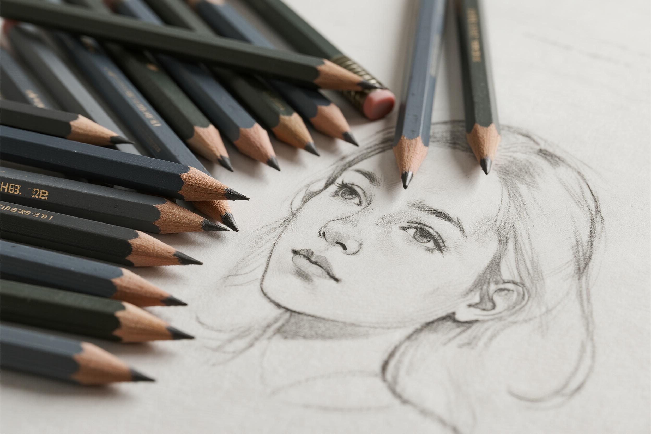
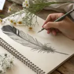
When I first stepped into the world of serious drawing, I stared at a row of pencils labeled with cryptic combinations of letters and numbers—9H, 4H, 2H, HB, 2B, 4B, all the way to 9B—feeling completely bewildered. What distinguished a 2B from a 4B? Why would anyone deliberately choose a pencil that produces lighter marks? It wasn’t until I understood what each grade actually does that my drawings transformed.
The Foundation: Understanding the Pencil Grading System
Pencil grades are standardized globally using what’s called the HB Scale, which measures two interconnected properties: hardness and the darkness of the mark. This system originated in Europe during the 18th and 19th centuries and has become the international standard for all serious drawing work.
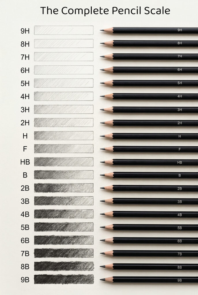
The scale works like this: H stands for hardness, indicating a pencil with a higher ratio of clay to graphite. The more clay in the core, the harder and lighter the pencil becomes. B stands for blackness, meaning the pencil contains more graphite and less clay, producing darker, richer marks. HB sits precisely in the middle, representing the perfect balance between the two qualities.
The numbers that accompany these letters indicate the degree of hardness or softness. A 2H is harder than an H, just as a 6B is significantly softer and darker than a 2B. This creates a continuous spectrum rather than isolated categories—think of it as a sliding scale of control and expressiveness rather than discrete boxes.
The Complete Pencil Scale at a Glance

| Grade Range | Characteristics | Primary Uses |
|---|---|---|
| 9H–6H | Extremely hard, very light marks, hold a sharp point for extended periods | Precision technical drawing, delicate underdrawings, preliminary architectural sketches |
| 5H–2H | Hard, fine lines, minimal smudging, durable points | Technical illustrations, detailed line work, light sketching for watercolor or painting |
| HB–F | Medium hardness, balanced light-to-dark range, versatile | General writing, sketching, casual drawing, everyday artistic work |
| B–2B | Soft, noticeably darker marks, smooth blending | General shading, loose sketching, portraiture, expressive work |
| 4B–6B | Very soft, deep blacks, excellent for tonal work | Professional shading, deep shadows, landscape drawing, dramatic effects |
| 8B–9B | Extremely soft, velvety blacks, maximum graphite deposit | Expressive gesture drawings, large-scale shading, rich textural effects, experimental work |


Hard Pencils: Precision, Control, and Foundation Work

Hard pencils (H grades) are your allies when precision matters most. These pencils produce crisp, controlled lines that remain visible but light enough to erase cleanly when necessary. The higher the number, the harder and fainter the mark—a 9H creates an almost ghostly line, while a 4H produces something more visible but still quite pale.
When to reach for hard pencils:
-
Initial sketching: I always begin drawings with a 2H pencil, applying just enough pressure to create a visible but erasable guideline. This light touch prevents the cartoony look that heavy outlines create, and it means you have maximum flexibility to adjust proportions before committing to darker values.
-
Technical and architectural drawing: Professionals creating precise plans, blueprints, or technical illustrations depend on H grades. These pencils hold their sharp points longer than softer options, crucial when accuracy is non-negotiable.
-
Detailed line work: For intricate designs, fine pen-like lines, or architectural rendering, 3H through 5H pencils provide the consistency and control needed. The fine point persists through extended use without requiring constant resharpening.
-
Burnishing and layering: A surprising superpower of hard pencils lies in their finishing role. After building rich shadows with soft pencils, applying a 2H or 4H pencil over the top “polishes” the graphite, smoothing it and compacting it into the paper’s tooth. This creates lacquer-like blacks without further darkening.
The key insight many beginners miss: hard pencils aren’t meant to create dark, finished drawings. They’re the foundation layer, the architectural skeleton upon which everything else is built.


The Middle Ground: HB and F—The Everyday Pencils
HB and F represent the sweet spot for all-purpose work. Most artists agree that HB is the world’s most versatile pencil, which is why it’s standard in schools and offices worldwide. An F pencil sits slightly harder than HB but maintains an exceptionally fine point even with moderate use.
Why HB remains the benchmark:
These pencils strike a balance that allows you to sketch, write, and add preliminary shading without requiring multiple pencil changes. They respond well to moderate pressure adjustments, making them forgiving for artists still developing pressure control. If you own just one pencil, HB is the obvious choice.
When HB becomes your main pencil:
- Casual sketching and drawing practice
- Quick studies and ideation work
- Mixed media where you need something that won’t dominate but provides clear marks
- Creating mid-tone values before deepening shadows
- Drawing on papers with less tooth, where softer pencils might become uncontrollably dark
That said, even professional artists often use HB as their working pencil during the planning and mid-tone stage. You’re not meant to stop there—it’s a beginning, not an endpoint.
Soft Pencils: Expression, Depth, and Professional Shading

This is where drawing truly begins to come alive. Soft pencils (B grades) deposit substantially more graphite with each stroke, allowing you to build rich tones and create the depth that separates amateur sketches from compelling artwork.
B grades explained:
A 2B pencil works wonderfully for general shading and loose sketching. It’s soft enough to produce satisfying darkness without the maximum softness that invites smudging. Many artists consider 2B the ideal sketching pencil for expressive work.
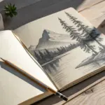
4B and 6B pencils are where professional portraiture and landscape drawing happen. These grades allow you to create smooth gradients through pressure control alone, without excessive burnishing or blending. A 4B delivers dramatic tonal shifts while remaining manageable; 6B offers profound shadows that seem to recede into the paper.
8B and 9B are for bold, expressive work and filling large areas with rich blacks. These ultra-soft pencils leave visible graphite with even minimal pressure, making them excellent for gesture drawing, dramatic sketches, and large-scale works. They do require frequent sharpening and prone to smudging—which is precisely the point.
The pressure revolution:
Here’s the insight that changed my work: softer pencils don’t require harder pressing. In fact, they punish it. The magic of a 4B or 6B lies in the range of values you can achieve through subtle pressure modulation. With light pressure, a 6B creates a gray softer than you’d get from heavy pressure on an HB. With medium pressure, it becomes a compelling mid-tone. With slightly increased pressure, it becomes a true black. This graduated control is impossible with hard pencils, no matter how forcefully you press.
Paper and Pencils: The Essential Partnership
The best pencil in the world fails if matched with unsuitable paper. Paper texture—called “tooth”—dramatically affects how graphite deposits and behaves.
| Paper Type | Tooth Description | Best Pencil Pairing | Ideal For |
|---|---|---|---|
| Smooth Bristol | Virtually no texture | Hard pencils (H–4H) and HB | Fine, detailed work; clean lines; technical illustration |
| Vellum Bristol | Weak, subtle texture | HB through 2B | Balanced drawing with room for blending |
| Drawing Paper (80–100 gsm) | Moderate tooth | HB through 4B | General sketching; shading; most artistic work |
| Sketching Paper | Minimal texture | Hard to medium (4H–2B) | Quick sketches; studies; practice |
| Mixed Media/Rough Paper | Pronounced texture | Soft pencils (4B–8B) | Expressive shading; texture emphasis; blending studies |
| Watercolor Paper (140+ gsm) | Variable texture | Hard pencils (2H–4H) | Preliminary sketches for painting; archival foundation |
My practical approach:
Smooth or vellum Bristol excels for finished work because its minimal tooth demands precision, but also accepts layered graphite beautifully. Drawing paper with moderate tooth is forgiving for learning—it accepts soft pencils without becoming uncontrollably dark, yet holds hard pencils’ marks without skating. Rough paper amplifies whatever pencil you use, making softer grades feel even more dramatic.
For sustained practice, I recommend 80–100 gsm (weight) paper. It’s durable enough to handle erasing, textured enough to accept multiple pencil grades, yet not so rough that hard pencils become frustrating.
Blending, Layering, and Building Depth

Once you understand what each pencil grade does individually, you need to understand how they work together.
Layering for polish:
Create the foundation of your darkest areas with a soft pencil (4B or 6B), applied with confident but not crushing pressure. Where you need the deepest blacks, add a second layer. Then—and this is crucial—go over that soft pencil with a pencil two grades harder (so over 6B, use 4B; over 4B, use 2B; over 2B, use HB or even 2H). This harder pencil sweeps across without adding darkness, but instead polishes the graphite, pressing it into the paper’s tooth and creating a lacquer-like surface. The result: blacks that seem to have depth rather than flatness, with a smooth surface instead of a grainy one.
Blending for soft transitions:
Blending—using stumps, brushes, or your finger (though graphite is attracted to skin oils, creating uneven results)—smooths harsh transitions between values. But blending isn’t your primary shading method; it’s an accent technique. Blend too aggressively and your drawing becomes muddy, losing the sharpness that keeps work compelling.
My approach: shade initially in layers with gradual pressure increases. If an area still lacks smoothness, selectively blend just the problematic transition zone using a tortillion or soft brush. Complete blending then stop—don’t obsess over every millimeter.
Practical Applications: Matching Pencils to Project Types
Understanding grades theoretically differs from deploying them strategically. Here’s how different drawing approaches demand different pencil selections:
For portraiture:
Begin with a 2H or H for structure and proportions. Move to HB for general mid-tones. Add 2B for shadow areas that need depth without extremity. Switch to 4B or 6B specifically for the deepest shadows—eyes, hair darkness, under-chin shadows. Use a 2H burnisher at the end to polish and smooth everything.
You don’t use all six grades simultaneously. You use each precisely when its characteristics match your current need.
For landscape drawing:
Structure matters less than atmospheric effect. Start with an HB sketch, then use 2B for mid-tone foliage and terrain. Reach for 4B or 6B for distant shadows, water reflections, and dramatic clouds. Hard pencils (2H–4H) work only at the very end, if at all, for refining foreground details.
For technical or architectural drawing:
Live in the H grades. A 4H handles the preliminary structure. An H or 2H creates the actual technical lines. Switch to HB only when you need to emphasize certain elements or add subtle shading. Avoid soft pencils entirely unless you’re adding atmospheric effect to an architectural rendering.
For experimental or expressive work:
Start with 4B and 6B immediately. Forget foundations. Use pressure and angle to create everything you need. Maybe add HB for calligraphic line accents. This approach proves that grades are tools for your vision, not rules to follow blindly.
Have a question or want to share your own experience? I'd love to hear from you in the comments below!