Whenever I’m not sure what to draw, I reach for fruit—simple shapes, gorgeous colors, and tons of texture make it the best practice subject. Here are my favorite fruit drawing ideas, starting with the classics and building up to more playful, extra-creative approaches.
Simple Banana Contour Study
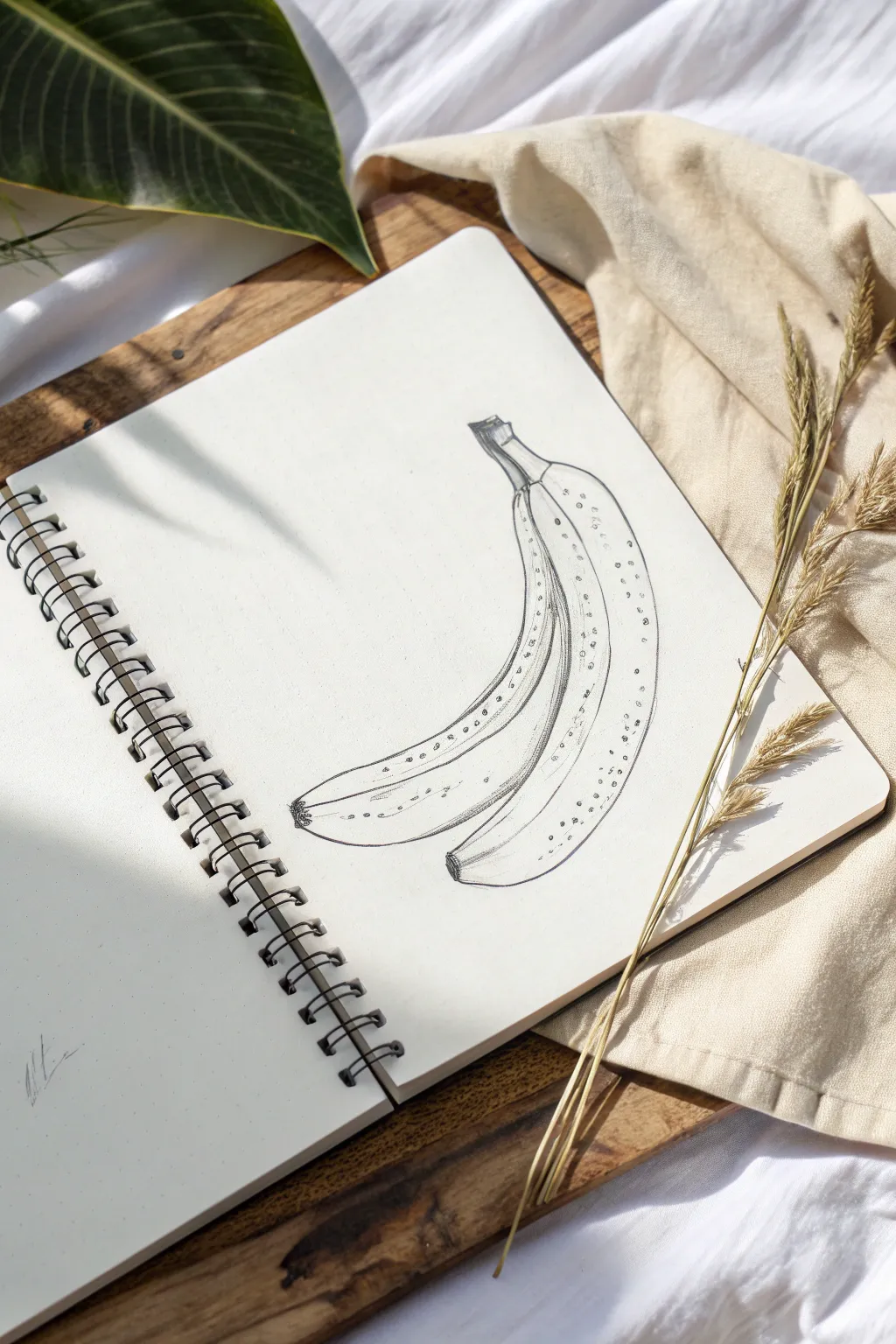
This study captures the graceful curve of a banana bunch using clean lines and subtle details. It focuses on mastering organic shapes and minimal shading to create form without overwhelming the page.
Step-by-Step Tutorial
Materials
- Sketchbook or drawing paper (medium tooth)
- H or HB pencil (for initial sketching)
- Fine liner pen or sharp dark pencil (2B/4B)
- Kneaded eraser
- Pencil sharpener
Step 1: Basic Structure
-
Establish the curve:
Begin by lightly sketching a long, sweeping ‘C’ curve in the center of your page. This central line will represent the main spine of the fruit bunch and dictate the overall flow drawing. -
Block in the first banana:
Around your central curve, sketch the elongated shape of the first banana. Keep the lines very faint. Focus on capturing the tapering ends—one end slightly blunt for the flower remnant, the other narrowing into the stem. -
Add the second banana:
Draw the second banana slightly behind and below the first one. It should follow a similar curve but peek out from underneath. Ensure the spacing between them feels tight, as if they are joined at the top. -
Construct the stem block:
At the top of the shapes, sketch a squared-off, blocky section where the individual stems merge. This ‘crown’ area connects both fruits and gives the bunch its structural anchor.
Wobbly Lines?
Don’t stress if your long curves aren’t perfect. Bananas are organic and irregular! A shaky line can actually make the texture look more ripened and natural than a perfect arc.
Step 2: Defining the Contour
-
Outline the top stem:
Switching to a slightly firmer hand or your fine liner, trace over the stem area. Add a few jagged, irregular lines at the very top cut edge to simulate the woody texture of the stalk. -
Draw the ridges:
Bananas aren’t perfect cylinders; they have distinct ridges. Draw a faint line running down the length of the front banana to indicate its geometric planes. This ridge line shouldn’t be perfectly straight—let it wobble slightly with the fruit’s curve. -
Refine the front banana:
Darken the outline of the primary banana. At the bottom, create a darker, small textured spot for the blossom end (the ‘bananaritis’). -
Refine the back banana:
Outline the secondary banana. Be careful not to draw through the first one; stop your line where it meets the front fruit to establish depth. -
Add connecting lines:
Connect the individual stems smoothly into the main fruit bodies. Pay attention to the ‘neck’ area where the stem transitions into the fruit, adding a slight crease line to show the bend.
Go Bananas
Try adding a third banana peeling away from the bunch, or use a blending stump on the graphite shading to make the fruit look smoother and less textured compared to the stem.
Step 3: Shading and Texture
-
Start striating:
Instead of smooth shading, we will use linear texture. Draw very short, fine lines along the stem and the upper neck of the bananas. These lines should follow the curve of the form. -
Deepen the shadows:
Identify where the bananas touch or overlap. Add more concentrated hatching or slightly thicker lines in these crevices to create separation and shadow depth. -
Spotting the fruit:
To give the bananas a realistic, ripe look, add small clusters of dots and tiny irregular circles randomly along the skin. I find concentrating these near the ridges and ends looks most natural. -
Stippling the ridges:
Along the main ridge line you drew earlier, add a very delicate trail of stippling (dots). This emphasizes the corner where the light catches the fruit. -
Darken the tips:
Add extra graphite or ink density to the very bottom tips and the cut top of the stem. These are the darkest points of the drawing and anchor the high-contrast look.
Step 4: Final Touches
-
Clean up:
Take your kneaded eraser and gently lift away any visible construction lines or stray smudges, leaving only your defined contours and texture marks. -
Assess the weight:
Look at the drawing as a whole. If the outline feels too thin in places, thicken it slightly on the ‘shadow side’ (usually the bottom curve) to give the object visual weight.
You now have a crisp, illustrative study that captures the essence of the fruit with elegant simplicity


Grapes Cluster With Highlights
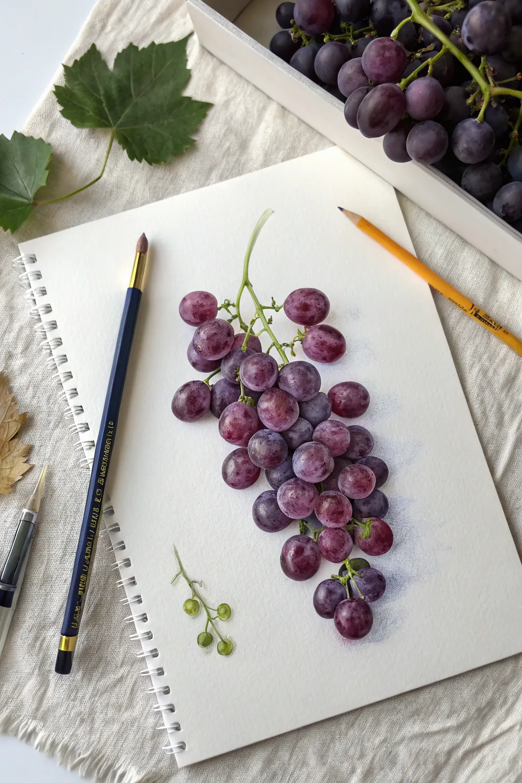
Master the art of botanical illustration by capturing the translucent glow and delicate bloom of purple grapes. This tutorial guides you through building layers of color and preserving crisp highlights to create a cluster that looks good enough to pluck right off the page.
Step-by-Step Guide
Materials
- Hot-pressed watercolor paper or smooth Bristol board
- Graphite pencil (HB or 2H)
- Kneaded eraser
- Colored pencils (spectrum of violets: plum, lavender, dark purple, indigo)
- Colored pencils (spectrum of greens: sap green, olive, lime)
- White gel pen or gouache (for finest highlights)
- Colorless blender pencil or burnisher
- Pencil sharpener
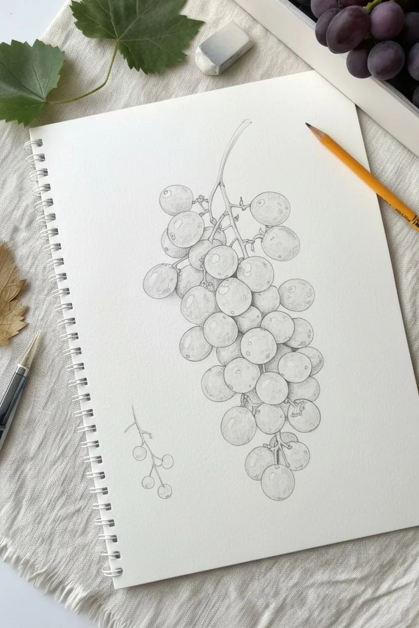
Step 1: Sketching the Structure
-
Map the cluster shape:
Begin by lightly sketching the overall triangular form of the grape cluster. Don’t press hard; you want these lines to be barely visible later. Treat the grapes as individual spheres overlapping each other. -
Refine the spheres:
Draw the individual grape outlines within your cluster shape. Vary their sizes slightly naturalism—some perfect circles, some slightly oblong. Ensure some grapes appear tucked behind others to create depth. -
Add the stem network:
Sketch the main central stem (rachis) winding through the top of the cluster. Add smaller pedicels (the tiny stems) connecting to the top grapes. Keep the lines organic and slightly jagged. -
Indicate highlight zones:
Before adding color, lightly mark small circles or ovals on the upper left side of each grape where the strongest light hits. This serves as a ‘do not color’ map. -
Sketch the loose tendril:
Draw a small, detached piece of vine with tiny, unformed green grapes to the lower left of the main cluster. This adds a lovely botanical composition element.
Fixing Flatness
If grapes look flat, your value contrast is too low. Don’t be afraid to press harder with your darkest indigo in the deepest crevices. The darker the shadow, the brighter the highlight will seem.
Step 2: Layering the Base Colors
-
Apply the first wash:
Using a light lavender or pale plum pencil, gently shade the entire grape surface, avoiding the marked highlight areas. Use small circular motions to avoid harsh directional strokes. -
Define the shadows:
Switch to a medium purple. unexpected darks appear where grapes touch each other. Shade the crevices and the bottom right curves of the spheres to establish volume. -
Integrate reddish tones:
Layer a reddish-purple or magenta lightly over the mid-tones. Grapes aren’t just purple; this warmth underneath mimics the translucency of the fruit skin. -
Color the stems:
Fill in the stems using a light lime green. Add olive green to the shadowed side of the stems and where they connect to the fruit to make them look cylindrical.
Water Droplet Trick
To add a dewdrop, outline a tiny circle. Darken the top inside edge and highlight the bottom inside edge. Add a tiny white glint on top and a cast shadow below it.
Step 3: Building Depth and Texture
-
Deepen the darkest values:
I find that using an indigo or deep violet pencil here really makes the form pop. Apply this darkest color strictly to the occlusion shadows—the tightest spots where grapes overlap. -
Create the ‘bloom’ effect:
Grapes often have a dusty, waxy coating called ‘bloom’. Simulating this by keeping your mid-tone transitions soft and slightly hazy. Gently blend the purple into the highlight area without covering it completely. -
Refine the edges:
Sharpen your dark purple pencil to a fine point. Clean up the outer edges of the grapes, ensuring they are crisp against the white paper. -
Add reflected light:
On the shadowed side of the grapes (opposite the highlight), lift a tiny bit of pigment with a kneaded eraser or add a touch of light blue. This suggests light bouncing off the paper.
Step 4: Polishing the Details
-
Enhance stem texture:
Use a brown pencil to add tiny specks and lines to the green stems, making them look slightly woody. Darken the connection points where the stem meets the fruit. -
Color the detached sprig:
Color the small green grapes on the loose sprig. Use yellow-green for the lights and sap green for shadows. These should look unripe and firm. -
Burnish for smoothness:
Use a colorless blender or a white pencil to go over the colored areas. This pushes the pigment into the paper grain, creating a smooth, painterly look. -
Pop the highlights:
If your preserved white paper highlights got muddy, use a white gel pen or a tiny dot of white gouache to add the sharpest reflection points back in. -
Cast a shadow:
Finally, add a very faint, cool grey or blue-violet shadow underneath the cluster on the right side to ground the subject on the page.
Step back and admire the vibrant, juicy texture you’ve created on the page
Strawberry Seed Texture Practice
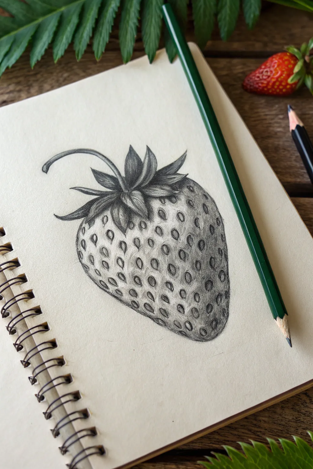
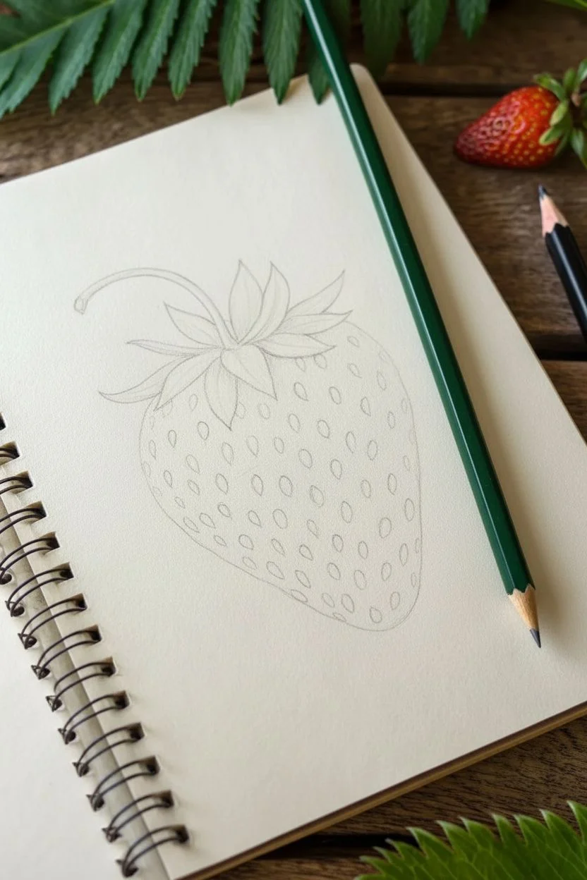
Capture the delicate details of nature with this focused study on strawberry textures. This project emphasizes the balance between light and shadow needed to make seeds look sunken and leaves appear crisp.
Step-by-Step Tutorial
Materials
- Spiral-bound sketchbook (creamy or off-white paper)
- Graphite pencils (HB for sketching, 2B and 4B for shading, 6B for deepest darks)
- Fine-point mechanical pencil (optional, for crisp details)
- Kneaded eraser
- Precision stick eraser (like a Mono Zero)
- Blending stump or tortillon
- Pencil sharpener
Step 1: Basic Structure
-
Outline the Berry Shape:
Begin with a light HB pencil. Draw a rounded, heart-like shape for the body of the strawberry. Keep your lines very faint so they can be easily erased or blended later. The shape should taper down to a gentle point at the bottom. -
Position the Calyx (Leaves):
At the top center, sketch the leafy crown known as the calyx. These leaves should fan out and curve slightly upwards or to the side. Don’t worry about texture yet; just get the jagged, star-like outline in place. -
Add the Stem:
Extend a thin, curved stem coming from the center of the leaves. Let it loop gracefully to the left, adding a sense of movement to the composition. -
Map the Seeds:
Lightly mark the placement of the seeds (achenes) all over the berry’s surface. Think of them as tiny teardrops. Spacing is crucial here—seeds near the edges should look thinner and closer together to illustrate the curvature of the fruit.
Seed Geometry
Follow the form! Seeds shouldn’t be random. Arrange them in spiraling, diagonal grid lines that wrap around the berry’s curve to emphasize roundness.
Step 2: Defining the Leaves
-
Darken the Leaf Edges:
Switch to a 2B pencil. Go over the outlines of the leaves, pressing slightly harder to create crisp, defined edges. The tips should be sharp. -
Shade the Leaf Center:
Leaves aren’t flat; they have central veins. Draw a central line down each leaf segment and shade outwards from it. Use short, flicking strokes to mimic the fibrous texture of plant matter. -
Deepen Leaf Shadows:
Using a 4B pencil, add dark shadows where the leaves bunch together at the base and underneath the main leaf blades. This contrast lifts the leaves off the berry.
Colorize It
Once the graphite shading is done, use a thin wash of red watercolor or colored pencil over the top. The graphite underneath will act as a grisaille underpainting.
Step 3: Creating Seed Texture
-
Outline Individual Seeds:
Return to the berry body. Carefully outline each tiny seed shape you mapped earlier using a sharper lead. They should look like little pockets. -
Shadow the Pits:
The secret to realism is depth. On the upper-left side of *each* seed pit, add a small, dark crescent shadow. This makes the seed appear sunken into the flesh. -
Highlight the Seeds:
Leave the actual seed inside the pit lighter than the surrounding hole. Add a tiny dot of graphite on the seed itself to give it form, but keep it subtle.
Step 4: Shading and Form
-
Build the Berry’s Volume:
Now, shade the main body of the fruit. Start shading the entire berry lightly, but leave the very center and upper-left somewhat lighter to suggest a highlight from a light source. -
Round the Edges:
Darken the right side and the bottom point of the strawberry significantly with a 4B or 6B pencil. This core shadow creates the illusion of a 3D round object on the 2D page. -
Refine the Pits:
Go back to your seed pits. Soften the harsh outlines of the holes so the flesh seems to roll gently into the divots rather than dropping off a cliff. -
Blend for Smoothness:
Use a torchon or blending stump to smooth out the skin texture between seeds. Be careful not to smudge your crisp seed details too much; blend *around* them. -
Adding Reflective Light:
If your drawing looks too flat, use a precision eraser to lift out tiny highlights on the ‘shoulder’ of the seed pits (the rim of flesh just catching the light). -
Final Contrast Check:
Take a step back. If the drawing feels gray, take your darkest 6B pencil and re-establish the deepest shadows under the leaves and on the shadowed side of the fruit for that final pop.
Take a moment to admire the texture you’ve built through careful repetition and observation


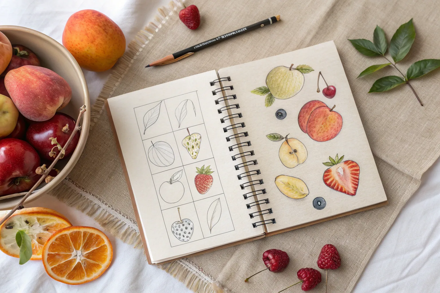
Tropical Fruit Grid Layout
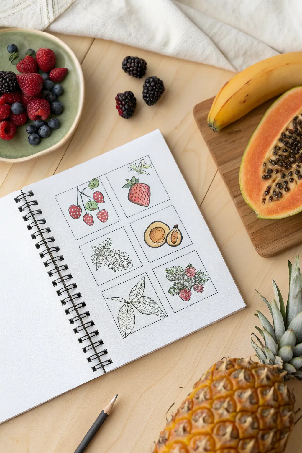
Capture the essence of fresh fruit with this structured yet whimsical grid layout. By isolating different botanical subjects into tidy squares, you can practice various textures and coloring techniques without the pressure of a full-page composition.
Detailed Instructions
Materials
- Spiral-bound mixed media or watercolor sketchbook
- Fine liner pens (0.1mm and 0.3mm, black, waterproof)
- Pencil (HB) and eraser
- Ruler
- Colored pencils or watercolor markers (red, green, yellow, ochre)
- Reference photos of berries, figs, grapes, and leaves
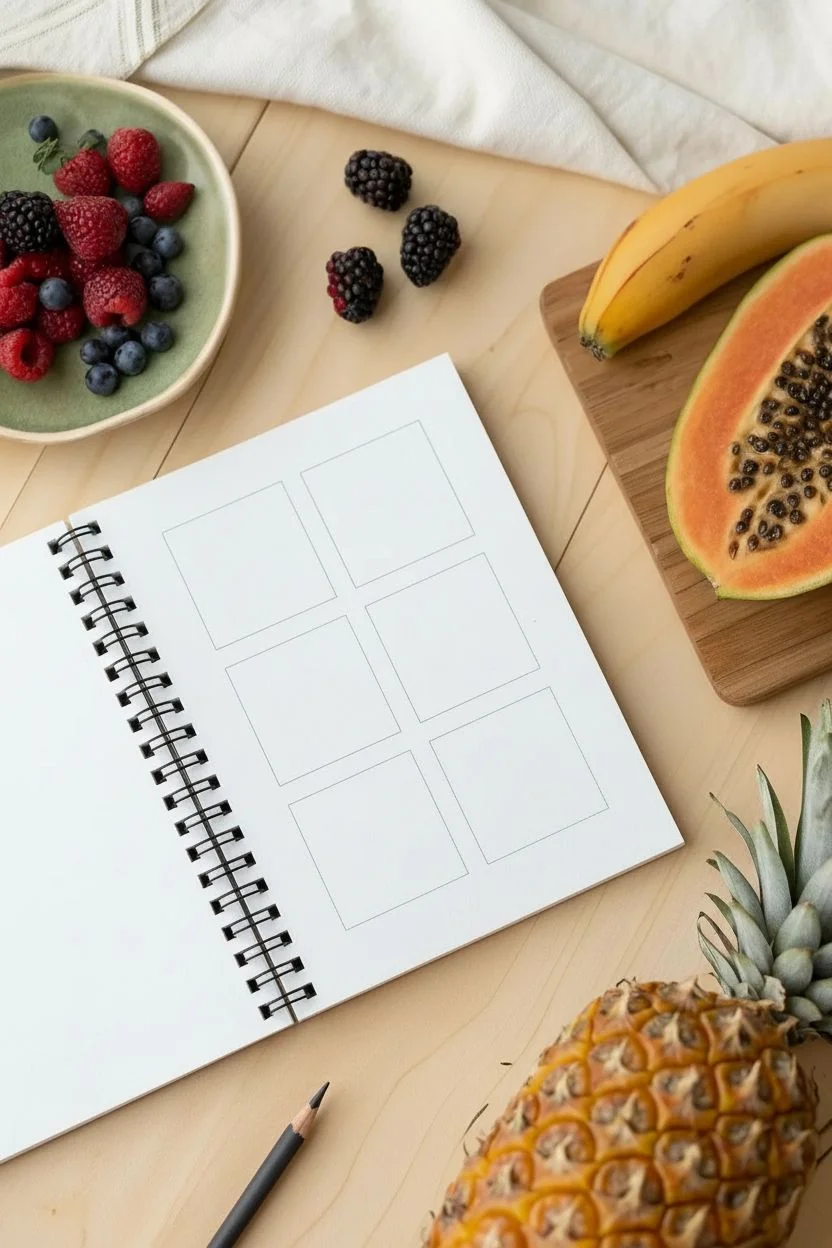
Step 1: Setting the Structure
-
Measure the grid:
Begin by lightly measuring out six equal squares on your sketchbook page. Leave a comfortable margin around the edges and distinct spacing between each box to let the individual drawings breathe. -
Draw the frames:
Using your 0.1mm fine liner and a ruler, carefully ink the borders of your six squares. Keep the lines crisp and straight, as this structure provides a satisfying contrast to the organic shapes you’ll draw inside. -
Erase guidelines:
Once the ink is completely dry, gently erase any pencil marks used for measuring. This ensures a clean slate for your botanical sketches.
Step 2: Sketching the Fruits
-
Outline the berries:
In the top-left square, lightly sketch a hanging branch with three or four small, round berries using your pencil. Ensure the stems connect naturally to a main twig. -
Draft the strawberry:
Move to the top-right square and sketch a large, singular strawberry shape. Focus on the wide shoulder and the tapering point, adding a leafy calyx at the very top. -
Add grape clusters:
For the middle-left box, draw a bunch of grapes. Start with circles near the top and layer them downwards, making sure some overlap others to create depth. -
Slice the fig:
In the middle-right square, draw a cross-section of a fig. Create a rounded shape with a flat top, and sketch a smaller, teardrop-shaped seeded area in the center. -
Sketch foliage:
For the bottom-left square, focus solely on leaves. Draw a central stem with three or four leaves radiating out, focusing on the vein patterns. -
Create a berry duo:
In the final bottom-right square, sketch a more detailed cluster of strawberries or raspberries nestled among prickly leaves.
Uneven Grids?
If your squares aren’t perfectly aligned, don’t restart. Thicken the border lines intentionally to mask the wobble, making it look like a bold stylistic choice.
Step 3: Inking and Detail
-
Ink the outlines:
Switch to your 0.3mm pen to trace the main contours of your fruit sketches. This slightly thicker line helps the subjects pop against the white background. -
Add fine textures:
Using the 0.1mm pen, add delicate interior details. For the strawberry, add small seeds; for the fig, stipple the center to suggest seeds; and for the leaves, draw thin veins. -
Leafy details:
I find that adding tiny serrated edges to the strawberry leaves makes them look much more realistic. Take your time with these small zigzag strokes. -
Clean up:
After allowing the ink to set for a few minutes, erase all remaining pencil sketches to leave a clean black-and-white foundation.
Bleeding Lines
If using markers, ensure your black fine liner is explicitly waterproof. Test it on a scrap page first; if it smears, let the ink cure overnight before coloring.
Step 4: Adding Color
-
Color the berries:
Take a red colored pencil or marker and fill in the berries in the top-left box. Leave tiny spots of white paper to act as highlights on the round surfaces. -
Shade the strawberry:
Color the top-right strawberry with a gradient of red, pressing harder near the bottom for shadow. Use a light green for the leafy top. -
Warm the fig:
For the sliced fig, use yellow ochre or a warm beige for the flesh, and a darker brown or purple for the outer skin rim. -
Detail the bottom berries:
On the bottom-right panel, carefully color the berries red, but leave the foliage intricate with thin green strokes, allowing the line art to show through. -
Leave some undone:
Deliberately leave the grape cluster and the leaf study (middle-left and bottom-left) in black and white. This creates a beautiful visual balance between study sketches and finished art.
Flip through your sketchbook and enjoy the mix of colorful pops and elegant line work you have created

Have a question or want to share your own experience? I'd love to hear from you in the comments below!