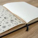
If you love the look of a drawing that’s packed from corner to corner, you’re in the right headspace. These full-page drawing ideas are all about saying goodbye to white space and giving your sketchbook that satisfying, finished feel.
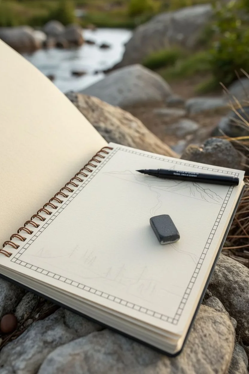
Edge-to-Edge Leaf Canopy Pattern
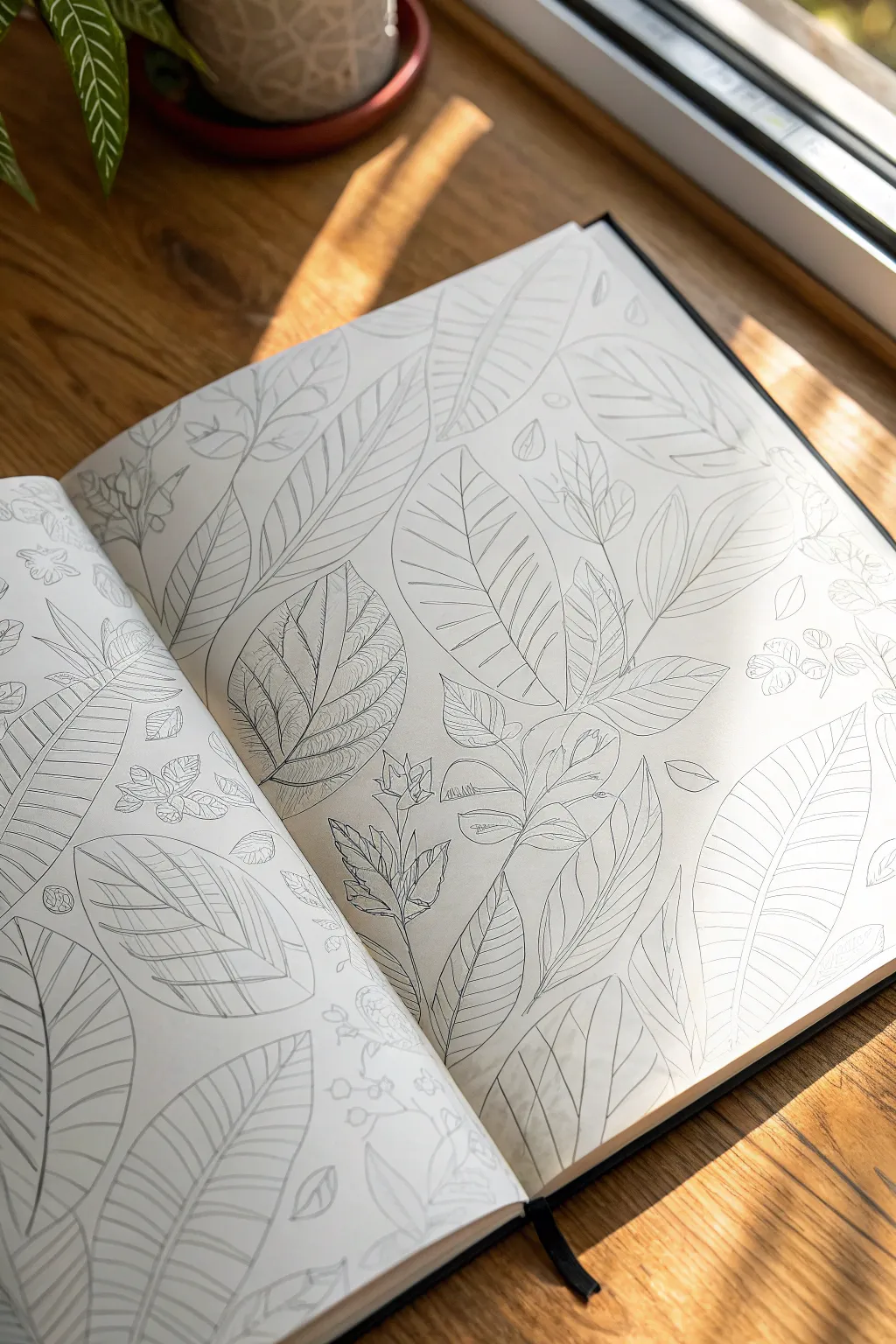
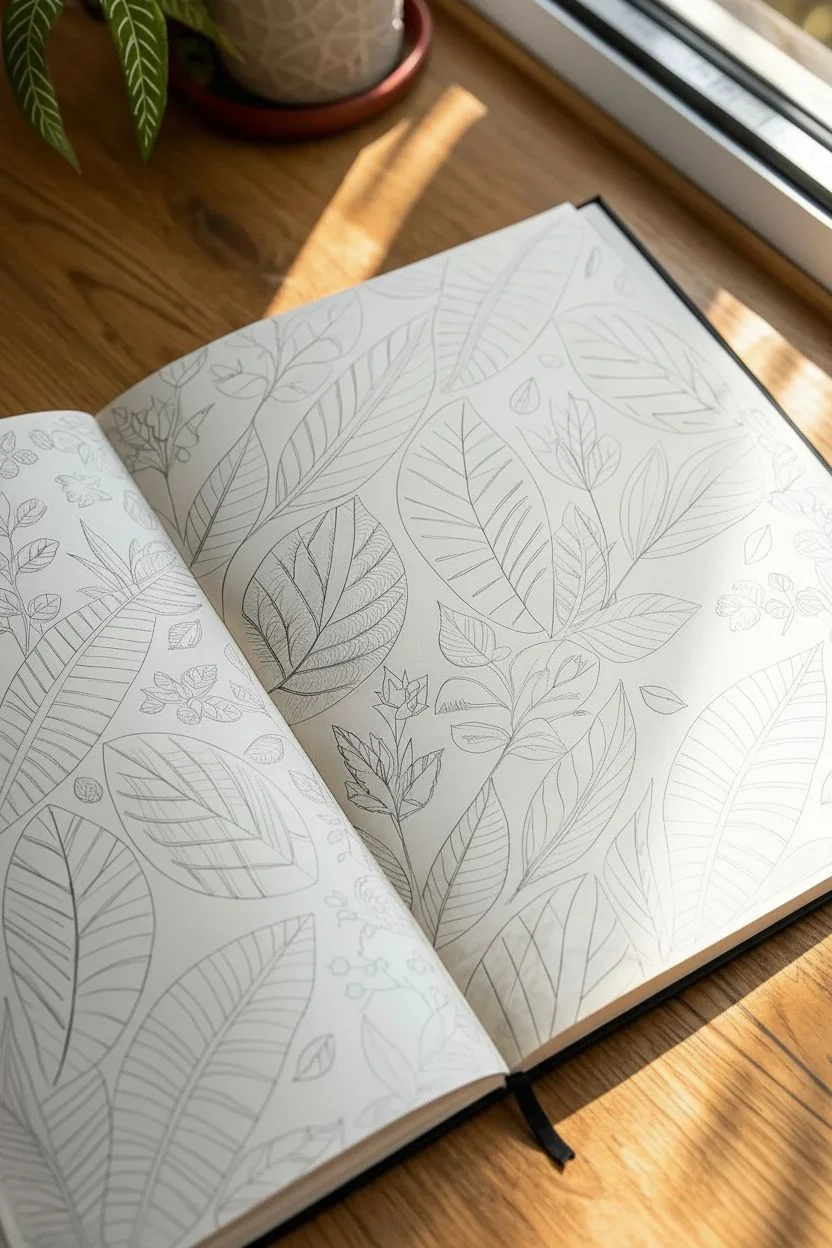
Transform a blank sketchbook spread into a lush, edge-to-edge jungle of line art foliage. This project focuses on the meditative process of layering organic shapes to create a seamless, full-page pattern that feels both structured and wildly natural.
How-To Guide
Materials
- Hardcover sketchbook (A4 or similar size)
- HB or 2H graphite pencil (for initial sketching)
- Fine liner pens (0.1mm, 0.3mm, and 0.5mm)
- Kneaded eraser
- Reference photos of tropical leaves (Monstera, Palm, Calathea)
- Ruler (optional, for spacing guides)
Step 1: Setting the Composition
-
Visualize the flow:
Since this is a full-spread drawing, open your sketchbook flat. Imagine a diagonal flow from the bottom corners upward. You want the leaves to look like they are overlapping and competing for sunlight, just like a real canopy. -
Establish the anchor leaves:
Using your HB pencil, lightly sketch three to five large ‘anchor’ leaves. Place one large oval leaf near the center fold, and others radiating outward. Keep these shapes loose and ghost-like; don’t press hard. -
Fill the gaps:
Draw medium-sized leaf shapes in the empty spaces between your anchors. Vary the orientations—some pointing up, some sideways. Think about variety: mix broad, paddle-shaped leaves with slender, pointed ones. -
Add background foliage:
Identify the smallest remaining negative spaces. Sketch tiny filler leaves, buds, or vine tendrils peeking out from behind the larger shapes to create depth without cluttering the page.
Smudge Prevention
Place a scrap piece of paper under your drawing hand. This acts as a shield, preventing oils from your skin or the friction of your palm from smearing the fresh ink or pencil sketches.
Step 2: Refining the Outlines
-
Start the ink work:
Switch to a 0.5mm fine liner. Begin tracing the ‘topmost’ leaves—the ones that appear to be in front and aren’t obscured by anything else. Use a confident, continuous line for the outer edges. -
Trace background layers:
Move to the leaves that sit behind the front layer. Carefully stop your ink line exactly where it intersects with a foreground leaf, creating the illusion of overlapping. -
Erase pencil marks:
Once the main outlines are inked and completely dry (give it a few minutes to avoid smudging), gently roll your kneaded eraser over the entire spread to lift the graphite guides.
Step 3: Detailing the Veins
-
Draw central veins:
With a thinner 0.3mm pen, draw the central spine (midrib) of each leaf. For some leaves, distinct double lines work best; for others, a single thin line is sufficient. -
Add primary venation:
Switch to your finest 0.1mm pen. Starting from the central spine, draw the main veins extending to the leaf edges. Curve them slightly towards the leaf tip to mimic natural growth curvature. -
Vary texture styles:
Don’t use the same vein pattern for every leaf. I like to give broad leaves wide-spaced, curved veins, while narrow leaves get tighter, straighter lines. -
Detail the Calathea style:
For the patterned leaves (like the one in the bottom center), draw internal shapes rather than just veins. Create a smaller leaf shape inside the main outline and fill it with very fine, closely spaced hatching lines.
Go Green
Instead of black ink, try using a set of dark green, olive, and teal micron pens. Using slightly different green hues for foreground vs background leaves adds instant atmospheric depth.
Step 4: Final Touches
-
Inspect intersections:
Look closely at where stems disappear behind leaves. If a connection looks floating or weak, darken the corner slightly with the 0.3mm pen to add a tiny occlusion shadow. -
Strengthen the perimeter:
Leaves at the very edge of the paper should just ‘cut off’ abruptly. Go over these cut-off lines once more to frame the page neatly. -
Review contrast:
Step back and look at the spread. If the drawing looks too uniform, thicken the outer contours of the largest leaves with the 0.5mm pen to make them pop against the finer background details.
Now you have a serene, permanent garden captured within the pages of your book


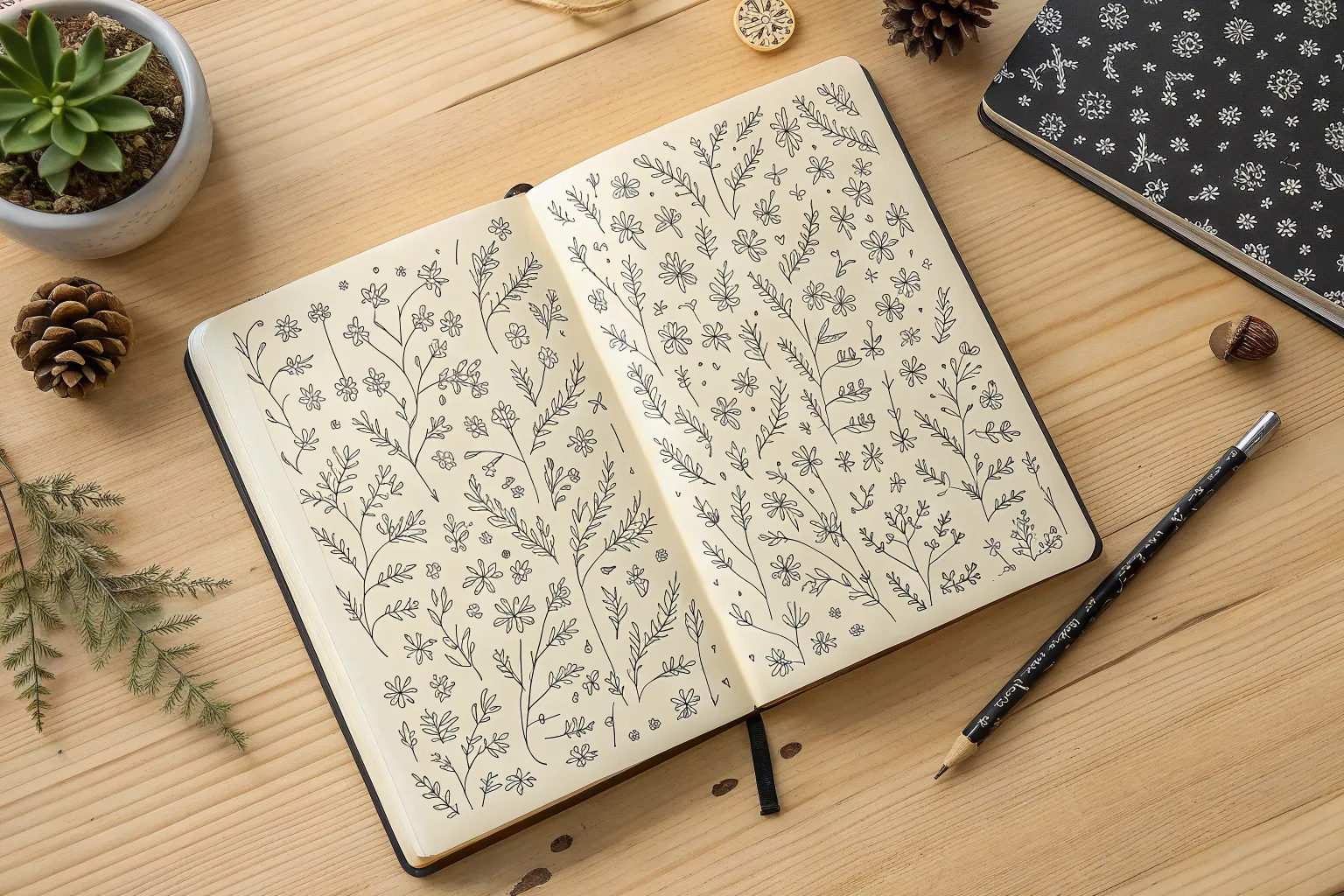
Doodle Collage of Tiny Everyday Icons
Fill a blank page with charm using this collection of tiny, disconnected line drawings that come together to form a playful pattern. It is the perfect low-pressure art exercise to spark creativity, resulting in a satisfyingly busy composition of everyday symbols.
How-To Guide
Materials
- Spiral-bound sketchbook (A5 or similar size)
- Fine-liner pen (black, 0.3mm or 0.5mm tip)
- Pencil (optional for sketching)
- Eraser (optional)
Step 1: Setting the Scene: Nature Elements
-
Start with a leafy vine:
Begin near the left-center of the page. Draw a long, slightly curved vertical line. Add small, pointed oval leaves in pairs moving up the stem, keeping them simple and open. -
Scatter floral icons:
Place 3-4 different flower types around the page. Try a classic daisy with looping petals near the center, and a simpler five-petal flower towards the bottom right. Keep the shapes loose and unperfect. -
Draw potted plants:
Near the bottom right corner, sketch tiny pots—some rounded, some square. Fill them with varied shapes like spiky aloe leaves or rounded cactus mounds. Add little lines on the cactus for texture. -
Add floating leaves:
Fill empty spots with individual leaves. Draw a standard leaf shape with a central vein line, or try a tropical Monstera style leaf for variety.
Keep it Loose
Don’t connect your doodles. Keeping white space between every object creates that sticker-sheet aesthetic rather than a chaotic scene.
Step 2: Sky and Weather Motifs
-
Create a shining sun:
Near the top center, draw a small circle. Surround it with alternating short and long lines to represent rays. I like to add a tiny squiggle inside the circle for character. -
Form fluffy clouds:
Draw cloud outlines using connected semi-circles. Place a large one near the sun and a smaller one slightly lower down. Make the bottoms flat for a stylized look. -
Sketch rainbows:
Draw two rainbows in different orientations. Use three nested arches for each. You can add small dots at the base of the arches to ground them. -
Sprinkle stars and moons:
Draw a crescent moon with a sleeping face profile if you’re feeling detailed, or just a simple crescent shape. Scatter 5-pointed stars and small diamond shapes throughout the gaps.
Step 3: Everyday Objects & Symbols
-
Draw a coffee cup:
Create a trapezoid shape widest at the top. Add a double rim and a ‘sleeve’ line across the middle. Don’t forget a small loop for a handle or just keep it as a takeaway cup. -
Add a hot air balloon:
Draw a large lightbulb shape. Add a small square basket hanging below it with tiny ropes connecting them. Decorate the balloon part with vertical stripes or a checkered pattern. -
Include geometric shapes:
Draw a heart symbol with double outlines or striped shading inside. Add circles with dots in the center to mimic buttons or wheels. -
Sketch a clock or compass:
Draw a circle with a dot in the center. Add two hands pointing in different directions and small dashes at the 12, 3, 6, and 9 positions. -
Incorporate food items:
Near the upper right, draw an ice cream cone. Use a triangle for the cone with a cross-hatch pattern, and a fluffy cloud-like shape on top for the scoop.
Smudged Ink?
If you smudge a line, transform the blob into a solid black element, like a planet or a stone, to hide the mistake naturally.
Step 4: Finishing Touches
-
Fill the gaps:
Look for large white spaces. Fill these with tiny ‘filler’ drawing elements like small hearts, singular dots, tiny circles, or little spirals. -
Balance the layout:
If one area looks too heavy, draw a slightly larger item in the opposite corner to balance the visual weight. -
Clean up:
If you used pencil sketch lines underneath, wait for the ink to be completely dry—give it a few minutes—then gently erase the graphite.
Now you have a charming page of icons that captures the simple joys of everyday life


Corner-to-Corner Wildflower Field
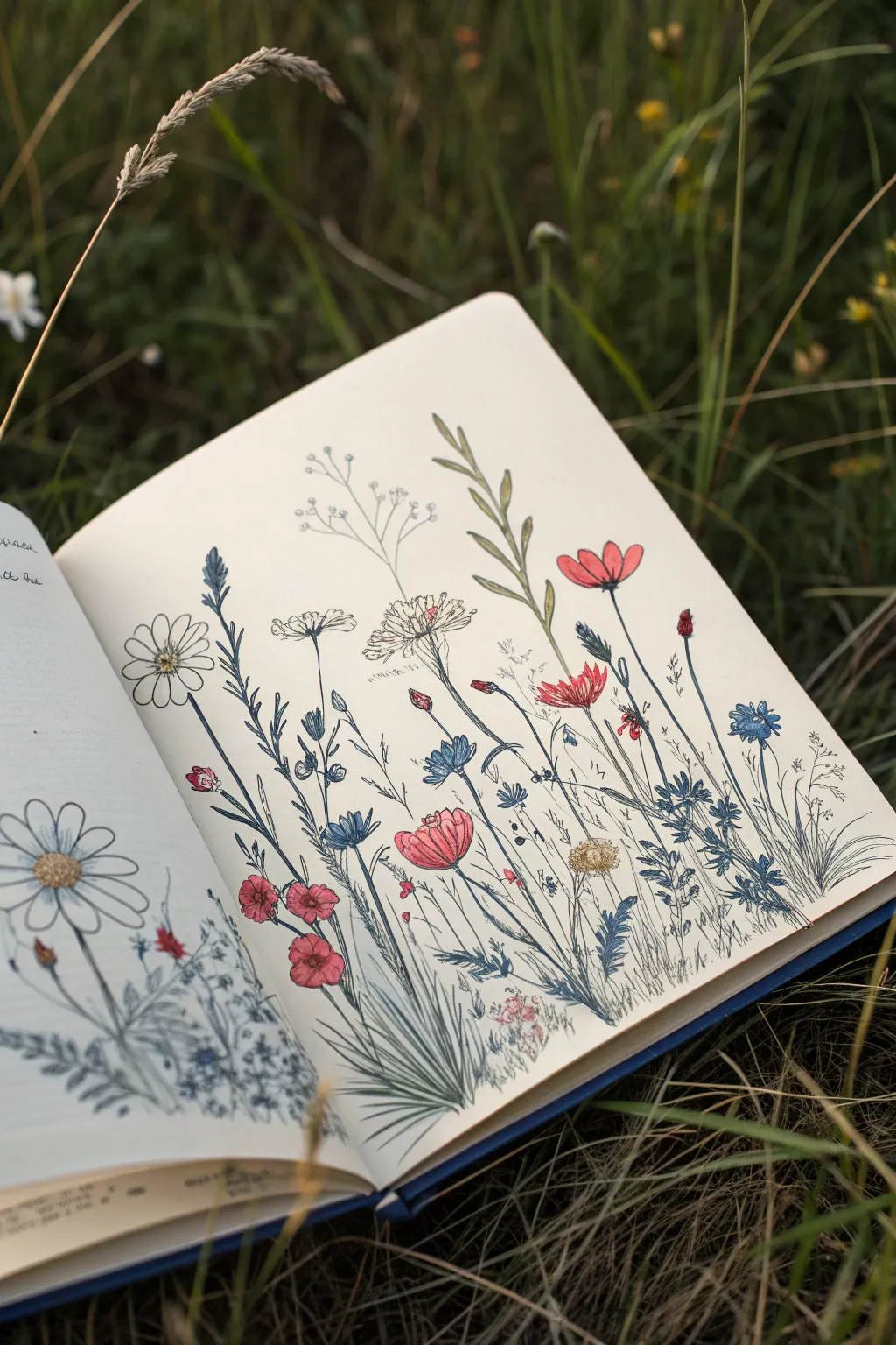
Capture the delicate beauty of a summer meadow with this corner-to-corner wildflower spread. Using fine liners and soft washes of color, you’ll create a lively botanical composition that feels as if it’s growing right off the page.
Step-by-Step
Materials
- Sketchbook with smooth, thick paper (mixed media or hot press watercolor paper works best)
- H pencil for initial sketching
- Kneaded eraser
- Fine liner pens (Black, 0.05mm, 0.1mm, and 0.3mm)
- Blue fine liner or gel pen (0.3mm)
- Watercolor paints or water-based brush markers (reds, muted pinks, blues, sage greens)
- Small round brush (size 2 or 4)
- White gel pen (optional for highlights)
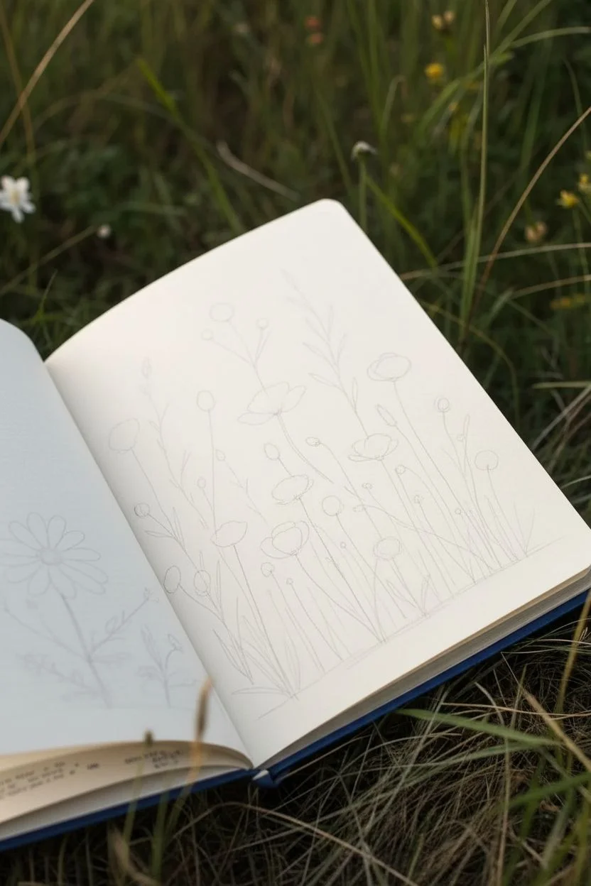
Step 1: Planning the Composition
-
Establish the ground line:
Begin by lightly sketching a very faint, uneven baseline near the bottom right corner. This doesn’t need to be perfectly straight; a slight slope mimics natural terrain. -
Draft the main stems:
Using your H pencil, draw long, sweeping lines extending upward from your baseline. Vary the heights and angles—some should stand tall and straight, while others should curve gently towards the edges of the page. -
Map out flower heads:
Sketch simple circles, ovals, or cone shapes at the tops of your stems to indicate where the blossoms will go. Place the largest blooms, like the poppies and daisies, first to anchor the composition.
Ink Movement Tip
When drawing grass or long stems, move your whole arm, not just your wrist. This creates smoother, more confident lines.
Step 2: Inking the Botanicals
-
Ink the foreground foliage:
Starting at the bottom with your 0.1mm black pen, draw clumps of grass. Use quick, upward flicking motions to create sharp, tapered blades that overlap the bases of your flower stems. -
Outline the prominent blooms:
Switching between black and blue pens, carefully outline your main flower heads. For the large white daisy on the left, keep the lines clean. For the poppy-like flowers, use slightly wobbly lines to suggest delicate petals. -
Add detail to the stems:
Go over your pencil stems with ink. I prefer using a slightly thicker 0.3mm pen for the main stalks to give them weight, while keeping the branching offshoots delicate. -
Incorporate blue accents:
Use your blue fine liner for specific plants, like the cornflowers or taller grassy reeds. This variation in ink color adds a lovely vintage botanical feel to the spread. -
Draw texture on petals:
Add center details to the flowers. Use stippling (tiny dots) for the centers of the daisies and fine parallel lines on the red petals to show curvature and shadow. -
Fill in the gaps:
Look for empty spaces between your main flowers. draw tiny sprigs, baby’s breath, or floating seeds using the 0.05mm pen to make the field look dense and lush. -
Erase pencil guides:
Once the ink is completely dry—give it a few minutes to be safe—gently roll your kneaded eraser over the page to lift all the graphite lines.
Pressing Flowers
Make this page interacting by gluing actual pressed petals or small dried leaves among your drawings for a mixed-media 3D effect.
Step 3: Adding Washes of Color
-
Prepare your palette:
If using watercolors, mix very watery, transparent puddles of red, sage green, and blue. If using markers, scribble them on a plastic palette first and pick up the color with a wet brush. -
Tint the red blooms:
Apply a light wash of red to the poppies and small buds. Keep the color sheer so the ink work shows through clearly. -
Add varied greens:
Paint the stems and leaves with your sage green. Don’t worry about staying perfectly inside the lines; a little looseness adds to the artistic charm. -
Layer blue tones:
Use a diluted blue wash for the cornflowers and some of the lower foliage shadows to create depth in the grassy areas. -
Create center contrast:
For the white daisy centers, use a touch of yellow ochre or gold, stippling it in to create a textured, pollen-heavy look. -
Final touches:
Once the paint is dry, you can use a white gel pen to add tiny highlights on the darkest leaves or the centers of the red flowers.
Close your sketchbook knowing you’ve preserved a small patch of summer forever


All-Over Fish School With Coral Fillers
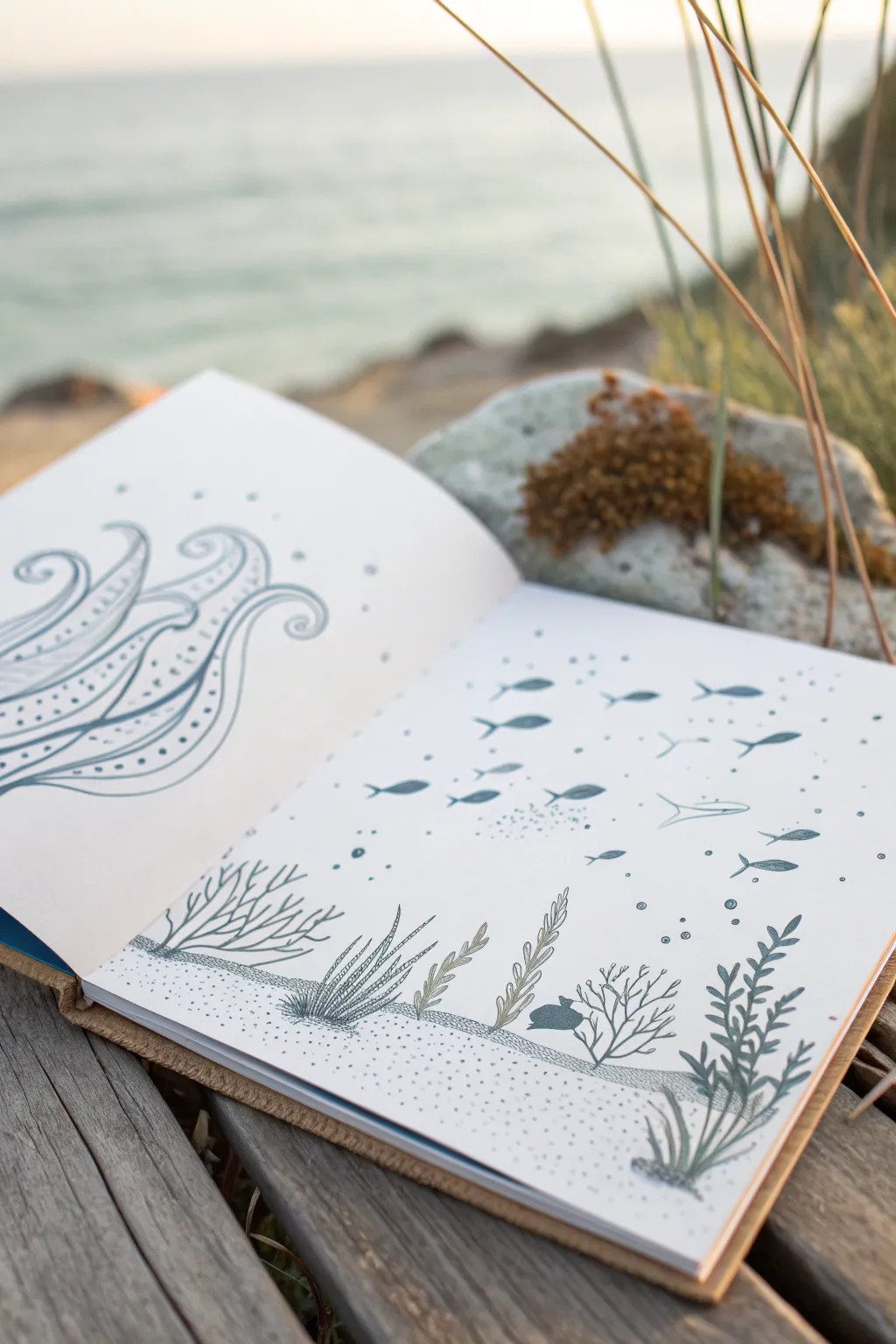
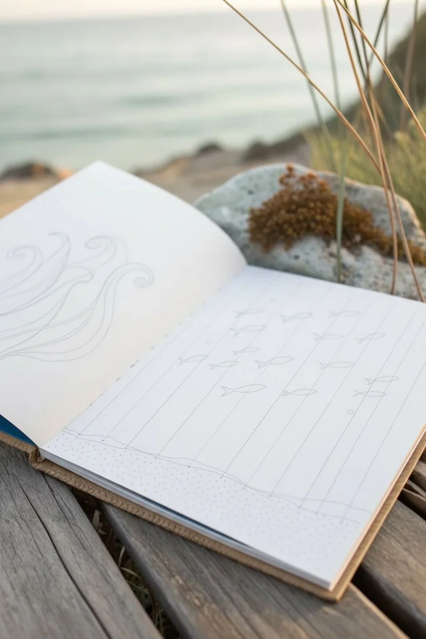
Capture the serenity of the ocean with this charming double-page spread featuring delicate line art. This project combines simple patterns, negative space, and minimalistic sea life to create a relaxing underwater scene that looks beautiful in any sketchbook.
Step-by-Step Tutorial
Materials
- Sketchbook with smooth, heavy paper
- Fine liner pen (0.3mm or 0.5mm, black or dark blue)
- Pencil (HB for sketching)
- Soft eraser
- Ruler (optional, for horizon line)
Step 1: Setting the Scene
-
Define the seabed:
Start on the right-hand page. Use your pencil to lightly sketch a wavy, uneven line about an inch or two from the bottom edge of the paper. This will serve as the sandy ocean floor for your plants. -
Sketch the plant placements:
Lightly mark vertical guidelines where you want your coral and seaweed to grow. Vary the heights and spacing to keep the composition organic and natural looking. -
Plan the fish school:
Draw faint directional arrows or ovals in the upper two-thirds of the right page to map out the flow of your fish school. This ensures they look like they are swimming together rather than randomly placed. -
Outline the abstract tentacles:
On the left-hand page, lightly sketch three to four large, swooping tentacle shapes emerging from the bottom left corner. Let them curve gracefully upward and outward, filling the majority of the page.
Stippling Precision
When stippling the sand, hold your pen vertically. Angled strikes create dashes instead of dots. Patience creates the best gradient effect.
Step 2: Inking the Sea Floor
-
Draw the seaweed stalks:
Switch to your fine liner. Starting on the far right of the right page, ink a tall, leafy plant. Draw a central stem and add small, pointed leaves in pairs moving upward. -
Add branching corals:
Moving left, draw a coral structure that looks like bare winter tree branches. Keep the lines somewhat jagged and thin to distinguish it from the leafy plants. -
Create soft seagrass:
For the next plant, draw a series of vertical, wavy lines that taper at the top. I like to group these closely together to mimic the movement of seagrass in a current. -
Draw the textured tube coral:
Near the center fold, draw a cluster of tube-like shapes. Fill these with small, closely packed circles or lines to give them a ribbed texture. -
Ink the seabed line and sand:
Go over your initial pencil line for the ocean floor. To create the sandy texture, apply stippling (closely grouped dots) just under the line and around the base of the plants, letting the dots fade out as you move lower.
Add Watercolor
After the waterproof ink dries, wash a sheer layer of pale blue watercolor over the background for an instant oceanic mood boost.
Step 3: Drawing the Marine Life
-
Draw simple fish silhouettes:
In the open space above the plants, start inking your fish. Use simple shapes—a pointed oval for the body and a small triangle for the tail. Vary their sizes slightly to create depth. -
Create a sense of movement:
Orient most of the fish in the same direction, following your pencil guide. Add a few distinct fish, perhaps larger ones or different shapes like a simple ray, to break up the pattern. -
Add bubbles:
Sprinkle tiny circles of varying sizes rising from the plants and trailing behind the fish to fill empty voids and suggest water.
Step 4: Completing the Abstract Left Page
-
Ink the main outlines:
Carefully trace over your large tentacle sketches on the left page. Ensure the lines are smooth and continuous. -
Divide the shapes:
Draw a central line or a secondary curve inside each tentacle shape to create a clear division or ‘stripe’ running the length of the form. -
Add decorative dots:
On one side of the internal division line, fill the space with a pattern of dots. Keep them evenly spaced for a clean, graphic look. -
Incorporate hatching:
On the other side of the division or in adjacent shapes, add short, parallel hatch marks to create contrast against the dotted sections. -
Clean up:
Once the ink is completely dry, gently erase all underlying pencil marks to reveal your crisp, finished illustration.
Enjoy the calm feeling of turning the page to see your underwater world come to life

PENCIL GUIDE
Understanding Pencil Grades from H to B
From first sketch to finished drawing — learn pencil grades, line control, and shading techniques.
Explore the Full Guide
Stacked Character Crowd With Zero Background


Transform a blank notebook page into a charming gallery of doodle characters with this layout idea. By stacking simple figures in neat rows without a background, you create a cohesive and visually pleasing collection that feels like a completed sticker sheet.
Detailed Instructions
Materials
- Spiral-bound notebook or sketchbook
- Fine-point black drawing pen (0.3mm or 0.5mm)
- Colored pencils (focus on pink, blush, orange, and light brown)
- Pencil (HB for sketching)
- Eraser
- Optional: Texture stencils or stamps
Step 1: Planning and Sketching
-
Divide the page:
Mentally divide your chosen page into two horizontal rows. You want to fit three characters on the top row and three on the bottom. -
Lightly sketch positions:
Using your HB pencil, lightly draw six ovals to represent the heads of your characters. Space them evenly to ensure none of the figures feel cramped later. -
Sketch the bodies:
Add simple geometric shapes below the head ovals for the bodies. Use trapezoids for dresses, rectangles for sweaters, and simple lines for legs. -
Draft unique features:
Give each character a distinct personality. Sketch a sun hat on one, a bob haircut on another, and a beanie on a third. Keep the facial features very simple—just dots for eyes and small curves for noses.
Keep it Cohesive
Limit your color palette to just 3 or 4 colors (like pink, sage, and tan) to make the separate characters look like they belong in the same collection.
Step 2: Inking the Outline
-
Begin the line work:
Take your fine-point black pen and start tracing over your pencil sketches. I like to start with the hairstyles, as they frame the face. -
Define the clothes:
Ink the clothing outlines. Don’t worry if your lines aren’t perfectly straight; a little wobble adds to the hand-drawn charm. -
Add clothing patterns:
Draw the details on the outfits while you have the pen in hand. Add horizontal stripes to a sweater, small flowers on a dress, or a grid pattern on a coat. -
Ink the faces:
Carefully dot the eyes and add the tiny smiles. These marks are small, so use a light touch to keep them delicate. -
Erase guidelines:
Wait a moment for the ink to dry completely to avoid smudging, then gently erase all visible pencil marks.
Step 3: Adding Color and Texture
-
Apply blush:
Using a pink colored pencil, draw small circular cheeks on every character. This unifies the group even if they are wearing different clothes. -
Color the hair:
Selectively color the hair. Leave some characters with white hair for a graphic look, or fill others with light brown or soft pink strokes. -
Fill the stripes:
Use an orange or coral pencil to color in the stripes of the central character’s sweater. Alternating colored and white bands creates a nice rhythm. -
Detail the accessories:
Add color to the accessories, like the beanie or the scarf. Keep your color palette limited to 3-4 cohesive shades to maintain the aesthetic. -
Add curly texture:
For the character with curly hair, use a scribbling motion with a light brown pencil to create volume and texture. -
Create background ambiance:
Draw tiny floating elements around the characters to fill empty white space. Little bubbles, flowers, or sparkles in black ink work perfectly here.
Symmetry Fixes
If one eye looks wonky, turn it into a wink! A small curved line instead of a dot can save a face drawing and adds extra personality.
Now you have a lively page of characters ready to brighten up your journal
Full-Page City Windows and Fire Escapes Pattern
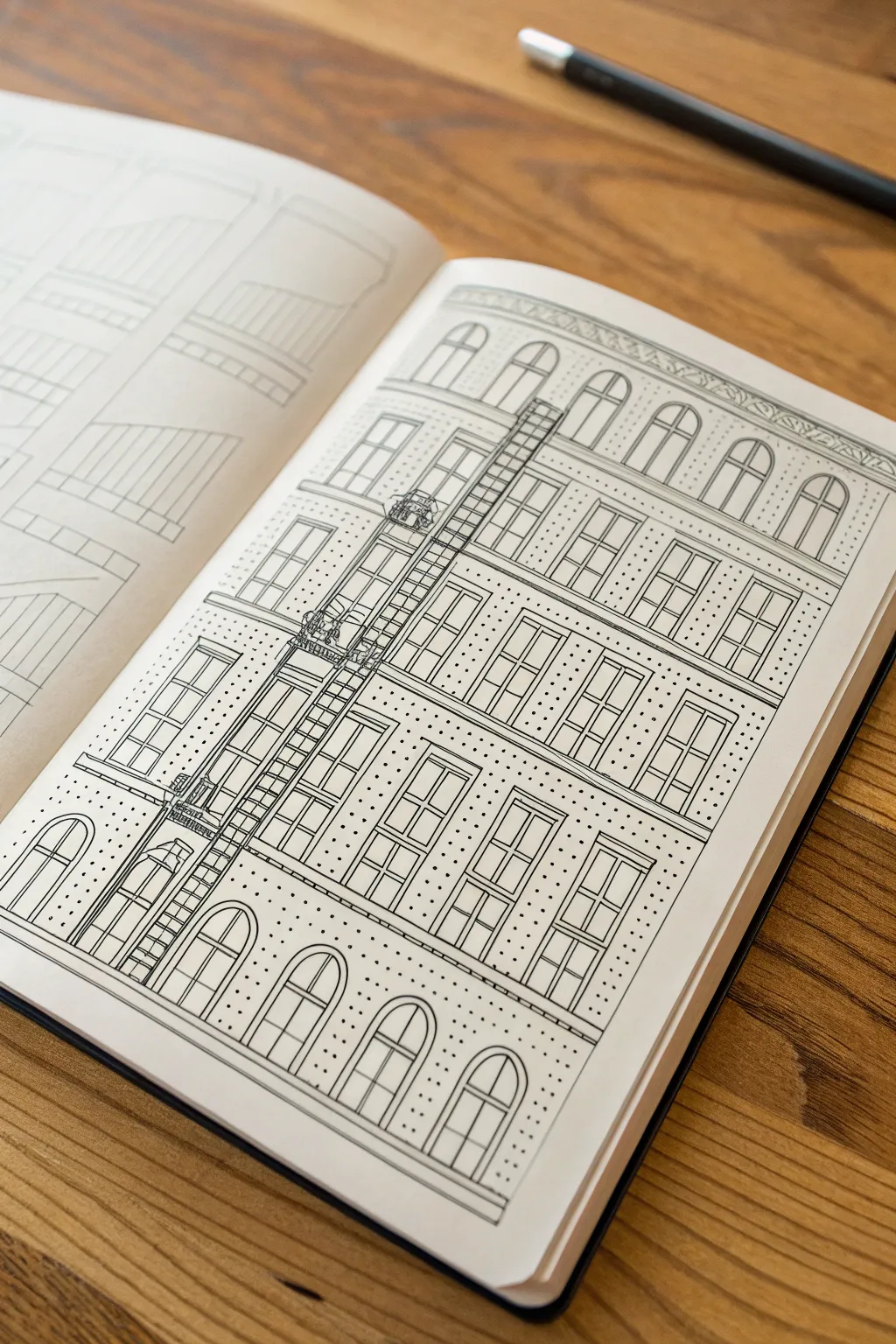
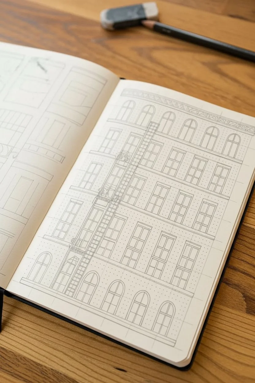
This intricate full-page drawing captures the charm of a classic city apartment building, complete with a detailed fire escape and arched windows. The clean black lines against the cream paper create a striking, technical illustration style that is both precise and visually satisfying.
Step-by-Step Guide
Materials
- Fine-liner pens (sizes 0.1, 0.3, and 0.5)
- Ruler or straight edge
- Pencil (HB or 2H)
- Eraser
- Sketchbook with smooth paper
Step 1: Drafting the Structure
-
Establish the grid:
Begin by using your ruler and pencil to lightly draw the main horizontal lines that will separate the floors of the building. Space them evenly to create five distinct levels. -
Mark vertical guides:
Draw faint vertical lines to designate where columns of windows will go. This early step is crucial for keeping your architecture symmetrical. -
Sketch the window shapes:
On the bottom floor and the very top floor, lightly sketch arched window frames. For the three middle floors, sketch rectangular window frames. Leave a gap in the second column from the left for the fire escape. -
Draft the fire escape:
In that reserved second column, sketch diagonal lines for the stairs connecting the floors and horizontal rectangles for the landing platforms. -
Add the roofline:
At the very top of the page, sketch a decorative cornice or frieze with a repeating geometric pattern to cap off the building.
Clean Lines
Wipe the edge of your ruler with a tissue every few lines. Ink can build up on the plastic edge and smear across your paper when you slide the ruler.
Step 2: Inking the Lines
-
Outline the main frames:
Switch to a 0.5 fine-liner pen. Carefully trace over your pencil lines for the main window frames and the horizontal floor dividers, using a ruler to ensure crisp, straight edges. -
Detail the window panes:
Use a thinner 0.3 pen to draw the inner frames and distinct panes within each window. The rectangular windows generally have a ‘four-pane’ look, while the arched ones detail the curve. -
Define the fire escape:
With the 0.3 pen, ink the vertical railings and the diagonal stairs. Add small horizontal hatch marks closely together on the stair diagonals to represent individual steps. -
Add architectural depth:
Use the ruler to double up on the horizontal lines separating the floors, creating a thin strip of molding rather than a single line. This adds weight to the structure. -
Inking the cornice:
Trace the decorative pattern at the roofline. You can freehand the small interior details here to give it a slightly more organic, carved stone appearance.
Wobbly Lines?
If your long ruler lines aren’t perfectly straight, don’t worry. Go over them freehand a second time to create a deliberate ‘sketched’ architectural style.
Step 3: Texture and Final Touches
-
Erase pencil guides:
Wait until the ink is completely dry—I usually give it at least five minutes—then gently erase all the underlying pencil sketches to reveal the clean drawing. -
Stipple the facade:
Using your finest 0.1 pen, begin adding texture to the building’s facade (the wall space between windows). Instead of shading, use a ‘stippling’ technique by tapping small dots onto the paper. -
Create gradients with dots:
Keep the dots fairly evenly spaced for a uniform brick or stone texture, but group them slightly tighter near the window edges to suggest shadow and depth. -
Fire escape details:
Add tiny vertical lines or railing details to the fire escape platforms to make them look like metal grates. -
Final heavy lines:
Take the 0.5 pen one last time and re-trace the outermost border of the entire building and the ground line to ground the illustration on the page.
Now you have a stunning architectural study that turns a blank page into a bustling city scene
BRUSH GUIDE
The Right Brush for Every Stroke
From clean lines to bold texture — master brush choice, stroke control, and essential techniques.
Explore the Full Guide
Sky Packed With Clouds, Stars, and Weather Swirls
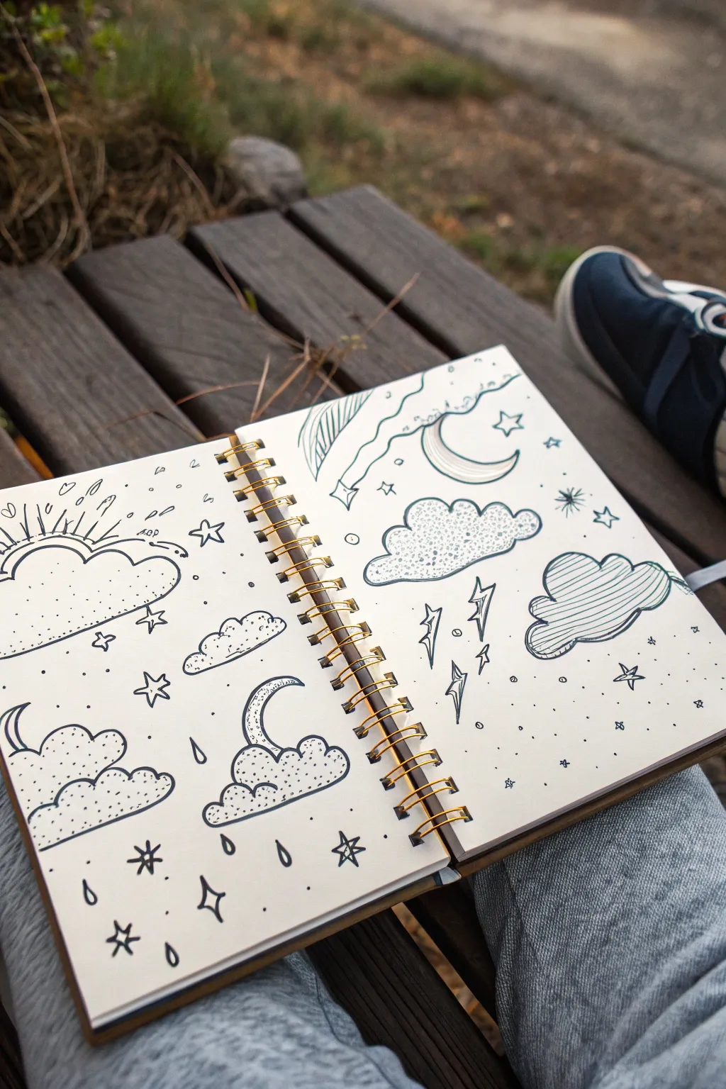

Fill a double-page spread with a charming collection of weather elements, featuring stylized clouds, celestial bodies, and atmospheric details. This monochromatic doodle style uses simple line work and patterns to create a cohesive and relaxing composition perfect for filling blank sketchbook pages.
Step-by-Step Tutorial
Materials
- Sketchbook with heavy paper (spiral bound preferred)
- Fine liner pen (0.3mm or 0.5mm, black ink)
- Thinner fine liner (0.1mm) for details
- Pencil (HB)
- Eraser
Step 1: Planning the Layout
-
Gridless composition:
Visualize your double-page spread as a loose collection of floating elements rather than a structured scene. Aim to scatter large cloud shapes evenly across both pages first to anchor the design. -
Sketch the major clouds:
Using your pencil lightly, draw the outlines of about 5-6 large cloud shapes. Make them distinct from each other—some puffy and round, others flat-bottomed or elongated. -
Add celestial bodies:
Pencil in a few crescent moons. Place one peeking out from behind a cloud on the left page, and perhaps a large, standalone crescent on the right page.
Fixing Smudges
If you smudge wet ink with your hand, turn it into a tiny grey cloud or a shadow for a star. Mistakes in doodling are just opportunities for new weather patterns.
Step 2: Inking the Outlines
-
Define the cloud edges:
Take your thicker fine liner (0.3mm or 0.5mm) and trace over your pencil cloud outlines. Don’t worry about perfect curves; a slightly wobbly hand adds to the hand-drawn charm. -
Draw the moons:
Ink the crescent moons. For the moon interacting with the cloud, ensure the cloud line overlaps the moon to show depth. -
Erase guidelines:
Once the foundational ink is completely dry—give it a full minute—gently erase your pencil marks to leave a clean slate for detailing.
Step 3: Adding Patterns & Texture
-
Dotted stippling:
Choose two or three clouds to fill with stippling. Using your pen, create density at the bottom of the cloud shapes with many small dots, spacing them out as you move upward to create a gradient effect. -
Hashed shading:
For a different texture, fill one large cloud on the right page with diagonal hatching lines. Keep the lines relatively parallel but consistent with the hand-drawn aesthetic. -
Empty space:
Leave one or two clouds mostly empty or with minimal detail. This negative space prevents the page from looking too cluttered. -
Moon details:
Add horizontal striping or small craters inside your moon shapes to distinguish them from the white of the paper.
Add Subtle Color
Use a light grey marker to add drop shadows to the right and bottom of your clouds. It makes the doodles pop off the page without needing full color.
Step 4: Atmospheric Elements
-
Lightning strikes:
Draw jagged, zig-zag lightning bolts coming down from the hatched cloud on the right page. Use double lines to give the bolts thickness. -
Raindrops:
Under the stippled clouds, draw stylized teardrop shapes. Leave some white in the center or fill them halfway to suggest reflection. -
Sunburst lines:
On the top left cloud, draw radiating lines extending outward to suggest a sun hidden behind the clouds. -
Wind swirls:
Add a few decorative, curly lines across the top right of the page to represent wind gusts or stylized atmosphere.
Step 5: Starry Fillers
-
Draw five-point stars:
Scatter open five-point stars into the larger empty gaps between your main elements. Vary their sizes for visual interest. -
Add starbursts:
Draw simple asterisks or crossed lines to represent smaller, distant twinkling stars. -
Micro-dots:
Fill the tiniest awkward gaps with single black dots. This ‘confetti’ effect ties the whole composition together. -
Final review:
Scan the page for any areas that feel unbalanced. I usually add a tiny star or circle if a spot feels too empty.
Close your sketchbook knowing you have captured a unique storm of creativity
Overlapping Hands Study Across the Entire Page
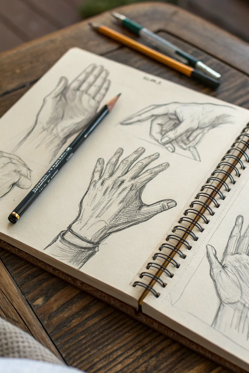
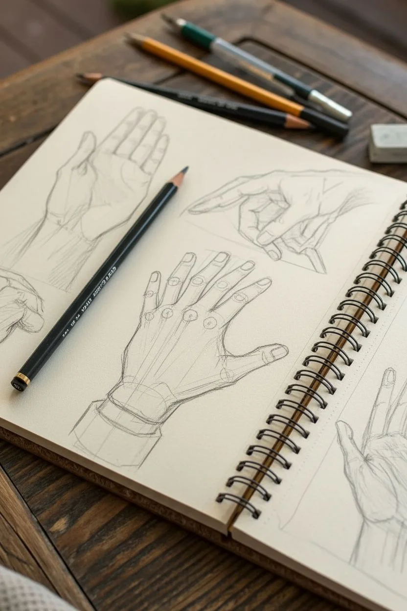
Move beyond the basics with this dynamic anatomical study that fills a sketchbook spread with expressive, structured hand poses. Using toned paper and graphite, you will explore foreshortening and gesture to create a cohesive reference sheet that feels both academic and artistic.
Step-by-Step Tutorial
Materials
- Spiral-bound sketchbook with tan or cream toned paper
- 2H graphite pencil (for initial layout)
- HB or 2B graphite pencil (for defining lines)
- 4B or 6B graphite pencil (for deeper shadows)
- Kneaded eraser
- Pencil sharpener
Step 1: Planning composition and structure
-
Visualize the layout:
Before making a mark, mentally divide your sketchbook page into quadrants. You want to feature three distinct hand poses: one reaching upward on the left, one pointing down on the right, and a central open palm dominant in the foreground. This triangular composition keeps the eye moving. -
Block in the central hand:
Using a sharp 2H pencil and very light pressure, sketch the basic geometric shape of the central hand’s palm—a square or trapezoid shape. Extend straight lines out for the fingers to establish their direction and length relative to the palm. -
Establish the secondary poses:
Lightly block in the upper left hand reaching upwards and the upper right hand pointing downwards. Focus solely on the ‘mitten’ shape—grouping the fingers together rather than drawing them individually—to get the gesture and size correct. -
Define the wrist connection:
For the central hand, sketch a cylinder shape for the wrist connecting to the palm. Note how the radius and ulna bones create a slight bump on the wrist’s side. Add simple cuff lines to suggest a sleeve, grounding the anatomy. -
Segment the fingers:
Map out the knuckles on the central hand using small circles. Break the fingers down into three cylinder segments each (except the thumb, which has two). This structural approach prevents the fingers from looking like sausages.
Fingers look crooked?
Check your knuckle alignment. Draw an arched line across the hand where the knuckles sit. If fingers look broken, ensure the three segments (phalanges) decrease in length as they reach the tip.
Step 2: Refining form and line weight
-
Outline the central hand:
Switch to an HB pencil. Carefully trace over your geometric guides on the central hand, softening the edges. Pay attention to the webbing between fingers—it doesn’t start at the knuckle but slightly higher up. -
Detail the fingernails:
Sketch the fingernails on the central hand. Instead of flat squares, draw them as curved planes that wrap around the curvature of the finger tip. This is crucial for showing the volume of the fingers. -
Refine the pointing hand:
Moving to the upper right drawing, sharpen the contours of the index finger and thumb. Ensure the index finger looks foreshortened if it is pointing somewhat toward the viewer, and curl the remaining three fingers tightly into the palm. -
Develop the upward hand:
On the left drawing, define the thumb muscle (the thenar eminence) as a fleshy, rounded shape. Outline the extended fingers, paying close attention to the natural gaps between them as the hand stretches open. -
Erase construction lines:
Take your kneaded eraser and gently dab away the darker geometric guidelines and construction circles you drew in the first phase. Don’t scrub; just lift the graphite so only your clean outlines remain.
Step 3: Shading and textural hatching
-
Start shading the central hand:
With a 2B or 4B pencil, begin shading the central hand. Identify your light source (usually top-left). Place shadows on the right side of the fingers and under the palm. Use parallel hatching lines that follow the form of the hand. -
Emphasize the tendons:
On the back of the central hand, use lighter, thinner lines to suggest the tendons radiating from the knuckles back toward the wrist. I find it effective to barely touch the paper here to keep the skin looking taut but delicate. -
Deepen the shadows:
Return to the wrist area. Darken the cuff of the sleeve and the cast shadow directly underneath the cuff on the skin. This high contrast anchors the drawing and adds depth. -
Hatch the secondary hands:
Add shading to the upper right pointing hand, focusing on the dark crevice between the thumb and index finger. Cross-hatch slightly in the darkest areas to build density. -
Texture the skin:
Add small, broken lines at the knuckles and wrist wrinkles to indicate skin folds. Don’t draw every wrinkle—just a few well-placed marks imply the texture sufficiently. -
Final contrast check:
Step back and squint at your page. Use your darkest 6B pencil to reinforce the absolute darkest points—usually where fingers touch or overlap—to make the drawings pop off the toned paper.
Pro Tip: Negative Space
When drawing complex poses like the pointing hand, don’t just draw the fingers. Draw the empty shapes *between* the fingers. Getting these ‘negative shapes’ accurate fixes proportion errors instantly.
Fill the rest of the page with quick gesture drawings to complete your study.


Mushroom Jungle With Tiny Plants in the Gaps
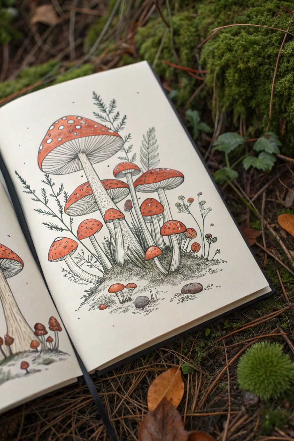
Capture the magic of an autumnal forest floor with this detailed pen and ink illustration of fly agaric mushrooms. This project combines precise botanical line work with warm, muted color washes to create a cozy, vintage-style sketchbook page.
How-To Guide
Materials
- Sketchbook with cream or off-white mixed media paper
- HB pencil and eraser
- Fine liner pens (sizes 0.05, 0.1, and 0.3mm, black ink)
- Watercolor paints or alcohol markers (Red, Orange, Warm Brown, Green)
- Small round paintbrush (size 2 or 4)
- White gel pen or gouache used for highlights
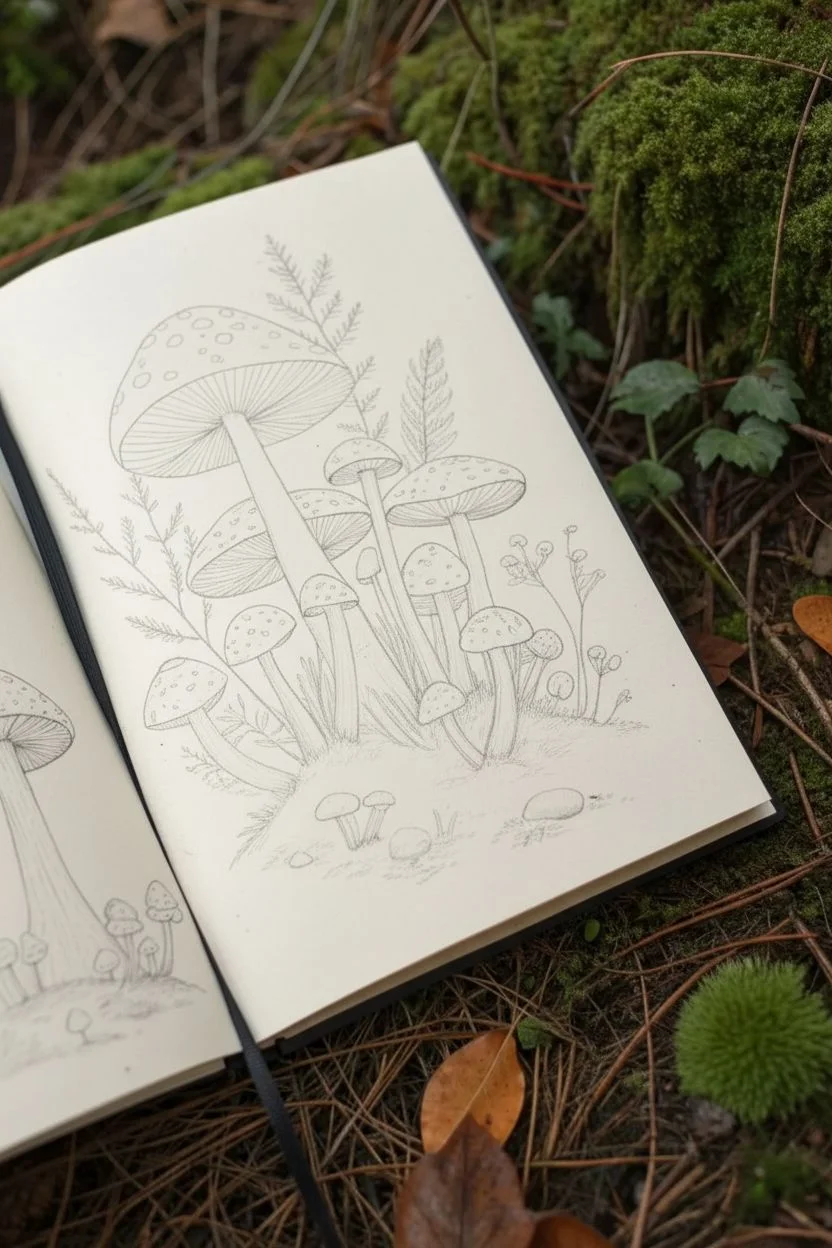
Step 1: Penciling the Composition
-
Establish the main anchor:
Start by lightly sketching the largest mushroom on the upper left side. Draw a large, flattened dome shape for the cap and a long, slightly curved stem extending downward. This will serve as the focal point for the rest of your cluster. -
Add the supporting mushrooms:
Sketch in the medium-sized mushrooms next. Place one behind the main stem and another cluster to the right side. Vary their heights and cap angles—some should look like they are sprouting up from behind others to create depth. -
Fill the gaps:
Draw the smallest, stout mushrooms near the base of the larger stems. These should look like little buttons pushing up through the soil. -
Sketch the foliage:
Lightly trace the shapes of fern fronds and small leafy plants rising up between the mushroom caps. Keep the lines faint, as these are background elements. -
Ground the scene:
Draw a rough, uneven horizon line at the bottom to form a mound of earth, adding simple ovals for small pebbles or rocks scattered in the foreground.
Ink Smearing?
If your black ink bleeds when you add watercolor, ensure your pens are labeled ‘waterproof’ or ‘archival.’ If not, simply paint the color first, let it dry, and then do the ink line work on top.
Step 2: Inking the Outlines
-
Ink the main structures:
Using a 0.3mm fine liner, carefully go over the pencil lines of the mushroom caps and stems. Use confident, smooth strokes. -
Detail the gills:
Switch to a thinner 0.1mm pen. Under the large open caps, draw very fine lines radiating from the stem to the edge of the cap to represent the gills. Keep them close together and delicate. -
Add stem texture:
Use the 0.05mm pen to add texture to the stems. I find that using tiny dots (stippling) and short, broken vertical lines gives the stalk a fibrous, organic look without making it too dark. -
Ink the background plants:
Outline the ferns and leaves with the 0.1mm pen. Don’t close every shape perfectly; broken lines can make the foliage look lighter and more delicate. -
Create the grassy base:
For the mossy ground, use quick, short, scribbly strokes to simulate grass and earth texture. Work densely right under the mushrooms to create shadow.
Make It 3D
Dilute your red paint heavily for the edges of the mushroom caps. Keeping the centers saturated and the edges pale creates a believable spherical effect without needing complex shading.
Step 3: Adding Color
-
Base coat for caps:
Mix a muted red-orange watercolor. Apply a smooth wash to the tops of the mushroom caps. Leave small circular areas unpainted if you can, or paint over them and add white back later. -
Add gradients:
While the red paint is still slightly damp, drop a tiny bit of darker reddish-brown near the center (top) of the caps to make them look rounded and 3D. -
Shade the stems:
Using a very diluted warm grey or brown, paint a thin shadow line down one side of each stem and underneath the caps where the gills are. This separation adds immediate volume. -
Tiny accents:
Paint the small pebbles in the foreground with a soft grey-brown. If you have tiny plants with petals, add a dot of muted color, but keep the ferns mostly uncolored or very faint green to keep focus on the fungi. -
Wait for drying:
Let the paint dry completely before moving to the final step to avoid smudging your crisp ink lines.
Step 4: Finishing Touches
-
Reinforce shadows:
Once dry, use your 0.1mm pen to add deeper hatching shadows where the stems meet the ground and where caps overlap each other. -
Add the spots:
If you painted over the spots earlier, use a white gel pen or a dot of white gouache to add the characteristic white warts to the red caps. Vary their sizes for realism. -
Clean up:
Erase any remaining visible pencil marks gently to leave a crisp, professional illustration.
Now you have a charming botanical study ready to fill your sketchbook with woodland whimsy
Insect Specimen Page With Labels and Texture
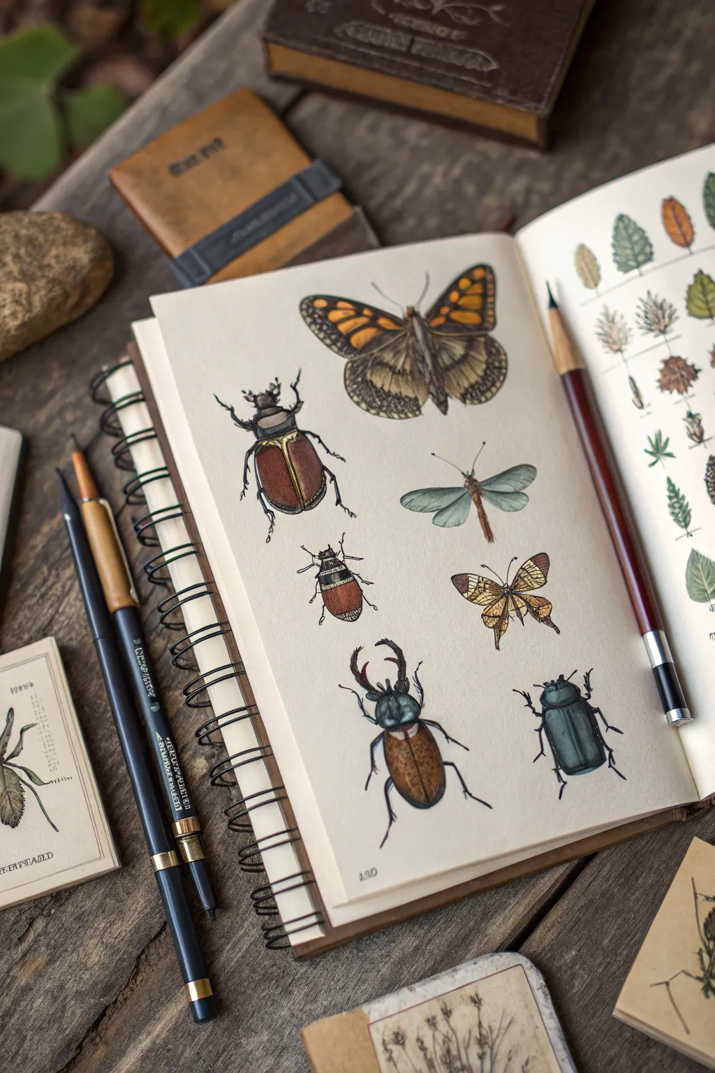
Capture the charm of 19th-century nature journals with this detailed insect specimen page. Using layering techniques with ink and colored pencils, you’ll create a collection of beetles and winged creatures that look like they’ve been preserved for decades.
Step-by-Step Guide
Materials
- Sketchbook with cream or off-white mixed media paper
- HB or H graphite pencil
- Kneaded eraser
- Fine liner pens (sizes 0.1, 0.3, and 0.5 – black or sepia)
- Set of colored pencils (earth tones, metallics, deep blues)
- White gel pen (optional for highlights)
- Ruler (for layout)
Step 1: Planning and Sketching
-
Grid the page:
Visualize a loose grid on your sketchbook page. You want to arrange the insects in two vertical columns or a staggered pattern to mimic a scientific display. Leave ample negative space around each creature. -
Block in basic shapes:
Using your HB pencil with very light pressure, draw ovals and circles to represent the thorax, abdomen, and head of each insect. Don’t worry about legs or antennae yet; focus on the main body proportions. -
Draft the butterflies and moths:
For the winged specimens, sketch a central vertical line for the body first. Then, draw triangular or rounded shapes for the wings, ensuring symmetry on both sides of the body line. -
Add appendages:
Sketch the legs and antennae. For beetles, remember that legs usually come from the thorax, not the abdomen. Draw them jointed and angular. Add mandibles to the stag beetles. -
Refine the outlines:
Go back over your rough shapes to define specific contours. Give the beetle shells a smoother curve and add the scalloped edges to the moth wings. Gently erase the initial construction guides with a kneaded eraser.
Natural gradients
When coloring beetle shells, blend colors directly on the paper. Overlay a layer of blue on top of brown to create an iridescent, ‘oil-slick’ shimmer effect common in insects.
Step 2: Inking the Specimens
-
Outline main bodies:
Switch to a 0.3 fine liner. Carefully trace the outer edges of the beetles’ hard shells (elytra) and the thorax. Use a steady hand but don’t worry if the line isn’t perfectly mechanical; a little wobble adds organic character. -
Detail the wings:
For the moth and dragonfly wings, switch to a finer 0.1 pen. Use broken or very thin lines to suggest the delicate veins. For the moth at the top, outline the large pattern blocks on the wings without filling them in yet. -
Texture the legs:
Use the 0.1 pen to add tiny hairs or spikes to the beetle legs. This small detail significantly increases realism. -
Stippling for depth:
Using the 0.1 pen, add stippling (tiny dots) along the sides of the beetle bodies and under the heads. This creates a shadow effect that suggests the curvature of the shell before you even add color. -
Erase pencil marks:
Wait at least five minutes for the ink to dry completely to avoid smudging. Then, gently erase all remaining graphite lines.
Step 3: Adding Color and Dimension
-
Base layers:
Start with your lightest colored pencils. Lay down a soft layer of cream or pale yellow on the moth wings and a light brown or grey on the beetle bodies. Keep the pressure light to allow the paper texture to show through. -
Deepening the beetles:
For the metallic beetles, layer greens, teals, and deep browns. Press harder on the sides of the shell to create a shadow gradients, leaving the center of the back lighter to suggest a glossy reflection. -
Coloring the moth:
Use burnt orange and ochre for the moth patterns. I like to mimic the ‘furry’ texture of a moth body by using tiny, short pencil strokes rather than smooth shading. -
Creating transparency:
For the dragonfly-like insect, use very pale blue or cool grey on the wings. Leave distinct white spaces between the veins so the wings look transparent. -
High contrast shadows:
Take a black or dark sepia pencil and deepen the darkest areas—specifically where the legs meet the body and the edges of the wings. This pushes the illustration off the page. -
Final highlights:
If you want an extra glossy look, use a white gel pen to add a tiny dot or line on the highest point of the beetle shells. Use sparingly so it doesn’t look cartoonish. -
Optional labeling:
To finish the scientific aesthetic, use a small 0.1 pen to write tiny, illegible cursive or faux-Latin names underneath a few specimens.
Aged Paper Hack
Before drawing, lightly wash your page with strong coffee or tea and let it dry. This creates an authentic, antique parchment look perfect for vintage scientific illustrations.
Close your sketchbook knowing you’ve preserved a beautiful collection of nature without harming a single bug
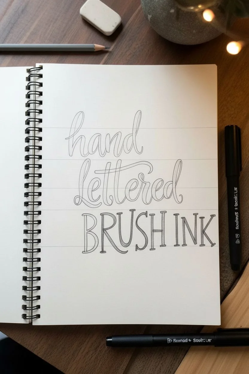
Big Center Word Surrounded by Chaos Doodles
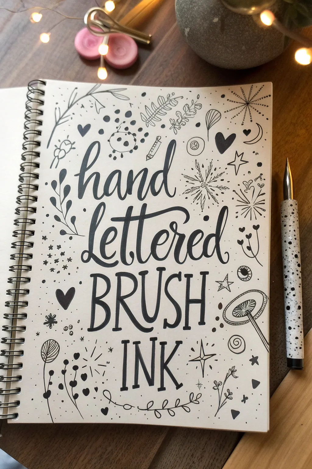
This project combines bold, central typography with a whimsical border of scattered doodles, creating a lively page that celebrates the art of ink. The contrast between the thick brush lettering and the delicate surrounding illustrations makes for a perfectly balanced composition.
Detailed Instructions
Materials
- Spiral-bound sketchbook (smooth paper recommended)
- Black brush pen (medium to large tip)
- Black fine-liner pen (0.3mm or 0.5mm)
- Pencil (HB or H)
- Eraser (kneaded or white vinyl)
- Ruler (optional for guidelines)
Step 1: Planning the Layout
-
Sketch center guidelines:
Begin by lightly sketching four horizontal lines in the center of your page to demarcate where your text will sit. Leave generous margins on all four sides for the doodles later. -
Draft the text:
Using your pencil, draft the words ‘hand’ and ‘lettered’ in a cursive script style on the top two lines. Below that, sketch ‘BRUSH’ and ‘INK’ in tall, condensed serif capital letters. -
Refine the lettering:
Go back over your pencil sketch to thicken the downstrokes of the script words and the capitals. This helps visualize the final weight before you commit to ink.
Ink Flow Secret
Work from the center outward to avoid smudging your wet ink. If you are right-handed, do the doodles on the left side last.
Step 2: Inking the Centerpiece
-
Letter the script:
Take your black brush pen and trace the word ‘hand’. Apply firm pressure on the downstrokes to make them thick, and lift up for light pressure on the upstrokes to keep them hairline-thin. -
Connect the letters:
Continue with the word ‘lettered’ directly underneath. Pay attention to the connections between letters like ‘tt’ and ‘er’ to keep the flow smooth and bouncy. -
Ink the capitals:
Switch to a steadier hand for ‘BRUSH’ and ‘INK’. These letters have a quirky, slightly uneven serif style. Use the tip of your brush pen or a thick felt tip to create bold, consistent lines. -
Add serif details:
Carefully square off the ends of your capital letters to create the slab-serif look. Make the vertical strokes slightly thicker than the horizontal crossbars. -
Erase pencil marks:
Wait until the ink is completely dry—I usually give it at least five full minutes to prevent smudging—then gently erase all your pencil guidelines.
Add Pop of Color
Once the black ink is totally dry, use gray or pastel markers to add simple drop shadows to the main letters or color inside the doodle hearts.
Step 3: Creating the Chaos Doodles
-
Start with larger corners:
Switch to your fine-liner pen. Begin drawing the largest doodle elements in the corners first. Sketch a few fern leaves or leafy branches reaching inward from the top left and bottom right corners. -
Add medium motifs:
Scatter medium-sized illustrations around the text. Draw simple line-art hearts, a crescent moon, and a few stylized flowers or bursts that look like fireworks. -
Draw the mushroom and stars:
On the right side, draw a mushroom shape with radiating gills underneath the cap. Add distinct four-point stars and five-point stars randomly throughout the empty spaces. -
Incorporate abstract shapes:
Fill gaps with abstract elements like spirals, circles with dots inside (eyeballs or bubbles), and little clusters of three dots. -
Add botanical details:
Draw thin, wiry stems with tiny heart-shaped leaves or small buds. Let these weave between the larger drawings to connect the visual space. -
Create texture with confetti:
Look for any awkward white spaces remaining. Fill them with tiny ‘confetti’—small standalone dots, little crosses, or tiny open circles. -
Anchor the bottom:
Near the bottom edge, draw a long, looping vine with small leaves to act as a bottom border or container for the chaos. -
Final assessment:
Step back and look at the balance. If one area looks too light, add a solid black element, like a filled-in heart or a dark leaf, to add visual weight.
You now have a dynamic sketchbook page that perfectly showcases your lettering skills surrounded by playful energy
Continuous-Line Maze That Fills Every Inch
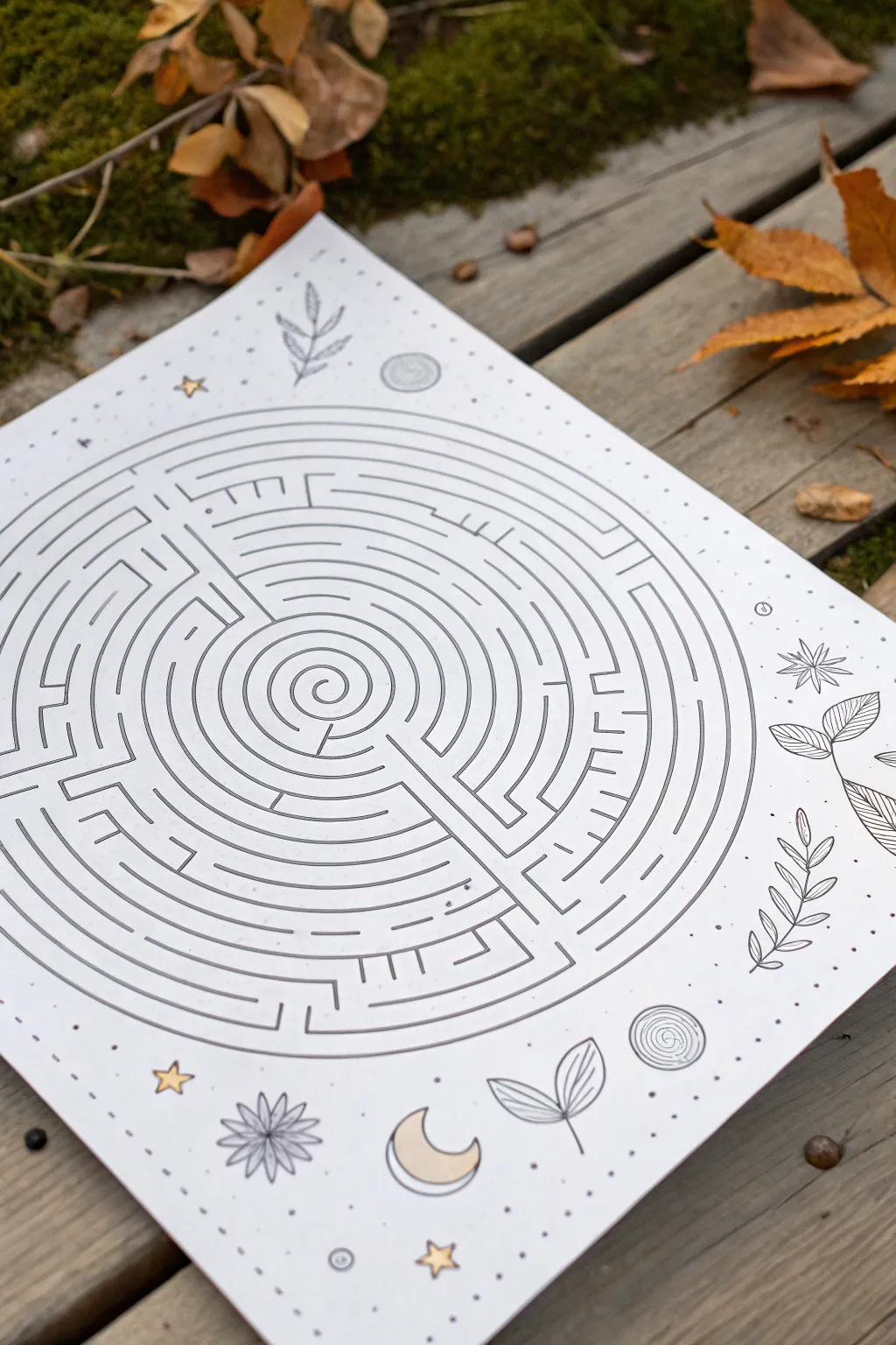
Draw your way into mindfulness with this intricate, circular maze design surrounded by celestial doodle motifs. This pen-and-ink project combines the logical challenge of a labyrinth with the relaxing free-flow of nature-inspired decoration.
Step-by-Step Tutorial
Materials
- High-quality white square cardstock or heavy drawing paper
- Compass with extension bar (or a string and pin for larger circles)
- Pencil (HB or H)
- Eraser
- Black fineliner pens (0.3mm and 0.5mm)
- Ruler
- Gold metallic marker or gel pen (optional for stars/moons)
- Circle template (optional)
Step 1: Drafting the Skeleton
-
Find the center:
Begin by finding the exact center of your square paper. Use your ruler to lightly mark an ‘X’ or a small dot where diagonal corners would meet. -
Draw the path guides:
Using your compass, place the point on your center mark. Draw a series of faint concentric circles. Start with a small circle (about 1 inch diameter) for the center goal. -
Expand outward:
Continue drawing concentric circles moving outward, spacing them consistently about 1cm to 1.5cm apart until you have nearly filled the page, leaving a generous margin for the border decorations. -
Define the quadrants:
Lightly sketch a cross through the center to divide your circle into four quadrants. This helps break down the maze construction so it’s less overwhelming.
Oops, Dead End?
If you ink a wall that blocks the solution, turn it into a ‘feature.’ Draw a small bridge or tunnel symbol over the line to indicate the path goes under or over it.
Step 2: Designing the Labyrinth
-
Create the entrance and goal:
Decide where your maze starts (usually the outer edge) and ends (the center spiral). Mark a clearly defined opening on the outermost circle. -
Draw the center spiral:
Switch to your pencil again to sketch the actual path. Inside the smallest central circle, draw a simple spiral that serves as the final destination. -
Build the walls:
This is the tricky part. You aren’t tracing the circles; you are drawing the walls *between* them. Start blocking off sections of the concentric rings with small vertical lines. -
Create openings:
Erase small segments of the concentric circles to create gaps. Place walls (vertical lines) immediately next to these gaps to force the ‘solver’ to change lanes. -
Verify the path:
I like to periodically trace the route with my finger to ensure I haven’t accidentally created an impossible maze or a path that goes nowhere too soon.
Step 3: Inking the Maze
-
Ink the structural lines:
Once you are happy with the pencil layout, take your 0.5mm black fineliner. Carefully trace over the concentric circle segments that serve as walls. -
Ink the barriers:
In the same thickness, draw the vertical barrier lines that connect the rings. Keep your hand steady to maintain consistent line weight. -
Add detail lines:
Switch to a finer 0.3mm pen. Inside some of the wider paths, add subtle decorative lines or partial inner rings to make the maze look more complex without changing the path. -
Clean up:
Wait at least 10 minutes for the ink to fully cure, then gently erase all remaining pencil guidelines. Brush away the eraser crumbs carefully.
Cosmic Color
Instead of plain paper, try drawing the maze on watercolor paper with a pre-painted galaxy wash in deep blues and purples. Use a white gel pen for the lines.
Step 4: Celestial Decorations
-
Sketch the border motifs:
In the white space corners outside the maze, lightly sketch nature and celestial elements: leaves, moons, and stars. -
Draw the leaves:
Ink the botanical elements with the 0.3mm pen. Use simple, clean lines for the veins and stems to match the minimalist aesthetic. -
Add moons and stars:
Draw crescent moons and small 5-point stars scattered around the border. Using a circle template can help make the moons look crisp. -
Stipple the background:
Using the 0.3mm pen, add tiny dots (stippling) around the border elements to create texture and a feeling of ‘magic dust’. -
Gold accents:
As a final touch, color in selected stars or moons with the gold metallic marker to give the piece a subtle shine.
Now you have a beautiful piece of interactive art ready to frame or solve.
Object Outline Tracing Collage With Patterned Spaces
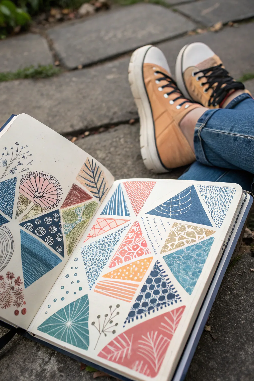
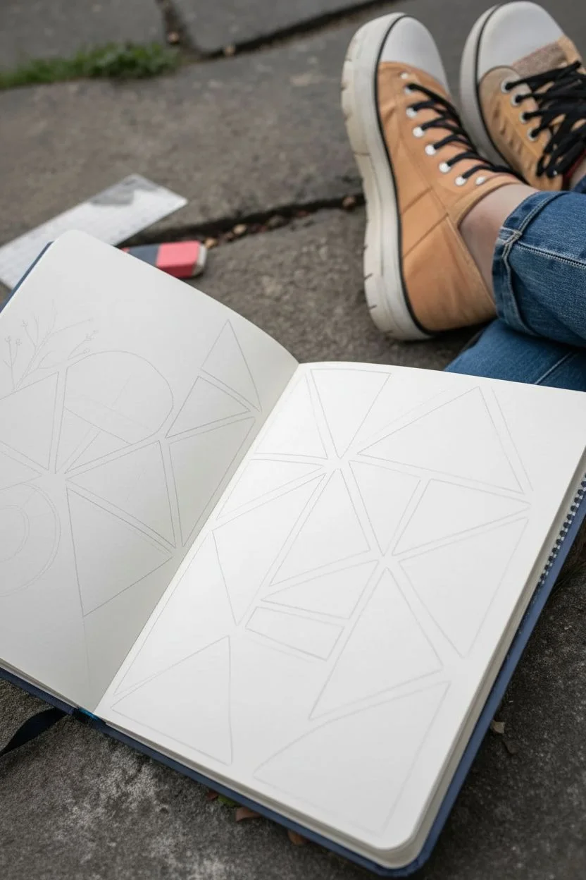
Fill a sketchbook spread with a mesmerizing mosaic of triangles, each holding its own miniature world of patterns and textures. This relaxing exercise combines simple geometry with creative doodling, resulting in a vibrant tapestry of color and line work.
Step-by-Step
Materials
- Sketchbook (heavyweight paper recommended)
- Ruler
- Pencil (HB or lighter)
- Eraser
- Fine liner pens (black, 0.3mm and 0.5mm)
- Colored markers or brush pens (muted/earth tones: orange, blue, green, pink)
- White gel pen (optional for highlights)
Step 1: Planning the Layout
-
Prime the page:
Begin with a clean double-page spread in your sketchbook. If your paper is thin, consider placing a scrap sheet underneath the pages to prevent ink bleed-through. -
Draw the grid structure:
Using your ruler and pencil, lightly draw a series of intersecting diagonal lines across both pages. You aren’t aiming for perfect symmetry. -
Form the triangles:
Add intersecting horizontal or vertical lines to break those diagonals into varied triangle shapes. Aim for a mix of sizes—some large focal triangles and smaller filler ones. -
Refine the shapes:
Look at the resulting web. If any shapes look too quadrilateral, bisect them with another line to turn them into two triangles. The goal is a tessellated look composed entirely of three-sided shapes.
Step 2: Adding Color to Selected Spaces
-
Select your palette:
Choose a cohesive color palette. The example uses a pleasing mix of salmon pink, slate blue, mustard yellow, and sage green. -
Block in solid backgrounds:
Pick about half of your triangles to be colored backgrounds. Use your markers to fill these shapes completely, distributing the colors evenly across the page so no two adjacent triangles share the same hue. -
Leave breathing room:
Leave the remaining triangles white. These will be used for stark black-and-white line drawings or negative space patterns later. -
Let it set:
Wait a few minutes for the marker ink to dry completely to avoid smudging when you go in with your fine liner.
Clean Lines Pro-Tip
Use drafting tape or washi tape along your pencil lines before coloring. Peel it off to reveal crisp, perfectly straight white gaps between your colored triangles.
Step 3: Patterning and Doodling
-
Start with organic shapes:
In the white triangles, use your black fine liner to draw botanical elements. Sketch simple leaf veins, flower petals, or small sprigs that fit within the triangular borders. -
Add geometric contrast:
On top of the colored triangles, introduce white geometric patterns if using paint pens, or use a darker shade of the same marker color for a subtle effect. -
Create ‘negative’ patterns:
For some colored triangles, take a white gel pen or opaque white marker and draw patterns over the color. Try grids, polka dots, or wave lines that pop against the slate blue or dark green. -
Incorporate linear textures:
Dedicate several triangles to simple line work. Fill one with vertical stripes, another with concentric circles, and another with cross-hatching. -
Mix fill styles:
I like to vary the density. Make some patterns very tight (like stippling dots) and others loose (like wide stripes) to keep the eye moving across the composition. -
Doodle specific motifs:
Recreate the specific motifs from the example: a stylized pink flower head, a blue triangle with white curved web lines, and a yellow section with white leaf veins.
Level Up: Texture
Instead of just drawing patterns, glue in triangular scraps of actual patterned paper, old book pages, or fabric to turn this drawing into a mixed-media collage.
Step 4: Final Touches
-
Clean up borders:
Once all ink is dry, gently erase the original pencil grid lines. This makes the colorful shapes float neatly on the page. -
Outline options:
Decide if you want a bold look or a soft look. For a bold look, trace the perimeter of every single triangle with a thick black pen. For a softer look, leave the edges defined only by the color differences. -
Add detail accents:
Use the white gel pen to add tiny dots or highlights on the botanical illustrations to give them a bit of depth. -
Assess and fill:
Step back and look at the spread. If any area feels too empty, add small floating dots or dashes in the background spaces between the triangles.
Close your sketchbook knowing you’ve created a complex piece of art from simple shapes and lines
Erase-Drawing on a Fully Shaded Graphite Page

Transform a simple page into a striking botanical study by working in reverse. Instead of drawing dark lines on white paper, you will carve light out of darkness by erasing a delicate fern frond from a solid graphite background.
Detailed Instructions
Materials
- Spiral-bound sketchbook (heavyweight paper preferred)
- Soft graphite stick (4B or 6B) or woodless graphite pencil
- Paper stump or blending tortillon
- Tissue or soft chamois cloth
- Kneaded eraser
- Precision eraser (stick eraser like a Tombow Mono Zero or an electric eraser)
- Workable fixative spray
Step 1: Setting the Stage
-
Prep the surface:
Begin by covering your entire sketchbook page with a solid layer of graphite. Since you want a deep, dark background, use the broad side of a soft graphite stick (4B or 6B) rather than a regular pencil tip. -
Build the layers:
Apply the graphite in cross-hatching motions to ensure full coverage. I find that doing two perpendicular layers creates a richer tone than just pressing hard on one layer. -
Smooth it out:
Take a tissue or a soft chamois cloth and rub the graphite vigorously into the paper tooth. You want a velvety, slate-grey or black finish with no visible pencil strokes. -
Protect your hand:
Place a scrap piece of paper under your drawing hand. This prevents the oils on your skin from smudging your nice smooth background or lifting the graphite unintentionally.
Step 2: Mapping the Form
-
Establish the stem:
Using the sharp edge of a kneaded eraser, gently tap out the central curve of the fern’s stem. Don’t erase fully yet; just make a ‘ghost’ line to guide your placement. -
Draft the frond placement:
Lightly blot out general triangular shapes where the main leaves will extend from the stem. Keep this very faint, just enough so you visualize the symmetry. -
Refining the main stem:
Switch to your precision stick eraser. Go back over that central stem line, pressing firmly to lift the graphite back to the white of the paper. Taper the line so it is thinner at the top.
Smudge Prevention
Graphite dust gets everywhere. Keep a large, clean brush nearby to gently sweep eraser crumbs away—never wipe with your hand or you’ll streak the background.
Step 3: Erasing the Details
-
Start at the base:
Begin with the largest fronds at the bottom of the stem. Use the precision eraser to ‘draw’ the central vein of the leaf first. -
Create the leaflets:
From that vein, erase small, rhythmic strokes outward to create the individual leaflets. Think of these as tiny saw-tooth shapes. -
Work upwards:
Move up the stem, making each pair of fronds slightly shorter than the last. The rhythm is repetitive, which can be quite meditative. -
Vary the pressure:
For the tips of the leaves, lift your eraser pressure slightly. This leaves a tiny bit of grey, making the tips look delicate and translucent. -
Add texture:
Go back into your bright white erased areas. Use a slightly dirty blending stump to add tiny shadows near the connection points, giving the fern 3D volume.
Add Metallic Flair
Once the fixative is completely dry, use a silver or gold gel pen to outline just the very tips of the fern leaves for a subtle, shimmering highlight.
Step 4: Finishing Touches
-
Clean up edges:
If you slipped and erased too much, use a sharp graphite pencil to neatly cut back into the white areas, refining the jagged edges of the leaves. -
Deepen the background:
The erasing process might have lightened the surrounding area. Carefully reinforce the dark background right next to the white leaves with a 6B pencil for maximum contrast. -
Seal the work:
Graphite smudges incredibly easily. Take the sketchbook outside and apply a light coat of workable fixative spray to preserve your crisp white lines.
Now you have a striking botanical piece that glows against the dark page
Texture Quilt: Tiny Tiles of Shading and Mark-Making
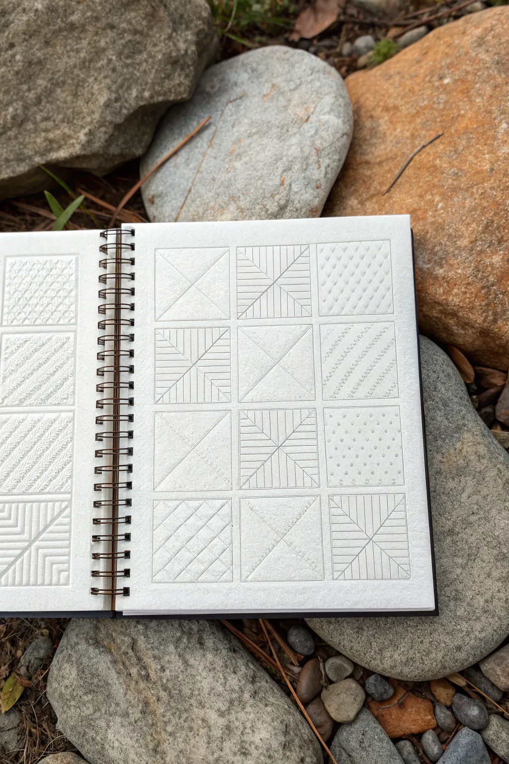
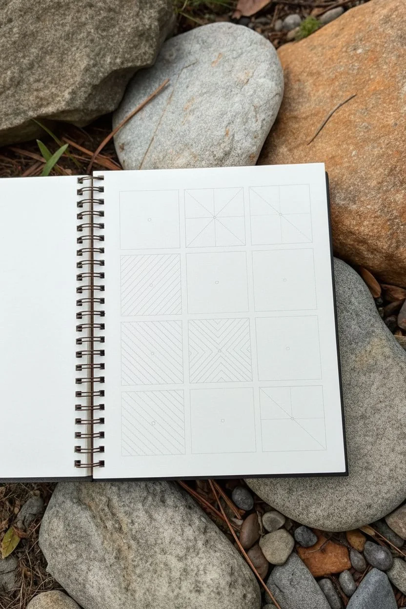
Transform a simple sketchbook page into a stunning sampler of geometric patterns and subtle textures. This project explores how basic line work—using only straight lines and diagonals—can create depth and visual rhythm when repeated in a grid.
Step-by-Step
Materials
- Sketchbook or quality drawing paper
- Ruler
- Fine-liner pen (0.1 or 0.3mm)
- Pencil (HB or H)
- Eraser
- Embossing stylus (optional, for texture)
Step 1: Setting the Framework
-
Measure the Grid:
Begin by lightly planning a 3-column by 4-row grid on your page. Measure the total width available and divide by three to determine your square size, leaving a small gap between each square for breathing room. -
Draw the Outlines:
Using your pencil and ruler, draw the twelve squares deeply enough to see, but light enough to erase later if desired. Consistency is key here; ensure your vertical and horizontal gaps are uniform. -
Mark the Centers:
Lightly mark the center point of each square with a tiny dot. This will be crucial for the diagonal patterns described in the next phase.
Step 2: Drafting the X Patterns
-
Create the Basic X:
In the top-left, middle-center, and bottom-middle squares, draw simple diagonal lines from corner to corner, creating a large ‘X’. This serves as the foundation for the ’empty’ tiles to rest the eye. -
Draft the Expanding Diamonds:
For the more complex patterns (like the top-middle and middle-left squares), start with the basic ‘X’. Then, measure and mark even intervals along the outer edges of the square. -
Connect the Intervals:
Connect these edge marks back to the center point or to the diagonal lines, creating the nested triangle effect. Use your ruler to keep these radiating lines perfectly straight. -
Draft the Parallel Diagonals:
For squares like the one in the bottom-left, draw a single diagonal. Then, instead of radiating lines, draw lines parallel to the square’s edges that stop at the diagonal, forming nested ‘L’ shapes.
Grid Perfection
Use a clear quilting ruler if you have one. The see-through plastic makes lining up parallel lines and 90-degree corners significantly easier than opaque rulers.
Step 3: Adding Texture and Detail
-
Stippling:
In the square at row 3, column 3 (middle right), create a pattern of dots. Start by placing dots in a grid formation, then carefully add intermediate dots to create a dense, uniform field. -
Embossing (Optional):
For a tactile effect like the top-right square, take an embossing stylus (or a dried-out ballpoint pen) and press firmly into the paper to create indentations before shading. I find this creates a lovely ‘ghost’ texture. -
Hatching the Patterns:
Return to your linear geometric squares. Using a fine-liner or sharp pencil, darken the lines you want to keep. Some squares can be filled with tight vertical hatching within the triangular sections to create value contrast. -
Create the Dashed Diagonal:
For the middle-right square, draw diagonal lines composed entirely of small circles or short dashes. This breaks up the rigidity of the solid lines used elsewhere. -
The Checkerboard Variation:
In the bottom-left square, experiment with a lattice pattern. Draw diagonal lines in one direction, then cross them perpendicularly. Keep the spacing wide to create an open net look.
Texture Play
Try rubbing a pencil over paper placed on a textured surface (like concrete or wood grain) for one square to introduce an organic element alongside the geometry.
Step 4: Final Touches
-
Clean Up:
Once your ink or primary pencil work is finished and completely dry, gently erase the initial grid construction lines and center dots. -
add Subtle Shading:
Take a soft pencil and very lightly shade the interior of specific shapes (like the triangles in the top-middle square) to give the illusion of depth or metallic sheen. -
Review Contrast:
Step back and look at the whole page. If any square feels too faint, go back over the lines to deepen the graphite or ink for better balance.
Now you have a reference sheet of patterns ready to be incorporated into larger artworks
Dream Montage Page Connected by Thread-Like Lines
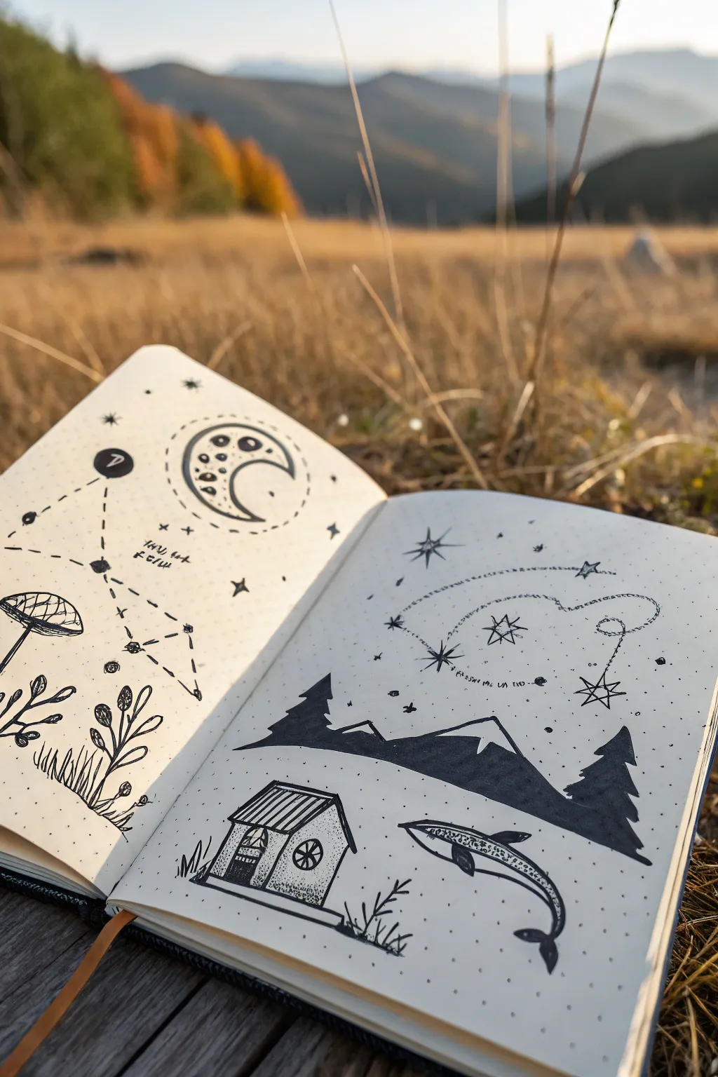
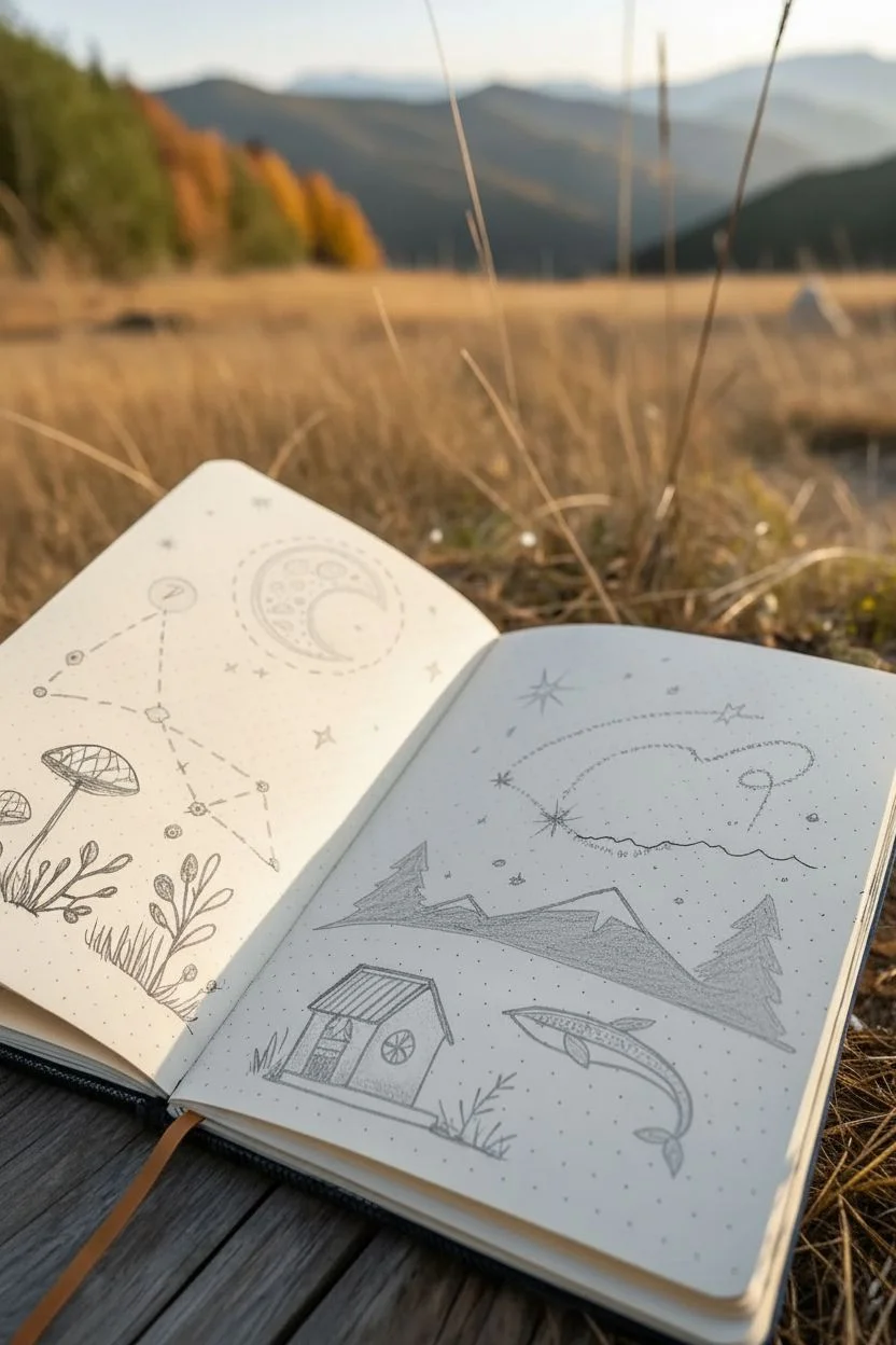
This two-page spread captures a sense of dreamy wanderlust by connecting celestial elements and tiny landscapes with dotted trails and constellation lines. It uses a dot-grid journal to anchor a variety of doodles, from mountains to whales, creating a cohesive story across the spread.
Step-by-Step Guide
Materials
- Dot-grid notebook or journal
- HB pencil for sketching
- Eraser (kneaded preferred)
- Fine liner pens (sizes 0.1, 0.3, and 0.5)
- Black brush pen or broad marker (for filling larger areas)
Step 1: Planning the Layout
-
Establish the horizon line:
Start on the right-hand page. Lightly sketch a wavy, uneven horizon line about one-third of the way up the page using your HB pencil. -
Sketch the focal points:
On the left page, lightly outline a large crescent moon in the upper center and a mushroom cluster in the bottom left. On the right page, sketch a small house in the bottom left corner and a whale silhouette in the bottom right. -
Map the constellations:
Draw faint circles or crosses where you want your stars to be. Focus on the upper left page for a geometric constellation and the upper right for a free-flowing, sparkling sky.
Step 2: Inking the Left Page
-
Ink the geometric constellation:
Using a 0.3 fine liner, draw small solid circles for the stars. Connect them with straight, dashed lines to form a geometric shape, like the abstract figure shown in the reference. -
Detail the crescent moon:
Outline your moon shape with a 0.5 pen. Inside, draw various sizes of craters—some just simple circles, others filled halfway with black to show depth. Add a dotted halo around the outside. -
Draw the mushroom cluster:
Switch to a 0.1 pen for delicate details. Draw the mushroom cap with close vertical lines for texture, and add a few leafy sprigs growing beside it. -
Ground the scene:
Use short, flicking strokes at the bottom of the page to create grass textures around the mushroom stems.
Smudge Alert
Dot grid paper can sometimes be smooth and slow-drying. Place a scrap piece of paper under your hand while drawing to prevent smearing wet ink across the page.
Step 3: Inking the Right Page
-
Outline the silhouetted landscape:
Using your 0.5 pen, outline the jagged peaks of the mountains and the triangular shapes of the pine trees along the horizon line. -
Fill the silhouettes:
Use a black brush pen or broad marker to fill in the mountains and trees, leaving the snowcaps white for contrast. This creates a strong visual anchor. -
Construct the tiny house:
Draw the house outline with straight lines. Use dots (stippling) on the walls to create a texture that looks like stone or stucco, and stripe the roof for shingles. -
Illustrate the whale:
Outline the whale swimming through the ‘sky’ area. Fill its body with a pattern of small scales or dots rather than solid black to keep it whimsical. -
Create the shooting star trail:
Draw a large, looping dotted line that sweeps across the upper right page. I find it helpful to rotate the book to get a smoother curve. -
Add the stars:
Draw several eight-pointed stars along the trail. Vary their sizes, making the one at the end of the shooting star trail the largest.
Add Cosmic Color
Use a white gel pen to add stars on top of the black mountain silhouettes, or create a soft glow around the moon using a gray mildliner or highlighter.
Step 4: Finishing Touches
-
Connect the pages:
Ensure there are small background elements, like tiny dots or single stars, that exist near the spine on both pages to visually bridge the gap. -
Add text snippets:
If desired, write tiny, cryptic notes or dates near the constellations using your smallest pen tip (0.05 or 0.1). -
Erase pencil lines:
Wait at least 10 minutes to ensure the ink is completely dry, then gently erase all your initial pencil sketches.
Close your journal knowing you’ve captured a little piece of a dream world.
Imaginary Map Crammed With Landmarks and Symbols
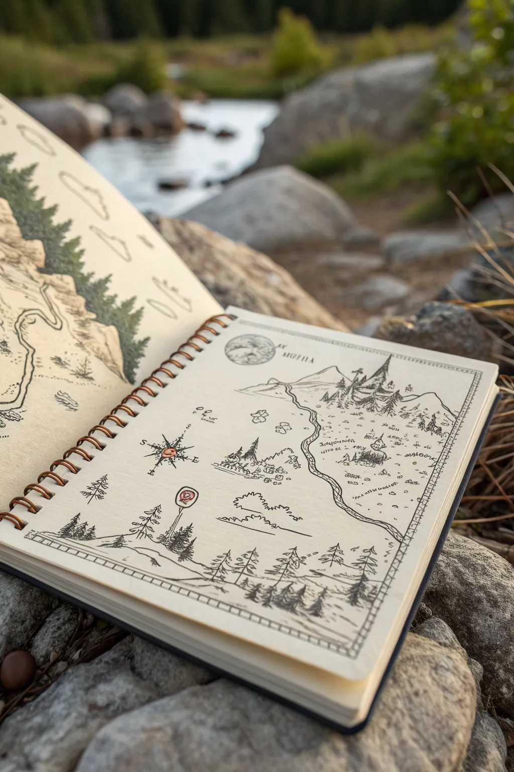
Transport yourself to an imaginary world by creating a detailed fantasy map in a spiral-bound sketchbook. This drawing captures the charm of exploration with delicate ink lines, custom geography, and whimsical symbols that hint at hidden stories.
Step-by-Step
Materials
- Spiral-bound sketchbook with off-white or cream heavy paper
- Fine liner pens (sizes 0.05, 0.1, and 0.3mm in black)
- Pencil (HB or 2H)
- Kneaded eraser
- Red colored pencil or fine marker
- Ruler
Step 1: Setting the Boundaries
-
Drafting the Border:
Begin by lightly penciling a rectangular border leaving about a half-inch margin from the paper’s edge. This frame will contain your map and give it a polished, professional look. -
Inking the Frame:
Go over your pencil border with a 0.3mm pen. Instead of a single straight line, draw two parallel lines very close together. Add small hash marks or ‘train track’ ties between them periodically to create a decorative, rustic border style.
Step 2: Main Features & Geography
-
Sketching the Horizon:
Using your pencil, sketch a high horizon line near the top third of the page. Draw a prominent mountain range here, dominated by a large, jagged peak on the right side. -
Defining the Path:
Draw a winding double-line path or river that starts from the mountain base and meanders down towards the bottom right corner. Let the lines widen slightly as they move closer to the viewer to suggest perspective. -
Inking the Mountains:
Switch to a 0.1mm pen to ink the mountains. Use jagged, angular strokes for the peaks. Add vertical hatching on one side of the slopes to indicate shadow and depth. -
Developing the Foreground Landscape:
At the very bottom of the page, sketch a rolling hill line. Populate this foreground area with a cluster of pine trees, varying their heights to make them look natural. -
Detailing the Pines:
Ink the pine trees using short, downward scribbles for the branches. Start narrow at the top and widen at the base. I find that quick, loose strokes actually make the trees look more organic than careful individual needles.
Ancient Paper Effect
Before drawing, lightly wash the page with diluted tea or coffee and let it dry completely. This gives the paper a weathered, parchment-like tone.
Step 3: Symbols & Landmarks
-
Placing the Compass Rose:
In the open space on the left side of the map, draw a compass rose. Start with a cross, then add diagonal points. Draw a circle in the center. -
Adding Color Accents:
Use your red colored pencil or marker to fill in the center circle of the compass rose. You can also add a small red circular signpost or marker near the path for a pop of color. -
Drawing the Castle:
Nestled near the main mountain peak, draw a small structure or castle using tiny geometric shapes—triangles for roofs and rectangles for towers. -
Scattered Settlements:
Draw tiny clusters of squares and rectangles along the winding path to represent villages. Keep these simple; at this scale, a square with a triangle top reads perfectly as a house. -
Forest Patches:
Fill empty mid-ground areas with ‘forest texture’—clusters of jagged, bumpy lines that suggest tree canopies without drawing every single tree trunk.
Burned Edges
For a true treasure map vibe, carefully tear the edges of a separate piece of paper and scorch them with a lighter before gluing it into the notebook.
Step 4: Final Touches
-
Atmospheric Clouds:
Draw a few stylized clouds in the sky area. Use flat bottoms and puffy, scalloped tops. Keep the lines thin (0.05mm) so they look airy and distant. -
Texturing the Ground:
Add small dashes, dots, and little ‘v’ shapes representing grass tufts sporadically across the open plains. This prevents the white space from looking empty. -
The Moon Detail:
In the upper left sky, draw a circle for a moon or planet. Add light crater details inside with your finest pen. -
Fantasy Script:
Write the name of your region near the top or next to landmarks. Invent a runic-style font or use unreadable scribbles to suggest an ancient, foreign language. -
Clean Up:
Once the ink is completely dry (give it at least 5 minutes), gently erase all underlying pencil sketch lines with the kneaded eraser to reveal the crisp ink work.
Now you have a recorded piece of a world that exists only in your imagination, ready for further expansion


Have a question or want to share your own experience? I'd love to hear from you in the comments below!