If you’ve ever wanted to turn your love of games into art you can hang up, you’re in the right headspace. I’m sharing my favorite gaming painting ideas that range from classic controller art to quirky, high-impact pieces that feel straight out of a game world.
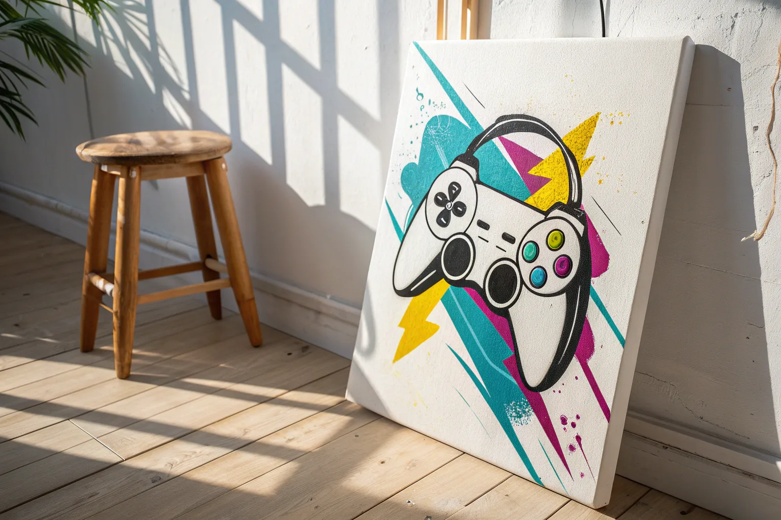
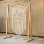
Controller Splatter Silhouette
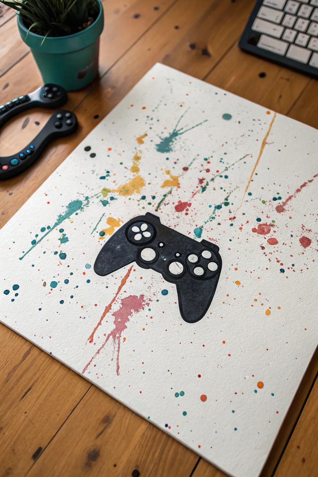
Capture the energy of gaming with this vibrant splatter art piece that utilizes negative space to create a striking focal point. The sharp black controller silhouette stands out boldly against a chaotic, colorful background of teal, ochre, and rust-colored splatters.
Step-by-Step Guide
Materials
- High-quality watercolor paper or canvas board (approx. 11×14 inches)
- Acrylic paints (Teal, Yellow Ochre, Burnt Orange, Red/Pink, Black, White)
- Adhesive vinyl or painter’s tape
- X-Acto knife or cutting machine (like a Cricut)
- Old toothbrush or stiff bristle brush
- Small detail paintbrush (size 0 or 00)
- Flat shader brush (medium)
- Water cups and paper towels
- Cardboard box or drop cloth (for splatter containment)
Step 1: Preparation & Masking
-
Create the silhouette template:
Find a simple outline of a game controller online. You can print this onto a sheet of adhesive vinyl or regular paper. -
Cut the mask:
Carefully cut out the controller shape using an X-Acto knife. If you used regular paper, roll loop of painter’s tape on the back to make it temporarily adhesive. If using vinyl, peel off the backing. -
Position the mask:
Center your cutout controller shape on the watercolor paper or canvas. Press down firmly on all edges to ensure paint doesn’t seep underneath later. -
Protect your workspace:
Since splattering gets messy, place your canvas inside a large cardboard box or lay down a generous drop cloth to catch stray droplets.
Step 2: Creating the Splatter Background
-
Prepare the teal paint:
Dilute a small amount of teal acrylic paint with water until it reaches a milky consistency—fluid enough to fly off a brush, but opaque enough to show color. -
Apply teal splatters:
Dip an old toothbrush or stiff bristle brush into the paint. Aim at the canvas and run your thumb across the bristles to flick the paint. Focus heavily near the masked edges. -
Mix the ochre:
Clean your brush and prepare the yellow ochre paint with the same milky dilution ratio. -
Layer the yellow:
Flick the yellow paint onto the canvas, aiming for areas that are currently empty to balance out the composition. -
Add warmth:
Repeat the process with the burnt orange and reddish-pink colors. I like to let the canvas dry for about 5 minutes between colors to prevent them from becoming muddy where they overlap. -
Create directional streaks:
For the longer streaks seen in the example, load a larger brush with watery paint and perform a sharp ‘whipping’ motion towards the paper, rather than just flicking bristles. -
Dry completely:
Allow the entire background to dry fully. This is crucial; if the paint is wet when you remove the mask, it will smear.
Clean Edges Pro-Tip
Before splattering, paint a thin layer of clear matte medium over the edge of your stencil. This seals the gap and prevents colored paint from bleeding under mask.
Step 3: Revealing & Detailing
-
Remove the mask:
Gently peel away your controller stencil. You should see a pristine white (or canvas-colored) controller shape surrounded by your colorful splatter. -
Paint the controller body:
Using black acrylic paint and a steady hand, paint the interior of the controller shape. Leave the distinct round button shapes unpainted for now to keep them white. -
Define the edges:
Use a small flat brush to carefully sharpen the outer edges of the black controller against the splatter background for a crisp look. -
Add button details:
If you accidentally painted over the button areas, use opaque white paint to add the four face buttons, D-pad, and center buttons back in. -
Add texture (optional):
To mimic the texture in the photo, you can lightly sponge a tiny bit of dark grey onto the black controller grips, giving it a worn, realistic appearance. -
Final touches:
Check for any stray splatter drops that landed inside your white button areas and touch them up with white paint if necessary.
Level Up: Metallic Pop
Swap out one of the splatter colors for metallic gold or silver paint. It catches the light beautifully and makes the artwork look high-end.
Hang this colorful piece near your gaming setup to add a personalized artistic touch to your station

Neon Outline Controller on Black
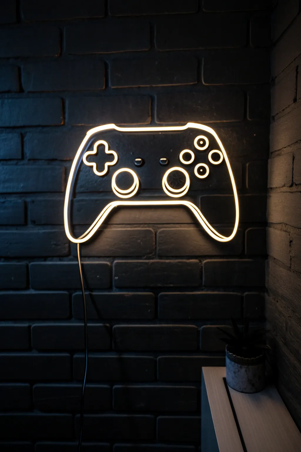
Capture the electric vibe of a dimly lit gaming lounge with this striking acrylic painting. By layering translucent glazes over stark white lines, you’ll create a convincing glowing neon effect against a moody brick backdrop.
Step-by-Step Tutorial
Materials
- Canvas (16×20 inches recommended)
- Acrylic paints: Mars Black, Titanium White, Raw Umber, Burnt Umber, Navy Blue, Neon Orange/Yellow
- Gesso (optional for priming)
- Painters tape or masking tape
- Chalk or white charcoal pencil
- Flat shader brushes (large and medium)
- Round detail brushes (sizes 0 and 2)
- Ruler
- Reference image of a game controller
Step 1: Setting the Scene
-
Prime the Surface:
Start by covering your canvas with a solid coat of Mars Black mixed with a tiny drop of Navy Blue. This cool, dark base is essential for making the ‘neon’ pop later. Let it dry completely. -
Map the Bricks:
Using a ruler and your white charcoal pencil, lightly sketch horizontal lines across the canvas to mark your brick rows. Freehand the vertical lines, staggering them like real masonry. -
Block in Shadows:
Mix Mars Black with a touch of Navy Blue to create a slightly glossy shadow tone. Paint thick, L-shaped shadows along the bottom and right side of each individual brick shape to create depth. -
Highlight the Mortar:
Using a dark grey mixture (Black plus a tiny bit of White), define the tops and left sides of the bricks. Keep these edges soft and uneven so the wall looks weathered, not perfect. -
Add Brick Texture:
Stipple or dry-brush a mixture of Black and Raw Umber onto the face of the brick shapes. You want them to recede into the darkness, so keep values very low contrast; we are painting a dark room.
Glow Like a Pro
For the softest glow, use a dry mop brush to gently blur the edges of your colored glaze while it is still wet. This feathers the light outward.
Step 2: Drafting the Controller
-
Create a Stencil or Template:
If you aren’t confident freehanding the symmetry, print a controller outline on paper, cut it out, and lightly trace around it with your chalk pencil in the center of the canvas. -
Refine the Outline:
Go over your chalk sketch to ensure the lines smooth and continuous. Mark the inner details: the D-pad cross, the two thumbsticks, and the four action buttons on the right. -
Paint the Base White:
Using your size 2 round brush and pure Titanium White, paint the entire outline of the controller and buttons. This line needs to be solid and opaque, so apply a second coat if needed once the first is dry. -
Add the Cord:
Don’t forget the power cord. Paint a thin, slightly wavy white line dropping down from the bottom center of the controller, trailing off the bottom of the canvas.
Step 3: Igniting the Neon
-
Mix the Glow Color:
Create a glaze by mixing your Neon Orange or Yellow paint with a clear glazing medium or a lot of water. It should be transparent but vibrant. -
Apply the First Haze:
With a soft brush, paint a wide, transparent band of your glow color over the white lines. I like to let this extend about half an inch outward from the white line onto the brick. -
Intensify the Center:
Once the first haze is dry, mix a slightly stronger, less watery version of your neon color. Paint a thinner band right over the white line, overlapping onto the previous haze just slightly. -
Re-establish the Core:
The glazing likely dulled your pure white line. Take your smallest detailed brush and repaint a very thin, crisp line of Titanium White right down the center of all your neon tubes. -
Add Wall Reflections:
Mix a very faint, transparent wash of your neon color (mostly water). Lightly glaze the brick faces immediately surrounding the controller to show the light casting onto the wall. -
Enhance the Tube Shadows:
To make the sign look 3D, paint a tiny, thin black line on the ‘back’ of the neon tubing (on the inside edge of the shape) and a small cast shadow on the brick directly behind the tubes. -
Final Brightness Check:
Step back and check the intensity. If it needs more punch, add one final, very focused highlight of pure white at the the brightest points, like the tops of the thumbstick circles.
Level Up: Color Shift
Make it an RGB setup! Paint different sections (like buttons vs. outline) in blue, pink, or green glazes for a custom multi-colored setup.
Hang your new artwork near your gaming setup to add atmosphere without the electricity bill
Retro Pixel Heart and Icons
Bring the golden age of gaming to your desk or shelf with this vibrant set of four hand-painted wooden blocks. Each cube features a classic 8-bit icon—a heart, a star, a coin, and a rupee—rendered in crisp, clean pixels for a nostalgic pop of color.
How-To Guide
Materials
- 4 smooth wooden cubes (approx. 3-4 inches)
- White acrylic gesso or primer
- Acrylic paints: Cyan, Magenta, Yellow, Black, White
- Graphite pencil (H or HB)
- Ruler
- Fine-grit sandpaper (220 grit)
- Small flat shader brush (size 2 or 4)
- Fine liner brush (size 0 or 00)
- Matte or satin varnish
- Palette for mixing
Step 1: Preparation and Priming
-
Prepare the surface:
Start by lightly sanding your wooden cubes on all sides to remove any rough patches or splinters. Wipe away the dust with a slightly damp cloth to ensure a smooth painting surface. -
Apply primer:
Paint a thin, even coat of white acrylic gesso over the faces you plan to decorate. This bright white base is crucial for making the pixel colors pop later on. -
Sand between coats:
Once the first coat of gesso is completely dry, give it a very gentle sanding. Apply a second coat of gesso for a flawless, opaque white background and let it cure fully.
Grid Master Tip
Instead of drawing full grid lines across the whole block, cut a square from graph paper the exact size of your wood glue it on. Paint directly over the paper for perfect squares instantly.
Step 2: Gridding and Sketching
-
Measure the grid:
Decide on your pixel resolution. A 16×16 grid works beautifully for this size. Measure the width of the block face and divide by 16 to find the exact size of each pixel square. -
Draw the grid lines:
Using a sharp H pencil and a ruler, very lightly draw your horizontal and vertical grid lines. Keep the pressure minimal so the graphite doesn’t smudge into your bright paint later. -
Map out the icons:
Reference the photo or classic sprite sheets to mark which squares get filled. I find it helpful to place a tiny dot in the center of the ‘active’ pixels so I don’t lose track of the pattern. -
Designate the borders:
Pay special attention to the black outlines. Mark the squares that will form the thick black border and the thinner interior black lines that define the shapes.
Step 3: Painting the Pixels
-
Mix your background colors:
Prepare your contrasting background shades. You’ll need a bright cyan for the Heart and Rupee blocks, and a bubblegum pink for the Coin and Star blocks. -
Paint the backgrounds:
Using a small flat brush, carefully fill in the background pixels. Don’t worry about perfection near the borders yet, as the black outline will cover minor slips. -
Fill the primary icons:
Mix a warm red for the heart, a rich yellow for the star and coin, and a lighter yellow for the currency symbol. Paint these interior pixels, leaving space for any white highlights. -
Add the highlights:
Paint the specific ‘shine’ pixels with pure titanium white. This little detail creates that retro 3D effect on the heart and the center of the coin. -
Execute the black outlining:
This step requires a steady hand. Use black paint to fill the grid squares that separate the icon from the background. The grid lines you drew earlier will help keep your straight lines crisp. -
Paint the outer frame:
Finish the design by painting the outermost row of pixels black on all four sides, creating a solid frame that contains the artwork. -
Touch up edges:
Once the face is dry, paint the sides of the wooden block white (or your preferred color) to clean up any messy edges where the face meets the side.
Level Up: 3D Depth
Paint the sides of the blocks in a darker shade of the front background color (e.g., dark teal for the cyan block) to make the pixel art look like a solid 3D cube
Step 4: Finishing Touches
-
Check for consistency:
Look over the blocks for any uneven coverage. The yellow paint often needs a second coat to be fully opaque. -
Clean up lines:
If any paint bled over the grid lines, use your fine liner brush and the appropriate background color to ‘erase’ the mistake and sharpen the pixel corners. -
Seal the work:
Apply a coat of clear matte or satin varnish. This protects the acrylic from chipping and unifies the sheen of the different colors.
Stack your new retro art pieces together to add a playful, nostalgic energy to your gaming setup

Three-Panel Gamer Triptych
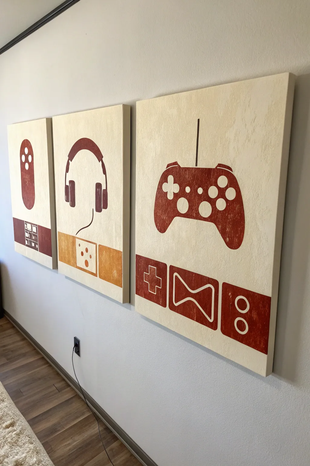
Celebrate your love for video games with this minimalist, three-panel canvas set featuring iconic gaming silhouettes. The warm brown and cream color palette gives these pieces a sophisticated, vintage vibe that fits perfectly in a modern game room or office.
Step-by-Step Guide
Materials
- 3 stretched canvases (16×20 inches or similar)
- Acrylic paint (Cream/Off-white for background)
- Acrylic paint (Burnt Sienna or Russet Brown)
- Acrylic paint (Mustard Yellow/Ochre)
- Wide flat brush
- Medium round brush
- Fine liner brush
- Pencil
- Ruler or T-square
- Painter’s tape
- Stencils (optional, can be printed)
Step 1: Preparing the Canvases
-
Base Coat Application:
Begin by painting all three canvases with your cream or off-white acrylic paint. Use a wide flat brush to ensure smooth, even coverage. -
Establish Texture:
To mimic the textured look in the photo, apply a second coat using a stippling motion or a dry brush technique once the first layer is tacky. This prevents the background from looking too flat. -
Let it Cure:
Allow the canvases to dry completely, ideally overnight, to ensure the tape won’t lift any paint later. -
Measuring the Border:
Using a ruler, measure about 4-5 inches from the bottom edge of each canvas. Lightly mark a horizontal line across all three canvases to delineate where the bottom icon bar will go. -
Taping the Lines:
Apply painter’s tape just above your pencil line to create a crisp, sharp edge for the bottom colored section.
Fixing Wobbly Lines
If your hand shakes while painting the fine button circles, let the paint dry completely. Then, use a cream-colored paint pen or Posca marker to clean up the edges for perfect circles.
Step 2: Creating the Silhouettes
-
Drafting the Shapes:
Lightly sketch the main icons in the center of the upper area: a Wii-style remote for the left, headphones for the center, and a gamepad controller for the right canvas. -
Transfer Method:
If you aren’t confident sketching freehand, I find it helpful to print out silhouettes of these shapes, cut them out, and trace around them lightly with a pencil. -
Painting the Remote:
Paint the remote shape on the left canvas using the Russet Brown paint. Leave small circular voids unpainted for the buttons, or paint over them and add cream details later. -
Painting the Headphones:
Fill in the headphone silhouette on the center canvas. Use the fine liner brush to carefully paint the thin wire curving downward. -
Painting the Controller:
Fill in the gamepad shape on the right canvas. This is the largest shape, so take your time to get the curves symmetrical. -
Adding Negative Space Details:
Once the main silhouettes are dry, use your cream background color and a small brush to paint the button details (D-pad, ABXY buttons) inside the brown shapes.
Step 3: The Bottom Icon Bar
-
Painting the Lower Section:
Paint the rectangular area below your tape line. Use Russet Brown for the left and right canvases, and the Mustard Yellow for the center canvas. -
Removing the Tape:
Peel off the painter’s tape while the paint is still slightly damp to achieve the cleanest possible line. -
Drafting the Lower Icons:
Sketch the secondary icons in the bottom bars: a grid/shelf for the left, a domino/outlet shape for the center, and D-pad/buttons for the right. -
Outlining the Details:
Using a fine liner brush and the cream paint, carefully outline these lower icons. Keep your hand steady and use quick, confident strokes for straight lines. -
Final Touch-ups:
Inspect the edges of your main silhouettes. If any background paint looks uneven near the edges, touch it up with the cream paint. -
Varnishing:
Once everything is fully cured (give it at least 24 hours), apply a matte varnish to protect the paint and unify the sheen across the triptych.
Level Up: High Gloss
Make the controllers pop by painting a high-gloss varnish ONLY over the brown controller silhouettes, leaving the background matte for a cool texture contrast.
Hang these canvases side-by-side with about two inches of spacing to create a cohesive gaming gallery wall
BRUSH GUIDE
The Right Brush for Every Stroke
From clean lines to bold texture — master brush choice, stroke control, and essential techniques.
Explore the Full Guide
Pixel-Style Game Room Lettering
Bring a touch of sophisticated nostalgia to your gaming space with this custom wooden sign. Combining clean typography with a subtle pixel-art border, this project balances modern design with 8-bit charm.
Detailed Instructions
Materials
- Large rectangular plywood sheet (approx 18″ x 24″)
- Thin wooden trim strips (for the frame)
- Acrylic paints (Cream, Salmon Pink, Burnt Orange, Charcoal Grey)
- Painter’s tape (multi-width)
- Detail brush (flat and pointed)
- Stencil vinyl or adhesive paper
- Transfer tape
- Cutting machine (optional) or X-Acto knife
- Wood glue
- Clamps
- Fine-grit sandpaper (220 grit)
- Matte clear coat sealer
Step 1: Preparation & Base
-
Prepare the wood surface:
Start by sanding your main plywood board with 220-grit sandpaper until it is completely smooth to the touch. Describe wipe away all dust with a tack cloth or slightly damp rag to ensure proper paint adhesion. -
Seal the wood:
Apply a very thin wash of cream acrylic paint mixed with water (50/50 ratio). This acts as a primer that keeps the wood grain visible but lightens the overall tone, providing a clean canvas for your lettering. -
Grid the borders:
Using a ruler and pencil, lightly draw a grid at the very top and very bottom of the board. You’ll need two rows of squares, roughly half an inch per square, spanning the full width.
Step 2: Painting the Pixel Border
-
Tape off the checkerboard:
Apply painter’s tape to mask off the alternating squares in your top and bottom grid. This can be tedious, but precise taping is crucial for that crisp pixel look. -
Apply the pink layer:
Paint the top row squares with the Salmon Pink acrylic. Use a small flat brush to keep the edges sharp and avoid bleeding under the tape. -
Apply the orange layer:
Paint the second row of squares (the one just below the pink) with Burnt Orange. Allow this to dry completely before removing the tape carefully. -
Fill the gaps:
Once the first set is dry, tape off the remaining empty squares in the pattern. Paint the alternating squares in the top row pink and the second row orange to complete the checkerboard strip.
Bleeding Lines?
If paint bleeds under your tape, wait for it to dry fully. Then, use an X-Acto knife to gently scrape the excess point away, revealing the wood beneath.
Step 3: Lettering
-
Create the stencil:
Cut your ‘GAME ROOM’ text out of adhesive vinyl. A bold, sans-serif font like Futura or Helvetica works best here. If you don’t have a cutting machine, print the text on paper, tape it down, and cut through the paper into the tape on the wood. -
Apply the stencil:
Position the vinyl stencil in the optical center of the board. Use a squeegee or credit card to burnish the edges down firmly so paint won’t seep underneath. -
Seal the stencil edges:
Paint a very thin layer of your cream base color over the stencil cutouts first. This clever trick seals the edges; if any paint bleeds, it will match the background and be invisible. -
Paint the letters:
Fill in the letters with Charcoal Grey paint. Instead of a solid, flat coat, I like to use a fairly dry brush and vertical strokes to mimic a wood grain texture within the dark paint. -
Remove the stencil:
Peel up the vinyl stencil while the grey paint is still slightly tacky. Pull at a sharp 45-degree angle to keep lines crisp. -
Touch up:
Use a tiny pointed brush and your background cream color to clean up any small bleeds or rough edges on the letters.
Pro Tip: Distressed Look
For a vintage arcade vibe, lightly sand over the finished lettering with 320-grit paper. This reveals a bit of wood through the grey paint.
Step 4: Framing & Finish
-
Cut the frame pieces:
Measure the height and width of your sign. Cut your thin wood trim strips to size using miter cuts for corners, or simple butt joints if you prefer a rustic look. -
Stain the frame:
Apply a medium-tone wood stain to your frame pieces that contrasts slightly with the main board. Wipe off excess stain and let them dry fully. -
Attach the frame:
Apply a bead of wood glue to the edge of the plywood sign. Press the frame pieces into place and secure them with clamps until the glue cures. -
Final seal:
Once everything is assembled and dry, spray the entire piece with a matte clear coat. This protects the pixel paint and unifies the sheen of the different elements.
Hang this sign near your console setup or pool table to define the zone with classic style
Minimal Line Art Controller
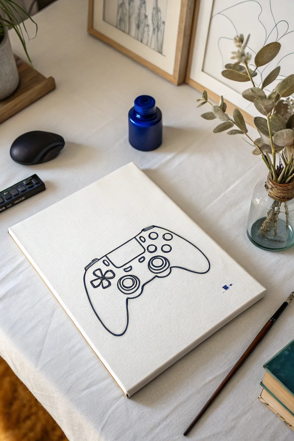
Capture the essence of your favorite pastime with this sleek, minimalist line art painting. Using a single color against a stark white background creates a modern, sophisticated look that fits perfectly in a grown-up gaming setup or living room.
Step-by-Step
Materials
- Pre-stretched canvas (11×14 or similar size)
- Acrylic paint (Navy Blue or Payne’s Grey)
- Fine liner brush (size 0 or 00)
- Pencil (HB)
- Eraser
- Printed template of a controller outline (optional)
- Carbon transfer paper (optional)
- Painter’s tape
- Palette or small dish
- Cup of water
- Paper towels
Step 1: Preparation and Sketching
-
Clean the canvas:
Start by wiping down your canvas with a clean, dry cloth to ensure there’s no dust or lint that could interrupt your crisp lines. -
Source your reference:
Find a high-contrast line drawing of a DualShock controller online to use as a reference. You can print this out to size if you aren’t confident freehanding. -
Transfer or sketch the outline:
If using a template, tape carbon paper and your printout to the canvas. Trace firm lines over the design. If sketching freehand, lightly draw the main kidney-bean shape of the controller first. -
Refine the details:
Sketch in the inner details: the circular joysticks, the D-pad cross, the four face buttons, and the central touchpad rectangle. Keep your pencil pressure very light so mistakes are easily erased. -
Check symmetry:
Step back and look at your sketch. Ensure the hand grips are symmetrical and the buttons are properly aligned before you commit to paint.
Step 2: Painting the Lines
-
Prepare your paint:
Squeeze a small amount of navy blue acrylic onto your palette. I like to add a tiny drop of water to improve the flow, making it ink-like but still opaque. -
Load the liner brush:
Dip your fine liner brush into the paint and twirl it on the palette surface to form a sharp point. You don’t want a glob of paint on the tip. -
Start with the outline:
Begin painting the main perimeter of the controller. Use long, confident strokes rather than short, sketchy ones to keep the line smooth. -
Anchor your hand:
To keep your hand steady, rest your pinky finger on a dry part of the canvas as you guide the brush along your pencil marks. -
Paint the joysticks:
Carefully outline the two joystick circles. These require a steady hand; try rotating the canvas itself as you paint the curve so your hand stays in a comfortable position. -
Detail the center:
Fill in the lines for the central touchpad and the small speaker vents. Keep these lines slightly thinner than the outer perimeter if possible. -
Add the button clusters:
Paint the D-pad cross on the left and the four circular buttons on the right. Remember, this is minimalist, so you don’t need to paint the symbols (X, O, etc.) inside the buttons. -
Refine the line weight:
Once the main lines are down, go back and slightly thicken the outer perimeter line to make the controller pop off the background.
Clean Lines Hack
If your hand shakes, use a paint marker (like Posca) instead of a brush. It offers the control of a pen with the look of paint.
Step 3: Finishing Touches
-
Let it dry:
Allow the paint to dry completely for at least 30 minutes. Acrylics dry fast, but thicker lines might take a moment longer. -
Erase pencil marks:
Check closely for any visible pencil lines peeking out from under the paint. Gently use a clean eraser to remove them without scrubbing the paint. -
Add a signature element:
As seen in the original, consider adding a tiny, stylized logo or your initials in the bottom right corner for a professional finish. -
Seal the artwork:
Apply a coat of matte varnish spray to protect the white canvas from yellowing and dust over time.
Add a Pop of Color
Keep the outline dark, but fill just the face buttons (X, O, Square, Triangle) with their signature neon colors for a retro accent.
Hang this piece near your console to celebrate the art of gaming in a subtle way

PENCIL GUIDE
Understanding Pencil Grades from H to B
From first sketch to finished drawing — learn pencil grades, line control, and shading techniques.
Explore the Full Guide
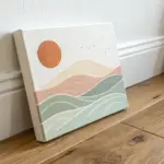
Fantasy Game Landscape Background
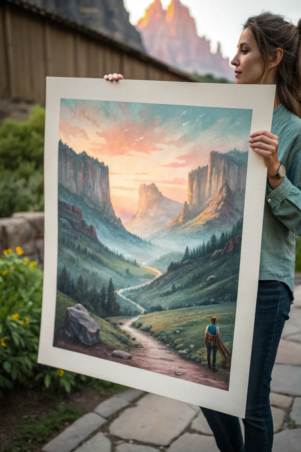
Capture the spirit of adventure with this sweeping landscape painting, featuring a lone traveler gazing toward a distant mountain pass. This project uses atmospheric perspective and warm lighting to create a sense of depth and epic scale perfect for a gaming-inspired backdrop.
How-To Guide
Materials
- Large canvas or heavyweight watercolor paper (approx. 18×24 inches)
- Acrylic paints (Titanium White, Mars Black, Sap Green, Burnt Sienna, Yellow Ochre, Cadmium Red, Phthalo Blue)
- Set of brushes: 1-inch flat wash, medium filbert, lush round brush, small detail liner
- Palette knife for mixing
- Water container and paper towels
- Masking tape (if using paper)
- Pencil for sketching
Step 1: Planning and Sky
-
Prepare the surface:
If working on paper, tape down all four edges securely to a board to prevent buckling. If using a canvas, ensure it is primed. Sketch a very light horizon line about one-third up from the bottom, and roughly outline the V-shape of the valley walls. -
Map the mountains:
Lightly sketch the jagged peaks of the distant mountains and the winding S-curve of the path leading from the foreground into the distance. Don’t worry about details yet; just get the placement right. -
Mix the sky gradient:
Create a pale blue using White and a tiny dot of Phthalo Blue. Create a second mix of peach using White, Yellow Ochre, and a touch of Cadmium Red. These will form your sky transition. -
Paint the upper sky:
Using the large flat wash brush, apply the pale blue mixture to the top corners of the painting, keeping the strokes loose and sweeping. -
Blend the sunset:
While the blue is still slightly wet, rinse your brush and pick up the peach mixture. Paint the center area just above the mountains, blending upwards into the blue to create a soft, hazy transition. -
Add cloud texture:
With a smaller filbert brush, scumble in some wispy clouds using a slightly darker pink-orange mix. Keep edges soft to maintain a dreamlike atmosphere.
Step 2: Background and Midground
-
Block in distant peaks:
Mix a hazy purple-grey color (White + Black + Phthalo Blue + Red). Paint the furthest center mountain silhouette. The color should be very pale to push it into the distance. -
Paint the canyon walls:
As you move forward to the large side cliffs, darken your grey mixture and add a touch of Burnt Sienna. Paint vertical strokes to imply stone texture and cliffs. -
Add sunlight hits:
Mix a warm golden yellow. Carefully dry-brush this color onto the inner faces of the cliffs that are ‘looking’ at the sunset to create a glowing rim light effect. -
Create the misty valley floor:
Use a pale blue-green mix (heavily watered down or mixed with glazing medium) to paint the valley floor between the cliffs, ensuring a soft, foggy look.
Muddy Colors?
If your valley mist looks dirty, stop mixing all colors on the canvas. leane your brush thoroughly and mix a fresh pale blue-grey on your palette before applying the fog layer.
Step 3: Foreground and Details
-
Establish the grassy slopes:
Mix Sap Green with a little Black and Burnt Sienna for a deep forest green. Block in the foreground hills, using curved strokes that follow the slope of the land. -
Add texture to the hills:
Switch to a smaller round brush. Mix a lighter olive green and dab in suggestions of trees and bushes on the slopes, getting larger as they get closer to the bottom edge. -
Define the path:
Paint the winding path using a beige/grey mix. Make the path narrow and faint in the distance, widening significantly as it reaches the foreground. -
Shadow the path:
Add shadows across the path where the hills block the light, and darken the edges of the dirt road to give it volume. -
Paint the foreground rock:
In the lower left corner, paint a large boulder using dark greys. Highlight the top edge with a light grey to show volume and weight. -
Place the traveler:
Using your smallest detail liner brush, silhouette the figure on the path. Start with the legs, then torso. Use blue for the backpack and a dab of skin tone for the neck. -
Final highlights:
Add tiny touches of white or light yellow to the tips of the foreground grass and the figure’s shoulders to catch the last light of the day.
Level Up: Scale
To make the mountains feel more massive, add tiny vertical lines on the distant cliffs to suggest giant trees. This size contrast makes the landscape feel enormous.
Step back and admire how the depth of the valley pulls your eye right into your own fantasy world
Original Hero Avatar Portrait
Capture the rugged charm of a classic RPG hero with this mixed-media portrait technique that blends the softness of watercolor with the precision of colored pencil. This project creates a striking character avatar that feels both timeless and personal, perfect for immortalizing your favorite gaming protagonist.
Step-by-Step
Materials
- Heavyweight watercolor paper (hot press recommended for smoother details)
- H or HB graphite pencil for initial sketching
- Kneaded eraser
- Watercolor paints (Skin tones: Yellow Ochre, Burnt Sienna, Alizarin Crimson; Scarf: Burnt Umber, Cadmium Red; background: soft greens/grays)
- Round watercolor brushes (Size 4, 8, and a fine detail brush)
- Colored pencils (wax or oil-based) in dark brown, sepia, black, and flesh tones
- Clean water and paper towels
- White mat board and frame (approx. 16×20 inches)
Step 1: Sketching the Hero
-
Establish the Head Shape:
Begin with a light H or HB pencil on your watercolor paper. Draw a basic oval for the head, tilting it slightly to the left for a three-quarter view. Mark the center line of the face and the eye line. -
Map Facial Features:
Lightly sketch the placement of the eyes, nose, and mouth. The subject has a strong jawline and deep-set eyes, so pay attention to the spacing between the brow and the eye socket. -
Draft the Hair and Accessories:
Outline the wavy hair, ensuring it has volume rather than lying flat against the skull. Sketch the large, draped scarf around the neck, focusing on the folds and how the fabric bunches. -
Refine the Linework:
Go back over your structural sketch with slightly more confident lines to define the jaw, the ear visible on the right, and the shape of the nose. Keep your pencil pressure light so graphite won’t dirty the watercolor later. -
Soften the Sketch:
Use a kneaded eraser to gently lift up most of the graphite, leaving only a faint guide visible for painting.
Layering Wisdom
Work light to dark. You can always add more pencil shading later, but it is difficult to remove dark colored pencil from delicate watercolor paper without damaging the texture.
Step 2: Watercolor Washes
-
First Skin Layer:
Mix a diluted wash of Yellow Ochre and a touch of Burnt Sienna. Apply this loosely over the face area, avoiding the whites of the eyes. Let the water encourage the pigment to bloom slightly for a natural skin texture. -
Building Shadows:
While the first layer is damp (but not soaking), drop a slightly more concentrated mix of Burnt Sienna and Alizarin Crimson into shadow areas: under the brow, the side of the nose, and under the chin. -
Painting the Hair:
Mix a light wash of Yellow Ochre and brown. Apply this as a base color for the hair. I like to leave small white gaps between strokes to represent highlights where the light hits the waves. -
The Red Scarf:
Create a rich mix of Cadmium Red with a hint of Burnt Umber. Paint the scarf, following the direction of the folds you sketched earlier. Use more water in the highlighted areas to keep the red transparent. -
Background Wash:
Using a large brush, apply a very watery, muted green or grey wash around the background. Keep this loose and abstract, letting it fade out toward the edges of the paper.
Class Customization
Change the scarf color to match your RPG class! Use deep blue for mages, forest green for rangers, or metallic grey washes if your character wears heavy plate armor.
Step 3: Defining Details
-
Dry Time:
Allow the painting to dry completely. If the paper feels cold to the touch, it is still damp inside; give it more time or use a hairdryer on a low setting. -
Eye Detail:
Switch to your colored pencils. Use a sharp blue or grey pencil for the iris, adding a dark pupil. Use a dark brown pencil to outline the upper lid and add lashes. -
Adding Stubble:
Using a sharp sepia or dark brown pencil, create short, directional strokes along the jawline and chin to simulate stubble. Keep the pressure light to maintain a realistic texture. -
Refining Hair Texture:
Use brown and dark blonde pencils to draw individual strands within the watercolor shapes of the hair. Focus on the darker areas behind the ear and at the roots. -
Structure and Contour:
Use a burnt umber pencil to lightly reinforce the nose bridge, the lips, and the jawline. Shade gently over the watercolor shadows to deepen the contrast. -
Scarf Texture:
With a dark red or brown pencil, shade inside the deepest folds of the scarf to give it weight and dimension. Add a few loose lines to suggest fabric weave. -
Final Highlights:
If needed, use a white gel pen or opaque white gouache for tiny reflective highlights in the eyes and on the tip of the nose.
Step 4: Framing
-
Sign and Mat:
Sign your work in the bottom corner. Center your artwork behind a clean white mat board, securing it with archival tape on the back. -
Assemble:
Place the matted artwork into your frame, clean the glass, and secure the back.
Hang your finished portrait prominently to bring a touch of adventure into your living space


Boss Fight Health Bar Banner
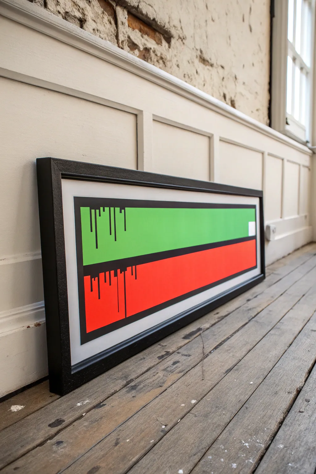
Immortalize the tension of a final boss fight with this sleek, minimalist health bar banner. Using vibrant flat colors and a stylized drip effect, this piece captures the retro gaming aesthetic in a clean, gallery-worthy format.
Step-by-Step Guide
Materials
- Long rectangular canvas or wood panel (approx. 10×30 inches)
- Black acrylic paint (heavy body recommended)
- Vibrant lime green acrylic paint
- Bright red acrylic paint (cadmium red hue)
- Painter’s tape (various widths, including 1 inch and thin detailing tape)
- Flat shader brushes (1 inch and 1/2 inch)
- Small round detail brush (size 0 or 1)
- Ruler or T-square
- Pencil
- Black gallery frame (custom size to fit canvas)
- White or off-white mat board (optional, depending on framing preference)
Step 1: Preparation and Layout
-
Prime the surface:
Begin by ensuring your long canvas or wood panel is clean. Coat it with a layer of white gesso if it’s not pre-primed. This white base will make the green and red colors pop vividly later on. -
Mark the borders:
Using your ruler and pencil, measure a consistent border around the entire edge of the canvas. This creates the white negative space you see in the reference. I usually aim for about 1.5 to 2 inches of white space on all sides. -
Define the health bars:
Inside your border, draw a large rectangle. Find the horizontal center line of this rectangle and mark it. This line will separate the green bar from the red bar. -
Tape the outer edge:
Apply painter’s tape along the OUTSIDE of your pencil border lines. This protects the white background while you paint the central graphic. -
Tape the divider:
Place a strip of tape directly over the horizontal center line. This will eventually become the black divider, so the width of the tape determines the thickness of that black line.
Bleeding Lines?
If paint bleeds under your tape, don’t panic. Wait for it to dry completely, then scrape the excess gently with an X-Acto knife or paint over it with the background color.
Step 2: Painting the Base Colors
-
Paint the green bar:
Load your flat brush with the lime green paint. Fill in the top rectangular section. Apply smooth, horizontal strokes to minimize texture. You will likely need two or three coats for full opacity. -
Paint the red bar:
Clean your brush thoroughly and switch to the bright red paint. Fill in the bottom rectangular section in the same manner. Ensure the coverage is solid and even. -
Let it cure:
Allow the paint to dry completely. If you peel the tape too early while the paint is gummy, it can lift off the canvas. Patience is key here. -
Remove mask:
Carefully peel away the tape covering the center dividing line. Do not remove the outer border tape just yet.
Level Up: Critical Hit
Leave the last 10% of the red bar unpainted (white) and add a tiny flickering heart icon or a jagged ‘static’ line to represent critical low health.
Step 3: The Outline and Drips
-
Outline the bars:
Using black paint and a steady hand (or fresh tape lines if you prefer), paint a thick black border around the entire colored rectangle block. This frames the health bars. -
Fill the center divider:
Paint the horizontal strip between the red and green bars with black paint. This creates the separation between the ‘health’ and the draining energy. -
Sketch the drip placement:
Lightly sketch vertical lines descending from the top edge of the green bar and the top edge of the red bar. Vary the lengths—some short, some crossing almost the full width of the bar. -
Paint the green bar drips:
Use your small round detail brush to paint black lines extending down from the top black border into the green field. Make the ends of the lines blunt and squared off, consistent with old-school pixel graphics. -
Paint the red bar drips:
Repeat the process for the red section, painting lines descending from the center black divider into the red field. Vary the pattern so it doesn’t look identical to the green section. -
Add connecting blocks:
For a ‘glitch’ effect, add small horizontal connectors between some of the vertical drip lines near their origin points, creating small blocky shapes. -
Clean up edges:
Once the black paint is bone dry, remove the outer perimeter tape. Check for any paint bleed on the white border and touch up with white gesso or acrylic if necessary.
Step 4: Framing
-
Mount in frame:
Place the artwork into the long black gallery frame. The contrast between the white border of the canvas and the black frame adds a professional finish. -
Secure backing:
Close the frame clips or secure the backing board firmly. If using a mat, ensure it is centered perfectly before locking it in.
Hang your new banner above your gaming setup to remind any challengers that the boss fight has just begun
Top-Down Level Map Painting
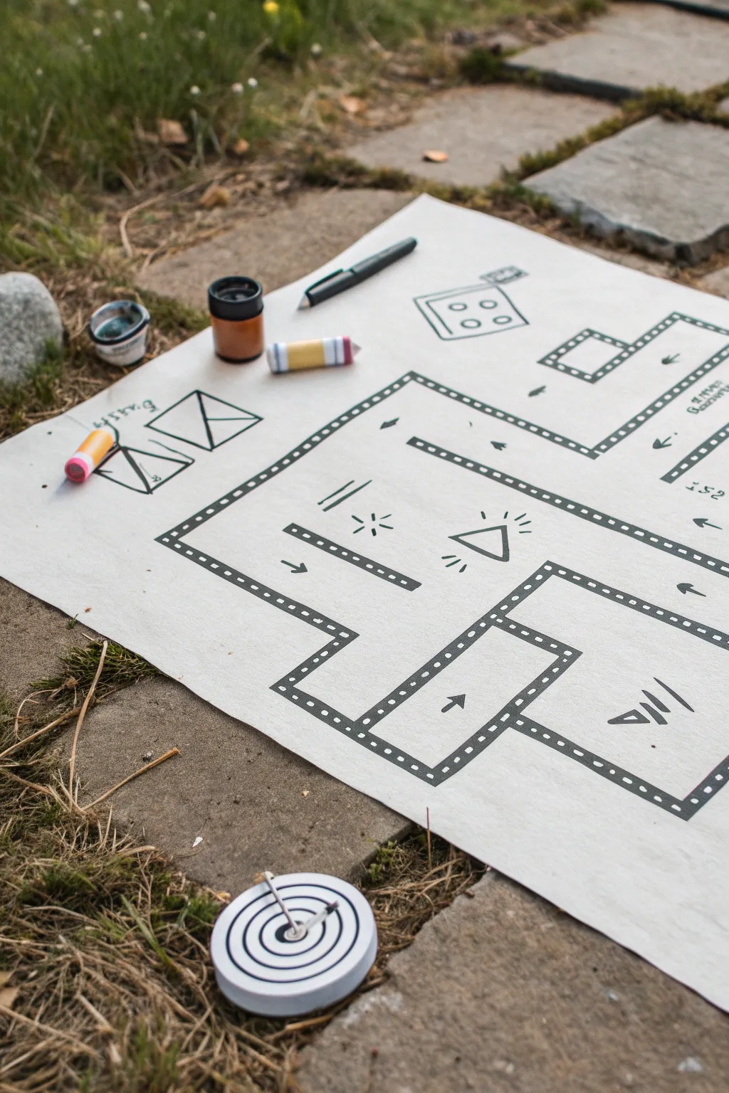
Bring the classic feel of retro gaming into the physical world with this crisp, high-contrast level design map. Using bold markers and simple geometric shapes, you’ll create an intricate top-down view that looks like it jumped straight out of a developer’s sketchbook.
Step-by-Step
Materials
- Large sheet of heavyweight white paper or Bristol board (A2 or A3 size)
- Black fine-point permanent marker
- Black chisel-tip marker
- Pencil and eraser
- Ruler or straight edge
- Small jars of acrylic ink or paint (black, brown, white)
- Colored paint markers (yellow, pink, blue)
- Compass (optional)
Step 1: Planning the Layout
-
Sketch the perimeter:
Begin with a light pencil sketch on your large paper. Draw a large, sprawling layout for your level, using rectangular rooms connected by corridors. Don’t worry about perfect lines yet; just get the shapes down. -
Define the walls:
Outline your pencil sketch to create double-walled borders. These should look like thick tracks defining the edges of your rooms and hallways. -
Add structural details:
Within your rooms, sketch in obstacles. Draw a central triangle in the main room, some smaller rectangular barriers, and corner nooks. -
Mark key elements:
Lightly sketch in gameplay elements like arrows to indicate flow, small triangles for hazards, and radiating lines to suggest triggers or hidden items. -
Include UI elements:
In the open white space outside the map borders, sketch some ‘user interface’ or design notes. Draw a stylized die, some triangular envelope shapes, and rough notes to give it a prototype feel.
Step 2: Inking the Structure
-
Outline the main walls:
Using your black fine-point marker and a ruler, carefully trace over your pencil lines for the inner and outer edges of the walls. -
Create the film-strip effect:
This is the signature look of this map. Inside the double lines of values you just drew, draw small, evenly spaced squares or dots along the entire length. This mimics a film strip or a classic bitmap pattern. -
Fill the wall gaps:
If you prefer a solid look, you can fill the space between the small squares with black ink, but leaving them open as ‘ladder’ rungs creates a lighter, sketchy aesthetic. -
Ink the obstacles:
Go over your internal obstacles. For the smaller lines used as shading or texture (like the hatch marks near the triangle), use quick, confident strokes. -
Detail the hazards:
Ink the triangle hazard in the center. Add the ‘radiating’ lines around it to suggest it’s glowing or active.
Grid Accuracy
Draw a faint grid across your paper first using a light blue pencil. This helps keep all your walls perfectly parallel and makes spacing the ‘film strip’ dots much easier.
Step 3: Adding Life and Color
-
Draw directional arrows:
Using the chisel-tip marker for boldness, draw the arrows on the floor of the map to guide the imaginary player’s path. -
Ink the sidebar sketches:
Move to the side illustrations. Outline the die and the envelope shapes. Keep these lines slightly looser to distinguish them from the rigid map structure. -
Clean up:
Wait at least 15 minutes for the black ink to fully set. Then, gently erase all visible pencil marks so the high-contrast black and white pops. -
Prepare accent features:
If you want to replicate the ‘tools of the trade’ look from the photo, you can mock up prop items to display alongside your art. Paint small wooden cylinders with bands of yellow, pink, and blue to resemble custom game pieces or chalk. -
Add the target token:
Create the circular token shown at the bottom. Cut a small circle from cardstock. Draw concentric black rings using a compass or by tracing different sized lids. -
Assemble the scene:
Place your finished map on a textured surface. Arrange your markers, small paint pots, and the striped game pieces around the edges to frame the work as a ‘dev station’ snapshot.
Quest Marker
Add a splash of color by painting ‘start’ and ‘finish’ zones in neon green or red. It breaks up the monochrome look and directs the viewer’s eye.
Now you have a striking piece of gamer art that celebrates the design process behind your favorite levels
Glitchy Gradient Background Poster
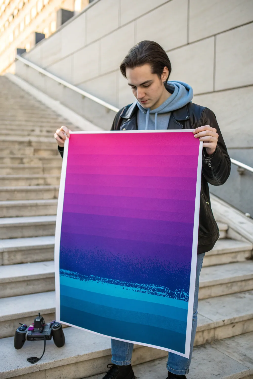
Capture the retro-futuristic vibe of 80s arcade gaming with a striking glitch-art gradient poster. This project combines precise taping techniques with calculated splatter effects to create a digital landscape aesthetic using traditional acrylics.
Step-by-Step
Materials
- Large heavyweight mixed media paper or canvas board (A2 or similar size)
- Painter’s tape or low-tack drafting tape (various widths)
- Acrylic paints: Neon Pink, Magenta, Purple, Indigo, Ultramarine Blue, Teal, White
- Flat synthetic brushes (1-inch and 2-inch)
- Old stiff-bristle toothbrush
- Ruler or T-square
- Pencil
- Palette knife
- Mixing palette
- Water container and paper towels
Step 1: Planning the Gradient
-
Prepare the Surface:
Lay your paper or board on a flat surface. Secure the edges with painter’s tape to create a crisp white border all around, which frames the final glitch effect beautifully. -
Map the Horizon:
Using a pencil and ruler, lightly mark horizontal lines across your canvas. These don’t need to be perfectly evenly spaced; varying the width slightly adds to the digital scan-line look. Leave a larger gap in the bottom third for the ‘glitch’ transition zone. -
Create the Color Palette:
Squeeze out your paints in order of the spectrum: Neon Pink, Magenta, Purple, Indigo, Ultramarine, and Teal. You’ll need substantial amounts for the large flat areas.
Bleeding Lines?
If paint bleeds under the tape, wait for it to dry completely. Then, use a small flat brush and the base color of the paper (or the adjacent color) to carefully touch up the edge.
Step 2: Painting the Bands
-
Tape the Upper Section:
Apply strips of tape across your pencil lines, masking off every *other* band in the upper two-thirds of the poster. Press the edges down firmly to prevent bleed-through. -
Apply the Warm Tones:
Start at the top with your Neon Pink mixed with a touch of White. Paint the exposed bands, gradually adding more Magenta as you work downwards. Use the 2-inch flat brush for smooth, solid coverage. -
Transition to Cool Tones:
As you reach the middle section, shift your mixing to Purple and Indigo. Paint these bands solid. -
Remove and Retape:
Wait for the paint to be fully touch-dry. Carefully peel off the tape. I find peeling at a sharp 45-degree angle helps keep lines crisp. Now, tape over the *painted* lines to protect them. -
Fill the Gaps:
Paint the remaining alternating bands. This is where you create the gradient steps. Mix intermediate shades (e.g., between Pink and Magenta) to make the transition look stepped but logical.
Level Up: UV Mode
Use fluorescent acrylics for the top pink and cyan bands. When hung near a UV blacklight (common in gaming setups), the poster will literally glow like a screen.
Step 3: Creating the Glitch Zone
-
Base the Bottom:
For the bottom third (the ‘ocean’ or ground area), paint horizontal bands of Teal and deep Ultramarine Blue. Keep the lines sharp and distinct like the top section. -
Prepare the Splatter Mix:
Mix a watery consistency of Cyan and White paint. It needs to be fluid enough to flick off a toothbrush but opaque enough to show up against dark blue. -
The Toothbrush Technique:
Dip your old toothbrush into the watery mix. Hold it over the transition line where the purple meets the blue. Run your thumb across the bristles to spray fine mist and larger droplets. -
Layering the Noise:
Repeat the splatter process with a darker Indigo mix. Focus this heavy texture right at the ‘horizon line’ to simulate digital static or data corruption. Let some splatter drift down into the teal bands. -
Dry Brushing the Interference:
Take a nearly dry flat brush with a tiny amount of light blue paint. Drag it horizontally across the splatter zone extremely lightly to create streaky, glitchy interference lines.
Step 4: Final Touches
-
Deepen the Shadows:
Once the main layers are dry, you can tint the very bottom band with a glaze of black or dark navy to ground the image. -
The Reveal:
Slowly peel away the border tape. This is the most satisfying part, revealing the clean white edge that makes the colors pop. -
Flatten and Seal:
If the paper buckled slightly from moisture, place it under heavy books overnight once completely dry. You can protect the finish with a clear matte spray varnish if desired.
Hang your masterpiece in your game room and enjoy the nostalgic digital atmosphere you’ve created by hand
Low-Poly Vehicle or Creature
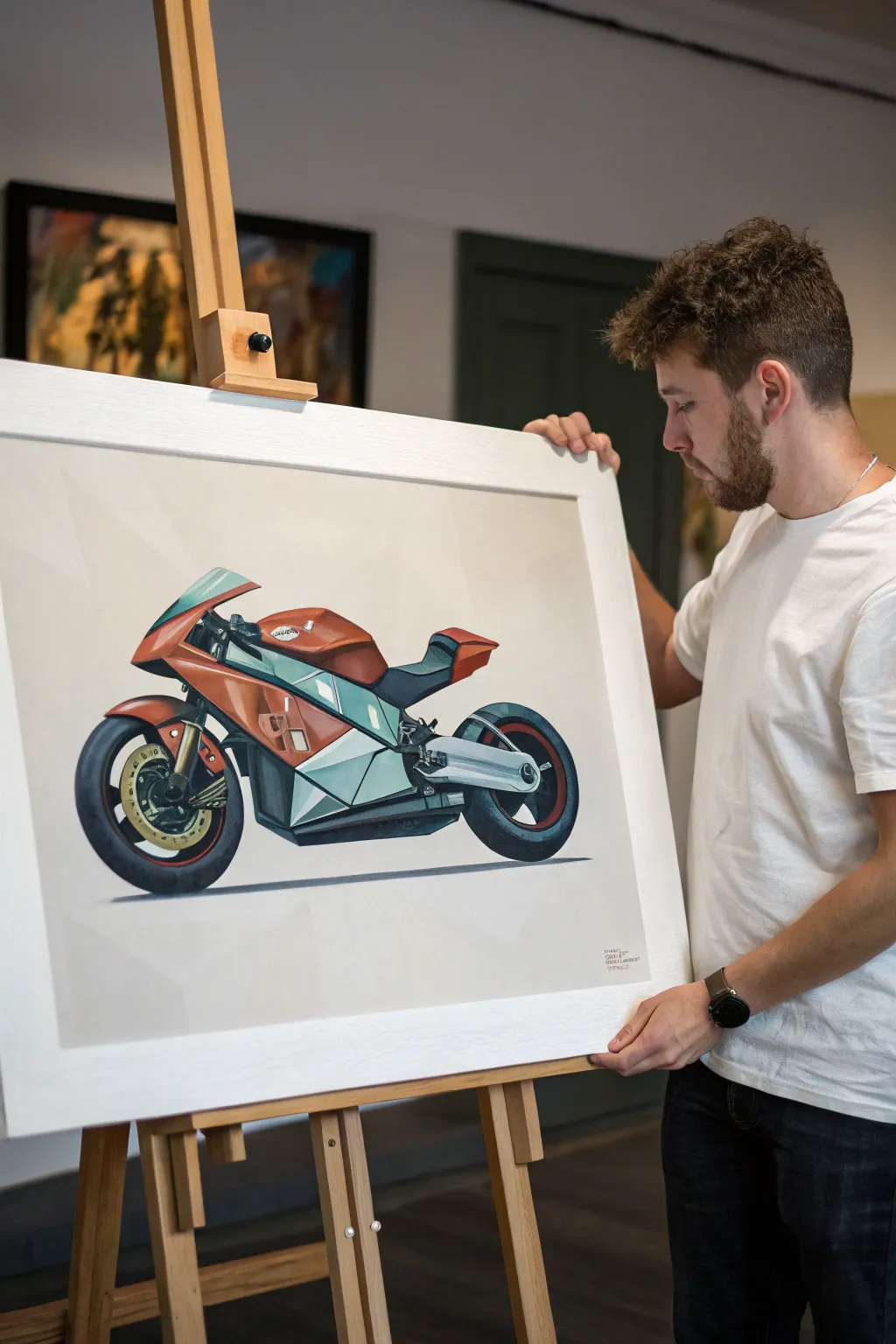
Capture the sleek energy of a modern superbike using the distinct low-poly art style, where complex curves are broken down into sharp, faceted planes. This acrylic painting project transforms a realistic vehicle into a striking geometric abstraction that feels both digital and handcrafted.
Detailed Instructions
Materials
- Heavyweight drawing paper or canvas board (approx. A2 size)
- Acrylic paints (Cadmium Red, Phthalo Green, Titanium White, Mars Black, Burnt Umber, Yellow Ochre)
- Graphite pencils (HB and 2B)
- Ruler or straight edge
- Fine liner pen (optional for initial layout)
- Flat synthetic brushes (various sizes: 1/4 inch to 1 inch)
- Detail round brushes (sizes 0 and 2)
- Mixing palette
- Painter’s tape or masking tape
- Reference photo of a motorcycle
Step 1: Planning the Geometry
-
Choose your reference:
Select a high-resolution photo of a motorcycle. A side profile or slightly angled view works best for low-poly interpretation because it clearly displays the bike’s main shapes. -
Sketch the silhouette:
Lightly sketch the overall outline of the motorcycle onto your canvas using an HB pencil. Don’t worry about details yet; just focus on getting the proportions of the wheels, body, and seat correct relative to each other. -
Triangulate the forms:
This is the crucial step for the low-poly look. Using your ruler, draw straight lines inside the silhouette to break curved areas into triangles and quadrilaterals. Imagine the fairing (the plastic shell) as a folded paper craft. -
Refine the mesh:
Go over your geometric ‘mesh’ to ensure the shapes make sense. Smaller shapes should be used for detailed areas like the handlebars and wheel hubs, while larger polygons can represent the side panels and windscreen.
Step 2: Color Blocking the Body
-
Mix your base orange:
Create a vibrant rusty orange by mixing Cadmium Red with a touch of Yellow Ochre and a tiny bit of Burnt Umber to desaturate it slightly. This will act as the mid-tone for the main body panels. -
Paint the shadow facets:
Identify which polygons on the bike’s body would be in shadow. Mix a darker version of your orange (add more Umber or a touch of Black) and paint these specific geometric shapes using a small flat brush to keep edges crisp. -
Apply the highlights:
Mix a lighter tint of the orange by adding Titanium White. Paint the upward-facing facets where the light hits the hardest. The sharp contrast between this light tone and the shadow tone is what creates the 3D ‘low-poly’ illusion. -
Fill the mid-tones:
Fill in the remaining body panels with your original base orange mix. Be very careful to paint up to the pencil lines without overlapping, preserving the sharp geometric boundaries.
Tape for Sharpness
For ultra-crisp lines between facets, use thin painter’s tape or drawing gum to mask off adjacent shapes. Paint one section, let it dry, peel, and then tape the next.
Step 3: Mechanical Details and Wheels
-
Mix the cool greys:
For the metallic parts and the lower fairing, mix a cool grey using Titanium White, Mars Black, and a tiny dot of Phthalo Green. You want a subtle teal undertone. -
Paint the engine block:
Block in the engine area and lower side panels with your cool grey tones. Use darker shades for recessed triangles and lighter shades for protruding ones to maintain the faceted aesthetic. -
Define the tires:
Use Mars Black mixed with a little Blue or Green for the tires—never use pure black straight from the tube. Paint the tires in segments rather than a continuous curve to keep the angular style consistent. -
Add rim details:
Paint the inner rims. I often like to add a thin line of red or orange on the rim edge to tie it back to the body color. Keep the brake discs simple—just flat geometric circles or hexagons.
Values Looking Flat?
If your bike looks 2D, increase the contrast between facets. Make your highlight planes nearly white and your shadow planes much darker to exaggerate the 3D volume.
Step 4: Finishing Touches
-
Create the windshield:
Mix a pale, transparent-looking blue-grey for the windshield. Paint it as two or three flat planes rather than a curved glass surface. -
Add deep contrasts:
Mix a very dark, near-black chromatic grey. Use a small detail brush to paint the darkest mechanical gaps, the space under the seat, and the tread patterns on the tires to make the colors pop. -
Paint the drop shadow:
Mix a watery grey wash. Paint a simplified, angular shadow cast on the ground beneath the wheels. This grounds the vehicle so it doesn’t look like it’s floating in space. -
Clean up edges:
Inspect your polygons. If any paint bled over the lines, use a small brush with opaque Titan white (or your background color) to touch up and sharpen the intersections between the shapes. -
Background wash:
If you aren’t leaving the background white, apply a very subtle, pale grey wash around the bike to give it atmosphere without distracting from the main subject.
Step back and admire how simple geometric shapes have come together to suggest speed and mechanical power
Isometric Gamer Bedroom Scene
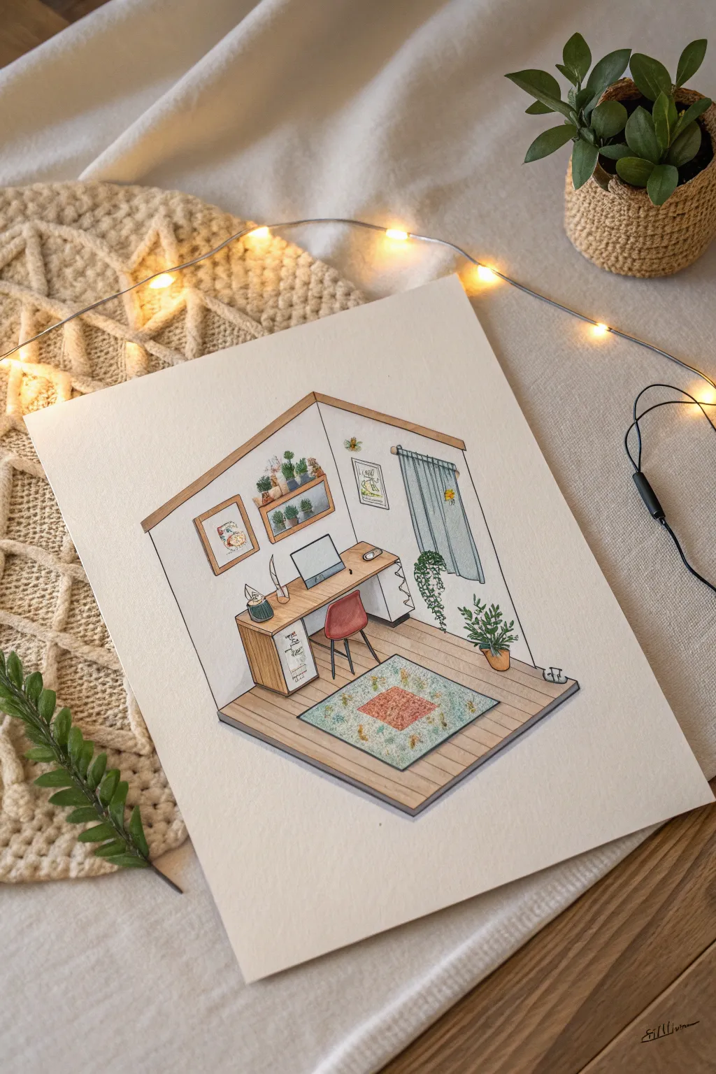
This charming project captures the cozy essence of a gamer’s retreat using clean isometric perspective and soft watercolor washes. The finished piece feels like a slice of life, featuring a tidy desk setup, trailing plants, and warm wood tones that make the tiny room inviting.
Step-by-Step Tutorial
Materials
- High-quality watercolor paper (hot press for smoothness)
- Fine liner pens (0.1mm, 0.3mm, 0.5mm, black)
- Watercolor paints (pan set or tubes)
- HB or 2H pencil for sketching
- Ruler or triangle ruler
- Eraser (kneaded preferred)
- Round watercolor brushes (size 0, 2, and 4)
- Masking tape
Step 1: Drafting the Isometric Shell
-
Set the foundation:
Begin by taping down your watercolor paper to a flat surface to prevent warping. Using your ruler and pencil, lightly draw a vertical line in the center of the page to act as the corner where the two walls meet. -
Establishing the floor:
From the bottom of your vertical line, draw two lines angling upwards at 30 degrees to the left and right. Connect these to form a diamond shape, though you’ll only need the bottom ‘V’ for the floor area. -
Adding walls:
Extend vertical lines up from the ends of your floor ‘V’ to create the outer edges of the walls. Close off the top with angled lines mirroring the floor angle. It should look like an open cube. -
Sketching the furniture:
Lightly sketch the desk against the left wall. Remember to keep all horizontal lines parallel to the floor angles (30 degrees) and all vertical lines straight up and down to maintain the isometric illusion.
Wonky Perspective?
If your furniture looks tilted, check your verticals. In isometric art, vertical lines must be perfectly straight up and down, never angled. Use a clear ruler to align closely.
Step 2: Filling the Room
-
Adding cozy details:
Draw the chair tucked under the desk, detailing the legs and curved back. Sketch a rectangular rug on the floor, angling it to match the room’s perspective. -
Wall decor and tech:
Add the computer monitor, keyboard, and mouse centered on the desk. On the walls, sketch rectangular frames for artwork and shelves. Don’t forget the window on the right wall with curtain drapes. -
Natural elements:
Sketch potted plants on the shelves, floor, and trailing down from the window. The organic shapes of the leaves will provide a nice contrast to the geometric furniture. -
Inking the lines:
Once satisfied with the pencil sketch, go over the lines with your fine liner pens. Use a 0.5mm pen for the main structural lines (walls, floor edge) and a thinner 0.1mm or 0.3mm for delicate details like plant leaves and picture frames. -
Clean up:
After the ink is completely dry—give it a few minutes to be safe—gently erase all the pencil marks to reveal a clean, crisp drawing.
Step 3: Adding Color
-
Flooring wash:
Mix a diluted light brown or tan watercolor wash. Apply it evenly to the floor area. While wet, dropping in slightly darker brown near the furniture bases creates subtle shadows. -
Wood textures:
Use a richer, warmer wood tone (like burnt sienna) for the desk top and shelf frames. Keep the paint fairly translucent so the line work shows through clearly. -
Greens and foliage:
Paint the plants using various shades of green. Mixing a bit of yellow into the green for the window plant suggests sunlight hitting the leaves. -
Textiles and accents:
Paint the chair a muted red or terracotta. For the rug, use a very pale blue-green wash for the background, then dab in orange and yellow details once the base is dry. -
Glass and metal:
Use a very watered-down blue-grey for the window glass and the computer screen. Leave small white gaps to represent reflections or highlights. -
Curtains and walls:
Paint the curtains a soft teal or slate blue. I like to leave the walls white or extremely pale grey to keep the room feeling bright and airy. -
Final shading:
Once all base colors are dry, mix a dilute grey-purple. Add thin lines of this shadow color under the desk, chair legs, and along the corners of the room to ground the objects.
Level Up: Night Mode
Paint the window dark blue and add yellow ‘glow’ effects around the monitor and lamps for a late-night gaming vibe.
Start with light washes and build up your dream room layer by layer
Controller Made of Botanicals
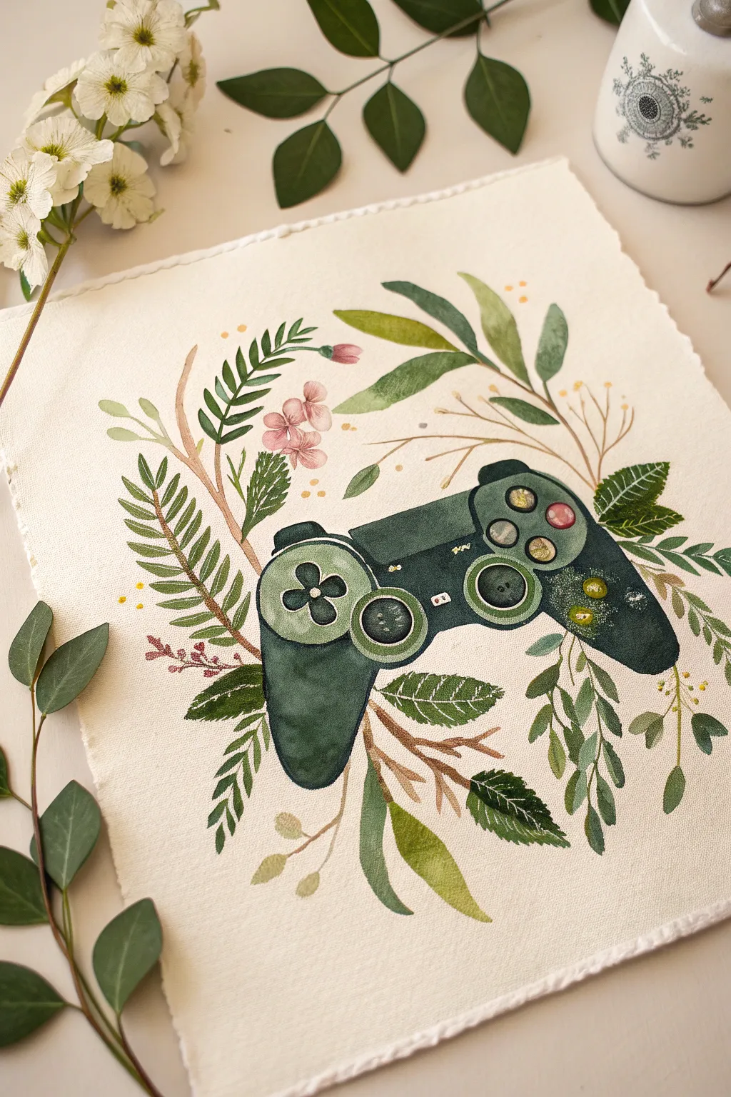
Merge the digital world with the natural one in this serene watercolor project featuring a game controller nestled among lush greenery. The result is a soft, organic take on gaming iconography that looks beautiful on heavyweight, deckle-edged paper.
Detailed Instructions
Materials
- Heavyweight watercolor paper (300gsm cold press recommended)
- Pencil (HB or H)
- Kneaded eraser
- Watercolor paints (Forest Green, Sap Green, Olive Green, Burnt Sienna, Payne’s Grey, touches of Pink and Yellow)
- White Gouache or white gel pen
- Round brushes (flats in sizes 2, 4, and 6)
- Fine liner brush (00 or 000)
- Jar of clean water
- Paper towels
- Palette for mixing
Step 1: Sketching the Framework
-
Outline the Controller:
Start by lightly sketching the main shape of the controller in the center of your paper. Focus on the iconic dual-handle shape, the central touchpad area, and the two round thumbsticks. Keep your lines faint so they won’t show through the transparent watercolor later. -
Add Button Details:
Sketch the four circular buttons heavily on the right side and the directional pad cross on the left. Don’t worry about perfect mechanical precision; a slightly hand-drawn look fits the botanical theme. -
Map the Foliage:
surround the controller with loose, flowing lines to represent vines and stems. Draw fern-like fronds curving around the left handle and larger, broad leaves tucked behind the right handle. Let the plants overlap the controller slightly to integrate the object into nature.
Step 2: Painting the Controller Base
-
First Wash:
Mix a deep, cool green using Forest Green and a touch of Payne’s Grey. Apply a watery wash to the main body of the controller, carefully painting around the buttons and thumbsticks. Use a ‘wet-on-dry’ technique to keep the edges crisp. -
Deepening Shadows:
While the first layer is still slightly damp, drop in more concentrated dark green pigment at the bottom of the handles and underneath the buttons to create dimension and weight. -
Painting the Thumbsticks:
Fill in the thumbstick circles with a mixture of Sap Green and Payne’s Grey. Leave the centers slightly lighter to suggest a concave shape. -
Button Details:
Paint the four action buttons on the right. I like to keep them muted, perhaps using diluted pinks or yellows rather than bright primary colors, to maintain the soft aesthetic.
Water Control Tip
Work in sections to prevent unintentional bleeding. Let the controller body dry completely before painting any leaves that touch or overlap it.
Step 3: Cultivating the Greenery
-
Base Stems:
Mix a warm brown using Burnt Sienna and a little green. Paint the main stems that weave behind and around the controller, varying the pressure on your brush to make the lines taper naturally. -
Broad Leaves:
For the larger leaves, like the ones at the bottom right, use a mix of Olive Green and yellow. Load your size 6 brush and press down fully to create the belly of the leaf, then lift as you reach the tip. -
Fern Fronds:
Switch to a smaller size 2 brush for the fern details on the left. Use quick, repetitive strokes with a darker Sap Green to create the individual leaflets attached to the stems. -
Adding Florals:
Touch in the small flowers with a very diluted pink or mauve watercolor. Keep these shapes loose and impressionistic rather than detailed petals. -
Layering Greens:
Go back over your foliage and add a second, darker layer to some leaves to create depth. This makes it look like some leaves are in the foreground and others are receding.
Level Up: Metallic Touch
Swap the standard yellow paint for metallic gold watercolor on the buttons or leaf veins. It catches the light beautifully and adds a premium feel to the art.
Step 4: Refining Details
-
Veins and Texture:
Once the leaves are completely dry, use your fine liner brush and a dark green mix to paint thin central veins on the larger leaves. -
Controller definition:
Strengthen the shadows on the controller, specifically around the directional pad and under the shoulder buttons, to make the form pop against the white paper. -
Highlights:
Using white gouache or a gel pen, add tiny highlights to the buttons, the rim of the thumbsticks, and the top edge of the controller. This mimics the plastic sheen of the device. -
Splatter Effect:
Optional: Load a brush with diluted gold or yellow paint and gently tap it against another brush handle over the paper to add subtle speckles around the foliage for a magical touch. -
Floating Elements:
Add a few disconnected small dots of yellow or green around the composition to represent pollen or floating spores, helping to balance the white space.
Now you have a refreshing piece of art that perfectly balances your love for gaming with the tranquility of nature
Negative Space Icon Series
This clean, minimalist wall art brings iconic gaming symbols together in a striking four-quadrant design. The use of bold, flat colors against crisp white negative space creates a modern look that suits any game room or bedroom setup.
Step-by-Step Guide
Materials
- Square canvas or heavy art board (12×12 or 16×16 inches recommended)
- Acrylic paints: Navy Blue, Teal/Forest Green, Rust Red, Mustard Yellow
- White Gesso or white acrylic paint (for the base)
- Painter’s tape or masking tape (1 inch width and 1/4 inch width)
- Stencil vinyl or contact paper
- X-Acto knife or cutting machine (like Cricut/Silhouette)
- Wide flat brush (for base coating)
- Medium flat brush (for coloring quadrants)
- Small detail brush (for touch-ups)
- Ruler and pencil
- Light wood frame (optional)
Step 1: Preparation and Base Layer
-
Prime the Surface:
Start by applying a smooth, even coat of white Gesso or white acrylic paint over your entire canvas or board. This ensures the negative space icons will be bright and clean. -
Check for Consistency:
If the first coat looks streaky, let it dry completely and apply a second coat. I like to sand it lightly between coats for an ultra-smooth finish. -
Measure the Grid:
find the exact center of your board. Use a ruler and a light pencil touch to divide the surface into four equal quadrants. -
Create the Borders:
Apply your 1/4 inch painter’s tape along the pencil lines to create a cross, separating the quadrants. Also, tape off the outer edges if you want a clean white border around the perimeter.
Bleeding Lines?
If paint bled under the tape, wait for it to dry fully. Then, use a white paint pen or a small brush with heavy body white acrylic to clean up the edges.
Step 2: Creating the Icons
-
Design the Stencils:
Draw or print out simple silhouettes of a gamepad, headset, down arrow, and up arrow. Size them so they fit comfortably within each quadrant. -
Cut the Stencils:
Transfer these shapes onto your stencil vinyl or contact paper. Carefully cut them out using an X-Acto knife or use a digital cutting machine for precision. -
Apply the Masks:
On your prepared canvas, peel the backing off your vinyl shapes and stick them precisely in the center of each quadrant. Press down firmly on all edges to prevent paint bleed. -
Seal the Edges:
Paint a very thin layer of your white base paint over the edges of the stickers and the tape grid. This tricks any potential bleed into being white, keeping your lines razor sharp.
Distressed Look
For the subtle worn texture seen in the photo, lightly sand the colored areas with fine-grit sandpaper after the paint is dry but before varnishing.
Step 3: Adding Color
-
Paint the Controller Quadrant:
Using your navy blue paint, fill in the top-left square. Use a flat brush and consistent strokes, painting right over the vinyl controller sticker. -
Paint the Headset Quadrant:
Clean your brush thoroughly and switch to the teal or forest green paint for the top-right section, covering the headset sticker completely. -
Paint the Arrow Quadrants:
Fill the bottom-left square with rust red and the bottom-right with mustard yellow. Apply two coats for opacity if the colors look transparent. -
Dry Time:
Allow the paint to set until it is dry to the touch, but don’t let it cure completely/harden before the next step.
Step 4: The Reveal
-
Peel the Grid Tape:
Carefully peel away the masking tape dividing the quadrants. Pull slowly at a 45-degree angle to avoid lifting any paint. -
Remove the Icon Masks:
Use the tip of your X-Acto knife or a pin to gently lift the edge of the vinyl stickers in the center of each square. Peel them up slowly to reveal the white icons beneath. -
Touch Ups:
Inspect the edges where the color meets the white. Use your smallest detail brush and a tiny bit of white paint to fix any small bleeds or jagged spots. -
Final Finish:
Once fully dry, you may choose to add a coat of matte varnish to protect the surface and unify the sheen of the different colors.
Place your finished piece in a simple wooden frame to complete the modern gaming aesthetic
Mixed-Media Inventory Grid Collage
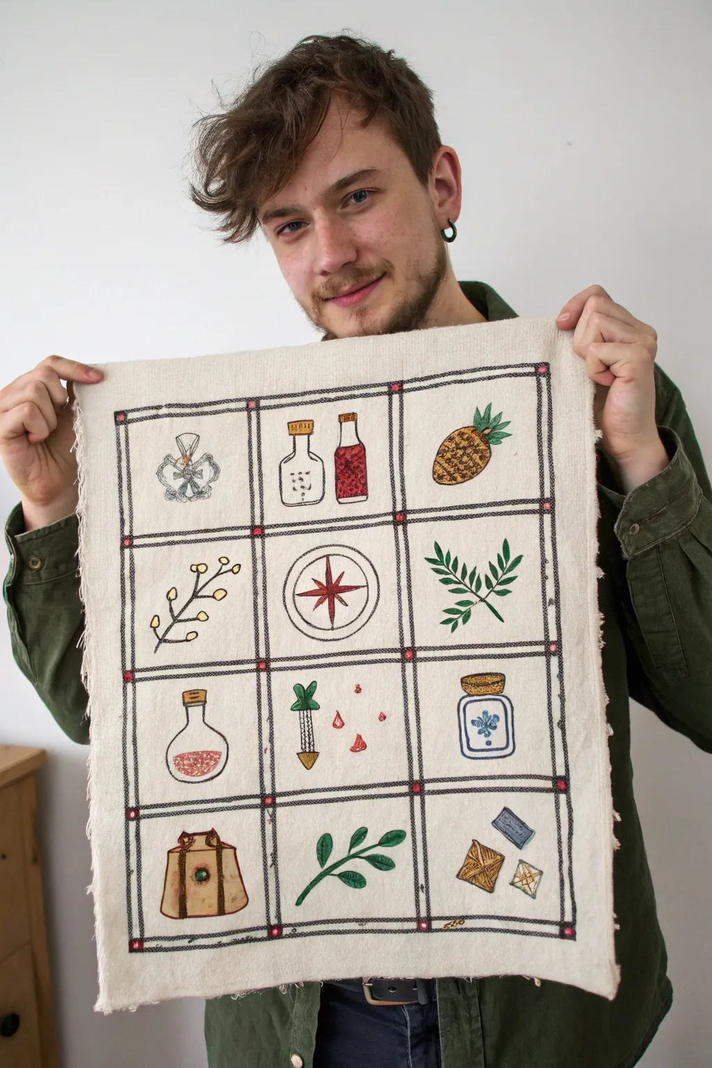
Bring the classic feel of a video game inventory screen into the physical world with this charming embroidered grid. Using a combination of fabric painting and stitching, you can catalog your own collection of fantastical items on a rustic canvas panel.
Step-by-Step
Materials
- Heavyweight unbleached muslin or canvas fabric (approx. 18×24 inches)
- Black embroidery floss (6-strand)
- Colored embroidery floss (red, green, gold, blue, brown)
- Fabric paint or watercolor paints
- Fine-point paintbrush
- Embroidery hoop
- Embroidery needle
- Water-soluble fabric marker or pencil
- Ruler or T-square
- Fray check or hemming tape (optional)
Step 1: Grid & Outline Preparation
-
Fabric Prep:
Cut your canvas or muslin to your desired size, leaving an extra inch on all sides. I like to gently pull on the raw edges to create a soft, frayed fringe effect before starting. -
Measure the Grid:
Using a ruler and your water-soluble marker, draw a large outer rectangle. Inside this, mark out a 3×4 grid layout, ensuring each square is equal in size (approx. 4×4 inches per square works well). -
Sketch the Items:
Lightly sketch your inventory items into the center of each square. You can copy the ones shown—potions, herbs, compass, pineapples, crystals—or substitute items from your favorite RPG. -
Stitch the Grid Lines:
Thread your needle with 4 strands of black floss. Use a backstitch specifically for the long vertical and horizontal lines of the grid to create a bold, defined border. -
Add Decorative Nodes:
At every intersection where grid lines meet, stitch a small square or ‘X’ using a contrasting color like reddish-pink to mimic the UI elements of a game menu.
Paint Consistency Pro-Tip
Treating your fabric paint like watercolor allows for soft shading. Test your water-to-paint ratio on a scrap of canvas first to prevent bleeding.
Step 2: Coloring the Icons
-
Base Painting:
Before doing the detail stitching, use diluted fabric paint or watercolors to fill in the color blocks of your sketches. Painting first ensures the color sits underneath the embroidery lines. -
Layering Transparency:
For the bottles and potions, use very watery paint to create a translucent glass effect, letting the fabric texture show through slightly. -
Solid Objects:
For solid items like the leather pouch or the pineapple, use less water in your mix for opaque, richer coverage. -
Drying Time:
Allow the paint to dry completely. This is crucial; stitching through wet paint will ruin your needle and smudge your work.
Level Up: Stat Text
Use a tiny single-strand backstitch to write stats or item names (e.g., ‘HP +50’) in the extra space of each grid square for true RPG authenticity.
Step 3: Detail Embroidery
-
Outline the Items:
Switch to 2 strands of black floss. Carefully backstitch the outline of every painted item to make them pop against the background. -
Stitch the Pineapple:
For the pineapple in the top right, use small cross-hatched stitches in brown over the yellow paint to create texture, and use a satin stitch for the green leaves. -
Detail the Plants:
For the green herbs and branches, add a single vein line down the center of each painted leaf using a simple straight stitch. -
Embellish the Potions:
Add small French knots inside the red potion bottles to represent bubbles or fizz. -
Compass Rose:
For the central compass, satin stitch the star points in red to give them a raised, glossy texture compared to the flat paint. -
Bag Buckles and Crystals:
Use a metallic gold thread or a bright yellow floss to add tiny highlights to the buckle of the bag and the facets of the crystals.
Step 4: Finishing Touches
-
Clean Up:
Rinse the fabric gently in cold water if you need to remove any visible marker lines, then let it air dry flat. -
Secure Edges:
If you want to stop the fraying from progressing too far, apply a thin line of fray check along the very edge of the fabric. -
Pressing:
Iron the piece face down on a fluffy towel. This protects your textured stitches while smoothing out the fabric canvas.
Now you have a stunning piece of textile art that holds all your essential adventure gear, ready for display

Have a question or want to share your own experience? I'd love to hear from you in the comments below!