Gemini drawings are basically an open invitation to play with duality, mirrors, and those delicious “two sides of the same story” vibes. If you’re craving ideas that feel both classic and a little mystical, these Gemini-inspired concepts will keep your sketchbook busy.
Twin Silhouettes With Stars
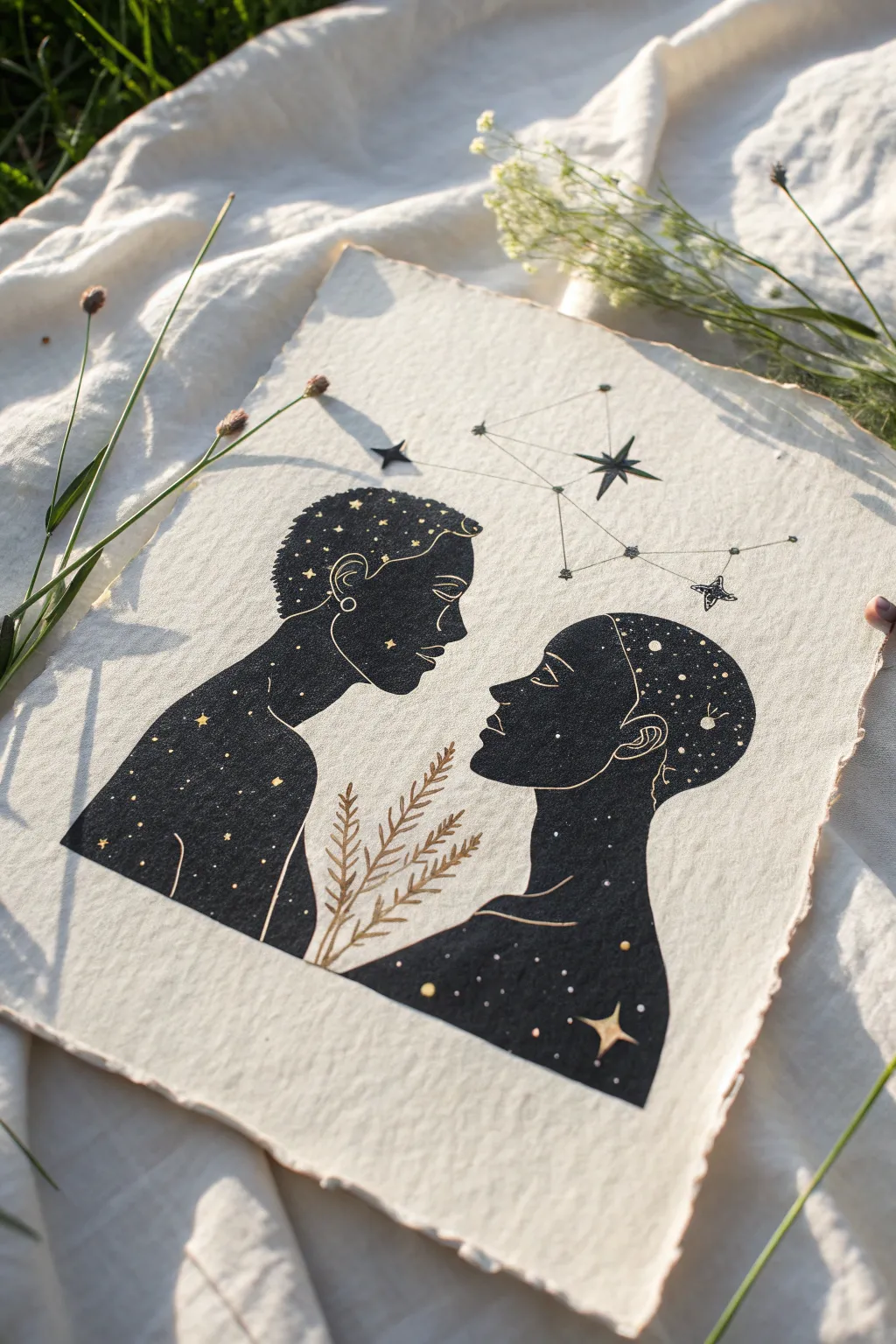
Capture the mystic connection of the Gemini sign with this striking silhouette portrait, where two figures face each other filled with the night sky. The contrast of deep black ink against creamy, textured handmade paper creates an ethereal, timeless piece perfect for framing.
How-To Guide
Materials
- Heavyweight textured paper (ideally handmade cotton rag paper with deckled edges)
- Black India ink or high-quality black gouache
- Gold metallic watercolor or pen
- Fine liner pens (black, sizes 01 and 03)
- Pencil (HB or 2H)
- Eraser
- Fine round paintbrush (size 0 or 1)
- Ruler
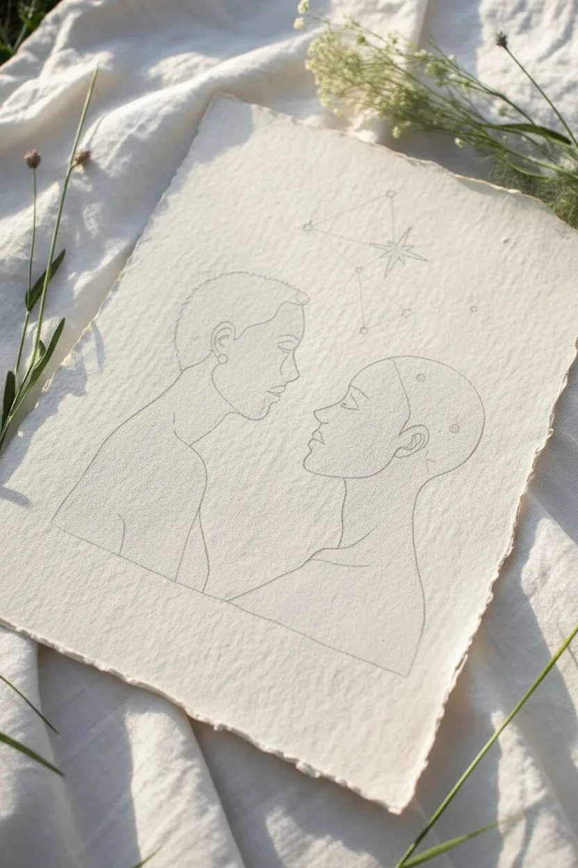
Step 1: Sketching the Silhouettes
-
Prepare the paper:
Begin with a sheet of textured, cream-colored paper. If your paper doesn’t have deckled edges, you can create a faux effect by carefully tearing the edges against a ruler rather than cutting them. -
Draft the profiles:
Lightly sketch two side-profile faces looking directly at each other using your HB pencil. Position them centrally, leaving space above for the constellation. The profiles should be close but not touching, emphasizing connection. -
Outline the bodies:
Extend the sketch downwards to include the necks and shoulders. Instead of drawing realistic clothing, create a smooth, curved boundary at the bottom to crop the portraits, giving them a bust-like appearance. -
Refine facial features:
Go back and refine the noses, lips, and chins. Since these will be silhouettes, the accuracy of the profile line is crucial; keep the lines clean and deliberate.
Gold Paint Viscosity
If using pan watercolor for the gold lines, add water drop by drop until it has the consistency of heavy cream. Too watery and it won’t be opaque on the black.
Step 2: Filling the Night Sky
-
Outline in ink:
Using a fine liner pen (size 03), carefully trace the outline of your entire graphite sketch. This creates a barrier for the ink wash you’ll apply next. -
Define the ear and jaw:
Before filling in the black, draw delicate internal lines to define the jawline, ear shape, and neck muscles. We want to leave these lines visible in gold or simply unpainted later, but visualizing them now helps. -
Fill with black:
Load your brush with black India ink or gouache. Carefully fill in the entire shape of the figures, creating a solid, opaque black silhouette. Work slowly near the edges to keep them crisp. -
Let it dry completely:
This is a critical patience test. Allow the black ink to dry fully before proceeding. If it’s wet, your metallic details will bleed and lose their shine.
Cosmic Variation
Instead of solid black, mix a tiny drop of deep blue or purple into your ink. This subtle tint creates a richer, more ‘midnight sky’ feeling than flat black.
Step 3: Adding Celestial Details
-
Detail with gold:
Using a fine brush and gold metallic watercolor (or a gold gel pen), trace over the internal lines you planned earlier: the jawline, the ear details, the brow bone, and the neck contours. This ‘reverse’ drawing technique brings dimension to the flat silhouette. -
Add the stars:
With the same gold medium, dot small stars throughout the black silhouettes. Vary the size of your dots to create a sense of depth, placing some denser clusters near the top of the heads. -
Draw the constellation:
Above the figures, lightly pencil the Gemini constellation. Use a ruler to connect the stars with straight lines, then go over this in fine black pen. -
Embellish the sky:
Add a few larger, stylized stars (diamond or flare shapes) around the constellation lines using black ink. You can accent the centers of these stars with a tiny dot of gold. -
Botanical accents:
Draw a simple, stylized fern or branch rising from the bottom center, between the two figures. Use gold paint for this to contrast beautifully against the cream paper and link the two dark figures. -
Final touches:
Review your piece for any stray pencil marks. Gently erase them once you are certain all ink and paint is bone dry. I find a kneaded eraser works best on textured paper to avoid damaging the fibers.
Now step back and admire how the gold catches the light, bringing your celestial twins to life.


Sun And Moon Twins
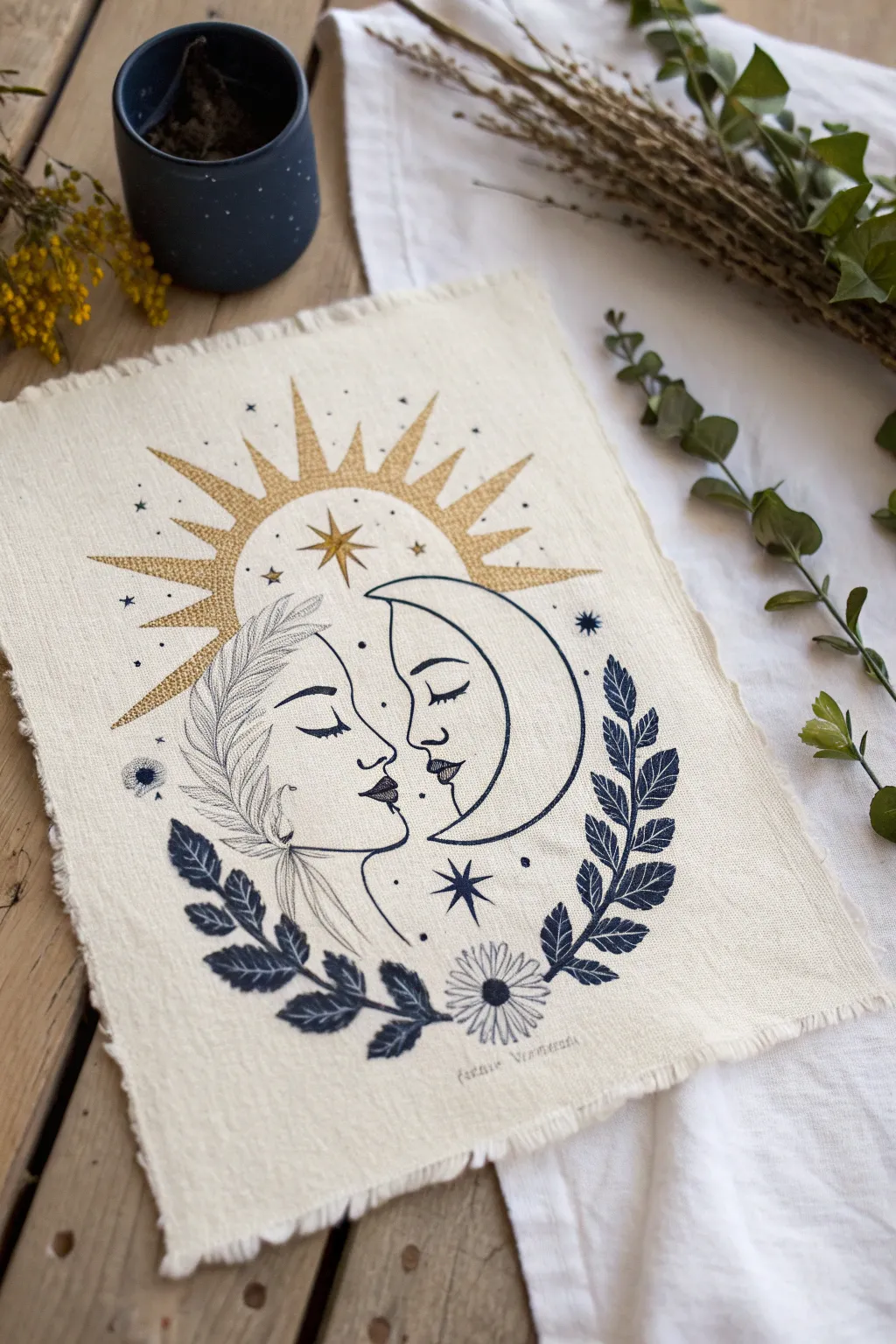
Capture the duality of Gemini with this striking sun and moon fabric print, blending golden celestial rays with deep indigo foliage. This project uses block printing techniques on raw-edged fabric to create a rustic, bohemian piece perfect for wall art or an altar cloth.
Step-by-Step Guide
Materials
- Cream or unbleached linen/cotton fabric blend
- Soft linoleum block (at least 6×8 inches)
- Linoleum carving tools (V-gouge and U-gouge)
- Fabric ink in Navy Blue and Metallic Gold
- Brayer (rubber roller)
- Pencil and tracing paper
- Glass pane or acrylic sheet (for rolling ink)
- Baren or wooden spoon
- Fabric scissors
- Fine-grit sandpaper (optional)
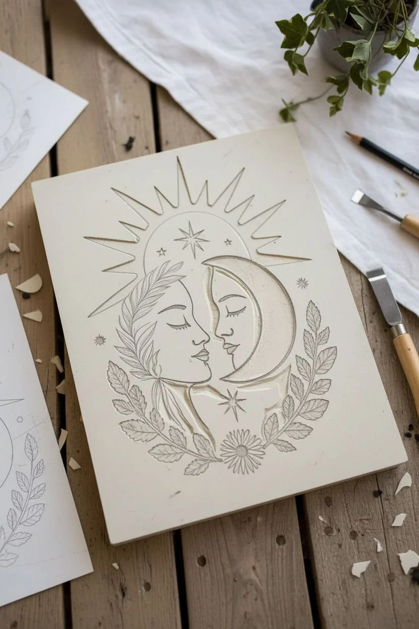
Step 1: Design & Carving
-
Prepare your sketch:
Begin by sketching the design on paper. Focus on the central motif: a crescent moon with a sleeping face on the right, nesting against a sun-face on the left. The sun face should have flowing, leaf-like hair, while the moon is smooth. -
Add celestial details:
Around the central faces, draw the sun’s rays extending outward at the top. Add a leafy laurel branch curving up from the bottom left and right to frame the faces. Don’t forget small stars scattered throughout. -
Transfer to the block:
Trace over your final drawing with a soft pencil (like a 4B). Place the tracing paper face-down onto your linoleum block and rub the back firmly to transfer the graphite image. -
Carve the fine lines:
Using your smallest V-gouge tool, carefully carve the outlines of the faces, the eyes, and the lips. This is delicate work, so take your time and carve away from your body. -
Clear negative space:
Switch to a wider U-gouge to clear away the background areas you don’t want to print. Remember, anything you leave raised will be printed. For this two-color design, you might choose to carve two separate blocks (one for blue, one for gold) or use a reduction print method. For beginners, I recommend carving two separate blocks or masking areas off.
Patchy Prints?
If the print looks too distressed, your fabric might be too textured. Place a slightly padded surface (like a towel) under the fabric while printing to help push ink into the weave.
Step 2: Printing Process
-
Prepare the fabric:
Cut your linen fabric into a rectangle, roughly 8×10 inches. To achieve the rustic look in the photo, gently pull at the loose threads along all four edges to create a soft fringe. -
Ready the gold ink:
Squeeze a small line of metallic gold fabric ink onto your glass pane. Roll the brayer back and forth until the ink sounds ‘sticky’ and has a velour-like texture. -
Print the sun rays:
If using a single block, carefully ink only the sun rays and the central star with the gold. Press the block firmly onto the top half of your fabric. Apply pressure evenly using a baren or the back of a wooden spoon. -
Clean and switch colors:
Clean your block thoroughly (or grab your second block if you separated the design). Now, prepare the navy blue ink on your palette using the same rolling technique. -
Print the main motif:
Ink the faces, the moon, and the leafy branches with the navy blue. Align this carefully with the gold rays you just printed. Press down firmly, ensuring you transfer the ink into the weave of the fabric. -
Detail work:
Once the main print is dry, you can add the tiny stars. You can either carve a tiny stamp from a scrap of lino or use the end of a paintbrush dipped in blue ink to dot them in.
Step 3: Finishing Touches
-
Heat set the ink:
Allow the print to dry completely for at least 24 hours. Once dry, heat set the ink by ironing the reverse side of the fabric for 3-5 minutes (check your ink manufacturer’s specific instructions). -
Enhance text (optional):
If you want to add the text seen at the bottom (‘ferris bueller’ or similar custom text), use a small alphabet stamp set with grey or light blue ink for a faded, vintage effect. -
Flatten the fringe:
Give the fringed edges a final comb-through with your fingers and a quick press with the iron to make them lay flat and neat.
Pro Tip: Registration
Make a paper ‘jig’ or mark corners with masking tape on your work surface. This ensures your fabric and block align perfectly every time, especially when printing in two layers.
Hang your finished celestial twin portrait in a spot where it can catch the morning light


Angel And Devil Gemini Twins
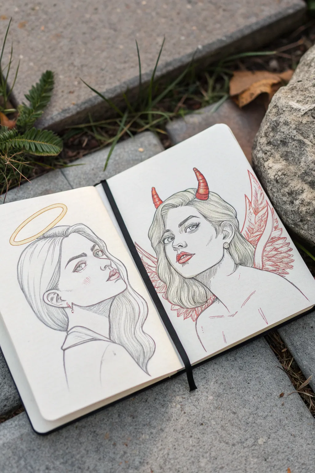
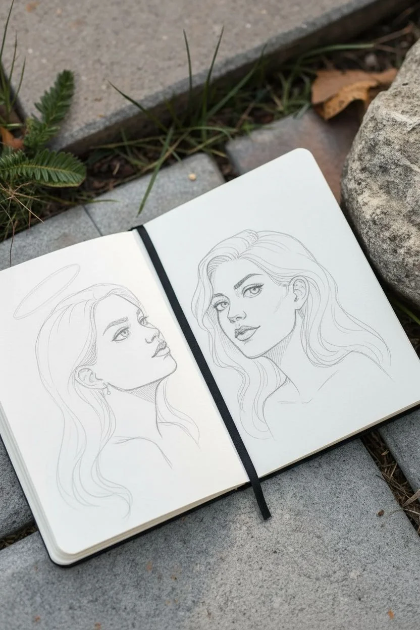
Capture the duality of the Gemini spirit with this striking sketchbook spread featuring mirrored portraits. This project juxtaposes an angelic profile with a mischievous devilish gaze, using clean line art and selective pops of color to create a balanced yet contrasting composition.
Detailed Instructions
Materials
- Hard-bound sketchbook (smooth or mixed media paper)
- Graphite pencil (HB or H for sketching)
- Fine liner pens (0.1mm and 0.3mm, black)
- Colored pencils or fine markers (Gold/Yellow, Red)
- Kneaded eraser
- Pencil sharpener
Step 1: Planning and Sketching
-
Establish the composition:
Begin by lightly marking the center of each page in your open sketchbook. Position the heads so they face slightly away from each other—the angel on the left looking up and left, the devil on the right looking forward. -
Construct the Angel’s head:
On the left page, sketch a soft oval for the face. Draw a curved guideline for the profile view, placing the jawline high to show an upward gaze. Keep the neck slender and elegant. -
Construct the Devil’s head:
On the right page, sketch a similar oval but positioned for a 3/4 view. The chin should be slightly tucked, creating a more direct and engaging expression compared to the angel’s distant look. -
Refine the facial features:
Sketch the eyes, noses, and lips. Give the angel soft, rounded features and a gentle eye shape. For the devil, sharpen the eye shape slightly and add a hint of a smirk to the lips. -
Draft the hair:
Draw long, flowing waves for both figures. I like to mirror the hair flow so they feel unified; however, the angel’s hair should rest calmly behind her shoulder, while the devil’s hair can be a bit more voluminous and wild.
Symmetry Struggles?
If matching face sizes is hard, trace the first head onto tracing paper, flip or move it to the other page, and use it as a size guide for your sketch.
Step 2: Inking and Details
-
Add symbolic elements:
Lightly sketch a floating halo ellipse above the angel’s head. On the devil, add two curved horns piercing through the hair and sketch the rough shape of bat-like wings behind her shoulders. -
Outline the Angel:
Using a 0.1mm fineliner, carefully trace your pencil lines on the left page. Use very light, broken strokes for the hair strands to keep them looking soft. -
Outline the Devil:
Switch to a slightly bolder approach for the right page. Ink the facial features, making the eyelashes slightly thicker. Define the hair strands with confident, sweeping strokes. -
Erase guidelines:
Once the black ink is completely dry, gently run a kneaded eraser over both pages to remove the graphite sketches, leaving only your clean line art. -
Detail the hair:
Use your finest pen (0.05mm or 0.1mm) to add hatching in the shadowed areas of the hair on both figures. Focus on the area behind the ears and the nape of the neck. -
Cross-hatch the shadows:
Add subtle hatching under the jawlines and inside the ears (especially on the devil figure) to give the drawings dimension without full shading.
Pro Tip: Line Weight
Use thicker lines for the outer silhouette and the underside of the jaw, and whisper-thin lines for interior details like hair strands and nose bridges.
Step 3: Color Accents
-
Color the Halo:
Using a gold or yellow colored pencil, trace the halo ring. Add a second, inner ring for thickness and shade firmly at the ends of the ellipse to create a metallic sheen. -
Add warmth to the Angel:
With a very light touch, add a bit of pink to the angel’s lips and a tiny sketch of blush marks on her cheek. -
Color the Horns:
Take a bright red pencil or fine marker. Color the horns, pressing harder at the base and sides to create a rounded, 3D effect. Leave a center strip lighter for a highlight. -
Define the Wings:
Use the red tool to draw the structural lines of the wings. Add feathery texture strokes in red, keeping the style strictly linear rather than fully filled in. -
Final Devilish details:
Fill in the devil’s lips with red. If you want extra contrast, add some red hatching lines in the hair shadows near the horns. -
Unified shading:
As a finishing touch, use a grey pencil to add very faint shading under the collarbones and on the neck of both figures to ground them in the space.
Close your sketchbook with satisfaction knowing you’ve perfectly captured two sides of the same coin


Two Hands, One Thread
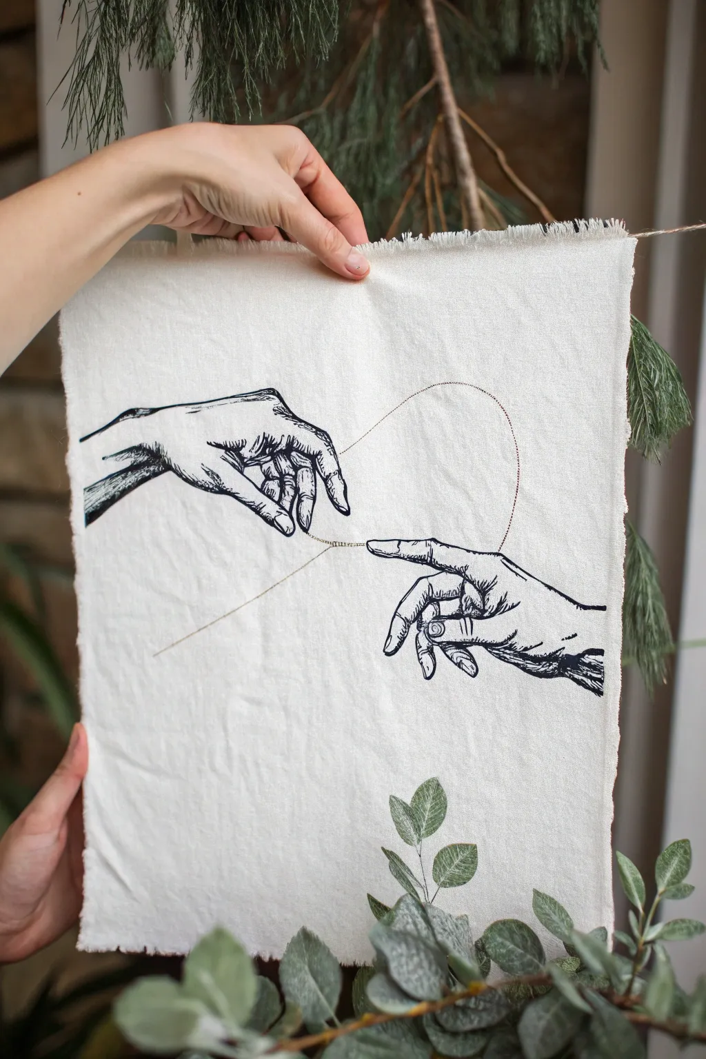
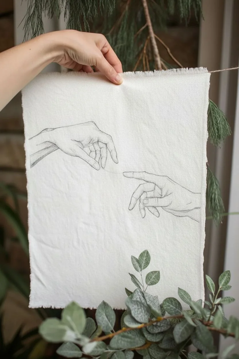
This minimalist mixed-media piece combines elegant line art with a delicate touch of embroidery. By stitching a single golden thread between two inked hands on textured fabric, you create a symbolic connection that feels both organic and refined.
Detailed Instructions
Materials
- Piece of medium-weight linen or cotton canvas (cream/off-white)
- Black fabric marker or fine-tip permanent ink pen (e.g., Micron)
- Gold metallic embroidery floss
- Embroidery needle (size 7-9)
- Transfer paper or graphite paper
- Pencil and eraser
- Reference image of hands (Creation of Adam style)
- Small embroidery hoop
- Scissors
Step 1: Preparation & Sketching
-
Prepare the fabric canvas:
Cut your fabric into a rectangle, approximately 8×12 inches. Instead of hemming, pull the loose threads along all four edges to create a purposeful 1/4-inch fringe. This gives the piece a rustic, handmade charm. -
Choose your design:
Locate a reference image of two hands reaching out. The classic ‘Creation of Adam’ composition works perfectly here. You can print out a template sized to fit your fabric. -
Transfer the artwork:
Place your transfer paper dark-side down on the fabric, then place your printed image on top. Secure it with tape so it doesn’t shift. -
Trace the outlines:
Using a pencil or stylus, trace over the main lines of the hands with firm pressure. Don’t worry about shading yet; just focus on getting the contours and knuckle details transferred clearly.
Ink Bleeding Info
If your ink spreads into the fabric fibers (bleeding), your fabric might be too absorbent. Test your pen on a scrap piece first. Using a finer tip pen usually helps reduce spreading.
Step 2: Inking the Design
-
Outline the left hand:
Take your black fabric marker or ink pen. Starting with the hand on the left, carefully go over your transferred pencil lines. Keep your hand steady and use a confident, flowing motion. -
Add shading details:
Refer to the original image to add shading. Use hatching (drawing closely spaced parallel lines) to create depth around the wrist, palm, and inner fingers. This mimics the look of a classic etching. -
Outline the right hand:
Repeat the inking process for the hand on the right. Pay special attention to the index finger, ensuring it points clearly toward the space where the thread will connect. -
Deepen the contrast:
Go back over the darkest areas—like the spaces between fingers and the deep shadows of the wrist—to make the black ink rich and solid. Let the ink dry completely for at least 30 minutes to prevent smudging.
Metallic Thread Tangle
Metallic thread is notoriously slippery and prone to kinking. Use a shorter length of thread than usual and run it through beeswax before stitching to help it glide smoother.
Step 3: Stitching the Golden Connection
-
Prepare the embroidery thread:
Cut a length of gold metallic embroidery floss. I find that using just one or two strands looks most delicate for this project. Thread your needle and tie a small knot at the end. -
Anchor the thread:
Bring the needle up from the back of the fabric, emerging exactly at the tip of the left hand’s index finger (or the finger holding the ‘string’). -
Create the curve:
Instead of a single long stitch, use a simple backstitch or a couching technique to create the curve. Bring the needle down and up along the intended path of the loose string. -
Form the heart loop:
Stitch upwards to create the large, loose loop that resembles the top of a heart. Keep your stitches small (about 3mm) to maintain a smooth curve without jagged angles. -
Connect the hands:
Continue stitching down from the loop until your needle reaches the tip of the pointing finger on the right hand. Pass the needle through to the back to finish the line. -
Secure the work:
Knot the thread securely on the reverse side of the fabric. Trim any excess thread tails.
Step 4: Finishing Touches
-
Erase guidelines:
Inspect the fabric for any visible transfer lines or pencil marks. Gently erase them, being careful not to rub the inked areas aggressively. -
Add hanging suspension:
To display the piece as shown, attach a piece of jute twine or rustic string to the top corners. You can sew loops onto the back or simply punch tiny holes in the upper corners to tie the string through. -
Press for perfection:
Iron the fabric face-down on a soft towel. This removes wrinkles without flattening your gold stitches or damaging the ink.
Hang your artwork in a well-lit spot where the gold thread can catch the light and shimmer.

PENCIL GUIDE
Understanding Pencil Grades from H to B
From first sketch to finished drawing — learn pencil grades, line control, and shading techniques.
Explore the Full Guide
Conjoined Twin Profile Drawing
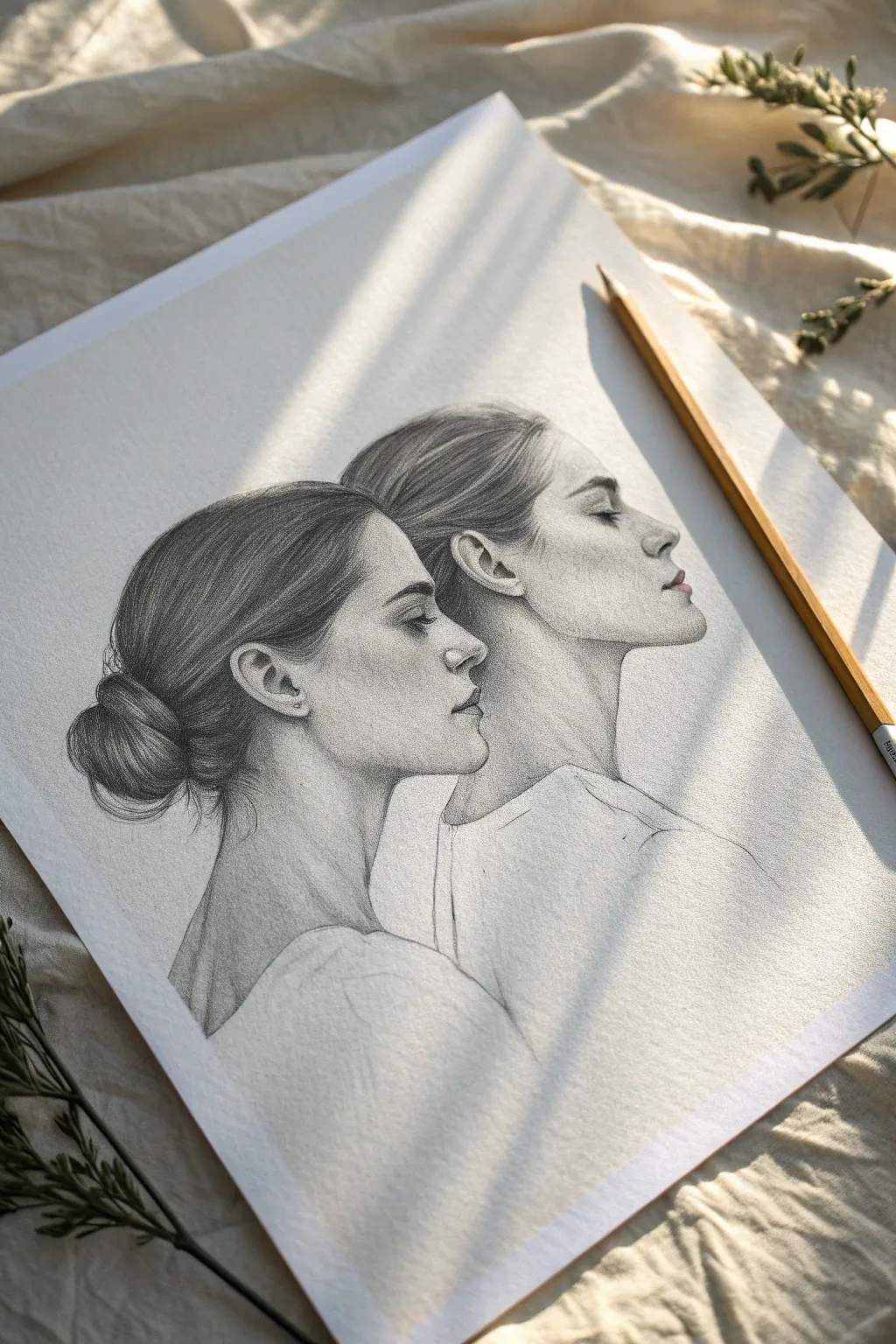
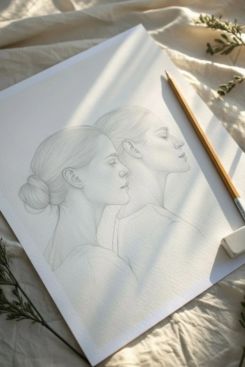
Capture the essence of connection with this delicate graphite drawing featuring two overlapping profiles gazing in the same direction. The soft shading and unified composition create a serene, almost dreamlike representation perfect for symbolizing twins or close bonds.
How-To Guide
Materials
- High-quality drawing paper (smooth or Bristol board, A4 size)
- Graphite pencils (HB, 2B, 4B, and 6B)
- Mechanical pencil (0.5mm HB) for fine details
- Kneaded eraser
- Blending stumps (tortillons) or soft tissue
- Sharpening tool
- Ruler (optional for grid method)
Step 1: Structural Layout
-
Establish the composition:
Begin by lightly marking the overall envelope of the two figures on your paper. Place them centrally, ensuring there is enough negative space above the heads and to the right of the faces. The figures should be looking towards the right side of the paper. -
Map the primary profile:
Using an HB pencil with a very light hand, sketch the outline of the front-most face. Focus on the slope of the forehead, the bridge of the nose, the curve of the lips, and the chin. Keep these lines faint so they can be adjusted easily. -
Position the secondary profile:
Sketch the second profile slightly behind and above the first. The chin of the second figure should align roughly with the jawline of the first. Their features should be parallel, creating a synchronized look. -
Define the hairlines:
Lightly outline the hair for both figures. The front figure wears a low bun, while the back figure’s hair is pulled back more loosely. Pay attention to the direction the hair grows from the forehead and the ear positioning on both subjects.
Smudge Control
Graphite smears easily. Place a scrap sheet of paper under your drawing hand to protect finished areas while you work. If smudging happens, dab (don’t rub) with a kneaded eraser.
Step 2: Rendering the Features
-
Detail the eyes:
Switch to a mechanical pencil for precision. Draw the closed eyelids with a gentle, curved line. The lashes should be delicate and sparse; avoid pressing too hard. The calmness of the expression relies heavily on the relaxed curve of the eye. -
Refine the noses and lips:
Strengthen the profiles. Use a 2B pencil to gently define the nostrils and the parting line of the lips. The lips should be soft, not outlined heavily, but rather defined by the shadows beneath them. -
Construct the ears:
Carefully draw the ears. Work on the front figure’s ear first, observing the complex cartilage curves. I find it helpful to think of the ear as a series of interlocking ‘C’ and ‘Y’ shapes rather than a single outline. -
Correct the jawlines:
Ensure the jawline of the front figure flows smoothly into the neck. The back figure’s jaw will be largely obscured by the front figure’s neck, creating that ‘conjoined’ or layered effect distinctive to this piece.
Step 3: Shading and Texture
-
Base skin tones:
Using an HB pencil held at a low angle, lay down a very light, even layer of graphite over the skin areas, avoiding the highest highlights on the forehead, cheekbone, and nose tip. -
Contour with shadows:
Switch to a 2B pencil to deepen the shadows. Focus on the eye sockets, under the nose, beneath the lower lip, and the area where the jaw meets the neck. Blend these gently with a stump for smooth skin texture. -
Build hair volume:
Start defining the hair strands using long, sweeping strokes that follow the curvature of the skull. Use a 4B pencil for the darker recesses near the bun and the nape of the neck to create depth. -
Detailing hair strands:
Sharpen your mechanical pencil or a hard H pencil to draw individual flyaway hairs and fine texture on the surface of the bun. This creates realism and breaks up the solid mass of the hair. -
Clothing suggestions:
Sketch the clothing very loosely. The shirt collars should be indicated with simple lines, keeping the fabric light and largely unshaded to maintain focus on the faces. A few varying line weights suggest folds without overworking it. -
Deepen contrast:
Use a 6B pencil sparingly to hit the darkest points—the pupil area (even though eyes are closed, the lash line is dark), the deepest part of the ear, and the darkest shadows in the hair bun. This pushes the contrast.
Pro Tip: Soft Transitions
To get that hyper-smooth skin look, avoid using your finger to blend, as oils from skin can cause patching. Use a clean tortillon or a dry tissue instead for an airy finish.
Step 4: Final Touches
-
Clean up highlights:
Take your kneaded eraser and pinch it into a fine point. Lift out pigment on the high points of the face (tip of nose, brow bone, cupids bow) to bring back the white of the paper. -
Refine edges:
Go around the outer profile edges. If they look too thick or outlined, use the eraser to soften them. The transition from skin to background should be crisp but not cartoonish. -
Add subtle freckles or texture:
If desired, lightly tap the pencil tip on the cheekbones to suggest skin texture or freckles, but keep this extremely subtle to maintain the ethereal look. -
Final assessment:
Step back and look at the drawing from a distance. Check the balance of the two profiles. If the overlapping area looks confusing, add a slightly darker shadow on the back figure’s neck where it meets the front figure.
Now you have a poetic double portrait that captures a beautifully quiet moment between two figures
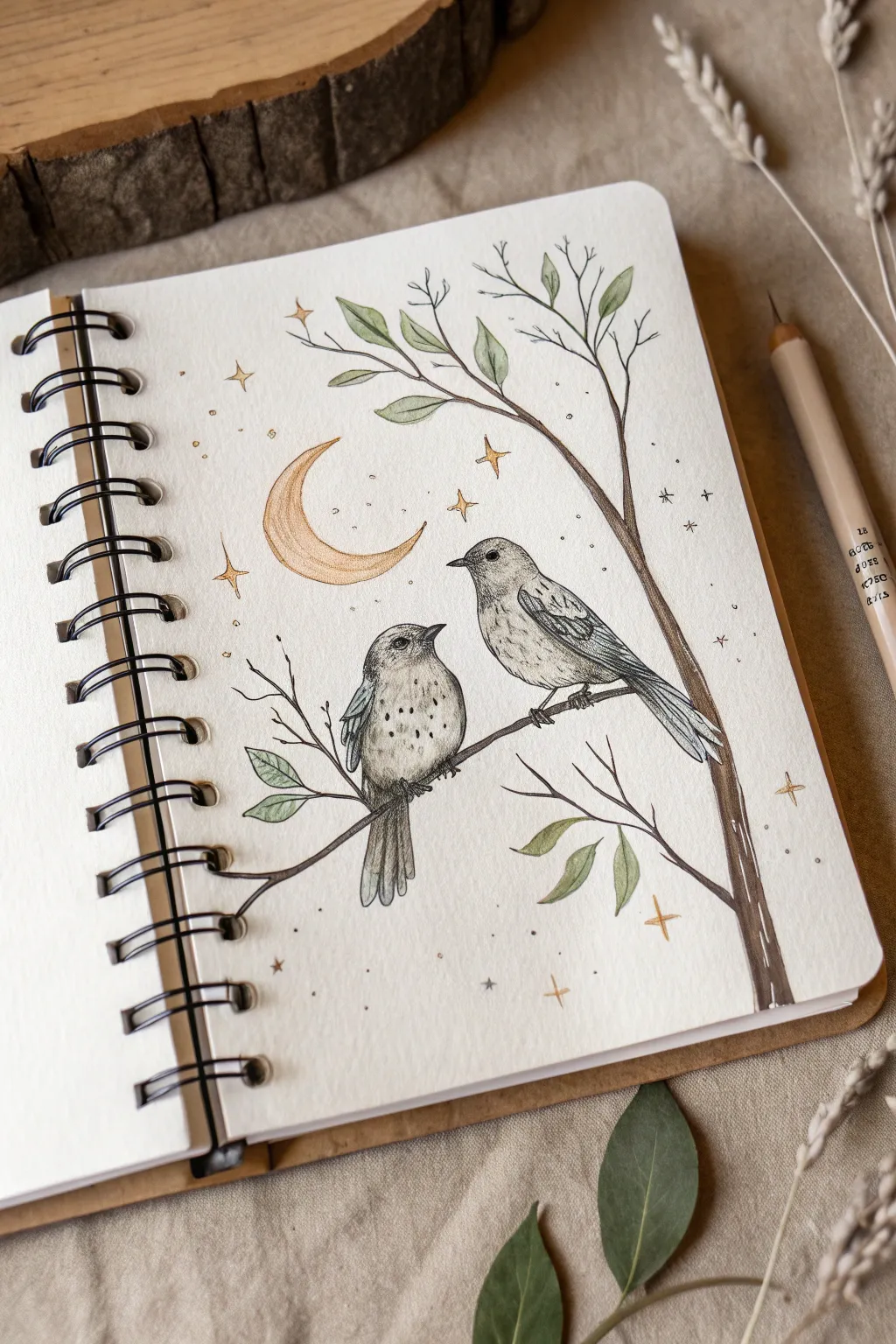
Two Birds Sharing One Branch

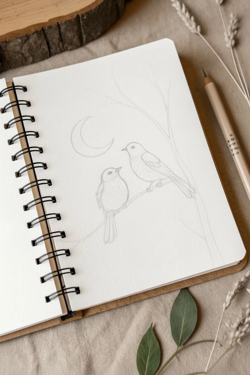
This whimsical illustration combines delicate ink work with soft watercolor washes to create a serene night scene. Two textured birds perch together under a golden crescent moon, surrounded by twinkling stars and gentle foliage.
Step-by-Step
Materials
- Spiral-bound sketchbook with mixed-media or watercolor paper
- Fine liner pens (0.1mm, 0.3mm, and 0.5mm, preferably waterproof)
- Watercolor pencils or a small watercolor pan set (muted green, gold/ochre, warm brown, grey)
- Soft graphite pencil (HB or 2B) and eraser
- Small round watercolor brush (size 2 or 4)
- White gel pen (optional for highlights)
Step 1: Sketching the Layout
-
Establish the branch:
Begin with a light pencil sketch. Draw a main branch entering from the bottom right corner, curving gently upwards towards the left. Add a secondary branch splitting off towards the top right. -
Position the birds:
Lightly sketch two oval shapes on the main branch for the birds’ bodies. Make the bird on the left slightly smaller and rounder, facing right. The bird on the right should be leaner and facing left, creating a connection between them. -
Add celestial elements:
Above and slightly to the left of the birds, draw a classic crescent moon shape. Scatter small four-pointed stars and tiny dots randomly around the empty space to balance the composition. -
Refine the forms:
Define the birds’ heads, beaks, and tail feathers. Add wing shapes resting against their sides. Sketch in small leaf clusters on the thinner upper twigs.
Ink Smudging?
If your black ink bleeds when you add watercolor, your pen isn’t waterproof. Let the ink dry for at least 24 hours before painting, or paint first and ink later.
Step 2: Inking the Details
-
Outline the birds:
Using a 0.3mm fine liner, go over your pencil lines for the birds. Use short, broken strokes for the belly and chest to suggest soft feathers, rather than a solid, heavy line. -
Texture the wings:
Switch to a 0.1mm pen for fine details. Draw layers of feathers on the wings using scalloped lines and elongated U-shapes. Darken the tips of the primary flight feathers. -
Detail the faces:
Carefully ink the beaks and eyes. Leave a tiny white speck in each eye for a catchlight, which brings the birds to life. Add subtle stippling (dots) around the cheeks and neck for shading. -
Ink the branch:
Use a 0.5mm pen for the branch to give it weight. Add wood grain texture by drawing long, wavy lines along the length of the branch, occasionally breaking the line for a knot or rough patch. -
Define the leaves:
Outline the leaves with a continuous, fluid line. Draw a central vein in each leaf, but keep the details minimal to let the color do the work later. -
Celestial outlines:
Trace the moon and the larger four-pointed stars with a steady hand. I like to use a slightly thinner pen here to keep the sky elements looking delicate. -
Erase guidelines:
Once the ink is completely dry—give it a few minutes to be safe—gently erase all underlying pencil marks to clean up the page.
Make it Metallic
Swap the yellow ochre paint for metallic gold watercolor or gold ink for the moon and stars. It creates a stunning shimmer when you turn the page.
Step 3: Adding Washes of Color
-
Color the moon and stars:
Using a gold or yellow ochre watercolor pencil or paint, fill in the crescent moon. Concentrate the pigment at the bottom curve and fade it out slightly towards the top for a glowing effect. Paint the stars the same gold. -
Paint the leaves:
Mix a muted, sage green. Paint the leaves loosely; it’s okay if the color doesn’t perfectly fill the lines, as this adds to the illustrative charm. Vary the intensity slightly between leaves. -
Shade the birds:
Use a very diluted warm grey or light brown. Apply a light wash to the birds’ wings and the tops of their heads. Keep the bellies mostly white or very pale to maintain contrast. -
Tint the branch:
Apply a wash of warm brown to the branch. While the paint is still damp, you can drop in incredible tiny touches of darker brown near the bottom of the branch for instant volume. -
Add atmospheric dots:
Using your finest pen, add tiny stippled dots scattered loosely around the moon and stars to simulate distant stardust or magic. -
Final touches:
If you have a white gel pen, add tiny highlights to the top of the moon or the tips of the leaves for extra dimension.
Enjoy the quiet moment you have captured on paper with your finished celestial illustration

Have a question or want to share your own experience? I'd love to hear from you in the comments below!