Geometric abstract art is my favorite kind of “structured play”—simple shapes that somehow turn into something powerful. If you’ve been craving bold color, crisp edges, and satisfying patterns, these geometric abstract art ideas will keep your sketchbook (and your walls) busy.
Classic Color-Block Grid
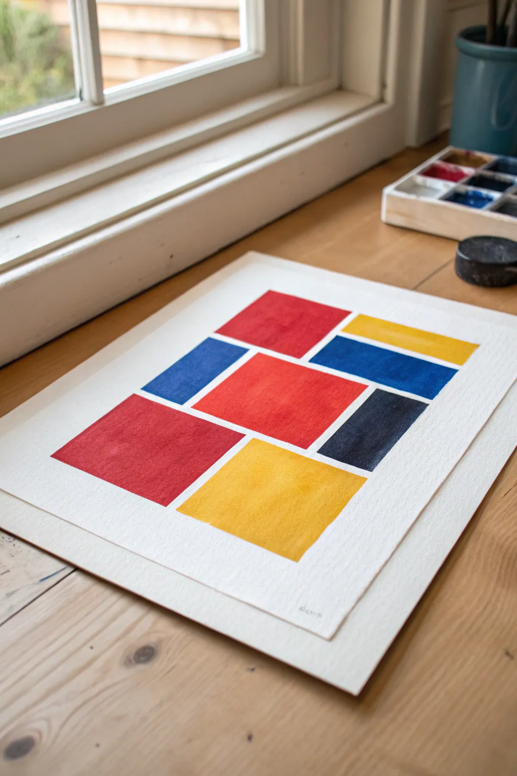
Capture the essence of De Stijl with this crisp, balanced composition of primary colors and bold shapes. This project relies on clean lines and saturated pigments to create a modern, minimalist statement piece perfect for brightening any corner.
Step-by-Step Guide
Materials
- Heavyweight watercolor paper (300gsm cold press recommended)
- Artist’s masking tape or painter’s tape
- Gouache or watercolor paints (Primary Red, Primary Blue, Primary Yellow, Black)
- Pencil (HB or 2H)
- Ruler or T-square
- Flat shader brushes (sizes 6 and 10)
- Mixing palette
- Jar of water
- Paper towels
Step 1: Preparation & Layout
-
Prepare your workspace:
Find a well-lit area, ideally near natural light like a window. Tape down the edges of your watercolor paper to a board or table surface to prevent warping when the paint is applied. -
Define the outer margin:
Using your ruler and pencil, lightly draw a rectangular border inside your paper roughly 1.5 to 2 inches from the edge. This will frame your composition and keep the artwork centered. -
Sketch the primary shapes:
Looking at the reference image, sketch the rectangular blocks lightly. Start with the large central red square, as it anchors the composition. -
Add supporting rectangles:
Draw the surrounding shapes: a tall yellow rectangle at the bottom, a blue rectangle to the left, and the smaller cluster of red, blue, and yellow blocks at the top right. -
Check the spacing:
Ensure you leave consistent gaps (channels) of white paper between every shape. These ‘gutters’ act as your negative space grid, so keep them uniform, about 1/4 inch wide. -
Finalize the grid:
Once you are happy with the arrangement, very lightly erase any heavy graphite lines so they won’t show through transparent paints later.
Clean Edges Pro-Tip
For laser-sharp lines, apply narrow masking tape over the white ‘gutter’ spaces before painting. Peel it off only after the paint is 100% dry.
Step 2: Painting the Primary Colors
-
Mix your red:
Load your palette with primary red gouache or watercolor. I prefer using gouache for this style because it dries opaque and matte, giving that solid ‘block’ look. -
Paint the red blocks:
Using a flat shader brush, carefully fill in the large central square and any other red sections. Use the flat edge of the brush to cut a straight line along your pencil marks. -
Let the red dry:
Allow the red sections to dry completely before moving on. Since we aren’t touching wet paint to wet paint, you don’t need to wait long, but you want to avoid accidental smudging. -
Apply the blue tones:
Mix a rich primary blue. Fill in the designated blue rectangles on the left and upper right. Keep your hand steady near the edges to maintain those crisp white borders. -
Add the yellow accents:
Clean your brush thoroughly. Mix a bright primary yellow and paint the large bottom rectangle and the smaller top strip. Yellow can be transparent, so you might need a second coat after the first dries.
Step 3: Adding Contrast & Details
-
Paint the black anchor:
Locate the single dark rectangle in the composition (usually near the bottom right or center-right). Fill this with flat black paint to add weight and contrast to the bright colors. -
Refine the edges:
Inspect your colored blocks. If any edges look ragged, use a slightly damp, clean brush or a tiny bit of fresh paint to straighten them out carefully. -
Erase stray marks:
Once the paint is bone dry—touch it lightly to be sure—take a kneaded eraser and gently lift away any visible pencil lines in the white ‘gutters’ between shapes. -
Sign your work:
Add your signature or initials in pencil at the bottom right corner, keeping it small and subtle.
Level Up: Texture
Instead of flat color, try a ‘dry brush’ technique on the final layer. It leaves tiny white speckles of paper showing through for a vintage, linen-like look.
Now you have a bold, modernist piece ready to frame and display
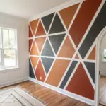
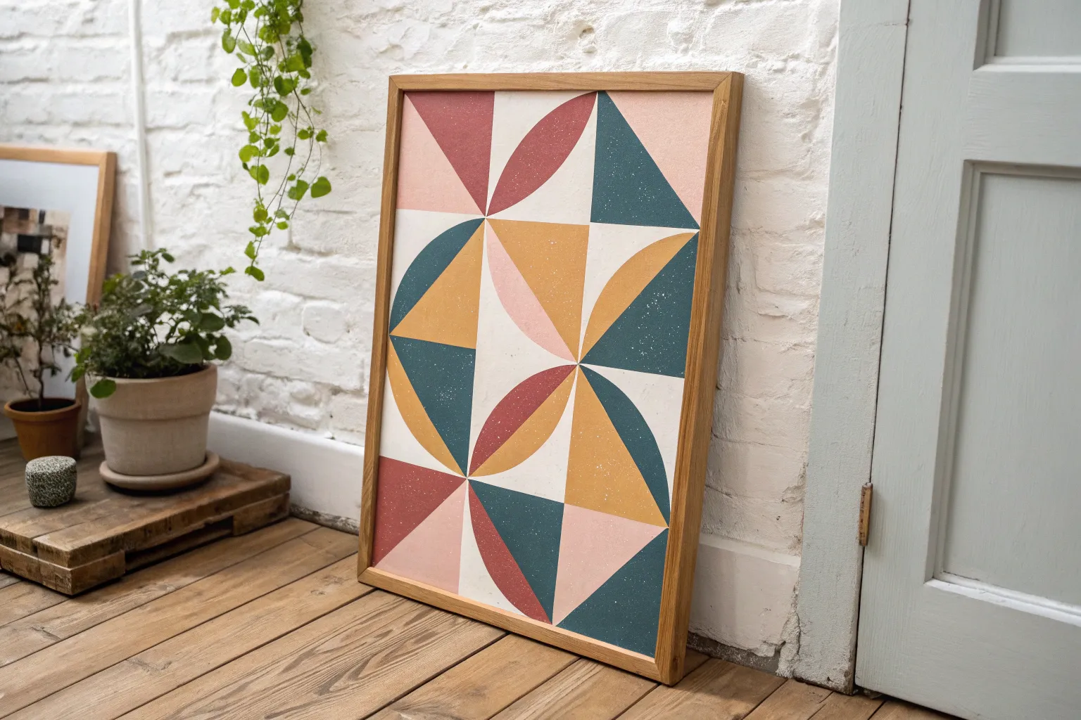
Tessellating Triangle Mosaic
Transform a plain canvas into a sophisticated geometric statement piece with this tessellating triangle design. The muted earth tones and crisp lines create a modern mosaic effect that adds warmth and structure to any wall.
Step-by-Step
Materials
- Large rectangular stretched canvas (approx. 24×36 inches)
- Acrylic paints (terracotta, sage green, navy blue, beige, light grey, mocha, mustard)
- Painter’s tape (0.25 inch or narrowest available)
- Ruler or straight edge
- Pencil
- Flat shader brushes (medium size)
- Palette or paper plate
- Floating frame (optional, for finishing)
- Matte varnish or sealant
Step 1: Drafting the Grid
-
Calculate your dimensions:
Measure the width and height of your canvas accurately. Decide on the size of your triangles; for the look in the image, equilateral triangles with roughly 3-inch sides work well. -
Mark horizontal guides:
Using your ruler and pencil, lightly draw horizontal lines across the entire canvas, spacing them apart by the height of your triangles (mathematically, this is the side length × 0.866). -
Mark vertical intervals:
On your first horizontal line, make a mark every 3 inches (or your chosen side length). On the second line, stagger these marks so they sit exactly halfway between the marks on the line above. -
Connect the dots:
Use your ruler to connect these staggered marks diagonally. Draw lines slanting right and lines slanting left to form a perfect grid of tessellating triangles across the entire surface. -
Wrap the pattern:
Don’t forget the edges! Extend your pencil lines over the sides of the canvas so the pattern continues seamlessly around the depth of the frame.
Bleeding Lines?
If paint bleeds under the tape, wait for it to dry completely. Then, use a small flat brush and the neighboring color to paint a straight line over the mistake, tidying the edge.
Step 2: Planning and Taping
-
Color map your design:
Before painting, take a moment to lightly label each triangle with a letter code for your colors (e.g., ‘T’ for terracotta, ‘N’ for navy). This helps ensure a random yet balanced distribution without adjacent colors clumping. -
Tape the first batch:
You cannot paint adjacent triangles simultaneously. Apply painter’s tape along the outlines of a scattered selection of non-touching triangles. Press the tape edges down firmly to prevent bleeding. -
Seal the tape edges:
I find it helpful to brush a tiny amount of clear matte medium or white paint over the tape edges first. This creates a barrier so any bleed-under is invisible, keeping your colored lines razor sharp.
Step 3: Painting the Mosaic
-
Mix your palette:
Prepare your acrylic colors. Aim for a matte finish to mimic the fabric-like texture in the photo. If your paints are glossy, mix in a little matte medium. -
Apply the first layer:
Paint the open triangles within your taped areas. Use straight, even strokes. Since we want a solid, opaque look, you usually shouldn’t dilute the paint with water. -
Add a second coat:
Once the first coat is dry to the touch, apply a second coat to ensure rich saturation, especially for darker colors like navy and forest green. -
Remove tape carefully:
Peel off the tape while the paint is still slightly tacky, pulling away from the painted area at a 45-degree angle. -
Tape the second batch:
Wait until the first set of triangles is completely dry. Then, tape off the next set of non-touching triangles. The tape will go over your previously painted sections, which is why total dryness is crucial. -
Continue the cycle:
This process requires patience. Repeat the taping, painting, drying, and peeling cycle until every triangle on the face and sides of the canvas is filled.
Textured Upgrade
For a true textile look, mix fine sand or a texture gel medium into your acrylic paints before applying. This adds tactile grit that mimics heavy woven fabric.
Step 4: Finishing Touches
-
Touch up lines:
Inspect your grid. If there are slight gaps between triangles where the canvas shows through, use a very fine liner brush and the appropriate color to bridge the gap carefully. -
Apply texture (optional):
To achieve the fabric-like texture seen in the inspiration photo, you can lightly dab a dry sponge over the painted surface before sealing. This breaks up the plastic look of acrylics. -
Seal the artwork:
Apply a coat of matte spray varnish over the entire piece. This protects the paint from dust and UV light while unifying the sheen of the different colors. -
Frame the piece:
Install the finished canvas into a floating frame, ideally in a light wood tone like oak or ash, to complement the earthy color palette.
Hang your geometric masterpiece in a well-lit spot to let those crisp lines and earthy tones shine.
Hard-Edge Tape Geometry
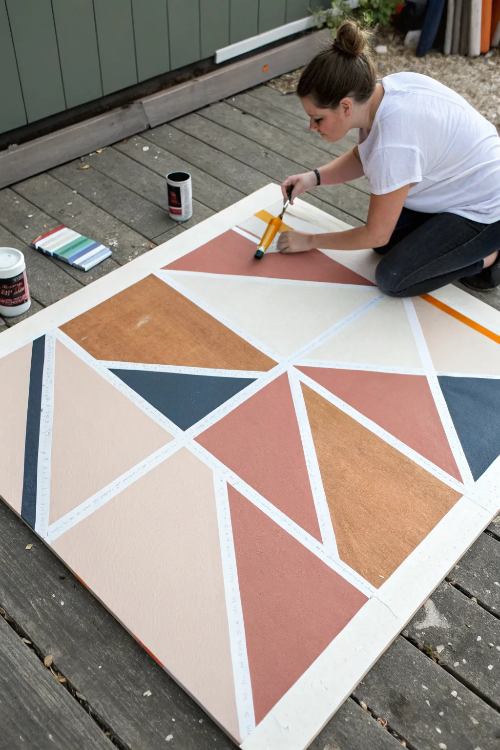
Transform a simple plywood sheet into stunning modern wall art using clean lines and a refined, earthy color palette. This hard-edge painting technique relies on painter’s tape to create crisp, geometric separations between blocks of terracotta, mustard, navy, and blush.
How-To Guide
Materials
- Large square plywood sheet or primed canvas board (approx. 4’x4′)
- White primer or gesso
- Painter’s tape (various widths if desired, standard 1-inch is fine)
- Acrylic or latex paints (Terracotta, Ochre/Mustard, Navy Blue, Blush/Beige, White)
- Small foam roller
- Medium flat paintbrush
- Utility knife
- Drop cloth
- Ruler or straight edge (optional)
Step 1: Base Preparation
-
Clean surface:
Ensure your plywood board is free of sawdust and dirt. If the wood is rough, give it a quick sanding with fine-grit sandpaper to create a smooth surface for the paint. -
Prime the board:
Apply a solid coat of white primer or gesso over the entire surface. This seals the wood and ensures your shapes will be bright and true to color later on. -
Dry completely:
Let the primer dry fully. It must be bone dry before you apply tape, or the adhesive might peel up your base coat.
Step 2: Design & Taping
-
Map the layout:
Visualize a grid system. Start by creating a large ‘X’ shape or crossing lines to divide the board into four main quadrants using your painter’s tape. -
Subdivide sections:
Within each quadrant, apply more strips of tape to create smaller triangles and trapezoids. Aim for asymmetry to keep the composition dynamic. -
Check intersections:
Where tape lines cross, press down firmly. Ensure your tape lines are straight and taut across the board. -
Seal edges:
Run your finger or a clean credit card firmly along every edge of the tape. This is crucial for preventing paint bleed. -
Anti-bleed trick:
I like to paint a very thin layer of the base color (white) over the tape edges. This seals the tape so any seepage is white-on-white, keeping your final lines razor sharp.
Bleeding Lines?
If paint seeped under the tape, wait for it to dry fully. Then, use a small flat brush and the white background color to ‘erase’ the mistake by painting a straight line over the bleed.
Step 3: Painting the Geometry
-
Plan your palette:
Assign colors to your shapes before opening the cans. Try to balance the darks (navy) and brights (terracotta) so they aren’t all clustered in one corner. -
Paint the lightest colors:
Start by filling in the blush and beige sections. Use a small foam roller for flat coverage or a brush for a textured look. -
Apply mid-tones:
Move on to your terracotta and ochre colors. Be careful not to paint over the tape onto adjacent sections that are designated for different colors. -
Add dark accents:
Fill in the navy blue sections last. These strong darks add visual weight and anchor the abstract design. -
Apply second coats:
Check for opacity. Most acrylics allow the wood grain to peek through after one coat, so apply a second layer if you want a solid, matte finish.
Burnish for Crispy Lines
Use the back of a spoon to rub the tape edges down aggressively before painting. The friction heats the adhesive slightly for a tighter seal on textured wood.
Step 4: The Reveal
-
Time it right:
Don’t wait for the paint to cure completely. The sweet spot for removal is when the paint is dry to the touch but still slightly flexible. -
Peel the tape:
Slowly pull the tape off at a 45-degree angle alongside the paint line. Pulling perpendicular can rip the paint film. -
Touch ups:
If any tiny bleeds occurred, use a small detail brush and your white base color to clean up the lines.
Hang your new large-scale art piece and enjoy the modern warmth it brings to your space

Concentric Circles Study
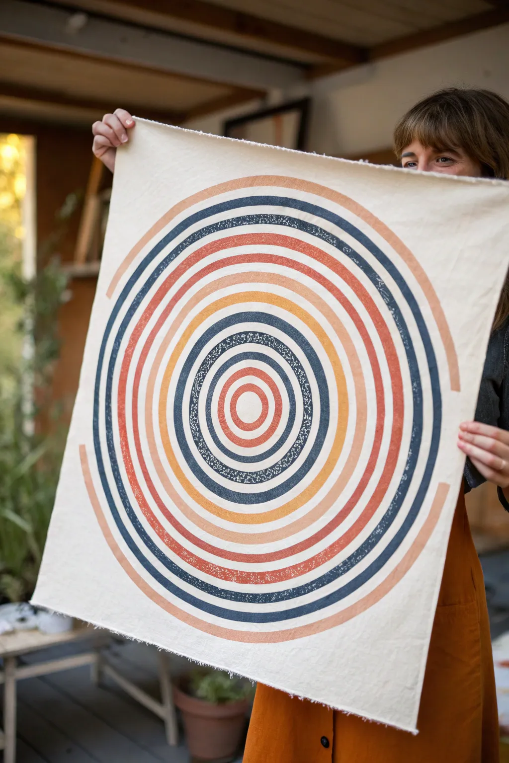
This striking wall hanging features a mesmerizing concentric circle design in a warm, retro-inspired palette. Using simple block printing techniques on natural linen, you’ll create a textured, geometric statement piece that feels both modern and timeless.
Detailed Instructions
Materials
- Natural linen or cotton canvas fabric (at least 20×20 inches)
- Fabric ink or screen printing ink (Navy, Terracotta, Peach, Mustard)
- Linoleum carving block (large sheet, approx. 12×12 inches)
- Linoleum carving tools (V-gouge and U-gouge)
- Brayer (rubber roller)
- Acrylic sheet or glass palette for inking
- Compass or string and pencil
- Ruler
- Masking tape
- Iron (for heat setting)
- Large cutting mat
Step 1: Design & Carving
-
Prepare the block surface:
Begin by lightly sanding your linoleum block if it has a glossy finish. This helps the pencil marks show up clearly and prevents the carving tool from slipping. -
Mark the center:
Find the exact center of your linoleum block using a ruler. Mark it clearly with a pencil, as this will be the anchor point for all your circles. -
Draw the concentric circles:
Using a compass, draw a series of concentric circles radiating from the center point. Make the bands approximately 1/2 inch to 3/4 inch wide. If your compass isn’t large enough for the outer rings, use the string-and-pencil method to extend the design to the edges. -
Plan the negative space:
Decide which rings will be inked and which will be the negative space (the gaps between colors). Mark the areas to be carved away with an ‘X’ to avoid mistakes later. -
Carve the outlines:
Using a fine V-gouge tool, carefully carve along the pencil lines that define the edges of your circles. Keep the blade angle low to create smooth, clean cuts without digging too deep. -
Clear the negative space:
Switch to a wider U-gouge tool to clear away the material between the rings. Don’t worry about getting this perfectly flat; leaving a little texture creates that authentic ‘stamp’ look seen in the original piece. -
Separate the rings (Optional):
For easier multi-color printing, I prefer to physically cut the linoleum rings apart completely using a craft knife. This creates separate ring stamps for each color band, rather than trying to ink one complex block with multiple colors.
Registration Trick
If using separate rings, mark a ‘top’ point on the back of every individual ring stamp. Aligning these marks ensures the circles stay concentric and don’t drift sideways.
Step 2: Printing Process
-
Prepare the fabric:
Iron your fabric piece completely flat. Lay it out on a slightly padded surface (like a towel under a drop cloth) or a firm table, taping the corners down so it doesn’t shift. -
Mark fabric guidelines:
Lightly mark the center of your fabric with a pencil or disappearing ink pen. This ensures your entire design stays centered on the cloth. -
Ink the center ring:
Squeeze a small amount of the lightest color (peach) onto your palette. Roll the brayer back and forth until it has an even, velvety texture. Roll the ink onto the smallest central ring block. -
Print the center:
Align the center ring block with your fabric mark. Press down firmly and evenly with your palms, or use a clean brayer to roll over the back of the block. Peel it back carefully to reveal the print. -
Print the subsequent rings:
Moving outward, ink the next ring in a contrasting color (like terracotta). Because you separated the rings, you can simply nest this ring around the first printed circle. Press firmly and lift. -
Continue the pattern:
Continue working outward, alternating colors between navy, mustard, terracotta, and peach. To match the photo, create a specific rhythm: perhaps the dark navy bands act as strong anchors every third or fourth ring. -
Create the texture:
Apply slightly less pressure on some of the darker rings, or use a ‘starved’ roller (less ink), to achieve the speckled, distressed texture visible in the darker navy bands of the reference image. -
Dry and set:
Let the fabric ink dry completely, which usually takes 24 hours. Once dry, follow the manufacturer’s instructions to heat set the ink with a hot iron, ensuring the print becomes permanent and washable. -
Finish the edges:
For the raw, rustic look shown in the image, simply fray the edges of the canvas slightly by pulling the loose threads, or sew a simple straight stitch 1/2 inch from the edge to stop the fraying at a specific point.
Mixed Media Dimension
After the ink is fully dry, embroider over one or two of the thinner rings using a simple running stitch in a matching thread color for added tactile texture.
Now you have a stunning piece of geometric fiber art ready to hang or use
BRUSH GUIDE
The Right Brush for Every Stroke
From clean lines to bold texture — master brush choice, stroke control, and essential techniques.
Explore the Full Guide
Half-Circle And Arc Stacks
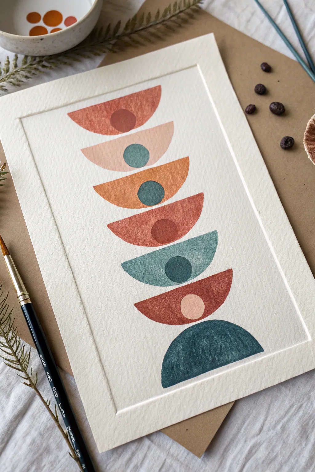
This serene geometric composition balances seven half-circles in varying orientations, creating a gentle sense of rhythm and calm. The interplay of warm terracottas and cool teals on textured paper gives it a grounded, organic feel perfect for modern decor.
Step-by-Step
Materials
- Cold press watercolor paper (300 gsm)
- Watercolor paints (terracotta, peach, teal, deep green, rust)
- Round watercolor brushes (size 4 and size 6)
- Pencil and eraser
- Compass or circle stencil
- Ruler
- Washi tape or painter’s tape
- Palette for mixing
- Cup of water and paper towels
Step 1: Preparation & Layout
-
Prepare your paper:
Begin by taping down your watercolor paper to a hard board using washi tape. This creates that crisp white border seen in the final piece and prevents the paper from buckling when wet. -
Establish the centerline:
Using a ruler and a very light pencil touch, draw a vertical line down the exact center of your paper. This will serve as the anchor for all your stacked shapes. -
Mark shape spacing:
Mark the vertical placement for seven shapes. Leave a little breathing room between each layer so the paints don’t bleed into one another. The shapes should decrease slightly in width as you go from the bottom up to the top. -
Draft the half-circles:
Use a compass or stencil to draw seven half-circles centered on your vertical line. Alternate their orientation: the top one faces up (like a bowl), the second faces up, the third faces down, and so on. Note that the bottom-most shape is a solid half-circle with no inner circle. -
Add the inner circles:
For the top six shapes, draw a small circle resting inside the curve. These ‘moons’ should sit centered within the arc of the half-circle. -
Clean up:
Gently erase your vertical centerline, leaving only the external outlines of your shapes visible. Keep these lines faint so they disappear under the paint.
Wet Edge Control
To keep edges crisp, painting ‘wet on dry’ is best here. If you accidentally go over a line, use a clean, damp brush to gently lift the excess paint while it is still wet.
Step 2: Painting the Shapes
-
Mix your palette:
Prepare your colors. You’ll need a gradient of warm earth tones—deep rust, soft peach, terracotta—and cool tones like muted teal and a dark forest green. Test them on scrap paper first. -
Paint the top arc:
Start with the top-most half-circle physically. Load your size 6 brush with a warm terracotta wash and fill in the large arc shape, carefully painting around the small inner circle. -
Add the inner contrast:
While the arc dries, use a smaller brush to paint the inner circle a darker, deeper red-brown. This creates immediate contrast. If the arc is still very wet, wait a moment to avoid bleeding. -
Second layer: Soft Peach:
Move to the second shape down. Paint the arc with a very diluted, watery peach color. This should be the lightest element in the stack. -
Teal accent:
Fill the inner circle of the peach shape with a medium teal. The contrast between the pale arc and the bold center is key here. -
Third layer: Textured Orange:
Paint the third arc (which faces downward) with a vibrant orange-rust. I like to let the pigment pool slightly in the corners for extra texture. -
Fourth layer: Red Earth:
The fourth arc is a deeper red clay color. It faces upward. Keep your edges crisp as you paint around the circular void. -
Fifth layer: Muted Teal:
Switch to your cool palette. Paint the fifth arc (facing upward) with a watery teal wash. It should be semi-transparent to show the paper texture. -
Sixth layer: Deep Rust:
The sixth shape (facing downward) returns to a dark rust red. Paint the inner circle a very pale peach, almost white, to make it pop against the dark surround. -
The anchor shape:
Finally, paint the large bottom half-circle a solid, deep forest green or indigo. This shape has no inner circle, acting as a heavy base for the stack.
Step 3: Finishing Touches
-
Check density:
Look over your dried shapes. If any look too pale or streaky, add a second glaze of the same color to deepen the saturation, particularly on the bottommost green shape. -
Erase guidelines:
Once the paint is 100% bone dry (touch it with the back of your hand to check), gently erase any remaining pencil lines visible around the edges. -
The reveal:
Slowly peel away the tape at a 45-degree angle, away from the painting, to reveal your clean, white border.
Metallic Accents
Once the watercolor is dry, paint the small inner circles with gold or copper metallic paint instead of matte colors for a luxurious, shimmering finish.
Frame this piece behind glass to protect the delicate texture of the paper and display your geometric creation with pride
Chevron And Zigzag Movement
This striking geometric artwork combines the rustic warmth of wood textures with clean, modern lines to create a dynamic chevron pattern. With its earthy palette of terracotta, sage blue, gold, and parchment, it brings a sophisticated sense of movement to any space.
How-To Guide
Materials
- Large sheet of sturdy watercolor paper or illustration board (18×24 or similar)
- Pencil and large ruler
- Protractor or angle finder
- Watercolor paints or diluted acrylics (Terracotta, Slate Blue, Ochre Gold, Pale Peach)
- Flat shader brushes (various sizes)
- White gel pen or fine white acrylic marker
- X-acto knife and cutting mat
- White matting board
- White frame (sized to your artwork)
- Masking tape or painter’s tape
Step 1: Drafting the Design
-
Prepare your surface:
Begin by taping down your watercolor paper or illustration board to a flat surface. This prevents buckling when we add the paint washes later. -
Establish the center point:
Find the exact horizontal and vertical center of your paper. Make a light mark where these two lines intersect; this central ‘X’ convergence point is the anchor for the entire chevron illusion. -
Draw the main X axes:
From the center point, use your ruler to draw two large diagonal lines extending to the four corners. This creates the primary ‘X’ shape that divides the composition. -
Mark chevron intervals:
Along one of the main diagonal lines, make tick marks every 1.5 to 2 inches (depending on your desired thickness). Repeat this exact spacing on the other three diagonal arms. -
Connect the lines:
Connect the tick marks to create parallel V-shapes nested inside each other. Ensure your lines meet perfectly at the vertical and horizontal center seams to maintain the clean, geometric structure. -
Refine the border:
Once the pattern is drawn, decide on the outer dimensions. Erase any lines that extend beyond your intended rectangular view.
Grain Direction
Always paint your brushstrokes in the same direction the ‘planks’ are moving. If the chevron points up, your strokes should angle up too.
Step 2: Creating Texture and Color
-
Mix your palette:
Prepare four distinct washes: a deep slate blue, a warm terracotta red, an earthy ochre gold, and a very pale peach-tan. Keep the paint slightly watery to allow the paper texture to show through, mimicking wood grain. -
Paint the first color group:
Start with the slate blue sections. I find it helpful to mark the sections lightly with a ‘B’ beforehand so I don’t get lost in the pattern. Apply the paint, brushing in one direction to simulate grain. -
Apply the warm tones:
Move on to the terracotta sections. Paint carefully up to the pencil lines but don’t worry about perfect edges yet—we will clean those up later. -
Add the gold and peach:
Fill in the remaining chevron stripes with the ochre and pale peach washes. The variation in transparencies here adds to the organic, wood-inlay look. -
Create wood grain effects:
While the paint is still slightly damp, take a drier brush or a tissue and streak through the color vertically. This lifts pigment to create subtle streaks resembling timber texture. -
Let it dry completely:
Patience is key here. Allow the piece to dry fully to prevent smudging during the detailing phase.
Step 3: Detailing and Assembly
-
Clean the boundaries:
Using a white gel pen or a fine white acrylic marker, meticulously trace over the pencil lines between every color block. This white ‘grout’ line separates the shapes and makes the colors pop. -
Double-check intersections:
Pay extra attention to where the chevrons meet in the center. The white lines should form crisp, sharp points to enhance the optical movement. -
Add texture details:
If any section looks too flat, use colored pencils in a matching shade to add fine scratching or stippling on top of the dried paint for added depth. -
Prepare the matting:
Cut your white mat board so the opening fits exactly around your design, leaving a generous white border to breathe. This negative space is crucial for the modern gallery aesthetic. -
Final framing:
Place the artwork behind the mat, secure it with tape, and insert it into the white frame. Clean the glass inside and out before sealing it up.
Real Wood Veneer
Swap the paint for actual wood veneer sheets. Cut shapes with an X-acto knife and stain them individually before gluing down.
Hang your new geometric masterpiece in a spot with good natural light to highlight the subtle textural details you created

PENCIL GUIDE
Understanding Pencil Grades from H to B
From first sketch to finished drawing — learn pencil grades, line control, and shading techniques.
Explore the Full Guide
Symmetrical Mirror Design
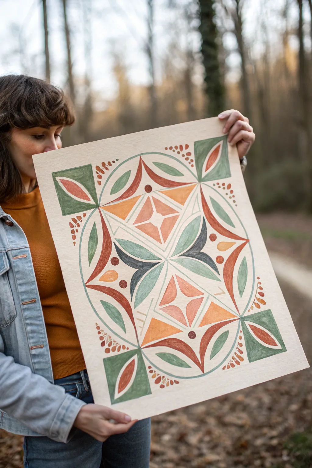
This project combines warm, nature-inspired tones with crisp geometry to create a striking symmetrical design reminiscent of traditional folk patterns. Using matte paints on textured paper, you will build a mirrored composition that feels both structured and organic.
Step-by-Step Guide
Materials
- Large sheet of cold-press watercolor paper or heavyweight mixed media paper (at least 18×24 inches)
- Gouache or matte acrylic paints (terracotta, olive green, ochre yellow, deep teal/black, white)
- Ruler or T-square
- Compass for drawing circles
- Sharp HB pencil and kneaded eraser
- Painter’s tape
- Flat shader brushes (medium and small)
- Fine liner brush for details
- Palette for mixing
Step 1: Drafting the Framework
-
Prepare the surface:
Tape down your large sheet of textured paper to a flat surface/board. This prevents buckling and gives you a nice clean edge later, though this design floats in the center. -
Mark the center:
Use your ruler to lightly measure and mark the absolute center of your paper. Draw a very faint vertical and horizontal axis line crossing through this point to guide your symmetry. -
Draw the primary circle:
Using a compass set to a large radius (leaving about 2-3 inches of margin from the paper’s edge), draw the main circle that will encase most of the design. -
Define the corner anchors:
Lightly sketch a square shape that intersects with the circle. At each corner of this invisible square, draw a smaller square ‘anchor’ that sits just outside the main circle’s curve. -
Sketch the internal diamonds:
Within the main circle, use your ruler to sketch two large diamond shapes stacked vertically along the central axis. These will house the starburst motifs. -
Draft the leaf motifs:
Sketch the flowing, organic leaf shapes that curve around the central diamonds. Ensure each leaf on the left is perfectly mirrored by one on the right.
Creamy Consistency
Mix your gouache to the consistency of heavy cream. Too watery and it will streak; too thick and it will crack. Test on a scrap piece first.
Step 2: Blocking in Color
-
Paint the corner squares:
Mix a muted olive green. Fill in the four outer corner squares, carefully cutting in the straight edges with a flat brush. -
Add the terracotta curves:
Switching to a deep terracotta or rusty orange, paint the long, curved petal shapes that hug the outer perimeter of the circle. I find it easiest to rotate the paper as I paint these curves to keep my hand steady. -
Fill the central stars:
Inside the two central diamond shapes, paint the four-pointed star motifs. Use a lighter, peach-toned mix (terracotta + white) for the star itself to make it pop against the background. -
Paint the ochre triangles:
Fill the triangular spaces surrounding the central stars with a warm ochre or mustard yellow. -
Block in the dark contrast:
Mix a very deep teal or soft black. Paint the central-most leaf shapes that radiate from the very center of the design, creating a strong focal point. -
Complete the green foliage:
Return to your olive green mix. Paint the remaining leaf shapes that curve inwards from the sides, ensuring the paint is opaque and matte.
Texture Play
Instead of flat color, try ‘dry brushing’ the final layer of the leaves. Use a mostly dry brush to drag a lighter shade over the base color for a vintage, weathered look.
Step 3: Refining and Detailing
-
Paint the leaves inside corners:
Inside the four green corner squares, paint the contrasting inner petal shapes. Use terracotta for the top and bottom corners to maintain balance. -
Add separation lines:
Using a fine liner brush and slightly thinned white or cream paint, carefully outline the central geometric sections to create crisp separation between the touching colors. -
Dot the perimeter:
Dip the handle end of a brush or a dedicated dotting tool into the terracotta paint. Stamp small clusters of dots (berries) in the negative space between the main circle and the corner squares. -
Add internal dots:
Place larger, singular dots at key intersection points within the design, such as the tips of the diamonds or the center of the cross-axis. -
Clean up edges:
Once the paint is fully dry, inspect your edges. Use a slightly damp angle brush to tidy up any fuzzy lines, or touch up with the appropriate color. -
Erase guidelines:
Gently erase any visible pencil lines in the unpainted areas. Be careful not to rub over the painted sections, as matte gouache can smudge.
Step back and admire the balance of your new symmetrical masterpiece
Asymmetrical Floating Shapes
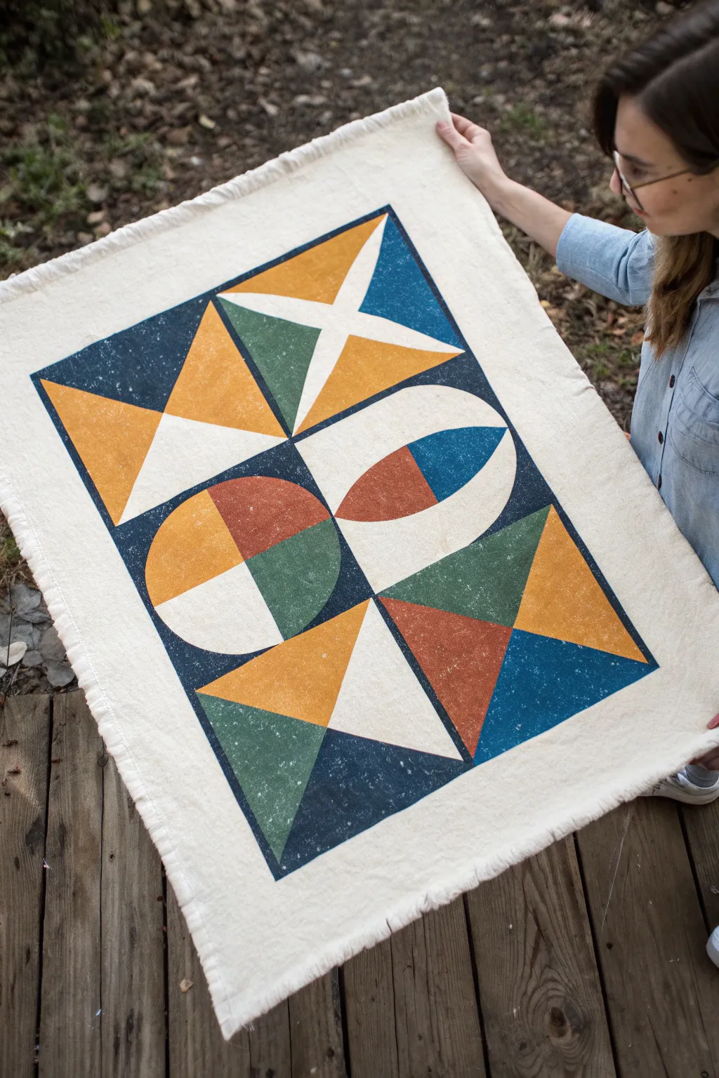
Embrace the beauty of bold shapes and earthy tones with this canvas wall hanging project. The textured, slightly distressed finish gives it a modern yet handcrafted feel that adds warmth to any room.
Step-by-Step Tutorial
Materials
- Heavyweight cotton canvas or duck cloth (approx. 24″ x 36″)
- Fabric block printing ink (navy blue, mustard yellow, burnt orange, forest green, white)
- Linoleum carving block or soft rubber carving block (Speedball speedy-carve work well)
- Linoleum cutter tool with assorted gouges
- Brayer (rubber roller)
- Plexiglass sheet or glass palette for rolling ink
- Ruler and pencil
- Painter’s tape or masking tape
- Scissors
Step 1: Design & Carving
-
Plan your grid:
Sketch out your design on paper first. The pattern relies on a grid layout, so decide on the dimensions of your individual blocks. A standard 6×6 inch square works well for this scale. -
Draw on the block:
Transfer your shape designs onto your carving block using a pencil. You’ll need separate blocks for distinct shapes (like the triangles, quarter circles, and semi-circles) unless you plan to carve a single large master block, which is much harder to manage. -
Carve the negative space:
Using your linoleum cutter, carefully carve away the areas of the block that you do NOT want to print. Remember, the raised surface is what will transfer the ink. -
Refine the edges:
Go back over your carved lines with a smaller gouge to ensure your geometric shapes have clean, sharp edges. Clear away any loose debris.
Uneven Printing?
If your print looks patchy, don’t worry—this adds to the handmade texture. However, putting a slightly padded surface (like an old towel) under the canvas while printing can help get solid coverage.
Step 2: Fabric Preparation
-
Cut the canvas:
Cut your canvas to the desired size, leaving about an extra inch on all sides if you plan to fray the edges later. -
Mark the layout:
Use a ruler and a very light pencil touch to mark out the main rectangular boundaries of your design on the canvas. Finding the exact center first helps keep everything symmetrical. -
Tape the borders:
Apply painter’s tape along the outside edges of your main rectangular print area. This creates a crisp border and prevents you from accidentally printing off the edge.
Add Dimension
Mix a tiny amount of white into your colors for the second coat on specific shapes. This slight tonal shift creates depth and makes the geometric forms pop even more.
Step 3: Printing Process
-
Prepare the workspace:
Lay your canvas on a flat, hard surface. Place a piece of scrap cardboard or paper underneath it to catch any ink bleed-through. -
Ink the brayer:
Squeeze a small amount of your navy blue ink onto the palette. Roll the brayer back and forth until the ink sounds ‘sticky’ and has a velvety texture. -
Print the background:
Apply the navy ink evenly to your carving block. Press the block firmly onto the canvas in the designated areas to create the dark background sections. I like to apply pressure with the heel of my hand to ensure good transfer. -
Clean and switch colors:
Wash your block and brayer thoroughly and dry them completely before switching to the next color, like the mustard yellow. -
Layer the shapes:
Continue the process with your other colors—mustard yellow, burnt orange, and forest green. Use your pencil grid to align the shapes precisely, creating the interactions between triangles and curves. -
Add white accents:
For the white sections, simply leave the natural canvas unprinted if your fabric is light enough. If you want a brighter white or are using darker fabric, print white ink last over the negative spaces. -
Dry completely:
Allow the print to dry according to the ink manufacturer’s instructions. This usually takes 24-48 hours for fabric ink to fully cure.
Step 4: Finishing Touches
-
Heat set the ink:
Once dry, heat set the ink by ironing the back of the canvas on a high setting (no steam) for several minutes. This makes the design permanent. -
Fray the edges:
Remove the painter’s tape. Pull individual threads from the raw edges of the canvas to create a decorative fringe on all four sides. -
Secure the fringe:
To stop the fraying from going too far, you can run a straight stitch with a sewing machine or use a line of fabric glue just inside the fringe line.
Now you have a stunning piece of geometric art ready to hang or display


Warm Gradient Triangles
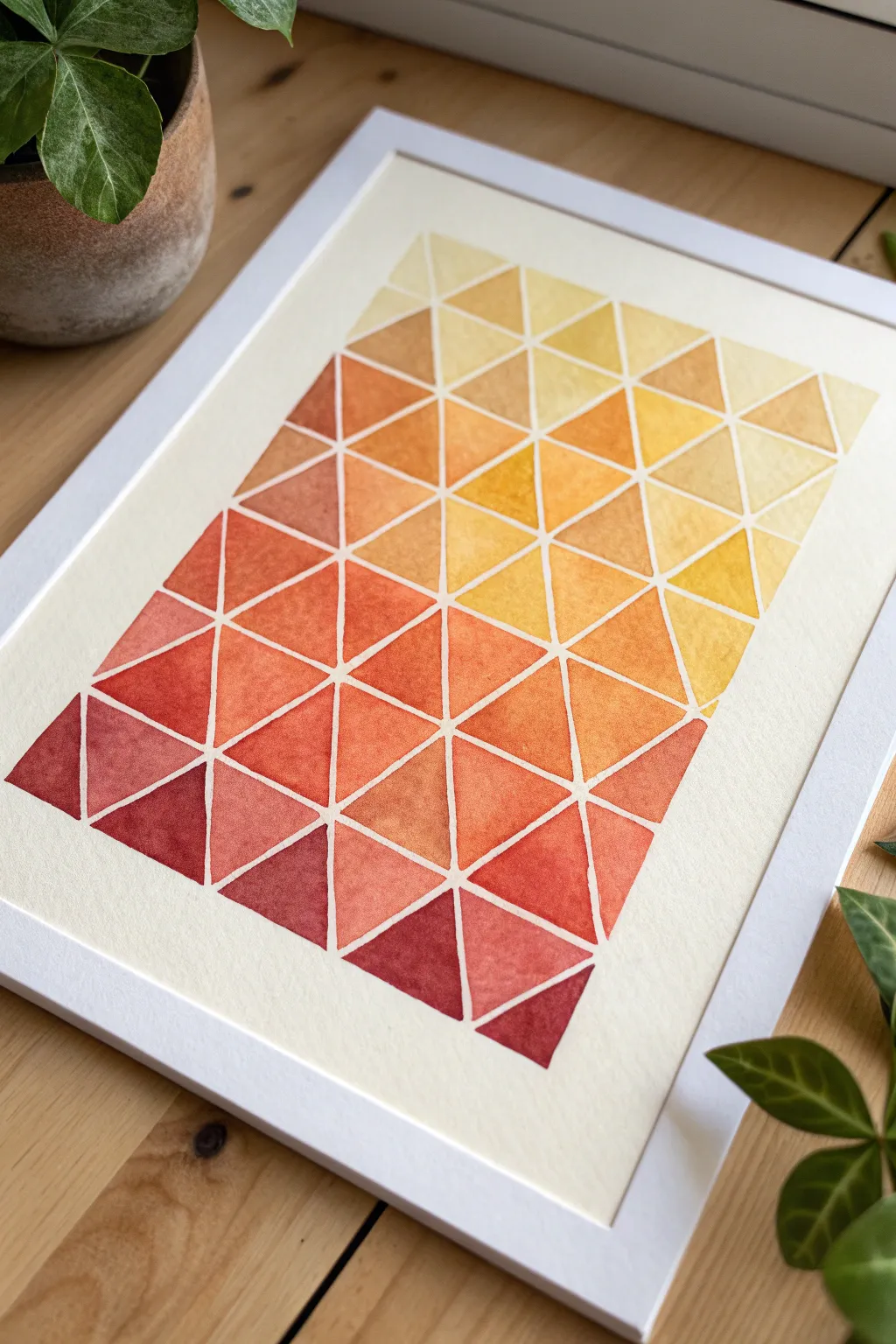
This radiant watercolor project captures the warmth of a setting sun through a structured geometric lens. By blending deep maroons into sunny yellows within a grid of crisp white lines, you’ll create a modern piece that feels both methodical and organic.
Step-by-Step
Materials
- Cold press watercolor paper (300 gsm)
- Watercolor paints (Alizarin Crimson, Cadmium Red, Cadmium Orange, Lemon Yellow, Yellow Ochre)
- Masking fluid (drawing gum) or thin white graphic tape
- Pencil and ruler
- Round watercolor brushes (size 4 and size 6)
- Mixing palette
- Cup of water and paper towels
- Eraser
- White frame for mounting
Step 1: Preparation & Grid Layout
-
Measure and mark margins:
Begin by deciding on the size of your final painted area. Use your ruler to lightly mark a generous border around the paper edges, ensuring the central artwork will be centered. -
Draw the grid structure:
Lightly draw a grid of vertical and horizontal lines within your border. For the layout shown, draw 6 vertical columns and roughly 10 horizontal rows to create small rectangles. -
Create the triangles:
Transform your rectangles into triangles by drawing diagonal lines. Create a zig-zag pattern: draw a diagonal from the bottom-left to top-right of the first rectangle, then mirror it in the next rectangle, alternating as you move across the grid. -
Apply masking fluid:
To achieve those crisp white spaces between shapes, carefully apply masking fluid over all your pencil lines. A ruling pen or an old, cheap brush works best for this as masking fluid can ruin good brushes. -
Allow to dry completely:
Let the masking fluid sit until it is perfectly dry and transparent. If you paint too soon, the fluid will smear and ruin the separation.
Bleeding Lines?
If paint seeps under the masking fluid, wait for it to dry, then use opaque white gouache or a white gel pen to touch up the lines and restore the crisp edge.
Step 2: Painting the Gradient
-
Prepare your palette:
Squeeze out your paints in a line on your palette, arranging them from darkest red to lightest yellow. Pre-mix a few transitional shades, like a reddish-orange and a golden-yellow, to make the painting process smoother. -
Start with the deepest tones:
Begin at the bottom left corner. Load your size 6 brush with a concentrated mix of Alizarin Crimson and a touch of Cadmium Red. Fill in the first few triangles in this corner. -
Transition to red-orange:
As you move slightly upwards and to the right, rinse your brush partially and pick up pure Cadmium Red. Paint the adjacent cluster of triangles, letting the color vary slightly in water concentration for texture. -
Introduce orange hues:
Continuing diagonally toward the center, switch to Cadmium Orange. I like to drop a tiny bit of red into the wet orange paint on the paper occasionally to keep the transition feeling organic. -
Shift to yellow-gold:
Paint the middle-right section using Yellow Ochre and a bit of Cadmium Yellow. These triangles should feel warm but significantly lighter than your starting point. -
Finish with pale yellow:
For the top right corner, use Lemon Yellow heavily diluted with water. You want these triangles to be very translucent and delicate breaks of color. -
Review color balance:
Step back and look at the overall gradient. If the transition looks too abrupt anywhere, you can glaze a thin layer of the intermediate color over the dry triangles to smooth the shift.
Make it Metallic
Instead of leaving the dividing lines white, fill them in with gold or copper metallic ink after removing the masking fluid for a luxurious Art Deco vibe.
Step 3: Finishing Touches
-
Dry strictly:
Wait for the entire painting to be bone dry. The paper should verify warm to the touch, not cool. Use a hairdryer on a low setting if you are impatient. -
Remove masking fluid:
Gently rub the masking fluid away using your finger or a rubber cement pickup tool. Reveal the stark white lines underneath. -
Clean up edges:
If any pencil lines are visible within the white gaps, gently erase them now, being careful not to smudge the paint. -
Mount and frame:
Center your artwork on a backing board or within a mat. Place it into a simple white frame, which compliments the white grid lines perfectly.
Now you have a glowing piece of modern art that brings a permanent golden hour into your home
Monochrome Value Blocks
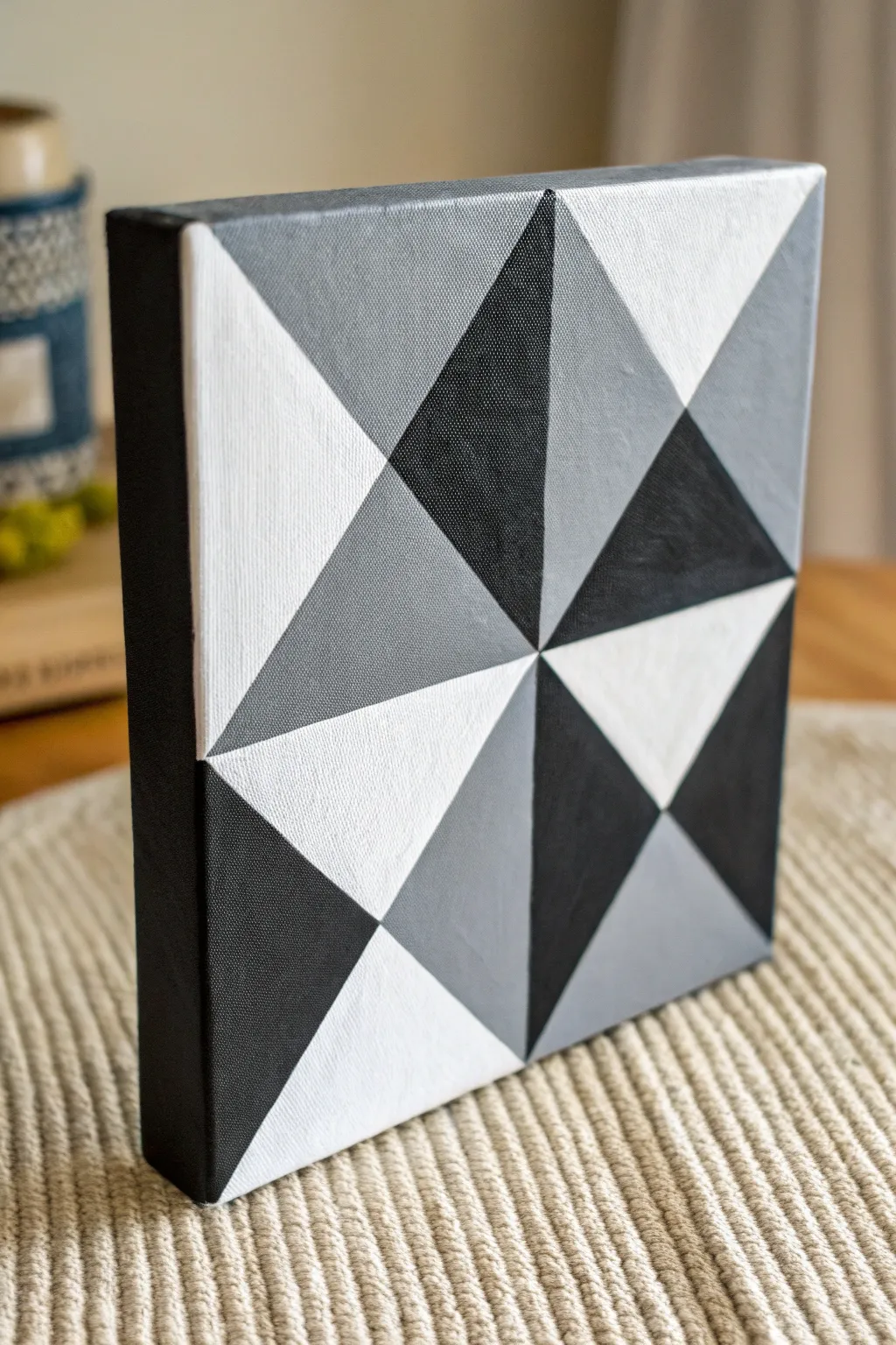
This striking geometric piece relies on clean lines and a simple value scale to create depth and movement. By limiting your palette to black, white, and grey, you’ll paint a sophisticated pinwheel design that looks sharp in any modern space.
Detailed Instructions
Materials
- Small square canvas (e.g., 6×6 or 8×8 inches)
- Acrylic paints: Mars Black and Titanium White
- Flat shader brushes (medium and small)
- Ruler or straight edge
- Pencil
- Painter’s tape or masking tape (low tack)
- Palette for mixing paint
- Cup of water and paper towels
Step 1: Planning and Mixing
-
Prep the surface:
Ensure your canvas is clean and free of dust. If it isn’t pre-gessoed, apply a coat of white gesso and let it dry completely to create a smooth painting surface. -
Find the center:
Use your ruler to draw diagonal lines from corner to corner lightly with a pencil. The point where they intersect is your exact center. -
Draw the grid:
Draw a vertical line and a horizontal line directly through the center point, dividing the canvas into four equal squares. -
Create the triangles:
Inside each of the four squares, draw a diagonal line. However, alternate the direction of the diagonals to create the pinwheel effect seen in the reference. Refer to the photo to ensure your angles match. -
Mix your values:
Squeeze out plenty of black and white paint. Create two distinct middle grey tones: a light grey (mostly white with a touch of black) and a dark charcoal grey (mostly black with some white). You now have four colors: White, Light Grey, Dark Grey, and Black.
Seal the Tape Edge
Before painting your color, brush a tiny amount of matte medium over the tape edge. This seals the gap and ensures absolutely zero paint bleeds underneath.
Step 2: Painting the Structure
-
Start with the edges:
Paint the sides of the canvas black first. This creates a finished frame effect and means you won’t have to worry about messy edges later. -
Tape the first sections:
Choose all the triangles that will be painted pure black. Apply painter’s tape along the pencil lines that border these shapes. Press the tape edges down firmly to prevent bleeding. -
Paint the black triangles:
Fill in the taped-off areas with pure black paint. Use a flat brush and stroke away from the tape edge inward to keep the line crisp. -
Remove tape and dry:
Peel the tape off immediately while the paint is still wet for the sharpest line. Allow these black sections to dry completely before moving on. -
Tape for white sections:
Once the black is dry, tape off the areas designated for pure white. Ensure the tape goes over the dry black paint to protect the previously painted lines. -
Paint the white triangles:
Apply two or even three coats of titanium white. White can be translucent, so building up layers ensures you don’t see the canvas weave underneath.
Paint Peeling fix
If lifting the tape peels up paint from a dry section, your underlying layer wasn’t fully cured. Let it dry longer, then carefully touch up the bald spot with a small brush.
Step 3: Adding the Mid-Tones
-
Prepare for grey:
Wait for the white sections to cure fully. Now, tape off the triangles meant for the dark charcoal grey tone. -
Touch up the mix:
If your grey mixtures have dried on the palette, mix a fresh batch of dark grey. It should be distinct from the black but clearly darker than the light grey. -
Apply dark grey:
Paint the dark grey sections smooth and flat. I find a slightly damp brush helps the acrylic flow better into the corners without leaving ridges. -
Remove tape and wait:
Peel back the tape carefully. Let this layer dry fully to the touch. -
Final taping:
Tape off the final remaining triangles. These will be your light grey sections. -
Apply light grey:
Fill these last shapes with your light grey mixture. Check that the value is visibly different from the adjacent white sections. -
Final reveal:
Remove the last pieces of tape. If you have any small bleeds or uneven spots, use a small detail brush to touch them up freehand. -
Check the contrast:
Step back and view the canvas. The pattern relies on the contrast between the four values, so ensure each triangle is opaque and distinct.
Hang this sharp monochromatic piece on a colored wall to really make those geometric details pop
Line-Only Geometric Minimalism
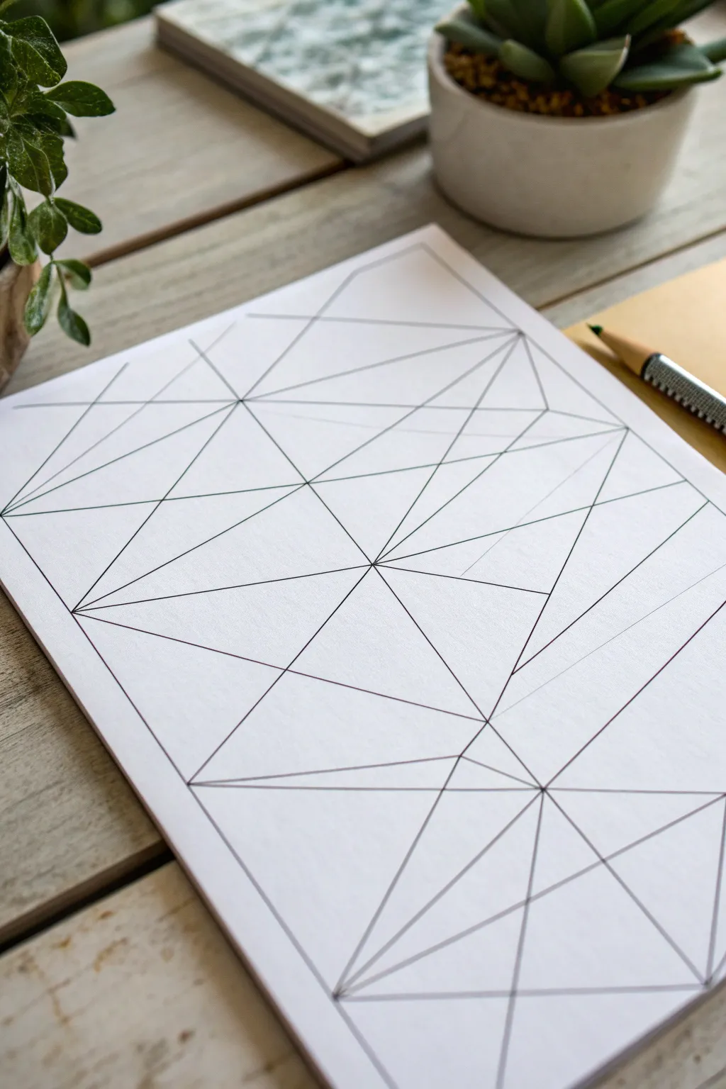
Embrace the purity of line with this crisp, architectural drawing that explores intersections and negative space. Using just a pen and ruler, you will construct a web of triangles and polygons that feels both calculated and delightfully abstract.
Step-by-Step Tutorial
Materials
- High-quality white mixed media paper or bristol board
- Fine-liner pen (0.3mm or 0.5mm, black ink)
- Hard graphite pencil (2H or 4H)
- Clear plastic ruler
- Eraser (kneaded or high-polymer)
- Grid paper (for initial practice, optional)
Step 1: Planning the Structure
-
Define the boundaries:
Start by drawing a very faint border around your paper with your hard pencil, leaving about a half-inch margin on all sides to frame your composition. -
Establish anchor points:
Visualize a grid of 6 to 8 invisible points scattered across your page. Mark them lightly with infinitesimal pencil dots; these will be the main junctions where multiple lines meet. -
Create the primary skeleton:
Using your ruler, connect these main dots with long, straight pencil lines. Don’t worry about creating a specific shape yet; just aim for a balanced distribution of large triangles. -
Subdivide the spaces:
Pick a few dominant triangles you’ve just created. Mark a center point within them or along one of their edges, then draw new lines radiating from that point to the corners of the shape. -
Add diagonal tension:
Look for areas that feel too open or empty. Place your ruler diagonally across these spaces and draw lines that cut through existing shapes to create smaller, sharper slivers. -
Check the balance:
Step back and look at your pencil sketch. You want a mix of large, breathing spaces and dense, busy intersections. Add a few more lines if one side feels heavier than the other.
Clean Lines Hack
Tape pennies or washers to the underside of your ruler. This lifts the edge off the paper, preventing ink capillary action and keeping lines crisp.
Step 2: Inking the Lines
-
Test your pen:
Before touching the final paper, test your fine-liner on a scrap sheet to ensure the ink flows smoothly without skipping or blobbing. -
Secure the ruler:
Place your ruler specifically so the edge is slightly away from the pencil line, accounting for the width of the pen nib. This prevents the ink from bleeding under the ruler. -
Commit to the first lines:
Start with the longest continuous lines that span across the page. Draw with a confident, consistent speed to keep the line weight steady. -
Work section by section:
I prefer to work from the top left to the bottom right (if you are right-handed) to avoid smudging fresh ink with your hand. -
Handle the intersections:
When approaching a junction where many lines meet, lift your pen precisely at the point. Don’t overshoot, as clean, sharp corners are essential to this aesthetic. -
Inking the subdivisions:
Move on to the smaller, inner triangles. Be extra careful here; the shorter the line, the more obvious a wobble becomes, so keep your breath steady. -
Review line weight:
Once the main web is inked, check for consistencies. If a line looks too thin compared to its neighbors, carefully re-trace it, but only if absolutely necessary.
Step 3: Refining the Finish
-
Wait for the ink:
Patience is key here. Let the drawing sit for at least 15 to 20 minutes to ensure every microscopic droplet of ink is completely dry. -
Erase the graphite:
Gently glide your eraser over the entire page. Use a circular motion rather than scrubbing back and forth to avoid shifting the paper fibers or crumpling the sheet. -
Clean the surface:
Use a drafting brush or a clean, dry cloth to sweep away the eraser crumbs. Avoid using your hand, as natural oils can smudge the pristine white paper. -
Final inspection:
Look closely at your intersections. If there are tiny gaps where lines didn’t quite meet, carefully touch them up with the very tip of your pen.
Add Dimension
Select specific triangles within the mesh and fill them with stippling (dots) or hatching. This creates shading and depth without adding color.
Now you have a striking piece of minimalist art ready to be framed in a simple black border
Overlapping Transparent Shapes
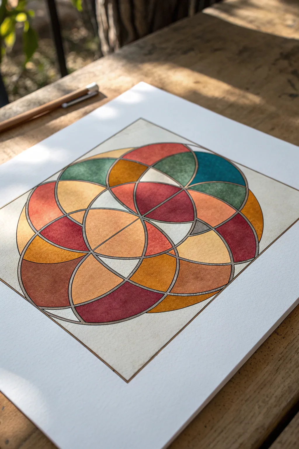
This meditative geometric study explores the interplay of warm earth tones colliding with cool teals through a network of precisely overlapping circles. The result is a stained-glass effect created with watercolor or gouache, defined by crisp metallic outlines.
How-To Guide
Materials
- Hot press watercolor paper (smooth texture is key)
- Compass with a pencil holder attachment
- HB Pencil
- Silver or pewter gel pen (archival quality)
- Watercolors or gouache paints (Warm red, burnt sienna, yellow ochre, teal, deep green)
- Small round brushes (Size 0 and 2)
- Ruler
- Eraser
- Masking tape
Step 1: Drafting the Grid
-
Determine center:
Begin by finding the exact center of your paper. Use your ruler to lightly mark a vertical and horizontal axis that intersect in the middle. This crosshair will be the anchor for your entire design. -
Set the radius:
Adjust your compass to a medium radius, approximately 2-3 inches depending on your paper size. Keep this radius locked; you will use the same setting for every primary circle to ensure symmetry. -
Draw the central circle:
Place the compass point on your center intersection mark and draw the first circle lightly with a pencil. This circle acts as the core of the ‘Flower of Life’ style pattern. -
Add intersecting circles:
Place your compass point at the top of the central circle (where it intersects the vertical axis) and draw a second circle. Repeat this at the bottom intersection point. -
Complete the rosette:
Move the compass point to the left and right intersections of the central circle and draw two more circles. You should now have a cross-like arrangement of five overlapping circles. -
Expand the pattern:
Continue adding circles by placing your compass point at the new intersections created by the first set of circles. Expand outward until you have a roughly square-shaped cluster of interlocking arcs. -
Establish the boundary:
Using a ruler, lightly draw a square frame around the cluster of circles. Allow the outermost curves of the circles to just touch or slightly cross this boundary line.
Compass Hack
Tape your silver gel pen securely to the leg of your compass if it doesn’t have a universal holder. This ensures your final ink lines are as geometrically perfect as the pencil draft.
Step 2: Inking the Structure
-
Switch to metallic ink:
Replace your pencil or grab your silver gel pen. If your compass allows, attach the gel pen directly to it for perfect metallic arcs. If not, carefully trace over your pencil lines freehand, or use a steady hand to guide the pen. -
Trace principal curves:
Go over the main circular lines that form the final design. You don’t need to trace every single construction line—only the ones that create the specific overlapping petal shapes shown in the reference image. -
Define the frame:
Use a ruler and the silver pen to ink the square border. Ensure the lines are crisp and meet perfectly at the corners. -
Erase guidelines:
Wait for the ink to dry completely—give it at least 20 minutes to prevent smudging. I prefer to wait an hour just to be safe. Then, gently erase any visible pencil marks that weren’t inked over.
Step 3: Adding Color
-
Plan your palette:
Select your colors: distinct shades of terracotta, ochre, maroon, and teal. Test them on a scrap piece of paper to ensure they create a harmonious, vintage earth-tone vibe. -
Paint the ‘petals’:
Start filling in the small, eye-shaped intersections (vesica piscis) with your smallest brush. Alternate colors so adjacent shapes rarely have the same hue, creating contrast. -
Create transparency effects:
For areas where ‘circles’ seemingly overlap, mix a darker version of the two parent colors. For example, where a yellow section meets a red section, use an orange or burnt sienna to simulate transparency. -
Fill larger sections:
Move to the larger, outer semi-circles. Apply the paint somewhat unevenly or with a ‘dry brush’ texture if you want that rustic, stone-like appearance seen in the reference. -
Mind the edges:
Paint carefully up to the silver line but try not to cover it. The metallic line acts as a barrier, similar to the lead came in stained glass. -
Dry and assess:
Let the first layer of paint dry. If the colors look too washed out, add a second layer to deepen the saturation, particularly for the teals and maroons. -
Final touches:
Once the paint is bone dry, verify your metallic lines are still visible. If paint has obscured them, re-trace those specific segments with your gel pen to make them pop again.
Warped Paper?
If your paper buckles from the wet paint, tape the edges down securely before starting, or press the finished (dry) artwork under heavy books overnight to flatten it out.
Step back and admire how simple mathematical curves can create such a warm and complex visual puzzle.
Geometric Sunburst Rays
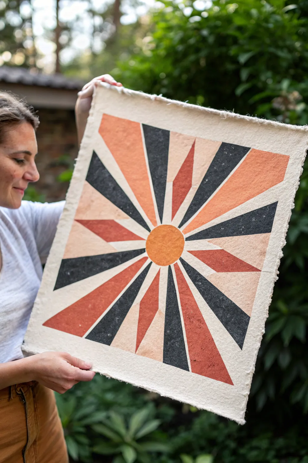
Capture the warmth of a setting sun with this bold geometric print on textured handmade paper. The design features alternating rays of black, rust, and peach radiating from a central orb, creating a striking modern primitive look perfect for any wall.
Step-by-Step Tutorial
Materials
- Heavyweight handmade paper with deckled edges (approx. 18×18 inches)
- Linoleum carving block or soft cut block (12×12 inches or larger)
- Linoleum carving tools (V-gouge and U-gouge)
- Block printing ink (Black, Burnt Sienna, White for mixing)
- Brayer (rubber roller)
- Inking plate or piece of glass
- Pencil and ruler
- Paper for sketching/transferring
- Barren or large metal spoon for burnishing
- Tracing paper (optional)
Step 1: Designing the Template
-
Draw the center:
Begin by sketching your design on regular paper or directly onto your linoleum block if you feel confident. Use a compass or a circular object to draw a circle right in the middle about 2-3 inches in diameter. -
Map the rays:
Using a ruler, lightly draw guide lines radiating out from the center circle to the edges of your square. Don’t worry about perfect symmetry; a little irregularity adds to the hand-carved charm. -
Define the ray shapes:
Sketch the final shapes of the rays. Notice in the example image that some rays are sharp triangles while others are truncated trapezoids. I like to alternate thick and thin rays to keep the eye moving. -
Transfer to block:
If you sketched on paper first, use carbon paper or the pencil-rubbing method to transfer your design onto the linoleum block.
Patchy Ink Troubles?
If the print looks too ‘salty’ (white spots), add a drop of oil or extender to your ink. Texture is good, but too dry means poor contact.
Step 2: Carving the Block
-
Outline the shapes:
Using your fine V-gouge tool, carefully carve along the outline of every pencil line you’ve drawn. This ‘stop cut’ creates a barrier so you don’t accidentally slip into the design areas later. -
Clear negative space:
Switch to a wider U-gouge to remove the material between the rays. Remember, whatever you carve away will be the paper color (white space). -
Separate the colors:
Since this is a multi-color print, you have two options: careful spot-inking or the ‘puzzle piece’ method. For this project, carefully cut the linoleum block into separate pieces—cutting the sun out, and separating the different colored ray groups if space allows. -
Alternative method: Reduction:
Alternatively, you can carve two identical blocks if cutting the single block feels too risky, assigning one block for the dark rays and one for the warm tones. -
Clean up edges:
Go back over your carved edges to ensure they are crisp. Brush away all stray linoleum crumbs.
Step 3: Inking and Printing
-
Mix your colors:
Prepare your palette. You’ll need a straight black, a rusty orange (Burnt Sienna), and a lighter peach (mix Burnt Sienna with plenty of White). -
Ink the sun:
Roll your brayer in the rust orange ink until it makes a velvety distinct hissing sound. Roll the ink onto the central sun circle piece. -
Ink the first set of rays:
Clean your brayer or use a second one to ink the black rays. Be careful not to get ink into the carved recesses. -
Ink the remaining rays:
Finally, ink the remaining ray sections with your custom-mixed peach color and the rust orange color designated for the rays. -
Reassemble:
If you used the puzzle method, fit your inked linoleum pieces back together on your work surface like a jigsaw puzzle. -
Position the paper:
With clean hands, carefully hover your handmade paper over the inked block. Align it so the margins are even, then commit and drop the paper onto the block. -
Burnish firmly:
Using a barren or the back of a large spoon, rub the back of the paper in small circles. Apply firm, consistent pressure over the entire design to transfer the ink. -
Check the transfer:
This is the exciting part—I gently peel back one corner to check the ink coverage. If it looks spotty, lay it back down carefully and burnish that area some more. -
Reveal:
Slowly peel the paper entirely off the block. Place the print face-up in a safe, clean area to dry for at least 24 hours.
Pro Tip: Registration
Mark the corners of your paper size on the table with masking tape before placing your block down. This ensures perfect centering every time.
Once dry, frame your artwork floating in a shadow box to show off those beautiful deckled edges
Isometric Cube Illusion
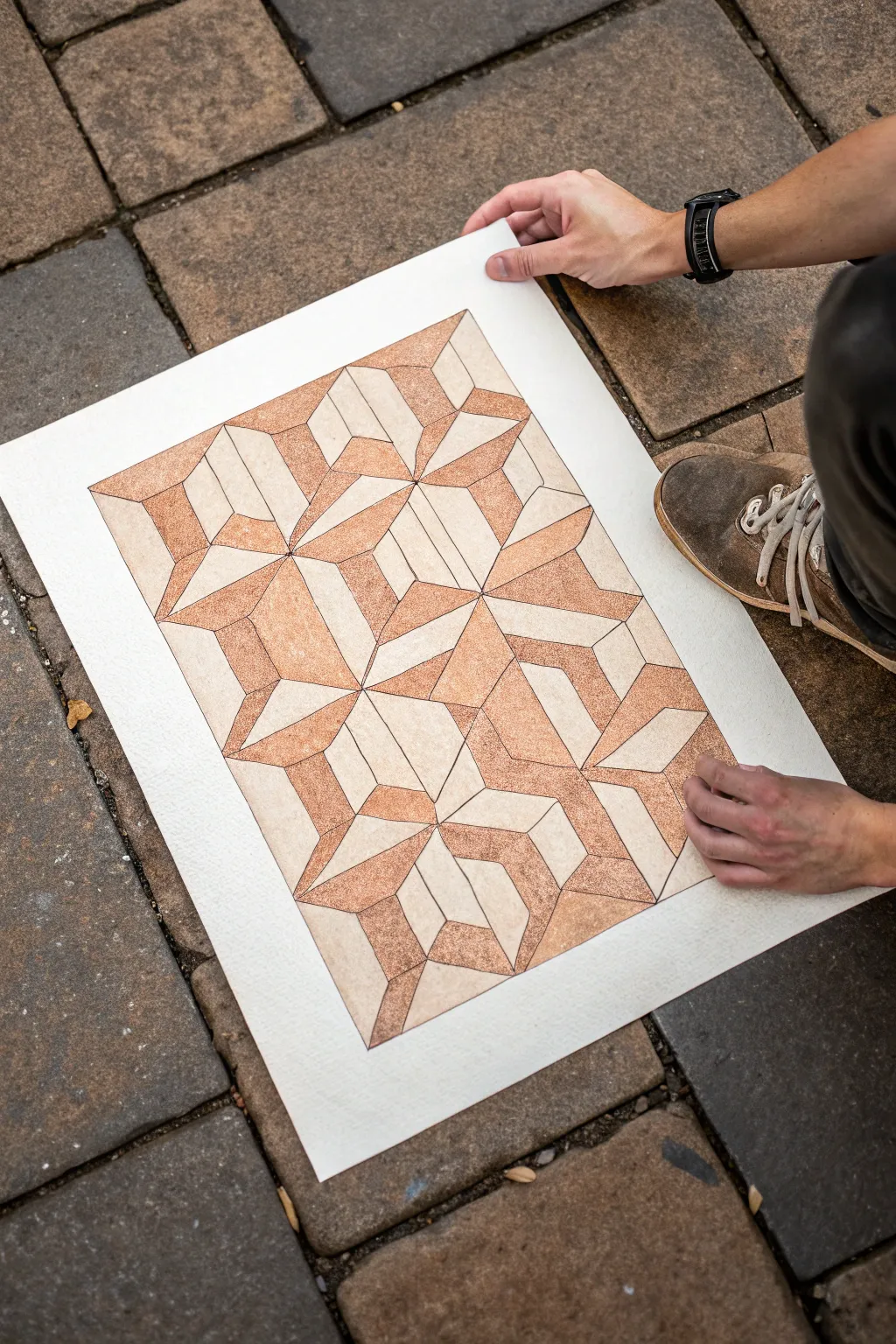
This mesmerizing geometric artwork plays with perspective using a complex interlocking pattern of 3D shapes. The muted, earthy tones of copper and beige give it a warm, architectural feel that rewards close inspection.
Step-by-Step Guide
Materials
- High-quality mixed media paper (heavyweight, cold press)
- Pencil (HB or 2H for drafting)
- Fine liner pen (black, 0.3mm or 0.5mm)
- Ruler or straight edge
- Protractor or isometric grid paper (optional but helpful)
- Copper or rust-colored watercolor paint (or colored pencils)
- Small round paintbrush (size 2 or 4)
- Eraser
- Masking tape
Step 1: Drafting the Grid
-
Prep the paper:
Begin by taping down your paper to a flat surface with masking tape. This creates a clean white border around the edge, which acts as a natural frame for the final piece. -
Establish the baseline:
Using your ruler, lightly draw a horizontal baseline near the bottom of your drawing area. This will anchor your geometric structure. -
Mark your measure points:
Decide on the size of your base unit cube (e.g., 2 inches). Make tick marks along your baseline at regular intervals to ensure your repeating pattern stays consistent. -
Draw the isometric angles:
From your tick marks, draw diagonal lines extending upwards at 30-degree angles in both directions. If you don’t have an isometric ruler, a protractor helps get these angles precise. -
Create the diamond grid:
Continue adding parallel diagonal lines until you have a grid of diamonds. This faint lattice is the skeleton upon which you will build the ‘tessellated’ shapes.
Uneven Angles?
If your shapes look warped, print out a sheet of ‘isometric dot paper’ and place it under your mixed media paper. Use a light box or window to trace the perfect grid.
Step 2: Defining the Geometry
-
Outline the star shapes:
Look closely at the reference. Notice how six diamonds often meet at a central point to form a hexagon or star. Boldly outline these clusters with your pencil to distinguish the main shapes. -
Add internal cube depth:
Within each shape, draw the internal ‘Y’ lines that turn a flat hexagon into a 3D cube. Vary the orientation of these Y-shapes to create the confusing, impossible geometry effect. -
Refine the interlocking pattern:
Connect the shapes so they appear to weave behind and in front of one another. You want to erase lines where a shape is ‘covered’ by another to solidify the illusion of depth. -
Ink the lines:
Once you are happy with the draft layout, trace over your final pencil lines with a black fine liner. Keep a steady hand and use the ruler for crisp, architectural edges. -
Clean up the sketch:
Wait for the ink to dry completely to avoid smudging, then gently erase all remaining pencil guidelines.
Granulation Hack
To get that gritty texture in the paint, sprinkle a tiny pinch of salt onto the wet watercolor. Brush it off once dry for a speckled, stone-like finish.
Step 3: Adding Texture and Color
-
Select your palette:
Mix a watery wash of copper or rust-colored paint. You want a gritty, textured look, so don’t worry about the mix being perfectly smooth. -
Paint the shaded planes:
Identify a consistent light source (e.g., top left). Paint only the side planes of your ‘cubes’ that would be in shadow, leaving the top and front faces the color of the raw paper. -
Build up texture:
While the paint is still damp, I allow pigment to pool slightly in the corners of the shapes. This creates a stippled, grainy texture that mimics stone or oxidized metal. -
Second layer for depth:
Once the first wash is dry, go back into the deepest recessed areas with a slightly more concentrated paint mix to darken the shadows further. -
Final ink touch-ups:
If the paint has dulled any of your black lines, re-trace them carefully with the fine liner to bring back that sharp, graphical contrast. -
Reveal:
Slowly peel away the masking tape at a 45-degree angle to reveal your clean, crisp borders.
Step back and let your eyes wander through the impossible pathways of your new creation
Op-Art Style Optical Pattern
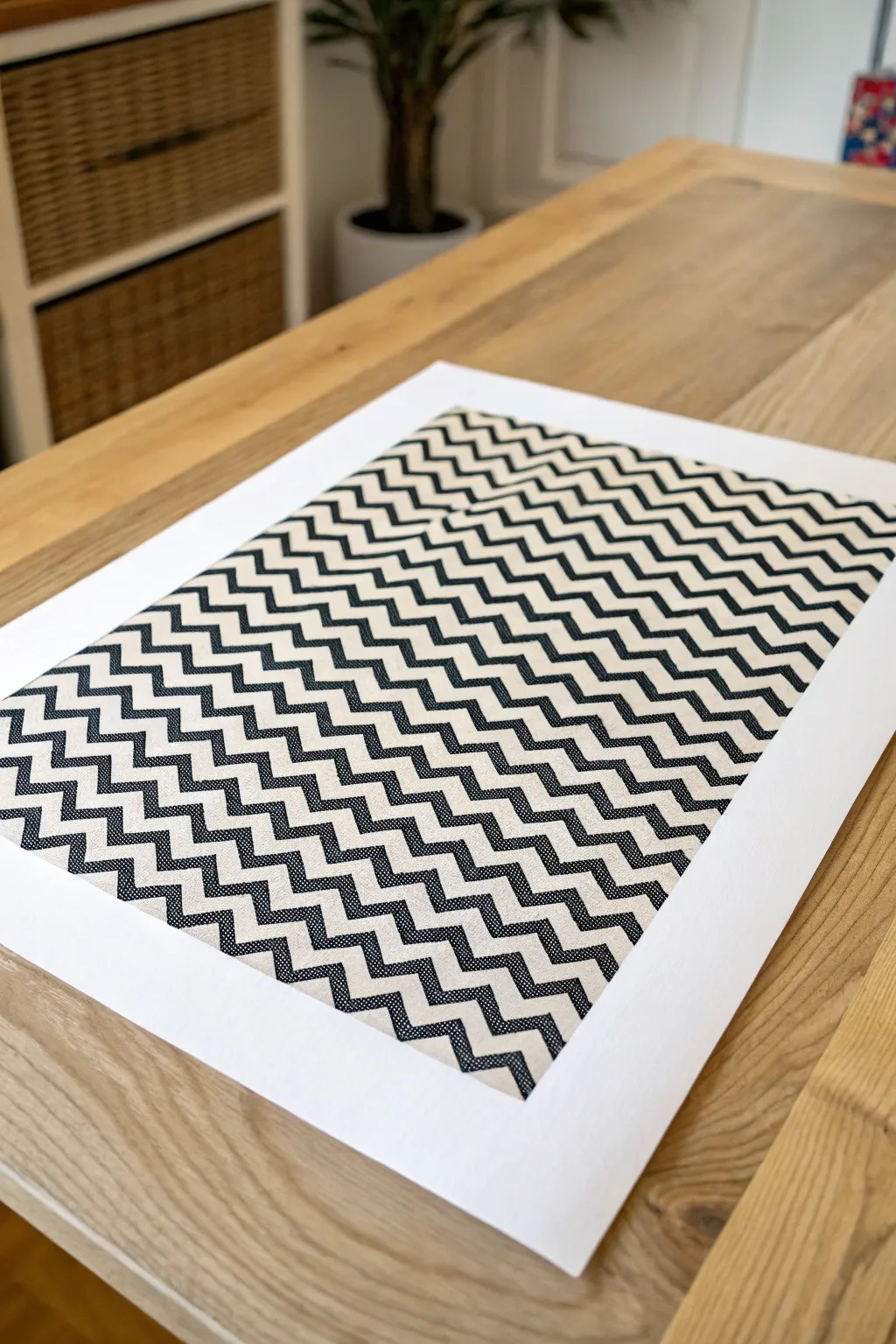
This eye-catching geometric project masterfully uses high-contrast zigzags to create a vibrating optical illusion. Whether you frame it as wall art or use it as a striking placemat, the repetitive chevron pattern brings a sophisticated, modern rhythm to any surface.
Detailed Instructions
Materials
- High-quality heavyweight textured paper or prepared canvas sheet (A3 or similar size)
- Black acrylic paint or black fabric ink (if using canvas)
- High-tack painter’s tape or drafting tape
- Ruler (preferably metal)
- Pencil
- Eraser
- X-Acto knife or craft knife
- Self-healing cutting mat
- Flat shader brush (medium size)
- White or cream backing card (for mounting)
Step 1: Grid Preparation
-
Define the perimeter:
Start by deciding on the size of your printed area. Measure and lightly mark a rectangular border on your paper or canvas, leaving a generous white margin of at least 2-3 inches on all sides to frame the design later. -
Mark vertical guides:
Along the top and bottom edges of your rectangle, mark small ticks every 1 inch (or your desired width for the chevron columns). Connect these marks lightly with a pencil to create vertical columns. -
Mark horizontal guides:
Along the left and right sides, measure and mark ticks every 0.5 inches. These will guide the height of your zigzags. Connect these horizontally to create a grid. -
Sketch the zigzags:
Now, connect the intersections diagonally. Start at the bottom left corner, draw a line up to the next horizontal line on the first vertical guide, then down to the next vertical guide on the baseline. Repeat this ‘up-down’ motion across the row. -
Complete the pattern sketch:
Continue this diagonal pattern on every row above, ensuring the points of the zigzags align perfectly vertically. It creates a stack of ‘V’ shapes.
Step 2: Stenciling and Masking
-
Isolate the black bands:
Identify which bands will be painted black. Because this is a dense pattern, you cannot tape everything at once. We will work in alternating horizontal rows. -
Tape the first set of rows:
Apply painter’s tape to mask off the rows that will remain the background color (cream/white). Use your craft knife to carefully trim the tape at the zigzag points so the tape fits perfectly into the ‘V’ grooves. -
Seal the edges:
Run a bone folder or the back of your fingernail firmly along the edges of the tape. This is crucial to prevent paint bleed and keep those geometric lines razor-sharp. -
Initial painting phase:
Load your flat brush with black acrylic paint. I find it best to use a ‘dry brush’ technique—wiping off excess paint—to avoid seepage under the tape. Apply the paint to the exposed zigzag rows. -
Dry and remove:
Allow these rows to dry until they are distinct to the touch but not fully cured. Gently peel back the tape at a 45-degree angle to reveal your first set of black zigzags.
Stay Sharp
Apply a thin layer of clear matte medium or white paint over the tape edges *before* the black paint. This seals the tape and ensures the black lines are crisp.
Step 3: Completing the Pattern
-
Mask the painted areas:
Once the first set of black stripes is completely bone-dry, apply tape over them to protect your work. This seems counter-intuitive, but it helps you paint the adjacent rows if you made mistakes or need to fill gaps, although usually, you just tape the *next* set of white rows. -
Paint remaining sections:
Repeat the taping and painting process for any alternating rows or sections you couldn’t reach in the first pass. Consistency is key here; try to keep the black opacity the same across the whole piece. -
Touch-ups:
Remove all tape. Use a very fine liner brush and a steady hand to fix any small bleeds with white paint, or fill in jagged edges with black. -
Clean the borders:
Erase any visible pencil grid lines that remain in the unpainted light sections. Be gentle to avoid scuffing the paper texture. -
Final mounting:
If your edges are messy, cut the artwork out leaving just a localized border, and mount it centrally onto a pristine, large sheet of white Bristol board or cardstock to achieve that clean, gallery-ready wide margin.
Gradient Effect
Instead of solid black, mix a tiny drop of white into your black paint for each subsequent row moving downward to create a subtle ombré fade effect.
Step back and let your eyes adjust to the rhythm of your striking new optical illusion piece
Negative Space Shape Play
Embrace the bold simplicity of mid-century modern design with this striking geometric artwork. By combining rich, earthy tones with clever negative space, this project creates a sophisticated focal point for any room.
Step-by-Step Tutorial
Materials
- Large sheet of heavyweight printmaking paper (deckle edge recommended)
- Acrylic paints or gouache (Teal, Terracotta, Mustard Yellow, Black)
- Painter’s tape or drafting tape
- Ruler and protractor
- Compass with pencil attachment
- Pencil and eraser
- Flat synthetic brushes (various sizes)
- Palette or mixing tray
- Cutting mat
Step 1: Drafting the Grid
-
Prepare the workspace:
Lay your large paper flat on a clean surface. Tape down the corners gently with low-tack tape to prevent shifting while you work. -
Calculate dimensions:
Measure the total area you want your design to cover, leaving a generous white border around the edge to highlight that beautiful paper texture. -
Draw the primary grid:
Using a light pencil touch, draw a 3×4 grid. Each square within the grid should be identical in size, approximately 6 to 8 inches depending on your paper size. -
Mark the midpoints:
Find the exact center of each square side and mark it lightly. These reference points are crucial for connecting your curves accurately. -
Draft the curves:
Place your compass point on the corners of the squares or the midpoints of the lines to draw the semicircles and quadrants. Follow the pattern in the reference image: some squares contain two quarter-circles meeting at a diagonal, while others use a full semicircle split in half. -
Refine the shapes:
Review your pencil lines. The design relies on balance, so ensure your curves meet perfectly at the grid intersections. Erase any stray marks now, as they are harder to remove once painted over.
Clean Curve Trick
Struggling with freehand curves? Cut a template from cardstock for the curve radius and trace lightly with the brush, or use flexible curve tape for a flawless edge.
Step 2: The Painting Process
-
Mix your palette:
Prepare your four main colors: deeply saturated teal, warm terracotta, dark mustard, and a soft charcoal black. If using acrylics, adding a drop of matte medium can help achieve that flat, screen-printed look. -
Tape for crisp edges:
Selecting one color to start with (e.g., teal), tape off the straight edges of the shapes that will be that color. I find it easier to work color by color rather than square by square to maintain consistency. -
Paint the first curves:
Carefully paint the curved edges of your teal shapes freehand with a steady hand and a flat brush, then fill in the rest of the shape up to your taped lines. -
Repeat for remaining colors:
Allow the first color to dry completely before moving to the next. Repeat the taping and painting process for the terracotta, mustard, and black sections. -
Manage the white space:
Remember that some sections are left unpainted (white). Be hyper-aware of these negative spaces; keeping them pristine is what makes the colored shapes pop. -
Apply second coats:
For a solid, velvety finish, apply a second coat of paint. This ensures no brushstrokes are visible and the color looks uniform and professional.
Block Print Texture
For a grittier, authentic texture, mix a little fine sand or pumice gel into your matte acrylics before painting to mimic rough handmade paper.
Step 3: Finishing and Revealing
-
Remove tape:
Once the final coat is touch-dry, slowly peel away any remaining tape at a 45-degree angle to ensure clean, sharp lines. -
Clean up edges:
inspect the curved boundaries. If any line is a bit wobbly, use a very small detail brush and a tiny bit of paint to smooth out the curve. -
Erase guidelines:
Wait until the painting is 100% bone dry—I usually give it a few hours just to be safe. Gently erase any visible pencil grid lines from the unpainted white sections. -
Flatten the artwork:
If the paint has buckled the paper slightly, place a clean sheet of paper over the artwork and weigh it down with heavy books overnight.
Now you have a stunning, gallery-worthy geometric abstraction ready to be framed or hung as is
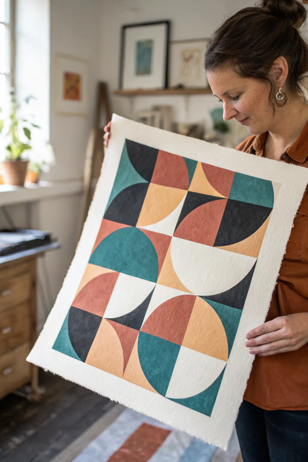
Multi-Panel Geometric Series
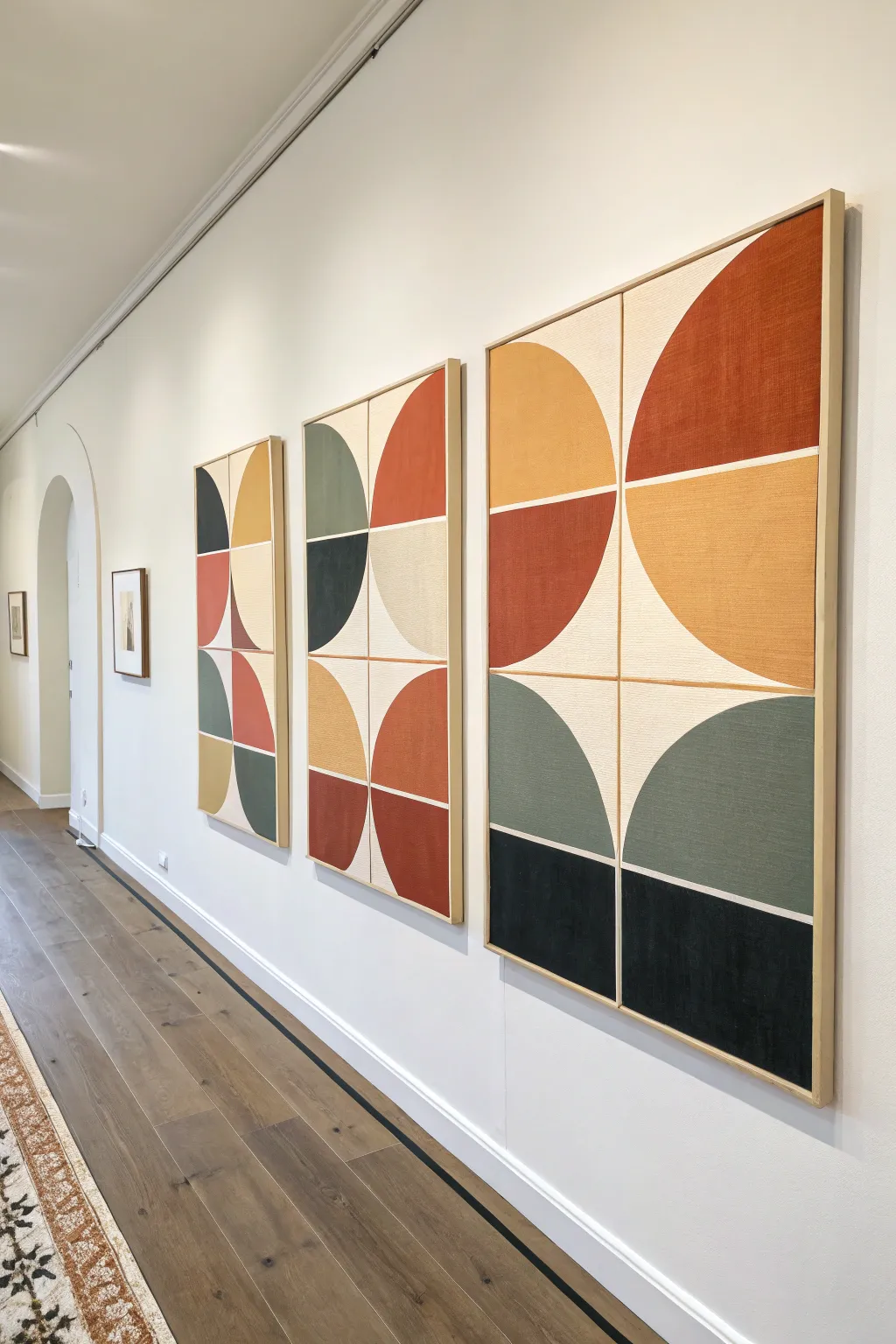
Transform a blank wall with this striking series of geometric panels, featuring bold semicircles and warm, earthy tones. By playing with negative space and rich, textured color blocking, you will create a cohesive statement piece that feels both modern and organic.
How-To Guide
Materials
- Three large gallery-wrapped canvases (tall rectangular format)
- Acrylic paints (rust, mustard yellow, olive green, charcoal black, cream/off-white)
- Painter’s tape (various widths, including fine line/masking tape)
- Large flat paintbrushes
- Medium round brush (for touch-ups)
- Ruler or tape measure
- Pencil
- String and pushpin (for drawing circles)
- Raw wood floating frames (optional, for finishing)
- Matte finish varnish
Step 1: Planning and Layout
-
Prepare the Canvases:
Start by priming your canvases with a coat of the cream or off-white acrylic paint. This base layer acts as your ‘negative space’ between the shapes and ensures a uniform texture across all three panels. Let this base coat dry thoroughly for at least two hours. -
Mark the Grid:
Lightly measure and mark the exact horizontal and vertical center of each canvas using your pencil and ruler. Draw a very faint cross that divides each canvas into four equal quadrants. -
Create a Compass Tool:
To draw the large curves, cut a piece of string slightly longer than half the width of your canvas. Tie one end to a pencil and the other to a pushpin. The length of the string between them should exactly match half the width of the canvas. -
Draw the Arches:
Place the pushpin at the intersecting center point of the grid you drew earlier. Keep the string taut and sketch bold semicircles or quarter-circles in specific quadrants. Vary the orientation on each canvas—some curves facing up, some down—to mimic the randomized pattern seen in the reference. -
Define the Spacing:
Use painter’s tape to mask off the central cross lines you drew in step 2. This creates the crisp white gaps that separate the distinct blocks of color. Make sure the tape is pressed down firmly to prevent bleeding.
Step 2: Applying Color
-
Mask the Curves:
Carefully apply painter’s tape along the curved pencil lines. For the smoothest curve, use multiple small pieces of tape overlapping slightly, or invest in flexible curve tape designed for this purpose. -
Seal the Tape Edges:
I like to brush a tiny amount of the cream base color over the edges of the tape first. This seals the seal and ensures that if any paint bleeds under, it will be the background color, keeping your final lines razor-sharp. -
Mix Your Palette:
Prepare your acrylic colors. Aim for earthy, muted tones rather than bright primaries. Mix a little brown or grey into your yellow to get that mustard tone, and a touch of red into orange for a deep rust. -
Paint the Lightest Blocks:
Start painting the lightest colored sections (the mustard yellows) first. Use a large flat brush and apply the paint in smooth, even strokes. Two thin coats are usually better than one thick one to avoid globs. -
Add Earthy Tones:
Move on to the rust and orange sections. Be mindful of which quadrant gets which color to maintain balance across the three panels. Allow these sections to dry to the touch. -
Apply Cool Tones:
Fill in the olive green and charcoal black sections. The dark charcoal acts as a heavy anchor, so place these usually at the bottom or sides for visual weight. -
Create Texture:
While the top coat is still slightly wet, you can lightly drag a dry brush over the colored areas to give it a canvas-like, linen texture. This mimics the fabric look in the inspiration image. -
Remove the Tape:
Carefully peel off the painter’s tape while the paint is still slightly tacky but not wet. Pull the tape away from the painted edge at a 45-degree angle to ensure a clean break.
Bleed Prevention
Running a fingernail or a credit card firmly over the edge of your painter’s tape is critical. Even a tiny gap can cause fuzzy lines that ruin the geometric look.
Step 3: Finishing Touches
-
Touching Up:
Once all tape is removed, inspect your lines. Use a small round brush and a steady hand to touch up any areas where the paint might have bled or where the cream background needs to be re-established. -
Seal the Artwork:
Apply a clear matte varnish over the entire canvas once the paint is fully cured (usually after 24 hours). This unifies the sheen of the different paint colors and protects the surface. -
Frame the Panels:
Place each canvas into a raw wood floating frame. This natural wood border compliments the earthy tones and gives the artwork a polished, professional gallery appearance.
Fabric Effect
Instead of priming with standard gesso, mix some modeling paste into your base coat or use untreated linen canvas for an authentic, high-end textile texture.
Hang your new trio with equal spacing between frames to let the conversation between the shapes really shine
Texture-Filled Geometry
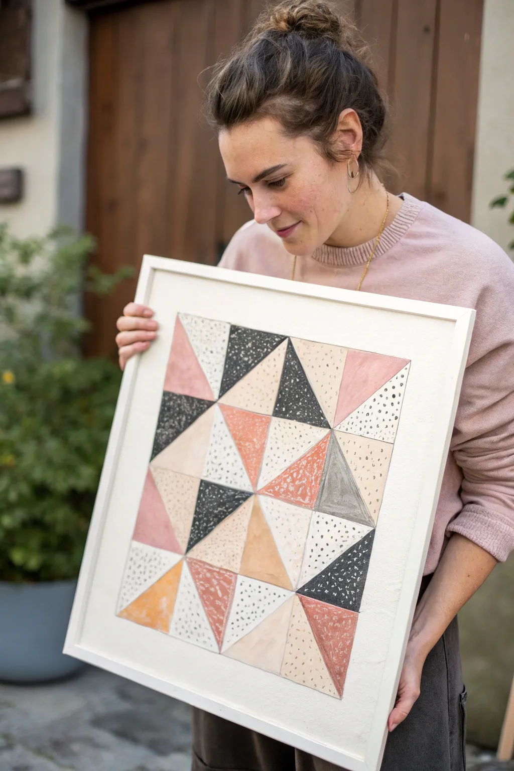
This modern, quilt-inspired artwork relies on the warmth of hand-painted textures and the precision of geometric shapes. By combining soft watercolors or gouache with deliberate inky details, you create a piece that feels both structured and organically playful.
Detailed Instructions
Materials
- High-quality watercolor paper (cold press, heavy weight)
- Pencil and ruler
- Watercolors or gouache (blush pink, terracotta, charcoal, beige, warm grey)
- Black ink pen or fine liner (0.3mm or 0.5mm)
- Masking tape or painter’s tape
- Soft round brushes (sizes 4 and 6)
- Old toothbrush (for splatter)
- Square wooden frame (approx. 16×16 inches)
Step 1: Drafting the Pattern
-
Prepare the paper:
Cut your watercolor paper to fit your frame, leaving a generous margin of white space around the edges. Tape the paper down to a flat board to prevent it from buckling when wet. -
Mark the boundaries:
Using a ruler and a very light pencil touch, draw a large square in the center of your paper. This will be the boundary of your design. -
Divide into a grid:
Measure and divide that large square into a 4×4 grid of smaller squares. Ensure your lines are perfectly straight, as precision is key for the geometric look. -
Create the triangles:
Draw a diagonal line through each small square. Importantly, vary the direction of the diagonal lines (some tilting left, some right) to create a randomized, patchwork effect rather than a uniform chevron pattern.
Step 2: Painting the Colors
-
Plan your palette:
Mix your paints on a palette before starting to ensure cohesive tones. You’ll need a dusty rose, a warm terracotta/rust, a deep charcoal gray, and a sandy beige. -
Paint the first color group:
Start with the dusty rose. Randomly select several triangles across the grid and paint them in. Keep the wash relatively flat but allow some natural pooling for watercolor texture. -
Add the terracotta tones:
Repeat the process with the rust/terracotta color. painting triangles adjacent to the pink ones but avoiding big clusters of the same color. -
Deepen with charcoal:
Fill in selected triangles with the dark charcoal paint. This adds strong contrast and anchors the composition. -
Fill the neutrals:
Paint the remaining non-white sections with your beige or warm grey tone. Leave a significant number of triangles completely white—about 30-40% of the shapes should remain unpainted. -
Let it dry completely:
Wait until the paint is bone dry. If you rush this step, the ink details in the next phase will bleed.
Uneven Edges?
If your painted triangles bled over the pencil lines, don’t panic. Use the final black ink outline step to slightly thicken the borders and cover any wobbles.
Step 3: Adding Texture and Detail
-
Create speckles:
Dip an old toothbrush into slightly watered-down black paint or ink. Use your thumb to flick fine spray onto a few specific painted triangles (like the charcoal or beige ones) to add grit. -
Ink the dots:
Take your black fine liner and add small, deliberate dots to several of the white (unpainted) triangles. Vary the density; cluster them tightly in corners or scatter them loosely. -
Define the edges:
Carefully trace over your initial pencil grid lines with the fine liner or a very thin brush with grey paint. This gives the ‘quilt’ defined seams. -
Add white highlights:
If your charcoal sections look too flat, I sometimes use a white gel pen to add tiny specks or scratches on top for extra dimension. -
Erase guidelines:
Once the ink is fully set, gently erase any pencil marks that are still visible around the outer border.
Go Metallic
Swap the beige paint for gold leaf or metallic gold watercolor in 2-3 triangles. It catches the light beautifully and elevates the piece.
Step 4: Finishing
-
Check the balance:
Step back and look at the composition. If a white area feels too empty, add a few more ink dots or a very faint wash of beige. -
Frame it:
Place the artwork into your square frame. Since the paper has a texture-filled center, a simple white or light wood frame works best to not distract from the pattern.
Hang your new geometric masterpiece in a well-lit spot to enjoy the subtle textures
Cut-Paper Collage Geometry
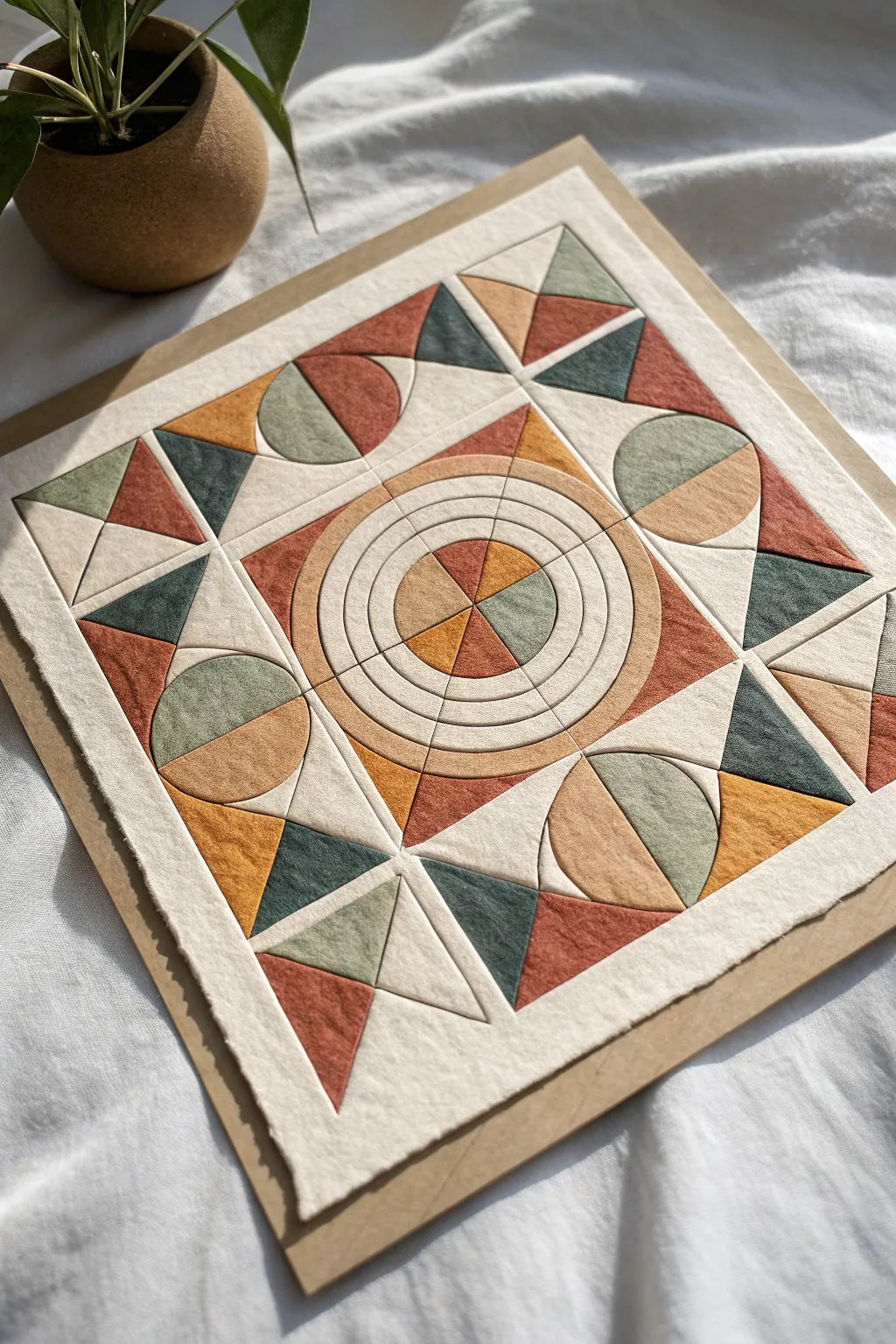
This stunning geometric collage mimics the warmth and structure of a traditional quilt, using layered paper to create deep texture without a single stitch. The design features a harmonious balance of earthy tones arranged in a complex pattern of triangles, semi-circles, and a captivating concentric centerpiece.
How-To Guide
Materials
- High-quality textured cardstock (cream, rust, mustard yellow, sage green, dark teal)
- Heavyweight backing board (cardboard or mat board)
- Pencil and eraser
- Ruler
- Compass or circle templates
- Craft knife (X-Acto)
- Self-healing cutting mat
- Bone folder or scoring tool
- Foam adhesive dots or tape (for dimension)
- PVA glue or craft glue stick
- Fine-grit sandpaper (optional, for distressing edges)
Step 1: Design & Preparation
-
Prepare the base:
Cut your heavyweight backing board to your desired finished size, for example, 12×12 inches, leaving a slight border if you plan to frame it later. -
Cut the foundation layer:
Cut a sheet of cream textured cardstock slightly smaller than your backing board. This will serve as the ‘grout’ or base layer that unifies the design. -
Map out the grid:
Using a pencil and ruler, lightly draw a grid on your cream foundation paper. Mark the center point, then divide the space into quadrants and further subdivisions to guide your shape placement. -
Plan the central motif:
Use a compass to draw a series of concentric circles radiating from the exact center of the page. The outermost circle should touch the edges of what will become the central square area.
Textured Paper Trick
To get that fuzzy, fabric-like look, gently sand the surface of your cardstock with fine-grit sandpaper before cutting. It breaks the smooth fibers.
Step 2: Cutting the Shapes
-
Create templates:
To ensure uniformity, sketch your core shapes—triangles, quarter-circles, and semi-circles—on scratch paper first and cut them out to use as tracing templates. -
Cut the central wedges:
From your colored cardstocks (rust, mustard, green, teal), cut curved wedge shapes that will fit inside the central concentric circles. These need to be precise to form the circular target pattern. -
Cut corner triangles:
Cut several sizes of triangles from the solid colored papers. You will need larger right-angle triangles for the main corners and smaller equilateral-style triangles for the border details. -
Cut circular accents:
Cut circles from your colored paper, then slice them in half or quarters to create the geometric moon-shapes seen in the mid-sections of the design. -
Create distinct outlines:
For the specific ‘quilted’ look, cut thin strips or rings of cream paper that will separate the colored sections, particularly for the central concentric rings.
Step 3: Assembly & Layering
-
Mount the center:
Begin gluing the central circular motif. Place the innermost wedges first, fitting them tightly together like a pie chart. I prefer using a tiny amount of liquid glue here for adjustability. -
Add concentric definition:
Place the thin cream paper rings or arc segments between the colored wedges to define the circular tracks. This creates that separate ‘pieced’ look. -
Build the surrounding square:
Working outward from the circle, adhere the corner triangles that frame the central motif, ensuring the points align perfectly with your pencil grid. -
Add the mid-section semi-circles:
Position the semi-circle shapes in the rectangular spaces between the corners. Orient them so the curved edges face different directions for dynamic visual rhythm. -
Construct the outer border:
Arrange the final layer of triangles along the outer perimeter. Alternate colors and orientations (some pointing in, some pointing out) to create the jagged border effect. -
Create dimension:
For a few select pieces, use thin foam adhesive squares instead of glue. This slight elevation mimics the puffiness of fabric batting in a real quilt. -
Burnish the edges:
Using a bone folder, gently run the tool along the cut edges of your paper pieces after gluing. This softens the sharp cuts and makes the paper look more like folded fabric. -
Final mount:
Center your finished collage onto the heavy backing board you prepared in step one, leaving an even reveal of the board around the edges.
Gap Management
If your pieces don’t meet perfectly, don’t force them. The underlying cream base layer acts as ‘grout’ and distinct gaps can actually enhance the mosaic look.
Step back and admire how the simple combination of paper and geometry creates a piece full of warmth and intricate detail

Have a question or want to share your own experience? I'd love to hear from you in the comments below!