When you’re staring at a blank page, you don’t need a “perfect” idea—you need a good one that gets your hand moving. Here are some good art ideas to draw that feel doable, look impressive, and give you plenty of room to make it your own.
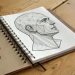
Quick Face Studies With One Light Source
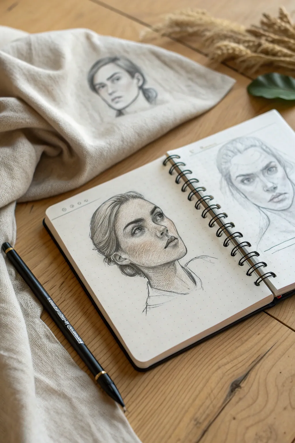
Master the fundamentals of lighting with this focused graphite portrait study, which uses a single imaginary light source to create dramatic volume and depth. By simplifying your shading to capture distinct planes of the face, you’ll create a striking, realistic sketch that feels sculptural rather than flat.
Step-by-Step Guide
Materials
- Dotted or grid journal (or medium-tooth sketch paper)
- HB graphite pencil (drawing)
- 2B or 4B graphite pencil (shading)
- White charcoal pencil or white gel pen (optional highlights)
- Kneaded eraser
- Blending stump (tortillon) or cotton swab
Step 1: Planning and Structure
-
Establish the light source:
Before making a mark, decide exactly where your light represents. For this study, imagine the light coming from the upper right, hitting the forehead and nose bridge directly while casting the opposite cheek and jaw into shadow. -
Map the head shape:
Using your harder HB pencil, lightly sketch an oval for the cranium and a tapered jawline. Keep your hand loose and grip the pencil further back to encourage flowing lines rather than stiff geometry. -
Place the guidelines:
Draw faint vertical and horizontal axis lines. Since the subject is looking up and to the right, curve the horizontal eye line upward and shift the vertical center line to the right side of the oval. -
Block in facial features:
Roughly indicate the positions of the eyes, nose, and mouth using simple geometric shapes. The nose should be a triangular wedge protruding from the center line, and the eyes should define the orbital sockets.
Step 2: Defining the Features
-
Refine the eyes:
Draw the eyelids, remembering that the eye furthest away will appear slightly compressed due to perspective. Pay special attention to the iris, ensuring the gaze is directed upward. -
Sculpt the nose:
Define the nostrils and the tip of the nose. Keep the lines soft; we will rely heavily on shading later to define the bridge of the nose rather than hard contour lines. -
Shape the lips:
Sketch the mouth, noting that the upper lip usually angles inward (in shadow) while the lower lip catches more light. Give the mouth a slight part to add expression. -
Add hair volume:
Outline the mass of the hair, pulling it back from the face. Don’t draw individual strands yet; just focus on the overall shape of the style and the bun at the nape of the neck.
Control Your Saturation
Don’t go pitch black too early. Build graphite layers gradually. It’s much easier to darken a shadow later than to try to erase a harsh, dark line that dug into the paper tooth.
Step 3: Shading and Form
-
Apply base shadows:
Switch to your softer 2B pencil. Lightly hatch the areas that facing away from your light source: the left side of the face, under the jaw, the eye sockets, and the side of the nose. -
Deepen the contrast:
Go back over your darkest areas—under the chin, the nostrils, and the crease of the upper eyelid. Press slightly harder to build up graphite density. -
Add mid-tones:
Connect your dark shadows to the highlighted areas with softer, lighter hatching. The cheekbone serves as a transition point; keep the top of the cheekbone light but shade beneath it to hollow out the cheek. -
Blend the skin:
I prefer to use a blending stump here to gently smudge the graphite, creating smooth skin texture. Use a circular motion, dragging graphite from the dark areas into the mid-tones, but leave the highlights paper-white. -
Detail the hair:
Use long, sweeping strokes to mimic strands of hair. Darken the roots and the area where the hair gathers at the bun, leaving a ‘halo’ of light on the curved crown the head.
Muddy Shading?
If your shadows look messy or grey instead of crisp, stop blending with your finger! Fingers transfer oils that lock graphite into the paper. Always use a dry paper stomp or tissue.
Step 4: Finishing Touches
-
Define the jawline:
Ensure there is a crisp separation between the jaw and the neck. The shadow on the neck should be darker than the shadow on the face to make the chin pop forward. -
Add reflected light:
Use your kneaded eraser to lift a tiny bit of graphite along the very edge of the shadowed jawline. This hints at ‘reflected light’ bouncing back onto the face, a key to realism. -
Enhance highlights:
Eraser lift any graphite that smudged onto the tip of the nose, the forehead, and the chin. If you have a white charcoal pencil, add a tiny sharp dot to the pupil of the eye for life. -
Sketch the clothing:
Keep the clothing sketch loose and minimal, just a few quick lines for the collar and shoulders. This keeps the viewer’s focus strictly on the detailed face.
Step back and admire how a simple shift in shading has given your drawing such compelling volume and character.

Simple Botanical Sprig Close-Up
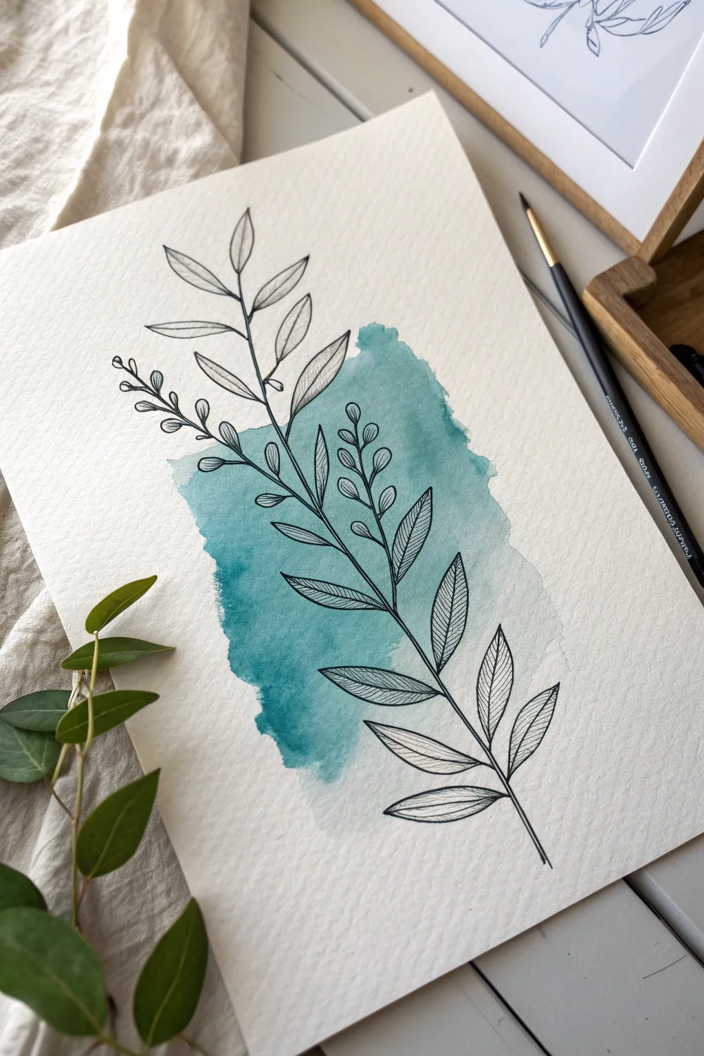
This project combines the unstructured freedom of a watercolor wash with the crisp precision of fineliner drawing. The result is a modern, minimalist botanical illustration where a teal geometric patch provides a lovely backdrop for delicate leaves.
Detailed Instructions
Materials
- Cold press watercolor paper (A5 or A4)
- Black fineliner pen (0.3mm or 0.5mm, waterproof)
- Teal or turquoise watercolor paint
- Medium round watercolor brush (size 6 or 8)
- Pencil (HB or H)
- Kneaded eraser
- Cup of water and paper towel
Step 1: The Watercolor Backdrop
-
Prepare the wash area:
Visualize a rough vertical rectangle in the center of your paper. We aren’t drawing a box, but rather painting within an imaginary one. If you feel unsure, you can lightly mark the corners with a pencil, but keep it faint. -
Mix your color:
Load your round brush with water and pick up a generous amount of teal or turquoise pigment. You want a medium transparency—bold enough to see the color, but light enough that black ink will show clearly on top later. -
Lay down the initial wash:
Start painting your rectangular patch from the top down. Use horizontal strokes, but allow the edges to be uneven and organic. Don’t try to make straight lines; the charm lies in the ‘ragged’ edge. -
Create texture via blooming:
While the paint is still very wet, drop a tiny bit more clean water or a slightly more saturated teal pigment into the center of the patch. This creates the beautiful ‘blooms’ and variations seen in the original. -
Soften the edges:
If one edge looks too hard, rinse your brush, dab it on a towel so it’s damp but not dripping, and gently run it along that edge to pull the color out slightly. -
Let it dry completely:
This is crucial. The paper must be bone dry before you touch it with a pen, or the ink will bleed and ruin the crisp lines. Wait at least 20-30 minutes, or use a hair dryer on a low setting.
Bleeding Lines?
If your fineliner bleeds, your paint wasn’t 100% dry. If the paper feels cool to the touch, it’s still wet. Always wait longer than you think you need to.
Step 2: Drafting the Botanical
-
Sketch the main stem:
Using your pencil very lightly, draw a long, slightly curved line starting from the bottom right and reaching up toward the top left. Let it extend past the painted area on both ends. -
Rough in branch placement:
Mark short lines coming off the main stem to indicate where your leaves will go. Notice how the reference alternates leaves rather than placing them directly opposite each other. -
Sketch the leaf shapes:
Draw simple almond shapes for the leaves. Towards the top left, sketch a smaller secondary branch that splits off, adding tiny circles at the tips to represent buds or berries. -
Refine the composition:
Step back and check the balance. The drawing should feel centered but dynamic, crossing over the teal patch comfortably. Adjust any pencil lines now before committing to ink.
Make it Metallic
After the black ink dries, trace just the outer rim of the teal watercolor shape with a gold gel pen for a luxurious, gilded frame effect.
Step 3: Inking the Details
-
Ink the main stem:
Take your waterproof fineliner and carefully trace the main stem line. I like to start from the bottom and pull the pen upwards for a smoother stroke. -
Outline the leaves:
Go over your almond-shaped leaf outlines. Keep your hand relaxed; if a line wobbles slightly, it just adds to the hand-drawn character. -
Draw the center veins:
Inside each leaf, draw a single line down the center, following the curve of the leaf shape. Stop just short of the leaf tip for a lighter look. -
Add texture with hatching:
This is the defining detail of this style. Draw tiny diagonal lines inside each leaf half to represent veins. Keep them closely spaced and parallel. Don’t rush this part. -
Ink the berry sprig:
Move to the upper left branch. Draw the thin stems and then the small elliptical buds or berries. You can add a tiny dot or semicircle inside the buds to give them volume. -
Connect the stems:
Ensure all your leaf stems connect smoothly back to the main branch. A slightly thickened connection point can make the plant look more robust. -
Erase pencil marks:
Wait 5-10 minutes to ensure the ink is totally set. Then, gently use your kneaded eraser to lift away the graphite guidelines, revealing the clean illustration. -
Final assessment:
Look at the finished piece. If the main stem looks too thin compared to the leaves, go over it one more time to thicken the line weight slightly.
Now you have a striking piece of botanical art that looks complicated but relies on simple, structured steps to achieve beauty

Cozy Room Corner Sketch
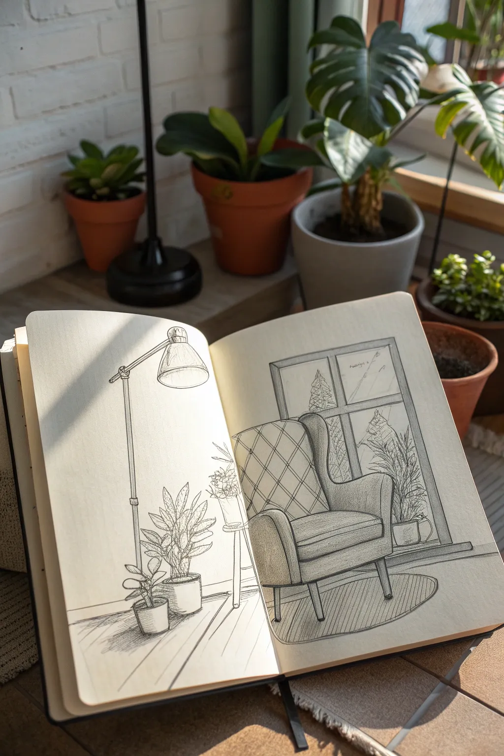
This sketch captures the quiet comfort of a favorite reading spot, featuring a wingback chair, simple floor lamp, and lively potted plants. It uses clean linework and soft shading to create an inviting interior scene perfect for your sketchbook.
Step-by-Step
Materials
- Sketchbook (creamy or off-white paper preferred)
- H or 2H graphite pencil (for initial layout)
- HB or 2B graphite pencil (for detailing)
- Fine liner pens (black, sizes 0.1mm and 0.3mm)
- Kneaded eraser
- Ruler (optional, for window lines)
Step 1: Setting the Perspective
-
Establish the horizon:
Begin by lightly sketching a horizontal line across the lower third of the right page. This will represent where the floor meets the wall and helps ground your furniture. -
Block in major shapes:
Using your H pencil, draw a large, rough rectangle on the right page for the armchair’s overall volume. To its left (on the left page), draw a tall vertical line for the lamp stand. -
Define the chair structure:
Refine the chair’s boxy shape. Sketch the tall backrest, the seat cushion, and the armrests. Don’t worry about details yet; just focus on getting the proportions right. -
Place the window:
Behind the chair, lightly draw a large rectangle for the window frame. Add a cross shape within it to create the window panes.
Cross-Page Flow
When drawing across the sketchbook gutter, avoid putting crucial details (like the lamp bulb) right in the crack. Leave a tiny gap so the image reads clearly.
Step 2: Adding Key Elements
-
Construct the floor lamp:
Flesh out the vertical line on the left page. Draw a sturdy base, a segmented pole, and an angled arm at the top. Sketch a trapezoid shape for the lampshade, angling it slightly downward. -
Position the plants:
Sketch a cylinder shape on the floor near the lamp base for the large potted plant. Add a smaller pot next to it. On the right page, place a pot shape on the window sill behind the chair. -
Refine organic shapes:
For the plants, draw individual leaves extending from the center of the pots. Use pointed ovals for the floor plant and wilder, grassy strokes for the window plant. -
Detail the armchair:
Add the wooden legs to the chair, making sure they angle slightly outward. Draw the curve of the wingback and add a diamond grid pattern lightly on the backrest to suggest quilting.
Wonky Perspectives?
If the chair looks twisted, check that the front legs are lower on the page than the back legs. This simple vertical difference creates depth.
Step 3: Inking & Texture
-
Outline with pen:
Switch to your 0.3mm fine liner. Go over the main structural lines of the chair, window, and lamp. Use confident, single strokes rather than feathery lines. -
Add detail to the lamp:
Ink the lamp structure. I like to add tiny screws or joint details where the arm angles. Use hatching on the shade’s interior to show depth. -
Texture the fabric:
Use the 0.1mm pen to ink the diamond pattern on the chair. Keep these lines thinner than the outline to make the texture look soft rather than rigid. -
Ink the greenery:
Outline the leaves, allowing some lines to break or waver to mimic natural organic forms. Add simple veins to the larger leaves on the left page.
Step 4: Shading & Atmosphere
-
Cast shadows:
Switch to your 2B pencil for softer shading. Add a cast shadow underneath the chair and the plant pots to firmly plant them on the ground. -
Shade the chair:
Lightly shade the side of the chair arm and the seat cushion to show form. Use vertical hatching lines on the side panel of the chair to distinguish planes. -
Create window depth:
Shade the inside edges of the window frame to give it thickness. Sketch faint suggestion lines outside the window (like distant trees) but keep them very light so they recede. -
Floorboards and rugs:
Draw an oval rug beneath the chair. Add diagonal lines across the bottom of the pages to suggest wooden floorboards, varying the pressure to keep it subtle. -
Final touches:
Erase any remaining grid lines or rough construction marks. Strengthen the darkest shadows—like the bottom of the pots or beneath the seat cushion—to increase contrast.
Enjoy viewing your peaceful interior scene, knowing you’ve built a cozy world on paper


Circle Drawing: Tiny Landscape Inside a Boundary
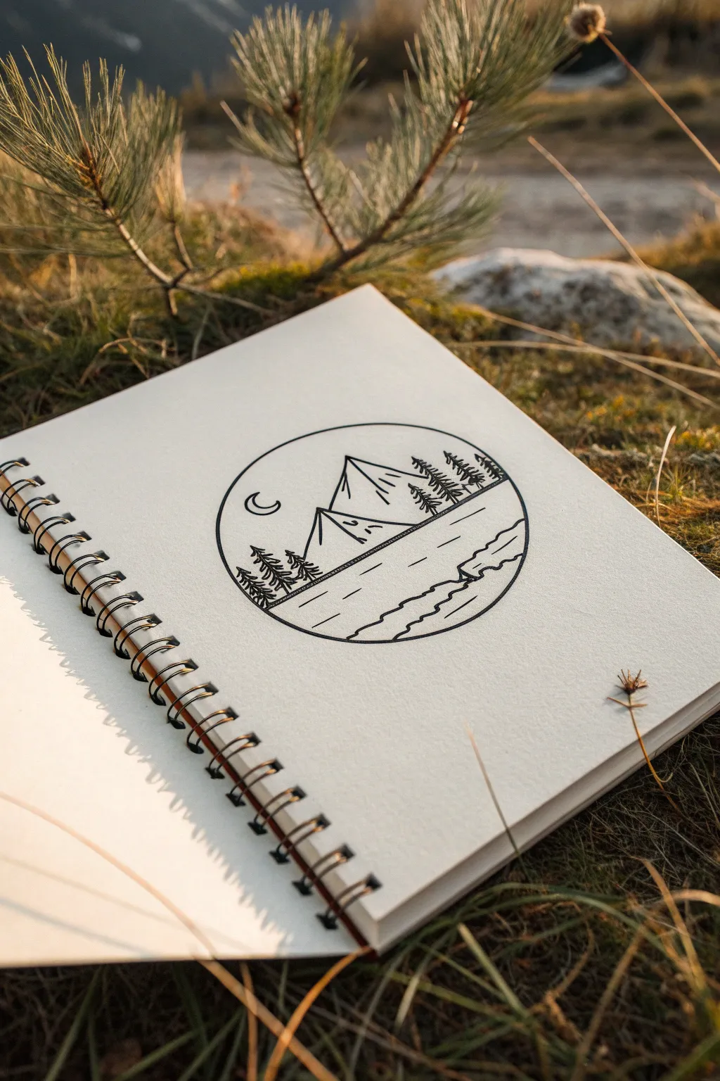
Capture the serenity of the outdoors with this simple yet striking circular landscape. Using bold, clean lines, you’ll create a stylized scene featuring mountains, pine trees, and a calm lake, all contained within a perfect geometric boundary.
How-To Guide
Materials
- Spiral-bound sketchbook (medium weight paper)
- Black drawing pen (0.5mm or 0.8mm for bold lines)
- Pencil (HB or H)
- Eraser
- Compass or a circular object to trace (approx. 3-4 inches diameter)
- Ruler or straight edge
Step 1: Setting the Stage
-
Draw the boundary:
Begin by finding the center of your page. Use your compass or a circular object like a cup or lid to lightly draw a perfect circle with your pencil. This will be the container for your entire landscape. -
Establish the horizon:
Using your ruler, lightly sketch a horizon line across the lower third of the circle. It doesn’t need to be perfectly straight; a slight diagonal angle adds a bit of dynamic interest. -
Sketch the mountain peaks:
Above your horizon line, penciling in two large triangular shapes for the mountains. Make the left peak slightly shorter and the central peak taller and wider, letting the points reach up toward the top section of the circle.
Wobbly Circle?
Don’t stress if your freehand inking isn’t perfect. If the line is shaky, go over it a second time to thicken it. The slight variation adds a rustic, hand-drawn charm.
Step 2: Inking the Landscape
-
Outline the circle:
Switch to your black drawing pen. Carefully trace over your pencil circle first. I like to rotate the sketchbook as I draw the curve to keep my hand angle consistent and the line smooth. -
Draw the lake shoreline:
Ink the horizon line you sketched earlier, extending it across the circle. On the right side, just below the horizon, draw a jagged, irregular line to represent a rocky shoreline or bank jutting into the water. -
Define the mountains:
Go over your mountain outlines with the pen. Instead of perfectly straight lines, give them a tiny bit of wobble or natural variation to make them feel organic. -
Add mountain details:
From the peak of the central mountain, draw a vertical line straight down to the base. This splits the face of the mountain. Add a few small, angled tick marks on the right side of this line to suggest texture or snow patches. -
Detail the second peak:
Do the same for the smaller peak on the left, adding a central festive line and a few small dashes for texture.
Stippling Shadows
Add depth by using tiny dots (stippling) on one side of the mountains or trees. This creates a shadow effect and makes the flat line art feel three-dimensional.
Step 3: Adding Flora and Atmosphere
-
Create the right-side forest:
On the slope rising behind the shoreline on the right, draw three small pine trees. Use a simple zigzag motion, starting narrow at the top and getting wider at the base. -
Balance with left-side trees:
On the far left side, at the base of the smaller mountain, draw a cluster of three slightly larger pine trees. Ensure their bases touch the horizon line to ground them in the scene. -
Add a celestial touch:
In the open sky area on the upper left, draw a small, simple crescent moon shape. Keep the lines clean and unconnected to anything else. -
Ripple the water:
In the bottom section representing the lake, draw a few horizontal dashes of varying lengths. Place them randomly but keep them parallel to the horizon to simulate calm water ripples. -
Texture the foreground:
In the very bottom right area of the circle, draw two or three wavy lines parallel to the circular edge. This suggests waves lapping against the shore or land contours.
Step 4: Finishing Touches
-
Let the ink set:
Wait a few minutes for the ink to dry completely. If you erase too soon, you risk smudging your crisp black lines. -
Erase guidelines:
Gently erase all visible pencil marks, including the original horizon sketch and mountain guides, leaving only the bold black ink work. -
Assess line weight:
Look over your drawing. If the outer circle feels too thin compared to the trees, re-trace it once more to give it a solid, frame-like appearance.
Now you have a peaceful miniature world captured right in your sketchbook
BRUSH GUIDE
The Right Brush for Every Stroke
From clean lines to bold texture — master brush choice, stroke control, and essential techniques.
Explore the Full Guide
Moon and Stars With High Contrast
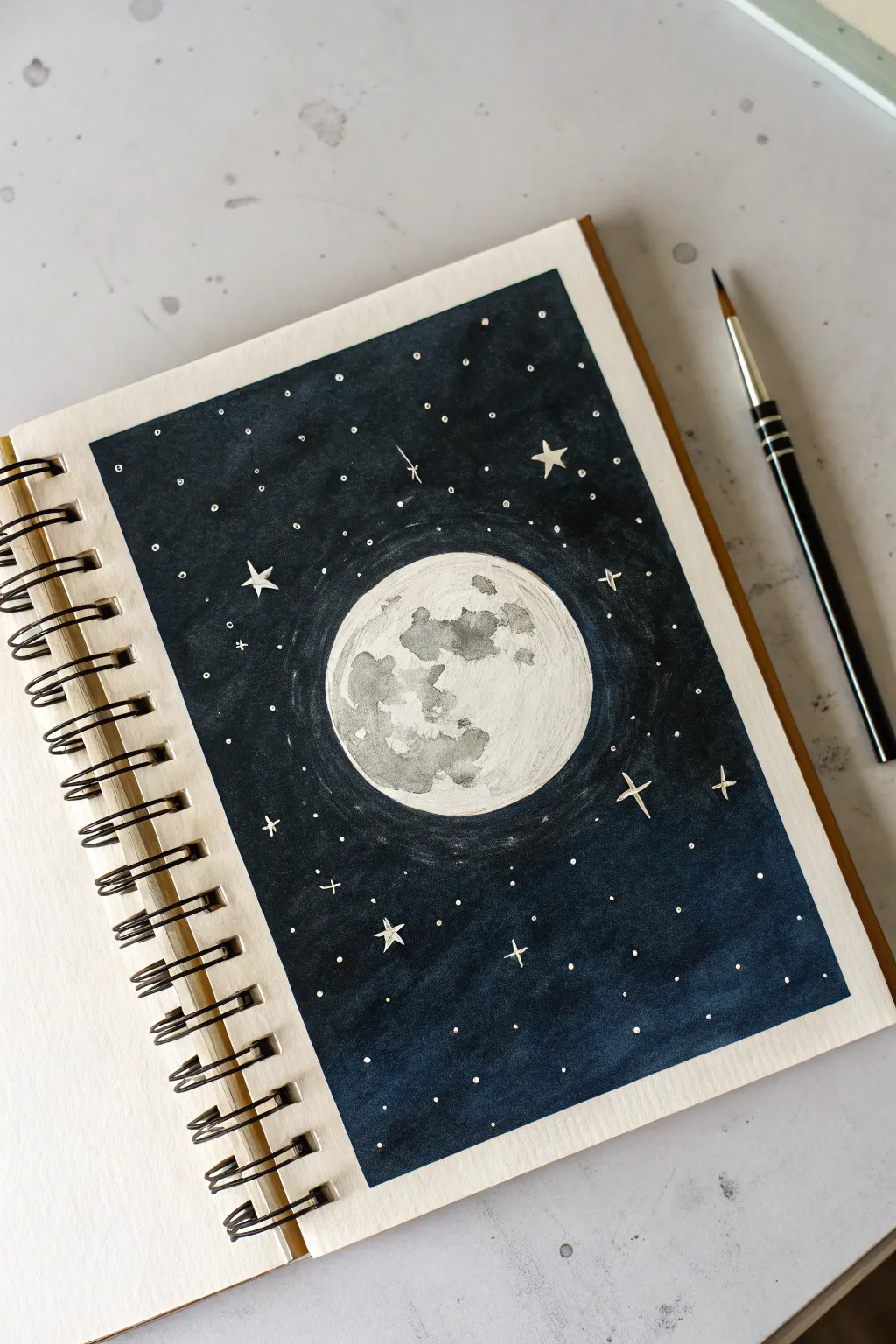
This stunning celestial spread captures the bright luminosity of the moon against a deep, inky cosmos. Using high-contrast negative space and precise masking techniques, you’ll create a glowing night sky that pops right off the page.
Detailed Instructions
Materials
- Sketchbook with watercolor paper (cold press recommended)
- Pencil and eraser
- Compass or circle stencil
- Masking fluid
- Deep indigo or black watercolor paint
- White gouache or white gel pen
- Diluted grey watercolor
- Round brushes (sizes 2 and 6)
- Small fine-liner brush
Step 1: Preparation & Masking
-
Outline the composition:
Begin by lightly tracing a rectangle or square on your page to define the boundaries of your night sky, leaving a clean border of white paper around the edges. -
Draw the moon:
Use a compass or trace a circular object to draw a perfect circle in the center of your framed area. Keep the pencil pressure very light so it doesn’t show through later. -
Sketch the craters:
Lightly sketch irregular shapes inside the moon to represent the playful maria (the dark plains) and craters. Reference a photo of the moon or just invent organic shapes. -
Apply masking fluid:
Carefully paint a layer of masking fluid over the entire moon circle. This essential step protects the white paper while you paint the dark background. -
Create star masks (optional):
If you want pure white stars without using gouache later, you can dot tiny specks of masking fluid in the sky area now. Otherwise, proceed to the drying phase. -
Let it cure completely:
Wait until the masking fluid is entirely dry and rubbery to the touch. Painting over wet fluid will ruin your brushes and tear the paper.
Step 2: Painting the Void
-
Mix your darkest shade:
Prepare a rich, concentrated mixture of indigo watercolor. I like to add a touch of black or Payne’s Grey to make it feel deeply atmospheric. -
Paint the first background layer:
Using your larger round brush, fill in the rectangular sky area around the masked moon. Work relatively quickly to keep a wet edge and avoid streaky drying lines. -
Create a subtle halo:
As you paint near the masked moon, you can slightly dilute the paint with water to effectively create a faint, lighter halo effect around the celestial body. -
Deepen the contrast:
Once the first layer is dry, apply a second coat of your dark indigo mixture. This ensures the background is opaque and provides maximum contrast for the white stars. -
Dry thoroughly:
Allow the background to dry completely. The paper should be flat and warm to the touch before you attempt to remove the mask.
Uneven Background?
If your background looks streaky, don’t overwork wet paint. Let it dry 100%, then add another thin, even layer of dark paint to unify the color without lifting the previous layer.
Step 3: Revealing & Detailing
-
Remove the mask:
Gently rub the masking fluid away with your clean finger or a rubber cement pickup tool to reveal the stark white circle underneath. -
Paint the lunar shadows:
Mix a very watery, pale grey wash. Paint in the topographic shapes you sketched earlier, blobbing the grey onto the white moon to mimic craters. -
Add texture to the moon:
While the grey patches are still damp, drop in slightly darker grey pigment into the wet areas. This ‘wet-on-wet’ technique creates natural, blooming textures that look like rocky terrain. -
Define the stars:
Using opaque white gouache or a white gel pen, dot the dark sky with stars. Vary the pressure to create different sizes like distant specks and closer planets. -
Add twinkling elements:
Select a few larger stars and draw simple four-pointed cross shapes to give them a twinkling effect. Place these randomly for a natural look. -
Create a constellation look:
Draw incredibly thin, faint lines connecting two or three stars together to suggest distant constellations. -
Refine the edges:
Check the border of your rectangle. If the paint bled out, use your white gel pen or thick white gouache to straighten the edges for a crisp, framed finish.
Level Up: Cosmic Glow
Before the dark background dries, sprinkle a tiny pinch of salt into the wet paint. When dry and brushed off, the salt leaves unique star-burst textures in the sky.
Peel off any tape borders you might have used and enjoy the serene glow of your moon.
Silhouette Scene at Sunset
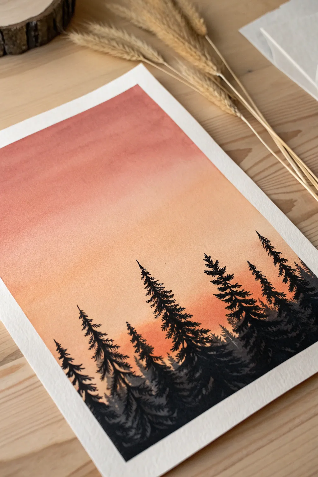
This serene watercolor project captures the calming transition of day to night with a smooth, warm gradient sky and contrasting dark foliage. By layering transparent washes and opaque silhouettes, you will create a sense of depth and atmosphere that feels both simple and striking.
Step-by-Step
Materials
- Cold press watercolor paper (300 gsm)
- Painter’s tape or masking tape
- Drawing board or hard surface
- Watercolor paints (Alizarin Crimson, Cadmium Orange, Yellow Ochre, Lamp Black/Payne’s Gray)
- Large flat wash brush (3/4 inch or 1 inch)
- Medium round brush (size 6 or 8)
- Fine detail brush (size 0 or 2)
- Two jars of water (one clean, one for rinsing)
- Paper towels
- Palette
Step 1: Preparing the Sky Gradient
-
Secure the paper:
Tape down all four edges of your watercolor paper to a board using painter’s tape to prevent buckling and create a clean white border. -
Pre-wet the paper:
Using your large flat brush and clean water, apply an even coat of water across the entire upper two-thirds of the paper. This ‘wet-on-wet’ technique is crucial for a smooth sky blend. -
Mix your sunset colors:
Prepare a watery mix of Alizarin Crimson (a cool red) and a separate mix of Cadmium Orange with a touch of Yellow. You want these to be fairly diluted for a soft look. -
Apply the top color:
Load your flat brush with the crimson mix and paint horizontal strokes across the very top of the paper, letting the wet surface help the pigment spread. -
Blend downward:
Quickly rinse your brush slightly and pick up the orange mix. Apply this just below the red, slightly overlapping the colors so they bleed together seamlessly. -
Fade to the horizon:
Continue painting downward with the orange mix, gradually adding more water to your brush to fade the color out to a very pale, almost white tone near where the tree line will be. -
Dry completely:
This is the most critical waiting period. Let the background dry 100% before moving on. I like to touch the tape (not the painting) to check temperature; if it feels cold, the paper is still damp.
Fixing “Blooms”
If water drops hit the drying sky, creating ‘cauliflower’ marks, don’t scrub. Wait for it to dry, then lightly glaze over the area with a damp brush to soften the hard edges.
Step 2: Painting the Foreground Outline
-
Mix the silhouette color:
Create a very concentrated, creamy mixture of black. You can mix Lamp Black with a tiny bit of Indigo or Payne’s Gray to give it a rich, cool undertone, but keep it opaque. -
Establish the tree line:
Using your medium round brush, paint an uneven, undulating hill shape across the bottom third of the paper. This will be the solid base for your forest. -
Map out tree trunks:
Switch to your finer brush. Draw varying vertical lines rising from the hill. Make some taller and some shorter to create a natural, organic rhythm.
Step 3: Detailing the Pines
-
Start the pine tops:
At the very tip of your tallest trunk line, use the fine brush to dab tiny, upward-facing strokes to create the delicate crown of the tree. -
Work your way down:
Moving down the trunk, start making horizontal, zig-zagging strokes. As you descend, make the branches wider and slightly heavier to form the classic triangular pine shape. -
Vary the texture:
Don’t make the branches too uniform. Leave some gaps between branches where the sunset sky can peek through—this ‘negative space’ adds realism. -
Add secondary trees:
Repeat this process for the medium-sized trees. For trees that are meant to look further back, you can dilute your black paint slightly to make them look lighter and deeper in the fog. -
Fill the bottom density:
As you reach the bottom of the trees where they meet the hill, merge the branches into the solid black base so there are no floating trunks. -
Final touches:
Use your smallest brush to add tiny stray branches or sprigs sticking out from the main silhouette for extra detail. -
Reveal the border:
Ensure the black paint is completely dry, then slowly peel the tape away at a 45-degree angle not to tear the paper.
Pro Tip: Depth of Field
Mix a tiny drop of white gouache into your black paint for the smaller background trees. This makes them look grayer and more distant than the sharp, pure black foreground trees.
Now you have a tranquil forest scene that captures the perfect moment of twilight stillness

PENCIL GUIDE
Understanding Pencil Grades from H to B
From first sketch to finished drawing — learn pencil grades, line control, and shading techniques.
Explore the Full Guide
Continuous Line Drawing of a Profile
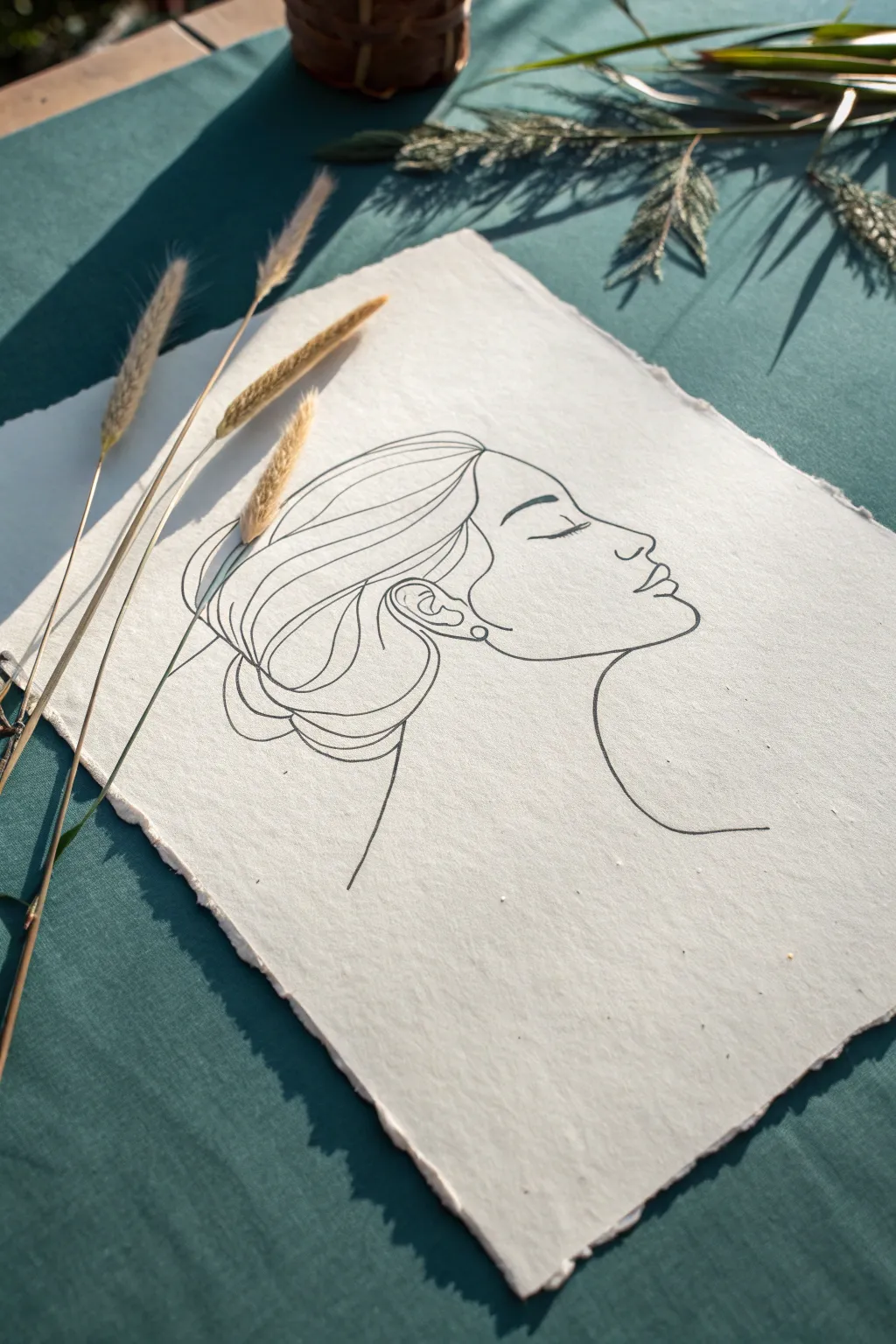
Capture the delicate beauty of a side profile using the flowing technique of continuous line art. This project creates a minimalist and sophisticated piece on textured paper, perfect for framing or gifting.
Step-by-Step
Materials
- Heavyweight handmade paper with deckled edges (cotton rag paper is ideal)
- Fine liner pen (0.3mm or 0.5mm, black)
- Pencil (HB or 2B) for sketching
- Kneaded eraser
- Tracing paper (optional, for practice)
- Reference photo of a profile (optional)
Step 1: Preparation and Rough Sketching
-
Select your paper:
Choose a piece of textured, handmade paper. The rough surface adds character to the simple lines, so ensure the deckled edges are positioned nicely. -
Define the composition:
Visualize where the face will sit on the page. You want plenty of negative space around the drawing, especially in front of the face, to let the artwork breathe. -
Lightly sketch the head shape:
Using your pencil very lightly, draw a rough oval or egg shape to represent the cranium. This helps ensure the head isn’t too flat or too elongated. -
Mark the facial features:
Make tiny, faint marks to indicate where the eyebrow, nose tip, lips, and chin will fall. Getting these proportions right now saves frustration later. -
Draft the profile outline:
Sketch the actual profile line—forehead, nose, lips, and chin—keeping your pencil pressure minimal so it can be erased easily. -
Sketch the hair volume:
Loosely outline the mass of hair, sweeping it back into a low bun shape. Don’t worry about individual strands yet; just focus on the overall silhouette. -
Position the neck and shoulder:
Draw the curve of the neck extending down and the line of the shoulder or upper back. This grounds the floating head.
Clean Lines
If your hand shakes, don’t stop abruptly. Pause with the pen tip down, take a breath, and continue. Wobbly lines add organic charm.
Step 2: Inking the Continuous Line
-
Test your pen:
Before touching the final paper, test your fine liner on a scrap piece of similar texture to see how the ink absorbs and flows. -
Start at the forehead:
Begin your final ink line at the hairline above the forehead. Draw slowly and steadily, moving down the slope of the forehead. -
Define the nose and lips:
Navigate the curve of the nose bridge, round the tip, and carefully loop into the philtrum and the upper lip. Keep the pen moving fluidly. -
Complete the chin and jaw:
Trace the bottom lip, round the chin, and sweep back up along the jawline toward the ear position. -
Draw the ear detail:
Instead of lifting the pen, loop inside the jawline to create the ear. Use a swirl motion to suggest the inner ear cartilage without being hyper-realistic. -
Flow into the hair:
From the ear, extend your line upward to create the sweeping strands of hair. I like to make these lines long and undulating to mimic hair texture. -
Create the bun:
Loop the lines around nearest the nape of the neck to form the messy bun, using overlapping curves to suggest volume and gathers. -
Add face details:
Carefully draw the closed eyelid and eyebrow. While true continuous line drawings never lift the pen, for this specific style, it is okay to lift briefly to place these floating isolate features cleanly. -
Finalize the neck:
Draw the sweeping back neck line and the front, plunging neck line, allowing them to fade off or stop abruptly for an artistic effect.
Go Digital
Scan your finished drawing at high resolution. You can then digitally overlay it onto colored backgrounds or print it on cards.
Step 3: Finishing Touches
-
Let the ink set:
Wait several minutes for the ink to completely dry. Handmade paper can be absorbent, and smudging at this stage is heartbreaking. -
Erase pencil guides:
Gently dab and roll your kneaded eraser over the sketch lines to lift the graphite without damaging the paper fibers. -
Assess line weight:
If any lines look too thin due to the paper texture, carefully re-trace them to add definition, but maintain the single-stroke look.
Now you have a serene, minimalist portrait that celebrates the beauty of simplicity
Flowing-Fin Fish With Color Gradients
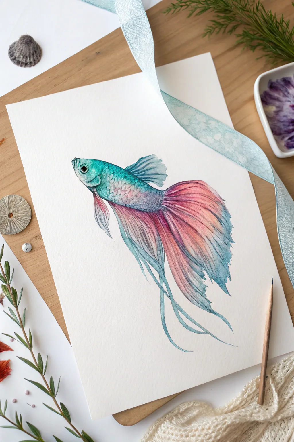
Capture the ethereal beauty of a Betta fish with this mixed-media project that combines watercolor washes and precise colored pencil details. You’ll create stunning, seamless gradients that transition from cool teals to warm salmon pinks along delicate, flowing fins.
Step-by-Step
Materials
- High-quality watercolor paper (cold press recommended)
- HB graphite pencil
- Kneaded eraser
- Watercolor paints (Teal, Prussian Blue, Alizarin Crimson, Salmon/Coral)
- Round watercolor brushes (size 4 and 0 for details)
- Colored pencils (Teal, Dark Blue, Magenta, White)
- Paper towels
- Clean water jar
Step 1: Sketching the Form
-
Outline the body:
Start with a light HB pencil sketch. Draw an elongated oval for the fish’s body, slightly tapering towards the tail. Keep your lines very faint so they won’t show through the translucent paint later. -
Map the fins:
Sketch the flowing fins extending from the top, bottom, and tail end. Use long, sweeping S-curves to mimic movement. The tail fin should be the largest, fanning out broadly, while the bottom ventral fins are long and ribbon-like. -
Refine the details:
Add the eye near the front of the head and the curve of the gill cover. Gently erase any harsh lines with a kneaded eraser until only a ghost of the image remains.
Step 2: Watercolor Base Layers
-
Wet-on-wet body wash:
Lightly wet the body area with clean water. Load your brush with a watery mix of teal and drop it onto the head and upper back, letting it bloom naturally. -
Transitioning colors:
While the teal is still damp, introduce a very pale purple or blue towards the center of the body. Let these colors bleed into each other softly without overworking them. -
Painting the main fins:
Move to the large tail fin. Start at the base (closest to the body) with a diluted teal/blue mix. As you move outward, rinse your brush and pick up the salmon or coral color. -
Creating the gradient:
Blend the blue into the pink while both are wet to create a soft violet transition zone. Paint the tips of the fins with the pink mix, letting the edges stay somewhat loose and organic. -
Lower fin washes:
Repeat the gradient process on the long visual fins below the belly. I find it effective to keep the tips of these long strands primarily blue or teal to frame the pinker tail section. -
drying time:
Allow the watercolor layer to dry completely. This is crucial; if the paper is cool to the touch, it’s still wet. Colored pencils will tear damp paper.
Control the Bleed
If your watercolor gradients run too fast, tilt your paperboard slightly. Gravity will pull the pigment down, helping you control exactly where the colors mix.
Step 3: Defining with Colored Pencils
-
Scale texture:
Using a sharp teal colored pencil, start defining the scales on the upper body. Draw small, overlapping ‘C’ shapes, pressing harder near the gill cover for depth. -
Enhancing the eye:
Fill in the pupil with a dark blue or black pencil, leaving a tiny spot of white paper for the highlight. Outline the eye with the teal pencil to make it pop. -
Fin rays – Part 1:
With a magenta or dark pink pencil, drawn long, thin lines radiating from the base of the tail fin outward. These represent the structural rays of the fin. -
Fin rays – Part 2:
Switch to a dark blue pencil for the blue sections of the fins. Follow the same direction as your painted strokes, adding definition to the folds and overlaps in the fin material. -
Deepening shadows:
Use a dark blue or indigo pencil to shade the area where the fins meet the body. This shadow creates a sense of volume and separates the detailed fins from the smoother body scales. -
Adding movement:
On the long, ribbon-like lower fins, use the blue pencil to outline the edges and add twisting lines that suggest the fins are turning in the water.
Metallic Magic
Once dry, lightly glaze iridescent watercolor medium or metallic silver paint over the scales on the fish’s back to mimic real shimmering fish scales.
Step 4: Final Highlights and Details
-
Softening transitions:
Where the pencil lines might look too harsh against the watercolor, use a barely-damp clean brush to gently smudge the pencil pigment, or use a white colored pencil to blend. -
Highlights:
Use a white gel pen or opaque white gouache to add tiny highlight dots to the wettest looking part of the eye and the tips of the scales for a shimmering effect. -
Edge refinement:
Check the very tips of the fins. If the watercolor dried jaggedly, smooth out the silhouette with your colored pencils to ensure a graceful flow.
Now you have a serene, swimming masterpiece that captures the delicate nature of aquatic life


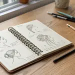
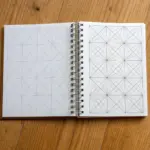
Tiny 5-Minute Sketch Grid Challenge
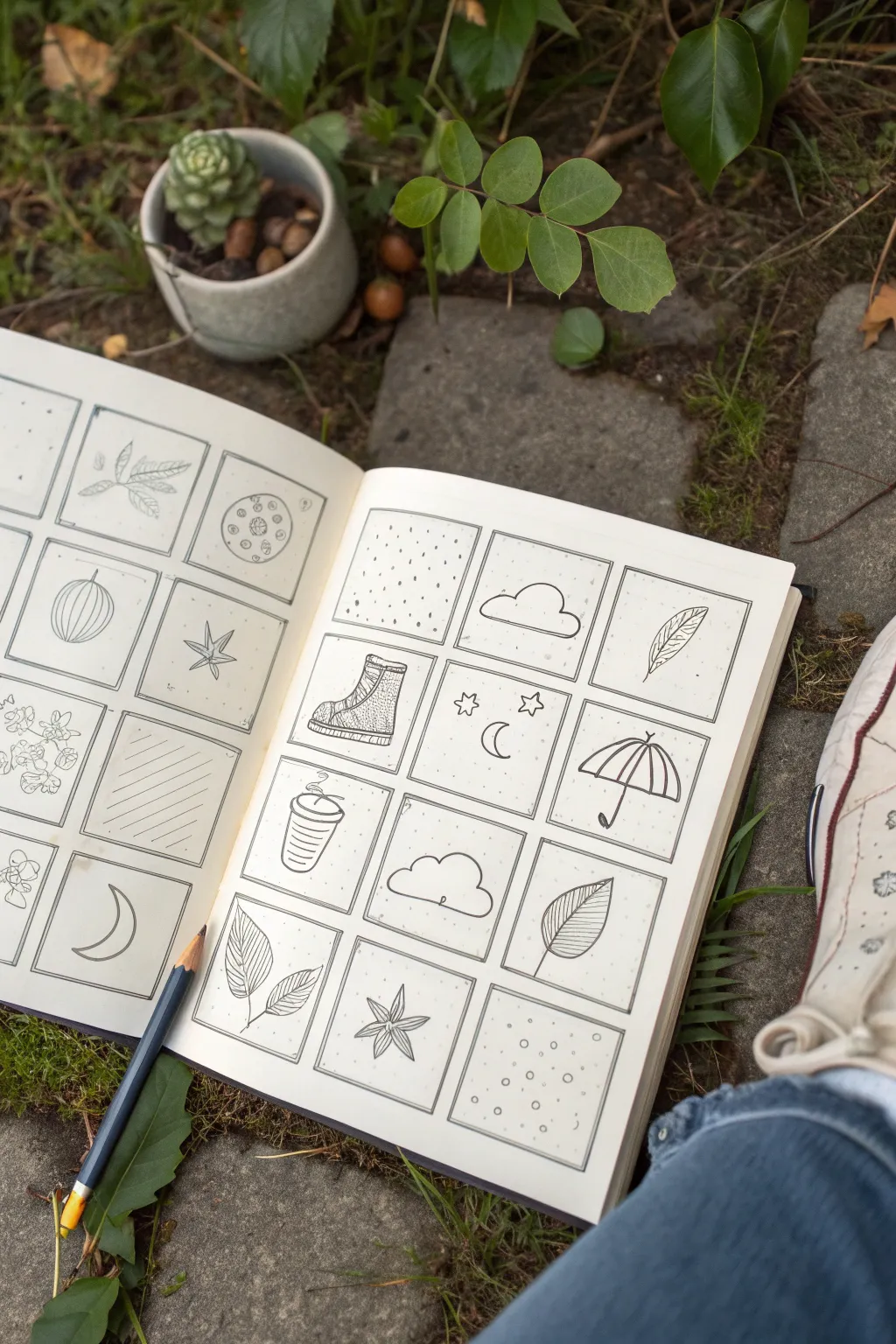
Beat creative block with this approachable exercise that breaks a large blank page into manageable, bite-sized squares. The aesthetic is clean and minimal, featuring simple line drawings of everyday objects and nature motifs in black ink.
Step-by-Step Guide
Materials
- Sketchbook with smooth paper (A5 size works well)
- Ruler
- Pencil (HB or H)
- Small fine-liner pen (0.1 or 0.3mm)
- Thicker drawing pen (0.5mm)
- Eraser
Step 1: Setting the Grid
-
Map out the margins:
Begin by deciding on the layout of your grid. Measure a comfortable border around the edge of your page—about 1.5cm usually looks balanced—and mark it lightly with your pencil. -
Calculate square sizes:
Measure the remaining width inside your border. Divide this number by three (for a 3-column layout like the image) to determine the width of each square. Do the same for the height to fit four rows. -
Draft the grid lines:
Using your ruler and a light touch with the pencil, draw the horizontal and vertical lines to create a grid of 12 squares per page. Don’t worry if they aren’t perfectly identical; handmade charm is part of the appeal. -
Ink the frames:
Trace over your pencil grid with the 0.5mm pen to create bold, definitive frames for your art. I like to stop just short of the corners or cross them slightly for a sketchbook-style look. -
Clean up the structure:
Once the ink is completely dry, gently erase the underlying pencil guides so you have a clean slate of empty boxes ready to be filled.
Grid Consistency
Cut a square from cardstock to use as a stencil. Trace it repeatedly to make your grid boxes uniform without measuring.
Step 2: Filling the Squares
-
Theme selection:
Choose a loose theme for your spread to keep it cohesive. The example uses ‘Autumn comfort’, featuring leaves, boots, rain gear, and celestial elements. -
Start with patterns:
pick 2-4 boxes scattered across the page to fill with simple textures rather than objects. Stipple dots in one box and draw diagonal hatching lines in another using the 0.1mm pen. -
Draw simple botanical shapes:
In the upper right corner, sketch a simple leaf with a central vein. Add diagonal lines for texture. Repeat leaf motifs in other boxes, varying the species—try a five-pointed maple leaf or a rounded wide leaf. -
Add manufactured objects:
Sketch a hiking boot in profile view. Start with the sole, then the L-shape of the boot body, and add tiny loops for laces. -
Incorporate weather elements:
Draw an open umbrella. Create a semi-circle with scalloped edges at the bottom, then add a curved handle (‘J’ shape) coming down from the center. -
Sketch celestial doodles:
Dedicate a square to the night sky. Draw a simple crescent moon and scatter a few small five-pointed stars around it. -
Add cozy details:
For a ‘coffee cup’ square, draw a tapered cylinder with a lid on top. Add a small wavy line rising from the lid to represent steam. -
Balance the composition:
Look at your spread. If one side feels ‘heavy’ with dark ink, add a lighter doodle (like a cloud or the circle-dot pattern) to the opposite side. -
Refine the line work:
Go back over your main object outlines with the slightly thicker 0.3mm pen to make them pop against the white paper. -
Erase pencil sketches:
If you sketched your doodles in pencil first, wait until the ink is totally dry, then erase the graphite marks to leave crisp black lines.
Smudged Ink?
If you smudge a line, transform it! Turn the smudge into a shadow or add more lines to turn it into a texture pattern box.
Step back and appreciate how a collection of tiny, simple drawings creates a complex and satisfying page layout
Surreal Object Mashup for Instant Wow
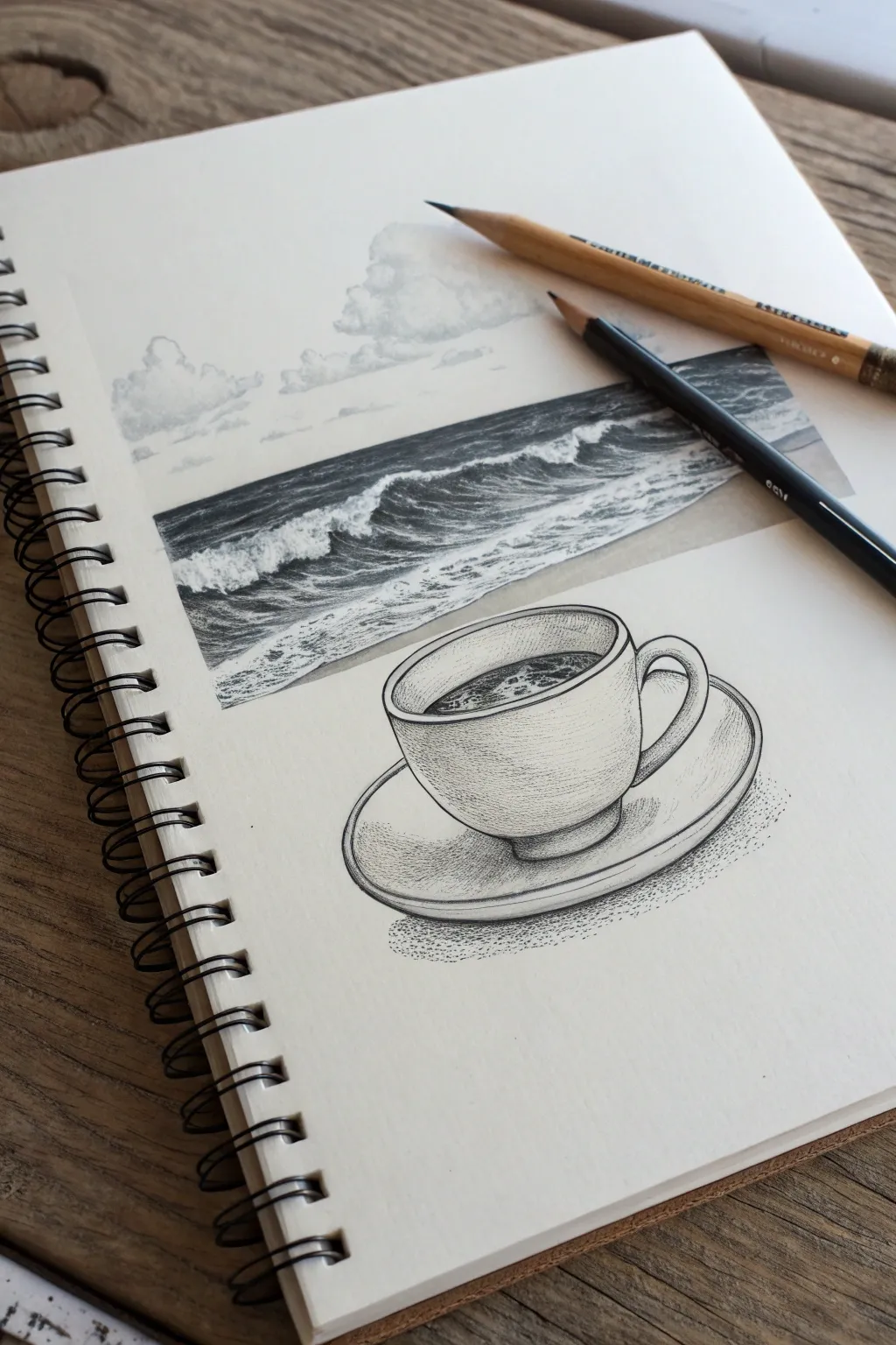
Blend the calm of a morning brew with the raw power of the ocean in this clever visual juxtaposition. This pencil sketch merges a classic seascape with a still life coffee cup, creating a dreamlike window where the liquid behaves like a crashing tide.
Step-by-Step
Materials
- Spiral-bound sketchbook (heavyweight paper)
- Graphite pencils (HB, 2B, 4B, 6B)
- Black fine-liner pen (0.3mm or 0.5mm)
- Stippling pen (0.1mm)
- Blending stump or tortillon
- Kneaded eraser
- Ruler
Step 1: Setting the Scene
-
Define the Horizon:
Begin by lightly sketching a horizontal rectangle in the upper portion of your page. This will act as the ‘frame’ for your ocean scene. Draw a straight horizon line about a third of the way down from the top of this box. -
Sketch the Coffee Cup:
Below the rectangle, lightly sketch the oval opening of a coffee cup. Make it wide enough that a viewer could imagine the ocean pouring into it. Add the body of the cup and the saucer using curved, elliptical lines. -
Connect the Worlds:
This is the crucial surreal element: erase the bottom boundary of your rectangle and the back rim of the coffee cup. Carefully draw connection lines so the water seems to flow seamlessly from the rectangular ‘photo’ space directly into the cup’s interior.
Step 2: Drawing the Seascape
-
Drafting Clouds:
Using an HB pencil, lightly outline fluffy cumulus clouds above the horizon line. Keep the shapes organic and irregular, avoiding perfect circles. -
Establishing the Water:
Switch to a 2B pencil to block in the dark areas of the ocean. The water furthest away should be a solid, dark tone, while the middle ground needs space reserved for the white foam of crashing waves. -
Creating Waves:
Use a 4B pencil to deepen the shadows under the cresting wave. Leave the paper white for the foam, using short, choppy strokes to suggest the texture of splashing water. -
Refining the Sky:
Gently shade the undersides of the clouds with the HB pencil. I like to use a blending stump here to soften the graphite, making the clouds look wispy and distant compared to the sharp waves. -
Water Details:
Darken the water transitioning into the cup. Use horizontal strokes that gradually curve downwards as they enter the cup’s rim, mimicking liquid pouring into a container.
Pro Tip: Foam Texture
Don’t draw the white foam; draw the shadows *around* it. Use a dirty blending stump to add faint grey tones to the ‘white’ foam for volume.
Step 3: Rendering the Cup
-
Inking the Outline:
Take your 0.3mm or 0.5mm fine-liner and trace the outline of the coffee cup, handle, and saucer. Keep the line weight consistent, but consider making the bottom of the saucer slightly thicker to suggest weight. -
Texturing the Porcelain:
Instead of smooth shading, we will use stippling (dots) for the cup. Use a 0.1mm pen to add density near the bottom of the cup and under the rim. The dots should be very sparse in the center to show highlight. -
Adding Liquid Interior:
Inside the cup, draw dark, swirling lines with your pen or a dark 6B pencil to represent dark coffee. Leave small white islands for bubbles or foam near the edge. -
Shadowing the Saucer:
Add shading to the saucer using cross-hatching or stippling. Focus the darkness directly under the cup where it sits on the plate. -
Grounding Shadow:
Create a cast shadow underneath the saucer using dense stippling or soft graphite shading. This grounds the object so it doesn’t look like it’s floating in space.
Troubleshooting: Flat Cup
If the cup looks flat, check your ellipses. The curve of the cup’s bottom must match the curve of the rim. Widen the bottom curve if it feels off.
Step 4: Final Touches
-
Enhancing Contrast:
Go back to your ocean rectangle. Use the 6B pencil to push the darkest values in the deep water, ensuring the white foam pops by contrast. -
Sharpening Edges:
Use a ruler and a sharp pencil to re-define the top and side edges of the rectangular ‘photo’ section, making it look crisp against the white paper. -
Clean Up:
Use your kneaded eraser to lift any stray graphite smudges from the white space around the drawing. The stark white background is essential for the surreal effect.
Take a moment to admire how you’ve bridged two completely different worlds on a single page


Have a question or want to share your own experience? I'd love to hear from you in the comments below!