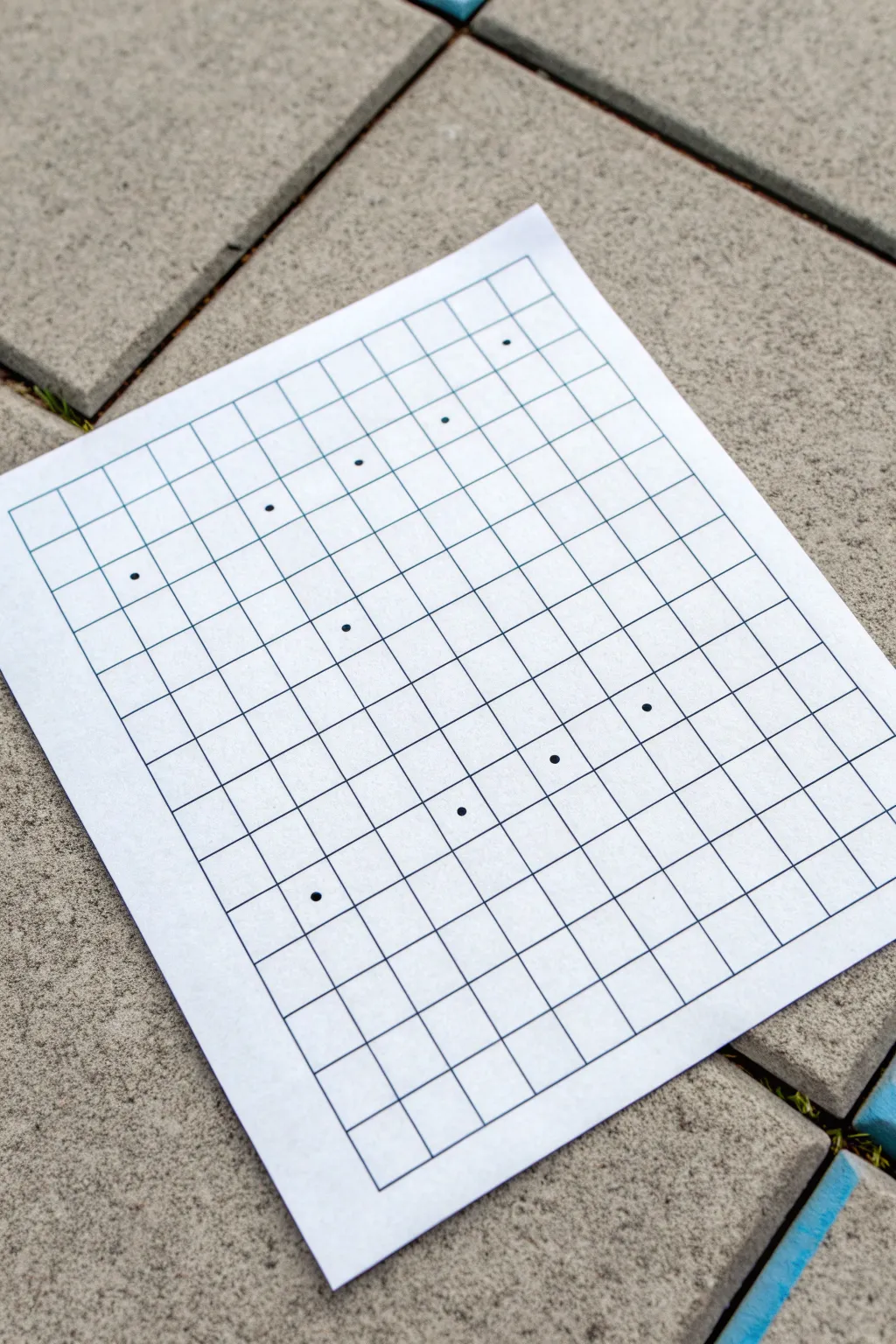
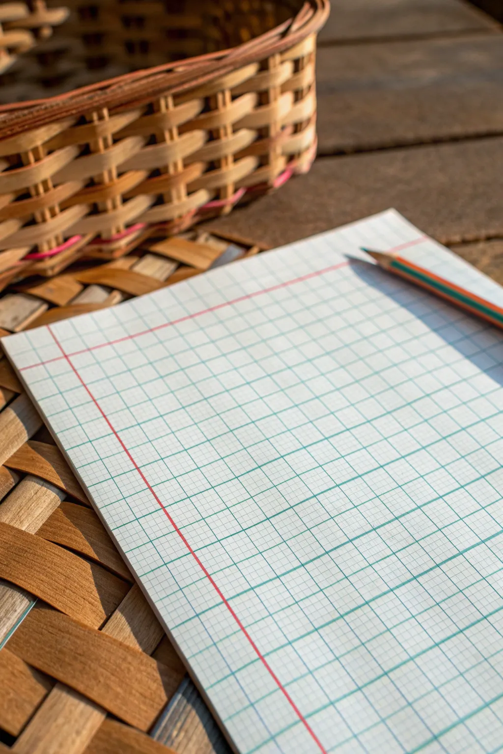
Whenever I’m stuck on what to draw, I grab graph paper because the grid instantly gives my hand a plan to follow. These graph paper drawing ideas lean into that built-in structure—so you can make crisp patterns, playful pixel art, and believable 3D illusions without overthinking it.
Classic Checkerboard Remix
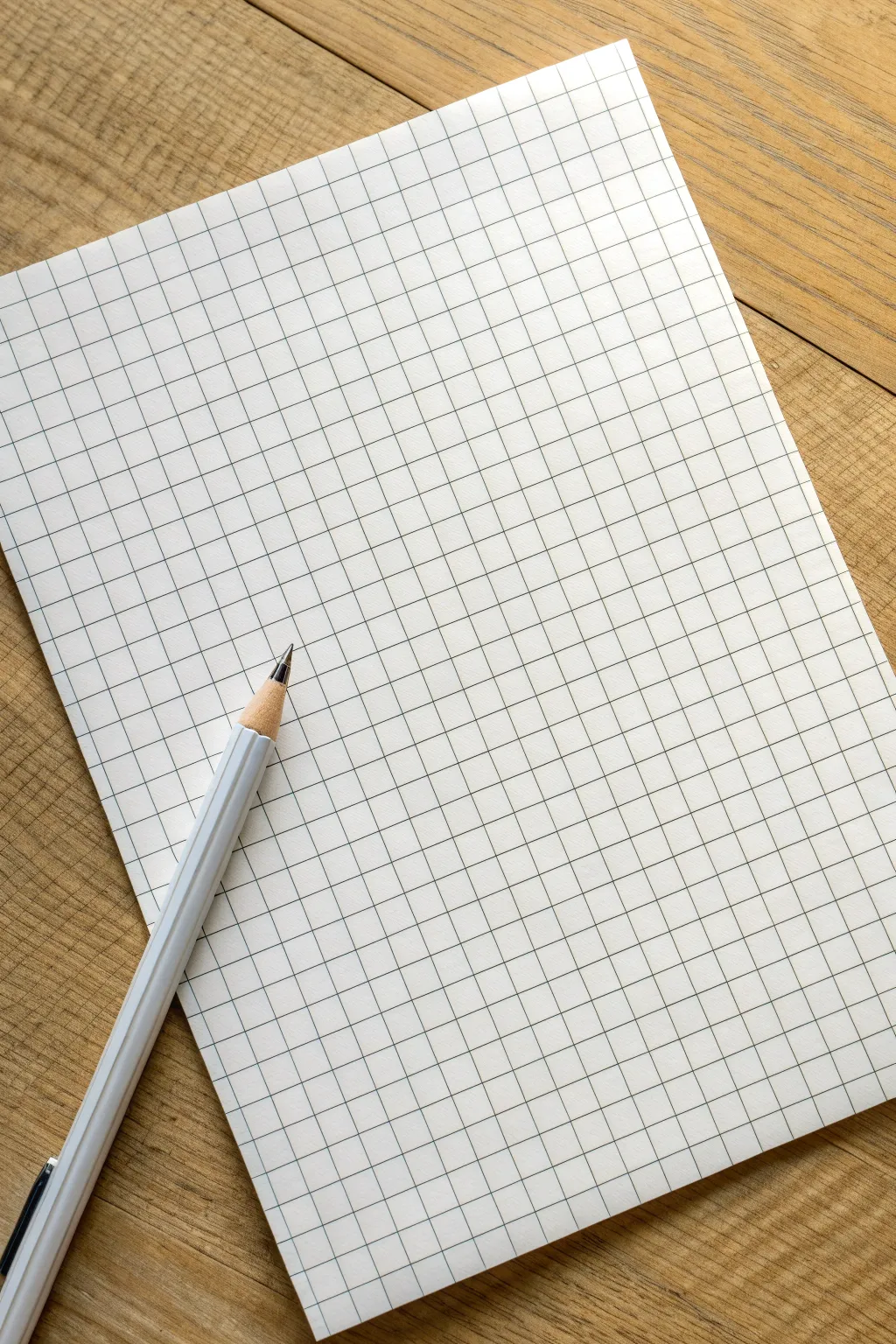
This minimalist project transforms a simple sheet of paper into a structured yet whimsical piece of abstract art using only straight lines and carefully placed dots. It explores the relationship between rigid grids and organic movement, creating a satisfying visual rhythm perfect for doodling or focused relaxation.
Step-by-Step
Materials
- Blank white paper (A4 or Letter size)
- Ruler or straightedge
- Fine-point black pen or marker (0.5mm or similar)
- Pencil (optional, for drafting)
- Eraser
Step 1: Setting the Foundation
-
Prepare your workspace:
Find a flat, stable surface. Since we are drawing precise lines, taping the corners of your paper down with masking tape can help keep it steady, though it isn’t strictly necessary. -
Define the outer boundary:
Using your ruler and pen, draw a large rectangle on your paper. Leave a generous margin of white space around the edges to frame your grid nicely. -
Mark vertical intervals:
Along the top horizontal line of your rectangle, measure and mark even intervals. For this scale, 1.5 cm or 2 cm spacing works perfectly. -
Duplication at the bottom:
Repeat these measurements along the bottom horizontal line to ensure your vertical lines will be perfectly straight. -
Draw vertical grid lines:
Connect the top marks to the bottom marks using your ruler and pen. Draw cleanly and steadily to create a series of parallel vertical columns. -
Mark horizontal intervals:
Now, measure along the left vertical side of the rectangle. Use the same spacing measurement you used for the vertical columns to create square cells. -
Complete the grid:
Mark the right side to match, then connect the left and right marks horizontally. You should now have a clean, uniform grid of squares.
Grid Master Tip
Work from the center outwards when drawing your grid. This ensures that any partial squares end up at the edges, keeping the core pattern symmetrical.
Step 2: Placing the Pattern
-
Visualizing the flow:
Before adding ink, look at your grid. The goal is to create a pattern of dots that feels random yet balanced. Imagine a wave or a scatter plot moving across the page. -
First strategic dot:
Place your first dot in the center of a square near the upper left quadrant. Make the dot solid and dark, large enough to be clearly visible but contained within the cell. -
Creating the upper curve:
Move roughly two squares to the right and perhaps one square up or down. I like to let my hand guide the spacing intuitively rather than counting strictly. -
Establishing the diagonal:
Continue placing dots in a general diagonal trend from left to right. Notice how in the reference, some dots sit alone while others have neighbors a few cells away. -
Developing the lower section:
Move to the bottom half of the grid. Place a dot near the bottom left, but not in the very corner. -
Mirroring the rhythm:
Add dots across the bottom section, mirroring the gentle slope or curve of your top line of dots, but keeping them independent. -
Connecting the middle:
Place a central dot or two that bridges the gap between your upper and lower groups. This prevents the drawing from feeling split in half. -
Reviewing the balance:
Step back and look at the composition. If a large area of white space feels too empty, add a single dot there to anchor it. -
Clean up:
If you used pencil guidelines for your dots before inking them, wait for the ink to dry completely, then gently erase any graphite marks.
Colorize It
Turn this into a pixel-art style mosaic by filling in the squares surrounding your dots with different shades of a single color, creating a gradient effect.
Enjoy the simple satisfaction of your geometric creation


Simple Repeating Line Patterns Across the Grid
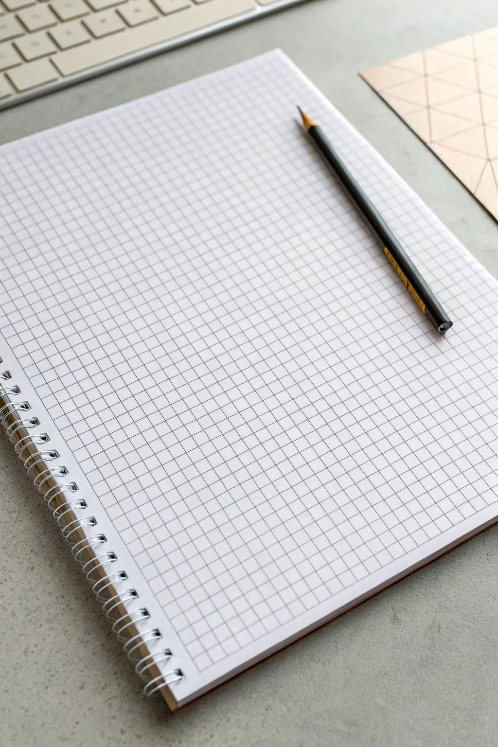
Before diving into intricate patterns, beginning with a pristine sheet of high-quality graph paper sets the tone for your entire project. This foundational preparation ensures your repeating line work has a clean, organized surface to shine on.
Step-by-Step Guide
Materials
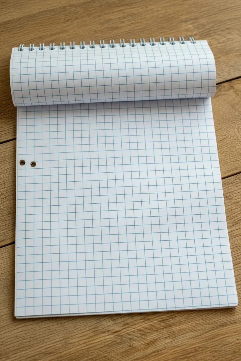
- Spiral-bound graph paper notebook (standard 5mm or 0.25 inch grid)
- Flat, sturdy wooden surface or desk
- Good lighting source (natural or daylight lamp)
Step 1: Preparation & Alignment
-
Select your page:
Open your spiral-bound notebook to a fresh, clean page. Look for a sheet that is free of wrinkles, erasures, or indentations from previous drawings. -
Check the grid alignment:
Examine the blue grid lines. Ensure the printing is straight relative to the paper’s edge, as skewed lines can make your patterns look uneven later. -
Flatten the spine:
Press down gently along the spiral binding. Getting the page to lay as flat as possible is crucial for maintaining straight lines when you start drawing near the margin. -
Position the paper:
Place the notebook at a comfortable angle on your wooden surface. I usually tilt mine significantly since I’m right-handed, which helps me see the entire grid without obstruction. -
Inspect the punch holes:
Notice the two reinforcement holes on the left side. Plan to work your pattern around these; decide now if you want to draw through the holes or create a border around them.
Step 2: Grid Assessment
-
Identify the scale:
Take a moment to mentally measure the squares. Most standard graph paper uses 5mm squares; knowing this helps you plan how large your repeating motifs should be. -
Locate the center point:
If you plan to start your pattern from the middle, count the squares to find the center lines and lightly mark them with a pencil tick if needed. -
Clean the surface:
Brush away any eraser dust or crumb particles from the paper surface. Even a tiny speck can disrupt a fine ink line later. -
Verify lighting:
Adjust your overhead light or window shade so grid lines are clearly visible without casting a harsh hand shadow over your working area. -
Test the paper tooth:
Lightly run a clean finger over the paper. Understanding the smoothness or ‘tooth’ of the paper helps you choose the right pen pressure.
Grid Clarity Check
If grid lines are too faint, place a darker sheet of paper underneath the active page to boost contrast while you work.
Step 3: Planning the Pattern Space
-
Define the boundaries:
Decide if your repeating pattern will bleed off the edge of the page or stop one square short to create a white border. -
Check the orientation:
Confirm the spiral is at the top or side depending on your preference. For this look, keep the spiral at the top to mimic the reference image. -
Final smooth out:
Give the page one last gentle smooth with the side of your hand to ensure it is perfectly flat against the wooden table texture underneath. -
Select your starting square:
Pick the exact square where your first pen stroke will go. This mental preparation prevents hesitation when you finally uncap your pen. -
Ready the workspace:
Clear the area around the notebook so your arm has full range of motion. You are now perfectly set up to begin your repeating line artwork.
Paper Curling?
If the paper curls near the spiral, use a small piece of masking tape on the top corners to secure it flat to the table.
With your canvas prepped and perfectly positioned, you are ready to start inking your design


Chevron Stripes Built One Square at a Time
This project sets the foundation for intricate geometric patterns by creating a bold, high-contrast grid on standard graph paper. The clean black lines overlaid on the delicate blue grid provide the perfect structure for filling in colorful chevron designs or other pixel-style art.
Detailed Instructions
Materials
- Spiral-bound graph paper notebook (standard grid size)
- Fine-point black drawing pen (0.5mm or 0.8mm)
- Ruler (preferably clear plastic)
- Pencil (HB or H)
- White block eraser
Step 1: Preparation and Mapping
-
Select your canvas:
Begin with a fresh page in your spiral-bound graph paper notebook. Ensure the paper is flat and clean, brushing away any eraser dust or debris that might interfere with your ink lines. -
Determine grid scale:
Decide how large you want your ‘macro’ squares to be. In the example shown, each large square spans 5×5 of the tiny pre-printed graph units. This 5-unit scale creates substantial boxes perfect for detailed filling. -
Mark vertical boundaries:
Starting from the top left corner (leaving a small margin if desired), count 5 small squares down. Make a tiny pencil tick mark. Continue marking every 5 squares all the way down the left side of the page. -
Mark horizontal boundaries:
Repeat this process along the top edge, placing a tick mark every 5 small squares to establish your column widths.
Smudge Prevention
Tape a penny to the underside of your ruler. This lifts the edge slightly off the paper, preventing ink from bleeding under the ruler and smearing when you slide it.
Step 2: Drafting the Grid
-
Draw vertical guides:
Align your ruler vertically with the first top tick mark. Lightly draw a pencil line down the length of the page. Repeat for all vertical columns. -
Draw horizontal guides:
Align your ruler horizontally with the first side tick mark. Lightly pencil in your horizontal line across the page. Continue until you have a full pencil grid. -
Review the structure:
Step back and look at your faint pencil grid. Ensure all squares look uniform. If a line is crooked, erase it now while it’s still graphite.
Grid Sizing Pro-Tip
Count your total page squares first. If the math doesn’t divide evenly by 5, center your grid by leaving equal margins on the left and right sides.
Step 3: Inking the Lines
-
Ink the verticals:
Take your fine-point black pen and the ruler. Place the pen tip on the first vertical pencil line. Applying firm, even pressure against the ruler, trace over the pencil line. I find drawing away from my body helps keep the line steadier. -
Continue vertical inking:
Move across the page, inking all vertical lines. Be careful not to smudge the fresh ink with your ruler; lift the ruler cleanly after each line. -
Let it set:
Pause for a minute to let the vertical lines dry completely. This prevents smearing when you place the ruler horizontally. -
Ink the horizontals:
Align your ruler with the horizontal pencil guides. Draw your black ink lines across, intersecting the vertical ones to close the boxes. -
Connect the perimeter:
Ensure the outer edges of the entire grid are closed off cleanly, giving the grid a deliberate, finished border rather than letting it bleed off the page.
Step 4: Finishing Touches
-
Final drying time:
Allow the ink to dry for at least 5-10 minutes. If you erase too soon, the heavy black ink might smear across your crisp white paper. -
Erase guidelines:
Gently run your white block eraser over the entire grid to remove the initial pencil tick marks and guide lines, leaving only the bold black grid. -
Inspect intersections:
Check where lines cross. If there are any gaps where the pen skipped, carefully freehand a tiny connection to ensure every corner is sharp and closed. -
Prep for pattern:
Your grid is now ready. The next phase will be filling each 5×5 block with diagonal lines to build the chevron effect.
Now you have a pristine, high-contrast canvas ready for pattern design


Pixel Art Icons Using Filled-In Squares
Create a charming row of faux-stitched icons on graph paper using simple shapes and clever outlining. This project mimics the look of cross-stitch embroidery using markers, resulting in a cozy, handmade aesthetic perfect for bullet journals.
Step-by-Step
Materials
- Grid or graph paper notebook
- Fine liner pen (Black, ultra-fine tip around 0.3mm to 0.5mm)
- Felt tip markers or highlighters (Pale Pink, Coral/Orange, Yellow, Teal)
- Ruler (optional, but helpful for spacing)
Step 1: Planning the Layout
-
Select your workspace:
Begin by opening your graph paper notebook to a fresh page. You will be working near the top margin, skipping the first row of grid squares to give the artwork some breathing room. -
Visualize the spacing:
You will be drawing four small icons in a horizontal row. Plan to leave about 2-3 empty grid squares between each icon so they don’t look crowded.
Uneven Stitches?
If your black outline looks too messy, slow down and try drawing tiny ‘v’ shapes at each corner rather than random zig-zags. This makes it look tidier.
Step 2: Drawing the Soft Pink Heart
-
Outline the base shape:
For the first heart on the left, use a pencil lightly if needed, or go straight in with your pale pink marker. Fill in a pixelated heart shape that is roughly 6 squares wide and 5 squares tall. -
Detail the top arches:
The top of the heart should have two ‘humps’ that are 2 squares wide each, separated by a 1-square dip in the middle. -
Create the stitched border:
Take your black fine liner. Instead of drawing a solid line, draw tiny ‘X’ marks or small zig-zag scribbles along the outer edge of your pink shape. This creates the faux-stitched effect. -
Refine the edges:
Ensure the black ink touches the corners of the grid squares to emphasize the pixelated look.
Step 3: Drawing the Coral Heart
-
Position the second icon:
Move about three grid squares to the right. Use your coral or orange marker to color in a second heart shape, identical in size to the first one. -
Apply the faux stitching:
Using the same technique as before, use the black fine liner to draw rough, jagged lines around the perimeter. I find that making these lines slightly messy actually enhances the embroidered look. -
Check consistency:
Make sure the ‘stitches’ on this heart match the visual weight of the first heart so they look like a set.
Level Up: Texture
After the marker ink dries, use a white gel pen to add tiny diagonal dashes inside the colored squares to mimic thread gloss.
Step 4: Creating the Yellow Star
-
fill the star shape:
Skip another three squares to the right. With the yellow marker, color a 5-point star shape. Often pixel stars are a bit tricky: try a central 2×2 square block with single squares extending out for the points. -
Add definition:
Use the black fine liner to trace the ‘stitching’ around the star. Pay special attention to the inner corners where the star points meet, making sure the black ink defines the shape clearly.
Step 5: Finishing with the Patterned Heart
-
Outline the final heart:
Move to the right again for the fourth icon. This heart is two-toned. Imagining the same heart shape as before, visualize the top two ‘humps’ and the bottom point. -
Color the top section:
Use a teal marker to fill in just the top row of squares for the heart’s arches. -
Color the bottom section:
Switch to the coral/orange marker and fill the remaining bottom part of the heart, leaving the middle row of squares empty or white for a striped effect. -
Add final stitching:
Complete the row by adding the jagged black outline around the entire perimeter of this two-toned heart. -
Let it dry:
Wait a moment for the ink to set to avoid smudging your crisp grid lines.
You now have a delightful row of pixel-stitch icons to decorate your page header

PENCIL GUIDE
Understanding Pencil Grades from H to B
From first sketch to finished drawing — learn pencil grades, line control, and shading techniques.
Explore the Full Guide
Shaded Gradients That Fade Across the Grid
Transform a simple sheet of grid paper into a mesmerizing study of light and depth using nothing but a pencil. This project creates a soothing, rippling gradient effect that flows diagonally across the page, turning stark squares into soft, dimensional tiles.
Step-by-Step Tutorial
Materials
- Grid paper (standard 5mm or 1/4 inch ruling)
- Mechanical pencil (0.5mm or 0.7mm lead) or sharpened HB pencil
- Soft eraser (kneaded eraser works best)
- Scrap paper (to prevent smudging)
- Ruler (optional, for crisp edges)
Step 1: Setting the Composition
-
Define boundaries:
Start by deciding the size of your drawing area. While you can fill the whole page, creating a defined 8×8 or 10×10 square block often looks cleaner and frames the artwork nicely. -
Mark the gradient path:
Lightly mark a diagonal line from the top-left corner to the bottom-right corner of your chosen area. This will serve as the ‘highlight’ zone where the paper remains white. -
Clean the workspace:
Ensure your hand is clean and place a piece of scrap paper under your drawing hand. This is crucial because graphite transfers easily, and we want to keep the white squares pristine.
Clean Graphite Tip
Place a sheet of clean scrap paper under your drawing hand at all times. This prevents oils from your skin smudging the graphite gradient and keeps the ‘white’ squares perfectly bright.
Step 2: Drafting the Pattern
-
Start the dark corners:
Go to the extreme top-right corner square. Fill this square in firmly with your pencil, creating a dark, solid tone. Repeat this for the extreme bottom-left corner square. -
Establish the second tier:
Move one square inward from your dark corners. shade the three surrounding squares (left, down, and diagonal-inward) with a slightly lighter pressure. You want a distinct difference between the black corner and this dark grey tier. -
Check consistency:
Ensure the shading on the top-right side mirrors the intensity of the bottom-left side. Keeping them balanced creates a satisfying symmetry.
Level Up: Color Fade
Try this same technique using colored pencils. Start with navy blue in the corners, fading into sky blue, and finally leaving the white paper exposed in the center for a glowing effect.
Step 3: Creating the Fade
-
Ease the pressure:
Continue moving inward diagonally toward the center line. For the next row of tiles, hold your pencil further back on the barrel to naturally reduce the pressure on the paper. -
Hatching technique:
Instead of coloring solidly, try using tight diagonal hatching lines. This helps control the lightness of the grey as you approach the middle of the grid. -
Mid-tone management:
When you are about three or four rows away from your center diagonal line, the grey should be very faint. It acts as a whisper of shadow before the white highlight. -
Preserve the highlight:
Leave the central diagonal row of squares completely empty. I find it helpful to leave the row immediately adjacent to the center empty as well, creating a broad, glowing path of white.
Step 4: Refining and Polishing
-
Smooth the transitions:
Look at your gradient. If the jump from one shade to the next is too abrupt, lightly shade over the lighter square to bridge the gap. -
Darken the depths:
Go back to your starting corners. Layer more graphite over the darkest squares to make them pitch black. This high contrast makes the fade look smoother. -
Clean edges:
Use your mechanical pencil to re-trace the grid lines *over* your shading. This crisps up the squares and makes the grid structure pop back out. -
Erase imperfections:
Take your eraser and clean up any graphite dust that strayed outside your defined border or onto the white highlight path. -
Final smudge check:
Lift your hand carefully. If you notice any accidental fingerprints in the white zone, dab them gently with a kneaded eraser rather than rubbing.
Step back and admire how a simple pressure change creates a smooth, flowing wave across the rigid grid.
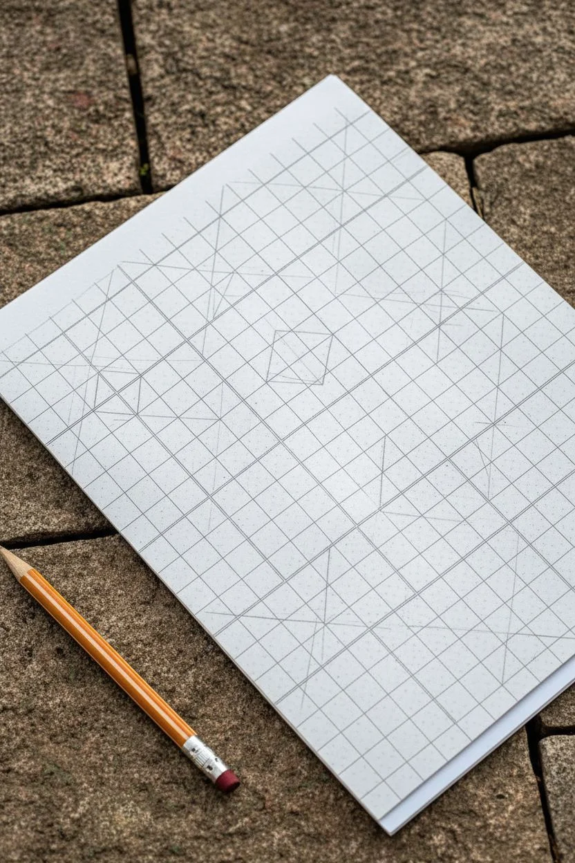
Geometric Tiles With Alternating Colors
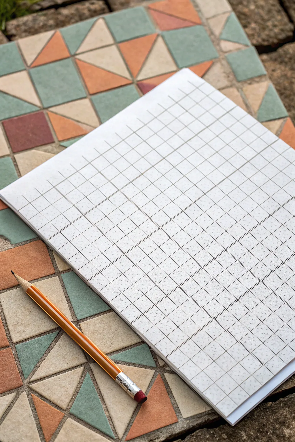
Recreate the charm of classic ceramic floor tiles with this satisfying geometric drawing project. By combining simple triangles and squares on a grid, you’ll build a complex-looking pattern that feels both retro and modern.
Detailed Instructions
Materials
- Graph paper (standard grid)
- Pencil (HB or 2B)
- Ruler or straight edge
- Colored pencils, fine liners, or markers (muted orange, sage green, beige, terracotta)
- Eraser
Step 1: Setting the Grid
-
Define the Major Blocks:
Start by identifying 4×4 squares on your graph paper grid. This large square will be the base unit for a single tile. Outline a few of these 4×4 blocks lightly with your pencil to establish the main structure of your pattern. -
Create the Cross:
Inside one 4×4 block, draw a vertical line straight down the middle (at the 2-unit mark) and a horizontal line across the middle. This divides your large square into four smaller 2×2 quadrants. -
Draw the Diagonals:
Now, draw diagonal lines connecting the corners of these 2×2 quadrants. In the top-left quadrant, draw a line from the bottom-left to top-right corner. Repeat this mirroring pattern for the other quadrants to create a star or ‘X’ shape in the center. -
Form the Center Diamonds:
Focus on the intersection of your perpendicular lines in the center of the 4×4 block. Connect the midpoints of the outer edges of the 2×2 quadrants to create a diamond shape sitting in the middle of the tile.
Step 2: Designing the Pattern
-
Outline the Triangles:
Looking at your grid, you should now see several triangle shapes formed by your intersecting lines. Darken the lines that form the main triangles: usually, four large triangles radiating from the center and four corner triangles. -
Add Small Accent Squares:
In the spaces between your main triangular forms, look for small square or rectangular gaps. If you are copying the photo exactly, occasionally substitute a triangle pair for a small solid square to mimic the variation seen in real tile work. -
Repeat the Unit:
Once you are happy with the geometry of your first 4×4 tile, replicate this drawing in the adjacent 4×4 block. Ensure the lines connect seamlessly to the first one, as if laying real physical tiles side-by-side. -
Clean Up Lines:
Take your eraser and gently remove any construction grid lines that shouldn’t be part of the final geometric shapes. I usually sweep the eraser crumbs away cleanly to keep the paper texture smooth.
Stay Sharp
Keep your pencil extremely sharp for the initial layout. Dull pencils create thick lines that make the 4×4 grid counts inaccurate.
Step 3: Coloring and Texture
-
Select a Palette:
Choose an earthy, muted palette to match the aesthetic. You’ll want a dusty terracotta orange, a sage or moss green, and a creamy beige for the ‘grout’ or neutral tiles. -
Color the ‘Pinwheels’:
select a set of four triangles that meet at a central point. Color them in an alternating pattern—orange, beige, orange, beige—to create a spinning pinwheel effect. -
Fill the Accents:
Use your sage green for the triangles that sit between the pinwheels. This contrasting cool tone helps pop the warm terracotta colors. -
Add Texture Dapples:
To mimic the stone texture of the reference image, don’t color excessively smoothly. Instead, use small stippling dots or uneven shading pressure to give the shapes a weathered, ceramic look. -
Simulate Grout Lines:
Leave the very thin grid lines between your colored shapes white or trace over them with a very light grey fine liner. This separation mimics the grout used between real mosaic pieces. -
Final Contrast Check:
Step back and look at the overall pattern. If some areas look too flat, darken the edges of the terracotta shapes slightly to suggest dimension and shadow where the tiles would slightly lift.
Go Digital
Scan your finished line work before coloring. You can then print multiple copies to test different color palettes without redrawing.
The result is a mesmerizing geometric sheet that looks beautiful enough to frame
BRUSH GUIDE
The Right Brush for Every Stroke
From clean lines to bold texture — master brush choice, stroke control, and essential techniques.
Explore the Full Guide
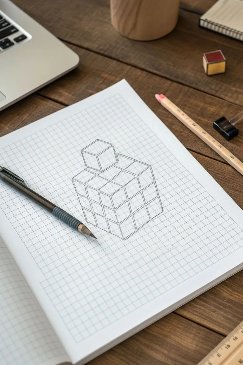
Isometric 3D Cubes Using the Grid as a Ruler

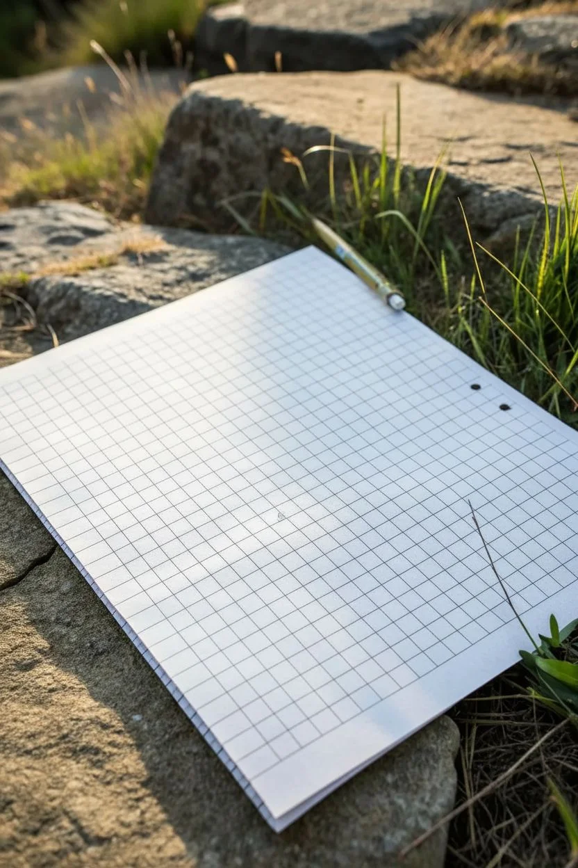
Before diving into complex isometric art, it helps to start with a clean slate to understand how the grid functions as your guide. This initial setup focuses on preparing your workspace and understanding the fundamental grid structure that makes 3D illusions possible.
Step-by-Step Tutorial
Materials
- Sheet of standard graph paper (quadrille pad)
- Mechanical pencil or sharp HB pencil
- Flat, stable surface (like a clipboard or smooth stone)
- Ruler or straight edge (optional but helpful)
Step 1: Preparation & Observation
-
Select your surface:
Find a firm, flat surface to support your paper. If you are drawing outdoors like in the inspiration photo, a large, flat rock or a clipboard is essential to prevent the pencil from poking through. -
Orient the paper:
Place your graph paper down so the grid lines are perfectly horizontal and vertical relative to your viewpoint. This alignment is crucial for maintaining perspective later. -
Check your pencil sharpness:
Ensure your pencil is extremely sharp. I usually prefer a mechanical pencil for this because the fine point never dulls, allowing for precise tracking along the grid lines. -
Analyze the grid unit:
Look closely at the individual squares. For the isometric cube exercise, you will need to mentally group these squares. Identify a central intersection point where grid lines cross.
Distorted Angles?
If your cube looks squashed, re-check your slope ratio. Standard isometric on square grids uses a ‘2 squares over, 1 square up’ slope. Using 1:1 will make it look too steep.
Step 2: Drafting the Initial Cube
-
Mark the center point:
Lightly place a dot at a grid intersection near the middle of the page. This will be the central corner of your cube where the three visible faces meet. -
Draw the vertical edge:
From your center dot, draw a straight vertical line down along the existing grid line. Make it exactly 4 grid squares long. This establishes the height of your cube’s front corner. -
Plot the isometric angles:
This is the trickiest part on a square grid. From the bottom of your vertical line, count 2 squares to the right and 1 square up. Mark a dot there. Repeat this pattern (2 right, 1 up) one more time to create a slanted line trajectory. -
Draw the right bottom edge:
Connect the bottom of your vertical centerline to the final dot you just plotted. This diagonal line creates the illusion of depth receding to the right. -
Create the left bottom edge:
Mirror the previous step on the left side. From the bottom of the centerline, count 2 squares to the left and 1 square up, repeating twice. Draw the diagonal line connecting these points. -
Establish the outer verticals:
From the ends of both diagonal bottom lines, draw vertical lines straight up. Make these exactly 4 grid squares long, matching your center line’s height. -
Connect the top center:
Go back to the very first center dot you made. Draw diagonal lines connecting it to the tops of your two outer vertical lines. You should now see the ‘open book’ shape appearing. -
Close the top face:
To finish the top diamond shape, draw diagonal lines from the tops of the outer vertical lines, angling them inward to meet at a single point above the center. -
Evaluate the shape:
Step back and look at your drawing. The ‘2-over-1-up’ rule on graph paper simulates a 30-degree angle, creating a convincing isometric look without a specialized isometric grid.
Step 3: Refining and Shading
-
Clean up intersections:
Is your pencil work smudged? Use a detail eraser to sharpen the corners where your lines meet. Crisp corners consisten with the grid are key to the 3D effect. -
Darken the outline:
Go over the perimeter of your cube with slightly more pressure to make the shape pop off the page. Keep the internal ‘Y’ shape (the inner edges) slightly lighter for better depth. -
Add a directional light source:
Decide where the light is coming from (e.g., top left). Lightly shade the side of the cube opposite the light source using parallel hatching lines following the grid. -
Final inspection:
Check that all vertical lines are parallel to the grid’s vertical lines to ensure the structure doesn’t look like it’s leaning or melting.
Level Up: Impossible Shapes
Turn your single cube into an optical illusion. Extend one edge of the cube and connect it to a second cube seamlessly to start building a Penrose triangle.
Now that you have mastered the basic unit, you can expand this single block into a sprawling isometric city.
Stacked Cubes and Floating Blocks

Create a mesmerizing optical illusion using simple graph paper and markers. This tutorial guides you through sketching a distorted, multi-colored cube structure with a playful floating block that seems to pop right off the page.
How-To Guide
Materials
- Grid or graph paper (blue lines preferred)
- Mechanical pencil
- Fine-point black liner pen or marker (0.5mm)
- Ruler or straight edge
- Colored markers (Teal/Aqua, Orange, Red, Yellow)
- Eraser
Step 1: Conceptualizing the Base Structure
-
Establish your anchor point:
Select a point on the graph paper where you want the bottom corner of your main cube to be. This will be the lowest point of the drawing. -
Draw the Y-axis:
From your anchor point, draw a vertical line upwards spanning 3 grid squares. This forms the central vertical edge of the main cube structure. -
Create the isometric V:
From the bottom anchor point, draw diagonal lines extending upwards and outwards to the left and right. Since this is graph paper, move ‘1 unit up and 2 units over’ for a classic isometric look, or follow the diagonals of the squares if you want a perfect 45-degree angle. The artwork shown uses a slightly steeper angle, roughly 2 squares up for every 3 squares over. -
Outline the cube volume:
Complete the outline of the main large cube. Think of it as a 3x3x3 block. Draw the top edges parallel to your bottom ‘V’ shape, and the side vertical edges parallel to your center line.
Clean Corners
When coloring near the black ink lines, stop just a hair short of the line. The ink might bleed if the marker saturates it, and the tiny white gap adds a professional crispness.
Step 2: Grid and Floating Block Details
-
Subdivide the faces:
Using your ruler, lightly sketch the internal grid lines to divide each face of the large cube into a 3×3 grid of smaller squares. Ensure these lines follow the same perspective angles as your outer edges. -
Position the floating block:
Locate the top-left section of the cube’s upper surface. Instead of drawing the block resting flat, start your sketch about one full grid square above the main cube to create the levitation effect. -
Sketch the floating cube:
Draw a single, smaller cube (representing a 1×1 unit) at this elevated position. Make sure its angles match the main structure beneath it perfectly so they look like part of the same world. -
Create the resulting gap:
On the main cube’s top surface beneath the floating block, ensure you have drawn the ’empty’ space or the top of the block that would be underneath it, maintaining the grid pattern.
Drop Shadow Depth
To make the floating block really pop, lightly sketch a small cast shadow in grey marker directly beneath it on the top surface of the main cube.
Step 3: Inking and Color
-
Ink the main lines:
Trace over your pencil lines with the fine-point black liner. Be deliberate with your strokes. Use a ruler if your hand isn’t steady, but a slightly organic hand-drawn line can add character. -
Add line weight:
Go back over the external perimeter lines of the entire shape (including the floating block) to make them slightly thicker. This separates the object from the background grid. -
Erase pencil guides:
Once the ink is completely dry—I usually give it a full five minutes just to be safe—gently erase all the graphite sketching underneath. -
Select your light source:
Decide where the light is coming from. In this reference, the light hits the top surfaces (brightest), the right side is mid-tone, and the left side is shadowed. -
Color the top faces:
Use the red marker for the top surface of the main cube. For the floating block, use orange on top to distinguish it slightly. -
Color the right-side faces:
Fill in the right-facing grids with yellow. Leave a few random squares white or use a lighter shade if you want a ‘glimmer’ effect, or color them solidly like the example. -
Color the left-side faces (Shadows):
Use the teal or aqua marker for the left-facing sides. Because this is the ‘shadow’ side, the cool tone helps recede that plane visually. -
Add the accent blocks:
Notice how some blocks on the right face are colored teal/blue instead of yellow? Choose 2-3 random squares on the yellow side and color them blue to create a scrambled puzzle look. -
Shade the floating block sides:
Color the left side of the floating block teal and the right side yellow (or white/grey) to match the lighting logic of the main structure.
Now you have a geometric illusion that transforms flat paper into a dimensional puzzle


3D Stair-Step Illusions on Graph Paper
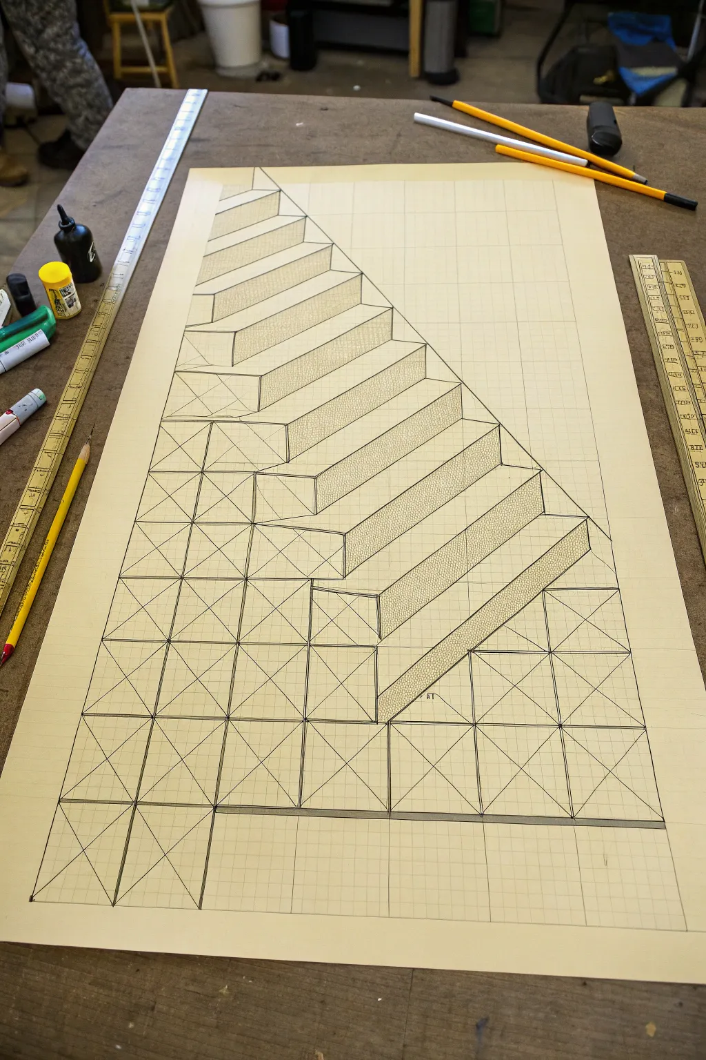
Master the art of perspective with this mesmerizing 3D illusion that transforms a flat sheet into a descending staircase. By combining precise geometric plotting with clever shading, you create an architectural structure that looks ready to climb.
Detailed Instructions
Materials
- Large sheet of graph/grid paper (square grid)
- Long ruler or T-square
- Sharp mechanical pencil (HB)
- Fine-point black pen or marker
- Eraser
- Reference photo (the original image)
Step 1: Setting the Foundation
-
Establish the Baseline:
Begin near the bottom third of your paper. Draw a distinct, straight horizontal line across the width of the page to serve as your ground level or the bottom edge of the structure. -
Define the Pyramid Shape:
From a central point on your baseline, draw a large triangle shape. The left side should rise steeply, while the right side will become the hypotenuse of your staircase. Use the grid lines to ensure symmetry if you want a perfect central view, or follow the image’s asymmetrical rise. -
Draw the Vertical Grid:
Using your ruler, draw vertical lines upward from every major grid intersection along your baseline. These will form the vertical edges of your columns. -
Add Horizontal References:
Lightly sketch horizontal lines at regular intervals going up the page. These intersections with the vertical lines create the ‘boxes’ that will serve as the front faces of your blocks.
Step 2: Constructing the Steps
-
Mark the Diagonals:
This is crucial for the distortion effect. Inside each square grid ‘box’ on the front faxes, lightly draw an ‘X’ from corner to corner. This helps you find the precise center of each block, which aids in perspective accuracy. -
Outline the Stair Profile:
Starting from the top left, draw a zig-zag line descending towards the bottom right. Each ‘zig’ is a vertical rise, and each ‘zag’ is a horizontal run. Follow the grid lines perfectly. -
Project the Depth:
From the corners of your stair profile, draw diagonal lines extending backward and slightly upward to the right. These lines create the 3D depth of each tread and riser. -
Close the Shapes:
Connect the ends of your depth lines to form the top surfaces (treads) and side surfaces (risers) of the stairs. You should start seeing the 3D block forms emerge from the flat grid.
Distortion Fix
If the stairs look flat, your depth angles might be inconsistent. Ensure every diagonal line going back into space is parallel to the others.
Step 3: Refining and Shading
-
Inking the Outlines:
Switch to your fine-point black pen. Carefully trace over the final perimeter of the stairs and the internal edges that define the steps. Use a ruler to keep these lines razor-sharp. -
Defining the Front Faces:
Ink the structural grid below the stairs. Trace the squares and the internal ‘X’ diagonals on the front-facing blocks to give them an industrial, scaffold-like appearance. -
Erase Guidelines:
Once the ink is completely dry, gently erase all the initial pencil construction lines that aren’t part of the final structure to clean up the drawing. -
Plan Your Shading:
Identify a light source direction (usually top-left). This means the tops of the stairs will be brightest, the front faces medium, and the sides darkest. -
Apply Stippling Texture:
I find that stippling works best for this specific look. Use your pen to tap thousands of tiny dots on the side faces of the stairs (the triangles created by the perspective). Densely pack dots near the edges for shadow. -
Hatch the Risers:
For the vertical ‘risers’ of the stairs, use tight, vertical hatching lines. This differentiates them from the stippled sides and the plain white treads. -
Final Contrast Check:
Darken the deepest corners where steps meet to enhance the 3D pop. Ensure the bottom baseline is thick and grounded.
Shadow Play
Add a cast shadow on the ‘ground’ underneath the structure. This grounds the object and makes the 3D illusion jump off the page even more.
Step back and view your drawing from an angle to see the full depth of your illusion come to life
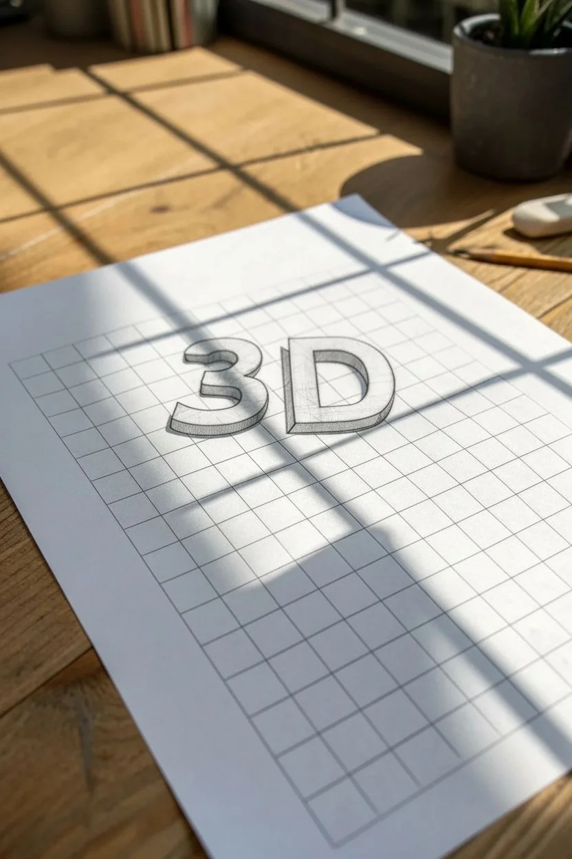
Block Letters With Measured 3D Depth
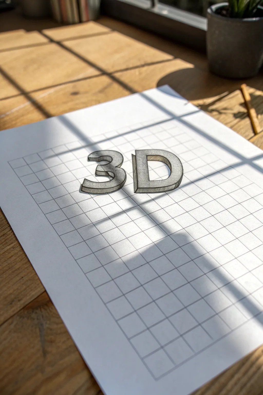
Master the art of illusion with this strikingly simple yet effective drawing project. By utilizing the grid of standard graph paper, you will learn to construct perfectly proportioned block letters that appear to pop right off the page.
How-To Guide
Materials
- Sheet of standard grid graph paper
- HB pencil (for initial sketching)
- Fine-point black drawing pen or micron pen
- Ruler
- Eraser
Step 1: Planning and Base Structure
-
Define the grid space:
Begin by selecting the area on your graph paper where you want your letters to sit. Count out a height of roughly 6-8 squares to ensure your letters are substantial enough to detail. -
Sketch the flat number ‘3’:
Using your pencil and ruler, lightly outline the front face of the number ‘3’. Follow the grid lines for the straight horizontal segments, and gently freehand the curves, using the grid intersections as guide points to keep the top and bottom loops symmetrical. -
Sketch the flat letter ‘D’:
Leave a gap of about 2-3 grid squares to the right of your ‘3’. Draw the vertical spine of the ‘D’ strictly along a grid line. Then, sketch the curved front, ensuring the top and bottom horizontal lines match the height of your ‘3’. -
Refine the flat shapes:
Go back over your initial light sketches. Make sure the thickness of the limbs on the ‘3’ and the ‘D’ is consistent—usually about 2 grid squares wide looks balanced.
Grid Guide
Use the grid squares to measure curves. If a curve goes ‘over 2, down 1’, mirror that exactly on the other side for symmetry.
Step 2: Adding the 3D Dimension
-
Establish the vanishing angle:
Decide on a light source and perspective. For this look, we are projecting the depth down and to the left. From every corner on your flat letters, draw a short diagonal line about 1 square long, angling downwards and left. -
Connect the depth lines:
Connect the ends of these diagonal lines. These new lines should run parallel to the original outline of your letters. For example, if the top of the ‘3’ is a horizontal line, the depth line behind it must also be perfectly horizontal. -
Handle the curves:
For the curved sections of the ‘3’ and ‘D’, mimic the curve of the front face but shifted down and to the left. It helps to draw this part slowly to maintain the parallel spacing. -
Check for hidden lines:
Assess your sketch to ensure you haven’t drawn depth lines that should be hidden behind the front face of the letters. Use your eraser to clean up any overlapping confusion.
Step 3: Inking and Detailing
-
Outline the main shapes:
Take your fine-point black pen and carefully trace over the final pencil lines. I prefer to start with the frontmost faces first, as this helps define what is in the foreground. -
Inking the depth:
Trace the side and bottom planes (the 3D parts) you created. Ensure your corners are sharp and the curves flow smoothly into the straight lines. -
Erase pencil marks:
Wait a minute or two for the ink to dry completely to avoid smudging. Then, gently erase all the underlying graphite sketch lines. -
Apply vertical hatching:
To create the shaded effect on the depth planes (the sides and bottom faces), use simple vertical hatching. Draw closely spaced vertical lines inside these areas. -
Refine the hatching density:
Keep the hatching lines consistent and parallel. Do not cross-hatch. The vertical texture contrasts nicely with the horizontal grid lines of the paper. -
Enhance the perimeter:
For a bolder pop, you can thicken the very outer perimeter line of the entire 3D shape slightly, leaving the inner defining lines thinner. -
Final inspection:
Look for any gaps in your inking or spots where the hatching might need one extra line to fill a white space. The drawing is complete when the forms look solid and heavy.
Shadow Play
Add a cast shadow on the paper surface detached from the letters to make them look like they are floating above the page.
Take a moment to admire how simple lines can trick the eye into seeing solid form
Diamond and Argyle Tessellations From Square Counts
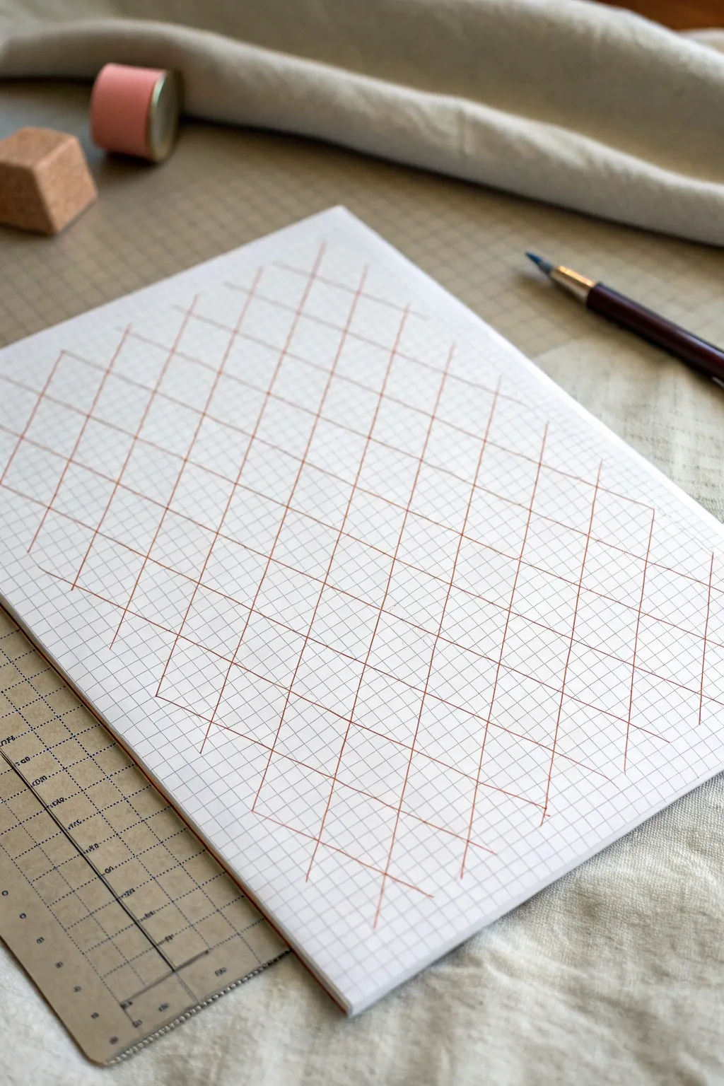
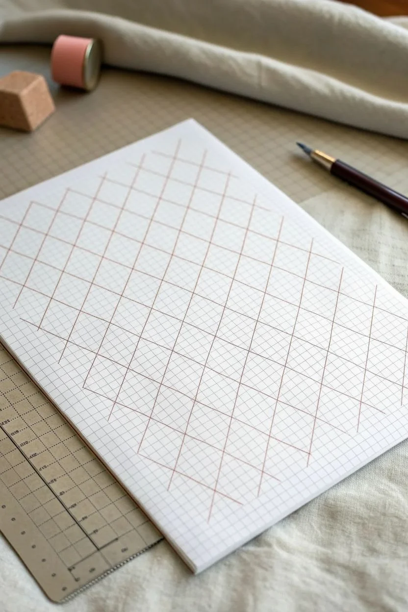
This project transforms a simple sheet of graph paper into an elegant geometric latticework using nothing but a ruler and a steady hand. The resulting pattern features intersecting diagonal lines that create a classic argyle diamond effect, perfect for practicing precision or creating background textures.
Detailed Instructions
Materials
- Sheet of standard graph paper (quadrille)
- Fine-tipped drawing pen or liner (brown or rust color)
- Straight edge or ruler (clear acrylic is helpful)
- Pencil (optional, for sketching)
- Eraser
Step 1: Setting the Intervals
-
Orient your paper:
Place your graph paper on a flat, stable surface. Keep it at a slight angle if that helps your natural drawing motion. -
Choose your baseline:
Locate the bottom-most horizontal line of the grid where you want your pattern to begin. This will serve as the anchor for your diagonal spacing. -
Mark the first points:
Using a pencil very lightly, mark a starting dot on a grid intersection. Count four squares to the right and make another mark. Continue this 4-square interval across the width of the page. -
Establish the height:
Move vertically up the page. The slope of these diamonds is steep; for every 2 horizontal squares, the line rises 4 vertical squares. You can mark these guide points lightly if you are unsure of the angle.
Step 2: Drawing the Primary Diagonals
-
Align the ruler:
Place your clear ruler on the paper so it connects your first base mark with a point 2 squares over and 4 squares up. This creates a steep right-leaning diagonal. -
Draw the first line:
Using your brown fine-tipped pen, carefully draw the line along the ruler edge. Maintain consistent pressure for an even line weight. -
Repeat the slope:
Move the ruler to the next base mark (4 squares to the right). Align it at the exact same angle—parallel to your first line—and draw the second diagonal. -
Fill the page width:
Continue moving right across the paper, drawing parallel diagonals at 4-square intervals until you reach the edge of your drawing area. -
Extend to the top:
If your ruler is short, you may need to slide it up to extend these lines all the way to the top of the page. Ensure the alignment remains perfect before extending the ink.
Use Clear Tools
A clear acrylic ruler is essential for this project. It lets you see the grid lines underneath, ensuring your ruler serves as a window to perfect parallel spacing rather than blocking your view.
Step 3: Creating the Cross-Hatch
-
Reverse the angle:
Now you need to create the left-leaning diagonals. Align your ruler starting from a base mark, but this time angle it to the left, aiming for a point 2 squares left and 4 squares up. -
Check the intersection:
Before inking, verify that this new angle intersects your previous lines exactly at the grid corners. The lines should cross cleanly. -
Draw the first crossing line:
Draw your first left-leaning diagonal with the brown pen. It should create a tall, narrow diamond shape with the existing lines. -
Complete the lattice:
Move across the page, drawing parallel left-leaning lines at the same 4-square intervals used before. -
Review the pattern:
Scan your work for any lines that stop short. I find it helpful to look away for a moment and look back to spot any uneven breaks in the pattern. -
Clean up:
Once the ink is completely dry—give it a few minutes to be safe—gently erase any initial pencil guide marks you made.
Add Dimension
To make the diamonds pop, shade every other diamond very lightly with a colored pencil, or thicken the intersection points with a tiny dot of darker ink for a knotted rope look.
You now have a satisfyingly precise geometric grid that looks complex but was built on simple counting
Woven Basket Pattern That Tricks the Eye
Transform a simple sheet of graph paper into a mind-bending 3D optical illusion that mimics the texture of a woven basket. Using just a few simple lines and shading techniques, you’ll create depth and dimension that looks like strips of material weaving over and under each other.
Step-by-Step
Materials
- Grid graph paper (standard 4-5 squares per inch)
- HB or 2B pencil for initial sketching
- Fine tip black drawing pen (0.5mm)
- Ruler or straight edge
- Colored pencils (brown, tan, or beige for a basket look)
- Eraser
Step 1: Setting Up the Grid Structure
-
Define the drawing area:
Select a square or rectangular section of your graph paper to work within. A 10×10 or 15×15 square area is a manageable size for your first attempt. -
Mark horizontal strips:
Using your pencil lightly, count two grid squares down and draw a horizontal line across your area. Skip two squares, then draw another line. Repeat this pattern of ‘two squares wide, skip two’ all the way down. -
Mark vertical strips:
Now do the same vertically. Count two squares from the left, draw a vertical line. Skip two squares, draw the next line. You should now see large 2×2 empty intersections where the strips cross.
Lost the pattern?
If you get confused about which strip goes over or under, look at a real woven basket or fabric photo. Or, shade one full strip lightly first to track its path.
Step 2: Drawing the Weave Pattern
-
Start the ‘over’ segments:
Focus on the first intersection in the top left. Decide if the vertical strip goes *over* the horizontal one. If so, draw the vertical sides of that 2×2 square firmly with your pencil, erasing the horizontal lines inside it. -
Create the alternating pattern:
Move to the intersection immediately to the right. Since the previous vertical strip went ‘over’, this next vertical strip must go ‘under’. Draw the horizontal lines through this square and stop the vertical lines at the border. -
Complete the first row:
Continue across the top row, alternating ‘over’ and ‘under’ for each intersection. It should look like a checkerboard of which strip is on top. -
Start the second row:
Move down to the next row of intersections. You need to alternate relative to the row above. If the top-left intersection had a vertical ‘over’, the one below it must have a horizontal ‘over’. -
Fill the remaining grid:
Systematically work through the rest of the grid, ensuring that every adjacent intersection alternates its orientation.
Step 3: Refining and Coloring
-
Inking the lines:
Once your pencil sketch looks correct, trace over the final lines with your fine tip black pen. Be careful not to trace the lines that are supposed to be tucked ‘under’. -
Erase pencil guides:
Allow the ink to dry completely to avoid smudging, then gently erase all remaining pencil marks to reveal clean, woven shapes. -
Apply base color:
Choose a light tan or beige colored pencil. Lightly shade all the strips with an even layer of color. -
Add shadows for depth:
This is the crucial step for the 3D effect. Identify where a strip goes *under* another. Use a darker brown pencil to add shading right next to the edge of the ‘over’ strip. -
Fade the shadows:
I find it works best to press hard right at the overlap line, then gradually lighten the pressure as you move away, fading the shadow out within about half a grid square. -
Highlighting (optional):
If you want extra realism, erase a tiny bit of color in the center of the ‘over’ segments to create a highlight, suggesting the strip is curving upward.
Level Up: Curved Weave
Instead of using straight ruler lines, freehand slightly curved convex lines for the edges of your strips. This makes the ‘fabric’ look puffy and more realistic.
Step back and enjoy how simple flat squares have transformed into a convincing woven texture
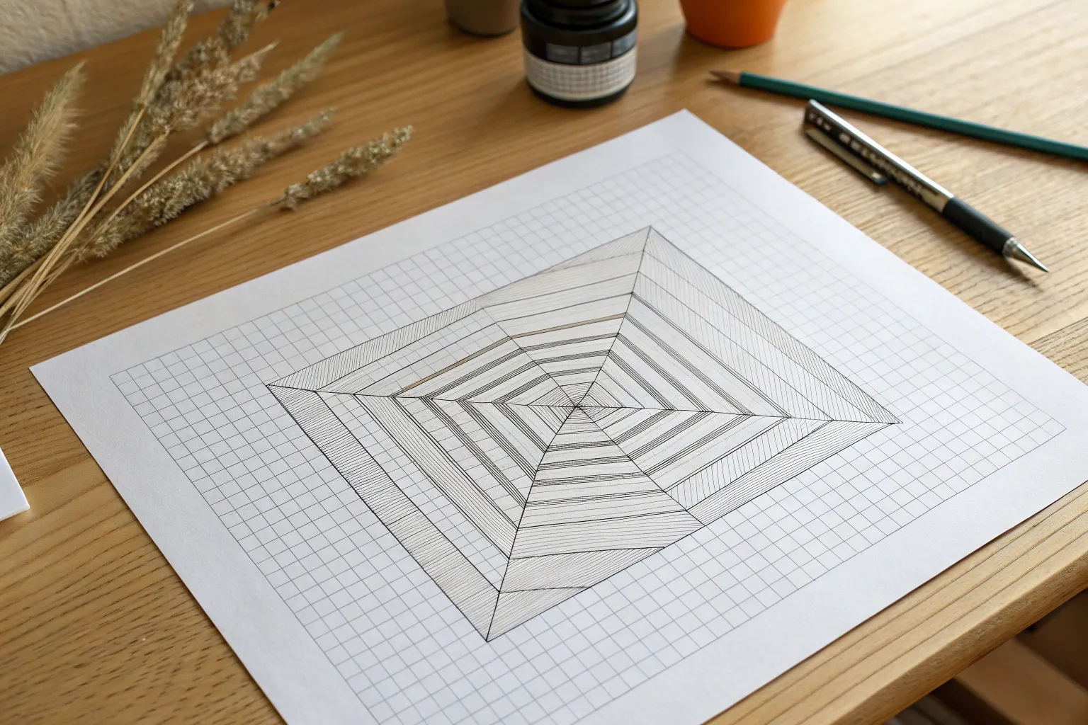
A “Hole in the Paper” Grid Pit Illusion
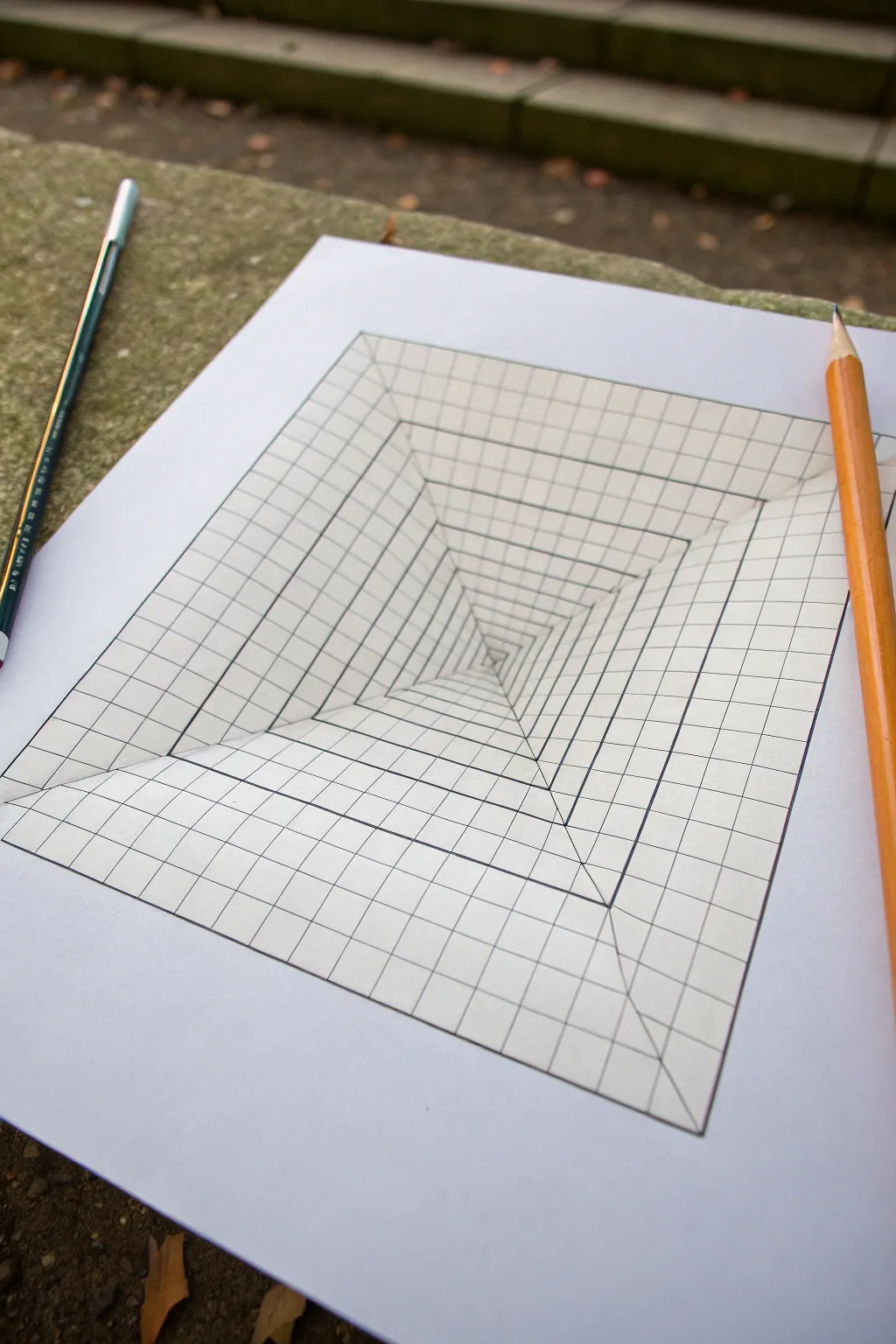
Transform a flat sheet of paper into a seemingly endless deep pit with this simple yet striking optical illusion. By manipulating grid lines and perspective, you’ll create a tunnel effect that looks like it’s sinking right through your table.
Detailed Instructions
Materials
- High-quality white drawing paper or cardstock
- Pencil (HB or H for light initial lines)
- Black fine-liner pen or marker
- Ruler (preferably clear plastic)
- Eraser
- Orange colored pencil (optional, for shading)
Step 1: Setting the Perspective Framework
-
Draw the main square:
Start by drawing a large, perfect square in the center of your paper. This will be the outer boundary of your illusion. A 15cm x 15cm (or 6in x 6in) square works well for a standard sheet. -
Mark the center point:
Using your ruler, lightly find the exact center of the square. A trick I use is to lightly sketch the two diagonals from corner to corner; where they cross is your center. -
Create the vanishing lines:
Draw four straight lines connecting each of the four outer corners of your square directly to that center point. These diagonal geometric lines form the main structural ‘walls’ of your pit.
Step 2: Creating the Grid Distortion
-
Mark spacing for concentric squares:
Along one of the diagonal lines you just drew, make tick marks. Start near the center with very small gaps (e.g., 3mm), and gradually increase the spacing as you move outward toward the corner (e.g., up to 15mm). -
Draw the inner squares:
Connect these tick marks by drawing squares inside your main square. Ensure these lines are parallel to the outer box. The squares should get progressively smaller and denser as they approach the center point. -
Mark vertical grid guides:
Focus on the top edge of your outer square. Mark evenly spaced points along this line (every 1-2cm). Repeat this for the bottom, left, and right outer edges. -
Draw the ‘vertical’ perspective lines:
Take your ruler and connect each mark on the top edge to the central vanishing point. Stop drawing these lines when they hit the diagonal ‘X’ lines; do not cross into the side walls yet. -
Rotate and repeat:
Rotate your paper. Connect the marks on the next side edge to the center point. Again, stop your lines strictly at the diagonal seams. This creates the illusion that the lines are diving down the slope. -
Complete the grid spokes:
Continue this process for the remaining two sides. You should now have four triangular sections, each filled with lines radiating from the center.
Keep it Clean
Place a scrap piece of paper under your drawing hand while you work. This prevents oils from your skin from smudging your pencil lines or fresh ink.
Step 3: Inking and Refining
-
Trace the outer square:
Switch to your black fine-liner. Carefully trace the outermost square border to define the edge of the pit. -
Ink the diagonal X:
Ink the four main diagonal lines that separate the walls. These need to be crisp, as they act as the corners of your tunnel. -
Ink the concentric squares:
Go over all the horizontal and vertical lines that form the square rings. Keep your hand steady to maintain the parallel look. -
Ink the radiating lines:
Trace the perspective lines that go from the outer edge toward the center. Remember, these lines represent the ‘grid’ painted on the walls of the pit. -
Clean up:
Once the ink is completely dry—give it a solid minute to prevent smudging—take your eraser and gently remove all the underlying pencil graphite.
Warp the Reality
Curve the grid lines slightly inward instead of keeping them perfectly straight. This changes the ‘pit’ from a pyramid shape to a hanging organic cloth shape.
Step 4: Adding Depth (Optional)
-
Deepen the shadows:
To enhance the depth, you can use a pencil to lightly shade the very center of the pit, fading out as you move upward. -
Add a darker outline:
I sometimes re-trace the very outermost rim of the square with a slightly thicker pen. This separates the illusion from the ‘flat’ paper surface surrounding it. -
Optional drop shadow:
For an advanced touch, draw a faint shadow on the outside of the paper, cast by a pencil or object sitting on top, to sell the 3D interaction.
Step back and view your drawing from an angle to watch the floor drop out beneath your page
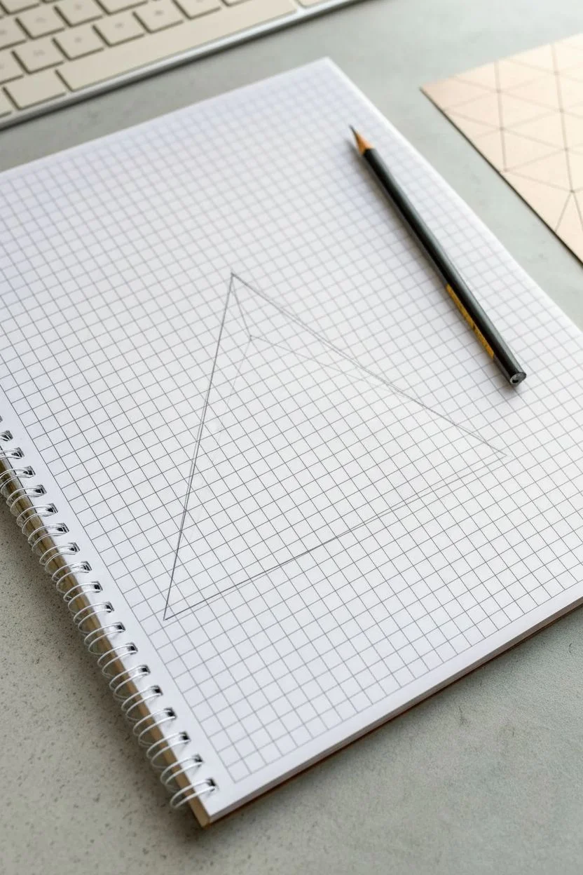
Impossible Triangle-Style Illusion Using Isometric Guides
Master the art of optical illusions by drawing a classic impossible triangle on simple graph paper. This mind-bending geometric shape uses isometric perspective to create a form that can’t exist in 3D space.
Step-by-Step Guide
Materials
- Spiral-bound graph paper notebook (5mm grid)
- Black drawing pencil (HB or 2B)
- Ruler or straight edge
- Fine liner pen (0.5mm, optional)
- Eraser
Step 1: Setting Up the Isometric Framework
-
Define the Base Scale:
Start by identifying a central point on your graph paper. You’ll be using the grid intersections as your guides. Decide on a ‘unit’ length—for this project, let’s say 4 squares wide. -
Draw the Outer Base Line:
Draw a horizontal line that is 9 grid units long. This will serve as the bottom edge of your triangle’s base. -
Establish the Left Angle:
From the left end of your base line, draw a diagonal line going upwards and inwards. Since this is grid paper and not isometric paper, you’ll need to approximate a 60-degree angle. A good hack is to go ‘over 1, up 2’ for each segment of the line. -
Establish the Right Angle:
Repeat the previous step from the right end of the base line, mirroring the angle so the two lines meet at a peak. You should now have a large, equilateral-ish triangle outline.
Step 2: Creating the Inner Structure
-
Draw the Inner Triangle:
Inside your large triangle, draw a smaller triangle. Keep the lines parallel to the outer edges. I usually space this about 2 grid units inward from the outer lines to give the shape some thickness. -
Define the Beam Width:
Now, draw a third, even smaller triangle inside the second one. This creates three parallel lines for each side of the main figure. These will form the ‘beams’ of the illusion. -
Cut the Corners:
At each of the three corners of your outermost triangle, draw a short line capping off the ends flat, rather than letting them come to a sharp point. This creates the blocky look needed for the illusion.
Wonky Angles?
If your triangle looks lopsided, count grid squares precisely for every angled line. The ‘over 1, up 2’ method must be consistent for all three sides.
Step 3: Closing the Impossible Loop
-
Extend the Bottom Beam:
Focus on the bottom horizontal bar. Extend its top line all the way to the right outer edge, but stop its bottom line short where it intersects with the right-side vertical beam. -
Connect the Right Beam:
Move to the right-hand diagonal beam. Draw lines to make it appear as if it is passing ‘in front’ of the bottom beam at the bottom corner, but ‘behind’ the left beam at the top peak. -
Connect the Left Beam:
Finally, draw the left-hand diagonal beam. This one needs to look like it crosses in front of the top peak but goes behind the bottom horizontal bar. This ‘over-under-over’ pattern is what breaks the brain. -
Erase Guide Lines:
Carefully erase the internal intersecting lines where the beams ‘overlap.’ You want clean, continuous paths that clearly show which bar is in front.
Level Up: Drop Shadow
Add a cast shadow beneath the bottom beam to make the triangle appear to float above the paper.
Step 4: Shading and Definition
-
Hardline the Edges:
Once your pencil sketch looks correct, go over your final lines with firmer pressure or a fine liner pen to make the shape pop off the grid. -
Identify Light Source:
Choose a light source direction, typically from the top left. This means the top-facing planes will be the brightest. -
Shade the Darkest Planes:
Shade the surfaces that would be facing away from the light -
Add Mid-Tones:
Lightly shade the remaining side surfaces with a soft, even gray. The contrast between white, gray, and black surfaces creates the essential 3D volume.
Enjoy sketching this classic paradox and watching your friends try to figure it out
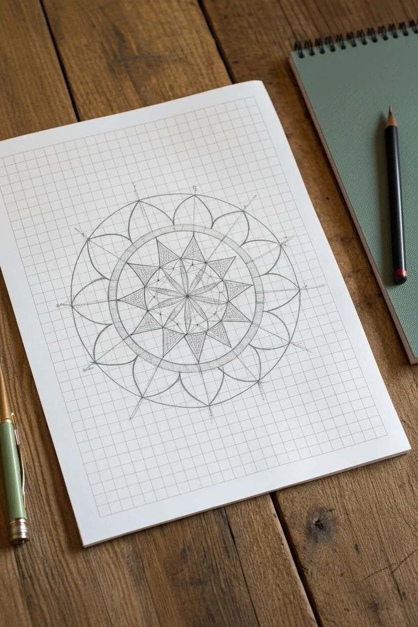
Mandala-Inspired Symmetry Centered on the Axes
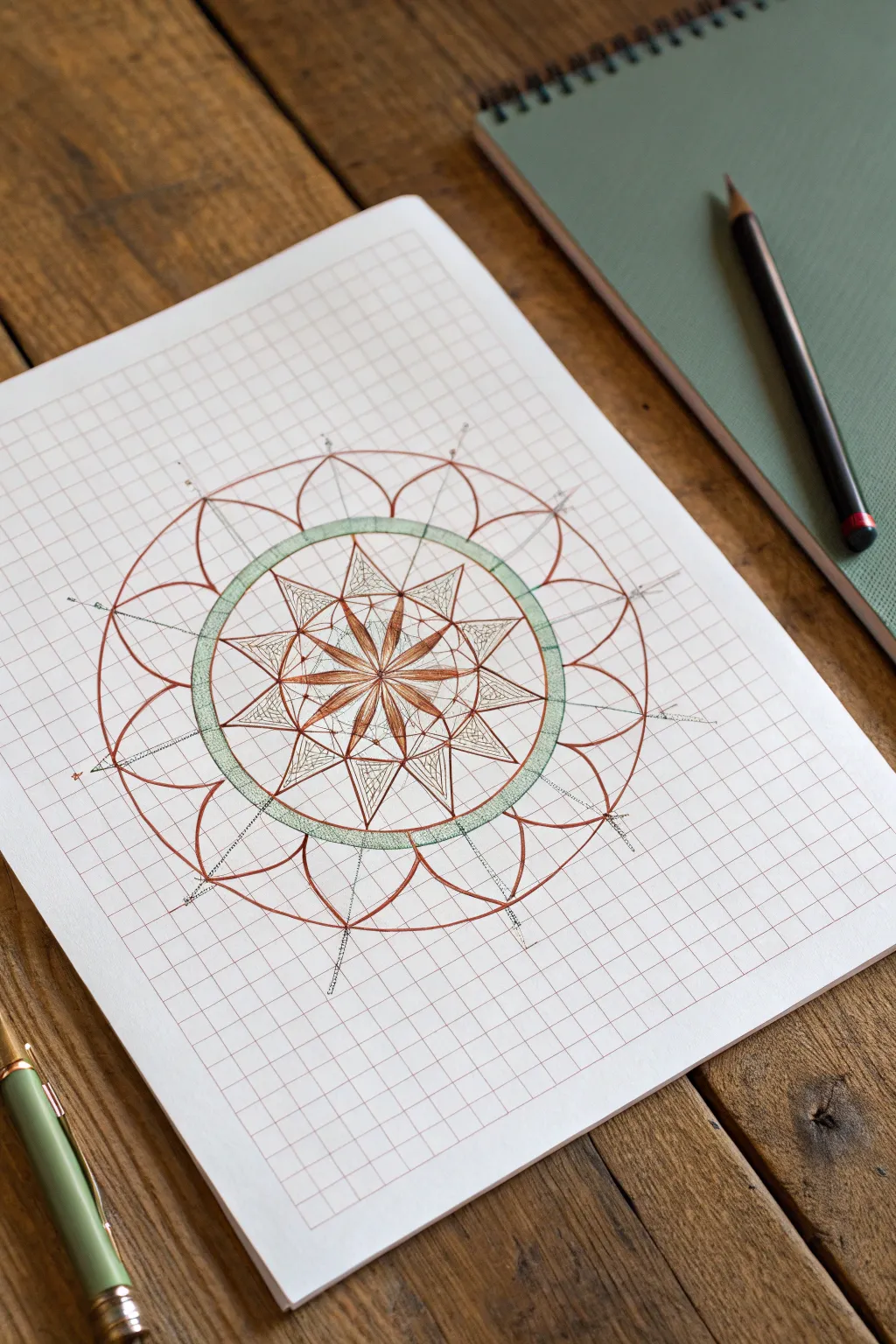
This intricate design combines the structure of geometry with the organic flow of a flower, all grounded by the precise lines of graph paper. The final look features a delicate interplay of copper-toned linework and soft sage green accents, creating a harmonious and balanced mandala.
Step-by-Step
Materials
- Grid/Graph paper (lightweight, standard 4×4 or 5×5 grid)
- Fine liner pen (brown or copper, 0.3mm or 0.5mm)
- Sage green colored pencil or fine marker
- Ruler (clear plastic is best)
- Compass
- Pencil (HB or 2H for sketching)
- Eraser
Step 1: Setting the Foundation
-
Find Center:
Locate the exact center of your graph paper page. Mark this point lightly with your pencil; this will be the anchor for the entire radial symmetry. -
Draw the Inner Guide Circle:
Using your compass, place the needle on the center point and draw a light pencil circle with a radius of approximately 4 grid squares. This will house the central star motif. -
Add the Outer Ring Guide:
Expand your compass to a radius of about 6 grid squares and draw a second concentric circle. This defines the thick green band seen in the final piece. -
Sketch the Flower Petal Limit:
Draw one final large circle with a radius of roughly 9 or 10 squares. This marks the outermost tip of the large flower petals. -
Establish Axes:
Use your ruler to draw faint pencil lines through the center: one vertical, one horizontal, and two diagonal lines at 45 degrees. These eight lines are crucial for maintaining the 8-fold symmetry.
Wobbly Circles?
If your hand-drawn circles are uneven, trace household items like cups or tape rolls instead of using a compass for the ink lines.
Step 2: Drawing the Central Star
-
Outline the Inner Star:
Switch to your brown or copper fine liner. Along the eight axis lines you drew, place a mark inside the first circle. Connect these points to shorter points in between the axes to form an eight-pointed star shape. -
Detail the Petals:
Inside each point of the star, draw a teardrop or petal shape that stems from the very center point. These act as the ‘seeds’ of the mandala. -
Create Depth:
Draw a straight line from the center out to the tip of each star point, bisecting the petal shapes. This creates a faceted, jewel-like effect. -
Fill the Petals:
Within the petal shapes, add very fine vertical hatching lines. I like to keep these strokes loose to give it a slightly organic texture compared to the rigid grid. -
Add Texture to the Star:
In the negative space of the star points (outside the petals), add delicate cross-hatching or stippling to create contrast.
Rotational Paper
Rotate the paper as you draw each repeated element. It helps you maintain the same hand angle and stroke pressure for consistent symmetry.
Step 3: The Green Ring & Outer Petals
-
Draw the Green Band:
Ink two concentric circles to form the band that sits between the inner star and outer petals. The band should be about one grid unit wide. -
Color the Band:
Use your sage green pencil or marker to fill this ring. Keep the pressure even for a solid look, or stipple it for a textured appearance like in the reference. -
Sketch Outer Petals:
Starting from the outer edge of the green band, use your pencil to sketch curved arches that connect the axis lines. These should peek out to the largest guide circle you drew earlier. -
Refine the Petal Shape:
Notice how the petals overlap slightly. Draw the main petals centered on the axes first, then draw the secondary petals tucked behind them in the spaces between. -
Ink the Petals:
Go over your pencil sketches with the brown fine liner. Focus on smooth, confident curves. -
Add Radial Spikes:
Extend a straight line from the tip of each outer petal outwards. Add tiny tick marks or dots along these lines to resemble stamens or energy radiating outward. -
Clean Up:
Once the ink is completely dry, gently erase all your pencil guide circles and axis lines to reveal the clean design.
Now you have a beautifully symmetrical mandala that transforms a simple grid into art
Mini Pattern Quilt: One Doodle Per Grid Box
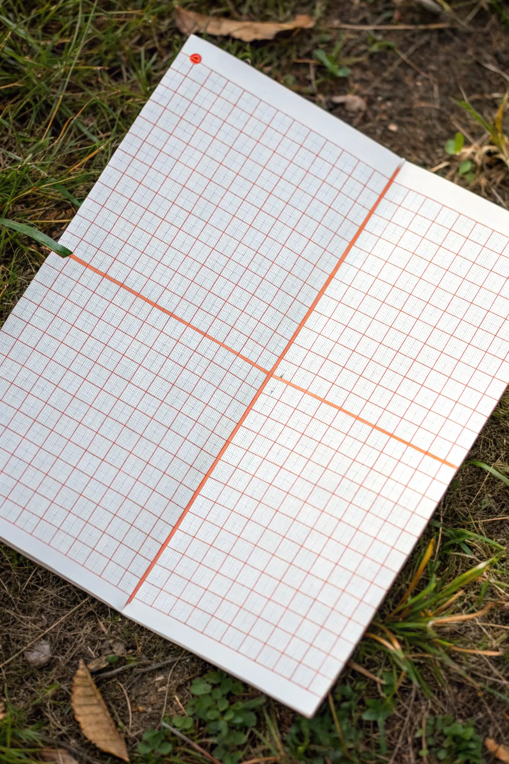
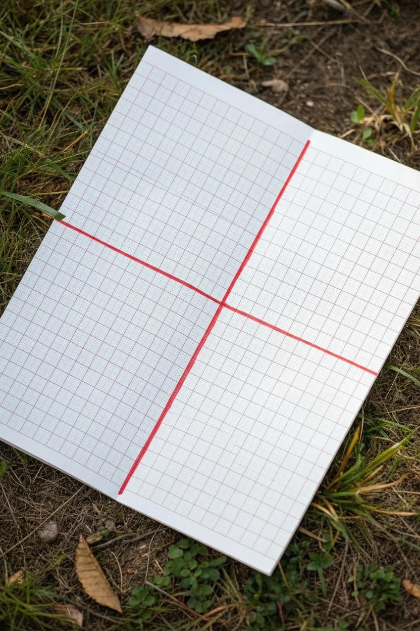
Before filling a page with doodles, you need a structured canvas. This simple setup transforms a standard notebook spread into four distinct zones, ready to host your mini pattern quilt in an organized and visually pleasing way.
Detailed Instructions
Materials
- Grid paper notebook (approx. A5 size)
- Red fine-liner pen (0.5mm)
- Red marker or brush pen (for thicker lines)
- Ruler or straight edge
- Small red dot sticker (optional)
Step 1: Planning the Layout
-
Inspect your grid:
Open your notebook to a clean, double-page spread. Take a moment to look at the existing grid lines. Notice how they are usually printed in a faint color like light blue or grey. -
Find the center point:
Locate the absolute center of the page. You can do this by counting the squares horizontally and vertically, or just eyeball it if you trust your estimation skills. This center point will be the anchor for your quadrants. -
Check paper quality:
Briefly test your maker on a back page. Since we will be drawing thick dividing lines, you want to ensure the ink doesn’t bleed through to the other side too heavily.
Smudge Alert
Red ink can smear easily on smooth paper. Place a scrap piece of paper under your hand while drawing grid lines to prevent dragging wet ink across the page.
Step 2: Drawing the Dividers
-
Align the vertical axis:
Place your ruler vertically along the center of the page. If your notebook lies flat, align it with the binding crease; if it’s spiral-bound, align it parallel to the spiral. -
Draw the vertical line:
Using your thicker red marker or brush pen, draw a bold line from the very top edge to the very bottom edge of the paper. I suggest going over it twice if the first pass isn’t opaque enough. -
Align the horizontal axis:
Turn your ruler horizontally. Place it at the vertical midpoint you identified earlier, ensuring it stays perfectly parallel to the top and bottom edges of the notebook. -
Draw the horizontal line:
Draw your horizontal axis across the entire width of the page, crossing over the vertical line you just made. You now have a large cross dividing your page into four equal sections.
Step 3: Adding the Grid Details
-
Select a finer pen:
Switch to your 0.5mm red fine-liner. The contrast between heavy divider lines and thin grid lines is what gives this layout its clean, architectural look. -
Trace vertical grid lines:
Starting from the left edge, carefully trace over the existing faint grid lines with your red fine-liner. Use a ruler to keep them perfectly straight. -
Continue across the page:
Work your way across the entire spread, drawing a red vertical line over every single existing vertical grid line. -
Check consistency:
Pause to make sure your pressure is consistent so the lines are uniform in color. If a line looks too faint, retrace it carefully. -
Trace horizontal grid lines:
Now, do the same horizontally. Align your ruler with the existing horizontal grid rows and trace them in red. -
Intersect lines cleanly:
As you draw the horizontal lines, try to keep the intersections clean where they cross your vertical lines, creating a crisp red web. -
Add the corner accent:
To mark the starting point or date your page, place a small red dot sticker in the top-leftmost square of the grid. Alternatively, you can color this square in with your red marker. -
Final clean up:
Let the ink dry completely for a minute or two to avoid smearing. Erase any faint pencil marks if you used them for initial guides.
Level Up: Color Coding
Instead of just red, use a different color for each quadrant to separate themes (e.g., blue for geometric patterns, green for organic doodles).
Your page is now perfectly prepped and waiting for your creative pattern ideas
Maze Designs Where Each Turn Follows the Squares
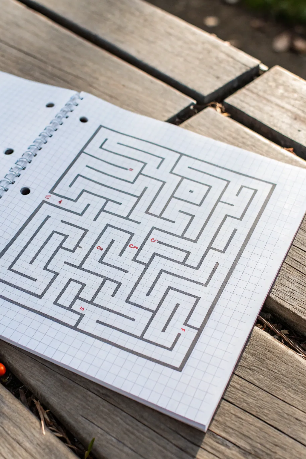
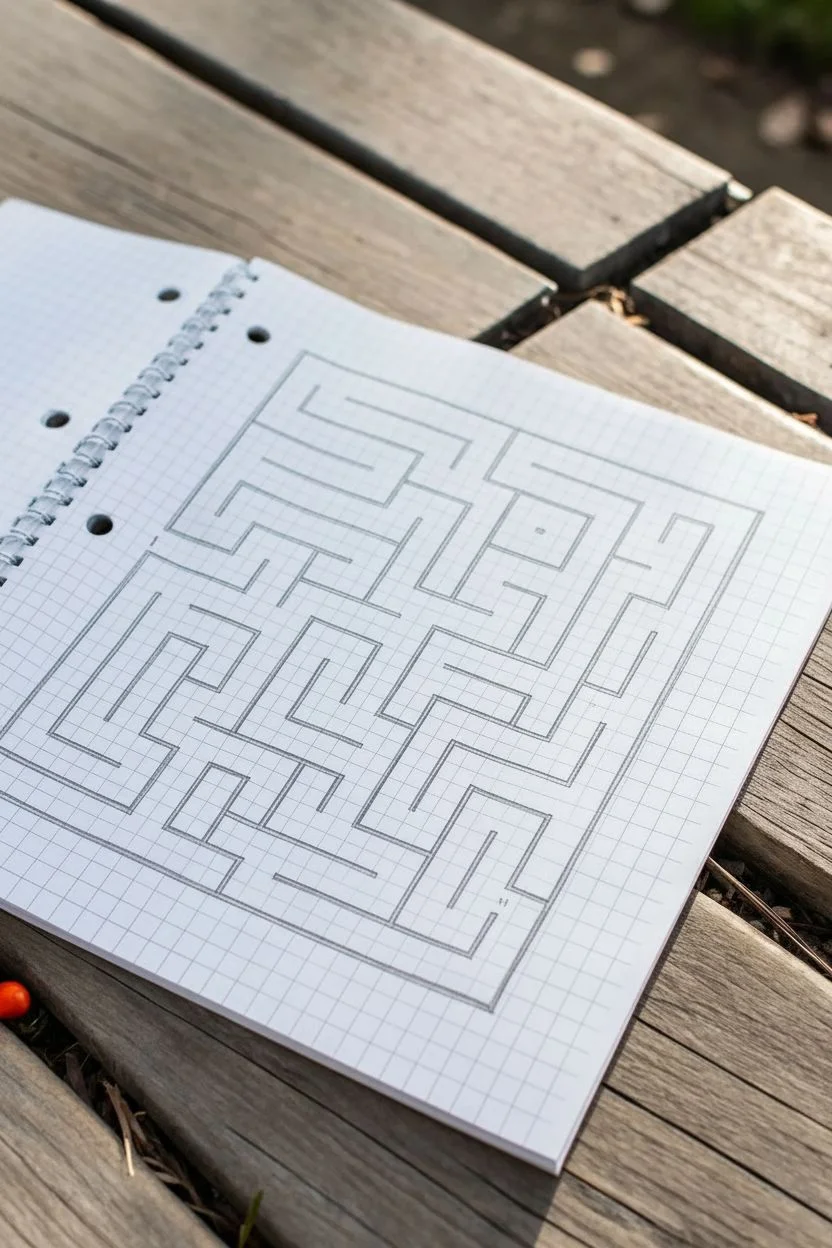
This classic puzzle design transforms simple graph paper into a complex, satisfying maze using straight lines and right angles. The stark contrast between the crisp, dark maze walls and the faint grid lines creates a clean, architectural aesthetic.
Step-by-Step Tutorial
Materials
- Grid paper notebook (spiral bound)
- Pencil (HB or 2B)
- Fine-liner or marker (black, 0.5mm – 0.8mm)
- Ruler or straight edge
- Eraser
- Red pen or fine marker (optional for numbering)
Step 1: Setting Boundaries
-
Define the outer frame:
Start by drawing a large rectangle to serve as the maze perimeter. Count out a grid space of approximately 22 squares wide by 20 squares high to match the reference, leaving a generous margin of white space around the edges. -
Mark the entrance and exit:
Create an opening on the left side of the frame, about a third of the way down from the top corner. This will be your starting point (number 1). -
Establish the exit point:
Create a second opening on the bottom edge near the right corner for the maze exit. Leaving these gaps now prevents you from accidentally closing the box later.
Straight Edge Secret
Use a clear plastic ruler when inking. It allows you to see the grid lines underneath, ensuring your maze walls don’t drift off the graph paper squares.
Step 2: Constructing the Internal Walls
-
Draft the major corridors:
Using your pencil lightly, begin sketching the primary paths. Start from your entrance and draw a long horizontal line inwards, then turn downward. The key to this style is that every line must follow a grid line perfectly. -
Create the central island:
In the center-right area, draw a small enclosed rectangle or square ‘island’ floating independently. This creates a loop in the solution path. -
Build the bottom-left quadrant:
Draw series of interlocking ‘L’ shapes and ‘U’ turns in the bottom left. Focus on creating dead-ends that look inviting but lead nowhere. -
Form the spiral trap:
Near the top center, sketch a path that spirals inward on itself. This is a classic maze element that consumes space efficiently and confuses the eye. -
Check path width consistency:
As you draw, ensure your corridors are consistently one or two grid squares wide. In this specific design, most paths are exactly one grid-square wide. -
Connect the quadrants:
Link your various sections together, ensuring there is at least one clear, continuous path from the start to the finish. Verify this with your eyes before inking.
Level Up: Double Walls
Instead of single lines, draw double lines for walls and fill them in with cross-hatching or solid black to make the layout look like a 3D dungeon map.
Step 3: Inking and Finalizing
-
Trace vertical lines:
Switch to your black marker. I find it helps to draw all the vertical wall segments first to maintain a consistent hand position and rhythm. -
Trace horizontal lines:
Rotate your notebook if necessary and ink all the horizontal lines, connecting them seamlessly to your verticals to form sharp 90-degree corners. -
Thicken the outer border:
Go over the main perimeter rectangle a second time or use a slightly thicker pen to give the maze a solid container. -
Erase pencil guides:
Wait at least 5 minutes for the ink to fully cure, then gently erase all underlying pencil sketches to reveal the crisp design. -
Add red waypoints:
Using a red fine-tip pen, add small numbers at key intersections or dead ends. Place a ‘1’ at the entrance and mark other tricky turns to guide the solver.
Now you have a professionally drafted puzzle ready to challenge a friend
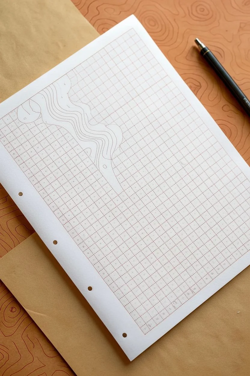
Topographic Contour Lines Mapped to the Grid
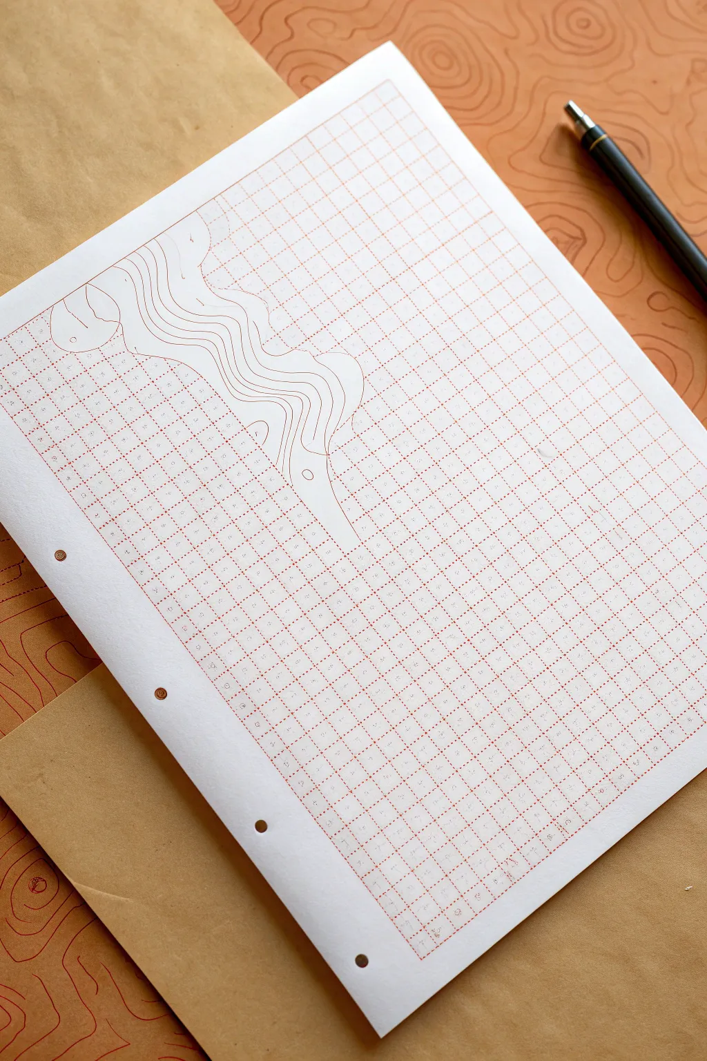
Transform a standard sheet of graph paper into a dimensional landscape by borrowing the visual language of topographic maps. This project plays with negative space and organic lines to make the rigid grid feel like it is melting into a flowing terrain.
Step-by-Step
Materials
- Red-grid graph paper (A4 or letter size)
- Fine-point pen (red or orange to match the grid)
- Pencil (HB or 2H)
- Eraser
- White gel pen (opaque) or correction fluid
- Ruler (optional, for initial planning)
- Reference image of topographic lines (optional)
Step 1: Planning the Flow
-
Visualize the terrain:
Start by looking at your graph paper and deciding where you want the ‘disruption’ to occur. In the example, the topographic lines flow diagonally from the top left, creating a visual break in the static grid. -
Sketch the initial curve:
Using a light pencil, draw a single, wavy line that cuts across the grid. This will be your main ridge or valley. Keep it loose and organic—nature rarely moves in straight lines. -
Add concentric neighbors:
Lightly sketch 3-5 more wavy lines parallel to your first one. Let them bunch up in some areas (indicating steep terrain) and spread out in others (indicating a gentle slope). -
Define the boundaries:
Decide exactly which grid squares will be ‘consumed’ by the drawing. You want to create a clear border where the graph lines stop and your topographic zone begins.
Ink Smearing?
If your pen smears on the graph paper’s coating, place a scrap piece of paper under your drawing hand. This acts as a shield while you work across the page.
Step 2: Inking the Topography
-
Match the ink color:
Select a fine-point pen that closely matches the color of your graph paper’s grid lines. The goal is to make it look like the grid itself is unraveling, so color matching is key. -
Trace the primary line:
Go over your first pencil sketch with the colored pen. Use smooth, confident strokes. I find it helps to lock my wrist and move my whole arm to get smoother curves. -
Ink the contour layers:
Carefully ink the remaining parallel lines. Focus on keeping the distance between them consistent with your sketch, creating that distinct ‘map’ aesthetic. -
Close the loops:
If you have any isolated ‘hills’ or circles within the flow, ink those now. These small islands help sell the topographic effect. -
Erase pencil guides:
Once the ink is completely dry—give it a few minutes to avoid smudging—gently erase all your pencil marks to leave a clean design.
Go 3D
Use slight shading with a very light grey marker on one side of each contour line. This adds depth, making the ridges look like they are actually rising off the paper.
Step 3: Creating Negative Space
-
Assess the intersection:
Look closely at where your new drawn lines intersect with the pre-printed grid lines. The illusion works best if the grid disappears behind your drawing. -
Apply white-out:
Take your white gel pen or correction fluid. Carefully trace over the pre-printed grid lines *inside* the zone of your topographic drawing. -
Clean up the edges:
Be precise at the edges where the grid meets your drawn wavy lines. You want the grid to stop slightly before it touches your ink, creating a tiny ‘halo’ of breathing room. -
Refine the blank space:
If your white gel pen is translucent, you may need a second coat to fully hide the grid. The area inside your drawing should look like plain white paper.
Step 4: Final Details
-
Connect grid fragments:
Sometimes the white-out creates a harsh stop. You can gently stipple or fade the ends of the grid lines near the artwork to soften the transition if you prefer a subtle look. -
Add elevation markers:
For extra realism, add tiny numbers along a few of the contour lines, just like real elevation numbers on a map. -
Review and touch up:
Step back and look at the composition. If any drawn lines look shaky, thicken them slightly to smooth them out.
Enjoy the satisfying contrast between the rigid geometric background and your flowing organic creation


Have a question or want to share your own experience? I'd love to hear from you in the comments below!