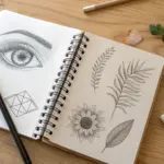
I still reach for the grid method anytime a reference image feels a little too impressive—because it turns “hard” into a bunch of doable little squares. Here are my favorite grid drawing ideas to help you practice accuracy, scale, and that satisfying moment when the likeness suddenly clicks.
Realistic Nose and Mouth Practice Grid
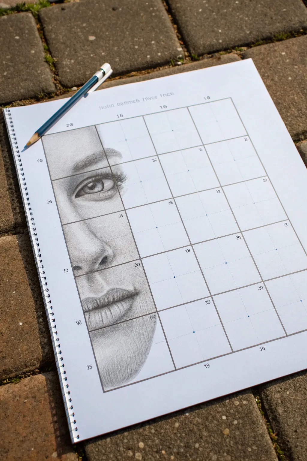
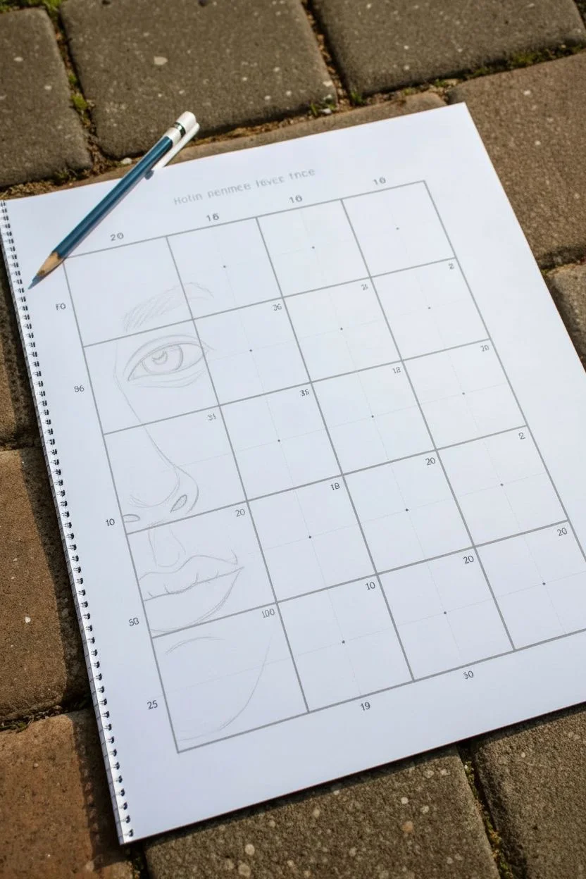
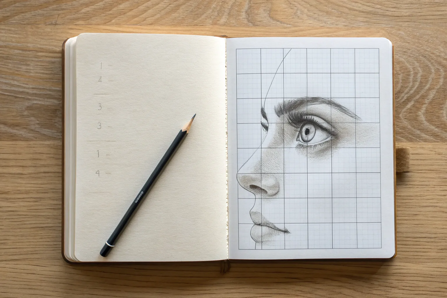
Master realistic facial features by tackling them piecemeal with this structured grid exercise. This project creates a striking partial portrait that focuses specifically on the eye, nose, and mouth, leaving the rest of the grid open for a modern, unfinished aesthetic.
Step-by-Step Guide
Materials
- Grid practice worksheet (printed or hand-drawn)
- Graphite pencils (HB, 2B, 4B)
- Fine-point mechanical pencil (0.5mm, HB)
- Kneaded eraser
- Precision eraser (erasers stick or mono zero)
- Blending stump or tortillon
- Reference photo of a face (frontal view)
Step 1: Setting the Foundation
-
Prepare the grid:
Start with a 4×5 grid on your paper. If you are drawing it yourself, ensure each square is perfectly even (e.g., 1 inch or 3cm squares). Add small reference numbers in the corners of the squares corresponding to your reference image. -
Establish the outline:
Using a light HB pencil, sketch the basic contours of the face within the left-hand column of the grid. Focus entirely on where the lines intersect the grid marks. Don’t worry about shading yet; just get the placement of the eyebrow, eye shape, nostril curve, and lip line correct. -
Check proportions:
Before adding tone, double-check your line work against the grid lines. Does the corner of the eye fall exactly in the middle of the square as it does in your reference? Adjust these landmarks now while the lead is light.
Clean Edges
Keep a piece of scrap paper under your drawing hand. This prevents your palm from smudging your work or transferring oils to the paper as you move across the grid.
Step 2: Rendering the Eye and Brow
-
Base shading for the eye:
Switch to your 2B pencil and lightly fill in the iris. Leave a small, crisp shape white for the highlight (catchlight) near the pupil. This white spot is crucial for giving the eye life. -
Deepen the pupil:
Use a 4B pencil to darken the pupil to a near-black, ensuring it contrasts sharply with the highlight. Add dark shading to the upper lash line, as this area naturally falls in shadow. -
Texture the iris:
Draw tiny, radiating lines outward from the pupil using a sharp mechanical pencil to mimic the texture of the iris. I find that varying the length of these lines makes the eye look more organic. -
Build the eyebrow:
Instead of drawing a solid block, use short, flicking strokes that follow the direction of hair growth. Start with an HB for the lighter hairs and layer darker 2B strokes on top for depth. -
Add eyelashes:
With a very sharp pencil, draw curved strokes for the lashes. Remember that lashes clump together slightly and curve outward, rather than sticking straight up.
Step 3: Sculpting the Nose
-
Soft transitions:
The nose is defined by shadow, not hard outlines. Use an HB pencil to lightly shade the side of the bridge and the rounded tip. Avoid drawing a hard line down the side of the nose. -
Define the nostril:
Darken the inside of the nostril with a 4B pencil, but let the shading fade out gradually as it moves into the skin tone. Keep the edge of the nostril wing soft. -
Blend the skin:
Use a blending stump (or a soft tissue) to smooth the graphite on the nose. This creates the illusion of smooth skin volume. Lift out a highlight on the tip of the nose with a kneaded eraser.
Drawing Looks Flat?
If the face looks cartoonish, you likely have outlines that are too hard. Use a kneaded eraser to tap these lines until they disappear, replacing them with gradients of shading.
Step 4: Refining the Mouth & Chin
-
Shade the lips:
Start with vertical, curved strokes on the lips to mimic their texture. The upper lip is usually darker because it is angled inward. Use a 2B pencil here. -
Darken the centerline:
The line between the lips shouldn’t be a straight, hard wire. vary the line weight, making it darkest in the corners and the center dip. -
Add lip highlights:
Use your precision eraser to lift pigment from the center of the bottom lip. This suggests moisture and volume. -
Shadow the chin:
Apply soft shading under the lower lip to creating the chin’s prominence. Fade this shading out gently towards the jawline, letting the drawing dissolve into the empty grid squares on the right. -
Clean the edges:
Since this is a partial drawing, use an eraser to clean up the right side of your drawing, ensuring a sharp or intentionally faded transition where the drawing stops and the empty grid begins.
Now you have a striking anatomical study that proves you don’t need to finish the whole face to create beautiful art


Human Hand Drawing Using a Larger Grid
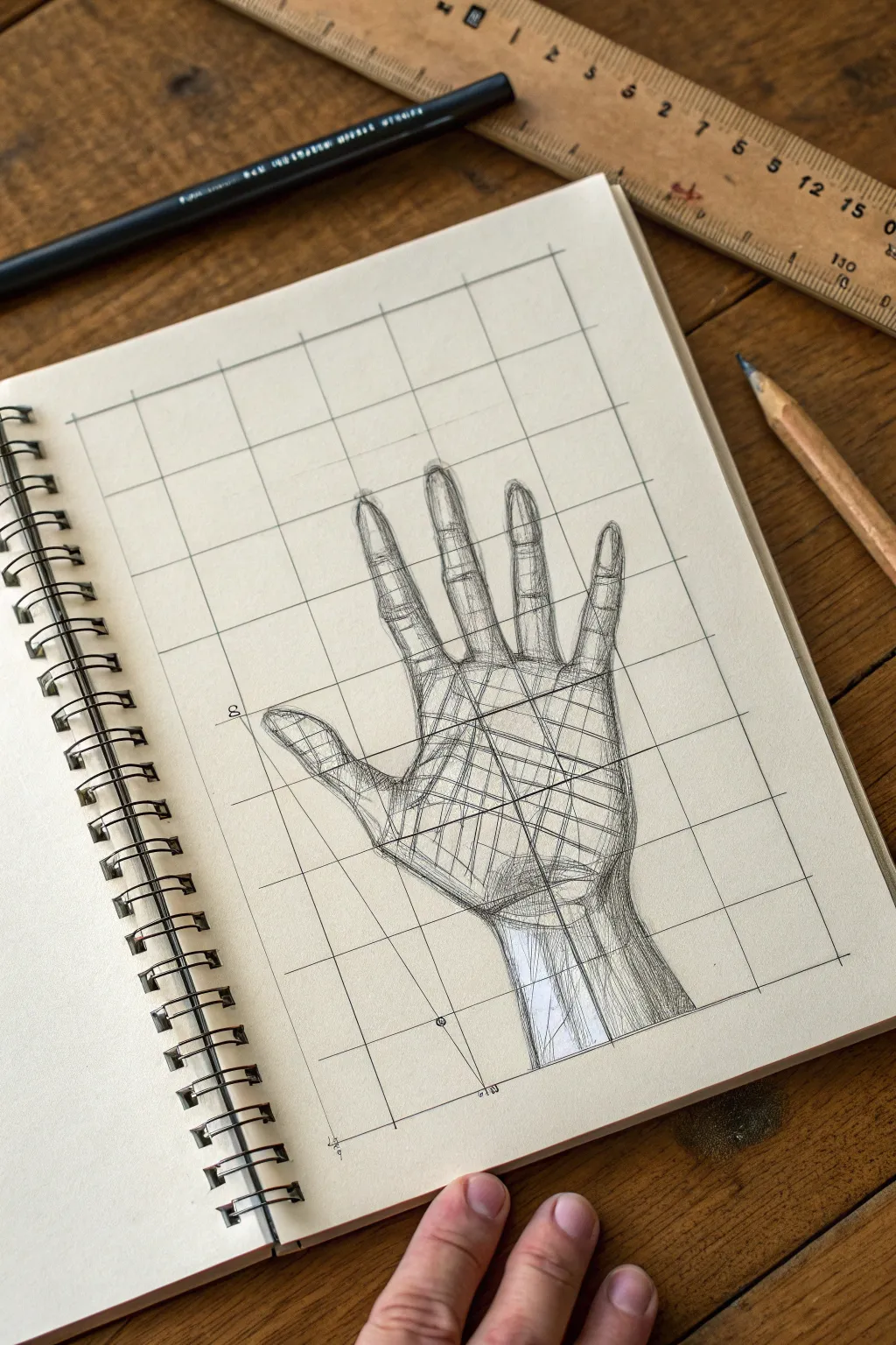

This tutorial guides you through sketching a realistic human hand using a structural grid framework to conquer difficult proportions. By breaking the anatomy down into squares, you’ll create a drawing that looks detailed and professional, blending technical precision with artistic flow.
Detailed Instructions
Materials
- Spiral-bound sketchbook (cream or off-white paper preferred)
- HB graphite pencil (for the initial grid)
- Black fine liner pen (0.3mm or 0.5mm)
- Ruler (wooden or plastic)
- Eraser
- Reference photo of a hand
Step 1: Setting the Foundation
-
Assess your page area:
Begin by determining the size of your drawing area. Leave a comfortable margin of empty space around the edges of your sketchbook page so the composition doesn’t feel cramped. -
Draw the vertical bounds:
Using your ruler and HB pencil, draw two light vertical lines to define the width of your grid. Based on the reference image, the grid needs to be about four units wide. -
Draw the horizontal bounds:
Mark off horizontal lines to create a large rectangle. The total grid should act as a cage for the entire hand, extending from the wrist area up to the fingertips. -
Create the inner grid squares:
Divide your large rectangle into smaller, equal squares. Aim for a 4×6 or 5×7 grid depending on your reference’s aspect ratio. Press lightly with the pencil so these lines can be erased later if needed, though leaving them visible adds a cool ‘process’ aesthetic.
Grid Visibility
Don’t erase the grid! In this style, the grid lines are part of the art. Trace over them loosely with a pen to make them a permanent design element.
Step 2: Structural Sketching
-
Mark major landmarks:
Look at your reference and place dots on your grid where key points occur: the tip of the middle finger, the webbing between the thumb, and the base of the palm. Use grid intersections as coordinates. -
Outline the palm block:
Lightly sketch the main shape of the palm. It usually resembles a square or a pentagon. Don’t worry about curves yet; focus on the geometric ‘block’ shape. -
Indicate finger placement:
Draw simple straight lines extending from the palm to represent the core bone direction of each finger. This helps ensure they fan out correctly before you add volume. -
Flesh out the thumb:
Sketch the thumb’s shape. Notice how it sits lower on the palm and angles away. I usually pay extra attention to the joint bulge here to make it look grounded. -
Refine the finger segments:
Draw the cylindrical shapes of the individual finger segments (phalanges) over your guide lines. Use the grid lines to check if one finger is accidentally longer than another.
Level Up: Joint Studies
Draw small circles at every knuckle point before outlining the fingers. This robotic-style under-drawing helps you visualize the mechanics of movement.
Step 3: Inking and Detailing
-
Switch to ink:
Pick up your black fine liner. Begin tracing over your best pencil lines, starting with the outline of the hand. Use a confident, slightly broken line weight to keep it looking like a sketch. -
Add the internal structure:
Instead of shading normally, draw the ‘wireframe’ lines inside the hand as seen in the example. Cross-hatch the palm area to suggest the volume of the muscles. -
Detail the knuckles:
Use small ovals or curved hatching lines at the finger joints to indicate where the skin wrinkles and bends. -
Hatch the wrist area:
Create vertical shading lines running down the wrist. This directional shading helps visually separate the wrist column from the spreading shape of the hand. -
Enhance dark areas:
Go back in with your pen and add a second layer of cross-hatching to the deepest shadow areas, like the sides of the fingers and the center of the palm. -
Intensify contour lines:
Thicken the outer boundary line of the entire hand slightly. This ‘holding line’ makes the subject pop forward from the grid background. -
Final clean up:
Once the ink is completely dry, gently erase any pencil guidelines that feel too distracting, though keeping the main grid visible preserves the technical study look.
You now have a striking anatomical study that serves as both a drawing exercise and a finished piece of art


Animal Eye Grid for Ultra-Precise Highlights
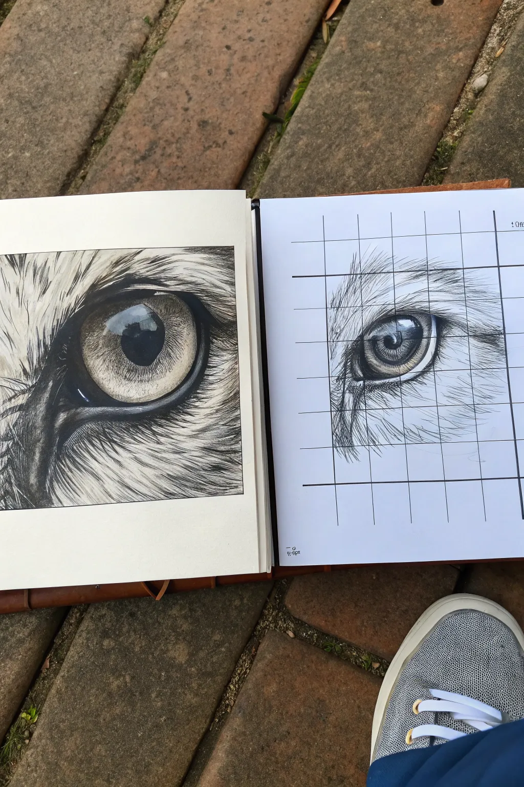
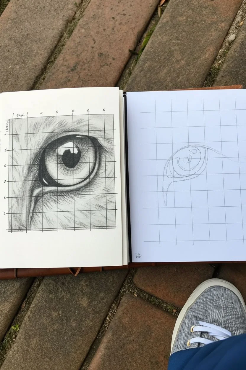
Master the art of hyper-realistic animal textures by focusing on a single, striking detail: the eye. This grid method project breaks down the complex layers of fur and reflection into manageable squares, helping you recreate the intense gaze and glossy highlight of a feline subject with incredible precision.
Step-by-Step
Materials
- High-quality sketchbook or drawing paper
- Reference photo of a cat’s eye
- Ruler
- HB pencil (for the grid)
- 2B and 4B graphite pencils
- Fine liner pens (0.1mm and 0.5mm)
- Kneaded eraser
- Blending stump or tortillon
- White gel pen or acrylic ink (for highlights)
Step 1: Setting the Foundation
-
Prepare your reference:
Start by selecting a high-contrast photo of an animal eye. Print it out and draw a grid over it, spacing lines about 1 inch (or 2.5cm) apart. Label the rows and columns if it helps you keep track. -
Draw the grid on paper:
On your fresh sheet of paper, lightly draw a matching grid using your ruler and an HB pencil. Keep these lines extremely faint so they can be easily erased later without damaging the paper surface. -
Outline the main shapes:
Focusing on one square at a time, sketch the basic outlines of the eye. Start with the pupil, then the iris, and finally the surrounding eyelids. Don’t worry about fur texture yet; just get the geometry correct. -
Map the highlights:
Pay special attention to the reflection in the eye. Outline the shapes of the light reflections carefully within the iris and pupil. These preserved white spaces are crucial for the realistic ‘wet’ look. -
Check proportions:
Step back and compare your line drawing to the reference grid. Ensure the curve of the eyelid and the roundness of the pupil align perfectly with the grid lines before moving on to shading.
Grid Lines Too Dark?
If grid lines won’t erase, try lifting them by pressing a kneaded eraser straight down instead of rubbing. Next time, use a harder pencil (2H) and lighter pressure.
Step 2: Rendering the Eye
-
Darken the pupil:
Using a 4B pencil or a dark pen, fill in the pupil. It should be the darkest part of your drawing. Be careful to work around the highlighted reflection shapes you outlined earlier. -
Shade the iris:
Use a 2B pencil to add tone to the iris. Observe the intricate patterns in your reference—lines often radiate from the pupil outward. Use short, flicking strokes to mimic this texture. -
Build depth in the iris:
Layer darker graphite or ink around the outer edge of the iris and near the upper eyelid where a shadow would naturally fall. This makes the eye look spherical rather than flat. -
Refine the reflection:
Inside the reflection zone, there might be subtle shadows (like the reflection of eyelashes or the horizon). Lightly sketch these in, keeping the brightest white areas purely the paper’s white.
Step 3: Fur Texture and Details
-
Directional mapping:
Look closely at the fur direction in your reference. In the squares surrounding the eye, lightly draw arrows or guide lines to remind yourself which way the hair flows. -
Base layer of fur:
Using an HB pencil, start drawing individual hairs. Use quick, tapered strokes where you lift the pencil at the end of the line. Follow your directional guides strictly. -
Deepen the shadows:
Switch to a softer pencil (4B) or a fine liner to add darker hairs in the shadowed areas, particularly near the tear duct and under the upper lid. This contrast creates volume. -
Layering for density:
Go back over your fur areas with more strokes. I find that layering different pencil grades creates a rich, realistic texture that doesn’t look flat. -
Erase the grid:
Once the main features are inked or shaded darkly enough, gently erase the visible grid lines in the lighter areas. Be careful not to smudge your work—a kneaded eraser represents a great tool for lifting graphite without rubbing. -
Final highlights:
If you lost any brightness in the eye reflection, restore it with a tiny dot of white gel pen or acrylic ink. Also, add a few stray white whiskers or highlights over the dark fur for added realism.
Pro Tip: The Paper Mask
Place a scrap sheet of paper under your drawing hand. This prevents natural hand oils and movement from smudging your graphite or ink as you work across the grid.
Now step back and admire the piercing gaze you have created using patience and precision

Cover-and-Reveal Grid Drawing for Focus
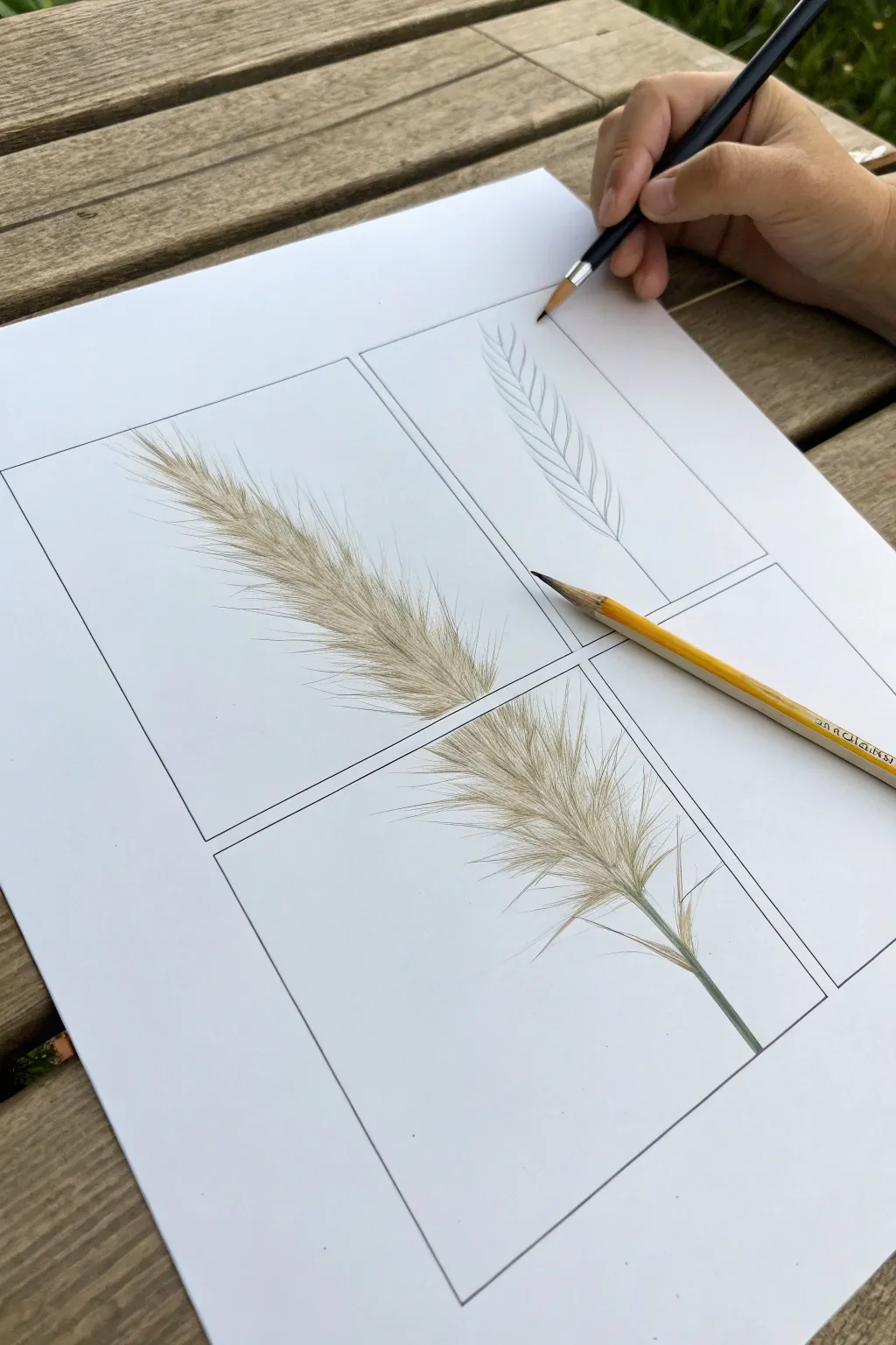
Master the intricate texture of ornamental grass by breaking it down into manageable sections with this grid method. This project guides you through capturing the softness and flow of each seed head, resulting in a beautiful botanical study.
Step-by-Step
Materials
- High-quality white drawing paper or Bristol board
- HB graphite pencil (for sketching)
- 2B or 4B graphite pencil (for shading)
- Ruler
- Yellow colored pencil (optional, for reference placement or light sketching)
- Fine liner pen (optional, for outlines)
- Clean eraser
- Reference photo of ornamental grass
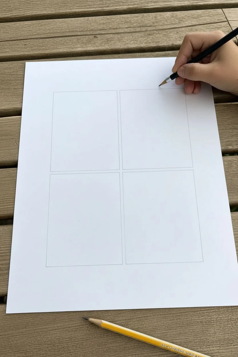
Step 1: Preparation & Layout
-
Prepare your paper:
Start with a clean sheet of high-quality drawing paper. Ensure you have a smooth surface underneath, like a wooden table or drawing board, to prevent texture transfer. -
Draw the main grid:
Using your ruler and HB pencil, lightly draw a large rectangle in the center of your page. Press very gently so these lines can be erased later if needed. -
Create the quadrants:
Divide your large rectangle into four equal smaller rectangles. Draw a vertical line down the center and a horizontal line across the middle. This “windowpane” effect isolates specific parts of the plant.
Grid Lines Smudging?
Keep a scrap piece of paper under your drawing hand. This acts as a shield, preventing your skin oils from smearing your pencil lines or grid borders.
Step 2: Sketching the Structure
-
Establish the stem line:
Visualize a continuous curve representing the grass stem flowing through the boxes. Lightly sketch a central spine line that connects through the bottom right box and extends upwards towards the top left box. -
Outline the basic shape (Top Right):
In the top right box, focus on the structural skeleton. Sketch the central stem and draw simple, curved rib-like lines branching out symmetrically. This acts as a simplified diagram of how the seed heads attach. -
Define the volume (Top Left):
Move to the top left box. Instead of individual ribs, lightly outline the general silhouette or ‘cloud’ shape of the fluffy head. This helps you gauge the overall width of the grass plume.
Step 3: Detailing & Texture
-
Start the fine hairs (Top Left):
Switch to a sharper pencil point. Inside the top left box, begin drawing hundreds of fine, rapid strokes radiating from the imagined center spine. Keep your wrist loose to create tapered, hair-like lines. -
Layering the density:
Build up the density in the center of the plume in the top left box. The strokes should be darker and closer together near the stem, becoming lighter and sparser as they fan outward. -
Detailing the lower section (Bottom Right):
Now focus on the bottom right box. Here, the grass is often less dense. Draw the main stem more clearly, thickening it slightly at the bottom. -
Adding branching seeds:
In the bottom right quadrant, draw distinct individual clumps of seeds branching off the main stem. These should look like miniature versions of the full plume, attached by thin stalks. -
Enhance the shadows:
Use your 2B or 4B pencil to deepen the shadows where the seed clumps meet the stem in the bottom right box. This contrast makes the lighter hairs pop against the white paper.
Level Up: Seasonal Colors
Instead of graphite, use colored pencils. Try ochre and burnt sienna for a dried autumn look, or soft greens and pinks for a fresh spring variety.
Step 4: Refining & Finishing
-
Connect the flow:
Step back and look at how the drawing flows across the grid lines. Ensure the angles of the grass in the top left box align logically with the stem in the bottom right box. -
Soften the edges:
Inspect the outer edges of your feathery grass. If they look too solid, use a clean eraser to gently tap or stroke the tips, or add faint, wispy stray hairs to break up any hard outlines. -
Clean up the grid:
I like to re-trace the grid boxes with a slightly firmer hand or a fine liner to make the frames distinct, creating a clean ‘window’ effect into the botanical world. -
Final texture check:
Add a few final, sharp dark strokes in the deepest shadow areas of the plumes to give the drawing depth and dimension.
Now you have a stunning botanical study that captures the delicate beauty of nature

PENCIL GUIDE
Understanding Pencil Grades from H to B
From first sketch to finished drawing — learn pencil grades, line control, and shading techniques.
Explore the Full Guide
Abstract Pattern Sampler: One Mark per Square
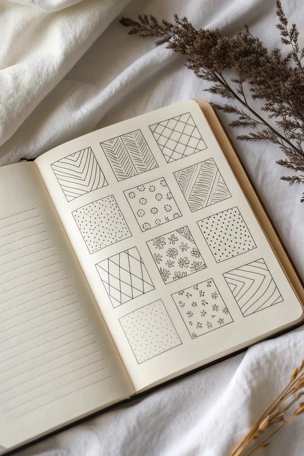
Transform a blank sketchbook page into a mesmerizing sampler of textures and patterns using nothing more than a pen and a simple grid structure. This project is a relaxing exercise in mindfulness, allowing you to focus on repetitive strokes to build a cohesive collection of abstract designs.
Detailed Instructions
Materials
- Sketchbook or bullet journal (blank or dot grid paper preferred)
- Fine-liner pen (0.3mm or 0.5mm black ink)
- Ruler or straight edge
- Pencil (HB or 2B)
- Eraser
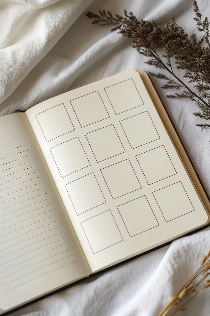
Step 1: Setting the Framework
-
Map out the grid:
Begin by lightly sketching a large rectangle in pencil centered on your page. Divide this rectangle into 12 equal squares, arranged in a grid of 3 columns and 4 rows. Leave a small, consistent gap of about 2-3mm between each square to let the patterns breathe. -
Define the boundaries:
Once you are satisfied with the pencil grid, trace over the outlines of the 12 squares using your fine-liner pen. Keep your hand steady or use a ruler for crisp edges. -
Erase pencil guides:
Wait a moment for the ink to dry completely to avoid smudging, then gently erase all the underlying pencil lines so you have clean, empty boxes ready to be filled.
Uneven Lines?
Don’t stress if your lines wobble! The charm of hand-drawn patterns lies in imperfection. Once the grid is full, minor errors blend into the overall texture.
Step 2: Row 1: Linear Energy
-
Square 1: Chevron path:
In the top-left square, draw a series of nested V-shapes. Start from the bottom edge and draw upward-pointing chevrons, spacing them evenly until you reach the top. -
Square 2: Diagonal conflict:
Split the middle square with a diagonal line. Fill the left triangular half with diagonal hatching lines going one way, and the right half with lines going the opposite way, creating a herringbone-style contrast. -
Square 3: Diamond lattice:
For the top-right square, draw a series of parallel diagonal lines spaced widely apart. Then, cross them with perpendicular diagonal lines to create a large diamond grid pattern.
Add Dimension
Use a thicker pen for the 12 main square outlines and a super-fine schematic pen for the interior patterns to make the grid pop off the page.
Step 3: Row 2: Organic vs. Geometric
-
Square 4: Confetti stipple:
Moving to the second row on the left, fill the square with random, small dots. Keep the density relatively uniform, but allow for natural variation so it doesn’t look too mechanical. -
Square 5: Floral circles:
In the center square, create small, stylized flowers using simple circular motions. Draw small circles arranged in rings, alternating with solid dots, to mimic tiny blooms spaced regularly apart. -
Square 6: Flowing textures:
Divide the right square into three vertical sections using slightly curved lines. Fill each section with horizontal, slightly waved hatching lines to simulate flowing water or wood grain.
Step 4: Row 3: Nature and Structure
-
Square 7: Simple slant:
On the third row, keep the first square distinctive by drawing diagonal lines across the entire box. Space them widely to create an open, airy feel compared to the denser patterns. -
Square 8: Meadow patch:
Fill the middle square with small, simple five-petal flower doodles. Scatter them randomly and fill the empty negative spaces with tiny leaves or stems to create a packed floral print look. -
Square 9: Polka dot grid:
For the right square, draw rows of small circles. Unlike the random stippling earlier, align these circles in straight horizontal and vertical rows for a structured polka-dot effect.
Step 5: Row 4: Final Textures
-
Square 10: Subtle grain:
In the bottom-left square, create a very light texture by filling the box with tiny, sparse speckles. This acts as a visual rest for the eye. -
Square 11: Scattered blossoms:
Use the middle square to draw tiny three-petal shapes or simple buds. Orient them in different directions to give the impression of falling petals or a disorganized pattern. -
Square 12: Corner chevron:
Finish the bottom-right square with a variation on the very first pattern. Draw nested V-shapes, but orient them sideways so they point toward the right edge of the paper.
Step back and admire how twelve simple ideas come together to form one complex and satisfying composition


Have a question or want to share your own experience? I'd love to hear from you in the comments below!