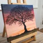
Whenever I’m painting on a horizontal canvas, I think of it like telling a story that moves left to right—your eye gets to travel. These horizontal painting ideas are made for wide, rectangular spaces, so you can fill the whole format on purpose instead of fighting it.
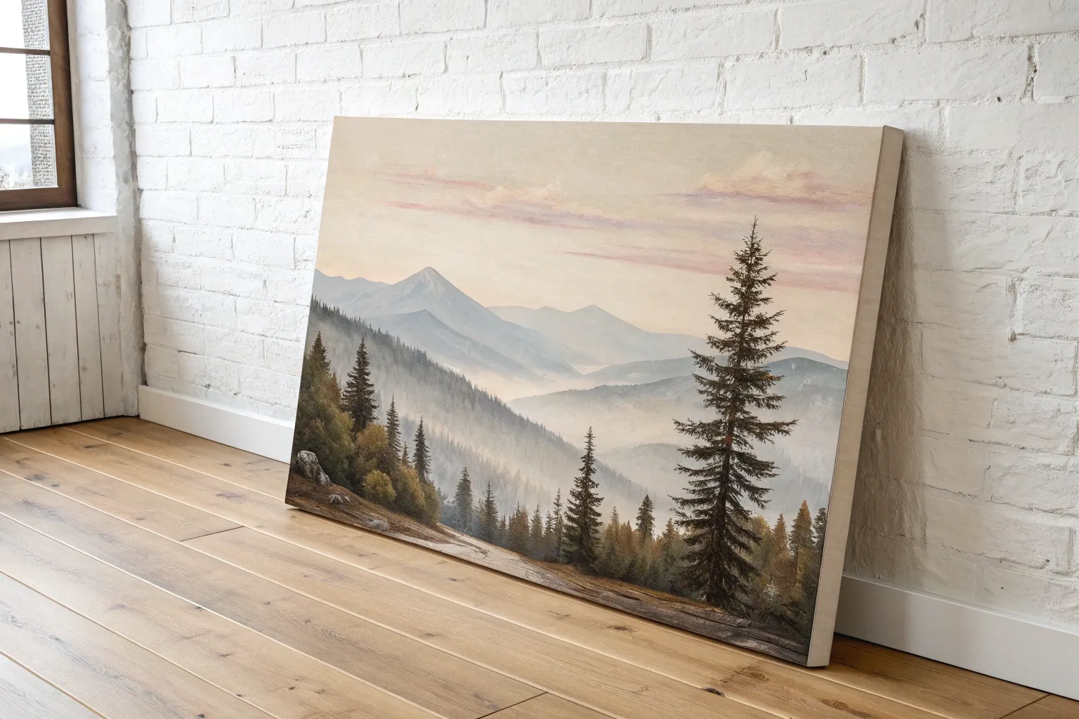
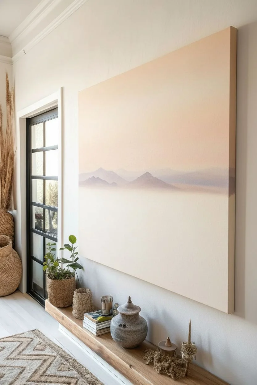
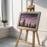
Panoramic Mountain Range
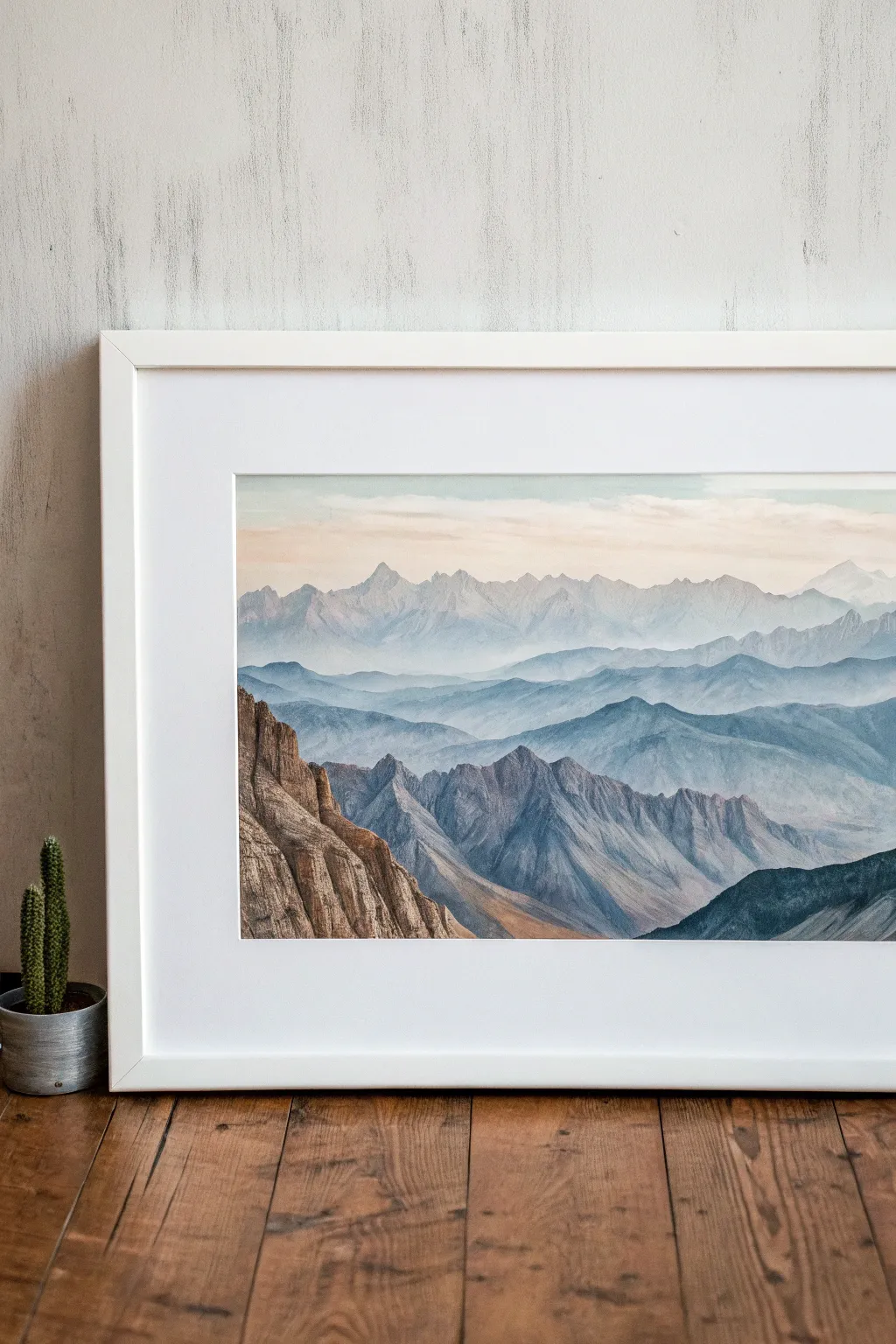

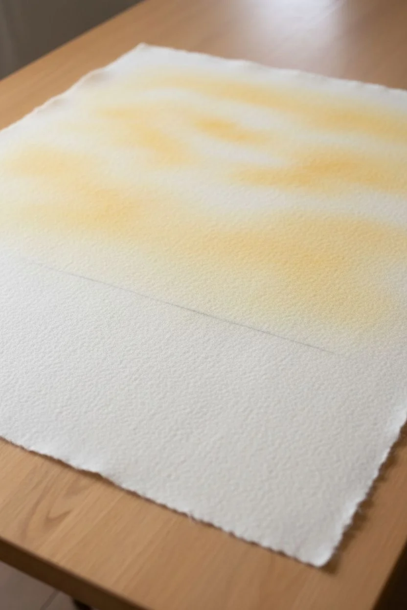
Capture the breathtaking depth of a sprawling mountain range with this layered watercolor tutorial. This project relies on atmospheric perspective to create vast distance, turning simple horizontal washes into majestically shifting peaks.
Detailed Instructions
Materials
- Wide watercolor paper (panoramic format, cold press)
- Watercolor paints (Indigo, Payne’s Gray, Burnt Sienna, Yellow Ochre, Ultramarine Blue, White Gouache for mixing)
- Large flat brush (1 inch or wider)
- Medium round brush (size 6 or 8)
- Small detail brush (size 2)
- Masking tape
- Mixing palette
- Two jars of water
- Paper towels
Step 1: Planning and Sky
-
Prepare the canvas:
Begin by taping down your panoramic paper to a board. Ensure the edges are sealed tightly to prevent warping and create that crisp white border later. -
Sketch the layers:
Lightly sketch four to five distinct zigzagging lines across the paper. These represent your mountain ridges. Keep the top line very jagged for distant peaks and the bottom lines more rugged for closer terrain. -
Mix the sky wash:
Create a very watery mix of Yellow Ochre with a tiny touch of Burnt Sienna. You want a faint, warm glow. -
Paint the sky:
Using your large flat brush, apply this wash to the top third of the paper. Let it fade to almost white as you reach the first pencil line.
Muddy colors?
If your mountain layers are blending into one brown mess, ensure each layer is 100% dry before adding the next. Use a hair dryer on low heat to speed this process up.
Step 2: Distant Ranges
-
Mix the first mountain color:
Prepare a very pale, watery mix of Ultramarine Blue and a hint of Indigo. It should be transparent and light. -
Paint the furthest peaks:
Fill in the shape of the furthest mountain range (the top pencil line). Paint right over the lower sketched lines; watercolor transparency is key here. -
Let it dry completely:
Patience is crucial. If you paint the next layer too soon, the edges will bleed and you’ll lose the sense of distance. -
Strengthen the mix:
Add a bit more Indigo and Payne’s Gray to your previous blue mix. The next layer needs to be slightly darker and cooler. -
Paint the middle range:
Paint the second mountain ridge. Create soft, rolling shapes. While the paint is wet, you can lift a little pigment with a thirsty brush to suggest mist in the valleys.
Step 3: The Mid-Ground
-
Add texture:
For the third layer of mountains, darken your blue-grey mix further. Switch to the medium round brush to get more control over the peaks. -
Create rugged edges:
As you paint this layer, use the side of the brush to create ‘dry brush’ effects occasionally, suggesting rock texture. -
Introduce shadows:
Before this layer dries, drop slightly darker pigment on the right side of the peaks to indicate a light source coming from the left. -
Layering continues:
I like to wait for this layer to be bone-dry before moving to the foreground. This ensures the sharpest contrast.
Go Massive
Try this technique on a long wooden board instead of paper. Prime the wood with watercolor ground first to keep the texture while allowing the paint to flow.
Step 4: Foreground Detail
-
Mix earthy tones:
For the closest mountains on the left and bottom right, mix Burnt Sienna, Indigo, and a touch of Yellow Ochre to get a brownish-grey rock color. -
Paint the foreground cliffs:
Using the medium brush, paint the large rocky outcrop on the left. This paint should be much less watery, almost creamy in consistency. -
Add geological details:
Switch to your small detail brush. While the rock shape is damp (not soaking), draw vertical lines using concentrated dark brown to mimic striations and crevices. -
Highlighting:
Mix a little white gouache with Yellow Ochre. Carefully drag this opaque mix over the sun-facing ridges of the foreground rocks for texture. -
Final deep shadows:
Use pure Indigo or Payne’s Gray to paint the deepest shadows in the bottom right corner and the crevices of the main cliff. -
The reveal:
Once absolutely everything is dry to the touch, slowly peel away the masking tape at a 45-degree angle to reveal your crisp border.
Frame your panoramic masterpiece in white to let those subtle blue hues really sing on your wall


Calm Ocean Horizon
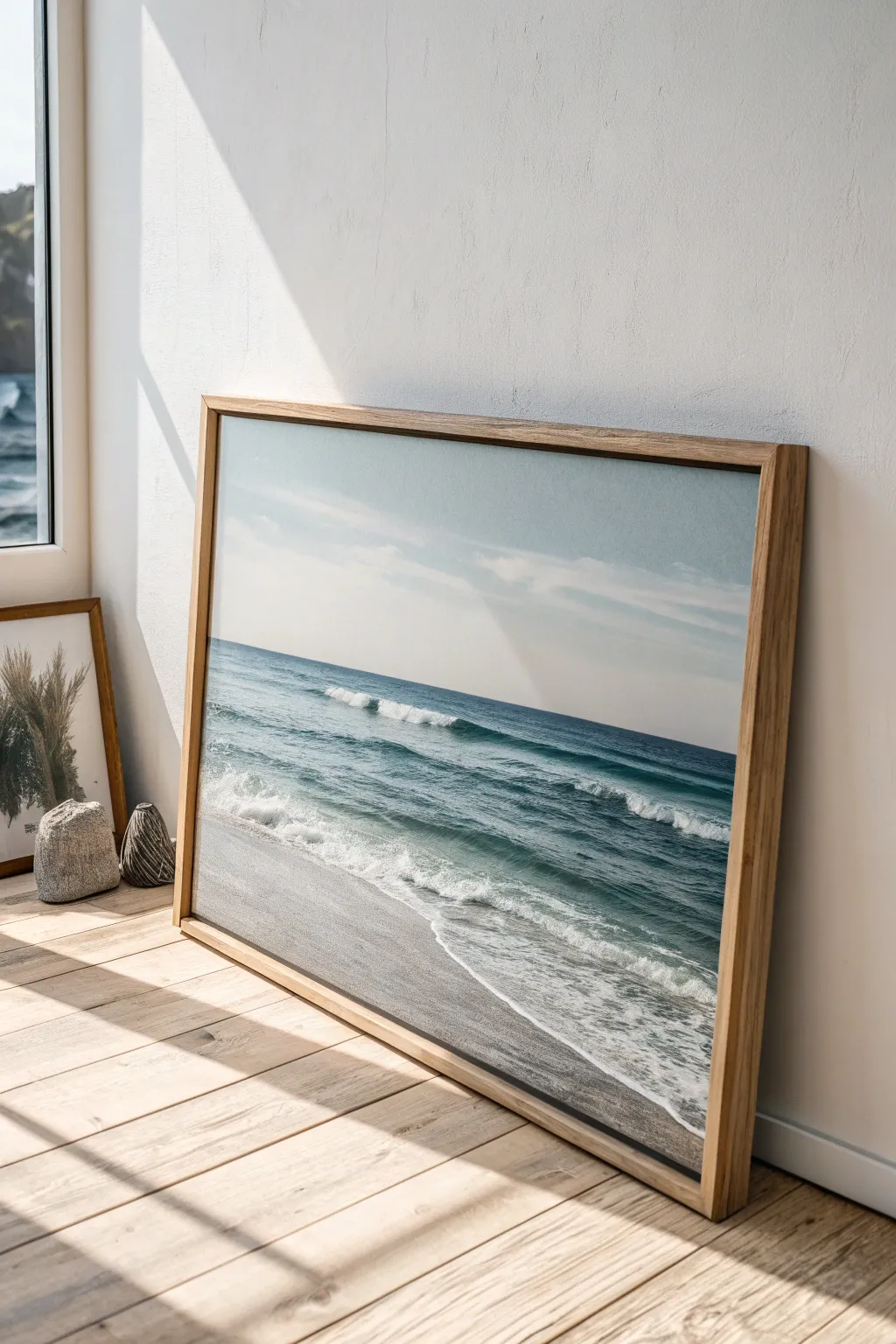
Bring the calming influence of the coast into your home with this large-scale acrylic seascape. The composition balances a wide expanse of sandy beach with gentle rolling waves under a soft, hazy sky, creating a perfect horizontal centerpiece for grounding any room.
How-To Guide
Materials
- Large horizontal canvas (approx. 30×40 inches)
- Acrylic paints: Titanium White, Ultramarine Blue, Phthalo Blue, Burnt Umber, Yellow Ochre, Payne’s Grey
- Large flat brush (2 inch)
- Medium filbert brush
- Small round detail brush
- Palette knife
- Water container and paper towels
- Mist spray bottle
- Floating wooden frame (light oak)
- Glazing medium
Step 1: Setting the Horizon
-
Prime and prep:
Ensure your canvas is clean and taut. Apply a thin coat of gesso if it’s not pre-primed, and let it dry completely to create a smooth surface for your seascape. -
Mark the horizon line:
Use a ruler to lightly draw a straight horizon line in pencil. Position it slightly above the center of the canvas—roughly at the top third mark—to emphasize the foreground and the water’s movement. -
Paint the sky gradient:
Mix Titanium White with a tiny touch of Phthalo Blue. Start painting at the very top of the canvas, using long horizontal strokes. As you work downward toward the horizon, add more white to your brush to fade the color into a very pale, hazy blue. Keep the brush strokes smooth and seamless.
Horizon Check
Is your ocean tilting? Step back 5 feet. If the horizon line isn’t perfectly level, use painter’s tape to mark a straight line and carefully repaint the sky/water meeting point.
Step 2: Building the Deep Ocean
-
Block in the deep water:
For the water directly below the horizon line, mix Ultramarine Blue with a touch of Payne’s Grey and Phthalo Green. Apply this as a dark, solid band across the horizon to establish depth. -
Transition to mid-tones:
As you move closer to the shore, lighten your blue mix with white and a hint of Phthalo Blue. This lighter teal color represents the shallower water where light penetrates the waves. -
Create wave movement:
Use your filbert brush to paint horizontal streaks of darker blue within the mid-tone area. These suggest the shadows of forming waves.
Level Up: Texture Pop
Mix modeling paste into your white acrylic paint for the wave crests. Apply it thickly with a palette knife for genuine 3D texture.
Step 3: The Rolling Waves and Foam
-
Establish the main wave:
Identify where the largest wave is breaking. Use a mix of Titanium White and your lightest blue to paint the top crest of the wave. Keep the edge ragged to mimic splashing water. -
Shadows under the foam:
Underneath the white crests, paint a thin, shadowed line using a transparent mix of Phthalo Blue and a tiny bit of Burnt Umber. This gives the wave volume and lifts the foam off the surface. -
Adding texture:
Switch to a palette knife or a dry brush. Pick up pure Titanium White and drag it lightly over the blue water areas to create the look of sea foam and surface bubbles. -
Painting the shoreline foam:
At the water’s edge, paint irregular, lace-like patterns where the water meets the sand. I find that thinning the white paint slightly with water helps it flow into natural, organic shapes here.
Step 4: The Sandy Foreground
-
Mix the sand color:
Combine Titanium White, Yellow Ochre, and a very small amount of Burnt Umber to create a warm, neutral beige. -
Apply the base sand layer:
Fill the bottom section of the canvas with this sand mixture. Use broad, sweeping strokes that mimic the angle of the shoreline. -
Wet sand effect:
Where the water meets the sand, darken your beige mix with a little Burnt Umber and glaze it. This darker strip simulates wet sand reflecting the sky. -
Refining the transition:
Blend the wet sand area slightly into the white shoreline foam while the paint is still tacky to create a soft, gentle wash.
Step 5: Finishing Touches
-
Highlight the crests:
Go back with your smallest round brush and pure white paint. Add sharp, distinct highlights to the very tops of the waves and the brightest parts of the foam to make them pop. -
Varnish and frame:
Once the painting is fully dry (wait at least 24 hours), apply a satin varnish to protect the surface. Finally, install the canvas into a light oak floating frame to complete the modern, coastal aesthetic.
Now you have a tranquil window to the sea right on your wall, offering a daily moment of calm


Rolling Hills and Farmland Bands
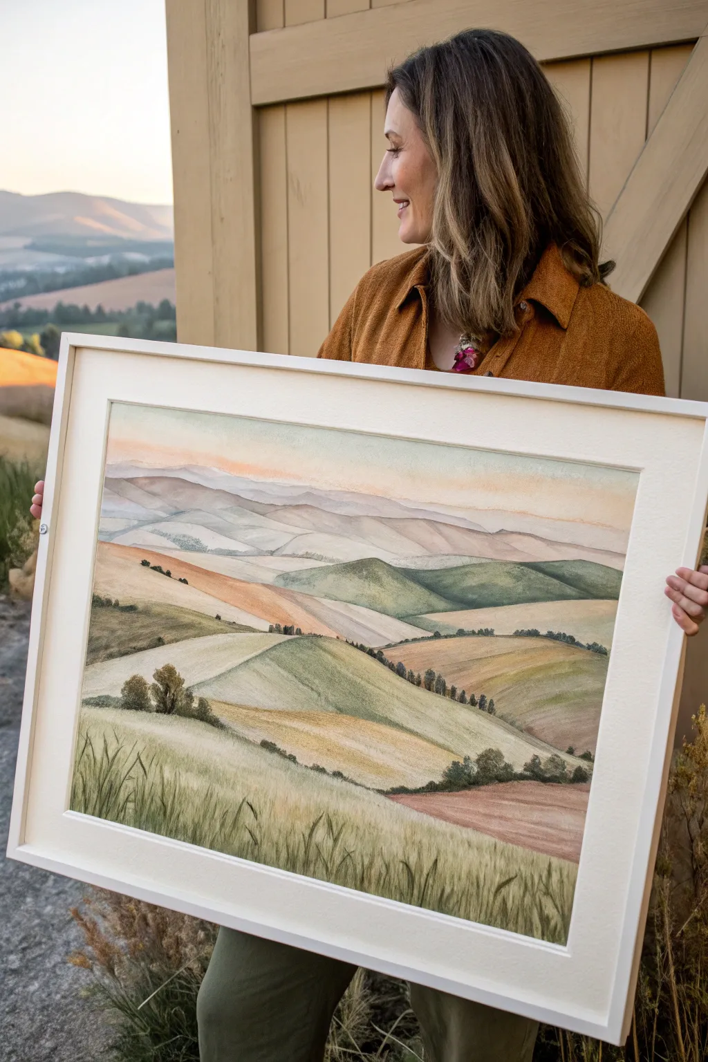
Capture the serene beauty of undulating farmland with this layered watercolor landscape. You’ll build up soft, overlapping bands of earth tones and greens to create a sense of depth and vastness.
Step-by-Step
Materials
- Cold press watercolor paper (140lb or heavier, large format)
- Watercolor paints (Yellow Ochre, Burnt Sienna, Sap Green, Olive Green, Ultramarine Blue, Alizarin Crimson)
- Large flat wash brush (1 inch)
- Round brushes (sizing 4, 8, and 12)
- Rigger or liner brush for fine grass details
- Masking tape
- Drawing board
- Pencil (HB or 2B) and kneaded eraser
- Two jars of water
- Paper towels
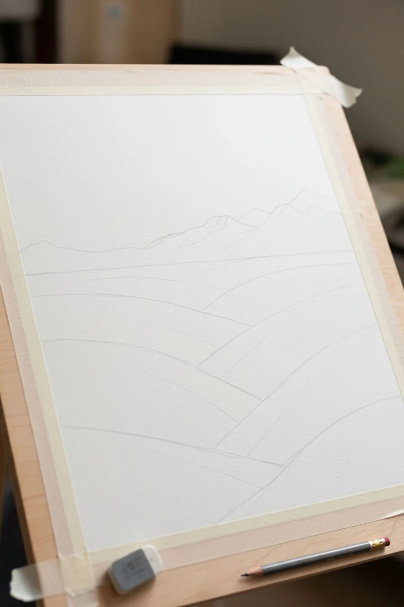
Step 1: Preparation and Sketching
-
Surface Prep:
Secure your watercolor paper to a drawing board using masking tape on all four sides. This prevents buckling when we apply heavy washes later. -
Horizon Line:
Using your pencil, lightly mark the horizon line about two-thirds up the paper. It doesn’t need to be perfectly straight; a slight undulation looks more natural for a mountain range. -
Contour Sketching:
Sketch the rolling hills below the horizon. Think of these as overlapping ‘V’ and ‘U’ shapes. Start from the foreground and work backward, ensuring lines crisscross to show how hills sit in front of one another. -
Mountain Silhouette:
Above the horizon, sketch the faint outlines of distant mountains. Keep these lines very subtle, as paint will settle into graphite grooves if they are too deep.
Atmospheric Depth
Remember: objects become cooler (bluer) and lighter as they recede. Keep warm ochres in the front and cool purples in the back.
Step 2: Painting the Sky and Distance
-
Sky Wash:
Wet the sky area with clean water. Mix a very dilute wash of Alizarin Crimson and a touch of Yellow Ochre to create a warm, sunset glow. Apply this near the horizon, letting it fade to white or pale blue at the very top. -
Distant Mountains:
Once the sky is dry, mix Ultramarine Blue with a tiny bit of Burnt Sienna to get a muted grey-purple. Paint the furthest mountain range with a watery consistency to simulate atmospheric perspective. -
Mid-Ground Hills:
As you move forward to the next range of hills, add slightly more pigment. Introduce a pale sap green to the mix, keeping the edges soft.
Salt Texture
Sprinkle coarse salt onto the wet paint of the foreground meadow. Once dry, brush it off to create a unique speckled soil texture.
Step 3: Building the Farmland Bands
-
Base Layers:
Working on dry paper, start blocking in the main hill shapes. Use a large round brush to apply a wash of Yellow Ochre for the dry wheat fields. -
Green Pastures:
For the greener hills, mix Sap Green with a touch of Olive. Apply this next to the ochre sections. Don’t worry if they touch slightly; a little bleed adds organic character. -
Creating Texture:
While the ochre sections are damp (not soaking), drop in hints of Burnt Sienna to suggest variations in the soil and crop density. -
Defining Shadows:
I find it helpful to wait for the base layers to dry completely before adding shadows. Use a darker mix of green or brown to paint the ‘valleys’ where the hills meet, emphasizing the rolling form.
Step 4: Foreground and Details
-
Tree Lines:
Mix a dark green using Sap Green and Ultramarine. Using the tip of a size 4 brush, dab small, irregular shapes along the ridges of the middle-ground hills to create distant tree lines and hedgerows. -
Foreground Grasses:
In the closest hill section at the bottom, switch to your rigger or liner brush. Quick, upward flickering strokes with various green mixtures will create the tall grasses. -
Final Contrast:
Evaluate the painting for depth. If the foreground looks too flat, add a glaze of darker Olive Green to the bottom corners to direct the eye upward. -
Drying and Framing:
Allow the painting to dry fully (at least a few hours) before removing the tape carefully. Frame with a wide white mat to let the subtle colors breathe.
Hang your finished piece in a well-lit room to bring the warm glow of the landscape to life


City Skyline Silhouette
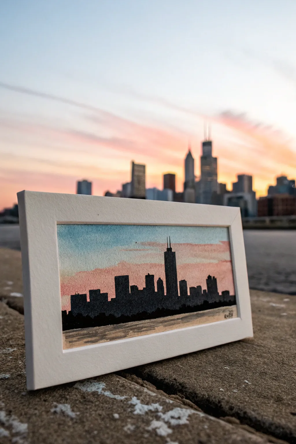
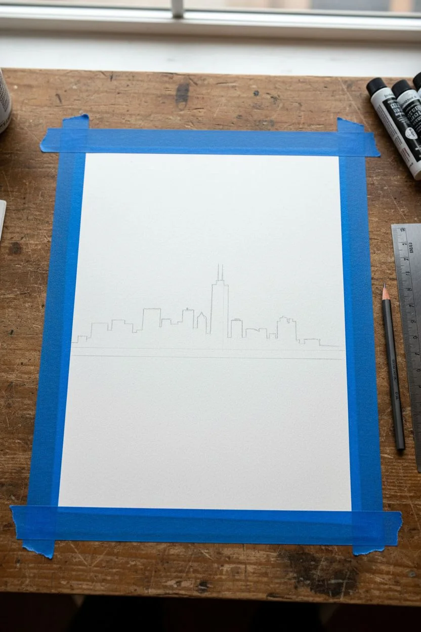
Capture the magic of an urban sunset with this striking watercolor silhouette. By blending a soft, fiery gradient sky behind crisp black architectural shapes, you can create a dramatic contrast that perfectly mimics the end of a day in the city.
Step-by-Step Guide
Materials
- Cold press watercolor paper (cut to roughly 4×8 inches)
- Watercolor paints (Cerulean Blue, Alizarin Crimson, Cadmium Yellow, Lamp Black)
- Painter’s tape or masking tape
- Soft round brush (size 6 or 8) for washes
- Fine detail brush (size 0 or 00) for buildings
- Pencil and eraser
- Ruler
- Water cups and paper towels
- White mat board frame (optional, for display)
Step 1: Setting the Scene
-
Prepare your paper:
Begin by taping down the edges of your watercolor paper to a flat, sturdy surface. This prevents the paper from buckling when wet and creates a clean white border around your painting. -
Sketch the horizon:
Using a ruler, lightly draw a straight horizon line about a quarter or third of the way up from the bottom of the paper. Keep this line very faint so it doesn’t show through later. -
Draft the skyline:
Lightly sketch the outlines of the skyscrapers. Focus on the distinct shapes: the tall, antenna-topped Willis Tower in the center and the surrounding blocky structures. Don’t worry about details like windows; just capture the overall silhouette shapes.
Clean Edges Trick
If you struggle with shaky hands on straight building edges, use a small piece of painter’s tape to mask the vertical sides of the skyscrapers while painting.
Step 2: Painting the Sunset Sky
-
Wet the sky area:
With your larger round brush and clean water, gently wet the entire sky area above your pencil line. The paper should be glistening but not forming puddles. -
Apply the blue:
Load your brush with a watery mix of Cerulean Blue. Paint a horizontal strip across the very top of the sky, letting the color bleed naturally downward into the wet paper. -
Blend into pink:
Rinse your brush and pick up Alizarin Crimson. Paint a horizontal strip just below the blue, allowing the edges to touch and blend softly to create a violet transition. -
Add the yellow glow:
Near the horizon line (but slightly above the building sketch lines), apply a wash of warm pale yellow or orange. Let this blend upwards into the pink for a glowing sunset effect. -
Create cloud streaks:
While the paint is still damp, you can lift out some color with a thirsty, dry brush or add faint streaks of slightly darker purple-pink to mimic wispy clouds stretching across the sky. -
Let it dry completely:
This is crucial. The paper must be bone dry before you start painting the black buildings, or the black paint will bleed into your beautiful sky gradient.
Make It Sparkle
Once the black silhouette is fully dry, use a white gel pen to add tiny dots of ‘lights’ in a few windows or street lamps at the base for a nighttime city vibe.
Step 3: Creating the Silhouette
-
Prepare the black paint:
Mix a rich, opaque black using Lamp Black. Unlike the sky, you want this paint to be fairly saturated with less water to ensure solid coverage. -
Outline the buildings:
Switch to your fine detail brush. Carefully outline the tops of the buildings first, paying close attention to the antennas on the tallest tower. Keep your hand steady and use the very tip of the brush. -
Fill in the shapes:
Once the delicate outlines are done, fill in the bodies of the buildings with solid black. Work from left to right (if you are right-handed) to avoid smudging your fresh paint. -
Add the tree line:
At the base of the buildings, dab your brush to create a slightly uneven, textured edge. This represents the tree line or smaller structures along the waterfront.
Step 4: The Water Reflection
-
Base wash for water:
Beneath the black skyline, paint a wash of very diluted brown or greyish-yellow. This represents the murky water reflecting the ambient light. -
Add ripples:
While the base wash is damp, use a detail brush with slightly darker grey paint to add horizontal lines. These lines mimic the gentle ripples of the water surface. -
Deepen the shadows:
Right underneath the darkest buildings, add a few stronger horizontal strokes of black or dark grey into the water to show the direct reflection of the large shadows. -
Final touches:
Allow the entire piece to dry completely. Once dry, carefully peel away the painter’s tape at a 45-degree angle to reveal your crisp white border. -
Frame it:
Place your finished artwork inside a white mat board frame to give it a professional, gallery-ready appearance.
Now you have a stunning miniature skyline that captures the peaceful transition from day to night
BRUSH GUIDE
The Right Brush for Every Stroke
From clean lines to bold texture — master brush choice, stroke control, and essential techniques.
Explore the Full Guide
Row of Trees Rhythm
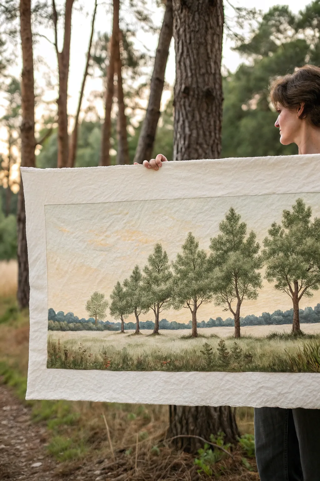
This peaceful landscape captures the serene rhythm of a row of trees using the soft, tactile medium of needle felting, though it can also be achieved with textured acrylics. The piece features a gentle gradation of trees receding into the distance, set against a creamy, subtly textured sky.
Step-by-Step Tutorial
Materials
- Large sheet of thick, cream-colored wool felt or heavy textured watercolor paper (approx. 24×36 inches)
- Wool roving in various shades of green (olive, sage, forest), brown, and cream
- Felting needles (coarse and fine gauges)
- Felting foam pad or brush mat
- Fabric stiffener or dilute PVA glue (optional, for mounting)
- Soft pastels or fabric paints (for sky shading)
- Fine detail brush (if using paint)
- Matte fixative spray
Step 1: Preparing the Foundation
-
Establish the Horizon:
Lay out your large felt sheet on a flat surface. Lightly mark a horizon line about one-third of the way up from the bottom using a disappearing fabric marker or pale chalk. -
tint the sky:
To create the warm, hazy sky, gently rub soft yellow and cream pastels into the upper two-thirds of the sheet. Blend them with your fingers or a soft cloth so the transition is seamless and cloud-like. -
Seal the background:
Spray a light coat of matte fixative over the pastel sky to prevent it from smudging while you work on the trees. Let this dry completely before proceeding.
Wool blending tip
Never use a single color of wool straight from the bag. Always card or hand-blend at least two shades (e.g., olive and brown) together for a more organic, painterly look.
Step 2: Felting the Foliage
-
Draft the tree placement:
Sketch the positions of your trees. Start with the largest tree on the far right, and space them out moving left, making each subsequent tree slightly shorter to create a sense of perspective. -
Base layer for trunks:
Take thin wisps of brown wool roving. Roll them between your palms to create varying thicknesses for the trunks. Needle felt these onto your marked lines, ensuring the rightmost trunk is the thickest. -
Adding branches:
Tease out thinner strands of brown wool for the main branches. Felt these attached to the trunks, angling them upwards in a V-shape, typical of deciduous trees. -
Creating canopy volume:
Mix olive and sage green wool roving together to create a natural, dappled color. Place loose cloud-like clumps of this mix over the branch structures. -
Securing the leaves:
Using a multi-needle tool if you have one, or a coarse single needle, tack down the green foliage. Don’t over-felt; keep the texture somewhat loose and puffy to resemble leaves. -
Shadows and highlights:
Add small bits of forest green to the lower right side of the tree canopies for shadow. Add tiny touches of lighter lime or cream green to the top left for sun highlights.
Step 3: Ground and Foreground
-
Distant tree line:
For the far background horizon, felt a very thin, hazy strip of blue-grey and dark green wool. This should look out of focus compared to your main trees. -
Field base layer:
Cover the bottom third of the canvas with horizontal layers of cream and pale beige wool. Felt this down firmly to create a smooth, grassy base. -
Texturing the grass:
Overlay thin wisps of greens and browns vertically in the immediate foreground to suggest tall grasses. I like to leave the ends slightly loose here for extra dimension. -
Grounding the trees:
Add darker patches of brown and dark green wool right at the base of each tree trunk to visually anchor them to the ground.
Add sunset glow
Before felting the trees, lightly wet-felt a sheer layer of apricot silk fiber across the sky area. This adds a subtle shimmer that mimics the golden hour light.
Step 4: Refining Details
-
Sharp branch details:
Use a single fine-gauge needle to tightly felt any exposed branch tips or trunk edges that look too fuzzy. This crispness will make the trees pop. -
Foreground variety:
Add tiny speckles of red or yellow wool in the bottom corners to suggest wildflowers amidst the tall grass. -
Final texture check:
Hold the piece upright. If any wool droops, tack it down more firmly with your needle. -
Mounting:
If you plan to hang this without a frame, you can stiffen the back with fabric stiffener, or sew a simple sleeve on the back for a dowel rod.
Step back and admire the gentle perspective you have created with just wool and a needle
Wide Forest Edge at Golden Hour
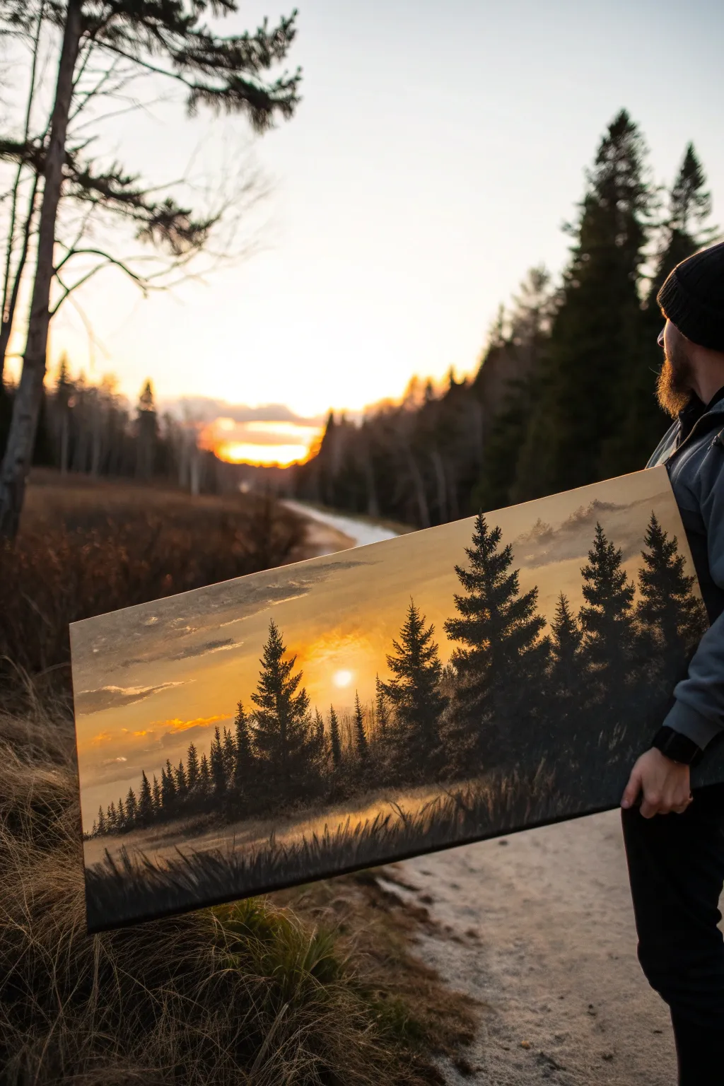
Capture the serene beauty of a waking forest with this wide-format landscape painting. The dramatic contrast between the glowing golden sky and the deep, shadowed pines creates a striking piece that brings warmth to any room.
Step-by-Step Guide
Materials
- Wide rectangular canvas (e.g., 12×24 or 15×30 inches)
- Acrylic paints: Titanium White, Cadmium Yellow, Yellow Ochre, Burnt Sienna, Burnt Umber, Mars Black
- Large flat brush (2-inch)
- Medium angle brush
- Fan brush (optional but helpful for trees)
- Small liner brush
- Palette knife
- Water cup and paper towels
- Easel or flat painting surface
Step 1: Setting the Sky
-
Prime the Surface:
Ensure your wide canvas is clean and ready. Apply a thin coat of white gesso if the surface isn’t pre-primed, allowing it to dry completely to ensure smooth blending later. -
Mix the Golden Gradient:
Prepare a gradient palette. Mix a large amount of Cadmium Yellow with a touch of Titanium White for the brightest area. Create a second mix of Yellow Ochre with a tiny dot of Burnt Sienna for the darker, moody clouds. -
Apply the Base Sky:
Using your large flat brush, paint the entire sky area. Start with the brightest yellow mix in the bottom center where the sun will be, radiating outward. While the paint is wet, blend in the darker ochre mix towards the top corners and outer edges to create depth. -
Add Cloud Layers:
With a dry, clean brush, pick up a very small amount of gray-purple (mix White, a touch of Black, and Burnt Sienna). Gently scumble horizontal streaks across the upper sky to suggest distant, hazy clouds floating above the sunrise. -
Paint the Sun:
Once the background is tacky but not fully dry, use your finger or a small round brush with pure Titanium White to tap in a soft, circular sun disc low on the horizon, slightly off-center. Blend the edges very softly into the surrounding yellow so it glows rather than looks like a sticker.
Muddy colors?
If your sky turns green when mixing clouds into the yellow, your brush may have had blue residue or your ‘black’ has blue undertones. Let the yellow layer dry completely before adding dark clouds.
Step 2: Creating Atmosphere
-
Lay the Misty Foundation:
Mix a hazy gray-brown using White, Burnt Umber, and a touch of Yellow Ochre. Apply this horizontally along the bottom third of the canvas, blending it upwards into the yellow sky to create a foggy horizon line. -
Deepen the Horizon:
Glaze a transparent layer of Burnt Sienna over the lower mist area. This warmth suggests the sun penetrating the low-lying fog.
Level Up: Texture
Use a palette knife to scrape in thin, vertical birch tree trunks among the dark pines. The sharp white lines will pop dramatically against the dark, misty forest background.
Step 3: The Forest Line
-
Mix the Tree Color:
Create a deep, nearly black green. Mix Mars Black with a little Burnt Umber and just a hint of Yellow Ochre to warm it up slightly. It should look like a silhouette color. -
Establish Vertical Lines:
Using the chisel edge of your medium angle brush, paint vertical lines to mark the trunks of your trees. Vary the heights significantly, grouping taller trees on the right and gradually getting shorter towards the left to mimic natural growth visually receding. -
Build Tree Foliage:
Switch to a fan brush or use the corner of a flat brush. Tap the paint onto the canvas starting from the top of a trunk and working down in a zigzag motion. Keep the tops narrow and pointy, widening the branches as you descend. -
Vary Density:
I find it helpful to leave some gaps in the branches so the golden sky peeks through. Make the trees on the far right heavy and detailed, while the distant trees on the left should be smaller, lighter in color (mix in some background mist color), and less detailed. -
Add Foreground Grassy Texture:
At the very bottom edge, use the dark tree mix and a fan brush to flick upwards, creating tall, shadowed grasses hitting the bottom of the canvas. This grounds the scene.
Step 4: Final Details
-
Highlight the Fog:
Clean your brush thoroughly. Take a transparent wash of Titanium White and Yellow and lightly glaze over the ‘feet’ of the trees where they meet the ground. This pushes the base of the trees back into the mist. -
Sunlight Glints:
Mix a warm orange brightness. Use a liner brush to add tiny rim lights on the right-side branches of the largest trees, suggesting the strong backlight hitting them. -
Refining the Grass:
Add a few lighter strokes of Ochre mixed with White to the foreground grass tips to show where the light catches.
Step back and admire how the light seems to break through the trees, inviting you into a quiet morning walk

PENCIL GUIDE
Understanding Pencil Grades from H to B
From first sketch to finished drawing — learn pencil grades, line control, and shading techniques.
Explore the Full Guide
Desert Dunes and Wind Lines
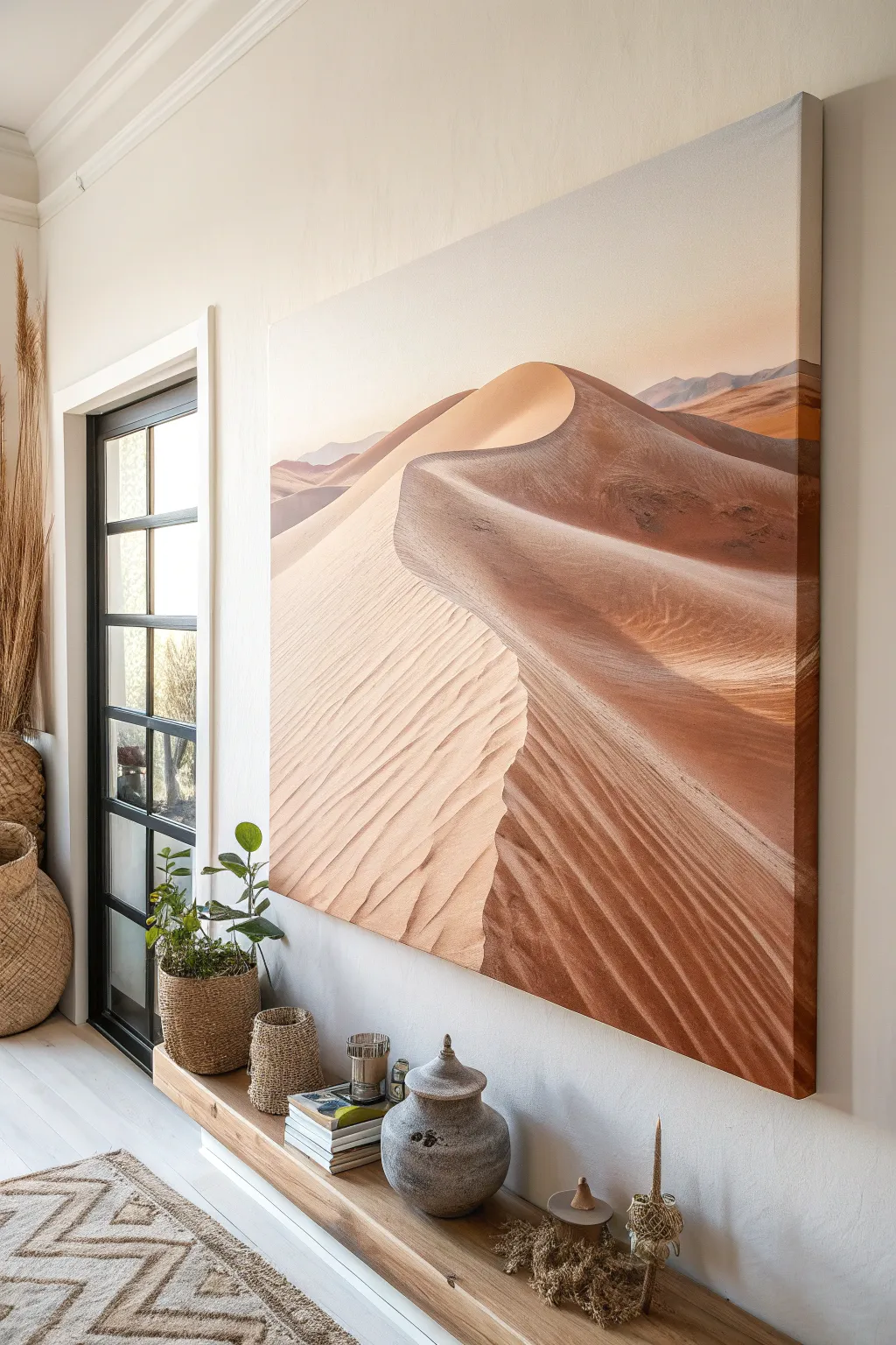
Capture the serene warmth of the desert with this large-scale acrylic painting, featuring soft gradients and crisp shadow lines. The focus is on creating depth through masterful blending and capturing the rhythmic patterns of wind-blown sand.
Step-by-Step Tutorial
Materials
- Large rectangular canvas (36×48 inches or larger)
- Acrylic paints: Burnt Sienna, Raw Umber, Yellow Ochre, Titanium White, Napthol Red Light, Ultramarine Blue
- Large flat brush (2-3 inch)
- Medium filbert brush
- Small round brush for details
- Slow-drying blending medium or retarder
- Palette knife
- Water container and rags
- Easel or flat working surface
Step 1: Sky and Horizon
-
Prime the background:
Begin by dampening your large brush slightly. Mix a generous amount of Titanium White with a tiny touch of Napthol Red and Yellow Ochre to create a very pale, warm peach color. -
Paint the gradient sky:
Starting at the top of the canvas, apply the peach mixture. As you move downward towards the horizon line (about 1/3 down the canvas), gradually mix in more white and a speck of blue to cool it down slightly, creating an atmospheric fade. -
Establish the horizon:
While the sky dries, mix ultramarine blue, burnt sienna, and white to make a muted, distant purple-grey. Paint the faint, jagged outlines of distant mountains along the horizon line, keeping the edges soft to suggest distance.
Step 2: Forming the Main Dune
-
Map the S-curve:
Using a diluted wash of Burnt Sienna and a medium brush, sketch the primary ‘spine’ of the large dune. This should be a sweeping S-curve that starts high on the right and snakes down towards the bottom left. -
Block in shadow areas:
Identify the side of the dune facing away from the light. Mix Burnt Sienna with a touch of Ultramarine Blue to create a deep, rich shadow tone. Apply this boldly to the right side of your spine line. -
Block in light areas:
Mix Yellow Ochre, Titanium White, and a hint of Napthol Red for the sunlit side of the dune. Paint the left side of the spine, ensuring you don’t blend it with the shadow yet. -
Refine the spine edge:
The magic of a sand dune is the sharp crest. taking a clean, smaller brush, carefully refine the meeting point between your light and dark blocks. This line should be crisp and sharp.
Muddy Shadows?
If shadows look grey or dirty, stop adding black. Mix complementary colors (orange/blue) instead for rich darks. Let distinctive layers dry before glazing over them.
Step 3: Texture and Details
-
Create the secondary ridge:
Add a second, lower swooping line in the foreground using your shadow color. This creates the layered effect of dunes stacked in front of one another. -
Start the wind ripples:
Mix a glaze using blending medium and a slightly darker version of your light sand color. Using a small round brush, paint thin, rhythmic lines across the sunlit face of the dune. -
Follow the contour:
Ensure your ripple lines curve slightly to wrap around the form of the sand mountain. They shouldn’t be straight; they must follow the volume of the earth. -
Soften the ripples:
Before the ripple lines dry completely, use a dry, soft filbert brush to gently sweep over them in the direction of the wind. This blurs the edges just enough to look like shifting sand rather than stripes. -
Deepen the shadows:
Go back into the darkest shadow areas on the right. I find that adding a glaze of pure Burnt Sienna here mimics the glow of reflected light bouncing inside the shadows.
Add Golden Hour Glow
Once fully dry, glaze the entire sunlit side with a very thin transparent layer of Indian Yellow or Zinc White to simulate that intense late-afternoon desert heat.
Step 4: Final Atmosphere
-
Highlight the crest:
Mix almost pure Titanium White with a tiny dab of yellow. Carefully drag the side of a palette knife or a firm brush along the very sharpest top edge of the dune spine to catch the sun. -
Connect to the foreground:
In the bottom right corner, paint larger, coarser ripples using darker browns to simulate perspective—details look bigger when they are closer to the viewer. -
Dusty haze:
Create a very watery wash of your sky color. lightly glaze the most distant part of the dunes where they meet the mountains to push them back into the atmospheric perspective. -
Final smooth out:
Check the large gradients on the sunlit side. If the transition from the bright crest to the bottom of the slope feels too rough, use a large, dry blending brush to gently unify the tones while the paint is tacky. -
Varnish:
Once the painting is fully cured (give it a few days), apply a satin varnish to unify the sheen of the different paint mixtures and protect those delicate gradients.
Step back and admire how the simple curves transform into a vast, warm landscape on your wall
Color Spectrum Across the Canvas
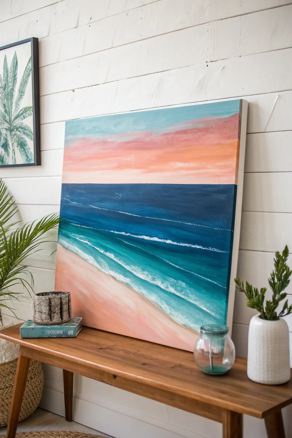
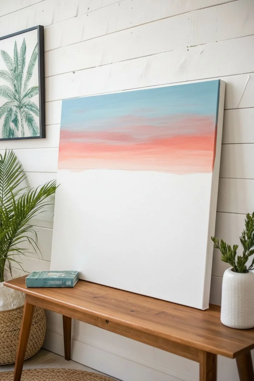
Capture the serene beauty of a coastal sunset with this vibrant abstract seascape painting. Featuring soothing horizontal bands of coral, deep navy, turquoise, and soft peach, this artwork brings a relaxing, modern beach vibe to any room.
How-To Guide
Materials
- Large square canvas (approx. 24×24 inches)
- Acrylic paints (Titanium White, Phthalo Blue, Turquoise, Deep Navy, Coral, Peach/Flesh Tone, Burnt Sienna)
- Large flat brush (2-3 inch)
- Medium flat brush (1 inch)
- Small round brush for details
- Palette knife or paper plate for mixing
- Cup of water and paper towels
- Painter’s tape (optional for horizon line)
Step 1: Setting the Scene & Sky
-
Prepare the Horizon:
Visualize your canvas divided into thirds. You can lightly sketch a horizontal line about one-third of the way down from the top to mark the horizon line where the sky creates a boundary with the sea. -
Mix the Sky Blue:
Start by mixing a very pale, dusty blue using Titanium White and a tiny dot of Turquoise or Phthalo Blue. Apply this to the very top edge of the canvas using your large flat brush. -
Transition to Sunset Colors:
While the blue is still slightly wet, clean your brush and pick up some coral pink paint. Blend this into the blue area, moving downward. Let the colors meet and streaks appear naturally; don’t overblend or it will turn muddy. -
Deepen the Sunset:
As you move lower in the sky section, switch to a more vibrant peach or salmon color. Paint horizontal strokes all the way down to your horizon line. The sky should transition from cool blue at the top to warm pinks near the water.
Fixing Muddy Blends
If sky colors turn gray while blending blue and orange, let the blue layer dry completely first. Then, glaze the orange over it for a clean transition.
Step 2: Creating the Deep Ocean
-
Establish the Horizon:
Using a straight edge or steady hand, paint a sharp line of Deep Navy Blue right at the horizon mark. This dark line anchors the painting. -
Fill the Deep Water:
Continue painting a block of this dark Deep Navy Blue downwards for about a third of the remaining space. Use long, confident horizontal strokes to mimic the vastness of the ocean. -
Add Ocean Textures:
Mix a slightly lighter shade of blue and gently streak it horizontally through the dark navy area while wet. This adds subtle movement to the deep water so it doesn’t look flat.
Texture Boost
Mix specific texture medium or styling paste into your white paint for the wave crests. It adds physical ridges that catch the light like real foam.
Step 3: Shallows & Shoreline
-
Mix the Turquoise Gradient:
Clean your large brush thoroughly. Mix a bright Turquoise with a little Titanium White. Start painting below the navy section, blending the edge where they meet slightly to create a gradient. -
Create the Surf Line:
Add more white to your turquoise mix as you move diagonally downward toward the bottom left corner. The water should get significantly lighter as it approaches the ‘sand’. -
Paint the Sand:
For the bottom left corner section, mix Peach/Flesh Tone with a tiny touch of Burnt Sienna and plenty of White. Paint this triangular wedge to represent the wet sand. -
Blend the Water’s Edge:
Where the light turquoise water meets the peach sand, gently blend the two wet paints together. The goal isn’t a hard line, but a soft, wet look where the water is thin over the sand.
Step 4: Detailing the Waves
-
White Water Lines:
Using a smaller flat brush or the edge of your large brush, load up pure Titanium White. Paint thin, slightly jagged horizontal lines across the blue and turquoise sections to represent breaking wave crests. -
Foam Textures:
Focus heavier white application near the shoreline transition. Dab the brush to create the frothy texture of sea foam washing up on the sand. -
Layering the Waves:
Add a second, thinner line of white further out in the deep blue section. Make this line very thin and broken, suggesting a distant wave catching the light. -
Highlight the Wet Sand:
Mix a very watery white glaze (lots of water, little paint). I like to lightly brush this over parts of the peach sand to make it look glistening and recently washed over by a wave. -
Final Adjustments:
Step back and look for balance. If the horizon looks crooked, fix it now with the dark navy. If the sky needs more warmth, gently dry-brush a little extra pink over the dry layers.
Let your beautiful new seascape dry completely before hanging it to bring a breath of fresh ocean air to your space


Have a question or want to share your own experience? I'd love to hear from you in the comments below!