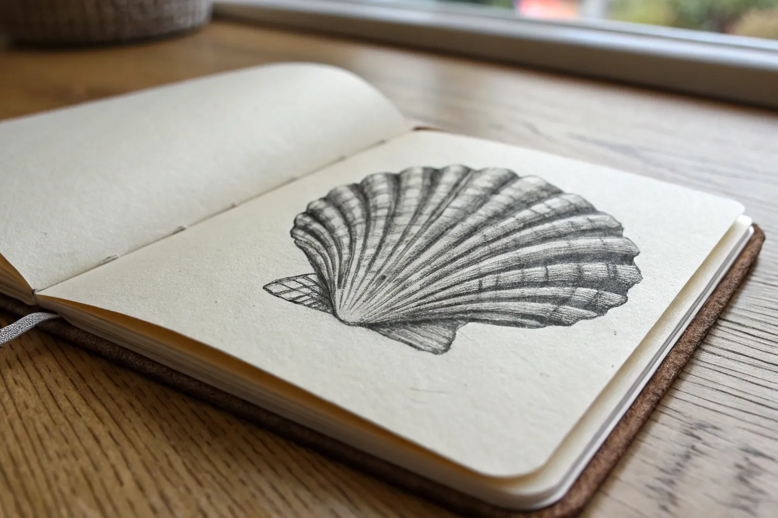
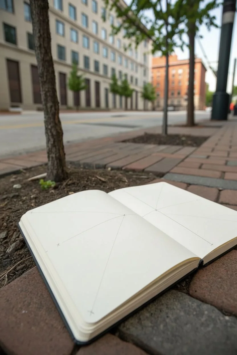
If you’re past simple outlines but not trying to go full photorealism every time, these intermediate drawing ideas are the sweet spot. I pulled together projects that feel impressive, but each one focuses on a few clear skills like shading, texture, and perspective so you can level up without spiraling.
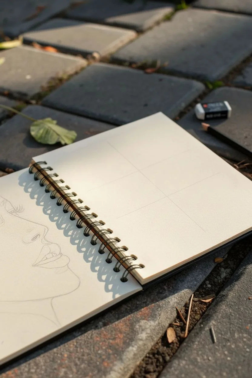
Realistic Eye Study in Time Blocks
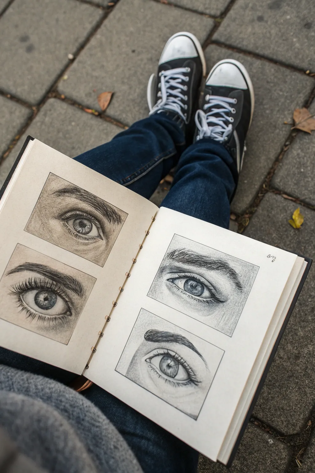
Master the intricacies of drawing human eyes by creating a dedicated study page featuring four distinct angles and expressions. This project focuses on capturing realistic textures like iris patterns, eyelashes, and skin folds using graphite pencils.
Step-by-Step Tutorial
Materials
- High-quality sketchbook (heavyweight paper)
- Graphite pencils (HB, 2B, 4B, 6B)
- Mechanical pencil (0.5mm, HB or 2B)
- Kneaded eraser
- Precision eraser or eraser stick
- Blending stumps (tortillons)
- Ruler
- Tissue or cotton swab
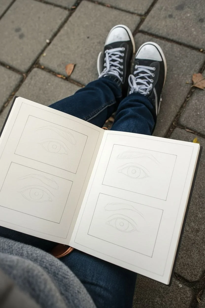
Step 1: Layout and Composition
-
Prepare the grid:
Begin by lightly measuring four rectangular boxes in your sketchbook using a ruler. Arrange them in a 2×2 grid or spaced out evenly to allow room for detailing. -
Basic outlining:
Using an HB pencil with very light pressure, sketch the basic almond shape of the eye within each box. Vary the shapes slightly; make one wider, one narrower, or one looking in a different direction. -
Adding landmarks:
Mark the position of the iris and pupil. Remember that the upper eyelid usually covers the very top of the iris, preventing that ‘staring’ look. -
Establish the creases:
Sketch the upper eyelid crease and the lower lid line. These lines define the volume of the eye socket and shouldn’t be too harsh yet.
Step 2: Shading the Iris and Pupil
-
Deepen the pupil:
Use a 4B or 6B pencil to fill in the pupil, making it the darkest point of the drawing. Leave a tiny, crisp white shape for the catchlight (reflection). -
Radiating texture:
With a mechanical pencil, draw fine lines radiating outward from the pupil toward the outer edge of the iris. Varied pressure creates a natural, fibrous look. -
Darkening the ring:
Shade the outer ring of the iris (the limbal ring) with a 2B pencil. It should be softer and slightly darker than the inner iris texture. -
Create depth:
Add a cast shadow from the upper eyelid onto the top of the iris and the white of the eye (sclera). This instantly makes the eye look spherical rather than flat.
Fixing Flat Eyes
If the eye looks flat, the sclera (white part) is too white. Shade the corners and under the lid with a blending stump to curve the form.
Step 3: Skin Texture and Definition
-
Shade the eyeball:
Lightly shade the corners of the ‘white’ of the eye using a dirty blending stump. The eyeball is a sphere, so the corners recede into shadow. -
Sculpt the eyelids:
Using an HB pencil, shade the skin around the eye. I find it helpful to focus on the ‘valley’ of the upper crease, making it darker, and highlighting the fleshy part of the lid. -
Eyebrow foundation:
Lightly map out the shape and flow of the eyebrow hairs. Don’t draw individual dark hairs yet; just lay down a soft base tone. -
Define the eyebrow hairs:
Switch to a sharp 2B pencil. Draw individual brow hairs in quick, flickering strokes following the direction of growth.
Try Different Mediums
Level up by drawing one eye in graphite, one in charcoal, one in colored pencil, and one in ink to study how different tools handle texture.
Step 4: Final Details and Lashes
-
Draw upper lashes:
Using a sharp 4B pencil, draw the upper eyelashes. Start the stroke at the root (lid line) and flick upward, curving them slightly. Clump a few lashes together for realism. -
Add lower lashes:
Draw the lower lashes with a lighter touch. These should grow out from the outer edge of the lower waterline, not directly from the eyeball. -
Refine the skin:
Add tiny crow’s feet or fine skin texture lines under the eye using a mechanical pencil. Soften these immediately with a stump so they don’t look like scratches. -
Touch up highlights:
Use a precision eraser to lift out highlights on the tear duct, the wetline of the lower lid, and the fleshy part of the brow bone. -
Clean borders:
Finally, take your ruler and re-trace the rectangular borders of your boxes with a firm line to make the drawings pop against the page.
Now you have a stunning reference sheet that shows off the subtle variations in human expression


Hair or Fur Direction Study
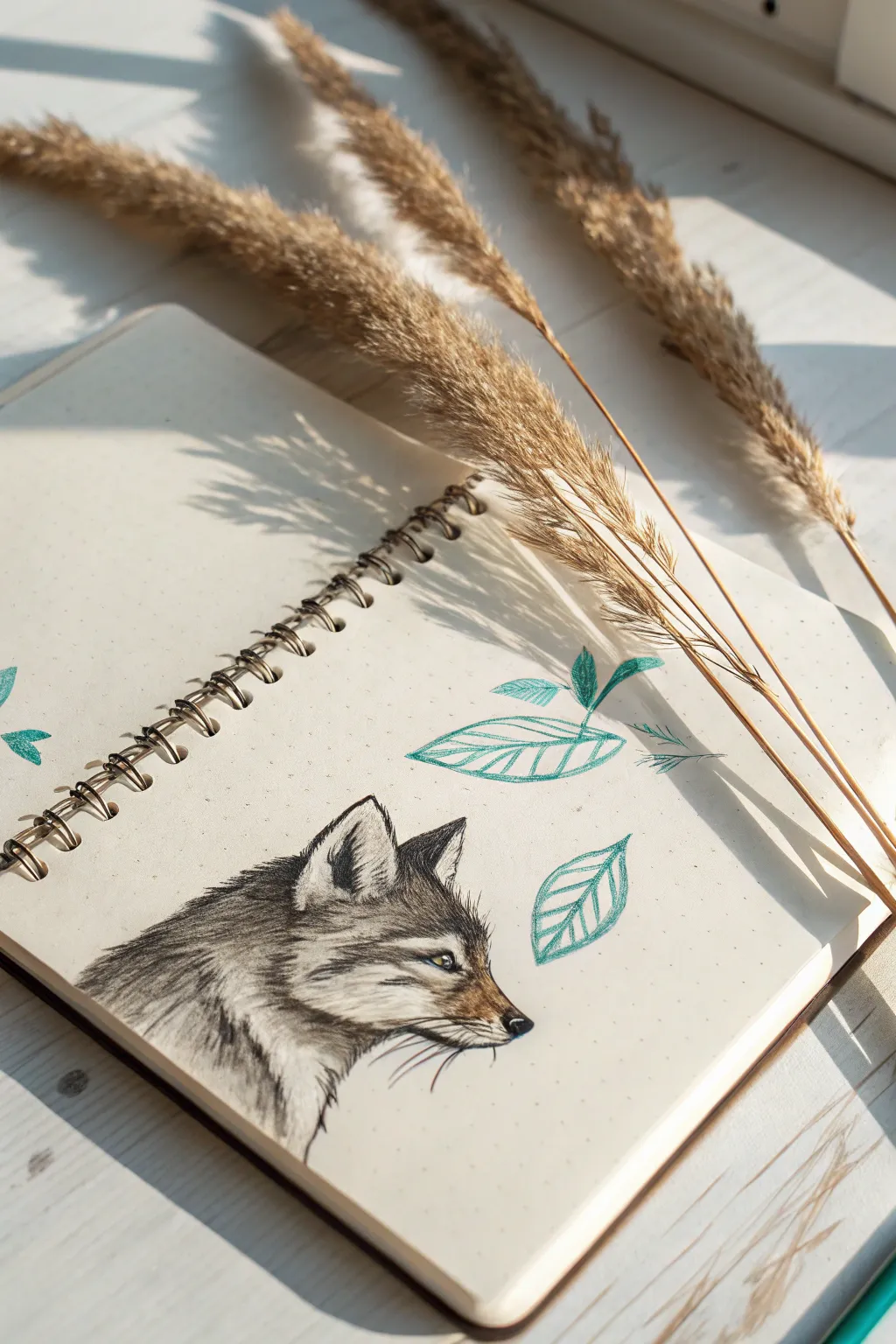
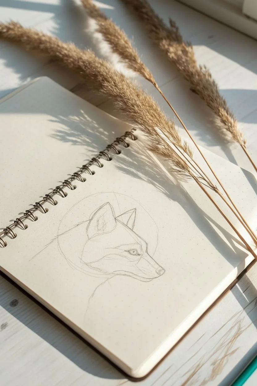
This study focuses on capturing the texture and direction of animal fur using a simple graphite sketch accented with stylized teal leaves. The juxtaposition of the realistic wolf head against the minimalistic botanical elements creates a striking, balanced composition on the dot grid page.
Detailed Instructions
Materials
- Spiral-bound dot grid notebook
- Graphite pencils (HB, 2B, 4B)
- Mechanical pencil (0.5mm) for fine details
- Teal or turquoise colored pencil
- Kneaded eraser
- Blending stump (optional)
Step 1: Structural Outline
-
Establish the head shape:
Start lightly with your HB pencil. Draw a circle for the main part of the skull and attach a triangular muzzle shape pointing to the right. -
Refine the profile:
Connect the forehead down to the nose bridge. Note that the bridge isn’t perfectly straight; it dips slightly before the nose tip. Sketch the triangular ear shape, keeping the lines faint. -
Place the features:
Mark the position of the eye. It should be almond-shaped and set back from the muzzle. Sketch the nose tip and the line of the mouth, ensuring the jawline curves naturally into the neck.
Fur looks flat?
Don’t shade with a solid block of grey. Every stroke should separate. If it gets muddy, erase a section and redraw clearer, individual directional lines.
Step 2: Fur Direction & Values
-
Map the fur flow:
Before shading, lightly draw arrows or faint lines to indicate which way the fur grows. On the muzzle, it flows back; on the neck, it flows downward and backward. -
Start the eyes:
Using a 2B pencil, darken the pupil and outline the eye. Leave a tiny white spot for the highlight to make the wolf look alive. -
Detail the muzzle:
Switch to your mechanical pencil. Use very short, quick flicking strokes to create the short fur on the nose bridge and cheeks. Keep these strokes tight together. -
Darken the markings:
Wolves often have darker fur around the eyes and ears. Use a 4B pencil to lay down darker values here, but remember to keep your edges soft and furry, not solid lines. -
Build the neck ruff:
The fur on the neck is longer and thicker. Use longer, sweeping strokes with the 2B pencil. I like to layer these strokes, lifting the pencil at the end of each motion to create tapered hair tips. -
Add deep shadows:
Go back into the deepest areas—inside the ear, under the jaw, and the markings behind the eye—with your darkest pencil to create contrast. -
Refine with eraser:
Take your kneaded eraser and mold it into a point. ‘Draw’ white hairs by lifting graphite out of the darker areas, especially on the cheek and inside the ear. -
Whiskers:
With a sharp point, add the whisker spots on the muzzle and draw a few long, curving whiskers. Make these lines confident and smooth.
Add a splash of life
Instead of graphite eyes, use an amber or yellow colored pencil for the iris. It creates a stunning focal point against the grey fur.
Step 3: Botanical Accents
-
Sketch leaf outlines:
Switch to your teal colored pencil. Draw two or three simple leaf shapes floating around the wolf head. Keep them loose and sketchy. -
Add veining:
Draw a central line down each leaf, then add diagonal shading strokes to suggest veins. Don’t color them in fully; use hatching lines for a stylized look. -
Final touches:
Review the drawing. If the teal leaves feel too light, go over the main outline once more to crisp up the edges.
This study captures the wild spirit of the wolf through careful attention to texture and flow


Flower Cluster With Overlapping Petals
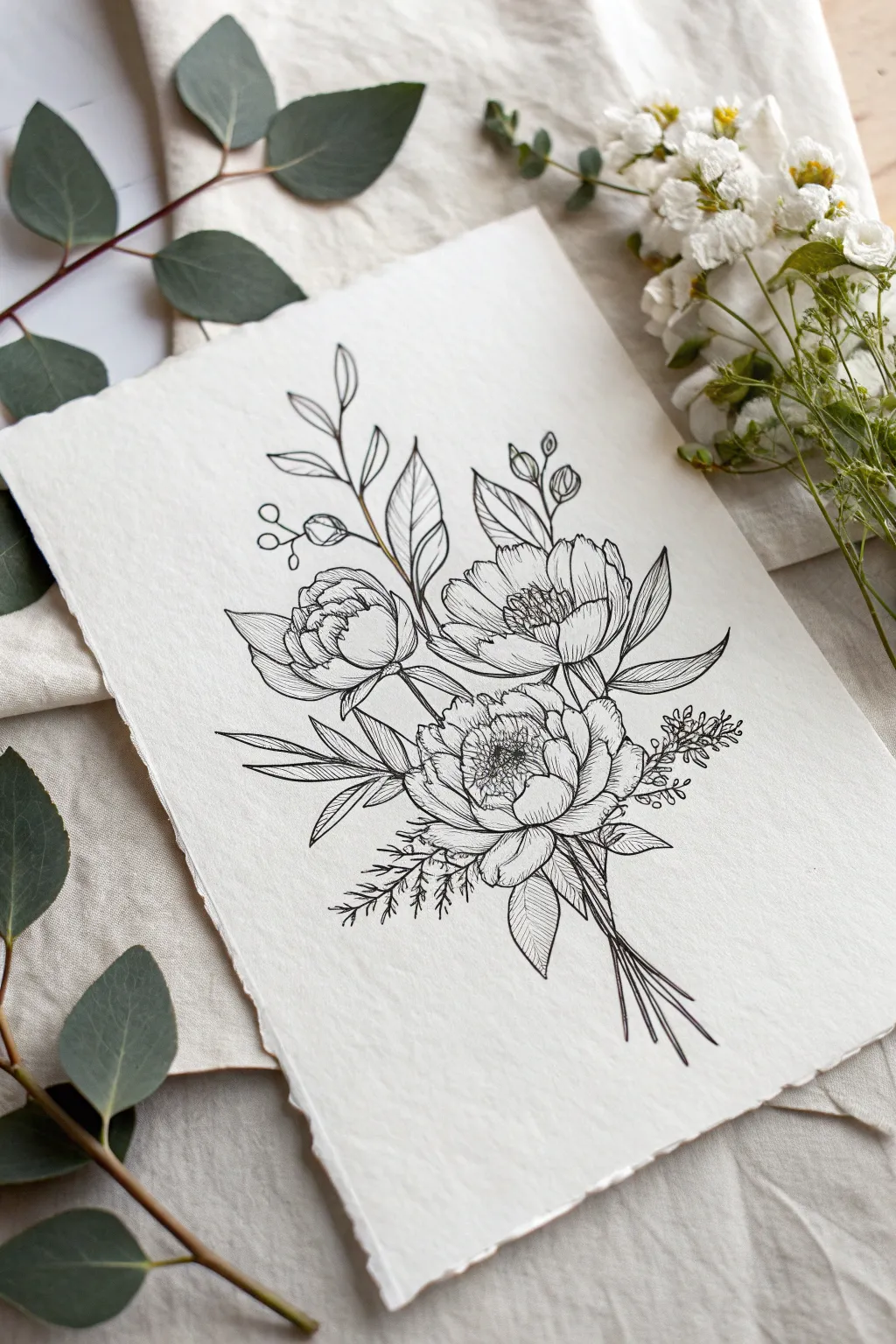
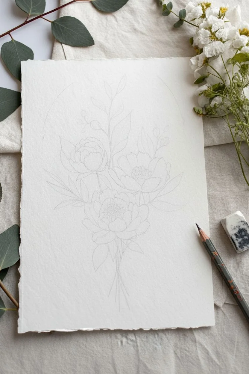
This elegant line drawing captures the delicate beauty of a floral cluster using precise ink work and confident strokes. The composition balances three large blooms with sweeping foliage, creating a timeless botanical illustration perfect for framing or card-making.
Step-by-Step Tutorial
Materials
- High-quality cotton rag or watercolor paper (cold press with texture)
- Pencil (HB or H for light sketching)
- Kneaded eraser
- Fine liner pens (0.1mm, 0.3mm, and 0.5mm nibs)
- Ruler (optional for finding center)
Step 1: Planning the Composition
-
Establish the framework:
Begin by lightly marking the general shape of your bouquet with a pencil. Draw three loose circles to represent the main flowers: one slightly left of center, one above it to the right, and the largest one anchoring the bottom center. -
Map out the stems:
Sketch a central axis line extending downwards where the stems will gather. From your flower circles, draw faint lines connecting them to this convergence point, creating a ‘hand-tied’ look. -
Add gesture lines for foliage:
Draw sweeping, curved lines extending outward from the bouquet center. Place two going upward (one left, one right) and two extending sideways to balance the composition.
Pro Tip: Line Variation
Use a thicker 0.5mm pen for the outermost edges of the whole bouquet and a thin 0.1mm for internal details. This creates visual weight and makes the drawing feel 3D.
Step 2: Drafting the Main Blooms
-
Sketch the bottom peony:
Start with the lowest, central flower. Sketch a tight cluster of petals in the middle, then add larger, cupped petals wrapping around them. Keep your pencil lines light and loose. -
Define the upper right bloom:
Move to the flower slightly above and to the right. This one is facing slightly more upward. Draw the overlapping petals so they look like a bowl opening up towards the sky. -
Outline the left flower:
Sketch the third flower on the left side, slightly smaller than the others. This one acts as a supporting element, so tuck it slightly behind the central bloom if needed. -
Refine the petal shapes:
Go back over your circles and give the petal edges some character. Make them slightly wavy or uneven to mimic real organic flower petals rather than perfect geometric shapes.
Step 3: Adding Foliage and Details
-
Insert large leaves:
Draw broad, pointed leaves nestling between the flowers. Add a few pointing downwards from the main bloom and a couple reaching upward to frame the top right flower. -
Sketch tall sprigs:
On the upward gesture lines you drew earlier, add small almond-shaped leaves for the taller foliage on the top left. Add simple buds on stems to the very top right. -
Include filler textures:
Sketch small, fern-like or berry textures on the right and left sides. These tiny details add contrast to the large smooth petals. -
Finalize stem bundle:
Clarify the stems at the bottom, ensuring they cross over each other naturally at a single binding point before flaring out slightly at the cut ends.
Level Up: Deckled Edges
To match the reference photo’s vintage feel, carefully tear the edges of your paper against a ruler instead of cutting perfectly straight with scissors.
Step 4: Inking and Refinement
-
Outline the main contours:
Switch to a 0.5mm pen. Carefully trace the outer edges of the main petals and the largest leaves. Use a confident hand, but don’t worry if the line breaks occasionally; it adds style. -
Detail the flower centers:
Using a finer 0.1mm pen, draw the stamens in the center of the open flowers. Use tiny circles and short dashes to create a dense, textured center. -
Add petal shading:
With the 0.1mm pen, add hatching lines at the base of the petals where they meet the center. Flick the pen outward quickly to create tapered lines that suggest curvature and shadow. -
Vein the leaves:
Draw a central line down each leaf with a 0.3mm pen. Add diagonal veins branching off. I find that keeping these lines slightly thinner than the outline prevents the drawing from looking too heavy. -
Texture the filler plants:
Ink the small berry sprigs and fern-like leaves with the 0.3mm pen. Keep these shapes simple to avoid cluttering the drawing. -
Erase and assess:
Once the ink is completely dry (wait at least 5-10 minutes to avoid smudges), gently erase all your pencil guides with the kneaded eraser. -
Final touches:
Look for areas that need more depth. Add a few more hatching lines with the 0.1mm pen in the deepest shadows between overlapping petals to make the image pop.
Now you have a stunning, permanent botanical illustration that captures the delicate complexity of nature on paper


Skull Study With Big Value Shapes
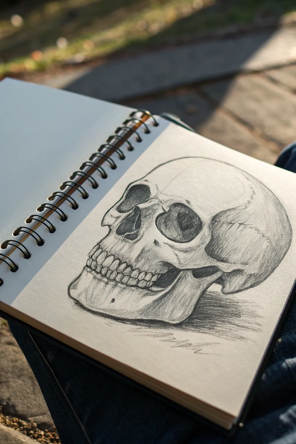
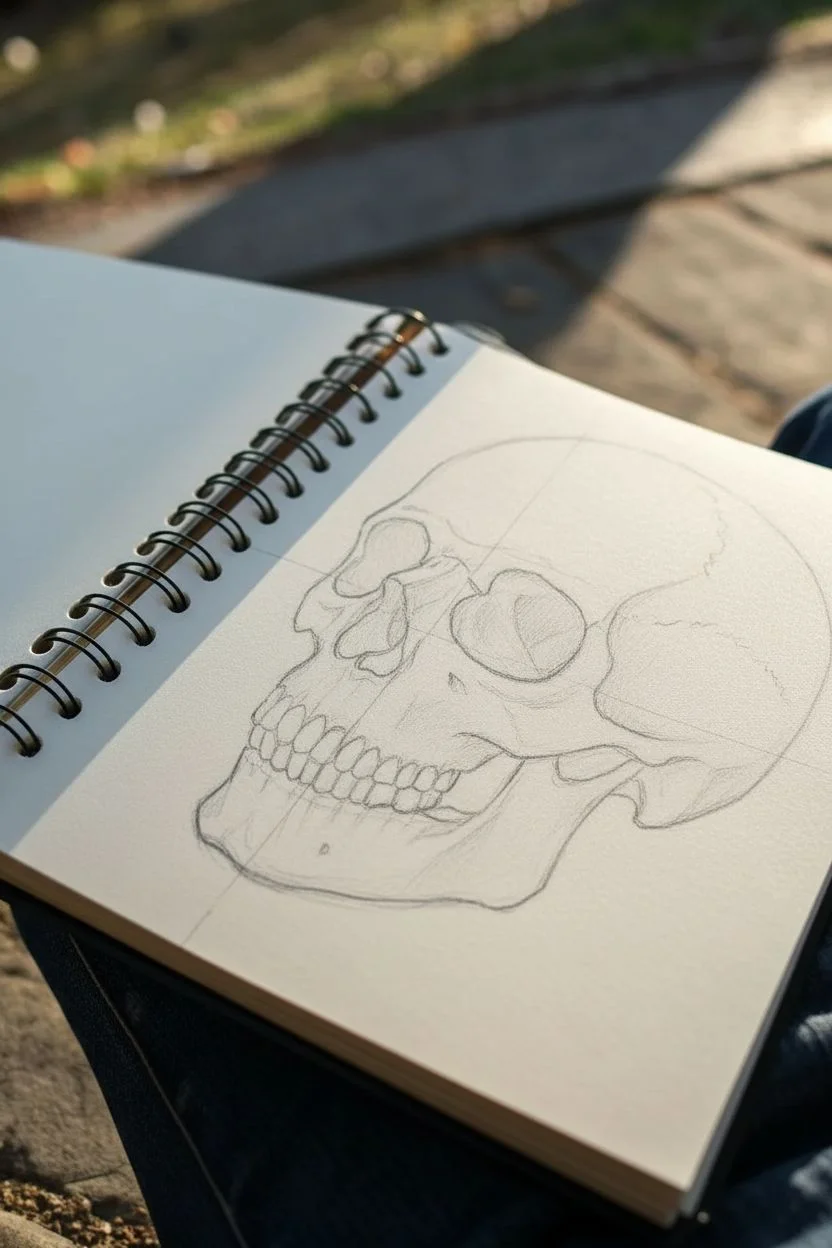
Master the art of skeletal structure with this striking 3/4 view skull study that builds form through distinct value shapes. Using simple graphite, you will learn to carve out deep shadows in the eye sockets while preserving the delicate highlights of the cranium.
Step-by-Step
Materials
- Sketchbook or drawing paper (medium tooth)
- HB Graphite pencil (for initial layout)
- 2B Graphite pencil (for general shading)
- 4B or 6B Graphite pencil (for deepest shadows)
- Kneaded eraser
- Pencil sharpener
Step 1: Structural Layout
-
Establish the Cranium:
Begin lightly with your HB pencil. draw a large, slightly flattened circle for the brain case (cranium). This will be the main mass of the skull. -
Map the Jaw Line:
Drop a vertical line down from the side of the cranium to mark the back of the jaw. Curve a line forward and down to suggest the mandible (lower jaw), keeping the chin slightly squared off. -
Divide the Face:
Draw faint guidelines to place features. A horizontal line across the center of your initial circle helps locate the brow ridge. Another line halfway down from the brow marks the bottom of the nose cavity. -
Outline the Eye Sockets:
Sketch the orbits (eye sockets). In this 3/4 view, the left socket appears more circular, while the right one is slightly compressed by the angle. Keep the shapes loose and organic; they aren’t perfect circles. -
Define the Nasal Cavity:
Draw the upside-down heart shape for the nasal cavity. Notice how the bone bridge separates the top slightly. Ensure it sits centrally between the two orbits. -
Sketch the Zygomatic Arch:
Connect the cheekbone (zygomatic arch) from the bottom of the outer eye socket back towards the ear hole area. This creates a distinct ridge on the side of the face.
Step 2: Refining Features
-
Detail the Teeth:
Lightly indicate the curve of the maxilla (upper jaw) and mandible. Instead of drawing individual teeth immediately, draw the ‘ribbon’ shape of the gum line first, then divide it vertically for teeth segments. -
Refine Bone Contours:
Go over your outer contour lines. Harden the edges around the brow ridge, the sharp turn of the cheekbone, and the angle of the jaw to make the bone look rigid. -
Add Cranial Sutures:
Draw the squiggly, jagged lines known as sutures towards the back of the skull. These organic lines add realism and texture to the smooth upper surface.
Value Shapes First
Don’t outline details like eyes first. Squint at your reference and draw the big shapes of shadow. If the shadow shape is right, the bone structure will emerge automatically.
Step 3: Shading and Form
-
Block in Darkest Values:
Switch to your 4B or 6B pencil. Fill in the eye sockets and the nasal cavity with strong, dark strokes. I prefer to leave small, irregular patches of light inside the nasal cavity to show inner bone structure. -
Under the Cheekbone:
Create a cast shadow underneath the zygomatic arch. This should be a stark, dark shape that helps the cheekbone pop forward three-dimensionally. -
Mid-Tone Shading:
Using the 2B pencil, add hatching to the side of the cranium and the jaw. Follow the curve of the bone with your pencil strokes to emphasize the roundness of the form. -
Defining the Teeth:
Darken the gaps between the teeth and the separation between upper and lower jaws. Keep the teeth themselves relatively light, shading only their undersides slightly to give them volume. -
Cast Shadow:
Ground the skull by drawing a horizontal cast shadow underneath the jaw. Use horizontal hatching strokes here to differentiate the flat surface from the curved bone. -
Final Contrast Check:
Deepen the shadows in the hollow of the temple and behind the jaw. Use your kneaded eraser to lift off any graphite smudge from the forehead and cheekbone highlights for maximum contrast. -
Signature Scrawl:
Add a loose, gestural signature or date near the bottom value mass to balance the composition.
Cross-Hatching Drama
Instead of blending smoothly, use distinct cross-hatching lines for the shadows on the side of the head. This adds an ‘old master’ study aesthetic to your sketchbook.
Now you have a solid anatomical study that captures the weight and density of bone

PENCIL GUIDE
Understanding Pencil Grades from H to B
From first sketch to finished drawing — learn pencil grades, line control, and shading techniques.
Explore the Full Guide
Portrait With Hat and Cast Shadows
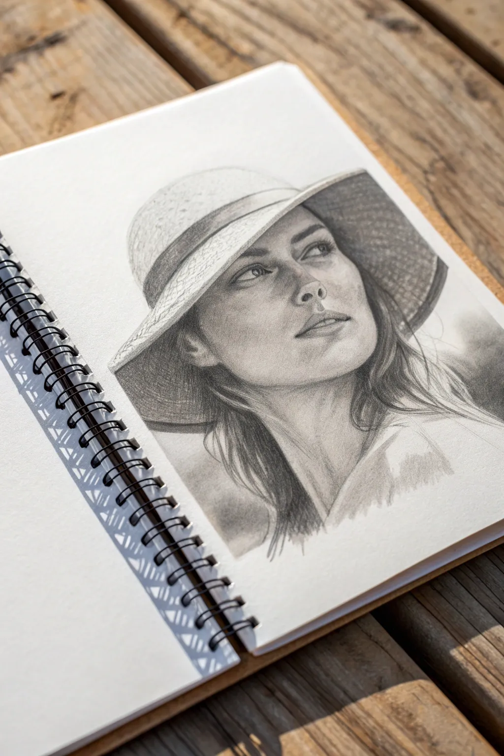
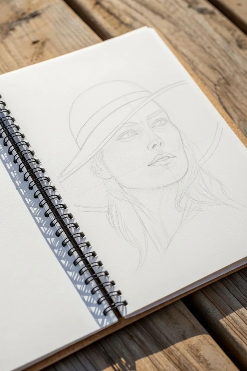
Capture the serene expression of a woman in a wide-brimmed hat with this intermediate pencil study. This project focuses on building realistic facial contours and mastering the interplay of light and shadow created by the hat’s brim.
Step-by-Step
Materials
- Spiral-bound sketchbook or drawing paper (heavyweight, smooth grain)
- Graphite pencils (range: HB, 2B, 4B, 6B)
- Kneaded eraser
- Precision eraser or eraser stick
- Blending stump (tortillon) or cotton swab
- Tissue for blending
- Pencil sharpener
Step 1: Initial Structure
-
Lay out the basic shapes:
Begin with an HB pencil to lightly sketch an oval for the head. Add a large, tilted ellipse cutting across the top third of the oval to represent the brim of the hat. -
Map the facial features:
Draw faint vertical and horizontal construction lines to center the face. Mark the eye line just below where the hat brim meets the forehead, and indicate the nose and mouth positions with simple dashes. -
Refine the outlines:
Sketch the specific contours of the jawline, the curve of the neck, and the flowing hair. Detail the hat’s brim, ensuring it wraps naturally around the head, and draft the ribbon band.
Tip: Lost Edges
For a softer look, don’t outline everything. Let the shadow on the hair merge with the dark underside of the hat brim to create a ‘lost edge’ that implies form without lines.
Step 2: Facial Features
-
Draw the eyes:
Switch to a sharp 2B pencil. Outline the almond shape of the eyes, paying attention to the upward gaze. Darken the pupils and iris, leaving small white spots for highlights. -
Nose and mouth construction:
Define the nostrils and the shadow under the nose rather than hard contour lines. Sketch the lips, keeping the upper lip slightly darker than the bottom one. -
Eye shading:
Use a 4B pencil to deepen the crease above the eyelid and the lash line. Softly blend the skin around the eyes with a stump for a realistic transition.
Step 3: Hair and Hat
-
Texture the hat:
Use cross-hatching or small, tight scribbles with an HB pencil to mimic the woven straw texture of the hat. Keep the top of the crown lighter where the sun hits it. -
Darken the brim shadow:
The inside of the brim casts a significant shadow. Use a 4B or 6B pencil to fill the underside of the hat, pressing firmly but evenly. -
Sketch hair strands:
Flowing from under the hat, draw the hair in grouped sections rather than individual strands. Use long, sweeping strokes that follow the hair’s wave pattern. -
Deepen hair values:
Darken the areas of hair closest to the neck and under the hat brim with your 6B pencil to create depth and volume.
Fixing Smudges
If you accidentally smudge the cheek with your hand, gently lift the graphite with a kneaded eraser (dab, don’t rub) and place a clean piece of paper under your hand.
Step 4: Shading and definition
-
Establish the main facial shadows:
Apply soft graphite layers (2B) to the side of the face away from the light source, under the chin, and along the neck. I find it helpful to squint at my reference to see these main shapes clearly. -
Cast shadow from the hat:
Critically, shade the upper forehead where the hat blocks the light. This shadow should be softer at the bottom edge but distinct enough to show form. -
Blend the skin:
Use a tissue or blending stump to smooth out the facial shading. Work in circular motions to avoid streaks, keeping the cheeks and nose bridge highlighted. -
Refine the lips:
Add vertical texture lines to the lips and darken the corners of the mouth. -
Sharpen contrast:
Go back in with your darkest pencil (6B) to punch up the darkest darks: the pupils, the nostrils, deep hair shadows, and the hat ribbon. -
Final highlights:
Use a precision eraser to lift out bright spots on the nose tip, the swell of the lip, and a few stray hairs catching the light.
Step back and admire how the cast shadows bring a sunny warmth to your finished portrait
Nose and Lips Mini Studies
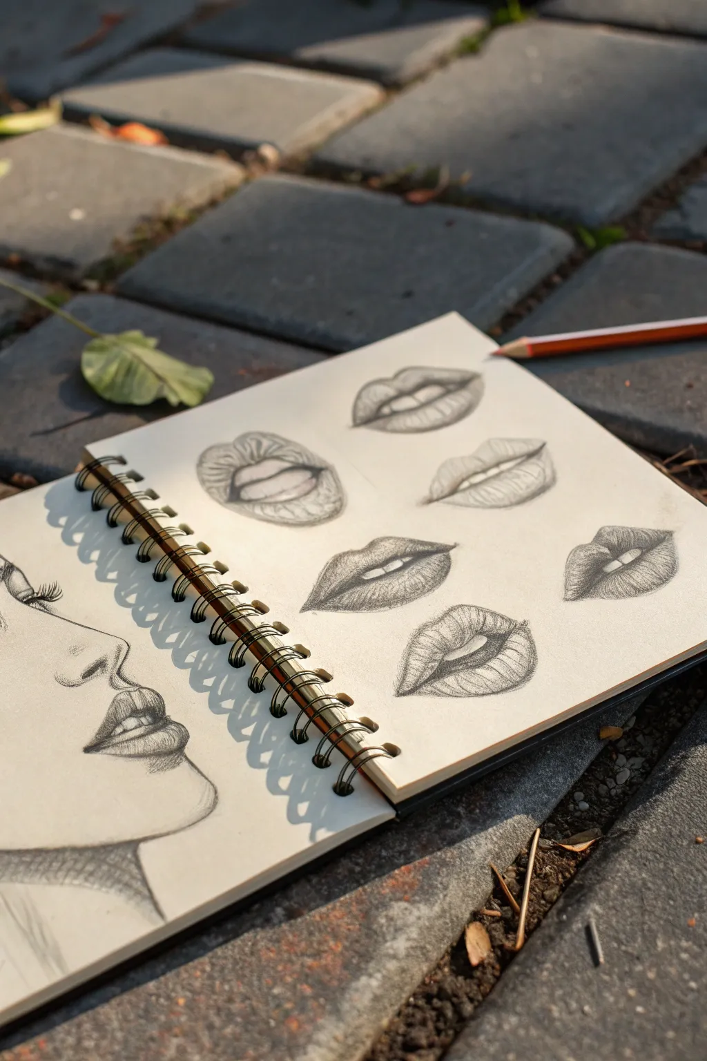
Master the subtleties of human facial features with this focused sketchbook study, capturing the delicate curves of the nose and the various expressions found in lip shapes. This project breaks down complex anatomy into manageable, bite-sized sketches perfect for practicing shading and volume.
Step-by-Step Tutorial
Materials
- Spiral-bound sketchbook (heavyweight paper preferred)
- Graphite pencils (HB, 2B, and 4B)
- Kneaded eraser
- Precision eraser (or eraser stick)
- Blending stump (optional)
- Pencil sharpener
Step 1: Profile Construction
-
Map the profile line:
On the left page of your sketchbook, start with a light HB pencil to draw a faint, sloping line that defines the angle of the face. This guide line will help you align the forehead, nose, lips, and chin. -
Block in the nose:
Sketch the triangular shape of the nose bridge, protruding outwards from your guide line. Keep the tip rounded and soft, and mark the position of the nostril with a small, curved semi-circle. -
Position the mouth:
Draw the ‘V’ shape of the cupid’s bow just below the nose, followed by the centerline of the mouth. Ensure the upper lip protrudes slightly more than the lower lip. -
Define the chin:
Sweep a curved line downward from the bottom lip to create the chin and jawline. Keep this line fluid to suggest the soft tissue covering the jawbone. -
Add the eye indication:
Sketch the side view of the eye, focusing heavily on the eyelashes. Draw thick, dark lashes curving upward and outward to give the eye dimension without needing to draw the entire eyeball.
Volume Trick
Make lips look 3D by shading strictly with curved lines that wrap around the form (like contour lines on a map) rather than flat back-and-forth shading.
Step 2: Shading the Profile
-
Establish core shadows:
Switch to a 2B pencil. Lightly shade the underside of the nose tip and the area just below the lower lip. These are usually the darkest points in a profile. -
Detail the lips:
Fill in the upper lip with a medium tone, as it usually catches less light. Leave a small highlight on the fullest part of the lower lip to make it look plump. -
Refine the nostril:
Darken the nostril cavity with a 4B pencil for depth, but keep the edges soft so it doesn’t look like a solid black hole. -
Cross-hatching the neck:
To give the drawing a classic sketchbook feel, use loose cross-hatching strokes on the neck area beneath the chin. This anchors the floating head without needing full shading.
Teeth Technique
When drawing parted lips, never outline individual teeth heavily. Instead, focus on the negative dark spaces between the teeth and gums.
Step 3: Lip Studies Matrix
-
Layout guidelines:
On the right-hand page, visualize a grid for six separate drawings. For each spot, lightly draw a horizontal cross to mark the center where the lips will meet. -
Outline varied shapes:
Using your HB pencil, outline six distinct lip shapes. Try different expressions: a slight smile, a neutral pout, slightly parted lips, and a wider grin. Focus on the perimeter shapes first. -
Mark the highlights:
Before shading, identify where the light hits the lips (usually the center of the bottom lip). Circle these areas lightly so you remember to preserve the white of the paper. -
Vertical contour shading:
Begin shading the first set of lips. Instead of colouring side-to-side, use curved, vertical strokes that follow the rounded form of the lips. This mimics the natural texture of skin creases. -
Build darker values:
Switch to your 2B pencil to deepen the corners of the mouth and the line where the lips part. This separation line should be the darkest part of each study. -
Enhance texture:
I particularly like using a sharp 4B pencil here to accentuate tiny vertical cracks or fissures on the bottom lip. This detail adds incredible realism. -
Repeat for variety:
Move through the remaining five sketches, varying your lighting. For parted lips, lightly shade the teeth so they sit back in the mouth; bright white teeth can sometimes look unnatural. -
Clean up edges:
Use your kneaded eraser to lift any smudges around the perimeter. Use the precision eraser to tap highlights back into the center of the lower lips if you shaded over them too much.
Now you have a comprehensive reference page for facial features that you can refer back to for future portraits
BRUSH GUIDE
The Right Brush for Every Stroke
From clean lines to bold texture — master brush choice, stroke control, and essential techniques.
Explore the Full Guide
One-Point Perspective Room Corner
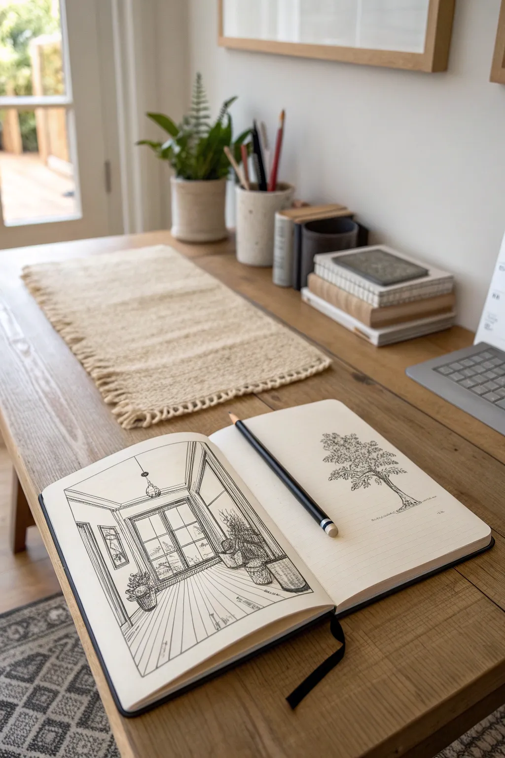
Master the art of depth with this charming one-point perspective sketch of a sunlit room corner. This project combines strict architectural lines with organic botanical details to create a balanced, inviting interior scene.
Step-by-Step Guide
Materials
- Sketchbook (smooth or mixed media paper)
- Black fine liner pens (0.1mm, 0.3mm, and 0.5mm)
- HB or 2B pencil for sketching
- Ruler or straight edge
- Kneaded eraser
Step 1: Setting the Perspective Framework
-
Establish the horizon line:
Start by drawing a light horizontal line across the middle of your page using your pencil and ruler. This sets your viewer’s eye level. -
Mark the vanishing point:
Place a small dot directly in the center of your horizon line. Every angled line in the room will eventually converge at this single point. -
Draw the back wall:
Draw a square or rectangle around the vanishing point. This shape represents the back wall of your room and should be completely flat, not angled. -
Create the side walls, floor, and ceiling:
Connect the corners of your back wall rectangle to the corresponding corners of your paper borders using diagonal lines radiating outward.
Step 2: Constructing Architectural Features
-
Draft the window:
On the back wall, sketch a large rectangle for the window frame. Add a central vertical line and two horizontal lines to create the panes. -
Add the window molding:
Give the window depth by drawing a second outline slightly inside the first. Add a simple sill at the bottom. -
Sketch the floorboards:
Place your ruler against the vanishing point and draw radiating lines across the floor section. Space them wider apart as they get closer to the bottom edge of the paper to enhance the illusion of depth. -
Add ceiling details:
Draw a thin molding strip where the ceiling meets the walls. Sketch a simple chord dropping from the ceiling center for the pendant light. -
Draft the side window:
On the left wall, draw vertical lines for the sides of a smaller window. Connect the tops and bottoms to the vanishing point to ensure the angle is correct.
Wonky Walls?
If walls look distorted, check that all vertical lines are perfectly straight up and down, parallel to the paper edge. Only depth lines should be angled.
Step 3: Adding Life and Inking
-
Sketch plant shapes:
Lightly block in rough shapes for potted plants. Place one on the floor near the window and another on a stand slightly further back. -
Detail the foliage:
Refine the plants with jagged, leafy outlines. Don’t worry about perfection here; organic shapes contrast beautifully with the straight room lines. -
Ink the main structure:
Switch to your 0.5mm pen. Trace over your pencil lines for the walls, window frames, and floorboards. Use the ruler for a crisp finish. -
Ink the details:
Use a finer 0.1mm or 0.3mm pen for the plant leaves, the light fixture, and the wood grain texture on the floor. I find using a broken, shaky line for the wood grain makes it look more natural. -
Add hatching for depth:
Use vertical hatching lines to create shadows in the corners of the room and underneath the window sill. -
Create texture on the plants:
Add small scribbles or dots to the plant pots to give them a woven or ceramic texture. -
Erase guidelines:
Once the ink is completely dry, gently erase the visible pencil lines, specifically the horizon line and vanishing point markers. -
Final touches:
Review your drawing and darken any lines that need more weight, particularly the foreground elements, to pop them forward.
Add a Rug
Draw a rug on the floor using the vanishing point for side edges and horizontal lines for the front/back. Add fringe for texture.
Now you have a structured yet cozy interior sketch ready to be filled with color or left as striking line art
Two-Point Perspective Street Corner
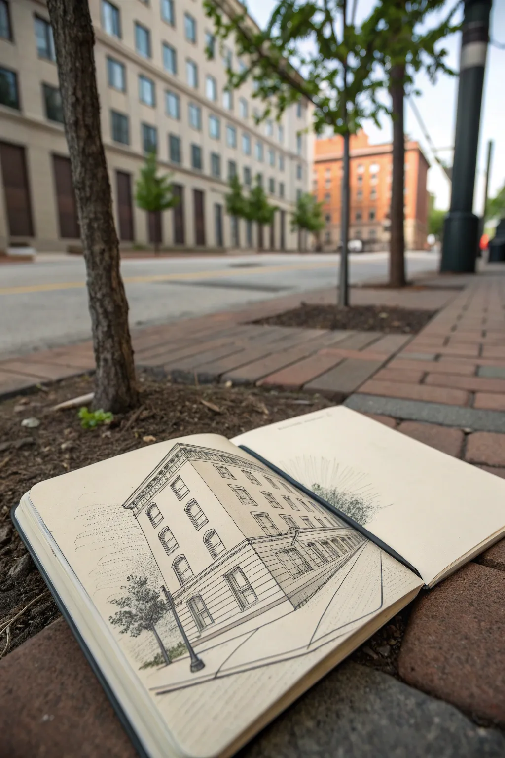
Capture the stately elegance of city architecture with this classic two-point perspective study. Using simple graphite on cream paper, you’ll learn to construct realistic depth and volume for a convincing street corner scene.
How-To Guide
Materials
- Hardcover sketchbook (cream or off-white paper)
- H or 2H pencil (for construction lines)
- HB or B pencil (for main outlines)
- 2B or 4B pencil (for shading and depth)
- Straightedge or clear ruler
- Kneaded eraser
- Fine liner pen (optional, for final touches)
Step 1: Setting the Perspective Framework
-
Establish the Horizon Line:
Begin by drawing a faint horizontal line across your page, positioned slightly below the center. This represents the viewer’s eye level and serves as the anchor for your perspective. -
Place Vanishing Points:
Mark two vanishing points on your horizon line. For this corner angle, place one point near the far left edge and the other far off the right edge (or imagine it just off the page) to avoid distortion. -
Draw the Corner Vertical:
Draw the prominent vertical line that represents the corner of the building nearest to you. This line should intersect the horizon line and determine the building’s height relative to your view. -
Connect to Vanishing Points:
Lightly draw converging lines from the top and bottom of your corner vertical to both vanishing points. This creates the basic ‘box’ shape of your building.
Distorted Angles?
If the building looks too sharp or pointy at the corner, your vanishing points are too close together. Move them further apart, even off the page, to flatten the angle.
Step 2: Constructing Architectural Elements
-
Divide the Floors:
Use vertical measurements along the corner line to mark floor heights. Draw lines from these marks back to the respective vanishing points to define the parallel floor levels on both sides of the street. -
Block in Vertical Divisions:
Sketch the vertical lines that separate windows and columns. Remember that as these intervals move away from the viewer toward the vanishing points, the space between them should appear narrower. -
Outline Window Arches:
On the upper floors, sketch arched tops for the windows. Use light guidelines to ensure the tops of the arches align with the perspective grid you’ve established. -
Add Decorative Cornices:
Draw the protruding cornice at the very top of the building. Add a double line to suggest thickness, ensuring it follows the perspective lines perfectly. -
Draft the Ground Floor:
Unlike the upper residential floors, the ground floor often has taller openings or storefronts. Sketch large rectangular openings here, perhaps adding a subtle awning or entrance detail.
Step 3: Shading and Details
-
Refine the Linework:
Switch to your HB or B pencil. Go over your construction lines with decisive strokes, focusing on the windows, the cornice details, and the structural corner. -
Deepen the Windows:
Use a 2B pencil to shade inside the window frames. I prefer to leave a tiny sliver of white paper unshaded to suggest the thickness of the glass or reflected light. -
Add Cast Shadows:
Determine a light source (e.g., from the upper left) and add shadows under the cornice, window ledges, and along one side of the building to enhance the 3D form. -
Sketch the Sidewalk:
Draw lines radiating from the vanishing points to indicate the curb and sidewalk edge. Keep these lines loose to contrast with the rigid architecture. -
Suggest Vegetation:
To the left of the building, use a scribbling motion with a softer pencil to create the texture of a street tree. This organic shape balances the strict geometry of the building. -
Clean Up:
Gently dab your kneaded eraser over the initial construction lines and vanishing points to fade them out, leaving only the finished architectural drawing visible.
Loose but Accurate
Don’t use a ruler for the final lines. A slightly wavering hand-drawn line adds character and warmth that a rigid ruler line kills instantly in urban sketching.
Close your sketchbook knowing you’ve mastered the geometry of the city street


Forest Depth With Atmospheric Perspective
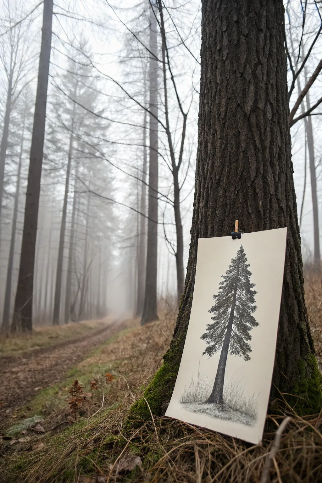
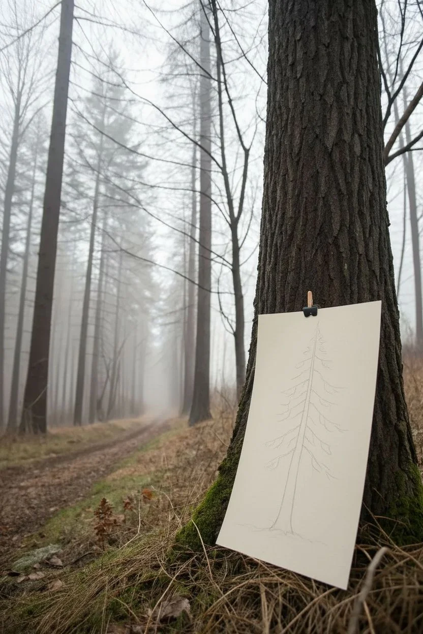
Master the texture of bark and needle with this focused graphite study of a towering conifer. This project explores the balance between sharp, defined foreground details and soft, atmospheric rendering to give your tree presence and volume.
Step-by-Step Guide
Materials
- Heavyweight drawing paper (smooth or vellum finish, approx. 9×12 inches)
- Graphite pencils (HB, 2B, 4B, 6B)
- Mechanical pencil (0.5mm HB) for fine details
- Kneaded eraser
- Precision stick eraser (optional)
- Blending stump or tortillon
- Artist tape or wooden clip
Step 1: Establishing the Structure
-
Central Axis:
Start by lightly drawing a vertical line down the center of your paper with an HB pencil to act as the trunk’s guide. It doesn’t need to be perfectly straight; a slight lean adds organic character. -
Trunk Width:
Sketch the outline of the trunk around your axis line. Make the base noticeably wider, tapering gradually as you move upward toward the tip. -
Branch Framework:
Mark horizontal indicators for where the main branches will sit. Notice how spruce branches often droop downward slightly before curving up at the tips. -
Negative Space Check:
Look at the gaps between your planned branch layers. These empty spaces are crucial for making the tree look realistic rather than like a solid triangle.
Fixing “Flat” Trees
If your tree looks too flat, your contrast range is likely too narrow. Don’t be afraid to press hard with the 6B for deep blacks; that darkness pushes the mid-tones forward.
Step 2: Texturing the Trunk
-
Base Layer Shading:
Using a 2B pencil, fill in the trunk with vertical strokes. Keep the pressure light to medium. -
Defining the Cylinder:
Darken the left and right edges of the trunk with a 4B pencil to create roundness. Imagine the light source coming from the front-center, leaving the middle of the trunk slightly lighter. -
Bark Texture:
With your mechanical pencil or a sharp HB, draw craggy, irregular vertical lines and cracks. The bark near the base should look rougher and more deeply grooved. -
Shadow Accents:
Use a 6B pencil to place deep, dark accents in the deepest cracks of the bark, particularly under where branches attach.
Misty Background
To replicate the photo’s foggy vibe, lightly shade the background with graphite powder and a cotton ball, then use an eraser to lift out faint, ghostly tree shapes behind the main subject.
Step 3: Building the Foliage
-
Upper Branches:
Start at the top where branches are shortest. Use short, upward flicking strokes with an HB pencil to simulate tight needles. -
Mid-Section Volume:
Move down to the middle section. Here, draw the underside of the branches in shadow using a 4B pencil. The needles hang down, creating heavy, dark masses. -
Highlighting Tops:
For the tops of these branches, use lighter pressure or an HB pencil to suggest where light hits the needles. -
Lower Boughs:
The bottom branches are the largest and heaviest. Sketch them sweeping downward. Use the 6B to create deep pockets of shadow within the thickest clusters of needles. -
Needle Direction:
I always try to vary angular strokes here; don’t make every needle uniform. Let some cross over others to create a messy, natural density.
Step 4: Ground Grounding & Details
-
The Root Flare:
Where the trunk hits the ground, curve your lines outward slightly to show the roots gripping the earth. -
Grassy Base:
Add vertical, wispy strokes around the base of the tree to represent tall grass. Vary the heights and pencil grades (HB and 2B) to create depth in the grass. -
Ground Shadows:
Lightly shade the ground area beneath the tree using the side of a 2B pencil to anchor the drawing so it doesn’t look like it’s floating. -
Atmospheric Fading:
Use a blending stump to gently soften the edges of the distant grass and the very top tip of the tree. This mimics the misty atmosphere seen in the reference photo. -
Final Contrast Check:
Step back. Use your darkest 6B pencil to reinforce the darkest shadows under the main branch masses one last time to make the highlights pop.
Pin your finished study against a textured surface to appreciate the contrast between your drawing and the natural world
Bicycle Study for Ellipses and Spokes


Master the art of geometric precision with this detailed fineliner study of a classic road bike. This project is deceptively simple, focusing on clean lines, perfect ellipses, and the rhythmic repetition of spokes to create a technical yet artistic illustration.
How-To Guide
Materials
- Spiral-bound sketchbook or smooth Bristol board
- HB graphite pencil
- High-quality eraser (kneaded or white vinyl)
- Ruler or straight edge
- Fine liner pens (sizes 0.1, 0.3, and 0.5mm)
- Compass (optional but helpful for wheel structure)
- Reference photo of a bicycle profile
Step 1: Structural Framework
-
Establish the ground plane:
Start by drawing a very faint horizontal line near the bottom of your page. This ensures your wheels will sit level and prevents the bike from looking like it’s floating. -
Map the wheel positions:
Using your pencil, sketch two large circles for the wheels. Space them apart so that the distance between them is roughly equal to the diameter of one wheel. Don’t worry about perfection yet; just get the placement right. -
Triangulate the frame:
Lightly sketch the main triangle of the bike frame. Draw a diagonal line connecting the center of the rear wheel to where the seat post will be. Connect this to the pedal crank area (between the wheels) and then up to the handlebars. -
Refine the geometry:
Check your angles. Does the top tube slope correctly? Is the front fork angled slightly forward? Adjust your pencil sketch now, as ink is permanent.
Wobbly Wheels?
If your hand-drawn circles look lumpy, try ‘ghosting’ the motion—hovering your hand in a circular motion above the paper before committing the pen to the page.
Step 2: Inking the Forms
-
Outline the tires:
Switch to your 0.5mm pen. Carefully trace your pencil circles to create the outer tire. Draw a second, slightly smaller concentric circle inside each one to define the tire thickness and rim. -
Define the frame tubes:
Turn the single pencil lines of the frame into tubes. Use the 0.5mm pen to draw parallel lines for the top tube, down tube, and seat tube. Keep your hand steady or use a ruler if you prefer a technical look. -
Detail the handlebars and seat:
Using a 0.3mm pen, draw the curve of the drop handlebars and the profile of the saddle. Notice how the brake hoods protrude slightly from the curve of the bars. -
Crankset and chain:
Draw the circular chainring near the pedals using a 0.3mm pen. Sketch the crank arm pointing downwards and the pedal platform clearly.
Step 3: Spokes and Fine Details
-
Set the hubs:
Draw a small circle in the exact center of both wheels to represent the hubs. This is the anchor point for all your spokes. -
First set of spokes:
Switch to your finest 0.1mm pen. I find it easiest to draw the vertical and horizontal spokes first (12, 3, 6, and 9 o’clock positions) to divide the wheel into quadrants. -
Fill in the remaining spokes:
Systematically fill in the remaining spokes in each quadrant. Work from the hub outward to the rim. Keep the spacing consistent, but remember this is a sketch—slight variations add character. -
Rear stylistic details:
Add the rear triangle stays—the thin tubes connecting the rear wheel hub to the seat post and pedal crank area. These are thinner than the main frame. -
Mechanical touches:
Add tiny circles for bolts on the stem and crank. Sketch the derailleur hanging below the rear axle with simple geometric shapes.
Make It Pop
Add selective color! Use a single bright marker (like fire engine red or electric blue) to color just the frame tubes while keeping the mechanical parts in black ink.
Step 4: Finishing Touches
-
Weighting the lines:
Go back over the bottom edges of the tires and the underside of the frame tubes with the 0.5mm pen to add subtle shadow weight. -
Texture the handle tape:
Add small diagonal hatch marks along the curve of the handlebars to simulate the wrapped grip tape. -
Ground shadow:
Draw a few quick, horizontal lines beneath the wheels to ground the object and suggest a floor surface. -
Clean up:
Wait at least 5-10 minutes for the ink to fully cure. Once dry, gently erase all underlying pencil marks to leave a crisp, high-contrast illustration.
Enjoy the sleek simplicity of your finished linear drawing.
Surreal Object Mash-Up With One Light Source
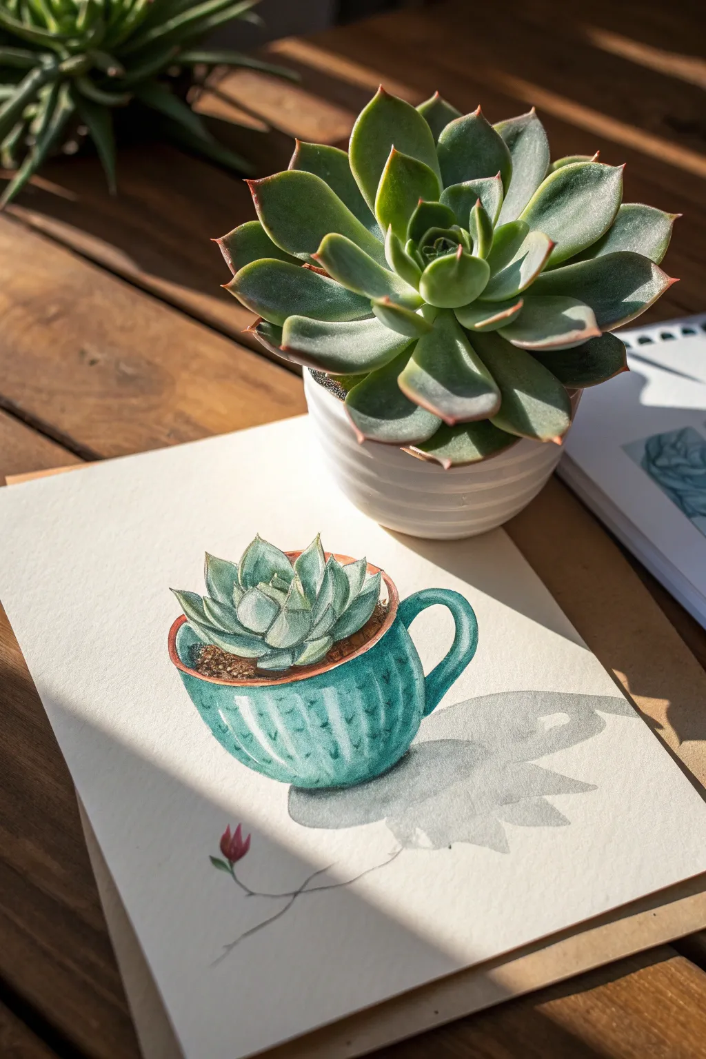
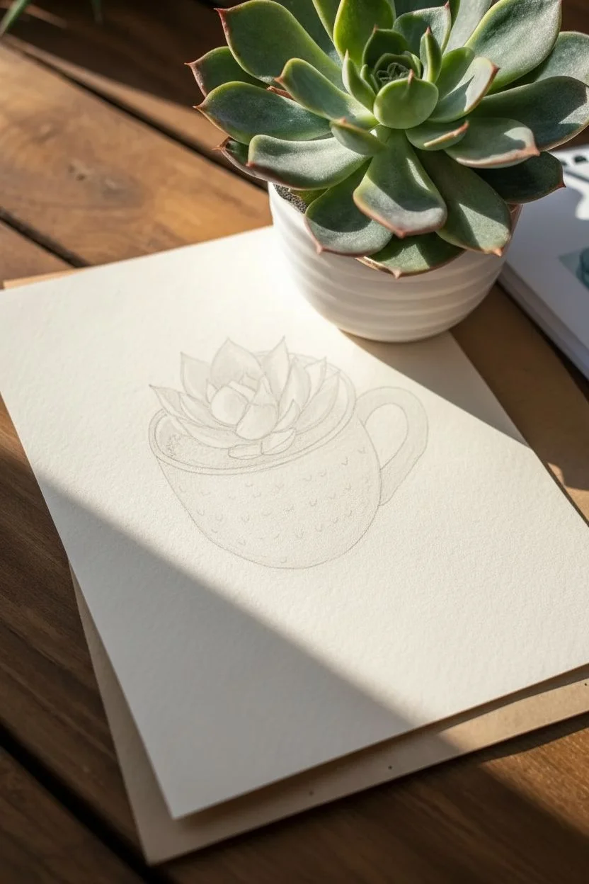
This whimsical watercolor project combines the organic shapes of a succulent with the structured form of a teacup, creating a delightful surreal object. The composition focuses heavily on casting a dramatic shadow from a single light source, giving the flat illustration a sense of three-dimensional depth.
How-To Guide
Materials
- Cold press watercolor paper (300 gsm)
- HB pencil for sketching
- Kneaded eraser
- Watercolor paints (phthalo green, sap green, burnt sienna, payne’s gray, alizarin crimson)
- Small round brushes (size 2 and 4)
- Fine liner brush (size 0 or 00)
- Palette for mixing
- Water jar and paper towels
Step 1: Sketching the Mash-Up
-
Outline the cup:
Begin by lightly sketching the rounded body of a teacup. Instead of a perfect cylinder, give it a slightly bulbous, inviting curve at the bottom. -
Add the handle:
Draw a curved handle on the right side. Ensure the connection points look natural, as if the handle emerges seamlessly from the cup’s body. -
Sketch the rim:
Create an oval for the rim of the cup. Since we are viewing it from a slight angle, the back edge should be visible but foreshortened. -
Plant the succulent:
Instead of drawing liquid/tea, sketch a rosette-style succulent emerging from the cup. Start with the central, tightest leaves and work outward with larger, pointed petals. -
Draw the soil line:
Indicate a small rim of soil just inside the cup edge to ground the plant, showing where the organic meets the man-made. -
Map the shadows:
Very lightly outline where your cast shadow will fall to the right. Use the reference image to see how the shadow mimics the shape of the cup and handle.
Fixing Muddy Shadows
If your cast shadow looks too opaque or muddy, you likely didn’t use enough water. Let it dry completely, then gently lift pigment with a damp, clean sponge.
Step 2: Watercolor Layers
-
First wash on leaves:
Mix a very watery pale green using sap green. Apply a light wash to the succulent leaves, leaving tiny white unpainted slivers at the tips and edges for highlights. -
Base coat for the cup:
While the leaves dry, mix a vibrant teal using phthalo green and white or a touch of blue. Paint the cup body, lifting color out with a thirsty brush in the center to create a rounded highlight. -
Deepening the succulent:
Once the first layer is dry, mix a darker green. Paint the shadows between the leaves and at the base of the rosette to create volume. -
Adding the soil texture:
Use burnt sienna with a fairly dry brush to stipple the soil texture around the base of the plant. -
Defining the cup rim:
Paint the rim of the cup with a warm terracotta or brownish-orange tone to create contrast against the cool green-blue of the cup body. -
Adding texture details:
Using your smallest brush and a darker teal mix, paint tiny vertical dashes or texture lines on the cup to give it a ribbed ceramic feel.
Surreal Twist
Make it more surreal by drawing roots breaking through the ceramic cup, or have the shadow cast a shape that doesn’t match the cup, like a bird or hand.
Step 3: Shadows and Details
-
Mixing the shadow color:
Create a transparent gray wash. I find payne’s gray diluted with water works perfectly for realistic shadows without looking muddy. -
Painting the cast shadow:
Apply the gray wash to the right side of the paper, following your sketched outline. The shadow should be darkest right next to the cup and fade slightly as it stretches away. -
Refining the plant:
Add tiny tips of reddish-brown to the very points of the succulent leaves for a realistic finishing touch. -
The small flower detail:
Sketch and paint a tiny, single flower bud on a thin stem below the main subject in the foreground shadow area, using alizarin crimson. -
Final touches:
Assess the contrast. If the cup needs more visual weight, deepen the shadows on the left side of the cup (the side away from the light source) with a second glaze of teal.
Step back and admire how the strong directional lighting brings your surreal garden cup to life


Have a question or want to share your own experience? I'd love to hear from you in the comments below!