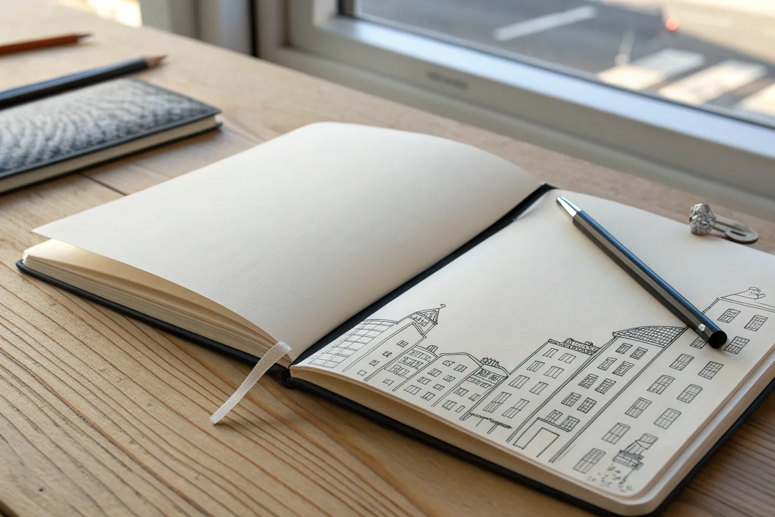
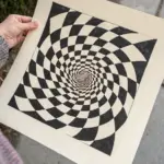
When you want a drawing to feel instantly clever, juxtaposition is my favorite shortcut: just pair two totally different ideas and let the contrast do the heavy lifting. These easy juxtaposition drawing ideas are all about bold, beginner-friendly mash-ups you can pull off with simple shapes, clean outlines, and a little shading.
Half Day, Half Night in One Scene
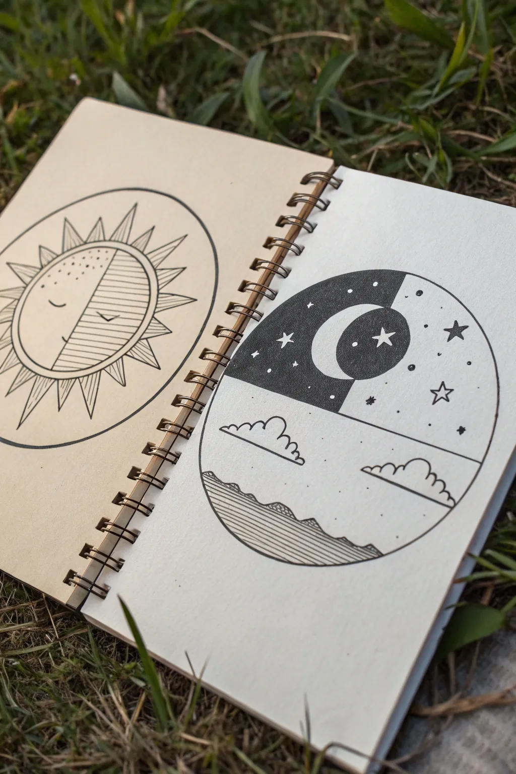
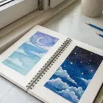
Capture the contrast of light and dark with this circular landscape drawing, blending starry skies with rolling hills. This project uses simple geometric shapes and clever shading to create a striking yin-yang effect between night and day.
Step-by-Step Tutorial
Materials
- Sketchbook or drawing paper
- Pencil (HB or H for sketching)
- Black drawing pen (fineliner, size 0.3 or 0.5)
- Thicker black marker (for filling)
- Compass or circular object (cup/lid)
- Ruler or straight edge
- Eraser
Step 1: Setting the Scene
-
Draw the boundary:
Start by using a compass or tracing a circular object to draw a perfect circle on your page. Lightly mark the vertical center with your pencil. -
Divide the circle:
Using a ruler, draw a horizontal line across the middle of the circle. This line will separate the sky portion from the landscape portion. -
Create the vertical split:
Draw a vertical line down the center of the top half only. This creates two quadrants in the sky area.
Clean Lines Tip
When filling large black areas, outline the shape first with a fine pen, then color inside with a thicker marker. This prevents bleeding over the edges.
Step 2: Drafting the Elements
-
Sketch the moon:
In the upper region, draw a crescent moon shape centered over the vertical dividing line. The left half of the moon should sit in the left quadrant, and the right half in the right quadrant. Add a simple face profile if you like, or keep it geometric. -
Outline the hills:
In the bottom half of the circle, sketch a series of gentle, rolling hills or waves along the bottom edge on the left side. Let them slope downwards toward the right. -
Add clouds:
Draw two fluffy cloud shapes in the middle section—one on the left and one on the right. Keep the bottoms flat and the tops bumpy. -
The sun and stars:
Lightly sketch a few star shapes and small circles in the upper right quadrant to map out the night sky details.
Step 3: Inking and Definition
-
Outline the main circle:
Switch to your black fineliner pen. Carefully trace over the main outer circle to create a crisp border. -
Ink the landscape:
Go over your pencil lines for the hills and the clouds. For the clouds, use a slightly bumpy line for the top curves to make them look soft. -
Define the moon:
Trace the crescent moon outline. Ensure the curve is smooth and clean. -
Draw the stars:
Ink the small five-pointed stars on the right side of the sky. I like to scatter a few tiny dots around them to look like distant starlight.
Make it Metallic
Use gold or silver metallic paint pens for the moon and stars instead of leaving them white. It adds a magical shimmer against the matte black ink.
Step 4: Creating Contrast
-
Fill the dark sky:
This is the most crucial step for the juxtaposition. Using your thicker black marker, fill in the entire upper quadrant that surrounds the moon—but pay attention to which side is dark. In the reference, the area *behind* the moon on the left creates a dark sky. -
Invert the moon color:
Notice the clever inversion: make the part of the moon that falls in the dark section white, and fill the part of the moon that falls in the light section with black (or textured dots/lines). -
Add texture to the hills:
Return to the bottom landscape. Use your fineliner to draw horizontal lines filling the hills or water area on the bottom left. Keep the lines parallel and closely spaced. -
Pattern the dark side:
On the left side of the upper section (the dark sky area), use a white gel pen if you have it to add stars over the black ink, or simply leave small circles uncolored when you’re filling it in. -
Final details:
Add small decorative elements like little plus signs or dots in the white sky area on the right to balance the composition. -
Cleanup:
Wait for all ink to dry completely to avoid smudging. Gently erase any remaining pencil guidelines to reveal the stark contrast of your drawing.
Now you have a beautifully balanced piece of art that explores the harmony between night and day

Split Face: Calm vs Chaos
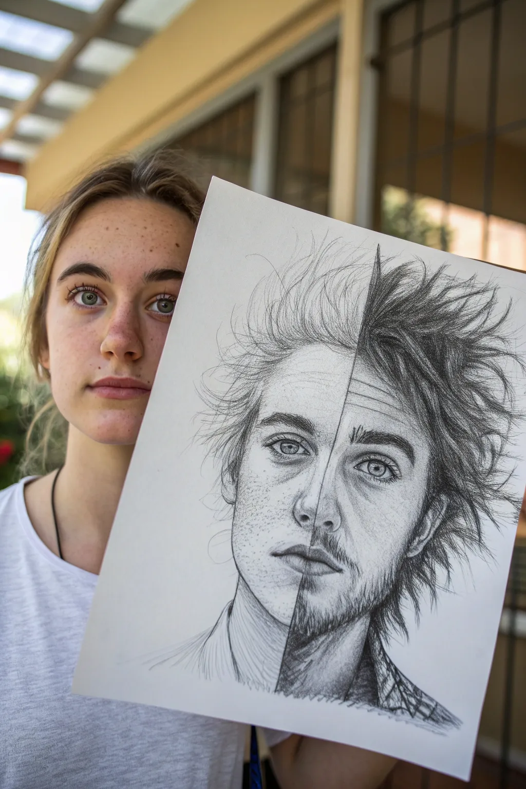
Capture the duality of human emotion with this striking graphite pencil drawing that divides a single portrait into two contrasting halves. You will combine delicate, high-key shading with aggressive, textured strokes to create a compelling visual narrative of ‘calm versus chaos’.
Step-by-Step Guide
Materials
- Smooth bristol board or heavyweight drawing paper (11×14 inches recommended)
- Graphite pencils (ranges: 2H, HB, 2B, 4B, 6B, 8B)
- Kneaded eraser
- Precision eraser (stick eraser)
- Blending stumps (tortillons)
- Ruler
- Reference photo of a face (looking straight ahead)
- Masking tape or painter’s tape
Step 1: Planning and Foundation
-
Establish the centerline:
Begin by lightly taping your paper down to a flat surface. Using your ruler and a 2H pencil, draw a faint vertical line directly down the center of the paper; this will be the boundary between your two worlds. -
Outline the basic proportions:
Sketch the oval shape of the head, ensuring it is symmetrical across your centerline. Mark horizontal guidelines for the eyes, nose, mouth, and hairline to keep the facial features aligned. -
Draft facial features:
Lightly sketch the eyes, nose, and lips. Both sides should match in placement and size at this stage, creating a unified face before you disrupt the style. -
Refine the contour:
Clean up your outline. Erase your construction lines (except the vertical divider) so you have a clean slate for the detailing phase.
Step 2: The ‘Calm’ Side (Left)
-
Start the left eye:
On the left side of the divider, begin shading the eye using a sharp HB pencil. Focus on clear, crisp lines for the iris and pupil, keeping the shading light and controlled. -
Apply light skin tones:
Using an H or HB pencil, lightly hatch the skin areas. Keep your pencil pressure very light. I prefer to hold the pencil further back on the barrel here to prevent pressing too hard. -
Blend for smoothness:
Take a clean blending stump and gently smooth out the graphite on the skin. The goal is a seamless, soft texture that looks ethereal and undisturbed. -
Add delicate details:
Use a sharp 2B pencil to add freckles and fine eyelashes. Keep these marks distinct but gentle, avoiding any harsh, black lines. -
Draw the ‘calm’ hair:
Sketch the hair on the left side using long, flowing strokes. Use a lighter touch (HB or 2B) to make the hair look airy and windblown, drawing individual strands rather than thick clumps.
Uneven Eyes?
If the eyes look misaligned, hold your drawing up to a mirror. The reversed reflection makes symmetry errors jump out instantly, allowing you to fix positioning before shading.
Step 3: The ‘Chaos’ Side (Right)
-
Deepen the contrast:
Moving to the right side of the line, switch to your softer pencils (4B and 6B). Immediately establish darker values in the eye socket and pupil to create intensity. -
Create rough texture:
Instead of smooth blending, use cross-hatching and scumbling (scribbling motion) to shade the skin. Allow the grain of the paper to show through to emphasize roughness. -
Add grit and stubble:
Use a 6B or 8B pencil to draw coarse facial hair and stubble. Use short, sharp, flicking motions to mimic the texture of rough hair. -
Emphasize wrinkles and stress:
Deepen the lines around the eye and mouth on this side. Adding forehead wrinkles or tension lines reinforces the chaotic, weathered theme. -
Execute the ‘chaos’ hair:
For the hair on the right, use aggressive, jagged strokes with your darkest pencils (6B or 8B). Press hard to create thick, dark masses, and stickery, unkempt spikes that contrast the flow of the left side. -
Enhance the dividing line:
Go back to the central vertical line. On the ‘chaos’ side, darken the edge significantly so it creates a sharp cliff-like drop-off against the light ‘calm’ side.
Level Up: Mix Media
For an even starker contrast, use charcoal or black ink for the ‘chaos’ side while keeping the ‘calm’ side strict graphite. The finish difference creates tactile depth.
Step 4: Final Touches
-
Check values:
Stand back and look at the drawing. The right side should feel significantly heavier and darker than the left. If the right side looks too gray, add more 8B graphite. -
Clean highlights:
Use your precision eraser or the sharp edge of a kneaded eraser to pick out bright highlights in the eyes and on the tip of the nose on both sides. -
Final cleanup:
Erase any smudges from the white background paper. The negative space needs to be pristine to let the portrait pop.
This dramatic piece is now ready to frame and spark conversation about the duality within us all


Heart Made of Clock Gears

This whimsical drawing combines the organic shape of a heart with the mechanical precision of clockwork gears for a lovely juxtaposition. Using simple fineliners on cream-colored sketchbook paper creates a warm, vintage aesthetic perfect for journaling.
Detailed Instructions
Materials
- Spiral-bound sketchbook with cream or off-white paper
- Fine-point black drawing pen (0.5mm or 0.8mm)
- Ultra-fine black drawing pen (0.1mm or 0.3mm)
- Blue felt-tip marker or brush pen (dark navy)
- Red-orange felt-tip marker or colored pencil
- Pencil (HB)
- Eraser
- Circle template or compass (optional)
Step 1: Laying the Framework
-
Sketch the heart outline:
Start by lightly sketching a large heart shape in the center of your page with a pencil. Make it wide enough to house several circular elements. -
Block in the internal circles:
Inside the heart, lightly sketch three main circles: a large one on the left for the clock face, a medium one at the top right for a gear, and a medium one at the bottom center for another gear. Add a smaller circle nestled between the two right-side gears. -
Define the outer double-line:
Using your thicker black pen (0.5mm), trace over your pencil heart outline. Draw a second heart line inside the first one, leaving about a 5mm gap between them to create a border effect. -
Seal the border:
Connect the inner and outer heart lines with a small perpendicular line at the very bottom point and the top center crevice to close the shape.
Clean Circles Hack
If freehand drawing perfect circles is stressful, trace the bottom of a glue stick cap or a small button. It keeps your gears looking mechanical and tidy.
Step 2: Drawing the Mechanisms
-
Ink the clock face:
Switch to your finer black pen (0.3mm). Ink the large circle on the left. Draw a heavy dot in the center for the axis. -
Add numbering marks:
Instead of full numbers, place small dots or dashes at the 12, 3, 6, and 9 positions. You can add the numbers ’12’, ‘3’, ‘6’, and ‘9’ in a small serif font if you like, just like the reference. -
Draw the hands:
Using the thicker blue marker or pen, draw two clock hands originating from the center dot—one shorter and one longer—pointing to a time of your choice. -
Create the top gear teeth:
For the top right gear, draw a bumpy, scalloped edge around your pencil circle to represent gear teeth. Ink an inner circle inside this shape. -
Detail the top gear:
Place a series of small dots between the inner circle and the outer teeth. In the very center, draw a cluster of seven tiny dots. -
Draft the bottom connection gear:
For the bottom gear, draw two concentric circles with the black pen. Between these two rings, draw small, uniform tick marks all the way around to create a cog texture. -
Build the gear spokes:
Inside the bottom gear, draw a smaller central circle. Connect this hub to the outer ring with four thick, rectangular spokes radiating outward. -
Draw the colored element:
Locate that small circle you sketched earlier. Ink the outer edge with black. Use your red-orange marker to fill a thick ring inside the edge, leaving the center paper-white. -
Add the face detail:
Inside the white center of the orange gear, draw a tiny confused or sad face with two dot eyes and a curved mouth.
Step 3: Surrounding Elements & Polishing
-
Draw the large star:
To the right of the heart, sketch a five-pointed star. Ink the outline with the navy blue marker. Fill the inside with solid blue, but leave circular ‘negative space’ spots white—one large circle in the center and smaller ones on the arms. -
Add decorative flowers:
Draw simple five-petal flower outlines using the red-orange marker. Place one near the right edge and another near the bottom right corner. -
Scatter the small stars:
With the fine black pen, draw several small, open five-pointed stars scattered around the heart to fill the empty background space. I like to vary their angles slightly so they look like they are twinkling. -
Ink the bottom star:
Draw one final star below the heart using the blue marker again. Draw just the outline, and then add a smaller black star inside it for contrast. -
Erase pencil guides:
Once the ink is completely dry—give it a few minutes to be safe—gently erase all your original pencil sketch lines.
Fixing Wobbly Lines
Did your gear teeth come out uneven? Don’t erase! Go over the line again to thicken it slightly. A bolder line weight often hides minor wobbles effectively.
Now you have a charming mechanical heart that perfectly captures the passage of time in your sketchbook

City Inside an Apple Core
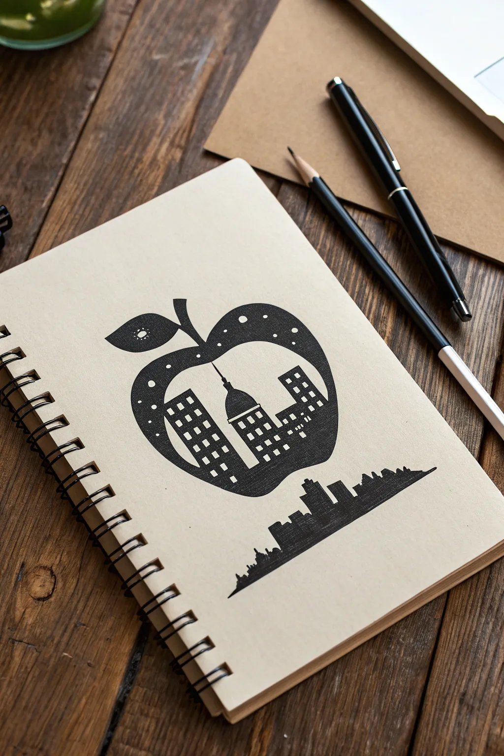
This clever juxtaposition merges nature and architecture by illustrating a sleek city skyline growing within the silhouette of an apple. The stark black ink pops beautifully against tan sketchbook paper, creating a modern, graphic design feel.
Step-by-Step
Materials
- Tan or kraft paper sketchbook
- Pencil (HB or lighter)
- Eraser
- Fine-point black drawing pen (0.3mm or 0.5mm)
- Thick black marker or brush pen
- Ruler (optional)
Step 1: Sketching the Apple Outline
-
Draft the apple shape:
Start by lightly sketching a large, classic apple shape in the center of your page. Aim for a nice, round curve on the bottom, tapering slightly at the top where the stem will go. -
Add the stem and leaf:
Draw a thick, curved stem emerging from the top center indentation. Add a single leaf attached to the left side of the stem, pointing outward. -
Define the negative space:
Within the apple’s body, lightly sketch the outlines of skyscrapers. These shouldn’t be detailed yet—just draw rectangles and a central dome shape to block out where the ‘white’ (or tan paper) space will be. -
Plan the bottom skyline:
Below the apple, sketch a separate, horizontal skyline that stretches wider than the fruit itself. This grounds the drawing and creates a visual echo of the city inside.
Ink Smearing?
Work from left to right (if right-handed) to avoid dragging your hand through wet ink. Place a scrap piece of paper under your hand as a guard.
Step 2: Inking the City Texture
-
Start the internal windows:
Using your fine-point pen, begin drawing rows of small squares inside the skyscraper shapes you sketched within the apple. These will remain the color of the paper. -
Fill the buildings:
carefully color in the space *around* those tiny window squares with the black pen. This creates a ‘lit up’ window effect against the dark building silhouettes. -
Outline the interior skyline:
Go over the outline of your interior city—the dome and the rooftops—with a clean, sharp line. Ensure the tops of the buildings are clearly defined against the empty space above them. -
Create the apple’s skin:
Now, start filling in the main body of the apple with solid black ink. Work carefully around your city sketch; the buildings are ‘negative space’ cut out of the black apple.
Step 3: Refining and Detailing
-
Add decorative dots:
Before you fill the entire top section of the apple solid black, draw several small circles near the top curve and on the leaf. These act as stars or decorative spots. -
Leaf details:
Inside the leaf shape, draw a small serrated or star-like shape, leaving it uncolored. Fill the rest of the leaf solid black around this detail. -
Fill the solid areas:
I like to switch to a thicker marker here to speed things up. Fill in the rest of the apple’s body, the stem, and the upper curves, being very careful not to bleed into your ‘stars’ or the city silhouette. -
Clean up edges:
Go back with your fine pen and sharpen the outer edges of the apple to ensure smooth, crisp curves.
Sharper Graphics
For the crispest windows, don’t draw squares individually. Draw a grid of lines first, then color in the squares you want to be ‘dark’, leaving the others open.
Step 4: The Floating Skyline
-
Ink the bottom city:
Move to the horizontal skyline at the bottom. Outline the buildings, including subtle details like roof antennas or stepped sides. -
Texture the lower buildings:
Instead of solid black, use a cross-hatching technique or very dense vertical lines to verify the bottom skyline. This makes it look distinct from the solid apple above. -
Add a central tower:
Ensure the tallest building in the lower skyline aligns roughly with the center of the apple above to create balance. -
Final erase:
Once the ink is completely dry (wait at least 5 minutes), gently erase any visible pencil lines, especially inside the windows and the lighter areas of the paper.
Now you have a striking piece of conceptual art that fits perfectly in your sketchbook
BRUSH GUIDE
The Right Brush for Every Stroke
From clean lines to bold texture — master brush choice, stroke control, and essential techniques.
Explore the Full Guide
Fish Swimming in a Lightbulb

This clever juxtaposition project blends a simple pencil sketch with a physical object to create a surreal, 3D illusion. By integrating a real lightbulb into a drawing of a fish, you create the whimsical appearance of an underwater scene contained within glass.
Detailed Instructions
Materials
- Spiral-bound sketchbook or heavy drawing paper
- Standard graphite pencil (HB or 2B)
- Fine-point black pen or marker (0.5mm)
- Clear incandescent lightbulb (burned out is fine)
- Black permanent marker (fine tip)
- Adhesive putty or clear tape
Step 1: Planning the Composition
-
Position the bulb:
Place your sketchbook on a flat surface. Take your clear lightbulb and stand it upright on the paper where you want the center of your ‘tank’ to be. -
Mark the perspective:
While holding the bulb steady, lightly mark the paper right at the bottom center of the metal screw base. This anchor point determines where your drawing interacts with the object. -
Visualize the illusion:
Look through the glass of the bulb. You need to plan your drawing so the fish appears to be swimming underneath or around this central point.
Glass Grip Tip
If permanent marker slides on the smooth glass, wipe the bulb with rubbing alcohol first. Let the marker dry for a full minute to avoid smudges.
Step 2: Drawing the Aquatic Scene
-
Sketch the fish body:
Using your pencil, lightly sketch a simple fish shape below where the bulb will sit. Draw an oval for the body and a triangle for the tail fin. -
Add fin details:
Refine the fish by adding a dorsal fin on top and a pectoral fin on the side. Sketch the curve of the gill cover and a small circle for the eye. -
Draw the bubbles:
Scatter several circles of varying sizes rising from the fish’s mouth area. Position some so they will be visible near the bulb, and draw a few largish bubbles directly to the right of the fish. -
Create water currents:
Draw three or four wavy, flowing lines to the right of the fish to suggest movement and water currents. These lines help balance the composition. -
Ink the drawing:
Take your fine-point black pen and trace over your pencil lines. Use confident strokes. I like to add a few small hatched lines on the fins for texture. -
Erase pencil guides:
Once the ink is completely dry, gently erase the underlying pencil sketches to leave a clean, crisp illustration.
Step 3: Modifying the Lightbulb
-
Clean the glass:
Wipe the lightbulb down with a cloth to remove any fingerprints or dust. A clean surface is crucial for the marker to adhere properly. -
Draw the ‘filament’:
On the front surface of the glass bulb, use the permanent black marker to draw two vertical lines extending upward from the metal base. Connect them with a horizontal line. -
Add the text:
Just above your drawn filament line, carefully write a word like ‘GROW’ or ‘IDEA’ in small capital letters directly on the glass. This adds to the conceptual feel. -
Create the waterline:
Draw a faint horizontal line or a series of small dots/bubbles near the top of the bulb’s curve to suggest the surface of the water inside. -
Add internal bubbles:
Using the permanent marker, dot a few tiny circles (bubbles) on the upper part of the glass to mimic the texture of water.
Level Up: Water Fill
Carefully pry open the base of an old bulb, remove the guts, and fill it with actual water and blue food coloring for a stunning real-liquid effect.
Step 4: Final Assembly
-
Secure the bulb:
Place a small piece of adhesive putty on the very bottom contact point of the lightbulb’s metal base. -
Position on paper:
Press the bulb firmly onto the paper, aligning it with your initial markings perfectly centered above the fish drawing. -
Check the angle:
Rotate the bulb slightly so your drawing on the glass aligns front-and-center for the viewer. -
Photograph the illusion:
To capture the finished effect, take a photo from a slightly low angle so drawings on the paper and the glass seem to exist in the same plane.
Now you have a striking piece of conceptual art that transforms everyday objects into a moment of imagination
Teacup That Turns Into a Storm Cloud

Capture the cozy feeling of a rainy afternoon with this charming sepia-toned illustration. This simple line drawing creates a whimsical juxtaposition by having a storm cloud pour directly into a comforting teacup.
Step-by-Step Guide
Materials
- Spiral-bound sketchbook with smooth white paper
- Brown fine-liner pen (0.5mm or 0.8mm)
- Pency (HB or 2B) for sketching
- Eraser
- Ruler (optional, but helpful for symmetry)
Step 1: Drafting the Teacup
-
Establish the cup shape:
Start near the bottom third of your page. Lightly sketch a wide, shallow U-shape for the bowl of the teacup. Keep your pencil pressure very light so these lines are easy to erase later. -
Add the rim:
Draw an oval connecting the top points of your U-shape. This forms the opening of the cup. Try to keep the perspective slightly flattened so we can see into the cup. -
Draw the saucer:
Beneath the cup, sketch a larger, flattened oval for the saucer. It should extend past the width of the cup on both sides. Add a second curve just under the front edge to give the plate some thickness. -
Detail the handle and base:
Add a small C-shaped loop on the right side for the handle. Double the line to give it thickness. Then, sketch a small, short cylinder shape at the bottom of the cup bowl where it meets the saucer.
Step 2: Drafting the Cloud & Rain
-
Position the cloud:
Move your pencil about three inches above the teacup. Sketch a fluffy, popcorn-shaped cloud. It should be roughly the same width as the teacup to keep the composition balanced. -
Sketch the raindrops:
Lightly mark the paths for the raindrops falling from the cloud into the cup. Draw small teardrop shapes, staggering them so they don’t look too rigid or grid-like. -
Define the liquid surface:
Inside the oval rim of the cup, draw a slightly smaller oval to show the surface of the liquid. Add a few ripple lines near the center where the rain is hitting.
Ink Flow Tip
When filling in the dark coffee liquid, use long, horizontal strokes rather than scribbling. This keeps the texture smooth and mimics the flat surface of liquid in a cup.
Step 3: Inking the Lines
-
Outline the cloud:
Switch to your brown fine-liner. Trace over your cloud pencil lines. I like to make these lines slightly wobbly or bumpy to emphasize the fluffiness of the cloud texture. -
Add cloud details:
Inside the cloud outline, add a second, broken line that echoes the bottom edge. Add a few small dots or tiny circles to give it volume and texture. -
Ink the raindrops:
Carefully ink each raindrop. Keep the points facing upward towards the cloud and the rounded bottoms facing the cup. Try to keep your hand steady for crisp shapes. -
Trace the teacup rim:
Ink the outer rim of the cup. For the inner liquid line, make the ink slightly thicker or darker to suggest depth. -
Fill the coffee:
Using the brown pen, fill in the liquid area. Leave thin white gaps or streaks to represent ripples and reflections on the surface. This negative space is crucial for making the liquid look wet. -
Complete the cup body:
Trace the U-shape of the cup and the handle. When inking the handle, ensure the connections to the cup body look seamless. -
Finish the saucer:
Ink the saucer ovals. You can add a very small, thin line just under the cup’s base to suggest a shadow, grounding the object.
Wobbly Ovals?
If your ovals are lopsided, turn your sketchbook upside down to check symmetry. It helps your brain see the shape abstractly rather than as a ‘cup rim’.
Step 4: Finishing Touches
-
Erase pencil marks:
Wait at least 5-10 minutes for the ink to dry completely. Gently erase all visible pencil sketches to reveal the clean line art. -
Evaluate line weight:
Look over your drawing. If the teacup feels too light compared to the dark liquid, go over the bottom curve of the cup one more time to thicken the line slightly. -
Add final texture:
If the cloud looks too flat, add a few tiny dots near the bottom curves to suggest shadow and density.
Now you have a cozy, conceptual doodle perfect for a bullet journal or a greeting card

PENCIL GUIDE
Understanding Pencil Grades from H to B
From first sketch to finished drawing — learn pencil grades, line control, and shading techniques.
Explore the Full Guide
Ice Cream Melting Into the Ocean
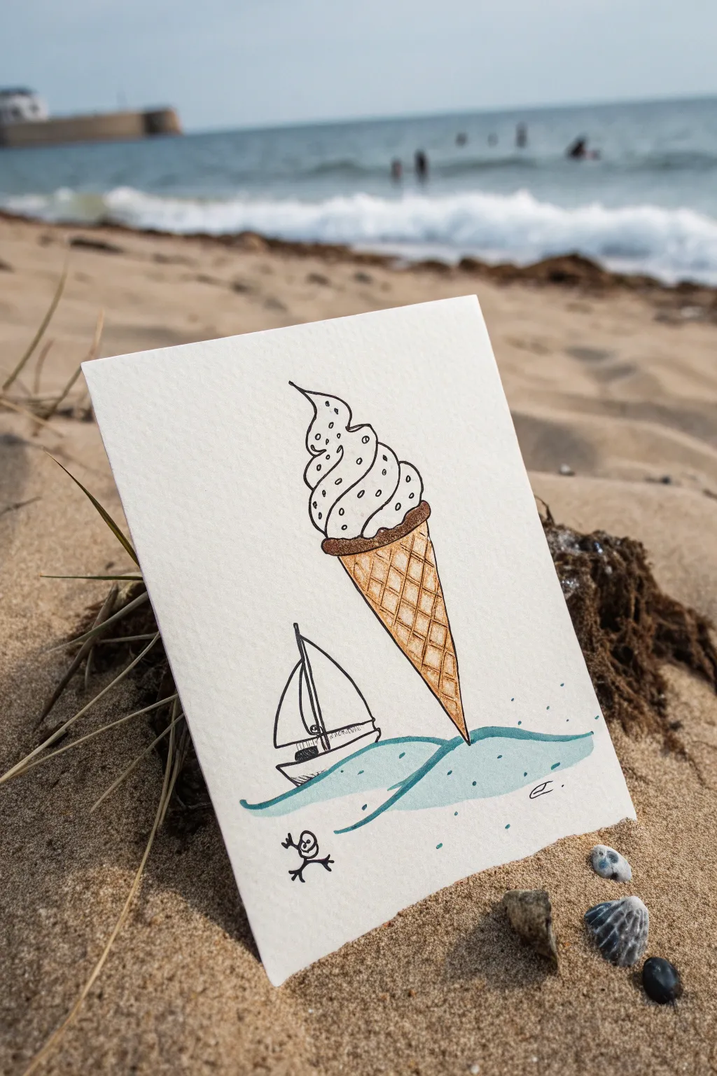
Blend imagination with reality in this charming ink and watercolor illustration where a giant ice cream cone mirrors the shape of a sailboat’s journey. This whimsical juxtaposition places a sweet treat directly into the seascape, creating a playful visual pun perfect for a summer greeting card.
How-To Guide
Materials
- Heavyweight watercolor paper or mixed media cardstock
- Fine liner pen (black, waterproof, size 0.3 or 0.5)
- Watercolor paints (Brown/Ochre, Light Blue/Teal)
- Small round paintbrush (size 2 or 4)
- Pencil and eraser
- Ruler (optional)
Step 1: Planning and Sketching
-
Rough layout:
Begin by lightly sketching the placement of your elements with a pencil. Position the ice cream cone slightly off-center to the right, angling it downward so the tip of the cone will meet the imaginary water line. -
Sketch the cone:
Draw the inverted triangle shape for the waffle cone. Make it substantial in size compared to the other elements. Add the rounded collar of the cone where the ice cream sits. -
Add the scoop:
Create the soft serve swirl on top of the cone. Use fluid, curving lines that taper upward into a classic soft-serve peak. Don’t worry about being perfectly symmetrical; organic curves look tastier. -
Draw the waves:
Sketch a simple, stylized wave line directly beneath the cone tip. The tip of the cone should just barely touch or slightly submerge into the crest of this wave, creating the visual connection. -
Add the sailboat:
To the left of the cone, draw a small sailboat riding the waves. Sketch a simple hull and a triangular sail. The juxtaposition works best if the sailboat is significantly smaller than the ice cream.
Ink Confidence
If you are nervous about drawing straight grid lines on the cone freehand, lightly mark the spacing with a ruler first, but draw the final ink lines by hand for a natural look.
Step 2: Inking the Outlines
-
Trace the ice cream:
Using your waterproof fine liner, carefully trace over your pencil lines for the soft serve swirl. Add small, sparse dots or ‘sprinkles’ within the swirls for texture. -
Ink the cone details:
Outline the cone shape. Draw a diagonal grid pattern inside the triangle to create the waffle texture. I usually draw lines in one direction first, then cross them, keeping spacing relatively even. -
Define the seascape:
Ink the waves with fluid, horizontal strokes that curve slightly to suggest movement. Outline the sailboat, adding a mast and a curved line for the sail catching the wind. -
Add the character:
Draw the tiny, surprised stick figure near the bottom left corner. A simple circle head and stick limbs add a humorous sense of scale to the scene. -
Clean up:
Wait for the ink to dry completely to avoid smudging. Once dry, gently erase all underlying pencil marks to leave a crisp black and white drawing.
Flavor Variations
Customize your scoop! Use pale pink washes for strawberry, mint green for pistachio, or keep it white for vanilla but add multicolored distinct dots for confetti sprinkles.
Step 3: Adding Color
-
Paint the cone:
Mix a warm golden-brown watercolor shade. Apply a light wash to the waffle cone area. The grid lines you drew earlier will show through, enhancing the texture. -
Deepen the shadow:
While the brown paint is still slightly damp or just after it dries, add a slightly darker brown tone just under the rim of the cone (the ‘collar’) to create a shadow and give the object volume. -
Paint the water:
Dilute a teal or light blue watercolor. Paint the space between the wave lines with a loose, watery stroke. You don’t need to fill every white space; leaving some paper showing creates a sparkling water effect. -
Add splatter details:
Dip your brush in the blue paint and gently tap it against your finger over the water area to create tiny droplets or ‘spray’ around the base of the cone and boat. -
Final touches:
Add a tiny signature in the corner if you wish, and let the entire piece dry completely before handling.
Now you have a whimsical piece of art that perfectly captures the playful spirit of summer.
Book Pages Turning Into Birds
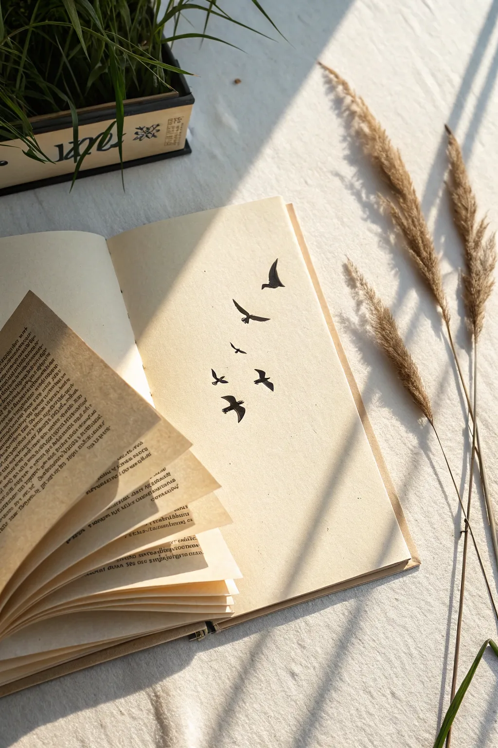
Transform an ordinary sketchbook into a poetic scene where printed words seemingly dissolve into a flock of birds. This mixed-media project combines papercraft and simple silhouette drawing for a striking visual metaphor of freedom.
Step-by-Step Guide
Materials
- Hardcover sketchbook with cream or off-white paper
- Old book with text (to sacrifice)
- Black drawing pen or fine liner (0.5mm and 0.8mm)
- Pencil (HB)
- Clear-drying craft glue or glue stick
- Scissors
- Eraser
- Ruler
Step 1: Preparation & Composition
-
Select your pages:
Begin by opening your sketchbook to a fresh two-page spread. You want the book to lie relatively flat, so pressing the spine down gently is helpful. -
Prepare the text pages:
Take your old book and carefully tear or cut out about 4-6 pages. These will become the fanned-out section on the left. -
Trim to size:
Cut the text pages so they are slightly smaller than the sketchbook pages. You want them to look like they belong there but offer a visual distinction. -
Arrangement check:
Place the text pages loosely on the left side of the sketchbook. Fan them out towards the center crease to visualize the transition point.
Natural Arch
When pressing the text pages, don’t crease the folds sharply. A soft, rolled bend mimics the natural motion of wings flapping.
Step 2: Creating the Fan Effect
-
Glue the base page:
Apply glue to the back of the first text page and adhere it securely to the left sketchbook page, aligning it somewhat centrally but tilted slightly. -
Layer the fan:
For the subsequent pages, apply a thin line of glue only along the inner vertical edge (the side closest to the book’s spine). This allows the outer edges to lift freely. -
Build the volume:
Continue gluing 3-4 more pages, shifting the angle of each one slightly upwards and outwards to create a fanned movement. -
Shape the lift:
Once the glue at the spine is tacky, gently roll the outer corners of the top text pages upward with your fingers to exaggerate the 3D effect.
Add Dimension
Use actual paper cutouts for the first one or two birds nearest the text, gluing them down flat to bridge the 3D and 2D worlds.
Step 3: Drawing the Migration
-
Sketch the trajectory:
Lightly use your pencil to draw a faint curved line starting from the fanned pages on the left, moving across the spine, and arcing up onto the blank right page. -
Outline the silhouettes:
Sketch simple bird outlines along this path. Start with smaller shapes near the ‘takeoff’ point and larger, more defined birds as they fly higher on the right page. -
Inking the outlines:
Using your thinner 0.5mm pen, carefully trace over your pencil sketches. Focus on capturing the sharp angles of the wings. -
Filling the shapes:
Switch to the thicker 0.8mm pen or a marker to fill in the bird silhouettes solid black. I find using a slight circular motion helps get a deep, even black coverage. -
Refine the edges:
Go back with the fine pen to sharpen the wingtips and beaks. Clean edges make the silhouettes look crisp against the cream paper. -
Connecting the elements:
Draw one or two very small, abstract bird shapes directly on the edge of the top fanned text page to visually link the paper to the drawing. -
Clean up:
Wait for the ink to dry completely to avoid smudging, then gently erase all visible pencil guidelines.
Now you have a dynamic piece of art that seemingly leaps off the page


Mountain Range Inside a Glass Jar
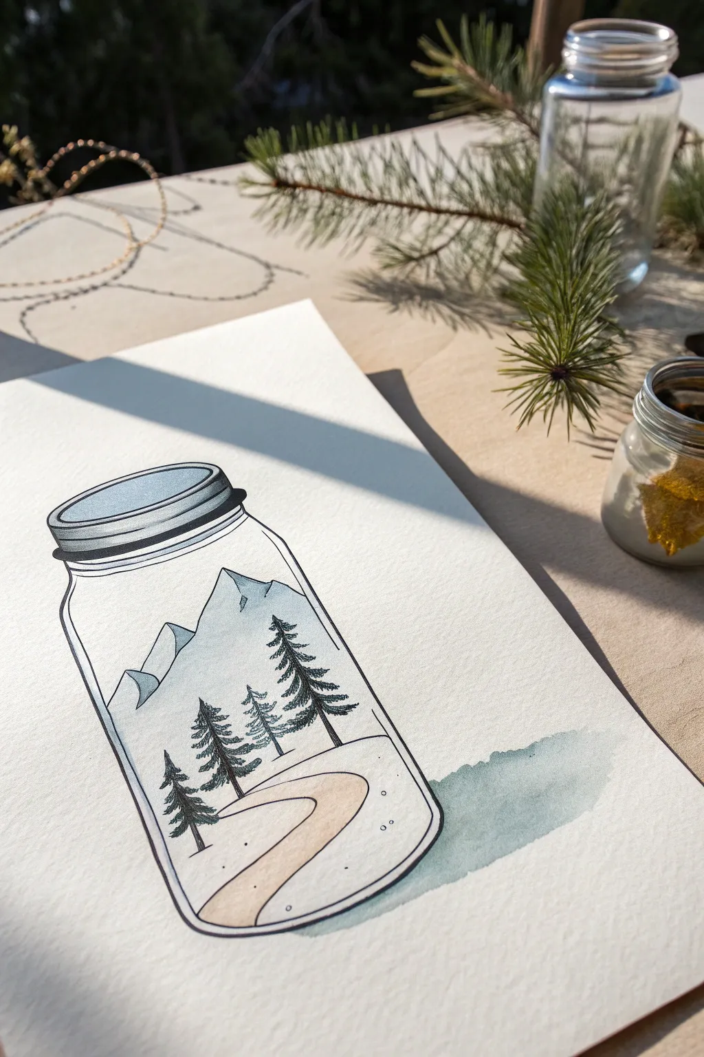
This whimsical project captures the serenity of a mountain landscape contained within the simple form of a Mason jar. Combining crisp ink lines with soft watercolor washes, you’ll create a charming scene that plays with scale and perspective.
Step-by-Step Tutorial
Materials
- Cold press watercolor paper (300 gsm)
- Pencil (HB or H)
- Fine liner pen (0.3mm or 0.5mm, waterproof black ink)
- Watercolor paints (Indigo, Payne’s Grey, Burnt Sienna, Yellow Ochre)
- Round watercolor brush (size 4 or 6)
- Eraser
- Jar of water
- Paper towel
Step 1: Drafting the Outline
-
Jar shape:
Begin by lightly sketching the outline of a mason jar in the center of your paper. Draw an oval for the lid, a slightly wider rim below it, and then the main glass body with rounded bottom corners. -
Mountain peaks:
Inside the jar, sketch two jagged mountain peaks occupying the upper back portion. Keep the lines irregular to mimic natural rock formations. -
Foreground terrain:
Draw a curved horizon line near the bottom of the jar to create a snowy ground. Add a winding path that s-curves from the bottom right towards the center. -
Trees placement:
Mark the positions for four pine trees. Place the smallest one furthest back on the left, and progressively make them larger as they move closer to the front right to establish depth. -
Refine lines:
Once happy with the composition, use your eraser to lighten the graphite lines until they are just barely visible guides.
Keep it Clean
When painting the sky or snow inside the jar, stop your brush specifically at the black ink line. Leaving the paper white outside the line enhances the ‘glass container’ effect.
Step 2: Inking the Details
-
Jar contours:
Using your waterproof fine liner, carefully trace the outer jar shape and the lid details. Use confident, smooth strokes for the glass to keep it looking clean. -
Mountain texture:
Ink the mountain outlines. Add minimal internal lines on the shadowed sides of the peaks to suggest craggy texture, but keep the lit sides open. -
Pine tree foliage:
For the trees, use short, quick scribbles or downward strokes to mimics pine needles. Build the branches denser at the bottom and lighter at the top. -
Path definition:
Ink the edges of the winding path with a thin, simple line. Don’t overwork the snowy ground; let the white of the paper do the work. -
Erase pencil:
Wait at least 5-10 minutes for the ink to fully cure, then gently erase all remaining pencil marks to leave a crisp black-and-white base.
Step 3: Adding Watercolor Washes
-
Sky and mountains:
Dilute a touch of indigo or cool blue with plenty of water. Paint a very pale wash over the mountains, leaving some areas white for snow caps. -
Shadows on peaks:
While the previous layer is still slightly damp, drop a slightly more concentrated grey-blue into the shadowed sides of the mountains for dimension. -
Winding path:
Mix a light wash of Burnt Sienna and a tiny bit of Yellow Ochre to get a beige sand color. Carefully paint the winding path. -
Lid coloring:
Paint the lid with a diluted grey wash. Add a darker stripe of grey on the shadowed side of the lid rim to make it look metallic. -
External shadow:
To ground the jar, mix a watery grey-blue. Paint a shadow extending to the right of the jar base, fading it out as it moves away from the glass. -
Final touches:
If you want a hint of ‘glass’ reflection, add a very faint, pale blue vertical stroke on the left side of the jar’s curve, but keep it extremely subtle.
Starry Night Variation
Swap the white background for a dark navy wash inside the jar behind the mountains. Use white gel pen dots to create a captured galaxy or starry night sky.
Let the paint dry completely before framing your miniature captured landscape
Cactus Hair on a Soft Portrait
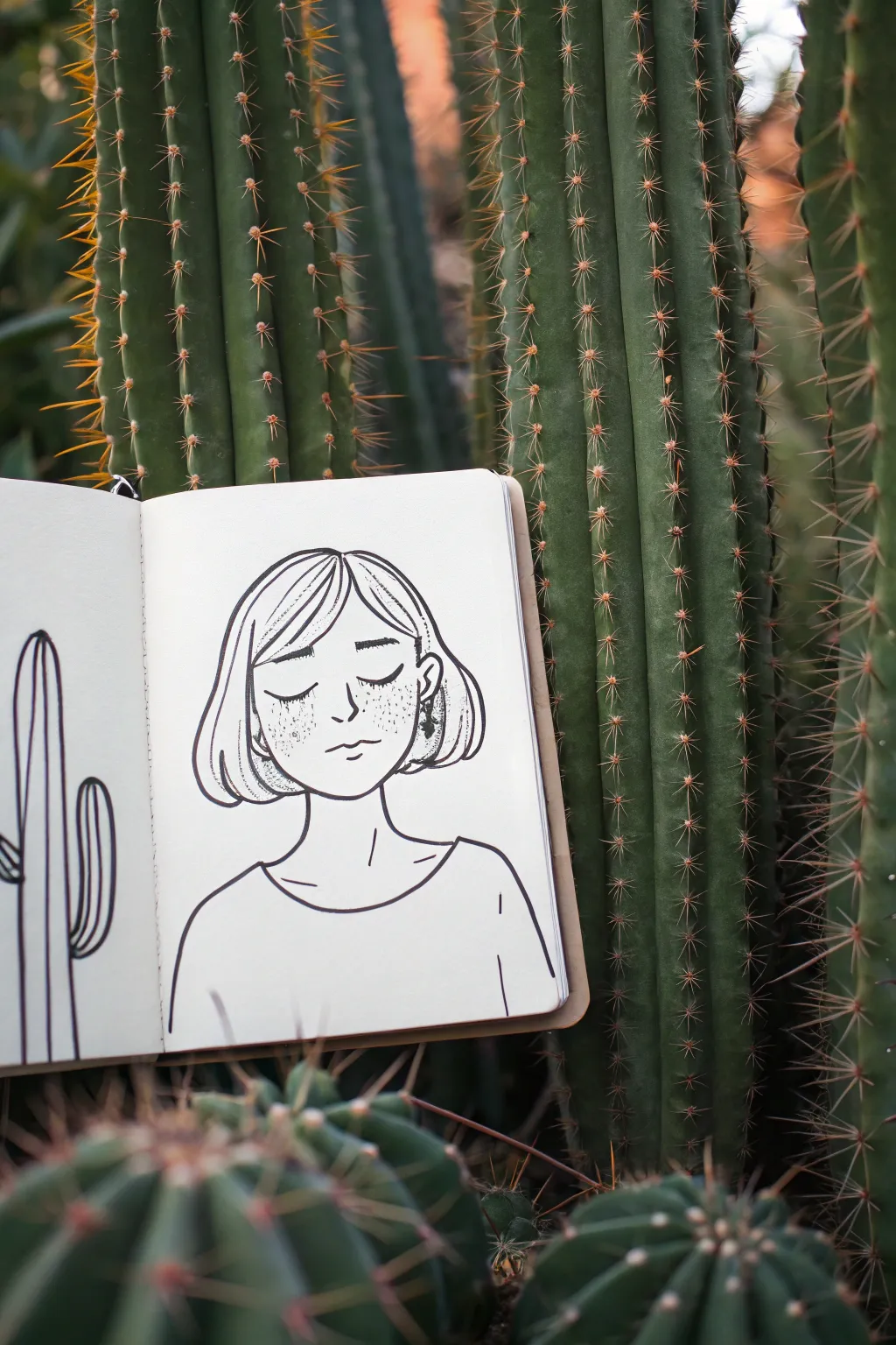
Capture a serene moment with this minimalist ink portrait, juxtaposing the softness of a human face against the structured lines of a cactus. This easy-to-follow sketch uses clean contours and delicate stippling to create a peaceful, dreamlike atmosphere in your sketchbook.
Step-by-Step
Materials
- Small sketchbook (cream or off-white paper recommended)
- Pencil (HB or 2B for initial sketch)
- Kneaded eraser
- Fine liner pen (01 or 03 size, black ink)
- Fine liner pen (005 size for details)
Step 1: Laying the Foundation
-
Sketch the Head Shape:
Begin with a pencil to lightly draw an oval for the head. Keep your lines very faint so they are easy to erase later. Slightly flatten the oval at the chin for a more natural jawline. -
Map Out Features:
Draw horizontal guidelines lightly across the face to mark the position of the eyes, nose, and mouth. The eyes should sit roughly in the middle of the vertical length of the head. -
Outline the Hair:
Sketch the basic shape of a bob haircut. Start from the part line slightly off-center and draw curved lines that hug the head shape, flaring out gently just below the ear level. -
Define the Neck and Shoulders:
Extend two vertical lines down from the jaw for the neck. Widen these into a gentle slope for the shoulders, keeping the pose relaxed and symmetrical. -
Add Clothing Basics:
Draw a simple curved neckline connecting the shoulders to indicate a t-shirt or loose top. Minimal detail is key here to keep the focus on the face.
Steady Hands
For smoother long lines, lock your wrist and move your entire arm from the elbow. This prevents shaky, jittery strokes on the hair and shoulders.
Step 2: Inking the Portrait
-
Trace the Face Shape:
Switch to your 03 or 01 fine liner. Carefully ink the jawline and chin. Use confident, smooth strokes rather than short, scratchy ones to maintain a clean aesthetic. -
Ink the Eyes:
Draw two downward-curving arcs for the closed eyelids. I find that making the lines slightly thicker in the middle helps imply eyelashes without drawing them individually. -
Add Nose and Mouth:
Place a small, subtle ‘L’ shape or tick for the nose. Below that, draw a simple, gentle curve for the mouth, adding a tiny dash underneath to suggest the lower lip. -
Detail the Hair:
Ink the hair outline. Inside the hair shape, add a few sweeping lines to suggest strands and volume, particularly near the part and the tips of the bob. -
Draw the Neck and Shirt:
Ink the neck lines and the shoulder curve. Go over the neckline of the shirt, adding a small crease line near the collarbone to give the fabric a bit of weight. -
Add the Earring:
On the visible ear (peeking through the hair on the right), draw a small dangling earring shape. Fill it in with black ink to create a high-contrast accent.
Botanical Borders
Instead of a single cactus on the side, try framing the entire portrait with prickly pear pads or succulents to deepen the nature theme.
Step 3: Adding Texture and Juxtaposition
-
Stipple the Freckles:
Using your finest pen (005), gently tap dots across the nose and cheeks. Vary the density, clustering them slightly more on the bridge of the nose for a realistic freckled look. -
Refine Hair Texture:
Add a few broken lines or dots near the tips of the hair to suggest texture without cluttering the clean design. -
Start the Cactus:
On the opposite page or to the left of your portrait, sketch a tall, vertical cactus shape. It doesn’t need to be fully detailed—just the outline of a ribbed column cactus works best. -
Ink the Cactus Ribs:
Draw vertical lines running up the cactus to represent its ribs. Keep these lines fairly straight but organic. -
Erase Pencil Marks:
Wait until the ink is completely dry—give it a full minute or two. Then, gently use your kneaded eraser to lift all the underlying pencil sketch lines. -
Final Assessment:
Look over the drawing for any lines that need connecting or thickening. Sometimes thickening the outer contour of the silhouette slightly can make the figure pop off the page.
Now you have a serene, nature-inspired portrait ready to enhance your journaling collection
Skeleton Hand Holding a Fresh Flower
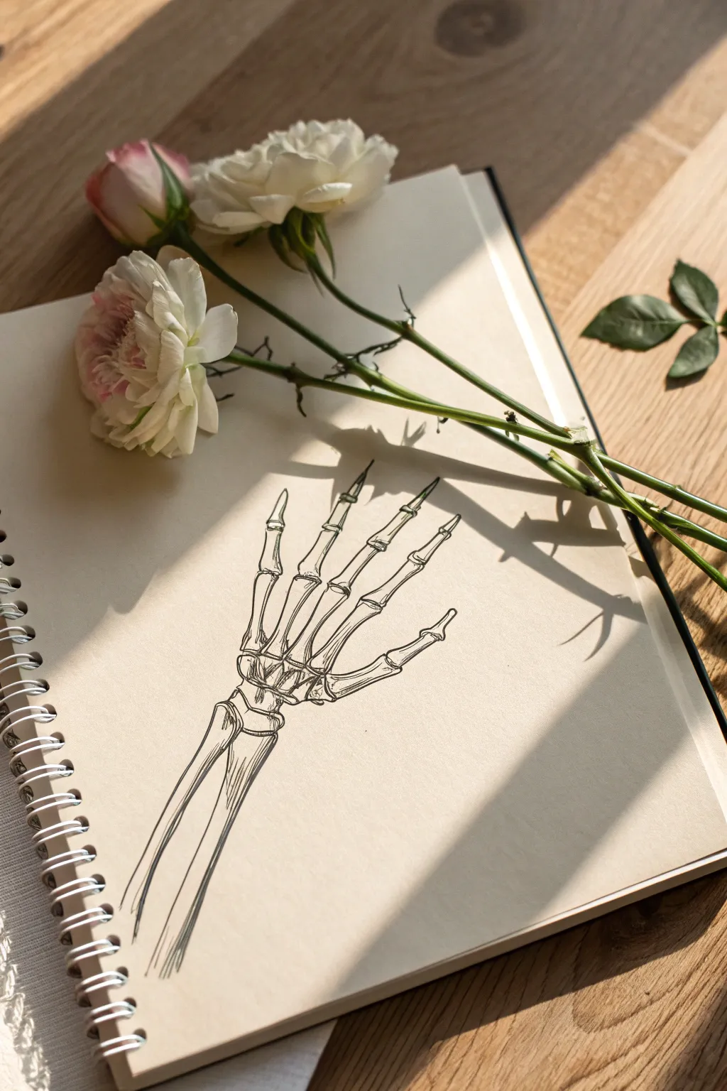
This elegant juxtaposition project contrasts the delicate linearity of a skeletal anatomy study with the vibrant softness of fresh blooms. The result is a moody, slightly gothic arrangement that plays with themes of life and structure, perfectly framed on a sunlit table.
How-To Guide
Materials
- Spiral-bound sketchbook (heavyweight cream paper preferred)
- Black fineliner pens (sizes 0.1, 0.3, and 0.5)
- Graphite pencil (HB or H for sketching)
- Kneaded eraser
- Fresh flowers (light pink ranunculus or spray roses)
- Reference image of a human hand skeleton
Step 1: Anatomy Sketching
-
Establish the Wrist:
Begin lightly with your pencil about a third of the way up the page. Sketch two long bone shapes for the forearm—the radius and ulna—angling slightly to the left. -
Block in the Carpals:
At the top of the forearm bones, draw a cluster of small, irregular pebble-like shapes to represent the carpal bones of the wrist. Keep this cluster tight and organized. -
Draw the Metacarpals:
Extend five longer, slender bone shapes upward from the wrist cluster. These fan out slightly, forming the base of the palm. -
Add the Phalanges:
Sketch the finger bones extending from the metacarpals. Remember that the thumb has two segments, while the other fingers have three distinct segments each. -
Refine the Joints:
Go back over your finger sketches and slightly bulb out the ends of each bone segment where they meet to create realistic-looking knuckles.
Step 2: Inking the Bones
-
Outline the Forearm:
Switch to a 0.5 pen. specific, confident lines, trace the outer edges of the radius and ulna. I like to break the line occasionally to suggest an organic, aged texture. -
Detail the Wrist Cluster:
Use a 0.3 pen for the carpal bones. Draw the gaps between the bones clearly to show that they are separate pieces fitting together like a puzzle. -
Define the Fingers:
Ink the metacarpals and phalanges with the 0.3 pen. Pay close attention to the knuckles, making the lines slightly thicker at the joints to emphasize structure. -
Add Stylized Tips:
Instead of rounding off the very tips of the fingers perfectly, give them a slightly tapered, almost sharp appearance to mimic the look of un-fleshed bone tips.
Bone Texture Tip
Don’t make your lines perfectly straight. Slight wobbles and small broken gaps in the outline make the bones look old, brittle, and organic rather than like plastic.
Step 3: Shading and Texture
-
Establish Light Source:
Decide on a light source coming from the upper left. This means shadows will fall on the right side of the bones. -
Hatching the Shadows:
Using your finest 0.1 pen, add delicate diagonal hatching lines on the shadowed side of the forearm bones. -
Detailing the Knuckles:
Add tiny stippling dots or very short hatch marks around the curve of the joints to give them three-dimensional volume. -
Erase Pencil Lines:
Wait until the ink is completely dry to avoid smudging, then gently lift away all remaining graphite sketch marks with your kneaded eraser. -
Final Contrast Check:
Look at the drawing as a whole. If the bone structure looks too flat, go back with the 0.1 pen and add a second layer of cross-hatching to the deepest shadow areas.
Ink Smearing?
If your ink smears when erasing, switch to pigment-based liners (like Micron) over dye-based ones. Wait at least 15 minutes before erasing sketches.
Step 4: Floral Juxtaposition
-
Prepare the Flowers:
Trim the stems of your fresh roses or ranunculus so they are slightly longer than the width of your sketchbook. Keep the leaves attached for greenery. -
Position the Blooms:
Lay the flowers diagonally across the top of the sketchbook page. The goal is to have the stems interact with the negative space above the skeleton hand. -
Arrange the Stems:
Ideally, place the stems so they overlap or extend from the fingertips of the drawing, creating the illusion that the skeleton hand is reaching for or holding the flowers. -
Capture the Light:
Find a spot with natural sunlight that casts shadows from the real flowers onto the paper, integrating the drawing with the physical objects.
Now you have a poetic blend of biology and botany ready to be photographed or displayed
Cracked Concrete With Tiny Daisies
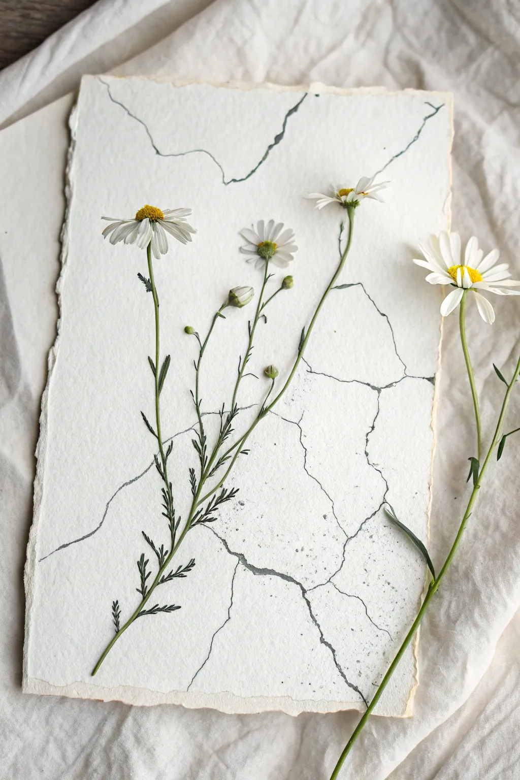
This mixed-media project beautifully captures the contrast between organic softness and urban decay. By combining real flowers with simple ink drawing techniques on textured paper, you’ll create a striking trompe-l’œil effect that looks like nature breaking through concrete.
Detailed Instructions
Materials
- Thick handmade cotton paper with deckled edges (A4 or A5)
- Black waterproof fine-liner pen (0.1mm or 0.3mm)
- Black ink or diluted watercolor paint
- Old toothbrush or stiff bristle brush
- Fresh daisies (for pressing) or high-quality silk flowers
- Flower press or heavy books
- Matte craft glue or floral adhesive
- Pencil (HB)
- Kneaded eraser
Step 1: Preparing the Botanicals
-
Evaluate your flowers:
Select two or three stems of daisies. Look for stems that have interesting curves and varying stages of bloom, from tight buds to fully open flowers, to add visual interest. -
Trim the stems:
Cut the stems to lengths that will fit comfortably on your paper, leaving a little extra length at the bottom that can be trimmed later. -
Pressing process:
Place the fresh flowers between sheets of parchment paper inside a heavy book or flower press. Leave them for at least a week until they are completely flat and dry. -
Alternative option:
If you don’t want to wait for pressing, you can use high-quality faux silk flowers. Carefully flatten them under a book overnight to reduce their bulk before gluing.
Natural Variations
Look for paper with visible fibers or inclusions. The rougher the paper texture, the more convincing your ‘concrete’ effect will be when inked.
Step 2: Drawing the Concrete Textures
-
Draft the cracks:
Take your sheet of handmade paper. Using an HB pencil very lightly, sketch the main fissure lines. I usually like to start from the edges and work inward, imagining how a stone slab would naturally fracture under stress. -
Refine the lines:
Aim for jagged, angular paths rather than smooth curves. Let the lines branch off into smaller ‘tributaries’ to mimic realistic geological veins. -
Ink the main cracks:
Trace over your pencil lines with a 0.3mm black fine-liner. Don’t worry about keeping the line thickness perfectly consistent; slight wobbles add to the realism. -
Vary line weight:
Go back over certain sections of the cracks to thicken them, creating depth. The intersections where cracks meet should be slightly darker and thicker. -
Add micro-fissures:
Switch to a 0.1mm pen to draw tiny, hairline cracks branching off the main lines. These should be very faint and disappear into the white space. -
Create texture splatter:
Dip an old toothbrush into black ink or diluted watercolor. Use your thumb to flick the bristles, spraying a very fine mist of speckles across the paper to mimic the grit of concrete. -
Control the splatter:
Keep the splatter distinct but subtle. You can mask off areas with scrap paper if you want certain sections to remain completely clean. -
Drying time:
Allow the ink drawing and splatters to dry completely. Once dry, gently lift any remaining pencil marks with a kneaded eraser.
Step 3: Assembly and Finishing
-
Dry arrangement:
Lay your pressed (or flattened faux) flowers onto the dry ink drawing. Experiment with the composition, arranging them so the stems appear to ‘grow’ out of or across the cracks you drew. -
Apply adhesive:
Using a toothpick or fine brush, apply small dots of matte craft glue to the back of the flower heads and the thickest parts of the stems. -
Secure the flowers:
Gently press the botanicals onto the paper. Hold them in place for a few seconds to ensure the glue tacks onto the textured paper surface. -
Adding dimension:
It’s okay if some leaves or petals lift slightly off the paper; this creates a nice shadow and enhances the 3D effect of the juxtaposition. -
Final stem trim:
If the stems overhang the bottom edge of the paper, trim them cleanly with scissors to align with the deckled edge or let them extend slightly for a ‘specimen’ look. -
Placement of loose stems:
Consider placing one single stem detached from the main group, perhaps lying across a crack on the right side, to balance the composition.
Gilded Edges
For a kintsugi-inspired look, paint thin gold leaf or gold ink inside the widest cracks instead of using solid black. It adds an elegant shine.
Frame your botanical juxtaposition in a shadow box to protect the delicate petals while displaying the textures.
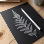
Key With Leaf Veins
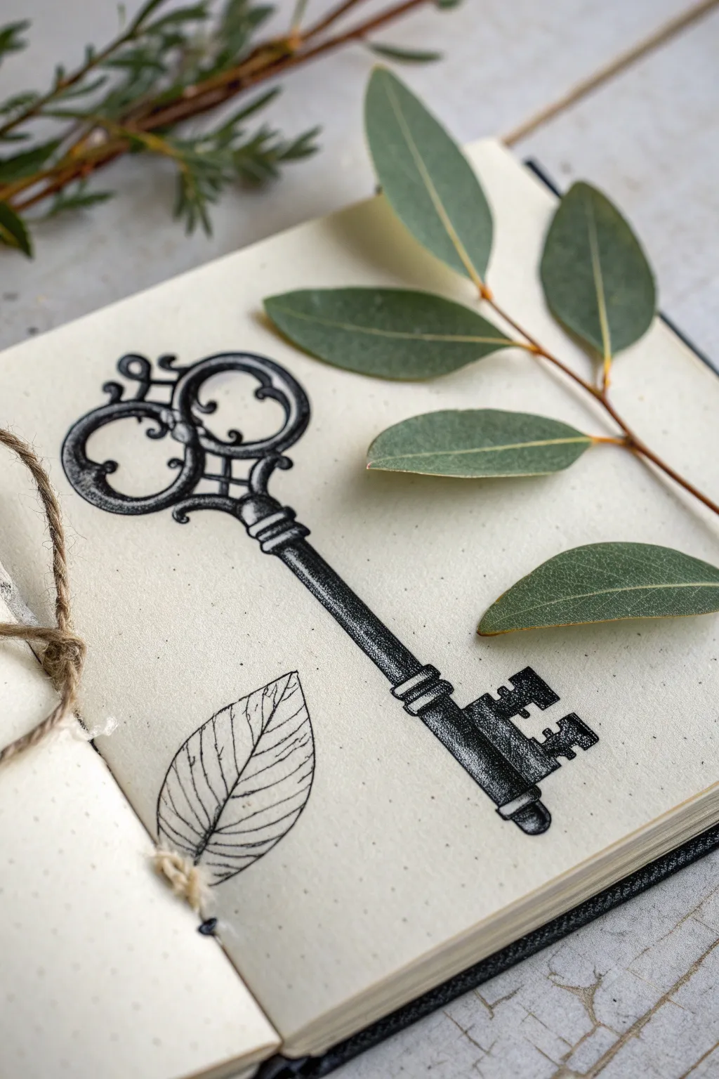
This project combines the mechanical precision of an ornate skeleton key with the organic simplicity of a leaf study. Using fine liners on dotted paper creates a stunning contrast between heavy, shaded textures and delicate line work.
How-To Guide
Materials
- Dotted or blank sketchbook suitable for ink
- Pencil (HB or 2B)
- Kneaded eraser
- Fine liner pens (sizes 0.05, 0.1, 0.3, and 0.5)
- Ruler (optional)
- Reference image of an antique key
- Real eucalyptus sprig or leaf reference
Step 1: Drafting the Shapes
-
Establish the centerline:
Begin by lightly drawing a vertical line down the center of the page with your pencil. This axis is crucial for keeping the key symmetrical. -
Block in the key head:
At the top of your axis, sketch the basic geometric shapes of the key’s bow (the handle). Start with large circles or ovals to map out where the filigree loops will go. -
Define the shaft:
Draw parallel lines down the axis to form the shaft of the key. Keep this tentative for now, marking where the decorative ridges or collars will be near the top and bottom. -
Sketch the bit:
At the bottom of the shaft, block out the rectangular shape of the bit (the part that turns the lock). Add the notches and details lightly. -
Refine the filigree:
Go back to the head of the key and refine the swirling shapes. Create the ‘clover’ or heart-like cutouts inside the metal loops, thickening the lines to show the volume of the metal. -
Position the leaf:
To the left of the key shaft, lightly sketch the outline of a simple, pointed oval leaf. Keep the shape somewhat imperfect to mimic nature.
Stippling Patience
Don’t rush the dots! Fast, aggressive tapping turns dots into tiny dashes or hooks. Keep your pen vertical and tap gently for perfect round points.
Step 2: Inking the Outlines
-
Trace the key outline:
Using a 0.3 fine liner, carefully go over your pencil lines for the key. Focus on smooth, confident strokes for the long shaft and curves. -
Ink the leaf border:
Switch to a 0.1 pen for the leaf. The line here should be thinner and more delicate than the heavy metal key to create visual contrast. -
Erase pencil guides:
Once the ink is completely dry—I usually give it a full minute just to be safe—gently erase all the pencil marks with a kneaded eraser.
Step 3: Shading and Texture
-
Establish light source:
Decide on a light source (the reference implies top-left). This means shadows will fall heavily on the bottom-right surfaces of the metal. -
Stipple the key:
Using your 0.05 or 0.1 pen, begin stippling (drawing tiny dots) on the shadowed areas of the key. Concentrate the dots heavily on the right side of the shaft and the inner curves of the handle. -
Add form shadows:
Build up the density of the dots to create a gradient. The transition from black ink to the white paper creates the illusion of a round, metallic cylinder. -
Detail the bit:
Darken the notches in the key bit significantly. Use solid black fill in the deepest crevices, fading out into stippling to show the worn texture of the iron. -
Enhance the collars:
Add horizontal curved lines on the decorative ridges (collars) of the shaft to emphasize their roundness. -
Draw leaf veins:
Using your finest 0.05 pen, draw a central vein down the leaf. Add branching veins that extend toward the edges but fade out before touching the outline. -
Texture the leaf:
Add very faint, broken lines between the veins to suggest texture without overworking it. This drawing should remain much lighter and airier than the heavy key. -
Final touches:
Review the key for contrast. If the metal doesn’t look heavy enough, go back with a 0.5 pen and re-line the shadowed edge to give it visual weight.
Mixed Media Rust
After the black ink dries, tap a very damp teabag or use a light wash of burnt sienna watercolor over the key to create an instant aged, rusted iron effect.
This high-contrast study is a perfect way to practice rendering different material weights side by side
Cat Behind Blinds on Lined Paper
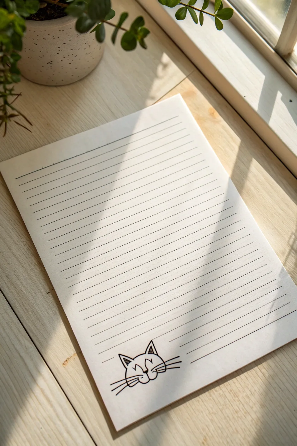
This clever drawing turns ordinary lined paper into a playful scene where a cat peeks through window blinds. By integrating the existing blue lines of the paper directly into your character design, you create a fun visual illusion with minimal supplies.
Step-by-Step
Materials
- Sheet of standard lined notebook paper (loose leaf or from a pad)
- Black fine-point drawing pen (like a Micron 05 or 08)
- Pencil (HB or 2B for sketching)
- Eraser
- Ruler or straight edge (optional)
Step 1: Planning the Placement
-
Position your paper:
Lay your sheet of lined paper flat on a hard, smooth surface. Ensure you have good lighting so you can see the faint blue lines clearly. -
Choose the location:
Look at the bottom third of the page. You want to place the cat’s head so that several horizontal lines will cross over its face naturally. I usually aim for the bottom 4-5 lines to serve as the ‘blinds’. -
Sketch the head shape:
Using your pencil very lightly, draw a simple oval or rounded trapezoid shape for the cat’s head. The top of the head should sit just below one line, while the chin rests near another. -
Add the ears:
Sketch two triangles on top of the head shape. Make them perky and alert. The tips of the ears can poke up into the white space between lines.
Step 2: Drawing the Cat Features
-
Locate the eyes:
This is the trickiest part. You want the eyes to ‘peek’ through the space between two horizontal lines. Sketch simple curved arcs or small circles just below one of the blue lines. -
Place the nose:
Drop down to the next space between lines to place the nose. Draw a small, inverted triangle or heart shape here. -
Draft the mouth:
From the bottom of the nose, draw two curved lines branching outward (the ‘W’ shape of a cat mouth). These can cross over the blue lines if needed, but it looks cleanest if they sit primarily in the white space. -
Sketch the whiskers:
Draw three long, sweeping lines extending from each cheek. These lines will definitely cross over the notebook lines, helping to break the rigidity of the background.
Master the Illusion
Don’t draw the vertical sides of the cat’s face where the blue lines are. By leaving those gaps, the cat truly looks like it is sitting *behind* the paper’s ruling.
Step 3: Inking and Interacting with Lines
-
Start inking the outline:
Switch to your black fine-point pen. Begin tracing your pencil lines for the top of the head and the ears. Make the lines crisp and confident. -
Inking the ears:
Add a smaller triangle inside each ear for detail. You can add a few vertical hatch marks inside the inner ear for texture, like shading. -
The ‘Blinds’ effect:
When inking the sides of the face, stop your pen line every time you hit a blue notebook line. Skip over the blue line, and continue the black ink on the other side. This makes the blue line appear to be ‘on top’ of the drawing. -
Ink the facial features:
Trace the eyes, nose, and mouth. Just like the head outline, be mindful of where they intersect with the paper’s lines. If a feature hits a line, break the ink stroke to maintain the illusion. -
Ink the whiskers:
With quick, fluid strokes, ink the whiskers. For these, it creates a nice contrast if you actually draw *over* the blue lines uninterrupted, showing that the whiskers are poking through the blinds.
Make it Yours
Draw paws reaching up to ‘pull’ down on one of the lines. You can make the line beneath the paw bend downward to distinctive visual weight to the character.
Step 4: Finishing Touches
-
Bold the key lines:
Go back over the outer contour of the cat with a slightly heavier pass of the pen to make it pop against the page. -
Erase sketches:
Wait at least five minutes to ensure the ink is completely dry. Then, gently erase all your initial pencil marks. Be careful not to crinkle the paper. -
Add emphasis (Optional):
If you want to enhance the ‘blinds’ look, you can use a ruler and very carefully re-trace the blue notebook lines that cross the cat’s face with a blue pen, but only strictly where they cross the drawing.
Now you have a charming little companion keeping you company during your study sessions or workday
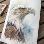
Bird With a Megaphone Beak
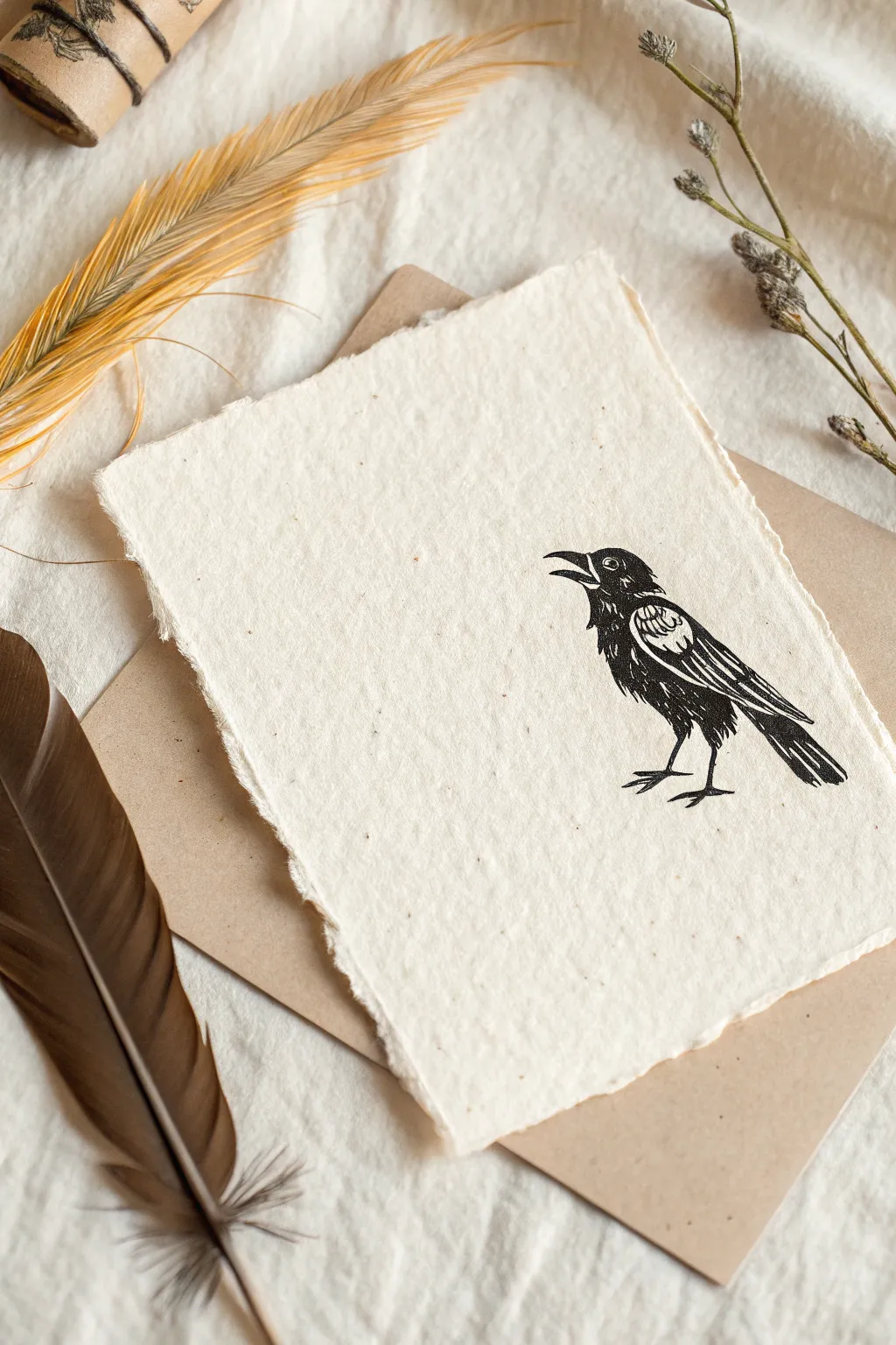
Create a striking piece of minimalist art by hand-carving a raven stamp and printing it onto beautifully textured handmade paper. The stark black ink against the creamy, deckled-edge paper creates a timeless, rustic aesthetic perfect for framing or gifting.
Step-by-Step
Materials
- Soft linoleum block (e.g., Speedy-Carve)
- Linoleum cutter tool with V-gouge and U-gouge blades
- Pencil and tracing paper
- Block printing ink (black, oil-based or water-soluble)
- Rubber brayer (roller)
- Glass or acrylic plate (for rolling ink)
- Handmade paper with deckled edges (heavyweight)
- Barren or a clean wooden spoon
- X-Acto knife
Step 1: Designing and Carving
-
Sketch the outline:
Begin by drawing a simple side-profile of a crow or raven on a piece of paper. Keep the design graphic and bold, focusing on the silhouette, the open beak, and the folded wing shape. -
Transfer to block:
Place a piece of tracing paper over your sketch and trace the lines with a soft pencil. Flip the tracing paper graphite-side down onto your linoleum block and rub the back firmly to transfer the image. -
Outline with fine gouge:
Using your smallest V-gouge blade, carefully carve along the transferred pencil lines. This outlines your positive space (the bird) and separates it from the background. -
Carve interior details:
Use the V-gouge to create the internal texture of the feathers. Carve short, directional lines on the wing and chest to mimic plumage, leaving raised areas that will hold the ink. -
Define the eye:
Carve a very small circle for the eye, leaving a tiny dot in the center raised if possible, creating a highlight. This gives the bird instant personality. -
Clear the background:
Switch to a wider U-gouge blade to carve away the large negative space around the bird. You want to remove enough material so the background doesn’t pick up stray ink. -
Cut out the shape:
Instead of leaving a rectangular block, I prefer to use an X-Acto knife or sharp blade to cut the excess linoleum away completely, following the general shape of the bird about half an inch from the design. -
Clean the block:
Brush away any loose carving debris or crumbs. You can wipe the block gently with a slightly damp cloth to ensure no dust interferes with the ink.
Uneven Ink Transfer?
If your print looks patchy, your paper might be too textured. Lightly mist the paper with water using a spray bottle before printing to soften the fibers and accept ink better.
Step 2: Inking and Printing
-
Prepare the workspace:
Set up a clean, flat workspace. Place your handmade paper nearby, ensuring the textured side is facing up and ready to receive the print. -
Charge the roller:
Squeeze a small line of black block printing ink onto your glass or acrylic plate. Roll the brayer back and forth and lift it occasionally to create a smooth, velvety layer of ink on the roller. -
Ink the block:
Roll the inked brayer over your carved bird block. Apply the ink in multiple directions to ensure all the raised ridges and details are thoroughly and evenly coated. -
Position the print:
Carefully pick up the inked block by the edges. Hover it over the bottom right quadrant of your handmade paper to match the composition in the example, then press it down firmly. -
Apply pressure:
While holding the block steady with one hand, use a barren or the back of a wooden spoon to rub the back of the block in circular motions. Apply firm, even pressure to transfer the ink. -
Reveal the image:
Hold one corner of the paper down and slowly peel the linoleum block upward. Do this carefully to avoid smudging the wet ink. -
Check for consistency:
Inspect the print. A slightly imperfect, ‘salty’ look (where small specks of paper show through) is desirable for this rustic style, but ensure the main lines are crisp. -
Let it cure:
Place the printed paper in a safe, dust-free area to dry. Oil-based inks may take several days to cure fully, while water-based inks will dry much faster.
Add a Color Pop
Before printing the black outline, use a small brush to paint a wash of gold watercolor exactly where the wing sits, letting it dry completely. Then print the black block over it.
Once the ink is fully dry, display your print on a simple clipboard or float frame to highlight those beautiful deckled edges


Have a question or want to share your own experience? I'd love to hear from you in the comments below!