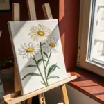
Leaves are basically nature’s ready-made paintbrushes, stamps, and stencils all in one. Here are my favorite leaf painting ideas—from classic prints you can do in minutes to artsy experiments that feel like a little studio adventure.
Ombre Background Behind Leaf Stencils
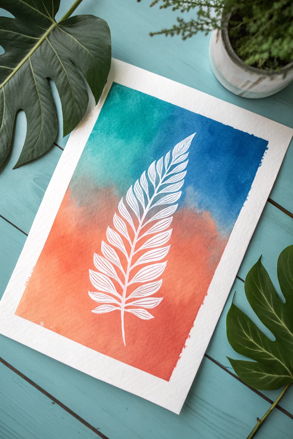
This project combines the delicate precision of a leaf silhouette with the bold, dreamy transitions of a sunset sky. By using a resist technique, you’ll capture the crisp white veining of the fern against a vibrant wash of teal, blue, and coral watercolors.
Step-by-Step Guide
Materials
- Cold press watercolor paper (white, 140lb/300gsm)
- Masking fluid or white wax crayon/oil pastel (for resist)
- Watercolor paints (teal, deep blue, coral orange)
- Medium round watercolor brush (size 8 or 10)
- Fine liner brush or drawing nib (if using masking fluid)
- Pencil (light H or HB)
- Painter’s tape
- Water cups and paper towels
- Clean eraser
Step 1: Drawing the Base Outline
-
Tape down the paper:
Secure your watercolor paper to a flat, hard surface using painter’s tape on all four sides. This prevents the paper from buckling when we add the water and creates that clean white border you see in the finished piece. -
Lightly sketch the spine:
Using a hard pencil, very faintly draw a curved line down the center of your paper. This will serve as the central vein (rachis) of your fern leaf, helping you keep the symmetry balanced. -
Outline the leaflets:
Sketch the basic shapes of the leaflets extending from the spine. Start small at the top, widen in the middle, and taper off at the bottom. Keep your pencil pressure incredibly light so it won’t show through later.
Clean Lines Pro Tip
Coat your brush in bar soap before dipping it into masking fluid. This creates a barrier that protects bristles and makes cleanup much easier.
Step 2: Applying the Resist
-
Prepare your resist tool:
Decide on your resist method. If you want the crisp, fine lines shown in the image, liquid masking fluid applied with a fine nib or old liner brush is best. A white wax crayon works for a rougher, more textured look. -
Mask the stem:
Carefully trace over your central spine line with the masking fluid. Ensure the line tapers nicely at the top and has a slightly thicker base at the bottom. -
Draw the leaflet veins:
For each leaf segment, draw the central vein first, connecting it to the main stem. Then, make the small outline shape of the leaflet around it. -
Add internal details:
Inside each leaflet outline, draw tiny diagonal lines to represent the secondary veins. This intricate detail is what makes the white negative space pop against the color. -
Let it cure completely:
If using masking fluid, you must wait until it is 100% dry and rubbery to the touch. Painting over wet fluid will ruin your brush and the paper.
Level Up: Salt Texture
While the watercolor wash is still wet, sprinkle a pinch of coarse sea salt onto the blue section. It creates star-like blooms when dry.
Step 3: Painting the Ombre Wash
-
Wet the paper:
Using your large round brush, apply a layer of clean water over the entire area inside the tape borders. This ‘wet-on-wet’ technique is crucial for a smooth gradient. -
Apply the teal top:
Load your brush with a vibrant teal or turquoise watercolor. Paint the top left corner, letting the pigment flow freely into the wet paper. -
Transition to blue:
While the teal is still wet, mix a deeper blue and apply it to the top right area, blending it slightly with the teal where they meet. -
Introduce the coral:
Clean your brush thoroughly. Pick up your coral or warm orange paint and apply it to the bottom half of the paper. I suggest working quickly here so the edges stay wet and soft. -
Create the blend:
Where the blue sky tones meet the orange sunset tones, gently tickle the paints together with a damp brush. Allow them to create a soft, muddy-purple transition zone naturally. -
Intensify the color:
While the paper is still damp, drop clearer, more saturated pigment into the corners—teal at the top, orange at the bottom—to deepen the contrast. -
Wait for drying:
Allow the painting to dry completely. The paper must be bone dry before the next step. Use a hairdryer on a low setting if you are impatient.
Step 4: The Reveal
-
Remove the mask:
Once dry, gently rub your finger or a rubber cement pick-up tool over the masking fluid to peel it away. Reveal the stark white paper underneath. -
Erase pencil lines:
If any graphite sketch lines are visible within the white leaf shapes, carefully erase them with a clean, soft eraser. -
Peel the tape:
Slowly peel away the painter’s tape at a 45-degree angle, pulling away from the creative area to ensure you don’t rip the surface layers.
Frame your new botanical masterpiece in a light wood frame to complement the organic vibes

Detailed Botanical Leaf Illustration
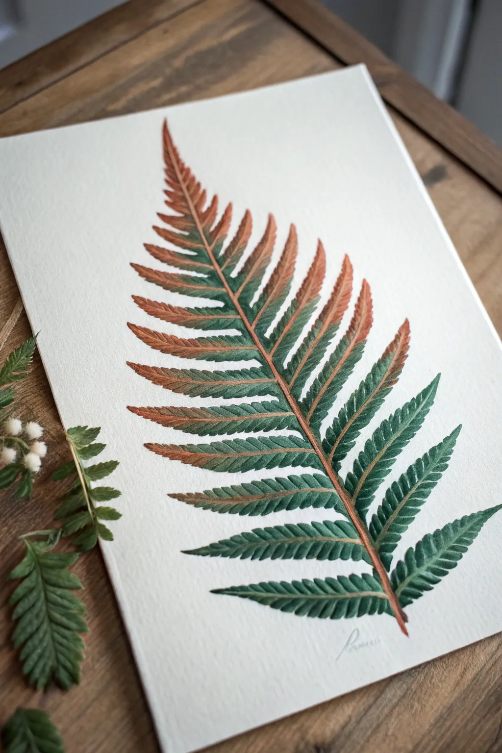
Master the delicate transition between the seasons with this botanical illustration, capturing a fern in mid-transformation. By blending vibrant emerald greens into rusty amber tones, you will create a piece that feels both organic and exquisitely detailed.
Step-by-Step
Materials
- Hot press watercolor paper (300 gsm)
- Watercolor paints (Sap Green, Hooker’s Green, Burnt Sienna, Burnt Umber)
- Round watercolor brushes (sizes 0, 2, and 4)
- HB pencil
- Kneaded eraser
- Jar of clean water
- Paper towel or mixing palette
Step 1: Sketching the Skeleton
-
Draw the central rachis:
Begin by lightly sketching a long, slightly curved diagonal line across your paper using an HB pencil. This main stem, or rachis, is the spine of your fern and determines the flow of the entire piece. -
Map the frond layout:
Mark small dashes along the stem where each leaflet (pinna) will attach. These should be larger at the bottom and gradually become smaller and closer together as you reach the tapering tip. -
Outline the leaflets:
Sketch the overall triangular shape of each leaflet. Instead of drawing every tiny jagged edge immediately, just capture the general sweeping form of each leaf section branching off the stem. -
Refine the jagged edges:
Go back over your leaflet outlines and lightly draw the serrated, saw-tooth edges characteristic of ferns. Keep your pencil pressure extremely light so graphite doesn’t muddy the paint later. -
Clean up the sketch:
Gently roll a kneaded eraser over the entire drawing. You want to lift up the excess graphite so that the guide lines are barely visible, appearing like a faint ghost image.
Wet-on-Wet Control
If the colors bleed too fast, blot your brush on a paper towel before touching the paper. A damp brush allows for a controlled gradient, while a dripping brush creates chaos.
Step 2: Base Washes and Gradients
-
Mix your palette:
Prepare two distinct puddles of paint on your palette: a rich, deep green mixture (Sap Green with a touch of Hooker’s Green) and a warm rust tone (Burnt Sienna). -
Paint the central stem:
Using a size 2 brush, paint the main stem. Start at the bottom with pure Burnt Sienna, and as you move upward, introduce a tiny bit of green, but keep the rust color dominant in the stem structure. -
Start the bottom leaflets:
For the lowest, largest leaves, load your brush with the green mix. Paint the outer tips of the leaves first, establishing that deep emerald color. -
Creating the gradient:
While the green paint is still wet, rinse your brush and pick up the Burnt Sienna. Touch this color to the base of the leaflet where it connects to the stem, letting the rust color bleed naturally into the green. -
Work upwards:
Continue this wet-on-wet technique for the middle section of the fern. I find it helpful to vary the transition point slightly on each leaf so the color shift looks organic rather than uniform. -
Transition to autumn tones:
As you reach the top third of the fern, reverse your ratio. Use more Burnt Sienna on the main body of the leaflets and restrict the green to just the very center vein or the shadowed edges. -
Paint the delicate tip:
For the very smallest leaves at the apex, use a mostly rust-colored mix with your size 0 brush, keeping the strokes crisp and defined.
Muddy Traditions?
If the orange and green blend into an ugly brown, let the first color dry slightly before adding the second. You can glaze the second color over top for a cleaner optical mix.
Step 3: Adding Texture and Detail
-
Form the midribs:
Once the base wash is fully dry, use your smallest brush (size 0) and a darker mix of Burnt Umber to paint a very fine line down the center of each individual leaflet. -
Deepen the shadows:
Mix a dark shadow green. Carefully paint tiny triangular shadows where the leaflets overlap or connect to the main stem to create depth and lift the leaves off the paper visually. -
Enhance serrated edges:
If any edges look too soft or washed out, use a relatively dry brush with concentrated green paint to re-define the sharp, saw-toothed outer margins. -
Add veining detail:
Using extremely faint, thin strokes, paint diagonal branching veins extending from the leaflet midribs to the outer edges. This texture is subtle but adds immense realism. -
Final stem definition:
Run a thin line of Burnt Umber along the shadowed side of the main central stem to give it a cylindrical, 3D appearance rather than looking like a flat line. -
Review and refine:
Step back and look at the overall balance. If the rust tones look too faded, glaze a thin layer of Burnt Sienna over the dry paint to boost the warmth without losing the details underneath.
Allow your painting to dry completely before framing this beautiful study of nature’s transition.


Monochrome Leaf Value Painting
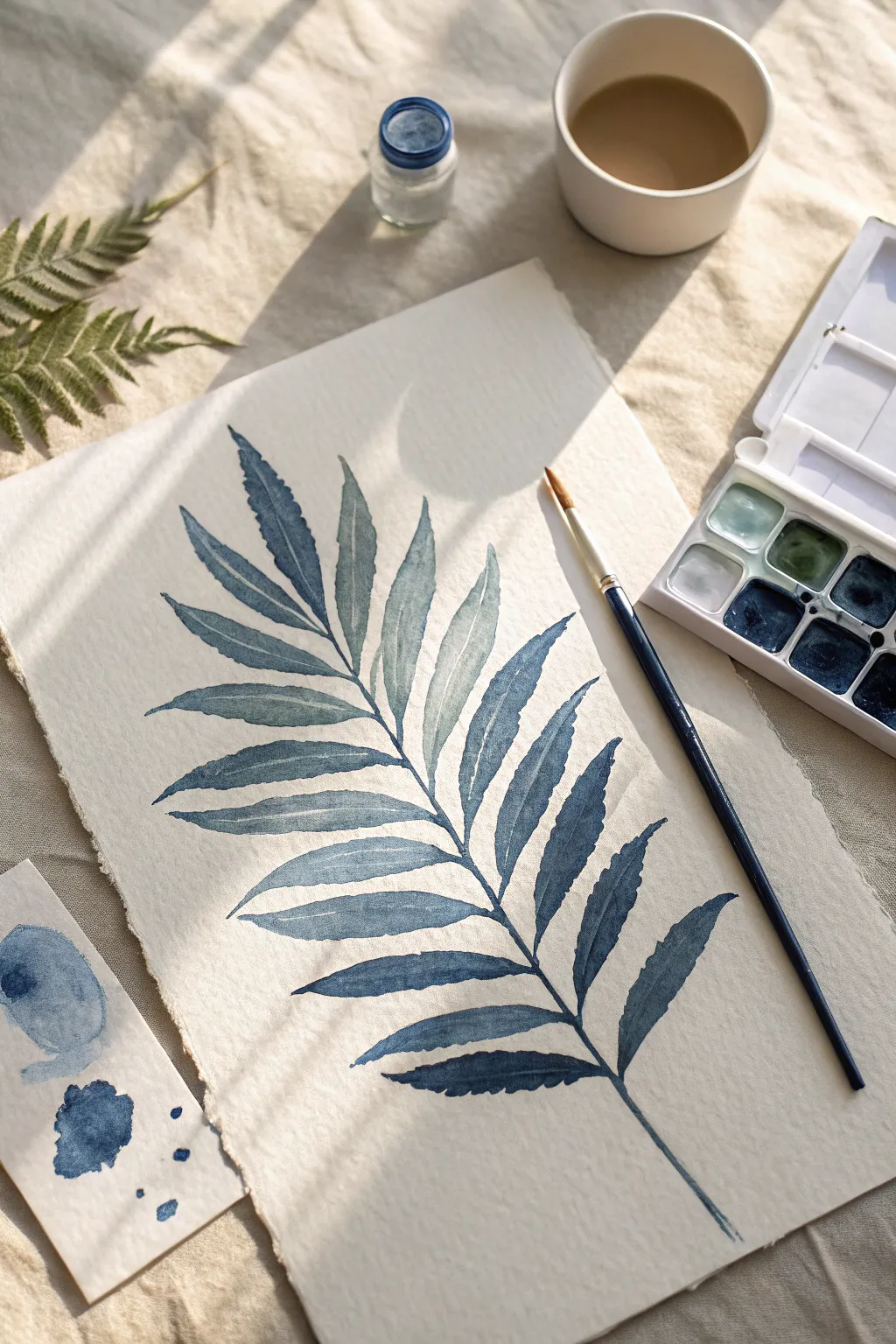
Capture the delicate elegance of a fern frond using just a single color in this meditative watercolor project. This study focuses on value control, allowing you to create depth and dimension by varying the intensity of indigo pigment on lovely textured paper.
Detailed Instructions
Materials
- Cold-pressed watercolor paper (heavyweight/rough texture preferred)
- Indigo watercolor paint (pan or tube)
- Round watercolor brush (size 4 or 6)
- Jar of clean water
- Ceramic or plastic mixing palette
- Scrap paper for testing values
- Graphite pencil (HB or H)
- Kneaded eraser
Step 1: Preparation & Sketching
-
Prepare your space:
Set up your workspace near a natural light source if possible. Tape down your textured watercolor paper to a board if you prefer a flat surface, though the raw deckled edge looks beautiful floating freely. -
Activate the paint:
Add a few drops of clean water to your indigo watercolor pan to soften the pigment. If using tube paint, squeeze a pea-sized amount onto your palette. -
Create a value scale:
On a small scrap strip of paper, practice making three distinct shades: a very watery pale wash (tea consistency), a medium tone (milk consistency), and a deep, saturated indigo (cream consistency). -
Sketch the central vein:
Lightly draw a long, slightly curved line down the center of your paper using an HB pencil. This will serve as the spine (rachis) of your fern. -
Outline the leaflets:
Sketch the individual leaflets extending from the spine. Draw them in pairs or alternating slightly, making them longer in the middle and tapering smaller toward the tip. Keep your pencil pressure very light so the lines don’t show through the paint later. -
refine leaf shapes:
Go back over your leaflet outlines and add slight serrations or jagged edges to mimic the natural texture of a fern, rather than making them perfectly smooth ovals.
Mastering Water Control
For smooth gradients, dab your brush on a paper towel after rinsing but before touching the paper to control the dampness.
Step 2: The First Wash
-
Mix a pale wash:
Load your brush with plenty of water and just a touch of pigment to create your lightest value. -
Paint the upper leaflets:
Starting at the top tip of the fern, fill in the first few leaflets with this pale wash. Use the tip of your round brush to stay inside your pencil lines. -
Vary the moisture:
As you move down to the next set of leaves, try distinct ‘wet-on-dry’ strokes. Paint one half of a leaflet and let it dry for a deeper hard edge, or paint the whole shape quickly for a uniform look. -
Work downwards:
Continue painting the basic shapes of the leaves all the way to the bottom stem. Don’t worry about shadows yet; just establish the base shape in a light-to-medium blue tone. -
Let it dry completely:
Wait until the paper is cool and dry to the touch. This is crucial before adding the next layer to prevent the colors from bleeding into muddy blobs.
Step 3: Adding Depth & Detail
-
Mix a medium-dark tone:
Create a puddle on your palette that has more pigment and less water. It should look significantly darker than your dried base layer. -
Paint the leaf spines:
Using the very fine point of your brush, paint a thin line down the center of each individual leaflet to suggest a central vein. -
Add gentle shadows:
Apply this darker indigo to one side of each leaflet (usually the bottom edge) to create the illusion of volume. I like to soften the inner edge of this shadow with a damp, clean brush to create a gradient. -
Create separation:
Where two leaves overlap or meet the main stem, drop in darker pigment to define the separation. This negative space painting makes the top leaf pop forward. -
Define the main stem:
Paint the main central stem with a confident, continuous stroke. Make it thicker at the bottom and thinning out toward the top. -
Intensify the tips:
Dip your brush directly into the sticky, concentrated paint and touch the very tips of some leaves or the serrated edges for high-contrast accents. -
Evaluate the balance:
Step back and look at the overall contrast. If the painting looks too flat, add a third layer of your darkest indigo to the deepest shadow areas near the stem. -
Final drying time:
Allow the finished piece to dry completely. Once dry, gently erase any visible pencil marks with a kneaded eraser, being careful not to scrub the textured paper.
Fixing Blooms
Cauliflower edges appearing? You added water to a drying wash. Let it dry fully, then glaze over it to hide the texture.
Now you have a stunning botanical study that celebrates the beauty of simplicity and shadow


Layered Leaf Wreath Painting
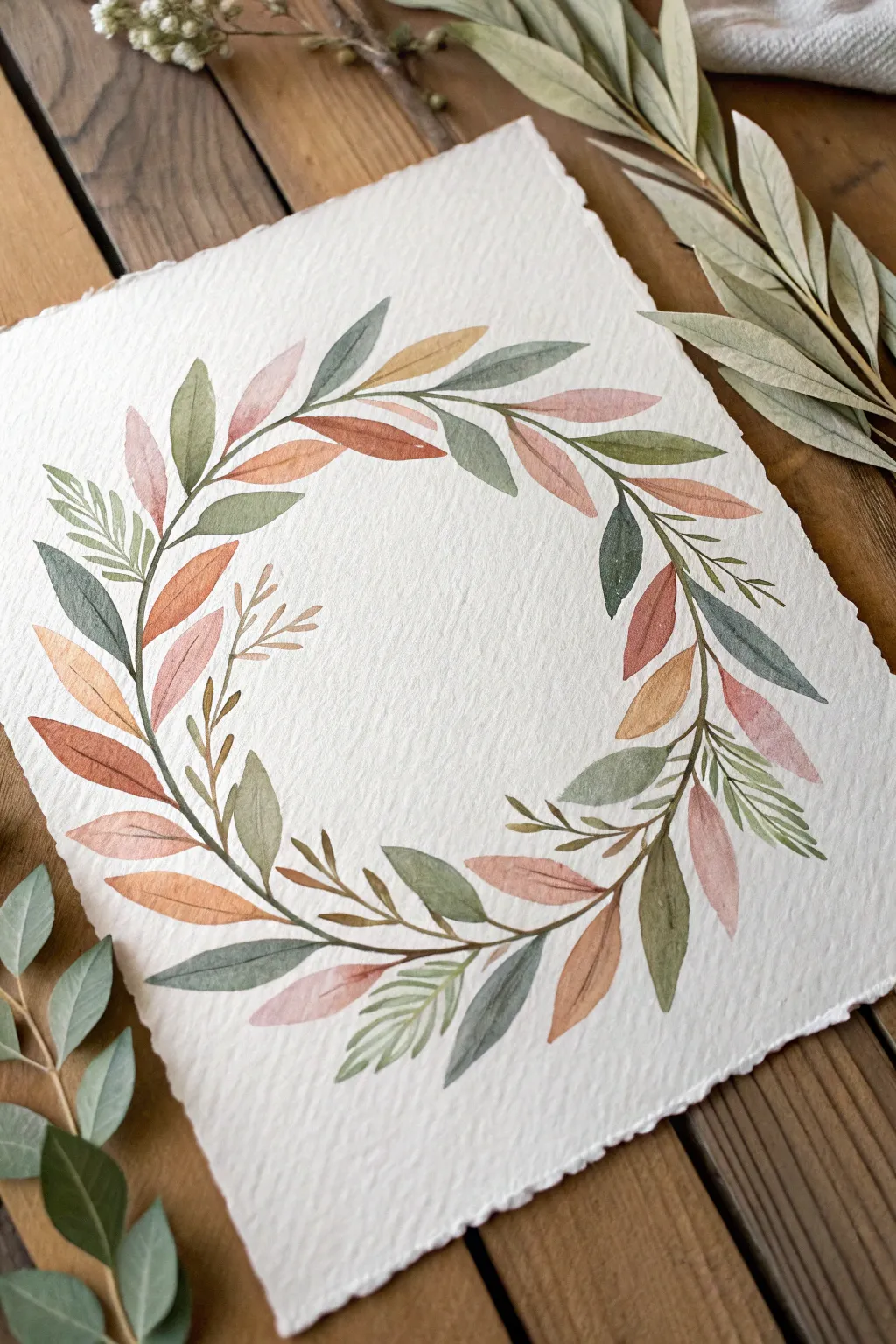
Capture the serenity of nature with this delicate watercolor wreath, featuring a harmonious blend of rust, sage, and ochre hues. This project focuses on layering simple leaf shapes to create a flowing, circular composition on textured paper.
Step-by-Step
Materials
- Cold press watercolor paper (deckle edge preferred)
- Watercolor paints (sage green, burnt sienna, ochre, muted rose, dark green)
- Round watercolor brushes (size 4 and 6)
- Fine liner brush (size 0 or 1)
- Pencil and eraser
- Circular object or compass
- Palette for mixing
- Water cups and paper towels
Step 1: Planning the Composition
-
Trace your guide:
Begin by lightly tracing a circle in the center of your paper using a bowl, plate, or compass. This line is just a guide for placement, so keep your pencil marks extremely faint so they can be erased later. -
Sketch the primary stems:
Draw a flowing, continuous vine weaving around your circle guide. Don’t make it a perfect circle; let the line drift slightly inside and outside the guide to create a natural, organic movement. -
Mark leaf placement:
Lightly sketch the positions of your largest leaves first, ensuring they flow in the same clockwise or counter-clockwise direction. Leave plenty of gaps for smaller filler leaves later.
Muddy colors?
If leaves bleed together creating brown sludge, you need more patience! Let each leaf dry fully before painting an overlapping one to keep colors crisp and distinct.
Step 2: Painting the Base Layers
-
Mix your palette:
Prepare watery pools of your earthy colors: sage green, rusty orange (burnt sienna), muted pink, and yellow ochre. You want the consistency of tea or milk, not heavy cream. -
Paint the first green leaves:
Using a size 6 brush, paint scattered sets of sage green leaves. Use a ‘press and lift’ motion: touch the tip to the paper, press down to widen the belly of the brush, and lift up as you drag to create a point. -
Add warm tones:
While the greens are drying, switch to your rust or burnt sienna mix. Paint almond-shaped leaves in the spaces between the green ones, varying the size slightly for visual interest. -
Incorporate soft pinks:
Wash your brush thoroughly and pick up the muted rose color. Add these softer leaves near the outer edges of the wreath to give it a lighter, airier feel. -
Let it dry:
Allow this initial layer to dry completely. If you paint the next step too soon, the colors will bleed into each other uncontrollably.
Step 3: Adding Depth and Detail
-
Layer overlapping leaves:
Once the first layer is dry, mix slightly more saturated versions of your colors. Paint new leaves that partially overlap the first set. This transparency creates the beautiful layered effect seen in the reference. -
Introduce dark contrasts:
Mix a deeper, darker green. Paint a few smaller, slender leaves tucked behind the lighter ones to add depth and shadow to the arrangement. -
Connect the stems:
Using your fine liner or the tip of a size 4 brush, carefully paint the thin brown stems connecting your leaves to the main vine. Keep your hand loose to avoid stiff, unnatural lines. -
Add texture with veins:
Return to your dried leaves. I like to use a very fine brush with a slightly darker shade of the leaf color to paint a delicate central vein line down the middle of select leaves.
Add Metallic Flair
Once fully dry, use metallic gold watercolor to add tiny berries or trace the veins on a few select leaves for a sophisticated, shimmering finish.
Step 4: Final Touches
-
Create botanical variety:
To break up the uniformity, add tiny sprigs of fern-like foliage or small clusters of berries using a fine liner brush. Keep these details sparse to maintain elegance. -
Evaluate balance:
Step back and look at the wreath as a whole. If one side looks too empty, add a small ochre or sage leaf to fill the gap. -
Erase guide lines:
Wait until the painting is 100% bone dry—seriously, give it extra time. Then, gently erase any visible pencil marks from your initial circle guide.
Using heavier textured paper adds a wonderful tactile quality to your finished botanical wreath
BRUSH GUIDE
The Right Brush for Every Stroke
From clean lines to bold texture — master brush choice, stroke control, and essential techniques.
Explore the Full Guide
Leaf Garland Border on Paper
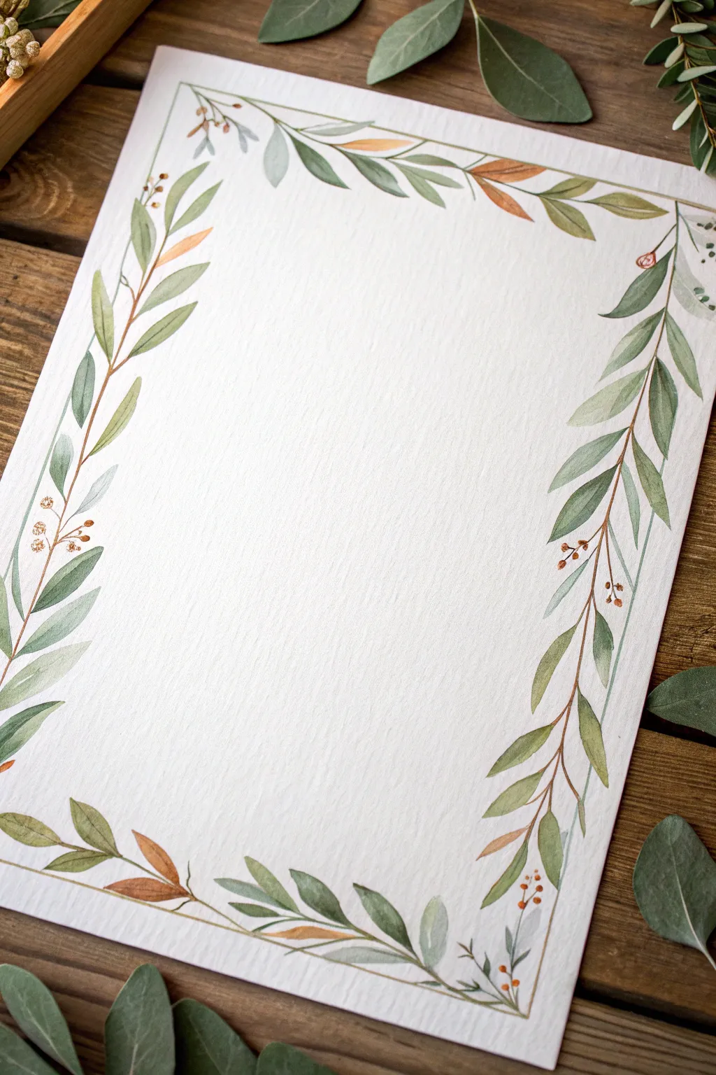
This delicate watercolor border transforms a simple sheet of textured paper into elegant stationery perfect for letters or invitations. You’ll layer various shades of green and warm earth tones to create a natural, flowing frame of leaves.
How-To Guide
Materials
- Cold-pressed watercolor paper (heavyweight, at least 140lb/300gsm)
- Watercolor paints (Olive Green, Sap Green, Burnt Sienna, Yellow Ochre)
- Round watercolor brushes (sizes 2 and 4 for leaves, size 0 or 1 for stems/berries)
- Pencil (HB or H)
- Kneaded eraser
- Clean water
- Paper towels
- Mixing palette
Step 1: Planning the Layout
-
Cut parchment size:
Begin by trimming your watercolor paper to your desired size. Standard A4 or letter size works well, but you might prefer a slightly smaller 5×7 inch format for personal stationery. -
Draft the guide lines:
Using a ruler and a very light touch with your pencil, draw a rectangle about 1 inch inward from the edge of the paper. This will serve as the ‘spine’ for your garland. -
Sketch the stems:
Lightly sketch wavy, organic lines over your straight guide lines. Let the stems meander slightly rather than being perfectly straight, overlapping at the corners. -
Place leaf markers:
Mark tiny dashes where main leaf clusters will go. Aim for asymmetry; nature isn’t perfect, so vary the spacing between leaves.
Fixing Blotches
If you drop too much water and get a ‘bloom’ or cauliflower edge, wait for it to dry completely. Then, glaze over it with a slightly darker semi-transparent green to hide the uneven texture.
Step 2: Painting the Foliage
-
Mix your greens:
Create three puddles of green on your palette: a pale watery sage, a medium olive, and a darker hunter green. I like to keep them quite diluted to maintain translucency. -
Paint the main stem:
Using your smallest brush (size 0 or 1) and a mix of Burnt Sienna and Olive Green, paint thin, delicate lines over your pencil sketch stems. -
First leaf layer:
With a size 4 brush, paint your largest leaves using the pale sage mix. Use a ‘press and lift’ motion: touch the tip to the paper, press down to widen the belly of the brush, and lift up to create a point. -
Add medium tones:
While the first layer is mostly dry, add a second set of leaves using the medium olive green. Tuck some of these behind the first set or angling in different directions. -
Create earthy accents:
Mix a little Yellow Ochre or Burnt Sienna into your green to create a brownish-autumnal hue. Paint interspersed single leaves with this color to add warmth and variety. -
Deepen the contrast:
Use the darkest green mix to add smaller leaves near the stem or to darken the tips of existing leaves. This adds depth so the garland doesn’t look flat.
Step 3: Details and Finishing
-
Paint berry clusters:
Dip your smallest brush into concentrated Burnt Sienna. Dot tiny clusters of three or four berries near the leaf junctions. Keep them small and precise. -
Connect the elements:
Draw very fine lines connecting the berries and floating leaves back to the main stem. These stems should be whisper-thin. -
Review balances:
Step back and look at the composition. If there are large white gaps, fill them with a single pale leaf or a small stray twig. -
Erase guidelines:
Once the paint is completely bone-dry (wait at least 30 minutes to be safe), use a kneaded eraser to gently lift any visible pencil marks. -
Flatten the paper:
If your paper has buckled slightly from the water, place it under a heavy book overnight to flatten it out seamlessly.
Gilded Touch
Once the watercolor is dry, use a metallic gold pen or gold watercolor paint to trace fine veins on a few leaves or add tiny gold dots near the berries for a luxurious finish.
Now you have a beautifully hand-painted border ready to frame your heartfelt words
Repeat-Pattern Leaf Print Grid
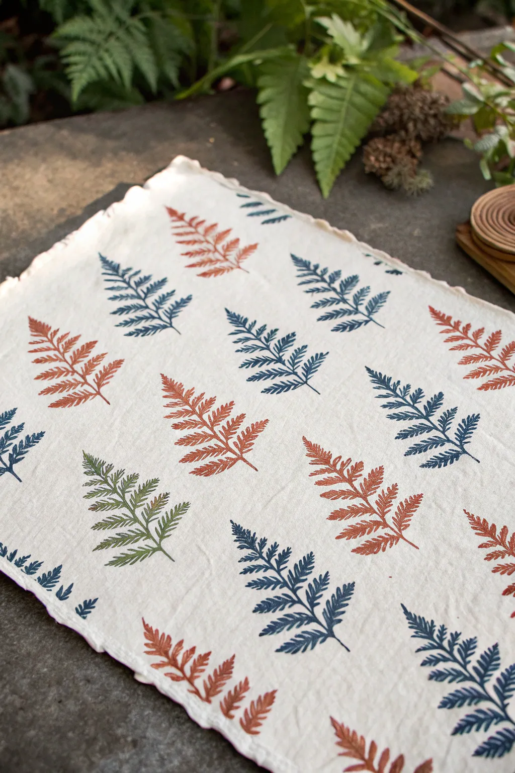
Bring the tranquility of the forest floor to your dining table with this elegant fern-printed linen mat. By alternating warm terracotta and deep indigo hues in a rhythmic grid, you’ll create a sophisticated textile that feels both organic and modern.
Step-by-Step
Materials
- White or cream linen fabric (pre-washed)
- Linoleum carving block (soft cut is easier for beginners)
- Linoleum carving tools (V-gouge and U-gouge)
- Fabric ink or block printing ink (Rust, Navy Blue, Forest Green)
- Brayer (rubber roller)
- Glass or acrylic sheet (for rolling ink)
- Pencil and paper
- Iron (for heat setting)
- Ruler or measuring tape
Step 1: Carving the Fern Stamp
-
Sketch the design:
Begin by drawing a simple fern leaf shape on paper. Focus on a central stem with small leaves branching off symmetrically. Keep the lines somewhat thick to make carving easier. -
Transfer to block:
Place your drawing face down onto the linoleum block and rub the back firmly to transfer the graphite. Alternatively, draw directly on the block. -
Outline the shape:
Using a fine V-gouge tool, carefully carve away the linoleum right along your pencil lines, outlining the entire fern shape first. -
Carve the details:
Switch to a U-gouge to clear away the background areas around the leaf. You want the fern to be raised and the background to be recessed. -
Test prints:
Before moving to fabric, do a test print on scrap paper. I like to check for any high spots in the background that might catch unwanted ink and carve them down further.
Patchy Prints?
If your print looks too faint or speckled, you likely need more ink on the brayer. The roller should make a distinct ‘hissing’ sound when it’s properly loaded.
Step 2: Planning and Printing
-
Prepare the fabric:
Lay your linen flat on a protected surface. If you want the raw edge look shown in the photo, you can tear the fabric to size or fray the edges manually before printing. -
Mark a light grid:
Using a ruler and a faint pencil, mark small dots or light lines to guide where each leaf stem will start. An offset or brick layout works beautifully here. -
Prepare the rust ink:
Squeeze a line of rust-colored fabric ink onto your glass palette. Roll the brayer back and forth until the ink sounds sticky and has a velvety texture. -
Ink the block:
Roll the brayer over your carved block, ensuring the entire raised surface of the fern is evenly coated with ink. -
Print the first color:
Press the block firmly onto your fabric in the designated spots for the rust color. Apply even pressure with your hand or a clean brayer, then lift straight up. -
Clean the block:
Thoroughly wash and dry your block and brayer before switching colors to prevent muddying the next hue. -
Print the blue leaves:
Repeat the inking process with navy blue ink, filling in the alternate spaces in your grid pattern. Arrange them so the leaves tilt slightly for a natural, wind-blown look. -
Add a green accent:
For a unique touch, print just one or two leaves in a forest green shade to break up the pattern and add visual interest.
Mix It Up
Try carving a second, smaller fern stamp to fill empty gaps, or use a paintbrush to add tiny hand-painted dots around the leaves for extra texture.
Step 3: Finishing Touches
-
Dry thoroughly:
Allow the printed fabric to dry completely. This usually takes 24 hours, depending on the thickness of the ink application. -
Heat set the ink:
Once dry, iron the reverse side of the fabric on a high setting (appropriate for linen) for 3-5 minutes. This makes the design permanent and washable.
Now you have a beautiful, hand-printed textile ready to enhance your next dinner gathering

PENCIL GUIDE
Understanding Pencil Grades from H to B
From first sketch to finished drawing — learn pencil grades, line control, and shading techniques.
Explore the Full Guide
Leaf Mandala With Stamped Rings
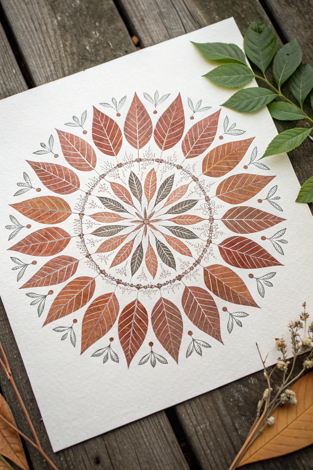
This intricate mandala captures the essence of autumn with its precise, radiating patterns of leaf prints and fine ink details. By combining stamping techniques with delicate hand-drawn embellishments, you can create a centerpiece that feels both organic and structured.
How-To Guide
Materials
- High-quality watercolor paper or heavy mixed-media paper (white)
- Rubber leaf stamps (large broad leaf, small narrow leaf)
- Ink pads in autumn tones: Rust, Terracotta, Deep Sage, Brown
- Fine-liner pen (Sepia or Dark Brown, 0.1mm – 0.3mm)
- Pencil and eraser
- Compass or circular objects for tracing
- Ruler
Step 1: Setting the Structure
-
Mark the center:
Begin by finding the exact center of your paper. Make a tiny, faint pencil mark to guide your entire mandala. -
Draw faint guide circles:
Using a compass, lightly draw two concentric guide circles. The first small circle (roughly 2-3 inches in diameter) will contain the inner star pattern. The second, much larger circle (roughly 8-9 inches) will mark the tips of the large outer leaves. -
Divide the circle:
With a ruler, lightly draw lines through the center to divide your circle like a pie. Aim for 12 or 16 even sections to help spacing, but keep these lines very faint so they erase easily.
Uneven Spacing?
Don’t panic if your last leaf doesn’t fit perfectly. Slightly overlap the final stamp or leave a small intentional gap and fill it with extra ink doodles to mask the spacing error.
Step 2: Inner Leaf Radiance
-
Stamp the central star:
Select your smaller, narrow leaf stamp. Using alternate ink colors—perhaps a lighter rust and a deep sage—stamp leaves radiating outward from the absolute center point. -
Creating the alternating pattern:
Stamp these inner leaves so they touch at the base but spread out like a starburst. I like to alternate colors for every other leaf to create visual depth and rhythm. -
Add the central detail:
Once the stamped ink is dry, use your fine-liner pen to draw a small, geometric flower or star shape right in the middle to cover the exact point where all the leaf stems meet.
Step 3: The Outer Ring
-
Position the large leaves:
Ink up your larger, broader leaf stamp with a consistent rust or terracotta color. Press the stamp firmly so the base of each leaf sits just outside your inner circle guide. -
Complete the circle:
Work your way around the circle, spacing them evenly. Creating a ‘clock’ pattern first (12, 6, 3, 9) helps keep spacing symmetrical before filling in the gaps. -
Check impression quality:
Aim for a slightly textured, vintage look. It’s okay if not every vein prints perfectly solid; that adds to the organic feel.
Real Leaf Stamping
For a truly authentic texture, forego rubber stamps and paint the backs of real, pressed leaves with acrylics or water-soluble ink, then press creating unique, one-of-a-kind prints.
Step 4: Inking and Details
-
Draw the detailed ring:
Between the inner starburst and the outer ring of large leaves, sketch a delicate chain using your fine-liner. Draw tiny circles or beads connected by a fine thread. -
Add scribble texture:
Around this beaded chain, add very loose, scribbly lines or tiny organic swirls. This creates a textured ‘nest’ effect that separates the two main leaf layers. -
Embellish the outer stems:
At the tip of each large outer leaf, draw a small symbol using the fine-liner. A tiny ‘V’ shape with two small seed pods or loops mimics the look of maple seeds. -
Connect the outer elements:
Draw tiny stems connecting these seed pod doodles to the tips of your large leaves or floating just above them for a magical, hovering effect. -
Inner leaf veins:
If your stamp impressions are solid silhouettes, use a white gel pen to draw veins. If they are outline stamps (as shown), ensure the veins are clear, or darken them slightly with your pen. -
Erase guide lines:
Wait until you are absolutely certain all ink is dry—smudging now would be heartbreaking. Gently erase all your pencil circles and dividing lines.
Frame your mandala on a rustic wooden background or in a simple wood frame to complement the earthly tones
Ink Resist Over a Leaf Print
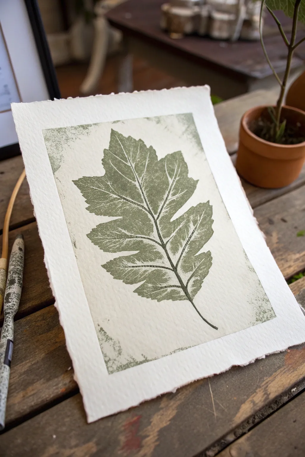
Capture the delicate veins and serrated edges of nature with this elegant block printing project. Using soft handmade paper and a muted olive ink creates a vintage botanical specimen look that feels both timeless and organic.
Step-by-Step
Materials
- Soft rubber carving block or linoleum sheet
- Linoleum cutter tool with V and U gouges
- Fresh leaf (for tracing) or leaf reference photo
- Pencil and tracing paper
- Olive green water-based block printing ink
- Brayer (rubber roller)
- Plexiglass sheet or smooth tray (for inking)
- Handmade cotton rag paper with deckle edge
- Baren or wooden spoon (for burnishing)
Step 1: Design & Carve
-
Trace your specimen:
Begin by finding a leaf with interesting jagged edges, like an oak or maple. Lay a piece of tracing paper over your chosen leaf (or reference image) and carefully outline the perimeter and the main central veins with a pencil. -
Transfer to the block:
Place your tracing paper face-down onto the rubber carving block. burnish the back of the paper with your nail or a spoon handle to transfer the graphite image onto the soft rubber surface. -
Define the outlines:
Using a fine V-gouge cutter, carve slowly along the transferred pencil lines. Keep the blade angle low and push away from your body to create smooth, consistent channels for the veins and leaf outline. -
Carve the negative space:
Switch to a wider U-gouge to clear away the rubber surrounding the leaf. For this specific look, you don’t need to clear the background perfectly flat; leave some texture and ridges, as these will create the rustic ‘noise’ around the print’s border. -
create a border:
Decide on a rectangular frame shape around your leaf and carve away the material outside of that rectangle, leaving a defined edge where the ink will stop. -
Clean the block:
Brush away all loose rubber crumbs with a soft brush or cloth to ensure they don’t get stuck in the ink later.
Step 2: Ink & Print
-
Prepare the paper:
Select a piece of thick, handmade cotton paper. The texture is crucial here—the deckle edge adds to the artisanal feel. Place it on a clean surface nearby. -
Charge the roller:
Squeeze a small amount of olive green block printing ink onto your printing tray. Roll the brayer back and forth and lift it vertically to distribute the ink evenly until it makes a sticky, whispering sound. -
Ink the block:
Roll the brayer over your carved block. Apply the ink in thin, even layers. I like to roll in multiple directions—vertical, horizontal, and diagonal—to ensure the raised leaf surface is fully coated without filling in the carved veins. -
Position the print:
Carefully pick up the inked block by the edges. Center it precisely over your handmade paper and press it down firmly. Once it touches the paper, do not shift or slide it. -
Burnish:
Flip the paper and block over together (so the paper is on top) or use a baren to rub usage firmly on the back of the paper. Press in circular motions, focusing on the edges and the center veins to ensure good ink transfer. -
Check the corners:
While holding the bulk of the paper down with one hand, gently peel up a corner to check the ink coverage. If it looks patchy, lay it back down and burnish that area again. -
The reveal:
Slowly peel the paper away from the block to reveal your print. The texture of the paper might create small white speckles within the green ink, adding to the weathered aesthetic. -
Dry properly:
Place the finished print on a drying rack or hang it up. Water-based inks dry relatively quickly, but allow at least an hour before handling to prevent smudging.
Clean Lines Pro Tip
If you carved too shallowly and ink is getting into the veins, wipe the block clean and re-carve those specific lines deeper before re-inking.
Level Up: Ghost Prints
Print a second copy immediately without re-inking the block. This ‘ghost print’ will be lighter and more textured, perfect for subtle background art.
Now you have a stunning botanical print ready to be framed or gifted.


Splatter Paint With Leaf Masks
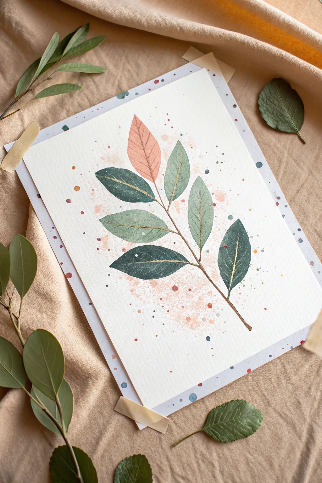
This elegant watercolor project captures the delicate beauty of a leafy branch, blending soft pinks and muted greens with a touch of luxury. The combination of loose splatter effects and fine metallic detailing creates a sophisticated piece perfect for framing.
Detailed Instructions
Materials
- Cold press watercolor paper (A4 or similar size)
- Watercolor paints (sage green, forest green, muted pink/peach, indigo)
- Gold metallic paint or gold paint pen
- Round watercolor brushes (sizes 4 and 8)
- Fine liner brush (size 0 or 00) for detailing
- Old toothbrush (for splattering)
- Paper towel
- Pencil and eraser
- Washi tape or painters tape
- Palette for mixing
- Two jars of water
Step 1: Preparation and Sketching
-
Secure the Paper:
Begin by taping down your watercolor paper to a hard board or table surface. This prevents buckling when the paper gets wet and creates a clean border if you tape slightly inward. -
Lightly Sketch the Branch:
Using a pencil, draft the central stem curving gently upwards from the bottom right to the top left. Add simple oval shapes for the leaves, arranging them in alternating pairs along the stem. -
Refine the Shapes:
Refine your leaf shapes, giving them slightly pointed tips. Keep the pencil lines extremely faint so they won’t show through the translucent watercolor later.
Don’t Overwork The Wet Paint
Watercolor naturally creates beautiful blooms as it dries. Avoid going back into a drying leaf to ‘fix’ it, as this causes muddy, rough textures known as cauliflower edges.
Step 2: Creating the Background Atmosphere
-
Mix the Splatter Color:
Dilute a small amount of peach or muted pink paint with plenty of water. It should be very fluid, almost like tea. -
Apply the Base Splatter:
Load an old toothbrush with the watery mix. Aim towards the center of the paper where the leaves will be and flick the bristles with your thumb to create a fine mist of speckles. -
Add Larger Droplets:
Load a round brush with slightly more saturated pink paint. Tap the handle against your finger over the paper to drop larger, distinct color spots near the center. Let this background layer dry completely.
Step 3: Painting the Leaves
-
Paint the Top Leaf:
Start with the single leaf at the very top. Mix a soft peach tone and fill in the shape using your size 4 brush. Keep the wash even and flat. -
Mix Green Tones:
Prepare two shades of green on your palette: a light, misty sage green and a deeper, blue-toned forest green. -
Paint the Upper Greens:
Paint the two leaves directly below the pink one using the lighter sage green mix. I like to leave tiny slivers of white paper unpainted specifically where the leaf meets the stem for a natural look. -
Paint the Middle Greens:
For the next set of leaves, mix a little of the darker green into your sage to create a mid-tone. Paint these leaves, allowing the water to settle naturally. -
Paint the Bottom Dark Leaves:
Use your darkest forest green (mixed with a touch of indigo for depth) for the bottom-most leaves. This creates visual weight at the base of the branch. -
Connect with the Stem:
Using the tip of your brush and a brown-green mix, carefully paint the central stem. Draw thin lines connecting each leaf to the main branch. -
Allow to Dry:
It is crucial to let the leaf layers bone dry before moving to the next step to prevent bleeding.
Fixing Hard Edges
If a splatter lands in a spot you don’t like while it’s still wet, quickly dab it with a clean, dry corner of a paper towel to lift the pigment almost completely.
Step 4: Adding Details and Accents
-
Create Texture:
Once dry, use a very watery version of your dark green to add subtle mottling or water blooms to the green leaves if they look too flat. -
Add Decorative Dots:
Using the tip of a small brush, add distinct dots of indigo, deep orange, and sage green around the outer edges of the composition, framing the leaves. -
Paint the Veins:
Shake your gold metallic paint well or prime your gold paint pen. Draw a central vein down the middle of each leaf. -
Add Fine Veining:
Branching off the central gold line, add delicate diagonal veins. Keep these lines extremely thin and wispy. -
Final Gold Splatter:
If you want extra shimmer, flick a tiny amount of gold paint over the entire piece to tie the elements together. -
Remove Tape:
Wait until everything is absolutely dry, then slowly peel off your tape at a 45-degree angle away from the painting.
Now you have a serene botanical artwork that brings a lovely organic feel to your space
Birds Built From Leaf Prints
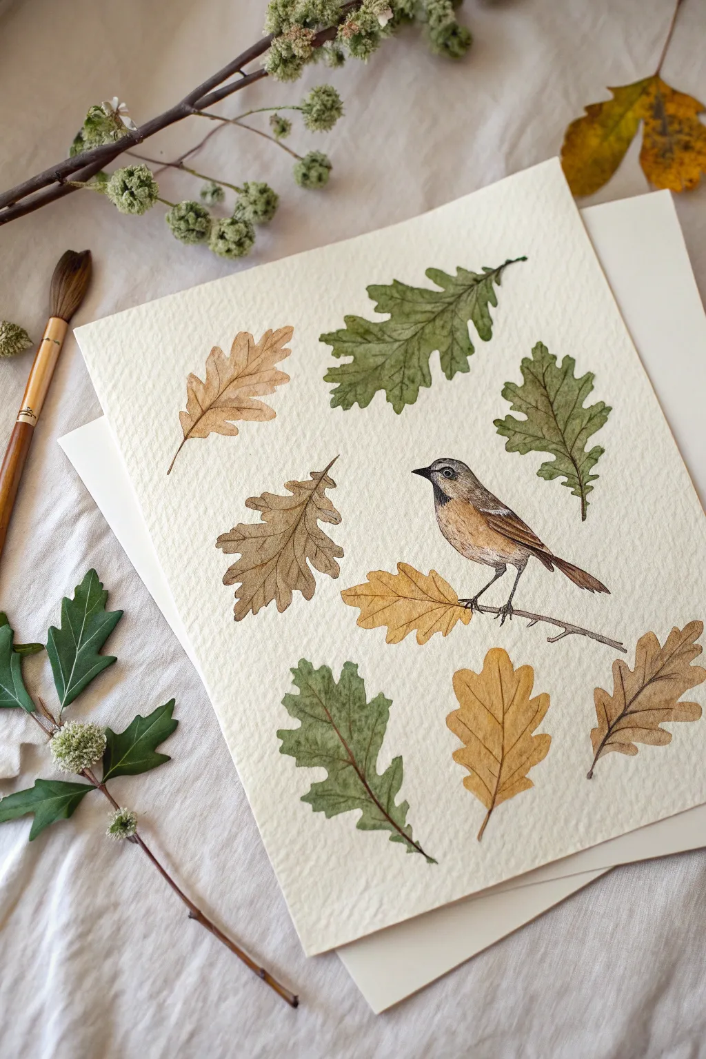
Capture the delicate beauty of autumn with this watercolor illustration, featuring scattered oak leaves in various stages of turning alongside a charming little songbird. The result is a clean, botanical-style art print that feels both natural and carefully composed.
Step-by-Step
Materials
- Cold-pressed watercolor paper (300 gsm)
- Watercolor paints (Sap Green, Olive Green, Yellow Ochre, Burnt Sienna, Burnt Umber, Payne’s Grey)
- Round watercolor brushes (Size 2, 4, and 6)
- Pencil (HB or lighter)
- Kneaded eraser
- Jar of clean water
- Paper towels
- Fine liner pen (optional, brown or black)
Step 1: Planning and Sketching
-
Lightly sketch the layout:
Begin by lightly sketching the outline of seven to nine oak leaves scattered across your paper. Vary their orientation and spacing to create a natural, falling effect rather than a rigid grid. -
Outline the bird:
Position your bird on the right side of the composition. Sketch a simple rounded body, a small head, and a long tail pointing downwards. Draw a thin branch beneath its feet for it to perch on. -
Refine the details:
Go back over your leaf sketches and add the central vein lines and the wavy, lobed edges characteristic of oak leaves. For the bird, mark the wing location and the beak. -
Lighten sketches:
Take your kneaded eraser and gently roll it over the entire paper. You want the graphite lines to be barely visible—just enough to guide your brush without showing through the translucent paint.
Step 2: Painting the Green Foliage
-
Mix your greens:
Prepare two shades of green on your palette: a vibrant Sap Green and a muted Olive Green. Mixing in a tiny touch of brown can make the greens look more earthy and natural. -
Base wash for green leaves:
Select 2-3 leaves to be green. Wet one leaf shape with clean water first, then drop in your green mix. Let the color flow naturally to the edges but try to keep it within your pencil lines. -
Add texture while wet:
While the paint is still damp, drop a slightly darker green concentration into the veins or near the stem base. This wet-on-wet technique creates soft, natural gradients.
Wet-on-Wet Magic
For realistic leaves, drop touches of brown into your green leaves while they are still wet. The colors will bleed together softly, mimicking the natural turning of leaves in autumn.
Step 3: Painting the Autumn Foliage
-
Mix warm autumn tones:
Create puddles of Yellow Ochre and Burnt Sienna. You’ll want a range from golden yellow to rusty brown. Dilute them with varying amounts of water for transparency. -
Paint the yellow leaves:
Use the Yellow Ochre mix for the leaves near the bottom and middle right. Apply the wash evenly, lifting out a little pigment with a thirsty brush in the center to suggest highlights. -
Paint the brown leaves:
Use Burnt Sienna mixed with a touch of Umber for the dried oak leaves. I like to let this dry briefly before adding a second layer to the tips, making them look crisp and curled.
Add Realism
Instead of drawing perfectly straight veins, give your brush a tiny wiggle as you pull the stroke. This erratic line mimics the organic, uneven structure of real dried foliage.
Step 4: Bringing the Bird to Life
-
Base layer for the bird:
Using a size 4 brush, apply a very diluted wash of Burnt Sienna to the bird’s chest and back. Keep the belly area almost white or very pale cream. -
Detailing the wings:
Switch to your smallest brush (size 0 or 2). Mix a darker brown using Burnt Umber and paint small, dashed strokes on the wing to simulate feathers. -
The face and accents:
Use a dark grey (Payne’s Grey) for the beak, the eye, and the legs. Be very steady here; a tiny white dot left in the eye will act as a ‘catchlight’ and make the bird look alive. -
Paint the perch:
Use a thin line of brown paint for the branch under the bird’s feet. Keeping the branch simple ensures the focus stays on the bird and leaves.
Step 5: Defining Veins and Details
-
Wait for complete dryness:
Ensure the leaf washes are bone dry before proceeding. If the paper feels cool to the touch, it’s still wet. -
Paint the leaf veins:
Using your finest brush and a darker version of each leaf’s base color (e.g., dark green for green leaves, dark brown for yellow ones), paint the central vein and side veins. -
Add texture and stems:
Paint thin, delicate stems connecting to the leaves. You can add tiny specks or imperfections to the leaves to make them feel more organic and less perfect. -
Final assessment:
Step back and look at the balance. If any leaf looks too pale, add a second transparent glaze of color to deepen it.
Once dry, you can frame this peaceful autumn study to bring a bit of nature indoors
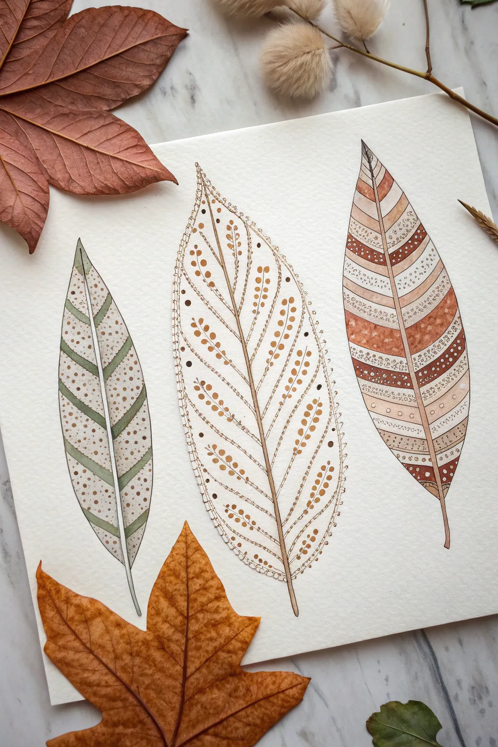
Patterns Painted Inside a Leaf Outline

Embrace the soothing rhythms of nature with this delicate trio of stylized leaves, each featuring its own unique internal geometry. Using a combination of watercolor washes and precise ink detailing, you will create an artwork that balances organic shapes with structured, meditative patterns.
How-To Guide
Materials
- Cold-pressed watercolor paper (300 gsm)
- Watercolor paints (Olive Green, Burnt Sienna, Sepia, Yellow Ochre)
- Fine liner pens (Black or Dark Brown, sizes 01 and 03)
- White gel pen or fine white gouache
- Round watercolor brushes (sizes 2 and 4)
- HB pencil and kneaded eraser
- Ruler (optional for guiding patterns)
Step 1: Sketching the Foundations
-
Outline the shapes:
Start by lightly sketching three distinct leaf shapes on your paper using an HB pencil. Place a slender lanceolate leaf on the left, a centrally stemmed ovate leaf in the middle, and a broader, slightly curved lanceolate leaf on the right. -
Draw the central veins:
For each leaf, draw a slightly curved central vein (midrib) that runs from the base to the tip. This line will act as the anchor for all your subsequent patterns. -
Map the internal sections:
Lightly sketch the internal structures perpendicular to the midrib. For the left leaf, draw diagonal stripes. For the middle leaf, gently mark out the branching vein structure. For the right leaf, create horizontal bands of varying widths.
Step 2: Painting the Left Leaf
-
Apply base stripes:
Mix a muted olive green watercolor. Paint every other diagonal stripe on the left leaf, carefully staying within your pencil lines. -
Add contrasting bands:
Once the green is dry, mix a diluted beige or light brown wash. Fill in the remaining white stripes to create a soft, alternating pattern. -
Detail with dots:
After the paint is fully dry, use a fine brown pen to add stippling. Place denser dots near the edges of the beige stripes and sparser dots toward the center to create a sense of volume.
Smudged Ink?
If your ink bleeds into the paint, your watercolor wasn’t dry enough. Let the paper dry until it’s cool to the touch, not just matte looking.
Step 3: Painting the Central Leaf
-
Outline the veins:
Switch to your fine liner pen (brown or sepia works best here). Trace the outer edge of the middle leaf and the central midrib, then draw the secondary veins branching out towards the edges. -
Create the berry pattern:
Along each secondary vein, paint small, round dots using a rich yellow ochre or light brown watercolor. I like to keep these dots fairly uniform to mimic seeds or pollen. -
Add decorative borders:
Use your finest pen to draw a scalloped or dotted border just inside the main outline of the leaf. This delicate edging frames the internal seed pattern beautifully.
Pro Tip: Volume Control
Make leaves look 3D by concentrating your stippling (dots) near the central vein and edges, leaving the middle of each section lighter.
Step 4: Painting the Right Leaf
-
Paint color blocks:
On the rightmost leaf, select specific bands to fill with a saturated burnt sienna or reddish-brown watercolor. Leave alternating bands unpainted or fill them with a very pale wash. -
Layer ink patterns:
Once the watercolor bands are bone dry, draw various geometric patterns over them with your pen. Try rows of small circles, zig-zags, or straight hatch lines. -
incorporate white highlights:
Use a white gel pen to draw tiny dots or lines on top of the darkest brown bands. This high-contrast detail adds a lovely sparkle to the design.
Step 5: Final Touches
-
Reinforce the stems:
Paint the stems of all three leaves with a mix of sepia and brown, making them slightly thicker at the base for realism. -
Erase guidelines:
Wait until you are absolutely certain all ink and paint is dry, then gently use a kneaded eraser to lift up any visible pencil marks. -
Review and refine:
Step back and assess your composition. If any area looks too flat, add a few more ink dots or a second glaze of watercolor to deepen the contrast.
Now you have a serene botanical study that captures the beauty of autumn textures


Have a question or want to share your own experience? I'd love to hear from you in the comments below!