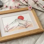
When I’m craving a relaxing, satisfying art session, I reach for line painting—it’s simple, graphic, and somehow always looks intentional. Here are my favorite line painting ideas, starting with classic go-to subjects and easing into the kind of weird, mesmerizing line tricks that make you want to try “just one more.”
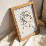
Continuous One-Line Face Portrait
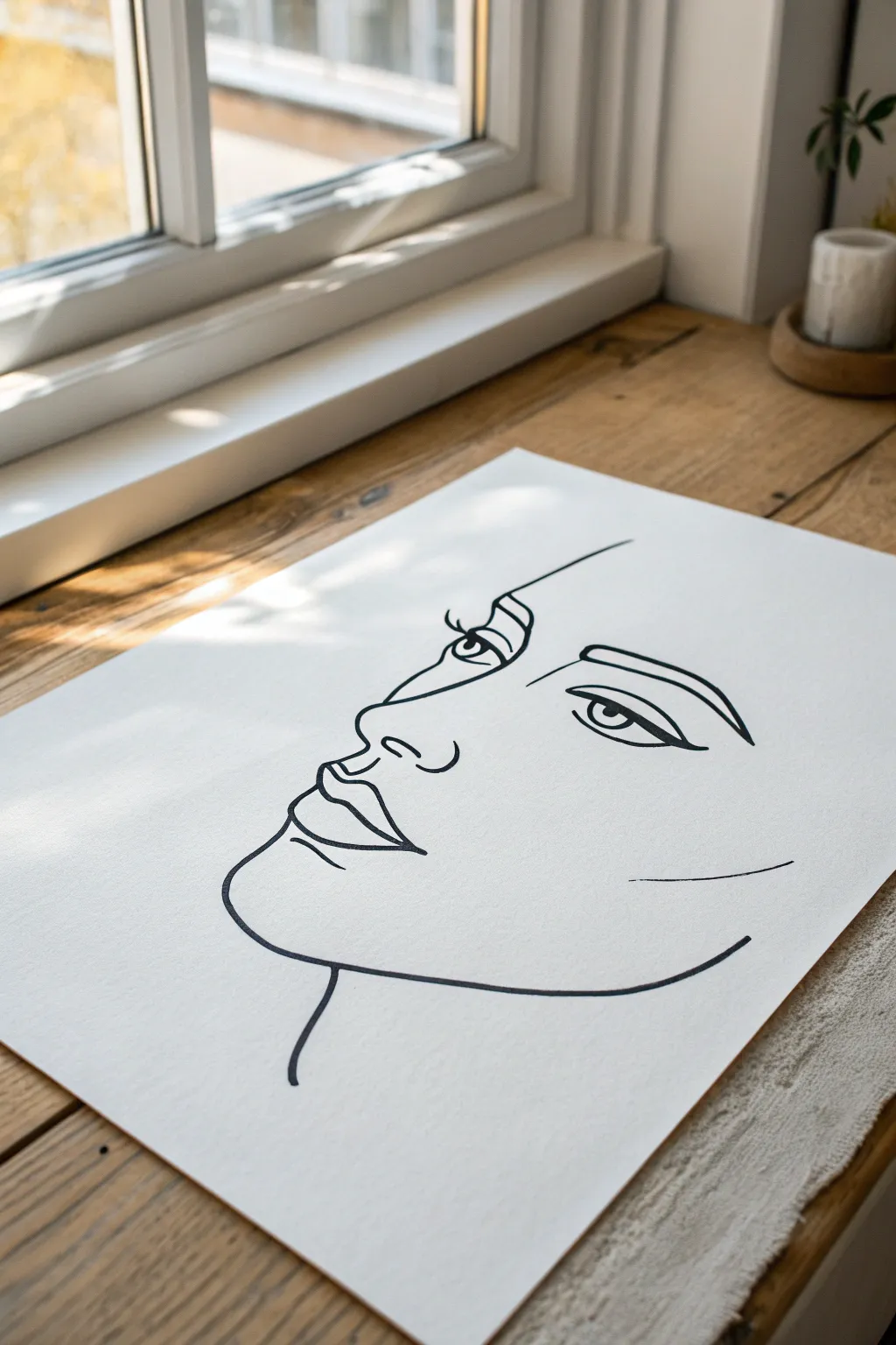
Capture the essence of a portrait with just a few confident strokes in this modern, minimalist art project. This continuous line style drawing relies on fluid movement and negative space to create a sophisticated, abstract look.
Detailed Instructions
Materials
- High-quality mixed media or Bristol paper (smooth finish)
- Black drawing ink or high-quality black fineliner (0.5mm – 0.8mm)
- Pencil (HB or H)
- Kneaded eraser
- Ruler (optional)
- Reference photo of a face (profile view)
Step 1: Preparation & Sketching
-
Set up your workspace:
Find a well-lit area, ideally like the natural window light shown in the image. Tape your paper down at the corners if you’re worried about it shifting while you draw. -
Study your reference:
Look at your reference photo. Instead of seeing features like eyes and noses, try to see the major lines and shadows that connect them. This mental shift is key for line art. -
Lightly pencil the anchor points:
Using your HB pencil, mark very faint dots where the key features will be located: the tip of the nose, the center of the eye, the corner of the lip, and the chin. -
Draft the profile outline:
Lightly sketch the profile line first. Start from the forehead, curve down into the nose bridge, round the tip of the nose, and trace the lips and chin. Keep this pressure extremely light so it’s easy to erase later. -
Map the internal features:
Sketch the eye and eyebrow placement. Don’t draw every eyelash; just indicate the shape of the eye and the arch of the brow. I find it helps to keep the lines simple here to avoid overcomplicating the ink stage.
Master the Flow
Practice the specific curves on scrap paper first. Focus on moving your whole arm, not just your wrist, to get smoother, less shaky long lines.
Step 2: Inking the Lines
-
Test your pen flow:
On a scrap piece of paper, test your pen or ink. You need a consistent flow without skipping to achieve that seamless look. -
Begin with the brow and nose:
Start your final inking at the forehead line. Draw a smooth stroke down the bridge of the nose. Commit to the line; a slightly wobbly line often looks better than a hesitant, sketchy one. -
Detail the eye:
Move the pen to the eye area. Draw the upper lid with a thicker line, adding a small loop for the pupil. Keep the lower lid line thin and unconnected to the upper lid to maintain an airy feel. -
Define the eyebrow:
Above the eye, draw the eyebrow with two distinct lines that taper together at the end. This adds necessary weight to the upper portion of the face. -
Trace the facial profile:
Return to the nose and continue the line down. Curve under the nose tip and create the philtrum (the groove above the lip). -
Ink the lips:
Draw the upper lip with a definitive curve. For the mouth opening, use a slightly darker or double-passed line to create depth. Add the bottom lip with a simple, singular curve beneath. -
Form the jawline:
From the bottom lip, sweep the pen down to create the chin. Continue this line backward and upward to suggest the jawline, letting it taper off into open space rather than connecting it to an ear. -
Add the neck:
Create a single, elegant swooping line starting from under the jaw to suggest the neck. This grounds the floating head. -
Include final accents:
Add a small dash or curve on the cheekbone area if the face feels too empty. This minimalist mark suggests bone structure without drawing it explicitly.
Step 3: Refinement
-
Let the ink cure:
Wait at least 15 to 20 minutes for the ink to dry completely. Smudging is the biggest risk at this stage. -
Erase guidelines:
Gently roll your kneaded eraser over the paper to lift the graphite sketch lines. Avoid scrubbing, which can damage the paper surface or fade the ink. -
Assess line weight:
Look at your drawing from a distance. If certain areas like the eyes or lips lack impact, carefully go over those specific lines again to thicken them slightly, adding contrast.
Wobbly Line Rescue
If a line goes astray, don’t erase. Instead, thicken the line intentionally in that spot to make it look like a stylized choice regarding line weight.
Frame your new minimalist masterpiece in a simple wooden frame to complement the organic flow of the lines

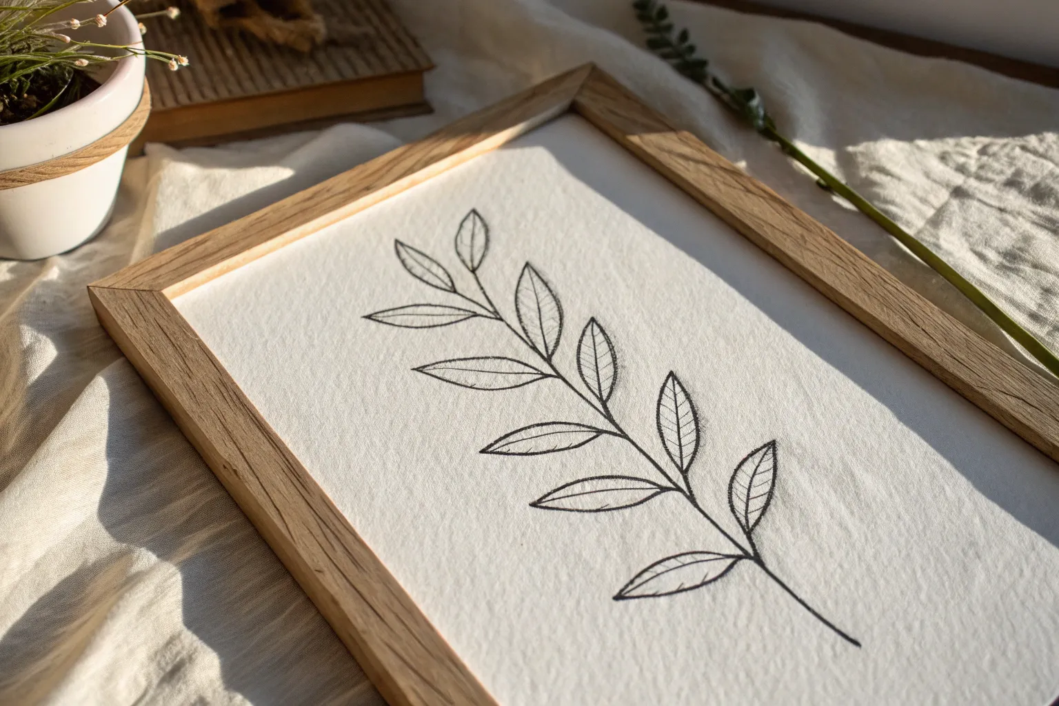
Minimal Botanical Stem Lines
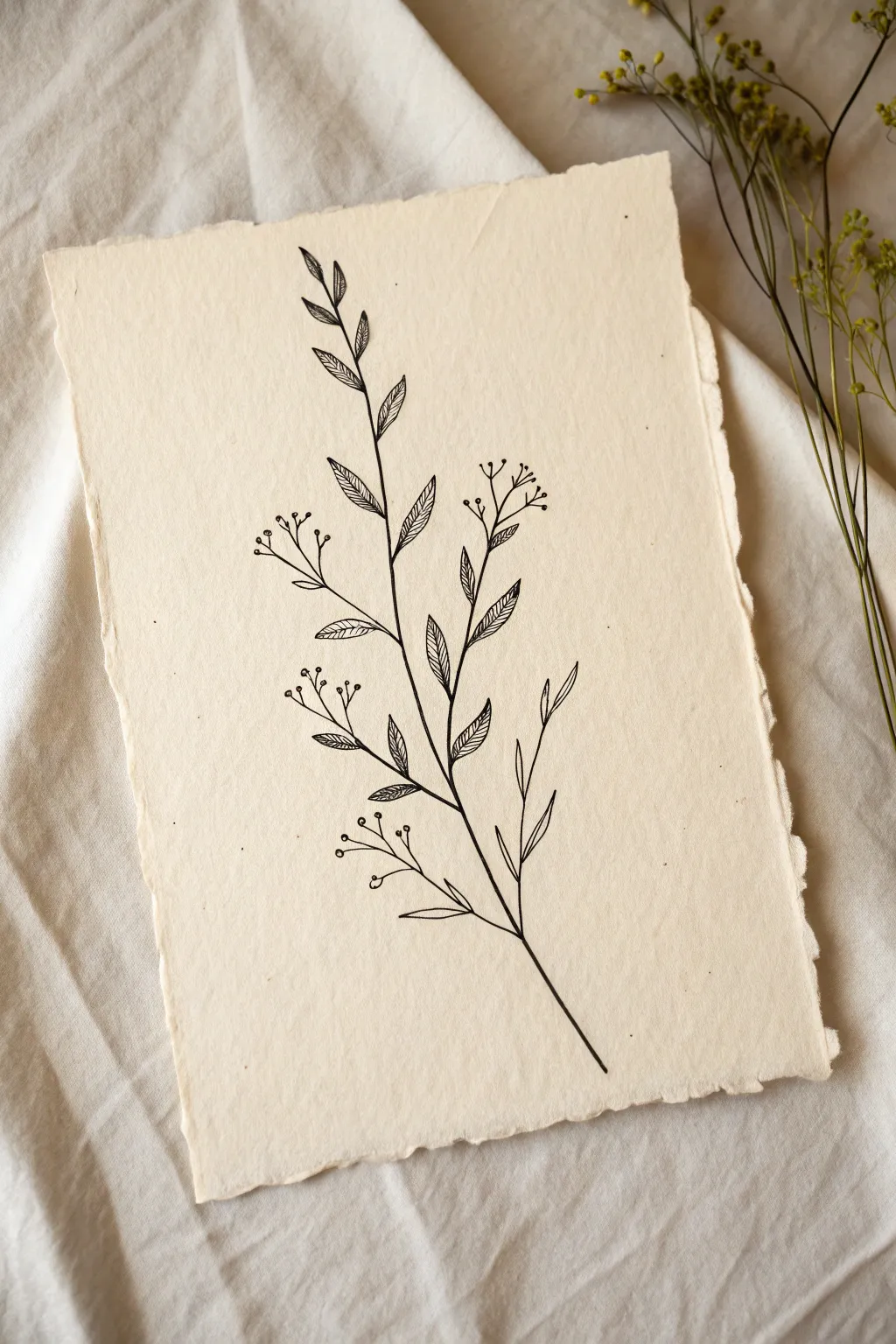
Capture the quiet elegance of nature with this minimalist line drawing on textured paper. The contrast of crisp black ink against the creamy, handmade surface creates a timeless botanical study perfect for framing.
Step-by-Step Tutorial
Materials
- Cream-colored handmade paper with deckle edge (approx. 5×7 inches)
- Fine liner pen (black, archival ink, preferably size 01 or 03)
- Finer detail pen (black, size 005)
- HB pencil
- Kneaded eraser
- Ruler (optional)
Step 1: Planning the Composition
-
Observe your paper:
Before making a mark, examine your handmade paper. Identify the smoothest side for drawing, though the texture is part of the charm. Let the natural deckled edges frame your mental image of the stem. -
Lightly sketch the spine:
Using your HB pencil with very light pressure, draw a single, slightly curved line starting from the bottom third and reaching almost to the top. This will be the main stem. -
Mark branch placement:
Along the main stem, lightly tick off small marks where the side branches will emerge. Alternate them left and right for a natural, organic rhythm rather than perfect symmetry.
Paper Texture Tip
On textured handmade paper, ink can bleed. Test your pen on a scrap piece or the back corner first. Move your hand slightly faster to prevent dots of ink from soaking in.
Step 2: Drawing the Main Structure
-
Ink the main stem:
Switch to your 01 or 03 pen. Starting from the bottom, trace your pencil line with a steady hand. I find it helps to pull the pen toward you rather than pushing it away. -
Add side branches:
Draw the offshoot stems where you made your pencil ticks. Keep these lines slightly thinner or lighter than the main trunk if possible, curving them gently upward. -
Create leaf outlines:
On the upper and middle branches, draw simple, elongated oval shapes for the leaves. They should taper to sharp points at the tips. Don’t worry about the vein details yet.
Antique Wash Effect
For a vintage look, lightly brush the paper with diluted tea or coffee before drawing. Let it dry completely flat under a book before you start inking.
Step 3: Detailing the Botanical Elements
-
Draw the lower berry clusters:
On the lower branches, instead of leaves, draw thin, branching stems that end in tiny circles. These represent small buds or berries. -
Detail the berries:
Add a tiny dot or a small ‘x’ inside some of the berry circles to give them depth, so they don’t look like empty bubbles. -
Ink the central leaf veins:
Go back to your leaf outlines. Draw a single line down the center of each leaf. It doesn’t need to touch the tip or base perfectly; a little gap adds artistic flair. -
Add diagonal shading:
This is the signature style of this piece. On one side of the central vein only, draw tightly spaced diagonal hatch lines. Keep them parallel and consistent. -
Switch sides occasionally:
To keep the drawing dynamic, vary which side of the leaf gets the shading. I usually shade the bottom half of the leaf, but alternating creates visual interest.
Step 4: Refining and Finishing
-
Add very fine details:
Switch to your 005 pen for the most delicate work. Add tiny connecting lines where the leaf stems meet the main branch to thicken the connection slightly. -
Incorporate upper buds:
Near the top of the main stem, add a few stray, microscopic offshoots with tiny dot tips to suggest new growth. -
Check line weight:
Review the main stem. If it feels too wispy compared to the filled leaves, carefully trace over the bottom section again to thicken it slightly, grounding the plant. -
Let the ink cure:
Wait at least 15 minutes to ensure the ink is completely dry. Handmade paper can be absorbent and hold ink wetness longer than standard paper. -
Erase pencil guides:
Gently roll your kneaded eraser over the drawing to lift the original pencil sketch. Do not rub vigorously, or you might pill the textured paper.
Place your finished botanical study in a floating frame to show off those beautiful decal edges
Simple City Skyline Outline
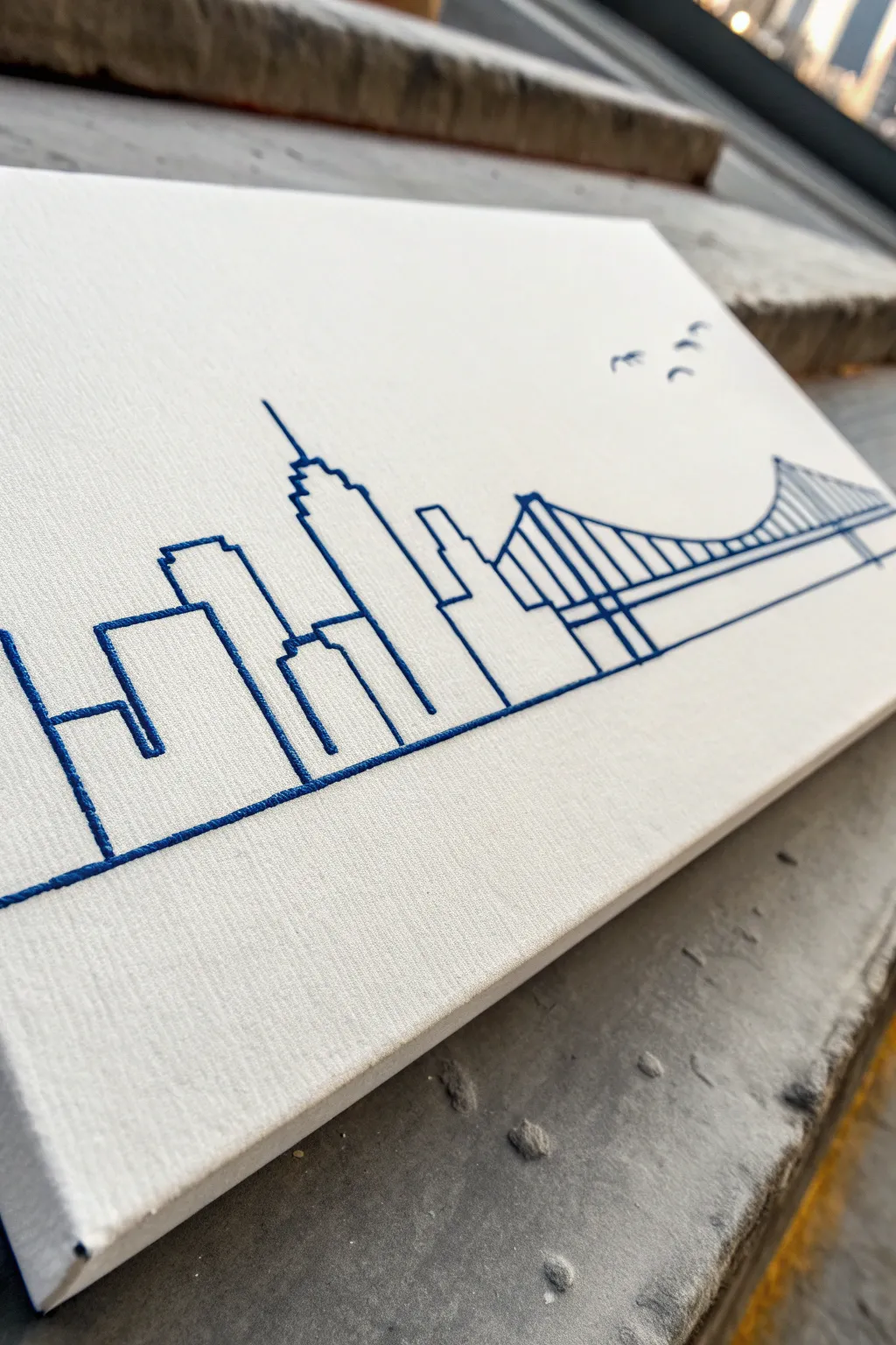
This minimalist project transforms a simple canvas into a textured cityscape using rich blue thread instead of paint. The clean lines capture the essence of a bustling city and iconic bridge, creating a piece that feels both modern and tactile.
How-To Guide
Materials
- Small stretched canvas (approx. 5×7 or 8×10 inches)
- Dark blue embroidery floss (6-strand)
- Embroidery needle with a sharp point
- Pencil or disappearing ink fabric pen
- Ruler or straight edge
- City skyline reference image or template
- Masking tape or painter’s tape
- Scissors
- Thimble (optional but helpful for canvas)
Step 1: Preparation & Design Transfer
-
Select your cityscape:
Find a simple line drawing of a city skyline that appeals to you. Look for distinct building shapes and perhaps a bridge element like the one shown. You can print this out sized to fit your canvas. -
Position the template:
Place your printed template on top of the canvas. Center it well, leaving plenty of white space at the top for the ‘sky’ area. -
Secure the paper:
Use small pieces of masking tape to hold the paper template firmly against the canvas so it doesn’t shift while you work. -
Mark the vertices:
Instead of tracing lines, use your sharp needle to poke holes through the paper and into the canvas at every corner, peak, and endpoint of your design. These guide holes will tell you exactly where to stitch. -
Remove the template:
Gently peel away the paper and tape. You should see a constellation of small holes on your canvas face. -
Connect the dots (optional):
If the design is complex, lightly connect your guide holes with a pencil and ruler so you don’t lose track of which points connect to form buildings.
Clean Lines Pro Tip
For ultra-straight building edges, stick a piece of tape on the canvas as a guide along the line you are stitching, peeling it away after the section is done.
Step 2: Stitching the Skyline
-
Prepare the thread:
Cut a length of blue embroidery floss, about 18 inches long. I prefer using all 6 strands for this project to get that bold, raised look visible in the photo. -
Knot the end:
Tie a secure knot at one end of your floss. Thread your needle with the other end. -
Begin the ground line:
Start from the back of the canvas, pushing your needle through the first hole on the far left of the horizon line. Pull until the knot catches on the back. -
Stitch the main outline:
Use a backstitch for the cleanest continuous line. Insert the needle into the next hole, pull through to the back, and then bring it up through the ‘next’ hole forward, doubling back to fill the gap. -
Navigate the corners:
When you reach a building corner, ensure your stitch ends exactly at the point. This keeps the architectural angles sharp and crisp rather than rounded. -
Tackle the bridge:
For the bridge section, stitch the main curve first. This establishes the structure before you add the vertical cables. -
Add vertical cables:
Stitch the vertical lines of the bridge and the buildings carefully. Keep tension consistent—too tight and the canvas will warp; too loose and the lines will sag. -
Tie off securely:
When you run out of thread or finish a section, weave the tail under existing stitches on the back of the canvas and knot it securely before trimming.
Step 3: Finishing Touches
-
Add birds:
Using just a couple of small straight stitches, create the ‘V’ shapes for birds in the upper right corner to balance the composition. -
Inspect the tension:
Look over the front of the canvas. If any stitches look loose, you can gently pull the corresponding thread from the back to tighten them slightly. -
Erase guidelines:
If you drew any pencil references that are still visible, very gently erase them with a white eraser, being careful not to rub the thread. -
Final check:
Ensure all ends on the back are trimmed and tucked away so they don’t create shadows visible through the front of the canvas.
Canvas Warping?
If the canvas starts to buckle or dimple around the holes, your thread tension is too high. Loosen future stitches slightly and press the holes flat from back.
Now you have a striking piece of textured line art ready to display on a shelf or desk
Line-Only Animal Silhouettes
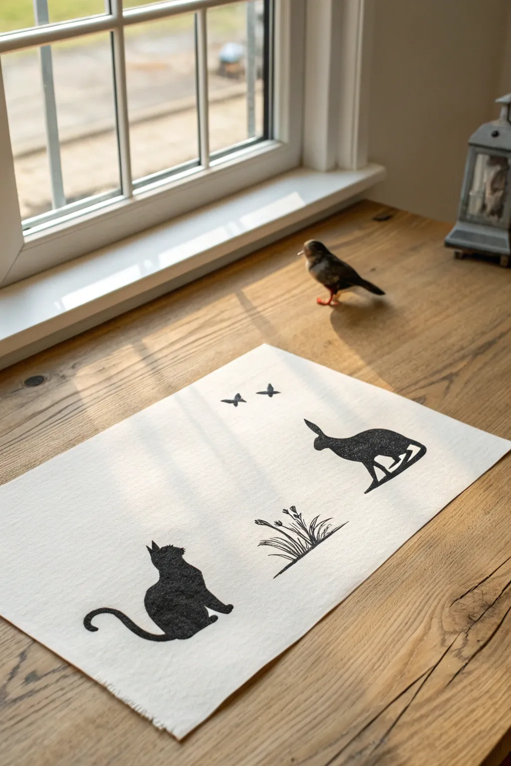
Capture the charm of the countryside with this minimalist fabric painting project featuring playful silhouettes. Using just black fabric paint on natural linen, you’ll create a striking contrast that turns simple outlines into a cohesive, narrative scene.
Detailed Instructions
Materials
- Rectangular piece of natural linen or heavy cotton fabric (approx. 12×18 inches)
- Black fabric paint (opaque)
- Small flat shader brush
- Fine liner brush (size 0 or 00)
- Pencil or disappearing fabric marker
- Cardboard or stencil acetate (for templates)
- Scissors or craft knife
- Iron and ironing board
- Protective sheet or scrap cardboard
Step 1: Preparation & Design
-
Pre-wash the fabric:
Begin by washing and drying your linen to remove any sizing chemicals. This ensures the paint adheres properly and won’t peel later. -
Press perfectly flat:
Iron the fabric thoroughly until it is crisp and wrinkle-free. A smooth surface is critical for achieving sharp painted edges. -
Sketch or trace templates:
Draw the outlines of a cat, a jumping hare, two small butterflies, and a tuft of grass onto cardboard or stencil paper. Keep the shapes simple and focused on the outer profile. -
Cut out the stencils:
Carefully cut around your drawn shapes. For this project, you can use the positive shape (the cutout itself) to trace around, which often gives a more organic, hand-painted feel than stenciling the negative space. -
Arrange the composition:
Place your cutouts on the fabric to decide spacing. Position the cat in the bottom left, the hare jumping in the middle right, the grass centered below them, and the butterflies floating near the top center. -
Transfer the outlines:
Lightly trace around your cutouts using a pencil or disappearing fabric marker. Apply very light pressure so the lines don’t show through the paint later.
Step 2: Painting the Silhouettes
-
Prepare the workspace:
Place a protective sheet or piece of cardboard underneath the fabric layer. Fabric paint can sometimes bleed through the weave, and you don’t want to stain your table. -
Outline the cat:
Using your fine liner brush and black fabric paint, carefully go over the pencil line of the cat. Keep your hand steady to create a crisp, sharp edge. -
Fill the cat shape:
Switch to the small flat brush to fill in the body of the cat. Apply the paint evenly, working it into the fabric weave to avoid white specks showing through. -
Paint the hare:
Repeat the process for the jumping hare. Outline first with the fine brush, paying close attention to the ears and legs, then fill the center with solid black. -
Add the butterflies:
For the tiny butterflies at the top, stick to the fine liner brush entirely. A single swipe for each wing is often enough to create a delicate shape.
Clean Lines Tip
If you’re nervous about unsteady hands, use masking tape or freezer paper stencils to create sharp, straight edges for the animal legs.
Step 3: Detailing & Finishing
-
Draft the grass details:
The grass clump requires a looser hand. Use the fine liner brush to flick paint upward from a central point, lifting weight off the brush at the end of each stroke to create tapered tips. -
Paint flower heads:
Add tiny dots or small V-shapes at the tips of a few grass blades to suggest seed heads or wildflowers. -
Refine the edges:
Inspect all your silhouettes. If any edges look fuzzy or uneven, use the fine brush with a tiny amount of paint to sharpen them up. -
Dry thoroughly:
Let the painted fabric sit undisturbed for at least 24 hours. The outlines need to be completely cured before heat setting. -
Heat set the design:
Once dry, iron the reverse side of the fabric on a cotton setting (no steam) for several minutes to permanently fix the paint. -
Fray the edges:
For a rustic finish, gently pull the horizontal and vertical threads at the edge of the fabric until you have a short, even fringe around the entire perimeter.
Make It 3D
Once the black paint is dry, use a white fabric pen to add tiny internal details like whiskers on the cat or highlights on the butterfly wings.
Now you have a charming piece of textile art ready to display on a table or frame for the wall
BRUSH GUIDE
The Right Brush for Every Stroke
From clean lines to bold texture — master brush choice, stroke control, and essential techniques.
Explore the Full Guide
Flowing Ocean Wave Lines
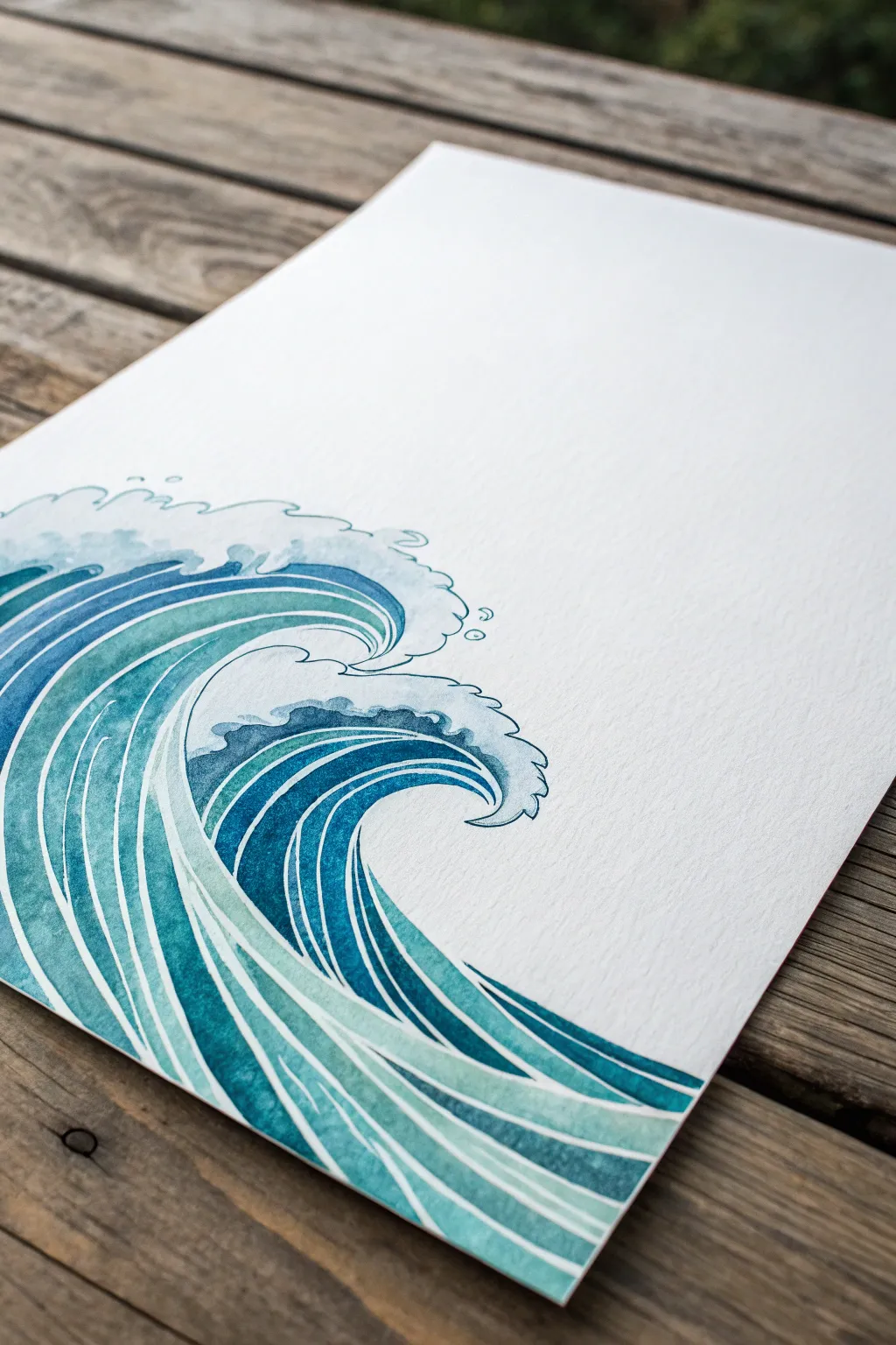
Capture the rhythmic energy of the sea with this clean, graphic watercolor wave study. By using negative space to define your lines rather than drawing them, you’ll create bold, flowing ribbons of turquoise and deep blue that feel both modern and timeless.
Step-by-Step
Materials
- Cold press watercolor paper (300 gsm)
- Pencil (HB or H)
- Kneaded eraser
- Watercolor paints (Turquoise, Phthalo Blue, Prussian Blue, Viridian)
- Synthetic round brushes (size 2, 4, and 6)
- Mapping pen or fine liner (optional for details)
- Masking fluid (optional but helpful)
- Palette for mixing
- Two jars of water
Step 1: Planning the Flow
-
Sketch the Base Curves:
Begin lightly with your H pencil. Start at the bottom left corner and sweep broad C-curves upward toward the center right. These lines represent the main body of the wave and should fan out slightly as they rise. -
Define the Crest:
At the top of your highest curve, sketch a rolling, cloud-like shape for the breaking foam. Keep these lines jagged and bubbly, contrasting with the smooth ribbons of the water below. -
Create the Secondary Wave:
Tucked underneath the main crest, draw a smaller, tighter curl. This ‘barrel’ shape adds depth and complexity to the composition. -
Map the White Lines:
This is crucial: instead of single lines, draw double lines to create ‘channels’ of white space. These narrow gaps will remain unpainted to separate your blue ribbons. Keep them consistent in width. -
Refine and Clean:
Go over your sketch to ensure the curves flow naturally without jagged kinks. Use a kneaded eraser to lift barely-visible graphite, leaving only the faintest guide for your brush.
Step 2: Painting the Ribbons
-
Mix Your Palette:
Prepare three distinct puddles of color: a light translucent turquoise (lots of water), a medium teal, and a deep, saturated Prussian blue. -
Start with the Lightest Tones:
Using a size 6 brush, fill in the ribbons near the bottom front of the wave with your lightest turquoise mixture. Paint carefully up to your pencil lines, preserving the thin white gaps. -
Build the Mid-Tones:
Move to the middle section of the wave’s body. Switch to the medium teal mix. Apply the paint in long, confident strokes that follow the curvature of your initial sketch. -
Deepen the Shadows:
For the area just under the crest and inside the barrel of the wave, use your darkest Prussian blue. This high contrast creates the illusion of a hollow space. -
Wet-on-Dry Texture:
Let the first layer dry completely. I like to then glaze over parts of the ribbons with a slightly darker shade to create a gradient effect within individual stripes. -
Enhance the Separation:
If your white lines accidentally got painted over, you can use opaque white gouache later to reclaim them, but try to maintain the pristine paper white for the crispest look.
Steady Hands
Rest your hand on a clean sheet of scrap paper while painting. This prevents oils from your skin transferring to the art paper and keeps your hand steady for those long curves.
Step 3: Defining the Crest
-
Outline the Foam:
Switch to your smallest brush (size 2). Using a very pale, watery blue-grey, outline the bubbly shapes of the crest you sketched earlier. -
Detailed Interior Lines:
Inside the main foam shape, add tiny C-shaped scales or scallops. These suggest the churning water and bubbles without needing photorealism. -
Add Droplets:
Paint a few small, detached circles floating above the crest to represent sea spray escaping the wave. -
Soften the Transition:
Where the solid blue ribbons meet the white foam, dampen your brush with clean water and slightly soften the edge so the water looks like it is dissolving into spray.
Sparkle Effect
Mix a tiny amount of iridescent medium or pearlescent watercolor into your lightest turquoise. It gives the water a subtle shimmer when the light hits the finished piece.
Step 4: Final Touches
-
Evaluate Contrast:
Step back and squint at your painting. If the dark barrel of the wave doesn’t look deep enough, add another layer of concentrated indigo or Prussian blue. -
Clean Up Edges:
Using a slightly damp, stiff brush, you can gently scrub (lift) any paint that strayed into your white negative space lines to keep them crisp. -
Erase Guidelines:
Once the paper is bone dry—and give it extra time to be sure—gently erase any remaining pencil marks to leave a clean, graphic illustration.
Frame your rhythmic seascape in a simple wood frame to let the blue tones really sing
Geometric Bird Line Painting
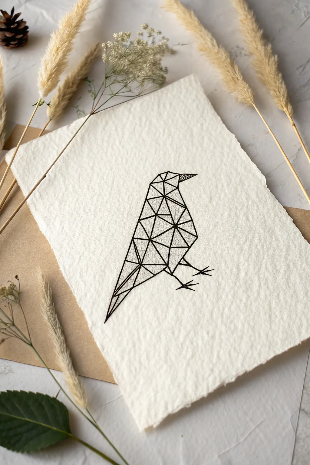
This project combines stark, modern geometry effectively with the rustic charm of textured paper. You will create a striking minimalist bird illustration composed of triangles, using fine liners to build depth and intricate detail.
How-To Guide
Materials
- A5 or 5×7 sheet of handmade cotton rag paper with deckled edges
- Pencil (HB or H for light lines)
- Fine liner pen (01 or 03 size, black ink)
- Fine liner pen (005 size for ultra-fine details)
- Ruler
- Eraser (kneaded eraser preferred)
- Tracing paper (optional)
Step 1: Planning and Sketching
-
Analyze the basic shape:
Before putting pen to paper, visualize the bird’s overall silhouette. It has a triangular body tapering to a tail, a smaller triangular head, and a beak. You can sketch a very faint outline of this silhouette first to guide your geometry. -
Draw the key anchor points:
Using your pencil and ruler, lightly mark the main vertices: the tip of the beak, the top of the head, the back of the neck, the wing point, and the tail tip. -
Create the primary triangles:
Connect your anchor points with straight lines to form large triangles. Don’t worry about the small details yet; focus on breaking the bird’s form into 5 or 6 large polygonal sections. -
Subdivide into smaller polygons:
Inside your large triangles, draw smaller connecting lines to create a mesh of varied triangles. Try to make smaller triangles near the head and beak for detail, and longer, sharper triangles for the wing and tail feathers. -
Add the legs and feet:
Sketch simple, sharp angular lines for the legs. Instead of realistic claws, use straight lines intersecting to suggest the feet, keeping with the geometric theme.
Ink Bleeding?
Handmade paper is porous. If your lines look fuzzy, switch to a waterproof archival pen, as the ink sits on top better. Test on a scrap corner first.
Step 2: Inking the Framework
-
Outline the main structure:
Switch to your 03 or 01 fine liner. Using your ruler, carefully trace over your pencil lines that define the outer shape and the major internal divisions of the bird. -
Be mindful of the paper texture:
Handmade paper is bumpy. Press lightly and move slowly so your pen nib doesn’t snag on the fibers. If the line breaks, simply go over it again gently; the rustic look is forgiving. -
Ink the internal mesh:
Continue inking all the smaller triangular divisions within the body. Ensure every line is straight and meets precisely at the corners helps maintain that crisp, digital-art aesthetic. -
Thicken key lines:
To give the bird weight, selectively go over the outer contour lines one more time to make them slightly bolder than the internal mesh lines.
Step 3: Detailing and Texturing
-
Select triangles for shading:
Pick a few random triangles within the body (scattered around the wing and chest area) to fill with pattern. This adds visual interest without overwhelming the design. -
Apply stippling or hatching:
Using the ultra-fine 005 pen, fill your chosen triangles. You can use tiny dots (stippling) or very close diagonal lines (hatching). I like to use a ‘cracked earth’ pattern for the beak area. -
Let the ink dry completely:
Wait at least 15 minutes. Cotton rag paper is absorbent and holds ink differently than standard paper, so it takes a bit longer to set. -
Erase pencil marks:
Gently dab—don’t rub—with a kneaded eraser to lift the graphite guidelines. Rubbing too hard might fuzz up the delicate paper surface.
Add a Splash
For a pop of flair, fill just one or two triangles with gold metallic ink or watercolor. This creates a stunning contrast against the black lines.
Your geometric bird is now ready to be framed or gifted as a unique piece of modern art

PENCIL GUIDE
Understanding Pencil Grades from H to B
From first sketch to finished drawing — learn pencil grades, line control, and shading techniques.
Explore the Full Guide
Abstract One-Line Couple
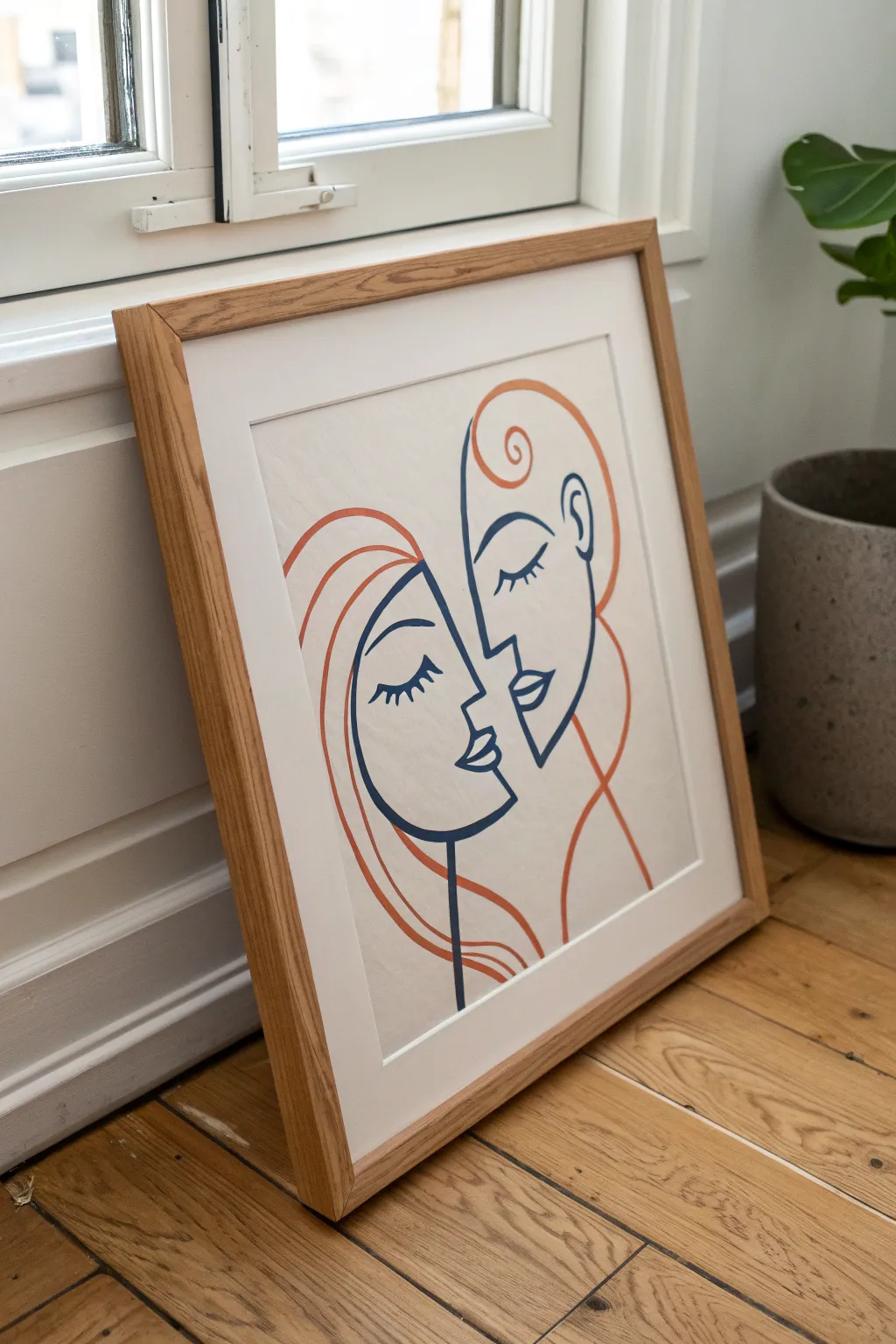
Capture the tender connection of a minimalist couple using confident, sweeping strokes in this modern line art piece. The contrast between deep navy facial contours and playful terracotta hair creates a striking yet simple composition perfect for any wall.
Step-by-Step Guide
Materials
- High-quality watercolor paper or heavy mixed-media paper (cream or off-white)
- Pencil (HB or lighter)
- Quality eraser
- Deep navy blue acrylic paint or paint marker
- Terracotta/Burnt orange acrylic paint or paint maker
- Fine round paintbrush (size 2 or 4) if using paint
- Ruler (optional for centering)
- Wooden frame with mount/mat board
Step 1: Planning Composition
-
Center Your Canvas:
Begin by finding the visual center of your paper. Since the two faces lean into each other, you want the space between their noses to be roughly central. -
Rough Outline:
Using a very light hand and your HB pencil, skate out the basic oval shapes of the two heads. The left head should be slightly lower, tilting up, while the right head is higher, tilting down. -
Mapping Features:
Lightly mark horizontal guidelines for where the eyes and mouths will sit to ensure they align naturally with the tilt of the heads.
Wobbly Lines?
If your hand shakes, don’t stop mid-line. Exhale slowly while pulling the stroke, and paint away from your body rather than across it for stability.
Step 2: Drafting the Faces
-
Left Profile:
Sketch the left profile first. Draw a smooth curve for the forehead, dipping in for the eye socket, and protruding for the nose. Don’t worry about the hair yet. -
Right Profile:
Sketch the opposing profile. The nose of this figure should nearly touch the other, creating intimacy. Their chin should tuck slightly under the other figure’s chin line. -
Adding Eyes:
Draw the closed eyelids. For the left face, use a simple curved lash line with downward lashes. For the right face, mirror this but angle it slightly more vertically to match their head tilt. -
Refining the Lips:
Add the lips as simple, geometric leaf shapes. Keep the details minimal—just the outline and a center line is enough.
Step 3: Adding the Hair
-
Left Hair Flow:
Sketch long, sweeping curves starting from the top of the left head. Let the lines cascade down the left side, framing the face in a C-shape. -
Right Hair Flow:
For the right figure, draw a distinct swirl at the forehead hairline. Continue this line up and over, creating a volume that balances the composition on the right side. -
Refining Curves:
Step back and look at your pencil sketch. Smooth out any jerky lines; the goal is for the hair to look like continuous, fluid motion.
Fake the Flow
Use a posca paint pen instead of a brush if you aren’t confident with fluid paint. It gives cleaner edges and greater control for beginners.
Step 4: Painting the Lines
-
Prepare the Navy:
Load your fine brush with deep navy blue paint. I prefer thinning the acrylic just a tiny bit with water so it glides smoothly without breaking. -
Inking the Faces:
Start tracing your pencil lines for the faces only. Use steady, confident pressure. Try to lift your brush as little as possible to maintain that ‘continuous line’ aesthetic. -
Detail Work:
Carefully paint the eyelashes and the small details of the slightly parted lips with the very tip of your brush. -
Switching Colors:
Wash your brush thoroughly or switch to a fresh one. Load it with the terracotta or burnt orange paint. -
Painting Hair:
Trace the hair outlines. These strokes are longer, so breathe out as you pull the brush across the paper to keep your hand steady. -
Connecting Lines:
Ensure the orange hair lines meet the navy face lines cleanly but don’t overlap them messily. They should look like they slot together perfectly.
Step 5: Finishing Touches
-
Erase Pencil Marks:
Wait until the paint is bone dry—completely dry to the touch. Then, gently erase any visible pencil guidelines. -
Check Line Weight:
Inspect your lines. If any areas look too thin or shaky, go over them one more time to thicken the line weight for a bold, graphical look. -
Framing:
Place your artwork behind a clean white mount and seal it in a light oak frame to match the earthy tones of the paint.
Hang your new minimalist masterpiece in a bright spot where the natural light can highlight the crisp contrast of the lines
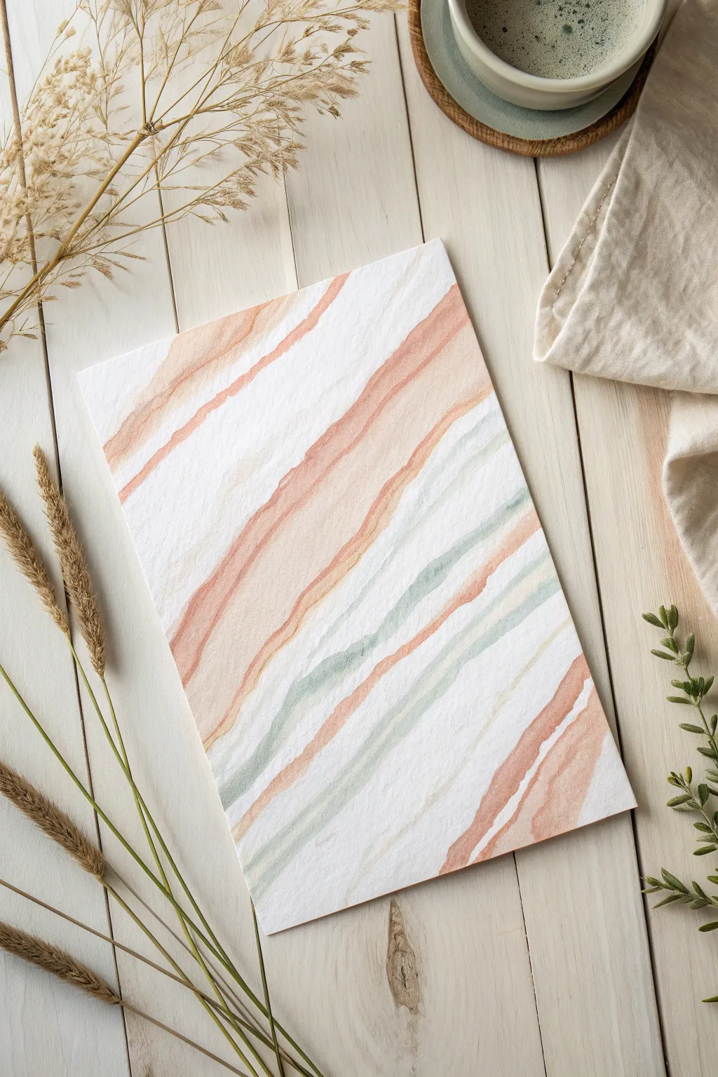
Line Art Over Color Blocks
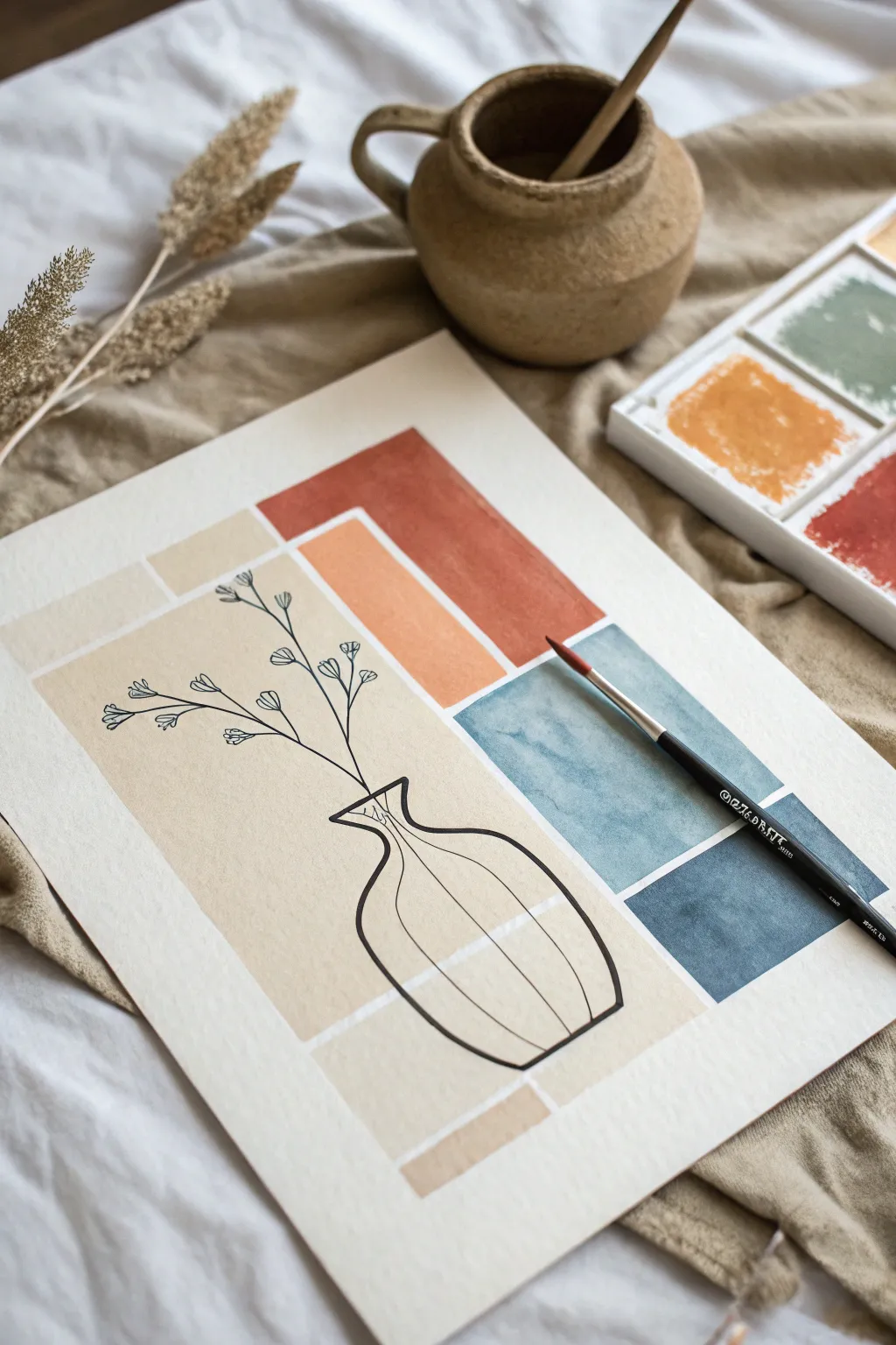
This project combines soft, geometric watercolor blocks with the crisp definition of line art to create a stunning piece of modern bohemian decor. The contrast between the organic, watery washes and the sharp black ink creates a sophisticated yet relaxed aesthetic perfect for any wall.
Detailed Instructions
Materials
- Cold-pressed watercolor paper (A4 or roughly 9×12 inches)
- Watercolor paint palette (Terracotta, Peach/Burnt Sienna, Sage Blue, Navy Blue, Beige/Buff)
- Flat shader brush (size 10 or 12)
- Round detail brush (size 2 or 4)
- Fine liner pen (Black, waterproof/archival ink, 0.5mm tip)
- Ruler or straight edge
- Pencil (HB) and soft eraser
- Masking tape (low tack)
- Cup of clean water and paper towels
Step 1: Preparation & Layout
-
Prepare your workspace:
Begin by taping down your watercolor paper to a hard board or your table surface. Use low-tack masking tape on all four edges to prevent the paper from buckling when it gets wet and to create a clean border. -
Sketch the layout lightly:
Using your ruler and pencil, extremely lightly sketch the rectangular zones where your color blocks will go. You don’t need to be perfectly precise, but establish the main vertical column on the left and the stacked horizontal blocks on the right. -
Plan the negative space:
Visualize thin white gaps between your shapes. I like to leave about an eighth of an inch between blocks to let the paper breathe, but you can eyeball this spacing for a more organic feel.
Step 2: Painting the Color Blocks
-
Mix the beige wash:
Start with the largest section on the left. Mix a watery wash of beige or buff titanium watercolor. You want this to be quite pale and transparent. -
Apply the first block:
Load your flat brush and fill in the large vertical rectangle on the left side. Work relatively quickly to keep a ‘wet edge’ so the paint dries evenly without harsh streaks. -
Terracotta tones:
Mix a warm terracotta or rust color. Apply this to the top horizontal block on the right side. Let the color pool slightly in areas for that characteristic watercolor texture. -
Peach accent:
Dilute your terracotta mix with more water or add a touch of yellow ochre to create a lighter peach tone. Paint the smaller block directly underneath the terracotta rectangle. -
The cool tones:
Clean your brush thoroughly. Mix a muted teal or sage blue. Paint the square block located below your peach section. The cool tone provides a beautiful contrast to the warm upper section. -
Deep anchor:
Finally, mix a deep navy or indigo. Paint the bottom-most block on the right. This dark value anchors the composition visually. -
Bottom beige accent:
If your layout includes the small horizontal strip at the very bottom, paint this now using your original beige mix to tie the composition together. -
Complete drying time:
This is crucial: Let the painting dry completely. If the paper is even slightly damp, your ink line will bleed and fuzzy up. A hair dryer on a low setting can speed this up.
Bleeding Lines?
If your ink feathers or spreads, the paper is still damp or the humidity is high. Wait longer or use a hair dryer. Ensure your pen is labeled ‘waterproof’ or ‘archival’.
Step 3: The Line Art Layer
-
Pencil the vase:
once the paint is bone-dry, lightly sketch the outline of a simple, bulbous vase. Position it so the bottom rests in the lower beige/navy area and the neck reaches the middle of the composition. -
Add floral stems:
Sketch three to four delicate stems rising from the vase neck. Angle them naturally to the left and right, extending into the beige and upper color blocks. -
Inking the vase outline:
Switch to your waterproof fine liner pen. Trace over your vase pencil lines with a confident, continuous stroke. Don’t worry if the line wavers slightly; it adds character. -
Adding dimension:
Draw vertical curved lines down the body of the vase to suggest roundness. These strike lines help the vase feel 3D rather than flat. -
Inking the flora:
Trace the stems, keeping your hand light. At the end of each branch, draw small, simple clusters of flowers or seed heads. Tiny teardrop shapes or small circles work perfectly here. -
Erase pencil guides:
Wait at least 10-15 minutes for the ink to fully set. Using a soft eraser, gently remove any visible pencil marks, being careful not to scrub the watercolor surface too hard.
Go Metallic
Swap the black liner for a gold paint pen or metallic marker. The shimmering gold lines against the matte watercolor blocks create an incredibly chic, high-end look.
Peel off your masking tape carefully to reveal those crisp white edges on your finished masterpiece


Boho Sun, Arches, and Curves
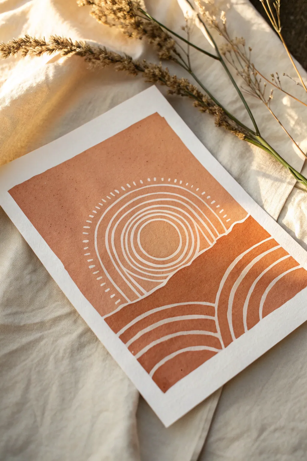
This warm, earthy artwork combines the simplicity of boho aesthetics with clean, rhythmic linework. By using negative space to define the sun and rolling hills, you create a striking contrast between the rich terracotta washing and the pristine white paper.
Step-by-Step Tutorial
Materials
- Heavyweight watercolor paper or mixed media paper (at least 300gsm)
- Terracotta or burnt sienna gouache paint
- Flat shader brush (medium size)
- Fine detail brush (size 0 or 1)
- White gel pen or fine tip masking fluid pen (optional)
- Pencil (HB or lighter)
- Ruler
- Eraser
- Mixing palette
- Water cup
Step 1: Planning and Sketching
-
Define the borders:
Begin by taping down your paper to a hard surface to prevent warping. Lightly sketch a rectangular border about an inch from the edge of the paper to frame your composition. This negative space border is crucial for the finished look. -
Sketch the horizon:
Draw a soft, wavy line horizontally across the paper, positioned slightly below the center. This line will separate the sky area from the ground. -
Outline the central sun:
In the center of the upper section, draw a circle for the sun. Around it, lightly sketch 3-4 concentric arches radiating outward, stopping where they hit the horizon line. -
Draft the lower curves:
In the bottom section, sketch two distinct sets of curved lines that mimic rolling hills. One set should curve upward from the left, and the other from the right, creating a pleasing asymmetry. -
Refine the gaps:
Go back over your sketch and clearly define the ‘gaps’ between your lines. These gaps will remain unpainted (white), so faint double lines can help you visualize exactly where the paint needs to stop.
Step 2: Painting the Sky
-
Prepare your paint:
Mix your terracotta gouache with a small amount of water. You want a creamy consistency that flows well but is opaque enough to cover in one coat. I prefer testing the opacity on a scrap piece of paper first. -
Paint the background sky:
Using your flat brush, carefully fill in the large area of the sky outside the sun’s arches. Keep your edges crisp against the border tape and the horizon line. -
Fill the sun’s center:
Switch to a smaller brush to paint the solid circle in the very center of the sun. -
Paint the sun arches:
Carefully paint the concentric bands around the sun. This requires a steady hand; use the fine detail brush to outline the edges of the arch first, then fill in between them, leaving a consistent white gap between each ring. -
Add radiating dashes:
Using the very tip of your fine brush, paint small, radiating dash marks around the outermost arch of the sun to create a glowing effect.
Steady Hands
Rest your pinky finger on a dry part of the paper while painting the curved lines. It acts as a pivot point and stabilizes your hand for smoother arches.
Step 3: Painting the Earth
-
Block in the ground:
Moving to the lower half, paint the large solid shapes that form the base of the hills. Ensure the top edge of these shapes meets the horizon line perfectly. -
Paint the first hill curves:
Follow your sketch to paint the curved stripes on the bottom left. Just like the sun, outline the stripe edges first with your fine brush to ensure the white gaps remain uniform. -
Paint the second hill curves:
Repeat the process for the curved stripes on the bottom right side. Try to keep the width of the painted stripes consistent with the ones you painted in the sky. -
Check opacity:
Once the first layer is dry, look for any patchy areas. Gouache dries matte, so it’s easy to spot thin spots. Apply a second coat where necessary for a solid, velvety finish. -
Clean up edges:
If any paint accidentally crossed into your white lines, wait for it to dry completely. Then, use a white gel pen or opaque white gouache to tidy up the mistakes and sharpen the lines. -
Erase guidelines:
Ensure the artwork is 100% bone dry. Gently erase any visible pencil marks remaining in the white gaps.
Add Texture
Mix a tiny pinch of baking soda or fine sand into your gouache paint before applying. This gives the terracotta sections a gritty, earthy texture like real clay.
Peel off your tape slowly to reveal those crisp edges and enjoy your serene boho creation
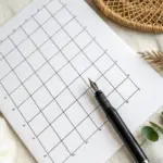
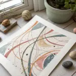
Line-Patterned Landscape Zones
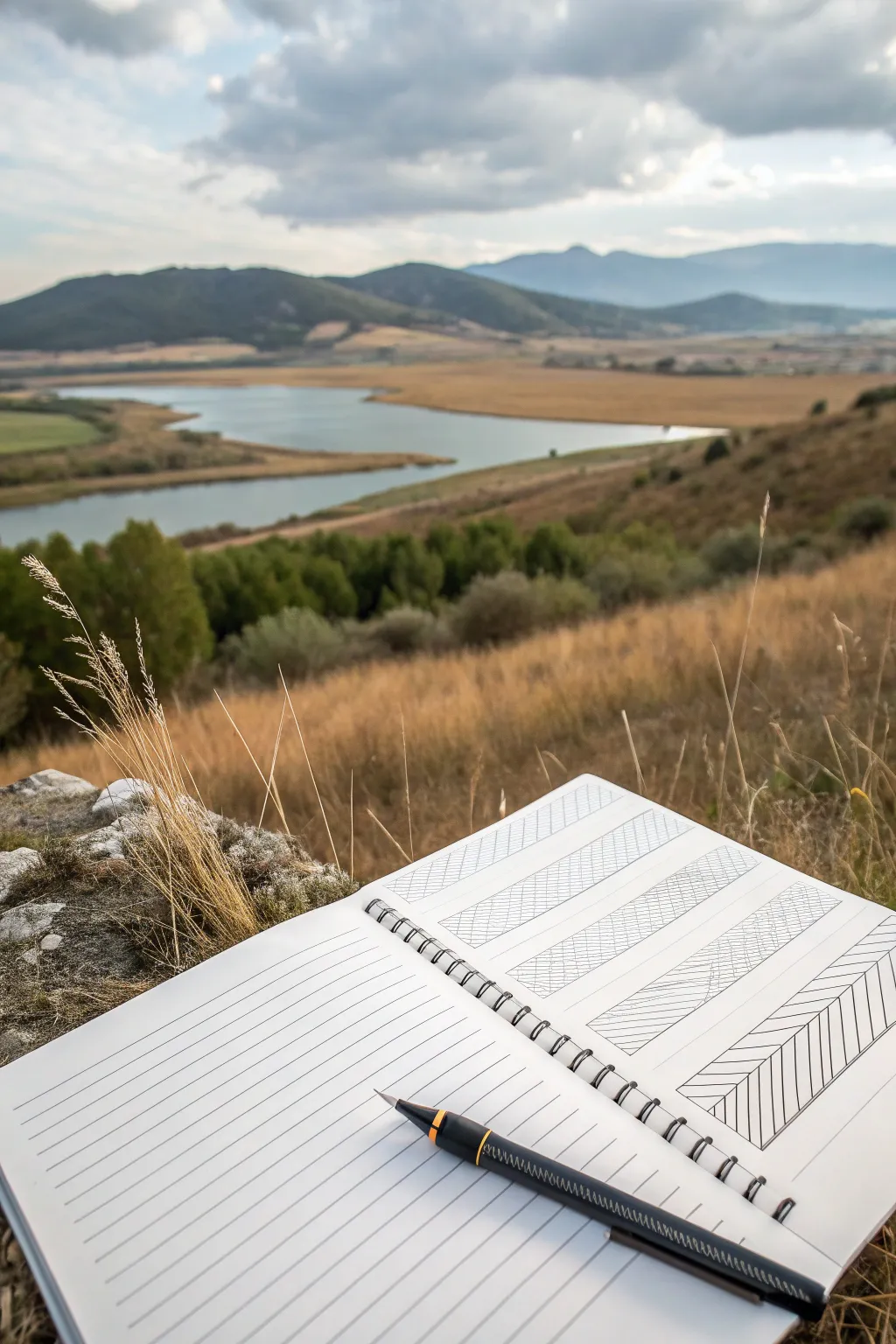
This project transforms a serene landscape view into a structured, abstracted study using simple geometric patterns and clean lines. By breaking down the scenery into rectangular zones, you create a minimalist interpretation that focuses on texture and direction rather than realistic detail.
How-To Guide
Materials
- Spiral-bound sketchbook (A5 or similar size)
- Black fineliner pen (0.3mm or 0.5mm)
- Ruler
- Pencil (HB or 2H for light drafting)
- Eraser
Step 1: Drafting the Layout
-
Create the frame:
Begin by drawing a large rectangular border on the right-hand page of your sketchbook. Leave a comfortable margin of about 1 inch from the edges of the paper to frame your composition nicely. -
Divide into zones:
Using your ruler and pencil, divide this main rectangle into four equal vertical strips. These strips will serve as the containers for your different line patterns. -
Sub-divide the strips:
Within each vertical strip, draw horizontal lines to create smaller rectangular sections. These don’t need to be perfectly uniform; varying their height slightly can add interest, though the example shows a fairly regular grid. -
Add diagonal guides:
Lightly sketch diagonal lines across your grid where you plan to change the direction of your hatching. This helps you visualize the flow before committing to ink.
Wobbly Lines?
If your hand shakes while hatching, try moving your entire arm from the shoulder or elbow rather than just your wrist. This creates smoother, straighter strokes.
Step 2: Inking the Structure
-
Outline the main grid:
Switch to your black fineliner. Carefully trace over your main rectangular frame and the vertical dividing lines. Use the ruler to ensure these structural lines are crisp and straight. -
Define the sections:
Ink the horizontal dividing lines within the strips. Make sure corners meet neatly without overshooting lines, as this precision gives the drawing its polished look. -
Erase guide lines:
Once the main grid ink is completely dry, gently erase your pencil guidelines. This gives you a clean slate for the pattern work.
Step 3: Filling the Patterns
-
Start the first zone:
Begin with the top-left section. Draw tightly spaced diagonal lines moving from bottom-left to top-right. Keep the spacing consistent to create a uniform grey tone effect. -
Contrast the direction:
In the adjacent section, switch the direction of your hatching. If the previous lines went up and to the right, make these lines go down and to the right. This alternating pattern creates the visual rhythm. -
Create cross-hatching:
For the middle sections, try layering lines. Draw a set of diagonal lines in one direction, then cross over them with lines in the opposite direction to create a denser, darker texture. -
Vary line density:
As you move down the page, experiment with the spacing. For the bottom strip (as seen in the reference), use wider spacing between lines to create a lighter, airier feel compared to the dense cross-hatching above. -
Add vertical interest:
In the bottom-most rectangles, incorporate vertical or near-vertical lines. This mimics the tall grasses or reeds often found near the water’s edge in a landscape. -
Refine the edges:
Go back over the perimeter of your filled shapes. If any hatching lines didn’t quite touch the border, carefully extend them. If some went over, thicken the border line slightly to hide the imperfection.
Add Dimension
Vary your pen sizes! Use a 0.8mm pen for the main grid borders and a delicate 0.1mm or 0.05mm for the internal hatching to create depth and visual hierarchy.
Step 4: Left Page Preparation
-
Rule the left page:
On the facing page, use your ruler to draw straight, evenly spaced horizontal lines across the entire page. These can serve as a space for notes or simply as a graphical counterpart to the complex right page. -
Clean up:
Do a final pass with your eraser to remove any remaining graphite smudges or construction lines, leaving only the crisp black ink.
Now you have a structured, geometric abstraction that captures the essence of a landscape through simple lines
Zentangle-Style Line Texture Fill
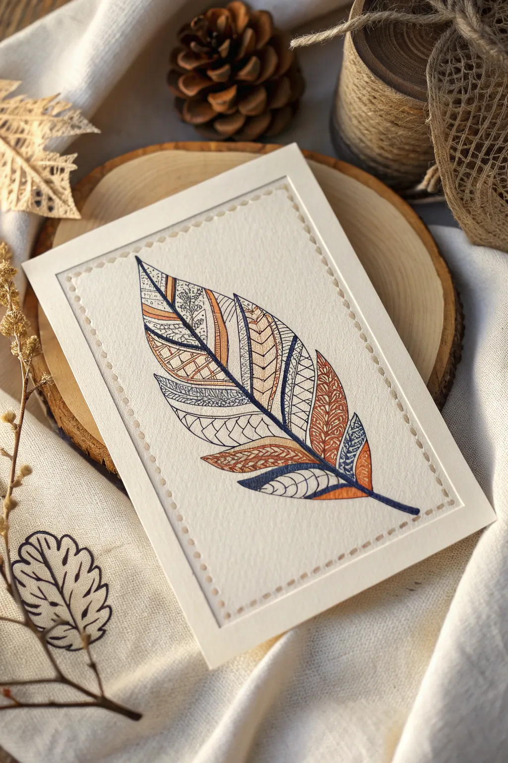
This project combines the meditative repetition of Zentangle patterns with the organic shape of a feather, resulting in a striking piece of card art. By breaking a simple outline into segments and filling them with diverse line textures, you create depth and visual interest without needing advanced drawing skills.
Step-by-Step Tutorial
Materials
- High-quality watercolor paper or heavy cardstock (textured, off-white/cream)
- Fine liner pens (Black, 0.1mm and 0.3mm)
- Colored pens or fine markers (Burnt Orange/Terracotta and Navy Blue)
- Pencil (HB or 2H)
- Eraser
- Ruler
- Embossing stylus or thick needle (for the border)
- Mousepad or foam mat (for embossing)
Step 1: Preparation & Outline
-
Prepare the card base:
Cut your textured paper to your desired size, likely around 4×6 inches or 5×7 inches. Ensure the edges are clean and sharp. -
Lightly sketch the feather:
Using a hard pencil like a 2H, lightly draw the central spine (rachis) of the feather. It should have a gentle curve to look natural. -
Define the outer shape:
Sketch the outer contour of the feather vanes. Don’t make it a perfect oval; allow for some variation in width and a tapered tip. -
Create the segments:
Draw diagonal lines extending from the spine to the outer edge, effectively dividing the feather into stripes or sections. These will be your containers for the different patterns. -
Ink the main lines:
Go over your pencil spine and section dividers with a blue fine liner to establish the primary structure. Keep a steady hand for smooth curves.
Ink Control Pro-Tip
When switching between colors, test your pen on a scrap piece of identical paper first. Some colored markers bleed more than black fine liners, so you may need to move your hand faster.
Step 2: Pattern Filling
-
Select your color palette:
This design relies on a limited palette of navy blue, terracotta orange, and black. Decide which sections will receive which dominant color before you start filling. -
Fill the ‘scales’ section:
Choose a middle section and draw small, overlapping U-shapes to create a fish-scale texture. I find using the finest black pen helps keep this delicate. -
Add woven details:
In a larger orange section, draw intricate interlocking loops or a paisley-inspired swirl pattern to add density and warmth. -
Incorporate geometric lines:
For contrast, fill a blue-outlined section with strict parallel lines or zig-zags. Varying the spacing between lines changes the perceived darkness of the area. -
Create organic flow:
In the black-and-white sections, use long, flowing lines that mimic the direction of actual feather barbs, interspersed with tiny stippling dots for shading. -
Balance the chevron:
Near the top, use the orange pen to create a chevron or V-shape pattern. This draws the eye upward and points toward the tip of the feather. -
Detail the spine:
Go back to the central spine and thicken the line slightly at the base, tapering it toward the top. You can fill the bottom quill area with solid blue or orange.
Step 3: Finishing Touches
-
Clean up the sketch:
Once the ink is completely dry, gently erase any visible pencil guidelines. Be careful not to smudge the lighter colored inks. -
Mark the border spacing:
Using a ruler and pencil, make tiny, faint marks about 1/4 inch inside the edge of the paper, creating a rectangular border guide. -
Emboss the border:
Place your paper face-up on a soft surface like a mousepad. Use an embossing stylus or a blunt needle to press into the paper along your guide marks, creating a raised, dotted ‘stitched’ look. -
Mount texturing:
For the final presentation, you can lightly distress the very edges of the cardstock with a scissor blade if you want a more rustic finish, though a clean cut works beautifully too.
Level It Up
Add subtle metallic accents by tracing over just one or two lines in each section with a gold or copper gel pen. It catches the light beautifully when the card is tilted.
Step back and admire how simple lines have woven together to create a complex, textured piece of art
Tape-Resist Crisp White Line Grid
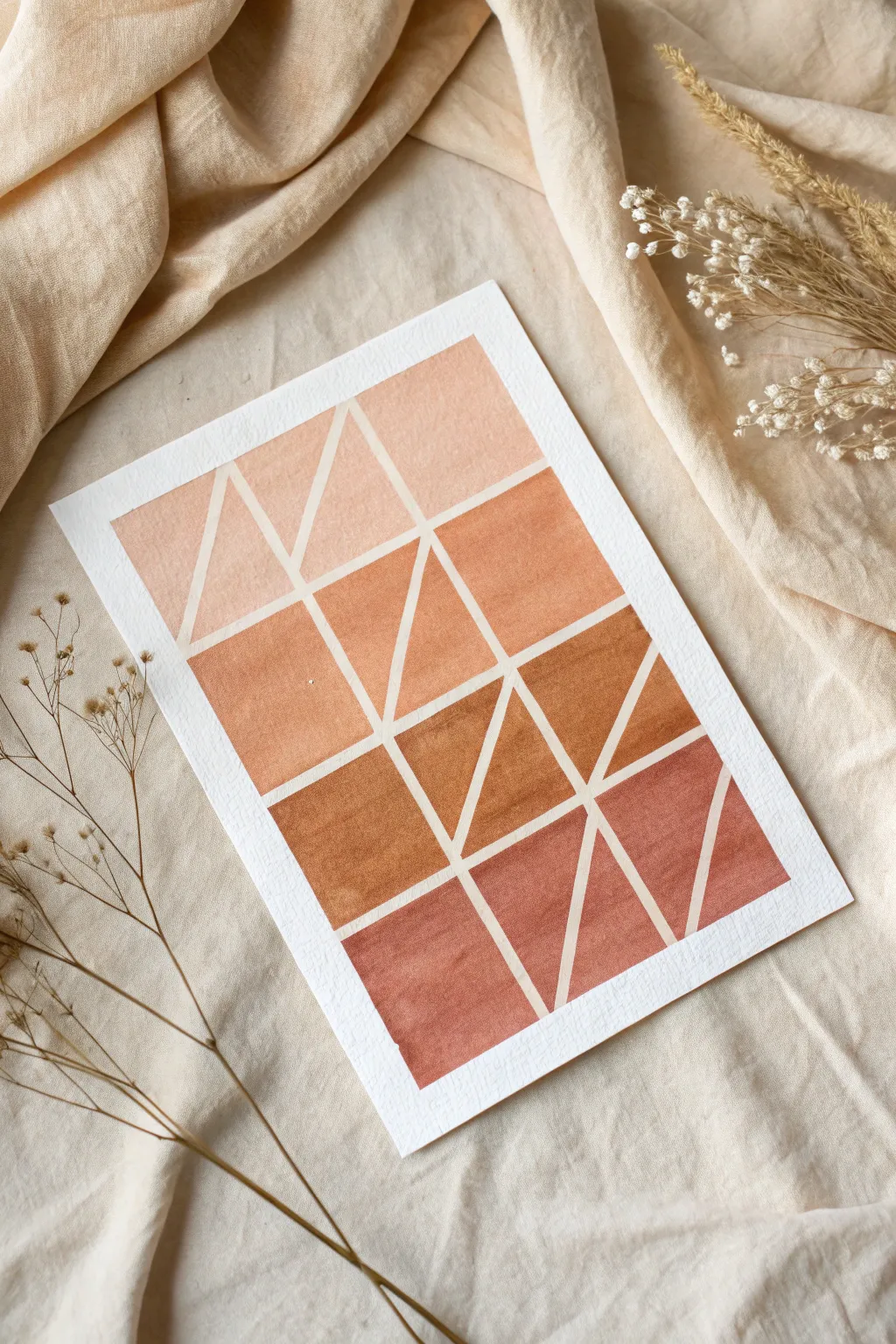
Achieve stunningly crisp lines and a modern geometric look with this satisfying tape-resist technique. This project explores a warm, monochromatic gradient from soft peach to deep rust, perfect for adding a touch of boho minimalism to your space.
Step-by-Step Tutorial
Materials
- Heavyweight watercolor paper (300gsm/140lb) or mixed media paper
- Washi tape or artist’s masking tape (specifically low-tack)
- Watercolor paints (shades of burnt sienna, ochre, and red)
- Flat shader brush (size 6 or 8)
- Palette for mixing gradients
- Ruler
- Pencil
- Jar of water
- Paper towels
Step 1: Grid Preparation
-
Prep your surface:
Start by securing your watercolor paper to a flat work surface. Framing the edges with tape not only holds the paper steady but also creates a clean, professional border around your finished piece. -
Measure the rows:
Using a ruler and light pencil marks, divide your paper vertically into four equal horizontal bands. These will become the rows for your gradient. -
Mark the columns:
Divide the horizontal width into three equal columns. You should now have a faint pencil grid of twelve rectangles. -
Tape the main grid:
Place strips of masking tape directly over your horizontal and vertical pencil lines. Run your fingernail or a bone folder firmly along the edges of the tape to ensure a tight seal against the paper. -
Create the diagonals:
Now for the fun part. Inside each of the twelve taped-off rectangles, place a diagonal strip of tape. Vary the direction of the diagonals—some can connect corners, while others can be steeper triangles—to create a random, dynamic geometric pattern. -
Seal the deal:
Double-check all your tape edges again. The key to crisp white lines lies entirely in this step; any loose tape will allow paint to bleed underneath.
Step 2: Painting the Gradient
-
Mix the lightest shade:
On your palette, prepare a very watery wash of burnt sienna mixed with plenty of water (or a touch of white gouache if you want opacity) to create a pale peach tone. -
Paint the top row:
Fill in the geometric shapes in the top row with this palest peach color. Use your flat brush to sweep pigment evenly across the paper, painting right over the tape. -
Deepen the color:
For the second row, add a little more pigment to your original mix. This should be a distinct step darker—a warm apricot or light terracotta. -
Paint the second row:
Apply this medium-light shade to the shapes in the second row. Because the tape separates the sections, you don’t need to worry about the wet paint from the top row touching this new layer. -
Mix the rich rust:
Add a small dot of red or brown to your mix now. You are aiming for a classic terracotta pot color. Test the shade on a scrap piece of paper first to ensure the gradient looks consistent. -
Paint the third row:
Fill the third row’s shapes with this rich, warm rust color. Ensure the coverage is solid; you can layer it slightly if the first pass looks too transparent. -
Create the darkest tone:
For the final bottom row, mix your most saturated color. Use burnt sienna with a touch of burnt umber or dark red to create a deep, earthy clay color. -
Finish the painting:
Apply this darkest shade to the bottom row shapes. You should now see a clear ombre effect moving from light at the top to dark at the bottom.
Seal Prior to Painting
Before adding color, paint a thin layer of clear water or white acrylic over the tape edges. This fills any tiny gaps, ensuring the subsequent colored paint doesn’t bleed.
Step 3: The Reveal
-
Let it dry completely:
Patience is crucial here. Wait until the paper is bone dry and cool to the touch. If you peel too early, the damp paper might tear. -
Start peeling:
Everything should be dry now. Start peeling the tape slowly at a 45-degree angle, pulling away from the painted area. I always hold the paper down firmly near the peeling edge for extra control. -
Reveal the diagonals:
Remove the inner diagonal pieces of tape first, followed by the main grid lines. -
Remove the border:
Finally, remove the border tape to reveal the clean edge around the artwork. -
Final touches:
If there are any pencil marks visible in the white spaces, gently erase them with a clean kneaded eraser.
Try Metallic Accents
For a glamorous twist, once the paint is dry and tape is removed, re-line just one or two triangles with gold ink or leaf for a pop of shine.
Step back and admire your clean lines and beautiful gradient work
Glue-Resist Raised Line Wash
Create a soothing, organic composition using the magic of glue resist to capture the fluid motion of sedimentary layers. This project combines the crisp white of watercolor paper with soft washes of terra cotta and sage for a naturally calming aesthetic.
Step-by-Step
Materials
- Cold-press watercolor paper (300 gsm)
- White liquid craft glue or clear blue gel glue (fine tip)
- Watercolor paints (Burnt Sienna, Sap Green, Yellow Ochre)
- Large round watercolor brush (size 10 or 12)
- Cup of water
- Paper towels
- Hairdryer (optional, for speeding up drying)
Step 1: Setting the Resist
-
Plan the flow:
Visualize a diagonal flow across your paper. You want organic, wavy lines that mimic geological strata or gentle waves, moving roughly from the bottom left to the top right. -
Test your glue flow:
Before touching the paper, squeeze a bit of glue onto a scrap surface to ensure the nozzle is clear and the flow is consistent. You want a smooth, steady bead. -
Draw the first wave:
Starting near the bottom right corner, gently squeeze the glue bottle while dragging it across the paper in a wavering, diagonal line upward. Vary the pressure slightly to create natural thick and thin spots. -
Add parallel currents:
Draw 4-6 more glue lines parallel to your first one. Keep them imperfect; let them wiggle and occasionally come close together or drift apart, but avoid having them cross over each other. -
Let it cure completely:
This is the most crucial patience test. Allow the glue lines to dry entirely until they are clear and hard to the touch. This usually takes several hours or overnight. If the glue is tacky, the paint will smudge it.
Step 2: Applying the Earth Washes
-
Prepare your palette:
Mix three distinct puddles of watercolor: a watery Burnt Sienna for the rust tones, a very dilute Sap Green mixed with a touch of grey for the sage, and a pale Yellow Ochre. -
Wet the first section:
Choose a wide channel between two dried glue lines. Use your clean brush and clear water to pre-wet the paper in just that specific lane. -
Drop in the rust color:
While the paper is damp, load your brush with the rust (Burnt Sienna) mix. Touch the tip to the top of the wet channel and let the color bleed down. Use the brush to guide it, painting right over the dried glue lines. -
Soften the edges:
As you paint up to the glue resist, don’t worry about staying perfectly inside the lines. The glue acts as a barrier, keeping the white paper underneath pristine. -
Switch to sage:
Move to a different channel, perhaps one separated by a few white spaces. Apply the sage green wash here. I like to keep the green very watery to contrast with the stronger rust tones. -
Blend localized gradients:
In the wider channels, try dropping a little rust color at one end and sage at the other, letting them meet and mingle in the middle for a variegated stone look. -
Leave breathing room:
Leave several channels completely unpainted or painted with extremely pale water to maintain the airy, light feeling of the piece. The white space is just as important as the color. -
Dry the paint layer:
Allow the entire painting to dry completely. The paper should be bone dry before you attempt the next step.
Use Blue Glue
Use ‘clear blue’ school gel glue instead of white glue. The blue tint makes it much easier to see where you’ve drawn your lines on white paper before painting.
Step 3: Revealing the Lines
-
Check dryness:
Touch the paper with the back of your hand. If it feels cool, it’s still damp. Wait a bit longer. -
Remove the resist:
Using your finger or a rubber cement pickup tool, gently rub the end of a glue line to lift it. Peel the dried glue off slowly. It should come away in long, satisfying strings. -
Clean up stray bits:
Continue rubbing away all the glue until only the crisp white paper remains where the lines once were. -
Flatten the artwork:
If the water buckled the paper slightly, place the finished artwork under a heavy book overnight to smooth it out for framing.
Salt Texture
Sprinkle coarse sea salt into the wet paint channels before they dry. Brush the salt off later for a speckled, mineral-like texture that enhances the earthy vibe.
Once peeled and flattened, your artwork will have a beautiful tactile quality reminiscent of agate slices or coastal sands
Op Art Hand Illusion Lines
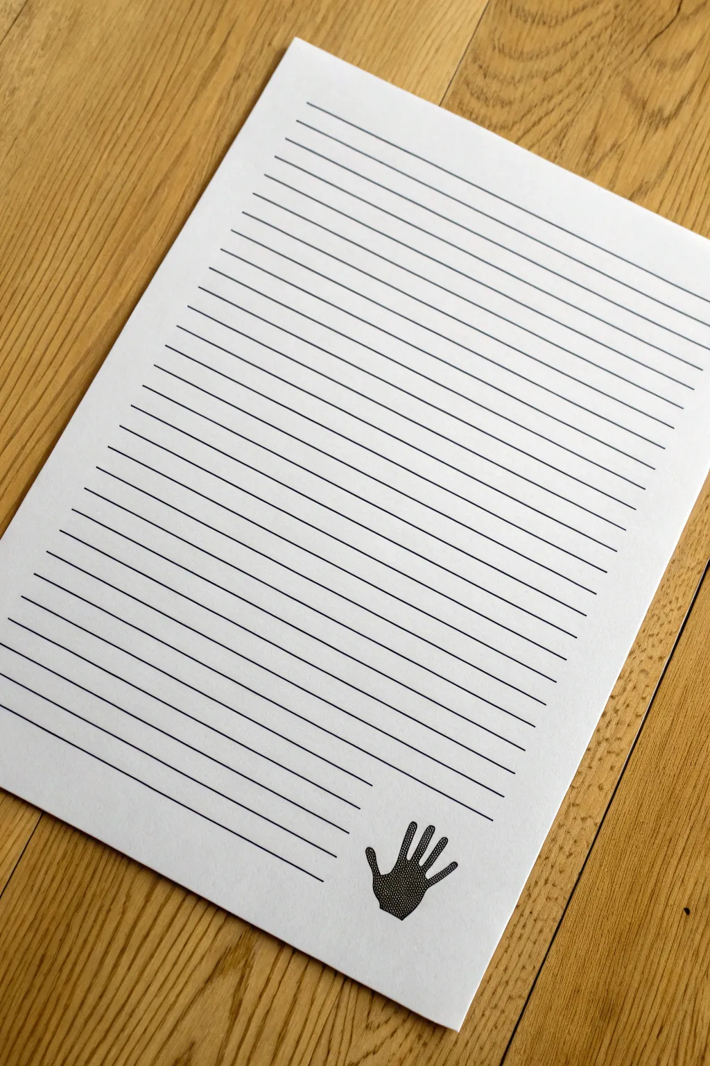
This intriguing drawing project transforms a simple sheet of paper into a piece of Op Art using just lines and negative space. By carefully breaking straight ruled lines around a hand tracing, the shape seems to emerge ghost-like from the page.
Step-by-Step Guide
Materials
- White cardstock or heavy drawing paper
- Pencil (HB or lighter)
- Black felt-tip pen or fine liner (0.5mm or 0.8mm)
- Ruler or straight edge
- Eraser
- Your own hand
Step 1: Planning and Layout
-
Position the paper:
Place your sheet of white paper on a flat, smooth surface. Orient it vertically (portrait mode). -
Trace your hand:
Lay your hand flat on the bottom right corner of the paper with your fingers slightly spread apart. Using a light pencil, carefully trace the outline of your hand and fingers. -
Refine the outline:
Lift your hand and check the pencil trace. Lightly fix any jagged edges or bumps so you have a smooth, clean hand silhouette. -
Mark spacing guides:
Along the left edge of the paper, use your ruler and pencil to make small tick marks every 1/2 inch (or 1 cm) from top to bottom ensuring consistent spacing. -
Repeat spacing marks:
Repeat this process on the right edge of the paper, ensuring the marks align perfectly horizontally with the ones on the left side.
Oops! Uneven lines?
If your ruler slips, don’t panic. Thicken that specific line slightly all the way across to hide the wobble, or turn it into a deliberate pattern of thick and thin stripes.
Step 2: Inking the Background
-
Prepare the pen:
Switch to your black felt-tip pen and ruler. Before drawing on the final paper, test the pen on a scrap piece to ensure the ink flows smoothly without skipping. -
Draw top lines:
Place your ruler across the top pair of tick marks. Draw a straight black line connecting them, going all the way across the page. Continue this for all lines located *above* your pencil hand drawing. -
Approach the hand:
As you reach the area where the fingers begin, line up your ruler as usual. Draw the line starting from the left edge but stop your pen exactly when it touches the pencil outline of the finger. -
Skip the finger:
Lift your pen, jump over the finger shape, and put the pen back down on the other side of the finger outline. Continue the line until you hit the next finger or the edge of the page. -
Continue the pattern:
Work your way down the paper line by line. Be extremely careful to stop your line precisely at the ‘outer’ edge of the hand and resume it immediately after the gap. -
Handle complex gaps:
For lines that cross multiple fingers, you will be drawing short dashed segments between the fingers. Keep the ruler firmly in place so all segments remain perfectly straight. -
Complete the palm area:
When you reach the palm, the gap will be much larger. Draw from the left edge to the thumb/wrist outline, stop, and then pick up again on the far right side of the paper. -
Finish the bottom lines:
Once you are past the wrist area, resume drawing solid lines all the way across the bottom of the page from edge to edge.
Step 3: Finishing Touches
-
Let the ink dry:
Allow the black ink to dry completely for at least 15 minutes to prevent smearing during the next step. -
Erase pencil marks:
Take a high-quality eraser and gently rub over the entire page. Remove the original pencil outline of the hand and the tick marks on the edges. -
Inspect the gaps:
Look closely at where the lines end. If any lines stopped too short of the invisible hand edge, carefully extend them slightly with the pen to create a sharp boundary. -
Optional stippling:
For extra dimension (like the reference image), you can add tiny stippled dots along the inside edge of the negative space to define the hand further, though leaving it blank creates a starker illusion.
Make it Pop
Instead of leaving the hand blank/flat, connect the broken lines with curved, arched lines over the hand shape. This creates a 3D effect where the hand looks like it’s pushing up.
Step back and admire how simple interrupted lines can trick the eye into seeing a solid form
Ripple Lines Around Dots
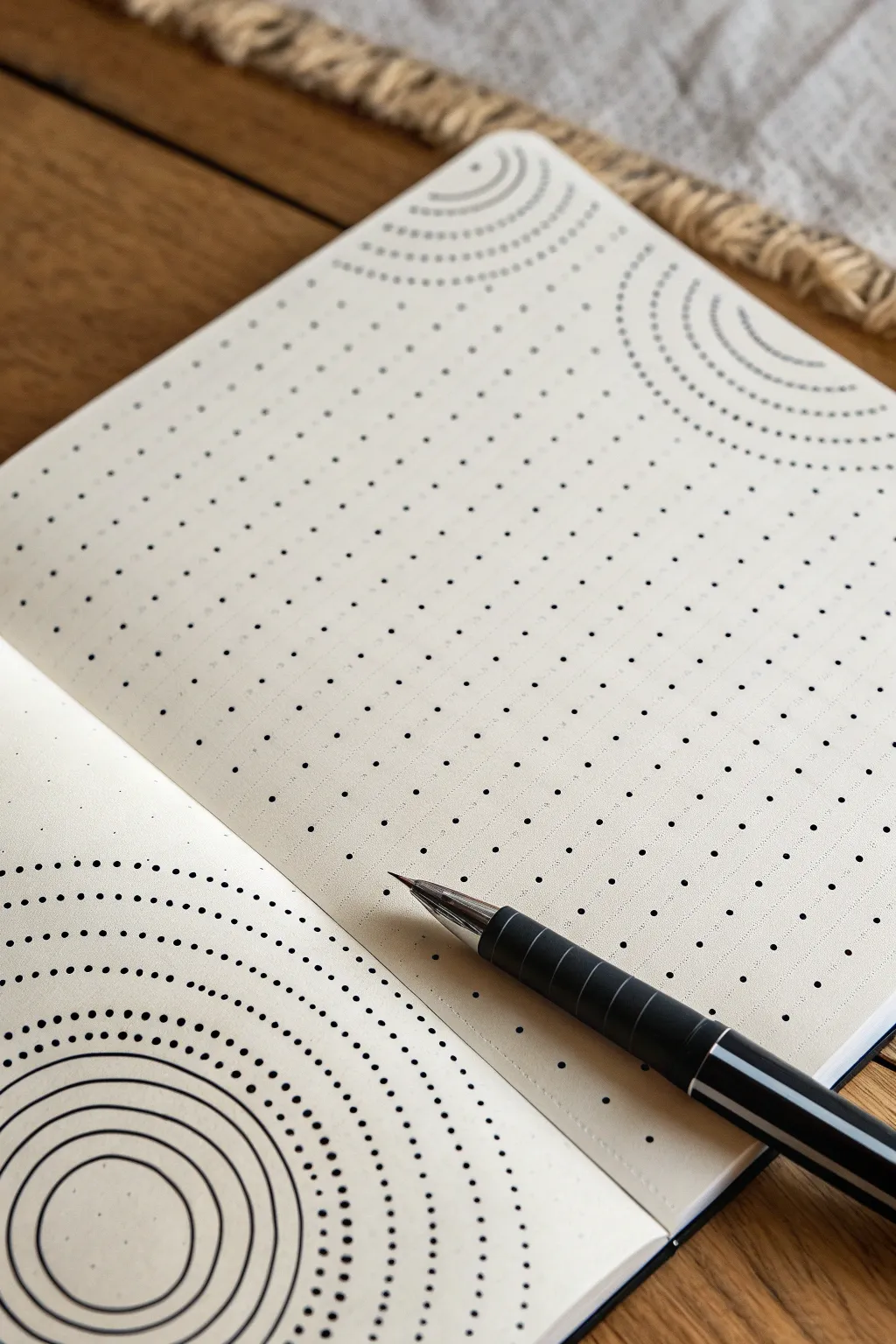
Transform a simple dotted notebook page into a meditative piece of geometric art using repeating circular motifs. This design plays with the existing grid, using it as a guide to create soothing ripples that look complex but are surprisingly relaxing to draw.
How-To Guide
Materials
- Dotted grid notebook or journal
- Fine liner pen (black, 0.4mm or 0.5mm)
- Compass (optional but helpful)
- Pencil (for guidelines)
- Eraser
Step 1: Planning the Layout
-
Identify your focal points:
Choose 2-3 specific dots on your page that will serve as the center points for your ripples. In the example, one is located near the bottom left corner and another mirrors it at the top right. -
Visualize the quadrants:
Imagine your page divided into zones. The ripples will originate from corners or edges and expand inward, creating a dynamic sense of movement across the spread. -
Test the spacing:
Before committing to ink, count the dots radiating out from your center point. A standard layout might skip one dot between each concentric circle to keep the design airy.
Wobbly circles?
Don’t stress about perfect circles. If a line goes astray, thicken it slightly to hide the wobble, or turn that specific ring into a thicker, bolder accent line.
Step 2: Drawing the Dotted Ripples
-
Start the top right arc:
Locate a dot in the upper right corner to be your center. Move three units away from it to start your first curve. -
Connect the dots loosely:
Instead of drawing a solid line immediately, use the grid dots themselves as the primary feature. You are highlighting the circular formation of the existing grid. -
Add intermediate dots:
Using your fine liner, place small, deliberate ink dots between the pre-printed grid dots to form a clearer curve. This creates a ‘dotted line’ effect that respects the grid geometry. -
Expand the pattern:
Move outward another two or three grid units and repeat the dotted arc. I find it helpful to rotate the notebook physically to keep my hand in a comfortable, natural drawing arc. -
Create variation:
Alternate between varying densities of dots. Some arcs can be tightly dotted, while others use only the pre-printed grid guide.
Add some depth
Use a light grey marker to trace distinct shadows on just the right side of your solid rings. This simple addition makes the ripples look like they are rising off the paper.
Step 3: Inking the Solid Ripples
-
Anchor the bottom left:
Now, focus on the bottom left corner. Select a dot near the edge as your absolute center. -
Draw the smallest circle:
Draw a solid, continuous circle around this center dot. It should be small, roughly the width of one grid square. -
Expand with concentric lines:
Draw a second circle around the first, maintaining an even gap. Keep your wrist loose and plant your palm for stability. -
Continue the expansion:
Add 3-4 more concentric rings. These should be solid, confident black lines. -
Transition to dots:
Once you have about 5 solid rings, switch your technique. On the next imaginary ring, start placing ink dots instead of a solid line. -
Build the dotted gradient:
Continue adding concentric rings of dots, expanding outward toward the center of the page. The dots should follow the circular path established by your solid lines. -
Merge the styles:
As the ripples from the bottom left approach the center of the page, let the spacing between dots become slightly wider, mimicking the airier style at the top right.
Step 4: Refining and Cleaning
-
Check for consistency:
Look at your dot weights. If some ink dots look too small compared to the pre-printed ones, carefully go back over them to increase their size. -
Erase guidelines:
If you used a pencil compass or sketched rough arcs earlier, wait until the ink is completely dry before gently erasing them. -
Add final details:
You can add a few tiny micro-dots between your main rings to add texture, or leave the negative space clean for a minimalist look.
Enjoy the satisfying rhythm of this geometric artwork as you fill your page


Have a question or want to share your own experience? I'd love to hear from you in the comments below!