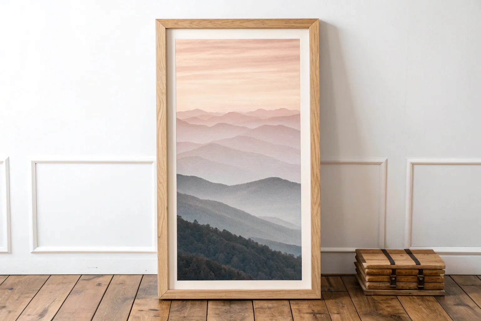
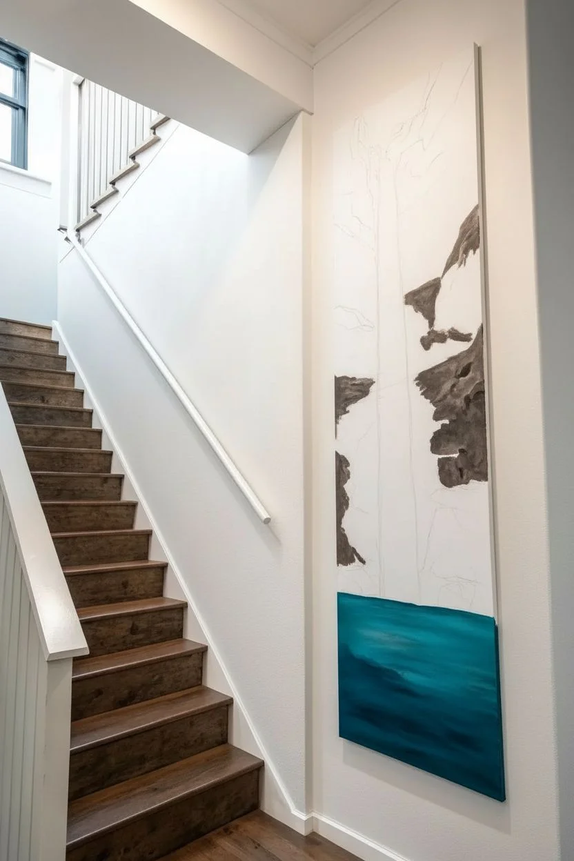
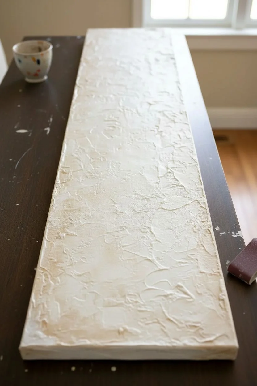
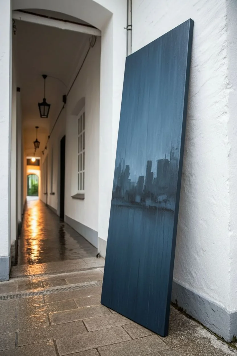
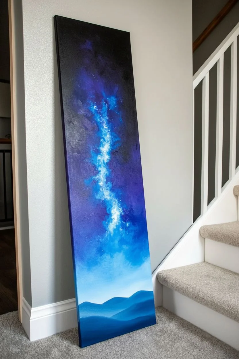
Long, skinny canvases can feel a little intimidating at first, but they’re honestly one of my favorite shapes to paint on because they naturally pull the eye upward. These long vertical painting ideas are built to look right at home in narrow wall gaps, stairways, and those tall, awkward spaces that beg for something sleek and intentional.
Misty Pine Trunks in a Vertical Forest
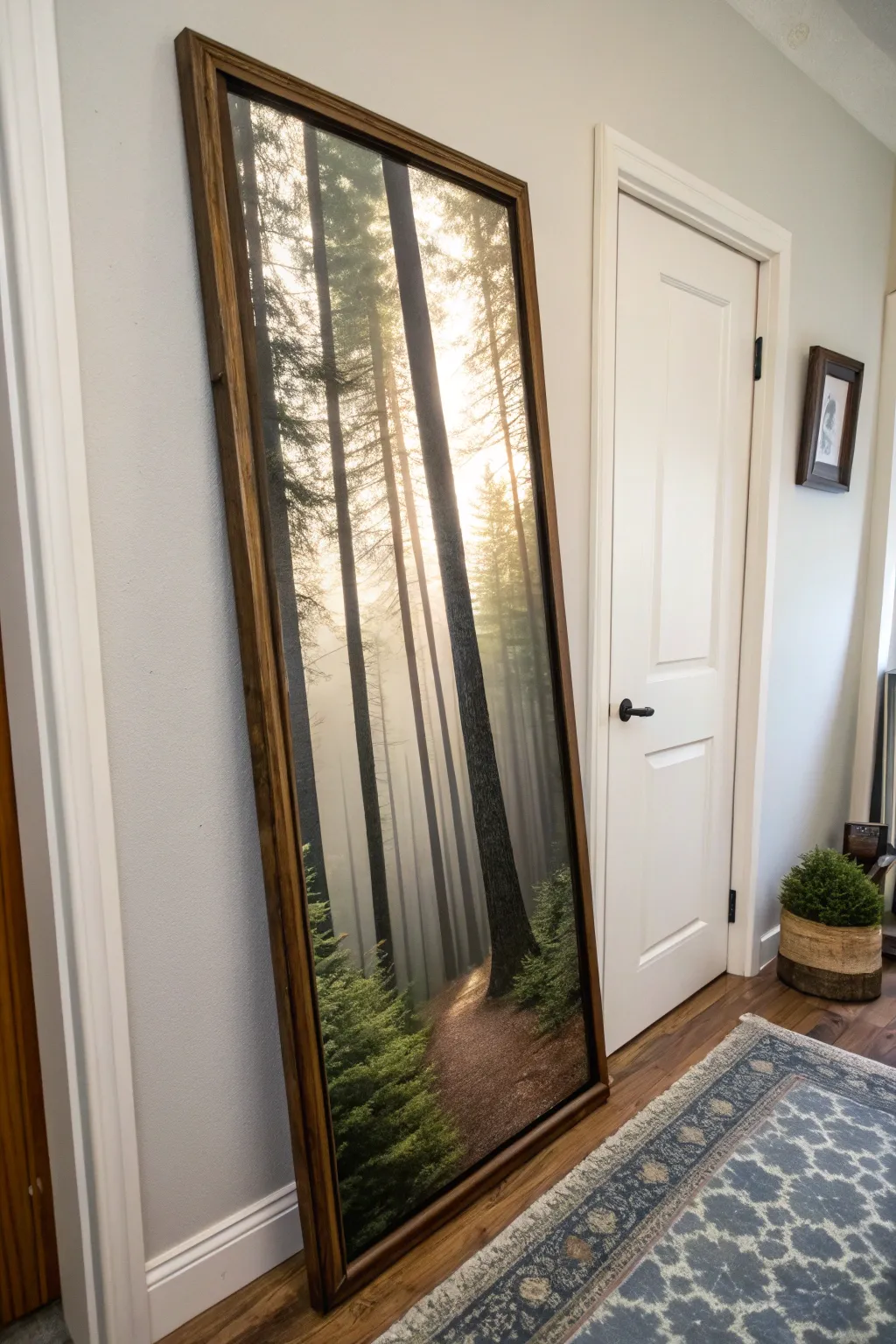
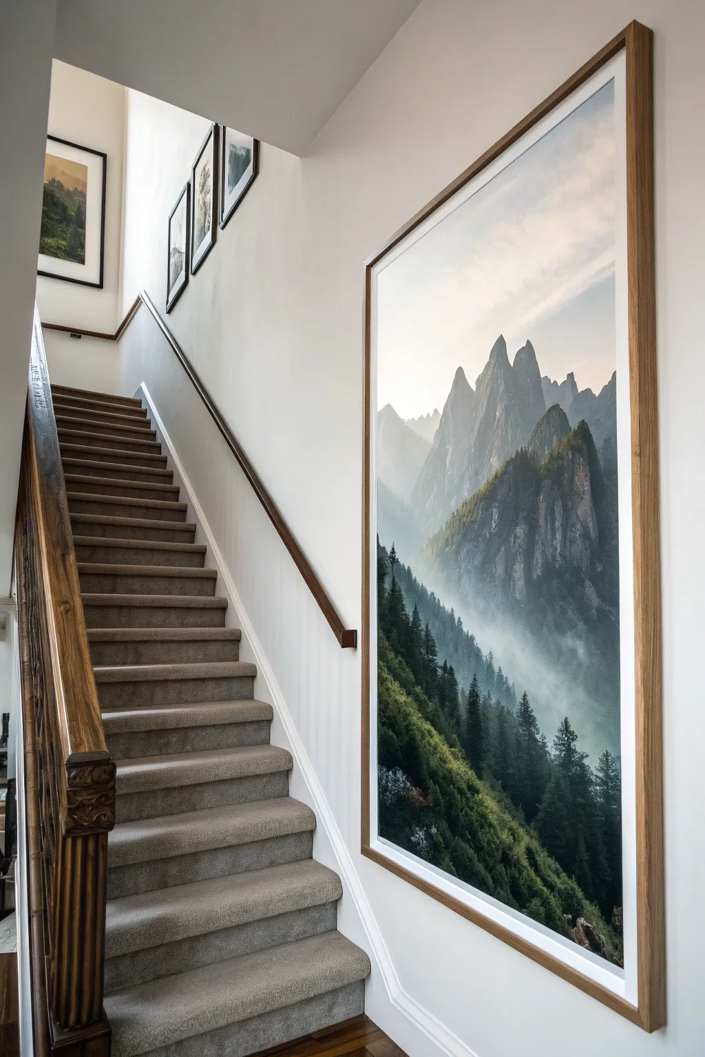
Bring the serene majesty of a misty forest indoors with this massive, statement-making vertical art piece. This project transforms a high-resolution digital print into a high-end, custom-framed masterpiece that creates a stunning visual window in any hallway or narrow wall.
Step-by-Step Tutorial
Materials
- High-resolution vertical forest photo (digitally source)
- Engineered print (36” x 72” or custom size)
- 1/4” plywood or hardboard backing
- Spray adhesive (heavy duty)
- 1×2 inch lumber (for frame)
- Wood stain (Dark Walnut or similar)
- Polyurethane sealer
- Wood glue
- Brad nailer or finishing nails
- Miter saw or hand saw
- Sandpaper (120 and 220 grit)
- Utility knife
- Brayer or clean rolling pin
- French cleat or heavy-duty picture hangers
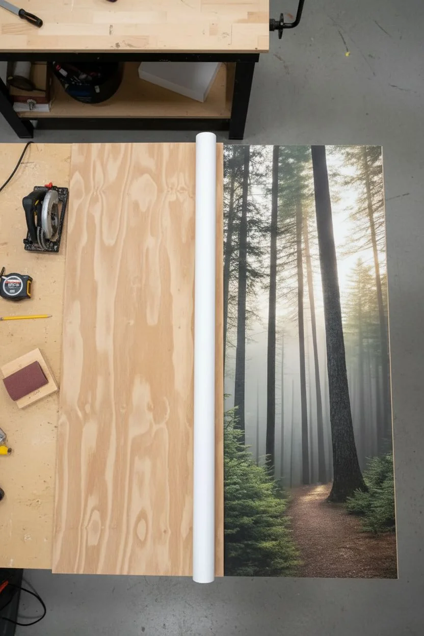
Step 1: Sourcing and Prep
-
Find your image:
Source a high-resolution stock photo of a misty pine forest. Because the final piece is vertical, crop your image to a tall, narrow aspect ratio (like 1:2 or 1:3) before printing to ensure the composition highlights the verticality of the trunks. -
Order an engineered print:
Upload your file to a print shop and order an ‘architectural’ or ‘engineered’ print on standard paper. This is a budget-friendly secret for getting massive prints for just a few dollars, though the paper is thinner than photo stock. -
Cut the backing board:
Measure your backing board (hardboard or plywood) to match the exact dimensions of your print. Use a circular saw or table saw to cut it down, or have your local hardware store cut it for you. -
Smooth the surface:
Sand the face of the backing board with 220-grit sandpaper to remove any texture that might show through the paper.
Pro Tip: Bubbles Begone
If you get a stubborn air bubble while mounting, prick it gently with a sewing needle and smooth it down with your fingernail. The hole will be invisible.
Step 2: Mounting the Art
-
Prepare the workspace:
Work in a well-ventilated area free of dust. Lay your backing board flat on a table or clean floor. -
Apply adhesive:
Shake your heavy-duty spray adhesive vigorously. Spray an even, generous coat across the top 6 inches of the backing board first. -
Align the print:
Carefully align the top edge of your print with the board. Press it down firmly. I find it helpful to have a second set of hands here to hold the bottom of the paper up so it doesn’t accidentally stick prematurely. -
Roll and stick:
Lift the unattached bottom portion of the paper. Spray the next section of the board, then slowly roll the paper down over it. Use a brayer or a soft cloth to smooth from the center outward to push out air bubbles. -
Seal the print (Optional):
Since engineered prints are delicate, you can lightly mist the surface with a matte clear acrylic spray sealer to protect the ink from fading and moisture.
Level Up: Texture Hack
Brush a layer of Mod Podge over the print with a wide brush using vertical strokes. This mimics the texture of painted canvas.
Step 3: Building the Frame
-
Measure for the frame:
Measure the total length and width of your mounted artwork. You want the frame to sit flush against the sides of the backing board. -
Cut the lumber:
Using your 1×2 lumber, cut two long side pieces and two shorter top/bottom pieces. Cut the corners at 45-degree angles using a miter saw for a professional join. -
Sand the wood:
Sand all wood pieces thoroughly, starting with 120 grit and finishing with 220 grit for a smooth finish. -
Stain the wood:
Apply a dark wood stain like Walnut or Espresso using a rag. Wipe off excess stain after a few minutes and let it dry completely according to the can’s instructions. -
Assemble the frame:
Apply wood glue to the mitered corners and clamp them together. Reinforce the corners with brad nails or V-nails from the back or side. -
Attach art to frame:
Place the mounted art inside the frame (or attach the frame directly to the edges of the backing board using brad nails through the frame side into the board edge). -
Install hanging hardware:
Due to the size, install a French cleat system or heavy-duty D-rings on the back to ensure the piece hangs safely and flush against the wall.
Step back and admire how this towering window into nature transforms the scale of your room


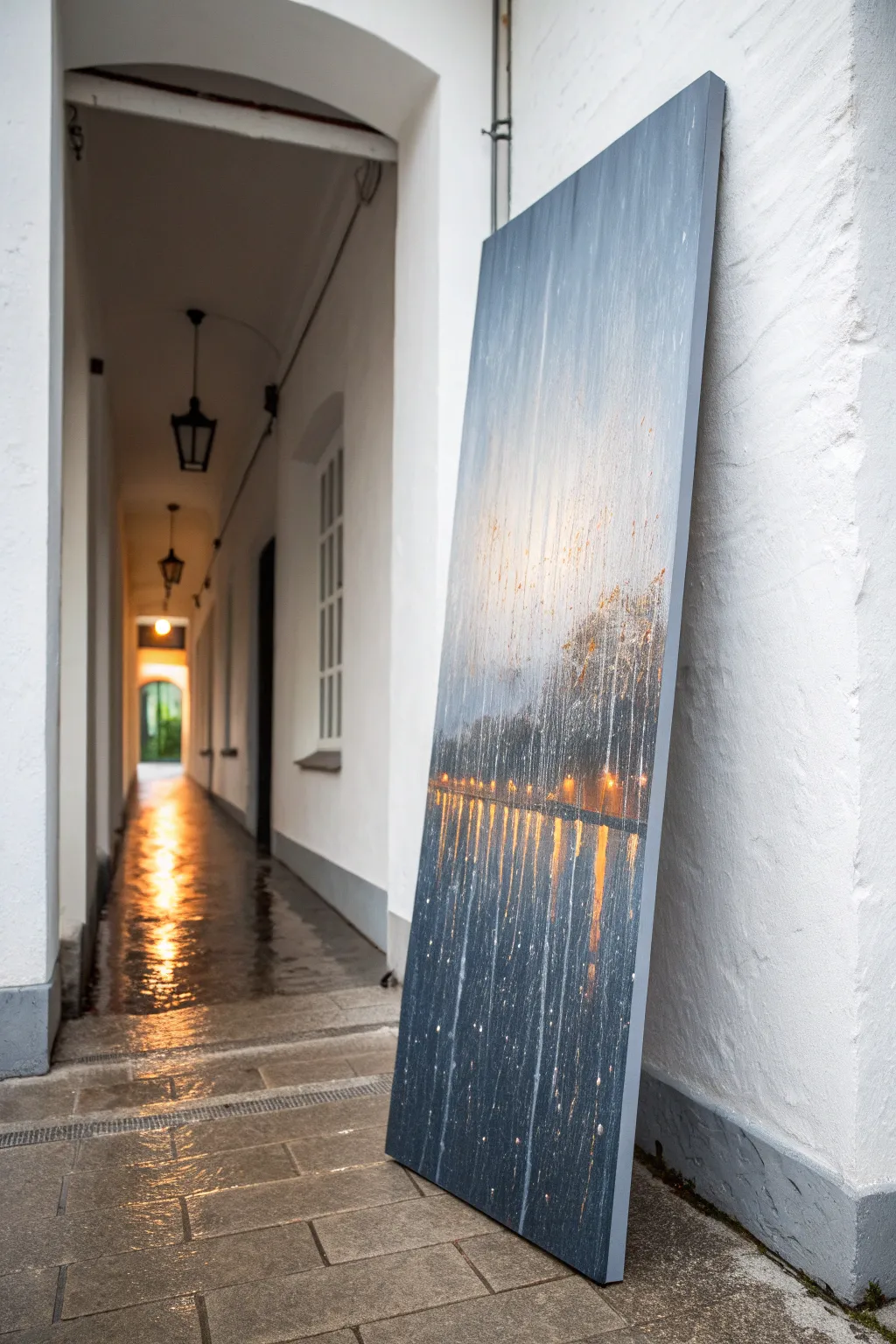
Waterfall Column With Splashy Texture
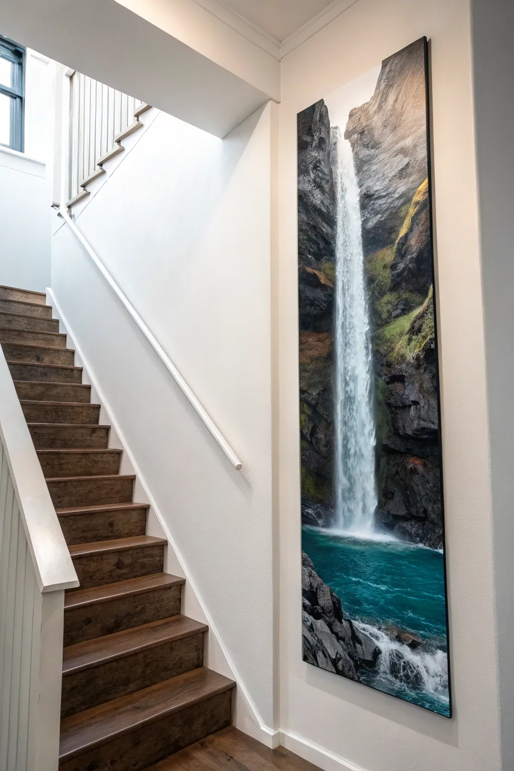
Transform a tall, narrow vertical canvas into a breathtaking window to nature with this realistic waterfall painting. The dramatic height emphasizes the falling water’s power, while layered acrylics capture the rugged texture of the cliffside and the misty splash pool below.
Step-by-Step Guide
Materials
- Tall vertical canvas (custom stretched or approximately 24×72 inches)
- Acrylic paints (black, white, burnt umber, raw sienna, phthalo blue, phthalo green, yellow ochre)
- Wide flat brushes (2-3 inch)
- Fan brush (medium)
- Small liner brushes
- Palette knife
- Spray bottle with water
- Gloss varnish
- Easel or wall mounting for working vertically
Step 1: Setting the Scene
-
Prepare the canvas:
Ensure your unusually tall canvas is primed with gesso. If you are building a custom stretcher frame to fit a specific niche like a stairwell, do this first and secure the canvas tightly. -
Sketch the composition:
Lightly pencil in the main vertical line of the waterfall. It shouldn’t be perfectly straight; give it a slight curve or stagger to look natural. Mark out the cliffs on either side, ensuring they frame the water asymmetrically. -
Block in dark foundations:
Mix a dark grey-brown using burnt umber and black. Paint the entire rock face area, keeping the paint fairly thin. Leave the waterfall strip and the pool area at the bottom white for now. -
Establish the water base:
For the bottom pool, mix phthalo blue, a touch of phthalo green, and white to create a deep turquoise. Paint the bottom section, blending it darker as it goes deeper into the corners.
Dry Brush For Mist
Don’t over-wet your brush when painting the falling water. A ‘dry brush’ technique creates natural breaks in the paint that look exactly like aerated, falling water.
Step 2: Building Rock Texture
-
Layer mid-tone rocks:
Mix raw sienna into your dark base color to create a lighter brown. Using a palette knife, scrape this color downwards onto the cliff areas to create the look of sheer vertical rock faces. -
Add mossy accents:
Mix yellow ochre with a tiny bit of blue to make a dull green. Stipple this onto the ledges and crevices of the rocks where moss would naturally grow near the moisture. -
Highlight rock edges:
Take a light grey mix and use the edge of your palette knife to catch the ‘ridges’ of the rocks. This adds dimension and makes the cliffs look jagged rather than flat. -
Deepen the shadows:
Go back in with pure black mixed with a little water. Paint into the deepest crevices next to where the waterfall will be to maximize contrast.
Make It 3D
Mix heavy gel medium into your white paint for the waterfall section. This physically builds up the paint texture, so the water literally stands out from the flat canvas.
Step 3: Creating the Waterfall
-
Paint the water column:
Using a wide flat brush loaded with titanium white and a tiny touch of blue, pull long, vertical strokes from the top of the falls to the bottom. Let the brush run dry towards the end of the stroke to create a broken, misty look. -
Soften the edges:
While the white paint is still tacky, use a dry brush to gently feather the edges of the waterfall into the dark rocks slightly, simulating mist. -
Brighten the core:
Apply pure, thick titanium white down the very center of the waterfall column. This is the fastest-moving water and should be the brightest point of the painting. -
Create the splash zone:
At the bottom where the water meets the pool, use a fan brush to tap in a cloud of white mist. I like to keep this loose and irregular so it feels explosive. -
Blend the pool entry:
The water hitting the pool creates foam. Use a liner brush to paint small, swirling turbulence patterns on the turquoise surface radiating out from the splash zone.
Step 4: Detailed Finishing
-
Refine the foreground rocks:
Paint the rocky shoreline in the bottom corners with high detail. Use sharp highlights on the wet rocks to show they are slick with spray. -
Add atmospheric mist:
Mist the painting lightly with water, then use a very watered-down white glaze over sections of the cliff halfway up. This simulates the water vapor rising in the air. -
Final highlights:
Add the brightest sparkles of white on the crest of the waterfall at the very top and on the wildest splashes at the bottom. -
Seal the work:
Once fully dry (give it 24 hours), apply a coat of gloss varnish. This will make the dark rocks look wet and the turquoise water pop with depth.
Hang this impressive vertical piece in a stairwell or narrow hallway to expand the feeling of space in your home


Single-Stem Wildflower With Lots of Air
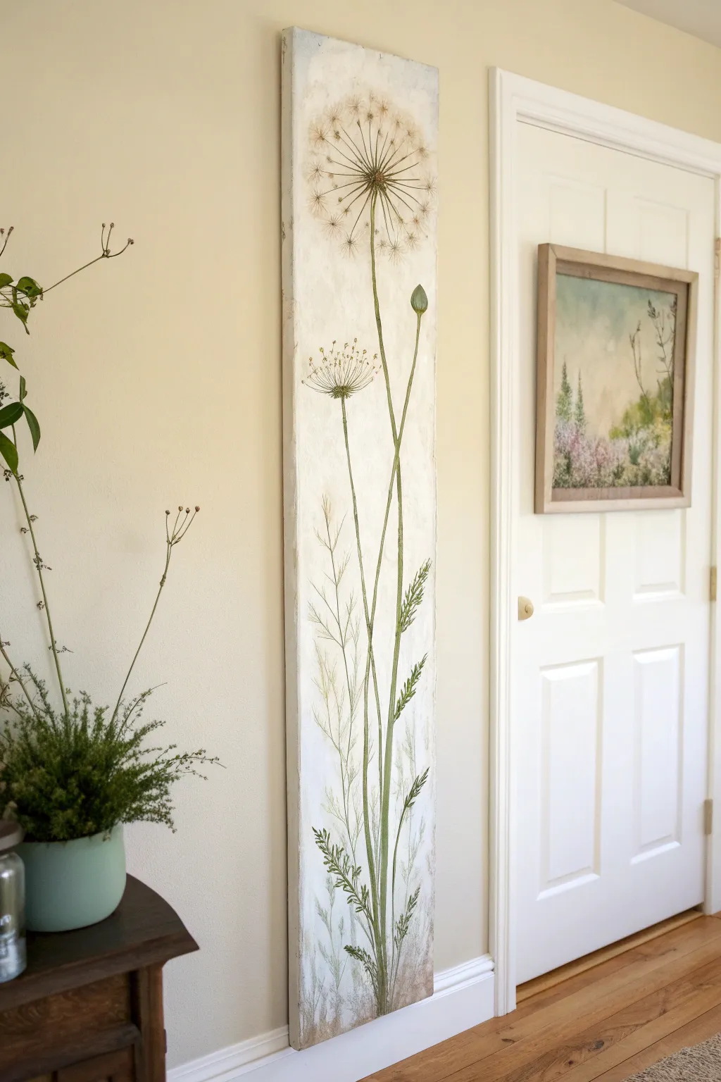
Embrace the elegance of vertical space with this tall, narrow botanical study featuring a delicate dandelion seed head. The creamy, textured background and soft natural greens create a calming, vintage-inspired focal point for any hallway or narrow wall.
How-To Guide
Materials
- Tall, narrow gallery-wrapped canvas (approx. 10″ x 40″ or similar)
- Acrylic paints (Titanium White, Unbleached Titanium/Cream, Sap Green, Olive Green, Burnt Umber, Raw Sienna)
- Modeling paste or thick gesso for texture
- Palette knife
- Assorted brushes: 1″ flat brush, #4 round brush, #0 or #00 liner brush
- Pencil for sketching
- Fine-grit sandpaper
- Matte medium or varnish
- Paper towels and water cup
Step 1: Preparing the Textured Base
-
Apply texture paste:
Lay your canvas flat and apply a thin, uneven layer of modeling paste or thick gesso using a palette knife. Don’t try to make it smooth; the goal is to create subtle ridges and bumps that mimic an old fresco wall. -
Dry and sand:
Allow the texture layer to dry completely, which may take several hours. Once hard, lightly run fine-grit sandpaper over the surface to knock down any overly sharp peaks while keeping the visual interest. -
Base coat application:
Mix Titanium White with a touch of Unbleached Titanium or Cream. Paint the entire canvas, including the sides, with a large flat brush to create a warm, off-white foundation. -
Create a vintage wash:
Dilute a very small amount of Raw Sienna with water to create a glaze. Brush this sporadically onto the background, concentrating slightly more on the edges and corners, then wipe it back with a paper towel for an aged parchment look.
Oops, too dark?
If your stems or background wash got too dark, don’t panic. Let it dry completely, then dry-brush a layer of the Unbleached Titanium over the area to push the darkness back.
Step 2: Sketching the Composition
-
Plan the stem height:
Lightly sketch a long, slightly curved vertical line starting from the bottom center and reaching up to the top third of the canvas. This will be your main dandelion stem. -
Add secondary elements:
Sketch a second, shorter stem for a flower bud branching off to the right, and a third thin line for a smaller bloom on the left. Variation in height is key for a balanced composition. -
Outline the head:
Draw a faint circle at the top of the main stem to guide the size of the seed head. It should be large and airy, filling the upper width without touching the edges.
Add metallic charm
Mix a tiny amount of iridescent gold medium into your white paint for the dandelion fluff. It will catch the light subtly without overwhelming the natural look.
Step 3: Painting the Greenery
-
Block in the stems:
Mix Sap Green with a little Burnt Umber for a muted, natural tone. Using a round brush, paint the stems following your pencil lines, keeping them slender but sturdy. -
Add lower foliage:
At the base of the painting, flick your brush upward to create grassy blades and fern-like leaves. Use a mix of Olive Green and White to vary the shades, giving depth to the lower garden. -
Paint the bud:
For the closed bud on the right, paint a tight oval shape in Olive Green, adding a highlight of light green on one side to give it volume. -
Detail the fern leaves:
Switch to a liner brush to add delicate, jagged leaves along the lower main stem. Keep the strokes quick and light to capture the feathery nature of the plant.
Step 4: Creating the Seed Head
-
Paint the center:
At the top of the main stem, dab a small, dark center using Burnt Umber. This anchors the seed head. -
Draw radiating spokes:
Using your thinnest liner brush and a watery mix of Burnt Umber and Green, paint very fine lines radiating outward from the center to the edge of your sketched circle. -
Create the fluff:
Mix a watery Titanium White with a tiny dot of Raw Sienna. Unlike heavy white application, you want this translucent. Use the liner brush to paint small ‘V’ shapes or tiny starbursts at the end of each spoke. -
Layer the seeds:
I like to add a few more white tufts closer to the center to make the sphere look three-dimensional. Keep the paint thin so the background texture still peeks through. -
Add floating seeds:
Paint one or two detached seeds near the top or sides of the canvas to suggest a gentle breeze is blowing.
Step 5: Final Touches
-
Refine the base:
Use a dry brush with a bit of the dark green mix to darken the very bottom of the painting, grounding the plants into the ‘soil’ area. -
Distress texture:
If desired, very lightly dry-brush some Titanium White over the raised texture of the background to highlight the bumps and ridges created in step one. -
Seal the work:
Once fully dry (give it 24 hours to be safe), apply a coat of matte varnish to protect the painting and unify the sheen of the different paint layers.
Hang this tall beauty in a narrow wall niche or beside a door frame to bring a breath of fresh air to your home

Standing Heron in Reeds
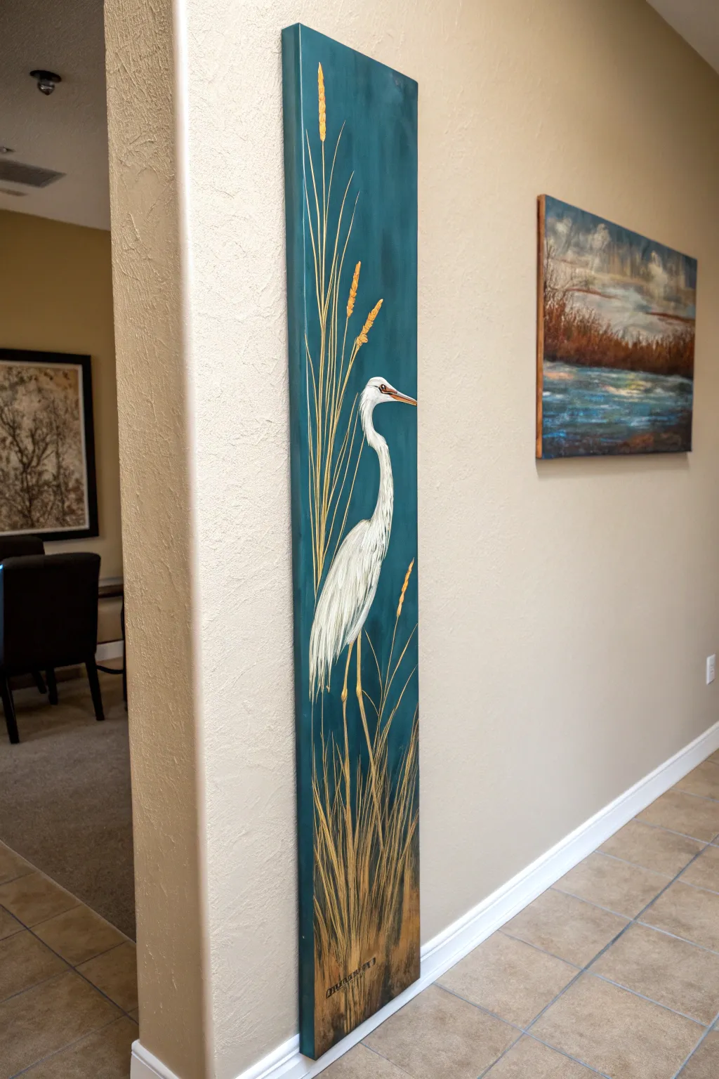
Capture the serene elegance of a white heron standing amidst tall marsh grasses with this striking vertical composition. The deep teal background contrasts beautifully with the stark white plumage and golden reeds, making it a perfect statement piece for narrow wall spaces.
Step-by-Step
Materials
- Long, narrow gallery-wrapped canvas (approx. 10×40 or 12×48 inches)
- Acrylic paints: Deep Teal/Phthalo Green, Titanium White, Raw Umber, Yellow Ochre, Burnt Sienna, Mars Black
- Large flat brush (2-inch width)
- Medium round brush (size 6 or 8)
- Small liner brush (size 0 or 1)
- Chalk or pastel pencil for sketching
- Palette and water cup
- Paper towels
- Easel or flat painting surface
Step 1: Setting the Atmosphere
-
Prepare the canvas:
Begin by ensuring your unique vertical canvas size is clean and dust-free. If it isn’t pre-primed, apply a coat of gesso and let it dry completely. -
Mix the background color:
Create a rich, moody background hue by mixing a large amount of Deep Teal with a touch of Raw Umber to dull it slightly, and perhaps a tiny bit of white to add opacity. You want a color that feels like twilight water. -
Paint the background:
Using the large flat brush, cover the entire canvas with your teal mixture. Use long, vertical strokes to mimic the flow of water and reeds. Paint the sides of the canvas as well for a finished gallery look. -
Add subtle variation:
While the base coat is still slightly tacky, mix a slightly lighter teal (add more white) and streak it vertically in random areas to create depth and light play. Let the background dry fully before proceeding.
Step 2: Drafting the Heron
-
Outline the shape:
Using a piece of white chalk or a light pastel pencil, lightly sketch the heron’s silhouette. Place the body just below the center point, with the long neck curving gracefully upward into an ‘S’ shape. -
Refine the proportions:
Ensure the beak is sharp and pointing slightly downward. Sketch long, thin lines for the legs extending down into where the reeds will be. -
Block in the white:
With a medium round brush and Titanium White, fill in the bird’s body. Don’t worry about texture yet; just get a solid base coat of white to cover the teal. This may need two coats for full opacity.
Uneven Lines?
If your reed lines are thick or shaky, thin your paint with a few drops of water until it has an inky consistency. This helps the paint flow smoothly off a liner brush for crisp strokes.
Step 3: Feathers and Details
-
Paint the beak and eye:
Mix a small amount of Yellow Ochre with a tiny touch of Burnt Sienna. Use the liner brush to paint the beak, leaving the top ridge slightly lighter. Add a tiny black dot for the eye and a thin gold ring around it. -
Create feather texture:
Mix a light grey using White and a speck of Raw Umber or Black. Using the small brush, paint rapid, downward strokes on the lower neck and wings to simulate overlapping feathers. -
Add highlights:
I like to go back in with pure Titanium White on the edges of the neck and the wing tips to make the bird pop against the dark background. -
Define the legs:
Paint the legs using a mix of Yellow Ochre and Raw Umber. They should be thin and knobby at the joints.
Level Up: Metallic Touch
Mix a small amount of iridescent gold paint into your Yellow Ochre for the reeds. When the light hits the canvas from the side, the grass will shimmer like it’s in actual sunlight.
Step 4: Painting the Reeds
-
Establish the base grass:
Load your liner brush or a rigger brush with thinned Raw Umber paint. Create long, sweeping lines starting from the very bottom of the canvas and reaching up past the bird’s head. -
Add golden stalks:
Mix Yellow Ochre with a little White. Paint new stalks over and among the dark ones, varying the heights. Ensure some lines cross in front of the heron’s body to ground it in the scene. -
Create seed heads:
At the tips of the tallest stalks, use a stippling motion (rapid dots) with the golden mixture to create the fuzzy ‘cattail’ or seed textures shown in the reference. -
Darken the bottom:
Mix Raw Umber and Black to create a shadow glaze. Lightly brush this at the very bottom of the canvas to create a ‘muddy’ base where the reeds emerge, anchoring the composition. -
Final highlights:
Add a few very thin, bright streaks of pure Yellow Ochre or lemon yellow to the sunny side of the reeds for dimension. -
Sign and seal:
Once everything is completely dry (give it overnight if possible), sign your name near the bottom in the reedy area and apply a satin varnish to protect the surface.
Hang your new vertical masterpiece in a hallway or narrow nook to bring a touch of wetland tranquility to your home
BRUSH GUIDE
The Right Brush for Every Stroke
From clean lines to bold texture — master brush choice, stroke control, and essential techniques.
Explore the Full Guide
Winding River That Leads the Eye Up
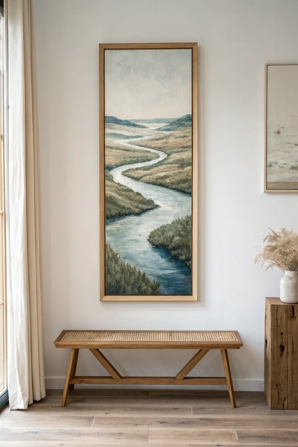
Capture the peaceful flow of nature with this elongated vertical landscape painting, designed to draw the eye upward through a meandering river valley. Using soft blending techniques and a muted, natural palette, you’ll create a sense of depth and tranquility perfect for narrow wall spaces.
Detailed Instructions
Materials
- Tall vertical canvas (approx. 12×36 or 15×45 inches)
- Acrylic paints (Titanium White, Phthalo Blue, Mars Black, Burnt Umber, Yellow Ochre, Sap Green, Raw Sienna)
- Large flat brush (1-2 inch)
- Medium filbert brush
- Small round brush for details
- Palette knife
- Water container and paper towels
- Easel or flat working surface
- Pencil for sketching
- Retarder or slow-drying medium (optional for smoother blending)
Step 1: Planning and Sky
-
Prime and Prep:
Ensure your tall canvas is primed with gesso. If you want a warmer undertone, apply a thin wash of Raw Sienna and let it dry completely before beginning. This adds a subtle glow to the final piece. -
Sketch the Composition:
Lightly sketch the horizon line about three-quarters of the way up the canvas. Draw a winding ‘S’ curve starting wide at the bottom and narrowing significantly as it snakes toward the horizon to establish the river’s path. -
Block in the Sky:
Mix Titanium White with a tiny touch of Phthalo Blue and a speck of Burnt Umber to create a muted, atmospheric grey-blue. Paint the sky area, keeping it lighter near the horizon and slightly darker at the very top edge. -
Add Cloud Hints:
While the sky paint is still wet, use a clean brush to gently swirl in pure white for soft, diffused cloud forms. Keep the edges very blurry and indistinct to push the sky into the background.
Fixing Flatness
If the landscape looks flat, your values are likely too similar. Darken the foreground grasses significantly and lighten the distant hills with more white to re-establish deep perspective.
Step 2: Establishing the Landscape
-
Distant Hills:
Mix blue, a little black, and white to make a cool, hazy slate color. Paint the distant hills along the horizon. Values should be light and cool here to create atmospheric perspective. -
Base Color for Grasslands:
Mix Yellow Ochre, White, and a touch of Sap Green. Apply this base tone to the land areas on either side of the river, using horizontal strokes that curve slightly to follow the land’s contour. -
Underpainting the River:
Fill the river shape with a flat coat of light blue-grey (White + Phthalo Blue + hint of Black). This acts as a base for the water reflections later. -
Defining Riverbanks:
Using a darker mix of Burnt Umber and Sap Green, paint a narrow strip along the edges of the river. This establishes the separation between the water and the grassy banks.
Step 3: Adding Texture and Depth
-
Mid-Ground Vegetation:
Switch to a filbert brush. Mix Sap Green with a little Burnt Umber and tap in texture for the grassy areas in the middle of the canvas. Vary the greens by adding more ochre or white occasionally to avoid a flat look. -
Foreground Grasses:
In the bottom third of the canvas, use larger, more distinct vertical strokes to suggest tall grasses. Use a darker green mix here (Sap Green + Mars Black) to bring the foreground closer to the viewer. -
Creating Water Flow:
Return to the river. Mix a clean white with a tiny amount of blue. Drag this color horizontally across the water surface, especially around the bends, to simulate current and light reflection. -
Deepening Shadows:
Add shadows where the banks overhang the water. Use a dark brown-green mix on the side of the riverbank that faces away from your imagined light source. I find this step instantly anchors the river into the earth. -
Highlighting Banks:
Mix a pale, sandy color (White + Raw Sienna). lightly brush the tops of the riverbanks where the light would catch the edge of the grass.
Go Texture Crazy
Mix a gel medium or modeling paste into your foreground paint. This adds physical ridges to the closest grass blades, making them pop off the canvas against the smooth water.
Step 4: Refining Details
-
Softening Transitions:
Using a clean, dry brush, gently sweep over areas where the distant hills meet the mid-ground to soften any harsh lines. The further back an object is, the softer its edges should be. -
Detailed Foreground Blades:
With your smallest round brush or a rigger brush, paint individual blades of grass in the immediate foreground using a mix of lighter greens and tans. Overlap them slightly over the water’s edge. -
Water Highlights:
Add pure Titanium White highlights to the center of the river bends to show strict reflection. Keep these strokes horizontal and thin. -
Final Adjustments:
Step back from the canvas. Check the perspective of the river—ensure it gets narrower as it recedes. correct any widths with your land color if necessary. -
Varnish and Frame:
Once fully dry (give acrylics 24 hours, oils much longer), apply a matte or satin varnish to protect the surface. Frame in a simple light wood frame to match the natural aesthetic.
Hang your vertical masterpiece in a hallway or narrow nook to create a stunning window into nature.
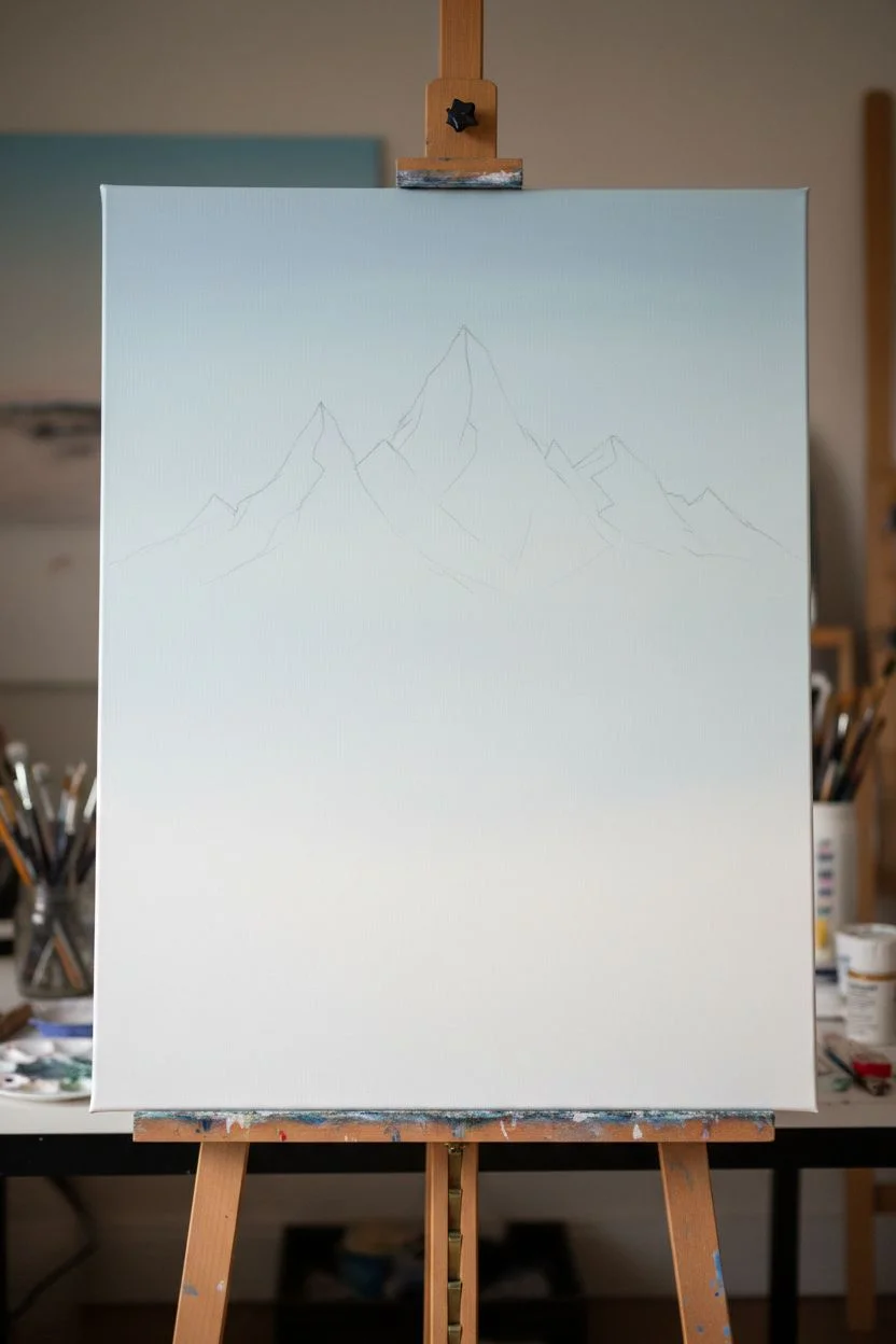
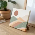
Mountain Ascent With Layered Peaks
Capture the majestic ascent of jagged mountains shrouded in morning mist with this dramatic vertical painting tutorial. You will use atmospheric perspective techniques to create incredible depth, moving from sharp, detailed foreground pines to hazy, ethereal peaks in the distance.
Step-by-Step Guide
Materials
- Large vertical canvas (approx. 24 x 48 inches)
- Acrylic paints (Titanium White, Mars Black, Phthalo Blue, Hooker’s Green, Burnt Umber, Payne’s Gray)
- Large flat brush (2-inch)
- Medium filbert brush
- Small round brush for details
- Fan brush
- Palette knife
- Mixing palette
- Water container and rags
- Slow-drying medium or retarder
- Easle or wall mount for vertical work
Step 1: Setting the Atmosphere
-
Prime and prep:
Ensure your large vertical canvas is primed with gesso. If you want a smoother finish for the misty sky, lightly sand the surface after the gesso dries. -
Gradient sky base:
Mix Titanium White with a tiny touch of Phthalo Blue and Payne’s Gray to create a very pale, cool sky tone. Using your large flat brush, paint the top third of the canvas, blending downwards into pure white near the center to simulate the glow of light. -
Sketching the layout:
Once the sky is dry, use a watered-down gray mix to lightly sketch the mountain hierarchy. Place the tallest, sharpest peaks in the upper third, leaving ample room below for the sloping valley and forest.
Mist Master
Use a dry mop brush to dab at wet white paint borders. This softens lines instantly and creates ‘fluffy’ cloud-like textures without needing complex blending skills.
Step 2: Painting Distant Peaks
-
Mixing atmospheric gray:
Create a ‘distance color’ by mixing White, Payne’s Gray, and a hint of Phthalo Blue. The color should be very light and low-contrast against the sky. -
Blocking in the furthest range:
Paint the silhouettes of the most distant mountains. Keep the edges soft; I like to use a dry brush to gently blur the outlines into the sky, making them look far away. -
Adding the mid-ground peaks:
Darken your gray mix slightly by adding more Payne’s Gray and a touch of Burnt Umber. Paint the next layer of craggy peaks below the first set. This value change is crucial for creating the illusion of depth. -
Defining rock structures:
Use a palette knife or the edge of a flat brush to scrape in vertical striations on these mid-ground mountains. Keep the contrast low; these details should look like they are seen through a veil of mist.
Golden Hour Glow
Glaze a transparent layer of Indian Yellow or transparent orange over the very top peaks to simulate sunrise hitting the highest points while the valley sleeps.
Step 3: The Misty Valley
-
Creating the fog layer:
Mix a glaze of water, slow-drying medium, and Titanium White. Apply this translucent wash at the base of your painted mountains to simulate thick fog settling in the valley. -
Softening the transition:
While the glaze is wet, use a clean, dry rag or a soft blending brush to feather the white paint upwards slightly, dissolving the hard bottom edges of the rock faces into the mist. -
Establishing the main ridge:
Mix a darker, more saturated color using Hooker’s Green, Burnt Umber, and Payne’s Gray. Paint the large, dominant mountain ridge that cuts diagonally across the middle of the canvas. -
Detailing the sheer cliffs:
On this main ridge, use a smaller flat brush to paint vertical rock faces. Add highlights to the sun-facing edges with a lighter gray-tan mix, and deepen the crevices with dark blue-black.
Step 4: The Foreground Forest
-
Deepest darks:
For the foreground slope in the bottom third, mix your darkest value yet: Hooker’s Green + Mars Black. Block in the steep slope shape, covering the bottom left to bottom right area. -
Painting pine texture:
Switch to a fan brush or a small filbert. Tap the brush vertically to create the jagged texture of dense pine trees. Start at the top of the tree line and work your way down. -
Individual tree definition:
Use a liner or small round brush to pull up tiny vertical lines for tree trunks and distinct treetops along the ridge line where the trees meet the mist. This silhouette is key for realism. -
Adding forest highlights:
Mix Hooker’s Green with a little Yellow Ochre and White. Lightly stipple this lighter green onto the sun-drenched tops of the trees in the lower left foreground, suggesting sunlight hitting the slope. -
Final atmospheric touches:
If the foreground looks too pasted on, apply a very thin, watery wash of the white fog color over the distant treetops of the foreground slope to push them slightly back into the atmosphere.
Step 5: Final Framing
-
Varnishing:
Allow the painting to cure fully (this takes time for acrylics, longer for oils). Apply a satin varnish to unify the sheen between the dark foreground and light sky. -
Custom framing:
For the finishing touch seen in the image, build or buy a thin, deep-set floating frame in natural oak. Secure the canvas inside with a small gap between the art and the frame edge.
Now step back and admire how the vertical format emphasizes the majestic height of your mountain landscape

PENCIL GUIDE
Understanding Pencil Grades from H to B
From first sketch to finished drawing — learn pencil grades, line control, and shading techniques.
Explore the Full Guide
Stacked Sky and Sea Bands
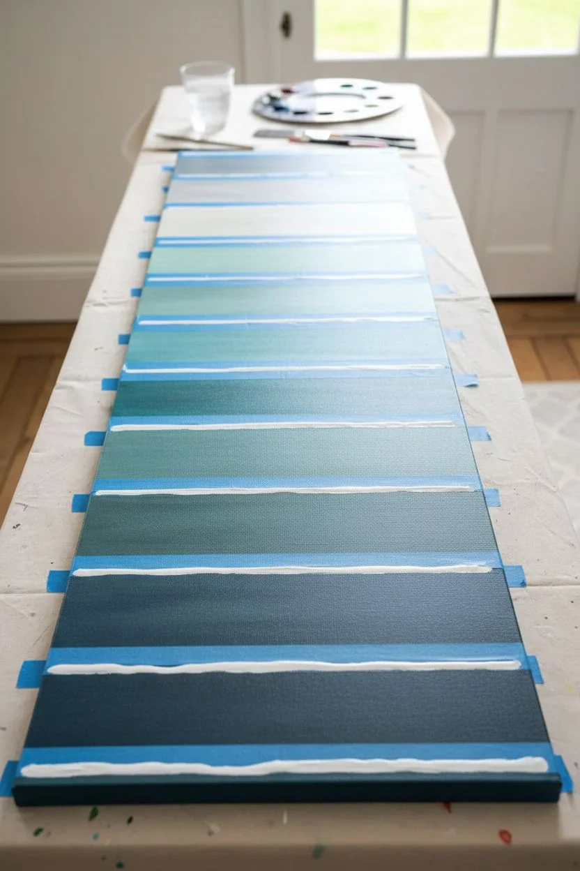
Capture the serene transition from deep ocean depths to airy skies with this striking vertical art piece. Using a stacked banding technique, you’ll create a cohesive gradient that serves as a modern focal point for narrow wall spaces.
Step-by-Step Guide
Materials
- Long vertical canvas (approx. 12 x 48 inches or similar custom size)
- Acrylic paints: Phthalo Blue, Prussian Blue, Titanium White, Grey, Turquoise
- Flat shader brushes (1-inch and 2-inch sizes)
- Painter’s tape or masking tape (approx. 1/4 inch width)
- Ruler or tape measure
- Pencil
- Palette or paper plates for mixing
- Cup of water and paper towels
Step 1: Preparation & Layout
-
Measure the bands:
Begin by laying your long canvas flat on a protected work surface. Decide on the number of horizontal bands you want—the example uses roughly 12-13 sections. Use your ruler to mark equal vertical increments up the left and right sides of the canvas. -
Pencil horizontal guides:
Lightly connect your markings with a pencil and ruler to create straight horizontal lines across the canvas. These don’t need to be dark; just visible enough to guide your tape placement. -
Apply the masking tape:
Run strips of painter’s tape across the canvas directly over your pencil lines. Press the edges of the tape down firmly with your fingertip or a credit card to prevent paint from bleeding under later. -
Seal the tape edges:
For crisp white lines between your colors, brush a very thin layer of Titanium White paint along the edges of the tape. Let this dry completely before starting with color.
Mastering the Gradient
Mix enough of your darkest color initially so you can use it as the base for the next 3-4 steps. It ensures a smoother color transition than mixing fresh every time.
Step 2: Mixing & Painting the Gradient
-
Prepare the base colors:
Squeeze out generous amounts of your blues, turquoise, grey, and plenty of white onto your palette. You will need to mix a new shade for every single band. -
Start at the bottom:
Mix your darkest shade first using Prussian Blue with a touch of black or deep Phthalo Blue. I like to keep the brushstrokes horizontal to mimic movement in water. -
Fill the lowest band:
Paint the very bottom rectangle with this dark mixture, ensuring full coverage right up to the tape edge and wrapping around the sides of the canvas for a finished look. -
Lighten the mixture:
For the next band up, take your dark base mix and add a small amount of Turquoise and a tiny dap of White. Mix thoroughly but leave it slightly streaky if you want texture. -
Paint the second band:
Apply this slightly lighter teal shade to the second section. Don’t worry about perfect smoothness; rapid back-and-forth strokes add a nice organic feel. -
Continue upward:
Repeat this process, adding more Turquoise and increasing the amount of White for each subsequent band. The middle section of the painting should be a vibrant, oceanic teal. -
Transition to sky tones:
Once you pass the middle point, stop adding the dark blues. Switch to mixing White with just a hint of Turquoise and Grey to create the atmospheric colors. -
Paint the upper bands:
As you reach the top third, your mixtures should be very pale pastels. The paint here can be slightly thinner to look more like clouds or mist. -
The final top band:
The uppermost section should be predominantly Grey and White with perhaps the faintest whisper of blue, anchoring the ‘sky’ portion of the piece.
Step 3: Finishing Touches
-
Remove the tape:
Wait until the paint is tacky but not fully hardened—usually about 30 minutes. Carefully peel the tape off at a 45-degree angle to reveal the white canvas lines beneath. -
Touch up lines:
If any paint bled through, use a small detail brush and thick Titanium White paint to clean up the horizontal dividing lines. -
Soften edges (optional):
To match the reference image’s painterly look, you can take a nearly dry brush with a tiny bit of white paint and lightly drag it horizontally over the stark white lines to soften them slightly.
Tape Tearing Paint?
If lifting the tape peels up your paint, the layers may be too thick or too drying. Use a craft knife to gently score the edge of the tape before pulling.
Hang your new vertical landscape in a narrow hallway or nook to create an illusion of height and depth
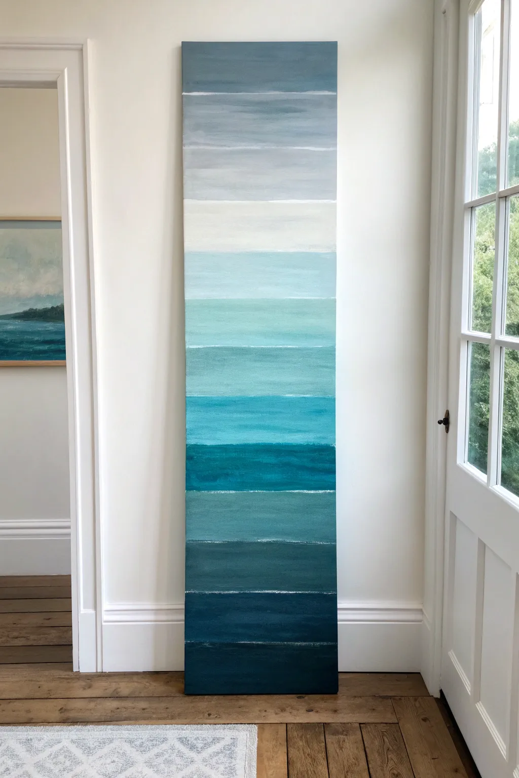
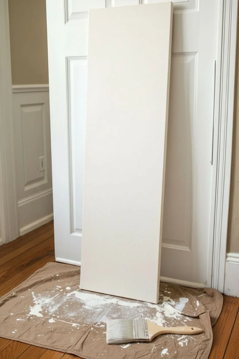
Top-to-Bottom Ombre Color Wash
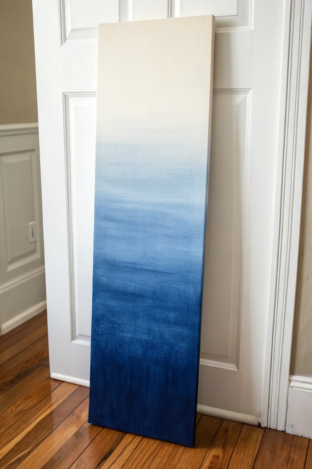
Achieve a calming coastal vibe with this impressive vertical ombre painting that transitions from deep indigo to creamy white. This simple wet-on-wet blending technique creates a seamless gradient that mimics the depth of the ocean or an evening sky.
How-To Guide
Materials
- Long vertical canvas (e.g., 10×30 or 12×36 inches)
- Acrylic paints: Indigo, Phthalo Blue, Titanium White, Unbleached Titanium (Cream)
- Wide flat synthetic brush (2-3 inches)
- Spray bottle with water
- Palette or disposable plate
- Cup of water
- Drop cloth or newspapers
Step 1: Setting the Foundation
-
Prepare the workspace:
Lay down your drop cloth or newspapers on a flat surface. While you can use an easel, laying the canvas flat prevents the watery paint from dripping down and ruining your smooth gradient. -
Prime the surface:
Even if your canvas comes pre-primed, apply a thin, even coat of Titanium White mixed with a tiny drop of Unbleached Titanium to the entire surface. This ensures the canvas weave is ready to accept the wash. -
Mist the canvas:
Before the base coat is fully dry, lightly spritz the lower two-thirds of the canvas with your spray bottle. The surface should be damp and glistening, but not pooling with water.
Step 2: Creating the Deep Gradient
-
Mix the darkest tone:
On your palette, squeeze out a generous amount of Indigo. Mix in a very small touch of Phthalo Blue to give it richness without losing the darkness. Add water until it has the consistency of heavy cream. -
Apply the bottom layer:
Load your wide brush fully. Start at the very bottom edge of the canvas and paint horizontal strokes upwards, covering about the bottom 20% of the canvas. Don’t forget to paint the bottom and side edges as you go. -
Prepare the mid-tone:
Without washing your brush completely (just a quick dip in water), take your dark indigo mix and add a marble-sized dollop of Titanium White. -
Blend upwards:
Apply this slightly lighter blue directly above your dark section. Use long, sweeping horizontal strokes that overlap with the wet dark edge below to encourage them to bleed together. -
Lighten the mix:
Add more Titanium White to your pile. You want a medium denim color now. Paint the next section up, overlapping the previous section by at least an inch. -
Smooth the transition:
If the line between colors looks too harsh, lightly mist that specific area with water and run your clean, damp brush back and forth horizontally over the seam until it softens.
Paint drying too fast?
If acrylics are drying before you can blend, mix in a ‘slow-dry medium’ or ‘retarder’ gel. This keeps the paint workable for much longer, allowing for stress-free smooth gradients.
Step 3: Fading to Light
-
Transition to sky blue:
Clean your brush thoroughly. Mix a fresh pile of Titanium White with just a tiny speck of the previous blue mix. It should be a very pale, airy blue. -
Paint the upper middle:
Apply this pale blue to the middle section of the canvas, blending it down into the medium blue you just finished. Work quickly so the paint below is still workable. -
The final blend:
Wash your brush completely again. Mix Titanium White with Unbleached Titanium (Cream). Apply this to the top 20% of the canvas. -
Feather the top:
Drag this creamy white paint downwards into the pale blue section. I find that using very light, feather-like pressure here helps the cream sit visually ‘on top’ of the blue drift. -
Check the edges:
Ensure the side edges of the canvas match the gradient happening on the front face. It gives the piece a professional, finished look without needing a frame. -
Final smooth out:
Take a large, dry, soft brush if you have one. Very gently sweep it horizontally across the entire canvas from top to bottom to soften any brush marks that are too textured. -
Let it cure:
Allow the painting to dry flat for at least 24 hours. Because we used water to thin the paint, it might feel dry to the touch quickly but needs time to fully set.
Add metallic sparkle
Once fully dry, dry-brush a tiny amount of iridescent pearl or silver glaze just over the transition areas. It will catch the light subtly like sunlight hitting ocean waves.
Hang your new vertical masterpiece in a narrow hallway or between windows to add instant height and calmness to the room


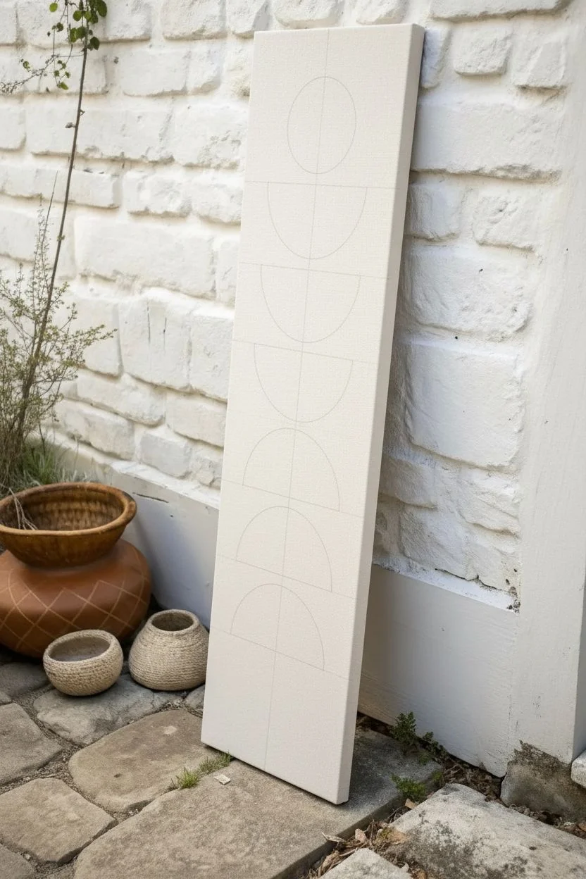
Totem Stack of Simple Geometric Shapes
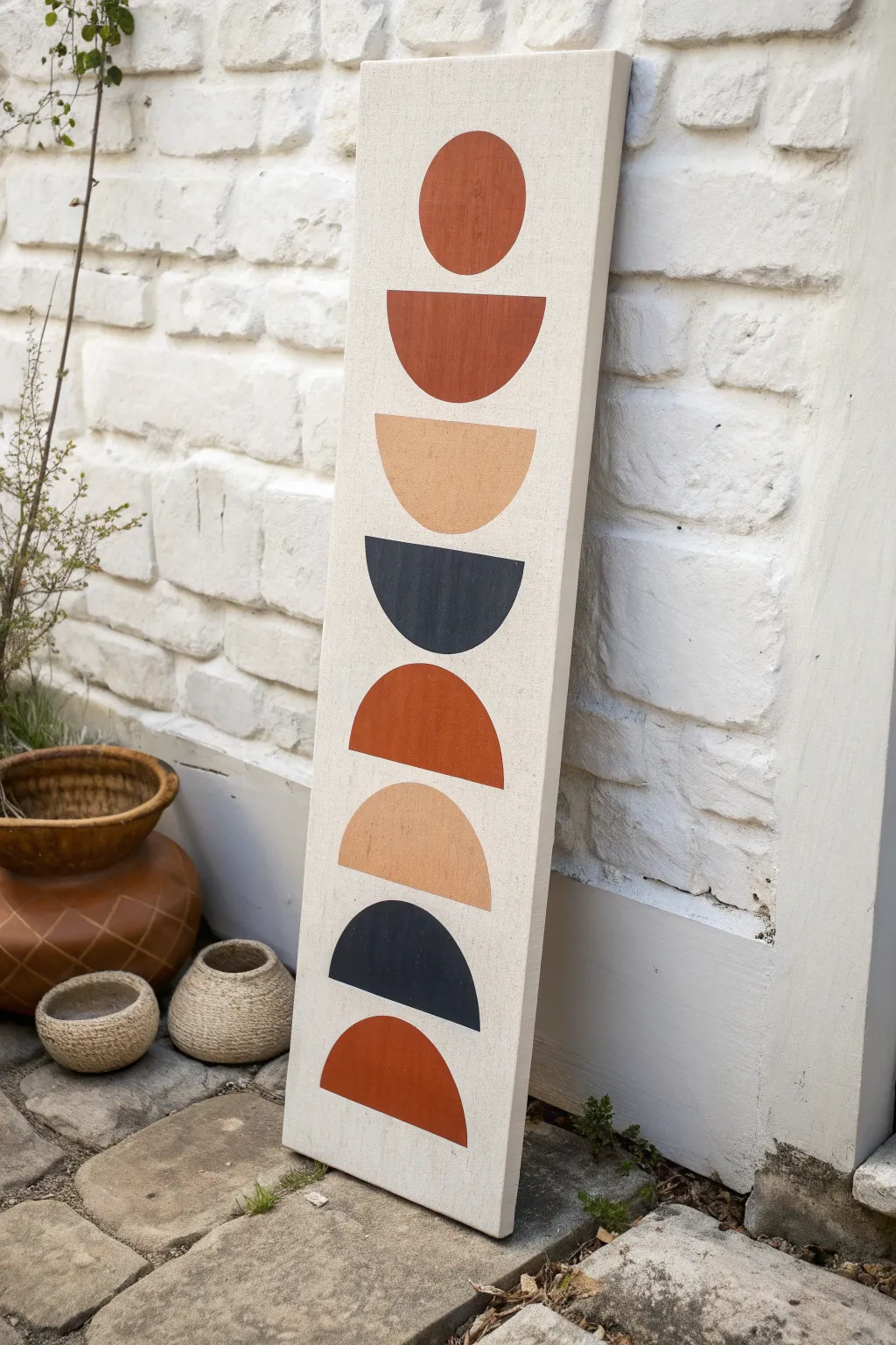
Embrace the beauty of simplicity with this mid-century modern inspired totem painting. Featuring earthy tones and clean, repeating curves, this long vertical canvas adds a striking architectural element to any narrow wall space.
Step-by-Step
Materials
- Long vertical canvas (e.g., 10×30 inch or custom stretched)
- Acrylic paints (Burnt Sienna, Unbleached Titanium/Beige, Payne’s Grey or Charcoal)
- Flat paintbrushes (1-inch width)
- Small round detail brush
- Gesso (optional, for priming)
- Compass or round household objects (bowls, lids) for tracing
- Pencil
- Ruler or tape measure
- Painter’s tape (optional)
- Eraser
Step 1: Preparation & Layout
-
Prime the Surface:
Start by ensuring your canvas is clean and ready. If you prefer a smoother surface or your canvas is raw, apply a coat of white gesso and let it dry completely. This helps the colors pop and prevents the paint from soaking into the fabric too much. -
Find the Center Line:
Using your ruler, lightly mark the vertical center line of the canvas from top to bottom with a pencil. This invisible guide is crucial for keeping your stack of shapes perfectly aligned so the tower doesn’t lean. -
Mark Shape Spacing:
Decide on the spacing for your eight shapes. Measure the total height of your canvas and divide it roughly into eight equal sections, leaving a little breathing room at the very top and bottom. Make small tick marks where the center of each shape should be. -
Draft the Top Circle:
For the top shape, use a compass or trace a small round object (like a jar lid) centered on your vertical line. This creates the ‘head’ of your totem. -
Draft the Semicircles:
For the remaining seven shapes, you will need semicircles. If using a compass, draw a full circle and then use a ruler to draw a horizontal line cutting it in half. Alternatively, trace the same round object but only trace half of it, using a ruler to close the flat side. -
Alternate the Orientation:
Pay close attention to the pattern: draw the second shape as a ‘bowl’ (flat side up), the third as a ‘bowl’, the fourth as a ‘dome’ (flat side down), the fifth as a ‘dome’, and so on. Refer to the image frequently to get the alternating rhythm right: Circle, Bowl, Bowl, Dome, Dome, Bowl, Dome, Dome. -
Clean Up Lines:
Once all your shapes are penciled in, take a step back to check alignment. Lightly erase any stray sketch lines or the center vertical guide line, leaving just the faint outlines of your geometric forms.
Crisp Curve Hack
Struggling to paint a perfect curve? Cut a stencil out of cardstock or painter’s tape that matches your circle size. Stick it down firmly to guide your brush for a flawless edge.
Step 2: Painting the Shapes
-
Mix the Terracotta:
Squeeze out your Burnt Sienna. If it feels too bright, dull it down slightly with a tiny dot of the dark grey or brown to get that warm, earthy clay color. -
Paint the Reds:
Using a flat brush, fill in the top circle, the first semicircle below it, the middle ‘dome’, and the very bottom ‘dome’ with your terracotta mix. Use the flat edge of the brush to get crisp straight lines, and the corner for the curves. -
Mix the Sand:
Next, prepare your beige tone. Unbleached Titanium works perfectly straight from the tube, or you can mix white with a tiny drop of yellow ochre and brown. You want a soft, neutral sandy hue. -
Paint the Beiges:
Identify the shapes for this color: the second semicircle down (a ‘bowl’) and the third shape from the bottom (a ‘dome’). Carefully fill these in, ensuring you have enough paint on your brush for solid coverage without distinct stroke marks. -
Mix the Charcoal:
For the dark contrast, use Payne’s Grey or a soft black. I like to mix a tiny bit of the terracotta into the black to warm it up so it doesn’t look too harsh against the other earth tones. -
Paint the Darks:
Fill in the remaining two shapes with your dark mixture. Be extra steady here, as dark paint is harder to correct if you slip outside the lines. -
Touchups and Edges:
Once the first coat is dry to the touch, inspect your work. If the canvas texture is showing through, apply a second coat to make the shapes look solid and opaque. -
Refine the Outlines:
Switch to your small round detail brush. Carefully go around the perimeter of each shape with the corresponding color to sharpen any fuzzy edges or bumps. -
Final Erase:
Check the white background area for any remaining visible pencil marks. Ensure the paint is 100% dry before gently using an eraser to clean up the white space, keeping the background crisp and bright.
Texture Play
Mix baking soda or sand into your acrylic paint before applying it to the shapes. This creates a gritty, stone-like texture that enhances the organic totem vibe.
Hang your new artwork in a slender nook or lean it on a mantle to enjoy those calming earth tones
Rainy Window Streaks With Soft Reflections
Capture the moody beauty of a rainy city evening with this atmospheric acrylic painting project. Using layers of glazes and deliberate streak techniques, you will create the illusion of looking through wet glass at glowing streetlights.
Step-by-Step Tutorial
Materials
- Large vertical canvas (approx. 24×60 inches)
- Acrylic paints: Payne’s Grey, Ultra Blue, Burnt Umber, Titanium White, Cadmium Orange, Yellow Ochre
- Slow-drying medium or glazing liquid
- Large flat brush (2-3 inch)
- Medium round brush
- Palette knife
- Spray bottle with water
- Pipette or eyedropper
- Rags or paper towels
Step 1: Setting the Atmosphere
-
Prime the Surface:
Even if your canvas is pre-primed, apply a coat of grey gesso or a mix of heavy body white and a touch of black acrylic. This ensures a uniform mid-tone to build depth upon. -
Mix the Base Gradient:
Create a dark, stormy mix using Payne’s Grey, Ultra Blue, and a hint of Burnt Umber. You want a color that reads as a deep, twilight slate blue. -
Apply the Background:
Paint the entire canvas with your slate blue mix. Use long, vertical strokes with your large flat brush to establish the verticality right from the start. -
Create the Horizon Line:
Identify a horizon line about one-third of the way up the canvas. This doesn’t need to be a sharp line; just a darker concentration of color where the ‘ground’ meets the ‘sky’. -
Add Distant Structures:
Using a slightly lighter grey-blue, block in vague shapes along the horizon line to suggest trees or buildings. Keep the edges extremely soft and blurry, as they are seen through rain.
Step 2: Bringing in the Light
-
Position the Streetlights:
Mix Cadmium Orange with a little Titanium White. With a medium round brush, dab small, softly glowing orbs in a horizontal row just above your horizon line. -
Blur the Edges:
While the paint is wet, use a clean, dry brush to gently feather the edges of the lights so they look diffuse and foggy. -
Paint the Reflections:
Using the same orange mix (but thinned with a glazing medium), pull long, vertical strokes downward from each light source. These represent the reflections on the wet pavement. -
Intensify the Glow:
Add a tiny dot of nearly pure Yellow Ochre or White to the very center of the brightest lights to make them pop against the gloomy background. -
Layering Darkness:
Once the lights are dry, apply a very thin wash of Payne’s Grey over the bottom third of the canvas to deepen the foreground shadows while letting the orange reflections shine through.
Gravity is Your Friend
For the most natural rain streaks, prop the canvas up vertically while painting the drip layer. Let gravity pull the paint down rather than forcing it with a brush.
Step 3: Creating the Rain effect
-
Prepare the Rain Glaze:
Mix Titanium White with a generous amount of water or glazing liquid until it has a milky consistency. I like to test the transparency on a scrap paper first. -
Apply Vertical Streaks:
Using a wide flat brush or even a squeegee, drag the milky white glaze vertically down the canvas in a few select areas. Do not cover the whole surface. -
The Drip Technique:
Load a pipette or eyedropper with water-thinned white paint. Squeeze droplets at the top edge of the canvas and let gravity pull them down, creating natural, organic streaks. -
Soften the Trails:
If a drip looks too harsh, lightly pat it with a clean, dry rag to lift some pigment and make it look translucent. -
Add Droplets:
Flick a stiff brush loaded with thinned white paint to create tiny splatter dots across the surface, simulating raindrops clinging to the glass. -
Highlight the Streaks:
Take a fine detail brush with pure white and paint very thin highlights along the right side of the most prominent drips to give them 3D volume. -
Final Contrast Check:
Step back and assess. If the rain obscures too much, glaze a little dark grey back into the negative spaces between the streaks to bring back the depth. -
Varnish the Scene:
Once completely dry (give it 24 hours), seal the painting with a gloss varnish. The gloss finish enhances the wet, watery look of the piece.
Streaks Too Opaque?
If your rain streaks dried too white and blocked the background, mix a transparent glaze of your background grey color and wash it lightly over the offending streaks.
Hang this vertical piece in a hallway or narrow space to create a stunning window into a rainy world
Night Sky Column With Star Trail Movement
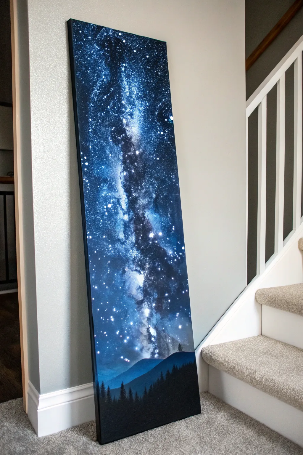
Transform a blank canvas into a stunning window to the cosmos with this tall, narrow painting that draws the eye upward. The deep blues, stark silhouettes, and luminous star clusters create a serene yet dramatic statement piece perfect for narrow wall spaces.
Step-by-Step
Materials
- Tall vertical stretched canvas (e.g., 12×36 or 10×30 inches)
- Acrylic paints: Phthalo Blue, Ultramarine Blue, Dioxazine Purple, Black (Mars or Lamp), Titanium White
- Large flat brush or foam brush (for background)
- Medium filbert brush (for blending)
- Small round detail brush (size 1 or 0)
- Old toothbrush (for stars)
- Sponge or scrunched paper towel
- Palette and water cup
- Paper towels
Step 1: Setting the Atmosphere
-
Prepare the Gradient:
Start by squeezing out generous amounts of black, purple, Ultramarine, and Phthalo Blue onto your palette. We will be working wet-on-wet, so having paint ready is crucial. -
Deep Space Base:
Using a large flat brush, paint the top left and right corners with pure black. Bring this down slightly, irregular in shape, to create the deepest parts of space. -
Mid-Tone Transition:
Without washing your brush fully, pick up the purple and Ultramarine Blue. Blend these into the edges of the black, moving towards the center of the canvas but leaving a diagonal channel through the middle somewhat lighter. -
Luminous Center:
Mix Phthalo Blue with a tiny touch of white to create a bright, electric blue. Paint this into the central diagonal channel, blending outwards into the darker purples and blacks. -
Horizon Glow:
At the very bottom quarter of the canvas, blend a soft, lighter blue horizon line that will eventually sit behind the mountains, simulating atmospheric perspective.
Step 2: Creating the Galaxy
-
Sponge Texturing:
Take a sponge or scrunched paper towel and dip it lightly into Titanium White mixed with a drop of blue. Dab off most of the paint on a paper towel until it’s almost dry. -
Building the Milky Way:
Gently sponge a cloudy, diagonal path through the center of your blue channel. Start faint; I like to use a dabbing motion to create irregular, cloud-like clusters rather than a solid line. -
Adding Depth:
Go back with a bit of dark blue/black on a clean corner of the sponge and dab into the white areas you just created. This breaks up the white ‘clouds’ and makes them look like separated gas pockets. -
Highlighting the Core:
Using almost pure white on the sponge, tap the very center of the galaxy formation to create the brightest, most dense area of stars.
Star Control Pro-Tip
Test your toothbrush splatter on a piece of cardboard first. If large globs fall, your paint is too thick. If it doesn’t spray, it’s too thick. Aim for a fine mist.
Step 3: The Stars
-
Mixing Spatter Paint:
Dilute some Titanium White paint with water until it has the consistency of ink or heavy cream. -
Creating the Starfield:
Dip an old toothbrush into this mixture. Hold it over the canvas and run your thumb across the bristles to spray fine mist across the entire dark sky area. -
Feature Stars:
Take your small round brush and manually dot in a few larger, brighter stars. Place some specifically near the galaxy core and scattered in the dark corners for balance. -
Adding Star Flares:
For the largest 3-4 stars, you can gently drag a very dry brush outwards from the center of the dot to create a tiny distinct glow or simple cross flare.
Level Up: Glow in the Dark
Mix phosphorescent medium into your white paint for the final star layer. In daylight, it looks standard, but at night, your stars will faintly glow!
Step 4: Foreground Silhouettes
-
Mountain Underpainting:
Mix a dark blue-grey (blue plus a little black). Paint a rolling hill shape about 1/5th of the way up from the bottom. -
Layering Hills:
Once the first hill is dry, mix pure black. Paint a second, closer hill shape in front of the grey one, covering the bottom edge of the canvas completely. -
Tree Structure:
Using the small round brush and pure black paint, draw a vertical line extending up from the black hill. This is the trunk of a fir tree. -
Adding Foliage:
Use a tapping motion with the tip of the brush to create branches. Start narrow at the top and widen as you go down, leaving gaps to see the sky through. -
Filling the Forest:
Repeat the tree process across the bottom black hill. Vary the heights—make some tall to reach into the galaxy and others short to create depth. -
Final Touches:
Ensure the bottom edge of the canvas is fully painted black for a finished look, and allow the piece to dry completely before hanging.
This celestial artwork brings a peaceful verticality to your space, guiding the viewer’s gaze from the dark forest floor up to the infinite stars.


Have a question or want to share your own experience? I'd love to hear from you in the comments below!