Loyalty can feel like a big, abstract idea—until you turn it into a simple symbol you can actually draw. Here are my favorite loyalty drawing ideas that capture trust, commitment, and that steady “I’ve got you” kind of connection.
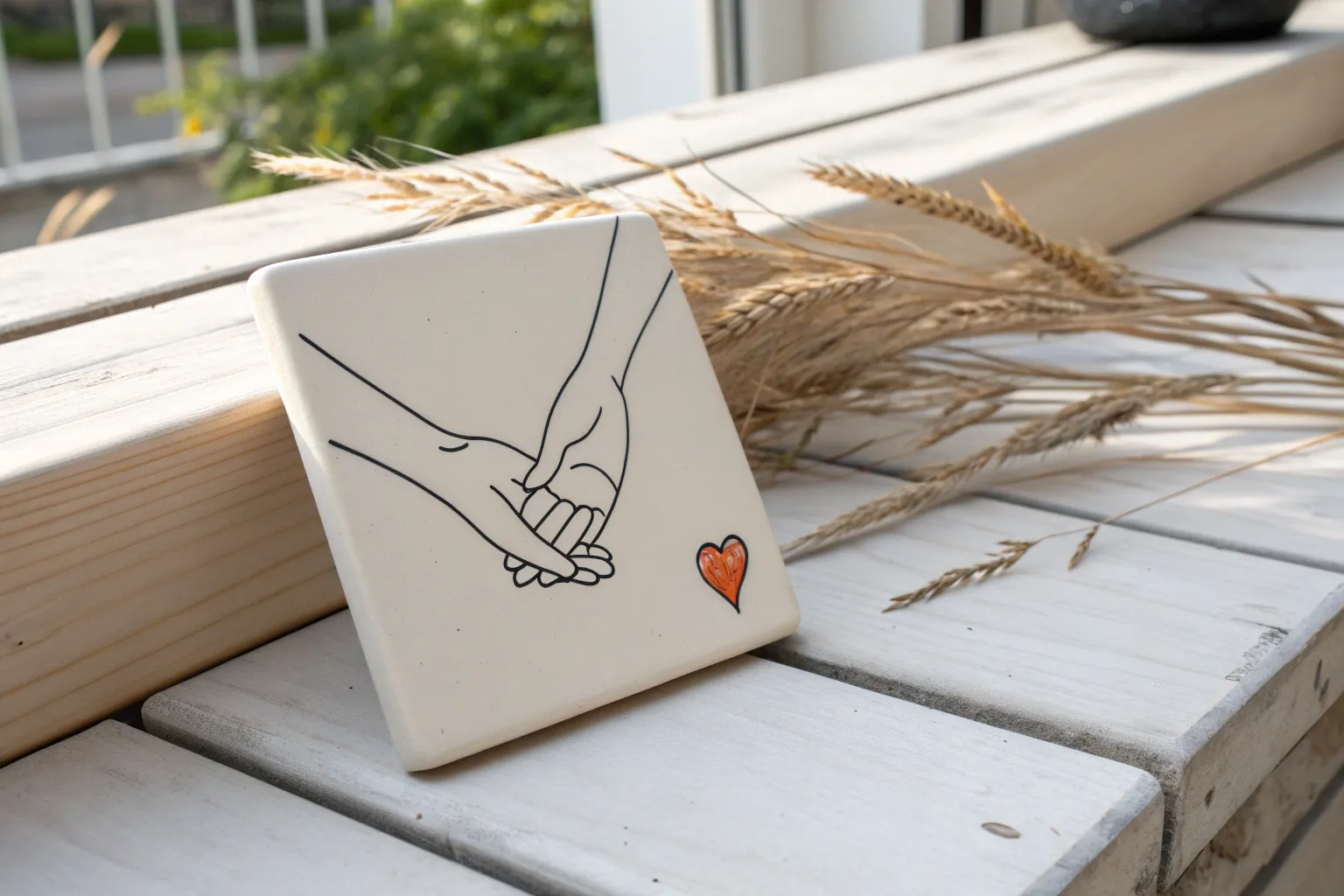
Pinky Promise Close-Up
Capture the ultimate symbol of trust with this detailed pen-and-ink illustration of a pinky promise. Using a combination of fine hatching and stippling techniques, you will create a realistic yet stylized artwork that emphasizes the texture of the skin and the intimacy of the gesture.
Step-by-Step
Materials
- Hot press watercolor paper or smooth Bristol board (A4 size)
- HB graphite pencil
- Kneaded eraser
- Fine liner pens (0.05mm, 0.1mm, and 0.3mm)
- Wooden frame (optional, for display)
- Ruler
Step 1: Drafting the Hands
-
Establish the composition:
Begin by lightly marking the center of your page. The connection point of the two pinky fingers should sit right near this center mark to ensure the drawing feels balanced. -
Sketch the basic shapes:
Using your HB pencil, block out the hands using simple geometric shapes. Draw a large oval for the palms and rectangles for the fingers. Don’t worry about details yet; just focus on the angle of the wrists coming in from opposite sides. -
Refine the finger placement:
Sketch the specific interlocking of the pinkies. The pinky on the left should hook underneath, while the right pinky loops over the top. Make sure the other fingers are curled into the palms naturally. -
Add anatomical details:
Lightly draw the fingernails, knuckles, and the prominent wrist bone on the right hand. Sketch the bracelet details on the right wrist, indicating a loose, beaded texture. -
Clean up the sketch:
Go over your lines with the kneaded eraser, lifting enough graphite so the sketch is barely visible. This ensures your final ink lines won’t get muddy.
Clean Lines
If your hand shakes while drawing long lines, try ‘ghosting’ the stroke in the air a few times before touching the paper. Pull the pen toward you rather than pushing it away.
Step 2: Inking outlines and primary shading
-
Outline the main contours:
Take your 0.1mm fine liner and carefully trace the main outlines of the hands. Use confident, continuous strokes for long lines like the forearms, but allow for slight breaks where skin might fold or wrinkle. -
Define the fingernails:
Switch to the 0.05mm pen for the fingernails. Keep these lines very delicate. Outline the cuticle area gently without making it a complete, hard circle. -
Start the hatching:
Using the 0.05mm pen, begin adding hatching lines (parallel lines) to the shadow areas. Focus on the underside of the fingers and where the palms meet. Keep your pen strokes following the curvature of the skin. -
Detail the knuckles:
Add short, curved hatching lines around the knuckles to show the skin stretching. These wrinkles are crucial for making the hands look realistic rather than stiff. -
Ink the bracelet:
Outline the beads or braided texture of the bracelet on the right wrist. Use small, circular motions to suggest individual beads or woven threads.
Step 3: Refining Texture with Stippling
-
Begin stippling shadows:
This is where patience is key. I like to switch between pens here to vary the dot size. Use the 0.1mm pen to place dots in the deepest shadow areas, such as the gap between the hooked pinkies. -
Create gradients:
Move outward from the dark shadows using the 0.05mm pen. Place the dots further apart as you move toward the highlighted areas (like the tops of the knuckles and back of the hand). -
Add arm hair texture:
On the forearms, use very short, sparse flicks with the 0.05mm pen to suggest fine hair. Don’t overdo it; a few well-placed marks are enough to give the skin texture. -
Deepen the contrast:
Return to the darkest crevices with your 0.3mm pen. Add a few deliberate dots or heavier lines right where the distinct fingers overlap to separate them clearly. -
Erase and final check:
Once the ink is completely dry (give it at least 15 minutes to be safe), erase any remaining pencil marks. Assess the balance of light and dark, adding a few more dots if certain shadows look too flat.
Add a Meaningful Date
Personalize the artwork by subtly inking a small date or initials into the ‘skin’ like a tattoo, or writing it in a classic serif font beneath the hands.
Frame your finished piece in natural wood to complement the organic feel of the drawing


Classic Handshake of Trust
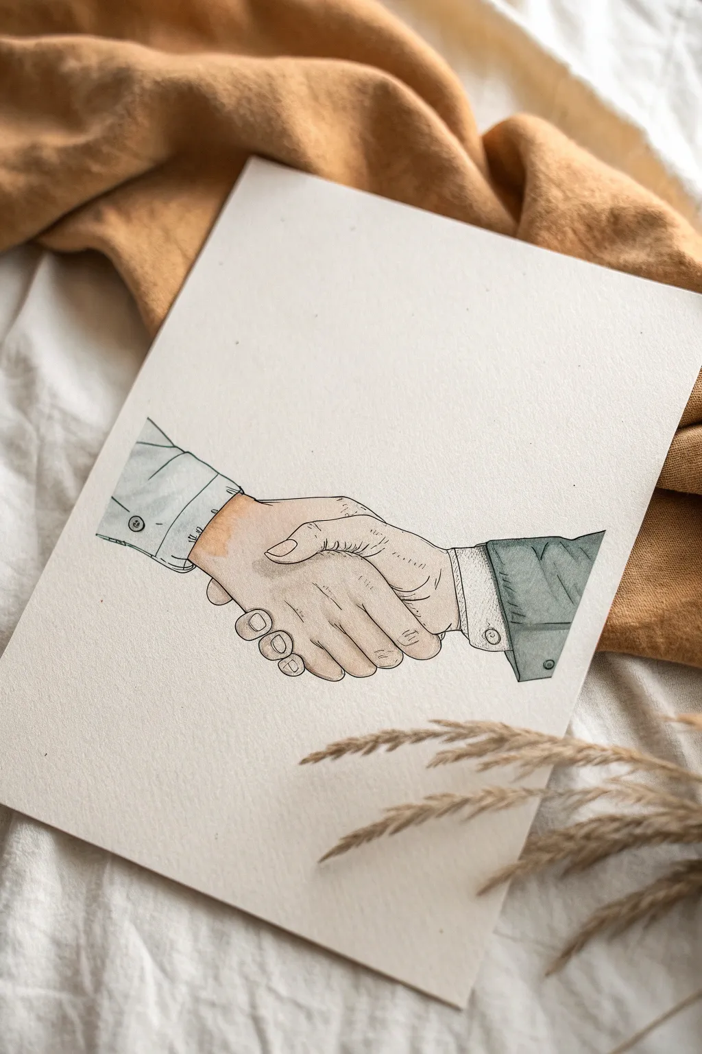
Capture the timeless symbol of loyalty with this refined ink and watercolor illustration. This project features a detailed handshake rendered with delicate linework and soft, washed-out tones on textured paper, creating a piece that feels both vintage and significant.
How-To Guide
Materials
- High-quality watercolor paper (cold press, roughly 300gsm)
- Pencil (HB or 2B) for sketching
- Kneaded eraser
- Fine liner pens (0.1mm, 0.3mm, and 0.5mm, preferably waterproof/archival ink)
- Watercolor paints (skin tones, cool grey, faint blue/green for the shirt)
- Small round watercolor brush (size 2 or 4)
- Clean water and paper towel
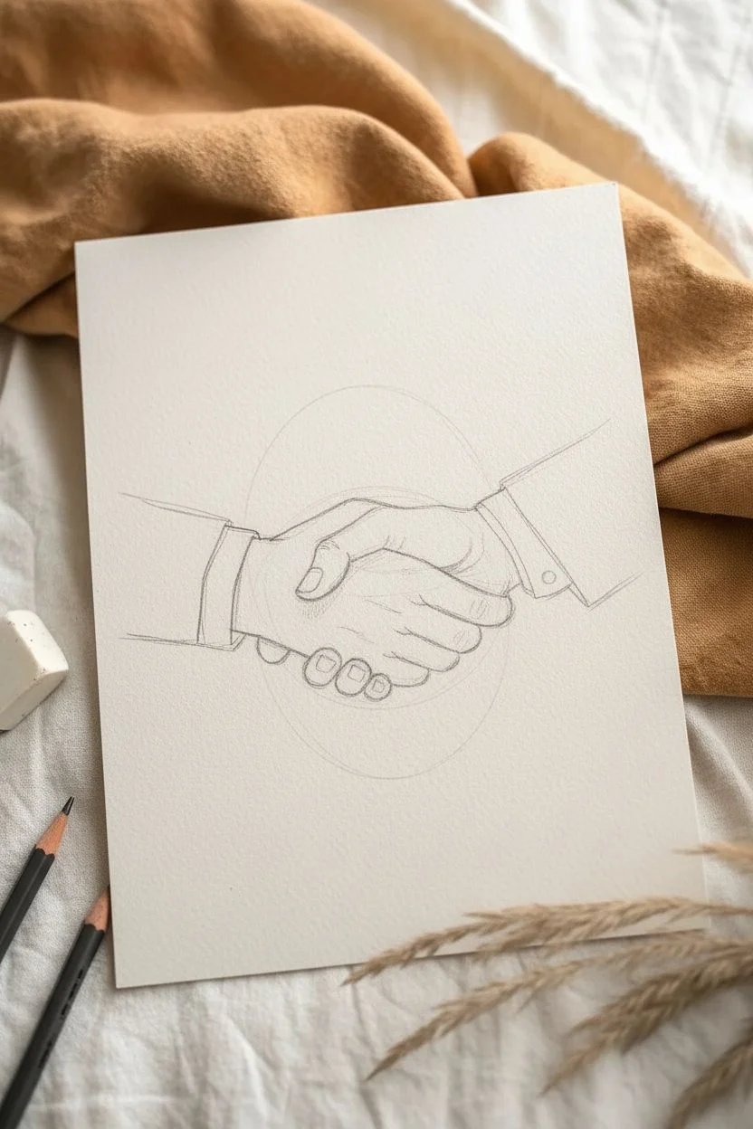
Step 1: Sketching the Grip
-
Draft the basic shapes:
Start lightly with your pencil. Draw a large oval in the center of the page to represent where the hands meet. Extend two parallel lines out to the left and two to the right to form the wrists and forearms. -
Define the thumb position:
Locate the thumb of the left hand (the one coming from the left side). Draw the thumb wrapping over the top of the other hand. The knuckle should be distinct, curving downward into the grip. -
Sketch the fingers:
Draw the four fingers of the right hand wrapping securely around the palm of the left hand. Make sure the knuckles are slightly staggered, not a straight line, to look natural. -
Detail the opposing hand:
add the visible back of the left hand. Suggest the knuckles and the slight tension in the skin where the thumb presses down. -
Add the sleeves:
Sketch the cuffs of the shirts. For the left arm, draw a simple buttoned cuff. For the right arm, create a slightly thicker suit-jacket cuff layered over a shirt cuff to add visual variety.
Wrinkle Reality
Don’t draw straight lines for knuckle wrinkles. Instead, use tiny, broken, curved hatched lines. This mimics the elasticity of skin without making the hands look old or withered.
Step 2: Refining with Ink
-
Outline the main contours:
Switch to your 0.5mm pen for the primary outlines. Trace the outer edges of the hands and sleeves carefully. I prefer to use broken lines occasionally on the sleeves to suggest fabric folds rather than rigid wireframes. -
Add skin texture details:
Using the 0.1mm pen, draw the fine details. Add the wrinkles on the knuckles, the fingernails, and the small creases where the thumb joints bend. Keep a very light hand here; these lines should be whisper-thin. -
Detail the fabric:
Use the 0.3mm pen to add buttons to the cuffs. Add small dashed lines (stitching) along the edges of the cuffs for a realistic tailored look. -
Erase pencil marks:
Once the ink is completely dry (give it a few minutes to be safe), gently use the kneaded eraser to lift all graphite sketch lines, leaving only the crisp ink work.
Step 3: Adding the Wash
-
Mix your skin tones:
Prepare a very watery mix of burnt sienna and a touch of yellow ochre. You want a pale, natural skin tone. Test it on a scrap piece of paper first to ensure it isn’t too saturated. -
Paint the hands:
Apply the skin tone wash over the hands. While the paint is wet, drop a tiny bit of darker pigment (more burnt sienna) into the shadowed areas between the fingers and under the thumb for subtle dimension. -
Color the shirt cuffs:
For the left sleeve and the inner right cuff, use an extremely diluted cool grey or faint blue. It should look almost white, just barely tinted to distinguish it from the paper. -
Paint the jacket sleeve:
Mix a darker, slightly distinct grey-green or slate blue for the right-side jacket sleeve. Paint this section carefully, respecting the stitched lines you drew earlier. -
Soft shading:
Once the base layers are dry, take a slightly darker version of your skin tone. Glaze over the knuckles and the underside of the wrist to create rounded form. -
Final shadow accents:
Use a small brush to add a very thin line of shadow right where the sleeves meet the skin to separate the materials visually.
Make it Personal
Customize the cuffs to represent specific people. Add a watch, a bracelet, or change the sleeve color to match a specific uniform or favorite outfit of the people symbolized.
Allow the watercolor to dry completely before framing this meaningful symbol of connection


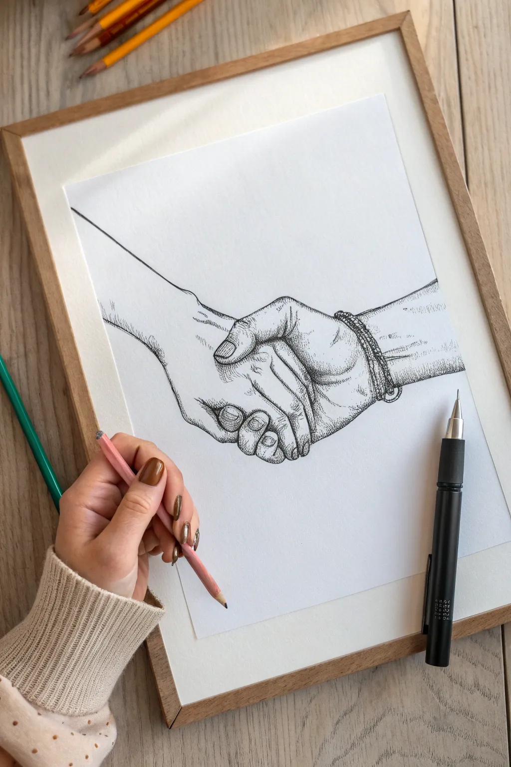
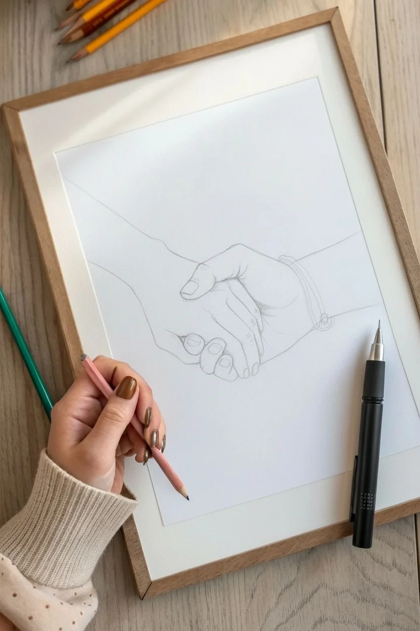
Intertwined Fingers Holding On


This elegant pen-and-ink illustration captures the simple yet powerful gesture of a handshake, symbolizing loyalty and trust. Using minimal linework and strategic hatching, you’ll create a drawing that feels both classic and expressive on textured paper.
Step-by-Step Guide
Materials
- High-quality heavyweight drawing paper (cream or off-white)
- HB graphite pencil
- Kneaded eraser
- Fine liner pens (sizes 0.1, 0.3, and 0.5)
- Ruler (optional for proportion checks)
Step 1: Laying the Foundation
-
Observe the Composition:
Begin by studying the reference image carefully. The drawing features two hands: one coming from the upper left and one from the right, meeting in a firm clasp. Notice the angle of the wrists and the interlocking fingers. -
Rough Guidelines:
Using your HB pencil with a very light hand, sketch the central axes of the arms. Draw a diagonal line coming down from the top left and a slightly more horizontal line coming from the right to determine where they intersect. -
Block in Shapes:
Instead of drawing fingers immediately, draw the hands as geometric blocks. Sketch a rectangular shape for the palm of the left hand and a wedge shape for the visible back of the right hand. -
Refine the Contour:
Start carving out the silhouette. Trace the outline where the thumb of the left hand wraps over the right hand’s knuckles. Pay attention to the negative space between the thumbs and wrists. -
Detailing the Fingers:
Lightly sketch the individual fingers. Focus on the nails of the lower hand (the one coming from the left) and the curve of the fingers wrapping around the palm. Keep these lines faint so they are easy to correct. -
Wrists and Sleeves:
Extend the lines back to form the wrists. The drawing suggests bare arms or tight sleeves, so keep the lines relatively straight and parallel, tapering slightly as they move away from the hands.
Anatomy Pro Tip
To get realistic proportions, remember that the hand is roughly the size of the face. Use your own hands as a live model to understand how the skin stretches when gripping.
Step 2: Inking the Outline
-
First Ink Layer:
Switch to your 0.3 fineliner. Begin tracing the main outlines of your pencil sketch. Use confident, single strokes rather than ‘petting’ the line, focusing on the outer silhouette first. -
Defining the Grip:
Ink the interaction point between the hands. Make the line slightly heavier where the thumb presses down and where the fingers curl underneath, creating a sense of pressure and contact. -
Finger Details:
Switch to a finer 0.1 pen for delicate areas like the fingernails and the subtle wrinkles on the knuckles. These lines should be broken or very thin to avoid making the hands look aged. -
Erase Guide Lines:
Once the ink is completely dry—I usually give it at least five minutes to be safe—gently erase all your pencil marks with the kneaded eraser. This leaves you with a clean, crisp line drawing.
Level Up: Washes
Add a very light wash of gray watercolor or diluted ink over the shadowed areas (the lower wrist and between fingers) to give the drawing a 3D sculptural feel.
Step 3: Adding Depth with Hatching
-
Establish Light Source:
The image implies light coming from the top left. Imagine where the shadows would naturally fall: underneath the clasping fingers, on the underside of the wrists, and between the knuckles. -
Directional Hatching:
Using the 0.1 pen, start adding texture. On the top hand (left arm), use long, thin lines that follow the curvature of the skin, running parallel to the arm’s length. This emphasizes the anatomy. -
Cross-Hatching Shadows:
For darker areas, particularly where the hands overlap, use cross-hatching. Draw a set of diagonal lines, then layer another set in the opposite direction to build density without creating solid black blocks. -
Wrist Shadows:
Focus on the lower right wrist. Add vertical hatching lines to suggest the cylindrical shape of the arm and cast a shadow where the other hand is gripping it. -
Knuckle Definition:
Add small, curved tick marks around the knuckle joints to give them volume. Keep these spare; too many lines will make the drawing look cluttered. -
Final Contrast Check:
Step back and squint at your drawing. If the hands look too flat, use your 0.5 pen to slightly thicken the outlines on the ‘shadow side’ (the bottom edges) to weigh the drawing down visually. -
Signature:
Finish your piece by adding a small, discreet signature near the shadow of the wrists, just like in the reference image, to mark the work as your own.
Now you have a timeless symbol of loyalty captured in ink, ready to be framed or gifted.


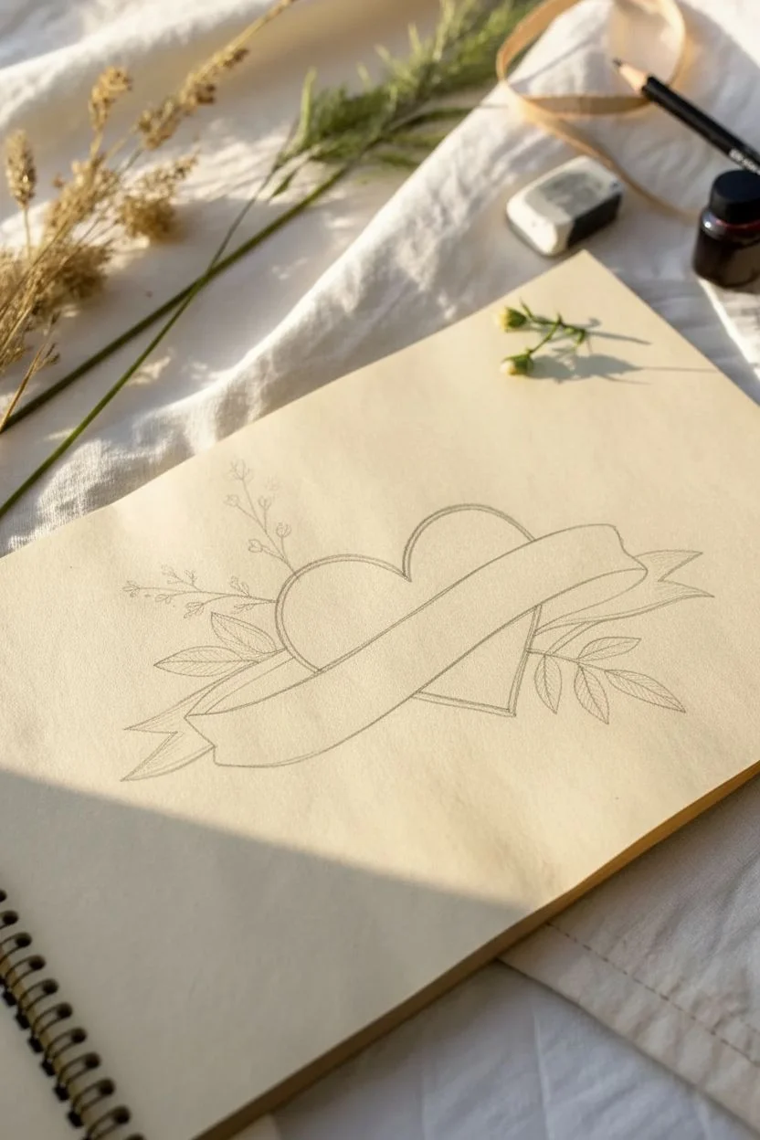
Two Hearts Joined by a Stitch
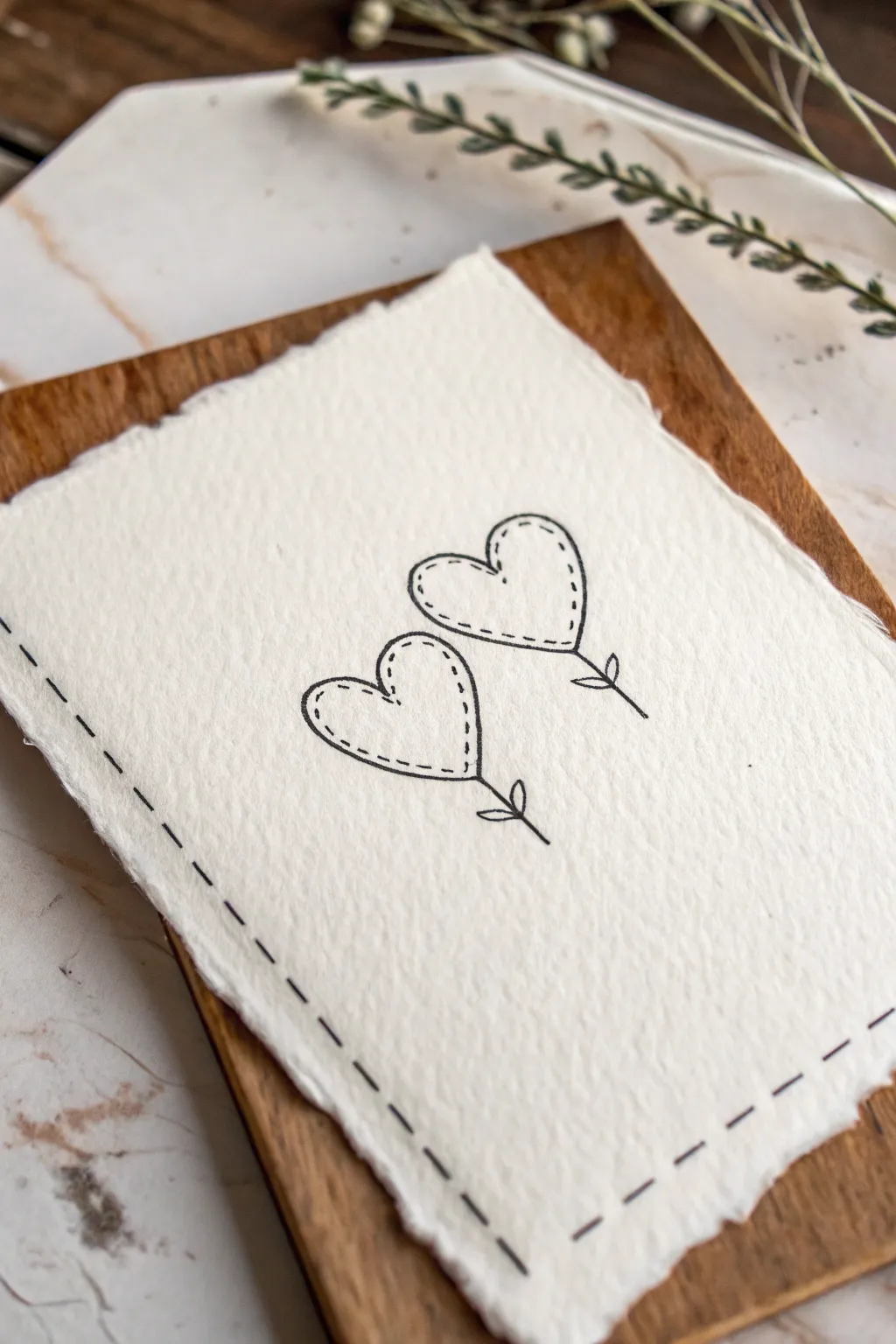
This minimalist project combines the rustic charm of deckle-edge paper with a sweet, hand-drawn illustration that mimics embroidery. The result is a delicate loyalty-themed art piece perfect for gifting or framing as a keepsake.
Detailed Instructions
Materials
- Heavyweight cold-press watercolor paper or handmade cotton rag paper (deckle edge preferred)
- Fine-liner pen (black, archival ink, 0.3mm or 0.5mm tip)
- Pencil (HB or H)
- Kneaded eraser
- Ruler
- Small wooden board or clipboard (for display backing)
- Paper tearing ruler (optional, creates deckle edge if paper is standard)
Step 1: Preparing the Base
-
Select your paper:
Choose a heavyweight paper with significant texture. Handmade cotton rag paper works best to achieve that soft, fibrous look shown in the image. -
Create the deckle edge (if needed):
If you are starting with a standard sheet, dampen a straight line with a wet paintbrush and gently tear the paper along a ruler to create rough, soft edges. -
Size the paper:
Ensure your paper is cut or torn to a size slightly smaller than your wooden backing board, leaving a pleasing border of wood visible around the edges. -
Flatten the surface:
Handmade paper can sometimes be bumpy. If it’s too uneven, place it under a heavy book for an hour to make the drawing surface friendlier.
Ink Bleed Prevention
Handmade paper is very absorbent. Test your pen on a scrap piece first; if it bleeds (‘feathers’), switch to a finer nib or use a specific drawing pen.
Step 2: Drafting the Design
-
Mark the borders:
Using a ruler and a very light pencil touch, measure about 1/4 inch from the edge of the paper to guide where your faux-stitching border will go later. -
Position the hearts:
Lightly sketch two heart shapes in the center of the paper. I find it pleasing to tilt them slightly towards each other, like flowers swaying in the wind. -
Add stems and leaves:
Draw single straight lines extending downward from the point of each heart. Add two small loops at the base of each line to represent simple leaves. -
Sketch the inner stitching:
Inside each heart shape, lightly draw a smaller heart. This will serve as your guide for the dotted ‘stitch’ lines.
Step 3: Inking the Illustration
-
Outline the hearts:
Take your fine-liner pen and trace over your outer pencil lines for the hearts. Use a steady hand but don’t worry about perfection; slight wobbles add character. -
Draw the stems:
Ink the stems and the small leaf loops at the bottom. Keep the lines crisp and confident. -
Create the faux stitching:
Along the inner pencil guide inside each heart, tap your pen to create small, evenly spaced dashes. These should look like thread stitches. -
Add corner details:
Review your dashed lines. If any gaps look too wide, gently add a tiny dot or dash to balance the visual rhythm. -
Ink the border:
Following your pencil guide around the paper’s edge, draw longer dashes to create a frame. These dashes should be larger than the ones inside the hearts. -
Vary the border spacing:
Allow the gaps between border dashes to vary slightly. This enhances the hand-drawn aesthetic rather than looking mechanically printed.
Add Real Texture
Instead of drawing the dashed lines, actually poke holes with a needle and thread red embroidery floss through the paper for a mixed-media 3D effect.
Step 4: Finishing Touches
-
Let the ink set:
Textured paper absorbs ink differently. Wait at least 15 minutes to ensure the ink is totally dry before touching it. -
Erase pencil marks:
Gently dab—do not scrub—the paper with a kneaded eraser to lift the graphite guides. Scrubbing can damage the delicate paper fibers. -
Mount the artwork:
Place your finished drawing onto the wooden board. Use a small piece of double-sided tape or simply rest it there if it’s for temporary display. -
Final smooth:
If the edges curled up while handling, gently smooth them down with clean hands to help the paper lay flat against the wood.
Now your heartfelt illustration is ready to be a quiet reminder of loyalty and connection
BRUSH GUIDE
The Right Brush for Every Stroke
From clean lines to bold texture — master brush choice, stroke control, and essential techniques.
Explore the Full Guide
Lock and Key Promise
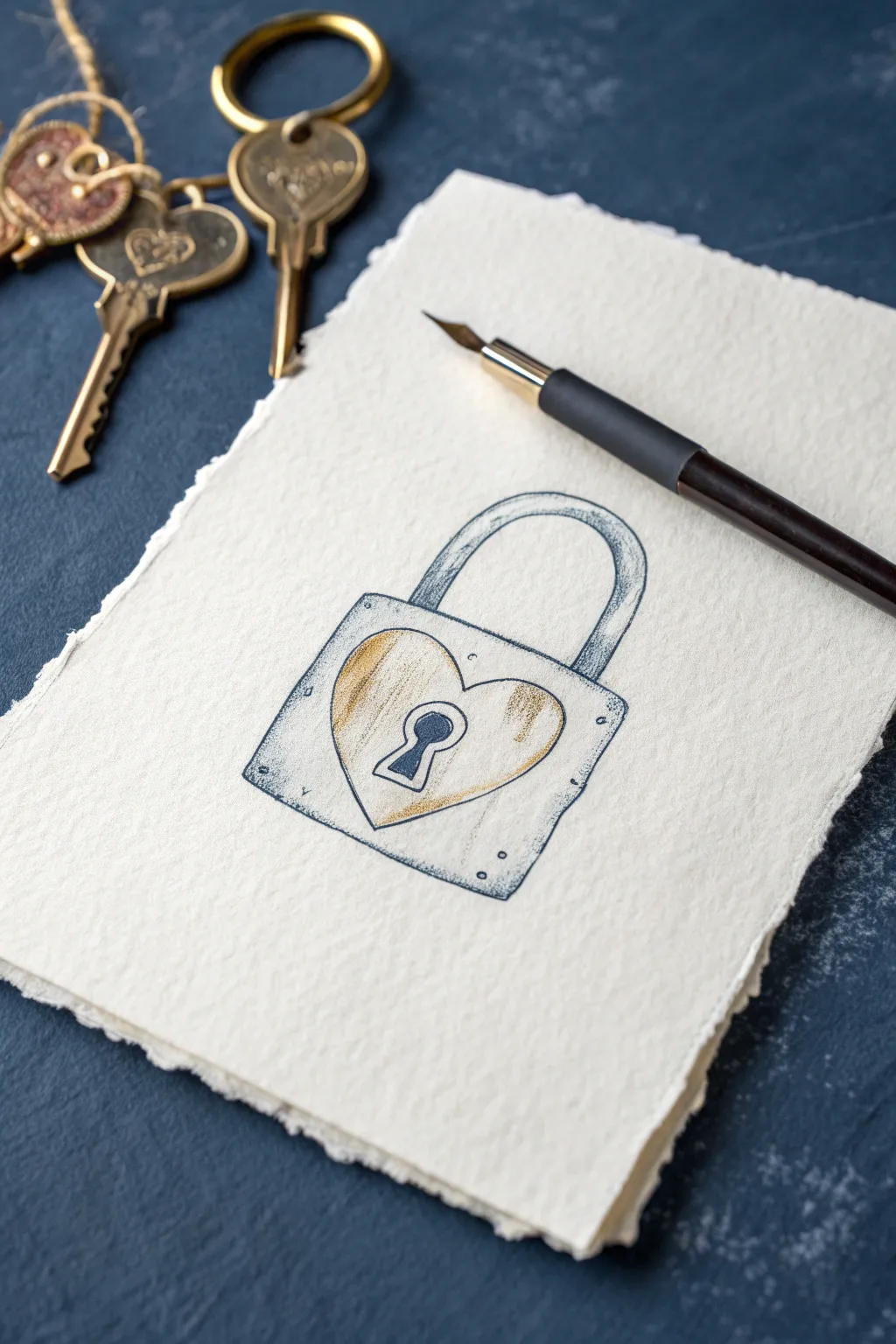
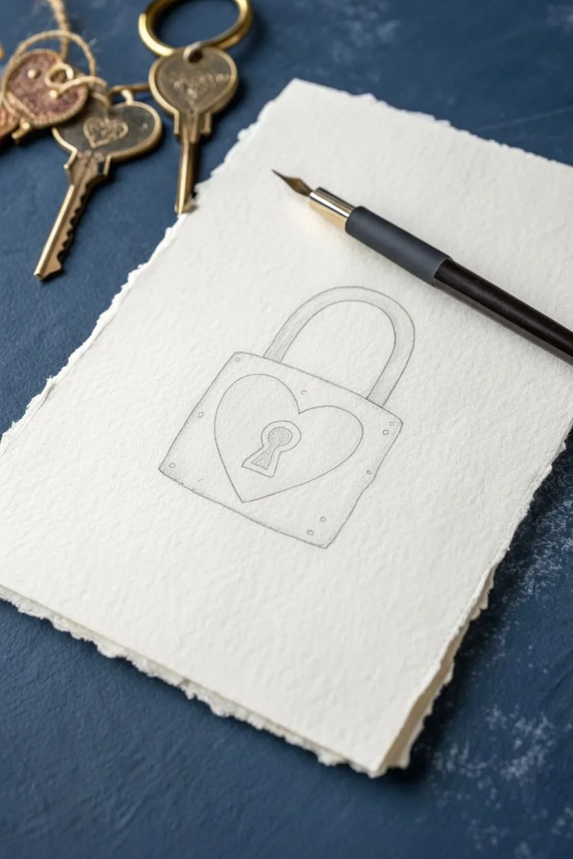
Capture the essence of loyalty with this charming ink and pencil sketch of a heart-centered padlock. The heavy texture of the handmade paper adds a timeless, rustic quality that perfectly complements the symbolic subject matter.
Step-by-Step Tutorial
Materials
- Heavyweight textured paper (cold press watercolor or handmade cotton rag)
- Graphite pencil (HB or H)
- Kneaded eraser
- Dip pen holder with a fine nib (e.g., mapping nib)
- Black waterproof drawing ink (India ink)
- Gold or ochre colored pencil
- Silver or grey colored pencil
- Ruler (optional)
Step 1: Planning and Sketching
-
Prepare your surface:
Begin by selecting a high-quality piece of textured paper. If using a loose sheet like cotton rag with deckled edges, ensure it is placed on a smooth, flat surface. The texture is key to the final look, so choose something with visible grain. -
Map out the square:
Using your graphite pencil, lightly draw a square in the center of the page. This forms the body of the lock. Keep your pressure extremely light, as the textured paper can trap graphite, making it harder to erase later. -
Add the shackle:
Sketch an arch extending from the top of the square body. Double the line to give the shackle thickness, ensuring the width is consistent all the way around the curve. -
Draw the heart center:
Inside the square body, sketch a large heart shape. It should fill most of the space. Center it carefully, leaving a small border between the heart’s edge and the square’s perimeter. -
Detail the keyhole:
In the direct center of the heart, draw a classic keyhole shape—a small circle sitting atop a widening triangle. Add a double line to the right side of the keyhole to suggest depth. -
Add character elements:
Sketch four small circles in the corners of the square body to represent rivets or bolts. These don’t need to be perfectly round; a little organic irregularity adds charm.
Ink Bleeding Issues?
If ink feathers on handmade paper, switch to a finer nib or use less ink. You can also lightly spray the paper with fixative before inking to seal the fibers.
Step 2: Inking the outlines
-
Prepare your dip pen:
Dip your nib into the black India ink. Test the flow on a scrap piece of paper first to ensure you don’t get a sudden blotch on your artwork. -
Ink the main contours:
Go over your pencil lines with the ink. Use short, deliberate strokes rather than trying to create one seamless line. I find that lifting the pen occasionally creates a broken, sketched aesthetic that works well with this style. -
Vary line weight:
Apply slightly more pressure on the right and bottom sides of the lock body and the shackle. This thickens the line, subtly indicating shadow and weight. -
Fill the keyhole:
Use the ink to fill in the dark center of the keyhole completely. Leave the small depth-line rim uncolored for now. -
Add texture marks:
Add tiny stippling dots or very short dashes around the corners and edges of the metal. This makes the lock look weathered rather than brand new. -
Let the ink dry completely:
Wait until the ink loses its sheen and is fully matte. Because the paper is textured, ink can pool in the valleys, so give it extra time before erasing your pencil marks.
Pro Tip: Vintage Vibe
For an antique look, lightly brush a tea bag over the paper before starting. Let it dry completely for a warm, aged background tone.
Step 3: Adding Color and Shading
-
Color the heart gold:
Take your gold or ochre colored pencil and gently shade the heart shape. Start lightly, using the side of the lead to catch the texture of the paper. -
Deepen the gold shadows:
Press harder with the gold pencil on the left side of the heart and near the bottom point. This gradient makes the heart appear slightly convex. -
Shade the metal body:
Using a silver or light grey pencil, add shading to the rest of the lock body. Focus on the corners and edges, leaving the center areas mostly the white of the paper for a highlight. -
Add definition to the shackle:
Shade the inner curve of the shackle with the grey pencil to create a rounded metal effect. -
Create a cast shadow:
Using the grey pencil or a very light touch of hatching with your pen, add a small shadow underneath the lock to ground it on the page.
This symbolic drawing makes a beautiful gift or a personal reminder of keeping promises.
Shield of Loyalty Crest
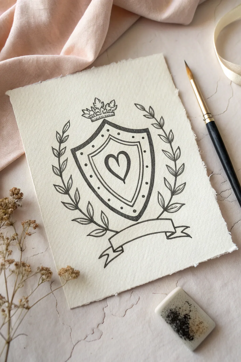
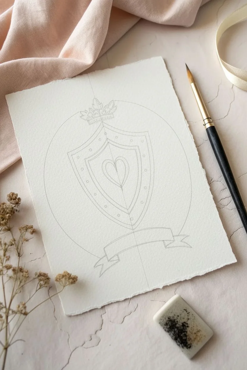
This rustic, hand-drawn crest combines symbols of devotion with a classic heraldic style. The central heart shield and laurel wreath are rendered in bold ink lines on textured paper, creating a timeless piece perfect for expressing steadfast loyalty.
Detailed Instructions
Materials
- Heavyweight, cold-press watercolor paper or handmade cotton paper (deckle edge optional)
- Pencil (HB or H for light sketching)
- Kneaded eraser
- Fine-liner pen (0.3mm or 0.5mm, waterproof black ink)
- Thicker marker or brush pen (for bolder outlines)
- Ruler (optional)
Step 1: Laying the Framework
-
Sketch the shield shape:
Start lightly with your pencil. Draw a central vertical line to help with symmetry. Sketch a classic heater shield shape: a straight horizontal top, curving sides that taper down to a distinct point at the bottom. -
Add the inner borders:
Follow the contour of your outer shield line to create an inner border about half an inch inside the edge. Draw a second line closer to the center to define the decorative band where the dots will go later. -
Center the heart:
Right in the middle of the smallest shield section, sketch a simple heart. Keep it elongated slightly to match the vertical feel of the shield. -
Draft the scroll banner:
Below the shield point, sketch a waving banner. Draw a long, curving rectangle that dips slightly in the middle. Add the folded ends (tails) tucking underneath and flaring out to the sides. -
Position the crown:
Place a small crown directly on top of the shield’s flat edge. Sketch a base band and three leafy points rising up. -
Outline the laurel branches:
Draw two long, curved stems rising from behind the banner’s center point, hugging the sides of the shield but not touching it. These guides will hold your leaves.
Symmetry Hack
Fold a piece of scrap paper in half, cut out your shield shape, and trace it onto your art paper. This guarantees perfectly symmetrical sides without measuring.
Step 2: Inking the Design
-
Ink the main shield outline:
Using your thicker marker or brush pen, trace the outermost line of the shield. Use confident strokes to keep the line weight consistent and bold. -
Define the inner bands:
Switch to your finer pen (0.3mm or similar). Carefully trace the two inner lines of the shield. The contrast between the thick outer edge and thin inner lines adds visual interest. -
Ink the heart:
Trace over your heart sketch with the thicker pen to make it stand out as the focal point. -
Detail the dot border:
In the space between your two inner shield lines, add small, evenly spaced dots using the fine pen. Try to keep the spacing uniform as you go around the curve. -
Trace the crown:
Ink the crown with the fine pen. Add tiny vertical lines or hatching on the crown’s base band to suggest texture or jewels.
Level Up: Antique Look
Before drawing, lightly stain your paper with tea or diluted coffee. Once dry, this creates a warm, aged parchment background perfect for a medieval crest.
Step 3: Leaves and Final Touches
-
Draw the leaves:
Along your curved stem guides, draw pairs of leaves. Start at the bottom and work your way up. The leaves should point generally upward and outward. -
Add leaf veins:
Draw the central vein in each leaf with a quick, flicking motion of your fine pen. This prevents the line from looking too stiff. -
Ink the banner:
Trace the banner outline with the thicker pen. Make sure the folded sections (where the ribbon turns back on itself) are clear. -
Erase guidelines:
Wait until the ink is completely dry—I usually give it at least five full minutes to be safe. Then, gently rub your kneaded eraser over the entire drawing to lift the pencil sketch. -
Create the rough edge:
If you aren’t using pre-torn paper, you can create the deckle effect now. Place a ruler firmly along the paper edge, wet the fold slightly with a brush or sponge, and carefully tear the excess paper away.
Your loyalty crest is now ready to be framed or gifted as a meaningful token.

PENCIL GUIDE
Understanding Pencil Grades from H to B
From first sketch to finished drawing — learn pencil grades, line control, and shading techniques.
Explore the Full Guide
Ribbon Banner With a Vow
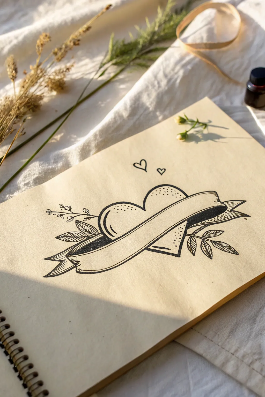
This classic tattoo-style illustration features a partially obscured heart wrapped in a flowing ribbon banner, perfect for inscribing a personal vow or name. The design uses bold outlines and delicate stippling on warm-toned paper to create a vintage, romantic aesthetic.
How-To Guide
Materials
- Cream or tan sketchbook paper (smooth texture preferred)
- Pencil (HB or H for light sketching)
- Fine liner pen (0.5mm or 0.8mm for outlines)
- Fine liner pen (0.1mm or 0.05mm for details)
- Kneaded eraser
- Ruler (optional)
Step 1: Sketching the Framework
-
Establish the heart shape:
Begin by lightly sketching a wide, symmetrical heart in the center of your page with a pencil. Don’t press too hard, as most of this line work will be erased later. -
Draft the banner placement:
Draw a gently curving rectangular shape diagonally across the heart more towards the bottom half. The strip should start lower on the left and curve upwards towards the right. -
Refine the banner fold:
Add the banner tails. On the left, draw a small fold going underneath the main banner, ending in a forked tail. Repeat on the right side, making the tail flick outwards slightly. -
Erase overlapping lines:
Using your kneaded eraser, carefully remove the pencil lines of the heart that are now ‘inside’ the banner shape. This helps you visualize the final layering. -
Add floral elements:
Sketch simple branches extending from behind the heart. Place a leafy branch on the left pointing leftward, and a similar cluster of leaves on the right pointing rightward. -
Add subtle sprigs:
Draw a thin, delicate twig with tiny buds rising vertically from the left side of the heart for varied texture.
Uneven Dots?
If your stippling looks messy, slow down. Instead of tapping rapidly, press the pen purposefully for each dot. Consistent spacing is more important than speed for clean shading.
Step 2: Inking the Outlines
-
Outline the banner:
Using your thicker fine liner (0.5mm or 0.8mm), trace the banner first. Since it is the topmost element, its lines should be unbroken and confident. -
Outline the heart:
Trace the visible sections of the heart using the same pen weight. Ensure you stop your lines cleanly where they meet the banner edges. -
Add dimension to the banner:
Draw a thin inner line parallel to the bottom edge of the main banner strip to give it a 3D rim effect. -
Ink the foliage:
Switch to a slightly thinner pen if desired, or use a light touch. Outline the leaves with sharp points and add a central vein to each leaf. Trace the delicate twig on the left with small dot-like buds. -
Draw floating hearts:
Add two tiny, simple heart outlines floating above the main heart, slightly to the right of the center dip.
Step 3: Shading and Details
-
Fill the dark shadows:
Identify the ‘folds’ of the ribbon where the banner tails tuck behind the heart. Fill these small, triangular recesses with solid black ink to create depth. -
Start stippling the heart:
Grab your finest pen (0.05mm or 0.1mm). Begin adding tiny dots (stippling) along the top curves of the heart. Cluster them densely near the outline and spread them out as you move inward. -
Shade the bottom of the heart:
Apply stippling to the bottom tip of the heart peaking out from under the banner. Keep the dots denser near the right edge to simulate a light source coming from the top left. -
Texturize the leaves:
Add very fine diagonal shading lines (hatching) inside distinct halves of the leaves. I like to alternate which side of the leaf gets shaded for visual interest. -
Add highlight accents:
Draw a small, curved ‘glint’ line on the upper left curve of the heart to suggest a shiny, smooth surface. -
Erase guidelines:
Once the ink is completely dry—give it a few minutes to be safe—gently erase all remaining pencil marks with the kneaded eraser to clean up the page.
Make It Yours
Use a pencil to draft a name or word like ‘LOYALTY’ inside the banner in a serif font. Ink it carefully to turn this illustration into a personalized dedication piece.
Now you have a timeless, handcrafted design ready for a meaningful inscription
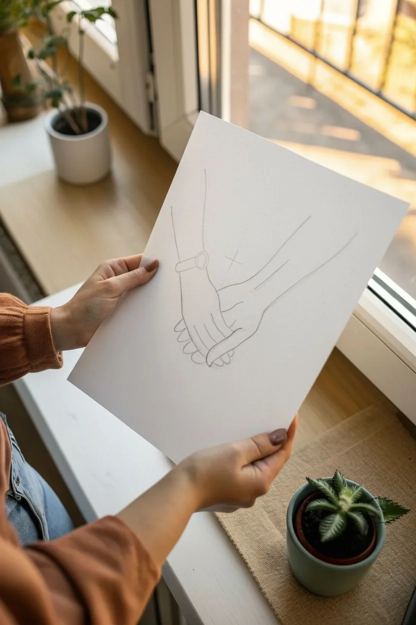
One-Line Loyal Hands
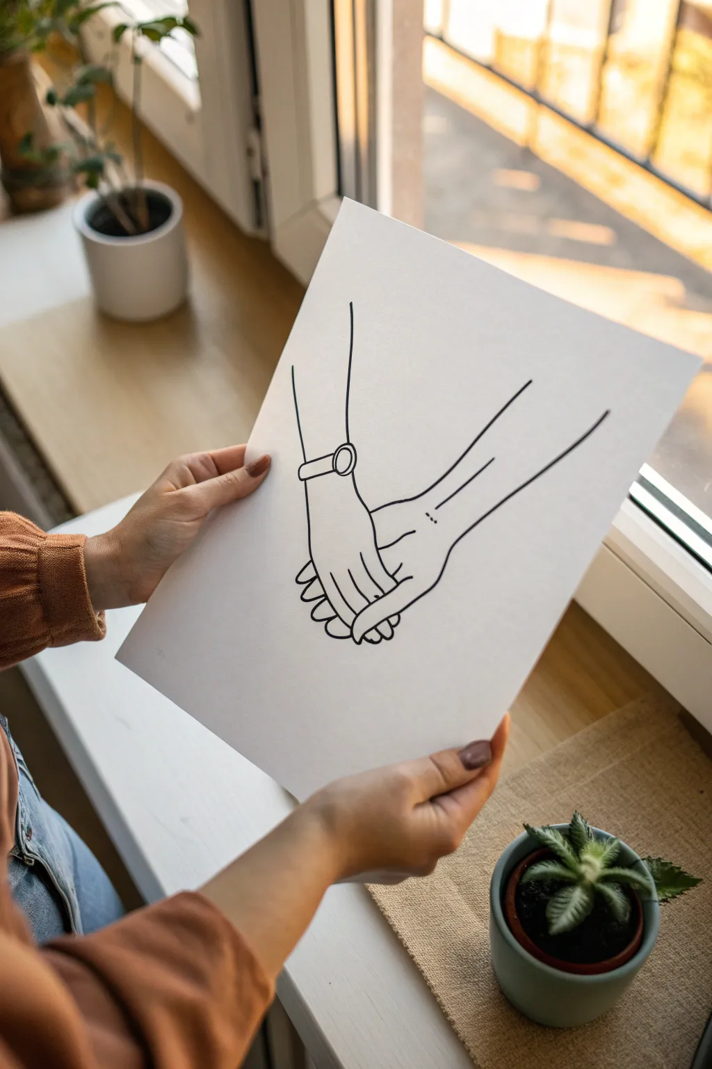
Capture the tender simplicity of holding hands with this elegant line art illustration. Using bold, clean strokes on bright white paper, you’ll create a modern piece of art that symbolizes loyalty and support.
Step-by-Step
Materials
- High-quality white cardstock or Bristol paper (A4 size)
- HB pencil for sketching
- Fine-point black fineliner (0.3mm or 0.5mm)
- Thicker black marker or brush pen (0.8mm or 1.0mm)
- Soft block eraser
- Ruler (optional, for arm alignment)
Step 1: Planning the Touch
-
Center layout:
Begin by lightly marking the center of your paper with your HB pencil to ensure the hands are positioned right in the middle of the composition. -
Establish the left arm:
Sketch a long, slightly angled vertical line representing the left forearm, originating from the upper left quadrant. -
Mark the wrist joint:
Draw a small oval shape at the end of the left forearm line to indicate where the watch or wrist cuff will sit. -
Outline the left hand:
Extend the line down from the wrist to form the back of the hand, curving slightly inward before flaring out for the knuckles. -
Add the fingers:
Sketch the basic shapes of the fingers curling underneath; don’t worry about perfect detail yet, just get the gesture of gripping. -
Establish the right arm:
From the upper right quadrant, draw a diagonal line coming down to meet the first hand, representing the partner’s arm. -
Position the right hand:
Draw the back of the right hand so it looks like it is resting inside the grip of the left hand. -
Intertwine the forms:
Refine the area where the hands meet. The fingers of the left hand should clearly wrap around the palm/side of the right hand.
Line Confidence
Draw from your shoulder, not your wrist. This creates smoother, more confident long lines for the arms rather than shaky, short strokes.
Step 2: Inking the Connection
-
Select your pen:
Switch to your thicker black marker or brush pen. This drawing relies on consistent line weight, so test it on scrap paper first. -
Ink the watch detail:
Start by inking the watch or cuff on the left wrist. Draw the band and the circular face with confident, single strokes. -
Trace the left arm:
Draw the long line of the left forearm down to the watch. Try to keep your hand steady for a smooth look. -
Define the grip:
Carefully ink the fingers of the left hand. Notice how the pinky and ring finger curl tighter than the others. -
Ink the right arm:
Draw the top line of the right arm, extending it down until it meets the wrist of the other hand. -
Add the second wrist detail:
Add two very small dots on the right wrist to suggest the ulnar bone or a minimalist tattoo detail. -
Connect the palm:
Draw the bottom curve of the right hand, ensuring it nestles perfectly against the gripping fingers of the left hand. -
Ink the visible thumb:
Add the small curve of the thumb or index finger of the right hand peeking out from the bottom grip. -
Finalize the arm lines:
Draw the underside lines of both arms, extending them back up towards the top edges of the paper.
Ink Smearing?
If you smudge the ink while erasing, dab the spot with a white gel pen or opaque white gouache to mask the mistake invisibly.
Step 3: Clean Up
-
Let the ink set:
Wait at least 5 to 10 minutes to ensure the black marker is completely dry to the touch. -
Erase pencil guides:
Gently rub your soft block eraser over the entire drawing to remove the initial sketch lines, leaving only the crisp ink.
Now you have a striking, minimalist representation of loyalty ready to be framed or gifted to someone special


Storm Umbrella Side-by-Side
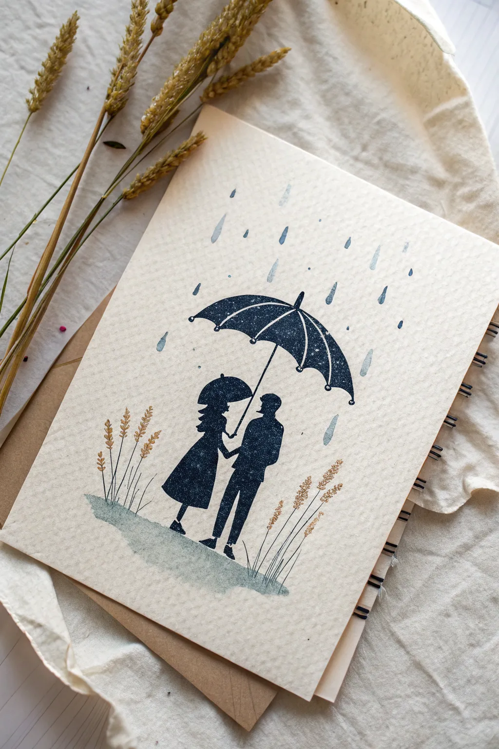
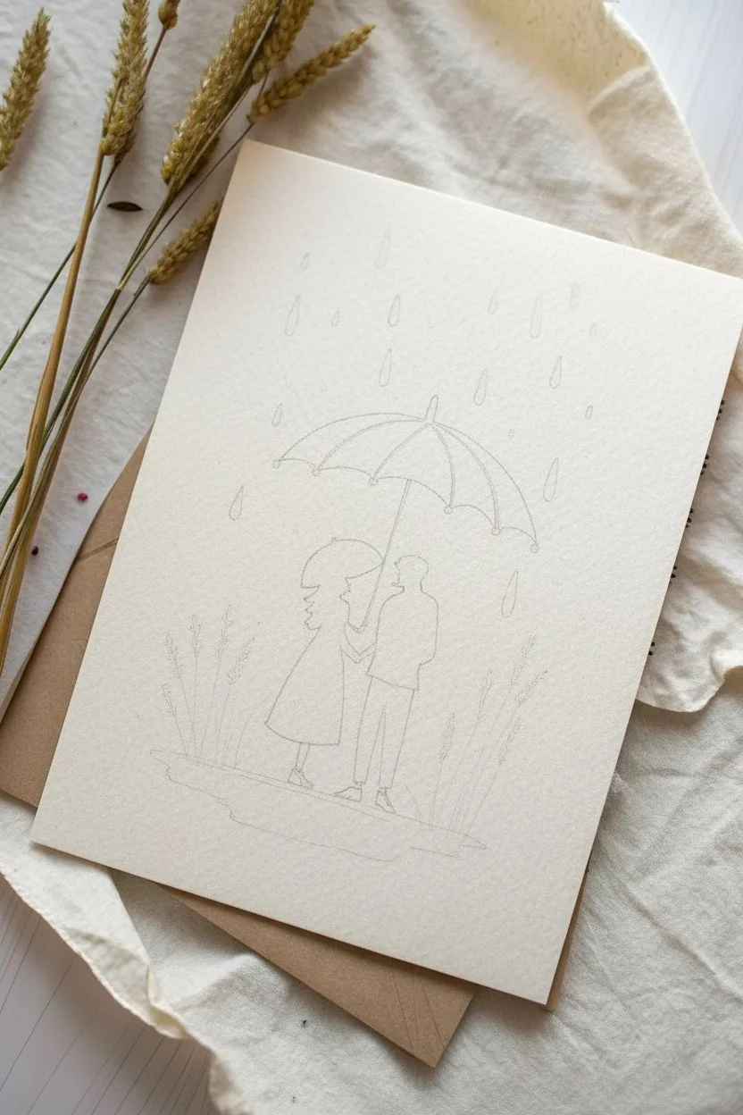
Create a heartfelt testament to loyalty with this minimalist silhouette artwork featuring a couple sheltering together under a single umbrella. Using rich dark inks against textured paper, you’ll capture a cozy, romantic atmosphere perfect for an anniversary card or a framed gift.
Step-by-Step
Materials
- Textured watercolor paper or heavy cardstock (cream or off-white)
- Black drawing ink or high-quality black felt-tip marker
- Light blue watercolor paint (diluted)
- Fine detail paintbrush (size 0 or 1)
- Pencil and eraser
- Ruler
- Gold or bronze fine-liner pen (for wheat details)
- Optional: Silhouette rubber stamps (couple and umbrella)
Step 1: Planning the Composition
-
Paper Preparation:
Begin by cutting your textured watercolor paper to your desired size. If making a folded card, score the center line lightly before folding to ensure a crisp edge. -
Sketch the Ground Line:
Using a pencil, lightly sketch a soft, uneven oval shape near the bottom third of the paper. This will serve as the wet pavement reflection area where the figures will stand. -
Outline the Couple:
Lightly pencil in the silhouettes of the two figures standing close together. The figure on the left should be wearing a dress or coat that flares slightly, while the figure on the right is in trousers. Position them so their hands gently meet in the middle. -
Add the Umbrella:
Sketch a large, wide umbrella shape hovering directly over both figures. Draw the central pole extending down to the hand of the figure on the right. Make sure the umbrella is large enough to realistically cover both people.
Stamp Instead of Draw
Not confident drawing figures? Use pre-made rubber stamps for the couple and umbrella shadows. Just mask the umbrella area when stamping rain.
Step 2: Inking the Silhouettes
-
Fill the Figures:
Using black drawing ink or a dark marker, carefully fill in the penciled silhouettes. Create a solid, opaque look. I find it helpful to outline the shape first with a steady hand before flooding the center with ink. -
Define the Legs:
Pay special attention to the legs and shoes. The figure on the left features simple heels, while the right figure has standard shoe shapes. Keep the lines crisp. -
Ink the Umbrella Canopy:
Fill in the canopy of the umbrella with the same dark ink. Leave extremely thin negative space (white lines) to suggest the ribs of the umbrella frame, or paint it solid black and add thin white details later with a gel pen. -
Connect the Handle:
Draw the straight line for the umbrella shaft, ensuring it looks like the figure on the right is gripping it firmly.
Add Metallic Rain
Mix a tiny amount of silver watercolor or iridescent medium into your blue rain paint. The drops will shimmer when the card catches the light.
Step 3: Creating Atmosphere
-
Paint the Ground Shadow:
Dilute a tiny amount of black ink or watercolor into a very light grey-blue wash. Paint the oval ground area you sketched earlier, letting the brush strokes be somewhat rough to mimic wet pavement. -
Add Rain Droplets:
Mix a watery blue-grey color. Using the tip of your small brush, dab irregular, tear-drop shapes falling from the top of the page. Vary the sizes slightly—some larger, some mere specks—to create depth. -
Create Rain ‘Motion’:
Keep the rain direction consistent. If you look closely at the reference, the drops slant slightly, suggesting a breeze. Paint or draw these marks with a quick, light touch. -
Avoid the Umbrella:
Ensure no rain drops are painted directly ‘under’ the umbrella canopy, reinforcing the idea of shelter.
Step 4: Golden Details
-
Sketch the Wheat Stalks:
On either side of the couple, lightly pencil vertical lines for tall grass or wheat stalks. They should originate from the painted ground patch. -
Ink the Stems:
Using a fine black pen, trace over these stems with very thin, delicate lines. -
Add Golden Grain:
Switch to your gold or bronze fine-liner. Draw small, V-shaped clusters at the top of the stems to create the heads of wheat. This adds a subtle warmth to the cool, rainy scene. -
Final Cleanup:
Once you are absolutely certain all ink and paint is dry, gently erase any visible pencil marks.
Now you have a touching piece of art that perfectly symbolizes weathering life’s storms side by side


Have a question or want to share your own experience? I'd love to hear from you in the comments below!