
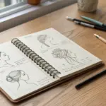
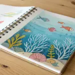
If you’re craving medium drawing ideas that feel like a real step up (without tipping into “impossible”), you’re in the right headspace. I put together these intermediate sketches to help you practice specific skills while still making drawings you’ll actually want to keep.
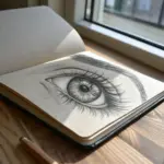
Realistic Eye Study With Crisp Catchlights
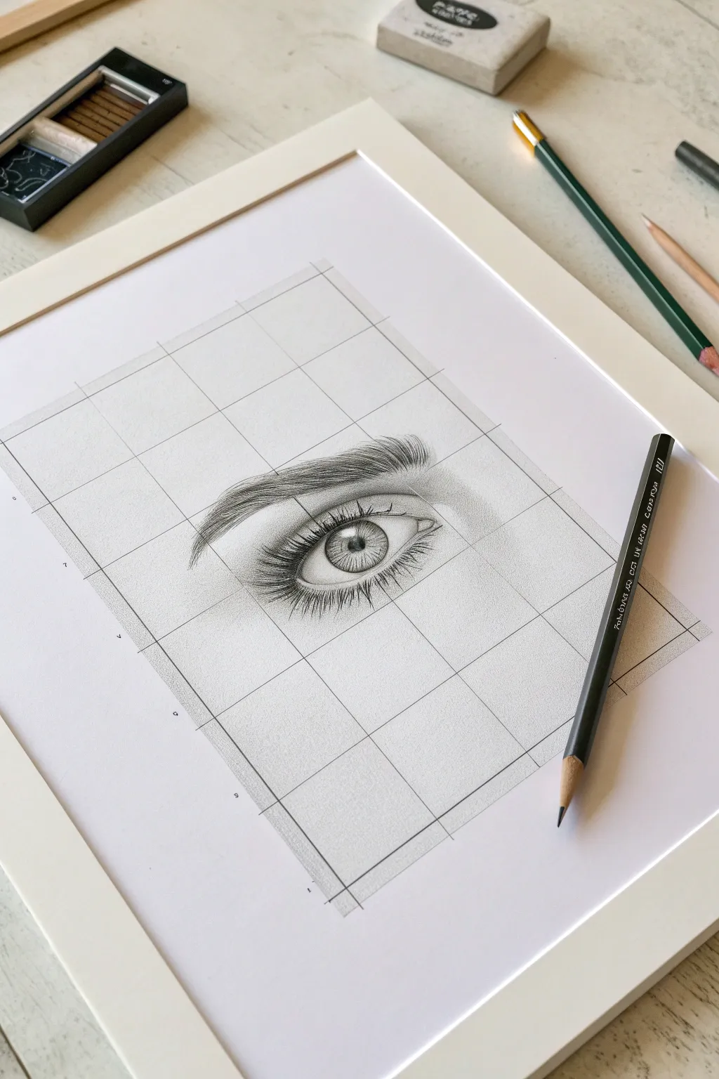
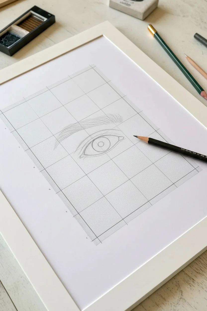
Master the art of realistic portraiture by breaking down a complex eye study into manageable squares. This tutorial uses a precise grid method to help you nail proportions and achieve striking, lifelike details in the iris and lashes.
Detailed Instructions
Materials
- High-quality drawing paper (smooth bristol or hot press watercolor paper)
- Graphite pencils (range from 2H for lines to 4B/6B for darks)
- Ruler
- Mechanical pencil (0.5mm)
- Kneaded eraser
- Blending stump or tortillon
- White gel pen (optional for highlights)
Step 1: Setting the Foundation
-
Prepare your grid:
Begin by lightly drawing a rectangle on your paper using a ruler. Divide this main rectangle into a grid of smaller, equal squares. For this study, a 4×5 grid works perfectly. Keep your lines very faint using a 2H pencil so they can remain part of the aesthetic or be erased later. -
Outline the main shapes:
Using the grid as your map, lightly sketch the almond shape of the eye. Notice which grid lines the tear duct and the outer corner intersect. Place the circle of the iris, ensuring a portion of the top is covered by the upper lid. -
Sketch the eyebrow:
Map out the general shape of the eyebrow above the eye. Don’t draw individual hairs yet; just outline the area where the brow sits relative to your grid squares.
Smudge Alert
Graphite loves to smear. Place a scrap piece of paper under your drawing hand to protect your shading and keep the white areas of your grid crisp and clean.
Step 2: Developing the Iris
-
Define the pupil:
Draw the pupil in the exact center of the iris using a softer pencil like a 2B or 4B. Press firmly to get a deep, dark black, but leave a small, crisp white shape for the primary catchlight (highlight). -
Add iris spokes:
Working outward from the pupil, draw fine, radiating lines toward the outer edge of the iris. Use a sharp HB pencil for this. These lines mimic the muscle fibers of the eye. -
Darken the limbal ring:
Thicken and darken the outer circle of the iris (the limbal ring). Softly shade the top third of the iris just under the eyelid to create a shadow cast by the lashes, which adds immediate depth. -
Enhance texture:
Layer more graphite into the iris, varying your pressure to create varied tones. Leave some tiny flecks of paper white near the pupil to suggest complex texture.
Skin Texture
Instead of blending perfectly smooth, use a very hard pencil (4H) to draw tiny, faint cross-hatching over the shaded skin areas. This subtle texture mimics pores.
Step 3: Shading and Form
-
Shade the sclera:
The ‘white’ of the eye isn’t pure white. Very lightly shade the corners of the eyeball with a 2H pencil, fading to white as you approach the iris. This rounding effect makes the eyeball look spherical. -
Define the waterline:
Draw a parallel line just inside the lower eyelid to create the thickness of the lower rim (the waterline). This is crucial for realism; lashes grow from the outer edge of this rim, not directly from the eye. -
Contour the eyelid crease:
Deepen the crease line above the eye. Shade the area between the crease and the eyebrow, keeping the shading smooth to represent skin. I like to use a blending stump here for a softer skin texture. -
Add skin tone around the eye:
Lightly shade the skin surrounding the eye, darkening slightly at the corners and under the brow bone. Keep your pencil strokes directional or use small circular motions for a smoother finish.
Step 4: Finer Details
-
Draw the upper lashes:
Using a sharp 4B pencil, draw the upper eyelashes. Start from the root on the upper lid line and flick your wrist quickly upward and outward. The lashes should curve and vary in length and direction. -
Draw the lower lashes:
Add the lower lashes, starting from the outer edge of the lower waterline. These should be shorter, sparser, and slightly lighter than the upper lashes. Group them slightly for a natural look. -
Refine the eyebrow:
Fill in your eyebrow outline with individual hair strokes. Start at the inner corner with upward strokes, transitioning to sideways strokes as you move toward the tail. Ensure the hairs follow the natural growth direction. -
Deepen contrast:
Go back over your darkest darks—the pupil, the lash line, and the deepest crease shadows. High contrast is what makes the drawing pop. -
Final highlights:
Use a clean eraser edge or a white gel pen to reclaim the brightest white in the catchlight and add a tiny sheen to the wet part of the lower waterline.
Take a moment to erase any stray graphite dust and admire the depth you’ve captured in your study


Ear Study From Three Angles
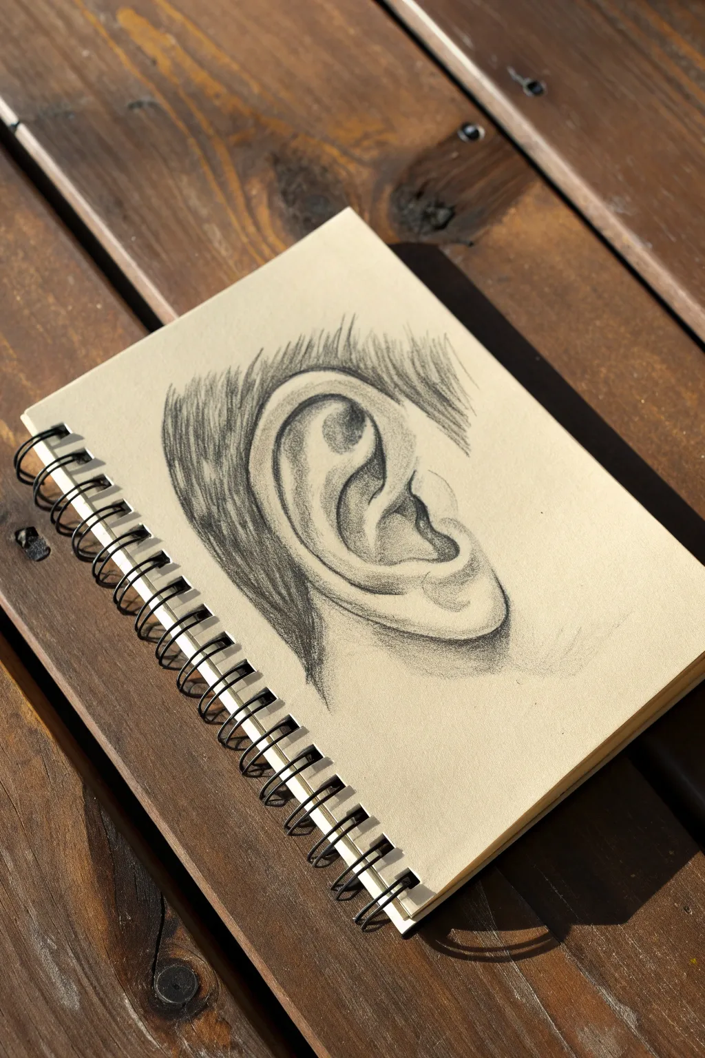
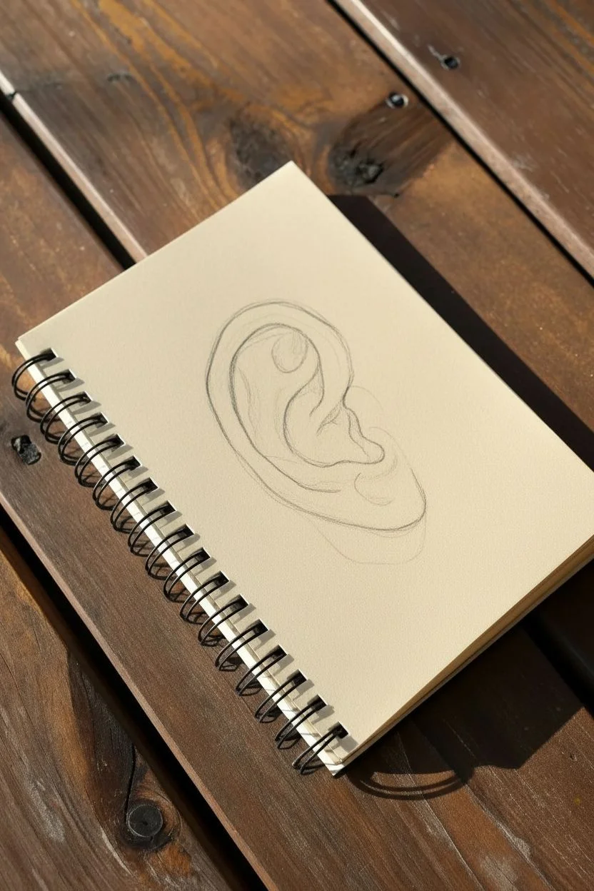
Master the intricate forms of human anatomy with this detailed graphite study of an ear on warm-toned paper. This project focuses on understanding cartilage structures through careful shading and directional strokes to create convincing depth.
Detailed Instructions
Materials
- Cream or off-white toned sketchbook paper
- Set of graphite pencils (HB, 2B, 4B, 6B)
- Kneaded eraser
- Fine mechanical pencil (optional for details)
- Blending stump or tissue
Step 1: Structural Outline
-
Establish the outer shape:
Begin with an HB pencil, using very light pressure. Draw a large, slanted ‘C’ shape to define the outer rim of the ear (the helix). Keep the line faint so it can be adjusted easily. -
Define the inner curve:
Sketch a smaller curve nestled inside the top of your ‘C’ shape. This marks the antihelix, the wishbone-shaped ridge of cartilage that divides the upper ear. -
Map the concha and tragus:
Draw the deep, bowl-like depression (the concha) in the center. Add the small nub of cartilage (the tragus) that protects the ear canal opening on the left side. -
Outline the lobe:
Complete the bottom of the ear with a soft, rounded curve for the lobe. Ensure it connects naturally to the helix without a sharp break.
Muddy Shading?
If your shadows look grey and muddy, you’ve likely over-blended. Re-apply fresh graphite with a sharp 4B pencil on top of the smudged areas to restore crisp, dark accents.
Step 2: Shading and Depth
-
Lay down base tones:
With a 2B pencil, lightly shade the entire inner ear area, leaving the highest ridges of the cartilage the color of the paper. This establishes your mid-tones. -
Darken the deepest recesses:
Switch to a 4B pencil to add deep shadows. Focus on the area under the helix rim and the deep pocket of the ear canal. Press firmly to create high contrast. -
Model the antihelix:
Use your HB pencil to shade the slopes of the Y-shaped antihelix. The shading should be gradual, fading from the dark recesses up toward the highlight on the ridge. -
Refine the tragus:
Shade the small tragus bump, keeping the side facing the ear canal dark and the outer face lighter to make it pop forward 3D space. -
Soften transitions:
I like to use a blending stump here to gently smudge the graphite in the mid-tone areas, creating a smooth skin texture. Avoid over-blending the darkest darks to keep them crisp.
Level Up: Skin Texture
Instead of smooth shading on the lobe, use tiny, faint stippling or cross-hatching marks with a sharp H pencil to suggest pores and skin imperfections for hyper-realism.
Step 3: Hair and Finishing Details
-
Start the hair flow:
Using a 4B or 6B pencil, begin drawing hair strands behind the ear. Use quick, confident strokes that flick outward to simulate the natural taper of hair. -
Layer hair texture:
Add layers of hair strokes, some overlapping others. Vary the pressure to create depth within the hair mass, making the area directly behind the ear the darkest. -
Refine ear edges:
Go back to the outer rim of the ear. Where the helix turns under, darken the shadow to separate it clearly from the hair behind it. -
Enhance highlights:
Take your kneaded eraser and pinch it into a fine point. Lift out graphite from the highest points of the helix and antihelix to creating striking, clean highlights. -
Final contrast check:
Use your 6B pencil to punch up the darkest shadows one last time—specifically in the ear canal and the deepest folds. This high contrast is what gives the drawing its realism.
With practice, observing these small anatomical details will transform your portrait drawings entirely

Three-Value Portrait Study (Light, Mid, Dark)
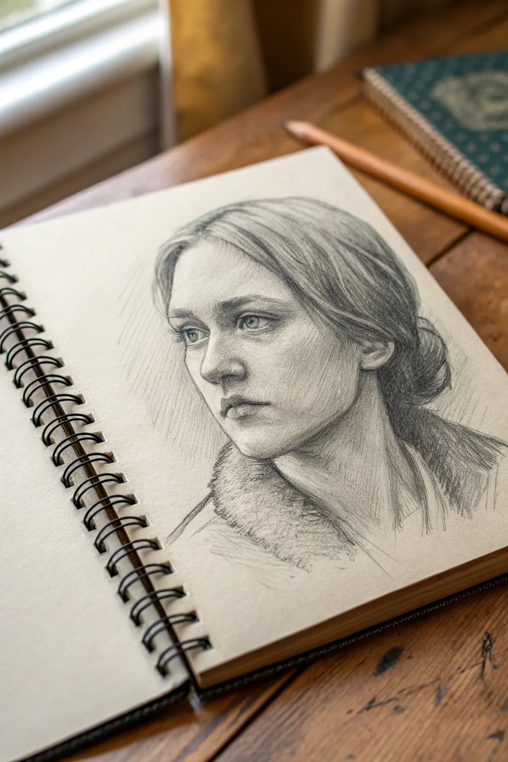
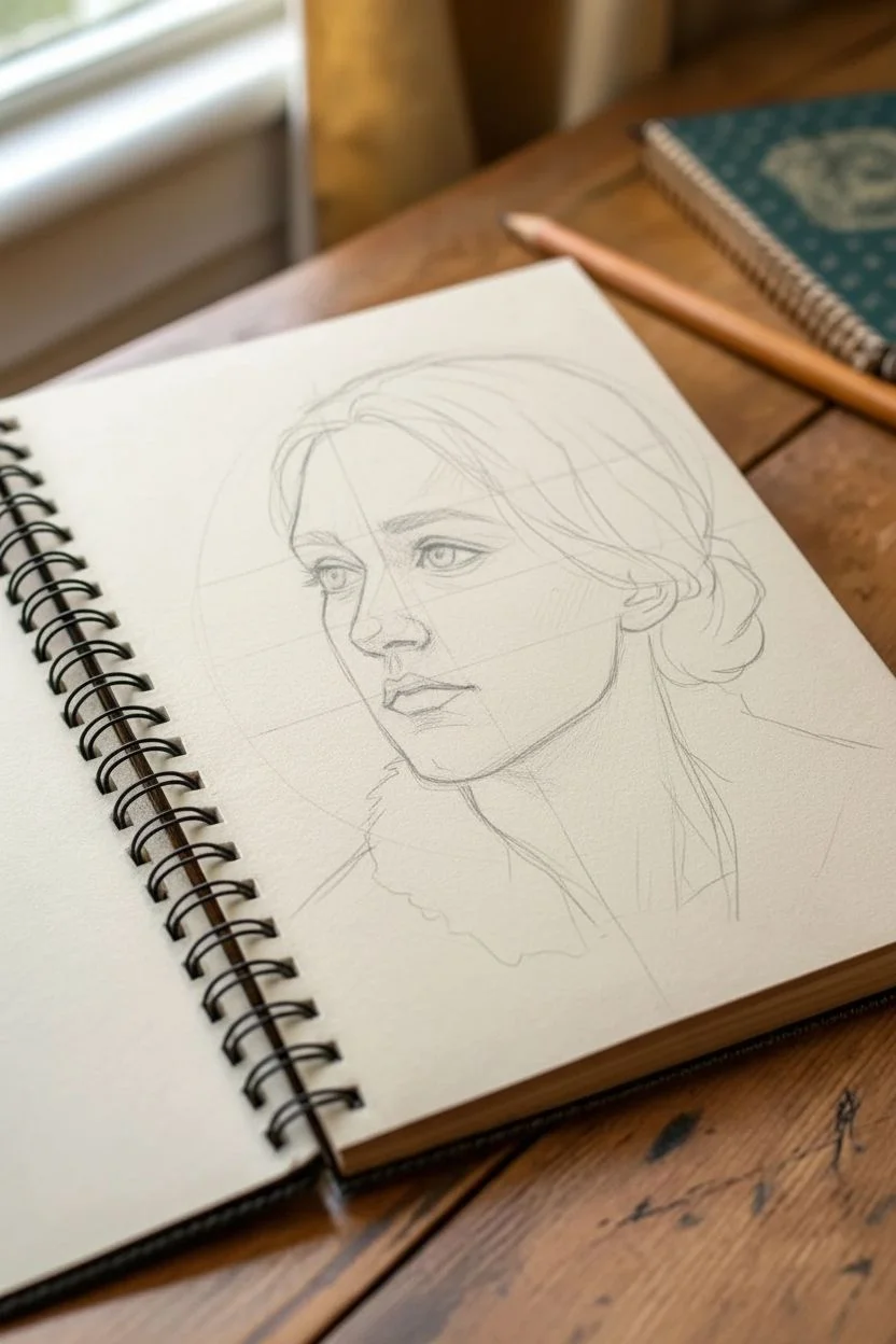
Master the fundamentals of portraiture by simplifying complex lighting into three distinct values: light, mid-tone, and dark. This pencil study captures a pensive expression with soft shading and delicate hair texture, perfect for practicing anatomical structure.
How-To Guide
Materials
- Spiral-bound sketchbook (smooth or vellum surface, toned paper preferred)
- Graphite pencils (HB, 2B, 4B)
- Kneaded eraser
- blending stump (tortillon) – optional
- Pencil sharpener
Step 1: Laying the Foundation
-
Establish the Head Shape:
Begin with a light HB pencil to sketch the basic oval of the head. Keep your grip loose and your lines faint. Sketch a vertical centerline down the face, tilting it slightly to the left to match the model’s gaze. -
Mark Feature Placement:
Draw horizontal guidelines across your centerline to map out where the eyes, nose base, and mouth will sit. Remember the rule of thirds: hairline to brow, brow to nose, and nose to chin are roughly equal segments. -
Block in Features:
Lightly sketch the simplified shapes of the eyes, nose, and lips. Don’t worry about eyelashes or nostrils yet; focus solely on the geometric planes and proportions. -
Outline Hair and Collar:
Draw the sweeping curves of the hair, noting where it parts in the center and tucks behind the ear. Roughly outline the shape of the fur collar and shoulders.
Muddy Shadows?
If your shading looks smudgey or dirt-like, you may be overworking it. Stop rubbing with your finger. Use clean, directional hatch lines instead to build up tone while keeping the drawing fresh.
Step 2: Developing the Values
-
Identify Shadow Shapes:
Switch to a 2B pencil. Squint at your reference to blur the details and see only the major shadow shapes. Lightly fill in all the shadow areas—under the brow, the side of the nose, the upper lip, and the neck—with a uniform mid-tone gray. -
Describing the Eyes:
Sharpen your pencil to a fine point. darker the pupil and the upper lash line. Leave the white of the eye paper clean, but shade the iris carefully, keeping the highlight crisp. -
Sculpting the Nose:
Refine the nose by darkening the detailed shadow under the tip and around the nostril. Avoid drawing a hard outline for the bridge; let the shading on the side of the nose define its form against the cheek. -
Defining the Lips:
Shade the upper lip darker than the lower lip, as it angles away from the light. Add a small, dark accent at the corners of the mouth and under the center of the bottom lip to create volume. -
Adding Structure to the Face:
Use parallel diagonal hatching strokes on the shadow side of the face (the right side in this drawing) to deepen the mid-tones. Use the side of your lead for softer transitions on the cheekbone.
Step 3: Texture and Refinement
-
Refining Hair Flow:
Using long, confident strokes, follow the direction of the hair growth. Start from the part and sweep down. I like to lift my pencil at the end of each stroke to create a tapered, hair-like effect. -
Deepening Darkest Values:
Switch to your 4B pencil. Go back into the darkest areas—the pupils, the deep crease of the eyelid, the shadow behind the ear, and the darkest folds of the hair bun—and push these to a near-black value. -
Rendering the Collar:
Create the texture of the fur collar using short, scribbly, looping strokes. Keep this area looser and less defined than the face to ensure the viewer’s focus remains on the portrait. -
Cleaning and Lifting:
Take your kneaded eraser and shape it into a point. Gently dab (don’t rub) to lift out graphite on the bridge of the nose, the forehead, and the cheek to create soft highlights. -
Background Atmosphere:
Add very light, directional hatching in the background around the head. This separates the subject from the page and adds a sense of atmosphere. -
Final Polish:
Step back from your drawing. Re-emphasize the jawline if it got lost, and ensure your three values (paper white, mid-tone gray, and dark graphite) are distinct and balanced.
Level Up: Tinted Paper
Try this study on tan or gray toned paper. This allows you to use a white charcoal pencil for brilliant highlights, giving you a wider range of values to work with.
Now you have a structured, expressive portrait study that captures both mood and form
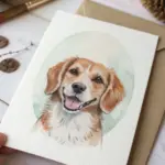
Pet Portrait Crop With a Fur Direction Map
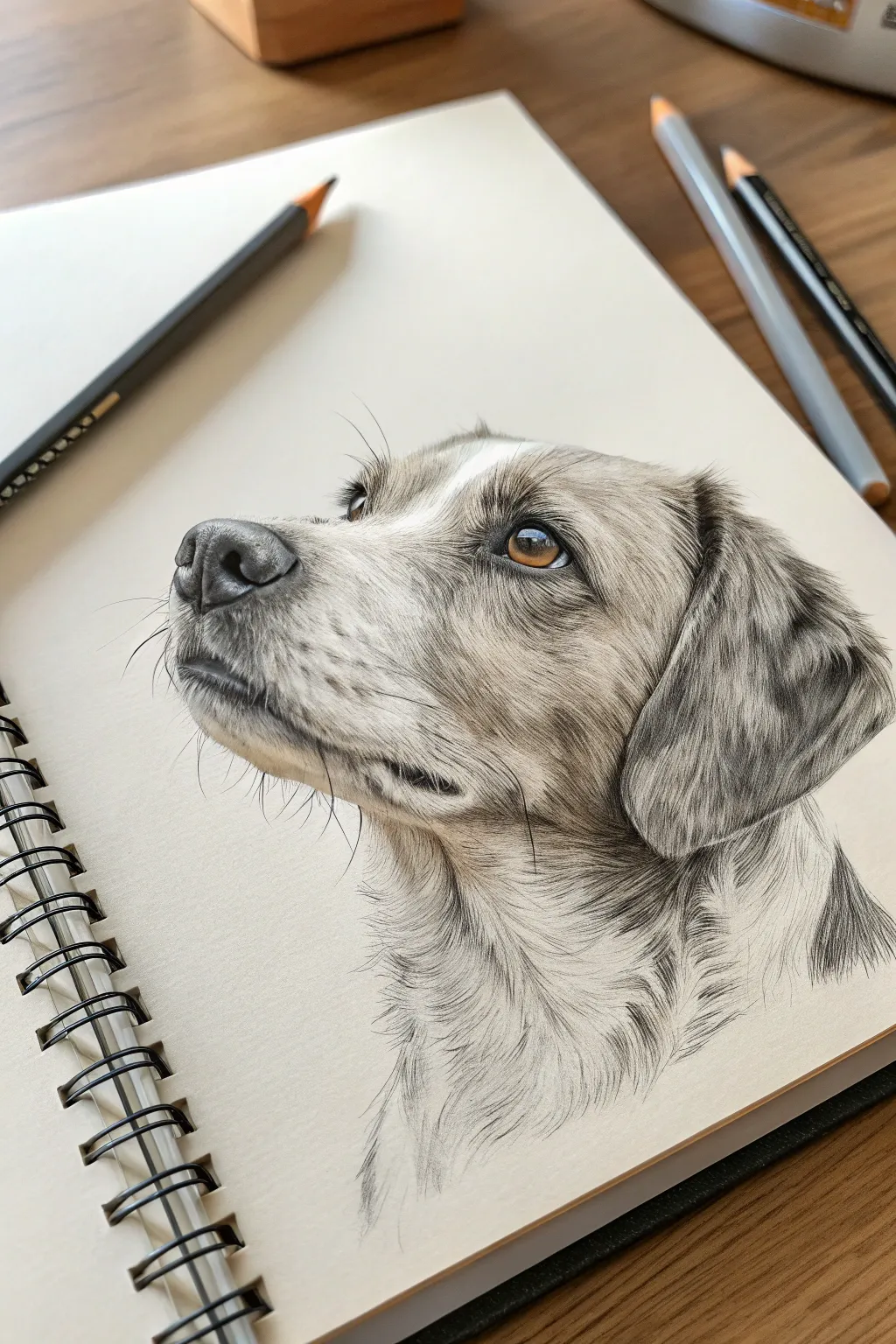
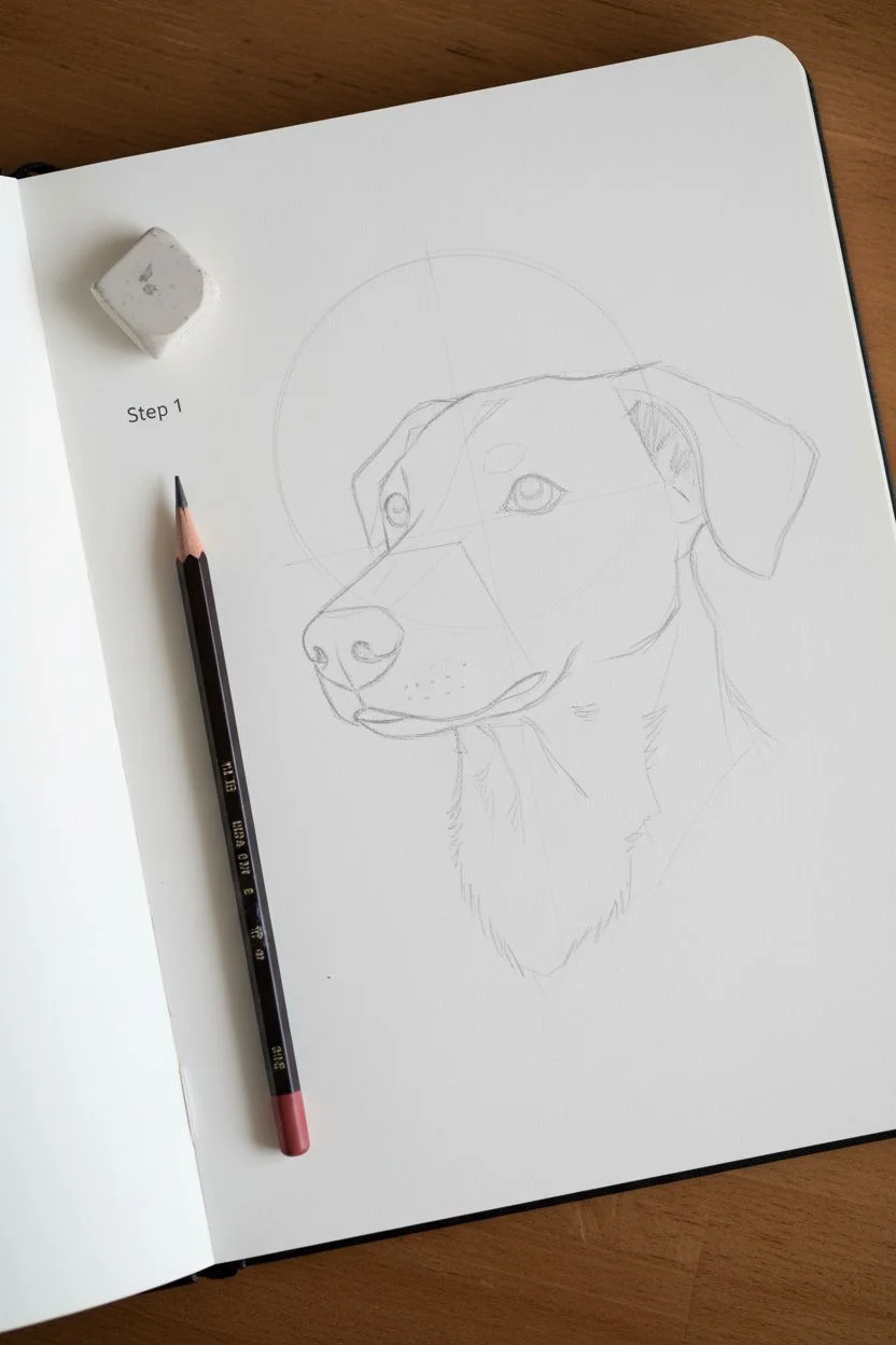
Learn to draw a stunningly realistic dog portrait that captures the soulful expression and soft texture of fur using just pencils. This project focuses on mastering fur direction and building tone layers to bring your pet subject to life on the page.
Detailed Instructions
Materials
- Spiral-bound sketchbook (smooth or vellum finish)
- Graphite pencils (HB, 2B, 4B, 6B)
- Kneaded eraser
- Fine-point mechanical pencil (0.5mm)
- Blending stump or tortillon
- Reference photo of a dog in profile
- Tissue or clean scrap paper (hand rest)
Step 1: Structural Foundation
-
Establish the Head Shape:
Begin with an HB pencil using very light pressure. Draw a circle for the cranial area and a rounded rectangular shape extending outwards for the muzzle to capture the profile view. -
Place the Features:
Lightly mark the position of the eye, ensuring it aligns with the stop (the angle between the muzzle and forehead). Sketch the triangular shape of the nose and the curve of the mouth line. -
Refine the Outline:
Connect your shapes to form the neck and ear. Don’t draw a solid line for the outline; instead, use small, broken strokes to suggest where the fur ends, keeping the edge soft and organic.
Keep It Clean
Place a piece of scrap paper under your drawing hand. This prevents skin oils from smudging your work and keeps the graphite where it belongs.
Step 2: Mapping the Flow
-
Create a Fur Map:
Before shading, study your reference. Lightly draw arrows or flow lines directly on your sketch to indicate which direction the fur grows on the muzzle, cheeks, and neck. This is crucial for realism. -
Detail the Eye:
Switch to a 4B pencil for the pupil, making it the darkest point on the page. Leave a crisp white circle for the highlight. Use a 2B for the iris, drawing radial lines outward from the pupil. -
Render the Nose:
Using a 2B pencil, shade the nose with a stippling or tight circular texture to mimic the leathery skin. Darken the nostrils with a 6B pencil for depth.
Add Color
For a unique twist, try using a colored pencil (like amber or blue) just for the iris of the eye, leaving the rest of the portrait in greyscale.
Step 3: Building Fur Texture
-
Initial Muzzle Tone:
Start near the nose. Use the mechanical pencil for precision, creating short, fine strokes following your map. These hairs are very short, so keep your strokes tiny and dense. -
Layering the Cheeks:
Move to the cheek area where the fur lengthens. Use an H or HB pencil for the base layer of grey hairs, following the curve of the jawbone. -
Developing the Ear:
The ear often has crimped or wavy fur. Use longer, undulating strokes here. Darken the shadows under the fold of the ear with a 4B pencil to lift it away from the head. -
Neck and Chest Fur:
The fur on the neck is typically the longest. Use broad, sweeping strokes with a sharpened 2B pencil. Pay close attention to where clumps of fur overlap and cast shadows on the layers below.
Step 4: Refining and Deepening
-
Deepen the Shadows:
Take your 4B or 6B pencil and reinforce the darkest areas: under the jaw, inside the ear, and the corners of the mouth. This contrast makes the drawing pop. -
Add Whisker Details:
Identify the whisker spots on the muzzle. I find it helpful to draw the whisker pores first as small dark dohs, then use quick, confident strokes for the whiskers themselves. -
Highlight Retrieval:
Mold your kneaded eraser into a fine point or wedge. meticulously lift out graphite to create white hairs in the dark patches and highlights on the brow bone. -
Soften Transitions:
Use a blending stump lightly on the mid-tone areas to smooth out the fur texture, but avoid over-blending, which can make the drawing look blurry. -
Final Contrast Check:
Stand back and look at your drawing. Ensure the eye is piercing and bright, and that the darkest shadows are truly black. Add a few final rogue hairs sticking out for ultimate realism.
Now you have a soulful pet portrait that captures the personality of your furry friend
BRUSH GUIDE
The Right Brush for Every Stroke
From clean lines to bold texture — master brush choice, stroke control, and essential techniques.
Explore the Full Guide
Skull Study With Dramatic Side Lighting
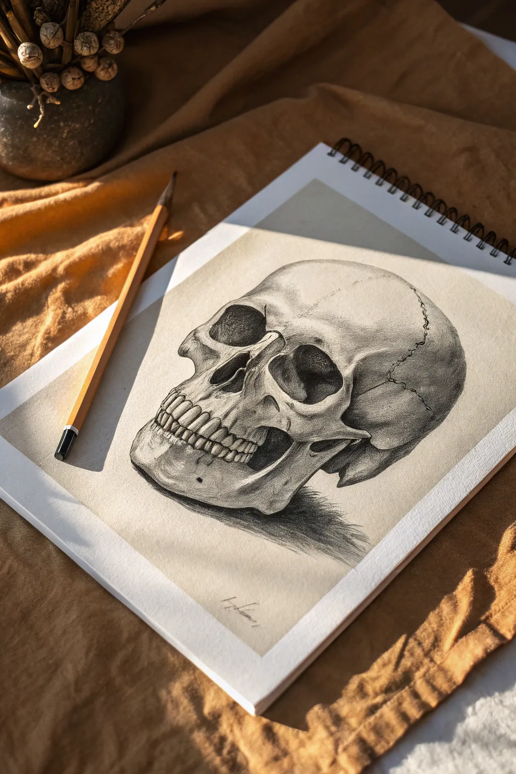
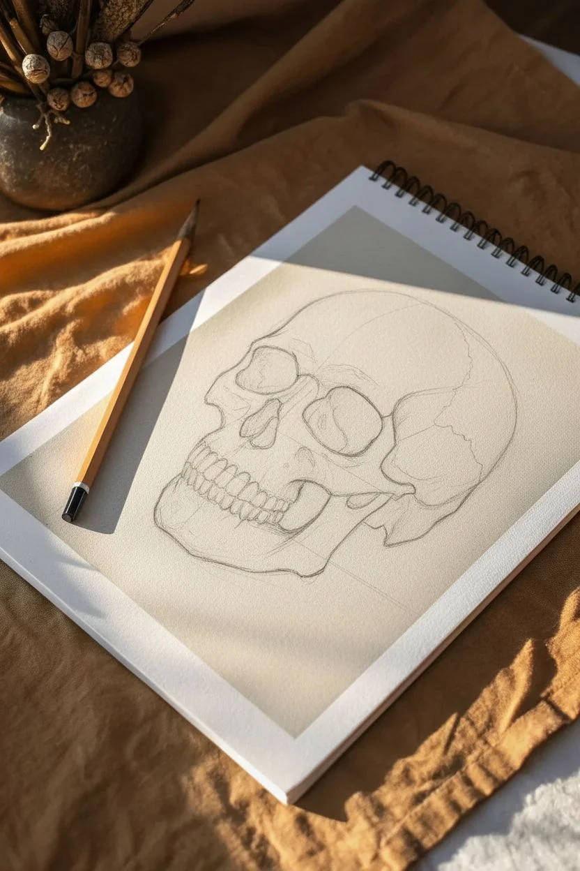
Master the art of chiaroscuro with this striking skull study that emphasizes strong contrasts and anatomical form. By working on toned paper, you’ll learn to push your darks deep while preserving highlights for a three-dimensional, sculptural effect.
Step-by-Step
Materials
- Toned sketching paper (tan or grey)
- Graphite pencils (HB, 2B, 4B, 6B)
- Charcoal pencil (optional, for deepest blacks)
- White charcoal or pastel pencil
- Kneaded eraser
- Blending stump (tortillon)
- Reference photo of a skull with side lighting
Step 1: Structural Layout
-
Establish the envelope:
Begin with a very light H or HB pencil. Sketch a loose, general shape that encompasses the entire skull—roughly a large circle for the cranium and a boxy shape for the jaw attached below. -
Divide the face:
Draw faint center lines to orient the direction the skull is facing (three-quarter view). Mark the horizontal lines where the eye sockets, nose cavity, and teeth will sit. -
Map the features:
Refine the shapes of the eye sockets (orbits). They aren’t perfect circles; look for the squared-off edges. Sketch the upside-down heart shape of the nasal cavity and the zygomatic arch (cheekbone) protruding on the side. -
Line the jaw and teeth:
Outline the mandible and the row of teeth. Don’t draw individual teeth yet; instead, draw the curved ribbon shape of the gums and the overall block of the dental arch.
Step 2: Defining Shadows
-
Identify the shadow shapes:
Switch to a 2B pencil. Look at your reference and lightly outline the borders where light meets shadow. This is critical for the side-lighting effect. -
Fill the darkest voids:
Use a 4B or 6B pencil (or charcoal) to fill in the deepest non-reflective areas: the nasal cavity, the far side of the eye socket, and the gap between the jaw and cheekbone. -
Establish the core shadow:
Lay down a mid-tone grey on the shadowed side of the skull. Use the side of your pencil lead for broader strokes, following the curved form of the cranium. -
Cast shadow placement:
Draw the cast shadow on the surface beneath the skull. This anchors the object. Press firmly near the base of the jaw and fade the pressure as the shadow stretches outward. -
Blend the mid-tones:
Use a stump or soft tissue to gently blend the graphite in your shadow areas, pushing the pigment into the paper tooth for a smooth, bone-like texture.
Fixing “Floating” Skulls
If the skull looks like it’s hovering, darken the occlusion shadow—the tiny, almost black sliver of shadow immediately where the bone touches the table.
Step 3: Refining Details and Texture
-
Carve the teeth:
With a sharpened HB pencil, define the separation between teeth. Focus on the shadows *between* them rather than outlining each tooth entirely, which can make them look cartoonish. -
Cranial sutures:
Draw the jagged, zigzagging lines of the sutures on the cranium. Vary your line weight—thick and thin—to make these cracks look organic and embedded in the bone. -
Fractures and imperfections:
Add small pits, cracks, or texture marks on the cheekbone and chin to give the bone an aged, realistic feel. I usually keep these subtle so they don’t distract from the main form. -
Deepen contrast:
Return to your darkest pencil (6B). Re-emphasize the darkest corners of the eye sockets and the underside of the cheekbone to maximize the dramatic contrast.
Level Up: Dramatic Props
Add a wilting flower or an extinguished candle next to the skull. Use the same harsh side lighting to tie the elements together for a classic ‘Memento Mori’ theme.
Step 4: Highlighting and Finishing
-
Apply white highlights:
Take your white charcoal or pastel pencil. Apply strong highlights to the areas hitting the light most directly: the forehead, the ridge of the nose, and the top of the cheekbone. -
Teeth highlights:
Add tiny flecks of white to the front of the teeth and the ridge of the upper jaw to make them pop forward. -
Rim lighting:
If your reference shows it, add a thin line of reflected light along the back edge of the jaw within the shadow side. -
Final clean up:
Use your kneaded eraser to lift off any stray smudges on the lit side of the paper, ensuring the background remains clean to contrast with the drawing.
Step back and admire how the simple interplay of light and shadow has turned a flat sketch into a compelling three-dimensional form
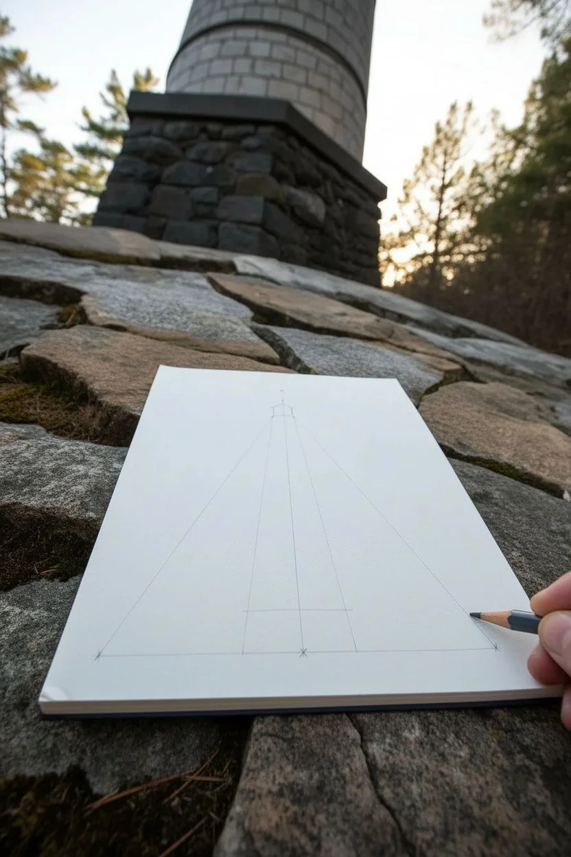
Stacked Cylinders in 3-Point Perspective
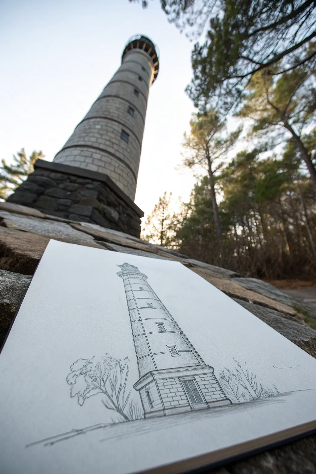
Master the dramatic look of extreme height by sketching a lighthouse using three-point perspective. This project simplifies complex architecture into stacked cylinders, creating a looming, majestic effect that draws the eye upward.
Step-by-Step Tutorial
Materials
- Sketchbook or drawing paper (heavyweight helpful for ink)
- Graphite pencil (HB or 2B)
- Fine liner pen (black, 0.3mm or 0.5mm)
- Ruler or straight edge
- Eraser
Step 1: Setting the Perspective Framework
-
Establish the horizon:
Start by drawing a faint horizon line very low on your page. Since we are looking up at a tall object, the horizon needs to be near the bottom to allow space for the tower to stretch upwards. -
Place vanishing points:
Visualize two vanishing points far off to the left and right on your horizon line. Place a third vanishing point high above the center of your page—this vertical point will create the tapering effect. -
Draw the central axis:
Lightly sketch a vertical line straight up the middle of your paper towards that top vanishing point. This will be the spine of your lighthouse. -
Define the base width:
Mark the width of the lighthouse base near the bottom. Connect these marks upward toward the top vanishing point to create the tapering sides of the tower.
Curve Control
Remember: Cylindrical curves get rounder the further they are from your eye level. The bottom line is flat; the top line is a deep U-shape.
Step 2: Constructing the Cylinders
-
Sketch the base ellipses:
Draw the bottom curve of the lighthouse. Because this is below eye level (very slightly) or right at ground level, the curve should be subtle. -
Stack the segments:
Divide the tower into horizontal sections. Draw curved lines for these divisions. Important: as you go higher, the curves should become more exaggerated ‘u’ shapes because you are looking up at them more steeply. -
Add the lantern room:
At the very top, sketch the housing for the light (the lantern room). Use a slightly wider ellipse for the walkway balcony just below it. -
Detail the base foundation:
Sketch a blocky, rectangular shape at the very bottom for the entrance foundation. Use your left and right vanishing points to angle the sides of this block correctly.
Step 3: Adding Details and Refining
-
Draw the windows:
Place small rectangular windows up the height of the tower. Align the tops and bottoms of the windows with the vanishing points to ensure they follow the perspective curve. -
Sketch the door:
Add a double door to the blocky base foundation. Give it a simple frame. -
Refine the contour:
Go over your pencil lines to define the final shape. I like to double-check the symmetry of the lantern room here before committing to ink. -
Add surrounding nature:
Sketch organic, jagged shapes for bare trees on the left and right of the base. Keep them loose and scribbly to contrast with the rigid architecture.
Atmospheric Depth
Make the lines at the very top of the lighthouse slightly thinner or lighter than the base. This mimics atmospheric perspective.
Step 4: Inking and Shading
-
Ink the main lines:
Using a fine liner, trace over your definitive graphite lines. Use a ruler for the long vertical edges of the lighthouse for a crisp, engineered look. -
Create brick texture:
On the base foundation, draw horizontal lines to suggest stone blocks. Stagger vertical lines between them. -
Shade the cylinder:
Add vertical hatching lines along the left or right side of the tower to suggest roundness and shadow. Keep the lines closer together near the edge and further apart as they move inward. -
Texture the trees:
Use quick, grassy strokes for the ground and angular, branching lines for the leafless bushes. -
Final clean-up:
Once the ink is completely dry, erase all underlying pencil guides and perspective lines to reveal the clean structure.
You’ve successfully built a towering monument on paper that captures the dizzying height of the real thing

PENCIL GUIDE
Understanding Pencil Grades from H to B
From first sketch to finished drawing — learn pencil grades, line control, and shading techniques.
Explore the Full Guide
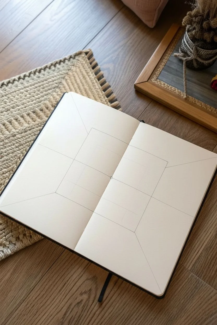
Cozy Room Corner in 1-Point Perspective
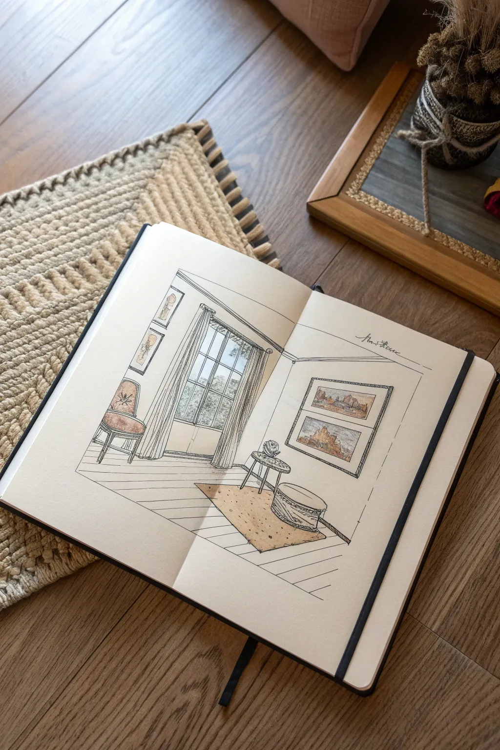
Capture the charm of a sun-drenched interior with this ink and wash study of a cozy corner. This project combines strict 1-point perspective rules with loose, organic line work for a sketchbook page that feels both architectural and inviting.
Step-by-Step
Materials
- Hardbound sketchbook with heavy mixed-media paper
- HB graphite pencil
- Eraser (kneaded preferred)
- Ruler or straight edge
- Fine liner pens (sizes 0.1, 0.3, and 0.5)
- Alcohol markers or watercolors (muted palette: warm grays, ochre, terra cotta)
- White gel pen (optional)
Step 1: Setting the Perspective Framework
-
Establish the horizon line:
Begin by lightly sketching a horizontal line across the middle of your page with your pencil. This represents the viewer’s eye level. -
Mark the vanishing point:
Place a single dot (the vanishing point) on the horizon line, slightly to the left of the center. All receding lines will converge here. -
Draft the back wall:
Draw a rectangle around the vanishing point. The vertical lines should be perpendicular to the horizon, and the horizontal lines parallel to it. This frames the back wall containing the window. -
Extend the room boundaries:
From the corners of your back wall rectangle, draw diagonal lines extending outward towards the edges of the page. These lines create the floor, ceiling, and side walls.
Slanted Furniture?
If your furniture looks like it’s sliding off the floor, check your vertical lines. In 1-point perspective, all vertical lines on furniture must remain perfectly straight up and down.
Step 2: Penciling the Layout
-
Sketch the window structure:
Draw the large window on the back wall. Use vertical lines for the frame and mullions, ensuring the top and bottom of the window frame align horizontally since they face us directly. -
Block in the side wall art:
On the right wall, sketch two rectangular picture frames. Remember to angle the top and bottom edges of these frames so they point directly back to your vanishing point. -
Add left wall details:
Repeat the process for the small vertical frames on the left wall, angling their horizontal edges toward the vanishing point. -
Position the furniture:
Lightly block in the shapes for the chair on the left, the small round table, and the pouf/ottoman. Keep their footprints simple boxes for now to get the scale right. -
Define the floorboards:
Draw the lines for the wooden floor. These should radiate outward from the vanishing point, getting wider as they come closer to the bottom of the page. -
Outline the rug:
Sketch a rectangular shape for the rug on the floor. The side edges should follow the perspective lines radiating from the vanishing point, while the front and back edges remain perfectly horizontal.
Loose but Straight
To get that artistic sketchbook look, draw the main structural lines (walls/windows) with a ruler, but freehand the furniture and decor lines. The contrast makes the drawing feel lived-in.
Step 3: Inking the Scene
-
Ink the structural lines:
Switch to a 0.5 fine liner. Go over the main lines of the walls, floor, and window frame. Use your ruler for a crisp architectural look. -
Detail the furniture:
Use a 0.3 pen to ink the chair, table, and pouf. I like to switch to freehand lines here, making them slightly wavy to suggest fabric and softness rather than rigid wood. -
Add the curtains:
Draw the curtains using long, flowing vertical strokes. Gather them at the top with curved lines to show the fabric bunching up. -
Fill in the artwork:
Using a 0.1 pen, sketch tiny landscapes inside the frames. Keep the details minimal—just hints of mountains or hills are enough at this scale. -
Erase pencil marks:
Once the ink is completely dry, gently erase all your graphite guidelines to clean up the drawing.
Step 4: Adding Color and Texture
-
Wash the floor:
Apply a pale warm gray or beige marker to the floorboards. Leave some white gaps between the lines to act as highlights. -
Color the rug:
Use an ochre or light brown shade for the rug. Add tiny dots with your pen afterward to simulate a woven texture. -
Tint the accents:
Add touches of terracotta or burnt orange to the seat cushion and the artwork inside the frames. Keep the colors muted to maintain a cozy vibe. -
Add shadows:
Use a cool gray marker to add shadows appropriately—under the chair, beneath the table, and inside the window frame to give the drawing depth. -
Final touches:
Inscribe a handwritten note or signature on the right wall space using a elegant script style to balance the composition.
Now you have a charming interior scene preserved in your sketchbook that invites the viewer right into the room
Stippling Landscape With Atmospheric Depth
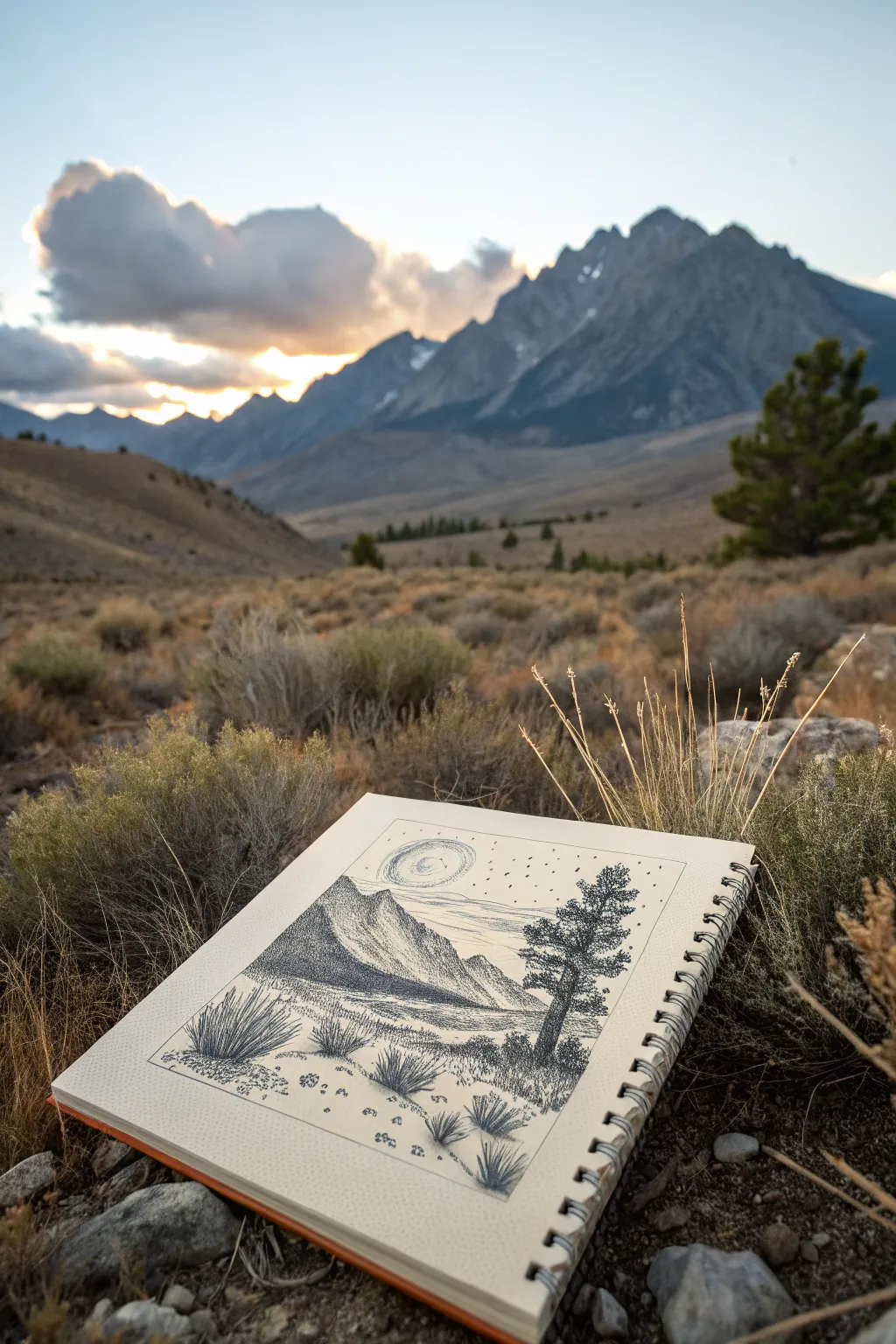
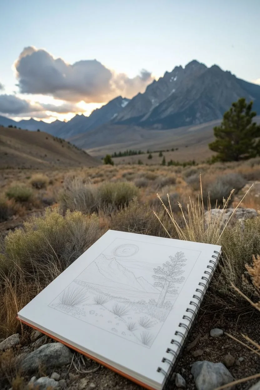
Capture the stark beauty of a high-altitude desert landscape using only black ink and the power of dots. This stippling project uses varying densities of dots to build dramatic mountain shadows and textured foreground scrub brush.
Detailed Instructions
Materials
- Spiral-bound sketchbook (heavyweight paper)
- Fine liner pens (sizes 005, 01, 03, and 05)
- HB graphite pencil
- Soft eraser
- Ruler (optional)
Step 1: Sketching the Composition
-
Define the boundaries:
Begin by drawing a rectangular frame in the center of your page using your pencil. Leaving whitespace around the drawing helps focus the eye and creates a professional finish. -
Outline the mountains:
Lightly sketch the main mountain ridge. Start the slope high on the left side and bring it down towards the right, adding a secondary, lower peak in front to create depth. -
Place the foreground elements:
Sketch the horizon line slightly below the middle of the frame. On the right side, outline the shape of a single conifer tree. In the immediate foreground, lightly mark the positions of three or four large yucca or sagebrush clumps. -
Add the celestial feature:
In the sky above the mountain gap, draw a circle for the sun or moon. Sketch spiral lines radiating outward from it to indicate atmospheric movement or glowing light.
Wrist Fatigue?
Stippling takes time and repetitive motion. If your hand cramps, switch to drawing the linear grass textures for a moment, or take frequent breaks to stretch your fingers.
Step 2: Stippling the Mountains
-
Establish the darkest shadows:
Switch to an 05 fine liner. Begin stippling the shadowed side of the large left mountain. Group your dots very tightly together so they almost merge into solid black, defining the steep, jagged ridge. -
Create a gradient:
As you move down the mountain slope towards the valley floor, space your dots further apart. This transition from dense black to open paper creates the illusion of form and lighting. -
Define the distant peaks:
Use an 01 pen for the mountains further in the background. Keep the stippling lighter and less dense here to simulate atmospheric perspective, making them look further away than the bold foreground peak. -
Texture the valley floor:
Using an 005 pen, add horizontal bands of sparse stippling across the middle ground. This suggests flat land without drawing too much attention away from the main subjects.
Step 3: Inking the Foreground
-
Detail the lone tree:
Use the 03 pen for the tree on the right. Instead of individual leaves, think of the needles as clumps. Stipple dense clusters for the dark undersides of branches and leave the tops lighter. -
Anchor the tree:
Darken the trunk with vertical lines and dense dots, and add a shadow at the base to ground it in the landscape. -
Draw the foreground scrub:
For the yucca plants at the bottom, use quick, upward flicking strokes with an 01 pen rather than just dots. This mimics the spiky texture of the leaves. -
Ground the plants:
Add small patches of stippling underneath each plant clump to create cast shadows. -
Scatter rocky details:
Draw tiny, irregular circles and shapes in the immediate foreground to represent pebbles and rocks, stippling one side of each for shadow.
Pro Tip: Dot Variation
Don’t hold the pen vertically the whole time. Slight angles can change the dot shape. For the gritty ground texture, I sometimes tap a bit harder to make uneven, organic marks.
Step 4: Sky and Finishing Touches
-
Ink the sun spiral:
Using your finest 005 pen, trace the spiral lines around the sun. Keep the dots very light and airy here so the sky doesn’t feel heavy. -
Add atmospheric motion:
Add a few horizontal lines of widely spaced dots across the sky to suggest drifting clouds or wind currents interacting with the peaks. -
Finalize the frame:
Go over your initial pencil frame with a ruler and an 03 or 05 pen to give the drawing a crisp, deliberate border. -
Clean up:
Wait at least 15 minutes to ensure the ink is completely dry, then gently erase all remaining pencil guidelines to reveal the high-contrast ink work.
The patience required for stippling pays off with a wonderfully textured landscape that feels both rugged and serene


Toned Paper Figure With White Highlights
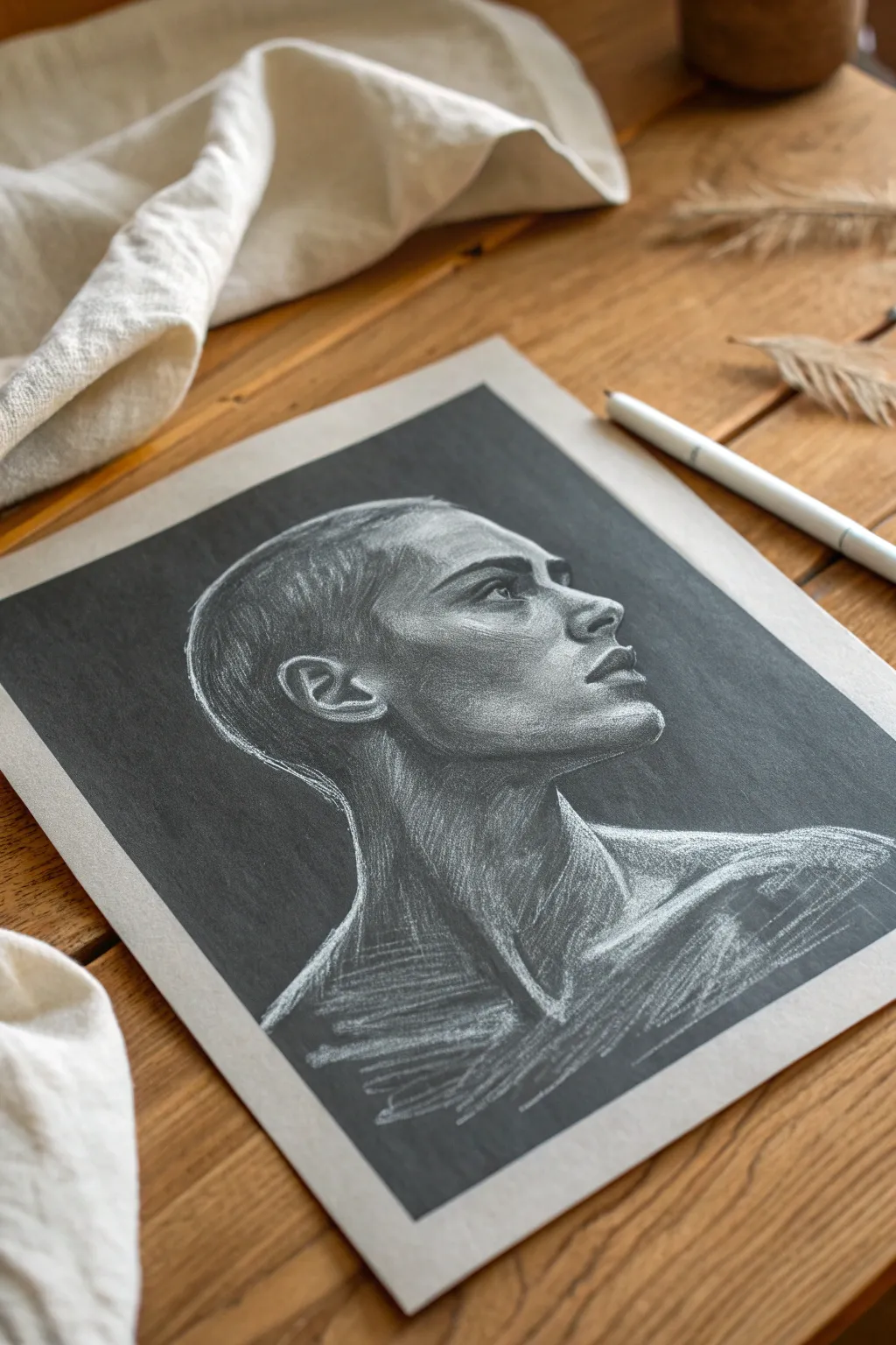
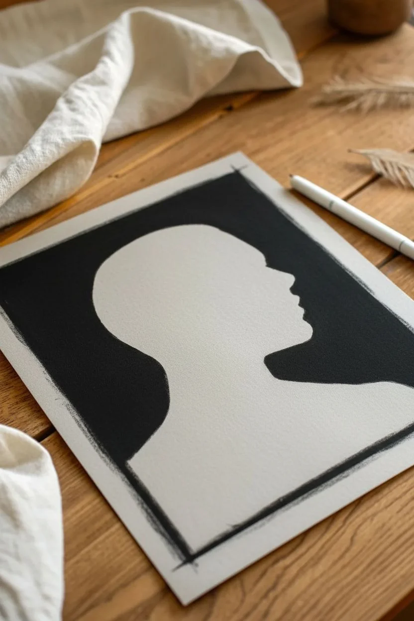
This striking portrait study captures the human form using a technique similar to the classical *trois crayons* method, but simplified to high drama. By working on mid-tone paper and carving out form with deep charcoal blacks and sharp white highlights, you create a sculptural effect that feels incredibly three-dimensional.
Detailed Instructions
Materials
- Toned drawing paper (grey or tan)
- Black compressed charcoal stick or black pastel
- White charcoal pencil or white pastel pencil
- Kneaded eraser
- Blending stump (tortillon)
- Workable fixative
Step 1: Establishing the Ground
-
Define the Frame:
Begin by masking off a rectangular border on your toned paper using artist’s tape if you want crisp edges, or simply draw a loose rectangular boundary. In the reference image, the background is filled in with solid black, creating a ‘night’ scene. Use your compressed black charcoal to fill in this negative space around where the head will be, leaving the silhouette of the head and shoulders as the bare paper tone. -
Refining the Silhouette:
Smoothing out that black background is crucial for the dramatic contrast. Use a blending stump or a soft tissue to push the charcoal into the paper’s tooth, ensuring a deep, matte black field. Clean up the edges of the profile with your kneaded eraser to get a sharp outline before you start drawing the features.
Step 2: Mapping the Shadows
-
Core Shadows:
Switch to your black charcoal pencil or a sharpened edge of the stick. Lightly map out the darkest areas on the face: the hollow of the eye, under the jawline, the side of the neck, and the nostril. Keep your pressure light initially; you can always go darker. -
Building Form:
Start shading the mid-dark tones. Observe how the shadow wrapping around the neck creates a cylindrical volume. Use directional hatching strokes that follow the curve of the muscles—down the neck, across the cheekbone. This hatching texture is a key part of the drawing’s style. -
The Hair texture:
For the short hair, avoid drawing individual strands. Instead, use the side of your charcoal to create a textured, rough tonal value across the top of the head, leaving space for the highlights later. -
Deepening Values:
Return to your darkest areas—the background connection and the deepest crevices of the ear and eye socket. Press harder now to match the intensity of the black background, blending the figure’s shadow side into the black void slightly for a ‘lost edge’ effect.
Muddy Greys?
If white and black mix, you get a dull grey. Keep them separated! Let the paper be the bridge between them. If they touch, lift the area with an eraser and re-apply.
Step 3: Sculpting with Light
-
Initial Highlights:
Now for the magic step. Take your white charcoal pencil and identify the ‘high points’ where the light hits directly: the bridge of the nose, the brow bone, the top of the cheekbone, and the chin. Lay down a soft layer of white here. -
Defining the Gaze:
Place a small, sharp highlight in the eye and on the lower eyelid. This tiny detail instantly brings the subject to life and gives direction to their gaze. -
Neck Muscles:
Draw the tension in the neck muscles (the sternocleidomastoid) using long, sweeping strokes of white. Don’t blend these too much; the visible texture of the pencil strokes mimics the tension of the skin. -
The Hairline:
Use the white pencil to create a halo effect on the top and back of the head. Use short, rhythmic hatching marks to simulate the texture of buzzed hair catching the rim light. -
Intensifying Contrast:
Go back over your brightest spots—the tip of the nose and the lips—with heavier pressure on the white pencil. The goal is to make these areas pop against the grey paper tone.
Color Pop
Add a surreal twist by replacing the white highlights with a neon pastel color like electric blue or pink for a cyberpunk lighting effect.
Step 4: Final Adjustments
-
Mid-tone Management:
Step back and look at your drawing. The grey paper should serve as your middle value. If you have covered too much of it, lift some pigment off with a kneaded eraser to let the paper color breathe through. -
Cross-Hatching Details:
To refine the texture on the skin, you can add very subtle white cross-hatching on the shoulder and chest. This suggests a slightly rougher skin texture or directional lighting without overwhelming the form. -
Edge Control:
Check the silhouette one last time. The white highlight on the profile (nose, lips, chin) should be crisp against the background, while the back of the neck can be softer. -
Shoulder Fade:
Allow the drawing to fade out at the bottom of the chest. Let your pencil strokes become looser and more spaced out, dissolving the figure into the paper tone for an artistic, vignette finish. -
Fixative Application:
Since charcoal and white pastel dust can mix and become grey mud if touched, gently spray a layer of workable fixative over the piece to set the powder in place.
Now step back and admire how just two pencils can create such a powerful sense of volume and mood

Have a question or want to share your own experience? I'd love to hear from you in the comments below!