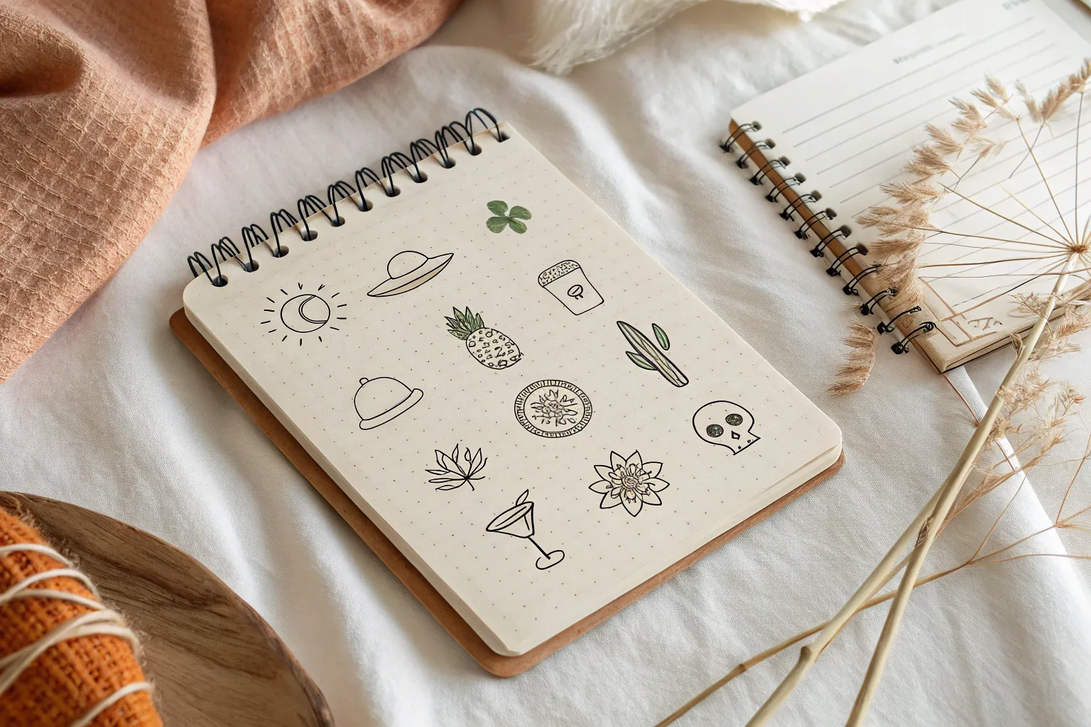
When I’m craving bold shapes and happy details, Mexico drawing ideas always spark a whole page of sketches for me. Think instantly recognizable symbols—folk art motifs, festive decor, and delicious little food doodles you can mix and match into your own style.
Sugar Skull With Floral Details
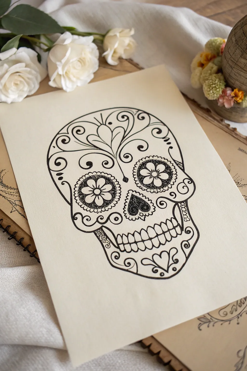
This classic sugar skull design relies on bold, sweeping ink lines and delicate stippling details to achieve its iconic look. Clean blackwork against cream-colored paper creates a striking, high-contrast illustration perfect for Day of the Dead celebrations.
Step-by-Step Tutorial
Materials
- Smooth cream or beige drawing paper (heavyweight cardstock preferred)
- HB pencil
- Kneaded eraser
- Fine liner pen (0.1mm) for details
- Fine liner pen (0.5mm or 0.8mm) for outlines
- Ruler (optional, for symmetry)
Step 1: Sketching the Framework
-
Establish the basic shape:
Start by lightly sketching a large, rounded inverted egg shape for the skull. The top cranium should be wide and round, tapering slightly inward where the cheekbones will sit. -
Add guide lines:
Draw faint vertical and horizontal center lines to help maintain symmetry. This is crucial for keeping the eyes and nose balanced. -
Define the jaw:
Below the cheekbone area, sketch a squared-off U-shape for the jawline. Give it a slight curve inward near the bottom center for the chin. -
Place the features:
Sketch two large circles for the eye sockets, spaced evenly apart. In the center, below the eyes, draw an upside-down heart shape for the nose cavity. -
Sketch the mouth:
Draw a horizontal line across the jaw area where the teeth will go. Sketch small U-shapes above and below this line to indicate the individual teeth.
Shakey Lines?
If your hand shakes while drawing long curves, lock your wrist and move your entire arm from the elbow. This creates smoother, more confident strokes than pivoting from the wrist.
Step 2: Drafting the Design
-
Design the forehead:
At the very center of the forehead, sketch a stylized floral motif that resembles a sprouting plant or heart. Extend scrolling vines outward from this center point toward the temples. -
Embellish the eyes:
Inside each eye socket circle, draw a 5-petal flower. The flower center should be a simple circle. Around the outer rim of the socket, sketch small scallops or petals. -
Add cheek scrolls:
On the cheekbones, draft large swirl designs that curve inward towards the nose. Add simpler spirals or dots near the jawline to fill empty space. -
Chin details:
Sketch a central heart or teardrop shape on the chin, flanked by two smaller scrolls mirrored on either side.
Add Pop of Color
Use colored pencils or markers to fill in just the flower petals inside the eyes and the forehead motif. Teals, marigolds, and magentas look striking against the black lines.
Step 3: Inking the Outline
-
Trace the main skull:
Using your thicker 0.5mm or 0.8mm pen, carefully trace the outer perimeter of the skull. Use confident, single strokes rather than feathery lines for a clean look. -
Ink the major features:
Go over the eye socket circles, the nose cavity, and the teeth outlines with the same thicker pen. Ink the separation line between the upper and lower teeth clearly. -
Refine the scrollwork:
Switch to a slightly thinner pen if desired, or stick with the bold one, to trace the forehead vines, cheek swirls, and chin details. Ensure the curves are smooth and fluid.
Step 4: Adding Texture and Detail
-
Stipple the eyes:
Switch to your 0.1mm fine liner. Inside the eye sockets (but outside the central flower), fill the negative space with tiny stippled dots. Keep the dots dense near the edges and slightly looser near the flower petals. -
Detail the nose:
Fill the inverted heart nose cavity with dense overlapping scribbles or very tight stippling to make it appear dark but textured. Leave a tiny sliver of white space in the center for depth. -
Decorate the petals:
Add tiny lines or dots inside the petals of the eye-flowers. You can also add small dots around the outer scallops of the eyes for a decorative border. -
Texturize the vines:
Thicken specific parts of your vine lines to give them a calligraphy effect—make the curve thicker at its widest point and tapering at the ends. -
Final touches:
Add small accent dots or creating tiny teardrop shapes in any large empty spaces to balance the composition. -
Erase and clean:
Wait at least 15 minutes for the ink to fully cure. Here I prefer to gently dab with the kneaded eraser first to lift graphite before rubbing firmly to remove all pencil marks.
Display your finished illustration in a simple frame to showcase the sharp contrast and intricate line work
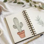
Saguaro Cactus Character Sketch
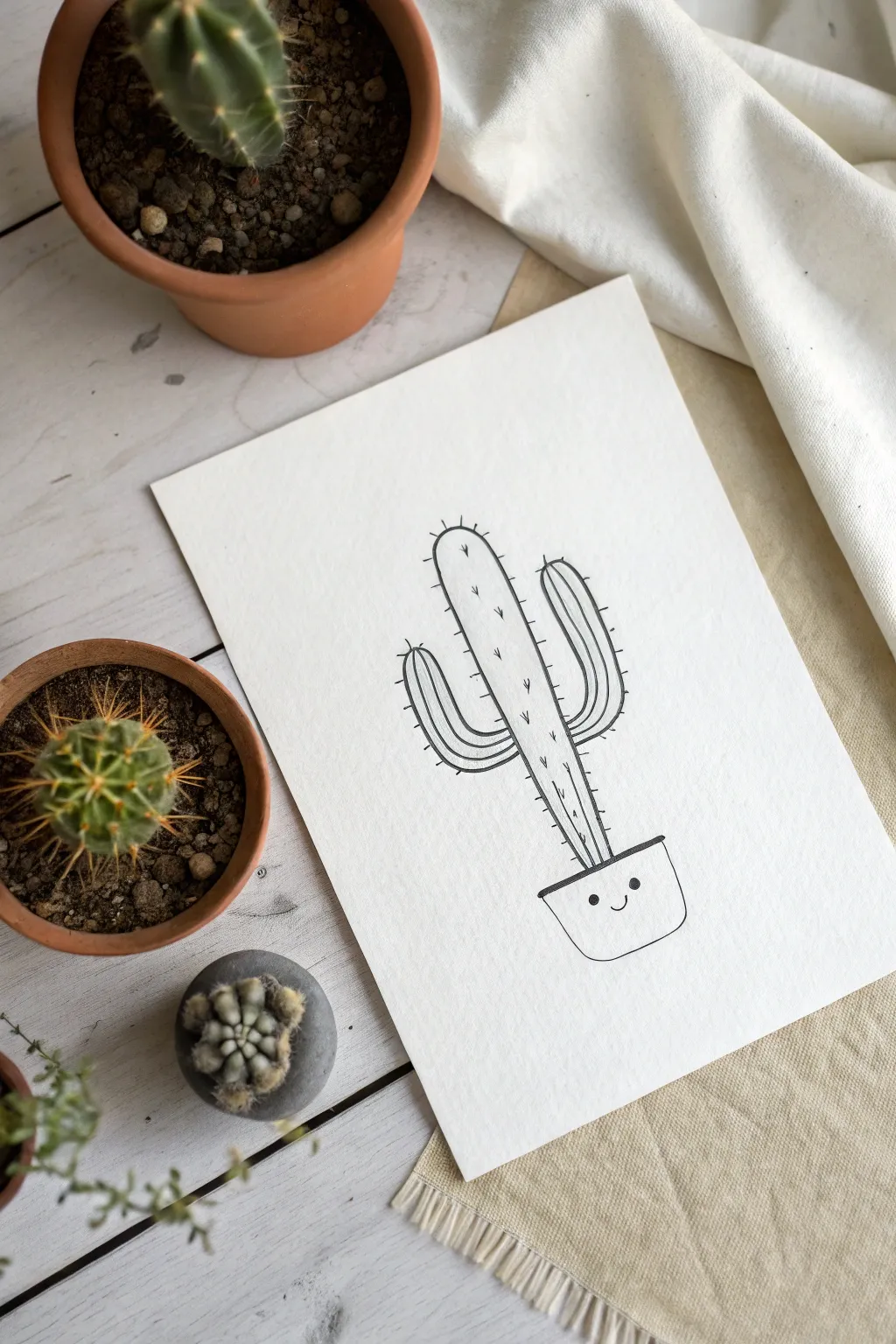
This charmingly minimal drawing captures the playful side of desert flora with clean lines and a friendly face. It’s a perfect beginner project that emphasizes confident ink work and simple character design.
Detailed Instructions
Materials
- High-quality white drawing paper (heavyweight or watercolor paper adds nice texture)
- Pencil (HB or 2B)
- Eraser
- Black fine liner pen (0.5mm or 0.8mm)
- Ruler (optional)
Step 1: Planning the Structure
-
Center layout:
Begin by lightly sketching a vertical centerline on your paper to help keep the cactus upright and balanced. -
Draw the main stem:
Sketch a long, tall oblong shape for the main body of the cactus. It should be rounded at the top and slightly narrower towards the bottom where it meets the pot. -
Add the pot:
At the base of your stem, sketch a simple pot shape. Draw a slightly curved horizontal line for the rim, and a U-shaped curve underneath to form the bowl of the pot. -
Position the arms:
Sketch the left arm first, starting about halfway up the stem. It should curve out and then upwards in an ‘L’ shape. Repeat this on the right side, perhaps positioning it slightly higher or lower for a natural, asymmetrical look.
Loose is Better
Don’t try to make the vertical rib lines perfectly straight. A little wobble creates a more organic, natural texture for the plant.
Step 2: Refining the Lines
-
Refine the pot:
Go over your pot sketch to give it a defined rim. Draw a narrow rectangle at the top of the pot shape to create a lip, turning the basic curve into a proper container. -
Curve the arms:
Soften the connection points where the arms meet the main stem. The transition should look smooth and organic, not like sharp angles. -
Add ribbing lines:
Lightly sketch vertical lines running up the length of the main stem and the arms. These represent the ribs of the cactus. They should follow the curve of the plant’s form. -
Place the face:
In the center of the pot, lightly mark two small dots for eyes and a tiny ‘u’ shape for a smile. Keep it low on the pot for cuteness.
Step 3: Inking the Drawing
-
Outline the main shape:
Switch to your black fine liner. Confidence is key here—trace over your pencil lines for the outer silhouette of the cactus first using a steady hand. -
Ink the ribbed details:
Draw the internal vertical lines on the cactus body and arms. I like to stop these lines just short of the very top and bottom to keep the drawing feeling light and airy. -
Add the spines:
Along the outer edges of the cactus and periodically along the internal rib lines, draw tiny ‘V’ shapes or short ticks. These represent the prickly spines. -
Vary spine direction:
Ensure the spines point slightly outwards and upwards to follow the growth of the plant. -
Ink the pot:
Trace the outline of your pot, making the top rim bold. -
Draw the face:
Carefully fill in the two small circles for eyes completely black. Draw the small smile with a simple, clean curved line.
Add a Bloom
Customize your cactus by drawing a small, simple flower on top of one of the arms or the main head for a pop of extra detail.
Step 4: Final Touches
-
Wait for ink to dry:
Give your drawing a few minutes to ensure the ink is completely set. Smudging at this stage is heartbreaking! -
Erase pencil marks:
Gently erase all the underlying pencil sketches, leaving only your crisp black ink lines. -
Assess line weight:
If needed, go back and thicken the outer outline of the entire cactus slightly to make it pop off the page more.
Now you have a delightful desert friend ready to frame or gift


Marigold Bouquet Motifs
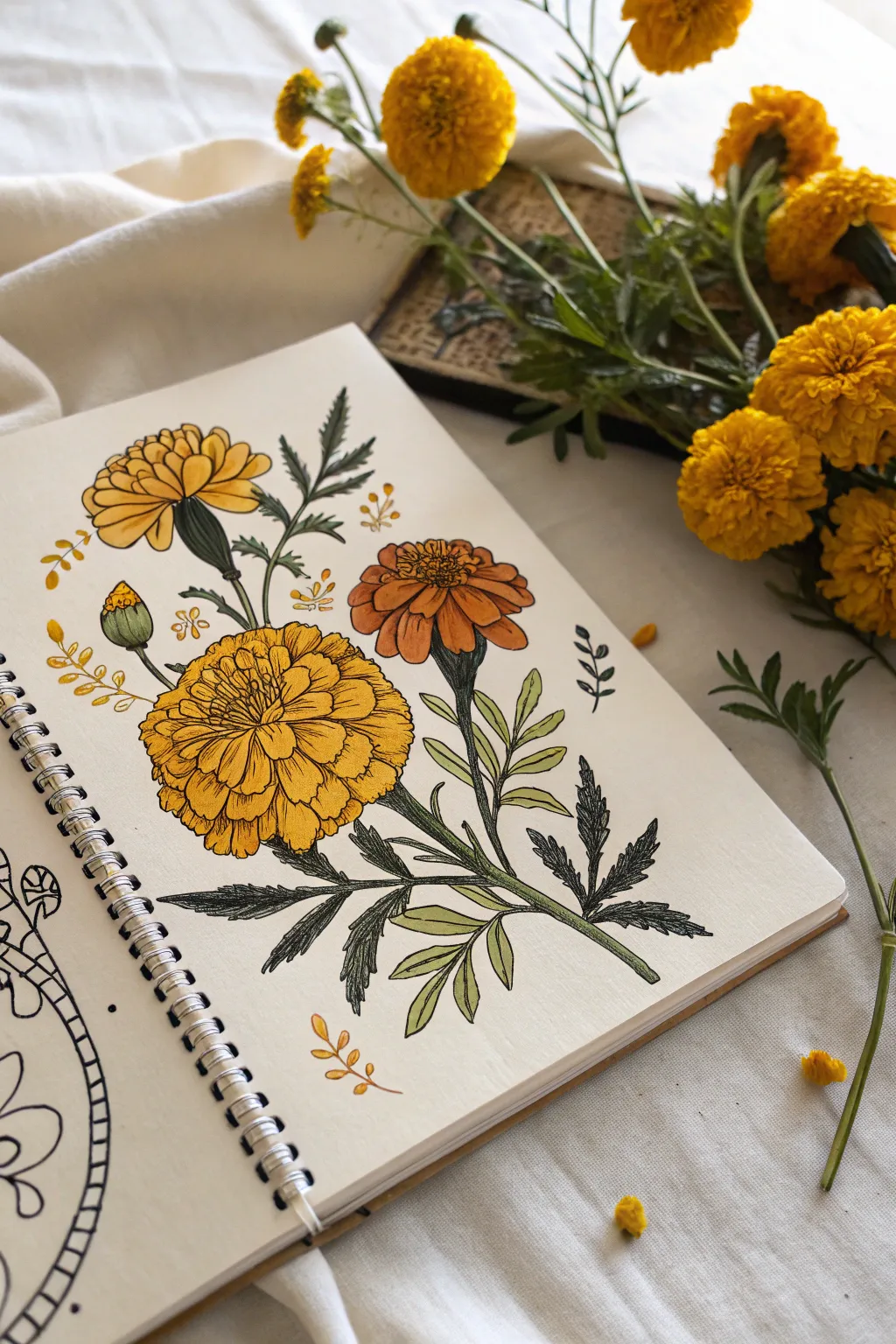
This botanical illustration captures the vibrant spirit of Mexican marigolds using clean linework and warm, saturated colors. It’s a perfect sketchbook exercise that blends precise pen details with loose, organic floral shapes.
Step-by-Step Tutorial
Materials
- Spiral-bound mixed media or watercolor sketchbook
- Fine liner pens (sizes 0.1, 0.3, and 0.5, black)
- Alcohol-based markers or watercolor paints (Yellow, Orange, Amber, Olive Green)
- Pencil (HB or H)
- Kneaded eraser
Step 1: Drafting the Composition
-
Lay out the stems:
Begin with a light pencil sketch to establish the flow of the plant. Draw three main curving lines originating from the bottom center, fanning out slightly as they move upward to create a balanced bouquet shape. -
Position the blooms:
At the top of your rightmost stem, sketch a flattened oval for the side-facing flower. On the central stem, draw a large circle for the main bloom. Add a smaller, slightly tilted circle on the upper left for the third flower. -
Add the bud:
Draw a small tear-drop shape on a short stem protruding to the left of the main cluster to represent the unbloomed bud. -
Sketch the foliage:
Lightly pencil in the jagged, fern-like leaves. Marigold leaves are compound, so draw a central vein with smaller lance-shaped leaflets extending from both sides.
Ink Confidence
Don’t worry if your lines wobble slightly. Marigold petals are naturally ruffled and uneven, so shaky lines actually make the texture look more realistic rather than messy.
Step 2: Inking the Outlines
-
Define the petals:
Using a 0.3 fine liner, start inking the large central flower. Create layers of ruffled, scalloped edges that radiate from the center, giving the bloom its characteristic pom-pom texture. -
Ink the side flowers:
For the upper right flower, draw the petals seen from the side profile, stacking them like a fan. For the yellow flower on the left, focus on the top-down view, keeping the petals tight near the center and looser at the edges. -
Detail the greenery:
Switch to a 0.1 pen for the leaves to keep them delicate. Use jagged, saw-tooth strokes to outline the leaflets, ensuring they look organic and not too stiff. -
Add floating elements:
Draw small, decorative sprigs of tiny leaves or berries floating in the negative space around the main bouquet to fill the page compositionally. -
Erase guidelines:
Wait for the ink to dry completely to avoid smudging, then gently gently remove all pencil marks with your kneaded eraser.
Level Up: Vintage Vibe
To give the page an aged, scientific study feel, use a light beige or cream wash on the background paper before you start drawing, or use toned tan paper from the start.
Step 3: Adding Color
-
Base layer for flowers:
If using markers, lay down a flat wash of bright yellow on the top left flower and a golden yellow on the central bloom. Use a muted orange for the flower on the right. -
Deepening the shadows:
Once the base is dry, go back in with a slightly darker shade of orange or amber. Add these shadows near the center of the flowers and strictly between the petal layers to create depth. -
Coloring the stems:
Use a dark olive green for the main stems and the base of the flower heads (the receptacle). This contrasts beautifully with the warm floral tones. -
Leaf variation:
I like to leave some leaves lighter than others. Color the lower, larger leaves with a deep forest green, but use a lighter, yellowish-green for the smaller leaves near the top.
Step 4: Final Textures
-
Hatching the shadows:
Take your 0.05 or 0.1 pen and add very fine hatching lines to the shaded areas of the petals. This enhances the illustrative ‘botanical plate’ look. -
Texturing the leaves:
Add central vein lines to the green leaves. You can create a darker value on one half of the leaf using dense stippling or hatching to suggest light direction. -
Highlighting the bud:
Add a tiny touch of yellow to the very tip of the green bud to show it is just about to open. -
Decorative accents:
Color the small floating sprigs with a simple golden yellow or light brown to tie the color palette together without distraction.
Now you have a permanent garden of marigolds that captures the warmth of Mexico on your page


Talavera-Style Tile Patterns
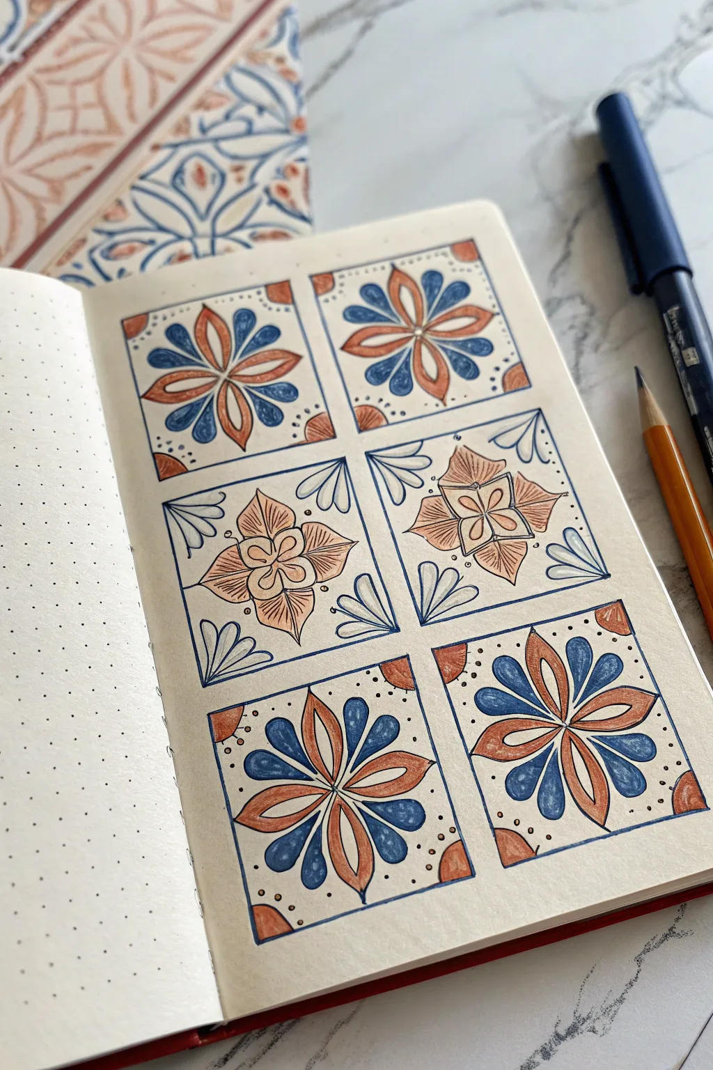
Capture the charm of Mexican ceramic artistry with this structured yet hand-drawn tile pattern. Using simple geometric shapes and a limited color palette of terracotta and indigo, you’ll create a cohesive grid that mimics traditional Talavera tiles.
Step-by-Step Tutorial
Materials
- Dot grid notebook or loose dot grid paper
- Fine liner pen (0.3mm or 0.5mm, black or dark blue)
- Ruler
- Pencil and eraser
- Colored pencils or fine tip markers (Terracotta/Burnt Orange)
- Colored pencils or fine tip markers (Indigo/Navy Blue)
Step 1: Setting the Structure
-
Establish the grid:
Begin by counting your dots to create six equal squares arranged in two columns of three. A 6×6 or 8×8 dot size per square works well, leaving a small gap (1-2 dots) between each tile to serve as ‘grout’ lines. -
Draft the borders:
Use your ruler and pencil to lightly draw the outlines of your six squares. Keep the pressure light so these lines can be erased or traced over later. -
Inking the frames:
Switch to your fine liner pen. Trace over your pencil grid lines to permanently define the six boxes. You can double-line the borders if you want a thicker, more definitive edge for each tile.
Wobbly Lines?
Don’t stress if your lines aren’t perfectly straight. Traditional tiles are hand-painted and often have imperfections. Wobbly lines actually add authentic rustic character.
Step 2: Designing the Corner Patterns (Top & Bottom Rows)
-
Find the center:
Focusing on the four corner tiles (top-left, top-right, bottom-left, bottom-right), lightly mark the exact center point of each square with your pencil. -
Sketch the primary petals:
Draw an eight-petaled flower radiating from the center. Start with four long, slender petals pointing to the corners, then add four slightly shorter, rounder petals in the spaces between them (pointing up, down, left, and right). -
Add corner details:
In the empty space remaining in the four corners of these tiles, draw a small quarter-circle accent. This looks like a tiny sun rising from the corner of the box. -
Ink the floral designs:
Carefully trace your pencil sketches with the fine liner. Add a line down the center of each long petal for extra detail, and add small dots within the corner quarter-circles. -
Erase guidelines:
Wait a moment for the ink to dry completely, then gently erase all remaining pencil marks within these four squares to reveal a clean black-and-white design.
Step 3: Designing the Center Patterns (Middle Row)
-
Reference material:
For the middle two tiles, recreate the distinct design shown in the reference image. Start by drawing a small four-lobed flower in the very center. -
Expand the motif:
Surround the small center flower with a larger diamond shape or four larger, leaf-like petals that extend toward the midpoints of the square’s edges. -
Fill the corners:
Instead of quarter-circles, draw three teardrop shapes fanning out from each corner of the square, pointing inward toward the center flower. -
Final inking:
Trace these middle designs with your fine liner. The variation in pattern here breaks up the repetition and adds visual interest to the page.
Make It a Border
Take this concept out of the grid! Use the corner tile pattern (the 8-petal flower) repeatedly in a single horizontal row to create a gorgeous decorative page divider.
Step 4: Applying Color
-
Color code strategy:
Select your terracotta orange and indigo blue markers or pencils. Traditional Talavera pottery relies heavily on this specific high-contrast pairing. -
Corner tiles: Orange step:
On the top and bottom rows, color the four long, slender diagonal petals with the terracotta shade. I also like to color the small corner quarter-circles with this same orange. -
Corner tiles: Blue step:
Fill in the remaining four cardinal petals (top, bottom, left, right) with the indigo blue. Leave the background of the tile white. -
Middle tiles: Orange step:
For the two middle tiles, color the large central petals or diamond shape with the terracotta orange. Use a light hand to layer the color if you want a softer, textured look. -
Middle tiles: Blue accents:
Use the blue to color in detail lines or small accents within the corner fan shapes, keeping the majority of these shapes white or very lightly shaded. -
Final touches:
Review your grid. Add tiny stippling dots in the background of any tile that feels too empty, or darken the border lines of the grid one last time to make the tiles pop.
You now have a vibrant page of faux-ceramic art that brings a warm, artisanal feel to your sketchbook.
BRUSH GUIDE
The Right Brush for Every Stroke
From clean lines to bold texture — master brush choice, stroke control, and essential techniques.
Explore the Full Guide
Sun Symbol in Ancient-Inspired Shapes
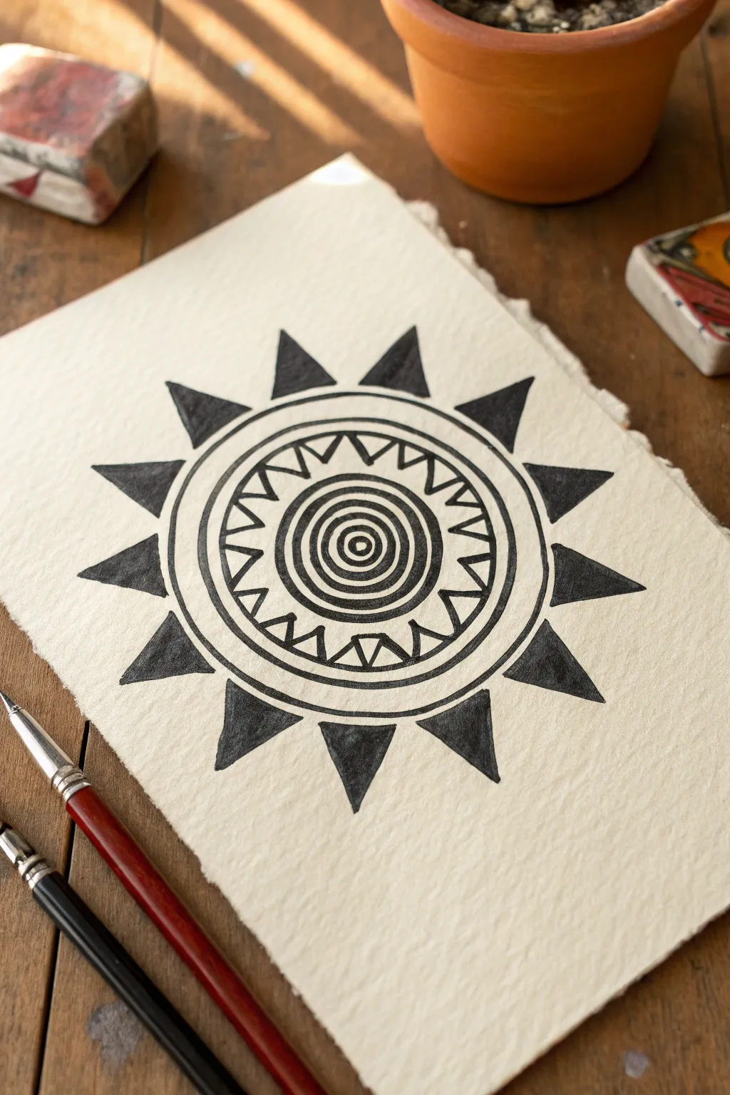
Create a bold geometric sun symbol inspired by ancient Mexican motifs using simple circles and sharp triangles. This high-contrast artwork relies on precise black ink work against textured paper to achieve distinct, historic feel.
How-To Guide
Materials
- Cold press watercolor paper or heavy textured cardstock
- Compass or circle stencils
- Ruler
- Pencil
- Eraser
- Black India ink or high-quality black gouache
- Fine liner pen (black, 0.5mm)
- Round brush (size 2 or 4)
- Small flat brush (optional)
Step 1: Drafting the Foundations
-
Establish the center:
Begin by finding the exact center of your paper. Make a small mark with your pencil to serve as the anchor for your compass. -
Draw the core rings:
Using your compass, draw a very small circle in the center, followed by three slightly larger concentric circles around it. These should be spaced relatively close together to create the ‘bullseye’ at the heart of the sun. -
Add the middle channel:
Widen your compass significantly and draw two circles with about a half-inch of space between them. This channel will house the sawtooth pattern later. -
Create the outer boundaries:
Extend the compass again to draw the final, largest circle that will define the limit of the main round body. Draw one more line just inside it to create a thick outer rim. -
Sketch the inner zig-zags:
Inside the middle channel you created earlier, lightly sketch a continuous zig-zag line. The points should touch the inner and outer boundary lines of that channel, forming a series of connected triangles. -
Plot the solar rays:
Around the outermost circle, lightly mark 12 evenly spaced points. Draw large, sharp triangles radiating outward from the circle’s edge, using these points as the tips. These are the main sun rays.
Steady Hand Trick
To keep concentric circles perfect while painting, rotate the paper slowly with one hand while holding your brush hand still in one position.
Step 2: Inking the Design
-
Outline the center:
Switch to your fine liner pen. Carefully trace the four smallest central circles. I like to keep my hand steady by resting my wrist on a scrap piece of paper so I don’t smudge the pencil. -
Define the zig-zags:
Ink the zig-zag pattern in the middle ring. For clarity, add a tiny solid triangle inside each ‘V’ shape of your zig-zag, pointing inward toward the center. -
Trace major circles:
Go over the remaining circular pencil lines with your pen. Ensure lines are consistent in thickness; if using a nib pen, maintain even pressure. -
Outline the rays:
Trace the 12 large outer triangles. Use a ruler here if you want perfectly straight edges, or freehand it for a slightly more organic, ancient look. -
Erase guidelines:
Wait until the ink is completely dry to the touch. Gently erase all visible pencil marks so you have a clean slate for filling in the black areas.
Aged Artifact Look
Stain your paper with strong black tea or thin coffee and let it dry before you start drawing to give your artwork an ancient parchment appearance.
Step 3: Filling and Finishing
-
Fill the center bullseye:
Dip your round brush into the black ink or gouache. Carefully fill in the alternating rings of the central bullseye, leaving the paper white for the contrast rings. -
Darken the secondary details:
Using the very tip of your brush or a thicker pen, fill in the small decorative triangles you drew inside the zig-zag ring. -
Create the heavy rim:
Fill in the space between the two outermost concentric circles to create a thick, bold black band that encases the whole inner design. -
Fill the sun rays:
Move to the outer triangles. Use your brush to fill each geometric ray with solid black. Start at the wide base and pull the paint toward the sharp point for a crisp tip. -
Refine edges:
Inspect your edges. If the brushwork looks a bit rough, go back with your fine liner pen to crisp up the points of the triangles and smooth out the curves of the circles. -
Final drying:
Let the artwork sit undisturbed until the heavy black areas lose their wet sheen. This ensures deep, opaque coverage without smearing.
Display your striking sun symbol on a shelf or frame it for a touch of historical warmth.
Hand-Lettered “México” With Icons
This elegant yet playful notebook spread captures the vibrant spirit of Mexico through clean typography and charming nature doodles. Using a mix of warm oranges and desert greens, this design is perfect for starting a travel journal or celebrating Mexican heritage with simple, impactful illustrations.
Step-by-Step
Materials
- Spiral-bound notebook or sketchbook (mixed media paper preferred)
- Black fineliner pens (sizes 0.3mm and 0.5mm)
- Colored pencils (sage green, forest green, warm orange, burnt sienna)
- Pencil (HB or H for sketching)
- Eraser (kneaded eraser works best)
- Ruler
Step 1: Drafting the Typography
-
Establish guidelines:
Begin by using your ruler and pencil to draw two light, horizontal parallel lines across the center of your page. These will define the height of your letters. Leave plenty of breathing room above and below for the illustrations. -
Block out the letters:
Lightly sketch the word “MÉXICO” in tall, narrow block letters. Ensure the ‘M’ and ‘O’ are slightly wider than the other characters. Don’t forget the accent mark over the ‘E’. -
Add serifs:
Refine your block letters by adding small triangular serifs to the ends of the strokes. Look closely at the ‘E’—the central bar gets a unique diamond-point finish. -
Draw the shadow:
Sketch a drop shadow on the left side of each vertical stroke. This should be a thin sliver that sits just slightly disconnected from the main letter body, giving it a dimensional feel. -
Ink the outline:
Using your 0.5mm black fineliner, carefully trace over your pencil lines for the main letters. For the accent mark, simply draw a single bold stroke.
Step 2: Adding the Illustrations
-
Position the main elements:
Switch back to your pencil to place the major decorative elements. Sketch a small round cactus on the top left and a tall, thin cactus directly below the ‘M’. Place a large floral bloom on the bottom right. -
Sketch the foliage:
Draw flowing, leafy vines. Place a long one curving over the top of ‘MÉXICO’ and another mirroring it along the bottom. Add smaller leaf sprigs and a tiny cactus to the top right to balance the composition. -
Ink the nature doodles:
Go over your illustration sketches with the thinner 0.3mm fineliner. Keep your lines slightly loose and organic rather than rigid. Add tiny dots or lines on the cacti to represent spines. -
Erase guidelines:
Once the ink is completely dry—I usually wait at least five minutes to be safe—gently erase all your pencil marks, leaving a clean black-and-white design.
Uneven Letter Spacing?
Count the letters (6) and find the center. Start by drawing the ‘X’ and ‘I’ first in the middle of the page, then work outward to the left and right.
Step 3: Color and Details
-
Fill the letter shadows:
Take your burnt sienna or rusty orange colored pencil and fill in the thin shadow gaps you created on the left side of the letters. Press firmly to get a saturated, opaque look. -
Color the cacti:
Use the sage green and forest green pencils for the cacti. Vary the pressure: color the bodies solidly but perhaps leave small white highlights to show roundness. Use the darker green for contrasting elements like the tiny cactus arms. -
Brighten the blooms:
Color the flower petals with your warm orange pencil. For the centers, use a dark brown or heavy circular strokes with black ink to create contrast. -
Leafy green accents:
Fill in the vines and leaf sprigs with your greens. You can alternate between light and dark green on different leaves within the same vine for visual interest. -
Final stippling:
To finish the page, use your 0.1mm or 0.3mm pen to add tiny random dots (stippling) scattered around the illustrations. This adds texture and fills the negative space without cluttering it.
Add Gold Accents
Make the page pop by using a metallic gold gel pen for the stippled dots or to outline the accent mark on the ‘E’ for a touch of festivity.
Now you have a beautifully balanced title page ready to document your Mexican adventures or cultural research

PENCIL GUIDE
Understanding Pencil Grades from H to B
From first sketch to finished drawing — learn pencil grades, line control, and shading techniques.
Explore the Full Guide
Alebrije-Inspired Creature Mashup
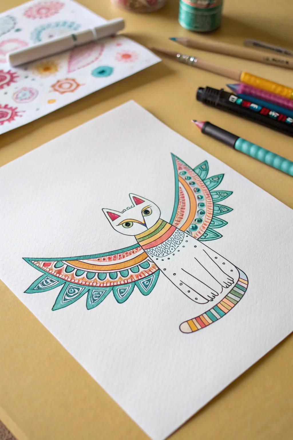
This project combines the sleek form of a cat with the vibrant, fantastical elements found in traditional Mexican Alebrijes. You’ll create a charming creature featuring bold patterns, a rainbow-striped tail, and magnificent wings, all brought to life with crisp linework and bright colors.
Step-by-Step Guide
Materials
- Heavyweight drawing paper or mixed media paper (light texture is great)
- Fine-liner pen (black, 0.3mm or 0.5mm)
- Colored pencils (teal, orange, yellow, pink, green, brown)
- Graphite pencil (HB or 2B)
- Eraser
- Pencil sharpener
Step 1: Sketching the Base Form
-
Lightly sketch the body:
Start with a simple, elongated oval shape for the cat’s body. Instead of a realistic crouch, angle the body slightly upright, almost like a sitting pose but simpler. -
Add the head:
Draw an inverted, rounded triangle shape on top of the body for the head. Add two prominent pointed ears at the top corners. -
Draft the wings:
Extend two large, sweeping curves from the shoulder area. The wings should be symmetrical, fanning out horizontally. Think of them like fan blades opening up. -
Outline the tail:
From the bottom right of the body, sketch a thick, curving tail that wraps slightly upward, ending in a rounded tip. -
Define facial features:
Place two almond-shaped eyes widely apart. Draw a V-shape from the forehead down to the nose area to create a mask-like effect, typical of Alebrije designs.
Uneven Wing Symmetry?
If one wing looks bigger, don’t erase! Alebrijes are whimsical. Just add slightly thicker outlines or more intricate patterns to the smaller wing to balance the visual weight.
Step 2: Inking the Lines
-
Trace the main outline:
Using your fine-liner pen, carefully go over your pencil lines. Keep the lines smooth and confident. Don’t worry if they aren’t perfectly straight; a little hand-drawn character adds to the folk art feel. -
Detail the wings:
Divide the wings into sections. Draw a long arc parallel to the top edge of the wing. Below that, add a row of scalloped semi-circles (feathers) along the bottom edge. -
Add decorative patterns:
Inside the top strip of the wing, draw small circles or dots. In the scalloped feathers, add small triangles or teardrop shapes. -
Segment the tail and neck:
Draw horizontal bands across the tail to create stripes. Do the same for the neck area to give the cat a colorful ‘collar’ or chest pattern. -
Inking the fur texture:
On the upper chest, just below the collar, add some tiny stippling dots or small squiggles to suggest texture without drawing individual hairs. -
Erase pencil marks:
Once the ink is completely dry (wait a minute to avoid smudges!), gently erase all the underlying graphite sketch lines.
Layering for Pop
For brighter colors, lay down a base of white colored pencil first, even on white paper. It creates a waxy surface that makes the subsequent colors sit on top more vibrantly.
Step 3: Adding Vibrant Color
-
Color the wings teal:
Use your teal colored pencil to fill in the bottom scalloped feathers. Leave the decorative teardrops inside them white or color them a lighter shade. -
Add warmth to the wings:
Color the upper strip of the wing with orange and yellow. I find that alternating these warm tones creates a nice rhythm against the cool teal. -
Stripe the tail:
Fill in the tail bands with a repeating rainbow sequence—pink, orange, yellow, green, teal. Press firmly to get saturated color. -
Color the collar:
Match the neck stripes to the tail colors, using horizontal bands of yellow, green, and pink. -
Face and ear details:
Color the insides of the ears pink. Use a touch of yellow or green for the eyes, and add a small black pupil with your pen if you haven’t already. -
Final shading touches:
Very lightly shade the edges of the white body with a soft grey or pale brown to give it a little dimension, so it doesn’t look completely flat.
Now you have a unique fantastical creature ready to guard your sketchbook


Have a question or want to share your own experience? I'd love to hear from you in the comments below!