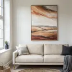
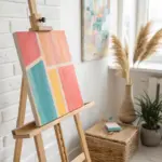
If you’re craving that mid-century modern vibe—clean lines, playful shapes, and optimistic color—painting it yourself is honestly the most fun way to get there. I pulled together my favorite mid century modern painting ideas that feel classic first, then get progressively more bold and experimental.
Bold Geometric Color Blocks
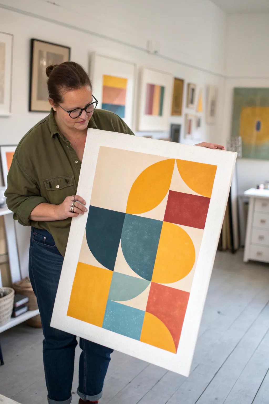
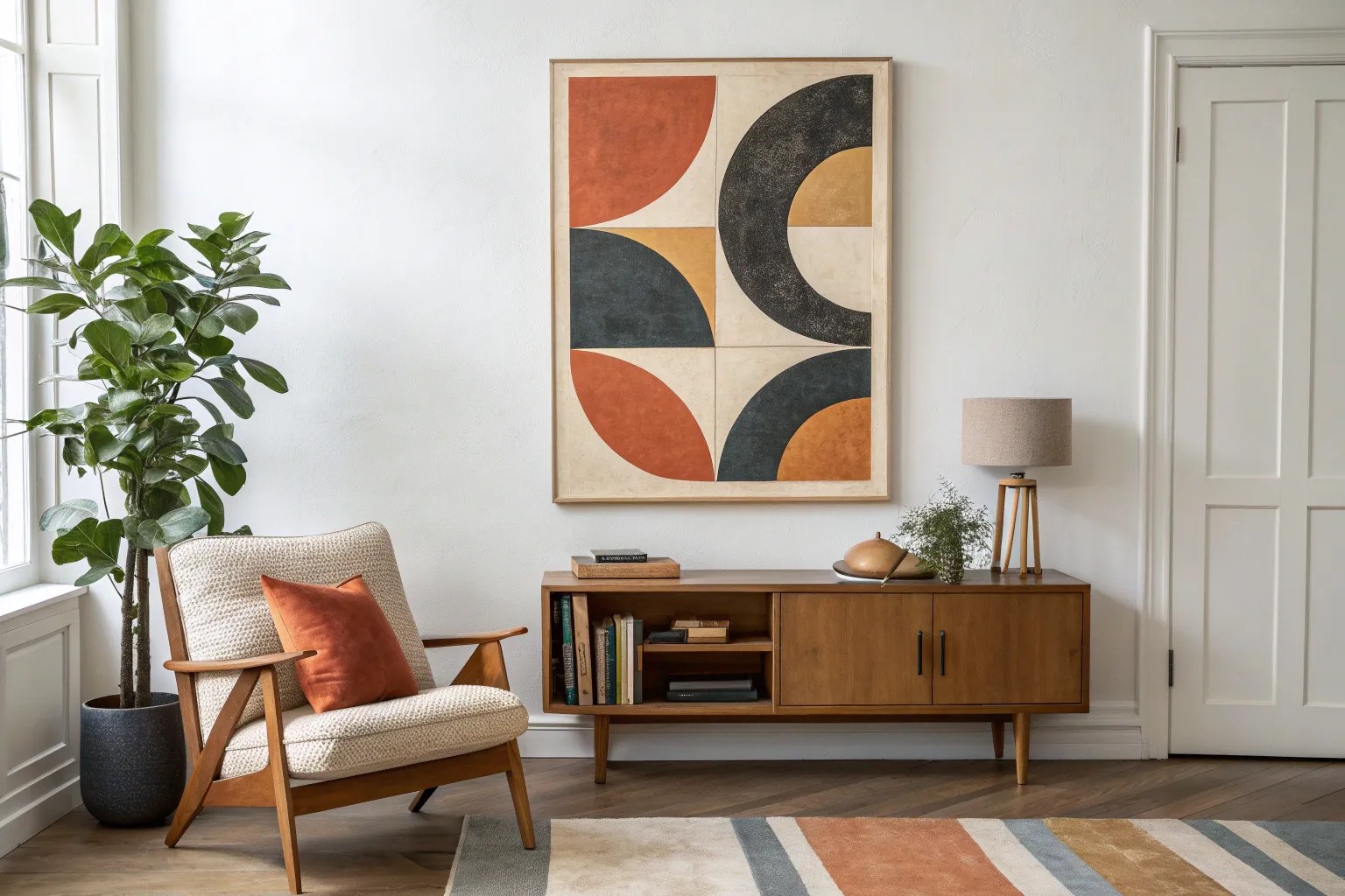
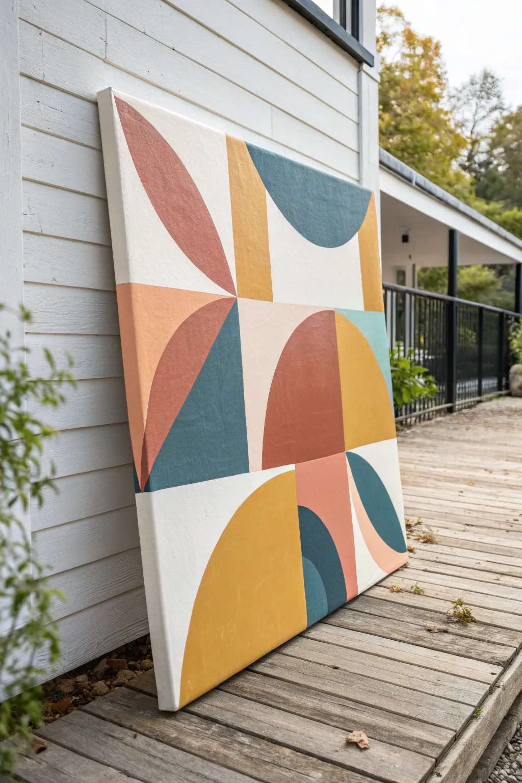
Capture the spirit of mid-century design with this striking composition of interlocking semicircles and squares. The warm palette of mustard, teal, and terracotta creates a retro aesthetic that instantly warms up any creative space.
Step-by-Step Tutorial
Materials
- Large heavy-weight watercolor paper or canvas panel (approx. 24×36 inches)
- Wide masking tape or painter’s tape
- Acrylic paints (Mustard Yellow, Deep Teal, Terracotta/Burnt Orange, Deep Red, Cream/Off-White)
- Ruler or T-square
- Compass with extension arm or a circular stencil set
- Pencil and eraser
- Flat synthetic brushes (various sizes for filling blocks)
- Palette knife (optional, for mixing)
- Mixing palette
- Cup of water and paper towels
Step 1: Planning the Layout
-
Prepare the surface:
If you are using a canvas panel or heavy paper, start by taping down the edges to a flat work surface to prevent warping. Paint the entire surface with a base coat of the Cream/Off-White shade to establish the negative space color seen between the shapes. -
Create a grid:
Using your T-square and pencil, lightly draw a 3×4 grid on your surface. Leave a wide margin around the edges to frame the composition, similar to the white border in the image. -
Sketch the geometric forms:
Within your grid squares, begin mapping out the shapes. The design alternates between full squares, quarter-circles, and half-circles. Use your compass to ensure the curves are perfectly smooth and consistent in radius. -
Double-check the balance:
Step back and verify your sketch against the reference image. Note how the shapes interact—the top right features a quarter circle next to a square, while the bottom left anchors the piece with a solid block.
Bleeding Edges?
If paint bleeds under your tape, seal the tape edge first with a thin layer of your base color (white/cream). Let it dry, then paint your color.
Step 2: Applying Color
-
Mix your palette:
Prepare your acrylics. You’ll need a substantial amount of the mustard yellow and deep teal, as these are dominant. Mixing a tiny bit of white into the teal gives it that chalky, vintage matte look. -
Tape for crisp lines:
To achieve the sharp edges characteristic of hard-edge painting, apply masking tape along the straight lines of your first shape. Press the tape edges down firmly with your fingernail. -
Paint the yellow shapes:
Start with the Mustard Yellow. Fill in the large central leaf-shape (composed of two opposing curves) and the bottom-left rectangle. Use a flat brush and apply two thin coats rather than one thick one for even coverage. -
Add the terracotta tones:
Move on to the warm reds. Paint the deep red square in the middle-right section and the softer terracotta quarter-circle at the bottom right. I find it helpful to let adjacent colors dry completely before painting next to them so they don’t bleed. -
Fill the cool tones:
Apply the Deep Teal to the semi-circle on the left and the central geometric shape. Ensure the curve meets the straight lines cleanly. -
Detail the lighter blues:
Mix a lighter, muted blue-green for the small quarter-circle accent near the bottom. This lighter variation adds depth to the teal section without introducing a completely new hue.
Add Dimension
Mix a tiny amount of texture paste or sand into your acrylics. This adds physical grit to the shapes, mimicking the look of felt or rough paper collage.
Step 3: Refining and Finishing
-
Remove tape carefully:
Once the paint is dry to the touch but not fully cured, slowly peel back the masking tape at a 45-degree angle. This prevents the paint from chipping at the edges. -
Touch up edges:
Inspect your lines. If any paint bled under the tape, use a small detail brush and your Cream base color to tidy up the straight edges and sharpen the intersections. -
Refine the curves:
Freehand boundaries on curved shapes can be tricky. Use a very small flat brush or an angled shader brush to smooth out the arc of your circles if they look a bit shaky. -
Create texture (optional):
The original image has a slightly textured, organic feel. You can replicate this by lightly dry-brushing a slightly lighter shade over the solid blocks to break up the flat color. -
Seal the artwork:
Once completely dry, apply a matte varnish to protect the paint and unify the sheen across all colors, enhancing that vintage poster effect.
Hang your new geometric masterpiece in a simple wooden frame to complete the mid-century modern vibe

Biomorphic “Kidney” Shape Abstract
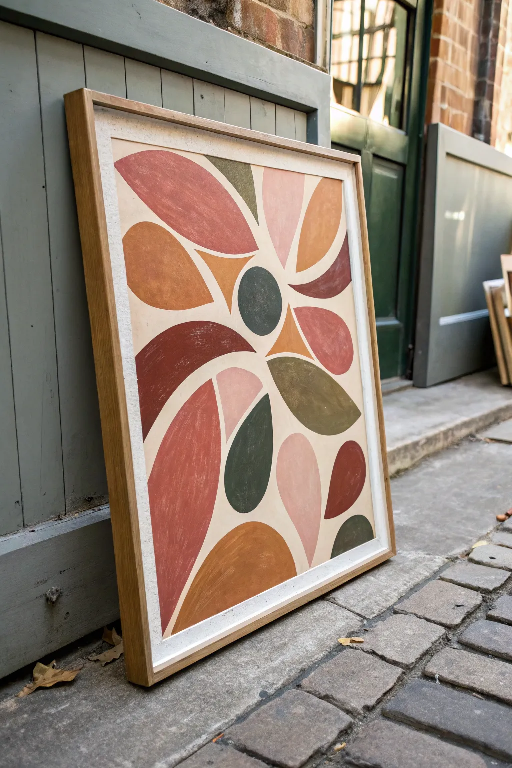
Embrace the organic warmth of mid-century aesthetics with this abstract biomorphic composition. Featuring a palette of terracotta, olive, and dusty pink, these fluid petals radiate outward to create a harmonious and grounded statement piece for any room.
How-To Guide
Materials
- Large watercolor paper (heavyweight, cold press, approx. 18×24 inches)
- Acrylic paints (terracotta, olive green, dusty rose, burnt sienna, ochre, cream/beige)
- Pencil (HB or H)
- Eraser
- Round synthetic brushes (sizes 4, 8, and 12)
- Flat brush (1 inch) for background
- Palette or mixing plate
- Water cups
- Painter’s tape
- Ruler (optional)
- Oak frame (custom or store-bought)
Step 1: Preparation & Composition
-
Prepare your surface:
Begin by securing your large watercolor paper to a clean, flat work surface using painter’s tape along all four edges. This prevents buckling and creates a crisp white border if you choose to paint the background color fully. -
Sketch the center:
Lightly sketch a small, imperfect circle slightly off-center on the paper. This will act as the anchor point for your radiating shapes. -
Draw the primary petals:
Around your central circle, sketch large, teardrop-like ‘petal’ shapes extending outward. Vary their sizes—some should be long and sweeping, others shorter and stouter. Keep lines loose and curved. -
Fill the gaps:
Looking at the negative spaces between your primary petals, draw smaller, curved shapes or ‘fillers’ that nestle in the gaps. Think of puzzle pieces that don’t quite touch. -
Refine the composition:
Step back and assess the balance. Some shapes should extend near the edge of the paper. I like to lightly erase and re-draw lines until the flow feels organic rather than rigid. -
Paint the background:
Mix a large amount of cream or very pale beige acrylic paint. Using your wide flat brush, paint the entire background, carefully cutting in around your pencil sketches. Two coats ensure a solid, matte finish.
Smooth Operator
To avoid visible brushstrokes in your shapes, add a drop of flow improver or water to your acrylics. This helps the paint self-level for a flat, print-like finish.
Step 2: Color Blocking
-
Mix your palette:
Prepare your acrylic colors: terracotta, olive green, dusty rose, golden ochre, and deep burnt sienna. Adding a touch of white to each can give them a slightly chalky, vintage matte look. -
Start with the darkest tones:
Using a size 8 round brush, paint the central circle and a few selected petals in your darkest olive or slate green. Focus on smooth, confident strokes to fill the shape. -
Apply the warm reds:
Switch to your terracotta and burnt sienna shades. Paint the large, dominant petals. Use the size 12 brush for big areas and the size 4 brush to tidy up the points. -
Add soft contrast:
Fill remaining shapes with dusty rose and golden ochre. The key is to distribute the colors so no two shapes of the same color are touching. -
Check for opacity:
Let the first layer dry completely. If you can see brushstrokes or the background poking through, apply a second coat to achieve that solid, graphic look typical of mid-century art.
Texture Play
Instead of flat paint, mix baking soda into your acrylics before applying. This creates a gritty, plaster-like texture that adds incredible physical depth to the shapes.
Step 3: Finishing Touches
-
Clean up edges:
Using your smallest detail brush and the background cream color, touch up any areas where the colored shapes might have accidentally overlapped or wobbled. -
Create texture (optional):
For a more vintage, weathered feel, you can very lightly dry-brush a tiny amount of a lighter shade over the centers of the larger petals. -
Let it cure:
Allow the painting to dry overnight to ensure all thick acrylic layers are hardened. -
Clean the margins:
Once fully dry, slowly peel away the painter’s tape at a 45-degree angle to reveal clean paper edges. -
Mount and frame:
Place your artwork into a natural oak frame. The light wood tone complements the earth tones of the paint perfectly, completing the mid-modern vibe.
Hang your new masterpiece in a well-lit spot to let those warm earth tones truly glow

Atomic Starburst and Orbit Lines
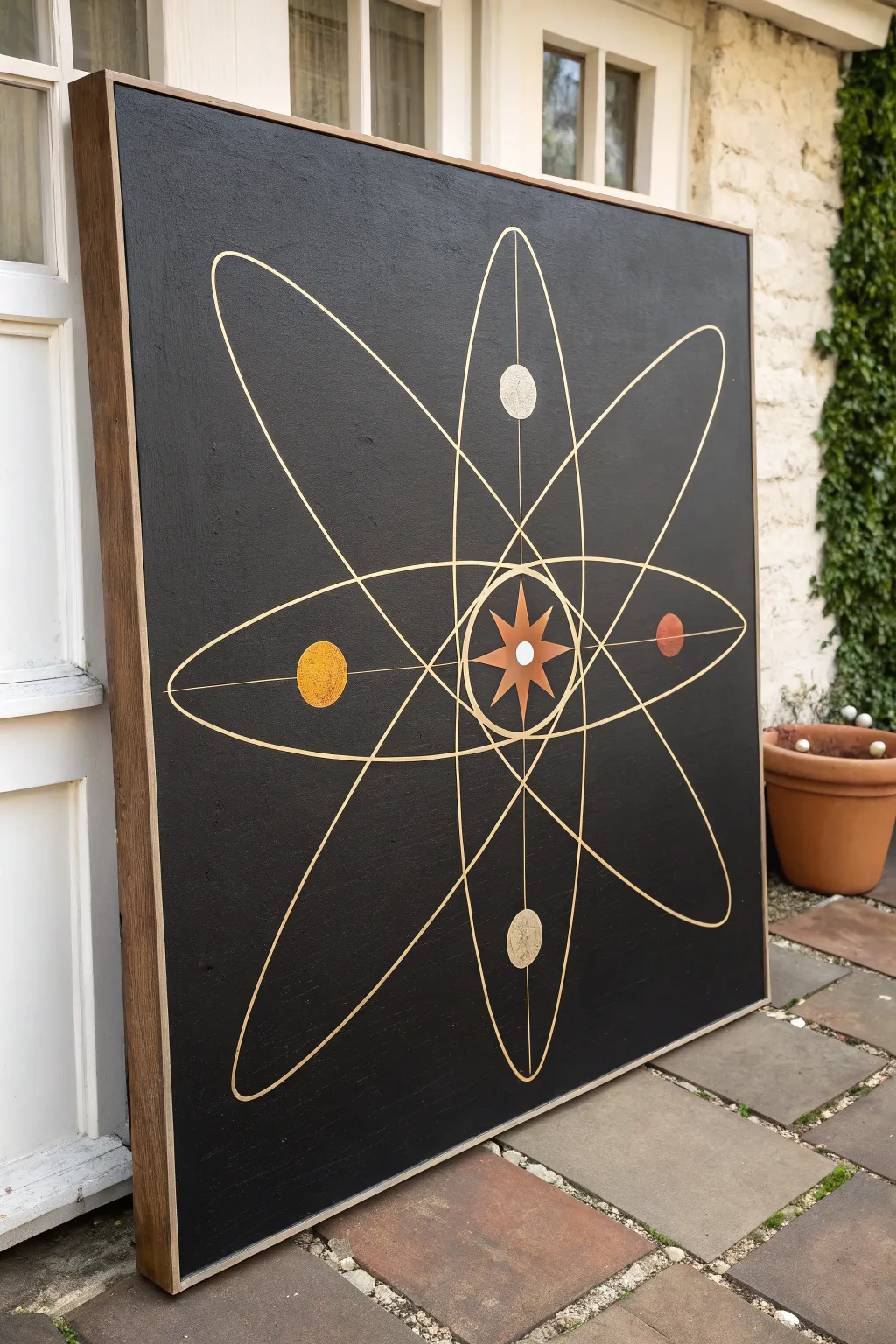
Capture the optimism and energy of the Space Age with this striking mid-century modern atomic art piece. Featuring precise orbit lines and a central starburst on a stark black background, this large-scale painting makes a bold, sophisticated statement in any room.
Step-by-Step Guide
Materials
- Large square canvas (36×36 or similar)
- Black acrylic paint (matte finish)
- Metallic gold paint pen (medium tip)
- Metallic gold acrylic paint
- Burnt orange acrylic paint
- Mustard yellow acrylic paint
- Titanium white acrylic paint
- Large flat paintbrush
- Assorted small round brushes
- Long ruler or yardstick
- Chalk or watercolor pencil (white)
- String and pushpin (for drawing ellipses)
- Floating frame (wood finish)
Step 1: Setting the Void
-
Prepare the canvas:
Begin by wiping down your canvas to remove any dust. If the canvas texture is too rough for your liking, apply a coat of gesso and sand it smooth once dry, although the texture in the original image adds a nice vintage feel. -
Apply the base coat:
Using a large flat brush, cover the entire canvas in matte black acrylic paint. I find that matte paint absorbs light better than gloss, giving you that deep, infinite space look. -
Check for coverage:
Let the first coat dry completely, which usually takes about an hour. Hold it up to the light to check for pinholes or thin spots. -
Second coat:
Apply a second coat of black paint to ensure a solid, opaque background. Ensure your brushstrokes are relatively uniform, or cross-hatch them to minimize visible streaks.
Steady Hands
Rest your pinky finger on a dry part of the canvas while using the paint pen. It acts as a stabilizer, preventing your hand from shaking during long curves.
Step 2: Mapping the Cosmos
-
Find the center:
Once the black paint is fully cured (give it at least 2-3 hours), use a ruler to lightly mark the exact center of the canvas with a white chalk pencil. -
Draft the axes:
Draw faint vertical and horizontal lines intersecting at your center point. These will serve as guides for the major elliptical orbits. -
Sketch the vertical ellipse:
Sketch a long, narrow vertical ellipse. If freehanding is difficult, use the string-and-two-pins method to guide your chalk line, ensuring the top and bottom peaks are equidistant from the center. -
Sketch the horizontal ellipse:
Repeat the process for a horizontal ellipse of the same size, creating a cross formation. Keep your chalk lines light so they are easy to remove later. -
Add diagonal orbits:
Draw two diagonal ellipses that intersect the center. These should be slightly wider/rounder than the vertical and horizontal ones to create the illusion of 3D movement. -
Draft the central axis:
Use your yardstick to draw straight lines through the vertical and horizontal axes, extending nearly to the edge of the artwork. These straight lines anchor the planetary positions.
Step 3: Painting the Goldwork
-
Trace the orbits:
Shake your metallic gold paint pen vigorously. Carefully trace over your chalk orbit lines. Use a steady hand and pull the pen towards you rather than pushing it away for smoother lines. -
Trace the axis lines:
Use the ruler as a guide for the paint pen to trace the straight vertical and horizontal axis lines. Be careful not to smudge wet ink as you move the ruler. -
Create the central starburst:
At the intersection of all lines, draft an eight-pointed star. Paint the main star shape with metallic copper or bronze acrylic paint. -
Detail the star:
Paint a smaller, four-pointed star shape in a lighter gold or yellow tone on top of the copper star, then add a crisp white dot in the very center.
Level Up: Texture
Mix a pinch of fine sand or baking soda into the acrylic paint for the planets. This creates physical texture that catches light and adds depth.
Step 4: Planetary Details
-
Position the planets:
Identify the four spots where your straight axis lines intersect with the orbit loops. These are your planet locations: Top (silver/gold), Bottom (gold), Left (mustard), Right (rust). -
Paint the left planet:
Paint a small circle on the left horizontal axis using mustard yellow paint. Stipple the paint slightly with a rough brush to give it a cratered texture. -
Paint the right planet:
Paint the corresponding circle on the right side using a burnt orange or rust color. Keep the edges clean for a sharp graphic look. -
Paint the vertical planets:
For the top and bottom circles, use a mix of metallic gold and a touch of white or silver. The top one in the image appears slightly lighter, almost like a moon. -
Clean up:
Once the paint is bone dry, gently wipe away any visible chalk guide lines with a barely damp microfiber cloth. -
Frame it:
Install the canvas into a simple wooden floating frame (stained oak or walnut works best) to complete the authentic mid-century aesthetic.
Hang your new masterpiece in a well-lit spot to let those metallic gold lines shimmer against the deep black background

Minimal Sun-and-Hills Landscape
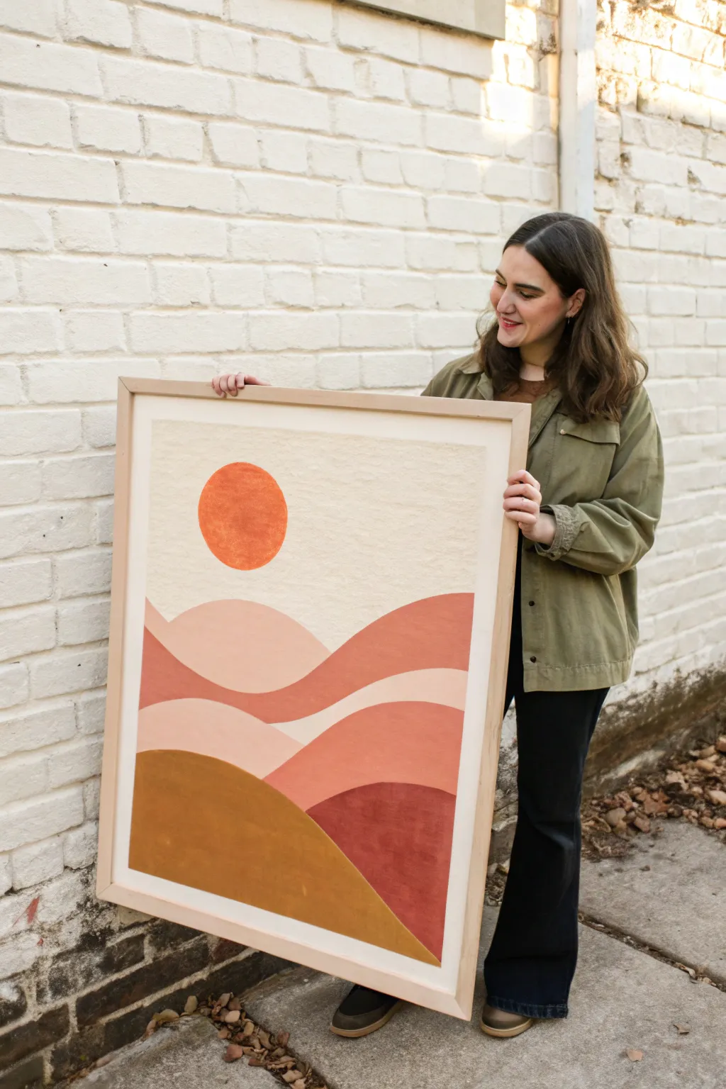
This large-scale minimalist landscape captures the warmth of a setting sun over rolling hills using a trendy palette of terracotta, mustard, and blush pink. The soft, organic shapes and textured finish make it a perfect statement piece for any mid-century modern or bohemian-inspired space.
How-To Guide
Materials
- Large canvas (approx. 24×36 inches) or wood panel
- Acrylic paints (terracotta, burnt sienna, mustard yellow, blush pink, cream/off-white)
- Black walnut floating frame (optional)
- Wide flat brush (2-3 inch)
- Round brush (medium size)
- Pencil
- Palette or paper plates for mixing
- Cup of water and paper towels
- Measuring tape or ruler
Step 1: Planning and Sketching
-
Prepare the canvas:
Start with a clean, dry canvas. If using raw canvas or wood, apply a coat of gesso first to ensure your colors pop and the surface is sealed. -
Identify your horizon lines:
Study the composition. Notice how the hills overlap in layers. Use a pencil to very lightly sketch the wavy lines of the hills, starting from the bottom and working upward. -
Draw the sun:
Sketch a perfect circle in the upper left quadrant for the sun. You can trace around a small plate or bowl to get a crisp, clean shape. -
Refine the shapes:
Step back and look at your pencil lines. The hills should feel organic and flowing, not jagged. Adjust the curves until the composition feels balanced.
Clean Curves
Struggling with wobbly hand-painted curves? Use painter’s tape! Stick it down, sketch your curve, cut gently along the line with a craft knife, then peel away the excess before painting.
Step 2: Painting the Background
-
Mix the sky color:
Create a creamy, off-white shade by mixing white acrylic with a tiny drop of yellow ochre or unbleached titanium. You want a warm, vintage paper look rather than stark white. -
Paint the sky:
Using your wide flat brush, paint the entire sky area, carefully working around the circle of the sun and the top edge of the highest hill. -
Second coat:
Let the first layer dry completely. Apply a second coat to the sky to ensure solid, opaque coverage without streaks. I find cross-hatching strokes help create a nice texture here.
Step 3: Painting the Landscape
-
Paint the sun:
Mix a vibrant burnt orange color. Use a medium round brush to carefully paint the sun, keeping the edges as sharp as possible against the cream background. -
Base layer for the first hill:
Starting with the subtle background hill (the one furthest back), mix a soft blush pink. Fill in this shape, ensuring smooth strokes. -
Middle ground tones:
For the sweeping middle hills, mix a terracotta or rust color. Paint these sections, carefully cutting in along the pencil lines where they overlap the pink hill. -
Foreground foundation:
Mix a deep, earthy mustard yellow for the large hill in the bottom left corner. Paint this section solidly. -
Bottom corner detail:
For the bottom right corner, use a deep burnt sienna or maroon shade to anchor the painting with a darker tone. -
Touch-ups and edges:
Once dry, check all your edges. If the paint has bled or looks uneven, use a small brush with the appropriate color to crisp up the lines where the hills meet.
Textured Grout Hack
For a true plaster-like relief effect, mix a tablespoon of baking soda or non-sanded grout into your acrylic paint. This creates a thick, tactile finish that looks very high-end.
Step 4: Finishing Touches
-
Add texture (optional):
To mimic the slightly worn look of the original, you can dry-brush a slightly lighter shade over each color block once the base is fully dry. This adds depth and a vintage feel. -
Seal the artwork:
Once the entire painting is completely cured (wait at least 24 hours), apply a matte varnish to protect the surface and unify the sheen of the different paint colors. -
Frame the piece:
Place your canvas into a floating frame. A light wood or natural finish complements the warm earth tones of the painting perfectly.
Hang your new masterpiece in a well-lit spot to let those warm earth tones glow
BRUSH GUIDE
The Right Brush for Every Stroke
From clean lines to bold texture — master brush choice, stroke control, and essential techniques.
Explore the Full Guide
Abstract Still Life With Bottles and Glasses
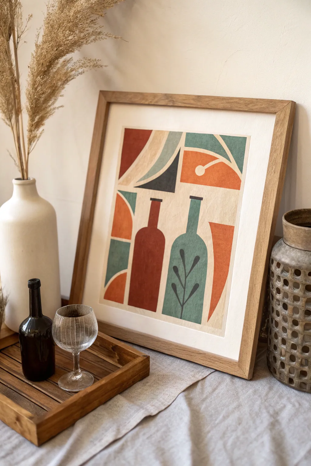
Capture the essence of mid-century aesthetics with this bold, abstract still life featuring stylized bottles and geometric forms. The textured, earthy palette brings a warm, vintage charm that perfectly complements modern interiors.
Step-by-Step Guide
Materials
- Heavyweight watercolor paper or mixed media paper (at least 300gsm)
- Acrylic paints: Burnt Sienna, Terra Cotta, Teal/Deep Turquoise, Cream/Off-White, Black, Deep Navy
- Flat shader brushes (medium and large)
- Small round detail brush
- Pencil and eraser
- Ruler
- Painter’s tape or masking tape
- Palette for mixing
- Wooden frame (optional)
Step 1: Planning and Sketching
-
Prepare the workspace:
Begin by taping down the edges of your paper to a flat work surface. This creates a clean white border around your artwork and prevents the paper from buckling as you paint. -
Establish the background:
Mix a warm Cream or Off-White color with a fair amount of water to create a semi-opaque wash. Apply this over the entire taped area as a base tone. Let it dry completely; this provides that aged, vintage paper look. -
Outline the composition:
Lightly sketch the main elements using a pencil. Start by drawing two vertical bottle shapes in the lower center—one slightly shorter and wider, the other tall and thin. -
Add geometric elements:
Around the bottles, sketch the supporting shapes. Draw a large quarter-circle in the lower left, a curved swooping shape above the bottles, and a segmented blocky area in the top right. Don’t worry about perfect symmetry; the handmade feel is key.
Texture Pro Tip
To get that gritty, vintage screen-print texture, try dabbing your wet paint with a paper towel or sponge immediately after applying it to lift small spots of color.
Step 2: Painting the Base Shapes
-
Mix the red tones:
Create a deep Terra Cotta or Rust color. Use your flat brush to fill in the left bottle. Apply the paint somewhat unevenly or with a dry brush technique to mimic the texture of a block print. -
Paint the teal elements:
Switch to your Teal or Deep Turquoise paint. Fill in the right-hand bottle carefully. I like to use the edge of the flat brush to get crisp, straight lines along the bottle’s neck. -
Fill surrounding shapes:
Using the same Teal mix, paint the geometric section in the top right corner and the small curved segment in the lower left. Let these areas dry to the touch before moving on to avoid smudging. -
Add orange accents:
Mix a lighter, brighter orange—perhaps by adding yellow to your Terra Cotta. Paint the semi-circle shape on the left border and the curved shape floating in the upper right quadrant. -
Incorporate dark contrasts:
Mix a very deep Navy or almost-black color. Paint the sharp triangular shape that sits just above the bottles. This dark value anchors the composition and adds visual weight.
Level Up: Mixed Media
Instead of painting the background, collage pieces of vintage book pages or beige craft paper onto the canvas first for authentic texture and depth.
Step 3: Detailing and Texture
-
Refine the edges:
Once the initial layers are dry, go back with a smaller brush and touch up any uneven edges. The style is loose, but distinct separation between colors is important. -
Paint the botanical detail:
Using your Black or Deep Navy paint and a fine round brush, paint a simple leaf motif onto the teal bottle. Draw a central vertical line with small, almond-shaped leaves branching off. -
Add the circle detail:
In the top right orange section, paint a small cream circle connected to a thin line, resembling an abstract fruit or geometric accent. Use opaque Cream paint or a paint pen for coverage. -
Create texture:
To enhance the ‘print’ look, take a nearly dry brush with a lighter version of your base colors and gently scuff it over the painted areas. This adds a weathered, canvas-like texture. -
Final background touches:
If the background feels too empty, add subtle cream or beige geometric echoes behind the main shapes to tie everything together without overwhelming the bold colors.
Step 4: Finishing
-
Remove the tape:
Ensure the painting is 100% dry. Slowly peel away the painter’s tape at a 45-degree angle to reveal your crisp, clean borders. -
Erase guidelines:
Gently erase any visible pencil marks that weren’t covered by paint, particularly in the lighter background areas. -
Frame your work:
Place your finished piece into a simple wooden frame. A light oak or walnut frame complements the earthy tones of the mid-century palette beautifully.
Hang your new artwork in a well-lit spot to let those warm, retro colors truly shine
Overlapping Circles and Arches
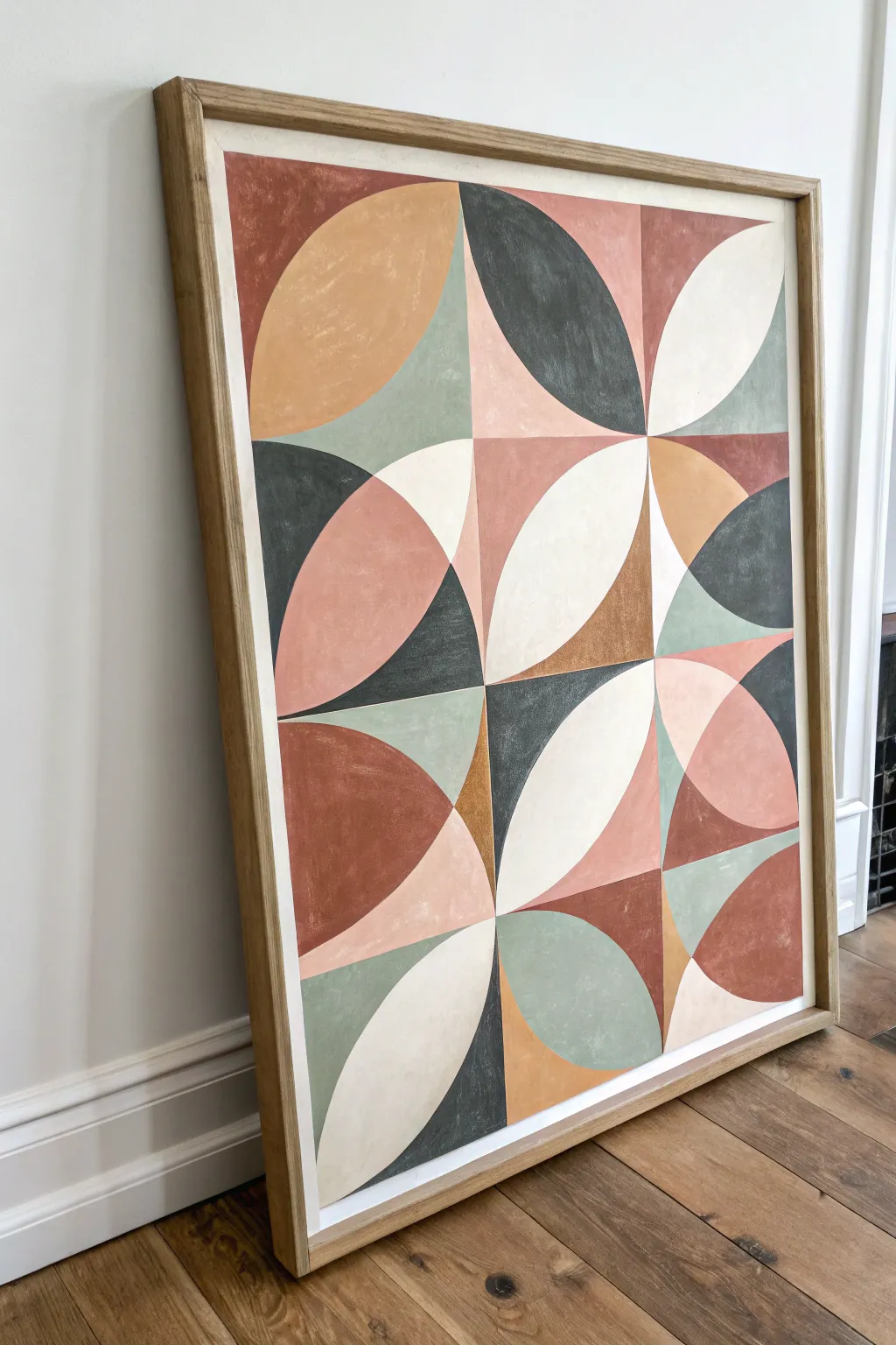
Bring the sophisticated warmth of mid-century design into your home with this striking geometric canvas. By layering quarter-circles and intersections in an earthy, muted palette, you’ll create a complex pattern that feels both structured and organic.
Step-by-Step
Materials
- Large square canvas (approx. 24×24 or 30×30 inches)
- Acrylic paints (terracotta/rust, sage green, cream, charcoal grey, mustard yellow, blush pink)
- Wide ruler or straightedge yardstick
- Compass tool (large artist compass or string and pencil method)
- HB Pencil
- Painter’s tape (optional but helpful for straight lines)
- Flat shader brushes (medium and large sizes)
- Fine liner brush for touch-ups
- Eraser
- Palette for mixing custom shades
Step 1: Drafting the Grid
-
Measure the canvas:
Begin by measuring the total width and height of your canvas. Divide both dimensions by four to create a 4×4 grid structure. -
Draw the main grid:
Using your long ruler and pencil, lightly draw three horizontal lines and three vertical lines. This divides your canvas into sixteen equal square sections. -
Find the centers:
Mark the center point of the entire canvas where the middle vertical and horizontal lines intersect. Then identify the corners of each individual square you’ve just drawn.
Wobbly Curves?
If painting freehand curves is difficult, use painter’s tape designed for curves (it’s flexible!) or cut regular masking tape into thin strips to guide your brush along the arcs.
Step 2: Mapping the Curves
-
Set your compass:
Adjust your compass so the radius matches exactly the side length of one of your small grid squares. If using string, ensure the length from pin to pencil tip is taut and accurate. -
Draw the petals:
Place the point of your compass at the corner of a grid square. Draw an arc that sweeps from one adjacent corner to the other. Repeat this from the opposite corner of the same square to create a pointed, leaf-like intersection. -
Vary the orientation:
To match the reference image, don’t make every square identical. In some squares, draw the arcs vertically; in others, draw them horizontally. Leave some sections as simple quarter-circles. -
Create overlaps:
Allow arcs to cross into neighboring squares. The beauty of this pattern relies on how shapes from one square interact with the next, creating smaller triangular gaps and new intersections. -
Review the composition:
Step back and check your pencil lines against the reference photo. You should see a mix of ‘eye’ shapes (petals) and larger sweeping curves that span across multiple grid blocks.
Add Texture
Mix a small amount of modeling paste or even baking soda into your acrylics. This creates a slightly gritty, plaster-like texture that enhances the vintage, mid-century aesthetic.
Step 3: Blocking in Color
-
Mix your palette:
Prepare your acrylics. You want a matte finish look, so avoid gloss mediums. Mix a dusty sage, a deep charcoal, a warm rust, a soft blush, and a creamy off-white. I like to mix enough of each color to fill a small jar so I don’t run out mid-painting. -
Plan the color balance:
Look at the reference to see how colors are distributed. Notice that dark charcoal shapes serve as anchors, while the cream and blush tones add lightness. Avoid putting two identical colors right next to each other. -
Paint the first shapes:
Start with one color, perhaps the sage green. Fill in specific petal shapes scattered across the canvas. Use a flat brush to get crisp edges along your pencil lines. -
Rotate through colors:
Move on to the terracotta rust color, filling in adjacent shapes. Continue this process with the charcoal, cream, and blush, working systematically around the canvas so wet colors don’t smear into each other. -
Fill the negative space:
Don’t forget the small triangular gaps created by intersection lines. These can be great places for pop accent colors like mustard yellow or a darker brown.
Step 4: Refining and Framing
-
Apply a second coat:
Most acrylics, especially the lighter cream and blush tones, will need a second layer to achieve that solid opacity. Let the first coat dry completely before applying the second. -
Clean up edges:
Inspect your curved lines. If any paint bled over or lines look shaky, use your fine liner brush with the correct color to neaten the boundary. A steady hand here makes the geometric effect pop. -
Erase visible guides:
Once the paint is bone dry, gently erase any pencil grid lines that might still be visible in unpainted areas or light-colored sections. -
Frame the piece:
To truly mimic the reference, finish your artwork by mounting it in a light oak floating frame. This natural wood element complements the earthy tones perfectly.
Hang your finished piece in a well-lit spot to let those calm, earthy tones warm up the room

PENCIL GUIDE
Understanding Pencil Grades from H to B
From first sketch to finished drawing — learn pencil grades, line control, and shading techniques.
Explore the Full Guide
Vertical Color-Field Stripes
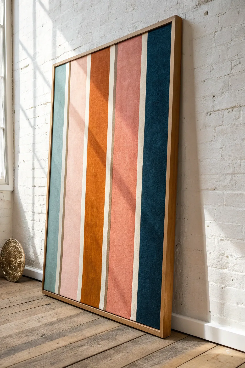
Bring the warmth of mid-century design into your space with this large-scale, texture-rich statement piece. By combining muted, retro hues with a soft, suede-like finish, you attain a luxurious depth that flat acrylics simply can’t achieve.
How-To Guide
Materials
- Large canvas (24×48 inches or larger)
- Light oak floating frame
- Painter’s tape (1-inch width)
- Heavy body acrylic paints (Sage Green, Pale Pink, Burnt Orange, Terracotta, Navy Blue)
- Texture medium (suede effect, sand medium, or baking soda)
- Wide flat synthetic brushes (2-inch)
- T-square or long ruler
- Pencil
- Palette knives
- Matte varnish
Step 1: Preparation & Layout
-
Prepare the canvas:
Begin by ensuring your canvas surface is completely clean and taut. If the fabric feels loose, mist the back with water and let it dry to tighten the fibers. -
Prime the background:
Apply a base coat of warm cream or raw linen color across the entire canvas. This will serve as the dividing lines between your colors later, so ensure solid, opaque coverage. -
Measure the stripes:
Decide on your stripe pattern. For the look in the photo, you will want five main color blocks of roughly equal width. Measure the total width, subtract the space for thin dividers (about 1/2 inch each), and divide the remainder by five to get your main stripe width. -
Mark the lines:
Using a T-square and a pencil, lightly draw the vertical lines from top to bottom. Double-check your measurements to ensure the stripes remain parallel. -
Mask the dividers:
Place painter’s tape exactly over the areas you want to remain cream-colored. Press the edges of the tape down firmly with your thumbnail or a palette knife to prevent paint bleed.
Clean Lines Pro-Tip
Brush a thin layer of matte medium over the tape edges before adding color. This seals the tape and ensures your cream lines stay perfectly crisp.
Step 2: Mixing & Texture
-
Mix the texture medium:
To recreate that soft, velvety look, mix your acrylic paints with a texture medium. I prefer using a specific suede-effect medium, but mixing a teaspoon of baking soda into your paint works wonders for a gritty, matte finish. -
Prepare the palette:
Mix all five custom colors before you start painting: a muted sage/teal, a soft blush pink, a deep burnt orange, a warm terracotta rose, and a dark navy teal. -
Test the consistency:
Your paint mixture should feel like thick frosting—stiff enough to hold a low peak but spreadable. If it’s too runny, add more heavy body paint or thickener.
Level Up: Textile Look
For true authenticity, skip the paint for the colored sections and use actual strips of felt or suede fabric glued to the backing board.
Step 3: Application
-
Paint the first stripe (Sage):
Start from the left with the muted sage color. Use a wide flat brush and apply the paint using long, vertical strokes. Don’t smooth it out perfectly; the brush marks add to the textile illusion. -
Apply the second stripe (Pink):
Move to the second section with the blush pink. Be careful near the taped edges; paint slightly onto the tape to ensure a crisp line when peeled. -
Paint the center stripe (Orange):
Fill the middle section with the burnt orange. This is the visual anchor of the piece, so apply the texture generously here for maximum impact. -
Complete the remaining stripes:
Continue with the terracotta rose next, followed by the dark navy teal on the far right edge. Ensure the texture profile is consistent across all five stripes. -
Immediate tape removal:
While the paint is still tacky (do not wait for it to dry completely), carefully peel back the painter’s tape at a 45-degree angle. This prevents the thick textured paint from cracking along the edges. -
Touch-ups:
Once the tape is removed, check for any bleed-through. If necessary, use a small detail brush and your original cream base color to clean up the dividing lines.
Step 4: Finishing & Framing
-
Let it cure:
textural paintings take longer to dry. Allow the canvas to cure flat for at least 24 hours to ensure the thick layers harden completely. -
Seal the surface:
Apply a spray matte varnish. Avoid glossy finishes, as they will ruin the fabric-like effect. A matte spray protects the texture without altering the light reflection. -
Install the frame:
Place the canvas into a light oak floating frame. Secure it from the back, ensuring an even gap between the canvas edge and the frame for a professional gallery look.
Hang your masterpiece in a bright spot where the natural light can rake across the surface and highlight that beautiful texture
Bauhaus-Style Grid With Warm Neutrals
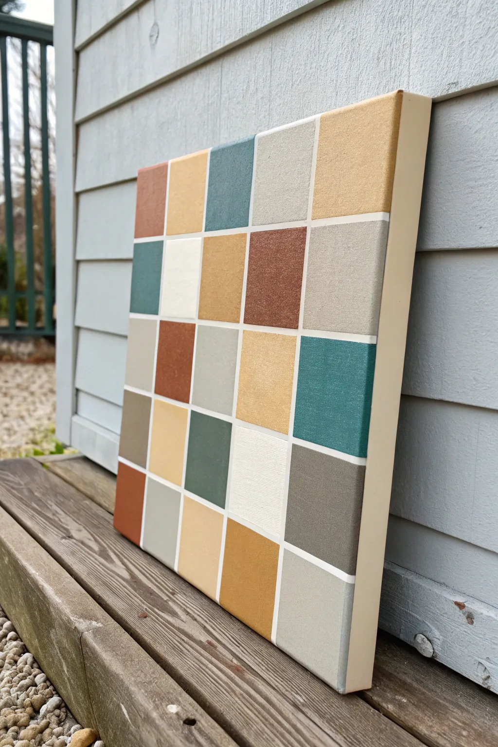
Embrace the clean lines and earthy palette of mid-century design with this satisfying grid painting project. By combining precise taping techniques with a warm collection of muted neutrals, you’ll create a sophisticated piece of wall art that feels both vintage and timeless.
Step-by-Step Tutorial
Materials
- 12×12 inch square stretched canvas
- Acrylic paints (muted palette: terra cotta, mustard, teal, sage green, taupe, grey, warm white/cream)
- Painter’s tape (1/4 inch or 1/8 inch width for best results)
- Flat shader brushes (medium and small sizes)
- Ruler or T-square
- Pencil
- Gesso or white acrylic paint (optional, for priming)
- Matte varnish
- Palette or paper plate
- Cup of water and paper towels
Step 1: Preparation & Layout
-
Prime the Surface:
If your canvas isn’t pre-primed, or if the texture is too rough, apply a coat of gesso or warm white acrylic paint across the entire surface. Let this base coat dry completely to ensure a smooth starting point. -
Measure the Grid:
Using your ruler and pencil, lightly mark out a 5×5 grid pattern. For a 12-inch canvas, you will want 5 distinct columns and rows, but remember to account for the width of the tape lines between them. -
Calculate Spacing:
A good rule of thumb is to measure 5 nearly equal sections, leaving about 1/4 inch gaps between them for the white grid lines. Don’t press too hard with the pencil; you just need faint guide marks. -
Lay the Vertical Tape:
Apply strips of your thin painter’s tape vertically along your pencil marks. Run the tape all the way over the top and bottom edges of the canvas to secure it tightly. -
Lay the Horizontal Tape:
Apply the horizontal strips crossing over the vertical ones. This will create your uniform grid of squares. Press down firmly on all tape edges to prevent paint seepage later. -
Seal the Tape Edges:
Here I like to paint a very thin layer of your base white color over the tape edges. This clever trick seals the tape, meaning any bleed-through will match the background white rather than the colored squares.
Bleeding Lines?
If paint bleeds under the tape, wait for it to dry completely. Then, lay fresh tape constantly along the color edge and repaint the white line for a crisp fix.
Step 2: Mixing & Painting
-
Plan Your Palette:
Squeeze out your acrylic colors. Aim for balance: mix in a tiny bit of grey or brown to bright colors to mute them down into true mid-century tones. -
Map the Colors:
Before painting, visualize where each color will go. Try to avoid placing two identical colors right next to each other to maintain visual interest. -
Paint the First Checkers:
Start painting specific squares, skipping every other one to work in a checkerboard fashion if you are worried about wet paint, though the tape protects you. Use a flat brush to get smooth, even coverage. -
Build Opacity:
Acrylics often dry darker and thinner than they look when wet. Apply a second coat to your terra cotta and teal squares once the first coat is touch-dry to get that solid, opaque look. -
Fill the Remaining Squares:
Continue filling in the grid with your lighter neutrals—the creams, taupes, and sages. Ensure the brushstrokes generally go in the same direction for a uniform finish. -
Paint the Canvas Sides:
Don’t forget the deep edges of the canvas. Paint these a solid warm cream or beige color to give the piece a finished, framed appearance without needing an actual frame.
Add Texture
Mix a small amount of modeling paste into your acrylics before painting the squares. This adds a raised, tactile dimension to the grid.
Step 3: Finishing Touches
-
Let It Dry:
Allow the paint to set fully. It should feel completely dry to the touch before you attempt the next crucial step. -
The Reveal:
Slowly peel back the painter’s tape. Pull at a 45-degree angle away from the painted area to ensure crisp lines and avoid lifting any paint chips. -
Touch Ups:
Inspect your grid lines. If any color bled under the tape, use a small detail brush and your base white paint to carefully tidy up the edges. -
Erase Marks:
If any pencil guides are still visible in the white gutters between squares, gently erase them with a soft white eraser. -
Varnish:
Apply a coat of matte varnish over the entire face of the canvas. This unifies the sheen of the different paint colors and protects your artwork from dust and UV light.
Hang your new geometric masterpiece in a spot where it can catch natural light to show off those subtle earthy tones


Stylized Leaf and Frond Silhouettes
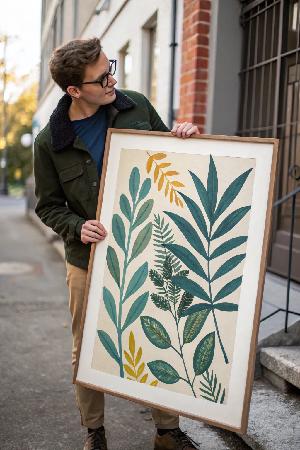
Capture the essence of 1950s design with this graphic botanical statement piece, featuring stylized fronds in muted teals and mustard yellows. The clean lines and retro color palette create a sophisticated, organic focal point perfect for modern interiors.
Detailed Instructions
Materials
- Large watercolor paper or heavy mixed-media paper (24×36 inches or similar)
- Acrylic gouache paints (Teal, Forest Green, Mustard Yellow, Cream/Off-White)
- Flat synthetic brushes (various widths: 1-inch, 1/2-inch)
- Small round detail brush (size 2 or 4)
- Pencil and eraser
- Ruler or straight edge
- Palette for mixing
- Water cups and paper towels
- Large wooden frame with matting (to match paper size)
Step 1: Planning and Background
-
Prepare the substrate:
Begin by laying your large paper flat on a clean surface. If your paper isn’t already a warm tone, mix a generous amount of cream or off-white acrylic gouache with a tiny drop of yellow oxide to create a vintage parchment look. -
Apply the background wash:
Using a large flat brush, apply your background color in broad, even strokes. Aim for full coverage, but don’t worry about perfect smoothness; a little texture adds to the hand-painted aesthetic. Let this dry completely before moving on. -
Sketch the composition:
Lightly sketch the main stems using a pencil. Start with a central, dominant vertical stem rising from the bottom, and add flanking stems on the left and right. Keep the lines curved and organic rather than stiffly straight. -
Draft the leaf shapes:
Block in the general shapes of the leaves. For the tall right-hand frond, draw long, lance-shaped leaves. For the left side, sketch rounded, oval leaflets. Add a shorter, fern-like feature near the center.
Gouache vs. Acrylic
Acrylic gouache is best here because it dries dead matte and opaque like traditional gouache, but is water-resistant once dry, allowing for easy layering without reactivating the paint.
Step 2: Painting the Foliage
-
Mix the teal shade:
Create a muted teal color by mixing your primary teal paint with a touch of grey or a tiny bit of orange to desaturate it. This will be the color for the large, dominant frond on the right. -
Paint the lance leaves:
Using a medium flat brush, fill in the long leaves on the right side. Start from the stem and pull the brush outward to the tip to create a tapered edge. I find that turning the paper as I work helps maintain a smooth curve for each leaf. -
Mix the sage green:
Lighten your forest green with a little white and a drop of yellow to create a soft sage color for the left-hand plant. -
Paint the oval leaves:
Switch to a filbert or rounded flat brush if you have one, to help with the curved edges of the oval leaves on the left. Apply the paint smoothly, ensuring crisp edges against the background. -
Add visual weight:
Check the opacity of your first layer. Acrylic gouache is usually opaque, but if the background shows through too much, apply a second coat once the first is dry to ensure that bold, graphic look. -
Mix the deep forest green:
Use your forest green straight from the tube or mixed with a tiny bit of black or dark blue for the central, lower fern-like leaves. This dark value anchors the bottom of the composition. -
Detail the central fern:
Use a smaller round brush to paint the delicate, feathery fronds in the center. Use short, quick strokes to mimic the texture of fern leaflets.
Collage Twist
Instead of painting, cut the leaf shapes out of colored construction paper or painted textured paper. Glue them onto the background for a Matisse-inspired ‘cut-out’ aesthetic.
Step 3: Accents and Details
-
Apply the mustard accents:
Mix a warm mustard yellow. Paint the small, floating branch sections near the top and bottom. These pops of color are essential for the mid-century vibe and break up the heavy greens. -
Add vein details:
Once the main leaf shapes are fiercely dry, use a very fine round brush or a paint pen to add subtle vein details. Use a lighter version of the base color for these lines—for example, a pale mint green on the dark forest leaves. -
Create texture:
On the darker leaves at the bottom, use a ‘dry brush’ technique with a lighter green to lightly drag texture across the surface, giving the impression of leaf ribs without painting solid lines. -
Clean up edges:
Step back and look at the composition. If any edges look ragged, use a small brush with your background color to carefully ‘erase’ or refine the silhouette of the leaves. -
Erase pencil marks:
Once the painting is completely cured (give it at least an hour), gently erase any visible pencil sketch lines that weren’t covered by paint. -
Frame the artwork:
Place the artwork into a simple, light wood frame. A thin profile frame works best to keep the focus on the bold shapes of the artwork.
Hang your new botanical masterpiece in a well-lit spot to bring a timeless touch of nature indoors
Boomerang and Pebble Motif Pattern
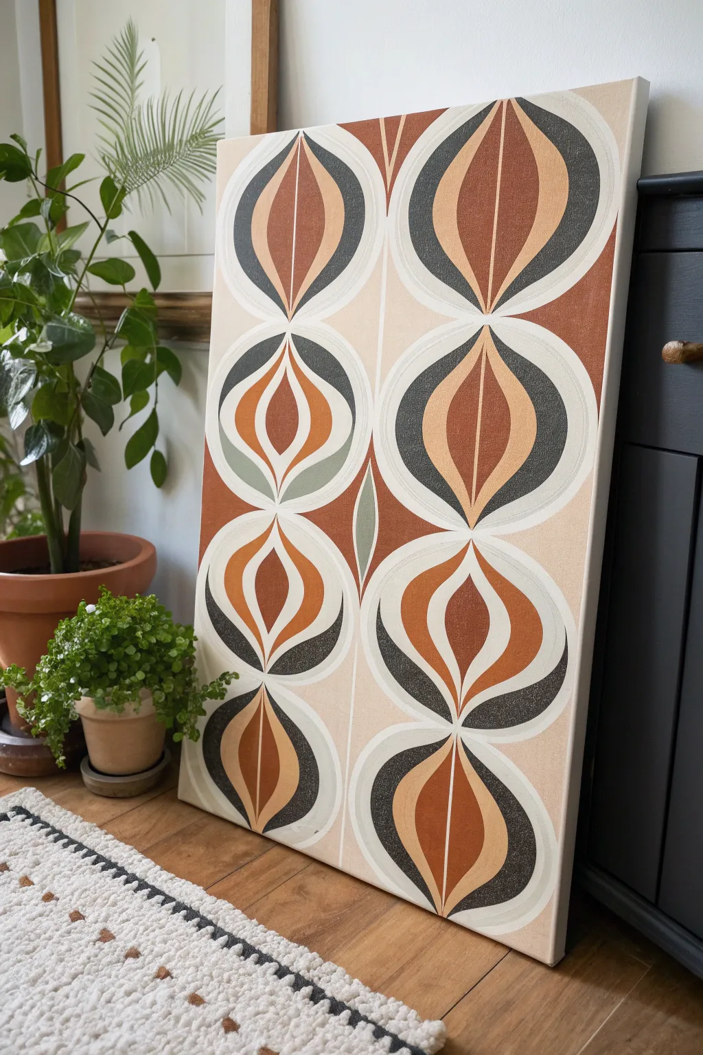
Embrace the warmth of mid-century modern design with this striking geometric canvas featuring a classic repeating ogee motif. The interplay of earthy terracotta, burnt orange, and charcoal grey creates a sophisticated retro focal point for any room.
Step-by-Step
Materials
- Large rectangular stretched canvas (e.g., 24×36 inches)
- Acrylic paints: Terra cotta, burnt sienna, deep charcoal grey, warm cream/off-white, sage green (optional accent)
- Pencil and large eraser
- Long ruler or T-square
- Cardstock or thick paper (for stencils)
- Scissors
- Painter’s tape (low tack)
- Flat shader brushes (various sizes: 1 inch, 1/2 inch)
- Fine liner brush (for crisp edges)
- Matte varnish (optional)
Step 1: Planning and Stencil Creation
-
Measure your grid:
Begin by measuring your canvas to determine the scale of your pattern. For a canvas of this proportion, a two-column layout works beautifully. Use your ruler to draw a very faint vertical line directly down the center of the canvas to split it into two equal columns. -
Mark horizontal guides:
Divide the height of the canvas into four equal sections. Lightly mark horizontal lines across the canvas at these intervals. These intersections will be the center points for your ‘eye’ or ‘seed’ shapes. -
Draft the master shape:
On a piece of cardstock, draw your main ogee shape—it looks like a pointed oval or a stylized almond. Make sure it is the correct width to fit inside your columns (half the canvas width minus a small border). Fold the paper in half vertically to cut it out, ensuring perfect symmetry. -
Trace the pattern:
Place your stencil on the canvas, aligning the top and bottom points with your vertical center lines. Trace the shape lightly with a pencil. Repeat this down both columns until the main structure is mapped out. -
Add internal details:
Create a second, smaller almond-shaped stencil for the inner core of the motif. Trace this inside each of your larger shapes. Finally, draw a vertical line splitting each shape down the middle to delineate the color blocks.
Uneven Curves?
If freehand painting curves is difficult, use flexible masking tape (sometimes called vinyl fineline tape) to mask off the curved edges before painting for laser-sharp lines.
Step 2: Painting the Base and Background
-
Fill the negative space:
Mix a warm cream or off-white shade. Using a 1-inch flat brush, paint the background areas outside of your traced overlapping shapes. You might need two coats to ensure the canvas texture is evenly covered. -
Refine the edges:
Use a smaller brush to carefully cut in the edges of the cream background where it meets the geometric shapes. Clean lines are essential for that sharp, mid-century look. -
Erase guide lines:
Once the background paint is completely dry to the touch, gently erase any visible pencil marks that fall within the cream areas so the finish looks professional.
Step 3: Applying the Colors
-
Paint the dark outer curves:
Starting with your deep charcoal grey, paint the outer curves of the shapes. Notice that the pattern alternates on some rows; refer to your plan. Use a flat shader brush to get smooth, sweeping strokes that follow the curve. -
Fill the terra cotta sections:
Switch to your terra cotta or rust acrylic. Paint the opposing curves or the inner sections depending on your specific color map. I find it helpful to paint all sections of one color at time to maintain consistency in texture. -
Add the burnt sienna cores:
Paint the innermost almond shapes with a rich burnt sienna or ochre tone. These vertical slivers act as the pupil of the ‘eye’ shape and anchor the design. -
Introduce accents:
If desired, paint specific sections in a muted sage green or a lighter beige to create visual variety, as seen in the center-left motif of the example. This breaks up the repetition slightly.
Pro Tip: Texture
To mimic a vintage fabric print look, mix a tiny amount of texture paste or fine sand into your acrylics. It gives the artwork a tactile, grainy quality close up.
Step 4: Finishing Touches
-
Sharpen the center line:
Using a fine liner brush and your cream paint, carefully re-trace the vertical spine that runs through the center of the motifs if it got covered by messy brushstrokes. This white spine creates the ‘leaf’ effect. -
Touch up edges:
Inspect the painting for any wobbly lines. Use your fine liner brush with the appropriate color to straighten out curves and sharpen the transition points between colors. -
Paint the canvas sides:
Don’t forget the edges of the canvas itself. Paint them the same cream color as the background or a solid charcoal for a framed look without the frame. -
Seal the work:
Allow the painting to cure for at least 24 hours. Apply a coat of matte varnish to protect the surface and unify the sheen of the different paint colors.
Hang your new masterpiece in a well-lit spot to verify the straightness of your lines and enjoy the vintage vibe it brings to your space
Triptych of Coordinated Abstract Panels
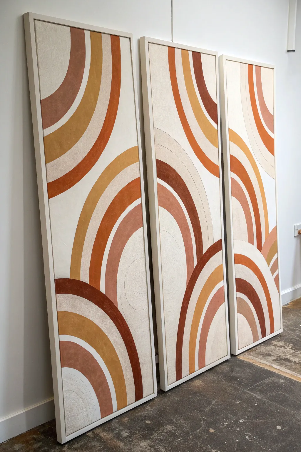
Bring the warmth of the desert sunset into your home with this stunning three-panel abstract artwork. Featuring sweeping arches in earthy terracotta, mustard, and rust tones, this oversized triptych creates a cohesive mid-century modern statement piece with deeply satisfying continuous lines.
Detailed Instructions
Materials
- 3 Large rectangular canvases (approx. 24” x 60” each)
- Acrylic paints (Terracotta, Burnt Sienna, Mustard Yellow, deep Rust, warm Cream, Titaniuam White)
- White Gesso (optional, for priming)
- Mod Podge or texture medium (optional for texture)
- Large flat paintbrushes (2-3 inch width)
- Medium angled sash brush
- Pencil
- String and pushpin (or a large beam compass)
- Painters tape (delicate surface)
- Ruler or straight edge
- Mixing palettes or plastic containers
- Clean rags
- Floating frames (natural wood finish)
Step 1: Preparation & Layout
-
Prime the surface:
Begin by applying a coat of white gesso to all three canvases if they aren’t pre-primed. For that slight texture visible in the reference, you can mix a little texture paste or even baking soda into the white base coat. Let this dry completely. -
Arrange the triptych:
Lay your three canvases side-by-side on the floor, leaving a small gap (about 1-2 inches) between them. This gap simulates where the wall space will be, ensuring your arches flow naturally across the breaks. -
Mark the horizon lines:
Using a long straight edge, lightly mark a few horizontal reference points across all three canvases to keep your design aligned. This isn’t a strict grid, but helps ensure the curves enter and exit the panels at matching heights. -
Draft the arches:
Create a makeshift compass using a pushpin and a piece of string. Secure the pin at the bottom center of the middle canvas (or wherever you want the arch’s origin). Tie a pencil to the other end. -
Sketch the curves:
Pull the string taut and sketch large sweeping semicircles that span across the canvases. Adjust the string length to create concentric bands of varying widths. I like to vary the width of the bands—some thick, some thin—to create visual interest. -
Refine the composition:
Stand back and look at your pencil lines. Add inverted arches coming from the top or sides to balance the composition, imitating the reference photo’s interplay of curves.
Step 2: Painting the Design
-
Mix your palette:
Prepare your colors. You want a gradient of warm earth tones: a deep rust/brown, a vibrant terracotta, a muted mustard yellow, and a warm beige. Keep a large amount of warm white or cream for the negative space. -
Paint the background:
Start by painting the large negative spaces with your warm cream color. Use a large flat brush and smooth out the strokes. Don’t worry about perfect edges yet; you’ll refine them when painting the colored bands. -
Apply the first color band:
Select your darkest rust color. Using an angled sash brush for control, carefully cut in the edges along your pencil lines. Then, fill in the rest of the band with a larger brush. -
Paint the middle tones:
Move on to the terracotta and burnt orange bands. Apply the paint somewhat thinly if you want the canvas texture to show through, or apply a second coat for opaque, solid color. -
Add the lighter accents:
Fill in the mustard yellow and lighter beige arches. These lighter tones often act as highlighters in the composition, so place them next to darker bands for high contrast. -
Texture the paint:
While the paint is tacky, you can use a dry brush to lightly drag over the colored areas. This creates a slightly weathered, matte look characteristic of mid-century art.
Achieving Clean Curves
If you have a shaky hand, use flexible masking tape (sometimes called vinyl tape) to mask off your curves before painting. It bends easily without buckling.
Step 3: Refining & Framing
-
Touch up edges:
Once the main colors are dry, use a small detail brush and your cream background color to clean up any shaky lines where the arches meet the background. Crisp lines are key to this graphic style. -
Define the texture lines:
In the reference, there are faint texture lines within the cream sections. You can achieve this by using a very hard pencil or a graphite stick to lightly draw concentric circles in the dried cream paint, adding subtle dimension. -
Paint the canvas sides:
Don’t forget the edges of the canvas. Paint them either solid white or wrap the design around the sides for a gallery-quality finish. -
Seal the artwork:
Apply a clear, matte varnish over all three panels. This unifies the sheen of the different paints and protects the surface from dust. -
Install the frames:
Place each canvas into a natural wood floating frame. Secure them from the back using offset clips. The wood frame creates a beautiful boundary that emphasizes the earthy palette.
Fabric Texture Trick
Glue uncolored linen or burlap onto the canvas before gessoing. The paint will soak into the weave, giving an authentic vintage textile feel to the arches.
Hang your panels with consistent spacing to let the arches flow seamlessly across your wall
Abstract Figurative With Geometric Limbs
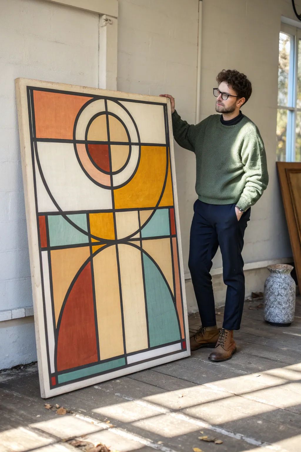
Capture the essence of the modernist movement with this striking large-scale panel that mimics the structural beauty of stained glass. Bold black outlines define a balanced composition of semi-circles and quadrants in warm ochres, muted teals, and earthy terracotta tones.
Step-by-Step
Materials
- Large canvas or primed wood panel (approx. 36″ x 60″)
- Acrylic paints (terracotta, mustard yellow, teal blue, off-white/cream, black)
- Wide flat artist brush (2-inch width)
- Medium flat brush (1-inch width)
- Fine liner brush or black acrylic paint marker (wide tip)
- Ruler or yardstick
- Compass or string and pencil for circles
- Painter’s tape (various widths, including 1/4 inch)
- Pencil and eraser
- Matte varnish (optional)
Step 1: Planning the Geometry
-
Prepare the surface:
If you are using a raw wood panel, prime it with two coats of white gesso to ensure the colors pop. If using a canvas, a single coat of gesso helps create a smoother texture for the geometric lines. -
Establish the central axis:
Use your yardstick to lightly draw a vertical line straight down the exact center of the panel. This line is crucial as the design relies on near-perfect symmetry. -
Draft the major horizontal divisions:
Divide the height of the canvas into roughly three sections. The top section will house the ‘sun’ motif, the middle is a transition band, and the bottom features the large rising arch shapes. -
Draw the top circle:
In the top third, use a compass or a string pinned to the center point to draw a large circle. This will form the main focal point. Inside this circle, draw a smaller concentric circle. -
Sketch the lower arches:
For the bottom section, draw two large quarter-circles rising from the bottom corners and meeting at the central vertical line. This creates a mirrored arch effect. -
Finalize the grid:
Connect your shapes with vertical and horizontal lines as seen in the reference, creating the ‘panes’ for your colors. Don’t worry about the thickness of lines yet; just get the skeleton layout down with pencil.
Bleeding Lines?
If paint bleeds under tape: let it dry fully, then gently scrape the excess with a craft knife or touch up the base color with a tiny brush before adding the black line.
Step 2: Color Blocking
-
Mix your palette:
Pre-mix all your colors to ensure consistency. You want a dusty warm terracotta (mix red oxide with a little white), a muted mustard (yellow ochre), a soft teal (blue-green with grey), and a creamy off-white. -
Tape off the first color group:
Apply painter’s tape along the pencil lines for all sections that will be painted mustard yellow. Press the edges of the tape down firmly to prevent bleed. -
Apply the yellow sections:
Using the wide flat brush, paint the large upper quadrants and the central diamond section in your mustard mix. Apply two thin coats rather than one thick one for an even finish. -
Paint the terracotta accents:
Once the yellow is dry and tape removed, tape off areas for the terracotta. Focus on the bottom-left arch and the upper-left quadrant of the inner circle. Painting diagonal opposites helps balance the composition. -
Fill the teal zones:
Repeat the taping process for the teal sections particularly the bottom-right arch and the rectangular accents in the middle band. I find that letting the tape sit for a minute before peeling helps keep lines crisp. -
Add the neutral background:
Fill the remaining large negative spaces with your off-white or cream paint. This neutral tone provides the ‘glass’ effect that lets the colors breathe.
Step 3: Defining the Structure
-
Prepare for outlining:
Ensure every block of color is completely dry to the touch. The stark black lines are the signature of this style, and smudging them now would be heartbreaking. -
Tape the grid lines:
To get those perfect graphic lines without shaky hands, use 1/4 inch painter’s tape or apply two strips of standard tape leaving a uniform gap between them where the black line will go. -
Paint the straight lines:
Fill in the gaps between the tape with opaque black acrylic. Do the vertical lines first, let them dry, then do the horizontal ones. -
Outline the curves:
For the curved lines where tape is difficult, use a steady hand and a medium flat brush loaded with black paint. Alternatively, a wide-tip black acrylic paint marker offers excellent control for these rounded edges. -
Touch up edges:
Inspect the intersections where lines meet. Use a fine liner brush and black paint to square off corners or smooth out any jittery connections. -
Seal the work:
Once the black paint has cured for 24 hours, apply a final coat of matte varnish. This unifies the sheen of the different paint colors and protects that crisp geometric look.
Texture Play
Mix a small amount of sand or modeling paste into just the terracotta paint. This adds tactile contrast against the smooth cream sections, enhancing the vintage look.
Hang your new masterpiece in a well-lit spot where the geometric shapes can truly command the room
Hard-Edge Shapes With Ombre Background
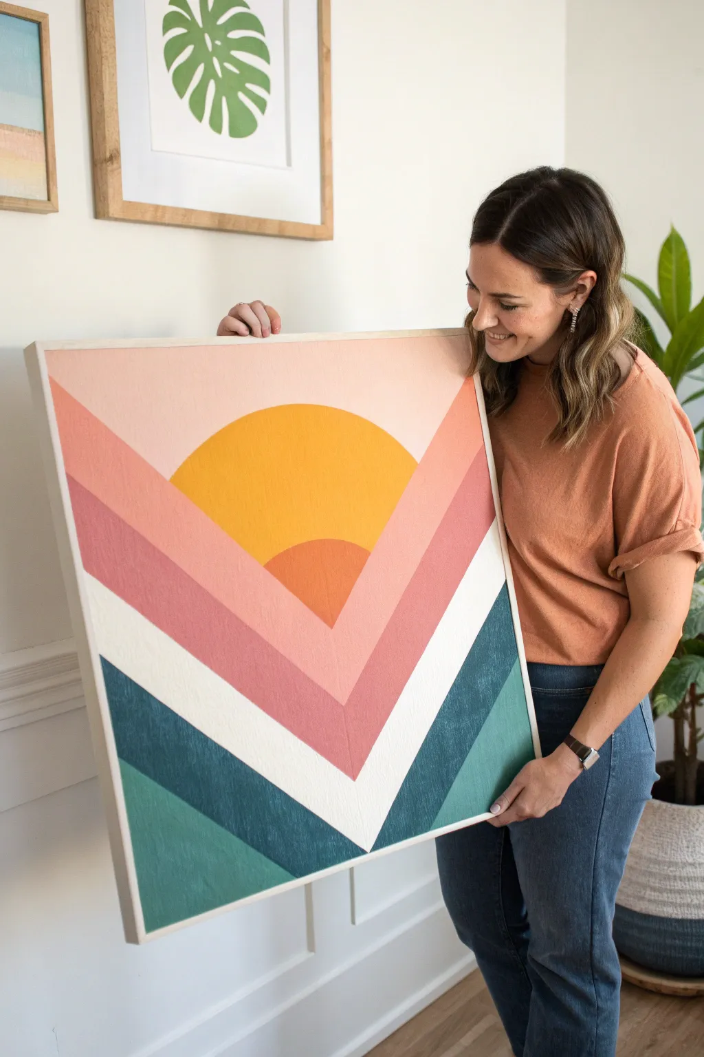
This stunning hard-edge painting combines a warm, abstract sunrise with cool, grounding chevron stripes for a perfect mid-century modern statement piece. The clean lines and bold color blocking create a sophisticated look that is surprisingly achievable with just some painter’s tape and patience.
How-To Guide
Materials
- Large square wood panel or gallery-wrapped canvas (approx. 24×24 or 30×30 inches)
- Acrylic craft paints (Light pink, dusty rose, golden yellow, dark orange, white, deep teal, light teal)
- Painter’s tape (high quality for clean lines)
- Compass or large circular object for tracing
- Pencil and eraser
- Ruler or straight edge
- Assorted flat paintbrushes (1-inch and smaller detail brushes)
- Floating wood frame (optional, for finishing)
Step 1: Planning and Sketching
-
Prime the surface:
Begin by applying a base coat of white acrylic paint or gesso to your wood panel or canvas to ensure your colors pop and the surface is smooth. Let this dry completely before moving on. -
Find the center:
Using your ruler, measure and lightly mark the exact horizontal center of the canvas at the very top edge and the bottom edge. This vertical centerline will guide your symmetry. -
Draw the sun:
Position your compass or a large round object (like a serving bowl or plate) along the top half of the centerline. Trace a semi-circle that will serve as the main sun element. You can sketch a smaller semi-circle nested inside near the bottom for the darker orange core. -
Mark the V-point:
Determine how deep you want your V-shape to go. Mark a point low on your vertical centerline—this will be the anchor for all your converging stripe angles. -
Sketch the rays:
Use your straight edge to draw lines radiating from that bottom anchor point upwards to the edges of the canvas. You’ll want about 4-5 distinct sections on each side, mirroring each other to create the chevron effect shown in the photo.
Bleeding Paint?
If paint bleeds under the tape, wait for it to dry completely. Then, use a small flat brush and the background color to carefully paint over the mistake and crisp up the line.
Step 2: Painting the Sun
-
Base coat the sun:
Carefully paint the larger semi-circle with your golden yellow paint. Use a flat brush to cut in the edges cleanly against your pencil marks. -
Add the inner core:
Once the yellow is dry to the touch, paint the smaller, nested semi-circle at the bottom of the sun shape with the dark orange paint. This adds dimension and depth. -
Refine the curve:
If your hand isn’t perfectly steady, you can clean up the outer curve of the sun later when painting the surrounding sky, so don’t stress over minor wobbles yet.
Step 3: Creating the Hard-Edge Stripes
-
Tape the first set of zones:
Select non-adjacent sections to paint first—for example, the outermost pink sky sections and the lowest teal sections. Apply painter’s tape firmly along your pencil lines. -
Seal the tape:
I always press the edge of the tape down firmly with a credit card or fingernail to prevent bleed-through. You can also paint a thin layer of your base white color over the tape edge to truly seal it. -
Apply the first colors:
Paint the top sections with your light pink/blush color. Paint the bottom-most sections with your deep teal. Apply 2-3 thin coats for opaque, even coverage. -
Remove tape and dry:
Peel off the tape while the final coat is still slightly wet to ensure a crisp line. Allow these painted sections to dry completely—patience is key here to avoid ruining your fresh paint. -
Tape the middle sections:
Once the first sections are fully cured, tape off the next set of stripes: the darker rose stripe and the lighter teal stripe. -
Paint the second wave:
Fill in these newly taped areas with the dusty rose and light teal paints. Ensure the rose color overlaps the sun graphic slightly if your design calls for the sun to sit ‘behind’ the mountain shapes, or stop neatly at the sun’s edge. -
Paint the white stripe:
The white V-stripe acts as a negative space separator. Tape off and paint this section with a fresh, bright white to make the colors above and below pop.
Add Texture
Mix a small amount of modeling paste into your acrylics before painting. This creates a subtle, raised texture that makes the piece look more like an original oil painting.
Step 4: Finishing Touches
-
Touch up lines:
Inspect your lines closely. Use a tiny detail brush and the appropriate paint color to fix any small bleeds or uneven edges where the colors meet. -
Frame the artwork:
To mirror the inspiration image, attach a simple light wood floating frame around your panel. This gives the piece a professional, finished appearance.
Hang your new geometric masterpiece in a bright room and enjoy the warm, retro vibes it brings to your space
Poolside Abstract in Flat Pastels
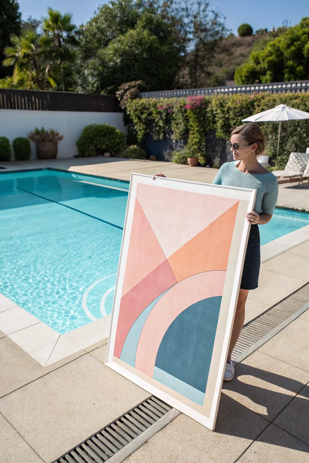
Capture the breezy elegance of mid-century aesthetics with this large-scale abstract painting defined by crisp lines and a soothing, warm pastel palette. The interplay of geometric arches and angular wedges creates a balanced composition that feels both retro and remarkably modern.
Step-by-Step
Materials
- Large canvas (approx. 36×48 inches) or sturdy wood panel
- Gesso primer (if canvas is unprimed)
- Painter’s tape (various widths, high-quality specifically for delicate surfaces)
- Acrylic paints: Blush Pink, Terracotta/Dark Peach, Teal/Dark Cyan, Light Blue, Cream/Beige
- Large flat brushes (1-inch and 2-inch)
- Small angled brush for touch-ups
- Pencil
- Long ruler or straight edge (yardstick)
- String and pushpin (for drawing curves)
- Palette or mixing tray
- Matte varnish (optional)
Step 1: Planning and Sketching
-
Prime the Surface:
Begin by ensuring your canvas is clean and primed. If you’re using raw canvas or wood, apply two coats of gesso, sanding lightly between coats for a smoother texture. -
Map the Horizon:
Using your yardstick and pencil, lightly draw a diagonal line descending from the upper left quadrant down towards the middle right. This divides the main pink and orange sections. -
Draw the Arches:
To create the perfect curved arches at the bottom, create a makeshift compass. Tie a string to a pencil and pin the other end at the bottom center of the canvas. Keep the string taut to draw your large outer arch, then shorten the string to draw the inner arch. -
Define the Geometric Blocks:
Complete the sketch by drawing the intersecting diagonal lines that form the triangular wedge on the left and the smaller rectangular block at the very bottom center.
Crisp Edge Secret
Burnish tape edges with a spoon or bone folder before painting. This extra pressure ensures the adhesive fills canvas texture gaps, stopping leaks.
Step 2: Taping and First Layers
-
Tape the Main Lines:
Apply painter’s tape along the straight pencil lines. For the curves, you can carefully cut tape into smaller pieces or use flexible drafting tape designed for curves. -
Seal edges:
For razor-sharp lines, I like to brush a tiny bit of matte medium or the base color over the tape edge first; this prevents the colored paint from bleeding underneath. -
Paint the Upper Left:
Mix a soft blush pink and apply it to the large triangular section in the upper left. Use broad, horizontal strokes for a uniform finish. -
Apply the Terracotta:
While the pink dries, mix your terracotta or dark peach shade. Apply this to the triangular section adjacent to the pink, ensuring full coverage. -
Fill the Right Corner:
Paint the upper right section with a very pale cream or beige to serve as a neutral background for the brighter shapes.
Texture Play
Mix a small amount of modeling paste into the terracotta or teal paint for slight 3D texture, adding depth to the flat geometric forms.
Step 3: Completing the Shapes
-
Remove and Retape:
Once the top sections are fully dry to the touch, peel off the tape gently. Re-apply tape over the dried paint edges to protect them while you work on the bottom sections. -
Paint the Main Arch:
Mix a darker version of the blush pink or a soft coral. Carefully paint the large arch shape that spans across the lower half. -
Fill the Inner Circle:
For the semi-circle inside the arch, use a rich teal or dark cyan. This provides the visual anchor for the painting and contrasts beautifully with the pinks. -
Add the Blue Accent:
Paint the sliver of the arch on the far left with a soft, muted light blue to add a cool tone to the palette. -
Detail the Bottom Block:
Paint the small rectangular section at the very bottom center with the same light blue used previously, grounding the dark teal circle.
Step 4: Finishing Touches
-
The Final Peel:
Wait until the paint is mostly dry but strictly slightly tacky before removing the final tape strips. Pull the tape away at a 45-degree angle to ensure clean lines. -
Touch Ups:
Inspect your edges. Use a small angled brush and the appropriate paint color to fix any bleeds or uneven lines carefully. -
Varnish:
Once the entire painting has cured (usually 24 hours), apply a coat of matte varnish to protect the surface and unify the sheen of the different paint colors. -
Framing:
Install the canvas into a simple white floater frame to mimic the clean, minimal look seen in the inspiration image.
Hang your new masterpiece in a sunlit room to let those warm pastels truly glow
Negative-Space Cutout Composition With Masking
This striking mid-century modern composition relies on the interplay between bold, earthy geometric forms and crisp negative space. By using strategic masking techniques, you will create sharp edges and perfectly balanced intersections that give this large-scale canvas its architectural feel.
Step-by-Step Guide
Materials
- Large stretched canvas (gallery wrapped, approx. 36×48 inches)
- Acrylic paints (Heavy Body): Unbleached Titanium, Yellow Ochre, Burnt Sienna, Terra Cotta, teal/muted petrol blue, deep forest green
- Gesso (bright white)
- Painter’s tape (various widths: 1-inch and 2-inch)
- Drafting compass or circular objects for tracing
- Pencil and large ruler/t-square
- Wide flat synthetic brushes (2-inch and 1-inch)
- Detail round brush (size 4)
- Matte medium or clear acrylic sealer
- Palette knife for mixing
Step 1: Preparation & Layout
-
Prime the Surface:
Even if your canvas is pre-primed, apply two coats of bright white gesso or a mixture of Unbleached Titanium and white to create a warm, neutral base. This background color will become your ‘negative space,’ so ensure the coverage is solid and smooth. Let it dry completely for at least 2 hours. -
Grid the Canvas:
Using a large ruler and a faint pencil, divide your canvas into a rough 2×3 or 3×3 grid system. You don’t need to draw lines all the way across; just mark registration points at the edges to help guide where your large shapes will sit. -
Draft the Geometries:
Sketch the main shapes lightly. Focus on the large semi-circles first using a compass or by tracing large round household items like mixing bowls or platters. Create intersections where circles meet straight lines, paying close attention to the photo to mimic the balance of the original design. -
Plan the Color Map:
Before painting, lightly label each section with a letter code (e.g., ‘O’ for Ochre, ‘T’ for Teal) directly on the canvas. This prevents confusion once you start masking off areas.
Bleeding Tape?
If paint bled under your tape, don’t panic. Wait for it to dry completely, then use a stiff, damp brush to gently scrub the excess away, or paint over the error with your background color.
Step 2: Masking & Blocking
-
Isolate the Straight Edges:
Apply painter’s tape along the straight lines of your design first. Press the edges of the tape down firmly with your thumbnail or a spoon to prevent bleed-under. -
Seal the Tape:
Here is a crucial trick: brush a thin layer of matte medium or your base background color over the edge of the tape. This seals the gap; any paint that seeps under will match the background, keeping your future color lines razor-sharp. -
Paint the Ochre Sections:
Mix Yellow Ochre with a touch of Titanium White to soften it. Apply this to the large rectangular pillars and the quarter-circle sections. Use a wide flat brush and paint in smooth, vertical strokes to minimize texture. -
Apply the Muted Teal:
Mix your petrol blue/teal shade. Apply this to the triangular wedge and the top semi-circle section. Depending on the opacity of your acrylics, you may need two coats. Allow the first coat to dry to the touch before adding the second. -
Add the Terra Cotta Tones:
Mix Burnt Sienna with a little red and white to get that warm, clay-pot terra cotta color. Fill in the large central semi-circle and the sweeping curve on the top left. I find that using a slightly smaller flat brush here helps navigate the curves better. -
Remove Tape Carefully:
Once the paint is dry to the touch but not fully cured (usually about 30 minutes), slowly peel back the tape at a 45-degree angle. This reveals your clean straight lines.
Step 3: Freehand Curves & Refinement
-
Tackle the Curved Edges:
Painter’s tape struggles with tight curves. For the rounded edges of the semi-circles, switch to a high-quality, medium-sized flat brush or an angle shader. Turn your canvas so your hand is always in a comfortable position, and carefully cut in the curved line freehand. -
Refine the Deep Green Accents:
Mix your darkest color, a deep forest green. carefully paint the smaller accent shapes, like the bottom right curved leaf shape. These dark values anchor the composition, so ensure the edges are crisp. -
Touch Up the Negative Space:
Inevitably, some paint might stray. Dip a small flat brush into your original background color and clean up any wobbles or smears on the white areas to re-establish the perfect negative space. -
Final Coat and Varnish:
Check the whole painting for inconsistent sheen. Once fully dry (allow 24 hours), apply a final coat of matte varnish. This unifies the surface texture and gives that professional, flat mid-century finish.
Add Texture
To make the piece feel older and more organic, mix a small amount of sand or modeling paste into the paint for the terra cotta sections to give them a gritty, earthen finish.
Hang your new statement piece in a well-lit area to let the bold geometry speak for itself
Have a question or want to share your own experience? I'd love to hear from you in the comments below!