Whenever I feel creatively stuck, I go smaller—miniature drawings are like tiny creative snacks that still feel super satisfying. You don’t need much space, just a sharp point, a steady breath, and one fun idea to explore in a small format.
Tiny Potted Plant Sketches
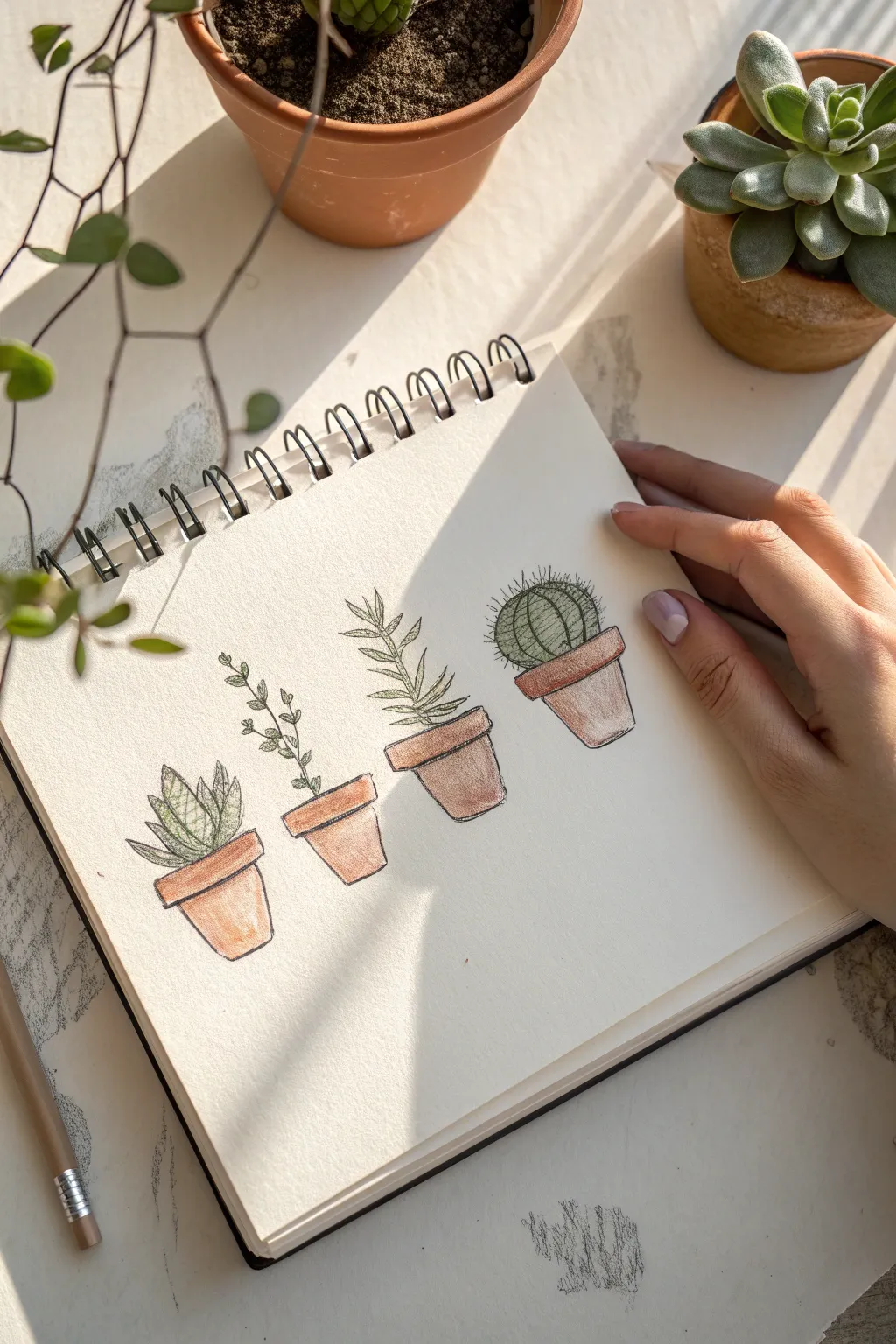
Capture the charm of your indoor garden with this delicate study of four tiny potted plants. Using a combination of fine liner and soft colored pencils, you’ll create a row of succulents and cacti that feels delightfully organic and illustrative.
Step-by-Step Tutorial
Materials
- Spiral-bound sketchbook (mixed media or heavy drawing paper)
- HB graphite pencil
- Eraser
- Fine liner pen (0.1 or 0.3mm, black, waterproof)
- Colored pencils (terracotta, sage green, forest green, warm brown)
- Pencil sharpener
Step 1: Planning the Layout
-
Establish the baseline:
Begin by lightly drawing a faint horizontal line about a third of the way up your page. This ensures all four pots sit on the same ground level, though you can vary their tilt slightly for a natural look. -
Sketch the pot shapes:
Sketch four simple trapezoids for the main bodies of the pots. Leave roughly equal spacing between them. Make the pots on the far left and right slightly smaller or simpler if you want to create a sense of variety. -
Add the rims:
Draw rectangular bands across the top of each trapezoid to form the distinctive rim of terracotta pots. Extend these slightly wider than the base of the pot for realism.
Highlight Hack
Don’t color the entire leaf! Leave the center of succulent leaves sheer or pure white. This negative space mimics the waxy, shiny texture of real succulents perfectly.
Step 2: Sketching Principles
-
First plant: Aloe style:
For the first pot on the left, sketch a cluster of pointed, triangular leaves radiating outward from the center. Keep the lines somewhat jagged to suggest the fleshy texture of an aloe or agave. -
Second plant: Trailing vine:
For the second pot, draw a single thin stem rising up and curving slightly. Add small, paired oval leaves growing upwards along the stem. It doesn’t need to be bushy—a minimalist sprig looks very elegant here. -
Third plant: The vertical succulent:
Create a taller, central stem for the third pot. From this stem, draw longer, slender leaves branching outward and upward, similar to a rosemary or a tall succulent variety. -
Fourth plant: The round cactus:
Draw a simple sphere or oval sitting comfortably in the final pot. Add vertical dividing lines curving with the shape of the sphere to denote the cactus ribs.
Step 3: Inking the Details
-
Outline the pots:
Using your waterproof fine liner, carefully trace over your pencil lines for the pots. Don’t use a ruler; a slightly shaky or imperfect hand-line adds character to the terracotta. -
Ink the foliage:
Go over the plant shapes with the pen. For the fuzzy cactus, use very short, dashed strokes or small spikes instead of a solid line to create a prickly texture. -
Add texture lines:
Add tiny details like a few dots in the soil area or small veins on the larger leaves. Erase all pencil guidelines completely once the ink is totally dry.
Uneven Ink Lines?
If your fine liner lines look shaky, thicken them slightly in the ‘shadow’ areas (the right side of the pots). This disguises the wobble as intentional line weight variation.
Step 4: Adding Color
-
Base layer for pots:
Take a terracotta or warm brown colored pencil and lightly shade all four flowerpots. Keep the pressure even but light to establish the base tone. -
Shadowing the terracotta:
Pressing harder with the same brown pencil, darken the right side of each pot and just under the rim. This simple shading creates a 3D cylindrical effect. -
Coloring the succulents:
Use a mix of sage and forest green for the leafy plants. Leave tiny white gaps on the tips or centers of leaves to simulate light reflecting off the waxy surfaces. -
Coloring the cactus:
Fill the round cactus with a medium green. I prefer to darken the grooves between the ribs to emphasize its spherical shape. -
Final touches:
Add a very light touch of brown near the base of the plants to suggest soil. If you have a white gel pen, you can add a tiny highlight dot to the cactus, but the paper white usually suffices.
Now you have a charming row of botanical miniatures perfect for greeting cards or journal headers


Mini Succulent Grid Page
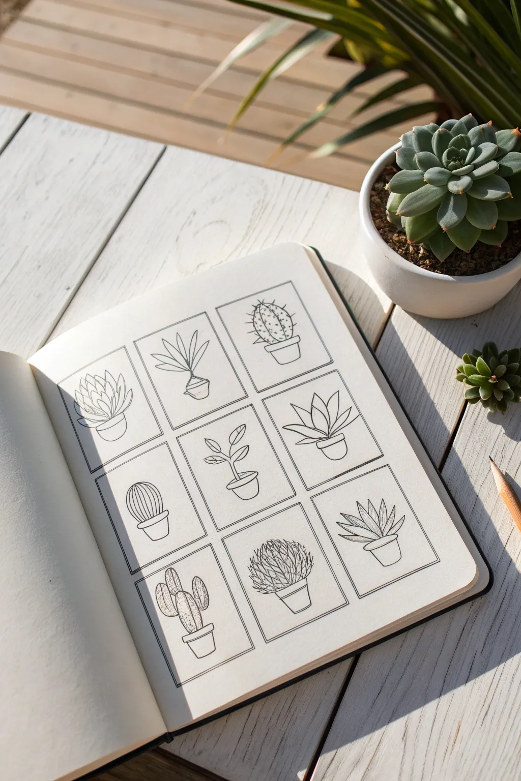
This project creates a satisfyingly organized grid of nine unique miniature succulents and cacti, perfect for filling a sketchbook page with botanical variety. The clean, linear style emphasizes simple shapes and delicate details, making it an excellent exercise in observation and line control.
Step-by-Step
Materials
- Sketchbook (smooth or mixed media paper recommended)
- Ruler
- Pencil (HB or H)
- Eraser (kneaded eraser works best)
- Fine liner pens (0.1mm and 0.3mm)
- Small compass (optional but helpful)
Step 1: Setting up the Grid
-
Measure the page:
Start by measuring the usable area of your sketchbook page to determine the size of your squares. You want equal margins on the sides and top. -
Calculate square sizes:
Divide your horizontal width by three to find the ideal width for each box, subtracting a small amount to allow for gaps between them. A gap of about 5-8mm looks clean. -
Draft the vertical lines:
Using your ruler and pencil, lightly draw the four vertical lines that will define your three columns. -
Draft the horizontal lines:
Measure down the page to create three rows of uniform height, matching the width you established earlier to ensure perfect squares. -
Finalize the boxes:
Darken the individual box outlines slightly with your pencil so you can clearly see the nine frames, and erase any guidelines extending past the grid.
Uneven Ink Lines?
Drawing straight boxes by hand is tough. If your hand shakes, try ‘ghosting’ the line in the air first, or embrace the wobble—organic lines often look better than rigid ruler lines in nature journals.
Step 2: Sketching Forms
-
Outline the pots:
In the bottom third of each square, lightly sketch a variation of a pot shape. Mix it up with rounded bowls, tapered terracotta shapes, and cylindrical planters to add variety. -
Draft the first row plants:
For the top row, sketch the basic volumes of the plants. Think in simple geometries: a rosette shape for the left, a tall singular sprout for the center, and a round ball cactus for the right. -
Draft the middle row plants:
Move to the middle row. Sketch a low, wide aloe-style plant on the right, a minimal stem with leaves in the center, and a classic ribbed cactus on the left. -
Draft the bottom row plants:
Finally, sketch the bottom designs. Plan for a tall, multi-lobed cactus on the left, a dense prickly ball in the center, and a sharp, spiky agave on the right. -
Clean up sketch lines:
Use your kneaded eraser to lift off excess graphite, leaving only a faint ‘ghost’ image to guide your ink work.
Step 3: Inking the Grid and Outlines
-
Ink the frames:
Using a 0.3mm pen and your ruler, carefully trace over the grid boxes. Stop at the corners to keep them sharp, or let them slightly overlap for a sketchier look. -
Ink the pots:
Switch to a 0.1mm pen for the drawings. Ink the outlines of the pots first, adding subtle curves to the rims to show perspective and volume. -
Ink the main plant shapes:
Trace the major convex curves of your leaves and cactus bodies. I find it helpful to rotate the sketchbook so my hand is always pulling the pen in a comfortable direction.
Level Up: Depth
Add a simple light gray wash or stippling (lots of tiny dots) to the right side of the pots and under the leaves to give your 2D drawings instant 3D volume.
Step 4: Adding Texture and Detail
-
Detail the leafy succulents:
For plants like the top-left rosette and right-middle aloe, add center veins or layer the leaves by drawing the front ones first and Tuck the back ones behind them. -
Add ribs and segments:
On the cacti (like the middle-left and bottom-left), draw vertical lines following the curve of the plant to create vertical ribs. -
Stipple and spine texture:
For the round cactus in the top right, use tiny dots and small ‘v’ shapes to suggest spines. Do the same for the dense cactus in the bottom center, using short strokes to create a fuzzy look. -
Refine the stems:
On the center plant, thicken the main stem slightly and ensure the leaves attach naturally to the stalk. -
Erase and final check:
Wait at least five minutes for the ink to fully cure. Gently erase all remaining pencil marks to reveal the crisp black lines.
You now have a beautifully curated collection of botanical miniatures to admire


Mini Mushroom Cluster Study
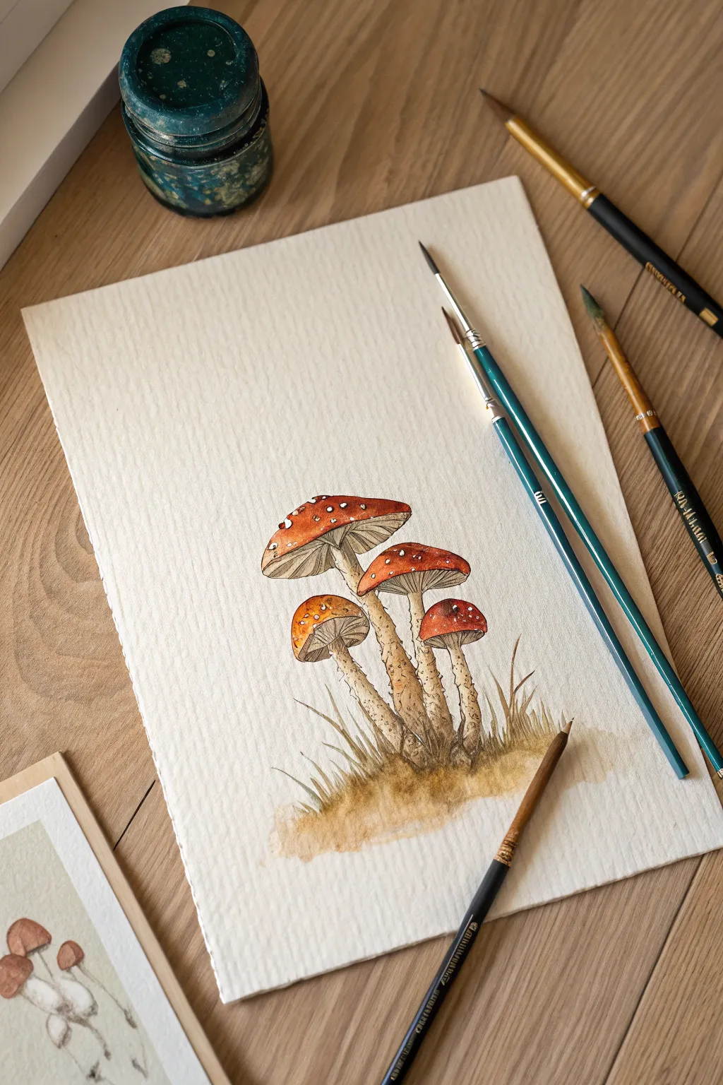
Capture the magic of the forest floor with this charming study of Fly Agaric mushrooms. Using fine liners and warm watercolor washes, you’ll create a textured, organic artwork that feels just dug from the earth.
How-To Guide
Materials
- Cold-press watercolor paper (300gsm)
- HB pencil and kneaded eraser
- Waterproof fine liner pens (sepia or dark brown, sizes 0.1 and 0.3)
- Watercolor paints: Scarlet Red, Burnt Sienna, Yellow Ochre, Raw Umber, Sepia
- Small round brushes (size 2 and 4)
- Mixing palette
- Jar of water and paper towels
Step 1: Sketching the Composition
-
Outline the caps:
Begin by lightly sketching four oval shapes for the mushroom caps. Place the largest one at the top center, slightly tilted. Place a medium one below it to the right, and two smaller ones tucked underneath to the left and right. -
Draw the stems:
From the center of each cap, draw stems curving downwards. Notice how they thicken slightly at the base where they meet the ground. Group the bases close together to show they are growing from a single cluster. -
Add the gills:
Lightly sketch the underside of the caps. Use fine, radiating lines that curve from the stem outward to the edge of the cap to indicate the gills. -
Detail the grass:
At the base of the stems, sketch a few blades of grass poking up. Keep these loose and organic, overlapping the bottom of the stems slightly.
Bleeding edges?
If your red paint bleeds into the white spots, don’t panic. Let it dry completely, then use opaque white gouache to paint crisp spots back over the red mistake.
Step 2: Inking the Lines
-
Ink the main outlines:
Using your 0.3 dark brown fine liner, go over your pencil lines for the caps and stems. Keep your hand relaxed for a slightly shaky, organic line rather than a perfect geometric one. -
Add texture to the stems:
Switch to a thinner 0.1 pen. Add small, broken lines and dots along the stems to create a rough, scaly texture. Focus these marks especially near the base of the stems. -
Define the gills:
With the 0.1 pen, draw the gill lines underneath the caps. Don’t draw every single line; broken or partial lines suggest detail without overwhelming the drawing. -
Erase pencil marks:
Once the ink is completely dry—give it a few minutes to be safe—gently erase all the visible pencil guidelines with your kneaded eraser.
Add Variety
Try painting a second cluster, but vary the cap stages: make one a tiny, round ‘button’ mushroom and another one fully flat and open with torn edges.
Step 3: Watercolor Application
-
Paint the red caps:
Mix a vibrant Scarlet Red with a touch of Burnt Sienna. Carefully paint the tops of the caps, leaving small, irregular white circles unpainted to represent the iconic white spots. -
Add shadow to caps:
While the red is still slightly damp, drop a tiny bit of concentrated Burnt Sienna or Sepia near the bottom edge of the caps to create a rounded, 3D form. -
Wash the stems:
dilute Yellow Ochre with plenty of water for a pale, tea-colored wash. Paint the stems and the gills, keeping the color very light. -
Deepen the gills:
Mix a diluted Raw Umber. With a very fine brush, paint thin shadows between the gill lines you inked earlier, adding depth under the cap. -
Texture the stems:
Using a mix of Raw Umber and Sepia, add small dabs of paint to the lower parts of the stems where you added ink texture. This enhances the rough, earthy look.
Step 4: Grounding and Finishing
-
Paint the earth:
Mix a watery wash of Raw Umber and Yellow Ochre. Apply this loosely at the base of the mushrooms to create the ground. Let the edges of this wash fade out softly. -
Define the grass:
Using a slightly darker mix of Sepia or even a dull olive green, paint the blades of grass you sketched earlier. Use quick, upward flicking motions with the tip of your brush. -
Add cast shadows:
Mix a darker Sepia tone. Paint small shadows right underneath the caps on the stems, and where the overlapping mushrooms cast shadows on each other. -
Splatter texture:
I like to load a small brush with watery brown paint and tap it against a finger to create tiny speckles on the paper around the base. It mimics dirt and grit perfectly. -
Final highlights:
If you accidentally painted over any white spots on the caps, you can use a tiny dot of white gouache or a white gel pen to reclaim them once everything is bone dry.
Now you have a lovely woodland specimen ready for your sketchbook or a nature journal


Coin-Size Animal Portrait
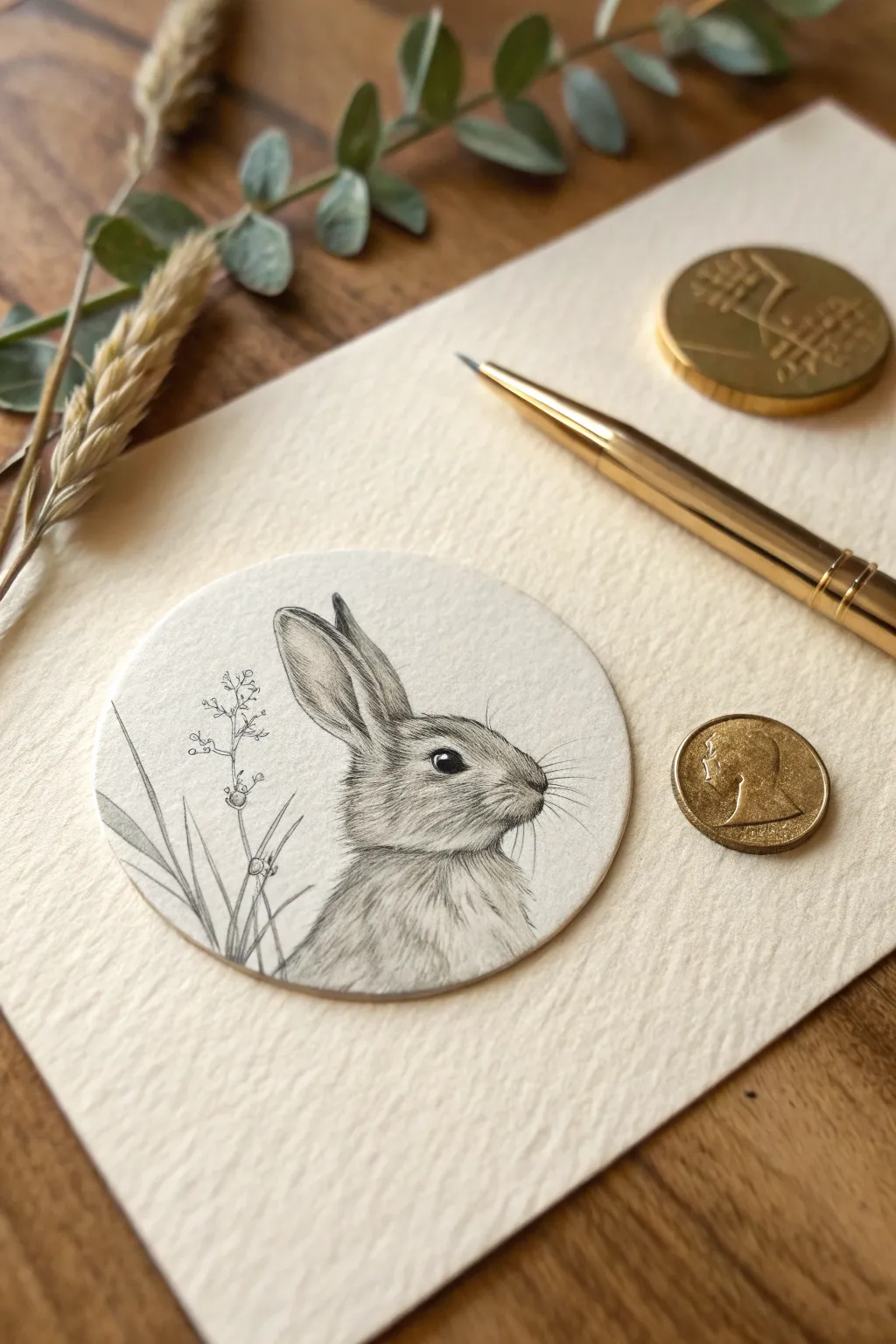
Capture the delicate spirit of a wild rabbit in a miniature format with this precise graphite drawing. Fits perfectly within the diameter of a small coin, this project transforms a simple circle of paper into a highly detailed wildlife portrait.
Step-by-Step Guide
Materials
- Hot press watercolor paper or smooth Bristol board
- Circle cutter or a small round object to trace (approx. 1.5 – 2 inches)
- Mechanical pencil (0.3mm or 0.5mm, HB and 2B leads)
- Graphite pencils (4H for layout, 4B for deepest darks)
- Kneaded eraser
- Fine-point eraser stick (e.g., Tombow Mono Zero)
- Blending stump or tortillon (extra fine)
- Ruler
Step 1: Preparation & Outline
-
Cut the canvas:
Begin by cutting a perfect circle from your smooth paper. A circle cutter works best for clean edges, but tracing a shot glass or coin and cutting carefully with scissors works too. Aim for a diameter between 1.5 and 2 inches. -
Establish placement:
Lightly mark a horizon line about one-third of the way up from the bottom using a 4H pencil. This will guide where the rabbit’s chest meets the tall grass. -
Basic shapes:
Sketch the rabbit’s head as a rounded oval tilted slightly upward. Add a larger, partial oval below it for the chest and body, letting it fade off the bottom edge of the circle. -
Ear construction:
Draw two long, slender ear shapes extending from the top back of the head. Notice how the ear closest to us is fuller, while the far ear is slightly obscured and tucked behind. -
Refine the profile:
Using your mechanical pencil, carefully refine the snout profile. The nose should be small and slightly blunt, leading into a curved cheek. -
Place the eye:
Position the eye centrally in the head oval, but slightly closer to the top edge. Draw a classic almond shape with a small white circle reserved inside for the highlight. -
Add floral elements:
On the left side of the circle, sketch three or four long, slender blades of grass crossing over each other. Add a thin, branching stem with tiny buds or seed pods to mimic the wildflower in the reference.
Sharpness is Key
For realistic miniature fur, rotate your pencil every few strokes. This keeps the lead point chiseled and sharp, preventing the fuzzy lines that ruin small-scale detail.
Step 2: Rendering Texture
-
The eye details:
Fill in the eye with your darkest lead (2B or 4B), being careful to leave that tiny highlight purely white. This anchors the drawing’s personality immediately. -
Directional mapping:
Before shading, visualize the direction the fur grows. It flows back from the nose, up the forehead, and down the neck. Lightly map these flowing lines with the HB pencil. -
Initial fur layer:
Using the 0.3mm mechanical pencil, start laying down short, quick hatch marks. Follow your directional map. Keep the pressure very light to create a soft gray base tone. -
Deepening the shadows:
Switch to a 2B lead to darken the areas under the chin, inside the near ear, and at the base of the neck. This creates separation between the head and body. -
Ear transparency:
The ears are thin, so keep the shading lighter in the center of the near ear. Darken the rim and the inner fold to give it a concave, cupped appearance. -
Creating fluff:
I find that varying stroke length helps here. Use longer strokes on the body and very tiny, stippled dashes on the nose and cheeks to mimic short velvet fur. -
The whiskers:
Press fairly hard with your sharpest HB pencil to flick out the whiskers from the muzzle. Do this in confident, single motions so the lines don’t look shaky. -
Defining the flora:
Outline the grass blades and the flower stem with a crisp line. Shade the bottom of the blades where they cluster, fading to white at the tips to suggest light hitting them.
Going 3D
Mount your finished circle onto a slightly larger gold or colored coin using a foam adhesive square. This lifts the art off the page, creating a beautiful shadow box effect.
Step 3: Final Polish
-
Lifting highlights:
Take your fine-point eraser stick and gently lift out tiny strokes of graphite on the cheekbone, the rim of the ear, and the chest. This simulates white hairs catching the light. -
Softening edges:
Use the very tip of a clean blending stump to gently smudge the graphite at the back of the neck and the bottom of the body. This vignette effect makes the rabbit look like it’s emerging softly from the paper. -
Contrast check:
Review the drawing from a distance. If the rabbit looks flat, add a few more touches of 4B graphite to the pupil and the deepest shadow under the chin.
Your tiny masterpiece is now ready to be framed in a locket or displayed as a precious miniature collectible.

PENCIL GUIDE
Understanding Pencil Grades from H to B
From first sketch to finished drawing — learn pencil grades, line control, and shading techniques.
Explore the Full Guide
Tiny Sleeping Cat Gestures
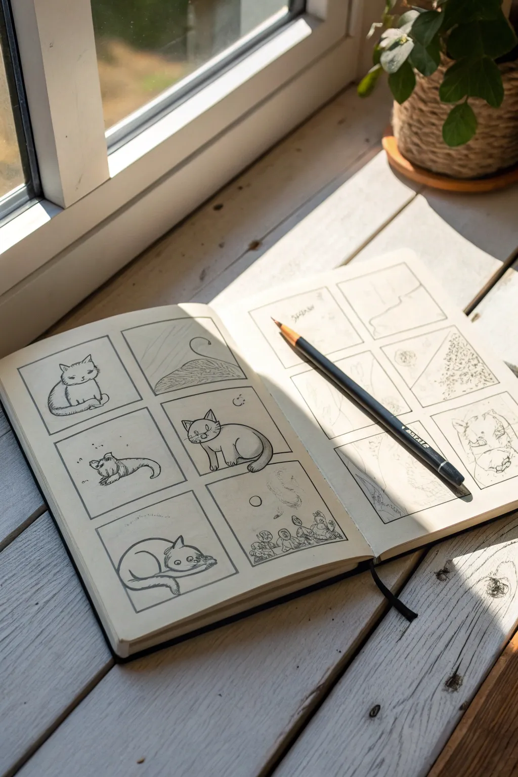
Capture the charm of feline movements with this sequential grid study, perfect for filling a lazy afternoon. Using simple, confident line work, you’ll create a series of six miniature panels that explore different sleeping and sitting poses of a stylized cat character.
How-To Guide
Materials
- Hardcover sketchbook (A5 or similar size)
- Black fine-liner pen (0.3mm or 0.5mm)
- Dozens of small square templates or a ruler
- Pencil (HB or 2B for initial sketching)
- Eraser
Step 1: Setting up the Grid
-
Mark grid boundaries:
Open your sketchbook to a fresh, flat spread. On the left-hand page, lightly mark out a grid of six equal squares with your pencil—two wide and three tall. Leave about a half-inch margin between each box to give the drawings breathing room. -
Ink the frames:
Using your black fine-liner, trace over your pencil grid lines to create the permanent frames. Don’t worry if the lines aren’t perfectly machine-straight; a slight wobble adds to the hand-drawn, organic aesthetic. -
Erase guidelines:
Once the ink is completely dry (give it a minute to avoid smudges), gently erase the underlying pencil marks so you have six clean, empty stages for your cat character.
Wobbly Lines?
If your square frames look too uneven, don’t restart. Simply go over the lines a second time loosely. The ‘sketchy’ double-line look is a style choice that hides imperfections well.
Step 2: Developing the Cat Character
-
Pose 1: The Loaf:
In the top-left square, sketch a rounded bean shape for the body. Add a small, circular head tucked slightly into the chest to represent the classic ‘loaf’ sitting position. -
Inking the Loaf:
Go over your sketch with the fine-liner. Use short, hatched lines on the belly to suggest fur texture and grounding shadow. Give the cat closed, slanted eyes and a small triangular nose for a contented expression. -
Pose 2: The Tail Chase:
For the top-right square, focus on abstract movement. Draw a curved horizon line representing the cat’s back, and a large, spiraling swirl extending upward to depict a tail in motion.
Step 3: Adding Narrative Poses
-
Pose 3: The Stretch:
In the middle-left square, draw the cat stretched out long and low. The head should be down, and the back legs extended, creating a sleek, worm-like silhouette. -
Detailing the Stretch:
Add small, floating dots or ‘dust motes’ around the stretching cat to fill the negative space and add atmosphere. Ink the outline with a confident, continuous stroke. -
Pose 4: The Alert Sitter:
In the middle-right square, draw the cat sitting upright. Use two large ovals for the body—one for the chest, one for the haunches. Place the head high with alert, triangular ears. -
Face details:
Ink the face with wide, round eyes this time, giving it a playful look. Add a tiny moon or star symbol in the upper corner of this box to suggest a nighttime scene.
Level Up: Washes
Dilute a tiny drop of black ink or watercolor with water to create a grey wash. Paint simple shadows under the cats to ground them and make the white paper pop.
Step 4: Final Sketches and Clean Up
-
Pose 5: The Curl:
In the bottom-left square, sketch the cat curled into a tight circle or donut shape. The head should be tucked near the tail, creating a closed loop of comfort. -
Pose 6: The Dream (Optional):
For the final bottom-right square, you can get surreal. Sketch tiny figures or abstract shapes near the bottom, suggesting a dreamscape or a view from a mouse’s perspective. -
Final inking pass:
Ink these final two sketches. Vary your line weight slightly—press harder on the bottom curves of the cat to simulate shadow and weight. -
Final erase:
Do one last pass with your eraser across the entire page to remove any remaining graphite construction lines, leaving only the crisp black ink.
Now you have a charming page of character studies ready to inspire your next larger illustration
Mini Bird on a Branch
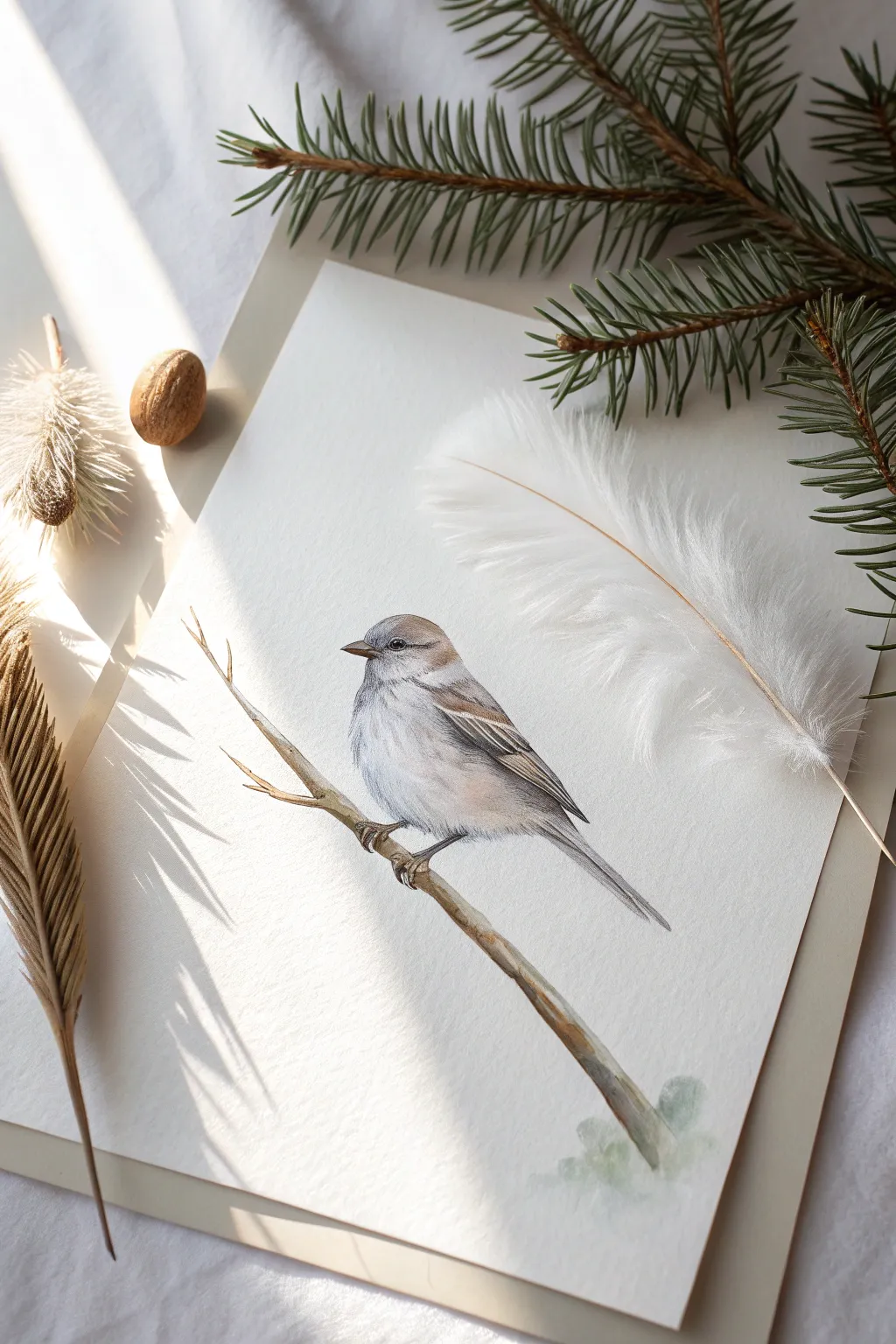
Capture the delicate beauty of winter nature with this soft mixed-media illustration of a sparrow perched on a bare branch. Combining watercolor washes with colored pencil details creates a lovely, textured realism that feels both gentle and grounded.
Step-by-Step Tutorial
Materials
- Hot press watercolor paper (fine texture)
- H or HB pencil for sketching
- Kneaded eraser
- Watercolor paints (Payne’s Grey, Burnt Umber, Yellow Ochre, Ultramarine)
- Small round watercolor brushes (sizes 0, 2, and 4)
- Colored pencils (grey, warm brown, dark brown, black, white)
- Blending stump or cotton bud
- White gouache or gel pen (optional for highlights)
Step 1: Planning the Sketch
-
Establish the curve:
Begin by lightly sketching the main branch line diagonally across the lower third of your paper. Keep the line slightly jagged and organic, rather than perfectly straight, to mimic natural wood. -
Position the bird:
Draw an oval shape just above the center of the branch for the sparrow’s body. Add a smaller circle for the head, slightly overlapping the body oval to intimate a hunched, cozy posture. -
Refine the outline:
Connect the head and body shapes with smooth lines. Sketch the tail extending downwards in a straight, narrow fan. Add the triangular beak and the small, bead-like eye positioned near the beak’s base. -
Detail the branch:
Thicken your initial branch line, adding small knots and a few shorter twigs or ‘spurs’ branching off. Ensure the bird’s feet grasp the branch convincingly. -
Lighten the lines:
Roll your kneaded eraser gently over the entire sketch. You want the graphite to be barely visible so it doesn’t dirty the watercolor layers that follow.
Step 2: Watercolor Washes
-
Base wash for the bird:
Mix a very dilute wash of Payne’s Grey and a touch of Burnt Umber. Apply this wet-on-dry to the bird’s back and head, leaving the chest and belly white for now. -
Add warmth:
While the first layer is still slightly damp, drop a tiny amount of watered-down Yellow Ochre or warmth into the cheek and wing area to suggest soft downy feathers. -
Paint the branch:
Mix Burnt Umber with a little blue to dull it down. Paint the branch with a size 2 brush, varying the pressure to create thick and thin areas. Leave small gaps of white paper for highlights on the wood. -
Shadows and depth:
Once the first layer is dry, add a slightly darker grey mix under the wing and tail feathers to build volume. I find it helpful to soften the edges with a clean, damp brush so there are no harsh lines. -
Grounding details:
Add a very faint, watery wash of green and grey at the bottom right corner of the paper to suggest foliage without drawing focus away from the bird.
Feather Tip
Keep your pencil extremely sharp for the feather strokes. A dull point will look like fur, while a sharp point mimics the structure of bird feathers.
Step 3: Pencil Refinements
-
Define the eye and beak:
Using a sharp black or dark brown colored pencil, draw the eye, leaving a tiny speck of white paper for the catchlight. Outline the beak, darkening the separation line between the upper and lower mandibles. -
Texture the feathers:
With a grey colored pencil, use short, flicking strokes to create the texture of feathers on the head and back. Follow the curve of the bird’s body with your strokes. -
Wing details:
Switch to a dark brown pencil to define the flight feathers on the wing. Draw the distinct striping patterns found on sparrow wings, pressing harder for the darker tips. -
Soften the belly:
Use a white or light grey pencil to gently blend the transition from the painted grey back to the white belly, creating a fluffy, soft appearance. -
Enhance the branch:
Use a warm brown pencil to add wood grain texture to your painted branch. Darken the underside of the branch to reinforce the lighting source coming from above. -
Final highlights:
If the eye catchlight got lost, use a tiny dot of white gouache or a gel pen to bring life back to the face.
Muddy Colors?
If your grey wash looks too dark or muddy, lift some pigment while it’s wet with a clean tissue. Watercolors dry lighter, so don’t panic until it’s dry.
Now mount your delicate artwork on a card or frame it with a wide mat to emphasize its minimal elegance
BRUSH GUIDE
The Right Brush for Every Stroke
From clean lines to bold texture — master brush choice, stroke control, and essential techniques.
Explore the Full Guide
Tiny Feather Texture Practice
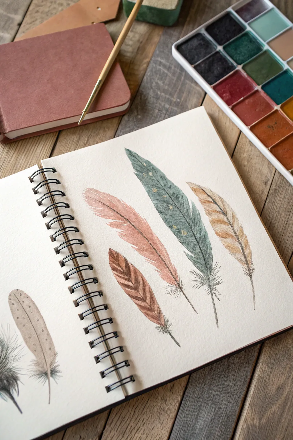
Master the art of lightness and texture with this study of four distinct feathers, capturing their softness and intricate barbs. Using delicate watercolor washes and fine liner details, you will create a naturalistic and serene composition in your sketchbook.
Detailed Instructions
Materials
- Spiral-bound watercolor sketchbook (cold press paper recommended)
- Watercolor paints (Payne’s Grey, Burnt Sienna, Yellow Ochre, Rose Madder/Pink)
- Fine round watercolor brush (size 2 or 4)
- Micron pen or fine liner (0.05 or 0.1 size, sepia or black)
- Pencil (HB) and kneaded eraser
- Clean water and paper towel
Step 1: Sketching the Composition
-
Map out the positions:
Begin by lightly sketching the central rachis (the main stem) of four feathers in a slightly fanned-out arrangement. Curve them gently to give them organic movement rather than making them stiff straight lines. -
Define the silhouettes:
Draw the outer contour of the vanes around each stem. Vary the shapes: make the left one slender and pink, the middle one largest and tapered, and the right one shorter and more ruffled. Add a small patterned feather at the bottom left. -
Add splits and gaps:
Erase small V-shapes along the edges of your outlines to represent natural splits in the feather barbs. Keep these markings light, just enough to guide your painting.
Step 2: Applying the Base Washes
-
Paint the pink feather:
Mix a watery wash of Rose Madder or a dusty pink. Apply this to the left feather, keeping the color strongest near the stem and fading slightly toward the edges. Leave tiny slivers of white paper where the splits occur. -
Wash the blue-green feather:
Create a muted teal using Payne’s Grey mixed with a touch of green. Paint the large central feather, allowing for some unevenness in the wash to suggest texture. Drop a slightly darker value into the wet paint near the bottom for depth. -
Paint the golden feather:
Use a mix of Yellow Ochre and Burnt Sienna for the right-hand feather. Apply the paint in strokes that follow the direction of the barbs (outward and upward), rather than filling it in solid like a coloring book. -
Detail the patterned feather:
For the bottom left feather, paint alternating diagonal stripes of Burnt Sienna and a pale cream wash. Let the stripes touch while wet if you want a softer transition, or let them dry for crisp lines.
Bleeding Edges?
If your paint bleeds outside the sketched lines, don’t wipe it! Let it dry completely, then turn that ‘mistake’ into a loose, stray barb with your fine liner pen.
Step 3: Building Texture and Detail
-
Deepen the shadows:
Once the initial washes are bone dry, mix slightly more concentrated versions of your base colors. Use the very tip of your brush to paint thin, hair-like lines emerging from the central stem outward. -
Enhance the blue feather:
I like to add tiny dots or speckles to the blue-green feather using a darker grey mix. Randomize their placement to keep it looking organic, focusing on the upper half. -
Layer the pink feather:
Add a second layer of pink strokes on the ‘shadow’ side of the feather (the bottom edge of the curve) to give it dimensionality. -
Refine the golden feather:
Use a dark brown mix to paint thin, sharp lines separating the barbs on the ochre feather, accentuating the rifts you sketched earlier.
Lift for lightness
While the wash is still wet, use a thirsty (clean, damp) brush to lift distinct lines out of the pigment. This creates soft highlights that look like light hitting the ridges.
Step 4: Final Ink Definition
-
Ink the stems:
Using your fine liner pen, carefully trace the central quill of each feather. Do not make a solid, heavy line; use a broken, delicate touch, thickening it slightly at the base. -
Add fine hairs:
At the very base of each quill, use quick, flicking pen strokes to create the fluffy down feathers. These lines should be loose and overlapping. -
Outline the edges:
Very selectively outline parts of the feather edges with Ink. Don’t outline the whole thing; focus on the tips and the areas where the barbs split to sharpen the silhouette. -
Add surface texture:
Draw extremely fine, short strokes inside the painted areas, following the direction of growth. This mimics the individual barbs and marries the paint to the ink.
Close your sketchbook knowing you’ve captured the fragile beauty of nature on the page
Mini Eye and Lash Studies
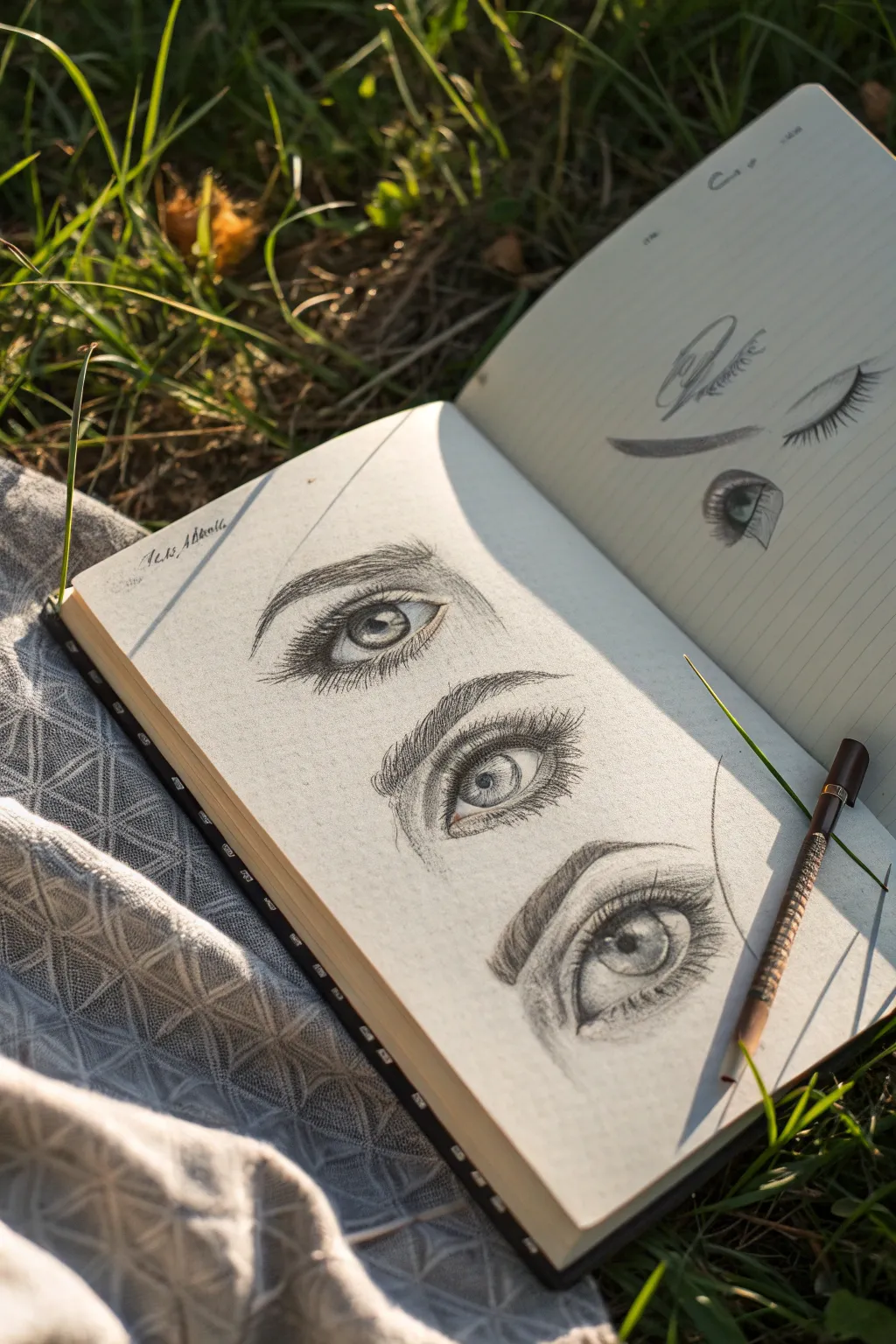
Capture the soulful depth of the human gaze with these detailed miniature graphite studies. This project focuses on rendering realistic textures, from the glossy reflection of the iris to the delicate sweep of eyelashes, directly into your sketchbook.
How-To Guide
Materials
- Sketchbook with smooth, heavyweight paper
- Graphite pencils (HB, 2B, 4B, 6B)
- Mechanical pencil (0.5mm or 0.3mm for fine details)
- Kneaded eraser
- Precision eraser (stick eraser)
- Blending stump or tortillon
- Soft tissue or cotton swab
Step 1: Structural Layout
-
Map the placements:
Begin by lightly marking the position of three separate eyes on your left page using an HB pencil. Leave generous vertical space between them so they don’t feel crowded. -
Outline the shapes:
Draw the basic almond shape for each eye. Vary the angles slightly—perhaps one looking straight ahead and another slightly downturned—to practice different perspectives. -
Define the iris and pupil:
Lightly sketch a perfect circle for the iris within each eye shape. In the center of each iris, draw a smaller circle for the pupil. Don’t press hard yet; these are just guides. -
Mark highlights:
Before doing any shading, draw small, irregular shapes inside the iris or pupil to reserve the white of the paper for reflections. This is crucial for a wet, glossy look. -
Sketch the eyebrow arch:
Above each eye, lightly ghost in the shape of the eyebrow. Pay attention to the distance between the eyelid crease and the brow bone.
Smudge Control
Place a piece of scrap paper under your hand while drawing. This prevents your palm from smearing the graphite of the lower eyes while you work on the upper ones.
Step 2: Shading the Iris and Pupil
-
Darken the pupil:
Switch to a 4B or 6B pencil to fill in the pupil. Make it as dark as possible, but be careful not to smudge into your reserved highlight area. -
Radiating lines:
Using a sharp 2B pencil, draw lines radiating outward from the pupil toward the edge of the iris, like spokes on a wheel. Keep your strokes loose and varied in length. -
Outer rim definition:
Darken the outer ring of the iris (the limbal ring). Softly blend this edge inward so it doesn’t look like a harsh cartoon outline. -
Create depth:
Shade the top part of the iris (under the upper lid) darker than the bottom. This cast shadow gives the eye volume and realism.
Practice Page
Use the facing page (like the image) to practice individual components, like a single lash curve or an eyebrow arch, before committing to the main study.
Step 3: Skin Texture and Features
-
Shade the sclera:
The ‘white’ of the eye isn’t pure white. Lightly shade the corners of the eyeball with an HB pencil, blending toward the iris to show the spherical form. -
Define the eyelid crease:
Deepen the line for the upper eyelid crease. Use a blending stump to soften the graphite upwards onto the brow bone, creating a smooth transition of skin. -
Waterline details:
Draw the lower waterline (the rim of skin between the eye and lashes). Keep this area mostly light to make it look wet, shielding it from heavy shading. -
Eyebrow foundation:
For the eyebrows, lay down a soft base tone with an HB pencil. Don’t draw individual hairs yet; just establish the general shape and shadow.
Step 4: Fine Details and Lashes
-
Draw eyebrow hairs:
Using a sharp mechanical pencil or 2B, draw short, quick strokes for eyebrow hairs. Follow the natural growth direction—upward at the nose, flattening out toward the temple. -
Upper lashes:
Flick curved lines upward from the top lash line. Start with heavy pressure and release quickly to taper the tip. Group some lashes together for a natural, slightly clumpy look. -
Lower lashes:
Add lower lashes using lighter strokes. These should be shorter, sparser, and Curve slightly downward and outward. -
Final highlights:
Use a precision eraser or the sharp edge of a kneaded eraser to lift out tiny highlights on the lower lid, tear duct, and the center of the lower iris for extra sparkle. -
Tone adjustment:
Step back and assess your values. Darken the darkest shadows (pupil, crease, lash line) with a 6B pencil to increase the contrast and pop.
Now you have a trio of expressive eye studies that bring life to your sketchbook pages


Tiny Teacup Still Life

Capture the delicate beauty of your favorite teacup in miniature with this charming sketchbook exercise. Learn to observe subtle shadows and intricate floral patterns as you render a tiny, realistic still life that pops off the page.
How-To Guide
Materials
- Sketchbook with heavy-weight or watercolor paper
- Small teacup and saucer (as reference)
- HB or 2H graphite pencil
- Kneaded eraser
- Watercolor paints (pans or tubes)
- Small round brushes (Size 0 and Size 2)
- Fine liner pen (optional, for details)
- Cup of water and paper towel
- White gel pen or white gouache
Step 1: Planning the Composition
-
Position your subject:
Place your actual teacup and saucer on the opposite page or a nearby surface. Ensure the handle is turned to a visually interesting angle, perhaps slightly to the side to show the cup’s volume. -
Lightly sketch the saucer:
Start with the base. Draw a flattened oval (ellipse) near the bottom corner of your page. Keep your pencil strokes very light so they disappear under the paint later. -
Add the cup shape:
Draw a smaller ellipse nested inside the top half of the saucer ellipse for the rim of the cup. Connect this down to the saucer with two curved lines that taper slightly inward. -
Draft the handle:
Sketch the handle shape on the side. Notice how it loops out and connects back to the cup body; pay attention to the negative space between the handle and the porcelain. -
Indicate patterns and coffee:
Draw a small inner line inside the rim to show the thickness of the china. Lightly mark where the coffee or tea liquid line sits, and loosely map out where the floral patterns will go on the saucer and cup side.
Step 2: Painting the Base Layers
-
Wash the shadows:
Mix a very dilute grey-blue or cool violet. Apply this sheer wash to the shadowed side of the white porcelain and the inner rim of the saucer to give the object form. -
Paint the liquid:
Mix a warm brown or burnt sienna. Fill in the liquid area inside the cup, leaving a tiny sliver of white paper near the edge for a highlight where the liquid meets the cup. -
Deepen the liquid:
While the brown is still damp, drop in a slightly darker brown or black on one side to suggest depth and reflection within the beverage. -
Define the gold rim:
Using a mix of yellow ochre and a touch of brown, carefully paint the thin rim of the cup and the edge of the saucer. Keep this line steady but delicate.
Pro Tip: Perspective Check
Turn your reference cup upside down to focus purely on the shapes of the ellipses without your brain trying to ‘correct’ the image into a symbol of a cup.
Step 3: Adding Details and Patterns
-
Paint the floral motifs:
Switch to your smallest brush (Size 0). Mix reds, greens, or blues to match your cup’s pattern. Use tiny stippling motions to create the small flowers on the saucer and the side of the cup. -
Refine the china:
Once the first shadow layer is dry, go back with a slightly darker grey-blue to deepen the shadows under the cup where it sits on the saucer and under the handle. -
Cast shadow:
Mix a transparent grey wash. Paint a soft shadow explicitly underneath the saucer to ground the object so it doesn’t look like it’s floating. -
Enhance the patterns:
Add darker accents to your floral patterns to give them dimension. If there are leaves, paint the veins with the very tip of your brush.
Level Up: Steam Rising
Wet the paper directly above the painted liquid with clean water and drop in a tiny amount of grey to create a soft, diffusing steam effect.
Step 4: Highlights and Final Touches
-
Boost contrast in the coffee:
I like to add one final dark glaze to the liquid if it dried too light, ensuring it looks deep and rich. -
Add clean highlights:
Use a white gel pen or a dot of white gouache to add sharp reflections on the rim, the handle, and the surface of the liquid. This ‘sparkle’ brings the glass and ceramic texture to life. -
Soften edges:
If any shadow edges look too harsh, use a clean damp brush to gently soften them before the paint fully cures. -
Clean up:
Once the paint is completely bone dry, gently erase any visible graphite lines that haven’t been covered by paint.
Now you have a timeless little keepsake preserved right on the page, ready for your next study.
Mini Shells and Pebbles Trio
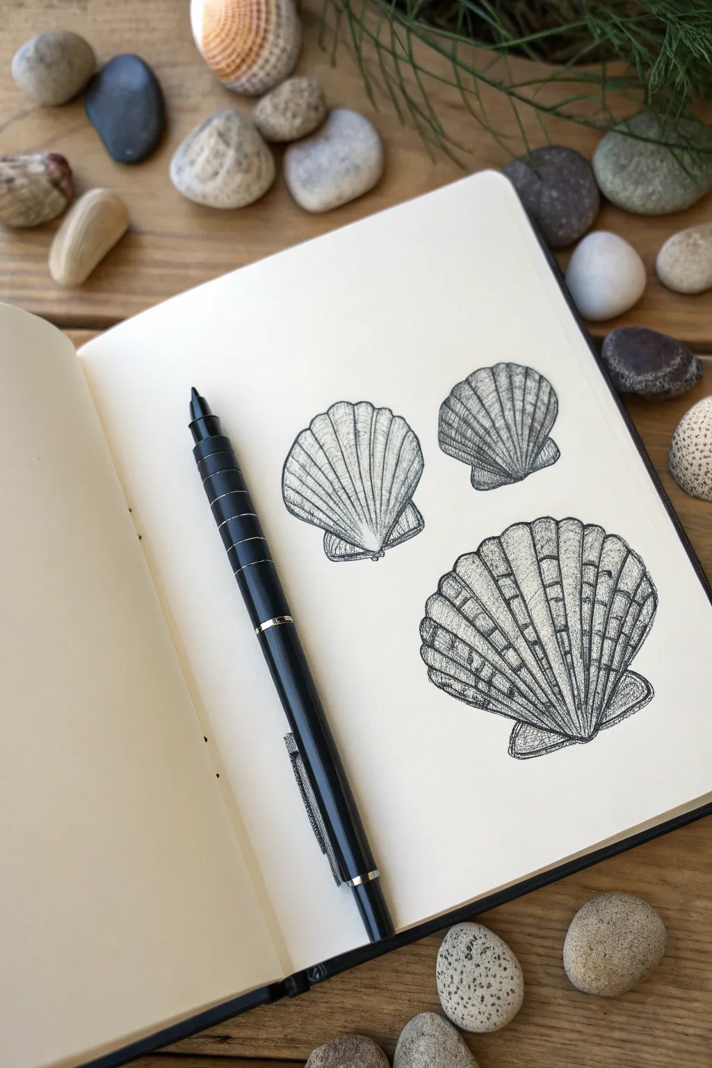
Capture the intricate textures of the seaside with this delicate pen-and-ink study featuring three scallop shells. By using simple hatching and stippling techniques, you’ll build up realistic ridges and depth on plain sketchbook paper.
Detailed Instructions
Materials
- Smooth sketchbook paper (cream or white)
- Fine liner pen (0.1mm or 0.3mm nib)
- Black drawing pen (medium nib for outlines)
- Graphite pencil (HB or H)
- Soft eraser
- Real seashells or reference photos
Step 1: Planning and Sketching
-
Composition:
Visualize where your three shells will sit on the page. Arrange them in a loose triangle formation—two smaller shells at the top and one larger shell below—to create a balanced composition. -
Basic Shapes:
Using your graphite pencil, lightly draw the fan shape of the first top shell. Start with a narrow point at the bottom (the hinge) and fan out into a wide arc at the top. -
Adding Volume:
Curve the top edge of the arc slightly downward to give the shell a convex, 3D appearance rather than a flat shape. -
Drawing the Hinge:
At the bottom point of your fan, sketch two small, triangular ‘wings’ or auricles that are characteristic of scallop shells. -
Repeating the Process:
Repeat these steps for the remaining two shells. Vary the angles slightly so they don’t look like carbon copies; tilt the second top one to the right and the large bottom one slightly left. -
Mapping the Ribs:
Lightly sketch the radiating ribs of the shells with your pencil. These lines should start from the center hinge and fan out toward the scalloped edge. Keep them evenly spaced.
Step 2: Inking and Outlining
-
Primary Outlines:
Take your medium-nib pen and carefully trace the outer perimeter of each shell. Use a broken or slightly wavy line for the top edge to mimic the natural scalloped growth pattern. -
Defining the Ribs:
Switch to a finer liner (0.1mm works well here). Draw the vertical lines for the ribs, but don’t make them solid straight lines. Use a slightly broken stroke to suggest texture. -
Erasing Guides:
Once the foundational ink lines are completely dry, gently erase all your graphite pencil marks to reveal a clean starting point for shading.
Ink Smearing?
Work from left to right if you are right-handed (or vice versa) to avoid dragging your hand through wet ink. If smudging occurs, turn it into a shadow.
Step 3: Shading and Texturing
-
Directional Hatching:
Begin shading the large bottom shell. Use short, fine hatching lines that follow the curve of the shell. I find it helpful to pull the pen toward the hinge to maintain the flow. -
Deepening Shadows:
Add density to the shadows between the ribs. Place more ink strokes in the ‘valleys’ of the shell surface, leaving the tops of the ribs lighter to act as highlights. -
Cross-Hatching Details:
On the darker shell at the top right, introduce cross-hatching. Layer perpendicular lines over your initial shading to create a darker value, making this shell appear distinct from the others. -
Horizontal Growth Rings:
To enhance realism, draw very faint, curved horizontal lines across the ribs. These represent the growth rings of the shell and break up the vertical dominance of the ribs. -
Stippling for Texture:
Use stippling (tiny dots) near the hinge and bottom edges of the shells. This adds a gritty, sandy texture closer to the base where dirt naturally accumulates. -
Final Contrast Check:
Step back and assess your values. If the shells look too flat, go back into the deepest crevices with your finest pen and add more ink density to specific areas for higher contrast.
Make it Pop
Use a white gel pen to add tiny highlights on the highest point of each rib. This creates a ‘wet’ look, as if the shells were just plucked from the tide.
Now you have a trio of permanent seashells preserved in your sketchbook to enjoy anytime
Landscape Inside a Circle

Capture the serenity of a moonlit mountain range contained perfectly within a crisp circular frame. This monochrome ink drawing combines bold silhouettes with delicate stippling and line work to create depth and atmosphere in a miniature format.
Step-by-Step Tutorial
Materials
- Spiral-bound sketchbook with smooth, thick paper
- Fine liner pens (sizes 0.05, 0.1, 0.3, and 0.5)
- Compass or a circular object to trace (approx. 3-4 inches diameter)
- Graphite pencil (HB or 2H)
- Soft eraser
- Ruler (optional, for the horizon line)
Step 1: Framework and Sketching
-
Draw the boundary:
Begin by lightly tracing your circle in the center of the page using a compass or a round object. This will be the viewport for your entire landscape. -
Map the mountains:
Using your pencil, sketch two main mountain peaks slightly off-center. Let the left peak sit a bit lower and in front of the right peak to establish depth. -
Add the tree lines:
Lightly sketch the shapes of the pine trees on the left and right sides. The right side should feature taller, dominant trees, while the left side has a smaller cluster to balance the composition. -
Define the path and foreground:
Sketch a winding S-curve starting from the bottom center, narrowing as it moves toward the mountain base. This creates the flowing path or stream. -
Place celestial elements:
In the upper left quadrant of the sky, sketch a crescent moon facing inward.
Wobbly circle borders?
Don’t panic! Instead of trying to fix a bumpy line, just thicken the entire border line slightly with a broader pen. A bold frame often looks even better.
Step 2: Inking the Foundation
-
Ink the circle:
Take a 0.5 pen and carefully trace over your circular border. Keep your hand steady and rotate the sketchbook as you go to maintain a smooth curve. -
Outline the mountains:
Switch to a 0.3 pen to outline the jagged peaks of the mountains. Use angular, broken strokes to suggest rocky terrain rather than smooth slopes. -
Shape the moon:
With the same 0.3 pen, ink the crescent moon cleanly. Ensure the points are sharp. -
Draw the path:
Ink the diverging lines of the path. Add internal lines flowing in the direction of the path to suggest movement or flowing water.
Step 3: Trees and Textures
-
Detail the right-side trees:
Using a 0.1 or 0.3 pen, start building the large pine trees on the right. use short, downward zigzag strokes to create the needles, keeping the silhouette dark and dense. -
Fill the left-side trees:
Repeat the zigzag technique for the tree cluster on the left. Make these slightly denser at the bottom to ground the image. -
Add distant trees:
Draw tiny, vertical strokes along the horizon line at the base of the mountains to suggest a distant forest. These should be much simpler than foreground trees. -
Texture the mountains:
On the shadowed side of the mountains (the right side of each peak), use thin, hatched lines with a 0.05 pen. Leave the left faces white to represent moonlight hitting the snow. -
Deepen the contrast:
Go back into the main pine trees with your 0.5 pen and darken the cores of the trees. High contrast is key to making this style pop.
Pro Tip: Depth of Field
Use your thickest pen for the closest trees and your thinnest pen (0.05) for the mountains and stars. This line-weight variation instantly creates deep perspective.
Step 4: Atmosphere and Finishing Touches
-
Add grassy details:
Scatter groups of two or three small vertical ticks in the foreground area using your finest pen. This mimics tufts of grass. -
Create the stars:
Dot the sky with the 0.3 pen. Ensure the dots are random and spaced out; avoid making them look like a grid. -
Refine the mid-ground:
Draw a few tiny, individual pine tree silhouettes in the rolling hills between the foreground and the mountains to bridge the gap. -
Clean up:
Once the ink is completely dry—I usually give it a full five minutes to be safe—gently erase all underlying pencil sketch lines. -
Final assessment:
Check the border of the circle. If any lines from the drawing bled over slightly, you can thicken the border line just a hair to hide imperfections.
Now you have a tranquil mountain scene ready to display or gift to a nature lover
Seaside Scene in a Triangle
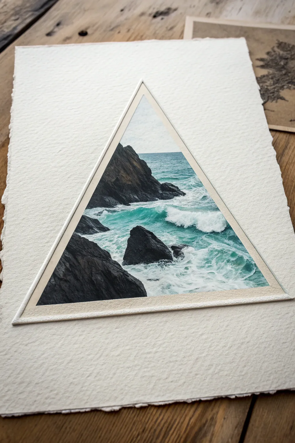
Capture the raw power of the ocean within a clean geometric boundary using gouache or acrylics on high-quality watercolour paper. This project contrasts the chaotic movement of crashing waves against sharp, structured lines for a striking modern aesthetic.
How-To Guide
Materials
- Heavyweight cold-press watercolour paper (300gsm+)
- Masking tape or painter’s tape
- Gouache or acrylic paints (Titanium White, Phthalo Blue, Lamp Black, Burnt Umber, a touch of Viridian)
- Small flat brush (size 2 or 4)
- Fine liner brush (size 00 or 0)
- Ruler
- Pencil
- Palette for mixing
- Water container and paper towels
Step 1: Preparation & Composition
-
Outline the Shape:
Begin by lightly sketching an equilateral triangle in the center of your textured paper. Use a ruler to ensure the lines are perfectly straight. -
Masking the Border:
Carefully apply masking tape along the *outside* of your triangle lines; press the edges down firmly with your fingernail to prevent paint from bleeding underneath. -
Sketching the Elements:
Lightly draw the main composition inside the triangle. Place a large, dark rock formation on the left side extending upwards, and a smaller rock jutting out near the center bottom breaks up the water.
Bleeding Edges?
If paint bled under the tape, wait for it to dry fully, then use a white gel pen or opaque white gouache to carefully paint over the mistake and straighten the line.
Step 2: Blocking In Color
-
Mixing the Sky:
Mix a very pale grey-blue using a lot of white and a tiny dot of black and blue. Apply this to the small sliver of sky visible at the top peak of the triangle. -
Base Ocean Layer:
Create a deep teal color using Phthalo Blue, a touch of Viridian, and white. Paint horizontal strokes for the water in the background, keeping the color darker near the horizon line. -
Foreground Water:
Lighten your teal mix with more white as you move closer to the foreground rocks. I like to keep these strokes loose to suggest movement early on. -
Rock Base Coats:
Mix Lamp Black with Burnt Umber for a dark, warm charcoal tone. Block in the rock shapes entirely, ignoring details for now to establish solid silhouettes.
Deckle Edge DIY
To get the torn paper look shown here, fold your paper repeatedly along a straight edge, wet the fold with a brush, and carefully tear it while damp.
Step 3: Adding Texture & Movement
-
Rock Texture:
Once the black base is dry, mix a lighter grey-brown. Use a damp, almost dry flat brush to scumble texture onto the rocks, highlighting the ridges where light would hit. -
Deepening Shadows:
Go back with pure black in the deepest crevices of the rocks to ensure they have weight and dimension. -
Building Waves:
Mix a light seafoam green. Paint the rolling bodies of the waves, focusing on the area just behind the main crash zone. -
Crashing Foam:
Using pure Titanium White, start painting the crashing foam. Use a stippling motion (tapping the brush) to create the fluffy, aerated look of churning water. -
Sea Spray:
With a very dry brush and a tiny amount of white paint, lightly drag the brush over the teal water surface to create sea spray and wind-blown mist. -
Water Highlights:
Add thin, swirling white lines around the base of the rocks to show how the water churns and swirls around the obstacles.
Step 4: Finishing Touches
-
Refining Edges:
Check the intersection between the water and rocks. Add small splashes of white climbing slightly up the rock face to integrate the two elements. -
Horizon Line Check:
Ensure your horizon line is perfectly straight with a steady hand and your fine liner brush. -
The Reveal:
Wait until the paint is completely bone-dry. Slowly peel the tape away at a 45-degree angle to reveal crisp, sharp edges. -
Adding the Border:
For the framed effect seen in the image, use a very sharp pencil and a ruler to draw a faint second triangle about 3mm outside your painted edge, or gently shade the gap with a pale beige pencil.
Enjoy the satisfying contrast between your wild seascape and the clean, modern geometry surrounding it
Mini Skyline in a Tiny Box Frame
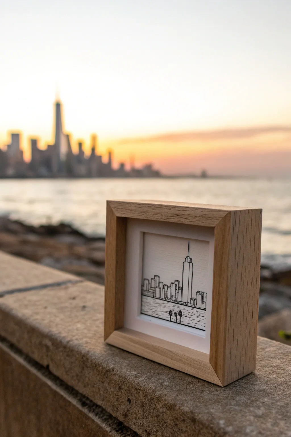
Capture the majesty of a city skyline in a charmingly compact package. This project combines minimalistic line art with the deep dimensionality of a shadow box frame to create a tiny window into your favorite urban landscape.
Detailed Instructions
Materials
- Small square shadow box frame (approx. 4×4 inches) with a natural wood finish
- Heavyweight bristol board or hot-press watercolor paper (smooth texture)
- Fine liner pens (sizes 0.05, 0.1, and 0.3mm)
- Pencil (HB or 2H)
- Eraser
- Ruler
- Cutting mat and craft knife
- Double-sided tape or acid-free glue dots
Step 1: Preparation and Composition
-
Measure the opening:
Begin by removing the backing and glass from your shadow box frame. Measure the exact dimensions of the inner recessed area or the mat opening where your artwork will sit. -
Cut the paper:
Cut a square of your bristol board to match these dimensions exactly. It needs to fit snugly inside the frame without bowing or leaving gaps. -
Plan the horizon:
Using your pencil and ruler, lightly mark a horizon line across the bottom third of the paper. This line separates the city from the water and grounds your composition. -
Sketch the prominent landmark:
Identify the tallest or most iconic building in your chosen skyline—like the Freedom Tower shown here. Lightly sketch its main vertical shape slightly off-center to create visual interest. -
Fill in the surrounding buildings:
Sketch the remaining skyscrapers and lower buildings on either side of your main landmark. Keep these shapes simple—rectangles and stepped blocks work best for a miniature scale.
Wobbly Lines?
If your hand shakes while inking vertical lines, don’t panic. Quickly go over the line again to thicken it intentionally, or add a second ‘shadow’ building behind it to mask the error
Step 2: Inking the Details
-
Outline the main shapes:
Switch to your 0.1mm fine liner. Carefully trace over your pencil outlines for the buildings. Keep your hand steady and try to make the vertical lines perpendicular to the horizon. -
Add architectural details:
Using the ultra-fine 0.05mm pen, add subtle details like vertical lines to suggest windows or structural elements. Don’t overdo it—suggestions of detail are more powerful than exact rendering at this size. -
Thicken key lines:
I prefer to use a slightly thicker 0.3mm pen to go over the outermost silhouette of the buildings. This subtle variation in line weight helps the skyline pop against the white sky. -
Draw the water ripples:
Below the horizon line, create the texture of water. Use the 0.05mm pen to draw short, horizontal dashes. Make them denser and shorter near the horizon, and slightly longer and more spaced out as you move down the paper. -
Include foreground elements:
To add depth, draw tiny silhouettes of foreground objects, such as the three small pier posts shown in the example. Ensure their bottoms align perfectly with a horizontal plane to look realistic. -
Clean up the sketch:
Once the ink is completely dry—give it a good five minutes to be safe—gently erase all underlying pencil marks.
Golden Hour Glow
Enhance the sunset vibe by applying a very faint wash of watercolor—pale orange fading to blue—on the paper before doing your ink work for a colorful background twist
Step 3: Assembly and Framing
-
Clean the glass:
Clean both sides of the frame’s glass thoroughly to ensure no fingerprints or dust are trapped inside your tiny gallery. -
Mount the artwork:
If your frame has a backing board that sits separate from the glass (like a shadow box), use double-sided tape to secure your drawing to the center of the backing board. -
Check the alignment:
Before closing everything up, place the frame over the backing to ensure your horizon line is straight relative to the frame edges. -
Secure the backing:
Place the backing board into the frame. If using a deep shadow box, the artwork sits recessed behind the glass; if standard, it presses against it. Secure the clips or tabs on the back. -
Final inspection:
Turn the frame over and wipe the front glass one last time. Place it on a shelf or windowsill where natural light can highlight the crisp black lines.
Now you have a timeless architectural memento that fits perfectly on any desk or mantelpiece
Scene in a Bottle Drawing
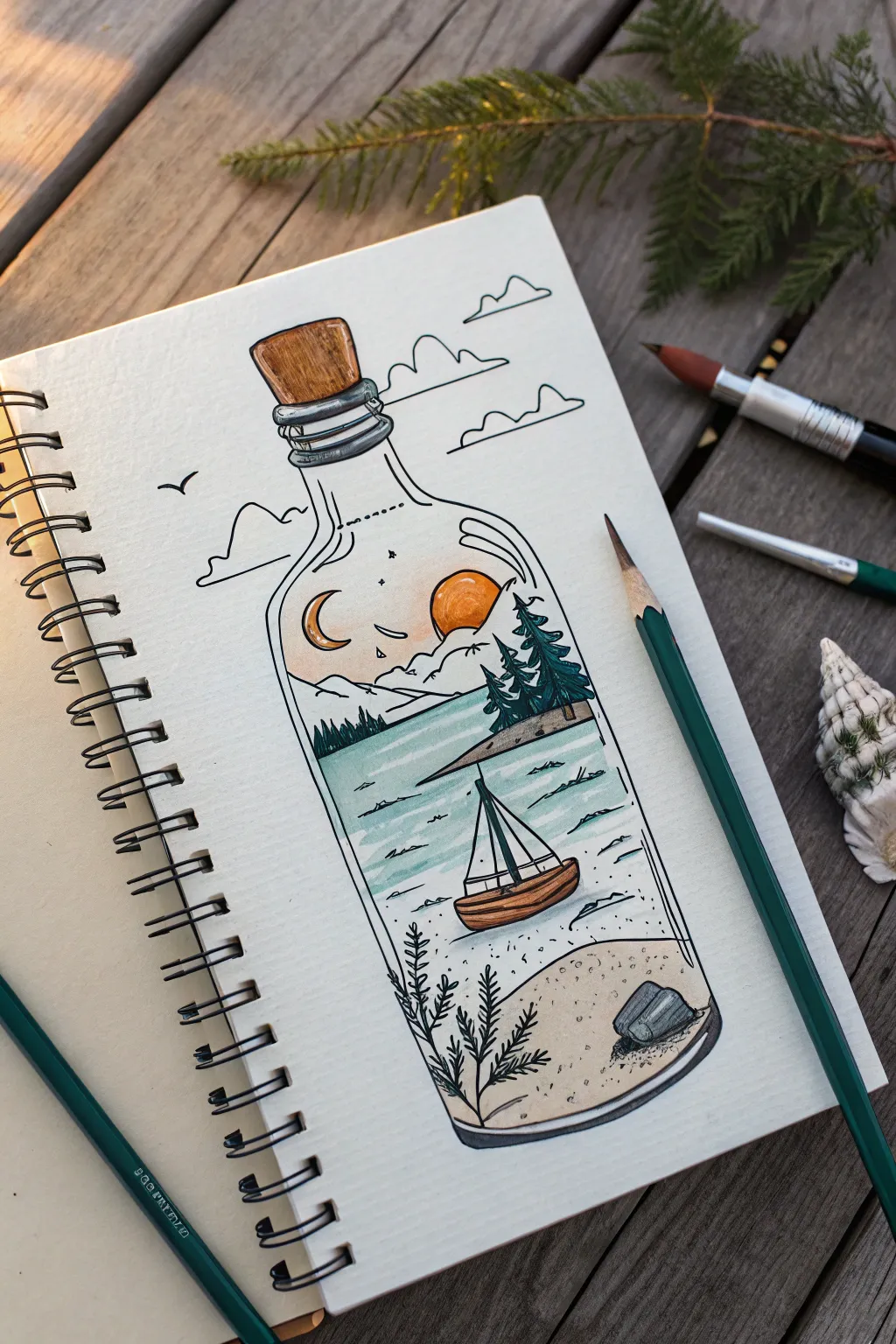
Capture the magic of exploring land and sea with this whimsical illustration of a tiny world contained within a glass bottle. This project combines simple line work with soft shading to create a serene, miniature landscape nestled right on your sketchbook page.
Step-by-Step Guide
Materials
- Sketchbook with smooth paper
- Pencil (HB or similar)
- Eraser
- Fine liner pen (0.3mm or 0.5mm, black)
- Colored pencils (teal, deep green, brown, orange, yellow, beige)
- White gel pen (optional for highlights)
Step 1: Sketching the Framework
-
Outline the bottle shape:
Begin by lightly sketching the outline of a classic glass bottle. Draw a tall cylindrical body that tapers gently up to a narrow neck. Make sure the shoulders of the bottle slope smoothly. -
Add the cork and rim:
At the top opening, draw a slightly trapezoidal shape for the cork stopper. Just below the cork, sketch two or three distinct rings around the neck to represent the glass lip and threading. -
Establish the horizon lines:
Divide the inside of the bottle into sections. Draw a line about one-third up from the bottom for the sandy beach. Draw a higher, slightly diagonal line about two-thirds up to separate the water from the sky and distant mountains.
Wobbly Lines?
If your bottle symmetry feels off, try drawing a vertical centerline first with a ruler. Measure equal distances from this line for the bottle walls to ensure a balanced shape.
Step 2: Drawing the Interior Scene
-
Sketch the mountains and celestial bodies:
In the top section, draw jagged, triangular shapes for distant mountains. Above them, place a crescent moon on the left and a circular sun setting behind the peaks on the right. Add a few tiny stars or sparkles. -
Plant the forest:
On the right side, just above the water line, sketch a small rocky outcrop. Draw three or four triangular pine trees of varying heights standing on this ledge. -
Draw the sailboat:
Place a small boat in the water section. Sketch a simple curved hull and a triangular sail. Keep the lines simple, as this is a miniature element. -
Add underwater details:
At the very bottom within the ‘sand’ area, sketch a couple of small rocks on the right. On the left side, draw fern-like seaweed or plants growing upward. -
Include exterior elements:
To integrate the bottle with the page, draw a few simple clouds behind the neck of the bottle and a tiny bird silhouette flying by on the left.
Pro Tip: Glass Effect
Make the glass look real by leaving distinct white vertical streaks uncolored on the bottle’s sides. These ‘reflections’ instantly make the object look shiny and transparent.
Step 3: Inking and Coloring
-
Ink the main outlines:
Using your black fine liner, carefully trace over your pencil lines. I prefer to use a steady, confident hand here to keep the bottle’s shape clean. Don’t forget the little details like the rope tied around the bottle neck. -
Add texture with ink:
Use small dots or stippling on the sand area to simulate grains. Add short, horizontal dashes in the water to represent ripples. -
Erase pencil guides:
Once the ink is completely dry—give it a minute to modify smudging—gently erase all the underlying pencil sketches. -
Color the sky and mountains:
Take a pale orange or peach pencil and lightly shade the sun and the sky immediately around it. Leave the rest of the sky white or very pale. Use a very light grey or cream for the mountain peaks. -
Fill the forest and water:
Color the pine trees with a deep green, pressing harder at the bottom of the branches for depth. For the water, use a soft teal or aqua blue, shading horizontally to mimic the flow of water. -
Color the sand and boat:
Use a beige or light brown pencil for the sandy bottom and the cork. Create a small gradient on the boat’s hull with a darker brown to make it look rounded. -
Final shading touches:
Add a little grey shading to the rocks and the metal rings on the bottle neck.
Now you have a peaceful little world safely corked away in your sketchbook to admire anytime
Tiny Hanging Photo Clothesline
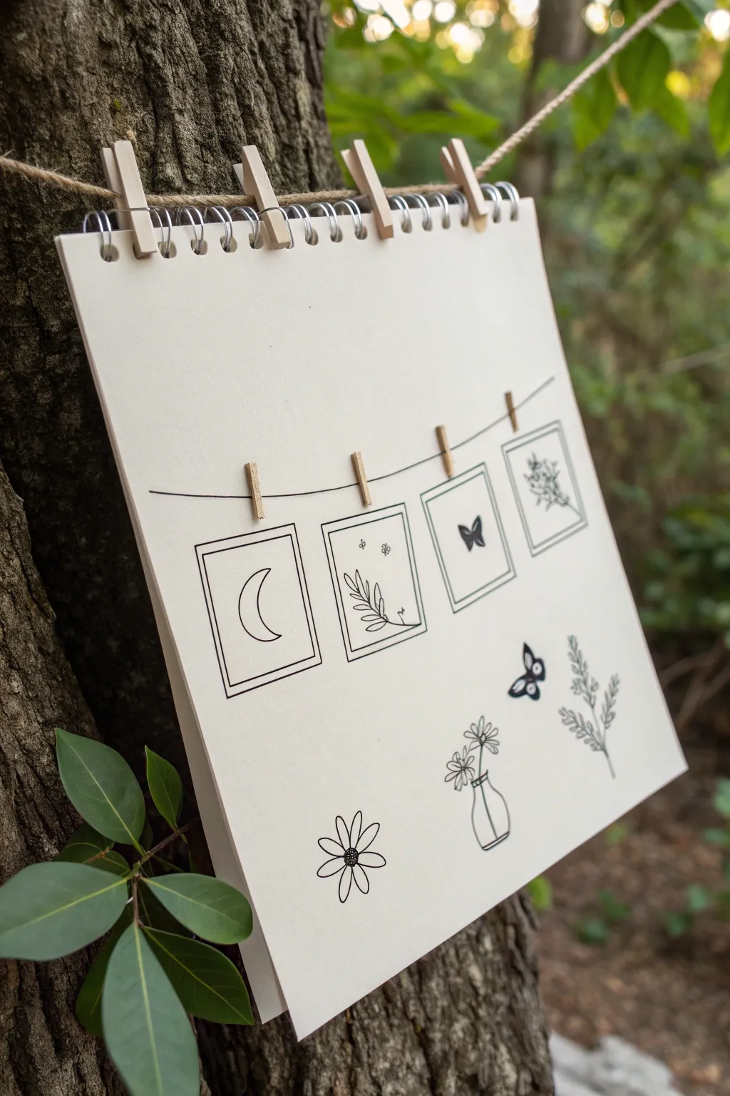
Create a charming meta-drawing featuring a clothesline holding framed miniature sketches of nature’s simple beauties. This project combines clean linework with a whimsical layout to produce a cozy, minimalistic aesthetic perfect for a sketchbook page.
Step-by-Step
Materials
- Fine-tooth sketch paper or mixed media paper
- 0.3mm and 0.5mm black fine liner pens
- Pencil (HB or H)
- Clean eraser
- Ruler or straight edge
- Brown colored pencil or fine marker (optional for clothespins)
Step 1: Setting the Scene
-
Establish the curve:
Begin by lightly sketching a gentle, downward-curving horizontal line across the upper third of your paper using your pencil. This represents the main string of the clothesline. -
Position the frames:
Sketch four rectangles hanging from the line. Vary the orientation slightly—some can be vertical (portrait) and some square. Space them out evenly but casually so they don’t look rigid. -
Add frame borders:
Draw a smaller rectangle inside each of the four shapes to create the look of a photo mat or frame border. Keep the spacing consistent. -
Sketch the clothespins:
At the top center of each frame, draw a small, narrow rectangle that overlaps both the string and the frame. This indicates where the wooden clip holds the picture. -
Ink the structure:
Using your 0.5mm pen, carefully ink the main curved line and the outer and inner edges of the picture frames. Use a steady hand, but don’t worry if the lines aren’t perfectly machine-straight; a little wobble adds character. -
Detail the clips:
Ink the small clothespins. You can add a tiny vertical line split in the middle to show the two wooden halves.
Step 2: Drawing the Miniatures
-
Frame 1: The Moon:
In the first frame on the left, draw a simple crescent moon shape. Keep the lines clean and leave the interior empty for a high-contrast look. -
Frame 2: Botanical Spray:
For the second frame, draw a single stem curving upward with small, simple leaves branching off. Add a few tiny dots around it to suggest pollen or motion. -
Frame 3: The Butterfly:
In the third frame, sketch a rudimentary butterfly silhouette. Focus on the wing shape rather than intricate patterns inside the wings. -
Frame 4: Wildflower Bouquet:
In the final frame, draw a small cluster of wildflowers or baby’s breath. Use tiny scribbles or dots to represent the complex flower heads.
Straight Line Struggles?
If your frame lines look shaky, lean into it! Go over them again loosely to create a deliberate ‘sketchy’ double-line style rather than trying to fix the original line.
Step 3: Adding the Lower Elements
-
Plan the loose sketches:
Below the hanging clothesline, lightly mark spots for four individual nature elements distributed across the bottom half of the page. -
Draw the Daisy:
On the bottom left, draw a simple daisy with visible petals radiating from a textured center. I usually draw the center first to guide the petal lengths. -
Draw the Vase:
Towards the center-right, sketch a glass bottle vase containing two flowers. Draw the ellipses for the vase rim and base carefully to show perspective, and draw the stems passing through the glass. -
Add the Butterfly:
Above the vase, add a small butterfly in flight, seen from the side or angular view. Fill in the wings with solid black ink for a bold, graphic look that contrasts with the line drawings. -
Draw the Branch:
On the far right, draw a leafy branch similar to the one in the framed picture, but larger and more detailed. -
Erase and Refine:
Once all ink is completely dry (give it a few minutes to prevent smudging), gently erase all underlying pencil sketch lines. -
Final touches:
If desired, use a brown pencil to very lightly shade the clothespins for a subtle pop of color against the monochrome ink.
Pro Tip: visual weight
Make the ‘loose’ items at the bottom slightly larger than the drawings inside the frames. This creates depth, as if the framed ones are further away.
Now you have a delicate collection of nature-inspired doodles suspended on a page
Mini Isometric Room Corner
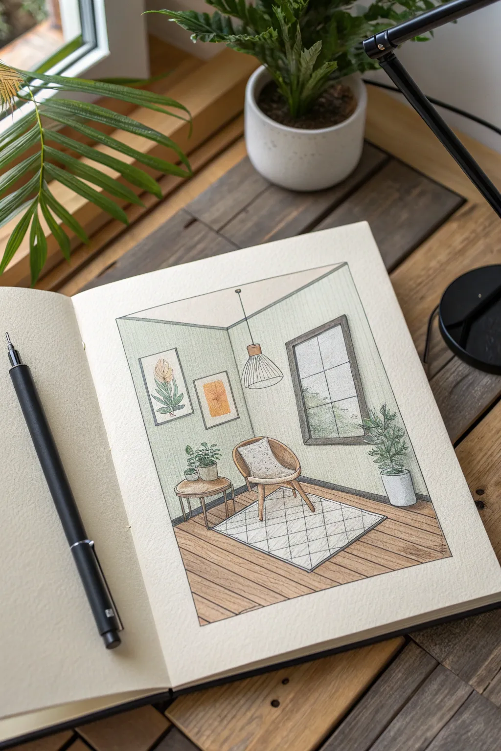
This sketchbook project captures a serene interior moment using clean lines and soft, inviting colors. It’s a perfect exercise in perspective and texture shading, turning a simple corner of a room into a tiny, detailed world.
Step-by-Step
Materials
- Heavyweight sketchbook paper
- HB or 2H graphite pencil
- Eraser
- Ruler
- Fineliner pens (sizes 0.1, 0.3, and 0.5)
- Colored pencils (muted greens, browns, light grey)
- Blending stump (optional)
Step 1: Constructing the Perspective
-
Establish the corner:
Start by drawing a vertical line near the center of your page to represent the corner of the room. From the top and bottom of this line, draw angled headers and footers extending outward to create the illusion of two walls meeting. -
Block in major furniture:
Using light pencil strokes, sketch simple geometric boxes to plan where the chair, side table, and window will go. Focus on placement and scale rather than detail right now. -
Refine the floorboards:
Draw diagonal lines for the floorboards. Their angle should roughly follow the bottom perspective lines of the walls to create depth. Keep the spacing consistent. -
Sketch the rug:
Place a rectangle on the floor for the rug, ensuring its edges align with the floor perspective. Sketch a diamond grid pattern lightly across its surface.
Wonky Perspective?
If your floor looks tilted, check your angles. The floorboards should angle away from the viewer, generally converging toward an imaginary vanishing point far off the page.
Step 2: Detailing the Elements
-
Draw the chair:
Refine the chair’s shape, curving the backrest and defining specific wooden legs. Add a small pillow shape sitting in the seat. -
Add nature:
Sketch the outline of the tall potted plant on the right and the smaller potted plants on the side table. Keep the leaves loose and organic to contrast the straight architectural lines. -
Outline the window and frames:
Define the thick window casing on the right wall. On the left wall, sketch two rectangular frames for artwork, varying their sizes for visual interest. -
Add the lighting:
Draw a thin line dropping from the ceiling for the pendant light cord, ending in a bell-shaped shade directly above the chair area.
Make it Yours
Customize the artwork in the frames to match your favorite real-life paintings, or change the scenery visible through the window to show a night sky or city street.
Step 3: Inking the Scene
-
Ink the structural lines:
Switch to a 0.5 fineliner to ink the main architectural lines—the corner, the floor boundary, and the window frame. This grounds your drawing. -
Ink the furniture and details:
Use a finer 0.1 or 0.3 pen for the furniture, plants, and decor. Use broken or lighter lines for texture on the rug and the pillow to keep them feeling soft. -
Clean up:
Once the ink is completely dry, gently erase all graphite guidelines. Be thorough so your colors won’t get muddy later.
Step 4: Adding Color and Texture
-
Base wall color:
Lightly shade the walls with a pale sage green colored pencil. Use the side of the lead to keep the texture smooth and avoid harsh strokes. -
Color the floor:
Fill in the floorboards with a medium brown tone. I like to press slightly harder near the edges of the rug and the walls to create a subtle shadow effect. -
Detail the greenery:
Color the plant leaves with varied greens—lighter on top leaves and darker for lower leaves—to suggest volume. -
Fill the frames:
Add pops of warm color, like mustard yellow or terracotta, inside the wall frames to bring life to the artwork. -
Shade the furniture:
Color the chair legs and table with warm wood tones. Keep the rug mostly white but shade the grid lines very lightly with grey to give it dimension. -
Final shadows:
Use a cool grey pencil to add shadows underneath the chair, table, and plant pot. This anchors the objects to the floor so they don’t look like they are floating.
Step back and enjoy the calming atmosphere of your newly designed miniature room


Have a question or want to share your own experience? I'd love to hear from you in the comments below!