Minimalist art is my favorite reminder that you don’t need much to say something big—just a few intentional marks and plenty of breathing room. Here are minimalist art ideas you can try right away, whether you’re sketching, painting, or mixing a little of both.
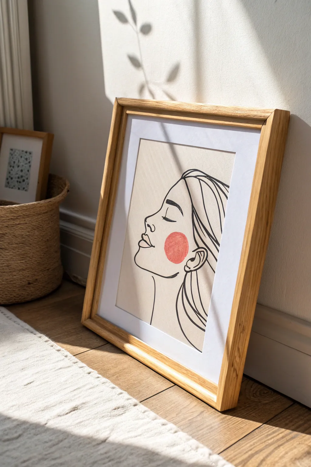
Continuous Line Face Sketch
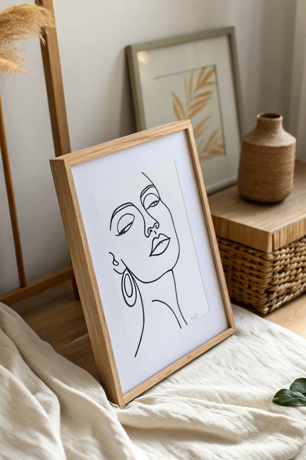
Capture the essence of elegance with this striking continuous line drawing that transforms a simple sketch into a sophisticated statement piece. The stark contrast of black ink on white paper creates a modern, airy feel perfect for any minimalist gallery wall.
Step-by-Step
Materials
- High-quality mixed media or watercolor paper (A4 size)
- Black fineliner pens (0.3mm and 0.5mm)
- Graphite pencil (HB or H)
- Kneaded eraser
- Ruler
- Light wood frame (A4 or similar size)
- Optional: Masking tape
Step 1: Drafting the Composition
-
Prepare your workspace:
Clear a flat surface and tape down the corners of your mixed media paper with masking tape if you want to prevent it from shifting. This ensures a stable base for smooth line work. -
Sketch the face shape:
Using your HB pencil, lightly sketch the general oval shape of a face in the center of the paper. Keep your touch incredibly light, as these lines are just guides and will be erased later. -
Mark facial features:
Lightly mark horizontal guidelines for where the eyes, nose, and mouth will sit. In this profile-meets-frontal view, the nose line sits slightly off-center to the left. -
Define the nose profile:
Start sketching the bridge of the nose. In this abstract style, the nose is a continuous connection from the eyebrow line down to the nostrils. Draw a soft curve downwards. -
Outline the left eye:
Draw the left eye as a simple almond shape. Add a heavy upper lid line to suggest lashes. This eye is often drawn closed or looking down in this style for a serene effect. -
Sketch the right eye and brow:
Place the right eye slightly higher or aligned with the left, depending on your preferred perspective. Connect the right eyebrow directly into the line of the nose bridge if you want that continuous flow. -
Form the lips:
Sketch the lips below the nose. Focus on the ‘Cupid’s bow’ of the upper lip and a fuller bottom lip. Don’t close the shape entirely; leave small gaps to maintain the airy, sketch-like quality. -
Add the jawline and neck:
Draw a strong jawline curve starting from below the ear area, sweeping down to the chin, and extending into a long, elegant neck line. -
Incorporate the earring detail:
Sketch a large, double-hoop earring on the left side. This geometric element adds balance to the organic curves of the face.
Pro Tip: Fluid Motion
Don’t plant your wrist on the table. Hover your hand slightly and move from the shoulder to get those lovely, confident long lines without jittery wobbles.
Step 2: Inking and Refining
-
Test your pen flow:
Before touching the final paper, scribble on a scrap piece with your 0.5mm fineliner to ensure the ink is flowing smoothly without skips. -
Begin the main outline:
Start inking with the 0.5mm pen at the top of the forehead or eyebrow. Move your hand confidently and relatively quickly; hesitant movements create shaky lines. -
Trace the continuous sections:
Unlike the sketch phase, try to keep your pen on the paper for longer segments. For example, trace the brow, down the nose, and around the nostril in one fluid motion if possible. -
Ink the eyes and lips:
Carefully go over the eye and lip lines. I like to thicken the upper lash line slightly by going over it twice to give the face more definition and femininity. -
Add the sweeping neck lines:
Use your whole arm, not just your wrist, to draw the long, vertical lines of the neck. This technique produces smoother, more graceful curves. -
Detail the earring:
Ink the earring loops carefully. Since these are geometric, try to keep the ovals consistent, though perfect symmetry isn’t necessary for this hand-drawn aesthetic. -
Let the ink cure:
Allow the ink to dry completely for at least 15 to 20 minutes. Smudging wet ink with an eraser is a heartbreaking way to ruin a drawing. -
Erase pencil guides:
Gently gently rub the kneaded eraser over the entire drawing to lift the graphite guidelines. The kneaded eraser is gentler on paper texture than standard rubber erasers. -
Final inspection:
Look for any lines that need connecting or thickening. You can use the thinner 0.3mm pen to add tiny details or sharpen tapered ends of lines.
Level Up: Gold Leaf
Add a touch of luxury by applying gold leaf to just the earring hoops or the lips. It creates a stunning textural contrast against the simple black lines.
Step 3: Framing
-
Prepare the frame:
Clean the glass of your light wood frame on both sides to remove dust and fingerprints. -
Mount and hang:
Place your artwork inside. If the paper is smaller than the frame, use a white mount/mat board to center it. Secure the back and display it in a spot with good natural light.
Now step back and admire how a few simple curves can convey so much emotion and style

Sun or Moon Color Block
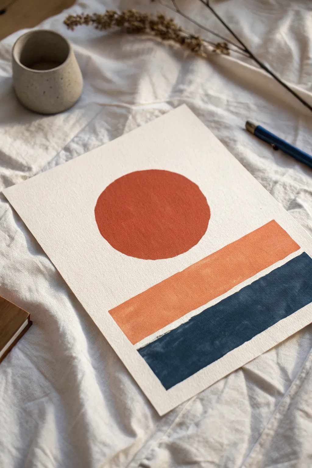
This striking minimalist piece balances warm earth tones with deep hues to create a composition that hints at a setting sun or rising moon over an abstract horizon. The clean lines and bold shapes make it a perfect beginner-friendly project that looks effortlessly chic.
Step-by-Step Tutorial
Materials
- Heavyweight watercolor paper or mixed media paper (300 gsm)
- Pencil (HB or 2H)
- Ruler
- Compass or roll of tape (for tracing a distinct circle)
- Eraser
- Acrylic paints (terracotta/burnt sienna, apricot/muted orange, navy blue/payne’s gray)
- Flat shader brushes (medium and large)
- Small round detail brush
- Palette or mixing plate
- Washi tape or masking tape (optional)
- Cup of water and paper towels
Step 1: Planning the Layout
-
Paper preparation:
Begin by selecting a high-quality, textured paper. I prefer cold-press watercolor paper because it adds a lovely tactile feel to the finished piece. Cut it to your desired size, ensuring the edges are clean. -
Find the center:
Lightly mark the vertical center of your paper with a pencil. This barely-there guide will help you align all three geometric elements perfectly. -
Sketch the circle:
Position your compass or a round object (like a jar lid or tape roll) in the upper third of the paper. Gently trace a perfect circle. Keep your pencil pressure very light so the graphite doesn’t show through the lighter paint later. -
Mark the middle bar:
Use your ruler to draw a horizontal rectangle about an inch below the circle. The width should be slightly wider than the circle’s diameter to create a balanced structure. -
Define the base block:
Measure a small gap (about a quarter-inch) below the middle bar and draw the final, bottom rectangle. This one should be the exact same width as the bar above it, but slightly taller to anchor the composition. -
Clean up sketch lines:
Use a kneaded eraser to lift up any excess graphite. You want the lines valuable enough to see, but faint enough to vanish under the paint.
Step 2: Applying Color
-
Mix the terracotta hue:
On your palette, mix a burnt sienna with a touch of red or orange to achieve that deep, warm terracotta color for the circle. Add a tiny drop of water to improve the flow, but keep the paint opaque. -
Paint the sun outline:
Using a small round detail brush, carefully paint the outline of the circle first. This technique, ‘cutting in,’ ensures a crisp edge before you fill the center. -
Fill the circle:
Switch to a medium flat brush to fill in the rest of the circle. Use smooth, horizontal strokes to minimize texture, or dab slightly if you want a more organic look. -
Mix the middle tone:
Clean your brush thoroughly. Mix a muted apricot shade by combining orange with white and a tiny speck of brown to desaturate it. This color should be lighter and softer than the circle. -
Paint the middle bar:
Focusing on the middle rectangle, use a flat shader brush to apply the apricot paint. Use the straight edge of the brush to get sharp corners and lines without needing tape. -
Check opacity:
If the apricot color looks streaky or translucent, let it dry completely and apply a second thin coat for solid coverage. -
Mix the deep navy:
For the bottom block, you need a dark, grounding color. Use Payne’s Gray or mix ultramarine blue with a touch of black solely to deepen it. It needs to contrast sharply with the white paper. -
Apply the dark base:
Paint the final bottom rectangle with the dark navy mix. Be extra careful with the top edge of this shape—keeping the white gap between the apricot and navy bars clean is crucial for the ‘block’ effect. -
Refine the edges:
Look closely at your edges. If any look wobbly, use your smallest brush with a tiny amount of thick paint to straighten them out. -
Final dry time:
Allow the entire piece to dry flat for at least an hour. If the paper buckles slightly from moisture, place it under a heavy book overnight once it is bone dry.
Uneven Edges?
If you struggle with freehand straight lines, use artist’s tape or washi tape to mask the rectangles. Peel the tape away slowly while the paint is still slightly damp to avoid tearing the paper.
Add Texture
Mix a small pinch of baking soda or fine sand into your acrylic paint before applying. This gives the shapes a gritty, stone-like texture that adds depth to the minimalist design.
Once framed, the contrast between the warm sun and the cool foundation creates a modern focal point for any room

Minimal Botanical Stem Drawing
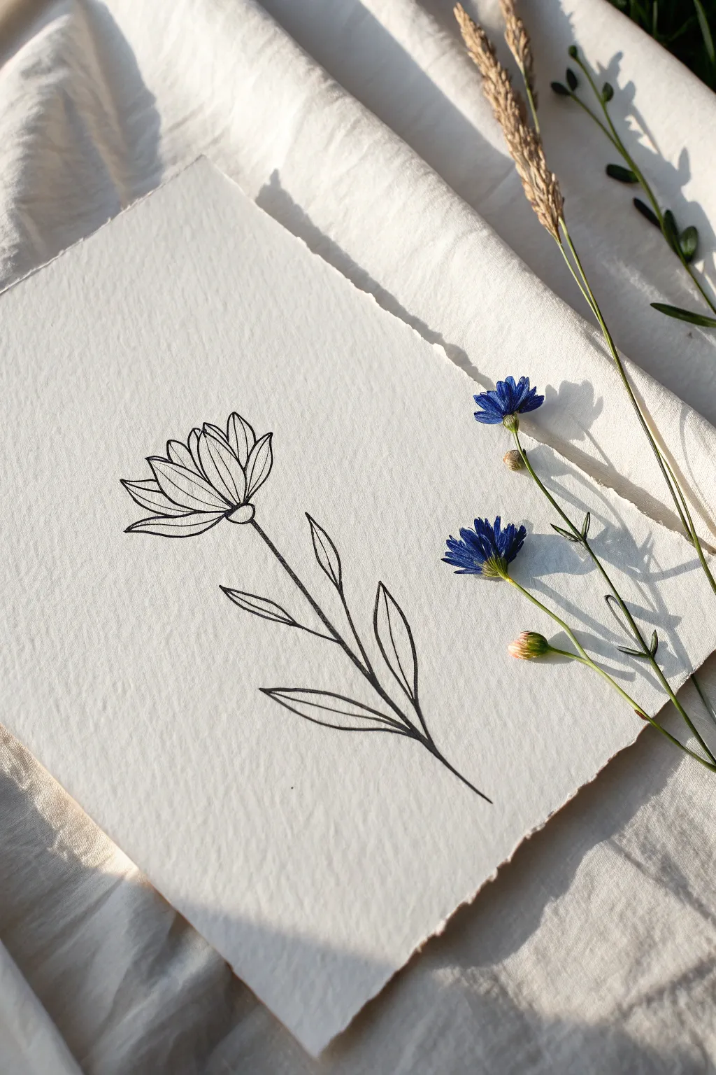
This elegant botanical sketch captures the simplistic beauty of a single wildflower stem using clean, deliberate lines. It serves as a perfect exercise in minimalist composition, focusing on the grace of the stem and the structure of the petals without the distraction of shading or color.
How-To Guide
Materials
- Heavyweight textured drawing paper (deckle edge preferred)
- Fine liner pen (black, 0.3mm or 0.5mm)
- Graphite pencil (HB or 2H)
- Soft eraser
- Ruler (optional)
- Reference photo of a wildflower
Step 1: Preparation & Sketching
-
Paper Selection:
Choose a high-quality paper with visible texture, such as cold-press watercolor paper or handmade cotton paper. The texture adds significant character to simple line drawings. -
Establish the Stem:
Using your pencil very lightly, draw a long, slightly curved line starting from the bottom third of the page and extending upward. This will be the main axis for your flower. -
Mark Leaf Positions:
Along the stem line, sketch faint tick marks where you want your leaves to emerge. Aim for an alternating pattern rather than perfect symmetry to make it look organic. -
Outline the Bloom Base:
At the top of your stem line, draw a small semi-circle or shallow ‘U’ shape. This represents the receptacle—the cup that holds the flower petals. -
Draft the Petal Shapes:
Lightly sketch the general fan shape of the flower head. Don’t worry about individual petal details yet; just establish the overall height and width of the bloom.
Step 2: Inking the Design
-
Start the Outline:
Switch to your fine liner pen. Beginning at the receptacle base you sketched earlier, trace the small cup shape with a confident, dark line. -
Draw the Front Petals:
Draw the petals that are closest to the viewer first. These should be shorter, slightly wider shapes originating directly from the center of the cup. -
Add Rear Petals:
Fill in the gaps behind the front petals with taller, narrower petal shapes. Let the lines of these back petals stop where they hit the front petals to create depth. -
Define Petal Interiors:
Add a simple central line down the middle of the larger petals. This subtle detail suggests the fold or vein of the petal without adding clutter. -
Ink the Stem:
Trace over your pencil stem line. Instead of a single rigid stroke, you can use two very close parallel lines or a slightly thicker stroke to give the stem some visual weight. -
Create the Leaves:
Draw the leaves starting from the stem outward. Use long, slender lanceolate shapes that taper to a sharp point. -
Add Leaf Veins:
Just like the petals, draw a single, simple line down the center of each leaf. Ensure this line follows the curve of the leaf for a natural flow.
Pro Tip: Line Quality
Don’t try to make lines mechanically straight. A slight wobble or variation in pressure mimics nature and adds organic warmth to the minimalist style.
Step 3: Refining & Finishing
-
Check Line Weight:
Examine your drawing. If any main outlines feel too thin or weak, go over them once more to boldly define the silhouette. -
Dry Completely:
Allow the ink to dry fully. Smudging wet ink at this stage is heartbreaking, so I usually wait at least 5-10 minutes to be safe. -
Erase Sketches:
Gently erase all underlying pencil marks. Hold the paper taut with one hand while erasing to prevent the paper from buckling or creasing. -
Tear the Edges (Optional):
If you used a standard sheet but want that rustic deckle-edge look shown in the inspiration photo, place a ruler against the paper edge and tear the paper slowly against it.
Level Up: Pressed Flowers
For a mixed-media touch, glue a real pressed flower petal or two over one of your drawn petals to add a surprising pop of 3D texture and color.
Frame your delicate botanical illustration in a floating glass frame to highlight the textured paper edges

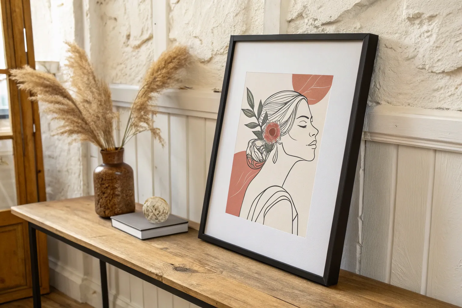
Black Ink on White Abstract Marks
Capture the essence of imperfection with this minimalist study in texture and line. This project focuses on the raw beauty of black ink bleeding onto handmade cotton rag paper, creating a striking yet simple abstract composition.
Detailed Instructions
Materials
- Handmade cotton rag paper (approx. 5×7 inches) with deckle edges
- Black India ink or Sumi ink
- Dip pen holder
- G-nib or a broad calligraphy nib
- Small inkwell or jar
- Paper towels
- Scrap paper for testing
Step 1: Preparation and Setup
-
Prepare your workspace:
Clear a flat surface and lay down a protective sheet if necessary. Since we are working with staining ink, ensure your work area is safe from spills. -
Orient the paper:
Place your handmade cotton paper vertically in front of you. Observe the natural texture; the ‘rougher’ side is often better for gripping the ink and creating texture. -
Prepare the pen:
Insert your chosen nib into the pen holder. A G-nib offers flexibility for line width variation, while a broader nib will create bolder strokes. -
Load the ink:
Dip your nib into the inkwell, submerging it just past the vent hole (the little opening in the middle of the nib). Tap the excess ink gently against the jar’s rim. -
Test the flow:
Before touching your final paper, draw a few lines on a scrap piece. You want the ink to flow smoothly but not flood the page immediately.
Step 2: Creating the Abstract Marks
-
Position the first line:
Hover your hand near the top third of the paper. You will be creating four distinct horizontal lines, starting from the top and working down. -
Draft the top stroke:
Place your nib on the left side. Pull the pen across to the right with a swift, confident motion. Don’t worry about keeping it perfectly straight; a slight wave adds character. -
Add pressure variation:
As you draw the subsequent lines, slightly vary the pressure on the nib. Pressing down creates a thicker pool of ink, while lifting slightly creates a wispy, broken trail. -
Create the second line:
Leave a gap of about an inch below the first line. Draw the second line, perhaps moving a bit slower to let the ink soak into the cotton fibers more deeply. -
Embrace the bleed:
You might notice the ink feathering slightly into the paper’s texture. I actually prefer when this happens, as it highlights the organic nature of the materials. -
Draw the third line:
Continue downward for the third stroke. Try rotating the pen angle slightly to scratch the paper surface, creating those rougher edges seen in the reference. -
Final heavy stroke:
For the fourth and final line, load your nib generously. Move across the page, allowing the ink to pool in certain spots to create contrast against the thinner sections.
Texture Trick
Pull the nib sideways or ‘push’ it slightly against the grain occasionally. This causes the nib to skip and catch paper fibers, creating beautiful rough splatter effects.
Step 3: Finishing Touches
-
Check balance:
Step back and look at the composition. The empty negative space at the bottom is crucial for the minimalist look, so resist the urge to add more. -
Dry completely:
Let the artwork sit undisturbed. Handmade paper absorbs moisture differently, so allow at least an hour for the thickest ink pools to dry fully. -
Clean your tools:
While the artwork dries, immediately rinse your nib with water and dry it thoroughly to prevent rust.
Ink Blotting?
If a line pools too heavily, don’t blot it immediately! Let it dry naturally. Blotting will smear the ink and ruin the crisp, jagged edges of the line work.
Display your new abstract piece in a floating frame to show off those beautiful deckle edges
BRUSH GUIDE
The Right Brush for Every Stroke
From clean lines to bold texture — master brush choice, stroke control, and essential techniques.
Explore the Full Guide
Two-Color Abstract Landscape
Capture the quiet beauty of a vast, arid landscape with this minimalist layered painting. It balances a calming, expansive pale blue sky against the warmth of sun-bleached fields and russet hills.
Step-by-Step Guide
Materials
- High-quality watercolor paper or mixed media board (heavyweight)
- Acrylic paints (Titanium White, Yellow Ochre, Burnt Sienna, Burnt Umber, Cerulean Blue, a touch of Teal)
- Flat shader brushes (large 1-inch, medium 1/2-inch)
- Small round detail brush (size 1 or 2)
- Palette knife (optional for texture)
- Painter’s tape or masking tape
- Water container and paper towels
- Matte geometric ruler (optional)
- Large wooden frame with white mat mount
Step 1: Setting the Sky
-
Prep the surface:
Begin by taping down the edges of your paper to a flat board. This keeps the paper taut and creates a clean white border for framing later. -
Mix the sky tone:
Create the dominant sky color by mixing a large amount of Titanium White with a very small dab of Cerulean Blue and a whisper of Teal. You want a pale, hazy cyan rather than a bright blue. -
Apply the first wash:
Using your largest flat brush, cover the top two-thirds of the paper with horizontal strokes. Keep the paint somewhat thin but opaque enough to cover the paper grain. -
Add subtle clouds:
While the blue is still slightly tacky, mix a nearly pure white with a lot of medium. Drag faint, streaky horizontal bands across the upper left and center right to suggest high-altitude wispy clouds. -
Let it dry:
Allow the sky section to dry completely before moving on. I like to use a hairdryer on a cool setting to speed this up if I’m impatient.
Atmospheric Perspective
Make the distant red hills slightly paler and bluer as they get closer to the horizon line. This mimics how atmosphere affects color over distance.
Step 2: Building the Landscape
-
Establish the horizon line:
Determine where your hills will sit. It should be roughly one-third from the bottom. Lightly sketch this undulating line with a pencil if you need a guide. -
Paint the distant hills:
Mix Burnt Sienna with a touch of Burnt Umber to create a deep reddish-clay color. Using the medium flat brush, paint the distant hill shape, ensuring a crisp edge where it meets the blue sky. -
Add dimension to the hills:
While the hill paint is wet, blend a slightly lighter mix (add a tiny bit of Yellow Ochre) onto the tops of the hills to simulate sunlight hitting the ridges. -
Create the golden field base:
Mix a large batch of ‘wheat’ color using Yellow Ochre and Titanium White. Fill the entire bottom section, slightly overlapping the base of the red hills to push them into the distance. -
Texturize the field:
Once the base layer is dry, take a dry brush with a slightly darker ochre mix. Use quick, horizontal sweeping motions to create the texture of dry grass and field rows. -
Layer the foreground:
Near the very bottom edge, apply a slightly more saturated tan color to ground the image and provide perspective.
Step 3: Detailing and Framing
-
Mix the scrub color:
Combine Burnt Umber with a tiny dot of black or dark green to make a dark, neutral earth tone for the foreground vegetation. -
Paint foreground flora:
Using your smallest round brush, paint tiny, irregular vertical ticks along the bottom edge. These represent scrubby bushes and weeds. -
Vary the density:
Group these little strokes into clusters rather than spacing them evenly. Some should be taller and denser, others sparse. -
Add highlights:
If the vegetation looks too flat, dab the very tips of the bushes with a lighter grey-brown to suggest light catching the leaves. -
Final drying:
Let the entire piece dry completely, preferably overnight, to ensure no moisture is trapped. -
Remove tape:
Carefully peel away the masking tape at a 45-degree angle to reveal your crisp white edges. -
Frame the work:
Place the artwork behind a large white mat board and secure it in a light oak or timber frame to complement the warm earth tones of the painting.
Golden Hour Glow
Glaze a very thin, transparent layer of diluted orange-yellow over the entire field section once dry to give the whole scene a warm, sunset cohesive look.
Hang your new landscape in a well-lit spot to enjoy the subtle warmth it brings to the room
Minimal Ocean Horizon Lines
Capture the calm of the coast with this minimalist ink drawing that balances structured lines against organic textures. Using simple pen techniques on heavy, deckle-edged paper creates a sophisticated piece that feels both modern and timeless.
Step-by-Step
Materials
- Heavyweight printmaking paper or watercolor paper (300gsm+)
- Fine liner pens (sizes 0.1, 0.3, and 0.5)
- Ruler or straight edge
- Pencil (HB or H)
- Soft eraser
- Plate or rectangular object for embossing (optional)
- Bone folder (optional)
Step 1: Preparation & Layout
-
Prepare your paper:
Begin by tearing your heavyweight paper to size rather than cutting it. This creates the soft, deckled edge seen in the reference, adding a tactile, handmade quality. -
Create the plate impression:
This step is optional but adds the professional debossed look. Place a rectangular piece of acrylic, mat board, or cardstock in the center of your paper. Run it through a press if you have one, or firmly rub the back of the paper with a bone folder to create an indented rectangular area for your drawing. -
Pencil the boundary:
Lightly trace the inner rectangle where your drawing will live using a pencil. If you skipped the embossing step, simply draw a neat rectangle with a ruler to serve as your frame. -
Set the horizon:
Measure about halfway down your rectangle and lightly draw a horizontal line. This will be your horizon line separating sky from sea.
Step 2: Drafting the Sky
-
Mark the sky lines:
In the top half of the rectangle, use your ruler to mark out even spacing for the horizontal sky lines. Leave a larger gap near the horizon for the clouds. -
Ink the structural lines:
Switch to a 0.5 pen for a bold, crisp look. Using your ruler, carefully draw the straight horizontal lines across the top section. Stop just before the vertical frame lines to keep the corners neat. -
Draw the frame:
Ink the outer rectangular boundary line now. Use the ruler to ensure these lines are perfectly straight, connecting the ends of your sky lines.
Clean Lines Tip
Wipe your ruler’s edge with a tissue after every few lines. Ink can build up on the edge and smear across your clean white sky if you aren’t careful.
Step 3: Organic Details
-
Sketch the cloud outlines:
Just above your horizon line, use a 0.3 pen to draw the tops of the clouds. Use a bumpy, irregular line quality to contrast with the straight sky lines above. -
Refine the cloud forms:
Add a few smaller, disconnected bumpy lines slightly above the main cloud mass to suggest depth and fluffiness. Keep these minimal; don’t overwork them. -
Establish the horizon:
Draw the sharp horizon line just below your clouds using a ruler. This line anchors the ocean and provides a solid base for the water texture.
Add a Pop of Color
For a subtle twist, use a diluted watercolor wash in a single hue—like a faint indigo or sepia—over just the ocean area once the ink is totally dry.
Step 4: Inking the Ocean
-
Start the water texture:
For the ocean, put away the ruler. Use a 0.1 pen to draw thin, slightly wavy horizontal lines starting just below the horizon. -
Build wave density:
As you move down the page, begin to thicken your lines or group several thin lines close together to represent the shadows of waves. -
Create movement:
Vary the length and waviness of your strokes. Unlike the sky, these shouldn’t be perfect; let the pen skip slightly to mimic sparkling water. -
Darken the foreground:
Switch to a 0.3 pen for the bottom third of the water. Draw thicker, darker clusters of wavy lines here to simulate the nearness and depth of the waves in the foreground. -
Add high contrast:
I find that adding small patches of dense cross-hatching or solid black in the deepest wave troughs really makes the water pop. Focus this darker shading on the left side to match the reference lighting.
Step 5: Finishing Touches
-
Review contrast balance:
Take a step back and look at the whole piece. If the ocean looks too pale compared to the structured sky, go back in and thicken a few wave lines near the bottom. -
Erase guidelines:
Wait at least 15 minutes for the ink to fully cure. Then, very gently erase any visible pencil marks, being careful not to rub the paper surface too hard. -
Final clean up:
Brush away eraser crumbs and inspect your edges. The contrast between the crisp ink rectangle and the rough paper edge is what creates the final aesthetic.
Now you have a serene, structured seascape perfect for framing or gifting

PENCIL GUIDE
Understanding Pencil Grades from H to B
From first sketch to finished drawing — learn pencil grades, line control, and shading techniques.
Explore the Full Guide
One-Line Animal Profile
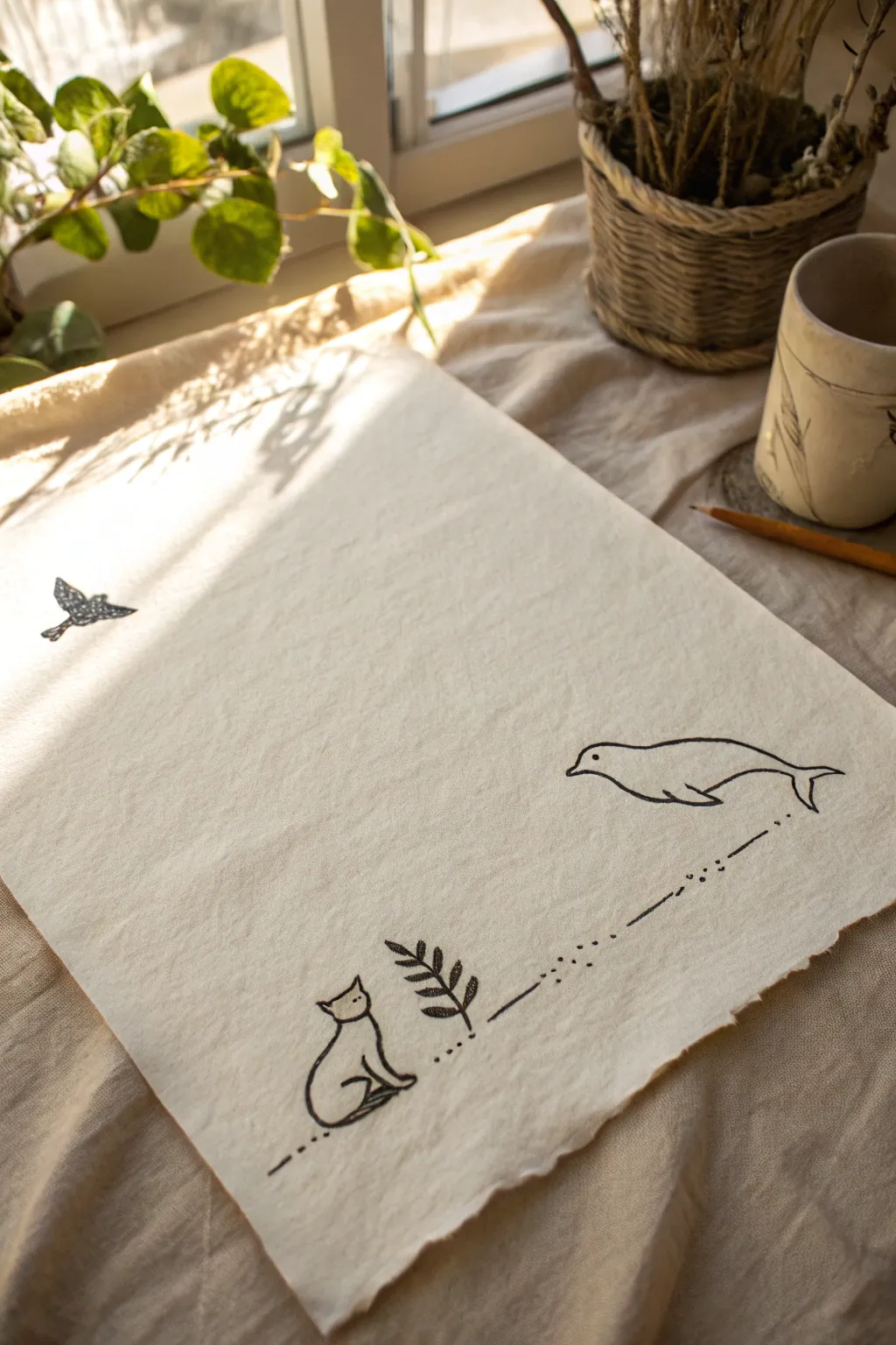
Transform a simple piece of textured fabric into a narrative artwork using minimalist line drawings. This project combines the charm of stark black ink with the rustic warmth of unbleached cotton or linen for a serene, folk-art aesthetic.
Step-by-Step Tutorial
Materials
- Unbleached cotton or linen fabric (heavyweight)
- Black fabric marker or fine-tip permanent marker (archival quality)
- Pencil (HB or lighter)
- Eraser
- Iron and ironing board
- Ruler or straight edge
- Hard backing board or cardboard
Step 1: Preparation and Planning
-
Fabric Selection:
Begin by selecting a piece of unbleached cotton or linen. The natural cream or beige tone adds warmth that white paper simply can’t match. -
Prepping the Surface:
Cut your fabric to the desired size, leaving raw, unfinished edges for a rustic look. Iron the piece flat to remove any creases that could interrupt your pen strokes. -
Secure the Fabric:
Place a hard board or piece of smooth cardboard underneath your fabric. Tape the corners down lightly if needed to prevent shifting while you draw. -
Sketching the Elements:
Using a very light pencil touch, sketch out the three main figures. Position the small bird high on the left, the cat sitting in the bottom left corner, and the whale swimming in the middle right area.
Step 2: Inking the Animals
-
Drawing the Bird:
Start with the bird in the top left. Use short, deliberate strokes to create the wing texture, filling the body with tight stippling or tiny circles to give it visual weight compared to the open line work elsewhere. -
Outlining the Cat:
Move to the bottom left for the seated cat. Draw a continuous, fluid outline for the body, keeping the shape simple and abstract. Add two small triangles for ears and simple dots for eyes. -
Adding the Plant:
Just to the right of the cat, draw a vertical stem. Add pairs of simple, leaf-shaped loops climbing up the stem. I like to fill these leaves with quick diagonal hatching for texture. -
Creating the Whale:
On the right side, draw the smooth, horizontal curve of the whale’s back, flowing into the tail flukes. Complete the underbelly with a gentle curve and add a simple dot for the eye.
Keep it Taut
Fabric drags against pen tips more than paper. Keeping the fabric taped down tight prevents skipping and snagging.
Step 3: Connecting the Story
-
Drafting the Path:
Lightly visualize a connection between the cat/plant motif and the whale. Use your ruler to guide a faint pencil line if you struggle with straight lines. -
Inking the Dotted Line:
Using your black marker, create a trail of dots and dashes connecting the plant to the whale’s tail. Vary the rhythm—group a few dots, then a long dash, then more dots—to create visual interest. -
Refining the Lines:
Go back over your main outlines if needed to thicken them slightly, ensuring the black ink looks solid against the fabric texture. -
Checking for Bleed:
Lift the fabric corner gently to ensure ink isn’t soaking through too heavily. If you are using a quality fabric marker, it should sit nicely on the fiber. -
Erasing Guides:
Once the ink is completely dry—give it a good 10 to 15 minutes—gently erase any visible pencil marks. Hold the fabric taut while erasing to avoid catching and wrinkling the cloth.
Ink Bleeding?
If ink feathers into the fibers, your marker is too wet or the fabric too porous. Switch to a finer tip or stiffer canvas.
Step 4: Finishing Touches
-
Setting the Ink:
To make your artwork permanent, heat-set the ink. Place a scrap cloth over your drawing and iron on a high, dry setting for a few minutes. -
Distressing Edges (Optional):
If you want to enhance the rustic vibe, gently pull a few loose threads from the edges of the fabric to create a soft fringe.
Enjoy displaying your quiet, storybook scene on a wall or desk
Abstract Arch Shapes
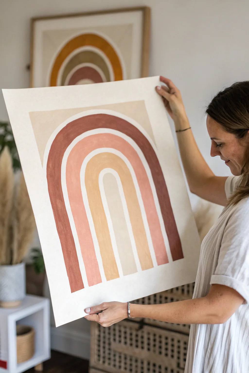
Bring warmth and modern simplicity to your walls with this large-scale arched rainbow painting. Using a soothing palette of terracotta, rust, and mustard, this minimalist piece relies on clean lines and negative space to make a subtle yet striking statement.
How-To Guide
Materials
- Large sheet of heavy watercolor paper or mixed media paper (at least 18×24 inches)
- Acrylic paints (terracotta, burnt sienna, mustard yellow, beige, titanium white)
- Wide flat paintbrush (1-inch width)
- Medium flat paintbrush (1/2-inch width)
- Pencil
- String and pushpin (or a large compass/protractor)
- Ruler
- Painter’s tape or masking tape
- Palette or paper plate for mixing
Step 1: Preparation and Sketching
-
Prepare your workspace:
Lay your large paper flat on a clean, hard surface. If the paper has a tendency to curl from being rolled, tape down the corners with low-tack masking tape to keep it taut while you work. -
Establish the baseline:
Decide where you want the bottom of your rainbow to sit. Use a ruler to draw a very faint horizontal line across the paper about 2-3 inches from the bottom edge to serve as your guide. -
Find the center point:
Measure the width of your paper and mark the center point on your baseline. This central dot will be the anchor for all your arches. -
Set up your drawing tool:
Tie a piece of string to a pencil. Place a pushpin or hold your finger firmly at the center mark you just made. -
Sketch the outermost arch:
Extend the string to determine the height of your largest arch. Keeping the string tight, swing the pencil in a semi-circle from the left side of the baseline to the right side. -
Sketch the inner arches:
Shorten the string by approximately 1.5 to 2 inches (depending on how thick you want your bands) and draw the next inner line. Repeat this process until you have four distinct bands sketched out. I find it helpful to vary the width slightly to make it feel more organic. -
Clean up the lines:
Use your ruler to draw vertical straight lines connecting the ends of your semi-circles down to the baseline. Erase any stray marks or double lines gently so they don’t show through the paint.
Wobbly Arches?
If freehand painting feels too risky, use narrow painter’s tape or flexible contour tape to mask off the curves before painting for ultra-crisp edges.
Step 2: Painting the Arches
-
Mix the outer color:
Create a deep rust or terracotta shade by mixing burnt sienna with a tiny touch of black or dark brown to deepen it. It needs to be opaque but fluid. -
Paint the first band:
Using the 1-inch flat brush, carefully fill in the outermost arch. Keep your brush loaded with paint to ensure smooth, long strokes that follow the curve of the arch. -
Mix the second color:
For the second band, mix a softer peach or coral tone. Combine terracotta with titanium white and a little yellow to lighten and warm it up. -
Paint the second band:
Switch to a clean brush and fill in the second arch. Leave a very thin sliver of unpainted white paper between this band and the first one to create that distinct, separated look. -
Mix the third color:
Create a mustard or ochre shade for the third band. Mix yellow oxide with a bit of beige or white to tone down the brightness so it matches the earthy vibe. -
Paint the third band:
Apply the mustard paint to the third arch. Again, be mindful to leave a tiny negative space gap between this arch and the previous peach one. -
Mix the center color:
For the innermost arch, mix a very pale beige or off-white. Use mostly titanium white with just a drop of the brown or mustard mixture to tint it slightly. -
Paint the center arch:
Fill in the smallest, central arch with your pale color. Use the medium flat brush here if the larger brush feels too clumsy for the tighter curve.
Add Texture
Mix baking soda or texture paste into your acrylic paint before applying it. This gives the artwork a raised, plaster-like finish that looks high-end.
Step 3: Finishing Touches
-
Check for opacity:
Once the first layer is dry to the touch, assess the coverage. If the paper texture is showing through too much or the color looks streaky, apply a second coat to solidify the shapes. -
Refine the edges:
Use a small detail brush with the appropriate color to touch up any wobbly edges or spots where the paint strayed outside your pencil lines. -
Erase guidelines:
Once the paint is completely bone dry (wait at least an hour), gently erase any visible pencil marks at the bottom or between the arches.
Now you have a serene, modern focal point ready to be framed or hung with poster rails


Tone-on-Tone Color Field
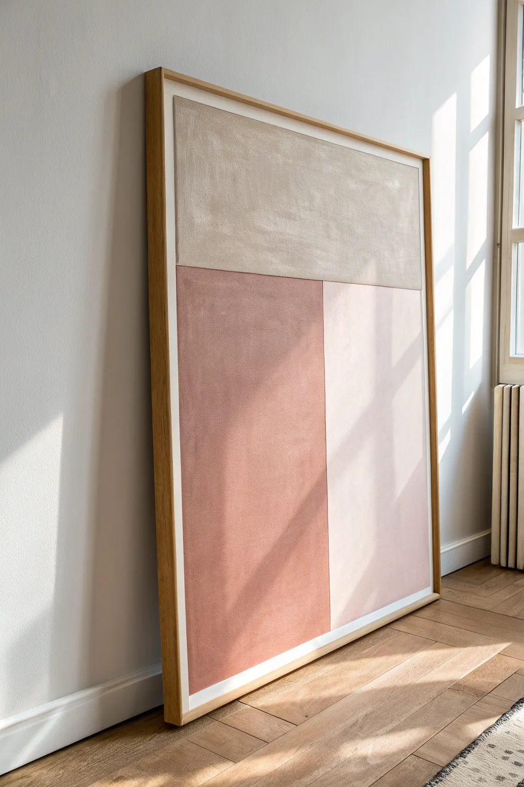
Bring serene architectural balance to your space with this tone-on-tone abstract painting, featuring large fields of soft terracotta, greige, and blush pink. The textured finish adds warmth and depth to an otherwise sleek minimalist design, perfect for creating a focal point in a neutral room.
Step-by-Step
Materials
- Large canvas (e.g., 36×48 inches)
- Acrylic paints (Titanium White, Burnt Sienna, Raw Umber, Yellow Ochre)
- Modeling paste or gesso (for texture)
- Wide masking tape (painter’s tape)
- Large flat paintbrush (2-3 inches)
- Palette knife or wide spatula
- Measuring tape
- Pencil
- Mixing palette or paper plates
- Drop cloth
- Light wood floating frame (optional, for finishing)
Step 1: Preparation & Layout
-
Prime the Surface:
Start by laying your canvas flat on a drop cloth. Even if the canvas is pre-primed, I like to apply a thin, uneven layer of gesso or modeling paste across the entire surface using a palette knife to create that subtle, plaster-like texture seen in the inspiration image. -
Let it Dry:
Allow the texture layer to dry completely. This usually takes about 2-4 hours depending on the thickness, but leaving it overnight guarantees the best adhesion for your paint. -
Measure the Composition:
Decide on your layout. The inspiration piece uses a horizontal division about one-third of the way down from the top. Measure and lightly mark this line with a pencil. -
Mark the Vertical Split:
For the bottom section, measure to find the vertical line that splits the lower area. In the example, the left block is slightly wider than the right, roughly a 55/45 split, but you can center it if you prefer perfect symmetry. -
Tape the Boundaries:
Apply masking tape firmly along your pencil lines. Important: Decide which section you will paint first (we’ll start with the top) and tape *outside* that area so the paint covers the line fully. Run your fingernail over the tape edges to seal them tight.
Bleed-Proof Lines
To get razor-sharp lines, apply a thin layer of clear matte medium or white paint along the tape edge first. This seals the tape so your colored paint won’t seep underneath.
Step 2: Mixing & Painting
-
Mix the Top Shade:
Create a warm ‘greige’ (grey-beige). Mix a large amount of Titanium White with a small touch of Raw Umber and a tiny dot of Yellow Ochre. You want a sandy, limestone color. -
Paint the Top Section:
Using your large flat brush, apply the paint to the top horizontal rectangle. Use multi-directional brushstrokes (cross-hatching) to enhance the underlying texture rather than painting in straight rows. -
Remove Tape Promptly:
Peel off the tape around this section while the paint is still slightly tacky but not wet. This helps prevent the paint from peeling off in chunks. -
Mix the Terracotta:
For the bottom-left darker section, mix Burnt Sienna with a little White and a touch of Raw Umber to desaturate it. You are aiming for a dusty, sun-baked clay color, not a bright orange. -
Retape for Sharp Lines:
Once the top section is 100% dry (give it time!), apply new tape specifically along the bottom edge of the greige section to protect it. Also, place a vertical strip of tape to define the right edge of this terracotta block. -
Apply the Darker Block:
Paint the bottom-left section with your dusty terracotta mix. Ensure you work the paint into the weave or texture fully so no white speckles show through. -
Mix the Blush Tone:
For the final bottom-right section, take a scoop of your leftover greige mixture or white paint and add just a tiny smudge of the terracotta mix. You want a very pale, warm off-white that reads as a soft blush. -
Final Taping:
Ensure the terracotta section is fully dry. Tape over the vertical edge of the terracotta paint to create a crisp boundary for the final block. -
Paint the Final Section:
Fill in the bottom-right rectangle with your pale blush mix. Again, keep the brushstrokes loose and textural to match the other sections. -
Reveal the Work:
Carefully remove all remaining masking tape. If you have any small bleeds, use a tiny brush with the appropriate color to touch up the edges once everything is dry. -
Seal the Surface (Optional):
If you want to protect the finish without adding sheen, apply a layer of matte varnish spray.
Uneven Coverage?
If the canvas texture causes white gaps, don’t press harder. Instead, thin your paint slightly with water or flow medium so it sinks into the crevices without losing opacity.
Hang your new large-scale artwork in a well-lit spot to let the shadows play across the textured surface
Three-Shape Balance Composition
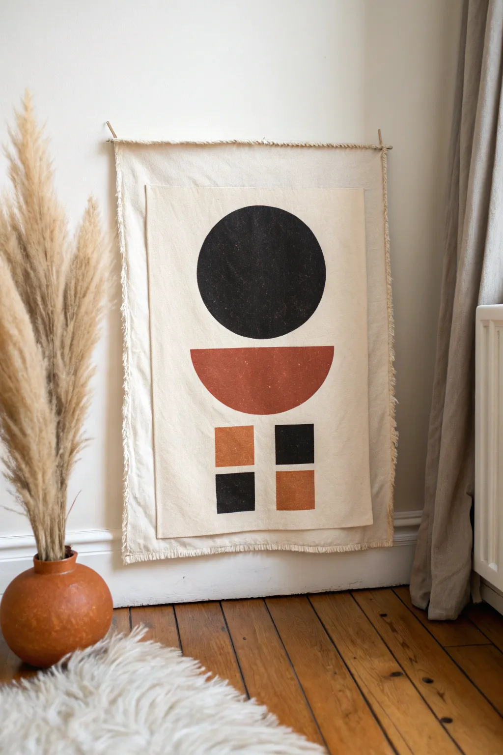
Bring warmth and modern structure to your space with this layered textile art piece. Combining earth tones with bold geometric shapes on raw canvas creates a sophisticated balance of texture and minimalism.
How-To Guide
Materials
- Heavyweight unbleached cotton canvas (approx. 1/2 yard)
- lighter weight calico or muslin fabric (for the top layer)
- Fabric paint (black and terracotta/burnt sienna)
- Flat paintbrushes (1-inch and 2-inch widths)
- Painter’s tape or masking tape
- Ruler and pencil
- Circular object (plate or bowl) or compass for tracing
- Fabric glue or a sewing machine with beige thread
- Wooden dowel (approx. 1/4 inch diameter)
- Jute twine or string for hanging
- Scissors and a seam ripper (for fraying edges)
Step 1: Preparing the Canvas Base
-
Cut the base layer:
Begin by cutting your heavyweight canvas into a rectangle approximately 18 inches wide by 24 inches long. This will act as the sturdy foundation for your artwork. -
Create the fringe:
With the base canvas cut, pull the loose threads along all four edges. Continue pulling until you have a nice, uniform fringe about 1/2 inch deep on all sides. -
Prepare the painting surface:
Cut the lighter weight calico fabric into a slightly smaller rectangle, roughly 14 inches by 20 inches. This difference in size allows the fringed base to frame the painted section perfectly. -
Iron the fabrics:
Before any paint touches the fabric, iron both pieces ensuring they are perfectly flat. Wrinkles now will be permanent later.
Stamp for Texture
For a block-printed look, cut your shapes out of a potato or foam sheet and stamp the paint onto the fabric instead of brushing it.
Step 2: Designing the Composition
-
Center the design:
Lay the smaller calico piece on a flat surface. Using a ruler, lightly mark a vertical centerline to help align your shapes symmetrically. -
Draw the main circle:
Place your circular template (about 8-10 inches in diameter) near the top center of the fabric. Trace around it lightly with a pencil. -
Outline the semi-circle:
Measure about 2 inches below the circle. Draw a horizontal line matching the circle’s diameter, then use your template again to draw the curved bottom half of the semi-circle shapes below the line. -
Draft the lower squares:
Move roughly 2 inches below the semi-circle. Mark out four squares arranged in a larger square formation (two rows of two). Each individual square should vary between 2-3 inches.
Level Up: Dyed Fringe
Dip-dye the very ends of the canvas fringe in diluted coffee or tea before assembly to add an aged, vintage border effect.
Step 3: Painting the Shapes
-
Paint the black circle:
Using the 2-inch flat brush and black fabric paint, fill in the large top circle. Use slow, deliberate strokes to keep the edges crisp, but don’t worry about complete opacity; a little texture looks organic. -
Apply the terracotta:
Switch to a clean brush and fill in the semi-circle shape with the terracotta paint. I like to brush horizontally here to mimic the horizon line. -
Tape the squares:
For the crispest lines on the small squares, apply painter’s tape around the outside edges of your pencil marks. -
Paint the checkerboard:
Paint the top-left and bottom-right squares in terracotta. Paint the top-right and bottom-left squares in black. This creates the alternating balance. -
Let it dry:
Allow the painted fabric to dry completely flat for at least 4 hours, or overnight if possible.
Step 4: Assembly and Hanging
-
Attach the layers:
Center your dry painted calico onto the fringed canvas base. Use fabric glue around the perimeter (or sew a simple straight stitch) to secure them together. -
Prepare the dowel casing:
On the top edge of the back canvas layer only, create a small channel by folding the top edge over slightly to make a pocket, or simply attach two small loops of string to the top corners. -
Insert support:
Measurements can be tricky, so simply trim your wooden dowel to be slightly wider than the canvas. Slide it into your pocket or loops. -
Add the hanger:
Tie a piece of jute twine to each end of the exposed wooden dowel. -
Final fraying check:
Inspect your edges one last time. If handling the fabric caused kinks in the fringe, comb them out gently with your fingers.
Hang your new textile art in a bright spot to enjoy the interplay of geometric balance and soft textures
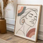
Line Drawing With One Color Pop
Embrace the elegance of minimalism with this striking line art project that proves less is often more. This tutorial guides you through creating a continuous-style profile drawing accented by a single, bold circular pop of color for a modern aesthetic.
Detailed Instructions
Materials
- High-quality mixed media or Bristol paper (A4 or A3 size)
- Black fine liner pen (0.5mm or 0.8mm)
- Pencil (HB for sketching)
- Soft eraser
- Coral or terracotta acrylic paint
- Round paintbrush (medium size, approx. size 6 or 8)
- Drafting compass or a small round object (like a spice jar lid)
- Ruler (optional, to center your composition)
- Light wood frame with mat board
Step 1: Preparation and Composition
-
Prepare your workspace:
Clear a flat, well-lit surface and tape down the corners of your paper slightly if it tends to curl. Ensuring a stable surface is crucial for steady line work. -
Establish the center:
Using a ruler, lightly mark the vertical and horizontal center of your paper with your pencil. This will help you position the profile so it feels balanced within the frame later. -
Outline the anchor shape:
Before drawing the face, determine where the cheek color will go. Use your compass or a small circular object to lightly trace a circle in the lower-middle right quadrant of the page. This circle will serve as a focal point for the face’s positioning.
Keep it Clean
Place a clean sheet of scrap paper under your drawing hand while inking. This pro tip prevents oils from your skin transferring to the paper and protects your pencil sketch from smudging.
Step 2: Sketching the Profile
-
Rough the forehead and nose:
Starting above and to the left of your circle, lightly sketch a sloping forehead line that transitions into the bridge of the nose. Keep your pencil pressure very light so mistakes are easily erased. -
Define the nose and lips:
Curve the line outward for the tip of the nose, then draft the philtrum and the upper lip. The upper lip should protrude slightly more than the lower lip. -
Draft the chin and jawline:
Continue the line under the lower lip to form the chin. Draw the jawline sweeping upward and backward, ensuring it passes just underneath your pre-drawn circle. -
Indicate the eye and brow:
Sketch a simple, closed eyelid shape—a curved line with a few lashes—positioned above the cheek area. Add a slightly thicker, arched line above it for the eyebrow. -
Sketch the ear and neck:
Draw the ear shape behind the jawline, roughly in line with the nose. Extend a long, graceful curve down from the chin area to form the front of the neck. -
Flowing hair lines:
Add sweeping, organic curves to suggest hair. Don’t try to draw individual strands; instead, draw long, confident S-curves that frame the face and flow down the back of the neck. -
Refine the sketch:
Step back and look at your composition. Adjust the proportions if necessary, ensuring the circle sits comfortably on the ‘cheek’ area without overlapping the main facial features.
Step 3: Adding the Color Pop
-
Mix your paint:
Squeeze a small amount of coral or terracotta acrylic paint onto a palette. If the paint is too thick, add a tiny drop of water to improve flow, but keep it opaque. -
Paint the cheek:
Carefully fill in the pencil circle you drew earlier. Use the tip of your round brush to outline the edge first for neatness, then fill the center. -
Check opacity:
If the paper texture shows through too much for your liking, let the first coat dry completely and apply a second thin layer for a solid, matte finish. -
Let it dry completely:
Allow the paint to fully cure before moving on to the ink. Wet paint can smudge easily under your hand while drawing.
Texture Play
Instead of flat acrylic paint for the circle, try using gold leaf or a textured impasto gel mixed with color to add a tactile, 3D dimension to your minimalist piece.
Step 4: Inking and Finishing
-
Test your pen:
Scribble on a scrap piece of the same paper to ensure your fine liner is flowing smoothly and hasn’t dried out. -
Ink the profile:
Start with the forehead and nose. Commit to your lines with a steady hand. I find that exhaling slowly as I draw a long curve helps minimize shakiness. -
Add line weight variety:
As you ink the hair and jaw, you can thicken the line slightly in shadow areas (like under the chin or the nape of the neck) by going over the line a second time. -
Detail the features:
Carefully ink the eye, eyelashes, and eyebrow. These are delicate features where a lighter touch works best. -
Ink the hair:
Go over your hair sketches with long, fluid motions. Let the lines taper off naturally at the ends rather than stopping abruptly. -
Erase pencil marks:
Once the ink is 100% dry (give it at least 15 minutes to be safe), gently erase all visible pencil sketches. Be very careful around the painted circle to avoid scuffing the pigment. -
Framing:
Place your finished artwork behind a mat board (mount) to give it breathing room, and secure it in a light wooden frame to match the natural, minimalist vibe.
Hang your new masterpiece in a bright spot where the single pop of color can truly shine
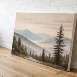
Minimal Shadow Shape Study
Capture the fleeting beauty of a misty horizon with this minimalist watercolor study. By layering a soft, creamy wash over textured black strokes, you’ll create a landscape that feels both grounded and dreamlike.
Step-by-Step Guide
Materials
- Cold press watercolor paper (approx. 300 gsm)
- Watercolor paints: Ivory Black or Lamp Black, Yellow Ochre or Naples Yellow
- Flat wash brush (1 inch)
- Small round brush or fan brush (size 4 or similar)
- Clean water jar
- Paper towel or cloth
- Art masking tape (optional)
Step 1: Setting the Scene
-
Paper preparation:
Begin with a rectangular sheet of cold press watercolor paper. You can leave the edges raw for an organic look or tape them down if you prefer a crisp border. -
Mix the sky tone:
Create a very dilute wash of Yellow Ochre or Naples Yellow. You want a color that is barely there—think of hazy morning light rather than bright sun. -
Apply the first wash:
Using your large flat brush, paint a broad, sweeping rectangle that covers the upper two-thirds of your paper. Keep the edges slightly uneven and organic. -
Soften the edges:
While the yellow wash is still wet, dip a clean brush in water and gently run it along the bottom edge of the color to feather it out, preventing a hard line from forming. -
Initial drying:
Let this first layer dry completely. The paper should be cool to the touch but not damp before you proceed to the darker tones.
Muddy Horizon?
If the black bleeds too much into the yellow, your sky layer wasn’t dry enough. Let layers bone-dry between major color changes.
Step 2: Creating the Horizon
-
Mix the shadow color:
Prepare a mixture of Ivory Black. For this bottom section, you want a variation in consistency—some watery and some more saturated. -
Establish the ground line:
With a smaller brush, paint a horizontal band across the lower third of the paper, overlapping slightly with the faded bottom of your yellow sky. -
Dry brush texture:
Load your brush with thicker black paint, dab off excess moisture on a towel, and drag it horizontally. This ‘dry brush’ technique creates the rough, textured appearance seen in the foreground. -
Layering transparency:
Dip your brush in water to dilute the black remaining on the bristles. Paint a second, lighter grey band just above the dark one to create depth and a sense of distance. -
Suggesting pine trees:
While the horizon line is damp but not soaking, use the tip of a small round brush to dab vertical, uneven strokes along the right side of the dark band to suggest a distant tree line.
Step 3: Atmospheric Blending
-
Integrating the layers:
Clean your flat brush and dampen it slightly with clean water. I like to gently drag it vertically from the dark horizon up into the yellow sky in just one or two spots to blur the transition. -
Softening the trees:
If your tree shapes look too sharp, touch them lightly with a damp brush or a tissue to lift a tiny bit of pigment, making them look like they are receding into fog. -
Adding atmospheric haze:
Mix a very watery, pale grey wash. Glaze this swiftly over the middle section where the sky meets the land to unite the two elements. -
Final drying check:
Allow the darker sections to dry naturally. Resist the urge to use a heat tool, as this allows the pigment to settle into the paper’s texture more beautifully. -
Assess the balance:
Step back and look at your composition. If the sky feels too pale, you can add a second, extremely faint glaze of yellow, but ensure the first layer is 100% dry. -
Refining the bottom edge:
The bottom edge of the painting should look somewhat unfinished or faded. If it’s too abrupt, use clean water to feather the very bottom edge of the black paint into the white of the paper.
Texture Tip
Use rougher paper for more dramatic dry-brush effects. The texture catches the pigment, creating natural white gaps.
Enjoy the quiet simplicity of your new minimalist landscape on your wall
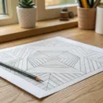
Tape-Resist Line Grid
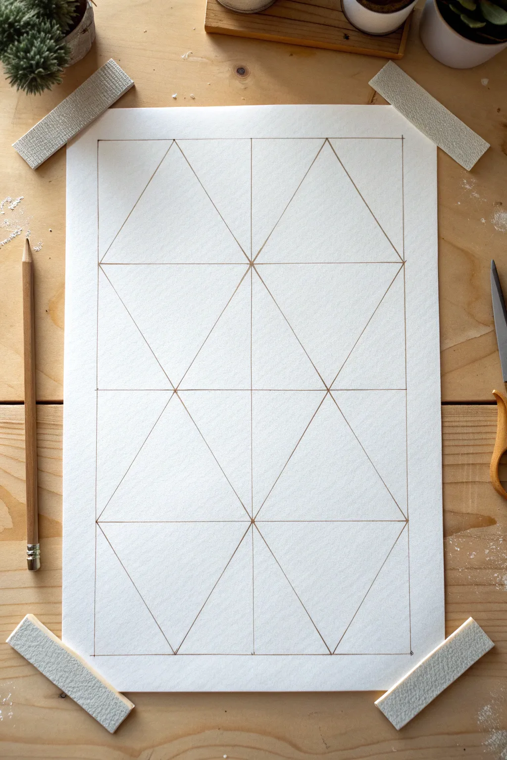
This minimalist project focuses on the beauty of precision and basic geometry, creating a clean, structured grid of triangles. The result is a satisfyingly symmetrical line drawing that can serve as a standalone piece or the foundation for color blocking.
Step-by-Step
Materials
- High-quality drawing paper (smooth bristol or mixed media paper)
- Pencil (HB or 2B)
- Long ruler (18-inch preferred)
- Eraser
- Masking tape or painter’s tape
- Art board or flat work surface
- Pencil sharpener
Step 1: Preparation and Border
-
Secure the paper:
Start by taping down the four corners of your drawing paper to your work surface. Use small strips of masking tape placed diagonally across the corners to keep the sheet perfectly flat and immobile while you draw. -
Clean your tools:
Wipe down the edge of your ruler to ensure no graphite smudges transfer to your pristine white paper. -
Mark the outer boundary:
Measure a consistent margin from the edge of the paper (about 1 to 1.5 inches) and mark small dots at the corners to define your working area. -
Draw the main rectangle:
Connect your corner marks to create a large, perfect rectangle. Keep your pencil pressure light but firm enough to see the lines clearly.
Step 2: Creating the Grid Structure
-
Divide vertically:
Measure the total width of your rectangle and find the exact center point at both the top and bottom lines. -
Draw the center line:
Draw a straight vertical line connecting the top center mark to the bottom center mark, splitting your rectangle into two equal tall columns. -
Establish horizontal sections:
Measure the height of your rectangle and divide it by three. Mark these third-points along the left and right vertical borders, as well as on your center line. -
Draw horizontal guides:
Connect these marks horizontally. You should now have a grid consisting of six equal rectangles arranged in a 2×3 layout.
Clean Edges
Keep your pencil very sharp. A dull point creates fuzzy corners and makes accurate measuring difficult. Rotate the pencil slightly as you draw to maintain the point.
Step 3: Forming the Triangles
-
Locate triangle peaks:
For the top row, identify the top-center point of each of the two rectangles. Do the same for the bottom row’s rectangles. -
Draw the first diagonals:
Starting in the top-left rectangle, draw a line from the bottom-left corner up to the top-center point you just identified. -
Complete the first triangle:
Draw a line from that same top-center point down to the bottom-right corner of that specific rectangle. You now have your first large triangle. -
Repeat for the top right:
Mirror this process in the top-right rectangle to create the second triangle. -
Address the middle row:
For the middle row, we instruct the eye differently. Draw diagonals creating an inverted ‘V’ shape, or simply connect corners to form diamonds where they meet the triangles above and below. -
Draw the bottom row:
Repeat the process used for the top row in the bottom two rectangles, drawing upward-pointing triangles. -
Review intersections:
Check all points where lines meet. The vertices should be sharp and precise, with multiple lines converging at exactly the same spot.
Add Color
Use this grid as a base for watercolor or gouache. Paint alternating triangles in monochromatic shades for a stunning geometric abstract effect.
Step 4: Refining the Artwork
-
Darken the lines:
Once you are happy with the geometry, go over your lines one final time with slightly more pressure or a darker pencil lead to unify the visual weight. -
Clean up stray marks:
I usually take a small eraser to dab away any tiny overshot lines at the corners or intersections to keep the drawing crisp. -
Remove the tape:
carefully peel away the tape from the corners, pulling slowly away from the paper to avoid tearing the fibers.
Now you have a perfectly balanced geometric composition ready for display or further decoration
Minimal Collage With Two Papers
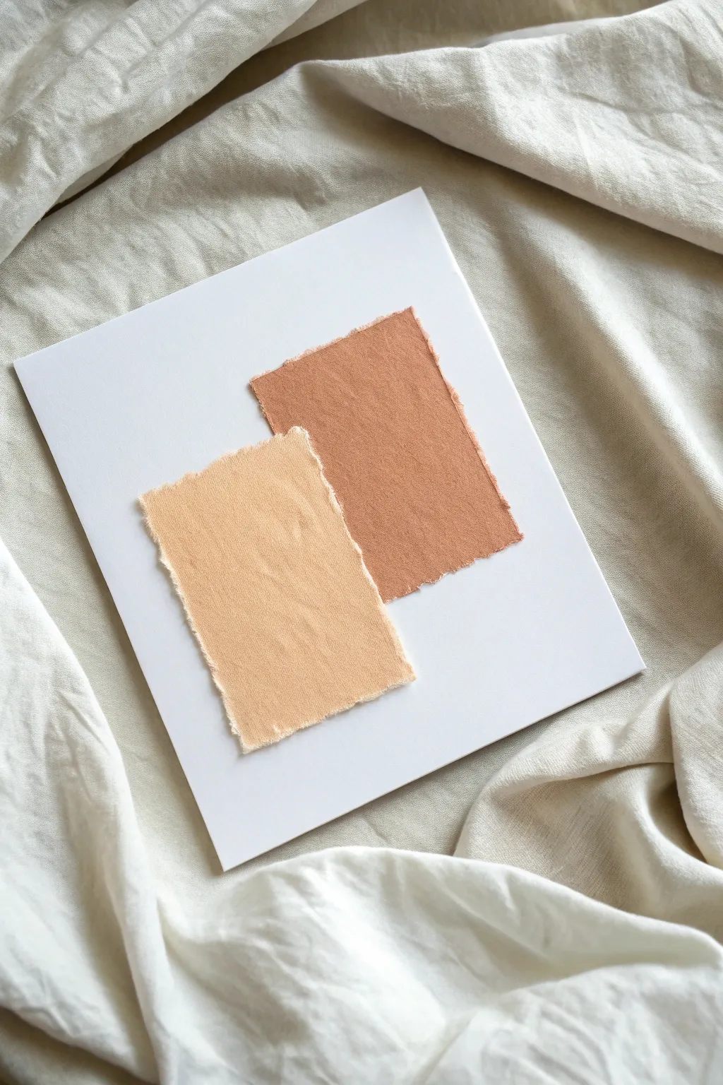
Embrace the serene beauty of subtle textures with this understated collage project. By combining raw-edged fabrics or papers in coordinating earth tones, you’ll create a piece that feels both tactile and modern, perfect for bringing a calm stillness to any room.
Step-by-Step Tutorial
Materials
- Heavyweight white cardstock or canvas board (square)
- Cotton or linen fabric scraps (light peach and terracotta)
- Ruler
- Pencil
- Fabric scissors (optional)
- Archival spray adhesive or PVA glue
- Tweezers
- Small paintbrush (if using glue)
Step 1: Preparing the Base
-
Select your foundation:
Choose a sturdy white base for your artwork. A square piece of heavy cardstock works beautifully, but a canvas board provides a bit more elevation and durability. -
Clean the surface:
Wipe down your chosen base material to ensure there is no dust or oil, which guarantees the best possible adhesion for your collage elements. -
Visualize the layout:
Before cutting anything, visualize where you want your two main elements to sit. The goal is an overlapping composition that feels balanced but slightly off-center for visual interest.
Step 2: Creating the Textured Swatches
-
Select your fabrics:
Choose two fabrics with a nice visible weave, like linen or cotton. You want earthy, muted tones—one in a light peach or sand color, and the other in a deeper terracotta or rust. -
Measure the first shape:
Using a ruler, lightly mark a rectangle on the darker terracotta fabric. It should be roughly 1/4 the size of your background board. -
Tear the fabric:
Instead of cutting with scissors, create a small snip at your mark and tear the fabric along the grain. This is crucial for achieving that soft, frayed edge seen in the example. -
Measure the second shape:
Repeat the marking process for the lighter peach fabric. Make this rectangle slightly wider but shorter than the first one to create contrast in proportions. -
Create the second frayed edge:
Snip and tear the lighter fabric just as you did the first. The tearing action naturally releases loose threads that give this piece its character. -
Refine the edges:
Inspect the edges of both rectangles. If some threads are too long and unruly, gently pull them out completely or trim them down slightly so the fraying looks intentional, not messy. -
Iron the pieces:
Fabric can hold creases from storage. Give your two torn rectangles a quick press with an iron to ensure they lie perfectly flat against the board.
Fixing Glue Seepage
If glue soaks through the fabric, don’t wipe it! Let it dry completely, then gently buff the spot with a clean, dry cloth to reduce the shine.
Step 3: Assembling the Composition
-
Dry run arrangement:
Place the terracotta rectangle on your white board first, positioning it towards the upper right quadrant. Layer the lighter peach rectangle over it, shifted towards the bottom left. -
Adjust the overlap:
Tweak the positioning until the relationship between the two shapes feels harmonious. A slight overlap connects the two forms, creating a single visual unit. -
Mark the position:
Once you are happy with the layout, I like to use a pencil to make tiny, faint dots at the corners of the bottom layer (the terracotta one) to guide placement during gluing. -
Apply adhesive to the first layer:
Flip the terracotta fabric over. Apply an even coat of spray adhesive or brush on a thin layer of PVA glue. Focus on the center, leaving the very edges slightly free to enhance the texture. -
Place the first layer:
Carefully align the fabric with your pencil marks and press it down gently. Smooth from the center outward to push out any air bubbles. -
Apply adhesive to the second layer:
Apply your adhesive to the back of the lighter peach fabric. Again, ensure even coverage without soaking the fabric, which could cause discoloration. -
Place the top layer:
Position the peach fabric so it overlaps the bottom corner of the terracotta piece as planned. Press down firmly but gently. -
Tease the edges:
Use tweezers to gently lift or ruffle the frayed edges just a tiny bit. This separates them from the board and emphasizes the beautiful shadow lines. -
Final drying time:
Let the artwork sit flat for at least an hour to ensure the adhesive cures completely and the fabric remains taut.
Framing for Depth
Use a shadow box frame rather than standard framing. The distance between the glass and the textured fabric will cast soft shadows that highlight the frayed edges.
Hang your new textured collage in a spot with good natural light to truly appreciate the subtle interplay of shadow and fiber


Have a question or want to share your own experience? I'd love to hear from you in the comments below!