Minimalist painting is my favorite kind of “less is more” magic—just a few shapes, a calm palette, and suddenly it feels like a finished statement. If you’ve been craving art that looks modern but still feels handmade, these minimalist painting ideas will give you plenty of easy starting points.
Clean Geometric Color Blocks
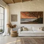
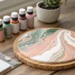
Achieve a high-end gallery look with this large-scale geometric painting that balances warm earth tones with structured minimalism. By using textured mediums and careful masking, you’ll recreate the sharp lines and organic feel of this striking focal point.
How-To Guide
Materials
- Large rectangular canvas (approx. 36″ x 48″)
- Acrylc paints: Terracotta, Mustard Yellow, Dark Charcoal, Warm Cream/Off-White
- Modeling paste or thick gesso for texture
- Wide flat artist brush (2-inch)
- Palette knife or spreaders
- Painter’s tape (low-tack delicate surface tape)
- Ruler or T-square
- Pencil
- Black wooden floating frame (custom size to fit canvas)
- Matte varnish spray
Step 1: Preparation & Layout
-
Prime the Surface:
Even if your canvas is pre-primed, apply a coat of white gesso to ensure a uniform starting surface. Let this dry completely before moving on. -
Map the Geometry:
Using a ruler and a light pencil, sketch the grid layout. Draw a vertical line roughly one-third of the way from the left edge. Then, mark horizontal divisions to create the specific block sizes: a large top right quadrant, a smaller bottom right rectangle, and the varied column on the left. -
Plan Your Colors:
Lightly mark inside each penciled rectangle which color will go where (e.g., ‘Terra’ top left, ‘Cream’ top right). This prevents confusion once you start taping and painting.
Step 2: Building Texture
-
Add Dimension:
Mix a generous amount of modeling paste into your cream and terracotta paints on a palette—about a 50/50 ratio. This will give that tactile, plaster-like quality seen in the original. -
Alternative Texture Method:
If you prefer a rougher finish, apply a thin layer of modeling paste directly to the canvas first with a palette knife, scraping it flat but leaving subtle ridges. Let it dry fully before painting.
Bleeding Lines?
If paint seeps under the tape, wait for it to dry completely. Then, re-tape the line slightly over the mistake and paint over the bleed with the correct color to ‘erase’ the error.
Step 3: Painting the Color Blocks
-
Tape the First Group:
Apply painter’s tape along the pencil lines for the first set of non-adjacent shapes. I usually start with the large top-right cream section and the bottom-left charcoal section. -
Seal the Tape Edges:
To ensure razor-sharp lines, brush a tiny amount of matte medium or white paint over the tape edge. This seals gaps and prevents colored paint from bleeding underneath. -
Apply the Cream Tone:
Using a wide flat brush, paint the large top-right rectangle with your warm cream mix. Use horizontal and vertical strokes to create a woven texture appearance. -
Paint the Charcoal Block:
Fill the bottom-left rectangle with the dark charcoal paint. Keep the coverage opaque; you may need two coats here to get that solid, heavy look. -
Remove Tape While Damp:
Carefully peel back the tape while the paint is still slightly tacky—don’t wait for it to be bone dry, or it might chip the edges. -
Dry Time:
Allow these first sections to dry completely. Since modeling paste is thicker, give it at least 2-3 hours. -
Tape the Second Group:
Once dry, tape off the boundaries for the remaining sections: the terracotta blocks and the mustard yellow square. Apply tape directly over the dried paint edges of the previous sections. -
Terracotta Application:
Paint the top-left block and the central vertical strip in the terracotta hue. Focus on keeping the texture consistent with the cream section. -
Mustard Yellow Block:
Fill the middle-right square with the mustard yellow paint. This color adds the crucial warmth to the composition, so ensure it is vibrant and solid. -
Paint the Final Cream Section:
Finish the painting by filling the bottom-right rectangle with the warm cream/off-white tone. -
Final Reveal:
Remove the final strips of tape to reveal the clean, intersecting lines of your geometric composition.
Add Organic Depth
Mix a tiny drop of sand or sawdust into the terracotta paint before applying. This subtle grit mimics raw linen or earth, making the minimalist blocks feel less manufactured.
Step 4: Finishing Touches
-
Touch Up:
Inspect the lines. If any bleed-through occurred, use a small angled brush and the correct paint color to carefully neaten the edges. -
Varnish:
Once the entire piece has cured (wait 24 hours), spray a light coat of matte varnish to protect the surface without adding unwanted gloss. -
Frame It:
Place the canvas into the black floating frame. Secure it from the back using offset clips so the dark rim creates a crisp border around your art.
Hang your new masterpiece in a hallway or living space to add instant architectural interest and warmth


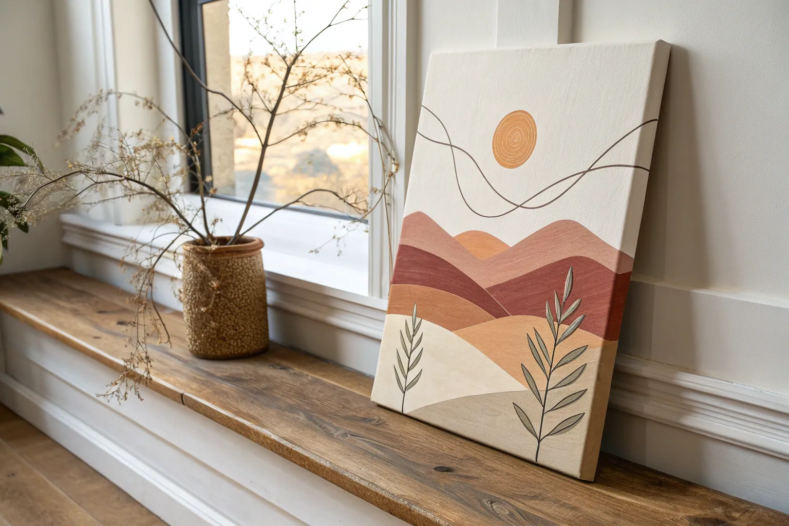
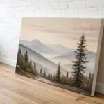
Minimalist Mountains in Overlapping Shapes
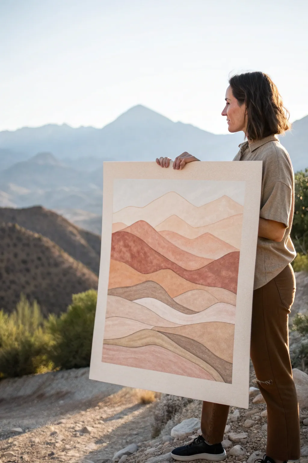
Capture the serene beauty of distant hills with this minimalist layered landscape. Using a warm, earthy palette and soft, overlapping curves, you will build a sense of depth that mimics a tranquil desert sunset.
Step-by-Step
Materials
- Large watercolor paper or primed canvas (24×36 inches suggested)
- Acrylic paints (burnt sienna, raw umber, yellow ochre, titanium white, mars black)
- Set of flat synthetic brushes (1-inch and 2-inch widths)
- Small round brush for details
- Pencil and eraser
- Palette or mixing plate
- Painter’s tape or artist tape
- Water cups and paper towels
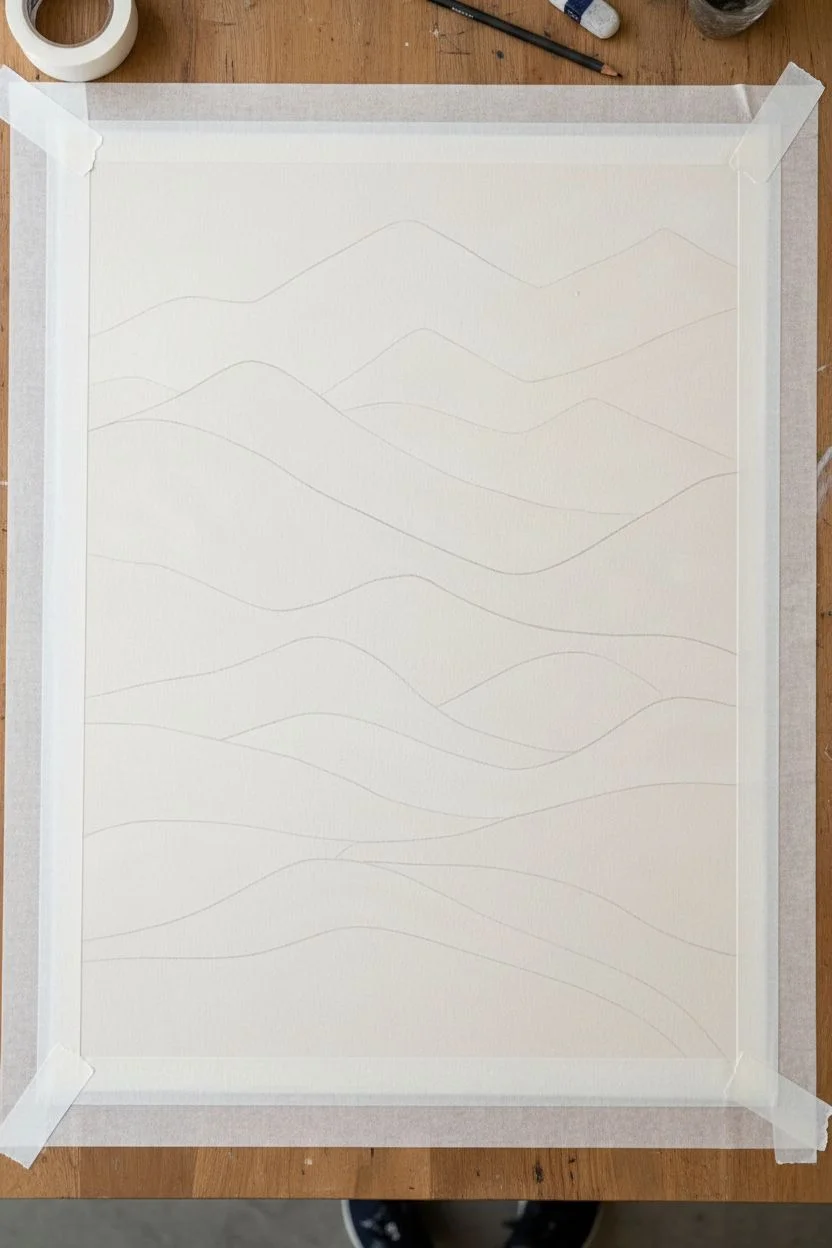
Step 1: Planning and Sketching
-
Prepare the Surface:
Begin by taping down your watercolor paper to a board to prevent buckling, or set up your canvas on an easel. Ensure the surface is clean and free of dust. -
Create a Border:
If you want the clean white border seen in the example, use artist tape to mask off a 2-inch border around the entire perimeter of your working area. -
Sketch the Horizon:
Lightly sketch the highest mountain range near the top third of the canvas. Keep the lines soft and undulating rather than jagged peaks. -
Draw Middle Layers:
Continuing downwards, sketch 3-4 distinct overlapping hill shapes. These should intersect and weave behind one another to establish the middle ground. -
Outline Foreground:
Finish your sketch by drawing the lowest, closest hills. Make these shapes slightly larger and flatter to suggest proximity to the viewer.
Clean Lines Hack
To get razor-sharp edges between mountain layers without gaps, paint slightly over the pencil line of the layer below, then cut back in with the new color on top.
Step 2: Mixing the Palette
-
Base Earth Tones:
Squeeze out generous amounts of burnt sienna, yellow ochre, and raw umber. These will form the foundation of your desert scheme. -
Create Tints:
Mix a large portion of titanium white with a touch of yellow ochre and a tiny dot of burnt sienna to create a pale, creamy sand color for the sky and distant peaks. -
Mix Mid-Tones:
Create a spectrum of terracotta and dusty pinks by mixing burnt sienna with varying amounts of white. You want a gradient of warmth. -
Prepare Dark Accents:
Mix raw umber with a touch of mars black and burnt sienna to create a deep, rich brown for the strongest contrast areas.
Step 3: Painting the Layers
-
Paint the Sky:
Using your largest flat brush, fill in the sky area above the first mountain line with your palest cream mix. Ensure an even, matte application. -
First Mountain Range:
Paint the most distant mountains with a very light beige-pink. This atmospheric perspective helps push them into the background. -
Adding Warmth:
Moving down to the next layer, use a soft peach or light terracotta. Apply the paint smoothly, following the curve of your pencil line. -
The Bold Stripe:
Identify the central, boldest band in your composition. Paint this section with your rich, unmixed burnt sienna or rust color to anchor the piece. -
Textural Variation:
For the lower sections, I like to mix a little sand or texture medium into the paint, or simply use a drier brush technique to give the appearance of sandy soil. -
Painting the Foreground:
Fill the bottom-most shapes with varied shades of taupe and darker beige. Alternate between cool and warm neutrals to separate the layers visually. -
Refining Edges:
Use a smaller flat brush or a round brush to clean up the edges where shapes overlap. You want crisp, deliberate lines distinct from one another. -
Second Coat:
Once the first layer is touch-dry, assess the opacity. Apply a second coat to any areas that look streaky, particularly the lighter colors. -
Reveal the Border:
Wait until the painting is completely bone dry. Carefully peel away the painter’s tape at a 45-degree angle to reveal your crisp, clean border.
Textured Finish
Mix a small amount of baking soda into your acrylic paint. This creates a grainy, stone-like texture perfect for mimicking desert sandstone.
Hang your finished piece in a well-lit spot to bring that warm, earthen calm into your living space and enjoy the view

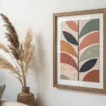
Single-Stem Botanical Line Painting
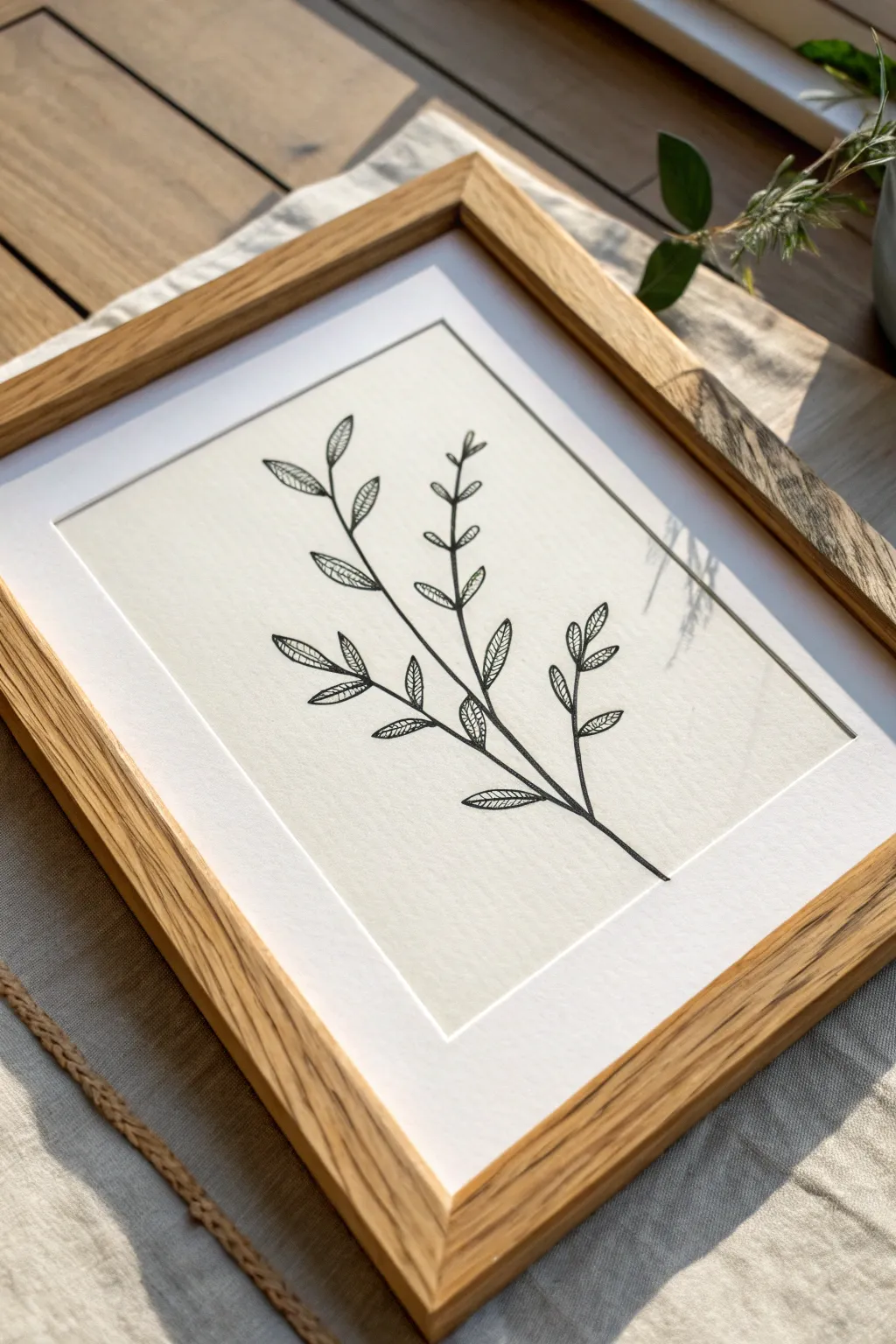
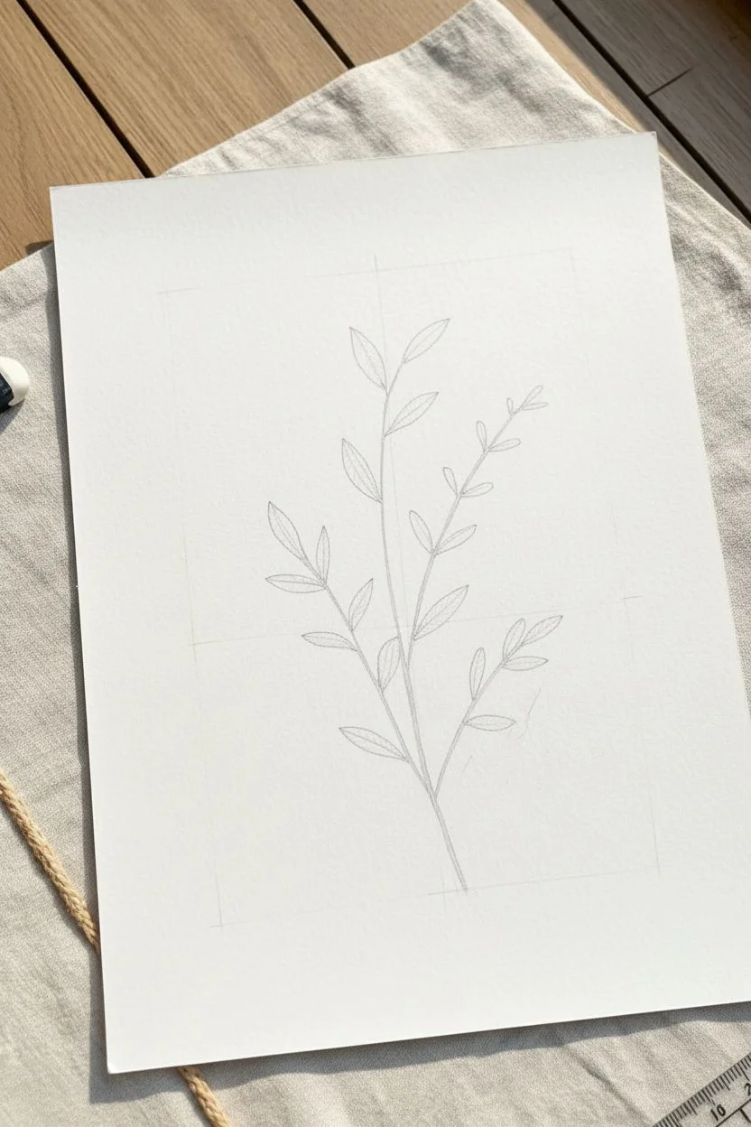
Embrace the beauty of restraint with this minimalist single-stem botanical illustration. Using precise ink lines and delicate hatching techniques, you’ll create a sophisticated piece of art that looks stunning in a clean wooden frame.
Step-by-Step Guide
Materials
- High-quality white cardstock or cold-pressed watercolor paper (A4 or 8×10)
- Fine liner pens (sizes 005, 01, and 03; black)
- Pencil (HB or 2H)
- Soft kneadable eraser
- Ruler
- Picture frame with mat (light wood finish)
- Flat, clean workspace
Step 1: Sketching the Skeleton
-
Prepare your paper:
Cut your paper to fit your chosen frame, ensuring it’s slightly larger than the mat opening. Tape the corners down lightly if you’re worried about it shifting. -
Mark the boundaries:
Using your ruler and a very light pencil touch, mark center points to guide your composition, keeping the design centered but slightly organic. -
Draw the main stem line:
Start near the bottom center and draw a gentle, curving line upwards, leaning slightly to the left or right to create a natural bowing movement characteristic of real plants. -
Add secondary branches:
Sketch three to four smaller branches stemming off the main line. Alternate their placement—left, then right, then left again as you move upward. -
Outline the leaf shapes:
At the end of each small branch and the main stem, lightly sketch elongated almond or lanceolate leaf shapes. Add a few leaves attached directly to the main stem near the branch junctures.
Ink Flow Secret
Keep a scrap piece of paper nearby. Before touching the final artwork, test your pen on the scrap to ensure the ink is flowing smoothly and not blobbing.
Step 2: Inking the Outline
-
Select your medium pen:
Take your size 01 fine liner. This will be the primary weight for the main structural lines of the plant. -
Trace the stems:
Carefully go over your pencil lines for the main stem and branches. Keep your hand relaxed; a slight wobble adds organic charm whereas a ruler-straight line looks stiff. -
Ink the leaf contours:
Trace the outer perimeter of each almond-shaped leaf. Ensure the tips meet at a crisp, sharp point. -
Draw the central veins:
Draw a single line down the center of each leaf, extending from the stem to just before the leaf tip. -
Erase pencil guides:
Wait at least 10 minutes to ensure the ink is totally completely dry. Then, gently use the kneadable eraser to lift away the graphite sketches.
Fixing a Wobbly Line
Don’t panic if a stem line goes crooked. Just thicken the line slightly on one side to correct the curve. Nature isn’t perfect, and neither is art.
Step 3: Detailed Texturing
-
Switch to the finest pen:
Pick up the 005 fine liner. This ultra-thin tip is crucial for the delicate interior shading that gives the leaves their texture. -
Start the hatching process:
Inside one half of a leaf, begin drawing tiny diagonal lines. These should run from the central vein outward toward the leaf edge. -
Maintain angle consistency:
Keep your diagonal strokes roughly parallel to each other. They don’t need to be perfectly spaced—slight variation creates visual interest. -
Fill the opposite side:
Repeat the hatching on the other half of the leaf, mirroring the angle so the veins form a comprehensive ‘V’ pattern pointing toward the leaf tip. -
Vary the density:
I like to leave small gaps or ‘white space’ near the center vein occasionally to simulate light hitting the glossy surface of a leaf. -
Check for balance:
Step back and assess your drawing. While consistency is good, ensure that not every leaf looks identical; natural variance is key to the aesthetic.
Step 4: Finishing Touches
-
Deepen the shadows:
Switch back to the 01 pen or even the 03. Go back to where the leaves join the stem and thicken the line slightly to add weight and shadow. -
Clean up the piece:
Do a final check for any lingering pencil marks or smudges, cleaning them up gently with your eraser. -
Cut the mat (optional):
If your frame didn’t come with a mat, cut a white cardstock border to create a professional window for your art. -
Frame the artwork:
Place the artwork behind the mat and glass, securing the back of the frame firmly.
Hang your new botanical illustration in a bright spot where the delicate lines can be fully appreciated


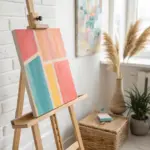
Sun Circle Over a Flat Horizon
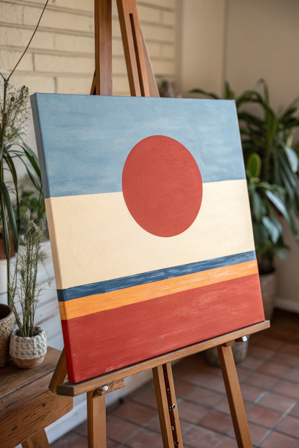
Capture the serene warmth of a minimalist sunset with this bold, geometric abstract painting. This project relies on clean lines and a dusty, desert-inspired color palette to create a striking centerpiece for any modern room.
Detailed Instructions
Materials
- Square stretched canvas (approx. 20×20 or 24×24 inches)
- Acrylic paints: Terra cotta red, dusty blue, cream/off-white, mustard yellow, dark teal/navy
- Flat paintbrushes (wide 2-inch brush and medium 1-inch brush)
- Small round detail brush
- Painter’s tape or masking tape
- Ruler or T-square
- Pencil
- Compass or round object for tracing (plate, bowl)
- Palette for mixing
- Cup of water and paper towels
Step 1: Planning the Horizon
-
Measure your zones:
Start by dividing your canvas horizontally. Use a ruler and pencil to lightly mark a line about one-third of the way down from the top edge. This will separate your sky from the land. -
Mark the lower stripes:
Measure about 4 inches up from the bottom edge and draw a horizontal line. Then, measure another inch above that line for the yellow stripe, followed by a thinner half-inch band above that for the dark teal stripe. -
Tape the main horizon:
Apply a strip of painter’s tape directly below your top pencil line. Rub the edges of the tape firmly with your fingernail or a spoon to ensure a tight seal against paint bleed. -
Tape the lower boundaries:
Apply tape along the lines for your bottom red section and the thin teal stripe. It’s best to tape off every other section first so you can paint without waiting for adjacent wet edges.
Step 2: Painting the Background Layers
-
Paint the sky:
Mix a dusty blue with a touch of grey to desaturate it. Using your wide flat brush, paint the entire top section above the tape. Use long, horizontal strokes for a smooth, matte finish. -
Fill the bottom block:
While the sky dries, mix your terracotta red. Paint the large bottom rectangular section. This color should be rich and opaque, so you might need two coats. -
Add the cream center:
Once the sky paint is dry to the touch, carefully peel off the tape. Re-tape over the dried blue edge to protect it. Paint the large middle section with a creamy off-white paint. -
Let it dry completely:
Allow these large blocks of color to dry fully. If you rush this steps, your tape might pull up the paint later.
Bleeding Tape?
To get razor-sharp lines, paint a thin layer of the *base* color (the color underneath the tape) over the tape edge first. Let it dry to seal the gap, then paint your new color on top.
Step 3: Adding Detail Stripes
-
Tape the accent stripes:
Now tape off the area for the mustard yellow stripe and the dark teal stripe. Ensure the tape is placed over dry paint only. -
Paint the yellow band:
Fill in the stripe just above the bottom red section with mustard yellow. I like to mix a tiny bit of the cream color into the yellow to improve its opacity. -
Paint the teal line:
Fill the thin stripe above the yellow with a dark teal or navy blue. Use a smaller flat brush here to stay neat. -
Reveal the background:
Carefully peel away all remaining tape to reveal your clean horizontal stripes. Touch up any bleed-through spots with a small detail brush.
Texture Twist
Mix a tablespoon of baking soda or modeling paste into your paint for only the red circle. This adds a subtle 3D sandy texture that makes the sun pop against the flat background.
Step 4: Creating the Sun Circle
-
Trace the circle:
Find the center point of your canvas horizontally. Position your compass or round template so the circle will overlap both the blue top section and the cream middle section. Lightly trace the circle in pencil. -
Outline the shape:
Using a small round brush and your terracotta red paint (the same shade as the bottom block), carefully outline the pencil circle. -
Fill the circle:
Switch to a medium flat brush to fill in the rest of the circle. Paint carefully near the edges to keep the curve smooth and perfect. -
Apply a second coat:
Red pigments are often translucent. Wait for the first layer to dry, then apply a second coat to the circle to ensure the blue background doesn’t show through. -
Final inspection:
Check your edges. If the circle looks a bit wobbly, use the background colors (blue or cream) and a detail brush to carefully carve back into the shape and refine the curve.
Hang your finished piece in a well-lit spot to enjoy the calming balance of your new desert horizon
BRUSH GUIDE
The Right Brush for Every Stroke
From clean lines to bold texture — master brush choice, stroke control, and essential techniques.
Explore the Full Guide
Crescent Moon in a Minimal Night Sky
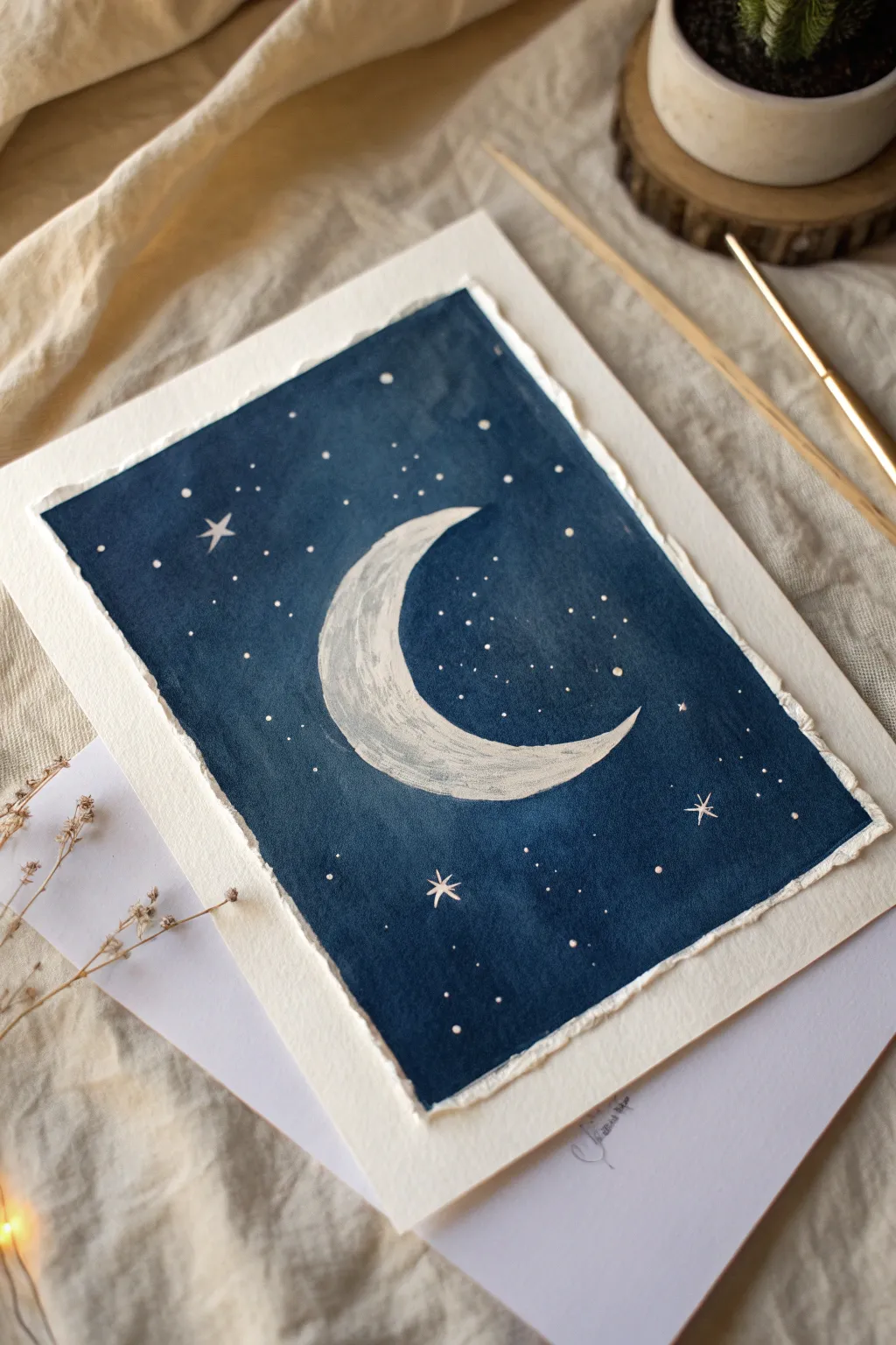
Capture the serene beauty of a quiet night with this striking monochromatic study. Using deep indigo hues against textured paper creates a dreamy, atmospheric piece that looks far more complex than it actually is.
Step-by-Step Guide
Materials
- Cold-press watercolor paper (300 gsm)
- Masking tape or painter’s tape
- Watercolor paints (Indigo, Payne’s Grey, or Phthalo Blue)
- White Gouache or opaque white acrylic paint
- Flat wash brush (1/2 inch or larger)
- Round detail brushes (size 0 and 2)
- Pencil and eraser
- Two jars of water
- Paper towels
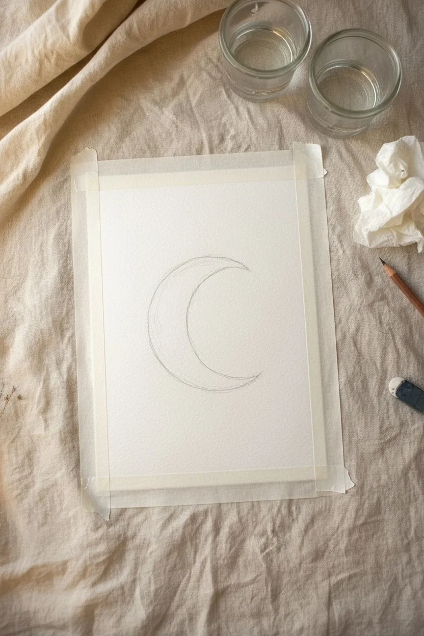
Step 1: Preparation and Sketching
-
Tape the edges:
Begin by taping down all four sides of your watercolor paper to a hard surface. This creates a clean border and prevents the paper from buckling under heavy washes. -
Sketch the crescent:
Lightly sketch a large crescent shape in the center of your paper. Don’t worry about perfect symmetry; a slightly organic shape adds character. -
Masking (Optional):
If you are strictly using transparent watercolors, apply masking fluid to the moon shape now. However, for this tutorial, we will be painting opaque white over the blue, so you can skip this step if you have gouache.
Patchy Background?
If your dark blue dries with unwanted ‘blooms’ or watermarks, wait for it to dry fully, then apply a second, slightly thicker coat of paint to even out the tone.
Step 2: Creating the Night Sky
-
Mix your darks:
Create a rich, deep blue mixture. Combine Indigo with a touch of Black or Payne’s Grey to get a very saturated, dark tones. You want enough pigment to cover the paper solidly. -
First wash:
Using your flat wash brush, apply the dark blue paint to the entire background, carefully painting *around* your pencil sketch of the moon. It doesn’t have to be perfect at the edges yet. -
Deepen the color:
While the first layer is still slightly damp, drop in more pigment in random areas to create subtle texture and depth in the sky. This prevents the background from looking flat. -
Let it dry completely:
Allow the blue background to dry fully. The paper should be flat and room temperature to the touch before moving on.
Step 3: Painting the Moon
-
Prepare the white:
Squeeze out some white gouache. You want a creamy consistency—thick enough to be opaque, but thin enough to spread smoothly. -
Fill the crescent:
Using a size 2 round brush, carefully fill in the crescent moon shape. I like to paint slightly over the inner edge of the blue background to ensure there’s no white paper gap. -
Add lunar texture:
While the white is wet, you can dab a dry brush or a tiny bit of grey-tinted white into the curve of the moon to simulate craters and surface texture. -
Refine the edges:
Use your smallest brush to sharpen the tips of the crescent, making them taper off into fine points.
Add Metallic Flair
Mix a tiny amount of gold or silver watercolor into your white gouache for the moon, or use metallic ink for the stars to make the artwork shimmer in the light.
Step 4: Stars and Details
-
Map the major stars:
Decide where you want your prominent stars. Use a size 0 brush dipped in pure white gouache to paint small four-pointed stars. -
Paint the points:
For the four-pointed stars, use a flicking motion: start from the center and flick outward in four directions (up, down, left, right) to get thin, tapered rays. -
Add distant stars:
Dot the rest of the sky with tiny specks of white. Make them random and vary the sizes slightly to create a sense of distance. -
Splatter technique:
For a natural galaxy look, load a toothbrush or stiff brush with watered-down white gouache and gently flick the bristles to spray tiny mist-like stars across the dark blue areas. -
Final touches:
Examine the moon. If the blue background is showing through, add a second coat of white gouache to brighten it up.
Step 5: Finishing Up
-
The reveal:
Once the painting is 100% dry, slowly peel off the masking tape at a 45-degree angle away from the painting to reveal crisp white edges. -
Deckled edges (Optional):
To match the reference image’s rustic look, you can tear the edges of the paper against a ruler instead of leaving them straight.
Now you have a peaceful piece of the night sky ready to display on your wall
Two-Color Abstract Seascape With a Tiny Boat
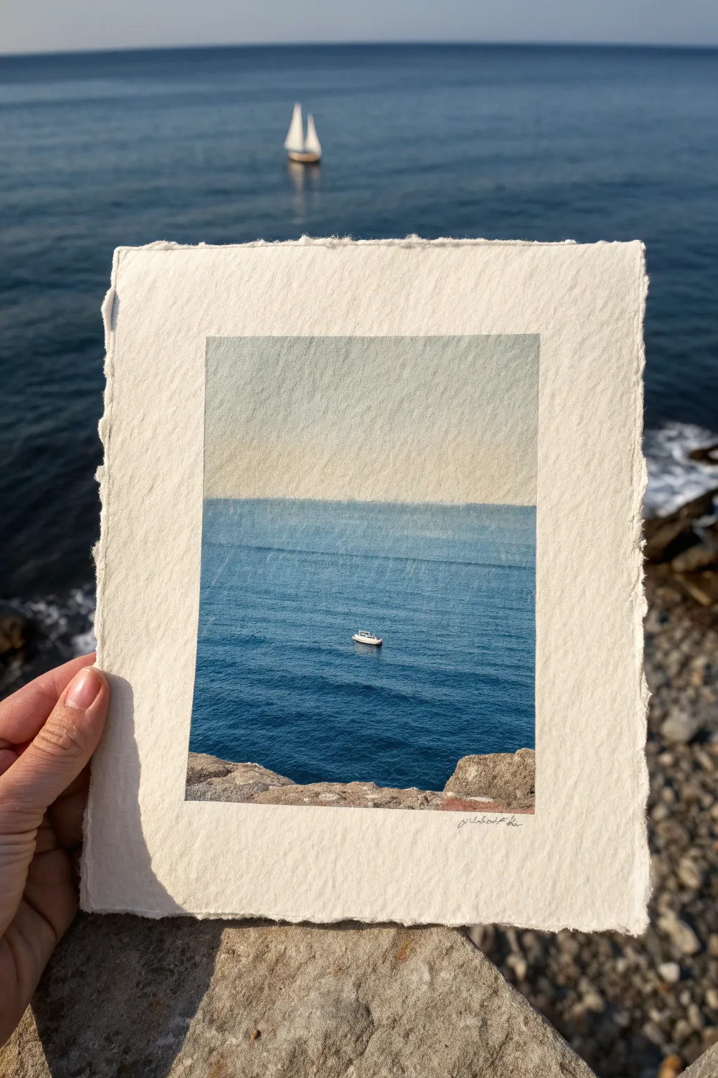
Capture the vast calmness of the ocean with this minimalist project that balances expansive negative space with fine detail. Using creamy, deckle-edged paper adds an organic, tactile quality that perfectly complements the serene blue wash of the sea.
How-To Guide
Materials
- Heavyweight watercolor paper (300gsm, cold press with deckle edge)
- Masking tape or painter’s tape
- Acrylic paints (primary blue, titanium white, burnt umber, yellow ochre)
- Glazing medium or water for thinning
- Wide flat brush (1-inch)
- Small round detail brush (size 0 or 00)
- Old toothbrush or bristle brush (for texture)
- Paper towels
- Ruler
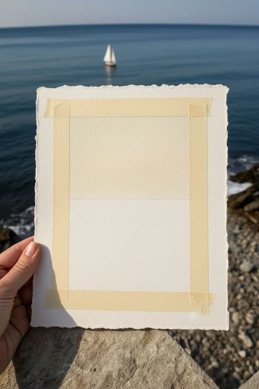
Step 1: Preparing the Surface
-
Mask the Border:
Begin by measuring a generous border around your deckle-edged paper. Place masking tape firmly to create a clean, rectangular window in the center. Press down the inner edges of the tape well to prevent paint bleeding. -
Prime the Sky:
Mix a very pale wash of titanium white with a tiny dot of yellow ochre to create a warm, creamy off-white. Apply this to the top half of your taped rectangle, fading it downward. -
Establish the Horizon:
Determine where your horizon line will sit—about two-thirds of the way up the rectangle works well for this composition. Use a ruler and a faint pencil line if you need a guide.
Step 2: Painting the Ocean
-
Mix the Base Blue:
Combine primary blue with a touch of burnt umber and a drop of white to create a deep, realistic ocean blue. It shouldn’t be too bright; aim for a slightly desaturated cerulean tone. -
Apply the Horizon Wash:
Using your flat brush, paint a straight line across the horizon. Dilute your paint slightly with glazing medium so the color is soft and hazy right at the meeting point with the sky. -
Deepen the Gradient:
As you move down the paper, add slightly less water and a tiny bit more blue pigment to your mix. This creates a natural gradient where the water appears deeper and darker closer to the foreground. -
Add Subtle Texture:
While the blue paint is still tacky, use a mostly dry brush to pull horizontal strokes across the water area. This implies the movement of waves without painting individual ripples. -
Create Depth:
Mix a darker version of your blue (more burnt umber) and apply very faint horizontal streaks in the lower third of the water. Soften these edges immediately with a damp brush so no sharp lines remain.
Bleeding Edges?
If paint bleeds under the tape, wait for it to dry fully. Then, paint over the bleed with a white acrylic that matches the paper tone, or gently scrape it away with an X-Acto knife.
Step 3: Foreground and Details
-
Paint the Rocky ledge:
At the very bottom of the painted area, mix burnt umber, white, and a touch of black or grey. Rough in a jagged rocky shape that enters from the bottom edge. -
Texture the Rocks:
Dab a paper towel or sponge onto the wet rock paint to lift color and create a stone-like texture. Add highlights with a lighter grey mix on the top edges of the rocks. -
Position the Boat:
Identify a spot in the middle of your blue expanse for the boat. It needs to be extremely small to convey the scale of the ocean. -
Paint the Boat Hull:
Using your smallest detail brush and pure titanium white, paint a tiny horizontal dash. It should be barely larger than a grain of rice. -
Add Boat Details:
With a steady hand, add a minuscule dark dot for the cockpit or motor area. Paint a faint reflection underneath the boat using a slightly darker blue than the water around it. -
Initial Drying:
Let the entire painting dry completely. This is crucial before removing tape to ensure clean lines.
Pro Tip: Atmospheric Haze
To make the boat look distant, mix a tiny speck of the ocean blue color into your white boat paint. Pure white can look too stark and pasted-on against the deep blue.
Step 4: Finishing Touches
-
Remove the Tape:
Slowly peel the masking tape away at a 45-degree angle, pulling away from the painted area. This reveals the crisp edges contrasting with the rough paper border. -
Sign the work:
Use a fine-point archival pen or a very small brush with watered-down black paint to sign your name just below the painted rectangle on the right side. -
Surface Protection:
If desired, apply a light coat of spray matte varnish to protect the acrylics, especially if you plan to display it without glass.
Now you have a serene little window to the sea that brings a breath of fresh air to any desk or shelf

PENCIL GUIDE
Understanding Pencil Grades from H to B
From first sketch to finished drawing — learn pencil grades, line control, and shading techniques.
Explore the Full Guide
Boho-Inspired Arches and Half Moons
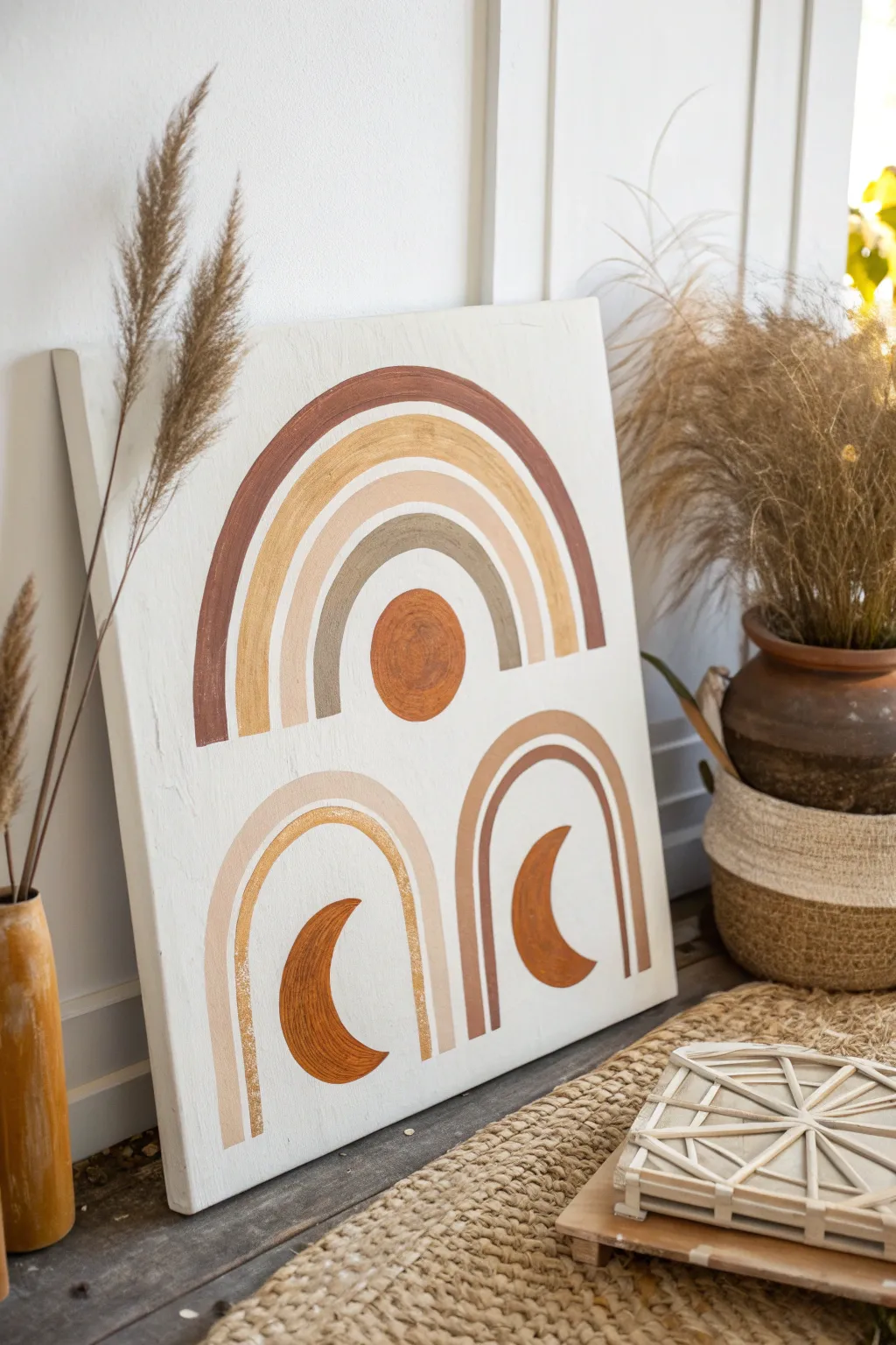
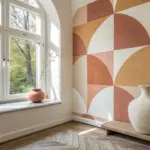
Bring warmth to any room with this textured, earth-toned canvas featuring nested arches and celestial motifs. This minimalist boho design uses a warm palette of terracotta, beige, and gold to create a calming, symmetrical focal point.
Step-by-Step Tutorial
Materials
- Large stretched canvas (square or rectangular)
- White Gesso or white acrylic paint (for background)
- Acrylic paints: Burnt Sienna, Terracotta, Yellow Ochre, Buff/Beige, Metallic Gold, Warm Grey
- Wide flat paintbrush (1-inch width)
- Medium filbert brush (rounded tip for curves)
- Small round detail brush
- Pencil
- String and pushpin (or a compass)
- Ruler
- Palette for mixing
- Water cup and paper towels
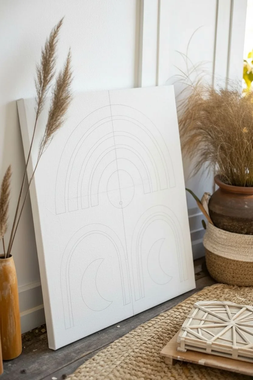
Step 1: Preparation & Mapping
-
Prime the Surface:
Start by giving your canvas a fresh coat of white gesso or white acrylic paint to ensure a clean, bright base. Use broad vertical strokes for a subtle texture or sand it lightly if you prefer a super smooth finish. -
Find the Center:
Let the base coat dry completely. Using your ruler, measure the width of your canvas to find the exact vertical center line and mark it lightly with a pencil. -
Establish the Upper Arch:
Decide on the height of your main, large rainbow. Place a pushpin on your center line where the bottom of the rainbow legs will sit. Tie a string to the pin and a pencil to the other end to create a makeshift compass. -
Sketch the Large Arches:
Draw four concentric semi-circles, adjusting the string length for each layer. Leave about an inch of spacing between each line to define the thickness of your rainbow stripes. -
Sketch the Lower Arches:
Below the main rainbow, divide the lower space into two equal sections. Repeat the string-and-pin method (or sketch freehand) to create two smaller, identical arch sets side-by-side. -
Add Celestial Details:
In the negative space under the top large arch, sketch a perfect circle for the sun. Under each of the bottom two arches, sketch a crescent moon shape, ensuring they mirror each other or curve inwards.
Step 2: Painting the Base Layers
-
Mix Your Terracotta:
Combine Burnt Sienna with a touch of white to create a deep, warm terracotta. Use your medium filbert brush to paint the outermost stripe of the large top rainbow. -
Apply the Gold Layer:
Using a clean brush, paint the second stripe of the top rainbow with metallic gold paint. I find that dabbing the metallic paint slightly rather than dragging it creates a richer shimmer. -
Paint the Neutral Stripes:
Mix a warm beige using white and a drop of Yellow Ochre. Fill in the third stripe of the top rainbow. For the innermost small arch, use a warm grey mixture. -
Fill the Lower Arches:
Move to the bottom two arches. Paint the outer bands in a soft, diluted beige-pink tone. For the inner bands, use the metallic gold again or a lighter tan for contrast.
Uneven Arches?
If your curves look shaky, use a flat-edge brush. Press the bristles flat and turn the canvas—not your hand—as you paint the curve for smoother lines.
Step 3: Adding Detail & Texture
-
Paint the Sun:
Fill in the central circle under the top arch with a mix of Terracotta and Orange. Apply the paint thickly here, perhaps swirling the brush, to give the sun a textured, dimensional look. -
Paint the Moons:
Using a reddish-brown or dark rust color, carefully fill in the two crescent moons at the bottom. Use the small round brush to get sharp, crisp points on the moon tips. -
Refine Edges:
Step back and look at your arches. Use a small detail brush with white paint to clean up any wobbles on the edges where the color meets the background. -
Second Coat for Saturation:
Acrylics often dry darker or slightly transparent. Apply a second coat to the terracotta and rust-colored sections to ensure the colors look solid and opaque. -
Add Distressed Texture (Optional):
To mimic the worn look in the photo, take a mostly dry brush with a tiny bit of white paint and lightly scuff over the painted arches once they are fully dry. -
Final Seal:
Once the entire painting is cured (give it a few hours), apply a matte varnish to protect the surface without adding unwanted glossy glare.
Pro Tip: Masking Tape
For ultra-crisp straight legs on your arches, use low-tack painter’s tape to mask off the vertical sections before painting the curved tops freehand.
Hang your finished piece near natural light to let those metallic gold accents truly shine.
Simple Diptych With Matching Shapes
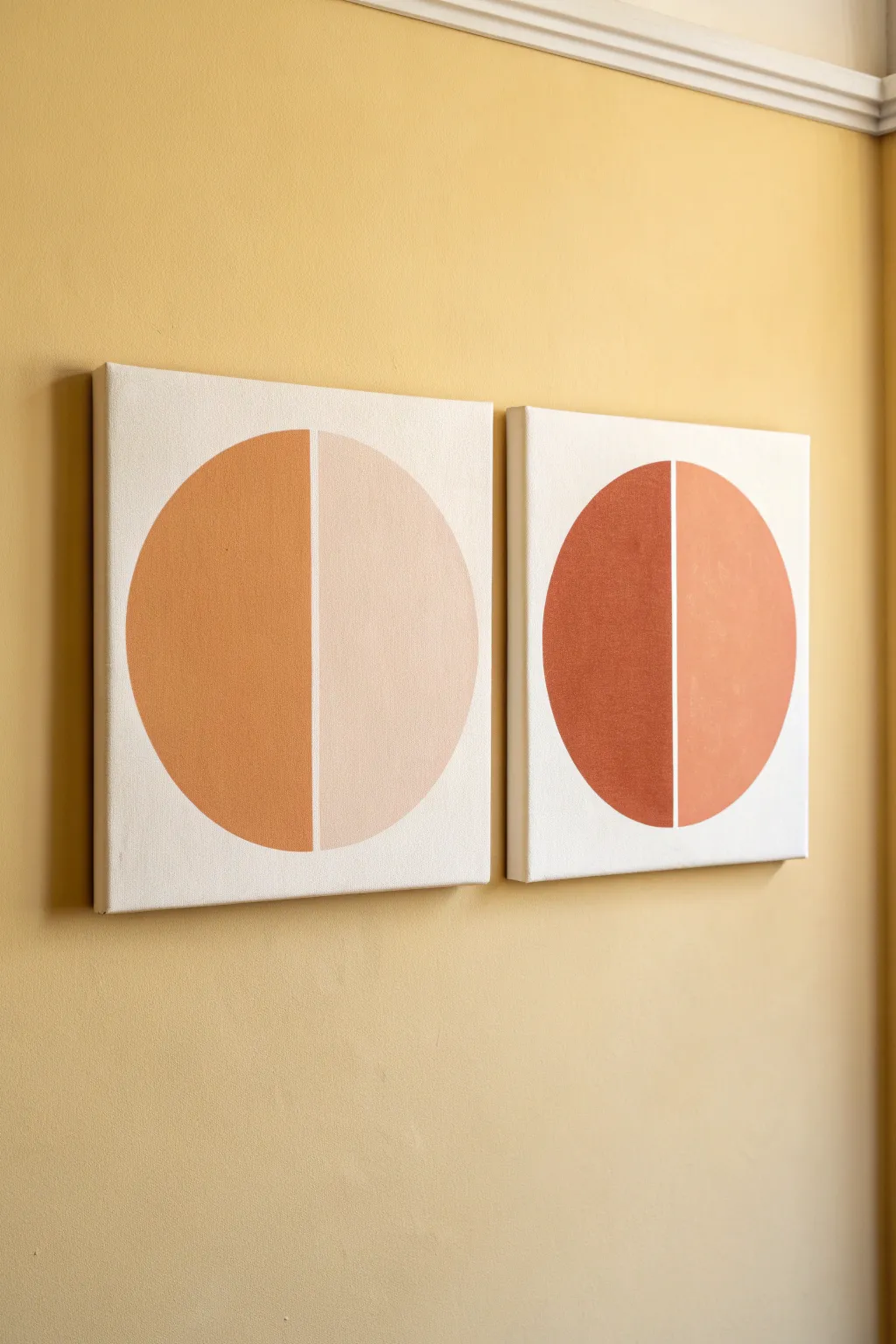
Embrace the warmth of desert hues with this striking minimalist diptych, featuring bold, split circles in complementary earthy tones. This project relies on clean lines and a harmonious color palette to create a modern statement piece for any wall.
Step-by-Step
Materials
- Two square stretched canvases (e.g., 12×12 inches)
- Acrylic paints (Titanium White, Burnt Sienna, Yellow Ochre, Red Iron Oxide)
- Gesso (optional, for smoother priming)
- Painter’s tape or masking tape (low tack)
- Compass or a round object for tracing (plate, lid)
- Pencil
- Ruler
- Flat synthetic paintbrushes (medium and small)
- Palette or paper plate
- Eraser
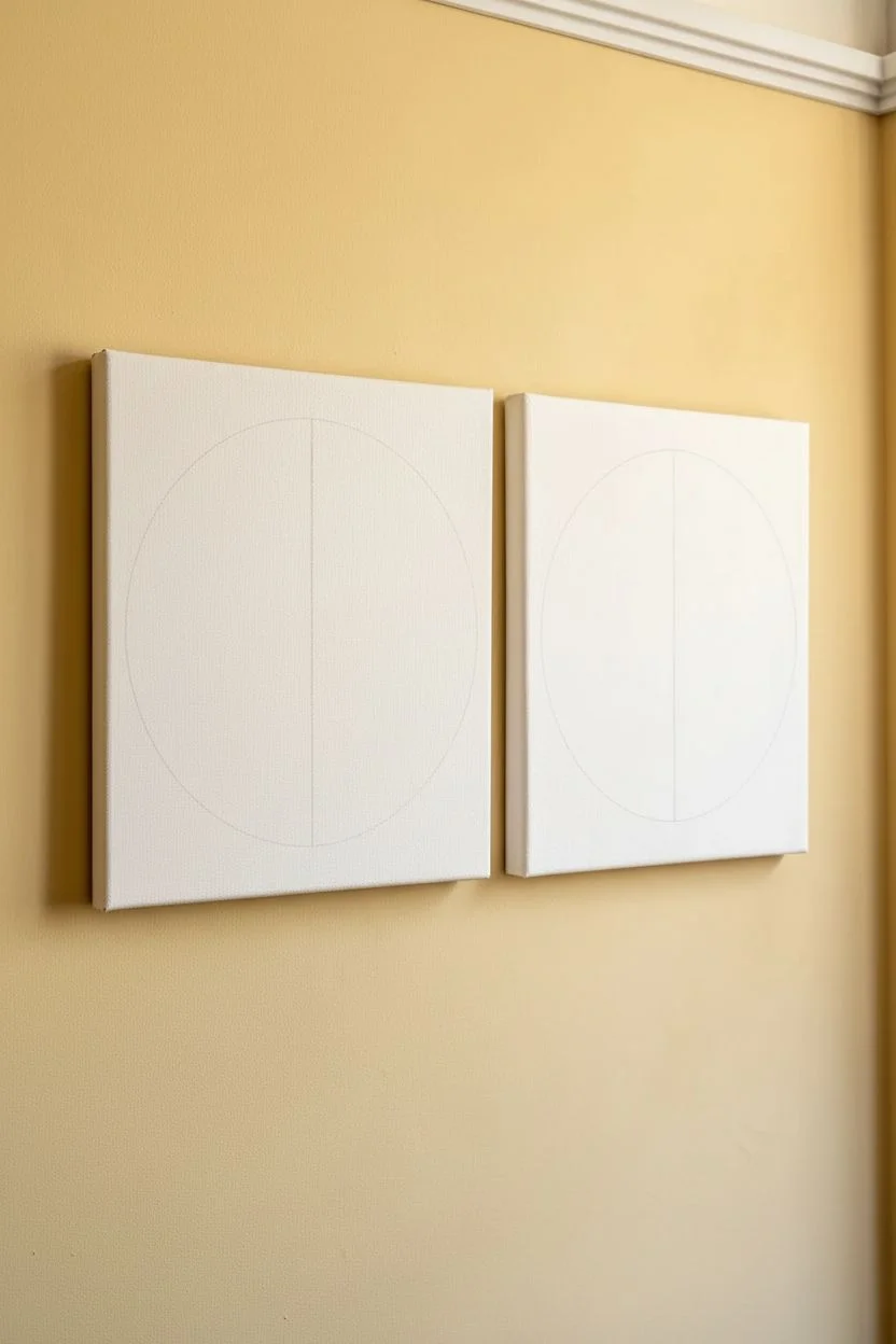
Step 1: Preparation & Layout
-
Prime the surface:
If your canvases aren’t pre-primed, apply a coat of white gesso to ensure a bright, smooth background. Let this dry completely before moving on. -
Find the center:
Using your ruler, measure the width of your first canvas to find the exact horizontal center point. Make a tiny mark at the top and bottom edges. -
Draw the dividing line:
Lightly draw a vertical line connecting your top and bottom marks. This line will serve as the split between your two colors. -
Position your circle:
Place your compass point or your circular tracing object directly on the center line. Ensure it is centered vertically on the canvas as well. -
Trace the shape:
Trace the full circle lightly with a pencil. Repeat this entire measuring and tracing process on the second canvas so they match perfectly. -
Clean up guidelines:
Erase the vertical line segments that extend outside the circle, leaving only the line that bisects the circle’s interior.
Crisp Curve Tip
For the outer curves, don’t use tape. Use a flat brush, load it with paint, and use the corner of the bristles to drag the paint slowly along the pencil line.
Step 2: Mixing & Masking
-
Create the palettes:
You will need four distinct shades. For the left canvas, mix a medium terracotta (Burnt Sienna + hint of White) and a pale peach (White + tiny drop of Burnt Sienna/Red Oxide). -
Mix the second set:
For the right canvas, mix a deep rust red (Red Iron Oxide + Burnt Sienna) and a muted clay orange (Yellow Ochre + Burnt Sienna + White). I often swatch these on scrap paper first to ensure they harmonize. -
Tape the first half:
Apply a strip of painter’s tape along the vertical center line, covering the *right* half of the circle’s interior. Press the edge down firmly to prevent bleeding. -
Seal the tape:
Paint a very thin layer of white (or your background color) over the tape edge. This locks the seal and ensures a crisp line later.
Step 3: Painting the Artwork
-
Paint the left sections:
On the left canvas, paint the exposed semi-circle with your medium terracotta. On the right canvas, paint the exposed semi-circle with the deep rust red. -
Apply second coats:
Let the first layer dry to the touch, then apply a second coat to ensure the color is opaque and solid. -
Remove tape:
Carefully peel back the tape while the paint is still slightly damp to reveal a sharp edge. Allow this side to dry completely before proceeding. -
Tape the painted side:
Once fully dry, place a new strip of tape over the painted side, aligning it perfectly with the center limit. -
Paint the right sections:
Fill in the remaining semi-circle on the first canvas with the pale peach paint. Fill the second canvas’s semi-circle with the muted clay orange. -
Refine the edges:
Use a small flat brush to carefully tidy up the outer curved edges of the circles if your tracing wasn’t fully covered. -
Final reveal:
Remove the final tape strips. Check for any small smudges on the white background and touch them up with white paint if necessary.
Add Texture
Mix baking soda or dedicated modeling paste into your acrylics before painting. This gives standard acrylic paint a stone-like, plaster finish.
Hang your new diptych side by side and enjoy the sophisticated, modern warmth they bring to your space


Triptych Color Story With Repeated Motif
Embrace the mid-century modern aesthetic with this stunning three-piece wall art project featuring a warm, earthy color palette and bold teal accents. By repeating simple arch motifs across three separate panels, you create a cohesive and sophisticated gallery-worthy display that makes a big impact.
Detailed Instructions
Materials
- 3 large rectangular wooden art panels or hefty canvases (e.g., 18×36 inches)
- Acrylic craft paints (Deep teal, burnt sienna, terracotta, warm beige, camel, white)
- Painter’s tape (various widths, preferably artist-grade flexible tape)
- Pencil and large compass (or string and tack)
- Large flat paint brushes (1-2 inch)
- Small angled shader brush
- Gesso (optional, if using raw wood)
- Ruler or yardstick
- Fine-grit sandpaper
- Matte spray varnish
Step 1: Preparation & Layout
-
Prep the Surface:
If you are using raw wooden panels, give them a quick sanding with fine-grit sandpaper to remove any splinters. Wipe away the dust with a tack cloth. -
Prime the Panels:
Apply a coat of white gesso or white acrylic paint to the front and sides of all three panels. This ensures your colors will pop and creates a clean background for the unpainted ‘white space’ lines. -
Establish the Horizon Line:
Measure exactly halfway down the height of each panel. Use your yardstick and a pencil to draw a faint horizontal line across all three boards. This splits your composition into the top ‘sky’ section and the bottom ‘ground’ section. -
Mark the Centers:
Locate the horizontal center point of each board. On the top half, the center point will be at the bottom edge (the horizon line). On the bottom half, the center point will be at the very bottom edge of the board.
Curve Control
Struggling with painting clean curves? Use specific “flexible masking tape” designed for curves, or paint slightly over the line and clean it up later with white paint for a crisp gap.
Step 2: Drafting the Arches
-
Set Up Your Compass:
Create the top arches first. Place the point of your compass (or a tack with string) on the center mark of the horizon line. -
Draw the Outer Arch:
Extend your compass to about 2 inches from the side edge of the board and draw a large semi-circle. This is the top boundary of your rainbow. -
Create the Inner Bands:
Retract the compass by approximately 1.5 to 2 inches (depending on how thick you want your stripes) and draw another concentric arch. Repeat this inward until you have 4 distinct bands. -
Draft the Bottom Arches:
Repeat the previous steps for the bottom section of the artwork. Place your compass point at the bottom center of the board and draw four concentric arches upward. Do this for all three panels.
Step 3: Painting the Design
-
Block in the Background Teal:
On the top half of the panel, paint the area *outside* the largest arch with your deep teal paint. Use a steady hand or flexible tape to get a crisp edge along the curve. -
Paint the Top Outer Band:
Fill the outermost band of the top arch with a rich burnt sienna (dark orange) color. I find using an angled brush helps navigate the curves smoothly. -
Fill the Middle Bands:
Paint the next band in a lighter beige or camel tone. Skip a small gap of white space between colors to mimic the reference image style. -
Finish the Top Center:
Paint the innermost semi-circle of the top arch with a warm terracotta or darker beige tone. -
Start the Bottom Arches:
Move to the bottom arches. Note that the reference image swaps the color order here; use the darkest rust/brown for the outer band on the bottom shapes. -
Layering the Bottom Colors:
Progress inward on the bottom arch with lighter terracotta, then orange, leaving thin white gaps between each stripe. -
Complete the Bottom Center:
Fill the smallest, central arch on the bottom with a solid block of burnt orange paint.
Metallic Pop
Replace the beige tone in the arches with a metallic gold or copper leaf paint. This adds a subtle shimmer that catches the light and elevates the texture.
Step 4: Refining & Sealing
-
Touch Ups:
Once the paint is dry, use a small detail brush and white paint to clean up the ‘gaps’ between the arches. The lines should look intentional and relatively uniform in width. -
Create Texture (Optional):
If your paint looks too flat, dry brush a tiny amount of a slightly lighter shade over the teal and orange sections to give it a worn, canvas-like texture. -
Paint the Edges:
Don’t forget the sides of your wood panels or canvas. Painting them white usually looks cleanest and frames the artwork nicely. -
Final Coat:
Protect your triptych with a layer of matte spray varnish. This unifies the sheen of the different paints and protects the surface from dust.
Hang your panels with about 2-3 inches of space between them to fully realize that flowing, connected effect
One-Vase Minimal Still Life Silhouette
Capture the essence of stillness with this striking minimalist study of a single vessel and wispy grasses. Using rich black pigment on textured handmade paper creates a beautiful contrast that feels both modern and timeless.
How-To Guide
Materials
- Large sheet of heavyweight handmade paper with deckled edges (creamy off-white)
- Black India ink or heavy body black acrylic paint
- Charcoal stick or black pastel (for texture)
- Pencil (HB or H for light sketching)
- Round synthetic brush (size 6 or 8)
- Fine liner brush (size 0 or 00)
- Water container and paper towels
- Diluted grey wash (ink mixed with lots of water)
Step 1: Preparation & Sketching
-
Paper Selection:
Choose a paper that has significant tooth and character. A handmade cotton rag paper with rough, uneven ‘deckled’ edges is essential for replicating this specific organic look. -
Secure the Surface:
Tape your paper to a board or table using low-tack artist tape, or simply weigh down the corners if you want to preserve the delicate edges completely. -
Drafting the Vase Shape:
Lightly sketch the vase silhouette using a hard pencil like an H. Aim for a bulbous, organic bottom that tapers gracefully into a long, narrow neck. -
Refining the Curves:
Don’t aim for perfect symmetry; slight irregularities make the vase look hand-thrown and more authentic to the wabi-sabi aesthetic. -
Detailing the Neck:
Sketch a very slight flare at the top of the vase neck to suggest a gentle opening.
Pro Tip: Texture Trick
For extra gritty texture on the vase, sprinkle a pinch of salt onto the wet ink. Once dry, brush the salt away to leave pitted, aged marks.
Step 2: Painting the Vase
-
Outlining in Ink:
Load your round brush with undiluted black India ink or heavy body acrylic. Carefully trace the outline of your pencil sketch to define the shape. -
Filling the Form:
Fill in the body of the vase. Use horizontal strokes that curve slightly with the form of the vase to give it volume, rather than just colouring it in flatly. -
Adding Texture:
While the ink is still slightly tacky, I like to gently scuff a charcoal stick or dry brush over the wettest areas. This disturbs the solid black surface and creates that stony, weathered texture seen in the photo. -
Creating Highlights:
If the black is too solid, dab it gently with a dry paper towel to lift a tiny amount of pigment on the right side, suggesting a matte reflection. -
Dry Time:
Let the vase dry completely before moving on to the sensitive line work. Ink can smudge easily if you rest your hand on it.
Step 3: The Botanical Elements
-
Planning the Stems:
Visualize two main directional lines emerging from the vase neck—one tilting left and one longer one tilting right. -
Drawing the Main Stems:
Switch to your fine liner brush. Using just the tip and very little pressure, paint thin, wavering lines extending upwards. Let your hand shake slightly for a natural look. -
Adding the Grass Heads:
Along the upper portions of the stems, make tiny, jagged tick marks or dashes. These represent seeds or grain heads on the dry grass. -
Varying Line Weight:
Press slightly harder at the base of the stems and lift off as you go up to ensure the lines taper into nothingness.
Troubleshooting: Shaky hands?
If you struggle with the fine stems, switch to a technical drawing pen (0.1mm or 0.3mm) instead of a brush for better control.
Step 4: Grounding Shadows
-
Mixing a Shadow Wash:
Dilute a small drop of black ink into a cup of water until it is a very pale, transparent grey. -
Applying the Base Shadow:
Paint a horizontal oval shape underneath the vase. Keep this wash very wet and loose. -
Softening Edges:
Use a clean, damp brush to feather out the edges of the shadow so it fades seamlessly into the paper white, grounding the object without drawing attention.
Now step back and admire the stark, quiet beauty of your finished piece.
Minimal Figure Outline With Continuous Line
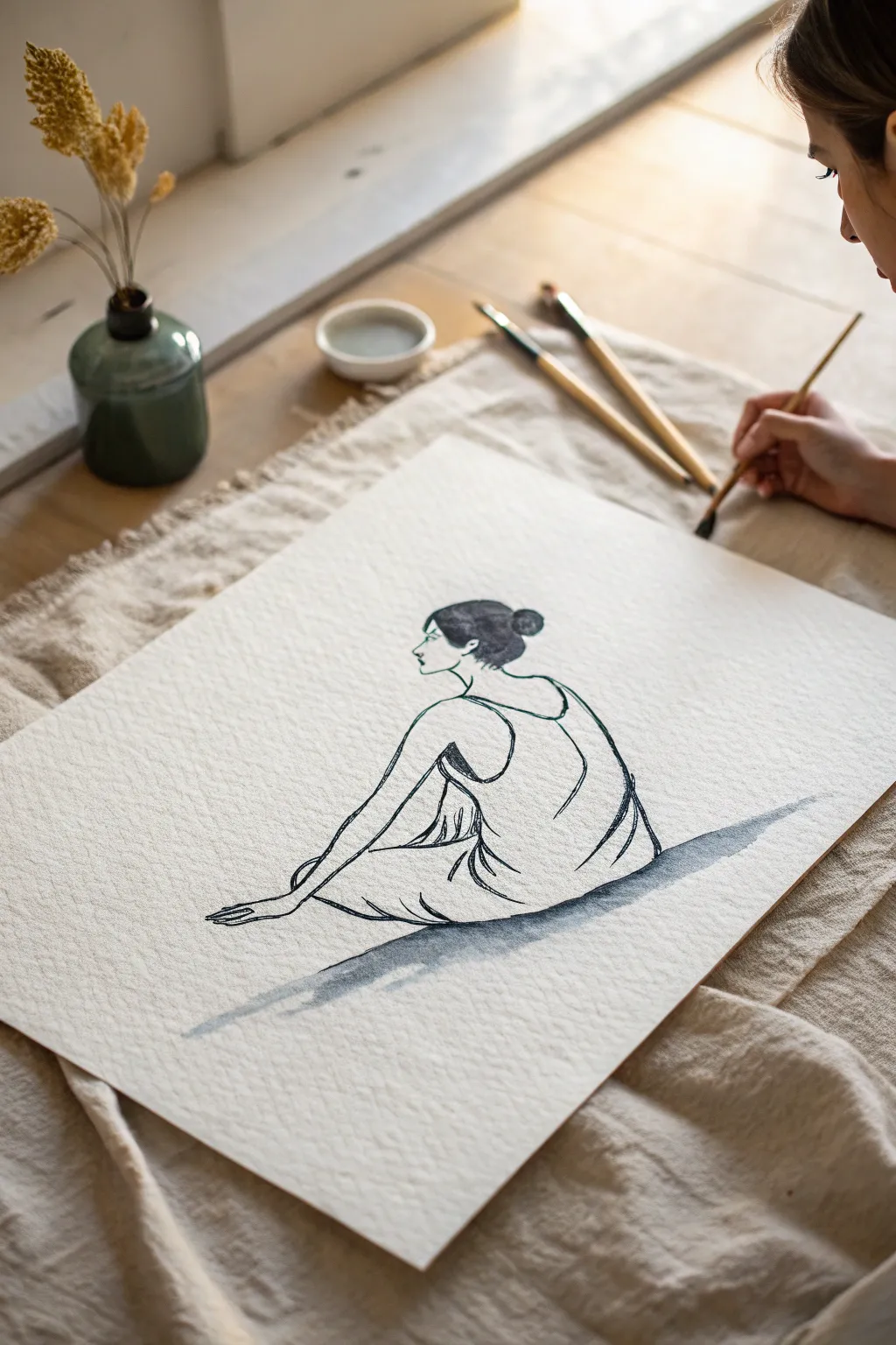
Capture the graceful stillness of the human form with this minimalist ink painting that balances flowing lines with evocative negative space. Using a simple palette and confident brushwork, you’ll create a striking piece of art focused on the silhouette of a seated figure.
Step-by-Step Tutorial
Materials
- Heavyweight watercolor paper (300gsm cold press for texture)
- Black Sumi ink or Payne’s Grey watercolor paint
- Round watercolor brush (Size 4 or 6)
- Small fine-liner brush or rigger brush (Size 0 or 1)
- Jar of clean water
- Small ceramic dish or palette
- Pencil (HB or H)
- Kneaded eraser
- Paper towels
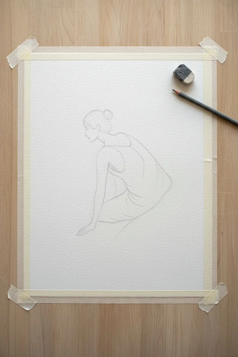
Step 1: Planning the Composition
-
Paper Preparation:
Begin by taping the edges of your heavyweight watercolor paper to a board or table surface using masking tape. This prevents the paper from buckling when wet and creates a clean border later. -
Establishing the Horizon:
Mentally divide your paper. The figure will sit in the lower center, forming a triangle shape that grounds the composition. -
Sketching the Posture:
Using an H pencil, very faintly sketch the triangular base of the seated figure. Don’t worry about details yet; just focus on the angle of the back and the legs folded beneath. -
Refining the Silhouette:
Lightly draw the curve of the spine, the tilt of the head, and the bun hairstyle. Keep your pencil pressure extremely light so the graphite doesn’t show through the ink later. -
Mapping the Fabric:
Sketch the drape of the dress. Instead of drawing every fold, choose two or three major flowing lines that suggest the fabric pulling against the body. -
Cleaning the Sketch:
Take your kneaded eraser and gently roll it over the drawing. You want to lift up almost all the graphite, leaving only a ‘ghost’ image to guide your brush.
Pro Tip: Breath Control
Exhale slowly as you make your long, continuous ink strokes. This steadiest your hand and creates smoother, more fluid lines compared to holding your breath.
Step 2: Inking the Figure
-
Preparing the Ink:
Pour a small amount of black ink or watercolor into your dish. I like to keep a second dish with slightly diluted ink (grey wash) for the shadows. -
Starting the Outline:
Load your fine-liner brush with pure black ink. Start at the nape of the neck and trace the bun and profile. Keep the line varied—press down for thicker sections and lift for thin hairlines. -
Defining the Back:
Continue the line down the curve of the back. Let the brush skip slightly over the paper’s texture; this ‘dry brush’ effect adds organic character to the piece. -
Drawing the Arms:
Extend the line for the arm reaching backward. Use a quick, confident stroke for the forearm to maintain a sense of movement rather than stiffness. -
Suggesting Fabric Folds:
Switch to your medium round brush. Using the tip, draw the broader lines of the dress draped over the hip. Allow lines to break; the viewer’s eye will connect the gaps. -
Adding Weight:
At the points where the fabric folds or gathers (like the waist or under the leg), re-trace the line slightly to thicken it, adding visual weight to these shadow areas. -
The Grounding Shadow:
Wash your large brush but leave it damp. Dip it into the diluted grey ink wash. -
Painting the Cast Shadow:
With a broad, horizontal stroke, sweep the grey wash underneath the figure. Start right at the base of the dress and pull outward to the right, letting it fade naturally. -
Refining the Hand:
Return to the fine detail brush. Carefully articulate the fingers resting on the floor or leg. Keep them simple and elongated; detail isn’t as important as the gesture. -
Deepening Contrasts:
Look for the darkest points, such as the hair bun and the deepest folds of the dress. Dab pure, undiluted black ink into these spots while the previous layer is still slightly damp for a soft bloom. -
Final Assessment:
Step back and look at the negative space. If an area feels too empty, you might add a tiny, stray ink mark to suggest a fold, but resist the urge to overwork it. -
Drying:
Allow the piece to dry completely flat for at least an hour before removing the tape to ensure the paper remains crisp.
Troubleshooting: Blotchy Lines?
If ink pools unexpectedly, touch the corner of a paper towel to the puddle immediately. It acts like a straw, lifting excess liquid without smudging the surrounding area.
Frame your finished piece in a simple wood frame to complement the clean lines and tranquil mood you have created
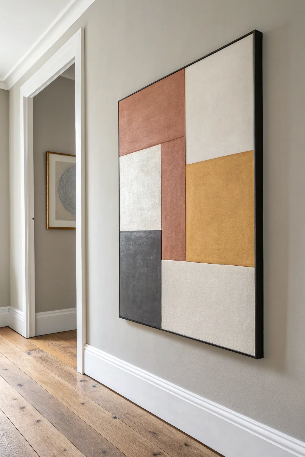
Tape-Resist Lines for Crisp Minimal Geometry
Elegance meets simplicity in this structured four-color composition, perfect for bringing a contemporary touch to any room. By relying on precise masking and a muted, earthy palette, you’ll create professional-looking lines that feel both modern and timeless.
Step-by-Step
Materials
- Large rectangular stretched canvas (approx. 24×36 inches)
- Acrylic paints: Heavy body (Titanium White, Burnt Sienna, Sage Green, Unbleached Titanium/Beige)
- Painter’s tape (1-inch width, low-tack for delicate surfaces)
- Wide flat synthetic paintbrush (2-3 inches)
- Medium flat synthetic paintbrush (1 inch)
- Ruler or T-square
- Pencil
- Matte medium or white acrylic paint (for sealing tape edges)
- Jar of water
- Paper towels
- Palette or paper plate
Step 1: Preparation & Base Coat
-
Surface Prep:
Begin by wiping down your canvas with a clean, dry cloth to ensure no dust interferes with your paint adhesion. -
Base Color Application:
Squeeze a generous amount of Titanium White mixed with a tiny drop of Unbleached Titanium onto your palette to create a warm off-white. -
Painting the Background:
Using your wide flat brush, cover the entire canvas with this off-white mixture. Don’t forget to paint the sides of the canvas for a finished, gallery-wrapped look. -
Full Coverage:
Apply a second coat if the canvas texture is still showing through too strongly. The goal is a solid, opaque background. -
Deep Drying:
Allow the base coat to dry completely. This is crucial—if the paint is even slightly tacky, the tape we apply next will pull it up.
Bleed Patrol
Paint bled under the tape? Wait for it to dry completely, then use a small stiff brush and a dot of the background color to ‘erase’ the error carefully.
Step 2: Mapping the Geometry
-
Measuring Sections:
Using your ruler, measure the total width of your canvas. Divide this number by four to determine the width of each vertical stripe. -
Marking Guidelines:
Lightly mark these four vertical sections with a pencil at the top and bottom edges of the canvas. -
Taping the Lines:
Apply strips of painter’s tape vertically to delineate your sections. Place the tape on the *outside* of the area you intend to paint, so the stripe remains the correct width. -
Strategic Masking:
Since the stripes touch, you cannot paint them all at once. Mask off the first and third stripes (Orange and Green area) to paint first, covering the second and fourth areas with tape or paper. -
Sealing the Edges:
Here is the most important step for crisp lines: paint a thin layer of your base coat color (the off-white) over the edge of the tape. This seals the gap so any seepage is invisible.
Add Texture
Mix a medium-grit modeling paste into your acrylics before painting the stripes. This adds a tangible, architectural grain to the minimal shapes.
Step 3: Applying Color
-
Mixing Terracotta:
Mix Burnt Sienna with a touch of Unbleached Titanium to get that warm, earthy terracotta orange. It should be rich and matte. -
Painting the First Stripe:
Apply the orange paint to the far-left section using the medium flat brush. Use long, vertical strokes to minimize texture. -
Mixing Sage:
Prepare your sage green. If your green is too bright, tone it down with a little gray or a tiny dot of the orange mix to make it earthy. -
Painting the Third Stripe:
Skip the second section (white) and apply the sage green to the third section. Ensure coverage is solid and opaque. -
Initial Peel:
While the paint is still slightly wet, carefully peel back the tape at a 45-degree angle. This prevents the dried paint film from ripping.
Step 4: Finishing Touches
-
Drying Time:
Let the orange and green stripes dry fully. They must be hard to the touch before you tape over them. -
Retaping:
Now, place new tape lines gently over the dried orange and green edges to protect them while you paint the final beige section. -
Painting the Beige:
Mix Unbleached Titanium with a drop of white for the far-right stripe. Apply carefully, painting the side edge of the canvas as well. -
Final Reveal:
Remove the final tape strips slowly. If you see any minor bleeds, use a tiny angle brush with the base color to touch them up. -
Varnish (Optional):
Once fully cured (usually 24 hours), apply a matte varnish to unify the sheen of the different colors.
Hang your new geometric masterpiece in a spot with good natural light to let the earthy tones really warm up the space

Have a question or want to share your own experience? I'd love to hear from you in the comments below!