I love monochromatic art because it proves you don’t need a rainbow to make something powerful. When you stick to one color family and play with tints, tones, and shades, the depth and mood practically build themselves.
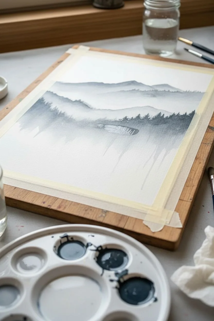
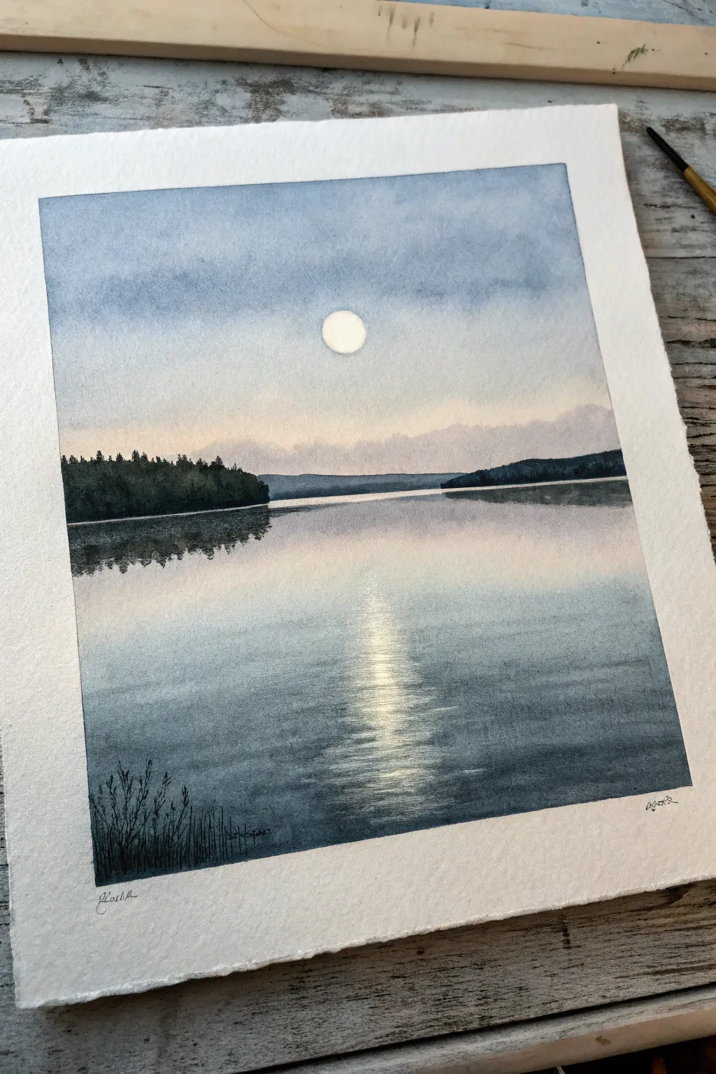
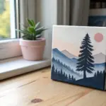
Gradient Sky With Silhouette Scene
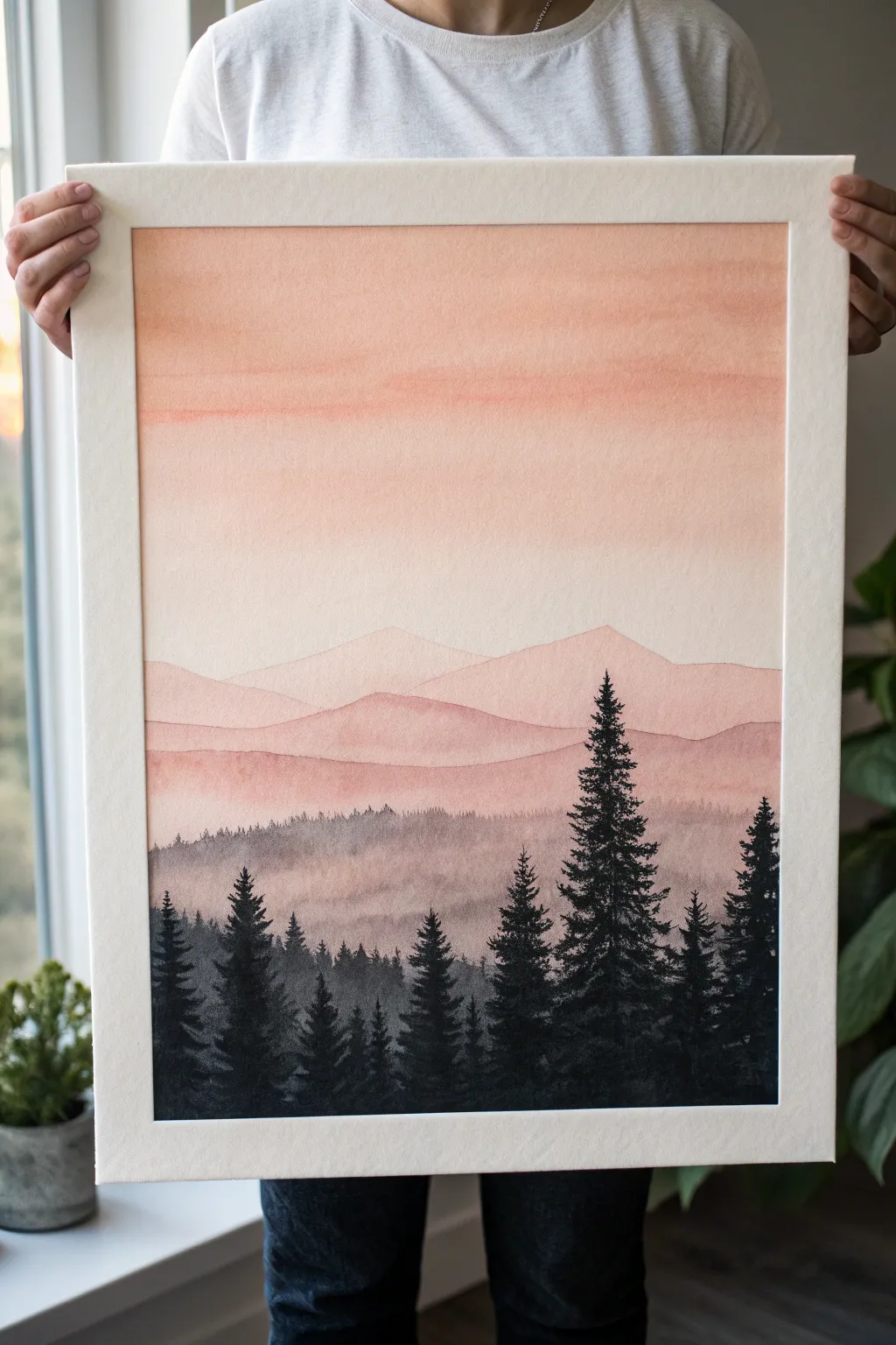
Capture the serene beauty of twilight with this monochromatic watercolor landscape featuring soft, layered mountains and striking pine silhouettes. This piece relies on mastering the balance between wet-on-wet washes for the background and precise dry brushing for the foreground.
Step-by-Step Tutorial
Materials
- Cold press watercolor paper (minimum 140lb)
- Watercolor paints (Peach, Burnt Sienna, Payne’s Gray, Lamp Black)
- Painter’s tape
- Flat wash brush (1-inch width)
- Round brushes (sizes 6 and 2)
- Mixing palette
- Two jars of water
- Paper towels
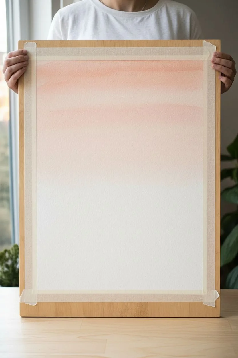
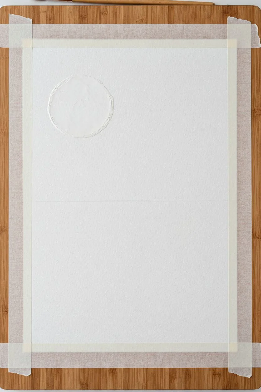
Step 1: Setting the Sky
-
Tape it down:
Secure your watercolor paper to a board or table using painter’s tape on all four edges. This creates a crisp white border and prevents the paper from buckling when wet. -
Mix clarity:
Prepare a very watery mix of peach paint on your palette. You want a high water-to-pigment ratio for the initial sky layer. -
Wet the paper:
Using your large flat brush and clean water, dampen the upper two-thirds of the paper. It should glisten but not have standing puddles. -
First wash:
Load your flat brush with the watery peach mix. Start at the very top and sweep horizontally across the paper, moving downward. -
Fade the gradient:
As you move past the middle of the paper, dip your brush in clean water without adding more pigment. Continue brushing downward to fade the color into white near the horizon line. -
Second layer:
While the paper is still slightly damp, add a slightly more saturated peach strip near the top quarter to deepen the sky’s crown, letting it bleed naturally downward. -
Dry thoroughy:
Let this sky layer dry completely. The paper must be bone dry before starting the mountains to prevent unwanted blending.
Wet-on-Wet Magic
To get that distinctive ‘blooming’ texture in the lower mist layer, sprinkle a tiny pinch of salt onto the wet paint. Brush it off once dry for a mottled texture.
Step 2: Layering the Mountains
-
First mountain ridge:
Mix a light wash of peach with a tiny touch of Burnt Sienna. With a size 6 round brush, paint a jagged mountain outline about halfway down the paper. -
Filling the shape:
Immediately fill in the area below that first mountain line with water or very light wash, fading it out as it reaches the bottom of the page. -
Darkening the mix:
Add a tiny drop of Payne’s Gray to your peach mix to slightly desaturate and darken it. Paint a second mountain range slightly lower than the first one. -
Overlapping forms:
Ensure the shapes of the second range overlap the first, creating depth. Fade the bottom edge of this layer out with water just like the previous one. -
Mist layer:
For the lowest mountain layer (just above where the trees will be), use a mix of Payne’s Gray and peach. Paint this layer broadly and while wet, drop in tiny clear water droplets to create a texture that mimics mist. -
Final drying:
Allow all mountain layers to dry completely. If the paper feels cold to the touch, it is still wet inside.
Starry Night Variant
Before painting the trees, splatter a stiff brush dipped in white gouache or acrylic ink over the upper dark peach sky to create a field of stars.
Step 3: The Forest Foreground
-
Mixing black:
Create a rich, dark mixture using Lamp Black and a touch of Payne’s Gray. It should be the consistency of heavy cream—very pigmented with little water. -
Establishing the tallest tree:
Using your size 2 round brush, draw a thin vertical line for the trunk of the main focal tree on the right side. -
Adding branches:
Starting from the top of that line, use a stippling motion to tap in branches. Keep them narrow at the top and wider at the bottom. -
Varying heights:
Paint a few smaller, distant-looking trees to the left using a slightly more diluted grey-black mix. This pushes them into the background. -
Dense tree line:
Fill the bottom edge of the paper with dense black foliage. I like to use a dabbing motion here to create the look of clustered pine needles. -
Refining details:
Use the very tip of your smallest brush to add tiny stray branches sticking out from the main tree silhouettes for a realistic, imperfect look. -
Removing tape:
Once the black ink is 100% dry, slowly peel the painter’s tape away at a 45-degree angle to reveal your crisp borders.
Now you have a stunning, atmospheric landscape that perfectly captures the quiet of dusk


Monochrome Mountain Layers for Depth
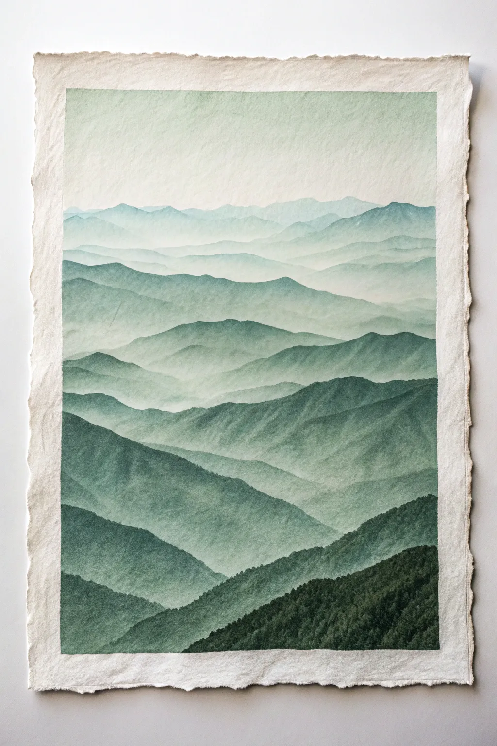
Capture the serene beauty of rolling hills with this monochrome watercolor study, where varying values of a single green hue create immense depth. The rough, deckle-edged paper adds a rustic, organic touch that perfectly complements the natural subject matter.
Step-by-Step
Materials
- Heavyweight handmade cotton paper (300gsm+) with deckle edges
- Watercolor paint (Perylene Green or Hooker’s Green Dark)
- Mixing palette with multiple wells
- Large round watercolor brush (size 10 or 12)
- Medium round watercolor brush (size 6)
- Two jars of water (clean and dirty)
- Masking tape
- Paper towels
- Pencil (HB)
- Kneaded eraser
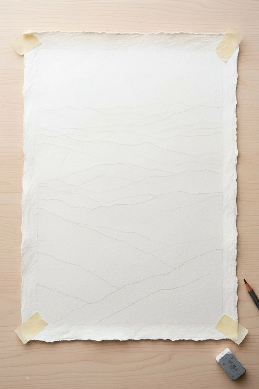
Step 1: Preparation and Sketch
-
Secure the paper:
Begin by taping the back of your handmade paper to your work surface using loops of masking tape. Do not tape over the front edges, as we want to preserve that beautiful deckle texture. -
Sketch the ridges:
Using a light hand and an HB pencil, map out the mountain ranges. Start from the bottom with distinct, jagged peaks and work your way up. -
Creates zones of depth:
Draw at least 7-9 overlapping ridge lines. Space them closer together as you reach the top of the paper to simulate distance. -
Lighten the lines:
Before painting, gently roll a kneaded eraser over your sketch. You want the lines to be barely visible guideposts so graphite doesn’t muddy your green paint.
Step 2: Painting the Atmospheric Layers
-
Prepare your washes:
Create four distinct puddles of green paint on your palette. One should be very concentrated (dark), one medium, one light, and one extremely watery and pale. -
Start with the sky:
Wet the sky area (the top 20% of the paper) with clean water. Drop in your palest wash, letting it fade to white near the very top edge. -
Paint the furthest range:
While the sky is still slightly damp but not soaking, paint the most distant mountain range using your palest wash. The soft edge where it meets the sky creates that misty look. -
Let it dry completely:
This is crucial. If you paint the next layer too soon, the mountains will bleed into each other. Use a hairdryer on low heat if you’re impatient. -
Second range:
Using a slightly stronger mix (but still very watery), paint the next ridge down. Ensure the top edge of the mountain is crisp, then fade the bottom of this shape with clear water to create mist. -
Build darker layers:
Continue working your way down the paper. For each subsequent mountain range, add slightly more pigment to your mix. I like to test the color on a scrap paper first to ensure the step-up in darkness is gradual. -
Create texture:
As you reach the middle layers, stop fading out the bottom of the shapes completely. Let some hard edges remain to suggest rocky terrain. -
Enhance the mid-ground:
On the middle ridges, use your medium brush to dab slightly uneven darker spots along the top edge while wet. This mimics distant tree lines.
Mist Master
To get that “fog in the valley” look, paint the top edge of a mountain sharp, then immediately rinse your brush and drag clean water along the bottom edge to fade it into the white paper.
Step 3: Foreground Detail
-
The darkest values:
For the bottom 2-3 layers, switch to your most concentrated paint mix. Use very little water here; you want a rich, deep forest green. -
Stipple texture:
Instead of smooth strokes, use a stippling or dabbing motion with the tip of your brush for the closest mountains. This texture replicates thousands of individual trees. -
Layering the foreground:
If the foreground looks flat, wait for it to dry and add a second glazing layer of your darkest green to the valleys and lowest points. -
Softening transitions:
If any ridge line looks too stark against the one behind it, maintain atmospheric perspective by running a slightly damp clean brush along the transition to soften it just a touch. -
Final assessment:
Step back and squint at your work. You should see a clear gradient from white/pale top to dark bottom. If a layer is too light, carefully glaze over it with a weak wash once dry.
Float Mount It
Since you used deckle-edged paper, don’t hide it behind a standard mat. Use a float frame technique to show off the beautiful rough edges of the paper against a white background.
Enjoy the calm that comes from watching your misty landscape slowly emerge from the page


Foggy Forest in One Color
Capture the serene solitude of a foggy mountain morning with this monochromatic watercolor project. Using only a single dark pigment and varying amounts of water, you will create a stunning landscape filled with depth and atmospheric mystery.
Detailed Instructions
Materials
- Cold press watercolor paper (300 gsm or heavier)
- Black or Indigo watercolor paint (tube or pan)
- Round brushes (sizes 2, 6, and 12)
- Flat wash brush (1 inch)
- Clean water jar
- Mixing palette with deep wells
- Paper towels
- Masking tape
- White mat board and frame (optional)
Step 1: Preparation and Base Layers
-
Secure the paper:
Tape your watercolor paper down to a rigid board on all four sides. This prevents buckling when the paper gets wet and creates a crisp white border for later. -
Create wash puddles:
On your palette, prepare three separate puddles of paint using your chosen color: one very watery and pale (tea consistency), one medium tone (milk consistency), and one thick and dark (cream consistency). -
Wet the sky area:
Use your large flat brush to wet the top two-thirds of the paper with clean water. The paper should glisten but not have standing pools of water. -
Paint the distant mountains:
While the paper is still damp, load a size 12 round brush with your palest wash. Swiftly paint the silhouette of a distant mountain ridge near the top, letting the wet paper soften the bottom edge of the stroke into a blur. -
Add floating mist:
While the mountain layer is wet, drop clean water along the bottom edge of the painted ridge. Tip the board slightly so the pigment runs downward, creating the effect of mist rolling down the slope. -
Painting the mid-ground ridge:
Allow the first layer to dry until just slightly damp. Using the medium-tone wash, paint a second ridge line slightly lower than the first, varying the height to look natural. -
Creating separation:
Soften the bottom edge of this second ridge with a clean, damp brush. This gradation from dark top edge to faded bottom effectively creates the illusion of fog separating the mountain layers.
Fixing Hard Edges
If your ‘mist’ dries with a hard line, gently scrub the edge with a damp stiff brush and blot with a tissue to lift the pigment and restore the foggy blur.
Step 2: Building the Forest
-
First layer of trees:
Once the background is dry, switch to a size 6 brush and your medium-pale wash. Paint small, indistinct vertical shapes along the misty ridges to suggest distant treetops poking through the fog. -
Darker mid-ground trees:
Move lower down the paper. Using the medium-dark wash, paint a cluster of pine trees. Use the tip of the brush for the tops and press down as you move lower to widen the branches. -
Softening the base:
Before the paint dries on these trees, touch the bottom of the trunks with a wet brush to bleed the color out into the white of the paper, simulating ground fog obscuring the forest floor. -
Layering for depth:
Repeat this process, moving lower on the page and making the paint mixture slightly darker each time. I like to let each layer dry completely to keep sharp edges on the tree tops.
Pro Tip: Depth Check
To check your values, take a photo of your work in black and white mode. If the layers blend together, darken your foreground mix to boost contrast.
Step 3: Foreground Details
-
The foreground wash:
At the very bottom of the paper, paint a solid, dark uneven line for the nearest ground using your darkest paint mixture. -
Adding texture:
While the foreground strip is wet, dab it with a crumpled paper towel in a few spots to create texture that resembles low bushes or rocks. -
The focal tree:
Using a size 2 brush and the thickest, darkest paint, paint a tall, thin tree trunk extending from the bottom right side up into the sky area. Interpretation is key here: make it slightly crooked or jagged for character. -
Detailed branches:
Add very fine, sporadic branches to this main tree. Keep them sparse and mostly horizontal or slightly drooping, characteristic of an old spruce or fir. -
Supporting foreground trees:
Paint two or three smaller, highly detailed dark trees on the left side of the foreground to balance the composition. Ensure their silhouettes are crisp against the misty background. -
Final touches:
Inspect the painting for any hard edges in the mist that look unnatural. You can gently scrub these with a damp brush to soften them before the paint cures completely. -
Mounting:
Once fully dry (give it at least an hour), peel off the tape. Place a white mat board over the image to frame the composition perfectly before placing it in your frame.
Hang your finished piece near a window to let the natural light enhance the atmospheric mood of your misty forest.


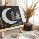
Moonlit Night Sky in Indigo Values
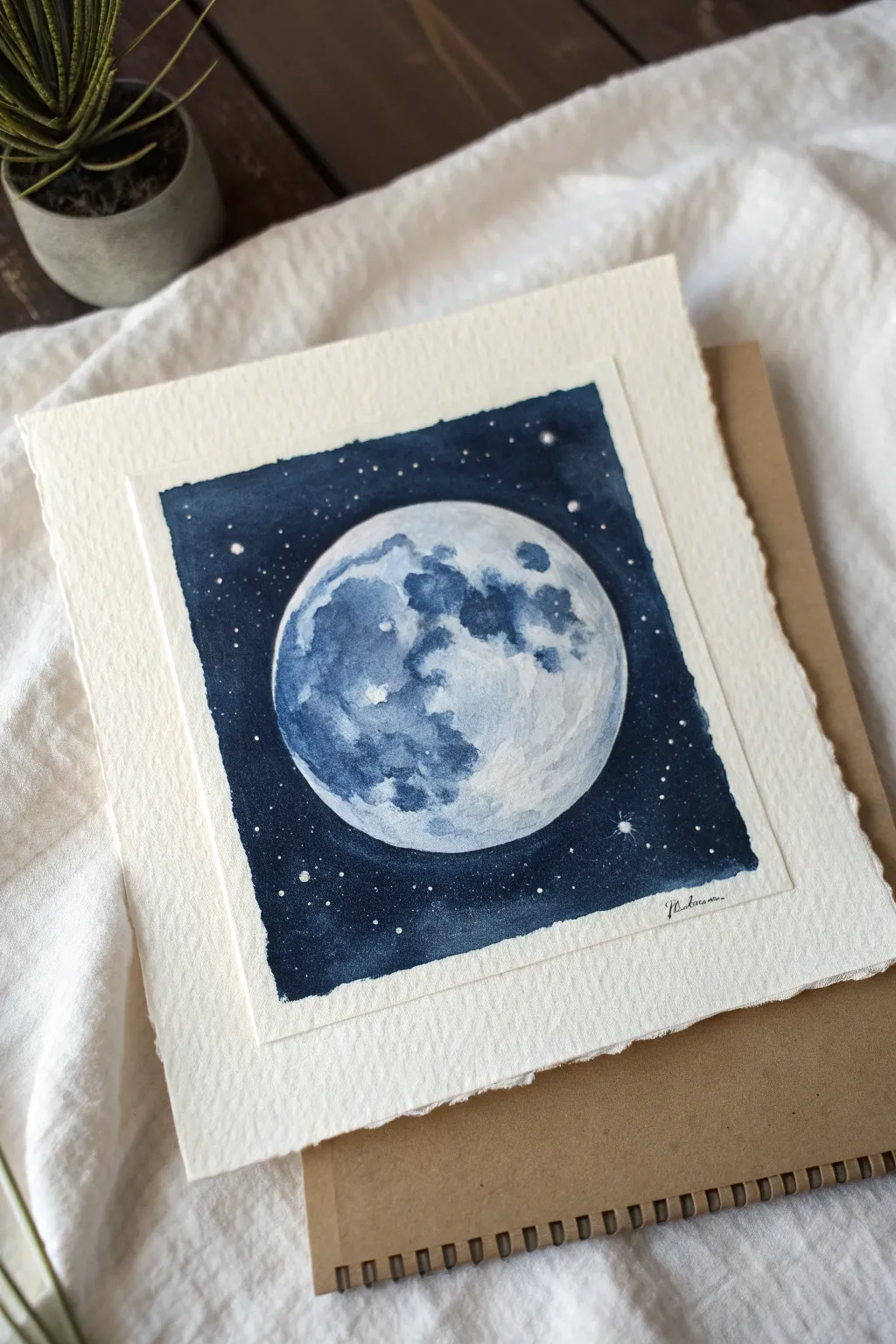
This stunning lunar study relies on the delicate balance of negative space and rich, layered pigments to create a glowing effect. Using a single shade of indigo watercolor, you will capture the serene beauty of a moonlit night sky on textured paper.
How-To Guide
Materials
- Cold press watercolor paper (300 gsm or heavier)
- Indigo watercolor paint (tube or pan)
- White opacity gouache or bleed-proof white ink
- Round watercolor brushes (size 2, 6, and 10)
- Masking fluid
- Pencil and geometric compass or circular object to trace
- Paper towel
- Masking tape or gummed tape
- Two jars of water
Step 1: Preparation and Sketching
-
Tear the edges:
Begin by tearing your watercolor paper down to a square size, roughly 6×6 inches. Fold the paper back and forth against a ruler before tearing to create that soft, deckled edge look found in the reference image. -
Tape it down:
Secure your paper to a hard board using masking tape. For this project, you want a clean white border, so place your tape about half an inch inward from the deckled edges on all four sides. -
Outline the moon:
In the center of your taped area, lightly sketch a large circle using a compass or by tracing a mug. Keep the pencil lines faint so they disappear under the paint later. -
Mask the stars (optional):
If you want crisp white stars without lifting paint later, dip an old toothbrush or a ruling pen into masking fluid and splatter tiny dots into the background area outside the moon circle. Let this dry completely.
Bloom Patrol
Cauliflowers or water blooms happen if you add water to drying paint. If you see one forming in the sky, don’t touch it! Let it dry, then glaze over with another dark layer later.
Step 2: Painting the Cratered Surface
-
First lunar wash:
Mix a very watery, pale puddle of indigo. With your size 6 brush, wet the inside of the moon circle with clean water first, then drop in this pale wash. Leave a few irregular spots completely white for the brightest highlights. -
Adding texture:
While the first wash is still damp but not soaking, drop slightly more concentrated indigo into the shadow areas—typically the left side and the ‘seas’ (maria) of the moon. Let the paint bloom naturally to create crater-like textures. -
Defining the craters:
Once the first layer is dry, switch to your size 2 brush. Mix a medium-tone indigo and carefully paint the specific shapes of the lunar maria. Use a reference photo of the moon to get the placement of the ‘Ocean of Storms’ and ‘Sea of Tranquility’ somewhat accurate. -
Softening edges:
Immediately after painting a dark crater shape, rinse your brush and run the damp, clean bristles along one edge of the shape to soften it. This creates the spherical dimension rather than a flat map. -
Deepening shadows:
Add the darkest value of indigo to the deepest pits on the left side of the moon. I find that building these darks slowly in layers prevents the paper from getting overworked. -
Final lunar glaze:
If the moon looks too stark, apply a very thin, watery glaze of indigo over the shadow side to unify the shapes. Let the moon dry completely before moving to the sky.
Step 3: The Night Sky
-
Preparing the background:
The sky needs to be deep and consistent. Prepare a large puddle of your thickest, creamiest indigo paint. You want a high pigment-to-water ratio here. -
Painting the void:
Using your size 10 brush, carefully paint around the moon’s edge first to ensure a crisp circle. Then, working quickly outward, fill the rest of the square background with the dark indigo. -
Creating a glow:
While the background paint near the moon’s rim is still wet, you can lift a tiny bit of pigment or dilute the edge slightly to suggest a faint atmospheric glow, though a hard edge is also perfectly striking. -
Adding stars:
If you used masking fluid, rub it off now to reveal sharp white stars. If not, load a stiff brush with white gouache and flick the bristles to splatter stars over the dark background. -
Enhancing stars:
Use your smallest brush and white gouache to manually place larger, brighter stars. Add tiny cross-shapes to a few of them to create a twinkling effect, just like in the bottom right of the reference. -
The reveal:
Wait until the paper is bone dry—cool to the touch. Slowly peel away the masking tape at a 45-degree angle to reveal the crisp white border inside the deckled edge art paper. -
Signing and mounting:
Sign your name small in the bottom right corner of the indigo field using a white gel pen or thin brush. You can adhere the finished piece onto a larger sheet of kraft or differently textured paper to mimic the layered look shown.
Level Up: Salt Galaxy
While the background indigo is still very wet, sprinkle a pinch of table salt into the corners. As it dries, the salt pushes the pigment away, creating incredible starry nebulas.
Enjoy the peaceful process of watching your moon rise from the page.
BRUSH GUIDE
The Right Brush for Every Stroke
From clean lines to bold texture — master brush choice, stroke control, and essential techniques.
Explore the Full Guide
Reflective Lake With Monochrome Ripples
Capture the tranquil beauty of a moonlit lake using a limited palette of cool blues and greys. This project focuses on wet-on-wet techniques to create a soft, glowing atmosphere and precise brushwork for shimmering water reflections.
Step-by-Step
Materials
- Cold press watercolor paper (140lb/300gsm), taped down
- Indigo or Payne’s Grey watercolor paint
- Ultramarine Blue or Cobalt Blue watercolor paint
- Masking fluid (drawing gum) and old brush
- Large flat wash brush (1 inch)
- Round brush (size 6 or 8)
- Fine rigger or detail brush (size 0 or 1)
- Two jars of water
- Paper towels
- Hairdryer (optional for speeding up drying)
Step 1: Setting the Scene
-
Prepare the paper:
Begin by taping your watercolor paper firmly to a board. Use masking tape along all four edges to create a clean, white border when finished. -
Mask the moon:
Decide on the placement of your moon, slightly off-center in the upper third. Carefully paint a perfect circle using masking fluid. Let this dry completely before touching it with any water. -
Establish the horizon:
Lightly sketch a horizontal line across the middle of the paper with a pencil to separate the sky from the water. Keep this line faint so it disappears under the paint later.
Dry Brush Technique
For the sparkling water ripples in the center, wipe your brush on a towel before painting. The texture of the paper catches the pigment, leaving white gaps that mimic light.
Step 2: Painting the Sky
-
Wet the sky area:
Using your large flat brush, apply clean water to the entire sky area, stopping exactly at the horizon line. The paper should be glisten evenly. -
Apply the first wash:
Mix a watery solution of Indigo and a touch of Ultramarine for a steel-blue hue. Start at the top edge of the paper and stroke downwards, letting the color fade naturally as it approaches the horizon to create a gradient. -
Darken the upper corners:
While the paper is still wet, drop a more concentrated mix of the same blue-grey into the top corners. Tilting your board slightly can help the pigment flow downward seamlessly. -
Add distant clouds:
With a slightly thicker paint mix, dab in soft, indistinct cloud shapes just above the horizon. Because the paper is wet, these edges will blur beautifully. -
Refining the horizon glow:
Lift a little pigment from right above the horizon line using a clean, damp brush. This creates the illusion of fading light or mist just above the distant land.
Step 3: The Distant Landscape
-
Dry completely:
Wait for the sky to become bone dry. If the paper is cool to the touch, it’s still wet. -
Paint the far tree line:
Mix a medium-value grey-blue. Using your round brush, paint a jagged silhouette of trees along the horizon line. Vary the heights to make it look organic. -
Deepen the shadows:
Drop a darker concentration of paint into the bottom edge of the tree line while it’s still wet. This grounds the trees and separate them from the water.
Blooms in the Sky?
If you see cauliflower-like textures in your smooth sky, you likely added water to a drying wash. Let it dry completely, then glaze over the area to unify it.
Step 4: The Water and Reflections
-
Wet the lake area:
Apply clean water to the lake section below the tree line. Be careful not to reactivate the bottom edge of your painted trees. -
Paint the water base:
Apply a wash of your sky color to the water, but this time, keep it lighter in the center column below the moon to reserve the glowing reflection path. -
Mirror the trees:
While the water area is damp (not soaking), drag some of the dark tree color downwards into the water directly below the land masses. Use vertical strokes to suggest reflection. -
Create the reflection ripples:
Using a smaller brush and a fairly dry mix of dark blue-grey, paint horizontal rhythmic lines across the center light path. Keep lines closer together in the distance and wider apart as you move down the page. -
Intensify the foreground:
I prefer to darken the bottom corners of the water significantly. This vignette effect draws the viewer’s eye toward the central light.
Step 5: Final Details
-
Paint foreground reeds:
Once the water layer is dry, use your finest rigger brush with thick, dark pigment (almost black) to paint delicate grasses in the bottom left corner. Use quick, upward flicking motions. -
Reveal the moon:
Gently rub away the masking fluid to reveal the crisp white paper of the moon. -
Soften the moon’s edge:
With a damp brush, gently scrub the very edge of the moon if it looks too sharp, blending it slightly into the sky for a glowing effect.
Peel off your tape carefully to reveal the crisp border that frames your peaceful lakeside scene
Single-Color Botanical Line and Wash
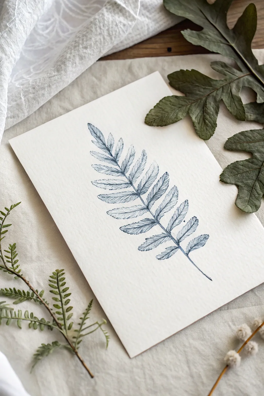
This elegant botanical illustration captures the delicate structure of a fern frond using nothing but a single shade of navy blue. By combining precise pen work for the veins with a loose, watery wash for the leaves, you’ll create a piece that feels both scientific and artistically expressive.
Step-by-Step Tutorial
Materials
- Cold press watercolor paper (A5 size recommended)
- Navy blue waterproof fine liner pen (0.3mm or 0.5mm)
- Navy blue watercolor paint or ink
- Small round watercolor brush (size 2 or 4)
- H pencil (hard lead for light lines)
- Kneaded eraser
- Paper towel
- Water jar
- Reference photo of a fern leaf
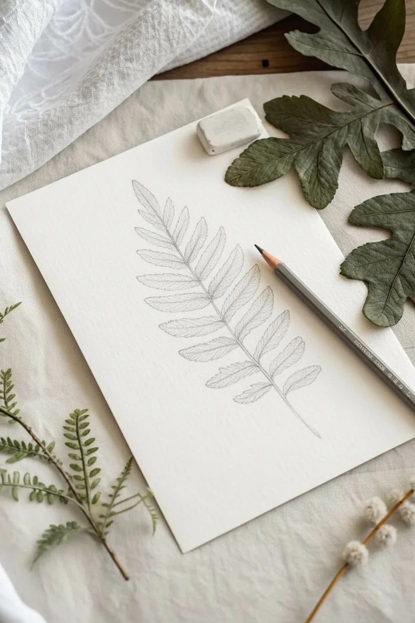
Step 1: Sketching the Structure
-
Establish the curve:
Begin with your H pencil by drawing a single, slightly curved line down the center of your paper. This will be the central stem (rachis) of your fern, blending structure with a natural flow. -
Mark leaflet positions:
Lightly mark short dashes along both sides of the central stem to indicate where the leaflets (pinnae) will attach. Keep the spacing fairly even, but let the gaps get slightly smaller toward the tip. -
Outline the leaflets:
Sketch the overall shape of individual leaflets. Start wider near the stem and taper them to points. The leaflets at the bottom should be larger, gradually shrinking as you move up the frond. -
Refine the edges:
Go back over your leaflet outlines and add the characteristic serrated or jagged edges typical of ferns. Don’t worry about perfection; natural irregularities make it look more realistic.
Bleeding Lines?
If your ink lines are feathering or bleeding into the paper, the underlying paint wash isn’t fully dry yet. Wait another 10-15 minutes or use a hair dryer on low heat.
Step 2: Applying the Wash
-
Prepare the paint:
Mix a small amount of navy blue watercolor with plenty of water on your palette. You want a pale, transparent tea-like consistency for the base layer, not a thick opaque color. -
Paint the first leaflet:
Starting at the top, fill in one leaflet with your pale wash. Use just enough water to wet the shape without creating a puddle. -
Create texture while wet:
While the first leaflet is still damp, dab a tiny bit of more concentrated pigment near the center vein. Let it bleed naturally outward to create a subtle gradient. -
Continue the wash:
Work your way down the stem, painting each leaflet individually. I find it helpful to skip every other leaf to prevent wet edges from touching and merging together. -
Fill the gaps:
Once the first set of leaves is dry to the touch, go back and paint the remaining skipped leaves using the same technique. -
Paint the stem:
Use the very tip of your brush to paint a thin line down the central stem. You can make this slightly darker than the leaves to anchor the drawing. -
Let it dry completely:
Allow the entire paper to dry fully. If the paper feels cool to the touch, it still holds moisture, so give it a few more minutes.
Sketchy Style
Don’t connect every single ink line. Leaving small breaks in your outline (called ‘lost and found’ edges) makes the drawing look more professional and airy.
Step 3: Adding Ink Details
-
Trace the central vein:
Take your waterproof fine liner and carefully draw the central vein of each leaflet. Use a broken, sketchy line rather than a solid stroke to keep it looking organic. -
Add secondary veins:
Draw delicate lines branching out from the center vein to the edges of each leaflet. These should follow the curve of the leaf and be very light pressure strokes. -
Outline selectively:
Trace parts of the outer edges of the leaves with the pen. Don’t outline every single millimeter; leaving gaps allows the eye effectively -
Intensify shadows:
Add small hatching or stippling marks near the base of the leaflets where they meet the main stem. This adds depth and suggests a slight shadow. -
Erase pencil marks:
Once you are absolutely certain the ink is dry, gently roll a kneaded eraser over the drawing to lift any visible pencil guidelines.
Frame your monochromatic study with a wide mat to really let the deep blue details stand out

PENCIL GUIDE
Understanding Pencil Grades from H to B
From first sketch to finished drawing — learn pencil grades, line control, and shading techniques.
Explore the Full Guide
Monochromatic Fruit With Soft Shading
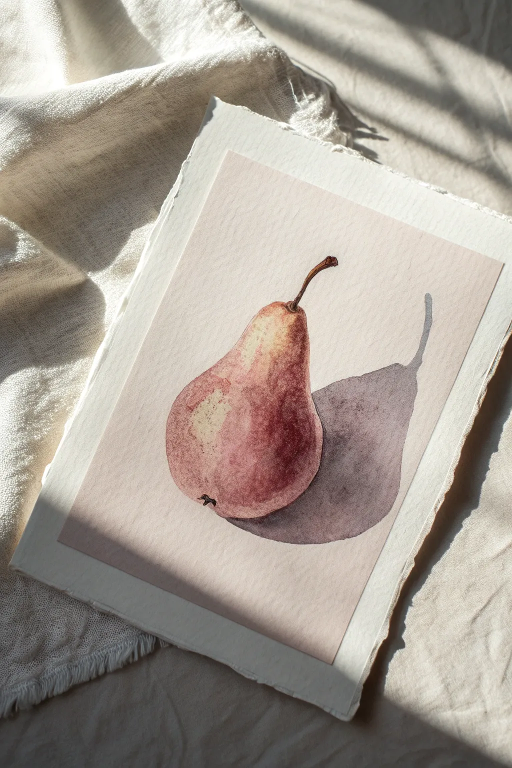
Capture the subtle elegance of a single pear using a limited, monochromatic palette of earthy reds and warm browns. This tutorial focuses on soft shading and realistic textures, resulting in a gentle, vintage-inspired botanical illustration that looks lovely on textured paper.
How-To Guide
Materials
- Cold press watercolor paper (medium texture)
- Pencil (HB or H)
- Kneaded eraser
- Watercolor paints (Alizarin Crimson, Burnt Sienna, Burnt Umber, or a premixed Sepia)
- Round watercolor brushes (Size 4 and Size 8)
- Clean water
- Paper towel
- Mixing palette
Step 1: Sketching and Preparing
-
Outline the pear shape:
Begin by lightly sketching the outline of the pear in the center of your paper. Focus on the asymmetrical, organic bulb shape at the bottom and the tapering neck at the top. Keep your pencil pressure very light so the graphite doesn’t show through the transparent watercolor later. -
Add the stem detail:
Draw the thin stem extending from the top, giving it a slight curve or crook to add character. Mark where the stem connects to the fruit with a small divot. -
Refine the form:
Sketch the small aesthetic imperfections, like the calyx (the blossom end) at the bottom left of the pear. Roughly outline the shape of the cast shadow extending to the right to guide your painting later. -
Lighten the guides:
Take your kneaded eraser and gently roll it over the sketch. You want to lift up most of the graphite, leaving only the faintest ghost of a line visible to guide your brush.
Step 2: Painting the Base Layers
-
Mix your base color:
On your palette, create a watery, pale mix of Alizarin Crimson and Burnt Sienna. You want a very warm, reddish-brown hue that is diluted enough to be transparent. -
Apply the first wash:
Using the size 8 brush, paint the entire body of the pear with this pale wash. Leave a small, irregular patch unpainted on the upper left side of the bulb; this negative space will serve as your brightest highlight. -
Soften the edges:
While the paint is still wet, clean your brush, dab it on a towel, and gently run the damp bristles along the edge of the highlight to soften the transition so it isn’t too stark. -
Let it dry completely:
Wait until the first layer is bone dry. If the paper feels cool to the touch, it is still wet. Patience here prevents the colors from becoming muddy.
Fixing Hard Edges
If you get an unwanted hard line in your gradient, scrub it gently with a stiff, damp brush, then blot with a tissue to lift the pigment and soften the transition.
Step 3: Building Form and Shadow
-
Mix a mid-tone shadow:
Create a slightly thicker, darker version of your base mix by adding a touch more Burnt Sienna. This will be used to start shaping the roundness of the fruit. -
Paint the shadow side:
Apply this mid-tone to the right side and bottom of the pear, mimicking the curve of the fruit. This helps establish the light source coming from the left. -
Add texture marks:
While the mid-tone is damp, drop in tiny dots or dabs of slightly more concentrated pigment to suggest the speckled texture of pear skin. I find this creates a nice organic feel compared to a perfectly smooth wash. -
Deepen the contrast:
Mix Burnt Umber with your red tone to create a deep, chocolatey red. Paint this into the darkest areas: the bottom curve of the pear and the right edge, blending it inward toward the center. -
Detail the stem:
Switch to your size 4 brush. Using a concentrated mix of Burnt Umber, paint the stem. Make the base of the stem slightly darker where it connects to the fruit, and add a tiny dark mark for the calyx at the bottom.
Level Up: Paper Texture
For the authentic look shown in the image, tear the edges of your watercolor paper against a ruler instead of cutting them. This decal edge adds a rustic, handmade touch.
Step 4: The Cast Shadow
-
Mix a cool shadow tone:
For the cast shadow on the table, you want a cooler, more neutral tone. Mix your brown with a tiny touch of blue or a neutral grey to desaturate it. -
Paint the shadow shape:
Fill in the shadow outline you sketched earlier. The shadow should stretch out to the right, mirroring the shape of the pear but elongated. -
Darken the contact point:
While the shadow wash is still wet, drop a darker concentration of pigment right underneath the fruit where it touches the surface. This ‘occlusion shadow’ grounds the object. -
Soften the shadow edge:
If you prefer a softer look, take a clean, damp brush and gently run it along the outer edge of the cast shadow to diffuse it slightly, suggesting diffused light. -
Final assessment:
Step back and look at your painting. If the pear needs more punch, add a final glaze of pure crimson to the roundest part of the cheek once everything is dry.
Enjoy the quiet beauty of your finished monochromatic study.
Simple Portrait in One Hue Family
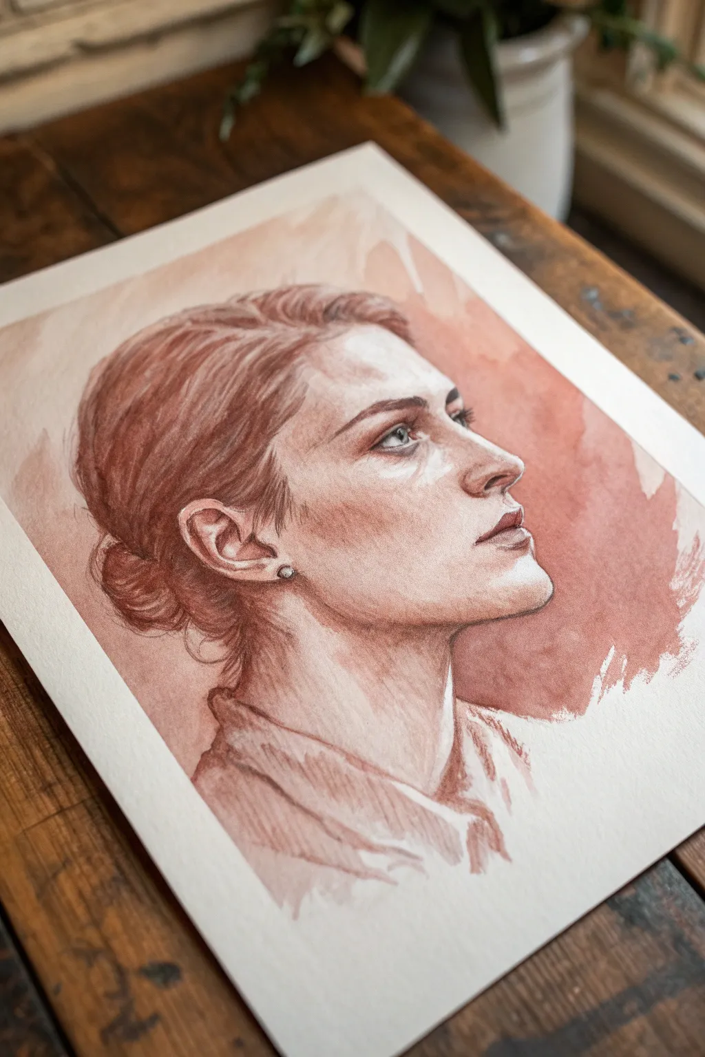
Capture the elegance of a classic profile using a single, warm hue family. This tutorial guides you through building layer upon layer of reddish-brown watercolor to create depth, realism, and a timeless, vintage aesthetic.
Step-by-Step Guide
Materials
- Cold press watercolor paper (300 gsm)
- Watercolor paint (Burnt Sienna or Indian Red)
- Small round brush (size 2 or 4)
- Large round brush (size 8 or 10)
- H pencil for sketching
- Kneaded eraser
- Jar of clean water
- Paper towels
- Painter’s tape and drawing board
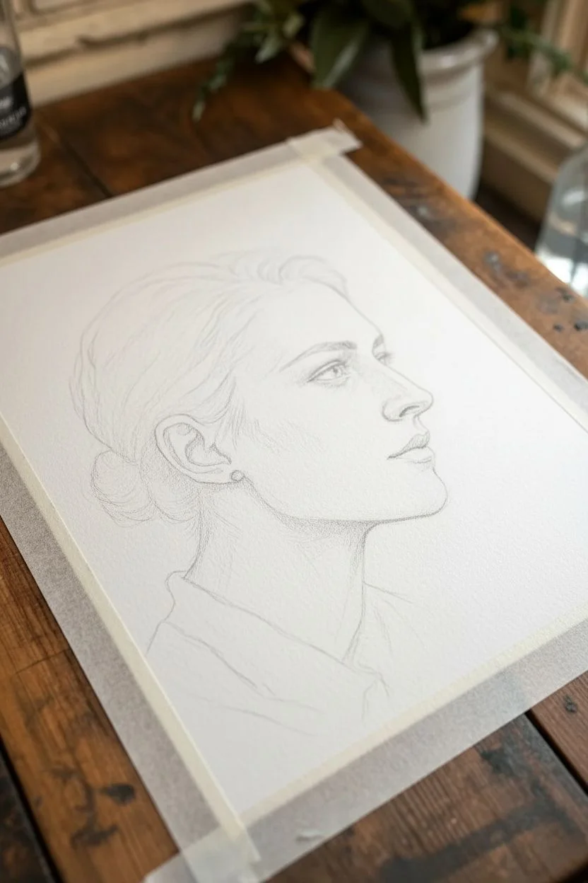
Step 1: Initial Sketching
-
Define the silhouette:
Begin by taping down your paper to a board to prevent warping. Using an H pencil, lightly sketch the outer contour of the head, focusing on the angle of the jawline and the slope of the nose. -
Map facial features:
Refine the internal features. Mark the placement of the eye relative to the top of the ear, sketch the nostril wing, and outline the lips. Keep lines faint so they don’t show through the transparency of the paint later. -
Indicate shadow shapes:
Very lightly draw the boundaries where the main shadows fall—under the jaw, the hollow of the cheek, and the eye socket. This acts as a map for your first washes.
Muddy Shadows?
If layers look muddy, you didn’t let the paper dry fully between washes. Patience is key! Use a hairdryer on a low, cool setting to speed up drying if you’re eager to paint the next layer.
Step 2: First Wash & Foundation
-
Prepare your palette:
Mix a large puddle of your chosen color (like Burnt Sienna) with plenty of water to create a very pale, tea-like consistency. -
Apply the base skin tone:
Wash this pale mixture over the entire face and neck area, avoiding only the highlights on the forehead, the bridge of the nose, and the white of the eye. -
Soft background wash:
While the face is drying, wet the area behind the head with clean water. Drop in a slightly more concentrated pigment and let it bloom outward for that loose, expressive background effect. -
Initial structural shadows:
Once the base layer is dry to the touch, mix a slightly darker value. Paint the shadow under the chin and the side of the neck to separate the head from the body.
Temperature Shift
Add subtle variety by mixing a tiny drop of blue into your shadow mix for cooler recessions, or a touch of yellow for sun-hit areas, while staying within the monochromatic feel.
Step 3: Building Form
-
Deepen the eye socket:
Using a smaller brush, apply a mid-tone wash into the eye socket and around the eyelid creases. Soften the edges with a damp brush so there are no harsh lines. -
Cheek and jaw definition:
Glaze a layer of paint underneath the cheekbone, fading it out as you move toward the ear. Strengthen the shadow line along the jaw to sharpen the profile. -
Nose and lip structure:
Add shading to the underside of the nose and the upper lip. Use a finer point to create the philtrum (the groove above the lip) and the shadow beneath the lower lip. -
Hair base layer:
Apply a sweeping wash over the hair area, following the direction of growth—from the forehead back toward the bun. Leave a few gaps of white paper for highlights.
Step 4: Refining Details
-
Texture the hair:
Switch to your smallest brush and a thicker, cream-consistency paint mixture. Draw individual strands within the darker masses of the hair, contrasting against the lighter base wash. -
Define the eye:
Paint the pupil and iris with concentrated pigment. Leaves a tiny speck of white paper for the catchlight to bring the eye to life. -
Darkest accents:
Use your darkest value (least water) to emphasize the corner of the mouth, the nostril, the ear canal, and the earring stud. -
Clothing rough-in:
Keep the shirt loose and painterly. Use quick, diagonal strokes to suggest the collar and folds without overworking the details, ensuring the face remains the focal point. -
Final adjustments:
Step back and assess the contrast. If the portrait feels flat, I usually add one final glaze of mid-tone shadow under the chin or behind the ear to increase dimension.
Peel off your tape carefully to reveal a striking, classic portrait full of emotion and depth


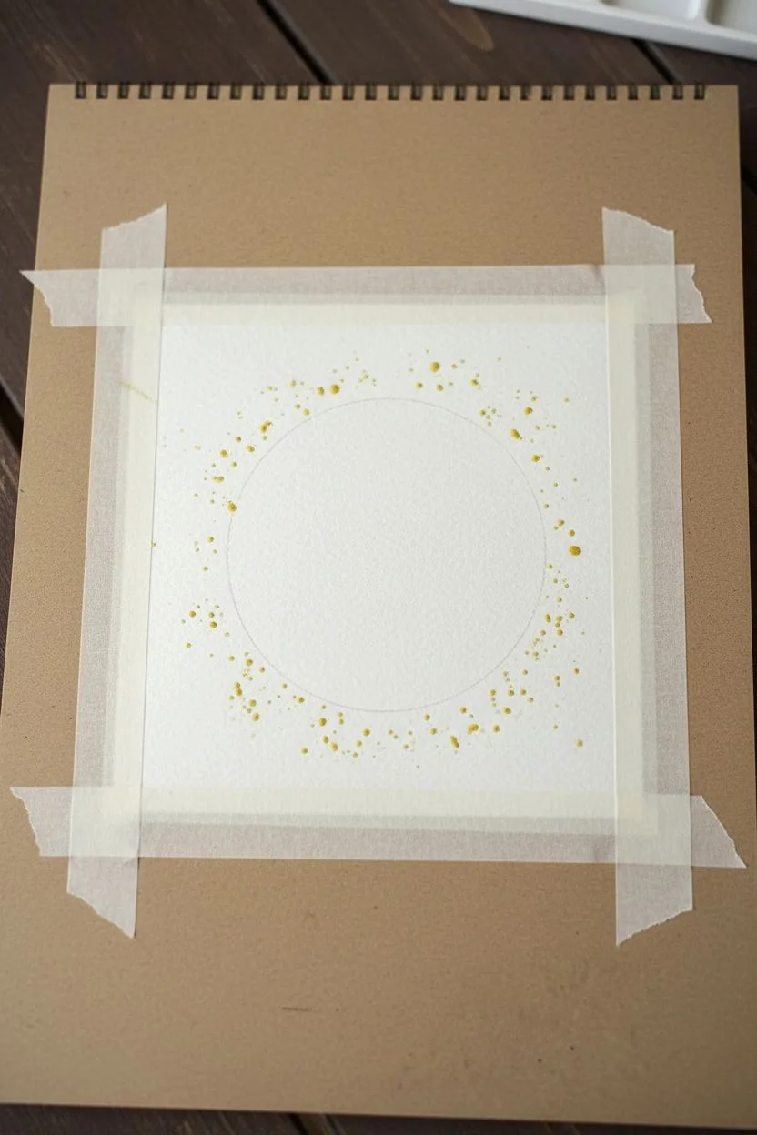
Monochrome Mandala With Value Rhythm
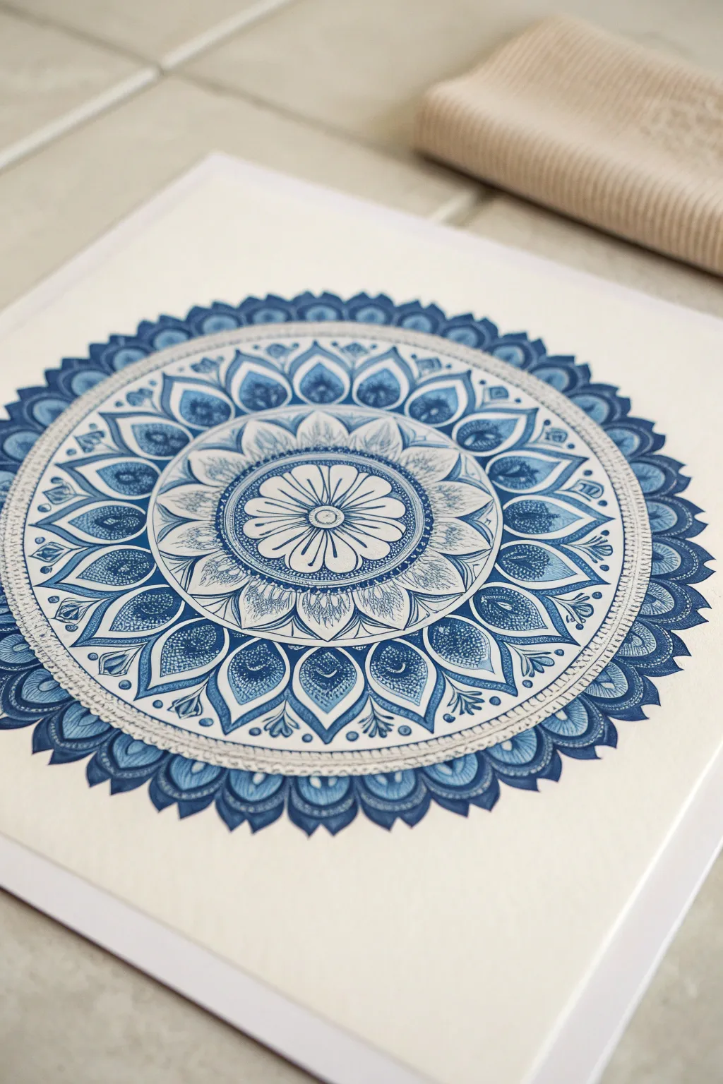
This meditative project explores the depth of a single hue through varying concentrations of ink. By layering translucent washes of blue with crisp, saturated linework, you’ll create a mesmerizing radial design that feels both precise and organic.
How-To Guide
Materials
- High-quality watercolor paper (140lb/300gsm, cold press works well)
- Blue liquid acrylic ink or watercolor (Prussian Blue or Phthalo Blue)
- Fine liner pens (0.1, 0.3, and 0.5mm) in matching blue, or waterproof black
- Watercolor brushes (Round sizes 2 and 6)
- Compass for drawing circles
- Protractor
- HB Pencil and eraser
- Ruler
- Mixing palette with multiple wells
- Jar of clean water
- Paper towels
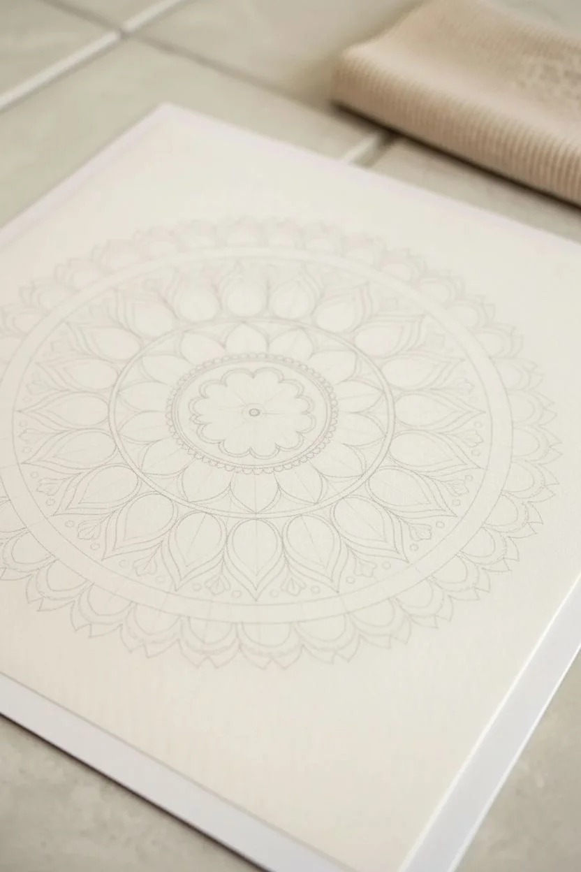
Step 1: Planning the Structure
-
Find the center:
Begin by lightly marking the exact center of your square paper. Use a ruler to ensure it is perfectly centered. -
Draw guide circles:
Using your compass, draw a series of concentric circles radiating from the center. Create about 6-8 rings of varying widths; these will serve as the boundaries for your different petal layers. -
Mark radial divisions:
Use your protractor to mark degrees around the outermost circle. For a symmetrical design like this, I find dividing the circle into 16 or 32 equal sections works best. Use a ruler to connect these marks lightly through the center point. -
Sketch the primary petals:
Starting from the center and working outward, lightly sketch the petal shapes within your circular guides. Use a pointed petal shape for the outer rows and a rounded flower shape for the center.
Uneven Ink Coverage?
If your large washes look blotchy, wet the paper shape with clean water first, then drop in the ink. This ‘wet-on-wet’ technique helps the color flow evenly across the area.
Step 2: Applying the Ink Washes
-
Prepare your values:
On your palette, create three distinct puddles of blue ink: one pure and undiluted, one mixed with 50% water for a mid-tone, and one heavily diluted (90% water) for a very pale tint. -
Paint the center flower:
With the Size 2 brush, apply the palest wash to the innermost flower petals. Let the brush barely graze the paper to keep the texture light. -
Fill the mid-layers:
Moving to the next ring of petals, use the mid-tone wash. Carefully fill in the shapes, leaving a tiny sliver of white space between adjacent petals to maintain definition. -
Add gradient depth:
While the mid-tone ink is still slightly damp in the petal, touch the very tip of the petal with a drop of undiluted ink. Let it bleed naturally toward the center for a soft gradient effect. -
Paint the outer border:
The outermost, scalloped border requires the darkest value. Use your strongest ink mix here to create a visual frame that anchors the mandala. -
Let it dry completely:
Pause here. The paper must be bone-dry before you add the fine details, otherwise, your pens will snag or bleed into the damp fibers.
Pro Tip: Rotation
Don’t twist your wrist or body to reach awkward angles. Instead, constantly rotate the paper itself. This keeps your hand in a comfortable, steady position for every petal.
Step 3: Detailing and Definition
-
Outline the center:
Using your 0.3mm pen, trace the outline of the central flower. Add delicate stamens and a central dot to give it a realistic botanical feel. -
Add texture to mid-petals:
For the middle rings, use the 0.1mm pen to draw tiny, swift hatching lines at the base of each petal. This stippling effect suggests shading without overpowering the blue wash. -
Create the lace effect:
In the open ring between the central flower and the outer petals, draw intricate geometric patterns or tiny dots. This negative space keeps the mandala feeling airy. -
Define the outer leaves:
Outline the large outer petals with the 0.5mm pen for a bolder line. Inside each leaf shape, draw a smaller, similar shape to create a double-border effect. -
Fill tonal gaps:
Look for areas in the outer ring that need more weight. Use the pure blue ink and a small brush to fill in the ‘background’ spaces between the petal tips, making the white patterns pop. -
Final decorative touches:
Add small dots, circles, or teardrop shapes in any remaining white spaces using the 0.3mm pen. These micro-details add that professional, complex look. -
Erase guidelines:
Once you are absolutely certain the ink is dry (give it an extra hour to be safe), gently erase all your pencil construction lines.
Step back and admire the rhythmic calm of your finished monochromatic piece
Textured Monochromatic Abstract With Layers
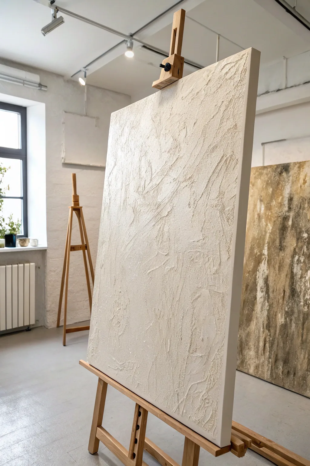
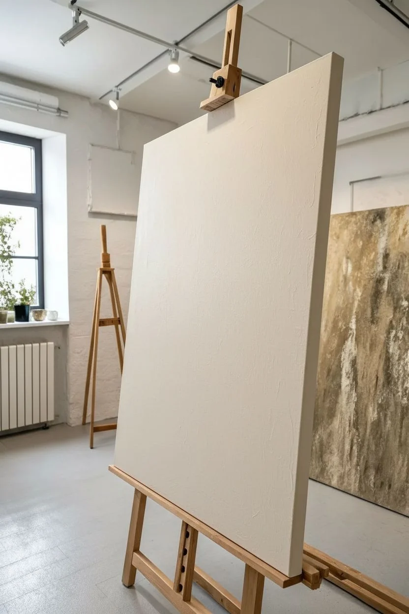
Embrace the beauty of subtle movement with this large-scale textured art piece that mimics the look of carved stone or rough plaster. By using heavy-body mediums and simple tools, you’ll create a sophisticated, monochromatic statement piece that focuses entirely on light and shadow.
Step-by-Step Guide
Materials
- Large stretched canvas (at least 24×36 inches)
- Gesso (white)
- Modeling paste or heavy structure gel (large tub)
- Plaster powder or sand (optional for grit)
- Heavy body acrylic paint (Titanium White and Unbleached Titanium)
- Large palette knives (assorted shapes)
- Painter’s trowel or wide putty knife
- Old credit card or plastic scraper
- Drop cloth
- Matte spray varnish
Step 1: Preparation & Base
-
Prime the Surface:
Start by laying down a drop cloth, as this process can get messy. Apply a coat of simple white gesso to your canvas to seal it, even if it came pre-primed. This ensures the heavy texture paste adheres properly without soaking into the fabric. -
Mix the Medium:
In a large disposable container or on a palette, mix your modeling paste with a small amount of Unbleached Titanium acrylic paint. You want a very pale, warm cream color. -
Add Texture Agents:
If you want the gritty, sandy look seen in the reference, mix a handful of plaster of Paris, fine sand, or marble dust into your paste mixture. Stir until it feels thick, like frosting. -
Apply the Base Layer:
Using your widest trowel or putty knife, spread a generous, even layer of the mixture over the entire canvas about 1/8 inch thick. Don’t worry about pattern yet; just get the canvas covered.
Cracking Paste?
If your thick paste cracks while drying, don’t panic. Mix a thinner batch of paste and paint, push it into the cracks with a finger, and smooth it over.
Step 2: Sculpting the Texture
-
Create Large Sweeps:
Working while the paste is wet, use the flat edge of your trowel to make long, broad strokes diagonally across the canvas. Angle the tool slightly to carve into the paste rather than just smoothing it. -
Build Ridges:
Apply fresh blobs of the paste mixture onto the canvas in random areas. Use a palette knife to push this extra material into standing ridges and peaks, mimicking rugged terrain. -
Scrape and Drag:
Take the edge of an old credit card or a smaller palette knife and drag it perpendicular to your main strokes. This creates the ‘chattered’ or rough broken effect seen in the valleys of the texture. -
Layering Direction:
Vary your hand movement. If your main strokes go Up-Right, use a few smaller strokes intersecting them diagonally to break up uniformity. The goal is organized chaos. -
Check Glancing Light:
Step back and view the canvas from the side. The shadows created by the ridges are your actual composition. If an area looks too flat, add more paste now. -
Initial Drying:
Allow this heavy texture layer to dry completely. Because it is thick, this might take 24 to 48 hours. Do not rush this step, or the outer shell will crack while the inside stays wet.
Step 3: Refining & Finishing
-
Sand the Sharpness:
Once fully rock-hard, lightly run a fine-grit sandpaper block over the highest peaks. You just want to knock down any dangerously sharp spikes, not flatten the texture. -
Highlight Mix:
Squeeze out pure Titanium White heavy body acrylic. Do not dilute it with water—you need the thickness. -
Dry Brush Technique:
Dip a wide, dry bristle brush or a clean roller into the white paint. Offload most of it onto a paper towel until the brush is almost dry. -
Catching the Peaks:
Gently graze the surface of the canvas with the white paint. The brush should only hit the tops of the texture ridges, leaving the cream-colored valleys untouched. This enhances the 3D effect. -
Detail Work:
I like to use a small palette knife with pure white paint to dab onto specific high points that need more drama, creating a stark contrast against the warmer base. -
Seal the Work:
Since textured art collects dust easily, finish with a light coat of matte spray varnish. This seals the porous paste without adding an unwanted glossy shine.
Add Metallic Warmth
Once dry, lightly sponge a diluted gold or bronze glaze over just a few texture valleys for a subtle, luxurious glow that catches the light.
Hang your new textural masterpiece in a spot with side lighting to show off all that dimension
Negative Space Monochrome Cutout Look
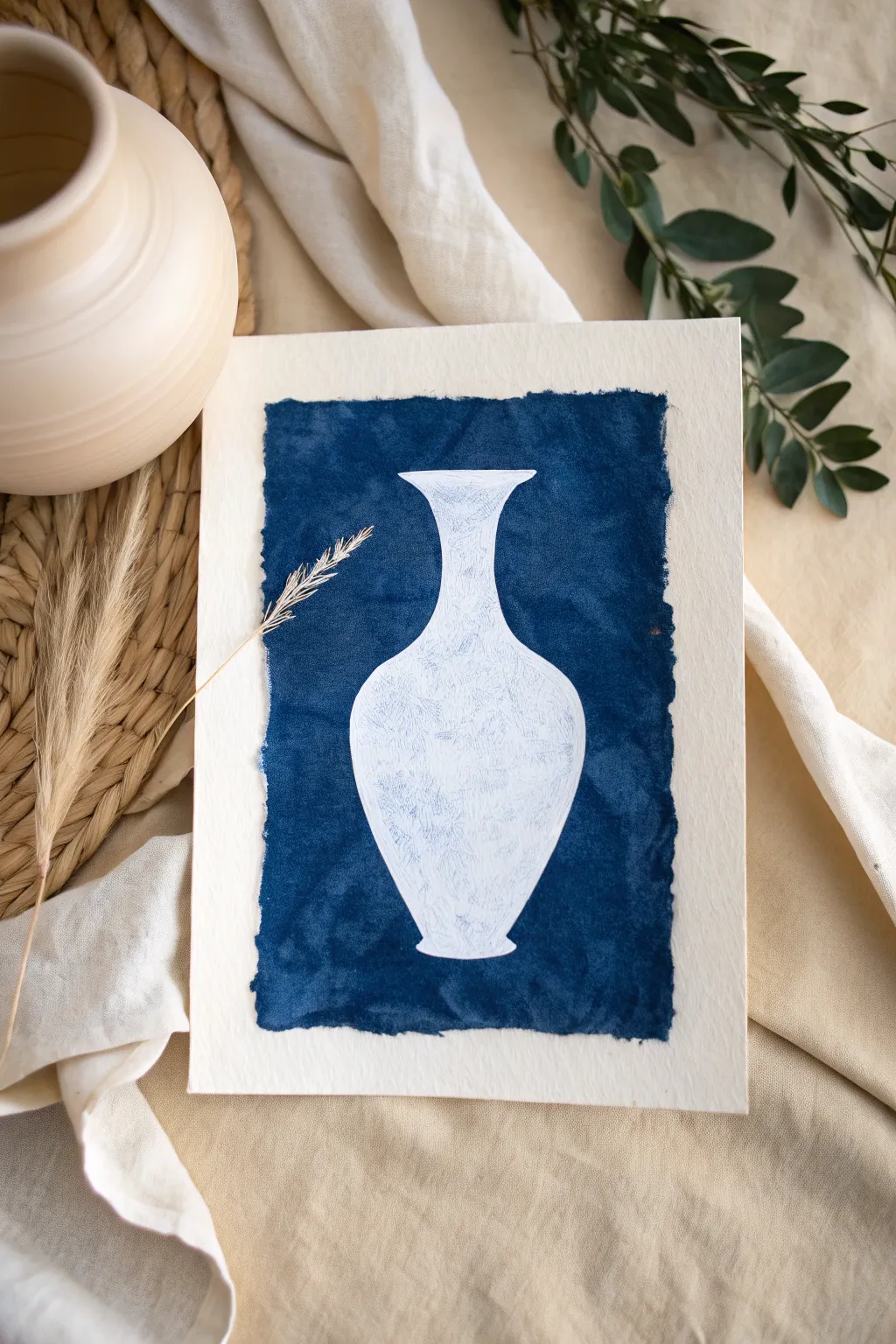
This project explores the beauty of negative space by defining a delicate vase shape not by drawing it, but by painting the space around it. The deep indigo blue against the bright white paper creates a striking, high-contrast look reminiscent of classic cyanotypes or pottery.
Step-by-Step Tutorial
Materials
- Cold press watercolor paper (heavyweight, 300gsm)
- Indigo watercolor or gouache paint
- Pencil (HB or H)
- Kneaded eraser
- Round brush (size 6 or 8)
- Flat brush (size 1/2 inch or similar)
- Masking fluid (optional but helpful)
- Old brush or silicone tool (if using masking fluid)
- Palette
- Water cups and paper towels
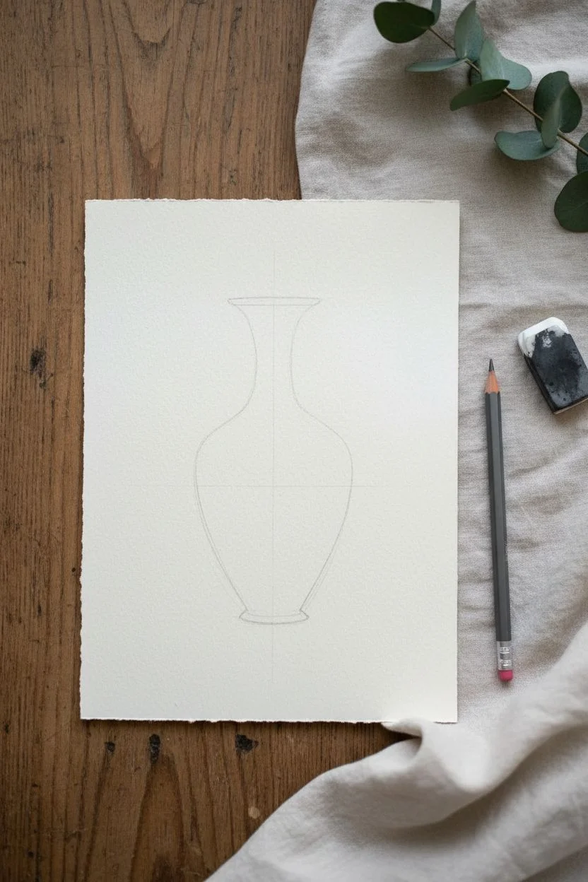
Step 1: Planning the Composition
-
Prepare your workspace:
Tape down your watercolor paper to a board using painter’s tape if you want crisp outer edges, though this project features a free-floating focal point, so taping is optional. -
Sketch the centerline:
Lightly draw a vertical line down the center of your paper using a ruler. This will serve as your guide to ensure the vase remains symmetrical. -
Outline the vase shape:
Using your pencil, lightly sketch the silhouette of a curvaceous vase. Start with a wide mouth, narrow the neck, swell out for the body, and taper back in for the foot. -
Refine the symmetry:
Check both sides of your vase against the centerline. It helps to look at your sketch in a mirror to spot any lopsided areas. Correct any uneven curves now. -
Clean up the sketch:
Once you are happy with the shape, use a kneaded eraser to lift off almost all the graphite, leaving only the faintest ghost lines visible to guide you.
Fixing Wobbly Lines
Hand slipped? Don’t panic. Wait for the blue paint to dry fully, then use opaque white gouache to ‘paint back’ the curve of the vase and cover the mistake.
Step 2: Painting the Negative Space
-
Mix your indigo:
Squeeze out a generous amount of indigo watercolor or gouache. You want a consistency that is rich and opaque, similar to heavy cream, rather than a transparent wash. -
Define the vase edge:
Using your medium round brush, carefully paint along the *outside* of your pencil line. This is the most critical step—keep your hand steady to create a smooth, clean edge for the white vase. -
Work in small sections:
Don’t try to outline the whole vase at once. Paint a few inches of the outline, then immediately use your brush to pull that wet paint outward away from the vase. -
Create the rough border:
As you move the paint outward to fill the blue rectangle, stop abruptly to create a ragged, uneven outer edge. I personally love how this deckled look makes the art feel handmade and organic. -
Complete the outline:
Continue around the entire perimeter of the vase. Ensure the foot of the vase is flat and grounded. -
Fill the background:
Switch to your larger flat brush if needed to fill in the rest of the blue area efficiently. Work while the paint is still damp to avoid harsh internal drying lines.
Add Gold Accents
For a kintsugi-inspired look, paint thin gold cracks across the white vase or outline the rim in metallic gold paint once the blue is dry.
Step 3: Adding Texture and Depth
-
Create texture while wet:
While the large blue field is still semi-wet, you can dab it lightly with a crumpled paper towel or drop in tiny amounts of water to create ‘blooms’ and variations in the tone. -
Wait for the first layer to dry:
Let the painting dry completely. This allows the pigment to settle into the texture of the cold press paper. -
Add subtle shadows (optional):
If the white vase looks too flat, you can mix a very watery, pale grey wash. Paint a thin shadow line along one side of the vase interior to suggest roundness, but keep it minimal. -
Deepen the contrast:
Evaluate your blue background once dry. If it dried too light, apply a second coat of indigo, carefully avoiding your crisp white vase edges, to achieve that deep, velvet midnight blue. -
Final assessment:
Check the edges of your vase one last time. If any blue paint accidentally crossed into the white space, use white gouache or a white gel pen to touch it up.
Frame your monochromatic masterpiece in natural wood to highlight the organic textures of the paint
Monochrome Cityscape in Misty Values
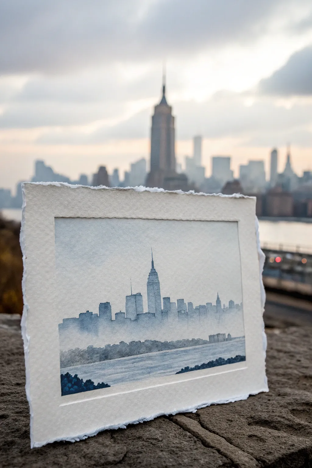
Capture the ethereal beauty of an urban horizon with this monochromatic watercolor study. Using a single pigment, you’ll learn to build depth through atmospheric perspective, creating ghostly skyscrapers that fade into a soft, misty fog.
How-To Guide
Materials
- Cold press watercolor paper (deckle edge preferred, 140lb/300gsm)
- Indigo or Payne’s Grey watercolor paint (tube or pan)
- Flat wash brush (3/4 inch)
- Round brushes (size 4 and 8)
- Two jars of water (one for rinsing, one clean)
- Paper towels
- Masking tape (optional for edges, though deckle edge is best exposed)
- Pencil (HB or H)
- Kneaded eraser
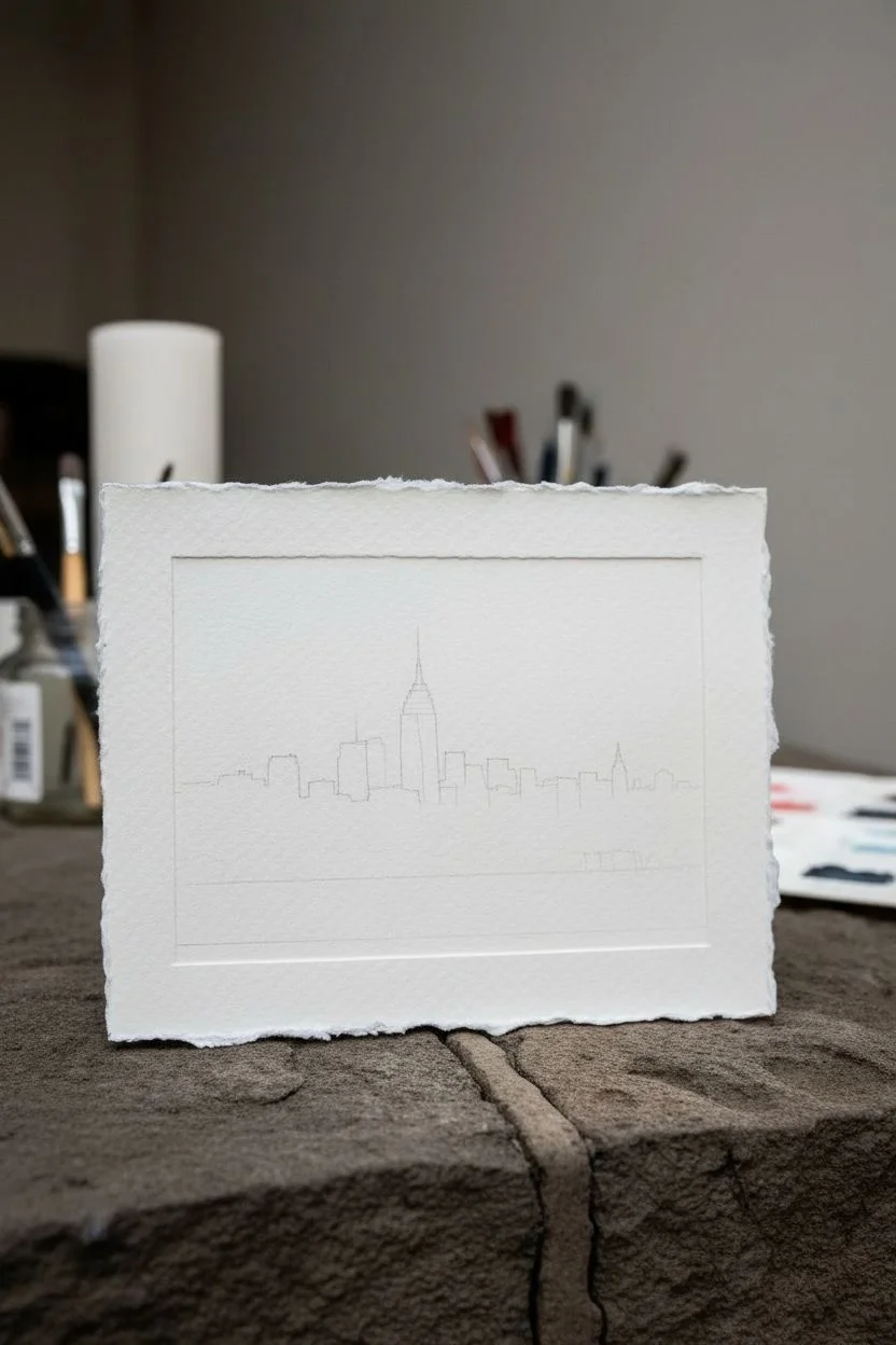
Step 1: Preparation and Sketching
-
Paper Selection:
Choose a high-quality cotton paper, ideally one with a torn or deckle edge to mimic the rustic look of the example. If you have a large sheet, tear it to size (approx 5×7 inches) using a ruler as a guide to create that soft, fibrous edge. -
Observe the Horizon:
Lightly mark your horizon line about one-third of the way up from the bottom of the paper. This project relies on atmospheric layers, so identify three main planes: the distant skyline, a middle ground island or treeline, and a foreground riverbank. -
Outline the Skyline:
With a hard pencil (H or HB), very faintly sketch the silhouette of the skyscrapers. Focus on the iconic spire shape in the center. Keep these lines barely visible so they don’t show through the transparent watercolor layers later.
Step 2: Painting the Sky and Distance
-
Mix a Tea Wash:
Prepare a very dilute puddle of your chosen color (Indigo or Payne’s Grey). It should be the consistency of weak tea—mostly water with just a hint of pigment. -
Wet-on-Wet Sky:
Using your large flat brush, wet the entire sky area mostly with clean water, bringing it down just past the tops of the buildings. Drop in just a tiny amount of your weak wash at the very top, letting it fade to pure white as it reaches the horizon line. -
First Building Layer:
While the paper is bone dry, mix a slightly stronger wash (coffee consistency). Paint the entire silhouette of the city, ignoring individual building details. The goal here is a flat, uniform shape that represents the furthest, haziest buildings. -
Creating the Fog Effect:
Before the city silhouette dries completely, rinse your brush and blot it on a towel so it’s damp but not dripping. Gently run this damp brush along the bottom edge of your building shapes to soften the paint, dragging it downwards to create a misty, undefined base.
Muddy Waters?
If your mist looks muddy or has hard lines, your paper was likely too dry when you tried to blend. Rewet the area with clean water and lift excess pigment with a paper towel.
Step 3: Building Depth and Atmosphere
-
Defining the Key Structures:
Once the first layer is dry, mix a ‘milk consistency’ wash (more pigment). Use the size 4 round brush to glaze over specific buildings, like the central skyscraper and a few surrounding towers. This darkens them, bringing them visually forward while leaving the pale buildings behind them. -
Adding Texture:
For the darker buildings, you can use a dry brush technique slightly on their vertical edges to suggest windows or architectural details without actually painting them. -
The Middle Ground:
Mix a darker wash for the treeline or landmass sitting just below the city. Paint this strip horizontally across the paper, allowing the top edge to be slightly uneven to suggest treetops or low structures. -
Soften the Water Line:
Just as you did with the buildings, use a clean, damp brush to soften the bottom edge of this middle ground strip, blending it downwards into what will become the water area.
Granulation Magic
Use a granulating pigment like Lunar Black or a moody Ultramarine. The sediment settles in paper valleys, creating instant, gritty city texture without extra work.
Step 4: The Water and Foreground
-
Water Ripples:
Using a diluted wash and your flat brush, paint horizontal strokes across the bottom third of the paper to represent the river. Leave gaps of white paper showing through to represent light reflecting off the water surface. -
Foreground Elements:
Prepare your darkest mix yet—creamy consistency, almost full pigment strength. Use the size 8 round brush to tap in some textured shapes in the bottom left or right corners. These represent nearby bushes or the riverbank. -
Detailing the Foreground:
While this dark paint is wet, drop in a tiny bit of clean water or a slightly different concentration of pigment to create ‘blooms’ that look like leaf textures. -
Final Adjustments:
Step back and assess your values. If the central spire needs to pop more, add one final, careful glaze of dark pigment to its shadowed side. Ensure the ‘mist’ at the base of the city still feels soft and transitioned. -
Deckle Check:
If you taped your paper, remove the tape carefully. If you are going for the floater-frame look shown in the photo, gently fluff the torn edges with your fingernail to enhance the paper’s texture.
Allow your painting to dry flat completely before framing it to keep those beautiful washes perfectly even.
Monochromatic Mixed-Media Collage in a Single Hue
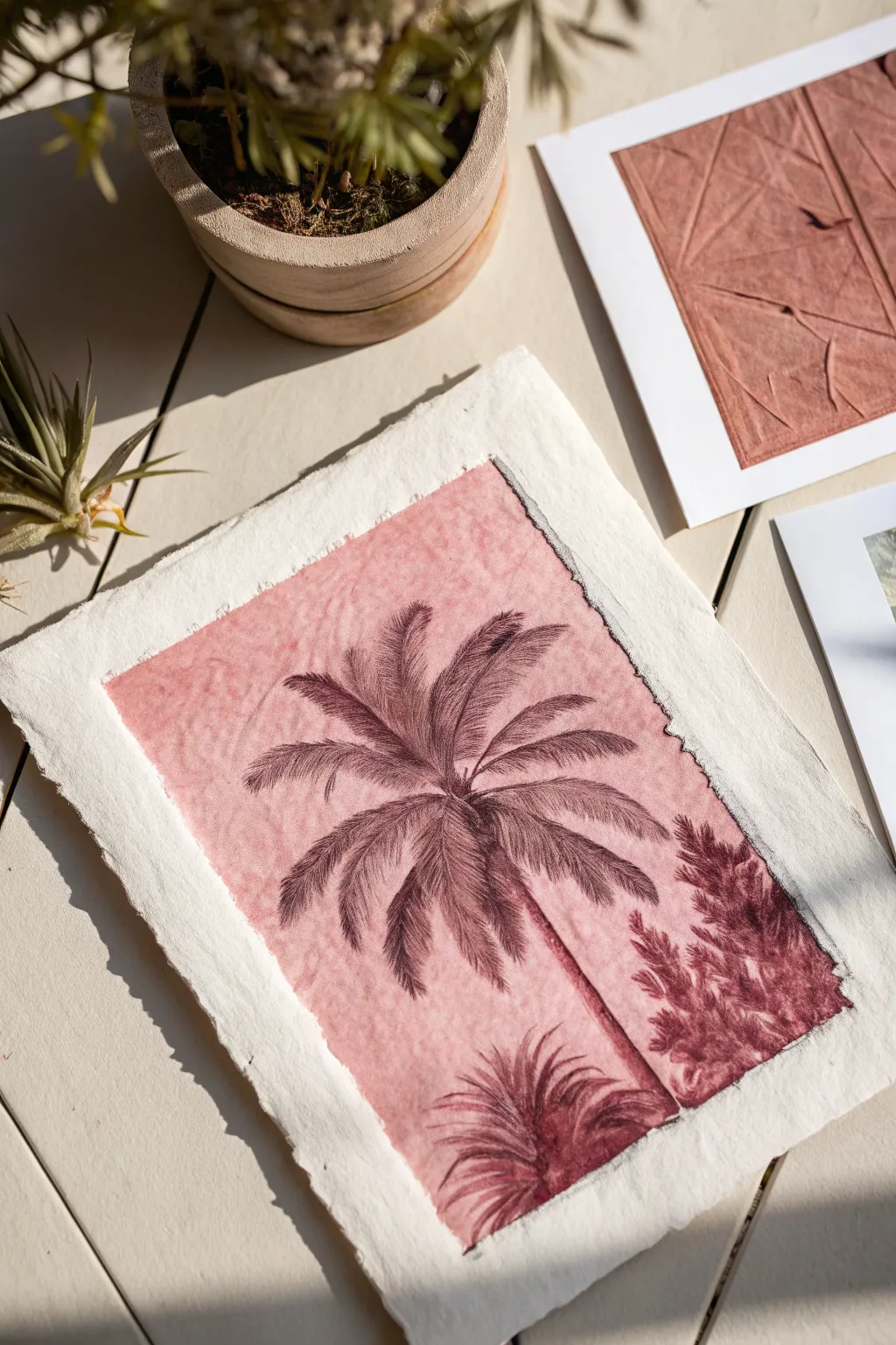
Capture the elegance of botanical illustrations with this monochromatic drypoint etching technique. Using a rich, dusty rose ink on textured handmade paper creates a timeless, antique feel that mimics pressed flowers or old-world scientific sketches.
Step-by-Step Guide
Materials
- Sheet of clear heavy acetate or plexiglass (approx 5×7 inches)
- Etching needle or sharp awl
- Reference photo of a palm tree
- Handmade cotton rag paper (heavyweight, 250gsm+)
- Water-soluble printmaking ink (Crimson and Burnt Umber)
- Tarlatan cloth, cheesecloth, or stiff fabric
- Old phone book or newsprint pages
- Shallow tub for water
- Clean towel
- Wooden spoon or barren (for hand printing)
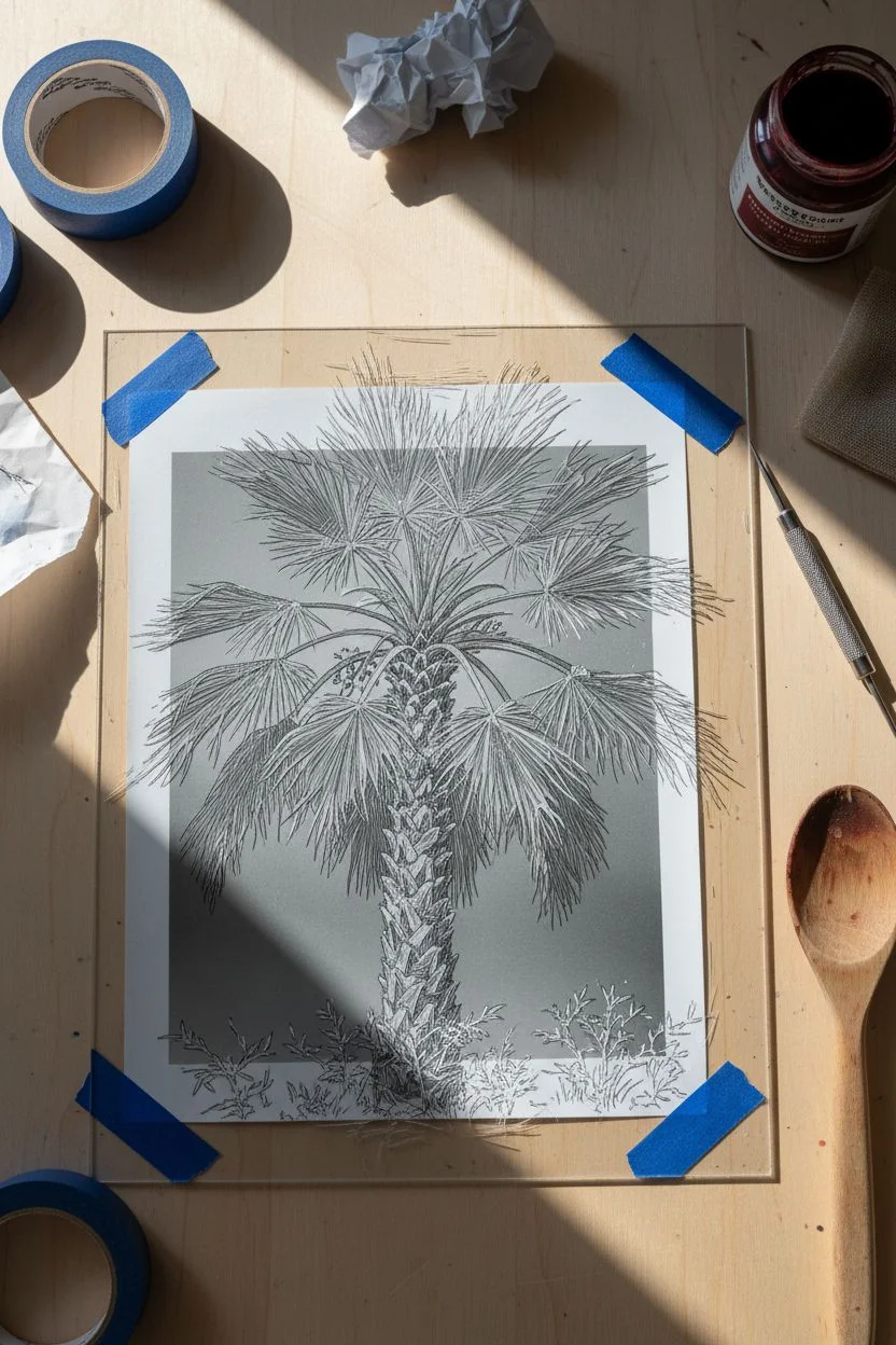
Step 1: Creating the Matrix
-
Prep your reference:
Tape your palm tree reference photo securely to your work surface, then tape your clear plastic plate directly over it so it doesn’t shift. -
Trace the trunk:
Using your etching needle, firmly scratch into the plastic following the lines of the palm trunk. Use vertical hatch marks to mimic the rough bark texture. -
Etch the fronds:
Trace the spine of each palm leaf first. Then, use quick, flicking motions to scratch the individual needles of the fronds, varying your pressure to create depth. -
Add darker values:
Return to the shadowed areas where the fronds meet the trunk. Cross-hatch your scratches here (creating grid-like lines) to hold more ink and create darker tones. -
Create the foreground:
Sketch the smaller, bushier plants at the bottom using looser, more chaotic scratch marks to differentiate the texture from the main palm.
Step 2: Inking and Wiping
-
Mix your custom hue:
On a palette, mix a small amount of Crimson ink with a touch of Burnt Umber to achieve that vintage, earthy ‘dried rose’ color seen in the artwork. -
Apply the ink:
Using a scrap of matte board or an ink card, spread the ink over the entire etched plate. Scrape it in multiple directions to ensure the ink is pushed deep into your scratched grooves. -
The initial wipe:
Ball up your tarlatan or cheesecloth. Gently wipe the surface of the plate in a circular motion to remove the bulk of the excess ink. -
Refining the tone:
Switch to a clean section of cloth or a piece of phone book paper. Wipe gently with the flat of your hand. Stop wiping before the plate is perfectly clean; leaving a thin film of ink creates the pink background tone. -
Clean the edges:
Use a rag or paper towel wrapped around your finger to wipe the very edges of the plastic plate perfectly clean, creating a sharp border frame.
Pro Tip: Plate Tone
The pinkish background isn’t painted—it’s leftover ink! This is called ‘plate tone.’ A ‘dirty wipe’ leaves a thin residue of color, giving the print its moody atmosphere.
Step 3: Printing the Image
-
Soak the paper:
Submerge your handmade paper in the water tub for about 2-3 minutes. This relaxes the fibers so they can reach into the scratches. -
Blotting:
Remove the paper and blot it between clean towels. Ideally, the paper should feel cool and damp, but not wet or shiny. -
Registration:
Place your inked plate ink-side up on a clean surface. Carefully lay the damp paper over the plate, centering it to leave generous white margins. -
Burnishing the print:
Cover the paper with a protective sheet of newsprint. Using the back of a wooden spoon, rub firmly over the entire plate area in small circles. I like to confirm I’ve gone over every inch at least twice. -
The reveal:
Lift one corner of the paper to check the transfer. If the lines look faint, lay it back down carefully and rub harder. Once satisfied, peel the paper off strictly to reveal your print. -
Drying:
Place the finished print between two sheets of clean tissue and weigh it down with a heavy book to dry flat for 24 hours.
Level Up: Deckle Edges
To get the rough, torn edges seen in the photo, place a ruler on your paper and tear the excess off slowly against the ruler’s edge before soaking the paper.
Once dry, your monochromatic print will have a sophisticated, tactile quality perfect for framing.

Have a question or want to share your own experience? I'd love to hear from you in the comments below!