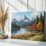
If you’ve ever paused a scene and thought, “I need to paint that mood,” you’re in the right headspace. These movie painting ideas are all about capturing that cinematic feeling without getting stuck in tiny details.
Paint a Stylized Movie Poster Layout
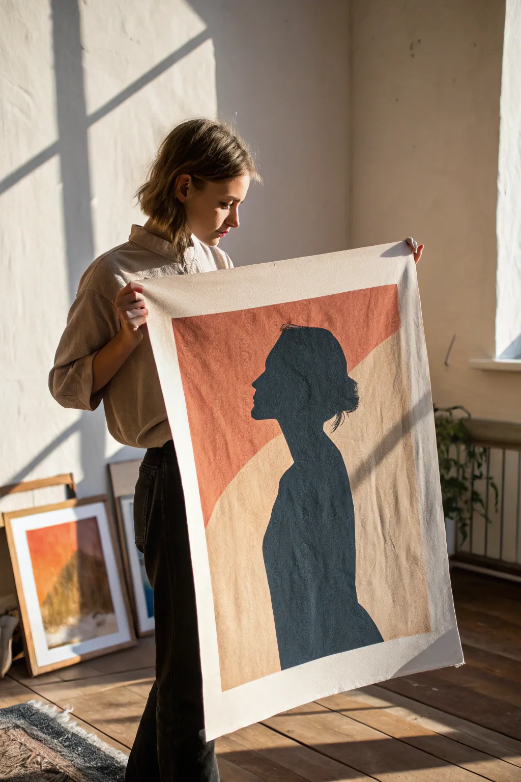
Capture the elegance of classic cinema with this minimalist silhouette painting on canvas fabric. The stark contrast between the deep teal profile and the warm, earthy geometric shapes creates a sophisticated, poster-like aesthetic perfect for any modern space.
Step-by-Step Guide
Materials
- Heavyweight cotton canvas fabric (unprimed or primed)
- Acrylic paints (dark teal/petroleum blue, terracotta orange, warm beige)
- Large flat paintbrush (2-3 inch)
- Medium round brush
- Fine liner brush
- Pencil
- Masking tape or painter’s tape
- Large sheet of paper or cardstock (for stencil)
- Scissors or craft knife
- Ruler or straight edge
- Palette or mixing plate
Step 1: Preparation and Background
-
Prepare the canvas:
Begin by cutting your canvas fabric to the desired size, leaving an extra inch on all sides if you plan to frame it later. Lay it flat on a protected work surface and tape down the corners to keep it taut. -
Draft the layout:
Using a pencil and a ruler, lightly sketch the large diagonal division for the background. This line should sweep across the upper portion of the canvas, creating a dynamic angle. -
Mix the background colors:
Prepare your background palette. You will need a muted terracotta orange and a soft, warm beige. I find that adding a tiny touch of white to the orange helps it sit better on the fabric texture. -
Paint the upper section:
Using the large flat brush, paint the upper section with the terracotta orange. Apply the paint in long, smooth strokes, following the weave of the fabric for distinct coverage. -
Paint the lower section:
Clean your brush thoroughly, then paint the lower section with the warm beige tone. Ensure the edges where the two colors meet are crisp; you can use masking tape along your pencil line for a perfectly straight edge if your hand isn’t steady. -
Dry completely:
Allow the background layers to dry fully. Since canvas fabric absorbs moisture, this might take a bit longer than paper—usually about an hour or two.
Clean Lines Hack
When painting over masking tape, seal the edge first with a thin layer of the *base* color (or clear medium) to prevent the new color from bleeding underneath.
Step 2: Creating the Silhouette
-
Create a template:
While the background dries, draw or trace a side-profile silhouette onto a large sheet of paper or cardstock. Look for a photo with a strong outline, focusing on the forehead, nose, and chin definition. -
Cut the stencil:
Carefully cut out your paper silhouette. You can use the negative space (the hole left in the paper) as a stencil, or use the cutout piece to trace around. -
Position the figure:
Place your template on the dried canvas. Position it so the head overlaps the color block line, creating visual interest where the dark figure intersects with both the orange and beige zones. -
Trace the outline:
Using a pencil, very lightly trace the outline of the silhouette onto the painted background. -
Outline with paint:
Load a medium round brush with your dark teal or petroleum blue paint. Carefully paint along the inside of your pencil line to establish the edge of the figure. -
Fill in the shape:
Switch to a larger brush to fill in the main body of the silhouette. Apply the paint generously to ensure solid, opaque coverage that hides the background colors beneath. -
Refine the details:
Use the fine liner brush to sharpen intricate areas like the eyelashes, lips, or stray hairs in the extensive bun. Sharp, clean edges are crucial for the silhouette effect. -
Check opacity:
Once the first layer of the silhouette is dry, hold it up to the light. If you see streaks or the background color showing through, apply a second coat of the dark teal for a solid, velvety look. -
Final touches:
Erase any visible pencil marks gently. If the edges of the canvas fabric have frayed during painting, trim them with sharp scissors for a neat finish.
Uneven Texture?
If the canvas weave is making your edges look jagged, switch to a flow improver medium mixed with your paint to help it glide smoothly into the fabric texture.
Hang your new cinematic masterpiece using wooden poster rails or simply tack it up for an effortless, artistic studio vibe
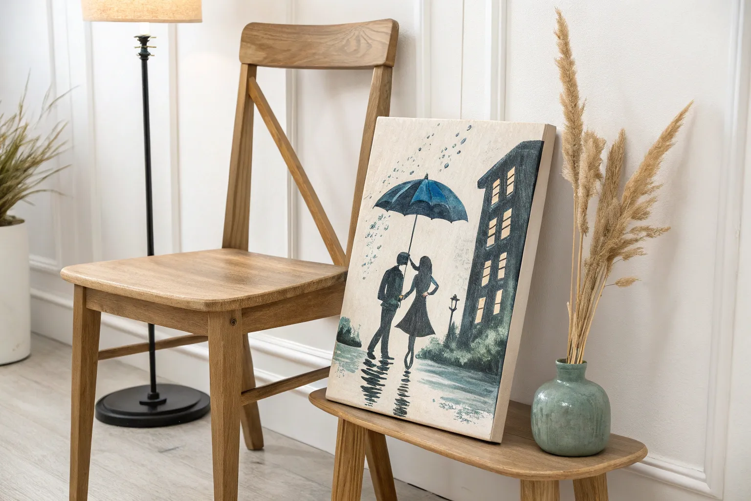
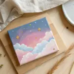
Create an Iconic Silhouette Scene
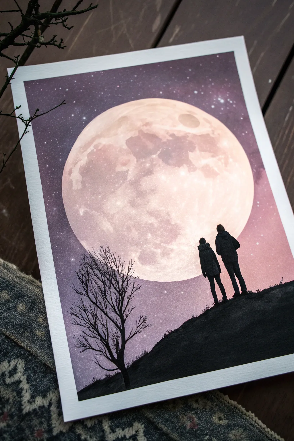
Capture the magic of a quiet night with this striking silhouette painting that places two figures against a luminous, oversized moon. The contrast between the soft, textured lunar surface and the crisp black foreground creates a captivating sense of depth and scale.
Step-by-Step Tutorial
Materials
- Thick watercolor paper or mixed media paper (A4 or A3 size)
- Masking tape or painter’s tape
- Acrylic paints: Titanium White, Black, Purple (Dioxazine), Magenta or Pink, Dark Blue
- Large flat brush or sponge applicator
- Key tools: Large circular object (plate/bowl) or compass for the moon
- Round brushes (sizes 2 and 6)
- Detail brush or liner brush (size 0 or 00)
- Old toothbrush or stiff brush for splattering stars
- Paper towels
- Palette or mixing plate
Step 1: Setting the Scene
-
Secure the paper:
Tape down all four edges of your paper to a flat board or table. This creates a clean white border and prevents the paper from buckling as you apply wet paint. -
Mask the moon:
Place a large circular object, like a dessert plate or bowl, in the center-top area of your paper where you want the giant moon to be. Trace lightly with a pencil. -
Protect the moon area:
To keep the moon perfectly round and white for now, either paint carefully around your pencil line or, for a cleaner edge, cut a circle of masking paper or frisket film and adhere it over the moon shape.
Uneven Moon Shape?
If your hand wobbled while painting the moon’s edge, wait for it to dry. Then, use the background purple color to carefully ‘cut back’ into the moon shape to correct the circle.
Step 2: The Cosmic Background
-
Mix the sky colors:
Prepare a gradient on your palette. You’ll need a deep purple mixed with a touch of blue for the top corners, transitioning into a lighter purple-pink mix, and finally a soft pinkish-white near the horizon. -
Paint the gradient:
Starting at the top with your darkest purple, paint horizontally across the paper. While the paint is still wet, gradually blend into the lighter magenta tones as you move downward past the moon. -
Blend smoothly:
Use a large, slightly damp brush to smooth out the transitions between colors. The goal is a seamless fade from the dark night sky into the glow near the horizon line. -
Add the stars:
Once the background is completely dry, mix a little water into titanium white acrylic. Dip an old toothbrush into it and flick the bristles with your thumb to spray tiny stars across the purple sections of the sky. -
Detail larger stars:
Use your smallest detail brush to dot a few slightly larger, brighter stars in the upper corners to add variety to the galaxy.
Personalize It
Reference a specific movie scene by changing the silhouettes! You could paint a bicycle flying across the moon, a wolf howling, or characters holding specific props.
Step 3: Painting the Moon
-
Reveal the moon:
If you used a masking sticker, carefully peel it off now. If you traced a line, ensure the inside area is clean and dry. -
Base coat the moon:
Fill the circle with a mixture of Titanium White and a tiny drop of pink or magenta to give it a warm, glowing base color. -
Create lunar texture:
Mix a very pale grey-purple. Using a scrunched-up paper towel or a dry sponge, lightly dab this color onto parts of the moon to simulate craters and maria (the dark spots). -
Add crater details:
I like to take a small round brush with watered-down grey paint to outline a few specific crater circles, then soften the edges immediately with a clean, damp brush. -
Highlight the glow:
Paint pure white onto the brightest parts of the moon, blending it softly outward. You can also dry-brush a faint halo of white around the outside edge of the moon on the purple sky to make it look luminous.
Step 4: The Silhouette Foreground
-
Establish the horizon:
Using pure black acrylic and a medium round brush, paint a sloping hill at the bottom of the page. Make the line slightly uneven to represent grassy terrain. -
Outline the figures:
Lightly sketch the outlines of the two people standing on the hill. Ensure their feet are grounded in the black hill area. -
Fill the silhouettes:
Use your smallest brush and black paint to carefully fill in the figures. Pay attention to the shape of the clothing folds and posture—small lumps on the outline suggest coats and hoods. -
Construct the tree trunk:
On the left side, paint the main trunk of a bare tree rising from the hill. Let the trunk get thinner as it reaches upward. -
Add main branches:
Extend 3-4 main branches from the trunk. Remember that trees usually split into ‘V’ shapes as they grow outward. -
Paint fine twigs:
Switch to your liner brush or a distinct ink pen to add the delicate, spindly twigs at the very ends of the branches. These fine lines crossing over the moon create beautiful contrast. -
Final touches:
Add tiny brushstrokes along the top of the black hill to suggest grass blades. -
Remove tape:
Wait until everything is 100% dry, then slowly peel away the masking tape at a 45-degree angle to reveal your crisp white border.
Hang your masterpiece on the wall and enjoy the peaceful, cinematic atmosphere you have created
Paint a Balloon-Lifted House in Open Sky
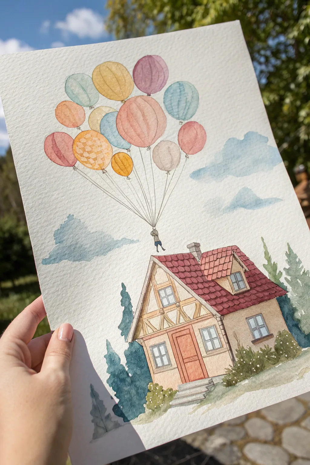
Capture the magic of adventure with this charming watercolor illustration featuring a cozy cottage being lifted into the clouds by a bouquet of balloons. This pen-and-wash project combines precise architectural details with loose, dreamy washes for a nostalgic storybook feel.
Step-by-Step Guide
Materials
- Cold-press watercolor paper (300 gsm)
- Waterproof fineliner pens (0.1 and 0.3 sizes)
- Watercolor paint set
- Round brushes (sizes 2, 4, and 8)
- Pencil (HB or 2H)
- Kneaded eraser
- Ruler (optional)
- Jar of clean water
- Paper towel
Step 1: Sketching the Composition
-
Block in the house shape:
Begin by lightly sketching the main structure of the house in the lower right quadrant of your paper. Draw the main A-frame roofline and the boxy structure of the first floor, ensuring the perspective looks slightly tilted upwards. -
Add architectural details:
Refine your sketch by adding specific features: the chimney on the roof, the dormer window jutting out, the front door with steps, and the timber framing (the wooden beams) on the facade. -
Draw the balloon cluster:
Move to the upper left area and lightly sketch roughly 12-15 overlapping circles of various sizes. They should drift diagonally upward from the house. Sketch a tiny figure hanging below the balloons. -
Connect the strings:
Use your ruler or a steady hand to draw straight lines connecting the base of each balloon down to the figure, and a single line attaching the figure to the chimney top.
Ink Confidence
Don’t stress if your ink lines wobble slightly. In architectural illustration, shaky lines act as ‘character’ and make the house look older and more charming.
Step 2: Inking the Lines
-
Outline the house:
Switch to your 0.3 waterproof fineliner. Carefully trace over your pencil lines for the house structure, roof tiles, and windows. Use broken lines occasionally on the bushes to suggest texture. -
Detail the balloons:
Outline the balloons with the thinner 0.1 pen for a more delicate look. For one or two balloons, draw a simple pattern inside, like a checkerboard, to add visual interest. -
Erase pencil marks:
Once the ink is completely dry—wait at least 5 minutes to be safe—gently use the kneaded eraser to lift all visible graphite from the paper.
Step 3: Painting the House and Landscape
-
Warm the walls:
Mix a very watery wash of yellow ochre or pale beige. Paint the walls of the house, leaving the timber beams unpainted for now. Keep the wash light to suggest a sunlit day. -
Roof texture:
Use a burnt sienna or reddish-brown mix for the roof tiles. You don’t need to paint every single tile perfectly; let the color vary slightly in intensity to create a weathered look. -
Timber and door details:
With a size 2 brush, carefully fill in the wooden beams and the front door with a slightly darker brown or terracotta mix. -
Paint the landscape:
Mix a deep blue-green for the pine trees flanking the house. Paint them loosely, allowing the white of the paper to show through slightly for highlights. Add a soft olive green wash for the grass at the base.
Avoid Muddy Colors
Watercolors will bleed if adjacent wet areas touch. When painting the balloon cluster, paint every other balloon first, let them dry, and then paint the ones in between.
Step 4: Bringing the Sky to Life
-
Color the balloons:
Choose a variety of pastel colors—pinks, blues, yellows, and oranges. Paint each balloon individually. To make them look round, touch your brush to one side and just use clean water to drag the pigment to the other side, creating a highlight. -
Paint the tiny figure:
Using the very tip of your smallest brush, dab a little blue for the pants and grey or brown for the jacket of the hanging figure. -
Create soft clouds:
Mix a watery sky blue. Paint irregular cloud shapes in the background. While the paint is still wet, blot portions of it with a crumpled tissue or paper towel to create fluffy white textures. -
Final shadows:
Once the main layers are dry, mix a dilute purple-grey. I like to add this shadow color under the eaves of the roof and on the shady side of the house to ground the structure.
Step back and admire your flight of fancy, now ready for framing or gifting
Do a “From-Behind” Character Shot
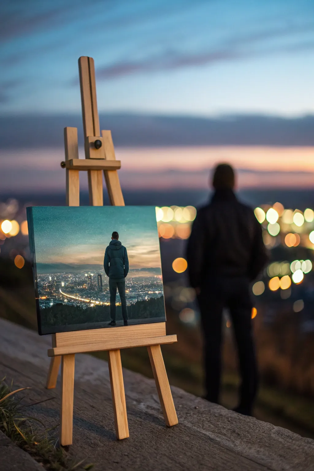
Capture a contemplative cinematic moment with this moody acrylic painting featuring a figure overlooking a sprawling city at twilight. The composition uses a classic “from-behind” perspective to invite the viewer to share the subject’s quiet observation of the urban landscape.
Step-by-Step
Materials
- Square stretched canvas (approx. 12×12 inches)
- Acrylic paints (Phthalo Blue, Ultramarine Blue, Titanium White, Mars Black, Burnt Umber, Cadmium Yellow, Cadmium Orange)
- Set of synthetic brushes (1-inch flat, medium filbert, small round, fine liner)
- Palette knife
- Water container and paper towels
- Easel
- Chalk or pastel pencil for sketching
Step 1: Setting the Atmosphere
-
Gradient Sky Base:
Begin by dampening your canvas slightly. Mix a gradient starting with a deep teal (Phthalo Blue + touch of Black) at the very top, blending down into a lighter, hazy blue-grey in the middle. -
Horizon Glow:
While the sky is still wet, introduce a warm horizon line using a mix of Titanium White, a tiny drop of Orange, and Yellow. Blend this upwards into the blue to create a soft twilight transition. -
Blocking the Ground:
Use Burnt Umber mixed with Black to block in the dark foreground silhouette. Create a rough, uneven line for the hill or overlook where the figure will stand. -
Distant Mountains:
Paint a faint, hazy mountain range just above the city line using a transparent wash of grey-blue. These should look distant and atmospheric, not sharp. -
Initial Drying:
Allow this background layer to dry completely before adding crisp details. I like to use a hairdryer on a cool setting if I’m impatient to get to the city lights.
Step 2: The Cityscape
-
Mapping the Grid:
Using a thin wash of dark blue, loosely map out the perspective lines of the city streets. They should converge towards a vanishing point near the horizon. -
Structure Silhouettes:
With a small flat brush and dark grey paint, add small vertical rectangles to represent distant skyscrapers and building blocks. Keep these abstract rather than detailed. -
Primary Street Lights:
Load a fine liner brush with fluid Cadmium Yellow mixed with White. Dot in lines of lights following your major street perspective lines. These should be the brightest points. -
Background City Glow:
Scumble a very dry, small brush with soft orange paint over sections of the city to create the ambient light pollution and haze found in urban night scenes. -
Window Details:
Add tiny, random specks of pure White and very light Blue throughout the dark building shapes to represent individual windows.
Wobbly Lines?
If your straight lines for city streets look too shaky, use the edge of a piece of thick cardstock or a ruler dipped in paint to stamp straight lines instead of dragging a brush.
Step 3: The Figure
-
Sketching the Posture:
Using a piece of chalk, lightly outline the figure in the center foreground. Focus on the ‘A-shape’ of the torso and the straight stance of the legs to convey stillness. -
Underpainting the Jacket:
Fill in the jacket area with a mid-tone cool grey-blue. Don’t worry about folds yet; just get the solid shape established. -
Pants and Shoes:
Paint the legs using a darker charcoal grey, almost black. Ensure the feet engage solidly with the dark ground you painted earlier. -
Adding Dimension:
Mix a darker shadow tone (Blue + Black) and paint the sides of the jacket and the creases where the arms rest. This creates volume. -
Highlighting the Figure:
Imagine the city light hitting the figure from below and the twilight from above. Add subtle rim lighting to the shoulders and head using a light grey-blue.
Pro Tip: Atmospheric Depth
Make distant city lights smaller and cooler in color (more blue/white), while keeping foreground lights larger and warmer (orange/yellow) to drastically increase the sense of depth.
Step 4: Stars and Finishing Touches
-
Starry sky:
Dilute Titanium White with water until it’s the consistency of ink. Load a stiff brush and flick the bristles to create a spray of stars in the upper darker teal section of the sky. -
Foreground Texture:
Use a palette knife or dry brush to add a little texture to the ground the figure is standing on, suggesting concrete or rough earth. -
Final Contrast Check:
Step back and assess your values. If the city lights aren’t popping enough, add one final dot of pure thick White to the center of the brightest lamps.
This evocative piece is now ready to transport viewers to a quiet moment above the bustling world
BRUSH GUIDE
The Right Brush for Every Stroke
From clean lines to bold texture — master brush choice, stroke control, and essential techniques.
Explore the Full Guide
Make a Minimalist Symbol Painting
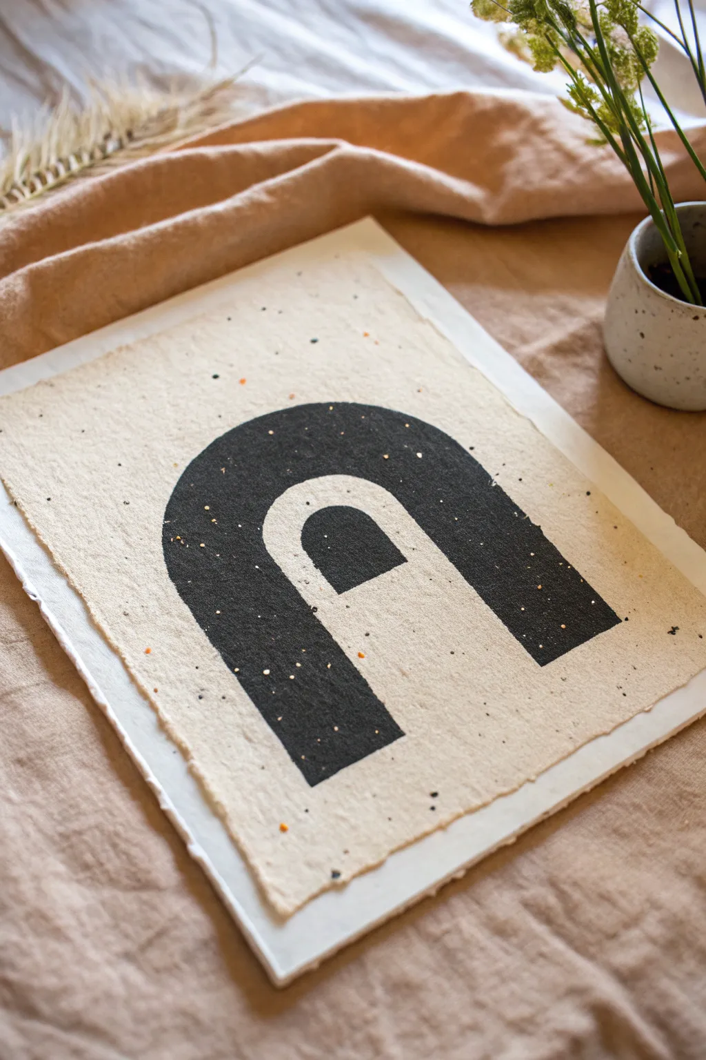
Capture the essence of modern simplicity with this striking black arch design on textured paper. The contrast of bold geometric shapes against the organic, speckled surface creates a sophisticated piece that feels both contemporary and timeless.
How-To Guide
Materials
- Heavyweight handmade cotton rag paper (with deckled edges)
- Black acrylic paint or gouache
- Pencil (HB or lighter)
- Ruler
- Compass or circular object (for tracing)
- Flat shader brush (medium size)
- Fine liner brush (for edges)
- Palette or small dish
- Paper towels
- Cup of water
Step 1: Preparing the Canvas
-
Paper Selection:
Choose a sheet of heavy, handmade paper. The texture and natural flecks are crucial for this look, so opt for something with visible pulp or botanical inclusions. -
Flattening:
If your paper is curled from storage, place it under a heavy book for a few hours. A flat surface is essential for clean geometric lines. -
Surface Prep:
Gently brush away any loose debris from the paper surface with a dry, soft brush to ensure your paint adheres smoothly.
Step 2: Drafting the Design
-
Measuring the Center:
Use a ruler to find the horizontal center of your paper. Make a tiny, faint mark near the bottom third to anchor your design. -
Drawing the Base Lines:
Lightly sketch two vertical parallel lines about 3-4 inches apart. These will form the outer legs of the large arch. -
Drawing the Inner Legs:
Sketch two more vertical lines inside the first pair. Leave a gap of roughly an inch between the outer and inner lines, creating a thick band. -
Creating the Outer Curve:
Using a compass set to the width of your outer lines, or tracing a bowl, draw a smooth semi-circle connecting the tops of the outer vertical lines. -
Creating the Inner Curve:
Repeat the process for the inner lines using a smaller circle guide, ensuring the curve is parallel to the outer one. This creates the main rainbow-like arch shape. -
Adding the Central Element:
Inside the negative space of the main arch, draw a smaller, solid arch shape at the bottom center. It should look like a small door or thumb shape nesting inside. -
Refining Lines:
Go over your sketch very lightly to clean up connections. I prefer to erase distinct graphite marks until they are barely visible so they don’t show through the paint.
Bleeding Lines?
Handmade paper is absorbent. If paint bleeds, use less water and heavier body paint. You can also seal the sketch area with clear matte medium before applying black.
Step 3: Painting the Form
-
Paint Consistency:
Squeeze a generous amount of black acrylic onto your palette. Add a tiny drop of water to improve flow without making it transparent; you want a solid, opaque black. -
Outlining the Shape:
Using your fine liner brush, carefully paint along your pencil outlines. Keep your hand steady to maintain a crisp edge against the rough texture of the paper. -
Filling the Outer Arch:
Switch to your flat shader brush. Fill in the large, curved band you created. Use long, even strokes to minimize texture in the paint itself. -
Filling the Central Shape:
Paint the smaller central arch solid black. Be careful not to let it touch the outer arch; the negative space between them is vital. -
Check for Gaps:
Because handmade paper is textured, the paint might skip over deep crevices. Dab the tip of your brush into any white speckles showing through the black areas. -
Second Coat:
Let the first layer dry completely (about 15-20 minutes). Apply a second coat if the black looks patchy or greyish, ensuring a deep, matte finish. -
Final Clean Up:
Inspect the edges one last time. If the paper’s texture caused a jagged line, use the fine liner with slightly thinned paint to smooth it out.
Gold Dust Accents
Mix a pinch of gold mica powder into clear glazing medium. Roughly flick a stiff brush over the dry painting to add subtle, starry speckles like the original image.
Allow your artwork to dry flat overnight before framing to prevent warping the delicate paper fibers
Try a Classic Black-and-White Noir Scene
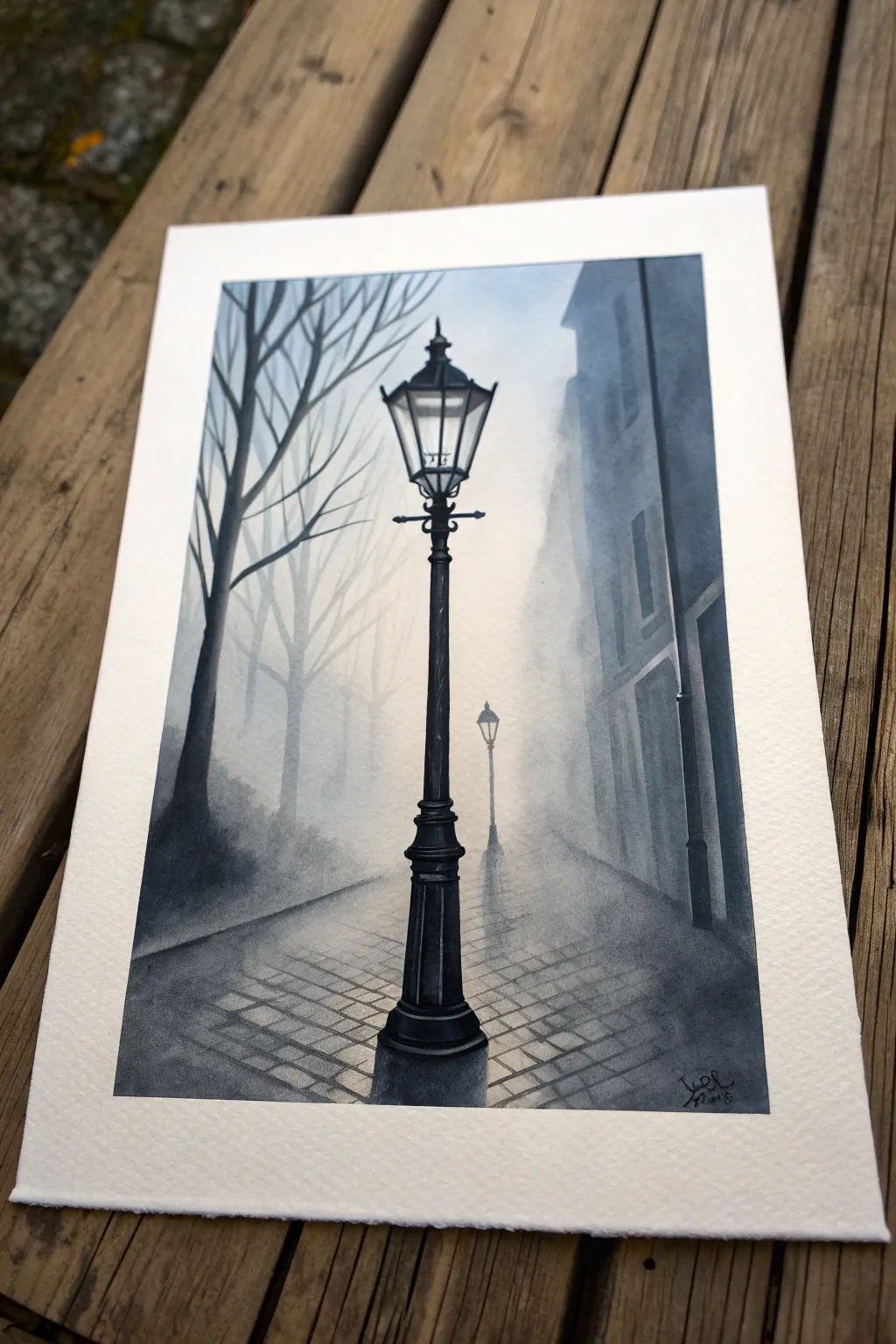
Capture the moody atmosphere of a classic film noir with this monochromatic watercolor painting featuring a lonely streetlamp. By playing with soft, diffused backgrounds and crisp foreground details, you’ll create a striking sense of depth and mystery.
Step-by-Step
Materials
- Cold Press Watercolor Paper (300gsm/140lb)
- Pencil (HB or 2B) for sketching
- Kneaded eraser
- Watercolor paint (Payne’s Grey or Indigo)
- Round watercolor brushes (Size 12 for washes, Size 4 and 0 for details)
- Jar of clean water
- Paper towels
- Masking tape (optional)
Step 1: Sketching the Scene
-
Establish the composition:
Begin by lightly sketching the central lamp post. Place the base slightly off-center at the bottom and extend the post vertically, ending with the lantern housing about a third down from the top edge. -
Add perspective lines:
Draw faint diagonal lines radiating from a vanishing point located behind the central lamp. These lines will guide the placement of the cobblestones later. -
Outline background elements:
Sketch the silhouette of the building on the right and the bare tree branches on the left. Keep these lines very faint, just enough to know where your boundaries are. -
Place the distant lamp:
Drawing a much smaller, secondary lamp post further back in the distance adds immediate scale and depth to the composition.
Step 2: Creating the Atmos-fear
-
Prepare the background wash:
Mix a very watery, pale puddle of your chosen dark color (Payne’s Grey works beautifully here). We want a mist effect, so keep the pigment load low. -
Apply the wet-on-wet sky:
Using your large size 12 brush, dampen the sky area and the background street. While the paper is glistening but not soaking, drop in your pale wash, leaving the area directly behind the lantern almost white to simulate glowing light. -
Paint the distant shadows:
While the paper is still slightly damp, paint the blurry silhouette of the right-side building and the distant trees. The damp paper will soften the edges, creating a ‘foggy’ look. -
Add the distant lamp post:
Once the background is mostly dry, paint the small, distant lamp post. Keep the edges slightly soft to push it into the background mist.
Pro Tip: Light Control
To make the lamp look like it’s truly glowing, keep the paper pure white inside the glass housing and immediately behind the lantern. Contrast is key.
Step 3: The Foreground Details
-
Paint the main post base:
Now, switch to a darker, creamier mix of paint. Using the size 4 brush, carefully fill in the central lamp post, starting from the heavy iron base. -
Define the lantern housing:
Work your way up the post. When painting the glass housing at the top, outline the iron framework carefully but leave the ‘glass’ panels mostly clear to represent transparency. -
Add the crossbar detail:
Paint the decorative horizontal bar just below the lantern head. Ensure these lines are crisp and opaque to make the object pop against the misty background. -
Deepen the shadows:
Go back over the darkest parts of the lamp post—the base and the joints—with almost pure pigment to give the iron a heavy, solid weight.
Level Up: Rain Effects
Once fully dry, use opaque white gouache and a fine liner brush to add thin, diagonal streaks for rain, or tiny dots on the ground for glistening reflections.
Step 4: Textures and Finishing Touches
-
Suggest cobblestones:
Using a diluted mix and your size 4 brush, paint horizontal dashes and small rectangles on the ground, following your perspective lines. Fade these out as they move away from the viewer. -
Add tree branches:
With the size 0 brush, paint the spindly branches on the left side. Use a ‘shaky hand’ technique to make them look organic and gnarled. -
Paint the building details:
Add vertical lines and window recesses to the building on the right. Keep the values lighter than the lamp post so the architecture doesn’t compete for attention. -
Enhance the glow:
If the glow around the lamp feels too stark, you can use a clean, damp brush to gently soften the edges where the lamp meets the foggy sky. -
Final contrast check:
Stand back and look at your painting. If the foreground lamp feels flat, add one final layer of the darkest darks to the shadow side of the post.
Frame your moody masterpiece and enjoy the cinematic mystery you’ve created

PENCIL GUIDE
Understanding Pencil Grades from H to B
From first sketch to finished drawing — learn pencil grades, line control, and shading techniques.
Explore the Full Guide
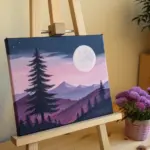
Paint a Split “Day vs. Night” Movie Still
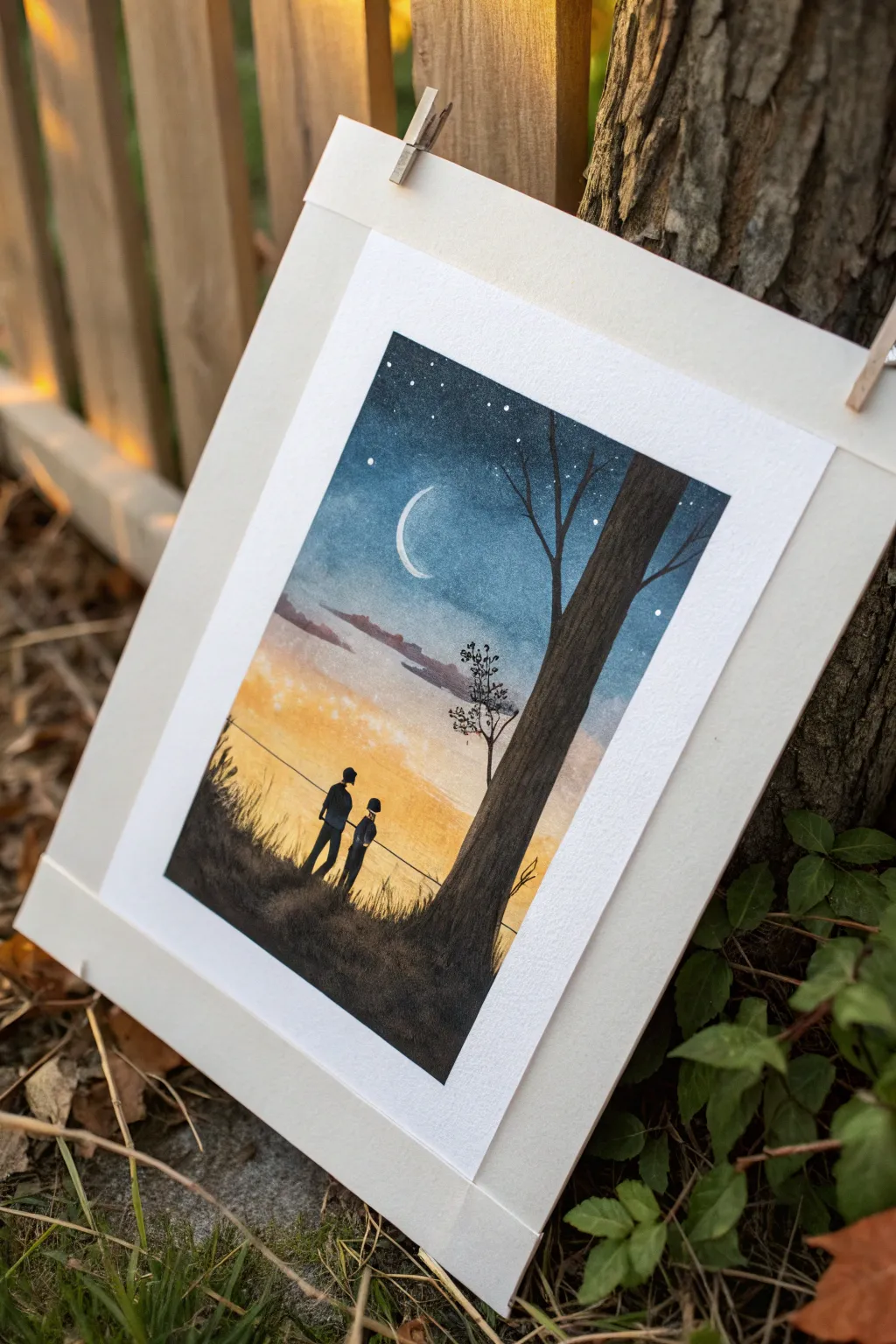
Capture the magic of two worlds colliding with this dreamy watercolor painting that blends a starry night sky into a warm, golden sunset. This project uses silhouette techniques to create a poignant movie-style moment that feels both vast and intimate.
Detailed Instructions
Materials
- Cold press watercolor paper (300 gsm)
- Watercolor paints (Indigo, Prussian Blue, Payne’s Gray, Yellow Ochre, Cadmium Orange, Burnt Sienna, Black)
- White gouache or white gel pen
- Masking tape
- Round brushes (sizes 2, 6, and 10)
- Fine liner brush or rigger brush
- Pencil and eraser
- Jars of water
- Paper towels
Step 1: Preparation and Sketching
-
Tape the borders:
Begin by securely taping down all four edges of your watercolor paper to a board or table. This creates that crisp, clean white border seen in the final piece and prevents the paper from buckling when wet. -
Sketch the horizon:
Lightly sketch a sloping hill line roughly one-third of the way up from the bottom. Don’t make it perfectly straight; organic bumps make it look more natural. -
Outline the tree:
Draw the outline of the large tree trunk on the right side. It should extend from the bottom corner all the way to the top edge, tapering slightly as it goes up. -
Place the figures:
Sketch two small figures standing on the hill. Keep them simple, as you will be filling them in with solid black later. Add a faint horizontal line for the railing or fence they are leaning against.
Bleeding Colors?
If your yellow sunset turns muddy green when touching the blue sky, let the blue layer dry slightly before adding the yellow, or leave a tiny strip of unpainted white paper between them.
Step 2: Painting the Sky Gradient
-
Prepare the night colors:
Mix a deep, dark blue using Indigo and a touch of Black for the very top of the sky. Prepare a lighter Prussian Blue for the mid-section. -
Start the wet-on-wet wash:
Brush clean water over the entire sky area, stopping just above the hill line. Avoiding the tree trunk is optional since the tree will be dark, but careful painters might want to paint around it. -
Apply the night sky:
While the paper is wet, drop the dark Indigo mix at the very top edge. Let it flow downwards. Blend in the Prussian Blue as you move toward the middle of the paper. -
Transition to sunset:
Rinse your brush thoroughly. Pick up a watery Yellow Ochre and apply it near the horizon line, blending it upwards to meet the blue. Allow the colors to touch slightly to create a soft, greenish-grey transition zone, or keep a small gap of clear water to separate them. -
Intensify the sunset:
Add touches of Cadmium Orange and Burnt Sienna just above the hill line to create the warmth of the setting sun. Add faint horizontal streaks of diluted purple or grey in the middle sky to suggest distant clouds. -
Let it dry COMPLETELY:
This is crucial. The paper must be bone dry before you add the stars or foreground details, otherwise the sharp lines will bleed.
Step 3: Adding Details and Silhouette
-
Paint the moon:
Using white gouache or a white gel pen, carefully draw a thin, crisp crescent moon in the blue section of the sky. -
Create the stars:
Dilute a bit of white gouache with water. Tap your brush against another handle to splatter tiny stars over the blue night section. You can also hand-dot larger stars for precise placement. -
Fill the hill:
Mix a solid black using watercolor or ink. Paint the entire hill area solid black. Use the tip of your brush to flick upward along the top edge of the hill to simulate tall grass blades. -
Paint the main tree:
Fill in the large tree trunk with a mix of Dark Brown and Black. I prefer to paint vertical strokes to mimic the texture of bark. Add a few branches extending into the sky. -
Add the figures:
Carefully paint the two figures in silhouette using your smallest brush. Ensure their postures look relaxed, perhaps leaning slightly against the railing line you sketched earlier. -
Draw the railing:
With a fine liner or rigger brush, paint the thin horizontal line of the fence or railing connecting the figures to the edge of the frame. -
Paint the distant tree:
Add the smaller, spindly tree in the middle ground using a dark grey or black. Keep the leaves sparse to maintain the stark silhouette look.
Add Magic
Use a metallic gold paint pen to outline the moon or add tiny fireflies in the grass for a fantasy movie feel.
Step 4: Finishing Touches
-
Add grass texture:
Go back to the bottom foreground. Use a dry brush technique with black paint to stipple and drag texture at the base, making the ground look earthy and wild. -
Peel the tape:
Once you are 100% sure the paint is dry, slowly peel the masking tape away at a 45-degree angle. This reveals your satisfyingly clean edges.
Step back and admire the beautiful contrast between your peaceful night sky and the warm, nostalgic sunset below.
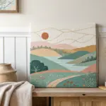
Go Wide With a Cinemascope Landscape
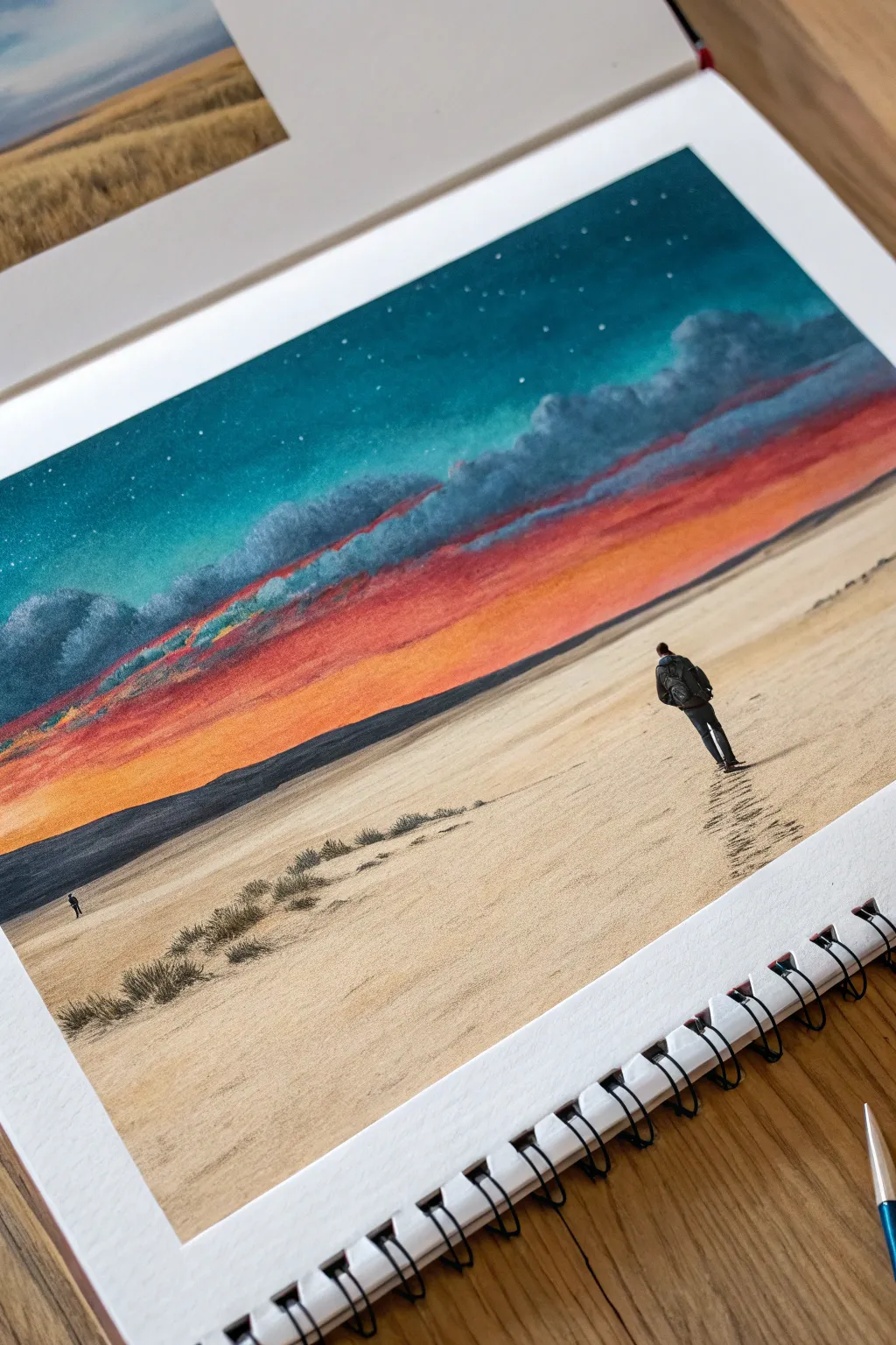
Capture the epic scale of cinema in your sketchbook with this vibrant desert landscape painting. By blending saturated sunset hues with vast negative space, you’ll create a striking sense of solitude and wonder.
How-To Guide
Materials
- Heavyweight sketchbook paper (mixed media or watercolor)
- Gouache or acrylic gouache paints
- Flat shader brushes (medium and large)
- Fine liner brush (size 0 or 00)
- Colored pencils (black, charcoal, sandy brown)
- Masking tape
- Mixing palette
- Jar of water
Step 1: Setting the Scene
-
Tape the borders:
Begin by taping off a clean rectangular border on your sketchbook page using masking tape. This will give that crisp, cinema-screen look once peeled away. -
Sketch the horizon:
Lightly sketch a low horizon line about one-third of the way up the page. Keep it slightly diagonal to add dynamic tension to the composition. -
Block in the sand:
Mix a warm, pale beige using white, yellow ochre, and a tiny dot of brown. Paint the entire foreground area below your horizon line with even, horizontal strokes.
Step 2: Painting the Sky
-
Start with the glow:
For the sky, work from the horizon up. Mix a vibrant orange-yellow and paint a thick band just above the distant hills, blending it slightly upward into a pure orange. -
Add the red band:
While the orange is still slightly tacky, mix a bold scarlet red. Paint the next band upward, carefully blending the transition zone to create a seamless gradient. -
Create the upper atmosphere:
Mix a deep teal or turquoise color. Paint the top third of the sky, bringing it down to meet the red section. -
Paint the cloud layer:
Mix a dark, stormy purple-grey. Using a smaller brush, dab in a rugged line of clouds right where the red meets the teal, softening the upper edges to make them look fluffy but heavy. -
Add stars:
Once the teal section is bone dry, mix white paint to a thin, ink-like consistency. Use a small brush to dot in tiny stars, clustering a few for realism.
Muddy Gradients?
If your sunset colors turn brown where they meet, let the first layer dry completely. Then, apply a thin wash of the intermediate color (like orange) over the transition zone to blend them.
Step 3: Foreground Details
-
Paint the distant hills:
Mix a dark, desaturated navy or charcoal. Paint the distant mountain range along the horizon line, keeping the bottom edge sharp against the sand and the top edge undulating. -
Texture the sand:
Switch to a dry brush technique with a slightly darker beige tone. Lightly drag the brush horizontally across the sand to create subtle texture and wind-swept lines. -
Add vegetation:
Using a very small brush or a dark colored pencil, draw small, scrubby bushes in the lower left foreground. Keep these loose and irregular. -
Draw the main figure:
With a fine liner brush and black paint (or a black pen), draw the silhouette of the hiker. Place them on the right side, walking away into the distance to emphasize scale. -
Add the secondary figure:
Paint a tiny, microscopic silhouette of a second person far in the distance on the left to exaggerate the vastness of the landscape.
Add Cinematic Grain
Once dry, lightly rub the entire painting with a dry tissue or textured cloth. This subtle abrasion mimics the ‘film grain’ look of old movie reels
Step 4: Final Touches
-
Create footprints:
Mix a diluted brown paint. Use the tip of your brush to dab a trail of footprints leading from the bottom right corner up to the main figure’s feet. -
Cast shadows:
Add a small, elongated shadow stretching to the left of the main figure, consistent with the light source coming from the right. -
Peel the tape:
Wait until everything is completely dry. Slowly peel the masking tape away at a 45-degree angle to reveal your clean edges.
Step back and admire the grand atmosphere you’ve captured in such a small space


Paint Motion With Action Blur Strokes
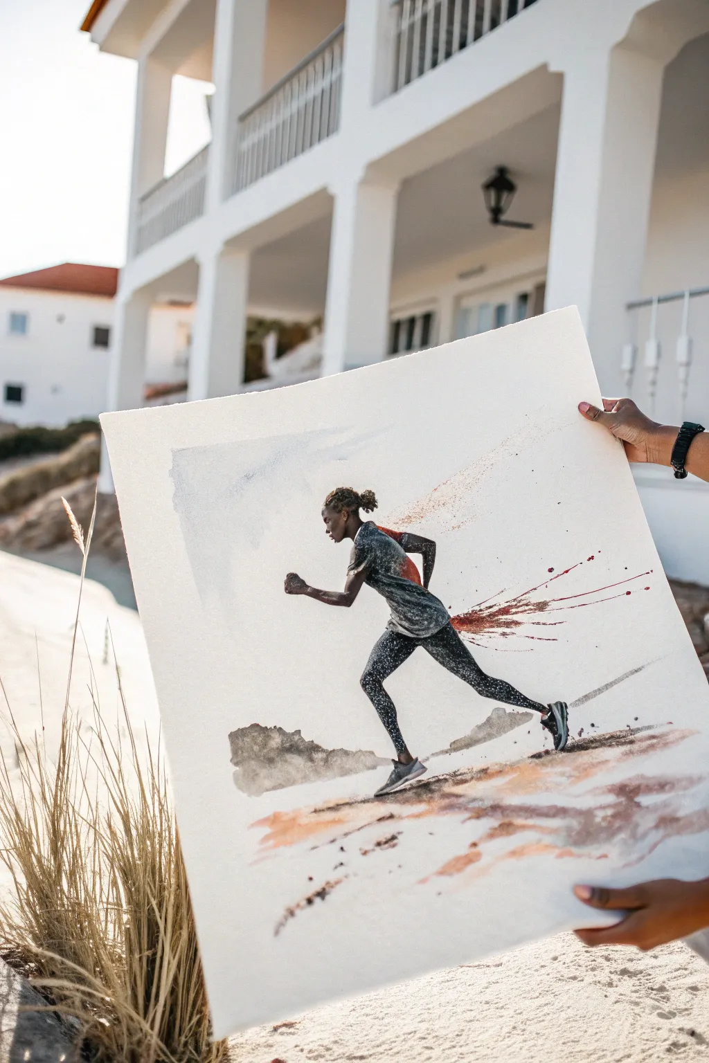
Capture the raw energy of a sprint with this dynamic mixed-media painting that combines precise anatomy with explosive, abstract motion. The resulting artwork uses textured darks and sweeping crimson splatters to convey the feeling of speed frozen in time.
Step-by-Step Tutorial
Materials
- Large sheet of cold-press watercolor paper (at least 140lb)
- Black acrylic ink or high-flow fluid acrylics
- Charcoal sticks (soft and medium)
- Crimson red acrylic ink or watercolor
- Burnt sienna and raw umber watercolor paints
- Round synthetic brushes (sizes 4 and 8)
- Large flat brush or hake brush
- Masking fluid (optional)
- Clean water containers
- Paper towels
- Old toothbrush for splatter
Step 1: Drafting the Motion
-
Establish the curve:
Begin with a very light pencil or charcoal sketch to map out the runner’s posture. Focus on the forward lean and the extension of the legs to ensure the figure looks unbalanced and propelled forward. -
Define the anatomy:
Refine the sketch, paying close attention to the muscle definition in the calves and thighs. Keep your lines loose; you don’t want a stiff outline, just a guide for where the dark values will go. -
Masking highlights:
If you want to preserve pristine whites for the sunlit edges of the figure, apply a thin line of masking fluid along the top of the shoulders and head. Allow this to dry completely before proceeding.
Uneven Splatter?
If your paint splatters are looking too blobbish, your mixture is likely too thick. Thin the ink slightly with water and test on a scrap paper until you get fine, sharp droplets.
Step 2: Building the Figure
-
Base tonal wash:
Mix a diluted grey wash using black ink and water. Paint the runner’s skin and clothing, intentionally leaving gaps for highlights to suggest sunlight hitting the form. -
Deepening the blacks:
While the first layer is semi-dry, go in with undiluted black ink or heavy fluid acrylic. Focus on the shadows of the clothing folds and the underside of the limbs to create volume. -
Adding texture with charcoal:
I like to take a piece of soft charcoal and draw directly into the damp paint on the clothing. This creates a gritty, textural quality that mimics the fabric and adds visual weight to the runner. -
Creating the speckled effect:
Load a stiff brush or toothbrush with white acrylic ink or gouache. Use your thumb to flick a fine mist of white specks over the dark clothing areas to give the impression of sweat or metallic fabric sheen.
Level Up: Metallic accents
Mix a small amount of gold or bronze ink into your ground wash. The shimmering particles will make the ‘dust’ look like it’s catching the sunlight.
Step 3: Unleashing the Speed
-
The crimson blur:
Load a medium round brush with crimson red ink. Apply it to the back of the runner’s shirt, then immediately drag the pigment backward horizontally using a dry brush to create a ‘swish’ motion. -
Controlled splatter:
Dip a brush into the red ink again. Hold it near the paper’s surface behind the runner and tap the handle sharply against another brush. Direct the splatter backward to simulate a trail of broken air. -
Extending the trail:
Use a very fine liner brush to pull thin, energetic lines out from the red splatter zone. These lines should taper off into nothingness, emphasizing the direction of travel.
Step 4: Grounding the Scene
-
Shadow shapes:
Mix a watery grey-black and paint a loose, abstract shape beneath the runner’s feet for a shadow. Don’t paint a realistic shadow; just a suggestion of contact with the ground is enough. -
The horizon wash:
Prepare a very dilute wash of burnt sienna and raw umber. With a large flat brush, sweep horizontal strokes across the bottom third of the paper to suggest arid, dusty terrain. -
Adding ground debris:
Drop darker pigment (burnt umber mixed with black) into the wet ground wash. Let these spots bloom naturally to create look of rocks and uneven dirt texture. -
Distant mountains:
Using a pale grey wash, paint a simple, jagged shape in the background. Keep edges soft so it recedes visually, ensuring the sharp, dark figure remains the focal point. -
Atmospheric sky:
Wet the upper left corner of the paper with clean water. Drop in a hint of diluted slate blue or cool grey, tilting the paper to let it drift diagonally, hinting at clouds without overworking it.
Step 5: Final Motion Details
-
Foot blur:
Soften the edges of the back foot. Use a damp brush to gently scrub the heel area, pulling a tiny bit of pigment backward to show the rapid lifting motion of the stride. -
Highlight recovery:
If you used masking fluid, rub it away gently to reveal the crisp white paper. If not, use opaque white gouache to add sharp rim lighting to the top of the head and shoulders. -
Final assessment:
Step back and look at the composition. If the motion feels static, add a few more horizontal splatters or dry-brush streaks trailing behind the figure to reinforce the speed.
Hang your artwork in a space where you need a daily reminder of momentum and drive
Add a Made-Up Film Quote in Lettering
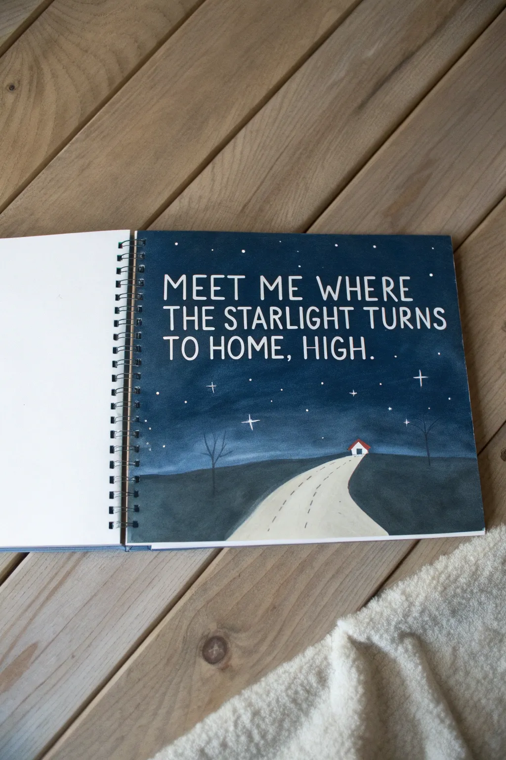
Capture a moody, cinematic moment with this mixed-media sketchbook page that pairs a deep night sky with striking white lettering. This project combines acrylic gouache layering with precise pen work to create an evocative scene perfect for your favorite movie quotes.
How-To Guide
Materials
- Spiral-bound sketchbook (heavyweight paper)
- Acrylic gouache paints (Navy Blue, Black, White, Burnt Umber)
- Flat shader brush (approx. size 6 or 8)
- Small round detail brush (size 0 or 1)
- White gel pen or fine-tip white paint marker
- Pencil and eraser
- Ruler
- Palette or mixing plate
- Water cup and paper towels
Step 1: Planning and Sketching
-
Tape the edges:
If you want clean borders or just want to protect the spiral binding, place a strip of washi or painter’s tape along the left edge near the coil. This keeps your binding clean while you paint. -
Establish the horizon:
Using a pencil, lightly draw a curved horizon line about one-third of the way up from the bottom of the page. This separates your ground from your sky. -
Sketch the road:
Draw two converging lines starting near the bottom center-right and meeting at a point on the horizon line to create a winding road perspective. -
Place the house:
Sketch a tiny house silhouette right at the end of the road where it touches the horizon. Keep it simple—just a small rectangle with a triangle roof. -
Draft the lettering:
Lightly letter your quote in the sky area. Use a ruler to keep your lines straight if needed, but a hand-lettered look adds charm. Leave plenty of space around the letters.
Opaque Lettering
Does your white pen look transparent on the dark blue? Don’t press harder. Instead, let the first layer of ink dry completely, then retrace the letters. Light layers build brightness better than heavy pressure.
Step 2: Painting the Background
-
Mix the sky color:
Create a deep midnight blue by mixing navy blue with a tiny touch of black. The goal is a rich, dark color that will make the white text pop. -
Paint around the letters:
Carefully paint the sky area using your flat brush. You can withstand painting over your pencil lines if the paint is opaque enough, but I prefer to paint carefully around the text area if I’m using less opaque paint. For acrylic gouache, you can just paint the whole sky solid and re-letter later, which is often easier. -
Blend the horizon:
While the sky paint is still slightly wet near the horizon, lighten your mix slightly with a speck of white to create a subtle atmospheric glow just above the ground line. -
Paint the ground:
Mix a dark grey-brown for the grassy areas. Apply this to the hills on either side of the road using horizontal strokes to simulate land. -
Fill the road:
Paint the road surface with a creamy off-white or light beige color. One coat should be enough, but apply a second if the paper texture shows through too much. -
Detail the house:
Use your smallest brush to paint the house white, and once dry, add a tiny red roof for a pop of color.
Uneven Coverage?
If your night sky looks streaky, the paint was likely too thin or you brushed over drying areas. Apply a second coat using slightly more paint on the brush, moving in smooth horizontal strokes.
Step 3: Details and Lettering
-
Add road markings:
Using a very fine brush or a thin black pen, add dashed lines down the center of the road to guide the eye toward the house. -
Paint the trees:
With watered-down black or dark grey paint and your detail brush, paint two delicate, bare trees on either side of the road. Use light, flicking motions for the branches. -
Dry completely:
Ensure the entire background is bone dry before starting the lettering. If it’s cool to the touch, give it a few more minutes. -
Letter formatting:
Using your white gel pen or paint marker, carefully write out your quote. If you painted over your sketch, re-pencil the guides lightly first. Go over each stroke twice to ensure maximum opacity. -
Create the stars:
Dot the sky with your white pen to create stars. Vary the pressure to make some stars tiny and others larger. -
Add starbursts:
Select three or four dominant stars and draw a simple cross shape through them to create a twinkling ‘starburst’ effect. -
Final touches:
Erase any visible pencil marks once the ink is totally dry, and remove your edge tape.
Now you have a beautifully moody scene that perfectly frames your cinematic quote
Do a Pop-Art Star Portrait (Without Likeness)
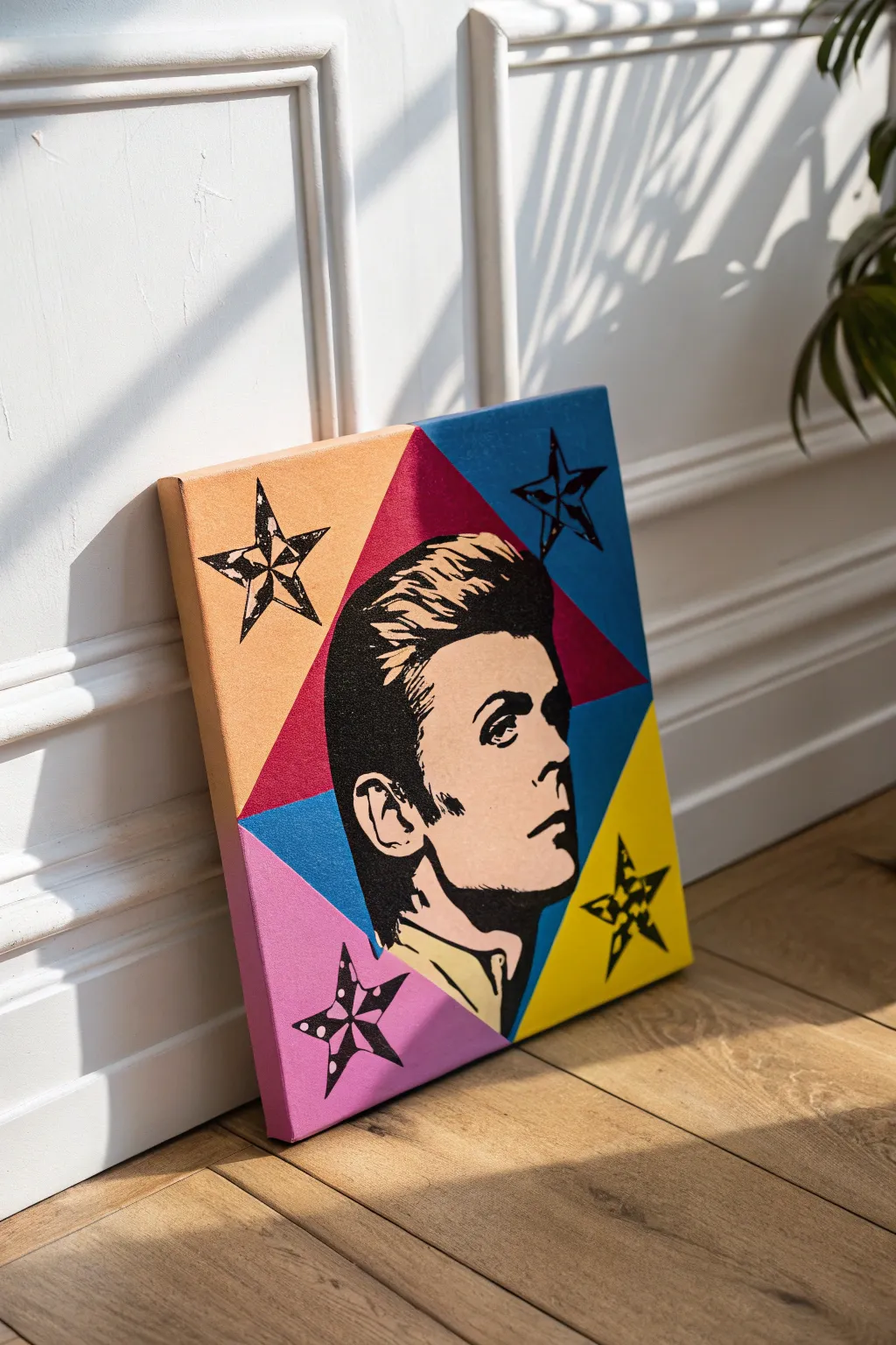
Bring a touch of glam rock into your home with this stylized pop art portrait featuring iconic geometric shapes and bold, contrasting colors. This project combines sharp lines with high-contrast stenciling techniques to create a striking piece that looks professionally printed.
Step-by-Step Tutorial
Materials
- Square stretched canvas (approx. 12×12 or 16×16 inches)
- Acrylic paints (Titanium White, Mars Black, Cadmium Yellow, Cyan or Phthalo Blue, Magenta, Orange)
- Painter’s tape (various widths, preferably artist grade)
- High-contrast photo reference of David Bowie (or chosen subject)
- Graphite transfer paper or soft pencil for tracing
- X-Acto knife with fresh blades
- Self-healing cutting mat
- Cardstock or acetate sheets (for stencils)
- Flat synthetic brushes (medium and large)
- Small round detail brush (size 0 or 1)
- Ruler
- Pencil
Step 1: Planning the Layout
-
Prepare the reference:
Start by selecting a photo of your subject—like this classic Bowie profile. Use photo editing software to threshold the image, turning it into a high-contrast black and white graphic with no gray tones. Print this to the size of your canvas. -
Mark the center:
Find the exact center of your canvas using a ruler and lightly mark it with a pencil. This will point where your background triangles meet. -
Draw the background grid:
Draw diagonal lines from corner to corner, intersecting at your center mark. Then, draw horizontal and vertical lines through the center if you want a more complex starburst, though this specific design focuses on large triangular quadrants.
Bleeding Lines?
If paint bleeds under tape, wait for it to dry fully. Then, gently scrape the excess away with a craft knife or paint over the mistake with the original background color.
Step 2: Painting the Background
-
Tape the first sections:
Apply painter’s tape along your pencil lines to mask off the areas you won’t be painting immediately. Focus on non-adjacent triangles first (e.g., the top blue and bottom right yellow) to prevent wet paint from bleeding. -
Apply base colors:
Paint the exposed triangles with flat, opaque layers of acrylic. You may need two coats of yellow and orange to ensure the white canvas doesn’t show through. Let each coat dry completely. -
Tape and paint remaining sections:
Once the first sections are bone-dry, carefully remove the tape. Re-tape over the painted lines to protect them and paint the remaining triangles (pink and orange). Ensure your brush strokes are smooth to mimic a screen-print look. -
Touch ups:
Remove all tape and inspect your lines. If any paint bled under the tape, use a small flat brush with the appropriate color or a tiny bit of white gesso to tidy up the edges.
Add Some Texture
For a vintage comic look, mix your skin tone with glazing medium and apply it over a subtle pattern of Ben-Day dots stenciled in a slightly darker shade.
Step 3: Creating and Painting the Portrait
-
Create the transfer:
Place a sheet of graphite transfer paper dark-side down on the dry canvas. Position your printed black-and-white reference image on top and tape it securely so it doesn’t shift. -
Trace the subject:
Trace the outline of the black shadow shapes on your reference photo with a pencil. Apply firm pressure. Include the facial features, hair details, and the collar. -
Paint the skin tone:
Mix a flat, comic-book style flesh tone using white, a drop of orange, and a tiny speck of yellow. Carefully paint the face area inside the hair outline, avoiding the areas you marked as deep black shadows if possible, though painting over them is fine since black covers well. -
Block in the black areas:
Using a medium round brush and slightly thinned Mars Black acrylic, fill in the large shadow areas of the hair and neck. I find thinning the paint slightly helps it flow better for sharp edges. -
Refine facial details:
Switch to your smallest detail brush for the eyes, lips, and ear details. These high-contrast shapes define the likeness, so take your time to get the shapes accurate to your transfer lines.
Step 4: Adding the Stars
-
Make a star stencil:
Draw or print a five-pointed star onto cardstock. Cut it out carefully with an X-Acto knife. -
Position the stars:
Place your stencil in the corners of the canvas. You can vary the rotation for a dynamic feel. Lightly trace the star shape with a pencil. -
Paint the stars:
Fill in the stars with black paint. For the distressed look seen in the example, don’t fill them perfectly solid—leave tiny speckles of the background color showing through, or scuff the wet paint slightly with a dry bristly brush. -
Add inner details:
Once the black stars are dry, use a white paint pen or a liner brush with white paint to add the internal geometric lines or dots inside the stars for that extra pop-art flair.
Hang your bold new artwork and enjoy the retro energy it brings to the space
Remix a Scene Into a New Season or Holiday
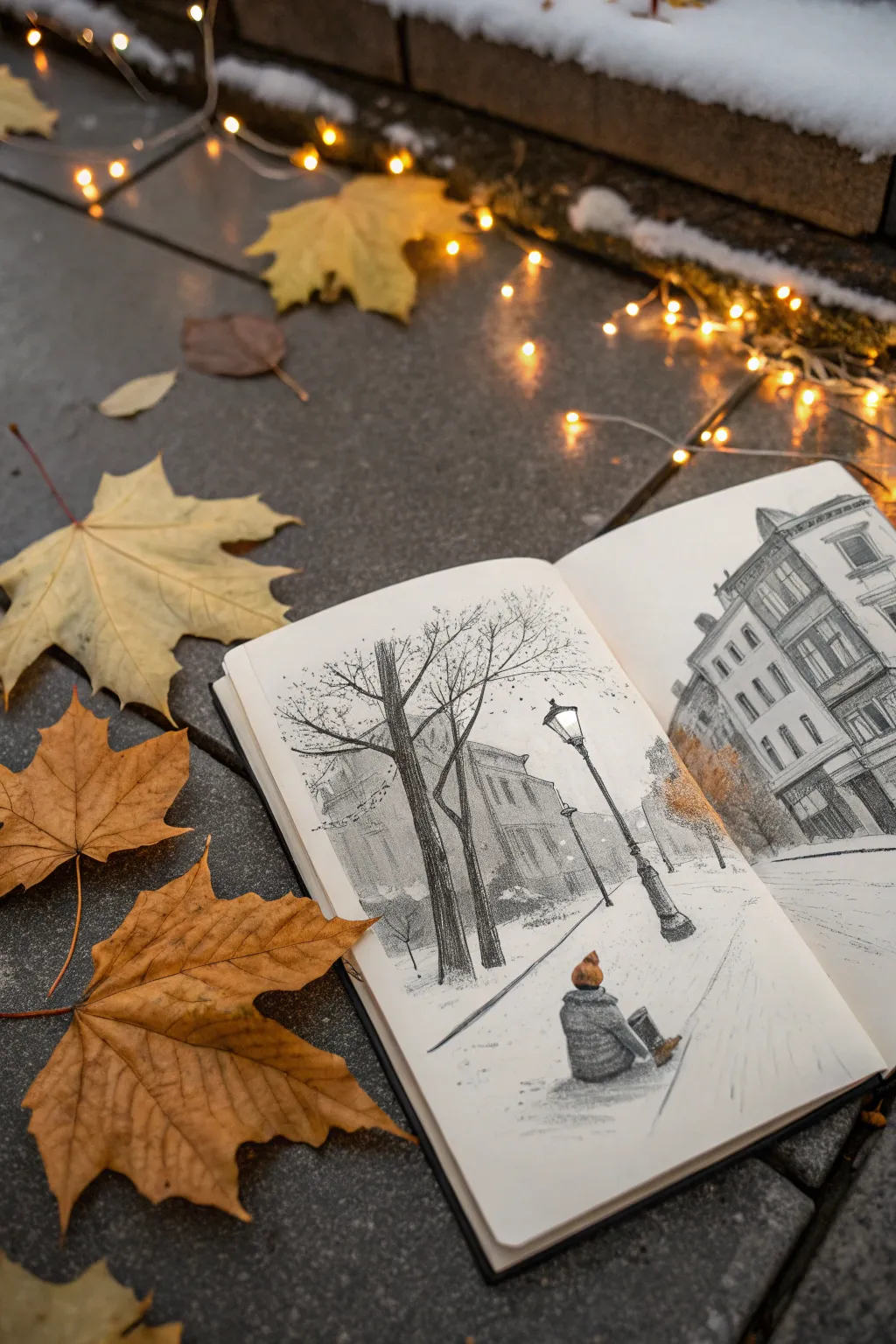
Transform a classic movie street scene into a cozy winter vignette with this graphite and charcoal sketchbook project. By focusing on atmospheric perspective and texture, you’ll create a drawing that feels cold to the touch but inviting to the eye.
Detailed Instructions
Materials
- Hardbound sketchbook (smooth or vellum finish)
- Graphite pencils (2H, HB, 2B, 4B)
- Charcoal pencil (medium or soft)
- Kneaded eraser
- Blending stump or tortillon
- Ruler (optional)
- White gel pen or gouache (for snow details)
Step 1: Laying the Urban Foundation
-
Establish the perspective:
Begin lightly with a 2H pencil to map out your street’s perspective. For this scene, use a one-point perspective where the buildings and sidewalk lines converge toward a single vanishing point in the distance. -
Block in the architecture:
Sketch the basic geometric shapes of the buildings on the right side. Don’t worry about windows yet; just get the height and width of the facades correct relative to the street size. -
Position key elements:
Mark the vertical line for the prominent lamppost in the foreground and the rough shapes for the bare trees on the left. Place a simple rounded shape where the sitting figure will be. -
Refine building details:
Switch to an HB pencil to define the architectural details. Draw the window frames, rooflines, and decorative molding on the buildings. Keep the lines near the back lighter to create depth. -
Construct the lamppost:
Detail the vintage lamppost, giving it a sturdy base and an ornate lantern top. This dark vertical element will serve as a high-contrast anchor for your composition.
Step 2: Creating Atmosphere and Texture
-
Render the trees:
Use a 2B pencil to draw the tree trunks. Texture the bark with small vertical strokes, then branch out into fine, spindly twigs that reach over the street. The branches should look chaotic and organic compared to the rigid buildings. -
Shade the buildings:
Apply shading to the buildings using diagonal hatching. To suggest distance, let the buildings further away remain slightly lighter and less detailed than the ones in the foreground. -
Detail the figure:
Focus on the small sitting figure. Use a 4B pencil to heavily shade their coat and hat, creating a dark silhouette against the white ground. Add a small pop of orange pencil or pastel to the hat if you want that subtle accent shown in the example. -
Add structural shadows:
Deepen the shadows underneath the eaves of the roof and inside the window frames. This high visual contrast makes the drawing feel crisp and realistic. -
Introduce charcoal depth:
I like to bring in a charcoal pencil here for the darkest blacks. Carefully darken the tree trunk nearest the viewer and the lamppost to push them into the foreground.
Muddy Shadows?
If your pencil shading looks messy or shiny, press lighter. Layer graphite gradually rather than pressing hard. Use a piece of scrap paper under your hand to prevent palm smudging.
Step 3: The Finishes Touches of Winter
-
Smooth the ground:
Use a clean blending stump to lightly smudge some graphite on the ground area. This shouldn’t be dark; just a very faint grey wash to suggest the texture of trodden snow. -
Cast soft shadows:
Draw long, diffuse shadows casting from the trees and lamppost across the snowy street. Keep edges soft, as snow reflects light and softens shadow boundaries. -
Texture the snow:
Add tiny, minimal marks on the ground to indicate footprints or uneven snowpack. Less is more here; you want to preserve the white of the paper. -
Add falling snow:
Using a white gel pen or a tiny dot of white gouache, add snowflakes falling against the darker areas of the buildings and trees. Vary the size of the dots slightly for realism. -
Final clean up:
Use your kneaded eraser to pick up any stray graphite smudges from the sky area or the brightest patches of snow, ensuring the whites remain crisp and cold.
Warm It Up
Contrast the cold grey pencil tones by adding small touches of colored pencil. A warm yellow in the streetlamp or a red scarf on the figure makes the winter scene feel even colder.
Now you have a captured a quiet, snowy moment that brings a cinematic feel to your sketchbook pages
Paint Three Color Grades of the Same Scene
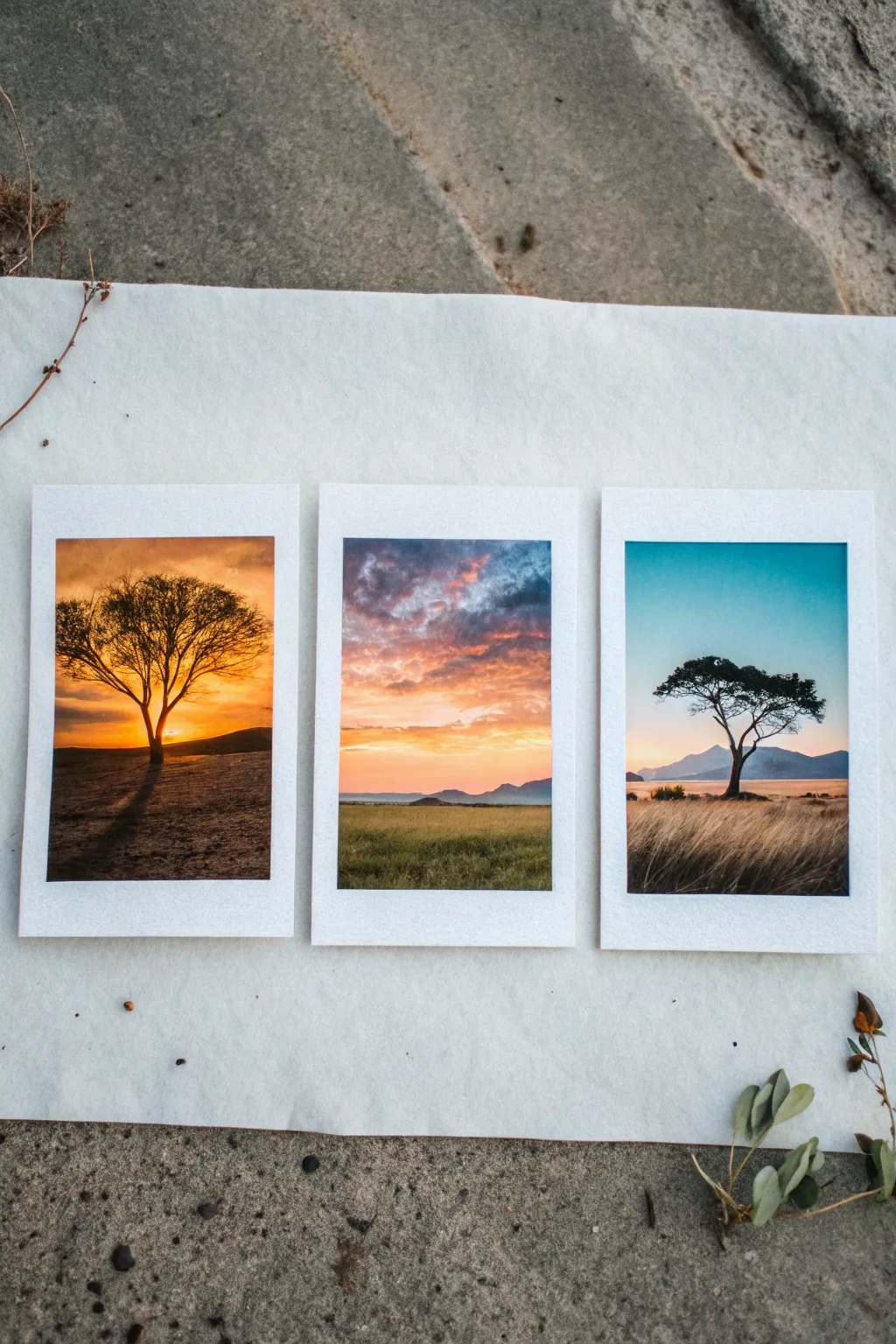
Enhance your color theory skills with this trio of landscape studies, each capturing the same serene savanna setting under vastly different lighting conditions. By shifting shifting palettes from warm amber to soft violet and cool teal, you’ll learn how color grading completely transforms the mood of a scene.
Step-by-Step Guide
Materials
- Heavyweight watercolor paper or mixed media paper (300gsm)
- Masking tape or painter’s tape
- Gouache or acrylic paints (prefer gouache for the matte finish)
- Flat brushes (small and medium)
- Fine liner brush (size 0 or 00 for details)
- Palette for mixing
- Ruler
- Pencil
- Water cups and paper towels
Step 1: Preparation & Layout
-
Paper Setup:
Cut your watercolor paper into three identical rectangles, roughly 4×6 inches each. Alternatively, work on one large sheet and cut them later. -
Border Taping:
Using your masking tape, tape down the edges of each rectangle to a board. Ensure you leave a consistent 1/2-inch border covered by tape to create that classic instant-photo white frame. -
Composition Sketch:
Lightly sketch the same simple composition on all three panels: a flat horizon line about one-third up from the bottom, a distant mountain range, and a focal acacia tree. -
Variation Planning:
Mentally assign a mood to each panel: Panel 1 is ‘Golden Hour’ (oranges/yellows), Panel 2 is ‘Dusk’ (pinks/purples/blues), and Panel 3 is ‘Cool Daylight’ (teals/blues/tans).
Step 2: Painting the Skies
-
Golden Hour Gradient (Panel 1):
Mix cadmium orange, yellow ochre, and a touch of white. Start at the horizon with the brightest yellow-orange and blend upwards into a deeper burnt sienna or rust color at the top. -
Dusk Clouds (Panel 2):
Create a soft gradient using indigo blue at the top fading into a pale lavender. While wet, dab in streaks of salmon pink and soft orange near the horizon to mimic setting sun clouds. -
Clear Teal Sky (Panel 3):
Mix a crisp cyan or turquoise with plenty of white. Paint a smooth, flat wash from the top down, fading slightly to nearly white at the horizon line.
Master the Glaze
To fix a color grade that feels ‘off’, apply a very watered-down wash of your main color (like thin orange) over the entire dried painting to unify the tones instantly.
Step 3: Landscapes & Silhouettes
-
Ground Layer (Panel 1):
For the golden scene, mix burnt umber with a bit of black. Paint the ground in horizontal strokes, ensuring the area closest to the horizon is slightly lighter to suggest distance. -
Ground Layer (Panel 2):
Use a muted olive green mixed with a bit of the sky’s purple for the grass. This creates color harmony. Keep the strokes somewhat rough to simulate grassy textures. -
Ground Layer (Panel 3):
Paint the foreground in dry, beige tones—think raw sienna mixed with white. I like to dry-brush this part to capture the texture of long, dry grasses. -
Mountain Ranges:
Paint the distant mountains on all three panels. Use a darker version of the sky color for each respective panel (dark orange, dark violet, dark blue) to push them into the background.
Bleeding Borders?
If paint bled under your tape, don’t panic. Wait for it to dry completely, then use a white gel pen or a small flat brush with thick white acrylic to touch up the edges.
Step 4: The Focal Trees
-
Tree Structure:
Switch to your fine liner brush. Mix a solid black or very dark brown. Paint the trunk first, keeping it thin and slightly crooked for a natural look. -
Branches:
Extend branches outward horizontally, forming the classic flat-topped acacia shape. Make the lines extremely delicate. -
Foliage Texture:
Stipple the leaves on top of the branches. For the golden panel, use black for a silhouette effect. For the teal panel, you can use a dark mossy green. -
Cast Shadows:
Add long, horizontal shadows stretching from the tree trunk. Panel 1 requires a long shadow toward the viewer; Panels 2 and 3 can have softer, diffused shadows.
Step 5: Finishing Touches
-
Peeling the Tape:
Wait until the paint is bone dry. Carefully peel the masking tape away at a 45-degree angle to reveal the crisp white borders. -
Final Assessment:
Arrange the three paintings side-by-side to check the color grading. If one looks too dull, add a quick glaze of the dominant color to unify it.
Display these side-by-side to show off the dramatic impact of color choice on a single landscape composition
Make a Mini Storyboard Painting Series
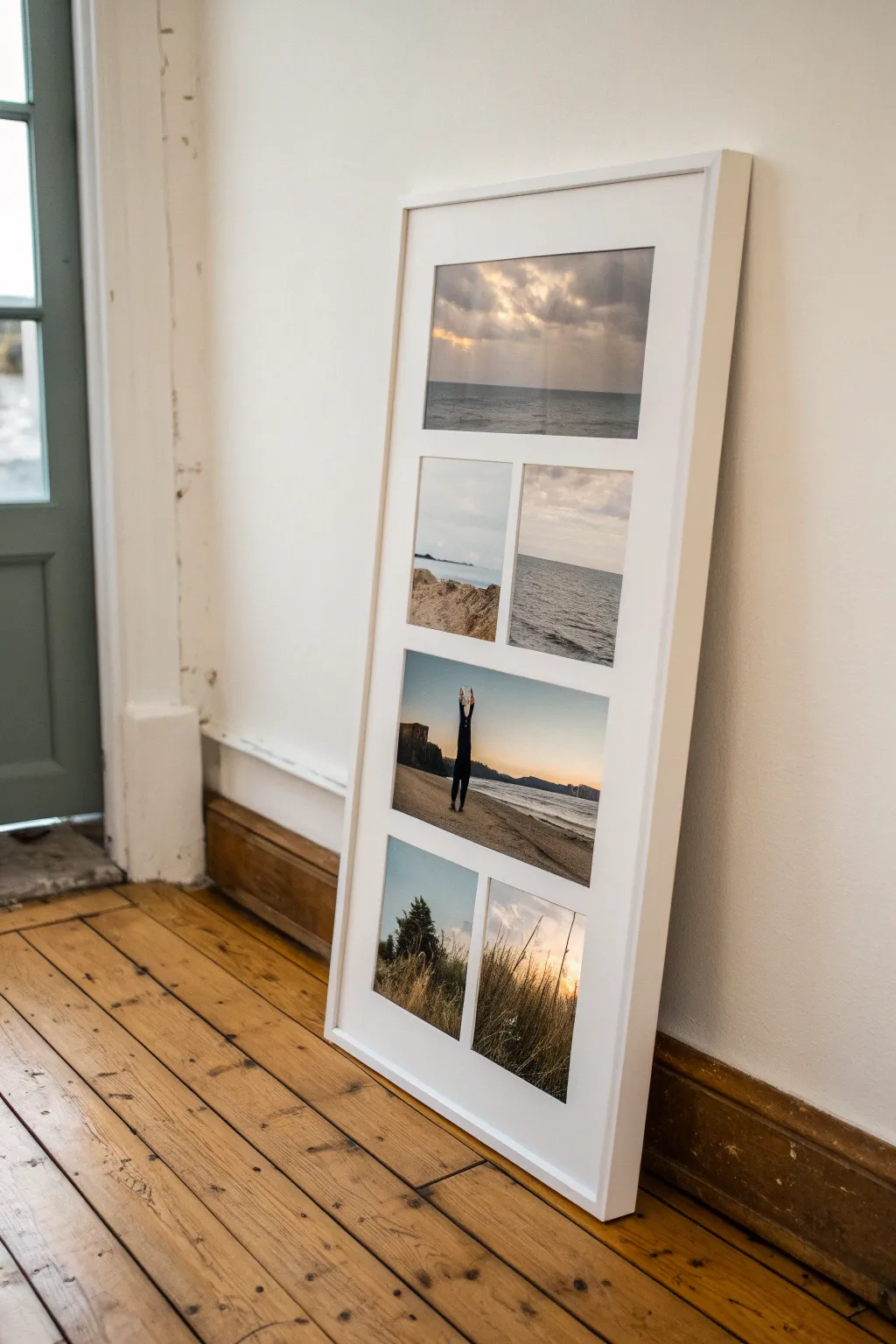
Transform fleeing moments into a cohesive narrative with this multi-panel storyboard project. By combining five distinct yet thematically linked images into a custom layout, you recreate the nostalgic feel of film stills in a sleek, modern display.
Step-by-Step Tutorial
Materials
- Large white picture frame (approx. 12×24 inches or similar ratio)
- Heavyweight white mat board or cardstock
- X-Acto knife or mat cutter
- Metal ruler
- Cutting mat
- Pencil
- Double-sided archival tape or photo mounting squares
- High-quality photo prints (5 total: 1 landscape, 4 smaller portrait/squares)
- Glass cleaner and microfiber cloth
Step 1: Planning the Narrative
-
Select your sequence:
Choose five images that tell a story or share a strong visual theme. For a cinematic look, mix wide establishing shots (like a horizon) with detail shots (like textures) and action shots (a figure in silhouette). -
Determine the layout:
Measure the inner dimensions of your frame. Sketch a layout on scratch paper that features a large establishing shot at the top, a middle row of two smaller images, a wide central action shot, and a bottom row of two details. -
Size your prints:
Based on your sketch, resize your digital images to fit the specific openings you planned. I like to leave an extra 1/4 inch on all sides of each print to make mounting easier later.
Uneven Cuts?
If your mat windows have jagged edges, don’t panic. Use a bone folder or the back of a spoon to burnish the edge smooth. If it’s still rough, fine-grit sandpaper (300+) gently rubbed on the edge fixes it.
Step 2: Creating the Custom Passepartout
-
Measure the mat board:
Cut your white mat board to the exact dimensions of your frame’s backing board using the metal ruler and X-Acto knife. -
Mark the openings:
Lightly draw the window openings on the back of the mat board. Ensure the borders between images (the gutters) are consistent; 0.5 to 0.75 inches usually looks professional. -
Double-check spacing:
Verify that the top and side margins are equal, though the bottom margin can be slightly larger for visual weight. -
Cut the windows:
Place the board on your cutting mat. Use a sharp new blade to cut out the windows. If you have a mat cutter, cut at a 45-degree angle for a beveled edge; otherwise, a straight 90-degree cut with a steady hand works perfectly for a modern look. -
Clean up edges:
Gently gently sand any fuzzy paper edges with very fine-grit sandpaper or a clean emery board if the cuts aren’t perfectly crisp.
Level Up: Color Grade
Before printing, edit all photos with the same color preset or filter. Desaturating slightly or adding a uniform grain mimics the texture of actual film stock for a cohesive storyboard effect.
Step 3: Mounting and Assembly
-
Position the photos:
Lay your mat face down. Position your photos face down over the openings, adjusting them until the composition looks balanced from the front. -
Secure the top image:
Use archival tape to create a T-hinge at the top of the first large landscape photo. This allows the paper to expand and contract with humidity changes without buckling. -
Mount the middle row:
Align the two smaller ‘split screen’ images carefully. Ensure the horizon lines match if they are part of the same scene, or contrast nicely if they differ. -
Secure the action shot:
Mount the large central image. This is often the focal point of the story, so ensure it is perfectly straight. -
Attach the final row:
Tape down the bottom two detail shots. Check the front of the mat one last time to ensure no white edges of the photo paper are showing. -
Clean the glass:
Remove the glass from the frame and clean both sides thoroughly. Dust is the enemy here, so inspect it against a light source for specks. -
Final assembly:
Place the glass back in the frame, followed by your matted artwork and the backing board. Secure the clips or flex points tightly.
Lean your framed storyboard against a wall or hang it up to showcase your personal cinema moment
Have a question or want to share your own experience? I'd love to hear from you in the comments below!