If you’ve ever wanted a painting to feel bigger, bolder, and more “wow” without tackling one giant surface, multiple canvas paintings are such a fun way to do it. I love how a polyptych instantly turns a simple subject into a statement, just by letting the image dance across a few panels.
Botanical Vines and Leaves
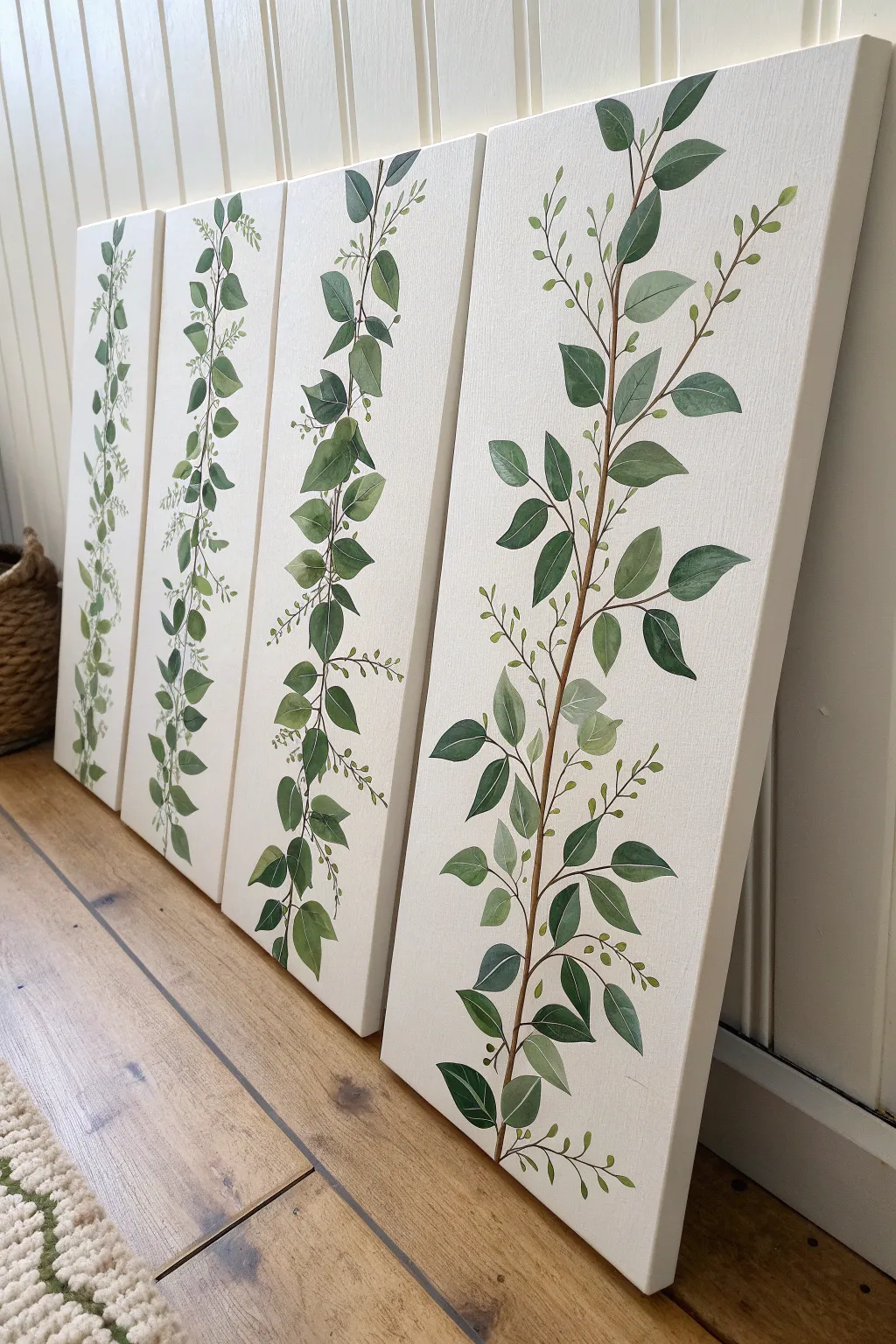
Bring the outdoors in with this elegant four-panel canvas set featuring trailing botanical vines. The minimalist design uses varying shades of green and earthy browns on a soft cream background to create a cohesive, gallery-style installation that adds height and serenity to any room.
Step-by-Step Tutorial
Materials
- 4 tall, narrow stretched canvases (e.g., 10×30 inches or 12×36 inches)
- Acrylic paints: Titanium White, Unbleached Titanium (or Cream), Burnt Umber, Sap Green, Hooker’s Green, Yellow Ochre
- Large flat brush (2-inch width)
- Round brushes (sizes 2, 4, and 6)
- Liner brush (size 0 or 00)
- Palette or paper plate
- Pencil and eraser
- Cup of water and paper towels
- Easel or flat work surface
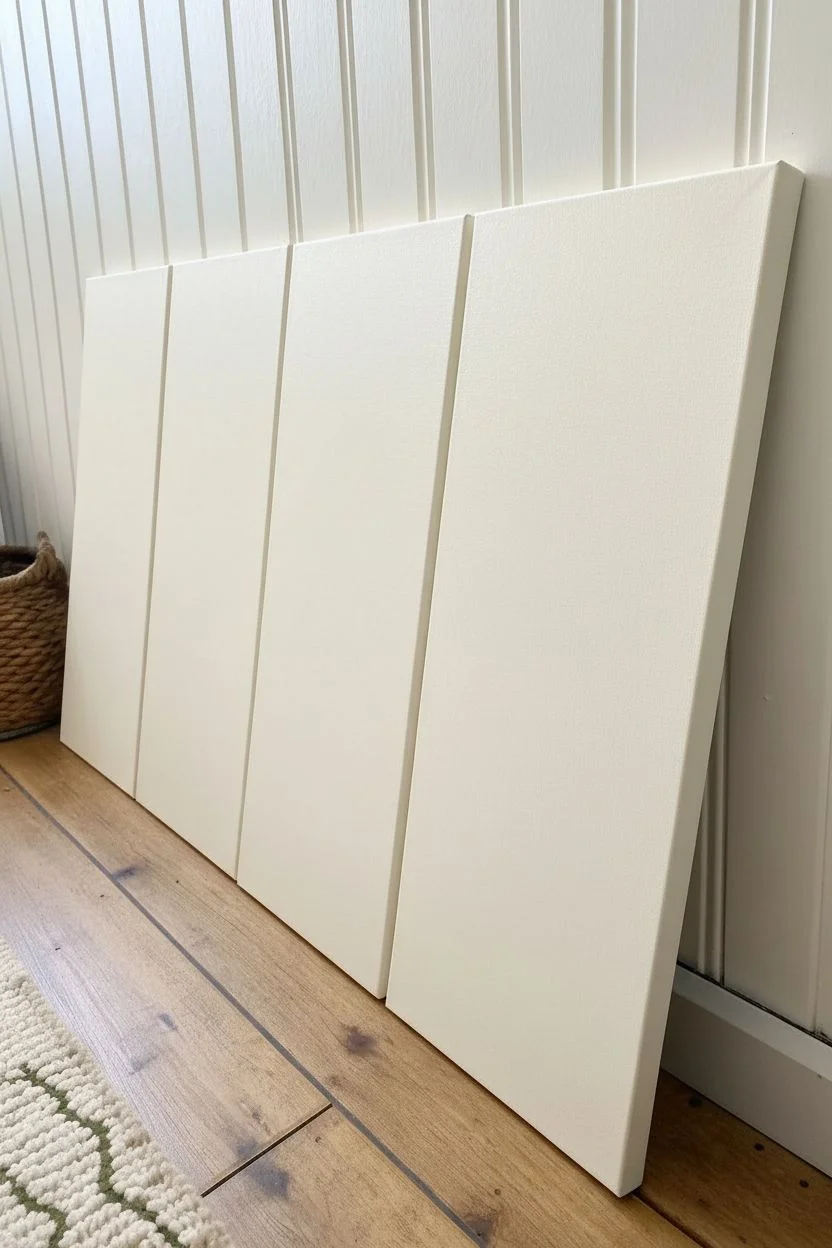
Step 1: Preparing the Background
-
Mix the base color:
Start by creating a perfect off-white base. Mix a generous amount of Titanium White with a touches of Unbleached Titanium to warm it up. If it’s too stark, a tiny dot of Yellow Ochre will give it that vintage botanical paper look. -
Apply the first coat:
Using your large flat brush, apply the cream mixture to all four canvases. Use long, vertical strokes to ensure a smooth finish. Don’t forget to paint the sides of the canvas for a polished, frameless look. -
Sand and recoat:
Allow the first coat to dry completely for about 20-30 minutes. If the texture feels rough, lightly sand it with fine-grit sandpaper, wipe away the dust, and apply a second coat for a truly opaque background.
Natural Flow Tip
Don’t paint every leaf the same size or facing the same angle. Twist your brush slightly as you paint to vary the shapes, giving the vine a wild, organic feel.
Step 2: Sketching the Vines
-
Plan the composition:
Line up your four canvases side-by-side or lean them against a wall as shown in the photo. Think of them as one large surface; the vines shouldn’t necessarily connect perfectly across the gaps, but they should share a similar vertical flow and rhythm. -
Draw the main stems:
With a pencil, lightly sketch a central wavy line traveling from the bottom to the top of each canvas. Vary the curves slightly so no two canvases look identical—nature is rarely perfectly symmetrical. -
Add leaf placement:
Sketch the locations of the leaves branching off the main stem. Alternate them left and right. Aim for a mix of sizes: larger leaves near the visual center or bottom, and slightly smaller, delicate leaves near the top to suggest new growth.
Level Up: Textile Texture
Before painting, apply a light layer of modeling paste with a stencil or coarse brush strokes to the background. This creates a faux-linen texture that mimics vintage botanical scrolls.
Step 3: Painting the Stems
-
Mix the brown tone:
Create a vine color by mixing Burnt Umber with a small amount of Yellow Ochre. You want a warm, woody brown, not a flat dark chocolate color. Add a drop of water to improve the paint flow. -
Paint the main stems:
Use a size 4 round brush to paint over your pencil lines for the main stems. Keep your hand loose. I find it helpful to pull the brush toward me rather than pushing it away for smoother curves. -
Taper the branches:
Switch to a liner brush or size 0 brush for the smaller offshoot branches that will hold the leaves. Press harder at the connection point and lift pressure as you move outward to create a natural taper. -
Add tiny shoots:
While you have the liner brush, add very fine, thin stems near the top and scattered throughout that won’t have fully formed leaves—just tiny buds or bare tips.
Step 4: Adding the Foliage
-
Create a green gradient:
Prepare three shades of green on your palette: a dark ‘shadow’ green (Hooker’s Green + tiny bit of Burnt Umber), a mid-tone green (Sap Green), and a light ‘highlight’ green (Sap Green + White + Yellow Ochre). -
Paint the leaf base:
Using a size 6 round brush, fill in your leaf sketches with the mid-tone green. Start at the stem and press down to widen the stroke, then lift as you reach the leaf tip to create a point. -
Apply shadows:
While the base layer is still slightly wet (or dry, if you prefer hard edges), use the dark green on the bottom half or inner vein area of the leaves. This adds dimension and prevents the pattern from looking like a flat stamp. -
Add highlights:
Clean your brush and pick up the light green mix. Paint strokes on the upper edges or tips of the leaves where sunlight would naturally hit. Don’t overblend; visible brushstrokes add character. -
Paint the tiny buds:
dip your liner brush into the light green or even a pure yellow-green mix. Add tiny dots or small teardrop shapes to the ends of the thinnest branches you painted earlier to represent buds.
Step 5: Final Details
-
Refine the edges:
Step back and look at the composition from a distance. If any leaves look awkwardly shaped, carefully reshape them. You can use your background cream color to ‘erase’ or slim down any stems that got too thick. -
Enhance contrast:
If the leaves feel too flat, take your darkest green (almost black) and add a tiny, thin line for the central vein on the largest leaves only. This anchors the drawing. -
Seal the artwork:
Allow the paintings to dry for at least 24 hours. Because these are illustrative, a matte or satin varnish works best to protect the paint without creating distracting glare.
Hang these canvases with 2-3 inches of space between them to enjoy your new, serene botanical gallery wall

Soft Ombre Gradient Series
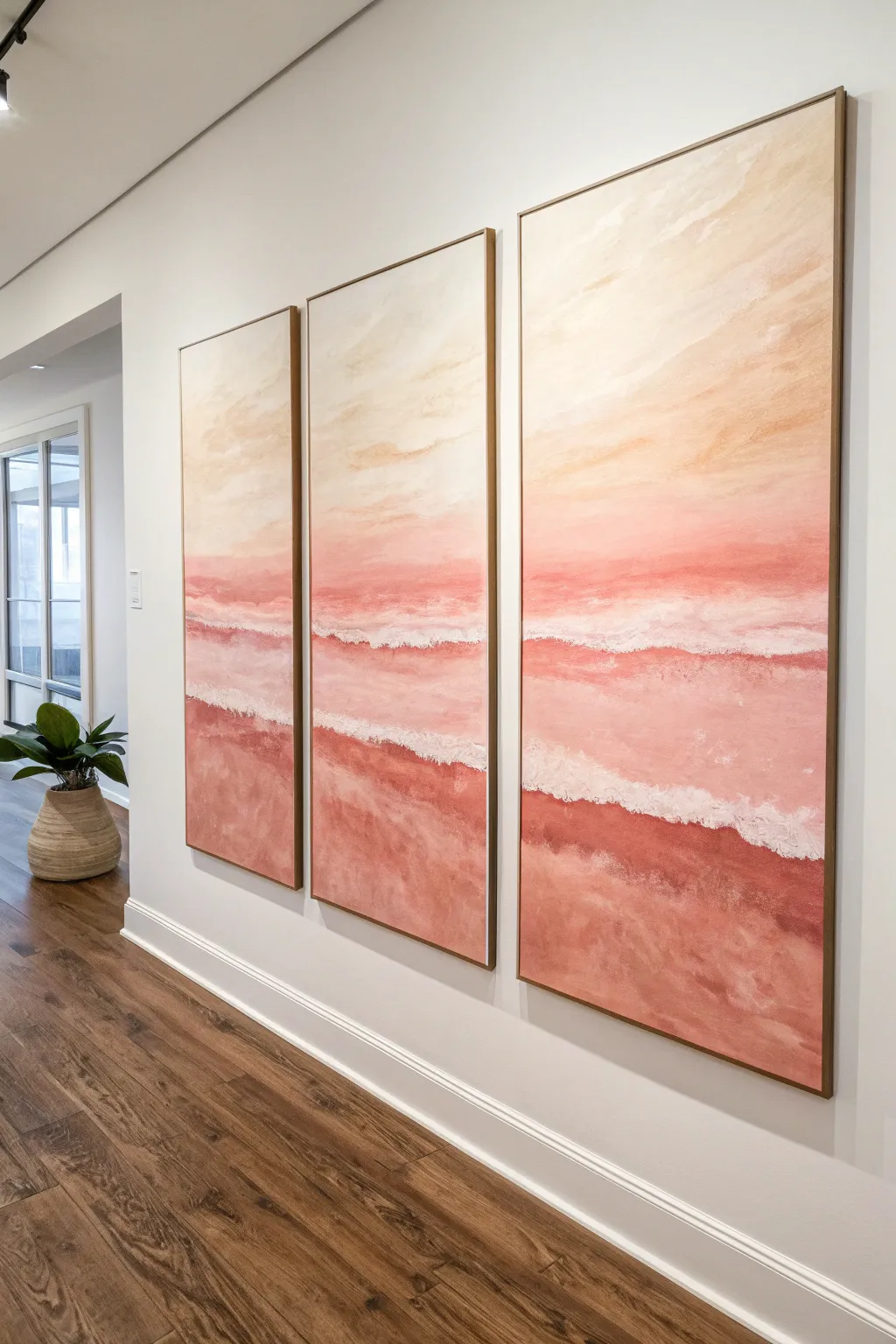
Bring the serene calm of a pink sunset shoreline into your home with this dreamy three-panel abstract series. By using soft ombre blending techniques and textured whites, you’ll create a cohesive coastal statement piece that feels both modern and romantic.
How-To Guide
Materials
- 3 large vertical canvases (e.g., 24×48 inches)
- Acrylic paints: Titanium White, Coral Pink, Burnt Sienna, Yellow Ochre, Deep Rose
- Large flat paintbrushes (2-3 inch)
- Medium round brush
- Palette knife
- Texture medium or modeling paste
- Water spray bottle
- Painter’s tape or drop cloth
- Large mixing palette or disposable plates
- Natural sea sponge (optional)
Step 1: Preparation and Planning
-
Set the Stage:
Lay out all three canvases side-by-side on your workspace or easel setup. It is crucial to paint them simultaneously to ensure the horizon lines and color gradients flow seamlessly from one panel to the next. -
Prime the Surface:
Apply a base coat of gesso or Titanium White to all three canvases. This gives you a fresh, bright surface that will help those coral tones pop. Let this dry completely before moving on. -
Map the Horizon:
Using a very light pencil line or a piece of painter’s tape, mark your horizon line across all three canvases. For this composition, place it slightly below the middle to emphasize the expansive sky.
Fixing Hard Lines
If your color transitions look too stripey, dampen a clean sponge and gently dab the line where two colors meet while they are still tacky. This softens the edge instantly.
Step 2: Painting the Sky Gradient
-
Mix the Upper Sky Color:
Create a pale, creamy beige by mixing a large amount of White with a touch of Yellow Ochre and a tiny dot of Burnt Sienna. This will be the very top section of your sky. -
Apply the Top Layer:
Using your largest flat brush, paint the top third of all three canvases with this creamy mixture. Use long, horizontal strokes that span across the gaps between canvases mentally. -
Mix the Mid-Sky Transition:
Add a small amount of Coral Pink and a touch more White to your previous mix. You want a soft, peachy tone that is slightly warmer than the top layer. -
Blend the Sky Downward:
Paint the middle section of the sky, slightly overlapping with the top beige layer. While the paint is still wet, use a clean, dry brush or a soft mist of water to blur the line between the two colors, creating a soft ombre effect. -
Intensify the Horizon:
For the area just above your horizon line, mix a bolder Coral Pink with a hint of Deep Rose. Apply this right above your pencil line, blending it upward into the peach tone. The sky should get darker and richer as it nears the water.
Step 3: Creating the Ocean and Waves
-
Base the Water:
Below the horizon line, start with a solid band of your deepest Coral Pink mixed with Burnt Sienna. This creates depth where the water meets the sky. -
Create the Gradient Wash:
As you move down the canvas toward the bottom, gradually mix more White and Yellow Ochre into your deep coral color. The bottom of the canvas representing the sand should be a warm, dusty pink-sand color. -
Soften the Transitions:
Use your water spray bottle to keep the acrylics misted. Use a large brush to sweep back and forth horizontally, ensuring the transition from the deep water to the sandy shore is seamless and misty. -
Texture Preparation:
Mix Titanium White paint with your modeling paste or texture medium. I like to keep this mixture quite thick, almost like frosting, to stand up to the palette knife.
Add Subtle Sparkle
Mix a tiny amount of iridescent pearl medium into your white wave foam mixture. It catches the light beautifully and mimics the sun glinting off wet water.
Step 4: Adding the Wave Details
-
Apply the First Wave:
Using the palette knife, scoop up some textured white mix. Apply it horizontally across all three canvases in a broken, organic line about halfway down the water section. Scrape the knife gently to create ‘foam’. -
Add Shoreline Foam:
Apply a second, thicker band of textured white closer to the bottom, where waves would gently lap at the shore. Use the flat side of the knife to drag the texture downward, mimicking the receding water. -
Create Depth in Foam:
While the texture paste is still wet, use a small brush with a tiny bit of watery light pink paint to glaze over parts of the white foam. This adds shadow and dimension so the foam doesn’t look flat. -
Final Blending Checks:
Step back and look at the piece as a whole. If any horizon lines or wave lines don’t match up across the gaps, make small adjustments now with a small brush to connect the visual flow. -
Seal the Artwork:
Once the textured areas are completely dry (this may take overnight due to the modeling paste thickness), apply a coat of satin or matte varnish to protect the surface and unify the sheen.
Hang your new triptych with about two inches of space between each panel to let the scene breathe and expand across your wall
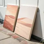


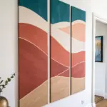
Matched Abstract Pair
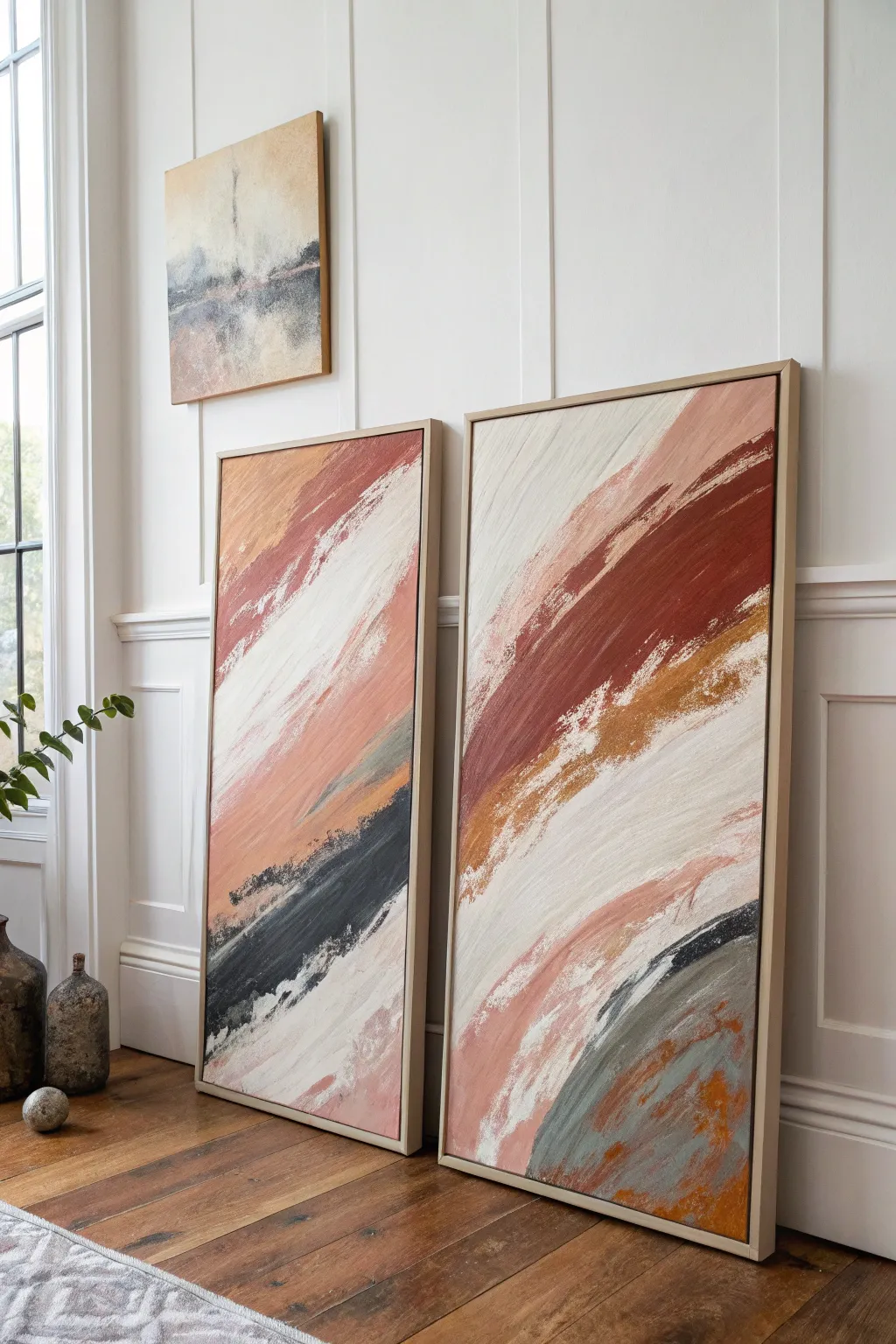
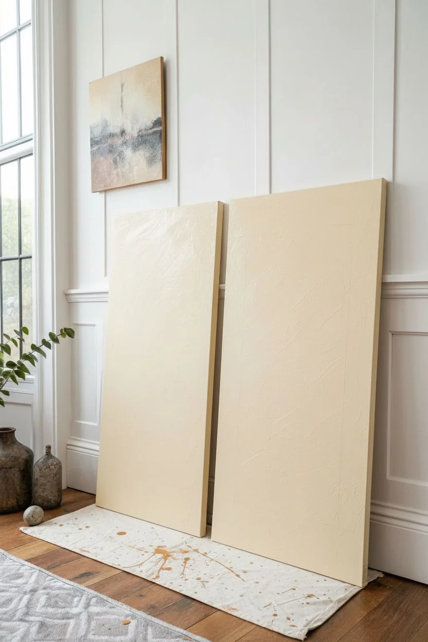
Bring dramatic movement to your space with this pair of large-scale abstract canvases featuring broad, diagonal strokes. The composition uses a sophisticated palette of rusted terracotta, soft peach, cream, and deep slate grey to create a look that feels both grounded and dynamic.
Step-by-Step Tutorial
Materials
- Two large rectangular gallery-wrapped canvases (e.g., 24×36 or larger)
- Acrylic paints (Titanium White, Burnt Sienna, Mars Black, Yellow Ochre, Deep Slate Blue/Grey, Unbleached Titanium)
- Large flat paintbrushes (3-4 inch width)
- Wide palette knife or squeegee tool
- Mixing medium (matte or satin glazing liquid)
- Floating natural wood frames (optional but recommended)
- Drop cloth
- Water container and rags
Step 1: Planning and Base Layers
-
Prepare your workspace:
Lay down your drop cloth and set both canvases upright side-by-side. Seeing them together is crucial because the diagonal lines need to complement each other, creating a sense of flow from one canvas to the next. -
Mix the cream base:
Create a large volume of off-white by mixing Titanium White with a touch of Unbleached Titanium. You want a warm, milky color, not a stark bright white. -
Apply the background:
Using your widest brush, cover both canvases entirely with the cream mixture. Apply it loosely; visible brush texture is actually desirable here, so don’t worry about getting it perfectly smooth. -
Define the diagonal flow:
Visualize a diagonal line running from the top right to bottom left. This project relies on strong diagonal movement. Using a faint pencil line or just your mind’s eye, mark out broad channels where your main colors will go.
Step 2: Building the Color bands
-
Mix the rust tones:
Combine Burnt Sienna with a little Yellow Ochre and a dot of Black to deepen it. You want a distinct terracotta or rust color. Create a second, lighter version by mixing in some of your cream base paint. -
Apply the primary rust stroke:
Load a large brush heavily with the dark rust paint. Starting from the upper right quadrant, pull the brush firmly diagonally down towards the center left. Let the brush run out of paint naturally to create that ‘dry drag’ effect at the edges. -
Add the peach nuance:
Mix a soft peach tone using White, a tiny bit of Burnt Sienna, and yellow. Paint this alongside the darker rust stroke, allowing them to overlap slightly while wet so they blend softly in some areas but stay distinct in others. -
Introduce the dark contrast:
Mix Mars Black with a touch of white and blue to create a charcoal or deep slate grey. On the left canvas specifically, add a bold, thick sweep in the lower third, running parallel to your rust strokes. -
Create the grey-blue accent:
On the right canvas, mirror that lower darkness but use a slightly lighter slate grey. Use a palette knife here to scrape the paint across the surface, creating broken, organic edges rather than smooth brush lines.
Paint Getting Muddy?
If your colors are blending into a brown mess, stop immediately. Let the current layer dry completely before adding the next color stroke. Crisp layers require patience.
Step 3: Refining and Layering
-
Layering white highlights:
Once the color layers are tacky (not fully wet, not fully dry), load a clean dry brush with pure Titanium White. Drag this swiftly over parts of the colored sections. This ‘dry brushing’ technique simulates the weathered look seen in the inspiration image. -
Adding ochre details:
Mix a golden ochre tone. Look for areas where the white and rust meet and dab in small, rugged patches of this gold. It adds warmth and complexity to the transitions. -
Enhancing the texture:
I prefer to use a palette knife to scrape through some of the wet paint layers, revealing the canvas texture or colors underneath. This mimics the rugged, worn aesthetic of the original artwork. -
Balancing the composition:
Step back and look at both canvases from a distance. If one area feels too heavy, layer wide strokes of the cream base color over it to knock it back. The goal is plenty of negative space balanced by bold color. -
Final dry brushing:
Add final swift diagonal marks of very pale peach or off-white to unify the two pieces. Ensure the angles on both canvases feel related, like they belong to the same wind gust. -
Framing:
Once completely dry (allow 24 hours due to the thick paint), install the canvases into natural wood floating frames to achieve that professional gallery finish.
Level Up: Texture Pop
Mix a modeling paste or sand into your rust-colored paint before applying. This adds physical grit and dimension that catches the light beautifully.
Hang your new statement pieces together to transform your wall with modern, earthy elegance


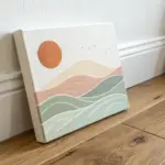
Staggered Step Panel Arrangement
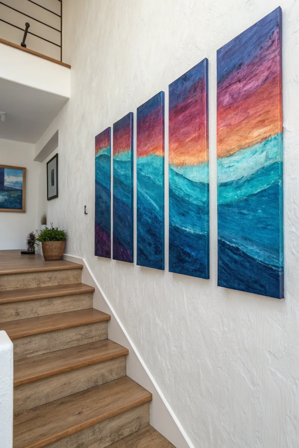
Transform a blank staircase wall into a stunning visual journey with this five-panel ascending canvas set. The artwork features a continuous abstract ocean view that flows seamlessly across staggered heights, mimicking the upward rhythm of the stairs themselves.
How-To Guide
Materials
- 5 Gallery-wrapped relatively narrow canvases (varying heights, same width)
- Acrylic paints: Ultramarine Blue, Phthalo Blue, Teal/Turquoise, Titanium White, Cadmium Orange, Magenta, Deep Purple
- Large flat brushes (2-3 inch)
- Medium round brushes
- Palette knife
- Large blending brush (mop style)
- Water container & paper towels
- Measuring tape & pencil
- Wall mounting hardware
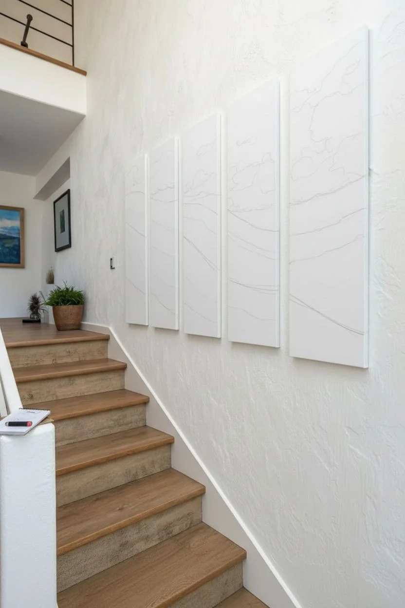
Step 1: Planning and Layout
-
Determine Canvas Sequence:
Before touching a brush, arrange your naked canvases on the floor. Line them up from shortest to tallest (or however you wish them to appear on the wall) to visualize the ‘step’ effect. Leave about 2-3 inches of space between each one to account for the gaps. -
Sketch the Horizon Line:
Lightly draw a continuous horizon line across all five canvases using a pencil. Since the canvases will be hung at different heights, deciding where the horizon sits is crucial; putting it roughly 1/3 down from the top usually creates a balanced composition. -
Outline the Composition:
Sketch the major wave shapes and cloud formations. Ensure the lines ‘jump’ across the gaps logically so the eye connects the image as one cohesive scene when hung.
Edge Consistency
When painting the edges, wrap the image around the side. This ensures the image looks continuous even when viewed from an angle while walking up the stairs.
Step 2: Painting the Sky
-
Top Layer – Deep Sky:
Start at the very top of each canvas with your Deep Purple mixed with a touch of Ultramarine Blue. Apply this dark tone using broad, horizontal strokes. -
Mid-Sky Transition:
Mix Magenta with a little White. Blend this into the bottom edge of the purple section, working your way down. Use a clean, slightly damp large brush to feather the edges where the colors meet for a soft gradient. -
Sunset Glow:
Near the horizon line, introduce Cadmium Orange mixed with White. Blend this upward into the magenta layer. The goal is a fiery, vibrant band that signifies the setting sun. -
Add Texture:
While the paint is still tacky, use a dry brush or a scrunched-up paper towel to dab gently at the color transitions, creating a subtle cloud-like texture rather than a perfectly smooth gradient.
Texture Boost
Mix coarse pumice gel or modeling paste into your white acrylic paint before applying the sea foam. This adds gritty, realistic texture to the waves.
Step 3: Creating the Ocean
-
Horizon Line Definition:
Use a straight edge or steady hand to paint a crisp line of deep Phthalo Blue right at the horizon. This separates the chaotic water from the soft sky. -
Base Wave Colors:
Block in the main water sections with patches of Ultramarine, Phthalo Blue, and Teal. Don’t worry about details yet; just get the color mapped out. -
Building Wave Volume:
I like to use a palette knife here to scrape thicker heavy-body white paint mixed with teal onto the crests of the waves. This physical texture mimics sea foam. -
Deepening the Depths:
Mix a very dark navy (Blue + a tiny bit of Black or Burnt Umber) and paint the valleys between the waves to create depth and dimension. -
Connecting the flow:
Stand back and check the flow across the panels. If a wave crest starts on canvas 2, make sure it logically continues or terminates on canvas 3. Adjust paint lines to ensure continuity.
Step 4: Details and Mounting
-
Highlighting Foam:
Using a smaller round brush and pure Titanium White, add sharp, crisp highlights on the very tops of the waves where the light would catch the water. -
Edge Painting:
Don’t forget the sides! Paint the edges of each canvas to match the image on the front (gallery wrap style) or paint them a solid neutral color like black or grey for a framed look. -
Final Varnish:
Once fully dry (give it 24 hours), apply a satin or gloss varnish to protect the paint and make the colors pop. -
Measuring the Installation:
This is the trickiest part. Measure the height of each step on your staircase. You want to mimic that rise. If your stairs rise 7 inches per step, mount the bottom of each subsequent canvas 7 inches higher than the previous one. -
Hanging the Set:
Use a level to ensure vertical alignment. Start with the lowest canvas and work your way up the stairs, maintaining consistent spacing between panels.
Step back and admire how the staggered rhythm of your artwork perfectly complements the architecture of your home
BRUSH GUIDE
The Right Brush for Every Stroke
From clean lines to bold texture — master brush choice, stroke control, and essential techniques.
Explore the Full Guide
Four Seasons Canvas Set
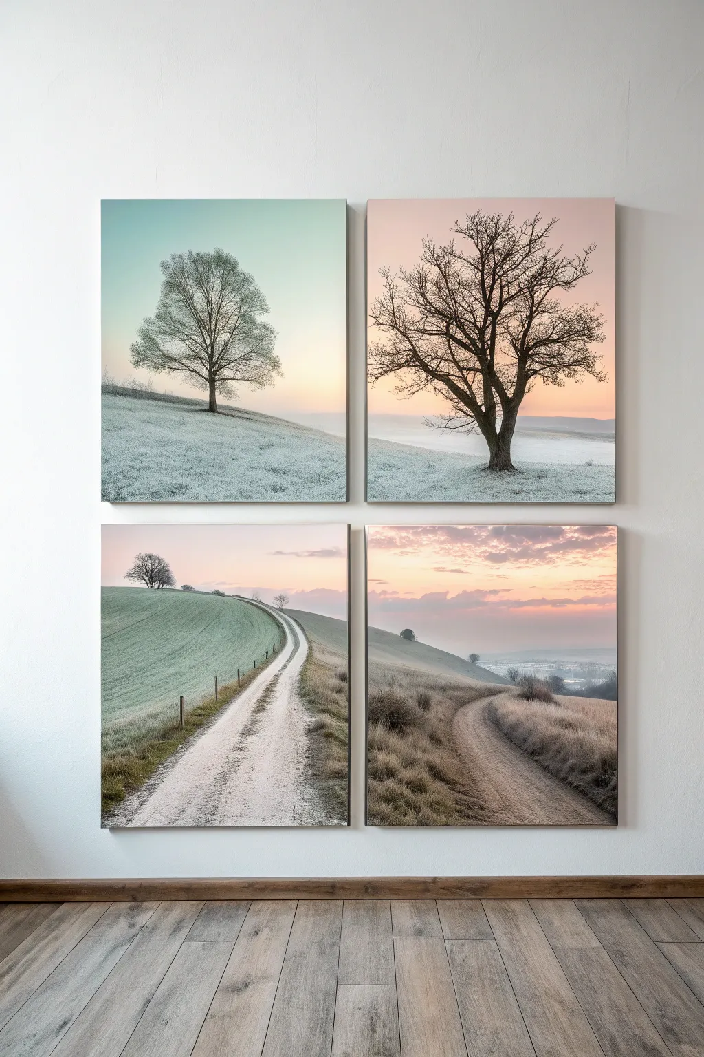
Capture the serene transition of seasons and times of day with this stunning four-panel landscape series. Using a soft, natural palette, you’ll create a cohesive gallery wall where each canvas tells a different part of the same quiet story, from frosty mornings to golden sunsets.
Step-by-Step
Materials
- 4 square stretched canvases (12×12 or 16×16 inches)
- Acrylic paints (Titanium White, Payne’s Grey, Burnt Umber, Yellow Ochre, Sap Green, Cerulean Blue, Alizarin Crimson)
- Isopropyl alcohol or blending medium
- Large flat brushes (1-2 inch) for skies
- Medium filbert brushes for hills
- Fine liner brushes for tree branches
- Palette knife
- Pencil and eraser
- Masking tape (low tack)
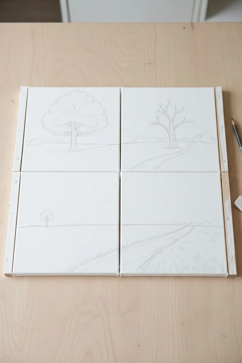
Step 1: Planning the Vista
-
Prepare the canvas grid:
Lay your four canvases out on a flat surface in a 2×2 grid, just as they will hang on the wall. This helps you visualize how the horizon lines and hills will flow from one panel to the next, creating a unified composition rather than four disjointed images. -
Sketch the horizon:
Lightly sketch the rolling hill lines across the canvases. For the top two, keep the hills low to emphasize the sky and trees. For the bottom two, bring the horizon higher and sketch a winding dirt path that starts in the bottom right canvas and curves into the bottom left one. -
Outline the focal points:
Pencil in the basic shapes of your trees. Place a large, symmetrical tree in the top left, a more rugged, bare tree in the top right, a distant small tree on the horizon of the bottom left, and soft grassy textures for the foreground of the bottom right.
Step 2: Painting the Atmospheres
-
Mix the sky gradients:
For the top left canvas, mix Titanium White with a tiny touch of Cerulean Blue for a cold, frosty morning sky. Applying this with a large flat brush, I like to keep the top slightly darker and fade to pure white near the horizon. -
Create the sunset glow:
On the top right canvas, blend Titanium White with faint Alizarin Crimson and Yellow Ochre. Start with the peach tones at the horizon and blend upwards into a soft, pale grey-pink to mimic clear twilight. -
Paint the lower skies:
For the bottom two panels, create a duskier atmosphere. Use a mix of Payne’s Grey, Alizarin Crimson, and White to create purplish clouds near the horizon, blending into a pale peach sky above. Keep these strokes horizontal and soft.
Pro Tip: Atmospheric Haze
To push background hills further away, mix your landscape color with 50% sky color. This ‘atmospheric perspective’ technique makes distant objects look naturally hazy and far off.
Step 3: Grounding the Scene
-
Block in the hills:
Mix a base color for the frosty grass using Sap Green, White, and a dot of Black to desaturate it. Paint the rolling hills on all four canvases. The color should be palest in the top left (frost) and slightly browner/warmer in the bottom right (dried grass). -
Add texture to the fields:
Using a dry brush technique, drag lighter shades of white and pale yellow over the green base coats. This mimics frost on the grass in the top panels and dry wheat texture in the bottom panels. -
Carve the path:
On the bottom two canvases, fill in the sketched path with a mix of Titanium White and Burnt Umber. Once the base works, streak in uneven lines of darker brown to suggest tire tracks or footpaths.
Level Up: Texture Gel
Mix a little sand or modeling paste into your path color before painting. When dry, this grit will catch the light and make the dirt road look incredibly realistic and tactile.
Step 4: Detailing the Trees
-
Paint the main trunks:
Using a liner brush and Burnt Umber mixed with Payne’s Grey (for a near-black look), paint the trunk of the tree in the top left and top right. Press harder at the base and lift off as you move up to taper the trunk. -
Branch structure:
With the paint thinned slightly with water, map out the main branches. Remember that branches usually grow upwards and outwards in a ‘V’ shape. Keep lines shaky and organic, not perfectly straight. -
Adding fine twigs:
Switch to your smallest liner brush. Add hundreds of tiny, interconnecting twigs to the ends of the branches. This dense network of fine lines is crucial for that realistic winter tree silhouette. -
Distant details:
On the bottom left canvas, paint the tiny silhouette of the distant tree on the horizon. It should be much smaller and less detailed than the top trees to establish depth.
Step 5: Final Touches
-
Define the fence line:
On the bottom left canvas, along the curved path, add tiny vertical ticks of dark brown paint to represent fence posts. Connect them with extremely faint, thin lines for the wire. -
Enhance the shadows:
Mix a transparent wash of Payne’s Grey and glaze it over the side of the hills away from the light source. This simple step adds immediate volume to the flat landscape. -
Highlight the foreground:
Use a palette knife to add touches of pure white and heavy cream paint to the immediate foreground of the bottom right panel, creating the look of coarse, frost-covered grass closest to the viewer.
Once dry, hang your panels with equal spacing to let the landscape flow seamlessly across your wall
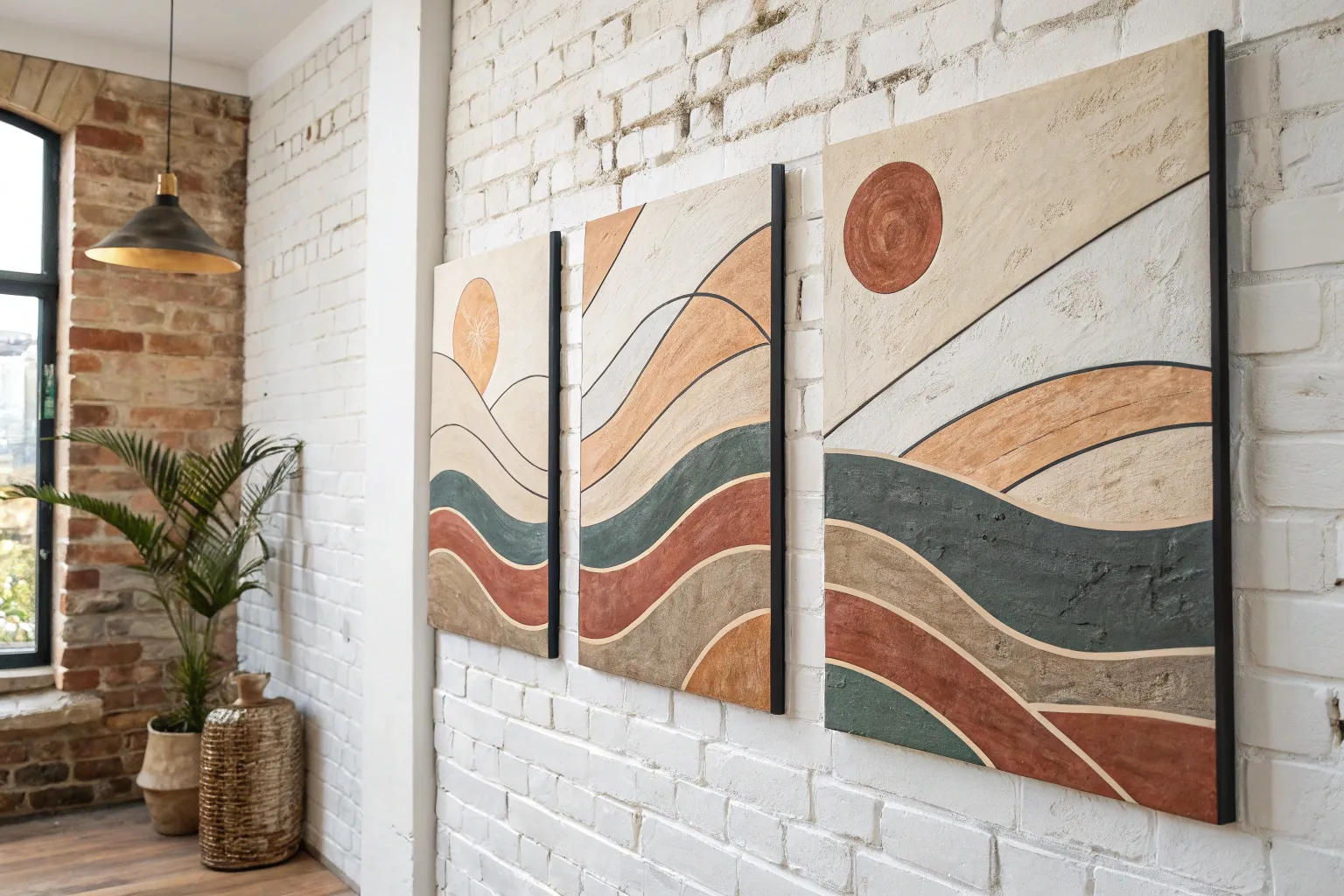
Negative Space Gap as Design
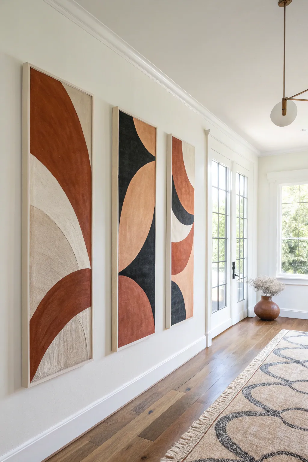
Embrace the elegance of negative space and bold geometry with this striking three-panel canvas project. Using warm earth tones and charcoal accents, you’ll create a cohesive triptych featuring sweeping arches and textured curves that flow seamlessly from one panel to the next.
Step-by-Step Guide
Materials
- Three tall, rectangular canvases (e.g., 24×48 inches)
- Acrylic paints (terracotta/rust, black, beige, cream)
- Modeling paste or texture medium
- Large palette knives
- Wide flat synthetic brushes (2-3 inches)
- Pencil
- Painter’s tape or string (for planning curves)
- Reference photo or sketch paper
- Easel or large drop cloth for floor work
- Ruler or straight edge
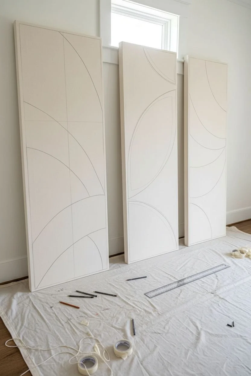
Step 1: Planning and Preparation
-
Prepare the workspace:
Lay down a large drop cloth or plastic sheet. Since these canvases are large and need to be aligned, working flat on the floor or leaning them against a long wall side-by-side is often easier than using a standard easel. -
Align the canvases:
Position your three canvases next to each other on the floor with equal spacing between them—about 2 to 3 inches apart matches the final wall installation gap. This spacing is crucial for ensuring the design flows across the gap. -
Sketch the primary curves:
Using a pencil, draw your large geometric shapes. Start with the dominant rust-colored sweeping curve on the left panel that extends upward. Let your lines jump across the gaps to the next canvas imagining they are one solid surface. -
Define the intersecting shapes:
Sketch the counter-curves. Notice how the middle panel features a large beige oval shape intersected by black, while the right panel echoes these curves in reverse. Keep the lines smooth and continuous.
Pro Tip: Consistent Flow
Use a long piece of string or a flexible strip of wood to guide your pencil when drawing the curves across the gaps. This ensures the arc lands efficiently on the next canvas.
Step 2: Adding Texture
-
Mix texture medium:
Mix a generous amount of modeling paste into your white base paint or use it directly from the jar. The goal isn’t just color, but physical relief. -
Apply base texture:
Using a large palette knife, spread the texturing medium onto the canvas within your sketched areas. Focus on creating vertical striations or directional sweeps that mimic the flow of the shapes. -
Directional dragging:
For the lighter beige sections, drag the palette knife downwards to create visible vertical grooves. I like to let this texture layer dry completely overnight before adding any color.
Level Up: Floating Frames
Build or buy light wood floating frames (like ash or maple) for each canvas. The wood tone complements the terracotta paint and adds a high-end gallery finish.
Step 3: Painting the Forms
-
Mix the rust tone:
Create a warm terracotta by mixing burnt sienna with a touch of red oxide and white. You want a matte, earthy finish. -
Paint the rust sections:
Fill in the large arch on the left panel and the lower sections of the middle and right panels. Use a wide brush, working the paint into the dried texture grooves you created earlier. -
Apply the charcoal black:
Mix black with a tiny bit of brown to soften it. Paint the negative space shapes—specifically the top left of the middle panel and the curving accents on the right panel. -
Layer the beige tones:
Mix a sandy beige using titan buff, white, and a drop of yellow ochre. Apply this to the large central curves, allowing some of the underlying texture to shadow through. -
Refine the edges:
Use a smaller flat brush to sharpen the lines where different colors meet. The edges should be crisp but hand-painted, not taped-off perfect.
Step 4: Finishing Touches
-
Add depth and highlights:
Dry brush a lighter shade of cream over the beige sections to highlight the texture ridges. This emphasizes the vertical movement of the piece. -
Paint the canvas sides:
Decide if you want a gallery wrap look or a natural frame look. Painting the edges a solid beige or leaving them raw canvas can create a nice finished boundary. -
Seal the artwork:
Once fully dry (give it 24 hours for thick paint), apply a matte varnish. A glossy finish would distract from the earthy texture, so matte is best here. -
Install with precision:
When hanging, measure carefully to maintain that critical gap you accounted for during the sketching phase, ensuring the design connects visually across the wall.
Step back and admire how the negative space between the canvases becomes an integral part of your dynamic new focal point


Have a question or want to share your own experience? I'd love to hear from you in the comments below!