
Negative space is one of my favorite little art tricks because it turns “empty” background into the real storyteller. If you love that satisfying aha moment, these negative space ideas will keep your sketchbook busy in the best way.
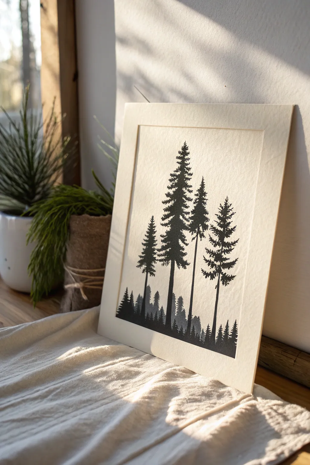
Animal Silhouette With a Hidden Baby
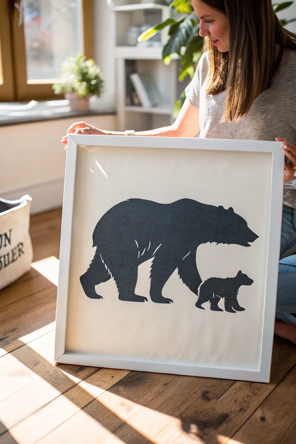
This charming negative space artwork features a majestic bear silhouette that cleverly reveals a cub walking in its shadow. The stark contrast between the dark figure and the creamy background creates a modern, minimalist piece perfect for a nursery or living room.
Step-by-Step
Materials
- Heavyweight textured cardstock (cream or off-white)
- Black adhesive vinyl or dark grey textured cardstock
- Digital cutting machine (Cricut/Silhouette) or precision craft knife
- Cutting mat
- Transfer tape (if using vinyl)
- Spray adhesive (if using cardstock)
- Brayer tool or credit card
- Square white wooden frame (approx. 16×16 inches)
- Vector graphic software or pencil for sketching
Step 1: Design and Preparation
-
Source the silhouette:
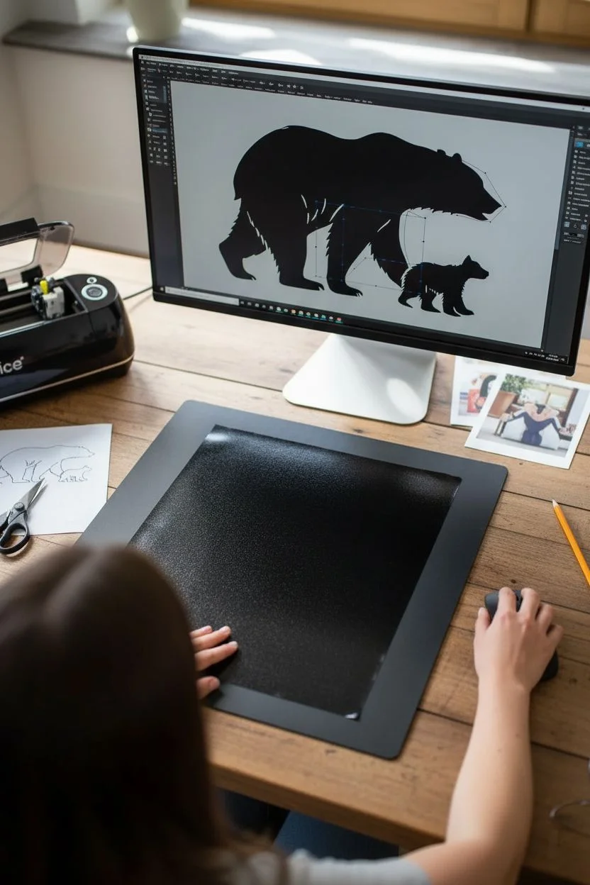
Begin by finding a high-resolution reference image of a walking bear. You can also purchase a ‘bearing with cub negative space’ SVG file online if you aren’t comfortable drawing it freehand. -
Refine the negative space:
If designing yourself, manipulate the space between the adult bear’s front and back legs. Shape this void to form the silhouette of a small cub walking in the same direction. -
Add texture details:
Incorporate small jagged cuts along the bear’s back, legs, and belly to simulate fur. These small details prevent the silhouette from looking like a shapeless blob. -
Prepare your material:
Place your black vinyl or dark grey cardstock onto your cutting mat. Ensure it is smoothed down perfectly to prevent tearing during the cut.
Fixing Bubbles
If a bubble appears under the vinyl after applying, don’t peel it up. Prick the center with a fine needle and press the air out through the tiny hole.
Step 2: Cutting the Figure
-
Machine cutting setup:
If using a machine, load your design and select the ‘Cardstock – Intricate Cut’ or ‘Vinyl’ setting depending on your material. Perform a small test cut first. -
Manual cutting option:
If cutting by hand, tape your template over the dark paper. Use a fresh blade in your craft knife to trace the outline, cutting the intricate fur details first before moving to the long exterior lines. -
Weeding the design:
Carefully remove the excess material from around the bear. Pay special attention to the negative space where the cub is essentially ‘removed’ from the larger bear’s shape. -
Check the edges:
Inspect the cut edges for any fraying or hanging paper fibers. I like to use a pair of micro-tip scissors to snip away any tiny imperfections for a crisp look.
Step 3: Assembly and Framing
-
Prepare the background:
Cut your cream textured cardstock to fit the exact inner dimensions of your frame. Wipe it gently with a microfiber cloth to remove any dust. -
Apply transfer tape (Vinyl method):
If using vinyl, apply transfer tape over your weeded design. Burnish it firmly with a squeegee to ensure the vinyl lifts from the backing paper. -
Adhesive application (Paper method):
If using cardstock for the bear, flip the design over onto a scrap surface. Apply a light, even coat of spray adhesive. Wait 30 seconds until it feels tacky, not wet. -
Position the artwork:
Hover the design over the cream background to center it visually. The bear should be grounded, with slightly more space above the back than below the feet. -
Commit and press:
Lower the design onto the paper. Start pressing from the center of the large bear’s body, working your way out to the nose and tail to push out air bubbles. -
Secure the bond:
Use a brayer roller or the edge of a credit card (protected by a cloth) to press the design firmly into the texture of the background paper. -
Clean the glass:
Clean the inside of your frame glass thoroughly. Smudges or dust trapped inside are incredibly visible on such a minimal piece. -
Mount in frame:
Place your artwork into the frame face down. Insert the backing board and secure the clips or tabs tight to keep the paper flat.
Level Up: 3D Shadow
Use foam adhesive squares instead of glue to mount a cardstock bear. This raises it off the background, casting real shadows for depth.
Now you have a striking piece of minimalist art ready to hang on your wall


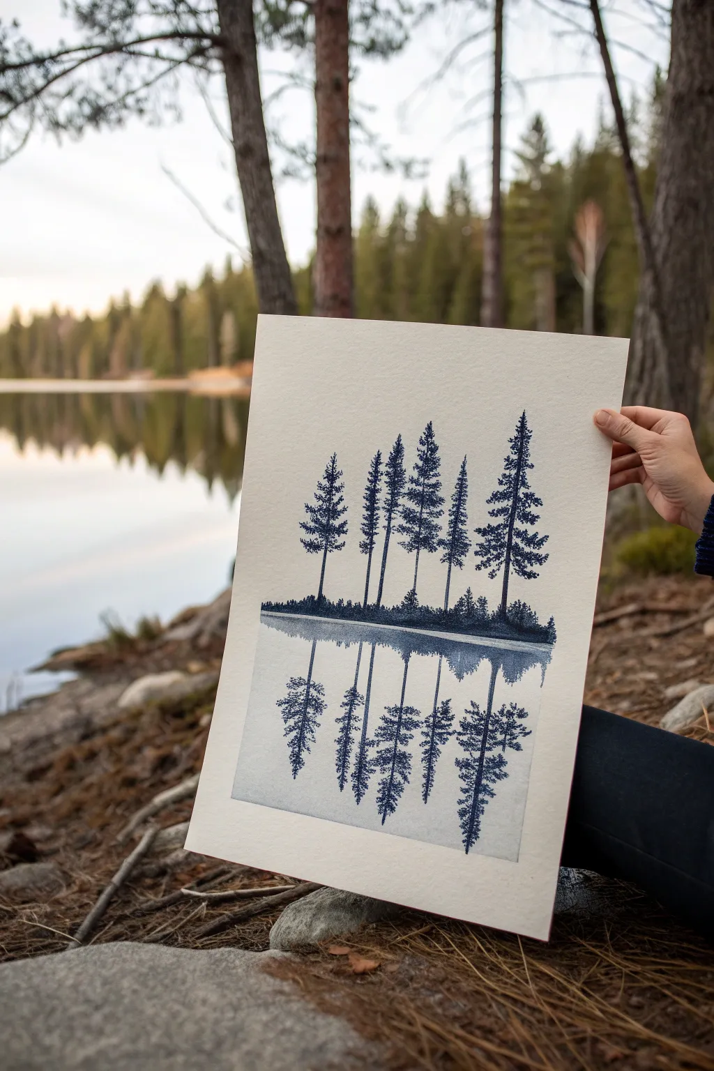
Birds Form a Tree (or the Tree Forms Birds)
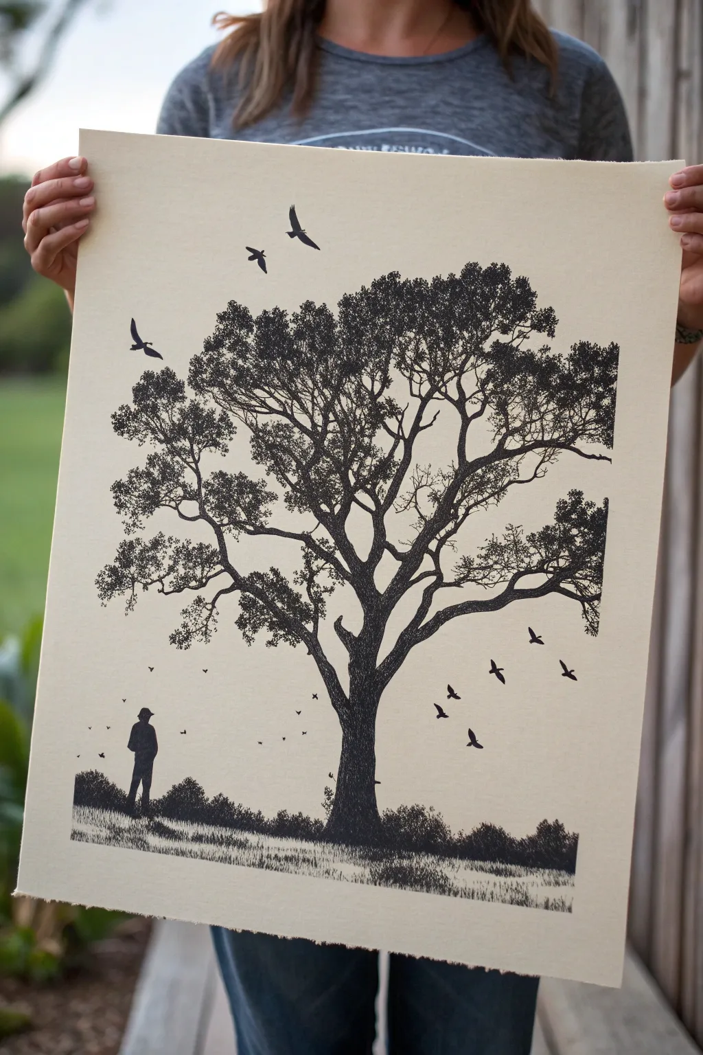
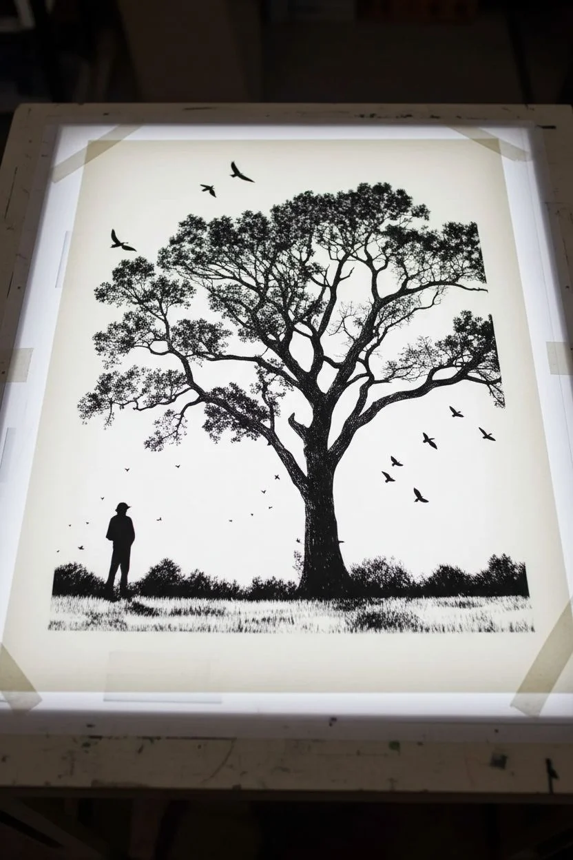
This striking monochromatic project creates a bold statement piece featuring a detailed oak tree silhouette and subtle narrative elements. By using a high-contrast black-on-cream palette, you’ll capture the delicate interplay between positive and negative space in a scene that feels both grounded and ethereal.
Detailed Instructions
Materials
- Large sheet of heavy, cream-colored printmaking paper (e.g., Rives BFK or Stonehenge)
- Black screen printing ink or high-flow acrylic paint
- Screen printing frame and squeegee (sized to your paper)
- Photo emulsion and light source (for burning the screen)
- Transparency film for printing the design
- Digital design software or heavy black markers
- Painter’s tape
- Work table with tarp or newsprint protection
Step 1: Design Preparation
-
Draft the concept:
Begin by sketching or digitally composing your scene. You aim for a large, central oak tree with sprawling branches. Ensure the foliage utilizes a ‘dithering’ or stippling effect rather than solid blocks of black to create texture. -
Add narrative elements:
Place a small human silhouette standing to the lower left of the trunk. Add a scattering of birds—some high above the tree, and a flock sweeping low to the right. -
Refine the ground:
Create a grassy texture at the bottom. Use short, vertical strokes that mimic tall grass, ensuring the ground line feels organic and uneven rather than a straight horizon. -
Print the transparency:
Convert your final design to pure black and white (no grays). Print this onto large transparency film sheets. If your design is larger than your printer, print in sections and carefully tape them together with clear tape.
Uneven Ink Coverage?
If the black looks patchy, your squeegee pressure might be inconsistent. Ensure a smooth, firm pull. A second pass is risky but possible if you haven’t moved the screen.
Step 2: Screen Creation
-
Coat the screen:
In a darkroom or dim space, apply a thin, even layer of photo emulsion to both sides of your screen using a scoop coater. Let this dry completely in the dark, usually overnight. -
Expose the image:
Lay your transparency design flat on the dry screen. Expose it to your light source according to your emulsion’s specific timing instructions. The black ink on the transparency blocks the light, keeping the emulsion underneath soft. -
Wash out the stencil:
Immediately spray the screen with lukewarm water. The unexposed emulsion (where your black design was) will wash away, revealing the mesh. The background will remain hardened. -
Dry and tape:
Let the screen dry thoroughly. I usually tape off the inside edges of the frame with painter’s tape to prevent ink from leaking through the gaps where the mesh meets the wood or metal.
Step 3: Printing Process
-
Prepare the paper:
Lay your cream printmaking paper on a flat, clean surface. You may want to mark the corners with tape on the table so you can register the screen in the exact right spot. -
Ink the screen:
Place the screen flat on the paper. Pour a generous bead of black screen printing ink along the top edge of the screen, above the design area. -
The flood stroke:
Lift the screen slightly off the paper (or use off-contact tabs). Pull the ink across the design with the squeegee without applying pressure, filling the mesh with ink. This is called flooding. -
The print stroke:
Lower the screen onto the paper. Holding the squeegee at a 45-degree angle, pull the ink firmly down the length of the screen with steady, even pressure. -
Reveal the print:
Carefully lift the screen from one side to avoid smudging. Check that the fine details of the leaves and grass transferred clearly. -
Dry the print:
Place the wet print on a drying rack or hang it carefully. Allow it to cure for at least 24 hours before handling.
Add Metallic Flair
Mix a tiny amount of gold mica powder into your black ink before printing. It adds a subtle shimmer to the birds and leaves that only catches the light at certain angles.
Now you have a stunning, gallery-worthy print that celebrates the quiet beauty of nature’s silhouettes
Cat Shape Cut From the Night Sky
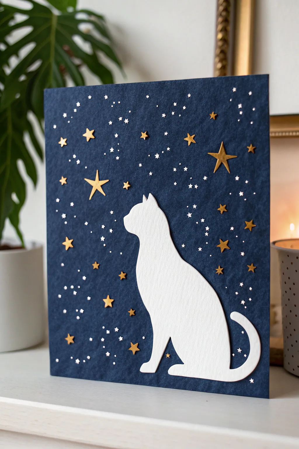
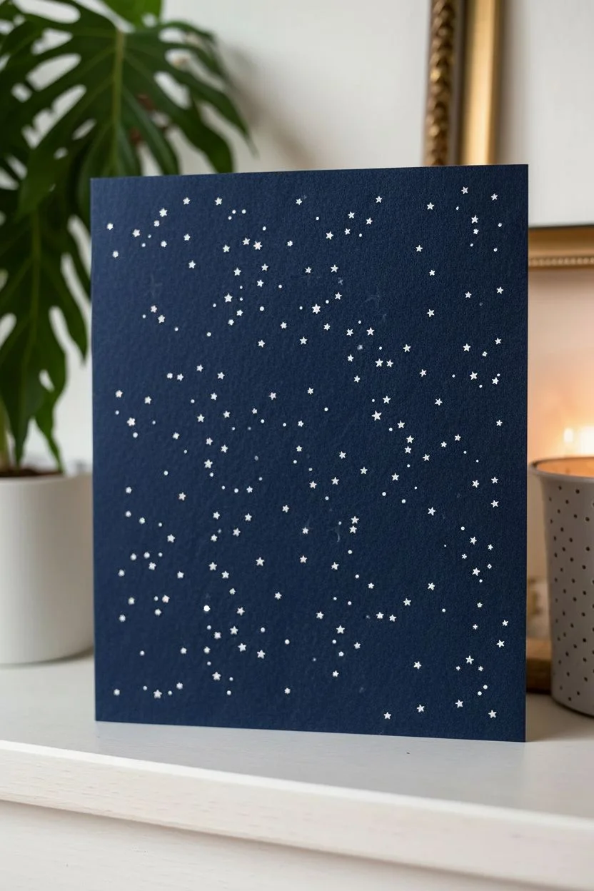
This striking papercraft project features a crisp white cat silhouette gazing into a deep blue negative space sky. By combining simple cutouts with pin-pricked details and metallic accents, you’ll create a celestial scene that feels both minimalist and magical.
Step-by-Step
Materials
- Dark navy blue cardstock (heavyweight)
- Bright white cardstock or watercolor paper (medium weight)
- Gold metallic paper or gold foil stars
- Various star-shaped paper punches (small and medium sizes)
- Sharp crafting knife (X-Acto styled) or precision scissors
- Self-healing cutting mat
- Push pin or thick sewing needle
- Pencil and eraser
- Craft glue or glue stick
- Ruler
- Double-sided foam tape (optional for dimension)
Step 1: Creating the Celestial Background
-
Prepare the night sky:
Cut your dark navy cardstock to your desired final size, such as 8×10 inches or a folded greeting card size. This heavy paper will serve as the substantial base for your artwork. -
Map out the star field:
Lightly trace the general area where your cat will sit using a pencil. This helps ensure you don’t place stars in the area that will be covered by the white silhouette later. -
Punch the tiny stars:
Using a simple push pin or a thick needle, begin poking holes randomly into the navy cardstock. These tiny pricks mimic distant stars and add texture. -
Create variation:
Vary the pressure and tool size slightly. Some holes should be larger than others to create depth in your galaxy field. Keep the cluster denser near the center and top. -
Add punched accents:
If you have a very small star punch or a shaped hole punch, add a few tiny die-cut holes directly into the blue paper to let the white backing (which we will add later) show through. -
Clean up the texture:
Turn the paper over and gently rub the back with the bowl of a spoon to flatten the pushed-out paper fibers around the holes.
Starry Struggles?
If the pinholes look torn rather than round, your needle might be dull. Use a fresh pin and place the paper on a scrap of cardboard or foam while piercing.
Step 2: Crafting the Silhouette
-
Draw the outline:
On your bright white cardstock, sketch the profile of a seated cat. Focus on a smooth curve for the back and a simple, elegant shape for the ears and tail. -
Refine the shape:
Ensure the tail curves around the base, which adds stability to the visual composition. You can also print a template and trace it if drawing freehand feels daunting. -
Cut the silhouette:
Place the white paper on your cutting mat. carefully cut along your pencil lines using a sharp craft knife for the cleanest edge. Precision is key here, especially around the ears. -
Check the fit:
Position the white cutout over the navy background without gluing it yet. Make sure it sits nicely at the bottom and doesn’t obscure too many of your favorite star clusters.
Level Up: Depth Effect
Use foam mounting tape instead of glue for the cat silhouette. This slight elevation creates a shadow behind the figure, adding lovely 3D depth to the card.
Step 3: Assembly and Embellishment
-
Prepare the gold stars:
Using your gold metallic paper, punch out several stars in different sizes. Aim for a mix of 5-point stars and perhaps some smaller diamond shapes. -
Hand-cut larger stars:
For the few focal stars (like the one the cat is looking at), I prefer to hand-cut slightly larger, irregular stars to give them a whimsical, storybook feel. -
Attach the cat:
Apply glue to the back of the white cat silhouette. Make sure to get glue all the way to the tips of the ears and tail to prevent curling. -
Secure the silhouette:
Press the cat firmly onto the navy background, aligning the bottom edge perfectly with the bottom of the blue paper. -
Place the gold stars:
Arrange the gold stars on the blue sky. Create a ‘path’ of stars leading upward from the cat’s gaze for better composition. -
Glue the embellishments:
Using small dots of glue or tweezers for precision, secure the gold stars in place. Press down gently to ensure they adhere flat against the textured background. -
Add a backing layer:
Glue a sheet of white paper behind the entire navy cardstock. This will make the pin-pricked holes appear bright white against the dark blue.
Display your celestial cat art in a simple frame or gift it to a stargazer who loves felines
A Chair That’s Mostly Air
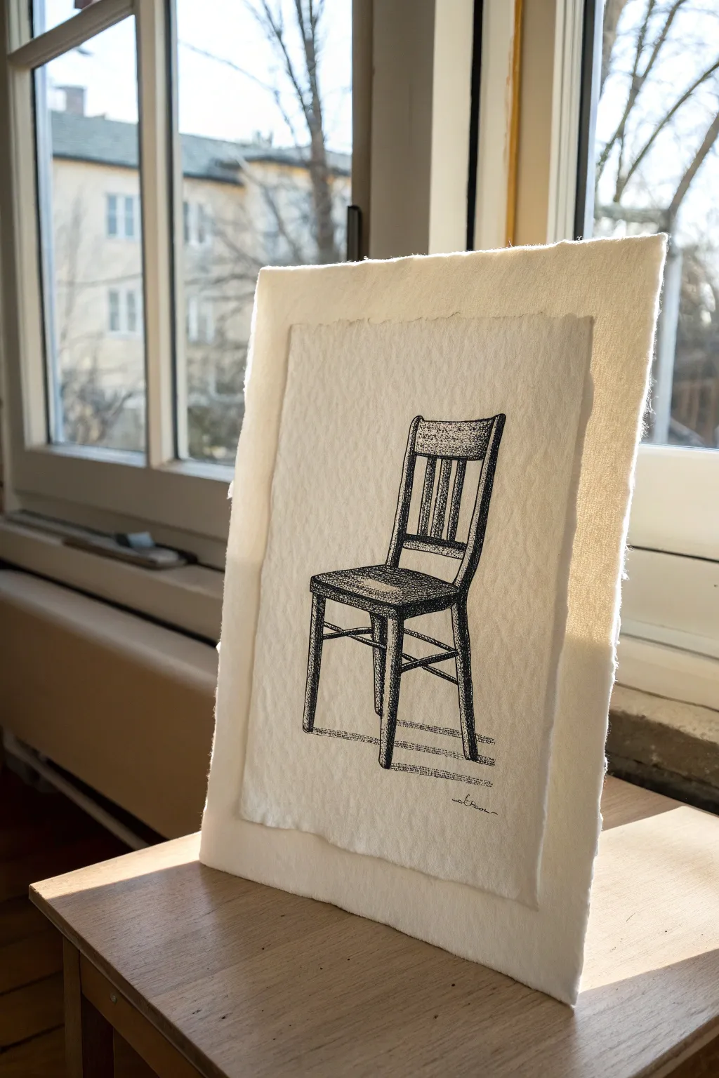
This elegant ink drawing plays with the concept of negative space by isolating a simple wooden object against a creamy, textured background. The charm lies not just in the linework, but in the handmade quality of the layered, deckled-edge paper that frames it.
Step-by-Step
Materials
- Heavyweight cold-press watercolor paper (300gsm or higher)
- Black pigment liner pens (sizes 0.1, 0.3, and 0.5)
- Pencil (HB or H)
- Kneaded eraser
- Ruler
- Water and a clean paintbrush (for tearing paper)
- Double-sided foam tape or archival glue dots
Step 1: Preparing the Canvas
-
Measure your layers:
Decide on the size of your final piece. You need two sheets: a backing sheet (e.g., 8×10 inches) and a slightly smaller drawing sheet (e.g., 6×8 inches) to create a border effect. -
create the deckled edge:
To get that soft, fuzzy edge shown in the photo, don’t use scissors. Instead, run a wet paintbrush along the line where you want to cut the paper. -
Tear the paper:
Wait a moment for the water to soak in, then gently tear the paper along the wet line. Pull the paper away from the main sheet to create a fibrous, uneven edge. Do this for all four sides of both paper sheets. -
Flatten the sheets:
If the water caused any buckling, place the paper under a heavy book for an hour until perfectly flat again.
Uneven Tearing?
If the paper tears too abruptly, the fibers aren’t wet enough. Re-wet the line with your brush, wait 30 seconds for the pulp to soften, and try tearing slowly again.
Step 2: Drafting the Design
-
Establish the perspective:
On the smaller sheet, lightly sketch a vertical rectangle to define the chair’s total height. Locate the seat level slightly below the middle point. -
Block in major shapes:
Using your HB pencil, sketch the trapezoid shape of the seat and the simple ladder-back design. Keep your pressure very light so these lines can be erased later. -
Refine the legs:
Draw the legs, paying attention to the faint splay of the back legs. I like to double-check the placement of the horizontal cross-braces here to ensure the chair looks structural. -
Detail the backrest:
Add the vertical slats in the backrest. Don’t worry about perfect symmetry; a little wobble adds to the hand-drawn aesthetic.
Try Colored Paper
Swap the white backing sheet for a charcoal grey or kraft paper sheet. This creates a dramatic frame that really highlights the delicate deckled edge of the drawing.
Step 3: Inking and Texture
-
Outline the structure:
Switch to a 0.5 pen for the main contours of the chair. Outline the seat, the legs, and the main frame of the backrest. -
Add wood grain:
Use a finer 0.1 pen to draw vertical lines on the chair legs and horizontal lines on the seat edge to mimic wood grain. Keep these lines broken and organic. -
Stipple the shading:
This style relies heavily on stippling (dots) for shadow. Use the 0.3 pen to add dense dots to the side of the legs facing away from the light source. -
Darken the seat:
The seat surface should be the darkest area. Use dense cross-hatching or very tight stippling with the 0.5 pen to create deep contrast here. -
Create cast shadows:
Using horizontal hatching strokes, draw small cast shadows on the ‘floor’ beneath the legs. This grounds the chair so it doesn’t look like it’s floating. -
Clean up:
Once the ink is completely dry (give it at least 20 minutes), gently roll a kneaded eraser over the drawing to lift all pencil marks. -
Sign your work:
Add a small, stylistic signature near the bottom right leg using your finest pen.
Step 4: Final Assembly
-
Mount the artwork:
Apply double-sided foam tape to the back of your drawing. This adds a slight 3D elevation, creating a shadow between the drawing and the backing paper. -
Center and stick:
Carefully center the drawing onto the larger backing sheet and press down firmly to secure it.
Place your finished piece near a window to let the natural light play off the textured paper layers
BRUSH GUIDE
The Right Brush for Every Stroke
From clean lines to bold texture — master brush choice, stroke control, and essential techniques.
Explore the Full Guide
Leaves and Stems as Pure Cutouts
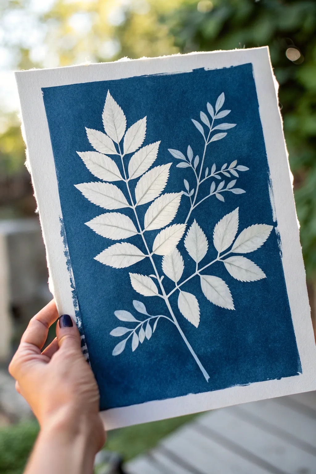
This stunning deep blue print utilizes one of the oldest photographic printing processes to create crisp, ghostly silhouettes of nature. The result is a striking negative space artwork where the sun does the painting, leaving behind brilliant white leaf shapes against a rich Prussian blue background.
Step-by-Step Guide
Materials
- Cyanotype kit (Part A: Ferric Ammonium Citrate, Part B: Potassium Ferricyanide)
- Heavyweight watercolor paper (300gsm, cold press)
- Wide foam brush or hake brush
- Glass pane or clear acrylic sheet (about 11×14 inches)
- Sturdy backing board (cardboard or plywood)
- Fresh plant clippings (fern-like leaves and smaller sprigs)
- Large tray or tub for rinsing
- Hydrogen peroxide (optional, for intensifying)
- Distilled water
- Dark room or low-light area
Step 1: Preparing the Chemistry
-
Mix stock solutions:
If using a powder kit, fill your Part A and Part B bottles with distilled water according to the package instructions. Shake them vigorously to dissolve the crystals completely. -
Let the solution settle:
Ideally, let your stock solutions sit for 24 hours before use to ensure full dissolution, though many kits work well immediately if shaken thoroughly. -
Create the working emulsion:
In a small cup, mix equal parts of Solution A and Solution B. For a single sheet like this, you will only need about 1-2 teaspoons of each. Do this in a dimly lit room away from sunlight.
Press for Perfection
For the sharpest white lines, press your fresh leaves inside a heavy book for 30 minutes before printing. This flattens the veins, ensuring tight contact with the paper.
Step 2: Coating the Paper
-
Prepare the workspace:
Turn off any bright lights or close the blinds. While the solution isn’t instantly sensitive, prolonged exposure to UV light will spoil it. -
Apply the emulsion:
Dip your foam or hake brush into the mixed solution. I like to apply the liquid using horizontal strokes first, then cross over with vertical strokes to ensure even coverage. -
Create the border:
Leave a distinct border around the edge of the paper. Don’t worry about making straight lines; the rough, painterly edges are part of the handmade charm. -
Dry in the dark:
Place the coated paper in a completely dark closet or drawer. Let it dry until bone dry to the touch, which usually takes about 30 to 60 minutes.
Step 3: Composing and Exposing
-
Harvest your botanicals:
Choose leaves with interesting serrated edges or distinct shapes. Slightly flatter leaves work best for sharp lines; thicker stems can cause blurriness. -
Arrangement:
Working quickly in a shaded area (away from direct sun), place your dried sensitized paper on your backing board. Arrange your main large leaf diagonally across the paper, then tuck smaller sprigs near the stem for balance. -
Secure the sandwich:
Place the glass pane or acrylic sheet directly on top of the plants. Press down firmly to flatten the leaves against the paper. You can use clamps on the edges if your glass is light. -
Expose to UV light:
Carry your assembly out into direct sunlight. The yellow-green chemical coating will slowly turn a stealthy grey-blue. In bright midday sun, this might take 10-15 minutes; on overcast days, it could take 30 minutes or more. -
Check the color:
Wait until the exposed areas look bronze or a deep, dull grey before bringing it inside. Don’t stop when it simply looks blue; it needs to overexpose slightly to wash out correctly.
Level Up: Double Exposure
Expose for 5 mins, remove some leaves, and expose for another 5. You’ll get pure white shapes (leaves kept on) and light blue ‘ghost’ shapes (leaves removed early).
Step 4: Developing the Print
-
Stop the exposure:
Bring the board inside and remove the glass and plants. The shadows left by the plants will still look yellow-green. -
Initial rinse:
Submerge the print face down in a tray of cool tap water. Agitate it gently. You will see yellow chemicals streaming off the paper. -
Continue rinsing:
Change the water and rinse again for at least 5 minutes. Keep rinsing until the highlights (where the leaves were) are pure white and the water runs clear. -
Oxidation bath (optional):
To get that deep Prussian blue instantly, add a splash of hydrogen peroxide to a final rinse of water. Dip the print in, and watch the blue deepen dramatically in seconds. -
Final dry:
Blot the excess water carefully with a clean towel, then hang the print or lay it flat on a drying rack to finish the process.
Frame your deep blue masterpiece in a simple white mat to highlight the beautiful organic edges
Fish and Water Ripple Swap Roles
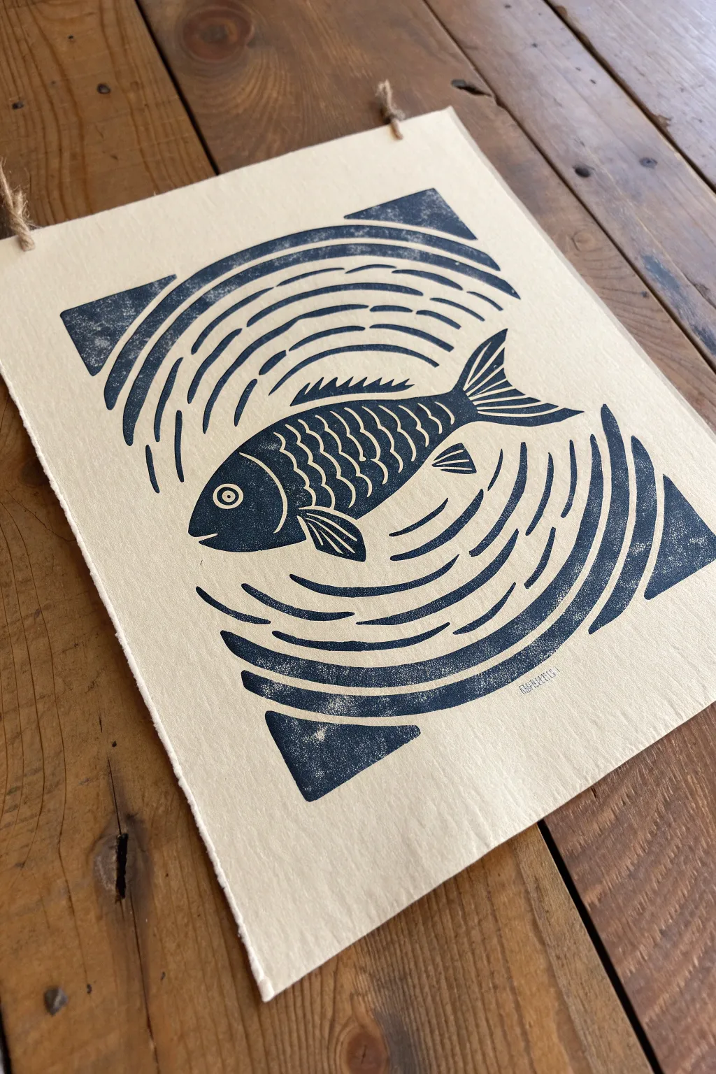
This striking block print plays with the balance between positive and negative space, where the water ripples are defined by what is carved away rather than what is printed. The result is a bold, rhythmic design featuring a swimming fish surrounded by concentric energy, printed in a deep, moody blue on textured paper.
Detailed Instructions
Materials
- Soft-cut lino block (roughly 5×7 or 6×8 inches)
- Lino cutting tool set (V-gouge and U-gouge)
- Tracing paper and pencil
- Carbon transfer paper (optional)
- Block printing ink (Dark Navy or Prussian Blue)
- Brayer (rubber roller)
- Inking plate or piece of glass
- Cream or off-white printmaking paper (preferably with deckled edges)
- Baren or wooden spoon for burnishing
- Newsprint or scrap paper
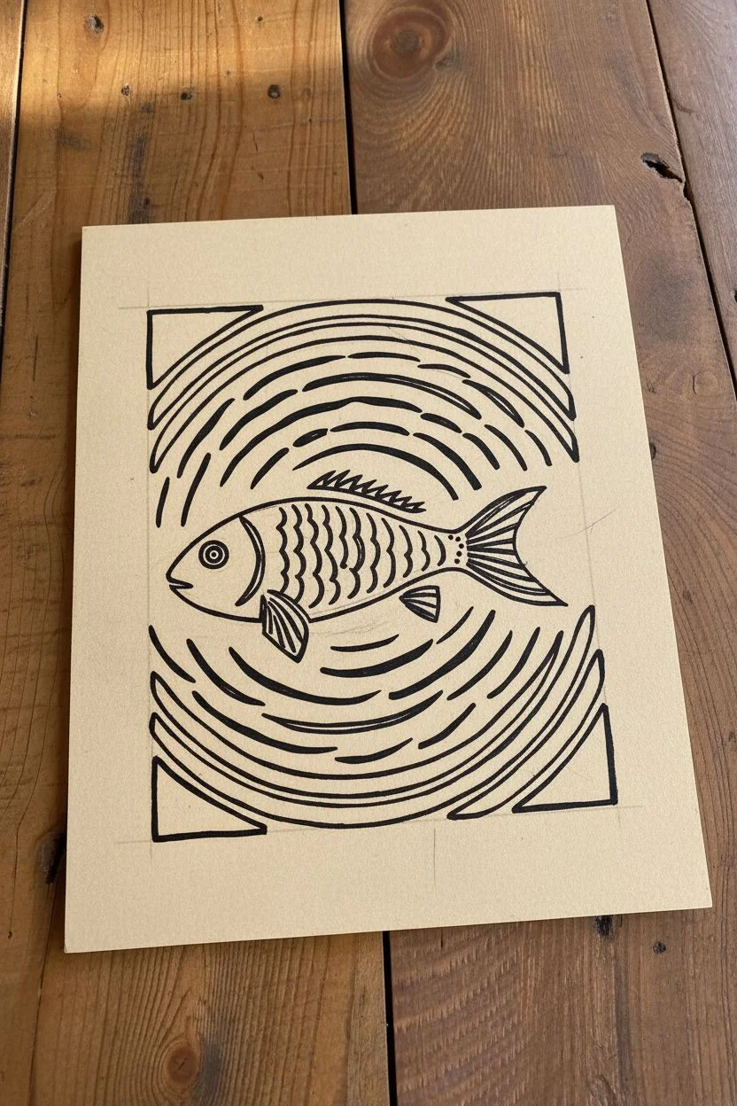
Step 1: Design and Transfer
-
Drafting the Concept:
Begin by sketching your fish in the center of a square or rectangular boundary on paper. Keep the fish shape simple, focusing on the curve of the body and the distinct fins. -
Mapping the Negative Space:
Around the fish, draw concentric circles to represent the ripples. Remember the core concept: inside the ripple lines will be white paper (carved away), while the spaces *between* the ripples will be inked. -
Breaking the Borders:
Instead of a solid square border, draw four corner triangles to frame the ripples. This creates an implied square shape without closing the design in completely. -
Transfer to Block:
Place your drawing face down on the lino block to transfer the graphite, or use carbon paper to trace your design onto the surface. The image will print in reverse, so ensure your fish is facing the direction you want. -
Reinforcing Lines:
Go over your transferred lines on the block with a permanent marker. Color in the areas that will remain uncut (the dark parts) to avoid confusion while carving.
Clean Lines Pro-Tip
Warm your lino block slightly with a hairdryer or on a sunny windowsill before carving. This softens the material, allowing your gouge to glide smoother for fluid water lines.
Step 2: Carving the Block
-
Outlining the Fish:
Using a fine V-gouge, carefully carve the outline of the fish. Be precise around the delicate fins and the mouth area. -
Defining the Texture:
Carve the scales on the fish body using small, U-shaped scoops. Leave thin ridges between the scales to catch the ink. -
Carving the Ripples:
Switch to a medium U-gouge for the water. Consult your marked design and carve away the ripple lines, leaving the ‘islands’ of lino between them intact. -
Detailing the Corners:
Carve the straight lines that define the triangular corners. Ensure the space between the ripple curves and these corner triangles is clean and distinct. -
Clearing the Negative Space:
Use a wide U-gouge to clear away the large areas of lino outside your design boundaries. You want these areas to be low enough that they don’t pick up stray ink. -
The Test Proof:
Before final printing, I like to do a quick rub with a crayon or pencil on thin paper over the block to see if any ridges need deeper carving.
Level Up: Ombré Water
Try a gradient inking technique (‘rainbow roll’). Put dark blue ink and teal ink side-by-side on the glass, roll them together, and print so the water fades from deep ocean to shallow turquoise.
Step 3: Inking and Printing
-
Preparing the Ink:
Squeeze a small line of dark navy ink onto your inking plate. Roll the brayer back and forth and lift it occasionally to create a smooth, velvety texture often called the ‘orange peel’ look. -
Charging the Block:
Roll the inked brayer over your carved block. Apply thin, even layers, rolling in multiple directions to ensure the raised surfaces are fully coated but the carved grooves remain empty. -
Positioning the Paper:
Carefully align your cream paper over the block. Once the paper touches the ink, do not shift it or the image will smudge. -
Burnishing the Print:
Using a baren or the back of a wooden spoon, rub the back of the paper in small circular motions. Apply firm pressure, focusing on the solid black areas and edges. -
Checking Transference:
Carefully lift one corner of the paper while holding the rest down to peek at the ink transfer. If it looks spotty, lay it back down and burnish that area again. -
The Reveal:
Slowly peel the paper off the block to reveal your print. Any ‘chatter’ (small incidental ink marks in carved areas) can be left for character or carved away for the next print. -
Finishing Touches:
Allow the ink to dry fully (oil-based inks may take several days). If desired, punch two small holes at the top corners and thread rustic twine for hanging.
Hang your finished print and enjoy the rhythmic movement of your handcrafted aquatic scene

PENCIL GUIDE
Understanding Pencil Grades from H to B
From first sketch to finished drawing — learn pencil grades, line control, and shading techniques.
Explore the Full Guide
Simple Landscape as a Hidden Animal
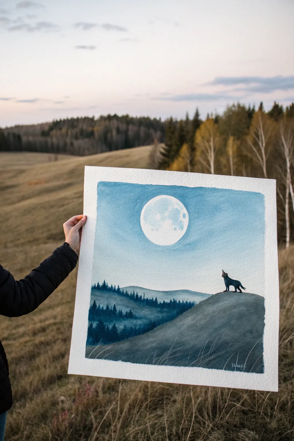
Capture the serene mystery of a wolf howling at a full moon with this monochromatic watercolor landscape. The painting relies on layers of blue washes and crisp silhouettes to create depth and atmosphere on textured paper.
Step-by-Step Tutorial
Materials
- Cold press watercolor paper (300 gsm)
- Painter’s tape or masking tape
- Drawing pencil (HB) and eraser
- Masking fluid (drawing gum) and old brush
- Watercolor paints: Indigo, Prussian Blue, Payne’s Grey, and Titanium White (gouache or watercolor)
- Round brushes (sizes 4, 8) and a finer detail brush (size 0 or 1)
- Jar of clean water
- Palette for mixing
- Paper towels
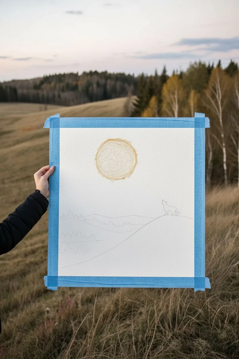
Step 1: Preparation and Sketching
-
Secure the paper:
Tape down all four edges of your watercolor paper to a board or table. This creates a crisp white border and prevents the paper from buckling when wet. -
Sketch the moon:
Lightly trace a perfect circle for the moon in the upper center of the page. You can use a roll of tape or a jar lid as a stencil to get it perfectly round. -
Outline the landscape:
Sketch the rolling hills. Draw a large, sweeping hill in the foreground on the right side and a series of receding hills on the left. -
Place the wolf:
Draw a small silhouette of a wolf standing on the highest point of the foreground hill, head tilted up toward the moon. -
Mask the moon:
Apply masking fluid carefully over the entire moon circle using an old brush or a silicone applicator. Let it dry completely until it’s tacky and clear.
Step 2: Painting the Sky and Background
-
Prepare the sky wash:
Mix a watery wash of Prussian Blue. You want a light, airy blue for the sky. Make sure you have enough mixed to cover the upper two-thirds of the paper. -
Wet-on-wet sky technique:
Brush clean water over the sky area, stopping at the horizon line of the distant hills. While the paper is glistening but not puddling, apply your blue mix. -
Create a gradient:
Start with a slightly deeper blue at the top edge and let it fade into a lighter wash as you move down towards the hills. The area around the moon should be fairly light. -
Paint the distant hills:
Once the sky is dry, mix a slightly darker blue-grey value. Paint the furthest hill shapes using a flat wash, creating the first layer of depth. -
Add distant trees:
While the distant hill wash is still wet, or just after it dries for sharper edges, dab in tiny vertical strokes along the ridges to suggest a forest line.
Soap Savior
Before dipping your brush into masking fluid, coat the bristles in bar soap. This creates a barrier that makes cleaning the sticky fluid off much easier later.
Step 3: Foreground and Details
-
Prepare a dark mix:
Mix a strong concentration of Indigo and Payne’s Grey. This needs to be much darker than your previous layers to bring the foreground forward. -
Paint the main hill:
Fill in the large foreground hill shape with this dark mix. The contrast against the lighter sky and distant hills is key here. -
Refine the silhouette:
Carefully paint around your wolf sketch if you didn’t mask it, or paint the wolf shape now using your darkest pigment mixture for a solid black look. -
Add texture to the hill:
I prefer to use a nearly dry brush to sweep some horizontal strokes across the dark hill, suggesting terrain and grass texture. -
Detail the mid-ground trees:
Using your fine detail brush and a dark blue mix, paint identifiable pine tree shapes on the hills just behind the foreground. Use quick, jagged strokes for branches.
Nebula Nuances
While the sky wash is still wet, drop in tiny hints of purple or turquoise. It adds a magical, galaxy-like variation without complicating the simple scene.
Step 4: Finishing Touches
-
Reveal the moon:
Once the painting is bone dry, gently rub off the masking fluid from the moon using your clean finger or a rubber cement pickup. -
Texture the moon:
Mix a very faint grey-blue wash. Dab it onto parts of the bright white moon to create craters and shadows. Keep edges soft. -
Add grass highlights:
Using opaque white gouache or a gel pen, add thin, wispy lines at the bottom of the foreground hill to represent tall grasses catching the moonlight. -
Remove the tape:
Slowly peel away the painter’s tape at a 45-degree angle away from the artwork to reveal your clean white borders.
Frame this piece behind glass to preserve the delicate watercolor texture and enjoy your moonlit creation
Day and Night Reflection Flip
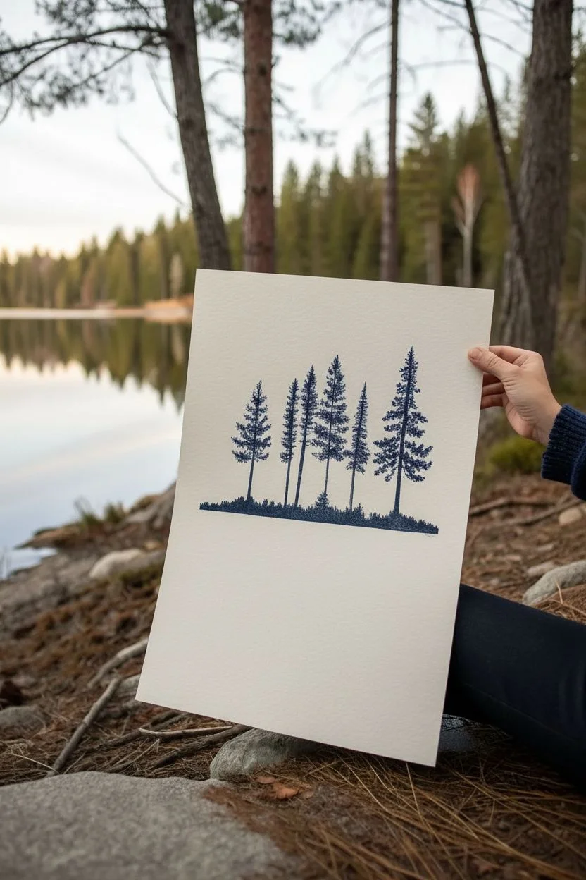
Capture the serene beauty of a lakeside forest with this striking monochromatic print that plays with negative space and transparency. The stark contrast of the deep blue trees against the textured paper creates a crisp, modern aesthetic while the faded reflection adds a ghostly, ethereal quality.
Step-by-Step
Materials
- Heavyweight printmaking paper (e.g., Fabriano or Stonehenge, cream or off-white)
- Linoleum block or soft-cut carving rubber (approx. 8×10 inches)
- Linoleum carving tools (V-gouge and U-gouge)
- Oil-based relief ink (Prussian Blue or Payne’s Grey)
- Rubber brayer (roller)
- Glass or acrylic sheet for rolling ink
- Baren or a wooden spoon
- Pencil and tracing paper
- Scrap paper or newsprint for masking
Step 1: Design and Carving
-
Sketch the silhouette:
Start by sketching a row of pine trees on your tracing paper. Vary the heights and widths to create a natural, organic rhythm. The trees should sit on a distinct horizon line. -
Transfer to block:
Transfer your pencil sketch onto the linoleum block. Remember that the final print will be a mirror image, though for trees, this orientation matters less. -
Carve the negative space:
Use your carving tools to remove the background area around the trees. You want the trees themselves to remain raised (uncarved) so they catch the ink. Keep the horizon line sharp and straight. -
Detail the branches:
Use a fine V-gouge to add texture to the tree branches. Instead of carving them away completely, just nibble at the edges to create the jagged look of pine needles. -
Clear the sky:
Ensure the large open space above the trees is carved away cleanly. If you leave small ridges, they will pick up ink and create ‘chatter’ marks, which we want to avoid for this minimal look.
Patchy Prints?
If your main trees interpret as too speckled or light, you likely didn’t use enough ink. Add a tiny drop of oil modifier to loosen stiff ink.
Step 2: Inking and The First Press
-
Prepare the ink:
Squeeze a small amount of Prussian Blue ink onto your glass slab. Roll it out with the brayer until you hear a consistent ‘hissing’ sound and the texture looks velvety. -
Ink the block:
Roll the brayer over your carved block. Apply a thin, even layer of ink to the raised tree surfaces. Ensure the coverage is solid but not gloppy, so you don’t lose the fine needle details. -
Position the paper:
Place your paper carefully over the inked block. The block should be positioned in the upper half of the paper to leave room for the reflection below. -
Print the trees:
Using a baren or the back of a wooden spoon, rub firmly in circular motions over the back of the paper. Focus pressure on the tree shapes to transfer the ink dark and crisp. -
Lift the print:
Carefully peel back one corner to check the transfer. If the black is solid, lift the paper entirely and set it aside for a moment—but don’t clean the block yet.
Step 3: Creating the Ghost Reflection
-
Assess residual ink:
Look at your linoleum block. It should still have a faint residue of ink left on it from the first pull. Do not add more ink; we are using this remaining amount for the ‘ghost’ print. -
Mask the horizon:
Place a scrap piece of paper just below where the new horizon line will be on your print. This ensures a clean break between the real trees and the reflection. -
Re-align the paper:
Take your printed paper and rotate it 180 degrees. You are going to print the exact same block again, but upside down directly beneath the first print. -
Protect the original print:
Place a clean sheet of newsprint over the area you already printed (the dark trees) so your hand rubbing doesn’t smudge the wet ink. -
Print the reflection:
Rub the back of the paper over the block again. Use slightly less pressure this time. I find this helps achieve that watery, faded look characteristic of a reflection. -
Lift and reveal:
Gently peel the paper off the block. You should now see a dark, crisp forest on top and a lighter, hazy mirror image below it. -
Dry the print:
Oil-based inks take time to cure. Hang your print or lay it flat on a drying rack for several days before framing.
Add Watercolor
Once the oil ink is fully dry, paint a very diluted wash of pale blue watercolor over the ‘reflection’ area to enhance the watery effect.
Hang your finished print in a bright spot where the contrast can truly shine


Pen Tip That Frames a Tiny Story
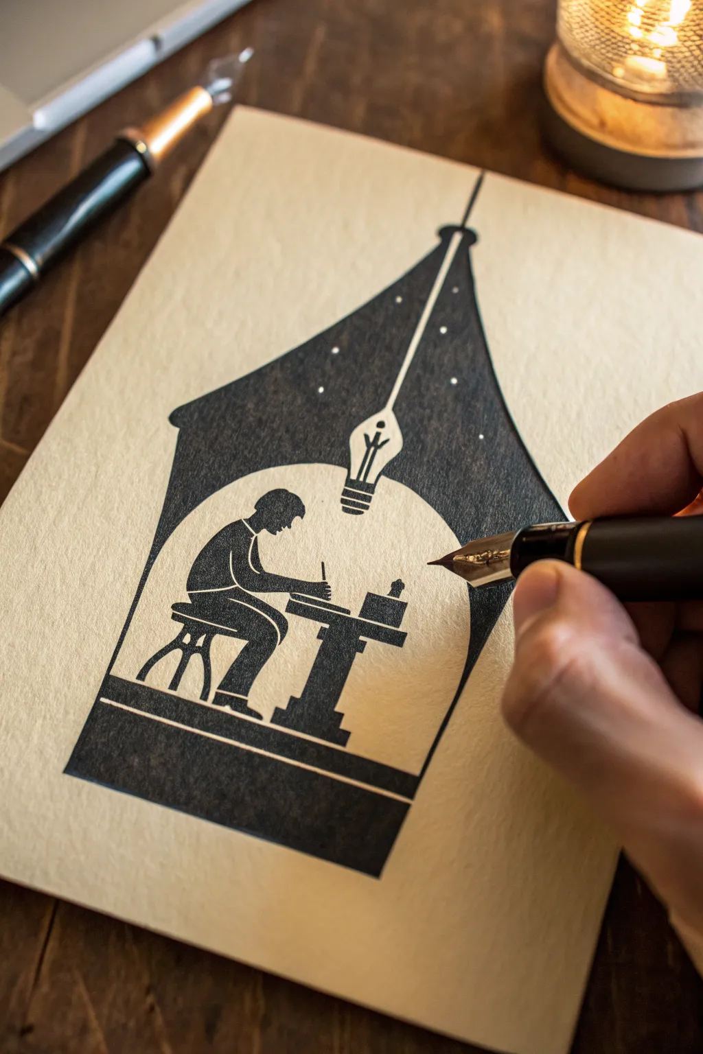
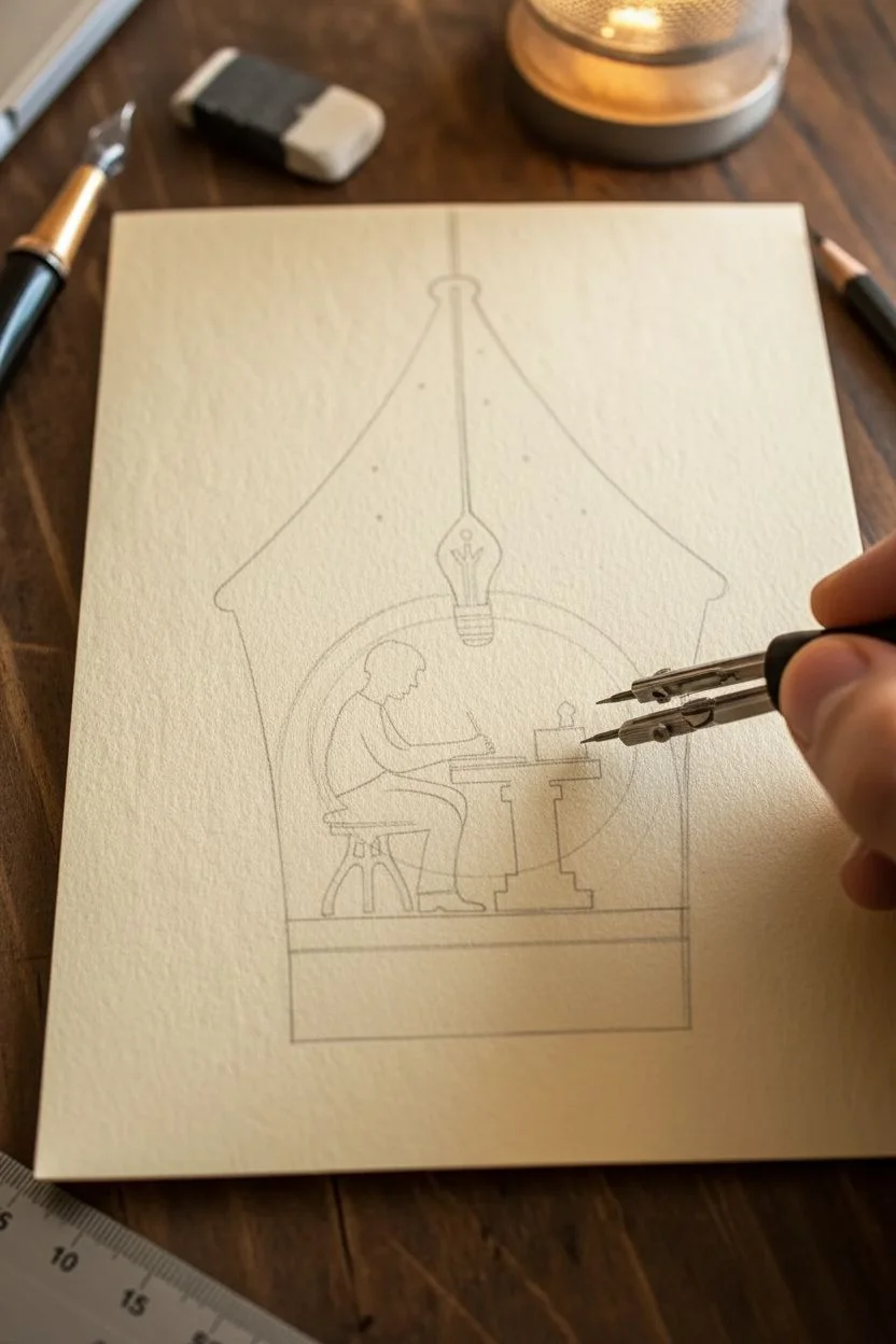
This elegant ink drawing uses clever negative space to turn a simple fountain pen silhouette into a cozy scene of inspiration. By carefully framing a tiny figure within the ‘breather hole’ of the pen nib, you create a meta-narrative about the act of creating itself.
How-To Guide
Materials
- High-quality hot press watercolor paper or smooth Bristol board (approx. A5 size)
- Black India ink or high-pigment acrylic ink
- Fine liner pens (sizes 0.05, 0.1, and 0.5)
- Small round paintbrush (size 0 or 1)
- Hard pencil (2H or H) for drafting
- Compass or circular object (approx. 2-3 inches diameter)
- Kneaded eraser
- Ruler
Step 1: Drafting the Composition
-
Establish the centerline:
Use your ruler to draw a very light vertical line down the center of your paper. This axis is crucial for keeping the pen nib symmetrical. -
Mark the central circle:
Place the point of your compass on the center line, slightly below the vertical middle of the page. Draw a circle approximately 2.5 inches in diameter. This will become the negative space ‘window’ for your character. -
Sketch the nib outline:
Draft the outer shape of the fountain pen nib. Start wide at the bottom base, curve gently inward as you go up, and then curve back out slightly before converging at the sharp tip. The tip should align perfectly with your center line at the top. -
Define the tines:
From the top tip of the nib, draw a straight line down the center axis until it meets a teardrop or keyhole shape that connects to the top of your circle. This represents the split tines and the breather hole of the pen. -
Sketch the inner scene:
Inside the circle, lightly sketch a horizontal line for the desk surface. Add the silhouette of a chair and a figure leaning forward, engaged in writing. I like to keep the posture exaggerated—leaning in implies focus. -
Add the filament detail:
From the ‘breather hole’ at the top of the circle, sketch a hanging lightbulb socket and filament shape directly above the figure’s head. This cleverly doubles as the internal mechanism of the pen.
Step 2: Inking the Frame
-
Outline the nib perimeter:
Using your 0.5 fineliner or a steady hand with the brush, trace the outer boundary of the large pen nib shape. Do not ink the bottom horizontal line yet; we want that to feel grounded but open. -
Protect the negative space:
Carefully outline the *outside* of the central circular area. It is vital that no ink crosses into the circle or the thin channel running up to the nib’s tip. -
Fill the large black areas:
Load your round brush with black India ink. Begin filling in the solid black shape of the nib body. Work slowly near the edges to maintain a crisp line. -
Vary the texture:
As you fill the large areas, you can let the ink pool slightly or dry unevenly if you want a subtle, organic texture. For a flat graphic look, apply a second coat once the first is dry. -
Add the stars:
While the main black area is drying, use a white gel pen or opaque white gouache to add tiny dots in the upper black section of the nib. This turns the dark ink into a night sky above the writer.
Pro Tip: Masking Magic
For a perfect circle, apply liquid masking fluid to the central area before painting the black surround. Rub it off at the end for crisp, sharp edges.
Step 3: Detailing the Narrative
-
Ink the figure outline:
Switch to your 0.1 fineliner. Carefully trace the outline of your character, the chair, and the desk inside the circle. Keep the lines clean. -
Fill the interior silhouettes:
Fill in the figure, chair, and desk with solid black. Leave tiny white gaps to define where the arm crosses the body or where the legs separate, ensuring the posture remains readable. -
Detail the lightbulb:
Ink the hanging lightbulb mechanism. Be precise with the threads of the bulb socket to give it that industrial look. -
Refine the desk objects:
Use your 0.05 pen to add tiny details on the desk, like an ink bottle or a stack of paper. These small touches add immense scale to the drawing. -
Add the base:
Draw a thick, solid black horizontal band beneath the entire composition to ground the image, merging it with the bottom of the nib shape. -
Erase and clean:
Wait at least 30 minutes for the India ink to fully cure. Gently erase your pencil guidelines with the kneaded eraser to reveal the stark contrast between the paper and the ink.
Troubleshooting: Bleeding Lines
If ink bleeds into negative spaces, your ink is too wet or paper too absorbent. Wait for layers to dry fully and switch to pigment liners for edges.
Step back and admire how a simple silhouette can tell such a deep story about the writing process
City vs. Nature in One Shape
Blend the rigid lines of urban architecture with the organic growth of a forest in this striking negative space study. Using deep black ink on heavy watercolor paper creates a high-contrast piece that feels both modern and serene.
Step-by-Step Tutorial
Materials
- Heavyweight watercolor paper or Bristol board (cream or off-white)
- Black India ink or high-quality black gouache
- Fine liner pens (0.1mm, 0.3mm, 0.5mm)
- Small round brush (size 2 or 4)
- Pencil (HB)
- Kneaded eraser
- Ruler
- Mat board for framing (optional)
Step 1: Planning the Composition
-
Prepare the paper:
Cut your paper to your desired size, leaving a generous margin around the edges. Tape the paper down to a flat board with painter’s tape to prevent warping if using wetter media. -
Sketch the horizon:
Lightly draw a horizon line roughly two inches from the bottom of your designated drawing area. -
Outline the trees:
Sketch four main vertical lines to represent the trunks of your large pine trees. Vary their heights, making the center-left tree the tallest to create a focal point. -
Draft the city layer:
Here is the trick for the ‘City vs. Nature’ theme: sketched faintly at the very base, beneath the trees, draw the blocky, rectangular outlines of a city skyline instead of roots or dirt. Keep this extremely subtle for now.
Ink Bleeding Info
If ink feathers on the paper, your paper may be too absorbent. Switch to smooth Bristol board or hot-press watercolor paper for sharper lines.
Step 2: Inking the Trees
-
Start the main trunks:
Using a 0.5mm pen or your brush with black ink, draw the vertical trunks. Keep your hand somewhat loose; these shouldn’t be ruler-straight. -
Create the branches:
Starting from the top of the tallest tree, use a stippling or small dash motion to create pine needles. The branches should point slightly upward near the top and droop heavily as you move down. -
Build density:
Layer your ink marks. The tops of the trees should be airy and sparse, allowing the paper to show through, while the foliage should become dense and nearly solid black as you reach the lower third. -
Repeat for all trees:
Move to the smaller trees. Vary the width of your branches to give each tree a unique ‘personality’ so they don’t look like carbon copies. -
Detail with fine liners:
Switch to a 0.1mm pen to add tiny stray branches and fine needles on the outer edges of the silhouette. This adds realism and softness to the shapes.
Metallic Accent
Add a hidden layer of magic by using gold leaf or metallic pen for just the windows in the tiny city skyline at the bottom.
Step 3: The Urban Undergrowth
-
Fill the background forest:
Between the main trees, use a diluted wash of ink or a grey marker to draw a smaller, distant forest line. This adds depth and makes the black foreground pop. -
Incorporate the city elements:
At the very bottom, where the ‘ground’ would be, fill in your city skyline sketch with solid black. Merge the tops of the buildings seamlessly into the bottom branches of the trees. -
Blend the worlds:
Ensure there is no clear line separating the buildings from the trees. The skyscrapers should look like they are growing out of the forest floor, or perhaps the trees are rooting into the city. -
Refine the edges:
Go back over the bottom edge of the artwork. Clean up the silhouette to ensure the bottom forms are recognizable as buildings upon closer inspection.
Step 4: Finishing Touches
-
Check contrast:
Step back and look at the piece. If the main trees look too light or gray, apply a second coat of India ink to make them a deep, void-like black. -
Erase guidelines:
Once the ink is completely dry—I usually give it at least an hour to be safe—gently erase any visible pencil marks with a kneaded eraser. -
Create the border:
If you want the embossed look shown in the image, cut a piece of smooth cardstock slightly smaller than your paper size, cut a window in it, and mount it over your artwork as a faux mat.
Now you have a piece that rewards the viewer for looking closer at the details
Upside-Down Illusion With One Set of Shapes
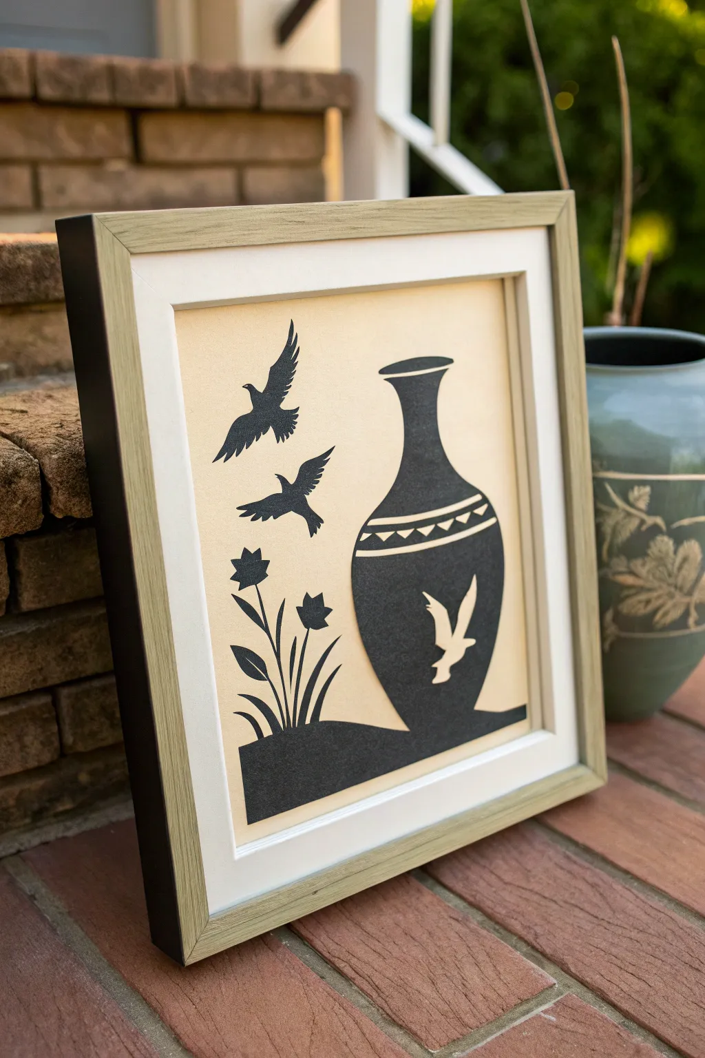
This striking silhouette art relies on the interplay between positive and negative space to create a visually engaging scene. By carefully cutting black cardstock against a cream background, you’ll form a classic vase shape that hides a secret flock of birds within its contours.
Step-by-Step Guide
Materials
- Black cardstock or heavy construction paper
- Cream or light beige cardstock (for background)
- Shadow box frame (square, approx. 8×8 or 10×10 inches)
- Craft knife (X-Acto)
- Self-healing cutting mat
- Pencil and eraser
- Ruler
- Spray adhesive or craft glue stick
- Tracing paper (optional)
- Small sharp scissors (optional for curves)
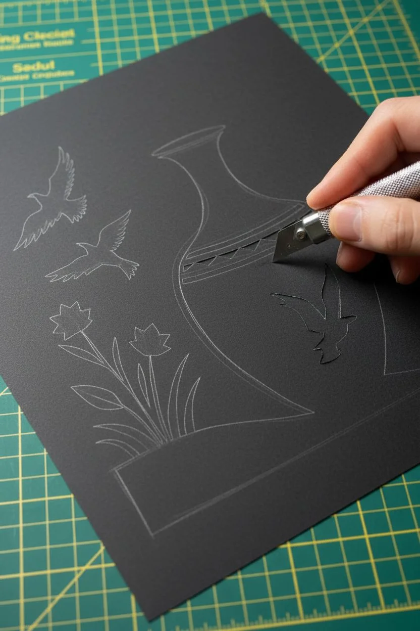
Step 1: Designing the Template
-
Measure your frame:
Begin by dismantling your shadow box frame to measure the exact size of the backing board. You will need to cut your cream background paper to these precise dimensions. -
Draft the concept:
On a scrap piece of paper or sketchbook, draw a large vase shape on the right side. Add a ground line connecting from the left. Sketch two birds flying in the air on the left side, and some simple tulip-like flowers rising from the ground. -
Incorporate the illusion:
This is the tricky part. Look at your vase shape. Instead of a solid black vase, you want to cut a white bird shape *out* of the black vase body, letting the cream background show through. -
Create the final pattern:
Transfer your final design onto the black cardstock. You can draw lightly with a pencil directly on the black paper, or draw on white paper first and use graphite transfer paper to trace it onto the black stock. Remember to include the geometric band detail near the vase’s neck.
Step 2: Cutting the Silhouette
-
Prepare your workspace:
Place your self-healing cutting mat on a solid table. Ensure you have a fresh, sharp blade in your craft knife—dull blades tear paper rather than slicing it cleanly. -
Start with internal details:
Begin cutting the smallest internal shapes first. Cut out the bird silhouette that sits inside the vase. Remove the small triangles in the decorative band around the vase’s neck. -
Cut the flying birds:
Move to the separate flying birds on all the left. Carefully trace the feathered edges of their wings. I find it easiest to rotate the paper while cutting curves, rather than moving my hand. -
Tackle the flowers:
Cut out the stems and leaves of the flowers. These can be delicate, so take your time and don’t pull on the paper if a cut isn’t fully separated yet. -
Outline the main shapes:
Once all interior details are done, cut the main outline of the vase, the ground, and the flower silhouettes. You should end up with one main connected piece (ground + vase + flowers) and two separate bird pieces. -
Clean up edges:
Inspect your cutouts. If there are any fuzzy edges or little hanging bits of paper, carefully snip them off with small sharp scissors.
Fixing Tears
Did a delicate stem rip? Apply a tiny dot of white glue with a toothpick to the tear, press it back together, and let it dry before gluing the whole piece down.
Step 3: Assembly and Framing
-
Prepare the background:
Take your pre-cut cream cardstock. Lay your black cutouts on top without glue first to check the positioning and spacing. Make sure the margins look balanced. -
Apply adhesive:
Flip your black cutouts over onto a scrap piece of paper. Apply a thin, even layer of spray adhesive. If using a glue stick, focus on the delicate stems and edges to prevent them from lifting. -
Mount the artwork:
Carefully pick up the main black piece (vase and ground) and place it onto the cream background. Press down gently from the center outwards to avoid air bubbles. -
Place the flying birds:
Adhere the two separate flying birds in the upper left empty space. Ensure they are angled as if flying towards or around the vase. -
Clean the glass:
Before reassembling the frame, clean the inside of the glass thoroughly to remove fingerprints or dust specks. -
Final assembly:
Place your mounted artwork into the frame, add the spacer if your shadow box has one, and secure the backing board. Your negative space illusion is ready to display.
Add Dimension
Use small foam adhesive squares behind the flying birds or the vase body to lift them slightly off the background, creating real cast shadows.
Hang your finished piece in a spot with good lighting to really highlight the crisp contrast of the silhouettes


Have a question or want to share your own experience? I'd love to hear from you in the comments below!