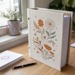
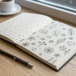
A notebook cover is basically a tiny canvas you get to carry around all day, so I love making it feel like “me” right from the start. Here are notebook cover drawing ideas I use all the time—easy to customize, fun to draw, and totally doable even on a busy day.
Simple Floral Corner Doodles
Transform a plain spiral notebook into a personalized journal with this delicate ink and color pencil design. The artwork features charming botanical elements framing opposite corners, leaving plenty of white space for your titles or thoughts.
Detailed Instructions
Materials
- A5 spiral-bound notebook with white cover
- Fine liner pen (0.3mm or 0.5mm, black waterproof ink)
- Colored pencils (soft pink, darker pink, and yellow)
- Pencil (HB or 2H for sketching)
- Eraser
Step 1: Sketching the Layout
-
Visualize the Balance:
Before drawing, look at your notebook cover. You will be placing a smaller cluster of leaves in the top right corner and a larger, more complex garden scene along the bottom edge, primarily focusing on the bottom right corner. -
Lightly Pencil the Top Corner:
In the top right corner, use your pencil to lightly sketch a few curving lines drooping downwards. These will be the stems for the hanging leaves. -
Rough in the Bottom Garden:
Sketch the main vertical lines for the bottom section. Draw a few tall, straight stems on the far right, and some shorter stems towards the left-center. -
Place the Main Flowers:
Mark the position of the three main flowers with light circles: a large daisy-like shape on the left, a small 5-petal flower in the middle, and a small bud-like flower higher up on the right.
Steady Your Hand
If you’re nervous about inking directly on the cover, practice the leaf shapes on a scrap piece of paper first. Pull the pen towards your body for smoother lines.
Step 2: Inking the Top Corner
-
Draw the main stem:
Using your fine liner, trace over your pencil line for the main hanging stem in the top right corner. -
Add Leaf Details:
Draw small, teardrop-shaped leaves attached to the stem. Add a central vein to each leaf for a classic botanical look. -
Create Berry Sprigs:
Next to the leafy stem, draw a few very thin, branching lines ending in small circles to represent berries or buds. This adds texture variation to the corner.
Step 3: Inking the Bottom Garden
-
Outline the Daisy:
Start with the large flower on the left. Draw a small oval center, then add many long, thin petals radiating outward. Don’t worry if they aren’t perfect; irregularity adds charm. -
Draw the Daisy Stem and Leaves:
Bring a stem down from the daisy head. At the base, draw two large, broadly veined leaves. -
Ink the Pink Flower:
Moving right, draw the five-petal flower. Give it a tiny circular center and rounded petals. Draw a thin stem connecting it to the ‘ground’. -
Add the Tall Grasses:
On the far right side, draw long, vertical stems. Add pairs of leaves climbing up the stems—some pointed like willow leaves, others smaller and rounded. -
Fill the Gaps:
Between your main flowers, draw a few simple, tall grass blades or single-line stems with tiny dots on top to make the garden look full without being cluttered. -
Erase Sketches:
Wait a moment for the ink to fully set, then gently erase all your pencil guidelines to reveal the crisp black lines.
Add Metallic Accents
Once the ink is dry, use a gold or silver gel pen to add tiny dots or trace the veins of a few leaves. It catches the light beautifully when the notebook moves.
Step 4: Adding Soft Color
-
Color the Middle Flower:
Take your soft pink colored pencil and gently fill in the petals of the five-petal flower. Keep the pressure light to maintain a pastel look. -
Add Yellow Centers:
Use the yellow pencil to color the tiny center of the pink flower. You can also add a touch of yellow to the center of the large daisy, though keeping it black and white is a nice stylistic choice too. -
Highlight the Buds:
Find the small bud on the taller stem to the right of the pink flower. Color the petals with a slightly darker pink or apply more pressure with your soft pink pencil to create contrast. -
Final Touches:
If you have a very tiny bud on the lower left near the daisy stem, give it a small dab of pink as well to balance the color across the design.
Now you have a custom notebook that invites you to open it and start writing


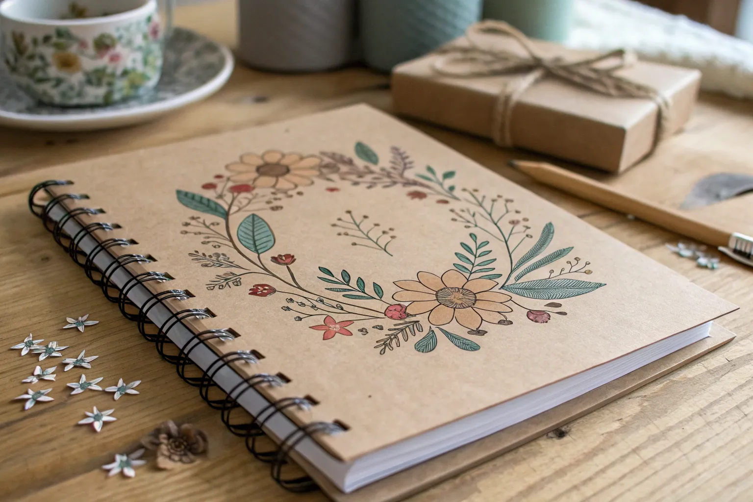
Botanical Line Art Wreath
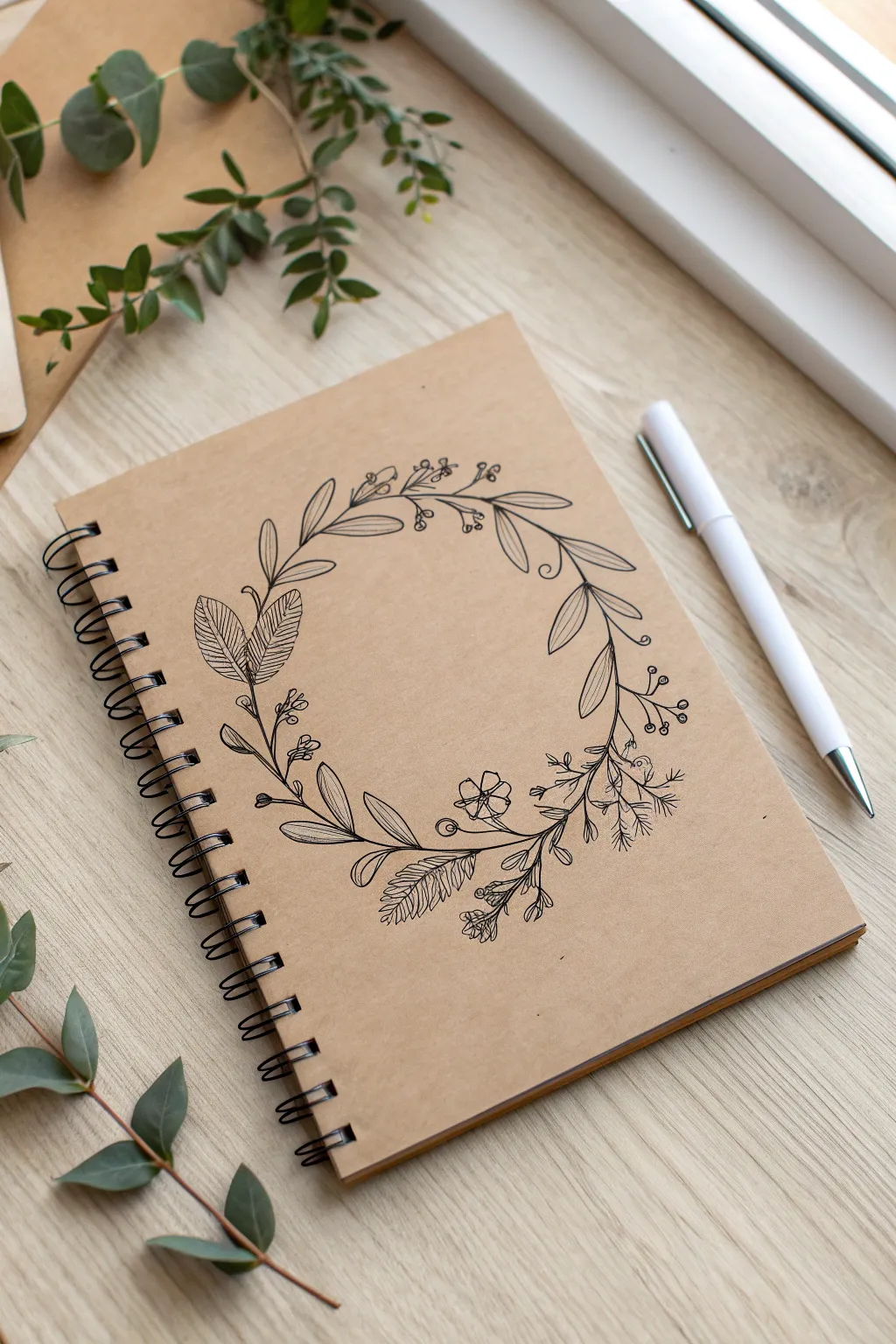
Transform a plain kraft notebook into a personalized journal with this delicate botanical line art wreath. The contrast of crisp black ink against the rustic brown paper creates an elegant, organic look perfect for nature lovers.
Step-by-Step
Materials
- Spiral-bound notebook with a plain kraft paper cover
- Fine liner pen (black, size 0.3 or 0.5)
- Ultra-fine liner pen (black, size 0.05 or 0.1)
- Pencil (HB or H)
- Compass or a round object to trace (bowl or lid)
- Kneaded eraser
Step 1: Planning the Structure
-
Prepare the surface:
Ensure your notebook cover is clean and free of dust. If the paper has a textured grain, run your hand over it to familiarize yourself with the resistance you might feel while drawing. -
Establish the circle:
Using a compass or by lightly tracing around a circular object like a bowl, draw a very faint circle in the center of the cover. This will serve as the spine for your wreath but won’t be part of the final ink drawing. -
Mark focal points:
Lightly sketch small tick marks at the 12, 3, 6, and 9 o’clock positions on your circle to help space out your botanical elements evenly.
Smudge Alert
Kraft paper is fibrous and inks can smudge easily. Place a clean scrap sheet of paper under your drawing hand to protect your work as you move around the wreath.
Step 2: Drafting the Botanicals
-
Anchor the design:
Start sketching your main leaf branches in pencil. Draw curved lines that hug the main circle guide, extending slightly outward or inward. I find it helpful to vary the direction of these stems to create movement. -
Add primary leaves:
Sketch the larger leaf shapes first. On the left side (around 9 o’clock), draw two large, textured leaf shapes. At the bottom (6 o’clock), add a sprig of feathery fern-like leaves. -
Introduce florals:
Place a small, five-petaled flower near the bottom right quadrant. Keep it simple and open. -
Fill the gaps:
Add secondary elements like sprigs of small berries on long stems and thin, wispy branches with tiny leaves to connect the larger components. Ensure the visual weight is balanced around the circle.
Go Golden
Add a touch of luxury by tracing over just the berries or the vein lines of the largest leaves with a metallic gold gel pen for a subtle shimmer.
Step 3: Inking the Design
-
Outline main stems:
Switch to your larger fine liner (0.3 or 0.5). Begin tracing the main structural stems. Use a confident, fluid motion to avoid shaky lines. -
Ink the large leaves:
Outline the prominent leaves on the left. Inside these leaves, draw tight, distinct vein lines using the thinner pen (0.05) to add complex texture without darkening the shape too much. -
Detail the fern:
For the fern sprig at the bottom, use quick, short strokes with the fine liner to replicate the delicate leaflets. -
Draw the flower and berries:
Ink the flower petals and the small clusters of berries. For the berries, leave a tiny white dot inside each circle to mimic a glint of light. -
Connect the branches:
Carefully ink the connecting vines and smaller filler leaves. Allow some lines to cross over others naturally, just as real plants would entangle.
Step 4: Finishing Touches
-
Add depth and shading:
Using your ultra-fine pen, add very sparse stippling (dots) or hatching at the base of the leaves where they meet the stem to create a sense of shadow. -
Review contrast:
Step back and look at the wreath. If any area looks too empty, draw a tiny extra twig or a loose coil to fill the void. -
Erase guidelines:
Wait at least 15 minutes for the ink to dry completely—kraft paper can be absorbent and hold moisture longer than standard paper. Gently remove the pencil circle and draft lines with a kneaded eraser to avoid damaging the paper fiber.
Your sketchbook now has a custom cover that invites creativity every time you open it

All-Over Polka Dots and Stars
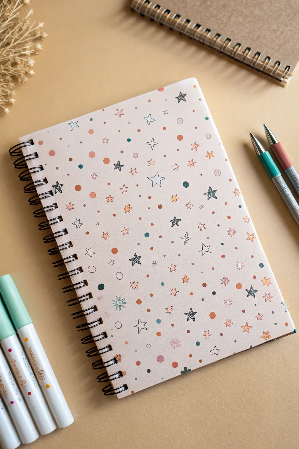
Transform a plain notebook into a whimsical galaxy of doodles with this scattered star and dot design. The soft pastel palette combined with sketchy, hand-drawn stars creates a dreamy, laid-back aesthetic perfect for journaling.
Step-by-Step
Materials
- Spiral-bound notebook with a plain light pink or cream cover
- Fine-liner pen (black, 0.3mm or 0.5mm)
- Pastel markers or highlighters (peach, teal, mint green)
- Gel pens (white, metallic gold/silver – optional)
- Pencil and eraser
Step 1: Planning and Base Layer
-
Surface Preparation:
Ensure your notebook cover is clean and dry. If the surface is glossy, test your pens on a back corner first to make sure they won’t smear. A matte paper cover works best for this project. -
Map Out the Large Stars:
Using a pencil very lightly, sketch the positions of about 5-7 distinct ‘hero’ stars. These are your largest elements and will anchor the design. Don’t worry about making them perfect; the charm is in the doodle style. -
Add Medium Elements:
Still using your pencil, sketch a few medium-sized outlined stars and some small starburst shapes in the empty spaces between your hero stars. Aim for an uneven, organic scatter rather than a grid.
Step 2: Inking the Stars
-
Draw the Scribble Stars:
Take your black fine-liner. Unlike traditional neat stars, draw these ‘hero’ stars with a loose, scribbly motion. Go over the lines 2-3 times continuously without lifting the pen to create that sketched, energetic look. -
Outline the Simple Stars:
Ink the medium-sized stars you penciled in earlier. Use single, clean lines for these to contrast with the scribbly hero stars. You can leave some open and color others later. -
Create Starbursts:
Draw small asterisks or simple 5-point line crosses scattered throughout the page. These act as tiny twinkling fillers. -
Erase Guide Lines:
Once the ink is completely dry (give it a good 5 minutes to be safe), gently erase your initial pencil sketches.
Smudge Alert
Work from the top left to bottom right (if right-handed) to avoid smearing fresh ink with your hand. Place a piece of scrap paper under your palm for extra safety.
Step 3: Adding Color and Dots
-
Color the Large Dots:
Using your pastel markers (peach or terracotta works beautifully here), draw solid circles of varying sizes. Place them randomly, but try to fill larger gaps between the stars. -
Add Accent Dots:
Switch to a second color, like teal or mint, and add smaller solid dots. I like to place some of these near the black doodle stars to create a little cluster effect. -
Fill Selected Stars:
Take a colored marker and carefully color inside a few of the simple medium stars you drew earlier. Leave most of them white for balance. -
Create Tiny Speckles:
Use the tip of your fine-liner to add tiny black dots or ‘dust’ in the negative spaces. This density makes the pattern feel cohesive. -
Draw Hollow Circles:
With your fine-liner, draw small open circles scattered among the solid colored dots. This adds a nice variety of visual weight.
Level Up: Metallic Pop
Trace over some of the scribble stars with a gold or silver gel pen. The metallic shine catches the light beautifully and makes the cover look premium.
Step 4: Final Details
-
The Second Scribble Layer:
Go back to your teal or mint marker. Draw loose, scribbly stars directly over a few blank spots. These don’t need black outlines; the color alone adds a soft texture. -
Add Micro-Details:
Look for any remaining large empty areas. Fill them with tiny ‘v’ shapes, miniature crosses, or single dots using your finest pen. -
Review Balance:
Hold the notebook at arm’s length. If one side looks too empty, add a few more solid colored dots to even out the visual weight. -
Protect the Art:
If you are worried about ink running from daily use, cover the front with a sheet of clear self-adhesive laminate or clear contact paper.
Now you have a custom stationery piece that is perfectly unique to you and ready for your best ideas


Geometric Shapes Pattern Fill
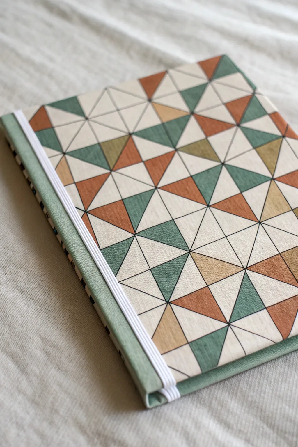
This project transforms a plain notebook into a modern statement piece using a repeating triangle pattern. The soft, muted color palette of sage green, terracotta, and mustard creates a sophisticated look that mimics the texture of fabric or tile.
Step-by-Step Guide
Materials
- Hardcover sketchbook or notebook (A5 size recommended)
- Heavyweight drawing paper or cardstock (cut to cover size)
- Pencil (HB)
- Ruler
- Fine liner pen (black, 0.5mm)
- Colored pencils, markers, or gouache (Sage Green, Terracotta, Mustard, Cream/Off-White)
- Green fabric tape or bookbinding tape (for the spine)
- White elastic band (approx. 5mm width)
- Craft glue or double-sided adhesive sheets
- Scissors or craft knife
- Cutting mat
Step 1: Planning the Grid
-
Measure the cover:
Measure the front cover of your notebook accurately. Cut your drawing paper to these exact dimensions, double-checking the fit before you start drawing. -
Establish the grid:
Using your ruler and pencil, lightly draw a grid of squares across the entire paper. For this pattern, 1-inch or 2cm squares work beautifully to keep the detail visible but manageable. -
Divide into triangles:
Draw diagonal lines across your squares. Create an ‘X’ shape through every square by connecting opposite corners. This will divide each square into four equal triangles meeting at the center point. -
Ink the lines:
Once you are satisfied with your pencil grid, retrace all the lines—the outer square borders and the inner diagonals—using your black fine liner. Keep a steady hand or use the ruler edge for crisp, professional lines.
Step 2: Adding Color
-
Select your palette:
Choose four specific colors to replicate this look: a deep sage green, a warm terracotta orange, a muted mustard yellow, and leave the white of the paper as your fourth ‘color’. -
Plan the random fill:
The charm of this pattern is its controlled randomness. Before coloring permanently, mark tiny dots in pencil indicating which color goes where if you want to ensure no two identical colors touch. -
Start with the darkest tone:
Begin filling in triangles with your sage green. Distribute them widely across the page, rotating their orientation (sometimes top, sometimes side) to keep the eye moving. -
Add warmth with terracotta:
Next, fill in the terracotta sections. I find that placing these near the green triangles creates the strongest contrast and makes the pattern pop. -
Fill the accents:
Add the mustard yellow sparingly compared to the other two colors. It acts as a highlight. -
Leave negative space:
Leave the remaining triangles uncolored (white/cream). This negative space prevents the design from feeling too heavy or cluttered. -
Erase guidelines:
Once your ink and coloring medium are completely dry, gently erase any remaining pencil marks from your initial grid sketching.
Uneven Grid?
If your hand-drawn grid looks wonky, try using dot grid paper as your base. The pre-printed dots act as perfect anchors for drawing your diagonal lines without needing to measure every square.
Step 3: Assembly and Binding
-
Apply the artwork:
Apply a uniform layer of craft glue or a double-sided adhesive sheet to the back of your drawing. Carefully align it with the front cover of the notebook and press down firmly, smoothing out any air bubbles from the center outward. -
Prepare the spine:
Cut a strip of green bookbinding tape or fabric tape slightly longer than the notebook’s height. This will cover the raw edge where your drawing meets the notebook spine. -
Attach the spine tape:
Place the tape over the spine, wrapping it onto the front cover by about half an inch to overlap your drawing. Fold the excess tape at the top and bottom over the edges for a clean finish. -
Measure the elastic:
Cut a length of white elastic band. It should be slightly shorter than the height of the notebook so it stretches tautly. -
Secure the closure:
Punch two small holes in the back cover near the edge, or simply glue the ends of the elastic inside the back cover before pasting down an endpaper to hide the attachment points.
Add Texture
To mimic the fabric look even more, choose a cold-press watercolor paper with a slight grain. Use colored pencils and shade lightly so the paper’s texture shows through the pigment.
Now you have a custom, geometric notebook ready for your next big idea

PENCIL GUIDE
Understanding Pencil Grades from H to B
From first sketch to finished drawing — learn pencil grades, line control, and shading techniques.
Explore the Full Guide
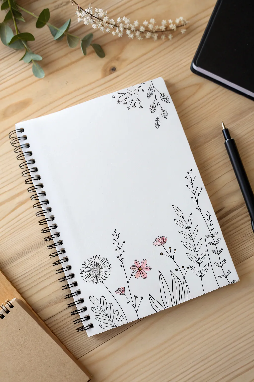
Minimal One-Line Portrait
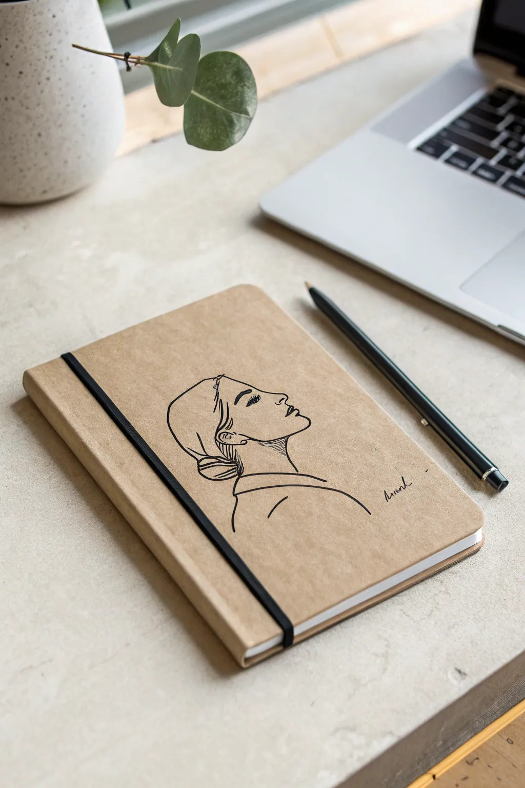
Transform a plain kraft notebook into a personalized sketchbook with this elegant, minimalist profile drawing. Using simple linework techniques, you’ll create a sophisticated illustration that looks effortlessly chic on the natural brown paper.
Detailed Instructions
Materials
- Kraft paper cover notebook
- HB pencil
- Soft eraser
- Black fineliner (0.5mm tip)
- Black gel pen or slightly thicker marker (0.8mm tip) for variation
- Reference photo of a side profile (optional)
Step 1: Planning and Sketching
-
Clean the surface:
Before you begin, wipe the cover of your notebook gently with a dry cloth to remove any dust or oils that might resist the ink. A clean surface ensures crisp lines. -
Map the head shape:
Using your pencil very lightly, draw a loose oval shape in the center of the cover. This doesn’t need to be perfect; it just establishes the size and placement of the head so you don’t run off the page. -
Define the forehead and nose:
Start sketching the actual profile. Draw a gentle slope for the forehead leading into the nose. Aim for an upturned perspective, so the nose points slightly upward towards the corner of the book. -
Sketch the lips and chin:
Continue the line down from the nose to create the lips. Keep the upper lip slightly more prominent. Curve inward for the chin and extend a long, graceful line down for the neck. -
Outline the neck and shoulder:
Draw the back line of the neck parallel to the front. At the base of the neck, sweep a curved line horizontally to suggest the collarbone and shoulder area. -
Draft the hair shape:
Visualize the hair pulled back into a low bun. Sketch a sweeping curve from the forehead over the ear area, gathering at the nape of the neck. Add a small, rounded bun shape at the back. -
Add facial details:
Place the ear just behind the jawline. Sketch a simple almond shape for the eye, complete with a few lashes, and a thin, arched line for the eyebrow.
Step 2: Inking and Refining
-
Start the main outlines:
Switch to your 0.5mm black fineliner. Begin tracing your pencil lines, starting with the face profile. Use a confident, steady hand rather than short, scratchy strokes. -
Vary the line weight:
For areas where shadows naturally fall, like under the chin or the back of the hair bun, you can go over the line a second time to thicken it slightly. I find this simple trick adds instant depth. -
Detail the eye:
Carefully ink the eye. Fill in the pupil solid black, leaving a tiny speck of white for a highlight if possible. Draw the eyelashes with quick, flicking motions. -
Refine the hair:
Inside the main hair outline, add a few internal sweeping lines to suggest strands and direction. Use lighter pressure here so these lines don’t compete with the main profile. -
Ink the clothing lines:
Trace the shoulder and collar area. Keep these lines very clean and minimal to maintain the abstract, modern aesthetic of the piece. -
Add the signature:
In the open space to the right of the shoulder, add a small, handwritten script signature or a short word. This balances the composition. -
Let the ink set:
Wait at least 15 minutes for the ink to dry completely. Kraft paper can sometimes be more absorbent, and smudging at this stage is heartbreaking. -
Erase guidelines:
Once clearly dry, gently erase all visible pencil marks. Hold the notebook paper down firmly with one hand while erasing to prevent the paper from buckling.
Uneven Ink Flow?
Kraft paper has texture that can interrupt ink flow. If lines look skippy, retrace them slowly or switch to a felt-tip pen, which handles porous paper better than a ballpoint.
Add a Pop of White
Use a white gel pen to add highlights to the top of the nose, the lip, and strands of the hair. The contrast against the tan paper looks incredible.
Now you have a custom, boutique-style notebook ready for your daily thoughts
Abstract Rainbow Wave Bands
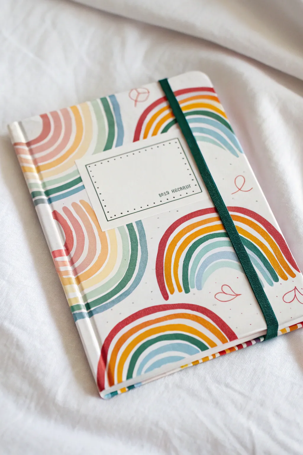
Transform a plain white notebook into a piece of personalized stationery with these soothing, abstract rainbow waves. The muted color palette and soft curves give this cover a laid-back, retro feel that’s perfect for journaling or sketching.
How-To Guide
Materials
- Hardcover notebook (white cover preferred)
- Acrylic paints (rust red, coral pink, mustard yellow, sage green, dusty blue)
- Medium flat paintbrush (approx. size 4-6)
- White sticker paper or cardstock
- Fine-tip black fineliner pen
- Ruler
- Pencil and eraser
- Matte spray sealant or Mod Podge (optional)
Step 1: Planning and Base Layers
-
Prep your surface:
Start with a clean, dry notebook cover. If your notebook isn’t already white, apply two coats of white gesso or acrylic paint to create a blank canvas, letting it dry completely between coats. -
Sketch the label placement:
Decide where your central label will go. Lightly draw a rectangle in the upper-middle area with a pencil. This zone will remain mostly free of paint so the label sits flat later. -
Map out the curves:
Using a pencil, very faintly sketch the placement of your rainbow arches. You want a variety of orientations—some sprouting from the bottom, some from the sides, and some inverted from the top. Don’t worry about drawing every single stripe; just mark the general flow and spacing. -
Mix your palette:
Prepare your acrylics. Aim for a ‘boho’ look by mixing standard primary colors with a tiny dot of white or a hint of brown to mute them down. You specifically want a rust red, a soft coral, a mustard yellow, a dusty sage green, and a muted sky blue.
Step 2: Painting the Rainbows
-
Start the first arch:
Choose one of your sketched curves to start. Load your brush with the rust red paint. Paint the outermost, largest curve of the rainbow first. Use a steady hand to create a smooth, even stroke about 1/4 inch wide. -
Add the second stripe:
Clean your brush thoroughly and switch to the coral pink. Paint the next stripe directly nestled inside the red curve. Leave a tiny, almost invisible gap between colors to keep them distinct. -
Continue the sequence:
Follow with mustard yellow, then sage green, and finally the dusty blue on the innermost curve. Repeat this color order for consistency, or mix it up for a more eclectic look. -
Vary the sizes:
As you move to other rainbows on the cover, feel free to vary the number of stripes. Some arches might only have three or four colors if space is tight near the edges. -
Painting off the edge:
For rainbows located near the perimeter, paint right off the edge of the cover and wrap the color around the thickness of the hardback binding. This gives the notebook a professional, finished appearance. -
Fill the gaps:
Continue painting arches until the cover feels balanced but not cluttered. Allow the white background to breathe between the shapes. -
Add floating details:
Once the heavy painting is done, use a very fine brush or even a broad paint marker to add small, simple accent shapes in the empty white spaces. Small hearts or loose loops in rust red or coral add a nice whimsical touch. -
Let it cure:
Allow the entire cover to dry for at least one hour. Acrylics dry fast, but you want them fully set before adding the label.
Wobbly Lines?
If you’re struggling to paint smooth curves freehand, try using a slightly wider flat brush. The bristles naturally create a consistent width, so you only have to focus on the direction.
Step 3: The Label and Finishing Touches
-
Create the label:
Cut a rectangle from your sticker paper or cardstock that is slightly smaller than the unpainted area you reserved earlier. A size of about 3×2 inches usually works well. -
Draw the frame:
Using a ruler and your fine-tip black pen, draw a double border around the edge of the label. I like to make the inner line a simple solid line and the outer line a series of small dots for texture. -
Add placeholder text:
In the bottom right corner of the label, you can write a title like ‘Notes’ or ‘Journal’ in a small, neat serif font, or leave it blank for now. -
Attach the label:
Peel the backing off your sticker paper and adhere it to the center of the cover. If you used cardstock, glue it down firmly with a glue stick, smoothing out any air bubbles. -
Seal the work:
To protect your artwork from scratches and moisture, take the notebook to a well-ventilated area and apply a clearer matte spray sealant over the entire cover. Two light coats are better than one heavy one.
Level Up: Texture
Once the paint is dry, use a metallic gold gel pen to outline just one side of each rainbow band. This adds a subtle shimmer that catches the light beautifully when you turn the book.
Your stylish new notebook is now ready to be filled with your brightest ideas and sketches
BRUSH GUIDE
The Right Brush for Every Stroke
From clean lines to bold texture — master brush choice, stroke control, and essential techniques.
Explore the Full Guide
Soft Gradient Background With Doodles
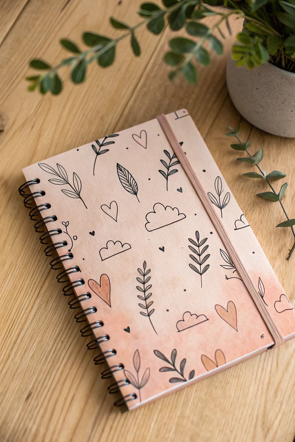
Transform a plain spiral notebook into a dreamy piece of stationery with a soft watercolor wash and simple, charming line art. This project combines a gentle peachy-pink gradient with crisp black doodles for a look that is both organic and organized.
Detailed Instructions
Materials
- Spiral-bound notebook with a plain paper or cardstock cover
- Watercolors (peach, light pink, and warm beige)
- Wide flat brush for washes
- Fine liner pen (technical pen or waterproof marker, size 0.5 or 0.8)
- Pencil and eraser
- Paper towel
- Clean water
- White gel pen (optional for highlights)
- Clear matte varnish spray (optional)
Step 1: Creating the Soft Base
-
Prepare the workspace:
Slip a sheet of scrap paper or cardboard underneath the front cover of your notebook. This acts as a barrier to protect the inner pages from any moisture or ink bleeding through while you work. -
Mix your palette:
On your mixing palette, prepare a very watery wash of peach and a separate puddle of warm beige. You want the consistency to be transparent, like tea, rather than thick or opaque. -
Wet the cover:
Using your clean flat brush, lightly dampen the entire notebook cover with plain water. This wet-on-wet technique helps the colors bloom and blend softly without harsh edges. -
Apply the first wash:
Load your brush with the peach wash and sweep it across the bottom third of the cover. Tilt the notebook slightly so the pigment pools naturally towards the bottom. -
Blend the gradient:
While the peach strip is still wet, clean your brush slightly and pick up the beige tone. Apply this to the middle section, overlapping the peach edge just enough to let them merge. -
Fade to the top:
For the top third, use mostly water with just a hint of the leftover beige pigment on your brush to fade the color out almost completely to the paper’s natural tone. -
Let it dry completely:
Allow the cover to air dry flat. If the paper buckles slightly, you can place a heavy book on it *after* it is fully dry to flatten it out.
Ink Confidence
Use a waterproof fineliner so you can layer paint over your doodles without smearing. If your pen isn’t waterproof, do all painting first!
Step 2: Doodling the Elements
-
Sketch the layout:
Lightly sketch your main doodle elements with a pencil. Focus on spacing; place larger items like the clouds and big leaves first to ensure a balanced composition. -
Outline the main leaves:
Switch to your fine liner pen. Start by tracing your main botanical sprigs. Use quick, confident strokes for the stems to keep them looking organic rather than shaky. -
Draw the clouds:
Ink the cloud shapes using a simple scalloped line. Don’t worry about making them perfect; a little asymmetry adds to the hand-drawn charm. -
Add hearts:
Scatter open heart shapes throughout the empty spaces. Keep them simple and unshaded for now. -
Draw secondary foliage:
Fill in gaps with smaller botanical elements, like single leaves or tiny vines. Vary the direction they point to create a sense of movement. -
Incorporate tiny details:
Look for empty pockets of space and add tiny dots or very small solid hearts. These filler elements make the pattern look cohesive and complete. -
Erase pencil lines:
Wait until the ink is completely dry—give it a few extra minutes just to be safe—and then gently erase your preliminary pencil sketches.
Step 3: Finishing Touches
-
Color selected doodles:
Dip a small round brush into a slightly more concentrated peach watercolor mix. Carefully paint inside a few of the hearts and leaves, but leave most of them as line art for contrast. -
Shade the leaves:
For a bit of depth, add a second layer of diluted grey or darker beige paint to just one side of a few leaves, mimicking a shadow. -
Add highlights:
If you have a white gel pen, add tiny highlights to the painted hearts once they are dry to make them pop. -
Seal the design:
To protect your artwork from daily wear and tear, take the notebook outside and apply a light coat of clear matte varnish spray.
Texture Twist
Try adding gold leaf flecks or metallic watercolor accents to the painted hearts for a bit of shimmer that catches the light.
Now you have a fully customized notebook that’s ready to handle your daily notes and creative ideas
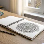
Zen-Doodle Border Frame
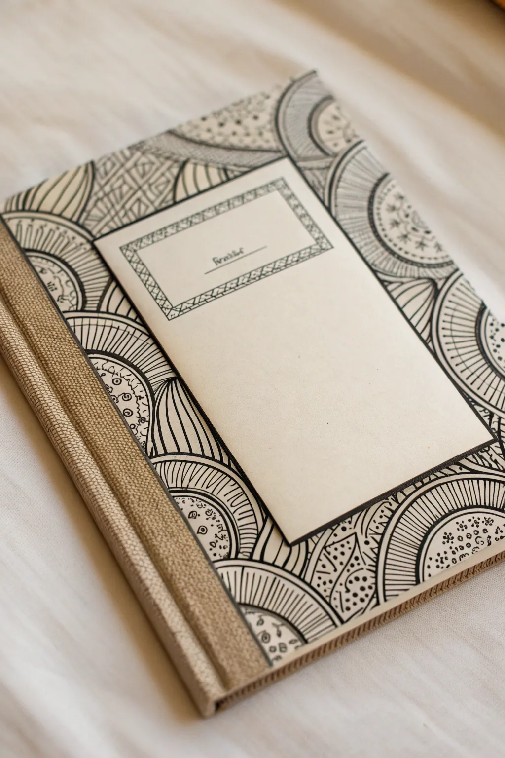
Transform a plain notebook into a stunning art piece featuring intricate black ink patterns inspired by mandalas and organic geometry. The contrast between the crisp black lines and the rustic fabric binding creates a sophisticated, hand-crafted aesthetic perfect for journaling.
Step-by-Step Tutorial
Materials
- Hardcover sketchbook or notebook (blank cover)
- Beige or oatmeal-colored linen bookbinding tape (approx. 2 inches wide)
- Fine liner pen (0.3mm or 0.5mm tip, black)
- Thicker marker pen (0.8mm or 1.0mm tip, black)
- Pencil and eraser
- Ruler
- Compass (optional)
- Cream colored cardstock (approx. 4×6 inches)
- Glue stick or double-sided tape
Step 1: Preparing the Base
-
Bind the Spine:
Cut a strip of beige linen bookbinding tape slightly longer than the height of your notebook. Center it over the spine so it wraps equally onto the front and back covers, creating a textured fabric edge. -
Secure the Edges:
Fold the excess tape over the top and bottom edges of the cover to the inside for a clean finish. Press down firmly to ensure good adhesion, smoothing out any air bubbles. -
Create the Label Panel:
Cut a rectangle of cream cardstock approximately 3.5 by 5.5 inches. This will double as your title block and a visual break from the busy pattern. -
Design the Label Border:
Using your fine liner, draw a double border about 1/4 inch from the edge of the cardstock rectangle. Inside this double border, sketch a simple repeating geometric pattern, like small triangles or crossed lines, to frame the space. -
Add Text Lines:
In the upper third of the cardstock panel, draw two short parallel lines for writing a title. Add a tiny decorative doodle nearby if you like. Set this panel aside; we will attach it last.
Step 2: Drafting the Zen-Doodle Pattern
-
Pencil Sketching:
Lightly sketch large, intersecting semi-circles and arcs across the front cover using a pencil. Start from the edges and the spine tape, allowing the shapes to overlap naturally. -
Define Major Shapes:
Fill the space with large curved sections. Imagine them like overlapping plates or large scales. Don’t worry about perfect symmetry; the organic flow is key here. -
Ink the Outlines:
Take your thicker marker (0.8mm or 1.0mm) and trace over your main pencil arcs. These bold lines will define the structure of your design and separate the different pattern zones.
Uneven Spacing?
If your radiating lines get uneven, don’t erase! Simply add smaller lines in between the wider gaps. This adds density and makes the variation look like an intentional design choice.
Step 3: Filling with Details
-
Radiating Lines Texture:
Choose several of the large arc sections to fill with radiating lines. Using the fine liner, draw straight lines fanning out from the center of the arc to the outer edge, spacing them evenly like wheel spokes. -
Dot Patterns:
In adjacent sections, create a lighter texture by stippling. Draw clusters of small circles or dots. Group them densely near one edge and let them scatter out for a gradient effect. -
Scallops and Scales:
Fill other sections with small, repetitive U-shapes or scales. Keep these tight and uniform to contrast with the open radiating lines. -
Geometric Triangles:
For variety, find a section to fill with a grid of triangles or cross-hatching. This introduces a sharper, more angular element among the curves. -
Adding Contrast:
Look for small gaps or narrow borders between patterns. Use your thicker marker to color these areas completely black. This heavy contrast makes the delicate line work pop. -
Refining the Edges:
Check where your patterns meet the linen spine tape. Draw a clean, thick line along the tape’s edge to act as a barrier, ensuring the ink design looks intentional and finished. -
Erase Pencil Marks:
Wait at least 15 minutes for the ink to fully dry. Gently erase all visible pencil guidelines to reveal the crisp black-and-white artwork.
Design Continuity
Extend a few of your circular patterns so they look like they go ‘under’ the glued-on label. This creates depth and makes the composition feel layered rather than just stuck on.
Step 4: Final Assembly
-
Attach the Label:
Apply glue or double-sided tape to the back of your prepared cardstock label. Position it centrally on the cover, slightly angled or straight depending on your preference. -
Scale the Panel:
If the panel feels too stark against the busy background, draw a thick black outline around the very edge of the cardstock after gluing it down to integrate it into the design.
Now you have a beautifully intricate notebook that invites creativity every time you open it.


Night Sky Galaxy Cover
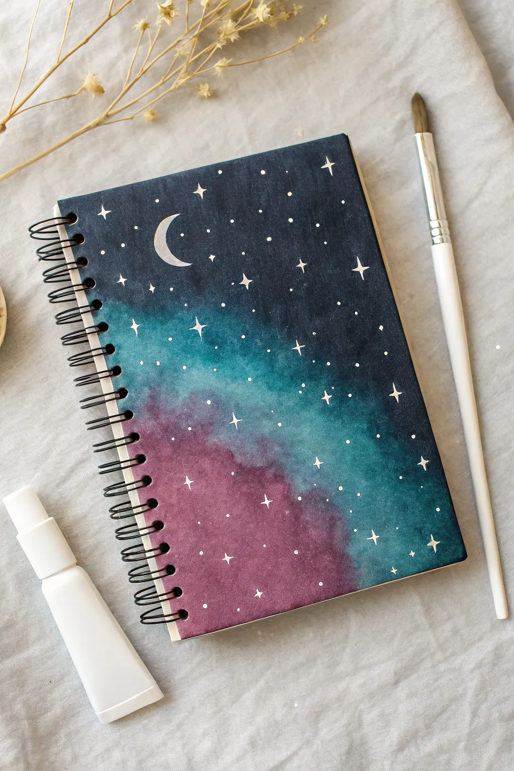
Transform a plain spiral-bound notebook into a breathtaking view of the cosmos with this stunning galaxy cover. Featuring deep indigos, vibrant teal, and dusty purple blends, this project captures the magic of a starry night sky right on your sketchbook.
Detailed Instructions
Materials
- Spiral-bound notebook (with thick cardstock or watercolor paper cover)
- Watercolor paints (Indigo, Teal/Turquoise, Deep Purple)
- White opacity marker (e.g., Posca) or white gel pen
- Round watercolor brush (size 6 or 8)
- Small detail brush (size 0 or 1)
- Cup of water
- Paper towel
- Masking tape (optional)
Step 1: Setting the Background
-
Prepare the surface:
If your notebook cover is glossy, lightly sand it to help the paint adhere. If it’s already a matte cardstock or watercolor paper cover, ensure it is clean and dust-free. -
Mix your darkest shade:
On your palette, load up a generous amount of indigo or navy blue watercolor. You want this pigment to be quite saturated. -
Paint the top section:
Start painting at the very top of the cover, applying the dark indigo in a horizontal band. Keep the paint wet and fluid. -
Fade downwards:
As you move about a third of the way down, clean your brush slightly and use water to soften the edge of the indigo, preparing it for the next color transition.
Star Placement Trick
Don’t evenly space your stars. Nature is random! Create small clusters of tight dots and leave some areas of empty ‘negative space’ for a realistic look.
Step 2: Blending the Galaxy Colors
-
Introduce the teal:
Load your brush with a vibrant teal or turquoise paint. While the indigo edge is still damp, apply the teal just below it. -
Create the gradient:
Gently gently stroke the brush back and forth where the indigo meets the teal to create a seamless, soft blend. Avoid overworking it or the paper might pill. -
Angle the color flow:
Instead of straight horizontal lines, bring the teal down diagonally towards the right side to create dynamic movement in your galaxy. -
Add the purple tones:
Mix a deep, dusty purple. Apply this to the bottom left section of the cover, blending it upwards into the teal section. -
Complete the bottom right:
Fill the remaining bottom right corner with a mix of the teal and indigo to anchor the composition with darkness again. -
Refine the blends:
Look for any harsh lines. I like to use a slightly damp, clean brush to gently feather out any hard edges between the purple and teal sections. -
Let it dry completely:
This is crucial. The paint must be bone-dry before adding stars, or the white ink will bleed. This usually takes about 20-30 minutes.
Step 3: Adding Celestial Details
-
Paint the crescent moon:
Using a white paint pen or a fine detail brush with opaque white gouache, draw a crescent moon shape in the upper left indigo section. -
Add major stars with four points:
Select 5-7 spots across the cover for your brightest stars. Draw a small cross shape, extending the vertical and horizontal lines slightly to create a twinkle effect. -
Scatter medium stars:
Draw simple solid dots of varying sizes randomly throughout the painting. Focus a few clusters near the transition zones of colors. -
Create distant stardust:
For the tiniest stars, take a small amount of white paint on a toothbrush or stiff brush and gently flick it over the cover to create a fine mist of specks. -
Enhance the moon:
If the moon looks translucent after drying, apply a second layer of white to make it pop against the dark background. -
Highlight the major stars:
Add a tiny dot of concentrated white in the very center of your four-pointed stars to give them a glowing core. -
Seal the artwork:
Once absolutely everything is dry, you can lightly spray a fixative or matte sealant over the cover to protect the watercolor from moisture and handling.
Fixing Muddy Blends
If your purple and teal turn brown where they meet, let the first layer dry fully. Then, apply a thin glaze of one color over the other rather than wet-mixing.
Now you have a personalized sketchbook that inspires creativity every time you open it to draw or write
Cute Animal With Big Eyes
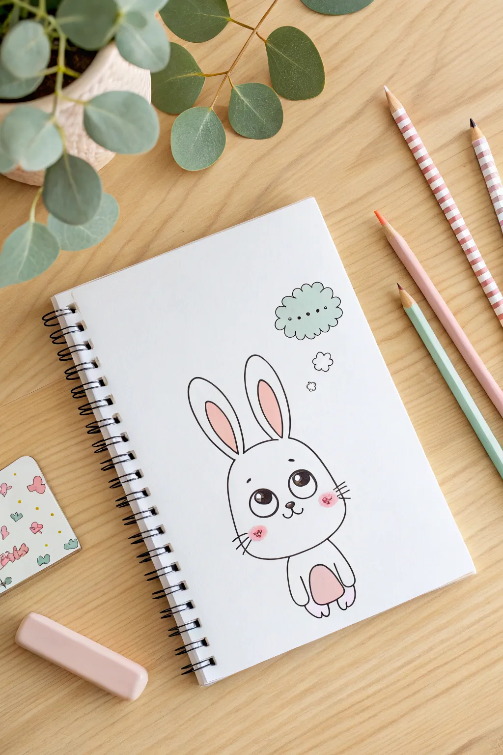
This adorable bunny sketch features oversized, expressive eyes and soft pink accents that make it pop off the page. The clean lines and playful thought bubble give it a whimsical charm perfect for personalizing any plain notebook cover.
Step-by-Step
Materials
- Spiral-bound sketchbook or plain notebook
- Pencil (HB or 2B for sketching)
- Eraser (kneadable or vinyl)
- Black fineliner pen (0.5mm or 0.8mm)
- Pink colored pencil or pastel marker
- Mint green or light blue colored pencil (for the thought bubble)
Step 1: Sketching the Base Shape
-
Map out the head:
Start near the lower center of your page. Lightly sketch a large, rounded shape for the head; it should look a bit like a softened rectangle or a squarish oval, wider at the bottom than the top. -
Add the body:
Directly beneath the head, draw a smaller U-shape for the body. It should be significantly smaller than the head to emphasize the cute, chibi-style proportions. -
Position the ears:
Draw two long, tall loops extending from the top of the head. Space them slightly apart, with the tips slightly rounded rather than pointy.
Symmetry Check
If the eyes look uneven, try turning your notebook upside down. This trick helps your brain see the shapes abstractly so you can spot and fix lopsided ovals before inking.
Step 2: Drawing the Facial Features
-
Outline the big eyes:
In the lower half of the face, draw two large circles side-by-side. Leave a small gap between them for the nose. -
Add eye details:
Inside each eye circle, draw a smaller circle near the top right for a highlight catchlight. Then, draw a U-shape at the bottom of the eye. -
Sketch the nose and mouth:
Place a tiny, inverted triangle (with rounded corners) between the eyes for the nose. Draw two small curved lines coming down from the nose to form a ‘w’ mouth. -
Add expressive eyebrows:
Draw two small, floating curves well above the eyes. Angling them slightly downwards on the outer edges gives a sweet, innocent expression. -
Inner ear details:
Draw smaller loops inside the main ear outlines to define the inner ear pink areas.
Make it blush
For extra blushing cuteness, use a cotton swab to lightly smudge the pink cheek pencil. This softens the edges and makes the blush look more natural and integrated.
Step 3: Adding Character Details
-
Draw the paws:
On the small body shape, sketch two small oval curves at the bottom corners to suggest feet. Add two simple curves near the belly for arms. -
Define the belly:
Draw an oval inside the body area to mark the tummy patch. -
Add whiskers:
Sketch three short, straight lines on each cheek, extending outward. -
Create the thought bubble:
To the upper right of the bunny, sketch a wavy cloud shape. Connect it to the bunny with three small circles leading up to the cloud.
Step 4: Inking and Coloring
-
Ink the main outlines:
I like to take a deep breath before this step to keep my hand steady. Go over your pencil lines with the black fineliner. Use smooth, continuous strokes. -
Fill in the eyes:
Carefully color in the pupils with black ink, leaving the white highlight circles completely empty for that sparkle effect. -
Erase pencil sketch:
Once the ink is fully dry (wait at least two minutes to avoid smudges), gently erase all underlying pencil marks. -
Color the pink accents:
Use your pink pencil to fill in the inner ears and the belly patch. Apply color lightly for a soft look. -
Add rosy cheeks:
Draw small, rough pink circles on the cheeks, right over the whisker area. I prefer a scribbly texture here rather than solid coloring to make it look stylized. -
Color the thought bubble:
Lightly shade the cloud shape with your mint green or light blue pencil. Keep the color subtle. -
Final dots:
Add three small black dots inside the thought bubble to signify thinking or silence.
Your custom notebook cover is now ready to hold all your brightest ideas
Vintage Mushroom and Fern Scene
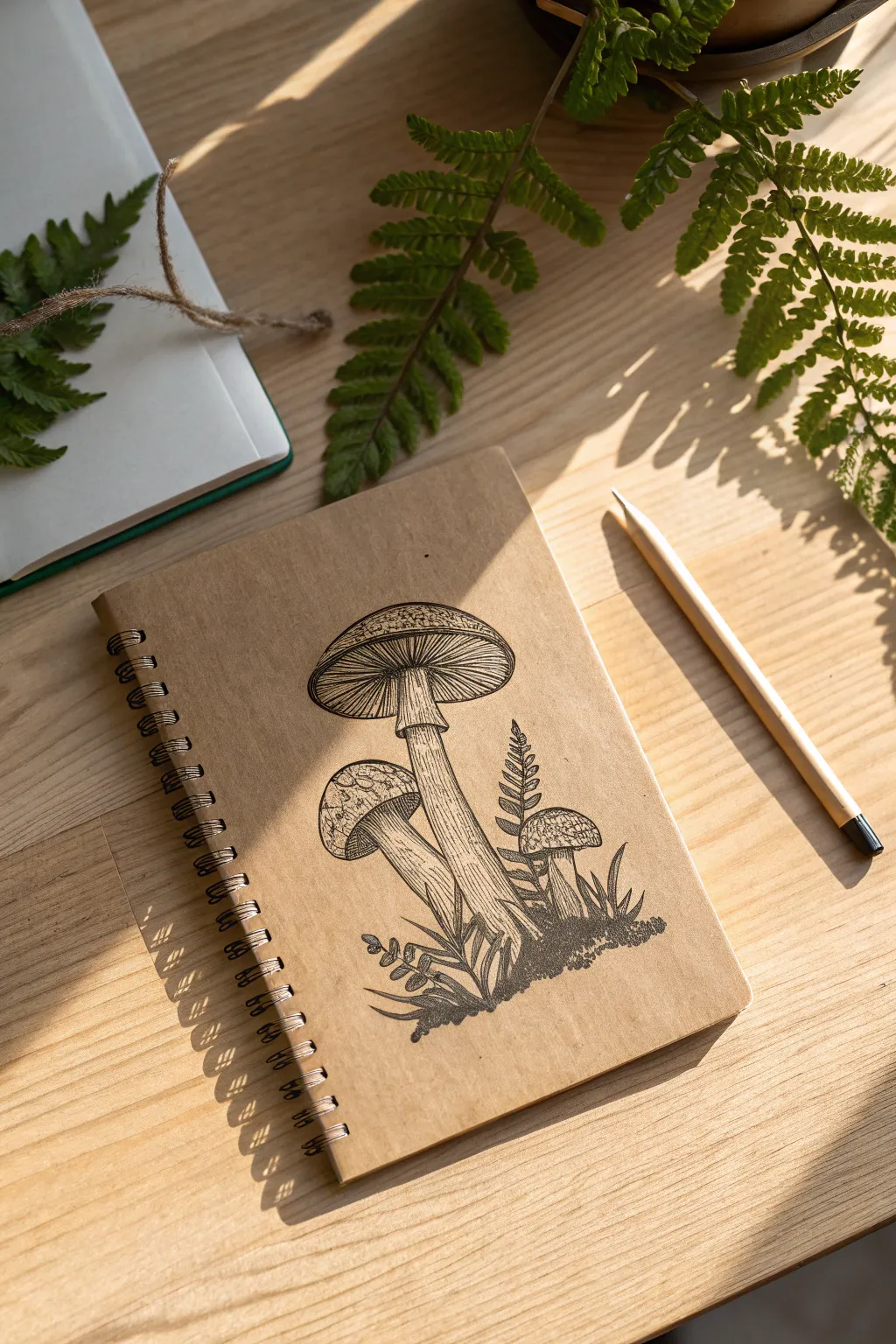
Capture the charm of an old field guide with this vintage-inspired botanical drawing on a kraft notebook. The warm paper tone complements the crisp black ink lines, creating a timeless mushroom and fern composition perfect for nature journals.
How-To Guide
Materials
- Spiral-bound kraft paper notebook
- HB or 2B graphite pencil
- Kneaded eraser
- Fine liner pens (sizes 0.1, 0.3, and 0.5)
- White gel pen (optional for highlights)
- Ruler (optional)
Step 1: Planning and Sketching
-
Establish the composition:
Begin by lightly marking the central placement for the main mushroom group. Aim for the lower center of the cover, leaving negative space at the top. -
Outline the main mushroom cap:
Sketch a broad, flattened umbrella shape for the largest mushroom cap. Curve the top line gently and create a slightly wider curve for the bottom rim. -
Draw the main stem:
Extend a thick stalk downwards from the center of the cap. Add a subtle ring (annulus) about a third of the way down the stem. -
Add the secondary mushroom:
To the left of the main stem, sketch a smaller, younger mushroom. Draw its cap more rounded and bulbous, tucking it slightly behind the main stem. -
Sketch the third mushroom:
Position a tiny button mushroom on the far right. Keep this one short and stout to create a pleasing size hierarchy. -
Draft the background foliage:
Lightly pencil in fronds of ferns rising behind the mushrooms and blades of grass near the base. Keep these lines loose and gestural for now. -
Check proportions:
Step back and review your pencil sketch. Ensure the stems look like they are rooting into the same ground line and adjust any overlapping shapes.
Step 2: Inking the Outlines
-
Trace major outlines:
Switch to your 0.5 fine liner. Carefully ink the outer edges of the mushroom caps and the main lines of the stems. Use a steady hand but don’t worry about microscopic wobbles; organic lines look more natural. -
Define the cap texture:
Draw the scales on top of the mushroom caps. These look like irregular patches or cracks. I prefer not to connect every line fully, leaving small gaps to suggest light hitting the surface. -
Ink the gills:
Using the 0.1 fine liner, draw very fine, closely spaced lines radiating from the stem to the edge of the cap underneath the main mushroom. This creates that classic ‘gilled’ look. -
Detail the stems:
Add vertical striations up the mushroom stalks with the 0.3 pen. Start from the bottom and flick upward, lifting the pen as you go to taper the lines.
Ink Bleeding?
Kraft paper can be porous. If your lines look fuzzy or spread, switch to a pigment liner or micron pen specifically designed for porous surfaces, and use a lighter touch.
Step 3: Shading and Finishing
-
Detail the ferns:
Ink the fern fronds using the 0.3 pen. Draw a central vein for each leaf, then add small hatched lines on one side of the vein to give the leaf dimension. -
Ground the composition:
Create the mossy base. Use small, stippled dots and tiny scribble marks around the bottom of the stems. This anchors the drawing so the mushrooms don’t look like they are floating. -
Add deep shadows:
Identify the darkest areas, such as right underneath the caps and where stems overlap. Use cross-hatching (overlapping diagonal lines) with the 0.1 pen to deepen these shadows gradually. -
Refine the grass:
Add sharp, confident upward strokes for the grass blades. Vary the lengths and angles to make the tuft look wild and natural. -
Erase pencil marks:
Wait at least 5-10 minutes for the ink to dry completely to avoid smudging. Gently rub the kneaded eraser over the entire drawing to lift the graphing lines. -
Final assessment:
Look for any areas that feel empty. If needed, add a few more stippling dots to the stem textures or the ground to balance the contrast.
Natural Imperfections
Don’t draw straight lines for mushroom stems. Add tiny bumps, bends, or a flared base. Nature is rarely perfectly geometric, and these flaws add realism.
Your custom botanical notebook is now ready for your next nature walk or journaling session
Sticker-Style Food Doodles Collage
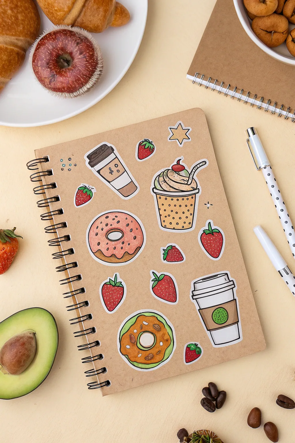
Transform a plain kraft notebook into a personalized café menu board with these charming sticker-style doodles. This project features a cozy collection of hand-drawn sweets and berries that look just like die-cut stickers, perfect for adding a touch of whimsy to your stationery.
Step-by-Step
Materials
- Kraft paper spiral notebook
- Heavyweight white drawing paper or sticker paper
- Fine liner pens (0.3mm and 0.5mm, black)
- Alcohol-based markers or colored pencils (pinks, browns, greens, creams)
- White gel pen
- Sharp scissors
- Glue stick or double-sided tape (if not using sticker paper)
- Pencil and eraser
Step 1: Drafting the Design Elements
-
Sketch the coffee cups:
Start by sketching two different coffee cup styles on your white paper with a pencil. Draw one tall travel cup with a cardboard sleeve and a lid, and a second shorter takeaway cup with a black lid. Keep the lines simple and slightly cartoonish. -
Outline the sweet treats:
Draw two donuts next. Create a classic ring donut shape for one, and perhaps a filled or differently glazed variation for the second. Add a large milkshake or sundae cup with a domed top and a straw sticking out. -
Add fresh fruit fillers:
Sketch several strawberries in various sizes and orientations. Draw some upright, some angled, and varying sizes to fill gaps later. Add a small star shape as an extra decorative element. -
Ink the main lines:
Go over your pencil sketches with a 0.5mm black fine liner. Use a steady hand to create crisp, continuous lines. For the ‘sticker’ look, ensure the outer boundary of each object is clearly defined. -
Erase guidelines:
Wait a moment for the ink to fully set to avoid smearing, then gently erase all visible pencil marks.
Use Heavy Paper
Draw on cardstock or 100gsm+ paper. Thin printer paper is transparent; heavy paper makes the white borders pop against the kraft cover.
Step 2: Adding Color and Texture
-
Color the donuts:
Use a light pink marker for the frosting on the top donut, adding darker pink dots for sprinkles. Color the dough parts with a warm golden-brown. For the bottom donut, try a green matcha glaze with brown dough. -
Fill in the berries:
Color the bodies of the strawberries a vibrant red. Use a leafy green for the stems. Leave tiny specks of white or use a lighter red to suggest highlights and dimension. -
Detail the drinks:
Color the cardboard sleeve of the tall coffee cup a medium brown. For the milkshake cup, use a light beige or cream color, adding polka dots in a darker shade for texture. -
Apply shading:
Use a slightly darker shade of your base colors to add shadows. I usually add shading to the bottom left of objects to create consistent lighting. -
Add highlights:
Using a white gel pen, add small curved lines on the berries, the curves of the cups, and the donut icing to make them look glossy and dimensional.
Step 3: Cutting and Assembly
-
Create the white border:
This is the most crucial step for the ‘sticker’ effect. Using your scissors, cut around each drawing, leaving a consistent 2-3mm border of white paper surrounding the black outline. -
Plan the layout:
Place your cut-out drawings onto the kraft notebook cover without gluing them yet. Scatter the strawberries between the larger items to balance the composition. -
Adhere the main items:
Once satisfied with the arrangement, glue the coffee cups and donuts down first. If using sticker paper, simply peel and stick; otherwise, apply an even layer of glue to the back. -
Stick the filler elements:
Place the strawberries and the star in the empty spaces. Rotate them slightly so they look casually tossed onto the cover. -
Add final doodles directly:
To integrate the stickers with the cover, use your black pen to draw tiny sparkles or small circles directly onto the kraft paper around the stickers.
Uneven White Borders?
Rotate the paper, not your scissors, while cutting curves. Use small, sharp embroidery scissors for tight corners around stems.
Now your notebook is ready to inspire your next coffee shop study session or journaling moment
Tape Border With Drawn Shadows
This project creates a striking optical illusion on your notebook cover, mimicking the look of woven fabric tape with nothing but markers and a steady hand. The geometric blue and rust-colored patterns add a sophisticated, bohemian touch that looks dimensional thanks to careful shading.
Detailed Instructions
Materials
- Cream or off-white sketchbook/notebook cover
- Ruler or straight edge
- Pencil (HB or H)
- Fine-liner pen (Dark Blue or Indigo, 0.3mm)
- Fine-liner pen (Rust or Terracotta, 0.3mm)
- Grey alcohol-based marker (Cool Grey 1 or 2)
- Eraser
Step 1: Drafting the Layout
-
Measure the bands:
Place your ruler vertically on the notebook cover. Mark two vertical channels, one near the spine on the left and one near the opening edge on the right. Each band should be approximately 1 inch (2.5 cm) wide. -
Draw the guidelines:
Using a light hand and your pencil, draw the long vertical lines that define the edges of your ‘tape.’ Ensure these lines are perfectly parallel to the notebook edges. -
Create the grid:
Very lightly sketch a diamond grid pattern inside these vertical bands. Draw a series of ‘X’ shapes stacked on top of each other to create the foundation for the geometric design.
Step 2: Drawing the Pattern
-
Outline the main borders:
Switch to your Rust/Terracotta fine-liner. Trace the long vertical outer edges of your bands. This defined color creates the ‘selvedge’ look of a fabric ribbon. -
ink the diamonds:
With the Dark Blue fine-liner, trace the central diamond grid you sketched earlier. Keep your lines crisp and sharp. -
Add internal details:
Inside each large blue diamond, draw a smaller concentric diamond using the blue pen. This creates the layered ‘ikat’ textile effect. -
Fill the gaps:
In the triangular spaces between the main diamonds and the outer rust border, use the blue pen to draw small hash marks or tiny triangles. -
Texture the design:
Go back into the rust-colored border areas. Add tiny, repetitive stippling dots or very short dashes to simulate increased texture and fabric weave. -
Refine the center:
Inside the very center of your diamond shapes, add a small starburst or cross shape with the blue pen to complete the geometric motif. -
Erase guidelines:
Wait at least 15 minutes for the ink to fully cure to prevent smearing. Gently erase all visible pencil marks from the grid and borders.
Wobbly Lines?
If your straight lines aren’t perfect, don’t worry. A slightly organic, wavering line actually makes the ‘fabric’ look more realistic and woven.
Step 3: Creating Dimension
-
Identify the light source:
Decide where your imaginary light is coming from. In this style, we usually assume top-left lighting, meaning shadows fall to the bottom and right. -
Add the drop shadow:
Using your Cool Grey marker, draw a thin line immediately to the *right* of the right-hand band. This makes the tape look like it is sitting on top of the paper. -
Shadow the left band:
Repeat the grey outline on the *right* side of the left-hand band as well. Consistency is key for the illusion to work. -
Soften the edges:
I usually like to go over the very edge of the grey shadow one more time to darken it right next to the ‘tape,’ letting it fade slightly outward. -
Detail the weave:
For an extra realistic touch, take the grey marker and add extremely faint, tiny diagonal dashes across the white spaces of the ‘tape’ to mimic canvas texture.
Pro Tip: Texture
Use a piece of actual canvas or textured paper under your drawing hand. Rub a soft pencil over the finished tape to catch the texture underneath.
Now you have a custom notebook that looks beautifully bound with intricate fabric tape, ready for your daily thoughts
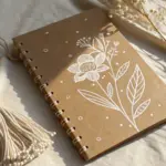
Kraft Cover With White Ink Sketches
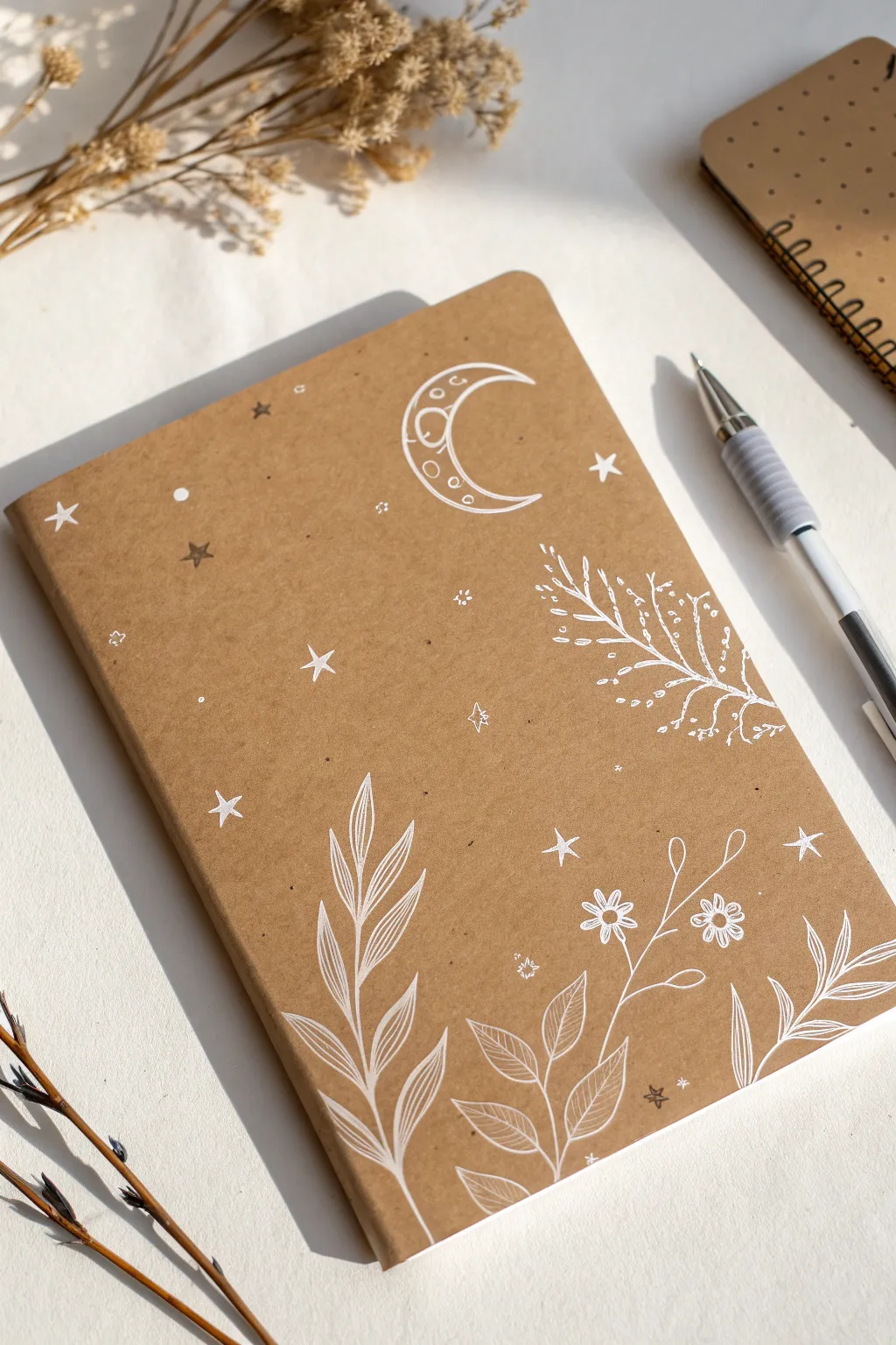
Transform a plain kraft notebook into a dreamy celestial journal using nothing but a white gel pen. This simple yet stunning technique relies on control and delicate linework to create contrasting floral and starry motifs against the brown paper background.
How-To Guide
Materials
- Kraft paper notebook (soft cover)
- White gel pen (e.g., Sakura Gelly Roll 08 or 10, or Uni-ball Signo Broad)
- Pencil (HB or H)
- Kneaded eraser
- Ruler (optional)
- Scrap paper for testing ink flow
Step 1: Planning & Sketching
-
Test your pen:
Before touching your notebook, scribble on a scrap piece of kraft paper or the inside back cover to ensure your white gel pen is flowing smoothly and opaquely. -
Sketch the moon placement:
Using an H or HB pencil, very lightly sketch a crescent moon shape in the upper center-right area of the cover. Keep your pressure extremely light so you don’t dent the soft paper cover. -
Outline the main botanicals:
Lightly sketch the three main plant stems rising from the bottom edge. Place a tall, leafy stem on the far left, a central flowering stem, and a shorter leafy branch on the right corner. -
Add detail cues:
Sketch small circles where the two main flowers will sit on the central stem, just to mark their position. Don’t worry about drawing every petal yet.
Ink skipping?
If the gel pen skips, don’t press harder. Instead, wipe the tip on a tissue or scribble on your thumb to get the ball rolling again. Oil from your skin can revive dried tips instantly.
Step 2: Inking the Celestial Elements
-
Outline the crescent moon:
Begin inking with the moon. Draw the outer curve first, then the inner curve. Draw a second line inside the shape to create a double-border effect. -
Add the moon’s face:
Carefully draw a profile face inside the crescent shape—a closed eye with lashes, a softly curved nose, and a small mouth. Add three small circles on the bottom curve for texture. -
Draw primary stars:
Scatter about 3-4 larger, solid white five-pointed stars around the moon and left side. Fill them in completely so they stand out bright white. -
Add secondary stars:
Draw several outline stars (unfilled) and simpler four-point ‘sparkle’ stars in empty spaces. Varying the size keeps the composition dynamic. -
Stipple the background:
Fill the negative space around the moon and top half with tiny dots. Group them in small clusters to mimic distant galaxies. -
Insert dark stars:
If you wish to replicate the grey/black stars seen in the reference, use a fine black pen to add 2-3 small stars, though sticking to all-white often looks cleaner.
Go Cosmic
After the white ink dries, color inside the moon or petals with metallic gold or silver markers for a pop of shimmer that complements the kraft paper perfectly.
Step 3: Inking the Botanicals
-
Draw the main left stem:
Starting at the bottom left, draw a single curved line upward for the main stem. Draw the leaves in pairs, giving them a pointed, lanceolate shape. -
Detail the left leaves:
Inside each leaf on the left stem, draw a central vein line. Add subtle diagonal hatching on one side of each leaf to suggest volume and shadow. -
Create the right branch:
Draw the leafy branch emerging from the bottom right corner. These leaves should be broader and more oval-shaped. Draw a central vein and delicate side veins in white. -
Ink the central flowers:
Draw the central stem. At your marked spots, draw two small daisies. Start with a center circle, then add simple loop petals around it. -
Connect the floral elements:
Draw thin, sweeping lines to connect the flowers to the main stem. Add a few stray tendrils or leaves to fill gaps between the three main plants.
Step 4: Finishing Touches
-
Side-branch details:
On the right side, about midway up, draw a delicate fern-like branch with tiny leaves or berries extending horizontally towards the center. -
Final star scatter:
Look for any large empty gaps among the plants at the bottom. Fill these with tiny white plus signs or single dots to tie the top and bottom themes together. -
Let it dry completely:
Gel ink sits on top of the paper surface and smears easily. I like to let this dry briefly for at least 15-20 minutes before handling. -
Erase pencil lines:
Once absolutely dry, gently dab (don’t rub hard) with a kneaded eraser to lift any visible graphite sketch lines.
You now have a personalized celestial notebook perfect for journaling or sketching.


Have a question or want to share your own experience? I'd love to hear from you in the comments below!