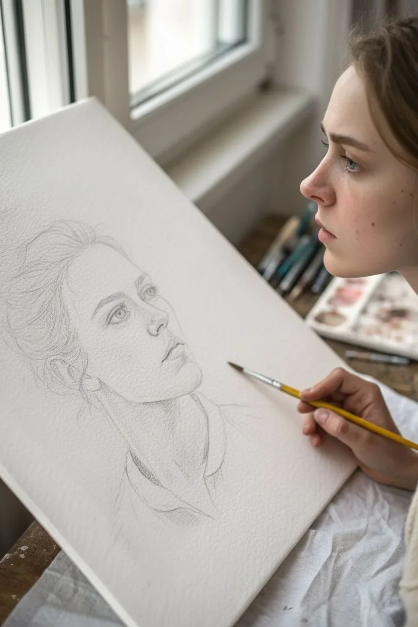
Oil pastels are my go-to when I want big color fast—no drying time, no fuss, just that buttery pigment sliding right onto the paper. If you’re craving fresh oil pastel art ideas, here are projects that lean into the best parts of the medium: bold layering, dreamy blending, and satisfying contrast.
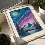
Sunset Gradient Sky With Silhouette Trees
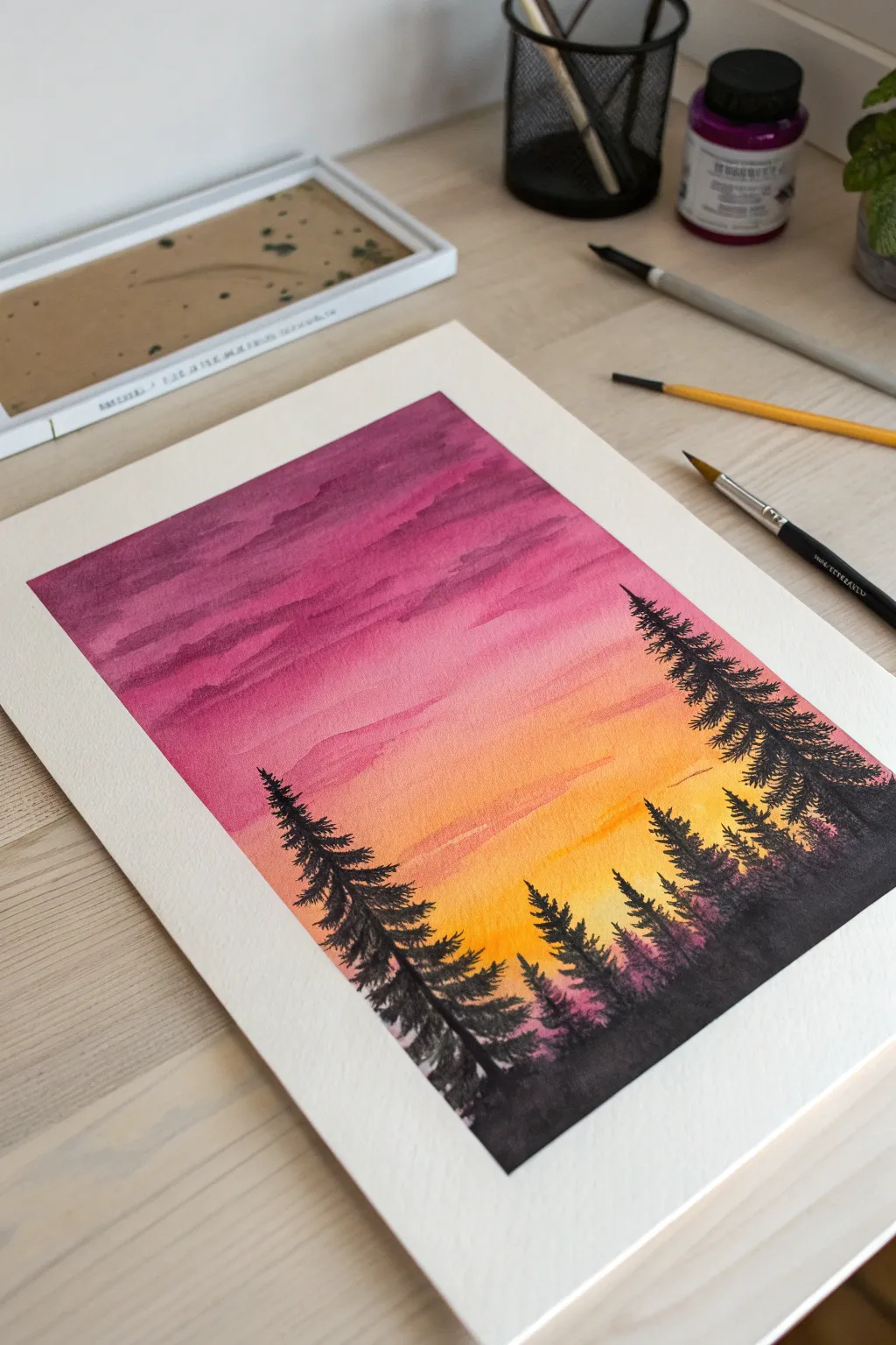
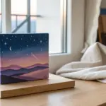
Capture the serene transition from day to night with this breathtaking gradient sky painting. Featuring deep magentas fading into warm oranges and yellows, accented by stark black pine silhouettes, this piece perfectly balances bold color with delicate details.
Step-by-Step Guide
Materials
- High-quality watercolor paper (cold press, 300gsm recommended)
- Watercolor paints (Magenta/Purple, Pink, Orange, Yellow, Black)
- Masking tape
- Large flat brush or wash brush
- Medium round brush
- Fine detail brush (size 0 or 00)
- Jar of clean water
- Paper towels
- Palette for mixing
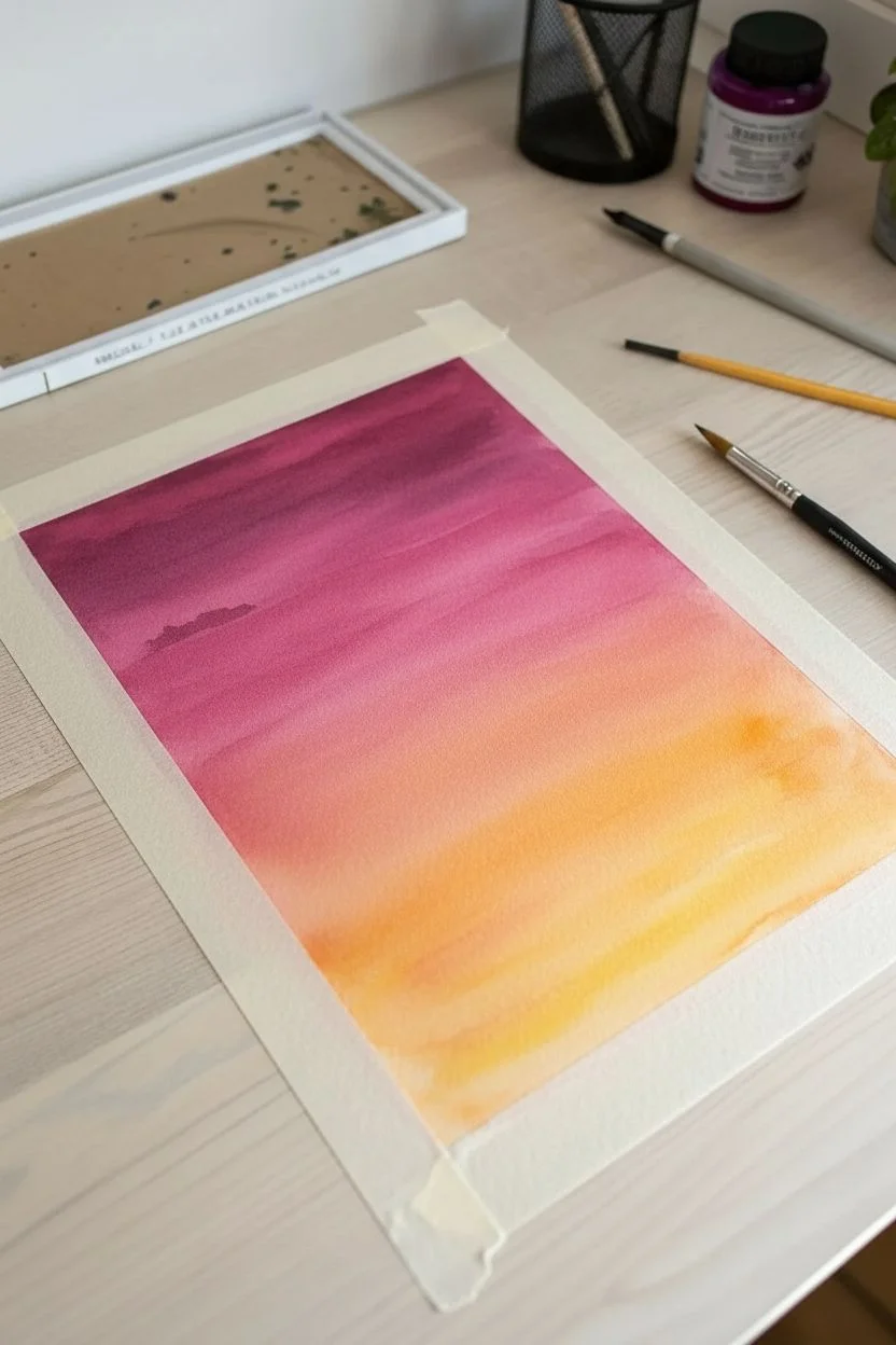
Step 1: Preparation and Sky Gradient
-
Secure the paper:
Tape down all four edges of your watercolor paper to a flat, hard surface using masking tape to create a crisp white border and prevent buckling. -
Wet the surface:
Using your large flat brush and clean water, apply an even coat of water across the entire paper surface. The paper should be glisten but not have standing puddles. -
Start with yellow:
Load your brush with a bright, warm yellow. Paint a horizontal band roughly one-third up from the bottom, allowing the wet paper to soften the edges. -
Add the orange layer:
While the yellow is still wet, mix a vibrant orange and apply it directly above the yellow section, blending the transition point gently with horizontal strokes. -
Introduce the pinks:
Moving upward, apply a rich pink or rose hue. Let it bleed slightly into the orange below to create a natural gradient effect. -
Paint the upper sky:
For the top third of the painting, use a deep magenta or purple. Apply this generously at the top edge, pulling it down to meet the pink layer. -
Create cloud textures:
While the purple layer is still damp, reload your brush with slightly more concentrated purple pigment and dab horizontal, irregular strokes across the top section to suggest cloud layers. -
Let it dry completely:
Allow the paper to dry fully. Whatever you do, don’t rush this step, as the black silhouettes need a bone-dry content to remain sharp.
Step 2: Painting the Silhouettes
-
Mix the black pigment:
Prepare a dense, opaque black paint. If using watercolors, use very little water to ensure the black is dark and striking against the colorful background. -
Establish the ground line:
Using a medium round brush, paint an uneven, undulating horizon line at the very bottom of the paper. -
Start the large trees:
Switch to a smaller brush. Paint a thin vertical line for the trunk of the tallest tree on the right side, extending up into the pink section of the sky. -
Add pine branches:
Starting from the top of the trunk, use tiny downward-flicking strokes to create pine branches. Make them shorter at the top and wider as you move down. -
Repeat on the left:
Paint a second large tree on the left side, slightly shorter than the right one, using the same flicking motion to create texture. -
Fill the middle ground:
Add smaller trees between the two main ones. Vary their heights so the treeline looks natural and organic. -
Paint distant trees:
For trees that appear further back, you can water down your black paint slightly to make them a dark grey, pushing them into the distance. -
Refine the details:
Use your finest detail brush to add tiny stray branches or sharp tips to the distinct treetops. -
Remove the tape:
Once the black paint is completely dry, slowly peel away the masking tape at a 45-degree angle to reveal the clean white border.
Bleeding Colors?
If your tree silhouettes are looking fuzzy or bleeding into the sky, the background wasn’t dry enough. Let it sit longer or use a hairdryer on low heat.
Pro Tip: Better Pines
Don’t make your pine trees perfectly symmetrical triangles. Leave gaps in the branches and make one side slightly fuller for a realistic, windswept look.
Step back and admire the dramatic contrast of your beautiful sunset landscape

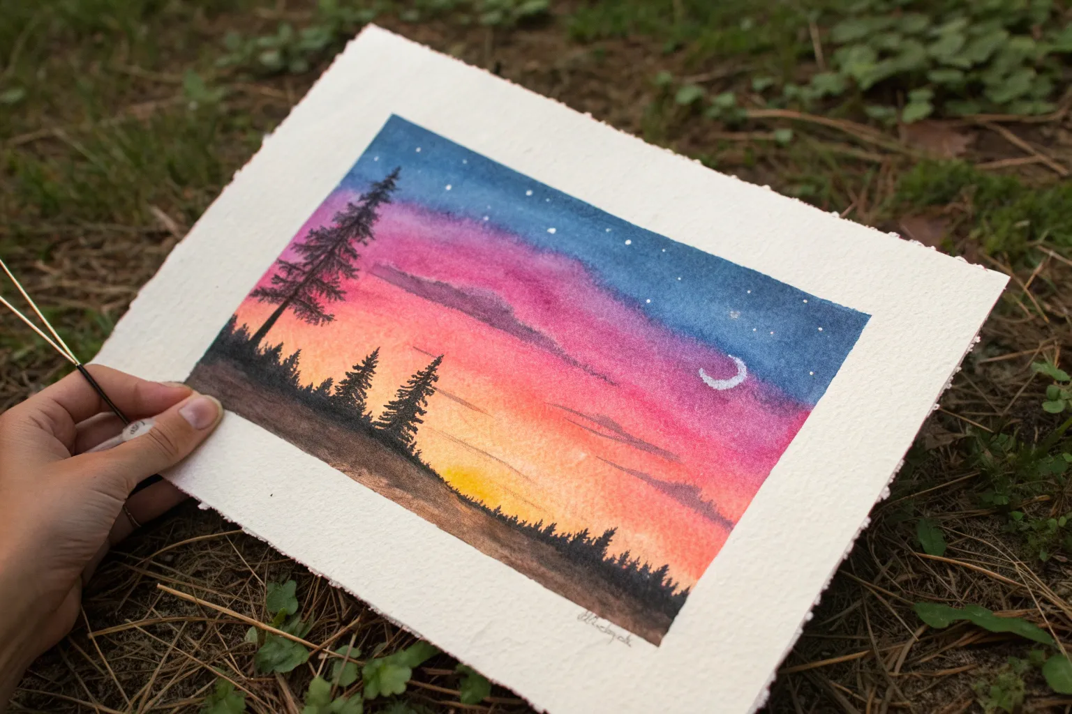
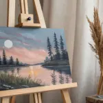
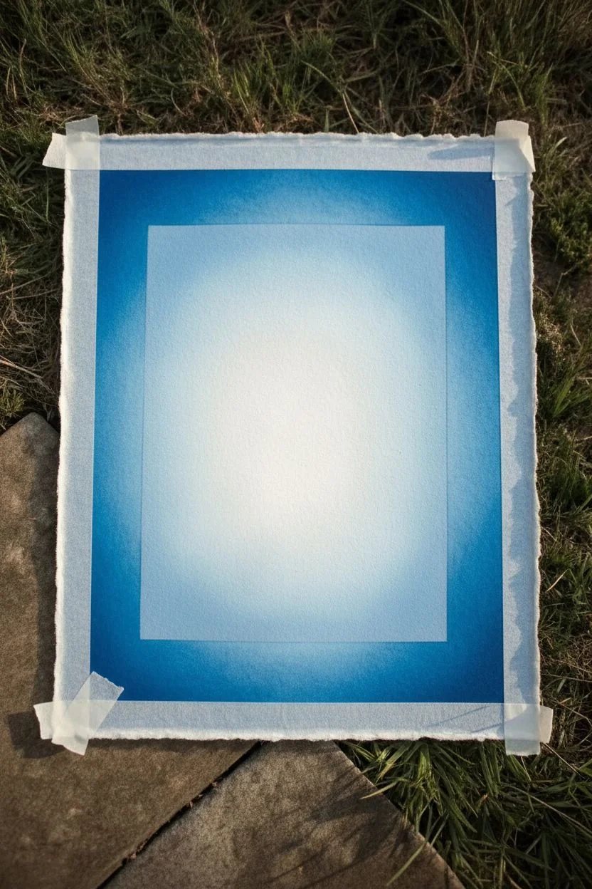
Moonlit Night Sky With a Glowing Moon Halo
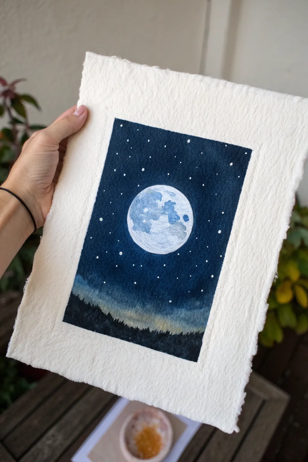

Capture the serene beauty of a full moon rising over a silent forest with this atmospheric painting project. Using heavy textured paper adds a wonderful rustic charm to the deep blues and bright whites of your night sky masterpiece.
Step-by-Step
Materials
- Heavyweight watercolor paper with deckled edges (300gsm or higher)
- Painter’s tape or masking tape
- Watercolors or gouache paints (Prussian Blue, Indigo, Black, White, optional Sap Green)
- White gel pen or white acrylic ink
- Round brushes (sizes 4 and 8)
- Fine liner brush (size 0 or 00)
- Compass or round object for tracing
- Pencil and eraser
- Paper towels and water cup
Step 1: Preparation and Sketching
-
Prepare the paper:
Begin by taping off a rectangular border in the center of your deckled paper. Press the tape down firmly to ensure clean lines, leaving a generous margin of raw paper exposed around the edges to frame the artwork. -
Map out the moon:
Using a compass or a small round object like a jar lid, lightly trace a circle in the very center of your taped-off area. Keep your pencil lines faint so they won’t show through the paint later. -
Sketch the horizon:
Draw a faint, uneven line near the bottom third of the rectangle to indicate where the tree line will eventually go. This doesn’t need to be detailed, just a guide for your darkest values.
Step 2: Painting the Moon
-
Base layer for the moon:
Mix a very diluted wash of blue-grey using a touch of Indigo and plenty of water or white gouache. Paint the entire circle, keeping it quite pale. -
Add lunar texture:
While the base is still slightly damp, drop in slightly darker grey-blue pigment in irregular blotches to mimic craters and maria (the dark plains/seas on the moon). Focus these darker spots on the left side and top right. -
Define the highlights:
Use clean, white paint (gouache works best here for opacity) to brighten the lightest parts of the moon, blending gently into the grey areas to create a spherical, glowing effect.
Clean Edges Trick
To prevent paint bleeding under the tape, seal the tape edge with a tiny amount of clear water or white paint before applying your dark colors.
Step 3: Creating the Night Sky
-
Start the sky gradient:
Mix a deep, rich color using Prussian Blue and a touch of Black. Starting at the very top of your taped box, apply this dark color, moving horizontally. -
Work around the moon:
As you move down the paper, carefully paint around your moon circle. I find using a size 4 brush gives me better control near the edge of the circle than a larger wash brush. -
Lighten the wash:
As you approach the horizon line you sketched earlier, dip your brush in water to dilute the paint slightly. This creates a haze or glow effect near the ground, transitioning from deep midnight blue to a lighter, misty blue-grey.
Splotchy Sky?
If your dark sky looks uneven, let the first layer dry completely, then apply a second thin glaze of the same deep blue to unify the color.
Step 4: Forest and Stars
-
Paint the forest silhouette:
Mix a very saturated black-blue or pure black paint. Fill in the bottom section below your horizon line, covering the lighter wash you just laid down. -
detail the treeline:
Using your smallest fine liner brush, add tiny vertical strokes along the top edge of the black area to simulate the jagged tops of pine trees. Vary the heights to make the forest look natural. -
Add the stars:
Once the sky fits completely dry, use a white gel pen or a fine brush dipped in white acrylic ink to dot starts throughout the darkest parts of the sky. -
Create variation:
Make some stars slightly larger than others, and cluster a few together. Avoid placing stars directly on the painted moon surface.
Step 5: Finishing Touches
-
Refine the moon edge:
If your sky paint bled into the moon, or the edge looks messy, carefully go around the circumference with your white gel pen or thick white gouache to clean up the outline. -
Let it dry completely:
Wait until the paper is cool to the touch and absolutely dry. This is crucial for crisp lines when removing tape. -
Reveal the border:
Slowly peel away the painter’s tape at a 45-degree angle, pulling away from the artwork to prevent tearing the paper surface.
Now you have a tranquil night scene framed beautifully by the texture of paper, ready to be displayed on a shelf or gifted to a friend
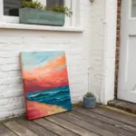
Seascape With Shimmering Sun Reflection
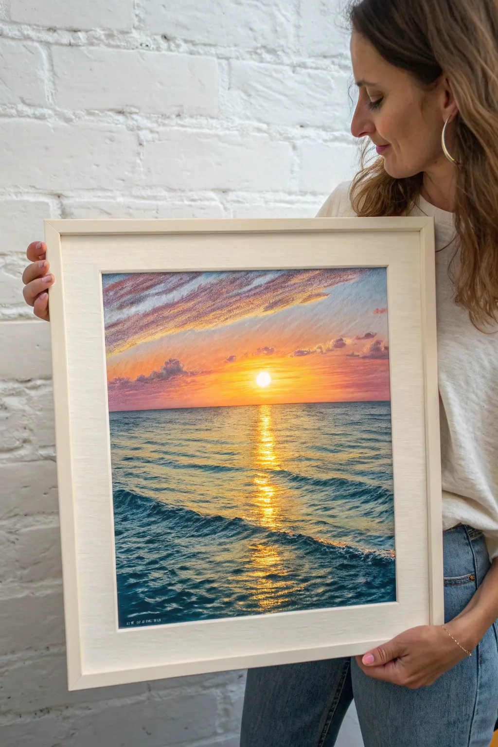
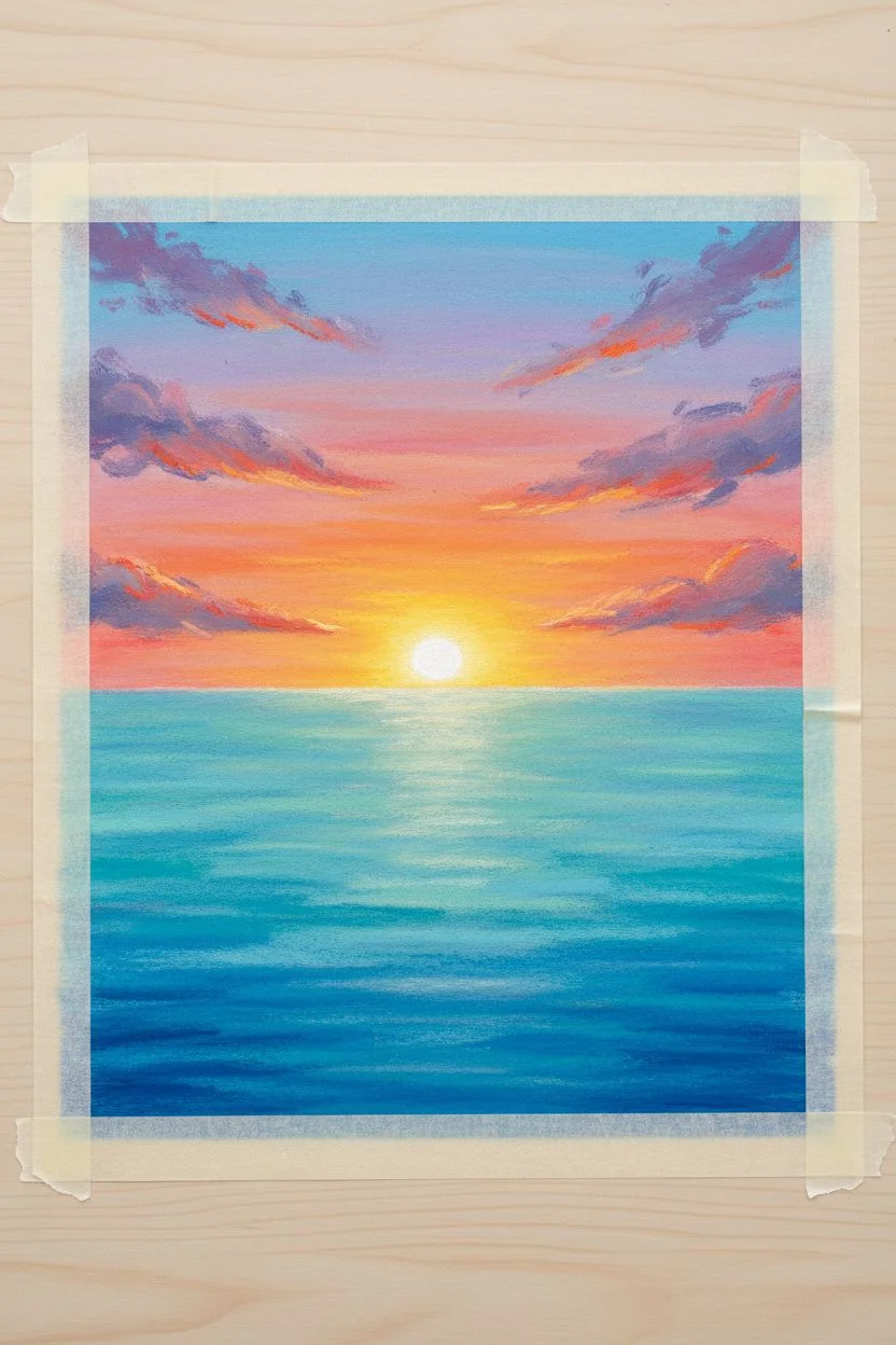
Capture the serene beauty of a setting sun casting a golden path across rippling waves in this vibrant oil pastel seascape. You will learn to blend warm sky gradients and create the illusion of shimmering light on deep blue water.
Step-by-Step Guide
Materials
- High-quality oil pastels (set of 48+ recommended)
- Pastel paper or mixed media paper (heavyweight, slight tooth)
- Masking tape
- Paper towels or blending stumps
- Palette knife or credit card (for scraping)
- White gel pen or opaque white pastel (for highlights)
- Fixative spray (optional)
Step 1: Setting the Horizon and Sky
-
Prep the surface:
Tape down all four edges of your paper to a flat surface. This secures the paper during vigorous blending and creates a crisp, clean border when finished. -
Draw the horizon line:
Lightly sketch a horizontal line across the slight middle-lower part of your paper using a light blue or gray pastel. Ensure it is perfectly straight to keep the ocean realistic. -
Base layer for the sun:
Place a small, circular mark with a bright white pastel just above the horizon line in the center. Surround this immediately with a ring of bright yellow. -
Build the sunset gradient:
Working outward from the sun, lay down bands of yellow, then orange, and finally a warm pinkish-red as you move further away and higher up the sky. -
Upper sky colors:
At the very top of the paper, apply a light cerulean blue, blending it softly into a light purple before it meets the pinks near the horizon. -
Blend the sky:
Use a paper towel or your finger to smooth out the sky colors. I like to blend horizontally to mimic the atmosphere, ensuring the transition from yellow to pink to blue is seamless. -
Add cloud textures:
Using a violet or greyish-purple pastel, scumble in some diagonal cloud formations in the upper left and right corners. Keep the strokes loose and feathered. -
Highlight the clouds:
Add touches of bright orange and pink to the bottom edges of these clouds to catch the light from the setting sun, then blend slightly.
Keep it Clean
Keep a scrap piece of paper nearby to clean your pastel sticks. Dirty tips can muddy your bright yellows, destroying the luminous sunset effect.
Step 2: Creating the Ocean and Reflection
-
Base ocean layer:
Start applying color to the water section. Use a mix of turquoise and light blue near the horizon, transitioning to deeper teal and Prussian blue as you move toward the bottom foreground. -
Establish the sun path:
Directly under the sun, leave a vertical column relatively light. Roughly sketch horizontal zig-zags of yellow and orange down this central column to map out the reflection. -
Deepen the waves:
In the foreground (bottom third), press harder with your darkest blue pastels. Create wavy, undulating strokes to suggest the movement of larger swells. -
Blend the water base:
Gently blend the blue areas of the water horizontally. Be careful not to smudge the dark blues into your bright yellow center reflection path yet. -
Refine the reflection:
Layer bright white and lemon yellow heavily over the central reflection path. apply these in short, horizontal dashes that get wider as they come closer to the viewer. -
Create water texture:
Take a dark blue or indigo stick and draw thin, horizontal lines and small ‘V’ shapes in the water to create the look of ripples and wave shadows. -
Interlock light and dark:
Where the reflection meets the blue water, overlap the colors slightly. Add small dashes of blue cutting into the yellow path, and yellow dashes glistening on the adjacent blue waves. -
Foreground wave details:
For the nearest waves at the bottom, use sharp strokes of dark navy to define the crests, then follow up with highlights of teal on the tops of the waves. -
Intensify the sun:
Return to the sun disc itself. Apply a heavy layer of pure white in the center to make it pop, blending the edges slightly into the surrounding yellow glow. -
Final shimmering touches:
Use a palette knife to gently scrape away tiny horizontal slivers in the reflection if it looks too muddy, or add final crisp dots of white for the strongest sparkles on the water.
Make it Shine
For an extra glistening wet look, use a white gel pen for the very brightest sparkles on the wave crests in the immediate foreground.
Peel off your tape reveal crisp edges and enjoy the warmth of your eternal sunset


Mountain Landscape With Misty Atmospheric Layers
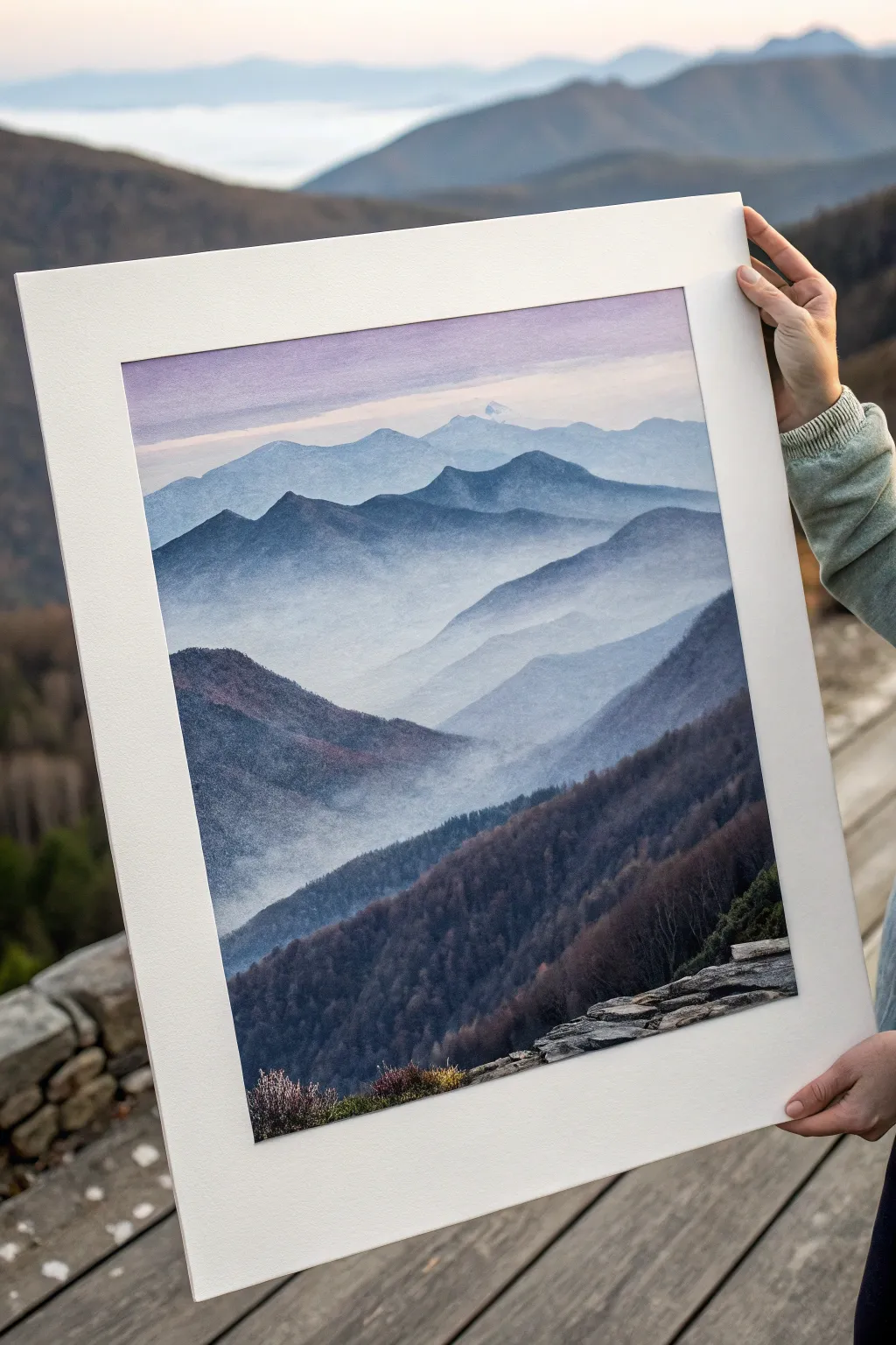
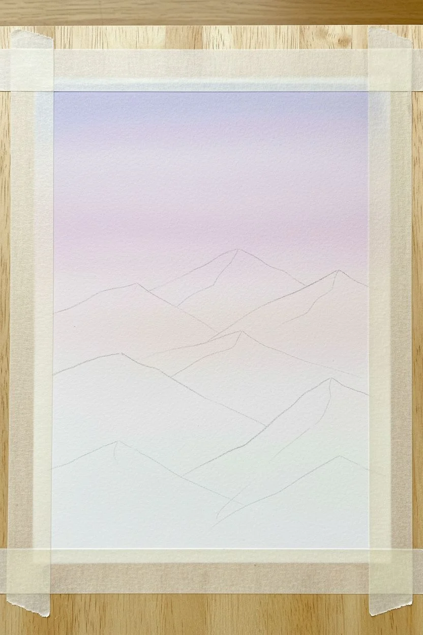
Capture the serene beauty of rolling mountains fading into the distance with this atmospheric landscape tutorial. Using oil pastels to build subtle layers, you’ll recreate the gentle haze and depth found in high-altitude vistas.
Detailed Instructions
Materials
- Textured pastel paper or cold-press watercolor paper (white or light grey tone)
- Oil pastels (set including white, lilacs, indigos, prussian blue, dark grey, violets, and black)
- Blending stumps or tortillons
- Paper towels or a soft cloth
- Masking tape
- Palette knife or scraper (optional for texture)
- Fixative spray
Step 1: Preparation and Sky
-
Secure Your Surface:
Tape your paper down to a rigid board using masking tape. This creates clean, crisp borders around your artwork, which is crucial for achieving that professional matted look later. -
Establish the Horizon:
Lightly sketch the outlines of your mountain ranges using a pale grey pastel. Start with the highest peaks in the background and work your way forward, creating overlapping V-shapes and sweeping curves. -
Lay the Sky Foundation:
Begin at the very top edge with a soft lilac or pale violet. Apply the pastel lightly, using the side of the stick rather than the tip to cover more surface area without harsh lines. -
Blend the Upper Atmosphere:
Transition the lilac into a very pale pink and then into white as you move closer to the distant peaks. Use your finger or a paper towel to blend the sky horizontally, ensuring a smooth gradient with no distinct stripes.
Clean Colors Tip
Oil pastels pick up other colors easily. Keep a paper towel nearby and wipe the tip of your white pastel frequently to prevent dragging dark foreground colors into your pristine misty valleys.
Step 2: Background Layers
-
The Furthest Peaks:
For the most distant mountain range, choose a very pale blue-grey. Apply a thin, even layer. These mountains should look faint, almost disappearing into the sky. -
Create Atmospheric Haze:
Take a white oil pastel and gently rub it over the base of this furthest mountain range. Smudge upwards slightly with a clean finger to simulate mist rising from the valley. -
Second Range Definition:
Move to the next layer of mountains. Use a slightly deeper shade like periwinkle or light steel blue. Define the ridge line clearly, but keep the fill relatively light. -
Softening the Transition:
Once again, apply white pastel heavily at the bottom of this mountain shape. Blend it upwards into the blue, creating a ‘foggy’ bottom edge that separates it visually from the layer in front of it.
Step 3: Middle Ground Depth
-
Deepening Values:
As you move forward to the middle peaks, switch to stronger colors like indigo mixed with a touch of violet. The tops of these ridges should be sharp and dark against the mist behind them. -
Simulating Texture:
Instead of smooth blending, start using shorter, vertical strokes on these middle mountains to suggest tree lines and rough terrain. -
Layering the Mist:
Apply a heavy layer of white horizontally across the valleys between these middle peaks. I find that scumbling (using a circular motion) helps the ‘mist’ look more organic here compared to the smooth background.
Add Scratch Texture
For the foreground trees, use a palette knife or an old credit card to scratch into the thick layers of dark pastel. This ‘sgraffito’ technique reveals the paper tooth for brilliant texture.
Step 4: Foreground Details
-
The Darkest Ridges:
For the large mountain slope in the foreground, use your darkest colors: Prussian blue, dark grey, and charcoal. Press firmly to get rich, opaque coverage. -
Adding Vegetation Texture:
Use the tip of a black or dark violet pastel to make small stippling marks and tiny vertical lines. This mimics the dense texture of a forest covering the hillside. -
Foreground Rocks:
In the bottom right corner, sketch out the rough, flat rocks. Use light grey and white for the top surfaces where the light hits, and dark grey for the shadowed sides. -
Botanical Accents:
Add small touches of deep purple, burnt sienna, and olive green near the rocks to suggest heather or low-lying shrubs. Keep these strokes loose and jagged. -
Final Adjustments:
Step back and assess your values. If the background mountains look too distinct, lightly glaze them with more white pastel to push them further back into the distance.
Peel off your tape carefully to reveal the crisp border and enjoy your serene mountain view
BRUSH GUIDE
The Right Brush for Every Stroke
From clean lines to bold texture — master brush choice, stroke control, and essential techniques.
Explore the Full Guide
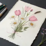
Flowers in a Vase With Loose, Creamy Petal Strokes
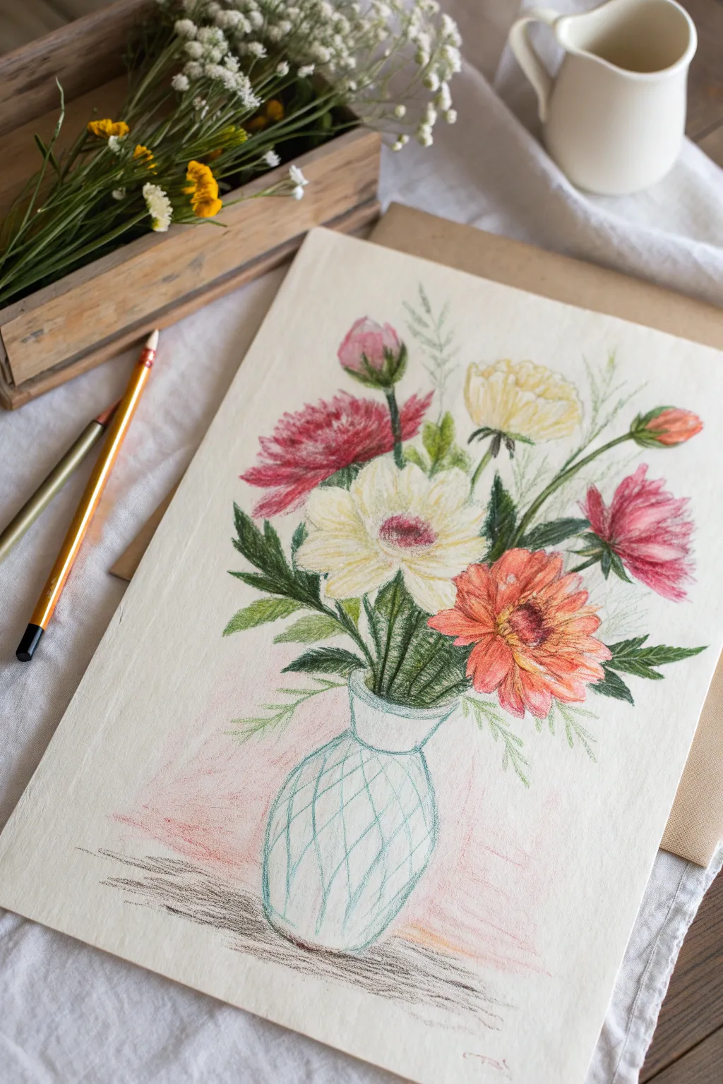
Capture the delicate beauty of a mixed bouquet with this soft and textured oil pastel drawing. The creamy consistency of the pastels brings life to the petals while keeping the glass vase light and airy.
Step-by-Step Tutorial
Materials
- Heavyweight textured paper (ivory or cream colored)
- Oil pastels (set including pinks, reds, yellows, greens, white, blue)
- Pastel pencil (light grey or blue-grey) for outlining
- Pointed blending stump or cotton swabs
- Kneadable eraser
Step 1: Sketching the Composition
-
Establish the vase shape:
Begin by lightly sketching the outline of a simple, bulbous vase near the bottom center of your page using a light grey pastel pencil. Keep the neck slightly flared. -
Map out flower placement:
Lightly indicate circles and ovals to represent where the main flowers will sit. Place the largest bloom (the white gerbera) front and center, with a red chrysanthemum to its left and an orange daisy to the right. -
Add secondary buds:
Sketch the positions for the smaller yellow ranunculus near the top right, a pink bud at the top, and trailing foliage.
Smudge Control
Oil pastels transfer easily. Place a spare sheet of paper under your drawing hand to prevent smearing your work as you move across the page.
Step 2: Coloring the Flowers
-
Start with the center white flower:
Using a creamy white oil pastel, fill in the petals of the central flower. Apply strokes radiating outward from the center. Layer a touch of pale yellow near the middle for warmth. -
Detail the center:
Use a deep magenta or reddish-purple to dab in the center of the white flower. Keep the edges of this center fuzzy to suggest pollen texture. -
Color the red chrysanthemum:
For the left flower, stroke vibrant red and pink pastels in short, spiky motions to mimic the feathery petals. Darken the base of the petals with a deeper crimson to add volume. -
Create the orange bloom:
Move to the bottom right flower. Lay down a base of orange, blending in touches of peach and soft pink on the petal tips. Use a dark brown to define the button-like center. -
Add the yellow accents:
Color the top-right flower with a soft buttery yellow. Keep the strokes loose and cupped to show the rounded form of the petals. -
Complete the buds:
Fill in the tight buds at the top and right edges using pinks and muted greens for the sepals holding them.
Step 3: Foliage and Vase
-
Draw the stems:
Use a sharp edge of your dark green pastel to draw precise lines for the stems leading down into the vase neck. Vary the pressure to make them look organic. -
Fill in leaves:
Add jagged leaves around the red flower using a mix of olive and forest green. For the softer ferns, use lighter, wispy strokes that fade out at the tips. -
Outline the vase pattern:
Switch back to a light blue or teal pastel. Draw a diamond (crisscross) pattern over the body of the vase. Keep these lines very thin to suggest etched glass. -
Add glass reflections:
Use white pastel to add subtle highlights on the shoulder of the vase and along the diamond grid lines to make the glass look shiny. -
Ground the object:
Underneath the vase, roughly scribble a cast shadow using grey an dark brown. Keep the strokes horizontal and somewhat messy to imply a wooden or textured surface. -
Soft background shading:
I like to take a pale pink pastel and lightly scumble the background behind the vase and lower leaves, blending it out with a finger to create a soft, hazy atmosphere.
Sgraffito Texture
Use a toothpick or palette knife to scratch thin lines into the thick layers of the red flower petals to reveal the white paper underneath for extra detail.
Step back and admire the vibrant bouquet you have created on paper
Cloud Study: Puffy Cumulus or Stormy Skies
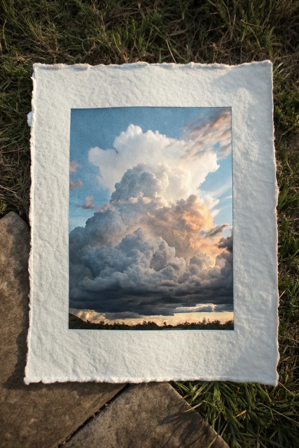
Capture the awe-inspiring volume of a summer storm cloud in this detailed oil pastel study. By balancing soft whites with deep moody greys and warm sunset peaches, you’ll create a striking contrast against textured paper.
Step-by-Step Guide
Materials
- High-quality oil pastels (soft consistency)
- Heavyweight textured paper (deckle-edged cotton paper or watercolor paper recommended)
- Masking tape or painter’s tape
- Paper blending stumps or tortillons
- Cotton swabs
- Palette knife or old credit card (for scraping)
- Paper towels for cleaning fingers
Step 1: Preparation and Sky Layer
-
Prepare your surface:
Begin by taping off a clean rectangular border on your textured paper. This creates the crisp edges seen in the reference while protecting the beautiful deckled edges of the paper itself. -
Establish the sky base:
Select a medium cerulean blue. Apply it firmly to the upper corners and sides of the rectangle, fading the pressure as you move toward the center where the cloud will be. -
Create the atmospheric gradient:
Blend a lighter sky blue or white into the lower sections of the sky area. Use your finger to smooth the transition between the deeper blue top and the paler horizon, leaving the central area blank for now.
Step 2: Building the Cloud Form
-
Outline the main shape:
With a very light grey or pale blue pastel, sketch the rough outline of your tower cloud. Keep the lines loose and jagged to mimic organic vapor. -
Lay in the brightest highlights:
Use a pure titanium white pastel to heavily color the very top peaks of the cloud. Press hard to get thick, opaque coverage that stands out against the blue sky. -
Add warm mid-tones:
On the right side of the cloud formation, scumble in peach, soft orange, or a warm cream color. This represents the sunlight catching the moisture in the cloud. -
Blend the upper cloud:
Gently blend the white highlights into the peach tones using a cotton swab. Keep the edges of the cloud fluffy but distinct, avoiding over-blending into the blue sky.
Muddy Colors?
If your white highlights turn grey when blending, your finger or tool is dirty. Use a fresh cotton swab or clean finger for every new light section.
Step 3: Developing Shadow and Depth
-
Establish the shadow base:
For the middle and lower sections of the cloud, start applying a medium cool grey. Use circular motions to suggest the rolling, billowing nature of the vapor. -
Deepen the storm center:
Layer a darker charcoal grey or slate blue into the recessed areas under the main ‘mushroom cap’ of the cloud. This contrast creates the heavy, water-laden look. -
Mix the transition zone:
Where the light top meets the grey body, dab small spots of lavender or pale purple. I like to blend this gently to bridge the warm light and cool shadow without creating muddy colors. -
Create the dark underbelly:
Apply your darkest grey or a midnight blue in a horizontal band near the bottom of the cloud mass. This flat bottom indicates the cloud base. -
Add texture to the shadows:
Don’t smooth the dark areas completely. Leave some graininess from the paper or the pastel strokes visible to simulate rain or heavy mist.
Creating Fluffiness
Avoid straight lines. Use small, tight circular scribbles when applying pastel to mimic the cauliflower-like texture of cumulus clouds.
Step 4: Finishing Touches
-
Define the horizon:
At the very bottom, paint a thin, dark silhouette of a tree line using black or deep dark green. Keep it uneven to suggest distant foliage. -
Add the sunset glow:
Just above the tree line and below the dark cloud base, create a sliver of warm light. Use yellow ochre or pale orange to show the sun peeking through underneath. -
Refine edges:
Go back with your white pastel and crisp up the very top edges of the cloud again if they got smudgey. Clean edges make the cloud pop forward. -
Scrape for texture (optional):
If an area looks too heavy, lightly scrape the surface with a palette knife to reveal a bit of the paper texture underneath. -
Reveal the frame:
Carefully peel away the masking tape. Pull it away from the drawing at a 45-degree angle to ensure a sharp, clean finish.
Step back and admire the powerful sense of scale and atmosphere you have captured in your cloud study

PENCIL GUIDE
Understanding Pencil Grades from H to B
From first sketch to finished drawing — learn pencil grades, line control, and shading techniques.
Explore the Full Guide
Black Paper Landscape to Make Colors Pop
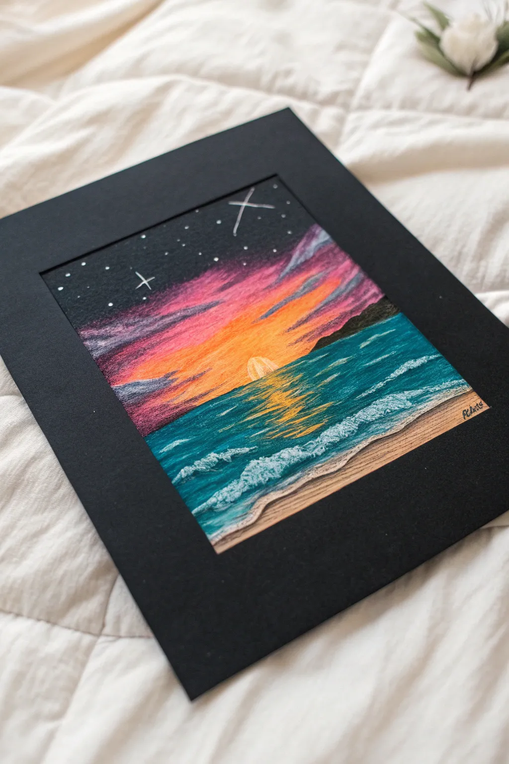
Utilizing black paper as a base creates instant drama and contrast for a glowing sunset seascape. The dark background makes the neon pinks and oranges pop while giving depth to the starry night sky above.
Detailed Instructions
Materials
- Black mixed media or pastel paper (heavyweight)
- Black cardstock mat frame (optional, for display)
- Oil pastels (artist grade preferred for blendability)
- Colors needed: White, yellow, orange, bright pink/magenta, purple, dark blue, teal/turquoise, light blue, beige/tan
- Paper towel or blending stump
- Scratch tool or toothpick (optional)
- Masking tape
Step 1: Setting the Sky
-
Establish the horizon:
Begin by placing a strip of masking tape horizontally across the paper to separate the sky from the ocean. This ensures a perfectly straight horizon line. -
Lay the sun foundation:
Using bright yellow, draw a small semi-circle resting on the tape line near the center. Color it in solidly. -
Create the sun’s glow:
Around the yellow sun, layer bright orange in outward radiating strokes. Let the orange fade slightly as it moves upward. -
Add dramatic pinks:
Above the orange, apply a thick band of bright pink or magenta. Blend the transition between the orange and pink using your fingertip to create a smooth gradient. -
Transition to night:
Layer purple above the pink, and finally, fill the very top of the sky area with the existing black paper or a touch of dark blue pastel if the paper isn’t dark enough. -
Add cloud texture:
Use the purple pastel to lightly sketch horizontal, streaky clouds over the pink and orange sections. Don’t over-blend these; let the texture sit on top. -
Remove the tape:
Carefully peel away the masking tape to reveal your crisp horizon line.
Keep it Clean
Keep a paper towel handy to wipe your pastels clean between colors. Dark pigments like black or blue can easily dirty your yellow sun if the stick isn’t clean.
Step 2: Building the Ocean
-
Block in the water:
Start directly under the horizon line with a dark teal or turquoise. Cover most of the water area, leaving a small gap at the bottom for the sand. -
Reflect the sun:
Directly under the yellow sun, sketch zigzagging horizontal lines of yellow and light orange onto the teal water to mimic the reflection of light on the waves. -
Deepen the water tones:
On the far left and right edges of the water, layer a bit of dark blue or purple to create a vignette effect that focuses attention on the center. -
Add the shoreline:
At the bottom, fill the remaining angled space with a beige or tan pastel to create the sandy beach. -
Create crashing waves:
Using a clean white pastel, draw thick, broken lines where the water meets the sand. Use a stippling or tapping motion to create the look of sea foam. -
Detail the open water:
Add smaller ripples further out in the ocean using thin white or light blue lines. Keep these lines horizontal to maintain perspective.
Make it Shine
Add tiny touches of white pastel right in the center of the yellow sun reflection on the water to create intense, sparkling highlights.
Step 3: Final Details
-
Pop the stars:
In the dark upper section of the sky, use a sharp edge of your white pastel to dot in stars. Vary the pressure to create stars of different brightness. -
Make them twinkle:
Select two or three larger stars and draw simple cross shapes to give them a twinkling effect. -
Define the distant land:
On the horizon line to the right, use a black or dark grey pastel to draw a small, silhouetted landmass or mountain shape. -
Add signature:
Sign your name in the bottom corner of the sand using a dark color for contrast. -
Frame it up:
Place your finished piece behind a black mat frame to enhance the colors even further.
Step back and admire how the darkness of the paper transforms the oil pastels into glowing light sources
City Skyline Silhouette With Reflections
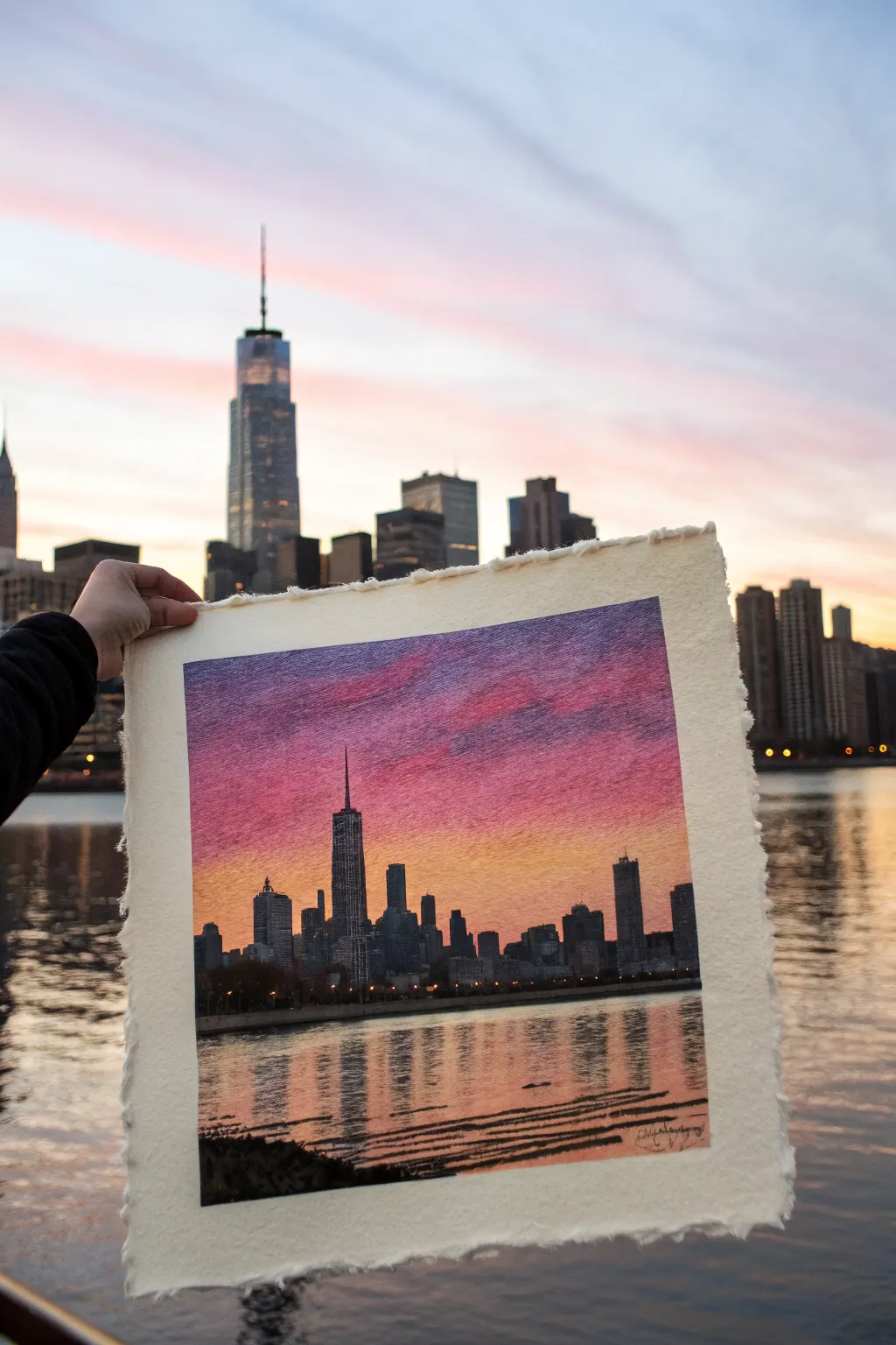
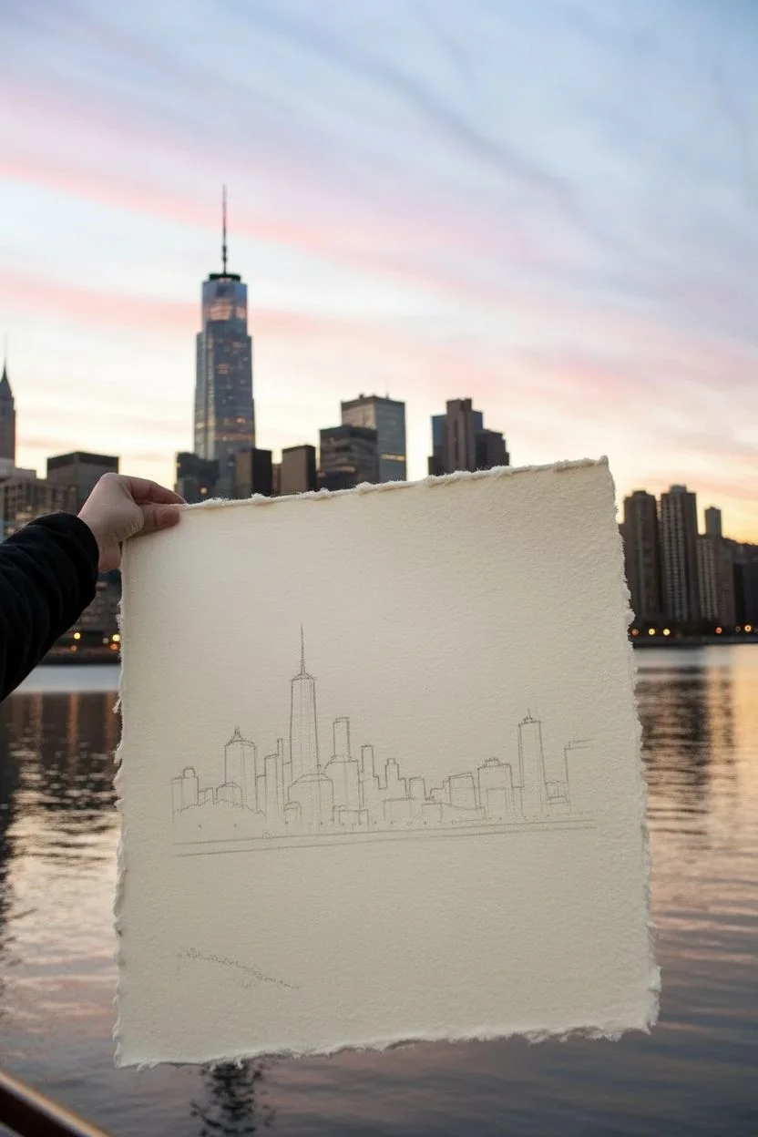
Capture the romantic glow of a city sunset with this vibrant oil pastel project. Using textured paper adds a beautiful, organic feel to the sky gradients and water reflections, creating a professional-looking silhouette skyline.
Step-by-Step Guide
Materials
- High-quality oil pastels (soft variety)
- Heavyweight textured watercolor paper (300gsm or comparable) with deckle edges
- Masking tape (low-tack)
- Blending tools (paper towel, cotton swabs, or blending stump)
- Graphite pencil (HB or lighter)
- Sgraffito tool or toothpick
- Fixative spray (optional)
Step 1: Preparation and Sketching
-
Prepare the paper:
Select a piece of thick, textured watercolor paper. If your paper doesn’t have a deckle edge naturally, you can carefully tear the edges against a ruler to create that ragged, handmade look. -
Secure the surface:
Tape the back of your paper to your work surface using rolled masking tape. Avoid taping the front edges, as we want the pastel to go all the way to the rough edge. -
Establish the horizon:
Lightly draw a straight horizontal line across the lower third of the paper with your pencil. This separates the sky from the water. -
Outline the skyline:
Sketch the silhouette of the city buildings starting from the horizon line up. Focus on varying heights and distinct shapes like the central spire to mimic a specific skyline or create your own.
Step 2: Creating the Sky
-
Apply the horizon glow:
Start with a bright yellow or golden orange oil pastel. Apply this color horizontally just above the building outlines, pressing firmly to get into the paper’s texture. -
Transition to warm tones:
Above the yellow, layer in shades of orange and pink. Allow the strokes to overlap slightly with the yellow to make blending easier later. -
Deepen the sky:
Move further up the paper using magenta and violet tones. Apply these colors with a slightly diagonal stroke to suggest cloud movement. -
Add the twilight:
At the very top edge, use a deep purple or indigo blue to simulate the fading daylight. -
Blend the gradients:
Use a folded paper towel or your fingertip to blend the sky colors. Work from the lightest yellow up towards the dark purple to keep the colors clean and vibrant. -
Add texture clouds:
Scumble a lighter pink loosely over the purple section to create wispy clouds. Don’t over-blend this layer; let the paper’s texture show through.
Deckle Edge Effect
To emphasize the handmade paper look, gently drag the side of a pastel lightly along the torn edges to catch just the high points of the texture.
Step 3: The City Silhouette
-
Fill the buildings:
Using a dark grey or charcoal pastel (black can be too harsh), fill in the building shapes sketch earlier. Start with the edges for precision. -
Solidify the forms:
Fill the interiors of the buildings solidly. If the pastel is too thick to get into small corners or spires, use a sharpened pastel edge or even a colored pencil for fine details. -
Add lit windows:
Once the buildings are filled, use a sgraffito tool or toothpick to gently scratch away tiny specks of the dark pastel, or dot with a white pastel, revealing ‘lights’ in the windows.
Handling Crumbs
Oil pastels create little crumbs. Don’t brush them off with your hand, or they will smear! Blow them away or dab gently with kneaded putty.
Step 4: Reflections and Water
-
Mirror the sky colors:
Below the horizon line, replicate the sky’s color order in reverse—yellow near the horizon, transitioning to pinks and purples at the bottom. -
Create water texture:
Apply these colors using horizontal strokes. Leave small gaps of white paper showing to represent the shimmer of water. -
Add building reflections:
Directly below the tallest buildings, drag vertical strokes of dark grey downward into the water. -
Distort the reflection:
Use horizontal dashes of the water colors to cut across the dark reflections, breaking them up to look like ripples. -
Foreground details:
Add a dark, uneven shape in the bottom corner for a rocky shoreline or foreground element to anchor the composition. -
Final touches:
Review the contrast. Re-darken the buildings if the blending muted them, and ensure the waterline is distinct.
Now you have a stunning, colorful skyline that captures the magic of the golden hour


Limited Palette Color Study in Mini Panels
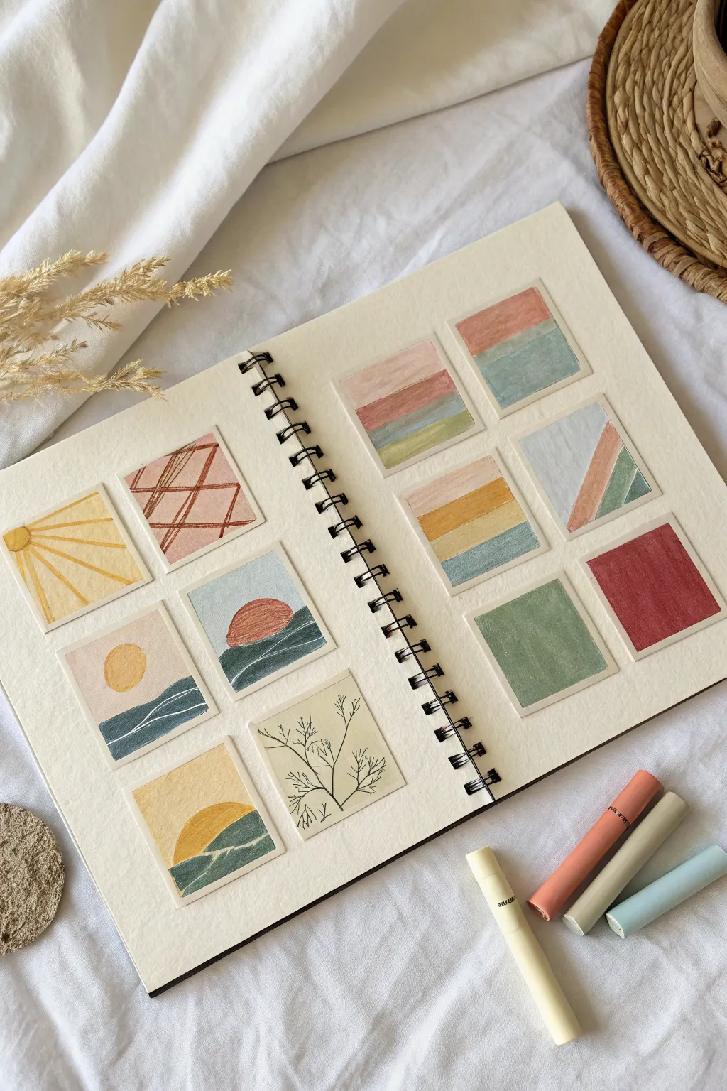
Explore the versatility of oil pastels with these twelve charming, thumbnail-sized studies focused on simple shapes and soothing earth tones. This exercise is perfect for testing color combinations and practicing clean edges without the pressure of a full-sized drawing.
Step-by-Step Tutorial
Materials
- Spiral-bound mixed media or watercolor sketchbook (heavyweight paper is best)
- Oil pastels (soft, creamy variety recommended)
- Washi tape or low-tack artist’s tape (1/4 inch width)
- Ruler
- Pencil
- Fine-tip black drawing pen
- Blending stump or cotton swabs
Step 1: Grid Preparation
-
Measure the layout:
Begin by measuring the space on your open sketchbook pages. You will need room for six squares on the left page and six on the right, arranged in a pleasing grid. -
Mark the squares:
Use a pencil and ruler to lightly mark out twelve uniform squares, approximately 2×2 inches each. Leave ample white space between them to let each design breathe. -
Apply masking tape:
Carefully apply low-tack tape along the outer borders of each individual square. This is the secret to getting those crisp, clean edges often seen in professional studies. Ensure the tape is pressed down firmly to prevent color bleeding.
Step 2: Left Page Designs
-
Radiant sun:
In the top-left square, draw a quarter-circle sun in the corner using yellow. Fill the background with a creamy off-white, then draw radiating yellow lines outward. -
Linear abstraction:
For the top-right square, sketch intersecting geometric lines in a reddish-brown tone against a soft peach background. -
Simple hills:
Moving to the middle row, draw a pale circle sun on the left and undulating hills in greens and blues on the right. Keep the shapes flat and blocky. -
Sunset horizon:
Beside the hills, create a simple horizon line. Place a reddish semi-circle sun sinking into dark teal waves against a pale blue sky. -
Golden landscape:
In the bottom-left square, replicate the earlier hill motif but use a warm yellow palette, with a large golden sun rising over sage-green slopes. -
Botanical sketch:
For the bottom-right square, color the background a solid pale cream. Use your fine-tip pen to draw delicate, branching botanical stems.
Sticky Tape Blues
If the tape tears your paper, tap it against your clothing a few times before applying. This reduces tackiness and protects delicate paper surfaces.
Step 3: Right Page Designs
-
Stacked horizons:
Start the right page by creating horizontal stripes. In the top-left, layer bands of pink, mauve, and sage green. -
Two-tone block:
Next to it, divide the square horizontally. Color the top half a dusty rose and the bottom half a muted teal. -
Warm gradients:
In the middle row, create a striped gradient using peach, mustard yellow, and light blue. -
Diagonal composition:
Beside that, draw diagonal stripes rising from the bottom right corner, using blue, peach, and green. -
Solid color study (Green):
For the bottom-left square, simply fill the entire space with a textured application of sage green to test its opacity. -
Solid color study (Red):
Finish the bottom-right square with a solid block of deep red or maroon.
Make It Shine
Add metallic accents! After peeling the tape, trace over key lines like the sun rays or horizon edges with a gold gel pen for a touch of luxury.
Step 4: Finishing Touches
-
Blend carefully:
Use a blending stump or your finger to smooth out the pastel layers where needed, especially in the sky gradients. -
Remove the tape:
Slowly peel away the tape at a 45-degree angle. Pulling away from the center of the drawing helps keep the paper from tearing. -
Smudge check:
Check the white borders for any stray pastel dust and gently erase it with a kneaded eraser to keep the presentation neat.
Now you have a beautiful grid of miniature artworks that celebrate simply color and form
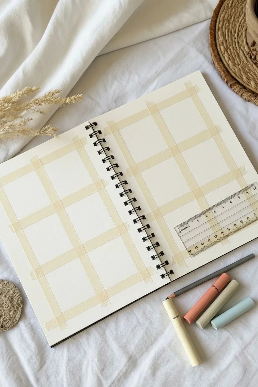
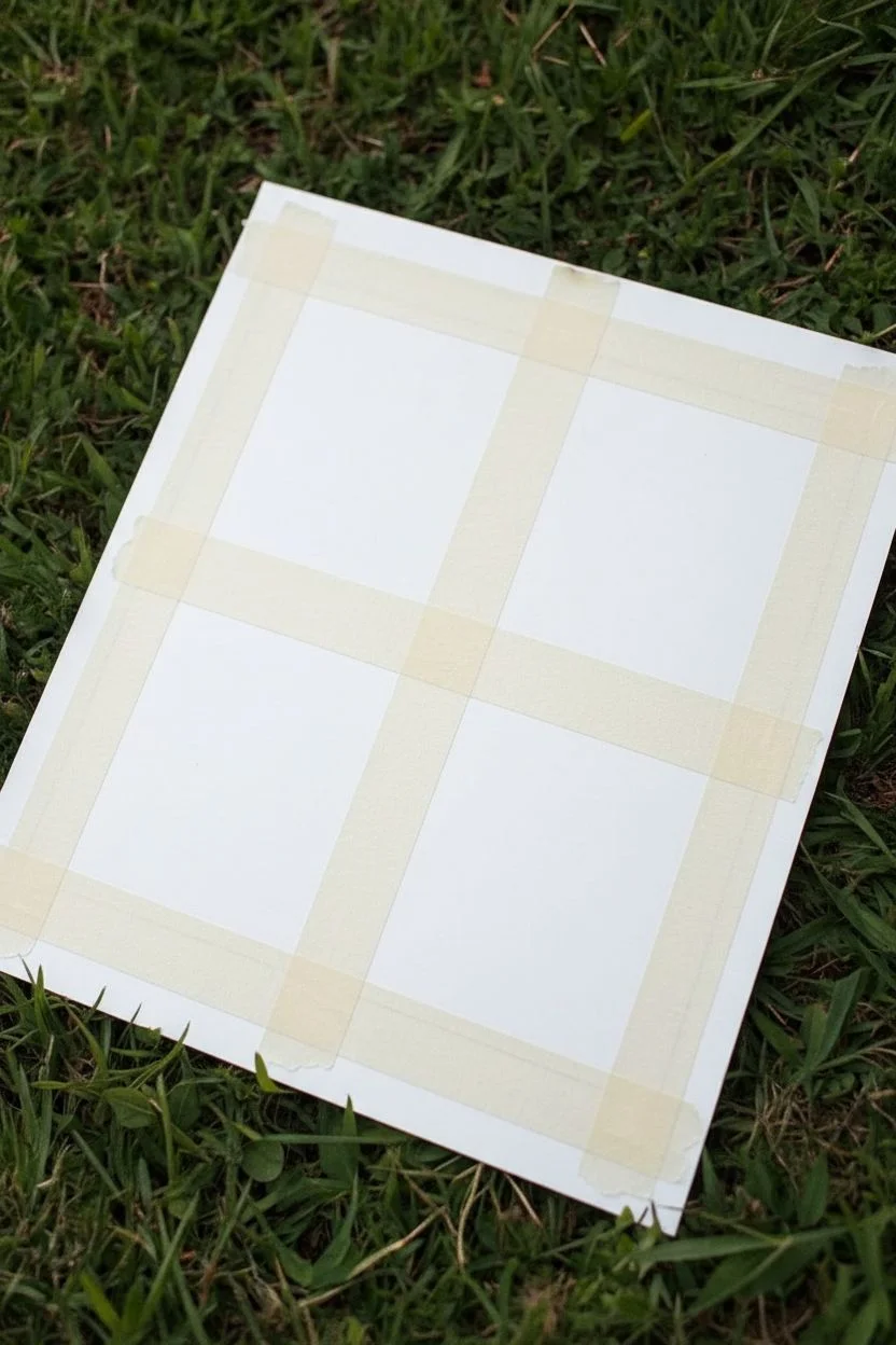
Taped Border Mini Landscapes in a Grid
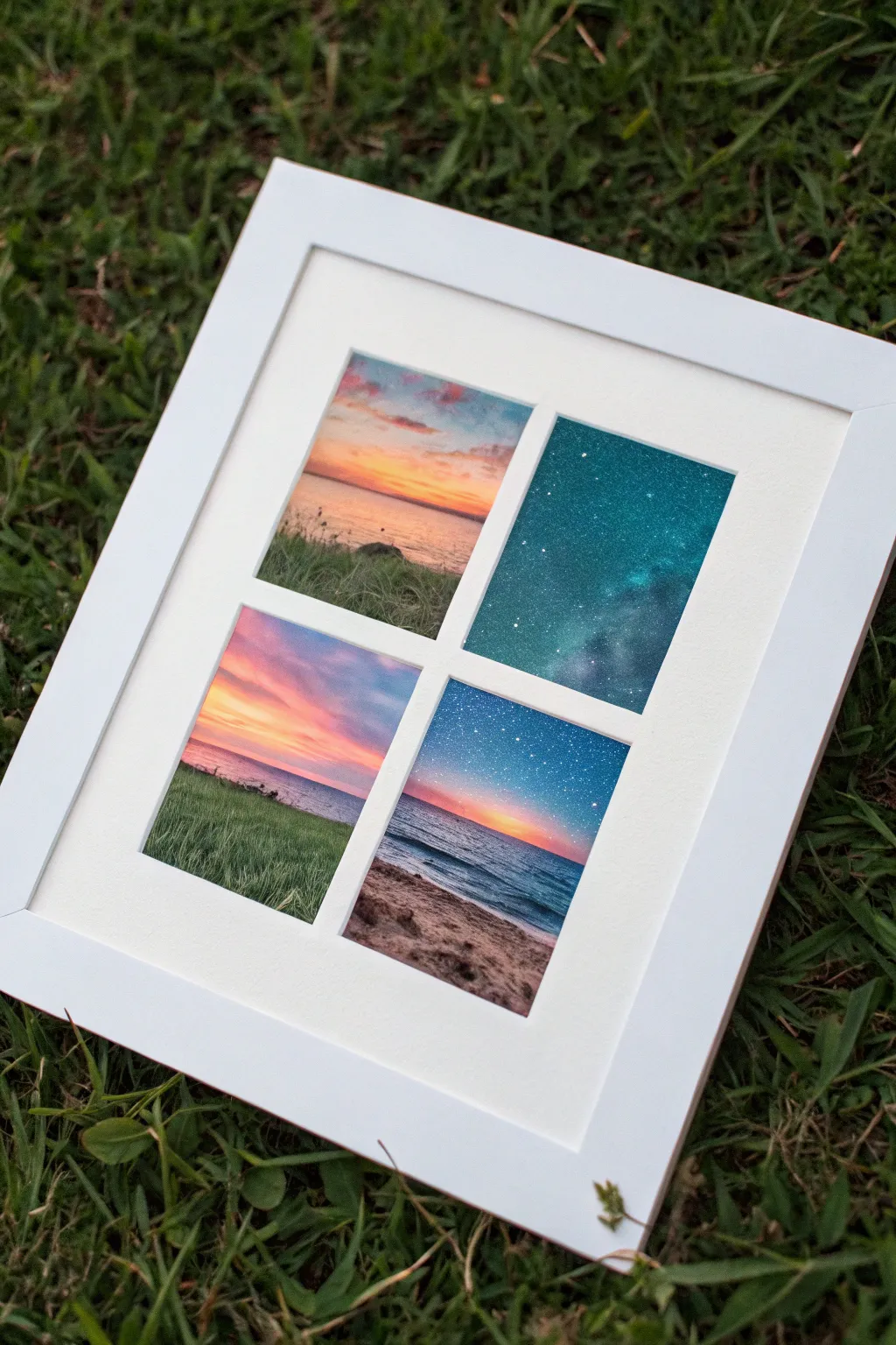
Capture the magic of the sky’s transition from dusk to starlight with this stunning grid composition. Using masking tape to create crisp borders, you’ll paint four distinct mini-landscapes that come together as a cohesive window into nature.
How-To Guide
Materials
- Heavyweight mixed media or watercolor paper
- Oil pastels (soft, blendable quality)
- Painter’s tape or drafting tape (low tack)
- Paper stump or blending tortillon
- Cotton swabs or tissue for blending
- White gel pen or correction fluid pen
- Ruler
- Pencil
- Scratch paper (for cleaning pastels)
Step 1: Setting the Grid
-
Measure the layout:
Begin by measuring a square on your paper that will fit your chosen frame. Lightly mark the center point both vertically and horizontally. -
Tape the borders:
Apply strips of painter’s tape to form the outer border of your square first. Press the edges down firmly to prevent pastel bleed. -
Create the cross:
Place two strips of tape intersecting perfectly in the middle—one horizontal and one vertical—to create four equal open squares. This ‘windowpane’ effect is the structure of the entire piece.
Step 2: Top Left: Sunset Marsh
-
Sky gradient:
In the top-left square, start with light blue at the very top, fading into peach and soft orange near the horizon line. Keep the horizon roughly one-third up from the bottom tape. -
Water reflection:
Mirror those sky colors below the horizon for the water, but use horizontal strokes to suggest ripples. -
Grassy foreground:
Use a dark green and olive green to fill the bottom area. I like to use quick, upward flicks with the edge of the pastel to simulate tall blades of grass.
Clean Edges Every Time
Before painting, run a bone folder or fingernail hard over the tape edges. This seals the paper against oil leakage, ensuring those satisfying crisp white lines.
Step 3: Top Right: Deep Space
-
Base layer:
Fill the entire top-right square with a deep teal or turquoise. This will be the glowing undertone of your night sky. -
Darkening the cosmos:
Layer dark indigo and black loosely over the teal, leaving cloudy patches of the bright color showing through to create a nebula effect. -
Blending the galaxy:
Use a paper stump or your finger to smudge the darks into the lights, creating a soft, ethereal texture. Do not add stars yet.
Muddy colors?
If your pastels are blending into gray, stop and clean the tip of the pastel on a scrap paper. Layer light colors first, then add darks to avoid smeary messes.
Step 4: Bottom Left: Pink Dusk
-
Vibrant sky:
For the bottom-left panel, layer vivid pinks and purples in the sky, blending them smoothly. Let the pink limit intensify near the horizon. -
Distant water:
Create a thin strip of dark blue water at the horizon line. -
Green field:
Fill the large foreground area with lush greens. Use a slightly lighter green than the top-left panel to suggest fading daylight, blending well for a softer grass texture.
Step 5: Bottom Right: Starry Beach
-
Night sky transition:
Create a gradient from deep starry blue at the top to a faint sunset glow (orange/pink) right at the horizon. -
Ocean waves:
Draw the ocean using deep blues, adding a line of white pastel where the water meets the sand to show foam. -
Sandy shore:
Fill the bottom corner with beige and light brown. Add tiny dots of dark brown for texture in the sand.
Step 6: Final Details
-
Adding stars:
Take your white gel pen or correction fluid. Dot spread-out stars in the top-right and bottom-right panels. Group some tighter together to look like distant galaxies. -
The Reveal:
Slowly and carefully peel away the tape. Pull the tape away from the drawing area at a 45-degree angle to ensure clean, sharp lines.
Frame your mini-gallery and enjoy the peaceful transition of your twilight scenes
Sgraffito Stars and Fireflies Scratch-Back Details
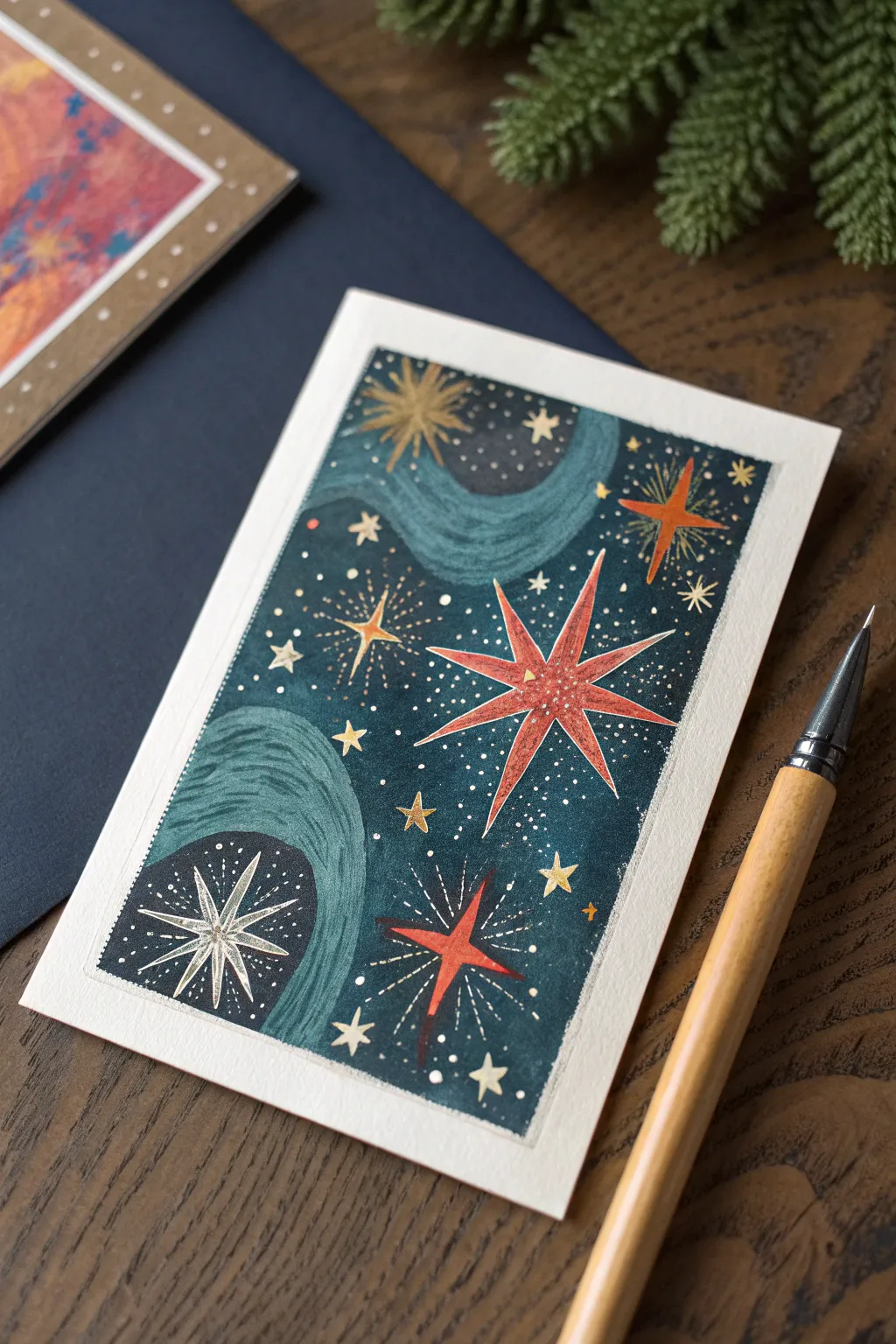
Create a dreamy, cosmic greeting card featuring vibrant stars and swirling nebulas against a deep teal backdrop. This project combines layering bold colors with the delicate technique of sgraffito to reveal brilliant details beneath the surface.
Step-by-Step Tutorial
Materials
- Heavyweight watercolor paper or mixed media cardstock
- Oil pastels (red, orange, gold/yellow, white)
- Deep teal or midnight blue gouache or acrylic paint
- Flat paintbrush (medium size)
- Painter’s tape or washing tape
- Scratching tool (stylus, toothpick, or dried-out pen)
- White gel pen or fine-tip white paint marker
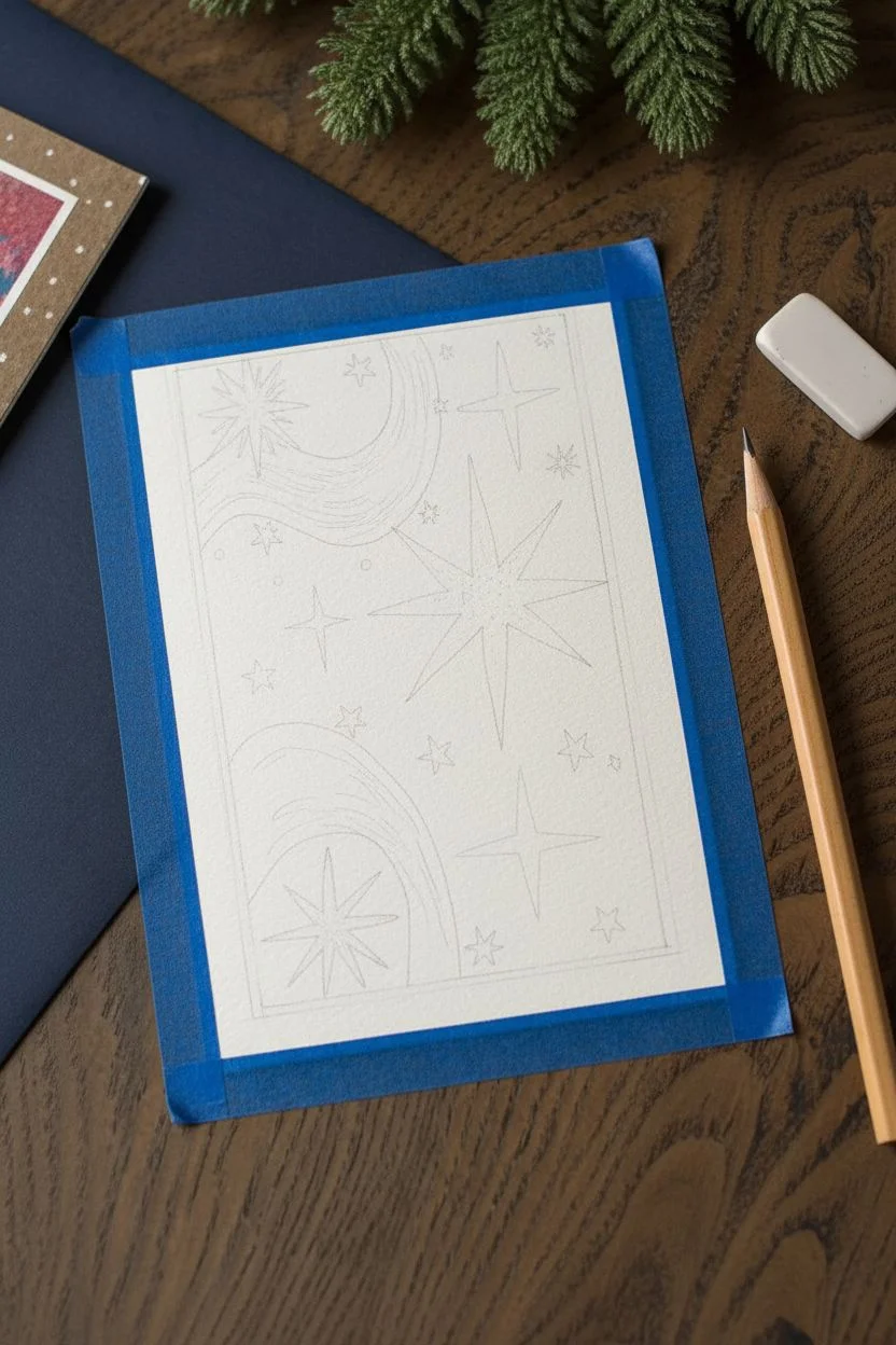
Step 1: Setting the Stage
-
Tape the border:
Begin by securing your paper to a flat work surface. Use painter’s tape to create a crisp rectangular border around the edges. This establishes the white margin visible in the final piece. -
Map out the cosmos:
Lightly sketch the composition with a pencil if you wish, or go freehand. You’ll need to identify where the large red stars and the golden bursts will live, as well as the swirling ‘milky way’ paths.
Clean Scratches
Wipe the tip of your scratching tool on a paper towel frequently. Buildup of scraped paint on the tool can cause clumps and ruin your fine lines.
Step 2: Applying the Base Layer
-
Color the stars:
Using your oil pastels, heavily color the areas where the stars will be. Use bright red and orange for the star shapes. Press firmly to lay down a thick, waxy layer. -
Add golden accents:
In the spots designated for the smaller bursts and the swirling pathways, apply a heavy layer of gold or yellow oil pastel. The thicker the pastel layer, the better the sgraffito effect will work later. -
Layer the swirls:
For the sweeping curves that represent the galaxy flow, use a mix of light blue or teal pastel, blending it slightly with the gold areas to create a soft transition.
Step 3: Creating the Night Sky
-
Mix your dark wash:
Prepare a deep teal or midnight blue gouache paint. You want a consistency that is opaque enough to cover the white paper but fluid enough to glide over the oil pastel resist. -
Paint over everything:
Coat the entire rectangle with your dark paint. The oil pastel areas will naturally resist the water-based paint slightly, but you want to cover them completely. Don’t worry if it looks messy right now. -
Let it dry completely:
Allow the paint to dry fully. It needs to be dry to the touch so it flakes off crisply when scratched, rather than smudging.
Gilded Galaxy
Add metallic gold paint splatter at the very end using an old toothbrush. It creates a magical, shimmering depth that mimics real stardust.
Step 4: The Magic of Sgraffito
-
Scratch the main stars:
Using your scratching tool, carefully etch out the shape of the large central star. Scratch away the dried dark paint to reveal the bright red oil pastel beneath. I like to start from the center and flick outward to keep the points sharp. -
Reveal the golden bursts:
Locate the areas where you laid down gold pastel. Scratch starburst patterns—simple intersecting lines—to let the metallic sunshine peek through the dark teal. -
Detail the swirls:
For the nebular swirls, use a lighter touch. Scratch fine curving parallel lines to mimic the flow of wind or stardust, revealing the lighter pastel colors underneath. -
Add tiny distant stars:
Use the very tip of your tool to prick small dots into the background, revealing pinpricks of light for distant stars.
Step 5: Finishing Touches
-
Enhance with white:
Take your white gel pen or paint marker and add tiny dots for extra brightness among the sgraffito stars. This creates depth by having two levels of brightness. -
Add crisp lines:
Use the white pen to outline one side of the large red stars, giving them a slight glimmer or highlight effect that makes them pop against the dark background. -
Peel and reveal:
Once you are satisfied with your galaxy, slowly peel away the painter’s tape at a 45-degree angle to reveal the crisp clean edges.
Step back and admire your hand-held universe before sending it to a lucky stargazer
Oil Blending With a Soft Brush for Painterly Skins
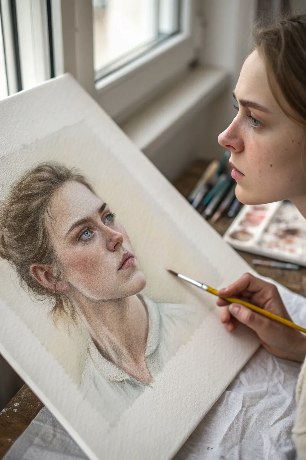
Achieve the delicate luminosity of classical oil paintings using the modern convenience of oil pastels and soft brush blending. This tutorial guides you through creating a soulful, realistic portrait characterized by remarkably smooth skin tones and a dreamy, textured atmosphere.
How-To Guide
Materials
- High-quality artist oil pastels (skin tone set essential)
- Heavyweight textured paper (mixed media or watercolor paper, cold press)
- Small round synthetic brushes (sizes 2 and 4)
- Flat shader brush (size 6)
- Baby oil or odorless mineral spirits for blending
- HB graphite pencil for sketching
- Paper towels
- Masking tape
Step 1: Structural Foundation
-
Prepare the Surface:
Tape your textured paper to a sturdy board using masking tape. This creates a clean border and prevents the paper from shifting while you work. -
Light Sketching:
Using an HB pencil, lightly sketch the contours of the face, focusing on the tilt of the head and the eye placement. Keep lines faint so they don’t show through the pale pastel layers later. -
Mapping Shadows:
Identify the key shadow areas: under the jawline, the eye sockets, and the side of the nose. Mark these lightly to serve as a roadmap for your darkest values.
Step 2: Layering the Skin Tones
-
Base Tone Application:
Select a mid-tone peach or beige pastel. Gently scumble (scribble lightly) over the face area, avoiding the eyes and lips. Do not press hard; let the paper’s texture show through. -
Adding Warmth:
Introduce a pale pink or salmon color to the cheeks, the tip of the nose, and the eyelids. This mimics the natural blood flow under the skin. -
Deepening Shadows:
Apply a burnt umber or terracotta pastel into the shadow areas you mapped earlier—specifically under the jaw and the inner corner of the eye. -
Highlight Placement:
Use a white or very pale cream pastel to mark the high points: the bridge of the nose, the forehead, and the chin. Lay this pigment on slightly thicker than the rest.
Muddy Colors?
If skin tones look dirty, you’re over-mixing shadows and lights. Wipe your brush on a paper towel between every few strokes and stop blending sooner than you think necessary.
Step 3: The Brush Blending Technique
-
Setting up the Medium:
Pour a small amount of baby oil or mineral spirits into a container. Dip your size 4 round brush in, then dab the excess onto a paper towel until it’s damp, not dripping. -
First Pass Blending:
Start with the lightest areas. Use the damp brush to gently swirl over the white and cream highlights, melting the pastel into a paint-like consistency. -
Mid-tone Transition:
Without cleaning the brush perfectly, move into the peach and pink zones. The residue on the brush helps create a seamless gradient between light and mid-tones. -
Shadow Integration:
Switch to a fresh or cleaned brush for the dark shadows to avoid muddying the lights. Pull the shadow color slightly into the mid-tones to soften the edges of the jawline.
Level Up: Background Hue
Apply a faint wash of complementary color (like pale sky blue) around the head before starting the hair. It makes the warm skin tones pop forward visually.
Step 4: Features and Details
-
Defining the Eyes:
Sharpen a blue or grey pastel, or use a pastel pencil for precision. Draw the iris and pupil. Use a tiny brush with barely any solvent to blend these small areas. -
Lashes and Brows:
Use a sharp dark brown pastel edge to fleck in the eyebrows and lash line. I prefer not to blend these too much to keep the texture distinct. -
Sculpting the Mouth:
Apply a dusty rose color to the lips, darkening the center line. Blend carefully with a small brush, softening the outer edges into the surrounding skin. -
Refining the Hair:
Roughly sketch the hair direction using light and dark brown pastels. Use the flat shader brush with solvent to sweep these strokes into soft waves, leaving some stray strands unblended for realism. -
Clothing Texture:
Sketch the collar of the shirt with white and grey. Use a dry brush (no solvent) to drag the pigment, creating a rougher, fabric-like texture compared to the smooth skin. -
Final Highlights:
Once the ‘skin’ layer is dry to the touch, add final touches of pure white pastel on the lower lip and tear duct. Do not blend these; let them sit on top for maximum brightness.
Step back and admire the soft, painterly glow you have achieved with this versatile medium.
Abstract Swirl Circles for Blending Practice
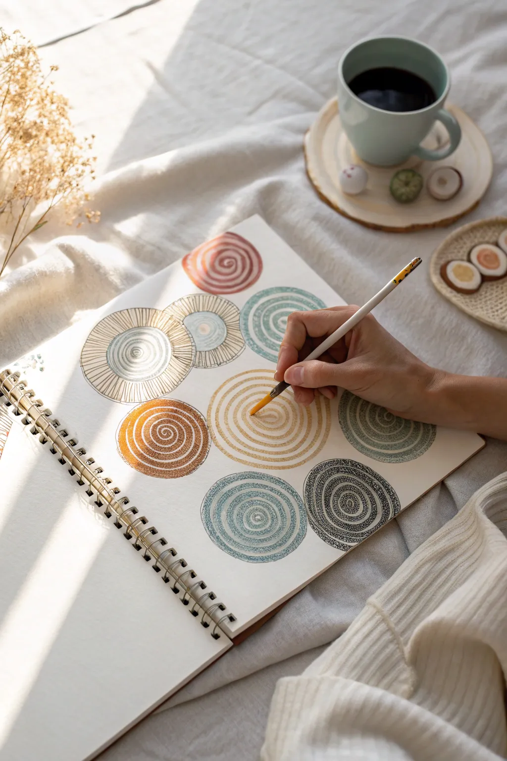
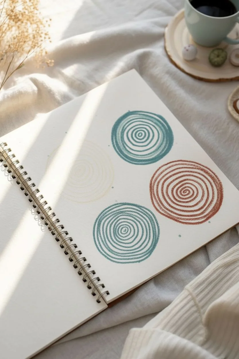
Embrace the soothing rhythm of creating abstract art with this meditative oil pastel project. This exercise features a collection of organic, textured spiral circles in an earthy, muted palette, perfect for practicing blending and line control.
Step-by-Step Guide
Materials
- Heavyweight sketchbook or mixed media paper
- Oil pastels (muted/earthy tones: ochre, rust, teal, gray, brown)
- Blending tools (tortillon or cotton swab)
- Small fine-detail brush
- Baby oil or pastel solvent (optional for blending)
- Fine-liner pen (optional for texture details)
- Masking tape (optional)
Step 1: Planning and First Layers
-
Layout Planning:
Visualize the composition on your page. You want roughly 8-10 circles of varying sizes, scattered comfortably without feeling cluttered. Leave some white space between them to let the artwork breathe. -
Drafting the Centers:
Choose a light, neutral color like a pale blue or cream. Lightly mark the center points of where your main spirals will go. This helps you anchor the composition before committing to heavier pigment. -
Teal Spiral Base:
Start with a dusty teal pastel. Pressing firmly, draw a small, tight spiral in the center of one of your planned locations. Keep the lines thick and creamy. -
Expanding the Spiral:
Continue winding the teal color outward. Don’t worry about making a perfect geometric circle; imperfections add to the organic, hand-drawn charm. -
Rust Red Accent:
Select a rust or terracotta colored pastel for the next circle. Create a solid swirl shape, filling it in slightly more densely than the first one to create variation in visual weight.
Muddy Colors?
If colors are getting muddy while blending, your brush or finger might be holding too much old pigment. Clean your tool frequently on a paper towel between spirals.
Step 2: Building Texture and Variety
-
Gold Ochre Ring:
With a golden ochre or mustard yellow shade, draw a large open spiral. Leave significant gaps between the lines of the spiral, as we will fill this negative space later or leave it for texture. -
Mixed Media Touch:
For the grey/black spiral, try using a very sharp black pastel or even switch to a wax pencil if your set allows. Draw tight, concentric rings that look almost like fingerprints. -
Creating Texture:
Take a lighter shade (like white or cream) and draw over a section of the brown spiral. This technique, called scumbling, adds a weathered, vintage look to the pigment. -
Solvent Blending:
Dip a small brush into a tiny amount of baby oil or solvent. I prefer to gently drag this over the rust-colored spiral to melt the pastel slightly, creating a painterly, watercolor-like effect. -
Defining Edges:
Use a darker shade of the same hue to outline the outer rim of your teal circles. This defines the shape and makes it pop against the white paper.
Step 3: Detailed Embellishments
-
Hatching Details:
On the larger beige or light brown circles, use a fine point tool or a harder pastel to draw radial lines (hatching) from the center outward, mimicking the iris of an eye or a sunburst. -
Layering Colors:
Go back to your initial teal spiral. Add a ring of light grey or white in between the teal lines to create a duo-tone effect. -
Smoothing the Centers:
Use a paper tortillon or your finger to gently smudge the very center of the solid swirls. This softens the focal point and enhances the dreamy quality. -
Adding Contrast:
Find the darkest spiral in your composition (likely a charcoal or deep brown). Reinforce the lines to ensure there is a strong anchor of contrast among the lighter pastels. -
Final Polish:
Check for any stray smudges on the white background and lift them with a kneaded eraser. If desired, use the solvent brush one last time to smooth out any textures that feel too rough.
Clean Lines Pro Tip
Keep a piece of scrap paper under your drawing hand. This acts as a bridge, preventing your palm from smearing the oils you’ve already laid down as you move across the page.
Enjoy the calm satisfaction of seeing your page fill up with these rhythmic, textured patterns

Have a question or want to share your own experience? I'd love to hear from you in the comments below!