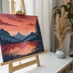
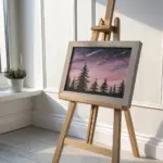
I’m obsessed with how oil pastels give you that rich, punchy color without a ton of setup—just grab a few sticks and you’re instantly making something bold. If you’re craving easy wins, these ideas lean hard into blending, simple shapes, and those dramatic sky gradients that look way harder than they are.
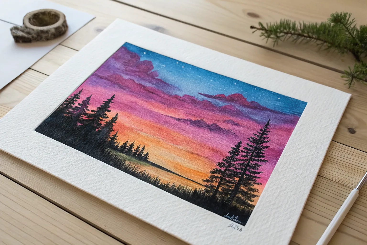
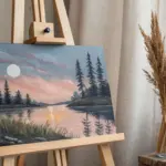
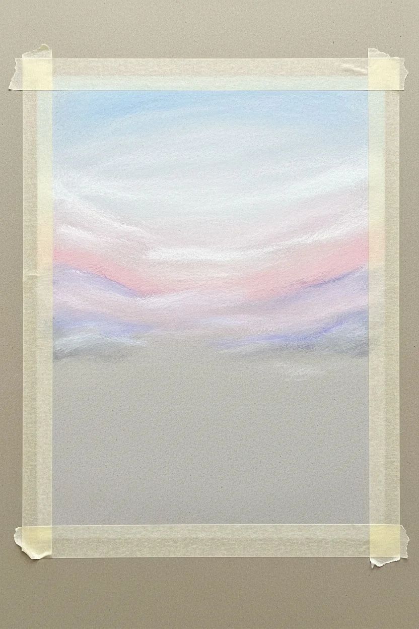
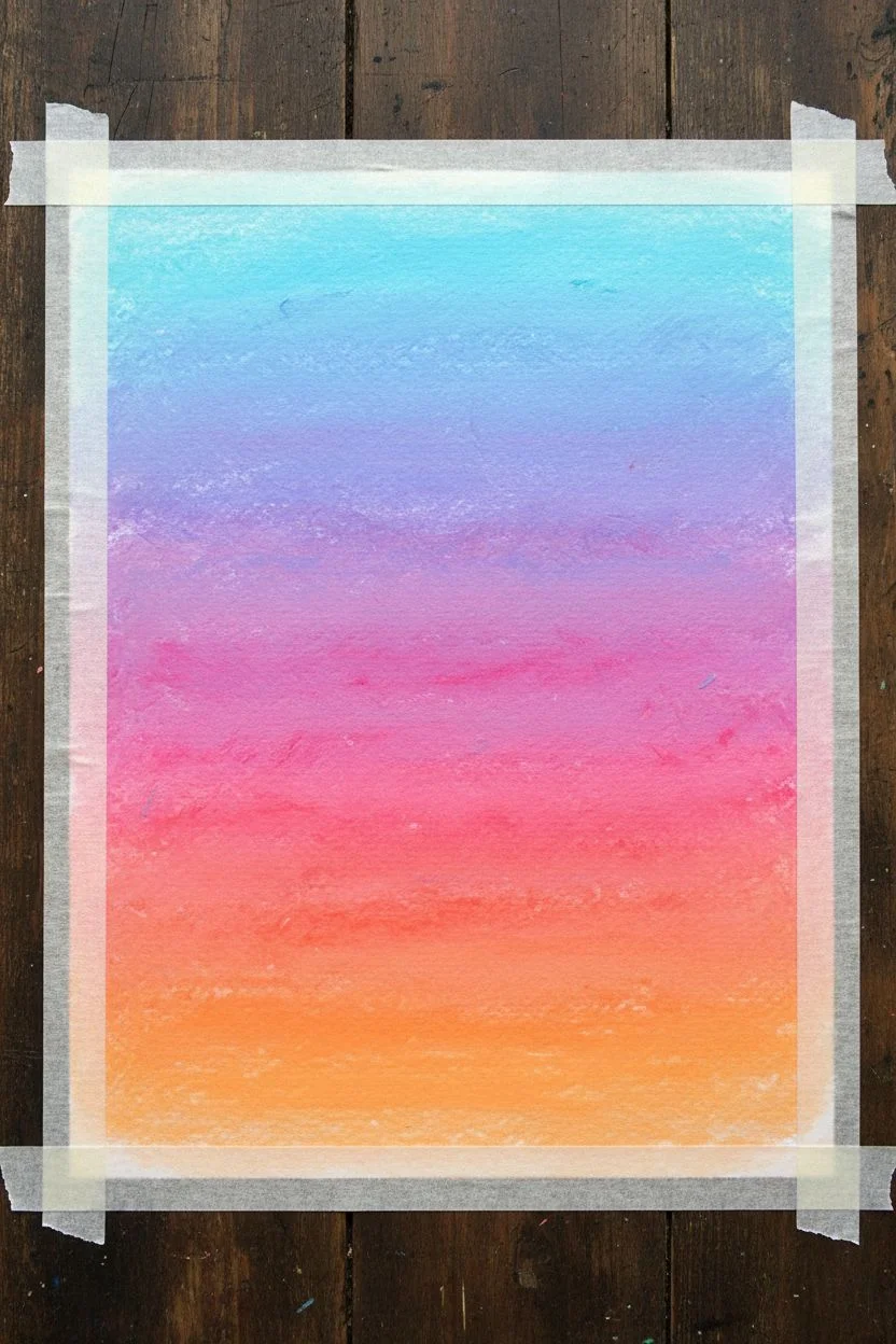
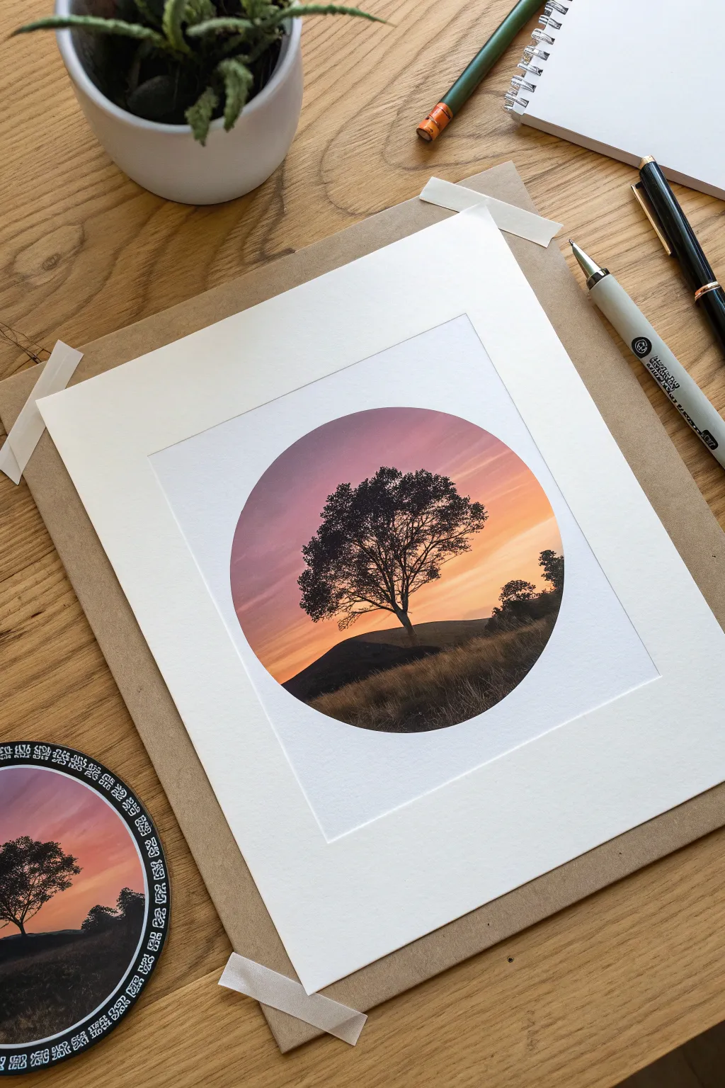
Sunset Gradient Sky With a Tree Silhouette
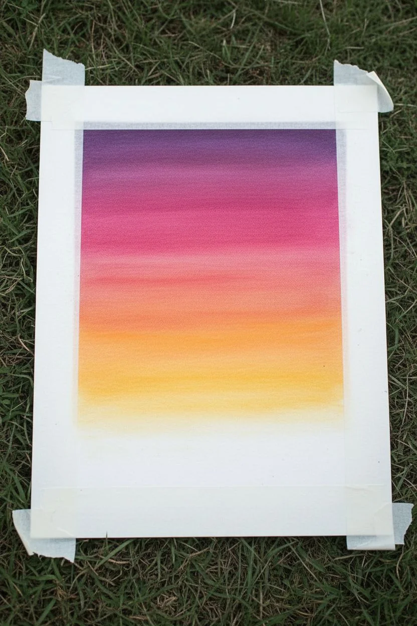
Capture the serene beauty of dusk with this vibrant gradient study. By blending rich purples into warm yellows, you’ll create a glowing backdrop for a striking, detailed tree silhouette.
Step-by-Step
Materials
- Heavyweight drawing paper or mixed media paper
- Oil pastels (Deep Purple, Magenta, Pink, Orange, Yellow, White, Black)
- Masking tape
- Tissue paper or blending stump
- Graphite pencil (HB or 2B)
- Black gel pen or fine liner (0.5mm)
- Paper towel for cleaning pastels
Step 1: Creating the Gradient Sky
-
Prepare your canvas:
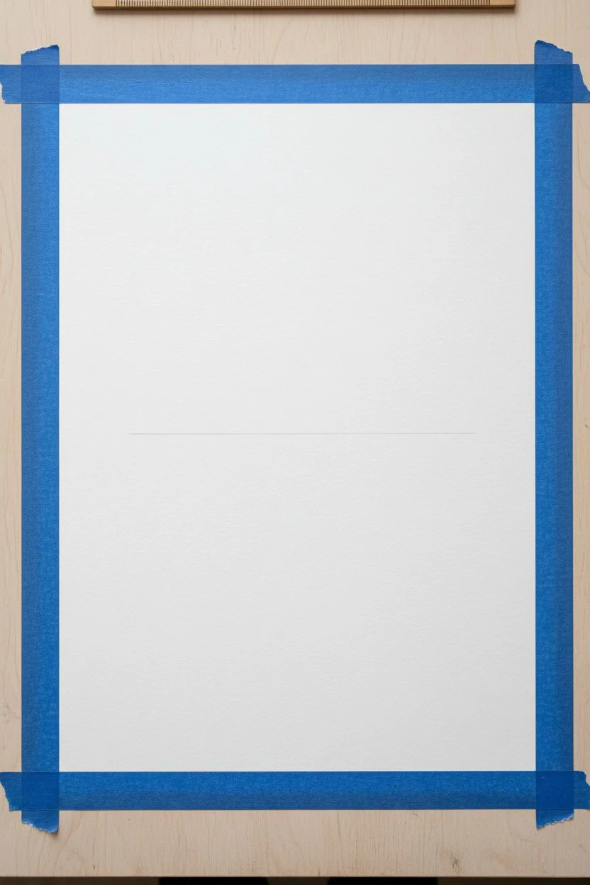
Begin by taping down the four edges of your paper with masking tape. This secures the sheet to your surface and ensures a crisp, clean white border when you finish. -
Apply the darkest sky tone:
Start at the very top of the page with your deep purple oil pastel. Apply a thick, horizontal band across the top quarter of the paper, pressing firmly to get good coverage. -
Transition to magenta:
Below the purple, add a band of magenta or deep pink. Overlap the purple section slightly to make blending easier later on. -
Add warmth with orange:
Continue downward with an orange pastel. Draw a band below the pink, again overlapping slightly with the color above it to create a seamless transition zone. -
Finish with yellow light:
Fill the remaining sky area down to the horizon line with a bright yellow. Leave the bottom fifth of the paper blank for the ground. -
Blend the sky:
Using a piece of folded tissue paper or your finger, vigorously rub the pastels horizontally. Start from the lightest color (yellow) and work your way up to the purple to prevent dragging dark colors into the light areas. -
Refine the gradient:
If the transitions look rough, re-apply pastel over the blending zones and rub again until the sky looks smooth and dreamy.
Clean Colors
Wipe your pastel stick on a paper towel before applying it if it has picked up other colors. Dirty pastels can make your yellow sky look muddy.
Step 2: Drawing the Silhouette
-
Establish the horizon:
Use a black oil pastel to color the bottom strip of the paper completely ensuring a solid, dark base for the ground. -
Texture the grass:
With the tip of the black pastel or a black colored pencil, draw short, upward flicking strokes along the horizon line to simulate blades of grass against the sunset. -
Sketch the trunk:
Switch to a black gel pen or fine liner for precision. Sketch the trunk of the tree off-center to the right, making the base wide and tapering it as it goes up. -
Draw main branches:
Extend several thick branches outward from the trunk. Let them curve naturally, splitting into smaller V-shapes as they reach higher into the sky. -
Add secondary branches:
From the main branches, draw thinner lines extending out. Keep your hand loose to avoid lines that look too stiff or straight. -
Create the fine twigs:
This is where patience pays off. Fill the canopy with hundreds of tiny, interconnecting lines using the fine liner. These intricate webs of twigs give the tree its realistic, wintery look. -
Thicken the shadows:
Go back over the trunk and thickest branches with the pen or a black colored pencil to ensure they are solid black against the bright background. -
Add a small bush:
To balance the composition, draw a small, low shrub silhouette to the left of the main tree using the same scribbling technique for the leaves. -
Peeling the tape:
Carefully peel away the masking tape at a 45-degree angle, pulling away from the drawing center to prevent tearing the paper.
Starry Night
Before drawing the tree, splatter opaque white acrylic paint or gouache over the purple section to create a starry twilight effect.
Step back and admire the stark contrast of your silhouette against that glowing sky


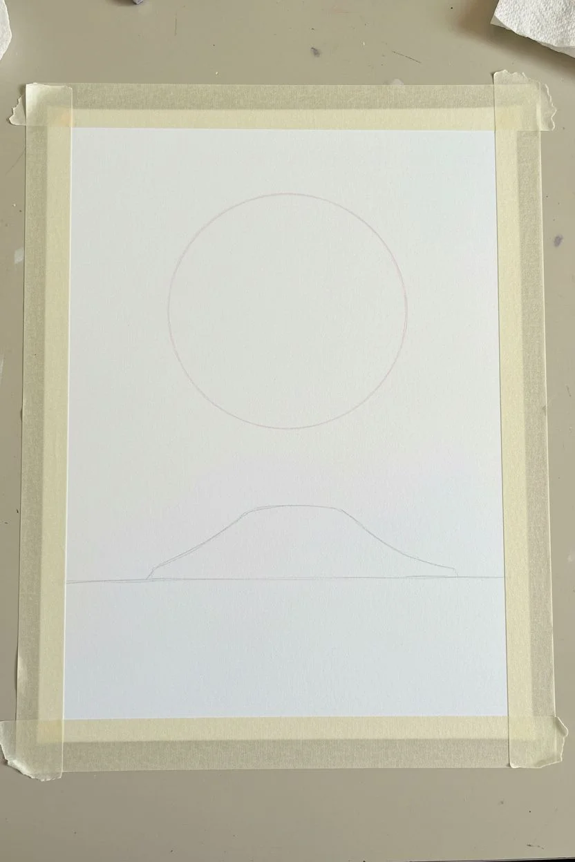
Moonlit Night With an Oversized Moon
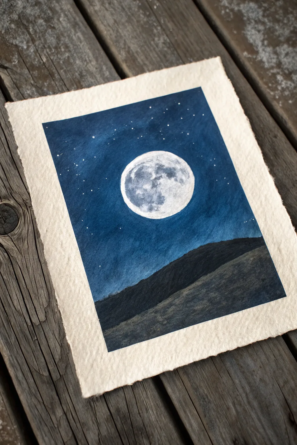
Capture the serene beauty of a moonlit night with this striking oil pastel drawing. The high contrast between the bright, cratered moon and the deep indigo sky creates a dramatic focal point that feels almost three-dimensional on the textured paper.
Detailed Instructions
Materials
- Heavyweight cold-press paper with deckled edges (e.g., Khadi or specialized pastel paper)
- Oil pastels (colors needed: white, light grey, prussian blue, indigo, black)
- Blending stumps or cotton swabs
- Masking tape (optional, for securing the paper)
- White gel pen or fine white paint pen (for stars)
- Paper towel or rag for cleaning pastels
- Scratch paper for testing blends
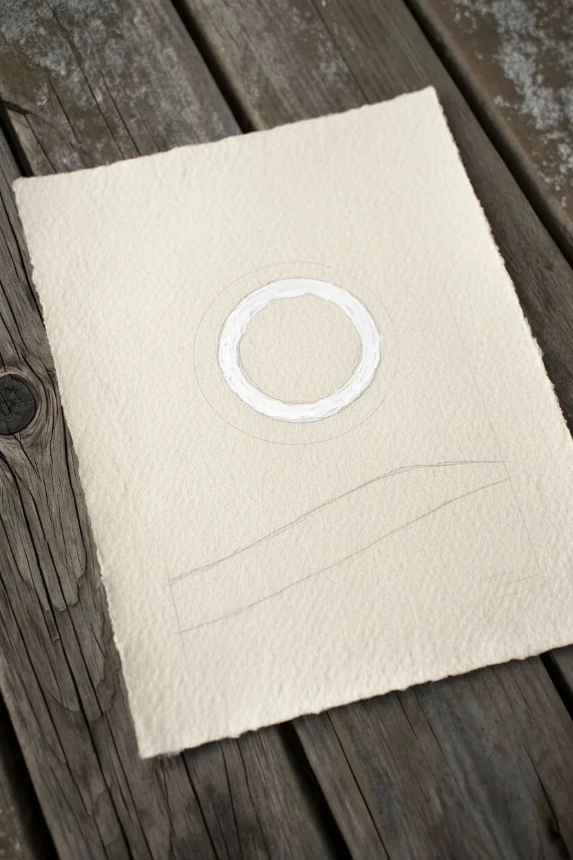
Step 1: Setting the Scene
-
Outline the composition:
Begin by lightly sketching a large circle in the center of your paper for the moon. Use a very light touch with a grey pastel or pencil so the lines don’t show through later. -
Mark the horizon:
Draw a sloping line across the bottom third of the paper to designate where the dark hillside will be. It doesn’t need to be perfectly straight; a slight unevenness adds realism to the terrain. -
Protect the moon:
Before coloring the sky, trace the outline of your moon carefully with white oil pastel. This creates a barrier so the dark blue sky pigments don’t accidentally smudge into your bright moon area.
Smooth Sky Secrets
Warm up your blue pastels in your hand for a few minutes before starting. Warmer oil pastels are softer and blend much more smoothly into the paper tooth.
Step 2: Creating the Night Sky
-
Apply the base blue:
Start applying your Prussian Blue heavily around the moon. Press firmly to get rich pigment coverage, working your way outward toward the edges of the paper. -
Deepen the edges:
Layer a darker Indigo blue or even a touch of black around the corners and the very top of the drawing. This vignette effect draws the eye toward the center brightness. -
Blend the sky gradient:
Use your finger or a paper stump to blend the blues together smoothly. Work in circular motions, merging the lighter blue near the moon into the deep darkness of the corners. -
Refine the sky texture:
If the paper tooth is still showing too much, add another layer of medium blue over the top and blend again until you have a velvety, solid night sky.
Fixing Smudges
If dark blue pigment accidentally smudges onto your bright white moon, don’t wipe it! Scrape it off gently with a craft knife, then layer fresh white on top.
Step 3: Detailing the Moon
-
Fill the moon base:
Color in the entire circle with a clean white pastel. Make sure this layer is thick and opaque to serve as a glowing foundation. -
Add lunar ‘seas’:
Lightly dab spots of light grey pastel on the moon’s surface to represent the maria (craters and seas). Look at the reference image to place these darker blotches naturally. -
Blend the craters:
Gently smudge the grey spots with a clean cotton swab. You want them to look like soft shadows rather than hard shapes. -
Highlight the rim:
Go back over the very edge of the moon with bright white, pressing firmly to make the rim pop against the dark sky. This enhances the glowing effect.
Step 4: Foreground and Finishing Touches
-
Block in the hill:
Fill the bottom section below your horizon line with black oil pastel. Apply it thickly to ensure it looks like a solid silhouette. -
Add subtle terrain:
To give the hill dimension, lightly skim a dark grey or deep brown pastel over the black area. Just catch the texture of the paper to suggest grassy unevenness. -
Create the halo effect:
Take a clean finger or cloth and very gently smudge a tiny amount of the white from the moon’s edge outward into the blue sky. This creates a soft atmospheric glow. -
Dot the stars:
Using your white gel pen or paint marker, tap tiny dots randomly across the blue sky. Vary the pressure to create stars of different brightness. -
Review contrast:
Step back and check your values. If the sky looks too light near the moon, carefully darken it with more blue to maximize the contrast.
Now you have a tranquil night scene that glows beautifully against the textured paper

Ocean Horizon With Mirror-Like Water Reflections
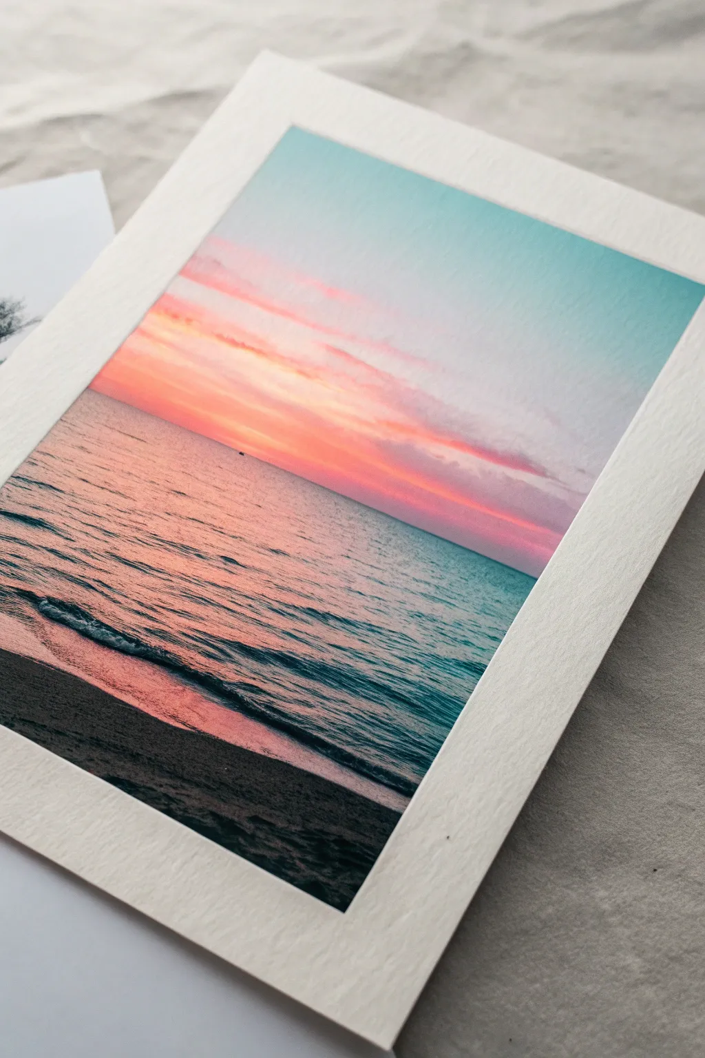
Capture the serene beauty of twilight with this glowing oil pastel drawing that features a mirror-like ocean surface reflecting a vibrant sky. You will learn to layer soft pinks and teals to create that magical moment just after the sun dips below the horizon.
Step-by-Step Tutorial
Materials
- Textured fine art paper or pastel paper (white or cream)
- Oil pastels (Set containing: white, turquoise/teal, deep ultramarine blue, bright pink, salmon/peach, violet, black)
- Masking tape or painter’s tape
- Paper towels or cotton swabs for blending
- Ruler (optional, for the horizon line)
- Palette knife or credit card (for scratching texture)
Step 1: Setting the Scene
-
Secure your paper:
Begin by taping down all four edges of your paper to your work surface. This creates a clean, professional white border like the one in the photo and prevents the paper from shifting while you blend. -
Establish the horizon:
Lightly draw a straight horizontal line across the paper, positioning it just below the halfway point. This separates your sky from the vast ocean expanse.
Pro Tip: Clean Colors
Keep a scrap piece of paper nearby. Wipe your oil pastel stick on it before applying new strokes to ensure you don’t accidentally streak a dirty color into your clean sky gradient.
Step 2: Painting the Sky
-
Apply the upper sky color:
Starting at the very top right corner, apply a soft layer of turquoise or light teal. Fade this color out gently as you move down and toward the left. -
Add the sunset glow:
On the left side, slightly above the horizon, lay down a vibrant band of salmon or peach. This represents the lingering warmth of the sun. -
Layer the clouds:
Using a bright pink pastel, draw horizontal streaks stretching from left to right across the sky, blending slightly into the peach tone below and the teal tone above. Keep these strokes somewhat loose to mimic drifting clouds. -
Blend the sky gradient:
Using a paper towel or your finger, gently smudge the sky colors horizontally. Smooth the transition between the teal and pink, but leave distinct textural streaks to suggest cloud movement.
Step 3: Creating the Ocean Reflection
-
Mirror the sunset colors:
Create the reflection of the sky on the water. On the left side of the water section, block in the same salmon and peach tones you used in the sky, pressing lightly. -
Fill the cool water tones:
Fill the rest of the ocean area (middle and right) with a mix of turquoise and light blue, ensuring it meets the pink reflection seamlessly. -
Define the horizon:
Take a slightly darker blue or violet and carefully trace strictly along the horizon line to give sharpness to the distant edge of the world. -
Initial water blending:
Blend the water colors horizontally. I find it helpful to use long, continuous strokes here to mimic the flatness of the calm sea surface.
Troubleshooting: Muddying
If your pinks and teals are turning gray where they meet, let the first layer set for a few minutes, or use a clean cotton swab to blend the transition zone very lightly.
Step 4: Adding Detail and Depth
-
Create water ripples:
Take a deep ultramarine or dark teal pastel. Draw thin, broken horizontal lines across the water’s surface, concentrating them closer to the bottom where the waves are clearer. -
Highlight the waves:
With a white pastel, add subtle highlights right next to your dark ripple lines. This creates the ‘mirror-like’ sheen mentioned in our title. -
Form the shoreline:
At the very bottom of the page, block in a dark, jagged shape for the wet sand. Use a mix of black and deep violet, pressing firmly for complete coverage. -
Create the foam edge:
Where the dark sand meets the water, use white to create a frothy, uneven line. Smudge this slightly upward into the blue water to show the wave receding. -
Refine the sand texture:
Use a palette knife or fingernail to gently scratch into the dark sand area, revealing tiny bits of the paper tooth to look like glistening grains of sand. -
Final blending touch-ups:
Look at the overall piece. If the clouds need softening, gently rub them again. Ensure the horizon is perfectly straight. -
The reveal:
Slowly peel away the masking tape at a 45-degree angle away from the drawing to reveal crisp, clean edges that frame your artwork beautifully.
Now you have a tranquil seascape that perfectly captures the stillness of an ocean evening

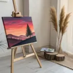
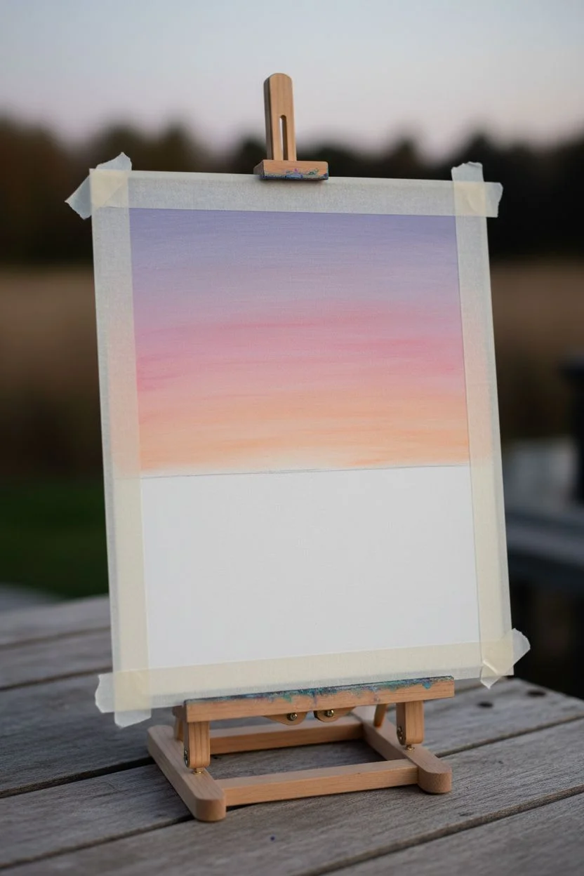
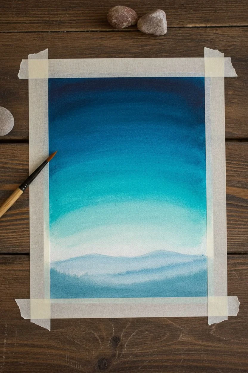
Mountain Range at Golden Hour With Simple Layers
Capture the breathtaking warmth of a canyon sunrise with this layered oil pastel drawing. You’ll build up depth through separating cool shadowed valleys from brilliant sunlit cliffs, creating a scene that feels both rugged and serene.
Detailed Instructions
Materials
- Textured pastel paper (e.g., Canson Mi-Teintes, gray or neutral tone)
- Oil pastels (set of 24 or higher)
- Specific colors needed: Cobalt Blue, Prussian Blue, Burnt Sienna, Orange, Yellow Ochre, White, light pink, and varied greens
- Paper blending stumps (tortillons)
- Masking tape
- Palette knife or credit card (for scraping)
- Fixative spray (optional)
Step 1: Setting the Sky and Atmosphere
-
Tape the borders:
Begin by taping down your paper to a hard surface with masking tape. This secures the paper and creates a crisp white border for that professional framed look later. -
Rough in the sky:
Start at the very top with light blue, fading quickly into white. In the middle sky area, introduce soft streaks of light pink and pale lavender to suggest early morning clouds. -
Blend the sky:
Use a clean finger or a paper stump to blend the sky colors horizontally. We want soft, ethereal transitions here, so keep the pressure light and the edges fuzzy. -
Define the cloud bottoms:
Add just a touch of light grey or diluted violet to the bottom edge of the larger clouds to give them volume and dimension against the sunrise colors.
Step 2: Building the Distant Mountains
-
Outline the distant range:
Using a light blue or cool grey pastel, lightly sketch the jagged silhouette of the furthest mountain range on the horizon. -
Fill the atmospheric distance:
Color these distant peaks with cool tones—Cobalt Blue mixed with a bit of White. Atmospheric perspective makes things bluer and lighter as they get further away, so avoid warm colors here. -
Layer the varying blues:
Identify the mid-ground mountains that sit slightly closer. Use a darker Prussian Blue for these shapes to separate them from the hazy background. -
Create valley shadows:
Deepen the blue tones at the very bottom of these mountain shapes where little light reaches. You can add a tiny touch of purple to enrich these shadows.
Muddy colors?
If your majestic peak turns brown instead of glowing orange, stop blending! Oil pastels can get muddy if overworked. Scrape off the excess wax and apply fresh, unmixed strokes of pure color.
Step 3: The Main Peak: Structure and Light
-
Sketch the prominent peak:
Draw the outline of the large, central red rock formation. It should dominate the center composition, rising higher than the blue mountains behind it. -
Establish the shadow side:
Identify the light source coming from the right. Color the left slope of the main peak in deep reddish-browns and cool violets to place it in shadow. -
Apply the base warmth:
For the sunlit faces of the cliff, apply a solid layer of Burnt Sienna. Press reasonably hard to get good coverage on the textured paper. -
Add the golden highlight:
Layer bright Orange and Yellow Ochre on the topmost ridges where the sun hits first. This creates that iconic ‘golden hour’ glow found in red rock canyons. -
Texture the rock face:
Use vertical strokes with a dark brown or maroon pastel to simulate the vertical striations and cracks typical of sandstone cliffs. Don’t blend these too much; the texture is key.
Add a hiker’s view
To give the viewer a sense of scale, scratch a tiny, winding white line into the lower brown slopes to represent a hiking trail winding through the canyon base.
Step 4: Foreground Elements and Details
-
Ground the mountain:
At the base of the red peak, create a transitional area with muted browns and greys. This represents the scree and rocky slopes leading down to the valley floor. -
Add foreground foliage:
In the immediate bottom corners, use short, choppy strokes of Olive Green and dark grey to suggest desert scrub brushes. I like to keep these loose to frame the main subject. -
Scrape for highlights:
Use a palette knife or the edge of a credit card to gently scrape away tiny lines on the sunlit cliffs. This reveals the paper texture and creates sharp, rocky highlights. -
Enhance contrast:
Go back and darken the deepest crevices in the red rock with a touch of dark blue or black to make the orange highlights pop even more. -
Final blending check:
Look at where the mountains meet the sky. Ensure the edge is distinct but not like a cartoon outline. Soften it slightly if needed. -
Remove tape:
Carefully peel away your masking tape at a 45-degree angle to reveal your clean edges and frame your masterpiece.
Place your finished drawing in a simple white frame to let those warm canyon colors truly shine
BRUSH GUIDE
The Right Brush for Every Stroke
From clean lines to bold texture — master brush choice, stroke control, and essential techniques.
Explore the Full Guide
Quiet Lake Reflection With a Pine Tree Line
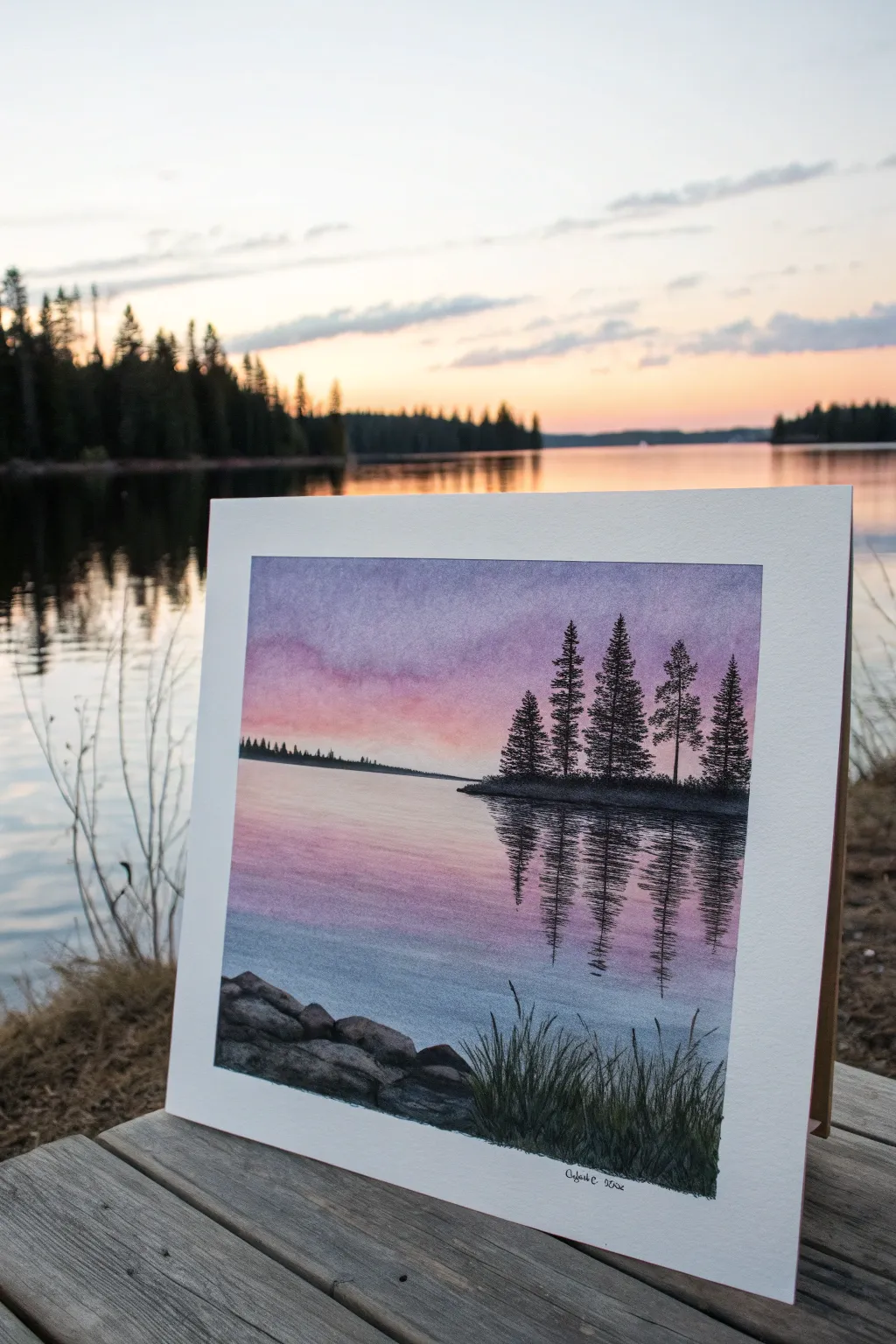
Capture the stillness of twilight with this atmospheric landscape study featuring silhouetted pines and gentle water reflections. Using oil pastels helps achieve the soft, blended gradients in the sky and the rich, dark textures of the foreground foliage.
Step-by-Step
Materials
- Heavyweight drawing paper or pastel paper (slightly textured)
- Oil passels (colors: violet, pink, peach, light blue, dark green, black, dark brown, grey)
- Blending stumps or tortillons
- Cotton swabs or soft tissues for blending
- Artist masking tape
- Sgrafito tool or toothpick (optional for grass details)
Step 1: Setting the Sky and Horizon
-
Tape the borders:
Begin by taping down all four edges of your paper to a flat surface. This not only keeps the paper from shifting but creates that crisp, professional white border seen in the example image. -
Establish the horizon line:
Lightly sketch a horizontal line about one-third of the way up from the bottom of the page. This divides the vast sky from the reflective water. -
Apply the top sky gradient:
Start at the very top of the paper with a muted violet or soft purple oil pastel. Apply the color horizontally, fading the pressure as you move downward. -
Transition to warmth:
Below the purple, introduce a soft pink tone. Blend it slightly into the purple edge, then allow it to transition into a warm peach or pale orange just above the horizon line to mimic the sunset glow. -
Blend the sky:
Use a cotton swab or your finger to gently rub the colors together horizontally. I find that using circular motions can create blotches, so stick to side-to-side sweeping motions for a smooth gradient.
Smooth Gradients
To get that seamless sky gradient without muddy colors, clean your fingers or blending tool thoroughly between blending the purple section and the peach section.
Step 2: Creating the Reflective Water
-
Mirror the sky colors:
Now, reverse the gradient for the water. Start just below the horizon with your pale peach tone, then transition into the soft pink, and finally the violet and light blue tones further down. -
Add water movement:
When coloring the water, use looser horizontal strokes than you did for the sky. Leave tiny flecks of white paper showing through occasionally to suggest light shimmering on ripples. -
Blend the water lightly:
Smooth out the water surface with a clean tissue, but don’t over-blend; retaining some texture helps differentiate the liquid surface from the airy sky. -
Define the distant shore:
Using a dark grey or muted dark green, draw a very thin, flat strip of land on the distant horizon line on the left side, keeping it extremely low profile.
Add Depth
For a cooler version, swap the peach sky for icy blues and teals. Adding a tiny white moon in the upper purple sky creates a beautiful winter twilight atmosphere.
Step 3: Adding the Pine Island
-
Shape the island base:
On the right side of the composition, draw a low, dark landmass jutting into the water using dark green mixed with black. Ensure the bottom edge is flat against the water level. -
Draw tree trunks:
Using a sharp corner of a black oil pastel, draw several vertical lines rising from the island. Vary their heights, making the center trees slightly taller. -
Add foliage:
Stipple or dab the pastel to create the pine branches. Start narrow at the top of the trunks and widen the strokes as you move down, creating that classic conical evergreen shape. -
Create reflections:
Directly below the island, pull dark vertical strokes downward into the water area. These should be rough and slightly wavy to mimic the distortion of the water surface. -
Disrupt the reflection:
Take a blending stump or a clean pastel stick and cut horizontal lines through the dark reflection to break it up, making it look like ripples are cutting through the mirror image.
Step 4: Foreground Details
-
Sketch the rocky shoreline:
In the bottom left corner, draw a cluster of rounded shapes for rocks. Use grey as a base, adding shadows with black on the bottom and right sides. -
Add rock texture:
Highlight the tops of the rocks with a touch of light grey or white to show where the ambient light hits them. -
Draw the foreground grass:
Using dark green and black, draw sharp, upward strokes flicking out from the bottom right corner. Press hard at the base and lift the pastel quickly to get tapering tips. -
Scratch in details:
If your grass looks too thick, use a toothpick or sgrafito tool to scratch fine lines into the dark pastel, revealing tiny hints of the paper underneath for texture. -
Final touches:
Review the horizon line to ensure it is straight and clean. Peel off the masking tape slowly at a 45-degree angle to reveal your crisp white border.
Step back and admire the peaceful atmosphere you have created with simple colors and silhouettes
City Skyline at Dusk With Glowing Windows
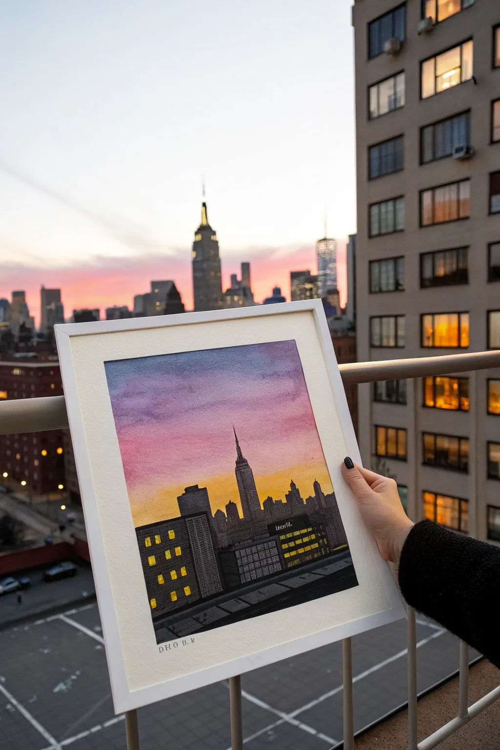
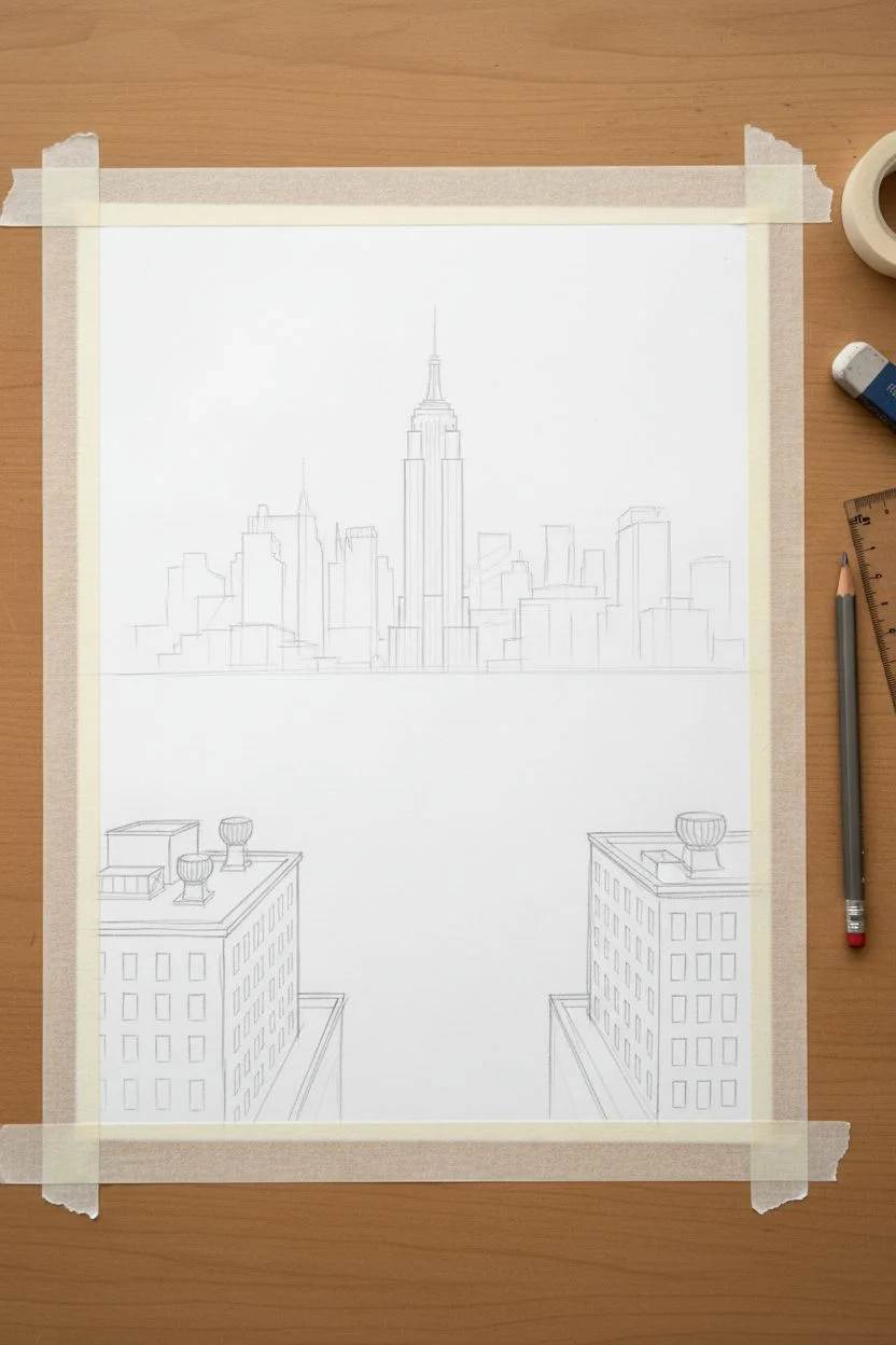
Capture the magic of an urban sunset by combining a soft, blended gradient sky with the sharp silhouettes of city architecture. This oil pastel project focuses on creating a dramatic contrast between the warm, fading light and the deep shadows of the buildings, punctuated by glowing windows.
Detailed Instructions
Materials
- Heavyweight mixed media or pastel paper (white)
- Oil pastels (purple, pink, orange, yellow, black, dark grey, light grey)
- Graphite pencil (HB) and eraser
- Paper towels or blending stumps
- Soft cloth for cleaning fingers
- Masking tape (for clean borders)
- Ruler or straight edge
- Fine-point black ink pen (optional, for fine details)
Step 1: Preparation and Sketching
-
Tape the borders:
Begin by taping down all four edges of your paper to a flat surface using masking tape. This secures the paper and ensures you’ll have a crisp, clean white frame when you peel it off at the end. -
Establish the horizon:
Using your pencil and ruler, lightly draw a horizon line about one-third of the way up from the bottom of the paper. This will be the base for your skyline. -
Outline the iconic shapes:
Lightly sketch the skyline silhouette. Focus on the Empire State Building as the central focal point, rising higher than the rest. Add various blocky rectangular shapes for the surrounding skyscrapers. -
Sketch the foreground:
Draw the details of the nearest rooftops in the foreground. Include the angled lines of the roof vents and the grid patterns for the windows on the closest buildings.
Step 2: Creating the Sunset Sky
-
Apply the top layer:
Start at the very top of the paper with a medium purple oil pastel. Apply it horizontally with moderate pressure, coloring down about two inches. -
Transition to pink:
Below the purple, apply a band of vibrant pink. Overlap the pink slightly with the purple edge to prepare for blending. -
Add the golden glow:
switch to a yellow-orange or golden hue for the lowest part of the sky, bringing it right down behind the building outlines. This represents the last light of the sun. -
Blend the gradient:
Use a paper towel or your fingertip to rub the colors horizontally. I find that blending from the lightest color (yellow) up toward the darkest (purple) keeps the light colors bright without muddying them. -
Refine the sky:
If the colors look too thin after blending, add a second layer of pastel and blend again until you achieve a smooth, dreamlike transition.
Clean Edges Trick
When coloring near your building outlines, place a piece of scrap paper over the sky area. This acts as a shield so you can color the buildings quickly without smudging black into your sunset.
Step 3: Building the Cityscape
-
Base layer for buildings:
Use a dark grey pastel to fill in the distant buildings. You don’t need to press hard yet; just establish the base tone for the silhouette. -
Define the silhouettes:
Take a black pastel and go over the distant buildings, pressing harder to make them opaque. Carefully trace the needle of the Empire State Building so it stands out sharp against the sky. -
Color the foreground buildings:
For the closer buildings on the left and right, use a mix of charcoal grey and black. These should have slightly more texture than the distant silhouette. -
Create the rooftop surface:
Fill in the immediate foreground (the rooftop you are ‘standing’ on) with dark grey. Add black horizontal streaks to suggest roof tiles or vents.
Make It Glossy
For a ‘wet pavement’ look on the bottom rooftop, add touches of light purple and pink reflection on the dark grey ground, mimicking the sky colors reflecting off the surface.
Step 4: Details and Illumination
-
Scrape out windows:
For the glowing windows, use the edge of a ruler or a palette knife to scrape away small squares of the black pastel on the foreground buildings, revealing the white paper underneath. -
Add the light:
Fill these scraped-out squares with a bright yellow pastel. Press firmly to make them look like illuminated windows in the night. -
Texturize the architecture:
Use a fine-point black pen or the sharp edge of a black pastel to draw grid lines on the grey buildings, giving them architectural definition. -
Add signage details:
If you want to mimic the reference signage, simple horizontal yellow dashes on a black rectangle can suggest a lit billboard. -
Final touch-ups:
Check your edges. If the sky color accidentally crossed into a building, cover it with black pastel. Ensure the window lights are bright.
Step 5: Finishing
-
Clean the borders:
Gently peel away the masking tape. Pull it away from the drawing at a 45-degree angle to prevent ripping the paper. -
Sign and date:
Use a pencil or fine pen to sign your name in the clean white border at the bottom, just like a professional print.
Now you have a captured a permanent sunset view that will brighten up any room

PENCIL GUIDE
Understanding Pencil Grades from H to B
From first sketch to finished drawing — learn pencil grades, line control, and shading techniques.
Explore the Full Guide
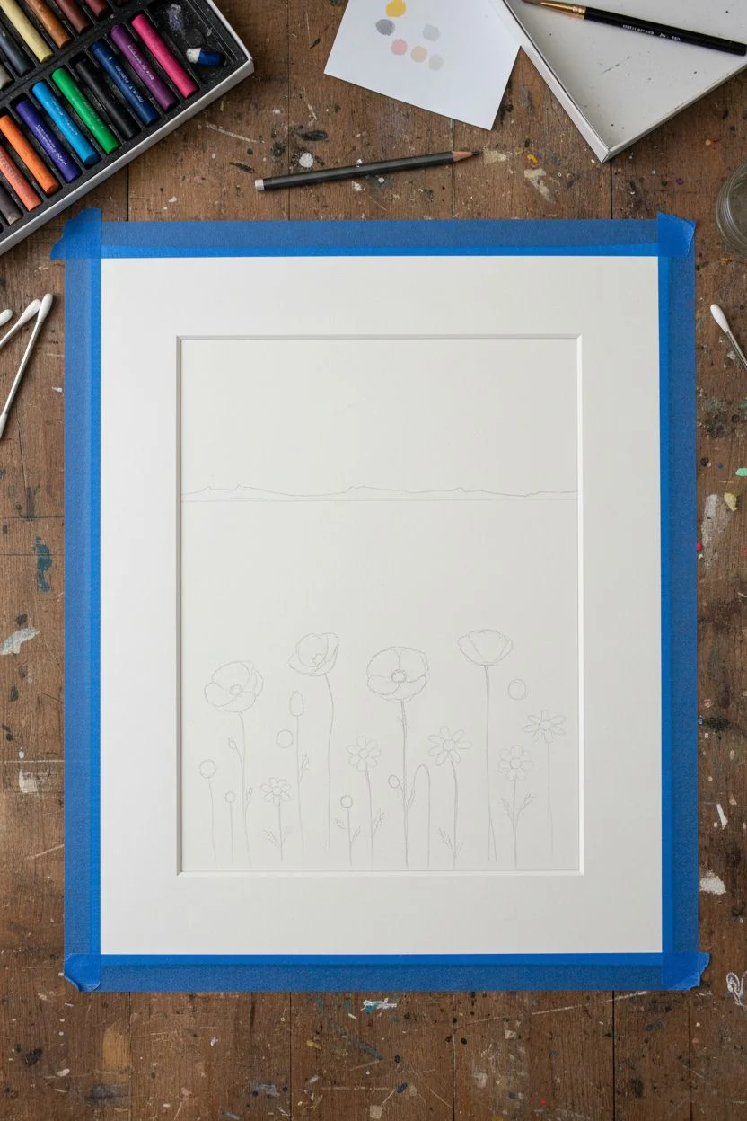
Meadow of Wildflowers With Bold Color Blocks
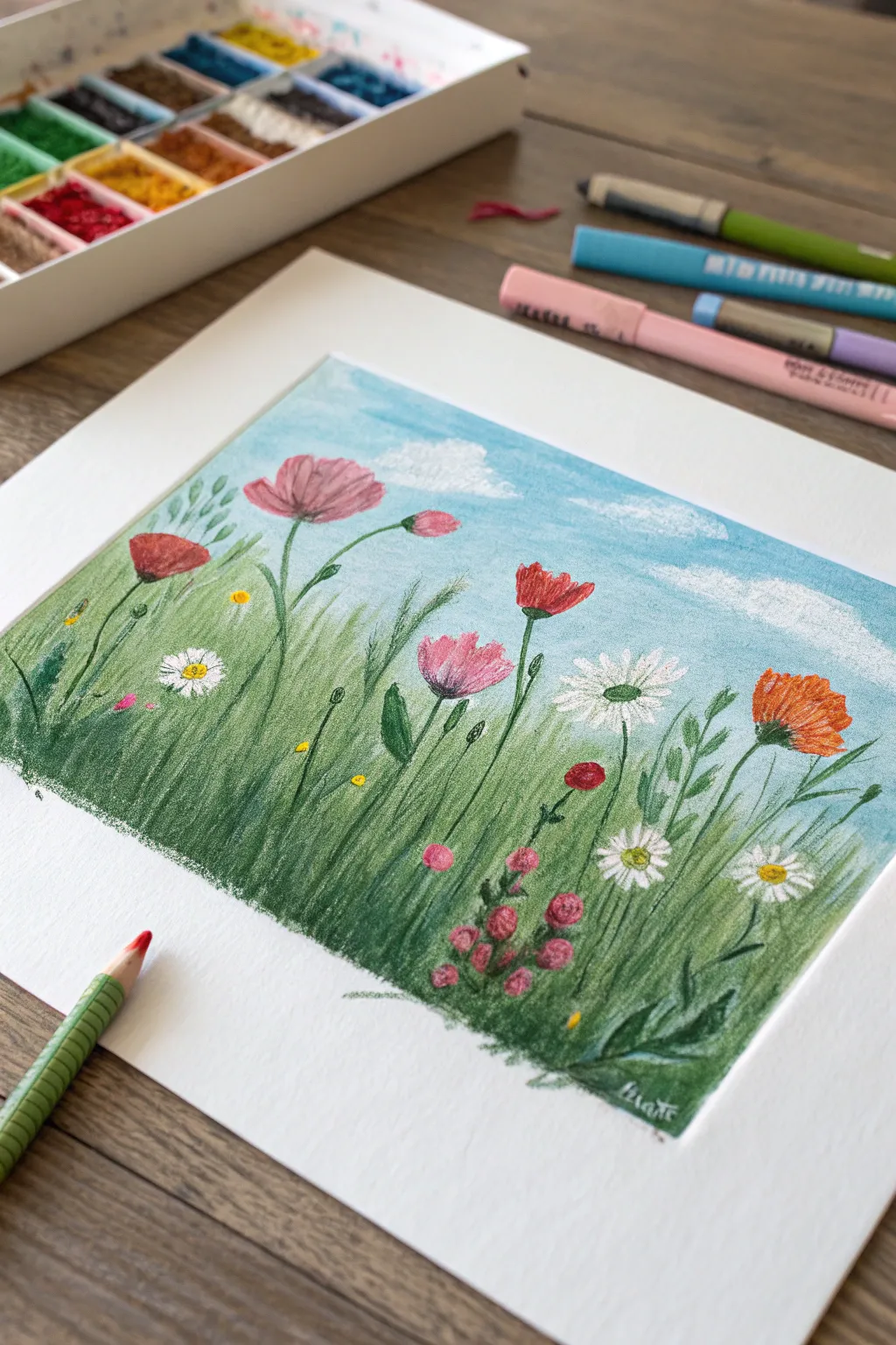
Capture the joy of a summer day with this vibrant oil pastel meadow scene, featuring bold poppies, delicate daisies, and a sweeping blue sky. This project combines smooth blending techniques with textured floral details for a charming, illustrative finish.
How-To Guide
Materials
- Oil pastels (set including pinks, reds, oranges, greens, blues, white, and yellow)
- Heavyweight drawing paper or mixed media paper (smooth to medium texture)
- Masking tape or painter’s tape
- Pre-cut mat board (white) for framing (optional, but good for sizing context)
- Blending tools (paper tortillon, cotton swabs, or fingers)
- Scrap paper (for testing colors and cleaning tips)
- Graphite pencil (H or HB for light sketching)
Step 1: Setting the Scene
-
Tape and Prep:
Begin by taping down the edges of your paper to your work surface. This creates a clean, crisp border that looks professional once the tape is removed. If you plan to use a pre-cut mat, trace the inner opening lightly with pencil so you know exactly where your composition needs to sit. -
Sketch the Composition:
Using a light hand and a graphite pencil, sketch the horizon line about two-thirds of the way up the paper. It doesn’t need to be straight; a slight unevenness adds natural character. -
Map Out Flowers:
Lightly draw the stems and basic head shapes of the main flowers. Sketch ovals for the poppies and circles for the daisies. Vary the heights—some tall and reaching for the sky, others tucked low in the grass.
Keep Colors Clean
Oil pastels pick up other colors easily. Wipe the tip of your pastel on a paper towel between every few strokes, especially when applying white over green.
Step 2: Blocking in the Background
-
Sky Base Layer:
Take a light blue pastel and fill in the sky area using broad, horizontal strokes. Apply medium pressure to get decent coverage but don’t press too hard yet. -
Adding Clouds:
While the blue is still fresh, take a white oil pastel and draw irregular, fluffy cloud shapes. Use a circular motion to blend the white directly into the blue, creating a soft, dreamy look. -
Grass Foundation:
Moving to the bottom section, lay down a base of light olive green. Apply vertical strokes that flick upward to mimic the direction of growing grass. -
Deepening the Greenery:
Layer a darker forest green over the olive base, concentrating on the bottom edge of the paper and the areas between flower stems. This creates depth and makes the foreground feel denser. -
Blending the Field:
Use your finger or a paper towel to gently smudge the green layers. Don’t over-blend; you want to maintain some of that vertical texture that suggests individual blades of grass.
Fixing Muddy Grass
If your grass looks too muddy from over-blending, let it sit for a minute, then use the edge of a credit card or palette knife to scrape back texture lines.
Step 3: Creating the Wildflowers
-
Poppy Petals:
Select a bright red and a warm pink for the poppies. Color in the cup-shaped blooms, pressing firmly to get opaque, rich color that stands out against the sky. -
The Orange Specimen:
For the prominent orange flower on the right, use a vibrant tangerine shade. Apply short, choppy strokes to give the petals a slightly ruffled texture. -
Adding Daisies:
Use a pointy white pastel to draw the daisy petals. Since white can get muddy easily on top of green, clean the tip of your pastel frequently on a scrap paper. Add a sunny yellow center to each daisy. -
Small Pink Blooms:
Scatter clearer, smaller pink shapes throughout the grass. These can be simple dabs or small circles to represent clover or buds. -
Tiny Blue Accents:
For visual variety, add very small dots of blue or purple near the base of the stems, suggesting tiny forget-me-nots hiding in the shade.
Step 4: Refining Details
-
Stem Definition:
Take a dark green or even a black-green pastel and carefully re-draw the stems. Make sure they connect convincingly from the flower head down into the grass. -
Leaf Texture:
Draw specific leaf shapes attached to the stems. I find that pressing harder at the base of the leaf and lifting off quickly creates a nice tapered tip. -
Highlighting:
Add tiny touches of white or light yellow to the tops of the poppy petals and the tips of the grass blades where the sunlight would hit. -
Final Cleanup:
Check for any stray smudges on the white border area. Carefully peel away your masking tape at a 45-degree angle to reveal the clean edge. Place your mat over the top to see the finished effect.
Now you have a cheerful meadow scene that captures the warmth of a perfect afternoon.
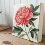
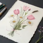
Flowers in a Vase With Thick, Creamy Petal Strokes
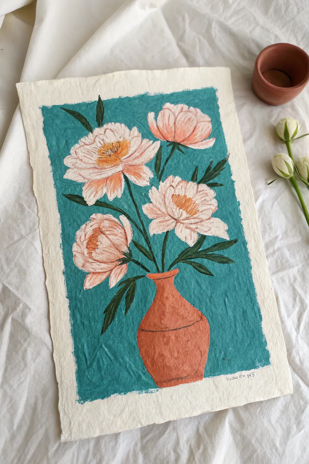
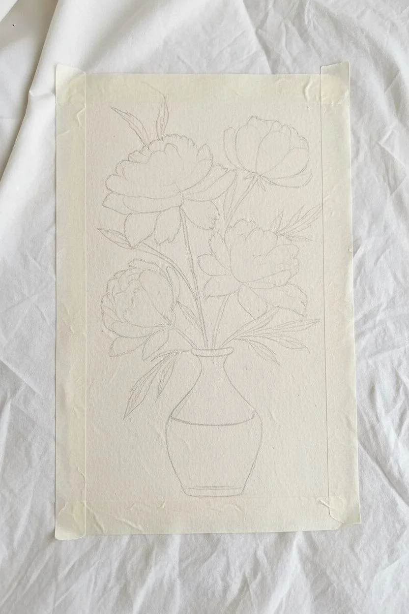
Capture the soft, lush beauty of blooming peonies with rich oil pastel textures on homemade or handmade paper. This project uses a beautiful contrast between creamy petals and a deep teal background to make the flowers pop.
Step-by-Step
Materials
- Textured, off-white handmade paper (approx. A4 size)
- Oil pastels (teal/turquoise, light peach/pink, white, terracotta/brown, deep yellow, dark green)
- Masking tape or painter’s tape
- Pencil (HB or lighter) for sketching
- Cotton swabs or blending stump (optional)
- Small palette knife or toothpick (for scratching details)
Step 1: Preparation & Sketching
-
Prepare the borders:
Begin by taping down your handmade paper to a flat surface. Place the tape relatively far into the paper (about 1.5 inches from the edge) to create that distinct, wide ragged border seen in the example. Press the tape down firmly to ensure crisp lines. -
Outline the vase:
Using a light hand and your pencil, sketch the vase shape in the lower center. Aim for a classic amphora or bottle shape—a wider base narrowing into a neck, then flaring slightly at the rim. Keep the lines faint. -
Position the flowers:
Lightly sketch four large circles to denote where the peony heads will go. Two should be higher up, one slightly lower on the right, and one tucked lower on the left. Don’t worry about petals yet, just the placement. -
Connect with stems:
Draw simple lines connecting your flower circles to the vase neck. Add rough guidelines for the pointed leaves branching out from the stems.
Fixing Smudges
Oil pastels smudge easily. If teal gets on your white petals, scrape it off gently with a craft knife before layering white over it. Don’t just rub it!
Step 2: The Background Layer
-
Block in the teal:
Take your deep teal or turquoise oil pastel and begin coloring the negative space around your pencil sketches. Be careful not to color inside the flowers or the vase. -
Refine the edges:
Work carefully right up to your pencil lines. The edge between the teal and the white paper of the flowers is crucial for the final look, so take your time here to keep it relatively neat. -
Smooth the texture:
If you want a solid look, go over the teal area a second time to fill in the paper tooth. The handmade paper texture will naturally show through, adding character.
Creating Texture
For realistic petals, don’t blend everything smooth. Leave physical ridges of pastel on the paper surface to mimic the thickness of real flower petals.
Step 3: Rendering the Flowers
-
Base layer for petals:
Start with a white oil pastel. Heavily color the outer edges of the flower petals, pressing hard to get that thick, creamy consistency mentioned in the title. -
Add soft pinks:
Using a light peach or soft pink pastel, color the centers of the petals, blending outwards into the white. Use short, curved strokes to mimic the cupped shape of peony petals. -
Create the centers:
For the pollen-rich centers, dab a deep yellow or ochre pastel in the middle of the open blooms. You can layer a tiny bit of orange here for depth. -
Define individual petals:
Go back in with your white pastel (clean the tip first) and redraw the tips of the petals to make them stand out against the pink interior. This layering creates volume.
Step 4: The Vase & Foliage
-
Color the vase:
Fill in the vase shape with a terracotta or reddish-brown pastel. Apply the color evenly, perhaps leaving it slightly lighter on one side to suggest a light source. -
Add vase details:
Use a darker brown or a fine-point tool to draw the thin horizontal line across the belly of the vase and define the rim. -
Draw the leaves:
Using a dark green pastel, color in the leaves. Make them sharp and pointed. I find that pressing harder at the base of the leaf and lifting off at the tip creates a nice tapered shape. -
Connect the stems:
Trace over your initial stem lines with the dark green, ensuring they connect visually from the vase neck to the flower heads.
Step 5: Final Touches
-
Clean up borders:
Check the edges where the flowers meet the teal background. If you need more contrast, carefully touch up the teal right next to the white petals. -
Remove the tape:
Slowly peel away the masking tape at a 45-degree angle. This reveals the crisp rectangle of the painting against the rough, natural edge of the paper. -
Sign your work:
Add your signature in small pencil or fine pen in the white border area below the image.
Now you have a vibrant floral study that balances bold background color with delicate blooms


Pet Portrait With Short Strokes for Fur Texture
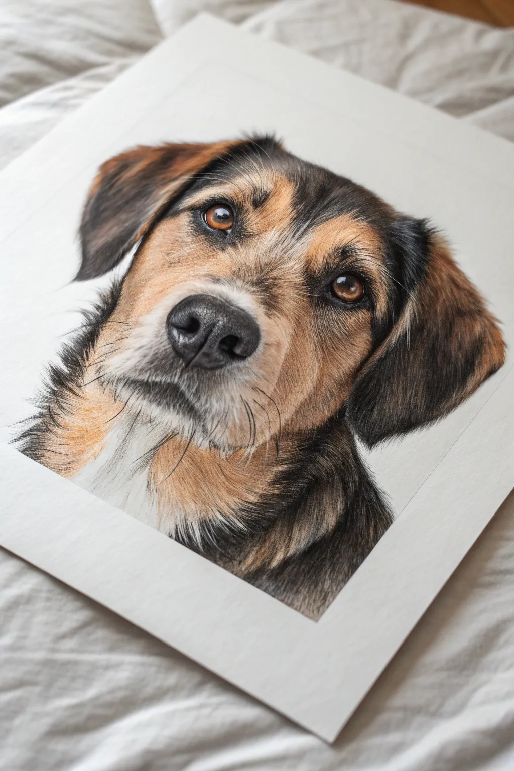
Learn to capture the soulful gaze of man’s best friend using layered oil pastels and a short-stroke technique. This project focuses on building realistic fur texture by mimicking hair growth patterns with distinct, deliberate marks.
Detailed Instructions
Materials
- High-quality oil pastels (including tans, browns, blacks, greys, and white)
- Heavyweight textured pastel paper (light grey or white)
- Hard graphite pencil (HB or H) for sketching
- Blending stumps or silicone shapers
- Scrap paper for testing colors
- Kneaded eraser
Step 1: Initial Sketching
-
Outline the head shape:
Begin by lightly sketching the large oval shape of the dog’s head on your paper with the graphite pencil. Keep your lines incredibly faint so they won’t show through the pastel later. -
Place facial features:
Mark the position of the eyes, nose, and the general flow of the ears. Draw guidelines for the direction of the fur, especially around the snout and forehead where the hair changes direction frequently.
Keep It Sharp
Oil pastels blunt quickly. Keep a piece of scrap paper nearby to rub the tip into a chisel shape, or chill your pastels in the fridge for 10 minutes to make them harder for fine details.
Step 2: Eyes and Nose
-
Establish the eyes:
Start with the eyes to bring life to the portrait early. Use a sharp black pastel to outline the rim and fill in the pupil. Layer amber and dark brown for the iris, leaving a tiny spot of pure white paper for the highlight. -
Detail the nose:
Fill the nose shape with a dark grey or black base. While the pastel is still workable, add small dabs of lighter grey on the top curves of the nostrils to create a wet, leather-like texture. -
Define the nostrils:
Deepen the darkest shadow areas inside the nostrils with black to create depth. Use a silicone shaper to push the pigment into the paper’s tooth for a solid, velvety look.
Step 3: Layering the Fur
-
Apply base colors:
Block in the underlying colors of the fur using broad, light strokes. Use burnt sienna for the tan areas around the eyes and cheeks, and a dark grey for the black patches on the ears and neck. Don’t worry about texture yet; just map out the color zones. -
Start the short stroke technique:
Begin adding texture on the snout. Using a sharpened tan or cream pastel, make short, flicking strokes that follow your directional guidelines. These marks should be no longer than a fingernail to mimic short facial hair. -
Build the forehead fur:
Move up to the forehead. I find it helpful to overlap colors here, alternating between strokes of warm brown, black, and tan. Let the strokes crisscross slightly in the center to show where the hair meets. -
Texture the ears:
The fur on the ears is often softer and longer. Use slightly longer, sweeping strokes of black and dark brown here. Allow the edges of the ear to look feathery rather than outlining them with a solid line. -
Create the white muzzle:
For the white area around the mouth and neck, apply a dense layer of white pastel. Layer grey strokes gently underneath the chin to form a shadow, creating the illusion of a three-dimensional form.
Muddy Fur?
If colors start blending into a brown mess, you’re overworking the layers. Stop, scrape off the excess wax gently with a palette knife, and apply fresh strokes once the area is clear.
Step 4: Refining Details
-
Sharpen edges:
Use the edge of a harder black pastel or even a black colored pencil if your pastels are too soft to reinforce the dark markings around the eyes. This ‘eyeliner’ effect makes the gaze piercing. -
Add whiskers:
Identify the whisker spots on the muzzle. With a very steady hand and the sharp edge of a grey or black pastel, draw thin, quick lines for the whiskers. Press firmly at the start and lift off quickly to taper the end. -
Enhance contrast:
Look for areas where the fur colors separate, like the tan eyebrow patches against the dark fur. Add fresh, crisp strokes of the lighter color on top of the dark to make the pattern pop. -
Blend neck fur:
On the neck and chest, the fur is often thicker. Layer your colors heavily and use a blending stump to smudge them slightly before adding a final layer of distinct strokes on top for definition. -
Final highlights:
Check the brightest points on the fur, particularly on the brows and the bridge of the nose. Add a few deliberate strokes of your lightest cream or white to simulate light hitting the glossy coat. -
Cleanup:
Use a kneaded eraser to lift any stray pastel dust from the white background, keeping the negative space clean to emphasize the portrait’s silhouette.
Step back and admire the lifelike texture you have created in your pet portrait
Birds on Power Lines Against a Candy-Color Sunset
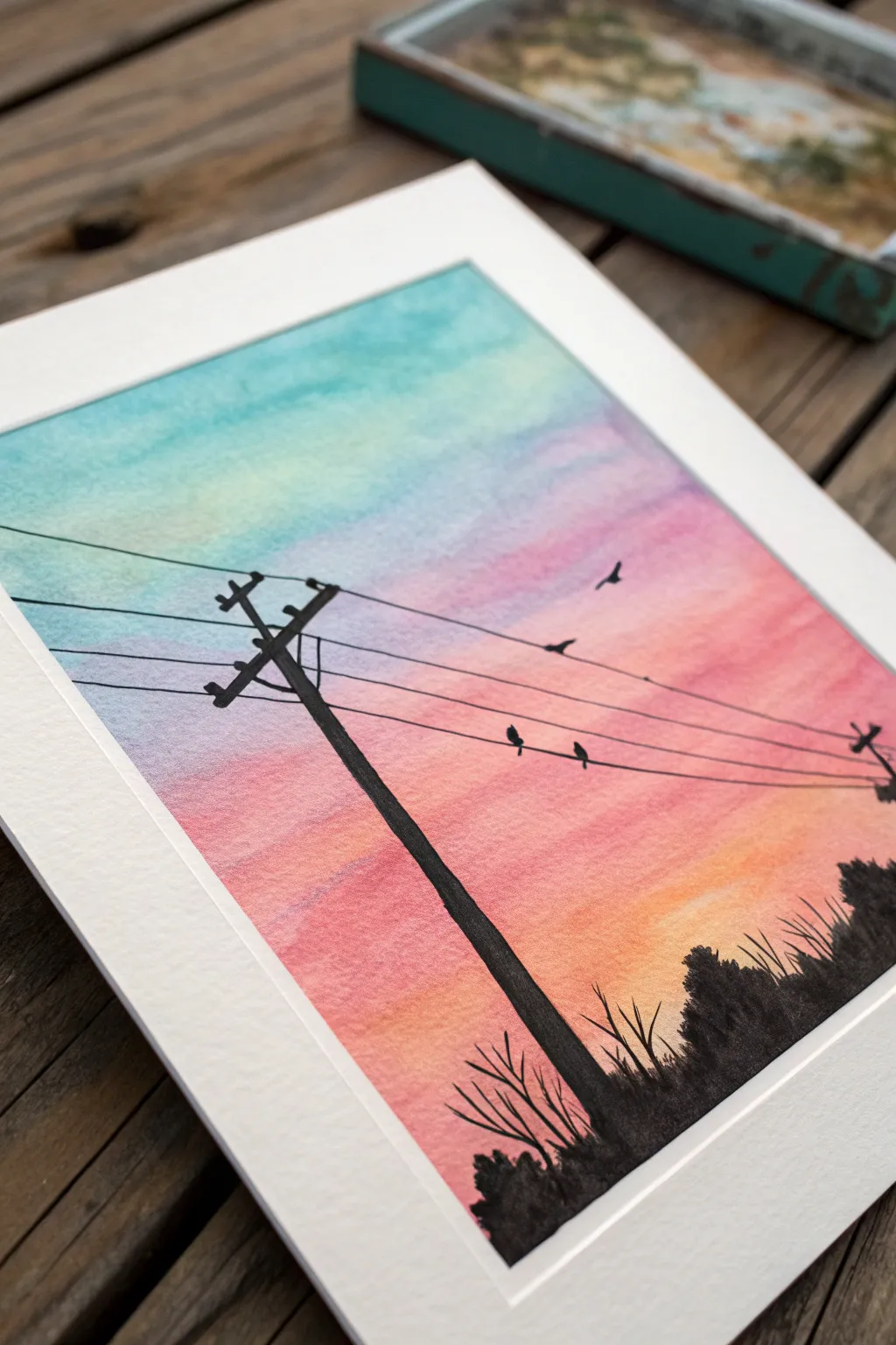
Capture the serene beauty of a twilight gradient with this vibrant yet simple landscape project. You’ll layer soft pastel skies against the striking contrast of black silhouettes to create a nostalgic scene featuring birds on a wire.
Step-by-Step
Materials
- Oil pastels (Cyan, Lilac/Light Purple, Hot Pink, Orange, Black)
- Heavyweight mixed-media or watercolor paper
- Masking tape or artist’s tape
- Paper towel or blending stump (tortillon)
- Cotton swabs
- Soft graphite pencil (HB)
- Ruler
Step 1: Setting the Sky Gradient
-
Prepare your canvas:
Tape down all four edges of your paper to a flat surface. This creates a crisp, clean border and prevents the paper from shifting as you blend. -
Apply the top layer:
Start at the very top of the page with a cyan or light teal oil pastel. Apply with light to medium pressure, covering the top quarter of the paper in horizontal strokes. -
Introduce the purple:
Directly below the blue, add a band of lilac or light purple. Allow the top of this purple section to overlap slightly with the blue to make blending easier later. -
Warm up the tones:
Next, lay down a band of hot pink. Let this mix slightly into the purple area above it. The colors should be getting progressively warmer as you move down the page. -
The horizon glow:
Fill the remaining bottom section with a bright orange. This represents the final glow of the sun just below the horizon. -
Initial blending:
Starting from the top (blue) and working downward, use a folded paper towel to rub the pastels into the paper. Use a circular motion to soften the texture. -
Smooth transitions:
When moving between colors (like blue to purple), use a clean spot on your paper towel or a fresh cotton swab to blend the seam so the gradient looks seamless, like a real sunset.
Sharpen Your Point
For thin wires, try freezing your black pastel for 10 minutes before drawing. A cold pastel is harder and holds a sharper edge.
Step 2: Drawing the Infrastructure
-
Sketch the pole:
lightly sketch the placement of your utility pole using a pencil. Place it off-center to the left, leaning ever so slightly to the right for a realistic perspective. -
Guide lines for wires:
Use a ruler to lightly pencil in four or five parallel lines stretching from the pole across to the right edge. Angle them slightly upward. -
Inking the pole:
Using your black oil pastel, color over your pencil sketch of the utility pole. Press firmly to get an opaque, solid black coverage. -
Adding crossbars:
Draw the crossarms near the top of the pole. The top one is a simple horizontal bar; the lower one is angled. Add small knobs for the insulators. -
Drawing the wires:
Trace over your pencil guide lines with the black pastel. Since oil pastels are thick, use the sharp edge of the stick. If you need a finer line, you can scrape away excess width with a toothpick or use a black colored pencil for this specific detail.
Smudge Control
If black pastel accidentally smears onto your sunset sky, don’t rub it. Gently scrape the mistake off with a craft knife or fingernail.
Step 3: Adding Life and Details
-
Ground the scene:
At the bottom right corner, create a silhouette of bushes and trees. Use short, upward strokes with the black pastel to mimic wild grass and foliage texture. -
Connect the foreground:
Extend the black foliage to the base of the utility pole, ensuring the pole looks planted in the ground rather than floating. -
Perch the birds:
Choose two wires and draw small, rounded teardrop shapes sitting on top. These are your resting birds. Keep them simple; silhouettes don’t need eyes or beaks. -
Birds in flight:
Add one or two small ‘v’ shapes or stretched ovals high in the pink or purple section of the sky to suggest distant birds flying home. -
Final cleanup:
Gently peel away the masking tape at a 45-degree angle to reveal your crisp white border.
Frame your silhouette landscape or gift it to someone who loves watching the sunset
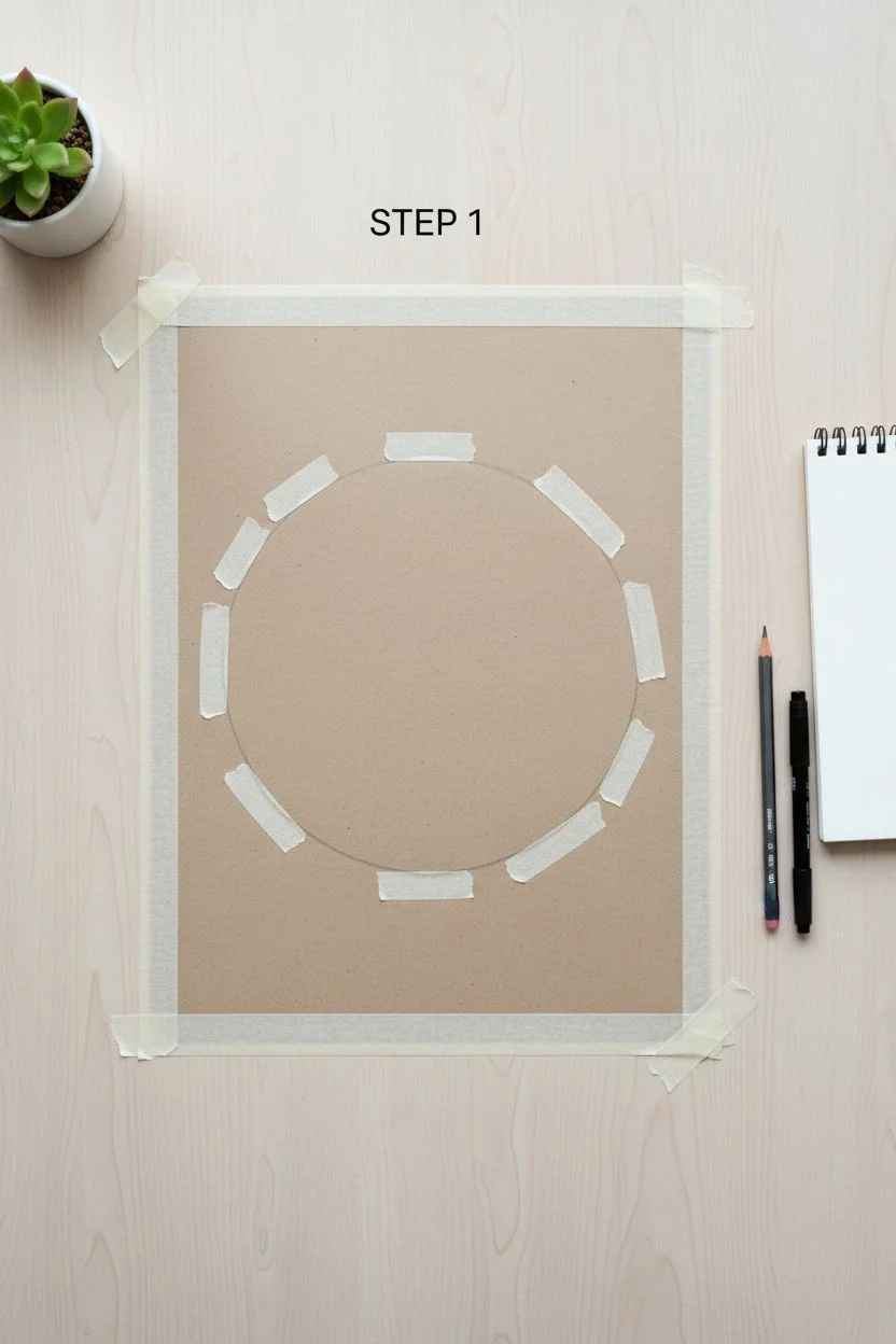
Circle-Masked Mini Sunset for a Polished Look
Capture the serene beauty of a twilight sky within a crisp, perfect circle. This project combines smooth oil pastel gradients with striking silhouettes to create a polished, professional-looking illustration that fits beautifully inside a mat frame.
Step-by-Step Tutorial
Materials
- High-quality oil pastels (soft, professional grade recommended)
- Heavyweight mixed media or watercolor paper
- Masking tape or drafting tape
- A circular object for tracing (like a bowl or compass)
- Graphite pencil (HB or 2B)
- Tissue paper, cotton swabs, or blending stumps
- Black ink pen or fine liner (waterproof)
- White gel pen (optional for highlights)
- Fixative spray (optional)
- Pre-cut mat board (for framing)
Step 1: Preparation and Masking
-
Secure the paper:
Begin by taping down the corners or edges of your paper to a flat work surface or drawing board. This prevents the paper from shifting while you blend the pastels. -
Trace the circle:
Place your circular object (or use a compass) in the center of the paper. trace a light outline using your graphite pencil to define the boundary of your artwork. -
Mask the edges:
This is crucial for that sharp edge. Carefully place pieces of masking tape around the exterior of your circle, curving them or using many small pieces to block off everything *outside* the circle. Alternatively, cut a circular hole in a piece of frisket film or scratch paper and tape that over your drawing surface.
Step 2: Creating the Sky Gradient
-
Establish the horizon line:
Lightly sketch a low horizon line within the circle where the hills will sit. Everything above this line will be your sunset sky. -
Base layer: Yellow and Orange:
Start near the horizon line with a warm yellow oil pastel. Apply it horizontally, pressing firmly for good coverage. Move up slightly and transition into a bright orange. -
Mid-tones: Pinks and Reds:
As you move upward, introduce a salmon pink or soft magenta. Overlap it slightly with the orange to make blending easier later. -
Upper sky: Purples:
At the very top of the circle, apply a dusky purple or violet. This creates the cooling effect of the evening sky. -
Blend the sky:
Using a folded tissue or your fingertip, rub the pastels horizontally. Start from the lightest yellow area and work your way up to the purple to prevent muddying the bright colors. The goal is a seamless, soft gradient. -
Add cloud wisps:
Take a white or very pale pink pastel and gently streak in some thin, horizontal cloud shapes across the gradient. Lightly smudge them so they look wispy rather than solid.
Clean Lines Secret
For a perfect circle mask, use a sheet of self-adhesive frisket film. Cut your circle out of the film, apply the negative space to your paper, and draw inside the hole.
Step 3: The Silhouettes
-
Block in the hills:
Using a black oil pastel or a very dark charcoal pencil, fill in the rolling hills at the bottom. Ensure the horizon line is somewhat uneven to mimic natural terrain. -
Deepen the foreground:
Layer a dark brown or deep indigo over the black at the very bottom edge to give the ground richness rather than a flat, dead black. -
Sketch the tree trunk:
With a fine-point tool (like a sharpened pastel edge or a black pastel pencil), draw the main trunk of the tree. It should lean slightly, anchoring it to the hill. -
Detail the branches:
Extend the branches outward and upward. Let them taper off into thin lines. If the pastel is too thick, I find switching to a black waterproof fine liner pen works wonders for these delicate twig details without smudging. -
Add foliage texture:
Stipple (dot) the leaves onto the branches using the black pastel. Don’t make it a solid blob; leave small gaps of sky showing through the leaves to make the tree look airy and realistic. -
Draw grassy textures:
At the very bottom foreground, use short, flicking upward strokes with a sharp black pastel or pen to suggest tall grasses catching the failing light. -
Secondary trees:
Add a smaller, simplified tree silhouette on the right side of the hill to create depth and balance the composition.
Add Golden Hour
Before removing the tape, use a gold metallic gel pen to outline the rim of the silhouetted tree branches where the sun would hit them for a subtle, shimmering highlight.
Step 4: Finishing Touches
-
Peel the tape:
This is the most satisfying part. Very slowly peel away your masking material. Pull away from the center of the drawing to avoid ripping the paper surface. -
Clean up edges:
If any pastel bled under the tape, carefully erase it with a precision eraser or cover it with a tiny dab of white gouache. -
Mat and display:
Place a pre-cut white mat over your drawing. The square opening contrasts beautifully with your circular art, making the colors pop instantly.
Once framed, this miniature landscape brings a permanent peaceful sunset to your desk or wall
Black Paper Nightscape With Super Bright Highlights
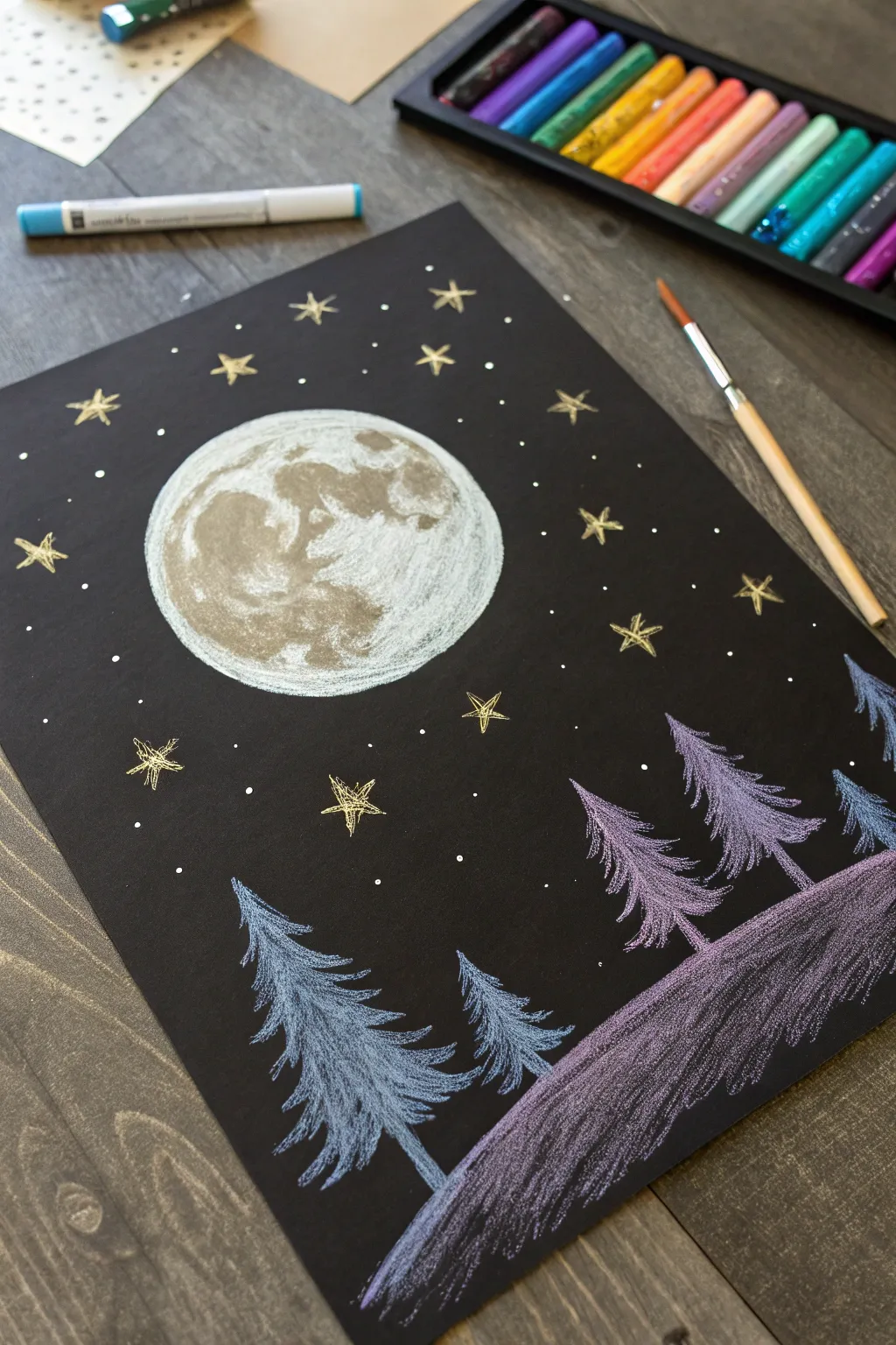
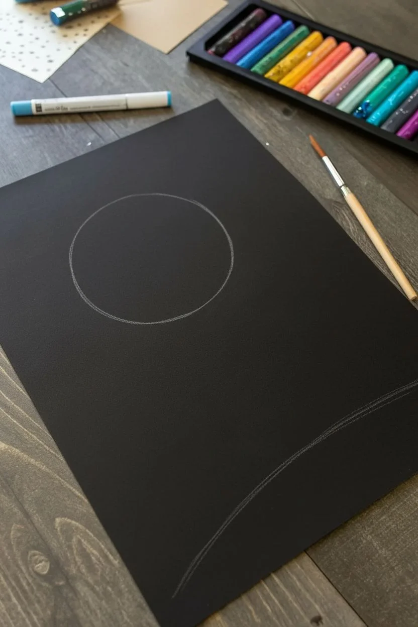
Capture the serene beauty of a winter night with this striking contrast study on black paper. Using metallic and bright oil pastels, you’ll create glowing celestial elements against a deep, dark sky.
How-To Guide
Materials
- Black construction paper or cardstock (heavyweight is best)
- Oil pastels (specifically white, metallic gold, light blue, lavender, and purple)
- A round object to trace (like a roll of tape or cup)
- Graphite pencil
- Paper towel or blending stump (optional)
- Paintbrush (for brushing away crumbs)
Step 1: Setting the Scene
-
Trace the moon:
Begin by placing your circular object in the upper-left quadrant of the paper. Lightly trace around it with a graphite pencil to establish the perfect shape for your moon. -
Set the horizon:
Sketch a gentle, sloping hill at the bottom right of the page. This doesn’t need to be a straight line; let it curve naturally to create the feeling of a snowy bank.
Smudge Alert
Oil pastels smear easily. Place a spare sheet of scrap paper under your drawing hand to protect your finished work while you reach across the page.
Step 2: Creating the Moon
-
Fill the base layer:
Take your white oil pastel and color in the entire moon circle. Apply heavy pressure to get opaque coverage, ensuring the black paper doesn’t show through too much. -
Add texture and craters:
Use a grey or metallic silver pastel to add shadows. Focus on creating blotchy, organic shapes mostly on the left side of the moon to simulate craters and lunar maria. -
Blend for realism:
Go back over the grey areas lightly with the white pastel. This blends the edges of the craters, making them look like natural shadows rather than harsh lines.
Make It Sparkle
For a magical finish, add tiny dots of glitter glue to the center of the gold stars or along the snow line to catch the light.
Step 3: Drawing the Forest
-
Draw the tree spines:
Using a light blue pastel, draw a vertical line for the trunk of your first tree on the left. Make it taller than you think the tree will be, as the top will be the tip. -
Create the blue trees:
Starting from the top of the blue trunk, make short, downward-angled strokes to create branches. Widen your strokes as you move down the tree to create a classic conical evergreen shape. -
Repeat for variety:
Add a second, smaller blue tree slightly behind the first one to create depth. Vary the height to keep the composition interesting. -
Switch to purple:
On the right side of the paper (on the hill), draw three vertical spines using a lavender or light purple pastel. -
Flesh out the purple forest:
Use the same downward stroke technique to add branches to these purple trees. I like to press harder at the tips of the branches to make the color pop against the black background. -
Color the ground:
Fill in the hill area beneath the purple trees with diagonal strokes of purple pastel. Don’t color it solidly; let some black show through to create a texture that looks like shadowed snow.
Step 4: The Starry Sky
-
Draw primary stars:
Select a metallic gold or bright yellow pastel. Draw 5-pointed stars randomly scattered around the moon, focusing on empty negative spaces. -
Add detail to stars:
For the larger stars, scribble a bit of extra color in the center to make them look like they are glowing intensely. -
Create distant starlight:
Use the tip of the pastel or a white gel pen to dot tiny specks of light throughout the sky. These represent distant stars and add magic to the atmosphere.
Step 5: Final Touches
-
Clean up edges:
Check the edges of your moon. If you went outside the lines, you can carefully scrape the excess pastel away with a fingernail or a craft knife. -
Define the tree trunks:
If your tree trunks got lost in the branches, re-draw the very bottom of the trunk line at the base so the trees feel anchored to the ground. -
Dust off:
Oil pastels create little crumbs. Take a clean, dry paintbrush and gently sweep away any loose debris so it doesn’t smear across your black sky.
Now you have a luminous nightscape that glows beautifully against the dark background
Sgraffito Starry Sky by Scratching Back Details
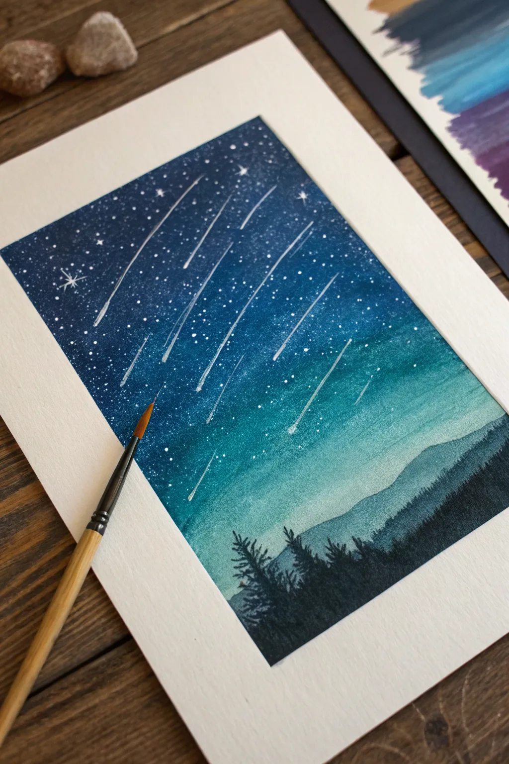
Capture the magic of a meteor shower over a silent forest using the sgraffito technique. This method allows you to reveal bright shooting stars by scratching through layers of deep blue and teal oil pastels.
Step-by-Step Tutorial
Materials
- Oil pastels (dark blue, teal/turquoise, black, white)
- Heavyweight mixed-media paper or pastel paper
- Masking tape
- Sgraffito tool (or a toothpick/empty ballpoint pen)
- Paper towel or tissue for blending
- White gel pen or correction fluid (optional for extra bright stars)
- Workable fixative spray (optional)
Step 1: Setting the Scene
-
Prepare your canvas:
Secure your paper to a hard, flat surface using masking tape on all four sides. This not only holds the paper still but creates that crisp, clean white border shown in the finished piece. -
Establish the horizon:
Lightly sketch a very faint line about one-third of the way up from the bottom of your paper to separate the sky from the forest area. This guide won’t be visible later. -
Apply the base sky color:
Starting at the very top of the paper, color heavily with your darker blue oil pastel. Press firmly to ensure a thick, opaque layer of pigment covers the paper tooth. -
Transition to teal:
As you move down the sky toward the horizon line, switch to a teal or turquoise shade. Overlap this slightly with the dark blue above to help with blending later. -
Lighten the horizon:
Near the horizon line, use a lighter blue or even a touch of white pastel mixed with the teal to create a hazy, glowing atmospheric effect right where the mountains will sit.
Clean scratching
Wipe your scratching tool on a paper towel after every few strokes. Built-up wax on the tip can smudge your lines rather than scratching them clean.
Step 2: Blending and Mountains
-
Blend the sky gradient:
use a folded paper towel or your fingertip to rub the sky colors aggressively. Blend the dark blue down into the teal until the transition is smooth and seamless. -
Create the distant mountains:
Using a medium blue-grey or muted teal, draw the silhouette of the distant mountain range just below your horizon line. Fill this shape in gently. -
Add the foreground forest:
Switch to your black oil pastel. At the very bottom, draw the jagged silhouette of pine trees. Make the trees nearest the bottom solid black, but allow the texture to get lighter as they touch the distant mountains. -
Refine tree details:
On the tops of the black trees, use quick, upward strokes to mimic the look of pine needles and pointed tree tops.
Step 3: Sgraffito and Stars
-
Scratch the shooting stars:
This is the core sgraffito step. Using a sharp tool like a toothpick even a specialized scraping tool, firmly scratch long, diagonal lines across the sky. The goal is to scrape away the blue wax to reveal the white paper underneath. -
Vary the line lengths:
Make some shooting star trails long and dramatic, while others should be shorter dashes. Keep them all following the same general diagonal direction for a cohesive meteor shower effect. -
Add the star field:
Use the sharp point of your tool to prick small dots randomly throughout the sky. Twisting the tool slightly creates larger, brighter stars. -
Create sparkling stars:
For a few select stars, scratch a small ‘x’ or cross shape over a dot to make it look like it’s twinkling. -
Enhance brightness (Optional):
If the scratched paper isn’t white enough, you can distinctively tap a white gel pen or a tiny dot of white paint into the center of your largest stars for extra contrast. -
Reveal the border:
Carefully peel away the masking tape. Pull the tape slowly away from the center of the artwork to prevent ripping the paper.
Level Up: Northern Lights
Before adding the black trees, streak vivid greens and purples horizontally across the teal section. Blend them softly to create an aurora borealis effect.
Step back and admire your personalized meteor shower captured perfectly on paper
Old Door or Brick Wall Texture Study With Chunky Marks
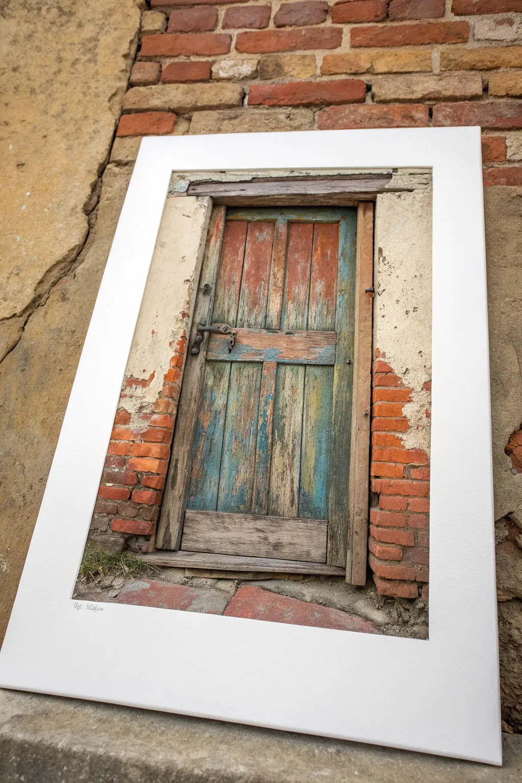
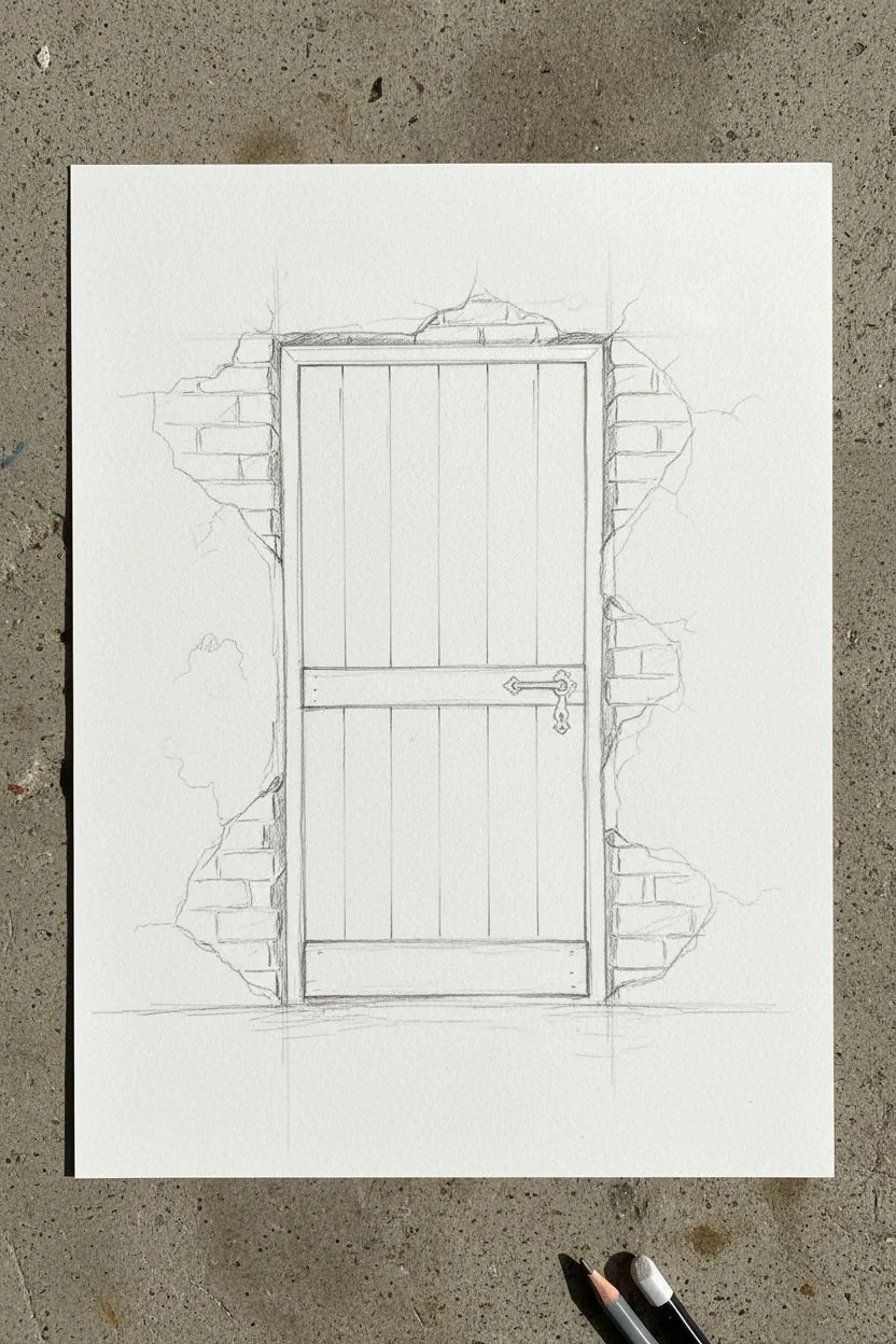
Capture the rustic charm of peeling paint and crumbling bricks in this detailed oil pastel study. You will focus on layering colors to create a convincing weathered wood texture and the tactile feel of aged masonry.
Step-by-Step Guide
Materials
- Heavyweight textured paper (pastel paper or watercolor paper)
- Oil pastels (set including earthy reds, browns, ochres, blues, grays, and white)
- Graphite pencil (HB or 2B) for sketching
- Paper blending stumps or tortillons
- Palette knife or credit card for scraping (sgraffito)
- White or cream mat board for framing
- Masking tape
Step 1: Sketching the Structure
-
Lay out the composition:
Begin by lightly sketching the main rectangle of the door frame in the center of your paper. Leave a generous border around the edges for the wall. -
Define the door panels:
Draw the vertical lines separating the door planks and the horizontal rail in the middle. Add the outer frame and the suggestion of the metal handle. -
Map out the brickwork:
Roughly sketch the irregular shapes of the exposed bricks on either side of the doorframe. Don’t make them perfect rectangles; ragged edges look more realistic.
Chunky Texture Trick
Don’t over-blend! Leaving physical chunks of oil pastel on the paper creates a tactile, 3D surface that perfectly mimics rough brick and peeling wood.
Step 2: Building the Wood Texture
-
Base layer for the wood:
Apply a base layer of warm ochre and light brown vertically along the door planks. Keep your strokes loose and in the direction of the grain. -
Add weathered blues and teals:
Scumble patches of teal, light blue, and grey over the brown base, particularly in the lower half of the door where paint might remain. -
Create depth with shadows:
Use a dark brown or charcoal grey to deepen the gaps between the planks and the shadow under the horizontal rail. -
Enhance the peeling effect:
Layer reddish-browns over the blue areas sporadically. Use a palette knife or fingernail to scratch through the top layers (sgraffito) to reveal the lighter wood or different colors underneath, simulating peeling paint. -
Detail the hardware:
Draw the metal handle with dark grey and black, adding a touch of rust-red for age. Use a tiny dot of white or light grey for a metallic highlight. -
Refine the door frame:
Color the wooden frame surrounding the door with a mix of beige and light grey, blending gently to distinguish it from the darker door planks.
Step 3: Rendering the Wall
-
Lay down brick colors:
Fill the brick shapes with heavy, chunky marks of terracotta, rust, and orange. Vary the pressure to create texture. -
Add mortar and plaster:
Surrounding the bricks, apply creamy white, beige, and light grey to represent the remaining plaster. Allow some of the white to drag over the edges of the bricks to look like crumbling mortar. -
Texture the plaster:
Stipple or dab dots of grey and brown into the plaster areas to mimic dirt and pitting. I like to leave some paper tooth visible here for extra roughness. -
Deepen the shadows:
Use dark brown or black to accentuate the cracks where the plaster meets the brick, and the deep recesses where the door frame sits in the wall. -
Ground the doorway:
At the bottom, sketch the threshold and step using cool greys and browns. Add a few strokes of dull green near the base to suggest moss or weeds growing in the cracks.
Add Realistic Age
Use a toothpick to scratch fine, erratic cracks into the ‘plaster’ areas of your drawing. This tiny detail adds incredible realism to old walls.
Step 4: Final Touches
-
Review contrast:
Step back and check your values. Darken the deepest shadows, especially around the door latch and the edges of the frame, to make the colors pop. -
Add subtle highlights:
Use a white pastel to add final highlights on the most raised edges of the wood and the top surfaces of the bricks. -
Clean up borders:
If you used masking tape, peel it away carefully to reveal clean edges. If not, you can erase smudges or trim the paper. -
Matting:
Place your finished drawing behind a clean white mat board to replicate the framed look of the reference image.
Now you have a piece full of history and texture ready to display
Limited-Palette Mood Scenes From Three Simple Colors
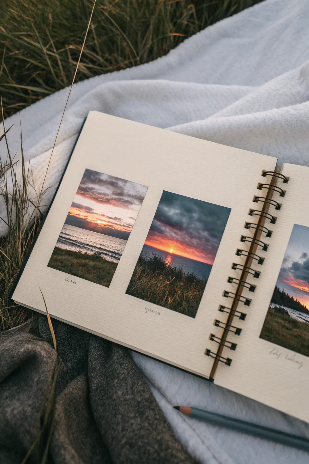
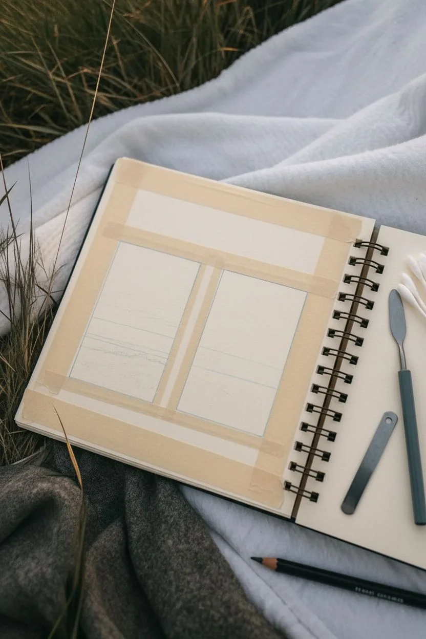
Capture the fleeting beauty of dusk with this set of three miniature landscapes, designed to look like vintage instant photos stuck right into your sketchbook. Using a limited palette helps unite the scenes while allowing you to explore slightly different lighting conditions in each frame.
How-To Guide
Materials
- Sketchbook with heavy mixed-media or watercolor paper (approx. 160gsm+)
- Oil pastels (soft quality for better blending)
- Masking tape or Washi tape (low tack)
- Tissue paper or blending stumps/tortillons
- Cotton swabs (Q-tips)
- Small palette knife or credit card edge (for scraping)
- Fine-tip pen (for captions)
Step 1: Preparation & Layout
-
Tape the borders:
Begin by deciding on the placement of your three frames. Use low-tack masking tape to create three equal rectangular boxes on your page. Press the edges of the tape down firmly with your fingernail to ensure crisp, clean lines later. -
Establish the horizon:
Lightly sketch a horizontal line across each box using a pale grey or blue pastel. Place the horizon low (bottom third) to emphasize the dramatic sky.
Step 2: Painting the Sky
-
Base layer for clouds:
Start with the middle darker scene. Apply a layer of dark grey or slate blue at the very top, pressing lightly so the tooth of the paper still shows. -
Adding the glow:
Directly below the dark clouds, scribble a band of vibrant orange or coral. Let this color overlap slightly with the grey above. -
Create the sun:
Place a small, concentrated dot of bright yellow or white right at the horizon line where the sun is setting. -
Left panel variation:
For the left panel, use softer colors. Apply a lavender or soft purple at the top, transitioning into a pale peach near the horizon for a calmer evening look. -
Blending the sky:
Use a cotton swab or your finger wrapped in tissue to blend the sky colors. Smudge horizontally to mimic the natural stretch of clouds.
Tape Tearing Paper?
Before applying tape to your sketchbook, stick it to your jeans or a t-shirt first. This removes some adhesive, making it much safer to peel off later.
Step 3: Water & Reflection
-
Base water color:
Fill the area below the horizon with a dark navy or deep teal. Keep your strokes horizontal to suggest the surface of the water. -
Reflecting the light:
Take the same orange or yellow used in the sky and draw a vertical streak downwards from the horizon into the water. -
Creating movement:
Use a clean cotton swab to drag the reflection color slightly sideways into the dark water, creating a shimmering, rippled effect. -
Adding whitecaps:
For the left panel, which looks rougher, use a white pastel to add thin, broken horizontal lines near the shore to represent small crashing waves.
Create Depth
Keep the horizon line sharp and the foreground slightly blurry or textured. This contrast mimics camera focus and draws the eye deeper into the scene.
Step 4: Foreground Details
-
Blocking in the land:
At the very bottom of each rectangle, layer a dark olive green or brownish-black to create the grassy dunes or shoreline. -
Texture technique:
Use the edge of a palette knife or a toothpick to scratch upward into the dark foreground layer. This sgraffito technique reveals the paper underneath, looking exactly like individual blades of grass. -
Highlighting the grass:
Lightly flick a golden ochre or yellow pastel upwards over the dark grass area to catch the ‘sundown light’ on the tips of the vegetation. -
Softening the transition:
Dab the bottom edge of the grass slightly to make it look out of focus, enhancing depth.
Step 5: Finishing Touches
-
The reveal:
Slowly peel away the masking tape. Pull it away from the drawing area at a 45-degree angle to prevent tearing the paper. -
Clean up edges:
If any pastel bled under the tape, carefully use a white eraser or a craft knife to tidy up the white borders. -
Add captions:
Use a fine-tip pen to write small, illegible or descriptive captions underneath each ‘photo’ to complete the travel journal aesthetic.
Now you have a serene triplet of sunsets to remind you of golden hour vibes
Surreal Silhouette Scene With Floating Land and Giant Moon
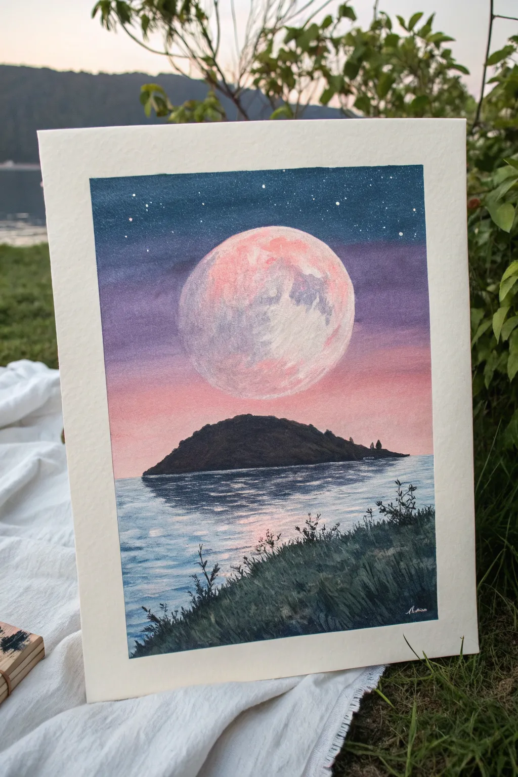
Capture the magic of a giant pink moon rising over a serene island with this vibrant oil pastel project. You will learn to create smooth gradients for the sky and textured detailing for the moon’s cratered surface.
Step-by-Step Guide
Materials
- Oil pastels (soft, artist grade)
- Heavyweight paper (mixed media or pastel paper)
- Masking tape
- Paper towels or blending stumps
- White gel pen or acrylic paint
Step 1: Setting the Stage
-
Prepare the Surface:
Begin by taping down all four edges of your paper to a flat surface with masking tape. This creates a crisp white border and keeps the paper secure while you work. -
Outline Major Shapes:
Lightly sketch a large circle in the upper center for the moon using a light grey or pale pink pastel. Below that, draw the horizon line and the hump-shaped outline of the island silhouette.
Clean Edges
Peel your masking tape away slowly and at a vivid 45-degree angle away from the drawing to prevent ripping the paper.
Step 2: Painting the Sky
-
Deep Space Blue:
Starting at the very top edge, apply a thick layer of dark navy or prussian blue. Bring this color down about an inch. -
Purple Transition:
Below the navy, apply a band of deep violet or purple. Overlap it slightly with the blue edge to make blending easier later. -
Sunset Pink:
Fill the remaining sky area down to the horizon line with a soft pink or salmon color, again slightly overlapping the purple above it. -
Smooth the Gradient:
Use a folded paper towel or your fingertip to blend the sky colors. Rub horizontally where the colors meet to create a seamless transition from the dark night sky into the sunset glow.
Smudgy Sky?
If your sky colors look muddy, clean your finger or blending tool frequently. Never drag dark blue directly onto the pink without cleaning first.
Step 3: Refining the Moon
-
Moon Base Layer:
Color inside the moon circle with a mix of white and pale pink. Don’t press too hard yet; we want to build texture. -
Crater Textures:
Dab patches of light purple and soft grey onto the moon’s surface to simulate craters and shadows. Focus these darker spots slightly more on the left side. -
Highlight and Blend:
Go back over the moon with white pastel, blending the purple and pink spots gently. Use a circular motion to keep the textured look rather than smoothing it completely flat.
Step 4: Island and Water
-
Island Silhouette:
Fill in the island shape completely with black or a very dark charcoal pastel. Press firmly to ensure opaque coverage. -
Water Base:
For the water, apply horizontal strokes of light blue mixed with white. Leave the area directly under the island slightly darker. -
Reflection:
Directly beneath the island, create a reflection in the water using horizontal strokes of dark grey and black. Keep these strokes slightly jagged to mimic ripples. -
Moonlight Shimmer:
Add white horizontal dashes across the water’s surface, concentrating them in the center where the moonlight would hit.
Step 5: Foreground Details
-
Grassy Base:
In the bottom right corner, create a sloped foreground area using dark green and black pastels. -
Adding Blades:
Use the edge of a black pastel or a dark colored pencil to flick upward lines from the foreground slope, creating the look of tall grass and weeds. -
Starry Night:
Finish the sky by dotting tiny white stars in the dark blue section using a white gel pen or a fine brush with white acrylic paint.
Now you have a serene, surreal landscape ready to frame or gift


Have a question or want to share your own experience? I'd love to hear from you in the comments below!