Oil pastels are my go-to when I want bold color fast, with that creamy texture that practically invites blending. If you’re craving fresh oil pastels ideas, these projects will keep your sketchbook busy—from the classics everyone loves to a few delightfully weird texture experiments.
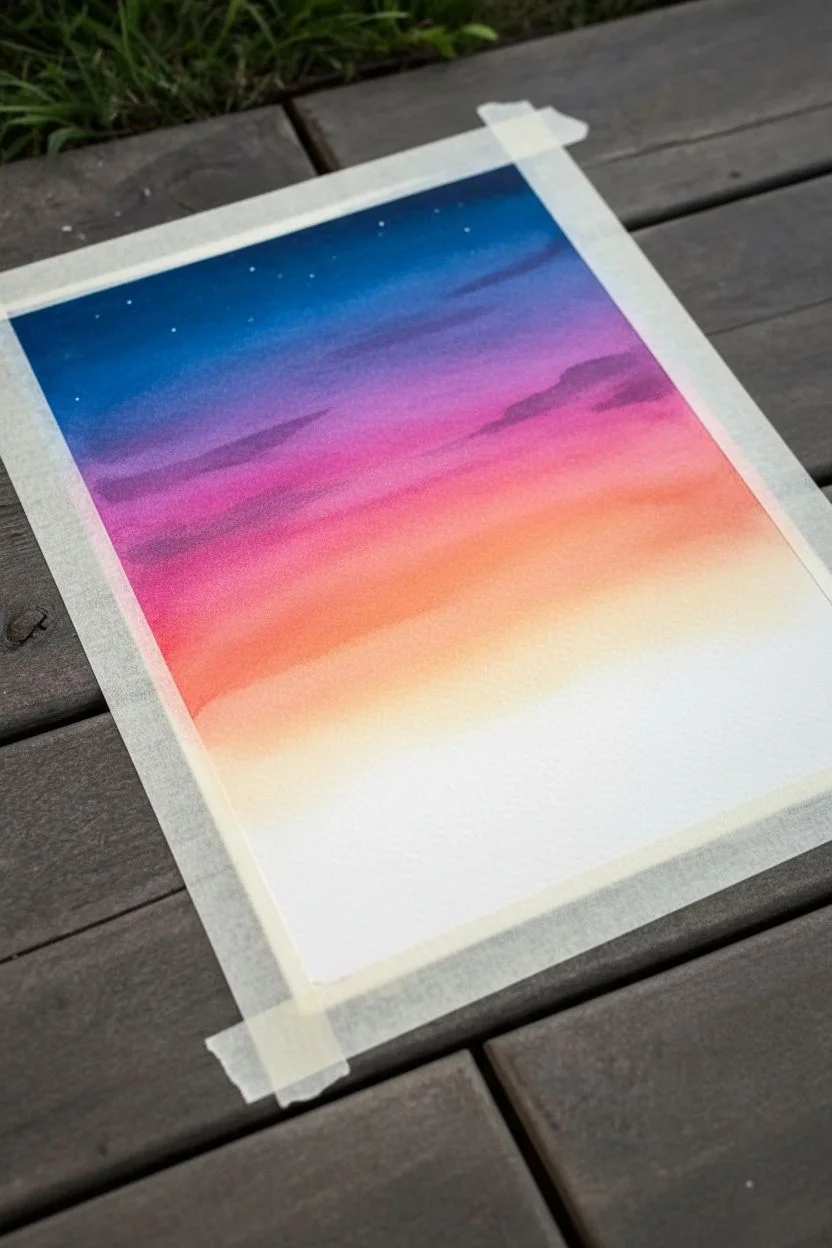
Blended Sunset Gradient Sky
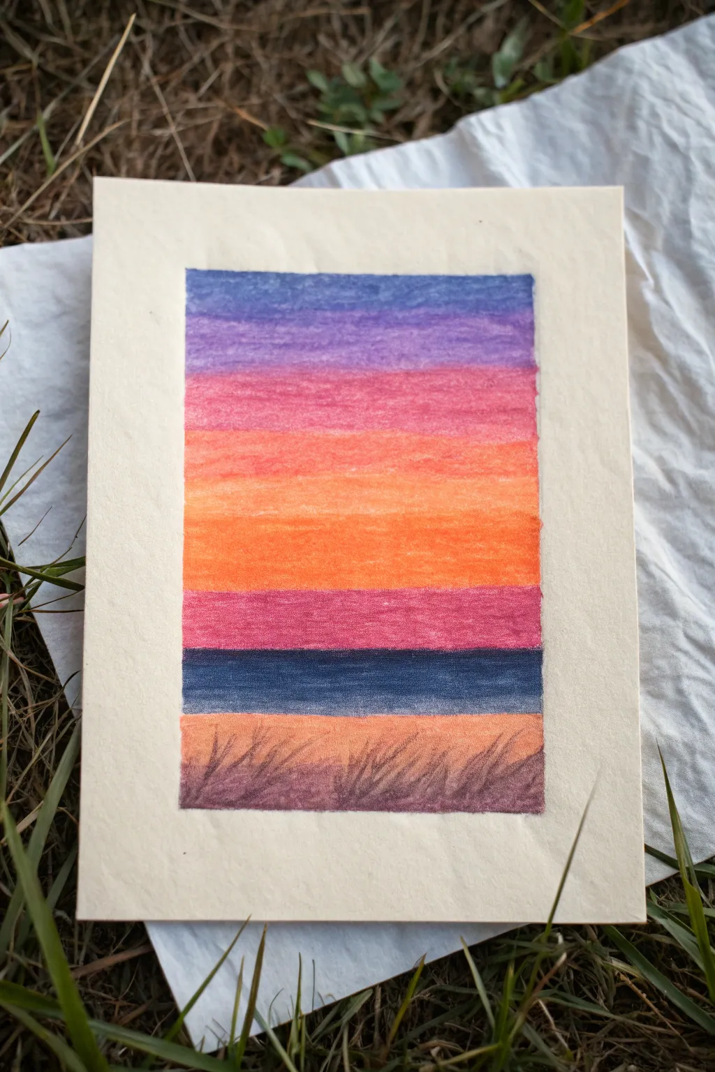
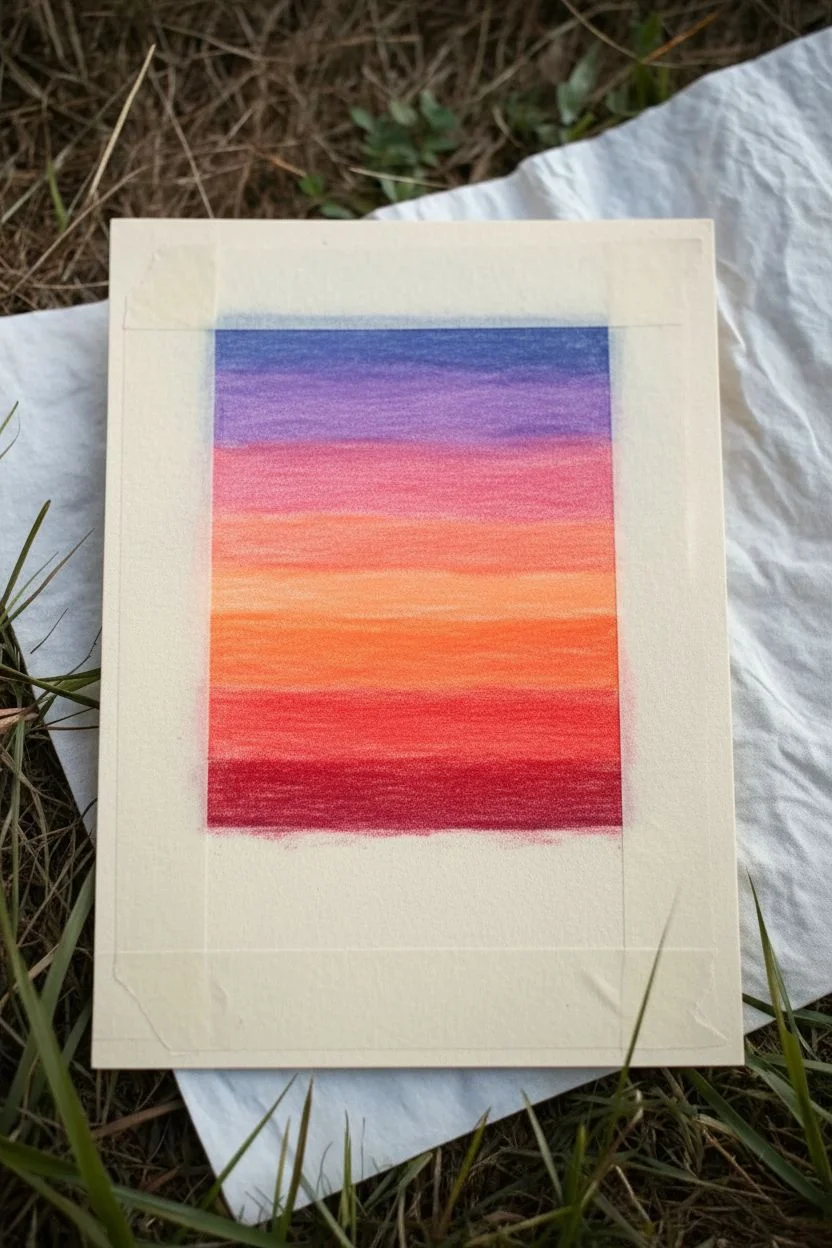
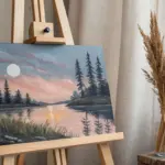
Capture the fleeting beauty of twilight with this vibrant oil pastel project featuring bold, striated bands of color. The result is a striking, simplified landscape that explores color blending and textural depth within a clean, sharp border.
Step-by-Step Guide
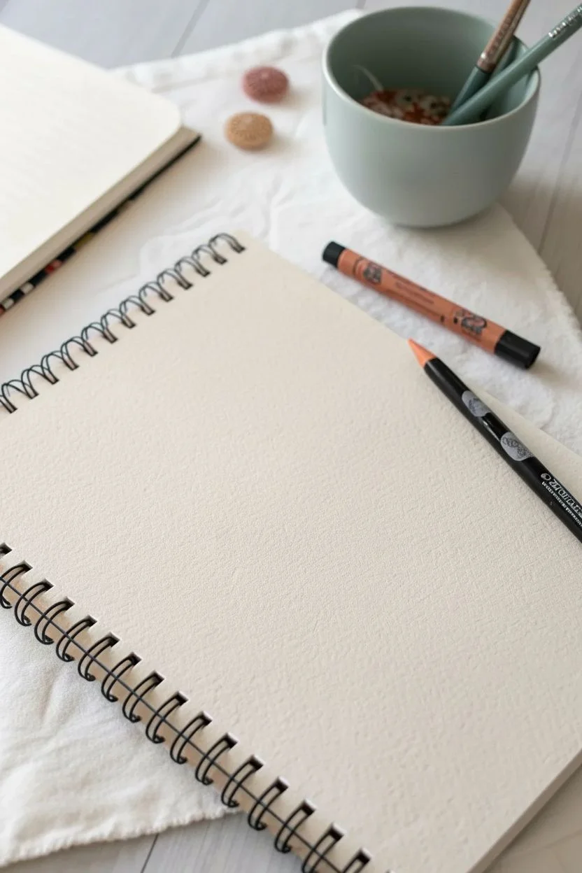
Materials
- Oil pastels (purple, pink, peach, bright orange, deep red, dark blue, brown, black)
- Heavyweight textured paper or cardstock (cream or white)
- Masking tape or painter’s tape
- Paper towel or blending stump (optional)
- Ruler
Step 1: Preparation & Sky Colors
-
Tape the borders:
Begin by taping down a rectangular area in the center of your paper using masking tape. Press the edges of the tape down firmly with your thumbnail to ensure a crisp, clean line later. -
Start with purple:
At the very top of your rectangle, apply a thick layer of purple pastel. Use firm pressure to cover the grain of the paper as much as possible. -
Add the lavender transition:
Directly below the purple, scribble a slightly lighter purple or lavender tone. Overlay it slightly with the bottom edge of the previous dark purple layer. -
Blend the upper sky:
Use your fingertip or a paper towel to actively rub the boundary between the two purples, smoothing them into a unified gradient. -
Introduce pink:
Below the purples, lay down a band of bright pink. Make this section roughly the same height as the purple section above it. -
Layer in peach tones:
Add a strip of peach or pale coral color directly connecting to the pink. This begins the transition into the warmer sunset colors. -
Apply bright orange:
Color a wide band of vibrant orange beneath the peach. This simulates the glowing horizon line where the sun has just set. -
Deepen with red-orange:
At the bottom of your orange section, press harder with a deep red-orange or vermilion shade to create intensity. -
Blend the warm zones:
Go back over the pink, peach, and orange transitions. I find that layering the lighter color on top of the darker color helps blend the seams seamlessly without muddying the brightness.
Clean Fingers, Clean Sky
Keep a damp cloth nearby. Wipe your fingers or blending stump thoroughly between color shifts (like moving from blue to orange) to prevent muddy, grey colors.
Step 2: Horizon & Foreground
-
Create the horizon line:
Below your orange section, add a distinct band of deep magenta or dark red. This acts as a heavy shadow before hitting the water or distant land. -
Add the dark blue band:
Block in a solid strip of dark navy blue. Allow this to be slightly textured, suggesting a distant body of water or shadows. -
Lay the ground foundation:
For the bottom-most section, fill the remaining space with a warm brown or tan color. This serves as the grassy foreground. -
Detail the grass:
Using a sharp edge of a dark brown or black pastel, draw quick, upward flicks over the brown base layer to create grassy textures. -
Add silhouetted reeds:
Draw darker, slightly thicker clumps of grass and reeds leaning to the left and right, mimicking the wind blowing through the field. -
Final blending touch-up:
Check your gradients one last time. If any white paper specks are showing through in the sky, add another heavy layer of pastel to fill the tooth of the paper. -
Reveal the edges:
Slowly and carefully peel away the masking tape, pulling it away from the artwork at a 45-degree angle to prevent tearing the paper.
Scratch for Texture
Use a toothpick or skewer to scratch fine lines into the foreground grass area (sgraffito technique) to reveal the lighter paper color underneath for extra detail.
Enjoy the satisfaction of seeing those crisp white borders frame your vibrant sunset scene


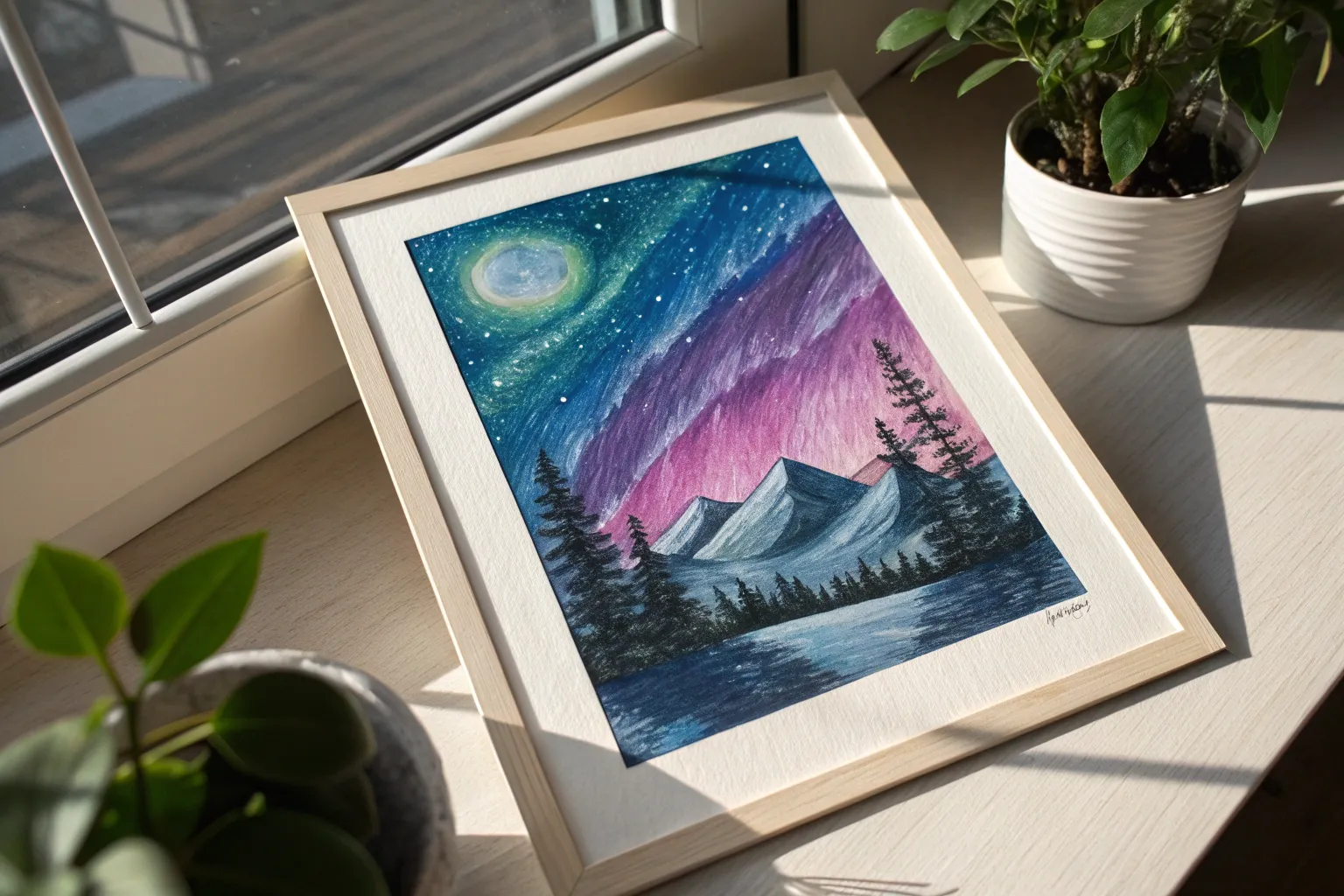
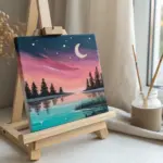
Starry Night Sky With a Glowing Moon
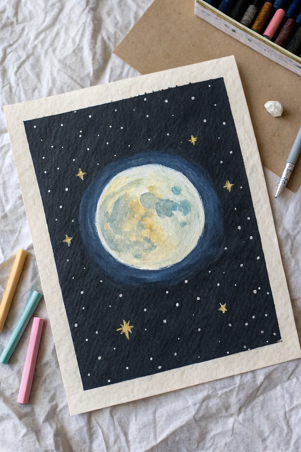
Capture the serene beauty of a full moon illuminating a deep night sky with this oil pastel project. The soft, buttery texture of the pastels allows for effortless blending, creating a luminous glow around the moon that feels almost magical.
Detailed Instructions
Materials
- Oil pastels (dark blue, black, white, yellow ochre, light blue, soft grey, gold)
- Heavyweight drawing paper or mixed media paper (A4 or A5)
- Masking tape or painter’s tape
- Paper towel or blending stump (tortillon)
- White gel pen or correction fluid pen
- A circular object for tracing (like a roll of tape or a jar lid)
- Pencil
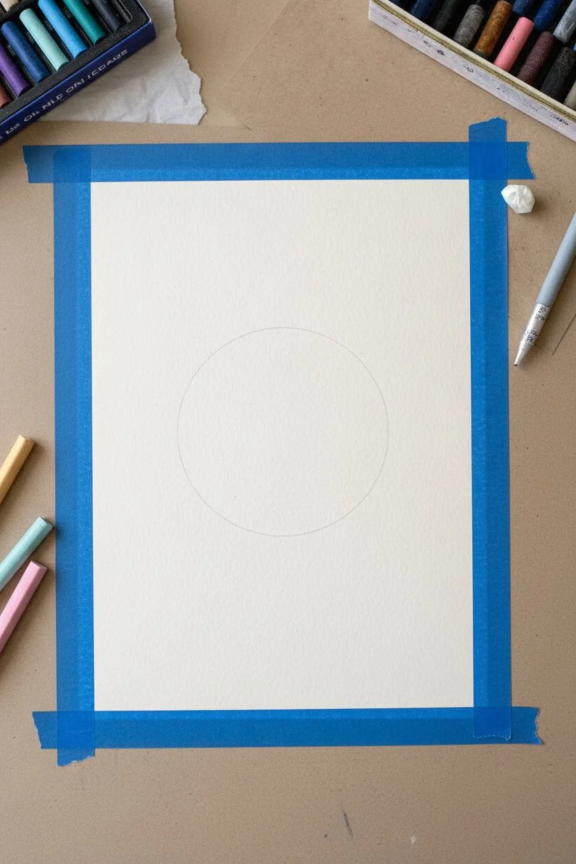
Step 1: Preparation & Outline
-
Secure the paper:
Begin by taping down all four edges of your paper to your work surface. This creates a crisp, professional white border around your final piece and keeps the paper from shifting while you work. -
Trace the moon:
Find the center of your page and place your circular object there. Lightly trace around it with a pencil to define the shape of your moon.
Step 2: Coloring the Moon
-
Base layer:
Start by filling the moon circle completely with white oil pastel. Apply it somewhat heavily to cover the grain of the paper. -
Adding texture:
To create the cratered look, lightly dab spots of pale blue and soft grey onto the white base. Focus on creating irregular patches rather than perfect circles. -
Warm highlights:
Introduce warmth by adding touches of yellow ochre or pale yellow to the textured areas. This mimics the ‘cheese-like’ appearance of the moon’s surface. -
Blend the surface:
Use your finger or a paper towel to gently smudge these colors together directly on the paper. You want them to look cloudy and soft, not like distinct splotches.
Clean Colors
Oil pastels pick up other colors easily. Keep a scrap paper nearby to wipe your pastel sticks clean before applying them, ensuring your white moon stays bright.
Step 3: The Glowing Halo
-
Inner glow:
Take a light blue pastel and draw a thick ring immediately surrounding the moon. Don’t worry about being too neat; this is the beginning of the gradient. -
Transition color:
Next to the light blue, add a layer of medium or dark blue, encircling the previous ring. -
Create the gradient:
Use your finger to blend the light blue outward into the dark blue, and slightly inward toward the moon’s edge. This creates that hazy, atmospheric glow.
Starry Texture
The scrape technique works great here. Apply heavy black background, then use a toothpick to scratch away the pastel, revealing the white paper as tiny stars.
Step 4: The Deep Night Sky
-
Fill the background:
Color the rest of the paper with your darkest blue or black oil pastel. Press firmly to get rich, opaque coverage right up to the tape edges. -
Blend the sky:
Blend the dark background to smooth out the strokes. Be careful when you reach the glowing halo area; blend the dark sky into the halo gently so there isn’t a harsh line.
Step 5: Stars & Details
-
Create main stars:
Using a gold oil pastel or a metallic marker, draw larger 5-point stars scattered randomly around the moon. -
Add detail to stars:
For the larger stars, draw a simple cross or a four-pointed shape to make them look like they are twinkling. -
Sprinkle small stars:
Use a white gel pen or correction fluid to dot tiny stars all over the dark background. Vary the pressure to create different sizes representing different distances. -
Final touches:
Look at the moon one last time. If the white edge got muddy during blending, use your white pastel to re-outline the moon for sharpness. -
Reveal the border:
Slowly and carefully peel away the masking tape. Pull the tape away from the drawing area to prevent tearing your clean white border.
Now you have a stunning piece of night sky art to display or gift to a friend
Silhouette Landscape Against a Colorful Sky
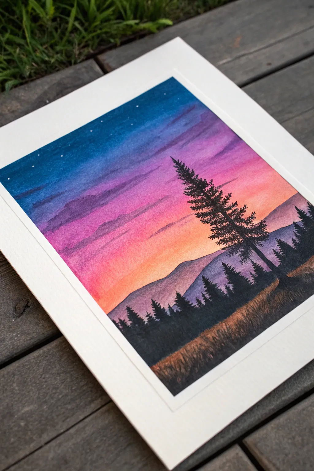
Capture the serene beauty of dusk with this vibrant gradient landscape, where a bold pine tree silhouette stands tall against a fading sunset. The smooth color transitions create a dreamy sky that perfectly frames the stark, dark foreground.
Step-by-Step
Materials
- High-quality watercolor paper (cold press, heavy weight)
- Painter’s tape or masking tape
- Watercolor paints (Indigo, Purple, Magenta, Orange, Yellow ochre)
- Black gouache or waterproof black ink
- Flat wash brush (1 inch)
- Round brush (size 6)
- Fine liner brush (size 0 or 00)
- White gel pen or white gouache
- Jars of clean water
- Paper towels
Step 1: Setting the Sky
-
Prepare the Surface:
Begin by taping down all four edges of your watercolor paper to a board or table. This creates that crisp white border and prevents the paper from buckling when wet. -
Wet the Sky Area:
Using your large flat brush and clean water, apply an even coat of water to the upper two-thirds of the paper. You want it shiny but not pooling. -
Apply the Midnight Blue:
While the paper is wet, load your brush with indigo or deep blue watercolor. Apply this across the very top edge, letting it bleed downwards slightly. -
Blend in Purple:
Immediately below the blue, introduce a rich purple tone. Gently brush the boundary where the blue and purple meet to encourage a soft gradient blend. -
Create the Pink Layer:
Clean your brush quickly and pick up magenta or deep pink. Paint a horizontal band below the purple. Use horizontal strokes to pull the purple down into the pink for a seamless transition. -
Finish with Orange Glow:
For the horizon line where the sun has just set, blend a bright orange into the bottom of the pink section, fading it out to a very light yellow wash near where the mountains will be. -
Add Cloud Textures:
While the sky is still damp but losing its sheen, use a slightly thirsty brush with a touch of purple to gently lift or dab in streaks. This creates the subtle, wispy cloud layers seen in the upper sky. -
Let it Dry Completely:
This is crucial; wait until the paper is bone dry and flat before proceeding to the mountains. The paper should feel room temperature to the touch.
Uneven Gradients?
If you get hard lines in your sky, re-wet the entire area very gently with a clean, damp brush and tilt the paper to help the pigments flow together again.
Step 2: Painting the Land
-
Paint Distant Mountains:
Mix a diluted wash of purple and a touches of black. Paint the silhouette of the distant mountain range using the round brush. Keep the edges smooth and rolling. -
Layering the Foreground:
Once the distant mountains are dry, mix a darker, more opaque purple-black color. Paint a second, closer range of hills that overlaps the first one slightly lower down. -
Create the Grassy Base:
For the immediate foreground, use a mix of yellow ochre and black to create a murky, dark brown-green base. Paint this at the very bottom, using upward flicking motions to simulate tall grasses.
Keep it Dark
For the truest silhouette effect, don’t use black watercolor, which dries pale. Use black gouache or India ink for that opaque, deep matte black finish.
Step 3: The Silhouettes
-
Start the Main Tree Trunk:
Switch to black gouache or ink for maximum opacity. Using a fine liner brush, draw a straight, vertical line slightly off-center for the main pine tree. -
Add Tree Branches:
Starting from the top of the trunk, paint branches extending outward. Use a tapping or stippling motion to mimic pine needles, making the branches wider as you move down the trunk. -
Reinforce the Silhouette:
Go back over your main tree, darkening the core where the branches are thickest to ensure no background sky shows through the dense parts. -
Add Smaller Trees:
Paint a few smaller, less detailed tree shapes along the foreground ridge line to create depth and scale. Vary their heights to keep the composition natural. -
Detail the Grass:
Using the fine liner brush and black paint, add distinct, sharp blades of grass in the immediate foreground, overlapping the base of the trees. -
Add the Stars:
Once everything is dry, use a white gel pen or a tiny dot of white gouache to place small stars in the deep blue section of the sky. Keep them sparse and random. -
The Reveal:
Slowly peel away the painter’s tape at a 45-degree angle to reveal your clean white borders.
Now you have a stunning twilight scene that perfectly captures the quiet transition from day to night
Ocean Waves With Chunky Foam Highlights
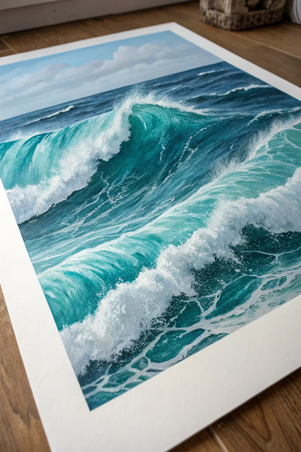
Capture the raw energy of the sea with this vibrant oil pastel study that focuses on translucent water and crashing foam. By layering deep blues and teals against crisp white highlights, you’ll create a stunning sense of depth and movement on the page.
Step-by-Step Tutorial
Materials
- Heavyweight mixed media or pastel paper
- Painter’s tape or masking tape
- Oil pastels (Set containing Prussian Blue, Phthalo Blue, Emerald Green, Turquoise, White, and Grey)
- Blending stumps or tortillons
- Palette knife or scraping tool
- Paper towels for cleaning tips
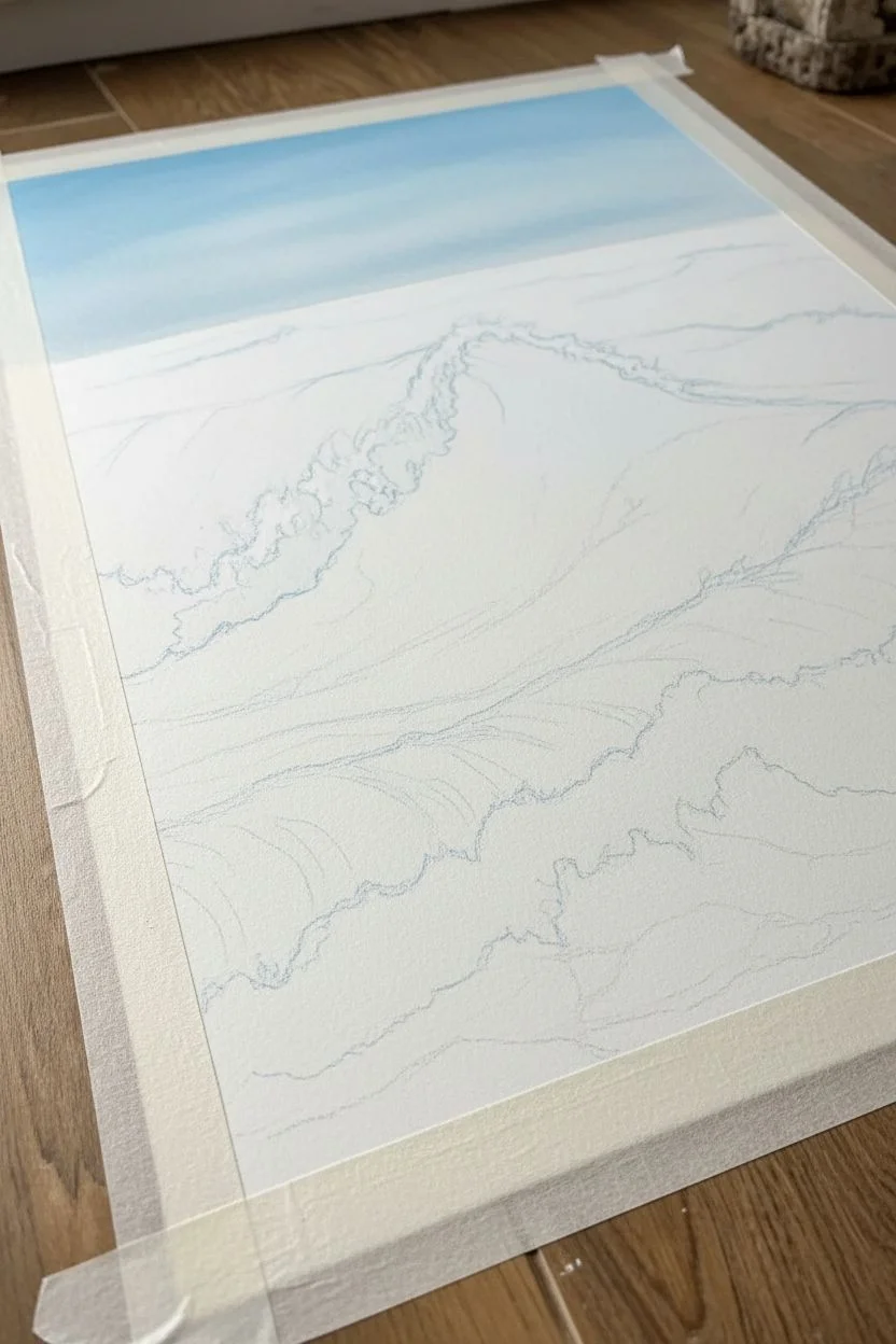
Step 1: Setting the Composition
-
Prepare your borders:
Begin by taping down all four edges of your paper to a flat surface. This not only keeps the paper creating the artwork immobile but ensures you’ll have that crisp, professional white border when you peel it away at the end. -
Sketch the wave structure:
Lightly sketch the main shapes of the rolling waves using a very light blue or grey pastel. Mark where the large, curling wave breaks in the background and where the secondary foam washes up in the foreground. Keep these lines faint as they are just guides. -
Establish the horizon:
Draw the horizon line near the top third of the paper. It’s crucial this line is perfectly straight to maintain realism. Block in the sky area with a soft gradient of light blue, fading to white near the horizon.
Step 2: Building the Deep Ocean
-
Lay the darkest foundation:
Start applying your darkest Prussian Blue just under the crest of the main wave and in the deep troughs between the swells. This darkness creates the shadow that makes the wave look tall. -
Introduce teal tones:
Transition from the dark blue into an emerald green and turquoise as you move up the face of the wave. The water gets thinner near the top, letting light through, so these lighter greens are essential for transparency. -
Blend the transition:
Use your finger or a blending stump to smudge the dark blue into the teal. You want a smooth gradient that mimics the fluid nature of water, avoiding harsh lines between the colors. -
Fill the foreground water:
For the water in the immediate foreground, use strokes that follow the curvature of the rolling surf. Mix turquoise and a touch of light blue, leaving some white of the paper showing where the foam will eventually go.
Clean Breaks
Clean your white pastel stick on a paper towel after almost every stroke. If it picks up blue pigment, your crisp white foam will turn muddy quickly.
Step 3: Creating the Foam
-
Block in white masses:
Take your white oil pastel and apply it heavily to the crashing top of the wave. Don’t press too hard yet; just establish where the bulk of the white water lives. -
Scumble for texture:
Use a scumbling technique (circular, scribbling motion) with the white pastel to create the frothy texture on the wave’s face. This shouldn’t be a solid block of white; let some of that teal underneath peek through. -
Define the sea spray:
Where the wave breaks against the surface, use short, upward flicks of white to simulate spray flying into the air. This adds energy and motion to the piece. -
Add shadows to the foam:
Foam isn’t purely white. Lightly dab a very pale grey or diluted light blue into the lower parts of the white foam mass to give it volume and three-dimensionality.
Make It 3D
Use a palette knife to physically slice into thick layers of white pastel foam. This creates physical texture that catches the light like real bubbles.
Step 4: Refining Details
-
Create surface webbing:
This is a key step for realism. Use a sharp edge of your white pastel (or a white pastel pencil) to draw the delicate, spider-web-like patterns of foam trailing on the water’s surface in the foreground. -
Distort the webbing:
Ensure these white foam lines aren’t straight. They should curve and warp around the shape of the water swells to show the surface tension and movement. -
Enhance the translucency:
I like to go back precisely where the wave crest is thinnest—right before it breaks—and add a touch of bright lemon yellow or light green underneath the white. This illuminates the wave from within. -
Deepen contrast:
Return to your darkest blue. Re-emphasize the shadows directly under the heavy white foam lips. The higher contrast will make the white pop significantly more. -
Scrape for highlights:
Take your palette knife and gently scrape away tiny bits of the blue pigment in the foreground to reveal the white paper grain. This creates sparkling highlights. -
Final heavy application:
Do one last pass with the white pastel on the brightest parts of the foam, pressing firmly to create a thick, impasto texture that stands off the paper.
Peel off your tape slowly to reveal those perfectly clean edges framing your ocean masterpiece
BRUSH GUIDE
The Right Brush for Every Stroke
From clean lines to bold texture — master brush choice, stroke control, and essential techniques.
Explore the Full Guide
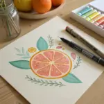
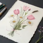
Simple Flower Bouquet in a Vase
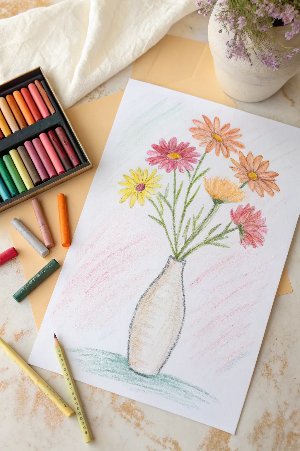
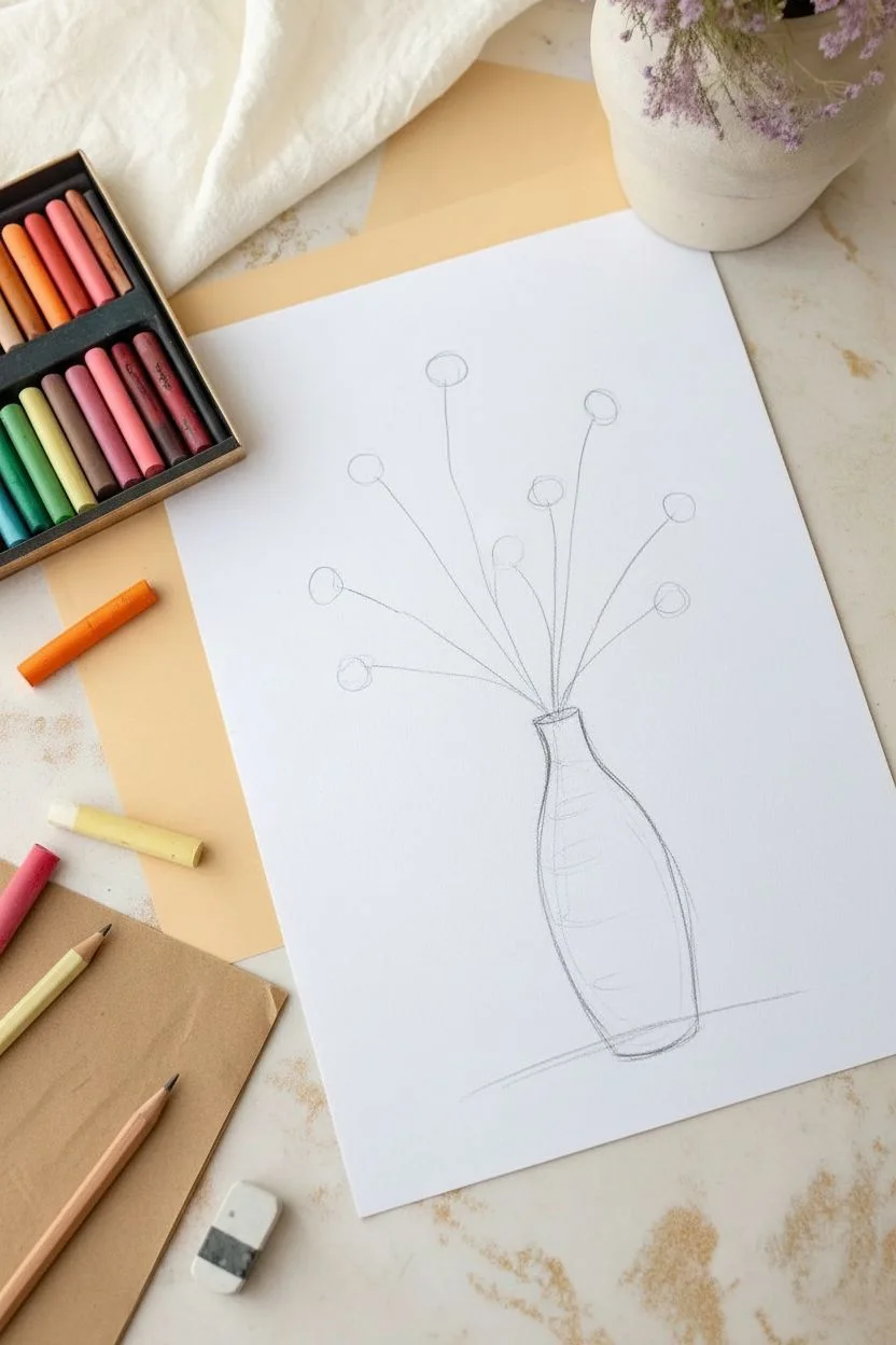
Brighten your sketchbook with this charming, airy bouquet of wildflowers resting in a simple stone-colored vase. The drawing captures a soft, sketchy style that features warm pinks, sunny yellows, and rustic oranges, perfect for a relaxing afternoon art session.
Step-by-Step Guide
Materials
- White pastel paper or heavy mixed media paper (A4 size)
- Oil pastels (set with pinks, yellows, oranges, greens, greys, and cream)
- Graphite pencil (HB or B)
- Paper towel or blending stump (tortillon)
- Kneaded eraser
Step 1: Sketching the Composition
-
Outline the Vase:
Start near the bottom third of your paper. Using your graphite pencil very lightly, sketch a tall, slender vase shape that is slightly wider at the bottom and tapers gently toward a narrow neck. -
Draw the Stem Lines:
From the neck of the vase, draw five to seven thin, curving lines radiating outward. These will be your main stems. Vary their heights so the flowers sit at different levels. -
Mark Flower Centers:
At the top of each stem line, lightly draw a small circle or oval. This helps you visualize where the blossom heads will sit before you commit to color.
Step 2: Coloring the Blooms
-
Create the Pink Daisy:
Select a medium pink pastel. For the flower on the upper left, draw long, slender petals radiating from the center. Leave tiny gaps between strokes to keep the look airy. -
Add the Dark Center:
Fill the center of your pink daisy with a yellow circle, adding a tiny dot of brown or dark orange in the middle for depth. -
Draw the Orange Blossoms:
Choose a warm orange pastel. Creating two flowers on the right side, draw petals that are slightly broader than the pink ones. Layer a bit of lighter peach over the tips for a sun-kissed look. -
Sketch the Yellow Flower:
On the far left, create a bright yellow flower. Make these petals slightly more pointed. I like to press a bit harder here to make the yellow pop against the white paper. -
Add the Textured Bloom:
For the center-right flower, use a golden-yellow or ochre shade. Instead of distinct petals, use short, upward flicking strokes to create a brush-like, thistle texture. -
Draw the Lower Pink Flower:
Add a drooping pink flower on the lower right using the same pink as before, but make the petals point downward and outward to suggest weight.
Smudge Control
Oil pastels transfer easily. Place a spare sheet of paper under your drawing hand to act as a shield, preventing your palm from smearing the artwork.
Step 3: Adding Greenery and Vase
-
Trace the Stems:
Take an olive green pastel and trace over your pencil stem lines. Use a light hand so the lines remain delicate and not too thick. -
Add Leaves:
Draw small, slender leaves branching off the main stems. Use quick, short flicks of your wrist to make the leaves taper naturally at the ends. -
Outline the Vase:
Using a dark grey or charcoal pastel, trace the outline of your vase drawing. Keep the line slightly sketchy and broken rather than a solid, heavy wall. -
Fill the Vase Base:
Color inside the vase with a cream or beige pastel. Apply it loosely, allowing some paper texture to show through to mimic stone or ceramic. -
Add Shadow Detail:
Add a few vertical strokes of light grey or light brown on the left side of the vase to suggest curvature and shadow. -
Ground the Object:
Use a slate blue or cool green pastel to draw a horizontal patch of color underneath the vase. Scumble the color (draw lightly in circles) to create a rough table surface.
Make it Pop
For a stylized look, outline just the flower petals with a very sharp, dark brown colored pencil after the pastels are down to define the shapes.
Step 4: Background and Final Touches
-
Add Background Atmosphere:
To make the flowers stand out, add very faint, diagonal or scumbled strokes of pale blue and pink in the background. Keep this extremely light and airy. -
Refine the Centers:
Go back to the flower centers. Add a tiny ring of brown or reddish-orange around the yellow cores to increase contrast. -
Highlight the Vase:
Using a white pastel, add a sweeping curve on the right side of the vase body to create a highlight. -
Clean Up Edges:
Check the edges of your petals. If any look too messy, you can carefully scrape away excess oil pastel with a craft knife or define the edge with a white pastel.
Now you have a lovely, everlasting bouquet that captures the softness of spring
Loose Wildflower Field With Dabbing Strokes
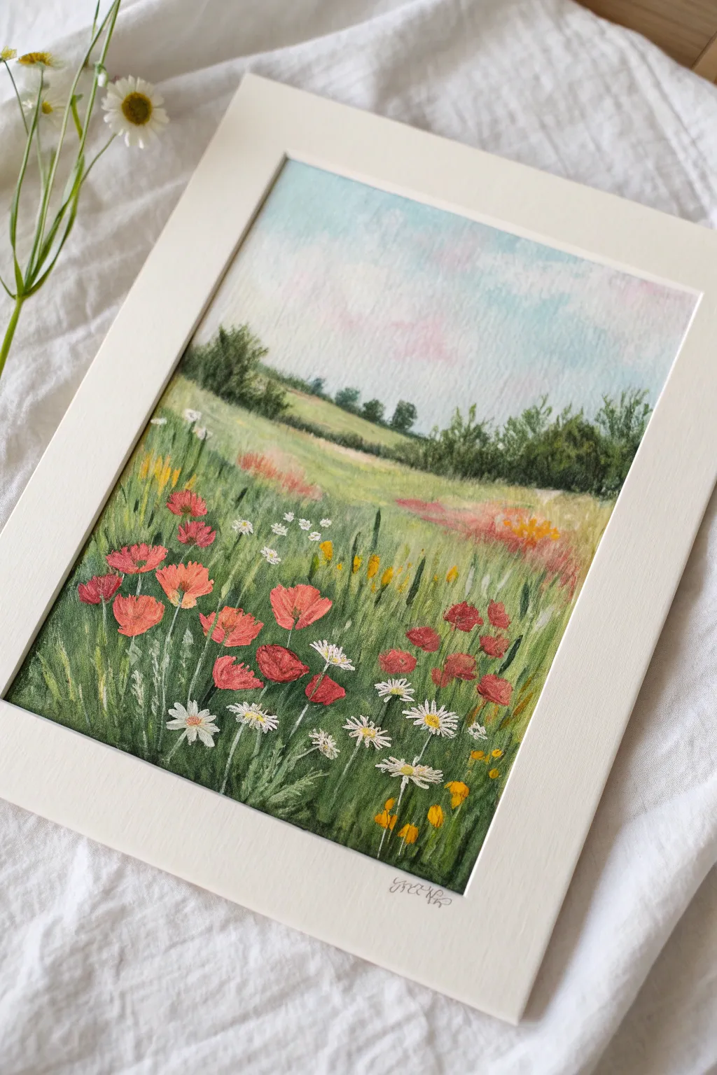
Capture the breezy charm of a summer afternoon with this soft, impressionistic landscape. Using oil pastels allows you to layer vibrant poppies and daisies over a textured grassy field, creating depth and movement with simple dabbing strokes.
Step-by-Step
Materials
- Oil pastel set (including multiple greens, red, white, yellow, and sky blue)
- Textured mixed media paper or pastel paper (approx. A4 size)
- Cream or off-white mat/mount board
- Paper towel or blending stump (tortillon)
- Masking tape
- Palette knife or old credit card (optional for scraping)
Step 1: Sky and Background
-
Tape the edges:
Begin by securing your paper to your work, tapping the edges with masking tape to create a crisp, clean border once finished. -
Lay the sky base:
Using a light blue pastel, colour the top third of the paper. Keep your strokes loose and horizontal, pressing lightly to allow the paper’s texture to show through, which adds a natural graininess to the atmosphere. -
Add cloud hints:
Scumble a touch of white and very faint pink into the blue area. Use your finger or a paper towel to gently smudge the boundaries where the colours meet, creating soft, wispy clouds. -
Establish the horizon:
Draw a gently sloping line about one-third down from the top using a dull, muted green. This will serve as your distant tree line. -
Draw distant trees:
Using a dark olive green, block in the shapes of distant trees along the horizon line. Keep these shapes vague and small; detail isn’t necessary this far back.
Keep it Clean
Oil pastels smudge easily. Keep a scrap paper handy to wipe your pastel sticks clean before applying light colors like the white daisies or yellow centers.
Step 2: Middle Ground and Field Base
-
Create the middle hills:
Below the tree line, colour a band of lighter, yellowish-green. This represents a sunlit hill in the middle distance. Blend this slightly upward into the base of the trees. -
Base layer for the foreground:
Fill the rest of the bottom page with vertical strokes using a mid-tone green. Don’t worry about complete coverage; let the white of the paper peek through to suggest light hitting individual blades of grass. -
Add patches of colour:
In the middle distance, loosely scribble patches of muted pinks and faded oranges. These are distant flower patches that shouldn’t be distinct yet. -
Deepen the shadows:
Take a dark forest green or even a touch of navy blue and add decisive vertical strokes near the bottom corners and in patches across the foreground field. This creates the deep shadows needed to make the bright flowers pop later.
Step 3: Foreground Details
-
Define the grass texture:
Use the edge of your green pastels to make sharp, upward flicking motions. Vary the greens you use—mixing warm olive tones with cool emeralds—to create a rich, realistic field texture. -
Insert grassy stems:
With a very sharp edge or corner of a light green or yellow pastel, draw fine, long stems rising from the grass. These will support your poppy heads and daisies. -
Paint the poppies:
Using a vibrant red oil pastel, press firmly to create organic, cup-like shapes in the foreground. I like to group some close together and leave others solitary. -
Highlight the petals:
On the top edges of the red poppies, dab a tiny bit of orange or coral pink. This suggests sunlight catching the delicate paper-thin petals. -
Add the daisies:
Use a clean white pastel to dab small, star-shaped clusters among the grass. Press hard so the opaque white sits clearly on top of the green background. -
Detail the flower centers:
Place a small dot of yellow in the center of your white daisies. For the poppies, a tiny dot of black or dark brown in the center adds realism. -
Scrape for texture:
Take a palette knife or fingernail and gently scratch thin lines through the green layers to reveal the paper underneath. This is sgraffito technique and it makes great fine weeds and stems. -
Final dabs of colour:
Add small dots of yellow and perhaps some blue wildflowers scattered low in the grass to fill any empty positive space and balance the composition. -
Reveal the border:
Carefully peel away the masking tape to reveal your clean edges. Mount the finished piece inside a cream mat to complement the warm tones of the field.
Make it Shine
Add a touch of metallic gold oil pastel to the center of the daisies or as highlights on the grass for a magical, sun-drenched afternoon effect.
Step back and admire how your simple strokes have come together to form a lively, swaying field of flowers

PENCIL GUIDE
Understanding Pencil Grades from H to B
From first sketch to finished drawing — learn pencil grades, line control, and shading techniques.
Explore the Full Guide
Animal Fur Texture With Directional Strokes
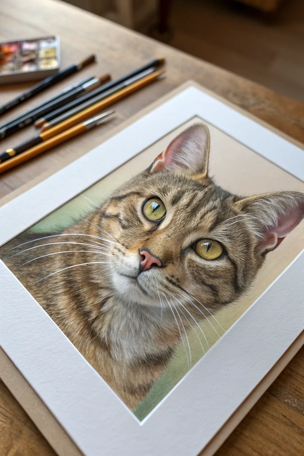
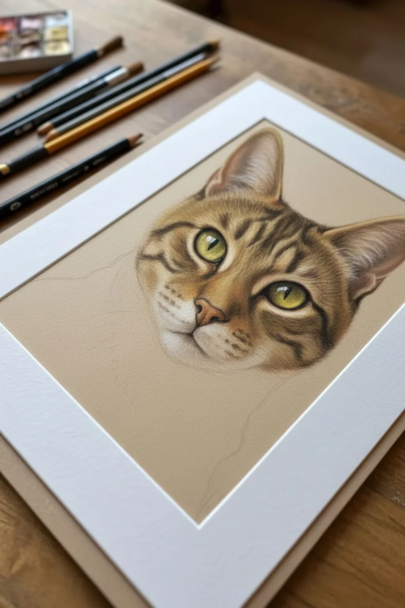
Capture the soulful gaze of a tabby cat by mastering the art of layering and directional mark-making. This project focuses on building up realistic fur textures from dark underlayers to bright highlights, creating a lifelike depth that practically pops off the page.
How-To Guide
Materials
- Heavyweight toned paper (grey or tan)
- Set of quality oil pastels
- Hard pastel pencils (black, white, various browns/ochres)
- Blending stumps or silicone shapers
- Kneaded eraser
- Detail knife or sgraffito tool
- White or cream mat board for framing
Step 1: Planning and Underpainting
-
Structure the sketch:
Begin by lightly sketching the outline of the cat’s head on your toned paper using a light brown pastel pencil. Pay close attention to the placement of the eyes and the angle of the ears. -
Block in dark values:
Using a dark umber or black oil pastel, block in the darkest areas first—specifically the pupils, the dark stripes on the forehead, and the deeper shadows inside the ears. -
Establish the mid-tones:
Apply a base layer of ochre and warm brown oil pastels to the main face area. Keep this layer relatively thin; don’t press too hard yet as we need “tooth” for subsequent layers. -
Map the eyes:
Fill the irises with a blend of yellow-green and olive oil pastel. Leave a small, uncolored spot for the reflection highlight to keep the sparkle bright.
Muddy Colors?
If fur colors turn to mush, you’ve over-blended. Stop rubbing! Scrape off the excess wax gently with a knife, let the paper rest, and re-apply fresh directional strokes on top.
Step 2: Building Fur Texture
-
Start the directional strokes:
Using a sharpened hard pastel pencil or the edge of a harder oil pastel, begin adding individual fur strokes. Follow the growth pattern of the fur—outwards from the nose and upwards on the forehead. -
Deepen the stripes:
Go back over the dark tabby markings with short, choppy strokes of dark brown and black. Feather the edges so the stripes look integrated into the fur, not like solid painted lines. -
Layering lighter furs:
Select a cream or light grey pastel. Apply strokes over the mid-tones, focusing on the muzzle, the chin, and the lighter patches above the eyes. Let these strokes interact with the darker layers beneath. -
Refining the ears:
The inside of the ear needs delicate pinkish-tan tones. Use very soft strokes here, and add wispy white hairs coming out of the ear canal using a sharp white pastel pencil. -
Create the nose:
Fill the nose leather with a soft dusty rose or terracotta color. Add a tiny highlight near the top curve to show moisture.
Pro Tip: Sharp Edges
Keep oil pastels cold (even in the fridge) before detailing. Cold pastels are harder and hold a sharp point longer, perfect for those final crispy whiskers and eye details.
Step 3: Detailing and Highlights
-
Enhance the eyes:
Outline the eyes carefully with black to create the rim. Add a touch of raw sienna near the pupil for depth, and ensure that white highlight is crisp and clean. -
Scraping for texture:
I like to use a palette knife edge or sgraffito tool to gently scratch through the top layers of the whiskers pads. This reveals the paper color or underlayer, creating very fine, dark negative lines for pore texture. -
Brightest highlights:
Using your softest, most opaque white oil pastel, add the final bright fur strands on the chin, cheekbones, and inner ears. Press firmly to make these strokes sit on top of the texture. -
Whisker work:
For the whiskers, use a very sharp white pastel pencil or a fine paintbrush dipped in white gouache (if your pastels allow mixed media) to sweep long, confident curves extending from the muzzle. -
Background softness:
Gently smudge a muted green or beige background around the cat, keeping it out of focus to ensure the sharp details of the face remain the focal point. -
Final matting:
Place a clean white mat over your finished artwork. This instantly elevates the drawing and cleans up any rough edges.
Step back and admire the vibrant, tactile quality your directional strokes have brought to this feline friend
Playful Animals in a Simple Landscape Scene
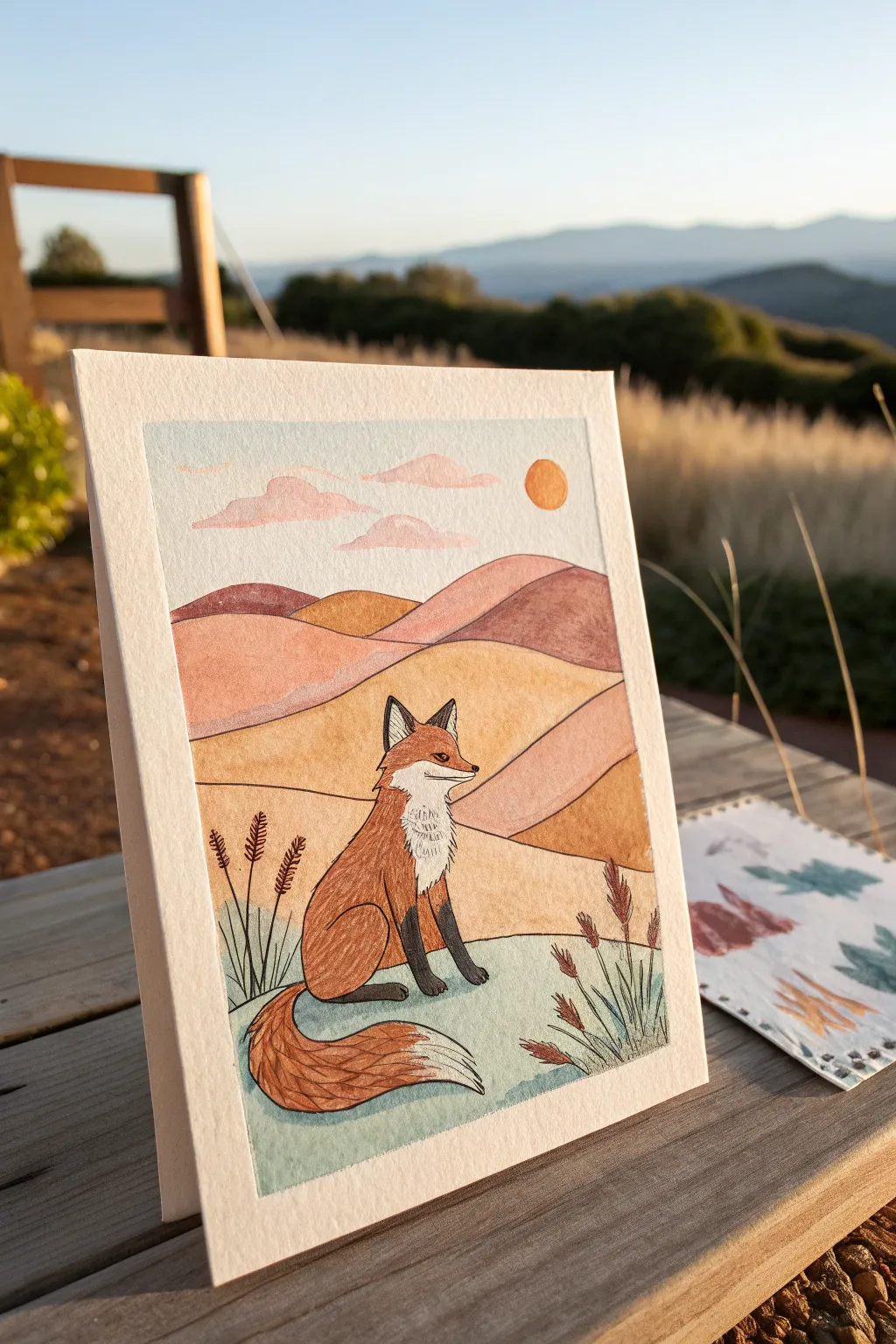
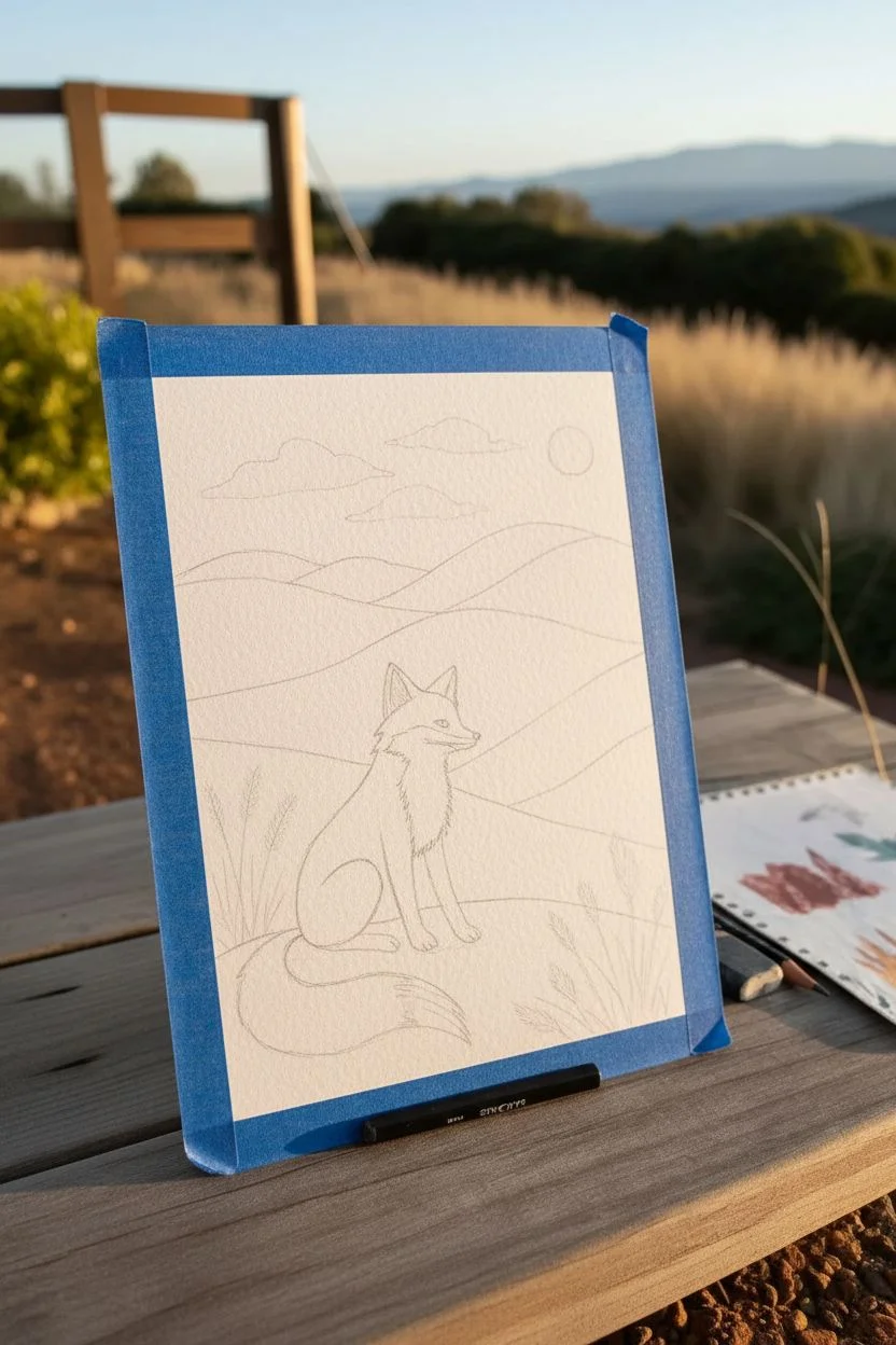
Capture the serene beauty of a golden hour landscape with this charming mixed-media illustration featuring a contemplative fox. Using a blend of soft watercolor washes and precise ink details, you’ll create a stylized scene full of warmth and character.
Step-by-Step Guide
Materials
- Cold press watercolor paper (A5 size or greeting card)
- Watercolor paints (shades of orange, ochre, terra cotta, sage green, pale blue, pink)
- Round watercolor brushes (size 2 and 6)
- Fine liner pen (black, 0.3mm or 0.5mm, waterproof)
- White gel pen or gouache for highlights
- Pencil and eraser
- Painter’s tape or masking tape
Step 1: Planning and Sketching
-
Define the Frame:
Begin by taping off a rectangular border on your watercolor paper using painter’s tape. This creates clean, crisp edges for your final piece. -
Sketch the Horizon:
Lightly sketch rolling hill lines with a pencil. Create three layers of hills to establish depth: a foreground for the fox, a middle ground of dunes, and a distant background range. -
Outline the Fox:
In the left-center foreground, draw the basic shape of the sitting fox. Use a simple teardrop shape for the body and a triangular shape for the head, adding large ears and a bushy tail sweeping forward. -
Add Decorative Elements:
Sketch a small circle for the sun in the upper right sky and add a few floating cloud shapes. Placing a few stems of grass in the foreground corners helps frame the scene.
Bleeding Lines?
If your ink lines bleed into the paper, your paint wasn’t fully dry. Use a hairdryer on a low setting to ensure the paper is bone dry before uncapping your pen.
Step 2: Painting the Landscape
-
Wash the Sky:
Mix a very dilute pale blue wash. Apply it to the sky area, carefully painting around the clouds and sun. Let this layer dry completely. -
Paint the Clouds and Sun:
Use a soft, diluted pink for the clouds to suggest a sunset glow. Paint the sun with a vibrant orange, keeping the edges neat. -
First Layer of Hills:
Paint the furthest hills in a muted mauve or terra cotta color. For the middle hills, use a warm ochre or golden yellow to contrast with the darker background. -
Foreground Grass:
Paint the ground where the fox sits with a pale sage green. This cooler tone helps visually separate the ground from the warm hills behind it. -
Adding Depth to Hills:
Once the first layers are dry, glaze a slightly darker shade on the right side of the hills to suggest shadows cast by the setting sun.
Make it Metallic
Swap the orange sun paint for gold watercolor or metallic ink. It catches the light beautifully and emphasizes the ‘golden hour’ feeling.
Step 3: Bringing the Fox to Life
-
Base Coat for the Fox:
Paint the fox’s body, head, and tail with a rich, reddish-orange watercolor. Leave the chest, inner ears, and tip of the tail white (unpainted). -
Deepening the Fur:
While the orange is still slightly damp, drop in a darker burnt sienna near the bottom of the tail and the back curve to create volume. -
Painting the Legs:
Use a dark grey or black for the fox’s legs and ear tips. Keep the paint relatively opaque here for a strong contrast. -
Details and Texture:
Paint the foreground plant stems with a brown or deep red hue, adding small feathery textures for the seed heads.
Step 4: Inking and Final Touches
-
Outline the Landscape:
Once the paint is bone dry, trace over your pencil lines with the waterproof fine liner. Use a steady hand for the hill curves. -
Detail the Fox:
Outline the fox carefully. Instead of a solid line on the chest and tail tip, use short, jagged strokes to mimic the texture of fur. -
Facial Features:
Draw the eye, nose, and mouth with the black pen. A tiny dot of white gel pen in the eye brings the character to life. -
Fur Texture:
Add subtle hatching lines with the pen on the darker parts of the fox’s body and tail to suggest hair direction and shadow. -
Reveal the Border:
Wait for the ink to dry completely to avoid smearing. Then, slowly peel away the painter’s tape at a 45-degree angle to reveal your crisp, clean frame.
Step back and admire the calm, storybook atmosphere you’ve created with just a few colors and lines


Tropical Leaves in Deep Green Layers
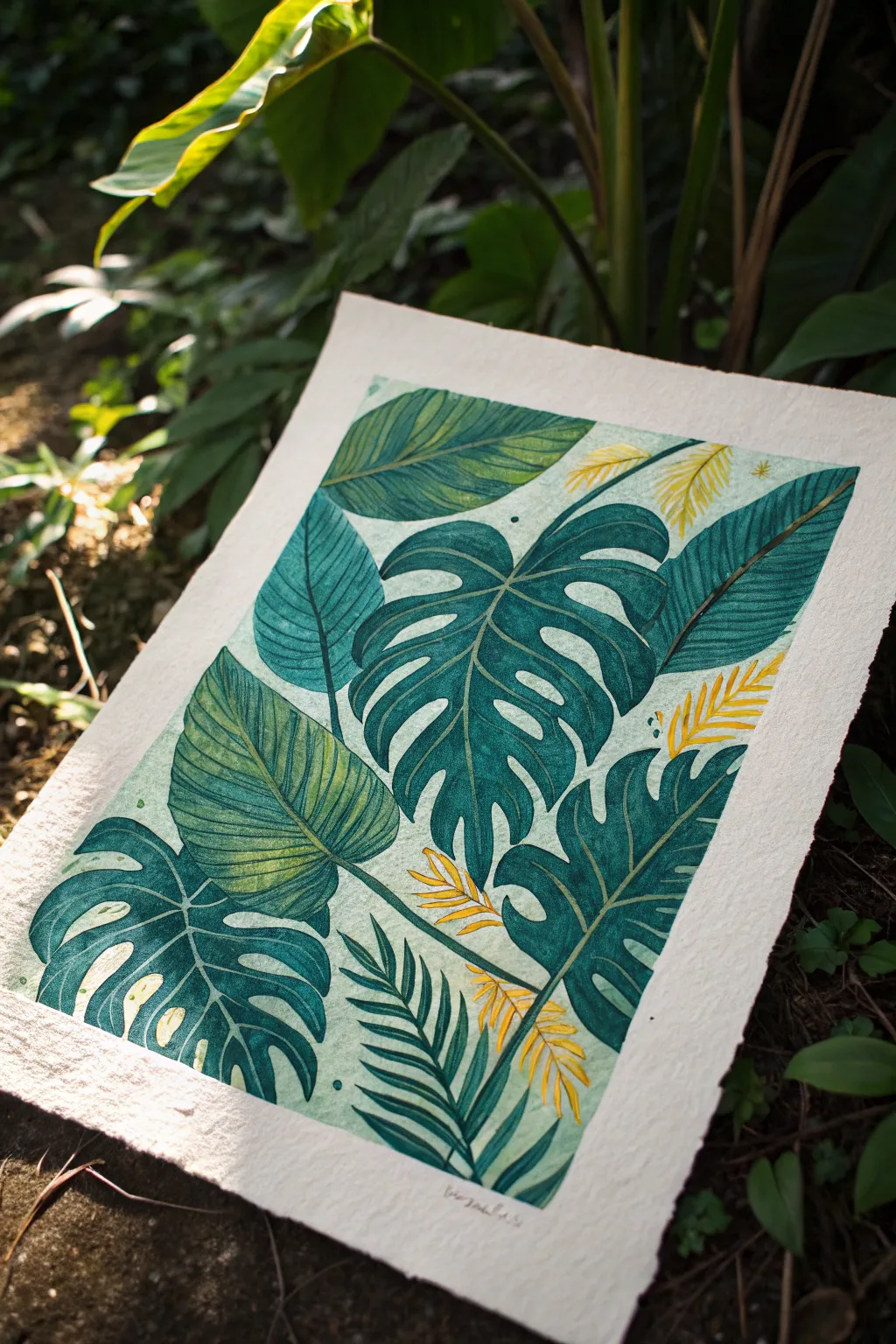
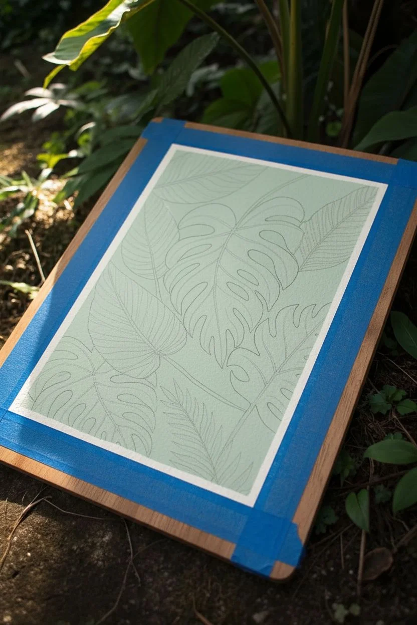
Capture the lush abundance of a tropical canopy with this layered mixed-media project. By combining opaque paints with the creamy texture of oil pastels, you’ll create depth and richness that brings these deep green leaves to life on textured paper.
How-To Guide
Materials
- Thick, textured paper (cold-press watercolor paper or handmade cotton paper)
- Gouache or acrylic gouache (Mint Green, Deep Teal, Forest Green, Yellow, White)
- Oil pastels (Dark Green, Emerald Green, Bright Yellow, Golden Yellow)
- Flat shader brushes (medium and small)
- Fine liner brush
- Pencil and eraser
- Masking tape
Step 1: Planning and Base Layers
-
Prep your surface:
Since we’re working with multiple layers, start by taping down your paper to a sturdy board. This prevents buckling and leaves a clean, crisp border around the edge of your composition. -
Sketch the layout:
Lightly sketch your leaf composition. Aim for variety: place a large Monstera leaf as a focal point, tuck broad paddle-shaped leaves behind it, and add fern-like fronds at the bottom. Overlap them to create a dense, jungle feel. -
Mix the background color:
Create a very pale, minty green using gouache. Mix plenty of white with just a touch of green and a tiny dot of yellow. You want an opaque, matte finish for this base layer. -
Block in the negative space:
Carefully paint the background spaces between your leaf sketches with the mint mixture. Don’t worry about being perfect near the pencil lines, as the darker leaf colors will cover any slight messy edges.
Step 2: Building the Greenery
-
Paint the foundation leaves:
For the largest leaves, mix a mid-tone teal utilizing your gouache. Paint the broad shapes of the Monstera and the large background leaves. Keep this layer flat and solid; we will add texture later. -
Create color variation:
Mix a slightly more yellow-green shade for the broad leaves on the left. Painting these a different hue helps distinguish them from the central Monstera. -
Add deep contrast:
Mix a very dark forest green. Use this for the leaves that feel furthest ‘back’ or closest to the bottom edge, like the shadowy parts of the fern fronds. -
Introduce the accents:
Using a bright opaque yellow paint, fill in the small fern-like shapes scattered throughout the composition. These pops of yellow break up the heavy greens. -
Let it dry completely:
Before moving to pastels, the paint must be bone dry. If it’s cool to the touch, it’s still damp. I usually give it an extra ten minutes just to be safe, as moisture ruins oil pastel application.
Smudge Control
Oil pastels transfer easily. Place a piece of clean scrap paper under your drawing hand while you work on details to prevent smearing your green layers into the pale background.
Step 3: Texture and Details
-
Layering the veins with pastel:
Take a sharpened dark green oil pastel (or a hard pastel pencil if you have one) and draw the central veins on the Monstera leaves. Press firmly to get a solid line. -
Add shading depth:
Use a dark teal or emerald oil pastel to gently shade one side of the leaf veins. Scumble the color lightly—rubbing it in small circles—to let the paper’s texture show through. -
Define the ribbed leaves:
On the broad, lighter green leaves, use a fine-tip dark green pastel or colored pencil to draw many parallel lines extending from the center vein to the edge. -
Highlight the yellow fronds:
Go over your yellow painted accents with a golden yellow oil pastel. This adds a waxy sheen that contrasts beautifully with the matte gouache background. -
Refine the edges:
If any paint edges looked ragged, use your colored pencils or sharp pastels to outline the leaves crisply. This ‘cleans up’ the look and makes the shapes pop. -
Add final speckles:
For a bit of organic texture, take a wet brush with dark green paint and tap it against your finger to flick tiny droplets onto the artwork. Keep it subtle.
Level Up: Sgraffito
Apply a thick layer of oil pastel over a leaf, then use a toothpick or empty ballpoint pen to scratch vein lines through the top layer, revealing the paint color underneath.
Peel back the tape slowly to reveal your crisp edges and enjoy your vibrant botanical creation
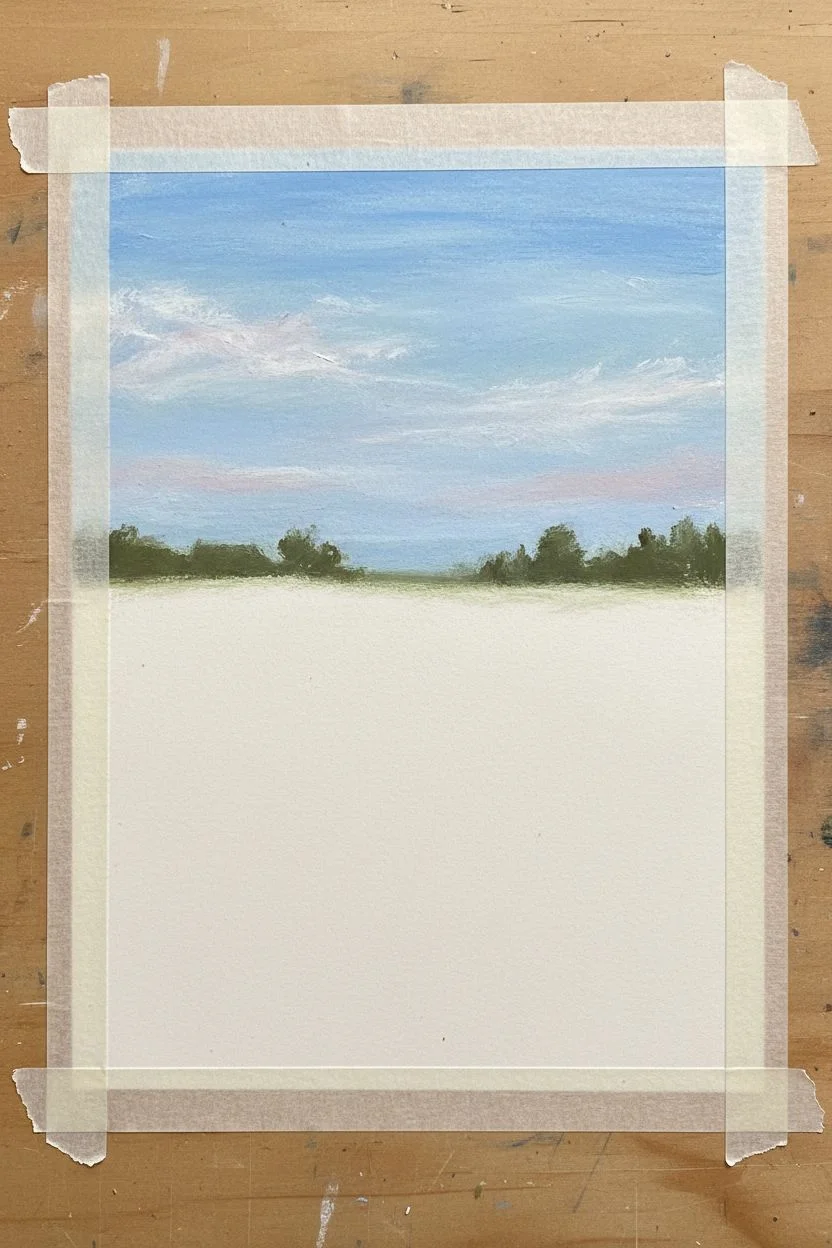
Limited-Palette Mood Study in Three Colors
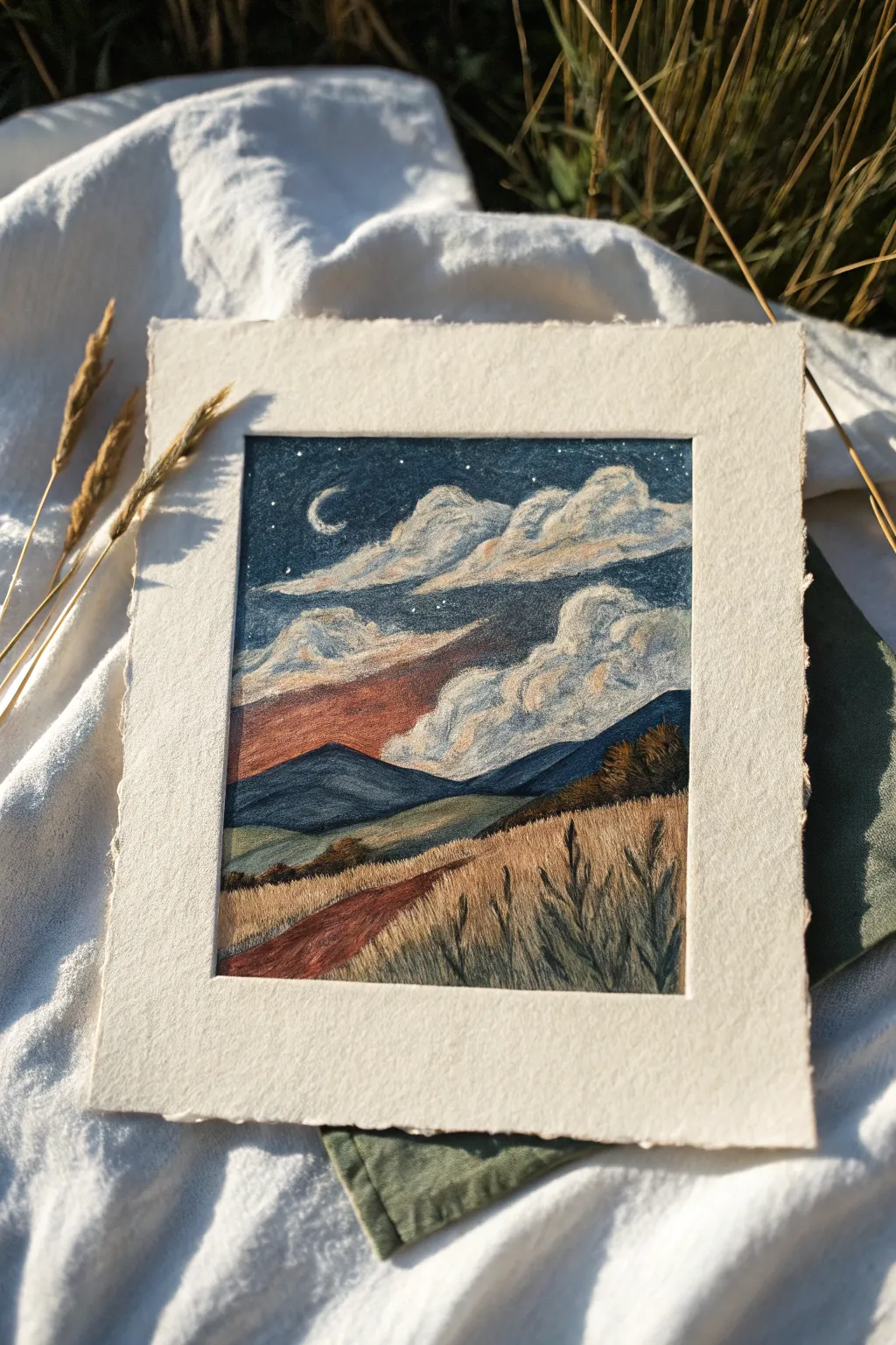
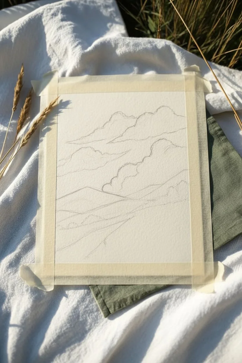
Capture the serene transition from sunset to starlight with this dreamy, limited-palette landscape. This study focuses on blending soft clouds against a deep night sky while maintaining the rich texture of heavy grain paper.
Step-by-Step Guide
Materials
- Oil pastels (specifically a muted palette: Prussian Blue, Burnt Sienna/Red Oxide, Golden Yellow/Ochre, White, and Black)
- Heavyweight textured paper (cold press watercolor paper or pastel paper, approx. 300gsm)
- Masking tape
- Paper stump or blending sponge (optional)
- White gel pen or gouache (for stars)
Step 1: Preparation and Sketching
-
Secure the paper:
Tape down all four edges of your textured paper to a flat work surface. Creating a crisp border is essential for this framed look, so press the tape down firmly to prevent pastel bleed. -
Establish the horizon:
Lightly sketch the main horizon line about one-third of the way up from the bottom. Don’t worry about perfect straightness; organic lines look more natural for hills. -
Outline the composition:
Pencil in the basic shapes of the rolling mountains, the path leading into the distance, and the large, billowy cloud formations in the upper half of the sky.
Step 2: Sky and Clouds
-
Base sky layer:
Start at the very top of the sky with your Prussian Blue. Apply it heavily, pressing firmly to get pigment into the tooth of the paper, but stop before you reach the cloud outlines. -
Cloud shadows:
Use the same blue but with much lighter pressure to shade the undersides and inner pockets of the clouds. This establishes the volume before we add light. -
Sunset glow:
Beneath the clouds and just above the mountain line, apply a band of Red Oxide or Burnt Sienna. Blend this upward slightly into the bottom of the clouds to create that fading sunset effect. -
Highlighting clouds:
Take your white pastel and vigorously color the tops and bodies of the clouds. Where the white meets the blue shadows, overlap them to smudge and create a soft, greyish transition. -
Blending the sky:
Go back over the dark blue sky areas if needed to fill white spots, or use your finger to smooth the transition between the dark sky and the cloud edges.
Sticky Pastels?
If your oil pastels feel too sticky or are smudging uncontrollably, pop them in the fridge for 15 minutes. Cool pastels are harder and easier to detail with.
Step 3: Mountains and Midground
-
Distant mountains:
Color the furthest mountain range with a mix of blue and a tiny touch of black. Keep the edges relatively crisp against the sunset strip. -
Middle hills:
For the closer hills, mix your Golden Ochre with the blue to create a muted, earthy green. Apply this in sweeping horizontal strokes to mimic the lay of the land. -
Shadow definition:
Add dark accents to the right-hand slope using deep blue or charcoal colors to suggest trees or shadows where the hill dips.
Sgraffito Stars
Instead of adding white on top, try the ‘sgraffito’ technique. Scratch through the thick blue sky layer with a needle or toothpick to reveal the white paper beneath for sharp stars.
Step 4: Foreground and Details
-
The path:
Fill in the winding path with the Red Oxide pastel. Use short, directional strokes that follow the curve of the road to lead the eye into the painting. -
Grassy textures:
Cover the foreground fields with Ochre and touches of Red Oxide. Instead of flat coloring, use upward flicking motions to suggest tall, dry grass. -
Dark foreground accents:
Using a sharp edge of your black or dark blue pastel, draw jagged, vertical strokes in the immediate foreground to represent silhouetted weeds and plants. -
Adding the moon:
With a fine edge of white pastel or a white gel pen, carefully draw the crescent moon in the upper left corner. -
Starlight:
Dot tiny points of white in the dark blue section of the sky. I like to vary the pressure to make some stars appear brighter than others. -
Final reveal:
Once you are satisfied with the blending, carefully peel away the masking tape at a 45-degree angle to reveal your clean, crisp edges.
Now frame your miniature landscape or gift it as a peaceful reminder of evening stillness
Abstract Swirls as a Blending Practice Page
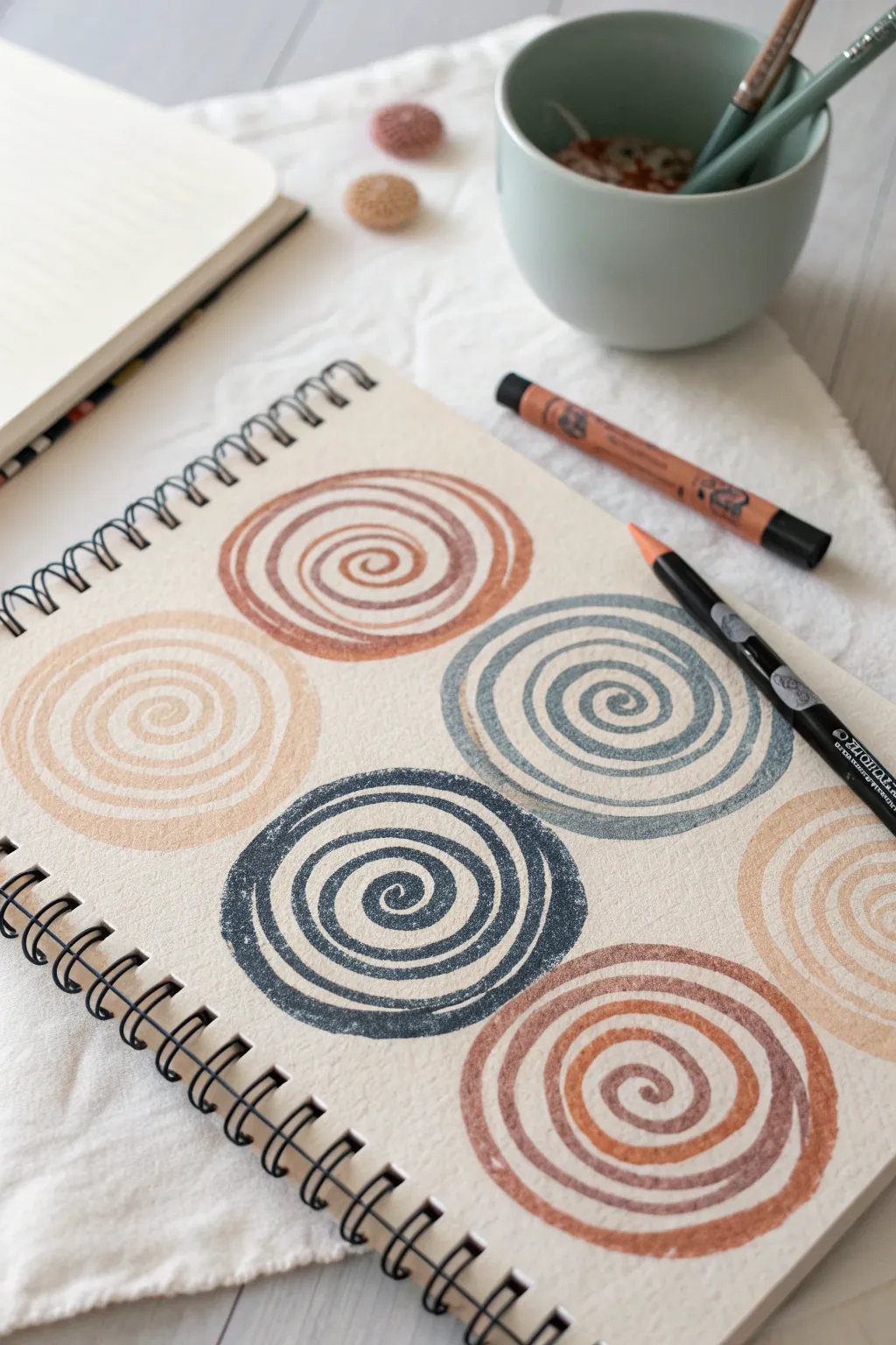
Embrace the soothing rhythm of circular motion with this abstract study in muted earth tones. Using the thick, creamy texture of oil pastels on textured paper creates a satisfyingly rustic finish perfect for practicing control and color harmony.
How-To Guide
Materials
- Heavyweight textured paper or mixed media sketchbook (spiral bound preferred)
- Oil pastels in earthy tones: rust orange, dusty blue, beige, terracotta, and soft brown
- A smooth black drawing surface or table
- Paper towel or blending stump (optional)
Step 1: Preparation & Layout
-
Grid visualization:
Visualize a 2×3 grid on your sketchbook page. You don’t need to draw lines, but imagine where six evenly spaced circles will sit to keep the composition balanced. -
Select your palette:
Pick out 5-6 distinct colors that harmonize well together. For this project, lean into a ‘desert’ palette: warm ochres, deep rusts, and a cool slate blue for contrast.
Step 2: Creating the First Swirls
-
Start from the center:
Choose a rust-colored pastel for the top middle swirl. Place the tip firmly in the center point. -
Spiral outward:
Slowly draw a continuous line spiraling outward. Keep your pressure consistent but heavy enough to catch the grain of the paper. -
Maintain spacing:
As you widen the spiral, try to keep the white space between the pastel lines relatively consistent. This negative space is crucial for the textured look. -
Finish the edge:
Stop when the circle reaches about 2-3 inches in diameter. The outer edge doesn’t need to be perfect; a little irregularity adds organic charm.
Fixing Smudges
Did your hand drag color across the white paper? Use a kneaded eraser to lift oily smears. Press down and lift straight up rather than rubbing.
Step 3: Adding Color Variety
-
The blue accent:
Switch to your slate blue or grey-blue pastel. Position this swirl to the right of your first one, or in the row below, to disperse the cool tones evenly. -
Watch the texture:
Notice how the paper’s tooth breaks up the oil pastel line. Don’t fight this—let the white speckles show through for that stamped, vintage effect. -
Lightest tones:
Select a pale beige or cream pastel. Create a swirl on the far left. Because this color is light, you may need to press slightly harder to ensure it stands out against the paper. -
Deep contrast:
Use a dark charcoal or deep navy pastel for the bottom middle swirl. This anchors the composition visually.
Two-Tone Twist
Try holding two different colored pastels together in your hand as you draw the spiral. This creates a fascinating double-line effect in one stroke.
Step 4: Refining and Layering
-
Check density:
Look at your spirals. If any lines look too thin or scratchy, retrace over them carefully with the same color to build up the waxy layer. -
Thicken the strokes:
For a bolder look, go over the spiral again, slightly widening the stroke. This makes the color more vibrant and solid. -
Clean edges:
If a spiral looks too lopsided, carefully extend the outer ring on the shorter side to balance the circular shape. -
Smudging (optional):
If you prefer a softer look over a textured one, you can lightly tap the lines with your finger, but for this specific recreations, we want to keep that raw texture intact.
Step 5: Final Touches
-
Fill the gaps:
Complete the remaining spots in your mental grid with terracotta or soft brown swirls. -
Clean up debris:
Oil pastels create little crumbs. Lift the sketchbook vertically and tap it firmly on the table to knock off loose bits without smearing your work. -
Inspect negative space:
Ensure the spacing between the different swirls feels somewhat uniform, so no two circles are crowding each other.
Now you have a page full of meditative patterns that celebrate texture and simple forms
Clean Tape-Border Postcard Series
Capture the serene beauty of a twilight ocean with this miniature oil pastel landscape. The vibrant sunset gradients blend seamlessly into cool ocean tones, all framed by a crisp white border for a professional postcard finish.
Step-by-Step Guide
Materials
- Oil pastels (artist grade preferred)
- Textured watercolor paper or mixed media paper (postcard size)
- Masking tape or painter’s tape
- Tissue paper or blending stump
- Palette knife or old credit card (optional for scraping)
- Fixative spray (optional)
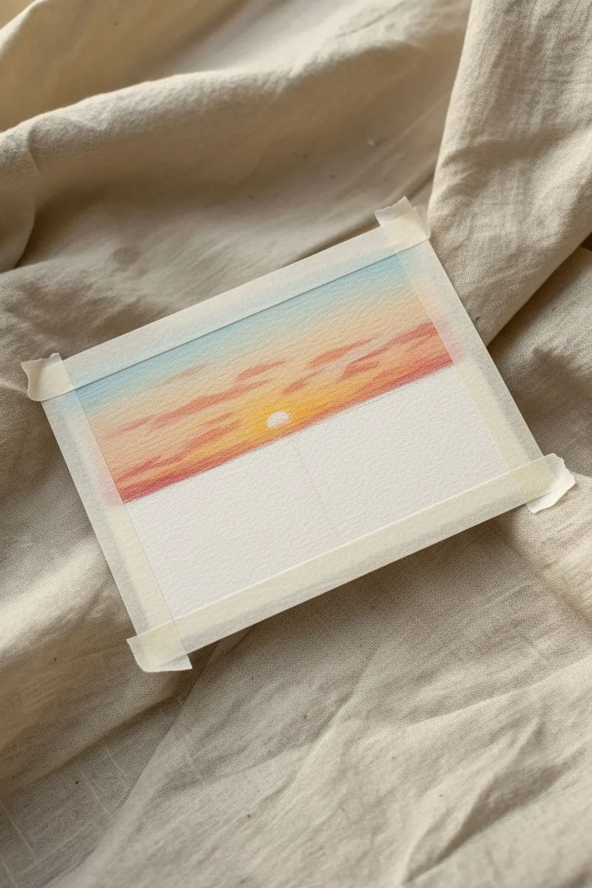
Step 1: Preparation and Sky Layering
-
Prepare the borders:
Begin by taping down all four edges of your paper to your work surface. Press the tape down firmly to ensure a clean, crisp border later, which is a signature look for this series. -
Establish the horizon line:
Lightly sketch a straight horizon line about one-third of the way up from the bottom using a light blue or gray pastel. This separates your sky from the sea. -
Apply the base sky colors:
Start near the horizon with a warm yellow tones, blending upwards into soft oranges and pinks. As you reach the top corners, transition into a pale blue. -
Blend the sky gradient:
Use your finger or a folded tissue to gently smudge the sky colors together. Aim for a smooth transition where the colors meet, creating a soft, dreamy twilight effect. -
Add warm clouds:
Layer streaks of deeper pink and coral horizontally across the sky to suggest stratus clouds soaking up the last light of the day.
Clean Edge Secrets
Peel the tape away from the drawing, not toward it. This prevents the paper from tearing and keeps the paint edge sharp.
Step 2: Ocean and Waves
-
Block in the water:
Below the horizon, fill the ocean area with a mix of teals, deep blues, and hints of green. Keep your strokes horizontal to mimic the movement of water. -
Create the sun reflection:
Directly below where the sun will be, add vertical dashes of yellow and orange on top of the blue water. This simulates the sunlight dancing on the waves. -
Define the waves:
Use a dark navy or indigo pastel to draw undulating lines near the foreground, creating the shadowy troughs of the waves rolling onto the shore. -
Add sea foam highlights:
With a clean white pastel, press firmly to add the crashing foam on the wave crests. Apply this thickly so the texture stands out against the darker water. -
Detail the shoreline:
Near the bottom edge, blend a sandy beige color with the white foam to show the wet sand where the water receding.
Muddy Colors?
If colors start looking gray, wipe your pastel stick clean on a paper towel before applying. Layer light over dark carefully.
Step 3: Details and Finishing Touches
-
Place the sun:
Draw a small, solid half-circle of bright white or pale yellow sitting right on the horizon line in the center of the glow. -
Draw the crescent moon:
In the upper right corner of the blue sky, carefully draw a thin, sharp crescent moon shape using white or light grey. -
Refine wave textures:
I like to go back in with a sharp edge of the white pastel to add tiny flecks of foam and spray to the mid-ground waves for more realism. -
Deepen the contrast:
Add a few final touches of dark blue or even a touch of black in the deepest parts of the waves to make the white foam pop. -
Reveal the border:
The most satisfying part: slowly peel away the masking tape at a 45-degree angle to reveal your clean, crisp edges. -
Sign your work:
Don’t forget to add your initials or signature in the bottom corner of the sand area using a fine-point tool or pencil.
Frame this miniature masterpiece or send it as a heartfelt postcard to a friend


Have a question or want to share your own experience? I'd love to hear from you in the comments below!