Optical illusion art is one of my favorite ways to make a flat page feel like it’s moving, bending, or popping right up into your space. If you’re craving satisfying patterns, bold contrast, and that “wait, how is that possible?” moment, these optical illusion ideas will keep your sketchbook busy.
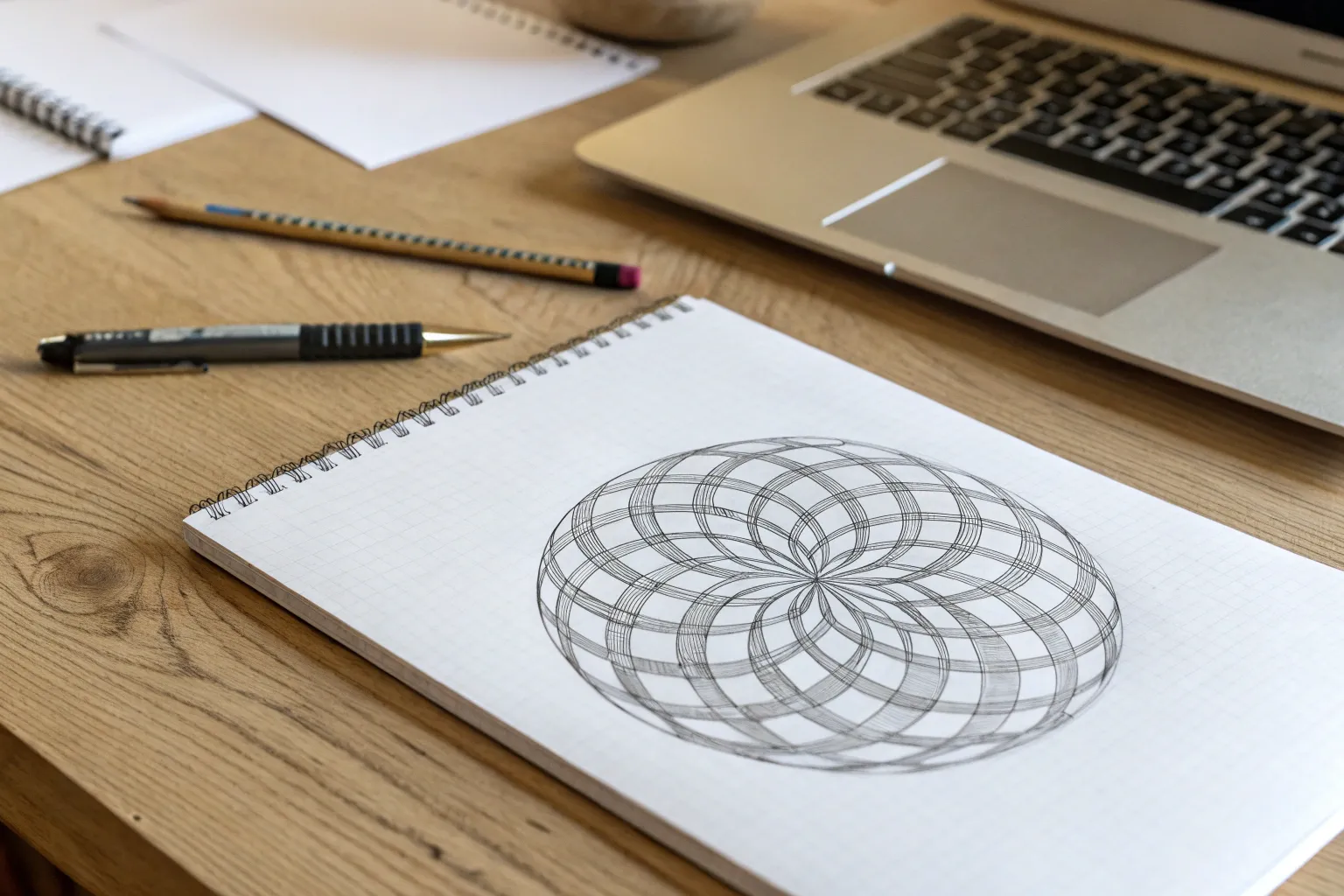
Concentric Circle Tunnel
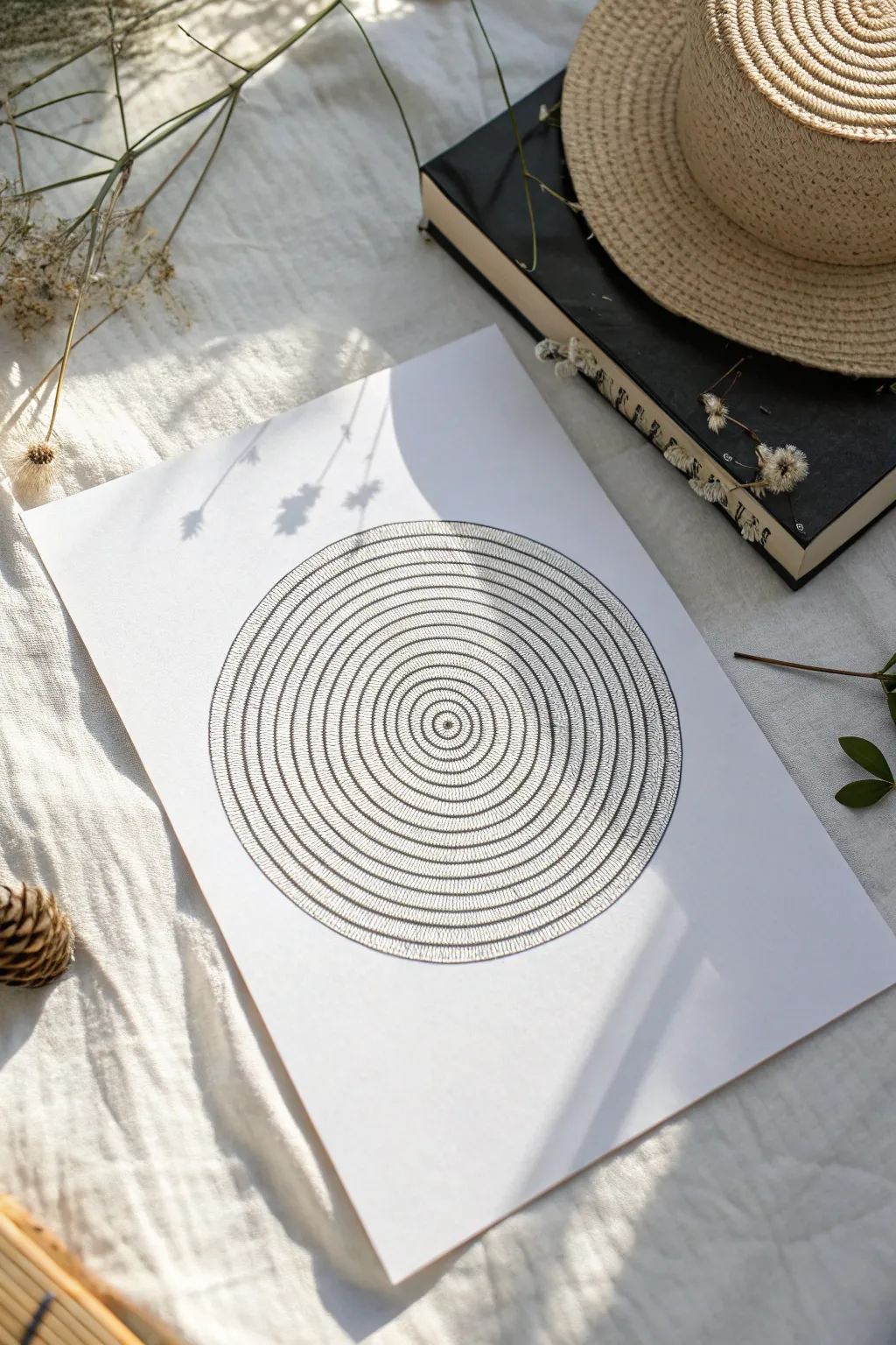
Create a mesmerizing optical effect using nothing more than simple circles and repetitive line work. This minimalist black-and-white drawing builds depth and rhythm through density, resulting in a tunnel-like illusion that feels both organic and precise.
Step-by-Step Tutorial
Materials
- High-quality white drawing paper or cardstock (A4 or similar)
- Compass or circle drawing tool
- Fine liner pens (0.1mm, 0.3mm, and 0.5mm)
- Pencil (HB or 2H)
- Eraser
- Ruler
Step 1: Planning the Structure
-
Find the center:
Begin by finding the exact center of your paper. Use your ruler to lightly mark an ‘X’ or a dot where you want the focus of your illusion to be. It’s crucial this is precise so the symmetry holds up later. -
Draw the central eye:
Place the point of your compass on your center mark. Draw a very small circle, roughly 1cm in diameter. This will be the ‘eye’ of your tunnel. -
Expand outward:
Widen your compass by about 0.5cm and draw a second circle around the first. -
Establish the pattern width:
Continue creating concentric circles outward. Unlike a standard target, you want bands of varying widths. Try alternating between a narrow gap (0.3cm) and a wider band (1cm). The wider bands will hold your texture, while the narrow gaps act as separators. -
Complete the skeleton:
Keep drawing these expanding rings until you have filled the page or reached your desired size. Ensure your pencil lines are extremely faint, as they serve only as guides and will be erased later.
Uneven Circles?
If your hand shakes while tracing the circles, thicken the outline intentionally to hide the wobble. A thicker border actually adds more contrast to the delicate hatching inside.
Step 2: Inking the Outlines
-
Trace the rings:
Switch to a 0.5mm fine liner. Carefully trace over all your penciled circle lines. keep your hand steady and try to maintain a consistent line weight. -
Define the center:
For the very center circle (the ‘eye’), you might want to switch to a slightly thinner 0.3mm pen to keep it crisp. Draw a tiny dot right in the middle for a focal point. -
Let the outlines dry:
Pause for a moment to let the ink set completely. Smudging the main structure now would be frustrating. -
Erase pencil guides:
Once the ink is bone-dry, gently erase the visible pencil lines. You should now have a clean series of empty concentric rings on your paper.
Add Color Depth
Use a grey marker to very lightly shade one side of the textured rings. This adds a shadow effect, making the ‘tunnel’ look like it is physically dipping into the paper.
Step 3: Creating Texture and Depth
-
Analyze the method:
The illusion of depth comes from filling the wider bands with texture while leaving the narrow gaps white (or vice versa). We will fill the wider bands. -
Start the hatching:
Using your 0.1mm or very fine pen, begin filling the first wide ring closest to the center. Draw tiny, straight lines that radiate from the inner circle to the outer circle of that specific band. -
Maintain density:
Pack these little radial lines closely together. The denser they are, the darker that ring will appear. I find that inconsistent spacing actually adds a nice organic vibration to the piece, so don’t stress about perfection. -
Work outward:
Move to the next wide band. Repeat the process, drawing thousands of tiny dashes connecting the ring’s inner and outer edges. -
Vary the line weight (Optional):
To enhance the 3D effect, you can use a slightly thicker pen for the outermost rings. This subtle change mimics how objects appear bolder when closer to the viewer. -
Check your progress:
Periodically step back. You should see alternating bands of dense texture and clean white space. -
Fill the final rings:
Complete the outermost circles. This can be time-consuming, so take breaks to save your wrist and keep your lines sharp. -
Final clean up:
Check for any gaps in your hatching or stray pencil marks. Use an eraser one last time to ensure the white paper is pristine.
This meditative drawing exercise results in a sophisticated piece of art that looks great framed on a wall
Wavy Op Art Stripes
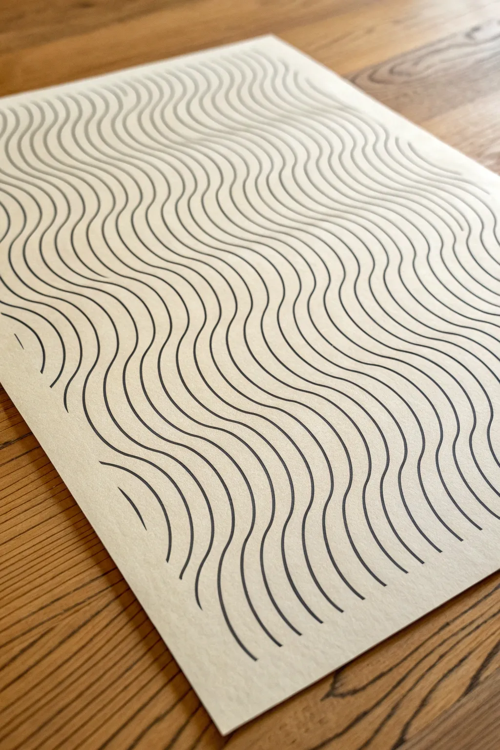
This minimalist project uses the power of repetition to create a mesmerizing visual vibration, transforming a simple sheet of paper into a sea of undulating lines. The meditative process of drawing parallel curvy lines results in a striking piece of optical art that feels both organic and structured.
How-To Guide
Materials
- High-quality heavyweight paper (hot press watercolor or bristol board)
- Fine liner pen (0.5mm or 0.8mm, black archival ink)
- Pencil (HB or 2H)
- Eraser
- Ruler (optional, for spacing guides)
- Masking tape or painter’s tape
Step 1: Preparation & Setup
-
Secure the paper:
Tape your paper down to a flat work surface using masking tape on the corners or edges. This prevents the paper from shifting while you work, which is crucial for maintaining consistent lines. -
Establish the first wave:
Using your pencil, lightly sketch a single, flowing wavy line diagonally or horizontally across the page. This first line will serve as the ‘master wave’ that all other lines will follow, so take your time to get a curve you find pleasing. -
Refine the curve:
Look at your pencil sketch. Ensure the ‘hills’ and ‘valleys’ of the wave are relatively smooth. Erase and redraw as needed until the movement feels fluid.
Smoother Curve Trick
Look slightly ahead of your pen tip rather than directly at it. This helps your brain anticipate the curve and results in much smoother, less shaky lines.
Step 2: Drawing the Base Waves
-
Ink the master line:
Take your fine liner pen and carefully trace over your pencil line. Keep your hand steady and try to draw from your shoulder rather than just your wrist for a smoother stroke. -
Wait for drying:
Let the ink sit for a moment to ensure it is completely dry before moving your hand over it, preventing any accidental smudges. -
Start the second line:
Position your pen tip just a few millimeters away from your first line. Begin drawing a second line that mimics the curve of the first one exactly. -
Maintain spacing:
As you draw, focus intently on the white space between the two lines. The goal is to keep this gap consistent throughout the entire length of the wave. -
Continue the pattern:
Draw the third and fourth lines, repeating the process. I find it helpful to rotate the paper occasionally if the angle becomes awkward for my hand.
Step 3: Filing the Page
-
Find your rhythm:
Continue adding lines, working outwards from your initial waves. You will start to fall into a meditative rhythm. Don’t rush; speed is the enemy of precision here. -
Handle the edges:
As your waves reach the edge of the paper, let the lines run off the page naturally. Place a scrap piece of paper underneath the edges to protect your table from ink marks. -
Manage accumulation errors:
Sometimes, tiny variations in spacing can compound, making your waves drift apart or bunch up. If you notice a gap widening, slightly adjust the amplitude of your next line to gently correct it over the course of a few curves. -
Drawing ‘partial’ waves:
When you get to the corners, you will likely only be drawing small arcs of the wave. Treat these with the same care as the full lines to maintain the illusion. -
Check density:
Periodically pause and step back to look at the whole piece. The optical effect relies on the density of the lines, so ensure you aren’t unconsciously widening your spacing as you get tired.
Add Depth
Vary the line weight! Use a thicker pen for ‘closer’ waves and a thinner one for ‘background’ waves to create a 3D rippling fabric effect.
Step 4: Finishing Touches
-
Final ink check:
Scan the artwork for any lines that might have broken or skipped. carefully touch up these spots without making the line noticeably thicker. -
Erase guidelines:
Once you are absolutely certain the ink is 100% dry (give it an extra 5-10 minutes just to be safe), gently erase any visible pencil marks from your initial sketch. -
Clean and remove:
Brush away the eraser dust with a clean, dry brush or blow it off—don’t use your hand, as oils can smear the ink. Carefully peel up the masking tape.
Now you have a dynamic piece of abstract art that seems to move right before your eyes


Impossible Cube Sketch
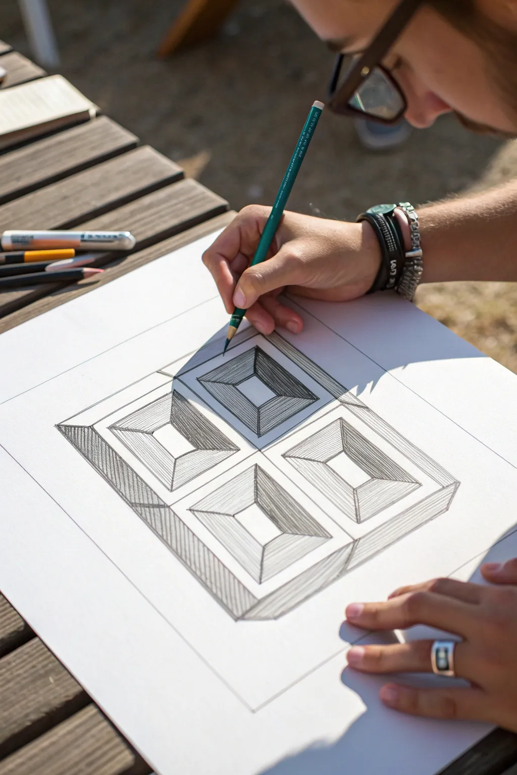
Create a mesmerizing 3D effect with this simple yet striking geometric drawing. By combining clean structure with careful hatching, you’ll produce an illusion of four deep, recessed chambers on a flat surface.
How-To Guide
Materials
- White drawing paper or sketchbook (smooth texture preferred)
- H or HB graphite pencil (for initial layout)
- 2B or 4B graphite pencil (for shading)
- Ruler
- Eraser
- Pencil sharpener
Step 1: Structuring the Grid
-
Define the outer boundary:
Start by using your ruler to draw a large, perfect square. This will be the container for your entire illusion. -
Create the inner frame:
Draw a smaller square inside the first one, leaving about a 1-inch border evenly around all sides. This creates the ‘frame’ of your illusion. -
Divide the space:
Using a light touch, draw a vertical line and a horizontal line through the exact center of the inner square. This divides your workspace into four equal quadrants. -
Add quadrant borders:
Inside each of the four quadrants you just made, draw a slightly smaller square. Leave about a quarter-inch gap between these new squares and the dividing lines you drew in the previous step.
Sharpen Up
Keep your pencil extremely sharp, especially when shading the corners. Dull tips create fuzzy shadows that ruin the crisp architectural look of the illusion.
Step 2: Drawing the Depths
-
Mark the centers:
Locate the center point of each of the four smaller squares. You can do this by lightly marking an ‘X’ from corner to corner if needed, then erasing the X, leaving only the center dot. -
Draw the base squares:
Around each center point, draw a small square. These represent the ‘bottom’ of the pits. Make sure they are aligned perfectly with the larger squares surrounding them. -
Connect the corners:
Take your ruler and draw diagonal lines connecting the corners of the small inner squares to the corresponding corners of the larger squares containing them. This creates the four sloping walls of each pit. -
Clean up guidelines:
Erase any initial construction lines, such as the crosshairs that divided the main quadrants, so the four distinct recessed areas stand alone.
Smudge Alert
If your hand drags graphite across the white paper, place a clean scrap sheet under your drawing hand to act as a shield while you work.
Step 3: Shading for Dimension
-
Determine the light source:
Decide where your light is coming from; usually, top-right or top-left works best. For this tutorial, let’s assume the light comes from the top right. -
Start the darkest shading:
Switch to your softer pencil (2B or 4B). Based on our light source, the left-side interior walls of each pyramid will be in the deepest shadow. Fill these trapezoid shapes with dark, dense hatching. -
Layer the top shadows:
The top interior walls (the ones facing down) should also be shaded, but slightly lighter than the left walls. Use evenly spaced diagonal hatch lines here. -
Shade the bottom walls:
The bottom interior walls (facing up) catch some light but aren’t fully bright. Apply a very light, sparse hatching pattern or leave them mostly white with just a little shading near the corners. -
Leave the highlights:
Leave the right-side interior walls (facing left towards the light) completely white paper. This contrast is crucial for the depth effect. -
Shade the outer frame:
Moving to the thick outer border around the whole drawing, apply vertical hatching to the left side and bottom side of the frame to give the entire block a 3D lift. -
Deepen the contrast:
Go back over your darkest areas with the 4B pencil. I find that pressing harder near the deep corners creates a sharper sense of depth. -
Final clean up:
Use your eraser to sharpen any smudged edges, ensuring the distinction between the shadowed walls and the white highlights is crisp and clean.
Step back and admire how flat lines have transformed into deep geometric tunnels
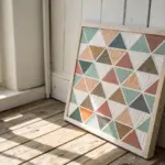
Vibrating Color Contrast Blocks
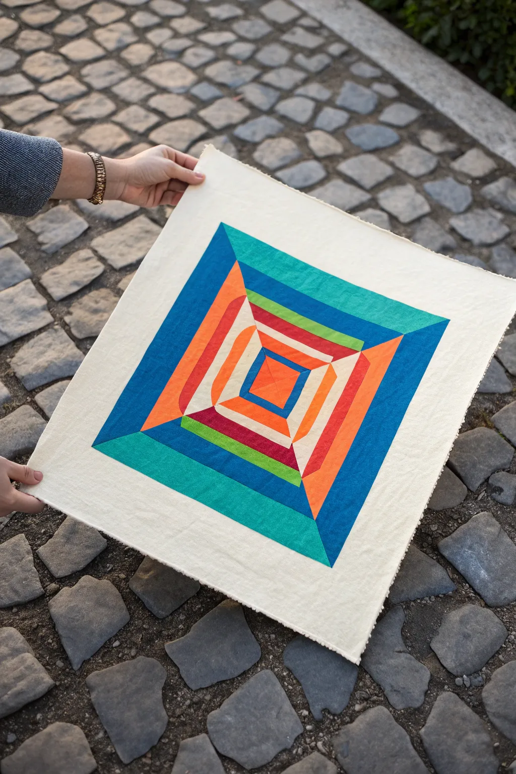
This striking textile project uses simple fabric piecing to create a sophisticated 3D optical illusion, drawing the eye effortlessly toward the center. By strategically combining cool teals and blues with warm oranges and reds, you’ll build a vibrating color tunnel that feels like it’s popping right off the background.
Detailed Instructions
Materials
- Solid cotton craft fabric in 7 colors: light cream (background), teal, royal blue, sky blue, rust orange, bright orange, red, lime green, deep purple
- Rotary cutter and self-healing mat
- Quilting ruler (clear acrylic)
- Sewing machine with neutral thread
- Iron and ironing board
- Fabric marking pen or chalk
- Pins or sewing clips
- Fine-point scissors
Step 1: Planning and Cutting
-
Analyze the pattern structure:
Visualize the block as four triangular quadrants coming together. The illusion works because the ‘squares’ aren’t perfectly centered; they shift slightly in each layer to create a spiraling tunnel effect. -
Cut the central square:
Start by cutting a small 2-inch square from your bright orange fabric. This will be the very bottom of your ‘tunnel’ and the anchor for the rest of the piece. -
Prepare the colored strips:
Cut strips of all your colored fabrics (teals, blues, reds, greens, oranges) to a uniform width of 1.5 inches. Having these pre-cut makes the piecing process much smoother. -
Cut the background fabric:
Cut your cream background fabric into four large triangles that will eventually frame the colored center. You can cut a large 16-inch square and slice it diagonally twice to get four triangles.
Wobbly Lines?
If your square starts twisting, check your seam allowance. Use a magnet guide on your sewing machine plate to ensure every single strip is sewn at exactly 1/4 inch.
Step 2: Piecing the Inner Rings
-
Sew the first tier:
Take a 1.5-inch strip of red fabric. Align it with the top edge of your central orange square. Sew with a consistent 1/4-inch seam allowance. Trim the strip distinctively at an angle to match the side of the square. -
Rotate and repeat:
Rotate the square 90 degrees clockwise. Sew a strip of purple fabric to the next side, overlapping the end of the red strip you just attached. This ‘log cabin’ style rotation is key. -
Complete the first ring:
Continue rotating, adding a rust orange strip, and finally a sky blue strip to the last side. Press all seams outward immediately after sewing each strip to keep the block flat. -
Begin the second ring:
Select your lime green strip. Align it with the red side of your now-larger block. I find it helpful to pin both ends to ensure the strip doesn’t shift under the presser foot. -
Construct the asymmetrical layers:
Work your way around the block again for the second ring, using lime green, bright orange, cream, and royal blue. Notice that by varying the colors on specific sides, the perspective begins to tilt.
Level Up: Quilted Texture
Use ‘stitch-in-the-ditch’ quilting along every color change line. This physically depresses the seams, making the 3D tunnel effect even more convincing.
Step 3: Expanding the Illusion
-
Add the third ring:
Attach the third layer of strips: teal (top), rust orange (right), darker teal (bottom), and lighter blue (left). Keep your seam allowances strict; even a small variance can warp the final square. -
Add the final outer ring:
Sew the final, largest border of strips using royal blue and the widest teal strips. This creates the outermost rim of your tunnel. -
Press perfectly flat:
Take the pieced center to your ironing board. Use steam and a clapping block or just firm pressure to get every seam as flat as possible. This sharpens the geometry and enhances the optical effect. -
Square up the center:
Using your quilting ruler, trim the edges of your colorful pieced block so it forms a perfect square with straight, clean edges.
Step 4: Final Assembly
-
Attach the background corners:
Pin the long edge of one cream background triangle to the top edge of your colored block. Sew, then press open. Repeat this on the opposite side first. -
Finish the background:
Attach the remaining two cream triangles to the side edges. Your colorful block is now ‘on point’ (diamond orientation) relative to the cream fabric. -
Trim to final size:
Place your large square ruler over the artwork. Trim the outer cream edges to your desired final dimensions (e.g., 18×18 inches), ensuring the colored block is centered. -
Stay-stitch the edges:
Run a straight stitch very close (1/8 inch) to the raw outer edge of the entire piece. This prevents the cream fabric from stretching or fraying while you handle it for framing or quilting.
Hang your finished textile piece on a wall where you can stand back and admire the deep, mesmerizing tunnel you’ve created.
BRUSH GUIDE
The Right Brush for Every Stroke
From clean lines to bold texture — master brush choice, stroke control, and essential techniques.
Explore the Full Guide
Spiral Vortex Swirl
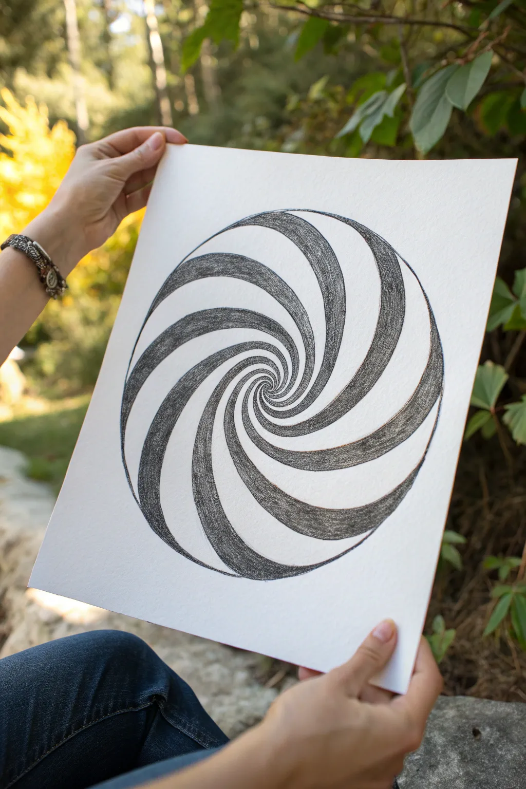
This mesmerizing optical illusion uses simple graphite shading to create a striking sense of depth. While it looks complex, the pattern relies on a repeating swirl motif that pulls the viewer’s eye straight into the center of the page.
Step-by-Step
Materials
- High-quality white drawing paper (heavyweight works best)
- Graphite pencils (HB for sketching, 4B or 6B for shading)
- Compass
- Ruler
- Eraser (kneaded eraser preferred)
- Blending stump (optional)
- Pencil sharpener
Step 1: Setting the Foundation
-
Find drawing center:
Begin by finding the exact center of your paper. Make a tiny, faint mark where you want the vortex to originate; this will be the anchor point for your compass. -
Draw outer boundary:
Set your compass to a wide radius—about 4 to 5 inches—and draw a perfect circle around your center point. This will contain your spiral design. -
Mark perimeter guides:
Using a protractor or just estimating by eye, make small tick marks along the outer circle’s edge. Aim for about 12 to 16 evenly spaced marks. These points determine how many spiral arms your vortex will have.
Keep It Clean
Place a scrap piece of paper under your drawing hand while shading. This prevents your palm from smearing the graphite across the white sections you want to keep crisp.
Step 2: Drafting the Swirls
-
Draw first curve:
Starting from one of your perimeter tick marks, draw a smooth, loose ‘S’ curve that swoops inward toward the center dot. Don’t make a straight line; let it curve naturally. -
Repeat the pattern:
Repeat this curve for every tick mark around the circle. It’s crucial that each line follows the exact same curvature and direction. I find rotating the paper as I draw helps keep my hand motion consistent. -
Check the spacing:
You should now have a pinwheel shape. The lines will get very close together near the center. If any lines look wobbly or uneven, lightly erase and correct them now before shading. -
Create ribbon width:
Now, go back to each curve and draw a second line parallel to it, tapering it so it gets thinner as it reaches the center. This turns your single lines into ‘ribbons’ that have actual width. -
Refine the center:
The very center can get messy. Ensure your ribbons spiral tightly into the middle point without overlapping chaotically. Sharpen your pencil for these tiny details.
Add Color Pop
Instead of graphite, use colored pencils for the dark swirls. Use a dark blue at the outer edge fading into a lighter cyan near the center for a glowing effect.
Step 3: Shading for Depth
-
Select shading set:
Decide which ribbons will be dark and which will be light. You want an alternating pattern: dark spiral, white paper, dark spiral, white paper. -
Start filling in:
Switch to a softer, darker pencil like a 4B or 6B. Begin filling in the ribbons you selected to be dark. Use short, consistent strokes that follow the curve of the spiral. -
Build texture:
Don’t press too hard immediately. Build up layers of graphite. This creates the nice, textured grain visible in the reference photo rather than a shiny, solid black. -
Darken the edges:
For a 3D effect, press slightly harder near the edges of the dark ribbon, leaving the center of the dark strip ever-so-slightly lighter. This implies a curved surface. -
Approach the center:
As you shade toward the vortex center, switch to a sharper points. The spaces become tiny, and you need precision to keep the alternating pattern distinct right down to the middle. -
Clean up boundaries:
Once shaded, go back over the boundary lines of your chosen ribbons with a sharp pencil to make the edges crisp against the white paper. -
Final erase:
Use a kneaded eraser to lift up any graphite smudges from the white ‘negative space’ swirls. The contrast needs to be high for the illusion to work effectively.
Hang your finished vortex on a wall and watch how it seems to move when you walk past

Have a question or want to share your own experience? I'd love to hear from you in the comments below!