Nothing resets my brain like taking my sketchbook outside and letting the light, wind, and little surprises guide my hand. If you’re craving fresh outside drawing ideas, here are my favorite prompts—starting with the classic scenes everyone loves and drifting into more playful, adventurous ways to draw the world out in the open.
Tree Trunks and Branch Silhouettes
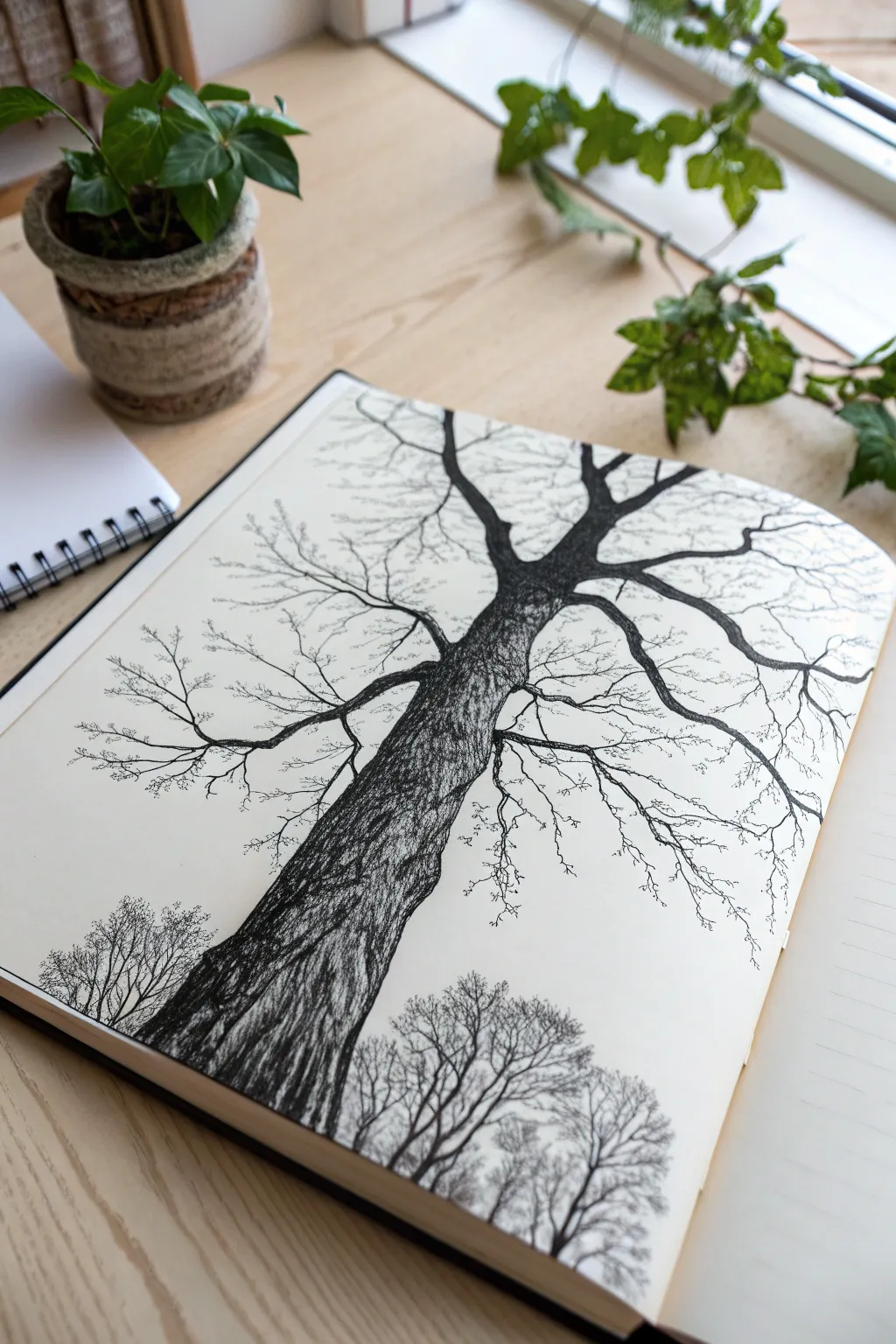
Capture the towering majesty of an old tree by drawing it from a worm’s-eye perspective, emphasizing the texture of the bark and the intricate spread of winter branches. This pen and ink study uses high contrast and careful line work to create a dramatic, skeletal silhouette against a stark background.
Step-by-Step Guide
Materials
- Sketchbook with smooth, heavy-weight paper (min 160gsm)
- HB graphite pencil
- Kneaded eraser
- Fine liner pens (sizes 0.05, 0.1, 0.3, and 0.5mm)
- Brush pen or thick marker (black)
Step 1: Drafting the Perspective
-
Establish the horizon:
Begin lightly with your pencil. Mark a low horizon line near the very bottom of the page where the smaller background trees will eventually sit. -
Map the main trunk:
Draw the main trunk starting wide at the bottom left-center and sweeping upward diagonally toward the top right. Taper it gradually as it reaches the middle of the page. -
Split the branches:
At the point where the trunk tapers, split the form into two or three primary thick branches. Let them reach out like veins, creating a ‘Y’ shape that dominates the composition. -
Add secondary limbs:
Sketch smaller limbs growing off the main branches. Aim for angular, slightly jagged lines rather than perfect curves to capture the organic, weathered feel of the wood.
Ink Smearing?
If your hand smears the ink while you work, place a scrap piece of paper under your drawing hand. Work from left to right (if right-handed) to keep your palm off fresh lines.
Step 2: Inking the Texture
-
Outline the silhouette:
Switch to a 0.3mm fine liner. Carefully trace over your pencil outlines for the main trunk and largest branches, giving the edges a tiny bit of wobble to suggest rough bark. -
Base bark texture:
Using the 0.1mm pen, start hatching along the curve of the trunk. Use long, vertical strokes that follow the tree’s upward growth, but break them up so they aren’t perfect straight lines. -
Deepen the shadows:
With a 0.5mm pen or brush pen, fill in the darkest shadowed areas of the trunk, particularly on the left side and underneath the branch splits. This establishes the heavy, solid weight of the wood. -
Detailing the bark:
Return to the 0.1mm pen to add cross-hatching and short, squiggly lines in the mid-tone areas. I find that varying the pressure here creates a convincing rough texture without looking too uniform.
Step 3: Branch Structure
-
Extend the reach:
Use the 0.3mm pen to solidify the medium-sized branches. Ensure they taper off into thinner lines as they move away from the trunk. -
Add fine twigs:
Switch to your finest 0.05mm pen. Draw the delicate, capillary-like twigs at the very ends of the branches. Let your hand shake slightly to keep these lines looking organic and brittle. -
Create overlapping:
Draw some smaller branches crossing underneath or over the main limbs. This creates depth and prevents the tree from looking like a flat pressed flower. -
Refine connections:
Thicken the ‘armpits’ where branches connect to the trunk. These joints should look strong and reinforced, not pinched.
Add Winter Atmosphere
To suggest a cold, foggy day, use a diluted gray wash or very light stippling around the upper branches. This softens the stark white background and adds mood.
Step 4: Foreground Context
-
Sketch the distant treeline:
At the very bottom of the page, use the 0.05mm pen to draw tiny, lighter silhouettes of other trees. These should be much smaller to emphasize the immense scale of your main subject. -
Density variation:
Make the base of these small trees denser with ink, fading to very fine lines at their tops to suggest atmospheric distance. -
Cleanup:
Once the ink is completely dry (give it a few minutes to be safe), gently erase all underlying pencil sketch lines with your kneaded eraser. -
Final contrast check:
Step back and look at the drawing. Use your thickest pen to darken the deepest shadows on the main trunk one last time to ensure the main tree pops against the white paper.
Enjoy the dramatic perspective of your towering tree sketch


Wildflower Patch Close-Up
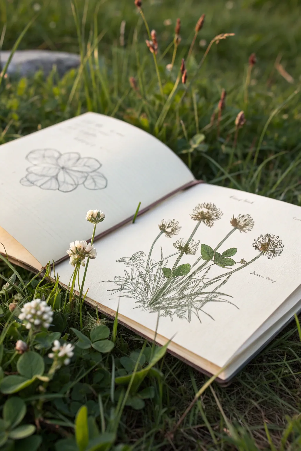
Capture the delicate details of nature with this scientific illustration-style study of white clover. This project combines pencil sketching with precise line work and subtle shading to create a vintage botanical field guide aesthetic.
Step-by-Step Tutorial
Materials
- Sketchbook with cream or off-white pages
- HB or 2B graphite pencil
- Fine liner pen (0.1mm and 0.3mm, black or sepia)
- Colored pencils (olive green, forest green, muted purple, cream)
- Kneaded eraser
- Real clover specimen (optional, for reference)
Step 1: Drafting the Composition
-
Observe and plan:
Begin by observing your clover specimen or reference photo. Note the cluster of three leaves (trifoliate) and the spherical flower heads. Lightly mark the top and bottom boundaries of your drawing on the right-hand page to ensure the entire plant, from flower to root, fits comfortably. -
Establish the stems:
Using your HB pencil, draw long, slightly curved lines to represent the main stems. Let them radiate from a central point near the bottom, mimicking how clover grows in a clump. Vary the angles slightly so the flowers don’t look like soldiers in a row. -
Block in the flower heads:
At the top of the taller stems, sketch rough circles or ovals to define the size of the flower heads. Don’t worry about individual petals yet; just capture the overall mass and volume. -
Position the leaves:
Draw the leaflet shapes along the lower stems. Remember that white clover leaves often have a faint, white V-shaped chevron marking on them. Roughly sketch these shapes now as guides for later detailing. -
Add the root system:
At the very base of your stems, sketch a tangle of fine lines to represent the root mass and the runner (stolon) that connects the plant to the ground. This adds that authentic botanical study feel. -
Sketch the left page study:
On the facing page, create a magnified ‘detail study’ of just the leaves. Draw a larger, top-down view of a leaf cluster to analyze the vein structure and shape without the distraction of the flowers.
Step 2: Inking and Definition
-
Refine the flower petals:
Switch to your 0.1mm fine liner. On the flower heads, start drawing the individual florets. These look like tiny, tubular petals that point outward from the center. Keep the ones at the bottom of the flower head slightly drooping, as they often fade first. -
Outline stems and leaves:
Use the 0.3mm pen to firm up the lines of the stems and leaves. Use a broken or slightly wavering line for the stems to suggest organic texture rather than a rigid pipe. -
Add leaf details:
Draw the central vein in each leaflet. Add delicate serrations or smooth curves to the leaf edges depending on your specific specimen. If drawing the chevron pattern, use very light stippling (dots) rather than solid lines. -
Texturize the grass and roots:
Use quick, upward flicking motions with the fine pen at the base of the plant to simulate grass blades intermingling with the clover roots. This grounds the drawing so it isn’t floating in space. -
Erase pencil marks:
Once the ink is completely dry—I usually give it a full five minutes to be safe—gently roll your kneaded eraser over the page to lift the graphite guidelines.
Ink Smearing?
If your ink smudges when erasing or coloring, check your pen type. Water-based pens need longer to dry than alcohol or pigment liners. Test on a scrap page first.
Step 3: Color and Shading
-
Base layer for leaves:
Take your olive green colored pencil and apply a very light, even layer of color to the leaves. Leave the ‘V’ marking uncolored or very pale green to represent the variegated pattern. -
Deepen the shadows:
Use the forest green pencil to shade the areas where leaves overlap or where the stem meets the distinct leaflets. Press slightly harder to build contrast, but keep the stroke direction following the veins. -
Tint the flowers:
White clover flowers often have a hint of color. Use the cream pencil for the main body of the flower, and add tiny touches of muted purple or pink at the very base of the flower head where it meets the stem. -
Shade the stems:
Run a thin line of forest green along one side of each stem to create a cylindrical 3D effect. Keep the other side lighter to act as a highlight. -
Final notations:
To finish the scientific look, neatly write the common name or Latin name (*Trifolium repens*) near the plant in pencil or a thin pen. Small handwritten notes about the date or location add a lovely personal touch.
Natural Variation
Don’t make your clovers perfectly symmetrical. Drawing a bent stem, a chewed leaf, or a browning flower adds realism and character to the botanical study.
Now you have a timeless botanical record of your time spent observing nature


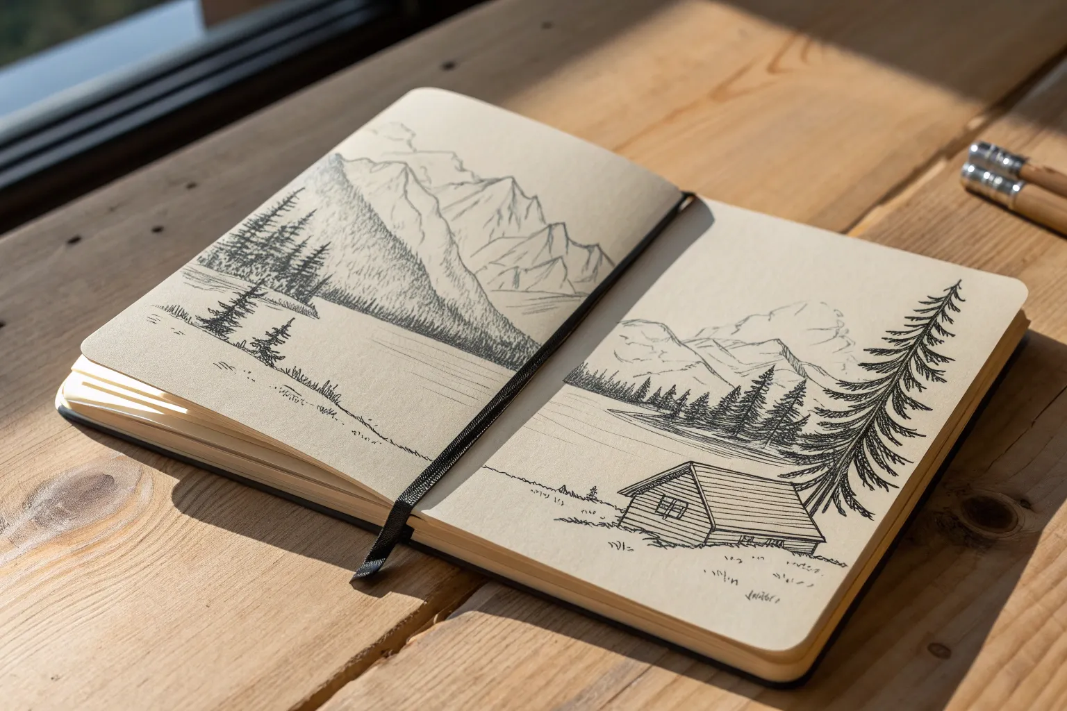
Mountain Layers on the Horizon
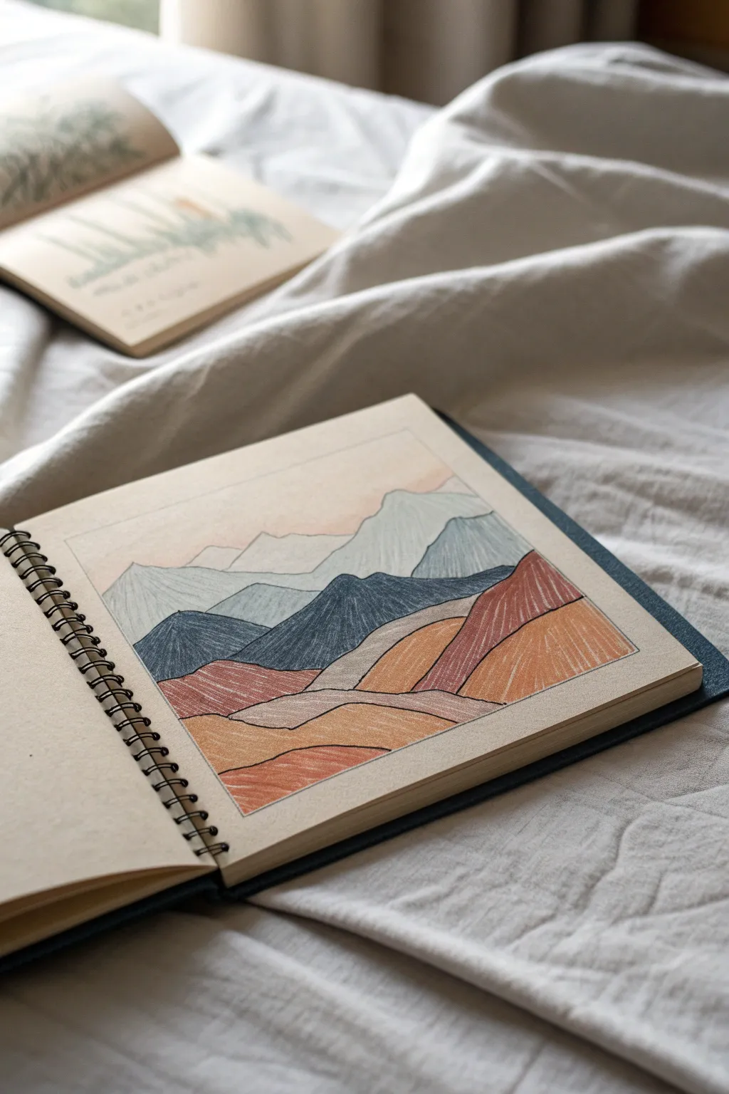
Capture the serene beauty of a mountain landscape with this layered colored pencil drawing on toned paper. The warm, earthy palette and visible texture strokes create a cozy, stylized look perfect for a sketchbook page.
Step-by-Step
Materials
- Spiral-bound sketchbook with tan or toned paper
- Set of colored pencils (specifically: deep blue, slate blue, teal-grey, rust red, ochre/mustard, peach, and white)
- Ruler
- Graphite pencil (HB or H)
- Kneaded eraser
- Fine-liner pen (optional, for the border)
Step 1: Planning the Composition
-
Frame the space:
Start by using a ruler and a graphite pencil to draw a crisp rectangular border on your page. Leave plenty of margin around the edges to let the drawing breathe. -
Lightly sketch the horizon:
Very faintly, sketch the silhouette of the furthest mountain range about two-thirds of the way up the box. Keep the lines jagged but soft. -
Map out the middle ground:
Draw the next layer of mountains slightly lower. These peaks should be a bit larger and more defined than the distant ones, overlapping the first layer. -
Define the foreground hills:
Sketch large, rolling hill shapes at the bottom. These should look closer to the viewer, with wider curves rather than sharp peaks. -
Refine the lines:
Go over your sketch to ensure the layers overlap logically—foreground covering middle ground, middle covering background. Use a kneaded eraser to lift away any excess graphite so it doesn’t dirty the colored pencil later.
Directional Shading
Don’t shade randomly. Make your pencil strokes follow the slope of each mountain. Vertical strokes make peaks look tall; curved strokes make hills look round.
Step 2: Coloring the Layers
-
Start with the sky:
Create a gradient for the sky using a pale peach or cream pencil. Start darker near the mountain tops and fade out to the paper tone as you go up, using light horizontal strokes. -
Shade the distant peaks:
For the furthest mountains, select a very pale blue or slate grey. Fill them in with vertical or diagonal hatching strokes. Keep the pressure light to allow some paper grain to show through. -
Add the middle range:
Choose a medium teal-grey or steel blue for the second layer of mountains. Apply the color with slightly more pressure than the first layer to create atmospheric perspective. -
Color the dark mountains:
For the central, most prominent mountain shapes, use a deep navy or dark denim blue. Use dense, vertical strokes to create a rich, heavy texture that anchors the middle of the composition. -
Begin the warm foreground:
Switch to your warm palette. Color the first set of rolling hills in a rust or terracotta red. Notice how the stroke direction in the image follows the slope of the hill; try to mimic this directional shading. -
Fill the lowest hills:
Use an ochre or mustard yellow for the remaining foreground shapes. Again, let your pencil strokes follow the contours of the land to suggest volume.
Step 3: Refining and Detailing
-
Apply a second pass:
Go back over your dark blue and rust red sections. Layering the color makes it more opaque and vibrant, covering more of the paper tooth. -
Add white highlights:
Take a white charcoal or pastel pencil and lightly glaze the very tips of the distant mountains. This suggests snow caps and adds separation between the layers. -
Sharpen the edges:
Ensure the boundary lines between different color zones are crisp. You can use a sharpened pencil of the darker color to define the edge where it meets a lighter section. -
Enhance texturing:
I like to add distinct hatching lines over the solid blocks of color now. For example, add diagonal white or light grey lines over the blue mountains to simulate rock formations. -
Clean up the border:
Using a ruler, go over the rectangular frame one last time. You can use a dark grey pencil or a fine-liner pen to make the artwork look contained and polished. -
Final dust off:
Blow away any pencil crumbs and use your kneaded eraser to blot up any smudges outside the border.
Mixed Media Detail
Try using a white gel pen for the snowy peaks or border lines instead of pencil. It creates a stark, crisp contrast against the earthy toned paper.
Now you have a tranquil landscape that explores depth and color temperature


Forest Stream and River Rocks
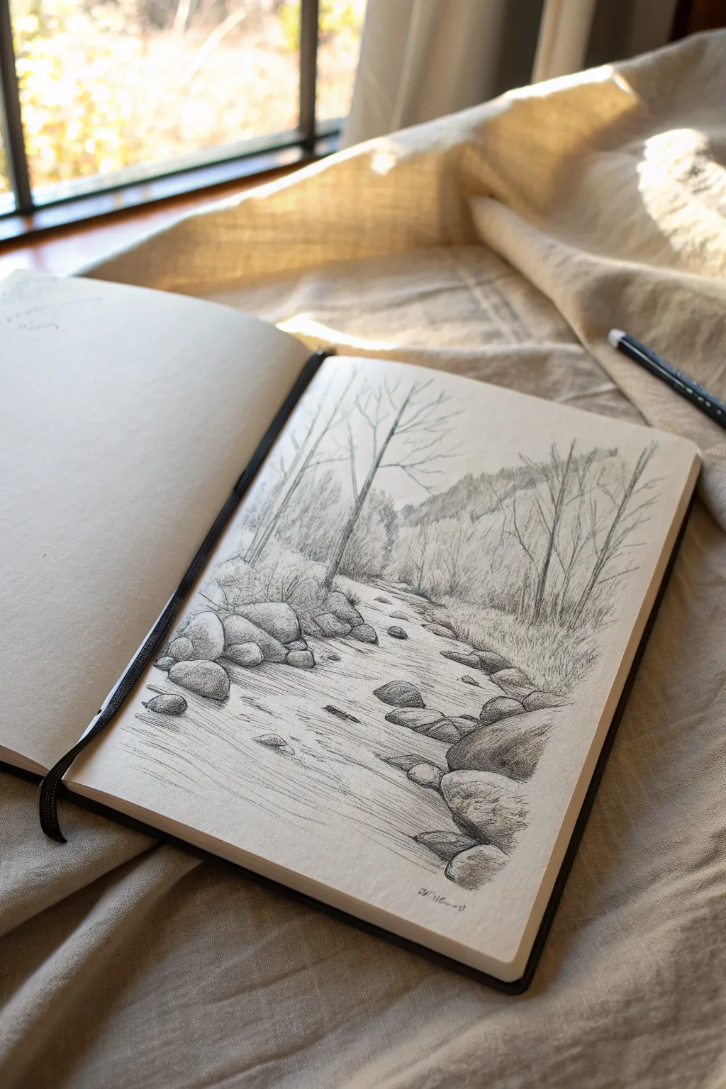
Capture the peaceful ambiance of a woodland stream using simple graphite techniques. This sketch emphasizes the contrast between the flowing movement of water and the solid, textured forms of river rocks.
How-To Guide
Materials
- Sketchbook or drawing paper (medium tooth)
- H or HB pencil (for initial sketching)
- 2B and 4B pencils (for shading and depth)
- Kneaded eraser
- Pencil sharpener
Step 1: Laying the Foundation
-
Establish the Horizon:
Begin by lightly sketching a horizontal line roughly two-thirds up the page to mark where the distant treeline meets the sky. Keep your pressure extremely light so these lines can be erased later if needed. -
Map the Stream Bed:
Draw the winding path of the stream. Start wide at the bottom of the page and narrow it as it recedes toward the horizon line, creating natural perspective. Define the uneven banks on either side with loose, organic lines. -
Place Key Rocks:
Sketch rounded, oval shapes along the banks and in the stream bed to represent the major rocks. Focus on the large cluster in the foreground left and the right bank first, ensuring they overlap slightly to create depth. -
Position the Trees:
Draw faint vertical lines to indicate the trunks of the main trees. Place a prominent, slender tree on the left bank and a cluster of thinner saplings on the right side. Don’t worry about branches yet; just get the vertical placement right.
Step 2: Building Form and Structure
-
Define Stone Contours:
Switch to a sharpened HB or 2B pencil. Go over your rock shapes, refining their outlines to make them look heavy and seated in the earth. I like to add small cracks or indentations to give them character. -
Add Tree Details:
Thicken the tree trunks, making them slightly wider at the base. Draw branches extending upward and outward, purposefully keeping the lines jagged and irregular to mimic natural growth patterns. -
Suggest Distant Foliage:
Sketch the background treeline above the stream. Use soft, vertical hatching strokes to suggest a dense forest without defining individual trees. This creates atmospheric perspective, pushing the background away. -
Create Flow Lines:
Draw long, sweeping horizontal curves within the stream boundaries. These lines should follow the direction of the water, flowing around the rocks rather than through them, to indicate movement.
Keep it Clean
Place a scrap piece of paper under your drawing hand. This prevents your palm from smudging your pencil work across the clean paper while you draw.
Step 3: Shading and Texture
-
Shade the Rocks:
Using a 2B pencil, apply shading to the rocks. Identify a light source (likely from above), and shade the undersides and sides of the rocks more heavily, leaving the tops distinctely lighter to suggest sunlit surfaces. -
Texture the Stone:
Add texture to the shadowed areas of the rocks with stippling (dots) or small scumbling motions. This differentiates the rough stone surface from the smooth water. -
Darken the Banks:
Use a 4B pencil to add deep shadows where the rocks meet the ground and under the grassy overhangs of the stream bank. This anchors the objects and prevents them from looking like they are floating. -
Draw Grassy Textures:
Add short, quick upward strokes along the riverbanks and around the base of the trees. Vary the length and angle of these marks to create a realistic, unruly grassy texture. -
Deepen the Forest Background:
Go back to your background trees and darken the lower sections with denser hatching. This creates a sense of shadowy depth in the woods while keeping the treetops lighter.
Rocks Look Flat?
Make sure your shading follows the curve of the rock. If you shade flat across, the rock will look flat. Curve your pencil strokes to wrap around the form.
Step 4: Final Verification
-
Enhance Water Movement:
Reinforce the flow lines in the water with a sharp 2B pencil. Add subtle shading near the banks and behind rocks to show where the water deepens or creates small eddies. -
Refine the Trees:
Add texture to the main tree trunks using broken vertical lines to interpret bark. Ensure the bare branches taper off naturally into fine points. -
Boost Contrast:
Scan the drawing for areas that need more punch. Use your darkest pencil (4B) to deepen the darkest crevices between rocks and the thickest parts of the foliage shadows. -
Clean Up:
Use your kneaded eraser to lift off any smudges in the sky area or on the highlights of the water to keep those areas crisp and bright.
Take a moment to appreciate the quiet depth you’ve created on the page before closing your sketchbook
BRUSH GUIDE
The Right Brush for Every Stroke
From clean lines to bold texture — master brush choice, stroke control, and essential techniques.
Explore the Full Guide
Beach Waves and Shoreline Lines
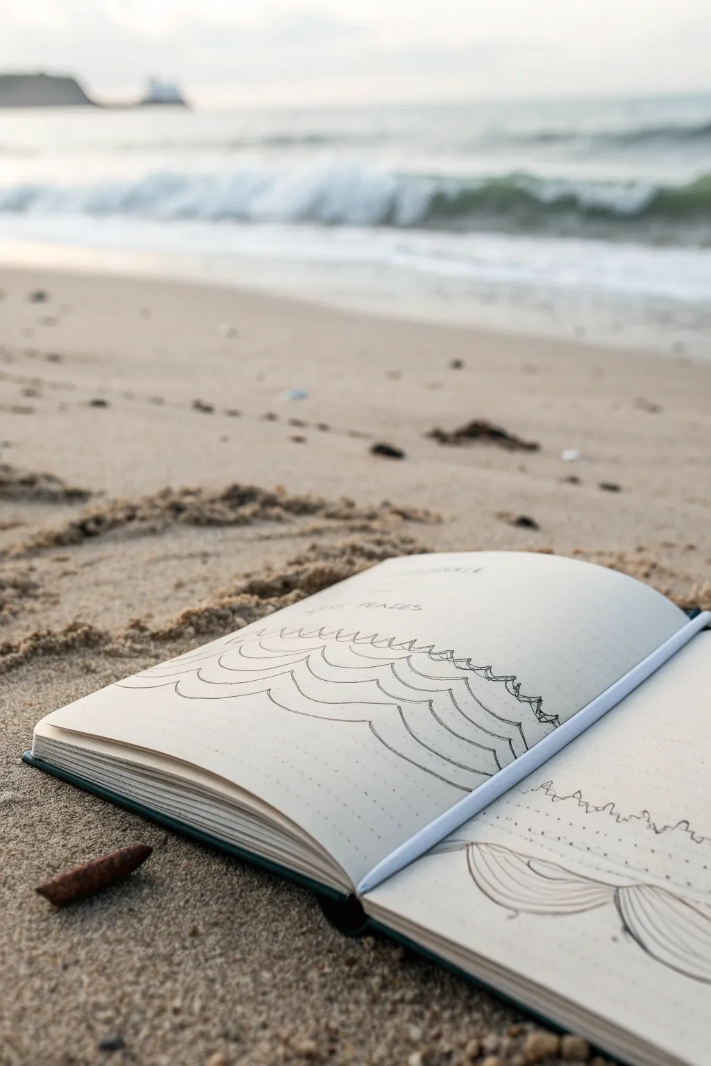
Capture the rhythm of the ocean with this minimalist wave sketch, utilizing simple, repetitive line work to create depth and movement. This project focuses on observing the natural flow of water and translating it into a stylized, calming pattern perfect for your field journal.
Step-by-Step
Materials
- Dotted or blank sketchbook (A5 size recommended)
- Fine liner pen (0.3mm or 0.5mm, black)
- Pencil (HB or 2B)
- Eraser
- Ruler (optional)
Step 1: Planning and Composition
-
Observe the horizon:
Sit comfortably on the sand, or find a photo reference of the shoreline. Notice where the sea meets the sky and how the waves roll in layers. -
Mark the boundaries:
Lightly sketch a horizontal line about two-thirds up the page using your pencil to establish your horizon line. -
Establish the foreground:
Draw three large, sweeping curves at the very bottom of the page. These will be your closest, most prominent waves. -
Layer the mid-ground:
Sketch a second row of wave curves just behind the first set. Make these slightly smaller and offset them so the peaks sit between the troughs of the first row. -
Add receding layers:
Continue sketching rows of waves moving upward toward the horizon line. Gradually decrease the height and width of the curves with each layer to create a sense of distance.
Distance Trick
To force perspective, flatten the curves of the waves significantly as you get closer to the horizon line. Tall arches belong in the front only.
Step 2: Inking the Waves
-
Start the main outlines:
Switch to your 0.5mm fine liner. Begin tracing the pencil curves in the foreground with a confident, smooth hand. -
Refine the line weights:
As you move to the mid-ground waves, try to keep your pressure consistent. I find that lifting the pen slightly at the end of each curve keeps the drawing looking fluid. -
Create overlaps:
Ensure that the lines of the waves behind stop cleanly when they hit the outline of the waves in front. This overlapping is crucial for the 3D effect. -
Detail the peaks:
For the larger foreground waves, add a second, thinner line parallel to the top curve to suggest the thickness of the water or a breaking crest. -
Ink the background waves:
Use a lighter touch or a thinner pen (0.3mm) for the distant waves near the horizon. Keep these lines very flat and subtle.
Wobbly Lines?
Don’t stress over perfect arcs. Ocean water is naturally irregular. A slightly shaky hand actually adds organic realism to water sketches.
Step 3: Adding Texture and Context
-
Add surface movement:
Draw faint, vertical or slightly curved hatching lines inside the belly of the largest waves. This suggests the curvature and volume of the water. -
Suggested foam:
At the crests of the waves, you can add tiny scribbles or broken lines to mimic sea foam or spray, just like in the drawing on the right page. -
Horizon detail:
Carefully ink the horizon line. You can make it slightly uneven to represent distant swells rather than a perfectly straight ruler line. -
Include text:
Above the horizon, lightly pencil in a title or location, such as ‘The Needles’ or the date. Go over it with small, neat lettering. -
Erase guidelines:
Wait for the ink to become completely dry to the touch. Gently erase all visible pencil marks to clean up the page. -
Final assessment:
Look at the overall balance. If the foreground feels empty, extend existing lines slightly or add a few dots to represent sand texture at the bottom edge.
Now you have a serene, linear record of your day at the beach
Lakeside Reflection Sketch
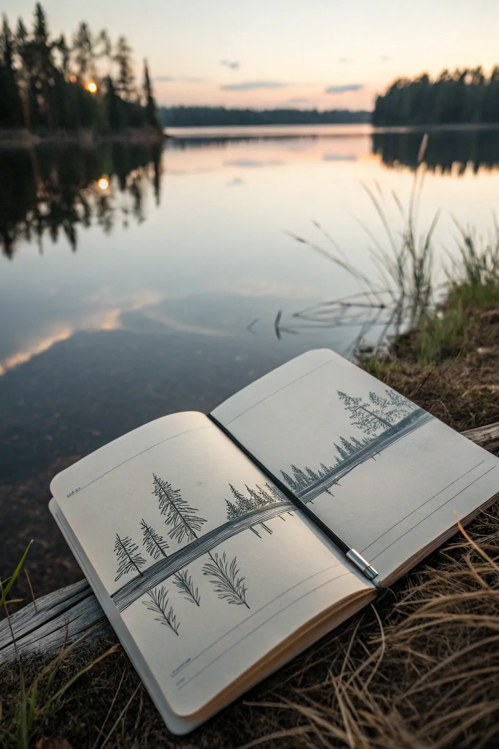
Capture the stillness of a calm lake evening with this elegant pen-and-ink landscape study. Using simple linework and negative space, you’ll create a mirrored composition that spans across your sketchbook page to evoke perfect serenity.
Step-by-Step Tutorial
Materials
- Sketchbook (smooth, heavy paper preferred)
- H pencil for initial layout
- Fine-point black drawing pen (0.3mm or 0.5mm)
- Ruler or straight edge
- Eraser
Step 1: Setting the Horizon
-
Divide the space:
Begin by opening your sketchbook flat. Using your ruler and a light pencil touch, draw a horizontal line straight across the middle of the open spread. This will serve as your water level. -
Define the reflected bank:
Just above your horizon line, pencil in a very narrow, elongated shape to represent the distant shoreline. Do the same immediately below the line to create its reflection. -
Ink the horizon band:
Switch to your black pen. Carefully fill in this central band with dense, horizontal hatching lines. Keep the strokes tight and parallel to create a dark, solid anchor for your composition.
Ink Control Tip
For the reflected trees, hold your pen slightly further back on the barrel. This reduces control intentionally, creating wobbly lines that look more like ripples.
Step 2: Designing the Trees
-
Mark tree positions:
With your pencil, lightly tap small dots along the top edge of your horizon line where you want your trees to stand. Vary the spacing—cluster some together and leave other areas open for balance. -
Draw the trunks:
From each dot, draw vertical lines upward to various heights. Make the one on the left page particularly tall and prominent. -
Mirror the trunks:
Directly below each tree trunk, draw a corresponding vertical line extending downward into the ‘water’. These should match the length of the upper trunks roughly, but can be slightly distorted or shorter to suggest depth. -
Refine the left focal tree:
Starting with the tall tree on the left page, begin adding branches. Use short, downward-angled strokes that start at the trunk and flare out. Keep the top sparse and the bottom denser. -
Refine the right focal tree:
Move to the right page and detail the largest tree there. I like to make the branches slightly more irregular here, perhaps showing a bit of wind or age. -
Fill in the forest line:
For the smaller background trees in the middle distance, use simpler scribbles or zig-zag vertical motions. They don’t need distinct branches, just a textured triangular shape.
Step 3: Creating the Reflection
-
Invert the branches:
Now, work on the reflection of the main left tree. Draw branches angling upward (the inverted version of the downward branches above). Keep your pen pressure lighter here to distinguish the reflection from reality. -
Invert the right tree:
Repeat the process for the large tree on the right page. Mimic the branch structure of the tree above it, but feel free to let the lines be a little wobbly. -
Mirror the background forest:
Add the reflections for the smaller tree clusters. These can be even more abstract—just loose zig-zags reflecting the density of the forest above.
Add Atmosphere
Use a light gray marker or diluted ink wash to add a soft mist layer behind the trees on the upper half, leaving the reflection crisp black and white.
Step 4: Final Details
-
Add water texture:
To sell the illusion of water, draw a few very thin, horizontal lines cutting through the reflected trees. These break up the image and suggest ripples on the surface. -
Darken the shoreline:
Return to your central horizon band. If it looks patchy, go over it again to ensure it is the darkest, most solid part of the drawing. -
Clean up:
Once the ink is completely dry—give it a good few minutes—gently erase any remaining pencil guidelines, especially the initial horizon line. -
Initial and date:
Add a tiny date or location note in the corner to remember where you sketched this peaceful moment.
Now you have a serene landscape captured forever in your sketchbook, ready to revisit whenever you need a moment of calm

PENCIL GUIDE
Understanding Pencil Grades from H to B
From first sketch to finished drawing — learn pencil grades, line control, and shading techniques.
Explore the Full Guide
Desert Cactus and Canyon Shapes
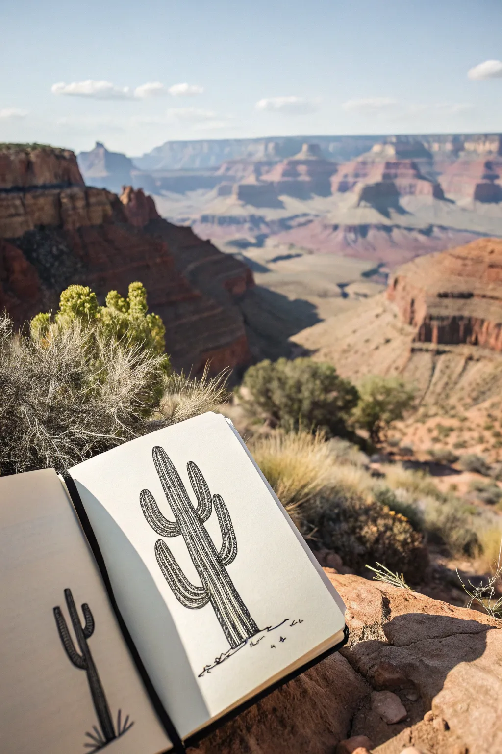
Capture the stoic beauty of the desert with this pen and ink cactus study, sketched directly in your field journal. Using simple hatching techniques, you will create a textured, three-dimensional Saguaro that pops off the page against any backdrop.
Detailed Instructions
Materials
- Sketchbook or drawing paper (heavyweight preferred)
- HB or 2B Graphite pencil
- Kneaded eraser
- Fine liner pen (0.3mm or 0.5mm)
- Thicker felt tip pen or marker (optional for shadows)
Step 1: Planning and Outline
-
Establish the main column:
Begin with your pencil by drawing a tall, vertical cylinder in the center of your page. Make it slightly wider at the base and subtly taper it toward a rounded top. -
Rough in the arms:
Sketch the placement of the cactus arms. Draw one arm branching out from the left side, curving upward in an ‘L’ shape. Since nature isn’t perfectly symmetrical, place the right arm slightly higher or lower. -
Add secondary branches:
Draw smaller, emerging arms on top of the main branches if you want complexity. In this specific sketch, there is a prominent arm on the left, a smaller one above it, and two arms branching off the right side. -
Define the ribs:
Lightly sketch vertical lines running down the length of the main column and following the curves of the arms. These guidelines represent the deep ribs of the cactus and will dictate where your shading goes later. -
Refine the silhouette:
Go over your pencil outline to smooth out any wobbly sections, ensuring the connections between the trunk and arms look organic and curved rather than sharp and angular.
Step 2: Inking the Form
-
Ink the main contours:
Take your fine liner pen and carefully trace the outer silhouette of the cactus. Use a confident, steady hand, but don’t worry if the line has a little natural waiver—it adds character. -
Draw the vertical ridges:
ink the vertical rib lines you planned in pencil. Break these lines occasionally rather than drawing them perfectly solid; broken lines imply organic texture and prevent the drawing from looking too rigid. -
Ink the arm connections:
When inking the arms, pay attention to where they join the trunk. Curve the rib lines around the ‘shoulder’ of the arm to show how the form bends and connects. -
Erase pencil guides:
Once the main ink lines are completely dry (wait a full minute or two to avoid smearing), gently use your kneaded eraser to lift away the graphite underdrawing.
Smudge Alert
Ink smears ruin drawings! Place a scrap piece of paper under your drawing hand to protect wet ink, and always test dried ink with a gentle touch before erasing pencil lines.
Step 3: Texture and Shading
-
Start hatching shadows:
Decide on your light source. If the light is coming from the right, your shadows will be on the left side of the trunk and arms. Begin adding short, diagonal hatch marks along the left side of the main trunk. -
Build darker values:
Deepen the shadows by cross-hatching (adding lines in the opposite direction) in the darkest areas, typically where the arms meet the body and on the shaded undersides of the branches. -
Texture the ribs:
I like to add tiny, vertical tick marks or dots along the internal rib lines. This stippling effect mimics the rows of spines without having to draw every individual needle, which can look cluttered. -
Differentiate the planes:
Leave the areas facing the light largely white or with very minimal marking. This high contrast between the dense hatching and the white paper creates the illusion of a rounded, cylindrical volume. -
Ground the subject:
Draw jagged, organic lines at the very base of the cactus to represent rocky desert soil. A few scattered squiggles and dots near the bottom help anchor the plant so it doesn’t feel like it’s floating. -
Final touches:
Scan your drawing for areas that need more contrast. If a shadow feels too light, add a second layer of ink hatching. Add a few stray marks on the ground for pebbles or dry grass.
Add Pop of Color
Use a water brush and a tiny drop of watercolor to wash a pale sage green over the body, leaving a white highlight strip. Add a terra cotta wash for the ground.
You now have a permanent memory of a delicate desert giant in your sketchbook
Rustic Cottage in an Open Field
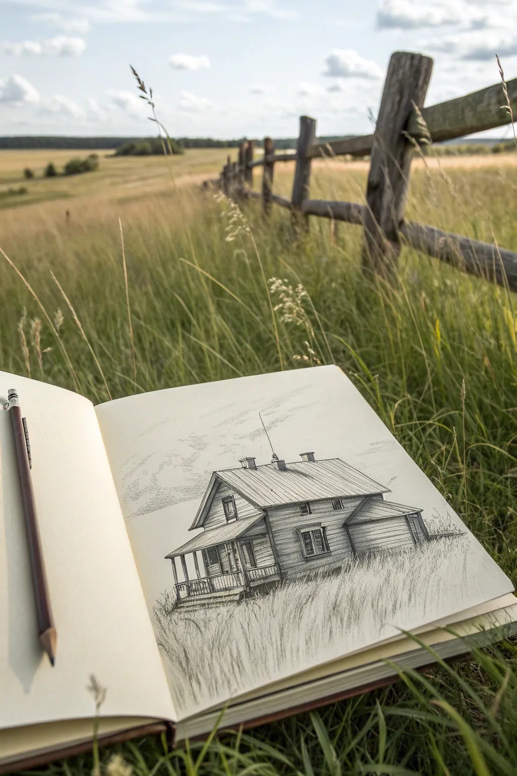
Capture the serenity of rural life with this detailed pencil study of an old wooden farmhouse. This project focuses on rendering realistic wood textures and integrating architecture into a grassy foreground for a nostalgic, grounded feel.
Step-by-Step
Materials
- Heavyweight sketchbook paper (smooth or vellum finish)
- Graphite pencils (HB, 2B, 4B)
- Mechanical pencil (0.5mm) for fine details
- Kneaded eraser
- Standard vinyl eraser
- Blending stump or tortillon (optional)
- Ruler (optional for initial lines)
Step 1: Laying the Foundations
-
Establish the horizon:
Begin by lightly sketching a horizontal line roughly one-third up from the bottom of your page to denote where the flat ground meets the sky. -
Block in the main shape:
Using an HB pencil, sketch a basic rectangular box for the main body of the house. Don’t press hard; these are just guide lines that you will refine later. -
Add the roof angles:
Draw the main roofline as a simple triangle atop your box. Notice the perspective; the roof slopes down towards the right side, so angle your lines accordingly to show depth. -
Attach the extensions:
Sketch the smaller rectangular shapes for the lean-to addition on the right side and the covered porch area on the front left. Keep the perspective lines focusing toward a vanishing point on the right.
Step 2: Structuring the House
-
Define the porch columns:
Vertical lines are crucial here. Draw the thin posts for the porch, ensuring they stand straight up and don’t lean. Space them evenly along the front edge. -
Place windows and doors:
Mark the locations for the attic window, the main ground-floor windows, and the door. Pay attention to the thickness of the frames—draw a double line to suggest the depth of the casing. -
Detail the chimneys:
Add three small rectangular chimneys along the roof ridge. Give them a slight 3D dimension by showing the side planes. -
Refine the siding:
Switch to a sharper pencil or mechanical pencil. Lightly draw horizontal lines across the walls to simulate weatherboard siding. You don’t need to draw every single plank all the way across; broken lines often look more natural. -
Roof texture:
Draw vertical lines down the roof slopes to represent metal ribbing or panel seams. These lines should follow the angle of the roof pitch perfectly.
Fixing “Floating” Houses
If the house looks like it’s hovering, add darker, denser grass shadows right at the baseline where the wood touches the ground to anchor it.
Step 3: Shading and Texture
-
Establish light source:
Decide on your light coming from the left. This means the right-facing walls and the areas under the eaves will be in shadow. -
Shade the walls:
Using a 2B pencil, apply hatching strokes to the shadowed side of the house (the right wall). Keep the strokes fairly uniform to suggest the flat surface of the wood. -
Create depth under the porch:
The area under the porch roof needs deep shadows. Press harder here with a 4B pencil to create high contrast, making the white porch columns pop forward. -
Detail the windows:
Darken the glass panes, leaving tiny slivers of white paper to represent reflections. This small detail instantly adds realism. -
Texture the roof:
Add light shading between the roof seams. I like to vary the pressure slightly to make the roof look weathered and uneven rather than perfectly brand new.
Uneven Planking
Wobble your horizontal siding lines slightly and add tiny vertical ticks occasionally to mimic gaps or joints in the old wood boards.
Step 4: The Grass and Sky
-
Start the foreground grass:
At the base of the house, use quick, upward flicking motions with your pencil to create grass blades growing up against the foundation. -
Expand the field:
Continue these upward strokes across the entire bottom foreground. Vary the length and direction of the strokes. Some should cross over each other to look dense and wild. -
Mask the bottom edge:
Ensure the bottom of the house isn’t a hard straight line; overlap it with grass strokes so the structure feels settled into the landscape. -
Suggest clouds:
Very lightly sketch irregular, fluffy shapes in the sky using the side of your pencil lead. Keep this extremely subtle so it doesn’t distract from the house. -
Final touches:
Add a thin antenna line rising from the roof for a touch of character, and deepen the darkest shadows under the eaves one last time to maximize contrast.
Take a step back and appreciate how your rugged little cottage now sits peacefully in its grassy field


Leaf, Bark, and Stone Texture Studies
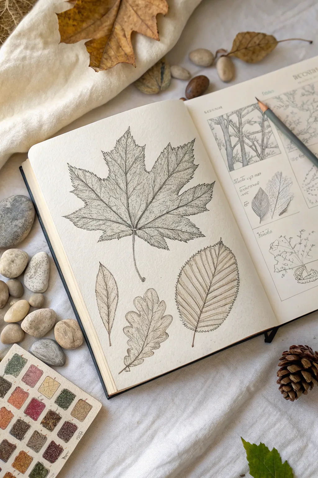
Capture the intricate beauty of fallen foliage with these detailed pen and ink studies. This project focuses on observing and rendering the delicate vein structures and serrated edges of various leaf types in a sketchbook format.
Step-by-Step Guide
Materials
- Sketchbook with smooth or hot press paper
- HB or 2H graphite pencil
- Kneaded eraser
- Fine liner pens (sizes 0.05, 0.1, and 0.3mm)
- Sepia or dark brown ink pen (optional for variety)
- Real leaves for reference (Maple, Oak, Elm)
- Ruler (optional for layout)
Step 1: Planning and Sketching
-
layout the composition:
Begin by deciding the placement of your leaves on the left page. Position the largest leaf—a maple shape—centrally at the top, allowing it to dominate the space. Arrange three smaller, distinct leaf shapes (willow-like, oak-like, and elm-like) in the negative space below. -
Main vein structure:
Using your graphite pencil, lightly draw the central vein (midrib) for each leaf. Use gentle, sweeping curves to suggest movement rather than stiff, straight lines. For the large maple leaf, radiate five main veins outward from a single gathering point near the base. -
Define the perimeter:
Sketch the outer contour of each leaf lightly. Don’t worry about the serrated edges yet; just capture the overall geometric shape. For the oak leaf, block in the rounded lobes; for the elm leaf, outline a simple oval. -
Detail the edges:
Refine your pencil outlines by adding the specific edge characteristics. Add sharp, jagged teeth to the maple and elm leaves, and smooth, wavy undulations to the oak leaf. Keep your pencil pressure very light so these lines can be erased later.
Natural Line Variance
Don’t hold the pen too tightly. A loose grip allows for slight ‘jitters’ in your line work, which naturally mimics the imperfect, organic edges of dried foliage better than straight lines.
Step 2: Inking the Outlines
-
Select your pens:
Choose a 0.1mm fine liner for the main outlines. If you want the warmer look shown in the reference, use a sepia or dark brown ink rather than standard black. This mimics the tone of dried autumn leaves. -
Ink the stems and midribs:
Start by inking the stems and the primary central veins. Use a confident, steady hand. Taper the line slightly as it reaches the tip of the leaf to show the vein getting thinner. -
Trace the outer edges:
Carefully ink the serrated contours you sketched earlier. Instead of a continuous solid line, allow for slight breaks or variations in line weight to give the drawing an organic, natural feel. -
Erase pencil guides:
Once the ink is completely dry—I usually give it at least five full minutes to be safe—gently roll a kneaded eraser over the page to lift the graphite without damaging the paper surface.
Ink Smudge Rescue
If you accidentally smudge wet ink, turn it into a ‘blemish’ on the leaf. Draw a small, irregular circle around the smudge and stipple inside it to look like a fungal spot or insect damage.
Step 3: Texturing and Veining
-
Secondary veins:
Switch to your finest pen (0.05mm). Draw the secondary veins branching off the midribs. Ensure they angle towards the leaf tip. Observe how the veins in the elm leaf run parallel and straight to the edge, while the maple veins form a web. -
Tertiary reticulation:
This is the most time-consuming step but crucial for realism. Fill the spaces between secondary veins with a delicate mesh of tiny, interconnecting lines. These shouldn’t be random; try to form irregular polygon shapes that mimic actual cellular leaf structure. -
Add shading with stippling:
To create depth, use stippling (tiny dots) along the veins and near the center of the leaf where the stem attaches. This subtle shading makes the leaf appear to undulate rather than lying perfectly flat. -
Contour hatching:
On the oak and elm leaves, add very fine hatch marks following the curve of the leaf surface. This directional shading reinforces the 3D form.
Step 4: Contextual Elements
-
Create the reference page:
On the right-hand page, create a grid of boxes using a ruler. These will serve as ‘scientific’ reference panels, adding to the botanical study aesthetic. -
Sketch tree silhouettes:
Inside the boxes, sketch simplified versions of the trees the leaves belong to, or close-ups of bark texture. Keep these looser and sketchier than the main leaf drawings to create visual hierarchy. -
Add handwriting:
Label your specimens using a cursive or small-caps print. Write the common name (e.g., ‘Maple’, ‘Oak’) and add small observational notes like ‘serrated margin’ or ‘lobed structure’ near the relevant parts. -
Final touches:
Assess the overall balance. If the main leaves look too light, go back with your 0.1mm pen and darken the deepest creases and overlaps to increase contrast and pop.
Close your sketchbook knowing you’ve preserved a fleeting piece of nature forever on the page
Encapsulated Landscape Badge Drawing
Capture the serenity of the great outdoors with this minimalist, badge-style landscape drawing. Combining clean line work with limited pops of color, this tutorial helps you create a structured yet organic piece perfect for postcards or journals.
Step-by-Step Tutorial
Materials
- High-quality mixed media or watercolor paper (heavyweight)
- Fine liner pens (Black, sizes 01 and 05)
- Compass or circular object (e.g., masking tape roll) for tracing
- Pencil (HB or 2H)
- Eraser (kneaded preferred)
- Green felt-tip pen or fine marker (forest green)
- Orange colored pencil or pastel
- Grey marker or diluted watercolor wash (optional for shading)
- Ruler
Step 1: Framework & Sketching
-
Draw the boundary:
Start by positioning your compass or circular template in the center of the paper. Draw a clean, perfect circle with your pencil. This will serve as the container for your entire landscape. -
Establish the horizon:
Lightly sketch a horizontal line across the lower third of the circle. It doesn’t need to be perfectly straight; a slight curve adds a natural feel to the ground level. -
Outline the peaks:
Above your horizon line, sketch the jagged outlines of two main mountain peaks. Let the left peak be slightly taller and sharper, while the right one can be broader. Ensure the peaks do not touch the top edge of the circle. -
Add the sun:
In the upper right quadrant of the sky, use a small coin or circle stencil to sketch a small circle for the sun. -
Sketch the tree lines:
Draw diagonal guidelines sloping down from the right side towards the center. This will be where your density of pine trees sits. Add a few small vertical dashes in the foreground to mark individual trees.
Wobbly Circle?
If you can’t draw a steady circle freehand over the pencil line, try using a specific fine-liner compass adapter, or just go slow and embrace the organic look.
Step 2: Inking the Structure
-
Ink the circle:
Switch to your thicker fine liner (05 size). Carefully trace over your main circle outline. I find it helps to rotate the paper as you draw to maintain a smooth curve. -
Define the mountains:
Use the 05 pen to ink the main silhouette of the mountains. Keep the lines crisp and unbroken. -
Add rock texture:
Switch to the thinner 01 pen. Draw broken, vertical lines down the face of the mountains to suggest crags and ridges. Keep these lines lighter and less continuous than the outline. -
Detail the peaks:
Add small dashes and dots near the summits to suggest rough terrain or snow pockets. -
Draw the sun:
Ink the outline of the sun with the 01 pen. -
Ink the clouds:
Draw two simple, angular clouds in the sky using thin lines. Keep them geometric rather than puffy to match the style.
Step 3: Greens & Shading
-
Start the trees:
Using your green fine liner, start drawing the pine trees. Begin with a vertical line for the trunk, then add downward-sloping zig-zag strokes for the branches. -
Build the forest density:
Cluster the trees heavily on the right side slope. Overlap them slightly to create depth. The trees should get smaller as they move ‘further back’ toward the mountain base. -
Add foreground trees:
Draw three larger, distinct pine trees in the bottom foreground area. Give these more detail in their branches since they are closest to the viewer. -
Fill the sun:
Take your orange colored pencil or pastel and fill in the sun. Apply even pressure for a solid, matte look. -
Shade the slope:
If you have a grey marker or very light watercolor wash, add a subtle tint to the mountain slope behind the trees to separate it from the snow-white foreground. -
Final touches:
Add tiny ‘v’ shapes in the white foreground to represent distant birds or small tufts of grass poking through snow. Wait for all ink to dry completely. -
Clean up:
Gently erase all remaining pencil marks. Be careful not to smudge the orange sun or the green ink.
Tree Texture Trick
Don’t overthink the pine branches. Quick, messy zig-zags often look more realistic than carefully drawn needles. Keep the motion loose.
Now you have a crisp, nature-inspired badge drawing ready to display
Moonrise Over Tree Line
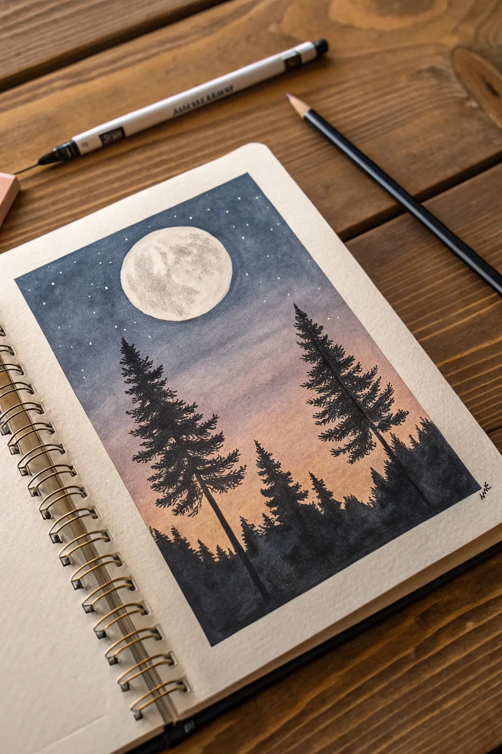
Capture the serene beauty of a twilight forest with this atmospheric watercolor and ink illustration. You’ll create a seamless gradient sky that fades from deep indigo to warm peach, framing a luminous full moon above towering pine silhouettes.
Step-by-Step Tutorial
Materials
- Heavyweight watercolor paper or sketchbook
- Watercolor paints (Indigo, Purple, Peach/Light Orange, Black)
- White gouache or white gel pen
- Black fineliner pens (various sizes, e.g., 0.1, 0.3, 0.5)
- Masking tape or painter’s tape
- Circle template or a compass
- Pencil and eraser
- Round watercolor brushes (size 4 and 8)
Step 1: Setting the Scene
-
Tape the borders:
Begin by taping off a clean rectangular border on your sketchbook page using masking tape. Press the edges down firmly to prevent paint from bleeding underneath, ensuring a crisp white frame later. -
Sketch the moon:
Decide on the placement of your moon, keeping it slightly off-center in the upper third of the page. Use a circle template or compass to draw a light pencil outline. Keep this line faint so it disappears later. -
Mask the moon:
To keep the moon bright white while painting the sky, carefully apply masking fluid inside the circle. If you don’t have masking fluid, you can carefully paint around it, or cut a piece of masking tape into a circle and adhere it over your sketch.
Step 2: Painting the Sky Gradient
-
Prepare your palette:
Mix three distinct puddles of watercolor: a deep indigo blue for the top, a soft purple or violet for the middle, and a warm peach or light orange for the horizon line. -
Apply the peach tone:
Start at the bottom third of your rectangle (above where the trees will be). Wet the paper slightly with clean water, then drop in your peach color, brushing upwards with a large round brush. -
Blend in the purple:
While the peach layer is still damp, introduce the purple paint just above it. Use horizontal strokes to gently blend the two colors where they meet, creating a soft transition. -
Add the night sky:
Load your brush with the deep indigo paint and apply it to the very top of the sky. Bring it down to meet the purple, blending carefully. The goal is a smooth gradient from dark night to sunset glow. -
Deepen the blue:
While the paper is still wet, you can drop concentrated indigo into the top corners to create a vignette effect. Let the entire sky dry completely before moving on.
Clean Lines
Warm up your masking tape with a hairdryer for a few seconds before removing it. This softens the adhesive and prevents the paper from tearing.
Step 3: Adding the Moon & Stars
-
Reveal the moon:
Once the paper is bone dry, gently rub off the masking fluid or peel away your tape circle. You should have a stark white circle against your painted sky. -
Texture the moon:
Dilute a tiny amount of black or grey watercolor until it is very watery. Dab small, irregular patches onto the moon to simulate craters and shadows. Keep the edges of these patches soft. -
Sprinkle the stars:
Load a small brush or toothbrush with white gouache. Tap the handle against your finger to splatter fine white dots across the dark indigo section of the sky. I find this creates a more natural star field than drawing them individually.
Dreamy Glow
Before the black ink dries, touch a wet brush to the edges of the distant trees. This slight bleed creates a ‘foggy’ atmospheric perspective.
Step 4: Drawing the Silhouettes
-
Outline the main trees:
Switch to your black fineliner pens or a small brush with black ink. Draw vertical lines to establish the trunks of two large pine trees, making them taller than the rest of the forest line. -
Add pine branches:
Starting from the top of the trunks, use a scribbling motion to create the needle texture. Make the branches narrow at the top and gradually wider as you move down the tree. -
Fill the forest floor:
Paint a solid black silhouette along the bottom edge of the paper to represent the dense forest floor. Vary the height of the top edge to suggest distant treetops. -
Layering details:
Add smaller tree shapes into the background silhouette using a finer pen. These should look like smaller spikes rising from the forest mass, creating depth. -
Final touches:
Check for any gaps in your black silhouettes and fill them in solid. Once the ink is fully dry, peel off the border tape slowly at a 45-degree angle to reveal your crisp edges.
Enjoy the peaceful atmosphere of your new nightscape sketchbook page
Campsite Scene Under Tall Pines
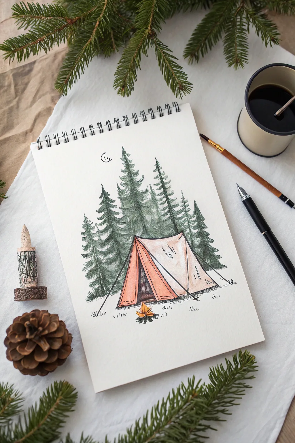
Capture the serenity of sleeping under the stars with this mixed-media sketch. Combining crisp ink lines with soft colored pencil shading creates an illustration that feels both rustic and detailed.
Step-by-Step Guide
Materials
- Spiral-bound sketchpad (heavyweight paper preferred)
- Fine-liner ink pens (black, sizes 0.1 and 0.5)
- Graphite pencil (HB or H) for sketching
- Eraser (kneaded)
- Colored pencils (forest green, moss green, terra cotta/orange, yellow, warm grey)
- White gel pen (optional for highlights)
Step 1: Planning the Composition
-
Establish the horizon:
Begin with your graphite pencil. Draw a very faint, straight horizontal line about one-third of the way up the page to mark the ground level. -
Outline the tent shape:
In the center foreground, sketch a triangle for the tent opening. Extend a diagonal line back and to the right to create the side wall, connecting it down to the ground to form a simple prism shape. -
Position the trees:
Sketch light vertical lines behind the tent to indicate where the pine trees will stand. Vary their heights, making the center trees the tallest to create a balanced composition. -
Add the campfire placement:
Draw a small oval shape directly in front of the tent opening to mark the spot for your campfire.
Natural Tree Tips
Don’t make your pine trees perfectly symmetrical. Nature is weird! Make one side fuller than the other or skip a branch section to make them look organic.
Step 2: Inking the Scene
-
Outline the tent:
Using your 0.5 fine-liner, go over the pencil lines for the tent. Add a slight sag to the roofline to make the fabric look relaxed, not rigid. -
Detail the tent opening:
Draw the triangular flaps of the tent entrance. Add vertical seams and a few small wrinkles near the corners where the fabric is pulled taut by the stakes. -
Ink the tent ropes:
Draw thin, straight lines extending from the tent corners to the ground for guy lines. Add tiny ‘V’ shapes at the ends to represent stakes. -
Draw the pine foliage:
Switch to a 0.1 fine-liner for delicate texture. Start at the top of a tree line and use jagged, downward-sloping strokes to create pine branches. Repeat this pattern down the trunk, widening the tree as you go. -
Layer the forest:
When drawing trees behind others, stop your ink lines where they intersect with foreground trees. This overlap creates depth. -
Ink the fire and ground:
Draw jagged, flame-like shapes for the fire and small cylinder shapes for logs at the base. Add small grassy tufts around the tent and fire using short, upward flicking strokes. -
Add the moon:
Draw a small crescent moon in the upper left sky. I like to add a few tiny dots around it to suggest distant stars.
Step 3: Adding Color and Texture
-
Erase pencil guides:
Wait for the ink to dry completely, then gently erase all visible graphite lines with your kneaded eraser. -
Color the trees:
Use a moss green colored pencil to fill in the trees. Use varying pressure—press harder near the center of the tree and lighter near the tips of the branches to simulate volume. -
Deepen the shadows:
Take a darker forest green pencil and shade the areas where trees overlap or near the bottom branches. This contrast makes the forest feel dense. -
Color the tent exterior:
Lightly shade the side wall of the tent with a warm grey or very pale beige, leaving the center white for a highlight. -
Accent the tent flaps:
Use the terra cotta or orange pencil to color the front flaps of the tent. Apply more pressure near the folds to create dimension. -
Illuminate the fire:
Fill the fire shape with bright yellow, blending into orange at the tips. Add a faint orange glow on the ground immediately surrounding the fire. -
Ground the scene:
Use a grey colored pencil to add light shadows under the tent and trees. Use horizontal strokes to plant the objects firmly on the ground.
Smudge Prevention
If you are right-handed, work from the left side of the page to the right (and vice versa) to avoid smearing fresh ink or pencil pigment with your hand.
Step 4: Final Touches
-
Enhance contrast:
Go back with your black pen and darken the deepest shadows inside the tent opening and the base of the fire logs. -
Texturize the bark:
If visible, add tiny vertical lines to any exposed tree trunks for bark texture.
Enjoy the peaceful atmosphere of your hand-drawn campsite as you close your sketchbook
Mini Illustrated Trail Map From Your Walk

Capture the memory of your favorite outdoor path by sketching a charming, minimalist trail map right in your bullet journal. This project combines simple line drawing with stylized icons to create a delightful record of your journey through the woods.
How-To Guide
Materials
- Dot grid notebook or sketchbook
- Fine liner pen (black, 0.3mm or 0.5mm)
- Colored pencils or fine tip markers (brown, olive green, grey)
- Pencil for sketching
- Eraser
Step 1: Planning the Route
-
Observe your surroundings:
Sit somewhere comfortable on the trail or reference a photo of your walk to get a sense of the key landmarks you want to include. -
Lightly sketch the path:
Using a pencil, draw a faint, curving line that meanders across the page. Let it loop and wind naturally rather than following a straight line. -
Mark landmark locations:
Place small ‘X’ marks lightly in pencil where you want your major icons to sit—like the start, finish, a scenic view, or a campsite.
Use Nature’s Palette
Match your colored pencils to nature. If the actual trail has reddish soil, use a terracotta color for the path dashes.
Step 2: Drawing the Icons
-
Start with the trees:
Select a spot near your path and draw a vertical line for a trunk. Add downward-sloping, jagged branches to create a classic pine tree shape. -
Sketch the mountains:
Draw three jagged triangles clustered together in the distance. Add zigzag lines inside the peaks to suggest snow caps or rugged terrain. -
Add deciduous variety:
Draw a ‘cloud’ shape on top of a simple stick trunk to represent a leafy tree. Add a few ‘Y’ shapes inside the cloud for branches. -
Create the campsite:
Draw a simple triangle for a tent. Add a vertical line down the center for the opening and diagonal lines on the side for flaps or structure. -
Place the location pin:
Near a significant spot, draw a classic teardrop shape with a circle inside it to mimic a digital map pin. Add three small dots underneath it. -
Add tiny shrubbery:
Fill in empty spaces with small, organic cloud-like shapes on short stems to represent bushes or smaller flora.
Step 3: Inking and The Trail
-
Outline the icons:
Trace over your pencil sketches with your black fine liner. Keep the lines sketchy and loose for a rustic look. -
Draw the footprints:
Instead of a solid line for the path, draw tiny pairs of footprints or shoe prints following your original pencil curve. -
Use dashed lines where needed:
If the shoe prints feel too crowded, alternate with simple dashed lines to keep the map feeling light and airy. -
Erase pencil marks:
Once the ink is completely dry, gently erase all the underlying pencil sketches to clean up the page.
Add Hidden Details
Draw tiny mushrooms, birds, or specific flowers you saw along the route next to the trail for extra personalization.
Step 4: Adding Accents
-
Color the pine trees:
Take a brown or olive colored pencil and lightly shade some of the pine trees. I like to leave some trees uncolored for visual balance. -
Shade the tent:
Use a grey or blue pencil to add just a touch of color to the tent panels, leaving the highlights white. -
Highlight the deciduous tree:
Add a soft brown hue to the trunk of your leafy tree, but keep the foliage linework crisp and uncolored. -
Add a date or title:
In the corner or margin, write the location name and the date of your hike in small, neat block letters.
Close your notebook knowing you’ve preserved a beautiful afternoon walk in a creative way


Have a question or want to share your own experience? I'd love to hear from you in the comments below!