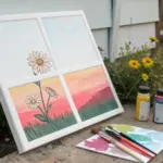
When you’re planning a paint and sip night, the best picture ideas are the ones that look impressive fast—without needing perfect drawing skills. Here are my go-to paint and sip pictures ideas that keep things relaxed, social, and totally doable in a single session.
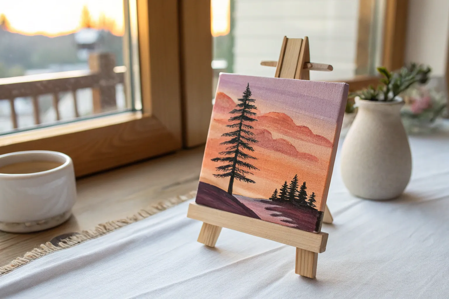
High-Contrast Sunset Silhouette
Capture the magic of twilight with this striking silhouette painting that plays with bold contrasts. Using a vibrant gradient background and crisp black foreground details, you will create a dramatic scene that feels both peaceful and majestic.
Step-by-Step
Materials
- Stretched canvas (e.g., 16×20 inches)
- Acrylic paints: Titanium White, Bright Orange, Magenta/Deep Pink, Deep Violet/Purple, Mars Black
- Large flat wash brush (1-2 inch)
- Medium flat brush
- Small round detail brush
- Fan brush (optional, for texture)
- Cup of water
- Paper towels
- Palette or paper plate
Step 1: Setting the Sky Gradient
-
Prepare the violet top:
Start by squeezing out a generous amount of Deep Violet onto your palette. Using your large flat wash brush, paint a wide horizontal band across the very top 20% of your canvas. Use long, smooth strokes from left to right to ensure coverage. -
Introduce magenta:
Without cleaning your brush thoroughly (just a quick wipe), pick up the Magenta or Deep Pink paint. Apply this directly below the violet section. As you paint, brush upwards slightly into the wet violet edge to blend the two colors seamlessly. -
Transition to orange:
Clean your large brush well. Load it with Bright Orange. Paint the middle section of the canvas, starting just below the pink area. Work quickly while the paint is wet, brushing upwards into the pink layer. The mixture will create a lovely coral transition tone. -
Lighten the horizon:
Mix a little Titanium White with your Orange to create a soft peach color. Paint the lower third of the canvas with this lighter shade, blending it smoothly into the vibrant orange above. This mimics the glowing light of the setting sun. -
Let it dry completely:
This step is crucial. The background gradient needs to be bone-dry before we add any clouds or trees, otherwise the black paint will turn muddy. Take a break or use a hairdryer on a low setting to speed this up.
Muddy Gradient?
If your sky colors are turning brown instead of blending, wipe your brush clean more often. Don’t overwork the paint; blend the seam once or twice and then let it sit.
Step 2: Adding Atmospheric Details
-
Paint faint clouds:
Mix a small amount of Magenta with a tiny touch of Violet. Using a medium flat brush, tap in a few wispy, elongated clouds in the upper purple and pink sections. Keep your hand light; these should look soft and distant. -
Create lower clouds:
Using just a bit of clean Magenta on your brush, add a couple of thin, floating clouds in the orange section. I like to dry-brush these slightly so they don’t look like solid stickers, but rather like fading vapor. -
Add distant mountains:
Mix a shadowy purple using Violet and a tiny dot of Black. With a medium brush, paint a low, rolling mountain range silhouette vaguely in the background, sitting in the pink section. Keep the edges soft to suggest distance.
Step 3: Silhouetting the Forest
-
Establish the ground line:
Switch to pure Mars Black. Paint a solid, uneven horizon line across the absolute bottom of the canvas. This will be the forest floor. Vary the height slightly so it doesn’t look like a ruler line. -
Map the main tree:
Locate the spot for your large focal tree on the right side. Using the tip of a small round brush or the edge of a flat brush, draw a straight vertical line from the ground up to the orange section to act as the trunk guide. -
Start the pine branches:
Starting at the top of your trunk line, use a small detail brush to paint short, downward-dangling strokes. Pine trees are naturally narrower at the top, so keep these first branches very short. -
Widen the tree shape:
As you work your way down the trunk, make your branch strokes progressively wider using a zig-zag motion. Leave small gaps of background color showing through—real trees aren’t solid triangles. -
Add the smaller trees:
To the left of your main tree, paint three or four smaller vertical lines for the distant pines. Repeat the branch process for these, but keep them shorter and slightly less detailed to push them into the background. -
Fill the foreground grass:
Using your smallest brush or an old fan brush turned vertically, flick tiny upward strokes all along the black bottom edge. This creates the illusion of tall grasses and weeds growing in the shadows. -
Refine the silhouettes:
Step back and look at your composition. Use your liner brush to add a few sharper tips to the tops of the trees or extra stray branches sticking out to make the silhouettes feel organic.
Add Some Starlight
Once the sky is fully dry, dip a toothbrush in watery white paint and flick it over the purple section to create a dusting of early evening stars.
Step back and admire how the stark black shapes make those sunset colors truly glow
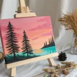
Mountain Lake Mirror Scene
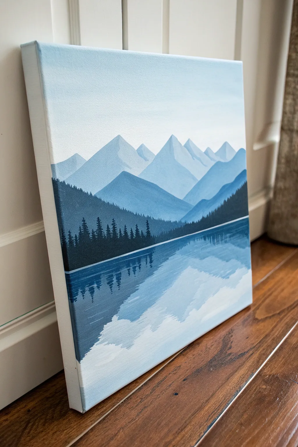
Create a serene atmosphere with this layered landscape that relies on a single color palette of blues and white to achieve depth. By mastering simple gradients and reflection techniques, you’ll paint a tranquil scene where misty mountains meet calm waters.
Detailed Instructions
Materials
- Stretched canvas (e.g., 11×14 or 16×20 inches)
- Acrylic paints: Phthalo Blue (or Prussian Blue), Titanium White, Mars Black
- Large flat wash brush (1 inch)
- Medium flat brush (1/2 inch)
- Small round detail brush
- Palette or paper plate
- Cup of water
- Paper towels
- Ruler (optional)
Step 1: Setting the Atmosphere
-
Prepare your palette:
Squeeze out a generous amount of Titanium White and a moderate amount of Phthalo Blue. You will be mixing various shades of light blue throughout this process, so keep them separated initially. -
Paint the sky gradient:
Start at the very top of your canvas. Mix a very light blue (mostly white with a tiny dot of blue). Using your large flat wash brush, paint horizontal strokes across the top quarter of the canvas. -
Fade to white:
As you move down the canvas, gradually add more white to your brush without rinsing it fully. By the time you reach the middle of the canvas—where the horizon will be—the color should be almost pure white, creating a soft, misty fade.
Keep Edges Crisp
For the sharp mountain peaks, I like to reload my brush often. If the paint drags or looks dry, add a tiny drop of water to make the acrylic flow smoothly for those fine edges.
Step 2: Building the Mountains
-
Mix the distant mountain color:
Create a pale blue mix that is just slightly darker than your sky color. It should still be quite airy and light. -
Paint the furthest peaks:
Using the medium flat brush, paint jagged, triangular shapes about one-third down from the top. Fill them in completely down to where your horizon line will be. Let the edges be crisp. -
Mix a mid-tone blue:
Add a little more Phthalo Blue to your previous mix. This new shade needs to be noticeably darker than the first mountain range to create depth. -
Layer the middle mountains:
Paint a second range of mountains slightly lower than the first, overlapping the bottoms of the previous layer. Vary the heights of the peaks so they don’t look identical to the range behind them. -
Create the foreground mountains:
Mix an even deeper blue, perhaps with the tiniest touch of black to desaturate it slightly. Paint a large, sweeping mountain shape that starts from the sides and dips down toward the center, acting as a frame for the lake. -
Establish the water line:
Decide exactly where your water begins. Use a ruler or a steady hand to paint a straight distinct line across the canvas where the bottom of the mountains meets the soon-to-be lake.
Level Up: Golden Hour
Add a tiny drop of yellow or pale orange to your white paint near the horizon line for a subtle ‘sunrise’ glow that reflects warmly in the water.
Step 3: The Forest and Reflection
-
Mix the deep forest color:
Mix Phthalo Blue with a small amount of Mars Black. You want a very dark navy, almost midnight blue. Do not use pure black; the blue undertone keeps the painting cohesive. -
Paint the treeline shape:
Using the medium flat brush, fill in a dark band of land just above your water line. Make the top edge irregular to suggest the tops of trees. -
Add tree details:
Switch to your small round detail brush. With the dark navy mix, tap small vertical lines extending upward from the dark land mass. Keep your brush movement choppy and irregular to mimic pine tree silhouettes. -
Vary tree heights:
Make some trees taller than others, especially on the left and right sides of the canvas, to create natural variety. -
Begin the water base:
Clean your large flat brush. Re-create the light sky gradient, but upside down in the bottom half of the canvas. Start with white just under the dark treeline and fade into light blue at the very bottom. -
Paint the reflection mass:
While the water layer is technically dry, mix a watery, slightly transparent version of your dark navy forest color. Paint the shape of the mountain and trees upside down into the water area. -
Blur the reflection:
Before the reflection paint dries, take a clean, damp flat brush and gently run it horizontally across the reflection. This ‘cuts’ the image and makes it look like rippling water. -
Add the separation line:
Load your small round brush with pure white paint. Carefully paint a very thin, straight horizontal line right between the dark trees and the water reflection to separate the shore from the lake.
Step back and admire the depth you’ve created with just a few simple shades of blue
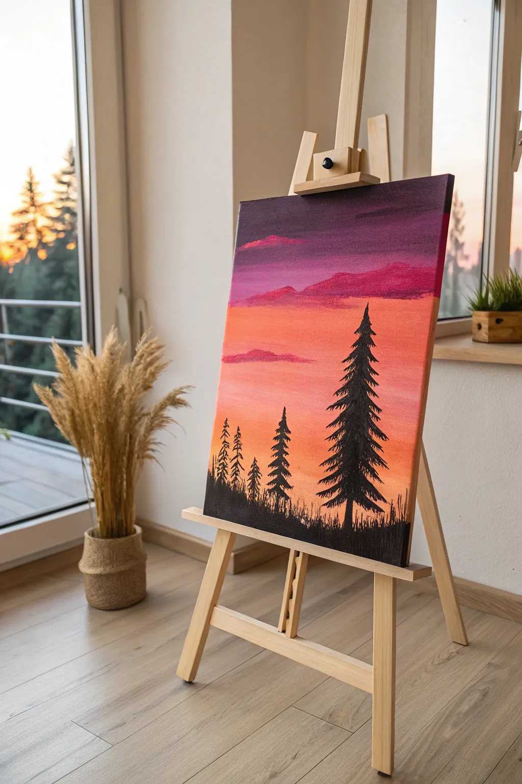
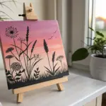
Tree and Swing Silhouette
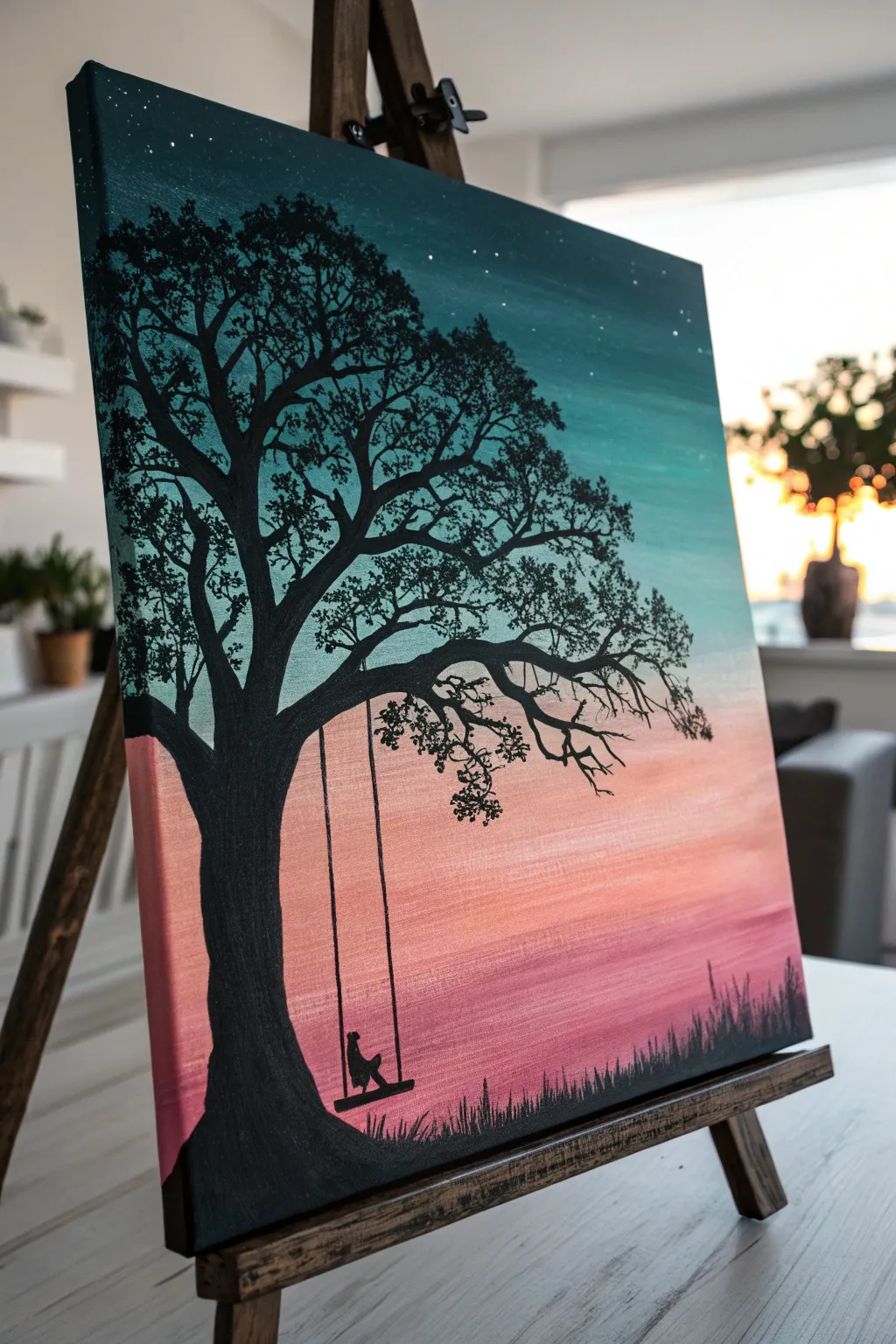
Capture the peaceful transition from day to night with this striking silhouette painting. You’ll blend a vibrant gradient sky ranging from deep teal to warm coral before layering on a bold, detailed black tree.
Step-by-Step Tutorial
Materials
- Stretched canvas (11×14 or similar)
- Acrylic paints: Dark Teal, Turquoise, White, Coral/Pink, Black
- Large flat brush (1 inch)
- Medium flat brush
- Small round brush (size 1 or 2)
- Fine liner brush (size 0 or 00)
- Cup of water
- Palette or paper plate
- Paper towels
- Old toothbrush or stiff bristle brush (optional for stars)
Step 1: Painting the Gradient Sky
-
Establish the horizon:
Visualize your canvas divided into thirds. The bottom third will be your warm colors, and the top two-thirds will be your cool tones. You don’t need to draw a line, just keep this mental map for spacing. -
Start with the darkest teal:
Load your large flat brush with Dark Teal. Paint the top 2-3 inches of the canvas using long, horizontal strokes. Ensure full coverage right to the edges. -
Blend into turquoise:
Without cleaning your brush fully, pick up some Turquoise. Apply this below the dark teal, overlapping the wet edges slightly. Use back-and-forth strokes to blend the two colors seamlessly, creating a soft transition. -
Fade to white:
Wipe your brush clean on a paper towel. Pick up White paint and blend it into the bottom edge of the turquoise area. Continue painting downward until the color is very pale, almost white, near the center of the canvas. -
Introduce the coral:
Clean your brush thoroughly. Load it with Coral or Pink paint. Start from the bottom edge of the canvas and paint upwards. This creates the warm glow of the setting sun. -
Create the sunset transition:
As you move up with the pink/coral paint, mix in a tiny amount of White to soften it. Gently blend this upward to meet the pale turquoise/white section in the middle. The goal is a dreamy haze where the warm and cool tones meet without creating a muddy gray line. -
Add stars:
While the paint is drying, create stars in the dark teal section. Dilute a tiny bit of White paint with water. Use an old toothbrush or a stiff brush to flick fine specks onto the top dark corners. Let the entire background dry completely before proceeding.
Muddy Middle?
If the pink and blue mix into a brown mess, let the paint dry completely. Then, re-paint a layer of White over the transition area before trying to blend the colors again.
Step 2: Creating the Silhouette
-
Outline the trunk:
Switch to your medium flat brush and load it with Black paint. Start at the bottom left corner to paint the base of the tree trunk. Make it wide at the bottom and slightly narrower as it curves upward and inward toward the center. -
Paint the main branches:
Extend the trunk upward about halfway up the canvas. At this point, split the trunk into two or three thick primary branches. One large branch should arch significantly to the right to hold the swing later. -
Add secondary branches:
Using the small round brush, paint thinner branches growing out from your main ones. Let your hand shake slightly as you paint; organic lines look more natural than straight ones for tree limbs. -
Detail the twigs:
Switch to your fine liner brush. Add very thin, delicate twigs extending to the top and sides of the canvas. These should reach up into the dark teal sky area. -
Stipple the leaves:
You can use a worn-out flat brush or a small round brush for this. Load it with Black paint but dab off the excess so it’s relatively dry. Tap the brush repeatedly over the ends of your twigs to create clusters of leaves. Focus on the upper canopy, leaving gaps so the sky peeks through. -
Ground the tree:
Return to the bottom of the canvas. Use the medium brush to fill in the ground area with solid Black. Paint an uneven, bumpy line across the bottom to represent grass or a hill. -
Add grass blades:
With the liner brush or the edge of a small flat brush, flick quick, upward strokes along the black ground line. Vary the height and direction to make the grass look wild and natural.
Leaf Texture Tip
For realistic leaves, use a crumpled piece of paper towel dipped in black paint. Dab it lightly on the canvas branches for an effortless, organic texture.
Step 3: The Final Details
-
Draw the swing ropes:
Using your fine liner brush and thinned black paint (add a drop of water for flow), paint two vertical parallel lines hanging from the large branch on the right. Pull the brush down in one confident motion if you can. -
Paint the seat:
At the bottom of your ropes, paint a small, thick horizontal rectangle for the wooden seat. Ensure it creates a ‘U’ shape connection with the ropes. -
Add the figure:
Paint a small silhouette sitting on the swing. I usually start with a small oval for the body and a smaller circle for the head. Add tiny legs dangling down or a tail if you prefer a cat silhouette. -
Check for light gaps:
Step back and look at your tree. If the foliage looks too sparse, stipple on a few more black leaf clusters. If the trunk looks streaky, add a second coat of black for a solid, opaque silhouette. -
Sign your work:
Use your liner brush and a contrasting color (like white or silver) or just black in the corner to sign your masterpiece.
Hang this painting in a well-lit spot to let those gradient colors truly shine
City Skyline at Golden Hour
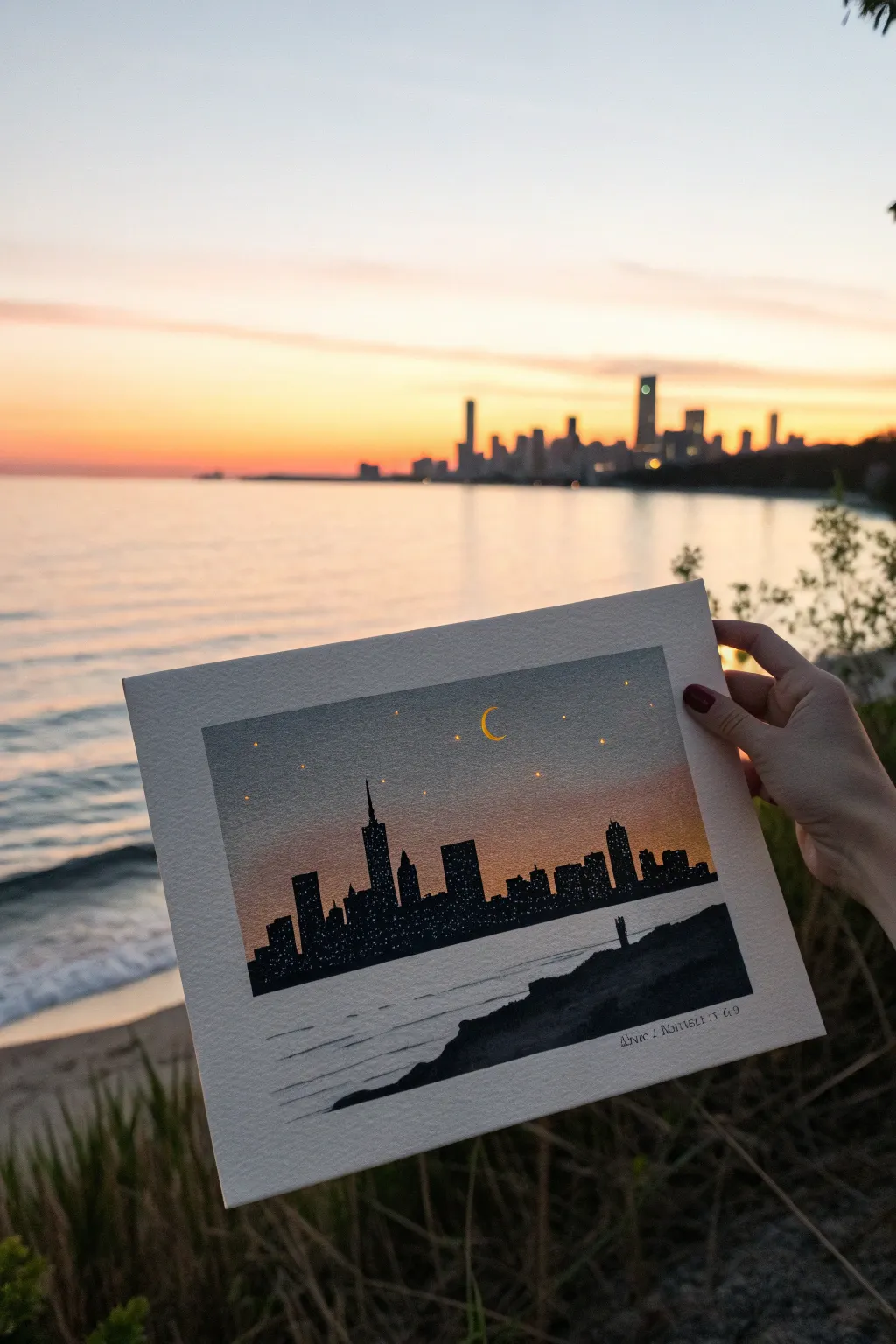
Capture the magic of the city transitioning from sunset to night with this atmospheric skyline painting. You’ll create a seamless gradient sky that fades into deep indigo, framing a crisp urban silhouette and shimmering water reflections.
Step-by-Step Guide
Materials
- Cold-press watercolor paper (140lb/300gsm)
- Painter’s tape
- Pencil and eraser
- Watercolor paints or acrylics (Indigo, Purple, Orange, Yellow, Black)
- White gel pen or fine white acrylic paint
- Flat wash brush (large)
- Round detail brushes (sizes 0 and 2)
- Paper towels
- Two cups of water
Step 1: Preparation & The Gradient Sky
-
Tape edges:
Secure your watercolor paper to a board or table using painter’s tape on all four sides. This creates that crisp, professional white border shown in the photo and prevents the paper from buckling. -
Sketch the horizon:
Lightly draw a straight horizontal line across the lower third of the paper to mark where the water meets the skyline. Then, sketch a rough, uneven line for the rocky foreground in the bottom right corner. -
Pre-wet the sky:
Using your large flat brush and clean water, gently wet the entire sky area above your horizon line. You want the paper damp and glistening, but not soaking wet with puddles. -
Apply base yellow:
Start near the horizon line with a warm yellow or peach color. Paint a horizontal band, letting the wet paper help diffuse the edges upwards. -
Blend in orange:
While the yellow is still wet, introduce a soft orange hue just above it. Use horizontal strokes to blend the bottom of the orange into the top of the yellow for a smooth transition. -
Introduce twilight purple:
Moving upward, mix a dusty purple or mauve. Apply this above the orange, carefully blending the meeting point so there are no harsh lines, just a soft gradient. -
Deepen the night sky:
For the very top section, use a deep indigo or dark blue-grey. Blend this down into the purple. I find that tilting the board slightly helps gravity pull the pigments together naturally. -
Let it dry completely:
This is crucial—wait until the paper is bone dry and flat to the touch. If you paint the black silhouette too soon, it will bleed into your beautiful sky.
Clean Lines Hack
For super straight building sides, you can use small pieces of tape as a stencil, or run a ruler along the edge while using a fine-liner pen before filling it in.
Step 2: The City & Foreground Details
-
Outline the skyline:
Using a pencil, lightly sketch the shapes of the buildings. Focus on variety—tall skyscrapers with spires, shorter blocky buildings, and varied rooflines to create interest. -
Fill the silhouette:
Switch to a smaller round brush and solid black paint (acrylic works best here for opacity). Carefully fill in your building shapes, ensuring the edges against the sky are sharp and crisp. -
Add windows:
While the black paint is wet, you can lift tiny dots out with a damp brush, or wait for it to dry and use a white gel pen to stipple tiny clusters of lights on the buildings. -
Paint the foreground rocks:
Paint the rocky landmass in the bottom right corner using the same black paint. Keep the top edge rugged to mimic grass or rocks. -
Add the couple:
With your smallest brush (size 0), paint two tiny stick-figure silhouettes standing on the edge of the foreground rocks, looking out at the view. -
Create water ripples:
Dilute your black paint significantly with water to make a transparent grey wash. Paint horizontal, wiggly lines in the water area to suggest gentle waves reflecting the dark city. -
Paint the moon:
Using opaque yellow paint or a gel pen, verify the sky is dry, then draw a tiny, crisp crescent moon in the upper center of the sky. -
Stipple the stars:
Dot tiny stars around the moon using your white gel pen or the tip of a small brush. Keep them random and delicate. -
Final reveal:
Once everything is completely dry, slowly peel away the painter’s tape at a 45-degree angle to reveal your clean white border.
Blooms in the Sky?
If you get ‘cauliflower’ marks in your sky gradient, it means you added water to drying paint. Don’t touch it! Let it dry, then gently glaze over it later to smooth it out.
Frame your dusk masterpiece or gift it to someone who loves the city night lights
BRUSH GUIDE
The Right Brush for Every Stroke
From clean lines to bold texture — master brush choice, stroke control, and essential techniques.
Explore the Full Guide
Big, Bold Sunflower Close-Up
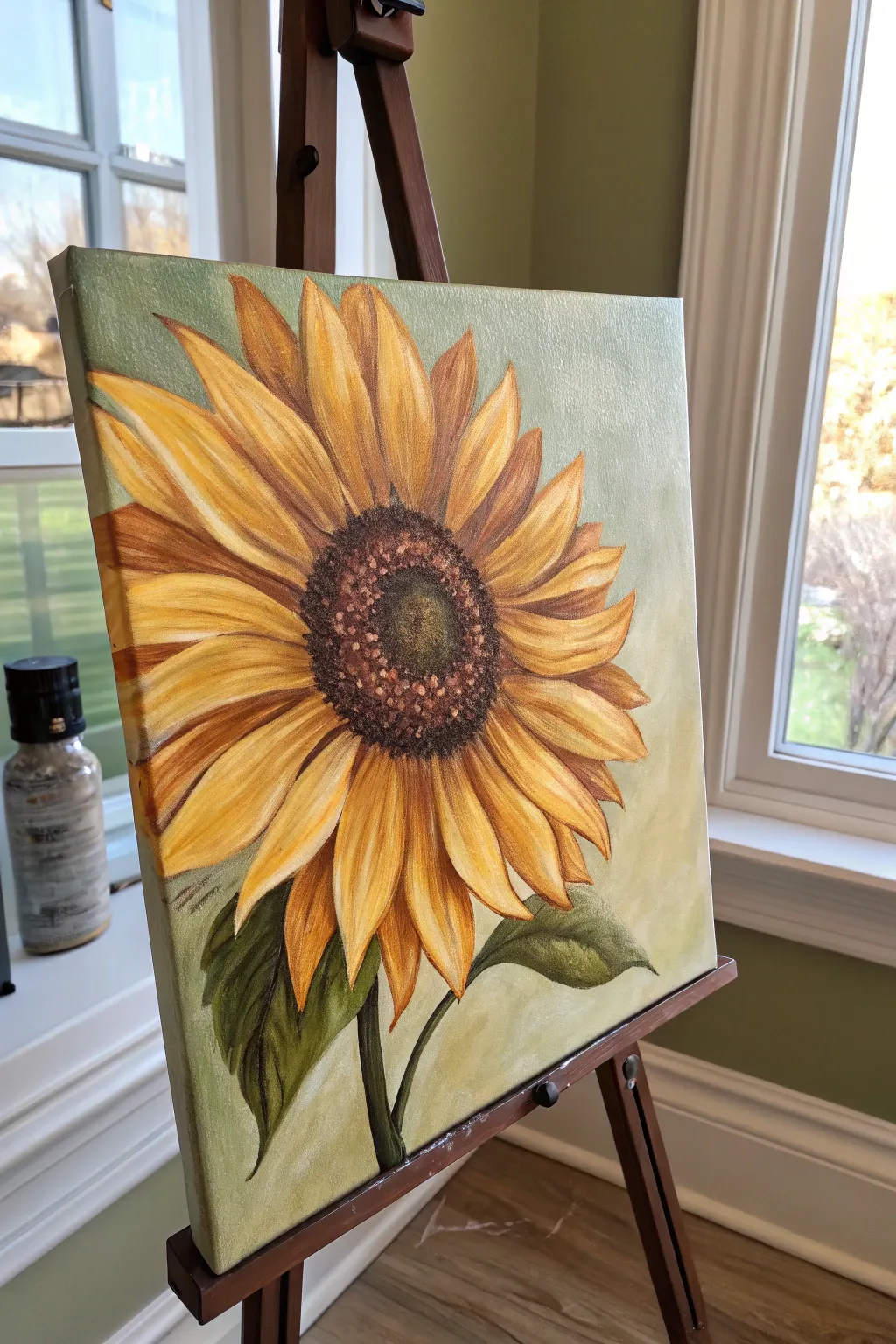
Capture the radiant warmth of a late-summer garden with this dramatic sunflower close-up. The soft sage background makes the golden yellows and rich browns pop, creating a statement piece that feels both rustic and refined.
Step-by-Step Tutorial
Materials
- Square canvas (12×12 or 16×16 inches)
- Acrylic paints: Cadmium Yellow, Yellow Ochre, Burnt Sienna, Raw Umber, Titanium White, and Sap Green
- Large flat brush (for background)
- Medium filbert brush (for petals)
- Small round brush (for details)
- Palette or paper plate
- Cup of water and paper towels
- Pencil and eraser
Step 1: Setting the Scene
-
Mix the background:
Start by mixing a large amount of a soft sage green. Combine Titanium White with a touch of Sap Green and a tiny dot of Raw Umber to dull the brightness. You want a creamy, muted tone. -
Apply the base coat:
Using your large flat brush, cover the entire canvas with your sage mixture. Use long, sweeping strokes in various directions (criss-cross) to create a subtle, textured backdrop rather than a flat wall of color. -
Dry thoroughly:
Let this background layer dry completely. This is crucial so your pencil sketch doesn’t drag through wet paint or become muddy.
Fixing Muddy Centers
If your seed dots are blending into a globs, stop! Let the dark brown base layer dry fully before adding the lighter dots on top to keep textures crisp.
Step 2: Sketching the Giant Bloom
-
Position the center:
Find the center point of your sunflower. Instead of placing it squarely in the middle of the canvas, offset it slightly up and to the left for a more dynamic composition. Draw a medium-sized circle here. -
Outline the inner petals:
Sketch a ring of shorter petals radiating directly from the center circle. These should point outwards like the rays of a sun. -
Add the outer petals:
Draw larger, longer petals behind and between the first ring. Extend some of these almost to the edge of the canvas. Vary the shapes twists at the tips to make them look natural. -
Add the stem and leaves:
Sketch a thick stem coming down from the bottom center. Add two large, jagged leaf shapes near the bottom, angling them downwards.
Step 3: Painting the Petals
-
Base layer for petals:
Mix Yellow Ochre with a little Titanium White. Use your medium filbert brush to fill in every petal. It’s okay if this looks a bit flat right now; we are just building coverage. -
Inner shadows:
While the yellow is drying slightly, mix Burnt Sienna with a touch of Yellow Ochre. Paint the base of each petal (where it meets the center) and pull the color outward gently about one-third of the way up the petal. -
Bright highlights:
Clean your brush. Mix Cadmium Yellow with Titanium White. Apply this bright mixture to the tips and outer edges of the petals. Blend it gently where it meets the darker base color to create a gradient. -
Defining the veins:
With a damp small round brush and diluted Raw Umber, paint very thin, wispy lines down the center of each petal to suggest veining. Keep your hand loose. -
Deepening contrast:
I like to take a bit of pure Burnt Sienna or Raw Umber and tuck it into the V-shapes between overlapping petals. This deep shadow separates them visually.
Metallic Magic
For a glamorous touch, use metallic gold paint for the final highlights on the petal tips. It catches the light beautifuly when hung on a wall.
Step 4: The Center and Foliage
-
Dark foundation:
Fill the large center circle with pure Raw Umber. Dab the paint on with the tip of the brush (stippling) rather than smoothing it out, to start building texture immediately. -
Seed texture:
Mix a lighter brown using Burnt Sienna and a tiny bit of White. Using just the very tip of your small brush, dot this color over the dark center, concentrating the dots in a ring halfway between the middle and the edge. -
Deepest center:
Mix a touch of blue (or black if you have it) into your brown to make an almost-black shade. Stipple this right in the very middle of the flower center to create depth. -
Leaf base coat:
Mix Sap Green with a little Raw Umber for a natural, dark olive tone. Fill in the stem and the leaves fully. -
Highlighting the leaves:
Add some Yellow Ochre to your green mix. Paint the veins of the leaves and add highlights to the top edges where the light would hit.
Step 5: Final Touches
-
Refine edges:
Check the edges of your petals against the background. If you need to crisp up a line, use your small brush and the original background color to “cut in” and sharpen the petal shape. -
Final brights:
Add a few touches of pure White to the very tips of the petals that are closest to the viewer for a pop of shine.
Step back and admire your glowing botanical masterpiece, ready to brighten any room
Cute Stacked Birds on a Branch
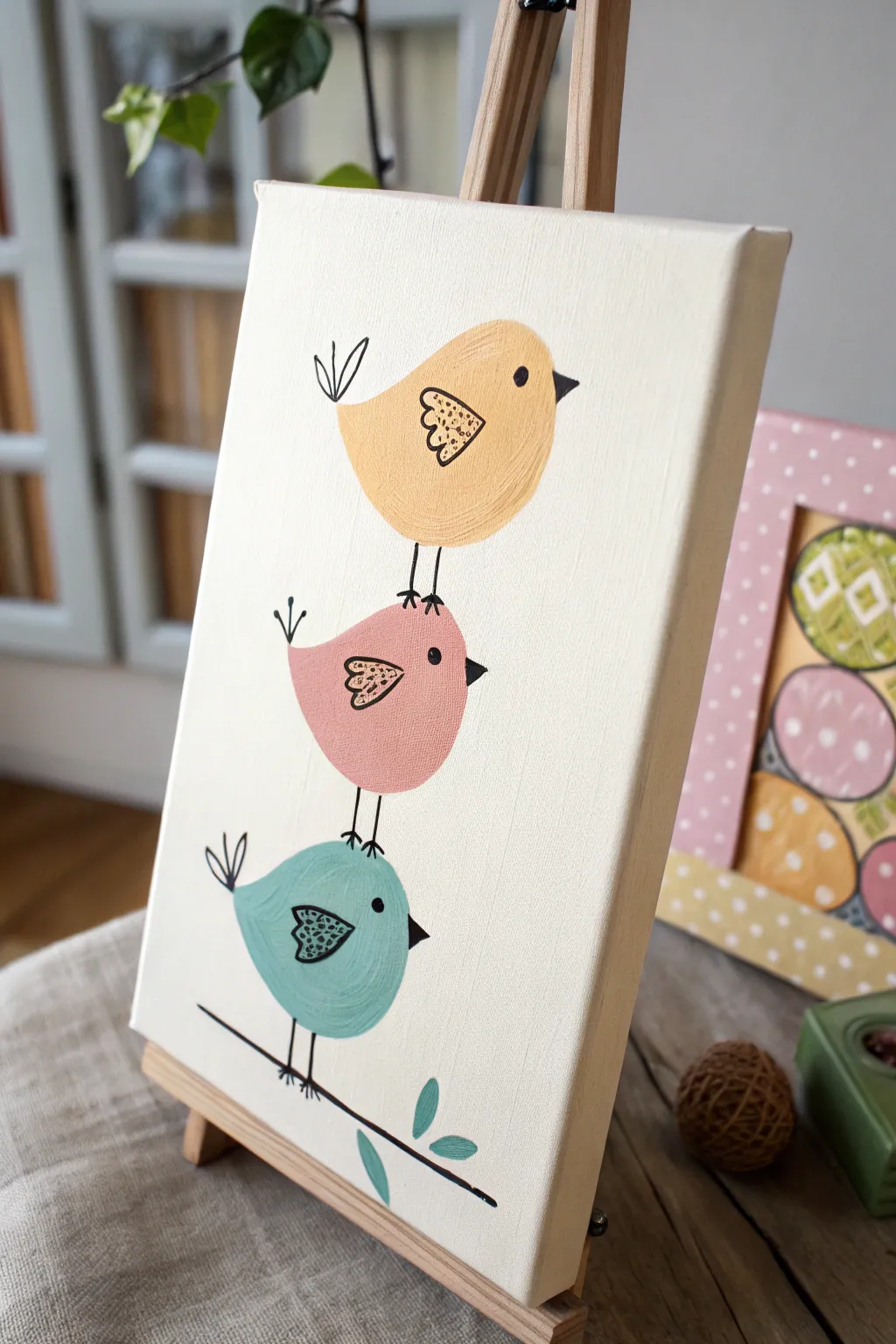
This charming painting features three round, stylized friends balanced perfectly atop one another, bringing a touch of playful simplicity to your canvas. The pastel color palette and crisp black outlines make it a fantastic project for beginners looking to practice clean shapes and steady lines.
Step-by-Step Tutorial
Materials
- Small canvas or canvas panel (8×10 inches works well)
- Acrylic paints: Cream/Off-white (background), Butter Yellow, Soft Pink, Teal, Black, White
- Paintbrushes: 1-inch flat brush, medium round brush, fine liner brush
- Pencil and eraser
- Palette or paper plate
- Cup of water and paper towels
- Optional: Black paint marker (for outlines)
Step 1: Setting the Scene
-
Preparing the canvas:
Start by giving your entire canvas a smooth coat of cream or off-white acrylic paint. This provides a warm, uniform base rather than the stark white of the raw canvas. Let this layer dry completely before moving on. -
Sketching the stack:
Using a pencil, lightly sketch three circles stacking vertically. The bottom circle should be slightly larger and flatter, like a squashed oval. The middle one sits right on top, and the top one balances at the peak. Don’t worry about perfect circles; a slightly organic shape adds character. -
Adding details:
Sketch a small triangle beak on the right side of each circle. Add a small tear-drop shape for the wing in the center of each body. Finally, mark a simple line at the bottom for the branch.
Wobbly Lines?
If painting thin lines is stressful, swap the liner brush for a waterproof black acrylic paint pen. It gives you drawing-like control.
Step 2: Blocking in Color
-
Painting the top bird:
Load your medium round brush with the butter yellow paint. Fill in the top circle carefully, smoothing out your brushstrokes so they follow the curve of the bird’s body. Avoid the wing area if you can, but painting over it is fine too since the wing color will be similar. -
Painting the middle bird:
Rinse your brush and switch to the soft pink shade. Paint the middle circle, ensuring the paint is opaque. You might need a second coat here if the background shows through. -
Painting the bottom bird:
Use the teal or aqua paint for the bottom bird. This cool tone anchors the stack visually. Fill in the shape completely, keeping the edges as neat as possible. -
Adding the branch leaves:
Using the same teal color mixed with a tiny dot of black to darken it slightly, paint two or three simple leaf shapes coming off the bottom branch line. Let all the paint dry thoroughly.
Step 3: Fine Lines and Details
-
Drawing the branch:
Using a fine liner brush with thin black paint (or a black paint marker), draw a confident line beneath the bottom bird for the branch. Extend it slightly past the bird on both sides. -
Adding the legs:
Draw tiny stick legs connecting the birds. Two simple vertical lines connect the top bird to the middle, and the middle to the bottom. Don’t forget the little feet gripping the branch on the bottom bird. -
Outlining the bodies:
This step makes the image pop. Carefully outline the wings first. I like to fill the wings with the same body color but add small black doodles or dots inside for texture. Then, draw the triangular beaks in solid black. -
The eyes:
Place a solid black dot for the eye on each bird. Position them relatively close to the beak to give them a cute, attentive expression. -
Tail feathers:
On the left side of each bird, opposite the beak, draw two or three simple loops or lines to represent tail feathers. Keep them loose and sketchy. -
Wing patterns:
Go back to the wings. Add variety by painting small dots inside the teal bird’s wing, small scribbles in the pink bird’s wing, and tiny dashes in the yellow bird’s wing. -
Final touches:
Check your work for any smudges. If you see pencil lines showing through the lighter paint, you can gently erase them now that the paint is bone dry, or touch them up with a bit of paint.
Customize the Trio
Give each bird a unique personality by adding accessories like a tiny top hat, a bow tie, or holding a flower in their beak.
Now you have a delightful stack of feathered friends ready to brighten up any shelf or wall

PENCIL GUIDE
Understanding Pencil Grades from H to B
From first sketch to finished drawing — learn pencil grades, line control, and shading techniques.
Explore the Full Guide
Lighthouse on a Moody Coast
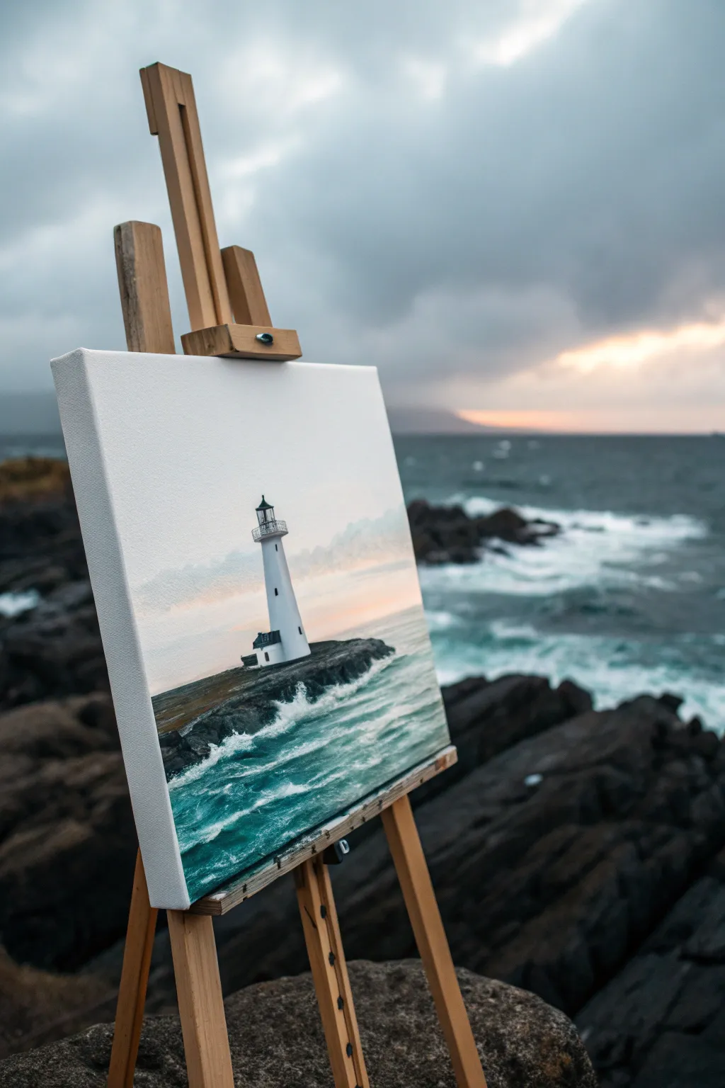
Capture the dramatic beauty of a solitary lighthouse standing firm against churning waves and a moody sky. This acrylic painting balances soft, blended atmospheric skies with sharp, detailed rock textures for a strikingly realistic effect.
Step-by-Step
Materials
- Canvas (12×16 or 16×20 inches recommended)
- Acrylic paints: Titanium White, Phthalo Blue, Mars Black, Burnt Umber, Payne’s Gray, Yellow Ochre, hint of Alizarin Crimson
- Brushes: 1-inch flat brush, medium filbert brush, small round detail brush, rigger brush
- Palette knife (optional for texture)
- Water cup and paper towels
- Painter’s tape or ruler (for horizon line)
Step 1: Setting the Atmosphere
-
Prime the Horizon:
Begin by deciding where your horizon line will sit. For this composition, place it slightly below the center of the canvas. You can use a strip of painter’s tape to ensure a perfectly straight line between the sky and the sea. -
Base Sky Layer:
Mix Titanium White with a tiny touch of Payne’s Gray to create a very pale, cool gray. Using your large flat brush, cover the entire sky area with broad horizontal strokes. -
Adding Cloud Depth:
While the base layer is still slightly damp, mix a darker gray using more Payne’s Gray and a dot of Alizarin Crimson for warmth. Gently blend this into the upper corners and random patches in the sky to suggest brooding clouds. -
Warm Horizon Glow:
Near the horizon line, blend in a mixture of White and a very small amount of Yellow Ochre and Alizarin Crimson. This creates that faint, warm peachy glow of a setting or rising sun trying to break through the overcast sky. -
Ocean Underpainting:
Remove the tape if you used it. For the sea, mix Phthalo Blue, a touch of Mars Black, and White to create a deep, teal-gray. Paint the water area horizontally, getting slightly darker as you move from the horizon down toward the foreground.
Keeping Straight
Lighthouses must stand straight! Turn your canvas upside down to check vertical lines. If the tower leans even slightly, it will look like it’s falling over.
Step 2: Constructing the Landscape
-
Blocking the Rocks:
Mix a dark, solid color using Burnt Umber and Mars Black. With a medium filbert brush, paint the large, jagged shape of the rocky island extending from the bottom left toward the center. -
Lighthouse Shape:
Once the sky is dry, use a small round brush with thinned Titanium White to outline the lighthouse. It should stand tall on the rocky outcrop. Paint the main tower shape, making it slightly wider at the base and tapering toward the top. -
Lighthouse Shading:
To make the tower look cylindrical, shade the left side (or whichever side is away from your light source) with a very light gray mix. Keep the side facing the ‘glow’ pure white to show the reflection. -
Lantern Room Details:
Switch to your smallest detail brush and Mars Black paint. Carefully add the gallery deck, the lantern room glass housing, and the roof. A tiny touch of green on the roof dome adds a nice realistic oxidation effect.
Make it Shine
Mix a tiny bit of gloss medium into the white paint used for the lantern room glass. It creates a subtle physical shine that mimics real glass reflecting the sky.
Step 3: Bringing the Sea to Life
-
Distant Waves:
Using a flat brush and a lighter teal mix (White + Phthalo Blue), create small, horizontal streaks in the water behind the lighthouse. These suggest distant rolling swells. -
Crashing Foam:
Load a worn-out or stiff bristle brush with thick Titanium White. Stipple (tap repeatedly) along the edge where the dark water meets the rocks to create the look of churning sea foam. -
Wave Movement:
Paint sweeping, curved strokes of light aqua and white in the foreground water. Angle these strokes to look like the water is rushing up and around the rocks. -
Rock Texture:
I like to go back to the black rocks now. Dry-brush lighter gray and brown tones over the top edges of the rocks. This highlights their rough texture and separates the top planes from the shadowy sides. -
Final Highlights:
Add the brightest white highlights to the crests of the nearest waves and the sun-facing side of the lighthouse. If you have a rigger brush, add a thin railing to the lighthouse walkway. -
Windows and Door:
Paint small vertical dashes in black for the lighthouse windows. Add a small adjoining building at the base if you wish, using the same white and gray shading techniques as the tower.
Step back and admire the rugged, solitary atmosphere you have created on your canvas
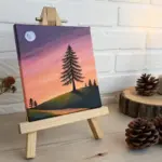
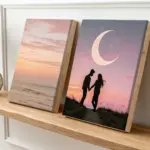
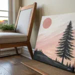
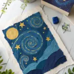
Big Moon and Starry Gradient Sky
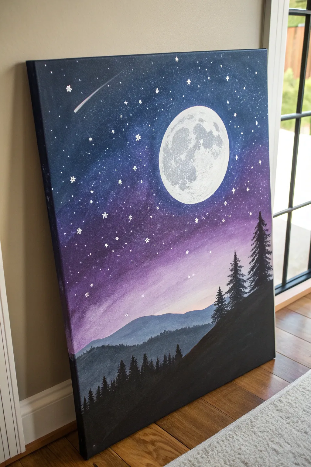
Capture the magic of a clear night sky with this stunning gradient painting that features a brilliant, textured moon looming large over silhouette pines. The blend of deep blues and dreamy purples creates depth, making it a perfect centerpiece for any room.
Step-by-Step Tutorial
Materials
- Stretched canvas (e.g., 16×20 inches)
- Acrylic paints: Titanium White, Mars Black, Prussian Blue or Phthalo Blue, Dioxazine Purple, Magenta
- Large flat brush (1-inch or larger)
- Medium flat brush
- Round detail brushes (small and medium)
- Small sponge or crumpled paper towel (for moon texture)
- Cup of water
- Paper palette or plate
- Paper towels
- Circular object or compass (to trace the moon)
Step 1: Setting the Scene
-
Prepare the canvas:
Start by positioning your canvas vertically. Using a circular object like a small bowl or a compass, lightly trace a large circle in the upper right quadrant of the canvas. This reserves the space for your moon so you don’t paint over it with dark colors later. -
Mix the sky colors:
Prepare three piles of paint on your palette: deep blue (Prussian Blue mixed with a tiny bit of Black), purple (Dioxazine Purple), and a lighter lavender-pink (Magenta mixed with White and a touch of Purple).
Sponge Secret
Don’t have a sponge for the moon? A tightly crumpled piece of plastic wrap or aluminum foil creates excellent, random crater textures when dabbed gently.
Step 2: Creating the Gradient Sky
-
Paint the upper corners:
Using your large flat brush, apply the deep blue mixture to the top left and top right corners of the canvas, painting around the moon outline. Bring this color down about one-third of the way. -
Blend in the purple:
Without cleaning your brush fully, dip into the purple paint. Apply this below the blue section, using side-to-side strokes to blend the blue and purple together where they meet. The goal is a seamless transition, so work while the paint is wet. -
Add the horizon glow:
Clean your large brush. Pick up the lavender-pink mixture and paint the area below the purple, extending down towards the bottom third. Blend upward into the purple to create a soft, glowing horizon effect. -
Refine the blend:
Use a clean, slightly damp brush to smooth out any harsh lines between the color bands. Ensure the area around the moon circle stays relatively clean, though imperfect edges are fine for now.
Blending Blues
If acrylics dry too fast while blending the sky, mist the canvas lightly with a spray bottle of water to keep the paint workable for longer.
Step 3: Painting the Moon
-
Base coat the moon:
Once the sky is dry to the touch, use a medium flat brush to paint the entire moon circle with solid Titanium White. You may need two coats to ensure it is opaque against the canvas. -
Create moon texture:
Mix a light grey color (White with a tiny dot of Black). Dip a small piece of sponge or a crumpled paper towel into the grey, dab off the excess, and gently sponge texture onto the moon. Focus the grey markings on the left side and bottom to create craters and depth. -
Highlight the moon:
Cleaning your sponge or using a fresh piece, dab pure Titanium White over the top right edge of the moon to make it look like it’s glowing.
Step 4: Mountains and Trees
-
Paint distant mountains:
Mix a blue-grey shade by combining Blue, White, and a touch of Black. Using a medium brush, paint a rolling mountain range silhouette across the lower middle section, overlapping the bottom of the pink sky. -
Layer the foreground hills:
Mix a darker charcoal grey (plenty of Black with a little Blue and White). Paint a second, larger hill shape in front of the distant mountains, sloping up towards the right side. -
Add foreground slope:
Using pure Mars Black, paint a steep slope starting from the bottom right corner and curving diagonally upward towards the middle right. This will be the base for your largest trees. -
Paint tall pine trees:
Switch to a small flat brush or fan brush. Load it with black paint. On the dark foreground slope, paint vertical lines for the tree trunks. Use the corner of the brush to dab foliage in a zig-zag pattern, starting narrow at the top and getting wider at the bottom. -
Fill the forest:
Continue adding smaller black trees along the charcoal grey hill line. Vary the heights to make the forest look natural. I like to make the trees on the far left smaller to simulate distance.
Step 5: Starry Details
-
Splatter stars:
Dilute some Titanium White with water until it’s inky. Load a brush, hold it over the sky area, and tap the handle against another brush to splatter tiny stars. Avoid splattering over the trees. -
Hand-paint large stars:
Using your smallest detail brush and pure White, paint specific ‘twinkle’ stars by making small crosses or dots. Place a few larger ones near the moon. -
Add a shooting star:
Paint a small white dot in the upper left corner. Quickly drag a thin line of white paint away from it to create a tail, fading it out as it gets further from the head of the comet. -
Final touches:
Check your moon edges and crisp them up with white if necessary. Ensure your black trees are fully opaque and let the masterpiece dry completely.
Step back and admire the tranquil night scene you have created


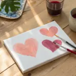
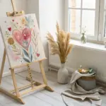
Abstract Ombre Heart
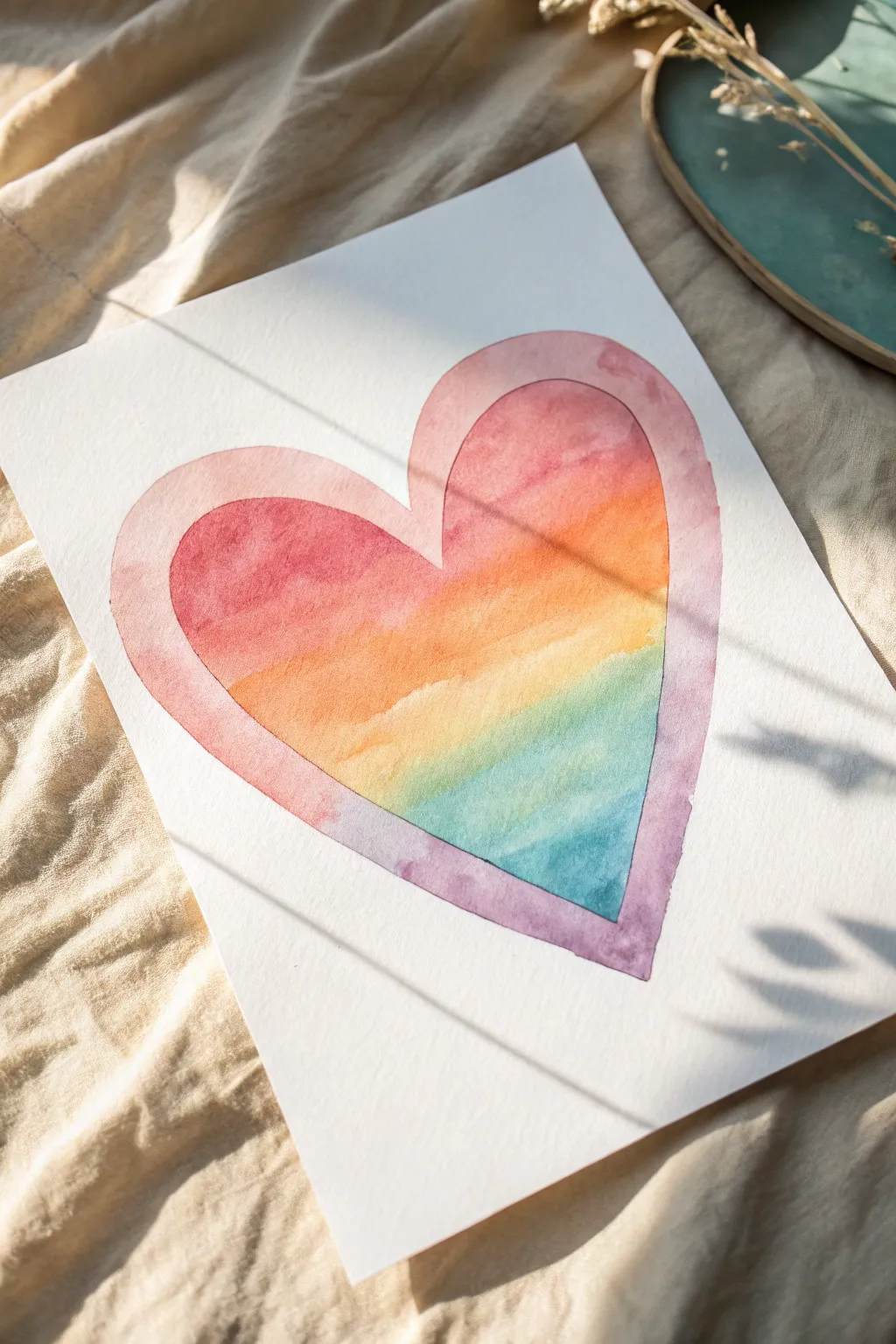
This elegant watercolor project captures a heart filled with a soft, sunset-like gradient, framed by a delicate outer border. The transparent layers of pink, orange, yellow, and teal blend seamlessly into one another, creating a warm, glowing effect that feels both modern and timeless.
Detailed Instructions
Materials
- Cold-press watercolor paper (140lb/300gsm)
- Watercolor paints (Pink/Rose, Orange, Yellow, Teal/Turquoise, Purple)
- Round watercolor brush (size 6 or 8)
- Flat shader brush (optional, for larger blends)
- Pencil (HB or lighter)
- Kneadable eraser
- Two jars of clean water
- Paper towels or cotton rag
- Washi tape or painter’s tape (optional)
Step 1: Preparation & Sketching
-
Prepare your workspace:
Clear a flat surface and keep your water jars, paints, and brushes within easy reach. If you want a clean border on the paper itself, tape down the edges of your watercolor sheet to your table or a drawing board. -
Sketch the inner heart:
Using a light hand, draw a large heart shape in the center of your paper. Focus on symmetry, but don’t worry if it’s not mathematically perfect; a slightly organic shape adds charm. -
Add the outer border:
Draw a second, larger heart distinctively around the first one to create a thick frame. Aim for a consistent width between the two lines, about half an inch to an inch wide. -
Lighten the lines:
Take your kneadable eraser and gently roll it over your sketch. You want the graphite to be faint enough that it won’t show through the translucent paint, but visible enough to guide your brush.
Uneven Blends?
If colors aren’t bleeding together smoothly, your paper might be too dry. Rewet the edge of the previous color with clean water before adding the next hue.
Step 2: Painting the Ombre Center
-
Mix your palette:
Pre-mix puddles of your sunset colors: a rosy pink, a warm orange, a sunshine yellow, and a cool teal. Having these ready prevents the paper from drying while you scramble for colors. -
Start with pink:
Load your round brush with watered-down rose pink. Paint the top curves (the lobes) of the inner heart, keeping the edges crisp against your pencil line. -
Blend into orange:
While the pink is still wet, rinse your brush slightly and pick up the orange paint. Apply it just below the pink, letting the two wet edges touch and bleed together naturally. -
Refine the transition:
If the line between pink and orange looks too harsh, clean your brush, dampen it slightly, and gently stroke the boundary to encourage them to mix. -
Introduce yellow:
Continue moving down the heart. Rinse your brush and apply the yellow paint, blending it upwards into the wet orange layer. -
Transition to cool tones:
As you move past the middle of the heart, begin introducing the teal or light blue. Paint this into the bottom of the yellow section. -
Create the green merge:
Watch as the yellow and teal mix directly on the paper; this will naturally create a lovely soft green transition band without you needing to mix a separate green paint. -
Finish the point:
Fill the bottom point of the inner heart with a slightly deeper teal or turquoise to ground the shape. Let this inner heart dry completely before moving on.
Step 3: Painting the Outer Frame
-
Mix a transition color:
For the border, we want a continuous shift that mirrors the inside but connects differently. I like to start with a soft purple-pink mix for the frame. -
Paint the left frame:
Start at the top left of the outer border. Paint down the curve using a pale, watery rose color. -
Shift toward purple:
As you reach the bottom point of the frame, gradually drop in a little purple pigment. This creates a shadow effect at the bottom where the heart comes to a point. -
Complete the right side:
Continue painting up the right side of the frame. You can transition from the purple bottom back into a warmer pink or even a very light orange at the top right. -
Leave the gap:
Crucially, ensure you do not paint the space between the inner heart and the outer frame. Leave this strip as bare white paper to create the ‘glowing’ separation. -
Soften hard edges:
Check the outer edges of your frame. If paint has pooled, lift the excess moisture with a thirsty (clean, damp) brush to keep the tone even. -
Final drying:
Allow the entire piece to dry undisturbed. If the paper buckles slightly, you can place it under a heavy book once it is bone dry to flatten it out.
Add Metallic Accent
Once fully dry, outline the white negative space gap with a gold paint pen or metallic watercolor for a luxurious, shimmering finish.
Step back and admire the soft, soothing gradients you have created with simple water and pigment
Split-Canvas “Cheers” Pair Painting
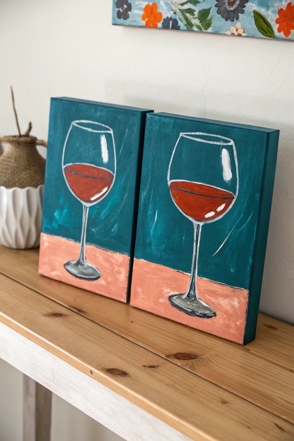
Create a sophisticated pair of paintings featuring elegant wine glasses set against a rich teal backdrop and warm peach surface. This split-canvas style project uses bold color blocking and simple highlights to capture the reflective quality of glass without needing advanced skills.
Step-by-Step
Materials
- Two 8×10 or 9×12 inch stretched canvases
- Acrylic paints: Teal (or Phthalo Green + Blue and White), Titanium White, Mars Black, Burnt Sienna, Primary Red, Peach/Flesh Tone
- Flat brush (3/4 inch or 1 inch) for backgrounds
- Medium round brush (size 4 or 6)
- Small detail brush (size 0 or 1)
- Chalk or a light pencil for sketching
- Palette or paper plate
- Cup of water and paper towels
Step 1: Setting the Scene
-
Marking the horizon:
Place your distinctive canvases side-by-side to ensure they align perfectly. About one-third of the way up from the bottom, use your pencil or a piece of chalk to draw a straight horizontal line across both canvases. This separates the wall from the table. -
Mixing the teal background:
On your palette, mix a deep teal color. If you don’t have a pre-made tube, combine a generous amount of Phthalo Green with a touch of Blue and a little White to mute it slightly. You want a rich, dark jewel tone. -
Painting the upper wall:
Using your large flat brush, paint the entire area above the horizon line in your teal mixture. Use vertical strokes to give the wall some texture, and don’t worry about complete smoothness; visible brushstrokes add painterly charm. -
Painting the table surface:
Rinse your brush thoroughly. Mix a peach tone using White, a little Burnt Sienna, and a tiny dot of Red (or use a pre-mixed flesh tone). Paint the bottom section of both canvases with this warm color, ensuring a crisp edge where it meets the teal. -
Painting the sides:
Don’t forget to wrap your colors around the edges of the canvas. Paint the top and side edges teal, and the bottom edges peach, to give the artwork a finished, gallery-ready look. -
Drying time:
Allow the background layers to dry completely. Acrylics dry fast, but if the paint is cool to the touch, give it a few more minutes. A damp background will make sketching the glass difficult and muddy the white lines.
Wobbly Stem Syndrome?
If painting a straight stem is tricky, use the edge of a ruler or a piece of painter’s tape as a guide. Paint the line, let it dry slightly, then peel away for a crisp edge.
Step 2: Drafting the Glass
-
Sketching the bowl:
Using chalk, sketch a large U-shape in the center of the teal section on the first canvas. Close the top with a slightly curved oval to form the rim. Repeat this on the second canvas, trying to keep the size consistent. -
Drawing the stem and base:
Draw a straight vertical line coming down from the center of the bowl’s bottom, crossing onto the peach section. At the bottom of this line, sketch a flattened oval for the foot of the glass. I find stepping back a few feet helps me spot if the stem is straight. -
Refining the outline:
Once you are happy with the shape, use your small detail brush and watered-down white paint (or a very light grey) to trace over your chalk lines. These outlines should be somewhat loose and artistic, not mechanically perfect.
Step 3: Filling the Glass
-
Mixing the wine color:
Create a burgundy shade by mixing Primary Red with a touch of Burnt Sienna. If it feels too bright, add a tiny speck of Black or Green to deepen it into a wine color. -
Pouring the wine:
Paint an ellipse shape inside the bowl of the glass to represent the surface of the wine. Then, fill the area below that ellipse with your burgundy mix, following the curve of the glass bottom. Leave a small gap between the red wine and the white outline of the glass. -
Adding depth to the liquid:
While the red paint is still wet, mix a slightly darker version (add a tiny bit of black) and stroke it along the bottom curve of the wine area. This creates volume and weight to the liquid. -
Stem shadows:
Take a diluted grey (black plus lots of water or white) and paint a sheer vertical line down the stem and a loose oval on the foot of the glass. This suggests the shadow of the glass casting onto itself.
Chalk It Up
Using chalk for the initial sketch is superior to pencil because any mistakes can simply be wiped away with a damp cloth without staining the background paint.
Step 4: Highlights and Sparkle
-
Major reflections:
Using pure Titanium White and your medium round brush, create the main reflection on the bowl. Paint a bold, slightly curved vertical dash on the upper right side of the glass bowl, right over the teal background. -
Liquid luster:
Add a smaller, curved white stroke inside the wine area on the right side, and a thin highlight line along the top rim of the liquid. This makes the wine look wet and glossy. -
Rim and stem details:
Use your detail brush to sharpen the white rim of the glass. Add a crisp white vertical line down one side of the stem and a few bright strokes on the foot of the glass where light would hit. -
Final touches:
Step back and assess your contrast. If the white outlines faded during painting, re-trace them gently with fresh white paint to make the glass pop against the dark background.
Hang these canvases together for a charming, cohesive display that celebrates your favorite vintage
Marbled Pour Background With Bold Silhouette
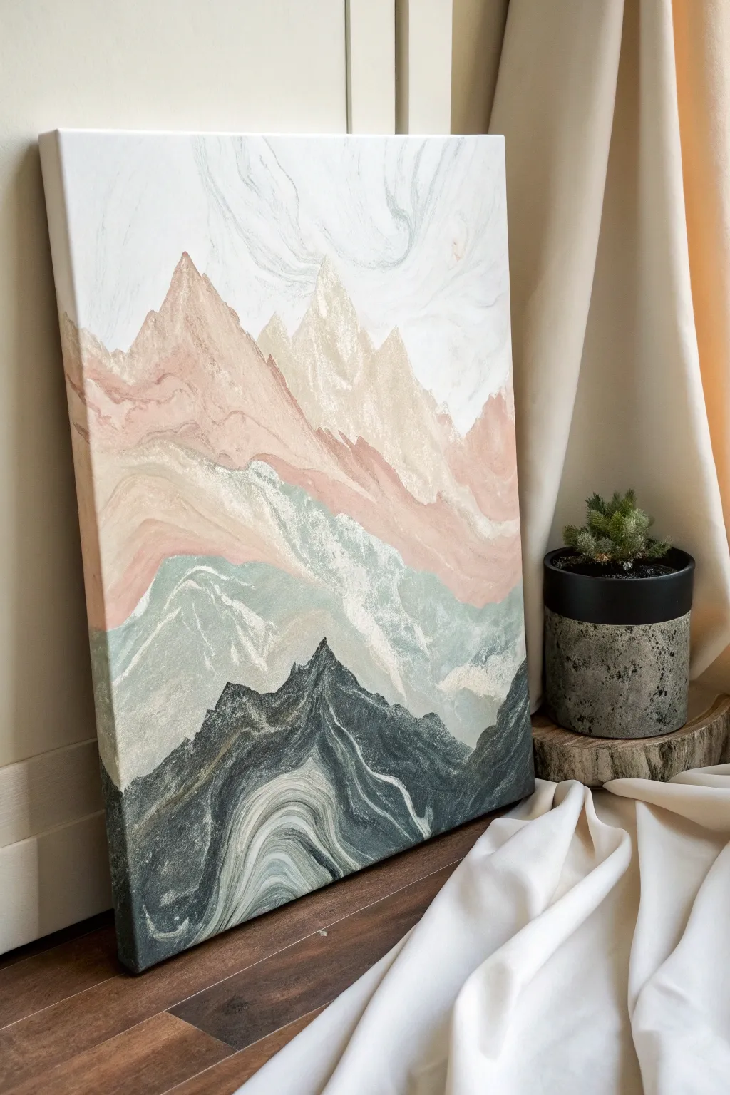
Capture the organic movement of stone and earth with this stunning mountain landscape created using a controlled acrylic pour technique. By layering fluid paints and tilting your canvas, you’ll build ethereal, misty peaks that look incredibly intricate but are surprisingly simple to form.
Step-by-Step Tutorial
Materials
- Stretched canvas (12×16 or similar)
- Acrylic paints (White, Beige/Sand, Dusty Pink, Sage Green, Dark Charcoal/Black)
- Pouring medium
- Small plastic cups (one for each color)
- Craft sticks for stirring
- Painter’s tape or masking tape (optional)
- Hairdryer (optional, specifically for pushing paint)
- Palette knife
- Drop cloth or plastic sheeting
Step 1: Mixture Preparation
-
Mix your pouring consistency:
Begin by prepping your colors in separate cups. Mix roughly one part acrylic paint with two parts pouring medium. You want a consistency like warm honey—fluid enough to move but thick enough to hold some shape. -
Create the color palette:
Mix a large amount of white, as this will act as your negative space and blending agent. Then prepare your earth tones: a soft beige, a muted pink, a sage green, and a deep charcoal gray. -
Test the flow:
Lift your stir stick from the cup; the paint should drizzle off in a continuous stream without breaking immediately. If it’s too thick, add a tiny splash of water.
Clean Beakers
Don’t over-mix your paint on the canvas. The beauty of this style comes from the colors sitting next to each other rather than blending into a new color. Let them swirl, not combine.
Step 2: Creating the Sky & Base
-
Prime the sky:
Pour some of your white mixture across the top third of the canvas. Use a palette knife or tilt the canvas to spread it thinly; this slick surface helps subsequent layers glide. -
Add subtle sky marbling:
Drizzle the tiniest amount of very pale gray or diluted beige into the wet white sky area. Gently tilt the canvas back and forth to create whisper-thin, cloud-like streaks.
Step 3: Pouring the Mountains
-
Pour the furthest peaks:
Start about one-third down from the top. Pour a horizontal, wavy line of the beige/sand color directly onto the canvas where you want the highest mountain peaks to be. -
Tilt for shape:
Immediately tilt the canvas upward so the beige paint slides slightly into the white sky, forming irregular, jagged peaks. I like to let gravity do most of the work here for a natural look. -
Layer the pink range:
Below the beige line, while it is still wet, pour a wavy line of the dusty pink mixture. Pour it slightly overlapping the bottom edge of the beige. -
Marbling the mid-ground:
Tilt the canvas side-to-side and slightly downward. The pink should swirl gently into the beige, creating those beautiful marbled strata lines without turning into a muddy brown. -
Introduce the green foothills:
Repeat the process for the next layer down using your sage green mixture. Pour this line thicker than the previous ones to create a sense of weight and closeness. -
Create texture with movement:
For the green layer, try blowing gently on the paint with a straw or using a hairdryer on the ‘cool/low’ setting to push the green paint upward into the pink, creating valley crevices. -
Pour the foreground:
Finally, pour your dark charcoal mixture at the very bottom of the canvas. This needs to be your boldest, darkest layer to anchor the composition. -
Define the dark peaks:
Use a palette knife or just the tilt of the canvas to pull the dark charcoal paint upward into sharp points. This creates the ‘bold silhouette’ effect against the lighter background. -
Add the white veins:
While the dark charcoal area is still wet, drizzle a very thin line of white paint inside the dark shape. Tilt the canvas to stretch this white line, mimicking quartz veins in rock.
Touch of Gold
Once the painting is fully dry (2-3 days later), use a fine liner brush and metallic gold leaf paint to trace the very top edges of the mountains for a shimmering, sun-kissed effect.
Step 4: Refining & Drying
-
Clean the edges:
Run your finger or a damp cloth along the underside of the canvas frame to catch any drips. This stops the paint on top from constantly pulling downward as it dries. -
Touch up peaks:
If any mountain peaks look too rounded, dip a small brush or the edge of your palette knife into the matching color and gently sharpen the tips. -
Check for level drying:
Place the canvas on cups or a rack to dry. Ensure the surface is perfectly level, or your mountains will slide off the canvas overnight. -
Allow extensive drying time:
Because this technique uses thick pools of paint, let it dry untouched for at least 24 to 48 hours. The surface may look dry sooner, but the layers underneath need time.
Once dry, you’ll have a tranquil, stone-textured landscape that looks professionally crafted
Have a question or want to share your own experience? I'd love to hear from you in the comments below!