Paint markers are my go-to when I want instant bold color, crisp edges, and that satisfying opaque pop. Here are my favorite paint marker art ideas—starting with the classics and drifting into the delightfully unexpected.
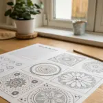
Doodle Page With Pattern Fills
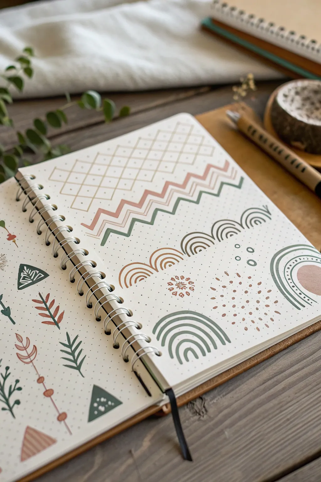
Transform a plain notebook spread into a relaxing reference sheet of earthy, bohemian-inspired patterns. This project combines simple geometric shapes with a muted color palette to create a cohesive and aesthetic doodle page that serves as great practice for line control.
Detailed Instructions
Materials
- Dot grid journal or notebook
- Paint markers (extra fine tip) in sage green, terracotta/rust, and beige/tan
- Pencil (HB or lighter)
- Eraser
- Ruler or straight edge
Step 1: Setting the Structure
-
Grid layout:
Begin by counting the dots on your page to plan your spacing. You’ll be creating a mix of structured geometric sections and free-floating organic motifs. -
Pencil guidelines:
Using your ruler and a light pencil touch, mark out a rectangular area at the top of the right page for the diamond lattice pattern. This helps ensure your lines stay straight before committing to marker. -
Lattice lines:
With a beige or tan paint marker, draw diagonal lines in one direction across your marked rectangle, connecting the dots to keep the spacing even. -
Cross it over:
Draw diagonal lines in the opposite direction to create a diamond grid. Don’t worry if the lines possess a slight hand-drawn wobble; it adds to the organic charm.
Steady Hands
For cleaner lines, lock your wrist and move your entire arm. Exhale slowly as you draw each long stroke to reduce shakiness.
Step 2: Linear Patterns
-
Zig-zag foundation:
Below the lattice, start a zig-zag pattern using the sage green marker. Use the dots as anchor points for the peaks and valleys to keep the wave consistent. -
Layering colors:
Directly above the green zig-zag, add a parallel line in terracotta. Follow the same path, keeping the gap between the lines steady. -
Echoing lines:
Add a third zig-zag line above the terracotta one using the beige marker to complete this tri-color band. -
Rainbow arches:
Further down the page, draw a horizontal row of small semicircles or ‘rainbows.’ Alternate between sage green and terracotta for the outer arches. -
Inner details:
Fill the inside of each arch with smaller concentric semicircles. Vary the number of rings—some might have three, others four—depending on the size of your initial arch.
Step 3: Organic Motifs
-
Dotted burst:
In the open space below the arch borders, create a ‘sunburst’ effect using dots. Start with a dense cluster of terracotta dots in the center. -
Expanding the burst:
Radiate outward with more spaced-out dots, making them slightly smaller as they get further from the center to create a fading effect. -
Corner accents:
Draw large, corner-style rainbow curves in the bottom right corner of the page using the sage green marker. Thicken the lines slightly by going over them twice if needed. -
Solid shapes:
Add a solid terracotta semicircle inside the largest green corner arch to anchor the design visually.
Ink Bleeding?
If your markers bleed through the paper, try gluing two pages together before starting or place a scrap sheet behind your work.
Step 4: Botanicals & Fillers
-
Leafy vines:
On the left page, draw vertical stems using different colors. Add small, simple leaves branching off the sides. Making the leaves slightly teardrop-shaped gives them a nice flow. -
Triangle triangles:
Draw scattered triangles on the left page. Fill some partially with stripes or dots using a contrasting white or lighter gel pen if your beige marker is dark enough, or simply use the existing colors for internal patterns. -
Abstract arrows:
Create long, thin vertical lines embellished with circles and semicircles to look like stylized arrows or geometric totems. -
Floral stamps:
Fill any awkward empty gaps with tiny, simple flower doodles—just a center dot with five small loops around it. -
Cleanup:
Once you are certain the ink is completely dry, gently erase any visible pencil guidelines. I prefer to wait an extra ten minutes just to be safe from smearing.
Enjoy flipping through your sketchbook and seeing this beautiful collection of patterns.
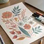
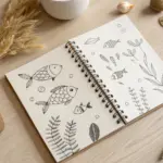
Simple Botanical Line Art With Color Pops
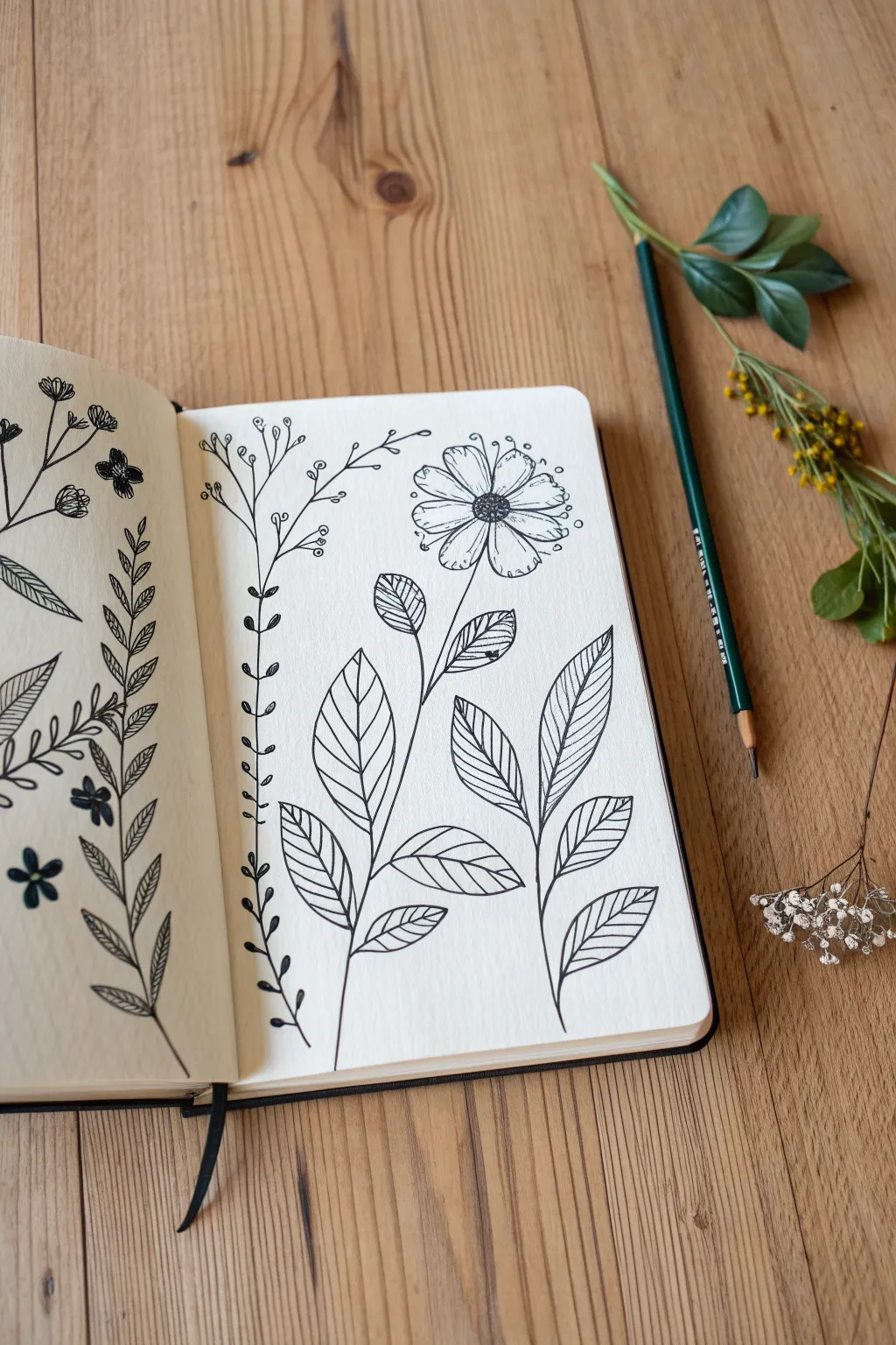
Capture the delicate beauty of nature with this minimalist line art project that focuses on clean strokes and intricate leaf details. This spread combines simple sprigs with a bold focal flower, perfect for practicing your pen control and composition.
Step-by-Step
Materials
- Fine liner pen (black, 0.3mm or 0.5mm)
- Pencil (HB or H for light sketching)
- Eraser (kneaded preferred)
- Sketchbook with smooth or mixed-media paper
- Ruler (optional for spacing)
Step 1: Planning the Layout
-
Sketch the main stems:
Begin on the right-hand page by lightly penciling a long, slightly curved vertical line focused near the bottom center; this will be your main flower stem. -
Place the flower head:
Draw a rough circle at the top of your main stem to mark where the flower blossom will sit, leaving enough room for petals. -
Outline leaf positions:
Sketch two smaller stems branching off the main one—one to the left and one to the right—just below the halfway point of the page. -
Add side sprigs:
To the left of the main flower, pencil in a tall, thin vertical line for a secondary botanical sprig, extending almost to the top of the page.
Step 2: Inking the Blooms
-
Draw the flower center:
Switch to your black fine liner. Draw a small circle for the flower center, filling it with tiny stippled dots to create a textured, pollen-like look. -
Create the petals:
Draw roughly 10-12 petals radiating from the center. Keep them simplistic with rounded tips, allowing some slight irregularity for a natural feel. -
Add petal details:
Draw a single, short line inside each petal, starting from the center and extending outward about halfway, to suggest depth. -
Detail the side foliage:
Move to the tall, thin sprig on the left. Draw tiny circles at the end of each small branch to look like berries or buds. -
Connect the sprig:
Ink the thin stem of this side sprig, connecting the buds with delicate, wobbly lines to mimic a wildflower stem.
Steady Hand Pro-Tip
Pull the pen toward you rather than pushing it away when drawing long stems. This naturally stabilizes your hand and creates smoother, more confident lines.
Step 3: Detailed Leaf Work
-
Outline the main leaves:
Draw large, teardrop-shaped leaves on the branches you sketched earlier. Aim for three leaves on the left branch and three on the right. -
Draw the central veins:
Place a single line down the center of each large leaf, curving slightly to follow the shape of the leaf itself. -
Add diagonal veining:
I usually start from the bottom of the leaf, drawing parallel diagonal lines from the center vein to the outer edge. -
Repeat for all leaves:
Continue this pattern on all six leaves, keeping your spacing relatively consistent but not mathematically perfect. -
Fill the decorative vine:
On the far left edge of the page (near the spine), draw a vertical vine with small, solid black leaves alternating up the stem.
Level Up: Color Pops
Use a light watercolor wash or colored pencils to fill only the leaves or just the flower petals. A monochromatic green or a soft yellow adds subtle focus.
Step 4: Finishing Touches
-
Erase pencil marks:
Wait at least five minutes to ensure the ink is completely dry, then gently erase all your underlying pencil sketches. -
Add whimsical dots:
Sprinkle a few tiny open circles around the flower head and near the tips of the leaves to add a playful, pollen-dust effect. -
Review and refine:
Check your lines for any gaps. If a line feels too thin, carefully go over it again to add very subtle line weight variation.
Enjoy the calm satisfaction of seeing your botanical garden grow on the page

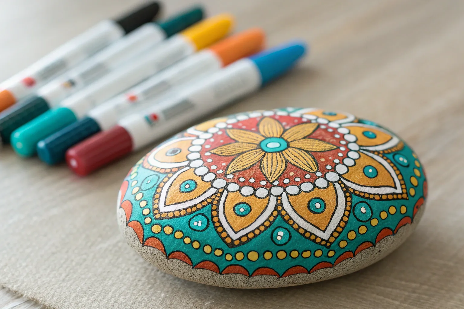
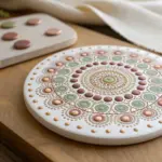
Mandala Circles With Clean Symmetry
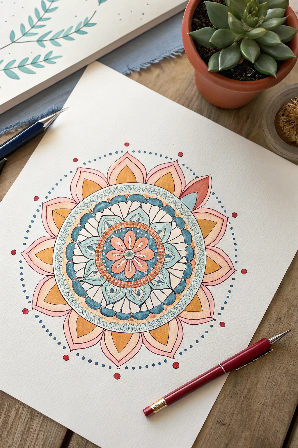
This project combines the rhythmic calm of geometric drawing with the vibrant, matte finish of paint markers. The result is a soothing, bohemian-style mandala featuring layered petals, precise dots, and a harmonious palette of peach, teal, and gold.
Detailed Instructions
Materials
- High-quality mixed media or watercolor paper (thick enough to prevent bleeding)
- Fine tip paint markers (peach, mustard/gold, teal/light blue, dark blue, reddish-brown)
- Extra-fine black liner pen (for outlining)
- Refillable mechanical pencil (0.5mm)
- Compass
- Protractor
- Straight edge or ruler
- Eraser
Step 1: Building the Skeleton
-
Establish the center:
Find the exact center of your paper and mark it lightly with your pencil. Place the point of your compass here; this will anchor the entire design. -
Draft the concentric circles:
Using your compass, draw a series of light concentric circles. Start with a very small center circle about 1 inch in diameter, then add rings expanding outward. You’ll need roughly 5-6 distinct rings to create the tiers for the petals and borders seen in the reference. -
Divide the circle:
Use a protractor to divide your circle into even sections—I usually aim for 12 or 16 equal slices to keep the symmetry manageable. Draw light lines through the center to the outer edge to act as guides for your petal peaks.
Stay Sharp
Keep a scrap piece of paper nearby to ‘test’ your paint markers before touching the artwork. This prevents sudden blobs of ink from ruining your symmetry.
Step 2: Drawing the Inner Design
-
Sketch the central flower:
In the very center circle, pencil in eight small, rounded petals. Ensure they meet at the center point like a classic daisy shape. -
Add the first decorative band:
Surrounding that central flower, draw a second band. This area will feature a textured, cross-hatched pattern later, so define its inner and outer boundaries clearly with your pencil. -
Create the teal petal layer:
In the next ring outward, sketch a layer of broader, scalloped petals. These should touch side-by-side. Inside each petal, draw a smaller, teardrop shape to create the layered effect visible in the blue sections. -
Draft the lattice ring:
Drawing the next band outward requires a steady hand; sketch a narrow ring that will eventually hold the delicate scribble or lattice texture seen in white/pale blue.
Wonky Circles?
If your concentric circles aren’t perfect, thicken the outline with your black pen to disguise the wobble. Varying line weights can hide many small mistakes.
Step 3: The Outer Petals and Details
-
Shape the large outer petals:
For the final and largest layer, draw big, pointed petals that extend to your outermost guide circle. These should have a slight curve to their sides, resembling a lotus flower. -
Refine the lines:
Go over your pencil sketch and ensure your symmetry looks correct. If one petal looks lopsided, fix it now before adding permanent ink. -
Ink the outlines:
Switch to your extra-fine black liner pen. Carefully trace over all your pencil lines. Don’t rush this part; consistent line weight is key to the clean look. -
Erase guidelines:
Wait for the black ink to dry completely to avoid smearing. Once safe, gently erase all the pencil construction lines and circle guides so you have a clean coloring page.
Step 4: Applying Color
-
Color the center flower:
Use your peach paint marker to fill in the central flower petals. Add a small dot of teal in the very center hub. -
Fill the textured ring:
For the band surrounding the center flower, use a reddish-brown or rust-colored marker. Once the base color is down and dry, add tiny vertical ticks or cross-hatching to mimic the texture shown. -
Paint the teal layer:
Fill the middle ring of petals with a light teal or blue marker. I like to leave the small inner teardrop shapes uncolored (white) or color them a very pale grey for contrast. -
Detail the teal petals:
Use a darker blue marker or pen to color the negative space between the teal petals. This dark background makes the design pop. -
Color the large outer petals:
These petals have a gradient-like effect. Color the main body of the petal with a light pink or blush marker. Then, use a mustard or gold marker to fill the inner diamond shape at the base of each petal. -
Add the scribbled border:
Return to that narrow lattice ring you drew earlier. Using a very fine tipped pale blue or white pen, draw a loose, loopy scribble pattern inside the band.
Step 5: Final Touches
-
Add the dot framing:
Using a dark blue or grey marker, carefully place small dots in a ring around the entire mandala. Space them evenly, following an imaginary circle just outside the petal tips. -
Place the accent dots:
Switch to a red or rust-colored marker and place larger, distinct dots at the peak of every other outer petal. This creates a visual rhythm that draws the eye outward. -
Final inspection:
Check for any white gaps where the color should be solid. Gently fill them in, being careful not to over-saturate the paper.
Step back and admire how the simple repetition of shapes has built up into a complex and calming piece of art.

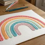
Color-Blocked Abstract Shapes
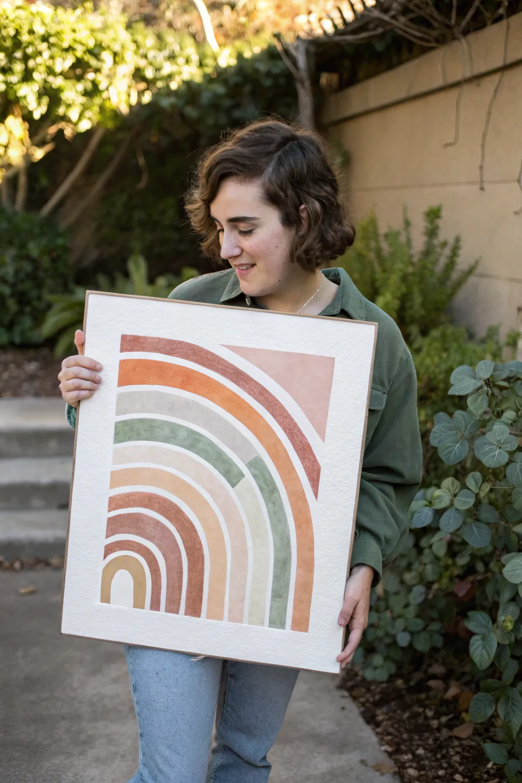
This striking wall art combines warm earth tones with modern geometric shapes for a cozy yet contemporary feel. By playing with negative space and overlapping blocks, you’ll create a sophisticated twist on the classic rainbow motif.
Step-by-Step Guide
Materials
- Large sheet of thick watercolor paper or mixed media board (approx. 18×24 inches)
- Acrylic paint markers (broad tip) in terracotta, sage green, beige, mustard yellow, and rose
- Pencil (HB or lighter)
- Large ruler or T-square
- Compass or string and thumbtack for drawing circles
- Painter’s tape or masking tape
- Eraser
- Large wooden frame (optional)
Step 1: Planning and Sketching
-
Prepare your surface:
Lay your paper on a flat, clean surface. Secure the corners with a small amount of tape if the paper tends to curl. -
Establish the baseline:
Using your ruler, measure about 2-3 inches from the bottom edge of the paper. Lightly draw a horizontal line across the entire width to serve as the base for your arches. -
Mark the center point:
Find the horizontal center of your baseline and mark a small dot. This will be the anchor point for your compass or string. -
Draw the smallest arch:
Set your compass to a radius of about 2 inches. Place the point on your center mark and draw the first semi-circle lightly. -
Create the spacing:
Increase the compass radius by roughly 1.5 inches to draw the outer edge of that first band. Continue increasing the radius in 1.5-inch increments to draw concentric semi-circles until you have about 6 or 7 distinct bands. -
Sketch the geometric interruption:
This design features a unique ‘cutout’ look. Use your ruler to draw a vertical line slightly to the right of the center. Then, draw a horizontal line intersecting the arches about two-thirds of the way up. This creates the boxy, abstract section on the upper right.
Step 2: Applying Color
-
Start with the innermost arch:
Take your beige or lightest mustard marker. Shake it well to get the paint flowing. Carefully outline the smallest semi-circle, then fill it in using long, smooth strokes to minimize streakiness. -
Work outward with contrast:
For the next band, switch to a terracotta or rust color. Outline the band first to ensure crisp edges, then fill the center. I find that working from the inside out prevents me from smudging wet paint. -
Incorporate the green tones:
Select a muted sage green for the third or fourth band. As you color, pay close attention to your pencil lines—paint markers can sometimes bleed slightly on textured paper, so go slow near the edges. -
Address the ‘interrupted’ section:
When you reach the right side where you drew the rectangular block section, do not follow the curve of the arch. Instead, fill that section as a solid block of color (like the rose or blush tone shown) that squares off against the curved lines. -
Create the split-color band:
Notice how one of the larger green bands stops abruptly and changes color or fades out. Use a piece of painter’s tape to mark a clean vertical line where you want the color to stop, paint up to the tape, and peel it off while wet for a sharp edge. -
Layering for texture:
Once the first layer of marker is dry, evaluate the opacity. If you can see the paper texture too much, apply a second coat moving in the opposite direction (horizontal vs. vertical strokes) for solid coverage.
Fixing Bleeds
If the marker bleeds outside the line, wait for it to dry completely. Then, use a white paint pen or a dab of white gesso to cover the mistake before re-drawing the correct edge.
Step 3: Finishing Touches
-
Clean up the edges:
Inspect the bottom baseline. Use a ruler and a white paint marker (or heavy body acrylic) to clean up the bottom edge if any color went below the line. -
Erase guidelines:
Wait at least an hour to ensure the paint is fully cured. Gently erase any visible pencil marks between the arches or around the border. -
Frame your work:
Place the artwork into a simple wooden frame to complement the organic color palette. No glass is needed if you want to highlight the paper’s texture.
Pro Texture Tip
Choose cold-press watercolor paper with a heavy grain. The paint markers will skip slightly over the paper’s tooth, giving the artwork a vintage, printed look naturally.
Hang your new masterpiece in a well-lit spot to enjoy those warm, harmonious vibes

PENCIL GUIDE
Understanding Pencil Grades from H to B
From first sketch to finished drawing — learn pencil grades, line control, and shading techniques.
Explore the Full Guide
White Highlights Over Dark Colors
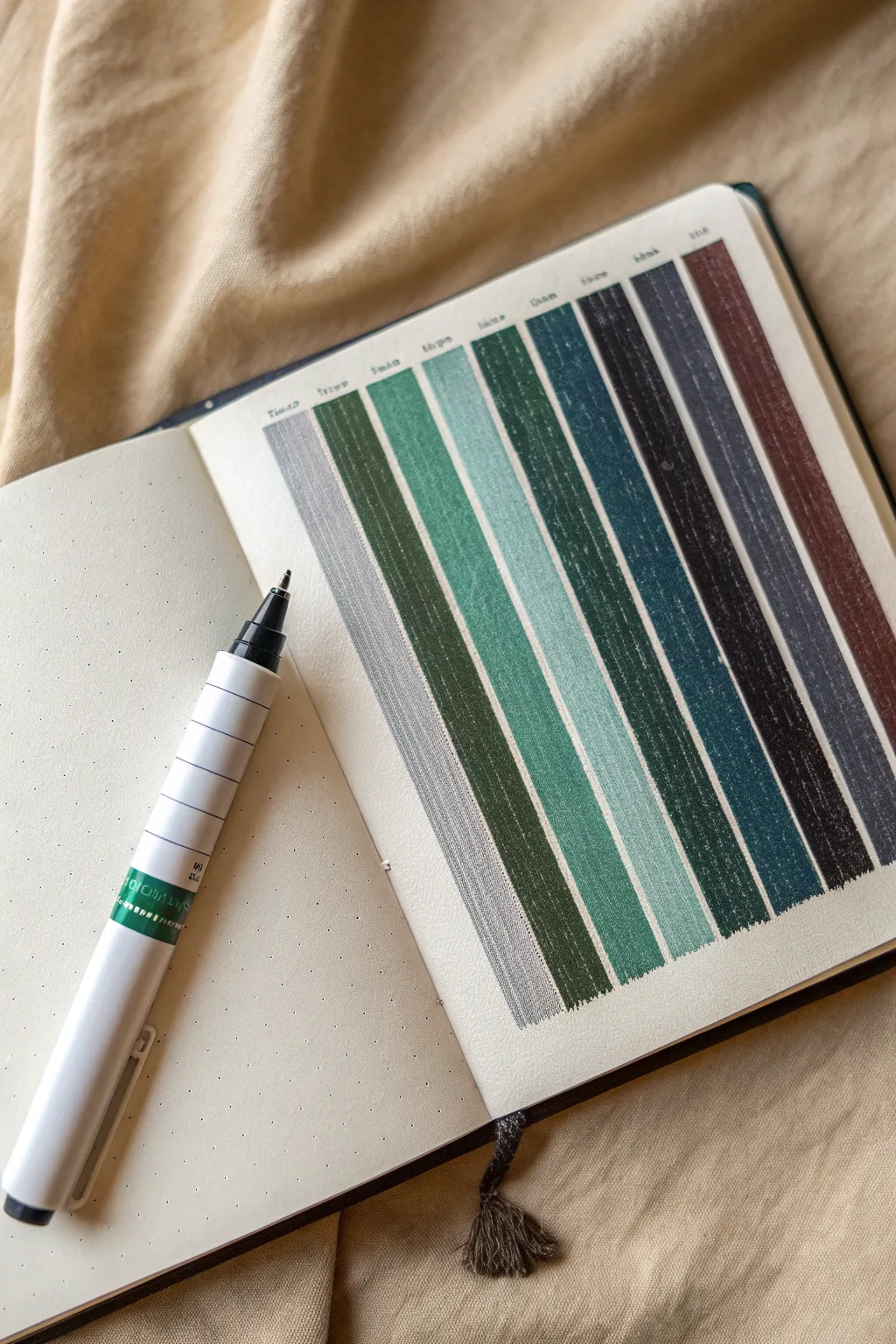
Transform a simple color swatch page into an artistic reference guide by learning to simulate texture over solid blocks of color. This project combines the clean aesthetic of bullet journaling with subtle white ink detailing to create a soothing, organized palette display.
Detailed Instructions
Materials
- Dotted bullet journal or mixed media sketchbook
- Set of color markers (muted/vintage tones: olive, teal, navy, maroon, grey)
- Fine point white gel pen or white paint marker (0.5mm or 0.7mm)
- Ruler or straight edge
- Black fineliner (0.1mm or 0.3mm)
- Pencil and eraser
Step 1: Planning and Layout
-
Define the grid:
Start by counting the dots in your journal to determine the width of your columns. A width of 3 or 4 dot spaces works well for these vertical strips. -
Mark the boundaries:
Using a pencil and ruler, lightly mark the top and bottom edges where your color strips will start and end to ensure they remain uniform in height. -
Create guidelines:
Lightly pencil in the vertical lines separating each column. Leave a small gap (about one dot space) between each column so the colors don’t bleed into one another.
White Ink Disappearing?
Some markers absorb white gel ink as it dries. If your highlights fade, wait for the first white layer to fully set, then apply a second light pass to bring back the opacity.
Step 2: Applying Color
-
Select your palette:
Choose a cohesive set of markers. The example uses a moody, nature-inspired palette ranging from light grey through greens and blues to a deep maroon. -
Fill the first strip:
Starting with your lightest grey, carefully fill in the first rectangular column. Use long, even strokes from top to bottom to minimize streakiness. -
Continue the gradient:
Move to the next color, perhaps an olive green, and fill the adjacent column. Work slowly near the edges to keep the lines crisp against the white paper. -
Darken the tones:
Progress through your teals and deeper blues. Darker colors are particularly important here because the white highlighting we add later will pop most dramatically against them. -
Finish the spectrum:
Complete the row with your darkest charcoal and reddish-brown tones. Allow the marker ink to dry completely before proceeding to avoid smudging.
Clean Edges Hack
Apply actual washi tape or masking tape along the top and bottom borders before coloring. When you peel it off, you’ll get a perfectly straight, satisfying edge every time.
Step 3: Adding Texture and Detail
-
Prepare the white pen:
Scribble your white gel pen or paint marker on a scrap piece of paper to ensure the ink is flowing smoothly but not glooping. -
Apply vertical hatching:
This is the secret to the ‘fabric’ look. Over the dried color, use the white pen to draw very fine, quick vertical lines. They shouldn’t be perfect or continuous. -
Vary the pressure:
As you hatch, lift your pen slightly at random intervals to break the lines. This creates a distressed, denim-like texture rather than a solid white veil. -
Focus on darker hues:
Add slightly more density to the hatching on the darker blue and black strips, as these colors absorb the white ink more and need extra contrast. -
Create the headers:
Using your fine black pen, write the name of the color or the marker code in small, neat letters just above each column. -
Refine edges:
If any color edges look ragged, you can use the white pen to carefully touch up the perimeter, though a slightly imperfect edge adds to the organic washi tape feel. -
Clean up:
Once you are certain the white ink is fully dry (gel ink takes longer than alcohol marker), gently erase your pencil guidelines.
Now you have a beautiful reference page that turns simple color testing into a textured work of art
Cute Food Icons With Glossy Shine
Fill your journal page with this adorable collection of dessert-themed doodles that pop with a glossy, finished look. The charm of this project lies in the clean outlines and the strategic use of white gel pen to create a shiny, sticker-like effect on each treat.
Step-by-Step Tutorial
Materials
- Dotted or blank journal notebook (thick paper recommended)
- Black fine-liner pens (0.3mm and 0.5mm)
- Paint markers (Pink, Orange, Light Brown, Green, Red)
- White gel pen (opaque)
- Pencil and eraser
Step 1: Sketching the Layout
-
Plan the positions:
Start by lightly sketching the basic shapes of your six main icons using a pencil. Arrange them loosely on the page: a strawberry, a pink fruit/berry, a heart, an ice cream cone, a donut, a soft-serve cone, and a slice of cake. Leave plenty of breathing room between each item. -
Refine the sketches:
Go back over your rough shapes to add details. Give the strawberry its leaves, add the scoops to the ice cream cone, and draw the frosting drizzle on the donut. Don’t worry about perfection; the hand-drawn look adds character. -
Add filler elements:
Scatter small decorative elements in the empty spaces. Sketch tiny four-pointed stars, sparkles, simple hearts, and dots to make the composition feel full and festive.
Smudge Alert
Paint markers take longer to dry on smooth paper. Test dryness by lightly touching a colored area with the back of a clean knuckle before inking.
Step 2: Colors & Filling
-
Color the strawberries:
Using a red paint marker, fill in the main body of the top-left strawberry and the strawberry topping on the cake slice. For the cake strawberry, I like to use a slightly stippled motion to suggest texture. -
Paint the pink treats:
Switch to a soft pink paint marker. Color the central pale berry, the frosting on the ice cream cone, the donut’s glaze, and the top layer of the cake slice. -
Fill the bakery tones:
Use an orange or golden-brown marker to color the donut base, the waffle cones, and the cake layers. This warm tone contrasts nicely with the cool pinks. -
Add the greenery:
Use a green marker to carefully fill in the leaves on the strawberries and the stem area of the pale berry.
Make It a Sticker Sheet
Draw these designs on adhesive label paper instead of a notebook. Cut them out leaving a small white border to create your own custom planner stickers.
Step 3: Inking & Outlining
-
Outline the main shapes:
Once the paint is completely dry, use a 0.5mm black fine-liner to trace over your pencil lines. Focus on smooth, continuous strokes for the outer edges of the food items. -
Add interior details:
Switch to a thinner 0.3mm pen for details inside the shapes, like the waffle pattern on the cones or the seeds on the strawberries. Keep these lines delicate. -
Draw the sparkles:
Ink your background filler elements (stars and sparkles) with the black pen. You can leave some hollow and color others in for variety. -
Erase guidelines:
Wait at least five minutes to ensure the ink is set, then gently erase all visible pencil marks to clean up the page.
Step 4: The Glossy Finish
-
Add strawberry seeds:
On the red strawberry, use your white gel pen to tap small dots across the surface to mimic seeds. -
Create shine highlights:
This is the most crucial step for the ‘glossy’ look. Add small white curved lines or dots to the upper right or left of each object. Think about where the light would hit a round scoop of ice cream or a shiny donut glaze. -
Highlight the leaves:
Add tiny white lines to the green leaves to give them dimension and a waxy texture appearance. -
Detail the donut:
Use the black pen to add sprinkles to the pink donut glaze, ensuring they don’t overlap with your white highlights. -
Decorate the soft serve:
Add a few texture lines to the white soft-serve swirl to show the twisting motion of the cream. -
Final touches:
Review your page and strengthen any black outlines that might have been dulled by the paint, ensuring everything looks crisp and bold.
Now you have a vibrant page of sweet treats that look good enough to eat not to mention stylized enough to be stickers
BRUSH GUIDE
The Right Brush for Every Stroke
From clean lines to bold texture — master brush choice, stroke control, and essential techniques.
Explore the Full Guide
Sticker-Style Labels and Badges
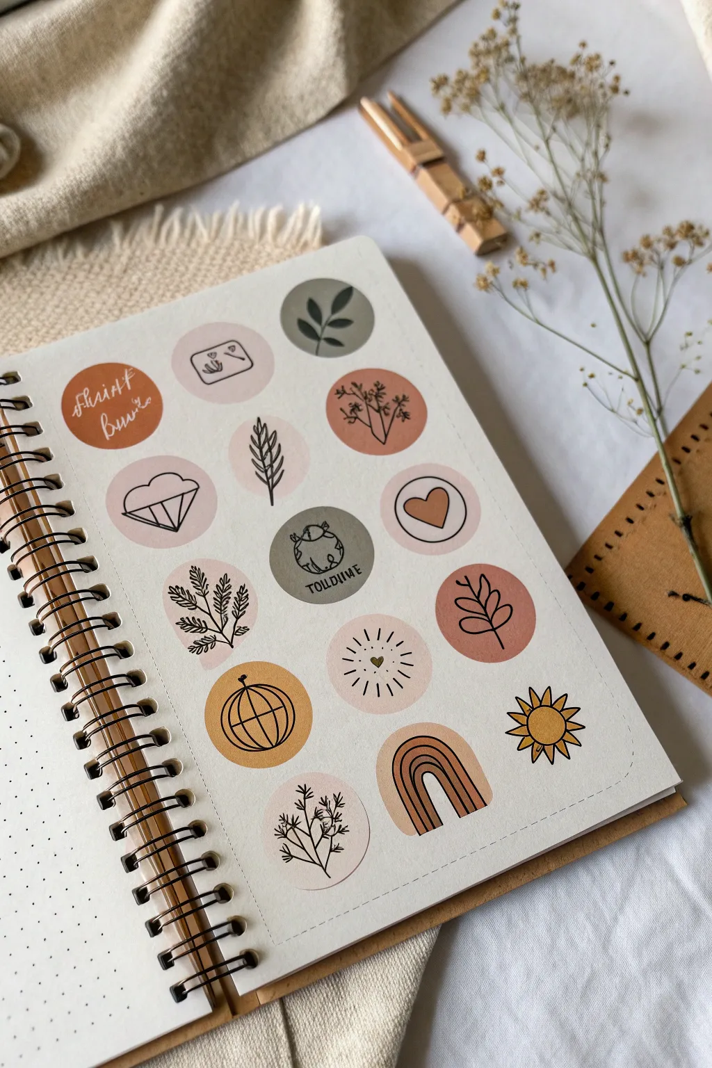
Transform a simple journal page into a sheet of aesthetic, sticker-style illustrations using paint markers. This project combines soothing, earthy color blocks with crisp black line work for a look that is both modern and organic.
Detailed Instructions
Materials
- Dot grid journal or high-quality mixed media paper
- Paint markers (earthy tones: terracotta, sage green, mustard yellow, beige, blush pink)
- Fine liner pen (black, waterproof, size 0.3 or 0.5)
- Circle stencil or a small circular object to trace (approx. 1 inch diameter)
- Pencil (HB or similar)
- Eraser
Step 1: Preparation & Layout
-
Grid setup:
Begin by deciding on the arrangement of your circles. In a dot grid journal, you can use the dots to center each element perfectly. Plan for a mix of solid colored circles and outline-only circles. -
Trace the circles:
Using your circle stencil or a small round object (like a coin or bottle cap), lightly trace circles onto the paper with a pencil. Leave roughly half an inch of space between them to let each design breathe.
Keep it smooth
To avoid pilling the paper when filling circles, dab the paint marker tip on a scrap piece of plastic first to get the ink flowing, then apply with a light touch.
Step 2: Color Blocking
-
Fill solid circles:
Select your palette of earthy paint markers. For the solid designs, fill in the entire pencil circle. Start from the center and spiral outward to the edge for a smooth finish. -
Vary the tones:
Alternate colors across the page so no two adjacent circles are the same shade. Use sage green for botanical themes, terracotta for warmth, and mustard or beige for neutral bases. -
Create background shapes:
For the rainbow and sun designs, don’t fill a full circle. Instead, lightly sketch the arch or circle shape of the object itself with the appropriate color marker. -
Let it dry completely:
Allow the paint marker base layers to dry fully. This is crucial before adding ink on top to prevent the fine liner from snagging or bleeding.
Make them real
Draw these designs on full-sheet label paper or sticker paper instead of a journal page. Cut them out, and you have custom stationery for sealing envelopes.
Step 3: Line Art & Details
-
Drafting designs:
Once the paint is dry, lightly sketch your botanical and icon designs over the colored circles using a pencil. Keep shapes simple: leaf sprigs, geometric diamonds, sun rays, and rainbows. -
Inking botanicals:
Take your black fine liner and carefully trace over your pencil sketches. For the leaf designs, draw a central stem first, then add small, symmetrical leaves branching off. -
Adding text and icons:
For text elements like the ‘Spirit’ circle, use a loose, cursive script in white or beige paint marker over a dark rust background. For the ‘Wild One’ badge, sketch a small globe icon before lettering. -
Geometric details:
Draw the diamond and globe shapes with deliberate, straight lines. If your hand feels unsteady, you can use the edge of a ruler or a stiff piece of cardstock as a guide. -
Sunbursts and sparkles:
Add a sunburst design by drawing a small heart or dot in the center of a beige circle, then drawing dashed lines radiating outward. This creates a lovely ‘sparkle’ effect. -
Rainbow arches:
Outline your painted rainbow arches with thin black lines. Add a small heart or simple dot pattern in the negative space above or below the arches for extra detail. -
Standalone doodles:
Intersperse the solid circles with outline-only drawings, like the standalone sun icon. I like to thicken the outer lines slightly to make these pop against the colored neighbors.
Step 4: Finishing Touches
-
Erase guidelines:
Wait at least 10–15 minutes to ensure all ink is completely set. Gently erase any visible pencil marks from your initial circle tracing. -
Add highlights:
Use a white gel pen or extra-fine white paint marker to add tiny dots or highlights to the dark leaves or the disco ball shape to give them dimension. -
Border definition (optional):
If you want the sticker look without actually cutting them out, you can draw a very faint, dashed gray line around the group of designs to simulate a sticker sheet border.
Now you have a charming page of faux-stickers ready to brighten up your journal spreads or planner layouts
Rock Painting Mini Illustrations
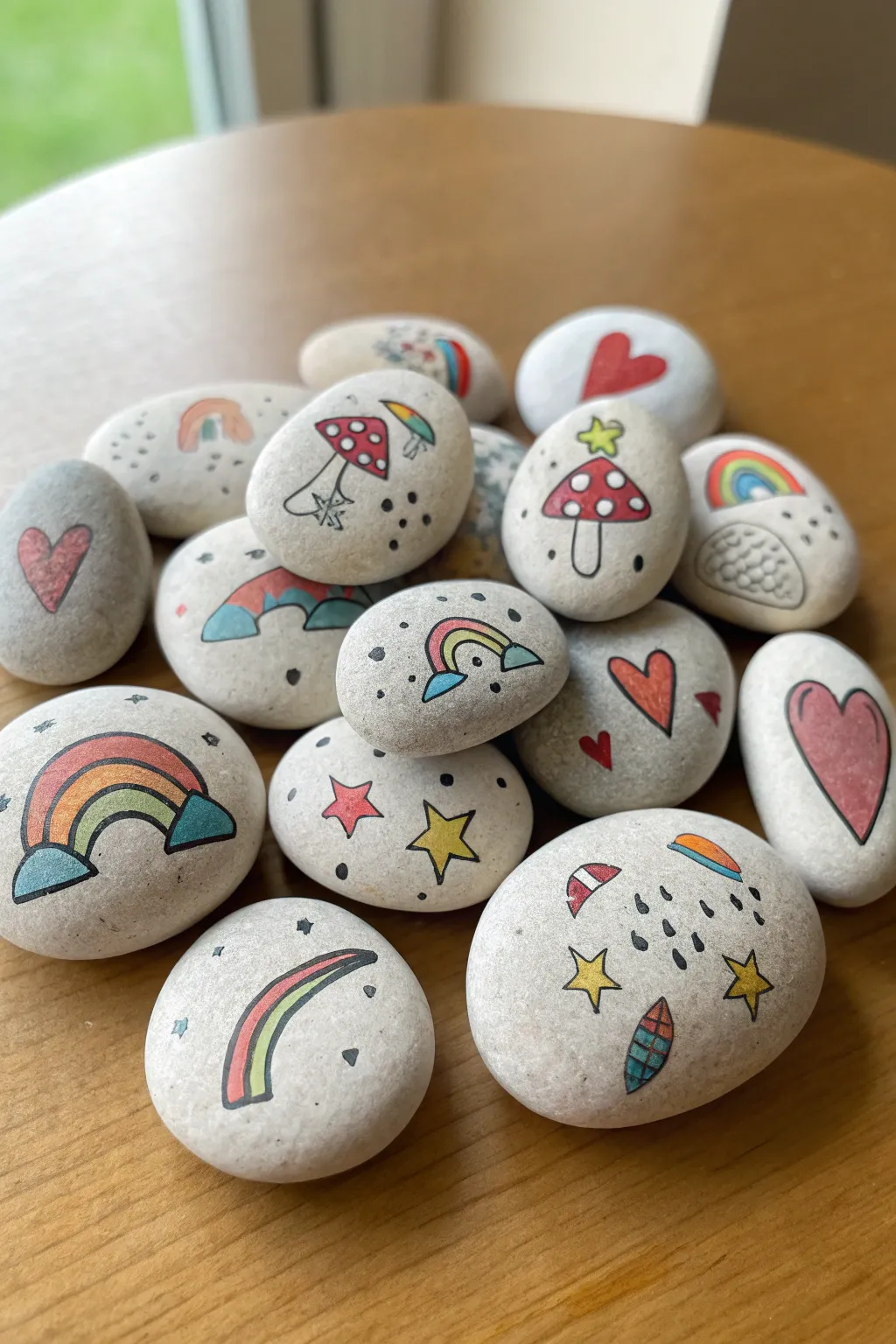
Transform ordinary smooth pebbles into a collection of charming tokens featuring rainbows, mushrooms, hearts, and stars. These mini illustrations use simple line work and bright pops of color to create a cohesive and playful set perfect for hiding or gifting.
Step-by-Step
Materials
- Smooth, light-colored river stones or pebbles
- Extra-fine point black paint marker (acrylic or oil-based)
- Set of fine point paint markers (red, yellow, blue, turquoise/teal, orange, pink)
- Pencil and eraser (optional)
- Matte spray varnish or sealant
Step 1: Preparation & Planning
-
Clean the surface:
Begin by washing your stones with warm soapy water to remove any dirt or oils that might prevent the paint from sticking. Let them dry completely, preferably in the sun. -
Sort your canvas:
Lay out your stones and examine their shapes. Choose rounder stones for mushroom designs and flatter, oval stones for rainbows or cloud patterns. -
Sketch lightly:
If you’re nervous about freehanding, use a pencil to lightly sketch your main motifs on the stones. Keep the lines very faint so they don’t smear into the paint later.
Ink Control
Before touching the stone, press the marker tip on a scrap paper to get the ink flowing. This prevents sudden puddles of paint that can ruin your fine lines.
Step 2: Drawing the Outlines
-
Black outlines:
Using your extra-fine point black paint marker, draw the primary outlines for your designs. Start with the larger elements like mushroom caps, rainbow arches, and heart shapes. -
Adding details:
Once the main shapes are dry (which happens quickly with paint markers), add internal details. Draw the spots on the mushroom caps, the vertical lines inside the mushroom stems, and the segments of the rainbows. -
Tiny fillers:
In the negative space around your main subjects, draw tiny stars (both five-pointed and simple crosses), small dots, and little dashes to create texture and interest.
Step 3: Adding Color
-
Mushroom caps:
Fill in the mushroom caps with red paint marker, carefully working around the white spots you outlined. I find it easier to outline the spots first with the red, then fill the rest. -
Rainbow arches:
Color your rainbows using a variety of schemes. For a classic look, use red, yellow, and blue. For a softer look, mix in teal and pink segments. -
Heart details:
Fill in the hearts with pink or red. Notice how some hearts in the example are solid while others are outlined in black with scattered dots inside—try both styles. -
Star accents:
Color the larger five-pointed stars with bright yellow. Leave the smaller ‘cross’ stars as simple black lines. -
Weather elements:
For the cloud/rain stone, color the raindrops and any small cloud accents with blue or teal. Add small semi-circles of color (like mini rainbows) floating in the background.
Make Them Magnets
Hot glue a small, strong circular magnet to the back of smaller, flatter stones to turn your mini illustrations into a custom refrigerator magnet set.
Step 4: Finishing Touches
-
Let it cure:
Allow all the paint to dry completely. Although paint markers dry to the touch quickly, giving them an hour ensures the colors won’t bleed during the next step. -
Clean up sketch lines:
If you can still see any original pencil marks, gently erase them now. Be very careful not to rub off any paint. -
Re-outline if needed:
Sometimes coloring can obscure your crisp black lines. Go back over any key outlines with your black marker to make the illustration pop again. -
Seal the art:
Take the stones to a well-ventilated area. Hold your matte spray varnish about 12 inches away and apply a light, even coat to protect your work from chipping.
Now you have a handful of cheerful art pieces ready to brighten up your desk or garden path


Phone Case Geometric Pop Art
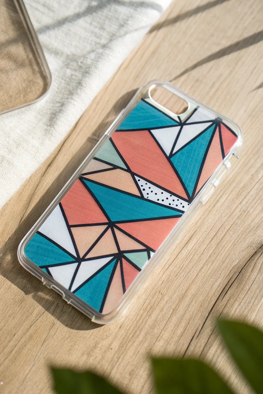
Transform a plain, clear phone case into a statement piece with this vibrant geometric design. Using bold triangles and unexpected pops of pattern, you can create a custom accessory that combines modern aesthetics with a playful, artistic touch.
Detailed Instructions
Materials
- Clear plastic phone case (hard shell preferred)
- Oil-based paint markers (Teal/Turquoise, Coral/Salmon, White, Black, Peach/Beige, Pale Mint Green)
- Fine tip permanent marker (Black) or ultra-fine paint pen
- Ruler or straight edge
- Rubbing alcohol
- Cotton pads
- Pencil (optional)
- Clear spray sealant (matte or gloss)
Step 1: Preparation & Planning
-
Clean surface:
Before you begin, wipe the inside of the clear phone case thoroughly with rubbing alcohol and a cotton pad. This removes any oils or fingerprints that could prevent the paint from sticking properly. -
Choose your side:
Decide whether you want to paint on the *inside* or the *outside* of the case. Painting on the inside protects the design from scratches but requires you to paint in reverse order (details first, background last). For this tutorial, we will paint on the *outside* for easier layering and texture control. -
Sketch the layout:
Lightly sketch your geometric pattern directly onto the case using a pencil. Start by drawing large intersecting lines to create various triangles and polygons across the surface.
Smudged Lines?
If you accidentally smudge the black outline while coloring, wait for the paint to dry fully. Then, simply draw over the mistake with the black paint marker to cover it up.
Step 2: Creating the Framework
-
Outline the shapes:
Shake your black paint marker well to mix the pigment. Using a ruler, carefully trace over your pencil lines to create a bold, black geometric framework. Start from the top and work your way down to avoid smudging. -
Thicken the lines:
Go over your initial black lines a second time to ensure they are opaque and consistent in thickness. The bold black borders are key to the ‘stained glass’ effect. -
Let it dry:
Allow the black outline to dry completely for at least 15-20 minutes. If you proceed too quickly, the colors might bleed into the black borders.
Add Metallic Flair
Swap the grey or peach sections for a gold or silver metallic paint marker. The shimmer adds a luxe, modern twist that catches the light beautifully.
Step 3: Adding Color
-
Start with Teal:
Select your teal or turquoise paint marker. Choose 3-4 scattered triangular sections and fill them in completely. Apply the paint in smooth, even strokes. -
Apply Coral tones:
Take the coral or salmon-colored marker and fill in several large triangles. Try to place these next to the teal sections for high contrast. -
Fill with Peach:
Use the peach or beige marker to fill in smaller, intermediary shapes. This neutral tone balances the brighter colors. -
Add Mint accents:
Identify a few small slivers or triangles in your design and fill them with the pale mint green marker. These subtle highlights add depth. -
White spaces:
Fill the remaining empty geometric shapes with white paint markers. The white sections will act as negative space to make the colors pop. -
Second coat:
Once the first layer of color is dry to the touch, assess the opacity. I usually find that the white and paler colors need a second coat to be fully opaque and streak-free.
Step 4: Detailing & Pattern
-
Select a detail spot:
Locate one of your white or light-colored triangles where you want to add extra interest. In the reference image, this is a central wedge shape. -
Add polka dots:
Using your fine-tip black marker or a very fine black paint pen, carefull add small, random dots inside that specific triangle. Keep the dots distinct and avoid clustering them too closely. -
Touch up borders:
Inspect your black outlines. If any color paint has accidentally overlapped the black lines, re-trace those specific border sections with your black marker to clean up the edges.
Step 5: Sealing & Protection
-
Final drying time:
Allow the entire case to sit undisturbed for at least 1-2 hours. Paint markers can feel dry on top but still be soft underneath. -
Prepare for sealing:
Take the case to a well-ventilated area or outdoors. Place it on a piece of scrap cardboard. -
Apply sealant:
Spray a thin, even coat of clear sealant over the painted surface. Hold the can about 8-10 inches away to avoid drips. -
Cure:
Let the sealant dry fully according to the manufacturer’s instructions (usually 24 hours) before snapping the case onto your phone.
Enjoy your custom geometric case that brings a splash of art to your everyday tech
Sneaker Custom Pattern Panels

Transform a plain pair of white leather sneakers into a high-end designer lookalike using paint markers and strategic blocking. This project combines geometric color blocks with faux textures like cork and perforated leather for a sophisticated finish.
Step-by-Step
Materials
- White leather sneakers (clean and prepped)
- Angelus leather preparer and deglazer (or acetone)
- Cotton pads
- Painter’s tape or masking tape
- Green paint marker (fine tip, leather-safe)
- Brown/Tan paint marker (fine tip)
- Black paint marker (ultra-fine tip)
- Gold or Mustard Yellow paint marker
- Matte acrylic finisher/sealer
- Small flat paintbrush (optional)
- Pencil
Step 1: Preparation & Mapping
-
Clean the surface:
Before laying down any color, wipe the side panels of the sneaker thoroughly with leather preparer and cotton pads. This removes the factory finish so the paint marker ink adheres properly. -
Tape the boundaries:
Apply painter’s tape along the soles and the upper stitching lines of the middle panel. This ensures your lines remain crisp and prevents accidental marks on the sole. -
Sketch the design stripes:
Use a pencil to lightly mark vertical lines on the side panel. You’ll need four distinct sections: a rear ‘cork’ section, a dotted section, a wide green stripe, a wide brown stripe, and a front dotted section with accent lines.
Clean Lines Hack
For perfectly straight vertical divisions between your color blocks, apply a strip of masking tape over the area you aren’t painting, color the stripe, let it dry, move the tape, and repeat.
Step 2: Applying the Color Blocks
-
Paint the green stripe:
Shake your green paint marker well. Fill in the middle-rear stripe completely. Apply thin, even layers, letting the ink dry for a few minutes between coats until the white leather is fully covered. -
Paint the brown stripe:
Directly next to the green, fill in the next forward stripe with your brown or tan marker. Be careful at the border where the two colors meet to avoid bleeding. -
Paint the heel tab:
If your sneaker has a plain white heel tab, color the top half green to match the side stripe. This creates a cohesive color story across the shoe.
Fixing Bleeding Ink
If your marker bleeds into the leather grain, don’t panic. Wait for it to dry completely, then use a white paint marker to carefully ‘erase’ or cover the jagged edge.
Step 3: Detailed Textures
-
Create the cork base:
On the small triangular section near the heel, apply a base layer of tan or light brown. Let this dry completely before moving to the next step. -
Add cork texture:
Using a darker brown marker, make random, irregular specs and tiny squiggles over the tan base. I find that quick, jagged wrist movements make the texture look more organic and wood-like. -
Draw the rear perforations:
In the white space between the cork and the green stripe, use your ultra-fine black marker to make small, evenly spaced dots. This mimics perforated leather. -
Add colored accents:
Intersperse larger dots using green and brown markers among the black perforations for added visual interest. -
Detail the front section:
On the white panel section nearest the toes, draw a vertical line of small black dots similar to the rear section. -
Add the racing stripes:
Draw two thin, curved lines swooping toward the sole at the front of the panel: one in gold/mustard and one in black. These should curve slightly backward, following the shoe’s contour.
Step 4: Finishing Touches
-
Clean up edges:
Carefully peel away the masking tape. If any paint bled under the tape, use a q-tip dipped in a tiny amount of acetone to gently wipe it away. -
Inspect coverage:
Check your green and brown solid blocks. If the white leather is showing through, add one final light layer of marker. -
Seal the artwork:
Apply a thin layer of matte acrylic finisher over the painted areas using a soft brush. This is crucial to prevent the paint marker from cracking or scuffing during wear. -
Dry time:
Let the shoes sit for at least 24 hours before wearing them to ensure the sealer has fully cured.
Lace up your new custom kicks and enjoy walking in your own geometric art
Keychain Charms With Tiny Icons
Transform a simple white acrylic disc into a whimsical accessory featuring tiny, hand-drawn celestial icons and flowers. This project combines delicate line work with bold paint marker colors for a charm that feels both bohemian and neatly graphic.
Step-by-Step Tutorial
Materials
- White acrylic round keychain blank (with pre-drilled hole)
- Acrylic paint markers (extra fine tip recommended: 0.7mm)
- Colors: Russet/Terracotta, Navy Blue, Sky Blue, Mustard Yellow, Red
- Clear spray sealant or UV resin (for protection)
- Jump ring and keychain hardware
- Jewelry pliers
- Scrap paper (for practice)
Step 1: Planning and Surface Prep
-
Clean the surface:
Before you uncap a single marker, make sure your acrylic disc is free of oils or dust. Wipe it down gently with a microfiber cloth or a little rubbing alcohol and let it dry completely. -
Sketch your layout:
Trace the circle onto a scrap piece of paper. This is where you’ll figure out spacing. Draw your crescent moon, three distinct flowers, and the scattering of stars to ensure everything fits comfortably without crowding. -
Prime the markers:
Shake your paint markers well to mix the pigment. Press the nibs down on your scrap paper until the ink flows smoothly. You want opaque lines, not watery streaks.
Step 2: Painting the Icons
-
Draw the crescent moon:
Start with the largest element to anchor the design. Using the russet or terracotta marker, outline a crescent moon shape on the left side of the disc. -
Fill the moon:
Gently fill in the moon shape. Use light, even strokes to avoid creating ridges in the paint. If the color looks translucent, let it dry for a few minutes and add a second layer. -
Create the center flower:
Switch to your navy blue marker. Draw a five-petaled flower slightly off-center to the right. Make the petals long and slender. Add a tiny yellow dot in the center once the blue is dry. -
Add the bottom flower:
Using the same terracotta color from the moon, draw a rounded, four-petaled flower near the bottom edge. Add a navy blue center dot for contrast. -
Draw the yellow flower:
On the bottom right, use your mustard yellow marker to create a sunburst-style flower with many thin, radiating petals. Place a small terracotta dot in its middle. -
Paint a small accent flower:
In the upper right quadrant, add a tiny, simple four-petaled flower in terracotta with a blue center to balance the colors.
Don’t Smudge The Ink
Work from top-left to bottom-right (if right-handed) to avoid dragging your hand through wet paint. Rotate the disc, not your hand, to reach tricky spots easily.
Step 3: Adding Details and Stars
-
Draw the large stars:
Using the navy blue marker, draw two distinct five-point stars—one near the top edge and one near the bottom center. -
Add starbursts:
Draw simple ‘asterisk’ style stars in navy blue and terracotta. Place these in the empty gaps between the larger icons to fill the negative space. -
Scatter tiny stars:
Use the red or terracotta maker to add tiny five-point stars. These should be much smaller than your main blue stars. -
Dot the night sky:
Finally, inspect the composition. If there are awkward empty spots, add simple dots or tiny cross-shapes in blue or red to mimic distant stars. -
Let it cure:
Allow the paint to dry completely. Acrylic paint markers dry fast to the touch, but giving it an hour ensures the bond is solid before sealing.
Fixing Wobbly Lines
Made a mistake? Don’t panic. Dip a cotton swab in rubbing alcohol or nail polish remover and gently erase the error while the paint is still fresh.
Step 4: Sealing and Assembly
-
Seal the artwork:
To prevent scratching, coat the design with a clear sealant. A spray varnish works well for a matte finish, or you can brush on a layer of UV resin and cure it under a UV lamp for a glossy, domed look. -
Wait for sealant to dry:
Typically about 24 hours for spray varnish, or a few minutes for UV resin. Do not touch the surface while it sets. -
Open the jump ring:
Using two pairs of pliers, twist the jump ring open laterally (don’t pull it apart outward). This preserves the circle shape. -
Attach hardware:
Slide the jump ring through the acrylic hole and the last link of your keychain hardware. Twist the jump ring closed securely.
Now you have a charming, personalized accessory to organize your keys or gift to a friend
Layered Texture With Stippling and Hatching
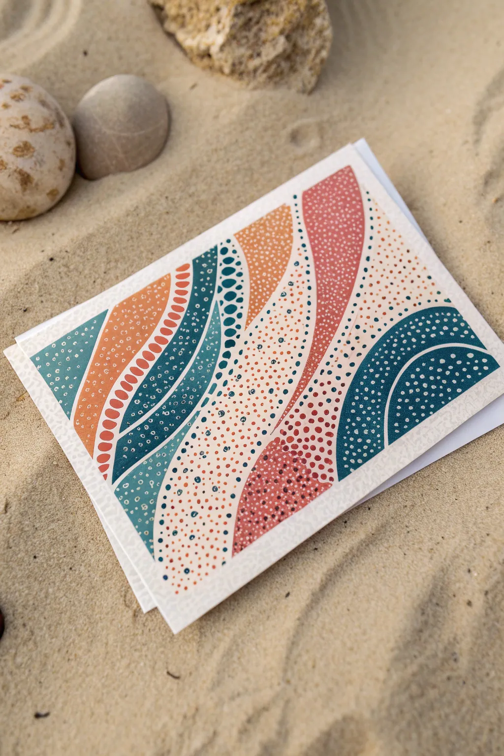
Capture the rhythm of the ocean with this soothing, abstract design using layers of stippling and organic shapes. The combination of warm coral tones and cool teals creates a balanced, modern aesthetic that looks deceptively complex but relies on simple repetitive patterns.
How-To Guide
Materials
- White cardstock card base (folded)
- Paint markers (fine tip: teal, rust orange, coral pink, cream/white, dark blue)
- Pencil (HB or lighter)
- Kneaded eraser
- Scrap paper for testing ink flow
Step 1: Planning the Flow
-
Sketch the initial curves:
Begin by lightly sketching five or six large, vertical S-curve lines across your cardstock. Let them vary in width, creating channels that look like flowing water or sand dunes. -
Refine the composition:
Review your pencil lines to ensure the spaces between the curves vary. Some sections should be wide enough to hold detailed patterns, while others can be narrower bands of color. -
Lighten the guides:
Roll your kneaded eraser gently over the pencil lines. You want them to be barely visible—just enough to guide your markers but faint enough to disappear under the paint.
Keep the Tip Fresh
Paint markers can clog on textured paper. Keep a scrap smoothness pad nearby to scribble on every few minutes; this keeps the ink flowing freely and preventing dry, scratchy dots.
Step 2: Blocking in Color
-
Fill the solid rust band:
Select your rust orange marker. Identify one of the curved bands on the left side and fill it in completely solid. Working slowly helps ensure an even coat without streak marks. -
Create the teal foundation:
Using a dark teal or petrol blue marker, fill in a sweeping curve adjacent to your orange section. Don’t worry about texture yet; we are just establishing the base color blocks. -
Add the coral accent:
Find a large curve on the right-hand side of your design and fill it with a solid coral pink. This warm tone balances the cooler blues involved. -
Paint the semi-circles:
In the bottom right corner, use your dark teal marker to paint two large, concentric semi-circle shapes. Leave a thin gap of white space between them for definition. -
Let it dry completely:
Pause here for 5-10 minutes. Paint markers need to be bone-dry before you can layer lighter colors or dots on top without dragging the pigment.
Metallic Magic
Swap the white dots in the final step for a metallic gold or copper paint pen. The metallic sheen adds a stunning, sun-kissed glimmer that catches the light beautifully.
Step 3: Adding Texture & Stippling
-
Detail the orange band:
Return to your solid rust orange band. Using a white fine-tip paint marker, draw a vertical line of small, hollow ovals down the center of the shape to create a spine-like pattern. -
Stipple the teal wave:
On your dark teal shape, use a lighter teal or mint green marker to add dots. I like to vary the size, making the dots larger near the center of the curve and smaller towards the edges. -
Create density on the coral:
Take your white marker to the coral pink shape. Fill this entire area with tiny, uniform stippling dots. This creates a soft, sandy texture contrasting with the solid lines. -
Pattern the semi-circles:
On the bottom right teal semi-circles, add rows of small white dots. Follow the curve of the shape so the pattern reinforces the movement of the design.
Step 4: Filling the Negative Space
-
Select the cream tone:
For the remaining white spaces on the card, we won’t fill them solid. Instead, use a cream or very light beige marker to add warmth without heaviness. -
Dot the background:
Fill these ’empty’ channels with loose, random stippling in cream. Vary the density—cluster the dots tightly near the edges of the colored shapes and let them disperse in the open centers. -
Add secondary accent dots:
Go back into these cream-dotted areas with a contrasting color, like tiny specks of teal or rust, to tie the whole palette together. -
Review edges:
Check the boundaries where your shapes meet. If you have any shaky lines, stippling right up to the edge is a great way to disguise imperfections. -
Final drying time:
Set the card aside in a safe spot for at least 15 minutes to ensure all the layered dots have fully set and won’t smear when handled.
You now have a beautifully textured piece of art that mimics the organic forms of nature
Have a question or want to share your own experience? I'd love to hear from you in the comments below!