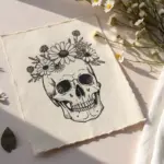
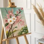
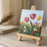
If you love the clean control of drawing but crave that juicy, opaque color only paint can give, paint pens are your best friend. I pulled together my favorite paint pen drawing ideas—from classic doodles to bolder, more unexpected projects—so you can start making something you’re excited to show off.
Sticker-Style Doodle Page
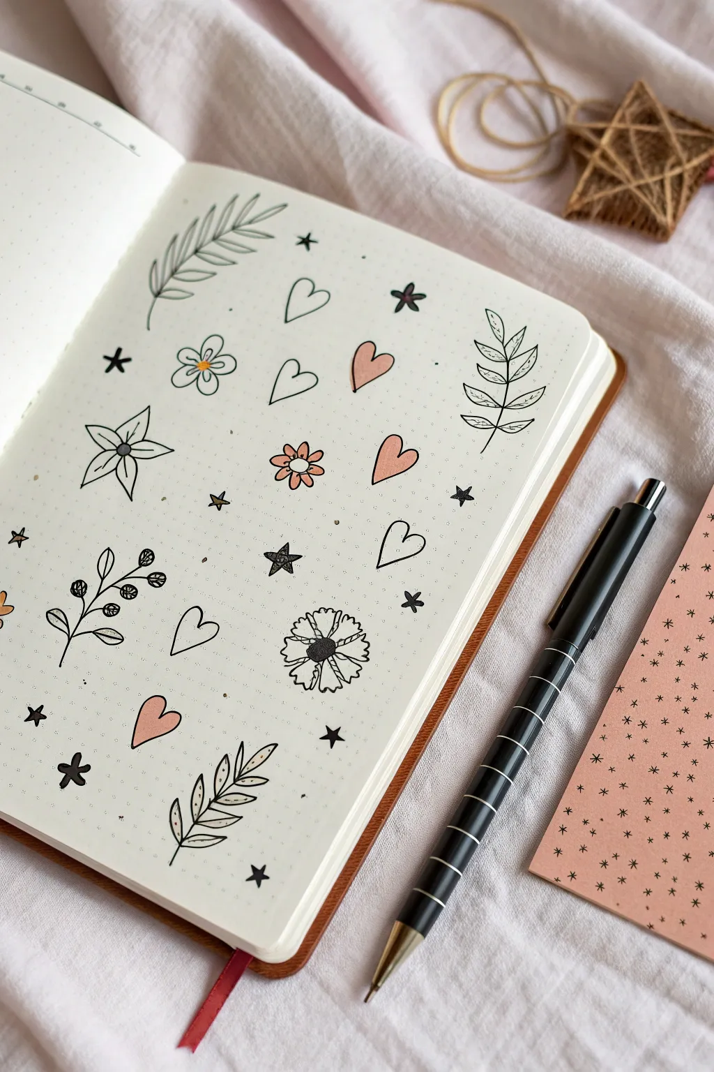
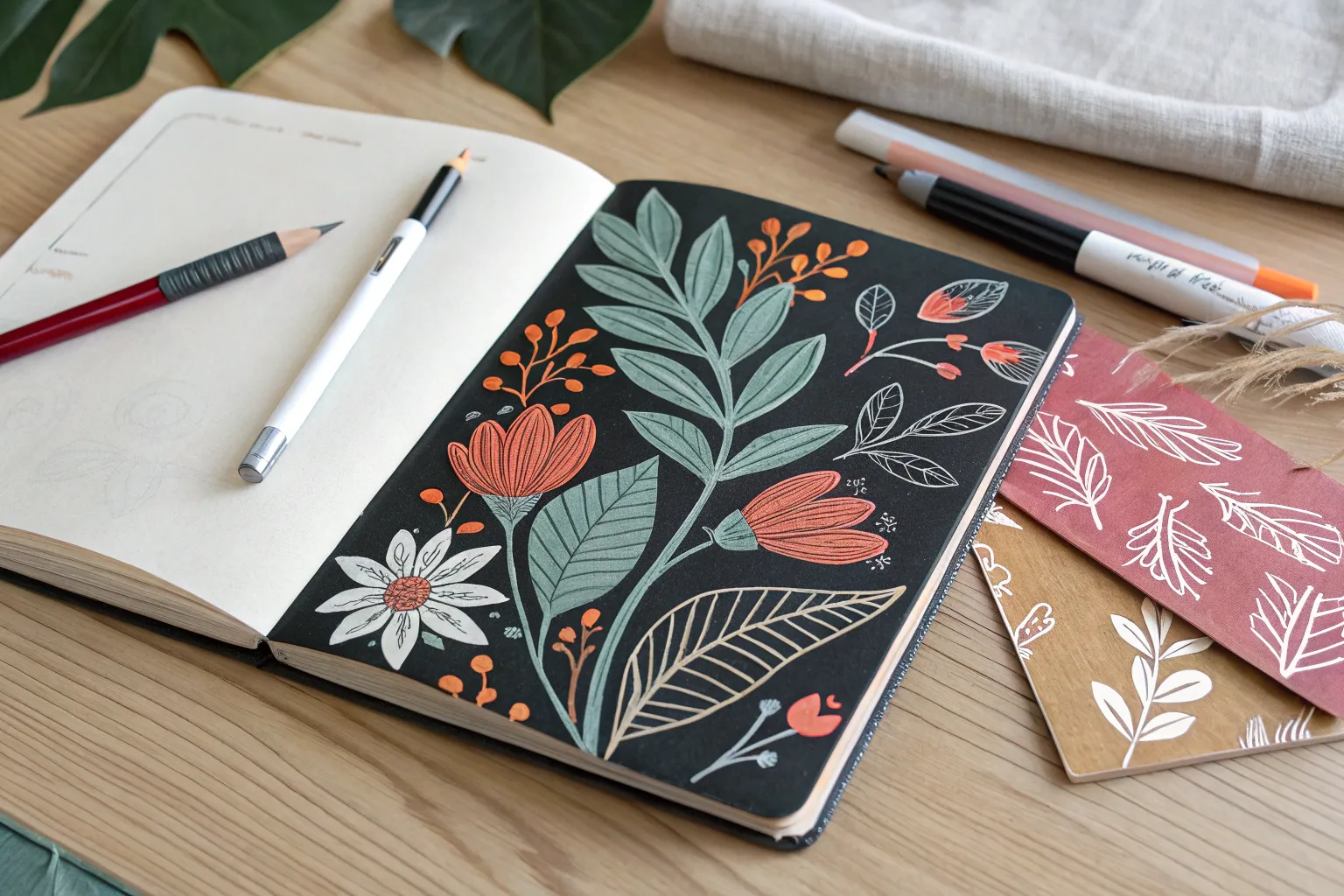
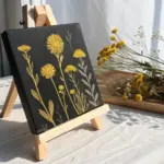
Transform a blank page into a charming collection of sticker-style illustrations using simple shapes and a limited color palette. This project combines crisp black linework with soft touches of peach and pink to create a cohesive, decorative spread reminiscent of a sticker sheet.
Detailed Instructions
Materials
- Dotted or blank journal notebook
- Fine-point black drawing pen (archival ink recommended)
- Paint pens or highlighters in soft peach/pink
- Pencil
- Eraser
Step 1: Planning the Layout
-
Visualize the spacing:
Before putting ink to paper, look at your blank page. Imagine an invisible grid where each doodle will sit. The goal is random placement that still feels balanced, so leave generous white space between imagined items. -
Sketch the main elements:
Using a pencil very lightly, sketch the positions of the larger items first: the leafy branches, the larger flowers, and the hearts. Don’t focus on details yet, just get the general shapes and placement down. -
Fill the gaps:
Now, lightly pencil in smaller filler elements like the tiny stars, dots, and smaller flowers between the larger sketches to avoid any awkward empty spots.
Ink Flow Tip
If using acrylic paint pens for color, pump the nib on a scrap paper first. You want a consistent flow that doesn’t puddle and warp the notebook paper.
Step 2: Drawing the Botanical Elements
-
Draw the fern-like leaves:
Starting near the top left, use your black pen to draw a curved central stem. Add long, slender oval leaves extending from both sides, keeping the lines thin and clean. -
Create the symmetrical leaf sprig:
On the right side of the page, draw a vertical stem. Add paired leaves that are wider at the base and pointed at the tip, ensuring the veins are visible by drawing a line down the center of each leaf. -
Add the berry branch:
Near the bottom left, draw a darker, thicker stem. Instead of leaves, draw small clusters of circles for berries, shading some in completely black and leaving others as open circles. -
Detail the bottom sprig:
At the bottom center, draw another leafy branch. For this one, draw the leaves slighty more spaced out and add a distinct central vein line to each one.
Step 3: Adding Florals and Hearts
-
Outline the hearts:
Ink the outlines of the various hearts scattered across the page. Make them slightly irregular and hand-drawn rather than perfectly symmetrical stencils for a cozy feel. -
Draw the five-petal flower:
Create the large flower on the left by drawing a small center circle, then adding five pointed petals that radiate outward. Draw a line down the center of each petal for dimension. -
Create the daisy-style blooms:
Ink the smaller, rounder flowers. For the one near the top left, give it rounded petals; for the central flower, make the petals slightly flatter at the ends. -
Draw the carnation shape:
For the complex flower near the bottom center, start with a dark, scribbled center. Draw ragged, zig-zagging edges for the petals to mimic a carnation or marigold texture.
Smudge Fixer
Did you smudge a black line? Turn the mistake into a solid black filled element, like a dark leaf or a solid star, to hide the error seamlessly.
Step 4: Stars and Accents
-
Ink the distinct star types:
Draw the solid black stars first to anchor the contrast. Then, draw the open five-point stars. Finally, add the simple asterisk-style stars (*), making the lines thick and confident. -
Erase pencil marks:
Wait until the black ink is completely dry to the touch—I usually give it at least two minutes—and then gently erase all your initial pencil sketches.
Step 5: Applying Color
-
Color selected organic shapes:
Using your soft peach or pink paint pen, color in specific elements. Fill in a few of the hearts completely, but leave others strictly black and white. -
Add floral accents:
Color the petals of the small central flower and the single petal of the bottom-left heart pattern. Adding color selectively helps guide the eye across the page. -
Final dots:
Take your black pen again and add tiny stippling dots around the larger doodles. This ‘confetti’ effect ties the whole composition together.
Now you have a delightful page of hand-drawn stickers to admire or replicate in future spreads

Bold Floral Line Art
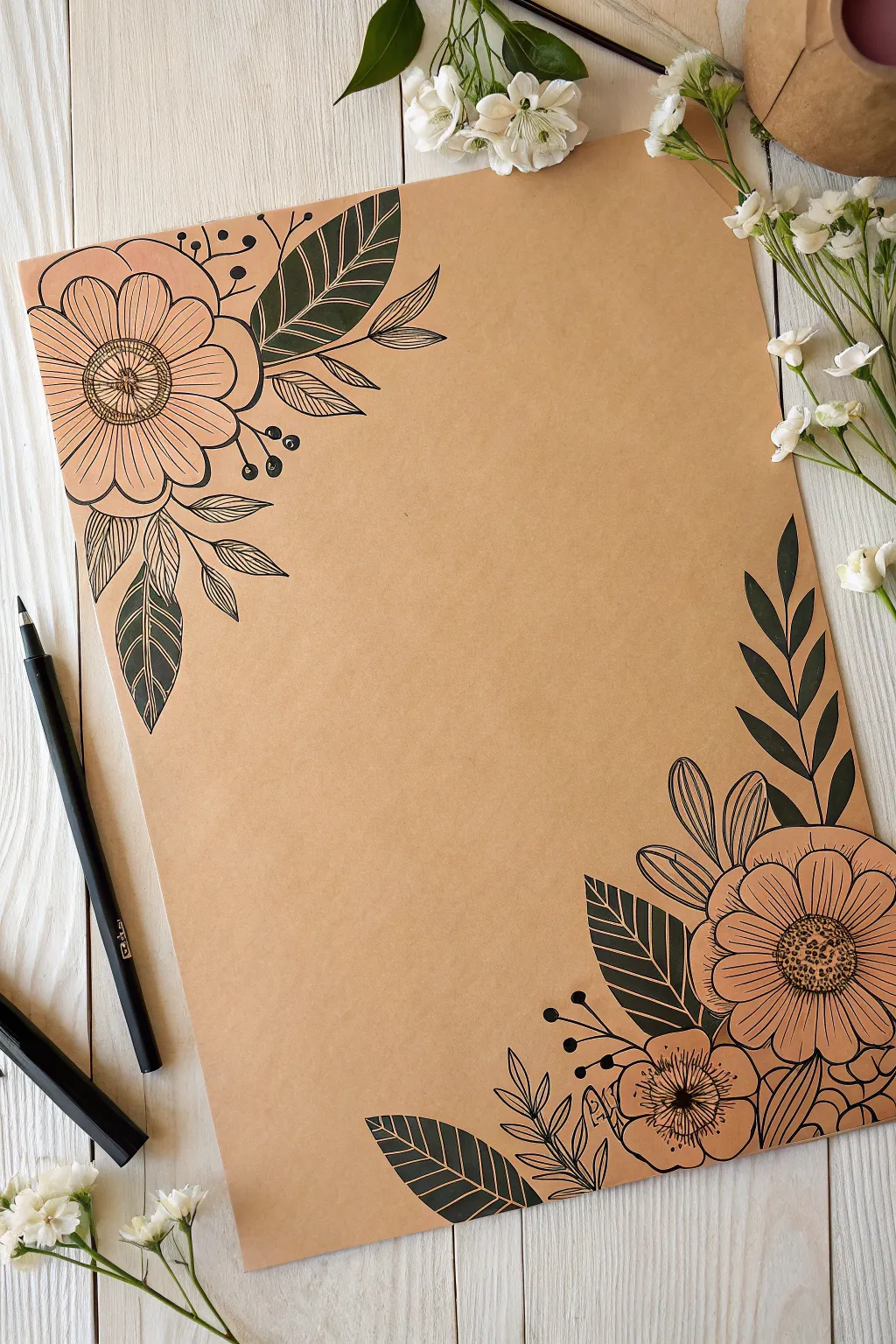
Transform a simple sheet of brown kraft paper into elegant stationery using bold floral line art. By focusing your design on opposite corners, you create a sophisticated frame perfect for handwritten letters or custom art prints.
Step-by-Step Guide
Materials
- Brown kraft paper or cardstock (A4 or letter size)
- Black paint pens (0.7mm fine tip and 2-3mm medium tip)
- Pencil (HB or H)
- Eraser
- Ruler (optional)
- Scrap paper for testing pens
Step 1: Sketching the Layout
-
Prepare your surface:
Lay your kraft paper on a flat, clean surface. Ensure the paper is free of oils or dust, which can interfere with paint pen adhesion. -
Map out the large blooms:
Using a pencil with very light pressure, sketch a large circle in the top-left corner and a slightly smaller circle in the bottom-right corner. These will be the centers for your main flowers. -
Add secondary flowers:
In the bottom-right arrangement, sketch a smaller circle just below and to the left of your main flower. This adds asymmetry and visual weight to the bottom of the page. -
Sketch petal guides:
Lightly draw radiating lines from the center of your circles to guide where the petals will sit. For the top flower, aim for a wide, open daisy shape. For the bottom ones, sketch overlapping rounded petals. -
Draft the foliage:
Sketch long, sweeping curves extending outward from the flowers along the paper edges. These will become the stems for the leaves. Add basic leaf shapes—some large and pointed, others small and clustered.
Ink Flow Tip
Store paint pens horizontally. Before drawing, shake well and press the nib on scrap paper to encourage flow, preventing blobs on your final artwork.
Step 2: Inking the Flowers
-
Outline the top flower center:
Take your fine-tip (0.7mm) black paint pen. Draw a small circle for the very center, then a larger ring around it. Fill the space between the rings with tiny, tight radiating lines. -
Draw top flower petals:
Carefully trace your pencil lines for the petals. Make the outer edges slightly wavy to look organic. Draw a single straight line down the center of each petal to create a fold effect. -
Inking the bottom cluster:
Move to the bottom right. Outline the petals of the larger flower first, then the smaller one underneath it. I find it helpful to rotate the paper so my hand doesn’t smudge wet ink. -
Detailing the centers:
For the bottom flowers, stipple tiny dots in the very center to create texture. Add short, quick strokes radiating outward from the center onto the petals to show depth. -
Adding whimsical elements:
Draw thin, curved stems shooting out from behind the flowers. Top these with small solid black circles to create berries or buds, grouping them in threes or pairs.
Level Up: White Highlights
Use a white gel pen or extra-fine white paint pen to add tiny highlights on the black leaves or centers of flowers for a 3D pop effect.
Step 3: Inking and Filling Foliage
-
Outline the skeleton leaves:
Use the fine-tip pen to draw the sprigs of smaller leaves. Keep these delicate—just a central stem and simple leaf outlines without any fill. -
Define the solid leaves:
Switch to your medium-tip (2-3mm) paint pen. Outline the larger, pointed leaves you sketched earlier. These should feel weightier than the flowers. -
Fill the dark leaves:
Completely color in these large leaves with the black paint pen. Work in smooth strokes to avoid streakiness. The opaque black against the kraft paper creates a stunning contrast. -
Add white veins (Optional technique):
If you want the white vein look shown in some styles, you actually create this by leaving negative space. Carefully draw the leaf shape but leave thin strips of kraft paper showing for the veins and center line. -
Review and refine:
Wait at least 10 minutes for the ink to fully cure. Look for any shaky lines that need thickening or any gaps in your solid black leaves. -
Erase pencil marks:
Once you are absolutely certain the ink is dry, gently run your eraser over the design to remove the initial pencil sketch, leaving only the crisp black ink.
Now you have a beautifully framed page ready for your favorite quote or a heartfelt letter
Simple Mandala Medallions
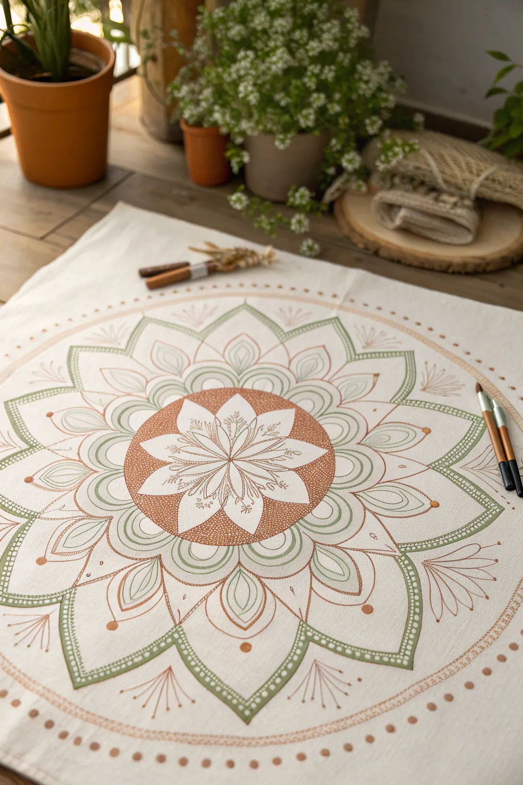
Bring a touch of organic serenity to your space with this earthy mandala design featuring soft sage greens and warm terracotta tones. The intricate floral center radiates outward into structured geometric petals, creating a meditative piece that looks beautiful on fabric or heavy cardstock.
Step-by-Step Tutorial
Materials
- White cotton fabric square or heavy watercolor paper (at least 12×12 inches)
- Acrylic paint pens (fine and medium tips) in Sage Green
- Acrylic paint pens (fine and medium tips) in Terracotta/Rust
- Pencil (HB or lighter)
- Large compass
- Protractor
- Eraser
- Ruler or straight edge
Step 1: Planning the Structure
-
Find your center:
Start by marking the exact center of your fabric or paper lightly with a pencil. Use your compass to draw a small circle about 3 inches in diameter for the central flower core. -
Map out the rings:
Continue with the compass to draw three larger concentric circles outward. These will guide the layers of petals: one for the middle tier, one for the large outer petals, and a final outer boundary line. -
Divide the circle:
Using a protractor, divide your circle into 8 or 12 equal sections (depending on how dense you want the petals). Draw faint straight lines through the center point to the outer edge to act as your radial guides.
Bleeding Lines?
If using fabric, ink might bleed into the fibers. Ensure you’re not pressing too hard, or prep the fabric with a clear gesso or fabric medium first to create a smoother barrier.
Step 2: The Floral Core
-
Draft the central flower:
Inside the smallest circle, sketch a multi-petaled flower shape. Aim for pointed petals that radiate from the very center, filling the space evenly. -
Fill the background:
Switch to your Terracotta paint pen. Instead of coloring the flower petals themselves, carefully fill in the negative space *around* the petals within that first 3-inch circle using a stippling technique (tiny dots) or solid color, leaving the petals white. -
Add floral details:
Using a fine-tip Terracotta pen, draw delicate veins and stems inside the white flower petals you just created by negative space. Add tiny decorative dots at the tips of the inner stamens.
Step 3: Layering the Petals
-
Draw the green layer:
Moving to the next ring, sketch rounded, slightly pointed petals using the radial lines as centering guides. These should nestle between the points of your central flower. -
Outline in sage:
Trace over your pencil sketch with a Sage Green paint pen. I like to double up the lines here to give them more visual weight before adding the internal details. -
Detail the green petals:
Inside each green petal, draw a smaller, echoing petal shape. Add fine vertical lines or veining inside this inner shape to create texture without making it too heavy. -
Create the large outer points:
Sketch large, dramatic pointed arches that extend to your third guide circle. These are the main structural elements of the mandala. -
Thicken the borders:
Outline these large arches with the Sage Green pen. Create a thick border by drawing a second line parallel to the first and filling the gap with a row of tiny, uniform dots.
Symmetry Hack
Make a paper template of just one ‘slice’ of your mandala (like a pizza slice). Trace this repeatedly around the center point to ensure every petal is identical in size.
Step 4: Finishing Touches
-
Add the terracotta layer:
In the spaces between the large green arches, draw smaller, simpler scalloped petals using the Terracotta pen. Fill these with simple linear veins. -
Incorporate floating elements:
At the very tips of the large green petals, add small floating circles or ‘beads’ in Terracotta. Add wispy, fan-like lines extending outward from the valleys between petals. -
The outer boundary:
Draw a faint final circle around the entire design. Using the Terracotta pen, create a dotted border along this line to contain the energy of the mandala. -
Erase guidelines:
Allow the paint to dry completely—give it at least 20 minutes to be safe. Gently erase all visible pencil marks, being careful not to snag the fabric fibers. -
Set the ink:
If you are working on fabric, heat set the design by ironing the reverse side of the cloth on a medium setting for a few minutes.
Step back and enjoy the calming rhythm of your painted design
Hand-Lettered Quote Blocks
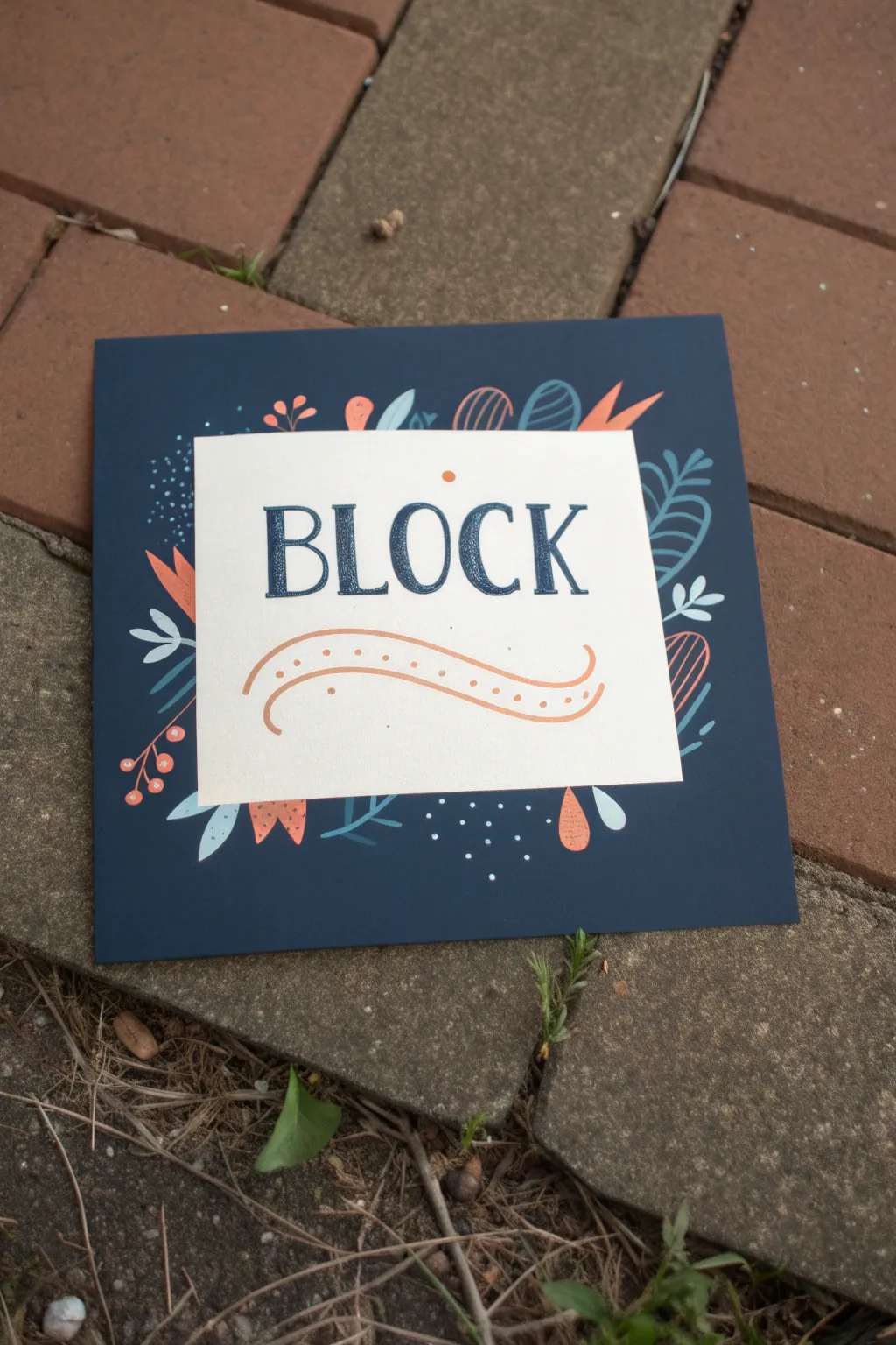
This elegant yet simple project combines bold lettering with whimsical floral doodles to create a striking piece of wall art or a personalized greeting card. The contrast between the deep navy background and the cream center creates a sophisticated frame for your chosen word or phrase.
Step-by-Step
Materials
- Navy blue cardstock (square, approx. 6×6 inches)
- Cream or off-white cardstock (square, approx. 4×4 inches)
- Navy blue fine-tip paint pen or marker
- Posca paint pens (Sage Green, Light Blue, Orange/Coral, White)
- Glue stick or double-sided tape
- Pencil and eraser
- Ruler
Step 1: Preparation and Lettering
-
Paper prep:
Begin by cutting your navy cardstock to your desired square size. Then, cut the cream cardstock to a smaller square size that leaves a generous border—about 1 to 1.5 inches—all around when centered. -
Mount the center:
Apply adhesive to the back of the cream square using a glue stick or double-sided tape. Center it carefully on the navy background and press down firmly to secure it. -
Draft the text:
Using a ruler, lightly mark a horizontal guideline across the center of the cream square. Sketch the word “BLOCK” (or your chosen word) in pencil, aiming for a classic serif style with thick vertical strokes and thin horizontal serifs. -
Lettering:
Trace over your pencil sketch with the navy blue fine-tip pen. For the thick downstrokes, draw two parallel lines and fill in the space between them to create weight. -
Refine the edges:
Go back over the serifs (the little feet on the letters) to sharpen them. Ensure the ink is fully opaque and let it dry completely before erasing any stray pencil marks. -
Add the flourish:
Beneath the text, draw a gentle, wavy swash using the orange paint pen. Start thin on the left, thicken slightly in the middle curve, and taper off on the right. -
Decorative details:
Inside the orange swash, carefully place a row of tiny orange dots following the curve of the line. Add a single orange dot above the center of the text for balance.
Clean Edges
To ensure your word is perfectly centered, count the letters first. Find the middle letter (the ‘O’ in Block) and draw that first in the absolute center, then work outward.
Step 2: Floral Border Design
-
Plan the border:
Lightly sketch your floral placement on the navy border with a pencil. I usually plan for balance rather than symmetry, grouping larger elements near the corners and centers of each side. -
Draw primary leaves:
Starting with the light blue paint pen, draw several sprigs of fern-like leaves. Some can curve outward from the center square, while others can frame the corners. -
Add bright accents:
Switch to your orange/coral paint pen. Draw abstract petal shapes and tulips. The stark contrast of the orange against the navy blue really makes the design pop. -
Teal details:
Use a teal or sage green pen to add secondary botanical elements, like simple stems with rounded leaves or abstract looping shapes that fill the gaps between the larger flowers. -
Berry sprigs:
With the orange pen, draw thin stems ending in small circles for berries. These look great tucked into the corners or alongside the blue fern leaves. -
Texture with white:
Using a white paint pen (or a very light blue), add small clusters of dots in empty spaces. This ‘confetti’ effect adds movement and lightness to the dark background. -
Internal details:
Once the base shapes are dry, use the white or navy pen to add tiny details inside the colored shapes, such as veins on the leaves or hatching lines inside the orange petals. -
Final touches:
Review the composition. If any area looks too empty, add a small floating leaf or a few more dots. Allow the paint to cure fully before handling.
Make It 3D
Use foam mounting tape instead of glue for the cream center square. This raises the text block off the background slightly, creating a lovely shadow and dimension.
Now you have a beautifully hand-lettered piece ready to display on a desk or shelf

PENCIL GUIDE
Understanding Pencil Grades from H to B
From first sketch to finished drawing — learn pencil grades, line control, and shading techniques.
Explore the Full Guide
Cute Fruit Characters
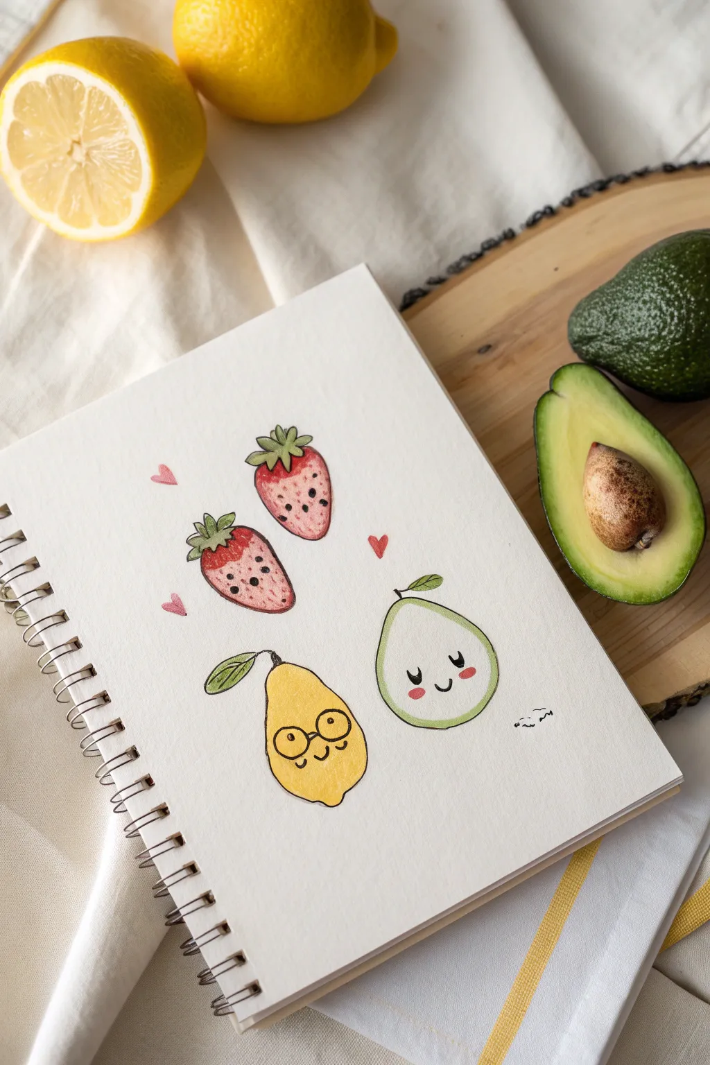
Bring your sketchbook to life with these adorable, kawaii-style fruit characters drawn with the opacity and precision of paint pens. This project features blushing strawberries, a bespectacled lemon, and a serene avocado, all realized with simple shapes and expressive faces.
Step-by-Step Tutorial
Materials
- Heavyweight sketchbook or mixed media paper
- Posca or acrylic paint pens (Red, Pink, Yellow, Light Green, Dark Green, Black, White)
- Pencil (HB or H)
- Clean eraser
- Scrap paper for testing nib flow
Step 1: Drawing the Base Shapes
-
Sketch the strawberries:
Start by lightly sketching two inverted triangular shapes with rounded corners near the top left of your page. Make the top one tilt slightly right and the bottom one tilt slightly left for a dynamic composition. -
Outline the lemon character:
Below the strawberries, sketch a pear-like or teardrop shape for the lemon/pear character. Give it a slightly wider bottom to accommodate the face later. -
Form the avocado:
To the right, draw a classic avocado shape—narrower at the top and bulbous at the bottom. Inside, lightly mark the large round seed area near the bottom center. -
Add leafy details:
Top your strawberries with jagged, crown-like leaves. Give the lemon a single stem with a leaf curving left, and add a small stem with a leaf to the top of the avocado.
Fixing Wet Smudges
If you accidentally touch wet paint, don’t wipe! Let it dry completely, then paint over the mistake with the background paper color or the fruit color. Layers are your friend.
Step 2: Adding Color
-
Base coat the strawberries:
Using a red paint type pen (or a deep pink), color in the main body of the two strawberries. If the paper is absorbent, move quickly to avoid streaks. -
Color the lemon:
Fill the teardrop shape with a bright, sunny yellow paint pen. Ensure the coverage is solid; you might need a second coat after the first dries completely to hide any paper texture. -
Paint the avocado flesh:
Use a very pale green or mint color for the main body of the avocado. Leave the center seed uncolored for now if you plan to use a different shade, or paint over it later if your pens are opaque enough. -
Detail the greenery:
Switch to a darker olive green for the strawberry leaves. For the lemon and avocado leaves, outline them in a dark green and fill them with a slightly lighter green for contrast. -
Add blush details:
While the base colors are drying, draw three small floating hearts around the strawberries using a soft pink or red pen to emphasize the cute theme.
Glossy Finish
Once fully dry, coat just the fruit shapes with a clear dimensional glaze (like Diamond Glaze or clear nail polish) to make them pop like real enamel pins.
Step 3: Bringing Them to Life
-
Outline the forms:
Once the paint is totally dry to the touch, use a fine-tip black paint pen or a micron liner to trace the outer edges of all your fruits. Keep the lines sketchy and organic rather than perfectly rigid. -
Create the strawberry seeds:
Dot the strawberries with small black specks. I like to keep them random but evenly spaced to mimic real texture without overcrowding the face area. -
Draw the strawberry faces:
On the lower half of each strawberry, draw two small black dots for eyes and a tiny ‘u’ shape for a smile. Add pink cheeks using a light touch with a pink pen. -
Give the lemon personality:
Draw two large circles for glasses on the lemon. Add dots inside for eyes and a curved line connecting them for the bridge of the nose. Add a smile and rosy cheeks. -
Finish the avocado:
Draw a happy face low on the avocado’s body. Use two ‘u’ shapes for closed, smiling eyes and a small mouth. Add prominent pink oval cheeks. -
Final highlights:
Use a white paint pen to add tiny reflection dots to the eyes (if open) or on the shiny parts of the fruit skin to give them a glossy sticker effect.
Now you have a page of sweet, cheerful companions ready to brighten up your art journal
Mini Animal Faces With Clean Outlines
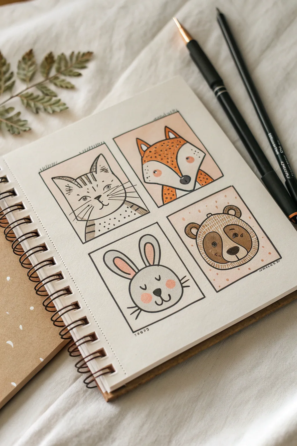
Create a charming collection of stylized animal portraits using clean black outlines and soft, muted colors. This project breaks down four adorable creatures—a cat, fox, rabbit, and bear—into simple geometric shapes perfect for sketchbook practice.
Step-by-Step Guide
Materials
- Spiral-bound sketchbook (mixed media or heavy drawing paper)
- Black fine liner pens (0.3mm and 0.5mm)
- Black brush pen or thicker marker (for bolder lines)
- Paint pens or colored markers (soft orange, muted brown, blush pink, beige)
- Pencil (HB)
- Eraser
- Ruler
Step 1: Setting the Grid
-
Draft the frames:
Using your pencil and ruler, lightly draw four equal squares on your page. Arrange them in a 2×2 grid, leaving a comfortable margin between each box to give the drawings room to breathe.
Clean Corners
Don’t connect the frame corners perfectly. Leave small gaps or let lines overshoot slightly for a loose, artistic sketchbook vibe.
Step 2: Sketching the Characters
-
Outline the cat (Top Left):
Sketch a U-shape for the head within the first box. Add two triangles for ears on top. Inside, draw two dots for eyes and a small ‘w’ shape for the mouth. -
Outline the fox (Top Right):
Draw a wide heart-like shape for the face, emphasizing the cheek points. Add large, pointy triangular ears. Place the nose lower down as a rounded triangle. -
Outline the rabbit (Bottom Left):
Sketch a simple circle for the head. Draw two long, oval ears pointing upward. Keep the facial features very centered and low on the face for a cute look. -
Outline the bear (Bottom Right):
Draw a rounded shape for the head. Add two small semi-circles for ears. Sketch a large oval patch in the center for the snout area.
Ink Smudging?
If your black outlines bleed when coloring, switch the order: apply the color blocks/washes first, let them fully dry, and then draw the black outlines on top.
Step 3: Inking the Lines
-
Trace the frames:
Go over your square borders with the 0.5mm pen. To make it look hand-drawn rather than rigid, you don’t need to use a ruler for this step—a slightly wobbly line adds character. -
Define the main contours:
Use the thicker pen or brush pen to trace the main outline of each animal’s head. Variations in line weight here really help the characters pop. -
Add fine details:
Switch to your 0.3mm fine liner for whiskers, fur texture, and smaller facial features. For the cat, add horizontal stripes on the forehead and dotted details on the body.
Step 4: Adding Color
-
Color the fox:
Use a muted orange paint pen to fill in the top half of the fox face and the outer ears. Leave the cheek tufts and snout area white for contrast. -
Color the bear:
Fill the bear’s main head shape with a soft brown marker. Use a lighter beige for the central snout area to make the nose stand out. -
Blush the rabbit:
Lightly color the inner ears pink. Add two soft pink circles on the cheeks. I find dabbing the marker lightly creates a softer, fur-like texture. -
Background tints:
Gently color the background of the cat and fox panels with a very pale blush or beige tone, creating a cohesive look across the grid.
Step 5: Final Touches
-
Enhance the eyes:
Go back with your black pen and darken the pupils. Add tiny white gel pen dots if you want a highlight, or keep them solid black for a graphic style. -
Texturize the fur:
Pattern the colored areas. Add small dots or dashes on the fox’s orange fur and the bear’s brown fur using a slightly darker pen or fine liner. -
Erase pencil marks:
Wait until the ink is completely dry to avoid smudging. Gently erase all visible pencil guidelines to reveal the crisp illustration underneath.
You now have a delightful grid of animal friends ready to brighten up your sketchbook page
BRUSH GUIDE
The Right Brush for Every Stroke
From clean lines to bold texture — master brush choice, stroke control, and essential techniques.
Explore the Full Guide
Geometric Pattern Tiles
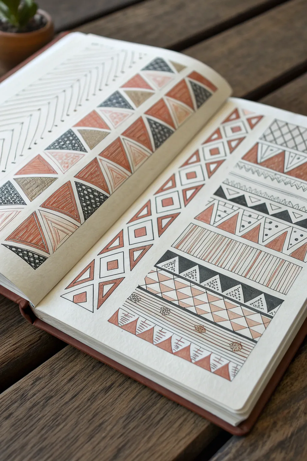
Fill your sketchbook with satisfying, structured geometric patterns using a simple color palette of black ink and warm terracotta. This project explores the beauty of repetition, turning basic triangles and lines into intricate, textile-inspired designs.
Detailed Instructions
Materials
- Fine-tip black drawing pen (size 01 or 03)
- Medium-tip black drawing pen (size 05 or 08)
- Terracotta or rust-colored brush pen or paint pen
- Pencil and eraser
- Ruler
- Sketchbook with smooth, heavy paper
Step 1: Planning the Layout
-
Set the boundaries:
Begin by using your ruler and pencil to draw light guidelines. On the left page, create a wide column for the large triangle pattern. On the right page, divide the space into several horizontal rows of varying heights. -
Map the master grid:
For the patterns on the right page, lightly sketch the vertical and diagonal grid lines to guide your deeper patterns, especially for the alternating diamond and triangle rows.
Step 2: Left Page: The Triangle Weave
-
Draw the main triangles:
Using your medium black pen, ink the outlines of the large, interlocking triangles. They should alternate pointing up and down, fitting together like puzzle pieces. -
Apply solid colors:
Select specific triangles to fill comfortably with your terracotta marker. I like to space these out randomly so the color feels balanced across the page. -
Add texture with ink:
Switch to your fine-tip pen. Fill some empty triangles with small circles, straight vertical lines, or cross-hatching to create contrasting textures against the solid colors. -
Create the top border:
Above your main triangle block, draw a row of simple chevron lines (V-shapes) stacking upwards. Keep the lines thin and evenly spaced for a delicate look.
Uneven Spacing?
If your freehand triangles are getting wonky, use a ruler to mark dots at equal intervals along the top and bottom of the row, then connect the dots diagonally.
Step 3: Right Page: Horizontal Bands
-
Band 1: Diamonds and squares:
Start at the top left. Draw a sequence of squares, outlining them in black. Inside each, draw a smaller square or diamond, coloring the negative space with terracotta. -
Band 2: Cross-hatch triangles:
To the right of the diamond band, create a section of stacked triangles. Use a ruler to cross-hatch the interior of every other triangle for a woven effect. -
Band 3: Zig-zag border:
Draw three parallel zig-zag lines. Fill the space between the top two lines with vertical hatching. On the points of the bottom line, add small black dots for emphasis. -
Band 4: The flag pattern:
Draw a horizontal line with triangles hanging down from it. Fill every other triangle with solid black ink. Inside the white triangles, place three small vertical dots. -
Band 5: Vertical stripes:
Create a tall rectangular block. Use your ruler to fill this entire space with closely spaced vertical lines. Ensure your hand pressure is consistent to keep the line weight steady. -
Band 6: Black and grey triangles:
Below the stripes, draw a row of smaller triangles. Fill the background behind them with solid black ink, leaving the triangles white. Inside the white triangles, add tiny stippling or dashed lines. -
Band 7: The bottom border:
For the final wide band at the bottom, draw a double horizontal line. Decorate the space with small floral doodles or geometric stars spaced evenly apart. -
Identify the base points:
Under the floral line, draw a final row of triangles pointing upwards. Fill these solidly with your terracotta pen. -
Add directional dashes:
Between the terracotta triangles, draw sets of small horizontal dashboards or ‘equals’ signs to fill the white negative space.
Ink Smearing
Place a scrap piece of paper under your drawing hand. This acts as a shield, preventing oils from your skin from warping pages and stops your palm from smudging wet ink.
Step 4: Finishing Touches
-
Erase guidelines:
Wait at least 10-15 minutes to ensure all ink is completely dry. Gently run your eraser over the entire page to remove the initial pencil grid. -
Refine edges:
Check the borders of your color-filled areas. If the edge is ragged, go over the black outline once more with the medium pen to crispen the boundary.
Now you have a stunning reference page of geometric patterns ready to inspire future artwork
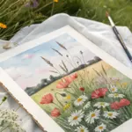
Rainbow Gradient Bands
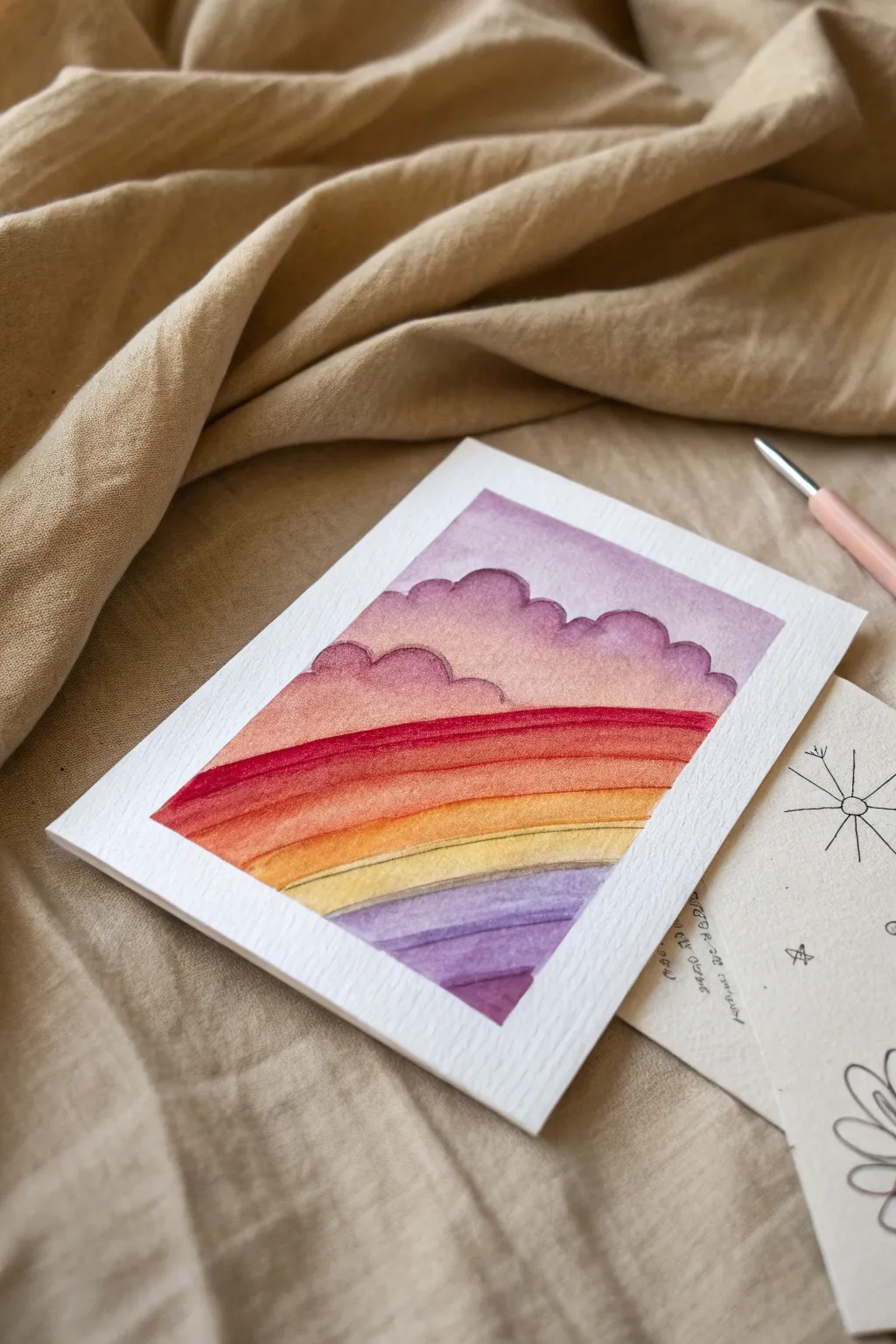
Capture the magic of a soft, colorful sunset with this layered watercolor and paint pen project. You’ll create sweeping bands of warm gradients underneath fluffy purple clouds, all on a lovely textured card.
Step-by-Step Guide
Materials
- Cold-pressed watercolor paper (300gsm)
- Watercolor paints (Purple, Magenta, Orange, Yellow, Indigo)
- White or light pink paint pen (fine tip)
- Round watercolor brush (size 6 or 8)
- Masking tape
- Clean water and paper towels
- Flat board or hard surface
Step 1: Setting the Scene
-
Prepare the paper:
Cut your cold-pressed watercolor paper to your desired size (A5 or postcard size works well). The textured surface is key for the final look. -
Tape it down:
Secure the paper to your board using masking tape on all four sides. This creates a clean white border and prevents the paper from buckling when wet. -
Sketch the clouds:
Lightly trace the outline of puffy cumulus clouds near the top third of the paper with a pencil. Keep the lines faint so they disappear under the paint later.
Fixing “Blooms”
If water puddles push pigment away creating creating cauliflower-like edges, wait for it to dry, then gently scrub the edge with a damp stiff brush to soften it.
Step 2: Painting the Sky
-
Mix a soft purple:
Dilute your purple watercolor with plenty of water to create a pale lavender wash. -
Paint the background sky:
Wash this pale purple over the very top area above your pencil cloud lines. Let this layer dry completely before moving on. -
Define the clouds:
Mix a slightly more saturated purple-pink. Paint the cloud shapes, starting with the edges to make them crisp, then softening the color with water as you move toward the center of the cloud. -
Layering the clouds:
While the cloud paint is still slightly damp, drop a tiny bit of darker purple into the bottom curves of the clouds to create shadow and volume.
Step 3: Creating the Gradient Bands
-
Start with deep red:
Beneath the clouds, paint a bold, horizontal band of deep magenta or red. Use a confident, sweeping stroke across the page. -
Transition to orange:
While the red edge is wet, paint an orange band right below it, letting the colors bleed slightly into each other for a soft transition. -
Add the yellow band:
Continue downwards with a warm yellow strip. This should be the brightest part of your gradient, representing the fading sun. -
Introduce the purple base:
Below the yellow, switch back to purple tones. Paint a lavender band that mimics the shape of the horizon or distant hills. -
Darken the bottom:
Finish the bottom-most band with a deeper indigo or violet mix to ground the composition. -
Dry completely:
Allow the entire painting to dry fully. If the paper feels cool to the touch, it’s still damp inside.
Add Metallic Magic
Once dry, trace the edge of the clouds or the yellow band with a gold paint pen. It catches the light perfectly and mimics the ‘silver lining’ of a cloud.
Step 4: Enhancing with Pens
-
Outline the clouds:
Using a fine-tip paint pen (or a very steady hand with dark purple paint), carefully outline the tops of your cloud shapes to make them pop. -
Separate the bands:
Use a subtle stroke of a darker watercolor or a fine pen to define the lines between the colored bands, giving it that illustrative, segmented look. -
Add delicate details:
I like to add very faint, thin lines within the colored bands to suggest texture or movement, just like in the reference image.
Step 5: The Final Reveal
-
Check for dryness:
Ensure absolutely no damp spots remain, otherwise the tape might tear the surface. -
Peel the tape:
Slowly peel the masking tape away from the paper at a 45-degree angle to reveal those crisp white borders.
Now you have a serene little landscape ready to frame or send as a card


Neon Pop on Black Paper
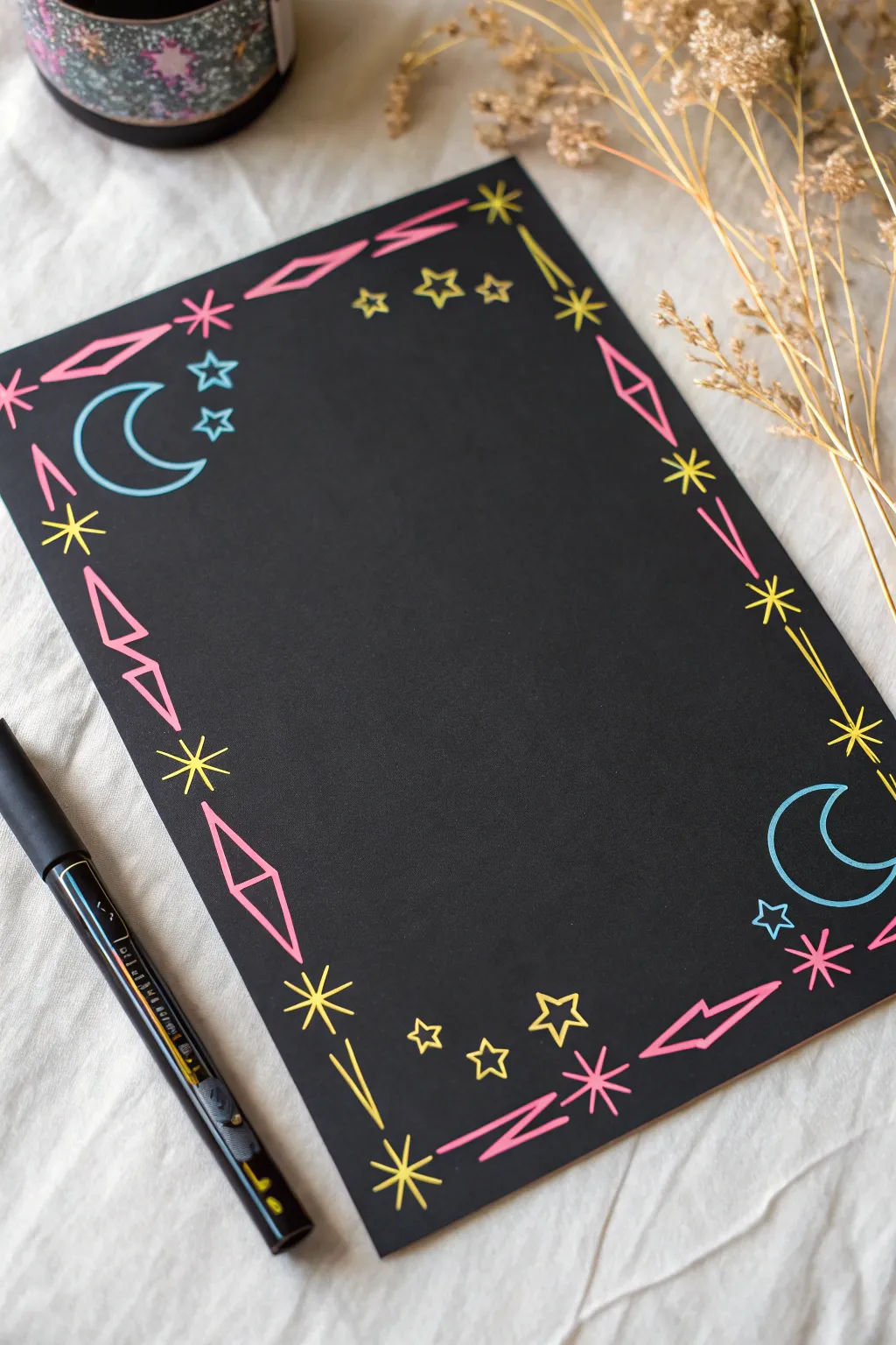
Bring the cosmos to your desk with this striking 80s-inspired border design that absolutely glows against black cardstock. Using vibrant neon paint pens, you’ll create a repeating pattern of moons, stars, and geometric shapes perfect for framing notes or journal entries.
Detailed Instructions
Materials
- Black cardstock or heavy black paper (A4 or A5 size)
- Neon paint pens (fine point): Electric Pink, Bright Yellow, Cyan/Light Blue
- Ruler (clear plastic is best)
- Pencil (optional for sketching)
- White eraser (optional)
Step 1: Planning the Layout
-
Establish the corners:
Visualize your paper as having four main focal points. We will build the design around the corners first to ensure everything is balanced. -
Light pencil sketch (optional):
If you are nervous about freehanding, use a pencil to lightly mark a 1-inch margin around the entire page so your border stays consistent.
Step 2: Drawing the Geometric Framework
-
Start with the diamonds:
Using your pink pen, draw elongated diamond shapes near the top left and bottom right corners. These act as anchors for the pattern. -
Add connecting zigzags:
Between the diamonds along the long edges, draw long, stretched ‘lightning bolt’ or zigzag shapes in pink. Keep the lines sharp and angular. -
Draw the straight lines:
Along the shorter edges and some parts of the long edges, draw disjointed straight pink lines that follow the border’s direction, leaving gaps for other elements. -
Create the large stars:
Switch to your yellow pen to draw large, eight-pointed asterisks or stars. Place these strategically at the midpoints of the sides and near the corners to break up the pink lines.
Fixing Smudges
Smudged a neon line? Don’t panic. Let it dry completely, then color over the mistake with a black paint pen or permanent marker to ‘erase’ it.
Step 3: Adding Celestial Details
-
Draw the crescent moons:
With the cyan blue pen, draw a large, open crescent moon in the top-left area. Create a mirror image of this moon in the bottom-right corner for symmetry. -
Add small blue stars:
Draw tiny, five-pointed outline stars in blue near the crescent moons. These should look like little clustered constellations. -
Mix in solid stars:
Use the yellow pen to draw small, five-pointed outline stars scattered throughout the empty spaces between the zigzags and diamonds. -
Incorporate radiating bursts:
Draw simple ‘starburst’ shapes—just a cross with diagonal lines through the center (*)—using the pink pen. Place these near the yellow stars for contrast.
Add Dimension
Use a white gel pen to add tiny highlight dots on the tips of the stars or the curves of the moon to make the neon colors pop even more.
Step 4: Refining and Finishing
-
Fill the gaps:
Look at the overall composition. If there are large black spaces, add tiny dots or very small four-pointed stars using the yellow pen to create a ‘sparkle’ effect. -
Check line opacity:
Neon paint on black paper sometimes needs a second pass. I like to let the first layer dry completely, then retrace any lines that don’t look bright enough. -
Sharpen the points:
Go back with your pens and carefully sharpen the tips of your stars and diamonds to make them look crisp and professional. -
Drying time:
Wait at least 5-10 minutes before touching the artwork to avoid smearing the ink, which sits on top of the paper surface. -
Erase guidelines:
Once you are 100% sure the ink is bone dry, gently erase any visible pencil marks from step 1.
Now you have a stunning, retro-styled page ready for your favorite quote or to-do list
Galaxy Strips and Space Icons
Create a stunning dimensional display with this tri-fold galaxy project, featuring vibrant watercolor nebulas overlaid with crisp white space icons. The blend of dreamy pinks, purples, and blues contrasting against sharp paint pen doodles makes for an out-of-this-world desk accessory or greeting card.
Step-by-Step Guide
Materials
- Heavyweight watercolor paper (300gsm recommended)
- Watercolors (pan or tube): Pink, Purple, Indigo/Dark Blue
- Painter’s tape or crafting washi tape
- White extra-fine paint pen (0.7mm or smaller)
- Soft round watercolor brush (size 6-8)
- Jar of water and paper towels
- Ruler
- Pencil
Step 1: Preparing the Canvas
-
Measure and fold:
Cut a rectangular strip of watercolor paper approximately 9 inches wide by 6 inches tall. Using a ruler, lightly mark the paper at 3-inch intervals. -
Create the creases:
Carefully score along your pencil marks to create crisp folds, folding the paper accordion-style so it stands on its own. -
Tape the borders:
Unfold the paper flat. Apply painter’s tape around the entire perimeter of each individual panel, leaving a small white border. This creates that clean, framed look seen in the example.
Step 2: Painting the Galaxy
-
Wet the first panel:
Start with the left panel. Brush clear water onto the paper inside the taped area until it creates a glossy sheen. -
Drop in bright colors:
While the paper is wet, load your brush with vibrant pink and drop it into the center area. Let it bloom naturally. -
Add deep purples:
Introduce purple paint around the edges of the pink, allowing the colors to bleed together where they meet. -
Create the blue panel:
Move to the middle panel. Use a wet-on-wet technique again, but this time stick to monochromatic blues. Start with a lighter wash and drop in concentrated indigo while it’s still damp for texture. -
Paint the final gradient:
For the right panel, create a gradient effect. Apply deep purple at the top and blend it down into a reddish-pink at the bottom. -
Dry completely:
Let the paint dry fully. I usually wait until the paper is barely cool to the touch before peeling the tape to ensure crisp lines.
Paint Bleeding Under Tape?
Ensure tape edges are sealed tight by running a fingernail over them. If paint bleeds, cover the error with a larger white star or planet doodle later.
Step 3: Designing the Cosmos
-
Activate the pen:
Shake your white paint pen well and press the tip onto a scrap piece of paper to get the ink flowing smoothly. -
Draw the main planets:
In the center of the left panel, draw a ringed planet. Start with the circle, then add an oval ring tilted at an angle. -
Add detail to the center:
On the middle blue panel, draw a similar ringed planet but slightly larger to serve as a focal point. -
Fill the third panel:
On the right panel, sketch two simple spheres with horizontal stripes to represent gas giants without external rings. -
Scatter the stars:
Draw four-pointed stars (diamond shapes with curved sides) sparingly around the planets to fill the larger gaps. -
Create distant stardust:
Use the very tip of the paint pen to dot tiny specks throughout the background. Vary the pressure to create different sized dots. -
Add constellations:
If you have open spaces, connect a few dots with thin lines to suggest distant constellations. -
Review and refine:
Check for any transparent lines. If the watercolor shows through your white ink, go over your doodles a second time once the first layer is dry.
Pro Tip: Splatter Stars
For a natural starry look, dilute white gouache or acrylic on a toothbrush and flick the bristles over the dry watercolor before drawing your icons.
Stand your creation on a windowsill or desk to enjoy your personal view of the galaxy
Color Blob Base With White Detail Lines
This soothing art project combines the structured beauty of a mandala with soft, organic botanical elements. By laying down pastel color blocks first and adding intricate ink details on top, you achieve a stunningly complex look that is surprisingly relaxing to create.
Step-by-Step
Materials
- Smooth bristol or mixed-media paper (A4 size)
- Pencil (HB) and eraser
- Compass and ruler
- Black fine liner pens (sizes 0.1, 0.3, and 0.5)
- Pastel brush markers or paint pens (Dusty Pink, Sage Green, Golden Yellow)
Step 1: Structure & Base Color
-
Find the center:
Mark a small dot in the exact center of your page. Using your compass, draw a small circle about 1 inch in diameter, followed by four more concentric circles expanding outward, leaving roughly 0.5 to 1 inch of space between each ring. -
Sketch the petal guides:
In the largest outer ring, lightly sketch large, scalloped petal shapes with your pencil to define the mandala’s outer edge. -
Apply the center colors:
Using your golden yellow marker, fill in the very central circle. Move to the next ring out and fill it with segments of dusty pink, leaving petal-shaped negative spaces of white paper in between the pink blocks. -
Color the middle bands:
Fill the third ring completely with your sage green marker. In the fourth ring, draw a series of small golden yellow triangles or a jagged ‘sawtooth’ pattern all the way around. -
Block in the outer petals:
For the large outer petals you sketched earlier, color just the bottom half of each petal with the dusty pink marker, creating a curved horizon line within each shape.
Pro Tip: Symmetry Hack
If you struggle to keep your petals even, lightly draw a ‘plus’ sign (+) and an ‘X’ through the center with a pencil directly after drawing your circles. These 8 slices act as guides to keep your spacing consistent.
Step 2: Inking the Details
-
Define the center:
Switch to a 0.5 black fine liner. Outline the central golden circle and draw two smaller circles inside it. Fill the innermost circle with a grid or tiny dots. -
Outline the central flower:
Using the 0.3 pen, outline the white ‘petals’ in the second ring. I like to add a second, thinner outline inside each petal to give it depth. -
Detail the pink zones:
In the pink spaces between those white petals, draw small circles or teardrop shapes to add texture to the background color. -
Vine work:
Moving to the green band, use your finest 0.1 pen to draw a continuous, wiggly vine line through the center of the green. Add tiny leaves branching off the vine to fill the colored band. -
Define the gold ring:
Outline your golden triangles (or sawtooth pattern) with the 0.5 pen. Add a small dot at the tip of each triangle for a decorative touch. -
Create a pattern buffer:
In the white space between the gold ring and the outer petals, draw a delicate pattern using the 0.1 pen—tiny scallops or a ‘fish scale’ pattern works beautifully here. -
Outline outer petals:
Trace over your large outer pencil scallops with the 0.5 pen to finalize the mandala’s shape. -
Decorate the pink bases:
Inside the pink bottom half of the large petals, use the 0.1 pen to draw intricate botanical doodles—tiny flowers, leaves, or swirls works well. -
Detail the petal tips:
For the white top half of the large petals, draw a smaller internal petal shape that mimics the outer outline, leaving a bit of breathing room. -
Erase and refine:
Wait at least 15 minutes to ensure all ink is completely dry. Gently erase your pencil grid lines to reveal the crisp contrast between the pastels and the black ink.
Level Up: Metallic Pop
Once the drawing is finished, use a white gel pen or a metallic gold paint pen to add tiny highlight dots in the center of the darkest colored areas to make the design shimmer.
Step back and admire how the simple blocks of color have transformed into a sophisticated garden design.
Dotwork Tree Canopy
This elegant monochrome project combines bold silhouette work with delicate stippling to create a stylized tree canopy full of texture. Using just a black paint pen, you will build up the foliage dot by dot for a satisfyingly organic look that pops against the white background.
Step-by-Step Guide
Materials
- Thick white paper roll or canvas pad
- Black paint pen (medium or broad tip)
- Black fine liner pen (optional, for details)
- Pencil
- Eraser
Step 1: Drafting the Structure
-
Set up your workspace:
Unroll your paper or canvas on a flat, sturdy surface. If the paper curls, weigh down the corners with books or smooth stones to keep it perfectly flat while you work. -
Sketch the ground line:
Using a pencil lightly, draw a horizontal line across the lower third of the page. It doesn’t need to be perfectly straight; a slight unevenness adds natural character. -
Outline the trunk:
Sketch the trunk of the tree rising from the center of your ground line. Draw a wide base that tapers inward as it goes up, creating a strong foundation. -
Add main branches:
Split the trunk into two or three primary thick branches. Let them curve gracefully outward and upward, reaching towards the top corners of your page. -
Develop smaller branches:
From your main branches, sketch secondary, thinner branches. Keep dividing them until you have a network of fine twigs that create a rounded canopy shape. -
Mark the canopy boundary:
Very lightly sketch a large, loose circle or oval around the branch tips to guide where your dotwork leaves will eventually go.
Step 2: Inking the Silhouette
-
Outline the trunk in ink:
Take your black paint pen and carefully trace the pencil outlines of the trunk and the thickest main branches. -
Fill the trunk:
Color in the entire trunk area with solid black. Use long, smooth strokes to ensure an even, opaque finish without visible marker streaks. -
Refine the branch tips:
Switch to a finer tip or use the very edge of your paint pen to trace the thinnest twigs. These lines should taper off into sharp points rather than blunt ends. -
Create the ground:
Draw a thick, solid line over your pencil ground sketch. Extend the black fill from the tree base outwards to connect seamlessly with this horizon line. -
Add grassy details:
along the top edge of the ground line, flick your pen upward quickly to create sharp, triangular spikes of grass. Vary their heights and angles for a realistic look.
Wrist Saver Idea
Stippling can be tiring! Instead of pecking straight down, hold the pen at a slight angle and rest your hand on a clean scrap of paper to glide smoothly.
Step 3: Creating the Canopy
-
Start the stippling:
Begin placing small dots just above the tips of your drawn branches. I find it easiest to work in clusters, keeping dots dense near the branch itself. -
Expand outward:
Continue adding dots further away from the branches. As you move outward into open space, space the dots slightly further apart to create a fading effect. -
Shape the leaf clusters:
Group your dots into rounded cloud-like shapes around each branch tip. Leave small gaps of white space between these clusters to suggest separation in the foliage. -
Layer for density:
Go back over the areas closest to the branches and add more dots to darken them. This creates a shadow effect and adds volume to the canopy. -
Fill the canopy edge:
Work your way to the outer pencil boundary you sketched earlier. Keep the dots loose and airy at the very edge to keep the tree looking soft rather than rigid. -
Review contrast:
Step back and look at the overall balance. If any area looks too pale or empty, add a few more dots to unify the texture. -
Final clean up:
Once the ink is completely bone dry, gently erase any visible pencil marks from your initial sketch, being careful not to smudge the paint.
Uneven Dots?
If your markers bleed and make blobs, your paper might be too absorbent. Try a smoother, coated cardstock or tap more lightly to control ink flow.
Now you have a striking piece of nature-inspired art that balances bold lines with delicate detail

Have a question or want to share your own experience? I'd love to hear from you in the comments below!