If you love that moment when colors start moving on their own, paint pouring is basically pure joy in motion. I pulled together my favorite fluid art ideas—from classic pours with juicy cells to a few we-irder studio experiments you’ll want to try at least once.
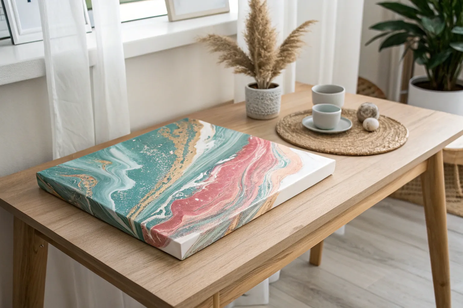
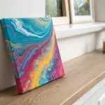
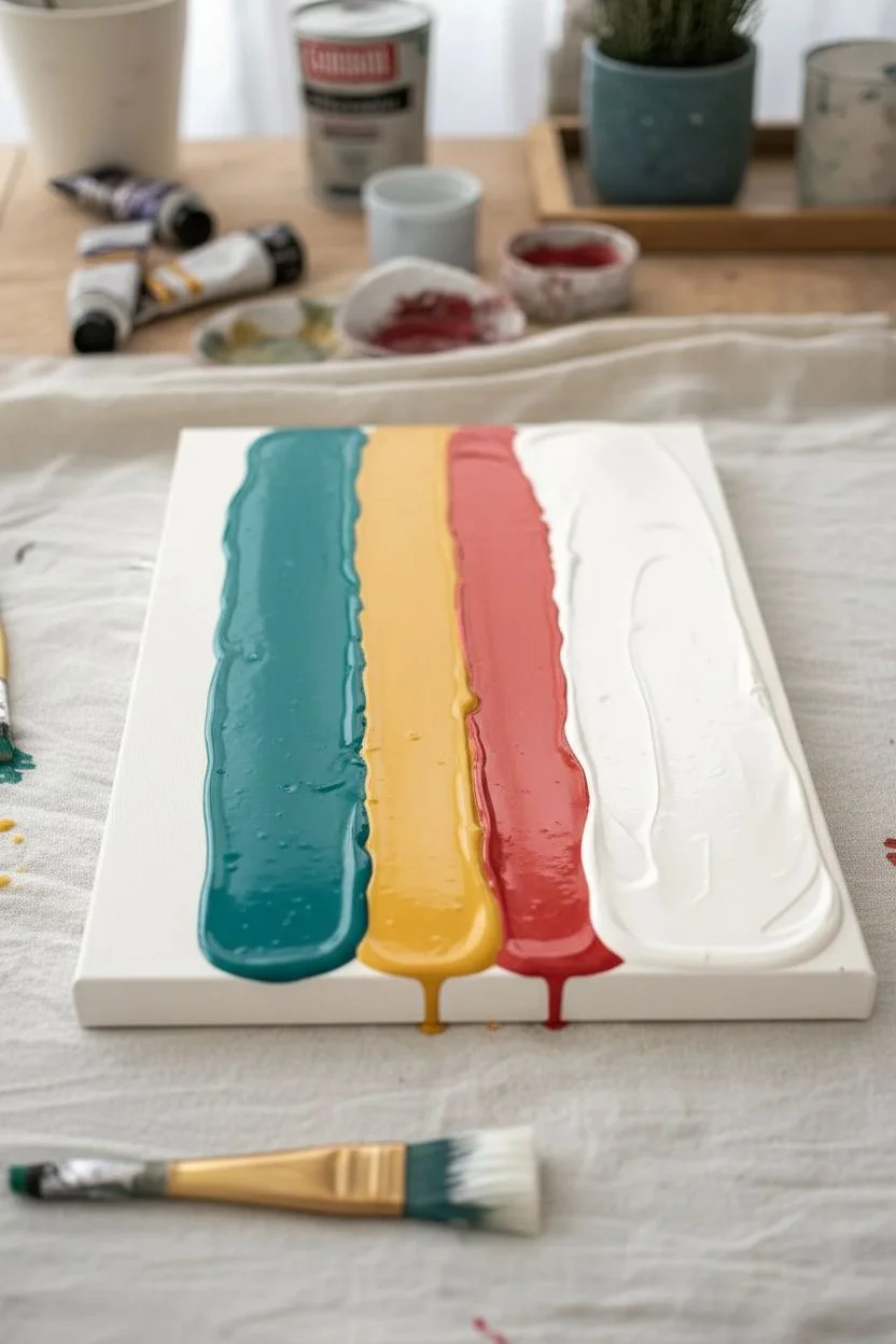
Flip Cup Acrylic Pour Reveal
This striking acrylic pour uses a multi-cup flip technique to create distinct zones of swirling color that merge into a cohesive abstract design. The combination of deep reds, teals, and milky whites creates a marbled effect that feels both energetic and fluid.
Step-by-Step Guide
Materials
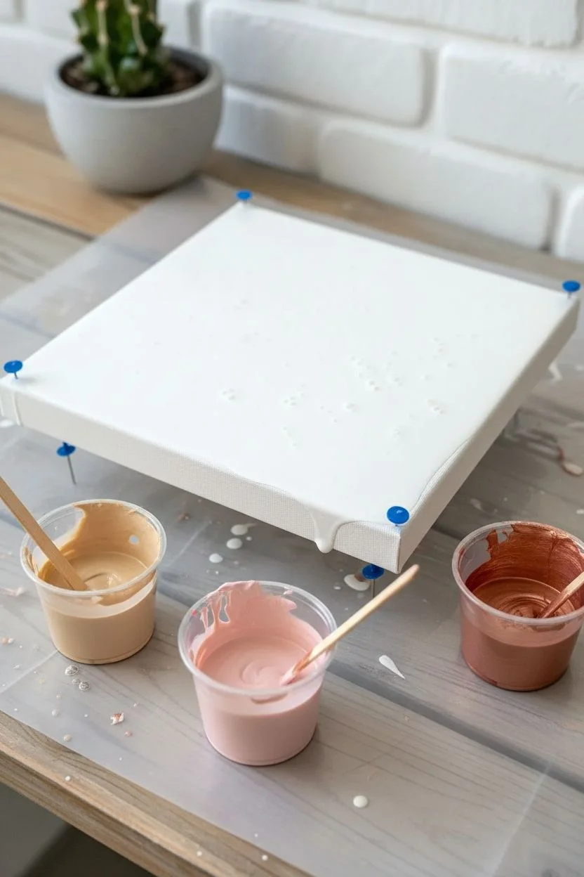
- Square stretched canvas (approx. 10×10 or 12×12 inches)
- Acrylic pouring paints (Deep Red, Teal/Turquoise, Titanium White, Copper or Orange)
- Pouring medium (like Floetrol or Liquitex)
- 3 small paper or plastic cups (approx. 3oz size)
- Wooden craft sticks for stirring
- Push pins (for elevating the canvas)
- Drop cloth or plastic sheeting
- Gloves
- Torch or heat gun (optional)
Step 1: Preparation
-
Workspace Setup:
Cover your entire work surface with a drop cloth or plastic sheeting to catch the excess paint run-off. This gets messy, so ensure you have plenty of covered space. -
Elevate Canvas:
Insert four push pins into the wooden corners on the back of your canvas. This lifts the canvas off the table, allowing the paint to drip freely over the edges without pooling underneath. -
Mix Paints:
In separate larger cups, mix your acrylic paints with your pouring medium. A standard ratio is 1 part paint to 2 parts medium, but follow the specific instructions on your medium bottle. -
Check Consistency:
Stir until the consistency resembles warm honey. The paint should flow off the stick in a thin, continuous stream without breaking immediately.
Muddy colors?
If your colors turn gray or brown, you likely over-tilted the canvas or mixed complementary colors (like red and green) too aggressively. Try tilting less next time.
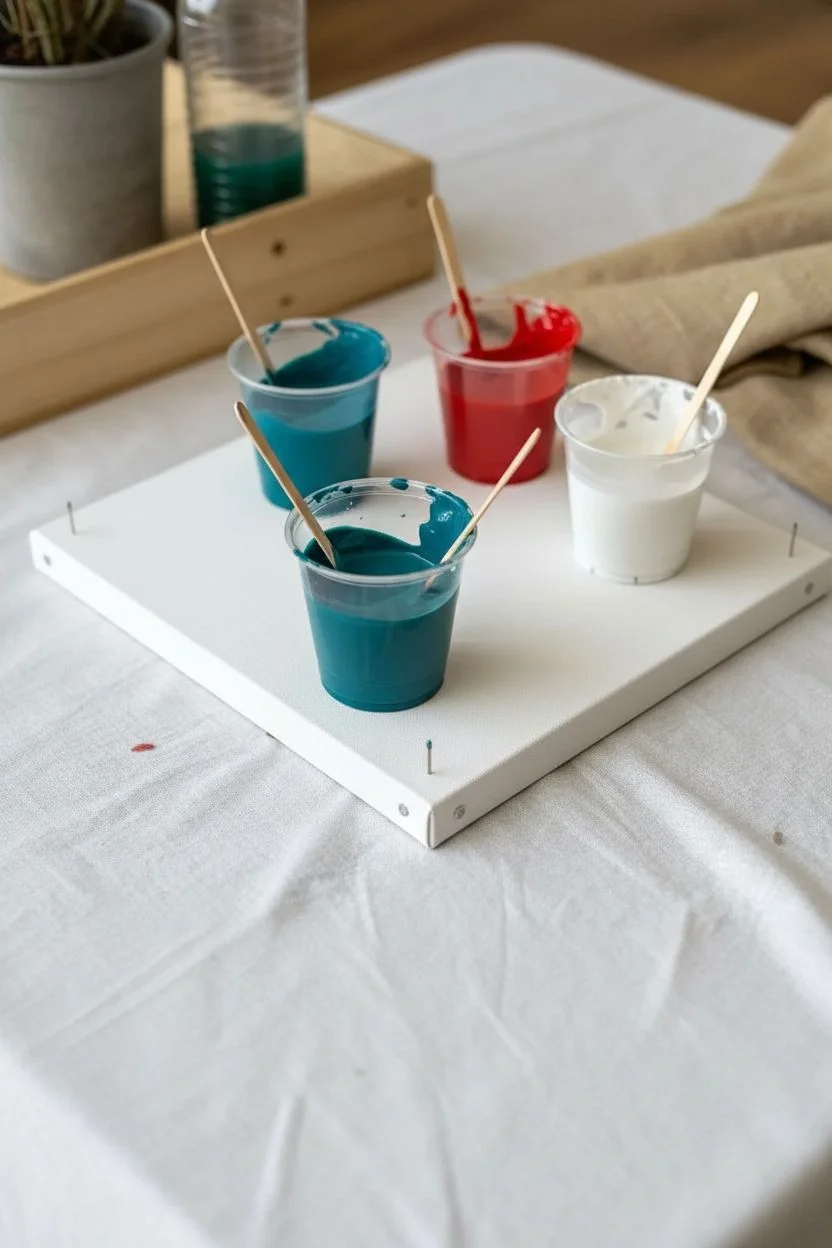
Step 2: Creating the Dirty Cups
-
Layering Cup 1:
Take the first small cup. Start by pouring a small amount of white into the bottom. Gently pour a layer of red on top of the white, followed by a dash of teal. -
Layering Cup 2:
For the second cup, alter the order slightly. Start with teal, then add white, and finish with a layer of copper or orange to create variety in the final pattern. -
Layering Cup 3:
In the third cup, repeat the layering process, perhaps focusing heavily on the red and white to anchor the composition. Don’t stir these cups; the distinctive layers are crucial. -
Fill Level:
Ensure each cup is about half to three-quarters full. You need enough paint to cover the canvas when combined, but not so much that you waste huge amounts.
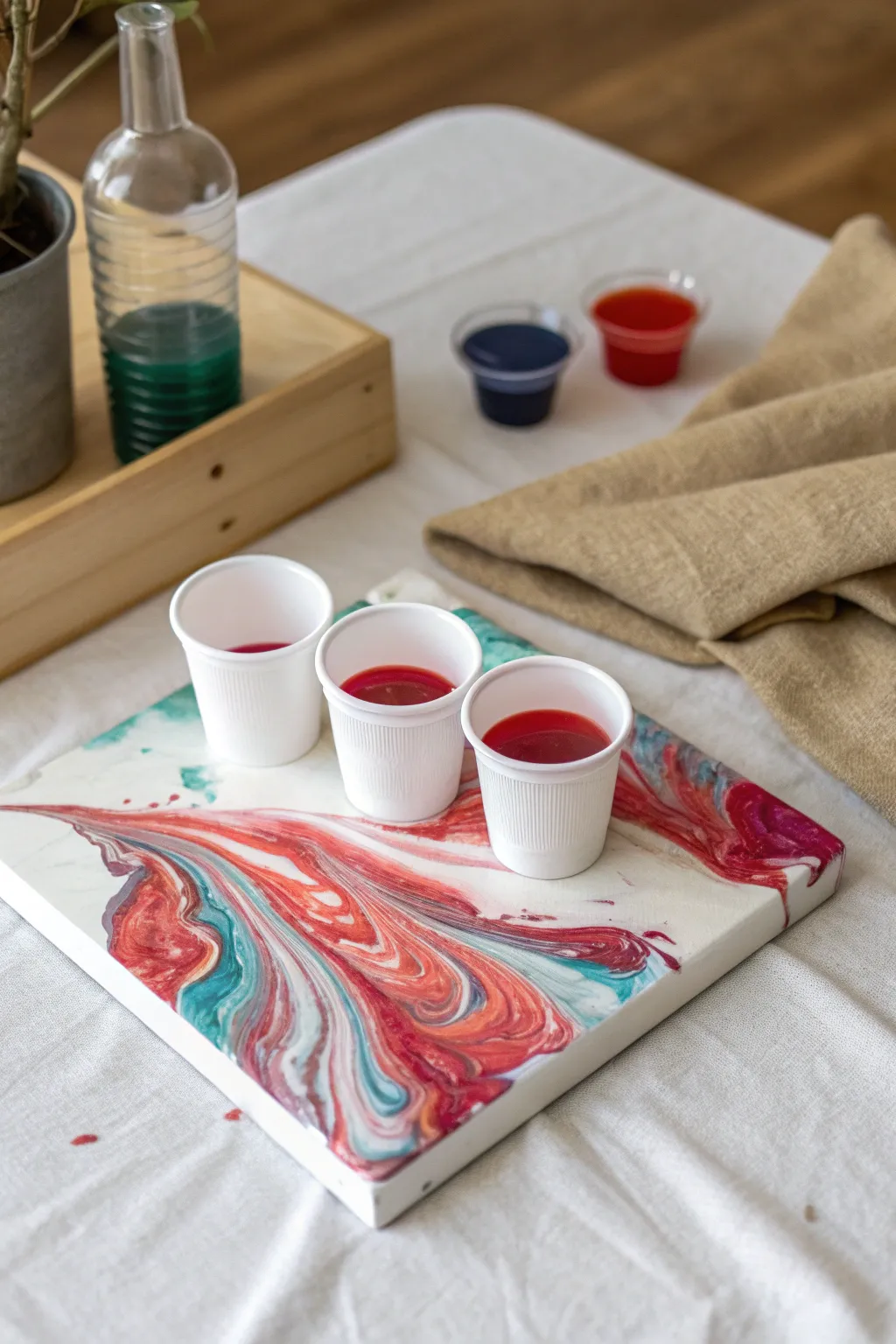
Step 3: The Flip and Pour
-
Positioning:
Place your canvas face up. Take one cup, place a piece of cardstock or your hand over the opening, flip it quickly upside down, and set it firmly onto the canvas surface. -
Repeat Flips:
Repeat the flipping motion with the remaining two cups. Arrange them in a triangular or diagonal formation across the canvas surface. -
Settle Phase:
Let the cups sit upside down on the canvas for a minute. This allows the paint to settle and the colors inside to mingle slightly before release. -
The Reveal:
Carefully lift each cup straight up. The paint will rush out in a puddle. You can drag the lip of the cup slightly through the paint to create extra movement.
Add some sparkle
For a glamorous touch, mix fine metallic gold powder into your white paint. It will create shimmering veins throughout the marble pattern when dry.
Step 4: Tilting and Finishing
-
Initial Tilt:
Gently tilt the canvas in a circular motion. Watch how the three separate puddles begin to touch and interact. -
Cover Corners:
Continue tilting until the paint reaches the corners. If a corner is stubborn, use a finger to dab a little paint there to help the flow pull across. -
Flow Control:
I like to tilt slowly back towards the center after hitting the edges to recenter the composition and prevent too much paint from running off. -
Pop Bubbles:
If you see air bubbles rising to the surface, wave a torch or heat gun briefly over the wet paint to pop them. Keep the heat moving constantly. -
Drying:
Leave the canvas to dry in a dust-free area for at least 24 to 48 hours. Ensure it remains perfectly level so the design doesn’t shift while drying.
Once fully cured, your unique abstract piece is ready to hang on the wall or be sealed with varnish
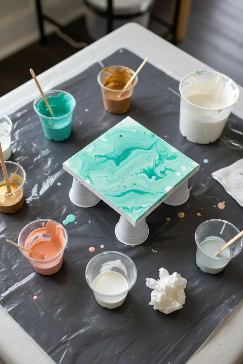
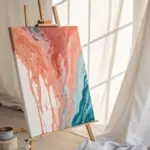
Classic Swipe Technique for Big Cells
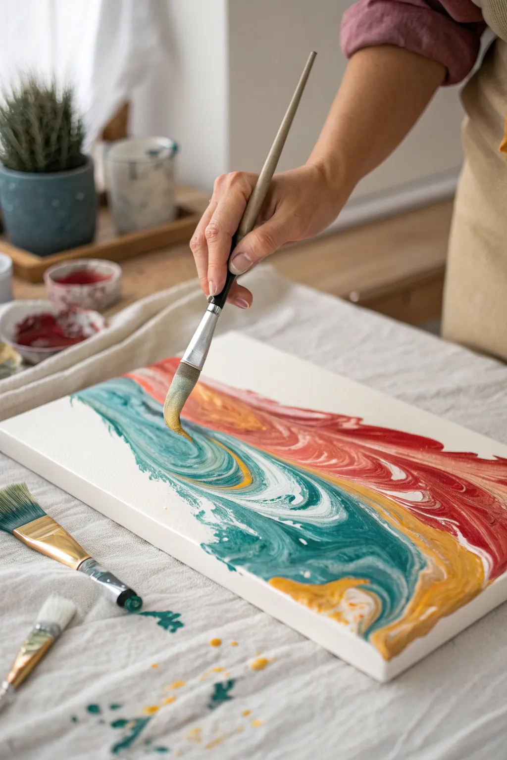
Create a mesmerizing fluid art piece that mimics the energetic crash of ocean waves against a sunset shore. This project uses the classic swipe technique to blend teal, ochre, and deep coral hues into organic, cell-rich patterns.
Detailed Instructions
Materials
- Stretched canvas (rectangular, e.g., 11×14 or similar)
- Acrylic pouring paints (Teal, Deep Coral/Rust Red, Yellow Ochre, White)
- Pouring medium (Floetrol or clear pouring medium)
- Silicone oil (100% dimethicone)
- Flat, wide paintbrush (specifically for swiping)
- Plastic cups and stir sticks
- Drop cloth or plastic sheeting
- Small torch (optional, for popping bubbles)
Step 1: Preparation & Mixing
-
Prepare the workspace:
Cover your table completely with a drop cloth. Fluid art is inherently messy, so ensure your area is protected from drips and splatters. -
Mix the paints:
In separate cups, mix your acrylic paints with the pouring medium. Aim for a ratio of approximately 1 part paint to 2 parts medium, depending on the paint’s thickness. -
Check consistency:
Stir until the consistency resembles warm honey. The paint should flow off the stick in a steady stream but not be watery. -
Add silicone:
Add 2-3 drops of silicone oil to the Teal, Coral, and Ochre mixtures. Stir just twice gently—over-stirring can break the oil down too much, preventing large cells. -
Reserve the swipe color:
Leave your White paint mixture without silicone. This will act as your ‘swipe’ color or negative space base.
Step 2: The Pour
-
Apply the white base:
Pour a generous amount of the White mixture onto the upper or lower third of the canvas to create negative space, but don’t cover the whole thing yet. -
Layer the colors:
Pour distinct ribbons of the colored paints directly onto the canvas. Start with the Deep Coral at one end, transition into Yellow Ochre, and finish with the Teal. -
Arrange the flow:
Tilt the canvas slightly just to get the paint to touch and cover the surface, but don’t over-stretch the bands of color yet. -
Add swipe paint:
Ensure there is a fresh bead of White paint right next to the colored bands where you intend to start dragging your brush.
Swipe Tool Tip
If brush bristles leave too many lines, try swiping with a dampened paper towel or a piece of flexible plastic packaging.
Step 3: The Swipe
-
Load the brush:
Take your wide, flat paintbrush. You don’t need to load it heavily with paint, but ensure it is clean and dry or slightly damp with water. -
Begin the swipe:
Place the brush lightly into the white paint adjacent to the colors. Gently drag the white paint *over* the colored bands. -
Control pressure:
Apply very light pressure. I find that imagine I’m skimming the top like a skater on ice helps—you want to drag the top layer without scraping the canvas. -
Create movement:
Don’t just swipe in a straight line. As seen in the photo, curve your wrist to create a wave-like motion, swirling the teal into the ochre and red. -
Lift and repeat:
Lift the brush at the end of the stroke. Clean the bristles, and repeat the swipe in adjacent areas if needed to blend the transitions.
Metallic Level Up
Mix gold metallic powder into your Yellow Ochre paint. When swiped, it creates shimmering ‘sand’ effects against the teal water.
Step 4: Finishing Touches
-
Develop cells:
Wait about a minute for the silicone to rise. You should see cells starting to pop up through the swiped layer. -
Torch application:
If cells are stubborn, briefly pass a small torch over the surface. The heat expands the air bubbles and brings the silicone to the surface instantly. -
Tilt for composition:
If the composition feels unbalanced, gently tilt the canvas to stretch the swiped design. Be careful not to distort the cells too much. -
Clean edges:
Run a finger or stick under the edge of the canvas to catch drips, which stops the paint from pulling the design off the side as it dries. -
Allow to cure:
Place the canvas on cups to elevate it and let it dry in a dust-free area for at least 24 to 48 hours.
Once dry, you will have a stunning, fluid recreation of a colorful shoreline to brighten your wall


Dutch Pour Petals With Air Movement
This elegant Dutch pour design captures the softness of marble with dynamic, petal-like movement in a warm palette of copper, cream, and blush. Using air to manipulate the paint creates organic, feathery edges that give the piece a sophisticated, fluid look.
How-To Guide
Materials
- Small square canvas (e.g., 6×6 or 8×8 inches)
- Acrylic paints (Titanium White, Copper/Bronze metallic, Blush Pink, Cream/Beige)
- Pouring medium (like Floetrol or Liquitex)
- Water (for thinning)
- Plastic cups and stir sticks
- Hairdryer with a concentrator nozzle attachment
- Torch (optional, for popping bubbles)
- push pins or canvas stands
- Drop cloth or plastic sheeting
Step 1: Preparation and Mixing
-
Prep the workspace:
Cover your table with plastic sheeting or a drop cloth to catch the drips. Elevate your canvas by inserting push pins into the four corners of the back or setting it on upside-down cups. -
Mix the base coat:
In a larger cup, mix your Titanium White paint with your pouring medium at a ratio of roughly 1 part paint to 2 parts medium. Add water slowly until it reaches a thin, fluid consistency similar to warm honey. It should flow off the stick without breaking but not be watery. -
Mix the colors:
Repeat the mixing process for your Copper, Blush Pink, and Cream colors in smaller cups. I usually aim for the same consistency for all colors to ensure they move together smoothly on the canvas. -
Check consistency:
Test the fluidity by lifting a stir stick; the paint should create a small mound that disappears into the cup within one or two seconds.
Muddy Colors?
Avoid over-blowing the paint. If you work an area too long, the colors will blend into a single brown tone. Stop while the separation is distinct.
Step 2: Pouring the Base
-
Flood the canvas:
Pour a generous amount of your white base mixture into the center of the canvas and spread it toward the edges. -
Cover the edges:
Use a palette knife or your finger to ensure the sides and corners are fully coated with the white base paint. This wet layer is crucial for the colored paints to glide effortlessly. -
Pop air bubbles:
Briefly pass a torch or a heat gun over the wet base coat to pop any surface air bubbles. Keep the flame moving to avoid scorching the paint.
Add Sparkle
Mix a tiny pinch of fine copper glitter into your pouring medium before adding it to the paint or sprinkle it on wet paint for extra shimmer.
Step 3: Creating the Composition
-
Layer the colors:
Pour a puddle or a diagonal line of your first color, Cream, directly onto the wet white base. Follow this immediately with a pour of Blush Pink right on top or slightly overlapping. -
Add the metallic accent:
Pour the Copper/Bronze paint as the final layer in your color puddle. Metallic paints often sink slightly, creating beautiful depth when blown out later. -
Add negative space:
Pour a ring of fresh white base paint around your puddle of colors. This extra white paint will act as a blanket to fold over the colors when we start blowing.
Step 4: The Dutch Pour Technique
-
Blow over the colors:
Using your hairdryer on the ‘cool’ and ‘low’ setting, angle the airflow to blow the white ‘blanket’ paint over the top of your color puddle, completely covering it for a moment. -
Blow out the petals:
Change your angle and blow the paint outward from the center towards the edges. Move around the canvas, pushing the paint in different directions to create petal-like shapes and feathery blending. -
Refine the center:
If the center looks muddy or empty, you can add a tiny drop of color and gently blow it out with a straw or your mouth for finer control. -
Enhance composition:
Look for areas that seem heavy. Use the hairdryer or straw again to gently push white space back into the color, breaking up solid blocks and revealing the layers beneath. -
Final torching:
Quickly torch the painting one last time. This not only pops new bubbles but can also encourage small ‘cells’ to appear where the metallic paint interacts with the other layers.
Step 5: Drying and Finishing
-
Check the sides:
Use your finger to gently touch up any sides where the canvas might be showing through, using the runoff paint from the table. -
Let it dry:
Allow the painting to dry undisturbed in a dust-free area for at least 24 to 48 hours. The surface should be completely level to prevent the design from shifting. -
Clean the back:
Once fully dry, you may want to tape the back or scrape off any dried drips for a professional finish before hanging or displaying on a small easel.
Enjoy the soothing process of watching the organic shapes emerge as your unique marble masterpiece dries


String Pull Pour for Feathered Lines
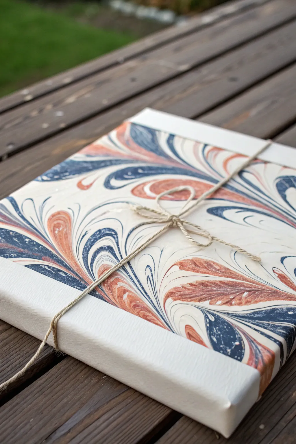
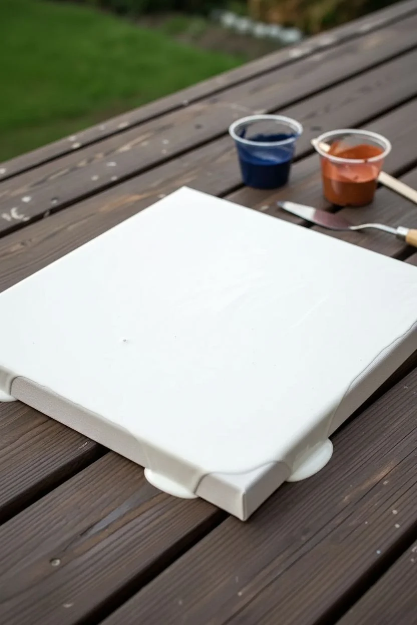
Recreate the delicate, feathery look of traditional paper marbling on a canvas using a clever string pull technique. This design pairs deep navy blues with warm coppers on a crisp white background for an elegant, organic finish that looks almost like a high-end gift wrap.
Step-by-Step Guide
Materials
- Square stretched canvas (8×8 or 10×10 inches)
- White acrylic paint (base coat)
- Navy blue acrylic paint
- Copper or burnt orange acrylic paint
- Pouring medium
- Cotton yarn or hemp string (approx. 12-15 inches per color)
- Small cups for mixing
- Palette knife or craft stick
- Jute twine (for the finishing touch)
- Scissors
Step 1: Preparing the Paint and Canvas
-
Mix your pouring medium:
In separate cups, mix your navy blue and copper paints with pouring medium. Aim for a consistency similar to warm honey; it should flow but hold its shape slightly. -
Prepare the base:
Create a larger batch of white paint mixed with medium. This needs to be slightly thicker than your colored paints to support the design. -
Flood the canvas:
Pour the white mixture generously over the entire surface of your canvas. Tilt the canvas gently to ensure even coverage, letting it flow over the sides. -
Smooth the surface:
Use a palette knife or a wide brush to smooth the white base coat if necessary, ensuring there are no dry spots. Pop any air bubbles with a toothpick.
Step 2: Creating the Feathered Design
-
Cut and soak strings:
Cut two pieces of cotton string or yarn. Submerge one completely into the navy blue cup and the other into the copper cup, leaving a clean ‘handle’ end dry. -
Lay the first string:
Take the navy-soaked string and lay it gently onto the wet white canvas in a serpentine or ‘S’ curve pattern. Don’t press down; let the paint weight settle it. -
The crucial pull:
Gently pull the string horizontally across the canvas surface. Don’t pull straight up; drag it slowly sideways to feather the paint outwards into those organic leaf-like shapes. -
Repeat with copper:
Repeat the process with the copper-soaked string, laying it parallel to or slightly interlacing with your blue waves. -
Control the feathering:
Pull the copper string slowly. I find that pulling at a slight diagonal angle creates the best ‘marbled’ effect shown in the example. -
Enhance the details:
If you want more definition, use a clean toothpick or skewer to drag fine lines through the paint while it is still wet, accentuating the feathered edges.
Muddy colors?
If colors are blending into grey, your base coat is too thin or watery. The white base needs enough body to hold the colored strings on top without sinking immediately.
Step 3: Finishing Touches
-
Clean the sides:
While the top is drying, use a damp finger or cloth to wipe the sides of the canvas clean if you prefer the white border look, or let the pattern drip over. -
Extended drying time:
Let the artwork dry completely on a flat surface. This technique can take 24-48 hours depending on humidity. -
Seal the art:
Once fully cured, apply a coat of gloss varnish to protect the paint and make that copper color pop. -
Wrap with twine:
To mimic the gift-wrapped aesthetic of the inspiration photo, cut a long length of jute twine. -
Tie the bow:
Wrap the twine around the dried canvas in the shape of a cross and tie a simple bow in the center, positioning it strategically over a negative space area.
Add some sparkle
Mix a tiny pinch of pearl metallic powder into your white base paint. It gives the negative space a subtle shimmer that looks incredible against the matte navy.
Hang your finished piece or gift it to a friend as a beautifully wrapped, permanent work of art
BRUSH GUIDE
The Right Brush for Every Stroke
From clean lines to bold texture — master brush choice, stroke control, and essential techniques.
Explore the Full Guide
Ghost Pour for Hidden Layers and Soft Reveals
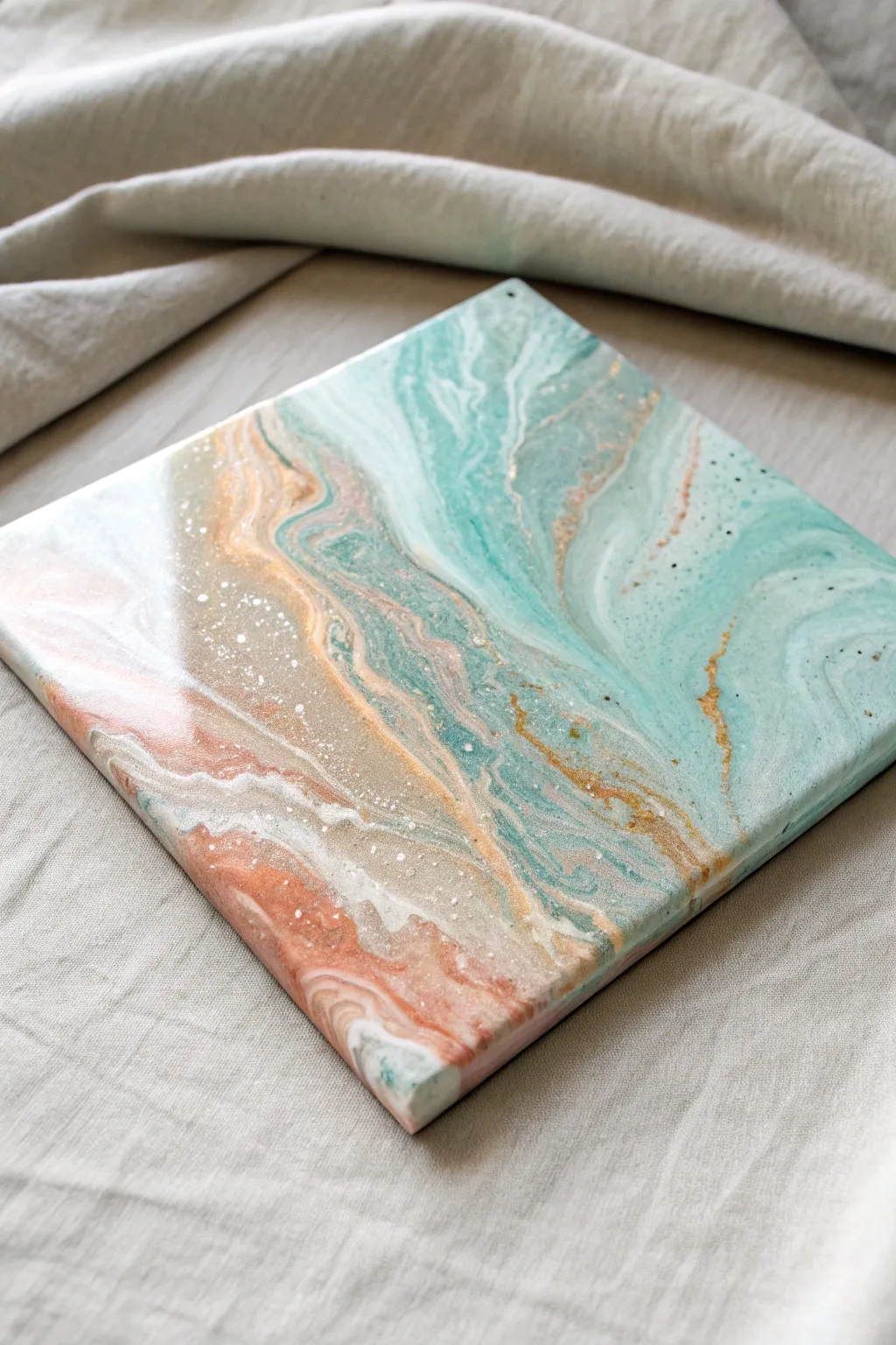
Capture the essence of a misty shoreline with this serene ghost pour technique, where soft teals and sandy beiges blend beneath a translucent veil. This project uses negative space and semi-opaque layers to create depth that mimics shallow water retreating over wet sand.
Step-by-Step Guide
Materials
- Square canvas (10×10 or 12×12 inches)
- White acrylic paint (heavy body)
- Titanium White acrylic paint (mixed for ghost layer)
- Teal or Aqua Green acrylic paint
- Beige or Sand colored acrylic paint
- Metallic Gold or Bronze acrylic paint
- Coral or Peach acrylic paint (optional accent)
- Pouring medium (Floetrol or Liquitex)
- Silicone oil (optional, for cells)
- Plastic cups and stirring sticks
- Hair dryer or straw (for blowing paint)
- Palette knife
- Torch (optional, for air bubbles)
Step 1: Preparation & Mixing
-
Prepare the workspace:
Cover your work surface with plastic sheeting or a large garbage bag. Place your canvas on four upside-down cups to elevate it, allowing drips to flow freely off the edges. -
Mix the base colors:
In separate cups, mix your teal, beige, coral, and metallic gold paints with pouring medium. Aim for a ratio of about 1 part paint to 2 parts medium. The consistency should resemble warm honey—flowing but not watery. -
Create the opaque white:
Mix a standard opaque white with pouring medium. This will be your base layer and part of the distinct white lacing. -
Mix the ‘Ghost’ white:
In a new cup, mix a very small amount of Titanium White with a larger amount of pouring medium and a splash of water. This mixture needs to be much thinner and more translucent than your other colors to create the foggy, ghostly effect.
Step 2: The Pour
-
Lay the foundation:
Pour a generous amount of your opaque white mixture onto the canvas. Use a palette knife or tilt the canvas to spread it evenly, ensuring the entire surface and corners are covered. -
Add color bands:
Pour puddles or ribbons of the teal paint diagonally across the upper right portion of the canvas. Follow this with the beige and coral ribbons in the lower left section, mimicking a shoreline. -
Inject metallic veins:
Drizzle thin lines of the gold or bronze paint between the teal and beige sections. I find that less is more here; these metallic touches will expand as the paint moves. -
Apply the ghost layer:
Gently pour your thin, translucent white ‘ghost’ mixture over specific areas where the colors meet. Don’t cover everything; focus on the transition zones to soften the harsh lines.
Cloudy Finish?
If your ghost layer dries too opaque, hiding the color, your white mix was too thick. Next time, add more pouring medium or a drop of water to increase transparency.
Step 3: Manipulation & Effects
-
Blow out the colors:
Using a hair dryer on the ‘cool’ and ‘low’ setting (or just a straw for more control), gently blow the paint waves over each other. Push the white base over the colors, and the ghost layer over the teals. -
Create movement:
Tilt the canvas slowly in a circular motion. Watch how the translucent ghost layer glides over the pigments, creating that milky, submerged look without fully hiding the color beneath. -
Refine the composition:
Stop tilting once you have a diagonal flow that pleases you. The upper right should be dominated by the teal ocean tones, while the lower left retains the sandy beige warmth. -
add spatter details:
Dip a stiff brush or toothbrush into thin white paint and flick it gently over the darkest teal areas to create tiny specks that look like sea spray or bubbles. -
Check the edges:
Run a finger along the underside of the canvas frame to catch drips. Use excess paint from the table to touch up any bare corners. -
Remove bubbles:
If you see stubborn air bubbles, quickly pass a culinary torch or lighter over the surface. Keep it moving constantly to avoid scorching the paint skin.
Beach Glass Vibes
Embed tiny pieces of crushed glass or real sand into the beige section while the paint is still wet to add genuine texture to your shoreline.
Step 4: Finishing
-
Initial drying:
Let the painting sit undisturbed in a dust-free area for at least 24-48 hours. The ‘ghost’ effects often become more pronounced as the medium dries and clarifies. -
Clean surface:
Once fully cured (which can take a few weeks), gently wipe the surface with a barely damp cloth to remove any silicone oil residue if you used it. -
Varnish or Resin:
Apply a high-gloss varnish or a coat of art resin. This step is crucial for this style as it wets the translucent layers again, making the depth pop and the gold shimmer.
Enjoy the calm atmosphere this beautiful, watery abstract piece brings to your space.
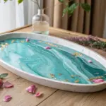
Negative Space Pour With Clean, Modern Breathing Room
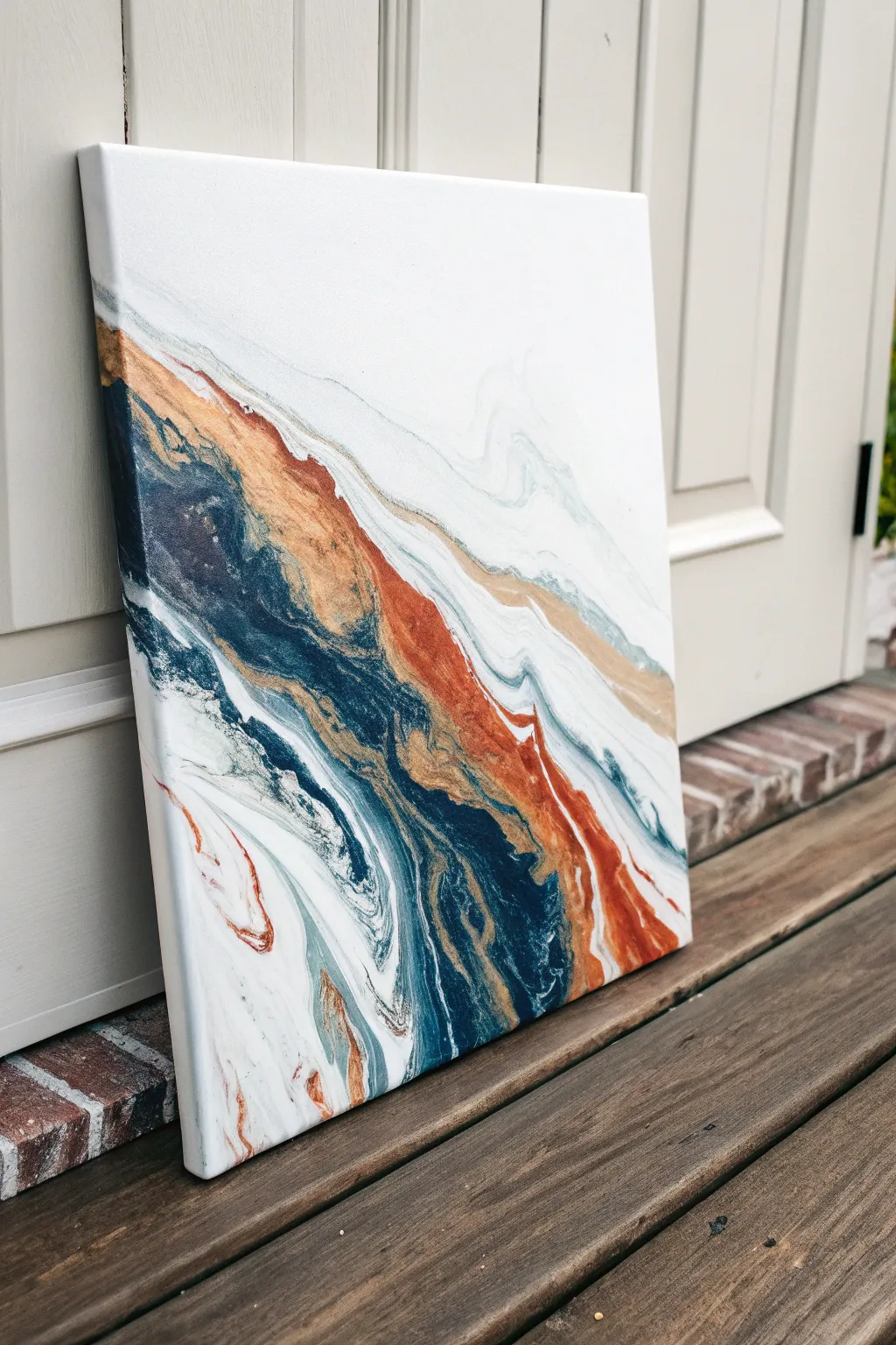
This fluid art project masterfully balances vibrant movement with minimalist calm, featuring a striking diagonal river of deep blues and metallic copper cutting through pristine white negative space. The result is a modern, sophisticated piece that evokes the feeling of a shoreline or a geode slice.
Step-by-Step
Materials
- Stretched canvas (12×12 or 16×20 inches recommended)
- White acrylic paint (heavy body or soft body)
- Deep Navy Blue acrylic paint
- Teal or Turquoise acrylic paint
- Metallic Copper or Gold acrylic paint
- Burnt Sienna or Rust Orange acrylic paint
- Pouring medium (Floetrol or dedicated gloss medium)
- Silicone oil (optional, for cells)
- Plastic cups for mixing
- Stir sticks
- Hair dryer or straw
- Palette knife or large spreader
- Drop cloth or plastic sheeting
- Gloves
Step 1: Preparation & Mixing
-
Prepare your workspace:
Cover your table with a drop cloth or plastic sheeting. Elevate your canvas on four upside-down cups to allow paint to drip off the edges freely. Ensure the surface is perfectly level so the design doesn’t shift while drying. -
Mix the base white:
In the largest cup, mix your white acrylic paint with your chosen pouring medium. Aim for a ratio of roughly 1 part paint to 2 parts medium, adding water drop by drop until it resembles the consistency of warm honey. You will need a significant amount of white to cover the background. -
Mix the colors:
In separate smaller cups, mix the Navy, Teal, Copper, and Rust paints with pouring medium using the same 1:2 ratio. These colors should have the same fluid consistency as your white. -
Add silicone (optional):
If you want bubble-like cells in your river, add 1-2 drops of silicone oil to the Navy and Copper cups only. Stir very gently just once or twice to barely incorporate it.
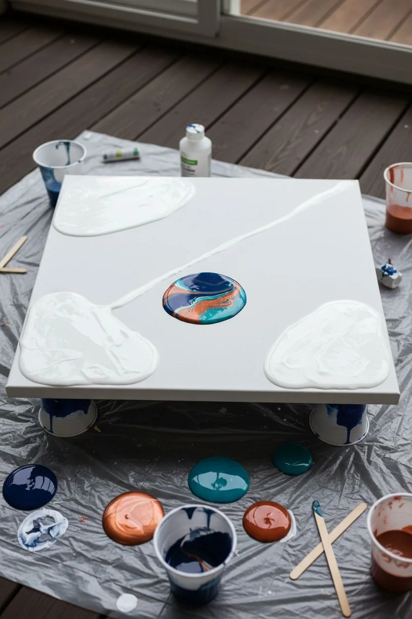
Step 2: The Pour
-
Establish the negative space:
Pour a generous amount of the white mixture onto the top left and bottom right corners of the canvas. Leave a diagonal channel in the center empty for now. -
Spread the white:
Use a palette knife or a spreading tool to push the white paint towards the edges and corners, ensuring full coverage in the negative space areas. Smooth it out gently. -
Create the dirty pour cup:
Take a fresh empty cup. Layer your colors into it one by one—start with Navy, then add a layer of Copper, followed by Teal, some white, and finally the Rust color. Don’t stir this cup. -
Pour the river:
Slowly pour the contents of your layered cup diagonally across the center of the canvas, right into the channel between your white sections. Use a slight wiggle motion to create undulations in the river. -
Connect the paints:
If there are gaps between your color river and the white background, gently add a little more white paint along the borders so the puddles touch.
Composition Control
Keep the white paint slightly thicker than the colored paints. This prevents the colors from sinking, keeping that crisp, clean contrast sharp.
Step 3: Styling & Finishing
-
Blow out the edges:
This is crucial for the feathery look. Using a hair dryer on the ‘cool/low’ setting or using a straw, gently blow the white paint over the edges of the colored river. Then, blow the color back slightly over the white. -
Create movement:
Tilt the canvas very slowly to stretch the design. I like to tilt it diagonally to elongate that center channel, letting the paint run over the corners if needed. -
Soften harsh lines:
Use a straw to blow specifically on any hard lines where the color meets the white. This creates those delicate, smoky wisps visible in the reference image. -
Check the sides:
Use your finger or a tool to catch drips and ensure the paint fully covers the sides of the canvas, maintaining the pattern down the edges. -
Pop air bubbles:
Pass a culinary torch quickly over the surface (or blow lightly) to pop any trapped air bubbles. If you used silicone, this will also help trigger cell formation. -
Protect while drying:
Place a large box or cover over the canvas (without touching it) to protect it from dust. Let it dry undisturbed for at least 24 to 48 hours. -
Clean silicone (if used):
Once fully dry (cured for 2-3 weeks), if you used silicone, gently wipe the surface with a cloth dampened with a little rubbing alcohol or soapy water to remove oil residue before varnishing. -
Seal the artwork:
Apply 1-2 coats of a high-gloss varnish or a layer of resin to protect the painting and make the metallic copper pop.
Golden Veins
After the main pour settles, drizzle a tiny, thin line of straight metallic gold along the darkest blue sections for a luxurious, geode-like crack effect.
Once fully cured, your sleek negative space pour is ready to bring a touch of modern elegance to your wall

PENCIL GUIDE
Understanding Pencil Grades from H to B
From first sketch to finished drawing — learn pencil grades, line control, and shading techniques.
Explore the Full Guide
Beachy Wave Pour With Layered Blues and White Lacing
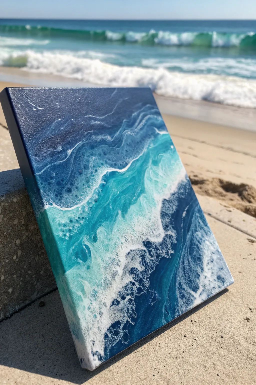
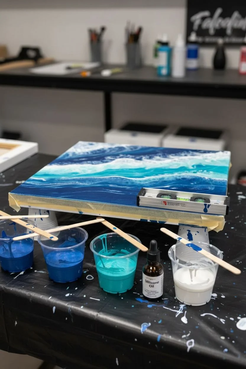
Capture the crashing spirit of the ocean with this dynamic fluid art pour that mimics the movement of sea foam and deep water currents. By layering rich navy, bright turquoise, and metallic teals with a special cell-activating white, you’ll create realistic lacing effects that look just like breaking waves.
Step-by-Step Guide
Materials
- Square stretched canvas (e.g., 10×10 or 12×12 inches)
- Acrylic paints: Navy Blue, Phthalo Blue, Turquoise, Metallic Teal, White
- Pouring medium (Floetrol or commercial medium)
- Silicone oil or Dimethicone drops (for cells)
- Hair dryer with a concentrator nozzle (essential for blowing waves)
- Plastic cups and stirring sticks
- Gloves and apron
- Level working surface covered with plastic sheeting
- Masking tape (for canvas back)
Step 1: Preparation and Mixing
-
Prep your canvas:
Flip your canvas over and use masking tape to cover the back of the wooden frame and canvas edges. This keeps the back clean and professional-looking once the drippings dry. -
Elevate the surface:
Place four plastic cups upside down under the corners of your canvas to lift it off the table. Check with a bubble level to ensure your surface is perfectly flat so the paint doesn’t run off unevenly. -
Mix the base colors:
In separate cups, mix your Navy Blue, Phthalo Blue, Turquoise, and Metallic Teal with pouring medium. Aim for a consistency like warm honey—fluid but not watery. A standard ratio is often 1 part paint to 2 parts medium. -
Prepare the white lacing mix:
Mix your White paint with pouring medium, but make this slightly thinner than your colored paints. Add 2-3 drops of silicone oil or dimethicone to the white mixture only; this is the secret ingredient for creating those bubble-like cells in the sea foam.
Muddy colors?
If your blues are mixing into gray mud, you are likely overworking the paint. Stop blowing as soon as the lacing appears. Less is more with fluid art.
Step 2: Creating the Ocean Gradient
-
Lay the deep water:
Start by pouring a thick band of Navy Blue across the top third of the canvas. This represents the deepest part of the ocean furthest from the shore. -
Add mid-tones:
Pour the Phthalo Blue and Turquoise in horizontal bands below the navy. Overlap the edges slightly so the colors will blend naturally later. -
Pour the shallow water:
Fill the bottom third of the canvas with your Metallic Teal and lighter turquoise shades. Let the paint flow over the sides of the canvas to ensure full coverage on the edges. -
Tilt to cover:
Gently tilt the canvas in all directions to help the bands of color meet and cover the entire white surface of the canvas. You want a thick, wet base of color before adding the wave details.
Step 3: Blowing the Waves
-
Apply the white wave line:
Drizzle a thin line of your silicone-infused White paint right along the boundary where the dark blue meets the lighter turquoise. Don’t worry if it’s not a straight line; nature rarely is. -
Position the blow dryer:
Turn your hair dryer on to the low cool setting. Hold the nozzle parallel to the canvas surface, aiming just behind the white line of paint. -
Push the wave forward:
Gently blow the white paint upward and outward over the darker blue section. The air should push the white over the blue, stretching it out and creating a thin, veil-like effect. -
Create the crashing foam:
Now, blow sections of the white paint down into the teal area. Use short bursts or quick sweeping motions to simulate the chaotic splashing of a crashing wave. -
Activate the cells:
As the white paint settles over the colors, watch closely. The silicone should interact with the underlying paint, causing ‘cells’ or holes to open up in the white layer, mimicking sea foam bubbles. -
Refine the composition:
If I feel a section looks too heavy, I sometimes use a straw to blow smaller, more precise details, pushing the white lacing exactly where I want it to curve.
Add beach sand
For extra realism, mix real sand with a gel medium and apply it to the bottom edge of the canvas before pouring the ocean colors.
Step 4: Drying and Sealing
-
Remove excess drips:
Run a stirring stick or your gloved finger along the underside edge of the canvas to scrape off dripping paint. This prevents the paint from pulling excessively as it dries. -
Let it cure:
Allow the painting to dry undisturbed in a dust-free area for at least 24 to 48 hours. The colors will darken slightly as they dry. -
Clean off silicone:
Once fully dry (give it a few days to be safe), gently wipe the surface with a little bit of cornstarch or talc powder on a cloth to absorb residual silicone oil, then wipe clean with a damp cloth. -
Final varnish:
Apply a coat of high-gloss varnish or a layer of clear art resin. This will make the metallic teal shimmer and give that ‘wet water’ look to the finished piece.
Hang your finished seascape in a room with plenty of natural light to let those metallic blues really shine
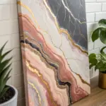
Geode-Inspired Pour With Metallic Veins
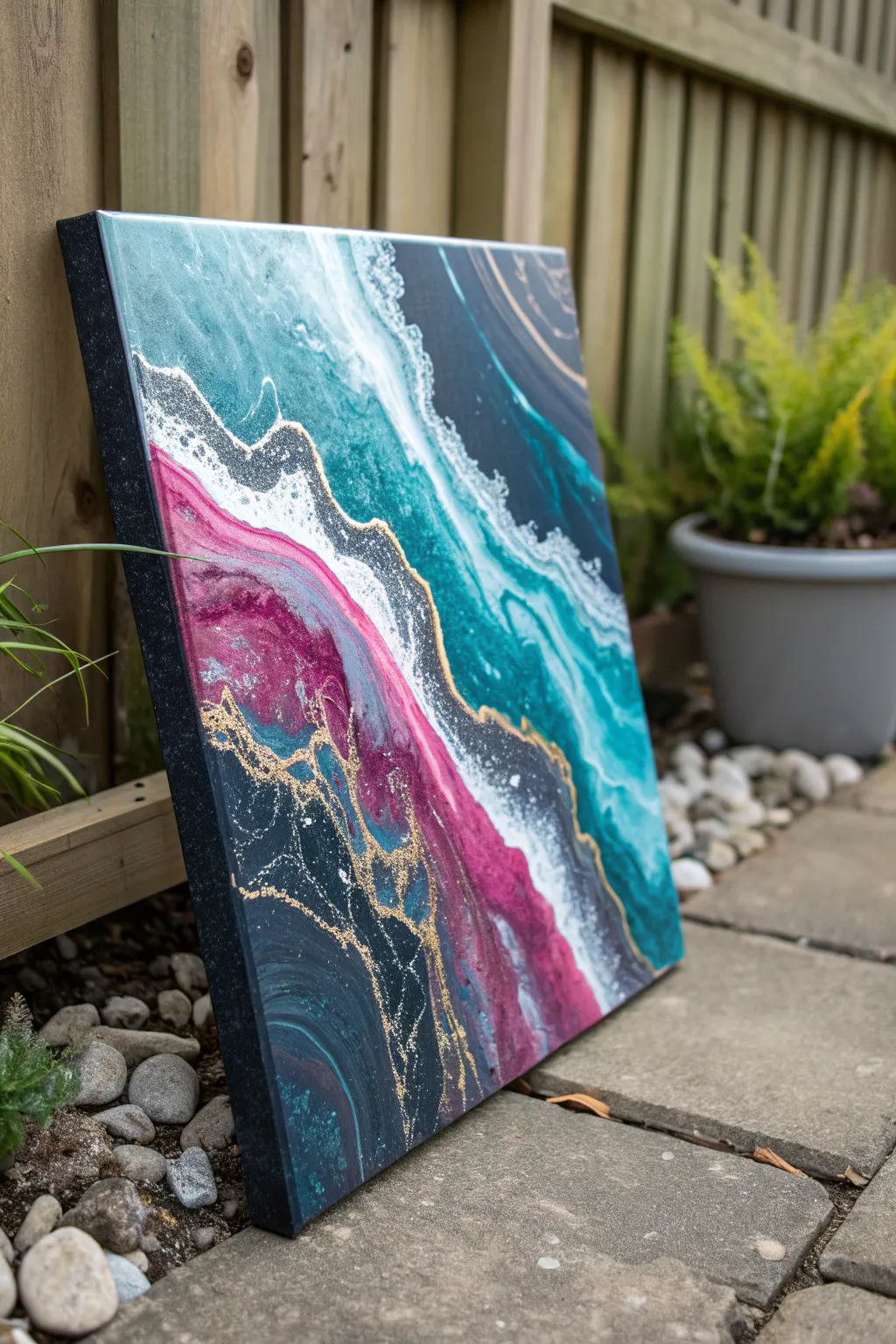
This stunning geode-inspired pour mimics the organic layers of crystallized rock using deep teals, vivid magenta, and stark white. By manipulating fluid acrylics and adding metallic gold veins, you’ll create a sophisticated statement piece that glimmers in the light.
Step-by-Step
Materials
- Square stretched canvas (12×12 or similar)
- Acrylic paints: Deep teal, emerald green, magenta, navy blue, titanium white, black
- Pouring medium (Floetrol or Liquitex)
- Gold metallic paint or liquid gold leaf
- Gold glitter (fine)
- Plastic cups (one for each color)
- Stirring sticks
- Hairdryer or straw for blowing
- Glitter glue or clear craft glue (optional)
- Gloves and workspace protection
Step 1: Mixing and Preparation
-
Prepare the workspace:
Cover your table with a drop cloth or plastic sheet. Elevate your canvas on four upside-down cups to allow paint to drip off the edges freely. -
Mix your colors:
In separate cups, mix your acrylic paints with pouring medium. Aim for a ratio of about 1 part paint to 2 parts medium. The consistency should be like warm honey—fluid but not watery. -
Create your dark base:
For the navy blue and black sections, mix a slightly larger quantity as these will form the outer edges and deep recesses of your geode design. -
Mix the metallics:
Prepare your gold paint. If you want extra shimmer, I like to mix a tiny pinch of fine gold glitter directly into the gold paint cup for added sparkle within the veins.
Muddy Colors?
If your colors are blending into grey, your paint is too thin or you are overworking the tilt. Stop tilting once the canvas is covered.
Step 2: Pouring the Layers
-
Lay the navy foundation:
Pour the navy blue mixture across the bottom left corner and the top right corner of the canvas. This frames the central colorful geode shape. -
Add the magenta band:
Pour a thick line of magenta next to the bottom navy section. Don’t worry about perfect straight lines; organic, wavy borders look more natural. -
Pour the teal and green:
Pour your teal and emerald green mixtures in the center and upper section, contrasting against the magenta. Allow these colors to touch but not fully mix yet. -
Introduce the white:
Pour thin ribbons of white paint between the color bands. The white acts as a highlighter and will help create the lacing effect seen in the reference. -
Tilt the canvas:
Gently tilt the canvas in a slow circular motion to spread the paint and cover the entire surface, letting excess drip over the sides.
Step 3: Creating the Veins and Details
-
Blow out the edges:
Use a straw to gently blow the white paint into the adjacent colors (teal and magenta). This creates the soft, frothy ‘sea foam’ or crystalline transitions. -
Add gold veins:
Drizzle fine lines of your gold mixture along the borders where the major colors meet—specifically between the navy/magenta and the teal/white sections. -
Refine the gold lines:
Use a thin stick or the back of a paintbrush to drag through the gold lines slightly, integrating them into the design without losing their distinctiveness. -
Apply glitter details:
While the paint is wet, sprinkle a pinch of loose gold glitter along the gold veins and into the darkest navy sections to mimic mineral deposits. -
Check the edges:
Ensure the sides of the canvas are fully covered. Use your finger to dab paint onto any bare spots on the canvas edge.
Add Texture
Add crushed glass or clear decorative stones to the center ‘white’ band while wet for a realistic 3D crystal texture.
Step 4: Finishing and Drying
-
Pop air bubbles:
Ideally, use a kitchen torch quickly over the surface to pop bubbles. If you don’t have one, blow gently on the surface with your breath. -
Let it cure:
Allow the painting to dry undisturbed for at least 24-48 hours. The paint needs to be completely cured before adding any final touches. -
Enhance the gold (Optional):
Once fully dry, if the gold lines have receded too much, paint over them with liquid gold leaf or a gold paint pen for a sharp, metallic finish. -
Varnish the piece:
Seal the artwork with a high-gloss varnish or a coat of resin to give it that wet, glass-like geode appearance.
Hang your geode masterpiece in a well-lit area to watch the gold veins catch the light throughout the day


Tree Ring Pour for Organic Wood-Grain Vibes
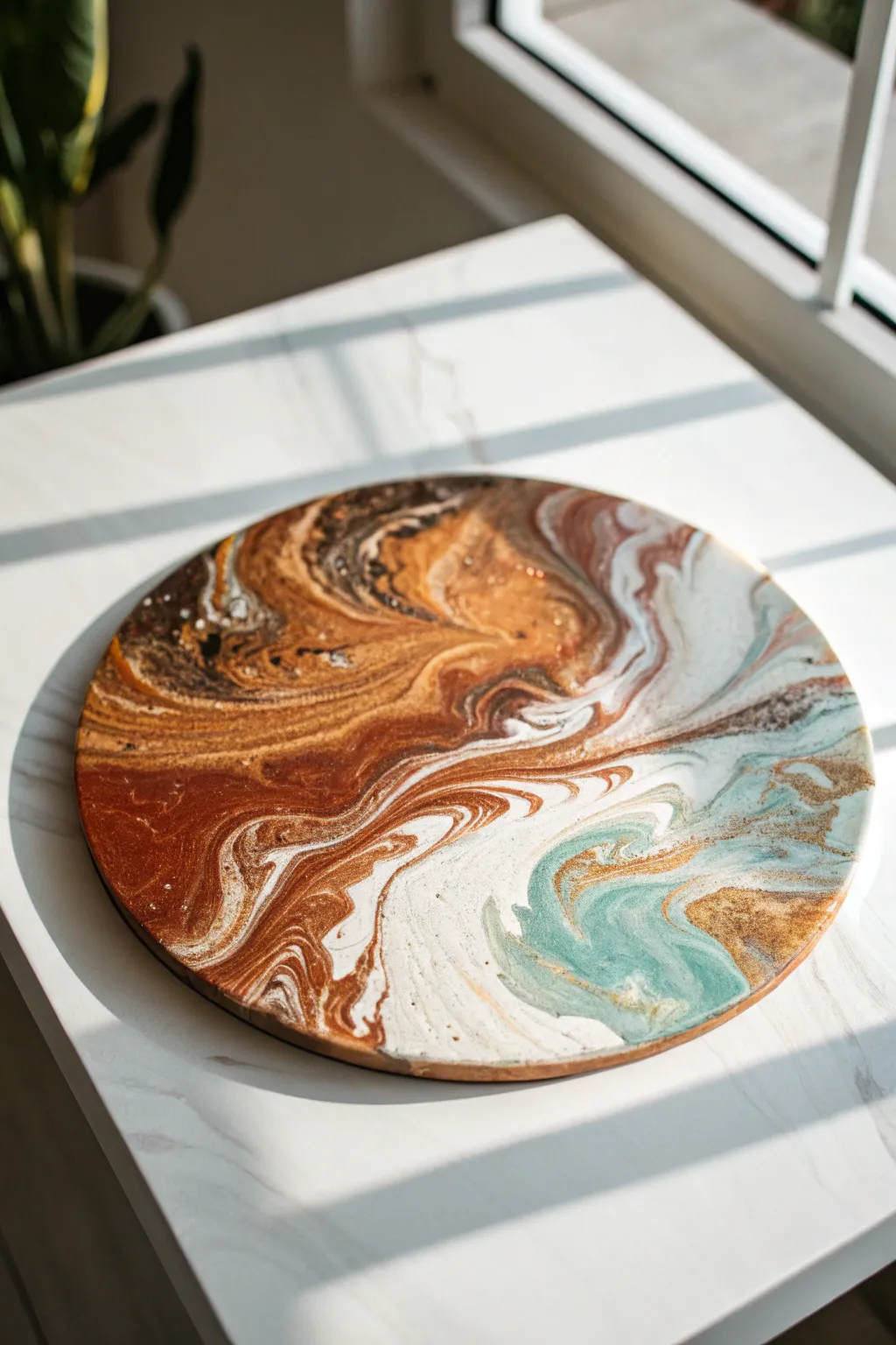
Capture the organic beauty of agate and polished wood with this mesmerizing fluid art project. By layering rich metallic coppers, deep browns, and a surprising splash of teal, you’ll create a stunning round centerpiece that brings nature’s palette indoors.
Step-by-Step Guide
Materials
- Round wooden panel or canvas (approx. 12-16 inches)
- Acrylic pouring paints (pre-mixed or mix your own)
- Colors: Burnt Umber, Metallic Copper/Bronze, Cream/White, Seafoam Green/Teal, Dark Chocolate
- Pouring medium (like Floetrol or Liquitex)
- Silicone oil (optional, for cells)
- Plastic cups (one for each color, one for the dirty pour)
- Stir sticks
- Gesso (if priming raw wood)
- High-gloss varnish or resin for finishing
- Gloves and workspace covering
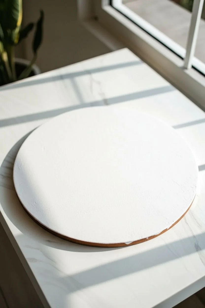
Step 1: Preparation
-
Prime the Surface:
If you are using a raw wooden round like the one in the photo, apply a coat of white gesso first. This seals the wood grain ensuring the paint sits on top rather than soaking in. Let it dry completely. -
Mix Your Palette:
Prepare your acrylic paints. You want a consistency similar to warm honey. Mix each color with your pouring medium at a ratio of about 1:1 or according to your medium’s instructions. Add water specifically if the mixture is too thick. -
Check Consistency:
Lift your stir stick from the cup; the paint should flow off in a continuous stream without breaking, creating a small mound that disappears within seconds. -
Add Metallic Touches:
Ensure your copper or bronze paint is well-mixed. Metallics are heavier than standard pigments and can sink, so keep the mixture slightly thicker than the others to help it stay visible.
Step 2: The Pour
-
Create the Dirty Cup:
Take a larger empty cup. Begin layering your colors one by one. Start with white or cream to create a base. -
Layering Order:
Pour small amounts of Burnt Umber, followed by the Metallic Copper, then the Dark Chocolate. Don’t stir them! Just let them sit on top of each other. -
Adding the Accent:
Add a layer of the Seafoam Green/Teal now. This cool tone contrasts beautifully with the warm browns. I find adding it near the middle or top of the cup prevents it from getting muddied by the darker browns. -
Repeat Layers:
Continue layering your colors until the cup is full enough to cover your canvas. End with a bit of white or metallic on top. -
The Tree Ring Technique:
Position the cup in the center of your board. Slowly start pouring the paint onto the board while making tiny, tight circular motions with your wrist. -
Maintain the Flow:
Keep pouring in that tight spiral. As the paint hits the surface, the rings will expand outward, pushing the previous layers toward the edge. Watch how the colors interact to create those wood-grain lines. -
Empty the Cup:
Continue until the cup is empty. You should have a concentrated bullseye of concentric rings in the center of your board.
Pro Tip: Contrast Control
To keep the teal section crisp like the photo, pour a small puddle of plain white on one side of the canvas before pouring your dirty cup. The colors will float over it rather than mixing.
Step 3: Tilting and Drying
-
Initial Tilt:
Gently pick up the board. Tilt it very slightly to one side to stretch the rings. Do not rush this part; slow movement preserves the distinct lines. -
Corner to Corner:
Tilt the paint toward the edges in a circular motion to cover the entire surface. If you want more white negative space like the reference image, tilt significantly toward the teal/white side to stretch that area out. -
Fixing Edges:
If paint isn’t reaching a specific edge, use your finger to dab a little extra paint on the bare wood; this breaks the surface tension and helps the flowing paint travel there. -
Check the Composition:
Stop tilting when you are happy with the composition. The paint moves for a few minutes after you stop, so account for a little settling. -
Pop Bubbles:
Use a kitchen torch or a heat gun lightly over the surface to pop any air bubbles trapped in the paint. This occasionally brings up small cells of color, adding to the texture. -
Drying Phase:
Place the artwork on cups to elevate it off the table. Let it dry in a dust-free area for at least 24-48 hours. The surface must be perfectly level to prevent shifting. -
Final Sealing:
Once fully cured (wait a few weeks for best results), apply a coat of resin or high-gloss varnish to make the metallics pop and protect the surface.
Level Up: Gold Leaf
Once the painting is completely dry, apply small flakes of gold or copper leaf along the darkest brown veins to enhance the metallic vein effect.
Hang your new masterpiece in a well-lit spot where the copper tones can catch the sunlight and shimmer.
Pendulum Swing Pour for Wild, Kinetic Spirals
Capture the raw energy of physics with this gravity-defying pendulum pour. This large-scale canvas features hypnotic spirals of crimson, cobalt, and white that twist together into a dynamic, kinetic vortex.
Step-by-Step
Materials
- Large rectangular canvas (24×36 inches or larger recommended)
- High-flow acrylic paints (Red, Blue, White)
- Pouring medium (Floetrol or Liquitex)
- Water (for thinning)
- Plastic squeeze bottles or cups with holes punched in the bottom
- String or twine
- Ceiling hook, tripod, or tall ladder (to hang the pendulum)
- Painter’s tape
- Drop cloth or large plastic sheet (essential for mess)
- Small cup (to plug the hole)
- Empty container or bucket (to catch drips)
Step 1: Preparation and Setup
-
Protect your workspace:
This technique is delightfully messy, so lay down a very large drop cloth or plastic sheet on the floor. -
Prepare the canvas:
Prop your canvas up on four cups or blocks in the center of your drop cloth so paint can flow off the edges freely. -
Prime the surface:
Apply a base coat of white acrylic paint if you want a clean background, though the pour will cover most of it. Let this wet base help the new paint glide if you choose. -
Rig the pendulum:
Suspend a string from a high point—a ceiling hook, a tall ladder, or a tripod setup works well. The longer the string, the wider the swing arcs will be. -
Attach the pouring vessel:
Tie your plastic cup or squeeze bottle to the end of the string. Ensure it hangs a few inches above the center of your canvas. -
Test the swing:
Give the empty cup a gentle push to test the pendulum’s path. Adjust the height so it doesn’t hit the canvas but stays close enough to control the lines.
Paint Getting Muddy?
To prevent muddy colors, layer the paint gently in the cup and don’t over-thin. Thicker paint maintains distinct lines better than watery paint.
Step 2: Mixing and Pouring
-
Mix the paints:
Mix your red, blue, and white paints with pouring medium in separate containers. Aim for a fluid consistency similar to warm honey or thin syrup. -
Layer the colors:
Plug the hole at the bottom of your hanging cup with a piece of tape or your finger. Pour the paint colors into the cup, layering them one by one without stirring. -
Plan your release:
Hold the filled cup (plugged) and pull it back to the starting position. I usually like to start slightly off-center to create an elliptical orbit. -
Release the pendulum:
Remove the tape or your finger and immediately give the cup a gentle push. Let it swing freely across the canvas. -
Watch the pattern form:
Observe as the paint streams out in rhythmic, intersecting ovals. The physics of the swing will naturally create the spiral effect. -
Add more paint if needed:
If the cup runs empty midway, carefully catch it, refill with layers of paint, and release it again, perhaps from a different angle to create overlapping dynamism. -
Focus on the center:
As the momentum slows, the circles will get smaller and tighter toward the middle. Let this happen to create the dense ‘eye’ of the vortex. -
Stop the flow:
Once you are happy with the composition or the cup is positioned over an area you don’t want painted, catch the cup and place a bucket underneath to stop the drips.
Try a Double Pendulum
For chaotic beauty, attach a second joint to your string. This ‘double pendulum’ creates unpredictable, jagged math-art patterns.
Step 3: Drying and Finishing
-
Check the edges:
Use a palette knife or your finger to touch up the sides of the canvas with excess paint from the drop cloth. -
Remove air bubbles:
Run a culinary torch quickly over the surface to pop any air bubbles trapped in the paint layers. -
Allow to cure:
Leave the painting to dry undisturbed on a level surface for at least 48 to 72 hours. Thick pours take time to settle. -
Seal the artwork:
Once fully cured (wait a few weeks for best results), apply a gloss varnish to protect the surface and make the colors pop.
Hang your masterpiece vertically to emphasize the incredible energy of the spiral

Have a question or want to share your own experience? I'd love to hear from you in the comments below!