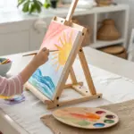
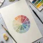
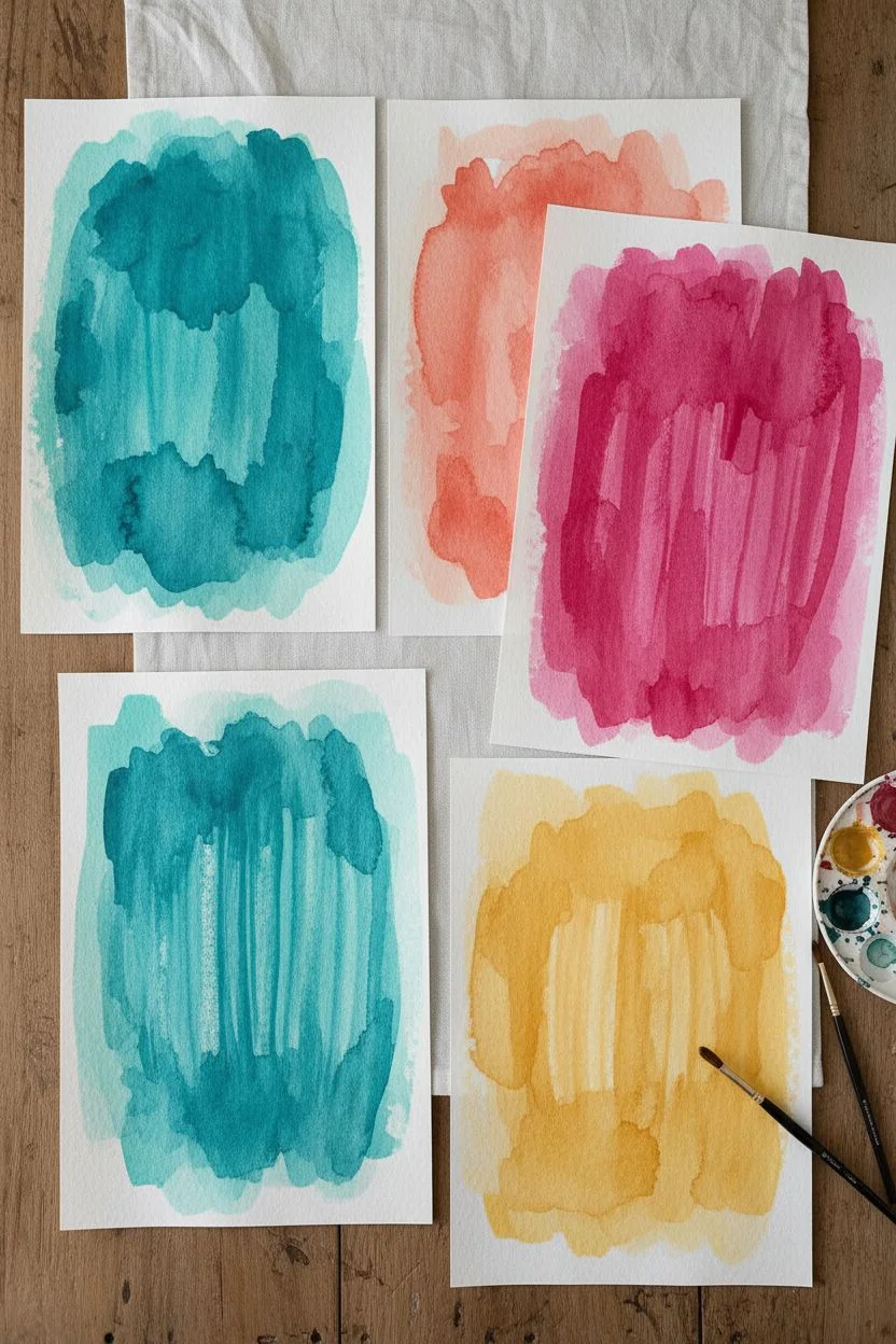
When you want something fun and creative without a ton of drawing skill, painting craft ideas are the sweet spot. I love projects that give you big color and texture fast—especially the kind that feel like a little art “magic trick.”
Painted Rock Mini Masterpieces
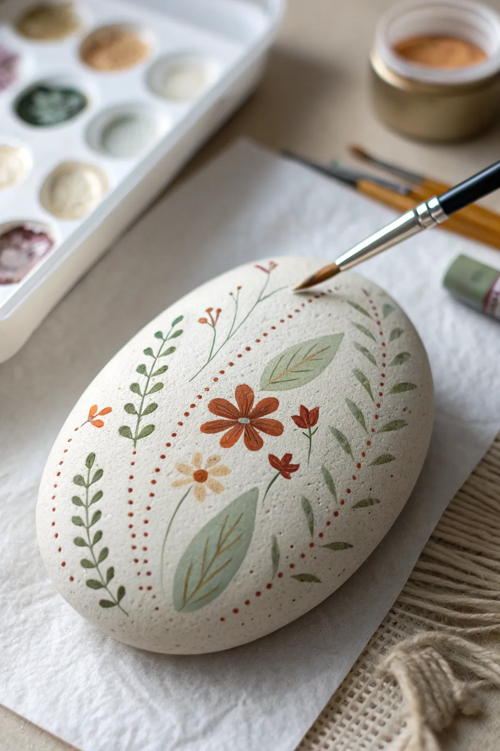
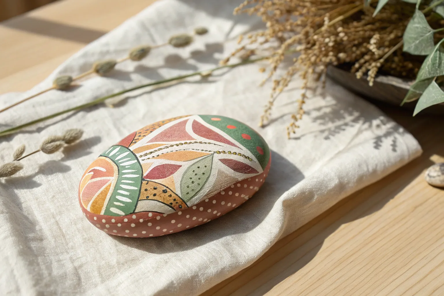
Transform a smooth river stone into a delicate piece of home decor with this folk-art inspired design. Featuring earthy tones of rust, sage, and cream, this painted rock uses simple strokes to create a sophisticated, organic pattern.
Step-by-Step Tutorial
Materials
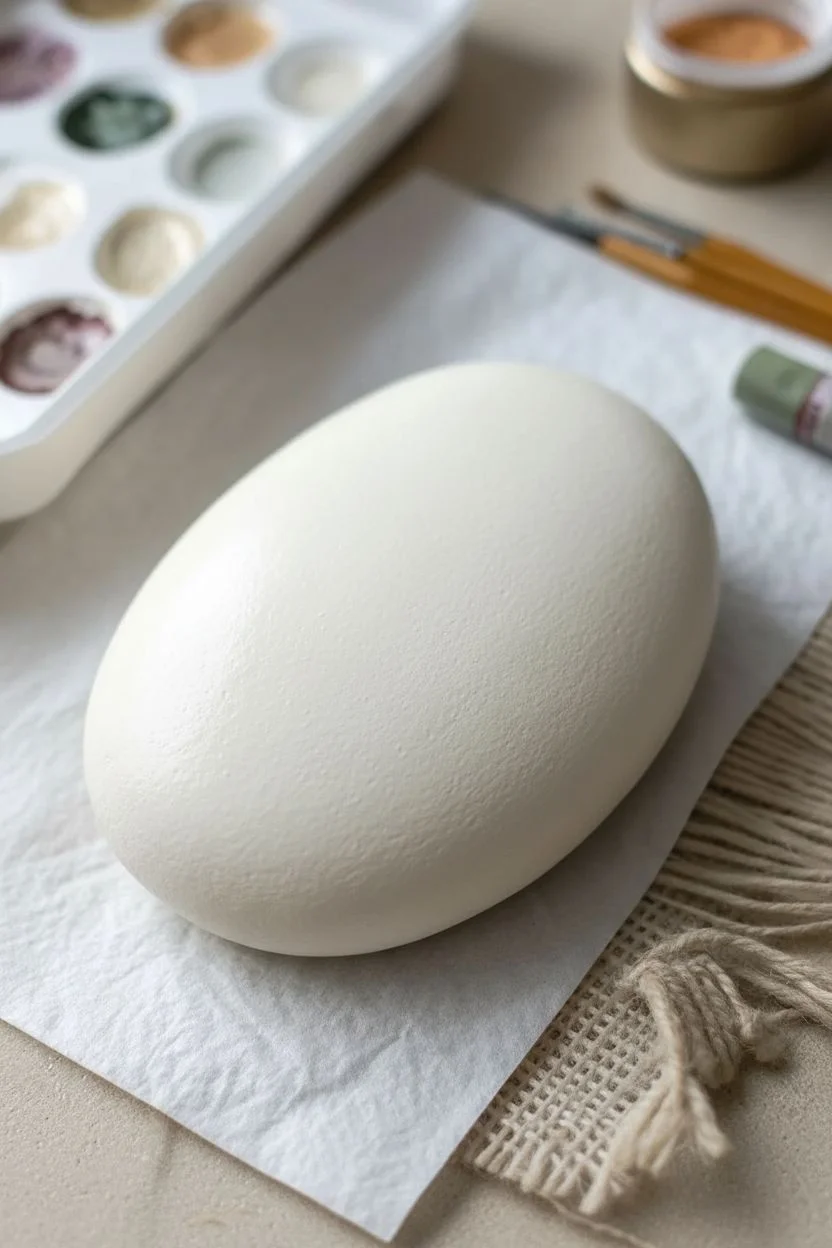
- Smooth, oval-shaped river rock (cleaned and dried)
- Acrylic paints (matte finish): antique white/cream, rust orange, burnt sienna, sage green, olive green
- Fine detail brushes (size 0 and 00 round)
- Small flat brush (for base coat)
- Palette or small dish
- Water cup and paper towels
- Matte spray varnish or sealer
Step 1: Preparation & Base Coat
-
Clean the surface:
Begin by scrubbing your rock with warm soapy water to remove any dirt or oils. Let it dry completely in the sun or with a hair dryer. -
Mix the base color:
Create a warm, off-white shade by mixing white acrylic paint with a tiny drop of brown or beige. You want a creamy, natural stone look. -
Apply the foundation:
Using the flat brush, paint the entire top surface of the stone. Apply two to three thin coats rather than one thick one to avoid brush strokes, allowing each layer to dry fully in between.
Step 2: Drafting & Main Elements
-
Visualize the layout:
Mentally divide the rock diagonally. The design flows from bottom-left to top-right. You can lightly sketch the main vine lines with a watercolor pencil if you need a guide. -
Paint the central flower:
Load a size 0 round brush with rust orange paint. In the center of the rock, paint a simple six-petal flower. Start each petal from the outside and pull your brush toward the center to get that tapered teardrop shape. -
Add the flower center:
Once the petals are tacky but not fully wet, place a small dot of white or pale beige in the center of the rust flower. -
Create the large leaves:
Mix a soft sage green. Paint two large, almond-shaped leaves—one branching down to the left of the flower, and one reaching up to the right. Keep the edges smooth and tapered. -
Detail the leaves:
Using your finest 00 brush and a slightly darker olive green (or diluted brown), carefully paint a thin central vein and delicate side veins inside the two large leaves you just created.
Brush Control Pro Tip
Add a drop of water to your acrylics to reach an ‘ink-like’ consistency. This helps the paint flow smoothly off the liner brush for crisp, thin stems.
Step 3: Adding Foliage & Fillers
-
Paint the secondary flower:
Below the main flower, paint a smaller, five-petal blossom using a pale cream or beige color. Add a tiny rust-colored dot to its center. -
Add warm accents:
Using the rust and burnt sienna shades, paint tiny three-petal buds scattered around the main elements. Place one near the top left and a couple near the bottom right to balance the composition. -
Create the leafy vines:
Switch back to your olive green. Paint climbing vines on the far left and far right edges of the rock. Use short, quick strokes to create small leaves attached to a thin, winding stem. -
Painting the delicate sprigs:
With a very light hand and sage green paint, add thin, wispy stems extending upward from the center, topped with tiny dots or micro-leaves.
Level Up: Gold Accents
For a luxe touch, use metallic gold paint for the center dots of the flowers or for the veins inside the large sage leaves to catch the light.
Step 4: Fine Details & Finishing
-
The dotted border:
Mix a warm terracotta color. Dip the very tip of your brush handle or a dotting tool into the paint to create the dotted curved lines that frame the central floral arrangement. -
Vary dot sizes:
I like to gently decrease the pressure as I move along the curve, making the dots naturally get smaller toward the ends of the vines. -
Highlighting:
Add microscopic dashes of white to the tips of the rust-colored petals to give them a bit of dimension and light reflection. -
Final drying:
Allow the rock to sit undisturbed for at least 24 hours to ensure the paint cures completely. -
Seal the artwork:
Finish by spraying a light coat of matte varnish over the rock. This protects the delicate line work without adding an artificial-looking shine.
Now you have a serene, nature-inspired paperweight or garden accent to enjoy

Tape Resist Geometric Panels
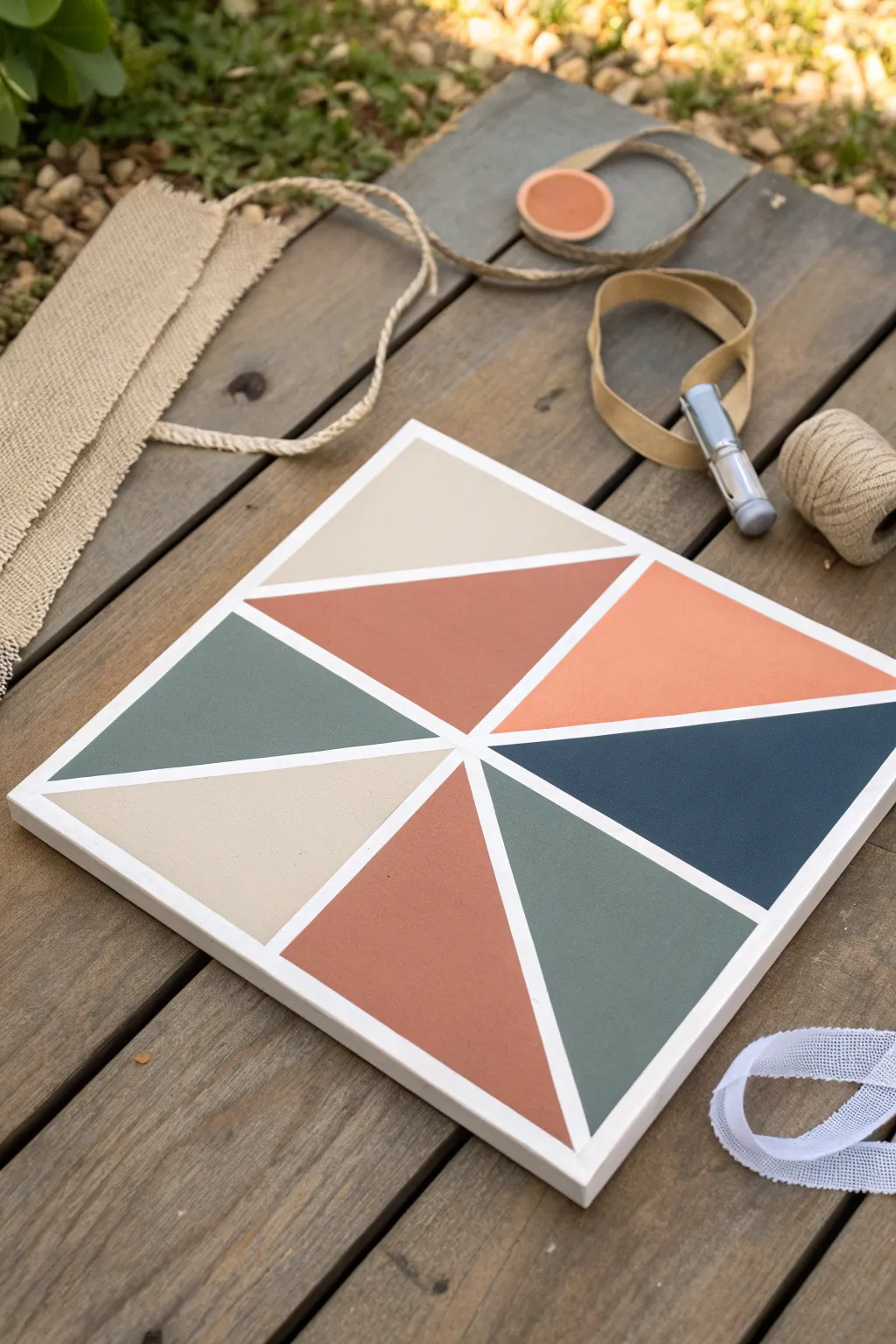
This striking wall art combines warm terracotta and cool sage tones in a crisp, geometric layout. Using a simple tape resist technique, you can achieve clean lines and professional-looking color blocks without needing advanced painting skills.
Step-by-Step
Materials
- Square canvas (12×12 inches suggested)
- Acrylic paints (Terracotta, Sage Green, Navy Blue, Light Beige, Peach)
- Painter’s tape or masking tape (approx 0.5 inch width)
- Flat paintbrush (medium size)
- Palette or paper plate
- Scissors
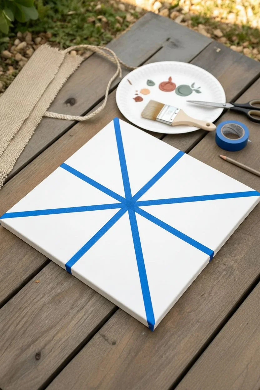
Step 1: Design & Taping
-
Prepare the canvas:
Begin with a clean, white primed canvas. If you want the separating lines to be a specific color other than white, paint the entire canvas that base color first and let it dry completely. -
Create the central intersection:
Locate the approximate center of your canvas. Cut two medium strips of tape and place them so they meet in the middle, creating a large ‘X’ shape that divides the canvas into four rough quadrants. -
Add intersecting rays:
Now, take longer strips of tape and run them from the edges of the canvas toward that central point. Aim to create triangular sections of varying sizes. -
Secure the edges:
Ensure all tape strips are pressed down firmly. I like to run the back of a fingernail or a credit card along the tape edges to prevent any paint from interfering with those crisp lines later. -
Plan your color placement:
Look at the seven triangle spaces you’ve created. Before opening paints, visualize or mark lightly with a pencil where each color will go to ensure a balanced composition like the reference photo.
Bleeding Lines?
Before applying color, paint a thin layer of white (or your base color) over the tape edges. This seals the tape so any bleed is invisible.
Step 2: Painting & Finishing
-
Mix the terracotta shade:
Mix a rusty orange or burnt sienna acrylic. Apply this to the large central triangle pointing downward and the smaller triangle on the bottom left. -
Apply the sage green:
Using a clean brush, paint the triangle on the middle left and the triangle on the bottom right with a muted sage green paint. -
Add the navy accent:
Fill the triangle on the middle right with a deep navy blue. This dark tone anchors the piece and provides contrast. -
Paint the beige section:
Fill the top left triangle section with a creamy light beige or sand color. -
Finish with peach:
Paint the final top right triangle with a soft peach or salmon tone to complement the terracotta. -
Apply second coats:
Acrylics can sometimes look streaky. Once the first layer is touch-dry, apply a second coat to any colors that look uneven. -
Let it set briefly:
Allow the paint to dry until it is tacky but not fully hardened. This usually takes about 10-15 minutes depending on thickness. -
The reveal:
Gently peel the tape off. Pull slowly at a 45-degree angle away from the painted area to ensure the cleanest possible edge. -
Touch up:
If any paint bled under the tape, use a tiny detail brush and white paint to tidy up the straight lines.
Add Texture
Mix a small amount of baking soda into your acrylic paint before applying strictly to the beige and terracotta sections for a trendy plaster effect.
Hang your new geometric panel on the wall or style it on a shelf for an instant modern update.

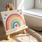
Handprint and Fingerprint Rainbow Art
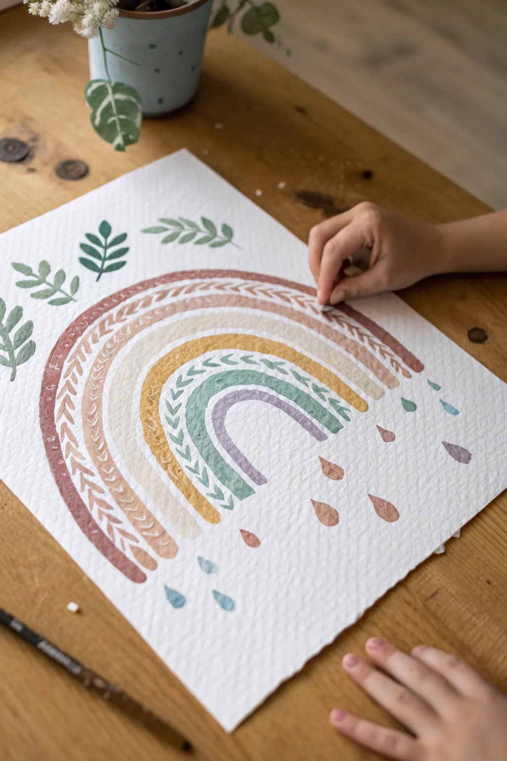
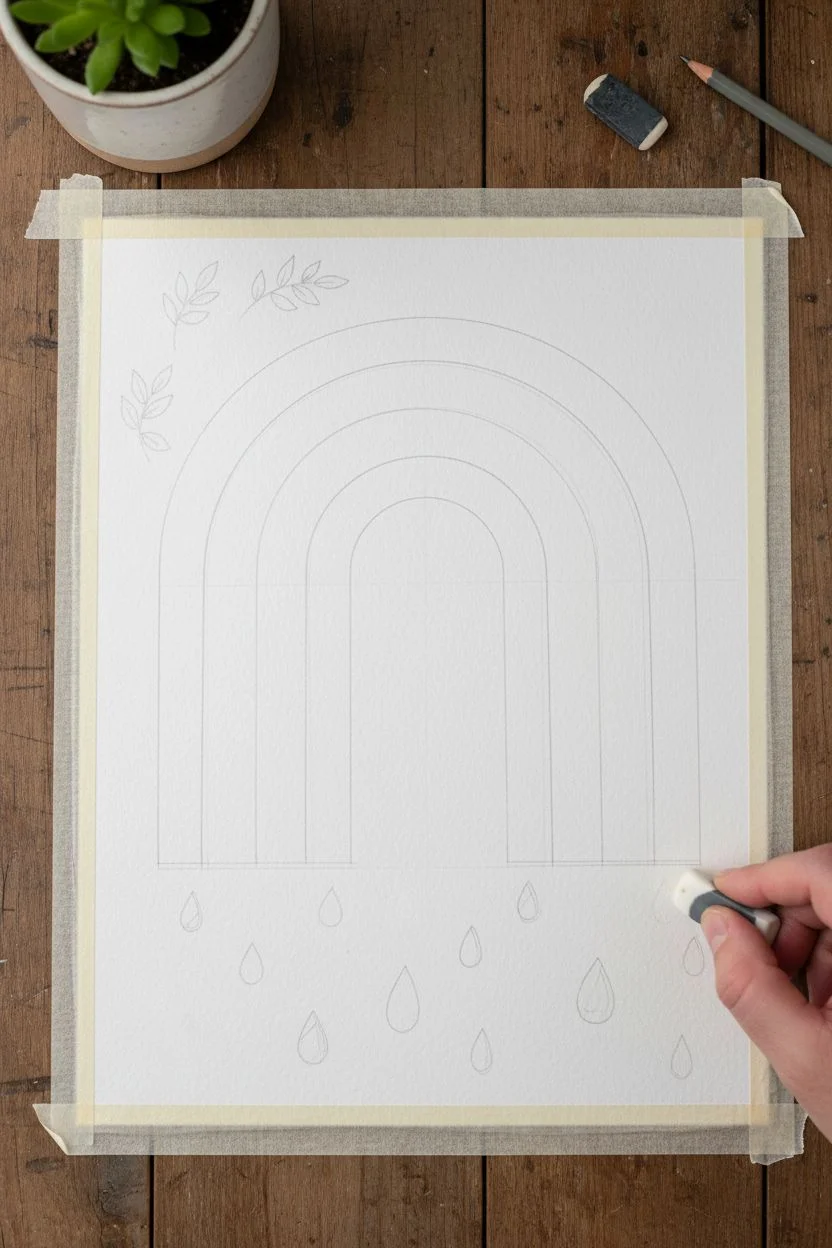
Create a serene and earthy piece of art with this textured rainbow project that combines watercolor techniques with pattern work. The muted tones and organic leaf motifs give it a lovely bohemian feel, perfect for a nursery or cozy corner.
Detailed Instructions
Materials
- Heavyweight cold-press watercolor paper (300gsm or higher for texture)
- Watercolor paints (terracotta, beige, mustard yellow, sage green, lavender)
- Round brushes (size 6 for arches, size 2 for details)
- Soft pencil (HB or 2B) and eraser
- Compass or round objects to trace (optional)
- Clean water and paper towels
- Painter’s tape (to secure paper)
Step 1: Preparation & Sketching
-
Secure the paper:
Tape down your watercolor paper to a flat surface. This prevents buckling when the paper gets wet and creates a clean edge if you paint to the sides. -
Map out the arches:
Using a pencil, very lightly sketch five concentric arches. Leave about half an inch of space between each arch. If you aren’t confident freehanding, use a compass or trace around bowls of varying sizes to get perfect curves. -
Plan the decorative elements:
Lightly pencil in where your leaf sprigs will go at the top left corners and where the raindrops will fall beneath the rainbow. Keep these lines faint so they don’t show through the paint later.
Fixing Bleeds
If two wet colors touch and bleed, quickly dab the area with a the corner of a clean, dry paper towel to lift the paint. Let it dry completely before carefully repainting the edge.
Step 2: Painting the Rainbow Arches
-
Paint the outer arch:
Mix a warm terracotta or rusty red color with plenty of water. Using your size 6 brush, paint the outermost arch. Keep the edges slightly rough or organic rather than perfectly sharp to enhance the boho look. -
Add the vine pattern:
While the terracotta paint is still wet (wet-on-wet technique) or just after it dries for a sharper look, use a smaller brush with a slightly darker concentration of the same color to paint small ‘V’ vine shapes along the curve of the arch. This creates a negative space effect. -
Paint the second arch:
Mix a pale beige or sand color. Paint the second arch, leaving a small gap of white paper between it and the terracotta arch to prevent bleeding. This layer can be solid. -
Paint the third arch:
Create a muted mustard yellow. Paint the third arch. For texture, dabbing the brush slightly as you go can create uneven color distribution that looks lovely on textured paper. -
Paint the fourth arch:
Mix a sage green color. Paint this arch carefully. As you did with the first arch, use a smaller brush to paint small leaf or vine details directly onto the green strip, perhaps in a slightly darker shade of green for contrast. -
Paint the inner arch:
Finish the rainbow with a small inner arch in a soft lavender or dusty purple. Keep this one solid and simple to anchor the center.
Add Metallic Sparkle
Once fully dry, trace over the vine patterns or add tiny dots between the rain drops using a gold or silver metallic gel pen for a magical, shimmering finish.
Step 3: Details & Finishing Touches
-
Add floating leaves:
Using the sage green mixture, paint the three sprigs of leaves floating above the rainbow on the upper left. Press down on the belly of the brush and lift up to create the leaf shape. -
Paint the raindrops:
Mix watery versions of your rainbow colors (terracotta, lavender, teal/blue). Paint teardrop shapes falling randomly beneath the arches. -
Vary the drop sizes:
Make some drops slightly larger and others smaller for a natural, whimsical rain effect. Keep the spacing irregular. -
Review and refine:
Look over your piece. If any edges look too messy, you can tidy them slightly with a damp brush, but remember the charm is in the hand-painted imperfection. -
Let it dry completely:
Allow the painting to dry fully before removing the tape. I like to let this dry briefly in a sunbeam if possible to speed things up, but air drying is safest. -
Erase sketch lines:
Once the paper is bone dry, gently erase any visible pencil marks that weren’t covered by paint.
Hang your beautiful new artwork in a simple wooden frame to complement those warm earth tones


Paper Plate Flower Painting Crafts
This stunning table decoration transforms a humble paper plate into a blooming mandala of color. By layering individually painted and cut petals, you achieve a dimensional, textured centerpiece that rivals ceramic art.
Step-by-Step Guide
Materials
- High-quality white paper plates (ribbed rim preferred)
- Heavyweight watercolor paper or cardstock
- Watercolors or diluted acrylic paints (teal, coral, magenta, golden yellow)
- Flat paintbrushes (medium and small)
- Scissors
- Pencil
- Craft glue or hot glue gun
Step 1: Painting the Petal Paper
-
Prepare your palette:
Mix your paints to create a soft, slightly translucent palette. You’ll need four distinct color families: a deep teal, a soft coral-orange, a vibrant magenta-pink, and a golden yellow. -
Paint color washes:
Take your sheets of watercolor paper or cardstock. Paint large swatches of each color. Don’t worry about being perfectly even; the visible brushstrokes constitute the charm of this project. -
Add texture:
While the paint is still damp, I like to drag a nearly dry brush through the pigment to create vertical striations. This mimics the natural grain found on real flower petals. -
Allow to dry:
Let all your painted papers dry completely. Because we will be cutting these intricately, any dampness will cause the paper to tear rather than slice cleanly.
Step 2: Cutting the Components
-
Sketch petal shapes:
On the back of your dry painted paper, lightly sketch three sizes of pointed, leaf-like shapes. You need large teals, medium corals/pinks, and smaller magentas. -
Cut the outer petals:
Cut out about 10-12 large teal petals. These should be roughly 3 inches long with a sharp point at the top and a slightly tapered base. -
Cut the middle petals:
Cut out 8-10 medium-sized petals from your coral and orange papers. Make these slightly wider than the teal ones to fill the gaps. -
Cut the inner petals:
Cut 8-10 smaller petals from the deep magenta paper. These should be more teardrop-shaped. -
Check the center:
From your yellow paper, cut a scalloped circle shape, roughly 2 inches in diameter, to serve as the flower’s heart. -
Create the pistil detail:
Cut an even smaller, star-burst shape from a darker shade of yellow or orange to adhere to the very center of your scalloped circle.
Uneven Petals?
Don’t panic if your spacing is off. Simply cut a few extra thin ‘filler’ petals in the same colors and tuck them behind the main layers to hide any large white gaps.
Step 3: Assembly
-
Prepare the base:
Take your clean white paper plate. If it has a ribbed rim, this adds a lovely texture that frames the artwork, so leave the rim exposed. -
Arrange the first layer:
Dry fit your large teal petals in a circle on the plate. The tips should point outward towards the rim, leaving spaces between them. -
Glue the teal layer:
Once satisfied with the spacing, glue the base of each teal petal down. Only glue the bottom third so the tips can lift slightly for a 3D effect. -
Add the second layer:
Place the coral/orange petals on top of the teal layer. Offset them so the points of these petals land in the gaps between the teal petals beneath. -
Apply the pink layer:
Glue the magenta petals in a tighter circle closer to the center, overlapping the bases of the previous layer. -
Construct the center:
Glue your small yellow star-burst onto the larger yellow scalloped circle. -
Final placement:
Adhere the yellow assembly firmly into the very center of the flower, covering the messy glued ends of all the chaotic petal bases.
Golden Edge
For a luxe finish, lightly brush metallic gold paint along the very edges of just the inner magenta petals after the glue has dried completely.
Place your beautiful floral plate on the table to brighten up your next gathering
BRUSH GUIDE
The Right Brush for Every Stroke
From clean lines to bold texture — master brush choice, stroke control, and essential techniques.
Explore the Full Guide
Q-Tip Dot Painting Patterns
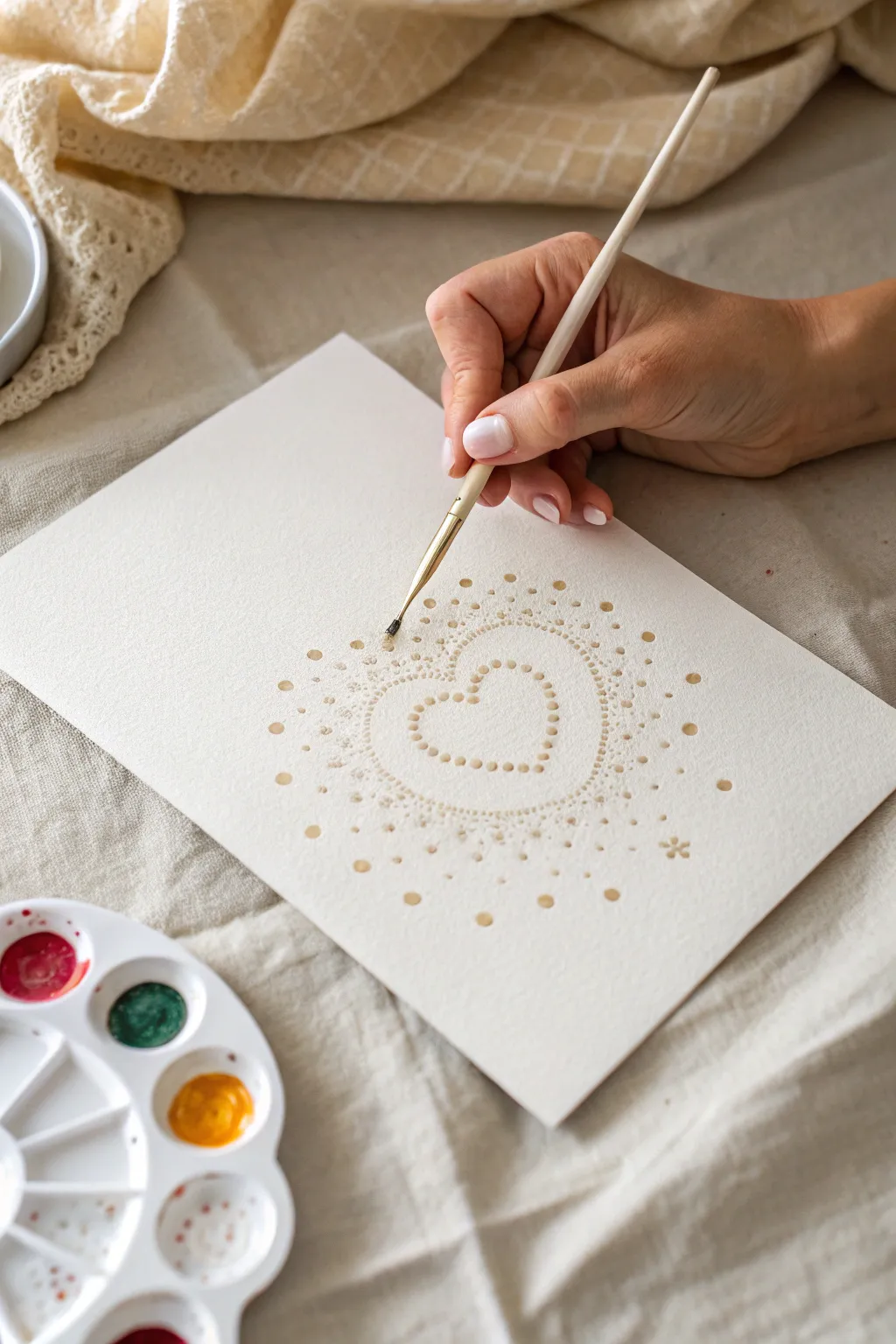
Create a delicate and serene piece of art using a simple dotting technique to form a radiating heart design. This calming project relies on pointillism to build a gentle, shimmering mandala effect perfect for greeting cards or wall decor.
How-To Guide
Materials
- Cold press watercolor paper (A5 or 5×7 inch)
- Metallic watercolor paint (gold or bronze)
- Fine detail paintbrush (size 0 or 00) or a pointed Q-tip
- Small palette
- Jar of clean water
- Paper towel
- Pencil (HB)
- Eraser
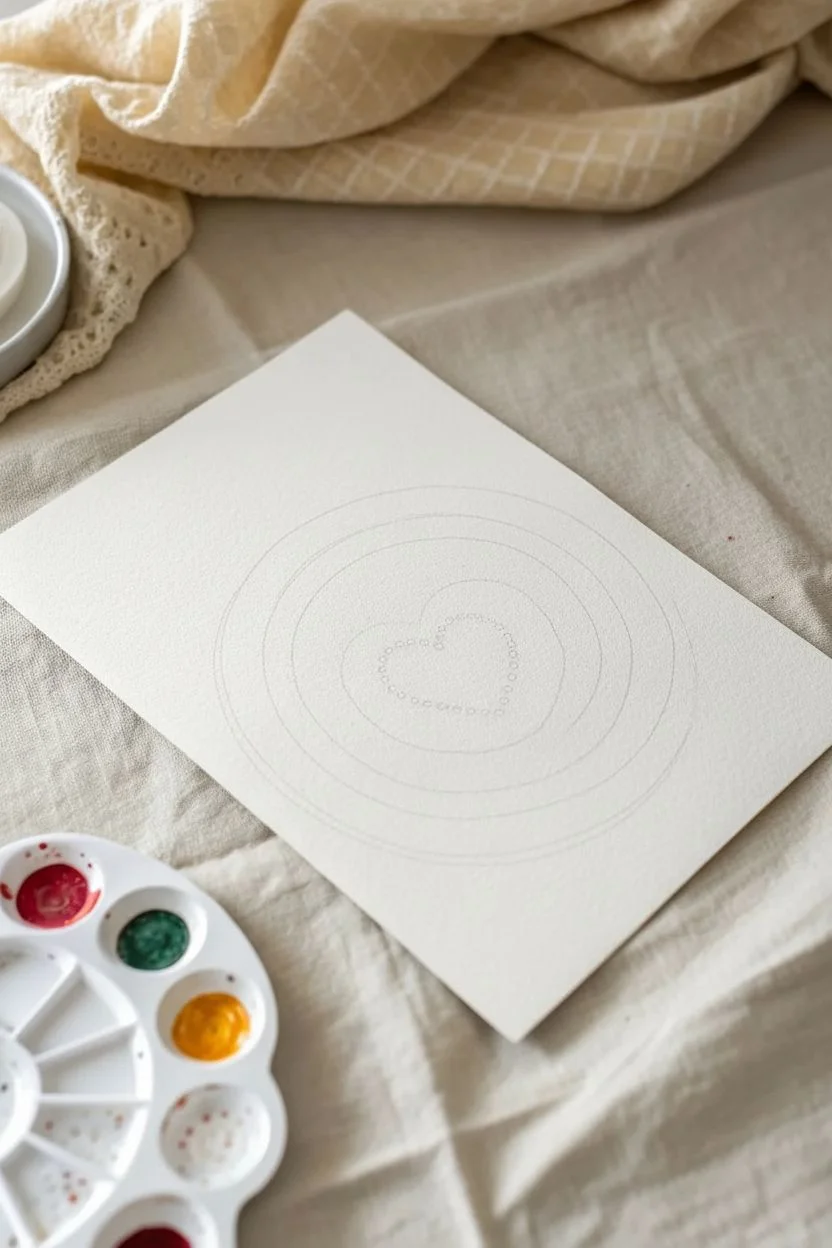
Step 1: Preparation & Sketching
-
Prepare your workspace:
Clear a flat surface and lay out your watercolor paper. Ensure you have good lighting, as the pale metallic paint can be tricky to see on white paper. -
Mix your paint:
Activate your metallic gold watercolor with a few drops of water. Swirl your brush until you achieve a creamy consistency—too watery and the dots will spread; too dry and they won’t form smooth circles. -
Sketch the heart outline:
Very lightly sketch a heart shape in the center of your paper using a pencil. This will serve as the anchor for your inner ring of dots. -
Mark guid lines:
Lightly draw a few concentric circles radiating outward from the heart. These don’t need to be perfect, but they help keep your expanding dot pattern symmetrical.
Uneven Dots?
If your dots are uniform blobs, your paint is too thick. Add a drop of water. If they run, blot your brush on a paper towel first.
Step 2: Painting the Core
-
Start the inner heart:
Dip your fine brush or pointed Q-tip into the gold paint. Begin placing small, evenly spaced dots along your pencil sketch of the heart. -
Check consistency:
Ensure each dot has enough pigment to shine but not so much water that it puddles. Reload your tool frequently to keep dot sizes consistent. -
Add the second heart layer:
Paint a second row of dots immediately outside the first heart outline. I prefer to stagger these dots slightly so they sit in the gaps of the first row, creating a nested look. -
Create the first radiation ring:
Moving outwards, begin dotting a loose oval or circle shape that surrounds the heart. Use smaller, more delicate dots here to create a transition zone.
Step 3: Expanding the Pattern
-
Vary dot sizes:
As you move further from the center, try pressing slightly harder with your brush to create slightly larger dots, or switch to the other end of your brush handle. -
Build density:
Cluster many tiny dots tightly around the immediate border of the outer heart shape. This density creates a ‘glow’ effect around the central motif. -
Expand outwards:
Continue adding concentric rings of dots. Space them out further as you get towards the edge of the paper to create a fading, airy effect. -
Add accent dots:
Selectively place larger, bolder dots in a symmetrical pattern within the outer rings. Think of these as the ‘gemstones’ of your mandala. -
Incorporate tiny details:
Use the very tip of your brush to add microscopic specks of gold paint in the empty spaces between the larger rings. This adds texture and sparkle.
Make It Pop
Use a dark colored cardstock (like navy or black) instead of white. The metallic gold paint will contrast brilliantly against the dark background.
Step 4: Finishing Touches
-
Review spacing:
Step back and look at the overall shape. If one side looks too empty, add a few floating dots to balance the visual weight. -
Paint corner motifs:
Add small, simple flower shapes or clusters of three dots in the empty corners of the paper to frame the central design. -
Let it dry completely:
Allow the paint to dry for at least 15-20 minutes. Metallic watercolors can smudge easily if touched while damp. -
Erase guidelines:
Once you are 100% sure the paint is dry, gently erase any visible pencil marks using a soft eraser.
Enjoy the peaceful rhythm of dotting as you watch your glowing heart design come to life
Salt and Glue Raised-Line Paintings
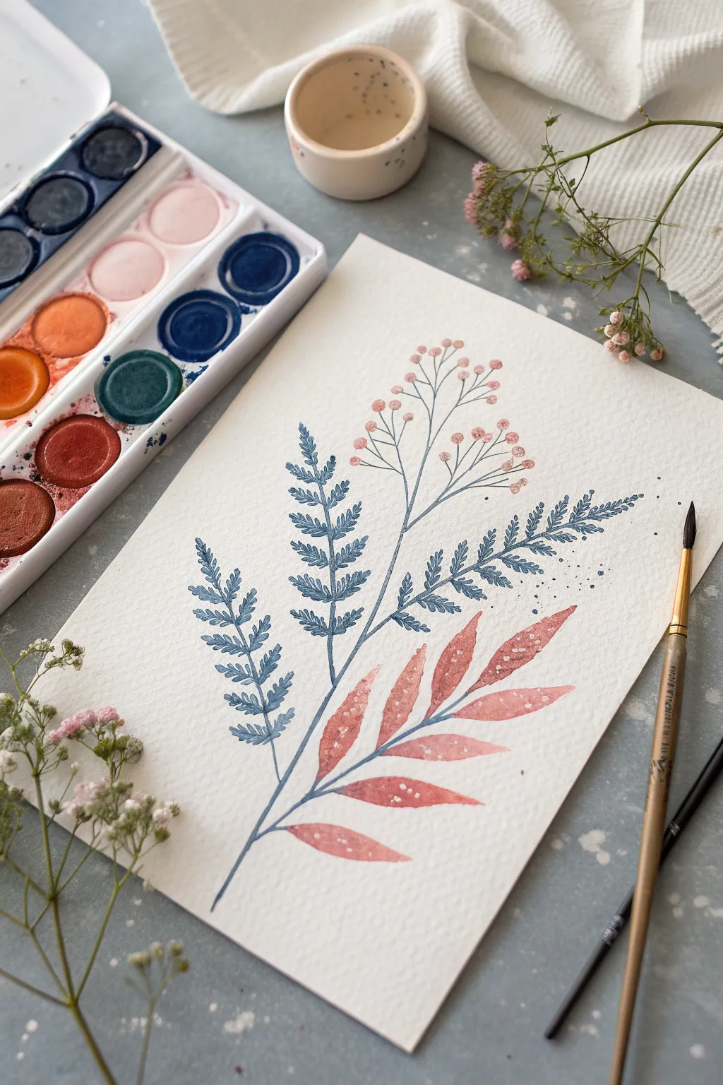
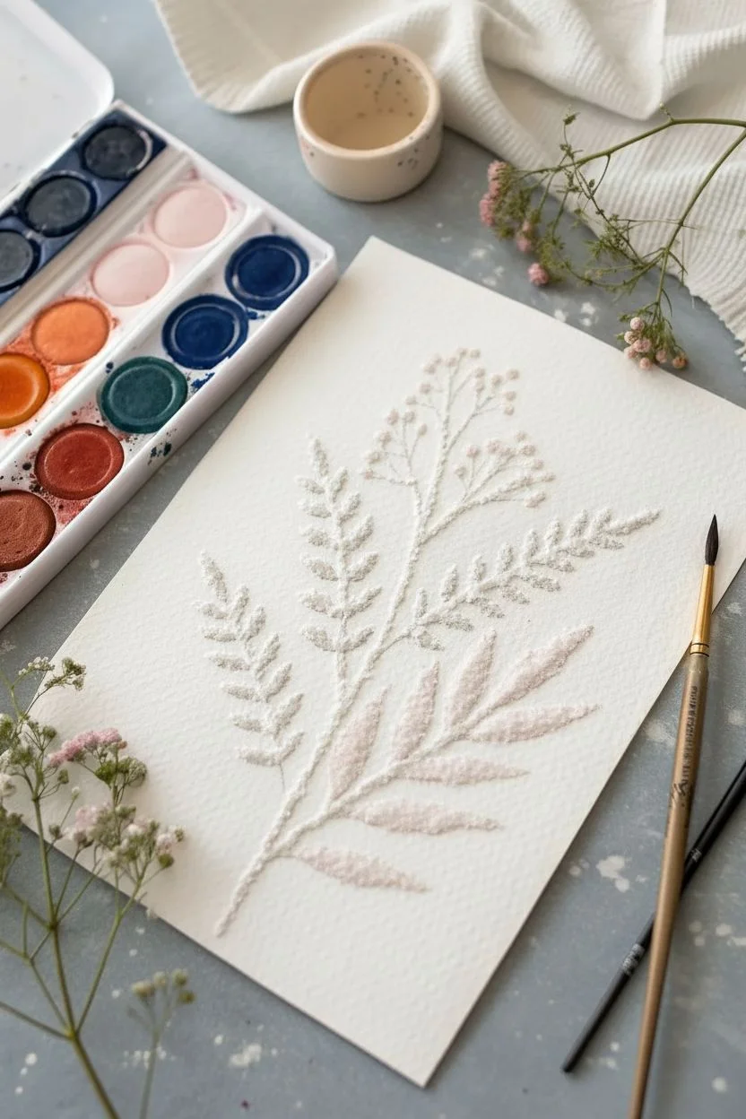
Capture the ethereal beauty of dried wildflowers with this textured botanical painting. Using a clever combination of fine-tip glue, table salt, and watercolors, you’ll create dainty, raised lines that actually hold pigment and shimmer subtly in the light.
Step-by-Step Tutorial
Materials
- Cold-pressed watercolor paper (300gsm, highly textured)
- White PVA glue with a fine-tip precision applicator
- Table salt or fine-grain sea salt
- Watercolor paints (Indigo, Burnt Sienna, Peach/Coral, Deep Teal)
- Round watercolor brush (size 4 or 6)
- Pencil (HB or H)
- Clean water jar
- Paper towels
- Soft brush (for dusting excess salt)
Step 1: Planning and Line Work
-
Light Sketching:
Begin by observing your botanical composition. Lightly sketch the main stem curvature using an H pencil so the graphite doesn’t smudge later. Start from the bottom left and curve gently toward the top right. -
Drafting the Fronds:
Add the fern-like fronds on the left side of the main stem. Keep these strokes loose and airy, marking where the tiny individual leaves will go without drawing every single detail. -
Sketching the Broad Leaves:
Outline the larger, tear-drop shaped leaves on the lower right side. These will balance the composition against the delicate ferns. -
Adding the Buds:
At the very top, sketch thin, branching stems that end in small circles, representing the flower buds. Keep this section sparse to maintain a delicate feel. -
Applying the Glue Lines:
Take your PVA glue with the precision tip. Carefully trace over your pencil lines, starting with the main stem. Squeeze gently to ensure a consistent, thin bead of glue. -
Detailing with Glue:
Continue tracing the fern fronds and the broad leaves. For the buds at the top, drop tiny dots of glue rather than drawing circles. -
Salting the Lines:
While the glue is still very wet, generously pour salt over the entire design. Ensure every bit of glue is completely covered in a mound of salt. -
Initial Drying Time:
Let this sit undisturbed for about 15-20 minutes. I usually take a short break here to mix my colors while the glue begins to set. -
removing Access Salt:
Once the glue is tacky but the outer shell is dry enough to hold shape, gently shake the loose salt off the paper into a trash bin.
Step 2: Painting the Texture
-
Preparing the Palette:
Mix a watery indigo blue for the ferns, a soft coral-peach for the broad leaves, and a pale pink for the buds. Ensure your paint is fluid, as the salt will absorb the moisture. -
Touching the Ferns:
Load your brush with the indigo mix. Gently touch the tip of the brush to the salted glue lines of the fern. Watch how the paint wicks along the salt crystals without you needing to stroke the brush. -
Painting the Broad Leaves:
Switch to your coral-peach color. Paint the space *inside* the glue outlines of the bottom right leaves, filling them in with a wash. Then, touch the salted outline with a slightly darker concentration of the same color. -
Adding Leaf Details:
While the coral leaves are damp, you can drop in tiny specks of clear water or darker red paint to create bloom textures. -
Coloring the Buds:
Isolate the top flower buds. Dab pink paint onto the salted glue dots. Use a very thin liner brush to connect these buds to the main stem with a faint grey-blue line if you didn’t glue those connections. -
Adding Splatter:
Load a brush with diluted indigo or grey. Tap the handle against another brush over the paper to create fine, atmospheric splatters around the fern area. -
Final Drying:
Let the entire piece dry completely, preferably overnight. The salt needs to be fully hardened into the glue. -
Clean Up:
Once bone dry, use a soft, clean brush to gently sweep away any stray salt grains that aren’t adhered to the glue lines, revealing the crystallized structure.
Salty Spreading?
If paint bleeds too much beyond the glue lines, your paint mix is too watery or the paper isn’t absorbent enough. Use less water and blot your brush before touching the salt
Gilded Edges
Mix a tiny amount of metallic gold watercolor or ink into your final touches. Dab it onto the highest points of the salt texture for a subtle, elegant shimmer
Frame your textured botanical piece in a shadow box to protect the delicate raised lines and display your work proudly

PENCIL GUIDE
Understanding Pencil Grades from H to B
From first sketch to finished drawing — learn pencil grades, line control, and shading techniques.
Explore the Full Guide
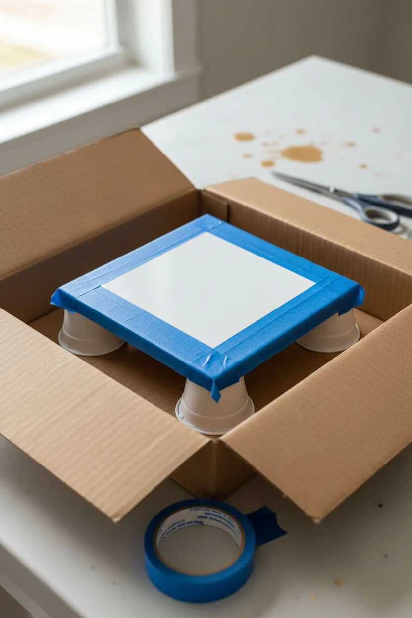
Acrylic Pour Coaster Tiles
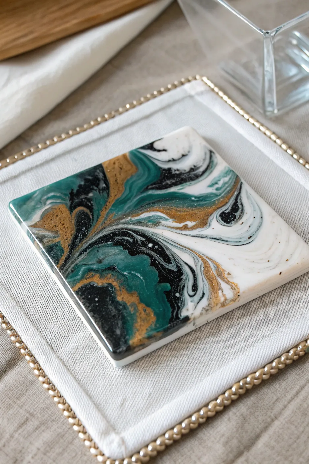
Transform plain ceramic tiles into luxurious faux-marble coasters using a fluid acrylic pouring technique. This project captures the elegance of swirling teal, deep black, and shimmering gold against a stark white background for a sophisticated home accent.
How-To Guide
Materials
- 4×4 inch white ceramic glossy tiles
- Acrylic paints (Teal/Deep Green, Black, Metallic Gold, Titanium White)
- Pouring medium (like Floetrol or Liquitex)
- Silicone oil (optional, for cells)
- Plastic cups (small shot-glass size for colors, larger for mixing)
- Wooden stir sticks
- Painter’s tape or masking tape
- Cardboard box or tray (to catch drips)
- Gloss varnish or clear resin (for sealing)
- Cork backing sheets or felt pads
- Straw or hair dryer (optional)
- Torch (optional)
Step 1: Preparation
-
Clean the tiles:
Wipe down your ceramic tiles with rubbing alcohol or a damp cloth to remove any dust or grease. Ensure they are completely dry before starting. -
Tape the bottoms:
Apply strips of painter’s tape to the underside of each tile. This prevents dripping paint from ruining the bottom surface and makes cleanup significantly easier. -
Set up the workspace:
Place your tiles on overturned cups (like yogurt cups or heavy shot glasses) inside a cardboard box or a plastic-lined tray. This elevates the tile so paint can flow freely off the edges.
Muddy Colors?
If your colors are turning grey or muddy, you are likely over-tilting or stirring the paint too much on the tile. Stop manipulating the paint sooner to keep separation distinct.
Step 2: Mixing the Paints
-
Prepare your colors:
In separate small cups, mix your acrylic paints with pouring medium. A standard ratio is 1 part paint to 2 parts medium, but follow the bottle instructions. The consistency should be like warm honey. -
Create the white base:
Mix a larger amount of Titanium White than the other colors, as this will form the negative space. I like to keep this mixture slightly thinner to help the other colors glide over it. -
Add metallic flair:
When mixing the metallic gold, ensure it is thoroughly combined so the mica particles are evenly distributed. Add 1-2 drops of silicone oil to the gold and teal cups if you want small cellular effects.
Pro Tip: Resin Finish
For a true glass-like finish that handles hot coffee mugs perfectly, skip the spray varnish and use a two-part epoxy resin topcoat. It adds depth and professional durability.
Step 3: The Pour
-
Technique selection:
For this specific marble look, we will use a ‘dirty pour’ or a ‘puddle pour’ method. Start by flooding the tile with a generous layer of white paint, spreading it gently to the edges. -
Layering the colors:
In a clean cup, layer small amounts of your colors: a splash of white, then teal, black, and gold. Do not stir. Repeat the layering once more. -
Applying the swirl:
Pour a ribbon of the layered colored paint diagonally across the white-flooded tile. You want a distinct band of color rather than covering the whole surface. -
Manipulate the paint:
Gently tilt the tile in different directions to stretch the color band. The goal is to let the white create ‘negative space’ while the colored vein expands and swirls naturally. -
Blow out details:
Use a drinking straw to blow gently on the edges where the color meets the white. This creates soft, feathery transitions and brings up delicate veins of gold and black.
Step 4: Finishing Touches
-
Pop bubbles:
If you see air bubbles trapped in the surface, quickly pass a chef’s torch or a lighter flame over the wet paint. Keep it moving to avoid scorching the paint. -
Check the edges:
Use a finger or a stir stick to touch up the sides of the tile, ensuring they are fully covered with paint as it drips down. -
Let it cure:
Allow the tiles to dry undisturbed for at least 24-48 hours. Ensure they are on a level surface so the pattern doesn’t shift while drying. -
Remove tape:
Once the paint is dry to the touch, flip the tiles over and peel off the painter’s tape to reveal clean backs. -
Seal the surface:
Wait for the paint to fully cure (check manufacturer times, usually a few weeks for full cure). Then, apply a heat-resistant glossy varnish or a coat of art resin to make the coaster waterproof and heat-safe for mugs. -
Add backing:
Cut a piece of cork sheet to size or apply self-adhesive felt pads to the bottom corners to protect your furniture from scratches.
Now you have a stunning set of custom coasters ready to protect your table in style
Painted Wood Slice Jewelry Charms
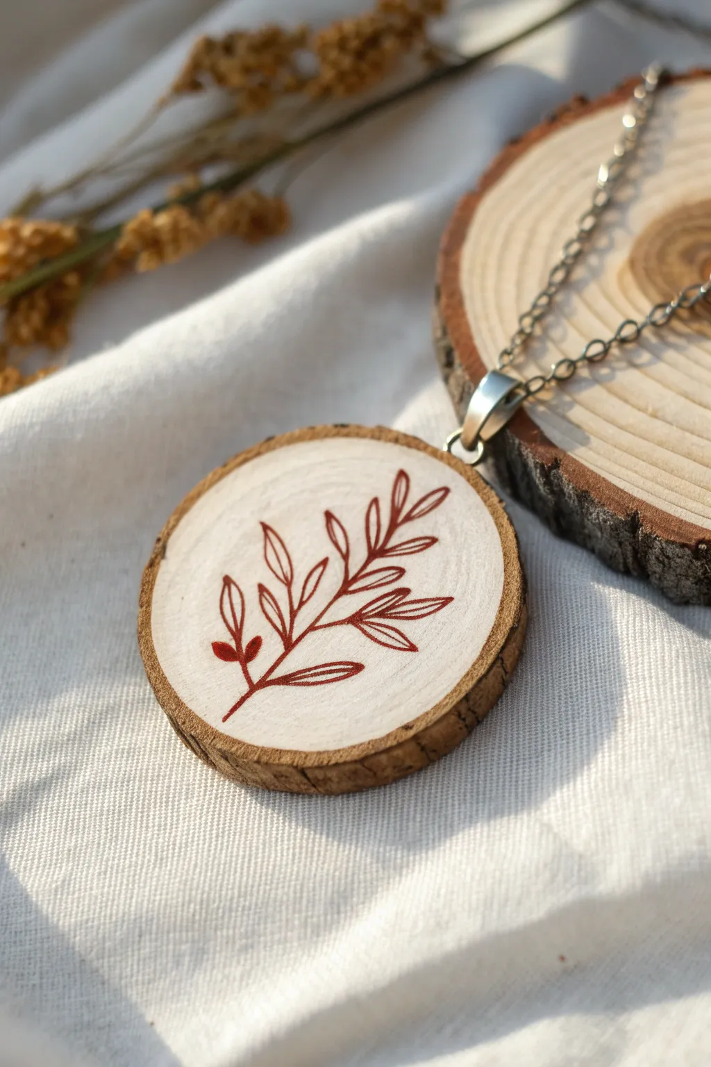
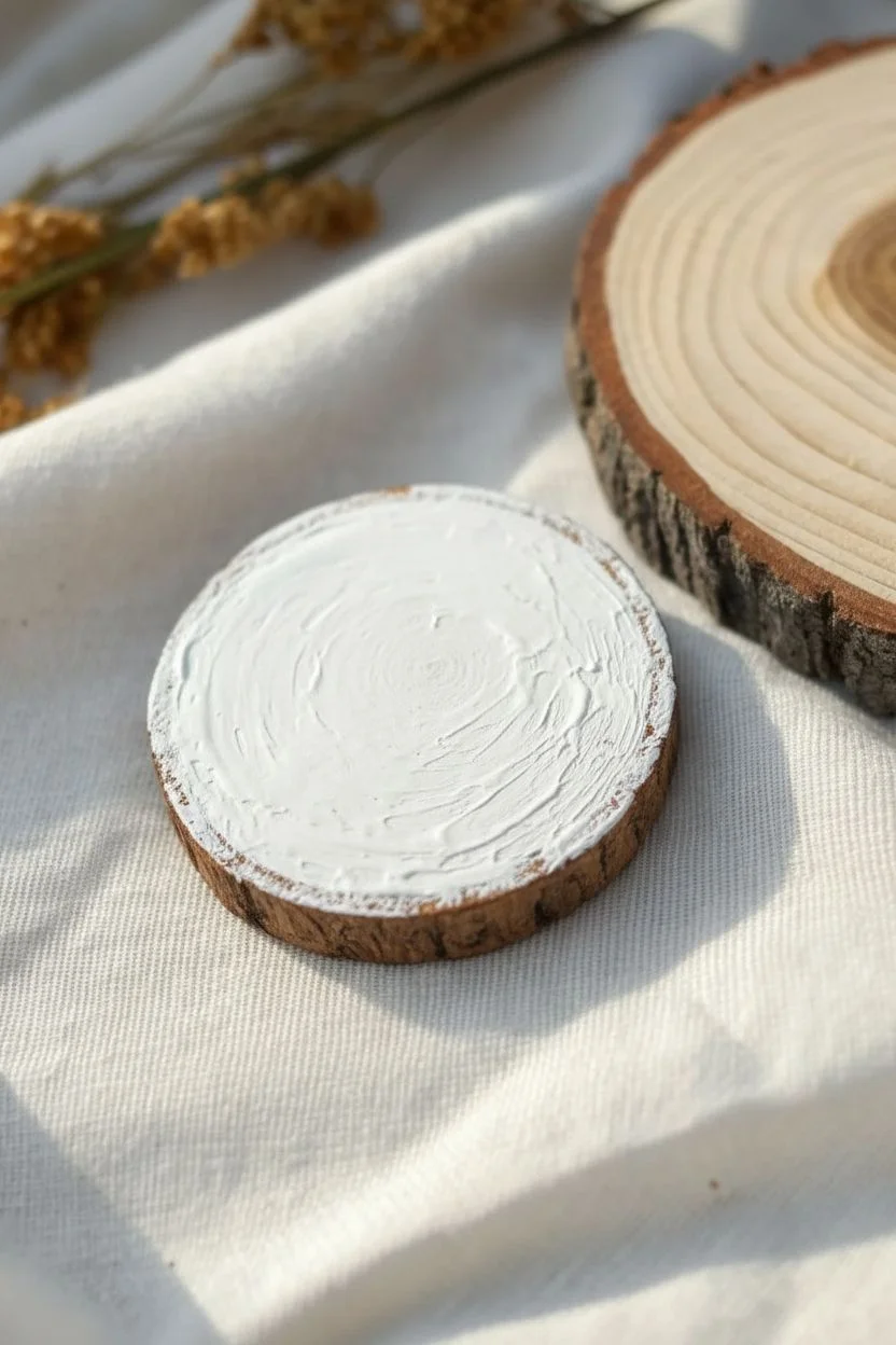
Transform a rustic slice of wood into an elegant piece of wearable art with this simple yet striking project. The contrast between the crisp white background and the delicate reddish-brown fern illustration creates a modern, nature-inspired jewelry charm.
Step-by-Step Guide
Materials
- Small wood slice with bark (approx. 1.5 – 2 inches diameter)
- Sandpaper (fine grit, 220 or higher)
- White acrylic paint or gesso
- Red-brown or terracotta acrylic paint
- Flat shader brush (small)
- Fine liner detail brush (size 00 or 000)
- Pencil
- Matte or glossy spray varnish/sealer
- Screw eye bail (silver)
- Jewelry chain and jump ring (optional)
- Small drill or awl (optional, for pilot hole)
Step 1: Preparation & Base Coat
-
Smooth the surface:
Before painting, take your small wood slice and inspect the surface. Sand the face gently with fine-grit sandpaper to remove any rough ridges or loose fibers that might catch your brush later. -
Clean the dust:
Wipe the wood surface with a slightly damp cloth or a dry tack cloth to remove all sanding dust. A clean surface is crucial for a smooth white background. -
Apply the first white layer:
Using a small flat shader brush, apply a coat of white acrylic paint to the center of the wood slice. Leave a small margin of raw wood visible just inside the bark ring to frame the artwork naturally. -
Let it dry:
Allow the first coat to dry completely. This usually takes about 10-15 minutes depending on how thick your application was. -
Build opacity:
Apply a second coat of white paint. If the wood grain is still showing through too much for your liking, you might even proceed with a third thin coat. I prefer to let each layer dry fully to avoid dragging up the previous paint. -
Final dry:
Ensure the white background is perfectly dry and hard to the touch before attempting to draw or paint over it.
Fixing Shaky Lines
Line too thick? Wait for it to dry completely, then use a tiny brush with white paint to ‘erase’ the mistake by painting over the edge to reshape it.
Step 2: Painting the Fern Design
-
Sketch the stem:
Using a pencil very lightly, draw a curved line starting from the bottom left quadrant and arching toward the upper right. This will be the main stem of your branch. -
Sketch the leaves:
Lightly mark the direction of the leaves branching off the stem. Keep them simple and spaced out; you don’t need to draw every detail, just the general flow. -
Paint the main stem:
Load your fine liner brush with red-brown paint thinned very slightly with a drop of water for better flow. Carefully paint over your pencil line for the main stem, tapering it slightly at the top. -
Paint the lower leaves:
Starting at the bottom of the stem, paint the first two small leaves. These can be solid, filled-in teardrop shapes to anchor the design visually. -
Outline the upper leaves:
For the rest of the branch, switch to an outline style. Paint elongated, narrow leaf shapes extending from the stem. Try to keep your hand steady and lift the brush at the tip of each leaf for a sharp point. -
Add detail lines:
Inside the larger outline leaves, paint a single, very thin line down the center to represent the vein. This adds delicate detail without overcrowding the design. -
Refine edges:
Look over your work. If any lines look shaky, you can carefully refine them with the liner brush, but remember that minor imperfections add to the hand-painted charm.
Step 3: Finishing Touches
-
Erase stray marks:
Once the red paint is 100% dry (give it at least 20 minutes), gently erase any visible pencil marks with a clean, white eraser. -
Seal the artwork:
Take your spray varnish (matte or gloss depending on preference) and apply a light mist over the pendant in a well-ventilated area. Let it dry, then apply a second coat to protect it from wear. -
Make a pilot hole:
Use a small awl or a tiny drill bit to make a shallow pilot hole into the top edge of the bark, centered above your design. -
Insert hardware:
Screw the silver eye bail into the pilot hole. Use small pliers to twist it firmly into place if your fingers slip. -
Attach chain:
Thread your chain through the bail loop, or use a jump ring if the chain clasp is too large to fit through directly.
Fluidity Secret
Use a flow improver medium instead of just water to thin your paint. It breaks surface tension for long, smooth lines without diluting the pigment color.
Now you have a charming, nature-inspired pendant ready to wear or gift to a friend


Yarn Pull Painting Butterflies
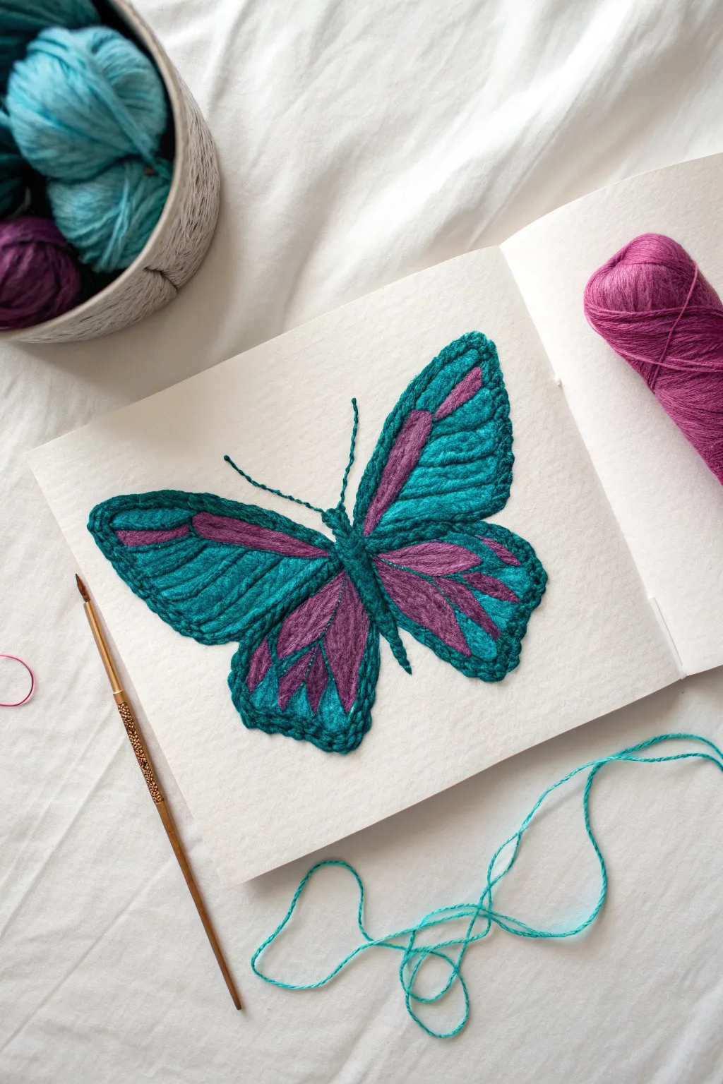
Create a stunning tactile butterfly using yarn and glue directly on paper to mimic the look of embroidery without a needle. This project combines the vibrancy of teal and purple yarn to build a dimensional, textured insect that almost flies off the page.
Step-by-Step Tutorial
Materials
- Thick sketchbook paper or cardstock (watercolor paper works well)
- Teal worsted weight yarn
- Purple or magenta worsted weight yarn
- Clear-drying craft glue (Tacky Glue is best)
- Small paintbrush (for spreading glue)
- Tweezers
- Pencil
- Scissors
Step 1: Preparation & Sketching
-
Prepare your workspace:
Lay the sketchbook flat. Since you’re working with glue, ensure the page underneath the one you are working on is protected with a piece of scrap paper or wax paper to prevent sticking. -
Lightly sketch the outline:
Using a pencil, draw the butterfly shape lightly in the center of the page. Start with the central body, then add the upper and lower wings. Keep the lines faint so they won’t show through later. -
Map out the pattern:
Sketch the interior designs of the wings. Draw the teardrop shapes inside the lower wings and the elongated sections on the upper wings where the color changes will occur.
Sticky Situation?
If glue seeps through the yarn, don’t wipe it! Let it dry completely clear. Wiping wet glue will smear it and ruin the yarn texture.
Step 2: Creating the Outline
-
Apply glue for the outline:
Working in small sections so the glue doesn’t dry, apply a thin bead of tacky glue along the outer perimeter of the upper left wing. -
Lay the teal yarn:
Cut a length of teal yarn. Using your tweezers for precision, gently press the yarn into the glue along the outline. Try not to stretch the yarn, just lay it gently. -
Complete the exterior border:
Continue gluing and laying the teal yarn around the entire perimeter of all four wings. Snip the yarn carefully at corners if needed to make sharp turns, or curve it gently for a softer look. -
Outline the body:
Apply glue down the center body section. Cut shorter pieces of teal yarn and lay them vertically to form the thorax and abdomen, building up slightly for thickness.
Better Curves
Use tweezers to twist the yarn slightly as you lay it down on curved sections. This prevents the yarn from springing back straight before the glue sets.
Step 3: Filling with Color
-
Start the lower wing details:
Identify the inner teardrop shapes on the lower wings. Apply glue inside these shapes and press cut strands of purple yarn into them. You may need to lay 2-3 strands side-by-side to fill the wider parts of the tear shape. -
Fill the upper wing stripes:
Apply glue to the elongated stripe sections on the upper wings. Cut lengths of purple yarn to match these shapes and press them firmly into place, ensuring no paper shows between the yarn strands. -
Fill the teal sections:
Now, fill the remaining empty space in the wings with teal yarn. I find it easiest to work from the outside in, following the curve of the wing outline. -
Create texture direction:
Pay attention to the direction of your yarn strands. On the upper wings, angle the strands diagonally upwards. On the lower wings, fan them out slightly like veins. -
Pack tightly:
Use the tip of your tweezers or a toothpick to nudge the yarn strands close together. The goal is a solid surface of fiber with no white gaps visible.
Step 4: Final Details
-
Add the antennae:
Draw two thin lines of glue extending from the head. Place a single, thin strand of teal yarn (you can untwist the yarn plies to make it thinner) on each line for delicate antennae. -
Refine the edges:
Check the perimeter of your butterfly. If any yarn ends possess a fuzzy fray, use a tiny dot of glue to smooth them down. -
Create the body texture:
To give the body more definition, cut very tiny snips of teal yarn (almost like flocking) and glue them over the vertical strands you laid earlier for a fuzzy, 3D effect. -
Clean up stray glue:
Look for any clear glue blobs that might have seeped out. While still tacky, you can often lift these away carefully with a clean toothpick. -
Let it cure:
Allow the project to dry completely flat for at least 4-6 hours. Do not close the sketchbook until the glue is fully hardened.
Once dry, your textured yarn butterfly will be a beautiful, touchable addition to your art journal
Pendulum Drip Painting for Hypnotic Lines
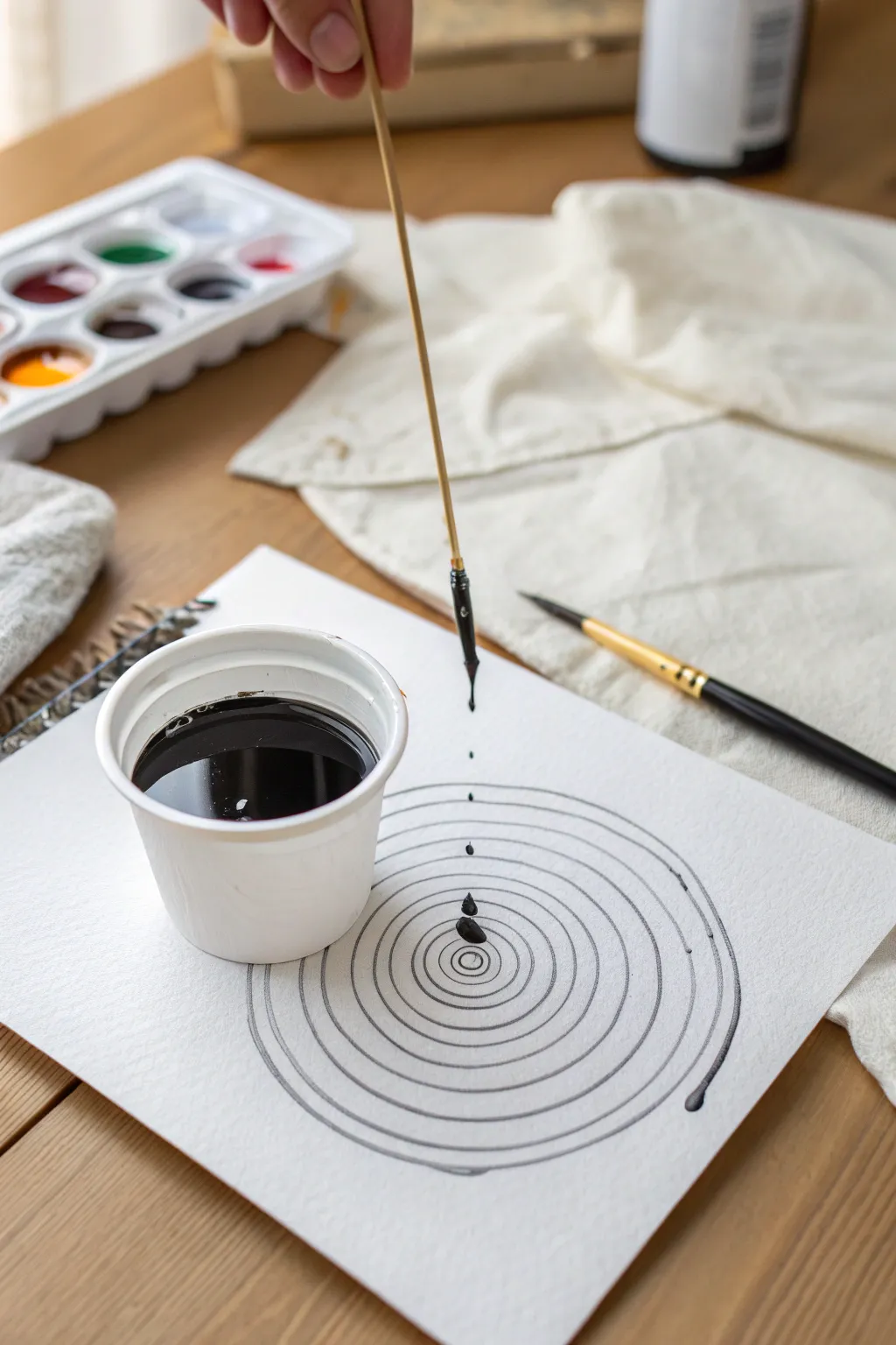
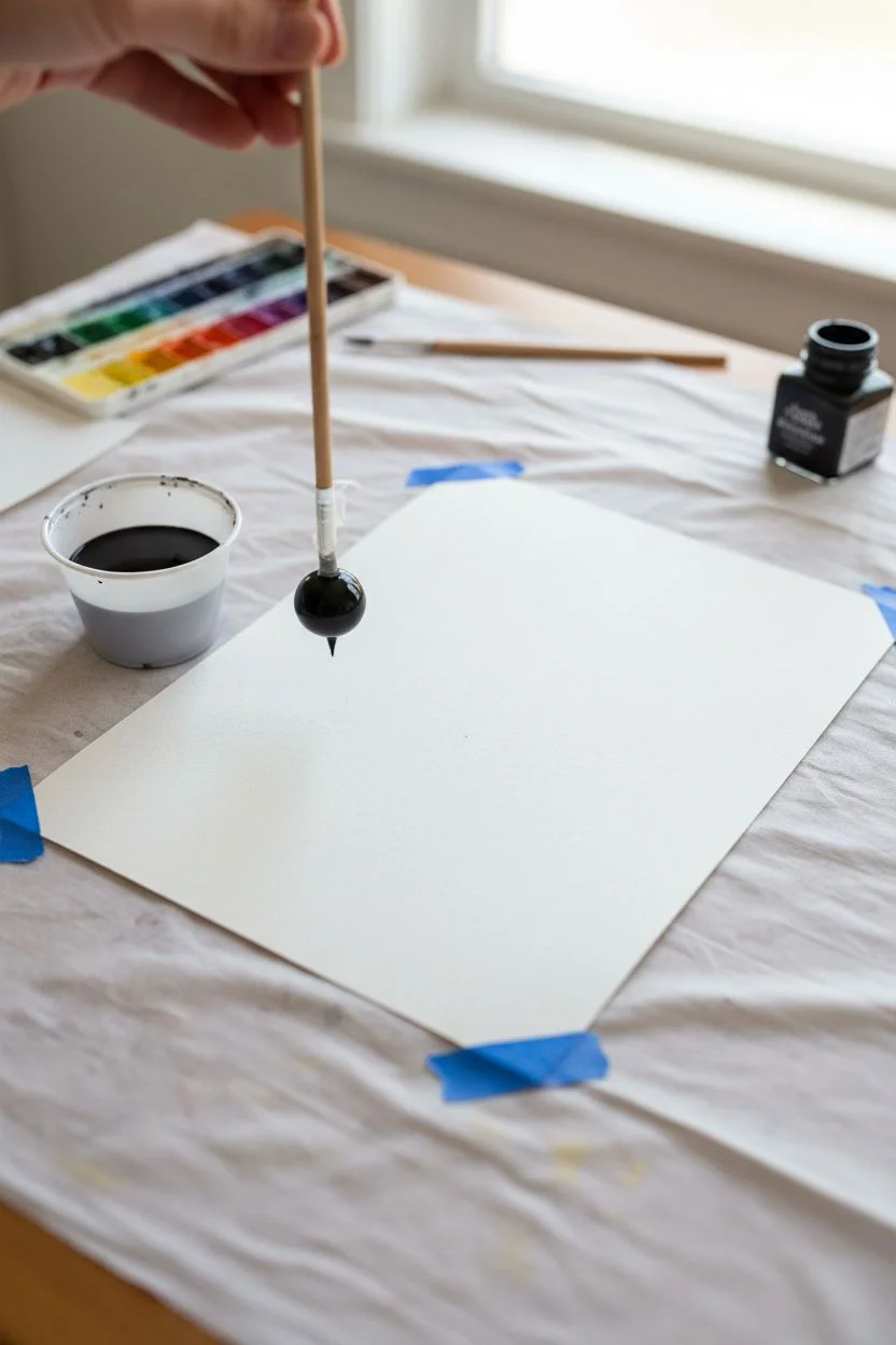
Harness the power of physics to create perfectly imperfect concentric circles with this soothing drip painting technique. By swinging a suspended brush over your paper, you’ll achieve hypnotic, spiral-like lines that feel both mechanical and wonderfully organic.
How-To Guide
Materials
- Heavyweight watercolor or mixed media paper
- Black ink or high-flow fluid acrylic paint
- Small plastic cup or container
- Thin wooden dowel or sturdy skewer (approx. 12 inches)
- Small round paintbrush (size 2-4)
- Tape or string (to attach brush to dowel)
- Water for dilution (if needed)
- Paper towels
Step 1: Preparation & Setup
-
Prepare your workspace:
Clear a flat, stable surface. Since this project involves dripping ink, it’s wise to lay down a protective cloth or some scrap paper underneath your main art paper. -
Secure the paper:
Place your sheet of heavyweight watercolor paper in the center of your workspace. You may want to tape the corners down lightly to prevent it from shifting while you work. -
Prepare the ink mixture:
Pour your black ink or fluid acrylics into a small plastic cup. The consistency needs to be quite thin—like heavy cream or milk—to flow off the brush easily without being uncontrollable. -
Construct the pendulum tool:
Take your wooden dowel and attach the small round paintbrush to one end using tape. The brush head should point downward, extending past the end of the stick. -
Check the connection:
Ensure the brush is secured tightly. You want the bristles to act as the weight at the end of your pendulum arm, so it shouldn’t wobble independently of the stick.
Step 2: Loading the Brush
-
Dip the brush:
Holding the top of the wooden dowel, dip the brush end into your cup of black ink. Submerge the bristles fully to load them significantly. -
Let excess drip:
Lift the brush out of the cup and let the initial heavy drips fall back into the container. You want the brush saturated but not gushing. -
Test the flow:
Do a quick test drip on a scrap piece of paper. The ink should release in distinct droplets when you hold it still, but flow more smoothly to create a line when moved.
Ink Spreading Too Fast?
If your lines are bleeding into fuzzy caterpillars, your paper is too absorbent or the ink is too watery. Switch to hot-press watercolor paper for crisper lines.
Step 3: Creating the Spirals
-
Position the pendulum:
Hold the top of the dowel directly above the center of your paper. Your hand acts as the pivot point for the pendulum. -
Start the swing:
Gently gently nudge the bottom of the stick to start it swinging in a circular motion. Don’t touch the paper yet; just get the rhythm going in the air. -
Lower toward the paper:
Slowly lower your hand until the tip of the brush just barely makes contact with the paper surface. Gravity and momentum will guide the brush in an elliptical or circular path. -
Create the first ring:
Allow the brush to complete a few revolutions. The friction of the paper will naturally slow the swing, causing the circle to become smaller. -
Lift and reload:
Once the line begins to fade or the circle gets too small, lift the dowel straight up. Reload your brush with more ink from the cup. -
Start the next layer:
Position your hand slightly higher or change the swing amplitude to start a larger or smaller ring. I usually like to overlap them slightly for a more complex look. -
Vary the rhythm:
Try swinging the stick with a bit more force for wider outer rings, allowing the ink to splatter slightly if you want a rougher texture. -
Add focal drips:
To finish, hold the loaded brush completely still over the center of the spiral. Let one or two heavy drops fall comfortably into the middle to anchor the composition. -
Final drying:
Let the artwork sit undisturbed. Because the ink is applied thickly in some spots, it might take longer to dry than a standard painting.
Pro Tip: Consistent Flow
Mix a few drops of pouring medium into your ink. This improves the viscosity, allowing for longer, unbroken lines before you need to reload the brush.
Enjoy the meditative process of watching physics create art on your page


Have a question or want to share your own experience? I'd love to hear from you in the comments below!