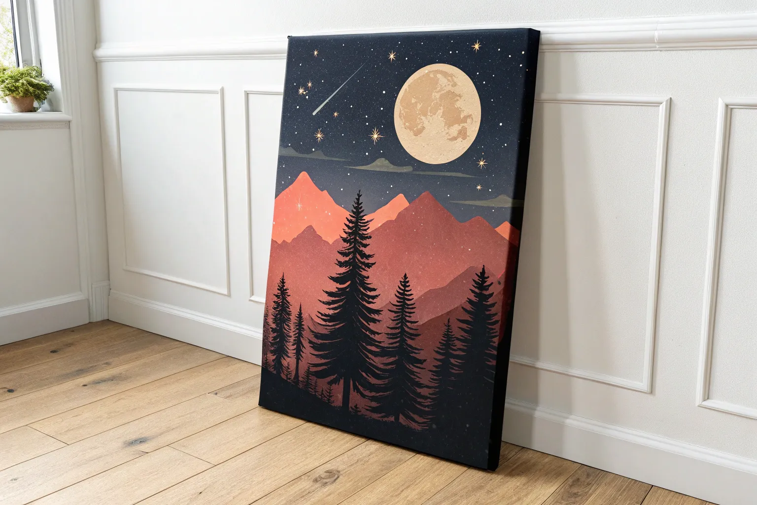
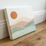
If you’ve ever stared at a blank page and thought, “What do I even paint?” you’re in very good company. Here are my go-to painting ideas that feel doable, relaxing, and still give you that “I can’t believe I made this” finish.
Starry Night Sky With Easy Splatter Stars
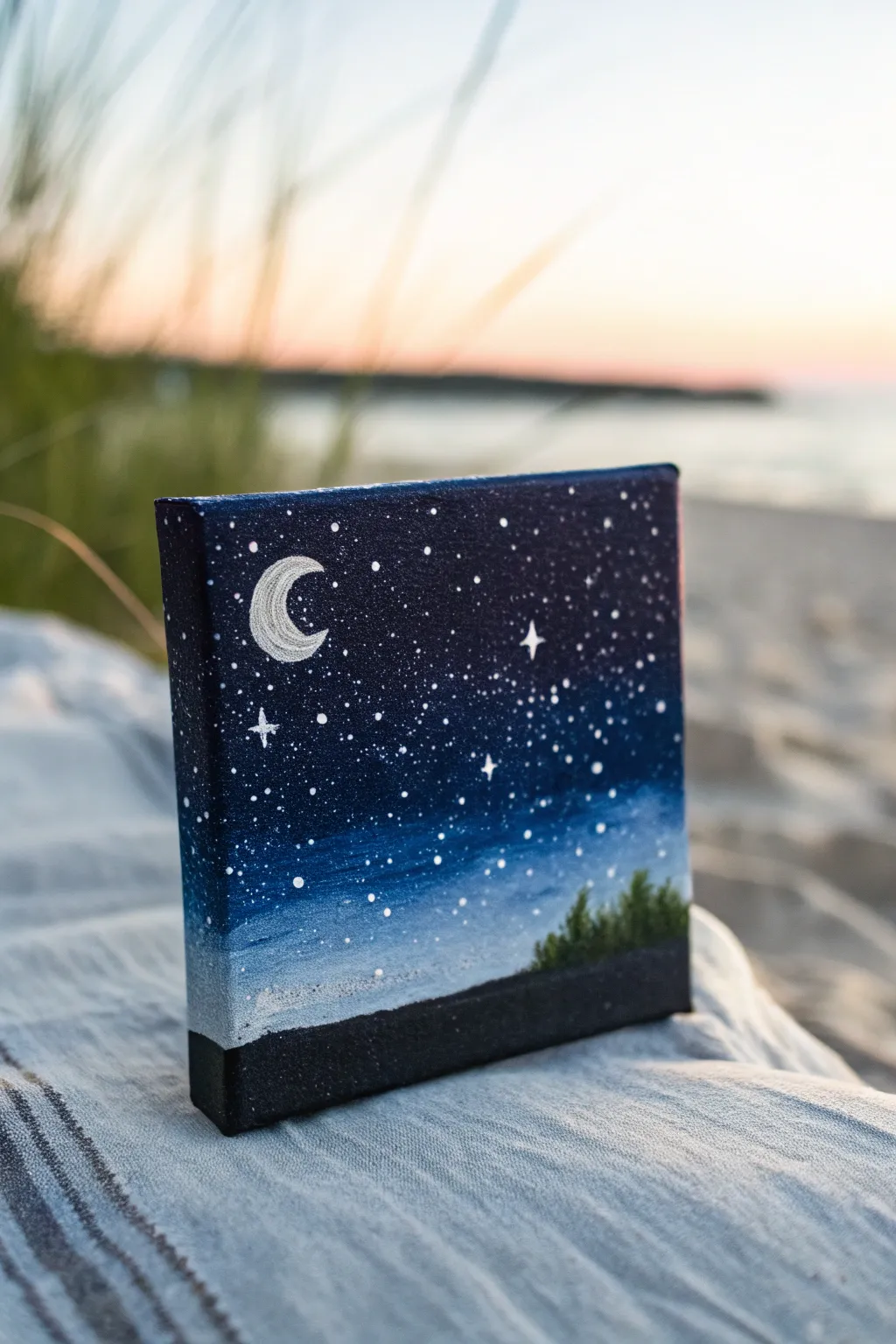
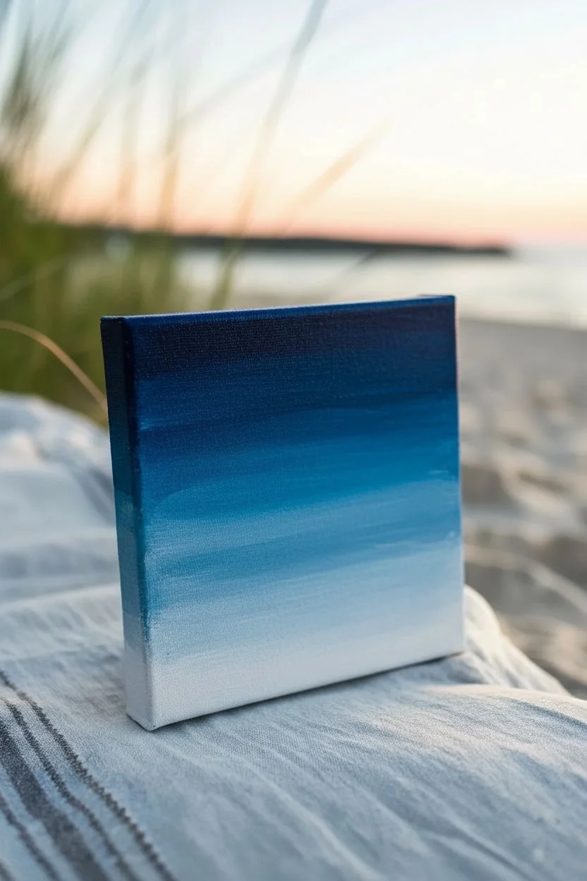
Capture the magic of a clear summer night on a tiny canvas with this celestial painting project. By blending deep blues and crisp whites, you’ll create a dreamy backdrop for a glowing crescent moon and a scattering of starlight.
Step-by-Step Guide
Materials
- Small square canvas (e.g., 4×4 or 5×5 inches)
- Acrylic paints: Phthalo Blue, Ultramarine Blue, Black, Titanium White, and Sap Green
- Flat shader brush (medium)
- Small detail brush (round size 0 or 00)
- Old toothbrush (for splattering)
- Palette or mixing plate
- Cup of water
- Paper towels
Step 1: Setting the Night Sky
-
Prime with dark hues:
Start by mixing a very dark midnight blue on your palette using Phthalo Blue and a touch of Black. Apply this color to the top third of your canvas, ensuring you paint the side edges as well for a finished look. -
Create the mid-tone transition:
For the middle section, mix pure Phthalo Blue with a tiny bit of Ultramarine. Paint this below your dark top layer, blending the two while the paint is still wet to create a smooth gradient. -
Fade to the horizon:
Mix Titanium White with Ultramarine and a dot of Phthalo Blue to create a light, dusty blue. Apply this to the lower third of the sky area, blending upwards into the mid-tone blue. -
Smooth the gradient:
Clean your brush, leave it slightly damp, and gently sweep back and forth horizontally across the transition lines where the colors meet. This removes hard stripes and creates a soft, atmospheric fade. -
Let the sky dry:
Because we will be splattering stars next, the background needs to be completely dry so the stars sit crisply on top. I usually wait about 15-20 minutes or use a hair dryer.
Step 2: Creating the Stars and Moon
-
Mix splatter paint:
Water down a small amount of Titanium White paint on your palette. It should be the consistency of heavy cream—runny enough to fly off bristles, but thick enough to stay opaque. -
Splatter the stars:
Dip an old toothbrush into your thinned white paint. Point the bristles toward the canvas and run your thumb across them to flick a fine mist of specks over the blue sky area. -
Outline the crescent shape:
Using your smallest detail brush and pure Titanium White, carefully paint a small ‘C’ shape for the crescent moon in the upper left quadrant. Start thin and gently widen the center. -
Fill the moon:
Fill in the crescent shape with solid white paint. If the first coat looks streaky or translucent against the dark blue, let it dry and apply a second coat for brightness. -
Add feature stars:
Select 3 or 4 spots in the sky to add larger ‘twinkle’ stars. Use your detail brush to paint a tiny cross (+) shape, then gently elongate the vertical and horizontal points to make them sparkle. -
Detail stray dots:
If the splatter technique left any empty patches, use the tip of your detail brush to add manual dots for stars to balance the composition.
Star Control
Test your splatter technique on a piece of scrap paper first. If the drops are too big, wipe the brush and use less water to get a fine mist.
Step 3: Adding the Horizon
-
Paint the ground silhouette:
Mix Black with a very small amount of dark Blue. Paint a solid horizontal band across the very bottom of the canvas, covering about half an inch to simulate the ground. -
Mix the tree color:
Create a dark forest green by mixing Sap Green with a little bit of your black/blue mixture. Only a subtle green tint is needed since it is a night scene. -
Start the treeline:
On the bottom right side of the canvas, just above the black ground line, use the detail brush to dab small, vertical strokes to suggest pine trees. -
Texture the trees:
Use a tapping motion with the tip of the brush to create the jagged texture of pine needles. Make the trees vary slightly in height for a natural look. -
Final touch ups:
Bring the black ground paint up slightly to meet the base of the trees so they feel rooted in the landscape rather than floating. -
Seal the sides:
Examine the edges of your canvas. Since this is a gallery-wrap style, extend the black ground color and the corresponding sky blues around the corners to complete the 3D effect.
Glow Up
Mix a tiny amount of glitter medium into the white paint for your larger stars to make the painting shimmer when it catches the light.
Place your finished mini-masterpiece on a small easel or shelf to add a peaceful night vibe to your room


Sunset Gradient With a Silhouette Foreground
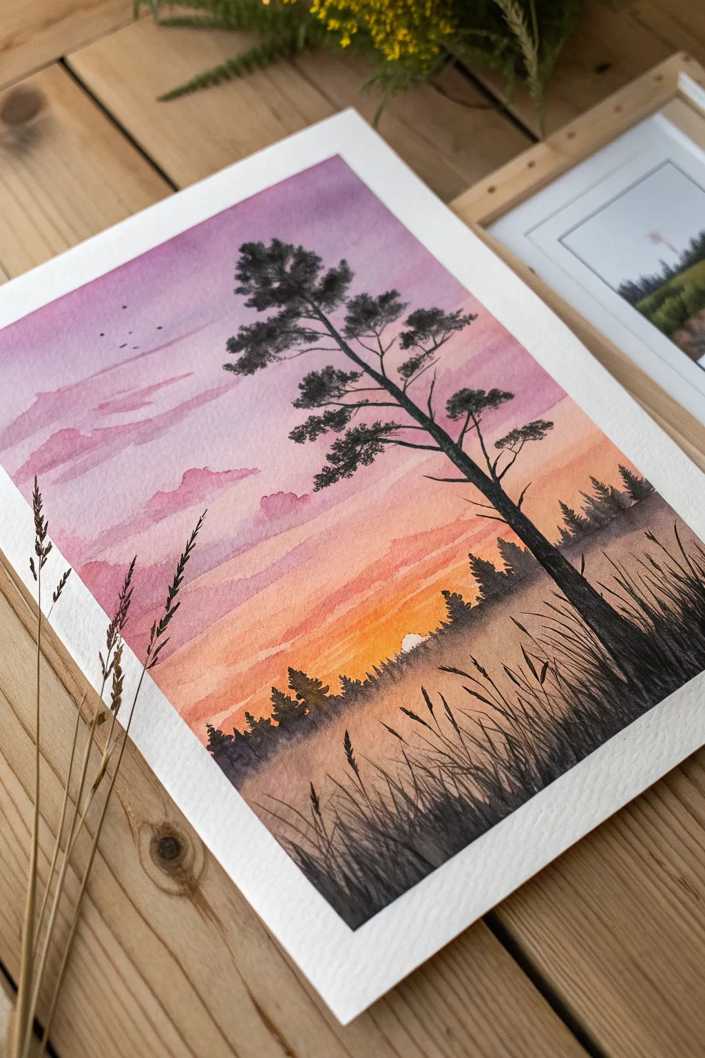
Capture the tranquil beauty of dusk with this vibrant watercolor landscape featuring a striking pine tree silhouette against a gradient sky. The blend of soft purples and warming oranges creates a peaceful atmosphere perfect for practicing your wet-on-wet technique.
How-To Guide
Materials
- Cold-pressed watercolor paper (300 gsm)
- Watercolor paints (Purple, Rose/Pink, Orange, warm Yellow, Black/Payne’s Grey)
- Large flat wash brush
- Medium round brush (size 6 or 8)
- Fine liner or detail brush (size 0 or 1)
- Masking tape
- Clean water and paper towels
- Palette for mixing
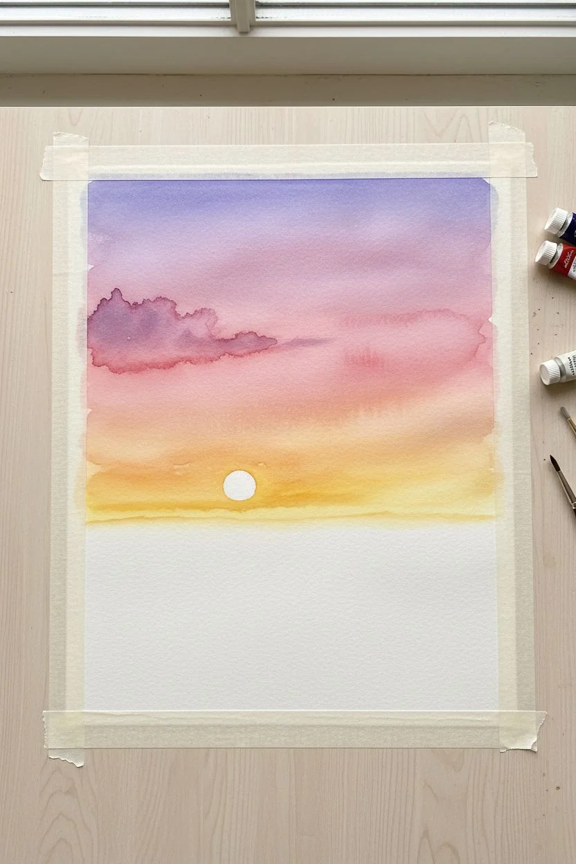
Step 1: Painting the Sky Gradient
-
Secure the paper:
Tape down all four edges of your watercolor paper to a board or table to prevent buckling and create a clean white border. -
Wet the surface:
Using your large flat brush, apply a clean coat of water across the entire upper two-thirds of the paper where the sky will be. The paper should be glisten, but not hold puddles. -
Apply the top layer:
While the paper is wet, load a medium round brush with a soft purple or violet. Paint horizontal strokes across the top third, letting the color bleed downwards slightly. -
Blend in the middle tones:
Rinse your brush and pick up a rose or soft pink shade. Paint horizontal strokes just below the purple, allowing the wet paints to touch and merge naturally. -
Add the horizon glow:
Switch to a warm orange and then a bright yellow as you move toward the horizon line (about one-third up from the bottom). Blend the yellow seamlessly into the pink above it. -
Create distant clouds:
Before the sky dries completely, mix a slightly stronger purple-pink. Using a damp brush, gently dab in soft, elongated cloud shapes in the upper left section. The wet paper will soften the edges for you. -
Leave a sun gap:
While painting the yellow horizon area, I like to carefully lift a tiny semi-circle of paint with a clean, damp brush or simply leave a rounded gap of white paper to represent the setting sun. -
Dry completely:
Let the sky layer dry thoroughly. If the paper feels cool to the touch, it’s still wet. This step is crucial before adding crisp details.
Step 2: Creating the Foreground
-
Paint the distant tree line:
Mix a diluted black or dark grey (add a lot of water so it looks misty). With a medium brush, paint an uneven, jagged row of small trees along the horizon line, right over the bottom of your yellow sky. -
Darken the foreground base:
As you move lower down the paper towards the bottom edge, darken your black mixture with less water. Paint solid, dark color at the very bottom, fading it upward into the misty tree line. -
Draft the main tree trunk:
Using a smaller round brush and concentrated black paint (creamy consistency), paint a thin line for the main tree trunk. Start slightly right of center and curve it gently towards the top left. -
Thicken and anchor:
Go back over the bottom of the trunk to thicken it, extending distinct roots into the dark foreground to anchor the tree visually. -
Add main branches:
Extend branches outward from the trunk. Remember that pine branches often curve slightly upward or hang heavy; keep them irregular and not perfectly symmetrical. -
Stipple the pine needles:
Using the tip of your brush or an old splayed brush, tap (stipple) clusters of black paint onto the branches to create the look of pine needle clumps. Leave gaps so the sky shows through. -
Paint the tall grasses:
Switch to your finest liner brush or detail brush. With quick, confident flicking motions, paint long blades of grass rising from the bottom right corner. -
Add seed heads:
On the tips of a few tall grass blades, add small textured dots or dashes to represent seed heads or wheat textures. -
Include flying birds:
If you wish, add microscopic ‘v’ or tick shapes in the upper left sky using the very tip of your detail brush to suggest distant birds. -
Final reveal:
Once the black paint is completely dry, slowly peel away the masking tape at a 45-degree angle to reveal your crisp white border.
Muddy colors?
If your purple and orange mix to create brown, create a buffer zone of pink between them. Pink blends beautifully with both purple and orange without getting muddy.
Make it sparkle
For a magical touch, lightly splatter clean water or white gouache onto the dry purple sky to create faint stars or atmospheric dust before painting the tree.
Step back and admire the peaceful transition of colors you’ve achieved in your sunset landscape.


Calm Ocean Horizon With Minimal Color Shifts
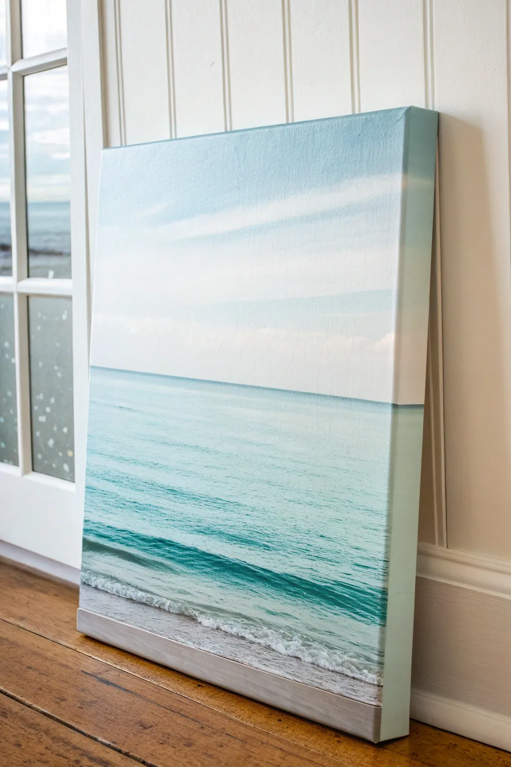
Capture the peaceful essence of a quiet beach day with this minimalist acrylic painting. By using subtle color shifts and gentle blending, you’ll create a soothing seascape that brings a breath of fresh air into any room.
Step-by-Step Guide
Materials
- Large rectangular stretched canvas (at least 18×24 inches)
- Acrylic paints: Titanium White, Phthalo Blue, Turquoise, Raw Umber, grey
- Large flat brush (2 inch)
- Medium filbert brush
- Small round detail brush
- Palette knife
- Water container and paper towels
- Painter’s tape or masking tape
Step 1: Setting the Sky
-
Define the Horizon:
Place a strip of painter’s tape horizontally across your canvas, positioned slightly below the halfway point. This will ensure your horizon line is perfectly crisp and separates the ocean from the vast sky. -
Mix the Sky Blue:
Create a very pale blue by mixing a large amount of Titanium White with a tiny dot of Phthalo Blue. The goal is an airy, barely-there blue. -
Paint the Upper Sky:
Using your large flat brush, apply this pale blue mix to the very top quarter of the canvas. Use long, horizontal strokes for a smooth finish. -
Blend Downward:
Without cleaning your brush, pick up more pure Titanium White. Blend the blue section downwards into the white, creating a gradient that becomes almost pure white as it nears the tape line. This mimics atmospheric perspective. -
Add Soft Clouds:
While the paint is still slightly tacky, use a dry, clean brush to gently scumble faint white streaks horizontally across the blue area to suggest wispy cirrus clouds.
Step 2: Creating the Ocean Body
-
Remove the Tape:
Once the sky is dry to the touch, carefully peel away the painter’s tape to reveal your sharp horizon line. -
Mix Deep Teal:
Mix Turquoise with a touch of Phthalo Blue and white to create a medium aquamarine shade. It should be darker than the sky but still vibrant. -
Paint the Distance:
Use the flat brush to paint a strip right against the horizon line with this aquamarine mix. Keep your hand steady to maintain that sharp edge you created. -
Transitions:
As you move down the canvas, gradually add more Turquoise and a tiny bit of white to your mix. The water should transition from a distinct blue horizon to a clearer, jewel-toned teal as it approaches the shore. -
Add Wave Depth:
Roughly 4-5 inches from the bottom, mix a slightly darker teal shade. Paint a horizontal band here to represent the swell of a breaking wave before it crashes.
Uneven Horizon?
If paint bleeds under your tape, wait for it to fully dry. Then, re-apply tape slightly above or below the error and paint over it with the opaque color of the correcting section.
Step 3: The Shore and Foam
-
Establish the Sand:
Mix Titanium White with a very small amount of Raw Umber and a touch of grey. Paint the bottom 3 inches of the canvas with this neutral sand tone, blending it slightly upward into the teal water area. -
Create the Foam Line:
Load a filbert brush with pure Titanium White. Paint a thick, curving line where the darker wave meets the lighter shallow water. Use a tapping motion to create texture. -
Detail the Swell:
Using the dark teal mix again, underline the white foam of the wave to create a shadow, giving the water volume and height. -
Sea Foam Texture:
Dilute some white paint slightly with water. Flick or stipple this watery white paint over the sand area next to the waves to mimic sea foam bubbles washing ashore. -
Final Highlights:
Add a few disconnected horizontal white streaks in the middle of the ocean section to suggest light catching the ripples on the water’s surface. -
Wrap the Edges:
Don’t forget the sides of your canvas. Extend the sky, horizon line, and water colors around the edges for a professional, gallery-ready look without a frame.
Add More Texture
Mix heavy body gel medium into your white paint for the crashing waves. This creates physical ridges on the canvas that catch the light like real sea foam.
Step back and enjoy the calming coastal window you have created for your home

Moonlit Tree Branches Against a Big Glowing Moon
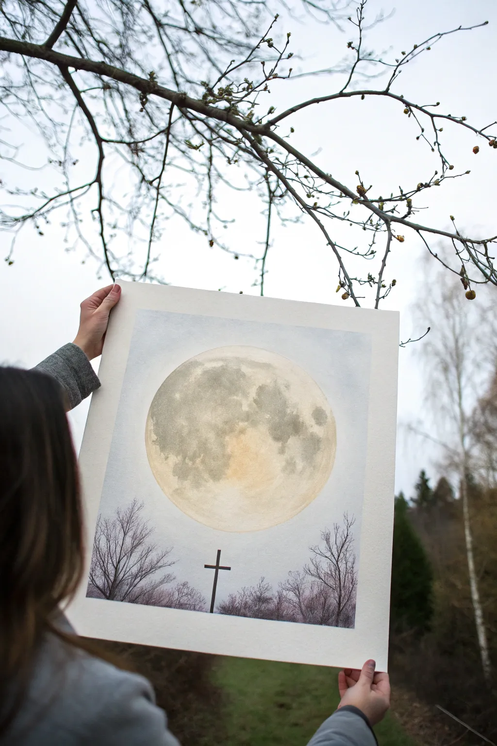
This serene watercolor project captures the majestic glow of a full moon hovering above bare winter branches and a solitary silhouette. The large scale of the moon creates a dramatic focal point, contrasting beautifully with the delicate details of the foreground.
Detailed Instructions
Materials
- High-quality cold press watercolor paper (A3 or similar size)
- Round plate or compass to trace a circle
- Pencil (HB or lighter) and kneaded eraser
- Watercolor paints (Payne’s Grey, Yellow Ochre, Burnt Umber, Ivory Black, Indigo)
- Masking fluid (drawing gum) and old brush
- Large flat wash brush
- Medium round brush (size 6-8)
- Small detail brush (size 0-2 or rigger brush)
- Paper towels
- Jars of clean water
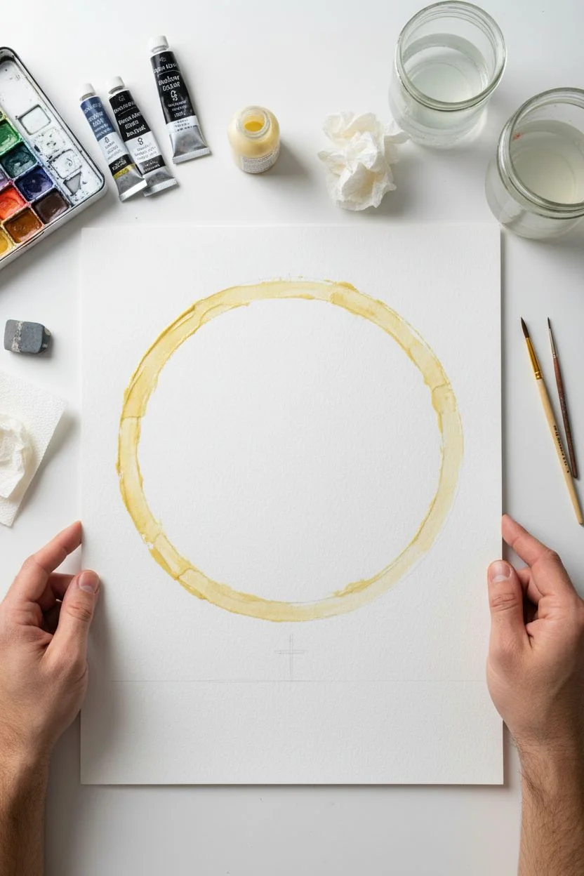
Step 1: Drafting and Masking
-
Trace the moon:
Center your round plate on the paper to serve as a template. Lightly trace a large circle with your pencil. This circle should dominate the upper two-thirds of the composition. -
Protect the moon:
Apply masking fluid carefully inside the circle’s edge. You don’t need to fill the entire moon, just a thick band around the perimeter to protect the crisp shape while you paint the sky later. Let this dry completely. -
Lightly sketch the foreground:
Very faintly sketch the horizon line near the bottom. Add the basic vertical line for the cross to ensure it is centered beneath the moon.
Fixing “Cauliflowers”
If water blossoms appear in your sky wash, wait until it’s fully dry. Then, gently scrub the edge with a damp stiff brush to soften it, or glaze a thin layer over the whole sky to unify it.
Step 2: Painting the Textured Moon
-
Wet-on-wet preparation:
Since we haven’t masked the center of the moon, we can paint it now. Carefully wet the interior of the moon circle with clean water using your round brush. -
Apply the glow:
Drop in a very diluted wash of Yellow Ochre or Raw Sienna near the bottom center of the moon. This creates that warm, reflected glow. -
Create the craters:
Mix a watery grey using Payne’s Grey and a touch of Burnt Umber. While the paper is still damp, dab this color onto the moon to form the ‘seas’ or maria. Look at reference photos of the moon to place these dark patches realistically. -
Build texture:
Use a crumpled paper towel to lift out pigment in some areas while the paint is wet, creating cloud-like textures on the moon’s surface. Let the moon dry completely before moving on.
Step 3: The Hazy Night Sky
-
Protect the moon fully:
Now that the moon is dry, you can apply masking fluid over the rest of the painted moon area if you’re worried about spills, or simply paint carefully around the existing masked edge. -
Wet the sky:
Using your large flat brush, wet the entire sky area surrounding the moon. You want the paper evenly glossy but not dripping. -
Apply the sky wash:
Mix a very pale, watery wash of Indigo or dilute Payne’s Grey. Apply this to the wet paper, keeping it lightest near the moon and slightly darker towards the corners of the paper to create a vignette effect. -
Soften edges:
Ensure the transition from the sky to the horizon is smooth. I find lifting the board and tilting it slightly helps the wash settle evenly. Let this layer dry thoroughly.
Pro Tip: Moon Glow
To make the moon really pop, re-wet the very edge of the sky (outside the moon) and lift a tiny bit of pigment with a clean brush. This creates a subtle ‘halo’ effect.
Step 4: Foreground Silhouettes
-
Remove masking:
Once the sky is bone dry, gently rub off the masking fluid with your finger or a rubber cement pickup tool to reveal the crisp edge of the moon. -
Paint the horizon:
Mix a concentrated dark purple-grey using Indigo and Burnt Umber. Paint the low uneven treeline at the very bottom, allowing variations in height to suggest distant bushes. -
Add the trees:
Switch to your rigger or small detail brush. Using the same dark mixture (but slightly drier so it doesn’t spread), paint the skeletal winter trees on the left and right sides. Use flicking motions to get tapering, thin branches. -
Branch structure:
Ensure the branches overlap slightly with the bottom of the moon. This overlapping creates depth and makes the moon look massive and distant. -
The central cross:
With a steady hand and your smallest brush, paint the silhouette of the cross in the center. Use a ruler if necessary to get the vertical line straight, but keep the edges slightly organic so it doesn’t look like a sticker. -
Final touches:
Step back and assess the contrast. If the trees look too pale once dry, add a second layer of the dark mixture to make them true silhouettes against the glowing moon.
Frame your painting with a white mat to emphasize the stark beauty of the winter night
BRUSH GUIDE
The Right Brush for Every Stroke
From clean lines to bold texture — master brush choice, stroke control, and essential techniques.
Explore the Full Guide
Simple Wildflower Field With Loose Brush Marks
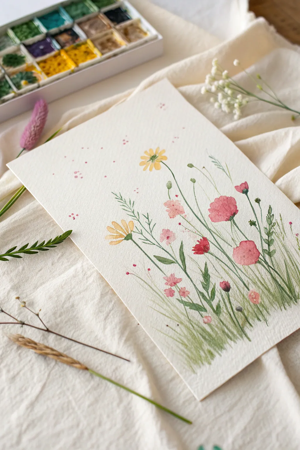
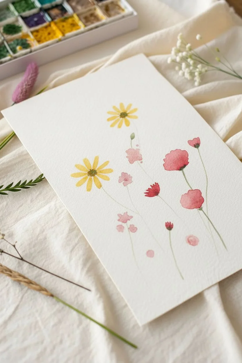
Capture the airy beauty of a summer field with this delicate watercolor tutorial. Using loose brushwork and playful splatters, you’ll create a charming composition of dancing stems and soft blooms that feels effortless and fresh.
Step-by-Step Guide
Materials
- Cold press watercolor paper (approx. 5×7 inches)
- Watercolor paints (Yellow Ochre, Sap Green, Alizarin Crimson, Rose Madder, Burnt Sienna)
- Round watercolor brushes (Size 2 and Size 6)
- Fine liner or rigger brush (optional for stems)
- Jar of clean water
- Paper towel
- Mixing palette
Step 1: Painting the Blooms
-
Mix your yellow:
Start by mixing a warm, summery yellow using Yellow Ochre with a tiny touch of Burnt Sienna to tone it down. Load your size 6 brush with this mixture, keeping it fairly watery. -
Paint the first daisy:
Near the center-left of your paper, paint a simple daisy shape. Use small, quick strokes that radiate outward from a central point, leaving a small gap in the middle. Don’t worry about perfect symmetry; irregular petals look more natural. -
Add a twin flower:
Paint a similar yellow flower slightly higher up and to the right of the first one. I like to make this one slightly smaller to create depth. -
Mix a soft pink:
Clean your brush and mix a very diluted wash of Rose Madder or a light pink. Paint two or three small, irregular blobs in the middle area of the paper to represent soft, out-of-focus posies. -
Create the red poppies:
Switch to a more saturated red mix using Alizarin Crimson. Paint two larger, distinctive poppy shapes on the right side. These shapes should be somewhat flat and oval-like, suggesting the cup shape of the flower. -
Add smaller red buds:
Using the tip of your size 2 brush and the same red mix, dot in a few tiny, unbloomed buds dispersed lower down in the grass area and one peeking out near the top right. -
Detail the centers:
While your yellow daisies are slightly damp (but not soaking), dab a tiny amount of the green mix into the very center. For the pink and red flowers, wait until they are dry, then add tiny dark specks or lines to suggest stamens.
Loose Lines
Hold your brush near the end of the handle, not near the bristles. This reduces control slightly, resulting in shakier, more organic lines that mimic nature perfectly.
Step 2: Stems and Grasses
-
Prepare your greens:
Mix two shades of green: one light and fresh (Sap Green with plenty of water) and one darker and deeper (add a touch of blue or red to your green). This variety prevents the grass from looking flat. -
Connect the flowers:
Using a size 2 brush or a rigger, draw very thin, wavy lines connecting your flower heads to the bottom of the page. Let your hand shake slightly to give the stems a natural, organic feel. -
Add leafy details:
Along the main stems, add small, alternating leaves. For the yellow daisies, use jagged, fern-like strokes. For the poppies, use smoother, longer leaves. -
Build the grass layer:
Starting from the bottom edge, flick your brush upward repeatedly to create blades of grass. Vary the height and angle of your strokes. Use the lighter green first as a base layer. -
Deepen the foliage:
Switch to your darker green mix. Add more upward flicks at the bottom, concentrating the darkness at the base to ‘ground’ the painting. This creates a lovely density where the plants meet the earth. -
Draw whimsical weeds:
Paint a few free-standing stems that don’t have flowers. Add tiny seed pods or feathered textures at the tips of these to suggest wild grasses.
Step 3: Finishing Touches
-
Add the magic dots:
Load a small brush with watery pink paint. Gently tap the brush handle against your finger over the top left area of the paper to create a spray of fine splatters. This adds a dreamy, pollen-like effect. -
Review and refine:
Step back and look at your composition. If there are any large empty spaces that feel unbalanced, add a tiny green shoot or a small red bud to fill the gap. -
Let it dry completey:
Allow the paper to dry completely flat before moving it to prevent any damp paint from running.
Bloom Control
If your flower centers bleed too much into the petals, your base layer was too wet. Dab it with a paper towel corner to lift excess water before adding the center color.
Frame this cheerful piece in a simple wood frame to bring a touch of the outdoors inside
Cozy Campfire Glow With Dark Surrounding Shapes
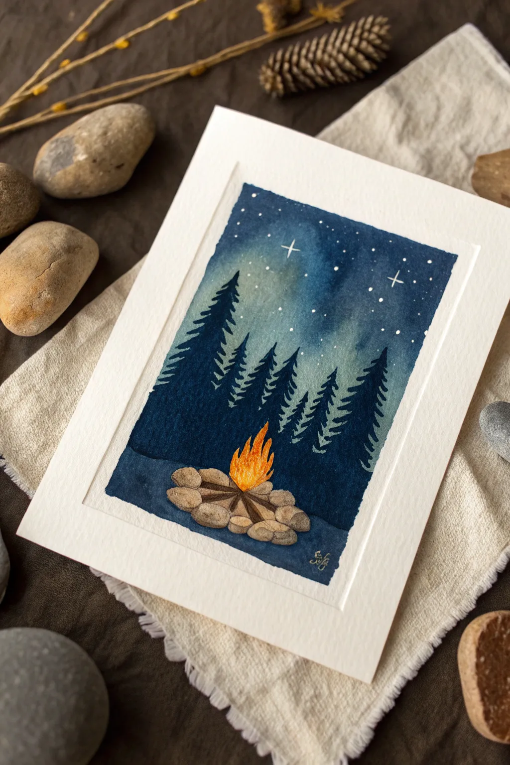
Capture the warmth of a crackling fire against the cool mystery of a starry night with this atmospheric watercolor project. By playing with negative space and intense contrast, you’ll create a cozy scene that feels like a deep breath of fresh mountain air.
Step-by-Step Tutorial
Materials
- Cold press watercolor paper (300 gsm recommended)
- Painter’s tape or masking tape
- Watercolors: Indigo or Prussian Blue, Lamp Black, Cadmium Yellow, Orange, Burnt Sienna, Burnt Umber
- White gouache or white gel pen
- Round brushes: Size 6 (for washes) and Size 0 or 1 (for details)
- Pencil and eraser
- Jar of clean water
- Paper towels for blotting
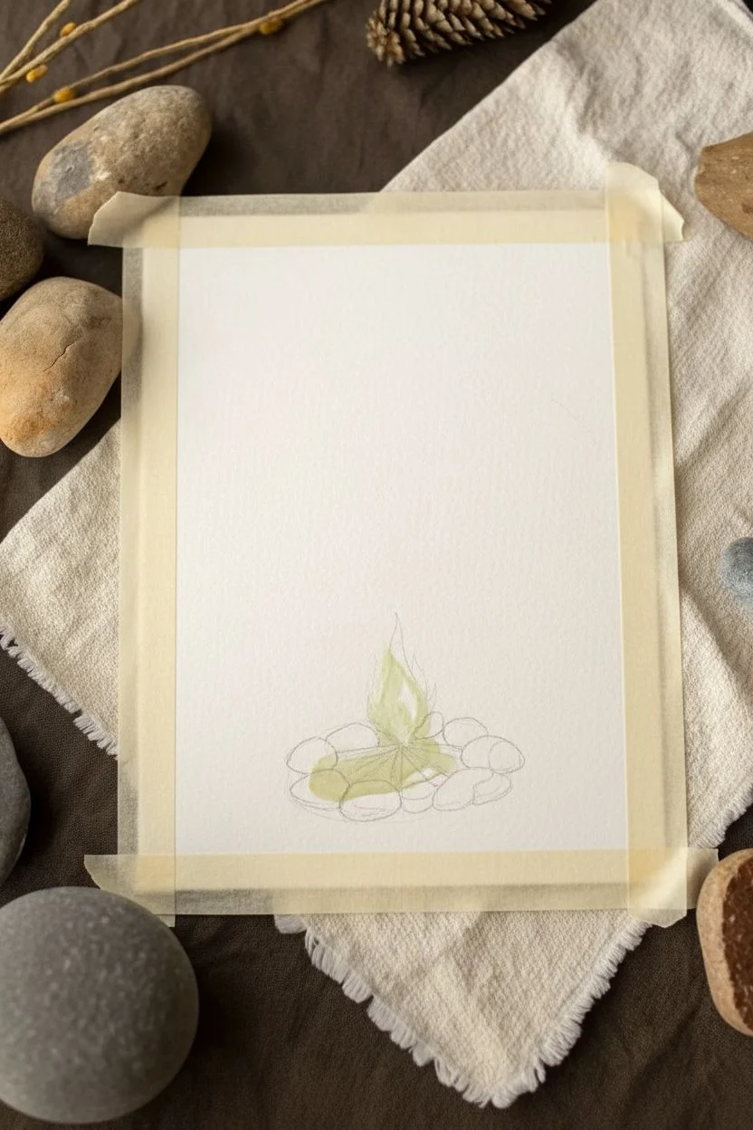
Step 1: Setting the Scene
-
Tape the borders:
Begin by taping down all four edges of your watercolor paper to a board or table. This creates that crisp, clean white frame you see in the final piece and prevents the paper from buckling under heavy washes. -
Sketch the layout:
Lightly sketch the main elements with a pencil. Draw an oval shape of rocks at the bottom center and a general triangular shape for the fire. Don’t worry about the trees yet; we’ll paint those freehand later. -
Masking the fire (optional):
If you have masking fluid, apply a thin layer over the flame area to keep it pristine white while you paint the dark background. If not, just be very careful to paint around this area in the next steps.
Step 2: Painting the Night Sky
-
Prepare your dark mix:
Mix a large amount of Indigo or Prussian Blue with a touch of Lamp Black. You want a deep, saturated midnight blue color. Make sure you have enough mixed to cover the entire background without stopping. -
Start the wash:
Using your Size 6 brush, start applying the dark blue wash at the very top of the paper. Work your way down with horizontal strokes. -
Create a gradient:
As you move toward the middle of the paper (where the treetops will be), add a tiny bit more water to your brush to lighten the blue slightly. This creates a subtle atmospheric glow. -
Paint around the fire:
Continue the dark wash down to the bottom, carefully painting around your pencil sketch of the campfire and rocks. The darkness should surround the fire completely. -
Let it dry completely:
This is crucial. The background must be bone-dry before adding the trees, or the paint will bleed and you’ll lose the crisp silhouette effect. Use a hairdryer if you’re impatient.
Bleeding Background?
If your trees are blurring into the sky, the background wasn’t dry enough. Let it dry longer, or use a slightly thicker paint consistency (less water) for the trees to prevent spreading.
Step 3: Forest Silhouettes
-
Mix a darker value:
Take your previous blue mix and add more black to create a near-black shade for the trees. It needs to be darker than the sky to stand out. -
Paint the tree trunks:
With a fine brush, paint vertical lines of varying heights. Place the tallest ones on the left and right edges, and shorter ones toward the center to create depth. -
Add the branches:
Using the tip of your small brush, dab on branches starting from the top of each trunk. Use a zig-zag motion, making the branches wider as you move down the tree. -
Refine the shapes:
Ensure the bottom branches merge into the dark ground color so the trees feel rooted in the scene.
Pro Tip: Glowing Fire
To make the fire really pop, lift a tiny bit of color out of the center of the flame with a clean, damp brush while wet. This white-hot center makes the fire look intense and bright.
Step 4: The Crackling Fire
-
Base layer for the fire:
Once the blue paint around the center is dry, erase any pencil lines inside the fire area. Paint the flame shape with a bright, clean Cadmium Yellow. -
Add warmth:
While the yellow is still slightly damp, drop in concentrated Orange at the bottom of the flames and let it bleed upward naturally. -
Define the flames:
Use a rigger brush or fine liner with Red or deep Orange to adding flicking strokes at the tips of the fire to mimic movement. -
Paint the logs:
Use Burnt Umber or a dark brown to paint a few simple logs arranged in a teepee shape at the base of the fire.
Step 5: Rocks and Stars
-
Paint the stones:
Mix a diluted watery grey-brown (Burnt Sienna + a tiny dot of blue). Paint the oval rocks surrounding the fire. Keep the color light so they look illuminated by the firelight. -
Shadow the stones:
Once the stones are dry, add a darker brown shadow on the outer edges of the rocks (the side facing away from the fire) to give them 3D volume. -
Add the stars:
Load a toothbrush or stiff brush with white gouache (consistency of heavy cream). Tap the handle to spatter tiny white dots across the upper blue sky. -
Highlight specific stars:
Use a white gel pen or fine brush with white gouache to manually draw a few larger, cross-shaped twinkling stars for extra magic. -
Reveal the border:
Wait until everything is completely dry, then slowly peel away the masking tape at a 45-degree angle to reveal your clean edges.
Frame this cozy little scene to remind yourself of peaceful nights outdoors

PENCIL GUIDE
Understanding Pencil Grades from H to B
From first sketch to finished drawing — learn pencil grades, line control, and shading techniques.
Explore the Full Guide
Rainy Window Effect With Drips and Soft Lights
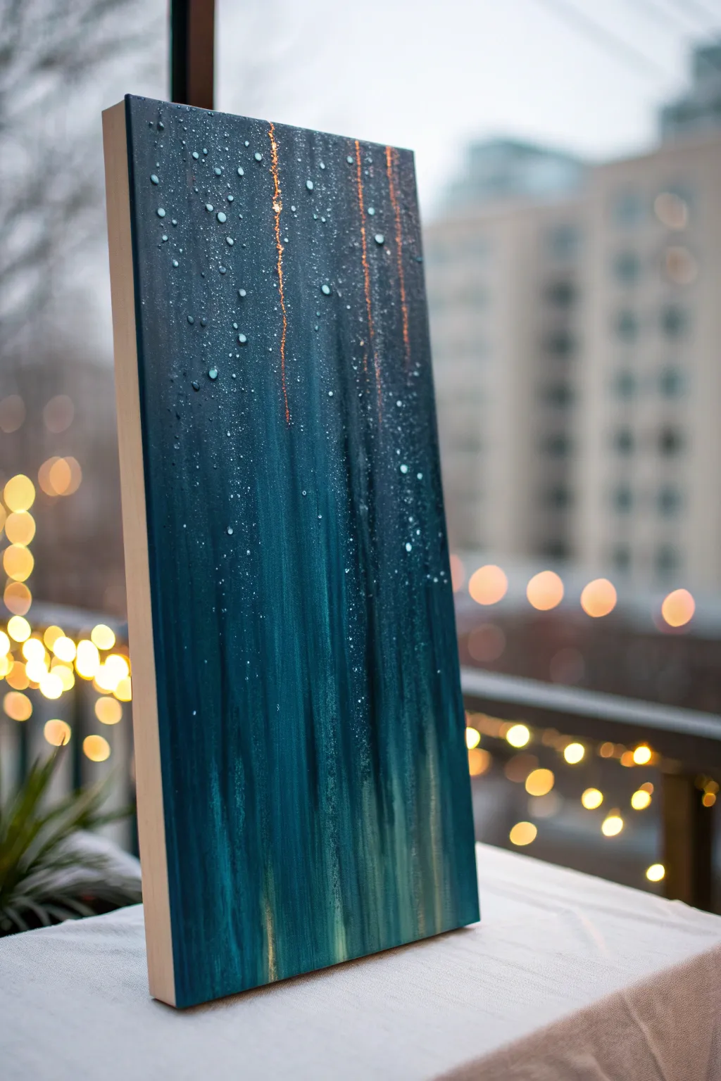
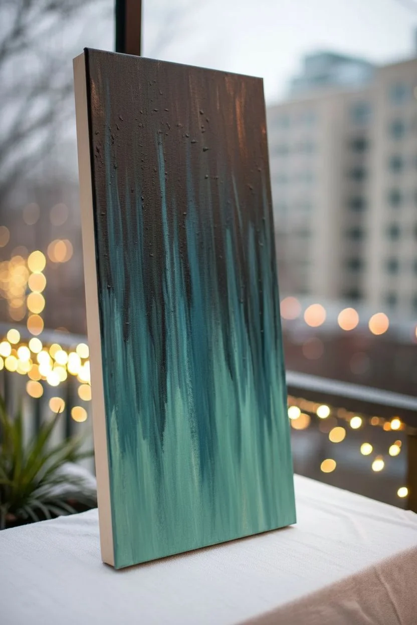
Capture the moody romance of a rainy evening with this textured acrylic painting that simulates a wet windowpane against city lights. You’ll create a rich, streaky background enhanced with realistic water droplets for a stunning trompe l’oeil effect.
How-To Guide
Materials
- Stretched canvas (rectangular, e.g., 10×20 inches)
- Acrylic paints: Phthalo Blue, Prussian Blue, Viridian Green, Titanium White, Burnt Umber, Metallic Copper or Gold
- Clear heavy gel medium or 3D gloss glaze (for droplets)
- Wide flat synthetic brush (2-3 inch)
- Medium flat brush
- Small round detail brush (size 0 or 1)
- Spray bottle with water
- Clean rags or paper towels
- Palette knife
- Easel or prop to hold canvas vertical
Step 1: Setting the Atmosphere
-
Prepare the gradient:
Begin by squeezing out your Phthalo Blue, Prussian Blue, and a touch of Burnt Umber for the top section, and mix Viridian Green with Titanium White for the lower section. You want a dark, moody top fading into a glowing street-level bottom. -
Apply the base coat:
Using your wide flat brush, apply the dark blue mixture to the top two-thirds of the canvas. Don’t worry about perfect blending yet; just get the color on the surface. -
Add the lower glow:
While the top is still wet, paint the bottom third with your lighter teal-green mixture. Allow the colors to meet, but don’t over-blend them horizontally. -
Create the vertical blur:
This is the crucial step for the rain effect. Clean your wide brush, leave it slightly damp, and drag it vertically from the very top to the very bottom in single, continuous strokes. This pulls the dark paint down into the light, creating that streaked, rainy-glass look. -
Intensify streaks:
If the effect is too subtle, add a tiny amount of water to your brush and drag down again. You can also add thin vertical streaks of slightly lighter blue or white to suggest reflections on the wet glass.
Step 2: Adding Light and Warmth
-
dry completely:
Let the background layer dry fully before proceeding. This usually takes about 20-30 minutes for acrylics, or you can speed it up with a hair dryer. -
Copper accents:
To mimic the reflection of streetlights or distant traffic, mix a small amount of metallic copper paint with a glazing medium or water to make it translucent. -
Paint light streaks:
Using a smaller flat brush turned on its edge, paint thin, broken vertical lines of the copper mixture. Focus these in the upper half where light would catch the running water trails. -
Soften the lights:
Immediately after painting a copper streak, use a clean, dry brush to gently feather the edges vertically, making them look unfocused and distant.
Drop Precision
To make droplets look real, group them brilliantly. Don’t scatter them evenly like polka dots. Cluster a few together and leave open negative space elsewhere.
Step 3: The Raindrop Effect
-
Mix the droplet color:
For the realistic 3D droplets, you won’t use plain paint. Instead, you’ll use a clear heavy gel medium. If you want them to pop more, tint the gel with the tiniest speck of titanium white or light blue. -
Apply large drops:
Using the back of a paintbrush handle or a small round brush, dab blobs of the heavy gel onto the canvas. Focus on the upper areas where rain gathers. Vary the sizes—some large, some distinct. -
Create dripping trails:
For a few of the larger drops, use your small brush to drag a thin tail of gel upwards from the drop, mimicking the path the water took as it slid down the glass. -
Add highlights:
Once the gel is partially set (it will still be cloudy), take your smallest detail brush with pure Titanium White and add a tiny, curved highlight to the top-left of each major droplet. This indicates the light source and adds dimension. -
Add shadows:
I like to mix a transparent dark blue glaze and paint a tiny crescent shadow on the *bottom* right of the droplets. This grounds them against the background. -
Micro-spray texture:
For the fine mist texture seen in the reference, load an old toothbrush or stiff brush with watered-down white paint. Run your thumb over the bristles to flick a fine mist over patches of the canvas. -
Final drying:
Allow the heavy gel droplets to dry completely. They will turn from milky white to clear and glossy, looking exactly like water on a window.
City Lights Upgrade
Before the rain layer, paint soft, out-of-focus circles of yellow and orange in the background layer to simulate distant bokeh streetlights behind the rain.
Place your finished piece near a window or lamp to let the light catch those glossy droplets for a truly atmospheric display
Abstract Color Wash With Layered Transparency
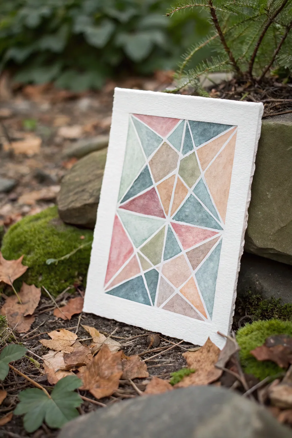
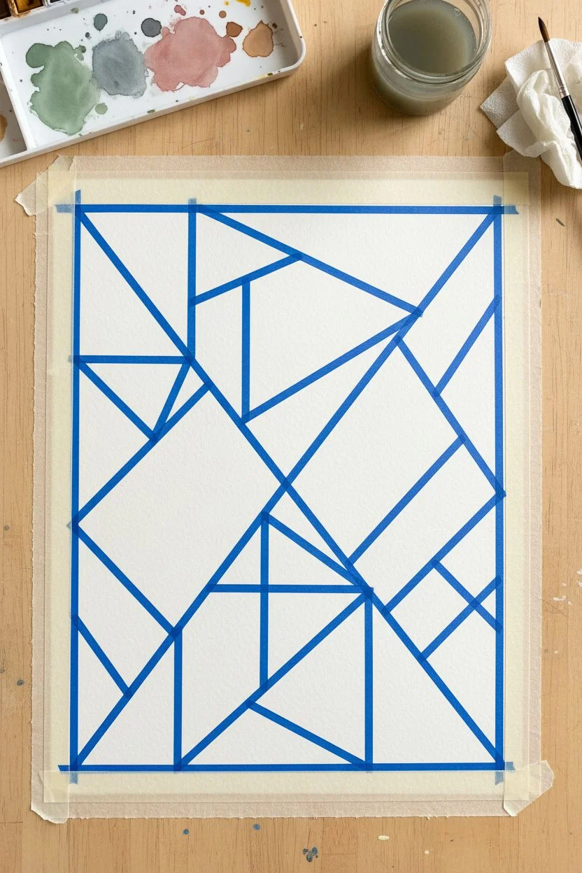
Create a modern, stained-glass inspired composition using sharp lines and soft watercolor washes. This project balances the precision of geometric shapes with the organic, unpredictable nature of watercolor pigments mixing on paper.
Step-by-Step
Materials
- Cold-press watercolor paper (300 gsm or heavier)
- Artist’s painter’s tape or drafting tape (thin, roughly 1/4 inch width)
- Watercolor paints (Sage Green, Dusty Rose, Payne’s Gray, Yellow Ochre, Burnt Sienna)
- Round watercolor brush (size 6 or 8)
- Flat wash brush (optional)
- Clean water jar
- Paper towels
- Palette for mixing
- Ruler (optional)
- Hairdryer (optional for speeding up drying)
Step 1: Preparation & Taping
-
Prepare your paper:
Start with a sheet of thick watercolor paper. If you want the deckled edge look shown in the example, you can tear the paper carefully against a ruler or purchase pre-deckled paper. -
Secure the borders:
Tape down all four edges of your paper to your work surface. This creates a clean white border and prevents the paper from buckling when wet. Press the edges of the tape firmly. -
Create the framework:
Begin your geometric design by placing long strips of thin painter’s tape diagonally across the paper. Create a large ‘X’ or criss-cross pattern first to anchor the composition. -
Subdivide the space:
Add shorter lengths of tape to connect existing lines, forming smaller triangles and quadrilaterals. Aim for variety in size—some large shapes and some smaller clusters. -
Seal the tape:
Run your fingernail or the back of a spoon along every edge of the tape. This is crucial to prevent paint from bleeding underneath and is the secret to crisp lines.
Step 2: Mixing & Painting
-
Prepare your palette:
Mix your watercolor paints in the palette. Dilute them with enough water to create semi-transparent washes rather than thick, opaque blobs. You want the paper texture to show through. -
Section 1: Cool tones:
Choose a few non-adjacent triangles and paint them with your blue-grey or Payne’s Gray mix. I like to vary the water ratio slightly in each shape so some are darker than others. -
Section 2: Warm accents:
Clean your brush thoroughly and switch to the dusty rose or pink shade. Fill in scattered triangles, ensuring you don’t paint two shapes of the same color right next to each other. -
Section 3: Earthy greens:
Introduce the sage green into the composition. This color bridges the gap between the cool blues and warm pinks, bringing a natural feel to the geometric layout. -
Section 4: Neutral connectors:
Use the ochre and burnt sienna mixes to fill the remaining white spaces. These warm neutrals help ground the brighter colors. -
Add texture:
While some shapes are still slightly damp, you can drop in a tiny bit of clear water or a darker pigment concentration to create a ‘bloom’ effect for added interest.
Bleeding Lines?
If edges aren’t crisp, use a white gel pen or white gouache later to touch up the white lines. Next time, apply clear water or masking fluid over tape edges first to seal them.
Step 3: Finishing Touches
-
Dry completely:
Let the painting dry entirely. The paper must be bone-dry and warm to the touch before removing tape. If you rush this steps, the paper might tear. -
Peel the tape:
Starting with the last pieces of tape you laid down, gently peel them back at a 45-degree angle. Pull slowly and away from the painted area. -
Remove borders:
Finally, remove the border tape. Do this carefully to reveal the crisp white frame around your colorful mosaic.
Go Metallic
For a glamorous twist, paint gold or silver watercolor into the white negative spaces (where the tape was) after the initial painting is fully dry.
Display your abstract mosaic on a shelf or easel to enjoy the interplay of light and geometry


Easy Cloud Study Using Only Two or Three Values
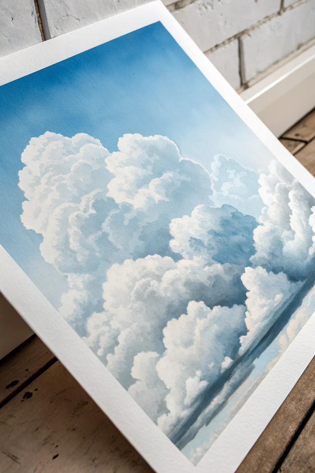
Master the art of painting voluminous clouds by limiting your palette to just a few shades of blue and white. This gouache study focuses on building form through distinct value changes, resulting in a striking, dreamlike sky scene.
Detailed Instructions
Materials
- Gouache paint (Primary Blue, Titanium White, slight touch of Black/Grey)
- Heavyweight cold-press watercolor paper (300gsm)
- Flat shader brush (size 6 or 8)
- Round synthetic brush (size 4)
- Mixing palette
- Water cups
- Paper towels
- Painter’s tape
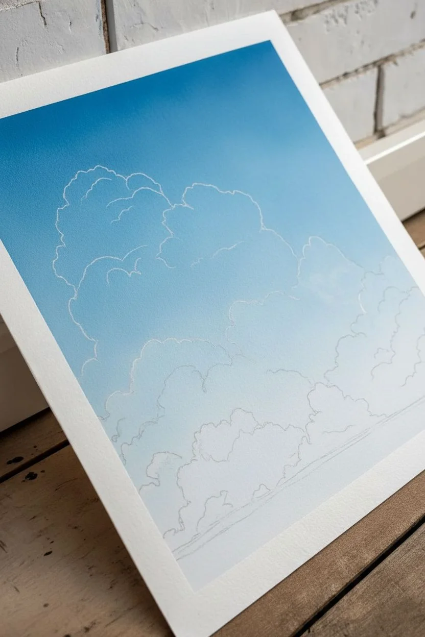
Step 1: Preparation and Sky Gradient
-
Secure your surface:
Begin by taping down all four edges of your watercolor paper to a rigid board using painter’s tape. This prevents buckling when the paper gets wet and creates that crisp, professional white border seen in the final piece. -
Mix your base sky color:
On your palette, mix a generous amount of Primary Blue with a touch of Titanium White. You want a vibrant middle-blue tone. Gouache dries matte and slightly lighter than it looks when wet, so keep the mix fairly saturated. -
Create the gradient:
Using your large flat brush, paint the entire paper with a smooth gradient. Start with the pure blue mix at the top. As you work your way down, gradually add more white to your brush to lighten the blue near the horizon. Let this layer dry completely. -
Sketch the cloud shapes:
Once the background is bone-dry, use a very diluted white paint or a pastel pencil to lightly outline the main clusters of your cumulus clouds. Focus on large, organic, cauliflower-like shapes rising from the bottom right.
Keep Edges Varied
Clouds have “lost and found” edges. Keep the top edges crisp where light hits, but blur the bottom edges into the sky for realistic weightlessness.
Step 2: Blocking in Values
-
Mix the shadow tone:
Create a blue-grey shadow color. Mix white, a small amount of blue, and the tiniest speck of black or grey. It should be darker than pure white, but significantly lighter than your top sky color. -
Apply the shadow base:
Using the round brush, paint the interior body of the clouds with this shadow tone. Don’t paint the very top edges where the sunlight hits; leave those sections alone for now. -
Soften the bottom edges:
As you paint the lower sections of the clouds, water down your paint slightly so the bottom of the cloud formation fades softly into the background sky rather than having a hard line. -
Layering darker depths:
Mix a slightly darker version of your shadow tone (more blue/grey). Apply this to the underside of the main cloud masses to create immediate volume and weight.
Step 3: Highlighting and Refining
-
Mix pure white opacity:
Squeeze out fresh Titanium White. You want a creamy, opaque consistency—like heavy cream. Do not add much water. -
Paint the billowing tops:
Load your round brush with the thick white. Paint the rounded, bubbling tops of the clouds. Use a dabbing motion to create the bumpy texture of the cumulus edges. -
Blend the transition:
While the white is still damp, gently feather it into the shadow grey areas below. You want a relatively sharp edge on the top (outer rim) and a soft gradient where the white highlight meets the shadow. -
Add secondary highlights:
Look at the shadow areas you painted earlier. Add smaller, softer patches of white within those shadows to suggest smaller puffs distinct from the main mass. -
Refine the edges:
Use the tip of your round brush to add tiny, irregular bumps along the top outline. This irregularity is what makes the cloud look natural instead of like a cartoon cutout.
Chalky or Streaky?
If the gouache looks streaky, the mix is too thin. If it cracks, it’s too thick. Aim for a consistency like melted styling clay for opaque, smooth coverage.
Step 4: Final Details
-
Deepen the darkest shadows:
If your clouds look too flat, mix a deeper blue-grey and carefully glaze over the very bottom-most crevices of the clouds. I find this simple step drastically increases the 3D effect. -
Adding atmospheric wisps:
With a very dry brush and a tiny amount of white, scumble (lightly drag) some faint, wispy cloud textures in the open blue areas to connect the main masses. -
Smooth distinct bands:
Check the lower area of the painting. If you want that layered, receding look, ensure your clouds are arranged in subtle horizontal bands that get smaller and lighter as they go down. -
Remove the tape:
Wait until the painting feels completely dry to the touch. Slowly peel your painter’s tape away at a 45-degree angle, pulling away from the painted area to reveal your crisp border.
Enjoy the peaceful process of building these soft forms and seeing your sky come to life
City Skyline Silhouette With a Colorful Evening Sky
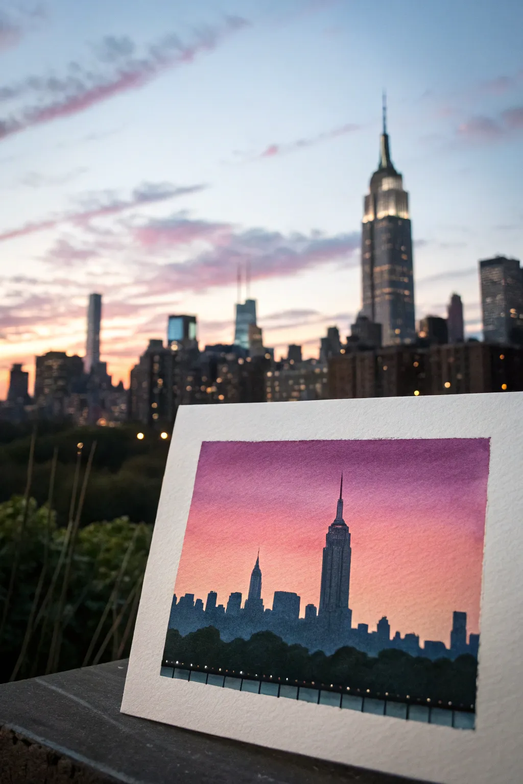
Capture the iconic New York City skyline against a vibrant gradient sunset with this atmospheric painting project. Using simple layering techniques, you’ll create a glowing backdrop that makes the dark cityscape silhouette pop dramatically.
Step-by-Step Guide
Materials
- Cold press watercolor paper (300 gsm)
- Masking tape
- Pencil and eraser
- Gouache or acrylic paint (Deep Purple, Magenta, Salmon Pink, Orange, Black, Dark Blue/Indigo)
- Flat wash brush (3/4 inch)
- Small round detail brush (size 0 or 1)
- Medium round brush (size 4 or 6)
- Jar of water
- Mixing palette
- Paper towels
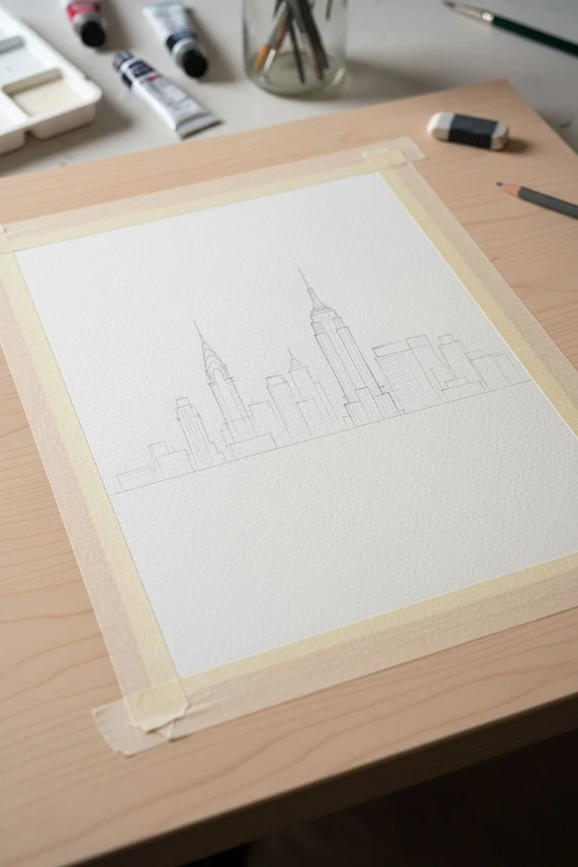
Step 1: Setting the Scene
-
Prepare your surface:
Begin by taping down all four edges of your watercolor paper to a board or table. This creates a crisp white border and prevents the paper from buckling when wet. -
Establish the horizon:
Lightly sketch a horizontal line roughly one-quarter of the way up from the bottom of the paper. This will mark the transition from the city buildings to the water below. -
Outline the skyline:
Sketch the silhouette of the buildings very faintly. Focus on the iconic shape of the Empire State Building in the right-center third and the Chrysler Building replica to the left. Don’t worry about windows or details yet; just focus on the outer shapes and varied heights.
Step 2: Painting the Sky Gradient
-
Mix your top sky color:
Prepare a rich mixture of Deep Purple with a tiny touch of Magenta on your palette. You want this color to be smooth and fluid, not too thick. -
Apply the first band:
Using your flat wash brush, paint a horizontal band across the very top of the paper. Keep the brush strokes fluid and horizontal. -
Transition to pink:
Clean your brush slightly and pick up pure Magenta. Blend this right into the bottom edge of the purple while the paint is still wet, creating a soft transition zone. -
Add warmth:
Mix a Salmon Pink color. Continue painting downwards, blending it into the magenta section. The sky should be getting lighter and warmer as you descend. -
Finish with orange:
For the area just above your building sketch line, use a soft Orange mixed with a little white to create a glowing horizon effect. Blend this upwards into the pink. -
Let it cure:
Allow the sky gradient to dry completely. It must be bone dry before you paint the dark buildings over it to ensure crisp edges.
Keep Edges Sharp
For the sharpest building silhouettes, use a flat-edged brush for the roofs. It gives you distinct corners instantly without needing a shaky steady hand.
Step 3: Creating the City
-
Mix the silhouette color:
Create a dark, moody grey-blue by mixing Black with Indigo or Dark Blue. Avoid using straight black, as it can look flat; a deep blue-black adds atmospheric depth. -
Paint the background buildings:
Use your medium round brush to block in the main shapes of the buildings. Since the paint is opaque, you can paint right over the lower part of your sunset gradient. -
Define the Empire State:
Switch to your small detail brush to carefully paint the needle and stepped setbacks of the Empire State Building. Keep your hand steady to get a sharp point at the top. -
Add distant structures:
Fill in the smaller, lower buildings on either side. Vary the heights to make the skyline look organic and realistic, rather than a flat block. -
Layer the foreground trees:
Mix a slightly darker, purer black for the tree line at the very bottom. Use a stippling motion (tapping the brush tip) to create the textured, leafy look of the treetops in the foreground. -
Paint the water base:
Between the trees and the buildings, ensure there is a solid dark base. If you want to hint at water reflection, you can drag a slightly dry brush downwards from the buildings before painting the trees over it. -
Add city lights:
Once the black silhouette is fully dry, use a tiny dot of white paint or a white gel pen to add a string of small lights along the waterfront or base of the buildings. -
Detail the waterfront:
Paint a very thin, straight horizontal line for the pier or barrier in the foreground, and add tiny vertical strokes for railings. -
The reveal:
Wait until the entire painting is completely dry to the touch. Slowly and carefully peel away the masking tape at a 45-degree angle to reveal your crisp white borders.
Add Subtle Stars
Dip an old toothbrush in watered-down white gouache and flick it gently over the dried purple section of the sky for faint, distant stars.
Frame this mini-masterpiece or prop it on a windowsill to enjoy a personalized sunset view anytime
Galaxy Swirl With Bold Color Pops and Nebula Clouds
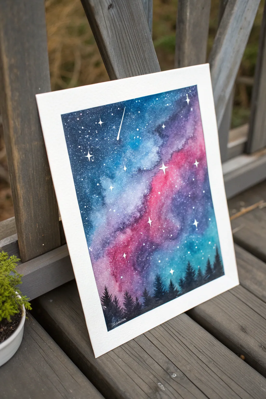
Capture the magic of a starry night sky with this vibrant watercolor galaxy painting featuring swirling nebulas of pink and violet. The stark contrast of dark pine trees against the luminous background creates depth and drama, perfect for beginners and seasoned artists alike.
Step-by-Step
Materials
- Watercolor paper (cold press, 300gsm recommended)
- Watercolor paints (Indigo, Phthalo Blue, Purple, Magenta/Opera Pink, Turquoise)
- White gouache or acrylic ink
- Masking tape or Washi tape
- Large flat wash brush
- Medium round brush (size 6 or 8)
- Small detail brush (size 0 or 1)
- Old toothbrush
- Jar of clean water
- Paper towels
- Palette for mixing
- Hairdryer (optional, to speed up drying)
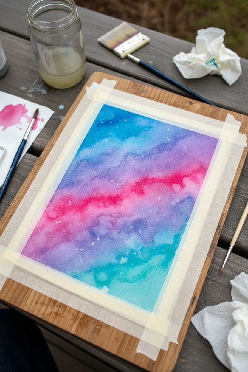
Step 1: Preparing the Sky gradient
-
Secure your canvas:
Begin by taping down all four edges of your watercolor paper to a board or table with masking tape. Press the edges down firmly to ensure crisp, clean borders later. -
Wet the paper:
Using your large flat brush, apply a generous layer of clean water across the entire area inside the tape. You want the paper to be glistening and evenly wet, but not holding puddles. -
Drop in bright colors:
Load your round brush with vibrant Magenta or Opera Pink. Dab this color diagonally across the center of the wet paper to form the bright core of the nebula. -
add secondary hues:
While the paper is still wet, add purple right next to the pink areas, allowing them to bleed slightly into one another. The water does the blending work for you. -
Apply the blues:
Switch to Turquoise or a lighter blue and dab it around the edges of the pink and purple sections. This creates a transition zone before the darkest sky.
Starry Texture Tip
Cover the bottom area with a scrap piece of paper before splattering stars with the toothbrush. This keeps your future black forest area clean from white dots.
Step 2: Deepening the Galaxy
-
Paint the dark corners:
Load your brush with a heavy concentration of Indigo or a mix of Phthalo Blue and Black. Apply this to the outer corners and edges of the paper, working your way inward. -
Blend the transition:
As the dark blue meets the lighter nebula colors, gently soften the edges with a slightly damp brush. I like to let this dry briefly for a minute before deciding if I need more pigment. -
Intensify the darks:
If the outer corners dried too light, add a second layer of Indigo while the first layer is still slightly damp to get that deep, infinite space look. -
Dry completely:
This is crucial: allow the painting to dry 100%. If the paper is cool to the touch, it’s still wet. Use a hairdryer to speed this up if you are impatient.
Level Up: Metallic Pop
Use metallic silver or pearlescent watercolor for the shooting star and the larger four-pointed stars. When the light hits the painting, the galaxy will truly shimmer.
Step 3: Stars and Trees
-
Splatter the stars:
Mix a creamy consistency of white gouache or acrylic ink. Dip an old toothbrush into it and run your thumb across the bristles to spray fine white speckles over the dark sky. -
Paint larger stars:
Using your smallest detail brush and pure white gouache, paint a few specific stars. Draw tiny crosses + to make four-pointed twinkling stars. -
Add a shooting star:
Choose an open area of blue sky and use the detail brush to flick a quick, thin line for a shooting star. Make the head of the streak slightly thicker than the tail. -
Start the tree line:
Mix a thick, opaque black using your darkest watercolor or straight gouache. Using a small round brush, paint a slightly uneven horizon line near the bottom tape edge. -
Paint tree trunks:
Pull up thin vertical lines from your horizon line to indicate the trunks of the pine trees. Vary the heights to make the forest look natural. -
Add pine branches:
Using the very tip of your brush, tap horizontal zig-zag motions down each trunk, starting very narrow at the top and getting wider at the base. -
Fill the forest floor:
Ensure the bottom section where all the trees meet is solid black to ground the silhouettes. -
Reveal the border:
Once the black trees are fully dry, carefully peel away the masking tape at a 45-degree angle to reveal your crisp white frame.
Step back and admire the vibrant cosmic window you have created
One-Color Painting Using Only Tints and Shades
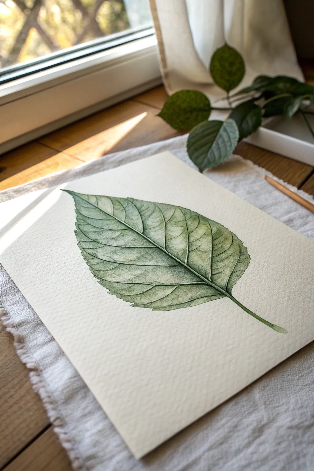
Capture the delicate beauty of a single leaf using just one color palette of green tints and shades. This project focuses on realistic texture not through multiple hues, but through careful observation of light, shadow, and vein structure on heavy-pressed paper.
Step-by-Step Guide
Materials
- Hot press watercolor paper (300 gsm)
- H or HB pencil for sketching
- Kneaded eraser
- Watercolor paints (Sap Green or Olive Green)
- Small round brushes (sizes 0, 2, and 4)
- Mixing palette
- Two jars of water
- Paper towels
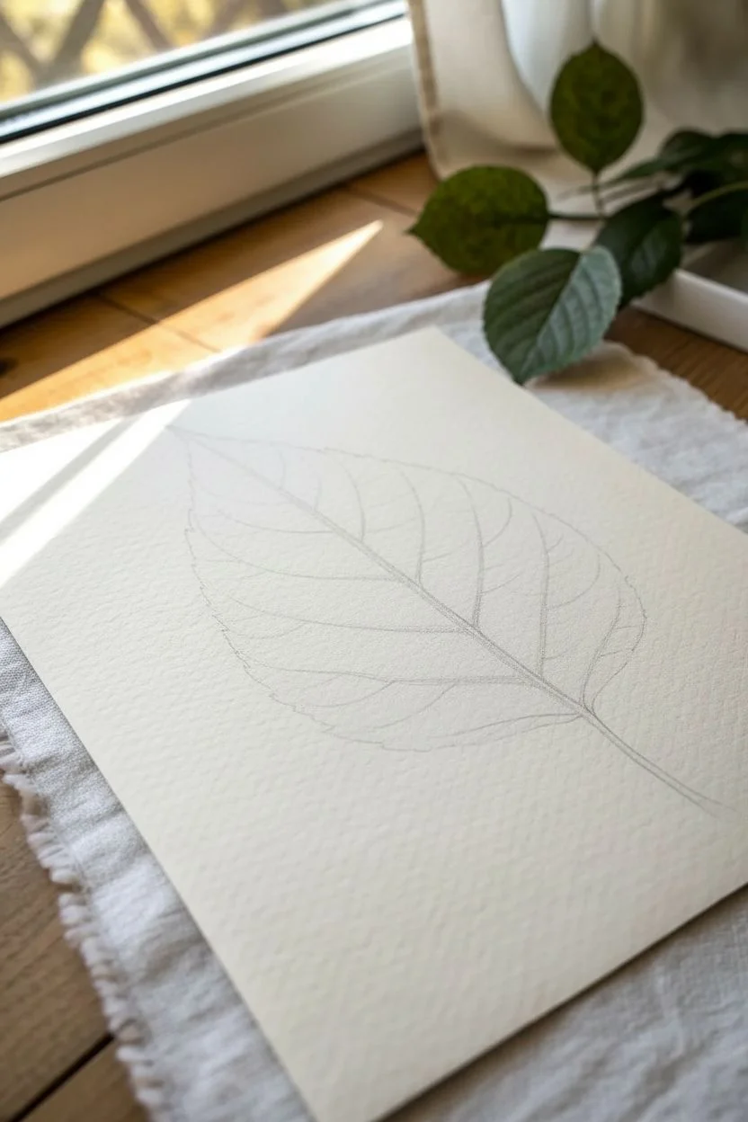
Step 1: Planning the Structure
-
Observe the Subject:
Before putting pencil to paper, look closely at your reference leaf. Notice the asymmetrical curve of the spine and the serrated edges -
Sketch the Spine:
Using your H pencil, draw a gentle, curved line diagonally across your paper. This will be the central vein (midrib) that anchors the entire leaf -
Outline the Shape:
Lightly sketch the outer perimeter of the leaf. Aim for a broad, ovate shape that tapers to a point, keeping your hand loose to capture the natural irregularity -
Add Vein Guides:
Map out the secondary veins branching from the center spine. Don’t draw every tiny capillary, just the main highways that divide the leaf surface -
Refine the Edges:
Go back over your perimeter line and add the small, jagged serrations typical of many leaves. Use your kneaded eraser to lift up almost all the graphite until only a faint ghost of the image remains
Step 2: Laying the Base Tints
-
Mix a Pale Wash:
Dilute a small amount of Sap Green with plenty of water. You want a very pale, tea-like consistency for this first layer -
Initial Glaze:
Paint the entire leaf shape with this pale wash. Work section by section between the veins if you want to preserve the veins as pure white paper, or wash over everything and lift the veins out later -
Lifting Highlights:
While the wash is still damp, use a clean, thirsty brush to lift pigment away from the high points between the veins. This creates a pillowy, 3D effect immediately -
Let it Dry completely:
Wait until the paper is bone dry. If it feels cool to the touch, it is still wet inside
Uneven Drying?
If you get ‘blooms’ or cauliflower marks, you likely added wet paint to a drying area. Wait for layers to completely dry before reworking them.
Step 3: Building Depth with Shades
-
Mix a Mid-Tone:
Add a bit more pigment to your green mix to create a medium strength shade. It should be distinct from the first layer but not dark -
Define the Veins:
Using a size 2 brush, paint strictly in the negative spaces between the veins. Leave a tiny sliver of the lighter under-layer visible right next to the vein lines to make them pop -
Softening Edges:
I like to keep a second damp brush handy here to soften the edges of the paint as I lay it down, ensuring the transition from shadow to highlight inside each leaf segment is smooth -
Deepen the Creases:
Mix a concentrated dark green (less water). Use your size 0 brush to paint thin, sharp lines right where the secondary veins meet the central spine -
Texture Details:
Paint tiny, branching tertiary veins within the leaf segments using the very tip of your smallest brush. Keep these faint and broken; continuous lines can look stiff -
Shadowing the Midrib:
Run a thin line of shadow along just one side of the central spine. This simple step instantly gives the stern of the leaf volume and roundness -
Final Contrast:
Evaluate your painting. If it looks flat, add your darkest green into the deepest recesses near the spine and along the serrated tips for crisp definition
Warm It Up
Add a tiny drop of red or brown to your green mix for the shadowed areas. This desaturates the green, making the shadows look more realistic.
Step back and admire the complex organic structure you’ve built using only a single color family
Negative Space Leaves Using a Painted Background
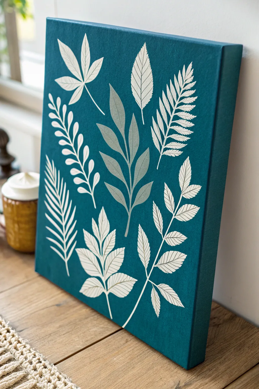
Create a striking piece of wall art featuring crisp white botanical silhouettes against a deep teal background. This project combines simple leaf shapes with fine line work to produce a modern, nature-inspired canvas that looks professionally printed.
How-To Guide
Materials
- Rectangular stretched canvas (approx. 16×20 inches)
- Deep teal or petrol blue acrylic paint
- Titanium white acrylic paint
- Light grey acrylic paint (or mix white with a touch of black)
- Wide flat brush (2-inch) for the background
- Round synthetic brushes (sizes 2 and 4)
- Fine liner brush (size 0 or 00)
- Pencil
- Eraser
- Leaf reference photos or stencils
- Palette or paper plate
- Water cup and paper towels
Step 1: Preparing the Foundation
-
Base coating:
Begin by squeezing a generous amount of deep teal acrylic paint onto your palette. Using the wide flat brush, apply an even coat over the entire front surface of the canvas. Ensure you brush in long, horizontal strokes to minimize texture. -
Edge coverage:
Don’t forget the sides of your canvas to give it a finished, gallery-wrapped look. Paint all four edges with the same teal color while the front is still wet to blend the corners seamlessly. -
Drying time:
Allow this base coat to dry completely. This usually takes about 30 to 60 minutes. If the white canvas still shows through, apply a second coat for a rich, opaque background.
Smooth Operator
To get super crisp lines on your leaves, mix a tiny drop of water or flow improver into your white paint. It helps the paint glide off the liner brush smoothly.
Step 2: Planning the Composition
-
Sketching layout:
Once the background is thoroughly dry, lightly sketch your leaf designs using a pencil. Arrange about 7-9 different leaf shapes across the canvas, varying their sizes and angles to create a dynamic composition. -
Variety is key:
Include different types of foliage: a fern frond, a maple-like leaf, a palm leaf, and simple oval leaves on stems. I like to place the largest, central grey leaf first to anchor the design.
Metallic Twist
Swap the grey paint for metallic silver or gold leaf paint for the central botanical. It catches the light beautifully and adds a luxe feel.
Step 3: Painting the Feature Leaf
-
Mixing the grey:
Mix a soft, medium-grey tone using white and a tiny drop of black, or use a pre-mixed light grey. This color will be used for the central, multi-stemmed leaf cluster to create depth. -
Filling the shape:
Using a size 4 round brush, carefully fill in the shape of the central leaf cluster with your grey paint. Keep the edges smooth and crisp. -
Adding the stem:
Paint the central stem of this grey leaf, tapering it slightly towards the top. Let this grey layer dry completely before moving on.
Step 4: Painting White Botanicals
-
Starting the fern:
Switch to your white acrylic paint. For the detailed fern leaf on the upper right, use a size 2 round brush to paint the main stem. -
Fern details:
Using the fine liner brush, paint the individual small leaflets extending from the stem. Make them slightly jagged or textured to mimic a real fern. -
Solid white leaves:
Move to the other leaves. For solid shapes like the palm frond (bottom left) or the simple leaflets (top left), fill them in with opaque white paint using the size 4 brush. -
Veining technique:
For leaves that require internal detail (like the large leaves at the bottom), paint the overall leaf shape in white first. Let it dry, then paint thin teal lines back over it to create veins, or leave negative space lines unpainted if you have a steady hand. -
Outline style:
For the leaves that look like line drawings (lower right), use your fine liner brush with slightly watered-down white paint. Paint only the stems, leaf outlines, and vein details, leaving the inside the color of the background. -
Refining edges:
Go back over any white areas that look patchy with a second coat. White over dark colors often needs two layers for true opacity.
Step 5: Finishing Touches
-
Cleanup:
Check your work for any pencil marks that are still visible and gently erase them, ensuring the paint is bone dry first. -
Final inspection:
Look for any messy edges where the white meets the teal. You can clean these up by painting a little of your teal background color over the mistake with your smallest brush.
Hang your new botanical artwork in a well-lit spot to let the contrast between the teal and white truly pop
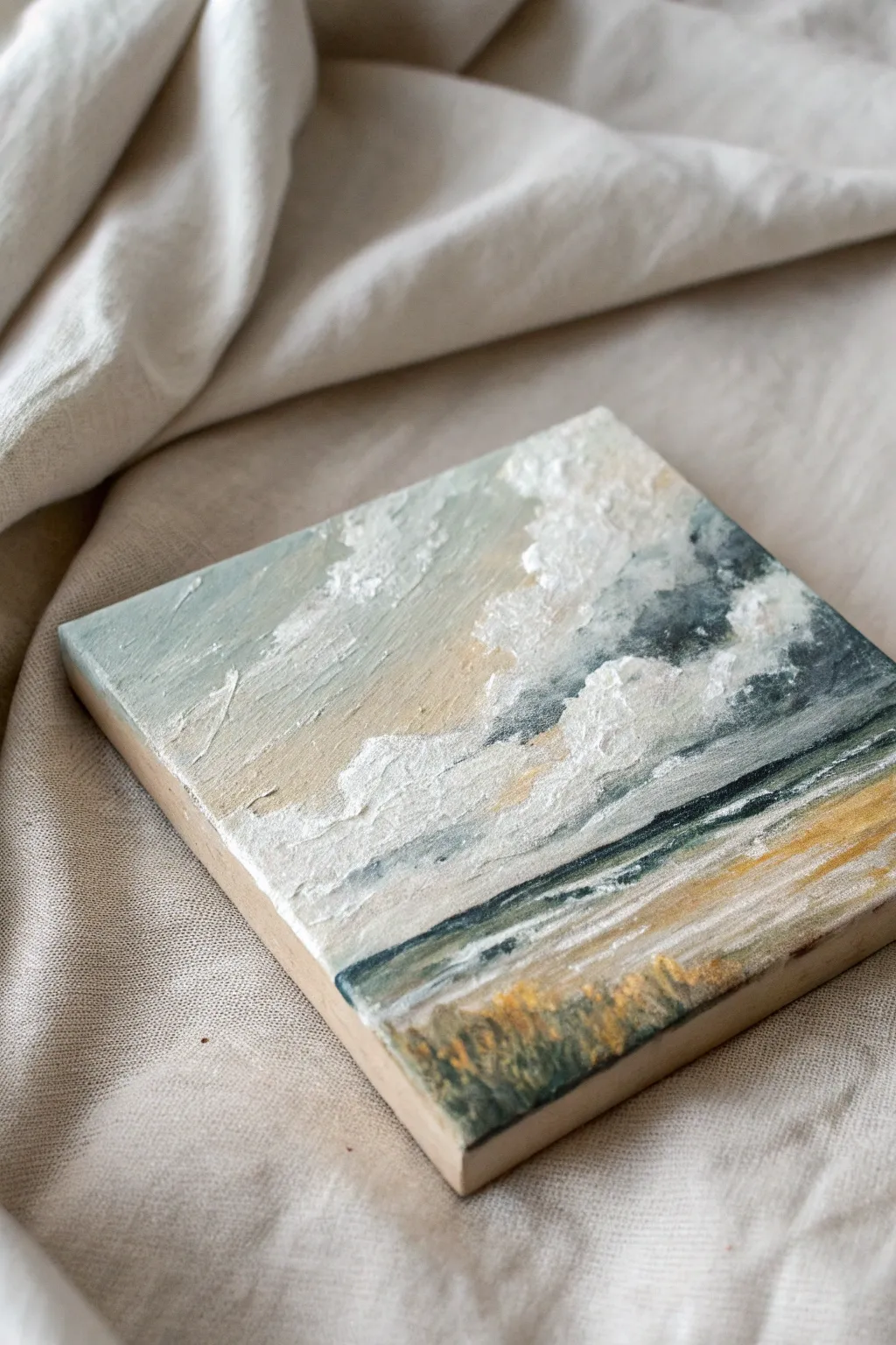
Textured Painting With Sponged or Stippled Layers
This small, textured study captures the raw energy of a coastal sky meeting the sea using thick, tactile layers of acrylics. The piece emphasizes movement through heavy impasto clouds and stippled grasses, creating a dreamy, almost sculptural effect.
Step-by-Step Tutorial
Materials
- Small wood panel or canvas board (approx. 6×6 inches)
- Heavy body acrylic paints (Titanium White, Payne’s Grey, Yellow Ochre, Burnt Umber, Teal or Phthalo Green)
- Modeling paste or thick gel medium
- Palette knives (one tear-drop shape, one straight edge)
- Small natural sea sponge
- Stiff bristle brush (small)
- Clean rags or paper towels
Step 1: Setting the Scene
-
Prepare the background mix:
Begin by mixing a soft, muted sky blue. Combine a generous amount of Titanium White with a tiny touch of Teal and a pinhead of Payne’s Grey to desaturate it. -
Apply the initial gradient:
Using a flat brush or your palette knife, spread this pale blue across the top half of your wood panel. It doesn’t need to be perfectly smooth; texture is good here. -
Warm up the horizon:
While the blue is still wet, mix White with a small amount of Yellow Ochre. Blend this warm cream color into the lower part of the sky area, creating a hazy transition where the sun might be hitting the clouds. -
Establish the horizon line:
Use the edge of your palette knife to scrape a distinct, dark line horizontally across the lower third of the panel. Mix Payne’s Grey and Teal for a deep, moody ocean color.
Too flat?
If your clouds look flat, wait for the first white layer to dry completely (about 1-2 hours) before adding a second, brighter layer of modeling paste on top.
Step 2: Building the Clouds
-
Create the texture paste:
Mix a 50/50 ratio of Titanium White heavy body acrylic with your modeling paste. You want a consistency similar to stiff frosting. -
Map out cloud shapes:
Load the back of your tear-drop palette knife with the white mixture. Press it onto the sky area, dragging slightly upwards and to the right to imply wind direction. -
Layering the whites:
Apply thicker dollops of the white paste on top of your first layer. Use a gentle tapping motion with the knife tip to pull up peaks of paint, creating that fluffy, cumulus texture. -
Shadowing the clouds:
Mix a tiny amount of Payne’s Grey into your white paste to creates a silvery grey. Tuck this shadow color underneath the thickest white cloud masses to give them volume and weight. -
Soften edges:
If any cloud edges look too sharp or geometric, use a clean, dry brush to gently lightly drag the wet paint into the background sky.
Step 3: Sea and Shore
-
Deepen the ocean:
Return to your dark Payne’s Grey and Teal mix. Use the flat edge of a knife to pull this dark color horizontally below your horizon line, letting the wood grain or canvas texture show through slightly. -
Add wave movement:
Take a small amount of your white texture paste on a thin brush or knife edge. Drag thin, broken lines horizontally across the dark water to suggest breaking waves and foam. -
Paint the sand:
Mix Titanium White, Yellow Ochre, and a touch of Burnt Umber. Apply this sandy beige to the bottom section of the panel using horizontal strokes. -
Highlighting the beach:
Layer a lighter, creamy white mixture over the sand color, specifically near the water’s edge, blending it slightly into the dark ocean line.
Gild the Lily
Once the acrylics are fully dry, gently embrace the texture by dry-brushing a tiny amount of metallic gold paint over the sun-lit parts of the clouds and sand.
Step 4: Foreground Details
-
Stippling the base grass:
Dip a small sea sponge into a mix of Teal and Burnt Umber (making a deep, murky green). Dab this along the very bottom edge of the painting to create a dense, shadowy base for vegetation. -
Adding grass texture:
Load a stiff bristle brush with Yellow Ochre and a little White. Use upward, flicking strokes starting from the dark sponged base to simulate tall grasses catching the light. -
Final highlights:
I like to add a few pure white impasto touches to the brightest parts of the clouds and the caps of the waves for final sparkle.
Allow the thick impasto layers several hours (or overnight) to cure completely before displaying your coastal scene
Paint Your Mood as an Abstract “Color Playlist”
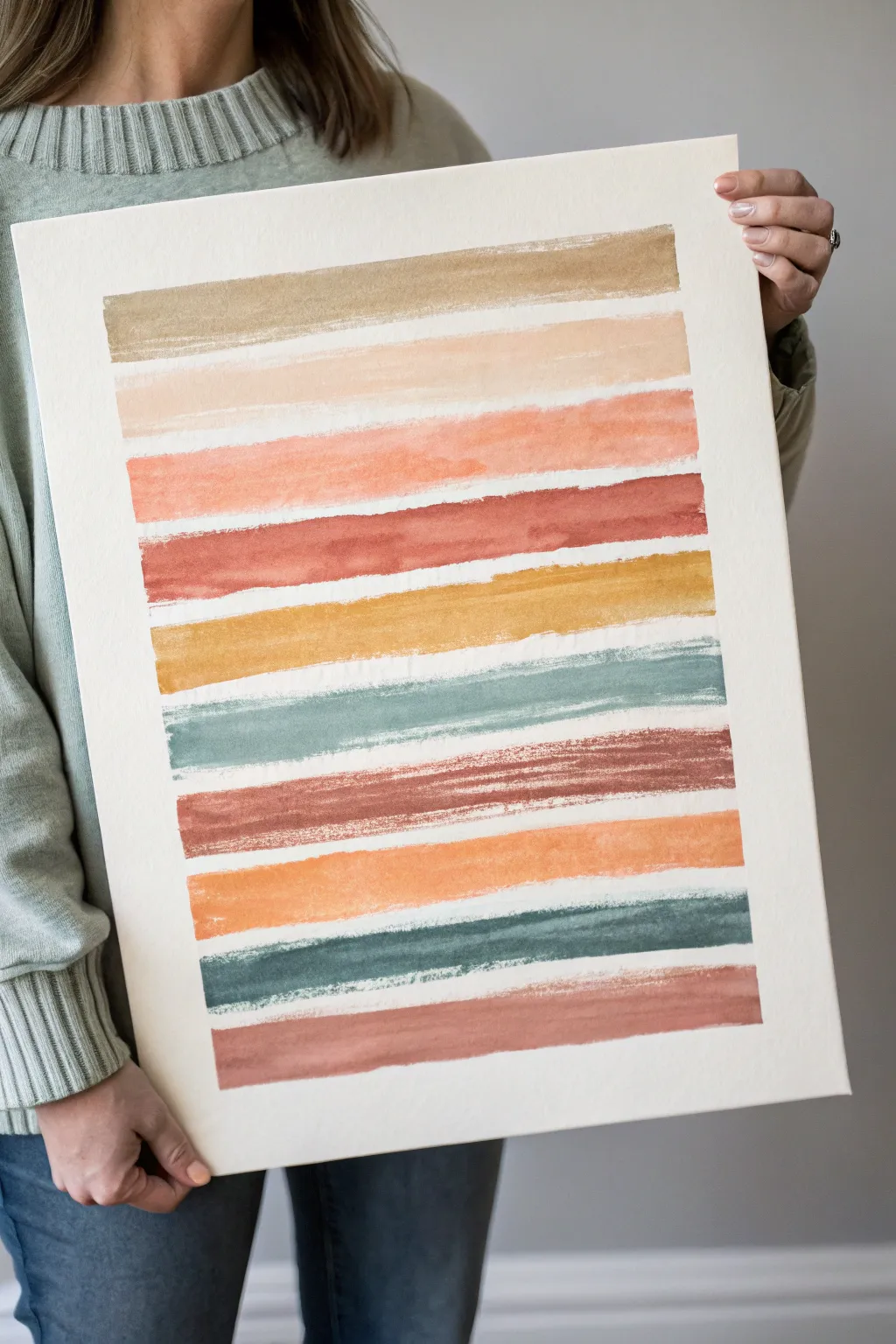
Visualise your mood or a favorite song through a soothing series of painted horizontal stripes in an earthy, warm palette. Ideally suited for beginners, this project emphasizes the therapeutic rhythm of repetitive brushstrokes and organic color transitions.
Step-by-Step Guide
Materials
- Heavyweight watercolor paper or mixed media paper (approx. 11×14 inches)
- Watercolor paints or fluid acrylics
- Wide flat wash brush (1 inch or 1.5 inch)
- Palette for mixing colors
- Jar of water
- Paper towels
- Painter’s tape (optional, for securing paper)
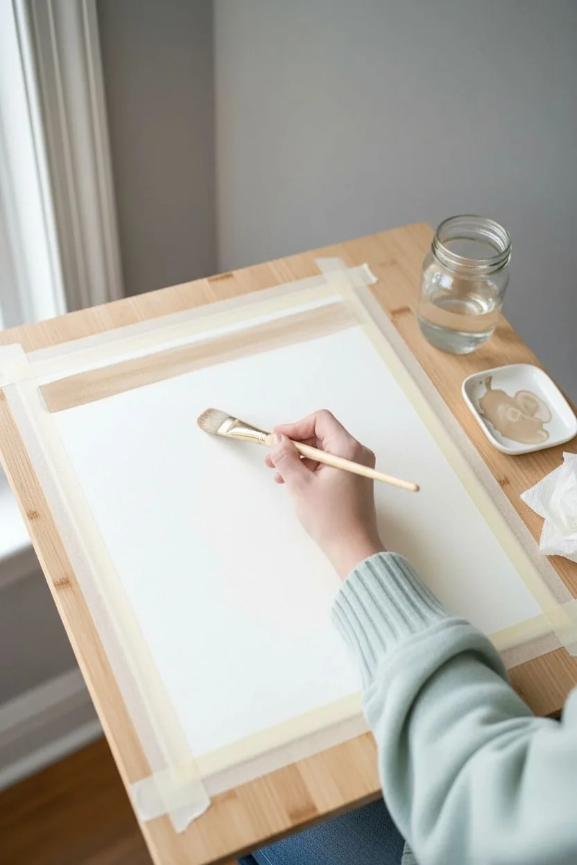
Step 1: Preparation and Palette
-
Secure the paper:
Tape your paper down to a flat surface or drawing board. This prevents the paper from buckling when it gets wet and keeps your workspace steady. -
Mix the first tone:
Start by mixing a muted ochre or sandy beige color. Add plenty of water to your pigment if using watercolors to ensure transparency. -
Plan your color story:
Select a palette that reflects a specific mood. The example uses a warm, earthy progression: beige, peach, terracotta, rust, mustard yellow, sage green, mauve, orange, and teal.
Step 2: Painting the Stripes
-
Paint the first stripe:
Load your flat brush fully with the sandy beige mixture. Starting at the top left, pull the brush horizontally across the paper in one confident motion. -
Create a natural edge:
Don’t worry about perfectly straight lines. Let the natural bristle texture show at the start and end of the stroke for an organic look. -
Add the second hue:
Clean your brush thoroughly. Mix a pale peach tone and paint the second stripe directly below the first, leaving about a half-inch gap of white paper between them. -
Layer in warmth:
Move to a deeper coral or terracotta shade. Paint this third stripe slightly closer to the peach one above it to vary the spacing rhythm. -
Intensify the color:
Mix a vibrant rust red. Paint a stripe that is slightly uneven in width—perhaps thicker on one side—to break up visual monotony. -
Introduce contrast:
Switch to a mustard or golden yellow. Apply this stripe with a slightly drier brush to create a ‘dry brush’ effect where the paper tooth shows through. -
Cool it down:
Mix a muted sage or dusty teal green. Place this stripe below the yellow, allowing the cool tone to balance the previous warm layers. -
Observation break:
Step back for a moment. I often squint at the canvas here to see if the color balance feels top-heavy or harmonious before continuing.
Wet Edge Technique
For softer stripes, dampen the paper slightly with clean water before applying paint. The color will bleed slightly for a dreamy, fuzzy edge.
Step 3: Completing the Composition
-
Add an earthy red:
Mix a reddish-brown or mauve tone. Paint a stripe that has textured edges, pressing the brush down harder in the middle of the stroke. -
Brighten with orange:
Create a soft, diluted orange mix. Paint a wide stripe here, letting the watery paint pool slightly for varying opacity as it dries. -
Anchor with deep teal:
Mix a dark, stormy teal or grey-blue. Paint a stripe near the bottom to provide visual weight to the composition. -
Final stripe:
Finish with a dusty rose or muted pink stripe at the very bottom. Keep this one relatively straight and solid to ground the artwork. -
Dry completely:
Let the painting sit flat until completely dry. If you taped the edges, wait until the paper is cool to the touch before peeling the tape away slowly.
Metallic Accents
Once the watercolor is dry, drag a thin line of gold leaf or metallic paint along the bottom edge of just two or three stripes for subtle shimmer.
Your finished piece is now a beautiful, abstract record of your color inspirations ready for framing


Have a question or want to share your own experience? I'd love to hear from you in the comments below!