There is something so incredibly relaxing about mixing colors and watching a blank canvas turn into something magical. Whether you are looking to decorate your room or just need a creative escape, these painting concepts focus on capturing a specific mood rather than perfect realism.
Dreamy Pink Cloudscape
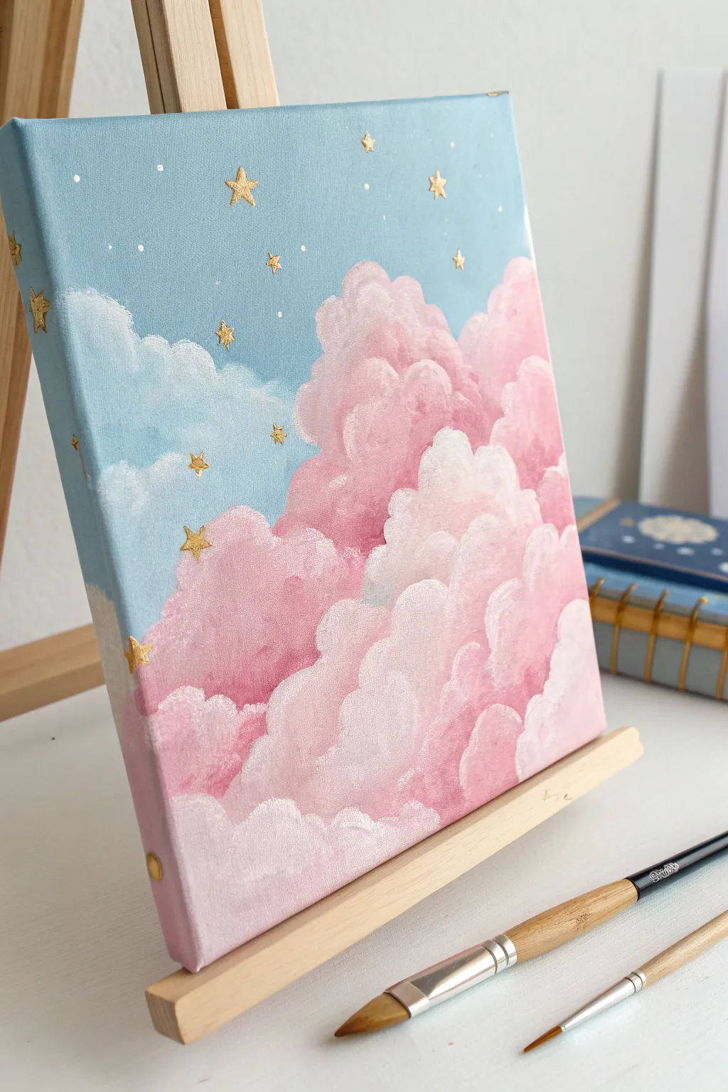
Capture the magic of a twilight sky with this dreamy acrylic painting project. You will create billowy, pink cotton-candy clouds set against a soft blue background, finished with sparkling gold celestial details.
Step-by-Step
Materials
- Square stretched canvas (8×8 or 10×10 inches)
- Acrylic paints: Titanium White, Light Blue, Magenta or Alizarin Crimson, Metallic Gold
- Large flat brush (for the sky)
- Medium filbert brush (rounded tip for clouds)
- Small fine liner brush
- Palette and water cup
- Paper towels
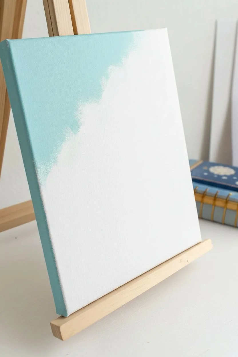
Step 1: Setting the Scene
-
Mix the sky color:
Start by mixing a large amount of Titanium White with a small dot of Light Blue. You want a very pale, pastel cyan color. -
Paint the background:
Using your large flat brush, paint the upper left portion of the canvas. Cover about 40% of the surface, leaving the bottom right diagonal area empty for the clouds. -
Wrap the edges:
Don’t forget to paint the top and left sides of the canvas edges with this blue mixture to give the artwork a professional, finished look. -
Soften the boundary:
Where the blue paint meets the unpainted canvas, feather the edges slightly so the transition won’t be too harsh underneath the clouds later. -
Let it dry:
Allow the blue layer to dry completely to prevent the pink cloud colors from turning purple when you apply them.
Cloud shape trouble?
If your clouds look flat, you likely need more contrast. Don’t be afraid to make your shadows darker and your highlights pure white to force that 3D volume.
Step 2: Building the Cloud Structure
-
Mix your base pink:
Create a medium rose color by mixing Magenta with White. This will be the main body color of your clouds. -
Block in the shape:
Using the filbert brush, fill the remaining white space on the canvas with this pink mixture. I like to use a dabbing motion to establish the rough, fluffy outline against the blue sky. -
Paint the cloud edges:
Carry this pink color over the right and bottom edges of the canvas, just like you did with the sky. -
Dab the texture:
While the paint is wet, use the tip of the brush to dab along the border where pink meets blue, creating rounded, bumpy cloud tops rather than a straight line.
Level Up: 3D Texture
Mix smooth modeling paste or heavy gel medium into your white highlight paint. This will physically raise the cloud tops off the canvas for real texture.
Step 3: Adding Volume and Fluff
-
Mix a shadow shade:
Add a tiny touch more Magenta (and perhaps the smallest dot of blue) to your pink mix to create a slightly darker, dusty rose shadow color. -
Apply shadows:
Paint this darker color at the bottom of individual cloud ‘puffs’ to create depth and separation between the different cloud masses. -
Mix a highlight shade:
Clean your brush and mix a fresh pile of White with a tiny speck of pink to create a very pale, almost white highlight color. -
Highlight the tops:
Using the filbert brush, paint the top curves of each cloud puff with this light color. The round shape of the brush does most of the work for you here. -
Blend the transition:
Gently tap the brush where the highlight meets the medium pink base to create a soft, gradient transition. Do not over-blend; you want visible texture. -
Final brights:
Add pure Titanium White to the very highest peaks of the clouds for maximum contrast and fluffiness.
Step 4: Celestial Embellishments
-
Dry completely:
Ensure the entire painting is bone dry before moving on to the metallic details to keep the lines crisp. -
Load the liner brush:
Thin your Metallic Gold paint slightly with a drop of water so it flows smoothly off your fine liner brush. -
Paint the stars:
Carefully paint small five-point stars scattered across the blue sky. Place a few overlapping the clouds for a magical depth effect. -
Add side details:
Continue a few stars onto the painted sides of the canvas to maintain that gallery-wrap continuity. -
Sprinkle stardust:
Finish by adding tiny golden dots randomly between the larger stars to fill out the galaxy.
Display your artwork on a mini easel to bring a dreamy pop of color to your desk or shelf.


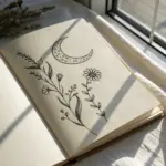
Glowing Moon and Stars
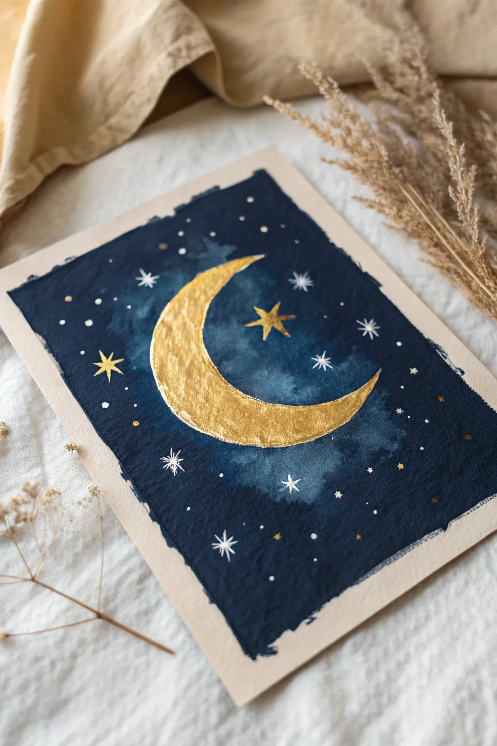
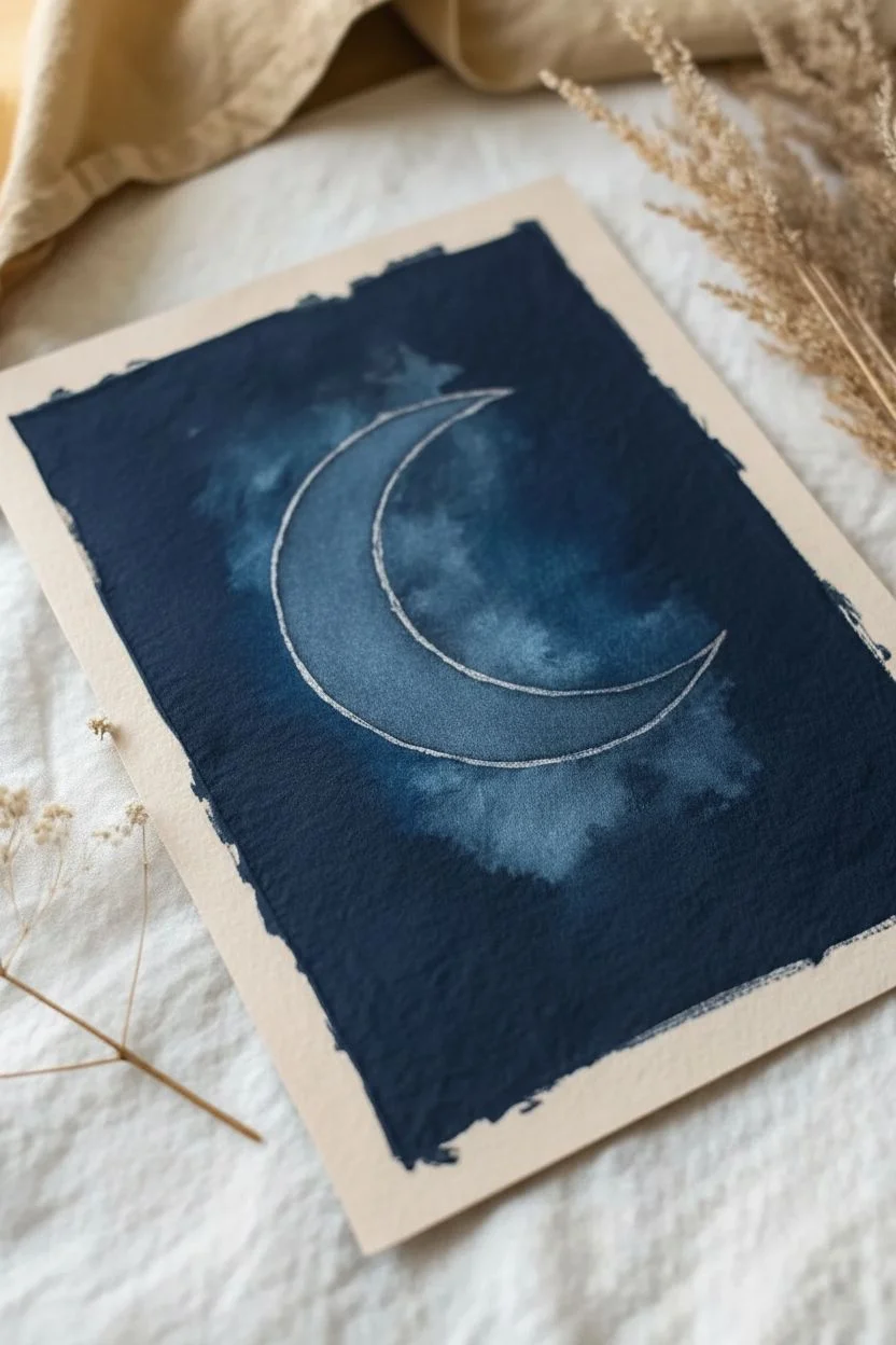
Create a mystical piece of art featuring a shimmering metallic crescent moon set against a deep moody sky. This project uses the matte finish of gouache or watercolor to make the gold details pop beautifully.
Detailed Instructions
Materials
- Cold press watercolor paper (300gsm)
- Indigo and Black Gouache (or watercolor)
- Metallic Gold paint or ink
- White Gouache or White Gel Pen
- Pencil and eraser
- Round brush (size 6 for washes)
- Detail brush (size 0 or 00)
Step 1: Sketch and Base
-
Outline the crescent:
Lightly sketch a large crescent moon in the center of your paper using a pencil. Keep the lines very faint so they don’t show through later. -
Mark the boundaries:
Decide on the size of your painted rectangle. You can lightly mark the four corners with dots to guide you, leaving a generous white border around the edge of the paper. -
Mix the night sky color:
On your palette, mix a generous amount of Indigo paint. Add a small touch of Black to deepen it, creating a rich, midnight navy hue.
Step 2: Painting the Sky
-
Start around the moon:
Using your size 6 brush, carefully paint the dark blue around the curve of your sketched moon. This creates a crisp edge for the crescent. -
Create the milky glow:
While the paint near the moon is still wet, rinse your brush and use clean water to slightly dilute the paint as you move outward, creating subtle variations and cloud-like textures. -
Fill the background:
Continue filling the rest of the rectangular area with the dark mix. I personally like to vary the opacity slightly here and there to give the sky depth rather than a flat block of color. -
Create rough edges:
When you reach the outer boundaries of your rectangle, use the tip of the brush to create a deliberately uneven, choppy edge. This ‘deckled’ look adds to the aesthetic charm. -
Let it dry:
Allow the blue background to dry completely. Gouache dries matte and quickly, but ensure there are no damp spots before moving to the gold.
Uneven Coverage?
If your blue background looks streaky in a bad way, wait for it to dry 100%, then add a second diluted wash of indigo over the top to unify the color while keeping the texture.
Step 3: The Golden Moon
-
Fill the crescent:
Load your brush with metallic gold paint. Carefully fill in the crescent moon shape you outlined earlier. -
Add texture:
Once the first layer of gold is tacky, dab a little more gold paint onto the center of the moon to create a textured, hammered metal look. -
Refine the inner curve:
Use your smallest detail brush to sharpen the points of the crescent, ensuring they taper off into very fine, elegant tips.
Make it Shine
For an extra magical touch, use real gold leaf instead of paint for the moon. Apply gold leaf adhesive to the crescent shape, wait for it to get tacky, and press the leaf sheet down gently.
Step 4: Starry Details
-
Paint gold stars:
Using the detail brush and gold paint, add three or four 5-point stars scattered around the moon. -
Add white starbursts:
Switch to white gouache or a white gel pen. Draw several 8-point ‘starburst’ shapes (a simple cross with an X over it) in the empty dark spaces. -
Create distant stars:
Dot tiny specks of white and gold throughout the background to represent distant constellations. Vary the pressure to make some dots smaller than others. -
Create a focal cluster:
Group a few tiny white dots closely together near the bottom left or top right to look like a distant star cluster or milky way dust. -
Final assessment:
Step back and look at the balance. Add a few more tiny gold specks if the sky feels too empty, then let the entire piece dry flat.
Frame your celestial artwork to add a touch of cosmic wonder to your wall

Pastel Sunset Gradient
Capture the serenity of twilight with this soft, wet-on-wet watercolor project. This exercise is perfect for mastering smooth transitions and creating a calming, aesthetic piece of art that looks beautiful on any wall.
Step-by-Step Tutorial
Materials
- Cold-press watercolor paper (300gsm)
- Watercolor paints (Purple, Rose/Pink, Warm Yellow)
- Round brush (Size 8 or 10)
- Painter’s tape or washi tape
- Two jars of water
- Paper towels
- Mixing palette
- Drawing board or hard surface
Step 1: Preparation and Mixing
-
Secure the paper:
Place your watercolor paper on a drawing board or flat surface. Apply painter’s tape along all four edges to create a clean border and prevent the paper from buckling when wet. -
Seal the edges:
Run your fingernail or a spoon handle firmly over the inner edge of the tape to ensure a tight seal so paint doesn’t seep underneath. -
Prepare the Violet:
On your palette, mix a soft violet hue. Add plenty of water to the pigment until you have a milky consistency; we want a pastel look, not a deep purple. -
Prepare the Pink:
Clean your brush and mix a rose or soft pink shade in a separate well. Test it on a scrap piece of paper to ensure it matches the intensity of your violet. -
Prepare the Yellow:
Finally, mix a warm yellow ochre or golden yellow. Keep this mix slightly more fluid, as it will act as the glowing horizon at the bottom.
Fixing ‘Blooms’
If you see cauliflower-like textures forming, it means you added water to drying paint. Don’t fuss with it! Let it dry, then gently scrub smooth with a damp brush.
Step 2: Painting the Gradient
-
Wet the paper:
Load a clean brush with fresh water and coat the entire area inside the tape. The paper should glisten evenly but not have standing puddles. -
Apply the top layer:
Dip into your violet mix and apply a broad stroke across the very top of the paper, letting the pigment flow into the wet surface. -
Fade the violet:
Rinse your brush slightly so it still holds some pigment but is more watery, and pull the violet color down about one-third of the page. -
Introduce the pink:
Load your brush with the pink mix. Apply it just below the fading violet area, allowing the wet edges to touch and bleed into each other naturally. -
Blend the transition:
If the line between purple and pink looks too harsh, I like to gently run a clean, damp brush horizontally between the colors to soften the merge. -
Add the sunlight:
Rinse your brush thoroughly and pick up the yellow paint. Apply this to the bottom third of the paper, working upwards toward the pink. -
Final blend:
Gently brush the yellow up until it meets the pink section. The colors should create a soft orange hue where they overlap. -
Tilt for smoothness:
If the blending looks stagnant, slightly tilt your board back and forth to let gravity help the pigments settle into a seamless gradient. -
Lift excess pools:
If water pools at the bottom tape line, dry your brush on a paper towel and touch the tip to the puddle to soak up the excess liquid.
Level Up: Silhouette
Once the background is 100% dry, use black ink or gouache to paint delicate silhouettes of power lines, birds, or pine trees along the bottom horizon.
Step 3: Drying and Reveal
-
Patience is key:
Let the painting dry completely flat. If you touch it while it’s damp, you risk creating fingerprints or texture marks. -
Check coolness:
Touch the back of the paper or board; if it feels cool to the touch, the paper is likely still damp inside even if it looks dry. -
Remove the tape:
Once fully bone-dry, peel the tape away slowly at a 45-degree angle away from the painting to avoid tearing the paper surface. -
Smooth the border:
If any paint bled slightly, you can use a damp Q-tip to gently scrub and lift the unwanted spot, or cover it with a white gel pen.
Enjoy the peaceful glow of your new pastel sunset!


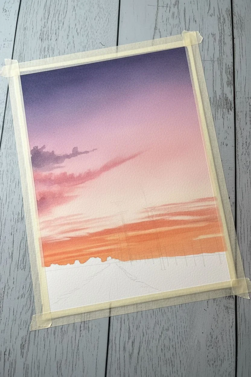
Silhouette Powerlines at Dusk
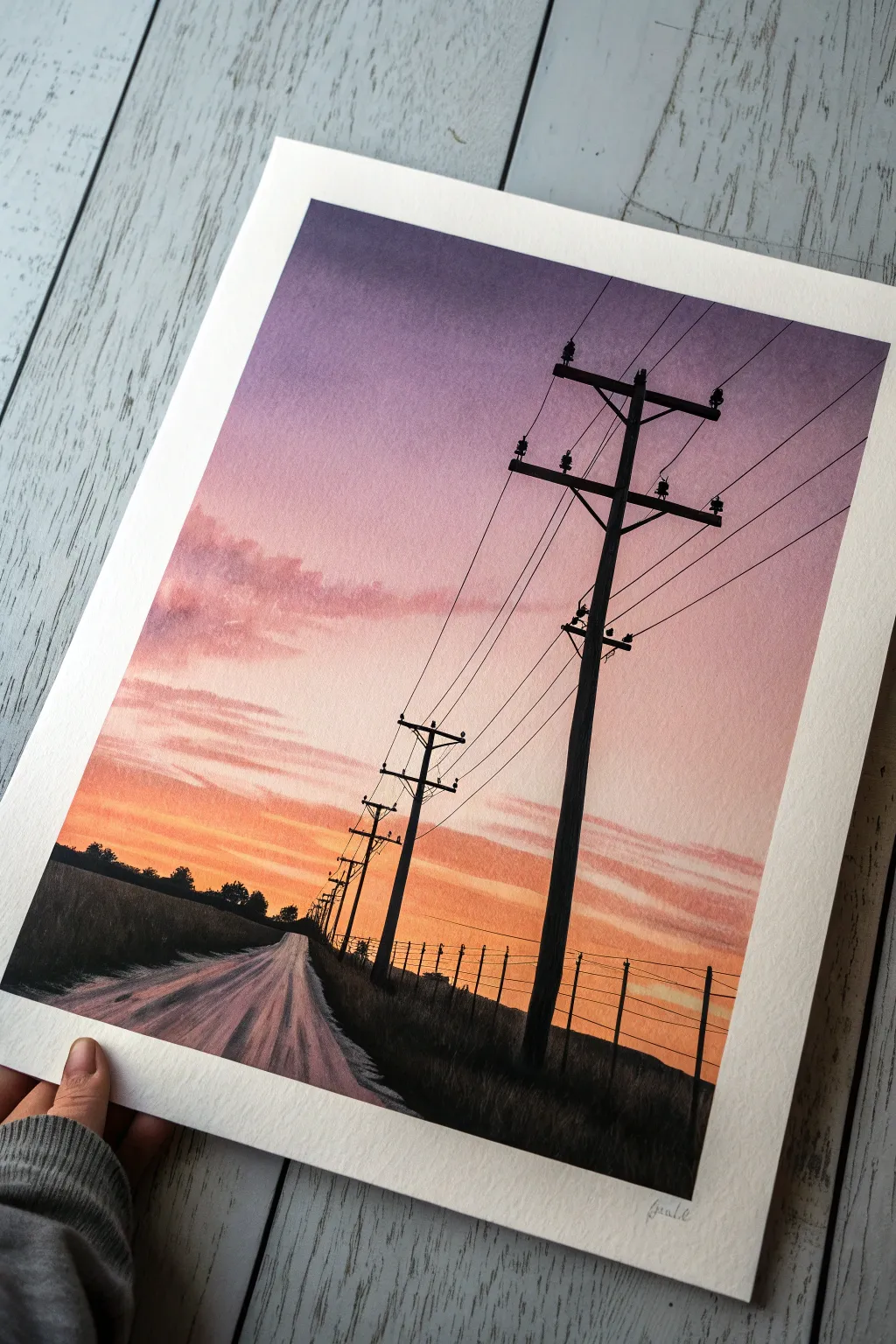
Capture the nostalgic feeling of a long drive at dusk with this vibrant watercolor project. You will learn to blend a seamless gradient sky and create high-contrast silhouettes against a glowing horizon.
How-To Guide
Materials
- Cold press watercolor paper (at least 300gsm)
- Masking tape
- Watercolor paints (Indigo, Purple, Alizarin Crimson, Cadmium Orange, Yellow)
- Black gouache or highly pigmented black watercolor
- Large flat wash brush
- Medium round brush
- Fine liner or rigger brush
- Two jars of water
- Paper towels
Step 1: Preparation & Sky Gradient
-
Secure the border:
Tape all four edges of your paper down to a board or table using masking tape. This creates the crisp white border seen in the final image and prevents the paper from buckling. -
Sketch the perspective:
Using a light pencil, draw a low horizon line about one-fifth from the bottom. Sketch diagonal lines converging toward the left of the horizon to create the road, and mark vertical positions for the retreating telephone poles. -
Wet the sky:
With your large flat brush, apply clean water to the entire sky area above the horizon line. The paper should be glistening but not forming puddles. -
Apply the purple:
Load your brush with Indigo or deep Purple. Paint the top third of the sky using horizontal strokes, letting the pigment bleed downward slightly. -
Transition to pink:
Rinse your brush slightly and pick up Alizarin Crimson or a rosy pink. Paint the middle section of the sky, blending it gently into the bottom edge of the purple while the paper is still wet. -
Add the sunset glow:
Clean your brush thoroughly. Mix a bright Orange with a touch of Yellow and paint the area just above the horizon, blending it upward into the pink. -
Create soft clouds:
While the sky is still damp, I like to take a slightly thirsty brush with purple-grey mix and gently dab in a few soft cloud shapes on the left side to add texture. -
Let it dry completely:
Wait until the paper is bone dry. If the paper is cold to the touch, it is still wet. This is crucial before moving to the crisp foreground elements.
Step 2: Road & Foreground
-
Base coat the road:
Mix a watery wash of purple and a tiny bit of brown. Paint the road surface, following the direction of the road with your brushstrokes. -
Add road texture:
While the road wash is damp, drop in slightly darker pigment in streaks to simulate tire tracks and shadows, enhancing the sense of movement toward the horizon torward the left. -
Paint the fields:
Mix a very dark, near-black green or simply use black. Paint the fields on either side of the road. Use rough, upward dabbing motions along the top edge to simulate tall grass and distant trees silhouetted against the bright sky. -
Define the horizon:
Ensure the horizon line where the dark field meets the orange sky is distinct, adding small bumps to represent distant tree lines.
Steady Hands Pro-Tip
To get smooth, draped power lines, turn your paper upside down or sideways. Pulling the brush toward your body is much physically easier and steadier than pushing it away.
Step 3: Silhouettes & Details
-
Paint the main pole:
Switch to opaque black paint (gouache works best here for opacity). Using a medium round brush or flat brush turned on its side, paint the thickest power pole in the foreground on the right. -
Add the crossbars:
Carefully paint the horizontal crossbars near the top of the main pole. Add small vertical nubs on top of the bars to represent the insulators. -
Paint distant poles:
Paint the remaining telephone poles, making them progressively shorter and thinner as they retreat toward the horizon on the left side of the road. -
Connect the lines:
Mix a fluid, inky consistency of black paint. Using your finest liner or rigger brush, connect the poles with thin, sweeping lines for the wires. Allow them to dip slightly in the middle for realism. -
Add the fence:
On the right side field, paint tiny vertical ticks for fence posts and connect them with delicate horizontal lines. -
Reveal the border:
Once everything is strictly dry, slowly peel away the masking tape at a 45-degree angle to reveal your clean edges.
Level Up
Use a white gel pen to add a few tiny stars in the darkest purple part of the sky, or paint small silhouette birds resting on the wires to add life to the scene.
Frame your beautiful sunset painting or scan it to create a lovely card for a friend.
BRUSH GUIDE
The Right Brush for Every Stroke
From clean lines to bold texture — master brush choice, stroke control, and essential techniques.
Explore the Full Guide
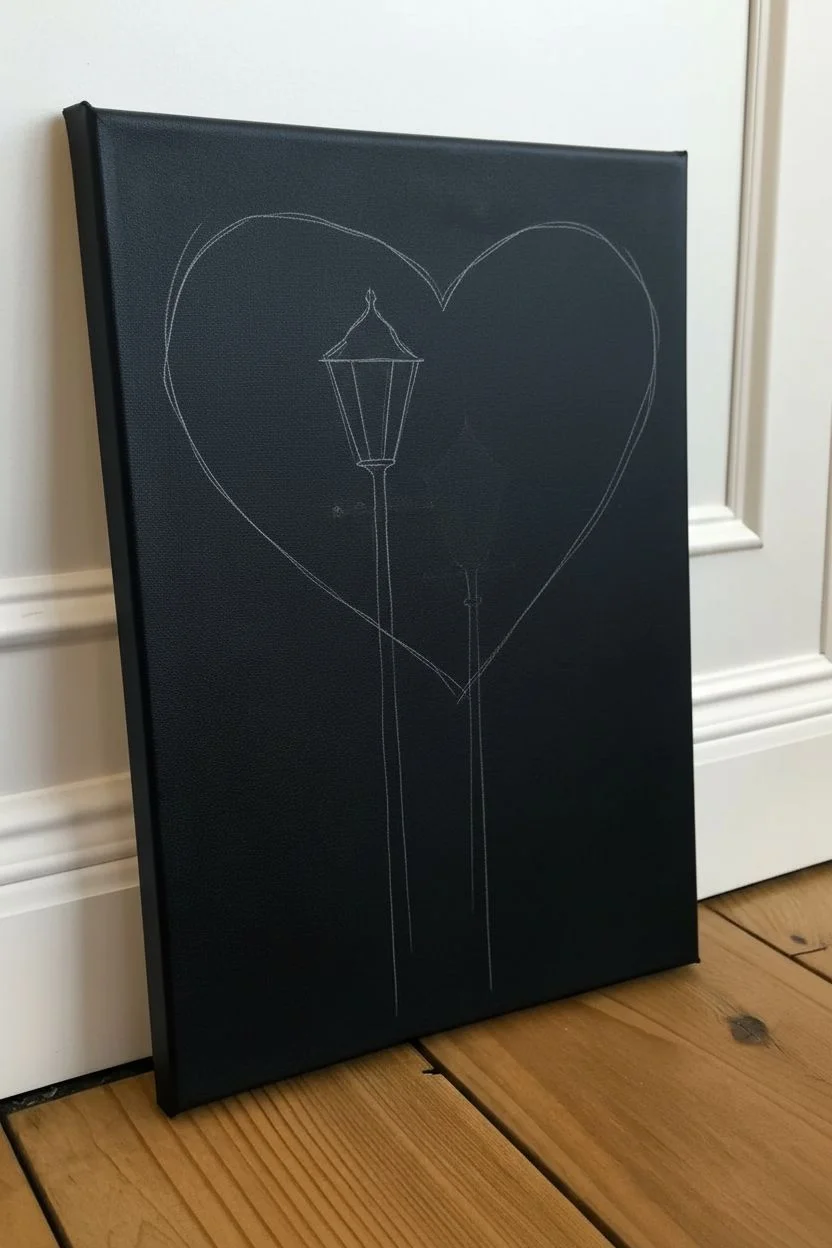
Whimsical Streetlight Love
Create a romantic atmosphere with this striking high-contrast painting featuring Victorian streetlamps against a fluffy, heart-shaped pink cloud. The clever use of white outlines on a black background makes the imagery pop with a stylized, illustrative quality.
Step-by-Step Guide
Materials
- Stretched canvas (painted black or black gessoed)
- Acrylic paints: Titanium White, Mars Black, Cadmium Yellow, Soft Pink
- Natural sea sponge or kitchen sponge
- Fine liner brush (size 0 or 00)
- Small flat shader brush
- White charcoal pencil or chalk
- Ruler
- Palette for mixing
Step 1: Setting the Scene
-
Prepare the background:
If you aren’t starting with a pre-primed black canvas, apply two even coats of black acrylic paint to your canvas over the entire surface. Allow this to dry completely before moving on. -
Sketch the heart:
Using a white charcoal pencil or a piece of chalk, lightly sketch a large, wide heart shape in the upper center of the canvas. Keep the lines faint so they are easy to cover later. -
Sketch the lamp placement:
Use a ruler to lightly mark two vertical lines starting from the bottom edge. Place the taller line on the left and the shorter one on the right, ensuring they overlap the heart area slightly.
Step 2: The Pink Cloud
-
Prepare the sponge:
Dampen a rounded piece of sponge slightly, squeezing out all excess water so it is mostly dry. -
Load the paint:
Dip the sponge into your soft pink acrylic paint. I personally like to dab it on a paper towel first to remove globs, ensuring a misty texture. -
Dab the texture:
Gently dab the pink paint inside your heart outline. Utilize a stippling motion—straight up and down—to create a fluffy, cloud-like texture rather than flat strokes. -
Refine the edges:
As you reach the edges of the heart, use less pressure and less paint on the sponge to create a soft, feathery perimeter that fades slightly into the black. -
Add dimension:
While the pink is still tacky, pick up a tiny amount of white paint on your dirty sponge and dab it into the upper curves of the heart to create highlighted volume.
Cloud Texture Tip
Rotate your wrist slightly between every few dabs when sponging. This prevents a repetitive pattern and keeps the cloud looking organic and fluffy.
Step 3: Constructing the Lamps
-
Block in the lanterns:
Using a small flat brush and white chalk to guide you, verify the shape of the lantern heads (trapezoids) at the top of your vertical lines. -
Paint the glow:
Fill in the trapezoid shapes of the lanterns with bright yellow paint. You may need two to three coats to get a solid, opaque opaque yellow against the dark background and pink cloud. -
Define the lantern structure:
Once the yellow is completely dry, use black paint and a fine brush to paint the ‘frame’ of the lantern over the yellow, creating the individual window panes and the roof cap. -
Create the silhouette:
Paint the solid black silhouette of the lamp posts and bases over the pink cloud area. Since the bottom of the canvas is black, you are essentially just visually blocking out where the post exists.
Level Up: Glowing Effect
Mix a tiny amount of fluorescent yellow or glow-in-the-dark medium into your final layer of yellow paint to make the streetlights really shine at night.
Step 4: Illumination & Details
-
Prepare outlining paint:
Mix a small amount of white paint with a drop of water to create an ink-like consistency that flows smoothly from a liner brush. -
Outline the posts:
Carefully paint thin white vertical lines to define the edges of the lamp posts. This is crucial for making the black posts visible against the black background. -
add the scrollwork:
Draw the decorative horizontal bars and small curlicues just below the lantern heads using your fine liner brush and the thinned white paint. -
Detail the bases:
Add horizontal curved lines at the bottom of the posts to create the tiered, architectural look of the lamp bases. -
Highlight the lanterns:
Add a crisp white outline around the black roofs of the lanterns to separate them from the background. -
Final clean up:
Once all paint is 100% dry, gently wipe away any visible chalk sketch lines with a damp cloth or cotton swab.
Hang your masterpiece to enjoy the charming glow of love on a whimsical street corner.
Boho Botanical Blocks
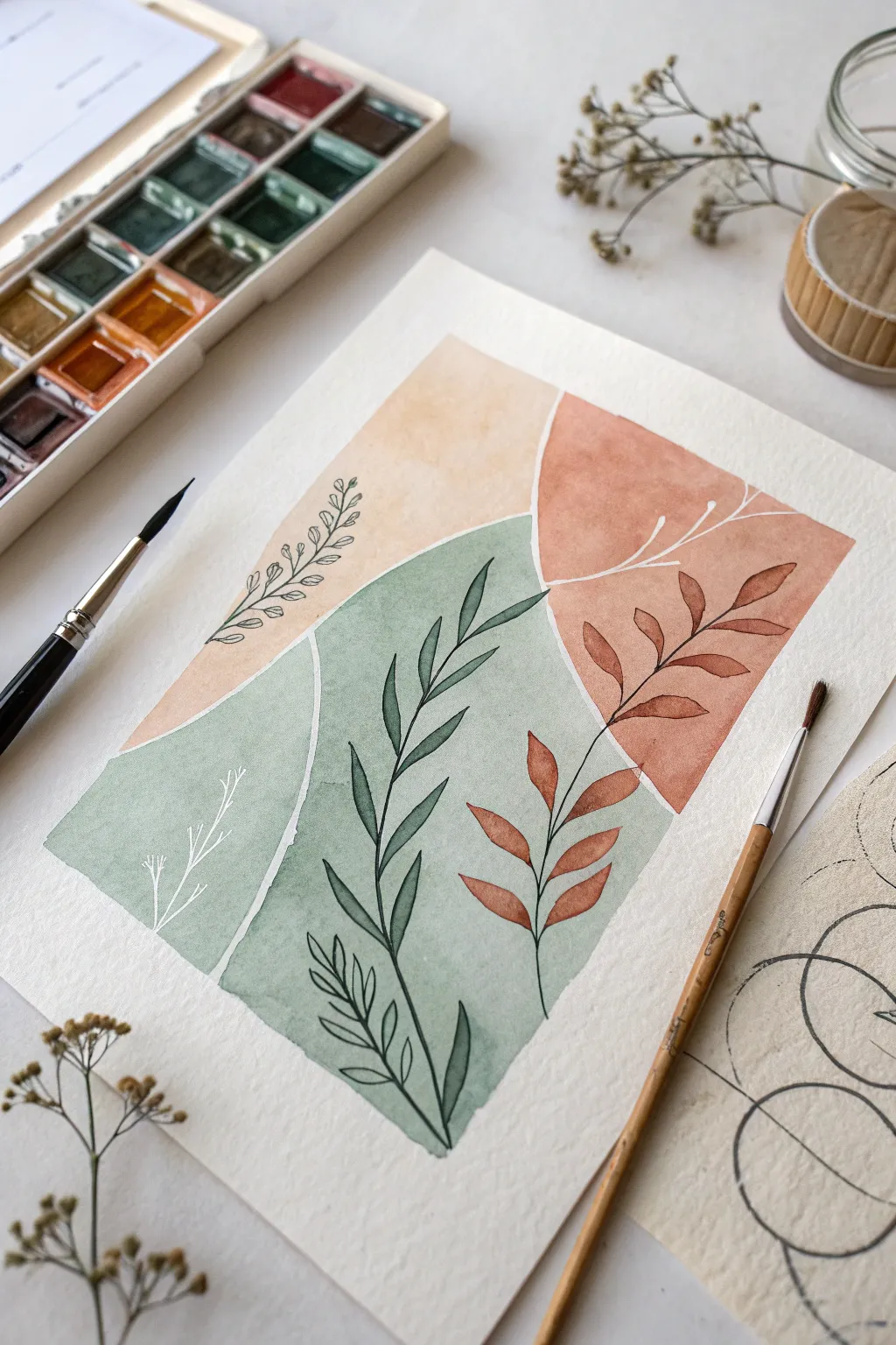
Embrace the imperfect beauty of organic shapes and earthy tones with this relaxing watercolor project. You’ll create a modern triptych composition that combines soft color blocking with delicate line art for a balanced, minimalist aesthetic.
How-To Guide
Materials
- Cold press watercolor paper (300 gsm)
- Watercolor paints (pan or tube)
- Round brush (size 6 or 8 for fills)
- Detail brush (size 0 or 1) or black fine liner pen
- White gouache or white gel pen
- HB Pencil and kneadsble eraser
- Masking tape
- Water cups and paper towels
Step 1: Laying the Foundations
-
Prepare the canvas:
Tape your watercolor paper down to a hard board on all four sides. This ensures a clean border and prevents the paper from buckling when wet. -
Sketch the blocks:
Using a light hand, draw the outlines of your three color blocks. Plan for a large sage shape at the bottom, a terracotta curve on the top right, and a peach section on the top left. -
Mind the gap:
As you sketch, leave a distinct gap of negative space (about 3-4mm) between each shape. This white channel is crucial for the ‘block print’ look. -
Mix the Sage:
Create a calming green by mixing viridian with a touch of burnt sienna or grey to desaturate it. Add enough water so the consistency is like tea. -
Paint the bottom block:
Load your larger round brush and fill in the bottom shape with the sage mixture. Work somewhat quickly to keep a wet edge, ensuring a smooth, flat wash without harsh internal lines. -
Mix the Terracotta:
Clean your brush thoroughly. Mix an earthy orange-red using red ochre or light red mixed with a tiny bit of brown. Aim for a warm, rusty clay tone. -
Paint the top right:
Carefully fill in the top right curved energetic shape. Be mindful near the edges closest to the sage block to maintain that clean white separator.
Troubleshooting
If your background colors bled across the white gaps, don’t panic. Wait for everything to dry fully, then use opaque white gouache paint to tidy up and re-establish the clean separation lines.
Step 2: Painting the Puzzle
-
Mix the Sand tone:
For the final block in the top left, mix yellow ochre with a lot of water and perhaps a tiny dot of orange. You want a very pale, sandy beige. -
Complete the background:
Fill in the final top-left section. I like to let the paint pool slightly in random areas here to create natural texture as it dries. -
Total drying time:
This is the most critical step: let the background layers dry completely. If the paper is cool to the touch, it’s still damp. Using a hair dryer on low heat can speed this up.
Step 3: Botanical Details
-
Sketch the stems:
Lightly pencil in the flow of your botanical stems. One main vine should rise through the center green block, and smaller shoots should inhabit the colored corners. -
Mix a deep green:
Mix a very concentrated dark green (almost black) by combining dark green with indigo or payne’s grey. This needs to be opaque and bold. -
Paint the central vine:
Switch to your size 0 detail brush. Paint the central stem and its elongated leaves directly over the sage background. Use light pressure for the tips of the leaves to keep them sharp. -
Add rust foliage:
Mix a slightly more saturated version of your earlier terracotta color. Paint the leaves of the plant on the right side, so they look tone-on-tone against the background. -
Connect the rust leaves:
Using your dark detailing color (or a black fine liner pen), draw the thin stems connecting the terracotta leaves you just painted. -
Top left line work:
On the pale sandy block, draw or paint a very delicate, airy vine with small outlines of leaves rather than filled shapes. This adds variety to the visual weight.
Level Up
For a luxe touch, swap the black botanical lines for metallic gold watercolor or a gold leaf pen. The shimmer against the matte earth tones creates a stunning, high-end effect.
Step 4: Highlights & Finish
-
White accents:
Using white gouache or a gel pen, add delicate twigs or ‘ghost’ branches on the sage green section, and extend a few lines across the gap into the terracotta section. -
Erase and peel:
Once you are 100% certain the ink and paint are dry, gently erase any visible pencil marks from the white gaps, then slowly peel off the masking tape.
Frame your new abstract botanical piece in light wood to complement those lovely earthy hues

PENCIL GUIDE
Understanding Pencil Grades from H to B
From first sketch to finished drawing — learn pencil grades, line control, and shading techniques.
Explore the Full Guide
Flowery Hills and Meadoes
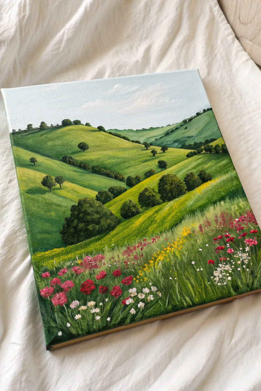
Capture the serenity of the countryside with this vibrant landscape featuring rolling green slopes and a detailed wildflower meadow. You will learn to create depth through color variation and layer distinct textures for a realistic grassy foreground.
Step-by-Step Guide
Materials
- Square primed canvas (approx. 10×10 or 12×12 inches)
- Acrylic paints: Titanium White, Ultramarine Blue, Sap Green, Hooker’s Green, Lemon Yellow, Yellow Ochre, Burnt Umber, Cadmium Red, Magenta
- Flat brush (1-inch)
- Filbert brush (medium)
- Round brush (small)
- Fine liner or rigger brush
- Palette and water cup
Step 1: Sky and Base Layers
-
Paint the sky:
Mix Titanium White with a tiny dot of Ultramarine Blue. Paint the top quarter of the canvas using long horizontal strokes, blending more white in as you move down to create a fade near the horizon. -
Add cloud wisps:
While the sky is still slightly damp, take pure white on the corner of your brush and scumble in very faint, diagonal cloud streaks for movement. -
Block in the furthest hills:
Mix Sap Green with a little White and Blue to create a hazy, cool green. Paint the most distant hill shapes at the horizon line; the blue tint pushes them into the background. -
Block in mid-ground hills:
Mix Sap Green with Yellow Ochre for a warmer tone. Paint the large overlapping hill shapes in the middle section, ensuring curvy, smooth outlines.
Step 2: Defining the Terrain
-
Add hill shadows:
Mix Hooker’s Green with a touch of Burnt Umber. Paint the valleys and the lower sides of the hills where the slopes dip down to create 3D form. -
Highlight the slopes:
Mix Lemon Yellow into your Sap Green. Apply this bright chartreuse color to the tops of the hills where the sunlight hits directly. -
Blend the gradients:
Use a clean, slightly damp brush to gently soften the transition between your shadow green and highlight green on the hills so the slopes look rolling and soft. -
Paint distant tree lines:
Using a small round brush and dark green (Green + Umber), dab small, connected distinct bumps along the ridges of the distant hills to simulate thick tree lines. -
Add individual trees:
Paint the scattered trees in the mid-ground using a dabbing motion to create foliage texture. Make them larger than the distant trees but smaller than foreground elements. -
Cast shadows:
Paint small, dark horizontal streaks to the left of the trees to ground them and show the direction of the sunlight.
Fixing Muddy Greens
If your greens look too fake or neon, don’t just add black. Mix in a tiny touch of red paint instead. This neutralizes the green slightly, creating a natural, earthy olive tone suitable for landscapes.
Step 3: The Wildflower Meadow
-
Foreground base:
Paint the bottom third of the canvas with a solid coat of dark bluish-green to act as a deep shadow layer for the tall grass. -
Mid-ground field texture:
In the area between the hills and the immediate foreground, dab bands of bright yellow and lime green to suggest a field of rapeseed or distant flowers. -
Paint grass blades:
Switch to your fine liner brush. Using lighter greens (mix Green + Yellow + White), flick smooth lines upward from the bottom of the canvas to create individual tall grass blades. -
Vary the grass tones:
I like to add a few strokes of very pale yellow-green here to look like sun-bleached grass tips catching the light. -
Add red flowers:
Mix Cadmium Red with a touch of Magenta. Dot small clusters in the foreground to create poppies or carnations, grouping them naturally rather than spacing them evenly. -
Add secondary flowers:
Use small dabs of pure Yellow and Magenta to add variety to the floral patches, keeping the dots smaller as they get further away. -
Detailed white blooms:
Using the very tip of your smallest brush and pure White, add tiny clusters of dots to mimic baby’s breath or cow parsley amongst the grass. -
Final highlights:
Add tiny specks of white or pale yellow to the tops of the red flowers and the nearest tree canopies to make the image pop.
Pro Tip: Liner Brush
For the thin grass blades, thin your acrylic paint with a few drops of water until it has an inky consistency. This allows the paint to flow off the liner brush smoothly for long, uninterrupted strokes.
Step back and admire your lush, sun-drenched landscape that brings a breath of fresh air to any room.
Floating Blue Butterflies
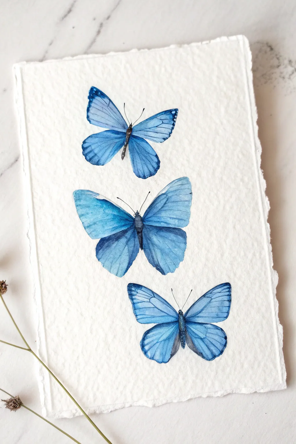
Capture the delicate beauty of three fluttering blue butterflies on gorgeous textured paper. This project focuses on monochromatic blue gradients and fine brush control to create a realistic yet dreamy watercolor trio perfect for framing.
How-To Guide
Materials
- Rough grain or 100% cotton watercolor paper (300gsm)
- Watercolor paints (Cerulean Blue, Ultramarine, Indigo/Prussian Blue, Paynes Grey)
- Round brushes (sizes 4 and 2)
- Detail/Liner brush (size 00 or 0)
- HB Pencil and kneaded eraser
- Ruler for tearing edges
- Mixing palette and two water jars
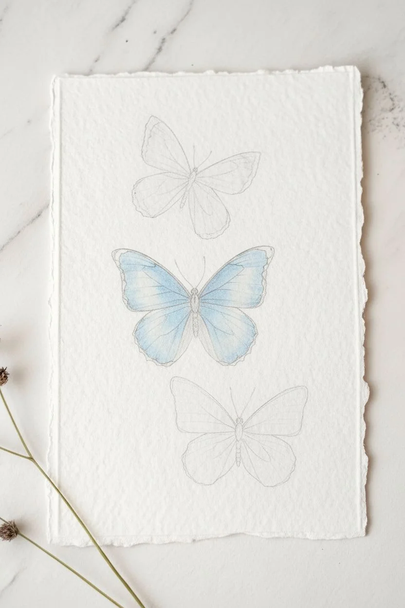
Step 1: Preparation & Sketching
-
Create the deckled edge:
To match the rustic look of the reference, place a ruler firmly against the edge of your dry paper and tear the strip towards you. Do this on all four sides to create a soft, fibrous ‘deckled’ border. -
Map out the composition:
Lightly sketch three butterflies vertically aligned. Draw the top one angled slightly right, the middle one largest and angled left, and the bottom one facing forward. Keep pencil lines very faint. -
Refine wing shapes:
Detail the wing scallops. The middle butterfly mimics a Morpho species, so give the top wings a broader, more rounded curve compared to the others.
Clear Lines
If your veins are bleeding into the blue wings, the base layer wasn’t fully dry. Use a hairdryer on a low, cool setting to ensure the paper is bone-dry before adding line work.
Step 2: Painting the Top Butterfly
-
Base wash:
Mix a watery wash of Cerulean Blue. Paint the upper wings, keeping the paint wet. While still damp, drop hints of Ultramarine near the outer edges to create a soft gradient. -
Lower wings:
Paint the lower wings with the same mix. I like to lift a tiny bit of pigment out of the center with a thirsty brush to create a highlight effect. -
Adding contrast:
Once the first layer is barely damp, outline the outer wing edges with a thin mix of Indigo. Allow this to bleed slightly inward for a soft transition. -
Body and antennae:
Using the size 00 brush and concentrated Paynes Grey (or thick Indigo), paint the slender thorax and abdomen. Add two very fine, curved lines for the antennae.
Add Some Sparkle
For a magical touch, mix a tiny drop of iridescent medium or silver watercolor into your blue paint. It gives the wings a natural shimmer just like real butterfly scales.
Step 3: The Middle Butterfly
-
Intense blue layer:
This butterfly is the focal point. Use a stronger mix of Ultramarine and Cerulean. Paint the upper wings, leaving a few tiny slivers of white paper near the top edge to represent light reflection. -
Create depth:
While the blue is wet, drop concentrated Indigo into the ‘shoulder’ area where the wings meet the body. This creates a deep, velvety shadow. -
Lower wing gradients:
Paint the lower wings, making them slightly lighter than the top ones. Let the color fade as it reaches the bottom scalloped edges. -
Dark borders:
Once the blue wash acts tacky (almost dry), meticulously paint the dark rims of the wings with Indigo to crisp up the silhouette.
Step 4: The Bottom Butterfly
-
Translucent wash:
Aim for a lighter, more ethereal look here. Dilute your Cerulean Blue significantly with water and apply a pale wash over all four wing sections. -
Shadowing:
Add a touch of Ultramarine only to the tips of the wings and right against the body line, keeping the center of the wings pale and bright. -
Final body details:
Paint the body with dashed strokes of Paynes Grey to give it a fuzzy texture, rather than a solid line.
Step 5: Fine Details & Veining
-
Veining preparation:
Ensure all butterfly wings are completely dry. If the paper is cold to the touch, it is still wet—wait until it is room temperature. -
Painting veins:
Mix a watery consistency of Indigo. Using your finest liner brush, paint delicate veins radiating from the body outward. Use very light pressure to keep lines thin. -
Final assessment:
Step back and check the balance. If any edges look too sharp, soften them with a slightly damp clean brush.
Let your beautiful fluttering trio dry completely before displaying them on a wall or greeting card.


Cute Frog in a Pond
Capture the charm of pond life with this adorable watercolor illustration featuring a friendly frog resting on a lily pad. Using soft washes and layer building, you’ll create a serene scene perfect for greeting cards or a sketchbook journal.
Step-by-Step
Materials
- Cold press watercolor paper (300gsm)
- Watercolor pan set (Greens, Yellow, Pink, Black, Blue)
- Round watercolor brushes (Size 6 for washes, Size 2 for details)
- HB pencil
- Kneaded eraser
- Jar of water and paper towels
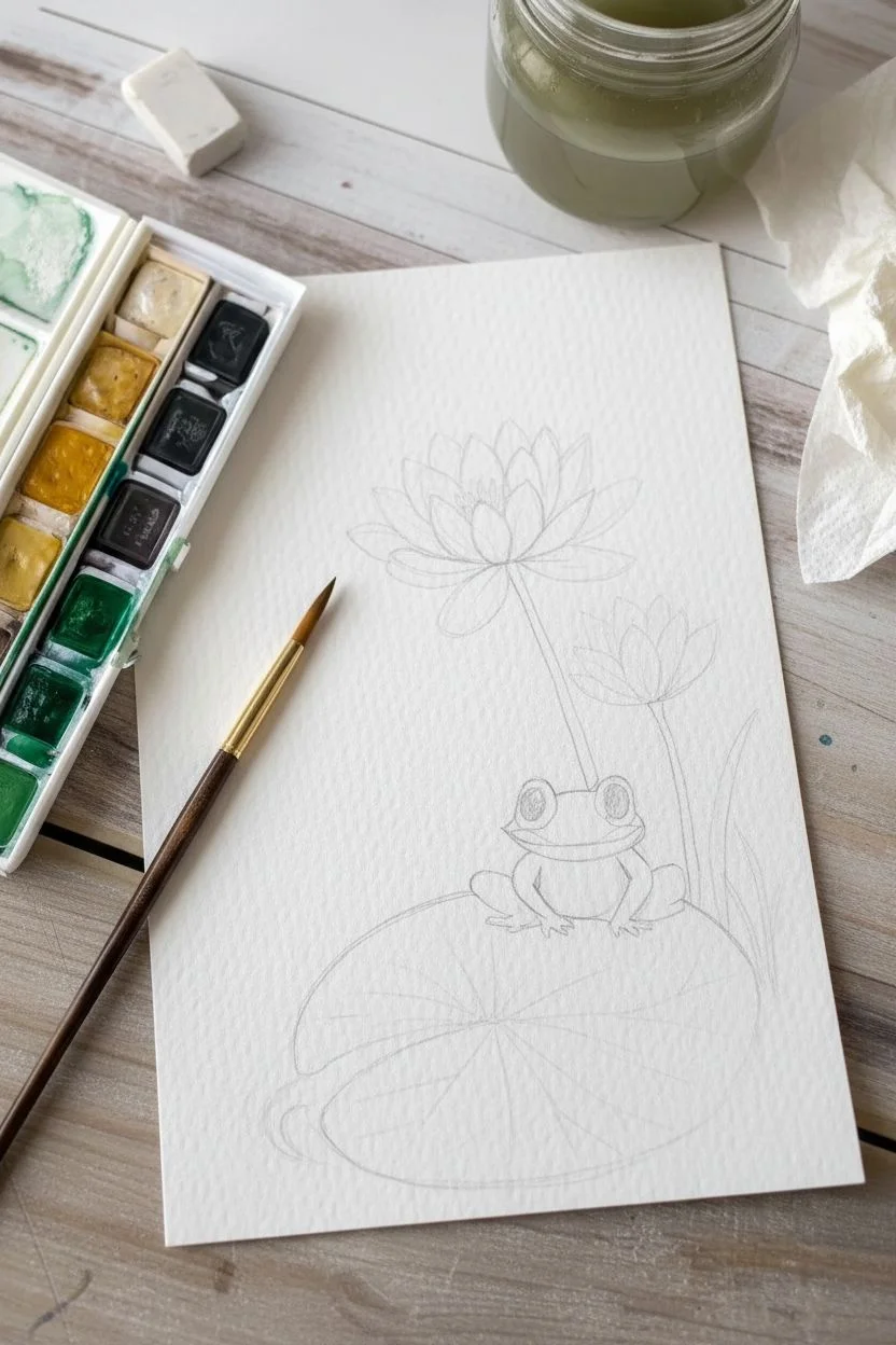
Step 1: Sketching the Scene
-
Outline the lily pad:
Start near the bottom third of your paper. Lightly sketch a large, slightly flattened oval for the lily pad, adding a small ‘V’ notch on the left side to give it that classic shape. -
Place the frog:
Sketch the frog sitting centrally on the pad. Use rounded shapes: a wide oval for the head and a chubby, round body beneath it. Add two bumps on top for the eye sockets. -
Draft the flowers:
Draw a long, slender stem rising from behind the frog. Top it with a fully open water lily shape. To the right, sketch a second shorter stem with a closed flower bud.
Step 2: Base Washes
-
Paint the lily pad:
Mix a muted sap green with plenty of water. Fill in the lily pad shape, keeping the wash fairly even but slightly translucent so the paper texture shows through. -
Color the frog’s body:
Using a slightly brighter, yellower green (like olive mixed with yellow ochre), paint the frog’s head, back, and legs. Leave the belly area unpainted or extremely pale for now. -
Paint the stems:
Switch to your smaller brush. Use a mix of sap green and a touch of brown to carefully paint the two flower stems and the grassy blades on the right. -
Initial flower tints:
The flowers are mostly white, so we paint the shadows. Dilute a tiny amount of green or grey to a watery consistancy and paint the bottom curves of the petals where they meet the stem. -
Let it dry COMPLETELY:
This is crucial! Wait until the paper is cool and dry to the touch before adding layers, otherwise your details will bleed into the base.
Muddy Colors?
Make sure each layer is 100% dry before painting over it. If the dampness remains, the new paint will lift the old layer, creating a muddy look.
Step 3: Layering & Details
-
Add frog shadows:
Mix a slightly darker version of your frog-green. Gently paint shadows under the chin and where the legs tuck against the body to create dimension. -
Paint the face:
Mix a soft pink and carefully paint a thin, curved line for the mouth across the face. Add a subtle wash of pink on the cheeks. -
The eyes:
Using concentrated black paint and your smallest brush, fill in the large pupil circles. I like to carefully leave a tiny white circle of dry paper in each eye for the highlight. -
Yellow flower center:
Dab a concentrated warm yellow into the center of the open water lily to represent the stamens.
Level Up: Dew Drops
Add tiny translucent circles on the lily pad. Darken the top curve and lift color from the center to make them look like water droplets.
Step 4: Texturing the Pond
-
Lily pad veins:
Using a size 2 brush and a dark forest green, paint thin lines radiating from the center of the lily pad to the edges to create the veins. -
Petal definition:
strengthens the separation between flower petals by adding very thin, pale green lines to define the edges of the white petals. -
Water ripples:
Mix a very watery, pale blue-green. Paint a few loose, curved strokes around the bottom of the lily pad to suggest water ripples. -
Final highlights:
If your eye highlights got covered, use a white gel pen or opaque white paint to add that spark of life to the frog’s eyes.
Sign your work near the water ripples and enjoy your charming little pond scene.
Mountain with Cherry Blossoms
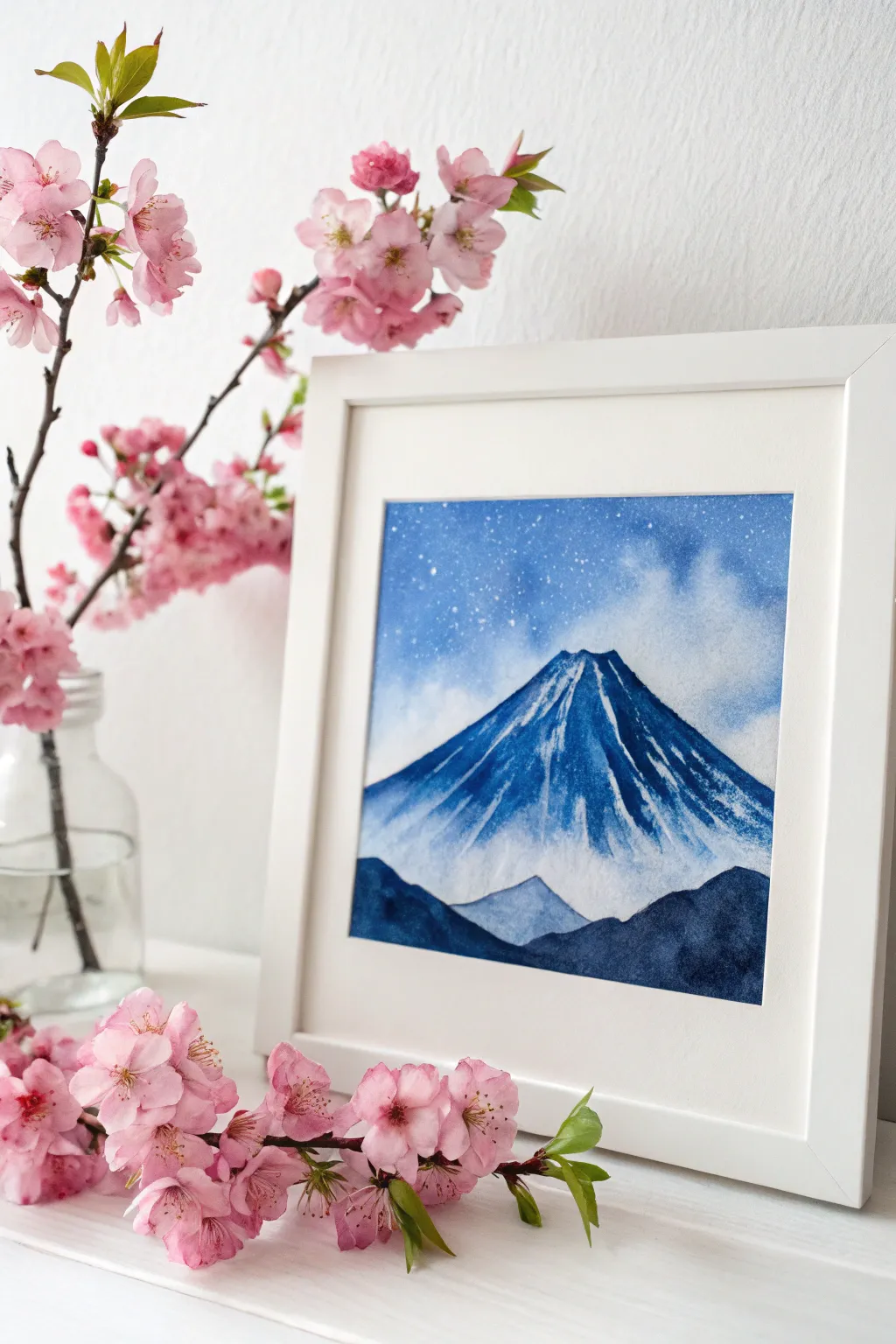
Capture the serene majesty of Mount Fuji under a celestial sky with this monochromatic watercolor project. Using various shades of blue and negative space, you will create a peaceful landscape that looks stunning in a square frame.
How-To Guide
Materials
- Cold press watercolor paper (300 gsm)
- Watercolor paints (Indigo, Prussian Blue, Ultramarine)
- White gouache or white ink
- Round brushes (size 8 and size 2)
- Masking tape
- Pencil and eraser
- Two jars of water
- Old toothbrush (optional for stars)
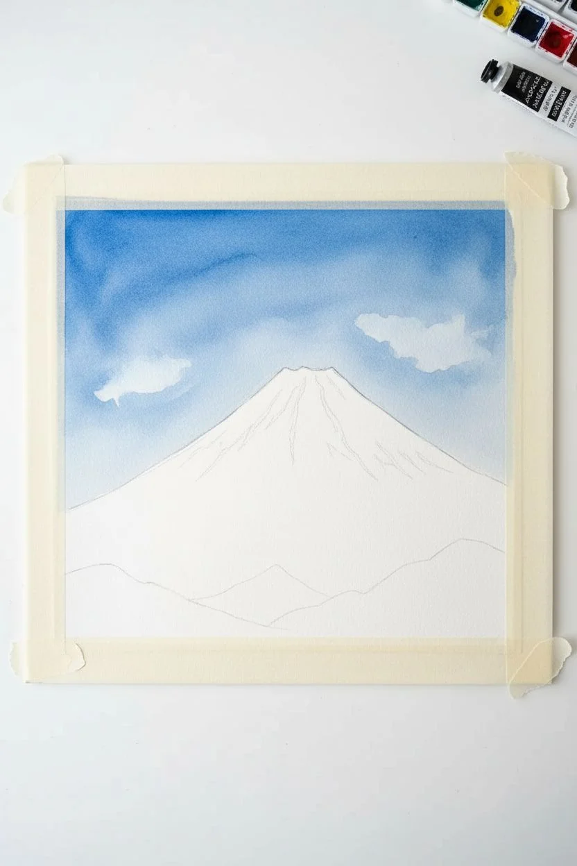
Step 1: Preparation and Sky
-
Secure the paper:
Tape your watercolor paper down to a hard board on all four sides. This creates a crisp border and prevents buckling when wet. -
Sketch the outlines:
Lightly sketch a large triangle for Mount Fuji, focusing on the sloping sides. Add a jagged line near the top to mark where the snow cap ends and rock begins, and sketch rolling hills at the bottom. -
Wet the sky:
Using your large clean brush, apply clear water to the sky area only, stopping carefully at the mountain’s outline. -
Paint the atmosphere:
While the paper is wet, drop in Ultramarine and Prussian Blue. Concentrate the pigment at the top corners and let it fade as it moves down. -
Create soft clouds:
Crumple a clean tissue and gently blot the wet sky in a few spots to lift the paint, creating soft, white cloud shapes. -
Let it dry:
Allow the sky layer to dry completely before touching the mountain to ensure sharp edges.
Bloom Control
If you see ‘cauliflower’ back-runs in your sky, it means you added water to drying paint. Don’t fight it! These can look like natural cloud formations in a landscape.
Step 2: Painting the Mountain
-
Define the peak:
Leave the very top triangle of the mountain unpainted (white paper) to represent the snow cap. -
Textured slopes:
Mix a mid-tone blue. Using a slightly dry brush, paint downward strokes starting from the jagged snowline you sketched earlier. This creates the texture of rock breaking through snow. -
Deepen the shadows:
While the blue is still damp, drop darker Indigo paint onto the right side of the mountain slope to suggest a shadow side. -
Paint the streaks:
Use the tip of your size 2 brush to drag thin blue lines upwards into the white snow cap, mimicking the vertical ravines of the volcano. -
Add the foothills:
Paint a smaller, lighter blue triangular peak in the lower center, slightly overlapping the base of the main mountain.
Step 3: Foreground and Details
-
Frame the bottom:
Load your brush with thick, concentrated Indigo paint. Fill in the foreground hills with this dark color to create strong contrast and depth. -
Create separation:
I prefer to leave a tiny hairline gap of dry paper between the dark foreground hills and the lighter mountain base to keep the shapes distinct. -
Dry completely:
Wait until the entire painting is bone-dry. If you touch it and it feels cool, it’s still wet. -
Add the stars:
Dilute a small amount of white gouache with water. Cover the mountain area with a scrap paper, then tap a loaded brush (or toothbrush) over the sky to splatter tiny stars. -
Define bright stars:
Use the fine tip of your small brush to manually dot a few larger, brighter stars in the upper corners. -
Reveal the border:
Slowly peel away the masking tape at a 45-degree angle to reveal your clean white edges.
Level Up
Mix a tiny bit of salt into the wet sky wash before it dries. The salt pushes the pigment away, creating beautiful crystalline textures that look like distant galaxies or frost.
Place your finished dry piece in a simple white frame to highlight those deep blues
Retro Wavy Patterns
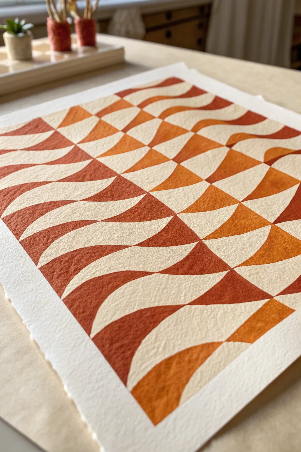
This project captures the warmth of 70s design with a modern, minimalist twist using an undulating checkerboard pattern. By combining rich earth tones with geometric precision, you’ll create a piece of optical art that feels both structured and organic.
Step-by-Step
Materials
- Cold-press watercolor paper (300gsm)
- Gouache paints (Burnt Sienna, Crimson, Yellow Ochre, White)
- Painter’s tape or masking tape
- Ruler
- HB Pencil
- Kneaded eraser
- Round synthetic brushes (Size 2 and 4)
- Mixing palette
- Cup of water and paper towels
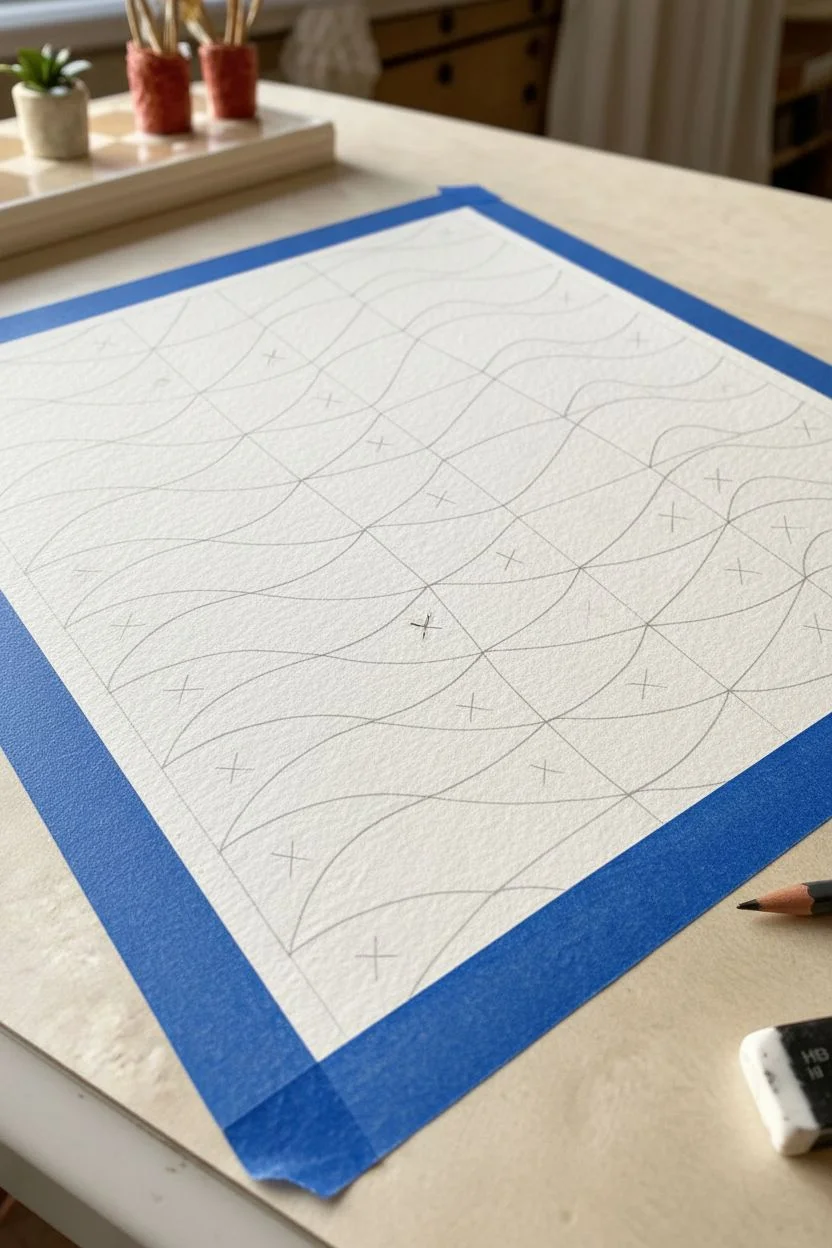
Step 1: Drafting the Distortion
-
Secure the foundation:
Tape your watercolor paper down to a hard board or your work surface on all four sides. This creates a crisp white border and prevents the paper from buckling when wet. -
Mark the grid spacing:
Using your ruler, lightly mark small tick marks every 1.5 inches (approx 4cm) along the top and bottom edges of your paper area. -
Repeat horizontal spacing:
Repeat this measuring process on the left and right sides, ensuring the tick marks align horizontally across from each other. -
Sketch vertical waves:
Connect the top ticks to the bottom ticks not with straight lines, but with gentle S-curves. Try to keep the curvature consistent for each line so they look like parallel flowing ribbons. -
Add horizontal flow:
Connect the left side marks to the right side marks. Instead of drawing these straight, curve them slightly upwards in the middle to enhance the warping effect seen in the reference image. -
Map the negative space:
To avoid confusion while painting, place a very small, light ‘X’ inside every other shape, creating a checkerboard pattern. These marked spots will remain the unpainted white of the paper.
Wobbly Lines?
If you struggle with shaky hands on curves, don’t hold your breath! Exhaling slowly while drawing the line actually stabilizes your hand muscles for smoother strokes.
Step 2: Mixing & Painting
-
Create a tonal palette:
On your palette, mix three distinct shades of terracotta. I like to start with a base of Burnt Sienna, adding small amounts of Yellow Ochre for a lighter tone and a touch of Crimson for a deeper rust hue. -
Adjust paint consistency:
Add water to your gouache until it reaches a heavy cream consistency. It should flow entirely opaque but not be watery. -
Start with the lightest tone:
Select about one-third of the empty (unmarked) shapes scattered randomly across the grid. Use the size 4 brush to fill their centers. -
Refine the edges:
Switch to your finer size 2 brush to push the paint carefully to the pencil lines. The cleaner these edges are, the stronger the optical illusion will be. -
Apply the mid-tones:
Clean your brush and pick up your middle rust color. Paint another third of the unmarked shapes, ensuring you don’t paint two identical colors right next to each other diagonally if possible. -
Fill the darkest accents:
Use your deepest red-brown mixture for the remaining empty shapes. This variation in color value creates the shimmering, dimensional look intended for this piece. -
Check for opacity:
If your gouache looks streaky as it dries, I prefer to let it dry completely and then apply a second thin layer for that velvety matte finish. -
Erase guidelines:
Once the paint is 100% dry (give it at least an hour), gently roll a kneaded eraser over the white ‘X’ marked spaces to remove your planning pencil lines. -
The peel reveal:
Slowly peel away the masking tape at a 45-degree angle, pulling away from the painting area to ensure you don’t rip the paper surface.
Pro Tip: Hand Position
Work from the top-left corner down to the bottom-right (if right-handed) to avoid smudging wet paint. Alternatively, rotate your board frequently so you are always pulling the brush toward you.
Frame your warm, wavy masterpiece and enjoy the retro vibes it brings to your space
Surreal Galaxy Whale
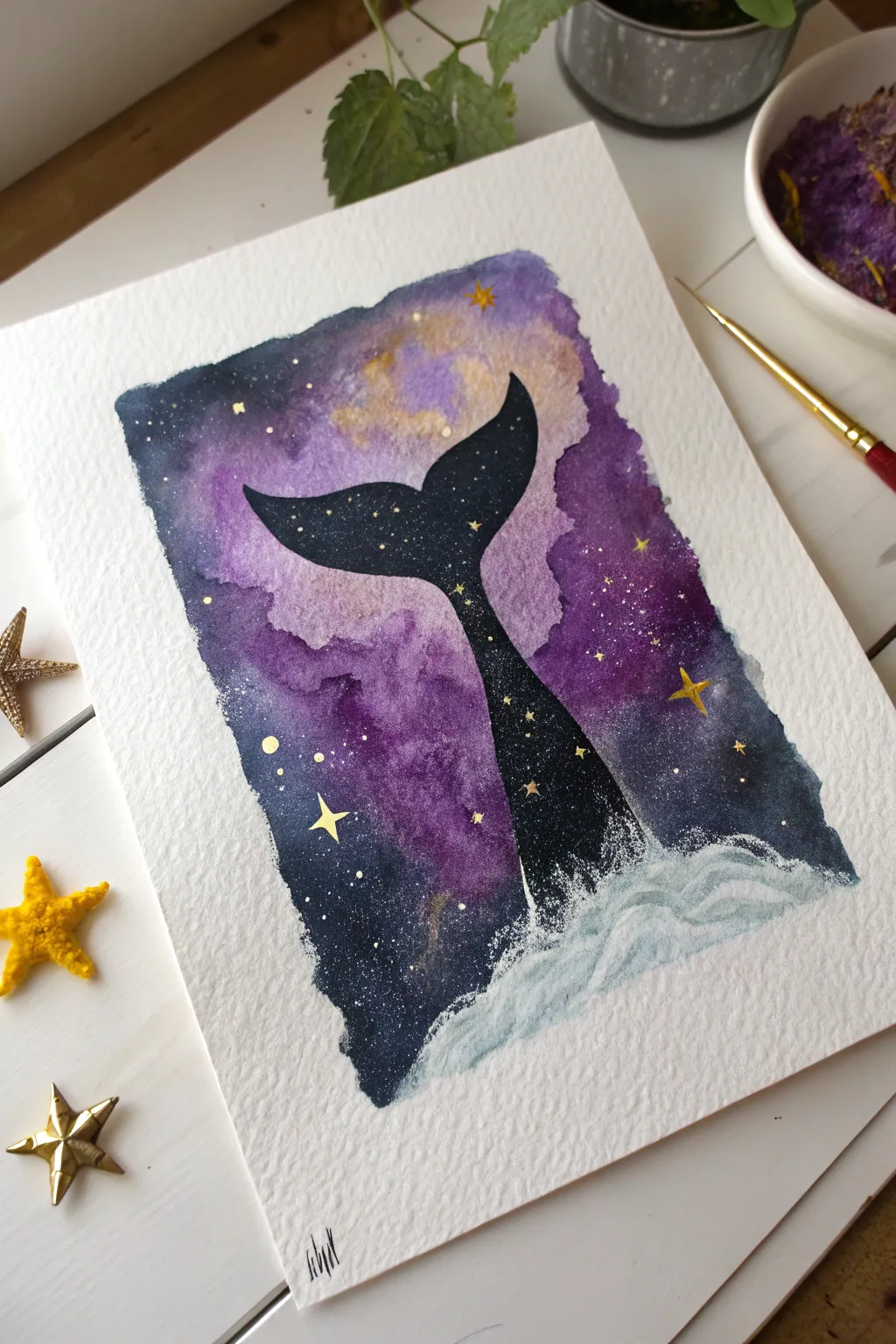
Merge the depths of the ocean with the vastness of space in this dreamy watercolor project. By silhouetting a whale tail against a vibrant nebula background, you’ll create a magical piece of art that sparkles with metallic gold details.
How-To Guide
Materials
- Cold press watercolor paper (300 gsm)
- Watercolor paints (Violet, Indigo, Black, Yellow Ochre)
- Metallic gold watercolor or ink
- White gouache or opaque white gel pen
- Pencil and eraser
- Masking tape
- Round brushes (sizes 2 and 6)
- Jar of water
- Paper towels
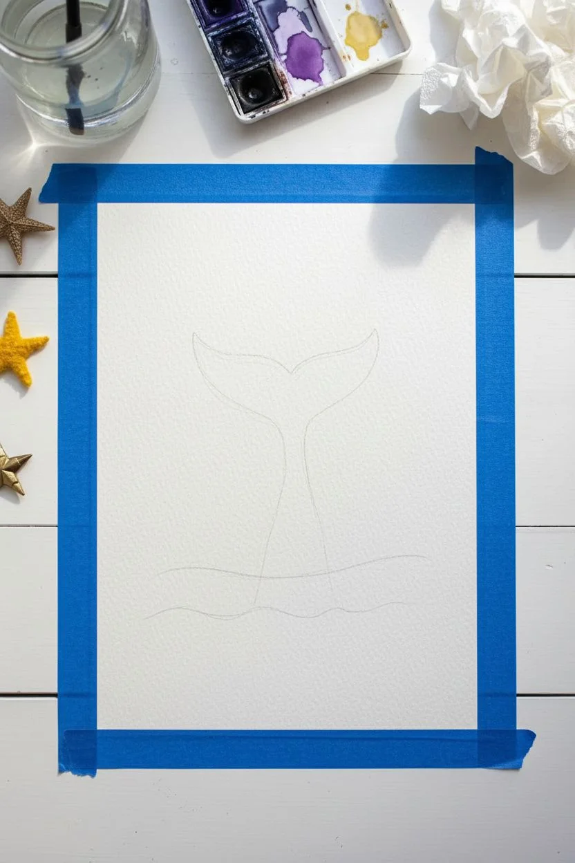
Step 1: Preparation and Sketching
-
Secure the Paper:
Begin by taping down all four edges of your watercolor paper to a board or table. This creates the crisp white border seen in the final piece and keeps the paper flat. -
Outline the Subject:
Using a pencil, very lightly sketch the shape of the whale tail in the center of the page. Keep the lines faint so they don’t show through the lighter parts of the nebula. -
Planning the Horizon:
Lightly mark a curved line near the bottom where the water splash will eventually go. This helps you know where to stop the galaxy background.
Pro Tip: Splatter Control
If you want to add splatters for stars but keep the tail clean, cut a piece of scrap paper in the shape of the tail and lay it over the silhouette as a mask before flicking your brush.
Step 2: The Galaxy Background
-
Wet-on-Wet Technique:
Brush clean water over the entire sky area, working around the tail shape if you want to keep your pencil lines visible, though painting over it is fine too since the tail will be dark. -
Adding the Nebula Glow:
While the paper is wet, drop in patches of diluted yellow ochre or gold paint towards the top center to create the glowing light of the nebula. -
Deepening the Cosmos:
Load your brush with vibrant violet and drop it around the yellow areas, letting the colors bleed naturally into one another without over-mixing. -
Darkening the Edges:
Introduce deep indigo or paine’s gray to the outer corners and edges of the sky. This creates a vignette effect that draws the eye toward the center. -
Creating Clouds:
Use a crumpled tissue or a damp brush to gently lift a little pigment here and there while wet, creating soft, cloud-like textures in the purple areas. -
Drying Time:
Allow this background layer to dry completely. The paper must be bone dry before you move on to the sharp details of the silhouette.
Step 3: The Silhouette
-
Mixing the Darkest Tone:
Mix a very saturated dark color using black mixed with a touch of indigo or violet. This ensures the silhouette feels cohesive with the background rather than flat black. -
Painting the Tail:
Carefully paint inside your pencil sketch of the whale tail. Use a smaller round brush for the sharp tips of the flukes to get a precise point. -
Refining Edges:
Smooth out the curves of the tail. I find it helpful to rotate the paper at this stage to get the best angle for your hand. -
Solid Coverage:
If the first layer looks streaky, let it dry and apply a second coat of your dark mixture to ensure the tail is perfectly opaque.
Level Up: Salt Texture
While the purple and indigo background is still wet, sprinkle a pinch of table salt onto the paint. Let it dry completely, then brush it off to reveal unique, star-burst textures.
Step 4: Celestial Details
-
The Stars:
Using your metallic gold paint or ink, paint small four-pointed stars scattered across the darker parts of the sky background. -
Constellations:
Switch to your smallest brush and paint tiny gold dots and crosses inside the black silhouette of the whale tail, making it look like a portal to space. -
Micro-Stars:
Add smaller clusters of gold dots around the main stars in the purple nebula for a dusting of cosmic glitter.
Step 5: The Splash
-
Base Waves:
Load a brush with white gouache. Paint the rolling shape of the water at the base of the tail, dragging the paint slightly dry to utilize the paper’s texture. -
Sea Foam:
Stipple (dab repeatedly) white gouache where the tail enters the water to create the look of frothy sea foam and splashing droplets. -
Blending the Horizon:
Soften the bottom edge of the white splash with a damp brush so it fades gently into the white of the paper at the very bottom. -
The Reveal:
Once all paint is 100% dry, slowly peel away the masking tape at a 45-degree angle to reveal your crisp, clean borders.
Sign your name in the corner and admire your beautiful cosmic seascape.
Cozy Nighttime Campsite
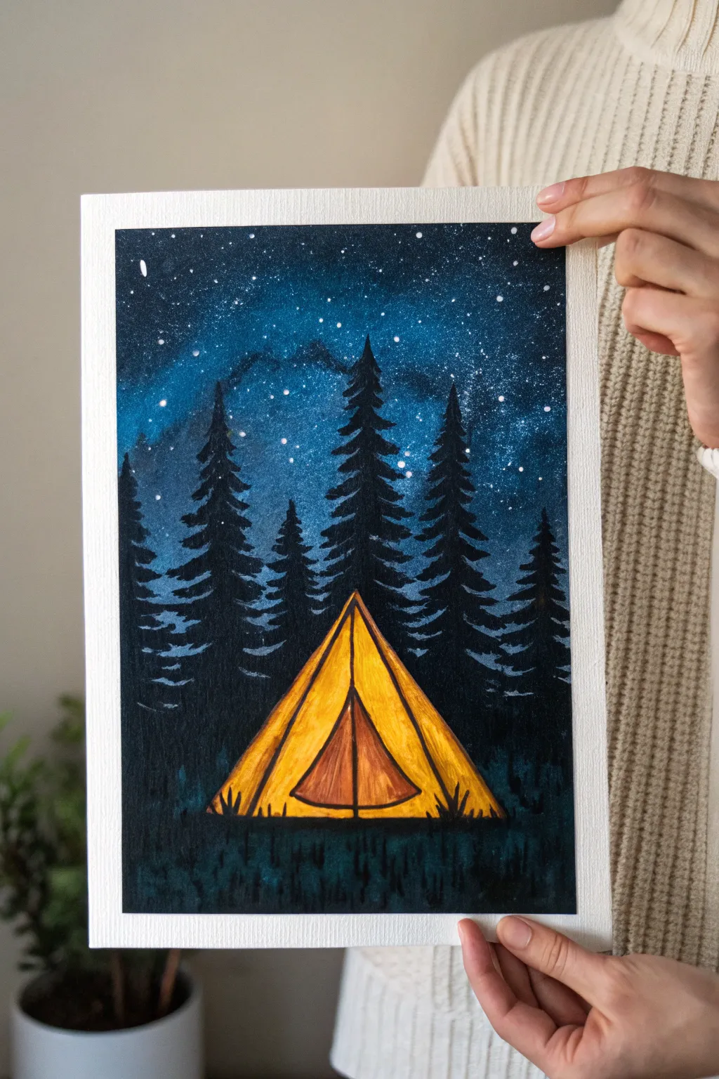
Capture the magic of a quiet night in the wilderness with this high-contrast painting. You will create a vibrant, glowing tent nestled among silhouetted pines against a deep, galaxy-inspired sky.
Step-by-Step Tutorial
Materials
- Cold press watercolor paper (300 gsm)
- Watercolors (Phthalo Blue, Indigo, Prussian Blue)
- Gouache paint (Opaque Black, Lemon Yellow, Orange, White)
- Masking tape
- Round brushes (size 6 and size 2)
- Old toothbrush (for splattering)
- White gel pen (optional)
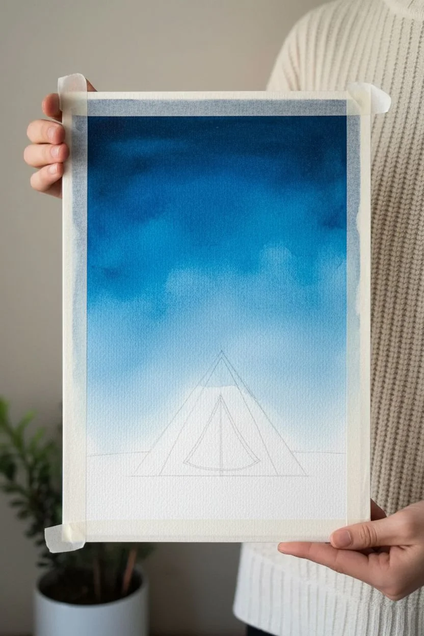
Step 1: Setting the Scene
-
Tape the borders:
Secure your paper to a hard board using masking tape on all four sides to create the crisp white frame seen in the artwork. -
Sketch the layout:
Lightly sketch the triangular shape of the tent in the lower center and a rough horizon line through the background. -
Wet the sky:
Use a clean, wet brush to moisten the entire sky area above the horizon line until the paper has a slight sheen. -
Apply base blues:
Drop in bright Phthalo Blue and Prussian Blue, letting them bleed together on the wet paper. -
Deepen the night:
While still wet, add Indigo and a touch of Black to the top corners and edges to create a vignette effect. -
Dry the sky:
Allow the sky layer to dry completely before proceeding to prevent the stars from blurring.
Gouache Opacity Tip
If you don’t have gouache, mix white acrylic paint into your watercolors. This transforms transparent watercolor into an opaque paint capable of covering the dark background for the tent.
Step 2: Stars and Silhouettes
-
Splatter stars:
Dilute a small mount of white gouache with water. Load on an old toothbrush and flick the bristles to spray fine stars over the blue sky. -
Add bright stars:
Use a size 2 brush or white gel pen to dot a few larger, brighter stars in the empty dark spaces. -
Paint tree trunks:
Switch to opaque Black gouache. Paint vertical lines of varying heights for the pine tree trunks. -
Add pine foliage:
Starting from the top of each trunk, use a dabbing motion to paint downward-slanting branches, getting wider as you move down. -
Layer the forest:
I like to vary the height of the trees, making the ones behind the tent slightly taller to frame the focal point. -
Fill the gaps:
Make sure the trees are dense enough that no blue sky shows through the main body of the forest.
Level Up: Fireflies
Mix a tiny drop of yellow paint into your white splatter mixture. Gently flick this only near the grass area to create the illusion of fireflies buzzing around the campsite.
Step 3: The Glowing Tent
-
Base layer:
Paint the main triangular shape of the tent with bright Lemon Yellow gouache. The opacity will help it stand out against the dark surroundings. -
Add warmth:
Mix a little Orange with the Yellow. Paint this onto the right-hand panel of the tent to create a shadowed, warm glow effect. -
Define the door:
Paint the smaller inner triangle (the door flap) with a darker Orange or Burnt Sienna shade. -
Detail the structure:
Using a thin detail brush and diluted black paint, draw fine lines for the tent pole and the seams separating the panels. -
Paint the ground:
Fill the bottom area with a mix of Black and dark Green gouache to represent the grassy forest floor. -
Add grass texture:
Use quick, upward flicking strokes along the bottom of the tent so the tent looks nestled in the grass rather than floating. -
Blend the transition:
Add extra grass blades in plain black around the sides to merge the foreground with the tree line. -
Reveal the border:
Once the painting is 100% dry, peel off the masking tape slowly at a 45-degree angle.
Step back and admire the cozy atmosphere you have created with just paint and paper
Abstract Portrait with Florals
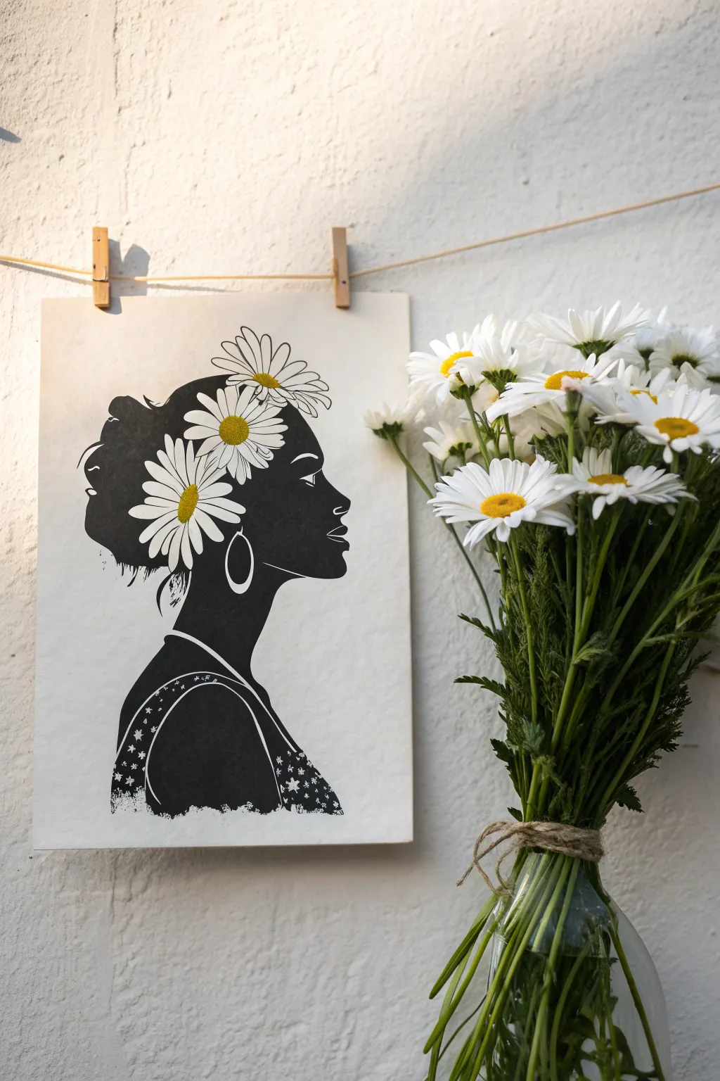
This striking high-contrast artwork blends the boldness of a black silhouette with the delicate charm of white daisies. It captures a peaceful, poetic mood that looks sophisticated but is surprisingly achievable with steady outlining.
Detailed Instructions
Materials
- Heavyweight mixed-media or watercolor paper (cream or white)
- Black acrylic paint or India ink
- Opaque white Gouache or white acrylic paint marker
- Yellow ochre acrylic paint
- Fine liner brush and medium flat brush
- HB Pencil and eraser
- Fine-tip black drawing pen
Step 1: Sketching the Composition
-
Map the profile:
Begin by lightly sketching the side profile of the face with your pencil. Focus on the forehead, nose, lips, and chin line, keeping the features elegant and streamlined. -
Outline the hair:
Draw the shape of the hair bun high on the back of the head. I like to keep the pencil lines very faint here so they don’t show through later. -
Position the flowers:
Sketch rough circles where the daisies will sit. Place some overlapping the hair and others floating towards the back, bridging the gap between the hair and the background. -
Detail the dress:
Sketch the curve of the shoulder and the dress strap, leaving a thin gap for the negative space that will define the arm. -
Refine floral shapes:
Inside your rough flower circles, draw individual petal shapes. For the flowers sitting on the hair, these will need to remain white, so mark them clearly.
Clean Edges
If your black paint bled into the flower petals, don’t panic. Wait for it to dry completely, then use a white acrylic paint marker to colour over the mistake and reshape the petal.
Step 2: Creating the Silhouette
-
Outline delicate areas:
Using a fine liner brush and black acrylic, carefully paint the outline of the face profile. Good breath control helps get a smooth line here. -
Paint around the flowers:
For the daisies that sit on top of the head using the black paint to carefully trace *around* the petals. You want to reserve the white paper for the flowers rather than painting white over black later. -
Fill the hair:
Switch to a slightly larger brush and fill in the rest of the hair mass with solid black. -
Define the neck and shoulder:
Paint the solid black area of the neck, stopping at the dress line you sketched earlier. -
Shoulder details:
Fill in the shoulder area, being careful to leave a thin unpainted white line for the dress strap and the top hem of the garment. -
Layer up opacity:
Let the first layer of black dry. If it looks streaky, apply a second coat to achieve that deep, velvety matte finish.
Step 3: Floral & Fine Details
-
Brighten the petals:
Even though you left the paper bare, use opaque white gouache or a paint pen to fill in the daisy petals. This ensures they are stark white and covers any heavy pencil marks. -
Paint the centers:
Dab a small circle of yellow ochre in the center of each daisy. -
Add floral definition:
Use a very fine black pen to draw thin outlines around the petals that are against the white background, and add tiny texture lines radiating from the yellow centers. -
Create the earring:
Using a white gel pen or thin white paint, draw the hoop earring loop directly over the black neck area. -
Pattern the dress:
Paint small white stars and dots onto the black area of the dress. I find a paint marker gives the most control for these tiny geometric shapes. -
Add wispy hair details:
With an ultra-fine brush or pen, flick a few loose strands of hair at the nape of the neck and forehead to soften the silhouette. -
Final clean up:
Once the artwork is 100% dry, gently erase any visible pencil sketch lines from the white background.
Gilded Touch
Instead of yellow paint for the flower centers, use metallic gold leaf or metallic gold paint. It adds a subtle shimmer that makes the art look expensive and dimensional.
Hang your beautiful monochrome portrait with simple wooden clips to complete the aesthetic.
Polaroid Snapshot Style
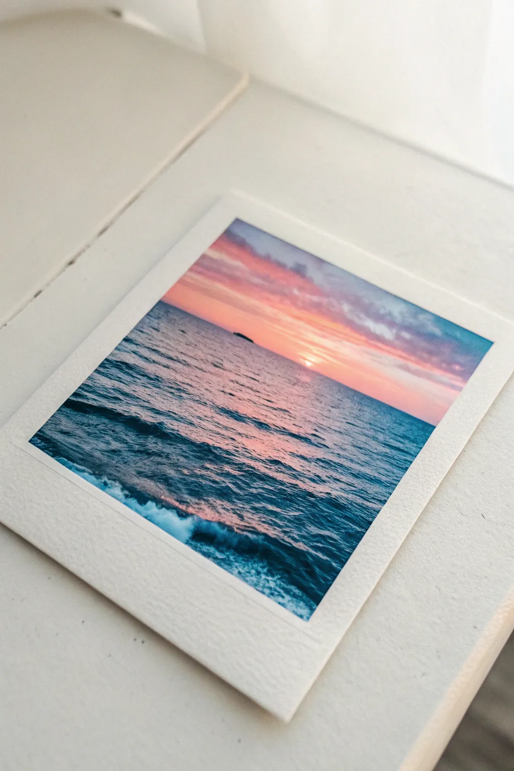
Capture the golden hour forever by recreating this nostalgic instant-photo look with watercolors. This project combines the charm of a vintage Polaroid frame with a dreamy, vibrant seascape that fits perfectly in any aesthetic journal or gallery wall.
Step-by-Step Guide
Materials
- Cold press watercolor paper (300 gsm)
- Painter’s tape or washi tape
- Watercolor paints (Indigo, Alizarin Crimson, Cadmium Yellow, Ultramarine)
- White gouache or white gel pen
- Flat brush (size 6 or 8)
- Small round brush (size 2)
- Jar of water and paper towels
- Ruler
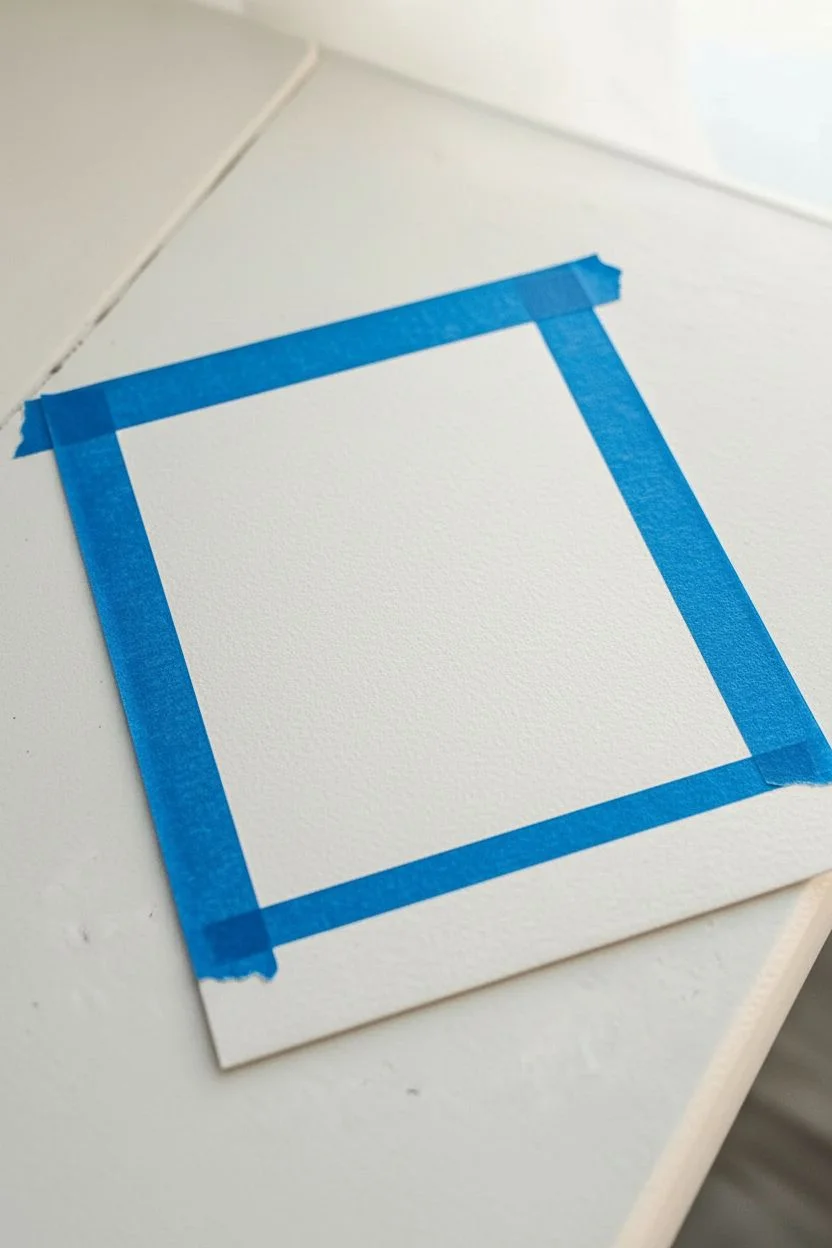
Step 1: Framing the Shot
-
Cut to size:
Cut your watercolor paper into a small rectangle, approximately 3.5 x 4.2 inches, to mimic standard instant film dimensions. -
Mask the borders:
Apply tape over the edges of the paper to create the frame. Tape about 1/4 inch on the top and sides. -
Create the signature bottom:
For the classic Polaroid look, tape off a larger section at the bottom, roughly 1 inch tall. -
Seal the edges:
Run your fingernail or a bone folder firmly along the inner edges of the tape to prevent paint from sneaking underneath.
Step 2: Painting the Sky
-
Wet the paper:
Using your clean flat brush, apply a light coat of water to the entire exposed rectangular area until it glistens. -
Apply top clouds:
Load your brush with a watered-down purple or mix Ultramarine with a touch of Crimson. Dab this loosely across the top third of the sky. -
Add the sunset glow:
Rinse your brush and pick up Alizarin Crimson. Paint a horizontal band just below the purple clouds, letting them touch and bleed slightly. -
Brighten the horizon:
While the paper is still damp, paint a strip of Cadmium Yellow or light orange right above where the horizon line will be. -
Blend the transitions:
Use a clean, slightly damp brush to gently soften the lines between the purple, pink, and yellow so the gradient looks natural. -
Dry completely:
Let this layer dry fully before moving to the ocean to keep a crisp horizon line.
Bleeding Edges?
If paint leaked under the tape, wait for it to dry completely. Then, use opaque white gouache or acrylic paint to carefully cover the smudge and restore the straight edge.
Step 3: The Deep Blue Sea
-
Define the horizon:
Load your flat brush with Indigo or a deep blue mix. carefully paint a straight line across the paper to separate sky from sea. -
Wash the ocean:
Fill in the rest of the water area with a gradient, making it darker navy at the bottom and slightly lighter near the horizon. -
Reflect the sky:
Where the water meets the horizon, drop in a tiny amount of the pink or orange mix to show the sun reflecting on the distant waves. -
Add wave texture:
Switch to your small round brush. Using concentrated Indigo, paint thin, horizontal squiggly lines to mimic ripples. -
Vary the waves:
I like to make the ripples very thin and close together near the horizon, and thicker with wider spacing as they get closer to the bottom.
Tape Trick
Before applying your masking tape to the paper, stick it to your clothing once or twice. This removes excess tackiness and prevents the tape from tearing your paper when you remove it.
Step 4: Details & Unveiling
-
Paint the island:
Using thick, dark paint (almost black), dab a tiny, low silhouette shape on the horizon line. -
Add sea foam:
Using white gouache, paint loose, crashing foam patterns in the bottom left corner where the wave creates a diagonal splash. -
Highlight the ripples:
Add tiny dashes of white gouache or a gel pen on the tops of the nearest waves to catch the light. -
Let it bone dry:
Wait until the paper is cool to the touch and completely dry to ensure clean edges. -
The peel:
Slowly peel the tape away at a 45-degree angle, pulling away from the painted area to reveal the crisp white border.
Now you have a stunning, sun-soaked memory captured in paint that looks just like the real deal.


Have a question or want to share your own experience? I'd love to hear from you in the comments below!