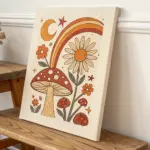
If you’re craving that aesthetic vintage vibe in your next painting, think nostalgia: softened edges, timeworn colors, and charming old-world details. Here are my favorite painting ideas that feel like little memories you can hang on the wall.
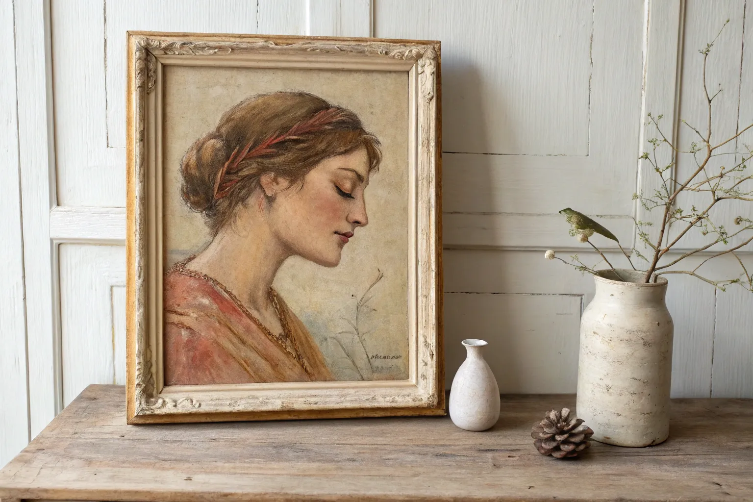
Sepia Portrait With an Ornate Frame
Capture the elegance of a bygone era with this soft, sepia-toned portrait that balances delicate lifework with warm, nostalgic coloring. This project teaches you to build up gentle layers of pastel to create a dreamy, historical aesthetic that perfectly complements an ornate frame.
Step-by-Step Guide
Materials
- Textured pastel paper (cream or light beige)
- Hard pastel sticks (NuPastel or similar)
- Pastel pencils (burnt sienna, raw umber, sanguine, cream, white)
- Kneaded eraser
- HB graphite pencil
- Tortillon or blending stump
- Fixative spray (workable and final)
- Ornate gold frame with matting
Step 1: Foundations & Sketching
-
Paper Selection:
Begin with a textured paper in a warm cream or beige tone. Avoid stark white paper, as the toned background naturally provides that aged, vintage look before you even make a mark. -
Initial Layout:
Using an HB graphite pencil, very lightly sketch the oval shape of the face and the tilt of the head. Keep your pressure minimal so the graphite doesn’t emboss the paper or show through the translucent pastel layers later. -
Mapping Features:
Mark the horizontal lines for the eyes, nose base, and mouth. The subject in our example is looking upward, so ensure the eyes are positioned slightly higher in the sockets and the chin is lifted. -
Refining the Drawing:
Flesh out the features more distinctly. Sketch the loose waves of the hair and the collar of the blouse. Don’t worry about shading yet; just focus on getting the proportions and the classic three-quarter profile correct. -
Lifting Graphite:
Take your kneaded eraser and roll it gently over the entire sketch. You want to lift up most of the graphite, leaving only a faint ‘ghost’ image to guide your pastel work without muddying the colors.
Muddy Complexion?
If skin tones look dirty, you’ve over-blended. Stop rubbing! Spray a workable fixative, let drawing dry, then layer fresh, clean strokes on top without blending.
Step 2: Layering Color
-
Base Skin Tones:
Using the side of a cream or very pale peach hard pastel stick, lightly scumble color over the face and neck. Use a light hand—you want to catch the tooth of the paper, not crush it. -
Initial Blending:
Gently smooth this base layer with your finger or a soft cloth to create a unified, soft complexion. This establishes the glowing undertone characteristic of vintage portraits. -
Adding Warmth:
Switch to a sanguine or terra-cotta pastel pencil. Lightly shade the cheek closest to the viewer, the shadow under the chin, and the bridge of the nose. This reddish-brown tone is crucial for the sepia aesthetic. -
Deepening Shadows:
Introduce raw umber into the deeper recesses: the corners of the eyes, the nostrils, and the line between the lips. Keep strokes feathery and directionally aligned with the facial contours. -
Defining the Eyes:
With a sharp brown pastel pencil, carefully draw the iris and pupil. Leave a tiny spot of the paper showing for the highlight to give the eyes life and direction.
Step 3: Hair and Details
-
Blocking the Hair:
I like to use a burnt sienna stick for the hair’s base. Apply broad strokes following the wave pattern—sweeping back from the forehead and down towards the nape of the neck. -
Hair Texture:
Layer a darker cocoa brown pencil over the base to define individual locks and creating depth behind the ear. Keep the edges soft where the hair meets the background to maintain that dreamlike quality. -
The Blouse:
Sketch the blouse collar using cream and light ochre. Keep this very loose and sketchy, fading out towards the bottom of the paper. This ‘vignette’ effect draws more focus to the face. -
Necklace Detail:
Add the delicate beaded necklace using small dots of sanguine or red oxide. Add a tiny speck of white to each bead to make them shimmer. -
Background Atmosphere:
Scumble a pale olive or sage green very lightly around the head and shoulders. Blend this out into the paper so there are no hard edges, suggesting an undefined outdoor setting.
Pro Tip: Lost Edges
Don’t outline the whole head. Let parts of the hair or shoulder fade completely into the paper tone. These ‘lost edges’ create atmosphere and movement.
Step 4: Final Touches & Framing
-
Highlighting:
Take a bright white pastel pencil and accent the tip of the nose, the brow bone, and the top of the cheekbone. This brings the three-dimensional form forward. -
Final Fixative:
Spray a light coat of fixative over the piece. Be aware that this might darken the tones slightly, so perform a test on scrap paper first. -
Selecting the Frame:
Choose an ornate, gold-leaf style frame. The complexity of the frame contrasts beautifully with the soft, simple lines of the pastel drawing. -
Matting:
Use a textured linen mat or a double mat with a gold fillet to separate the glass from the artwork. Pastels must never touch the glass directly. -
Assembly:
Secure the artwork into the frame, ensuring the backing is sealed to prevent dust from entering your archival piece.
Now you have a stunning, nostalgic portrait ready to transport any room back in time
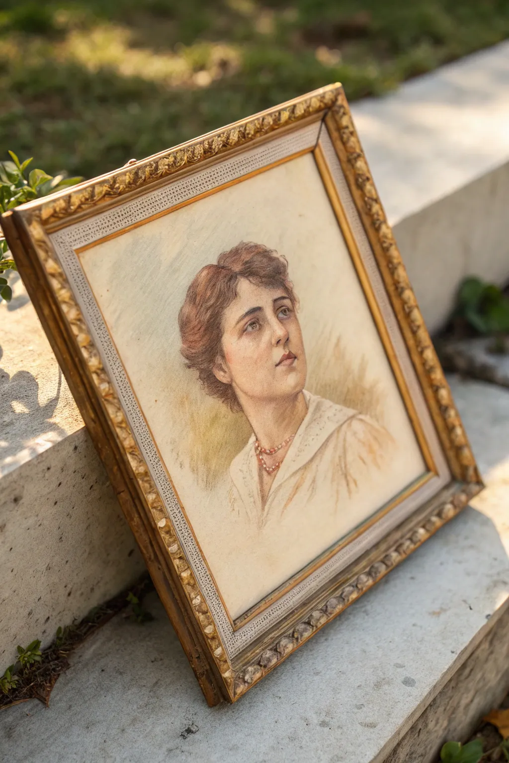
Victorian-Inspired Profile With a Hair Ribbon
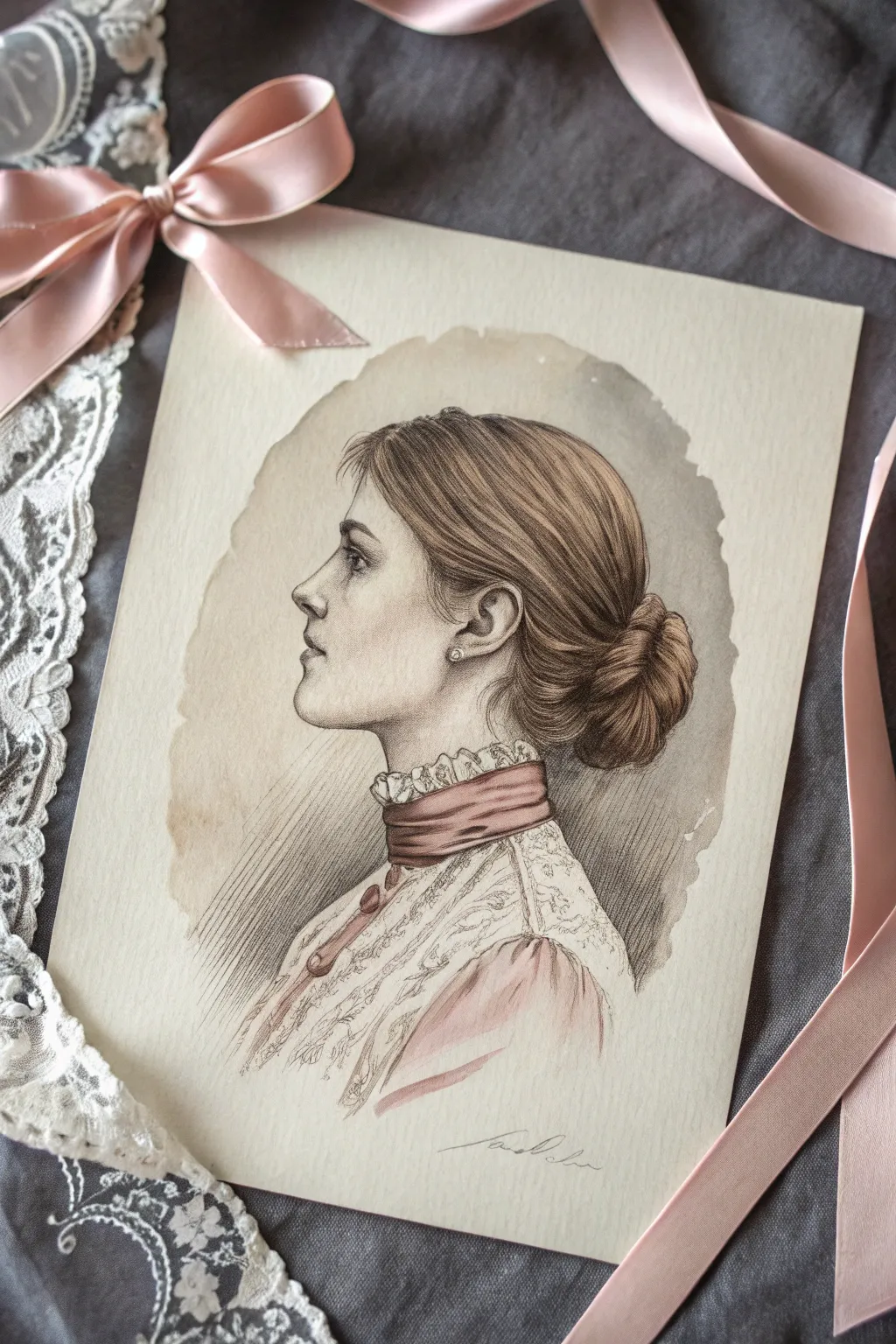
Capture the delicate elegance of the 19th century with this mixed-media profile portrait, which blends precise pencil work with soft watercolor washes. This project creates a stunning faux-vintage effect through a limited color palette and intricate linework.
How-To Guide
Materials
- Heavyweight hot-press watercolor paper (smooth texture is key)
- Graphite pencils (HB, 2B, 4B)
- Fine-point mechanical pencil (0.3mm or 0.5mm)
- Watercolor paints (Sepia, Burnt Umber, Alizarin Crimson, Titanium White, pale skin tones)
- Small round brushes (Size 0 and Size 2)
- Kneaded eraser
- Tea bag or coffee (optional, for staining)
Step 1: Sketching the Foundations
-
Create the framework:
Begin with a very faint loose oval on your paper to establish the head shape. Lightly mark the vertical alignment for the forehead, nose, lips, and chin line to ensure correct proportions before committing to details. -
Refine the profile shape:
Using an HB pencil, carefully trace the silhouette of the face. Focus on capturing the classic Victorian slope of the nose and the delicate curve of the chin. Keep your pressure extremely light so you can erase mistakes without leaving grooves in the paper. -
Outline the hair mass:
Sketch the large shapes of the hair, sweeping it back from the forehead into a low, gathered bun at the nape of the neck. Don’t draw individual strands yet; just map out the volume and direction of the flow. -
Draft the garment details:
Lightly sketch the high lace collar and the ribbon chocker. Indicate the ruffles at the top of the neck and the buttons running down the front of the bodice.
Step 2: Graphite Shading & Detail
-
Define the facial features:
Switch to a sharper pencil to define the eye, nostril, and mouth corner. Use a 2B pencil to add soft shading under the jawline, around the eye socket, and beneath the nose to create three-dimensional form. -
Build hair texture:
Using your mechanical pencil, begin stroke work on the hair. Follow the growth direction, starting from the roots and sweeping back. I like to use long, continuous strokes here rather than short dashes to mimic the silky texture. -
Deepen hair shadows:
With a 4B pencil, darken the areas where the hair gathers—under the bun, behind the ear, and in the deep creases where strands overlap. Leave the ‘crown’ of the head lighter to suggest a highlight. -
Detail the ear and earring:
Carefully render the ear, paying attention to the swirls of cartilage. Draw a small circle for the pearl earring, shading only the edges to leave the center bright white. -
Draw the lace intricacies:
Sketch the lace pattern on the collar using shaky, deliberate lines. It doesn’t need to be perfect; the suggestion of floral loops and netting is often more effective than drawing every thread.
Smudged Pencil Lines?
Place a scrap sheet of paper under your drawing hand as you work. This acts as a barrier, preventing oils from your skin from smearing the soft graphite while you focus on details.
Step 3: Adding the Vintage Wash
-
Mix a sepia wash:
Dilute Sepia watercolor heavily with water until it is very transparent. Gently paint a loose, uneven oval shape around the portrait to create that aged vignette look. Let the edges be rough and organic. -
Paint the background hatching:
Once the wash is dry, use a sharp pencil or a very fine pen to add diagonal hatching lines extending from behind the neck into the background. This adds density and grounds the figure. -
Glazing the skin:
Apply an extremely pale wash of skin tone (watered down Burnt Sienna works well) to the face. Keep it barely there—we just want to warm up the grey graphite, not fully color it. -
Tinting the hair:
Glaze a light brown or golden ochre wash over the hair. The graphite lines underneath will show through, providing the texture while the paint provides the warmth.
Pro Tip: Highlight Control
For the pearl earring and the sheen on the silk ribbon, don’t use white paint. Instead, leave the white of the paper completely untouched. The brightness will be much more convincing.
Step 4: The Pink Accents
-
Color the ribbon choker:
Mix Alizarin Crimson with a touch of brown for a muted, dusty rose color. Paint the neck ribbon, leaving small white gaps for highlights where the silk would catch the light. -
Paint the dress bodice:
Use the same dusty rose mix, perhaps slightly more diluted, to fill in the shoulder area of the dress. Let the color fade out casually at the bottom edge for an artistic, unfinished look. -
Intensify garment shadows:
Add a second layer of the pink mix to the folds of the ribbon and the darker areas of the dress fabric to create depth and volume. -
Final pencil refinements:
Wait for all paint to be bone dry. Re-establish any pencil lines that got lost under the paint, especially the eyelashes, the edge of the profile, and the crisp outline of the lace collar. -
Sign and seal:
Add a gentle signature at the bottom using a fine pencil. If you want that extra aged look, you can lightly dab a tea bag around the corners of the paper.
Frame your delicate portrait in gold or wood to complete the antique aesthetic
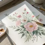

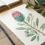
Faded Floral Bouquet on Aged Paper
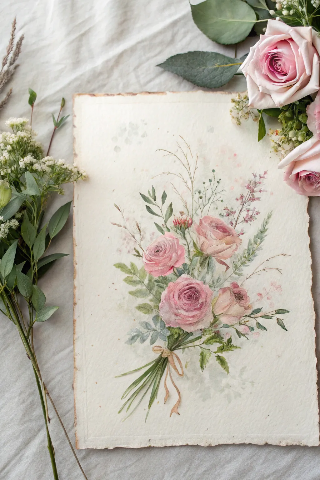
Capture the romance of a bygone era with this delicate watercolor tutorial, featuring a soft bouquet of pink roses and wildflowers. By working on textured, deckle-edged paper, you’ll create a piece that looks like a cherished botanical illustration found in an old attic.
Detailed Instructions
Materials
- Heavyweight cold-press watercolor paper (300gsm) with deckled edges
- Watercolor paints: Rose Madder, Alizarin Crimson, Sap Green, Olive Green, Burnt Sienna, Yellow Ochre, Indigo
- Round watercolor brushes: Size 6 (for washes) and Size 2 (for details)
- Pencil (HB or lighter) and kneaded eraser
- Jar of water
- Paper towels
- Tea or coffee (strong brew, cooled) for staining paper (optional)
Step 1: Preparation and Sketching
-
Age the paper:
If your paper looks too new, lightly brush a wash of strong, cooled tea or coffee over the surface. Let it puddle slightly in corners for a natural, aged effect, then allow it to dry completely before sketching. -
Outline the composition:
Using a light hand, sketch the central rose first, slightly below the center. Add two smaller roses drifting upwards to the right and left to create a gentle triangular shape. -
Add stem guides:
Draw faint, sweeping lines converging at the bottom to form the gathered stems. Loose, gestural lines work best here to keep the bouquet looking natural rather than stiff. -
Sketch foliage placement:
lightly indicate where your main leaves and sprigs of filler flowers will go. Don’t draw every leaf; just mark the general direction and volume with soft shapes.
Muddy colors?
If your roses look muddy, you likely overworked the wet paint. Let layers dry completely between glazes. Rose Madder is transparent; keep it crisp by not mixing it too much on the paper.
Step 2: Painting the Blooms
-
First wash for roses:
Mix a very watery Rose Madder. Paint the vague, round shape of the roses, leaving plenty of white paper showing for the highlights on the petal tips. -
Defining the centers:
While the first wash is still damp but not nice and wet, drop a slightly darker mix of Alizarin Crimson into the center of the spirals. This wet-on-wet technique creates that soft, blooming look. -
Building petal layers:
Once the base is dry, use your Size 2 brush to paint C-shaped strokes around the rose centers. Overlap them slightly, getting lighter and broader as you move toward the outer petals. -
Softening edges:
I like to keep a clean, damp brush handy to immediately soften the outer edges of these petal strokes, ensuring nothing looks too cut-out or rigid. -
Adding warmth:
glaze a tiny amount of diluted Yellow Ochre on a few outer petals of the topmost roses. This gives them a sun-kissed, vintage creamy tone.
Step 3: Greenery and Details
-
Base layer for leaves:
Mix Sap Green with a touch of water. Paint the larger leaves, varying the pressure on your brush to create thick-and-thin shapes. Leave some gaps for airiness. -
Deepening the shadows:
Mix Indigo into your green to create a moody, dark olive. Paint into the negative spaces between the roses and the stems, which makes the pink flowers pop forward. -
Painting the stems:
With the tip of your fine brush, pull long, slender lines downward for the stems. Use a mix of Olive Green and Burnt Sienna for a woody, realistic stalk color. -
Adding filler flowers:
Use a light gray-purple mix to dot in the delicate sprigs of wildflowers and seed pods rising above the roses. Keep these very faint and impressionistic. -
The ribbon tie:
Paint the simple bow holding the stems with a wash of Yellow Ochre and Burnt Sienna. Keep the loops loose and let the ribbon tails flow naturally alongside the stems. -
Final texture splatter:
Load a toothbrush or stiff brush with diluted brown paint and gently flick it over the paper to create faux aging spots or ‘foxing’ that enhances the vintage aesthetic.
Level Up: Deckled Edges
If you don’t have handmade paper, you can fake it! tear the edges of your paper against a ruler, then distress them further by scraping a scissor blade along the torn sides.
Frame your timeless bouquet in a rustic wood frame to complete the nostalgic presentation.
Mid-Century Kitchen in Simple Shapes
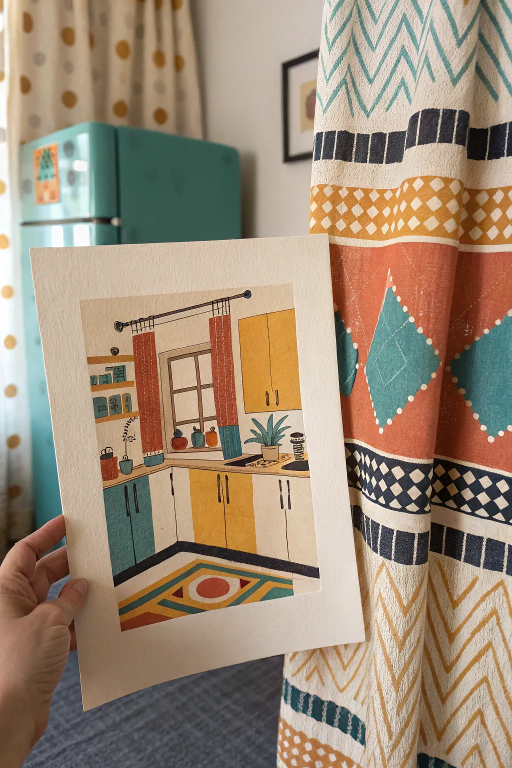
Capture the charm of a cozy vintage kitchen with this vibrant illustration, characterized by its flat, graphic shapes and a warm mid-century palette. The focus here is on clean lines and blocks of color rather than hyper-realistic shading, giving the piece a delightful, screen-printed feel.
Step-by-Step
Materials
- Cold press watercolor paper (300 gsm)
- Gouache paint set (primary colors + white)
- Pencil (HB or H)
- Ruler
- Fine liner pen (0.3mm or 0.5mm, black)
- Synthetic round brushes (sizes 2, 4, and 6)
- Palette for mixing
- Water cups and paper towels
- Washi tape or masking tape
Step 1: Planning and Sketching
-
Prepare the borders:
Begin by taping down the edges of your paper with masking tape or washi tape to create a crisp white border around your painting area. -
Establish perspective lines:
Using your ruler and pencil, lightly draw the main structural lines. Start with the corner of the room where the walls meet, then draw the floor line and the countertop level to anchor the perspective. -
Sketch the cabinetry:
Block out the shapes of the lower and upper cabinets. Keep the lines straight and geometrical, ensuring the cabinet doors take up equal space. -
Add room details:
Lightly sketch in the window frame, the curtain rod, and the hanging curtains. Don’t worry about the folds just yet; focus on the rectangular shapes. -
Draft the decor:
Draw the smaller items like the potted plant, the dish rack, the rug on the floor, and the decorative jars on the windowsill. Keep your pencil pressure very light so graphite doesn’t smudge into the paint later.
Clean Edges?
If your paint bleeds under the tape, use a slightly thicker paint consistency (less water). Always ensure the tape is pressed down firmly before starting.
Step 2: Applying the Base Colors
-
Mix your palette:
Prepare your gouache colors. You’ll need a muted teal, a warm mustard yellow, a burnt orange, and an off-white cream tone. Gouache dries matte and opaque, perfect for this style. -
Paint the walls:
Start with the largest areas. Paint the walls in a very pale cream or warm beige. Use a larger brush (size 6) for smooth coverage, working around your sketched objects. -
Fill the cabinets:
Using the mustard yellow and teal, fill in the cabinet doors. Alternate colors or create sections as shown in the reference. I like to keep the paint consistency creamy—like melted ice cream—for opaque coverage. -
Block in the floor:
Paint the floor area white or very light grey, leaving space for the rug design if you sketched it detailed, or paint the base color first and layer the rug on top once dry. -
Color the curtains:
Fill in the vertical rectangular shapes of the curtains with burnt orange. If you want the two-tone look, leave the bottom section for a teal strip.
Step 3: Adding Details and Texture
-
Paint the rug pattern:
Once the floor base is completely dry, paint the geometric rug design using your yellow, teal, and orange paints. Sharp corners are key here. -
Detail the clutter:
Switch to your smallest brush (size 2). Carefully paint the green leaves of the plant, the pots on the windowsill, and the items on the open shelving. -
Add cabinet hardware:
Using a dark grey or black paint mix, add vertical dashes for the cabinet handles. Ensure they are aligned consistently. -
Define the window:
Paint the window frames with a steady hand. A ruler can help guide your brush if you’re nervous about straight lines. -
Layer curtain textures:
Mix a slightly lighter version of your orange paint and add thin vertical stripes or dashes to the curtains to suggest fabric texture without realistic shading.
Make It Personal
Swap the palette colors to match your actual kitchen or dream decor. Adding a pattern to the floor, like a checkerboard, can also change the vibe instantly.
Step 4: Final Touches
-
Inking the outlines:
Wait until the paint is bone dry. Use your fine liner pen to outline objects that need definition, like the plant leaves, the stack of dishes, or the window panes. Keep the lines somewhat loose for a hand-drawn feel. -
Final check:
Look for any white gaps between color blocks and fill them in with the appropriate color or a touch of ink. -
Reveal the border:
Slowly peel away the masking tape at a 45-degree angle to reveal your crisp, clean edges.
Once the tape is peeled away, you’ll have a delightful, retro-inspired illustration ready to frame or gift
BRUSH GUIDE
The Right Brush for Every Stroke
From clean lines to bold texture — master brush choice, stroke control, and essential techniques.
Explore the Full Guide
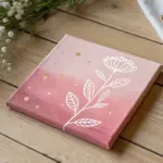
Mini Vintage Painting Set for a Gallery Wall
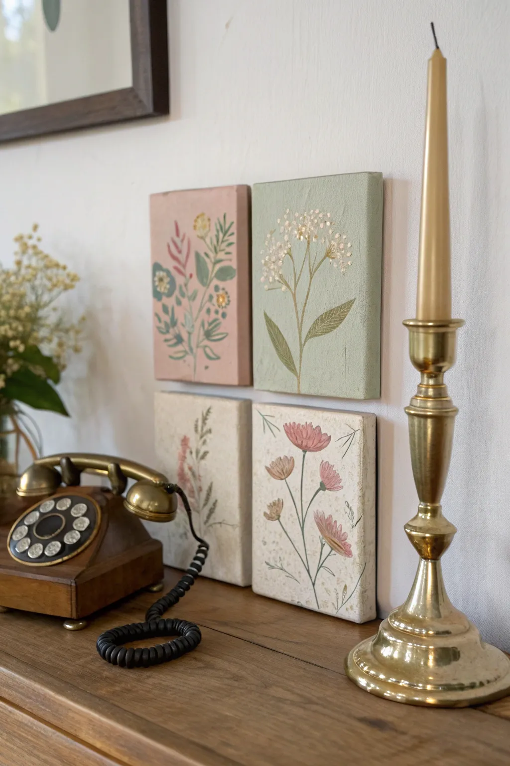
Create a charming vignette of four distinct botanical studies that blend cottagecore warmth with vintage scientific illustration. This set uses soft pastel backgrounds and delicate brushwork to mimic the look of aged pressed flowers and hand-painted tiles.
Step-by-Step Guide
Materials
- 4 small square canvases (approx. 4×4 or 5×5 inches)
- Acrylic paints: sage green, dusty rose, antique cream/beige, olive green, deep forest green, navy blue, mustard yellow, burnt sienna, titanium white
- Matte gel medium or gesso (for texture)
- Set of brushes: 1 inch flat brush, fine liner brush (0 or 00), small round brush (size 2)
- Palette and water cup
- Pencil
- Reference images of wildflowers (optional)
- Paper towels
Step 1: Preparing the Backgrounds
-
Prime with texture:
Before adding color, mix your white acrylic or gesso with a tiny bit of burnt sienna to create a warm off-white. Apply a layer to the bottom two canvases, dabbing the brush rather than stroking it to create a rough, stone-like texture. -
Paint the pink canvas:
For the top-left canvas, mix dusty rose with a touch of white. Paint the entire surface evenly. You might need two coats for full opacity, letting each dry completely in between. -
Paint the green canvas:
Paint the top-right canvas with a soft sage green. If your green is too bright, tone it down with a drop of burnt sienna or gray to achieve that vintage, muted look. -
Finish the neutral canvases:
Once the textured gesso layer on the bottom two canvases is dry, add a wash of antique cream. If you want an aged effect, lightly sponge on some watered-down tea or very diluted brown paint especially near the edges.
Palette Cohesion
Mix colors from a limited palette across all four canvases. Use the sage green from the top right as the leaf color for the bottom left to tie the set together.
Step 2: Folk Art Botanical (Top Left)
-
Sketch the layout:
Lightly sketch a central stem branching out. This design is stylized, so symmetry isn’t necessary, but balance is key. -
Block in leaves:
Using your small round brush and deep forest green, paint the larger leaves. Keep the shapes simple and almond-like. -
Add secondary foliage:
Switch to a lighter olive green or even a muted teal for the fern-like fronds and smaller filler leaves. -
Paint the blooms:
Add small circles or simple petal shapes in navy blue and mustard yellow. I like to keep these shapes flat and graphic rather than realistic.
Step 3: Detailed Queen Anne’s Lace (Top Right)
-
Paint the main stem:
With the sage background dry, mix an olive green. Use your liner brush to paint a thin, elegant stem rising from the bottom center, branching out near the top. -
Create the flower heads:
Using pure white paint and a very fine dotting tool or the tip of a toothpick, create clusters of tiny dots at the end of the stems. -
Add leaf details:
Paint two large, elongated leaves at the base using a semi-transparent wash of darker green, allowing some of the background texture to show through for a delicate feel.
Antique Finish
Once fully dry, lightly sand the edges of the canvases with fine-grit sandpaper to reveal the canvas weave, mimicking the wear of vintage art.
Step 4: Vintage Cosmos and Ferns (Bottom Row)
-
Draft the cosmos stems:
On the bottom right canvas, use a diluted olive green to paint very thin, wispy stems arching slightly. -
Paint the cosmos petals:
Mix a soft coral-pink. Using the small round brush, press down and lift up to create teardrop-shaped petals. Arrange them loosely around the stem tips. -
Add fine details:
Once the pink petals are dry, add tiny brown lines in the center of the flowers and jagged edges to the leaves. -
Create the faded fern:
On the bottom left canvas, paint a vertical fern or stalk. Use very watered-down paint (browns and muted reds) to make it look like a dried, pressed specimen. -
Apply speckling:
To unite all four pieces with an aged look, load an old toothbrush with diluted brown paint. Run your thumb over the bristles to flick tiny speckles across all four canvases.
Arranged together on your wall, these miniature paintings will create a peaceful, handcrafted focal point.

Have a question or want to share your own experience? I'd love to hear from you in the comments below!