Flowers are basically the perfect painting subject—pretty, forgiving, and endlessly remixable. I’m sharing a bunch of flower painting ideas you can try on a tiny canvas, in a sketchbook, or whenever you want a relaxing little art win.
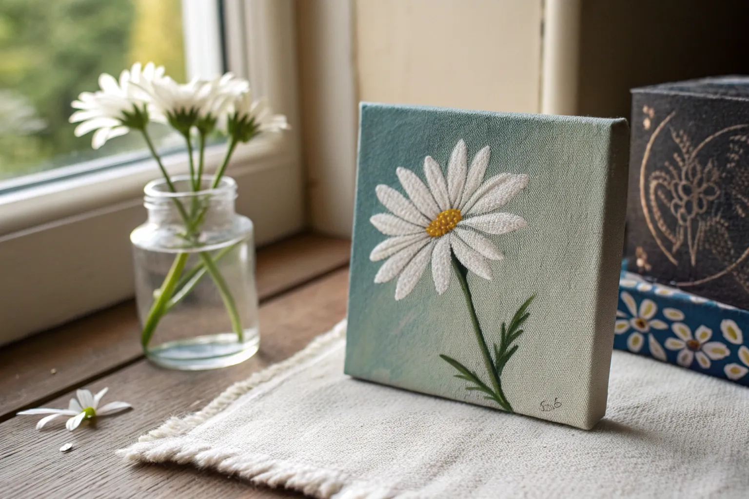
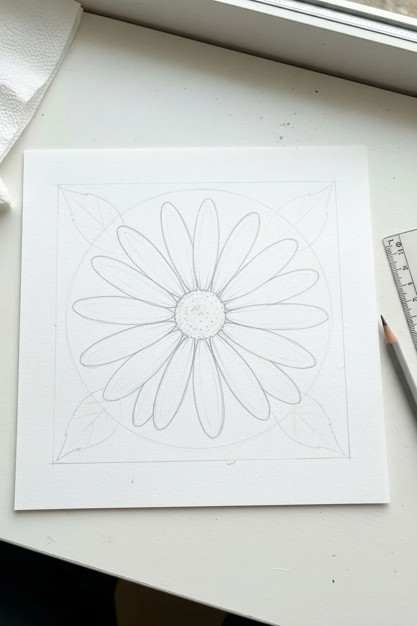
Simple Daisy Blossoms on a Solid Background
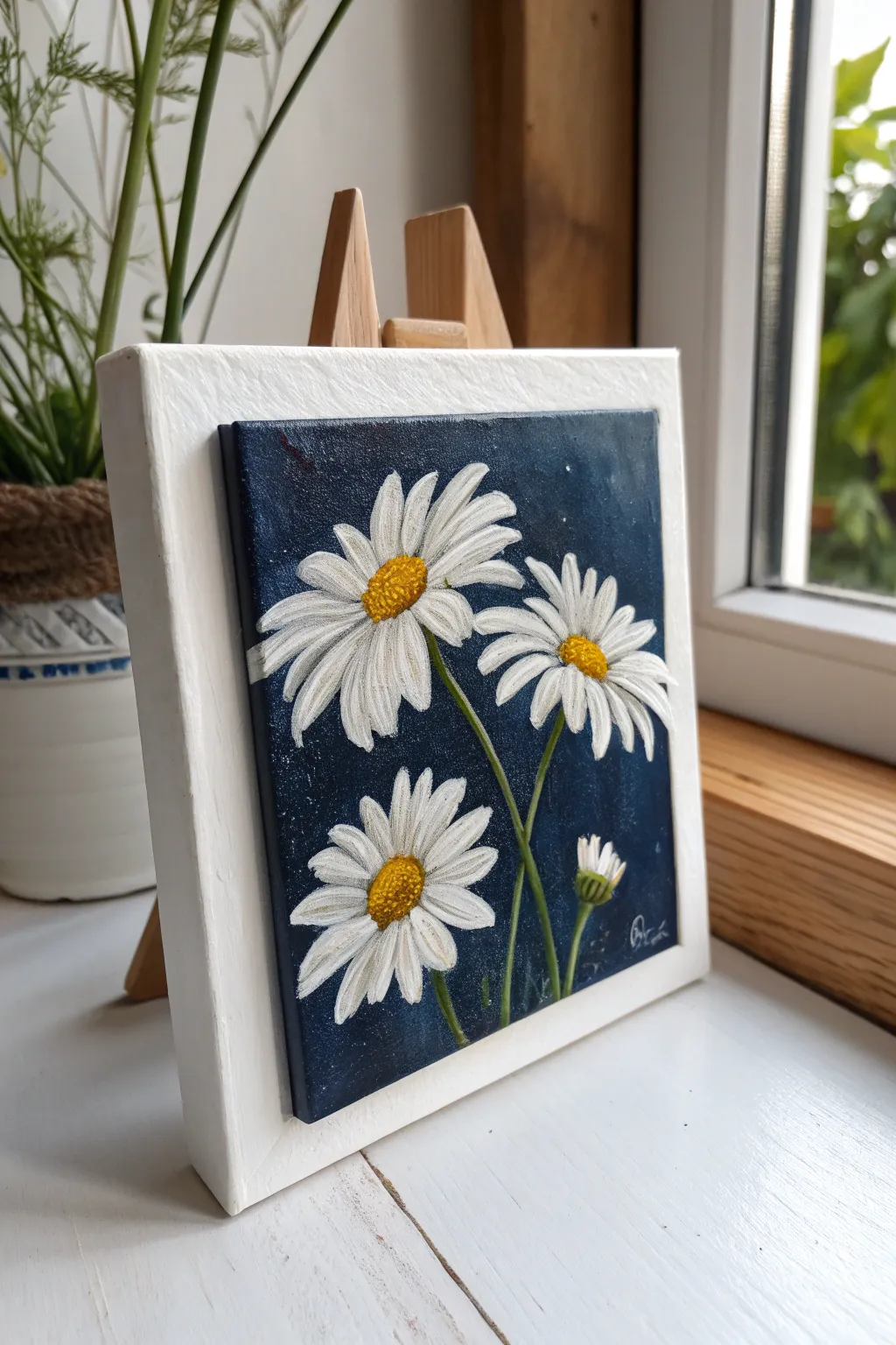
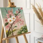
Create a striking contrast between delicate white petals and a deep, moody background with this dimensional floral piece. By painting on a smaller canvas panel and mounting it onto a larger white frame, you achieve a sophisticated gallery-style floating effect.
Detailed Instructions
Materials
- Small square canvas panel (approx. 4×4 or 5×5 inches)
- Larger white wooden panel or frame backer (approx. 6×6 or 7×7 inches)
- Acrylic paints: Midnight Blue, Phthalo Blue, Titanium White, Cadmium Yellow, Raw Sienna, Sap Green
- Paintbrushes: Large flat wash brush, medium filbert, fine liner brush
- Palette knife or sponge (optional for texture)
- Strong craft glue (e.g., E6000) or mounting tape
- Jar of water and paper towels
- Old toothbrush (optional for stars)
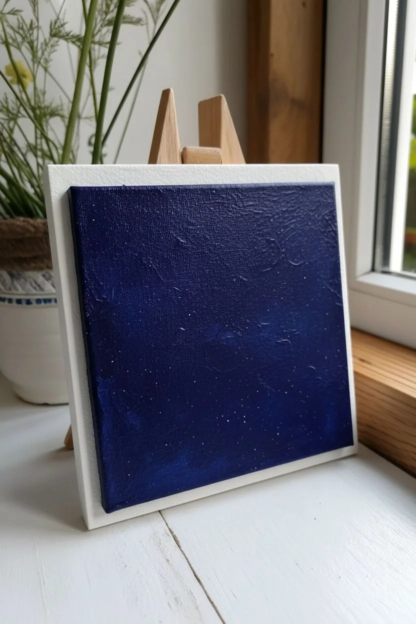
Step 1: Setting the Scene
-
Prepare the background:
Mix a small amount of Midnight Blue with just a touch of Phthalo Blue to create a rich, deep indigo color. Using your large flat brush, coat the entire surface of the small canvas panel. Don’t forget to paint the edges of the canvas, as they will be visible in the final mount. -
Add subtle texture:
While the blue paint is still wet, you can dab it lightly with a sponge or use a dry brush in swirling motions. This creates a slightly uneven, starry-night texture rather than a flat block of color. -
Create a starry effect (optional):
If you want that subtle cosmic look seen in the reference, dilute a tiny drop of white paint with water. Dip an old toothbrush into it and flick the bristles with your thumb to mist tiny white speckles across the dark blue. Let this base layer dry completely.
Petal Perfection
Use a filbert brush (oval-tipped) rather than a square brush. Since the bristles are naturally rounded, they create the perfect daisy petal shape with just a single stroke.
Step 2: Planning the Composition
-
Mark the centers:
Visualize where your three main flowers will go. Use a tiny dot of yellow paint to mark the center of each flower head. Place one high left, one middle right, and one lower left for a balanced triangular composition. -
Sketch the stems:
Using your fine liner brush and Sap Green mixed with a tiny bit of white (to make it opaque against the dark background), paint very thin, slightly curved lines extending downwards from your yellow dots. Add a fourth shorter stem for the bud at the bottom right.
Blue Bleed-Through?
If your white paint looks gray or transparent against the dark background, don’t keep brushing wet paint. Let the first layer dry completely, then apply a second layer for true opacity.
Step 3: Painting the Daisies
-
Petal base layer:
Load your filbert brush with Titanium White. Starting from the outside and pulling in toward the yellow center, paint your first layer of petals. Don’t worry if the blue shows through slightly; this adds shadow depth. -
Refining the petals:
Once the first layer is tacky, add a second coat of white to the tips and centers of the petals to brighten them up. Leave tiny gaps between petals so the dark background separates them. -
Developing the centers:
Mix Cadmium Yellow with a speck of Raw Sienna. Using a small round brush, dab this textured mix onto your center dots. Use a stippling motion (up and down dabs) to mimic the fuzzy pollen adjust texture. -
Adding dimension to centers:
Dip just the very tip of your brush into pure Raw Sienna or a light brown. Stipple this darker color onto the bottom-left side of each yellow center to create a shadow, making them look spherical. -
Highlighting the centers:
Clean your brush and pick up a tiny bit of pure white. Stipple a small highlight on the upper-right section of the yellow centers for a sun-kissed look.
Step 4: Finishing Touches
-
Painting the bud:
For the small bud, paint a green cup shape at the top of the short stem. Add tightly closed white petals peeking out of the top, resembling a small fan. -
Leaf details:
Using the liner brush and your green mix, add a few wispy leaves attached to the stems. Keep them loose and organic. -
Final highlights:
I like to take a liner brush with pure thick white paint and add one final, thin stroke to the brightest edge of the petals that are catching the most light. -
Mounting the art:
Once the painting is fully dry, apply strong craft glue or heavy-duty mounting tape to the back of your canvas. Center it precisely on the larger white wooden panel and press firmly to secure it.
Display your mounted daisy painting near a window to let the natural light enhance the textures


Sunflower Portrait With a Bold Center Texture
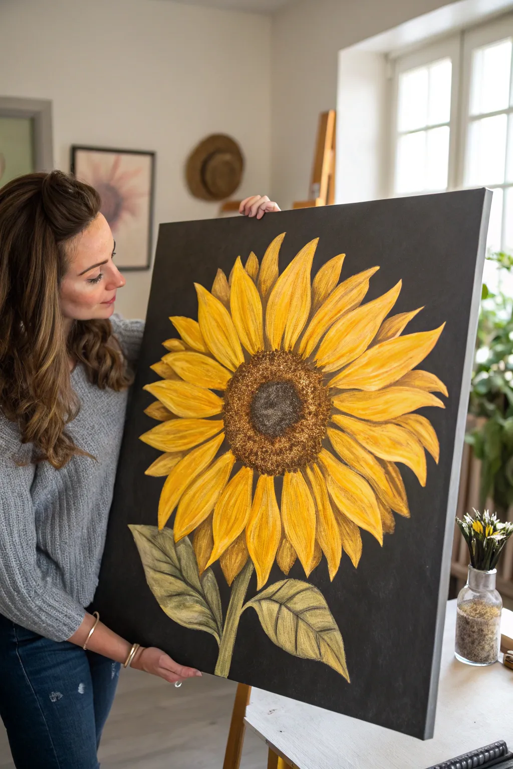
Contrast is the star of the show in this striking large-scale canvas project, where vibrant golden yellow petals pop against a deep matte black background. The centerpiece is a highly textured seed head that adds tactile dimension to your painted floral portrait.
Step-by-Step Guide
Materials
- Large square canvas (approx. 24×24 or 30×30 inches)
- Black gesso or matte black acrylic paint
- Acrylic paints (primary yellow, yellow ochre, cadmium orange, burnt umber, raw sienna, titanium white, olive green, hooker’s green)
- Wide flat brush for background
- Assorted filbert and round brushes (sizes 4, 8, 12)
- Texture paste or coarse sand medium
- Palette knife
- Chalk or pastel pencil (white or grey)
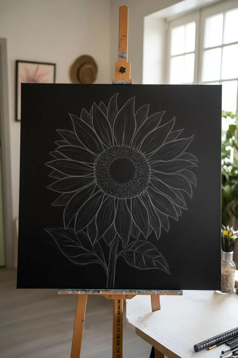
Step 1: Preparation & Background
-
Prime the Surface:
Since the black background is crucial for this dramatic look, start by coating your entire canvas with black gesso. If you don’t have gesso, two coats of heavy-body matte black acrylic paint will work perfectly. -
Ensure Full Coverage:
Check the canvas from different angles to ensure no white speckles remain locally; I like to brush horizontally and then vertically to get a solid, opaque finish. Let this dry completely, preferably overnight. -
Sketch the Layout:
Using a white charcoal pencil or light grey pastel, sketch a large circle for the flower’s center slightly below the middle of the canvas. -
Outline Petals:
Draw the petals radiating outward. Make them long, slightly curved, and overlapping. Don’t worry about perfection; natural variation adds character. -
Add Stem and Leaves:
Sketch a sturdy stem descending from the flower head and add two large, pointed leaves branching out near the bottom.
Clean Edges Trick
If you struggle with shaky hands near the black background, use a black Posca paint pen to tidy up the outlines of your petals after the yellow paint dries.
Step 2: Painting the Petals
-
Base Coat of Layers:
Mix a medium yellow with a touch of white to ensure opacity against the black. Paint the base shape of each petal, leaving the pencil lines slightly visible as a guide. -
Define Shadows:
While the base is tacky, mix yellow ochre with a tiny bit of burnt umber. Apply this darker mix near the base of the petals (where they meet the center) and along the edges of petals that are ‘behind’ others to create depth. -
Highlighting Edges:
Mix primary yellow with titanium white. Use a filbert brush to streak this lighter color from the tip of the petal inward, following the curve of the leaf. -
Adding Warmth:
Glaze a very thin layer of cadmium orange mixed with glazing medium over the middle sections of the petals to give that warm, sun-kissed glow. -
Refining Details:
Use a smaller round brush to add thin, crisp lines of white mixed with yellow down the center of each petal to suggest veins and texture.
Step 3: The Textured Center
-
Create Texture Mix:
Mix your burnt umber paint with a texture paste or coarse sand medium. You want a thick, gritty consistency that will hold its shape. -
Apply the Core:
Using a palette knife or an old stiff brush, dab this mixture into the center circle. Build it up thicker in the very middle to create a dome effect. -
The Outer Ring:
Mix raw sienna into your remaining texture paste. Dab this lighter brown mixture in a ring around the dark center, blending slightly where they meet. -
Stippling Detail:
Once the texture is partially dry but still workable, use a stiff brush to stipple (poke repeatedly) the surface to enhance the ‘seed’ look. -
Final Highlight Dusting:
Wait for the texture to dry completely. Dry brush a tiny amount of metallic gold or light ochre over just the tips of the texture bumps to make them sparkle and stand out.
Sparkle Upgrade
Mix a tiny pinch of fine gold glitter into your texture paste for the center. It will catch the light subtly without looking too crafty or childish.
Step 4: Leaves & Finishing Touches
-
Base Greenery:
Paint the stem and leaves with a mix of olive green and a touch of black to ground them in the dark background. -
Leaf Veining:
Mix hooker’s green with yellow ochre. Paint the veins and lighter areas of the leaves, blending gently into the darker base color. -
Leaf Texture:
Use a dry brush with a pale yellow-green to scumble lightly over the leaf surface, giving it a fuzzy, organic appearance. -
Clean Up Edges:
Switch back to your black paint and a small flat brush. Carefully go around the outer edges of your petals and leaves to sharpen any lines that got messy. -
Final Varnish:
Once the painting is cured (wait at least 24 hours due to the thick texture), apply a satin varnish to protect the surface and unify the sheen of the different paints.
Hang your masterpiece in a spot with good natural light to let those textured details truly shine


Poppy Blooms With Loose, Rounded Petals
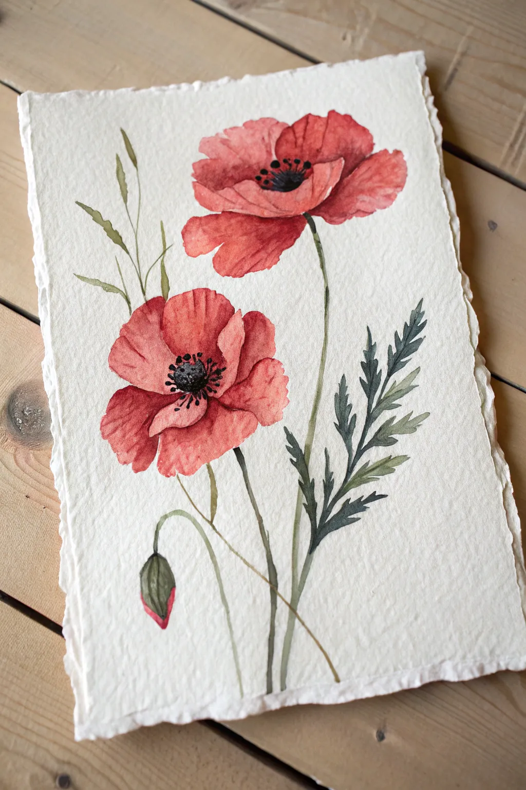
Capture the delicate, papery texture of wild poppies with this vibrant watercolor study. The composition features two full blooms and a shy bud, painted on beautiful deckle-edge paper to enhance the organic feel.
Step-by-Step Tutorial
Materials
- Cold press watercolor paper (deckle edge optional)
- Watercolor paints (Alizarin Crimson, Cadmium Red, Sap Green, Indigo, Yellow Ochre)
- Round watercolor brushes (Size 4 and 8)
- Fine detail brush (Size 0 or 1)
- Pencil (HB or H)
- Kneaded eraser
- Clean water jars
- Paper towels
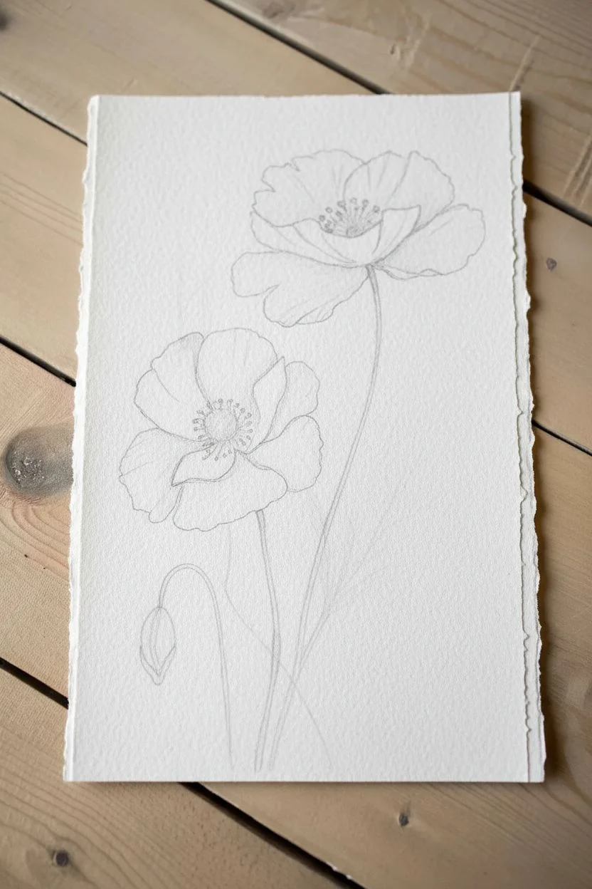
Step 1: Sketching and Preparation
-
Initial Placement:
Begin by lightly marking the positions of the two main flowers. Place the top flower slightly to the right and the lower flower larger and to the left to create balance. -
Drawing Petals:
Sketch the large, rounded petals. Poppies have ruffled edges, so let your pencil line wobble slightly. Don’t worry about perfect symmetry; these flowers are naturally irregular. -
Adding Stems and Bud:
Draw long, slender stems curving gently upwards. Add a small, drooping tear-drop shape near the bottom left for the unopened bud. -
Leaves:
Sketch the jagged, fern-like leaves on the right side. Keep the lines light so they don’t show through the paint later. -
Lighten Guidelines:
Roll your kneaded eraser gently over the entire sketch to lift excess graphite, leaving just faint ghost lines to guide your brush.
Step 2: Painting the Blooms
-
First Petal Wash:
Mix a watery wash of Cadmium Red. Paint the individual petals of the top flower, leaving tiny slivers of white paper between petals to separate them. -
Wet-in-Wet Texture:
While the first wash is still damp, drop in a slightly concentrated Alizarin Crimson near the center of the flower. Let it bleed outward naturally to create depth. -
Lower Bloom Base:
Repeat the process for the lower, larger flower. Use a size 8 brush to keep the strokes loose and fluid. I find that lifting the brush at the petal edge creates a nice ruffled effect. -
Deepening Shadows:
Once the first layer is barely dry, mix a stronger red using Alizarin Crimson and a touch of Indigo. Paint the shadowy areas underneath overlapping petals. -
Painting the Bud:
Paint the bottom tip of the bud with your red mix. Let it dry, then paint the enclosing sepals with Sap Green, letting the colors touch slightly.
Muddy Centers?
If the black center bleeds into the red petals, the petals were too wet. Wait for the red paint to be bone-dry before adding the dark center details.
Step 3: Stems and Greenery
-
Stem Work:
Mix Sap Green with a little Yellow Ochre for a warm, natural stem color. Using the size 4 brush, paint the long, continuous stems with a steady hand. -
Leaf details:
For the jagged leaves on the right, use a darker green mix (add more Indigo). Use the tip of your brush to flick outward, creating sharp, serrated edges. -
Wispy Grasses:
Add the faint, grass-like sprigs on the left side using a very watery, pale green mix. These should look distant and delicate.
Framing Tip
Float mount this artwork in a shadow box frame. This displays the beautiful deckle edges of the paper without hiding them under a mat board.
Step 4: Adding Details
-
Flower Centers:
Mix a very dark, thick color using Indigo and Sepia/Brown. It should be almost black. Paint the central button of the poppy carefully. -
Stamen Dots:
Using your smallest detail brush, dot tiny specks of the dark mix around the center button to represent the anthers. -
Connecting Stamens:
Draw incredibly fine, hair-like lines connecting those dots back to the center button. -
Final Touches:
Evaluate your dry painting. If the petals look too flat, add a final glaze of sheer red to the shadowed areas to boost the contrast.
Enjoy the gentle elegance of these red blooms forever captured on your page
Rose Spiral Study in Two to Three Shades
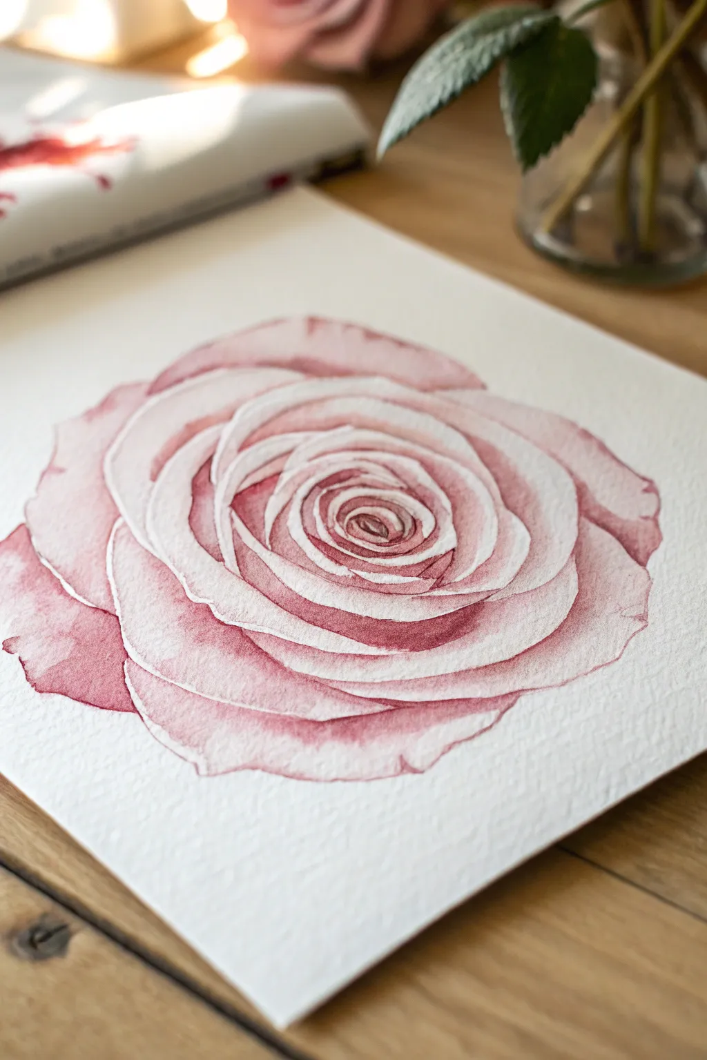
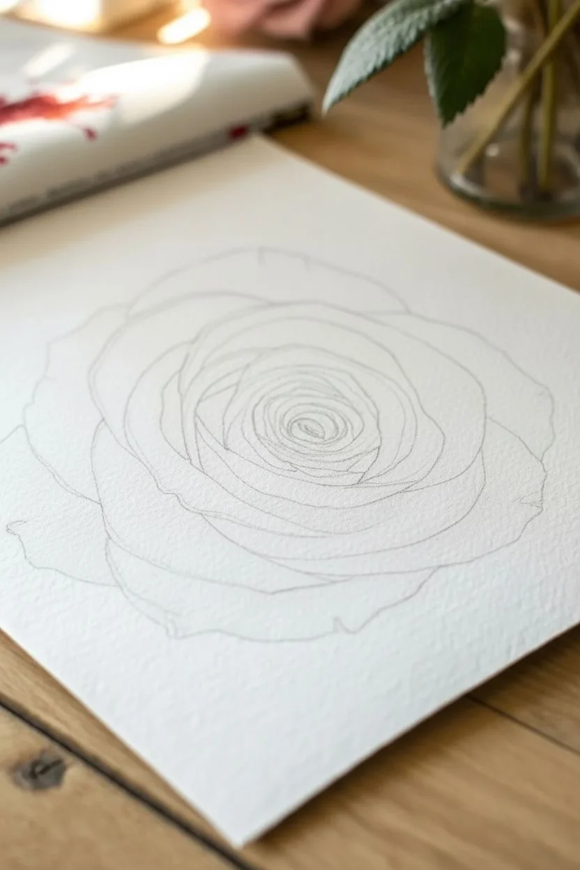
Capture the delicate unfolding of a rose by focusing on its mesmerizing spiral center using a limited palette of soft reds and pinks. This study emphasizes the clean, white edges of petals by carefully painting the shadows and depth behind them, creating a dimensional, sculptural effect.
How-To Guide
Materials
- Cold press watercolor paper (300 gsm)
- Round watercolor brushes (sizes 4 and 8)
- Watercolor paints: Alizarin Crimson, Burnt Sienna, and a touch of Opera Pink
- Pencil (HB or H) for sketching
- Kneaded eraser
- Two jars of water
- Paper towels
Step 1: Sketching the Structure
-
Map the center:
Begin by lightly marking the very center of your paper. Draw a tight, small spiral about the size of a dime to establish the heart of the rose. -
Expand the petals:
Continuing from the center spiral, sketch overlapping petal shapes that grow larger as they move outward. Focus on the ‘lips’ of the petals—the top edges that curl backward. -
Define the perimeter:
Draw the largest, outermost petals loosely. They don’t need to be perfect circles; give them slightly wavy, organic edges to look natural. -
Refine and lighten:
Once the spiral structure looks right, use your kneaded eraser to lift off most of the graphite. You want faint ‘ghost lines’ that guide you but won’t show through the translucent paint.
Bleeding Edges?
If your petal distinctness is lost, your paper is too wet. Let the painting bone dry, then re-define the edge with a darker shadow mix next to the highlight.
Step 2: Mixing and First Washes
-
Mix your base color:
Create a dusty rose hue by mixing Alizarin Crimson with a tiny bit of Burnt Sienna to warm it up. Add plenty of water to make a very pale tea-consistency wash. -
Paint the outer shadows:
Starting with the large outer petals, paint the areas *between* the petal edges. Leave the very rim of each petal unpainted (white paper) to create a highlight. -
Soften the edges:
While the paint is still wet, use a clean, damp brush to drag the color downwards towards the base of the petal, fading it into white. This gives the petal volume. -
Work in sections:
Move around the rose, painting the shadow shapes of the outer petals. Don’t let adjacent wet sections touch, or they will bleed together and lose the crisp white separation line.
Pro Tip: Hard Lines
To get those crisp white rims, paint negative space. Paint the dark shadow *behind* a petal, rather than painting the petal itself. This defines the shape.
Step 3: Deepening the Spiral
-
Intensify the mix:
Add less water to your existing red mixture to create a ‘milk’ consistency. It should be virtually the same hue, just more saturated. -
Target the mid-layers:
Move inward to the middle ring of petals. Paint the deeply shadowed crevices underneath the curled petal tips. Remember to preserve that crucial thin white line along the top edge of the petal below. -
Grading the color:
I find it helpful here to apply the dark paint in the crevice, then rinse my brush and soften the bottom edge of that stroke so it blends seamlessly into the pale pink of the petal body. -
Approach the center:
Switch to your smaller size 4 brush. The shapes here are tighter. Paint the cast shadows inside the spiral, being extremely careful to leave the rim of the spiral light. -
Create contrast:
The center of the rose receives the least light. Use your most concentrated pigment here to make the deep recesses pop against the light petal ridges.
Step 4: Final Details
-
Evaluate the values:
Step back and look at the whole flower. Does the center look deep enough? If not, add another layer of concentrated crimson to the deepest points of the spiral. -
Glazing for warmth:
Mix a very watery wash of just the Opera Pink or a clean red. Lightly glaze over the shadow parts of the outer petals to boost the vibrancy without losing the drawing. -
Crisping edges:
If any white edges got lost or look messy, you can use a slightly stiffer damp brush to gently ‘scrub’ and lift pigment to reclaim the highlight. -
Adding texture:
For a realistic touch, use the tip of your small brush to add very faint, fine veins on a few of the larger outer petals using a pale mix. -
Final dry:
Let the piece dry completely before erasing any remaining pencil marks that might be visible in the white areas.
Now stepping back reveals a soft, romantic bloom with wonderful depth created entirely through shadow manipulation
BRUSH GUIDE
The Right Brush for Every Stroke
From clean lines to bold texture — master brush choice, stroke control, and essential techniques.
Explore the Full Guide
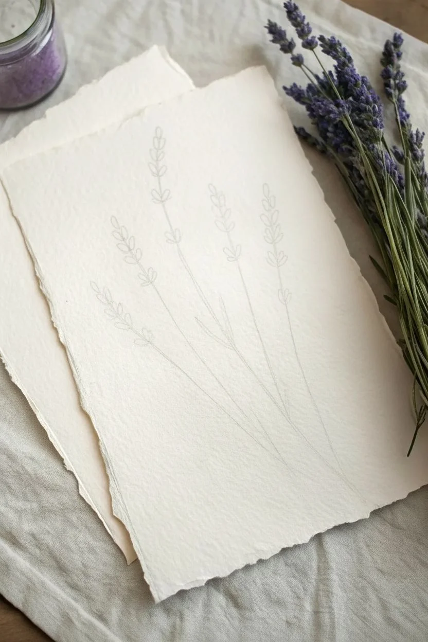
Lavender Sprigs Built From Tiny Dabs and Taps
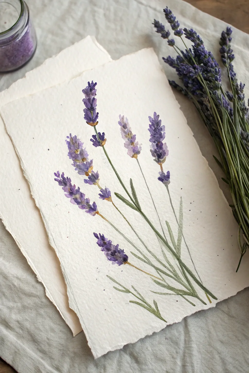
Capture the airy elegance of fresh lavender with this simple watercolor study that focuses on texture over precision. The loose, impressionistic style mimics the tiny individual buds of the flower without needing to paint every single petal.
Step-by-Step Tutorial
Materials
- Cold press watercolor paper (deckle edge preferred)
- Small round watercolor brush (size 2 or 4)
- Fine liner brush (optional for stems)
- Watercolor paints: Violet, Ultramarine Blue, Burnt Sienna, Sap Green, and Olive Green
- Paper towels
- Pencil (HB)
- Two jars of water
Step 1: Planning and Setup
-
Prepare your paper:
If you are using a large sheet, tear the paper carefully against a ruler to create a soft, deckle edge similar to the reference photo. This gives the piece a rustic, handmade feel. -
Lightly sketch stems:
Using an HB pencil, very faintly sketch four to six curved lines for your stems. Lavender stems are rarely perfectly straight, so let them wander slightly. -
Mark the flower heads:
At the top of each stem line, lightly mark the top and bottom of where the flower clusters will sit. Vary the heights to create a natural, unforced composition. -
Mix your purples:
Prepare three puddles of purple on your palette: one pure violet, one violet mixed with a touch of ultramarine blue for a cooler tone, and one very watered-down, pale lavender.
Natural Variation
Don’t make every flower head identical. Paint some slightly bent, some with fewer buds, and one ‘budding out’ lower on the stem for realism.
Step 2: Painting the Blooms
-
Start with the pale wash:
Dip your round brush into the palest, watery purple. Using the tip, dab small, irregular spots along the upper part of your first stem line. -
Build the shape:
Keep your dabs clustered but leave tiny white gaps between them. Lavender grows in whorls or tiers, so try to create small gaps between clusters of buds on the stem. -
Add medium tones:
While the first layer is still slightly damp (but not swimming), pick up your medium violet mix. Touching the tip of the brush to the paper, drop this darker pigment into the bottom of the pale clusters. -
Deepen the shadows:
Switch to your darkest violet-blue mix. With a dryer brush, add tiny dots near the stem and at the base of the flower clusters to suggest depth and shadow. -
Vary the brushes:
I like to rotate the brush in my fingers between dabs so the marks don’t all look identical. Keep the top of the flower sprig slightly tapered and pointy. -
Repeat for all stems:
Continue this process for the remaining stems. Vary the color slightly for each one—make one bluer and another more pink-violet to add visual interest.
Scented Art
Once fully dry, rub a drop of real lavender essential oil on the BACK of the paper. Frame it without glass to let the scent waft into the room.
Step 3: Stems and Leaves
-
Mix the green:
Create a natural, muted green by mixing Sap Green with a tiny touch of Burnt Sienna or your purple mix. This prevents the green from looking too artificial. -
Paint the main stems:
Using a fine liner brush or the very tip of your round brush, pull long, thin lines from the base of the flower heads down to the bottom of the page. -
Connect the buds:
Carefully paint a very thin line through the center of your flower clusters, connecting the gaps you left earlier. Add tiny brown-green dabs at the base of the flower sections where the buds attach. -
Add simple leaves:
Lavender leaves are long, narrow, and silver-green. Paint them using a single stroke: start with light pressure, press down to widen the stroke, and lift up to taper the end. -
Overlay leaves:
Allow some leaves to cross over the stems or other leaves. Wait for the underlying layer to dry first if you want crisp edges, or paint while wet for a softer look. -
Splatter texture:
Load your brush with watery purple or green paint. Tap the brush handle against a finger over the paper to sprinkle tiny droplets around the flowers for an artistic finish.
Allow the splatters to dry completely before erasing any visible pencil marks to complete your aromatic botanical study
Hydrangea Puff With Layered Dot Petals
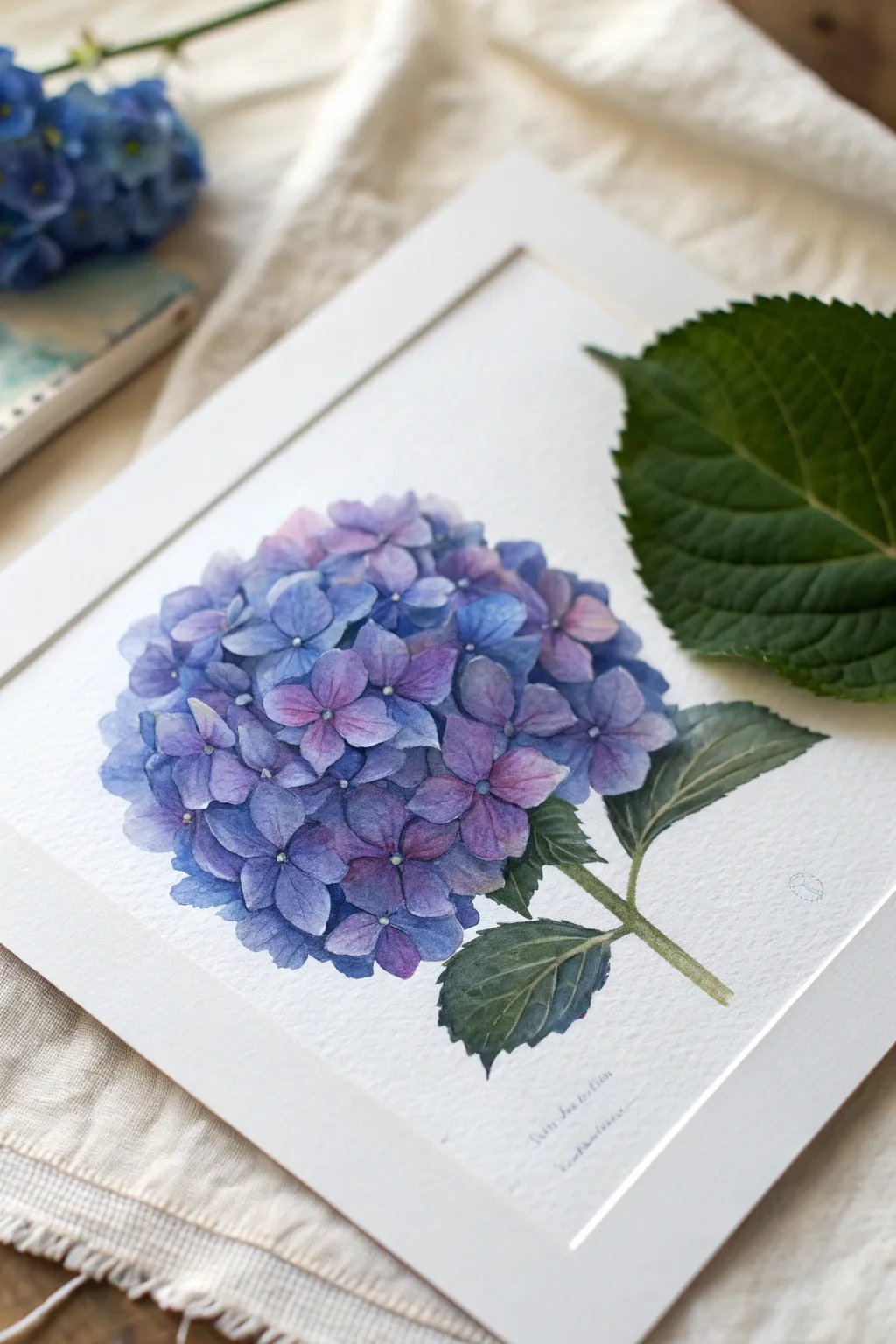
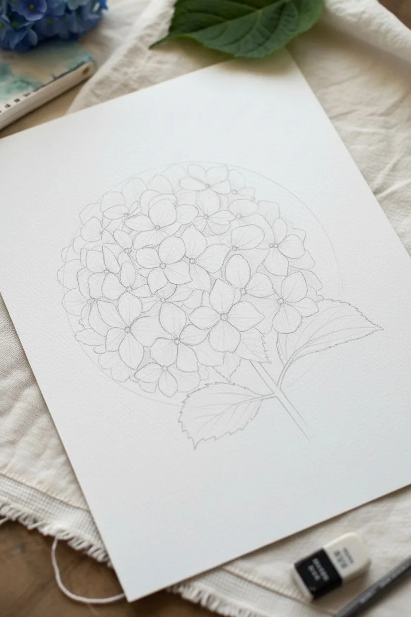
Capture the delicate, clustered beauty of a hydrangea using soft watercolor layers. This project focuses on building up individual florets to create a rounded, dimensional flower head filled with shades of periwinkle, violet, and soft blue.
How-To Guide
Materials
- Cold press watercolor paper (300 gsm)
- Watercolor paints: Ultramarine Blue, Cobalt Blue, Quinacridone Magenta, Purple Lake, Sap Green, Payne’s Grey
- Round brushes: sizes 2, 4, and 6
- Pencil (HB or H for light sketching)
- Kneaded eraser
- Clean water jars
- Paper towels
- White gel pen or gouache (optional for tiny centers)
Step 1: Sketching the Structure
-
Outline the orb:
Begin by lightly drawing a large circle or slightly flattened oval in the center of your paper. This will serve as the boundary for your flower head, ensuring it stays round and puffy. -
Sketch individual florets:
Inside your circle, start sketching the four-petaled florets. Don’t try to draw every single one perfectly; focus on the ones in the foreground and center. The florets consist of four tear-drop shaped petals meeting at a center point. -
Fill the gaps:
Draw partial petal shapes peeking out from behind the main florets to create density. Sketch the stem emerging from the bottom right, along with two or three serrated leaves branching off. -
Lighten the lines:
Take your kneaded eraser and gently roll it over the sketch. You want the graphite to be barely visible so it doesn’t show through the transparent watercolor layers.
Muddy Centers?
If the centers of your florets are bleeding and turning muddy, let the petals dry completely before adding the central dark dot. Wet-on-dry gives the sharpest detail.
Step 2: Painting the Florets
-
Mix your base colors:
Prepare three watered-down puddles on your palette: a pale blue (Cobalt), a soft purple (Cobalt + Magenta), and a deeper violet. Keep the consistency watery/milky for the first layer. -
First layer of petals:
Using your size 4 brush, paint a few non-adjacent petals with the pale blue mix. Switch to the purple mix for other petals while they are still wet to verify if you want soft bleeds, or let them dry for crisp edges. I prefer keeping edges crisp for hydrangeas to define distinct petals. -
Varying the hues:
Continue filling in the florets, alternating between your blue and purple mixtures. Leave very thin white gaps between petals to distinguish them from one another. -
Building depth:
Once the first layer is dry, mix slightly more saturated versions of your blue and purple. Paint the ‘background’ petals—the shapes you sketched in the gaps between the main florets. These should be slightly darker to recede visually. -
Adding shadow details:
Using a size 2 brush and a darker violet-blue mix, paint tiny triangular shadows where petals overlap or meet the center. This creates the ‘puffy’ 3D effect. -
Defining the centers:
Drop a tiny dot of concentrated indigo or deep purple into the very center of each four-petal cluster.
Negative Space
Don’t paint the whole flower ball a solid color first. Leaving the white of the paper untouched between the individual petals is crucial for that delicate, lace-like Hydrangea look.
Step 3: Leaves and Stem
-
Base green layer:
Mix Sap Green with a touch of the existing blue puddle for harmony. Paint the stem and leaves with a light wash. The leaves should have serrated (jagged) edges, matching the sketch. -
Veining strategy:
While the leaves are drying, mix a darker green by adding Payne’s Grey to your green mix. Once the base leaf layer is dry, carefully paint thin lines for the veins using your smallest brush. -
Glazing the leaves:
To make the leaves look realistic, paint a second layer of green over sections of the leaf, avoiding the veins you just painted. This negative painting technique makes the veins stand out as lighter than the rest of the leaf. -
Stem shadows:
Add a line of darker green along one side of the stem to give it a cylindrical shape.
Step 4: Final Touches
-
Highlighting:
If your petal centers need more pop, create a tiny dot of white gouache or gel pen right in the middle of the dark center dots. -
Softening edges:
Check the outer perimeter of the flower ball. If it looks too jagged, take a damp clean brush and gently soften some of the outermost petal edges to make the bloom feel rounder. -
Final assessment:
Step back and look for balance. If one area looks too blue, glaze a very watery purple wash over a few petals to even out the color distribution.
Now you have a stunning botanical study ready to be framed or gifted to a flower lover

PENCIL GUIDE
Understanding Pencil Grades from H to B
From first sketch to finished drawing — learn pencil grades, line control, and shading techniques.
Explore the Full Guide
Wildflower Meadow With Impressionistic Color Spots
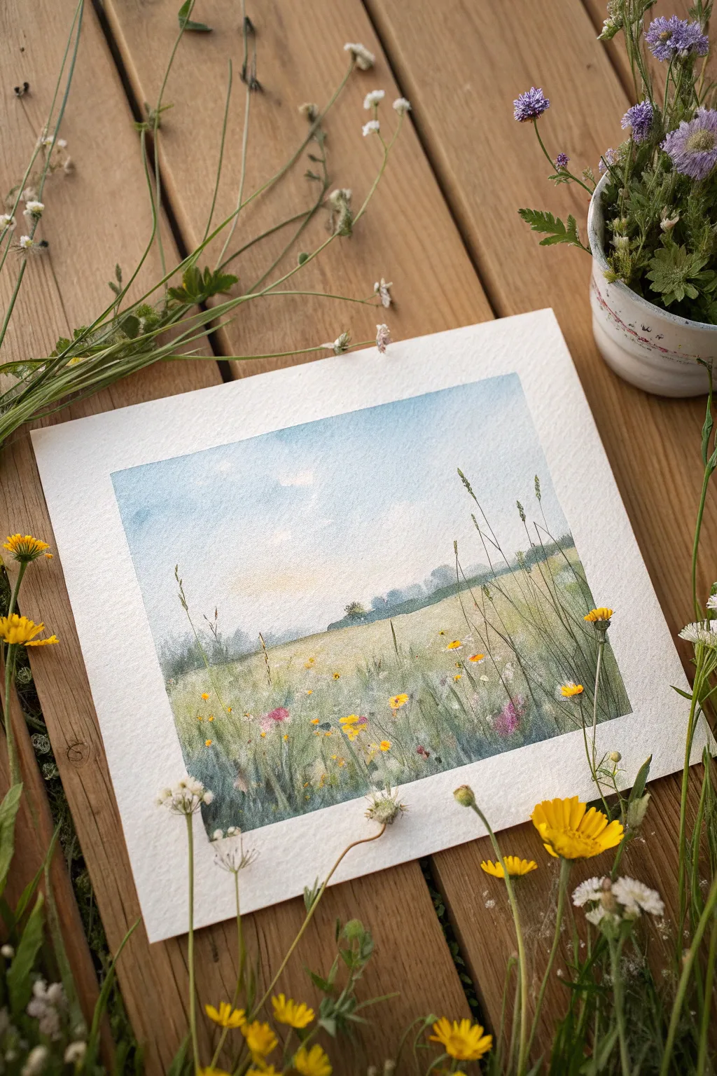
Capture the breezy tranquility of a wildflower field with this soft watercolor tutorial. By combining loose wet-on-wet washes for the sky with precise dry-brush details for the grasses, you create a beautiful sense of depth and atmosphere.
Step-by-Step Tutorial
Materials
- Cold press watercolor paper (300gsm/140lb)
- Watercolor paints (Cerulean Blue, Sap Green, Yellow Ochre, Burnt Sienna, Payne’s Gray, Lemon Yellow)
- Artists tape or masking tape
- Soft round brush (size 10 or 12)
- Small liner or rigger brush (size 0 or 1)
- White gouache or white gel pen (optional)
- Clean water and paper towels
Step 1: Planning and Sky
-
Tape details:
Begin by taping down all four edges of your watercolor paper to a board. This creates the crisp white border seen in the example and prevents buckling. -
Light sketch:
With a hard pencil (H or 2H), very faintly draw the horizon line about one-third of the way up the paper. Keep it slightly uneven to look natural. -
Wet the sky:
Load your large round brush with clean water and wet the entire sky area above your horizon line. The paper should glisten but not have puddles. -
Sky wash:
Drop in a watery mix of Cerulean Blue starting at the top edge. Let the color naturally fade as you move downward toward the horizon, leaving white spaces for clouds. -
Warm glow:
While the sky is still damp, lightly touch a very dilute wash of Yellow Ochre just above the horizon line to suggest a hazy sunrise or sunset glow.
Muddy Greens?
If your field looks muddy, you likely overmixed the colors on the paper. Let the yellow and green washes sit side-by-side and blend naturally rather than scrubbing them together.
Step 2: Horizon and Midground
-
Distant trees:
Mix a muted green using Sap Green and a touch of Payne’s Gray. While the sky is just barely damp (not soaking), dab in the distant tree shapes along the horizon line so they bleed slightly for a ‘foggy’ look. -
Create the field base:
Switch to a mix of Yellow Ochre and Sap Green. Paint the field area below the horizon using broad, horizontal strokes, letting the color be lighter near the horizon and darker at the bottom. -
Texture building:
While the field wash is wet, drop in spots of Burnt Sienna or darker green in the foreground area to create the impression of shadows and dense vegetation. -
The wait:
Allow the painting to dry completely. This is crucial—if the paper is cool to the touch, it is still wet. I often use a hairdryer here to speed things up.
Scratching Out
For realistic white grass stems, use a clean, damp brush or a palette knife edge to ‘lift’ or scratch out thin lines from the wet field wash before it dries.
Step 3: Foreground Details
-
Tall grasses:
Using your rigger or small liner brush and a creamy mix of Sap Green and Payne’s Gray, paint quick, upward flicks starting from the bottom edge. -
Varying line weight:
Press down at the start of the stroke and lift quickly at the end to create tapering grass blades. Vary the heights and angles so they don’t look like a picket fence. -
Stems and stalks:
Paint a few very tall, thin stems reaching up past the horizon and into the sky area. This overlaps the background and creates immediate depth. -
Color spots:
Mix a saturated Lemon Yellow. Dot small clusters of flowers amongst the grasses. Add a few dots of pink or orange if you want variety. -
White flowers:
Use white gouache or a gel pen to add tiny specs of white flowers or dandelion heads floating in the field. Keep these random and sparse. -
Final darkening:
Mix your darkest green (Green + Brown + Blue). Add a few more grass blades in the very bottom corners to frame the viewer’s entry point into the scene. -
The reveal:
Once totally dry, slowly peel away the tape at a 45-degree angle to reveal your crisp edges.
Now you have a serene little landscape ready to frame or gift
Anemones With Inky Centers and Soft Petal Rings
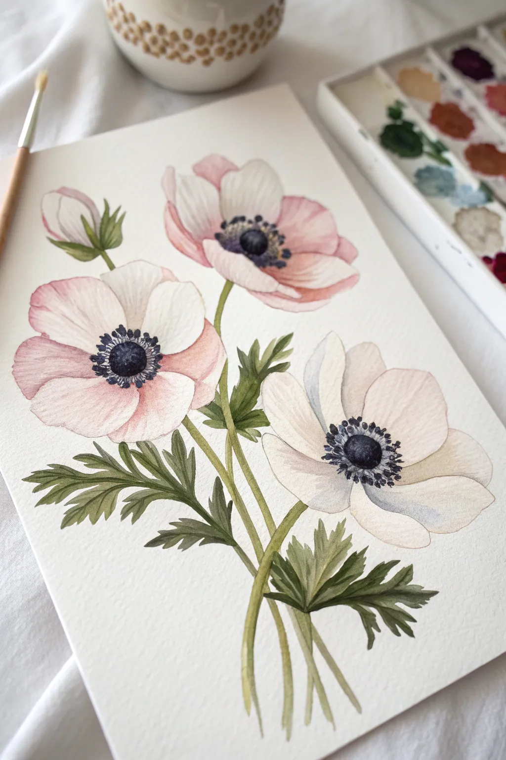
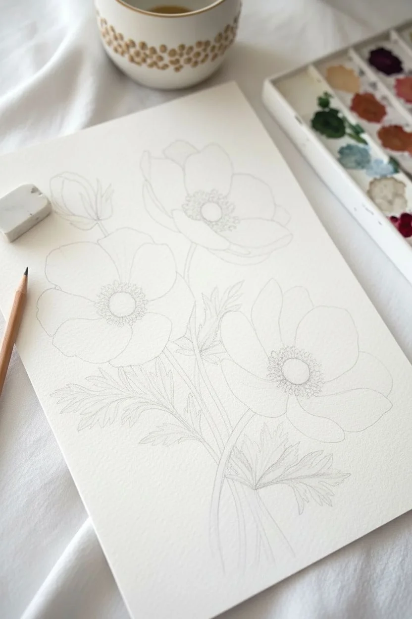
Capture the delicate beauty of anemone flowers with this soft and romantic watercolor study. You will learn to balance pale washes for petals with deep, saturated colors for the dramatic centers.
Step-by-Step Guide
Materials
- Cold press watercolor paper (300 gsm)
- Round watercolor brushes (sizes 2, 4, and 6)
- Watercolor paints: Alizarin Crimson, Sap Green, Indigo, Paynes Gray, Yellow Ochre
- Pencil (HB or H) for sketching
- Kneaded eraser
- Two jars of water
- Paper towels
Step 1: Sketching the Composition
-
Lay out the flowers:
Begin by lightly sketching three large circles for the open blooms and a teardrop shape for the bud. Place one bloom centrally on the left, one slightly higher on the right, and one lower on the right to create a balanced triangle. -
Refine the petal shapes:
Within your circles, draw the individual petals. Anemones have wide, overlapping petals with slightly ruffled edges. Keep your lines very faint so they don’t show through the translucent paint later. -
Add stems and leaves:
Draw long, slender stems curving down to a joining point. Sketch the deeply serrated, parsley-like leaves branching out creating a lush base for the flowers.
Muddy Petals?
If your pinks and greens are bleeding together, ensure each section is bone-dry before painting an adjacent area. Use a hairdryer on low heat to speed up the process.
Step 2: Painting the Petals
-
First wash for the pink flower:
Mix a very watery dilution of Alizarin Crimson. Using your size 6 brush, paint the petals of the left-hand flower, leaving the edges of the petals softer. Keep the paper white nearest the center for a glowing effect. -
First wash for the white flowers:
For the other two blooms, use clean water to wet the petals first. Drop in the tiniest amount of diluted Payne’s Gray or violet on the shadowed edges, keeping the majority of the petal pure white. -
Adding petal details:
Once the initial wash is dry, mix a slightly stronger pink. Use a size 2 brush to paint fine lines radiating from the center outward to mimic petal texture and veins. -
Deepening the shadows:
Glaze a transparent layer of pink or violet where petals overlap. This casts a shadow and separates the petals visually, giving the flower 3D volume. -
Painting the bud:
Paint the closed bud with a soft wash of pink at the tip, fading into green at the base where the sepals cup the petals.
Make it Sparkle
Once the painting is dry, use a white gel pen to add tiny dots to the dark center stamens. It simulates light catching the pollen and adds instant realism.
Step 3: Creating the Centers
-
Painting the inner button:
Mix a dark, rich Indigo or Payne’s Gray. Paint a solid specialized circle in the very middle of each open flower. While still wet, you can lift a tiny highlight out with a dry brush to make it look round. -
Adding the stamen ring:
surrounding the dark button, stipple tiny dots using the tip of your smallest brush. Use a mix of Indigo and violet to create that fuzzy, pollen-rich texture characteristic of anemones. -
Refining the center:
Draw very fine, short lines connecting the stippled dots to the center button. This creates the individual filaments.
Step 4: Leaves and Stems
-
Base green layer:
Mix Sap Green with a touch of Yellow Ochre for a natural, warm green. Fill in the stems and leaves with a size 4 brush. Pull the brush smoothly along the stem length. -
Shadowing the leaves:
While the green is still slightly damp, drop in a darker green (mixed with a little Indigo) at the base of the leaves and where leaves overlap stems. -
Leaf details:
Let the greenery dry completely. Use your size 2 brush and the dark green mix to paint fine veins on the leaves and sharpen the serrated edges. -
Final assessment:
Step back and look at your contrast. If the flower centers don’t look dark enough against the pale petals, add another layer of Indigo to make them truly pop.
Frame your delicate floral trio in a simple white mat to let those inky centers really stand out


Flower Buds and Almost-Blooms for a Gentle Study
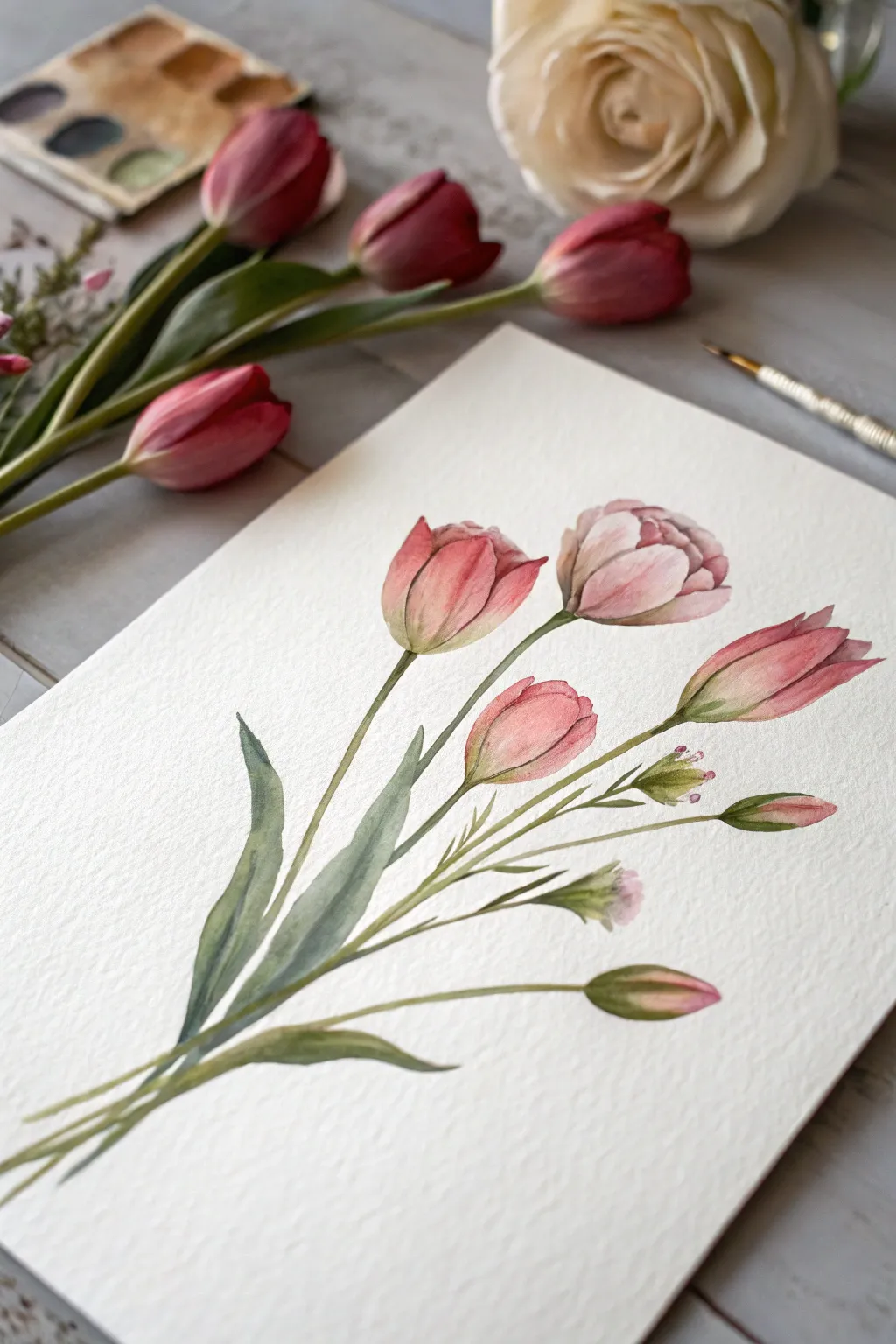
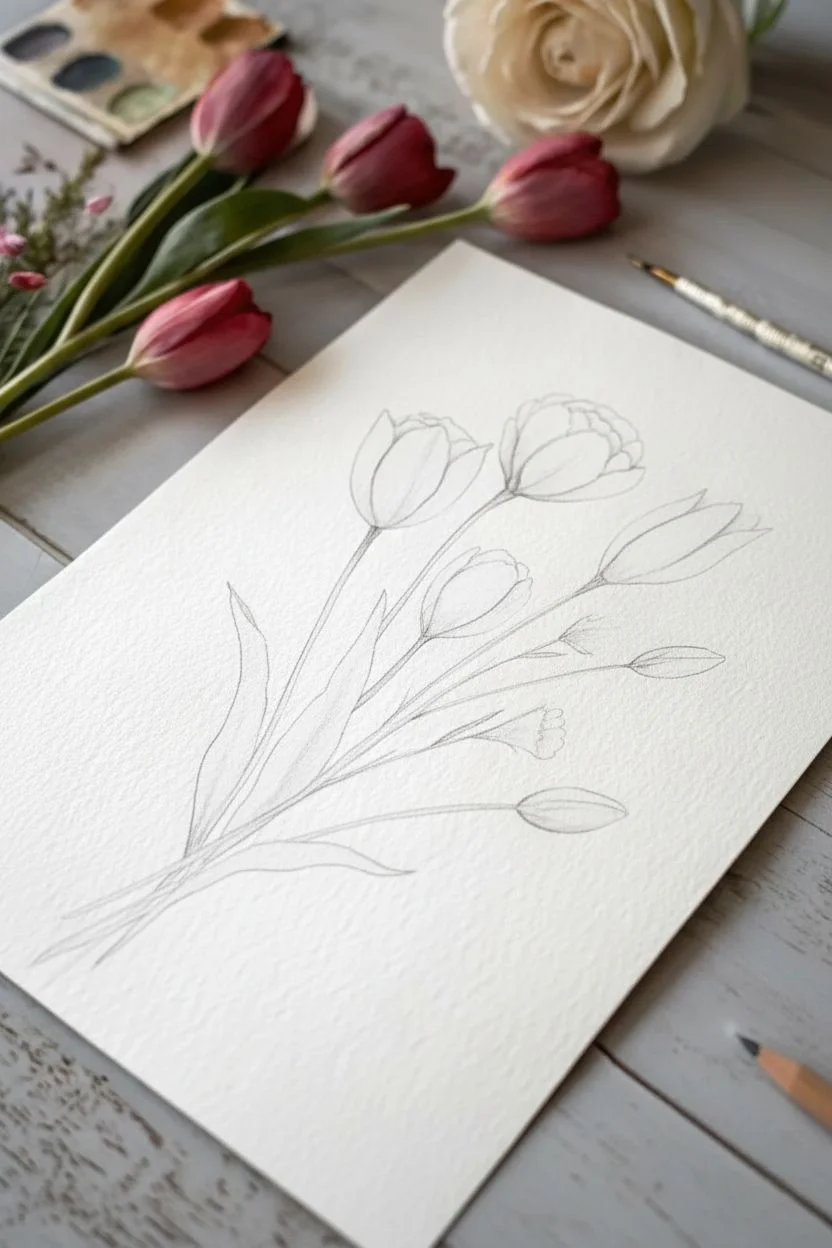
This project captures the quiet beauty of tulips just before they fully unfurl, focusing on gentle pink gradients and graceful stems. Using wet-on-wet techniques and soft layering, you’ll create a botanical study that feels fresh and elegantly simple.
Detailed Instructions
Materials
- Cold-pressed watercolor paper (300 gsm)
- Watercolor paints: Rose Madder, Sap Green, Burnt Umber, Alizarin Crimson
- Round watercolor brushes (Size 4 and Size 0 or 1 for details)
- Pencil (HB or H)
- Kneaded eraser
- Clean water container
- Paper towel
Step 1: Planning Composition and Sketching
-
Analyze the Layout:
Visualize the composition before you start. You have a fan-shaped arrangement: three main blooms at the top, two smaller buds to the right, and all stems converging at the bottom left. -
Sketch the Stems:
Using your HB pencil, lightly draw five curving lines radiating from the bottom left corner. Keep the lines fluid and natural—avoid stiff, straight rulers here. -
Outline the Blooms:
At the top of the central stems, sketch the egg-shaped outlines of the main tulip cups. Add the smaller, tighter buds on the lower right stems. -
Refine the Shapes:
Refine your sketch by drawing the overlapping petals within the main shapes. Keep your pencil pressure very light so the graphite won’t show through the transparent watercolor layers. -
Add Leave Details:
Sketch two long, lance-shaped leaves near the base where the stems converge. These anchor the bouquet.
Pro Tip: Hard Lines
To get those beautiful, crisp edges on the petals, ensure the paper is completely dry before painting an adjacent shape. This prevents colors from bleeding into one big blob.
Step 2: Painting the Blooms
-
Base Wash for Petals:
Start with the large central tulip. Wet the petal area with clean water, then drop in a very watery mix of Rose Madder. Let the color flow naturally. -
Deepening the Pink:
While the paper is still slightly damp, touch the tip of your brush load with more concentrated Alizarin Crimson to the base of the petals and let it bleed upward to create volume. -
Painting the Side Blooms:
Repeat this process for the other two large flowers. Leave tiny slivers of white paper between petals to define the separate shapes without using harsh outlines. -
Bud details:
For the smaller buds on the right, keep the wash tighter. Use a mix of pink and a tiny touch of green at the very base where the bud meets the stem. -
Refining Edges:
Once the first layer is dry, use a smaller brush to sharpen the petal edges with a slightly darker pink mix, giving the flowers deeper form.
Step 3: Stems and Greenery
-
Mixing Greens:
Prepare a natural green by mixing Sap Green with a touch of Burnt Umber to tone down the brightness. You want an earthy, muted tone. -
Painting the Stems:
With a steady hand and your size 4 brush, paint the stems in a single continuous stroke if possible. Start from the flower base and pull downwards. -
Connecting the Blooms:
Where the stem meets the flower head, widen the stroke slightly to create the receptacle. I find dropping a tiny bit of pink into the wet green here creates a lovely organic transition. -
Leaf Gradients:
Paint the leaves using a wet-on-dry technique. Start with a lighter green at the top and drop in darker green pigment near the base of the leaf for shadowing. -
Adding Texture:
While the leaves are drying, lift out a thin line of color down the center using a thirsty (damp but clean) brush to suggest a central vein.
Troubleshooting: Bloom Backruns
If you see ‘cauliflower’ blooms in your paint, you likely added water to a drying wash. Wait for it to fully dry, then glaze over with a light wash to smooth it out.
Step 4: Final Details
-
Shadows and Contrast:
Mix a darker version of your pink (Rose Madder + tiny dot of green/brown). Apply this carefully into the crevices where petals overlap to pop the shapes forward. -
Tiny Bud Accents:
Using your smallest brush, paint the tiny green sepals on the smallest buds to the right. -
Stem Bundling:
Darken the area where all stems overlap at the bottom left to show depth and density in the bouquet. -
Final Cleanup:
Wait until the painting is completely bone dry. Gently erase any visible pencil lines with your kneaded eraser.
Step back and admire the soft transitions and delicate forms of your botanical study
Color-Blocked Florals That Pop Off the Page
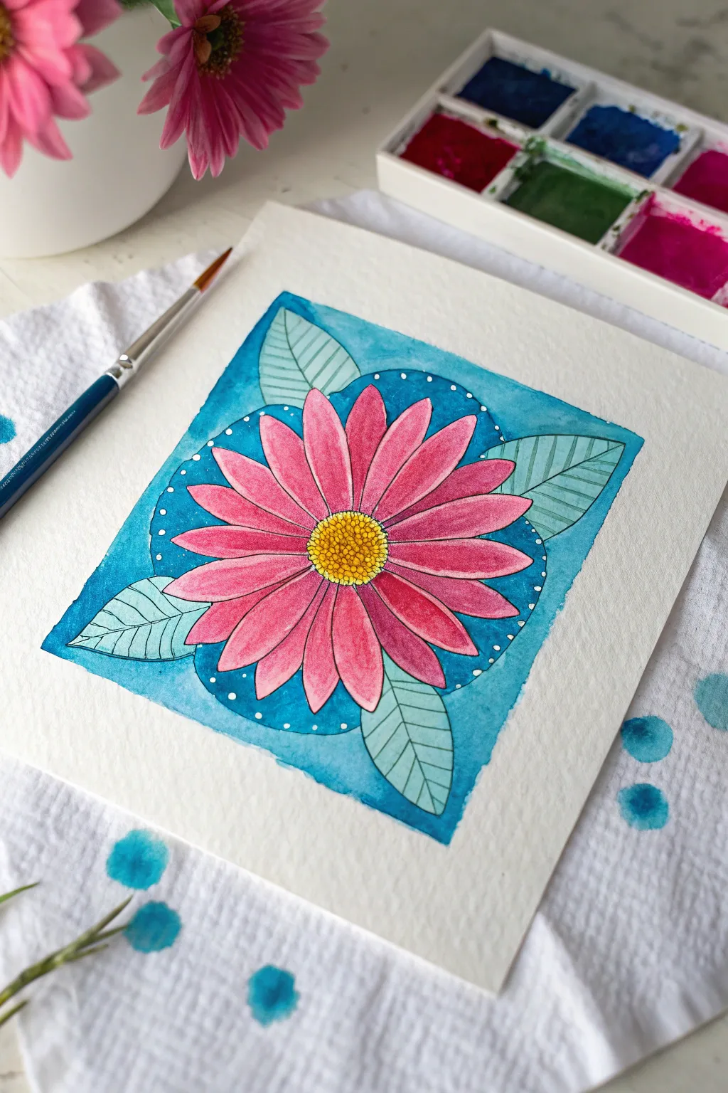
This vibrant project combines the organic beauty of a pink daisy with the structured appeal of geometric color blocking. By setting a detailed floral illustration against a crisp teal square, you create a modern composition that feels both playful and polished.
Step-by-Step Guide
Materials
- Cold press watercolor paper (square format recommended)
- Pencil (HB or H)
- Fine-point waterproof ink pen (black)
- White gel pen
- Watercolor paints (Pink, Teal/Turquoise, Yellow, Leaf Green)
- Round watercolor brushes (sizes 2 and 6)
- Ruler
- Compass or circular object for tracing
- Paper towel
- Masking tape (optional)
Step 1: Planning and Sketching
-
Define the boundaries:
Start by drawing a perfect square in the center of your watercolor paper using a ruler. This will be the boundary for your color block background. -
Sketch the center:
Find the middle of your square and lightly sketch a small circle for the flower’s center. It doesn’t need to be perfectly round, as organic shapes look more natural. -
Draw the petals:
Radiate long, oval-shaped petals out from the center. Aim to keep them contained mostly within the square, but sketching them lightly first allows you to adjust spacing. -
Add the leaves:
Tuck four leaves behind the petals, positioning one in each corner of the square to create a balanced, symmetrical look. -
Refine the background:
Using a compass or a roll of tape, lightly sketch a circle that sits behind the flower but inside the square spacing. This creates the inner halo effect you see in the blue background.
Clean Lines Pro Tip
For crucial sharp edges on the background square, apply drafting tape or washi tape to the border before painting. Peel it away only after the paint is 100% dry.
Step 2: Inking the Outline
-
Outline the flower:
With your waterproof black ink pen, carefully trace your pencil lines for the petals and the flower center. Add tiny circles inside the center disk for texture. -
Detail the leaves:
Ink the outlines of the leaves. Draw a central vein down the middle of each leaf, followed by thin, parallel diagonal lines for the veins. -
Erase pencil marks:
Wait until the ink is completely dry—usually about 5 minutes—before gently erasing all your pencil sketches to keep the paper clean.
Level Up: Metallic Touch
Swap the white gel pen dots for metallic gold ink. Adding gold accents to the flower center or leaf veins creates a shimmer that elevates the piece.
Step 3: Applying Color
-
Paint the petals:
Load your brush with a bright pink watercolor. Paint each petal, dropping slightly more concentrated pigment at the base of the petal near the center and letting it fade outward for a gradient effect. -
Fill the center:
Use a warm yellow paint for the flower’s center. While it’s damp, I like to touch a tiny bit of orange or brown to the bottom edge of the center circle to give it 3D form. -
Paint the leaves:
Using a diluted, soft green, fill in the leaves. The ink lines will show through nicely. Keep this layer fairly light so the detail remains visible. -
Block in the background:
Mix a vibrant teal or turquoise. Carefully paint the negative space inside the square around the petals and leaves. Use a smaller brush to get into the tight corners between petals. -
Create the halo effect:
Notice the subtle tonal shift in the background? Paint the area inside your circular sketch (closest to the flower) with a slightly darker, more saturated teal, and use a lighter wash for the square corners.
Step 4: Final Flourishes
-
Deepen the shadows:
Once the first layer of pink is dry, add a second, darker glaze of pink just to the tips and bases of the petals to enhance the visual ‘pop’. -
Add white accents:
Wait for the background paint to be bone-dry. Take your white gel pen and add small dots following the curve of the inner background circle. -
Clean edges:
If your square edges look a little ragged, you can tidy them up with a final careful pass of the teal paint or by re-defining the edge with your ruler and pen if you prefer a bordered look.
Enjoy the satisfaction of peeling off any tape and seeing your crisp, colorful floral design ready for display
Limited Palette Bouquet Using Only Three Colors
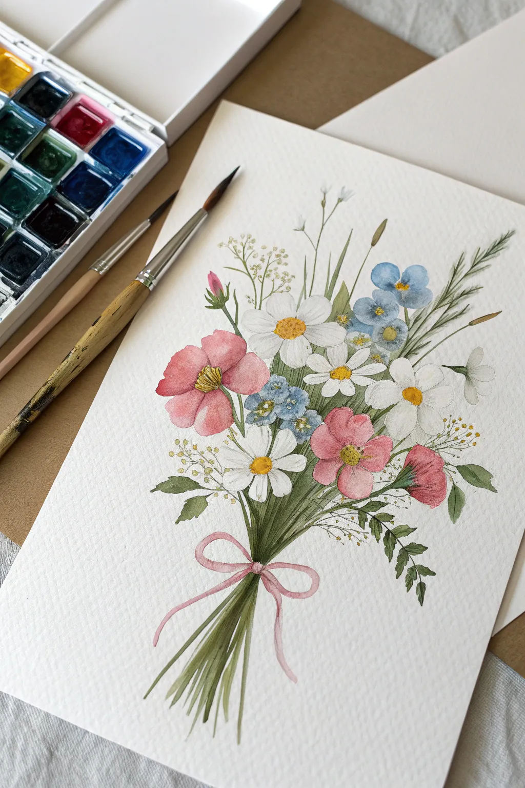
Create a charming, garden-fresh illustration using just a handful of watercolor paints. This project focuses on a whimsical arrangement of pink poppies, white daisies, and delicate blue forget-me-nots tied together with a sweet pink ribbon.
Step-by-Step
Materials
- Cold-press watercolor paper (300 gsm or 140 lb)
- Watercolor paints (Alizarin Crimson, Ultramarine Blue, Lemon Yellow, Hooker’s Green, Burnt Umber)
- Round brushes (Size 4 for petals, Size 0 or 1 for fine details)
- HB pencil for sketching
- Kneaded eraser
- Palette for mixing
- Two jars of water
- Paper towels
Step 1: Sketching the Composition
-
Outline the main blooms:
Begin by lightly sketching the largest flowers first. Place three oval shapes for the pink poppies—one on the left, two on the lower right—and scatter three or four circles for the white daisy heads. -
Add filler flowers:
Sketch small clusters of five-petal shapes for the blue forget-me-nots, tucked between the larger blooms. Add tiny circles on thin stems for the baby’s breath or filler foliage. -
Draw the stems:
Draw the stems gathering at a focal point near the bottom. Don’t make them perfectly straight artwork; allow them to curve naturally. Sketch a loose bow tying the stems together. -
Refine the sketch:
Gently roll a kneaded eraser over your drawing to lift excess graphite until only faint guidelines remain, ensuring your pencil lines won’t show through the transparent watercolor.
Keeping Colors Clean
Wait for each flower head to dry completely before painting a touching neighbor. This prevents the pinks and blues from bleeding into a muddy purple.
Step 2: Painting the Flowers
-
First wash for pink flowers:
Mix a watery wash of Alizarin Crimson. Paint the petals of the pink flowers using wet-on-dry technique, leaving tiny slivers of white paper between petals to define their edges. -
Define the white daisies:
Since the paper is white, use a very pale, watered-down mix of Ultramarine Blue and a touch of gray to paint distinct shadows on the daisy petals. This negative space painting defines the white forms without using white paint. -
Paint the blue blooms:
Using a size 4 brush, dab small strokes of Ultramarine Blue for the forget-me-nots. Vary the intensity by adding more water for some petals to create depth. -
Add flower centers:
Once the petals are dry, mix Lemon Yellow with a tiny dot of Burnt Umber for a golden tone. Paint the centers of the daisies and the pink flowers. Add tiny stippled dots for texture. -
Deepen the pinks:
Return to the pink flowers with a slightly more saturated crimson mix. Add strokes near the center of the bloom and along the petal edges to create a cupped, realistic 3D effect.
Fixing Hard Edges
If a shadow on a white petal looks too harsh, soften the edge with a clean, damp brush while the paint is still slightly moist to blend it out.
Step 3: Adding Foliage and Stems
-
Base layer for greens:
Mix Hooker’s Green with a touch of Lemon Yellow for a fresh, spring green. Using your fine brush, paint the main stems, starting from the flower heads and pulling down toward the gathering point. -
Paint grassy leaves:
Add long, slender blades of grass and fern-like leaves extending outward. Use quick, flicking motions with your brush to get tapered tips on the grass blades. -
Darker foliage accents:
Mix Hooker’s Green with a little Ultramarine or Burnt Umber to get a shadow green. Paint the stems that are ‘behind’ others in the bunch to create depth and volume in the bouquet. -
Filler details:
Use your smallest brush (size 0) to add tiny yellow-green dots for the baby’s breath or seeded grass elements floating above the main bouquet.
Step 4: Ribbon and Final Touches
-
Paint the ribbon:
Using a dilute mix of your pink color, carefully fill in the bow shape. Darken the loops where the ribbon folds over itself to show dimension. -
Stem ends:
Paint the cut ends of the stems below the ribbon. Vary the lengths slightly natural look, and use a mix of green and brown. -
Stamen details:
With a damp fine brush, lift a tiny highlight from the center of the pink flowers if needed, or add tiny dark brown dots around the yellow centers for contrast. -
Final assessment:
Step back and check for balance. If a particular area looks too light, add a transparent glaze of color to deepen the value and unify the bouquet.
Frame your botanical artwork in a simple wood frame to highlight its delicate nature
Monochrome Flowers in Black, White, and Gray
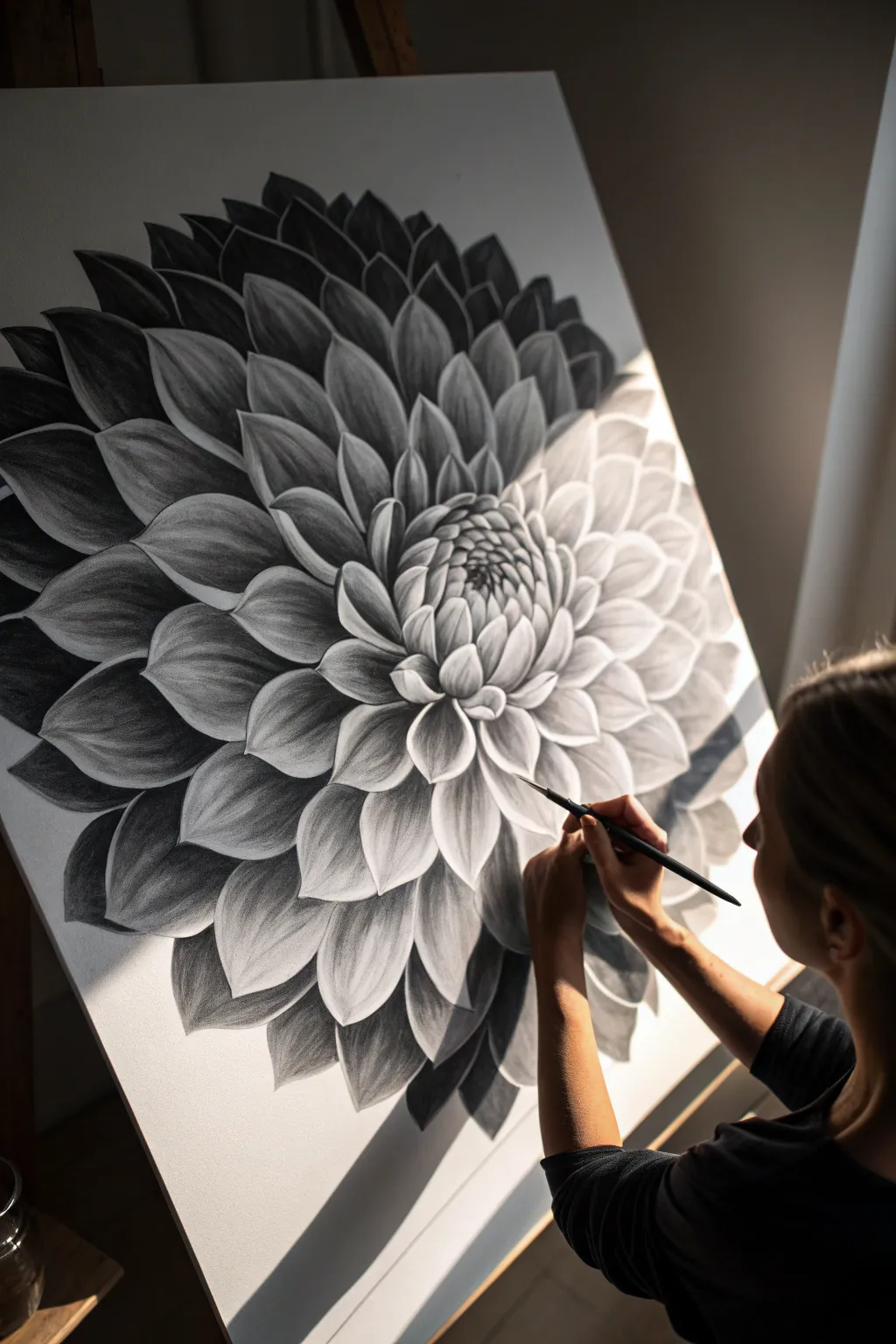
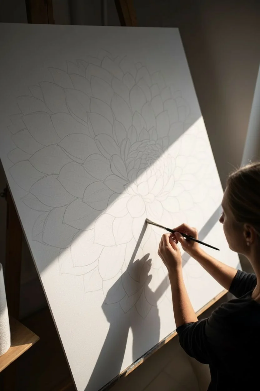
Master the art of light and shadow with this striking large-scale Dahlia study. Using a limited palette of black, white, and gray, you will learn to sculpt petals on the canvas to create a mesmerizing 3D effect that feels both modern and timeless.
Step-by-Step Tutorial
Materials
- Large stretched canvas (square or rectangular, primed white)
- Graphite powder or charcoal powder
- Soft synthetic brushes (large filbert and small round)
- Black acrylic paint
- Soft kneaded eraser
- Workable fixative spray
- Jar of water
- Paper towels for blending
- Painters tape (optional for edges)
Step 1: Drafting the Structure
-
Establish the center:
Begin by finding the exact center of your canvas. Lightly mark a small circle here using a pencil or very diluted charcoal wash; this will be the heart of your Dahlia. -
Map the petal rings:
Sketch concentric circles radiating outward from the center. These don’t need to be perfect, but they will guide the size of your petal layers as they expand toward the canvas edge. -
Sketch the inner petals:
Starting at the center, draw small, tight, cupped petal shapes. They should overlap significantly, like scales on a pinecone, all pointing inward. -
Expand outward:
Continue drawing rows of petals, making them progressively larger and more open as you move away from the center. Ensure the tips of the outer petals start to curve slightly.
Step 2: Applying Deep Shadows
-
Mix your darkest value:
Create a rich, deep black. I prefer using black acrylic paint for the darkest recesses to ensure they remain permanent and crisp against the softer charcoal textures. -
Fill the negative space:
Carefully paint the triangular gaps between the petals. This negative space painting is crucial; it defines the edges of the petals without you actually outlining them. -
Deepen the center:
Apply the dark black mixture into the deepest crevices of the central bud, where light naturally struggles to reach. -
Define the outer shadows:
Paint the shadows underneath the largest outer petals. Focus heavily on one side (e.g., the bottom left) to establish a directional light source immediately.
Clean Edges
Keep a piece of scratch paper under your hand while working. This prevents oils from your skin transferring to the canvas and stops your hand from smearing the graphite powder.
Step 3: Sculpting with Mid-Tones
-
Load the graphite brush:
Dip a dry, soft filbert brush into your graphite or charcoal powder. Tap off the excess so you build up color slowly rather than all at once. -
Create the gradient:
Start at the base of a petal (where it meets the black shadow) and sweep the gray powder outward toward the tip. Lift the brush pressure as you reach the end. -
Soften the transitions:
Use a clean, dry brush or a paper towel to blur the line where the black paint meets the gray powder. You want a smoky transition, not a hard barrier. -
Establish the light source:
If your light is coming from the top right, keep the petals in that quadrant significantly lighter, using very little graphite powder.
Muddy Grays?
If your grays look flat, you’ve likely covered too much of the white canvas. Use an electric eraser or a hard vinyl eraser to carve bright white paths back into the petal tips.
Step 4: Highlighting and Refining
-
Clean the petal tips:
Using your kneaded eraser, lift away any stray graphite dust from the very tips and edges of the petals. This reveals the bright white of the gessoed canvas. -
Enhance the contrast:
Look at the petals on the shadow side (bottom left). Even though they are in shadow, their tips need a touch of lightness to separate them from the petal beneath. -
Add white accents:
For the brightest highlights on the center petals, you can use a tiny amount of white acrylic paint or white charcoal to make them pop against the gray. -
Sharpen the edges:
Go back in with a fine round brush and touch up any black shadow areas that got dusty. Clean, sharp lines between the petals are essential for the 3D illusion. -
Seal the work:
Once you are happy with the balance, spray the entire canvas with a workable fixative. This prevents the loose graphite or charcoal powder from smudging over time.
Step back and admire how the simple combination of black and white has blossomed into a complex, photorealistic flower
Negative Space Flowers Where the Background Becomes the Petals
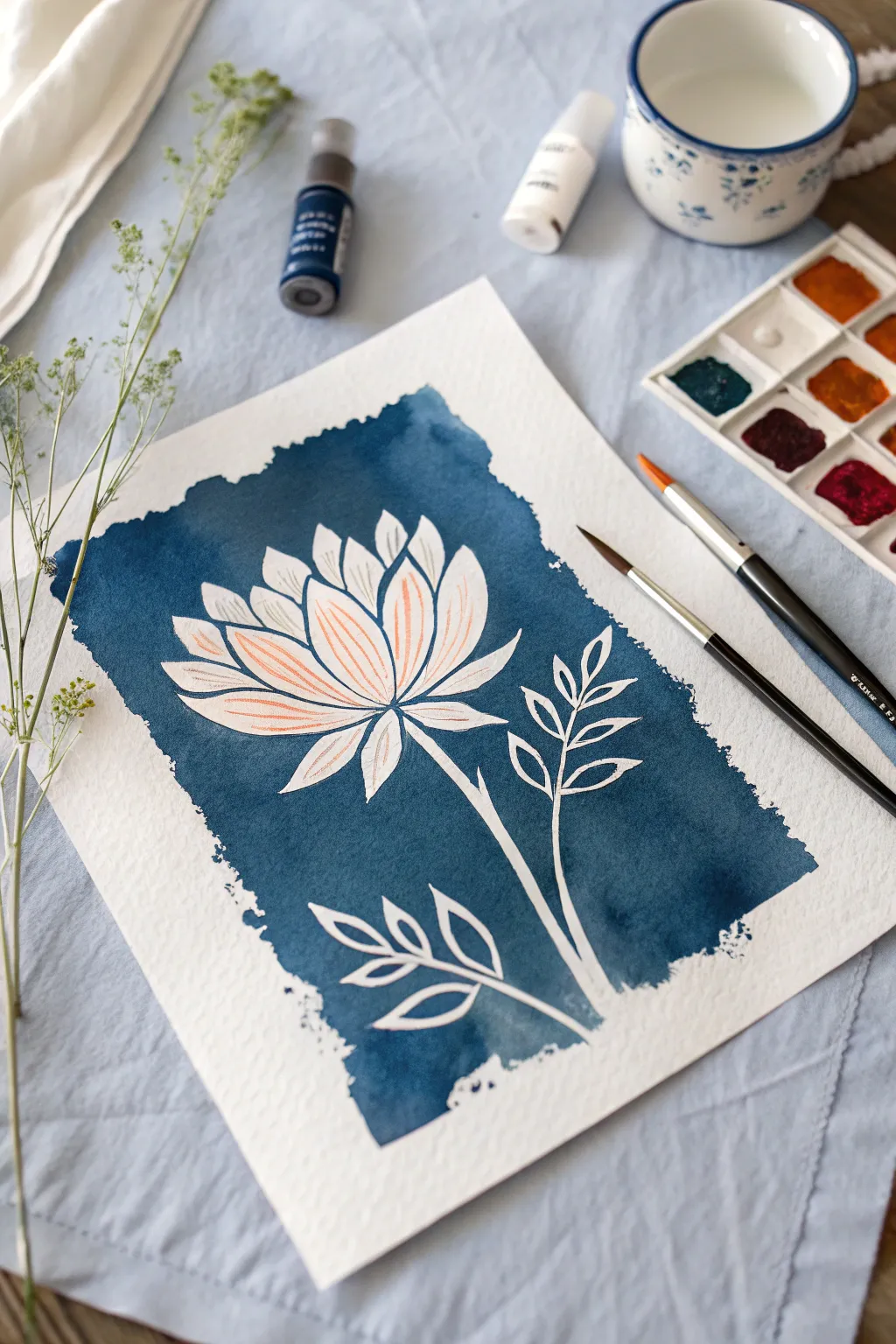
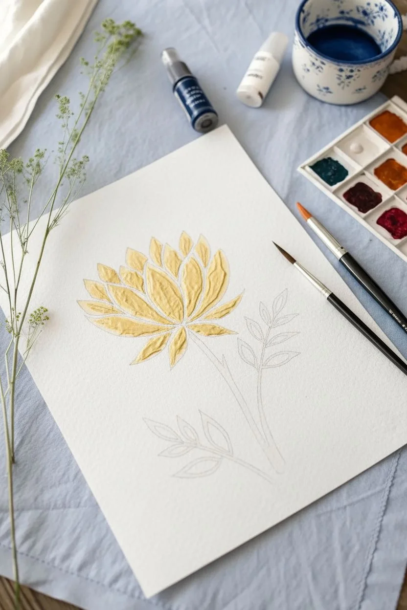
This striking watercolor project plays with perception by painting the space around the flower rather than the petals themselves. The result is a luminous white bloom emerging from a deep indigo background, accented with delicate veins for texture.
Detailed Instructions
Materials
- Cold press watercolor paper (300 gsm)
- Pencil (HB or H)
- Kneaded eraser
- Liquid masking fluid (drawing gum)
- Old brush or masking fluid applicator
- Watercolor paints: Indigo or Prussian Blue, Burnt Umber (for mixing)
- Burnt Orange or Terra Cotta light watercolor wash (optional)
- Round watercolor brush (size 6 or 8)
- Small detail brush (size 0 or 2)
- Palette
- Two jars of water
- Paper towels
Step 1: Sketching and Masking
-
Lightly sketch the flower:
Begin by lightly drawing the outline of your lotus flower and its stem in the center of the paper. Keep the lines faint so they don’t show through later. -
Draw the leaves:
Add simple branch-like leaves on either side of the main stem. Focus on the triangular shapes of the leaves, keeping them stylized and clean. -
Prepare the masking fluid:
Give your bottle of masking fluid a gentle shake. If using a brush, coat the bristles in bar soap first to protect them from clumping. -
Apply masking fluid:
Carefully fill in all the petal shapes, the stem, and the leaves with masking fluid. You are protecting the white paper that will eventually become your flower. -
Let it cure completely:
Allow the masking fluid to dry entirely. It should turn yellowish and feel rubbery to the touch. Do not proceed until it is 100% dry or you will tear the paper.
Clean Edges
If paint bled under the mask, use a tiny stiff brush with clean water to gently scrub the spot, then blot with a tissue to lift the unwanted color.
Step 2: Creating the Background
-
Mix a deep indigo:
On your palette, mix a generous puddle of Indigo paint. I like to add a touch of Burnt Umber to deepen it just slightly, making the blue feel richer and closer to velvet. -
Define the borders:
Instead of taping the edges, we’ll create a rough, painted edge. Decide where you want your blue rectangle to start and stop around the flower. -
Start the wash:
Using your larger round brush, load it with the indigo mix and begin painting at the top of your visual rectangle. Use horizontal strokes. -
Create a ragged edge:
As you paint down the sides, let the belly of the brush drag slightly on the paper’s texture to create that beautiful ‘deckled’ or rough edge effect. -
Paint over the mask:
Paint boldly right over your masked flower. Don’t worry about staying inside the lines of the petals; the mask protects them. -
Vary the saturation:
While the wash is wet, you can drop in slightly more concentrated pigment in some areas and a bit more water in others to create subtle texture within the blue field. -
Dry the background:
Let this background layer dry completely. The paper should be flat and warm to the touch before moving on.
Metallic Touch
Swap the peach vein details for metallic gold ink or watercolor. The shimmer against the matte indie background adds instant elegance.
Step 3: Reveal and Refine
-
Remove the mask:
Once the paint is bone dry, gently rub the masking fluid away using your finger or a rubber cement pickup tool. Reveal the crisp white paper underneath. -
Clean up edges:
Use your kneaded eraser to pick up any remaining pencil lines that might be visible inside the white flower shapes. -
Mix a pale peach:
Dilute a tiny amount of Burnt Orange or Terra Cotta with lots of water. You want a very faint, watery mix. -
Paint the veins:
Switch to your smallest detail brush. Using the pale peach mix, paint delicate, curved lines inside the petals to represent veins. Keep your hand loose. -
Add detail to the stem:
Add a few tiny lines or dots to the stem if desired, but keep the leaves mostly pure white for contrast.
Enjoy the dramatic contrast of your white bloom against that moody blue backdrop
Abstract Floral Shapes Using Swoops, Scrapes, and Smears
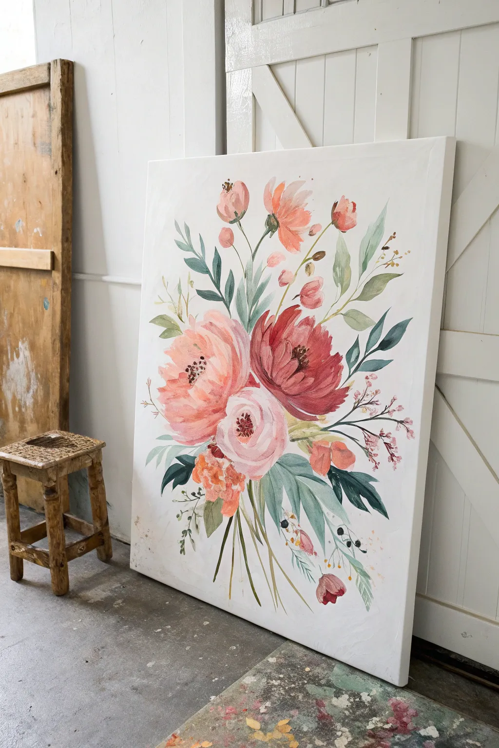
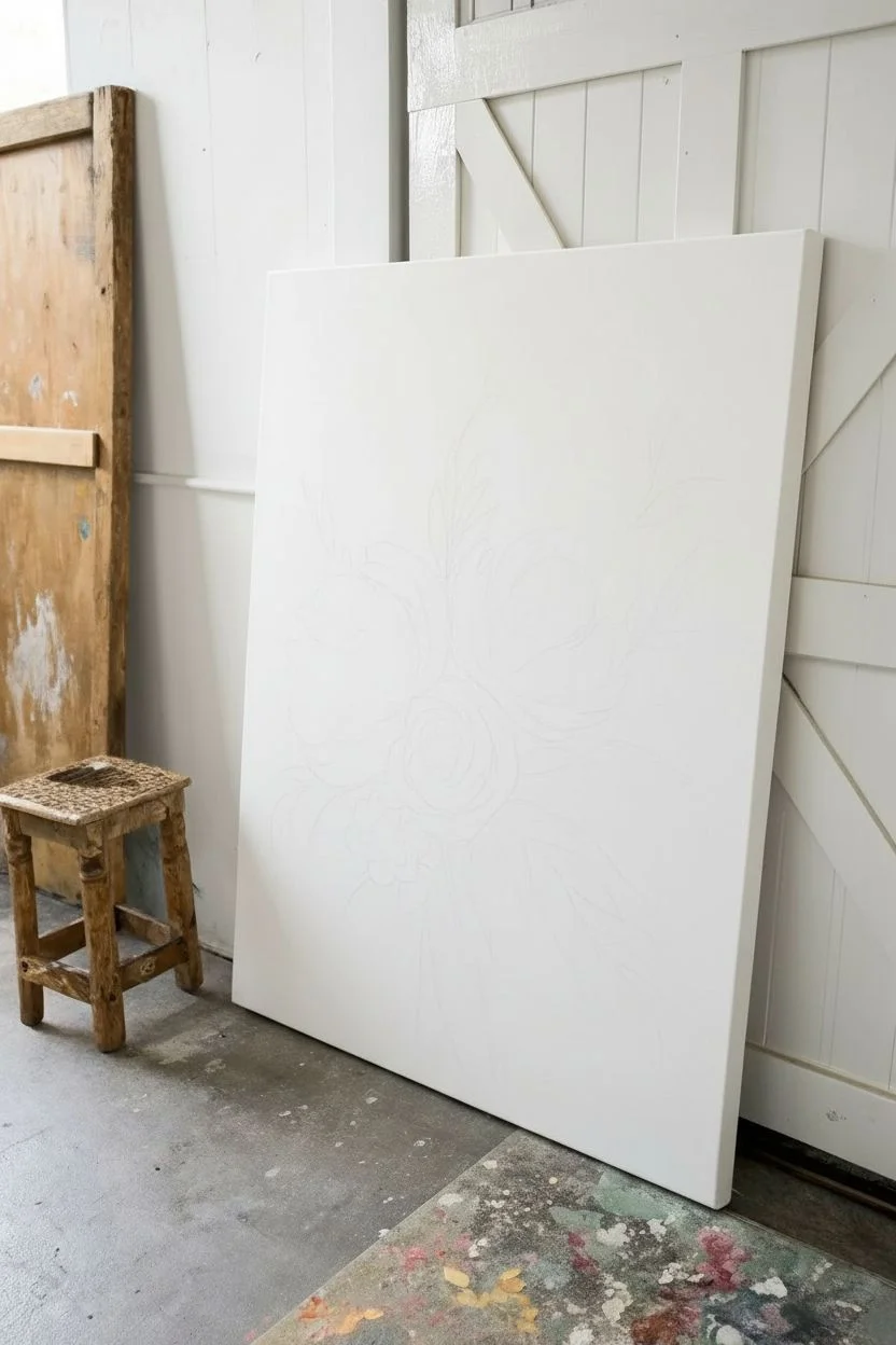
This elegant vertical canvas captures the soft, fluid movement of a wildflower bouquet with a muted, vintage-inspired color palette. By layering soft washes with defined brushstrokes, you’ll create a floral arrangement that feels both structured and effortlessly free-flowing.
Step-by-Step Tutorial
Materials
- Large vertical canvas (approx. 24×36 inches)
- Acrylic paints (Titanium White, Alizarin Crimson, Cadmium Red, Yellow Ochre, Sap Green, Phthalo Blue, Burnt Umber)
- Glazing medium or water for thinning
- Assorted synthetic brushes: 1″ flat wash, medium filbert, #4 and #6 rounds, fine liner
- Palette or mixing plate
- Graphite pencil (HB or B)
- Paper towels
- Jar of clean water
- Easel or wall mount
Step 1: Preparation and Sketching
-
Prime the Surface:
Even if your canvas is pre-primed, apply one additional coat of Titanium White mixed with a drop of water to create a silky, smooth surface. This helps your brushes glide more easily. Let this base coat dry completely, roughly 20-30 minutes. -
Map the Composition:
Using a light graphite pencil, sketch the general placement of your bouquet. Start with three large circles in the lower-middle area for your main blooms—a large peony on the left, a darker bloom on the right, and a smaller rose in the center. -
Branch Outwards:
Lightly draw sweeping lines extending upward and downward from the central cluster to indicate where the stems and taller bud sprays will go. Keep these lines loose; they are just guides for flow.
Step 2: The Focal Flowers
-
Mix the Peony Pink:
On your palette, mix Titanium White with a touch of Cadmium Red and Yellow Ochre to create a soft, warm peach-pink. Use a medium filbert brush to apply curved, C-shaped strokes for the large left-hand flower, leaving the outer edges soft. -
Create the Dark Crimson Bloom:
For the right-hand flower, mix Alizarin Crimson with a tiny bit of Burnt Umber for a deep, rich red. Paint wide, overlapping petals that curve inward toward a center point. Keep the paint somewhat thin so the white canvas adds luminosity. -
Paint the Central Rose:
Blend a very pale blush pink using mostly White and a speck of Alizarin Crimson. Paint the center flower with tight, concentric circles in the middle, loosening into wider petals as you move outward. -
Add Depth to Petals:
While the paint is still tacky, mix slightly darker versions of your base colors. Dab these into the bottom curves of the petals to create shadows and volume. -
Detail the Centers:
Using a #4 round brush and a dark mix of Burnt Umber and Blue, stipulate small dots and short dashes in the center of the pink and red flowers to represent stamens.
Muddy colors?
If your pinks and greens are turning brown where they touch, let the first color dry completely before painting a neighbor. Acrylic dries fast, so a 5-minute break usually solves this.
Step 3: Foliage and Filler
-
Mix Sage Green Shades:
Create a signature sage green by mixing Sap Green, White, and a touch of Red (to de-saturate it). Make a second, bluer variation by adding Phthalo Blue. -
Paint Broad Leaves:
With the flat brush or large filbert, paint the large leaves at the base of the bouquet. Press the brush down fully and lift as you pull away to create a tapered leaf shape. Use the blue-green mix for variety. -
Add Wispy Stems:
Switch to your #6 round brush. With thinner paint (use water or glazing medium), paint the long, elegant stems reaching upward. Curve them naturally like wild grass. -
Insert Secondary Blooms:
Using the peach-pink mix, paint smaller, tulip-shaped buds on the tall stems. Keep these simple—just two or three brushstrokes per bud is enough. -
Layer Delicate Sprigs:
Mix a diluted brown-pink color. Use the fine liner brush to add delicate, twiggy branches poking out from the sides. Dot the ends with tiny specks of white or pale pink to suggest baby’s breath or tiny berries.
Level Up: Texture
For a tactile finish on the flower centers, mix your dark brown paint with a pinch of cornstarch or sand before stippling. It adds a subtle 3D grit that mimics pollen.
Step 4: Finishing Details
-
Anchor the Bouquet:
Paint the lower stems trailing downward using a wash of transparent green and brown. Let them fade out near the bottom of the canvas rather than painting them all distinctively. -
Refine Edges:
Look at your main flowers. If any edges feel too harsh, use a damp, clean brush to gently soften the perimeter, enhancing that watercolor aesthetic. -
Add High Contrast Accents:
Mix a very dark, almost black green. Paint a few sharp, small leaves tucked deep between the main flowers. This high contrast makes the pastel petals pop forward. -
Final Highlights:
With pure White and a liner brush, add tiny highlights to the tops of the berries and the curviest parts of the main petals for a fresh, wet look.
Step back and admire how your simple brushstrokes have come together to form a garden on canvas
Overhead Flat-Lay Flower Studies in a Sketchbook Grid
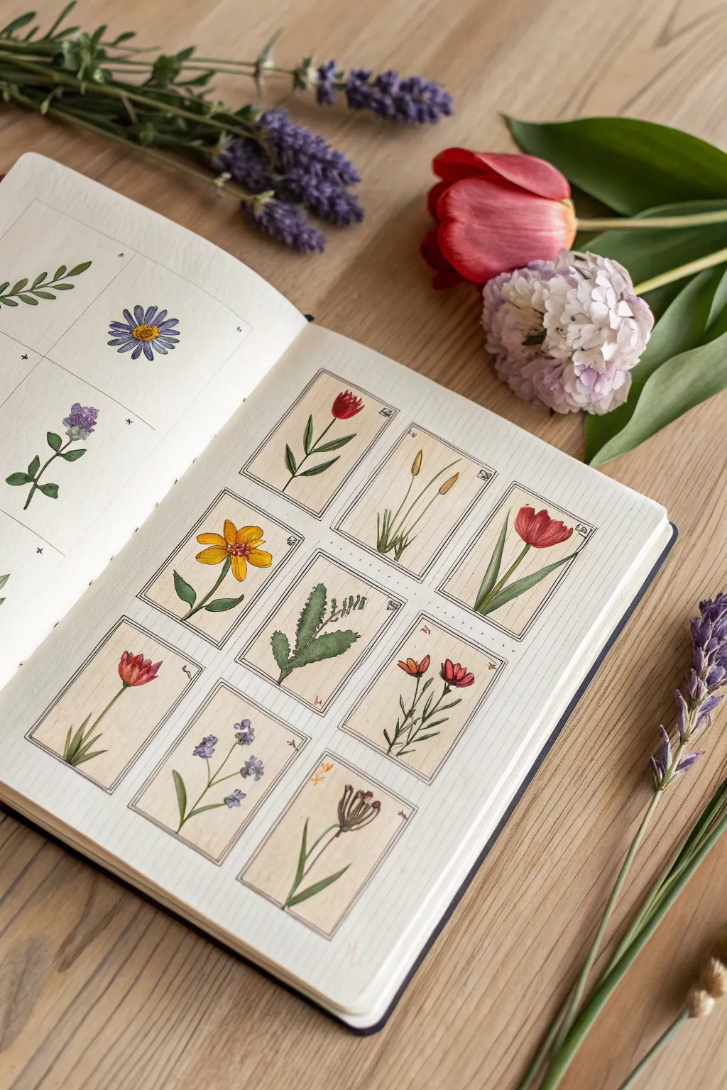
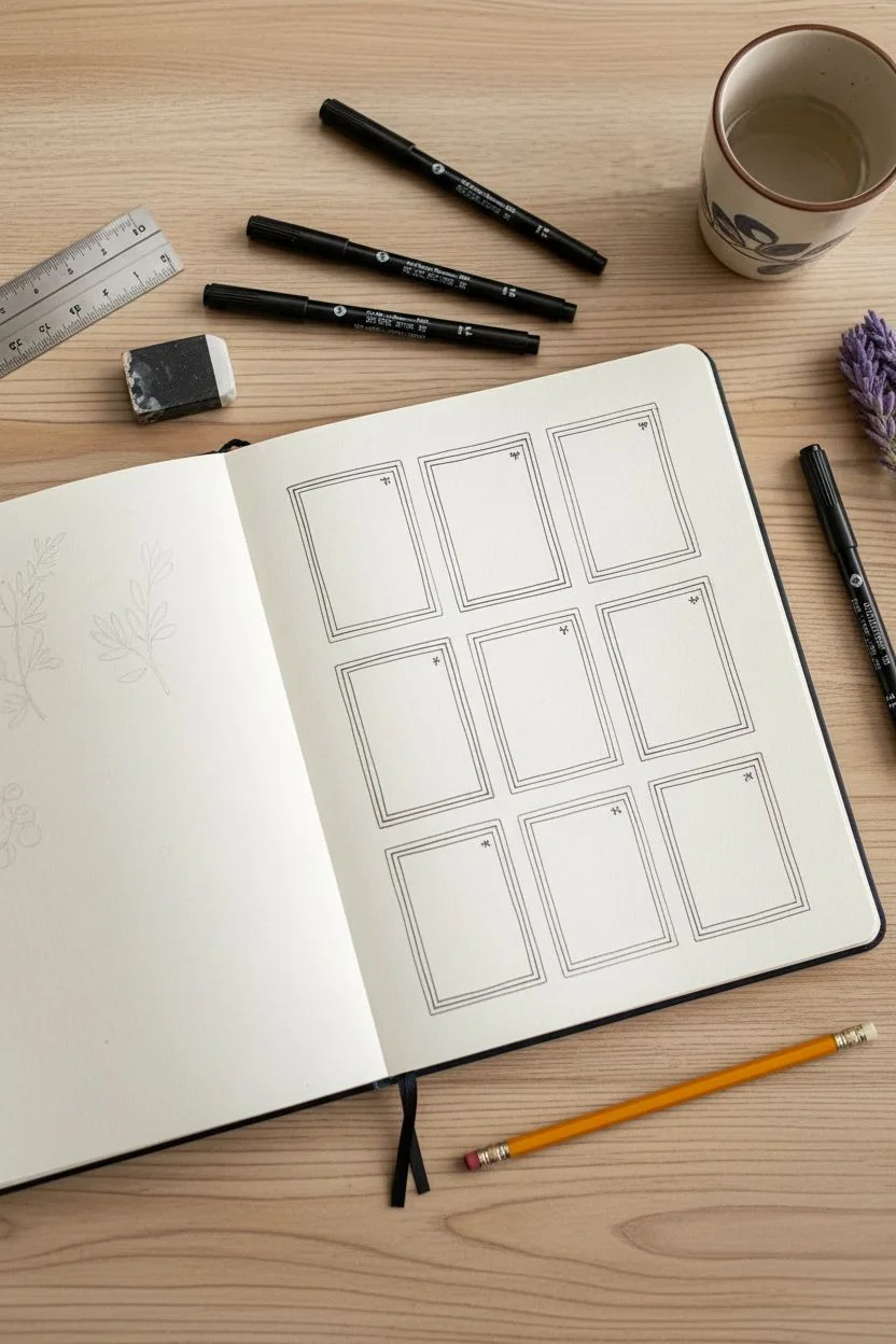
Capture the charm of an old field guide with this structured yet delicate sketchbook spread. By compartmentalizing your floral studies into a neat grid of “trading cards,” you can practice various plant forms and colors without the pressure of a full-scale composition.
Step-by-Step
Materials
- Mixed media sketchbook (A4 or A5)
- Ruler
- Pencil (HB or H)
- Fine liner pens (0.1mm and 0.3mm, black or sepia)
- Watercolor or gouache paints
- Small round brushes (Size 0, 2, and 4)
- Eraser (kneaded preferred)
- Water cup and paper towels
Step 1: Planning the Layout
-
Measure the grid:
Begin by measuring the usable space on your right-hand sketchbook page. You will need space for a grid of 12 rectangles (3 columns by 4 rows). Leave a comfortable margin around the edges of the page. -
Draw the frames:
Using your ruler and a light pencil touch, draw the outlines for your 12 card-sized rectangles. Aim for a size roughly akin to a large postage stamp or a small playing card, leaving a small gap between each one for breathing room. -
Add inner borders:
To mimic the look of traditional scientific illustration plates, draw a second, slightly smaller rectangle inside each of your main boxes. This creates a double-line frame effect. -
Ink the structure:
Go over your pencil grid lines with your 0.1mm fine liner. You don’t need these lines to be mechanically perfect; a slight wobble adds to the hand-drawn vintage aesthetic. Let the ink dry completely before erasing the pencil guides.
Bleeding Lines?
If your ink smudges when painting, your pen isn’t waterproof. Switch to pigment liners (like Micron) or paint the watercolor first, let it dry, and ink on top.
Step 2: Sketching the Flora
-
Select your specimens:
Choose 12 different simple botanical subjects. Good candidates include tulips, lavender, wheat stalks, simple daisies, and ferns. Vary the heights and shapes to keep the grid interesting. -
Pencil the outlines:
Lightly sketch one plant in each box. Focus on simple stems and distinct flower heads. For taller plants like the wheat or tulips, let them stretch nearly to the top of the inner frame. -
Refine the details:
Add small leaves, petals, and stamens. Notice how the example image keeps the drawings relatively two-dimensional and graphic, rather than hyper-realistic. -
Inking the botanicals:
Use the 0.1mm pen to trace your plant sketches. Use broken or lighter lines for delicate petals and firmer lines for the stems. Add tiny hatched lines for shading on the leaves or underneath flower heads.
Step 3: Adding Color
-
Mix your greens:
Prepare a few variations of green on your palette. I like to mix a sap green with a touch of burnt sienna for an earthy, dried-herb look, and a brighter viridian for fresh stems. -
Paint the stems and leaves:
Using a size 0 or 2 brush, carefully fill in the stems and leaves. You don’t need to stay perfectly inside the lines; a little bleed adds charm. Vary the green shades between different boxes so they don’t look uniform. -
Base layers for flowers:
Apply the main color for your blooms—crimson for the tulips, ochre for the daisy, lavender for the purple stalks. Use a watery mix (what artists call a ‘tea consistency’) for this first pass. -
Adding depth:
Once the base layer is dry, come back with a slightly more concentrated version of the same color. Dab this into the centers of flowers or the shadowed side of the tulips to create volume. -
Wheat and dried grasses:
For the grain-like illustrations, use yellow ochre or raw sienna. Keep the paint application fairly dry to suggest the texture of chaff and straw.
Vintage Vibe
For an antique look, skip bright white paper. Use a cream-colored sketchbook or pre-wash your page with strong coffee and let it dry before starting the grid.
Step 4: Finishing Touches
-
Background tint (Optional):
To make the grid look like aged paper, you can apply a very pale wash of diluted yellow ochre or buff titanium inside the boxes, painting around your flowers. Keep this extremely subtle. -
Add tiny details:
If you look closely at the reference, some boxes have tiny symbols or numbers in the corners, mimicking scientific classification systems. Add a few small scribbles or Roman numerals in the corners of random boxes with your finest pen. -
Final erase:
Ensure all paint is bone dry, then give the entire page one last gentle pass with your kneading eraser to pick up any remaining graphite.
Now you have a beautiful collection of botanical miniatures that serves as both practice and a finished piece of art


Have a question or want to share your own experience? I'd love to hear from you in the comments below!