If you’re looking for painting ideas that feel a little more rugged, bold, or just “you,” you’ve got so many directions to play with. I love helping guys find subjects and styles that look great on the wall and feel satisfying to paint—whether you’re into nature, machines, or moody color palettes.
Moody Mountain Landscape in a Dark Palette
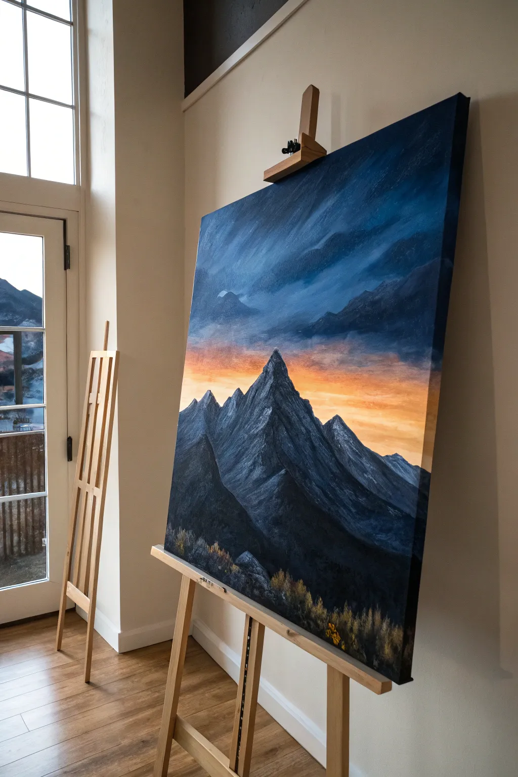
Capture the raw power of nature with this striking acrylic landscape that contrasts deep, stormy blues against a burning sunset horizon. This large-scale piece uses a limited but dramatic palette to evoke a sense of twilight mystery and solitude.
Step-by-Step Tutorial
Materials
- Large stretched canvas (at least 24×36 inches)
- Acrylic paints: Prussian Blue, Mars Black, Titanium White, Burnt Umber, Cadmium Orange, Cadmium Yellow
- Large flat brush (2-3 inch) for blending
- Medium filbert brush
- Small round detail brush
- Palette knife
- Water container
- Paper towels
- Easel
Step 1: Setting the Atmosphere
-
Prime the sky:
Begin by covering the top two-thirds of your canvas. Mix Prussian Blue with a touch of Mars Black to create a deep, midnight blue. Apply this generously to the top corners, using large, sweeping diagonal strokes to suggest movement. -
Create the gradient:
As you move down the canvas, slowly introduce small amounts of Titanium White into your dark blue mixture. This creates a transition from the dark upper atmosphere into a lighter, hazier blue just above where the mountains will sit. -
Paint the sunset band:
While the blue is still slightly tacky, clean your large brush and mix Cadmium Orange with Titanium White. Paint a horizontal band across the middle of the canvas, blending it slightly upwards into the lighter blue to create a soft, glowing horizon line. -
Intensify the glow:
Add touches of pure Cadmium Yellow into the wet orange paint, focusing the brightest light directly behind where the central peak will stand. This backlighting adds immense drama. -
Add cloud texture:
Return to your dark blue mix. Using a dry brush technique, scrub in diagonal cloud streaks over the upper blue section. Let some of these dark streaks cut slightly into the orange band to simulate storm clouds rolling in.
Muddy colors?
If your orange sunset turns green when meeting the blue sky, let the blue layer dry completely before painting the orange band. Wet-on-wet mixing of opposites causes muddy tones.
Step 2: Forging the Mountains
-
Block in the silhouette:
Mix Mars Black with a little Prussian Blue for a very dark, cool gray. Using a medium filbert brush, paint the outline of your mountain range. Create a tall, sharp central peak that dominates the composition, flanked by smaller, jagged peaks. -
Fill the base:
Fill in the entire mountain shape with your dark base color. Ensure complete coverage so no white canvas shows through the dark mass. -
establish light source:
Decide that your light is coming from the sunset behind and slightly to the right. This means the right-facing slopes will catch the most light, while the left faces remain in deep shadow. -
Paint the highlights:
Mix a slate gray using White, Blue, and a tiny bit of Black. Use a palette knife or a flat brush loaded with thick paint to drag this lighter color down the right-hand slopes of the peaks. Ideally, let the paint break naturally to create the texture of rough rock. -
Deepen the shadows:
Reinforce the shadowed sides (the left faces) with pure Mars Black. If the contrast feels too stark, glaze a very thin layer of watered-down Prussian Blue over the shadows to unify them with the sky colors. -
Refine the ridges:
Use a small round brush with nearly white paint to sharpen the very tips of the mountain peaks and the sharpest ridge lines. These crisp edges help the mountains pop against the glowing sky.
Edge Master
To make mountains look massive, keep the edges at the bottom slightly blurry or misty, and the peaks at the top razor-sharp. This mimics atmospheric perspective.
Step 3: Foreground and Finishing
-
Create the foothills:
At the very bottom of the canvas, mix Burnt Umber into your black base color. Paint rolling, uneven shapes to represent the foothills and rocky terrain leading up to the mountains. -
Suggestions of vegetation:
Using an old, frayed brush or a fan brush, tap in some texture along the bottom edge using a mix of Cadmium Yellow, Orange, and a touch of Black. These muted, earthy yellows suggest autumnal grasses or scrub caught in the last light. -
Add foreground rocks:
Use your palette knife to add a few distinct rocky shapes in the immediate foreground using medium gray. Keep these loose and impressionistic; they shouldn’t distract from the main peak. -
Final atmosphere check:
Step back from the easel. If the transition between sky and mountain looks too cut-out, dry brush a little bit of atmospheric mist (a thin, watery white-blue) at the base of the furthest mountains.
Now step back and admire the rugged, brooding landscape you have brought to life on the canvas

Classic Car or Motorcycle Portrait in Vintage Tones
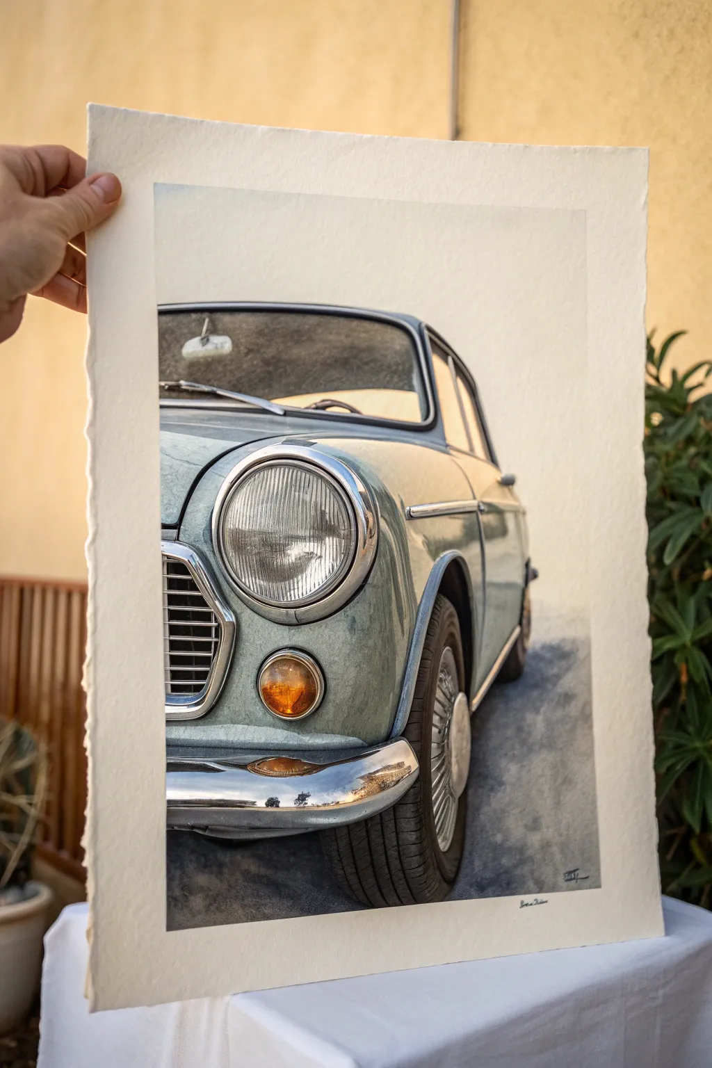
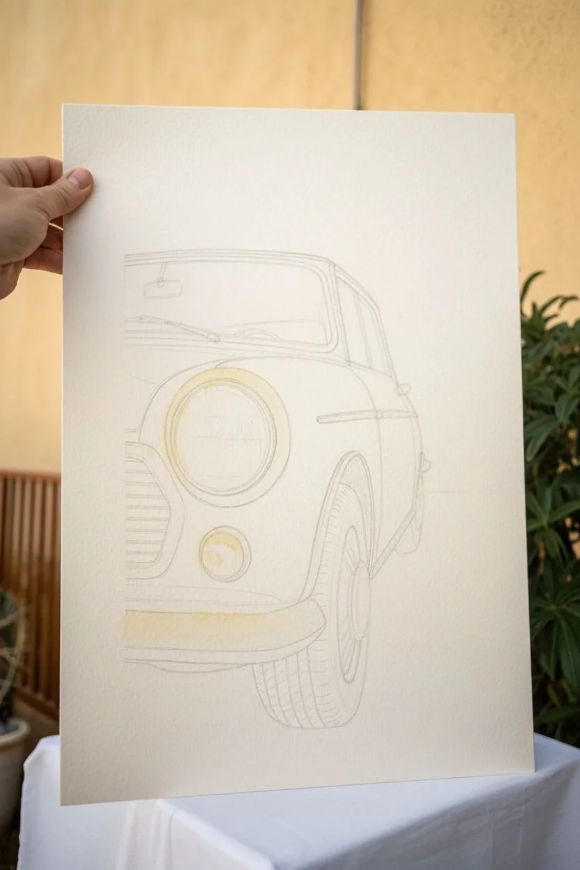
Capture the timeless elegance of classic automotive design with this detailed watercolor study. By focusing on reflective chrome textures and subtle weathering on cold-pressed paper, you will bring a nostalgic vintage vehicle to life with stunning realism.
How-To Guide
Materials
- High-quality watercolor paper (300gsm cold press, rough grain)
- Watercolor paints (Payne’s Grey, Cerulean Blue, Burnt Sienna, Yellow Ochre, Lamp Black, Titanium White)
- Masking fluid
- Pencil (HB or 2B) and kneaded eraser
- Round brushes (sizes 2, 6, and 10)
- Fine detail brush (size 0 or 00)
- Jar of clean water
- Paper towels
- Painter’s tape or board for mounting
Step 1: Planning and Sketching
-
Select your reference:
Choose a high-contrast photo of a classic car that features interesting chrome details and distinct lines. The vintage Mini in the example works well because of its rounded shapes. -
Prepare the paper:
Tape your watercolor paper down to a board to prevent buckling. If you want the deckled edge look shown in the photo, you can carefully tear the edges against a ruler now or leave the natural edges of a handmade sheet exposed. -
Draft the outline:
With a light hand and an HB pencil, sketch the main contours of the car. Focus on the geometry of the headlight, the curve of the fender, and the angle of the windshield. -
Refine the details:
Draw in the specific details like the grill slats, the chrome bumper shape, and the tire treads. Keep lines faint so they won’t show through the transparent watercolor layers later. -
Protect highlights:
Apply masking fluid to the brightest highlight areas, specifically the glint on the chrome headlight ring, the bumper, and the very brightest reflection on the hood.
Muddy Colors?
If your chrome looks dull, you likely overmixed the reflection colors. Let layers dry completely between applications to keep the sharp separation needed for metal.
Step 2: Base Washes and Body Color
-
Mix the body color:
Create a muted blue-grey wash using Cerulean Blue with a touch of Payne’s Grey and a tiny hint of Burnt Sienna to desaturate it. It should feel vintage and slightly weathered. -
Apply the first wash:
Using a size 10 brush, lay down a wet-on-dry wash over the car body panels. Work quickly to keep a wet edge and avoid hard lines where you don’t want them. -
Deepen the shadows:
While the first layer is still slightly damp, drop in a more concentrated mix of the blue-grey into the shadow areas, like under the headlight rim and along the side panel crease. -
Paint the interior shadow:
For the dark interior visible through the windshield, mix Payne’s Grey and Burnt Sienna for a rich, warm black. Paint the windshield area, leaving the steering wheel and mirror negative or lighter.
Step 3: Chrome and Metallic Textures
-
Start the chrome:
Chrome reflects its environment. Paint the sky reflections in the bumper with a very pale blue wash, and the ground reflections with a mix of grey and earth tones. -
Define the headlight:
The headlight glass has distinct vertical ridges. Use your size 2 brush and a watery grey mix to paint thin, vertical strokes, curving them slightly to match the lens shape. -
Darken chrome contrasts:
Once the base chrome colors are dry, use a strong black or dark grey to paint the sharp, high-contrast reflections often found in polished metal. This contrast creates the shiny effect. -
Add warmth to the turn signal:
Paint the small turn signal light below the headlight with Yellow Ochre and a drop of Burnt Sienna. Leave a tiny speck of white paper or use gouache later for the highlight.
Level Up: Vintage Patina
For an older look, lightly spatter some thinned Burnt Sienna paint with a toothbrush over the bumper or lower panels to simulate subtle rust spots.
Step 4: Details and Finishing
-
Paint the tire:
For the tire, avoid using pure black. Mix a dark charcoal grey. Paint the treads carefully, noting how the light hits the top edge of the tire and fades into shadow near the bottom. -
Ground the vehicle:
Add a cast shadow underneath the car using a cool grey wash. Soften the edges of this shadow with a clean, damp brush as it moves away from the tire to create a realistic depth of field. -
Remove masking fluid:
Once everything is bone dry, gently rub off the masking fluid to reveal the crisp white paper underneath. -
Add final highlights:
I like to use a small amount of opaque White Gouache or Titanium White watercolor on a detail brush to pop the brightest sparkles on the chrome grill, rim, and paint specs. -
Refine grill details:
Use your finest brush to paint the dark recesses between the horizontal grill slats. This requires a steady hand and creates immediate depth. -
Sign and assess:
Step back and look at the tonal balance. Darken any shadows that feel too light, and sign your work in the corner with a fine brush or archival pen.
Framing this piece with a floating mount will showcase the beautiful paper edges and enhance the classic aesthetic

Wildlife Strength Study: Stag, Bear, or Wolf
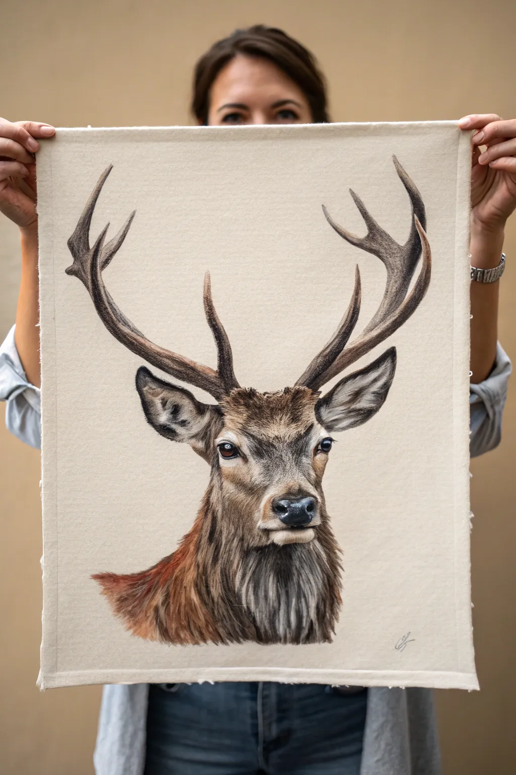
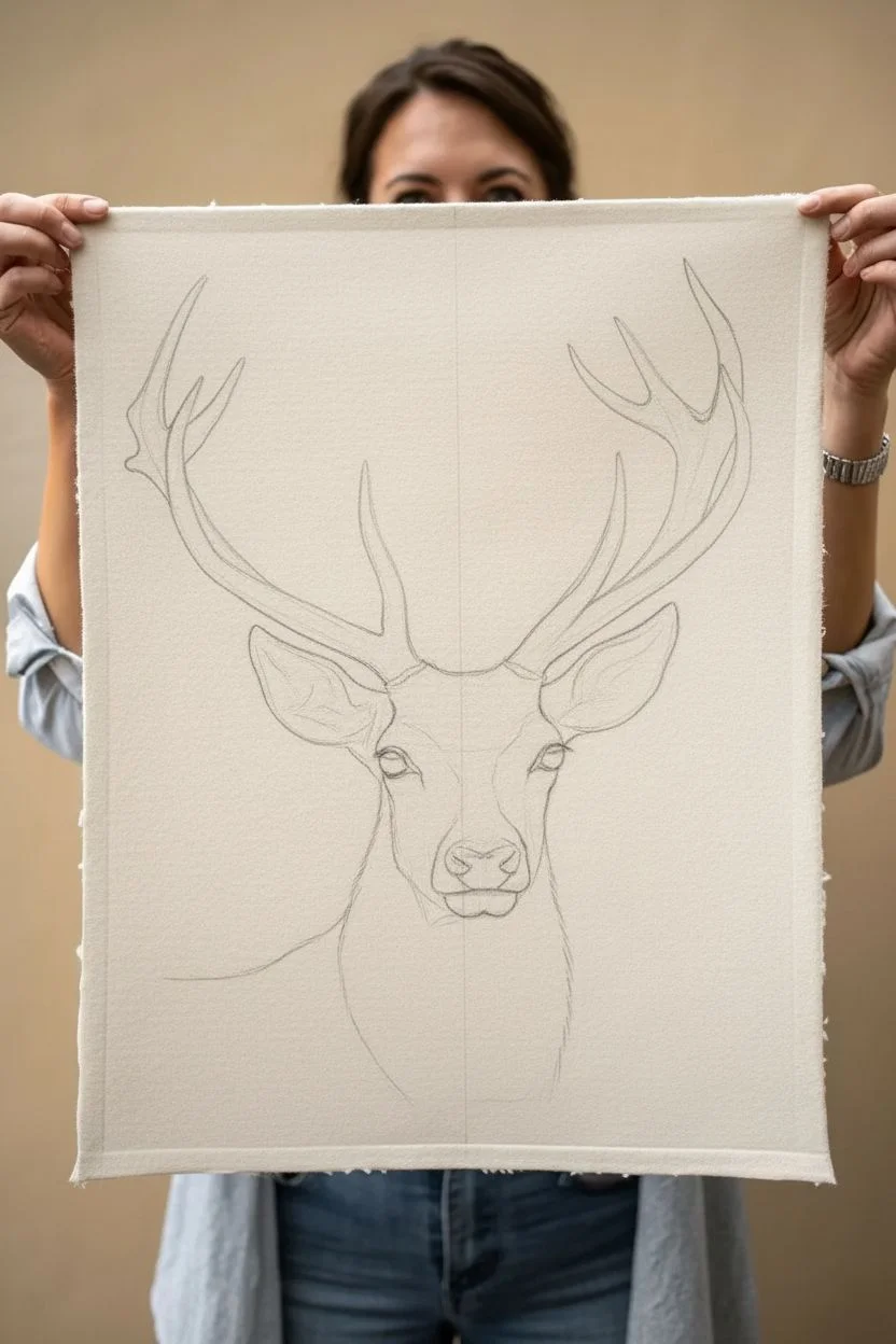
Capture the raw power and serene dignity of a stag with this detailed wildlife study. You’ll create a realistic portrait on heavy-textured paper or unprimed canvas, focusing on the intricate textures of fur and antler.
Step-by-Step Tutorial
Materials
- Heavyweight toned paper (beige/tan) or unprimed canvas sheet
- Soft pastel pencils or colored pencils (earth tones: browns, greys, blacks, ochre)
- White pastel pencil or charcoal (for highlights)
- HB and 2B graphite pencils for initial sketching
- Kneaded eraser
- Blending stumps (tortillons)
- Workable fixative spray
- Drawing board and tape
Step 1: Framework & Proportion
-
Map the centerline:
Begin by lightly drawing a vertical centerline down your paper. This is crucial for symmetry. Mark the top of the head, the nose placement, and the base of the neck to establish scale. -
Sketch the primary shapes:
Block in an oval for the head and a tapered cylinder for the muzzle. Add two large, sweeping curves extending upward to define the general path of the antlers. -
Refine the features:
Lightly sketch the eyes, ensuring they are level with each other. Outline the ears, paying attention to their large, cupped shape. Define the nose and the jawline, keeping your pencil strokes very faint so they don’t show later. -
Antler structure:
Develop the antlers from your initial curves. Draw the main beams first, then branch off the tines. Remember that antlers are organic and imperfect; slight asymmetry adds realism.
Uneven Eyes?
Turn your drawing upside down. It tricks your brain into seeing shapes rather than a face, making symmetry errors instantly obvious and easier to fix.
Step 2: Base Layers & Eyes
-
The soulful eyes:
Start coloring with the eyes to bring the subject to life early. Use deep blacks for the pupil and dark browns for the iris. Leave a tiny, sharp spot of the paper showing—or add a speck of pure white later—for the reflection. -
Underpainting the face:
Using a mid-tone brown pencil, gently shade the face. Follow the direction the fur grows—outward from the nose and up the forehead. Keep this layer light and airy. -
Initial shading on the neck:
Apply a base of reddish-brown or sienna to the neck and chest area. Don’t worry about individual hairs yet; just establish the underlying warmth of the coat.
Fabric Texture
Instead of paper, try drawing on unprimed cotton canvas or linen. The weave of the fabric adds an incredible, rugged texture that mimics the stag’s coat.
Step 3: Fur Texture & Detail
-
Building short fur:
Switch to a darker brown pencil. On the muzzle and around the eyes, use short, quick strokes to mimic fine hair. Layer these over your base tone to create depth. -
Developing the mane:
The neck fur is longer and coarser. I prefer using longer, sweeping strokes here, blending dark greys and deep browns. Overlap strokes to simulate layers of thick winter coat. -
Darkening the shadows:
Deepen the shadows inside the ears, under the chin, and along the front of the neck using charcoal or a black pastel pencil. This high contrast is what gives the portrait its ‘strength’. -
Adding the highlights:
With a white pastel pencil or sharp white charcoal, stroke in the lightest sheen on the fur. Focus on the bridge of the nose, the rim of the ears, and the chest fluff.
Step 4: Antlers & Final Touches
-
Texturing the bone:
Antlers have a rough, bumpy texture. Use a dull grey-brown pencil to shade the cylindrical form, using a stippling motion near the base (the burr) to create that knobby look. -
Defining the tines:
Darken the tips of the antlers slightly less than the base. Ensure the shadows on the antlers match the light source used for the face (usually coming from above). -
Blending for softness:
Use a blending stump to gently smudge areas where the fur transitions from short to long, particularly around the jawline. This prevents the drawing from looking too wirey. -
Final crisp details:
Sharpen your black pencil to a needle point. Re-define the nostrils, the eyelid rims, and add the longest whisker hairs on the chin and muzzle. -
Seal the work:
Once you are satisfied, spray a light coat of workable fixative over the piece to prevent smudging and lock in those intricate fur details.
Hang your finished wildlife study with pride, celebrating the quiet strength of the natural world in your own space

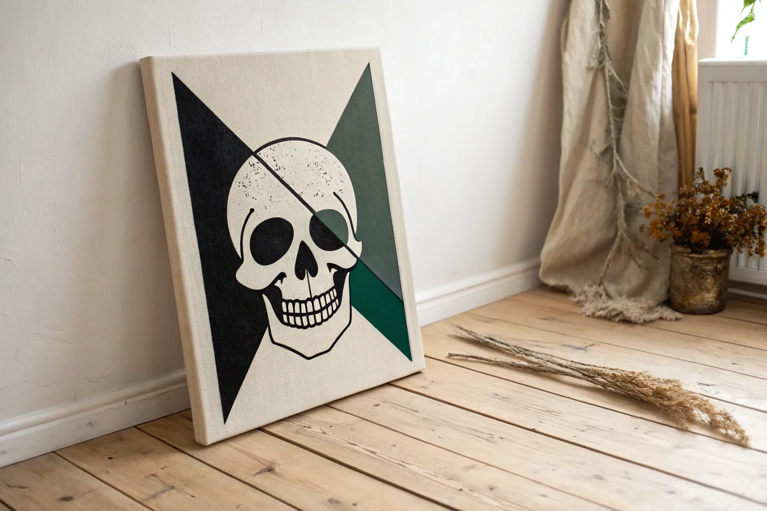
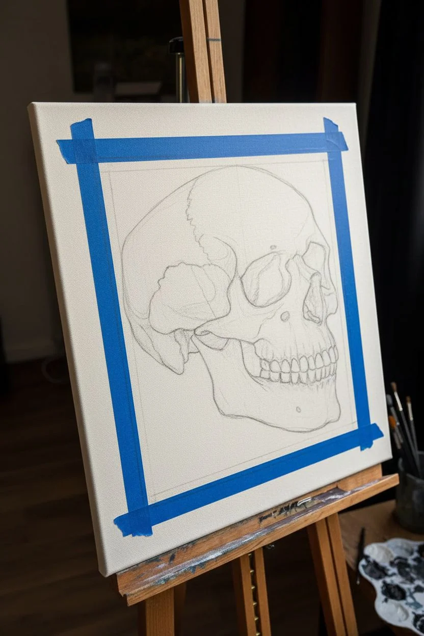
Black-and-Gray Skull With High-Contrast Shading
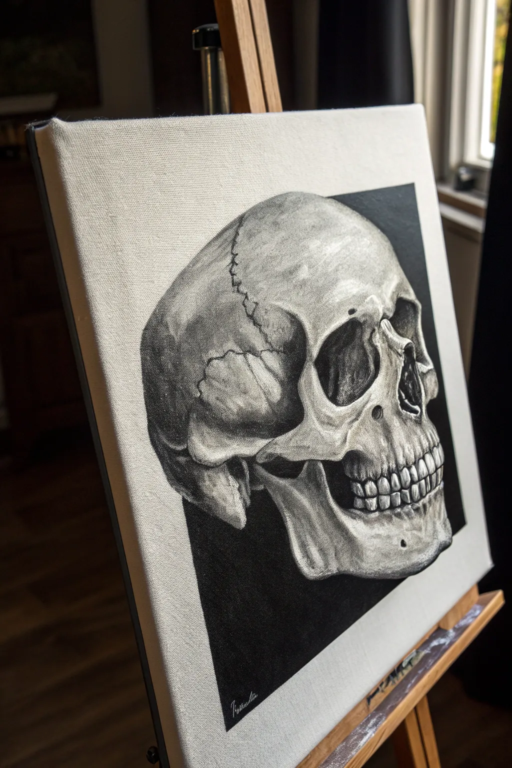
Master the art of high-contrast realism with this striking black-and-gray skull painting. By isolating the subject against a sharp, geometric black background, you’ll create a dramatic focal point that emphasizes form and bone texture.
Detailed Instructions
Materials
- Stretched canvas (rectangular, approx. 11×14 or 16×20)
- Acrylic or oil paints (Titanium White, Mars Black, Burnt Umber for warmth)
- Graphite pencil (HB) and eraser
- Ruler or painter’s tape
- Flat brushes (various sizes for blocking in)
- Round detail brushes (sizes 0, 1, and 2)
- Palette and palette knife
- Reference photo of a skull in profile
Step 1: Preparation and Sketching
-
Define the Frame:
Begin by deciding the size of the black background square. Use a ruler to measure a rectangle that sits centrally on your canvas, leaving a generous white border on all sides. -
Tape the Edges:
Apply painter’s tape along the outside edges of your measured rectangle. This ensures your background lines remain razor-sharp and protects the white border while you paint. -
Outline the Skull:
Lightly sketch the skull within the taped area using an HB pencil. Focus on getting the proportions correct, paying special attention to the eye socket, nasal cavity, and the curve of the cranium. -
Map Shadows:
Draw faint contour lines to map out where the deepest shadows will fall—specifically inside the eye socket, the nose, the jawline, and under the cheekbone.
Step 2: Blocking in Values
-
Paint the Void:
Mix a solid, opaque black using Mars Black. Carefully paint the negative space around your sketch, filling the background completely up to the tape edges. Let this dry thoroughly. -
Establish Mid-Tones:
Create a medium grey by mixing black and white. Apply a thin wash of this grey over the shadowed areas of the skull to establish the basic three-dimensional form. -
Deepen the Darks:
Go back in with pure black (or a very dark grey) to fill the eye socket, nasal cavity, and the gap between the jaw and cheekbone. These areas should be nearly as dark as the background. -
Add Base Highlights:
Mix a light grey (mostly white with a touch of black) and paint the areas that catch the light, such as the top of the forehead, the brow ridge, and the chin. -
Blend the Transitions:
While the paint is still workable, use a soft, dry brush to gently blend the transitions between your darks, mid-tones, and lights. You want smooth gradients on the round parts of the bone.
Muddy Greys?
If your grey values look dull or muddy, you might be over-blending. Accidental mixing on the canvas kills contrast. Let layers dry completely between applications to keep your lights crisp and darks deep.
Step 3: Detailing and Texture
-
Refine the Teeth:
Using a small round brush, carefully paint the individual teeth. Start with a mid-tone grey for the shape, then add dark lines for separation and bright white highlights for the enamel shine. -
Create Bone Texture:
Bone isn’t perfectly smooth. I like to use a scumbling technique—rubbing a small amount of light grey paint with a dry brush—to create the pitted, organic texture on the cheekbones and jaw. -
Paint the Sutures:
For the jagged cracks (sutures) on the skull, mix a dark grey and use your finest detail brush (size 0). Paint wiggly, nervous lines that branch out, varying the pressure to make them look natural. -
Enhance Contrast:
Look for areas where the form feels flat. Add touches of pure white to the brightest points and deepen the shadows near the edges to increase the contrast. -
Clean Up Edges:
Take a look at the silhouette of the skull against the black background. If you went over the lines, use black paint to cut back in and sharpen the edges.
Pro Tip: Warmer Shadows
Mix a tiny dot of Burnt Umber into your darkest blacks. It creates a subtle warmth that mimics old bone and prevents the monochromatic palette from feeling too cold or metallic.
Step 4: Final Touches
-
Remove the Tape:
Once the background is 100% dry, slowly peel away the painter’s tape at a 45-degree angle to reveal the crisp, clean edges of your composition. -
Highlight Check:
Step back from the easel. If the skull needs more ‘pop,’ add one final layer of pure titanium white to the absolute highest points of the brow and teeth. -
Sign and Seal:
Sign your work unobtrusively in the black background area using a white or light grey pencil/paint, and apply a varnish if desired once fully cured.
Hang this piece in a spot with good lighting to let those high-contrast details really stand out
BRUSH GUIDE
The Right Brush for Every Stroke
From clean lines to bold texture — master brush choice, stroke control, and essential techniques.
Explore the Full Guide
Abstract Suit-and-Hat Figure With Bold Brush Marks
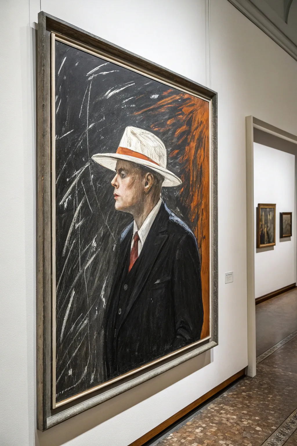
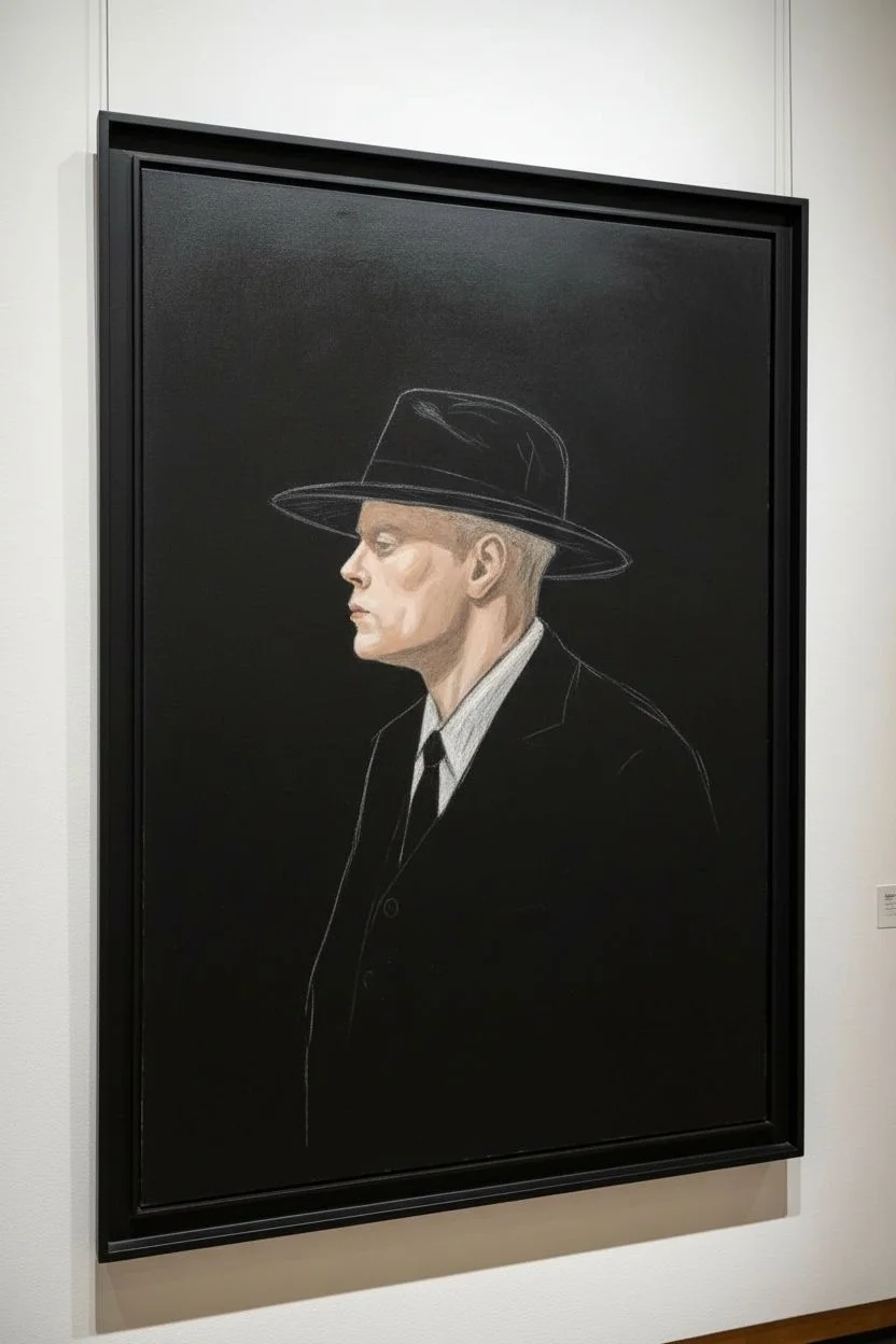
Capture a striking blend of realism and abstraction with this mixed-media portrait project. Combining charcoal intensity with the fluidity of ink and pastel, you’ll create a moody gentleman figure that emerges from a textured, kinetic background.
Step-by-Step
Materials
- Large canvas or heavy mixed-media paper (e.g., 18×24 inches or larger)
- Black gesso or black acrylic paint
- Soft charcoal sticks (vine and compressed)
- White pastel pencil or chalk
- Oil pastels (specifically white, bright orange, red, and burnt sienna)
- Acrylic paints (flesh tones: pale peach, ochre, soft pink)
- Medium and fine synthetic brushes
- Fixative spray (workable)
- Ruler or straight edge (optional for framing)
- Palette knife (optional for texture)
Step 1: Setting the Dark Stage
-
Prepare the substrate:
Begin by covering your entire canvas with two coats of black gesso or matte black acrylic paint. Allow it to dry completely between coats to ensure a deep, opaque void for your background. -
Sketch the silhouette:
Using a white pastel pencil, lightly sketch the outline of the head, the brim of the hat, and the shoulder line. Focus on the profile view—the sharp nose, the ear placement, and the backward tilt of the head. -
Block in the flesh tones:
Mix a pale flesh tone using acrylics (white, a touch of ochre, and a tiny drop of red). Paint the face and neck area within your sketched lines, keeping the paint application fairly flat for now to establish the shape.
Step 2: Structuring the Figure
-
Define the suit jacket:
The suit is nearly black, but needs distinction from the background. Use charcoal or a very dark grey pastel to draw the lapels, the shoulder seam, and the folds of the sleeve. Smudge these lines slightly to soften them into the black background. -
Paint the white hat:
Using white acrylic or heavy white oil pastel, fill in the hat shape. Don’t make it perfectly smooth; follow the curve of the brim with your strokes to suggest the fabric’s texture. -
Add the hat band:
Take a bright orange oil pastel or paint and draw a sharp, thick band across the base of the hat crown. This pop of color is crucial for the composition’s balance. -
Detail the tie and shirt:
Paint a sharp white triangle for the collar. Then, drop in a muted red for the necktie, ensuring it tucks neatly under the jacket lapels.
Muddy Colors?
If pastels are blending into the grey background too much, spray a layer of workable fixative. Let it dry completely before adding fresh, bright color on top to keep it crisp.
Step 3: Facial Details & Atmosphere
-
Refine facial features:
Switch to a fine brush and slightly darker skin tone mix. Carefully paint the shadow under the hat brim, the definition of the ear, and the jawline. I find that squinting at your reference helps you see where the deepest shadows fall on the face. -
Add highlights:
Use a nearly pure white pigment to add minimal highlights to the nose tip, the cheekbone, and the rim of the ear to give the face dimension. -
Create the atmospheric burst:
Behind the head, on the right side of the canvas, apply strokes of burnt sienna and orange pastel. Blend them outwards aggressively to create a fiery, energetic aura that contrasts with the still figure. -
Initial fixative layer:
Lightly spray the work with a fixative. This prevents the charcoal and pastel layers from muddying the next step.
Level Up: Texture
Before painting the black background, mix coarse pumice gel into your gesso. This grit will catch the pastel and charcoal marks more aggressively, creating a rougher, vintage look.
Step 4: The Kinetic Background
-
Layering energetic scratches:
Using a piece of white chalk or a hard white pastel, make rapid, diagonal slashing motions across the black background on the left side. Vary the pressure so some lines are thick and ghost-like, while others are sharp and thin. -
Integrating the figure:
Allow a few of these white scratch marks to overlap the darker parts of the suit jacket. This techniques help ‘seat’ the figure into the environment rather than having him look like a sticker on top of it. -
Deepening the suit texture:
Go back into the black suit with black compressed charcoal. Darken the deepest shadows to make the white scratches stand out more by contrast. -
Final highlights:
add a few final touches of white pastel to the hat brim and the very top of the shoulder to catch the ‘light’. -
Seal the work:
Finish with a final coat of spray fixative to protect your marks.
Step back and admire the mysterious narrative created by your bold strokes and dramatic contrast
Sports Moment Silhouette With Stadium Lights
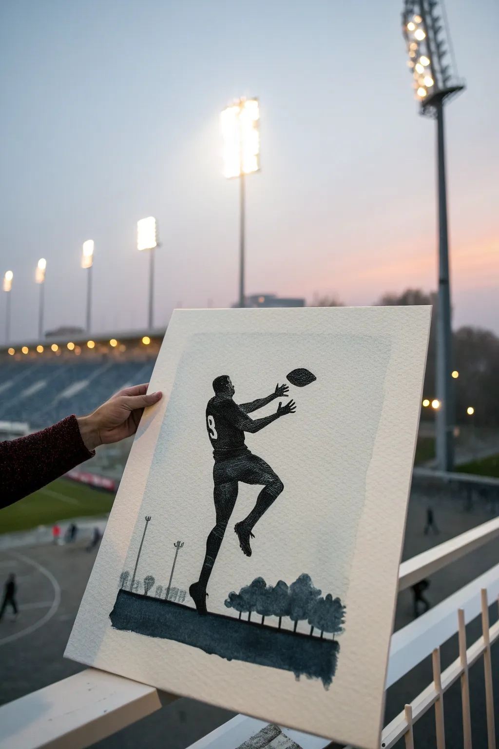
Capture the dynamic energy of a key play with this bold silhouette painting. Using deep blacks against textured paper provides a stark, modern aesthetic that looks fantastic in a simple frame.
How-To Guide
Materials
- Heavyweight watercolor paper (300gsm cold press) or textured cardstock
- Tracing paper
- Pencil (HB or H)
- Black India ink or high-flow black acrylic paint
- Fine liner pens (0.1mm, 0.3mm, 0.5mm)
- Small round brush (size 2 or 4)
- Masking tape
- Reference photo of an athlete
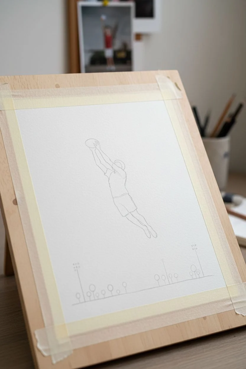
Step 1: Preparation and Sketching
-
Secure the paper:
Tape down all four edges of your watercolor paper to a board or table. This prevents the paper from buckling when you apply ink later and creates a clean white border. -
Create your outline:
Find a high-contrast photo of an athlete in action. Trace the outline onto tracing paper first to simplify the details into a solid shape, ignoring facial features or clothing wrinkles. -
Transfer the design:
Flip your tracing paper over and scribble on the back of the outline with your pencil. Flip it back, position it on your art paper, and re-trace the lines to transfer a faint graphite guide. -
Add landscape elements:
Beneath the figure, lightly sketch a horizon line. Draw small, simplified lollipop shapes for trees and thin vertical lines for stadium lights or goal posts to give context to the jump.
Step 2: Inking the Figure
-
Outline in ink:
Using a 0.3mm fine liner, carefully go over your pencil transfer lines. Keep your hand steady to ensure crisp edges, as the silhouette relies entirely on shape for legibility. -
Define the jersey number:
If your player has a number, outline the number ‘9’ carefully. This area will remain white (negative space), so it’s critical to preserve it cleanly. -
Fill the major shapes:
Switch to your small round brush and black India ink. Begin filling in the larger areas of the body—torso and thighs—being very careful not to cross into the white number. -
Detail the extremities:
As you move to the hands and feet, switch back to a thicker pen or a very fine brush. The fingers reaching for the ball need sharp definition to convey tension and movement. -
Inking the ball:
Draw the ball slightly separated from the hands. Instead of a solid black oval, use stippling (tiny dots) or cross-hatching to give the ball texture and suggest rotation, rather than just a flat shape.
Smudge Prevention
Place a scrap piece of paper under your painting hand while working. This prevents oils from your skin transferring to the paper and stops you from smearing wet ink across the white background.
Step 3: Ground and Atmosphere
-
Paint the ground layer:
Use a fairly dry brush with ink to create the ground. Drag the brush horizontally to create a textured, slightly uneven look that suggests grass or turf without painting individual blades. -
Create the tree line:
Paint the small tree shapes you sketched earlier. Keep them loose and slightly irregular. They should be significantly smaller than the figure to emphasize the height of the jump. -
Add distant details:
Using your finest 0.1mm pen, draw the delicate vertical lines for the background lights or goal posts. These should be extremely thin and subtle. -
Texturing the legs:
I like to go back over the legs once the ink is dry. Add a layer of tiny cross-hatching or stippling on the shins and socks to differentiate the fabric texture from the skin. -
Clean up borders:
Check the edges of your main silhouette. If any lines look shaky, thicken the outline slightly to smooth them out. -
Final inspection:
Wait for the ink to dry completely—give it at least an hour if you used heavy India ink. Gently erase any visible pencil marks, being careful not to smudge the dark areas. -
Remove tape:
Peel the masking tape away slowly at a 45-degree angle to reveal your crisp white border, framing the moment perfectly.
Make It Personal
Customize the negative space number on the jersey to match the recipient’s favorite player, or use a specific date (like ’88’ for 1988) to commemorate a special year.
Hang this striking piece in a study or hallway to celebrate the spirit of the game in a sophisticated way

PENCIL GUIDE
Understanding Pencil Grades from H to B
From first sketch to finished drawing — learn pencil grades, line control, and shading techniques.
Explore the Full Guide
Forest-in-a-Silhouette Double Exposure (Stag or Wolf)
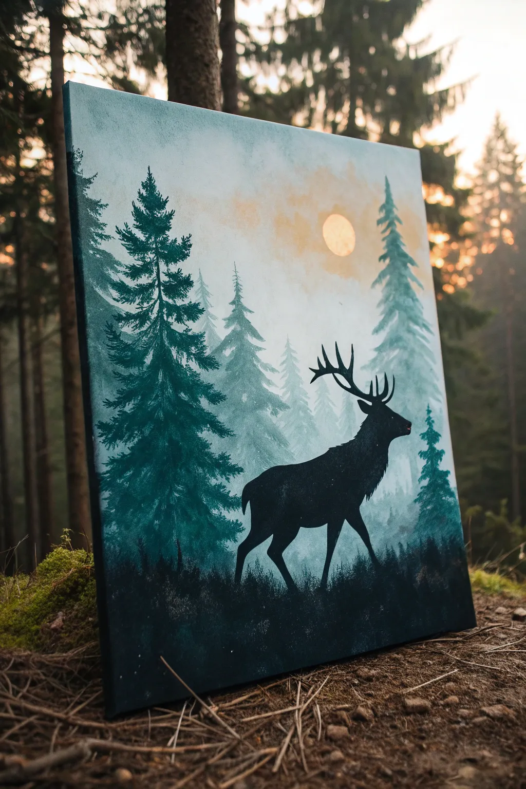
Capture the serene mystery of an evergreen forest with this atmospheric acrylic painting. You will layer misty tree shapes to create depth before grounding the scene with a bold, striking silhouette of a stag.
How-To Guide
Materials
- Rectangular stretched canvas (e.g., 16×20 inches)
- Acrylic paints: Titanium White, Mars Black, Phthalo Green, Yellow Ochre, Burnt Umber
- Flat shader brushes (large and medium)
- Small round detail brush (size 0 or 1)
- Palette
- Cup of water and paper towels
- Pencil for sketching
- Optional: Printed reference of a stag silhouette
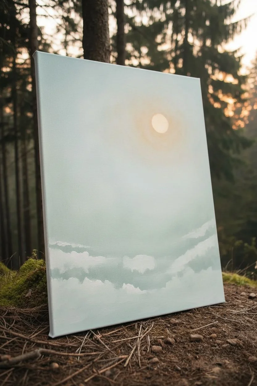
Step 1: Setting the Atmosphere
-
Prepare the sky gradient:
Begin by mixing a very pale, hazy sky color. Combine a large amount of Titanium White with a tiny touch of Yellow Ochre and a speck of Phthalo Green to gray it out slightly. Paint the upper two-thirds of the canvas with this mix, using a large flat brush. -
Add the sun:
While the sky is still slightly tacky, mix Titanium White with a little more Yellow Ochre to create a soft, warm sun color. Paint a small circle in the upper right quadrant, blending the edges softly into the surrounding sky so it glows rather than looking like a sticker. -
Create the distant mist:
Mix a very distinct ‘mist’ color using Titanium White and a tiny drop of Phthalo Green. It should be barely darker than the sky. Use a dry brush technique to scrub this lighter color in horizontal, cloud-like patches where the tree line will start.
Step 2: Layering the Forest
-
Mix the background tree color:
Create a pale blue-green for the furthest trees. Mix Titanium White, Phthalo Green, and a small touch of Black. The value should be light and low-contrast against the sky. -
Paint the distant trees:
Using a medium flat brush turned vertically, dab on the shapes of distant evergreens. Keep these shapes loose and indistinct; you don’t need perfect branches, just the suggestion of conical tree forms fading into the mist. -
Darken the mix for the middle ground:
Add more Phthalo Green and a bit more Black to your previous mixture. This should be a mid-tone deep teal. Paint a second layer of trees slightly lower on the canvas, overlapping the pale ones. -
Detail the mid-ground trees:
Refine the edges of these mid-tone trees. Use the corner of your brush to create jagged, fir-tree edges. Allow the bottoms of these trees to fade out or blend into a misty white base to maintain the foggy illusion. -
Create the foreground tree mix:
Mix a dark, rich evergreen color using Phthalo Green and Black, with just a hint of Burnt Umber to warm it up. It should be nearly black but still clearly green. -
Paint the large anchor tree:
On the left side of the canvas, paint a large, detailed pine tree using the dark mix. Start with a central line for the trunk, then use a fan brush or the corner of a flat brush to tap in heavy branches, getting wider as you go down.
Fixing “Floating” Trees
If your trees look like cutouts pasted on top of each other, glaze a very watered-down white paint over the bottom of the distant trees to simulate a layer of rising ground fog.
Step 3: The Stag Silhouette
-
Sketch the outline:
Once the background dry, lightly sketch the outline of the stag standing on the right side. Focus on the posture: head up, chest puffing out, and the specific shape of the antlers. -
Paint the silhouette body:
Load a medium brush with pure Mars Black. Carefully fill in the body of the stag. Ensure your edges are crisp and sharp; a fuzzy edge ruins the silhouette effect. I find it helpful to rest my hand on a dry part of the canvas for stability. -
Detail the antlers:
Switch to your smallest round brush (size 0 or 1). Paint the antlers with fluid, confident strokes. Make sure the points taper off sharply. -
Add subtle fur texture:
Along the back of the neck and the chest, use the small brush to flick tiny, microscopic strokes outward to suggest fur texture, rather than a perfectly smooth line. -
Ground the scene:
Using the pure black and some of your dark green mix, stipple in the ground beneath the stag and the large tree. Use an up-and-down tapping motion to simulate grass, moss, and undergrowth. -
Final touches:
Step back and assess. If the stag’s hooves look like they are floating, add more dark grass texture around them to bury the feet slightly in the terrain.
Level Up: Birds
Add 2-3 tiny V-shaped bird silhouettes high in the sky near the trees. Keep them extremely small to exaggerate the scale of the forest and make the trees feel massive.
Hang your finished piece in a well-lit spot where the subtle greens can really shine through against the dark silhouette
Geometric Lion or Wolf in Sharp Facets
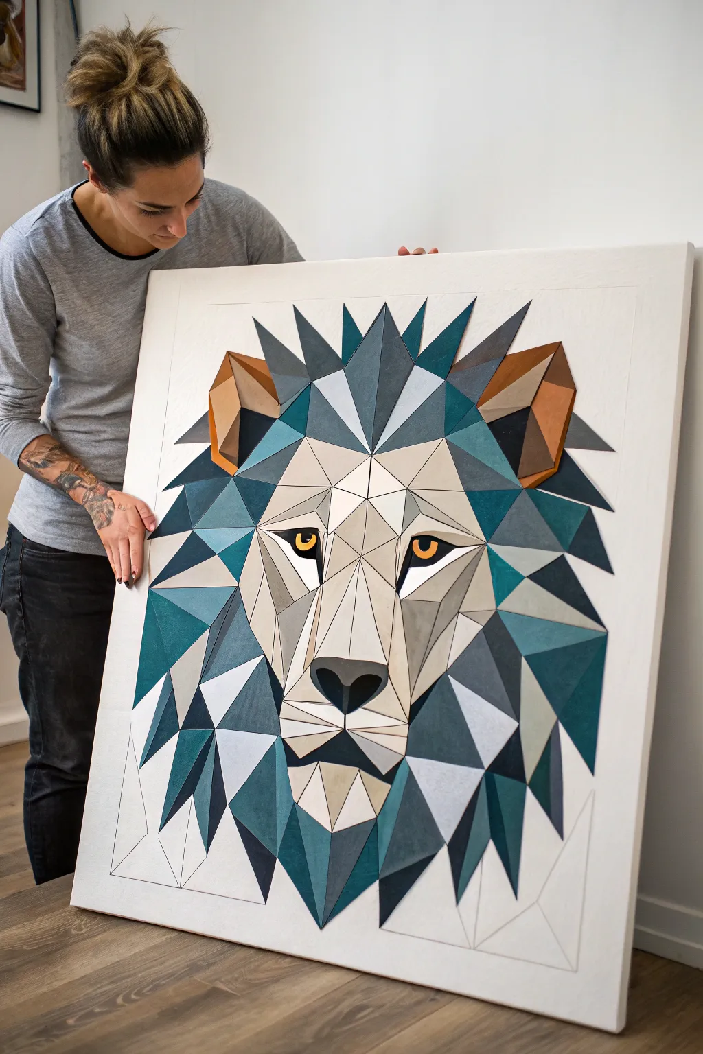
Capture the powerful calm of a lion with this striking geometric art piece, where sharp facets replace fur for a modern, architectural look. Using a low-poly design adds sophistication to the image, relying on shades of teal, slate, and gray to create depth without needing realistic fur techniques.
Step-by-Step Tutorial
Materials
- Large canvas (e.g., 24×30 or 30×40 inches)
- Acrylic paints (Teal, navy blue, slate gray, cream/off-white, burnt sienna, yellow ochre, black, white)
- Painter’s tape (various widths, especially narrow detail tape)
- Ruler or clear T-square
- Graphite pencil (HB or H)
- Angled shader brushes (medium and small)
- Fine liner brush
- Mixing palette
- Gesso (optional, for priming)
- Varnish (matte or satin)
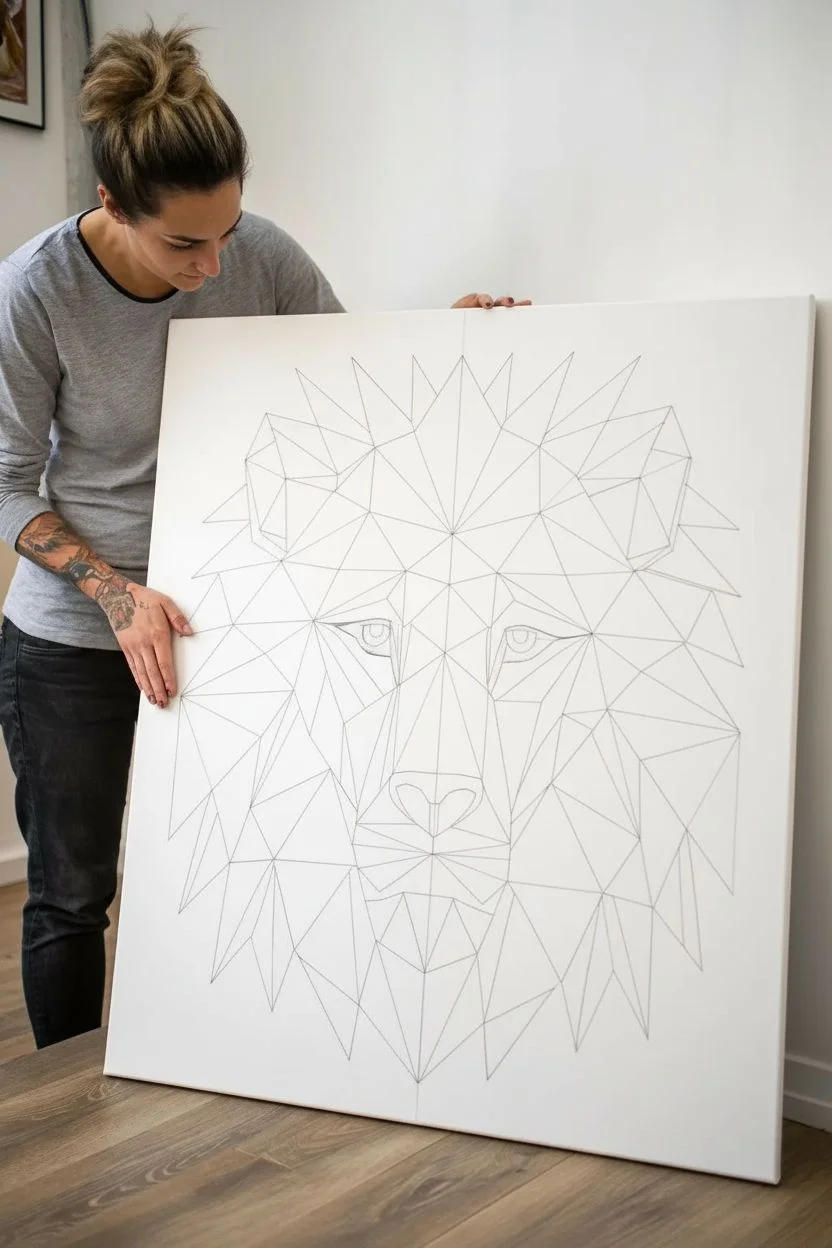
Step 1: Planning and Sketching
-
Prime the Surface:
Ensure your canvas is clean and white. If the texture is too rough, apply a coat of gesso and sand it lightly once dry to get smoother lines for your geometric shapes. -
Map the Center:
Use your ruler to find the exact vertical center of the canvas. Draw a very light vertical line; this axis is crucial because the lion’s face relies on symmetry. -
Draft the General Shape:
Lightly sketch the outer silhouette of the mane. Think in terms of large spikes radiating outward. Don’t worry about the small internal triangles yet, just get the overall size and placement right. -
Create the Facet Grid:
Starting from the nose bridge and eyes, begin drawing the internal triangles and polygons. Use your ruler for every single line to ensure they are perfectly straight. The ‘low poly’ look fails if the lines are shaky. -
Refine the Eyes and Snout:
Pay special attention to the nose and eyes. The polygons here are smaller and denser. The eyes need distinct upper and lower lid shapes, and the nose should be a distinct pentagon or hexagon shape.
Step 2: Color Blocking the Mane
-
Mix Your Palette:
Prepare a range of cool tones. You’ll need a dark teal, a medium slate blue, a light gray-blue, and a very dark navy/black. Having these premixed helps you visualize the shading map. -
Tape Off Non-Adjacent Sections:
To get those razor-sharp edges, use painter’s tape along the pencil lines of scattered triangles. Only paint sections that don’t touch each other in the same round to prevent wet paint from bleeding across the line. -
Apply Dark Tones:
Fill in the shadowed areas of the mane—usually the sections pointing downward or tucked behind other ‘tufts’—with your darkest teal and navy mixes. -
Apply Mid-Tones:
Find the facets that would be catching indirect light. Paint these with your medium slate blue. I find it helpful to squint at the canvas occasionally to make sure the values separate clearly. -
Peel and Dry:
Remove the tape while the paint is still slightly tacky to avoid peeling up dry skins of paint. Let these sections dry completely before taping over them for the next round.
Clean Lines Hack
Before painting a taped section, brush a tiny bit of clear matte medium or the base canvas color over the tape edge first. This seals the tape and ensures your colored lines are perfectly crisp.
Step 3: Painting the Face and Details
-
Paint the Face Mask:
The central face area relies on cream, beige, and light gray tones to contrast against the dark mane. Mix a warm off-white and apply it to the bridge of the nose and the cheeks. -
Define the Eyes:
Switch to your fine liner brush. Paint the iris with a vibrant yellow ochre or amber. Use pure black for the pupil and outline the eye shape sharply to give the lion an intense gaze. -
Add Ear Details:
Introduce a warm brown or burnt sienna specifically for the inner ear polygons. This splash of warm color balances the heavy cool tones of the mane. -
Shade the Snout:
Use a light gray to paint the side planes of the snout. This creates the illusion of 3D volume, making the nose look like it’s protruding forward. -
Fill Remaining Gaps:
Go back and tape off the remaining empty triangles (the ones adjacent to the first batch you painted). Fill them with appropriate colors to complete the puzzle.
Level Up: Texture
For a mixed-media twist, cut thin geometric shapes out of wood veneer or metallic cardstock and glue them onto specific facets (like the ears) instead of just painting them.
Step 4: Final Touches
-
Clean Up Lines:
Inspect your edges. If paint bleed occurred, use a small angled brush and the correct color to tidy up the straight lines. The crispness of the intersection points is key. -
Add the Catchlights:
Place a tiny white dot in each eye. This small detail immediately brings the animal to life and adds focus. -
Erase Guide Lines:
Check the surrounding white canvas for any stray pencil marks or smudges and gently erase them. -
Seal the Work:
Once fully cured (give it at least 24 hours), apply a matte or satin varnish to protect the paint and unify the sheen across all colors.
Hang your geometric lion in a well-lit spot where the sharp angles can command the attention of the room


Blueprint-Style Tool or Engine Study
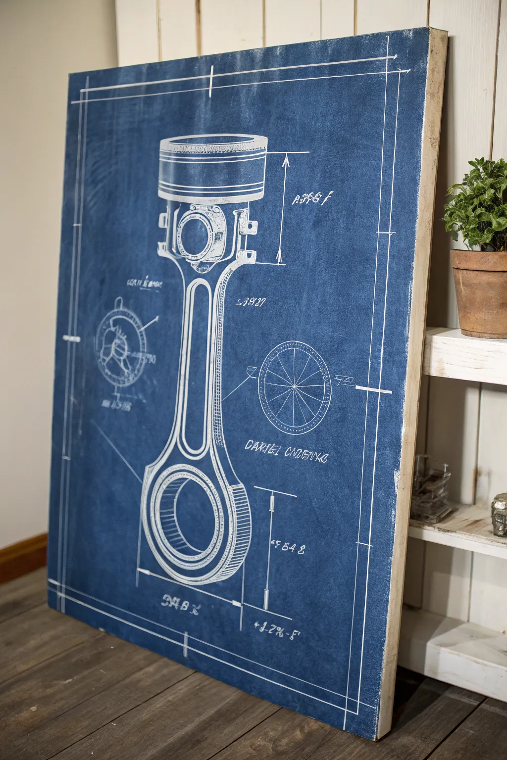
Transform a blank canvas into a striking piece of industrial wall art that mimics the classic look of a technical blueprint. This large-scale piston diagram uses deep blues and crisp white linework to create a sophisticated yet rugged focal point for any garage, office, or den.
Detailed Instructions
Materials
- Large stretched canvas (at least 24×36 inches)
- Deep Prussian Blue or Indigo acrylic paint
- Titanium White acrylic paint
- Acrylic glazing medium
- Wide flat wash brush (2-3 inch)
- Fine liner brushes (sizes 00 and 1)
- White or grey watercolor pencil
- Ruler or T-square
- Compass for circles
- Reference image of a piston or engine part
- Clean rag or sponge
- Matte varnish spray
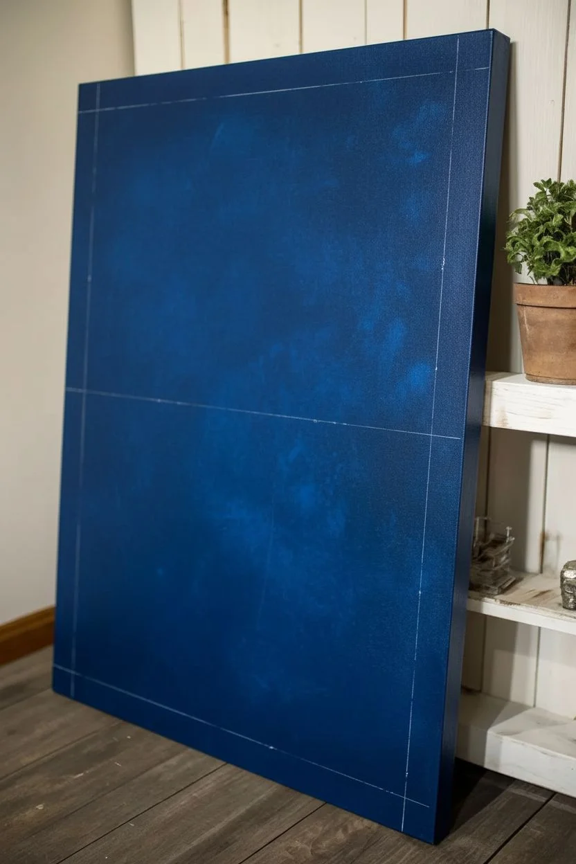
Step 1: Creating the Blueprint Background
-
Prepare the canvas:
Ensure your stretched canvas is clean and free of dust. If the surface feels too rough, give it a very light sanding with fine-grit sandpaper to help your fine lines glide more smoothly later. -
Mix the base color:
Combine your Prussian Blue paint with a small amount of white and a touch of black if needed. You want a rich, saturated navy blue that isn’t too bright but still holds color well. -
Apply the first coat:
Use your wide wash brush to cover the entire canvas with the blue mixture. Don’t worry about perfect coverage yet; broad, even strokes work best here. -
Build depth with texture:
While the first coat is dry to the touch but not fully cured, mix a slightly lighter shade of blue with glazing medium. Apply this thinly in random patches, scumbling with a rag or sponge to create that worn, mottled paper look. -
Add perimeter aging:
Darken your original blue mix slightly and apply it gently around the very edges of the canvas. This vignette effect draws the eye toward the center and simulates an old, sun-faded document. -
Create fold lines (optional):
For extra realism, you can dry-brush faint, straight white lines horizontally and vertically across the canvas to mimic where a real blueprint would have been folded. Keep these incredibly subtle.
Smudged White Lines?
If you smudge white paint, don’t wipe it while wet! Let it dry completely, then paint over the mistake with your base blue color. Wiping wet white paint will create a milky cloud that is hard to fix.
Step 2: Drafting the Technical Drawing
-
Grid and sketch:
Once the blue background is completely dry, use a ruler and a white watercolor pencil to lightly sketch a border about two inches from the edge. Then, lightly block in the basic shapes of your piston engine rod. -
Refine the sketch:
Use your compass to draw clean, perfect circles for the piston pin hole and the crankshaft bearing hole. I find that triple-checking measurements here saves a lot of headache later. -
Start the main linework:
Load a size 1 liner brush with thinned Titanium White acrylic paint. The consistency should be like heavy cream so it flows off the brush easily without dripping. -
Paint the heavy outlines:
Trace over your main watercolor pencil lines. Apply steady pressure to keep the line thickness consistent. These outer structural lines should be the boldest on the canvas. -
Create cross-hatching:
Using the finer 00 brush, fill in the shaded areas—like the inner curves of the rod—with thin, diagonal hatching lines. This classic drafting technique adds volume without needing gradients. -
Add dimension lines:
Using a ruler as a guide, paint very thin, straight extension lines and dimension arrows sticking out from the main object. These specific details are what sell the ‘technical drawing’ aesthetic. -
Incorporate schematic details:
Draw small exploded-view circles or cross-section diagrams in the negative space around the main piston. These don’t need to be fully detailed, just enough to add visual interest.
Step 3: Finishing Details
-
Lettering:
Add technical specifications or part numbers using a stencil or careful hand-lettering. A slightly italicized, serif style mimics traditional architect handwriting perfectly. -
Distress the white lines:
Once the white paint is fully dry, take a clean, dry stiff-bristled brush and gently scuff over a few of the white lines. This makes the drawing look like it’s part of the paper, rather than sitting on top of it. -
Clean up sketch marks:
Use a damp Q-tip or a soft eraser to gently remove any visible watercolor pencil marks that weren’t covered by paint. Be gentle to avoid burnishing the blue matte background. -
Seal the artwork:
Finish with a coat of matte spray varnish. This protects the acrylics and unifies the sheen, giving the entire piece a flat, paper-like finish suitable for framing or hanging as is.
Use a Paint Marker
Struggling with brush control on long straight lines? Swap the liner brush for a fine-tip white acrylic paint marker. Use a ruler as a guide for crisp, professional-looking diagram lines.
Hang your masterpiece with pride, knowing you’ve engineered a classic piece of industrial decor.
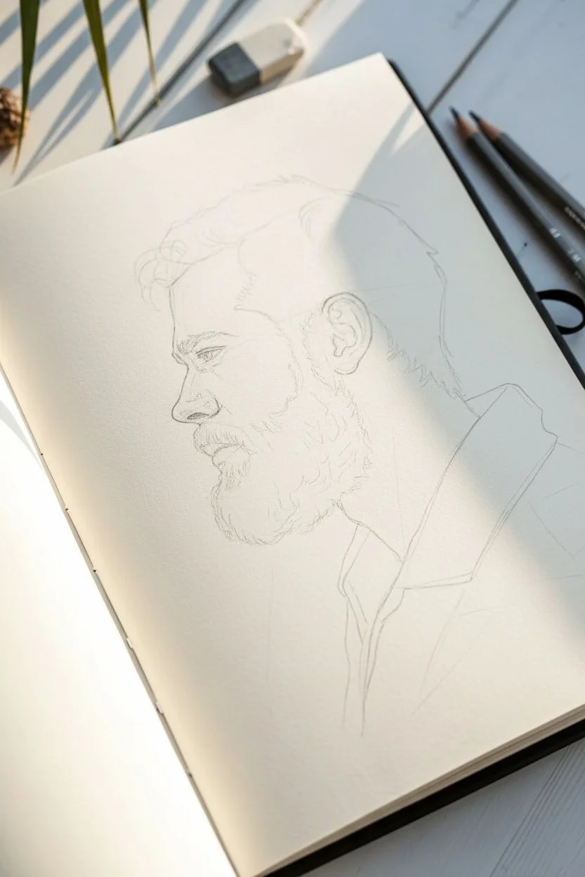
Barbershop Vibes: Beard and Hair Study With Loose Ink Wash
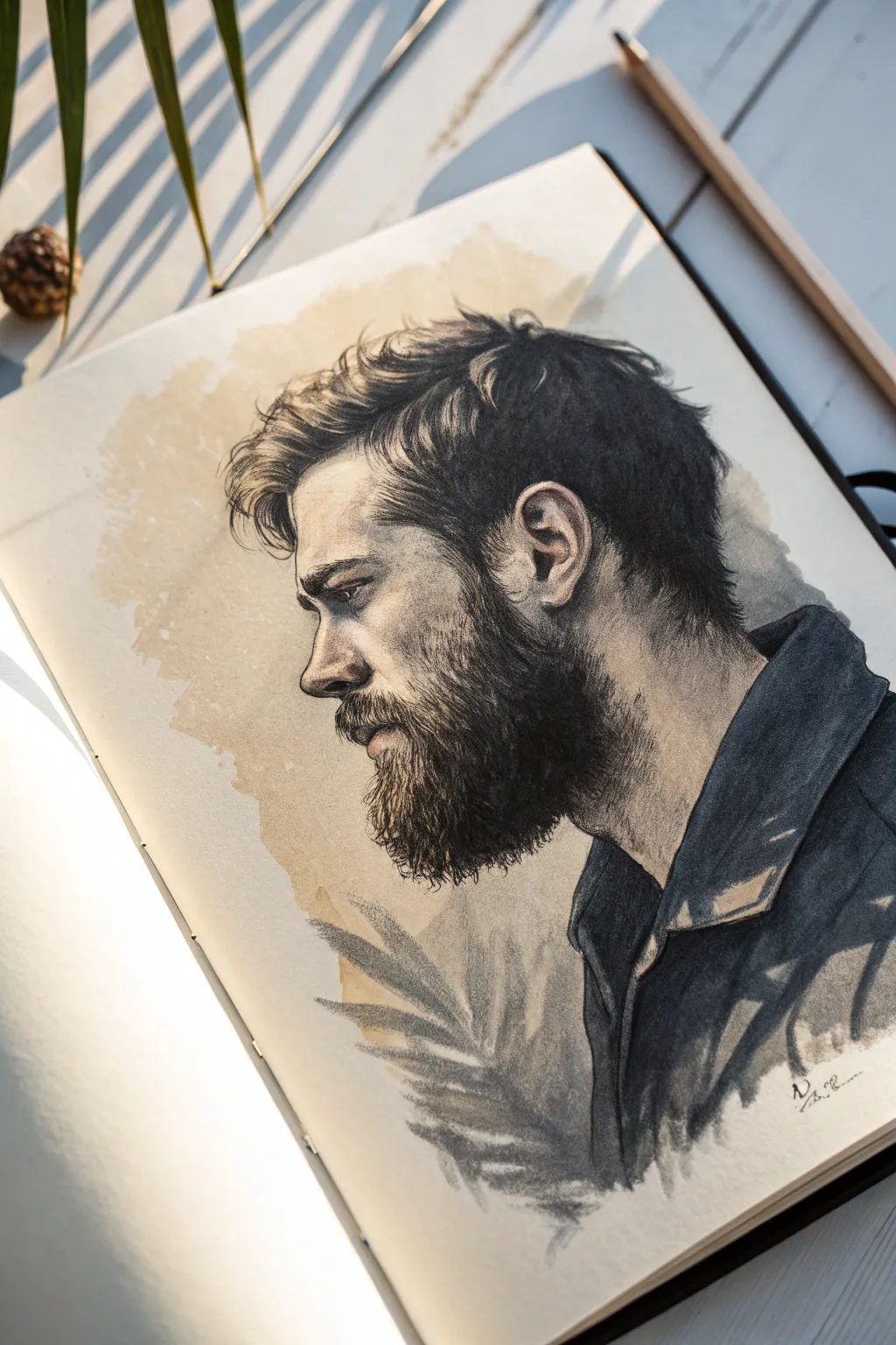
Capture the rugged elegance of a classic barbershop style with this mixed-media portrait. You’ll combine precise graphite detailing for hair texture with loose, expressive ink washes for a moody, artistic background.
Step-by-Step Guide
Materials
- Heavyweight sketchbook paper (mixed media or watercolor, approx. 180-200 GSM)
- Graphite pencils (4H, HB, 2B, 4B, 6B)
- Charcoal pencil (optional, for deepest blacks)
- Black drawing ink or diluted watercolor
- Brown watercolor or coffee for staining
- Soft synthetic brushes (Round size 4 and 8)
- Kneaded eraser
- Blending stump (tortillon)
- Drafting tape
Step 1: Laying the Foundations
-
Basic Blocking:
Begin with a 4H pencil to lightly sketch the overall envelope of the head. Focus on the profile shape—map out the angle of the nose, the brow ridge, and the chin. Keep these lines faint so they disappear later. -
Proportion Check:
Refine the placement of the ear, ensuring it aligns correctly with the nose and eye level. Mark the hairline and the general mass of the beard without drawing individual hairs yet. -
Structural Detailing:
Switch to an HB pencil to firm up the facial features. Define the shape of the eye, the nostril curve, and the lips hidden slightly by the mustache. Accuracy here is crucial before adding tonal values.
Hair Texture Tip
Don’t draw hair as straight lines. Use ‘C’ and ‘S’ curves. Vary your pressure within a single stroke—start firm, lift off at the end for a tapered, realistic hair tip.
Step 2: Texturing the Hair
-
Establishing Direction:
Using a sharp 2B pencil, start indicating the flow of hair. For the top of the head, use long, sweeping strokes that move backward from the forehead. For the beard, observe how the hair grows downward and slightly outward. -
Layering Shadows:
Take a 4B pencil to deepen the shadow areas, particularly behind the ear, at the nape of the neck, and under the jawline. This creates the volume that makes the drawing look 3D. -
Individual Strands:
Switch to a darker 6B pencil (or charcoal pencil) to pick out specific clumps of hair. Don’t draw every strand; instead, focus on the gaps between clumps and the darkest intersection points to imply density. -
Edge Control:
Soften the hairline edges using a blending stump or your finger. You want the hair to feel like it’s growing out of the skin, not sitting on top like a helmet. Keep the stray hairs around the silhouette distinct and sharp.
Step 3: The Ink Wash Background
-
Applying the Stain:
Mix a very watery brown watercolor wash (or actual strong coffee). Using a large round brush, apply an irregular, cloudy shape behind the head profile. Let the edges be rough and organic, imitating an old parchment look. -
Adding Leaf Shapes:
While the background is still slightly damp but not soaking, use a diluted black ink or grey watercolor to paint the suggestion of palm leaves at the bottom. Keep these loose—they are meant to be atmospheric shadows, not botanical illustrations. -
Clothing Construction:
For the shirt collar and shoulders, use a broad, bold application of black ink or heavy charcoal. Focus on the value shapes rather than fabric texture. Use the white of the paper to represent light catching the collar folds. -
Integrating Edges:
Where the beard meets the shirt, allow some of your dark graphite lines to blend into the dark clothing area. Use the kneaded eraser to lift out small highlights on the shirt shoulder to define the form.
Level Up: Color Accents
Introduce a single muted color, like a dull indigo or burnt sienna, into the shirt shadows. This subtle polychromatic touch adds sophisticated depth to the monochrome look.
Step 4: Final Refinements
-
Deepening Contrast:
Return to the face with your darkest pencil. Reinforce the pupil, the nostril, and the corner of the mouth. Ensure the deepest shadows in the beard match the intensity of the shirt collar. -
Highlight Recovery:
Use a precision eraser or a white gel pen sparingly to add tiny glints of light to the eye and perhaps a few bright individual hairs on the top of the head where the light hits. -
Atmospheric Adjustments:
If the background feels too plain, add very faint spatters of the brown wash. I find this creates a nice, gritty texture that complements the masculine subject matter.
Step back and admire how the loose wash contrasts with the sharp stubble to create a striking portrait

Have a question or want to share your own experience? I'd love to hear from you in the comments below!