If you’re craving painting ideas for teens that look instantly cool (and photograph like a dream), I’ve got you. These projects are my favorite sweet spot: not kiddie crafts, not intimidating fine art—just satisfying, high-impact pieces you’ll actually want to hang up.
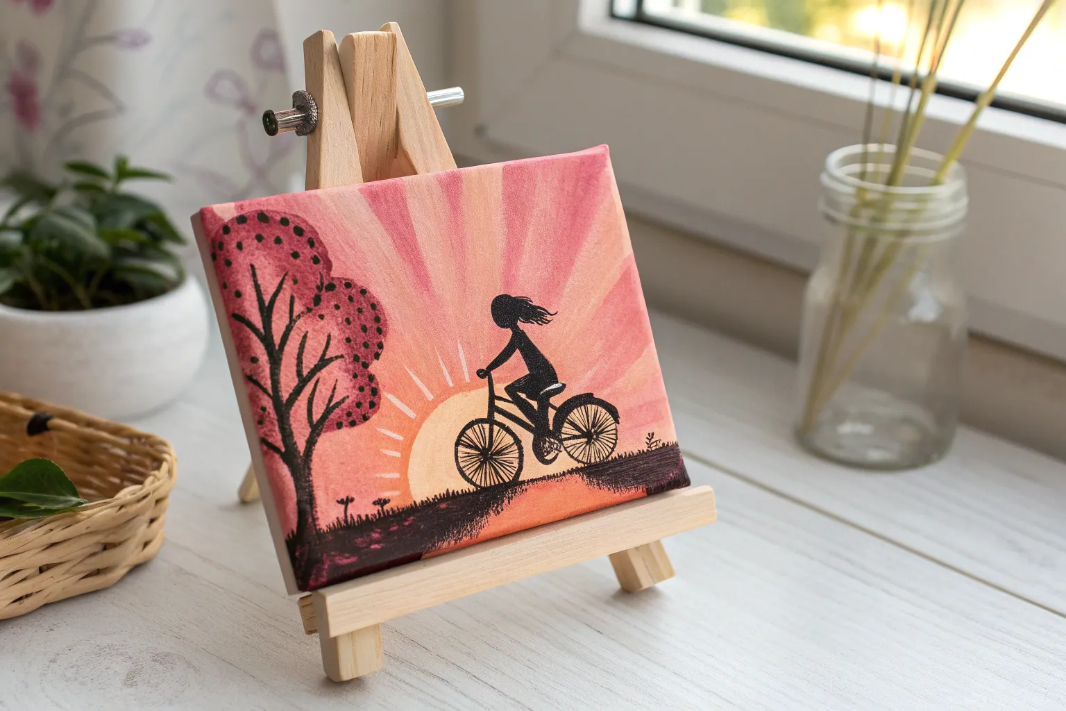
Sunset Ombre Skyline on Canvas
Capture the breathtaking colors of dusk with this vibrant gradient painting that transforms a blank canvas into a glowing horizon. By blending acrylics from deep violet to fiery orange and adding stark silhouettes, you’ll create a professional-looking landscape perfect for brightening any bedroom corner.
Step-by-Step Tutorial
Materials
- Square stretched canvas (12×12 or similar)
- Acrylic paints: deep purple, magenta, primary red, cadmium orange, yellow, and black
- Large flat brush (1-2 inch) for blending
- Medium flat brush
- Small round detail brush (size 0 or 1)
- Palette for mixing
- Cup of water and paper towels
- Easel or flat workspace
Step 1: Creating the Ombre Sky
-
Prepare the palette:
Squeeze out generous amounts of your sky colors: deep purple, magenta, red, orange, and yellow. Keep them separated but ready to mix. -
Start at the top:
Using your large flat brush, apply a thick band of deep purple across the top quarter of the canvas. Don’t worry about being neat; just get the color on. -
Add the first transition:
Clean your brush slightly (or wipe off excess paint) and pick up the magenta. Paint a band directly below the purple, allowing them to overlap slightly. -
Blend the upper sky:
While the paint is still wet, use horizontal strokes to blend the boundary between the purple and magenta. If the paint feels too sticky, dip just the corner of your brush in water to help the colors slide together seamlessly. -
Introduce the warms:
Apply a band of red mixed with a touch of orange below the magenta section. Blend this upward into the pink layer using long, smooth horizontal strokes. -
Create the glowing horizon:
Paint the lowest section of the sky with pure orange, blending it up into the red. Finally, add a streak of yellow right at the very bottom where the sun would be setting to create the brightest point of the glow. -
Smooth the gradient:
I like to take a clean, slightly damp large brush and do one final pass of long horizontal strokes from top to bottom to soften any harsh lines. Let this background layer dry completely.
Seamless Blending
If your acrylics are drying too fast to blend, mix in a slow-drying medium or mist the canvas lightly with water to keep the paint workable longer.
Step 2: Clouds and Texture
-
Mix a cloud color:
Combine magenta with a tiny dot of purple to create a color slightly darker than your mid-sky pink. -
Stipple the clouds:
Using a dry, medium flat brush, lightly dab or ‘stipple’ a horizontal band of broken clouds across the middle pink section. Keep the shapes irregular and horizontal. -
Soften the cloud edges:
Before the clouds dry, gently sweep over them with a clean dry brush to blur their edges, making them look wispy rather than stamped on.
Level Up: Starry Night
Wait for the sky to dry fully, then load a toothbrush with watered-down white paint. Flick the bristles to spray tiny stars over the purple section.
Step 3: Silhouetted Foreground
-
Paint the ground line:
Switch to black paint. Create a low, uneven horizon line across the bottom inch of the canvas to represent the field. It shouldn’t be perfectly straight; let it dip and rise slightly. -
Block in the field:
Fill in the entire area below this line with solid black paint. Ensure it is opaque; you might need a second coat after the first one dries. -
Add the main trees:
Using your small round detail brush, paint vertical lines on the right side of the canvas for the tree trunks. Make them taller towards the edge and slightly shorter as you move inward. -
Flick the branches:
From the trunks, paint delicate branches extending upward and outward. Use a very light hand and flick your wrist at the end of the stroke to make the tips taper off naturally. -
Create distant foliage:
On the left side of the horizon, dab small, bumpy shapes along the ground line to suggest distant bushes or smaller trees in the background. -
Detail the mid-ground:
Add a singular, thin vertical line near the center to represent a lone utility pole or fence post, adding a touch of realism to the rural scene. -
Final touches:
Check your silhouette for any light spots showing through the black and fill them in. Paint the edges of the canvas black or wrap your sky colors around for a finished gallery look.
Once the black paint is fully dry, hang your masterpiece to bring a permanent golden hour into your room
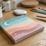
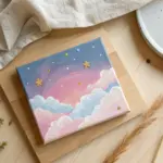
Galaxy Night Sky With Splatter Stars
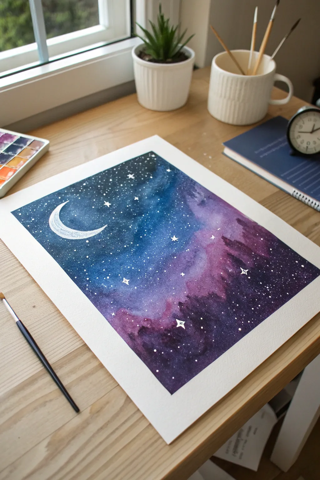
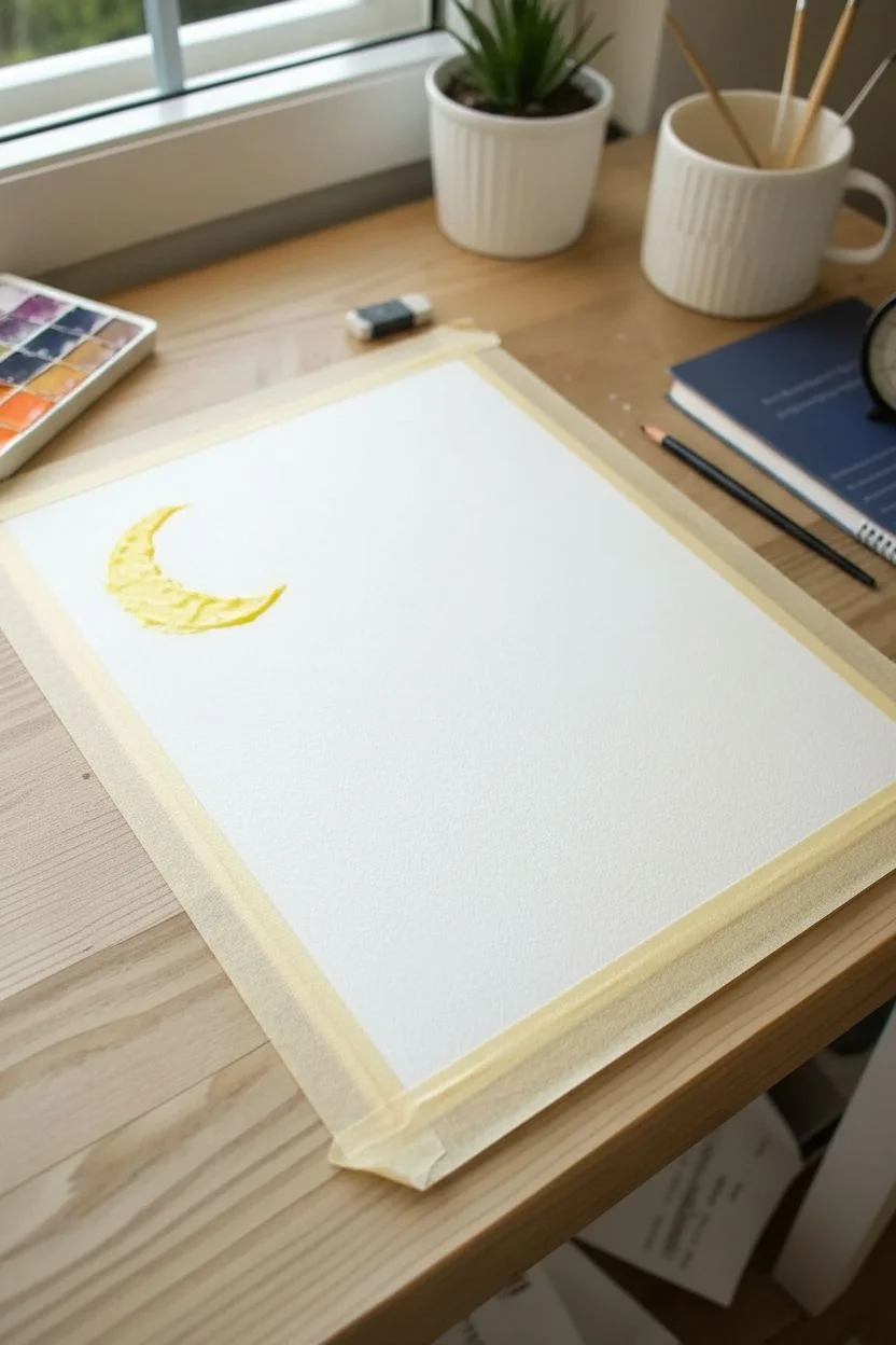
Capture the magic of a deep-space nebula with this vibrant watercolor project. By blending rich indigo blues into soft violets and adding a dusting of starry splatters, you’ll create a celestial scene that looks stunningly professional.
Step-by-Step Guide
Materials
- Watercolor paper (cold press, heavy weight 140lb/300gsm recommended)
- Painter’s tape or washing tape
- Watercolor paints (Indigo, Prussian Blue, Violet, Magenta/Purple)
- White gouache or white acrylic ink
- Paintbrushes: Large round wash brush and a small detail brush
- Jar of clean water
- Paper towel
- Old toothbrush (optional for splattering)
- Drawing board or hard surface
Step 1: Preparation and The Moon
-
Secure the borders:
Begin by taping down all four edges of your watercolor paper to a hard board using painter’s tape. Ensure the tape is pressed down firmly to prevent paint from seeping underneath, which creates that crisp white frame later. -
Sketch the crescent:
Lightly sketch a crescent moon shape in the upper left quadrant of the paper with a pencil. Keep the lines faint so they don’t show through the final paint. -
Mask the moon:
Carefully apply masking fluid over the crescent moon shape to preserve the white paper. Alternatively, if you don’t have masking fluid, just paint very carefully around this shape in the next steps.
Muddy Colors?
If your blues and purples turn grey where they meet, you are over-mixing on the paper. Let the wet-on-wet technique do the work and stop brushing once the colors touch.
Step 2: Creating the Galaxy Gradient
-
Wet-on-wet technique:
Brush a generous layer of clean water over the entire paper surface (excluding the masked moon). The paper should look glossy but not have puddles. -
Start with deep blues:
Load your large brush with Indigo or your darkest blue. Drop this color into the top left and bottom right corners, allowing the wet paper to diffuse the pigment naturally. -
Add the mid-tones:
While the paper is still wet, introduce Phthalo Blue or Prussian Blue near the indigo areas, blending them softly towards the center. -
Introduce the purple nebula:
Clean your brush slightly and pick up a vibrant Violet or Magenta. Paint this into the diagonal center strip of the paper, letting it bleed into the blue edges to create soft, cloudy transitions. -
Deepen the contrast:
While everything is still damp, go back in with concentrated Indigo paint (less water) to darken the corners and edges even further. This high contrast makes the ‘glowing’ purple center pop more. -
Let it dry completely:
Allow the painting to dry thoroughly. The paper must be bone-dry before moving to the next step, or your stars will bleed into fuzzy blobs.
Level Up: Silhouette
Once the background is dry, use black ink or gouache to paint a silhouette of pine trees along the bottom edge for a terrestrial landscape view.
Step 3: Stars and Details
-
Prepare the stars:
Squeeze a small amount of white gouache or acrylic ink onto your palette. Dilute it with just a tiny drop of water so it has a creamy consistency. -
Create the splatter:
Map out your star field by loading a brush with the white paint and tapping the handle against another brush over the paper. Focus the densest splatter on the darker blue areas. -
Add larger stars:
Using a fine detail brush, hand-paint a few slightly larger ‘four-point’ stars scattered randomly for variety. I like to add a tiny dot in the center of these to make them shine. -
Refine the moon:
If you used masking fluid, rub it off gently now. Paint faint grey shadows on the inner curve of the moon to give it dimension, or fill it with solid white gouache for a graphic look. -
The reveal:
Once the white paint is totally dry, slowly peel away the painter’s tape. Pull the tape away from the paper at a 45-degree angle to ensure a clean, sharp edge.
Frame your new galaxy painting or gift it to a friend who loves stargazing

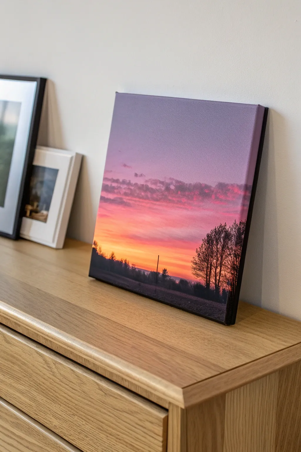
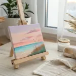
High-Contrast Silhouette Over a Bright Gradient
Capture the fleeting beauty of a sunset with this striking high-contrast painting. You’ll layer a smooth, dreamy color gradient background to set the perfect stage for a crisp, detailed black silhouette.
How-To Guide
Materials
- Stretched canvas (e.g., 8×10 or 11×14 inches)
- Acrylic paints: Teal/Turquoise, Pastel Pink, Light Orange/Peach, Titanium White, Mars Black
- Wide flat paintbrush (approx. 1 inch)
- Medium flat brush
- Fine liner or detail brush (size 0 or 00)
- Cup of water
- Paper towels
- Palette or paper plate
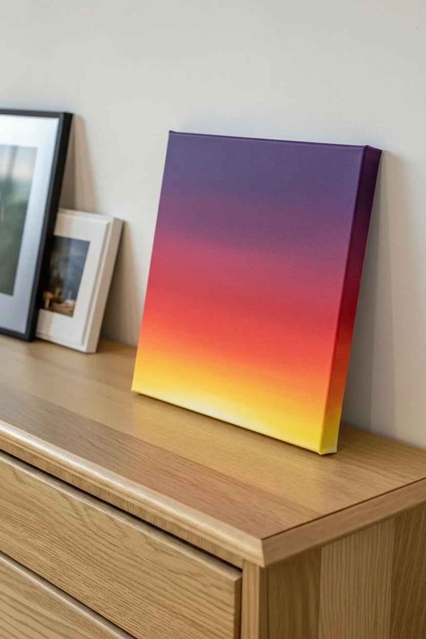
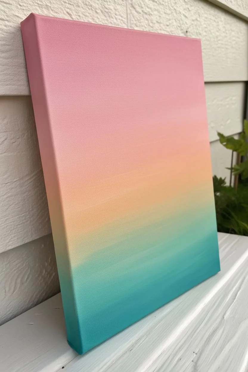
Step 1: Painting the Gradient Sky
-
Prepare your colors:
Squeeze out generous amounts of teal, orange, pink, and white onto your palette. Having the colors ready before you start is crucial because acrylics dry fast, and we need wet paint for blending. -
Paint the top section:
Start at the very top of the canvas with your pastel pink paint. Use the wide flat brush and apply horizontal strokes across the top third of the canvas. -
Blend in the middle tones:
While the pink is still wet, pick up the light orange color without fully cleaning your brush. Paint the middle third of the canvas, brushing back and forth where the orange meets the pink to create a seamless transition. -
Add the bottom layer:
Wipe your brush clean, then load it with teal. Paint the bottom third of the canvas. -
Creating the gradient:
Where the teal meets the orange, use long, gentle horizontal strokes to blend them. If the colors get muddy, add a tiny touch of white to your brush to help them mix smoothly into a soft, hazy transition. -
Don’t forget the edges:
Extend your paint colors around the sides of the canvas as you go. This gallery-wrap effect gives the finished piece a professional, polished look without needing a frame. -
Let it dry completely:
This is the most important step before moving on. The background must be 100% dry to touch, or the black silhouette will smear into the sky. A hairdryer on a cool setting can speed this up.
Pro Tip: Better Flow
If your black lines look shaky or dry, mix a tiny drop of water into your black paint. Inky consistency makes painting thin lines much easier and smoother.
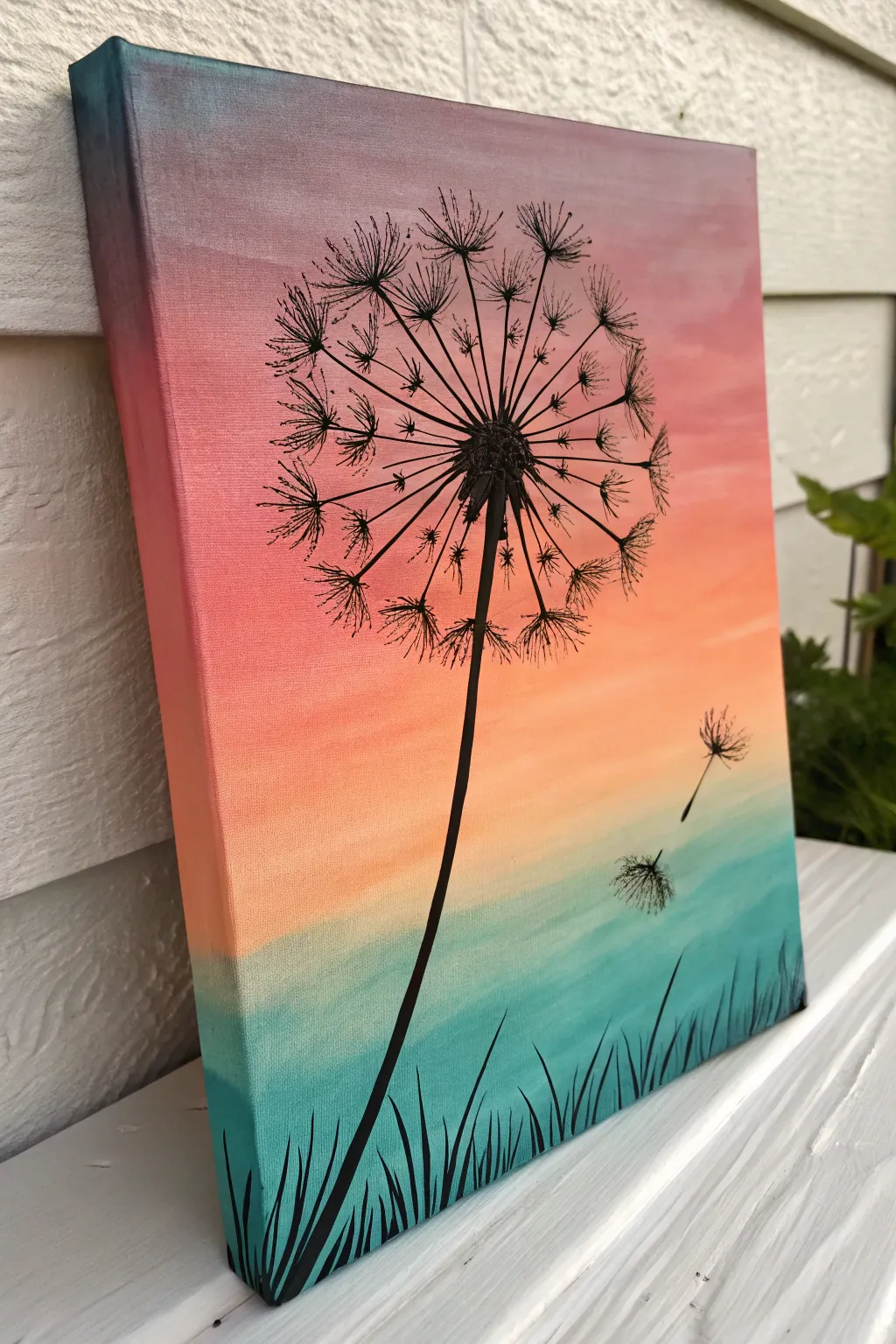
Step 2: Detailing the Dandelion Silhouette
-
Place the center:
Load a medium brush with black paint. Identify a spot slightly left of center and about two-thirds up the canvas. Dab a small, rugged circle to form the seed head center. -
Paint the stem:
Switch to your liner brush. Starting from the bottom of your center circle, pull a long, slightly curved line all the way to the bottom edge of the canvas. Press extremely lightly at the start and push down gradually for a thicker base. -
Add main spokes:
Using the fine liner brush and thinned black paint (add a drop of water for flow), draw long, thin lines radiating outward from the center seed head like the spokes of a wheel. -
Create the seeds (pappus):
At the end of each radiating spoke, paint small ‘V’ or ‘U’ shapes. Then, add tiny flicking lines coming off those shapes to mimic the fluffy texture of the dandelion seeds. -
Add floating seeds:
To the right of the main flower, paint two or three disconnected spokes floating away in the ‘breeze.’ Add the same fluffy detail to their ends to show them drifting off. -
Paint the grass blades:
At the very bottom of the canvas, paint upward strokes of varied lengths starting from the bottom edge. Curve them slightly to the left and right to make them look natural and wind-blown. -
Refine the center:
Go back to the main dandelion center. Add small dots and tiny dashes around the central black circle to give it texture and volume, covering the starting point of your spokes. -
Final touches:
Check your silhouette for opacity. If the colorful background shows through the black paint, carefully apply a second coat of black over the stem and center once the first layer is dry.
Level Up: Make a Wish
Add tiny dots of white or silver glitter paint onto the drifting seeds to make them sparkle, or paint a second smaller dandelion in the distance for depth.
Hang your new masterpiece on the wall and enjoy the calm, twilight vibe it brings to your room


Geometric Tape-Resist Abstract in Trendy Colors
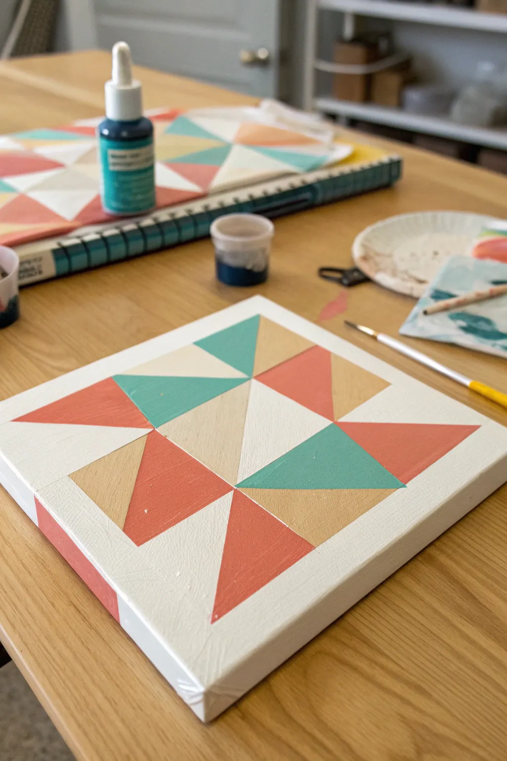
Capture the trendy aesthetic of modern quilting without sewing a stitch in this crisp geometric painting project. Using tape-resist techniques and a muted, earthy color palette, you’ll create sharp lines and bold blocks that look fantastic on a teen’s bedroom wall.
Step-by-Step Tutorial
Materials
- Small square stretched canvas (e.g., 8×8 or 10×10 inches)
- Acrylic craft paints (Coral/Peach, Teal/Turquoise, Beige/Tan, White)
- Painter’s tape or dedicated drafting tape (1/4 inch width is ideal)
- Flat shader brushes (medium size)
- Palette or paper plate
- Ruler
- Pencil
- Paper towels and water cup
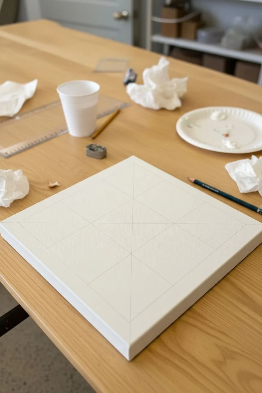
Step 1: Preparation & Mapping
-
Base coat:
Begin by painting your entire canvas with a solid coat of white acrylic paint. This ensures your lines will be crisp against a bright background later. Let this dry completely. -
Find the center:
Once the white base is dry, use a ruler to lightly mark the exact center of the canvas with a pencil. -
Grid lines:
Draw light pencil lines dividing the canvas into a 3×3 grid. Measure precisely to ensure all nine resulting squares are the same size. -
Diagonal guides:
Within specific squares, draw diagonal lines from corner to corner to map out where your colored triangles will go. Looking at the finished photo, note that the triangles rotate around the center.
Bleeding Lines?
If paint seeps under the tape, wait for it to dry fully. Then, place a ruler over the line and use a white paint marker to draw a fresh, straight edge over the mistake.
Step 2: Taping the Design
-
Strategic taping:
Apply strips of painter’s tape along the pencil lines where you want to preserve the white background. Start by masking off the borders of your color blocks. -
Seal the edges:
Press down firmly on the edges of the tape with your fingernail or a credit card tool. This prevents paint from bleeding underneath. -
The white seal trick:
For razor-sharp lines, I like to brush a very thin layer of white paint over the tape edges first. This seals any tiny gaps so the colored paint sits perfectly on top.
Make it a Set
Use the same three colors but change the triangle layout on 2 more canvases. Hang them together as a cohesive triptych for a high-end gallery wall effect.
Step 3: Adding Color
-
First color: Teal:
Mix your teal paint. Apply it to the corresponding triangle sections (center top and center right in the reference image) using a flat brush. -
Second color: Beige/Tan:
While the teal dries, mix a warm beige tone. Paint the triangles adjacent to the teal ones, ensuring even coverage. -
Third color: Coral:
Apply the coral/peach paint to the remaining triangle sections. You may need two coats for this color to look opaque and vibrant. -
Painting the sides:
Don’t forget the edges of the canvas! Extend the design around the sides, painting the corresponding colors down the edges to give the artwork a finished, gallery-wrapped look. -
Drying time:
Allow the paint to set until it is dry to the touch, but not fully cured. Waiting too long can sometimes cause the paint to peel up with the tape.
Step 4: The Reveal
-
Remove tape:
Carefully peel back the tape at a 45-degree angle. Pull slowly to reveal your crisp white lines. -
Touch ups:
If any paint bled through, dip a small detail brush in white paint and carefully tidy up the lines. -
Erase pencil marks:
Once the paint is 100% dry, gently erase any visible pencil guidelines remaining on the white sections.
Hang your new geometric masterpiece on the wall and enjoy the modern pop of color it brings to your space
BRUSH GUIDE
The Right Brush for Every Stroke
From clean lines to bold texture — master brush choice, stroke control, and essential techniques.
Explore the Full Guide
Acrylic Pour Cells for Instant Wow Factor
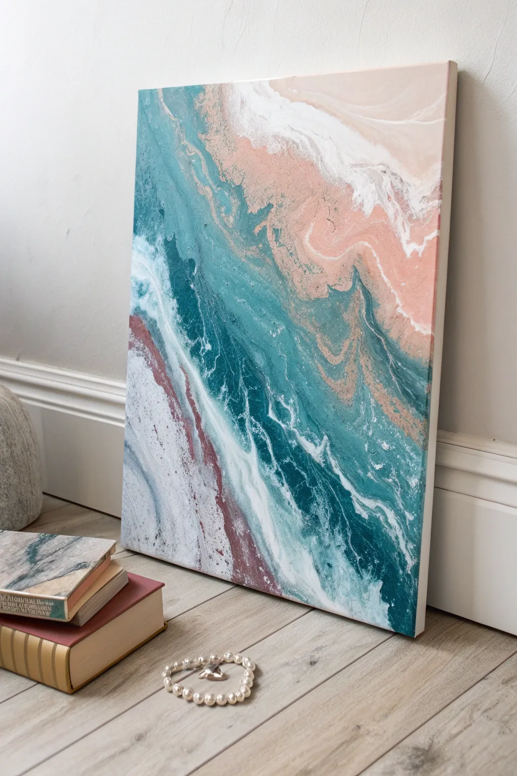
Capture the serene beauty of crashing waves meeting sandy shores with this elegant fluid art project. Using a specific pouring technique, you’ll create a mesmerizing blend of deep teals, soft blush pinks, and crashing white foam.
Step-by-Step
Materials
- Rectangular stretched canvas (approx. 16×20 inches)
- Acrylic fluid paints (Teal, Deep Ocean Blue, Blush Pink, White, Beige/Sand)
- Pouring medium (Floetrol or Liquitex)
- Silicone oil (optional, for extra cells)
- Plastic cups for mixing
- Popsicle sticks for stirring
- Hairdryer with a cold setting or a straw
- Palette knife or plastic spreader
- Plastic drop cloth
- Gloves
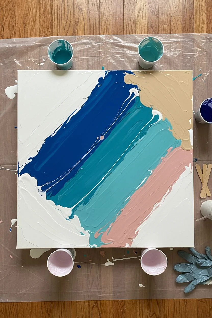
Step 1: Preparation & Mixing
-
Workspace Setup:
Cover your entire work surface with a plastic drop cloth. Elevate your canvas on four upside-down cups to allow paint to drip off the edges freely. -
Mix Your Base Colors:
In separate cups, mix your acrylic paints with pouring medium. A standard ratio is 1 part paint to 2 parts pouring medium, but check your specific brand’s instructions. You want a consistency like warm honey. -
Create the Sand Tone:
Mix a beige or sand color. If you don’t have a pre-made tube, blend white with a tiny drop of brown and yellow ochre. -
Prepare the Ocean Hues:
Prepare a dark ocean blue and a lighter teal. Ensure they are fully mixed so there are no lumps. -
Mix the Blush Accent:
Prepare your blush pink shade. This adds a lovely, warm contrast to the cool ocean tones, mimicking a sunset reflection on the water. -
Add Silicone (Optional):
If you want distinct ‘cells’ or bubbles in your waves, add 1-2 drops of silicone oil specifically to the teal and dark blue cups only. Stir very gently just once or twice.
Muddy Colors?
If your colors are turning gray or brown, you are likely over-mixing or blowing too hard. Stop moving the paint immediately and let the existing layers settle for a cleaner look.
Step 2: The Pouring Process
-
Technique Choice:
For this tide-like effect, we will use a ‘Dutch Pour’ inspired technique, which involves using air to move the paint rather than just tilting. -
Apply the Base Layer:
Cover the top right corner area with your sand/beige mixture and the bottom left area with a little extra white to act as a foundation. Spread it thin with a palette knife so the canvas is wet. -
Pour the Color Ribbons:
Pour a diagonal stripe of the dark blue across the canvas, separating the ‘sand’ area from the rest. Follow this closely with a stripe of teal right next to it. -
Add the Blush:
Pour a line of blush pink next to the sand color, letting it border the blue ocean section. This transition creates that shoreline feel. -
Add White Highlights:
Pour thin streams of white paint in between the blue and teal bands. This will eventually become your sea foam. -
Flood the Negative Space:
Pour a generous amount of plain white paint around the bottom left edges and corners if they aren’t fully covered yet.
Add Sparkle
Mix a pinch of fine gold mica powder into your sand-colored paint or sprinkle loose gold glitter along the ‘shoreline’ while the paint is wet for a shimmering beach effect.
Step 3: Moving the Paint
-
Blow the Paint Out:
Using a hairdryer on the ‘cool’ and ‘low’ setting, gently blow the white paint over the colored bands. Aim the air at the edge of the white paint puddle, pushing it over the blue and teal. -
Create Waves:
Now, change direction and blow the colors back into the white area. Use sweeping motions to create organic, wave-like shapes. Don’t overwork it; let the fluid dynamics do the work. -
Detailing the Shoreline:
Use a straw to blow smaller, more precise details where the pink meets the blue. This gives you distinct lacing effects that look like retreating water. -
Check Composition:
Look at the overall balance. If you need more ‘sand’, dab a little beige on the top corner and gently blow it towards the center. -
Torch for Cells:
If you used silicone, quickly pass a culinary torch (or a lighter) over the blue areas to pop air bubbles and encourage cells to rise to the surface. -
Clean the Edges:
Run your finger or a popsicle stick under the bottom edge of the canvas to remove drips. This stops the paint from continuing to pull off the canvas as it dries. -
Drying:
Let the painting dry undisturbed for at least 24-48 hours. Ensure it is on a perfectly level surface so the design doesn’t shift.
Once dry, you’ll have a permanent slice of the ocean to hang on your wall
Drip-and-Drag Poured Line Painting to Music
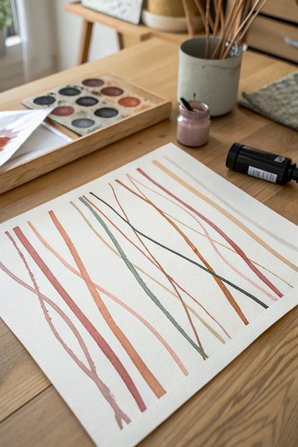
Inspired by the organic flow of poured paint, this project focuses on creating intersecting lines that mimic the rhythm of your favorite playlist. The result is a minimalist, modern watercolor-style piece with overlapping earth tones and soft textures.
Step-by-Step Tutorial
Materials
- Acid-free watercolor paper (heavyweight, at least 140lb)
- Liquid watercolor paints or high-flow acrylics
- Color palette: Burnt Sienna, Terracotta, Olive Green, Blush Pink, Beige or Cream
- Fine-tip rigger brush (size 0 or 1) or liner brush
- Round brush (size 4)
- Palette tray for mixing
- Clean water jar
- Paper towels
- Removable painter’s tape or masking tape
- A wooden board or flat surface to tape paper down
- Optional: Black ink or fluid acrylic for darker accents
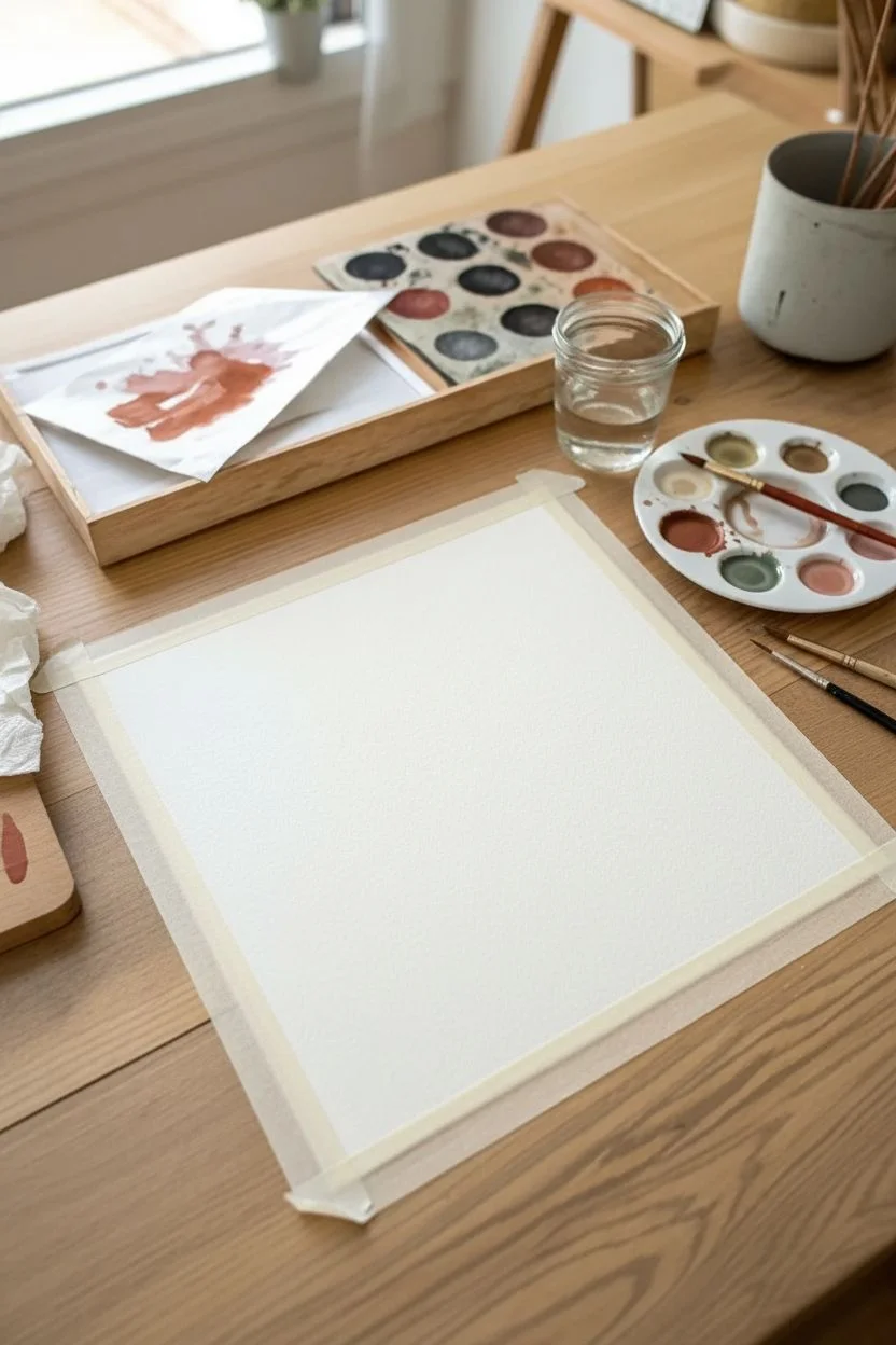
Step 1: Preparation and Palette
-
Prepare your surface:
Begin by taping your watercolor paper down to a flat board or your table. Ensure the tape is pressed firmly along the edges to create a crisp, clean border once the painting is complete. -
Mix your earth tones:
In your palette, prepare your colors. You want a consistent, watery consistency for all shades. -
Test the flow:
Mix a small amount of Terracotta and dilute it with water. Test it on a scrap piece of paper; the paint should be fluid enough to glide easily but pigmented enough to leave a solid mark. -
Create the olive mix:
Mix a muted olive green. If your green is too bright, add a touch of red or brown to desaturate it, making it fit the earthy theme. -
Prepare the wash:
Prepare a very pale beige or cream wash for the thickest, most transparent lines.
Steady Hands
Work from your shoulder, not your wrist. Locking your wrist and moving your whole arm creates smoother, more confident long lines compared to short, scratchy strokes.
Step 2: Painting the Rhythm
-
Start with the dominant lines:
Dip your medium round brush into the Terracotta mixture. Starting from the bottom left edge, pull a long, continuous line diagonally across the page toward the top right. -
Vary the pressure:
As you drag the brush, experiment with slightly twisting it or changing pressure to create natural variations in line thickness, just like a musical wave. -
Add a parallel echo:
Using a slightly lighter shade of the same terracotta or a blush pink, paint a second line running roughly parallel to the first, but allow it to drift apart near the top. -
Introduce the olive tone:
Switch to your rigger or liner brush. Load it with the olive green mixture and draw a thinner, sharper line that intersects the first two lines. -
Create branching forms:
Near the bottom left, paint a line that forks or splits into a ‘Y’ shape. This adds organic interest and breaks up the strict linearity. -
Draft the background beat:
Using the very pale beige wash and your largest brush, sweep a broad, faint stroke across the background. This acts as a subtle base layer behind the bolder colors. -
Cross-rushing lines:
Paint a dark, thin charcoal or slate-colored line cutting across the composition from the opposite direction (top let to bottom right) to create a focal point of tension. -
Let lines kiss:
Allow some wet lines to touch momentarily. Watch how the pigments bleed slightly into one another, creating beautiful, unplanned gradients. -
The drop-and-drag method:
For a textured look, load your brush heavily with water and pigment. Touch the paper and let a droplet form, then quickly drag that droplet out into a long tail. -
Review the balance:
Step back and look at the negative space (the white paper). Ensure you have areas of openness to let the composition breathe.
Metallic Pop
For a touch of glam, re-trace one of your thinnest lines with gold watercolor paint or a gold leaf pen. The shimmer catches the light beautifully against matte earth tones.
Step 3: Finishing Touches
-
Add faint echoes:
Mix a very watery, transparent version of your pink or rust color. Add one or two ‘ghost’ lines that are barely visible, adding depth to the piece. -
Refine the edges:
If any lines became too broken or faint where you didn’t intend, use the tip of your liner brush to carefully reconnect them or smooth out jagged starts. -
Dry partially:
Let the painting sit for about 10-15 minutes. It doesn’t need to be bone dry, but the shine should disappear from the paper. -
Flatten the paper:
If the paper has buckled slightly from the water, keep it taped down until it is 100% dry. This is crucial for a flat final piece. -
The reveal:
Once fully dry, slowly peel the tape away at a 45-degree angle, away from the painting area, to reveal those satisfying crisp white edges.
Now you have a serene, rhythmic abstract piece that looks professional and fits perfectly in a modern room

PENCIL GUIDE
Understanding Pencil Grades from H to B
From first sketch to finished drawing — learn pencil grades, line control, and shading techniques.
Explore the Full Guide
Big Floral Painting With Loose Brushstrokes
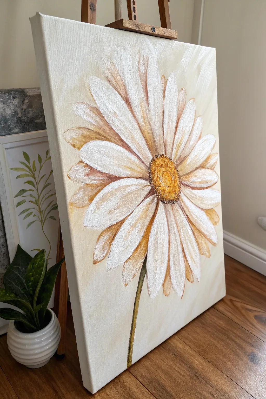
This large-scale floral painting captures the simple elegance of a daisy with loose, expressive brushstrokes and a warm, inviting color palette. By layering shades of white, cream, and deep gold, you’ll create a striking centerpiece that feels both modern and timeless.
Step-by-Step
Materials
- Rectangular stretched canvas (e.g., 16×20 or 18×24 inches)
- Acrylic paints: Titanium White, Unbleached Titanium (cream), Burnt Umber, Yellow Ochre, Raw Sienna
- Large flat paintbrush (1-inch width)
- Medium filbert brush
- Small round brush for details
- Palette knife or palette paper
- Jar of water and paper towels
- Pencil for sketching
- Easel (optional)
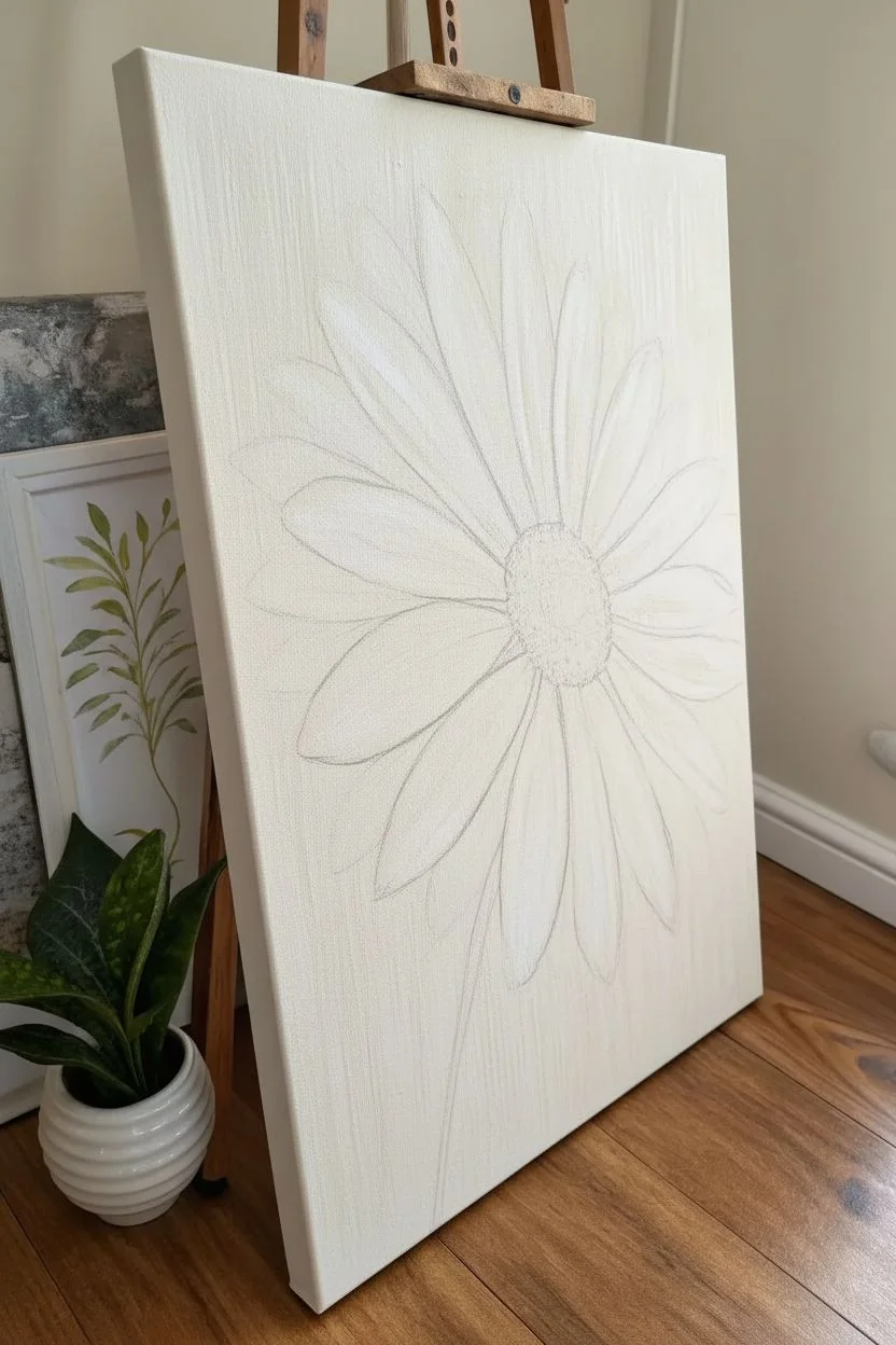
Step 1: Background & Sketch
-
Prime the background:
Begin by covering your entire canvas with a layer of Unbleached Titanium (cream) mixed with a generous amount of Titanium White. Use your large flat brush in long, vertical strokes to create a subtle, streaky texture that resembles faint wood grain or aged paper. -
Let it dry:
Allow this background layer to dry completely. Acrylics dry quickly, so this should take about 15-20 minutes. -
Map out the flower:
With a pencil, lightly sketch the center of the daisy slightly offset from the middle of the canvas, towards the right. Draw a simple oval for the center. -
Sketch the petals:
Draw long, slender petals radiating outward from the center. Don’t worry about making them perfectly symmetrical; some can overlap or curve slightly. Ensure the petals extend almost to the edges of the canvas to create that bold, large-scale look. -
Add the stem:
Draw a thin, slightly curved line extending from the bottom of the flower head down to the bottom edge of the canvas.
Muddiness Fix
If your white petals turn beige or muddy, let the brown shadow layer dry completely before painting the white highlights overtop. Patience is key.
Step 2: Painting the Flower
-
Base coat for petals:
Using the medium filbert brush, fill in the petals with a mix of Titanium White and a tiny drop of Yellow Ochre. This shouldn’t be bright white yet; it’s an underpainting to give the flower warmth. -
Establish shadows:
While the petals are still tacky, mix a little Burnt Umber into your cream color. Apply this darker shade to the spaces between petals and near the flower’s center where shadows naturally gather. -
Paint the center base:
Fill in the oval center with a solid coat of Yellow Ochre. Let it dry briefly. -
Brighten the petals:
Load your brush with pure Titanium White. Apply thick, confident strokes over the main body of each petal, leaving the edges and bases slightly darker to show the underlying shadow layers. I like to use a swift, sweeping motion here to keep the look loose. -
Define petal edges:
Mix a diluted wash of Burnt Umber and Raw Sienna. Use the small round brush to outline random segments of the petals, adding definition especially where one petal overlaps another. -
Texture the center:
Dab the center of the flower with a mix of Raw Sienna and Burnt Umber using the tip of your round brush. Use a stippling motion (tiny dots) to mimic the fuzzy texture of pollen. -
Highlight the center:
Add a few dots of pure Titanium White mixed with Yellow Ochre to the top left side of the flower center, suggesting a light source hitting the textured surface.
Metallic Pop
Mix a small amount of metallic gold paint into the flower center’s highlights for a subtle shimmer that catches the light beautifully.
Step 3: Refining Details
-
Paint the stem:
Paint the stem using a mix of Olive Green (or mix yellow and black/blue) and Burnt Umber. Keep the line thin and elegant. -
Highlight the stem:
Run a thin line of your lighter cream color down one side of the stem to give it volume and roundness. -
Enhance texturing:
Use a nearly dry brush with a tiny amount of plain white paint to dry-brush over the petals again. This creates a scratchy, textured look that mimics the veins in the petals. -
Deepen contrast:
If the flower looks too flat, go back with your darkest brown mix and deepen the shadows right next to the yellow center disk. -
Final background adjustments:
If you accidentally painted over your background too much, carefully touch up the negative spaces between petal tips with your original cream background color. -
Cleanup strokes:
Step back and view your painting from a distance. If any petal edges look too sharp or rigid, soften them slightly with a clean, damp brush.
Allow your beautiful floral study to dry fully before hanging it to brighten up your room
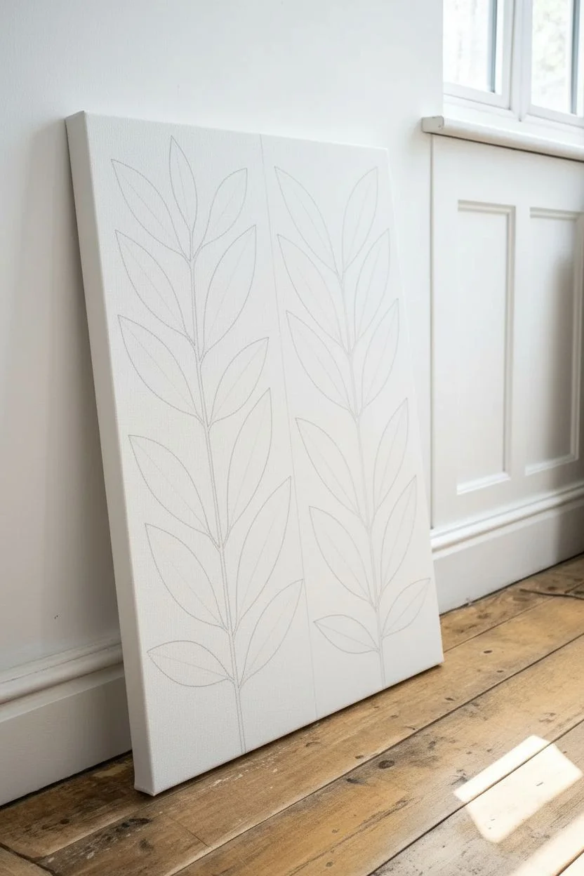
Minimalist Botanical Shapes With Negative Space
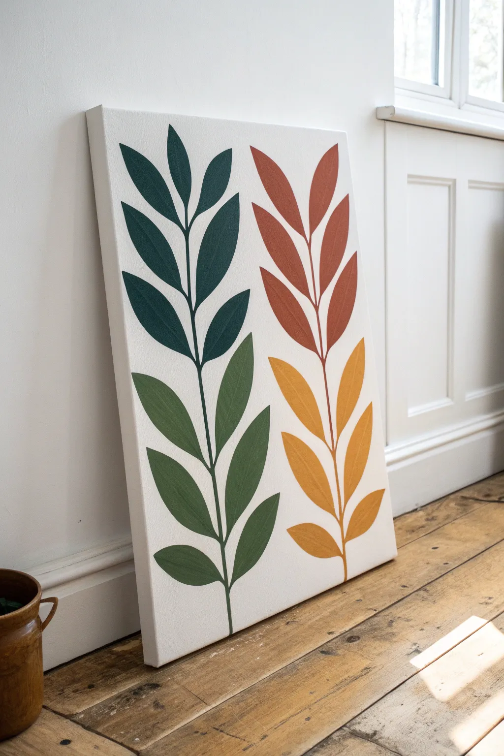
Embrace the beauty of simplicity with this bold, minimalist botanical painting that focuses on clean shapes and harmonious color blocking. This project is perfect for beginners wanting to practice brush control while creating a stunning, modern piece of wall art.
Detailed Instructions
Materials
- Stretched canvas (rectangular, gallery depth preferred)
- Acrylic paints (dark teal, sage green, terracotta/rust, mustard yellow)
- Flat shader brushes (medium and large)
- Small round detail brush
- Pencil
- Eraser
- Ruler
- Palette or mixing plate
- Cup of water
- Paper towels
Step 1: Planning the Composition
-
Prepare the canvas:
Start with a clean, primed canvas. If you want the background to be ultra-bright, you can apply a quick coat of gesso or white acrylic first and let it dry completely. -
Mark the center:
Using a ruler, lightly mark the vertical center of your canvas with a pencil. This will help you space out the two main stems evenly. -
Sketch the stems:
Draw two vertical lines for the main stems. Keep them roughly parallel but allow for a slight, natural curve. The left stem will hold the cool colors, and the right stem will hold the warm tones. -
Outline the leaf shapes:
Sketch the basic leaf shapes extending from the stems. Aim for a simple almond or willow leaf shape. Keep them relatively symmetrical, with pairs of leaves branching off at the same height. -
Refine the spacing:
Step back and look at your sketch. Ensure there is enough ‘negative space’ (white background) between the leaves so the colors won’t touch when painted.
Crisp Edge Secret
For perfectly sharp leaf edges, use an angled shader brush. Load the paint only on the tip and pull the brush toward the stem, lifting it as you reach the end to create a tapered point.
Step 2: Painting the Cool Tones
-
Mix the dark teal:
On your palette, prepare your darkest cool color. A deep teal or forest green works beautifully here. Add a touch of black if you need it darker. -
Paint the upper left leaves:
Using a flat shader brush, carefully fill in the top three pairs of leaves on the left stem. Use the edge of the brush to create crisp, sharp points at the tips of the leaves. -
Connect the stem:
Switch to your small round detail brush to paint the upper portion of the stem itself, connecting these dark teal leaves. -
Mix the sage green:
Clean your brushes thoroughly. Now mix a lighter, earthy sage green for the bottom half of the left plant. -
Paint the lower left leaves:
Fill in the remaining bottom leaves on the left stem with the sage green. Be careful not to blend this into the teal section; the transition happens abruptly at the stem junction. -
Finish the left stem:
Use the detail brush to paint the lower stem green, ensuring a smooth visual connection where the color shifts from teal to sage.
Texture Play
Instead of flat color, mix a little modeling paste into your acrylics before painting. This will add a subtle raised texture to the leaves, giving the minimalist design a tactile 3D effect.
Step 3: Painting the Warm Tones
-
Mix the terracotta:
Prepare a rusty orange or terracotta color. If mixing from scratch, combine orange with a tiny bit of brown or burnt sienna to mute it. -
Paint the upper right leaves:
Apply this warm rust color to the top section of the right-hand plant, mirroring the placement of the dark teal section on the other side. -
Paint the upper stem:
Use your detail brush to paint the stem segment for these top leaves. -
Mix the mustard yellow:
Clean your brushes again. Mix a golden mustard yellow tone. You might need to add a little white to your yellow to make it opaque enough to cover the canvas well. -
Paint the lower right leaves:
Fill in the bottom leaves of the right plant with the mustard yellow. I like to do a second coat on yellow tones to ensure it looks solid and not streaky. -
Complete the stem:
Finish the artwork by painting the final lower segment of the right stem in yellow.
Step 4: Final Touches
-
Check the edges:
Once dry, look closely at the edges of your leaves. If any lines are wobbly, use a small brush with a bit of white paint to ‘erase’ and tidy up the background negative space. -
Erase visible pencil:
Gently erase any remaining pencil marks that are still visible around the painted shapes.
Allow the canvas to dry completely before hanging it up to bring a breath of nature into your room


Pop-Style Self-Portrait in Two Bold Colors
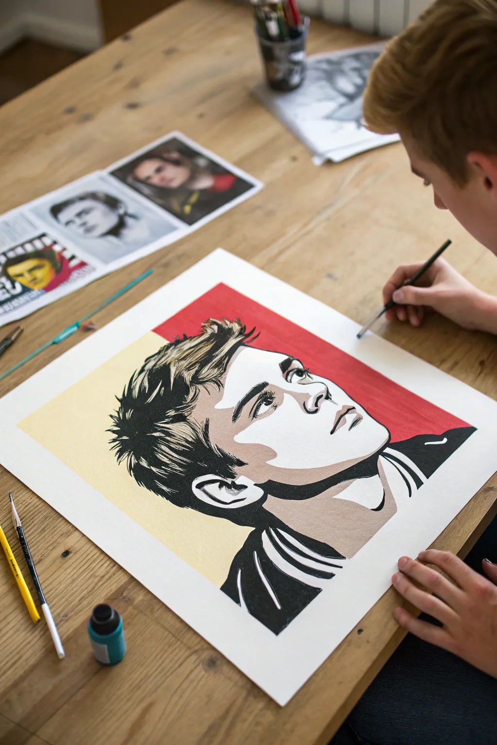
Transform a simple selfie into a striking work of art with this bold, two-tone poster style. By reducing your image to high-contrast shapes and limiting your palette to just red, cream, black, and white, you’ll create a professional-looking graphic portrait that pops off the page.
Step-by-Step Tutorial
Materials
- High-quality reference photo (selfie)
- Thick mixed-media paper or bristol board
- Pencil and eraser
- Acrylic paints (Red, Cream/Pale Yellow, Black, White)
- Flat shader brushes (small and medium)
- Fine liner brush
- Tracing paper or lightbox (optional for transferring)
- Painter’s tape or masking tape
- Ruler
- Photo editing software or app
Step 1: Planning and Preparation
-
Choose your photo:
Select a high-contrast photo of yourself looking up or to the side. Dramatic lighting with clear shadows works best for this posterized effect. -
Posterize the image:
Using a photo editing app, apply a ‘posterize’ or ‘threshold’ filter. Adjust the settings until your face is broken down into 3-4 distinct levels of value: shadows (black), mid-tones (cream), and highlights (white). -
Prepare the paper:
Tape down your mixed-media paper to your work surface to prevent warping. Using a ruler, lightly draw a large rectangle in the center, leaving a clean white border around the edge. -
Map the background:
Draw a diagonal line splitting the background behind the head. This dynamic split creates energy; in our example, we’ll paint the top right red and the bottom left cream.
Fixing Smudges
Accidentally got black paint on a white area? Don’t wipe it! Let it dry completely, then paint over the mistake with opaque white acrylic or gesso.
Step 2: Sketching the Outline
-
Transfer or sketch:
Lightly sketch the contours of your face onto the paper. If drawing freehand is tricky, I prefer using a lightbox or tracing paper to transfer the main shapes from a printed copy of my edited photo. -
Define the zones:
Don’t just draw features like eyes and noses; draw the shapes of the shadows and highlights. Outline specifically where the black shadows will sit versus the lighter skin tones. -
Refine the hair:
Simplify the hair into chunky shapes rather than individual strands. Look for the major clumps of shadow and the bright highlights on the crown of the head.
Level Up: Texture
Before painting, apply a layer of matte medium or gesso with horizontal brushstrokes. This subtle texture adds a canvas-like feel to the finished poster.
Step 3: Painting the Base Colors
-
Paint the background:
Start with the background to establish your color palette. Paint the top right section with a solid, opaque red. Use a flat brush to get crisp edges along the diagonal line. -
Fill the second tone:
Paint the bottom left background section with your cream or pale yellow paint. Let this dry completely before moving to the face. -
Apply skin mid-tones:
Fill in the shadow areas of the skin (like under the chin, the neck, and the side of the nose) with a slightly darker beige or grey-tone if desired, or stick to the high-contrast cream used in the background for a flatter look. -
Leave the white:
Identify the brightest highlights on the face—usually the forehead, bridge of the nose, and cheekbones. Leave these areas the bare white of the paper. This negative space is crucial for the high-contrast style.
Step 4: Adding Definition
-
Paint the solid blacks:
Using a smaller flat brush, fill in the darkest areas with black acrylic. This brings the portrait to life. Focus on the deep shadows in the hair, the nostrils, the pupils, and the strong shadow under the jawline. -
Detail the eyes:
Switch to a fine liner brush for the eyes. Carefully paint the lash line and iris, ensuring you leave a tiny white reflection dot in the pupil to give the subject life. -
refine the hair texture:
Add confident, sweeping black brushstrokes to the hair. These shouldn’t be messy; they should look like graphic spikes or blocks of shadow. -
Clean up edges:
Once the black is dry, check your edges. If any lines look shaky, use your cream or white paint to cut back in and sharpen the shapes. -
Final touches:
Add any final graphic details, like the collar of a shirt. Keep clothing simple and blocky to match the aesthetic of the face. -
Reveal:
Wait for the painting to be 100% dry, then slowly peel away the painter’s tape to reveal the crisp white border.
Hang your bold new self-portrait on the wall and enjoy the modern, graphic statement you’ve created
Quote and Typography Painting That Feels Like a Poster
Embrace the messy perfection of hand-painted typography with this bold, poster-style canvas. The dry-brush aesthetic gives the letters a gritty, energetic texture that makes the simple message feel modern and edgy.
Step-by-Step
Materials
- Rectangular stretched canvas (16×20 inches or similar)
- White acrylic paint (or gesso)
- Black heavy body acrylic paint
- Large flat paintbrush (2-3 inches wide)
- Medium flat synthetic brush (approx. 1 inch)
- Small round detail brush
- Pencil
- Ruler
- Paper plate or palette
- Plastic cup for water
- Paper towels
Step 1: Preparing the Surface
-
Prime the canvas:
Start by giving your store-bought canvas a fresh coat of white acrylic paint or gesso. Even if it came pre-primed, this extra layer adds a bit of texture and ensures a bright, clean background. -
Let it dry completely:
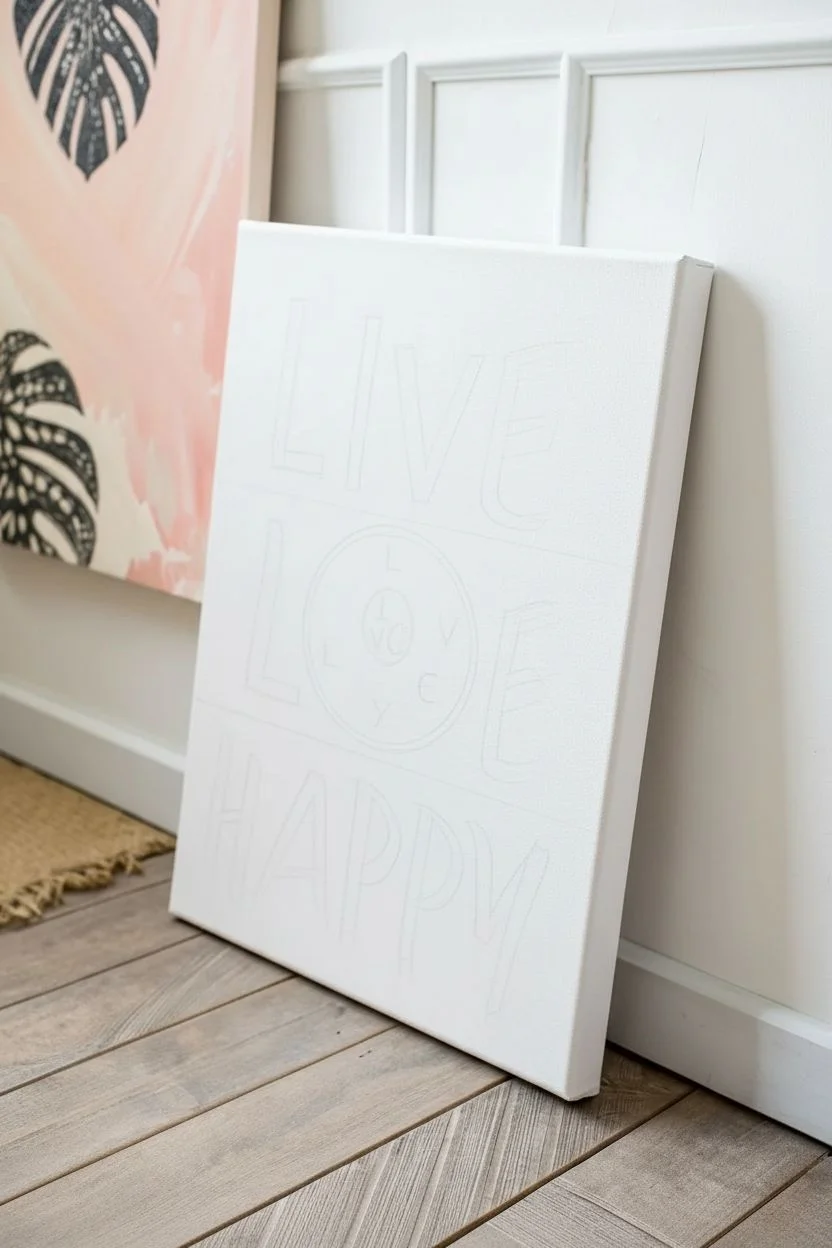
Wait for the white base coat to dry fully to the touch. You don’t want your pencil lines digging into wet paint later. -
Plan your layout:
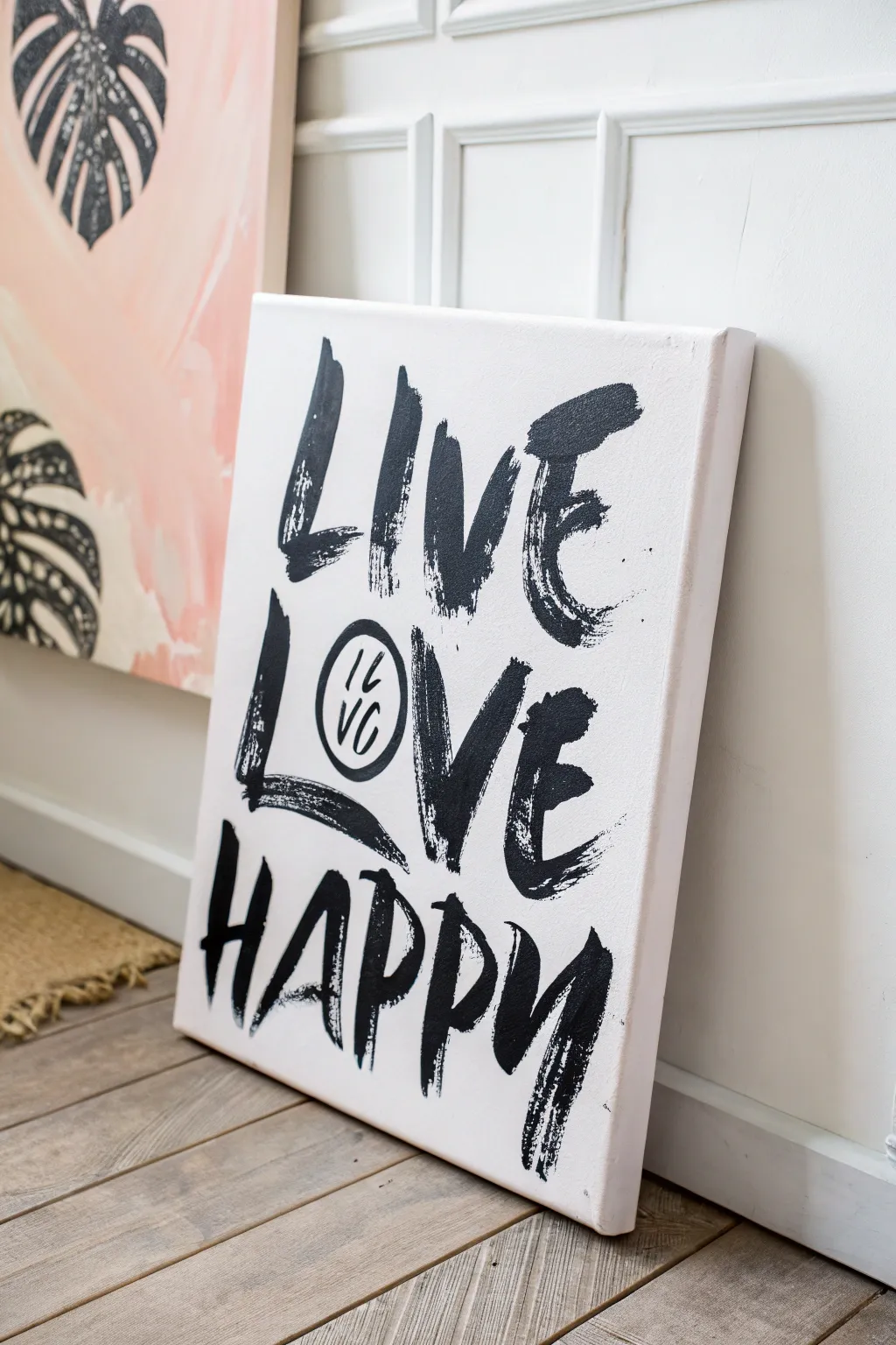
Visualize the three distinct rows for your lettering. The top row will be ‘LIVE’, the middle ‘LOVE’ (with the ‘O’ replaced by a symbol), and the bottom ‘HAPPY’. -
Mark loose guidelines:
Using a ruler and a pencil with very light pressure, mark three horizontal baselines where your words will sit. Keep the spacing roughly equal, but don’t worry about mathematical precision. -
Sketch the letters:
Lightly sketch out the block letters ‘LIVE’, ‘L’, ‘VE’, and ‘HAPPY’. Make the letters tall and compressed to mimic a poster font. Keep the lines faint so they are easy to cover.
Pro Tip: Dry Brushing
Don’t wet your brush with water between color loads. The stiffness of a dry brush creates those cool, scratchy streak marks that make the font look vintage.
Step 2: Painting the Typography
-
Load your brush:
Squeeze a generous amount of black heavy body acrylic paint onto your palette. Dip your medium flat brush in, but don’t overload it. We want a slightly ‘dry’ look. -
Test the stroke:
Before hitting the canvas, swipe your brush on a scrap paper. You want the bristles to drag slightly at the ends, creating that scratchy, rough texture visible in the photo. -
Paint vertical strokes first:
Start with the letter ‘L’ in ‘LIVE’. Use confident, downward strokes for the vertical bars. Allow the brush to run out of paint slightly at the bottom of the stroke for texture. -
Add horizontal strokes:
Complete the letters with horizontal crossbars. Connect them loosely; if they overlap or leave gaps, that adds to the charm. -
Create the brush curves:
For curved letters like ‘C’ or the spine of ‘S’ (or the ‘P’s in Happy), rotate your wrist slightly as you pull the brush down. Don’t try to make smooth vector curves; let them be angular and blocky. -
Paint the decorative circle:
In the middle row, instead of the letter ‘O’, paint a thick, slightly imperfect black circle outline using the tip of your medium brush. -
Detail the inner circle:
Switch to your small round detail brush. Carefully paint the tiny ‘IL’ stacked over ‘YC’ inside the circle. -
Continue to the bottom row:
Move to the word ‘HAPPY’. Notice how the ‘H’ and ‘A’ angles lean into each other. Replicate this dynamic movement by angling your brush strokes slightly. -
Emphasize the texture:
Go back over a few areas with a very dry brush (wipe most paint off on a towel). Drag it quickly over the stroke ends to enhance the ‘scratchy’ fade effect, especially on the ‘E’ in ‘LOVE’.
Step 3: Refining and Sealing
-
Check for balance:
Step back five feet from your canvas. Does the weight of the black paint feel balanced? If one letter looks too thin, add another quick pass. -
Clean up stray marks:
If you have pencil lines still visible that distract from the look, gently erase them once the black paint is 100% dry. Be careful not to smudge the paint. -
Optional touch-ups:
I sometimes use a bit of white paint to ‘cut back’ into a letter if a stroke got too thick or messy. It acts like an eraser for acrylics. -
Allow to cure:
Let the painting sit for at least 24 hours to ensure the heavy body paint is cured all the way through before leaning it against a wall or framing.
Level Up: Color Pop
Paint a solid neon background (like hot pink or electric blue) first, let it dry, then paint the black text over it for a high-contrast 80s punk look.
Hang this bold statement piece in your room to serve as a daily reminder to choose joy
Four-Panel Seasons Tree Set for Teen Room Decor
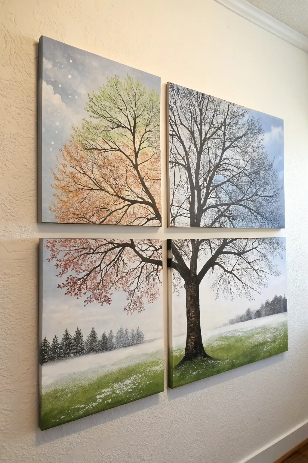
Transform a plain wall with this stunning four-panel canvas set that captures the changing seasons in a single, cohesive tree design. By splitting the image across a quadtych, you create a modern, gallery-style installation where vibrant spring greens, autumnal rusts, and wintry whites meet in harmony.
Step-by-Step Tutorial
Materials
- 4 square stretched canvases (12×12 inches or similar)
- Acrylic paints (Titanium White, Mars Black, Sap Green, Burnt Sienna, Phthalo Blue, Orange, deep brown)
- Wide flat brush (1-2 inch)
- Medium round brush
- Small liner brush or rigger brush
- Natural sea sponge or scrunched paper towel
- Masking tape or painter’s tape
- Pencil and eraser
- Palette for mixing paint
- Cup of water and paper towels
- Ruler or yardstick
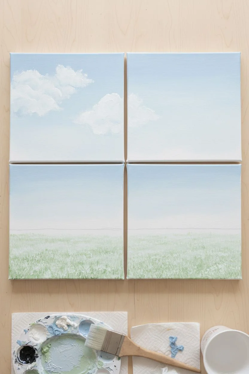
Step 1: Planning and Background
-
Arrange the grid:
Lay your four canvases on a flat surface in a 2×2 grid, leaving a small gap (about 1 inch) between them to simulate how they will hang on the wall. This negative space is crucial for the composition. -
Draft the background zones:
Visualize the horizon line. It needs to flow across the bottom two canvases. Lightly sketch a line about one-third of the way up on the bottom panels to mark where the snowy field meets the sky/distant treeline. -
Paint the sky:
Mix Titanium White with a tiny touch of Phthalo Blue for a pale, wintery sky. Paint the entire top two canvases and the upper two-thirds of the bottom canvases with this mix, using the wide flat brush in smooth, horizontal strokes. -
Add clouds:
While the blue is still slightly wet, dab in patches of pure Titanium White on the top left panel to create soft, fluffy clouds. I like to soften the edges with a clean, dry brush to make them look misty. -
Create the snowy ground:
On the bottom two panels, paint the area below your horizon line with white heavily mixed with Sap Green. It shouldn’t be solid green; blend white over it to look like grass covered in a dusting of frost or light snow.
Step 2: The Distant Landscape
-
Paint the tree line shadow:
Mix a dark grey-green using Sap Green and a touch of Black. Along the horizon line on the bottom two panels, tap in a row of small, indistinct pine tree shapes. -
Create atmospheric perspective:
Once the distant trees are dry, glaze over them with a very watery layer of white paint. This ‘mist’ pushes them into the background and creates depth. -
Detail the foreground grass:
Use a fan brush or a rough bristle brush with thicker white paint to stipple texture onto the bottom green area, mimicking patches of unmelted snow.
Alignment Issues?
Canvases shifted while painting? Use a yardstick or long ruler to draw the main trunk lines across the gap before you start painting to ensure they match up later.
Step 3: The Main Tree Structure
-
Sketch the trunk skeleton:
With the canvases still arranged in their grid, lightly sketch the main tree. The trunk should sit primarily in the bottom right panel but extend its branches into all four quadrants. -
Paint the trunk:
Using a dark brown/black mix and a medium round brush, fill in the trunk. Ensure the lines visually ‘jump’ the gaps between canvases correctly. -
Branch out:
Switch to your liner brush. Extend thin, delicate branches outward. The top right panel should be mostly bare, intricate twigs for winter. -
Add bark texture:
Mix a lighter grey-brown. On the left side of the trunk (the light source), dry-brush vertical streaks to give the tree volume and rugged texture.
Add Some sparkle
Mix a pinch of fine silver glitter or iridescent medium into the white paint used for the snow and winter branches to make the frost glisten in the light.
Step 4: Seasonal Foliage
-
Sponge on Spring:
On the top left panel’s upper branches, dip a sea sponge into a mix of Sap Green and White. Lightly dab to create the fresh, budding leaves of spring. -
Transition to Autumn:
Clean the sponge and switch to Orange and Burnt Sienna. Dab these colors onto the lower branches of the top left panel and the upper branches of the bottom left panel. -
Add falling blooms:
In the bottom left panel, use a small brush to dot specific pink or red blooms, suggesting flowering branches or perhaps the last clinging leaves of fall before winter. -
Enhance Winter:
On the top right panel (winter), re-trace the tops of the black branches with a very thin line of white paint to simulate snow resting on the wood. -
Paint the snowy base:
At the very base of the trunk on the bottom right panel, stipple pure white paint to show snow accumulation around the roots. -
Final continuity check:
Stand back and look at the whole grid. Add final twig connections where the canvas gaps might have broken the visual flow of the branches.
Hang these beauties with equal spacing to reveal the full effect of your seasonal masterpiece
Painted Locker-Size Mini Canvases for Swapping Themes
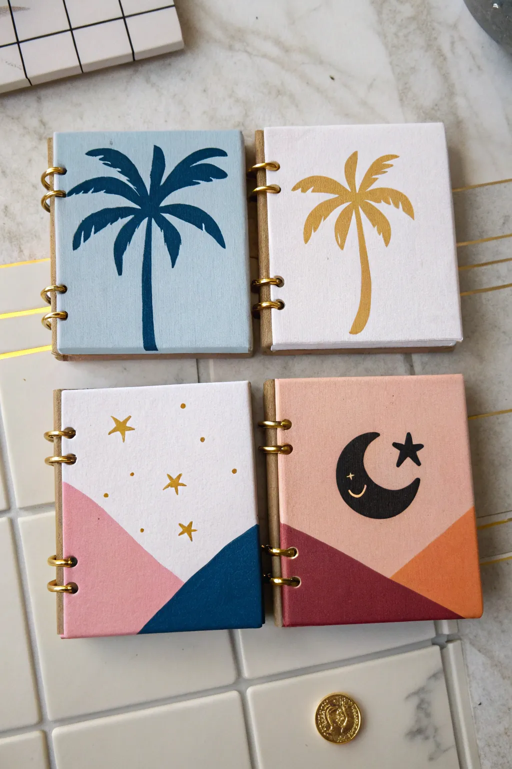
Transform tiny canvases into trendy, swappable locker decor with these four coordinating designs. Featuring minimalist palm trees and dreamy celestial landscapes, these miniature artworks use simple shapes and bold metallic accents for a high-impact look.
Detailed Instructions
Materials
- 4 mini square canvases (approx. 4×4 inches)
- Acrylic paints: light blue, dark navy blue, white, blush pink, coral/orange, terracotta red, gold, black
- Set of small paintbrushes (flat shader and fine liner)
- Pencil and eraser
- Ruler or straight edge
- Painter’s tape or masking tape
- Optional: Gold spiral binder rings (if creating a flip-book mechanism as shown)
- Palette or small plate for mixing
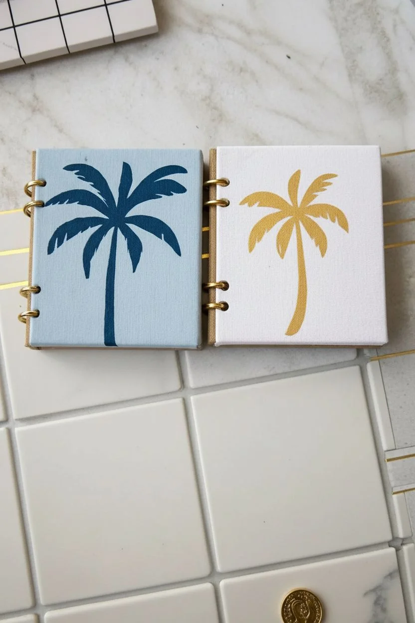
Step 1: Palm Tree Pair
-
Base Coating:
Start by painting the entire surface of one canvas with light blue paint for the background. Paint the second canvas solid white. You may need two coats for opaque coverage; let them dry completely. -
Sketch the Trunk:
Once dry, use a pencil to very lightly sketch a curved line starting from the bottom center, leaning slightly to the right for the trunk on both canvases. -
Outline Fronds:
Sketch the palm fronds radiating from the top of the trunk. Think of a firework explosion shape—curved lines drooping downward. -
Paint the Blue Palm:
On the light blue canvas, use a fine liner brush and dark navy paint to fill in the trunk. Gradually thicken the base of the trunk for stability. -
Detail the Fronds:
Using the navy paint, fill in the fronds. Create the leafy texture by painting small, quick strokes outward from the center vein of each frond. -
Paint the Gold Palm:
Repeat the painting process on the white canvas, but this time use metallic gold paint. You might need to load your brush heavily to get a shiny, solid finish. -
Final Touches:
Check the edges. If you want a clean look, paint the sides of the canvas to match the background color.
Step 2: Celestial Landscapes
-
Prepare the Backgrounds:
Paint the top 2/3 of one canvas white and the top 2/3 of the other canvas a soft blush pink/peach color. Let this base layer dry thoroughly. -
Tape the Geometrics:
For the crisp mountain lines, place a piece of painter’s tape diagonally across the bottom section. On the white canvas, create a V-shape overlap; on the pink canvas, create two intersecting slopes. -
Paint the Mountains:
On the white canvas, paint the left triangle blush pink and the right triangle dark navy. On the pink canvas, paint the left mountain deep terracotta red and the right mountain bright orange. -
Remove Tape:
Peel the tape off carefully while the paint is still slightly tacky to reveal sharp, clean lines. Touch up any bleed-through with a small brush. -
Add the Moon:
On the pink celestial canvas, paint a black crescent moon in the center. I find it easiest to paint a circle first, then paint over part of it with the background color to create the crescent shape. -
Celestial Details:
Using a very fine liner brush or a gold paint pen, add small stars. Draw traditional five-point stars, small dots, and four-point ‘sparkle’ shapes on the white canvas. -
Moon Character:
Give the black moon a personality by painting a tiny white or gold closed eye and a small smile near the bottom curve. Add a black star next to it for balance. -
Binding (Optional):
If you are mimicking the notebook look shown, punch holes on the left side (if the canvas frame allows) or attach faux gold rings to the side for decoration.
Uneven Lines?
If paint bleeds under your tape, wait for it to dry perfectly, then use a ruler and a paint pen in the background color to trace over and ‘erase’ the mistake.
Level Up: Texture
Mix a tiny pinch of baking soda into your acrylic paint for the mountains. It creates a matte, terra-cotta texture that contrasts beautifully with the metallic gold stars.
Now you have a chic set of mini art pieces ready to brighten up your locker or desk space
Painted Rocks as Desk Decor and Photo Holders
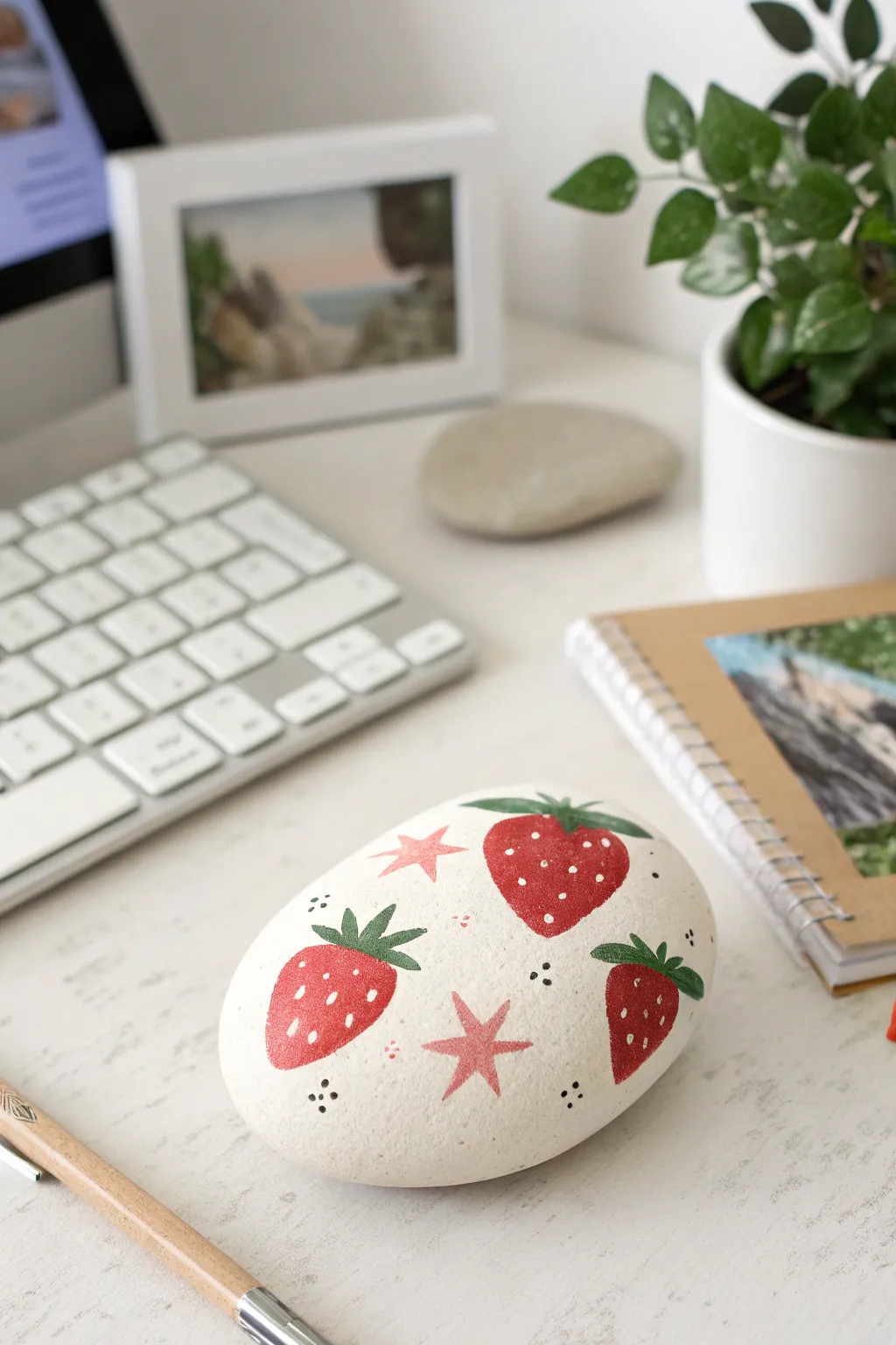
Transform an ordinary garden stone into a delightful desk companion with this sweet strawberry pattern. The smooth, matte finish combined with playful red berries and pink stars makes for charming decor that doubles as a sturdy paperweight.
Step-by-Step Guide
Materials
- Smooth, oval river rock (approx. palm-sized)
- White acrylic paint (matte finish)
- Bright red acrylic paint
- Forest green acrylic paint
- Soft pink acrylic paint
- Black acrylic paint or fine-tip paint pen
- Flat shader brush (size 6 or 8)
- Small round detail brush (size 0 or 1)
- Palette or paper plate
- Pencil for sketching (optional)
- Matte spray varnish (optional)
Step 1: Base Preparation
-
Clean the surface:
Begin by washing your rock thoroughly with soap and water to remove any dirt or oils. Let it dry completely before starting. -
Apply the base coat:
Using your larger flat brush, apply a smooth layer of white acrylic paint over the entire top surface of the rock. You don’t need to paint the very bottom unless you want to. -
Build opacity:
Let the first coat dry for about 10-15 minutes. Apply a second or even third coat until you have a solid, opaque white background with no grey rock showing through. -
Smooth it out:
Check for any brush strokes or lumps. If the paint is too thick, slight sanding with ultra-fine sandpaper can create a porcelain-like finish before you start the design.
Clean Lines Hack
Don’t have a steady hand for stars? Cut a tiny star shape out of painter’s tape or a sticky note to use as a stencil, then dab the pink paint gently inside.
Step 2: Painting the Motifs
-
Plan the placement:
Visualize a triangle pattern for your three strawberries. You want them spaced evenly—one top right, one bottom right, and one bottom left. Lightly sketch the outlines with a pencil if you’re nervous about freehanding. -
Paint the berry shapes:
Load your round brush with bright red paint. Paint the three strawberry shapes, resembling rounded, inverted triangles. -
Refine the edges:
Go back around the edges of your red shapes to ensure they are crisp and smooth. Let the red paint dry completely to prevent smudging. -
Add the leafy tops:
Switch to forest green paint. At the flat top of each berry, paint three or four small pointed leaves fanning out. They should overlap the red slightly. -
Paint the stars:
Using the soft pink paint and your smallest detail brush, paint five-pointed stars in the empty white spaces between the berries. Aim for two or three stars of varying sizes. -
Add floating dots:
While you have the pink paint out, add clusters of three tiny pink dots near the berry edges or stars to fill the negative space.
Make it a Photo Holder
Before painting, wrap a stiff copper wire tightly around the rock’s base and twist a spiral coil at the top to slide a photo into.
Step 3: Detaling & Finishing
-
Seed the berries:
I prefer using a fine round brush for this, but a toothpick works too. Dip the tip into white paint and create tiny teardrop shapes or simple dots on the red berries for seeds. -
Vary the seeds:
Keep the intricate white seeds scattered randomly; they shouldn’t look like perfect rows. -
Add black accents:
Using black paint or a very fine paint pen, add clusters of three black dots in the remaining open white areas, balancing the design. -
Review the composition:
Take a step back and look at your rock. If a space looks too empty, add another tiny cluster of pink or black dots. -
Protect your work:
Once the rock is fully dry (give it at least an hour), take it outside and spray it with a clear matte varnish. This seals the paint and protects it from scratches on your desk.
Place this cheerful rock on your desk to keep your papers organized and add a pop of summary color to your study space
Mood Palette Art Journal Pages for Real-Life Feelings
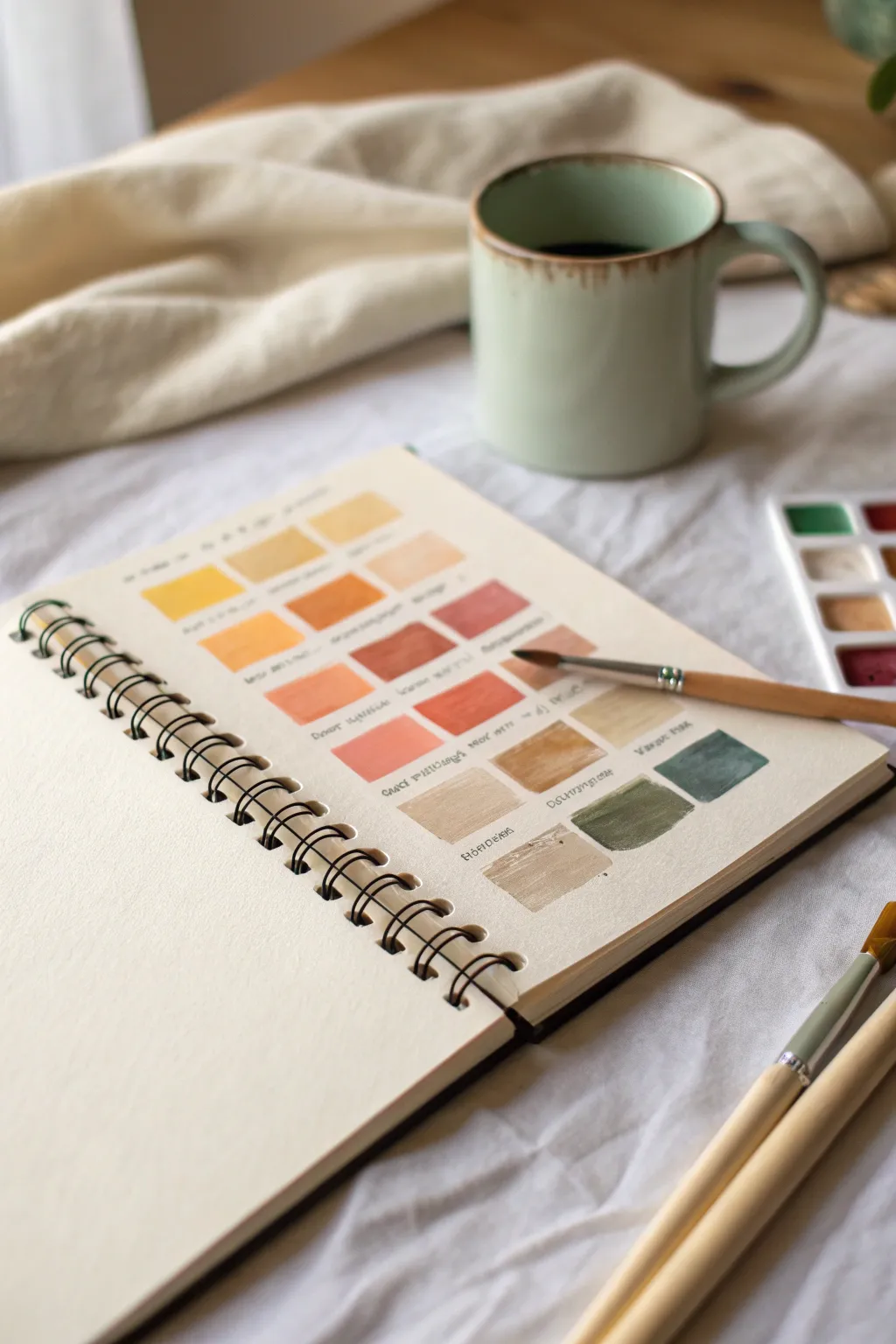
Capture your shifting moods and discover your personal color psychology with this aesthetic swatch page. Instead of painting a scene, you’ll create a satisfying gradient of square swatches, labeling each tone with the feeling it evokes for you.
Step-by-Step
Materials
- Spiral-bound watercolor journal or heavy sketching paper (300 gsm preferred)
- Watercolor pan set (variety of warm tones and neutrals)
- Round watercolor brush (size 4 or 6)
- Small cup of water
- Paper towel or rag
- Fine-tip waterproof black pen (0.3mm or 0.5mm)
- Ruler (optional, if you want perfect squares)
- Pencil and eraser
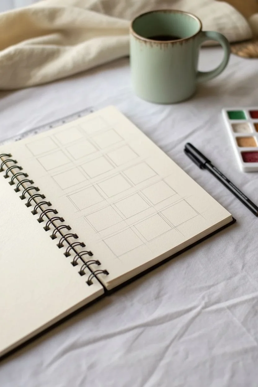
Step 1: Planning Your Grid
-
Grid Layout:
Visualize a grid on your page that is four columns wide and five rows down. You want the swatches to be roughly uniform squares, leaving enough white space between them to write text underneath. -
Pencil Sketching:
Using a light hand, sketch the outline of your squares with a pencil. I prefer to freehand these to keep the look organic and relaxed, but you can use a ruler if you crave precision. -
Spacing Check:
Ensure there is about a half-inch of vertical space below each row of squares. This ‘breathing room’ is where your handwriting will go later.
Step 2: Painting the Gradient
-
Start with Yellows:
Load your brush with a watery, pale yellow for the top left corner. Paint your first square, keeping the pigment translucent. -
Transition to Warmth:
For the next squares in the top row, mix in a tiny bit of orange or ochre. You want a subtle shift from lemon yellow to a sunny gold. -
Orange and Peach Tones:
Move to the second row. Start mixing stronger oranges and soft peach tones. Add more water to your brush to make the peach colors feel airy and light. -
Deepening to Reds:
As you descend to the third row, introduce terra cotta and muted red shades. If a color feels too bright, touch it with a little brown on your palette to desaturate it. -
Adding Neutrals:
For the fourth row, clean your brush thoroughly. Transition into beige, tan, and sand colors. These should look like skin tones or coffee stains. -
Earthy Anchors:
Finish the bottom row with your darkest, moodiest tones—think olive green, slate blue, or a muddy sage. Paint the final square in the bottom right corner with a solid, opaque application. -
Drying Time:
Let the page dry completely. If the paper feels cool to the touch, it’s still damp. Waiting ensures your pen ink won’t bleed into the paint.
Uneven Watercolors?
If you get ‘blooms’ or uneven drying, try picking up excess water with a thirsty, dry brush while the paint is still wet to smooth it out.
Step 3: Adding the Emotion
-
Naming the Colors:
Look at each swatch and ask yourself what feeling it represents. Is that pale yellow ‘Caution’ or ‘Hope’? Is the deep red ‘Passion’ or ‘Anger’? -
Lettering:
With your fine-tip pen, write the name of the emotion directly under each dried swatch. Use small, neat handwriting or print letters. -
Personal Notes:
Next to the feeling name, you can add tiny subtitles or code words that remind you of specific memories associated with that color. -
Header Title:
At the very top of the page, write the date or a title like ‘Current Moods’ or ‘Spring Feelings’ to time-stamp this snapshot of your emotions. -
Erase Guidelines:
Once the ink is totally dry, gently erase any visible pencil lines from your initial sketching phase to clean up the page.
Pro Tip: Custom Mixes
Never use colors straight from the pan. Always mix at least two shades or add extra water to create nuanced, sophisticated colors.
Now you have a beautiful reference guide for your emotions that you can look back on whenever you need clarity
Crumpled-Paper Texture Painting for a Stained-Glass Look
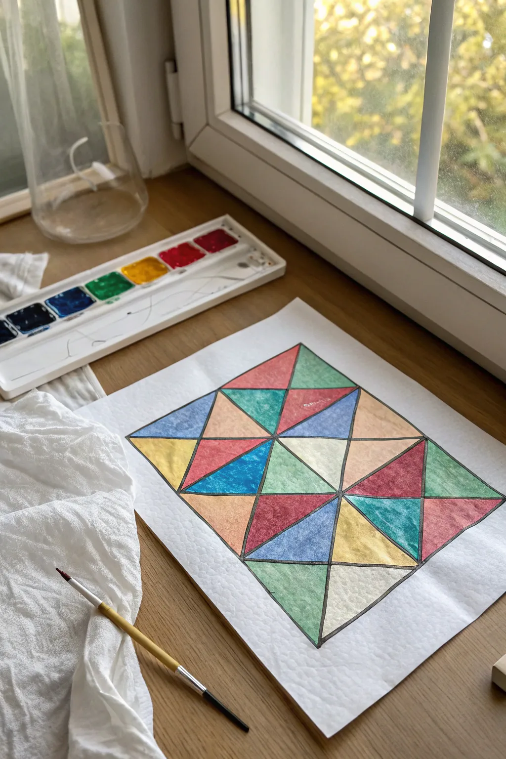
Achieve the timeless look of stained glass without cutting a single piece of glass. By combining a simple crumpling technique with bold geometric lines and vibrant watercolors, you’ll create a textured masterpiece that glows with color.
Step-by-Step Tutorial
Materials
- Heavyweight watercolor paper or mixed media paper
- Watercolor paint set
- Water container
- Small to medium round paintbrush
- Black waterproof fine-liner or permanent marker
- Ruler or straight edge
- Pencil
- Eraser
- Paper towels or rag
Step 1: Preparing the Texture
-
Crumple the paper:
Take your sheet of watercolor paper and gently crumple it into a loose ball. Don’t squeeze too tight, as you want organic creases, not rips. -
Flatten it out:
Carefully uncrumple the paper and lay it flat on your workspace. -
Smooth the surface:
Use the palm of your hand to smooth out the paper as much as possible so it lies relatively flat for drawing.
Make Those Lines Pop
If your marker looks grey against the colors, go over the black lines a second time. A thicker line weight makes the colors appear brighter by contrast.
Step 2: Designing the Grid
-
Draw the outer boundary:
Using a pencil and ruler, draw a large rectangle in the center of your paper to serve as the frame for your artwork. -
Create the main sections:
Divide your large rectangle into smaller squares or rectangles. In the example, a grid of 3×4 squares works well. -
Add diagonal lines:
Use your ruler to draw diagonal lines through your squares, creating a series of triangles. -
Vary the angles:
To make the pattern interesting, alternate the direction of your diagonal lines (some form an ‘X’, others just a single slash) to create a variety of triangle shapes. -
Trace with ink:
Go over all your pencil lines with a black waterproof marker. Make the lines slightly thick to mimic the lead came used in real stained glass.
Step 3: Painting the Glass
-
Select your palette:
Choose 4-5 distinct watercolor shades. A classic mix like emerald green, deep red, cobalt blue, ochre yellow, and a soft peach creates a nice vintage feel. -
Start with the first color:
Dip your brush in water and pick up your first color. Paint a few random triangles across the grid, ensuring no two touching shapes are the same color. -
Emphasize the texture:
As you paint, let the watercolor pool slightly in the creases created by the earlier crumpling. This darker concentration of pigment highlights the cracked texture. -
Continue with remaining colors:
Rinse your brush thoroughly and switch to your next color, filling in another set of non-adjacent triangles. -
Fill the gaps:
Proceed through all your chosen colors until every triangle is filled. I find it helpful to stand back occasionally to check the color balance. -
Let it dry completely:
Allow the paint to fully dry. The paper might buckle slightly due to the water, but this adds to the rustic, textured effect. -
Touch up the lines:
If any paint overlapped your black lines, you can carefully re-trace them with your marker to keep the grid crisp and bold.
Oil Pastel Resist
Instead of marker, draw your grid with a black oil pastel before painting. The wax will repel the water, keeping your colors perfectly contained.
Display your finished piece near a window where the light can play off the textured surface
Metallic Foil Background Painting for Shimmer Photos
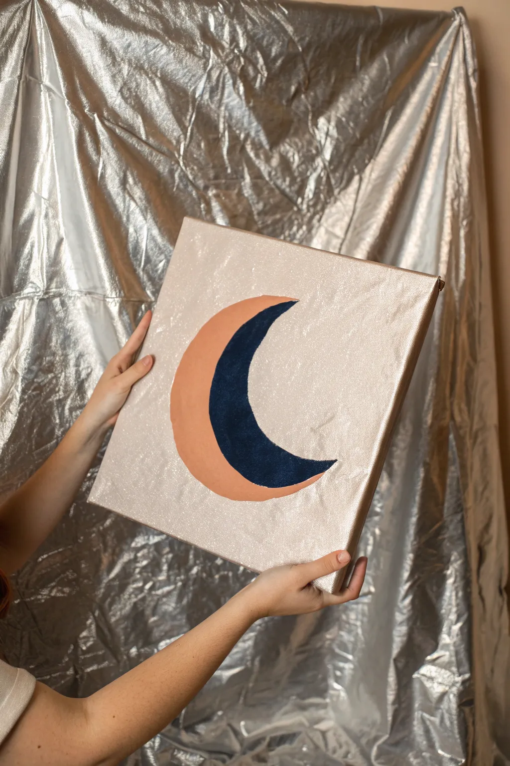
Capture the celestial beauty of the night sky with this modern, metallic moon painting. The textured silver background reflects light beautifully, making the bold peach and navy crescent pop with a chic, minimalist vibe.
Step-by-Step Guide
Materials
- Square stretched canvas (e.g., 12×12 inches)
- Metallic silver acrylic paint or silver leaf sheets
- Navy blue acrylic paint
- Terracotta or peach acrylic paint
- Wide flat paintbrush (for background)
- Medium round paintbrush (for the moon)
- Pencil
- Round object for tracing (like a plate or bowl)
- Palette or paper plate
- Spray adhesive (if using silver leaf)
- Sealer or varnish (optional)
Step 1: Prepping the Canvas
-
Base coat application:
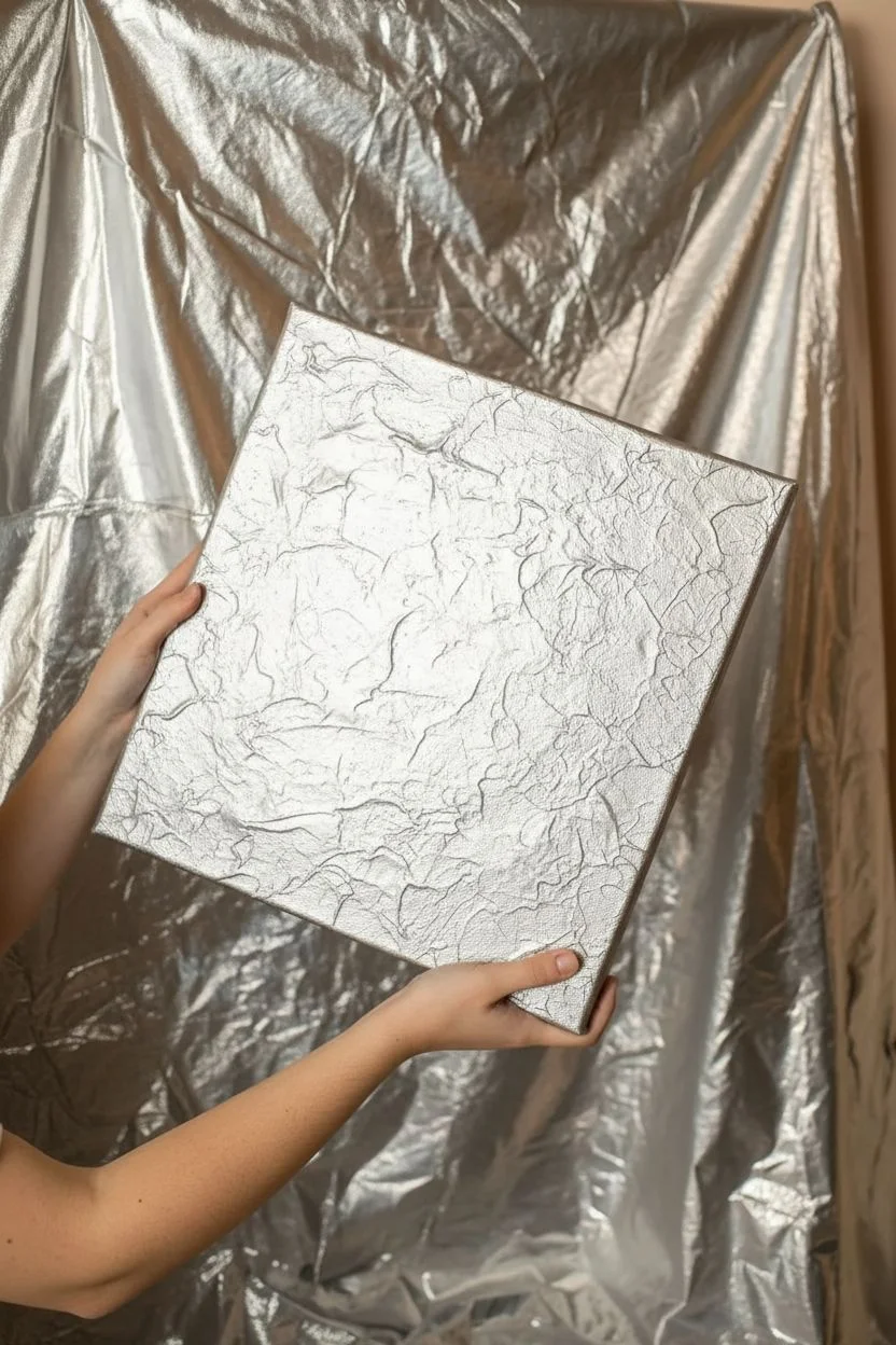
Start by applying a base coat of white or gray acrylic paint to your canvas if it isn’t pre-primed. This ensures your metallic layer will sit smoothly on top. -
Creating the metallic background:
For that high-shine, textured look seen in the photo, paint the entire face and sides of the canvas with a thick layer of metallic silver acrylic paint using a wide flat brush. -
Adding texture:
While the paint is still wet, you can dab the surface lightly with a scrunched-up paper towel or sponge to create a subtle, uneven texture that catches the light. -
Letting it dry completely:
Allow the silver background to dry fully. This is crucial because you don’t want the moon colors to mix with the metallic base. Wait at least 1-2 hours.
Step 2: Drafting the Moon
-
Tracing the outer curve:
Position a large bowl or circular plate slightly off-center on the canvas. Lightly trace the curve with a pencil to form the outer edge of your moon. -
Tracing the inner curve:
Shift the bowl or plate inward about an inch or two (depending on how thick you want the crescent) and trace a second line that connects to the tips of the first line. -
Refining the shape:
If the points of the crescent look too blunt, sketch them out by hand to make them sharper and more elegant. -
Dividing the crescent:
Draw a curved line right down the middle of your crescent shape, separating it into an inner sliver and an outer sliver.
Paint Slipping?
If your colored paint is sliding around on the metallic background, the surface might be too slick. Lightly sand the moon area with fine-grit sandpaper to give the paint some ‘tooth’ to grip onto.
Step 3: Painting the Design
-
Mixing the terracotta shade:
Squeeze out your terracotta or peach paint. If it’s too bright, I like to mix in a tiny drop of brown to make it earthier. -
Painting the outer curve:
Using a medium round brush, carefully fill in the outer section of the moon with the terracotta paint. Take your time along the edges to keep the lines crisp against the silver. -
Applying the navy blue:
Clean your brush thoroughly or switch to a fresh one. Load it with deep navy blue paint and fill in the inner section of the crescent. -
Touching up edges:
Look closely at where the terracotta and navy meet. Carefully paint over the seam to ensure there is no silver showing through between the colors. -
Second coat:
Acrylics can be translucent. Once the first layer is dry to the touch, apply a second coat of both the pink and blue to make the colors solid and opaque. -
Cleaning up mistakes:
If you accidentally painted outside the lines onto the silver, wait for it to dry, then create a small correcting patch with your silver paint to cover the smudge. -
Final dry time:
Set the canvas aside in a safe, dust-free area to dry completely overnight before hanging or displaying.
Go 3D
For a mixed-media look, use velvet fabric or felt for the navy section instead of paint. Cut the shape to match your sketch and glue it down for a soft, tactile contrast.
Hang your shimmering moon piece in a spot that gets plenty of natural light to see the background truly sparkle
Have a question or want to share your own experience? I'd love to hear from you in the comments below!