
If you’re craving painting ideas that feel like they’re saying something, you’re in the right mindset. I love pieces where simple symbols carry big emotions—like hope, grief, freedom, and growth—without needing a single word.
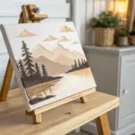
The Winding Road of Life
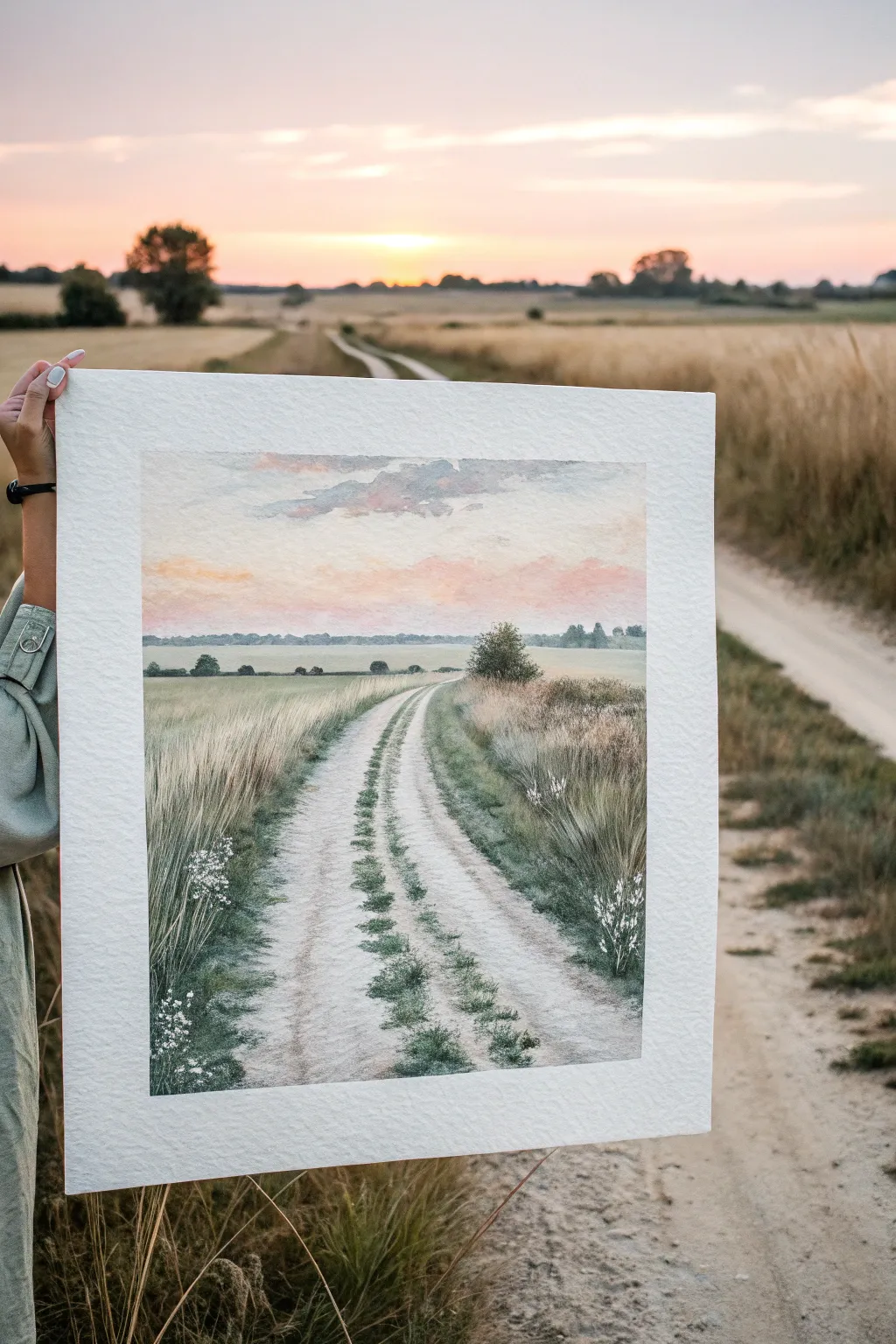
Capture the serene beauty of a quiet country lane at sunset with this gentle watercolor landscape. The soft, blended sky and textured grassy verges create a peaceful composition that invites viewers to imagine walking down the winding dirt road.
Step-by-Step Guide
Materials
- Cold press watercolor paper (140lb/300gsm), taped to a board
- Watercolor paints (Ultramarine Blue, Burnt Sienna, Yellow Ochre, Alizarin Crimson, Sap Green, Sepia)
- White Gouache (for highlights)
- Round brushes (sizes 4, 8, and 12)
- Detail brush (size 0 or 1)
- Masking fluid (optional)
- Pencil (HB) and kneadable eraser
- Two jars of water
- Paper towels
Step 1: Sketching and Sky
-
Lightly sketch the horizon:
Begin by drawing the horizon line about 1/3 of the way down from the top. Sketch the two converging lines of the road, curving them gently to the left as they recede into the distance to create depth. -
Outline the vegetation:
Loosely indicate where the taller bushes and tree line will sit on the horizon and the grassy verges on either side of the road. Keep these lines faint so they don’t show through the paint. -
Wet the sky area:
Using your largest round brush, apply clean water to the entire sky area above the horizon line. You want an even sheen, not puddles. -
Apply the sunset glow:
While the paper is wet, drop in a very watery mix of Yellow Ochre near the horizon. Quickly blend this into a soft Alizarin Crimson or pink tone as you move slightly upward. -
Add the upper sky:
Towards the top of the paper, blend in a soft grey-blue made from Ultramarine Blue with a touch of Burnt Sienna. Let these colors bleed naturally into the pinks below for a seamless gradient. -
Create soft clouds:
While the sky is still damp but losing its sheen, lift out some pigment with a clean, thirsty brush to suggest soft clouds, or dab in a slightly thicker grey-violet mix for cloud shadows.
Depth Perception
Make foreground grasses larger, darker, and more detailed. Make background trees smaller, paler, and bluer. This atmospheric perspective creates the illusion of distance.
Step 2: The Distant Landscape
-
Paint the horizon line:
Once the sky is bone dry, mix a cool, pale green using Sap Green and a little Blue. Paint the distant tree line along the horizon. Keep the edges soft and the color value light to push it into the background. -
Block in the middle ground:
Paint the fields on either side of the road with a wash of Yellow Ochre and Sap Green. Use horizontal strokes for the far fields to suggest flatness. -
Deepen the grassy verges:
As you move closer to the foreground (the bottom of the paper), intensify your greens. Mix Sap Green with Sepia for the darker, shadowed areas of the tall grass on the right side.
Muddy Greens?
If your greens look dull, stop mixing too many colors. Let a pure yellow and pure blue mix on the paper itself, or add a touch of red to de-saturate a green without making it gray.
Step 3: The Road and Foreground Details
-
Wash the road surface:
Paint the dirt road with a very diluted mix of Burnt Sienna and a touch of gray. Leave the paper white in some areas to represent the brightest highlights on the dry dirt. -
Add road texture:
While the road wash is damp, drop in slightly darker gray-brown spots to suggest gravel and uneven texture. Let this dry completely. -
Paint the center strip:
Using a smaller round brush, paint the strip of grass growing down the center of the road. Use short, vertical flicking motions to mimic blades of grass, getting larger as you move toward the bottom. -
Create the heavy grass texture:
Load your brush with a thick mix of Sap Green and Sepia. Paint the tall, wild grasses on the immediate left and right foreground using quick, upward strokes. Vary the direction slightly to look natural. -
Soften edges:
I like to take a damp brush and soften the bottom of the grass clumps where they meet the dirt road, so they don’t look like they are floating. -
Add floral details:
Using white gouache, dab tiny dots onto the brush tips in the foreground to create the white wildflowers seen on the left and right. Group them in clusters rather than scattering them evenly.
Step 4: Final Touches
-
Enhance shadows:
Mix a dark, neutral color (Sepia and Ultramarine). Add targeted shadows underneath the grassy clumps and in the deepest ruts of the road to boost the contrast. -
Refine the tree:
Add a bit more definition to the central bush/tree on the right side of the road, giving it a slightly darker core to make it stand out against the horizon. -
Review and remove tape:
Step back to check your values. Once the painting is completely dry—and the paper feels warm to the touch—carefully peel off the masking tape at a 45-degree angle.
Now you have a tranquil landscape that captures the feeling of a long walk home at dusk


A Single Figure Under Stars
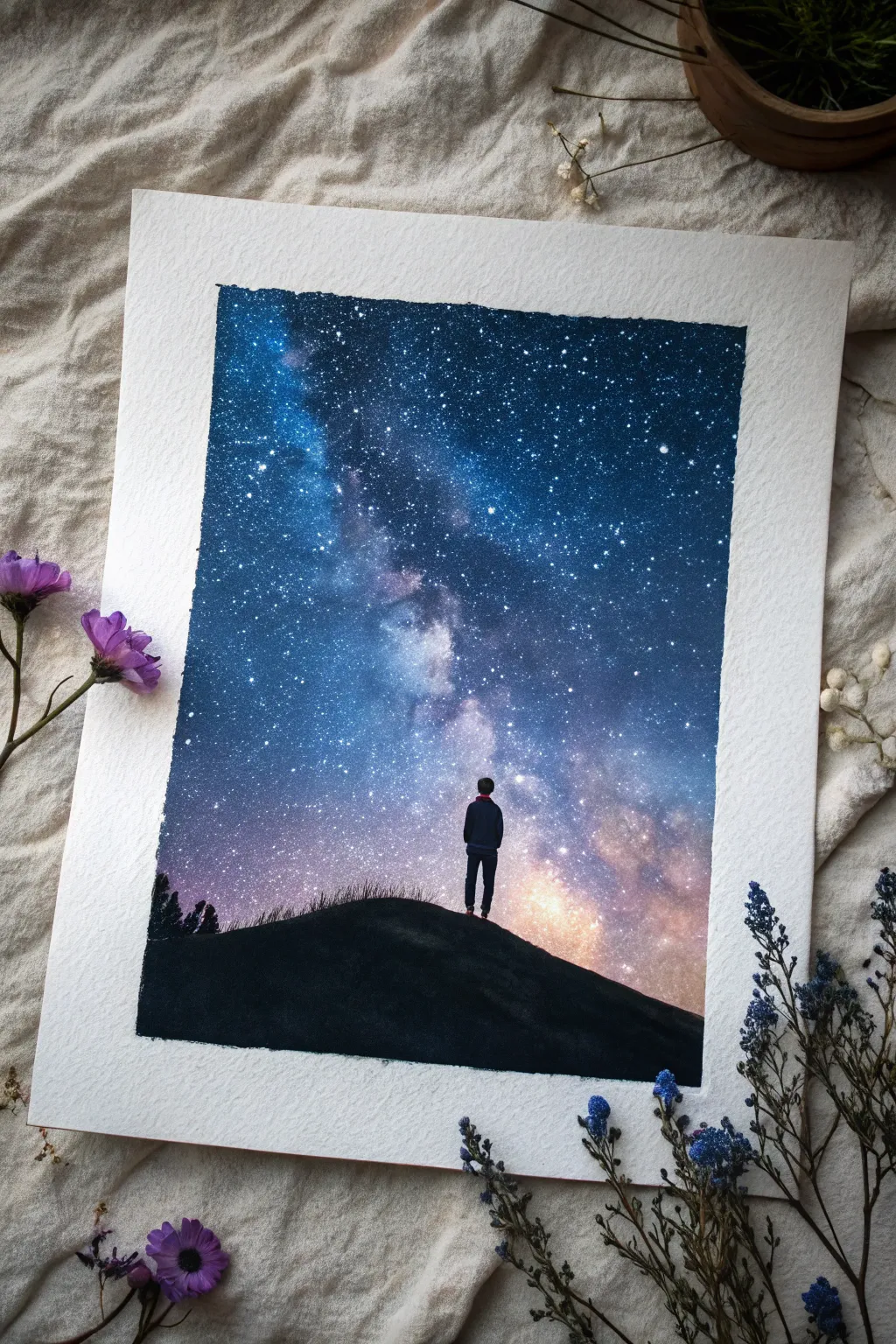
Capture the immense scale of the universe on a small sheet of paper with this breathtaking Milky Way galaxy painting. Using rich, opaque paints, you’ll create a glowing nebula and a lonely silhouette that evokes a sense of wonder and peaceful isolation.
How-To Guide
Materials
- Cold press watercolor paper (300 gsm or heavier)
- Masking tape
- Gouache or acrylic paints (primary cyan/phthalo blue, ultramarine, black, white, magenta, violet)
- Flat brush (3/4 inch)
- Small round brush (size 2 or 4)
- Detail brush (size 0 or 00)
- Old toothbrush (for splatter)
- Mixing palette
- Paper towels
- Two jars of water
Step 1: Setting the Stage
-
Prep your surface:
Begin by taping down all four edges of your watercolor paper to a hard board or table. Press the tape down firmly to ensure crisp, clean borders later. -
Base sketch:
Lightly sketch a curved hill at the bottom third of the paper. Add a tiny stick figure in the center of the hill to mark where your observer will stand. Keep pencil lines very faint.
Step 2: The Galaxy Sky
-
Deep space background:
Start at the very top corners with a mix of black and ultramarine blue. Paint a dark, U-shaped vignette around the top and sides, leaving the center diagonal swoosh lighter. -
Mid-tone transition:
Mix cerulean or cyan with a touch of ultramarine. Blend this into the dark edges, working wet-on-wet towards the center diagonal band where the Milky Way will be. -
Creating the glow:
Clean your brush thoroughly. Mix white with the tiniest dot of magenta and cyan to create a pale, milky lavender-blue. Apply this to the central diagonal band of the sky. -
Blending the nebula:
While the paint is still damp, use a clean, slightly moist brush to soften the edges where the pale Milky Way meets the darker blue sky. I like to use a dabbing motion here to create cloud-like textures. -
Adding warmth:
Near the horizon line on the right side, blend in a soft peach or pale orange tone. This suggests light pollution or the warm glow of the galactic core rising. -
Layering depth:
Once the first layer is semi-dry, go back in with your darkest black-blue mix. Stipple this color into parts of the Milky Way band to create ‘dust lanes’ or dark rifts within the stars.
Stars too blotchy?
If your toothbrush splatter creates huge blobs instead of mist, your paint is too wet. Blot the brush on a paper towel before flicking to ensure a fine, dusty spray.
Step 3: A Universe of Stars
-
Prepare the splatter:
Mix white acrylic or gouache with a few drops of water until it reaches the consistency of heavy cream or thin yogurt. -
The star field:
Dip an old toothbrush into the thinned white paint. Test it on a scrap paper first, then flick the bristles with your thumb to spray fine mists of stars across the entire sky area. -
Major stars:
Use your smallest detail brush (size 0) to essentially connect the dots or add larger, specific stars. Dot a few distinct bright spots in the dark blue areas to make them pop.
Make it Glow
For a brighter galaxy core, wait for everything to dry, then dry-brush a tiny amount of pure neon pink or fluorescent orange right at the horizon’s brightest point.
Step 4: The Silhouette
-
Painting the hill:
Load your flat brush with pure black paint. Fill in the hill area at the bottom, carefully painting over your pencil line to create a smooth, solid silhouette against the starry sky. -
Adding grass texture:
Before the black hill dries completely, use a small round brush to flick tiny, upward strokes along the crest of the hill. These fine lines simulate tall grass silhouetted against the glow. -
The figure’s form:
Switch to your detail brush and pure black paint. Carefully paint the legs and torso of the figure standing on the hill’s peak. -
The figure’s details:
Paint the head and arms. Keep the shape simple—a silhouette doesn’t need internal details, just a recognizable outline. Ensure the feet look grounded in the grass, not floating. -
Subtle coloring:
This is optional, but effective: mix a very dark midnight blue (almost black) and paint just the jacket area of the figure, leaving the pants pure black. This adds minuscule dimension. -
Final touches:
Add faint trees or bushes on the far left horizon line using the stippling technique with black paint to balance the composition.
Step 5: The Big Reveal
-
Peeling the tape:
Wait until the painting is completely bone-dry. Slowly peel the masking tape away at a 45-degree angle not to tear the paper. This reveals those satisfying crisp white edges.
Step back and admire how a few colors and a simple silhouette can tell such a vast story


Storm Cloud With a Secret Sun
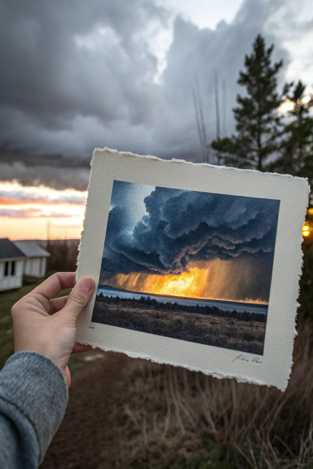
Capture the dramatic beauty of a storm breaking with this moody and luminous painting project. Using layers of dark blues and explosive oranges, you’ll create a powerful contrast that mimics sunlight piercing through heavy rain.
Detailed Instructions
Materials
- Heavyweight watercolor paper (300gsm, cold press works best)
- Watercolor or gouache paints (Indigo, Payne’s Grey, Phthalo Blue, Cadmium Orange, Lemon Yellow, White)
- Masking tape
- Large flat brush (3/4 inch)
- Medium round brush (size 6 or 8)
- Small detail brush (size 2)
- Paper towels
- Jars of clean water
- Deckle edge ruler or straight edge (optional)
Step 1: Setting step
-
Prepare your paper:
Cut your heavyweight watercolor paper to your desired size (around 5×7 inches works well). If you want that beautiful torn look, fold and carefully tear the edges against a ruler instead of cutting with scissors. -
Tape it down:
Secure the paper to your work surface using masking tape on all four sides. This prevents buckling when the paper gets wet and creates a clean border if you aren’t tearing the edges later. -
Sketch the horizon:
Lightly draw a straight horizon line about one-third of the way up from the bottom of the paper using a hard pencil (H or HB). This separates your sky from the dark foreground.
Step 2: The Glowing Core
-
Wet the center sky:
Using your large flat brush, apply clean water to the center area just above the horizon line where the light will be strongest. Don’t soak the whole sky, just the focal point. -
Drop in yellow:
While the paper is wet, load your brush with watered-down Lemon Yellow and drop it into the wet center. Let it bloom naturally upwards and outwards. -
Add intensity:
Mix Cadmium Orange with a touch of yellow. While the previous layer is still damp, paint this stronger color near the horizon line, blending it upwards into the pale yellow. This creates the ‘fire’ of the sun. -
Soften edges:
Clean your brush and wipe it slightly. Gently run the damp brush along the top edge of your yellow/orange section to ensure there are no hard lines before you add the dark clouds.
Cloud Control
If your fast-moving storm clouds are bleeding too much into the yellow sun, wait for the yellow layer to dry completely before painting the dark clouds on top.
Step 3: Building the Storm
-
Mix your darks:
Create a deep, moody storm color by mixing Indigo with a little Payne’s Grey. If you are using gouache, keep it fairly opaque; for watercolor, ensure it’s saturated. -
Paint the upper sky:
Start painting the very top of the sky with this dark mixture. Use irregular, rolling strokes to mimic the tops of cumulonimbus clouds. -
Create the cloud underbelly:
Work your way down toward the glowing center. As you get closer to the orange light, dilute your dark paint slightly with water or mix in a tiny bit of the background blue. -
Form the cloud shelf:
Using a round brush, dab thick, dark paint right above the orange glow to create the heavy ‘shelf’ of the cloud. Leave the edges somewhat rough to look like turbulent vapor. -
Blend the transition:
This is crucial: where the dark cloud meets the orange glow, don’t just stop. Use a clean, slightly damp brush to pull small streaks of the dark color downward into the orange, suggesting distant rain shafts.
Pro Tip: The Rain Effect
To make the rain look realistic, use a dry, stiff bristle brush for the rain streaks. Drag it lightly downwards; the bristles create multiple fine lines at once.
Step 4: Rain and Landscape
-
Add rain streaks:
Mix a semi-transparent wash of your storm color. Using vertical, slightly angled strokes, glaze over parts of the orange section to create the illusion of rain falling in front of the light. -
Paint the foreground:
Switch to your darkest mix (pure Indigo or Payne’s Grey). Block in the land below the horizon line. I like to make this silhouette quite solid to contrast with the bright sky. -
Detail the treeline:
With your smallest brush, paint tiny vertical irregularities along the horizon line to suggest distant pine trees or shrubs. -
Texture the field:
While the foreground is drying, use a dry-brush technique (very little paint on the brush) to drag some texture horizontally across the dark foreground, mimicking tall grasses catch hints of light. -
Final highlights:
Use a tiny dot of white gouache or undiluted watercolor to add the absolute brightest point of the sun right at the horizon if you lost it during blending. -
Flatten and finish:
Once completely dry, remove the tape. If the paper has buckled, assist it by placing it under a heavy book overnight to get that professional flat finish.
Now you have a dynamic storm captured on paper to display in your home

Anatomical Heart Growing Vines
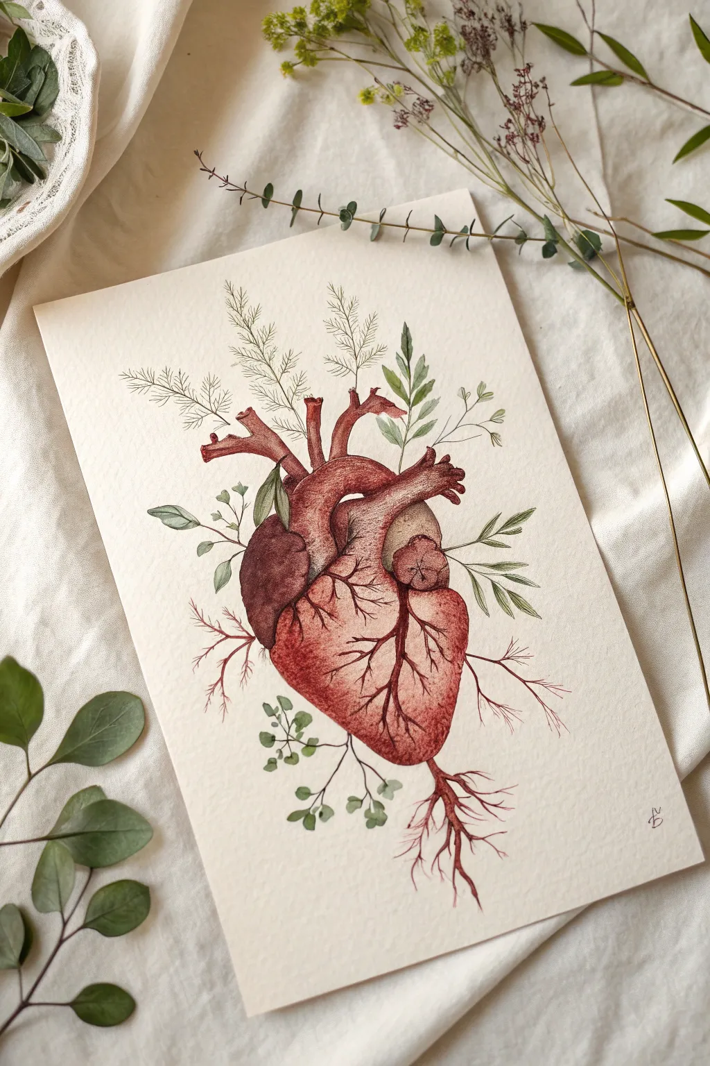
This captivating watercolor piece blends the raw reality of anatomy with the delicate beauty of botanical growth. By merging a realistic human heart with sprouting ferns and roots, you’ll create a powerful symbol of life and connection on paper.
Step-by-Step Guide
Materials
- Cold press watercolor paper (300 gsm)
- Watercolor paints (Alizarin Crimson, Burnt Sienna, Sap Green, Paine’s Grey, Yellow Ochre)
- Fine-liner pens (0.05 and 0.1, brown or sepia ink)
- Round watercolor brushes (Size 0, 2, and 4)
- HB Pencil and kneaded eraser
- Paper towels
- Two jars of water
Step 1: Sketching the Anatomy
-
Draft the heart shape:
Begin with a light HB pencil sketch of the heart’s main chamber. Think of it as a tilted, rounded cone shape, slightly wider at the top. -
Add the vessels:
Sketch the aorta and pulmonary veins at the top. Instead of ending them abruptly in open tubes, imagine them as the ‘soil’ where your plants will emerge. -
Sketch the botanical elements:
Drawing lightly, extend wispy fern fronds and small leafy stems out of the top arteries. At the bottom point of the heart, sketch twisting roots reaching downward to anchor the composition. -
Refine the outline:
Gently erase your sketch until it’s barely visible. This ‘ghost’ image will guide your painting without leaving harsh graphite marks under the transparent watercolor.
Wet-on-Dry Precision
For the tiny vessels and leaf stems, ensure the background paper is completely dry. This prevents the fine lines from bleeding and keeps your botanical details crisp.
Step 2: Painting the Heart
-
First wash of base color:
Mix a watery wash of Alizarin Crimson with a touch of Burnt Sienna. Using your size 4 brush, paint the entire body of the heart, leaving small white gaps for highlights on the curved surfaces. -
Build the shadows:
While the paper is still slightly damp, drop concentrated Crimson into the shaded areas, particularly where the vessels meet the main muscle and along the left side. -
Distinguish the chambers:
Use a darker mix (add a tiny bit of Paine’s Grey to your red) to paint the separation between the left and right distinct sections of the heart, creating depth. -
Detailing the texture:
Switch to a size 2 brush. Once the base is dry, use short, controlled strokes to mimic muscle fibers on the main body of the heart. -
Adding veins:
With a fine brush, paint the branching coronary arteries across the surface of the heart using a deep red-brown mix. Keep these lines organic and branching.
Symbolic Splatter
Load a toothbrush with diluted red paint and flick it near the roots or bottom of the heart to create an organic, slightly raw splatter effect.
Step 3: Growing the Greenery
-
Paint the leaves:
Mix Sap Green with a little Yellow Ochre for a natural, earthy tone. Carefully paint the individual leaves sprouting from the top vessels using the tip of your size 0 brush. -
Add fern details:
For the feathery plants, use very diluted green. Just barely touch the paper to create the delicate, needle-like foliage. -
Connect the stems:
Draw thin stems that disappear ‘into’ the arteries, ensuring the transition looks like growth rather than simply sitting on top. -
Paint the roots:
Using a reddish-brown mix (Burnt Sienna + Alizarin Crimson), paint the roots extending from the bottom. Make the color fade out to be lighter at the tips.
Step 4: Inking and Definition
-
Outline the heart:
Once the paint is bone dry, use a 0.1 sepia fine-liner to trace the heart’s outline. Use broken, sketchy lines rather than a solid continuous one for a more illustrative look. -
Stipple shading:
Add tiny dots (stippling) with the pen in the darkest shadow areas of the heart to increase contrast and texture without adding more paint. -
Define the plants:
Use the 0.05 pen to add central veins to the larger leaves and very fine outlines to the fern fronds. -
Final root details:
Add fine, hair-like rootlets branching off the main roots at the bottom using your finest pen to ground the image. -
Sign and clean:
Erase any remaining pencil marks carefully and sign your work near the bottom corner.
Step back and admire how the organic lines of anatomy and botany intertwine in your finished illustration
BRUSH GUIDE
The Right Brush for Every Stroke
From clean lines to bold texture — master brush choice, stroke control, and essential techniques.
Explore the Full Guide
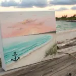
Ocean Waves as Emotions
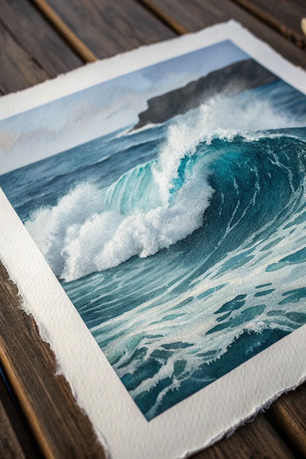
Capture the raw power and motion of the ocean with this dynamic watercolor study of a crashing wave. Using high-quality cotton paper with torn edges adds a tactile, organic feel that perfectly complements the fluidity of the water.
Step-by-Step
Materials
- 300gsm cold-press watercolor paper (rough texture preferred)
- Watercolor paints: Phthalo Blue, Indigo, Prussian Blue, Turquoise, Titanium White (gouache or watercolor)
- Flat brush (1-inch) for washes
- Round brushes (sizes 4, 8, and 12)
- Fine liner brush for details
- Masking fluid and an old synthetic brush
- Two jars of water (clean and dirty)
- Paper towels
- Board and artist tape
Step 1: Preparation and Sketching
-
Prepare the paper:
Start by tearing your watercolor paper to size rather than cutting it. This creates the beautiful deckled edge seen in the reference photo. Tape the paper down to a board, leaving about a half-inch margin to keep the paper flat. -
Outline the wave:
Lightly sketch the main curve of the wave using a hard pencil (H or 2H). Focus on the ‘C’ shape of the barrel and the jagged, irregular top where the foam breaks. Don’t press too hard; you want these lines to disappear under the paint. -
Mask the brightest whites:
Using an old brush or a silicone tool, apply masking fluid to the absolute brightest areas: the crashing foam at the top lip of the wave and the splashing whitewater in the foreground. Let this dry completely before touching it with paint.
Muddy Waters?
If your blues look dull, you likely over-mixed on the paper. Let layers dry completely between glazes. Water needs transparency to look wet, so aim for fewer, confident strokes rather than scrubbing.
Step 2: The Background and Base Layer
-
Paint the sky:
Mix a very dilute wash of Indigo and faint grey. Wet the sky area with clean water first, then drop in your color to create a soft, stormy atmosphere. Keep it pale so the ocean remains the focal point. -
Establish the horizon:
While the sky is damp but not soaking, paint the distant headland using a mix of Indigo and a touch of brown for a muted, rocky color. Allow the edges to blur slightly into the sky for depth. -
Base ocean wash:
Mix a large puddle of Turquoise and Phthalo Blue. Using your large flat brush, apply a graded wash across the main body of the water, leaving the foam areas white. Transition from a lighter turquoise in the wave’s curve to a deeper blue in the flat water.
Step 3: Building Depth and Form
-
Deepen the barrel:
Mix a concentrated Prussian Blue with a touch of Indigo. Paint the inside of the curling wave, specifically under the lip where the shadow is deepest. Use wet-on-dry strokes here to create sharp edges against the lighter turquoise barrel. -
Texture the water surface:
Switch to a size 8 round brush. With a medium-blue mix, paint the ripples on the ocean surface behind the wave. Use horizontal, slightly broken strokes that get smaller as they recede toward the horizon line. -
Define the wave face:
On the curved face of the wave, paint vertical, curved stripes following the water’s upward motion. I find lifting a little pigment with a damp blending brush helps soften these stripes so they look like moving water, not solid bars.
Salt Texture
While the blue paint on the wave’s face is still wet, sprinkle a pinch of table salt on it. As it dries, the salt pushes the pigment away, creating a natural, bubbly texture perfect for sea foam.
Step 4: Foam and Details
-
Remove masking fluid:
Ensure the paper is bone dry. Gently rub away the masking fluid to reveal the crisp white paper underneath. -
Soften the foam:
Pure white paper can look too stark. Mix a very watery grey-blue and paint shadows into the bottom sections of the large foam clumps to give them volume and 3D form. -
Add sea spray:
Take a stiff brush with white gouache or undiluted white watercolor. Use a ‘flicking’ motion or stippling technique to create the mist and spray rising off the top edge of the breaking wave. -
Foreground whitewash:
Paint the lacy patterns of foam in the foreground water. Use the fine liner brush and white gouache to create the intricate, web-like network of sea foam stretching out toward the viewer.
Step 5: Final Touches
-
Enhance contrast:
Assess the painting for drama. If the darks have faded during drying, re-glaze the deepest shadows under the wave’s curl with nearly pure Indigo. -
Dry brush highlights:
Using a nearly dry brush with white gouache, drag it lightly across the top of the blue water texture to catch the ‘tooth’ of the paper. This mimics sunlight catching the tops of small ripples. -
Review and refine:
Step back to view the piece as a whole. Gently erase any visible pencil lines in the light areas, ensuring the paper is perfectly dry to avoid smudging.
Now you have a powerful ocean scene ready to be framed or gifted to a sea lover
Head as a Weather System
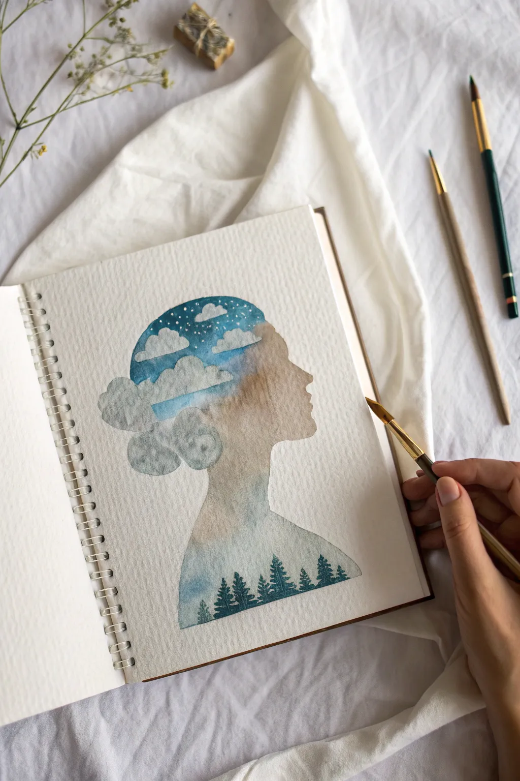
This serene watercolor piece captures the duality of human thought, framing a moody, atmospheric landscape within a delicate profile silhouette. By blending soft clouds and a starry night sky into a forest base, you create a visual metaphor for having your ‘head in the clouds’ grounded by nature.
Step-by-Step Guide
Materials
- Cold press watercolor sketchbook (spiral bound)
- Watercolor paints (Indigo, Prussian Blue, Burnt Sienna, Paynes Grey, Sap Green)
- Round watercolor brushes (sizes 2, 4, and 8)
- White gouache or white gel pen
- HB Pencil
- Kneaded eraser
- Masking tape (low tack)
- Two jars of water
- Paper towel
Step 1: Drafting the Silhouette
-
Sketch the outline:
Begin by lightly sketching the profile of a face using an HB pencil. Focus on the curve of the forehead, the nose, the lips, and the chin, leading down into the neck and shoulders. -
Define the hair shape:
Instead of drawing individual strands, sketch the outline of the hair in a large, bun-like shape at the back of the head. This area will eventually become fluffy clouds. -
Refine the boundary:
Go over your outline gently with a kneaded eraser to lighten the graphite. You want a faint guide that’s barely visible so the pencil lines don’t show through the final paint.
Step 2: Painting the Sky and Clouds
-
Prepare the cloud resist:
If you struggle with painting negative space, you can lightly mask off the cloud shapes at the top and back of the head with masking fluid. However, for a soft look like the reference, simply painting carefully around the white paper is best. -
Mix the night sky:
Create a rich, dark blue mix using Indigo and a touch of Prussian Blue. Keep this quite saturated. -
Paint the upper section:
Using your size 4 brush, paint the very top of the head shape (the skull area). Carefully paint around the edges of your ‘cloud’ shapes, leaving the paper white to represent the cloud tops. -
Soften the edges:
While the blue paint is still wet, rinse your brush and drag clean water along the bottom edge of the blue area to create a soft gradient fading downwards. -
Add cloud shadows:
Mix a very watery, pale gray-blue using Paynes Grey. Gently dab this onto the bottom portions of your white cloud shapes to give them volume and dimension.
Blooms are Good!
Don’t over-work the middle section. If the paint creates uneven watermarks or ‘blooms’ while drying, leave them alone. These textures mimic mist and suit the theme perfectly.
Step 3: Creating the Mid-Ground Atmosphere
-
Transition to warmth:
While the upper sky is damp but not soaking, introduce a wash of Burnt Sienna or a warm ochre into the face and neck area. Let this color bleed slightly into the fading blue sky above for an ethereal transition. -
Blend the profile:
Ensure the warm wash fills the nose, lips, and neck profile distinctively. Keep the paint fluid so it creates natural ‘cauliflower’ blooms or textures, which adds to the weathering effect. -
Lower atmosphere:
As you move down the neck and shoulders, gradually mix in some diluted blue-green to cool down the wash, preparing the ground for the forest.
Crisp Profile Tip
To get a razor-sharp nose and lip profile without pencil marks, lay down a strip of masking tape and cut the profile shape out with an X-Acto knife before you start painting.
Step 4: The Forest Foundation
-
Base layer for trees:
At the very bottom of the silhouette, paint a horizontal band of watery teal-blue. This serves as the misty distance behind your trees. -
Dry thoroughly:
Let the entire painting dry completely. This is crucial; if the paper is wet, your sharp tree details will turn into blurry blobs.
Step 5: Detailing the Landscape
-
Mix distinct forest colors:
Prepare a dark, concentrated mix of Indigo and Sap Green. You want a deep color closer to black-green than bright leaf green. -
Paint the first trees:
Switch to your smallest brush (size 2). Start painting tiny pine trees along the bottom edge. Use short, downward stippling motions to suggest pine boughs. -
Vary the heights:
Ensure the trees are different heights—some tall, some short—to create a natural ridge line. -
Layering depth:
Add a second row of trees slightly behind or in front using a slightly more diluted mix to create atmospheric perspective.
Step 6: Final Celestial Touches
-
Add stars:
Once the dark blue ‘night sky’ section at the top is bone dry, take your white gouache or a white gel pen. -
Dot the constellations:
Gently place tiny white dots into the indigo area. Vary the pressure to make some stars appear brighter than others. -
Clean up edges:
If any paint spilled outside the profile silhouette, use a slightly damp, stiff brush to gently scrub and lift the excess, keeping that profile outline crisp.
Now you have a poetic self-portrait of the mind that invites viewers to get lost in its details


Have a question or want to share your own experience? I'd love to hear from you in the comments below!