If you’ve ever stared at a blank canvas and thought, “What on earth should I paint?”, you’re in the right headspace. Here are painting pictures ideas that look bold and eye-catching, but stay totally doable—especially if you love silhouettes, gradients, and simple nature scenes.
Sunset Gradient With A Simple Horizon
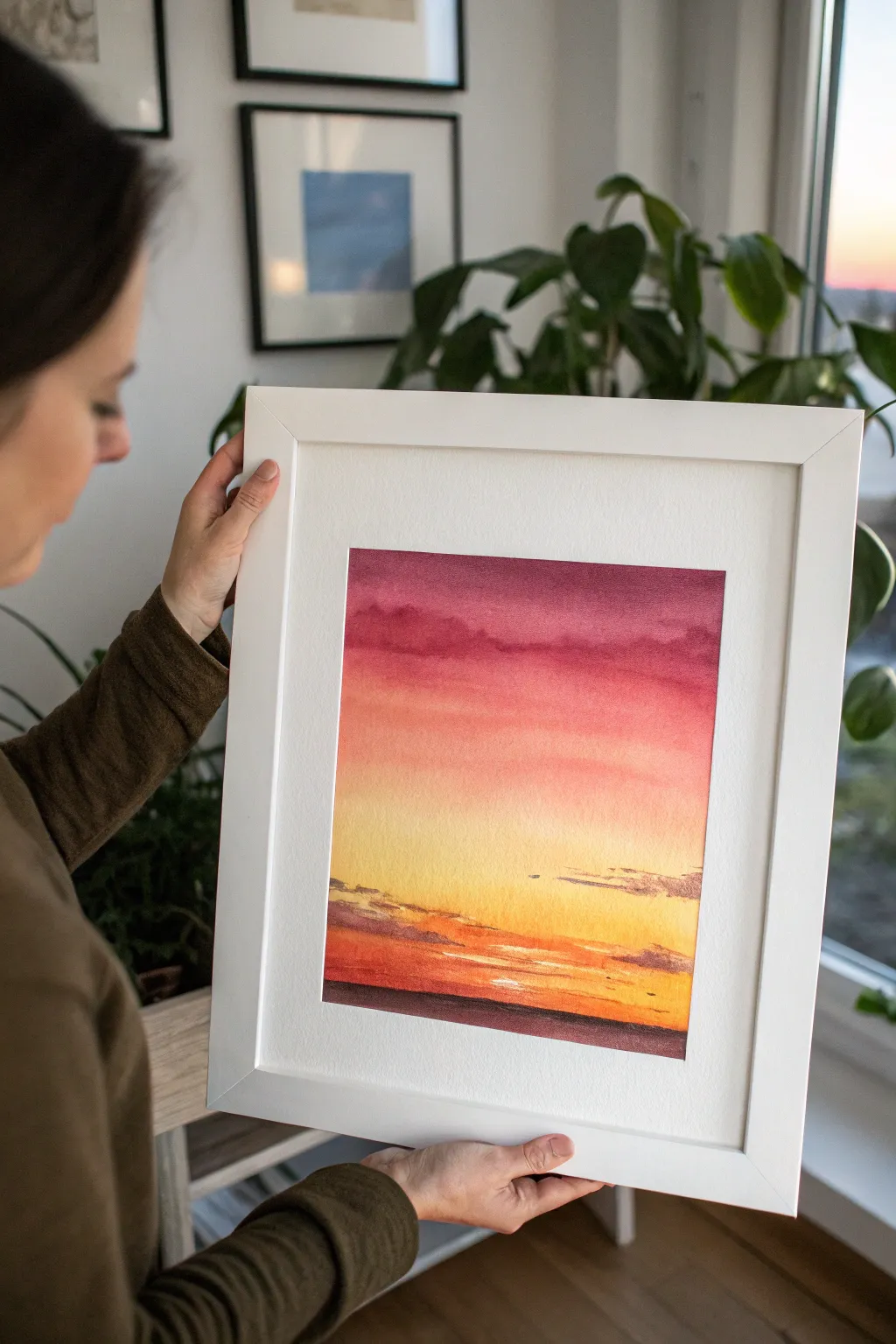
Capture the serene beauty of dusk with this vibrant watercolor project, featuring a seamless transition from deep magenta to glowing yellow. The soft, blended sky and minimal details create a calming and professional-looking piece perfect for framing.
How-To Guide
Materials
- High-quality watercolor paper (cold press, 300gsm/140lb recommended)
- Watercolor paints (Deep Purple/Violet, Alizarin Crimson, Cadmium Red, Cadmium Yellow, Payne’s Grey or Sepia)
- Large flat wash brush (1-inch or larger)
- Medium round brush (size 6 or 8)
- Painter’s tape or masking tape
- Board for taping down paper
- Two jars of water (one clean, one for rinsing)
- Paper towels
- Pencil and eraser
Step 1: Preparation and The Wash
-
Secure the Paper:
Begin by taping your watercolor paper securely to a hard board using painter’s tape on all four sides. This creates that crisp white border seen in the final piece and prevents the paper from buckling when wet. -
Sketch the Horizon:
Lightly draw a straight horizontal line near the bottom third of the paper. This will mark the separation between the sky and the dark water or land. -
Pre-wet the Sky:
Using your large flat brush and clean water, thoroughly wet the entire sky area above your pencil line. The paper should be glisten with a sheen but not have standing puddles. -
Begin with Dark Purple:
Load your large brush with a rich mix of Deep Purple or Violet. Apply a horizontal stroke across the very top edge of the wet paper, letting the pigment start to flow downward. -
Transition to Magenta:
Rinse your brush slightly and pick up Alizarin Crimson. Overlap the bottom edge of the purple stripe, working your way down the paper. The wet-on-wet technique will naturally blend the colors. -
Add Vivid Pink and Red:
While the paper is still wet, mix a bit of Cadmium Red into your pink. Continue painting downward, blending this warmer tone into the crimson section above. -
Introduce the Yellow:
Clean your brush thoroughly. Load it with pure Cadmium Yellow. Start just above the horizon line and paint upwards to meet the red section, allowing them to merge into a soft orange. -
Refine the Gradient:
If the transition looks stripey, use a clean, slightly damp brush to gently run horizontal strokes across the meeting points of the colors to smooth them out. Tilt the board slightly to encourage blending. -
Let it Dry Completely:
This is crucial: allow the wash to dry 100%. The paper must be bone-dry and flat before adding the next layer of details.
Step 2: Clouds and Horizon
-
Mix Cloud Colors:
Create a mixture for the lower clouds using purple mixed with a tiny touch of orange or brown to dull it slightly, creating a shadowed look. -
Paint Lower Clouds:
Switch to your medium round brush. With the paper dry, paint thin, horizontal cloud shapes near the horizon where the yellow is brightest. Keep the edges ragged and irregular. -
Add Upper Atmosphere texture:
If you want the subtle texture seen at the top of the example, re-wet the purple area slightly and dab in a tiny bit more concentrated pigment to suggest high-altitude clouds. -
Paint the Water/Land:
Mix a very dark, rich color using Payne’s Grey and Alizarin Crimson. Fill in the area below your horizon line completely, ensuring a sharp, straight edge against the yellow sky. -
Create Reflection Highlights:
While the dark bottom section is still drying, you can ‘lift’ a specific spot or add a tiny streak of orange gouache (if available) to suggest the sun reflecting on the water. -
Add Final Cloud Shadows:
Enhance the clouds near the sun by adding a slightly darker purple to the bottom of the cloud shapes, giving them volume. -
The Reveal:
Wait until the painting is completely dry to the touch. Carefully peel away the masking tape at a 45-degree angle to reveal your clean white borders.
Fixing “Cauliflowers”
If water blossoms (backruns) appear in your drying sky, don’t fuss with them while wet. Wait until dry, then lightly glaze over the area with a damp brush to smooth textures.
Silhouette Drama
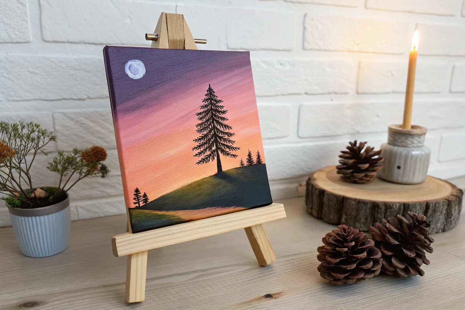
Make the view unique by painting tiny black silhouettes along the horizon line—try distant sailboats, a line of trees, or city buildings for added scale.
Place your finished piece in a wide mat frame to emphasize the glowing colors of your sunset.
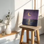
Oversized Moon In A Night Sky
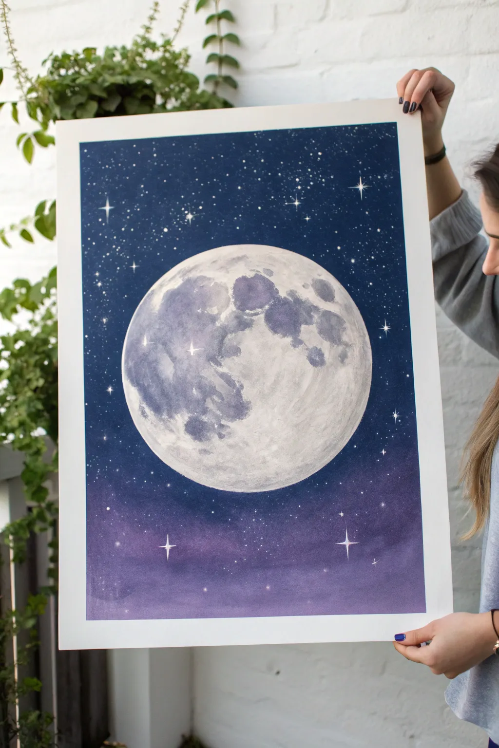
Capture the magic of a clear night sky with this striking project featuring a detailed, oversized full moon. Using blending techniques to create a gradient background and careful texturing for the lunar surface, you’ll create a piece that feels both peaceful and expansive.
Step-by-Step Tutorial
Materials
- Large watercolor paper (bright white, cold press, at least A3 size)
- Painter’s tape or masking tape
- Watercolor paints or gouache (Deep indigo, Prussian blue, black, purple, white)
- Large flat wash brush
- Medium round brush
- Small detail brush (size 0 or 00)
- Circular object for tracing (f.e. a dinner plate) or a compass
- Pencil
- White gel pen or white acrylic ink
- Clean water jars
- Paper towels
Step 1: Preparation & Masking
-
Secure the paper:
Tape your large watercolor paper down to a sturdy board or table on all four sides. Press the tape firmly to ensure clean, crisp white borders when you peel it off later. -
Outline the moon:
Place your circular object or use a compass to draw a large circle right in the center of the paper with a pencil. Make the line very faint so it doesn’t show through the final paint. -
Protect the moon:
Since we want the moon to remain distinct from the background, you can apply masking fluid to the circle area, or simply be very careful to paint around the edge. If you are comfortable painting ‘negative space’, just keep the circle clean.
Uneven Wash?
If your background gradient dries with hard water lines (blooms), gently glaze over the entire dry sky with a very thin, watery layer of the dominant blue color to unify it.
Step 2: Painting the Sky Gradient
-
Mix your base colors:
Prepare a large puddle of deep indigo mixed with a touch of black for the upper sky, and a softer purple-blue mix for the lower section. -
Start from the top:
Using your large flat brush, load up the darkest indigo mixture. Start painting horizontally across the top of the paper, moving downwards. The color should be richest and darkest at the very top edge. -
Transition the color:
As you move past the halfway point, clean your brush slightly and pick up the purple tone. Blend this into the still-wet indigo edge to create a seamless gradient. -
Finish the bottom edge:
Continue the purple wash down to the bottom tape line. The sky should look like it fades from deep space black-blue into a hazy, atmospheric violet at the horizon. -
Mind the moon barrier:
Work carefully around your pencil circle. It’s helpful to switch to a round brush near the line to get a crisp edge against the white of the moon. -
Let it dry completely:
This is crucial. Walk away and let the background dry thoroughly before even touching the moon section to prevent bleeding.
Add Metallic Magic
Mix silver or pearl watercolor pigment into your grey moon paint. When the light hits the finished piece, the crater edges will shimmer subtly like actual moonlight.
Step 3: Creating the Moon Surface
-
Base shadow layer:
Mix a very watery, pale grey wash. Paint broad, organic shapes on the left side of the moon to represent the lunar ‘meas’ or seas. Leave the right side mostly bright white. -
Deepen the craters:
While the first layer is damp, drop in a slightly darker, cooler grey (mixed with a tiny bit of blue) into the shadow shapes. Let the pigment bloom naturally to create texture. -
Refine the topography:
Using your medium brush, dab textures onto the grey areas to mimic craters. I like to blot some paint up with a paper towel here and there to create rough, rocky highlights. -
Soften edges:
Use a clean, damp brush to soften any hard lines within the moon, blending the grey patches into the white paper so the surface looks round and spherical, not flat.
Step 4: Stars & Final Details
-
Add background stars:
Once the sky is bone dry, load a stiff brush or toothbrush with white acrylic ink or gouache. Use your thumb to flick fine mist over the dark background for distant stars. -
Paint prominent stars:
Switch to your smallest detail brush. Dip it in opaque white paint and place specific, larger dots for brighter stars. Add cross-shapes to a few of them to create a twinkling effect. -
The crucial peel:
The most satisfying part: once everything is 100% dry, slowly peel away the painter’s tape at a 45-degree angle to reveal your crisp white border.
Enjoy the calm atmosphere this celestial painting brings to your space


Silhouette Tree With A Hanging Swing
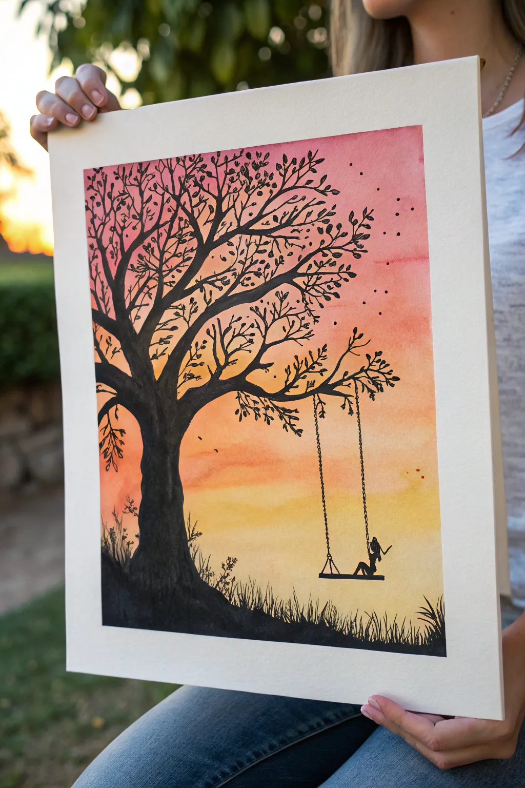
Capture the serene beauty of dusk with this evocative watercolor and ink project. You’ll layer warm sunset tones to create a glowing backdrop for a striking black silhouette tree and swing.
Step-by-Step Guide
Materials
- Watercolor paper (cold press, heavy weight)
- Watercolor paints (Yellow, Orange, Red, Pink)
- Black acrylic paint or India ink
- Fine liner pens (black, various sizes)
- Painter’s tape
- Flat wash brush (large)
- Round brushes (small and medium details)
- pencil
- Palette
- Water cups and paper towels
Step 1: Creating the Sunset Sky
-
Tape boundaries:
Begin by securing your watercolor paper to a board or table using painter’s tape. This not only keeps the paper flat but also creates that crisp, clean white border shown in the final piece. -
Pre-wet the paper:
Using a clean, large flat brush, apply a light coat of water across the entire paper surface. You want it damp and glistening, but not swimming in puddles. -
Apply the yellow base:
Start at the bottom third of the paper with a wash of bright yellow watercolor. Use horizontal strokes and let the pigment bloom slightly into the wet paper. -
Blend in orange tones:
While the yellow is still wet, introduce an orange hue just above it. Use your brush to gently blend the boundary where the two colors meet, creating a soft transition. -
Add red and pink:
Continuing upward, paint a band of red followed by a dusky pink or crimson at the very top. Allow gravity to help blend the colors downward slightly by tilting the board if needed. -
Strengthen the gradient:
If the colors look too pale, add a second layer of pigment while the paper is still damp to increase the vibrancy, especially in the pink upper section. -
Dry completely:
This is crucial: let the background dry completely before moving on. The paper must be bone dry to prevent the black silhouette from bleeding.
Clean Lines Tip
If your hand is shaky for the swing ropes, use a ruler with a fine-tip pen. Just make sure the ruler is elevated slightly so ink doesn’t bleed under it.
Step 2: Painting the Silhouette
-
Sketch the outline:
Lightly sketch the main trunk of the tree on the left side and the ground line using a pencil. Keep the lines faint so they don’t show through later. -
Paint the trunk:
Using black acrylic paint or India ink and a medium round brush, fill in the thick trunk. Make the base wider and gnarled, tapering as it goes up. -
Extend the main branches:
Draw the primary thick branches extending outward to the right. I find it helpful to twist the brush slightly to create organic, non-linear shapes. -
Add fine twigs:
Switch to a fine liner pen or a very small detail brush. branching off from the main limbs, add many thin, delicate twigs reaching upward and outward. -
Detail the leaves:
With the small brush or pen, dab small leaf shapes along the branches. Keep them somewhat sparse so the sunset sky peeks through the canopy. -
Ground the scene:
Paint the uneven, hilly ground at the bottom in solid black. Use short, upward flicks of the brush to simulate grass textures along the ridge. -
Add grassy texture:
Enhance the foreground by adding distinct blades of long grass and small weeds silhouetted against the yellow sky using your finest brush tip.
Level Up: Starry Night
Before painting the tree, flick a toothbrush loaded with white paint over the dry upper painted sky to create a subtle field of stars emerging at dusk.
Step 3: The Swing & Final Touches
-
Draw the swing ropes:
Carefully draw two vertical lines hanging from a sturdy branch using a fine liner pen. To make them look like chains or rope, simplify the line into tiny connected loops or dashes. -
Add the seat and figure:
Draw the flat board of the swing. Then, carefully paint the silhouette of a person sitting on it. Start with simple geometric shapes for the body and refine the pose. -
Add flying birds:
To give the scene movement, add small dots or tiny ‘v’ shapes in the upper right corner to represent a flock of birds in the distance. -
Scattered falling leaves:
Paint a few stray leaves floating in the air below the tree branches to suggest a gentle breeze. -
Remove the tape:
Once you are absolutely sure the black ink is dry, slowly peel away the painter’s tape at a 45-degree angle to reveal your clean border.
Step back and admire the peaceful solitude of your silhouette masterpiece


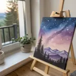
Mountain Layers In Misty Distance
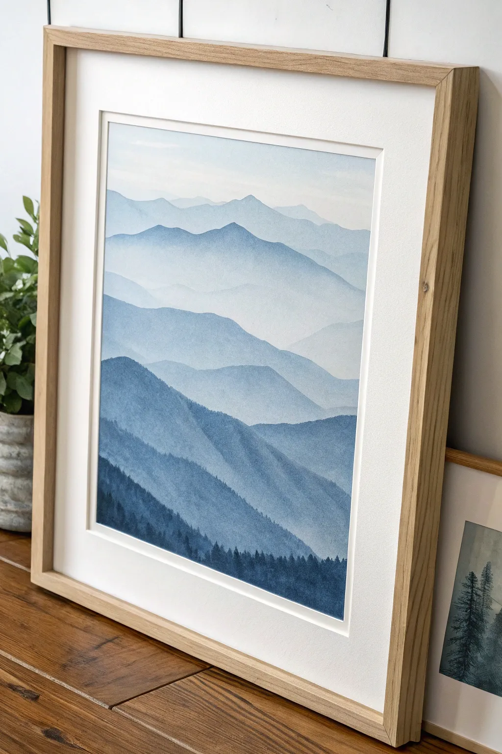
Capture the serene beauty of distant peaks fading into the fog with this watercolor study in atmospheric perspective. By layering lighter washes over darker ones, you create a breathtaking sense of depth that draws the viewer straight into the horizon.
How-To Guide
Materials
- Cold press watercolor paper (300 gsm)
- Watercolor paints (Indigo, Prussian Blue, Payne’s Grey)
- Large flat brush (3/4 inch or 1 inch)
- Medium round brush (size 8 or 10)
- Small detail brush (size 0 or 2)
- 2 jars of water (one for rinsing, one for clean water)
- Masking tape
- Paper towels
- Mixing palette
- Pencil for light sketching
Step 1: Preparation & First Wash
-
Tape edges:
Begin by taping your watercolor paper down to a board or hard surface using masking tape. This prevents the paper from buckling when wet and ensures you have a crisp, clean border once finished. -
Sketch the ranges:
Lightly sketch five to six wavy, horizontal lines across your paper to map out your mountain ranges. Don’t worry about perfection; natural landscapes are irregular. -
Mix the lightest shade:
Prepare a very dilute mixture of Indigo or Prussian Blue with plenty of water. It should be barely tinted, almost clear, to represent the furthest sky and most distant peak. -
Paint the sky:
Using your large flat brush, wet the sky area first with clean water, then drop in your faintest blue wash. Let it fade out as it reaches the top edge of the paper.
Step 2: Building Atmospheric Perspective
-
First mountain layer:
Once the sky is dry to the touch, mix a slightly stronger version of your blue. Paint the silhouette of the furthest mountain range, filling the shape down to the line of the next range. -
Softening the edge:
Immediately after painting the mountain shape, rinse your brush and drag clean water along the bottom edge of the wet paint. This fades the color out creating a ‘misty’ effect where it meets the next layer. -
Let it dry completely:
Patience is key here. Ensure this layer is bone dry before starting the next one to avoid the colors bleeding into each other. -
Second mountain layer:
Deepen your paint mixture by adding a touch more pigment. Paint the next range down, covering the faded bottom of the previous layer. -
Repeat the fade:
Just like before, soften the bottom edge of this new shape with clean water to maintain that foggy transition between distinct ridges. -
Add variance:
As you move closer to the foreground, consider adding a tiny drop of Payne’s Grey to your blue mix. This subtle shift keeps the color palette interesting without breaking the monochromatic theme.
Use Gravity
Tilt your board slightly while painting. This helps the pigment pool at the bottom of each mountain shape, creating a naturally darker top edge and a lighter, misty bottom.
Step 3: Foreground Depth
-
Mid-ground intensity:
For the middle layers, your paint consistency should be like tea—distinctly colored but still transparent. Paint these mountain shapes with a bit more undulating jaggedness to suggest rocky terrain. -
Preserve the mist:
Continue the technique of fading out the bottom of each mountain section. The white of the paper showing through the fade acts as the dense fog settling between the valleys. -
Darkest ridge:
Mix a saturated ‘creamy’ consistency of Indigo and Payne’s Grey. This should be bold and dark. Paint the final, closest mountain ridge at the bottom. -
Adding texture:
While this dark layer is still wet, you can tap in a few spots of even darker pigment to suggest uneven terrain or heavy vegetation shadows.
Bloom Patrol
If you see ‘cauliflower’ blooms, you added water to paint that was already half-dry. Avoid touching drying layers; fix mistakes only after everything is bone dry.
Step 4: Detailed Finishing Touches
-
Tree silhouettes:
Switch to your small detail brush. Using your darkest, most opaque paint mixture, paint tiny vertical lines along the ridge of the closest mountain layer to represent pine trees. -
Refining trees:
Add tiny horizontal dabs to these vertical lines, wider at the bottom and tapered at the top, to form the classic conical pine tree shape. -
Varying heights:
Ensure your trees aren’t all the same height. I like to group a few tall ones together and leave gaps or smaller trees in between for a natural look. -
Final dry:
Let the entire piece dry completely, preferably overnight if the paper is cold, to ensure no smudging occurs during the reveal. -
Reveal:
Gently peel the masking tape away from the paper, pulling at a 45-degree angle away from the painting to reveal crisp, clean white edges.
Frame your misty landscape in natural wood to echo the organic feel of your new masterpiece.
BRUSH GUIDE
The Right Brush for Every Stroke
From clean lines to bold texture — master brush choice, stroke control, and essential techniques.
Explore the Full Guide
Top-Down Beach Waves And Foamy Surf
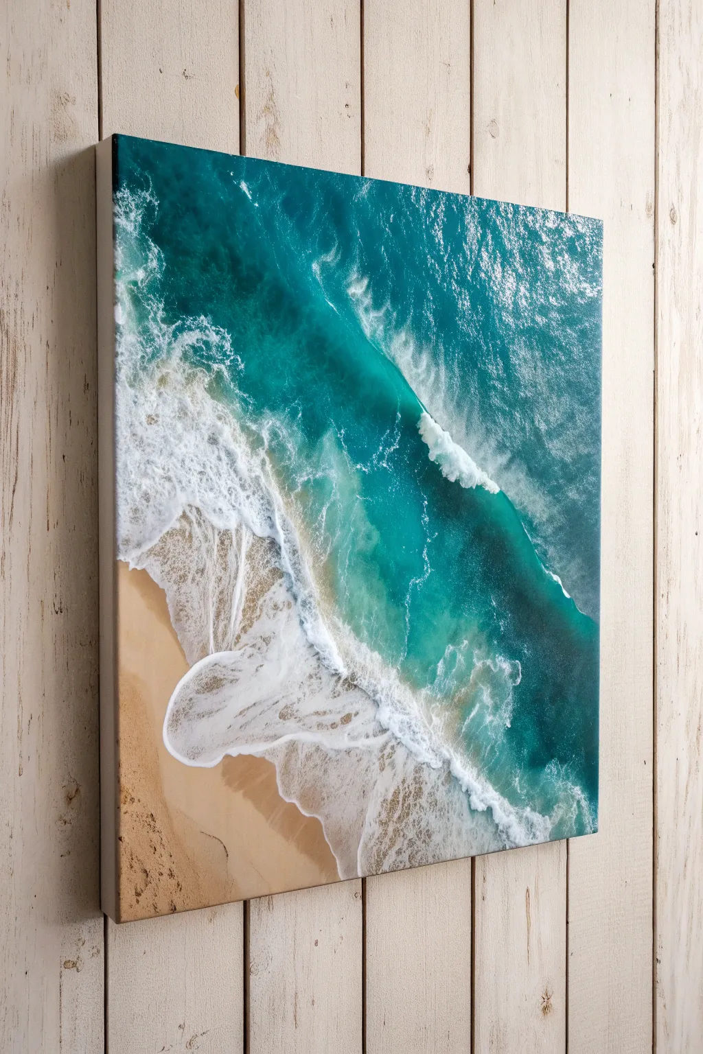
Transport yourself to the coast with this stunning top-down view of turquoise waves crashing onto a sandy beach. By layering acrylics and using simple techniques to create sea foam, you can achieve a realistic, textured ocean scene right on your canvas.
Detailed Instructions
Materials
- Square stretched canvas (20×20 inches recommended)
- Acrylic paints: Titanium White, Phthalo Turquoise, Phthalo Blue (Green Shade), Ultramarine Blue, Yellow Ochre, Burnt Sienna, Unbleached Titanium
- Large flat brush (1-2 inch)
- Medium round brush
- Small fine liner brush
- Old toothbrush or stiff bristle brush
- Sea sponge or crumpled paper towel
- Palette knife
- Glazing medium or water for thinning
- Spray bottle with water
Step 1: Setting the scene
-
Map out the shoreline:
Visualize a diagonal line cutting across the lower left corner of your canvas. This will be your sand area. It doesn’t need to be straight; a gentle curve makes the shoreline look more organic and natural. -
Mix the sand color:
Create a warm beige by mixing Unbleached Titanium with a touch of Yellow Ochre and a tiny dot of Burnt Sienna. You want the color of wet sand, so aim for something rich and earthy but still light. -
Paint the beach:
Apply your sand mixture to the bottom left corner using the large flat brush. As you get closer to the imaginary water line, darken the mix slightly with a bit more Burnt Sienna to mimic the wet sand where the water hits. -
Stipple for texture:
While the sand paint is still wet, take your sea sponge or a crumpled paper towel and gently dab the surface. This lifts a little paint and adds that grainy texture real sand has, avoiding a flat, plastic look.
Foam Cell Secret
Mix a tiny drop of silicone oil (found in pouring mediums) into your white paint. When dragged over wet blue paint, it naturally separates into cell-like circles perfect for sea foam.
Step 2: Creating the deep ocean
-
Mix the deep water:
For the upper right corner, which represents the deepest water, mix Phthalo Blue with a touch of Ultramarine. This needs to be your darkest value to create depth. -
Paint the depths:
Apply this dark blue mix to the top right section, covering about a third of the remaining white canvas. Use broad, sweeping strokes generally following the diagonal angle of the waves. -
Transition to turquoise:
Mix Phthalo Turquoise with a little Titanium White to create a vibrant mid-tone teal. Blend this into the dark blue section while the paint is still wet to create a soft gradient moving toward the shore. -
Shallow water wash:
Mix a very pale aqua using mostly White and a tiny dot of Turquoise. Paint this in the gap between the teal water and the sand. I like to thin this paint with glazing medium so the sand color underneath shows through slightly, just like clear shallow water.
Step 3: Making waves
-
Define the main wave:
Identify where the big ‘crashing’ wave will be—usually right where the deep teal transitions to the shallow water. Use a loaded round brush with pure Titanium White to paint the thick, leading edge of the wave. -
Soften the back edge:
On the ocean side of your white wave line, use a damp brush to drag the white paint backward into the teal. This creates the misty ‘spray’ effect where the wind catches the top of the wave. -
Create the rolling swell:
Add a shadow under the crest of the wave using a darkened teal mix. Place this thin line immediately behind your white foam to make the wave look like it is rising up from the surface. -
Add shore wash foam:
Along the sand line, paint irregular, lacy patterns of white foam. These should be thinner than the main wave. Use a detail brush to create little fingers of water reaching up onto the dry sand.
Gloss it up
Once the painting is fully dry, apply a high-gloss varnish or a coat of clear art resin. This mimics the shine of water and makes the colors look permanently wet.
Step 4: Adding the sea foam details
-
Sponge the crash zone:
Take a natural sea sponge, dip it in thick Titanium White, and blot off the excess. Gently dab over the main wave line to create the chaotic, bubbling texture of crashing water. -
The toothbrush trick:
For fine spray, dip an old toothbrush in watered-down white paint. Run your thumb over the bristles to flick tiny speckles of paint around the crashing wave and the shoreline. This mimics airborne mist perfectly. -
Connect the foam:
Using your fine liner brush, paint delicate, web-like lines connecting the different patches of foam. This represents the ‘cells’ or bubbles that form on the water surface after a wave breaks. -
Highlight the wet sand:
Add a few very thin, horizontal streaks of white glazing medium over the dark wet sand area to make it look reflective and glossy. -
Final adjustments:
Step back and look at your composition. If the ocean looks too flat, add small touches of lighter teal in the water between the waves to suggest sunlight hitting the ripples.
Hang your seascape and enjoy the calming coastal vibes you’ve brought into your space
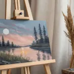
Pine Forest In Simple Winter Snow
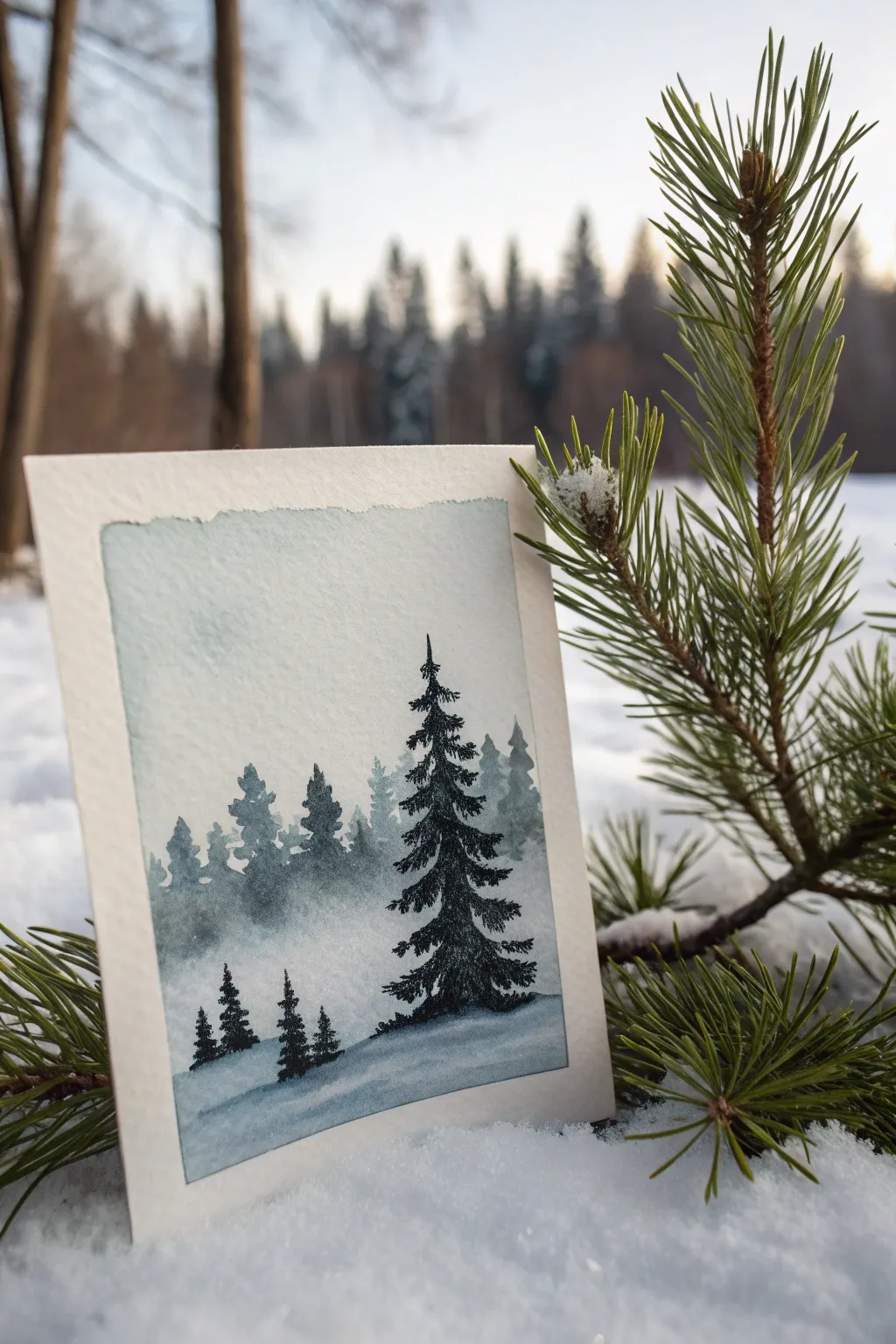
Capture the serene stillness of a snowy forest with this minimalist watercolor tutorial. Using a limited palette of cool blues and greens, you’ll create atmospheric depth and detailed pine trees on textured paper.
Step-by-Step
Materials
- Cold-press watercolor paper (300 gsm)
- Painter’s tape or masking tape
- Watercolor paints (Indigo, Payne’s Grey, Emerald Green)
- Small round brush (size 2 or 4)
- Very fine detail brush (size 0 or 00)
- Clean water and mixing palette
- Paper towel
Step 1: Preparation & Background
-
Tape the Edges:
Secure your watercolor paper to a board using painter’s tape. Create a border of about half an inch on all sides. Run your fingernail firmly along the inner edge of the tape to prevent paint from seeping underneath. -
Mix the Sky Tone:
Prepare a very diluted wash of Indigo or Payne’s Grey. You want a color that is barely visible, representing a pale, overcast winter sky. -
Apply the Sky Wash:
Using your round brush, gently wet the top two-thirds of the paper with clean water first. Drop in your pale sky color, allowing it to diffuse softly. -
Create the Horizon Fade:
As you move down the paper towards the horizon line, add a tiny bit more water to your brush to fade the color out almost completely to white. This creates the misty ‘fog’ effect where the trees will sit.
Pro Tip: Dry Brush Texture
For the main tree, dab your brush on a paper towel before painting. The slightly drier brush will skip over the paper’s tooth, creating a natural, flaky texture that mimics needles.
Step 2: Painting the Distant Forest
-
Mix a Misty Green:
Combine Emerald Green with a touch of Payne’s Grey and plenty of water. This should be a mid-tone value—darker than the sky, but much lighter than the final foreground trees. -
Shape the Distant Trees:
While the paper is dry, paint a row of small, jagged tree shapes across the middle of the paper. Keep the edges soft and don’t worry about perfect details; these are far away. -
Fade the Bottoms:
I like to immediately rinse my brush and run clean water along the bottom edge of this tree line. This blurs the base of the trees into the ‘snow,’ enhancing the foggy atmosphere. -
Let it Dry:
Wait until this layer is completely bone dry. Use a hairdryer on a low setting if you are impatient, but air drying is best for even texture.
Level Up: Snow Spray
Once the painting is dry, load a stiff brush with thick white gouache or acrylic. Flick the bristles to spatter tiny white dots over the trees for a falling snow effect.
Step 3: The Focal Pine
-
Mix the Darkest Value:
Create a concentrated mix of Indigo and Emerald Green. It should be thick and dark, almost black in intensity. -
Start the Trunk:
Using your fine detail brush, draw a very thin vertical line for the trunk of the main foreground tree. Don’t make it perfectly straight; a little wobble looks more natural. -
Paint Top Branches:
Starting at the top tip, use quick, short strokes that flick downward and outward. Keep the top very narrow and sparse. -
Fill the Middle:
As you move down the trunk, widen your strokes. Leave small gaps between branches to let the background ‘snow’ peek through. This negative space prevents the tree from looking like a solid triangle. -
Weigh Down the Bottom:
For the lowest branches, use heavier pressure on the brush. Make the branches droop slightly, as if weighed down by heavy snow.
Step 4: Foreground Details
-
Add Smaller Companions:
Using the same dark mixture, paint two or three very small pine trees to the left of the main tree. Vary their heights to create an interesting composition. -
Paint the Shadow:
Dilute your dark mix significantly with water to create a transparent blue-grey shadow color. -
Ground the Trees:
Paint a soft horizontal sweep of this shadow color underneath the main tree and the small saplings, sloping gently downward to the right. -
Final Dry & Reveal:
Ensure the paper is absolutely dry before touching the tape. Peel the tape away slowly at a 45-degree angle to reveal your crisp, clean borders.
Now you have a peaceful winter scenes perfect for a holiday card or framed artwork

PENCIL GUIDE
Understanding Pencil Grades from H to B
From first sketch to finished drawing — learn pencil grades, line control, and shading techniques.
Explore the Full Guide
City Skyline Silhouette At Dusk
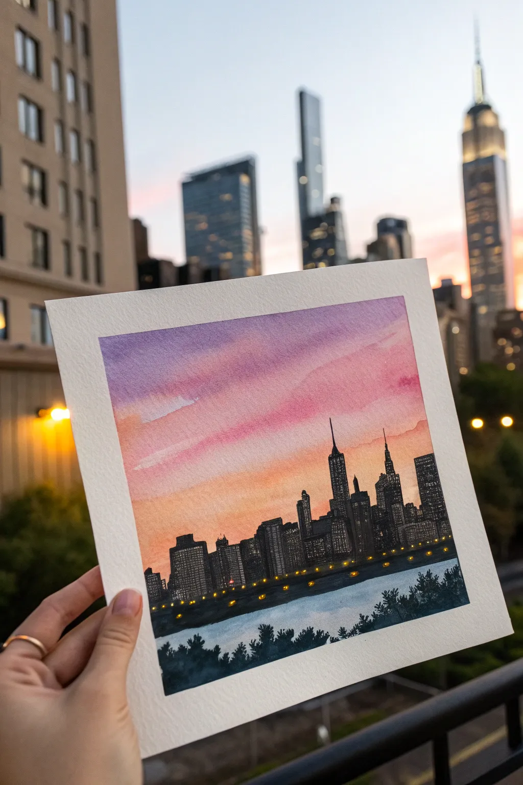
Capture the magic of twilight in the city with this vibrant watercolor project. By blending soft purples and pinks against a stark black silhouette, you’ll create a moody and atmospheric piece perfect for framing.
How-To Guide
Materials
- Cold press watercolor paper (approx. 6×6 inch)
- Painter’s tape or washi tape
- Watercolor paints (purple, magenta, warm yellow, orange)
- Black ink or gouache
- White or bright yellow gel pen (for lights)
- Flat wash brush
- Small round detail brush (size 0 or 1)
- Container of water and paper towels
- Pencil and ruler
Step 1: Setting the Sky
-
Tape the borders:
Secure your watercolor paper to a flat surface using painter’s tape on all four sides. This creates that crisp, clean white border you see in the photo and prevents the paper from buckling when wet. -
Wet the paper:
Using your flat wash brush and clean water, gently wet the entire sky area. You want the paper to be damp and glossy, but not so wet that puddles form. -
Lay down the violet:
Load your brush with a watered-down purple. Apply a broad stroke across the very top of the paper, letting the wet surface help diffuse the edges downwards. -
Blend in the pinks:
While the purple is still damp, rinse your brush and pick up a vibrant magenta or rose color. Paint a stripe just below the purple, letting them bleed together naturally to create a gradient. -
Add the sunset glow:
Near the horizon line (about 2/3 down the paper), apply a warm orange or peach tone. Ensure this blends smoothly into the pink above it without creating hard lines. -
Create cloud textures:
While the sky is still wet, you can lift out pigment with a slightly thirsty brush or dab in a touch of darker purple to suggest soft, streaky clouds. -
Let it dry completely:
This is crucial. The paper must be bone-dry before you add the silhouette, or the black ink will bleed into your beautiful sunset. A hair dryer can speed this up.
Bleeding Lines?
If your black silhouette bleeds into the sky, the background wasn’t dry enough. Let it dry longer next time, or use a hair dryer on the ‘cool’ setting to speed it up.
Step 2: Building the City
-
Sketch the outline:
Lightly sketch the skyline silhouette with a pencil. You don’t need details, just the varying heights of the skyscrapers. I like to include one or two distinctive spires, like the Empire State Building, to anchor the composition. -
Paint the silhouette:
Using your small round brush and black ink or opaque black gouache, fill in the buildings. Keep the edges sharp and vertical. -
Add the waterfront:
Paint a solid black strip at the base of the buildings to represent the riverbank or ground level. -
Suggest the water:
Dilute your black paint significantly to make a light grey wash. Paint the area below the skyline to represent the river, leaving some white paper showing for reflections. -
Darken the foreground:
At the very bottom of the paper, use thick black paint to stipple in rough shapes of trees or bushes. This frames the water and adds depth. -
Refine the buildings:
Once the main black shapes are dry, you can go back with your finest brush to sharpen the tips of antennas or spires.
Add Reflections
Drag a slightly damp brush from the yellow streetlights straight down into the water area to create shimmering light reflections on the river surface.
Step 3: Illuminating the Night
-
Prepare the lights:
Wait until all black paint is 100% dry. This prevents the yellow from turning muddy. -
Dot the windows:
Using a white or yellow gel pen (or opaque yellow gouache on a toothpick), gently tap tiny dots onto the black buildings to create lit windows. -
Vary the patterns:
Don’t fill every building perfectly. Cluster the lights in some areas and leave others dark to make it look realistic. -
Add streetlights:
Place a row of slightly larger, warmer yellow dots along the water’s edge to mimic streetlamps reflecting near the shore. -
The final reveal:
Carefully peel away the painter’s tape at a 45-degree angle to reveal your clean white border.
Enjoy the peaceful view creating this cityscape brings to your space
Cheerful Daisies On A Color-Block Background
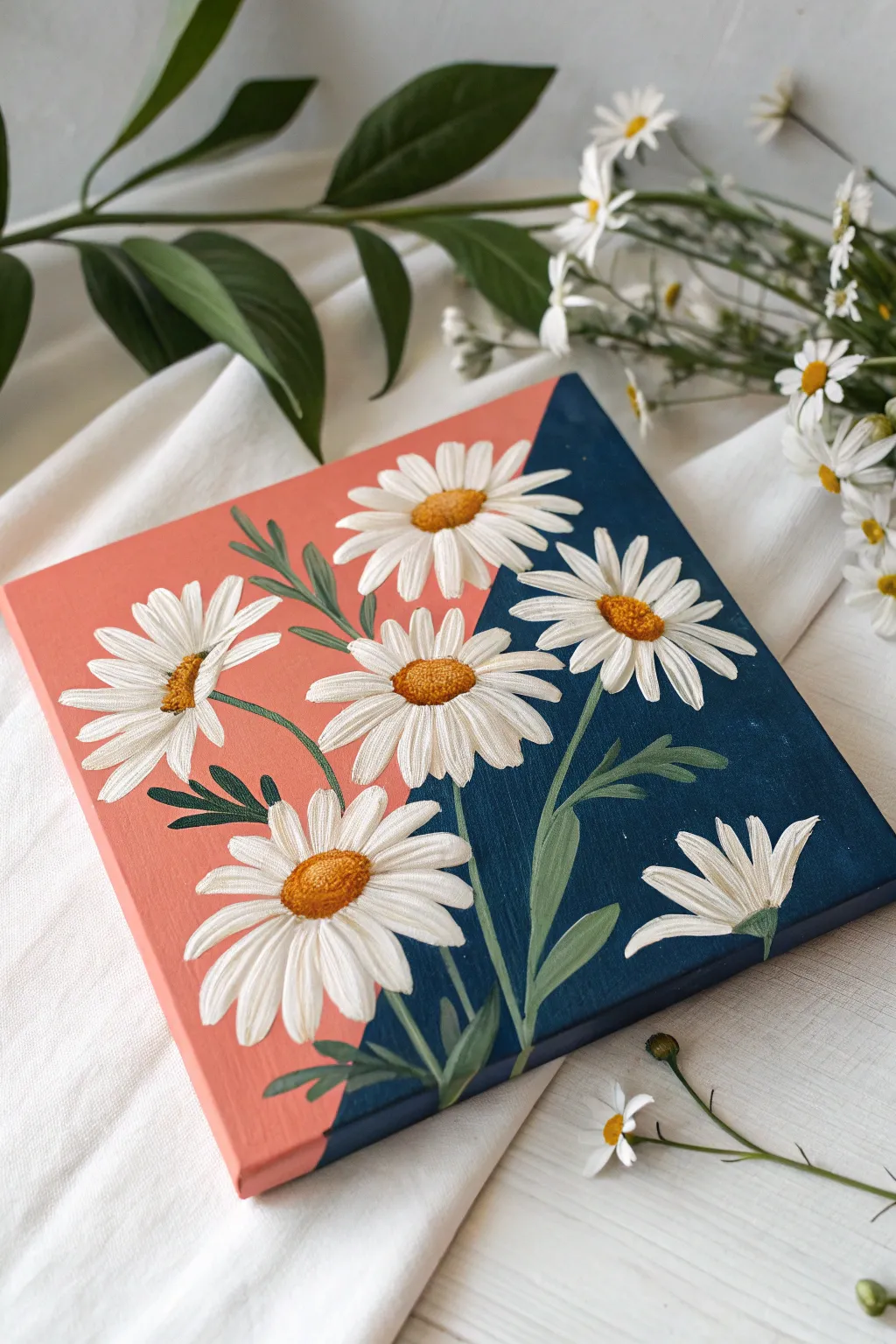
Brighten any corner with this striking floral study that combines classic botanical beauty with a bold, modern geometric backdrop. The contrast between soft coral and deep navy creates the perfect stage for crisp white daisies to pop.
Step-by-Step Tutorial
Materials
- Small square stretched canvas (approx. 8×8 or 10×10 inches)
- Acrylic paints: Coral/Salmon, Navy Blue, Titanium White, Yellow Ochre, Burnt Sienna, Forest Green, Lime Green
- Painter’s tape or masking tape
- Flat shader brush (medium size)
- Round brushes (sizes 2 and 4)
- Small detail brush (size 0 or 00)
- Palette and water cup
- Paper towels
- Chalk or a light pencil
Step 1: Setting the Background
-
Tape the Diagonal:
Begin by placing a strip of painter’s tape diagonally across your canvas. Run it from slightly left of the top center down to slightly right of the bottom center, dividing the canvas into two roughly equal triangles. -
Seal the Edge:
Press the tape down firmly, especially along the edge where paint will meet it. You can apply a tiny amount of matte medium or white paint along the tape edge to prevent bleeding. -
Paint the Coral Side:
Load your flat brush with a creamy coral or salmon pink shade. Paint the left triangle completely, using smooth strokes. Don’t forget to paint the side edges of the canvas that correspond to this color section. -
Paint the Navy Side:
Once the coral side is touch-dry, paint the right triangle with a rich navy blue. Ensure full opacity; you might need two coats for a deep, velvety finish. Paint the corresponding canvas edges as well. -
Reveal the Split:
Carefully peel back the tape while the paint is still slightly damp to reveal a crisp, clean line. Let the entire background dry completely before proceeding.
Stippling Success
Use an old, frayed brush for the flower centers. The messy bristles create a perfect, natural pollen texture better than a new brush.
Step 2: Designing the Composition
-
Sketch the Layout:
Using a piece of chalk or a very light pencil touch, sketch the placement of five main daisy heads. Position three crossing the color boundary and two fully within the sections to integrate the background. -
Outline Stems:
Lightly trace the stems flowing from the bottom center, branching out towards your flower heads. Keep the lines loose and organic.
Chalk It Up
If you struggle with pencil marks showing through yellow paint, sketch with white chalk instead. It wipes away easily with a damp cloth.
Step 3: Painting the Foliage
-
Base Greenery:
Mix Forest Green with a touch of the navy background color to create a shadowed green. Use a round brush to paint the stems and the main shapes of the leaves. -
Adding Highlights:
While the green is still tacky, mix a lighter Lime Green shade. Add highlights to the tops of the leaves and stems where the light would naturally hit, blending slightly for dimension.
Step 4: Creating the Blooms
-
First Petal Layer:
Load a size 4 round brush with slightly watered-down Titanium White. Paint the first layer of petals, pulling the brush from the outside tip inward toward the center of the flower. -
Building Opacity:
Let the first layer dry. It will look ghostly against the navy side especially. Apply a second, thicker coat of pure Titanium White to make the petals bright and solid. -
Petal Shadowing:
Mix a tiny dot of grey or light blue into your white paint. Use this to paint subtle shadows on the petals that are tucked underneath others, adding depth to the flower arrangement. -
Detailing Petal Texture:
Using your smallest detail brush and pure white, add fine streaks or ridges along the length of the petals to mimic their natural texture. -
Centers Base:
For the floret centers, paint a solid oval or circle of Yellow Ochre in the middle of each daisy. -
Texturing the Centers:
Create the fuzzy pollen texture by stippling (dabbing repeatedly) Burnt Sienna along the bottom edge of the yellow center. This creates a shadow effect. -
Highlighting the Centers:
Clean your brush and stipple a bright yellow or yellow-white mix on the top curve of the centers to make them look rounded and sunlit. -
Final Clean Up:
Look over your composition. If any petals look jagged, smooth them out with a liner brush. If the background needs touching up near the petals, carefully cut back in with your navy or coral paint.
Hang your new masterpiece in a spot that gets morning light to emphasize those sunny yellow centers


Easy Galaxy Swirl With Planets
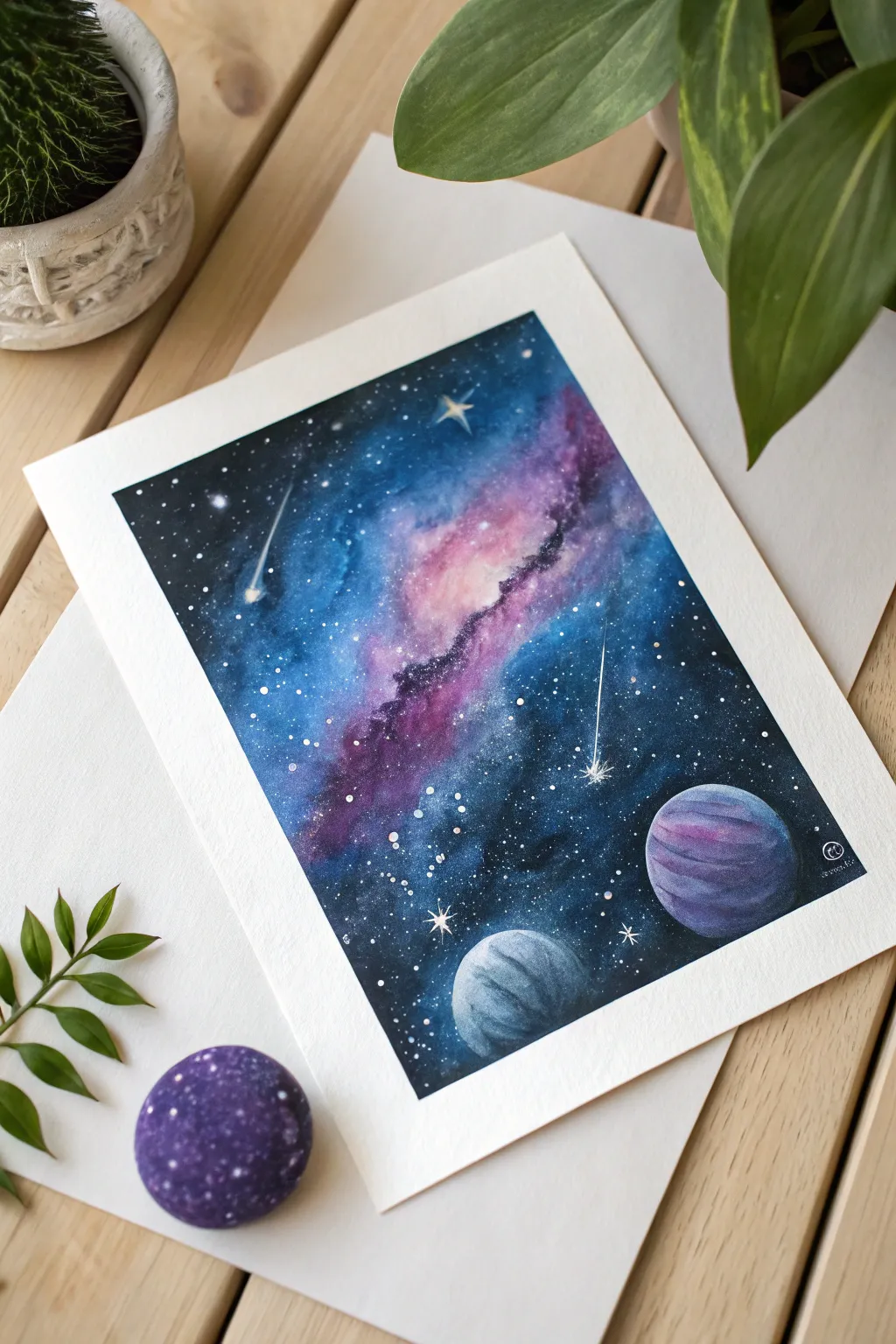
Capture the magic of deep space with this vibrant watercolor galaxy painting featuring swirling nebulas, shooting stars, and distant planets. This project uses wet-on-wet techniques to create a seamless, dreamy background that contrasts beautifully with crisp planetary details.
Step-by-Step
Materials
- Watercolor paper (cold press, 300gsm, taped down)
- Watercolor paints (Indigo, Black, Prussian Blue, Magenta/Purple, White Gouache)
- Round brushes (sizes 8 for wash, 4 for details, 0 for fine lines)
- Jar of clean water
- Paper towels
- Old toothbrush (for star splatter)
- White gel pen or white acrylic ink
Step 1: Setting the Background
-
Tape and Prep:
Secure your watercolor paper to a board using painter’s tape or masking tape. This creates a clean white border and prevents the paper from buckling when wet. -
Map the Composition:
Lightly sketch two circles in the bottom right corner for your planets. You can trace a coin or bottle cap to get perfect circles. Draw a faint diagonal line through the center to guide your nebula swirl. -
Wet the Paper:
Using your largest clean brush, apply a layer of clean water across the entire paper, avoiding the inside of the two planet circles. The paper should be glistening but not forming puddles. -
The Pink Nebula Core:
While the paper is wet, drop magenta or purple paint along the diagonal line you sketched. allow the pigment to bloom outward softly. Keep the center of this band slightly lighter to suggest glowing light. -
Adding Deep Space Blues:
Load your brush with Prussian Blue or a similar deep blue. Paint around the pink nebula strip, letting the blue and pink touch and blend naturally on the paper. I find that tilting the board slightly helps the colors flow together organically. -
Darkening the Edges:
Mix indigo with a touch of black creates a midnight hue. Apply this to the outer corners and edges of the painting to create depth and a vignette effect, drawing the eye toward the colorful center. -
Refining the Swirl:
While everything is still damp, dab in more concentrated purple and dark blue along the edges of the nebula swirl to create texture and ‘cloud’ formations. -
Let it Dry:
Allow the background layer to dry completely. The paper must be bone-dry before proceeding to the next steps to prevent bleeding.
Step 2: Planets and Stardust
-
Painting the Large Planet:
Fill the larger top planet circle with a medium purple wash. While wet, add darker violet stripes horizontally to mimic gas giant bands. -
Shading the Large Planet:
Add a shadow on the bottom right side of the planet using indigo to give it a spherical 3D form. -
Painting the Small Planet:
Fill the lower planet with a light blue-grey wash. Add texture by dabbing darker grey-blue paint while it’s still damp. -
Shading the Small Planet:
Paint a crescent-shaped shadow on the bottom right of the smaller planet, consistent with the light source coming from the nebula. -
Creating the Starfield:
Cover the planets with a scrap of paper to protect them. Dip an old toothbrush into white gouache or white acrylic ink watered down slightly. Run your thumb across the bristles to splatter tiny stars across the dark sky. -
Bright Stars:
Use a size 0 brush or a white gel pen to dot larger, specific stars in the darker blue areas for variety. -
Shooting Stars:
With the white gel pen or fine liner brush and gouache, draw two thin lines trailing off into points to create shooting stars. Add a tiny glowing dot at the head of each line. -
Sparkle Effects:
Draw small cross-shapes on a few of the larger white dots to create twinkling stars. -
Final Reveal:
Once the paint is absolutely dry, carefully peel away the masking tape at a 45-degree angle to reveal your crisp white border.
Starry Splatter Tip
Test your splatter on a scrap paper first. If the drops are too big, your paint is too wet; if nothing comes out, it’s too thick.
Level Up: Metallic Pop
Use metallic silver or gold watercolor for the shooting stars or planet rings to make the artwork shimmer when it catches the light.
Enjoy your beautiful slice of the cosmos as a wall decoration on its own or frame it for a friend
Painted Patterns With Wavy Lines
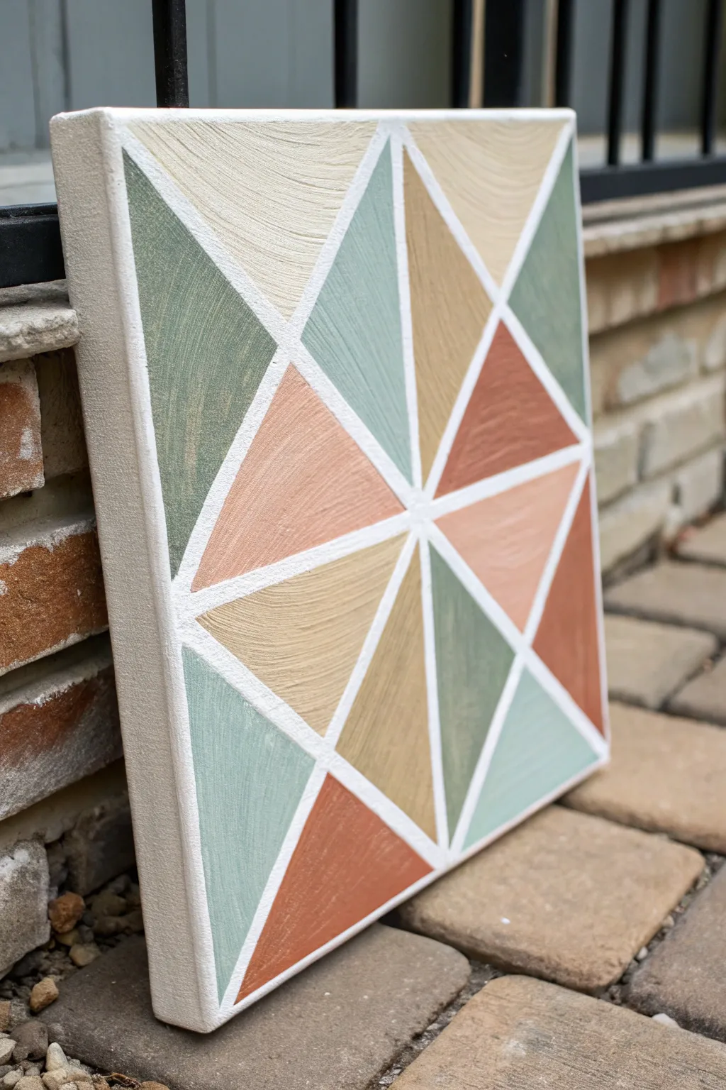
Bring the cozy charm of a traditional quilt to your walls with this textured geometric canvas art. Featuring soothing earth tones and clean white borders, this piece uses a clever taping technique to achieve crisp, professional-looking triangles.
Step-by-Step Guide
Materials
- Square stretched canvas (12×12 or similar size)
- Painter’s tape or masking tape (1/4 inch width is best)
- Acrylic paints: Sage Green, Terracotta/Burnt Orange, Beige, Tan, Soft Teal
- Gesso or white acrylic paint (for base)
- Flat shader brushes (medium size)
- Ruler or straight edge
- Pencil
- Palette or paper plate
- Texture paste (optional, but recommended for the look shown)
Step 1: Base Preparation
-
Prime the canvas:
Even if your canvas came pre-primed, apply a fresh coat of white gesso or white acrylic paint to the front and sides. This ensures a bright, uniform starting point for your lines. -
Create texture (optional):
To replicate the fibrous, wavy texture seen in the photo, mix a little texture paste into your white base coat or apply it directly with a palette knife, creating subtle ridges. -
Let it dry completely:
Wait for the base layer to be fully dry to the touch before moving on to measuring. This usually takes about an hour, or longer if you used heavy texture paste.
Tape Trouble?
If paint peels up with the tape, you likely waited too long. Use an exacto knife to gently score the edge of the tape before lifting it to sever the paint film.
Step 2: Mapping the Pattern
-
Find the center point:
Use your ruler to measure the width and height of the canvas. Make a small pencil mark exactly in the center. -
Draw primary dividing lines:
Lightly draw a vertical line and a horizontal line crossing through the center point, dividing your canvas into four equal squares. -
Draw diagonal lines:
Draw two diagonal lines from corner to corner, passing through the center -
Subdivide the sections:
Within each of the four main quadrants, draw a diagonal line connecting the midpoints of the outer edges to the center, creating the starburst effect seen in the design.
Step 3: Taping and Painting
-
Apply the tape:
Place your thin painter’s tape directly over all your pencil lines. Press the edges of the tape down firmly with your fingernail or a credit card to prevent paint bleed. -
Seal the tape edges:
I like to brush a very thin layer of white paint over the tape edges first. This seals the gap so any paint that bleeds underneath is white and invisible. -
Plan your color palette:
Squeeze your earth tones onto your palette. You’ll need a sage green, a muted terracotta, a soft beige, and a deeper tan. -
Paint the first set of triangles:
Identify non-touching triangles to paint first. Fill in random sections with your first color (e.g., sage green), applying the paint somewhat thickly to enhance the texture. -
Continue with remaining colors:
Switch colors and fill in the remaining triangles, trying to balance the darker terracotta tones with the lighter beige ones across the canvas. -
Address the edges:
Don’t forget to wrap the design around the sides of the canvas. Extend your paint colors over the edge for a finished, gallery-quality look. -
Add texture strokes:
While the paint is wet, run your dry brush through the paint in slight curves or straight lines to mimic the fabric grain shown in the inspiration photo.
Level Up: Glossy Finish
Apply a coat of high-gloss varnish over just the colored triangles, leaving the white lines matte. This creates a stunning contrast that mimics ceramic tile.
Step 4: Reveal and Refine
-
Peel the tape:
Once the paint is tacky but not fully hardened, carefully peel off the tape at a 45-degree angle. This reveals those crisp white lines between shapes. -
Touch up lines:
If any paint did sneak under the tape, use a small detail brush and white paint to clean up the dividing lines. -
Final cure:
Allow the entire painting to dry overnight before displaying it.
Now you have a piece of modern art that adds warmth and structure to any room
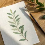
Negative Space Leaves Using Stencils
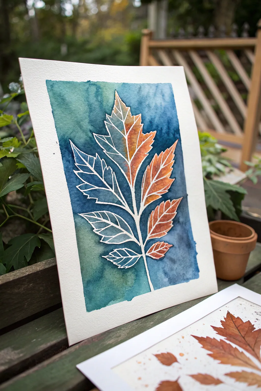
This striking watercolor project plays with negative space and bold color contrasts to create a stylized autumn leaf. By combining masking fluid techniques with a wet-on-wet background wash, you’ll achieve a crisp, graphic botanical illustration that looks beautifully complex but is surprisingly simple to execute.
Detailed Instructions
Materials
- Cold press watercolor paper (140lb/300gsm)
- Masking fluid (drawing gum) with a fine applicator tip
- Watercolor paints (Indigo, Prussian Blue, Burnt Sienna, Orange, Sap Green)
- painter’s tape or washi tape
- Round brushes (sizes 4 and 8)
- Graphite pencil and eraser
- Leaf template or real leaf for tracing
- Paper towels and water jar
Step 1: Preparation and Sketching
-
Secure the paper:
Begin by taping down all four edges of your watercolor paper to a board or table. This prevents buckling when we apply heavy washes later. -
Draft the leaf shape:
Lightly trace your leaf template or stencil in the center of the paper. You want the main outline and the central veins to be visible, but keep your pencil pressure very light so the graphite doesn’t smudge later. -
Add vein details:
Inside the leaf outline, sketch the intricate network of veins. These lines will eventually be pure white, so make sure they connect to the outer edges or stem where appropriate to create a cohesive structure.
Step 2: Applying the Mask
-
Outline with masking fluid:
Using a fine-tip applicator bottle or an old brush dipped in soap, carefully apply masking fluid over every pencil line you just drew. This includes the outer contour of the leaf and the inner veins. -
Create the split effect:
For the unique look shown in the example, apply masking fluid to fill in the *entire* left side of each leaf segment, leaving only the veins and the right side of the leaf segments as exposed paper. This protects the white space completely. -
Let it cure:
Allow the masking fluid to dry completely. It should feel hard and room temperature to the touch. Patience is key here; if it’s tacky, it will ruin your brush.
Sticky Situation?
If your paper tears when removing masking fluid, it usually means the paper was still damp or you pulled too aggressively. Always pull the mask slow and low, parallel to the paper surface.
Step 3: Painting the Background
-
Prepare the background colors:
Mix a generous amount of a dark, moody teal. I like to combine Indigo with a touch of Sap Green to get that deep forest shadow hue. -
Wet the paper:
Brush clean water over the entire background area around the leaf, getting right up to the masked edge. -
Drop in color:
While the paper is wet, load your size 8 brush with the dark teal mix and apply it essentially everywhere *except* inside the leaf shape. Let the color bloom and vary in intensity. -
Darken the edges:
While the wash is still damp, drop concentrated Indigo or Prussian Blue near the edges of the leaf to create high contrast against the white mask. -
Dry the background:
Wait for the background wash to be bone dry before moving to the next step.
Soap Savior
Before dipping your brush into masking fluid, coat the bristles in dish soap first. This creates a barrier that prevents the fluid from drying deep in the brush and ruining it forever.
Step 4: The Autumn Fade
-
Paint the leaf interior:
Now, focus on the exposed paper inside the right half of the leaf. Mix a warm Burnt Sienna and a bright Orange. -
Apply the warm tones:
Paint the unmasked sections of the leaf using the warm colors. Start with the darker brown near the center spine and blend out to orange at the tips. -
Let everything dry:
Ensure the entire painting—background and leaf interior—is completely dry. If the paper feels cool to the touch, it still contains moisture.
Step 5: Reveal and Refine
-
Remove the mask:
Gently rub your finger or a rubber cement pickup tool over the masking fluid to peel it away. This is always the most satisfying part, watching the crisp white lines emerge. -
Erase pencil lines:
If any graphite sketch lines are visible in the white negative space, carefully erase them with a kneadable eraser. -
Final assessment:
Check for any rough edges. If paint bled under the mask slightly, a tiny amount of white gouache can be used to touch up the lines.
Frame your piece with a simple mat to emphasize the beautiful contrast between the organic leaf textures and the crisp white lines
Have a question or want to share your own experience? I'd love to hear from you in the comments below!