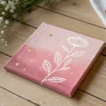
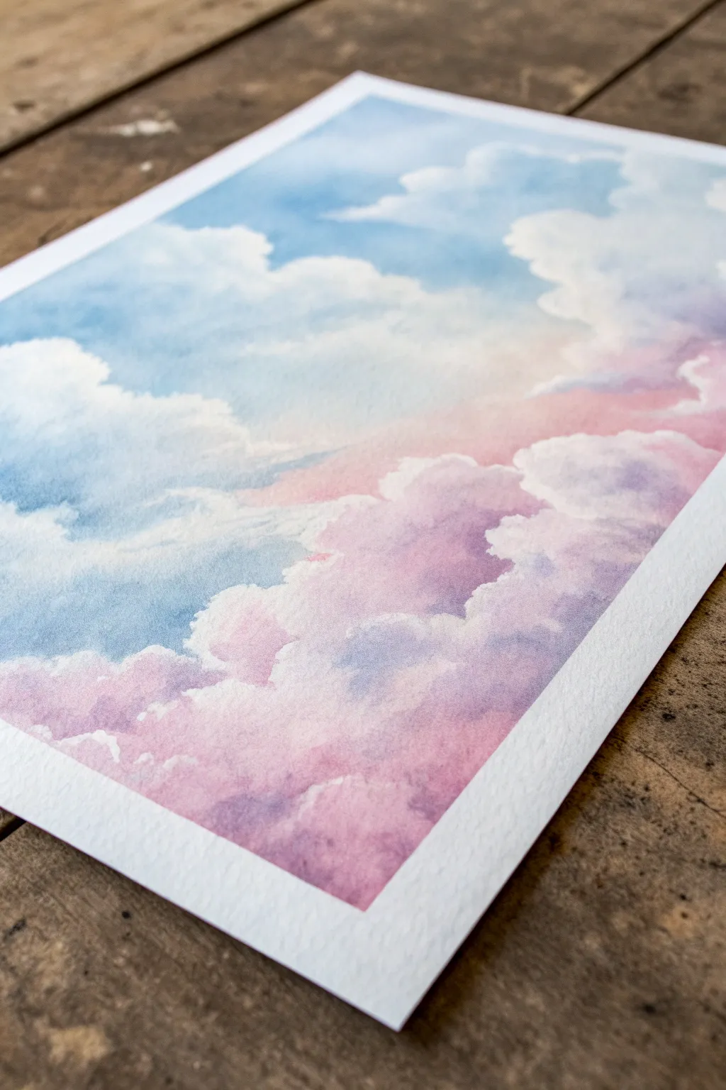
Whenever I’m craving something calm and satisfying, I reach for a pastel palette and let those soft gradients do the heavy lifting. Here are my favorite pastel color painting ideas—starting with the classics and ending with some playful, studio-style experiments you can totally make your own.
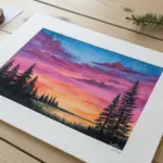
Pastel Sunset Gradient With a Silhouette
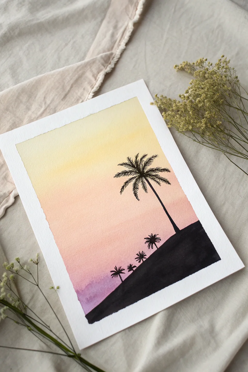
Capture the serenity of a beach at dusk with this soft, glowing watercolor piece. You’ll master a seamless gradient wash transitioning from pale yellow to dusty violet, punctuated by striking black palm silhouettes.
Step-by-Step Tutorial
Materials
- Cold-pressed watercolor paper (300gsm is ideal)
- Painter’s tape or masking tape
- Watercolor paints (Lemon Yellow, Pastel Orange or Peach, Rose Madder, Purple/Violet)
- Black ink, black gouache, or a fine-tip black brush pen
- Flat wash brush (approx. 1 inch)
- Small round detail brush (size 0 or 1)
- Jar of clean water
- Paper towels
- Pencil (optional)
Step 1: Setting the Stage
-
Secure Your Paper:
Begin by taping down all four edges of your watercolor paper to a hard board or your table. This creates a clean white border and prevents the paper from buckling when wet. -
Prepare Your Palette:
Pre-mix your gradient colors in separate wells. You need a very pale yellow, a soft peach/orange, a diluted pink, and a muted purple. Ensure the consistency is watery and light.
Tape Tip
To prevent the tape from ripping your paper, stick it to your clothes first to reduce its tackiness before applying it to the artwork.
Step 2: Painting the Sky Gradient
-
Wet on Dry Technique:
Dip your flat wash brush into the clean water and lightly dampen the entire paper surface, stopping just short of your tape edges. This helps the colors flow together softly. -
Apply the Yellow:
Load your brush with the pale yellow. Start at the very top of the paper, painting horizontals stroke across the top third of the page. -
Transition to Orange:
Clean your brush slightly, pick up the peach/orange mix, and apply it directly below the yellow. Overlap the wet edges so the yellow and orange bleed into each other naturally. -
Add the Pink Tones:
Moving down the paper, introduce the rose or pink hue. Blend it upwards slightly into the orange to create a warm middle section for your sunset. -
Finish with Purple:
For the bottom section of the sky, apply your purple wash. Let it blend with the pink above it, but keep the pigment concentration slightly heavier here for contrast. -
Tilt to Blend:
I like to gently tilt the board back and forth if the transition lines look too harsh; gravity will help smooth out the gradient. -
Allow to Dry Completely:
Let this background layer dry 100%. If the paper is cool to the touch, it’s still wet. Patience is key here to prevent the black silhouette from bleeding.
Golden Hour Glow
Add a tiny circle of white gouache near the horizon while the sky is still damp to create a soft, glowing sun breaking through the haze.
Step 3: Creating the Silhouettes
-
Rough Sketching (Optional):
If you’re nervous about freehanding, use a pencil to lightly sketch the slope of the hill and the position of the main palm tree. -
Paint the Hillside:
Using your black medium (ink or gouache), paint a solid black hill sloping upwards from the bottom left corner to the right side using a round brush. Ensure the top edge is crisp. -
Draw the Main Trunk:
Switch to your smallest detail brush. Start from the hill and pull a thin, slightly curved line upward for the main palm trunk. -
Palm Frond Center:
At the top of the trunk, paint a small star-like shape where the leaves will originate. -
Detailing the Leaves:
From that center point, paint 6-8 curved lines outward. Then, use quick, flicking motions to add the feathery leaflets hanging down from each main line. -
Add Distance Trees:
Paint three or four much smaller palm trees along the slope of the hill. Make them progressively smaller as they go down the hill to create depth. -
Final Touches:
Check your blacks; if the watercolor paper absorbed too much and looks gray, add a second coat of black ink to make the silhouette truly opaque. -
The Reveal:
Once the black ink is totally dry, slowly peel away the painter’s tape at a 45-degree angle to reveal those crisp white edges.
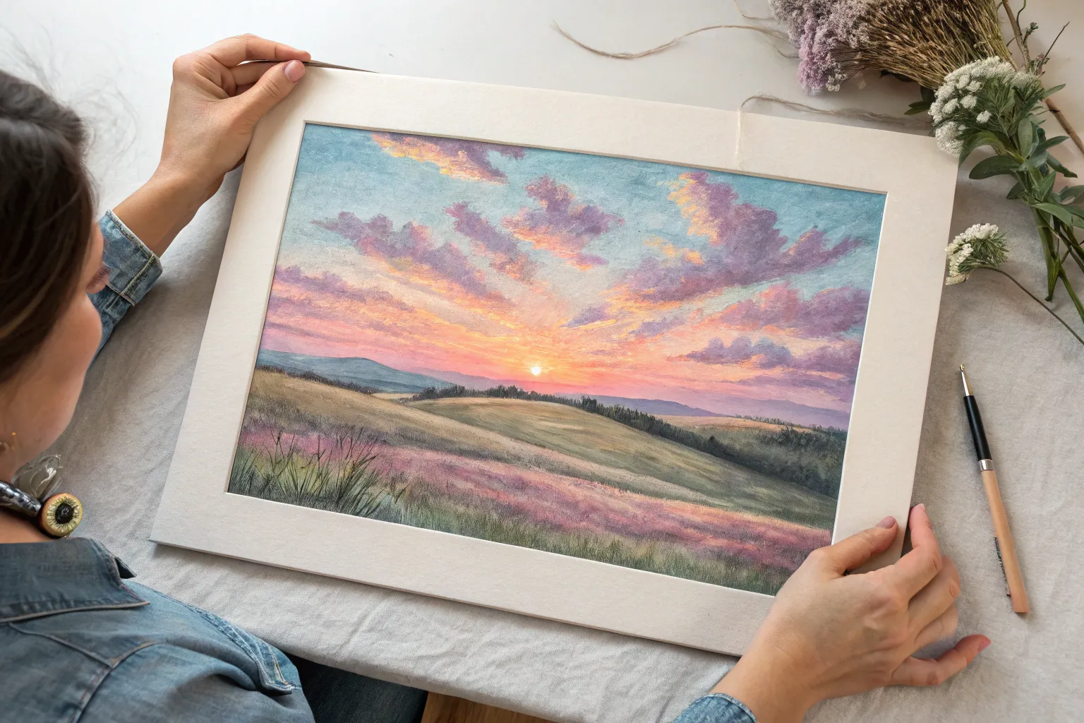
Frame this serene sunset to bring a permanent piece of warm, tropical calm to your space

Cotton-Candy Beach Horizon
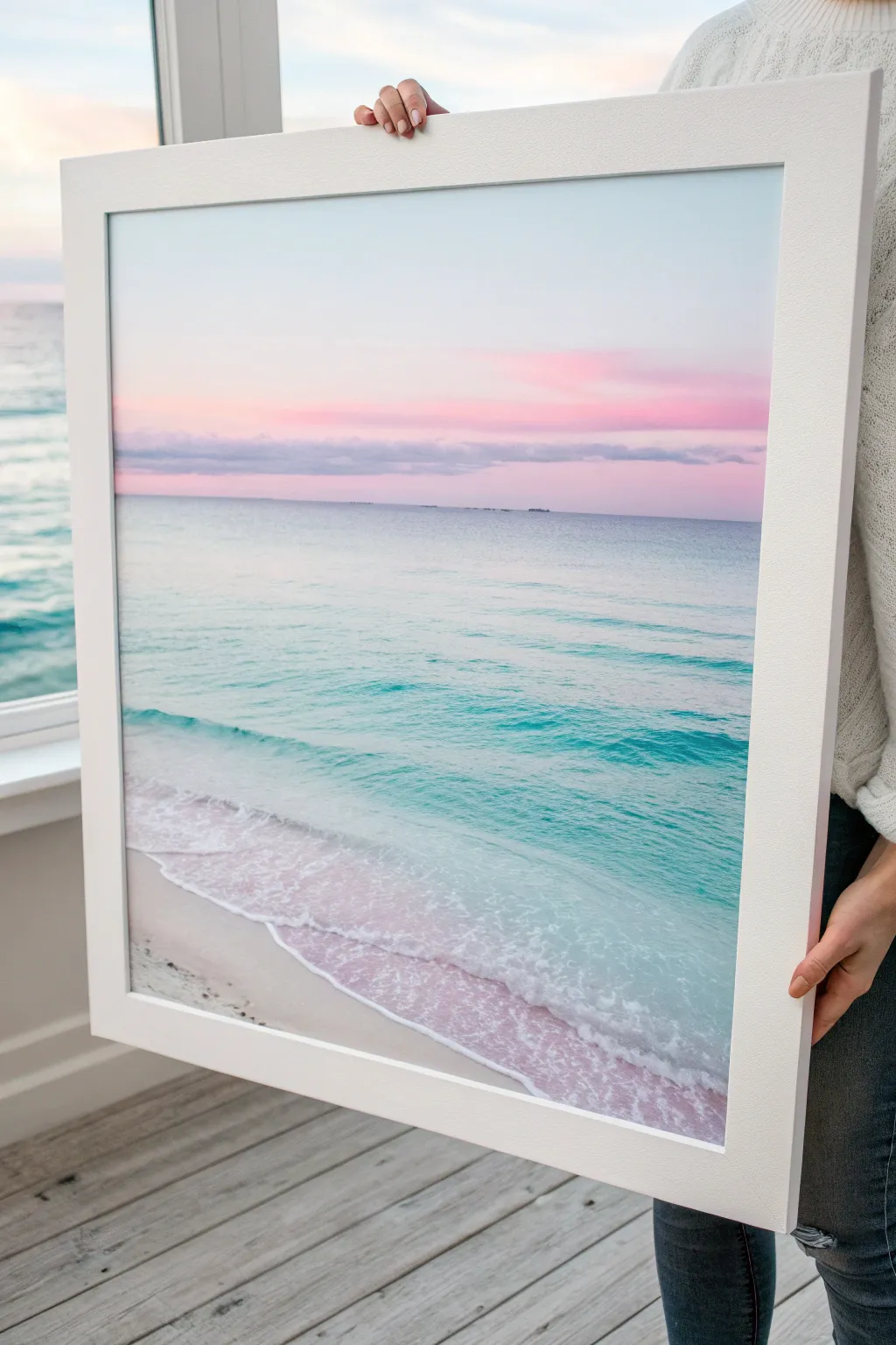
Capture the serene beauty of a twilight seascape with this soft, pastel-focused painting that blends dreamy pinks and cool turquoises. The finished piece features a calm horizon and gentle, foamy waves washing onto sandy shores, perfect for adding a coastal touch to any room.
Detailed Instructions
Materials
- Large square canvas (approx. 24×24 inches)
- Acrylic paints (primary cyan, magenta, white, warm yellow, burnt umber)
- Wide flat brush (2 inch)
- Medium flat brush (1 inch)
- Small round brush (size 4)
- Sea sponge or crumpled paper towel
- Palette knife
- Water container and mixing palette
- White or light wood floating frame (optional)
Step 1: Setting the Sky
-
Prepare the canvas:
Start by applying a thin coat of gesso if your canvas isn’t pre-primed, or simply dampen the canvas slightly with a clean brush to help the acrylics blend more smoothly. -
Mix the sky gradient:
Create a very pale blue by mixing a tiny dot of cyan into a large amount of white. Separately, mix a soft pastel pink using magenta and white. You want these colors to be whisper-light. -
Paint the upper sky:
Using your wide flat brush, paint the top third of the canvas with the pale blue mixture, keeping brushstrokes horizontal and smooth. -
Blend the horizon line:
While the blue is still wet, introduce the pastel pink just below it, blending the two where they meet to create a soft, violet transition. -
Intensify the sunset:
Deepen your pink mixture slightly and paint a horizontal band just above the horizon line. Add a streak of slightly darker mauve to suggest distant cloud formations.
Muddy Colors?
If your pinks and blues are turning grey where they meet, let the first layer dry completely. Then, apply a thin glaze of white before blending the second color on top.
Step 2: Creating the Ocean
-
Establish the horizon:
Use a ruler or painter’s tape to ensure a perfectly straight horizon line. Mix a muted, dark blue-grey and paint a thin, sharp line across the water’s edge. -
Paint the deep water:
Mix cyan, a touch of yellow, and white to make a light turquoise. Paint the area just below the horizon, keeping the color flat and calm. -
Transition to shallow water:
As you move down the canvas, gradually add more white and a tiny bit more yellow to your turquoise mix. This creates the illusion of clearer, shallower water. -
Add wave motion:
Switch to the medium flat brush. Use horizontal sweeping motions with slightly varied shades of turquoise to suggest the gentle movement of water. -
Create the shoreline:
Mix white with a very small amount of burnt umber and yellow to create a pale sandy beige. Paint the bottom curved section of the canvas where the water meets the land.
Glossy Finish
Once fully cured, apply a high-gloss varnish to the water section only. This mimics the shine of the ocean while keeping the sky and sand matte for contrast.
Step 3: Detailing the Waves
-
Paint the primary wave:
Identify where the largest wave is breaking. Use pure white paint and the edge of your flat brush to create a jagged, irregular line tracking the wave’s crest. -
Soften the foam:
Behind the crest line, scumble a mix of white and very pale turquoise. This adds volume to the rolling water without being too harsh. -
Add sea foam texture:
Here I prefer to use a damp sea sponge. Dip it lightly in white paint and dab it gently along the shoreline to mimic bubbly sea foam washing up on the sand. -
Refine the transparency:
Glaze over the sand area just under the foam with a very watered-down teal. This transparency makes the water look wet and realistic against the beach. -
Highlight the ripples:
Use your small round brush to add thin, squiggly white lines in the turquoise water area to represent sun reflections on small ripples. -
Final touches:
Step back and check your horizon line again. If needed, sharpen it with the palette knife for a crisp finish.
Once dry, frame your masterpiece in a simple white frame to let those pastel tones truly shine.


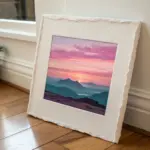
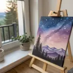
Misty Pastel Mountain Layers
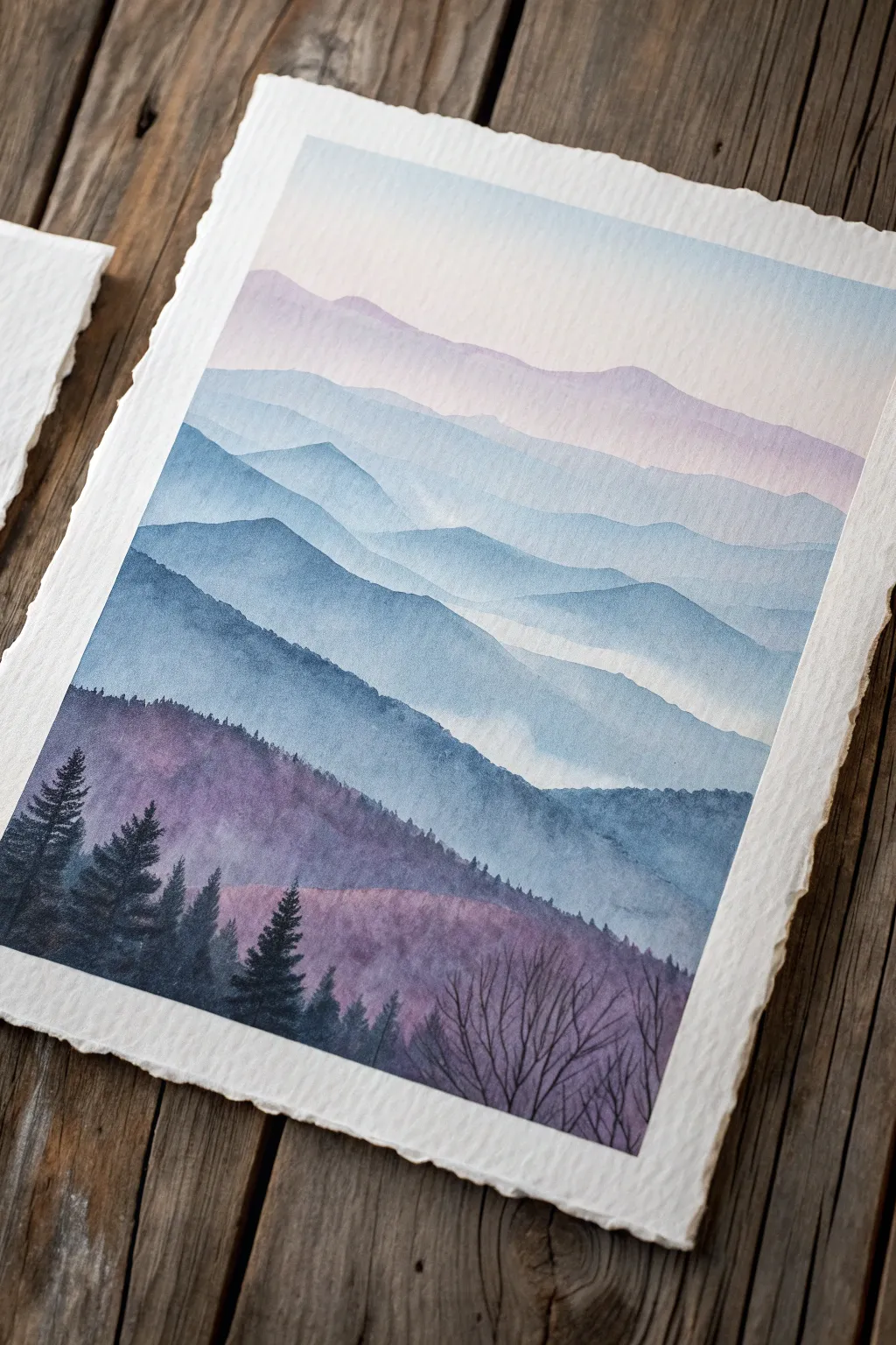
Capture the serene beauty of distant peaks with this atmospheric watercolor landscape. Through the magic of gradual layering and soft washes, you’ll create a sense of depth where misty mountains fade gently into a pastel sky.
Step-by-Step
Materials
- Cold press watercolor paper (300 gsm or heavier, with deckled edges if possible)
- Watercolor paints (Indigo, Payne’s Grey, Lavender, Rose Madder, Cobalt Blue)
- Round brushes (Size 4, 8, and 12)
- Clean water jars (two: one for rinsing, one for clean water)
- Mixing palette
- Paper towels
- Painters tape or masking tape
- Pencil (HB or lighter)
Step 1: Preparation and Sky
-
Prepare your paper:
Tape your watercolor paper down to a board on all four sides to prevent buckling. If you are using paper with deckled edges like the example, tape it gently from the back or skip taping if the block is glued, but be mindful of water control. -
Sketch the layers:
Using an HB pencil, very lightly sketch five to six wavy horizontal lines across the paper. These will represent the ridges of your mountains. Keep the lines random and organic; nature rarely draws straight lines. -
Wet the sky area:
With your largest clean brush, apply a glaze of clean water to the top section of the paper, stopping just above your first mountain ridge line. The paper should be glistering, not puddling. -
Paint a soft gradient:
Load a size 12 brush with a very watery mix of Rose Madder and a touch of Lavender. Drop this color into the wet sky area, letting it diffuse softly. Fade it out to almost clear water as you near the horizon line.
Hard Lines Appearing?
If you get hard drying lines where you wanted mist, your paper might be drying too fast. Try re-wetting the bottom edge with a clean damp brush to soften it again.
Step 2: Building the Distant Ranges
-
Mix the lightest violet:
Create a pale wash using Lavender and a tiny hint of Cobalt Blue. It should be transparent and light, almost like tinted water. -
Paint the first ridge:
Once the sky is fully dry, paint the most distant mountain shape. Fill in the area between your top pencil line and the next one down. Use a wet-on-dry technique here to get a crisp top edge. -
Fade the bottom edge:
Immediately after painting the ridge shape, rinse your brush and drag clean water along the bottom edge of that fresh paint. This creates a soft gradient that mimics mist rising in the valleys. -
Deepen the mix:
Add a little more Cobalt Blue and a touch of Payne’s Grey to your previous mixture. The goal is to go slightly darker and cooler for the next layer. -
Paint the second layer:
Wait for the first ridge to dry completely. Paint the next mountain down, repeating the process: crisp top edge following your pencil line, and a softened, watery bottom edge.
Add Some Sparkle
For a magical dawn effect, lightly spatter clean water or white gouache over the dried foreground trees to mimic morning dew or a light snowfall.
Step 3: Mid-Ground and Foreground
-
Shift to cooler blues:
As you move down the paper, introduce more Indigo and Payne’s Grey to your mix. The mountains should become distinctly bluer and darker than the purple-hued distant peaks. -
Paint the middle ridges:
Paint the next two layer shapes. I like to let the paint pool slightly in the dips of the mountains to create natural shadows before fading the bottom edge into white. -
Create the foreground base:
For the closest visible hill (the large dark shape), mix a saturated, creamy consistency of Indigo and Payne’s Grey with a hint of purple. This layer needs to be opaque enough to stand out against the misty background. -
Add texture:
While this large foreground hill is still damp (not soaking wet), drop in hints of pure Indigo along the top ridge to suggest dense tree cover or shadows. Let this layer dry completely.
Step 4: Details and Trees
-
Mix a darkest dark:
Combine Indigo and Payne’s Grey with very little water. You want a thick, ink-like consistency for the silhouettes. -
Paint the pine trees:
Switch to your size 4 round brush. On the lower left side, paint vertical lines for trunks, then dab small, irregular strokes outward and downward to create pine branches. Vary their heights for a natural look. -
Add deciduous trees:
On the bottom right, paint bare, spindly branches reaching upward. Use the very tip of your brush, starting with thicker trunks at the bottom and releasing pressure as you flick outward to create thin twigs. -
Refine the foreground:
Use the dark mix to fill in the bottom edge of the paper solid dark, grounding the trees and completing the composition.
Let your finished piece dry flat overnight to ensure the paper settles back into its beautiful texture.

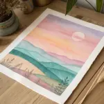
Pink-and-Gold Dawn Over a Field
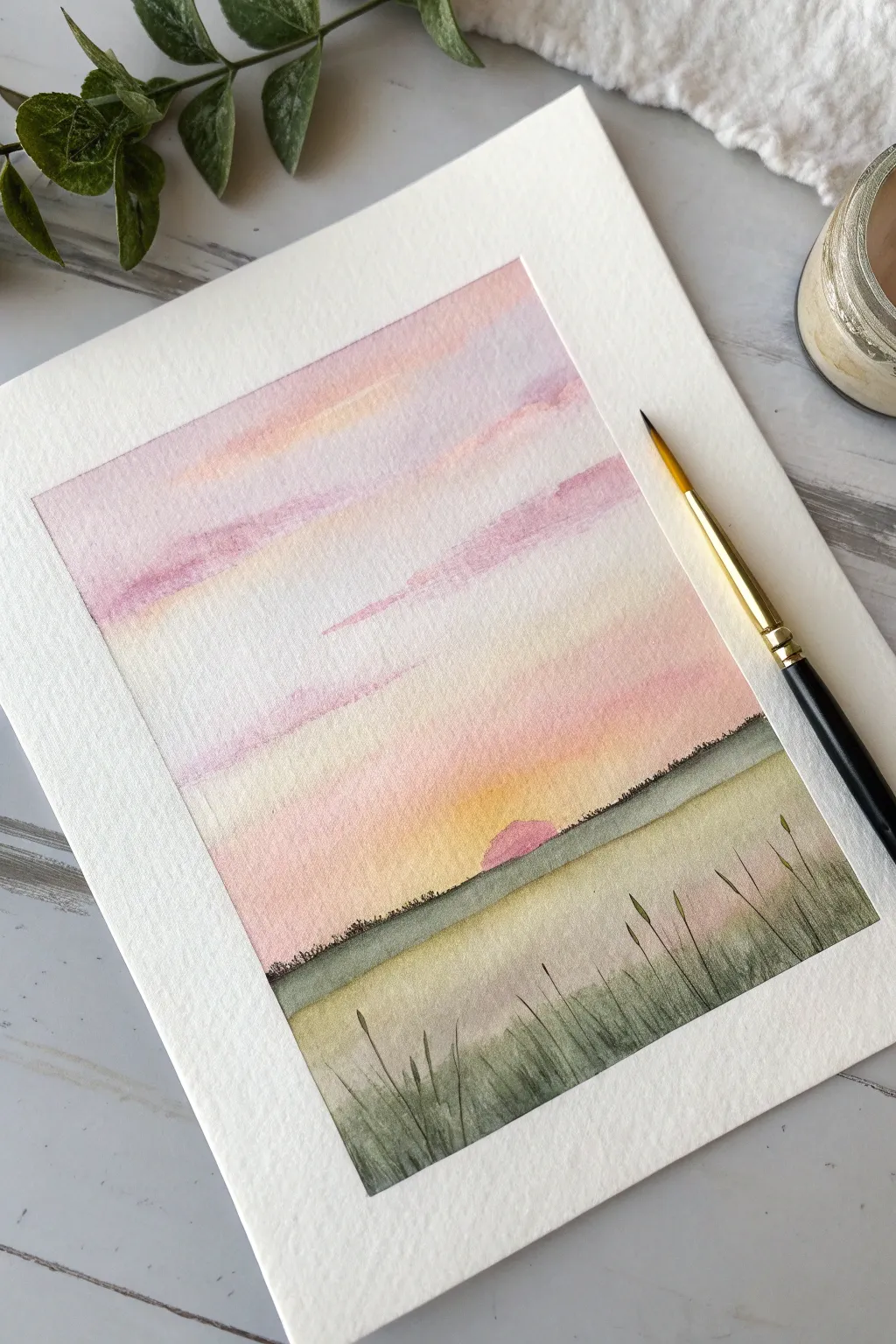
Capture the serene beauty of daybreak with this gentle watercolor project featuring a soft, gradient sky and delicate field grasses. The harmonious blend of blush pinks, warm golds, and muted greens creates a peaceful atmosphere perfect for framing.
Step-by-Step Tutorial
Materials
- Cold press watercolor paper (300 gsm)
- Watercolor paints (Alizarin Crimson, Lemon Yellow, Hooker’s Green, Payne’s Gray, Ultramarine Blue, Yellow Ochre)
- Masking tape
- Flat wash brush (3/4 inch)
- Round brush (size 6)
- Round rigger or liner brush (size 1 or 2)
- Clean water jar
- Paper towels
- Palette for mixing
Step 1: Preparing the Sky
-
Secure the paper:
Tape down all four edges of your watercolor paper to a board or table. This creates a crisp white border and prevents the paper from buckling when wet. -
Wet the surface:
Using your large flat brush and clean water, apply an even coat of water over the top two-thirds of the paper where the sky will be. It should be glistening but not forming puddles. -
Mix pastel shades:
Prepare watered-down puddles of Alizarin Crimson (for pink), a touch of Ultramarine with Crimson (for lilac), and Lemon Yellow. Keep the consistency light and tea-like. -
Apply the first wash:
Starting near the top, drop in streaks of the lilac mixture horizontally. Let the paint naturally disperse into the wet paper. -
Add warmth:
Below the lilac, introduce streaks of the pale pink mixture. As you move closer to the horizon line, blend in the Lemon Yellow to create a soft, glowing transition.
Muddy colors?
If your sky colors turn brown where they meet, you likely mixed purple and yellow too aggressively. Let the layers dry slightly before adding the opposing color next time.
Step 2: Building the Horizon
-
Paint the sun:
While the yellow area is still slightly damp but not soaking, use the tip of your size 6 brush to paint a small semi-circle in pink right at the horizon line for the rising sun. -
Define the horizon line:
Mix Hooker’s Green with a tiny touch of Payne’s Gray and Yellow Ochre to get a muted, earthy green. Draw a straight, horizontal line across the paper right below the sky wash. -
Soften the transition:
Immediately run a clean, slightly damp brush along the bottom edge of that green horizon line to drag the color downward, creating a misty field effect. -
Texture the distance:
Using a slightly thicker mix of dark green, tap the very top edge of the horizon line with the tip of your brush to imply distant trees or bushes. Keep these marks tiny and irregular.
Step 3: Creating the Foreground
-
Block in the field:
Paint the bottom third of the paper with a wash of Yellow Ochre mixed with a little green. Make the bottom corners slightly darker to frame the view. -
Layer grass blades:
Switch to your rigger or fine liner brush. Load it with a dark green mixture (Green + Payne’s Gray). Paint thin, sweeping upward strokes starting from the bottom edge. -
Determine height variations:
Vary the length and angle of your grass blades. Some should reach high towards the horizon line, while others stay low in the foreground. -
Add detail buds:
On the tips of the tallest grass stalks, paint small oval shapes to represent seed heads or buds, giving the field texture and interest. -
Deepen contrast:
Mix your darkest green yet. Add a final layer of grass blades in the bottom corners and very closest foreground to create depth and dimension. -
Remove the tape:
Wait until the painting is completely bone dry. Slowly peel the masking tape away at a 45-degree angle to reveal your clean edges.
Smooth Gradients
I like to tilt the board slightly while the sky is wet. Gravity helps pull the pigment downwards, blending the bands of pink and yellow naturally without brushstrokes.
Now you have a tranquil sunrise scene that radiates calm and warmth
BRUSH GUIDE
The Right Brush for Every Stroke
From clean lines to bold texture — master brush choice, stroke control, and essential techniques.
Explore the Full Guide
Fluffy Pastel Cloud Study
Capture the ethereal beauty of a sunset sky with this watercolor study, focusing on soft transitions between cerulean blue and dusty rose. This project highlights the wet-on-wet technique to create fluffy, effortless cloud textures that seem to float right off the page.
How-To Guide
Materials
- Cold press watercolor paper (300 gsm)
- Painter’s tape or masking tape
- Watercolor paints (Cerulean Blue, Cobalt Blue, Rose Madder or Quinacridone Rose, Ultraviolet or Purple mix)
- Round watercolor brush (size 6 or 8)
- Small round detail brush (size 2 or 4)
- Clean water jar
- Paper towels or cotton rag
- Mixing palette
Step 1: Preparation and Base Gradients
-
Tape the borders:
Secure your watercolor paper to a board or table using painter’s tape along all four edges. This creates that crisp, clean white border shown in the image and prevents the paper from buckling when wet. -
Pre-wet the sky area:
Using your larger brush and clean water, gently wet the upper two-thirds of the paper. You want an even sheen, not puddles, to prepare for a smooth blue gradient. -
Mix your sky blue:
On your palette, dilute Cerulean Blue with plenty of water to get a light aesthetic. Add a touch of Cobalt Blue near the top edge for depth. -
Paint the upper sky:
Apply the blue mix starting from the top left corner, sweeping diagonally downwards. As you move down towards the middle, add more water to your brush to fade the color out to almost white. -
Leave whites for clouds:
While applying the blue, carefully paint *around* the shapes of the big white clouds. Leave the paper completely dry and white in these fluffy areas to define the cloud tops. -
Prepare the pink tones:
While the blue settles, quickly mix a soft pink using Rose Madder. It should be very watery and pastel. -
Introduce the pink horizon:
On the bottom third of the paper, paint the pink mixture. Allow it to touch the wet edge of the fading blue sky slightly so they bleed together creating a soft lavender transition.
Clean Cloud Edges
Use a crumpled paper towel to blot wet paint while it is still fresh. This creates organic, unpredictable textures that look much more like real clouds than brushstrokes do.
Step 2: Building Cloud Volume
-
Mix shadow colors:
Create a ‘cloud shadow’ color by mixing your pink with a tiny drop of blue to verify a soft purple or lilac hue. Keep it transparent. -
Soften harsh edges:
Check the edges of your white cloud shapes. If the blue paint dried with a hard line, use a damp, clean brush to gently scrub the edge to soften it, making the cloud look wispy. -
Underpainting the clouds:
Apply your lilac shadow mix to the *bottom* areas of the white clouds you left blank. This gives them volume and suggests light is hitting them from above. -
Layering the pink clouds:
In the lower pink section, load your brush with a slightly more saturated pink/purple mix. Dab this color wet-in-wet into the pink area to create smaller, denser cloud formations. -
Lifting technique:
If the pink area gets too dark, rinse your brush, dry it on a paper towel, and lift up some pigment to create soft white highlights within the lower pink clouds.
Step 3: Refining and Detail
-
Deepen the shadows:
Once the first layer is damp (not soaking), mix a slightly darker violet. Use your smaller brush to add deeper shadows just at the base of the largest cloud clusters. -
Feather the edges:
Use a clean, damp brush to feather out these darker violet strokes so they blend seamlessly into the lighter pinks. No hard lines should be visible in the fluffy sections. -
Evaluating contrast:
Step back and look at the painting. I often find I need to darken the blue sky in the top corners just a bit more to make the white clouds pop. -
Final dry:
Let the painting dry completely. The colors will lighten as they dry, giving that perfect pastel finish. -
The reveal:
Carefully peel away the masking tape at a 45-degree angle to reveal your clean edges and frame your artwork.
Add Golden Hour
Glaze a very watered-down yellow ochre or warm gold over the white tops of the clouds once the darker colors are 100% dry to mimic the final moments of sunset.
You now have a serene slice of sky that captures the softest moment of the day
Soft Floral Bouquet With Blended Petals
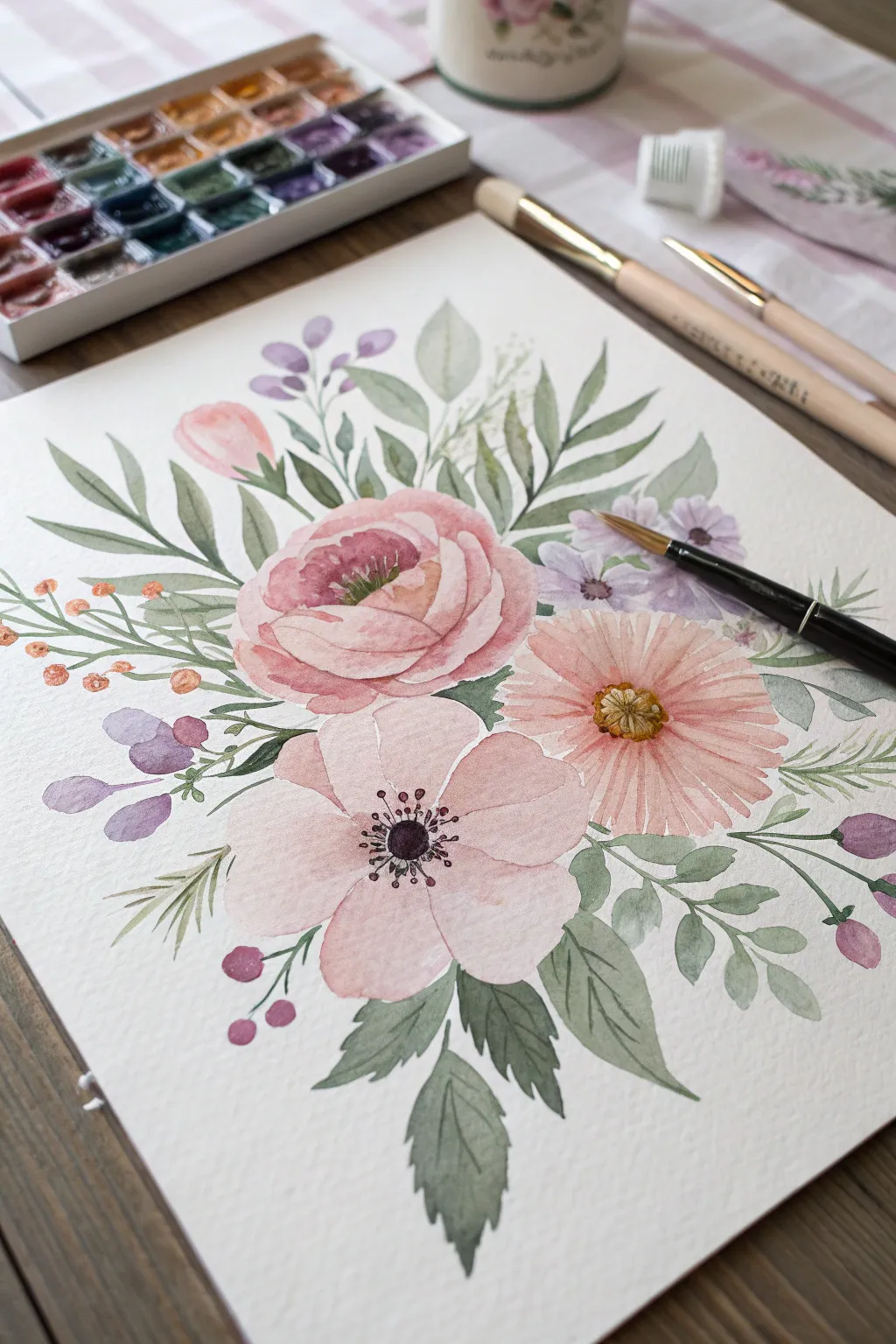
Capture the delicate beauty of springtime flowers with this soft, pastel-toned watercolor tutorial. You will learn to layer translucent washes to create a romantic bouquet featuring roses, anemones, and daisies surrounded by lush greenery.
Step-by-Step Tutorial
Materials
- Cold press watercolor paper (300 gsm)
- Watercolor paints (Light Pink, Rose Madder, Sap Green, Olive Green, Lavender, Yellow Ochre, Burnt Umber)
- Round watercolor brushes (sizes 2, 4, and 6)
- Pencil (HB or H for light sketching)
- Kneaded eraser
- Clean water jar
- Paper towels
- Palette for mixing
Step 1: Planning the Composition
-
Light Sketch:
Begin with a very faint pencil sketch. Outline three main circle shapes for the flowers: a large central rose, a daisy to the right, and an open anemone below. Add loose lines indicating the direction of stems and leaves. -
Refining Shapes:
Lightly define the petal shapes within your circles. Keep the lines barely visible so they won’t show through the transparent paint later. -
Erase Excess Graphite:
Roll your kneaded eraser gently over the sketch to lift up excess graphite, leaving only faint ghost lines to guide you.
Water Control Tip
For soft petals, use the ‘wet-on-dry’ technique but keep your brush loaded with plenty of watery paint. This prevents hard edges from forming too quickly.
Step 2: Painting the Main Blooms
-
The Rose Center:
Mix a watery Rose Madder with a touch of Yellow. Using a size 4 brush, paint tight, small C-curves in the center of the top rose, leaving tiny gaps of white paper between strokes for highlights. -
Rose Petals:
Switch to a lighter pink wash (add more water). Paint larger, overlapping C-curves radiating outward from the center to create the soft, open petals of the rose. -
The Pink Anemone:
For the bottom left flower, use a very pale pink wash. Paint five broad, rounded petals. Keep the edges soft and allow the water to pool slightly at the base of the petals. -
The Daisy:
Using a mix of Light Pink and a hint of Orange, paint long, thin petals for the flower on the right. Leave a circular gap for the center disk. -
Adding Depth:
While the rose is still slightly damp (but not soaking), drop a slightly more concentrated pink mixture into the shadows between the inner petals to add volume.
Step 3: Greenery and Fillers
-
Base Foliage:
Mix a soft Olive Green. Using a size 6 brush, paint the larger leaves framing the bouquet. Press the belly of the brush down to widen the leaf and lift up to create a sharp point. -
Color Variation:
While painting leaves, I like to dip the tip of my brush into a cooler Sap Green or a bluish-green to create natural variation within the foliage. -
Small Leaves:
Switch to a size 2 brush. Add delicate, smaller sprigs of leaves with a darker, cool green tone to create contrast against the pastel flowers. -
Lavender Sprigs:
Mix a watery Lavender color. Paint small, round dabs on thin stems in the upper left and right areas to represent filler flowers or buds. -
Orange Berry accents:
Using a small brush and a muted orange, add tiny round berries on thin stems protruding from the left side of the bouquet.
Level Up: Texture
Add subtle splatters of paint around the edges of the bouquet while everything is dry to give the piece a modern, loose artist-studio vibe.
Step 4: Details and Definition
-
Daisy Center:
Once the daisy petals are dry, paint the center with Yellow Ochre. Add tiny dots of light brown or orange while it’s damp for texture. -
Anemone Center:
With a fine brush (size 2), paint the center of the bottom flower using dark purple or black. Add tiny lines radiating out ending in small dots for the stamens. -
Defining Petals:
Check your rose again. If it feels too flat, use a very focused, slightly darker pink glaze to define the edges of just a few outer petals. -
Final Stems:
Connect any floating elements or leaves to the main bouquet using thin, pale green lines for stems. -
Final Touches:
Assess the balance. If you need more depth, add a second layer of green to the shadowed parts of the leaves.
Let your painting dry completely before framing this lovely, garden-fresh artwork

PENCIL GUIDE
Understanding Pencil Grades from H to B
From first sketch to finished drawing — learn pencil grades, line control, and shading techniques.
Explore the Full Guide
Cozy Little House at Dusk
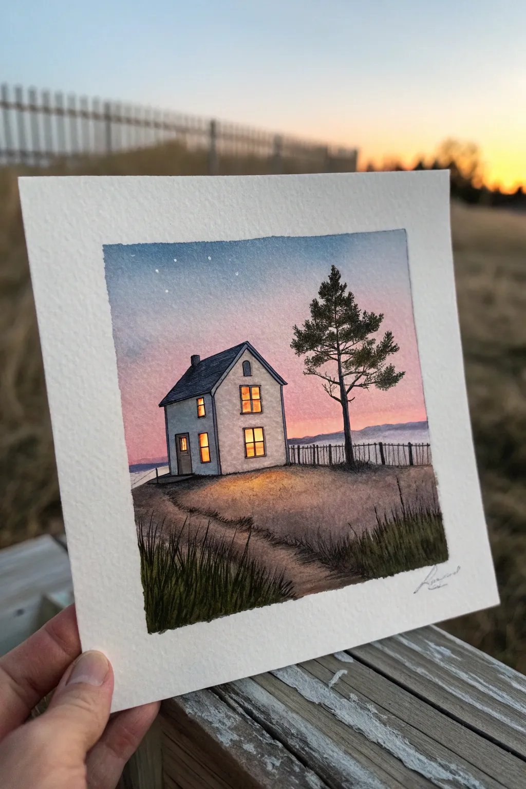
Capture the serene magic of twilight with this atmospheric watercolor study. You will learn to blend soft pastel gradients for a glowing sky and create inviting warmth with lighted windows against a cool landscape.
Step-by-Step Tutorial
Materials
- Cold Press Watercolor Paper (140lb/300gsm), cut to a square
- Watercolor Paints (Indigo, Alizarin Crimson, Cadmium Yellow, Burnt Sienna, Payne’s Grey, Sap Green)
- White Gouache (for stars/highlights)
- Masking Tape
- Pencil (HB) and Eraser
- Fine Liner Pen (Black, waterproof, 0.1mm)
- Round Brushes (Size 6 for washes, Size 0 or 1 for details)
- Paper Towels
- Jar of Water
Step 1: Preparation and Sketching
-
Tape the Edges:
Begin by taping down all four edges of your square paper onto a board. This creates the crisp white border seen in the reference and prevents the paper from buckling during the wash. -
Draft the Horizon:
Lightly sketch the horizon line about one-third of the way up from the bottom. Keep it slightly uneven to represent gentle terrain. -
Outline the House:
Draw the basic shape of the house slightly off-center. Include the pitched roof, chimney, and geometric window placements, but keep lines faint so they don’t show through later. -
Add Natural Elements:
Sketch a winding path leading from the bottom left corner toward the house. Roughly mark the position of the pine tree on the right and the fence line behind it.
Wet-on-Wet Magic
For the smoothest sky gradient, tilt your board slightly. Gravity pulls the pigment down, helping the blue, pink, and yellow blend seamlessly without harsh lines.
Step 2: The Sky Gradient
-
Wet the Sky Area:
Using your larger brush and clean water, thoroughly wet the paper above the horizon line, carefully painting around the house shape. -
Apply the Blue:
While the paper is wet, drop Indigo or a deep blue at the very top edge. Let it diffuse downward, fading out before it reaches the horizon. -
Blend the Sunset Hues:
Quickly rinse your brush and pick up a watery mix of Alizarin Crimson (pink). Apply this below the blue, allowing them to bleed together to form a soft purple transition. -
Add the Glow:
Near the horizon line, blend in a very pale wash of yellow or peach to suggest the last light of the sun. Let the sky dry completely before moving on.
Muddy Colors?
If the sky colors turn brown where they meet, you are overworking the blend. Lay the colors down quickly and let the water do the mixing on the paper.
Step 3: Painting the House and Ground
-
Shadow the House:
Paint the walls of the house with a very diluted mix of Indigo and cold water. Leave the window panes pure white for now. The house should look cool and shadowy against the sunset. -
Roof and Chimney:
Use a darker concentration of Payne’s Grey or blue-black to fill in the roof and chimney shape. -
Light the Windows:
Once the house walls are dry, paint the window panes with Cadmium Yellow. For extra warmth, drop a tiny dot of orange into the center of the wet yellow paint. -
The Grassy Foreground:
Mix Burnt Sienna with a touch of Payne’s Grey for a muted earth tone. Paint the foreground area, using varied brushstrokes to suggest uneven ground. -
Define the Path:
While the ground is damp, lift out some pigment with a thirsty brush or paper towel where the path lies to make it lighter than the surrounding grass.
Step 4: Details and Finishing Touches
-
Draw the Tree Structure:
Switch to your smallest brush or the fine liner pen (if the paper is bone dry). Draw the trunk and branches of the pine tree on the right side. -
Add Pine Needles:
Using a dark mix of Sap Green and Payne’s Grey, stipple small dashes onto the branches to create the texture of pine needles. -
Outline Details:
Use your fine liner pen to carefully outline the house, roof, window frames, and the tiny fence posts in the background. -
Grass Textures:
Use the pen or a dry brush with dark paint to flick upward strokes in the foreground, creating tufts of tall grass, especially in the bottom corners. -
Add Stars:
Using the tip of a fine brush or a toothpick, dot tiny specks of white gouache or gel pen into the upper blue section of the sky. -
Reveal the Border:
Ensure the artwork is 100% dry, then slowly peel away the masking tape at a 45-degree angle to reveal the clean edges.
Enjoy the peaceful feeling of your little illuminated cottage sitting quietly under the evening sky
Pet Portrait With a Pastel Backdrop
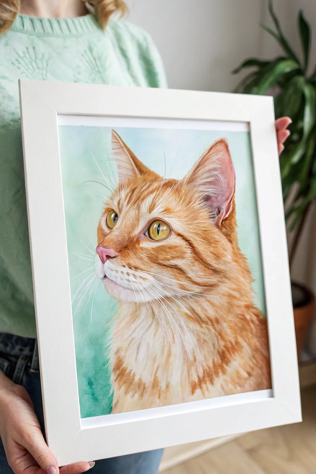
Capture the soulful gaze of a golden tabby cat with this detailed watercolor tutorial that focuses on realistic fur textures and a soft, dreamy backdrop. The contrast between the warm orange fur and the cool, pastel teal background makes the subject pop, creating a gallery-worthy piece for any pet lover.
How-To Guide
Materials
- High-quality watercolor paper (cold press, 300gsm)
- Watercolor paints (Burnt Sienna, Yellow Ochre, Cadmium Orange, Burnt Umber, Paynes Grey, Viridian Green, Cerulean Blue)
- White gouache or white gel pen
- Round watercolor brushes (sizes 2, 6, and 10)
- Fine liner brush (size 0 or 00)
- Masking tape
- Pencil (HB or 2H)
- Kneaded eraser
- Clean water and palette
- Simple white frame (A4 or 8×10 size)
Step 1: Preparation and Sketching
-
Tape down the paper:
Secure your watercolor paper to a board using masking tape on all four sides. This prevents buckling when we apply water and creates a clean border. -
Draft the outline:
Using a light pencil (H or 2H), sketch the basic shape of the cat’s head. Pay close attention to the positioning of the ears and the angle of the jaw. -
Refine the features:
Draw the details of the eyes, nose, and mouth. The eyes are the focal point, so ensure the pupils are shaped correctly and mark out where the white highlights will go. -
Map fur direction:
Lightly sketch directional lines for the fur, especially around the cheeks, ears, and neck ruff. This will act as a roadmap for your brushstrokes later.
Step 2: The Pastel Background
-
Mix the background wash:
Combine Viridian Green, a touch of Cerulean Blue, and plenty of water to create a misty pastel teal brightness. It should be very diluted. -
Apply the first wash:
Using the large size 10 brush, wet the background area around the cat with clean water first (wet-on-wet technique), then drop in your teal mix. Let the color flow naturally. -
Create soft textures:
While the background is still damp, dab in slightly more concentrated green near the bottom left corner to build atmospheric depth. Let this layer dry completely.
Fur Texture Pro-Tip
Don’t paint every single hair! Focus on painting ‘clumps’ of fur by establishing a shadow shape and leaving the paper white for the highlights. The viewer’s brain will fill in the rest.
Step 3: Eyes and Nose
-
Base coat for eyes:
Mix a diluted Yellow Ochre and fill in the iris area, carefully avoiding the white highlight spots you marked earlier. -
Add eye depth:
Once the yellow is dry, layer a translucent green-brown mix at the top of the iris to create a shadow from the eyelid. -
Define the pupil:
Use a strong mix of Lamp Black or Payne’s Grey to fill in the pupil slit. Outline the eye rim with a fine liner brush for definition. -
Paint the nose:
Mix a soft pink using a tiny bit of Cadmium Red and plenty of water. Paint the nose leather, darkening the bottom edge and nostrils with a touch of purple for shadow.
Level Up: Salt Technique
While the pastel green background wash is still wet, sprinkle a few grains of table salt on the paper. As it dries, the salt pushes pigment away, creating a beautiful starburst texture.
Step 4: Building the Fur
-
Underpainting warm tones:
Apply a very light wash of Yellow Ochre over the entire fur area. This ‘glow’ layer provides the warm undertone characteristic of orange tabbies. -
Layering orange markings:
Mix Burnt Sienna and Cadmium Orange. Using a size 6 brush, start painting the darker tabby stripes on the forehead and cheeks, following your pencil guide. -
Building texture:
Switch to a size 2 brush. Using a mix of Burnt Sienna and Burnt Umber, paint short, flicking strokes to mimic individual hairs. Keep strokes loose around the neck to suggest fluffiness. -
Deepening shadows:
Add depth under the chin and inside the ears using a mix of Burnt Umber and a tiny drop of blue (to cool it down). This makes the head look 3D. -
Ear details:
Within the ears, paint the inner skin pale pink, then use the fine liner to flick in the long, wispy ear furnishings with white gouache or diluted white paint mixed with a tiny bit of ochre.
Step 5: Finishing Touches
-
Refining white fur:
The chest and muzzle are white, but they need shadow to have form. Use a very watery mix of Cobalt Blue and purple to paint subtle shadows in the white fur clumps. -
Adding whiskers:
This is the crucial step. Load your size 0 liner brush (or white gel pen) with white gouache. With a confident, quick motion, sweep the long whiskers out from the muzzle. -
Final highlights:
Add tiny touches of white gouache to the tear ducts and the very brightest part of the eye glint to bring the cat to life. -
Frame the work:
Once the painting is bone dry—I usually give it an hour—carefully peel off the tape and place the artwork in a clean white frame to complement the brightness of the piece.
Hang your finished portrait in a well-lit spot to let those warm orange tones shine against the cool pastel background.


Circular Vignette Mini Landscape
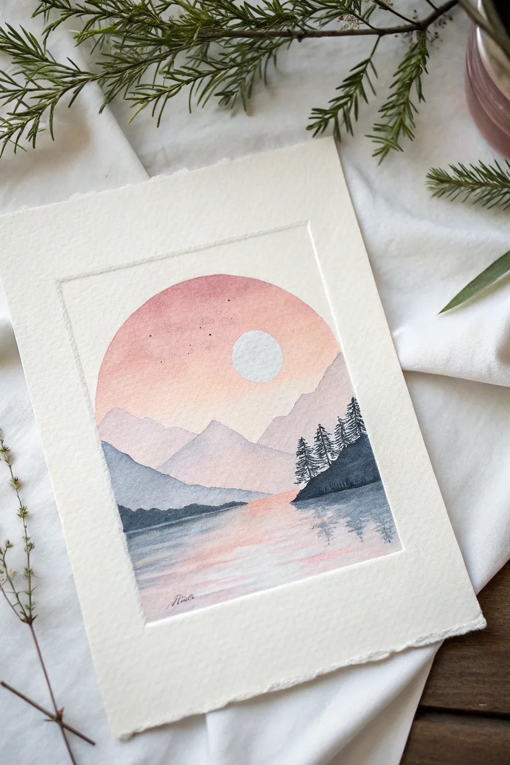
Capture the serenity of twilight with this delicate landscape painting, featuring a unique arched border that frames the scene like a stained glass window. The soft gradient sky and layered mountains create a peaceful depth that looks beautiful on textured cotton paper.
Step-by-Step
Materials
- Cold press watercolor paper (140lb/300gsm)
- Masking tape or washi tape
- Pencil and eraser
- Compass or circular object (like a bowl)
- Watercolor paints (Indigo, Alizarin Crimson, Yellow Ochre, Paynes Gray)
- Round watercolor brushes (Size 2 and Size 6)
- White gouache or white gel pen
- Clean water and paper towels
Step 1: Preparing the Frame
-
Outline the shape:
Begin by lightly drawing your arched frame. Use a ruler to draw a rectangle, then use a compass or trace a circular object to create a perfect half-circle dome on top of the rectangle. Keep your pencil lines faint so they don’t show through the paint later. -
Mask the moon:
Draw a small, perfect circle for the moon in the upper right quadrant of the sky. Apply a masking fluid to this circle to keep it pristine white, or plan to carefully paint around it. If you don’t have masking fluid, don’t worry—we can touch it up with white gouache at the end. -
Tape the borders:
Carefully apply masking tape along the straight vertical and bottom edges of your penciled frame. For the curved top, you can either paint carefully within the line or cut small pieces of tape to follow the curve, though freehanding the curve often yields a softer, more organic result.
Bleeding Edges?
If paint bleeds under the tape, wait until it’s 100% dry. Then, use a damp stiff brush (like an acrylic brush) to gently scrub and lift the unwanted paint, blotting with a tissue as you go
Step 2: Painting the Sky
-
Wet the sky area:
Using your larger brush and clean water, gently wet the entire sky area inside your frame, stopping at where the horizon line will be. The paper should be glistening but not forming puddles. -
Apply the peach tones:
Mix a watery wash of Yellow Ochre and a tiny touch of Alizarin Crimson to make a soft peach. Drop this color onto the wet paper, concentrating it near the center and lower sky. -
Blend the upper sky:
While the paper is still wet, introduce a slightly darker pinkish-purple mix (Alizarin Crimson with a dot of Indigo) to the very top of the arch. Let gravity assist you by tilting the paper slightly so the colors blend seamlessly downwards into the peach. -
Create soft stars:
While the sky is damp but losing its sheen, splatter tiny droplets of water or very diluted paint to create subtle texture. Alternatively, wait until it’s bone dry to add tiny dark specks with a fine tip pen.
Metallic Magic
Swap the white gouache moon for metallic gold watercolor. It catches the light beautifully and gives the piece a celestial, magical quality that looks stunning in a frame
Step 3: Layering the Mountains
-
First mountain range:
Once the sky is completely dry, mix a very pale, watery lavender using Indigo and Alizarin Crimson. Paint the furthest mountain range with jagged peaks, bringing the wash down to where the lake begins. -
Second mountain range:
Add slightly more pigment to your lavender mix to make it darker. Paint a second, lower range of mountains that overlaps the first one. This variation in value creates the illusion of distance. -
Foreground slopes:
Mix a stronger, cooler blue-grey using Paynes Gray and Indigo. Paint the closest land masses on the left and right sides, making sure the edges are crisp against the lighter mountains behind them.
Step 4: The Lake and Details
-
Reflecting the sky:
Wet the lake area with clean water. Mirror the sky colors upside down: peach near the horizon fading into a soft purple-grey at the bottom. Use horizontal brush strokes to suggest rippling water. -
Mountain reflections:
While the lake wash is still damp, drop in faint horizontal lines of your mountain colors directly below the land masses. Let them bleed slightly into the water to create a soft, wavy reflection. -
Adding the trees:
Now for the high contrast. Take a Size 2 brush and a concentrated mix of Indigo and Paynes Gray (almost black). Paint varying heights of pine trees on the right-hand slope. Use quick, small dabbing motions to create the pine needle texture. -
Tree reflections:
Clean your brush slightly so it holds less pigment. Paint the reflection of the trees in the water using zig-zag motions, pulling the color downwards and letting it fade out. -
Final touches:
Once everything is bone dry, remove the masking tape and check your moon. If needed, paint over the moon area with opaque white gouache to make it pop. Add three or four tiny dots in the sky for distant stars.
Peeling away the tape to reveal those crisp, straight edges is the most satisfying way to finish this peaceful scene
Textured Pastel Painting With Bold Marks
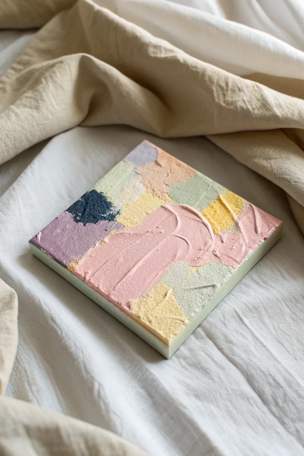
This abstract project celebrates the joy of thick, buttery textures and calming pastel hues. By layering modeling paste with acrylics, you will create a sculptural piece that feels just as interesting as it looks.
Step-by-Step Tutorial
Materials
- Small square canvas (approx. 6×6 or 8×8 inches)
- Heavy body acrylic paints (Titanium White, Pastel Pink, Sage Green, Pale Yellow, Lavender, Navy Blue)
- Modeling paste or heavy gel medium
- Palette knives (assorted sizes, with one offset trowel shape)
- Palette paper or mixing plate
- Paper towels
- Gesso (optional)
Step 1: Preparation & Mixing
-
Prime your surface:
Begin by ensuring your canvas is clean. If it isn’t pre-primed, apply a thin coat of gesso and let it dry completely to give the heavy heavy texture something to grip onto. -
Prepare the paste:
Scoop a generous amount of modeling paste onto your palette. You will need separate piles for each color you plan to use, keeping the white pile the largest. -
Mix the pink:
Mix a small amount of pink acrylic into a large dollop of modeling paste. Aim for a ratio of about 20% paint to 80% paste to maintain the thickness while achieving a soft, candy-colored hue. -
Create the sage and yellow:
Repeat the mixing process for your sage green and pale yellow. Remember that the white modeling paste will naturally lighten your acrylic colors, so start with slightly darker paint if needed. -
Mix the accent colors:
Prepare smaller piles of lavender and a very small amount of navy blue. The navy will serve as a high-contrast anchor point essential for balancing the composition.
Cracking Paste?
If your thick impasto layers crack while drying, the room might be too warm. Move the art to a cooler spot so the surface dries slowly at the same rate as the layers beneath.
Step 2: Applying the Texture
-
Map out the composition:
Mentally divide your canvas into rough, interlocking geometric shapes. You don’t need to draw lines; just have a general plan for where the main blocks of color will sit. -
Apply the first layer:
Load your palette knife with the pale yellow mixture. Spread it onto a corner of the canvas like you are frosting a cake, keeping the layer about 1/8th of an inch thick. -
Add the sage green:
Clean your knife and apply the sage green next to the yellow. Don’t worry about perfect edges; let the colors touch and slightly overlap to create organic boundaries. -
Create the textures:
While the paste is wet, use the flat side of your knife to press down and lift up, creating peaks and ridges. For smoother areas, drag the knife lightly across the surface. -
Introduce the lavender:
Apply the lavender mixture to the left side or a corner. I find that pulling the knife in a different direction for each color block adds a nice visual dynamism to the piece. -
Place the centerpiece:
Taking your large pink mixture, apply a sweeping, curved stroke right through the center or lower half. This should be your boldest mark, sitting slightly on top of the adjacent colors. -
Add the contrast:
Using the tip of a smaller knife, carefully place a dollop of the textured navy blue. Keep this area rugged and rough to contrast with the smoother pink swipes.
Clean Swipes
Wipe your palette knife completely clean with a paper towel between every single color switch. This prevents muddy hues and keeps those pastel tones bright and distinct.
Step 3: Finishing Touches
-
Refine the edges:
Clean your palette knife and run it along the outer edges of the canvas to remove any overhang, or intentionally spread the color around the sides for a gallery-wrapped look. -
Add highlights:
If any area feels too flat, mix a tiny bit of pure white with paste and dab it onto the high points of the yellow or pink sections to catch the light. -
Dry thoroughly:
Set the canvas in a safe, dust-free area. Because the application is so thick, this project will need at least 24 hours to cure completely. -
Protect the piece:
Once fully cured and hard to the touch, you can gently brush on a matte varnish to protect the porous texture from dust accumulation.
Display your new textured masterpiece on a shelf or desk where the angled light can really show off the dimension


Have a question or want to share your own experience? I'd love to hear from you in the comments below!