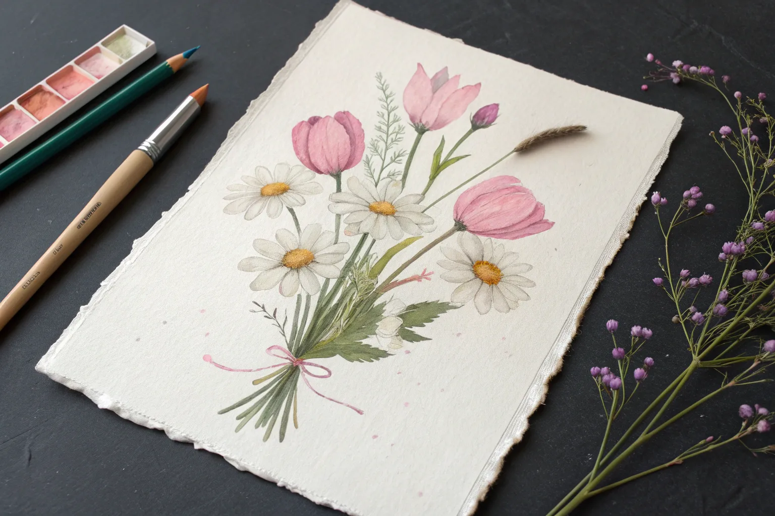
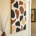
If you’re craving pastel ideas that feel fun, doable, and instantly satisfying, you’re in the right headspace. I love how soft pastels and oil pastels let you blend dreamy gradients, stack bold layers, and get that punchy color payoff fast.
Classic Sunset Gradient Over a Simple Horizon
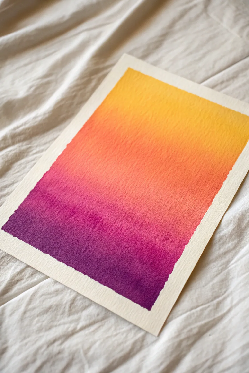
Capture the fleeting beauty of twilight with this seamless watercolor gradient exercise. The piece features a soothing transition from deep violet to sunny yellow, showcasing the natural texture of cold-press paper for a professional finish.
How-To Guide
Materials
- Cold-press watercolor paper (300 gsm)
- Painter’s tape or masking tape
- Waterfall watercolor paints (Violet, Magenta, Orange, Yellow)
- Large flat wash brush or hake brush
- Clean water jar
- Paper towels
- Flat board for taping down paper
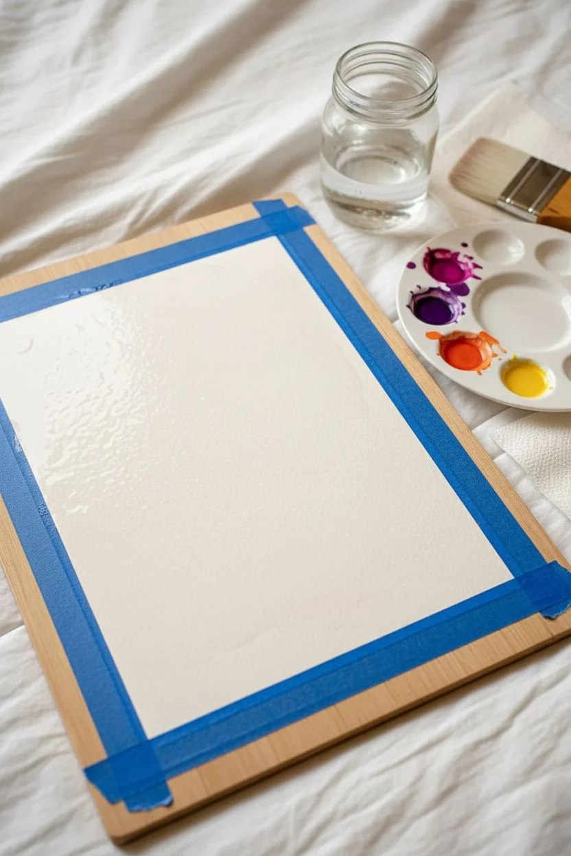
Step 1: Preparation
-
Secure the Paper:
Begin by taping your watercolor paper down to a flat board on all four sides. Press the tape down firmly along the inner edges to ensure a crisp, clean border later. This also prevents the paper from buckling when wet. -
Pre-mix Colors:
Prepare four distinct puddles of paint on your palette: a deep violet, a vibrant magenta, a warm orange, and a bright yellow. Ensure you mix enough of each color to cover the width of your paper, adding water until they reach a milky consistency. -
Wet the Surface:
Using your large flat brush and clean water, apply an even coat of water across the entire area of the paper inside the tape. You want the paper to be glistening and damp, but not so wet that puddles form.
Step 2: Applying the Gradient
-
Start with Yellow:
Load your brush with the yellow paint. Start at the very top of the paper and paint horizontal strokes across, moving downward to cover about the top quarter of the page. -
Transition to Orange:
Rinse your brush slightly and pick up the orange paint. Apply this directly below the yellow while the paint is still wet. Brush horizontal strokes where the yellow meets the orange to encourage them to bleed together naturally. -
Create the Mid-Tones:
Continue moving down the page, washing the orange section down until it occupies the next quarter. Keep your strokes horizontal and fluid to avoid hard lines. -
Introduce Magenta:
Clean your brush and load it with the magenta mixture. Apply this below the orange section. Use gentle back-and-forth strokes at the meeting point to blend the orange into the pink, creating a coral-like transition. -
Deepen with Violet:
Finally, load up pure violet paint for the bottom quarter. Apply it generously at the bottom edge and work your way up to meet the magenta. -
Blend the Base:
Where the violet meets the magenta, brush back and forth several times. The wet-on-wet technique allows the pigments to mingle, creating a seamless ombre effect rather than stripes.
Fixing “Cauliflowers”
If you see jagged blooms or ‘cauliflowers’ forming, it means you added water to drying paint. Don’t touch it! Let it dry fully, then lightly glaze over.
Step 3: Refinement
-
Tilt for Gravity:
If the blend looks a bit stagnant, pick up your board and tilt it slightly. Letting gravity pull the paint down can help smooth out the transitions between color zones. -
Blot Excess Moisture:
Check the edges near the tape. If pools of water are gathering, use the corner of a paper towel or a dry brush to gently lift the excess liquid so it doesn’t bloom back into your smooth wash. -
Check for Streaks:
Inspect the gradient while it is still damp. If you see harsh streaks, use a slightly damp clean brush to lightly sweep horizontally across the imperfection to soften it. -
Let it Dry:
Allow the painting to dry completely flat. Resist the urge to use a hair dryer strictly, as the strong air current can sometimes push the pigment around and ruin the smooth gradient. -
Peel the Tape:
Once the paper is bone dry and cool to the touch, slowly peel away the painter’s tape. Pull the tape away from the center of the painting at a 45-degree angle to prevent tearing the paper surface.
Smoother Blends
To get an even smoother transition, try tilting your board at a 30-degree angle while painting. Gravity pulls the bead of water down, helping colors mix seamlessly.
Display your vibrant gradient as a standalone piece of minimalist art or use it as a stunning background for lettering

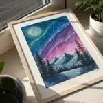
Glowing Moon and Clouds on Black Paper
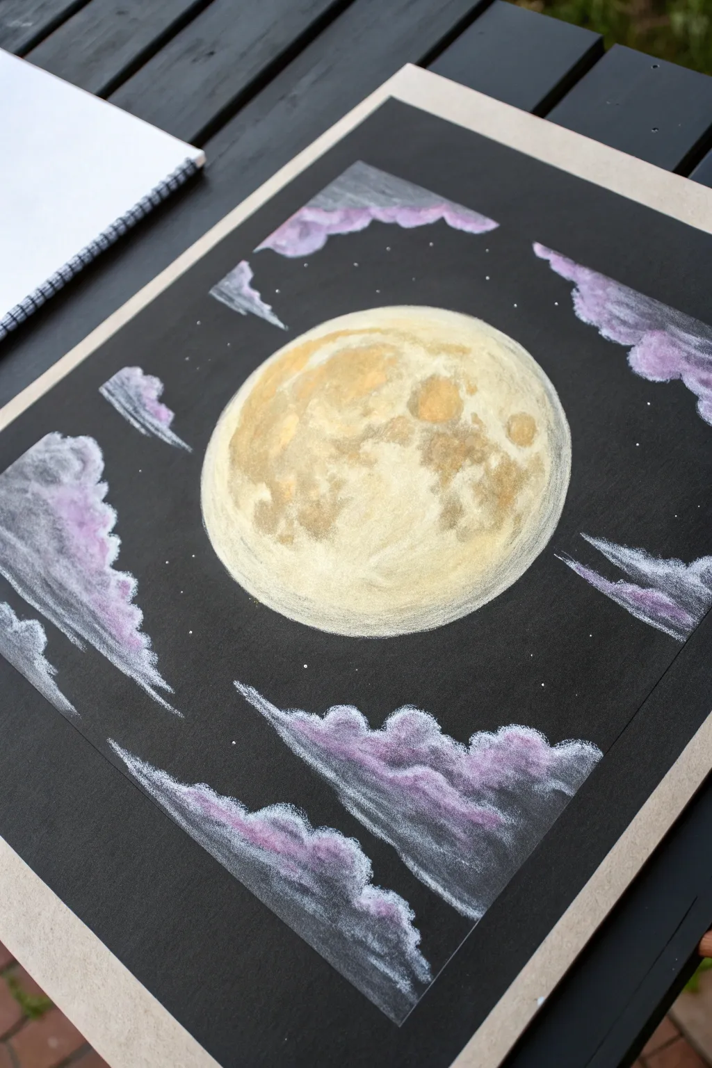
Capture the magic of a glowing night sky with this striking pastel project. Using black paper as your base makes the vibrant yellow moon and soft purple clouds pop with incredible luminosity.
Step-by-Step
Materials
- Black drawing paper or cardstock (square format recommended)
- Soft pastels or pastel pencils (white, cream, ochre, golden yellow, light purple, dark purple, grey)
- Circular object for tracing (like a bowl or lid)
- White colored pencil or white charcoal pencil
- Blending stump or cotton swabs
- Kneaded eraser
- Fixative spray (optional)
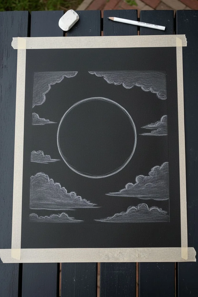
Step 1: Setting the Scene
-
Prepare your canvas:
Start by taping down the edges of your black paper to a flat surface using masking tape or painter’s tape. This will not only hold the paper steady but also give you a crisp, clean border when you peel it off at the end. -
Trace the moon:
Place your circular object in the center of the paper. Using a white pastel pencil or regular white pencil, lightly trace around the object to create a perfect circle for your moon. -
Sketch the cloud placement:
Lightly sketch the general shapes of the clouds around the edges of the paper. Think of them as framing the moon, with wispy tails stretching towards the center.
Step 2: Creating the Glowing Moon
-
Base layer:
Fill the entire circle with a layer of cream or very pale yellow soft pastel. Use your finger or a blending stump to smooth this out, pushing the pigment into the paper’s tooth. -
Adding depth:
Take a golden yellow or ochre pastel and gently dab irregular shapes onto the moon’s surface to represent the ‘maria’ or craters. Don’t be too precise; organic splotches look more natural. -
Shadow details:
Lightly layer a small amount of light grey or a muted brown over the darker yellow areas to create deeper shadows within the craters. -
Blending the surface:
Gently blend the new colors into the base layer. You want visible texture, so don’t over-blend into a solid color. Patting the surface with your finger works well here. -
Highlighting the rim:
Use a bright white pastel to outline the very edge of the moon, particularly on the top or side where the light would hit strongest, making it look spherical. -
Adding texture:
With a sharp pastel pencil or the edge of a pastel stick, add tiny dots and small scuff marks in white and cream across the surface for crater details.
Cloud Control
If your clouds look too solid or heavy, use a clean kneaded eraser to tap and lift pigment. This reveals the black paper underneath and creates a translucent, wispy texture.
Step 3: Painting the Clouds
-
Cloud base color:
Select a dark grey pastel and fill in the main bodies of the clouds you sketched earlier. Keep the strokes loose and feathery. -
Adding the purple hues:
Layer a rich purple pastel on top of the grey areas. Focus the color on the ‘belly’ of the clouds, leaving the edges slightly darker. -
Introducing light:
Apply a lighter lilac or lavender shade to the top edges of the clouds where they face the moon. This establishes the light source coming from the center. -
Bright highlights:
Take your bright white pastel and firmly draw along the very edges of the clouds closest to the moon. This high contrast against the black paper creates the ‘silver lining’ effect. -
Soft blending:
Use a blending stump or your finger to pull the white pigment slightly down into the purple, creating a soft transition. I find that using circular motions helps make the clouds look fluffier. -
Wispy tails:
Use the side of a white pastel stick or a pastel pencil to drag feathery strokes away from the main cloud bodies, letting them fade into the black background.
Don’t Over-blend!
For the moon’s craters, try to tap or stipple colors rather than rubbing them. Keeping the texture rough mimics the actual surface of the moon much better than smooth blending.
Step 4: Stars and Finishing Touches
-
Cleaning up:
Check the black negative space for any stray dust. Use a kneaded eraser to lift away unwanted smudges without damaging the paper. -
Creating stars:
Using a sharp white pastel pencil or a gel pen, dot tiny stars randomly throughout the black sky. Vary the pressure to create stars of different brightness. -
Final highlights:
Take a moment to step back and look at the contrast. Add a final touch of pure white to the brightest parts of the moon’s rim and the cloud edges to ensure they really glow. -
Reveal:
Carefully peel away the painter’s tape to reveal the crisp, clean borders of your night sky masterpiece.
Hang your finished celestial artwork on the wall and enjoy the peaceful glow of your personalized moonlit night
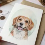

Pet Portrait Cropped Close for Fur Layering
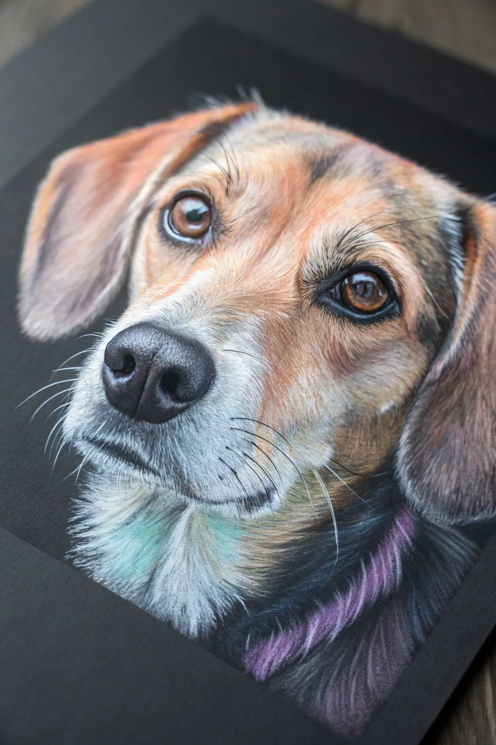
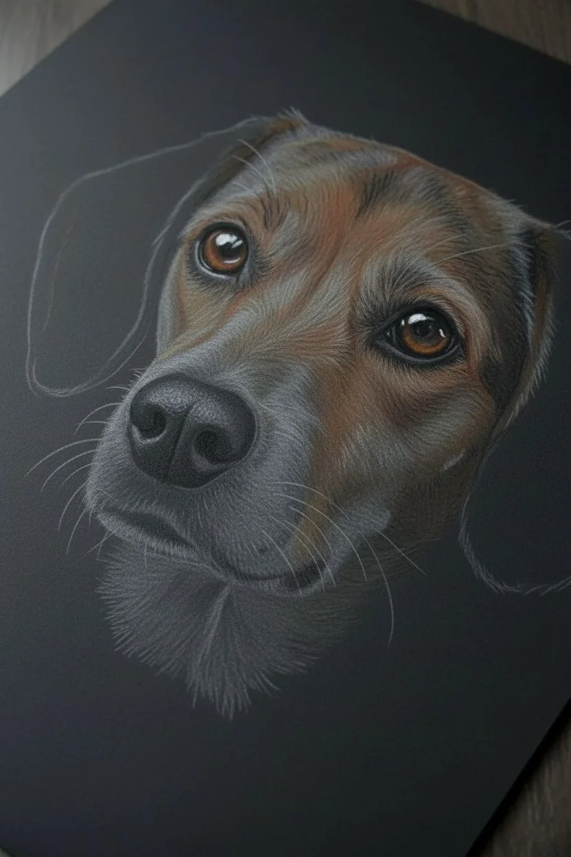
Capture the soul of your pet with this detailed pastel pencil study, focusing on realistic fur textures and expressive eyes. Using black paper as a base creates instant depth and makes the light fur and reflective highlights pop dramatically.
Step-by-Step Guide
Materials
- Black pastel paper or cardstock (smooth or fine tooth)
- Pastel pencils (white, warm grey, cool grey, burnt sienna, ochre, dark brown, black)
- Soft pastel sticks (optional, for blocking in larger areas)
- Kneaded eraser
- Paper stump or blending tool
- White gel pen (optional for intense highlights)
- Drafting tape
Step 1: Initial Sketch & Eyes
-
Create the outline:
Begin by lightly sketching the dog’s contours using a light grey or white pastel pencil. Keep your lines faint so they can be easily covered later. Focus on the placement of the eyes and nose relative to the ears. -
Define the eye structure:
Start with the eyes, as they anchor the portrait. Outline the iris and pupil with a sharp black pencil. Fill the pupil with deep black, leaving a tiny reserved specks of the paper for reflections if possible. -
Color the iris:
Layer burnt sienna and ochre into the iris. Add a touch of dark brown at the top of the iris to simulate the shadow cast by the eyelid. Lightly blend with a paper stump to smooth the transition. -
Add the catchlights:
Place the brightest white highlight in the eyes. This brings the dog to life immediately. Ensure the reflection follows the curvature of the eye to maintain realism.
Muddy Fur Fix
If fur looks muddy, you’ve over-blended. Stop rubbing! Apply a fixative spray, let it dry completely, then layer crisp strokes on top without touching them.
Step 2: Building the Fur Base
-
Establish dark values:
Usually, we work dark to light, but the black paper serves as our darkest shadow. Identify areas that aren’t quite black but are dark—like the deep fur folds or ear shadows—and scumble a dark brown pencil there. -
Block in mid-tones:
Using the side of a blunt ochre or tan pencil, gently block in the general color of the face patches. Don’t worry about individual hairs yet; focus on mapping out the color zones on the forehead and cheeks. -
Smooth the underlayer:
Gently rub these blocked-in areas with your finger or a blending tool. This pushes the pigment into the paper’s tooth, creating a soft, out-of-focus background for the crisp hairs you’ll add next. -
Layer cool tones:
Around the muzzle and neck, apply a base of cool grey or even a very subtle teal/blue in the deepest white fur shadows. This chromatic contrast makes the warm browns look richer. -
Develop the nose:
Draw the nose using black for the nostrils and dark grey for the leather texture. Use a stippling motion (tiny dots) with a light grey pencil on the top edge of the nose to simulate its bumpy, wet texture.
Step 3: Detailing Fur Texture
-
Start stroke work:
Sharpen your pencils to a fine point. I like to start on the muzzle where the fur is shortest. Use short, quick flicks with a white pencil, ensuring you follow the direction of hair growth. -
Layer warm fur colors:
Move to the forehead and cheeks. Layer strokes of ochre, burnt sienna, and cream. Overlap these strokes slightly to create density, letting some of the black paper peek through for depth. -
Refine the ears:
The fur on the ears is often softer and less defined. Use longer, sweeping strokes with a softer touch. Blend the edges slightly so the ears look like they are receding out of focus. -
Add neck ruff texture:
For the chest and neck area, use longer, bolder strokes. Mix cool white and very pale blue-grey to differentiate this white fur from the warmer muzzle fur. -
Create the purple sheen:
Observe the reference photo’s collar or shadow area. Add strokes of muted purple or violet into the dark fur around the neck to imply reflected light or a collar without drawing a hard line.
Level Up: Color Pops
Enhance realism by adding unexpected colors to black fur. Try deep blues or purples in the shadows instead of plain grey to make the coat look glossy.
Step 4: Final Touches
-
Add whiskers:
With a very sharp white pastel pencil (or a white gel pen if your pastel is too thick), draw the whiskers in single, confident sweeping motions. Hesitation causes shaky lines. -
Intensify highlights:
Go back over the brightest areas—above the eyes and the tip of the muzzle—with your brightest white, pressing harder to build opaque layers. -
Clean up edges:
Use a black pencil to tidy up the outer silhouette of the dog, cutting back into any fur strokes that went too far to crisp up the shape against the black background.
Step back and admire how the black paper does half the work for you, creating a dramatic, professional-looking portrait.

Color Scribble Backgrounds to Make a Subject Pop
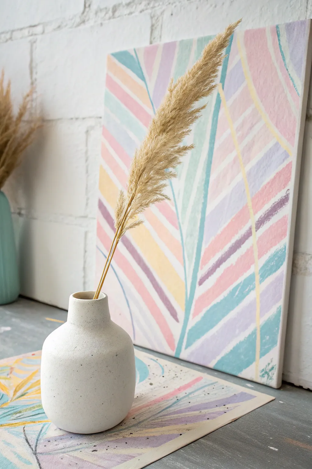
Bring soft, soothing energy to your space with a custom geometric botanical painting. This project uses gentle pastel stripes to form a stylized palm leaf, creating a modern and airy backdrop perfect for showcasing simple decor like pampas grass.
Step-by-Step Tutorial
Materials
- Rectangular stretched canvas (e.g., 16×20 inch)
- Heavyweight mixed media paper (for matching placemat)
- Set of pastel acrylic paints (blush pink, lavender, lemon yellow, mint green, sky blue)
- White acrylic paint (for mixing/lightening)
- Flat shader brushes (medium width, approx. 1/2 inch)
- Thin liner brush
- Pencil
- Ruler or straight edge
- Palette or paper plate
- Cup of water and paper towels
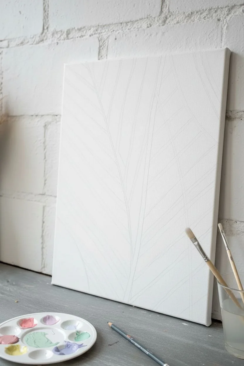
Step 1: Preparation & Sketching
-
Prepare your palette:
Squeeze out your pastel acrylic colors onto your palette. If your colors are too vibrant, mix in a small amount of white to soften them into true chalky pastels. -
Establish the center line:
Visualize a slightly curved line running vertically through your canvas, just off-center. This will represent the main stem or ‘spine’ of your abstract leaf. -
Sketch the leaf structure:
Using a pencil very lightly, draw two long, curved lines that start from the bottom center and flare outwards towards the top corners. This creates the ‘V’ shape that defines the outer edges of your leaf. -
Guidelines for stripes:
You don’t need to draw every stripe, but lightly mark the angle you want your stripes to follow. The stripes on the left should angle upward to the left, and the stripes on the right should angle upward to the right, meeting at that imaginary center spine.
Step 2: Painting the Stripes
-
Start with the dominant color:
Load your flat brush with your blush pink paint. Create the first few stripes on the left side of the leaf, pressing the brush flat to get a consistent width. -
Create the texture:
Don’t aim for perfectly opaque lines. Let the brush dry out slightly as you drag it to create a ‘dry brush’ effect at the edges; this mimics the raw texture of a pastel drawing. -
Introduce the second color:
Switch to lavender. Paint a stripe next to a pink one, leaving a very thin gap of white canvas between them. This negative space keeps the design airy. -
Add warmth:
Incorporate the lemon yellow stripes sporadically. These act as highlights and should be placed alongside the cooler tones to make them pop. -
Fill the right side:
Mirror the process on the right side of the spine. Use your sky blue and mint green paints here to create a cool contrast against the warmer left side. -
Vary the lengths:
Ensure some stripes stop shorter than others within the leaf shape to create a jagged, organic edge rather than a perfect triangle. -
Painting the background stripes:
Once the main leaf shape is filled, paint larger, broader stripes in the background area (outside the leaf). Make these stripes intersect the leaf stripes at a different angle to create depth. -
Define the spine:
Using a teal or darker blue shade and a liner brush, paint a thin, confident line up the center where your stripe angles meet. This anchors the floating shapes.
Stripes Too Solid?
If your paint looks too thick and lacks that ‘crayon’ texture, blot your brush on a paper towel before painting. You want the canvas weave to show through slightly.
Step 3: Refining & Matching
-
Review the color balance:
Step back and look at your canvas. If one area feels too heavy with a single color, add a thin accent stripe of a contrasting hue to break it up. -
Soften harsh edges:
I like to take a nearly dry brush with a tiny bit of white paint and gently scuff over any edges that look too sharp or plastic-like. -
Start the placemat:
Place your mixed media paper flat. Using the same technique, paint a smaller version or a cropped section of the design onto the paper. -
Create the ‘scribble’ texture:
On the paper version, use even less paint on your brush to emphasize the textured, crayon-like stroke. -
Add splatter details:
Dilute a small amount of black or dark grey paint with water on your brush. Tap the handle against another brush to create tiny speckles across the paper placemat for an artistic, messy finish. -
Let everything cure:
Allow the canvas and the paper to dry completely. The acrylics should dry to a matte finish, resembling chalk pastels.
Color Harmony
Keep your palette consistent! Premix a large batch of your 4-5 main colors before starting so the pink at the bottom matches the pink at the top perfectly.
Now you have a serene, coordinated art set ready to brighten up any corner of your home
BRUSH GUIDE
The Right Brush for Every Stroke
From clean lines to bold texture — master brush choice, stroke control, and essential techniques.
Explore the Full Guide
Rainbow Sgraffito Scratch Art With Hidden Layers
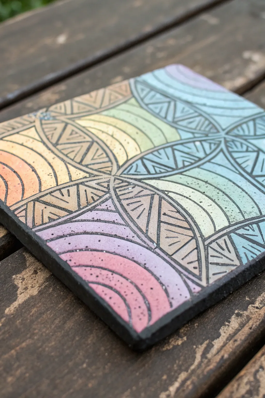
Transform a simple ceramic tile into a vibrant piece of functional art using a blend of pastel oil pastels and a scratch-away technique. This project combines a soft, rainbow gradient background with crisp geometric lines etched through a dark overlay for striking contrast.
Detailed Instructions
Materials
- Square ceramic tile (unglazed bisque works best)
- Oil pastels (assorted pastel rainbow colors)
- Black acrylic paint
- Liquid dish soap
- Foam brush or medium flat paintbrush
- Wooden skewer, toothpick, or etching tool
- Ruler
- Pencil
- Clear acrylic sealant spray (matte or satin finish)
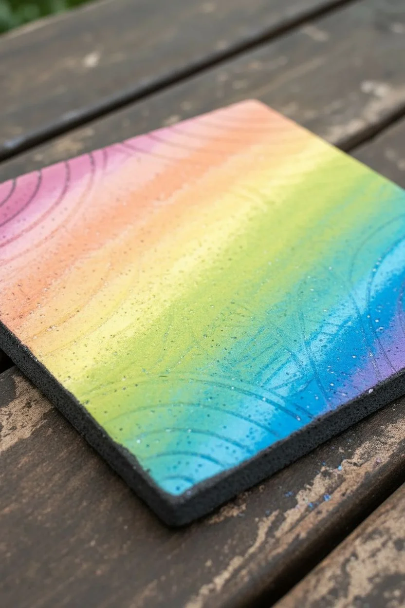
Step 1: Base Color Application
-
Clean the surface:
Begin by wiping down your ceramic tile with a dry cloth to remove any dust. The surface needs to be completely dry and clean for the oil pastels to adhere properly. -
Plan your gradient:
Decide on the order of your colors. A diagonal gradient—starting with pinks in one corner and moving through orange, yellow, green, and ending with blues and purples in the opposite corner—creates the dynamic look seen in the example. -
Apply the first color:
Start coloring heavily with your lightest pastel (like yellow or light pink) in your chosen starting area. Press firmly to get a thick, waxy layer that covers the tile’s texture. -
Create the rainbow blend:
Continue adding stripes or patches of color in your planned order. Overlap the edges of each color slightly with the next one to create a seamless transition. -
Blend the pastels:
Use your finger or a paper towel to vigorously rub the colors together where they meet. This ensures there are no white gaps and creates that smooth, dreamy pastel effect. -
Cover completely:
Ensure the entire top face of the tile is covered in a thick layer of oil pastel. If you see any bare spots, go back over them; a solid wax barrier is crucial for the scratching step.
Paint Peeling Tip
If the black paint beads up on the oily pastel, simply add a drop more dish soap to your paint mixture. It acts as a surfactant to help it lay flat.
Step 2: Preparing the Scratch Layer
-
Mix the scratch coating:
In a small cup, mix about two parts black acrylic paint with one part liquid dish soap. The soap prevents the acrylic paint from turning into a hard plastic skin, making it scratchable later. -
Apply the first coat:
Using a foam brush, painting in long, smooth strokes, cover the entire pastel surface with your black mixture. Don’t worry if the colors show through slightly on this first pass. -
Let it dry:
Allow the first coat to dry completely. This usually takes about 15-20 minutes depending on the thickness. It should be dry to the touch, not tacky. -
Apply the second coat:
Paint a second layer of the black mixture, preferably applying strokes in the opposite direction (cross-hatching) to ensure total coverage. Let this dry fully for at least an hour.
Metallic Magic
Swap the base layer of standard pastels for metallic or neon oil pastels. When scratched, the design will shimmer or glow against the matte black topcoat.
Step 3: Etching the Design
-
Mark the center:
Once the paint is bone dry, lightly use a ruler and a dull pencil to find the center of your tile. Do not press hard; just make a faint guide mark. -
Scratch the main axes:
Using your wooden skewer or etching tool, scratch a vertical diagram line and a horizontal line through the center, dividing the tile into four quadrants. Revealing the color below is extremely satisfying. -
Draw the curves:
In each quadrant, scratch a large semi-circle arch that connects the midpoint of the edges to the center. This creates the ‘petal’ shapes seen in the reference pattern. -
Add inner details:
Inside those petal shapes, scratch a few smaller, nested curves or straight lines. In the example, triangles are formed by scratching zigzag lines inside the petals. -
Fill the negative space:
In the spaces between the petals (the corners and the center edges), scratch concentric curves or rainbow arches. Vary the pressure to control the line width. -
Create texture:
For added visual interest, use the tip of your tool to gently stipple or poke small dots into the darker areas of the design. This mimics the speckled texture of stone. -
Clean up debris:
Periodically blow away the black paint crumbs or tap the tile on its side. Avoid wiping it with your hand, as this can smear the black paint into the pastel colors.
Step 4: Finishing Touches
-
Refine lines:
Go back over any main structural lines to thicken them slightly, making the geometric pattern pop more against the background. -
Seal the artwork:
Take the tile to a well-ventilated area and spray it with a clear acrylic sealant. This prevents the oil pastel from smudging and locks the black scratch layer in place. -
Add feet (optional):
If using as a coaster, stick small felt or cork pads to the bottom corners once the sealant is dry to protect your furniture surfaces.
Place your colorful creation on a desk or coffee table to add a touch of handmade geometric charm to your room
Have a question or want to share your own experience? I'd love to hear from you in the comments below!