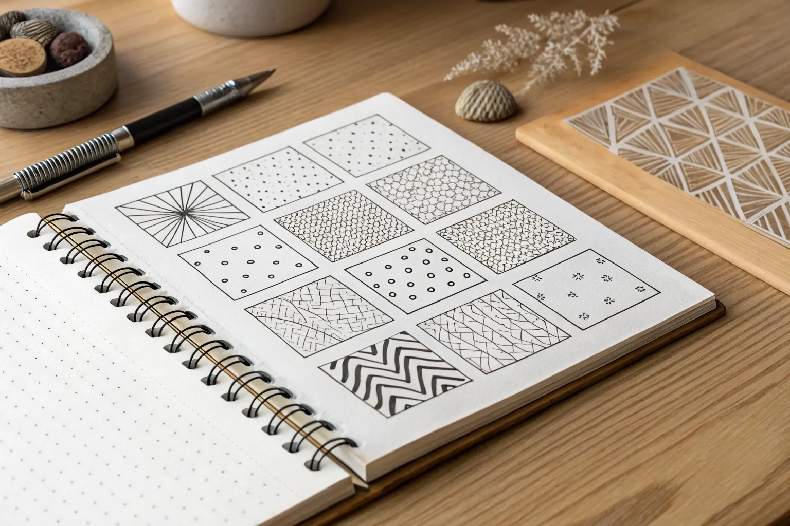
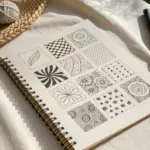
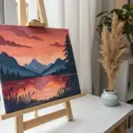
Whenever I’m stuck, I start playing with repeat motifs—it’s like flipping on a creative light switch with zero pressure. Here are my favorite pattern ideas for art, starting with the classic go-tos and building up to the kind of patterns that make people lean in and say, “How did you do that?”
Classic Stripes With Varying Widths
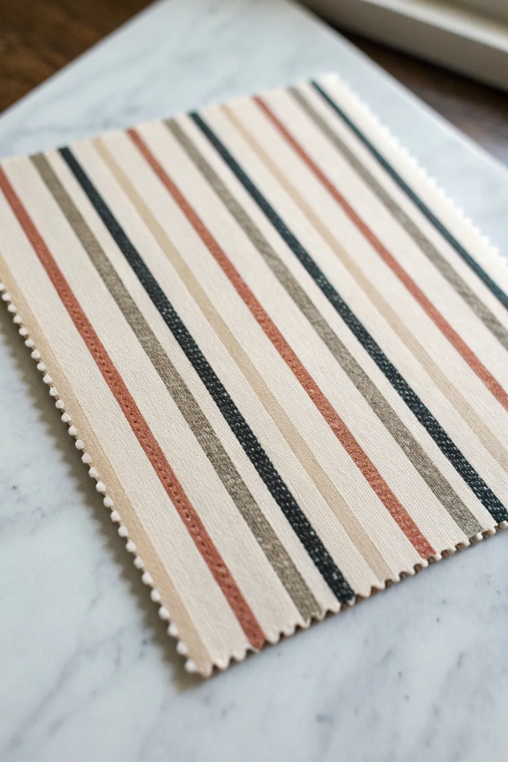
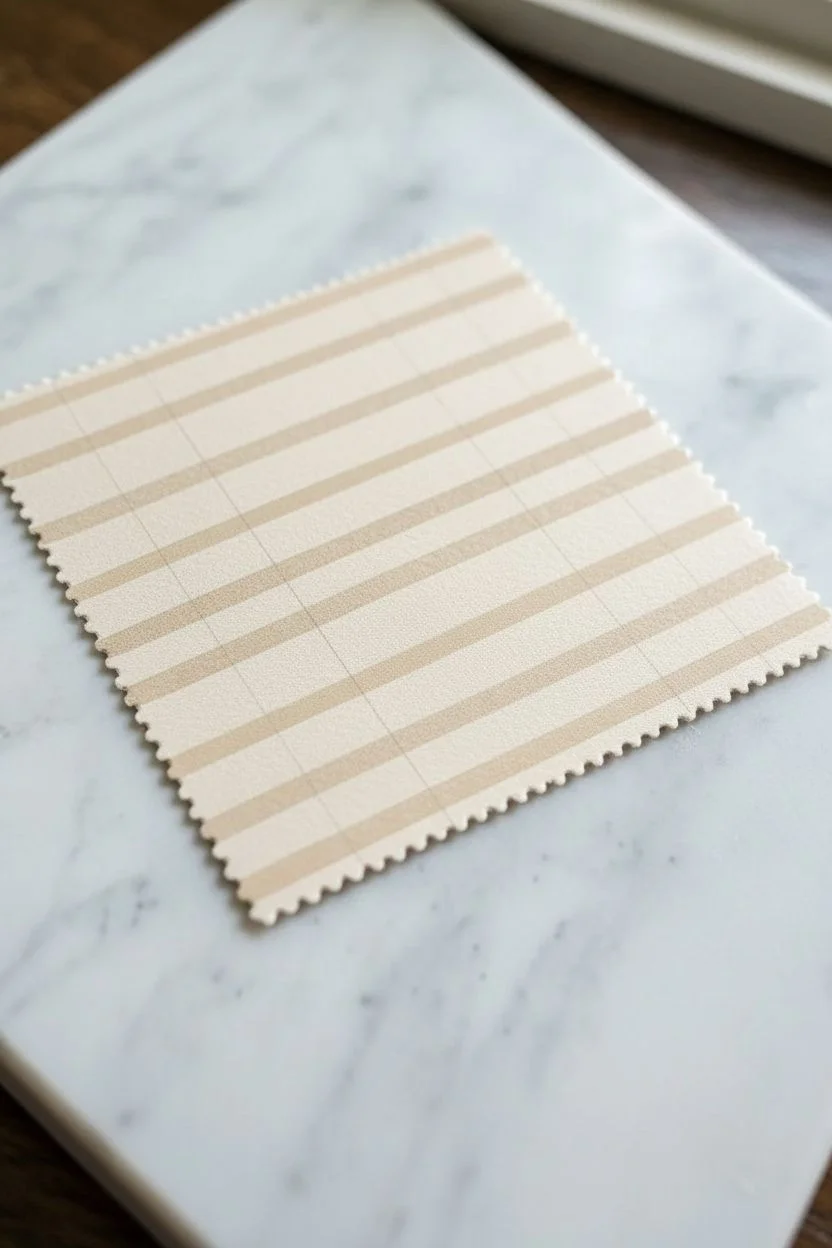
This project explores the sophisticated rhythm of classic stripes, blending earthy terracotta, grounding charcoal, and soft taupe against a creamy backdrop. You’ll create a painted textile simulation that mimics the texture and structure of woven fabric.
Step-by-Step Tutorial
Materials
- Heavyweight cold press watercolor paper or mixed media paper
- Acrylic paints (Cream, Terracotta/Rust, Taupe/Beige, Charcoal Black)
- Flat shader brushes (sizes 6, 10, and 12)
- Fine liner brush (size 0 or 00)
- Ruler or straight edge
- Pinking shears (zigzag scissors)
- Masking tape or painter’s tape (various widths if available)
- Pencil
- Mixing palette
- Water cup and paper towels
Step 1: Preparation and Background
-
Prepare the base:
Cut your paper to a manageable size, roughly 6×6 or 8×8 inches. Using pinking shears for this step adds an immediate textile feel to the edges, though you can also trim them at the very end. -
Mix the background color:
Create a warm, creamy off-white base. Mix a large amount of white acrylic with a tiny drop of yellow ochre or unbleached titanium. You want a color that looks like natural cotton or linen. -
Apply the foundation:
Paint the entire surface of the paper with your cream mixture. Use a large flat brush and deliberate horizontal strokes to simulate the ‘weft’ of a fabric. -
Create texture:
While the paint is still tacky, lightly drag a dry, clean brush across the surface horizontally. This subtle texture will help the piece look more like cloth than paper. -
Let it cure:
Allow this base layer to dry completely. If the paper buckles, you can flatten it under a heavy book once dry.
Straight Edge Secret
For ultra-crisp lines, apply matte medium over the edge of your painter’s tape before painting the color. This seals the tape and prevents any bleed-under.
Step 2: Drafting the Pattern
-
Mark the rhythm:
Using a ruler and a very light pencil touch, mark out your stripe intervals. The pattern here follows a specific sequence: a medium terracotta stripe, a gap, a thin charcoal stripe, a gap, a thick taupe stripe, and repeat. -
Vary the spacing:
Ensure the cream ‘gaps’ between the colored stripes aren’t uniform. Some should be wider than others to create visual interest. -
Vertical guidelines:
Draw faint vertical lines to guide your painting. Don’t press hard; you don’t want grooves in the paper, just visual guides.
Step 3: Painting the Stripes
-
Mix the terracotta:
Combine red oxide or burnt sienna with a touch of white and a speck of orange to get that warm, rusted clay color. -
Paint the warm stripes:
Using a medium flat brush (size 6 or 8), paint the terracotta stripes. Try to keep the edges relatively straight, but a little hand-wobble adds to the organic woven look. -
Mix the taupe:
Blend raw umber with white and a tiny bit of the cream base color. The goal is a neutral, sandy beige that contrasts gently with the background. -
Paint the neutral bands:
Fill in the wider taupe stripes. I find it helpful to use the largest flat brush that fits within the lines to ensure smooth, even coverage in one or two strokes. -
Mix the charcoal:
Use black mixed with a little bit of the taupe color. Avoid using straight black from the tube; softening it makes it look more like dyed thread. -
Add high contrast:
With a steady hand and a smaller flat brush, paint the dark charcoal stripes. These act as the anchors of the composition.
Level Up: Linen Look
Before painting, glue a layer of actual cheesecloth or loose-weave gauze to the paper. Paint your design over this fabric layer for authentic texture.
Step 4: Detailing and Texture
-
Simulate the weave:
Once the stripes are dry, take your fine liner brush and mix slightly lighter versions of each stripe color (add white). -
Dash details:
Paint incredibly tiny, vertical micro-dashes along some of the stripes. This mimics the vertical threads (warp) crossing over the horizontal threads. -
Soften the edges:
If any stripe looks too perfect or plasticky, lightly dry-brush a tiny amount of the cream background color over the very edge of the stripe to integrate it. -
Final trim:
If you didn’t use the pinking shears at the start, trim the edges now to create that classic fabric swatch zigzag border.
Display your finished swatch study in a simple floating frame to emphasize the textured edges

Checkerboard and Offset Squares
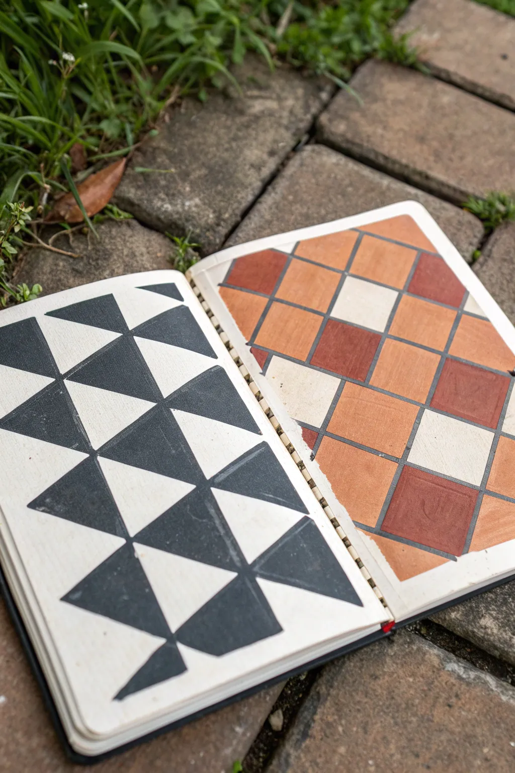
This project explores two contrasting geometric patterns side-by-side: a striking black-and-white pinwheel design and a warm, Mediterranean-inspired tile grid. It’s a perfect exercise for practicing precision, masking, and color blocking in your sketchbook.
How-To Guide
Materials
- Heavyweight sketchbook (mixed media or watercolor paper)
- Black acrylic paint or gouache
- Terracotta, burnt sienna, and cream acrylic paints
- Painter’s tape or masking tape (low tack)
- Ruler or quilting square
- Pencil (HB or H)
- Eraser
- Flat shader brush (small, approx. size 4-6)
- Fine liner brush (optional, for edges)
- Palette or mixing plate
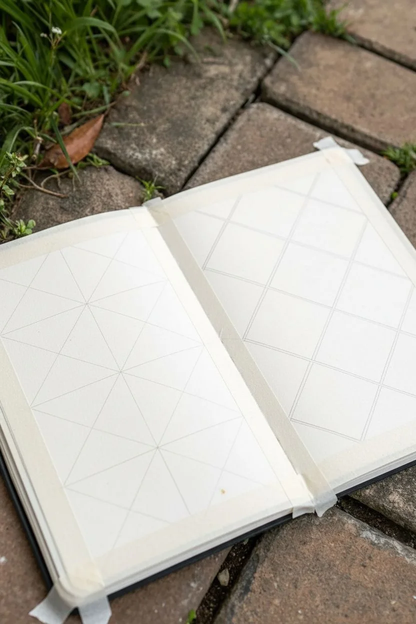
Step 1: Preparation & Layout
-
Tape the margins:
Begin by applying masking tape around the outer edges of both sketchbook pages to create a clean, crisp border frame for your designs. -
Grid the left page:
On the left page, use your ruler to draw a grid of large squares. Divide the height into four equal rows and the width into three equal columns. -
Draw diagonals (Left):
Inside each square on the left page, lightly draw an ‘X’ from corner to corner. This creates four triangles within each square, setting the foundation for the pinwheel pattern. -
Grid the right page:
Moving to the right page, draw a diagonal grid. Start by marking even intervals along the edges, then connect them diagonally to form diamond shapes rather than upright squares.
Straight Edge Secret
For ultra-crisp lines without tape, hold your breath for a second while pulling the brush for long strokes. It stabilizes your hand significantly.
Step 2: The Pinwheel Pattern (Left Page)
-
Identify the pattern:
Look closely at the reference: only specific triangles are painted black. In each square, the top and bottom triangles become black, forming an hourglass shape, or alternating depending on the specific row to create the larger pinwheel effect. -
Mark your fill areas:
I always find it helpful to place a tiny dot in pencil inside the triangles that will be painted black so I don’t get confused once the brush is wet. -
Paint the first coat:
Using your flat brush and opaque black paint, carefully fill in the marked triangles. Use the straight edge of the brush to define the lines. -
Define the points:
Where the triangles meet in the center of the squares, use the corner of your brush or a liner brush to get sharp, touching points without overlapping. -
Second pass:
Once dry, assess the black sections. If the paper texture shows through, apply a second thin coat for solid, matte coverage.
Step 3: The Tile Pattern (Right Page)
-
Mix your palette:
Prepare three distinct shades: a light cream/beige, a medium terracotta orange, and a deeper burnt sienna or reddish-brown. -
Randomize the placement:
This pattern works best when it feels organic. Start with the medium terracotta shade and paint random diamond tiles throughout the page, leaving plenty of empty spaces. -
Add the dark accents:
Switch to your darkest burnt sienna color. Fill in roughly 20-30% of the remaining diamonds, trying not to cluster them all in one spot. -
Fill the light tiles:
Use the cream paint to fill in the remaining empty diamonds. Be careful where colors touch; let adjacent wet tiles dry for a minute before painting their neighbors to prevent bleeding. -
Paint the grey grout:
Using a very fine liner brush and dark grey paint (or a diluted black), carefully trace over your initial pencil grid lines to create the look of grout between the colored tiles.
Uneven Coverage?
If acrylics look streaky, don’t keep brushing wet paint. Let it dry fully, then add another layer. Overworking wet acrylic lifts the previous layer.
Step 4: Finishing Touches
-
Clean up edges:
Check the perimeter of your shapes. If any paint went outside the lines, use a touch of white paint or gouache to tidy up the negative space. -
Erase guidelines:
Once the paint is completely bone-dry, gently erase any visible pencil marks in the unpainted white triangles of the left page. -
Peel the tape:
Slowly peel away the border tape at a 45-degree angle. This reveals the clean edges that make sketchbook spreads look professional and finished.
Now you have a dynamic double-page spread that shows off two distinct styles of geometric pattern design


Chevron Zigzags
Create a striking handmade booklet featuring bold black and white zigzag patterns on the interior pages. This simple binding project transforms basic paper into a graphic statement piece perfect for sketching or journaling.
Step-by-Step Guide
Materials
- Heavyweight white paper or cardstock (A4 or Letter size)
- Black ink marker or black paint pen (medium tip)
- Ruler
- Pencil
- Eraser
- Long-reach stapler (or regular stapler with cardboard backing)
- Bone folder (optional)
- Scissors or craft knife
Step 1: Planning and Folding
-
Select your paper:
Choose a sturdy white paper that can handle ink without bleeding through. A smooth cardstock or a mixed-media paper works best for this kind of graphic work. -
Fold the foundation:
Take your sheet of paper and fold it precisely in half widthwise to create a booklet shape. Use a bone folder or the back of your thumbnail to crease the fold sharply. -
Flatten for drawing:
Unfold the paper and lay it flat on your work surface. You need a flat canvas to ensure your pattern flows continuously across the spine.
Clean Lines Pro-Tip
For ultra-crisp edges, place drafting tape along your pencil lines before painting. Peel it off while the ink is slightly damp to prevent tearing.
Step 2: Drafting the Chevron Pattern
-
Mark horizontal guides:
Using a pencil and ruler, lightly draw horizontal lines across the entire spread. Space them evenly, about 1 to 1.5 inches apart, depending on how chunky you want your zigzags. -
Mark vertical intervals:
along the top and bottom edges of your horizontal rows, make small tick marks every inch. Offset the marks on alternating lines (so the ‘points’ of the zigzag fall in the middle of the segment below). -
Connect the dots:
Use your ruler to connect the tick marks diagonally, creating a continuous zigzag line across each horizontal row. Keep your pencil pressure light so these lines are easy to erase later. -
Review the flow:
Check that the points of the zigzags line up vertically. The peaks of one row should align vertically with the peaks of the row two steps down.
Level Up: Contrast Pop
Swap the black ink for a metallic gold or neon paint pen to give the classic chevron pattern a modern, high-energy twist.
Step 3: Inking and Filling
-
Outline the shapes:
Take your black marker or paint pen and carefully trace over your pencil lines. I find it easiest to trace all the diagonals going one direction first, then switch to the opposing diagonals. -
Determine the fill:
Decide which bands will be black. For a classic chevron look, you will fill in alternating rows of zigzags. -
Fill in the black zones:
Color inside the lines of the alternating rows. Use long, consistent strokes to get a solid black coverage without streakiness. -
Refine the edges:
Go back over the edges of your filled areas to sharpen the points of the zigzags. A crisp point makes the whole pattern look more professional. -
Let it dry:
Allow the ink to dry completely to avoid smudging. This is crucial if you are using a paint pen. -
Erase guides:
Once the ink is bone dry, gently erase any visible pencil marks remaining in the white areas.
Step 4: Binding the Booklet
-
Refold the spine:
Fold the paper back along your original center crease. The pattern should now be on the inside. -
Prepare for stapling:
Open the booklet to the center fold again. You will be stapling from the outside in, so the smooth slope of the staple is on the spine. -
Staple the spine:
Using a long-reach stapler, place two staples along the center fold—one near the top and one near the bottom. If you don’t have a long stapler, unfold the paper onto a piece of corrugated cardboard or foam and staple open flat, then manually bend the staple legs closed on the inside. -
Final press:
Close the booklet and press along the spine one last time to ensure it lays relatively flat.
Enjoy using your custom-patterned booklet for your next collection of sketches or notes


Crosshatching and Diagonal Weave
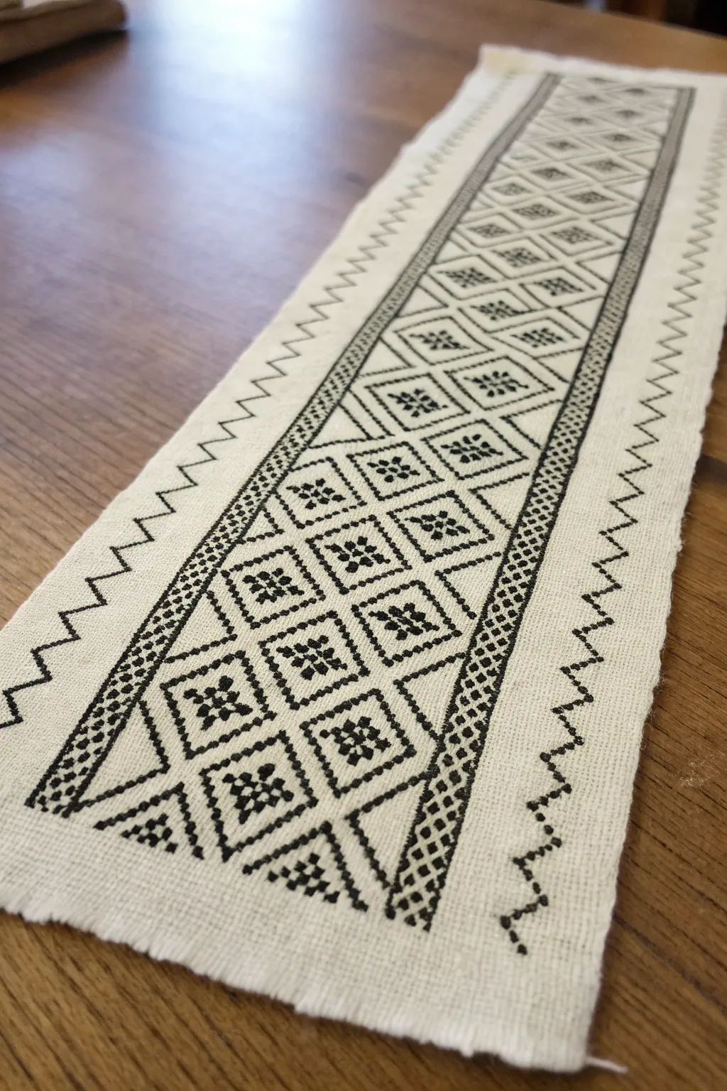
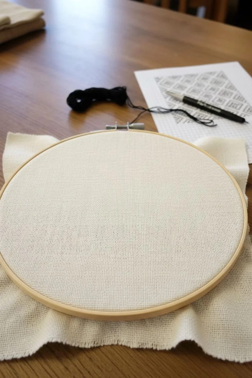
This elegant table runner features a striking geometric design executed in classic blackwork embroidery. The crisp contrast between the black thread and natural linen creates a timeless, folk-art aesthetic perfect for modern or traditional decor.
How-To Guide
Materials
- Even-weave linen or Aida cloth (28-count recommended)
- Black cotton embroidery floss
- Embroidery hoop
- Tapestry needle (size 24 or 26)
- Scissors
- Graph paper or embroidery software for charting
- Fabric marking pen (optional)
Step 1: Planning and Preparation
-
Analyze the pattern structure:
Study the design. It consists of a central column of diamonds. Inside each large diamond is a smaller diamond frame, and inside that is a four-point floral motif. The central column is flanked by narrow, dotted borders, and finally, wide zigzag lines on the outer edges. -
Measure and cut fabric:
Determine the desired length of your runner. Cut your fabric, ensuring you leave at least 2-3 inches of extra allowance on all sides for finishing later. Iron the fabric flat if it has creases. -
Secure the fabric:
Place your fabric into an embroidery hoop. Ensure it is taut like a drum skin, which helps keep your geometric lines straight and tension even. -
Thread the needle:
Cut a length of black embroidery floss. For this delicate look, separate the strands and use only one or two strands depending on the thickness of your fabric. Using two strands on 28-count linen usually gives good coverage.
Tangled Threads?
If your black floss keeps knotting, run it through a bit of beeswax or thread conditioner before stitching. It smooths the fibers and reduces friction.
Step 2: Stitching the Central Motifs
-
Start the center diamonds:
Begin in the middle of your fabric width to ensure the design is centered. Stitch the outline of the first large diamond using a double running stitch (Holbein stitch) or backstitch. Each side of the diamond should span the same number of fabric threads. -
Create the inner frames:
Inside your first large diamond, stitch a smaller, concentric diamond. Leave a consistent gap of two or three fabric threads between the outer and inner diamond lines. -
Stitch the floral center:
In the very center of the inner diamond, create the four-point flower or star motif. This is made up of four small clusters of stitches meeting in the middle. I find it easiest to stitch the four ‘petals’ first, then fill in any connecting center details. -
Repeat the diamond pattern:
Continue stitching these diamond units vertically down the length of the runner. Each large diamond should share its top and bottom points with the next one in the chain. -
Fill the half-diamonds:
Notice that the pattern creates triangular spaces (half-diamonds) along the left and right sides of your central column. Fill these with triangular versions of the inner frames and half-floral motifs to complete the dense center strip.
Reversible Stitching
Use the Holbein stitch (double running stitch) for the outlines. It makes the design look nearly identical on both the front and back.
Step 3: Adding Borders and Details
-
Stitch the inner dividers:
Run two straight vertical lines of stitching parallel to your diamond column, framing it on the left and right. -
Create the dotted borders:
Just outside those vertical lines, create the dotted border pattern. This is a narrow band (about 3-4 stitches wide) filled with a simple checkerboard or seed stitch texture to create a darker, denser value than the open diamonds. -
Start the outer zigzags:
Move about an inch outward from the dotted border. Begin the large zigzag line. This is a simple, single-line running stitch or backstitch that mirrors the angles of the central diamonds but on a larger scale. -
Complete the full length:
Work your way down the entire length of the fabric, maintaining the alignment between the central diamonds, the dotted border, and the outer zigzags.
Step 4: Finishing Touches
-
Secure ends and trim:
Once the embroidery is complete, weave your thread tails into the back of the stitching to secure them. Trim any excess thread carefully. -
Fray the edges:
For the rustic look shown in the image, carefully pull out horizontal and vertical threads from the raw edges of the fabric until you have a fringe about 1/2 inch long. -
Stay-stitch the fringe (optional):
To prevent the fringe from unraveling further over time, you can run a very subtle line of machine stitching or hand stitching in a matching thread color just inside the fringe line. -
Final press:
Place the runner face down on a fluffy towel and press it with a steam iron. This protects the texture of the stitches while smoothing the fabric.
Layout your finished runner on a wooden table to admire the sharp geometric contrast against the warm wood grain
BRUSH GUIDE
The Right Brush for Every Stroke
From clean lines to bold texture — master brush choice, stroke control, and essential techniques.
Explore the Full Guide
Bubble Clusters With Tiny Highlights
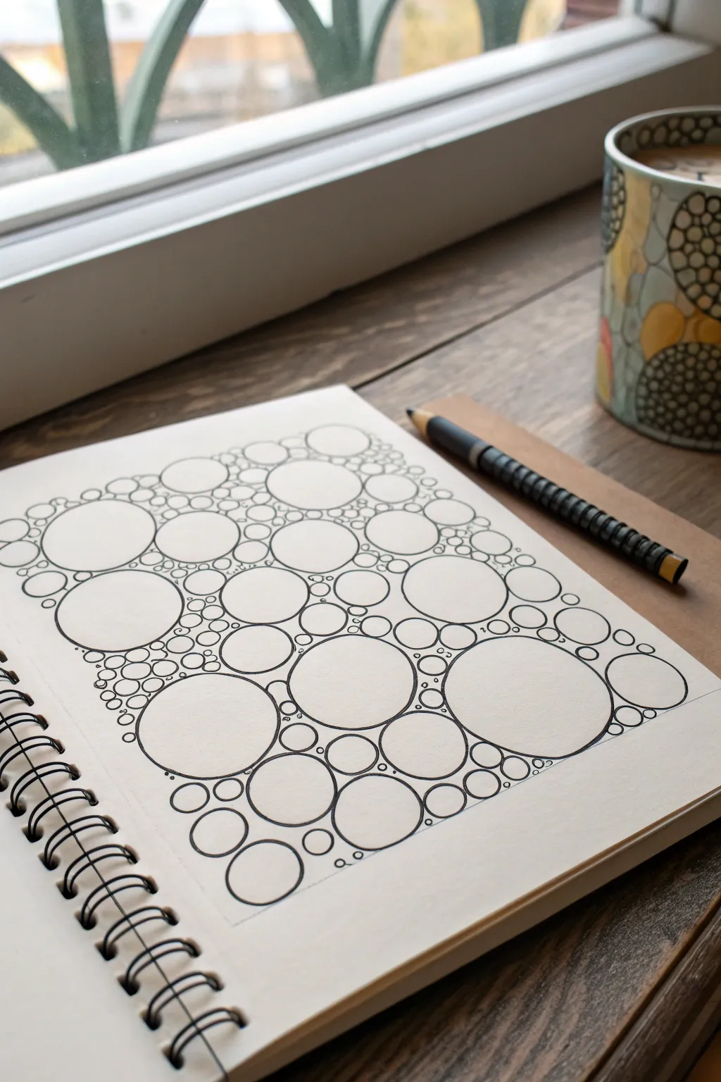
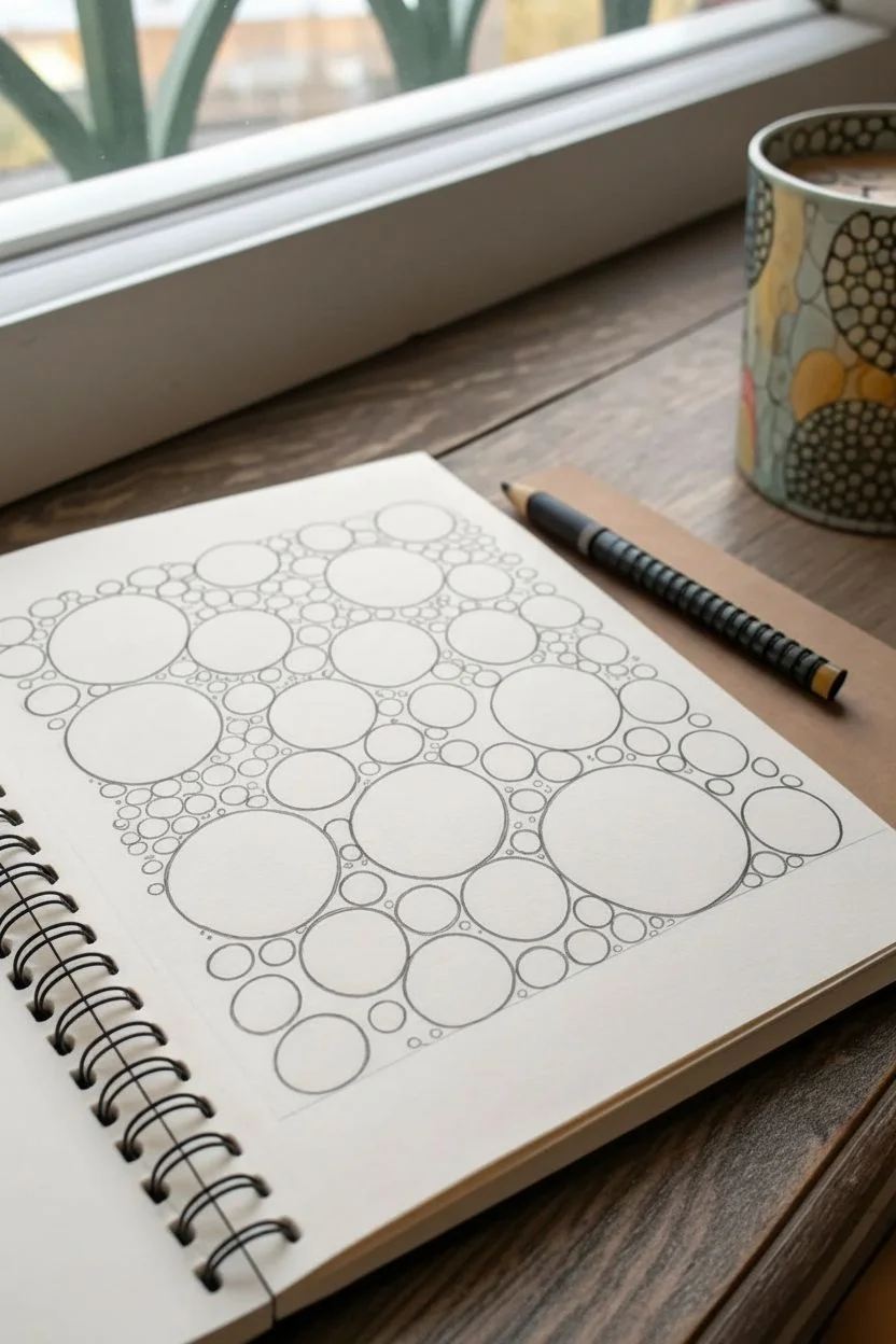
This meditative drawing exercise fills your page with an organic clustered pattern of interconnected circles. The result is a satisfying, cellular-looking design that plays with scale and negative space, perfect for sharpening your line work.
Step-by-Step
Materials
- Sketchbook or drawing paper (heavyweight preferred)
- Pencil (HB or 2B)
- Eraser
- Fine liner pen (0.3mm or 0.5mm)
- Thicker marker or brush pen (optional for filling bold gaps)
Step 1: Laying the Foundation
-
Establish the Boundaries:
Visualize a rectangular area on your page where the pattern will live. You can faintly pencil in a border if you want a crisp edge, or plan to let the organic shapes create a natural, uneven border. -
Place Anchor Circles:
Start by drawing 5-7 large circles scattered randomly across your defined area. These don’t need to be perfect spheres; a slightly hand-drawn, organic wobble adds character. Keep them spaced out so they don’t touch yet. -
Add Medium Connectors:
Draw medium-sized circles in the gaps between the large ones. Place them close enough so that their edges almost touch the larger circles, creating tight ‘v’ shapes of negative space between them. -
Fill with Small Bubbles:
Switch to drawing smaller circles—about the size of a pea—to fill the triangular gaps formed where larger and medium circles meet. This starts to build the ‘clustering’ effect. -
Pencil Review:
Step back and look at your pencil sketch. The composition should look balanced with no massive empty voids. If you see a large empty space, drop in another medium circle to break it up.
Pro Tip: Breathe & Rotate
Rotate your sketchbook constantly as you work. Drawing circles is much easier when you pull the pen towards your body in a natural arc rather than twisting your wrist awkwardly.
Step 2: Inking and Refining
-
Select Your Pen:
Choose a black fine liner with a steady flow. A 0.5mm nib works well for the main outlines, providing a bold enough line to stand out without being clunky. -
Trace the Anchors:
Begin inking the largest circles first. Draw slowly and confidently. If your hand shakes, don’t worry—revisiting the line to thicken parts of it later can hide imperfections. -
High-Contrast Inking:
As you ink the medium circles, pay close attention to where they neighbor the large ones. Keep the lines separate; don’t let the ink bleed them into a single blob unless that’s your specific style. -
Micro-Details:
Ink the smallest circles now. This is where patience counts. Try to keep your hand relaxed to avoid cramping while detailing these tiny components. -
Tiny Highlight Gaps:
For added dimension, you can leave extremely tiny gaps in the ink lines of the smallest circles, or add a tiny dot inside some of them to suggest a highlight or reflection. -
Fill the Interstices:
This is the most crucial step for the ‘cluster’ look. Identify the tiny, triangular voids between touching circles. Use your finest pen (0.1mm or 0.3mm) to draw tiny ‘pebble’ circles inside these voids, or fill them in solid black to add depth. -
Erase Guidelines:
Wait at least 5-10 minutes for the ink to fully cure. Gently erase the underlying pencil marks using a kneaded eraser to lift the graphite without damaging the paper surface.
Troubleshooting: Overlapping Lines
If you accidentally cross lines or a circle looks messy, don’t scrap it. Just thicken the line weight in that specific area to mask the error. It adds ‘shadow’ weight.
Step 3: Final Touches
-
Line Weight Variation:
Examine the drawing for visual interest. I like to go back over the outer edges of the largest circles to make those lines slightly thicker than the tiny interior bubbles. This hierarchy helps the drawing read clearly. -
Checking the Corners:
Ensure the overall shape of the cluster feels resolved. If the edges look too ragged, add a few tiny ‘stray’ bubbles on the perimeter to soften the transition to the white paper.
Enjoy the calming rhythm of filling the page as your finished bubble cluster emerges
Wavy Lines and Ripple Bands
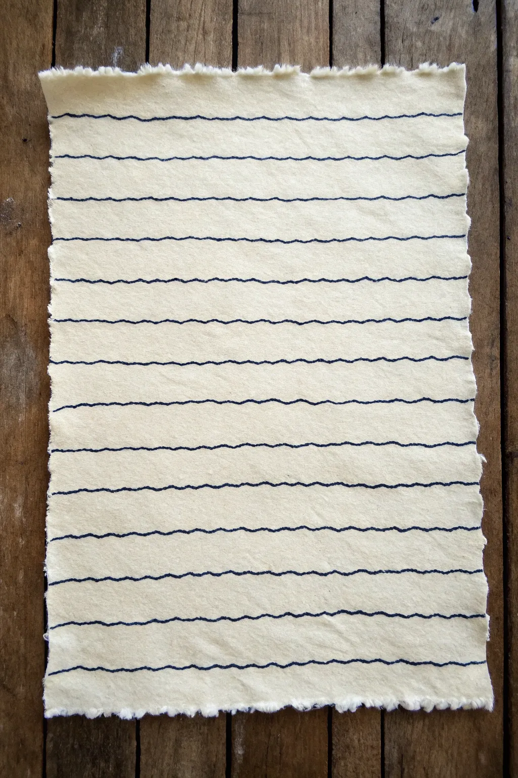
This project explores the meditative beauty of simple repetition, creating a look that mimics the gentle motion of water or fabric. By using textured paper and a steady hand, we transform a blank sheet into a calming study of wavy lines and soft edges.
Detailed Instructions
Materials
- Heavyweight textured paper (cold press watercolor or handmade cotton rag)
- Fine-liner pen or sketching marker (Dark Blue or Black, 0.5mm tip)
- Ruler (optional, for spacing guides)
- Pencil (H or HB)
- Small bowl of water
- Soft paintbrush
- Towel or rag
Step 1: Preparing the Textured Edge
-
Measure your paper:
Start with a sheet of paper slightly larger than your desired final size. A piece that is roughly A4 or letter size works beautifully for this pattern. -
Define the tear lines:
Using a ruler and a pencil, lightly mark where you want the edges of your paper to be. Don’t draw a hard line; just make small tick marks to guide you. -
Weaken the fibers:
Dip a small paintbrush into clean water. Run the wet brush along the invisible line connecting your tick marks. Let the water soak into the paper for about 30 seconds to soften the fibers. -
Create the deckle edge:
Place your ruler firmly along the wet line. Carefully tear the paper towards you against the ruler’s edge. This creates that soft, fuzzy ‘deckled’ look seen in the reference image. -
Refine the edges:
If any large chunks remain, gently tease them away with your fingers. Repeat this process for all four sides until you have a beautifully organic shape.
Step 2: Mapping the Pattern
-
Plan the spacing:
Decide how dense you want your ripples to be. For the look in the image, the lines are spaced roughly 1 to 1.5 centimeters apart. -
Mark visible guides:
Using your pencil very lightly, mark a small dot on the left and right edges of the paper at your chosen interval. These will serve as anchors for your waves. -
Visualize the wave:
Before drawing with ink, practice the motion on a scrap piece of paper. You want a low-amplitude wave—gentle undulations rather than sharp peaks.
Wobbly Lines?
If your waves look too jittery, try moving your entire arm from the shoulder rather than just your wrist. This creates smoother, longer strokes.
Step 3: Inking the Waves
-
Start the first line:
Begin at the top left mark. Place your pen nib down and breathe out as you start drawing. Keep your wrist loose. -
Draw the master wave:
Draw one continuous wavy line all the way to the right edge. Try to keep the ‘wavelength’ (the distance between peaks) consistent, but embrace small imperfections. -
Begin the second line:
Move to the second set of guide marks. As you draw this line, keep an eye on the line above it. I find it helpful to try and mirror the rhythm of the previous line without copying it exactly. -
Maintain the gap:
The key to this aesthetic is the white space. Ensure the gap between lines stays relatively consistent, even if the waves themselves shift slightly. -
Working down the page:
Continue adding lines one by one. If you notice your hand getting stiff, pause and shake it out. Tension creates jagged lines, while relaxation creates smooth ripples. -
Adjusting for texture:
Since you are using textured paper, the pen might skip slightly over the bumps. Don’t go back and fill these in; that texture adds character to the piece. -
Handle the edges:
Allow your lines to flow right off the paper or stop just before the fuzzy edge. Consistency is key here—choose one style and stick to it. -
Check the rhythm:
Halfway down, step back and look at the piece from a distance. Ensure your lines aren’t drifting diagonally. -
Finish the column:
Complete the lines until you reach the bottom edge. The final line should mimic the bottom edge of the paper slightly to frame the composition. -
Erase guide marks:
Wait at least 15 minutes for the ink to fully dry. Once safe, gently erase any visible pencil tick marks on the sides.
Varied Line Weight
To add depth, go over the ‘valleys’ of your waves a second time to thicken the line slightly, creating a subtle shadow effect.
Once complete, your rippled paper is ready to be framed or used as a unique background for calligraphy

PENCIL GUIDE
Understanding Pencil Grades from H to B
From first sketch to finished drawing — learn pencil grades, line control, and shading techniques.
Explore the Full Guide
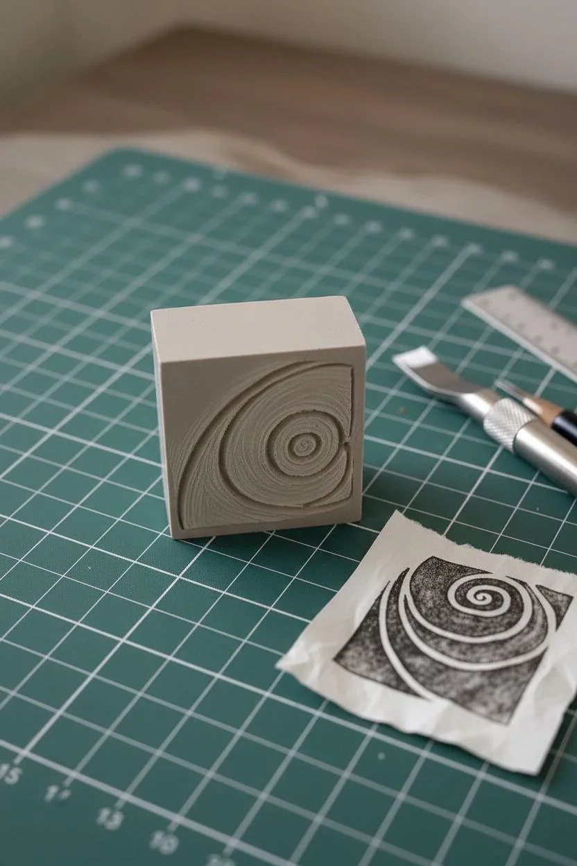
Spirals and Curling Tendrils
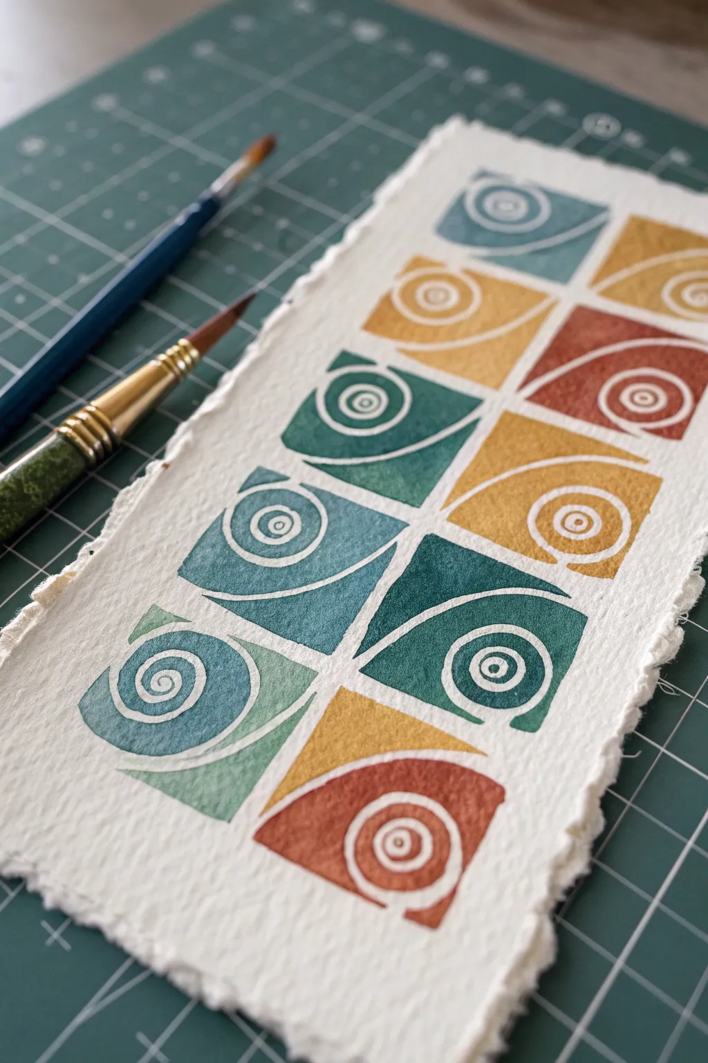
This project combines the rustic charm of handmade paper with the crisp, modern look of linocut printing. You’ll create a repeating grid of stylized spiral motifs, playing with a warm earthy palette and cool oceanic tones.
Step-by-Step Tutorial
Materials
- Heavyweight handmade paper with deckled edges (e.g., Khadi or heavy watercolor paper)
- Soft-cut lino block (approx. 4×4 inches to cut into smaller squares)
- Lino cutting tool with V-gouge and U-gouge blades
- Block printing ink (water-soluble) in teal, ochre, rust, and sage green
- Brayer (rubber roller)
- Glass plate or acrylic sheet for inking
- Pencil and ruler
- Tracing paper
- Baren or a clean wooden spoon for burnishing
Step 1: Designing and Carving
-
Draft your motif:
Start by sketching a square design on paper. The motif consists of a large, swooping curve that divides the square, with a concentric circle spiral nestled in one corner. -
Refine the lines:
Simplify your sketch into positive and negative space. Remember that the areas you crave away will remain white (the paper color), while the raised surface will hold the ink. -
Transfer to block:
Use tracing paper to transfer your design onto a small square piece of soft-cut lino. You will only need one block if you clean it between colors, or you can carve four identical blocks for a faster workflow. -
Carve the outlines:
Using a fine V-gouge, carefully carve along the lines of your design. Outline the spiral and the main dividing curve first to establish clear boundaries. -
Clear negative space:
Switch to a wider U-gouge to clear away the background areas. In this design, the ‘background’ consists of the thin lines separating the shapes and the center of the spiral loops. -
Test print:
Do a quick test print on scrap paper with black ink. This reveals any ridges or chatter marks that need to be trimmed down before the final print.
Registration Pro Tip
Make a simple ‘L’ shaped jig out of cardboard. Tape it to your table and slide your paper into the corner to ensure every print lands in the exact same relative spot.
Step 2: Printing the Pattern
-
Prepare your paper:
Lay your handmade paper on a cutting mat. Lightly mark the center line or grid positions with a pencil if you aren’t comfortable eyeing the alignment. -
Mix your first color:
Squeeze a small amount of teal ink onto your glass plate. Roll the brayer back and forth until the ink makes a velvety, sizzling sound. -
Ink the block:
Roll the ink evenly onto your carved block. I find that applying thin layers multiple times gives better coverage than one thick, gloopy layer. -
Print the first square:
Place the block onto the paper. Apply firm pressure with a baren or the back of a spoon, moving in small circular motions to ensure transfer. -
Lift and repeat:
Peel the block away carefully. Re-ink and print the next square in your grid pattern. Vary the orientation of the block (rotating it 90 or 180 degrees) to create a dynamic flow. -
Switch colors:
Clean your block thoroughly with water (if using water-soluble ink) and dry it completely. Mix your next color—a warm ochre or mustard yellow. -
Continue the grid:
Print the ochre squares, alternating positions with the teal ones. The goal is to build a checkerboard-style layout. -
Add accent tones:
Repeat the cleaning and printing process with the rust and sage green inks. These accent colors help break up the pattern and add visual interest to the composition.
Step 3: Finishing Touches
-
Check for gaps:
Inspect your prints. If a specific area looks too faint and the ink is still wet, you can sometimes very carefully lay the block back down to re-press, though this is risky. -
Dry flat:
Block printing ink can take a while to cure. lay the artwork flat in a safe area for at least 24 hours. -
Erase guides:
Once fully dry, gently erase any visible pencil guide marks from the paper. -
Flatten paper:
If the paper buckled slightly from the ink moisture, place the dry print under a heavy book between clean sheets of paper for a day.
Patchy Ink Fix
If your prints look salty or speckled, your ink might be too dry or the paper too textured. Try misting the paper very lightly with water before printing.
Now you have a striking geometric art piece ready to be framed or gifted to a friend
Scallops and Fish-Scale Arcs
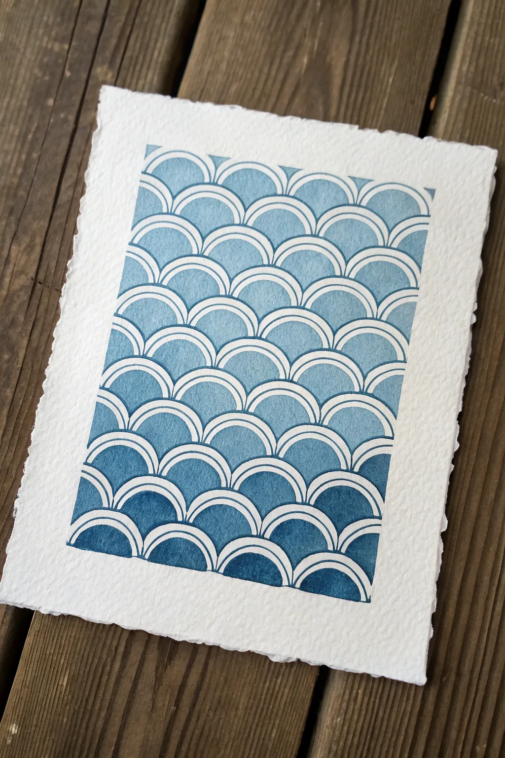
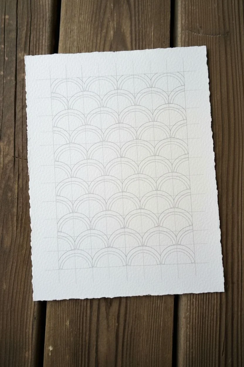
This project captures the soothing rhythm of the ocean with a classic fish-scale pattern rendered in a beautiful ombre gradient. The contrast between crisp white lines and loose watercolor pools creates a modern, calming piece perfect for deckle-edge paper.
How-To Guide
Materials
- Heavyweight cold-press watercolor paper (300 gsm or higher)
- Watercolor paints (Indigo and Prussian Blue)
- White gel pen or fine masking fluid pen
- Compass or circle template
- Pencil and eraser
- Ruler
- Round watercolor brush (size 4 or 6)
- Paper towels
- Mixing palette
- Washi tape (optional)
Step 1: Preparation and Mapping
-
Paper selection:
Begin by selecting a high-quality sheet of watercolor paper. If you want the look from the reference, carefully tear the edges against a ruler to create a soft, deckled border, or use pre-deckled stationery. -
Define the grid:
Using a ruler and a very light pencil touch, draw a rectangular boundary for your art. Inside this box, mark horizontal guidelines spaced evenly apart—about 3/4 of an inch is a good starting size. -
Mark centers:
On your first horizontal line, mark center points every inch. On the second line, offset these marks so they sit exactly between the marks on the line above. Continue this alternating pattern down the page. -
Draw the scales:
Set your compass to the distance between your horizontal lines. Place the needle on a center mark and draw a semicircle that touches the line above. Repeat across the row. -
Complete the pattern:
Continue drawing these interlocking semicircles (scallops) down the entire grid. The result should look like fish scales or stylized rolling waves.
Uneven Arches?
If using a compass is difficult or leaves holes, trace a coin or a round bottle cap instead. Line the bottom of the coin up with your horizontal guideline for perfect repetition.
Step 2: Creating the Resist
-
Outline the arcs:
Once your pencil sketch is complete, use a white gel pen or a fine-tip masking fluid pen to trace over every curved line. Go slowly to ensure smooth, continuous curves. -
Double the lines:
For that distinctive graphic look, draw a second, slightly smaller arch inside each scallop, leaving a small gap between them. This dual-line effect mimics the traditional Seigaiha pattern. -
Erase guidelines:
Wait until the ink is completely dry—give it an extra five minutes just to be safe—and then gently erase all your straight pencil guidelines so only the white arches remain.
Step 3: Painting the Gradient
-
Mix your palette:
Prepare a generous puddle of indigo watercolor. You will need a diluted, watery version for the top rows and a concentrated, creamy consistency for the bottom. -
Start light at the top:
Dip your brush into clean water and pick up a tiny amount of pigment. Paint the top row of scales with this very pale wash, carefully staying inside the inner white arches. -
Slightly darken the mix:
Add a touch more pigment to your mix for the second row. I like to paint every other scale first to prevent wet edges from bleeding into each other if my hand shakes. -
Mid-tone progression:
As you move to the middle rows, your blue should be a clear, true sky blue. Allow the water to settle naturally in the paper’s texture, creating that granulated watercolor look. -
Deepening the hue:
For the lower third, mix in a bit of Prussian Blue or less water to achieve a richer, stormier tone. The paint should feel slightly thicker on the brush now. -
The final row:
Paint the bottom-most scales with your most saturated, darkest indigo mixture. This anchors the visible weight of the artwork at the bottom. -
Drying and flattening:
Let the piece dry flat for at least an hour. If the paper buckles slightly, you can place it under a heavy book overnight once it is bone dry.
Add Metallic Shimmer
Swap the white gel pen for a gold or silver paint pen during the outlining phase. The metallic sheen adds a luxurious finish that pops beautifully against the matte blue watercolor.
Now you have a serene, rhythmic piece of art that brings a touch of coastal calm to any space


Triangle Tessellations
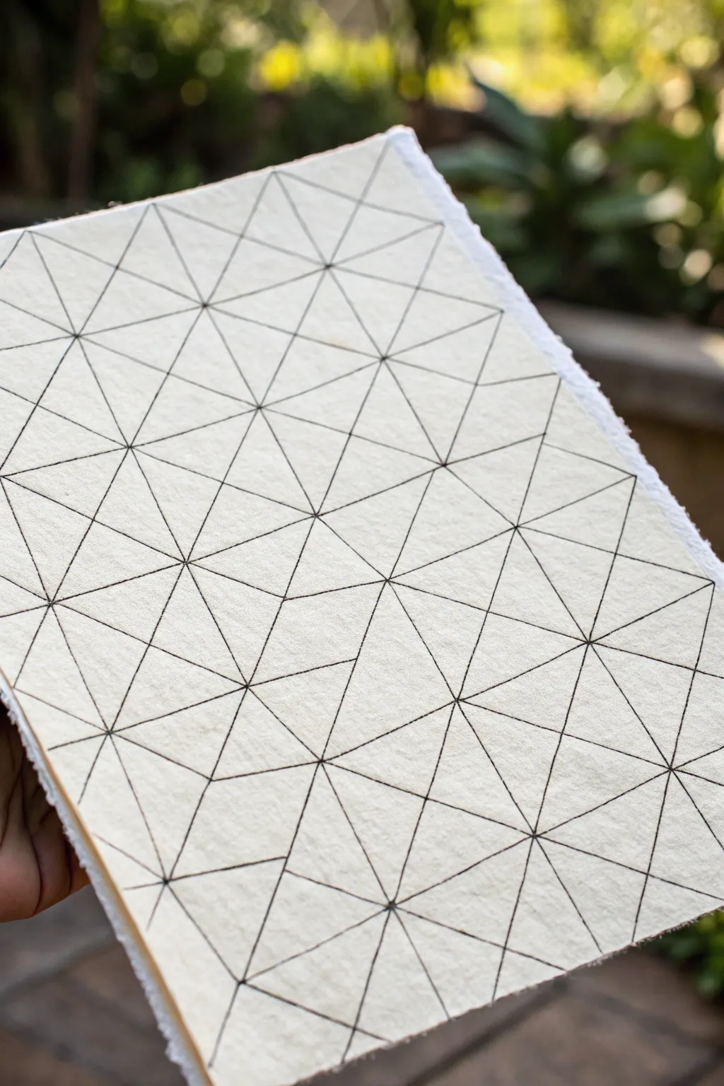
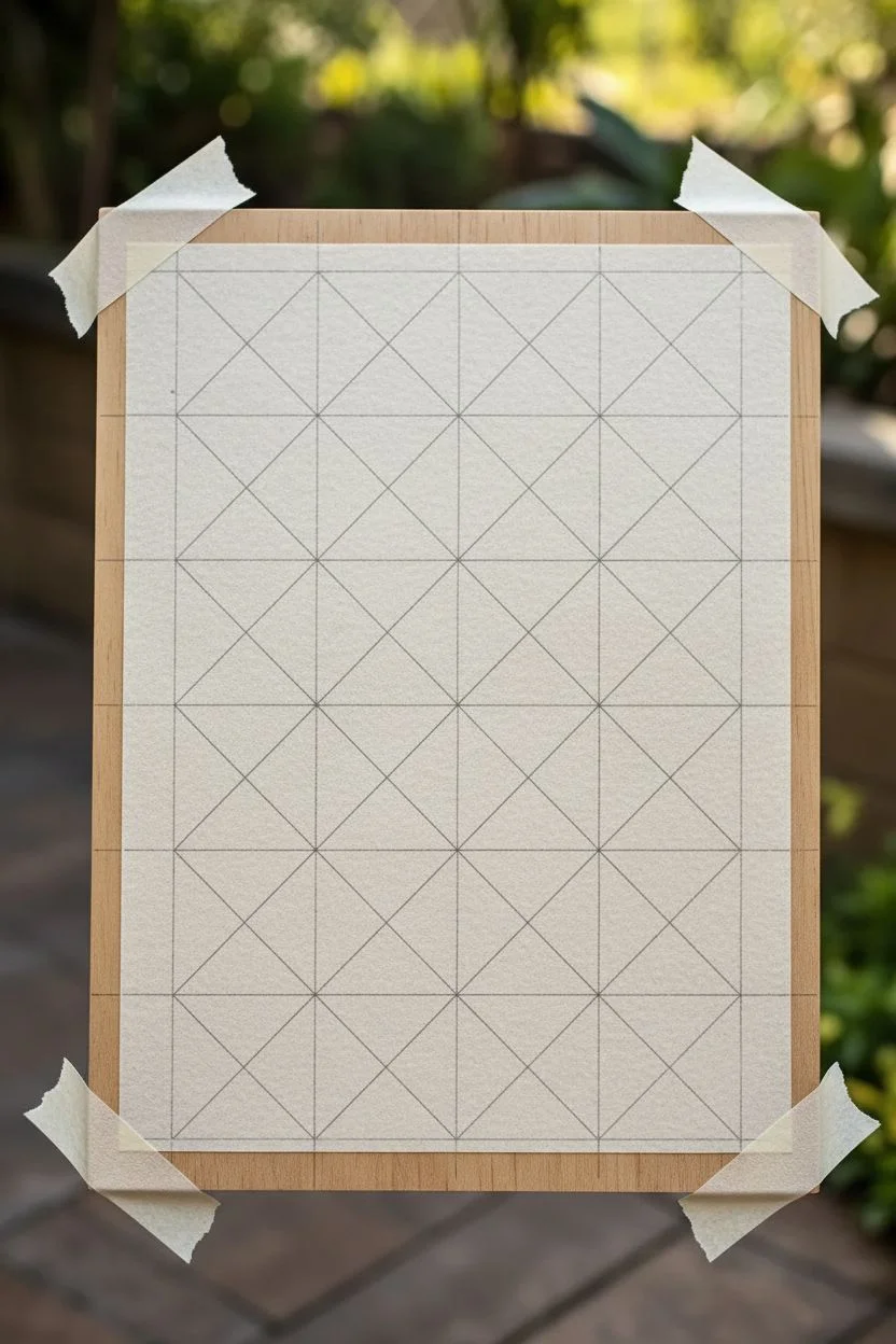
This project features a mesmerizing geometric pattern drawn on thick, textured paper, creating a striking minimalist design. By repeating simple triangular forms, you’ll build a complex web of lines that feels both precise and organically hand-crafted.
Detailed Instructions
Materials
- Thick, textured paper (handmade cotton rag or cold press watercolor paper recommended)
- Ruler or straight edge (transparent is best)
- Fine liner pen (0.3mm or 0.5mm, black)
- Pencil (HB or 2H for light lines)
- Eraser (kneaded eraser preferred)
- Drawing board or flat surface
- Tape (low-tack or artist tape)
Step 1: Preparation & Grid Layout
-
Secure your paper:
Begin by taping your textured paper to a flat drawing board or desk. This prevents it from shifting while you measure and draw, which is crucial for geometric accuracy. -
Mark the vertical spacing:
Using your pencil and ruler, make small tick marks along the left and right edges of the paper. Space them evenly, perhaps every 1.5 to 2 inches, depending on how dense you want your pattern. -
Mark the horizontal spacing:
Repeat this process along the top and bottom edges, using the same measurement interval to ensure your foundational shapes will be square. -
Draw the primary grid:
Connect your tick marks horizontally and vertically with very light pencil lines. You should now have a grid of squares covering your page. -
Add diagonal guides:
Within each square of your grid, lightly draw a diagonal line from the top-left corner to the bottom-right corner. Then, draw the opposing diagonal from top-right to bottom-left. -
Check your intersection points:
At this stage, you should see a central intersection point in every square where the two diagonals meet. Scan your grid to ensure all lines intersect cleanly before moving to ink.
Ruling Texture
On rough paper, tilt your pen slightly and draw slower than usual. This allows the ink to soak into the valleys of the paper texture for a solid line.
Step 2: Inking the Pattern
-
Select your pen:
Choose a black fine liner. A 0.5mm tip works well to stand out against the texture of rough paper without bleeding too much. -
Ink the primary diagonals:
Start by inking the long diagonal lines that run across the entire page. Align your ruler carefully and draw confident, single strokes over your pencil guides. -
Ink the vertical lines:
Next, ink over your vertical pencil grid lines. I find it helpful to work from left to right to avoid smudging fresh ink with my ruler hand. -
Ink the horizontal lines:
Complete the basic structure by inking the horizontal grid lines. You now have a grid of squares with ‘X’ shapes inside them. -
Add the connecting horizontals:
This step creates the specific pattern seen in the image. Look for the intersection points in the center of each square. Draw a horizontal line connecting these center points to each other across the row. -
Add the connecting verticals:
Similarly, draw vertical lines connecting those same center intersection points up and down the columns. This subdivides your drawing into a denser triangular mesh. -
Review line weights:
Inspect your work. If any lines look too thin due to the paper texture skipping the ink, go over them carefully once more to ensure solid black definition.
Smudge Alert
If you smear ink with your ruler, stick three small coins or tape layers to the underside of the ruler. This raises the edge off the paper just enough to prevent smudging.
Step 3: Final Touches
-
Let the ink cure:
Allow the ink to dry completely. On thick, fibrous paper, ink can take a little longer to set, so give it at least 15-20 minutes. -
Erase pencil guides:
Gently dab and rub with a kneaded eraser to lift the graphite guidelines. Be careful not to scuff the surface of the textured paper. -
Brush away debris:
Use a soft drafting brush or a clean cloth to sweep away any eraser crumbs, leaving your geometric design crisp and clean.
Now you have a stunning piece of geometric art that celebrates simple lines and complex repetition
Hexagon Honeycomb Cells
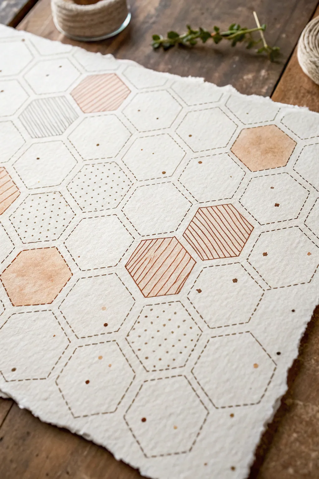
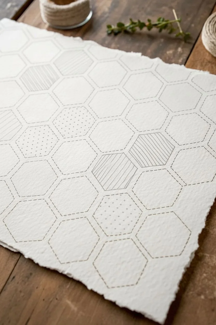
This elegant project combines precision geometry with the organic warmth of handmade paper and watercolor. The result is a sophisticated honeycomb lattice featuring dashed lines, soft copper tones, and delicate textures.
Step-by-Step
Materials
- Heavyweight cold-press watercolor paper with deckled edges
- Pencil (HB or H)
- Ruler
- Hexagon stencil or template
- Fine-tip brown archival ink pen (0.3mm or 0.5mm)
- Watercolor paints (burnt sienna, copper, or peach tones)
- Small round watercolor brush (size 2 or 4)
- Gold or copper metallic ink/paint for detailing
- Kneaded eraser
Step 1: Drafting the Grid
-
Prepare the paper:
Start with a sheet of high-quality handmade or cold-press paper. If your paper doesn’t have deckled edges, you can tear the edges against a ruler to create that soft, fibrous look before beginning. -
Establish the layout:
Using a ruler, lightly mark a straight horizontal baseline near the bottom of your paper to ensure your pattern doesn’t drift. This will be your reference for the first row of hexagons. -
Trace the hexagons:
Place your hexagon stencil on the paper, aligning the bottom edge with your baseline. Lightly trace the shape with a hard pencil like an H lead, which leaves faint lines that are easy to erase later. -
Build the honeycomb:
Continue tracing hexagons, interlocking them perfectly so they share sides. Work your way up the paper, creating a tight grid that covers the desired area. Don’t worry about partial shapes at the edges; these add visual interest.
Clean Lines Tip
When doing the dashed lines, rotate your paper frequently. Pulling the pen toward you is usually steadier and more consistent than pushing it away or drawing sideways.
Step 2: Inking the Structure
-
Create the stitched effect:
Using a fine-tip brown archival pen, trace over your pencil lines. Instead of a solid line, use small, evenly spaced dashes to mimic the look of running stitch embroidery. -
Vary the line weight:
Keep your hand relaxed. Subtle variations in the dash length or spacing actually enhance the handmade aesthetic, so don’t stress about mechanical perfection. -
Erase guidelines:
Once the ink is completely dry—give it a few minutes to be safe—gently roll a kneaded eraser over the entire design to lift the graphite pencil marks without damaging the paper surface.
Dimensional Pop
Once the paint is dry, use a white gel pen to add tiny highlights on the solid colored hexagons or metallic dots to make them look slightly raised like enameling.
Step 3: Adding Color and Texture
-
Plan your composition:
Look at your grid and decide which cells will get color, patterns, or remain empty. Aim for a balanced, random scattering rather than a strict pattern. I usually like to mark these lightly with a dot before painting. -
Apply solid washes:
Mix a watery wash of burnt sienna or peach watercolor. Fill in selected hexagons completely, keeping the color somewhat transparent to show the paper texture. -
Create striped cells:
For the striped hexagons, you can switch to a slightly darker mix of the same color or use your brown pen. Draw diagonal lines across the selected cells, keeping the spacing consistent. -
Add dotted textures:
In other cells, use the tip of your pen or a very fine brush to create a field of tiny dots. Keep them denser in some areas and looser in others for a varied look. -
Incorporate metallic accents:
Dip a small brush into gold or copper metallic ink. Add random speckles inside some of the empty hexagons or place a single metallic dot in the center of others. -
Detail the intersections:
For a subtle finishing touch, place a tiny dot of darker brown ink at the corners where the hexagons meet. This anchors the design visually. -
Final speckling:
Load your brush with a bit of watery paint or metallic ink and gently tap it over the paper to create very fine splatters across the whole piece, unifying the composition.
Frame your geometric masterpiece in natural wood to complement the earthy tones.
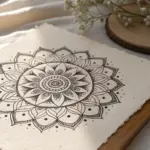
Mandala Rings and Radial Repeats
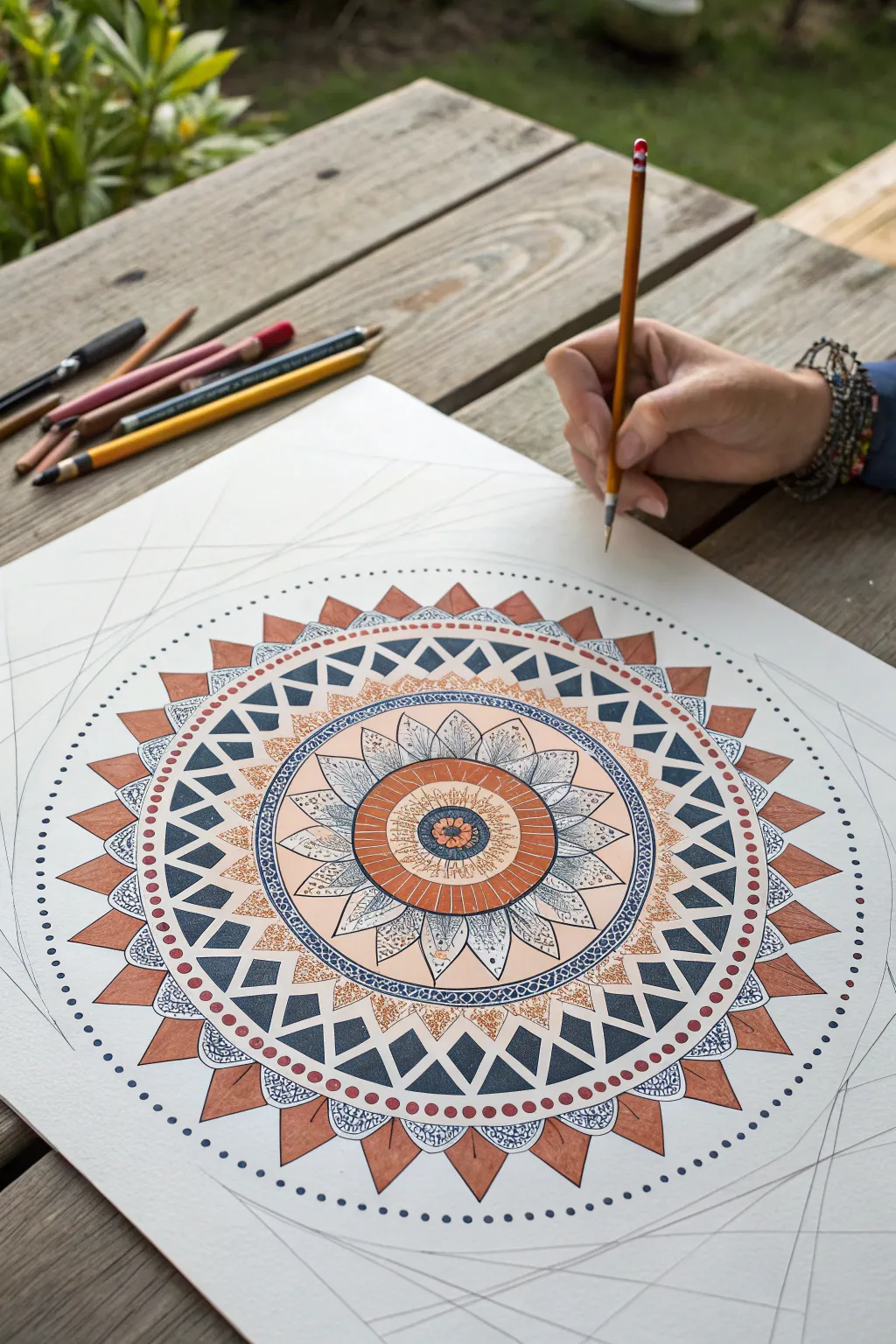
This intricate mandala combines geometric precision with organic warmth, featuring concentric rings of petal shapes, triangles, and dot work. The design balances terracotta and deep indigo tones against clean white space, creating a soothing radial pattern perfect for mindful art practice.
Step-by-Step Guide
Materials
- Heavyweight drawing paper or Bristol board (smooth surface)
- Compass and ruler
- HB or 2H pencil (for grid)
- Fine liner pens (Black, 0.1mm and 0.3mm)
- Fine liner pens (Blue/indigo, 0.3mm)
- Watercolor markers or colored pencils (Terracotta/Rust, Deep Blue/Indigo)
- Soft eraser
- Fine detail brush (if using paints)
Step 1: Setting the Geometric Grid
-
Establish the center:
Find the exact center of your paper and mark it lightly with a pencil point. This will be the anchor for your entire radial design. -
Draw primary circles:
Using your compass, draw a series of concentric circles radiating from the center. Create about 8-10 rings, varying the spacing between them to define different bands for your patterns. -
Divide the circle:
Use a protractor to divide your circle into even segments (e.g., every 10 or 15 degrees). Draw light straight lines from the center to the edge through these marks. These radial spokes will ensure your petals and triangles stay perfectly aligned.
Step 2: Creating the Central Flower
-
Draw the core:
In the very center circle, sketch a small floral motif or rosette. Surround this with a solid band of terracotta color. -
Add first petal layer:
In the next ring outward, draw pointed petal shapes. Keep them intricate by adding internal lines or veins with a fine black pen. -
Detail the petals:
Shade inside the petals very lightly with a soft gray or pale blue pencil to give them dimension without overwhelming the fine line work.
Grid Logic
Don’t press hard with your compass! The center hole can get large and ugly. Put a small piece of masking tape over the center point before starting to protect the paper fibers.
Step 3: Building the Middle Rings
-
Construct the triangle band:
Moving outward to the next major ring, pencil in a row of triangles pointing inwards. Alternate their orientation if you like, but the reference shows a consistent inward-pointing ring of blue triangles. -
Fill with color:
Color these triangles with a deep indigo or navy blue. I find using a water-based marker here gives a nice flat, graphic look compared to pencil. -
Create the decorative border:
Between the central flower and the triangle ring, add a thin band of intricate loops or small circles using your finest 0.1mm pen to act as a delicate divider.
Metallic Pop
Once your colours are dry, trace the inner edges of the blue triangles with a gold gel pen. The metallic shine adds a unexpected luxury to the matte colours.
Step 4: Designing the Outer Layers
-
Draw the sunburst ring:
For the prominent outer band, draw large, wide V-shapes or spikes radiating outward. These should be larger than your previous elements. -
Apply contrasting colors:
Fill these large spikes with your terracotta or rust color. This warm tone creates a striking contrast against the inner blue ring. -
Add the scalloped edge:
Connect the tips of these rust spikes with shallow, curved lines (scallops) to create a soft, flower-like perimeter. -
Incorporate intricate fill:
Inside the scallops (between the rust spikes), draw tiny detailed patterns like mini-scales or hatching using blue ink.
Step 5: Final Details and Cleanup
-
The dot border:
Draw the final, largest circle guideline. Along this line, carefully place small dots of indigo ink, spacing them perfectly evenly to frame the entire mandala. -
Refine ink lines:
Go over your main structural pencil lines with your black fine liner. Use a steady hand and pull the pen towards you for smoother curves. -
Erase guidelines:
Wait until the ink is completely dry—give it a good 10 minutes to be safe. Then, gently erase all visible pencil grid lines and spokes. -
Add texture:
Look for empty spaces in the bands. Fill them with stippling (dots) or tiny hatching to add texture and depth, particularly in the lighter colored areas.
Step back and admire the rhythmic balance of your handmade geometric world
Simple Floral Petal Sprays
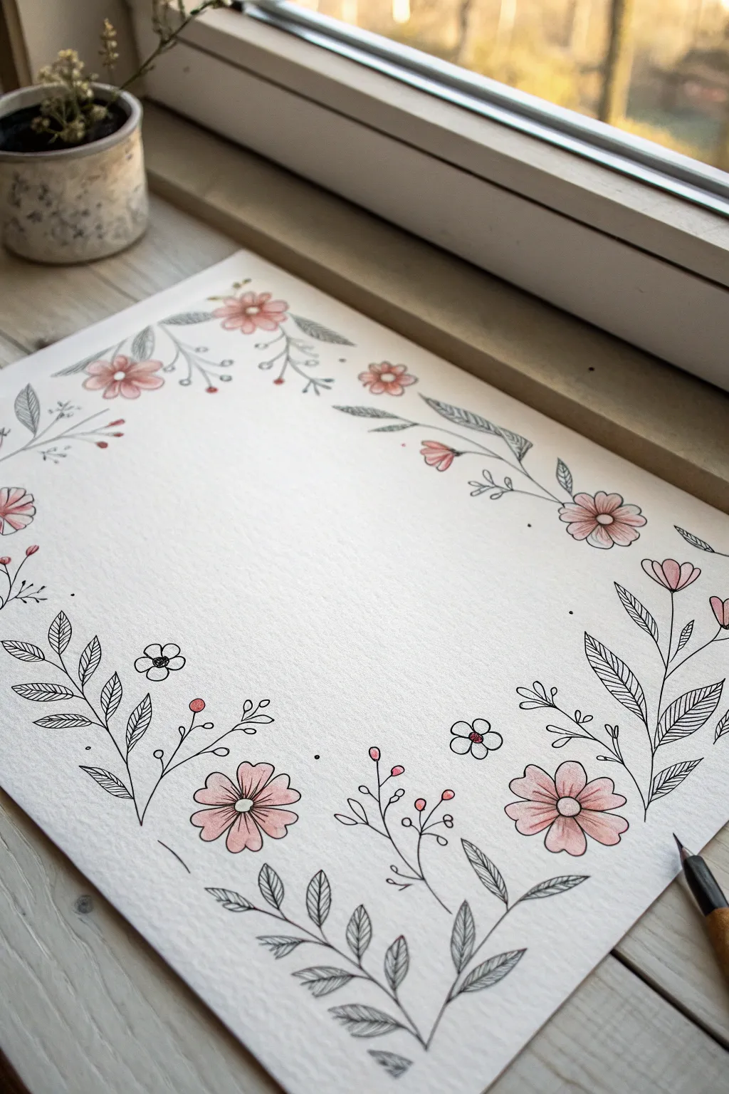
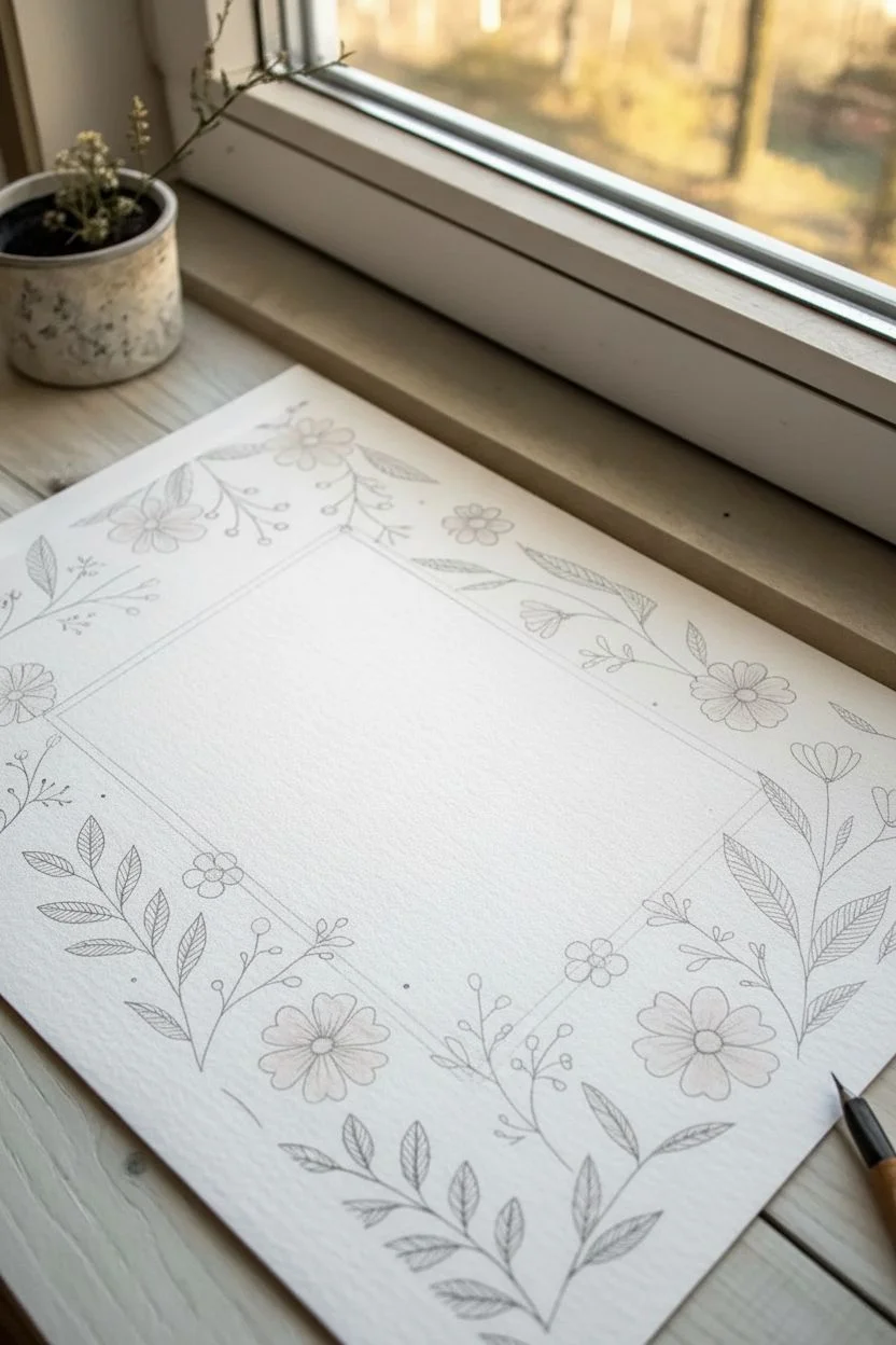
Frame your favorite quotes or create lovely stationery with this delicate floral border design. Combining fine black ink lines with soft washes of pink, this project balances botanical precision with a breezy, hand-drawn feel.
How-To Guide
Materials
- Heavyweight drawing paper or mixed media paper (smooth texture preferred)
- Black fineliner pens (sizes 0.1, 0.3, and 0.5mm)
- Pink colored pencils (pale rose and slightly darker blush)
- Graphite pencil (HB or 2H)
- Clean eraser
- Small blending stump (optional)
Step 1: Planning and Layout
-
Define the Frame:
Begin by lightly sketching a large rectangle in the center of your page with your graphite pencil. This negative space will remain empty, so the flowers will act as a border hugging these invisible lines. -
Mark Focal Flowers:
Lightly draw small circles where the largest pink daisy-like flowers will sit. Aim for an asymmetrical balance—place one large cluster in the bottom right corner, another in the bottom left, and scatter smaller ones along the top edge. -
Map the Flow:
Sketch faint directional lines connecting your flower circles. These will become the main stems. Ensure the lines have gentle, organic curves rather than rigid straight angles.
Step 2: Inking the Outlines
-
Draw Flower Centers:
Using a 0.3mm fineliner, ink the centers of your main flowers. Draw small circles, placing a tiny dot or two in the middle of each for texture. -
Create the Petals:
Draw the petals radiating from the centers. Keep them simple and rounded. For the side-facing flowers (especially in the corners), draw the petals shorter on the back side to create perspective. -
Add Main Stems:
Switch to a 0.5mm pen for the primary stems to give them slightly more weight. Trace over your pencil guides, ensuring the lines flow smoothly into the flower heads. -
Sketch Leaf Outlines:
Along the main stems, draw elongated, pointed leaf shapes. Vary their angles so some point up and others gently droop. Leave the insides of the leaves blank for now. -
Detail the Leaves:
With your finest 0.1mm pen, draw a central vein down each leaf. Then, fill the leaves with close, delicate hatching lines. I like to keep these lines slightly diagonal to suggest the leaf’s texture. -
Add Filler Sprigs:
Using the 0.1mm pen, draw thin, branching sprigs that extend into the empty spaces between the main flowers. Tip the ends of these sprigs with tiny circles to represent buds or berries. -
Tiny Botanicals:
Scatter a few very small, simple five-petal flowers (about the size of a fingernail) near the larger blooms to add variety to the scale.
Ink Confidence
Don’t correct wobbly lines! In botanical drawing, a slight shake mimics the natural irregularity of organic stems. Embrace the imperfections.
Step 3: Adding Color and Finish
-
Erase Pencil Guidelines:
Once the ink is completely dry—give it a minute to be safe—gently erase all your graphite sketch lines. Brush away the eraser precision. -
Base Color Layer:
Take your pale rose colored pencil and lightly fill in the large flower petals. Use a circular motion to avoid harsh directional strokes. -
Add Depth:
With the slightly darker blush pencil, shade just the base of the petals near the flower center. This gradient makes the blooms look slightly cupped and dimensional. -
Color the Buds:
Touch the tiny circular buds on your filler sprigs with the darker pink pencil. Press firmly here to make these small dots pop. -
Enhance Contrast:
Leave the leaves black and white. The contrast between the detailed black hatching and the soft pink petals is key to this style. -
Final Touches:
Add a few stray dots (stippling) in the empty white spaces around the dense floral clusters. This ‘flower dust’ helps integrate the border with the background.
Add Gold Accents
For a magical touch, use a metallic gold gel pen to add tiny dots to the flower centers or trace just the outer edge of the largest petals.
Now you have a delicate, custom-made border ready to frame your calligraphy or thoughtful note
Leaf Veins as a Repeating Motif
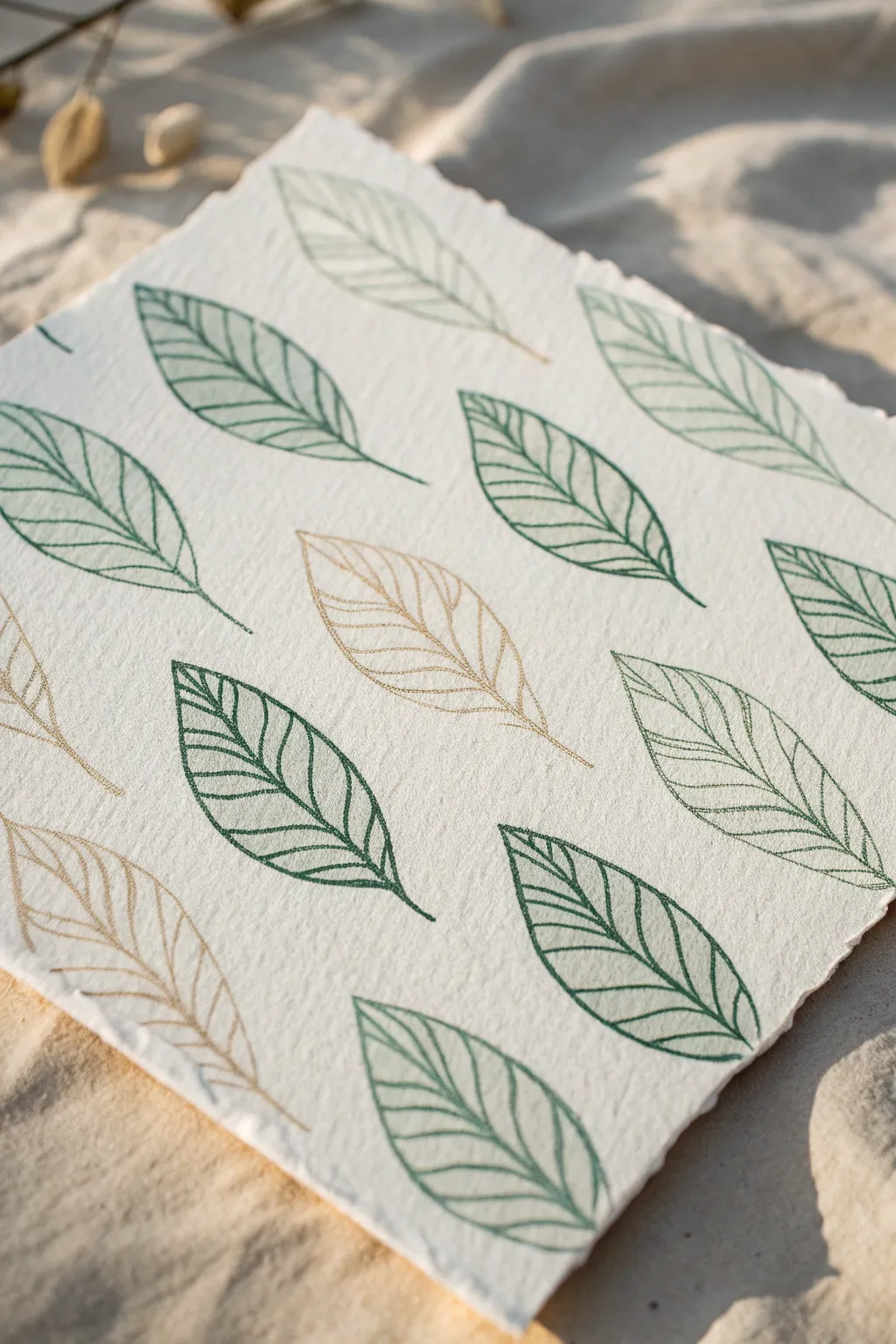
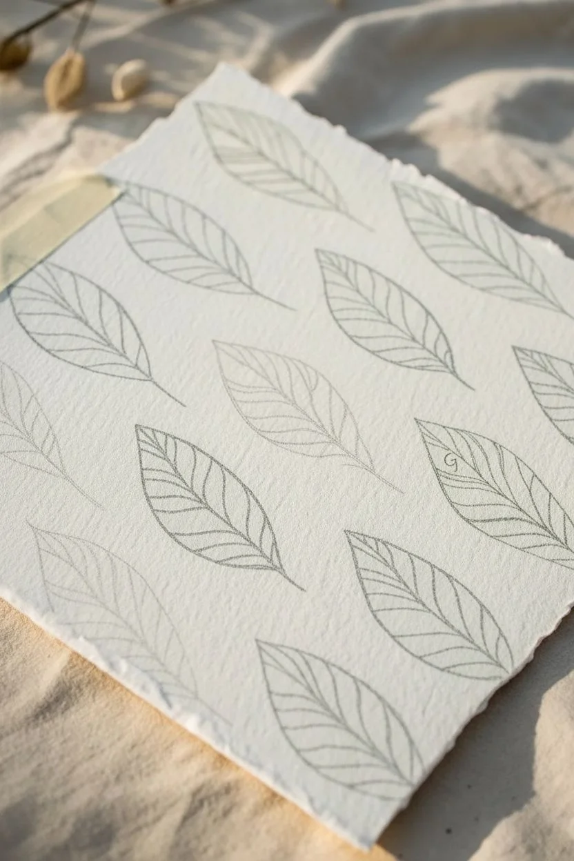
This elegant project combines the rustic texture of handmade deckle-edge paper with the precision of botanical line art. By repeating a simple leaf vein motif in soothing greens and subtle gold, you can create a sophisticated piece of art perfect for framing or gifting.
Step-by-Step Tutorial
Materials
- Heavyweight handmade cotton paper (deckle edge, roughly 5×7 or 8×8 inches)
- Pencil (HB or H)
- Kneaded eraser
- Fine-liner archival pens (dark green, 0.3mm or 0.5mm)
- Metallic gel pen or extra-fine paint pen (gold or bronze)
- Ruler (optional)
- Scrap paper for testing
- Masking tape (low tack)
Step 1: Planning the Composition
-
Prepare your workspace:
Clear a flat, well-lit surface. Place your handmade paper on top of a clean sheet of scrap paper to protect your table from ink bleed-through, although heavyweight cotton paper rarely bleeds. -
Secure the paper:
Use a small piece of low-tack masking tape on the back of the paper to hold it steady. This prevents shifting while you are drawing delicate lines. -
Visualize the grid:
Imagine a diagonal grid across the paper. You don’t want the leaves to be perfectly aligned in soldier-like rows; staggering them creates a more organic, textile-like flow. -
Sketch the leaf spines:
Using your pencil very lightly, draw the central spines (midribs) of the leaves first. Space them evenly, angling them all in roughly the same diagonal direction (about 45 degrees). -
Outline the leaf shapes:
Lightly sketch the outer perimeter of each leaf around the spines. Aim for a simple almond or lanceolate shape. Don’t worry if they aren’t identical; subtle variation adds character. -
Select accent leaves:
Decide which leaves will be gold. In the reference, there’s a ratio of roughly one gold leaf for every five or six green ones. Mark these lightly with a ‘G’ so you don’t accidentally ink them green.
Step 2: Inking the Greenery
-
Test your green pen:
Before touching the final paper, scribbling on a scrap piece of similar texture to ensure the ink flows smoothly and isn’t dried out. -
Draw the midribs:
Start by inking the central line of your first green leaf. I prefer to pull the pen towards me for better control over the line weight. -
Ink the outer edge:
Trace your pencil outline for the leaf shape. Keep your hand relaxed to allow for a slightly organic, not perfectly geometric, line. -
Add the veins:
Draw the secondary veins branching out from the midrib to the edge. Space them slightly apart, angling them upwards towards the leaf tip. -
Detail the texture:
To mimic the ‘pressed leaf’ look, sketch faint, tiny cross-hatching or smaller tertiary veins between the main veins. This doesn’t need to be solid coloring, just suggestion of texture. -
Review and repeat:
Systematically work through all the leaves designated as green. Be careful not to smudge wet ink with your hand as you move across the paper. -
Let the green ink set:
Give the green ink at least 10 minutes to dry completely. Cotton paper absorbs ink well, but surface lines can still smear if touched too soon.
Smudge Prevention
Place a loose sheet of clean paper under your drawing hand while you work. This acts as a shield, protecting your finished leaves from oils in your skin and accidental ink smears.
Step 3: Gilded Accents & Finishing
-
Shake the metallic pen:
If using a paint pen, shake it well to mix the pigment. If using a gel pen, ensure the ink is flowing consistently on scrap paper. -
Ink the gold leaves:
Repeat the same process for the accent leaves: draw the midrib, outline the shape, and add the branching veins using the gold pen. -
Add gold texture:
Just like the green leaves, add delicate interior lines within the gold leaves. The metallic sheen will catch the light beautifully against the matte paper. -
Erase pencil marks:
Once you are absolutely certain all ink is dry (wait an extra 15 minutes to be safe), gently roll your kneaded eraser over the paper to lift any visible pencil sketches. -
Check for gaps:
Inspect your pattern. If there’s an awkward empty space near the edge, draw a partial leaf ‘running off’ the paper to reinforce the idea that this is a continuous pattern. -
Flatten the paper:
If the ink has caused slight buckling, place the artwork under a heavy book overnight between two sheets of clean paper.
Natural Variation
Mix up your leaf shapes slightly! Try making some leaves a bit wider and others narrower, or vary the curve of the tip. This prevents the pattern from looking like a digital print.
Enjoy the rhythmic process of creating this botanical pattern and display it where the metallic accents can catch the sun
Wood Grain Swirls and Knots
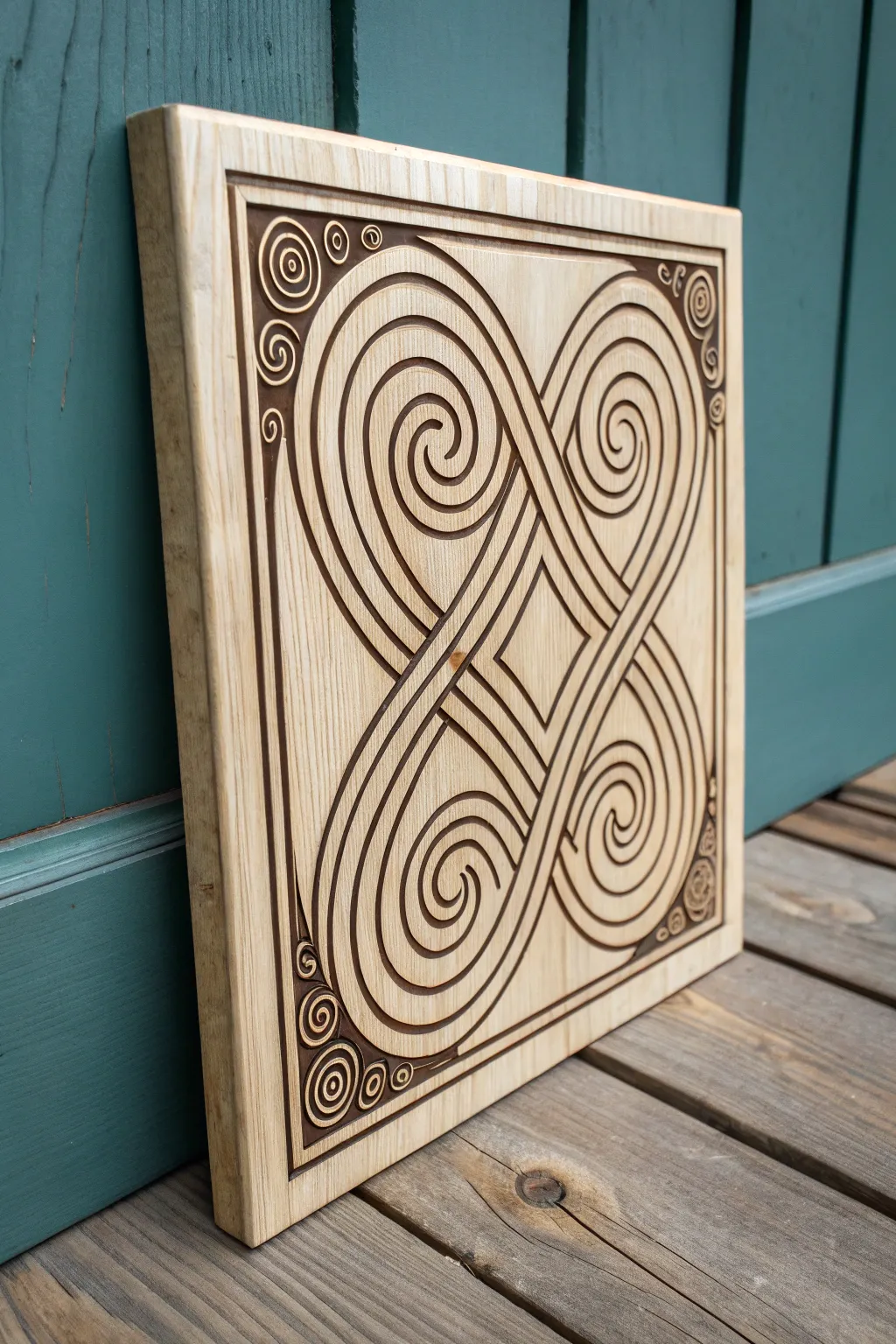
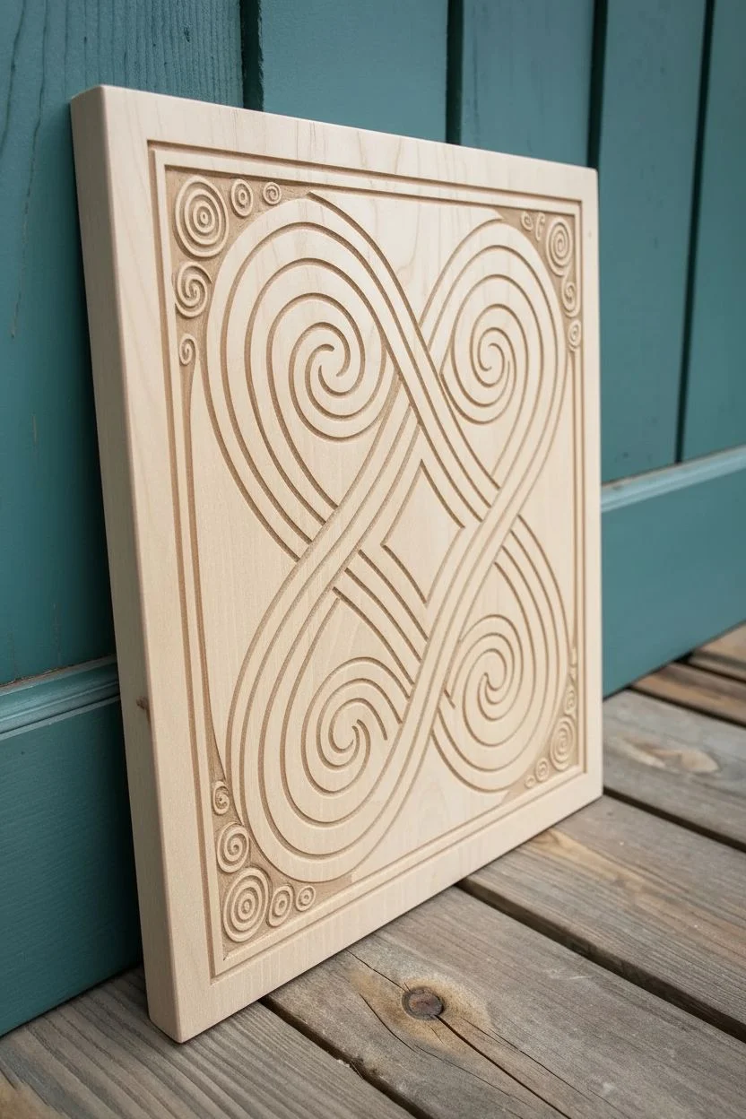
This project transforms a simple piece of light hardwood into a stunning display of geometric elegance, featuring deep, precise grooves that form an endless knot pattern. The contrast between the natural pale wood grain and the darkened, recessed channels creates a striking relief effect that feels both ancient and modern.
Step-by-Step Tutorial
Materials
- Solid maple or birch wood panel (approx. 12×12 inches, 1 inch thick)
- CNC Router machine or V-carve capable laser cutter (alternatively: trim router with V-groove bits and templates)
- Vector design software (e.g., Illustrator, Inkscape)
- 220-grit and 400-grit sandpaper
- Dark walnut gel stain or wood-burning tool (for contrast)
- Clear satin polyurethane or tung oil finish
- Tack cloth
- Detail sanding sticks
- Small stiff-bristled brush
Step 1: Design and Preparation
-
Sourcing the wood:
Begin by selecting a high-quality hardwood panel like maple, birch, or poplar. Look for a piece with distinct, straight grain but minimal natural knots, as these can interfere with the intricate spiral pattern you will be carving. -
Creating the vector file:
Design or download a Celtic-inspired quadruple spiral pattern. Ensure your vector paths are closed loops, specifically designed for V-carving where the width of the line determines the depth of the cut. The design should feature four large central spirals meeting in a diamond shape. -
Corner details:
Add smaller, triple-spiral flourishes (triskelions) or simple swirls to the four outer corners of the bounding box to frame the central motif. -
Surface prep:
Sand the face of your wood panel perfectly flat using 220-grit sandpaper. Any unevenness here can cause the carving depth to vary, ruining the crisp effect of the lines. -
Securing the workpiece:
Clamp the wood securely to your CNC wasteboard. If you are using a top-down hold, ensure clamps are well away from the router’s travel path to avoid collisions.
Step 2: Carving the Pattern
-
Tool selection:
Install a 60-degree or 90-degree V-bit into your router. A 60-degree bit will give you deeper, sharper grooves for the tight spirals, while a 90-degree bit creates wider, shallower channels. -
Running the simulation:
I always run a toolpath simulation in the software first. This helps confirm that the bit won’t cut through the entire thickness of the material and that the details aren’t too fine for the wood grain to hold. -
Refining the cut settings:
Set your feed rate conservatively. If the bit moves too fast, you risk tearing out the wood grain, especially on the tight inner curves of the spirals. -
Executing the carve:
Run the CNC program. Watch closely as the machine first clears the bulk of the channels and then refines the sharp corners. -
Manual alternative:
If you lack a CNC, you can transfer the pattern using carbon paper and use a palm router with a V-groove bit for the main lines, finishing the tightest centers with a hand V-gouge.
Fixing Fuzzy Grain
If the router bit leaves fuzzy fibers in the grooves, try running the toolpath a second time. This ‘cleanup pass’ usually shaves off the remaining fibers for a crisp look.
Step 3: Adding Contrast and Finish
-
Initial cleanup:
Use a stiff-bristled brush or compressed air to remove all sawdust from the deep grooves. Check for any ‘fuzz’ or hanging fibers. -
Cleaning up the edges:
Gently gently sand the top surface again with 220-grit paper to remove any burrs raised during the cutting process. Be careful not to round over the sharp edges of the design too much. -
Darkening the recesses:
To achieve the look in the photo, you need contrast. Paint a dark walnut gel stain carefully into the carved grooves using a fine artist’s brush. Alternatively, if you used a laser cutter, the burning is already done for you. -
Wiping the surface:
Immediately wipe any excess stain off the raised top surface with a cloth slightly dampened with mineral spirits. You want the top to remain light and the grooves to remain dark. -
Detail sanding:
Once the stain in the grooves is dry, do a final light sanding on the top face with 400-grit paper. This cleans up any smudges and highlights the pristine wood grain of the raised areas. -
Sealing the piece:
Apply a clear satin polyurethane or tung oil. Use a brush to get into the grooves, or a spray can for an even coat without pooling. This protects the wood and deepens the color of the darkened recesses. -
Final cure:
Allow the finish to cure fully according to the manufacturer’s instructions before hanging or displaying.
Inlay Upgrade
Level up by filling the carved grooves with a colored epoxy resin or a contrasting wood powder mixed with CA glue, then sanding flush for a seamless inlay effect.
Now you have a mesmerizing geometric relief carving that balances shadow and light beautifully.
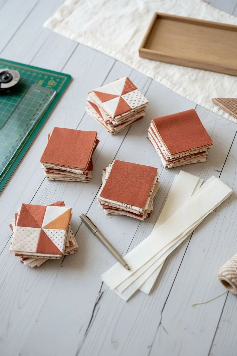
Patchwork Quilt Block Patterns
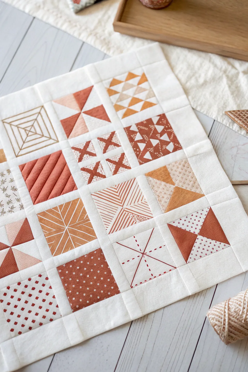
This charming mini quilt project explores a variety of patchwork and surface design techniques in a cohesive, earthy color palette. By combining traditional piecing with hand-embroidered accents, you’ll create a textural piece that works perfectly as a wall hanging or table topper.
How-To Guide
Materials
- Cotton fabric in cream (background) and rust/terra cotta shades (solid and printed)
- Rotary cutter and self-healing mat
- Clear quilting ruler
- Sewing machine with neutral thread
- Embroidery floss in matching rust/red colors
- Embroidery needle
- Iron and ironing board
- Fabric marking pen (air or water soluble)
- Batting and backing fabric (approx. 18×18 inches)
Step 1: Cutting and Preparation
-
Cut background sashing:
Begin by cutting your cream background fabric into strips for sashing. You will need long vertical strips and shorter horizontal strips to frame your blocks. Aim for a finished width of about 0.5 to 1 inch, so cut your strips 1 to 1.5 inches wide depending on your seam allowance preference. -
Determine block size:
This sampler features 16 individual squares. For a mini quilt, plan for each finished block to be 2.5 to 3 inches square. Calculate your raw cutting sizes by adding 0.5 inches to your desired finished size.
Fixing Wobbly Sashing
If your rows aren’t lining up, try pressing your seam allowances in alternating directions (up for row 1, down for row 2) so they ‘lock’ together when sewing.
Step 2: Creating Pieced Blocks
-
Sew Four-Patch blocks:
For the checkerboard-style blocks, cut small squares of cream and rust fabric. Sew two contrasting squares together, press the seam, and then join two of these units to form a four-patch. Remember to nest your seams for flat intersections. -
Construct Half-Square Triangles:
Several blocks use triangles. Place a cream square and a colored square right sides together. Draw a diagonal line, sew 1/4 inch on both sides of the line, and cut along the line. Open and press towards the darker fabric. -
Assemble Pinwheel blocks:
Take four of your half-square triangle units and arrange them in a spinning pattern. Sew them together in pairs first, then join the pairs to complete the pinwheel block. -
Make the Flying Geese variation:
For the block with triangles pointing inward, use the flying geese method or paper piecing to create precise points. I find using a specialized ruler helps maintain accuracy here. -
Sew the Strip-Pieced block:
Cut thin strips of rust fabric and sew them diagonally across a cream square foundation (improvisational style) or piece them traditionally to create the diagonal stripe texture.
Step 3: Adding Embroidery Accents
-
Mark embroidery guides:
Select the plain cream blocks designated for embroidery. Using your marking pen and a small ruler, lightly draw the geometric designs—concentric squares, radiating lines, or cross-hatch patterns—directly onto the fabric. -
Stitch the running lines:
Thread your needle with 2-3 strands of rust-colored embroidery floss. Use a simple running stitch or backstitch to trace your marked lines. Keep your stitch length consistent for a neat, graphic look. -
Add ‘X’ details:
For the block with the grid of X’s, stitch small cross-stitches evenly spaced. Ensure all top stitches cross in the same direction for a uniform appearance. -
Create the sunburst effect:
On the block with radiating lines, stitch from the center point outward. You can use a backstitch for solid lines or a running stitch for a dashed effect. -
Press embroidery gently:
Once stitching is complete, place the blocks face down on a fluffy towel and press them from the back. This prevents the embroidery stitches from being flattened.
Add Texture Details
Use a thicker pearl cotton thread (size 8 or 5) for the embroidery sections to make the stitches stand out more boldly against the flat pieced blocks.
Step 4: Assembly and Finishing
-
arrange the layout:
Lay out all 16 blocks on a flat surface or design wall. Shuffle them until you are happy with the balance of pieced geometric blocks versus embroidered white space blocks. -
Sew vertical rows:
Sew the blocks together into horizontal rows first, inserting your short vertical sashing strips between each block. -
Add horizontal sashing:
Sew your long horizontal sashing strips between your completed block rows. Pin at every intersection to ensure your vertical sashing lines align perfectly. -
Layer the quilt sandwich:
Place your backing fabric face down, layer the batting on top, and center your patchwork top face up. smooth out wrinkles and baste the layers together with safety pins. -
Quilt the layers:
‘Stitch in the ditch’ along the seam lines of the sashing to stabilize the quilt without distracting from the intricate block patterns. -
Bind the edges:
Prepare a binding strip from the cream fabric. Sew it to the front of the quilt, fold it over to the back, and hand stitch it down for a clean, invisible finish.
Now you have a stunning, textural sampler that celebrates the beauty of simplicity and geometric design
Optical Illusion Tunnels and Warped Grids
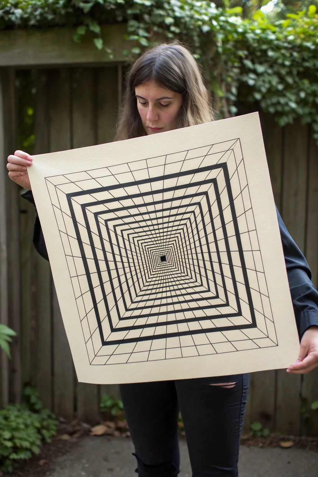
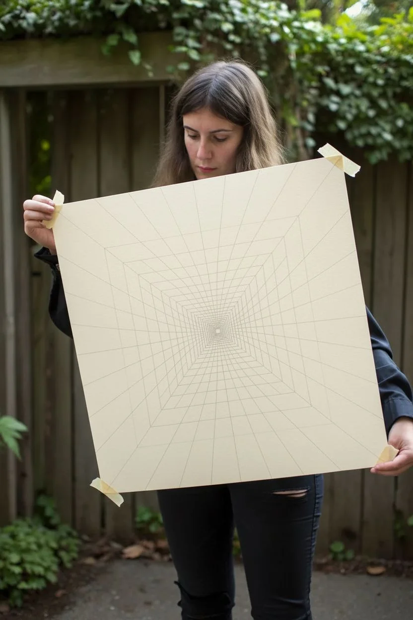
Dive into the world of op-art with this mesmerizing tunnel drawing that seemingly pulls the viewer into an endless void. Using simple high-contrast lines on sturdy paper, you will construct a geometric masterpiece that plays tricks on the eye through perspective and varying line weights.
Step-by-Step Guide
Materials
- Large square sheet of heavy drawing paper or illustration board (cream or off-white)
- Long metal ruler (ideally 24 inches or longer)
- Hard lead pencil (2H or 4H) for drafting
- Soft white eraser
- Black technical pens (various nib sizes, e.g., 0.5mm, 0.8mm)
- Large black chisel-tip marker or India ink with a flat brush
- Masking tape or painter’s tape
Step 1: Drafting the Framework
-
Prepare your surface:
Begin by securing your large square paper to a flat work surface with masking tape at the corners to prevent shifting. This ensures your long ruler strokes stay completely straight. -
Find the center point:
Using your ruler and a light pencil touch, draw a faint ‘X’ by connecting opposite corners of the paper. The intersection point is your vanishing point, the absolute center of your tunnel. -
Establish the main diagonals:
The ‘X’ you just drew actually serves as the main structural diagonals. Ensure these lines are perfectly straight, as every concentric square will rely on them for alignment. -
Draft the central Void:
Start near the center point. Measure a small distance (about 0.5 inches) out from the center along each diagonal line. Connect these four marks to create your smallest, innermost central square. -
Plot the concentric squares:
Moving outward from the center, mark intervals along one of the diagonal lines. These intervals should get progressively larger as you move away from the center to exaggerate the depth effect. For example, start with 0.5 inch gaps, then 1 inch, then 1.5 inches. -
Complete the square outlines:
Using the marks you made on the diagonal as guides, draw the full squares. Ensure every horizontal line is perfectly parallel to the top edge and every vertical line is parallel to the side edge. -
Add the grid lines:
To create the ‘floor’ and ‘ceiling’ tiles, you need radial lines. Mark even intervals along the outermost edge of your paper. Draw straight lines connecting these marks directly to the central vanishing point, but stop drawing once you hit the little central square.
Smudge Prevention
Place a scrap piece of paper under your drawing hand while inking. This mask protects the clean paper from oils in your skin and prevents you from smearing wet ink across the finished grid.
Step 2: Inking and Definition
-
Select your line weights:
The key to this illusion is contrast. Decide which squares will be thick heavy bands and which will remain thin grid lines. In the reference, thick black bands alternate with the grid sections. -
Ink the thin grid lines:
Start with a finer technical pen (around 0.5mm). Carefully trace over your pencil grid lines (the radial lines going to the center) and the thinner concentric squares. I prefer to do this first so the heavy marker lines can cover any small start/stop imperfections later. -
Outline the heavy bands:
For the prominent bold squares, use a slightly thicker pen (0.8mm) to outline the boundaries of where the thick black ink will go. This creates a barrier so your marker doesn’t bleed into the white space. -
Fill the center:
Using your black marker or ink, fill in the very smallest central square completely solid. This anchors the ‘bottom’ of the tunnel. -
Fill the bold squares:
Switch to your chisel-tip marker or brush with India ink. Fill in the specific concentric bands you outlined earlier. Work slowly near the edges to keep them crisp. -
Thicken the diagonals:
Taking a medium-weight pen, go back over the main ‘X’ diagonal lines. These often look better if they are slightly bolder than the internal grid lines but thinner than the main black squares. -
Clean up:
Allow the ink to dry completely. If you used India ink, give it at least an hour. Once dry, gently erase all remaining pencil guidelines with a soft white eraser. -
Check high-contrast edges:
Inspect the corners where the black bands meet the diagonals. If the corners look rounded or soft, use your finest pen to sharpen those angles into perfect points.
Level Up: Color Gradient
Instead of solid black bands, try using a colored marker set to create a gradient. Start with a dark navy at the center and fade to a lighter blue at the outer rim for an atmospheric depth effect.
Hang your finished piece on a wall where viewers can stand directly in front of it to experience the full intensity of the plunge


Have a question or want to share your own experience? I'd love to hear from you in the comments below!