When I’m making peace art, I love leaning on simple symbols that instantly feel warm, recognizable, and full of meaning. These peace art ideas are designed to be approachable projects you can do solo or as a group—perfect for turning creativity into a visual message of unity.
Classic Peace Sign Pattern Fill
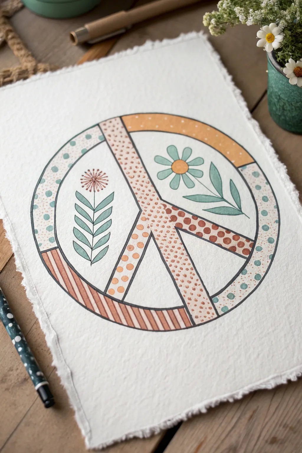
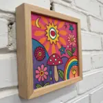
This charming project combines the iconic peace symbol with delicate botanical elements and earthy patterns for a relaxed, bohemian vibe. The hand-drawn quality and textured paper give it a wonderfully organic feel that’s perfect for framing.
Step-by-Step
Materials
- Heavyweight cold press watercolor paper (deckled edge optional)
- Fine liner pens (black, size 03 or 05)
- Pencil and eraser
- Compass or circular object (approx. 6-inch diameter)
- Ruler
- Watercolor paints or colored markers (earth tones: mild orange, terracotta, sage green, teal)
- Small round paintbrush (size 2 or 4) if using paint
Step 1: Drafting the Structure
-
Draw the main circle:
Center your compass on the paper and draw a large circle lightly in pencil. If you don’t have a compass, trace a bowl or plate. -
Define the peace sign structure:
Using your ruler, draw a vertical line straight down from the center point to the bottom edge. Then, draw two diagonal lines extending from the center to the bottom left and right, forming the classic peace sign legs. -
Thicken the lines:
Turn these single lines into bars. Draw parallel lines on either side of your initial pencil guides to create the thickness of the peace sign’s inner structure. Do the same for the outer circle rim. -
Refine the connections:
Erase the initial center guide lines so you are left with the hollow outline of the peace symbol completely mapped out.
Natural Edges
To get the torn look shown in the photo, fold your paper carefully back and forth along a ruler edge, lick the fold line lightly, and tear slowly.
Step 2: Adding Decorative Patterns
-
Section the borders:
Lightly divide the thick outer rim and the inner bars into smaller segments with your pencil. You don’t need to measure perfectly; estimating creates a more natural look. -
Fill the top outer rim:
In the top right quadrant of the outer ring, color it a solid, muted orange-yellow. In the top left, add small teal polka dots on a white background. -
Pattern the bottom outer rim:
For the bottom left curve, draw diagonal terracotta stripes. On the bottom right side, continue the teal polka dot pattern but make the dots slightly denser. -
Detail the center bars:
Fill the central vertical bar with tiny, stippled orange dots. I find that varying the pressure here adds nice texture by changing the dot sizes. -
Complete the diagonal legs:
On the left leg, add larger orange polka dots. On the right leg, draw larger terracotta-colored circles, filling the shape completely.
Step 3: Drawing the Florals
-
Sketch the left botanical:
In the large left open space, draw a vertical stem. Add symmetrical, pointed leaves extending upward on both sides, resembling a stylized fern. -
Top the left stem:
At the very top of this stem, draw a burst of thin lines radiating outward to create a dandelion-like flower head. -
Sketch the right daisy:
In the large right open space, draw a simple daisy shape with a round center and six to seven rounded petals. -
Add leaves to the right:
Draw three simple leaves extending below the daisy flower, curving gently to fill the space.
Go Metallic
Swap the terracotta or orange paint for copper or gold metallic watercolor. The shimmer adds a beautiful surprise when the light hits the artwork.
Step 4: Inking and Coloring
-
Outline in ink:
Trace over all your final pencil lines with a black fine liner pen. Keep your hand steady but don’t worry about machine-perfect lines; a little wobble adds character. -
Erase pencil marks:
Wait for the ink to dry completely, then gently erase all visible pencil sketches underneath. -
Color the left fern:
Paint or color the leaves of the fern shape with a soft sage green. Leave the stem as a simple black line. -
Color the dandelion:
Add a touch of terracotta or rust color to the radiating lines of the dandelion puff. -
Color the daisy:
Fill the daisy’s center with the muted orange-yellow. Color the petals a very pale, watery blue or teal. -
Final leaf details:
Color the leaves beneath the daisy with a slightly darker teal-green to balance the composition.
Once the paint is dry, you have a peaceful piece of art ready to display
Peace Dove With Olive Branch
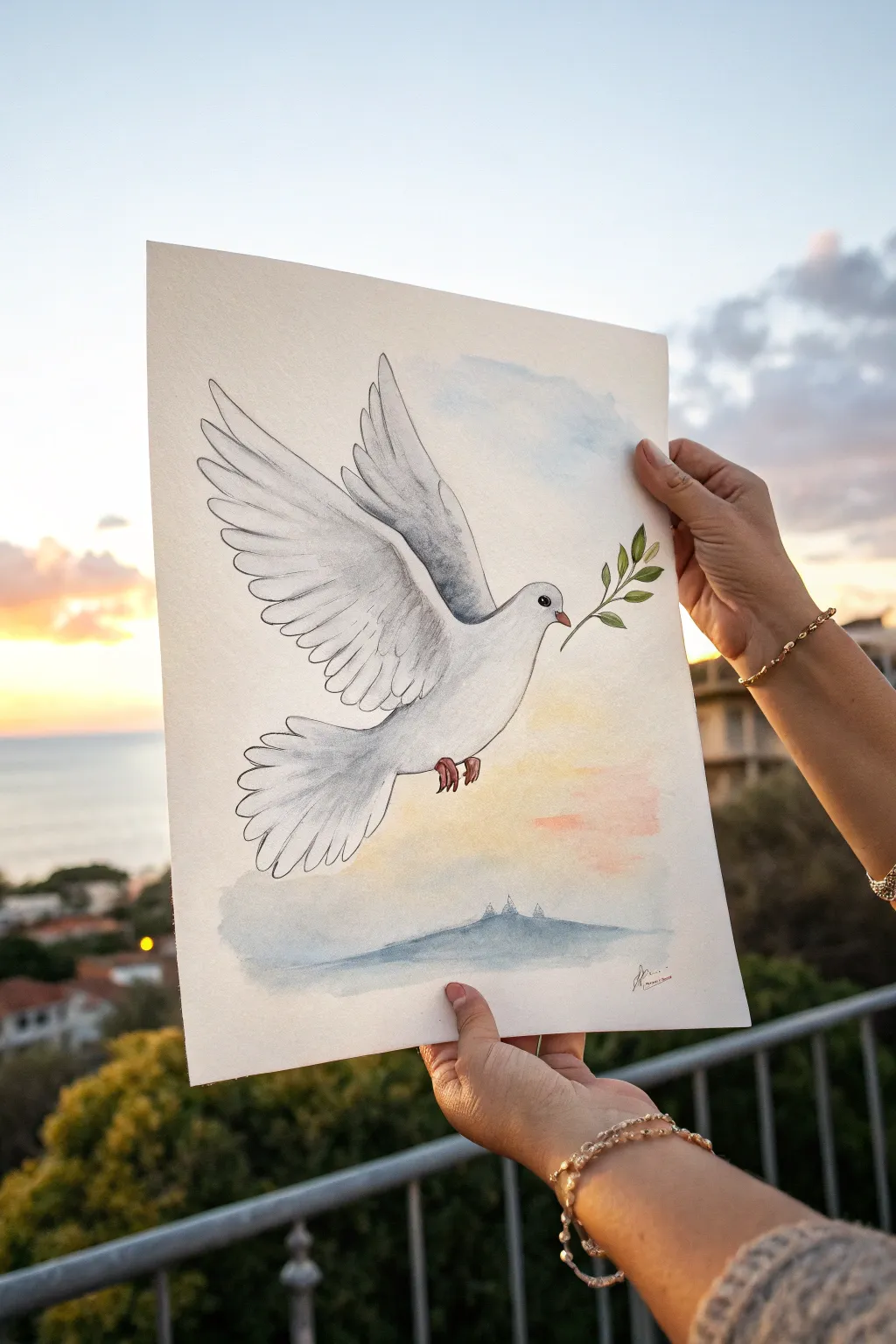
Capture the universal symbol of peace with this serene watercolor project featuring a dove in flight against a sunset sky. The combination of gentle washes and precise ink lines creates an illustration that feels both uplifting and grounded.
Step-by-Step Tutorial
Materials
- Cold press watercolor paper (A4 or roughly 9×12 inches)
- Pencil (HB) and kneaded eraser
- Watercolor paints (Ultramarine Blue, Alizarin Crimson, Cadmium Yellow, Burnt Sienna/Brown)
- Fine liner pen (Black, waterproof, size 0.3 or 0.5)
- Round watercolor brushes (Size 4 and Size 8)
- Jar of clean water
- Paper towel
- Masking tape (optional, to secure paper)
Step 1: Sketching the Dove
-
Outline the body:
Start by lightly sketching the main shape of the dove’s body in the center of your page. Draw a smooth, teardrop-like curve for the body, angling it upwards to suggest flight. -
Add the wings:
Extend a large, sweeping wing upwards from the top shoulder area. The feathers should fan out elegantly. Draw the second wing peeking out from behind the first, slightly offset to show perspective. -
Detail the tail:
Sketch a fan-shaped tail at the rear, using scalloped lines to indicate individual feathers spreading out. -
Refine features:
Define the head with a small beak and a round eye. Draw the legs tucked slightly underneath, with claws extended. Finally, sketch a simple olive branch with a few leaves held in the beak.
Ink Confidence
If you are nervous about inking directly on watercolor paper, practice your flowing wing lines on scrap paper first to warm up your wrist.
Step 2: Inking the design
-
Trace the main lines:
Using your waterproof fine liner, carefully trace over your pencil sketch. Use confident, smooth strokes for the outer edges of the wings to capture their aerodynamic shape. -
Add feather texture:
Inside the wings, draw secondary rows of smaller feather shapes. Don’t outline every single feather fully; broken lines can suggest softness. -
Complete the inking:
Outline the beak, eye, feet, and the olive branch. Once the ink is completely dry—I usually wait about five minutes to be safe—gently erase all the pencil marks underneath.
Golden Hour Glow
Once the painting is dry, add a tiny glazing of metallic gold watercolor to the edge of the sun-facing wing feathers for a magical touch.
Step 3: Painting the Background
-
Wet the sky area:
Using your larger brush and clean water to wet the area around the dove, being careful not to perform a wash inside the bird itself. -
Paint the sunset gradient:
While the paper is damp, drop in a very diluted wash of yellow near the horizon line below the bird. While moving upwards, blend in touches of soft pink or diluted crimson. -
Add sky blues:
At the very top and bottom edges of the background, brush in a pale blue wash. Let these colors blend naturally with the pinks and yellows where they meet to create a soft, atmospheric transition. -
Paint the horizon:
Mix a blue-grey tone using blue and a touch of brown. Paint a low, rolling mountain silhouette at the bottom of the page. You can add tiny vertical strokes to suggest distant structures or spires.
Step 4: Shading the Dove
-
Mix a shadow grey:
Create a very watery grey by mixing a tiny amount of blue with a dot of brown or black. The mixture should be 90% water. -
Shadow the body:
Apply this pale grey wash to the underside of the dove’s belly and the lower part of the neck to give the bird volume. -
Define the wings:
Paint broad strokes of the grey wash under the main wing feathers and where the wings connect to the body. This separation is crucial for making the wings look layered. -
Add definition to the tail:
Add shadows between the scalloped edges of the tail feathers to separate them visually.
Step 5: Final Details
-
Paint the beak and feet:
Use a diluted burnt sienna or reddish-brown to carefully fill in the feet and the beak. Keep the color slightly transparent. -
Color the olive branch:
Mix a fresh sap green using yellow and blue. Paint the leaves of the olive branch, varying the intensity slightly for interest. -
Define the eye:
Fill in the eye carefully with black ink or paint, leaving a tiny speck of white paper for a highlight, which brings the bird to life. -
Sign your work:
Once everything is fully dry, sign your name in the corner with your fine liner pen.
Hang your finished piece near a window where the natural light can complement your painted sky


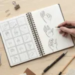
Hands Holding Peace
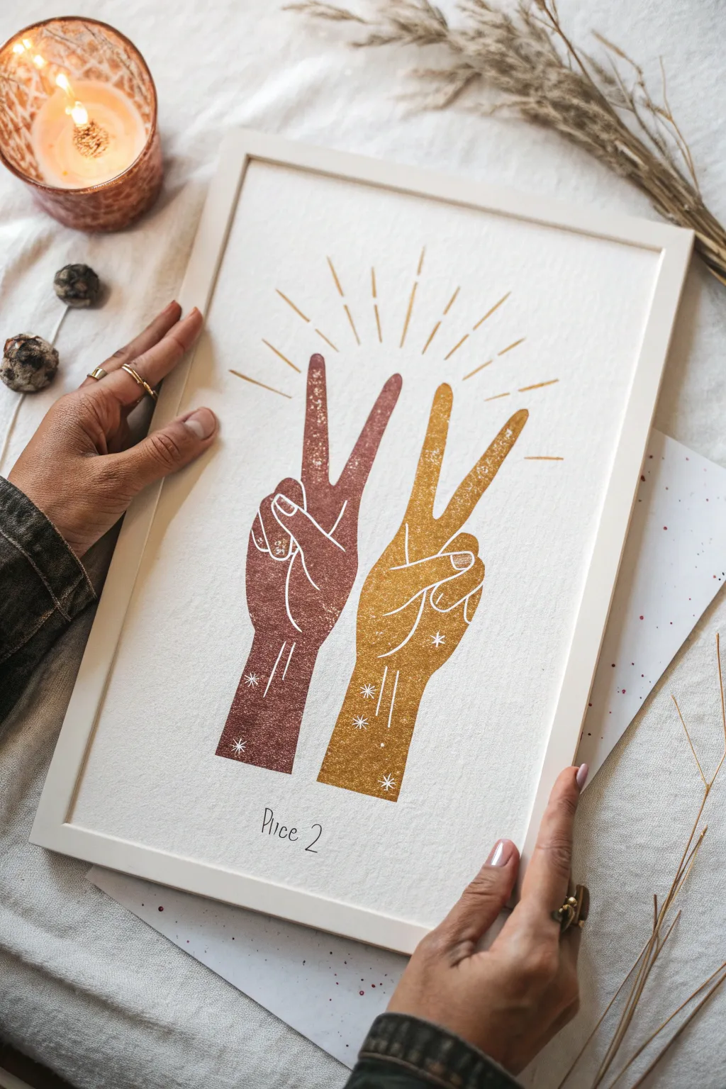
Create a striking piece of wall art featuring two hands making the peace sign, rendered in warm, earthy tones with a textured, block-print aesthetic. This project combines simple drawing with a stenciling technique to achieve that unique, slightly weathered look perfect for a boho-chic vibe.
How-To Guide
Materials
- Heavyweight mixed media paper or cardstock (A4 or A3 size)
- Acrylic paints (terracotta or reddish-brown, yellow ochre or gold)
- High-density foam roller or stippling sponge
- Stencil plastic sheets or mylar
- Craft knife and cutting mat
- Fine liner pen (0.5mm, white and black)
- Pencil and eraser
- Ruler
- Gold paint pen (optional for rays)
- White or light wood frame
Step 1: Designing the Stencil
-
sketch the hands:
Begin by lightly sketching two hands side-by-side on a piece of scrap paper. Each hand should have the index and middle fingers raised in a ‘V’ shape for the peace sign, with the other fingers tucked in. Angle them slightly outward from each other. -
refine the shapes:
Clean up your outlines. Focus on the silhouette; you don’t need inner details yet. Make sure the wrists are flat at the bottom so they feel grounded. The left hand will be for the darker terracotta color, and the right for the ochre. -
trace onto stencil material:
Place your stencil plastic sheet over your refined sketch. Using a permanent marker, carefully trace the outline of just the left hand. -
trace the second hand:
On a separate piece of stencil plastic (or a different section), trace the outline of the right hand. Keeping them on separate sheets makes positioning easier later. -
cut the stencils:
Place the plastic on your cutting mat. Use a sharp craft knife to cut out the inside of the hand shapes. Go slowly around the curves of the fingers to ensure a smooth line.
Step 2: Painting and Printing
-
prepare your paper:
Lay your final heavyweight paper on a flat surface. Secure the corners with a bit of painter’s tape if needed to keep it from shifting. -
position the first stencil:
Place the left hand stencil on the paper. I suggest visualizing the final composition first—leave enough room at the top for the rays. -
mix the terracotta paint:
On a palette, squeeze out your reddish-brown acrylic paint. Use a sponge or foam roller to pick up a small amount of paint. Dab off the excess; you want a ‘dry’ application for texture. -
apply the first layer:
Gently stipple or roll the paint into the stencil opening. Don’t aim for solid, opaque coverage. Allowing some paper grain to show through mimics that vintage block print look. -
repeat for the second hand:
Carefully lift the first stencil. Once the paint is touch-dry, position the second stencil to the right. Apply your yellow ochre or gold paint using the same dry-brush or stippling technique. -
add the wrist details:
While the main shapes dry, you can prepare your fine liner pens. If you want the speckled look shown in the inspiration, you can lightly flick a toothbrush with white paint over the dry colored hands, or use your white gel pen later.
Clean Lines
Use a temporary spray adhesive on the back of your stencil. This prevents paint from bleeding under the edges for a crisp silhouette.
Step 3: Adding Details and Finishing
-
outline the fingers:
Once the paint is completely dry, take your white fine liner or gel pen. Draw the defining lines for the tucked fingers and the palm creases directly over the painted shape. -
add celestial accents:
Draw small white stars and twinkles on the wrists and palms. Simple four-point stars or tiny dots work best to keep it subtle. -
create the radiating rays:
Using a ruler and your gold paint pen (or a mix of the ochre paint and a thin brush), draw straight lines radiating outward from the space between the peace signs. Make them varied lengths for a dynamic energy. -
letter the text:
At the bottom center, lightly pencil in your text (like ‘Place 2’ or a personal mantra). Go over it with a fine black pen in a loose, handwritten style. -
frame it up:
Once everything is fully dry, erase any visible pencil marks. Place your artwork into a light wood or white frame to complement the warm tones.
Fixing Smudges
If paint bleeds, wait for it to dry completely. Then, use a white opaque gel pen or acrylic paint to carefully cover the mistake.
Hang your double peace sign art in a sunny spot to enjoy those warm, positive vibes every day

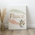
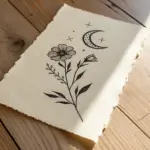
Peace Typography Word Art
Create a serene focal point for any room with this minimalist word art project, featuring elegant calligraphy on beautifully textured paper. The combination of deckled-edge paper and flowing black ink creates a timeless, organic look that celebrates harmony and calm.
Detailed Instructions
Materials
- Heavyweight handmade cotton rag paper (deckled edge, around A4 size)
- Black brush pen (medium to large tip) or India ink with a round brush
- Fine liner pen (01 or 03 size, black)
- Pencil (HB or lighter)
- Kneadable eraser
- Ruler
Step 1: Preparation & Layout
-
Center the design:
Begin by finding the visual center of your handmade paper. Using your ruler and a very light pencil touch, mark a small cross or dot in the middle. This paper is textured, so keep marks faint to avoid damaging the fibers when erasing later. -
Draft the main word:
Lightly sketch the word ‘Peace’ in the center using your pencil. Aim for a script style where the ‘P’ is large and flowing, and the ‘eace’ follows in a slightly smaller, connected cursive. Ensure the tail of the ‘P’ and last ‘e’ have graceful flourishes. -
Mark the perimeter:
Visualize an oval or circle surrounding your central word. Lightly mark where the smaller words will sit: ‘kindness’ (top left corner), ’empathy’ (top right corner), ‘harmony’ (bottom left), ‘calm’ (bottom right), and ‘unity’ (bottom center). -
Sketch the botanical elements:
Draw faint guidelines for two curved branches. The top one should arc over ‘Peace’ like a brow, and the bottom one should curve under ‘Peace’ like a smile. Sketch small leaf shapes along these curved lines.
Step 2: Inking the Typography
-
Letter the centerpiece:
Using your brush pen or dip pen with India ink, carefully trace your pencil sketch for ‘Peace’. Apply more pressure on the downstrokes to make them thick, and lift pressure on upstrokes for thin, hairline connectors. -
Refine the edges:
If your brush stroke looks a bit shaky on the textured paper, you can carefully go back over the edges of the thick downstrokes to smooth them out. I sometimes use the very tip to sharpen the ends of the flourishes. -
Ink the supporting words:
Switch to your fine liner pen. Write the surrounding words—kindness, empathy, harmony, calm, unity—using a simple, legible print or casual script. Keep these letters uniform in size but much smaller than the main title. -
Let the ink settle:
Give the main lettering a good 10-15 minutes to dry completely. Handmade paper acts like a sponge, and you don’t want to smudge the heavy ink while working on the illustrations.
Handling Texture
Handmade paper is bumpy! Work slowly with your brush pen. If the nib skips over a textured pocket, gently touch it up rather than pressing harder.
Step 3: Adding the Botanicals
-
Outline the top wreath:
Using the fine liner, trace the stem of the top botanical arch. Draw simple, open leaf shapes attached to the stem. Keep the lines clean and unshaded for a minimalist aesthetic. -
Detail the bottom wreath:
For the bottom branch, try a slightly different leaf style to add visual interest. Draw the stem first, then add small, textured leaves. You can fill these leaves with tiny hatch marks or dots to differentiate them from the top branch. -
Balance the composition:
Step back and look at the whole piece. If the garlands feel too thin, add a few extra stray leaves or small buds to the existing branches to thicken the visible weight. -
Final Cleanup:
Once you are absolutely certain all ink is dry—touch it lightly to test—take your kneadable eraser and gently dab or roll it over the pencil marks to lift them. Avoid scrubbing, which can ruin the paper’s texture.
Fixing Ink Bleeds
If ink starts feathering into the paper fibers, stop immediately. Switch to a pigment liner or a drier ink formula, as very watery inks tend to bleed on cotton rag.
Now you have a meaningful piece of art that radiates tranquility directly from your wall
BRUSH GUIDE
The Right Brush for Every Stroke
From clean lines to bold texture — master brush choice, stroke control, and essential techniques.
Explore the Full Guide
Rainbow Peace Gradient Background
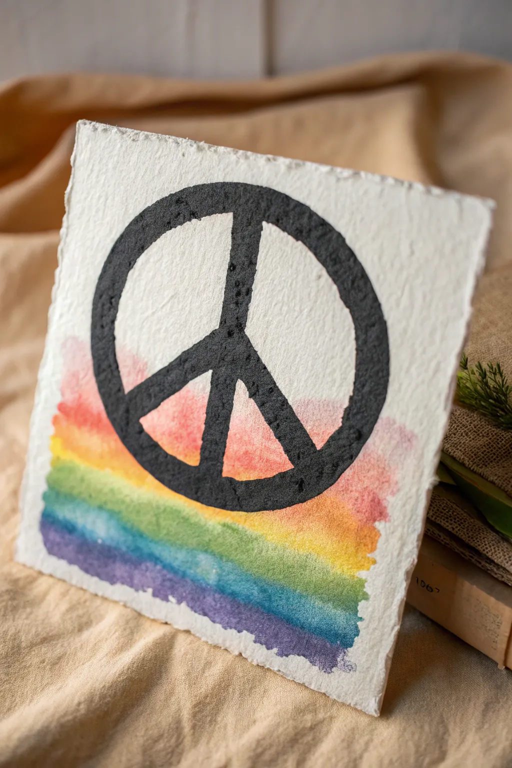
This project combines the texture of handmade paper with the vibrancy of a watercolor wash to create a stunning piece of modern peace art. The stark contrast between the bold black symbol and the soft, bleeding rainbow hues makes for an eye-catching display piece.
Detailed Instructions
Materials
- Thick handmade cotton rag paper (deckled edge)
- Watercolor paints (rainbow palette)
- Wide flat watercolor brush
- Black acrylic paint or black relief ink
- Peace sign stencil (or masking tape)
- Stencil sponge or foam pouncer
- Palette or mixing tray
- Clean water jar
- Hairdryer (optional for speeding up drying)
Step 1: Preparing the Base
-
Select your paper:
Choose a high-quality, cold-pressed handmade paper. The heavy texture and deckled edges shown in the example are crucial for achieving that organic, rustic look. -
Prepare your palette:
Squeeze out small amounts of red, orange, yellow, green, blue, and purple watercolor paint onto your palette. Make sure you have plenty of space between colors. -
Wet the lower half:
Using your flat brush and clean water, lightly dampen the bottom two-thirds of the paper where the rainbow will go. This wet-on-wet technique helps the colors bloom and blend naturally.
Step 2: Painting the Gradient
-
Start with purple:
Load your flat brush with purple paint and apply a horizontal stripe across the very bottom edge. Allow the paint to bleed slightly into the paper’s rough texture. -
Add the blue layer:
While the purple is still damp, rinse your brush and apply a blue stripe immediately above it, letting the edges touch and merge softly. -
Continue upward:
Repeat this process with green, yellow, orange, and finally red. Aim for broad, loose strokes that create a wash rather than perfect lines. -
Soften the top edge:
As you finish the red layer near the middle of the paper, use a slightly watery brush to fade the color out, so it doesn’t end in a harsh line. -
Dry completely:
This is the most critical step. Let the watercolor layer dry 100% before moving on. The paper must be bone-dry to prevent the black paint from bleeding. I sometimes use a hairdryer on a low setting here to speed things along.
Textured Paper Pro-Tip
For rough rag paper, use a ‘stippling’ motion (tapping straight down) rather than brushing sideways. This pushes paint into the deep fibers without bleeding under the stencil.
Step 3: Applying the Symbol
-
Position the stencil:
Center your peace sign stencil over the dried paper. The design should overlap both the white unpainted area and the rainbow wash. -
Prepare the black paint:
Squeeze a small amount of heavy-body black acrylic paint onto a flat surface. You want a thick application to cover the paper’s deep texture. -
Load the sponge:
Dab your foam pouncer or stencil sponge into the black paint. Tap off any excess on a paper towel so the paint is evenly distributed but not dripping. -
Stipple the design:
Use an up-and-down pouncing motion to apply the black paint through the stencil. Press firmly to ensure the paint gets into the nooks and crannies of the handmade paper. -
Check for coverage:
Look closely at the texture. If you see white specs of paper showing through the black, go over those areas again with a bit more paint. -
Remove stencil:
Carefully lift the stencil straight up to avoid smudging the design. Do this slowly to ensure crisp edges. -
Touch up edges:
If rough paper caused a slightly jagged line, you can use a fine liner brush with tiny amount of black paint to smooth out the circle’s outer edge.
Level Up: Metallic Pop
Once the black paint is fully dry, outline the peace symbol with a thin gold leaf pen or add gold flakes to the watercolor wash for a shimmering detail.
Once dry, display your beautiful creation on a small easel or float-mount it in a frame to show off those unique deckled edges
Olive Branch Peace Wreath
Capture a symbol of harmony with this delicate watercolor tutorial, featuring a lush wreath of olive leaves encircling a classic peace sign. The soft greens and gentle shading create a serene, botanical feel perfect for greeting cards or wall art.
Step-by-Step
Materials
- Cold press watercolor paper (300 gsm)
- Watercolor paints (Sap Green, Olive Green, Burnt Umber, Payne’s Grey, Yellow Ochre)
- Round watercolor brushes (Size 2 and 4)
- HB pencil
- Kneadable eraser
- Compass or circular object for tracing
- Ruler
- Jar of water
Step 1: Sketching the Framework
-
Draw the main circle:
Begin by lightly drawing a large circle in the center of your paper to serve as the guide for your wreath. Keep your pencil pressure very light so the graphite doesn’t show through the paint later. -
Draft the peace sign:
In the exact center of your wreath circle, draw a smaller circle for the peace symbol. Use a ruler to add the vertical line down the center and the two diagonal lines branching downward to complete the traditional peace icon shape. -
Thicken the symbol:
Add a second line parallel to your peace sign sketches to give the symbol thickness, turning the stick figure lines into shapes you can color in. -
Sketch the stems:
Along the large outer circle, lightly sketch two main stems curving upwards from the bottom center, overlapping slightly at the base. Let them wave naturally rather than following the circle perfectly. -
Add the leaves:
Sketch pairs of elongated, lance-shaped leaves extending from the stems. Vary their angles—some facing forward, some turning away—to create a realistic, organic look.
Muddy Greens?
If your greens look dull, you probably over-mixed them on the paper. Let the layers dry completely between glazes, or allow colors to mix wet-on-wet without disturbing them with the brush.
Step 2: Painting the Wreath
-
Mix your greens:
Prepare a palette with three variations of green: a light, yellowish green (Sap Green + Yellow Ochre), a standard mid-tone olive, and a darker, cooler green (Olive Green + touch of Payne’s Grey) for shadows. -
First wash on leaves:
Using your size 4 brush, paint a light, watery wash of the lightest green on all the leaves. Work one leaf at a time, keeping the edges crisp. -
Add depth while wet:
While the first wash is still damp on a leaf, drop a tiny amount of the mid-tone green at the base of the leaf near the stem. Let the paint bleed naturally toward the tip. -
Vary the tones:
Paint a few sporadic leaves with a slightly cooler, bluer mix to mimic the silvery underside of real olive leaves. -
Paint the woody stems:
Switch to a size 2 brush and a mix of Burnt Umber and a touch of green. carefully trace the main stems, letting the line break occasionally for a natural texture. -
Detail the veins:
Once the leaves are completely dry, mix a slightly darker green. With the very tip of your size 2 brush, draw a thin central vein down the middle of each leaf. -
Enhance shadows:
Where leaves overlap or tuck behind the stem, glaze a small amount of your darkest green mix to create separation and depth. -
Add tiny buds:
If you sketched any small olives or buds, touch them with a dab of yellow ochre or a purple-grey mix for ripened fruit.
Make it Metallic
For a stunning accent, re-paint the peace sign with gold watercolor or metallic gouache. The shimmer contrasts beautifully with the organic matte finish of the leaves.
Step 3: Finishing Touches
-
Outline the peace sign:
Mix a diluted watery grey using Payne’s Grey. Carefully outline the peace symbol shape you sketched earlier. -
Fill the symbol:
Fill in the peace sign with an extremely pale wash of the same grey. It should look translucent and subtle, not heavy or opaque. -
Erase guidelines:
Once the painting is 100% bone dry (touch it with the back of your hand to check), gently dab—don’t rub—with a kneadable eraser to lift any visible pencil lines.
Step back and admire the calm balance of your new botanical artwork

PENCIL GUIDE
Understanding Pencil Grades from H to B
From first sketch to finished drawing — learn pencil grades, line control, and shading techniques.
Explore the Full Guide
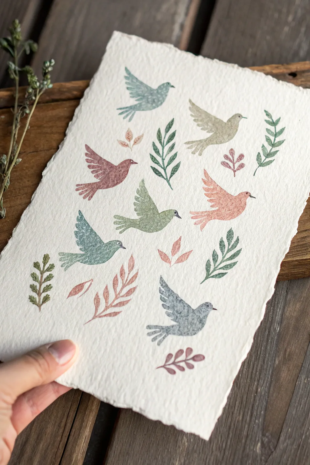
Fingerprint Peace Dove Flock

Capture a sense of serenity with this nature-inspired project featuring a flock of doves and delicate foliage. Using textured paper and soft, muted ink tones, you’ll create a composition that feels both vintage and organic.
Detailed Instructions
Materials
- Heavyweight cold-press watercolor paper or handmade cotton rag paper (deckled edge preferred)
- Rubber stamps: Dove/bird silhouette (flying pose)
- Rubber stamps: Various botanical sprigs/leaves
- Ink pads in muted earth tones: Sage Green, Dusty Rose, Slate Blue, Terra Cotta, and Olive
- Scrap paper for testing
- Damp cloth or stamp cleaner
- Flat, hard surface for stamping
Step 1: Preparation & Layout
-
Select your paper:
Choose a paper with significant tooth and texture. Handmade cotton rag paper with a deckled (torn-look) edge works perfectly to mimic the rustic feel of the reference image. -
Plan the composition:
Beforeinking, lay your clean stamps down on the paper to visualize the flow. Aim for a scattered, non-linear pattern where birds are flying in slightly different directions to create movement. -
Test your colors:
On a scrap piece of similar paper, test your ink colors. The textured paper will absorb ink differently than smooth paper, often resulting in a softer, more mottled look.
Clean Impressions
On heavily textured paper, place a thin foam mat or a stack of paper underneath your artwork while stamping. This ‘give’ helps the stamp make contact with the paper’s valleys.
Step 2: Stamping the Flock
-
Ink the first bird:
Start with a slate blue or grey ink. Tap the stamp pad gently but firmly over the rubber surface to ensure even coverage without flooding the fine details of the feathers. -
First impression:
Place your first bird near the top center or top left. Press straight down with firm, even pressure. Do not rock the stamp, or you’ll smudge the edges. Lift straight up. -
Switch colors:
Clean your stamp thoroughly with a damp cloth. Inking the next bird in a dusty rose or terra cotta shade, position it lower on the page, perhaps flying at an angle. -
Create a visual triangle:
Stamp a third bird in a sage green tone to form a loose triangular arrangement with the first two. This anchors the composition. -
Fill the gaps:
Continue stamping birds in alternating colors—grey, pink, green, and beige. Leave approximately 1-2 inches of space between them for the botanical elements later. -
Vary the angles:
Rotate your wrist slightly for each stamp so the birds aren’t all flying on the exact same horizontal distinct line; some should look like they are ascending while others are gliding level.
Step 3: Adding Botanical Accents
-
Choose leaf placements:
Identify the larger negative spaces between the birds. These voids are perfect for your botanical stamps. -
Stamp the large fronds:
Using an olive or deep green ink, stamp the larger, fern-like fronds first. Let them curve naturally around the birds, framing their movement. -
Add smaller sprigs:
Switch to a smaller leaf stamp and a contrasting color, like the terra cotta or a soft distinct brown. Tuck these small sprigs into tighter corners or near the edges of the paper. -
Overlap carefully:
It is okay if a leaf tip slightly touches a bird’s tail, but try to keep the elements mostly distinct to maintain that airy, floating quality. -
Balance the colors:
If you have a large cluster of green birds, place a pink or brown leaf nearby to balance the color distribution across the page. -
Final touches:
Look for any awkwardly large empty spots. A tiny, single-leaf stamp or even a second pale impression (stamping without re-inking) can fill these subtly. -
Dry completely:
pigment inks can take a little longer to dry on textured paper. Let the artwork sit undisturbed for at least 15 minutes before handling or framing.
Creative Edge
Instead of pre-dyed ink pads, use watercolor markers to color directly on the rubber stamp. Mist with water before stamping for a dreamy, painterly effect.
Once the ink has fully settled into the fibers, your peaceful avian artwork is ready to be displayed or sent as a thoughtful greeting

Have a question or want to share your own experience? I'd love to hear from you in the comments below!