Grab your favorite set of graphite pencils because we are diving into a world of monochrome magic today. Whether you are looking for a quick sketch to fill a quiet afternoon or a detailed study to challenge your shading skills, these concepts will get your creative gears turning.
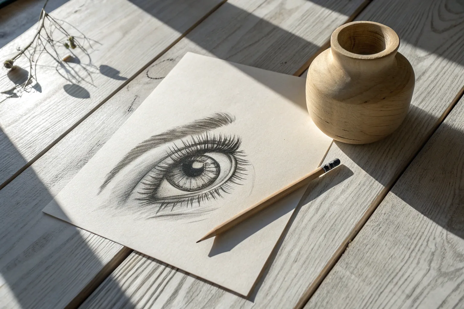
The Classic Realistic Eye Study
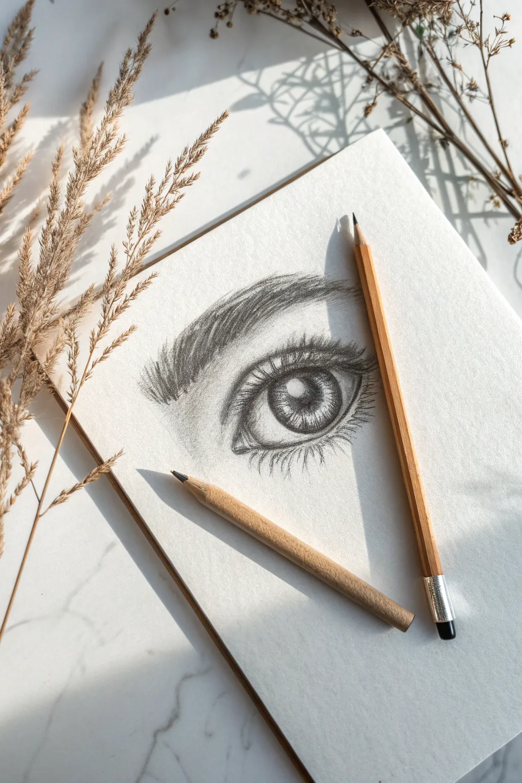
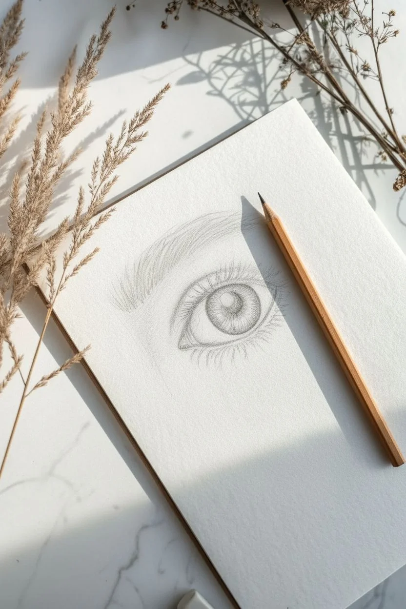
Capturing the soul of a subject starts with the eyes, and this project focuses on rendering a realistic graphite eye study. You will build depth through layering shading and create texture with precise stroke work, resulting in a captivating sketch.
How-To Guide
Materials
- Sketchbook with medium tooth paper
- HB or H pencil (for sketching)
- 2B and 4B pencils (for shading)
- Pencil sharpener
- Kneaded eraser
Step 1: Structural Sketch
-
Outline the shape:
Using your HB pencil, lightly sketch a classic almond shape. Keep the inner corner slightly lower than the outer corner for a natural tilt. -
Place the iris:
Draw a large circle for the iris. Ensure the top and bottom of the circle are slightly cut off by the eyelids so the eye doesn’t look startled. -
Define pupil and highlight:
Draw a smaller circle in the absolute center for the pupil. Immediately mark a small white rectangle or circle overlapping the pupil and iris; this ‘catchlight’ must stay paper-white. -
Sketch the creases:
Draw a curved line above the eye to indicate the upper eyelid crease, following the shape of the almond. -
Map the brow:
Lightly outline the general shape of the eyebrow above the eye, wider at the nose bridge and tapering toward the temple.
Clean Lines
Place a scrap piece of paper under your drawing hand. This acts as a barrier, preventing the oils in your skin from smearing your graphite work or dirtying the paper.
Step 2: Shading the Eye
-
Fill the darkest voids:
Switch to a 4B pencil and fill in the pupil completely black, being extremely careful not to shade over your catchlight zone. -
Darken the rim:
Trace the outer ring of the iris (the limbus) with a dark, thick line to define the separation from the white of the eye. -
Add iris spokes:
Draw lines characteristic of the iris radiating outward from the pupil like bicycle spokes. Vary your pressure to make some lines darker and some lighter. -
Cast the shadow:
I like to shade the top third of the iris darker than the rest to mimic the shadow cast by the upper eyelid and lashes. -
Shade the sclera:
The white of the eye isn’t flat. Lightly shade the corners with your 2B pencil to make the eyeball look spherical. -
Define the tear duct:
Add subtle shading to the inner corner (tear duct), leaving small spot highlights to make it look moist.
Step 3: Skin and Texture
-
Deepen the socket:
Go back to the eyelid crease line you drew earlier and darken it. Shade upward from the crease to suggest the depth of the eye socket. -
Under-eye volume:
Add soft shading beneath the lower lash line to suggest the curve of the lower lid. -
Base brow shading:
Lightly shade the entire area of the eyebrow outline with a mid-tone value to act as a background for the hairs. -
Draw brow hairs:
Sharpen your pencil to a fine point. Draw individual brow hairs using quick flicking motions, starting from the bottom of the brow and lifting up and out.
Pro Tip: Hair Direction
Eyebrow hairs don’t all grow the same way. Near the nose, draw them upward. As you move to the arch, angle them sideways. At the tail, stroke downward.
Step 4: Lashes and Final Details
-
Upper lash technique:
Place your pencil on the upper rim, moving downward slightly before sweeping upward in a long ‘J’ curve. This creates the natural weight of lashes. -
Clumping lashes:
Group the upper lashes slightly so they form little triangles rather than standing straight like a picket fence. -
Lower lashes:
Draw the bottom lashes shorter and sparser than the top ones. Keep a small gap between the lashes and the actual eye onto the ‘waterline’. -
Final contrast check:
Assess your values. Re-darken the pupil and the base of the lashes if they have faded during blending to ensure the drawing pops.
Step back and admire the intense gaze you have created using nothing but graphite and patience.

Soft Botanical Rose Sketches
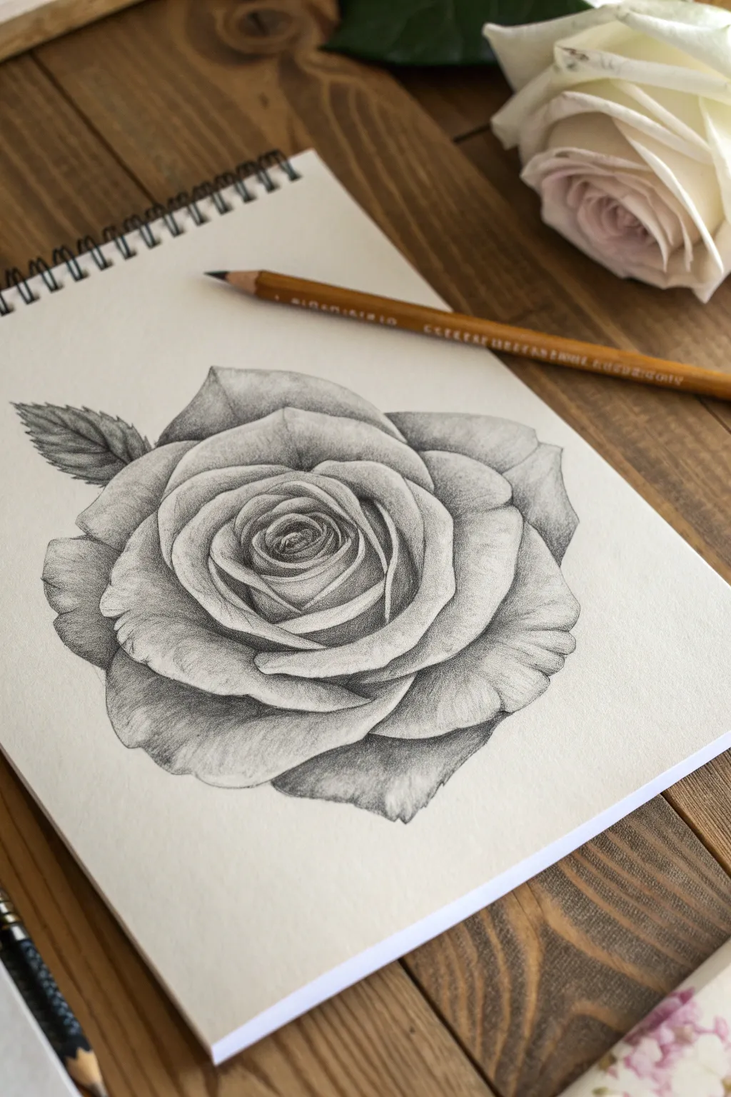
Capture the ephemeral beauty of a blooming rose with this study of soft gradients and sharp contrasts. Using simple graphite layering techniques, you will build a flower that looks heavy, realistic, and velvety to the touch.
Step-by-Step Tutorial
Materials
- Sketchbook paper (medium tooth)
- H or HB pencil (for outlining)
- 2B and 4B pencils (for shading)
- Kneaded eraser
- Pencil sharpener
- Tissue or blending stump (optional)
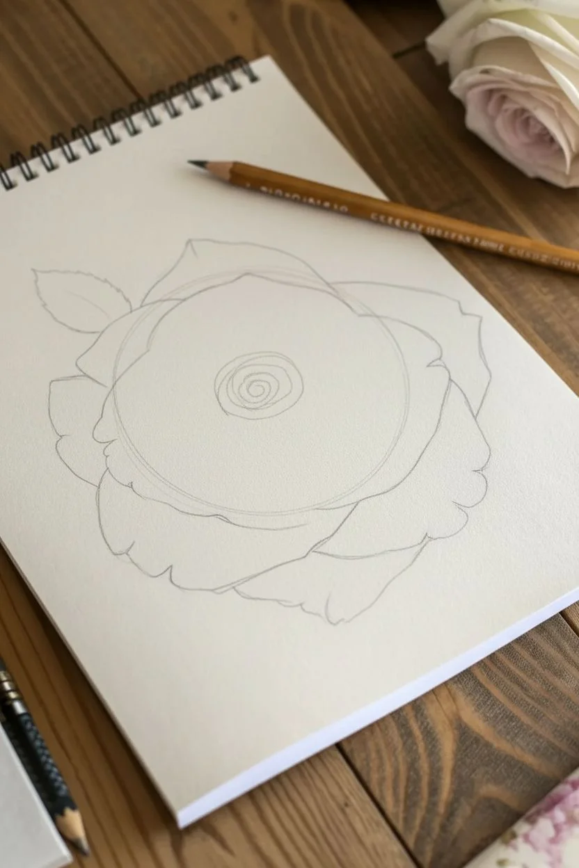
Step 1: Structural Foundation
-
Basic placement:
Using your H or HB pencil with very light pressure, draw a loose circle in the center of your page to determine the overall size of the flower head. -
The central spiral:
Inside the circle, sketch a small, tight spiral slightly off-center; this represents the tightly wound innermost petals of the rose. -
Unfolding layers:
Draw heart-shaped curves surrounding the spiral, allowing them to overlap naturally to establish the mid-layer petals. -
Outer boundaries:
Sketch large, wide, slightly drooping petals around the perimeter, letting the edges curl slightly to create a generous, blooming silhouette. -
Adding foliage:
extend a single leaf shape from the left side of the rose, indicating a central vein line for direction.
Step 2: Developing the Core
-
Establishing the darkest darks:
Switch to your 2B pencil. Go directly into the very center of the spiral and darken the deepest crevices where no light hits. -
Defining the edges:
Sharpen the outlines of the inner petals, pressing harder at the base of each petal and lifting pressure as you move toward the edges. -
Mid-tone shading:
Lightly shade the inner walls of the spiral petals, leaving the very tops white to represent light catching the rim. -
Creating separation:
I like to darken the shadow exactly underneath each overlapping petal to make the lighter petal above it pop forward visually.
Smudge Control
Place a clean sheet of scrap paper under your drawing hand. This acts as a shield, preventing your skin oils and movement from smearing the graphite work you’ve already completed.
Step 3: Petal Texture and Volume
-
Broad shading:
Moving to the middle ring of petals, apply soft graphite shading starting from the base of the petal upwards, fading out before you reach the edge. -
Contouring:
Use curved hatching lines that follow the bowl-shape of the petal; this directional shading helps the flower look round rather than flat. -
Ruffled edges:
Refine the outer edges of the large petals, adding tiny dips, tears, and wobbles to mimic organic, ruffled rose textures. -
Deepening shadows:
Use a 4B pencil to reinforce the cast shadows underneath the large outer petals, creating a high-contrast look that suggests deep folds. -
Subtle veining:
With a very sharp HB pencil, sketch faint, branching veins on the larger petals, keeping them subtle so they don’t overpower the shading.
Pro Tip: Directional Stroke
When shading petals, ensure your pencil strokes curve with the shape of the flower. If you shade in straight, flat lines, the petals will look stiff rather than organic and curved.
Step 4: Foliage and Final Polish
-
Serrated leaf edge:
Outline the leaf on the left with a zagged, sawtooth pattern to resemble real rose foliage. -
Leaf shading:
Fill the leaf with a medium-dark tone (2B), pressing harder than you did for the flower to suggest the darker green color of the leaves. -
Leaf details:
Draw crisp, dark veins inside the leaf, shading slightly heavily on one side of the central vein to give it a V-shape. -
Highlight recovery:
Take your kneaded eraser and dab (do not rub) the tops of the petals to lift off graphite and reclaim bright white highlights. -
Final assessment:
I always do a final pass to clean up any smudges on the white paper around the drawing, ensuring the silhouette looks crisp.
Take a moment to admire the depth you have created before signing your masterpiece


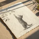
Fluffy Cat Portraits and Fur Texture
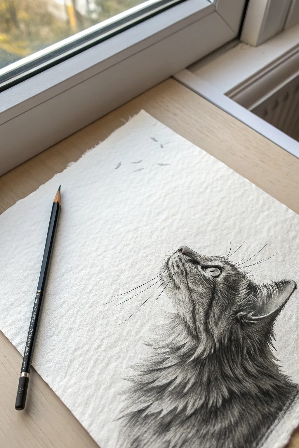
Capture the elegance of a cat in profile, focusing on the intricate challenge of rendering realistic fur layers. This project emphasizes directional stroke work and high-contrast shading on beautifully textured paper.
Detailed Instructions
Materials
- High-quality drawing paper (cold press or textured)
- Graphite pencils (range H, HB, 2B, 4B, 6B)
- Kneaded eraser
- Precision eraser (stick eraser)
- Blending stump
- Ruler (for tearing paper)
Step 1: Preparation and Outline
-
Paper prep:
To achieve the organic look shown in the reference, create a deckled edge on your paper. Place a ruler along the edge, dampen the paper line slightly with a wet brush, and gently tear the excess paper away to create a soft, fibrous border. -
Basic shapes:
Using an H pencil with very light pressure, sketch a circle for the head and a sweeping curve extending downward for the chest. Add a triangular shape for the ear. -
Profile refinement:
Carve out the profile view. define the slope of the forehead, the slight bump of the nose, and the curve of the chin. Mark the position of the eye, ensuring it sits deep enough in the skull structure.
Step 2: The Eye and Face
-
The focal point:
Start detailing the eye. Outline the almond shape and draw the pupil. Crucially, leave a crisp, white circle empty for the reflection highlight—this brings the cat to life. -
Shading the iris:
Fill the pupil with a 4B or 6B for a deep black. Shade the iris with radial lines moving from the pupil outward, keeping the tone lighter near the bottom of the iris to suggest transparency. -
Facial markings:
Switch to a 2B pencil to establish the tabby patterns. Draw the dark ‘M’ shape lines on the forehead and the stripe extending from the outer corner of the eye. -
Short fur texture:
On the nose and bridge, use very short, controlled ticks. The fur here is dense and velvety, so keep strokes tiny and close together, following the curve of the bone structure.
Troubleshooting: Wire Fur?
If fur looks like stiff wire, your stroke is too uniform. Flick your wrist at the end of each line to taper it. Also, group hairs into clumps rather than drawing every single strand individually.
Step 3: Building the Fluff
-
Mapping direction:
Before heavy shading, lightly map out the direction the fur grows on the neck and chest. I like to use faint arrows as a guide, ensuring the fur sweeps downward and backward. -
Layering the mane:
Start the neck ruff with an HB pencil. clear strokes that taper at the end. Establish the shadowed areas first, where clumps of fur overlap. -
Deepening contrast:
Use a 4B or 6B pencil to darken the areas deep between the fur tufts. This negative space delineates the lighter hairs on top without outlining them individually. -
Creating movement:
Work your way down the chest with longer, sweeping strokes. Vary the pressure: press down at the start of the hair root and flick up quickly at the end to create a fine, tapered tip. -
Ear details:
Return to the ear and add the long, wispy hairs growing from the inside distinct from the short velvet fur on the back of the ear. darken the outer rim for separation.
Level Up: Texture Pop
Place a scrap piece of paper under your hand to prevent smudging your work. This keeps the whites of the textured paper crisp, increasing the contrast against the dark graphite strokes.
Step 4: Final Details and Atmosphere
-
Whiskers:
Sharpen your 4B pencil to a needle point. Execute the whiskers with confident, quick strokes. They should originate from the muzzle pads and arc gracefully outward. -
Eyebrow whiskers:
Add the longer vibrissae (whiskers) above the eye. These are thinner and curve upwards. Ensure lines are smooth; a shaky line breaks the illusion. -
Highlight recovery:
Take your precision eraser and lift out thin highlights along the crests of the fur clumps on the chest to enhance the lighting. -
Atmospheric elements:
To mimic the reference image, lightly sketch a few faint, floating shapes in the upper empty space. These soft, indefinite marks suggest falling leaves or birds in the distance.
Step back and admire the soft textures you’ve created, noting how the directional strokes give your subject volume and life.


Atmospheric Forest Landscapes
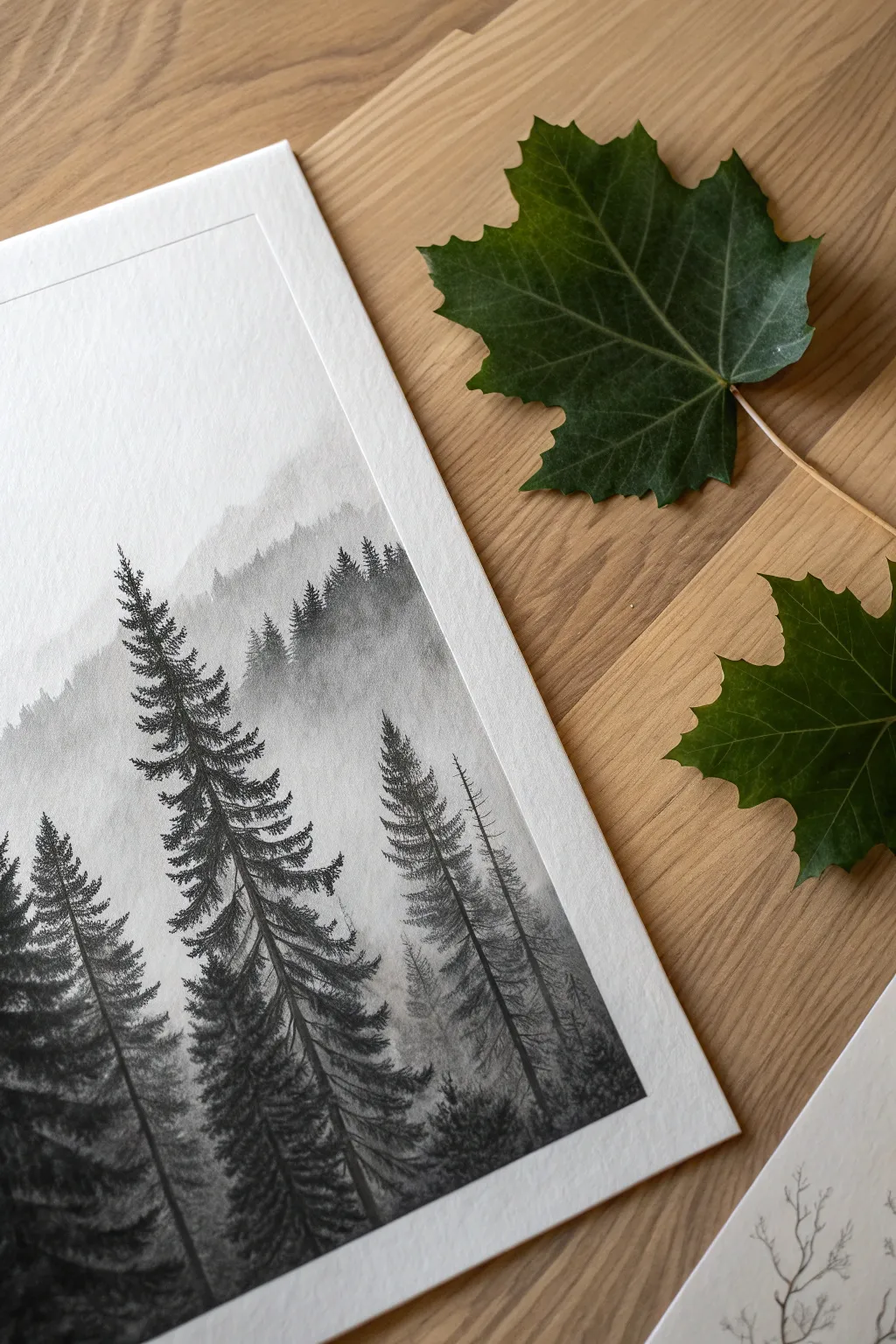
Master the art of atmospheric perspective with this serene, monochromatic landscape drawing. By layering varying shades of graphite from faint gray to deep black, you will create a stunning illusion of depth and fog in a dense pine forest.
Step-by-Step Tutorial
Materials
- Heavyweight textured drawing paper (vellum or cold press surface)
- Graphite pencils (Range: 2H, HB, 2B, 4B, 6B)
- Kneaded eraser
- Ruler
- Masking tape or artist tape
- Pencil sharpener
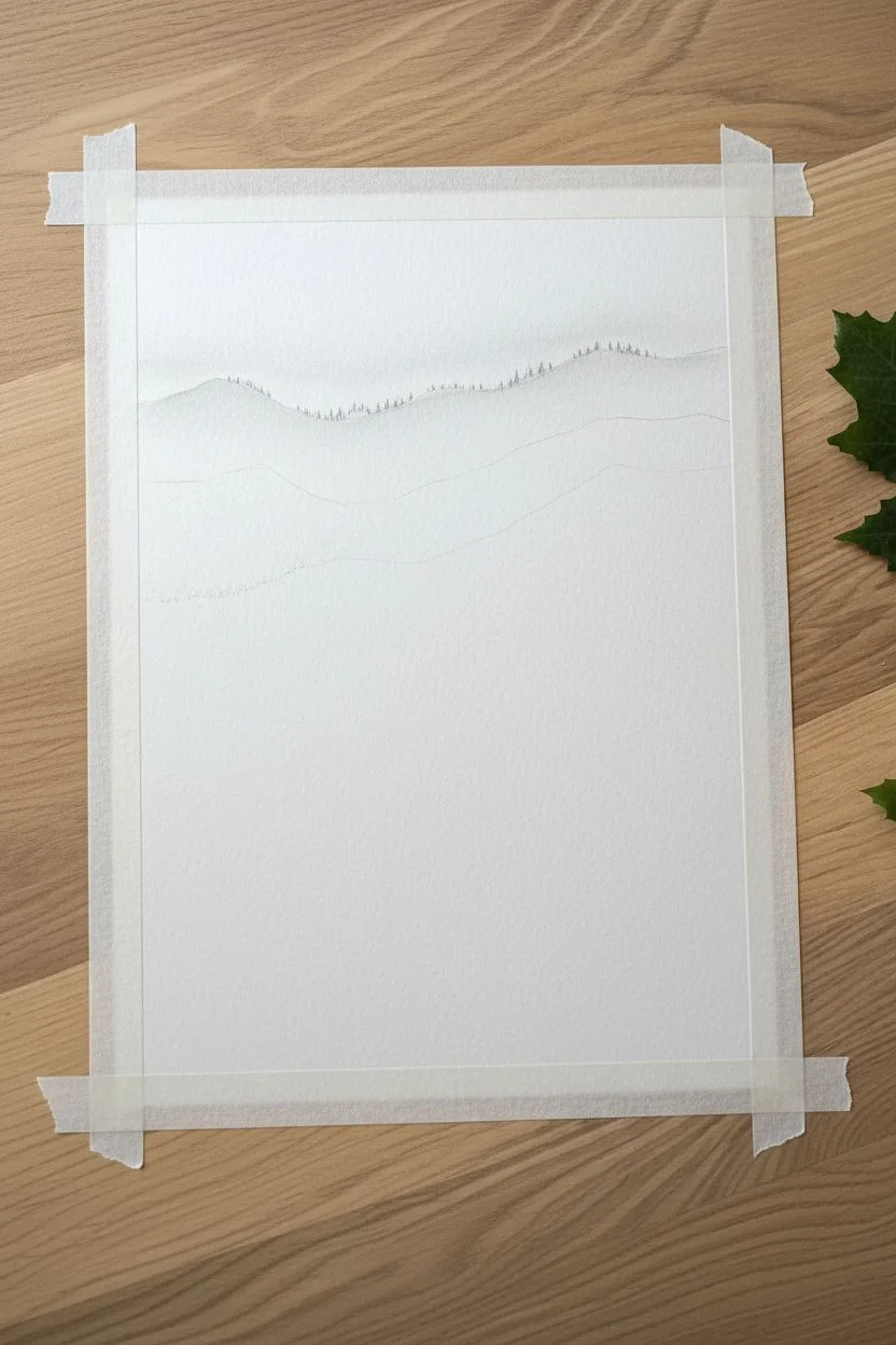
Step 1: Setting the Scene
-
Prepare the borders:
Begin by using masking tape to secure your paper to a work surface, or use a ruler and a light pencil touch to draw a crisp rectangular border about an inch from the edge of the paper. -
Map the horizon layers:
With a hard 2H pencil, very faintly sketch three to four horizontal, wavy lines across the paper to establish where your different mountain ridges will sit. -
The furthest distance:
Looking at the highest ridge line, use the 2H pencil to gently shade the silhouette of the furthest mountain, keeping the tone extremely pale and uniform. -
Distant tree line:
Along the top edge of this faint mountain, add tiny, jagged vertical strokes to suggest a microscopic forest line that barely breaks the horizon.
Step 2: Building the Mid-Ground
-
Establish the second ridge:
Move down to your next planned ridge line. Switch to an HB pencil to create a slightly darker gray value than the layer above it. -
Create distinct tree shapes:
Instead of a solid line, draw rows of small, pointed triangular shapes to represent the tops of pine trees in the middle distance. -
Fade into fog:
As you shade the body of this middle ridge, gradually lighten your pressure as you move downward toward the bottom of the ridge. This gradient mimics fog settling in the valley. -
Layering the lower mid-ground:
Repeat this process for the next ridge closer to you, switching to a 2B pencil. Make the tree tops slightly larger and the shading darker, but maintain that crucial fade-to-white at the bottom of the section.
Fog Control
If your fog layer looks dirty or ‘muddy’ rather than misty, use a clean kneaded eraser rolled into a log shape. Roll it gently over the gray areas to lift excess graphic dust without smearing it.
Step 3: The Foreground Giants
-
Positioning the main trees:
Identify where you want your large, detailed foreground trees to stand. Lightly draw vertical lines with an HB pencil to act as the central trunks/guides. -
Texturing the foliage:
Switch to your softest pencils, like 4B or 6B. Start at the top of your main tree guide and use short, scribbling strokes that flick downward and outward to create pine needles. -
Building branch density:
Work your way down the trunk, making the branches wider as you descend. Leave small gaps of white paper between some branches to keep the tree looking natural rather than solid black. -
Deepening the contrast:
Go back over the shadowed areas of the foreground trees with your 6B pencil. Press firmly to press the graphite into the paper’s texture for a rich, deep black. -
Adding secondary trees:
Draw one or two thinner, slightly lighter trees (using a 2B) next to the main dark ones to create variety in the immediate foreground. -
Grounding the scene:
Fill in the bottom corners of the drawing with heavy textured shading to represent the forest floor and underbrush, anchoring the large trees.
Winter Edition
To turn this into a snowy scene, use a white gel pen or white gouache at the very end. Add tiny dots of white on the tops of the black foreground branches to simulate heavy snowfall resting on the pines.
Step 4: Finishing Touches
-
Refining the mist:
Take your kneaded eraser and gently dab (do not rub) the areas between the tree layers to lift graphite and enhance the foggy effect. -
Enhancing textures:
I like to take a sharpened HB pencil and add a few stray, sharp branches sticking out from the soft dark masses of the foreground trees for realistic detail. -
The reveal:
Once you are satisfied with the contrast between duplicate layers, carefully peel away the tape or erase your guide border to reveal the crisp, clean edges.
Step back and admire how simple pencil lines have transformed into a calm, deep woodland view.

PENCIL GUIDE
Understanding Pencil Grades from H to B
From first sketch to finished drawing — learn pencil grades, line control, and shading techniques.
Explore the Full Guide
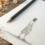
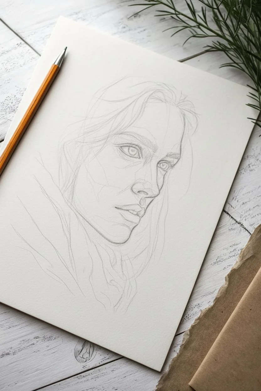
Expressive Hand Gestures
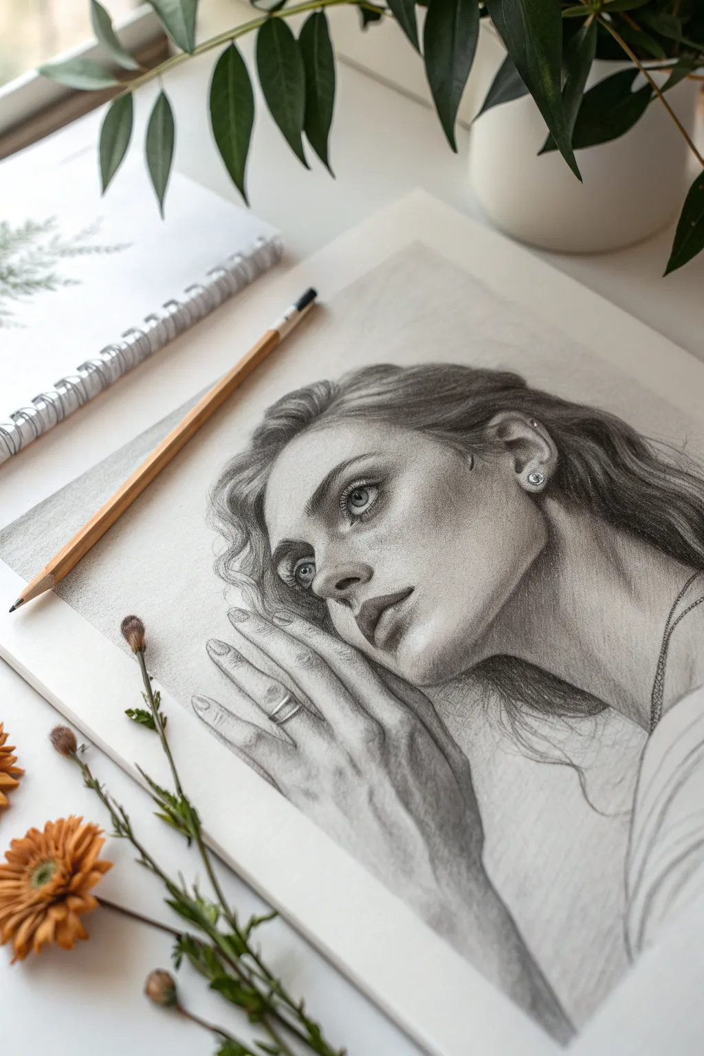
Capture the subtle emotion of a quiet moment with this realistic pencil drawing. You will focus on the intricate interplay between facial features and the delicate tension of a hand resting against the cheek.
How-To Guide
Materials
- High-quality drawing paper (Bristol or smooth surface)
- Graphite pencils (2H, HB, 2B, 4B, 6B)
- Kneaded eraser
- Precision eraser (for highlights)
- Blending stumps or tortillons
- Tissue or soft brush
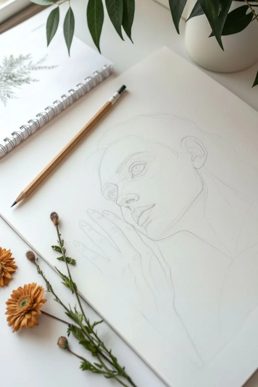
Step 1: Constructing the Framework
-
Establish the composition:
Begin with a 2H pencil, lightly sketching a large oval for the head and a blocky, angular shape for the hand. Position the hand so the fingers extend gracefully up the cheek and jawline. -
Map facial proportions:
Draw faint guidelines for the eyes, nose, and mouth. Observe that the face is slightly tilted; ensure your axis line reflects this angle. -
Refine the contour:
Outline the specific shapes of the features. Pay close attention to the negative space between the fingers, and sketch the ring on the ring finger. -
Initial clean-up:
Once satisfied with the proportions, gently lift the darkest structural lines with a kneaded eraser so they are barely visible before shading.
Step 2: Shaping the Face
-
Detail the eyes:
Using a 2B pencil, darken the pupils and outline the iris. Shade the iris with radial strokes, leaving a small white circle for the catchlight to create life. -
Sculpt the nose and lips:
Shade the nostrils and the underside of the nose. For the lips, shade the upper lip darker than the lower one, using vertical strokes to mimic natural texture. -
Build skin tone:
With an HB pencil, apply a soft, even layer of graphite over the face. Use a circular motion to avoid harsh lines, then smooth it out gently with a tissue. -
Deepen facial shadows:
Switch to a 4B pencil to deepen the shadows around the eyes, under the nose, and the side of the face interacting with the hair. -
Add skin texture:
Using a sharpened HB or H pencil, lightly tap small dots across the nose and cheeks to create natural-looking freckles. Vary the pressure so some are faint and others distinct.
Separation Pro-Tip
To keep the hand looking realistic against the face, avoid drawing a dark outline between them. Rely on shadows cast by the hand onto the cheek to separate the forms.
Step 3: The Expressive Hand
-
Define finger volume:
Shade the fingers as cylinders using an HB pencil. Observe where the light hits the knuckles and leave those areas lighter. -
Create contact shadows:
I prefer to use a 4B pencil here to darken the crevices between the fingers and the deep shadow where the hand presses against the cheek. -
Detail the hand anatomy:
Lightly sketch the tendons on the back of the hand and the wrinkles at the knuckles. Keep these subtle so the hand looks youthful but realistic. -
Render the ring:
Draw the ring with high contrast. Use a 6B for the dark metal reflections and leave the paper pure white for the metallic highlights.
Level Up: Texture
Make the drawing your own by changing the texture of the clothing at the bottom right, perhaps sketching a knit sweater or a lace collar for added complexity.
Step 4: Hair and Atmosphere
-
Establish hair flow:
Using long, sweeping strokes with a 2B pencil, map out the wavy strands of hair flowing back from the forehead. -
Deepen hair values:
Layer 4B and 6B pencils in the crevices of the hair waves to create depth and volume. Lift out highlights with a precision eraser to make the hair look shiny. -
Add the earring:
Draw the small stud earring with sharp contrast, similar to the ring, to catch the viewer’s eye. -
Background shading:
Lightly shade the background behind the head with a soft graphite wash. This pushes the portrait forward and adds atmosphere.
Take a moment to admire the lifelike depth you’ve achieved through careful observation and layering.
Hyper-Realistic Water Droplets
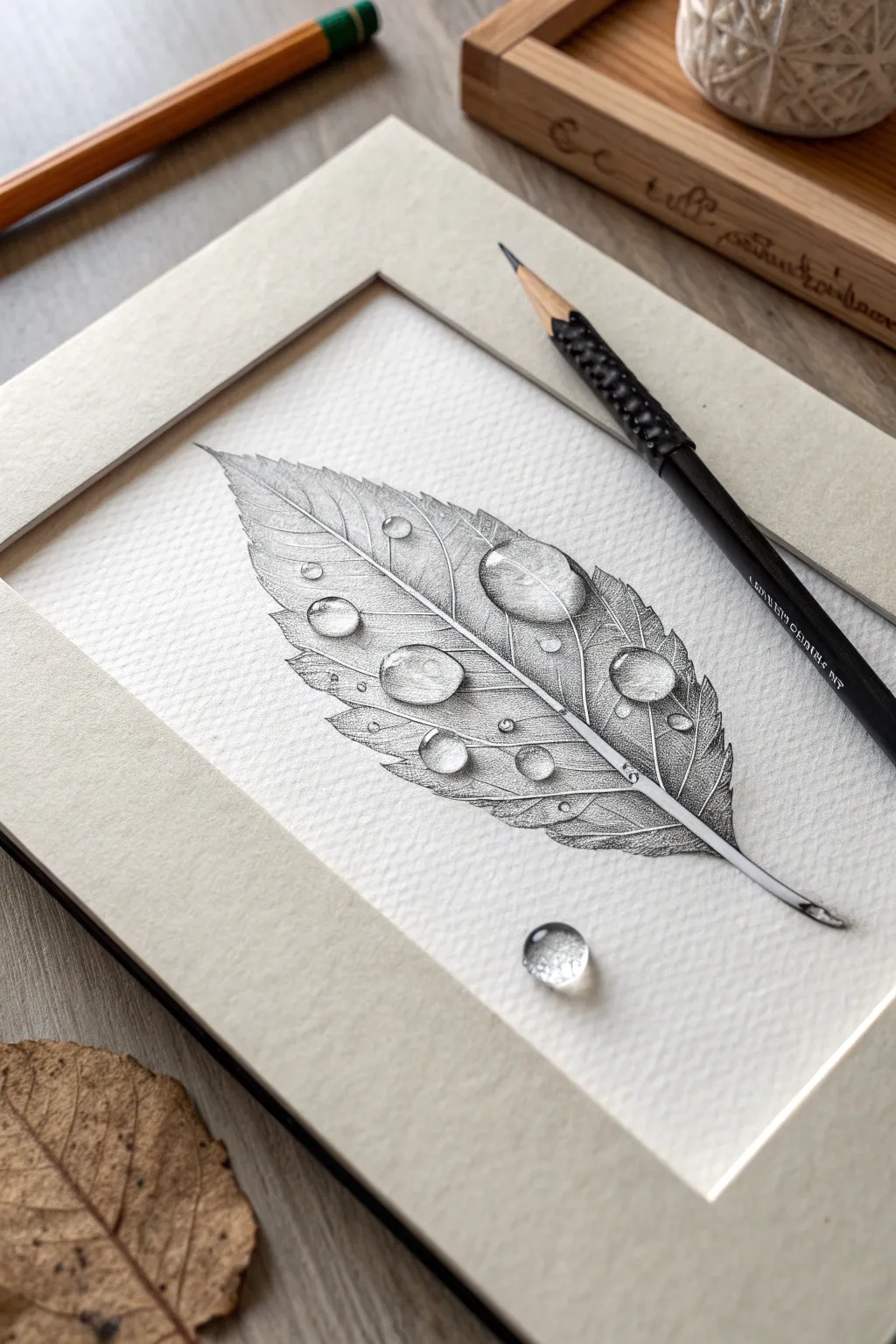
Master the art of texture and transparency with this intricate pencil study. You will create a highly detailed serrated leaf featuring three-dimensional water droplets that appear to rise right off the paper.
Step-by-Step Guide
Materials
- High-quality drawing paper with medium tooth (e.g., Bristol Vellum)
- Graphite pencils (HB, 2B, 4B, 6B)
- Mechanical pencil (0.5mm 2B) for fine details
- Kneaded eraser
- Precision eraser (e.g., Mono Zero)
- Blending stump or tortillon
- White gel pen (optional)
- Soft brush for drafting dust
Step 1: Structure & Outline
-
Establish the curve:
Using an HB pencil with a very light hand, draw the central vein (midrib) of the leaf as a gentle, graceful arc. -
Define the perimeter:
Sketch the serrated outline of the leaf around the midrib. Keep the jagged edges organic rather than perfectly uniform. -
Map the veins:
Draw the secondary veins branching outward from the center to the edges, spacing them evenly but allowing for natural variation. -
Position the droplets:
Lightly sketch varying sizes of circles and ovals on top of the leaf to mark where the water drops will sit. -
The trompe l’oeil element:
Sketch one small, solitary droplet on the empty white space below the leaf tip to create an illusion of depth.
Step 2: Shading the Leaf
-
Base shading:
Switch to a 2B pencil and begin shading the leaf sections between the veins, avoiding the droplet outlines entirely. -
Build texture:
Use short, hatched strokes following the direction of the veins to act as the fibrous texture of the plant matter. -
Deepen the ridges:
Darken the areas immediately adjacent to the veins to make the vein ridges appear raised and lighter by contrast. -
Refine edges:
I like to use a mechanical pencil here to sharpen the serrated outer edges of the leaf, adding crisp definition. -
Increase tonal value:
Layer 4B graphite over the darker areas of the leaf to enrich the tone, ensuring the paper tooth still shows through slightly.
Pro Tip: The Lens Effect
Water droplets act like magnifying lenses. When drawing the leaf texture inside the droplet, make the veins slightly larger and more curved than the surrounding lines to sell the illusion.
Step 3: Creating the Water Droplets
-
Internal details:
Inside the larger droplets, draw faint continuations of the leaf veins, but curve them slightly to mimic optical distortion. -
Preserve the glint:
Mark a small shape near the top of the droplet to remain pure white; this is your specular highlight. -
Gradient shading:
Shade the top inside of the droplet (around the highlight) with a dark gradient, fading to a lighter tone as you move downward. -
The refraction light:
Leave the very bottom curve inside the droplet significantly lighter to represent light refracting through the water. -
Cast shadow:
With a 6B pencil, draw a dark, sharp shadow underneath the droplet on the leaf surface, strictly opposite the highlight. -
Softening shadows:
Blend the edges of the cast shadow slightly so it integrates with the leaf texture, anchoring the liquid.
Troubleshooting: Flat Droplets?
If a droplet looks flat, check your contrast. The darkest dark (the cast shadow) and the brightest bright (the distinct highlight) must act as neighbors to create the 3D volume.
Step 4: Final Polish
-
Contrast adjustment:
Darken the leaf texture surrounding the droplets to enhance the look of transparency and make the drops pop. -
Lifting lights:
Use a precision eraser to lift subtle highlights along the top ridges of the main leaf veins. -
The lone drop:
Shade the isolated droplet on the white paper using the same technique: dark top, light bottom, and a crisp cast shadow. -
Ultimate highlights:
If your paper white isn’t bright enough, add a tiny dot of white gel pen to the highlight of each droplet for a wet look.
Step back and admire how your careful attention to light and shadow has turned simple graphite marks into a realistic, tangible object.
BRUSH GUIDE
The Right Brush for Every Stroke
From clean lines to bold texture — master brush choice, stroke control, and essential techniques.
Explore the Full Guide
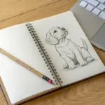
Detailed Bird Feathers and Wings
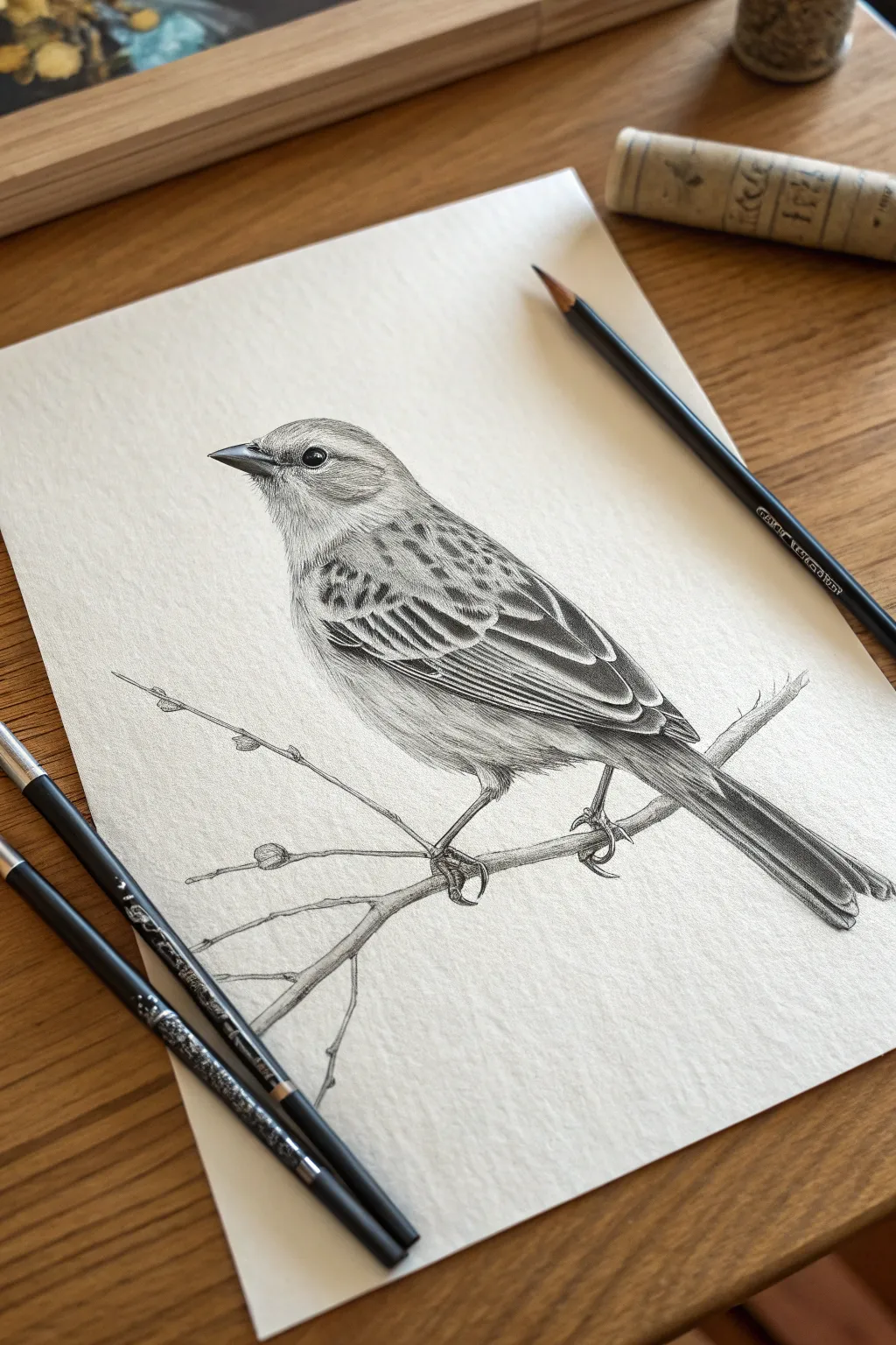
Capture the delicate texture and complex patterns of a perched sparrow in this detailed graphite study. You’ll focus heavily on layering pencil strokes to differentiate between the sleek flight feathers and the fluffy down on the bird’s chest.
How-To Guide
Materials
- Textured heavy-weight drawing paper (approx. 150gsm)
- Graphite pencils (2H, HB, 2B, 4B, and 6B)
- Kneaded eraser
- Precision eraser (like a Mono Zero) or sharp vinyl eraser
- Blending stump
- Pencil sharpener
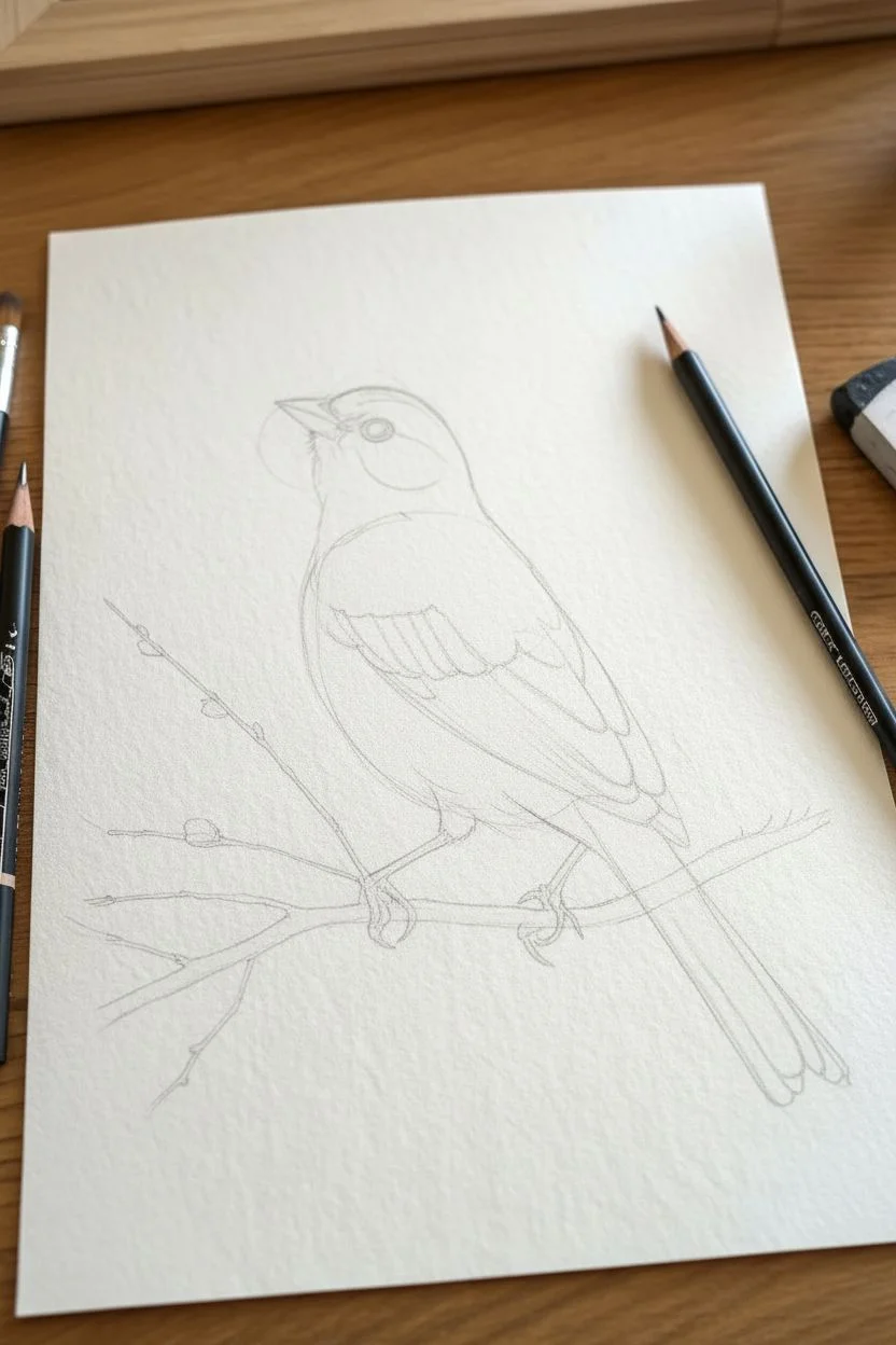
Step 1: Structural Sketch
-
Basic shapes:
Begin with a sharpened 2H pencil. Lightly sketch an oval for the bird’s body and a smaller circle for the head, ensuring they slightly overlap. -
Connecting the form:
Draw curved lines to connect the head to the body, forming the neck. Sketch a small triangle for the beak and a long, rectangular shape extending back for the tail feathers. -
Perch placement:
Sketch the main branch running diagonally beneath the bird, adding thin off-shoot twigs. Indicate the position of the feet with simple curved lines to ensure the bird looks grounded. -
Refining the outline:
Go over your shapes to create a singular, clean contour of the bird. Erase the internal construction lines gently with a kneaded eraser so only a faint guide remains.
Smudge Alert
Graphite smudges easily. Place a clean sheet of scrap paper under your drawing hand to protect finished areas while you work on the rest of the bird.
Step 2: Face and Head Detail
-
The eye:
Switch to a 4B pencil for the pupil. I usually leave a tiny, sharp circle of white paper uncolored to act as the reflection highlight—this brings the bird to life immediately. -
Beak structure:
Outline the beak with an HB pencil. Shade the upper mandible darker than the lower one, leaving a thin light strip on top to show dimension. -
Head feathers:
Using an HB pencil, draw short, flicking strokes radiating away from the beak. Keep these strokes very small to mimic the dense, short feathers mostly found on the crown.
Level Up
Try using a very light wash of watercolor or brown ink over the branch after drawing to give the piece a subtle mixed-media pop without overpowering the sketch.
Step 3: Wings and Body Texture
-
Mapping the wing:
Lightly draw the major shapes of the wing feathers using a 2H pencil. Notice how they layer like roof shingles; getting this overlap right is key to a realistic wing. -
Dark wing patterns:
Use a sharp 4B pencil to draw the distinctive dark markings inside the individual wing feathers. These shapes are roughly triangular or teardrop-like. -
Wing feather definition:
With a 2B pencil, shade the rest of the wing feathers, pressing lighter as you reach the edges of each feather to create a separated, layered look. -
Chest fluff:
Change your stroke style for the chest and belly. Use soft, curved hatching with an HB pencil to create the look of downy, fluffy feathers rather than rigid flight feathers. -
Underbelly shading:
Deepen the shading where the wing casts a shadow on the body and along the bottom of the belly to give the bird weight and roundness. -
Tail feathers:
Draw long, linear strokes for the tail. Use a 6B pencil to darken the gaps between the tail feathers to separate them visually.
Step 4: Feet and Branch
-
Claws and grip:
Outline the toes with a sharp 2B. Pay attention to the knuckles and talons, shading the underside significantly darker to show they are gripping the branch tightly. -
Wood texture:
Shade the branch using irregular, long horizontal strokes. Add small knots and variations in pressure to mimic rough bark texture. -
Cast shadows:
Add a dark shadow directly under the bird’s feet and tail on the branch to firmly anchor the subject to the perch.
Step 5: Final Polishing
-
Deepening contrast:
Take your darkest pencil (6B) and revisit the darkest areas: the pupil, the deepest wing markings, and the shadows between feathers. -
Highlight recovery:
Use your precision eraser to lift out tiny slivers of graphite on the feather edges and the top of the branch to regain brightness. -
Clean up:
Remove any smudges from the surrounding paper to leave a crisp, professional finish.
Now you have a stunning, lively avian portrait ready to be framed on your wall
Transparent Glass Objects and Reflections
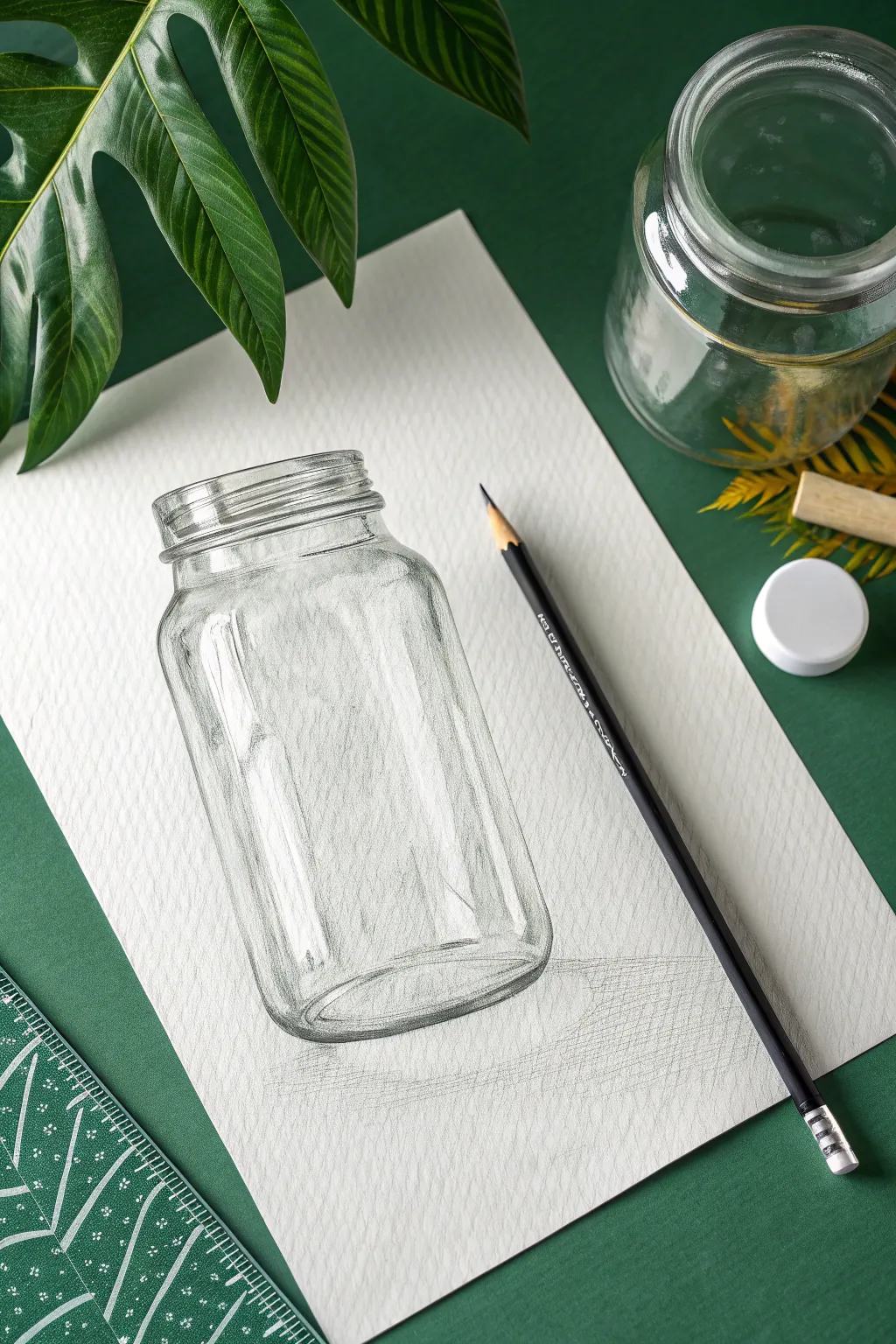
Capturing the look of transparent glass is a magical skill that relies less on drawing the object itself and more on drawing the distortions and reflections around it. This project helps you master high-contrast shading and precise ellipses to create a convincing 3D jar.
Detailed Instructions
Materials
- Graphite pencils (HB for outlines, 2B and 4B for shading)
- Heavyweight textured drawing paper
- Ruler
- Kneaded eraser
- Pencil sharpener
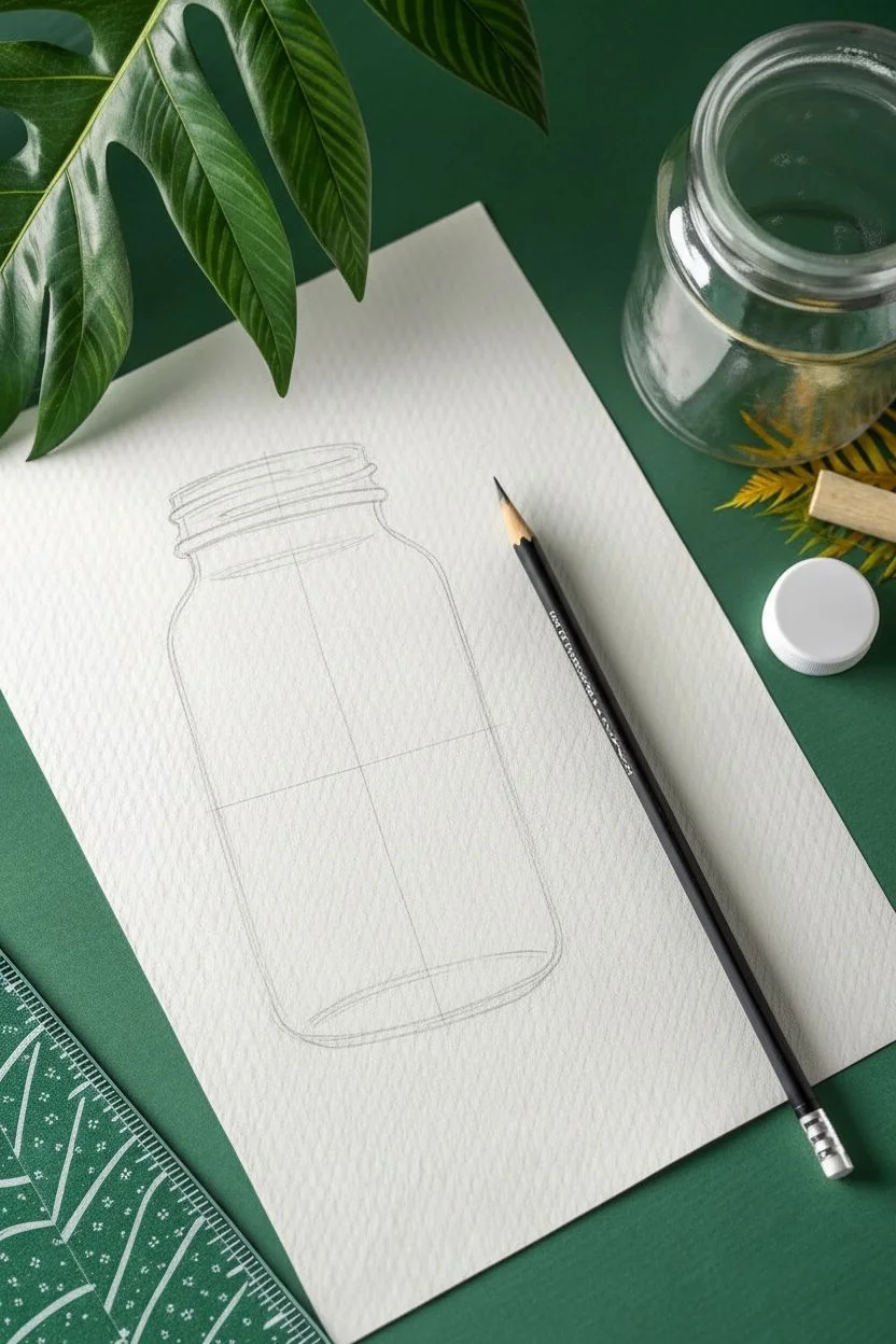
Step 1: Constructing the Frame
-
Establish the axis:
Use your ruler to draw a faint vertical line down the center of your paper. This axis will ensure your jar stands up straight and is perfectly symmetrical. -
Mark boundaries:
Mark the total height of the jar on the axis line. Then, draw horizontal lines to mark the width of the rim, the neck, and the widest part of the body. -
Sketch the ellipses:
Draw a narrow oval (ellipse) at the top mark for the opening. Draw a slightly wider and rounder ellipse at the bottom mark for the base, mimicking the perspective. -
Connect the shape:
Draw the vertical sides of the jar. Create the rounded ‘shoulders’ connecting the neck to the main body, ensuring the curve is identical on both sides of the axis.
Keep it Sharp
The key to drawing glass is crisp transitions. Avoid smudging with your finger. Keep your pencil point extremely sharp to define the hard edges of the rim and base against the paper.
Step 2: Defining the Glass
-
Detail the rim:
From your top ellipse, draw a second line just inside it to indicate the thickness of the glass rim. Erase the back half of the original construction ellipse so only the visible front curves remain. -
Add the threading:
Sketch the screw-top threads on the neck. These are essentially diagonal, parallel curves wrapping around the cylinder. Keep these lines fairly clean and sharp. -
Define the base thickness:
At the bottom, draw a crescent moon shape inside the base ellipse. This represents the thick, heavy glass usually found at the bottom of jars.
Level Up: Refraction
Draw a simple straw or pencil resting inside the jar. Where the object passes behind the glass, slightly offset the lines to visually ‘break’ the object, mimicking real light refraction.
Step 3: Shading and Transparency
-
Map the highlights:
Before shading, very lightly outline high-reflection areas—usually vertical strips on the sides and bright spots on the shoulder—to remind yourself to leave them completely white. -
Apply vertical shading:
Using a sharp HB or 2B pencil, begin shading the body of the jar using vertical hatch marks. Follow the curvature of the glass, keeping your strokes loose but controlled. -
Darken the edges:
Glass appears thickest at the edges. Press harder with a 2B pencil along the far left and right outlines of the jar to create dark, crisp boundaries. -
Shade the threads:
Add contrast to the screw top. The threads act like lenses, so they will have sharp dark lines right next to bright highlights. I find it helps to squint at the subject to see where the darkest contrast lies. -
Detail the uneven glass:
Add subtle, wavy vertical lines inside the jar’s body to suggest the uneven surface of molded glass. Do not color it in solid; allow the texture of the paper to show through.
Step 4: Refining and Anchoring
-
Deepen the base:
Switch to your 4B pencil to darken the bottom crescent. This is where the glass is densest and refracts the most light, so it should have the darkest values in the drawing. -
Lift highlights:
Take your kneaded eraser and shape it into a wedge. clean up the areas you mapped out earlier, erasing any stray graphite to create stark, bright white reflections. -
Cast the shadow:
To place the jar on the table, draw a cast shadow extending to the right. Use diagonal cross-hatching, keeping the shadow darker near the base and fading it out as it moves away. -
Final contrast check:
Review your drawing. If the glass looks ‘cloudy,’ try darkening the outlines and cleaning up the white highlights again to increase the contrast range.
Now that you have mastered the empty vessel, you have a perfect container to start filling with drawn marbles, flowers, or liquids


Traditional Skull Studies for Anatomy
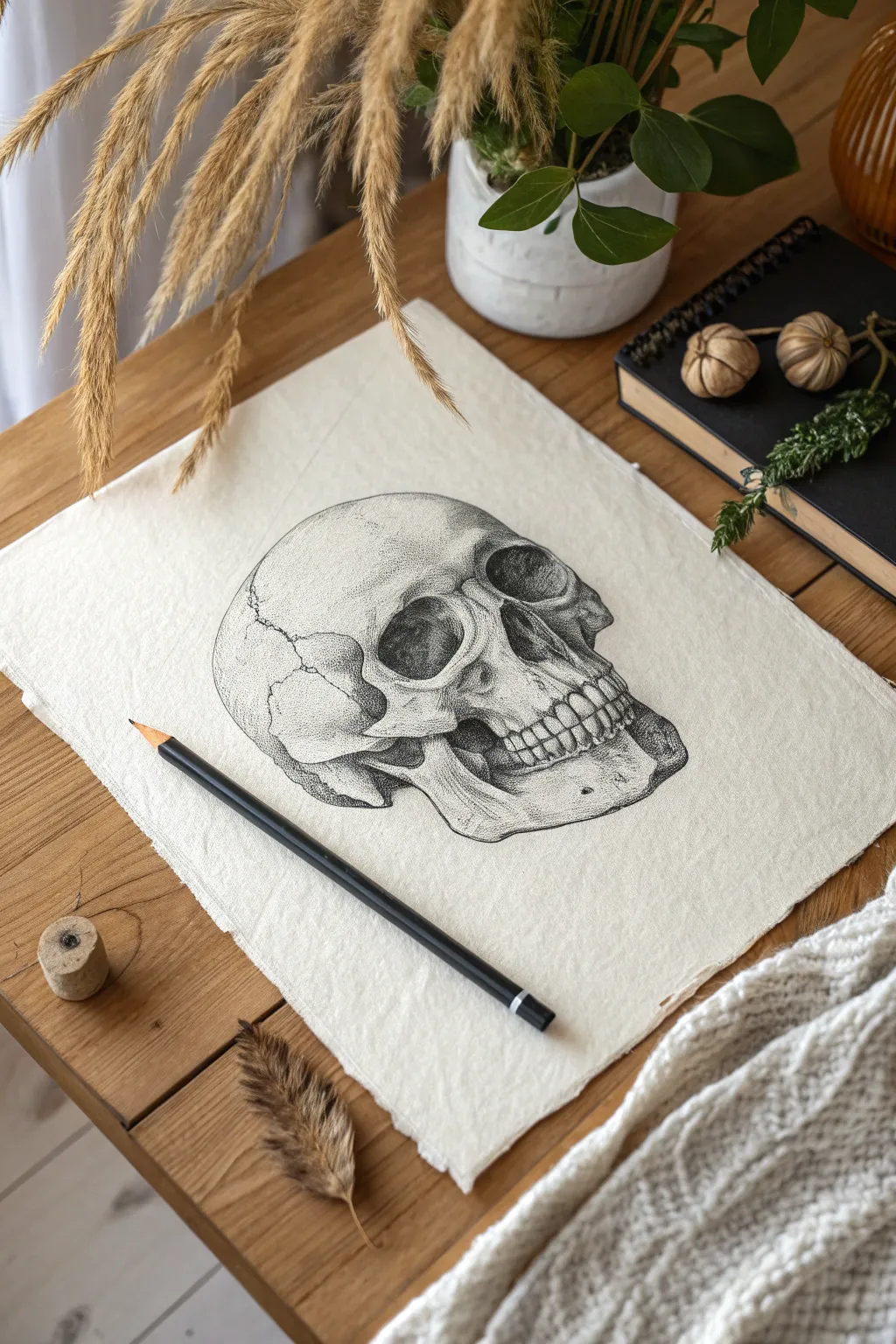
Master the art of anatomical illustration with this detailed skull study that focuses on texture and volume. By combining traditional hatching with stippling techniques, you’ll transform a simple sketch into a realistic bone structure on varied paper.
Step-by-Step Guide
Materials
- Heavyweight cream textured paper (rough grain)
- Graphite pencils (HB for sketching, 2B, 4B, and 6B for shading)
- Kneaded eraser
- Precision mechanical pencil (optional for details)
- Pencil sharpener
- Paper stump (optional)
Step 1: Structural Foundation
-
Basic Cranium Shape:
Begin with your HB pencil, using a weirdly light touch to draw a large, slightly flattened circle for the cranium. Since this is a three-quarter view, image the sphere slightly tilted back. -
Jawline Block-in:
Attach a boxy, U-shaped form descending from the side of the circle to represent the mandible (lower jaw). The angle should jut forward slightly to the right. -
Facial Guidelines:
Lightly sketch a curved vertical center line to determine where the nose and teeth will center. Mark horizontal lines for the eye sockets and the nose cavity. -
Orbital Cavities:
Sketch the eye sockets. The one on the right (closest to us) should be a distinct, slightly squared oval, while the left one is partially obscured by the nasal bridge. -
Nasal Aperture:
Draw the nose cavity as an upside-down heart shape. It sits centrally on your vertical guide but follows the skull’s angle. -
Cheekbones:
Define the zygomatic arches (cheekbones). The right cheekbone should protrude prominently below the eye socket, curving back toward the ear area.
Step 2: Refining Features
-
Dental Curvature:
Sketch the barrel shape of the mouth area (maxilla). Draw the line where upper and lower teeth meet, ensuring it curves around the skull rather than sitting flat. -
Teeth Placement:
Map out the teeth. I find it easiest to mark the center two incisors first, then work outward. Remember, teeth get smaller and more compressed as they recede into the perspective. -
Mandible Detail:
Refine the lower jawbone shape, adding the coronoid process (the bony spike) that tucks up under the cheekbone. -
Erasure:
Take your crushed kneaded eraser and gently dab away your initial geometric guidelines, leaving only the refined outline visible.
Uneven Teeth?
If the teeth look like a zipper, you’ve likely outlined them too heavily. Erase the vertical lines between them and define them only by shading the gums and the tiny shadows where they touch.
Step 3: Shading and Texture
-
Deepest Shadows:
Switch to a 4B or 6B pencil. Fill in the darkest areas first: the depth of the nasal cavity, the space under the zygomatic arch, and the shadowed corners of the eye sockets. -
Orbital Gradient:
Inside the eye sockets, create a gradient. It shouldn’t be solid black everywhere; leave lighter areas near the protruding bone ridges to show depth. Use a stippling motion (tiny dots) here for texture. -
Maxilla Shading:
Add shading above the teeth roots on the upper jaw. Use small, vertical hatching lines that fade upward to suggest the undulating bone surface. -
Stipple Texturing:
This project relies heavily on stippling for that porous bone look. With a sharp 2B, tap tiny dots heavily on the lower curves of the cranium and cheekbones, dispersing them as you move into highlighted areas. -
Defining Sutures:
Draw the cranial sutures (the squiggly cracks where bone plates fuse). Keep your line jagged and irregular, varying the pressure so perfectly straight lines don’t ruin the organic feel. -
Teeth Definition:
Shade the teeth, but avoid outlining them strictly. Instead, shade the small triangular gaps *between* the teeth and the gum line to define their shapes. -
Final Contrast:
Go back in with your 6B to punch up the contrast at the bottom of the jaw and inside the hollow of the cheek. High contrast makes the skull pop against the cream paper. -
Clean Up:
Use your eraser to lift out bright highlights on the brow ridge and the front of the chin to simulate light hitting the bone, then clean up any smudges on the background.
Pro Tip: Smudge Guard
Place a scrap piece of paper under your drawing hand. This prevents the oils in your skin from smearing your graphite work, keeping the cream paper textured and clean.
Step back and admire the stark, dramatic shadows of your finished anatomical study.
Urban Street Scenes and Perspective
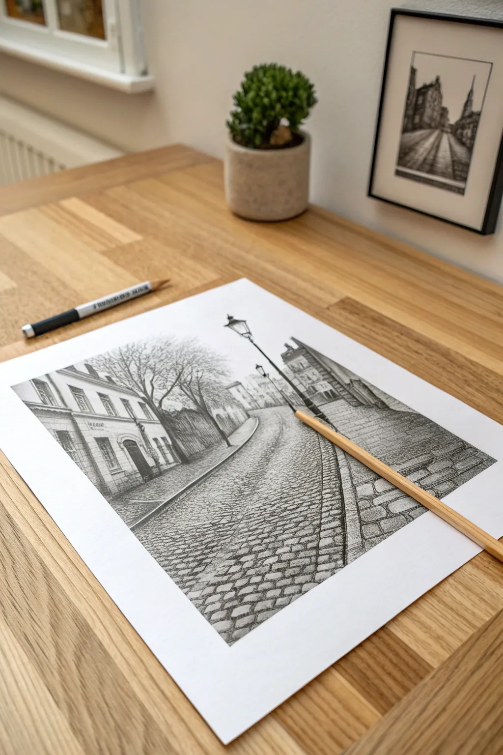
Capture the nostalgic atmosphere of an old European street in this detailed pencil study. You will learn to manage curved perspective and build rich textures, focusing heavily on realistic cobblestone patterns and architectural depth.
Step-by-Step
Materials
- Quality drawing paper (smooth or light tooth)
- Graphite pencils (H or HB for outlining, 2B and 4B for shading)
- Kneaded eraser
- Precision eraser (pencil style) for highlights
- Ruler (optional for initial lines)
- Blending stump (paper tortillon)
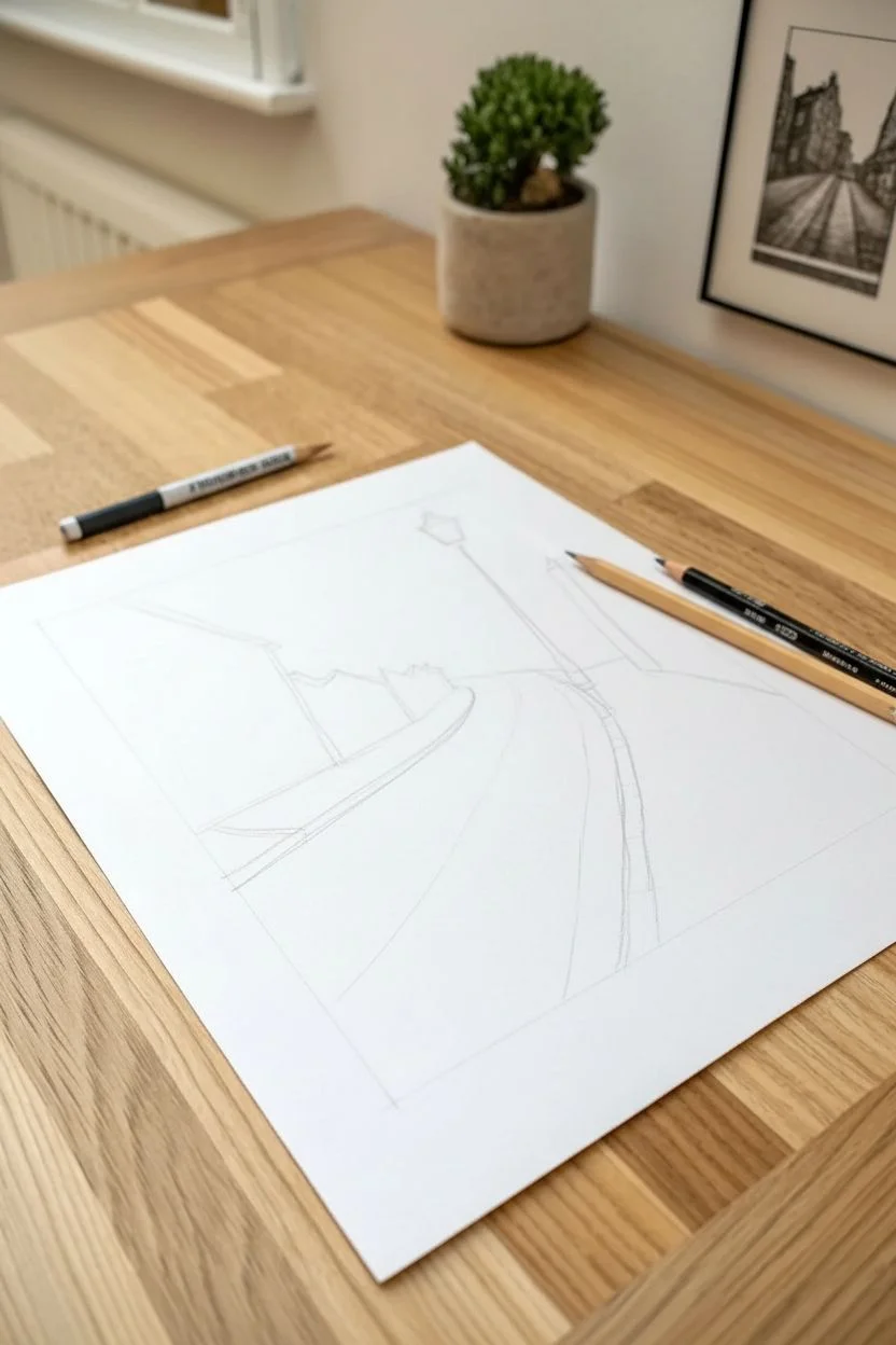
Step 1: Establishing the Perspective
-
Set the horizon:
Begin by lightly drawing a horizon line across the upper third of your paper using an HB pencil. This will anchor your viewer’s eye level. -
Map the road curve:
Sketch two sweeping curved lines starting wide at the bottom corners and converging toward the center-left of the horizon. This defines the width and direction of the street. -
Block in buildings:
On the left, lightly box in the shape of the main building, following the curve of the road. On the right, sketch a lower wall or building shape that pushes the eye toward the center. -
Position the lamp:
Draw a tall, vertical line on the right side of the street curve to mark the placement of the prominent streetlamp. It should stand taller than the distant buildings.
Troubleshooting: Flat Stones
If your cobblestones look like a wall rather than a road, they are likely too round. Flatten your stone shapes into thin Ovals or slivers the further back they go.
Step 2: Architectural Structure
-
Detail the left facade:
Add vertical lines for the windows and doors on the left building. Remember that as the building curves away, the space between these windows should become narrower. -
Refine the windows:
Draw the window frames and the arched doorway. I like to thicken the shadows inside the arches immediately to see the depth. -
Construct the lamp:
Flesh out the streetlamp. Draw the tapered base, the decorative cross-bar near the top, and the glass housing lantern. Keep lines clean and symmetrical. -
Add organic elements:
Sketch basic tree trunks rising behind the left building and in the background. Keep the branches jagged and irregular to represent winter limbs.
Step 3: Shading and Texture
-
Shade the buildings:
Switch to a 2B pencil. Apply vertical hatching to the building walls to suggest brick or stone texture, pressing harder under the roof eaves for shadow. -
Darken the windows:
Fill in the window panes with a 4B pencil. Leave tiny slivers of white paper to represent reflections on the glass. -
Detail the trees:
Go over the tree branches with a sharp dark pencil. Add many fine, intersecting twigs to create a dense, bushy appearance against the sky. -
Street lamp contrast:
Shade the metal of the streetlamp firmly with your darkest pencil. Leave a thin highlight strip down the center of the pole to make it look cylindrical and metallic.
Pro Tip: Suggestion Over Detail
Don’t draw every single stone in the distance. Draw the foreground stones in high detail, then gradually fade into simple textural scribbles as the road recedes.
Step 4: The Cobblestones
-
Guideline grid:
Lightly draw curved grid lines across the road surface that follow the street’s perspective. These will help keep your stones aligned. -
Foreground stones:
At the very bottom of the page, draw distinct, rounded rectangular stone shapes. These should be your largest stones, showing the most detail. -
Mid-ground texture:
As you move up the street, make the stones smaller and flatter. You don’t need to close every shape; short horizontal dashes can suggest stones effectively here. -
Deepen the cracks:
Using a sharp 2B or 4B, darken the gaps between the foreground stones. This contrast pops the stones upward. Shade the stones themselves lightly on one side. -
Final atmosphere:
Use a tissue or blending stump to soften the distant buildings and the far end of the road, creating a sense of atmospheric depth.
Step back and admire how your perspective lines invite the viewer for a walk down this quiet street.
Playful Doodle Grids for Warm-ups
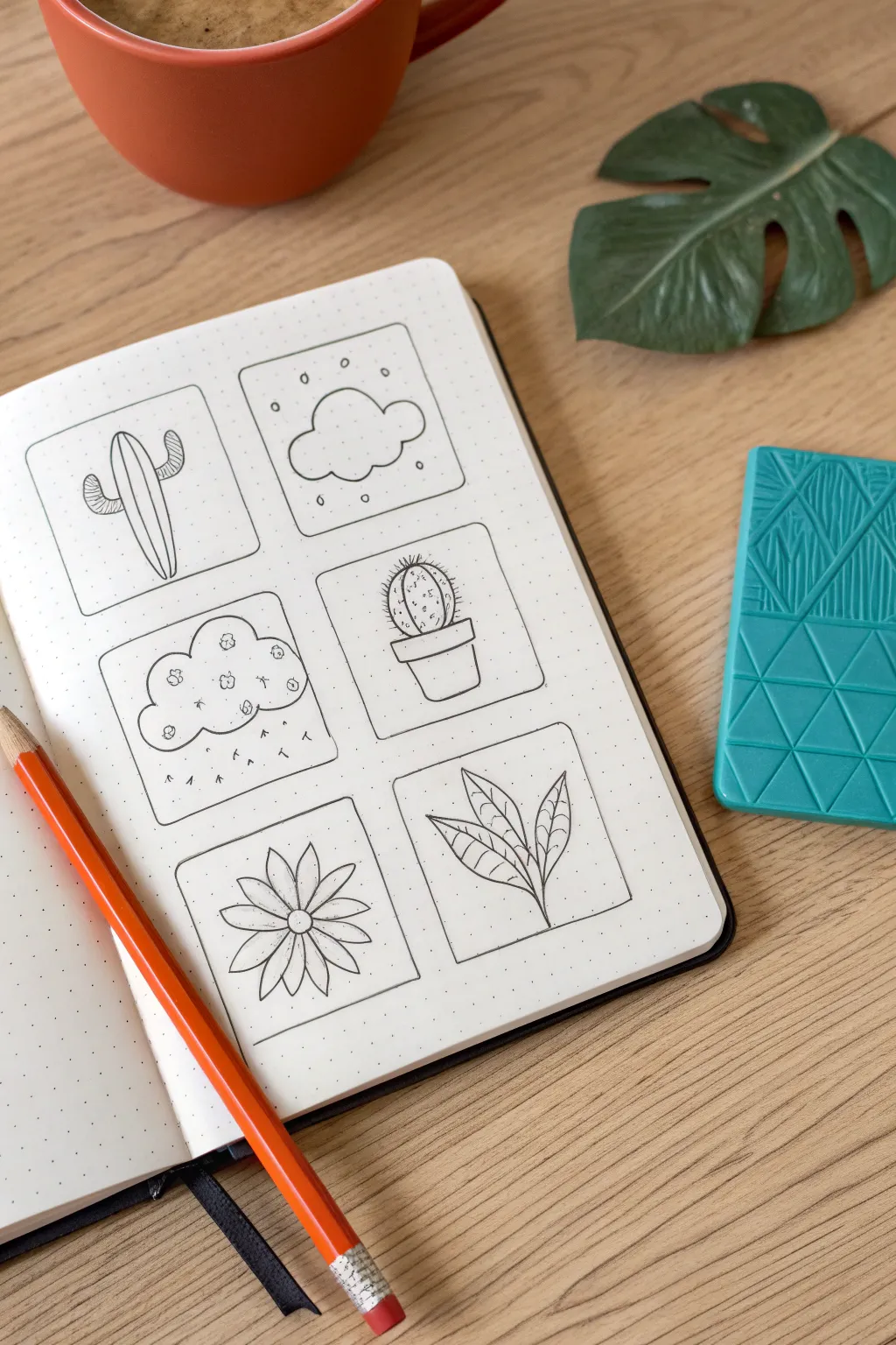
Warm up your creative muscles with this charming grid of miniature pencil sketches. Using a dotted notebook makes framing these bite-sized nature doodles satisfyingly neat and achievable for artists of any level.
Step-by-Step Tutorial
Materials
- Dotted notebook or graph paper
- HB Pencil
- Black fine liner pen (0.3mm or 0.5mm)
- Ruler (optional)
- Eraser
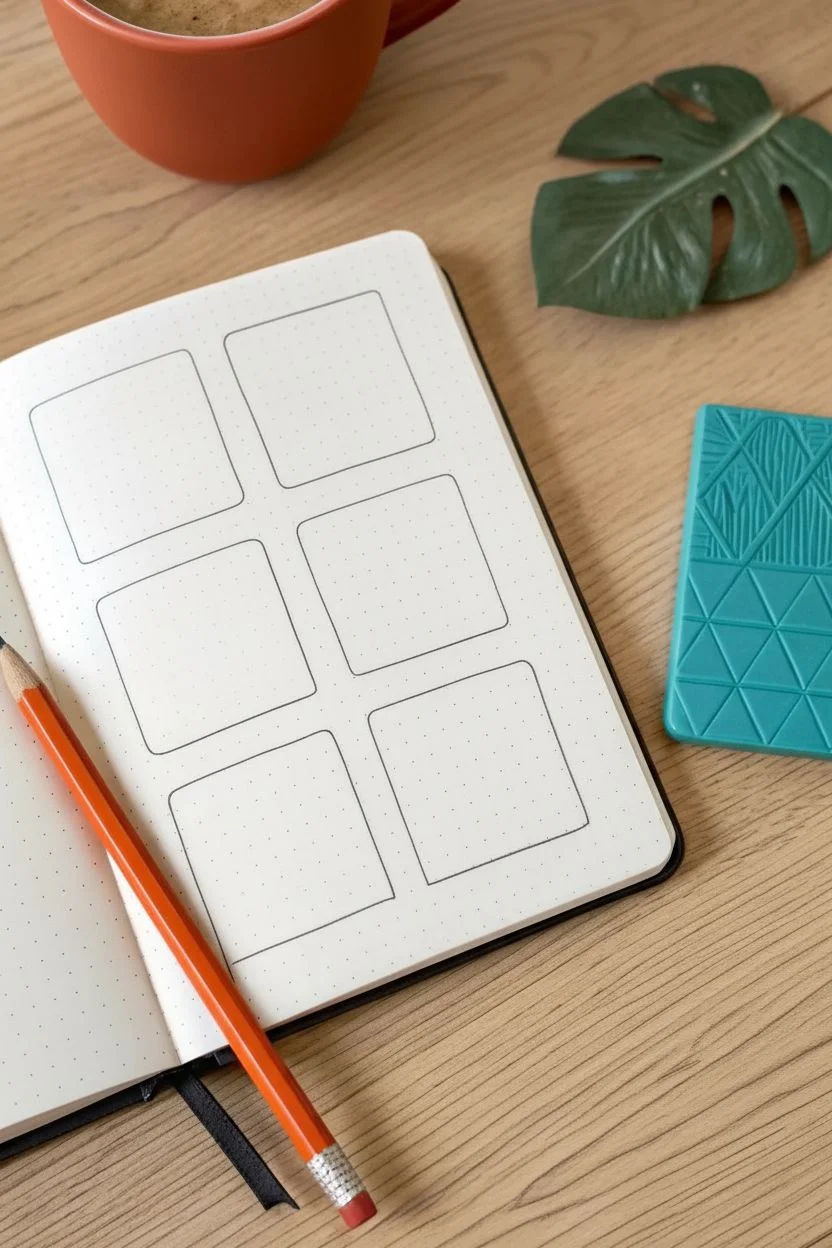
Step 1: Setting the Stage
-
Plan your layout:
Using your pencil and the notebook’s dots as a guide, count out a grid of six squares—two columns wide and three rows tall. Aim for squares that are roughly 8×8 dots. -
Sketch the frames:
Lightly draw the square borders. Instead of sharp 90-degree angles, gently round off the corners of each square to give the grid a softer, friendly appearance. -
Ink the borders:
Trace over your pencil frames with your black fine liner. Try to keep a consistent pressure so the line weight remains uniform, then let the ink dry completely.
Grid Geography
Count the empty dots between your frames carefully. Leaving exactly two or three dots of space between each doodle box ensures your layout feels balanced and not crowded.
Step 2: Top Row: Desert & Sky
-
Outline the saguaro:
In the top-left box, draw a tall, slender inverted U-shape. Add two smaller U-shaped arms on either side—one slightly higher than the other. -
Vertical texture:
Draw three or four vertical lines running down the length of the main cactus body to mimic its ribbed texture. -
Simple cloud shape:
In the top-right box, draw a standard cloud using connected semi-circles to create a fluffy, scalloped perimeter. -
Atmospheric details:
Scatter small, open circles around the cloud to represent light snow or gentle hail.
Step 3: Middle Row: Pattern & Potted
-
Textured cloud:
In the middle-left box, draw another cloud shape similar to the first one. -
Internal patterns:
Fill the inside of this cloud with tiny scribbled flowers or clusters of loops. Add small tick marks underneath to suggest rain. -
Draft the pot:
Move to the middle-right box. I like to start by drawing a small rectangle for the rim, then a trapezoid shape beneath it for the pot’s body. -
Round cactus:
Draw a sphere sitting inside the pot rim. Add vertical curved lines to give it volume. -
Spikes:
Add tiny dashes all along the vertical lines of the round cactus to represent prickly spines.
Smudge Stopper
Patience is key when erasing! Wait at least 60 seconds after your last pen stroke before using the eraser. Even quick-drying pens can smear if erased while the ink is still settling.
Step 4: Bottom Row: Botanical Blooms
-
Flower center:
In the bottom-left box, place a small circle right in the middle of the frame. -
Petals:
Draw eight pointed petals radiating outward from the center circle. Draw a straight line down the center of each petal for detail. -
Leaf stem:
In the final box, start with a single curved line stretching diagonally from broken corner to corner. -
Add foliage:
Draw pointed oval leaves attaching to the stem in alternating positions. -
Vein details:
Draw a center line through each leaf, and add tiny diagonal veins branching off that center line. -
Final inking:
Go over all your internal pencil sketches with the fine liner. Once the ink is totally dry, erase all underlying pencil marks for a crisp, clean finish.
Enjoy your beautifully organized mini-gallery of nature doodles
Surreal Whimsical Mashups
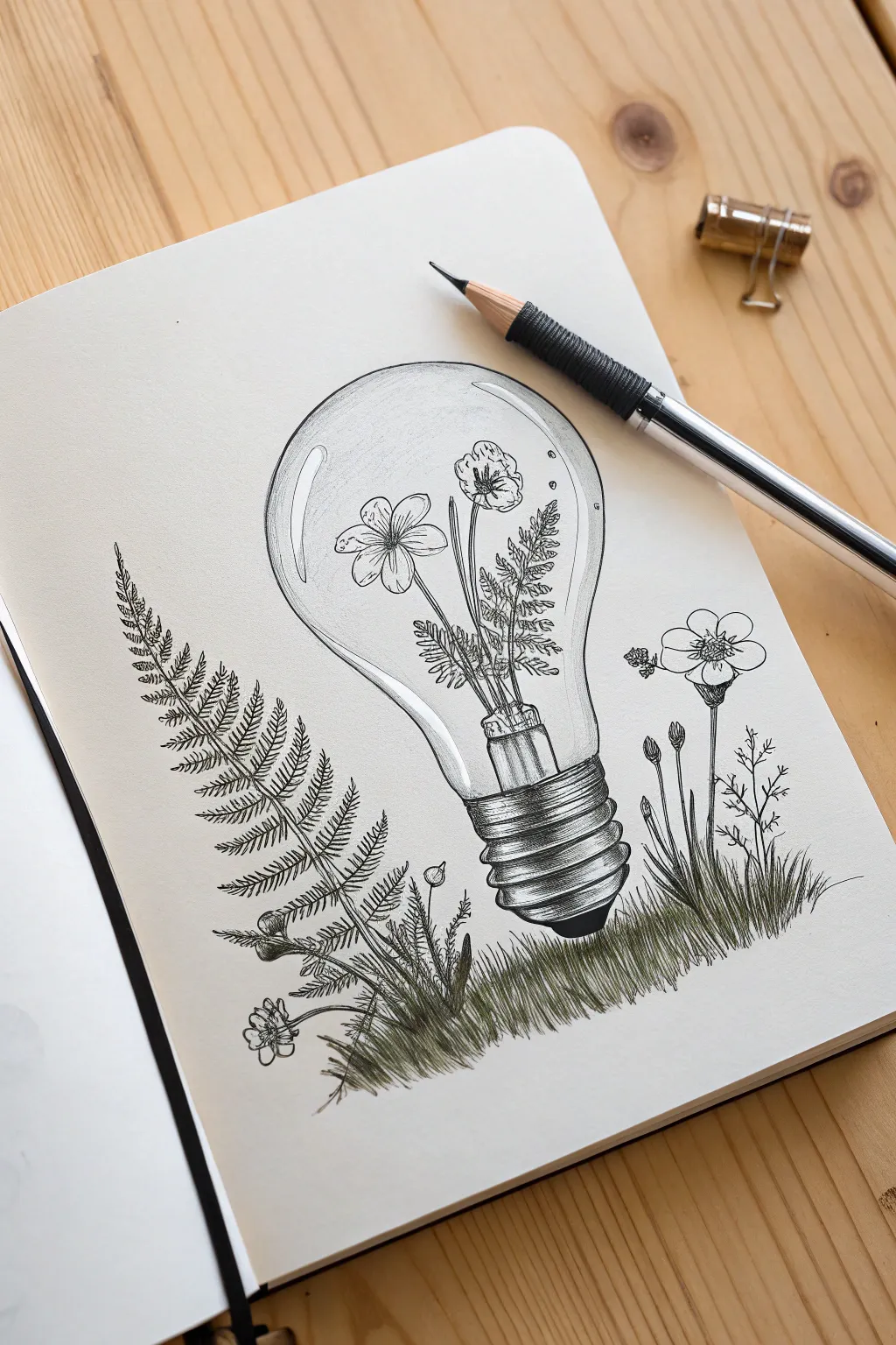

Merge the industrial with the organic in this surreal pencil drawing featuring wildflowers thriving inside a lightbulb. This project focuses on glass transparency effects and delicate botanical textures for a whimsical, thought-provoking piece.
Step-by-Step Guide
Materials
- Drawing paper (smooth surface)
- Graphite pencils (HB, 2B, 4B)
- Mechanical pencil (0.5mm sketch lead)
- Kneaded eraser
- Precision eraser (for highlights)
- Ruler (optional)
Step 1: Constructing the Bulb
-
Establish the axis:
Begin by lightly drawing a vertical line down the center of your page to ensure symmetry. -
Shape the glass:
Draw a circle for the main body of the bulb, then sketch two lines tapering downwards from the bottom of the circle to form the neck. -
Add the base:
At the bottom of the neck, sketch a cylindrical shape with rounded edges for the metal screw base and a small rounded nub at the very bottom contact point. -
Map the highlights:
Lightly outline elongated, curved rectangle shapes on the upper left and right sides of the bulb’s glass surface. These areas will remain pure white to create the illusion of reflection.
Symmetry Check
If your lightbulb shape looks lopsided, turn your paper upside down or look at it in a mirror. This shifts your perspective and makes structural errors jump out immediately.
Step 2: Sketching the Flora
-
Plant the inner stems:
Inside the bulb, draw thin stems rising from the neck area. Distort the lines slightly near the glass edges if you want a high-realism look, though keeping them straight works for this stylized illustration. -
Draft the inner blooms:
Sketch a five-petaled flower facing forward on the left stem, and a smaller, slightly closed bloom on the right stem. -
Add inner foliage:
Fill the space between the stems with delicate, fern-like fronds. Keep these pencil strokes light and airy. -
Sketch the outer fern:
Outside the bulb on the left, draw a long, curving line for a fern spine. Sketch small, repetitive leaf shapes all along this spine. -
Add side details:
To the right of the bulb, sketch a few vertical stems with small buds and leaves to balance the composition. -
Create the grassy bed:
At the very bottom, draw a rough horizontal zone where the bulb sits, filling it with short, vertical strokes to indicate grass blades.
Pro Tip: Crisp Glass
To get that convincing glass look, contrast is key. Make the outlines of the highlights sharp and dark right next to the pure white paper. Don’t blend the edges of reflections.
Step 3: Refining and Shading
-
Define the outlines:
Switch to a mechanical pencil or a sharpened HB. Go over your main contour lines with a confident, clean stroke, breaking the line occasionally for a more organic feel. -
Detail the fern:
Carefully darken the small leaflets on the fern. Add a tiny central line to each leaflet for texture. -
Shade the flowers:
Using a 2B pencil, add light hatching near the center of the flower petals radiating outward. Darken the very center stamen of the main flower. -
Render the metal base:
Draw curved horizontal lines across the metal base to represent threads. Shade the sides of this cylinder darker than the center to make it look round and metallic. -
Create glass volume:
Shade gently along the inner perimeter of the bulb using an HB pencil. Keep the gradient smooth, fading quickly into the white of the paper. -
Enhance the reflections:
Ensure the highlight shapes you mapped earlier are strictly white. I like to run a precision eraser along the edges of these highlights to make them pop.
Step 4: Final Contrast
-
Darken the grass:
Using a 4B pencil, go back to the grass bed. Use quick, firm upward flicks to create dense, dark blades of grass that overlap each other. -
Ground the object:
Add heavy shading directly underneath the bulb where it touches the grass to plant the object firmly in the scene. -
Boost values:
Review the drawing and deepen the darkest areas—such as the shadows between fern leaves and the edges of the metal base—to increase the overall contrast.
Now you have a captured piece of nature frozen in time, ready to display or gift!
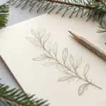
Clever Negative Space Compositions
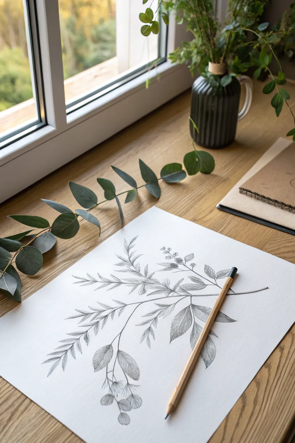
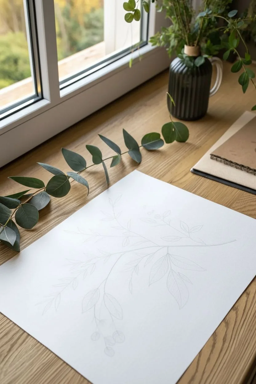
Capture the delicate beauty of nature with this detailed botanical pencil sketch. By focusing on organic lines and careful shading, you will render a lifelike branch that pops against the crisp white paper.
Step-by-Step
Materials
- Smooth drawing paper (A4 or similar)
- Graphite pencils (HB, 2B, 4B)
- Kneaded eraser
- Pencil sharpener
- Eucalyptus branch or similar reference
Step 1: Planning the Composition
-
Set the curve:
Using a sharp HB pencil, lightly sketch a long, graceful curve diagonally across your page to act as the main stem’s spine. -
Mark branching points:
Identify where the smaller offshoots will occur and mark them with tiny ticks along the main line. -
Extend the stems:
Draw thin guidelines extending from your marks, varying their lengths and angles to capture a natural growth pattern. -
Block in leaf shapes:
Sketch faint, elongated ovals and tear-drop shapes to represent the leaves, paying attention to their varying sizes. -
Add floral details:
Indicate the position of berry clusters or buds at the bottom and top of the branch with simple circles. -
Check proportions:
Step back and compare your sketch to the reference, adjusting the angle or size of any leaves that feel unbalanced.
Smudge Prevention
Place a scrap piece of paper under your drawing hand. This protects your finished shading from smearing while you work on other areas.
Step 2: Refining Outlines
-
Thicken the stem:
Go over the main stem line, adding a second line parallel to it to give it thickness, widening slightly at the base. -
Define leaf contours:
Trace over your leaf guides with a more confident line, adding subtle waves to the edges for realism. -
Draw central veins:
Sketch a single line down the center of each leaf, following the curvature of the leaf blade. -
Detail the buds:
Refine the circular berry shapes, drawing tiny connecting stems that attach them to the main branch. -
Clean up:
Take your kneaded eraser and gently list away the initial construction lines, leaving only your refined outlines.
Step 3: Shading and Texture
-
Establish light direction:
Decide where your light is coming from; in this project, light hits from the upper left. -
Shade the stem:
Switch to a 2B pencil and shade the right side of the stems to create a cylindrical 3D effect. -
Apply leaf shadows:
Use a hatching technique—drawing closely spaced parallel lines—to shade the leaves. -
Create volume:
I like to curve my hatching marks slightly to match the contour of the leaf surface, which enhances the sense of volume. -
Deepen contrast:
Press harder in areas where leaves overlap the stem or each other to create cast shadows. -
Texture the berries:
Add curved hatch marks to the bottom right of each berry to make them appear spherical. -
Final darks:
Use a 4B pencil to add the darkest accents in the deepest crevices and shadow points. -
Final assessment:
Review the drawing for balance and clean up any accidental smudges on the white background.
Level Up: Negative Space
Instead of shading the leaves, try shading only the background space around them. This ‘negative space’ technique highlights the delicate silhouette.
Enjoy the calm focus that comes with observing and rendering these natural details.
Soft Fabric Folds and Drapery
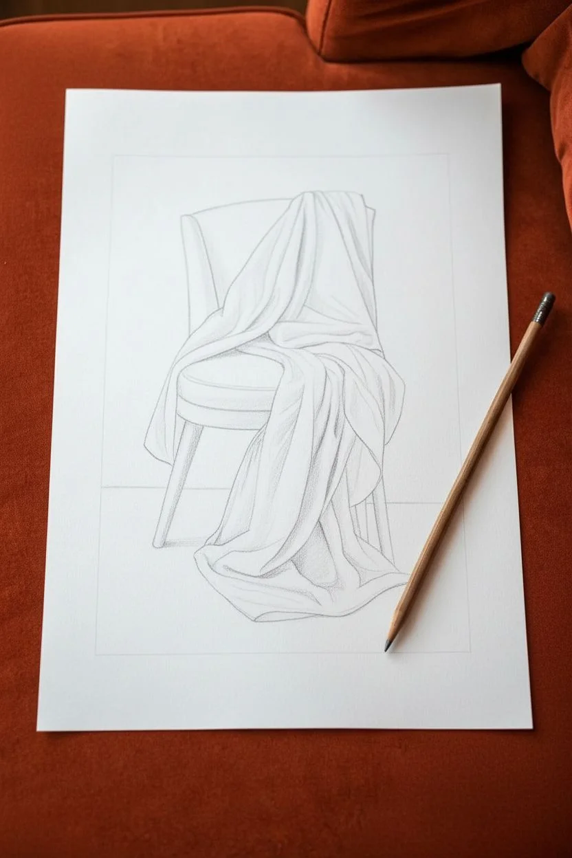
Capture the elegant flow and heavy weight of fabric draped over a chair in this realistic pencil study. This project focuses on understanding light, shadow, and soft transitions to turn simple lines into three-dimensional folds.
Step-by-Step Tutorial
Materials
- Set of graphite pencils (HB, 2B, 4B, 6B)
- Smooth drawing paper or Bristol board
- Kneaded eraser
- Blending stump or tortillon
- Ruler
- Tissues or soft paint brush (for sweeping crumbs)
Step 1: Sketching the Composition
-
Block in dimensions:
Using an HB pencil with very light pressure, draw a large rectangle in the center of your page to define the drawing’s border. Within this, sketch generic geometric shapes to place the chair’s back, seat, and legs. -
Outline the chair:
Refine the structural lines of the chair. You don’t need to draw the whole chair perfectly, just the parts that will be visible: the top left corner of the backrest, the rim of the seat, and the front legs. -
Map the major folds:
Observe the large triangular shapes where the fabric cascades. Draw the sweeping curves of the main drapery, focusing on the “Y” shapes where folds split and the heavy pooling of fabric on the floor. -
Refine the contours:
Go over your outline once more to create clean, definitive edges for the fabric. Pay close attention to where the cloth overlaps; these intersection points are crucial for realism.
Pro Tip: Smudge Guard
Place a scrap piece of paper under your drawing hand while you work. This prevents the oils in your skin from transferring to the paper and keeps you from smearing your finished shading.
Step 2: Establishing Values on the Chair
-
Shade the wood:
Using a 2B pencil, fill in the visible wooden parts of the chair. Keep your strokes even and strictly vertical to mimic the grain and structure of the legs. -
Add dimension to the legs:
Press slightly harder on the right side of each leg and the underside of the seat frame to create a cylindrical form. Leave a thin sliver of lighter value on the left edge to represent a highlight. -
Darken the crevices:
Switch to a 4B pencil to add deep contact shadows where the fabric touches the chair and where the legs meet the floor shadow.
Level Up: Texture Play
Instead of smooth shading on the chair, try using distinct, straight hatch marks to mimic a wood grain texture. This creates a beautiful contrast against the smooth, blended softness of the fabric.
Step 3: Shading the Drapery
-
Identify the light source:
Before shading, determine your light direction (coming from the upper left). This means the tops of the folds will remain white, while the right sides and deep valleys will be shadowed. -
Apply the mid-tones:
With an HB or B pencil, lightly hatch the shadowed areas of the fabric. Focus on the sides of the folds that turn away from the light, leaving the crests of the folds purely the white of the paper. -
Blend the transitions:
Use a blending stump (tortillon) to gently smudge your graphite hatch marks. I like to work in small circles, pulling the graphite slowly toward the highlighted areas to create a soft, seamless gradient. -
Deepen the valleys:
Take a 4B pencil and darken the deepest recesses effectively the ‘valleys’ between the folds. These should be the darkest points of the fabric, contrasting sharply with the neighboring highlights. -
Refine the edges:
Sharpen your 2B pencil and crisp up the edges where one fold overlaps another. A clean, sharp line here prevents the drawing from looking fuzzy or out of focus. -
Soften the floor pool:
For the fabric resting on the ground, use softer, horizontal strokes. Let the shadows puddle naturally under the heavy folds to ground the object.
Step 4: Background and Final Polish
-
Create the backdrop:
To make the white fabric pop, shade the background rectangle you drew in step 1. Use an HB pencil on its side to create a soft, uniform grey wash behind the chair, leaving the white page border clean. -
Cast shadow:
Add a darker cast shadow on the ‘floor’ area directly beneath the chair legs and the draped fabric. This anchors the floating object to the ground. -
Lift highlights:
Take your kneaded eraser and pinch it into a fine wedge. Dab along the highest peaks of the fabric folds to lift off any accidental smudging and return them to bright white. -
Final contrast check:
Step back and view your work. Use a 6B pencil to sparingly enhance the absolute darkest points—specifically under the seat cushion and inside the deepest fabric crevices.
Now you have a stunning study of light and form that makes the fabric look soft enough to touch.
Dramatic High-Contrast Portraits
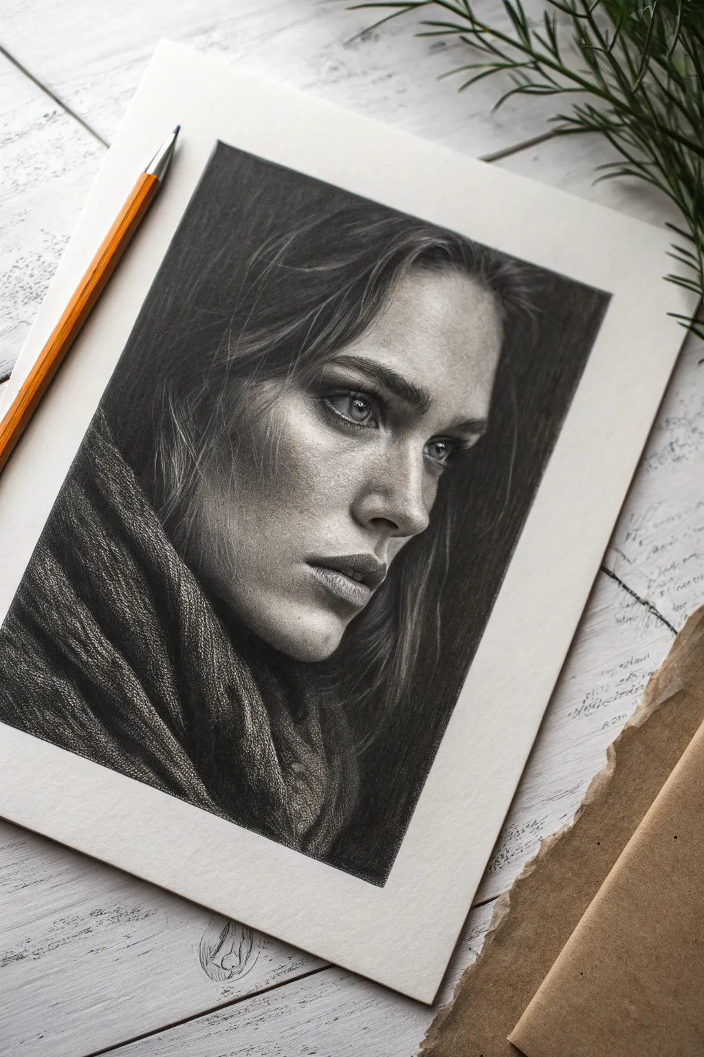
Master the art of chiaroscuro with this dramatic high-contrast portrait project that balances hyper-realistic skin texture against a deep, dark background. You will learn how to render intricate details like woven fabric and flyaway hairs while controlling your tonal values to create a moody, emotional atmosphere.
Step-by-Step
Materials
- High-quality drawing paper (Bristol vellum or fine-tooth)
- Graphite pencils (HB, 2B, 4B, 6B, 8B)
- Black charcoal pencil (medium or soft)
- Kneaded eraser
- Precision eraser (e.g., Mono Zero)
- Blending stumps (tortillons)
- Soft tissue or chamois cloth
- Workable fixative spray
Step 1: Structural Layout
-
Initial outline:
Begin with an HB pencil to lightly map out the facial proportions. Focus on the three-quarter angle, placing the near eye, the slope of the nose, and the distinctive jawline. -
Blocking shadow shapes:
Instead of drawing features, try outlining the shapes of the shadows around the eye socket, cheekbone, and beneath the jaw. This helps establish the dramatic lighting early on. -
Clothing placement:
Sketch the large, flowing curves of the scarf around the neck. Don’t worry about the knit texture yet; just get the main folds accurate.
Pro Tip: Beat the Shine
Heavy graphite layers can reflect light (graphite shine). To keep the background matte black, consider using carbon or charcoal pencils strictly for the darkest darks.
Step 2: Rendering the Face
-
The eyes:
Start with the eyes to anchor the portrait’s soul. Use a sharp 4B pencil for the pupil and upper lash line, but leave the catchlights pure white. -
Iris detailing:
Draw tiny radiating lines in the iris for texture. I like to let this dry briefly or just be careful not to smudge it while working outward. -
Skin base tones:
Using a 2B pencil held at a low angle, lightly cover the skin areas. Use a tissue to smooth this graphite into a soft, mid-tone gray base. -
Deepening facial shadows:
Switch to a 4B or 6B to carve out the geography of the face. Darken the area under the brow bone, the side of the nose, and the hollow of the cheek. -
Skin texture:
For the realistic pore and freckle texture seen on the cheek, gently tap a somewhat blunt pencil tip onto the paper, varying the pressure. Do not blend these dots. -
Lips and teeth:
Render the lips with vertical, curved strokes to mimic natural creases. Keep the teeth slightly shaded—they should never be stark white in a shadowy mouth.
Troubleshooting: Muddy Skin
If facial shading looks dirty or smudged rather than smooth, you likely over-blended. Lift the graphite with a sticky kneaded eraser and re-apply layers with a lighter touch.
Step 3: Texturing the Fabric
-
Scarf foundation:
Fill the scarf area with a solid mid-tone graphite layer. Use a blending stump to push the graphite into the tooth of the paper. -
Weaving the knit:
Use a 4B pencil to draw short, repeating cross-hatch marks over the folds. This mimics the coarse wool texture. -
Highlighting fabric:
Take your kneaded eraser and dab it along the tops of the scarf folds to lift rough, irregular highlights, enhancing the rough fabric look.
Step 4: Background and Finish
-
The void background:
To achieve that pitch-black background, switch to a soft charcoal pencil or an 8B graphite. Apply heavy pressure to fill the negative space completely. -
Merging edges:
Carefully blend the dark background right up to the skin and hair. In the shadowed side of the face, let the hair edge disappear into the dark background. -
Hair flow:
Draw the main clumps of hair using long, sweeping strokes with a 4B pencil. Follow the curve of the skull. -
Flyaways:
Use a very sharp HB pencil for the fine, loose strands crossing the face. Use your precision eraser to ‘draw’ white strands by lifting pigment from darker areas. -
Final contrast check:
Step back and squint at your drawing. Deepen the darkest crevices one last time to ensure maximum contrast against the highlights.
Now frame your striking portrait and enjoy the depth of that dramatic lighting.
The Aesthetic Sketchbook Flat Lay
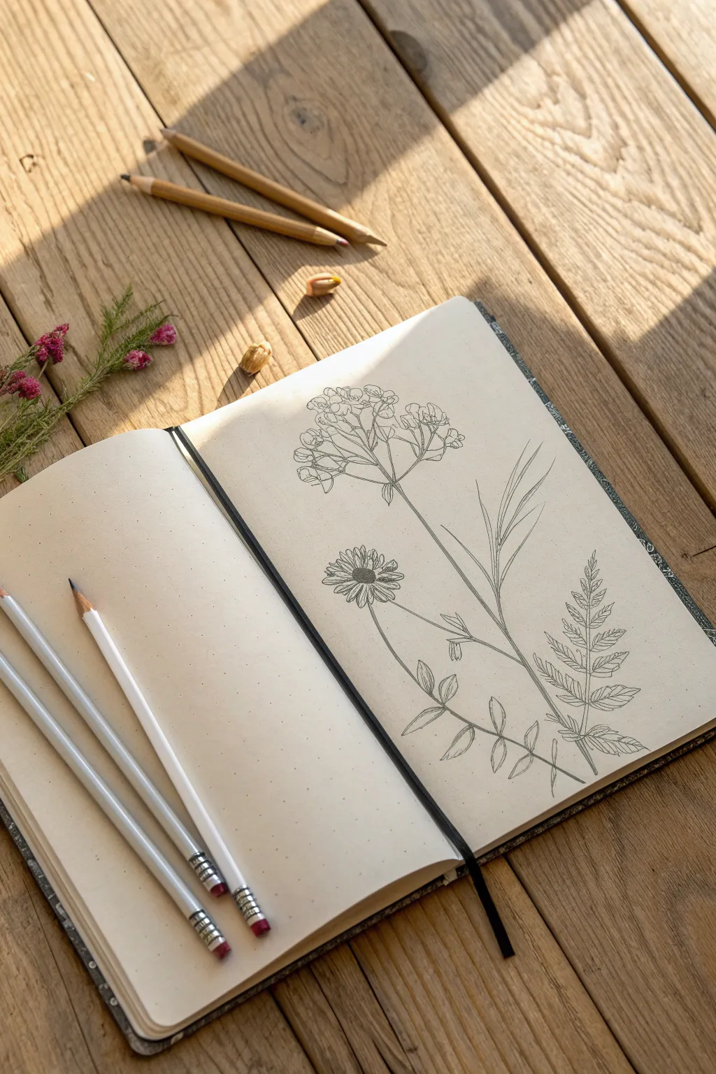
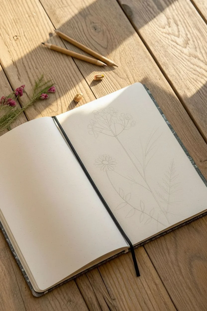
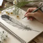
Capture the quiet beauty of a field study with this delicate arrangement of wildflowers. You will create a composition featuring an umbel bloom, fern fronds, and a detailed daisy, perfect for filling a sketchbook page with nature-inspired art.
Step-by-Step
Materials
- Dot grid or plain sketchbook (cream paper recommended)
- Graphite pencils (HB and 2B)
- Mechanical pencil (0.5mm) for fine details
- Kneaded eraser
- Pencil sharpener
Step 1: Structural Framework
-
Establish the main stems:
Lightly sketch a central vertical line curving slightly to the right to act as the anchor for the tallest flower. -
Map spatial relationships:
Draw a secondary line branching off to the right from the base area for the fern, and a shorter, angled line on the left for the daisy stem. -
Mark floral positions:
Sketch faint circles or ovals at the top of the main stems to indicate where the flower heads will sit, ensuring balanced spacing on the page.
Sharpen Up
Keep your pencil extremely sharp, especially for the top flower clusters. A fine point is essential for distinguishing those tiny individual blooms without smudging.
Step 2: The Umbel Flower
-
Create the skeleton:
At the top of the tallest stem, draw several small, straight lines radiating outward from a single point, resembling an umbrella frame. -
Define the clusters:
Sketch loose, irregular cloud-like shapes at the end of each radiating spoke to define the volume of the flower clusters. -
Detail the blooms:
Refine these clusters by drawing tiny, individual four-petaled flowers, keeping the linework light and overlapping to suggest density. -
Add foliage:
Draw long, slender, lance-shaped leaves attaching to the lower part of this main stem, using smooth, sweeping curves that taper to a sharp point.
Step 3: The Fern Frond
-
Draw the rachis:
Focusing on the right-hand curved line, darken the central rib (rachis) to establish the spine of the fern leaf. -
Sketch leaflet pairs:
Begin drawing paired leaflets extending from the rib, starting wider at the base and becoming smaller and closer together near the tip. -
Refine leaf edges:
Go back over the leaflets and add serrated or jagged edges to give them a realistic, textured botanical look. -
Add veining:
Draw a central vein down the middle of each small leaflet, keeping your hand pressure very light for a delicate effect.
Vintage Vibe
Try using a sepia or dark brown fineliner instead of graphite to give your drawing the look of an antique textbook illustration.
Step 4: The Daisy & Vetch
-
Outline the center:
Define the center of the daisy on the left with a tight, slightly flattened oval. -
Draw petals:
Sketch thin, elongated petals radiating from the center disc, varying their lengths slightly and allowing some to overlap for perspective. -
Texture the seed head:
Using a mechanical pencil or a very sharp point, fill the center oval with tiny stippling dots to simulate a pollen texture. -
Detail the lower stem:
Along the daisy’s stem, draw small, opposite pairs of oval leaves, mimicking a vetch or valerian plant structure.
Step 5: Finishing Touches
-
Deepen contrast:
Switch to a 2B pencil and re-trace the shadow side of the stems to add weight and dimension. -
Add shading:
I like to add very subtle hatching lines on the undersides of the leaves and near stem joints to create a sense of depth. -
Clean up:
Gently erase any underlying structural lines that are visible through the finished drawing, leaving a crisp botanical study.
Now you have a timeless botanical sketch ready to be admired or expanded into a full meadow scene.


Have a question or want to share your own experience? I'd love to hear from you in the comments below!